Pantone - Spring/Summer - 2021 - New York Palette: Introduction

I am a bit behind on the Pantone colors this year. I had a hard time getting back into the swing of regularly posting, but here I am. While we are a few weeks into spring, the Pantone colors for this season are for spring and summer. I don’t pay attention too much to their time table, because they already have the colors out for the fall/winter season. Who wants to think about fall/winter when we have barely made it into spring? Ha, ha.

Just as a quick review, the Pantone Color Institute is an entity that provides the color trends for both the fashion and interior design industries. If you go to their website you can see all sorts of information from color swatches you can order to educational opportunities. Obviously, these are not the only colors that you see trending on the runways, but Pantone is easily considered a color authority by both design areas.

Every year, Pantone chooses a color of the year. Last year it was Classic Blue. In 2019 it was Living Coral. This year they picked two colors, Illuminating, a sunny yellow and Ultimate Gray, which is a classic medium gray. Typically, the colors of the year are seen on both the New York and the London Palettes. As I have done in the past I will be starting my series with the New York Palette. This year, the palettes are quite dissimilar, which makes it more interesting for me, as I pick out outfits and for you, my lovely subscribers.

Here is the New York Palette.

ClassicColors_(12).jpg

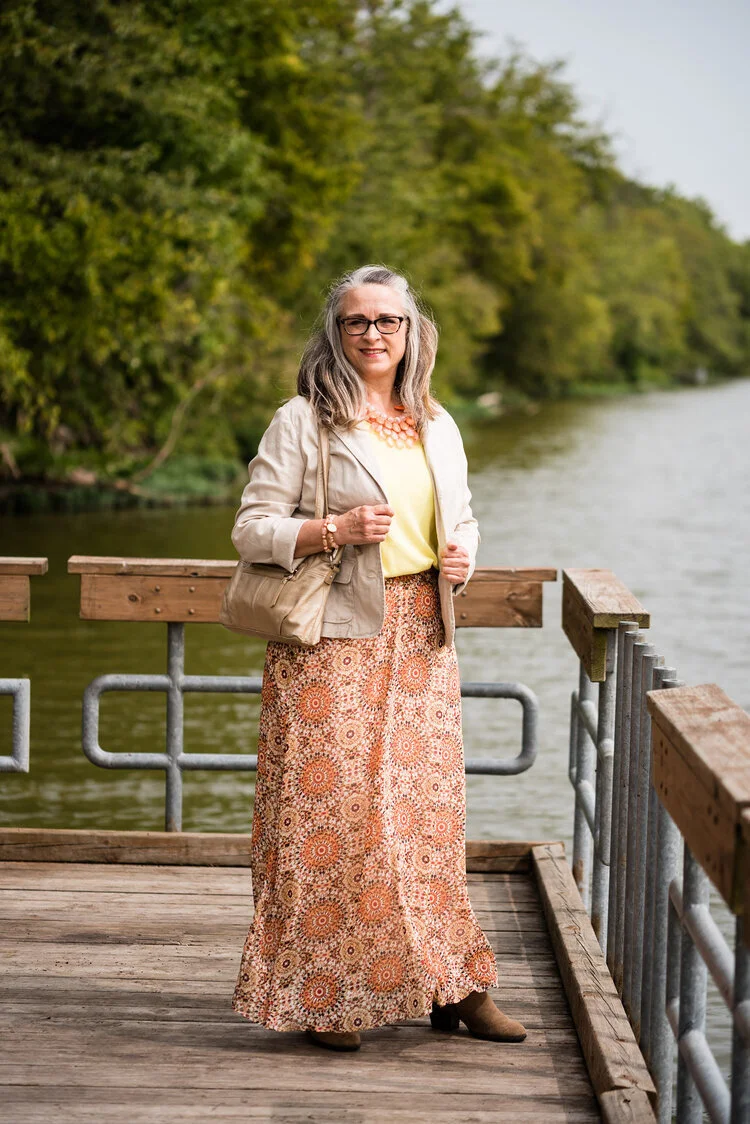
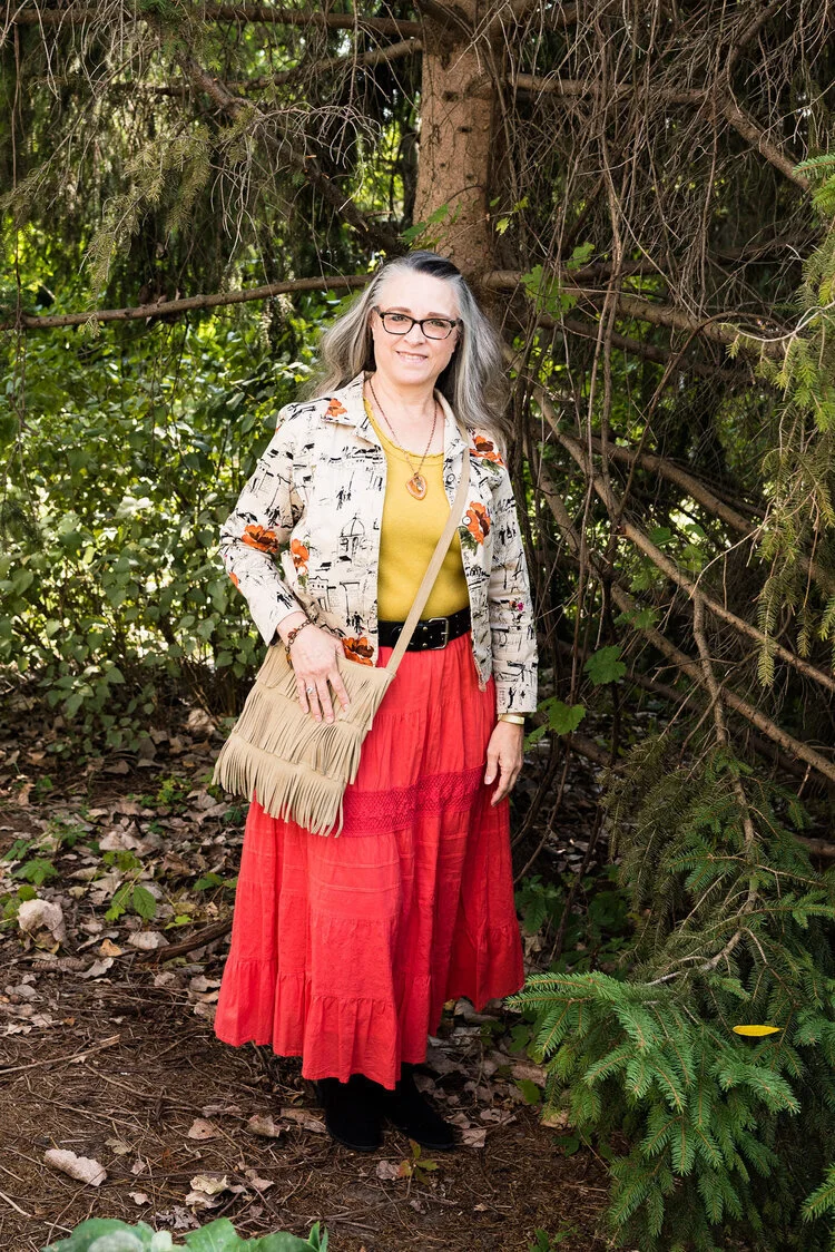
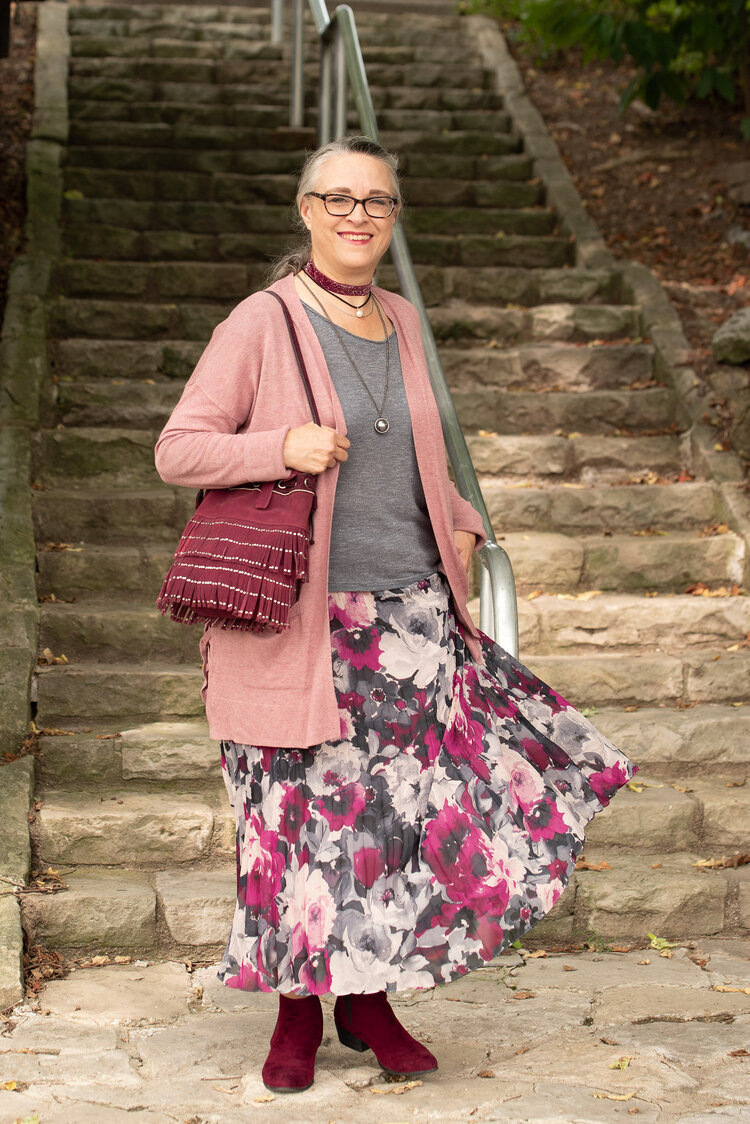
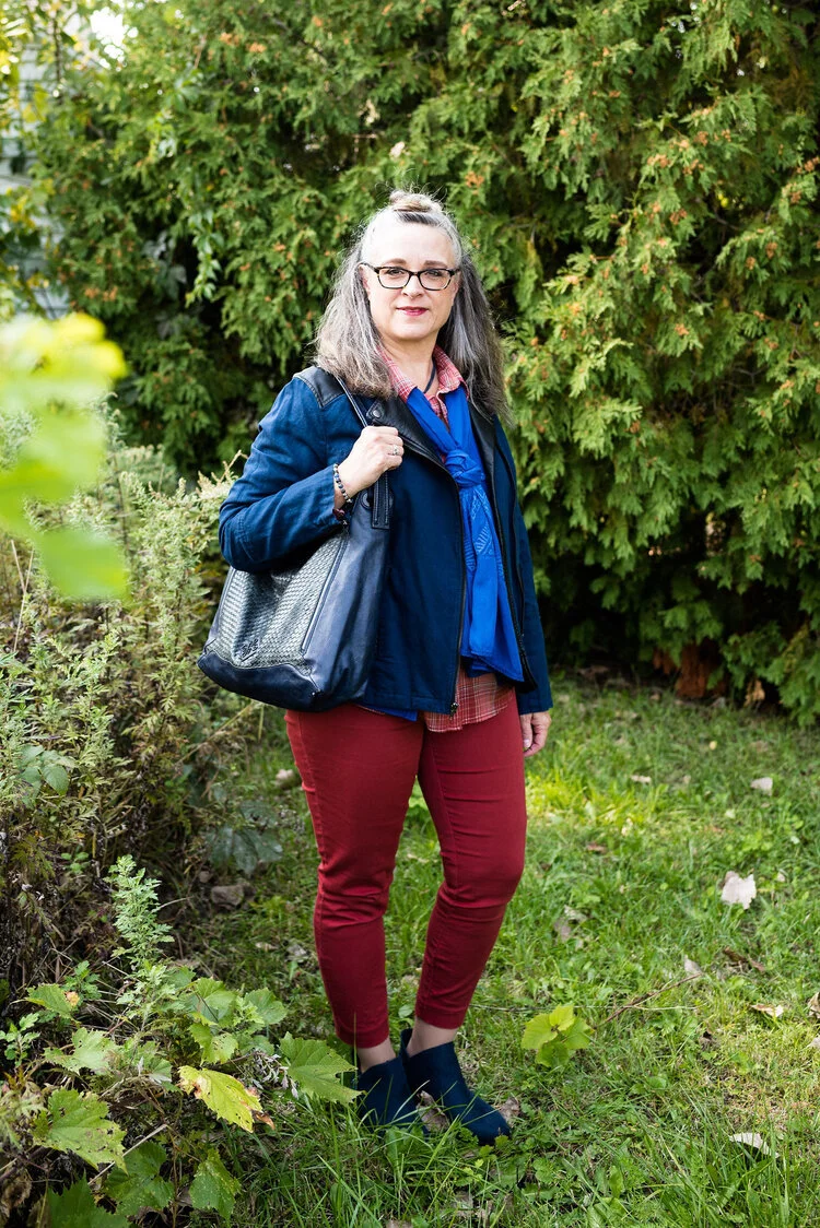
This is a mix of jewel tones and pastels, so if you lean towards one or the other, this palette will make everyone happy. Rust is a different color for summer, but I think it can work well with many of the others colors. Once again there is a selection of classic colors, which to me are helpful if you want to tone down an outfit and just accent with the brighter colors through jewelry and other accessories.

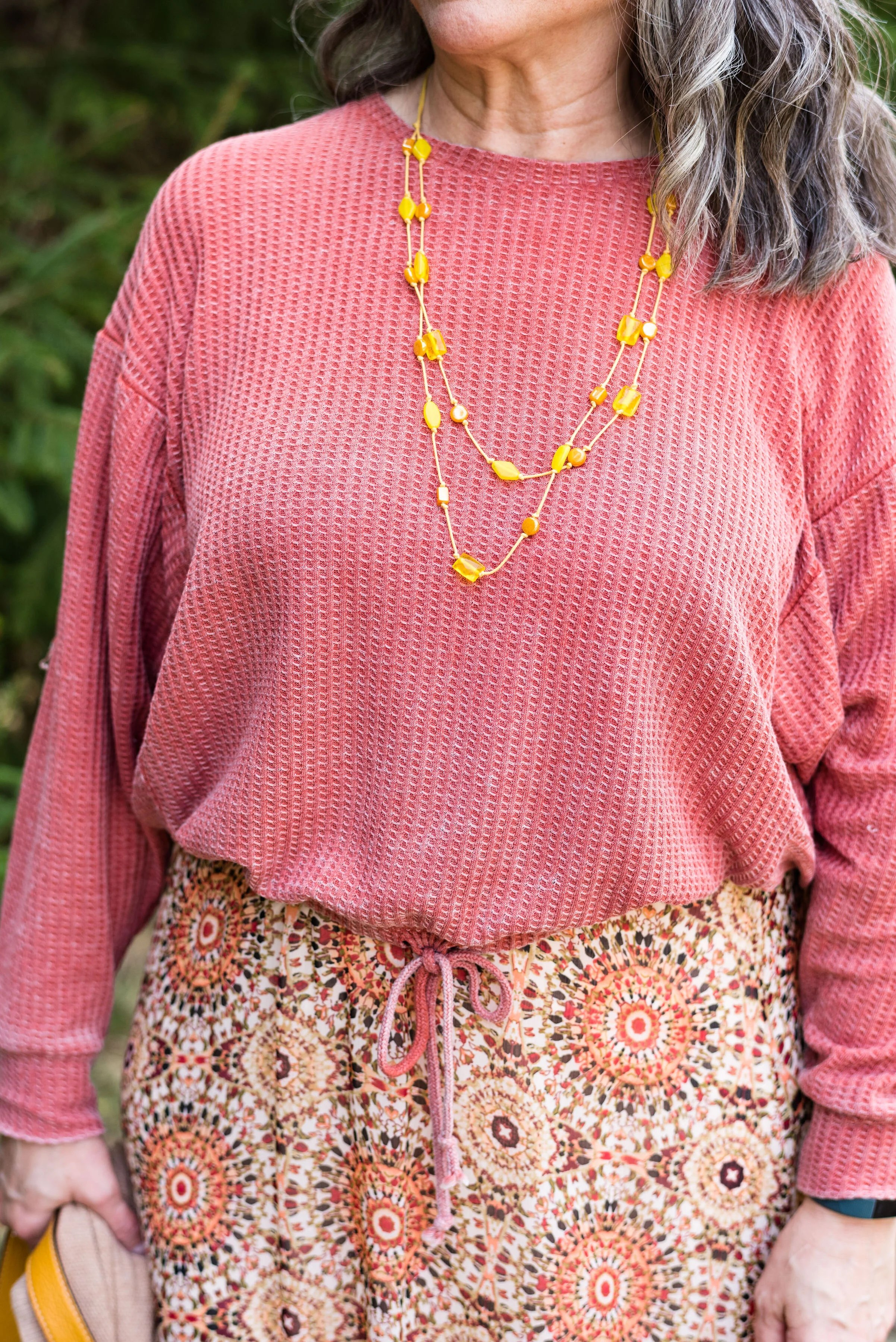
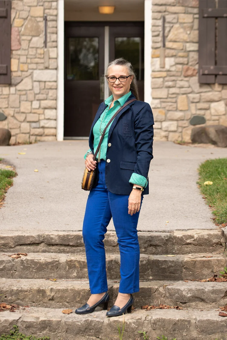
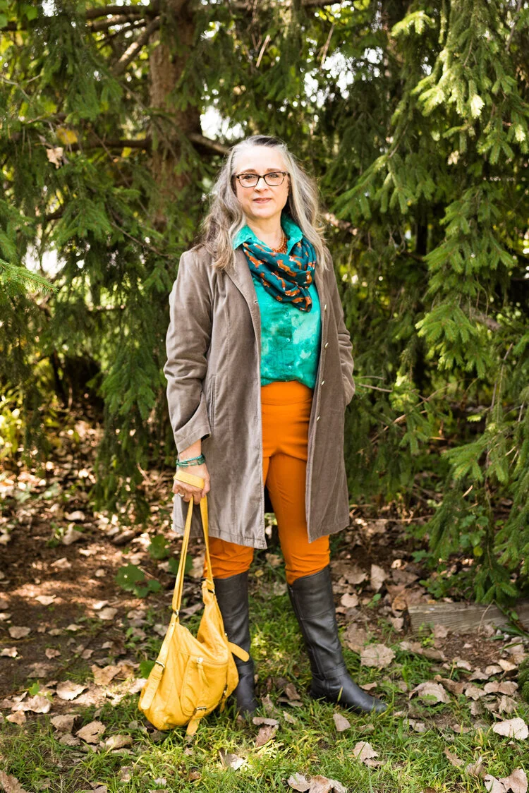
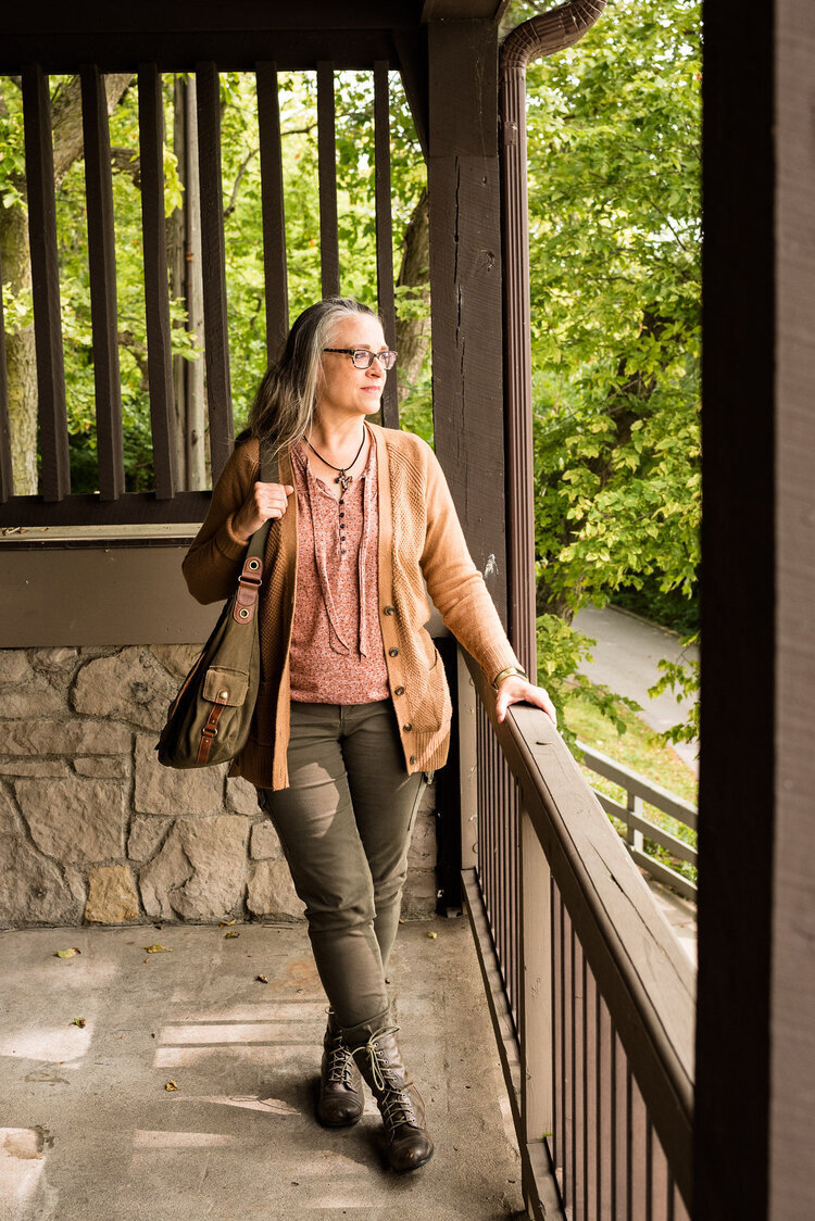
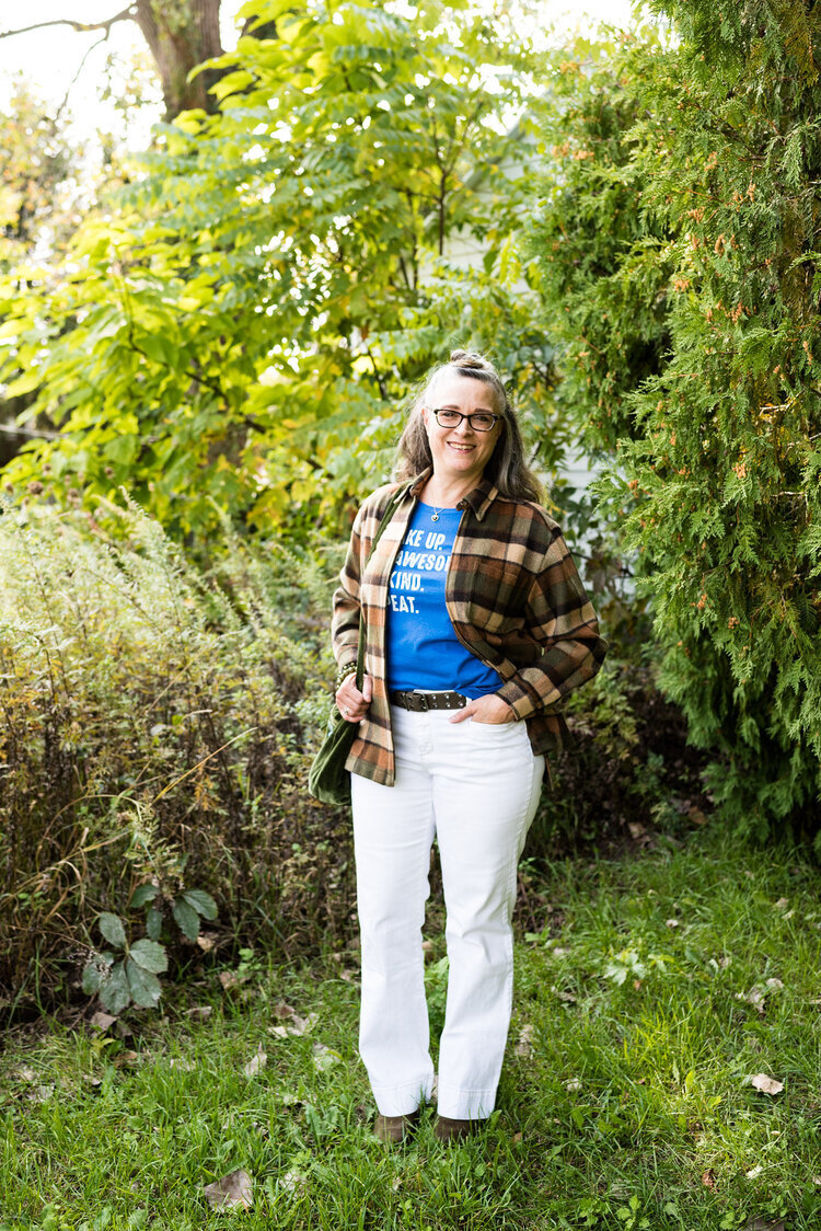
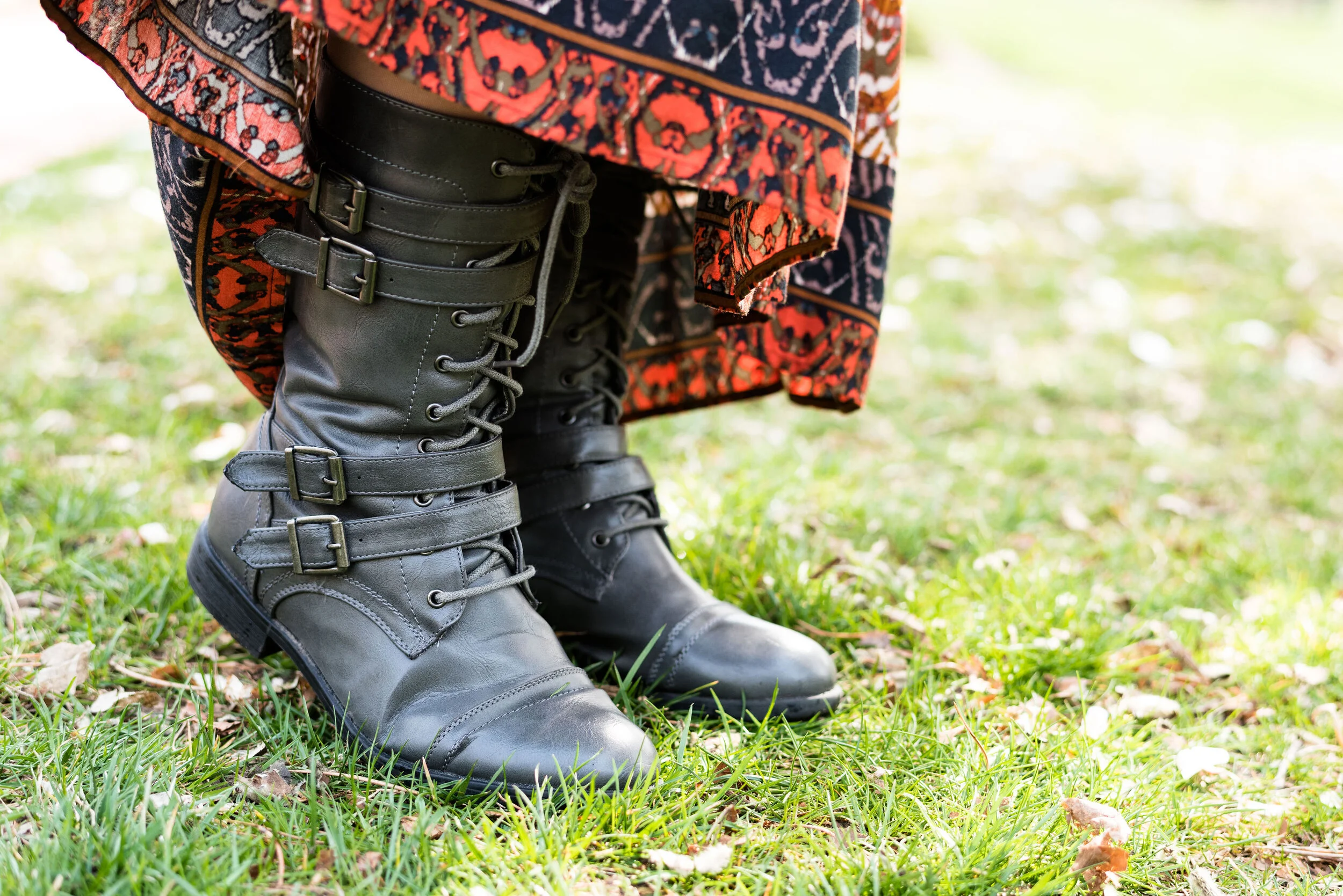
The following are a few photos from our shoot which give you some sneak peeks at how I combined these colors.

pantonespring2021preview-1.jpg
pantonespring2021preview-2.jpg
pantonespring2021preview-3.jpg
pantonespring2021preview-4.jpg
pantonespring2021preview-5.jpg
pantonespring2021preview-6.jpg

I hope you will join me on Thursday as I start the series. Have a great day!

Photo and graphic credit Rebecca Trumbull.
Pantone - Autumn/Winter - 2020 - All the Outfits

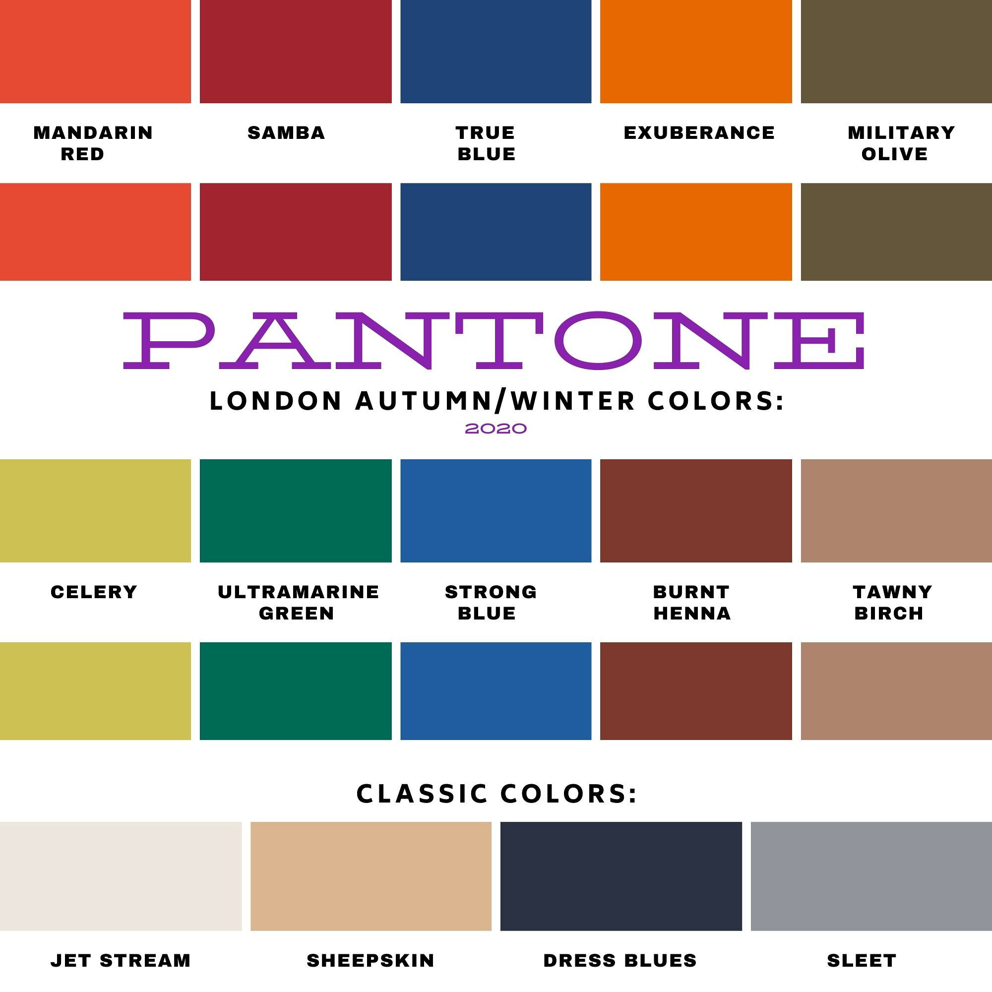
I wanted to end this fall color series by showing you all of the colors from both the Pantone New York Palette and the Pantone London Palette. To make it a little more interesting I thought I would show outfits that have, either a same color or a similar color side by side.

I hope that you enjoyed this series. If there are any other topics in fashion that you are interested in learning more about, or in seeing me talk about or put together in an outfit, I would love for you to let me know. I don’t follow trends too closely and this fall, I totally missed the boat on that, so I do apologize. I know some of you enjoy hearing what the trends are for each season and seeing how I apply those to the “real” world. Often when we look at websites or see magazines with tall, thin models or celebrities who are seamlessly coifed we think there is no way we would want to try this or that, especially when it comes to runway trends. However, there are a lot of trends that we can participate in and enjoy like leopard print, various colors and different types of accessories.

I will keep doing this Pantone series as long as I am blogging, because I feel strongly that even though we might differ from each other in our style, color is something we all have in common. Approaching new, bold and different colors without fear is a way to expand your wardrobe and spice up your style without completely committing to a whole different way of doing things.

The Color Palettes Side by Side.

Samba

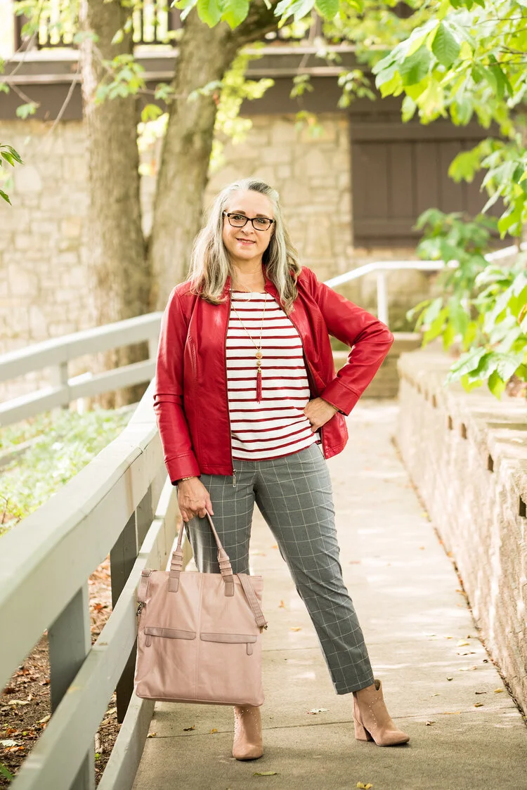
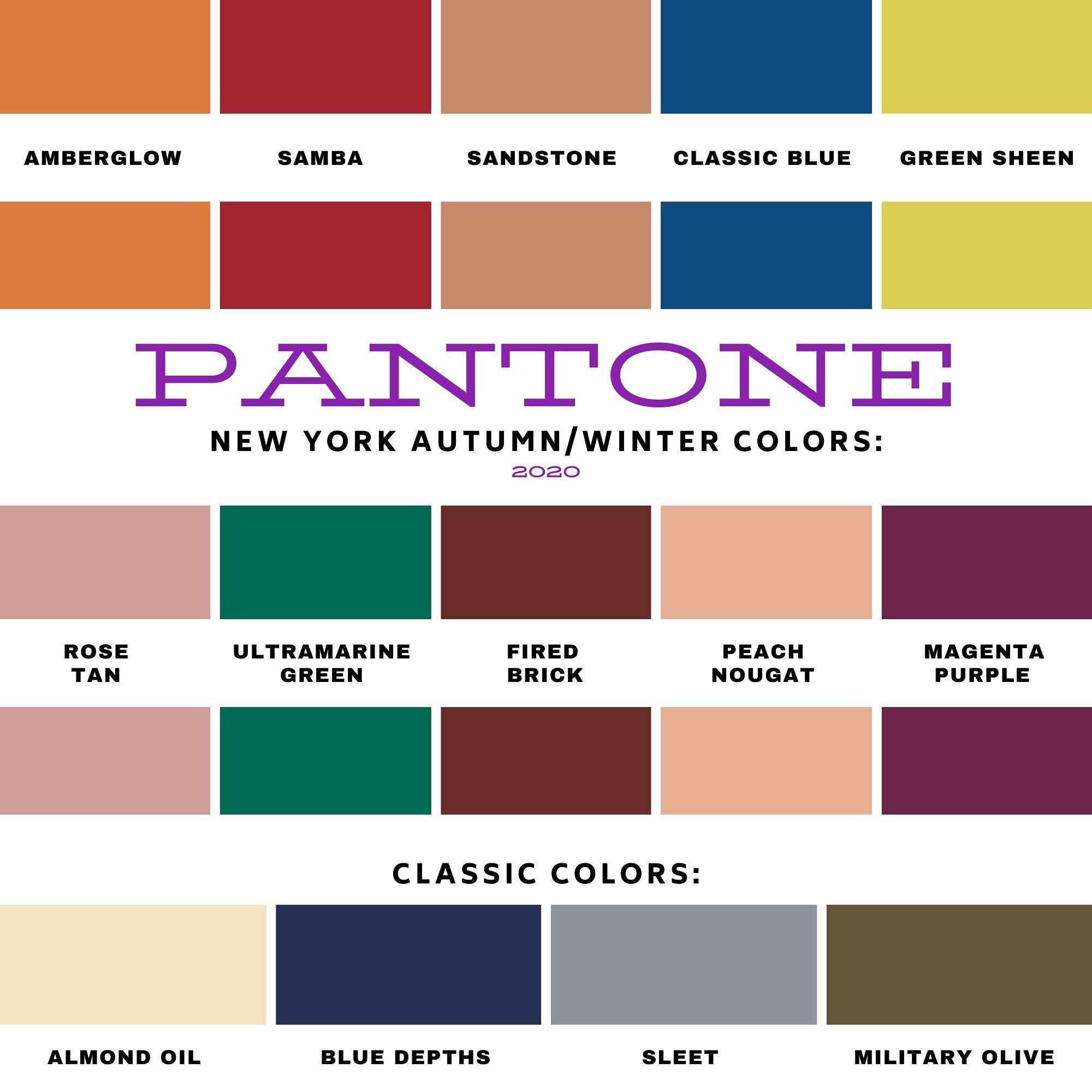
I love the color red and I think there is a red for every complexion. I think both of these outfits worked quite well and love that both of them present a more neutral palette with a bright pop of red. In the New York outfit on the left Samba is paired with Fired Brick and Sleet. In the London outfit on the right Samba is paired with Tawny Birch and Sheepskin.

Ultramarine Green

Ultramarine was on both palettes and I think it is a pretty green that can bring a peaceful, yet vibrant feel to any outfit. This color green would look great in a bag, jewelry or a scarf and to me it really seems to draw your eyes to it. Maybe it is just my love for the greens in nature that make me like this color so much. In the New York outfit on the left Ultramarine Green is paired with Classic Blue and Blue Depths. In the London palette on the right Ultramarine Green is paired with Exuberance and Sleet.

Military Olive

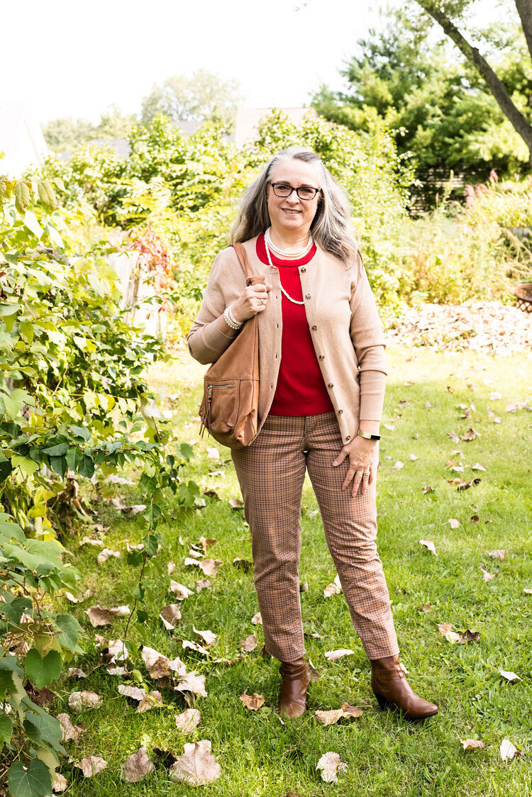
While I love bright and bold colors like the two I mentioned previously, I love using olive as a neutral. It goes with every color, and has a different vibe than gray or beige. It is classy, yet subtle. In the New York outfit on the left, Military Olive is paired with Peach Nougat and Sandstone. In the London outfit on the right Military Olive is paired with Strong Blue and Jet Stream.

Green Sheen/Celery

It is hard to tell in these pictures, but Green Sheen and Celery are pretty similar. I think, because the lighting is different the colors look brighter in the shaded picture. They are different colors, but not enough different that they couldn’t be exchanged from one outfit to another. In the New York outfit on the left, Green Sheen is paired with Amber Glow and Almond Oil. In the London outfit on the right, Celery is paired with Mandarin and Sheepskin.

The Other Colors

These last two are paired only because they were the last two and don’t really have anything in common. The New York outfit on the left is a combination of Rose Tan, Magenta Purple and Sleet. The London outfit on the right is a combination of Burnt Henna, True Blue and Dress Blues.

Which outfit do you like most? Which color from the two palettes is one you frequently wear? What new color(s) are going to try to add to your wardrobe. As always, I love to hear your thoughts.

I apologize to those of you who subscribe to my blog. The last three weeks, I have completely forgotten to send out my weekly emails. I’ll just attribute that to “squishy brain syndrome.” Ha, ha.

Thanks for following along on the blog. I hope to use the next couple of weeks leading up to Thanksgiving showing you more fall outfits and maybe a few ideas for what to wear to Thanksgiving dinner whether you are going some place or sheltering in place.

If you follow my Faith page be sure to check back tomorrow for the next installment in my series on the Unseen Enemy.

Have a great weekend!

Graphic and photo credit Rebecca Trumbull.