Pantone - Autumn/Winter - 2020 - All the Outfits

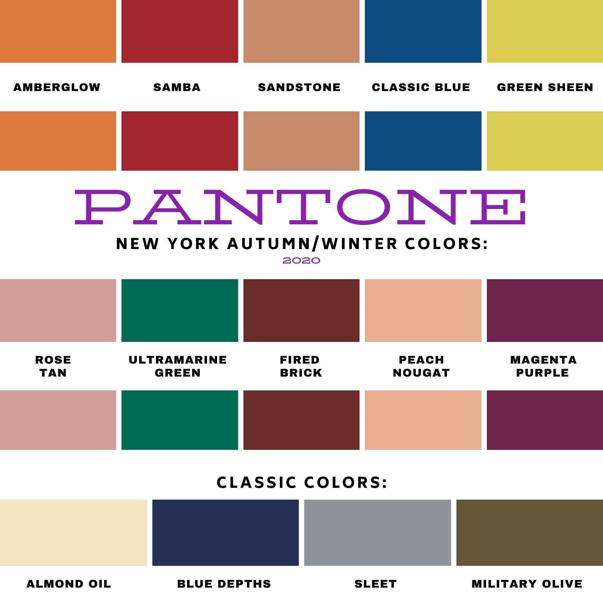
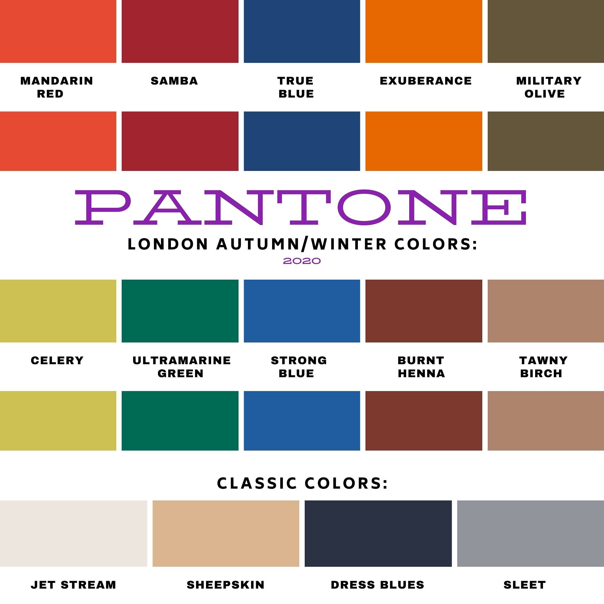
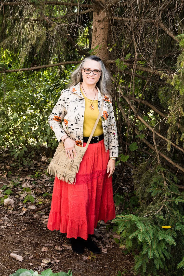
I wanted to end this fall color series by showing you all of the colors from both the Pantone New York Palette and the Pantone London Palette. To make it a little more interesting I thought I would show outfits that have, either a same color or a similar color side by side.

I hope that you enjoyed this series. If there are any other topics in fashion that you are interested in learning more about, or in seeing me talk about or put together in an outfit, I would love for you to let me know. I don’t follow trends too closely and this fall, I totally missed the boat on that, so I do apologize. I know some of you enjoy hearing what the trends are for each season and seeing how I apply those to the “real” world. Often when we look at websites or see magazines with tall, thin models or celebrities who are seamlessly coifed we think there is no way we would want to try this or that, especially when it comes to runway trends. However, there are a lot of trends that we can participate in and enjoy like leopard print, various colors and different types of accessories.

I will keep doing this Pantone series as long as I am blogging, because I feel strongly that even though we might differ from each other in our style, color is something we all have in common. Approaching new, bold and different colors without fear is a way to expand your wardrobe and spice up your style without completely committing to a whole different way of doing things.

The Color Palettes Side by Side.

Samba

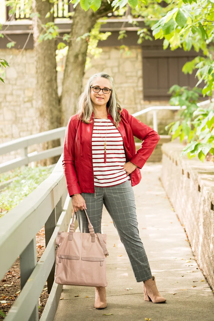
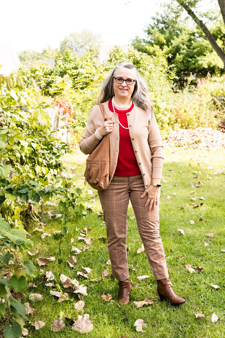
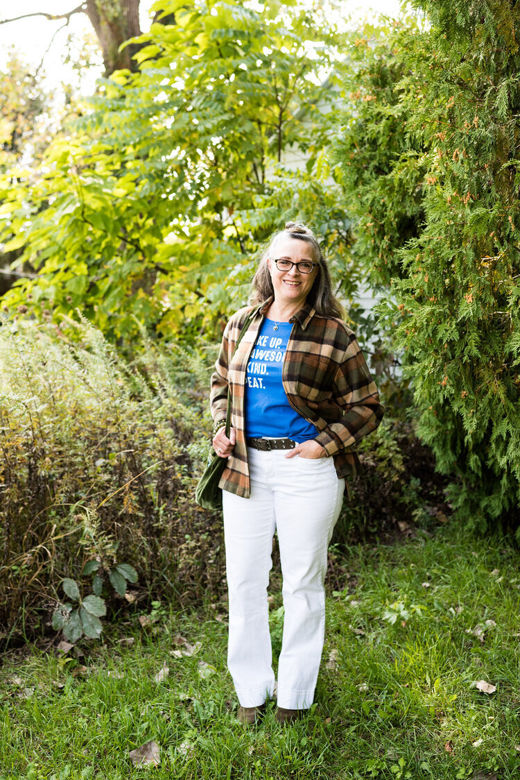
I love the color red and I think there is a red for every complexion. I think both of these outfits worked quite well and love that both of them present a more neutral palette with a bright pop of red. In the New York outfit on the left Samba is paired with Fired Brick and Sleet. In the London outfit on the right Samba is paired with Tawny Birch and Sheepskin.

Ultramarine Green

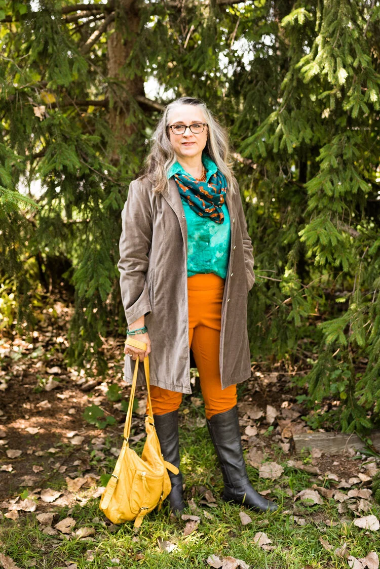
Ultramarine was on both palettes and I think it is a pretty green that can bring a peaceful, yet vibrant feel to any outfit. This color green would look great in a bag, jewelry or a scarf and to me it really seems to draw your eyes to it. Maybe it is just my love for the greens in nature that make me like this color so much. In the New York outfit on the left Ultramarine Green is paired with Classic Blue and Blue Depths. In the London palette on the right Ultramarine Green is paired with Exuberance and Sleet.

Military Olive

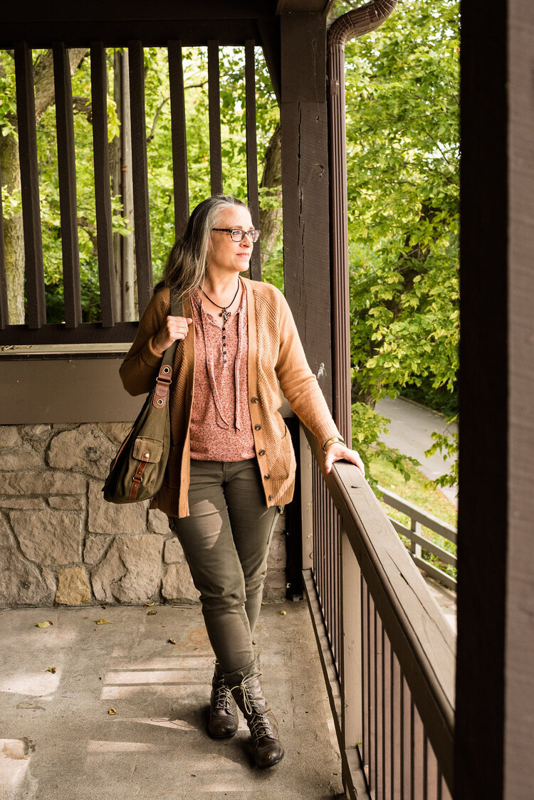
While I love bright and bold colors like the two I mentioned previously, I love using olive as a neutral. It goes with every color, and has a different vibe than gray or beige. It is classy, yet subtle. In the New York outfit on the left, Military Olive is paired with Peach Nougat and Sandstone. In the London outfit on the right Military Olive is paired with Strong Blue and Jet Stream.

Green Sheen/Celery

It is hard to tell in these pictures, but Green Sheen and Celery are pretty similar. I think, because the lighting is different the colors look brighter in the shaded picture. They are different colors, but not enough different that they couldn’t be exchanged from one outfit to another. In the New York outfit on the left, Green Sheen is paired with Amber Glow and Almond Oil. In the London outfit on the right, Celery is paired with Mandarin and Sheepskin.

The Other Colors

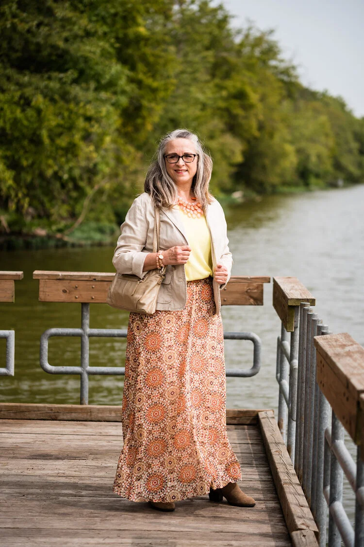
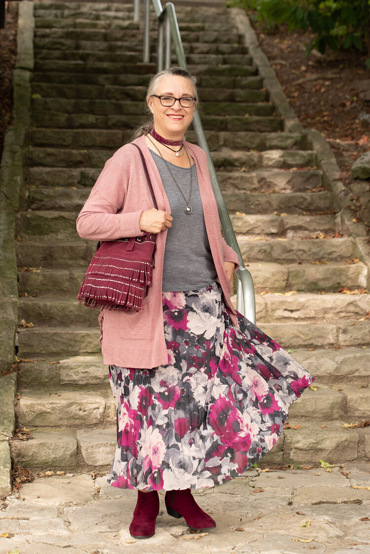
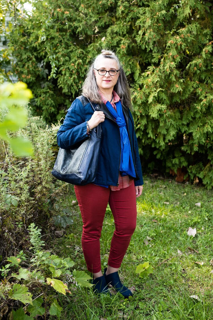
These last two are paired only because they were the last two and don’t really have anything in common. The New York outfit on the left is a combination of Rose Tan, Magenta Purple and Sleet. The London outfit on the right is a combination of Burnt Henna, True Blue and Dress Blues.

Which outfit do you like most? Which color from the two palettes is one you frequently wear? What new color(s) are going to try to add to your wardrobe. As always, I love to hear your thoughts.

I apologize to those of you who subscribe to my blog. The last three weeks, I have completely forgotten to send out my weekly emails. I’ll just attribute that to “squishy brain syndrome.” Ha, ha.

Thanks for following along on the blog. I hope to use the next couple of weeks leading up to Thanksgiving showing you more fall outfits and maybe a few ideas for what to wear to Thanksgiving dinner whether you are going some place or sheltering in place.

If you follow my Faith page be sure to check back tomorrow for the next installment in my series on the Unseen Enemy.

Have a great weekend!

Graphic and photo credit Rebecca Trumbull.

Pantone - Autumn/Winter - 2020 - New York Palette - Recap

I was going to jump right into the London Palette, but there have been some unforeseen problems, so I am going to put that off for a little bit. I usually do a recap post to show you all the the outfits at the same time, so that is what I am doing today.

Here is the whole New York Palette, along with the classic colors as well. Some people take the classic colors and build their outfits around them and simply add pops of the other colors for a more subdued approach to the palette. I think I need to try that some time. What keeps me from doing that more often is that I don’t have very many classic colored pieces. What I mean is, I don’t have a whole suit with pants or skirt and a jacket in any of the classic colors. In fact, I don’t have very many dress clothes that aren’t made up of colors and prints. Maybe in the spring I will try to focus more on using the classics as a way to build an outfit and add in the regular palette colors as accessories. We’ll see.

I thought I would give you a few of my thoughts about each outfit and why I think it worked or didn’t after each picture.

Pantone - Autumn/ Winter - 2020 - New York Palette

Peach Nougat, Sandstone and Military Olive

Pantone - Autumn/Winter - 2020 - Peach Nougat, Sandstone and Military Olive.

I like this outfit. I am not a big fan of these colors, but I really think the three colors worked well together and I think people found this, a neutral palette they could relate too. Almost everyone has something olive in their closet, so the fact that this was a classic color was a win, in my opinion. Not everyone can wear dark blue, oxford gray or tan, but I think everyone can wear Military Olive.

Samba, Fired Brick and Sleet

Pantone - Autumn/Winter - 2020 - Samba, Fired Brick and Sleet

I think this outfit might be my favorite out of this New York Palette. I like the mix of a more true red with the brick red, even thought my outfit in the photos didn’t do it justice. Putting the colors aside, however, I just like how this outfit looks polished and professional, but has a fun blend of bold and pastel colors along with the subtle print mix.

Amber Glow, Green Sheen and Almond Oil

Pantone - Autumn/Winter - 2020 - Amber Glow, Green Sheen and Almond Oil

This outfit was a surprise. Both my daughter and I thought these two colors just seemed to grate against each other, and well they might have, if I had worn a solid skirt with the solid top, but the printed skirt makes all the difference in the world. I also think the jacket and boots softened the whole look.


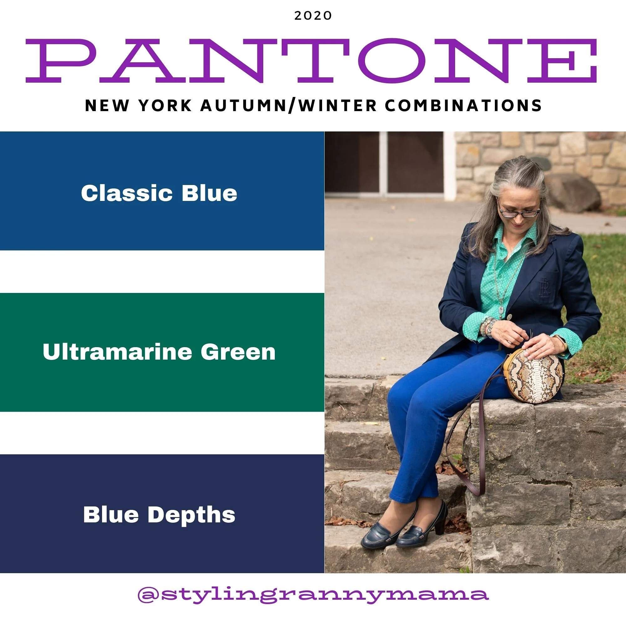
Classic Blue, Ultramarine Green and Blue Depths

Pantone - Autumn/Winter 2020 - Classic Blue, Ultramarine Green and Blue Depths

We don’t often think of combining green and blue, or blue with blue, for that matter, but I think this worked. The blue shades are quite different, but worked well next to each other and the green really pops against the blues. I think the addition of the snakeskin patterned round bag completed the look perfectly.

Magenta Purple, Rose Tan and Sleet

Pantone - Autumn/Winter - 2020 - Magenta Purple, Rose Tan and sleet

I really love both of these colors, but I was not thrilled with this outfit. Don’t get me wrong, I love a comfy, boho outfit, but I don’t know if throwing the long pink sweater in with the floral maxi and the gray tee made for a great outfit. I could see this with a long gray sweater, a similar shade to the tee and then a necklace or a scarf in a similar shade to the Magenta Purple. I don’t think it is the worst outfit I have ever done, but not my fave.

I would love to hear which outfit you liked the best from this series and which colors you like best from the New York Palette. Let me know by leaving a comment below, or a comment on Facebook. Thanks for following along. Be sure to check back on Thursday and hopefully I’ll have the first post for the London Palette colors. Also, if you follow my faith page, I am trying to post on Wednesdays, but due to schedule constraints, I am often having to post on Friday’s, so just check back if you don’t see it on Wednesday.

Have a great Tuesday everyone!

Photo and graphic credit Rebecca Trumbull.


Pantone Fall/Winter 2020 - New York Palette - Classic Blue, Ultramarine Green and Blue Depths

The Pantone Color of the Year is Classic Blue , so once again we are featuring this medium blue color in the Pantone series. Back in January I showed you this color paired with a furry bomber jacket and plaid skirt. You can also see this color with a multi-print midi dress and with a bright pink top. Classic Blue is a blue that just about anyone can wear. If you prefer not to have this pretty blue to close to your face you could carry it in a lovely bag, or wear it as a brooch pinned on your lapel. I’ll provide a few shopping links at the end with various options.

Pantone Fall/Winter 2020 - New York Palette - Classic Blue, Ultramarine Green and Blue Depths

I didn’t really have anything that seemed to perfectly match the Ultramarine Green, at least not until after the fact. My button up is actually a thrifted men’s shirt; a brand called Zylos. It has very small greenish blue print with white and almost has more of an aqua feel to it. Oh well, I have long ago given up on the idea of trying to be perfect. Ha, ha. You can see a closer look at the pattern, and see my thrifted, fringe, pendant necklace. Actually, the necklace is probably a closer match to the Pantone green.

Pantone Fall/Winter 2020 - New York Palette - Classic Blue, Ultramarine Green and Blue Depths

My Classic Blue pants were a thrifted piece from shopping a friend’s closet. They are Ruby Road brand and I have styled them over and over on the blog. You can see them with a light blue sweater and scarf, Beetroot purple top from last spring’s series, an olive velvet jacket, a plaid bomber jacket, and a multi-print kimono.

Pantone Fall/Winter 2020 - New York Palette - Classic Blue, Ultramarine Green and Blue Depths

I also threw on a few beaded bracelets, just for fun. Sometimes wearing a scarf or jewelry isn’t so much to help with the outfit as a whole, but just to enjoy something I have. Since I rarely go any where other than the grocery store, I occasionally throw on some bracelets, just because I have them and they are pretty.

Pantone Fall/Winter 2020 - New York Palette - Classic Blue, Ultramarine Green and Blue Depths

I thought this outfit would be perfect for my round Nine West snakeskin print bag. It think it adds an element of fall color to this more classic looking outfit.

Pantone Fall/Winter 2020 - New York Palette - Classic Blue, Ultramarine Green and Blue Depths.

My shoes are my old stand by thrifted Relativity loafer heels. If I had an office job, I would probably wear these a lot. They are a nice height for a stacked heel and fairly comfortable.

Pantone - Fall/Winter 2020 - New York Palette - Classic Blue, Ultramarine Green and Blue Depths

What do you think of these colors? Do you like the Classic Blue, or do you prefer the darker tones of Blue Depths? Do you like the color Ultramarine? As it is in the graphic, it seems to be more of a forest green color, which I do like. I like how these three colors worked together into an outfit that would be perfect for a day at the office or a date night with your significant other.

My life would not be complete if I didn’t leave you with a silly picture to make you smile. When I was trying to pose, I almost fell down. Ha, ha.

Pantone - Fall/Winter - 2020 - New York Palette - Classic Blue, Ultramarine and Blue Depths

I hope you enjoyed this post and I hope you’ll leave me a comment or two. Life is lonely around here, so I love to hear from my internet and long distance friends.

I’m including a few shopping links for you to peruse. These are affiliate links. That means when you click on a link I get a few pennies. All opinions are my own.

Graphic and photo credit Rebecca Trumbull.