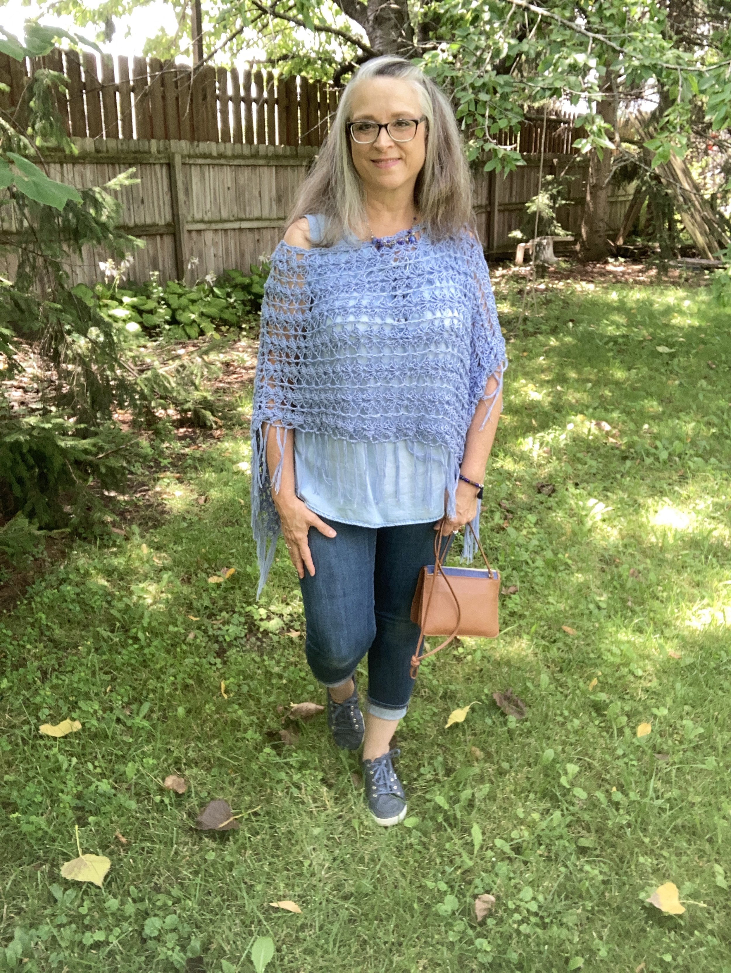
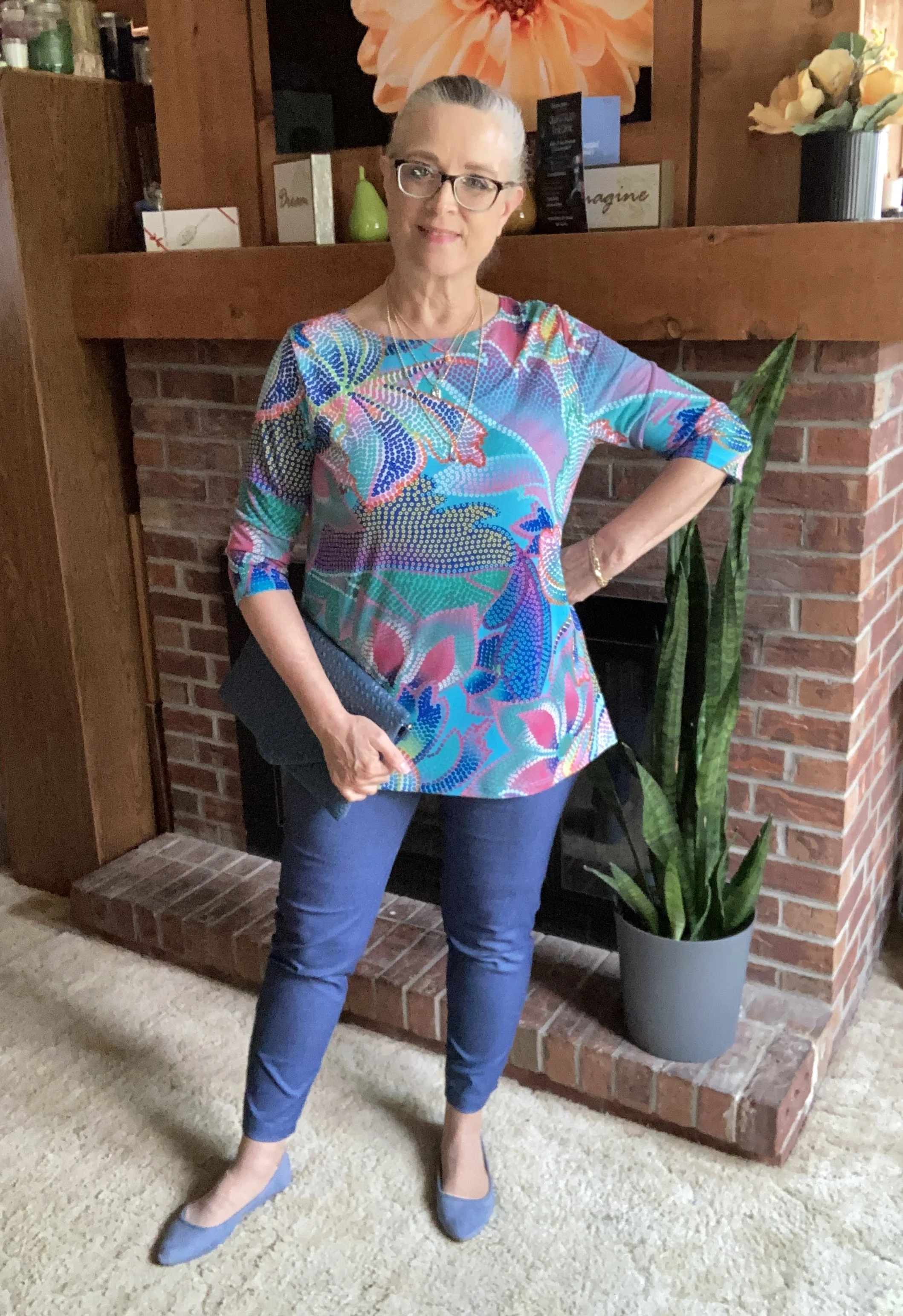
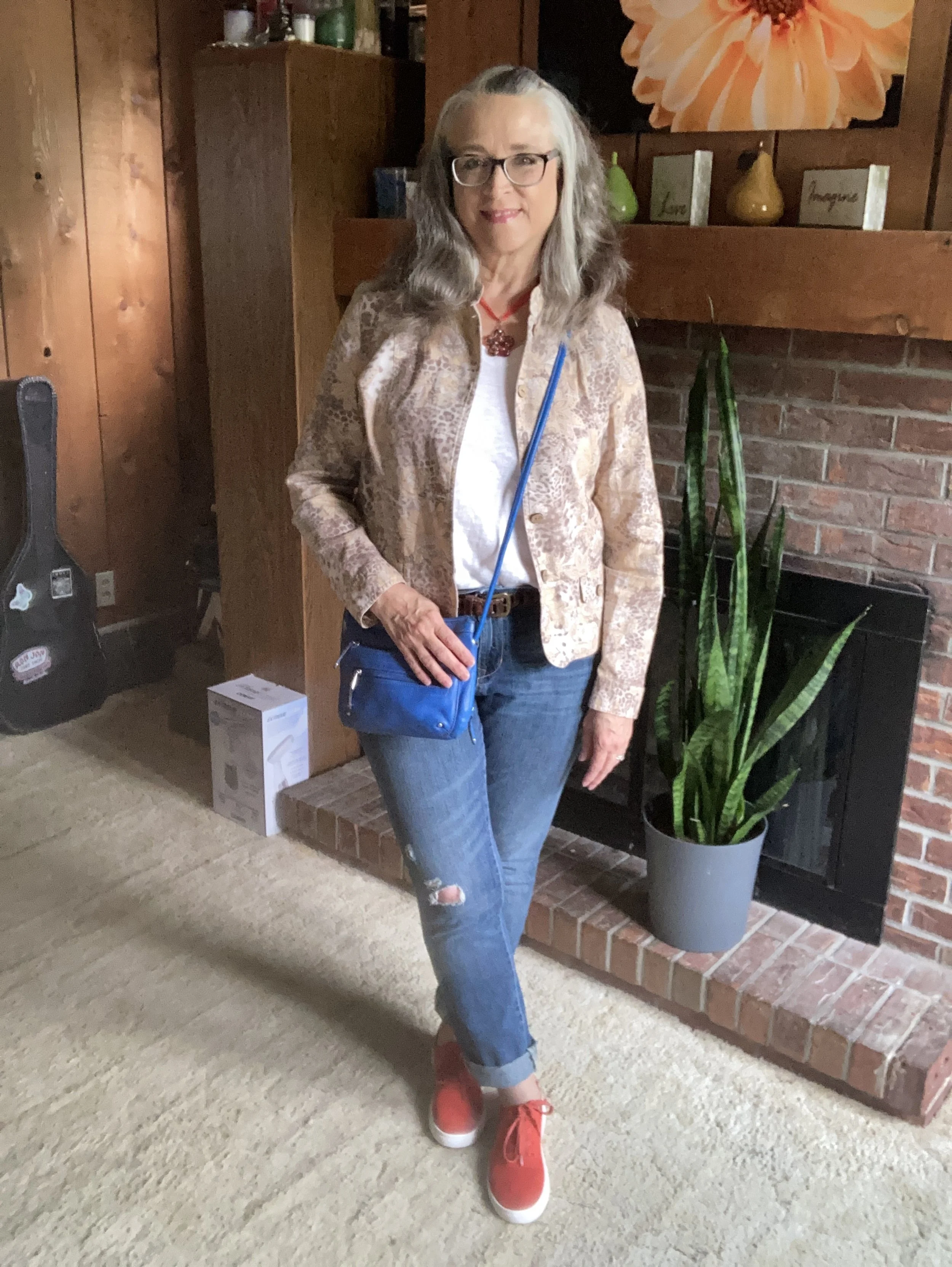
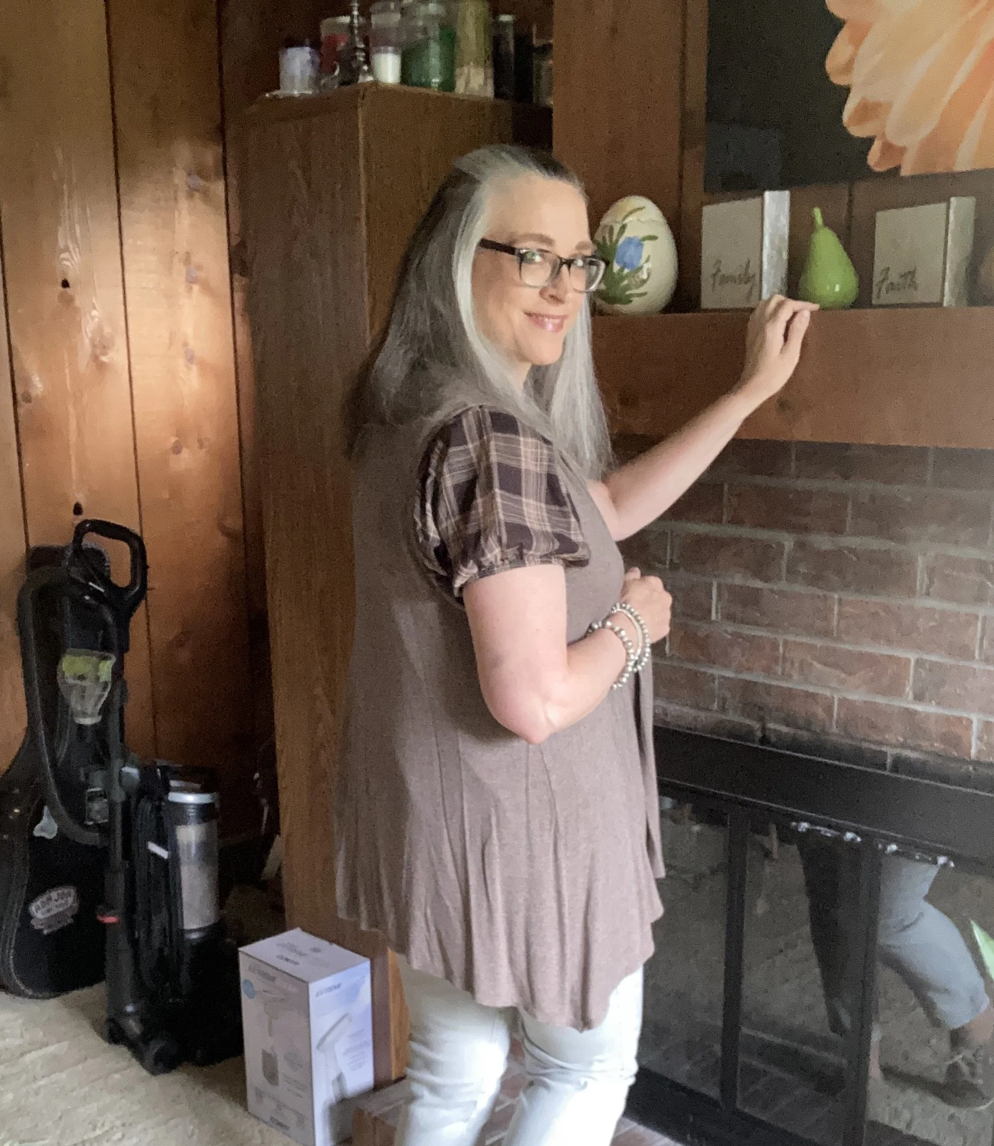
Outfit Inspiration: Cool, Coastal Vibes
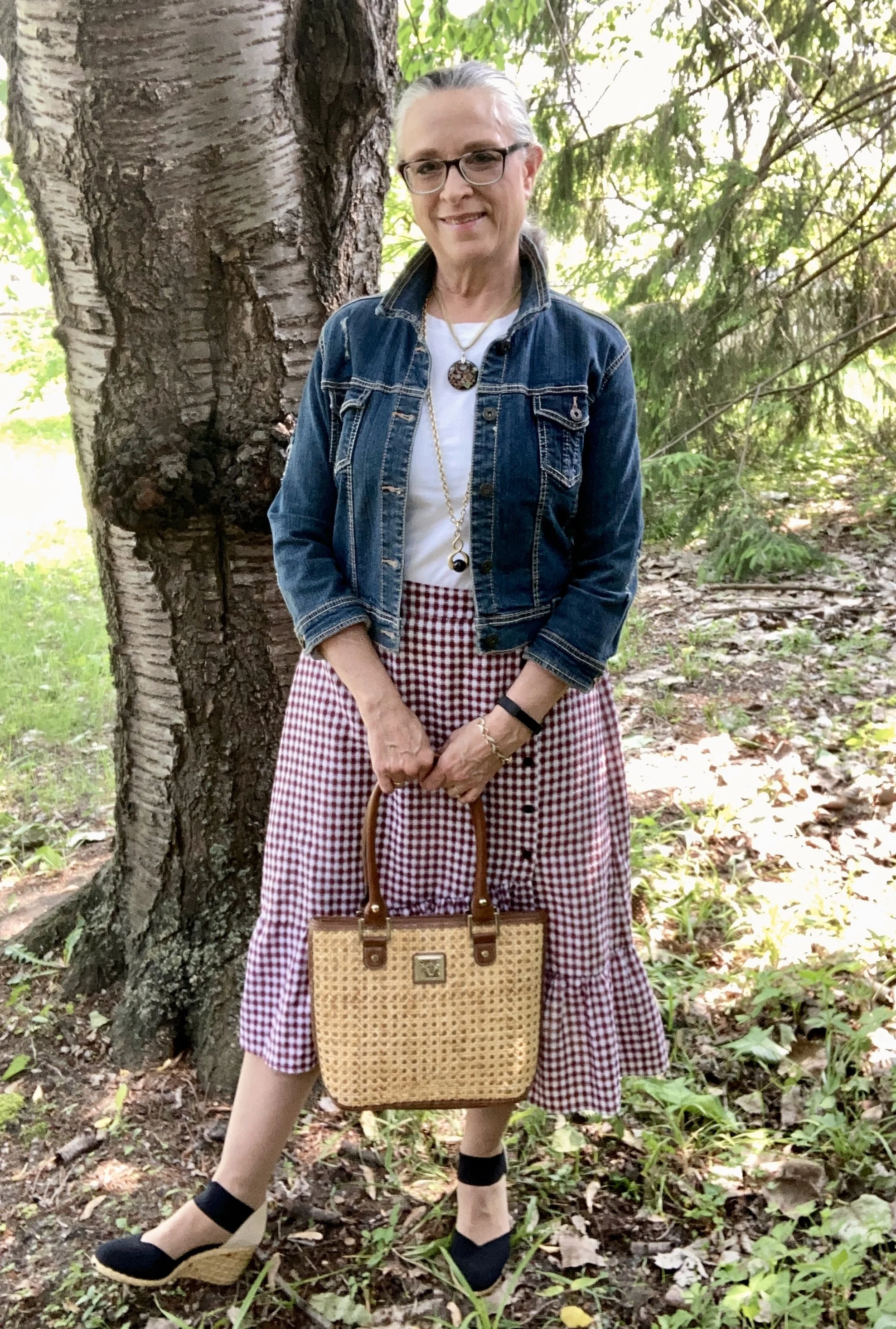
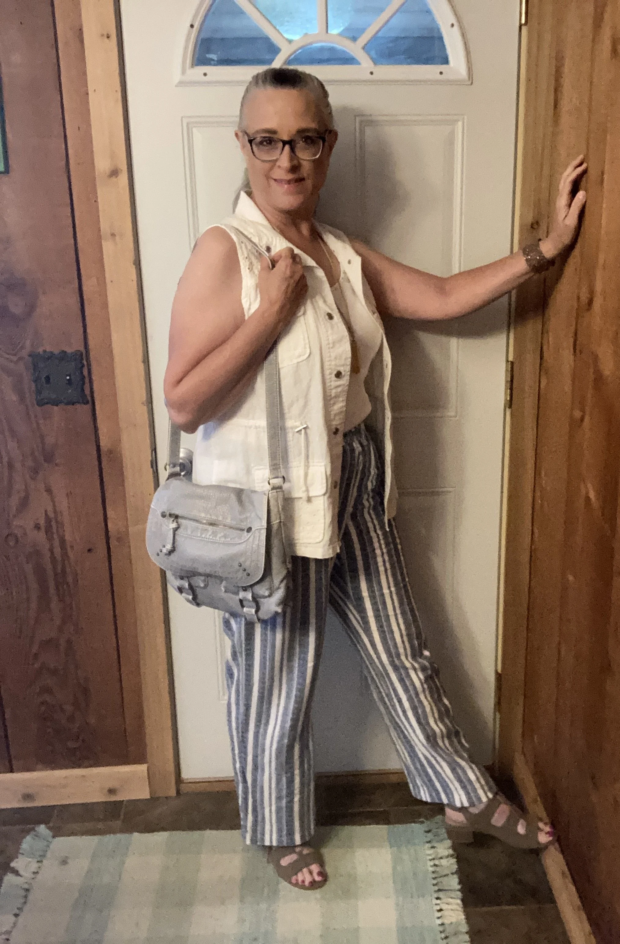
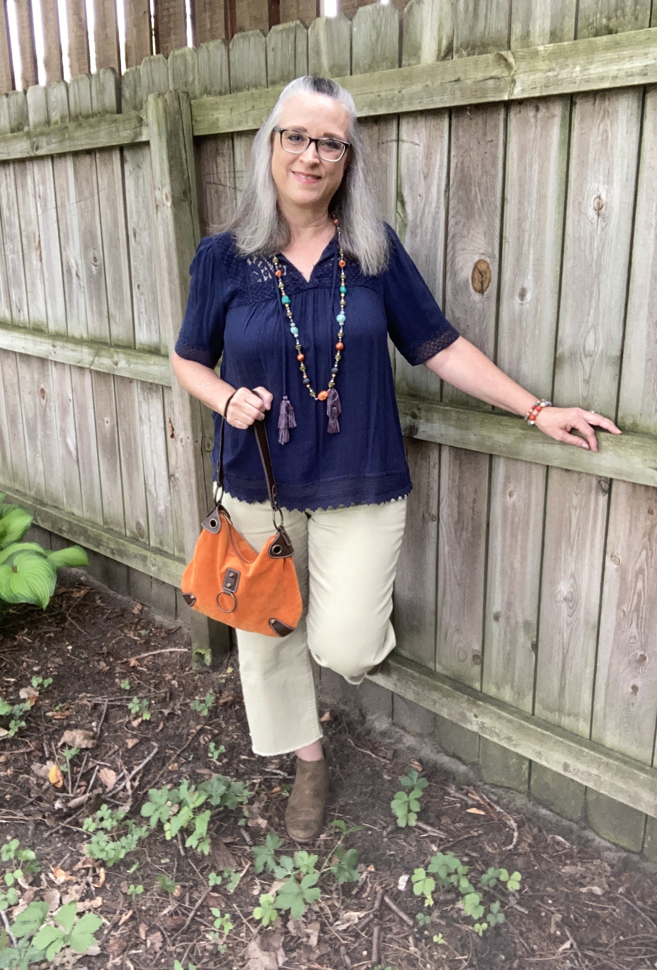
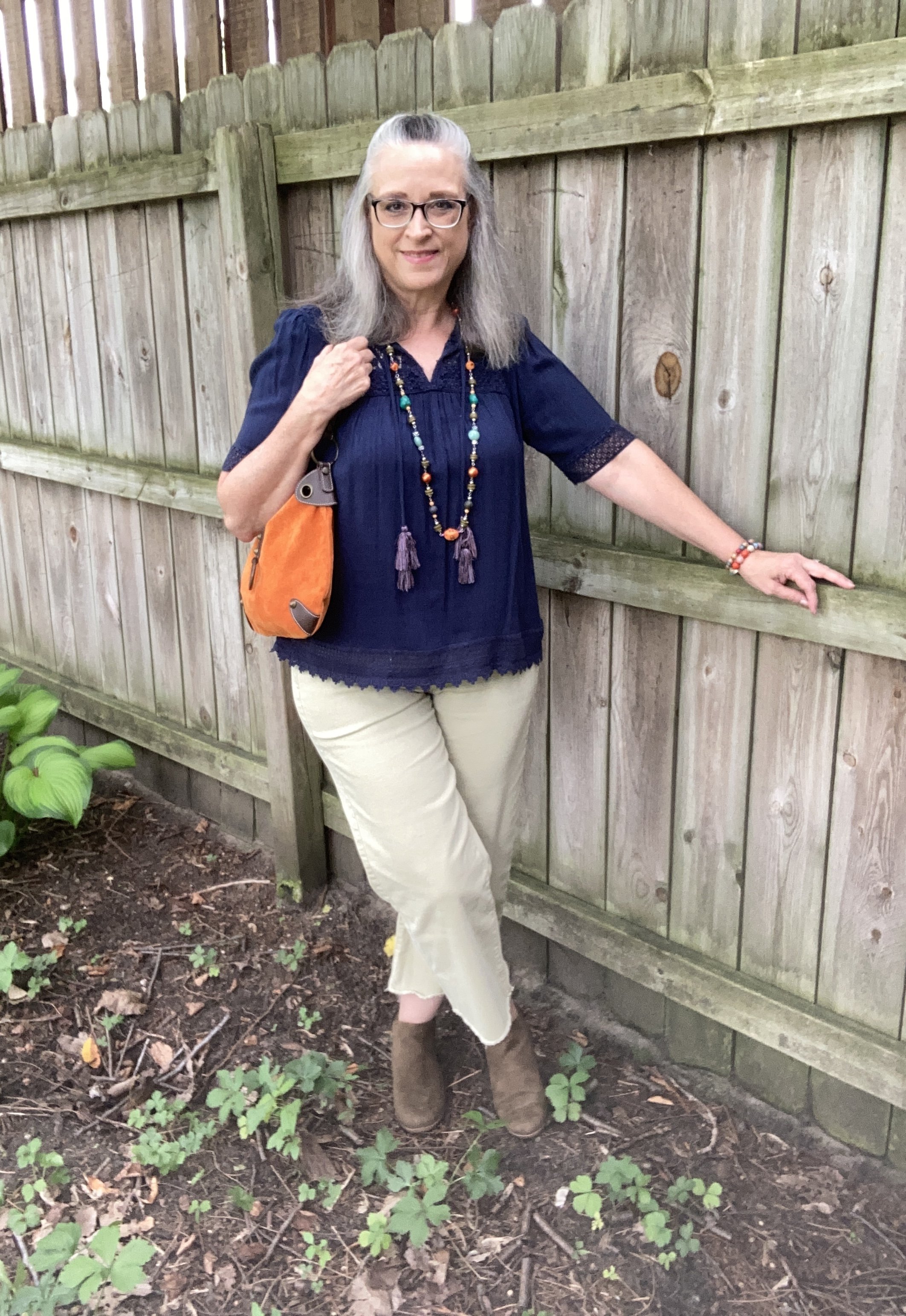
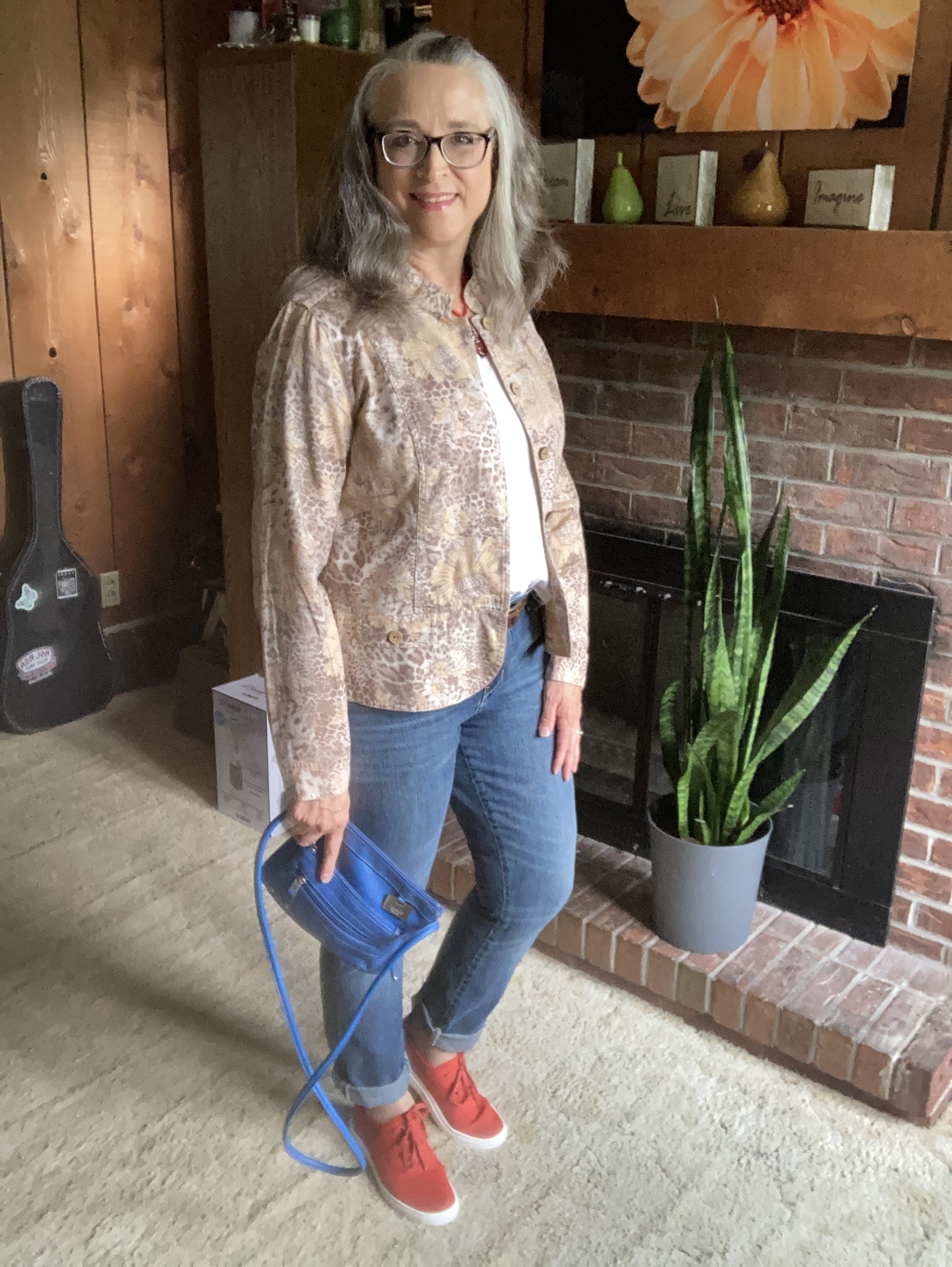
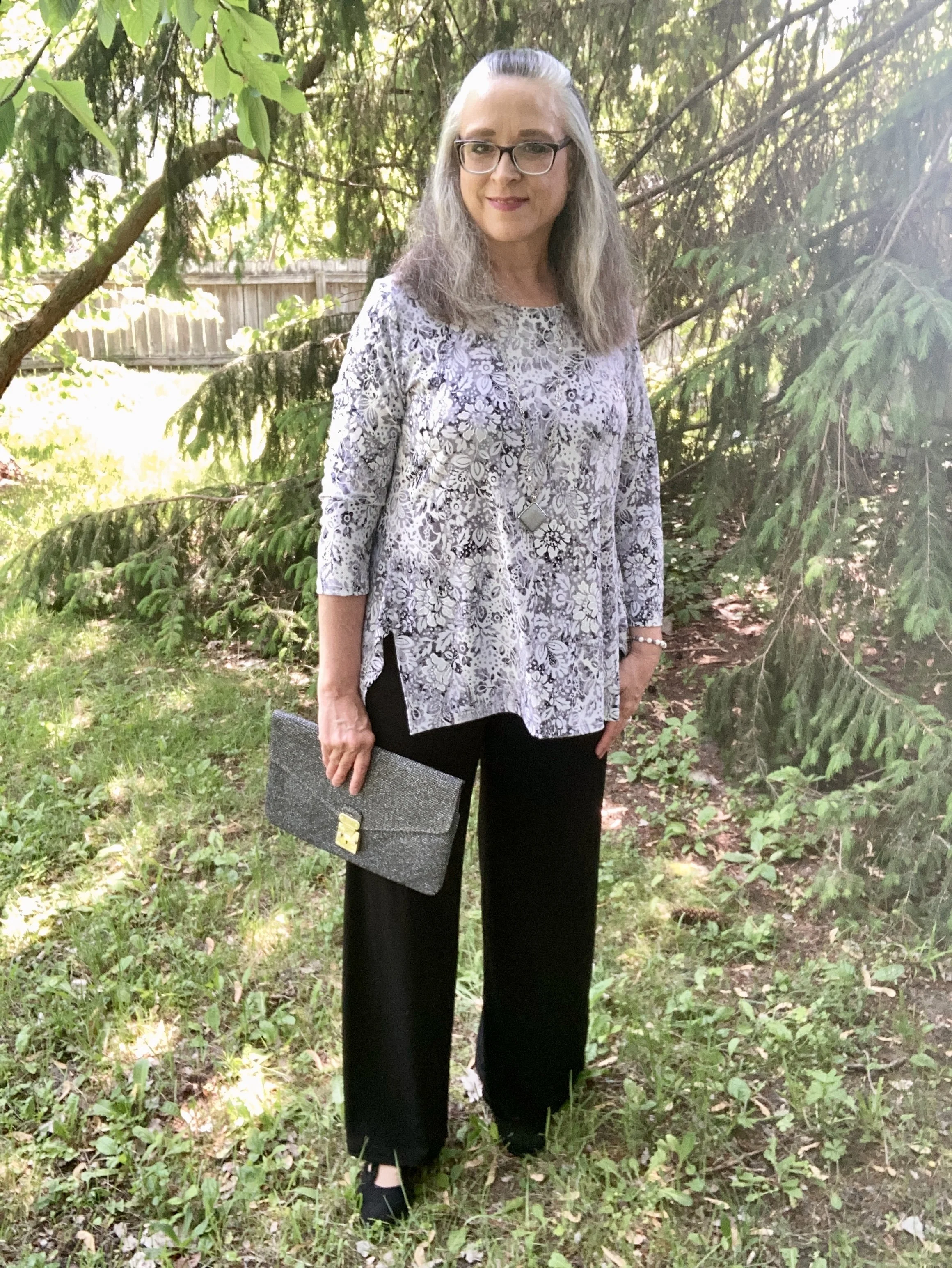
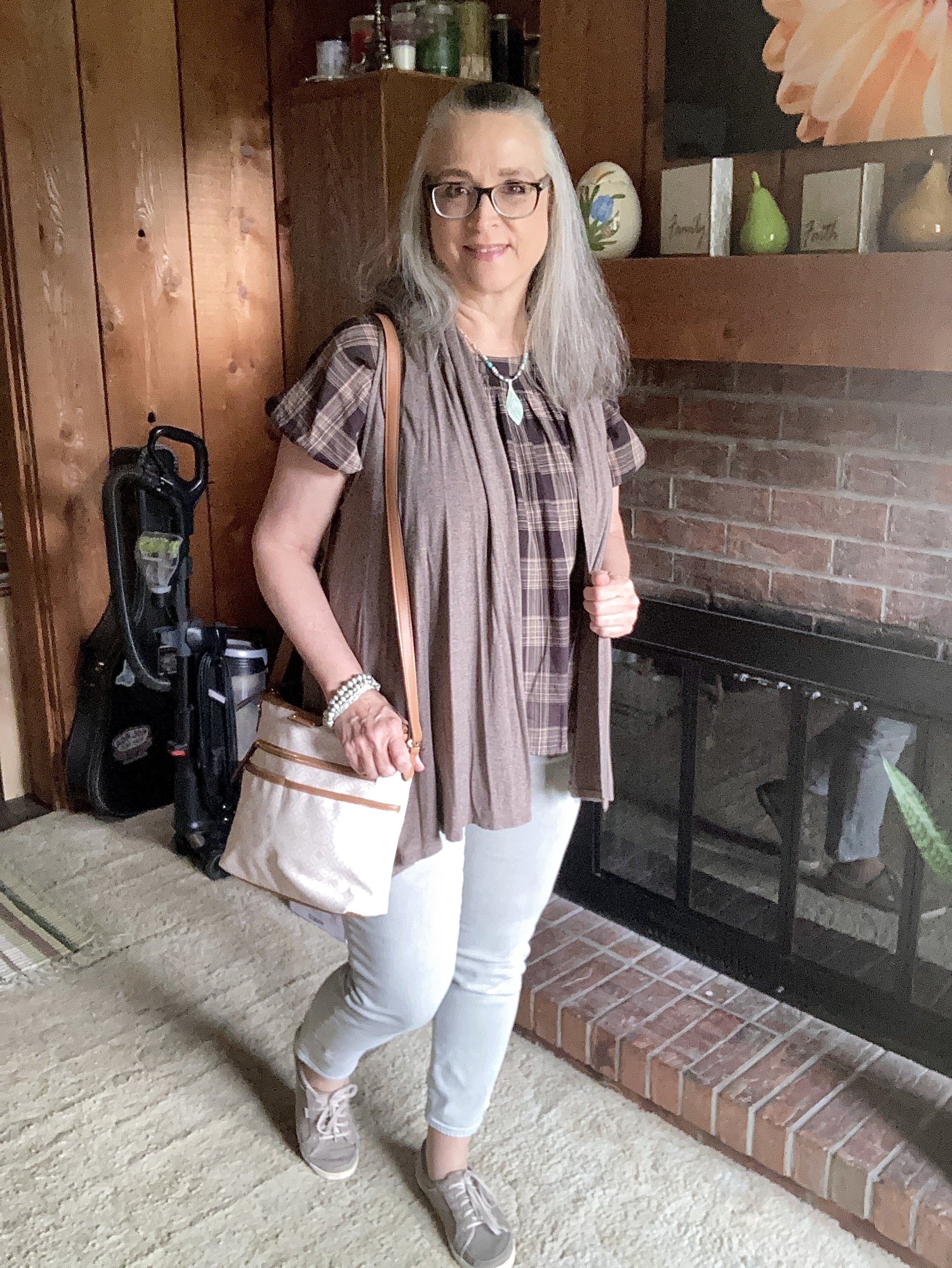
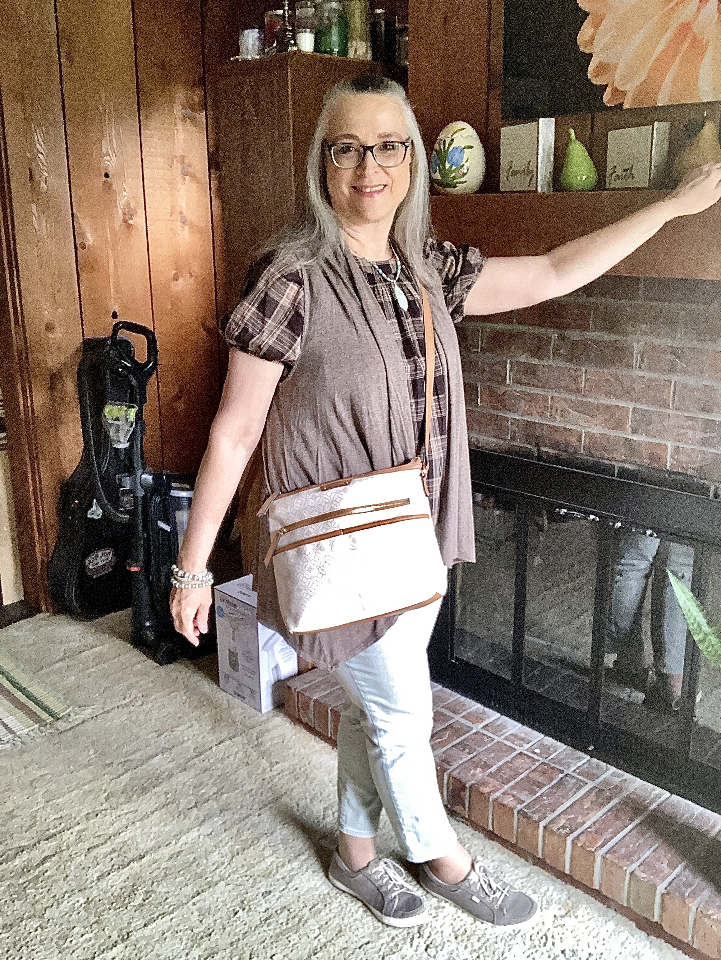
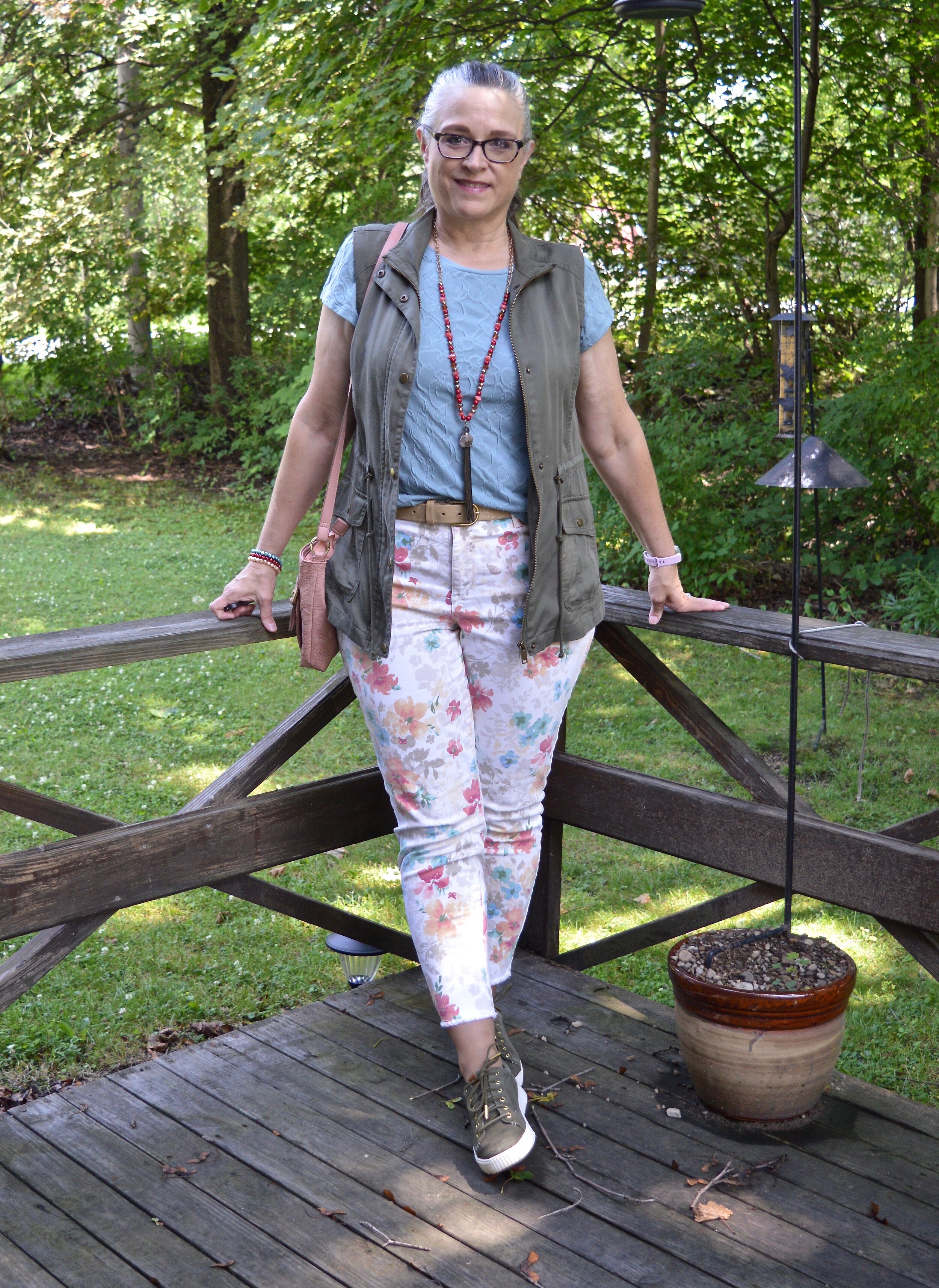
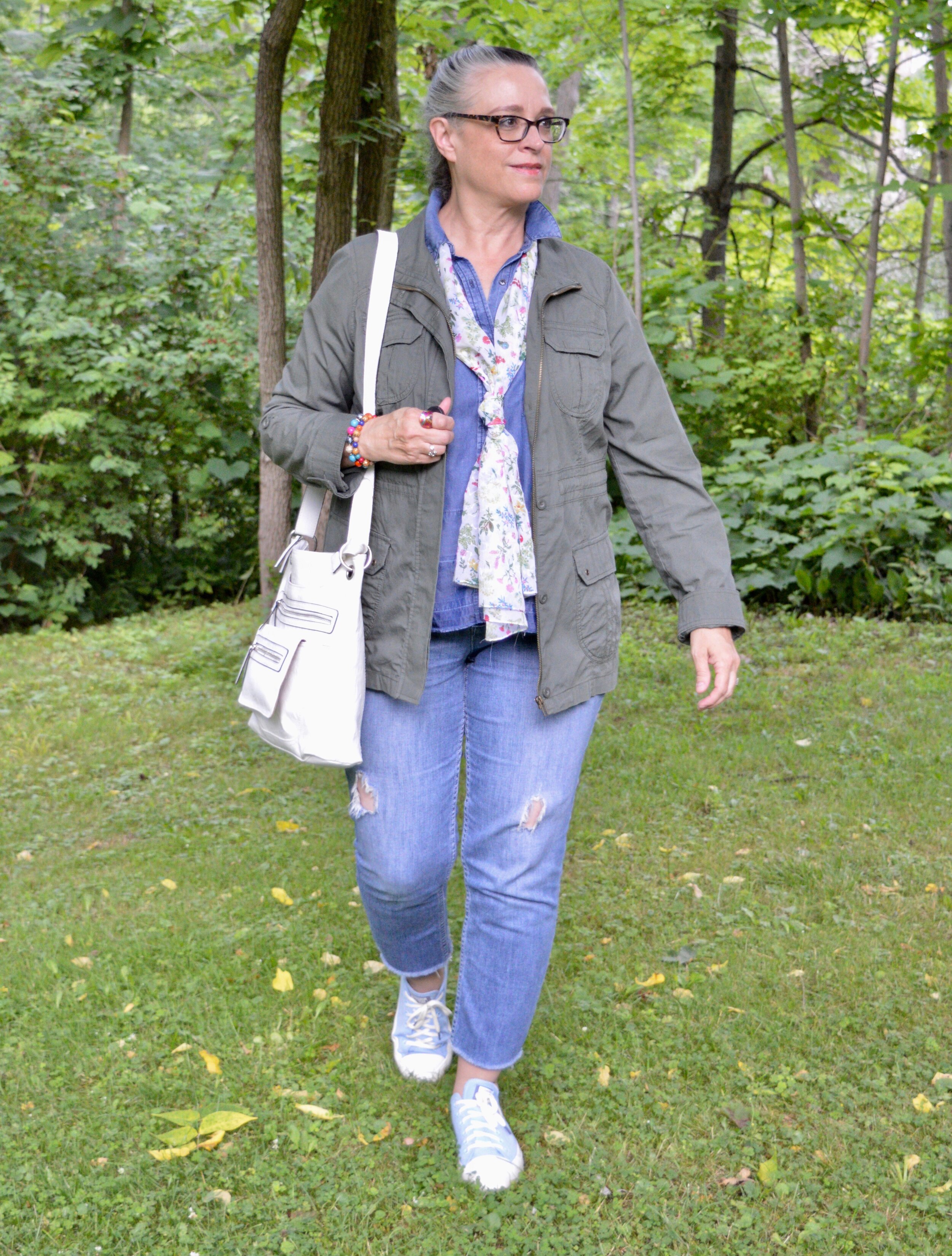
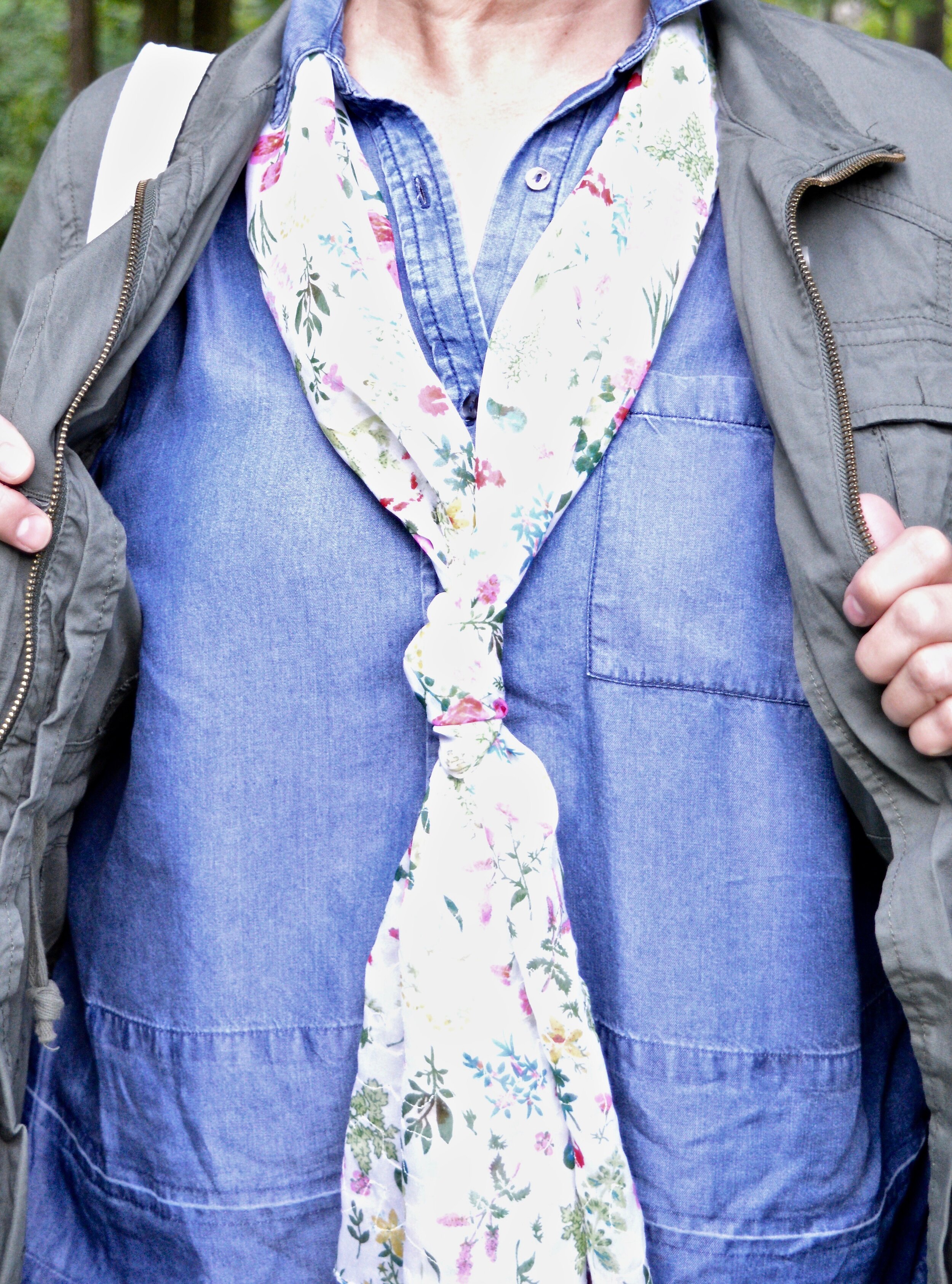
Another trend that is around this summer is one I feel is always on repeat. Whether you call it coastal or nautical this summer trend seems to be veering away from the traditional red, navy and white color palette and is leaning more towards soft neutrals and pastels, while still giving a nod to the more traditional nautical stripes. For today’s outfit I decided to stick with a neutral palette, leaving out the stripes for a soft, feminine outfit that would be great for a casual dinner out followed by a walk on the beach.
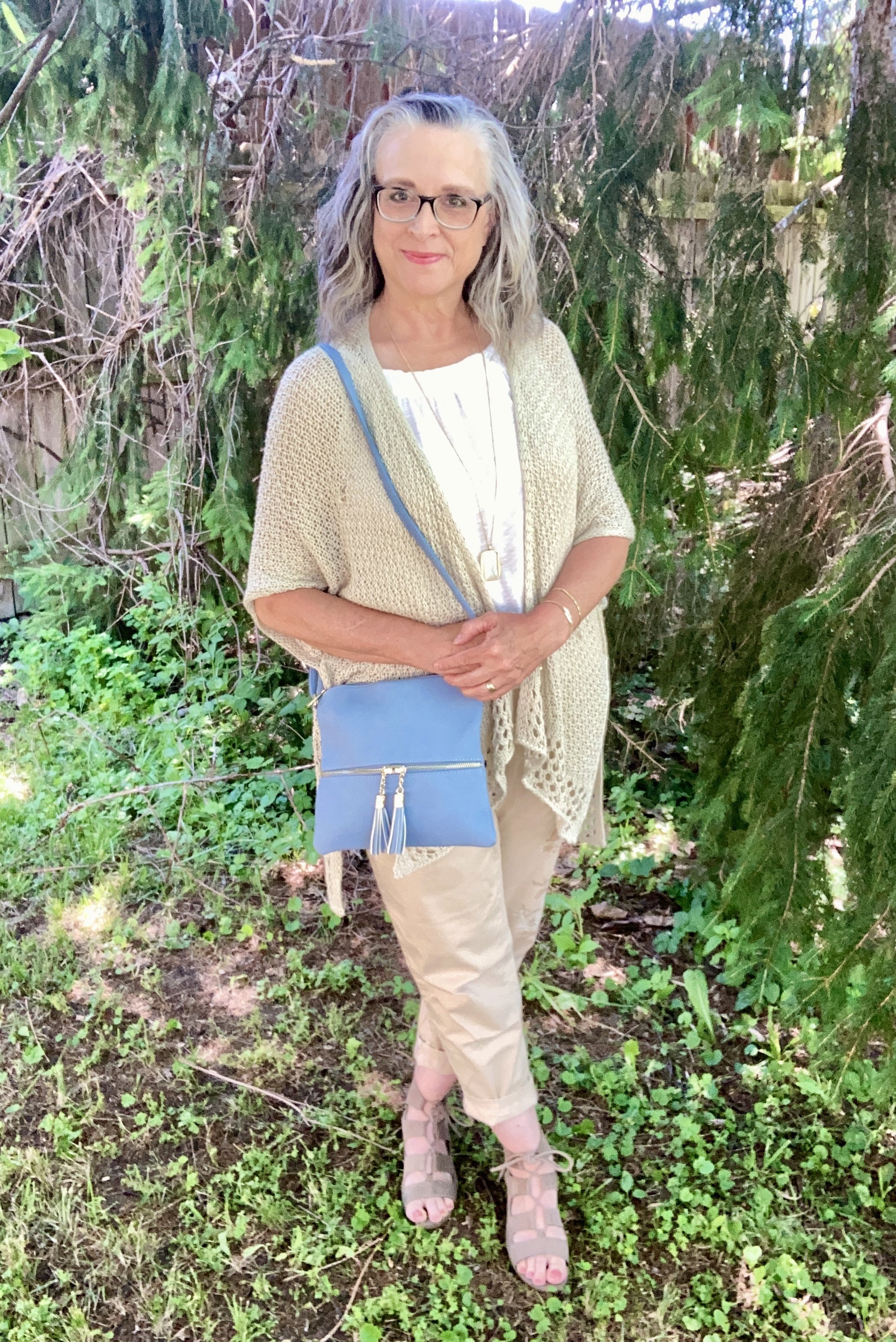
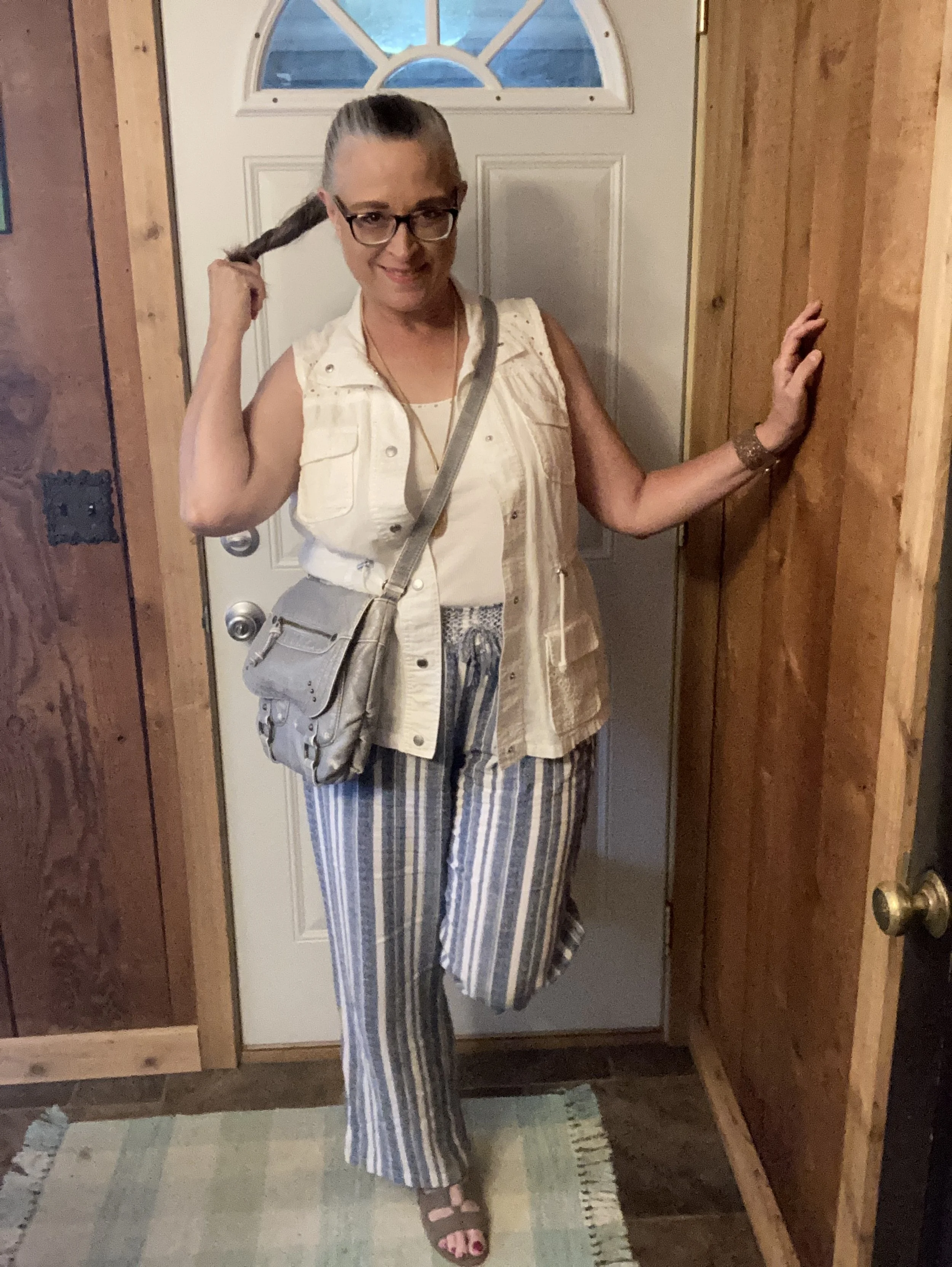
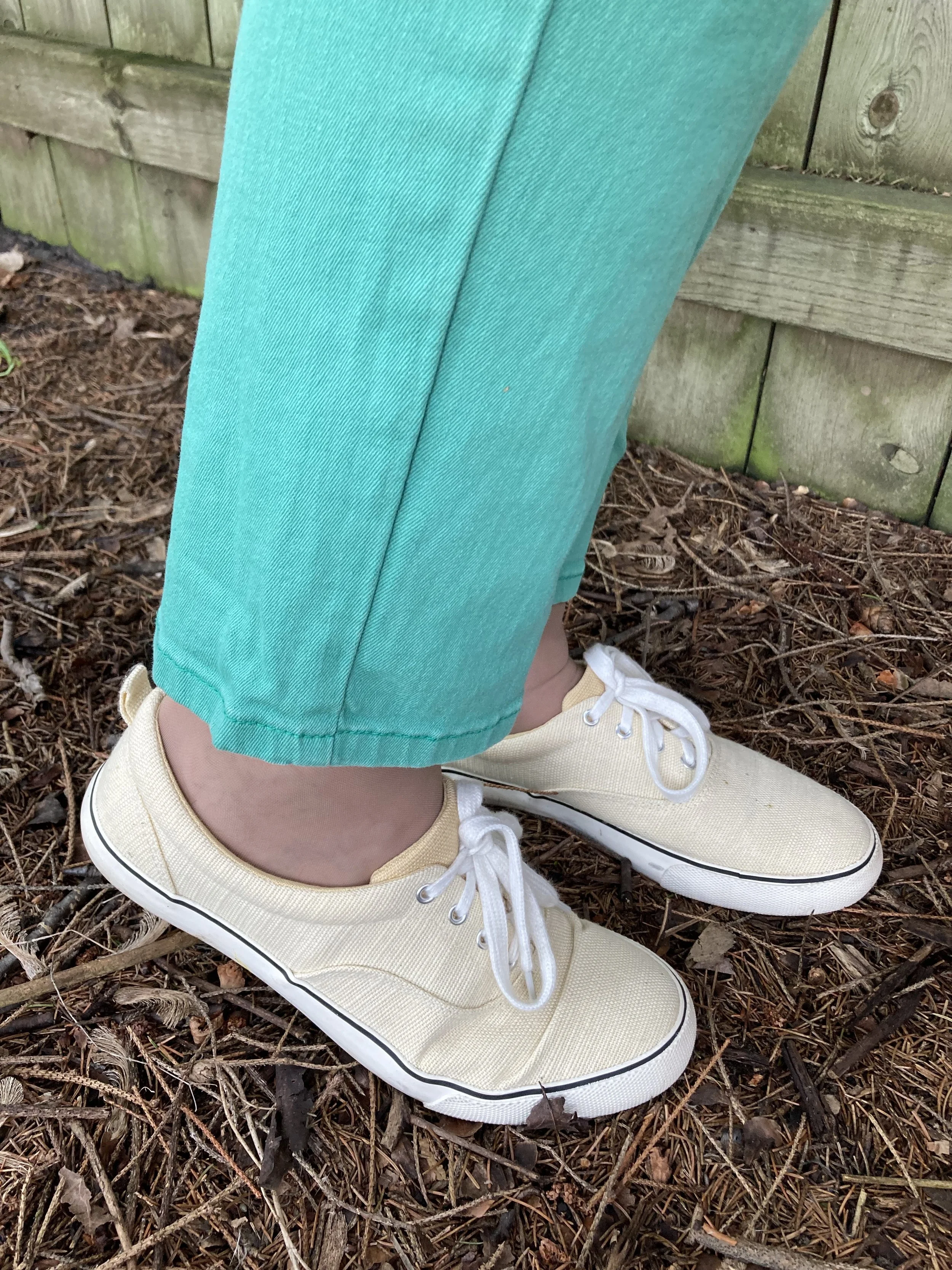
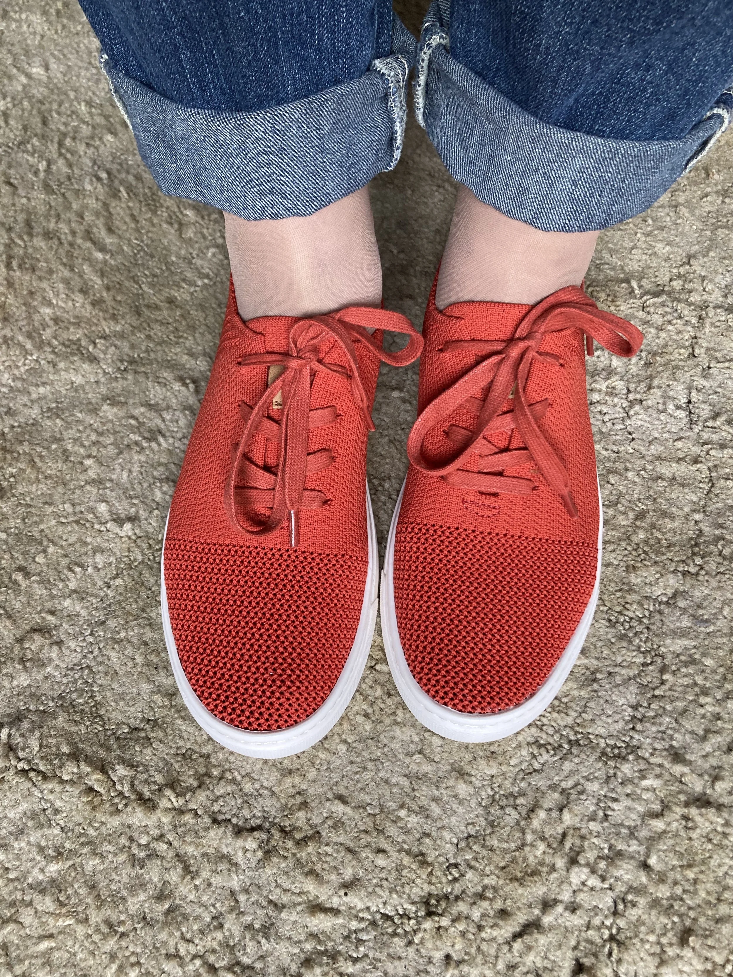
I looked at Pinterest for inspiration for this coastal trend, and I found a number of outfits with a similar color palette to what I have put together here. White, light tan, with a light version of blue often seen in chambray pieces like button downs or skirts. What seemed to dominate the looks I found on Pinterest were white tops and bottoms with layered pieces, bags, shoes and a bit of jewelry taking on the other colors. To make this look completely my own, I decided to use the neutral tan color as my overall grounding color and just add in a little white, and blue.
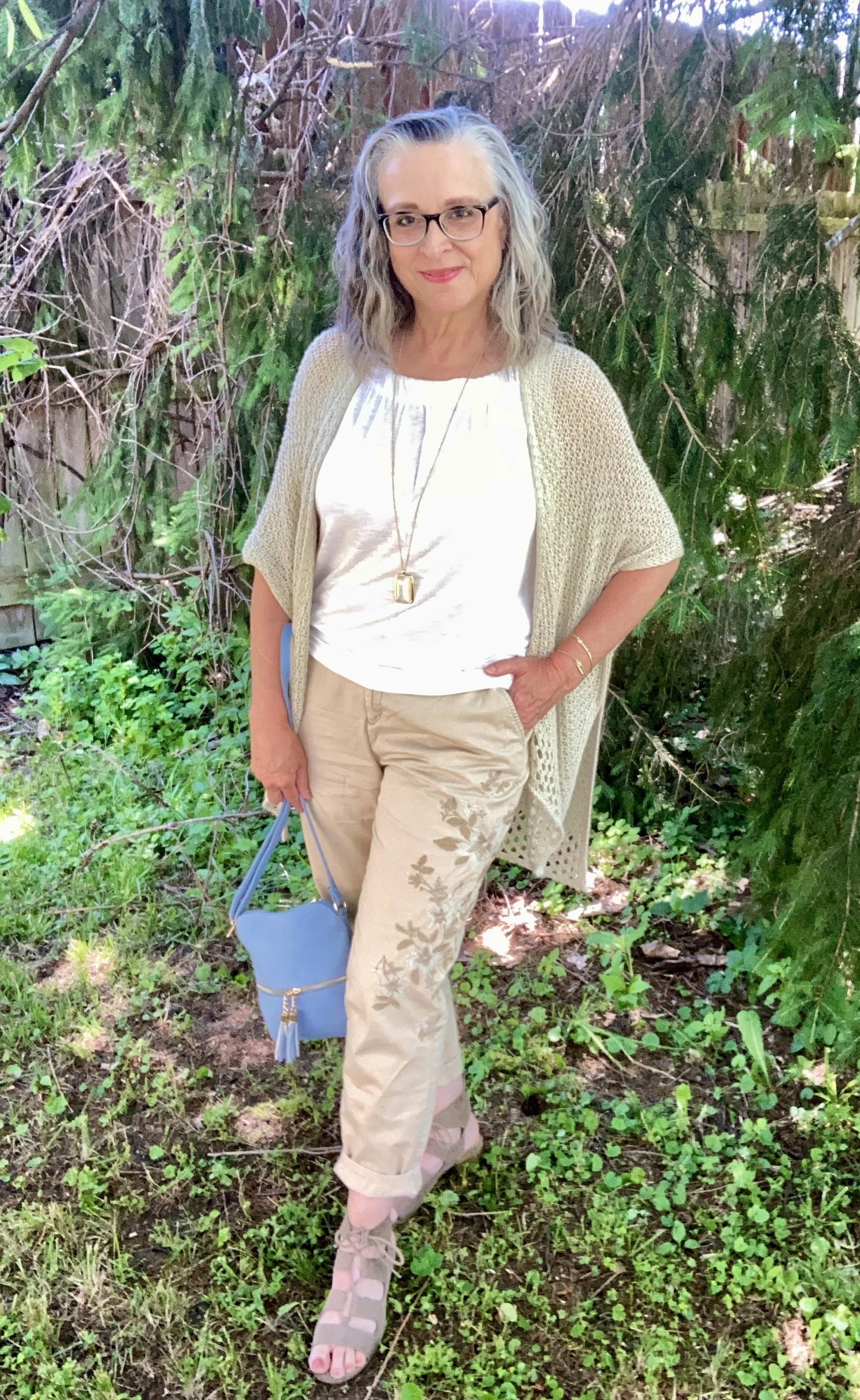
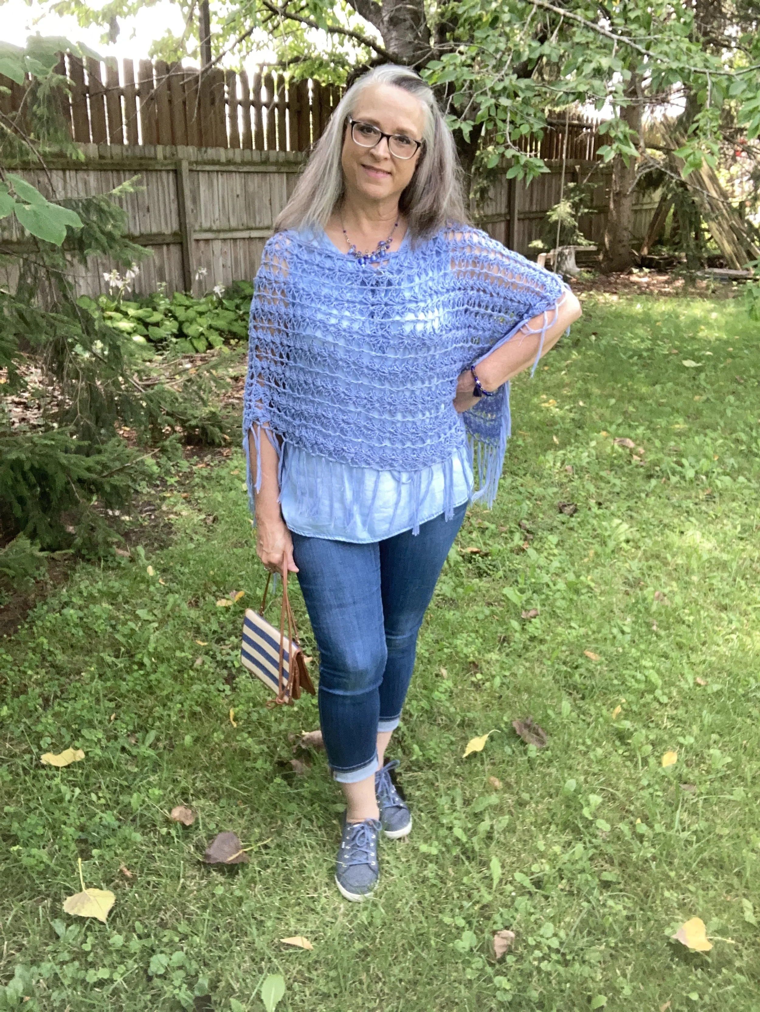
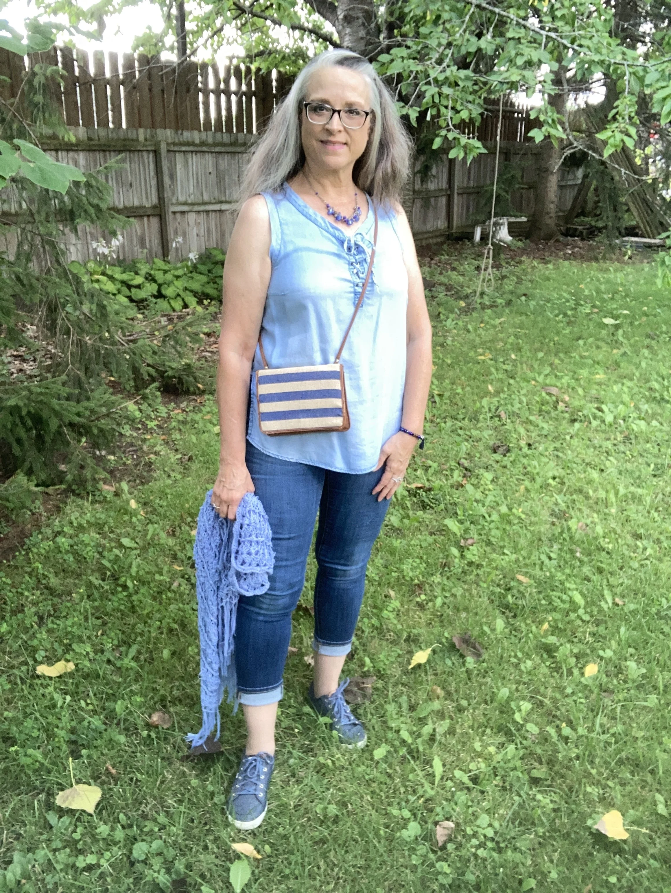
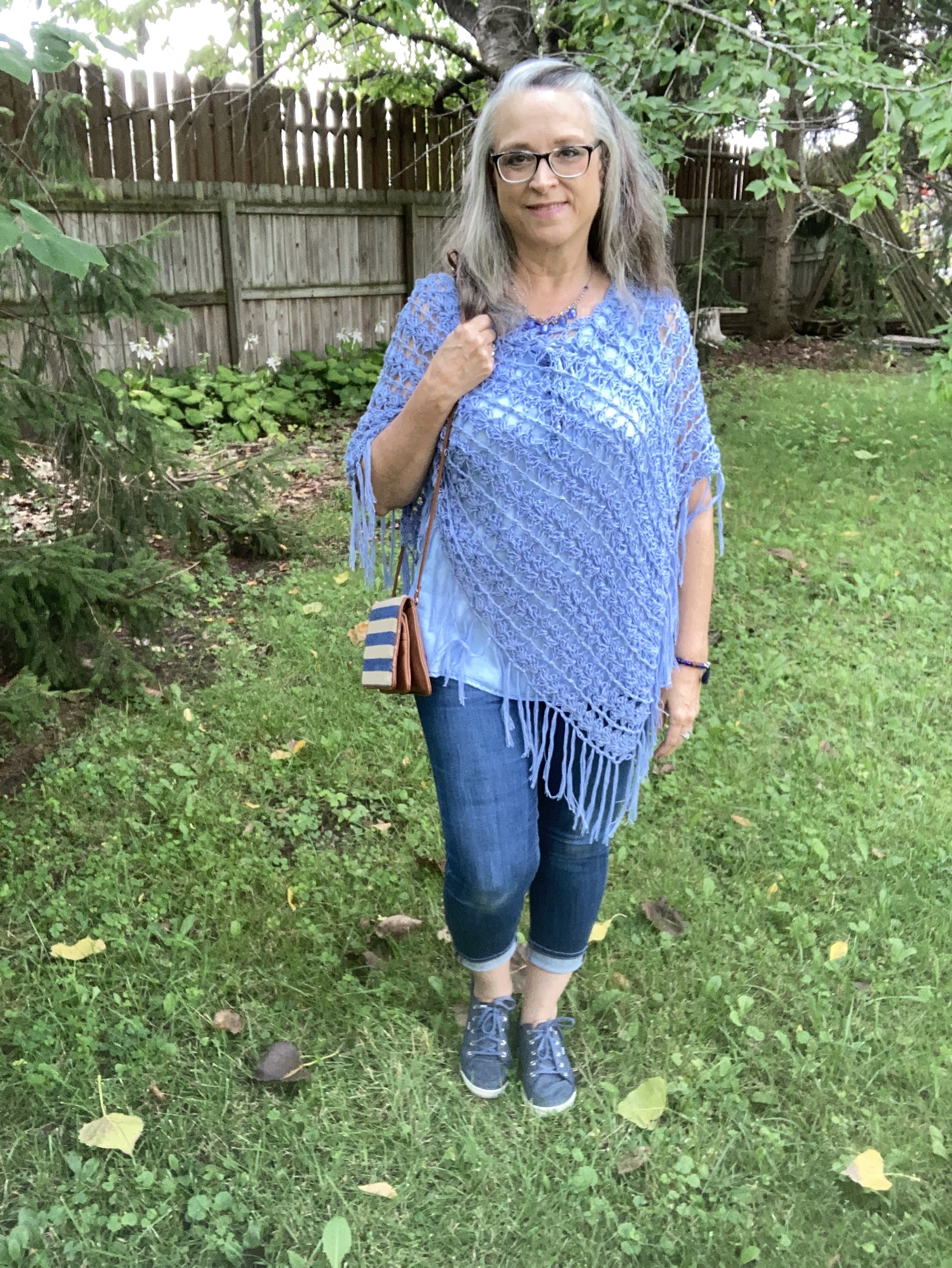
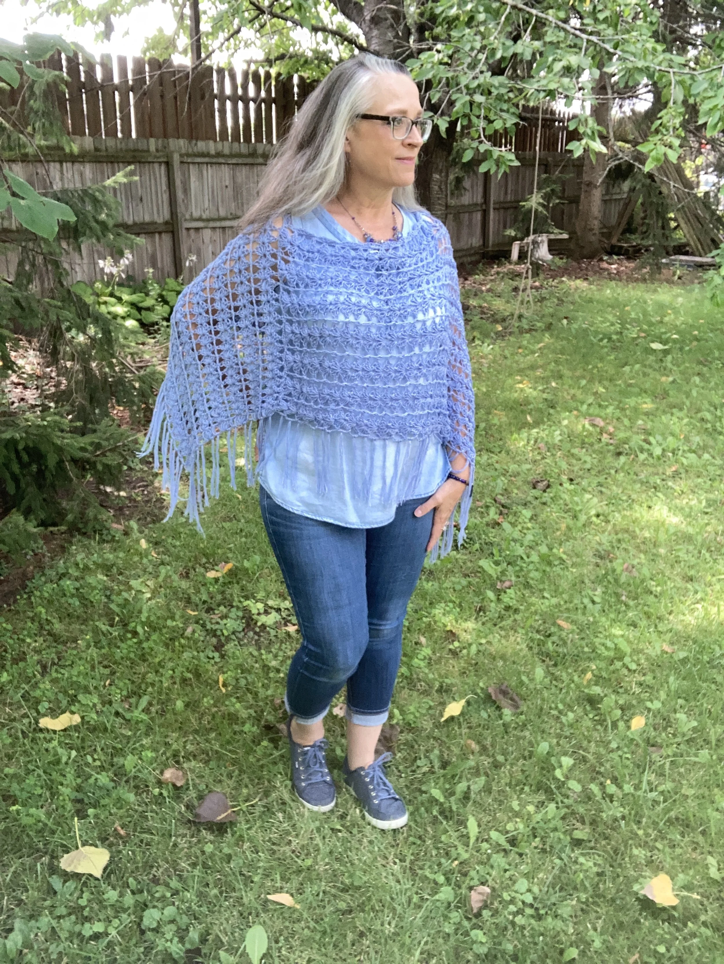
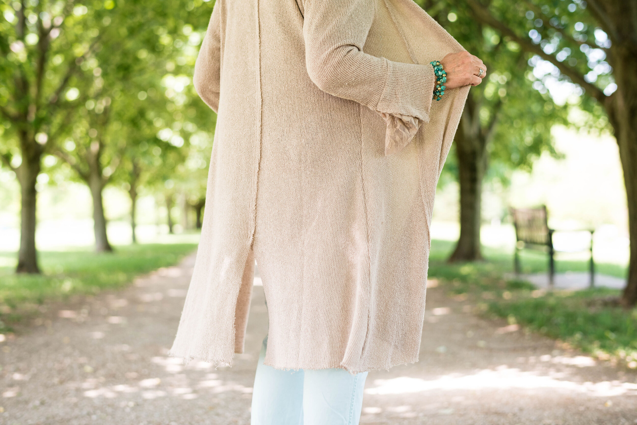
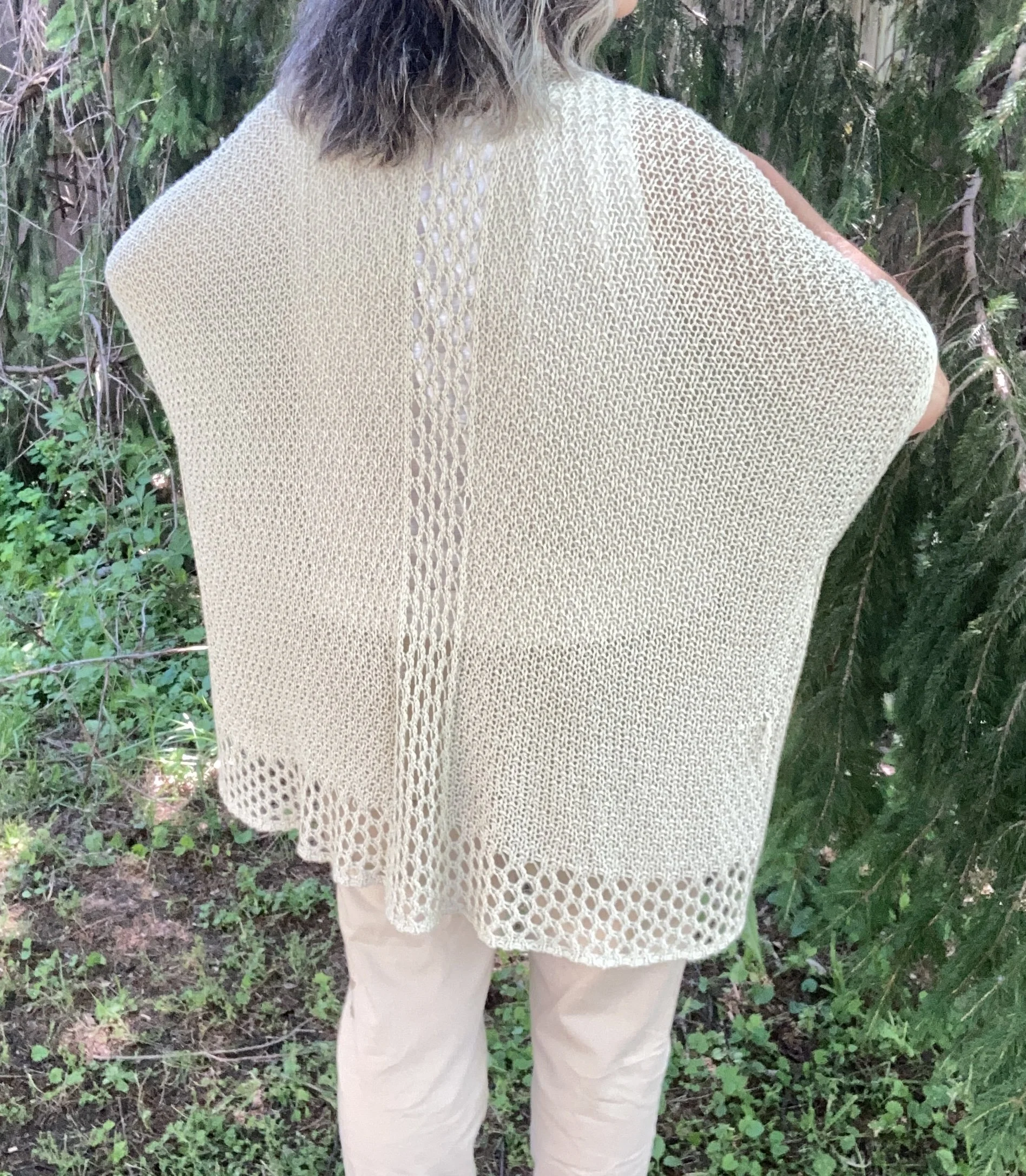
My knit ruana is a fabulous Sonoma piece I got a number of years ago at Kohl’s and use it every so often to help build an outfit with texture. You can see how I styled it on the blog as a work wear look, and a boho look.

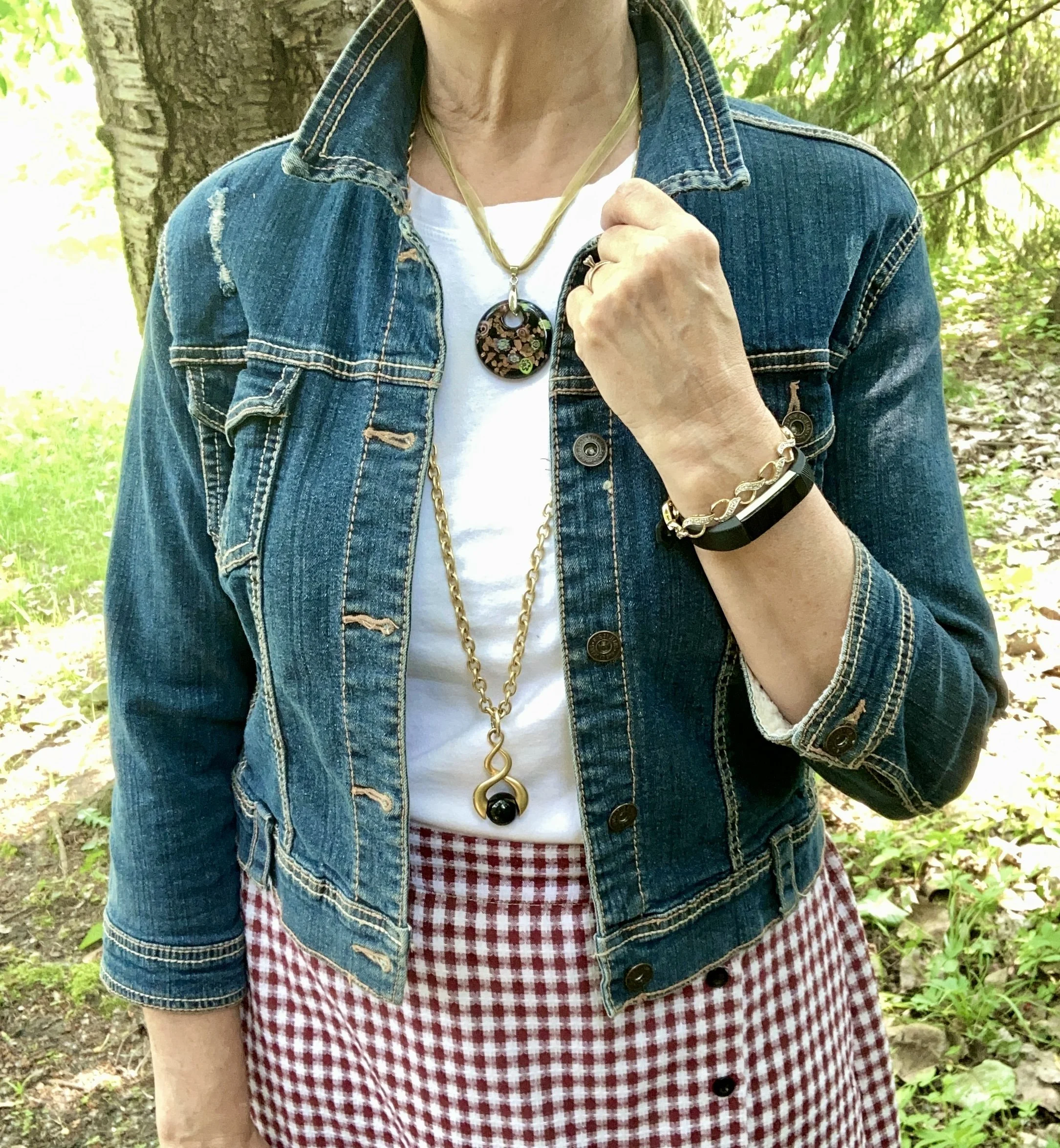
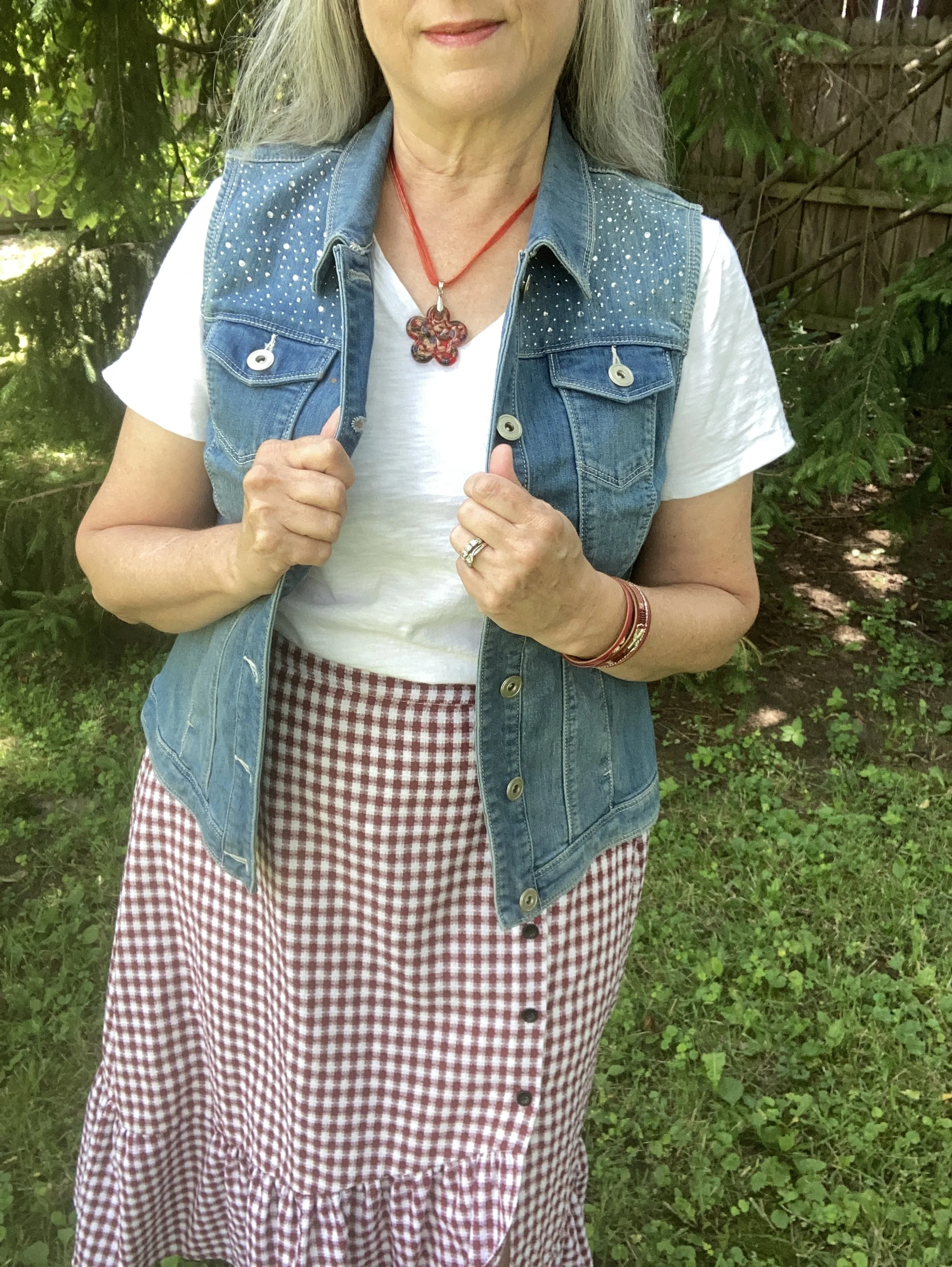
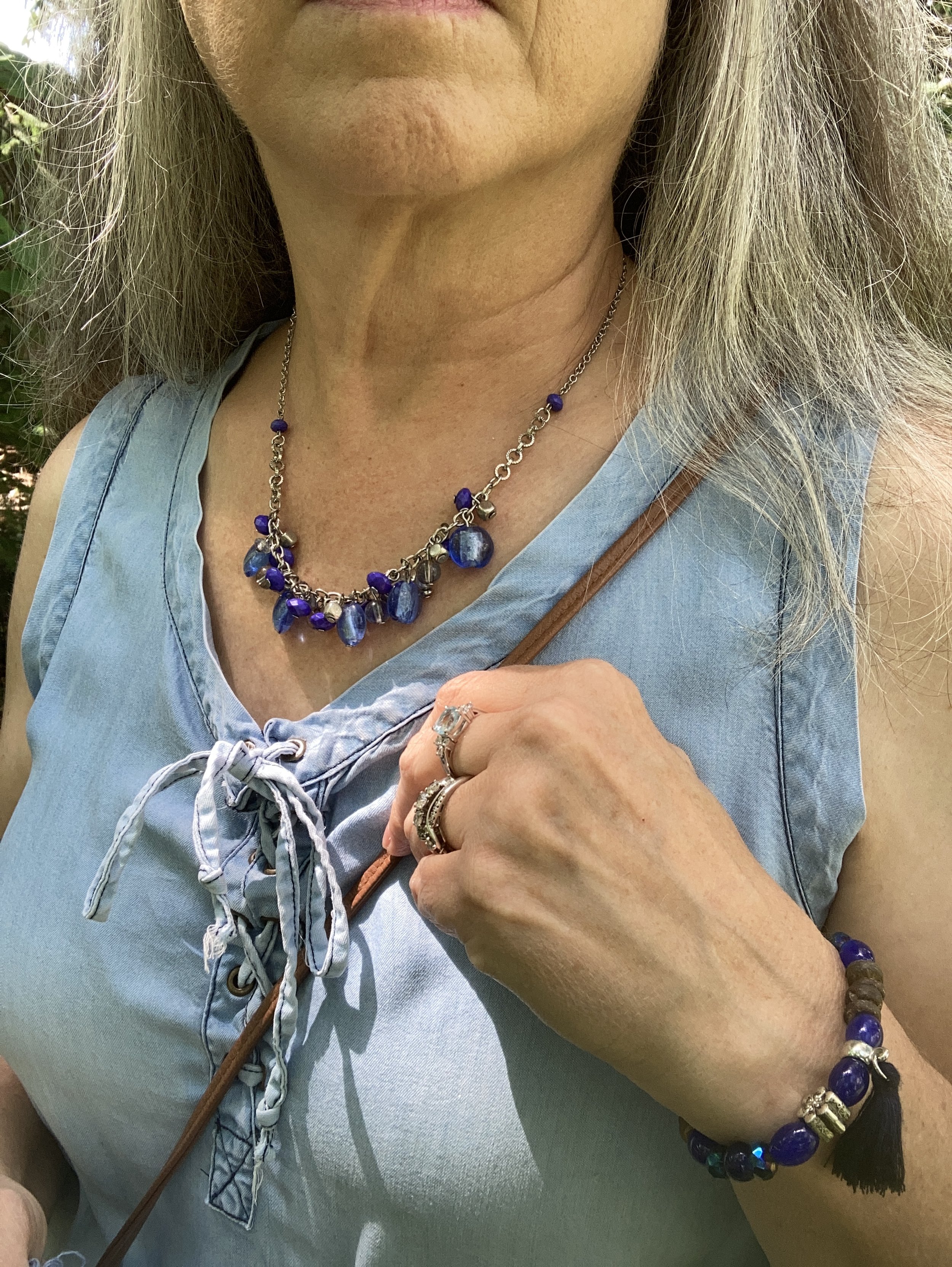
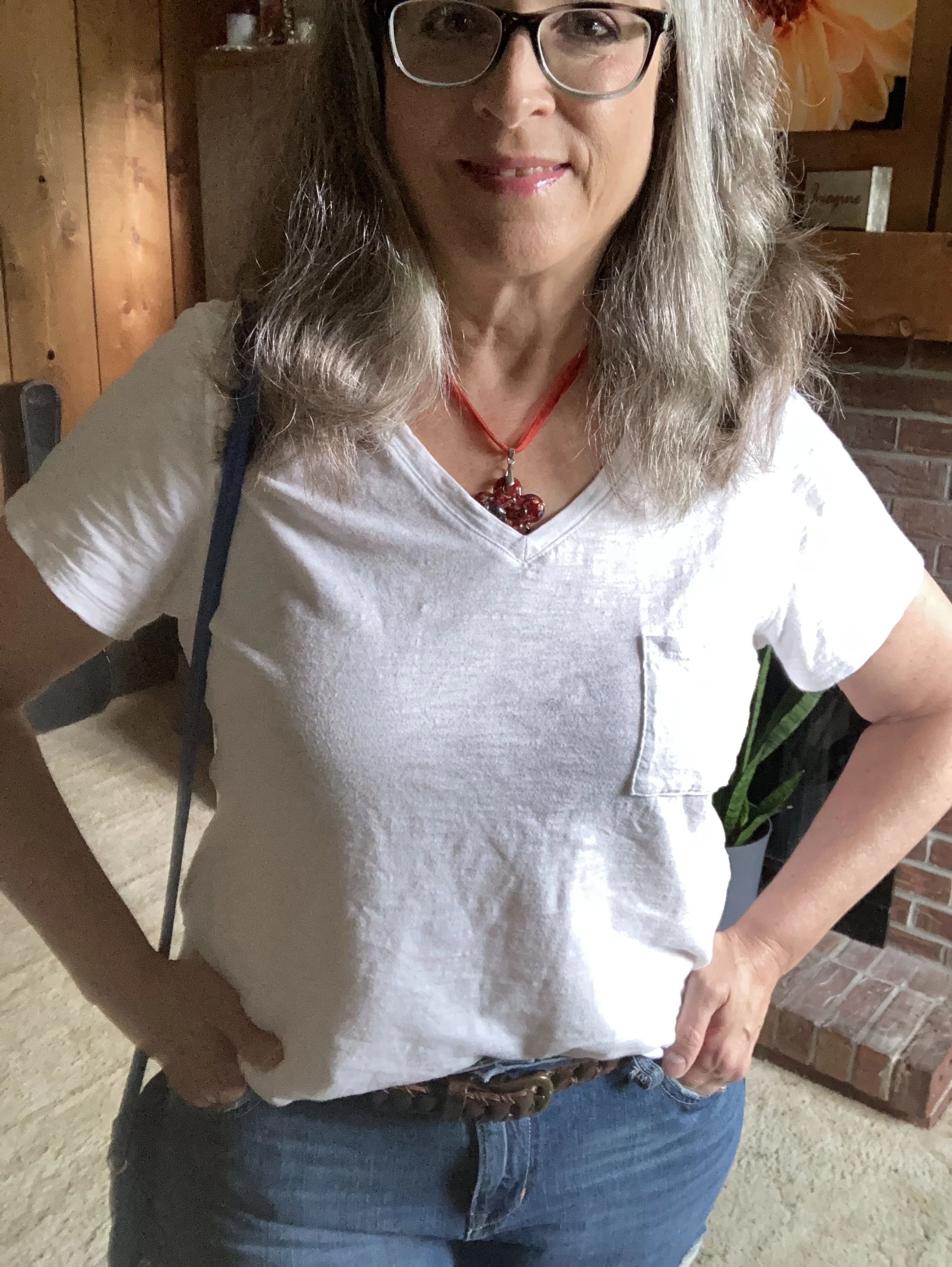
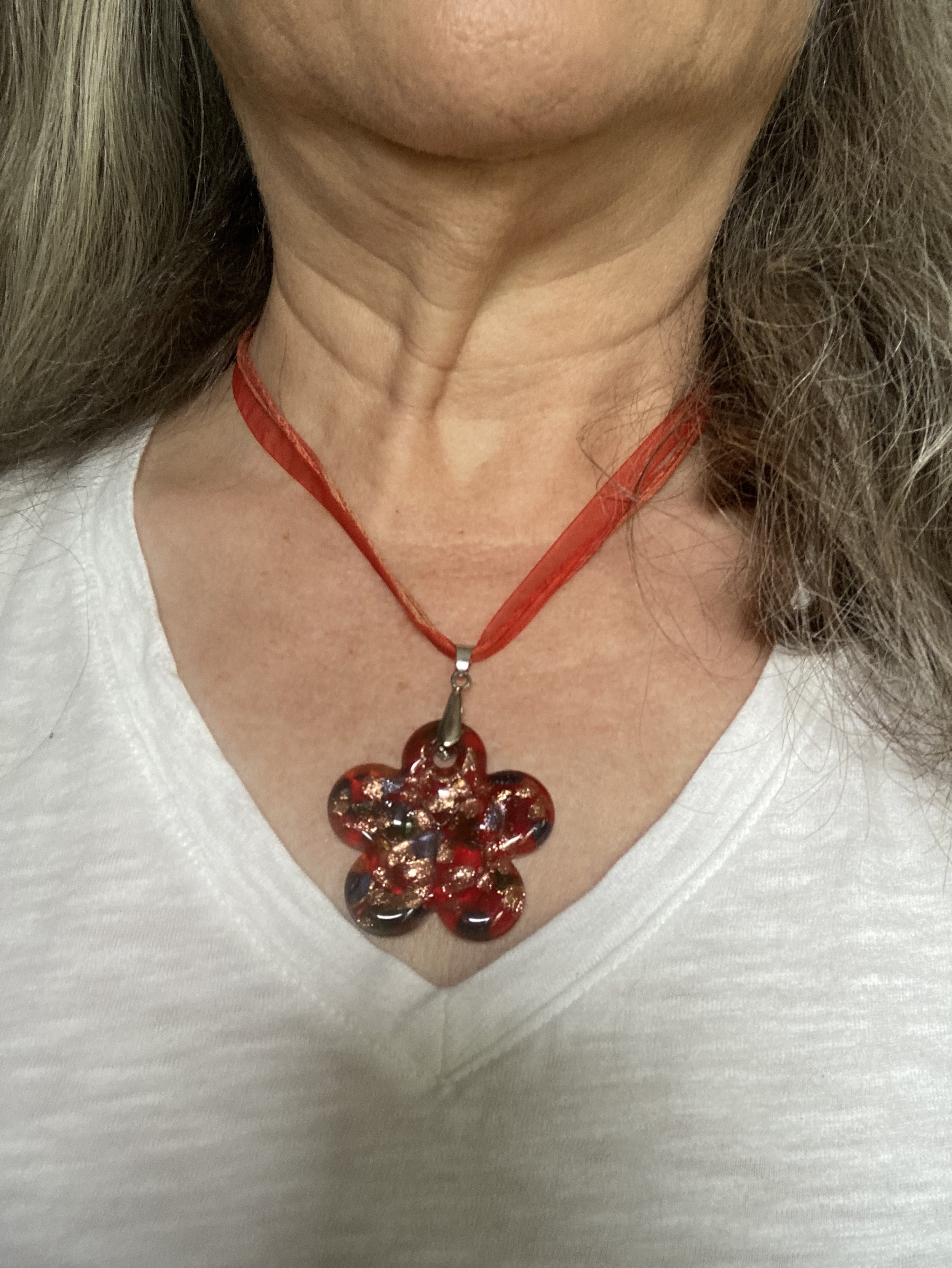
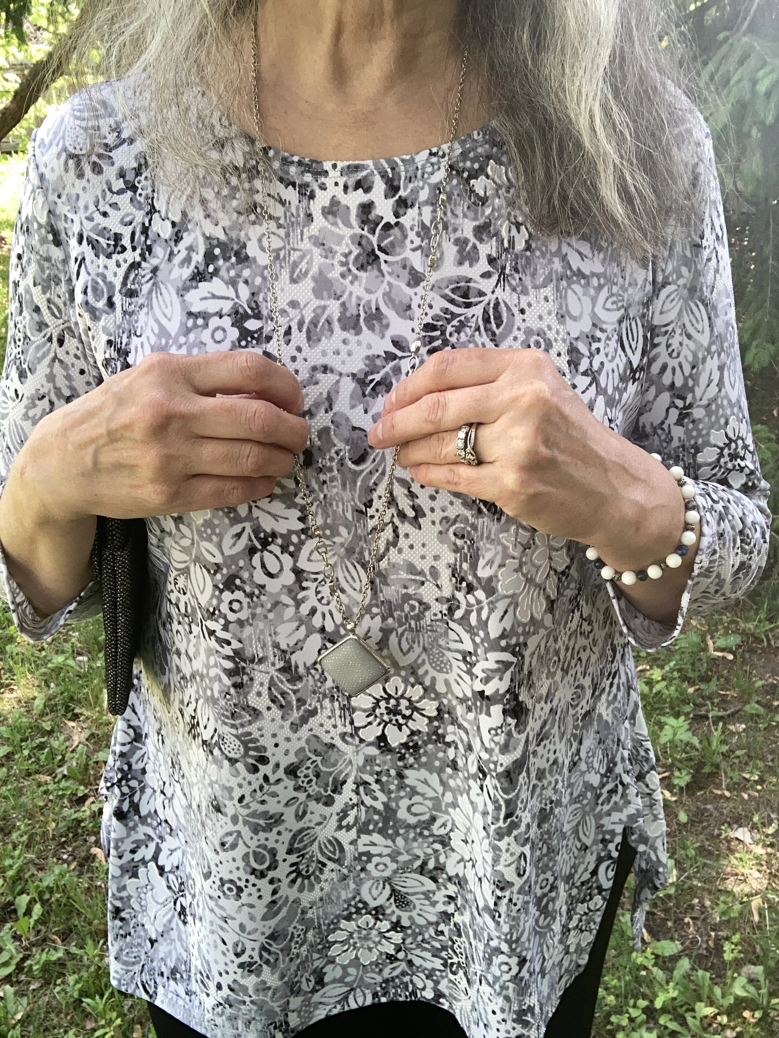
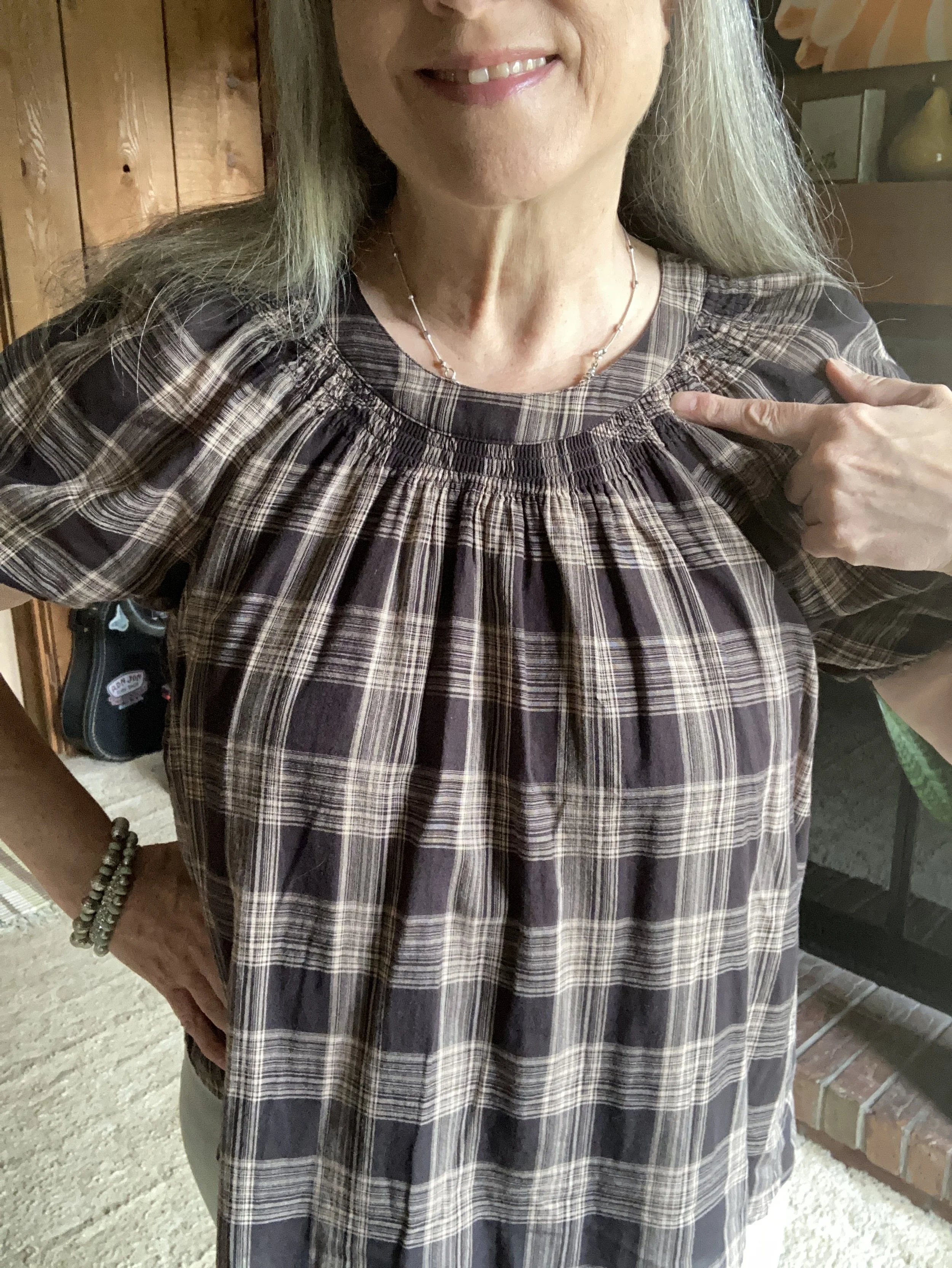
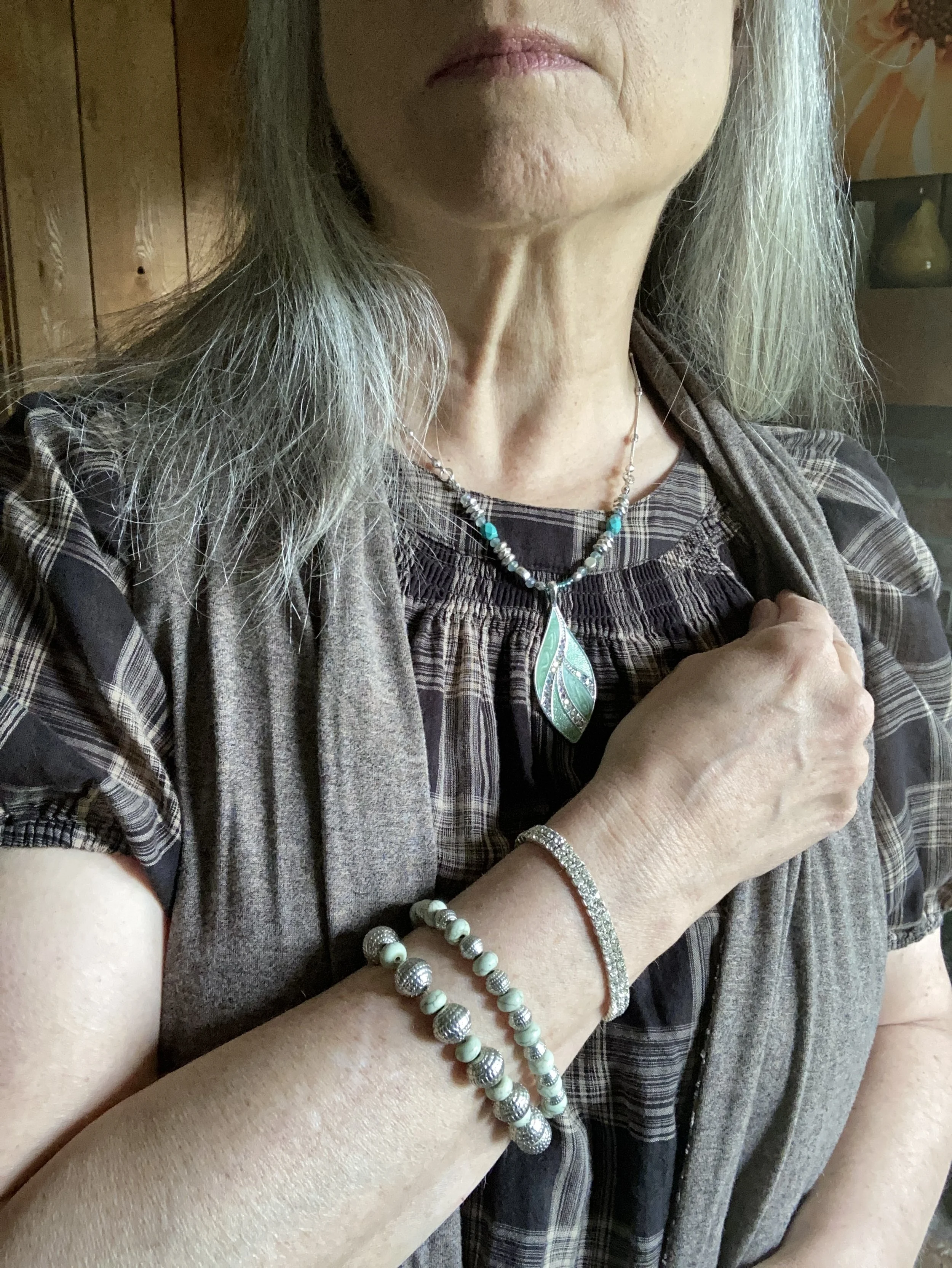
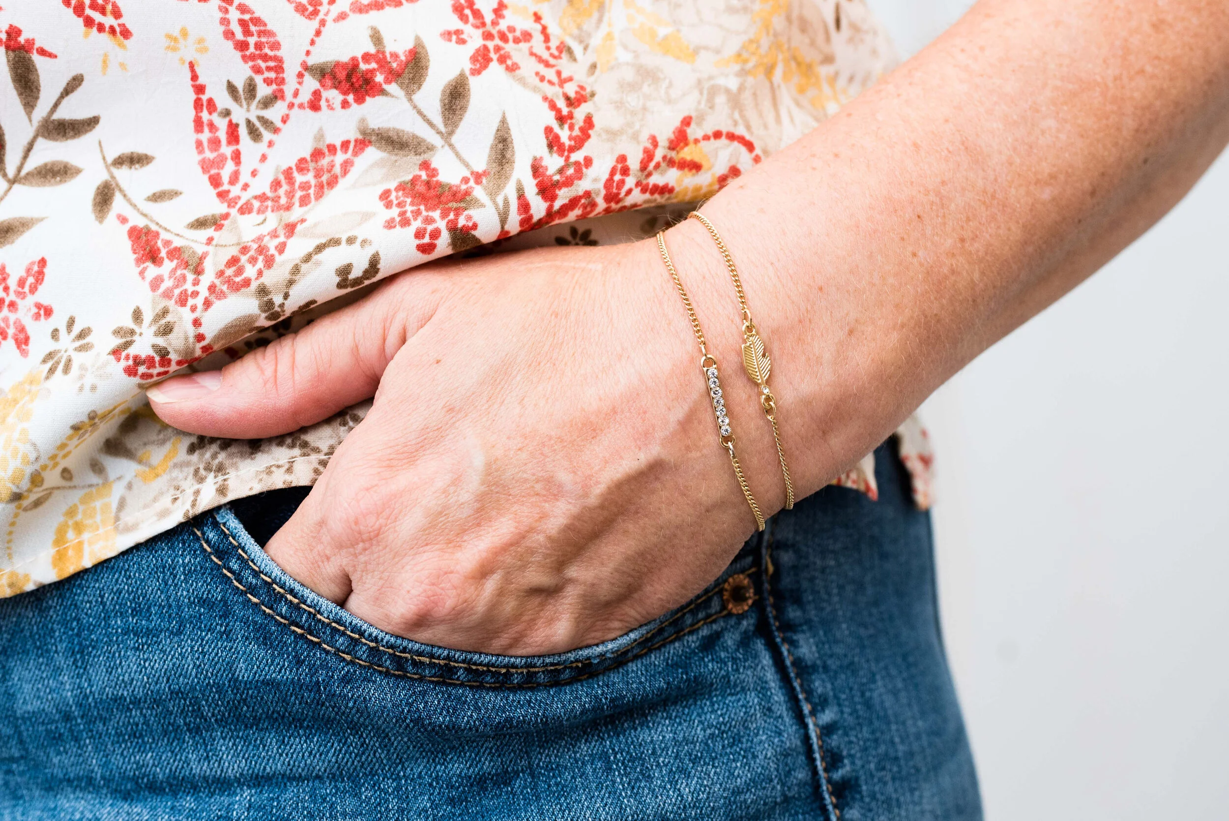
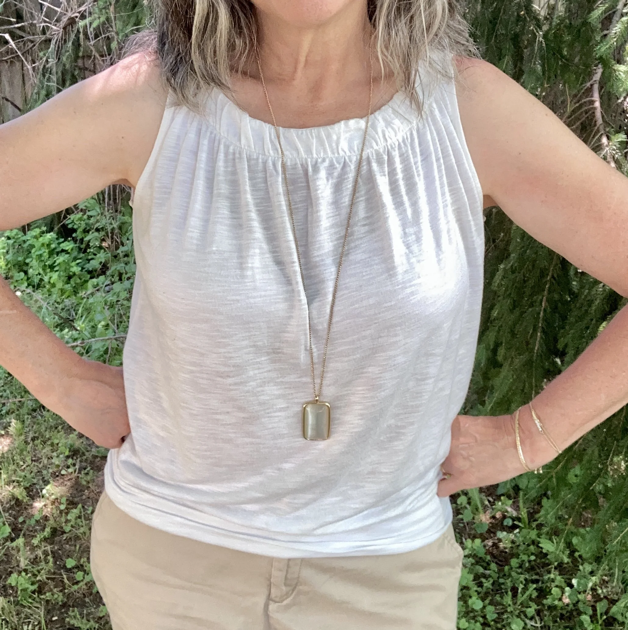
My white tank is a thrifted Loft piece. It has a bit of an iridescent sheen, so it didn’t show up real well in some of the pictures. You can also see the simple pendent necklace I chose to keep the outfit more low key.
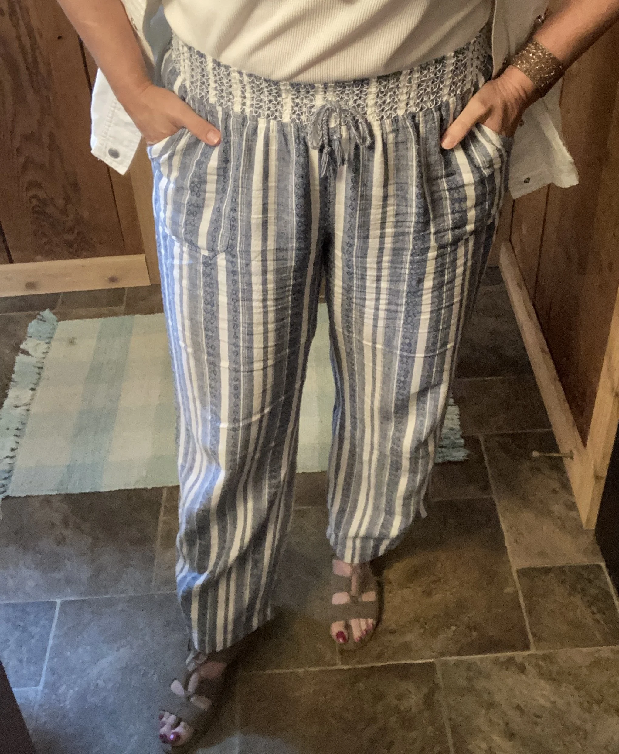
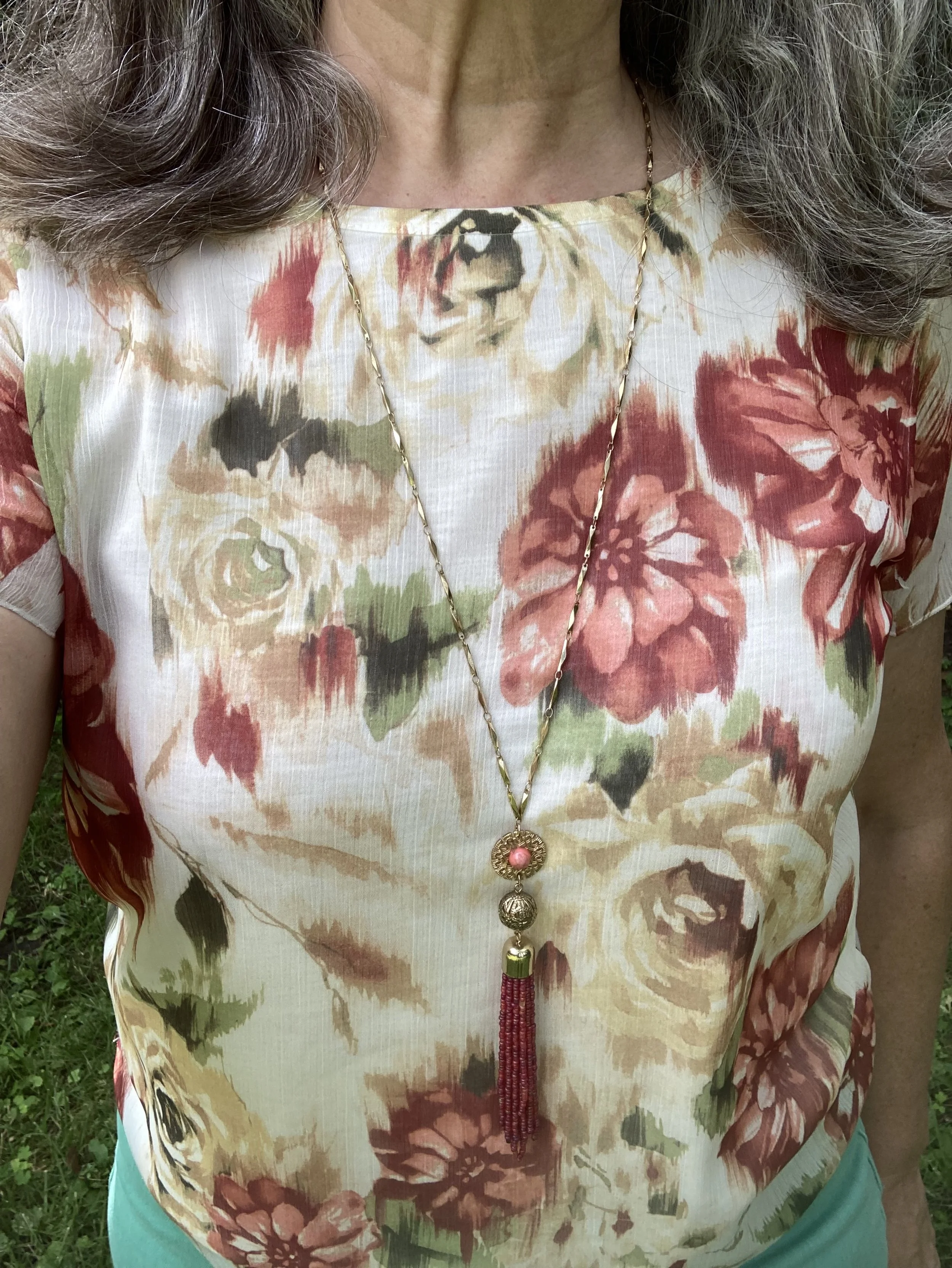
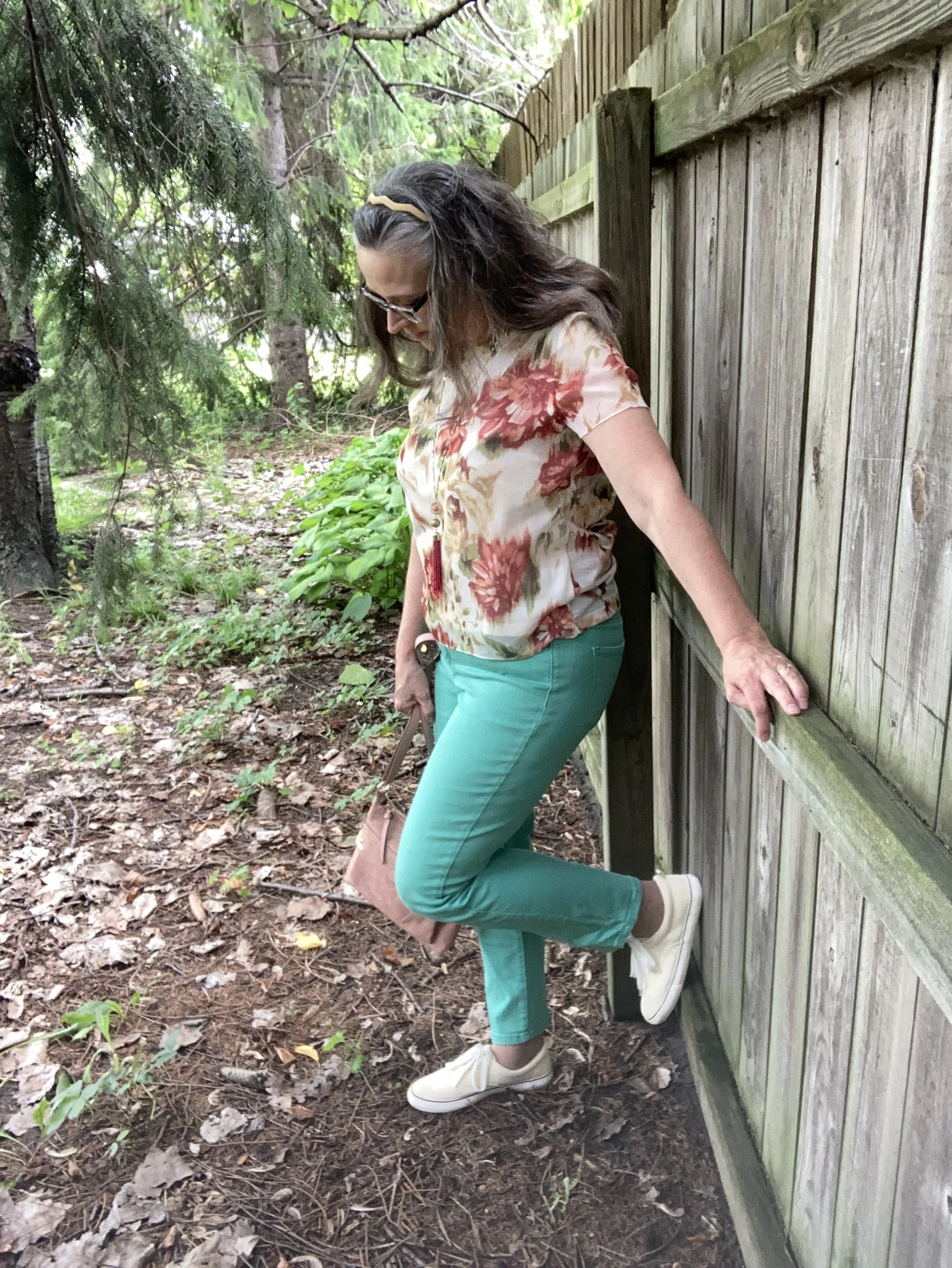
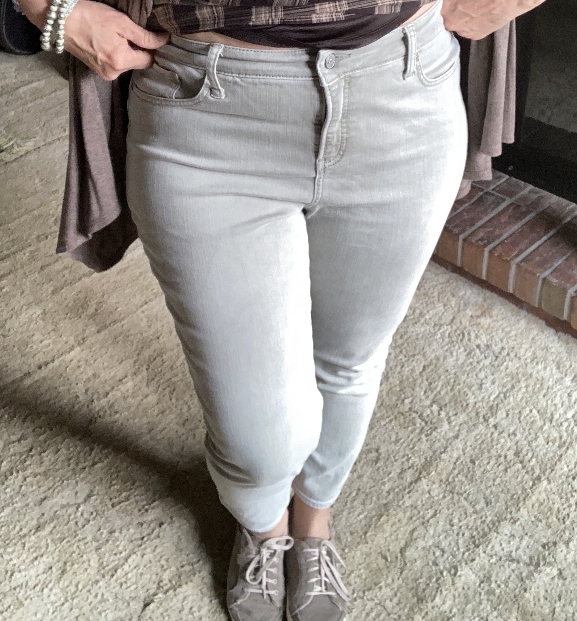
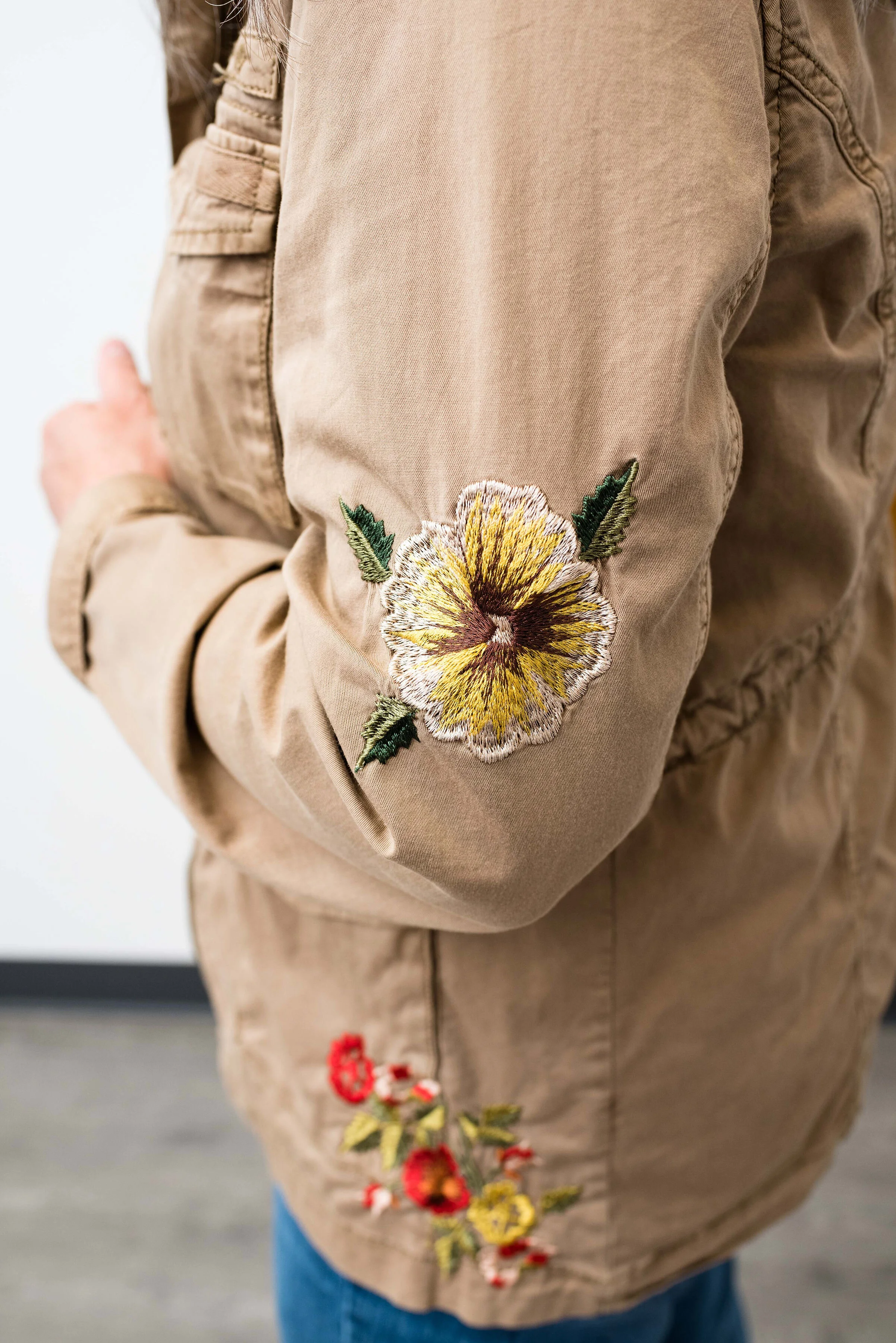
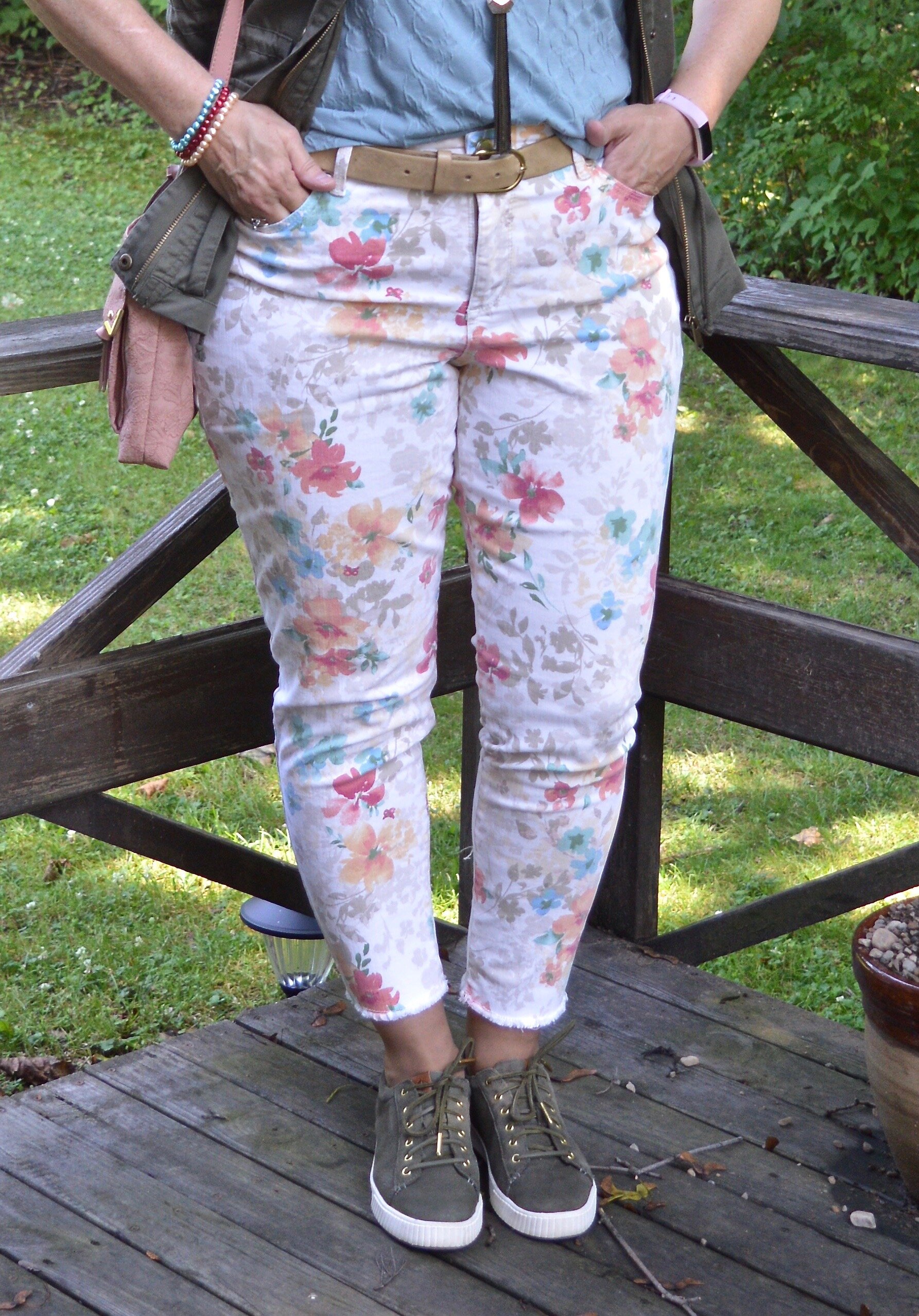
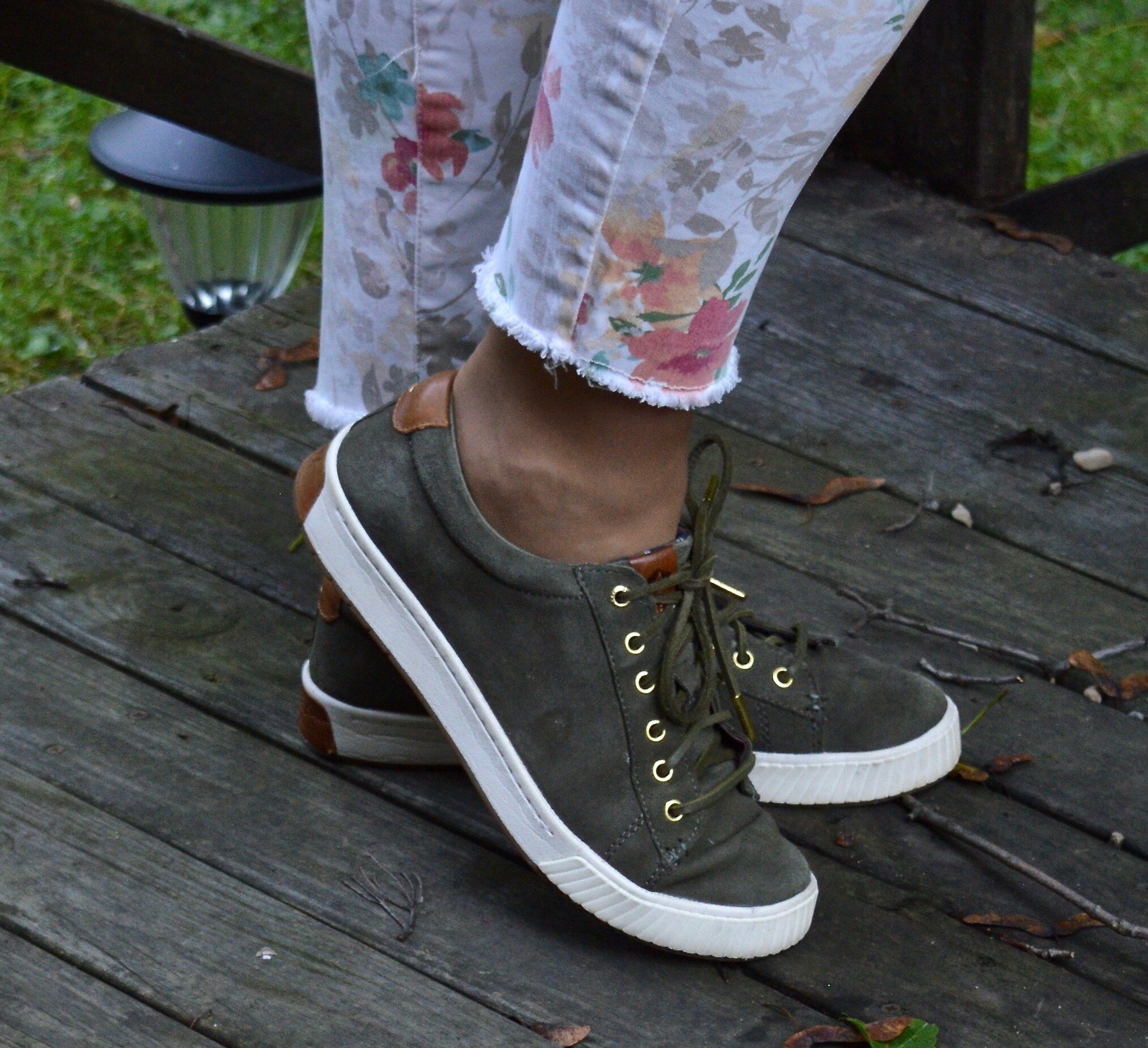
My pants have made the rounds and were a JC Penney’s clearance find years ago. They are Liz Claiborne brand. How could I resist these with their beautiful embroidery? You can see how I styled them on the blog with a yellow top and cardigan.

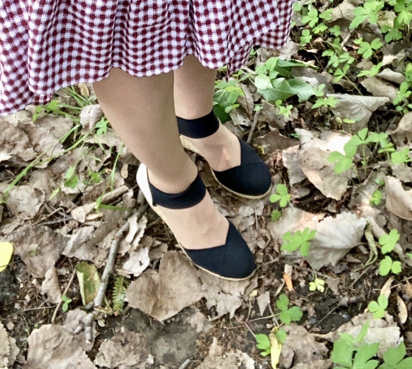
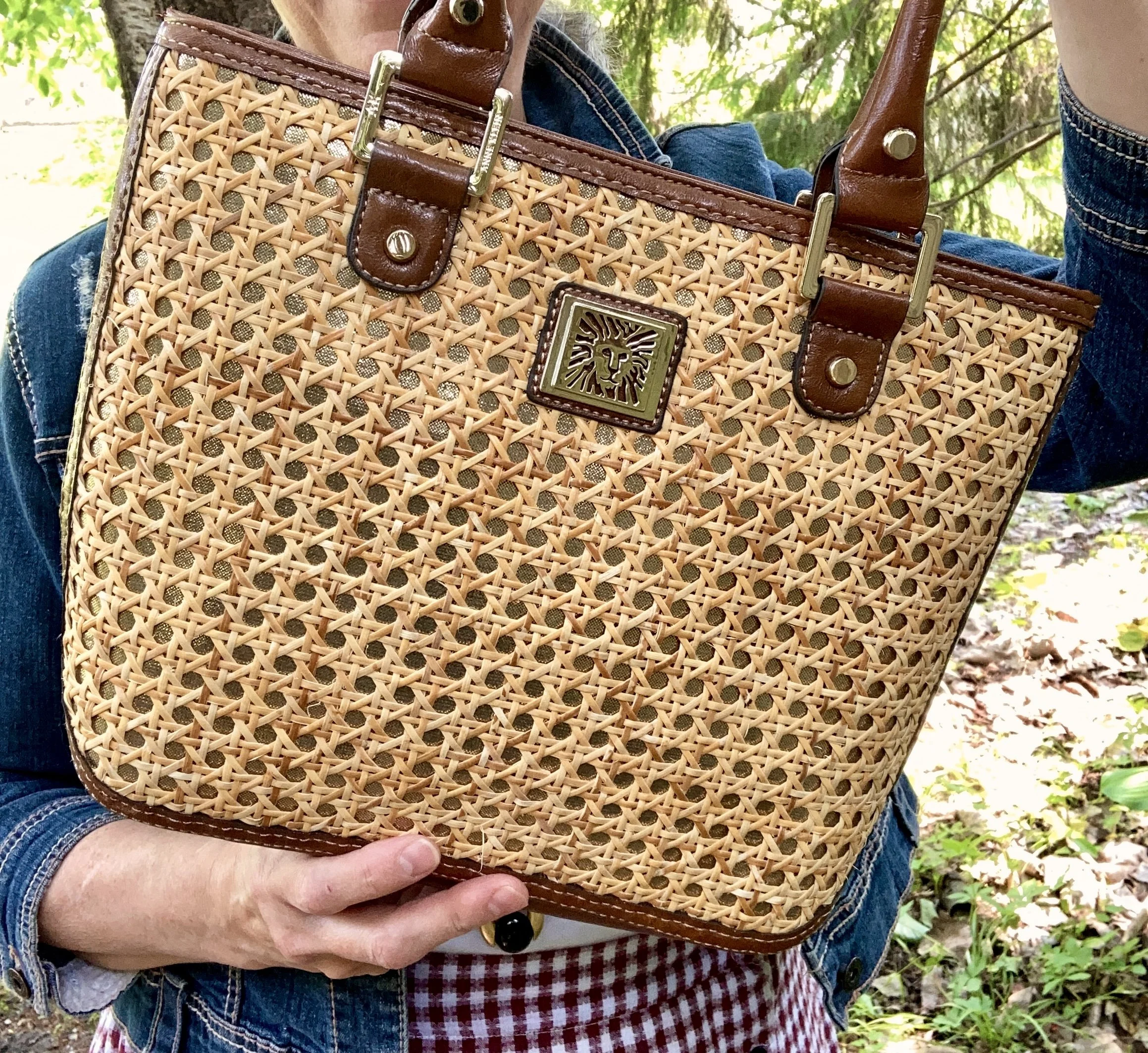
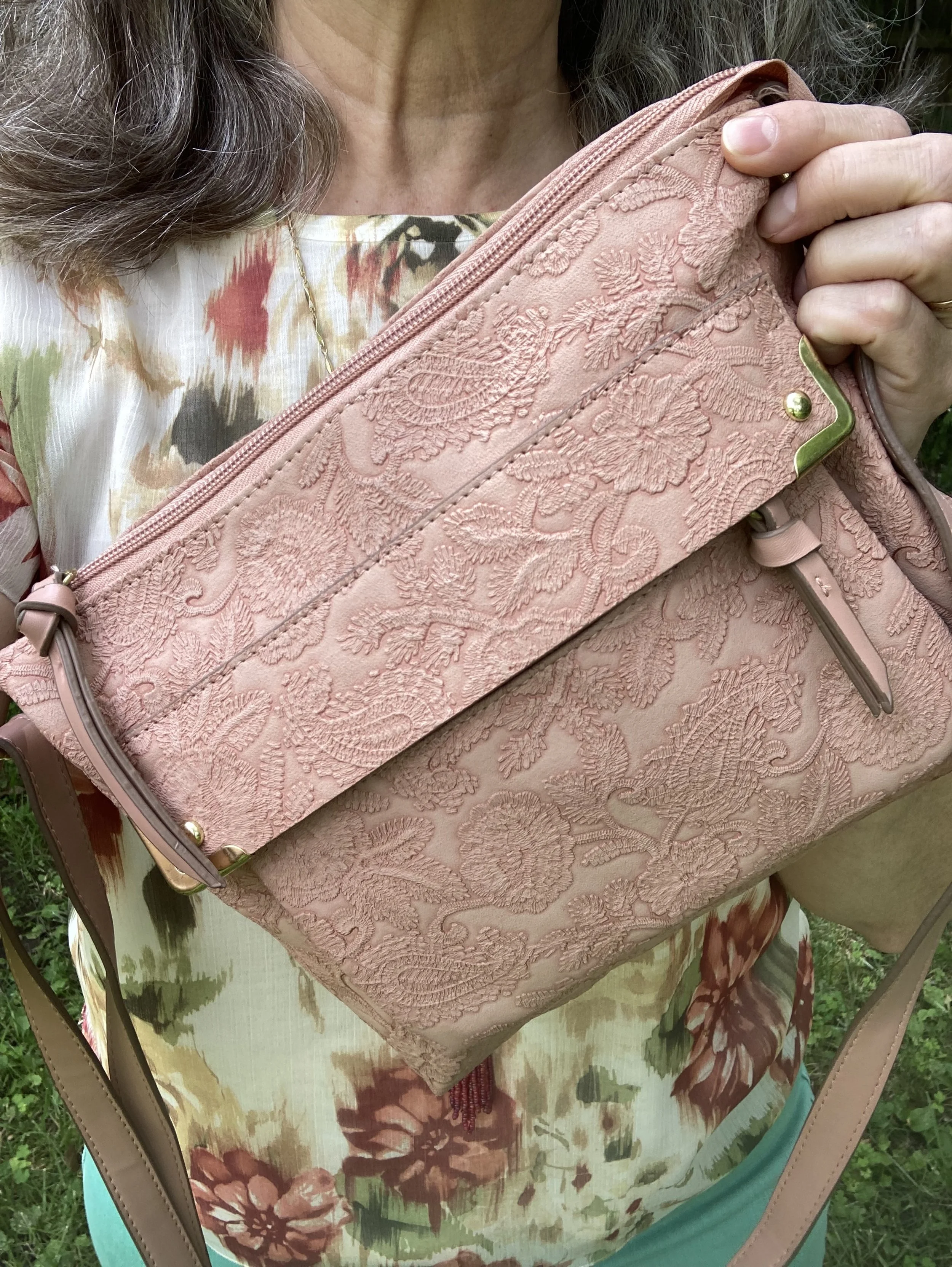
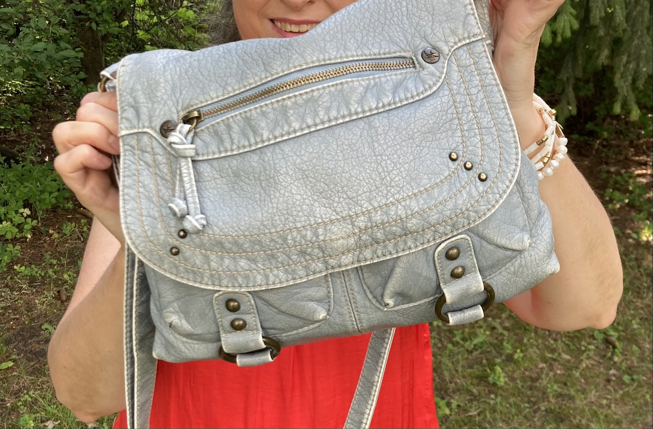
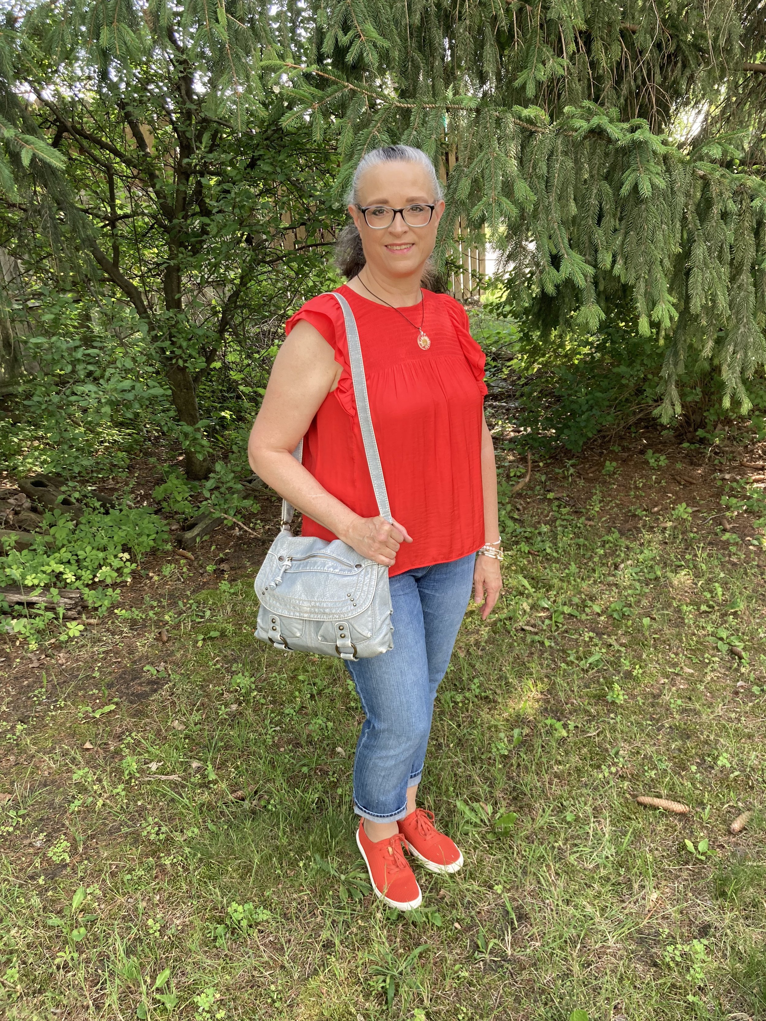
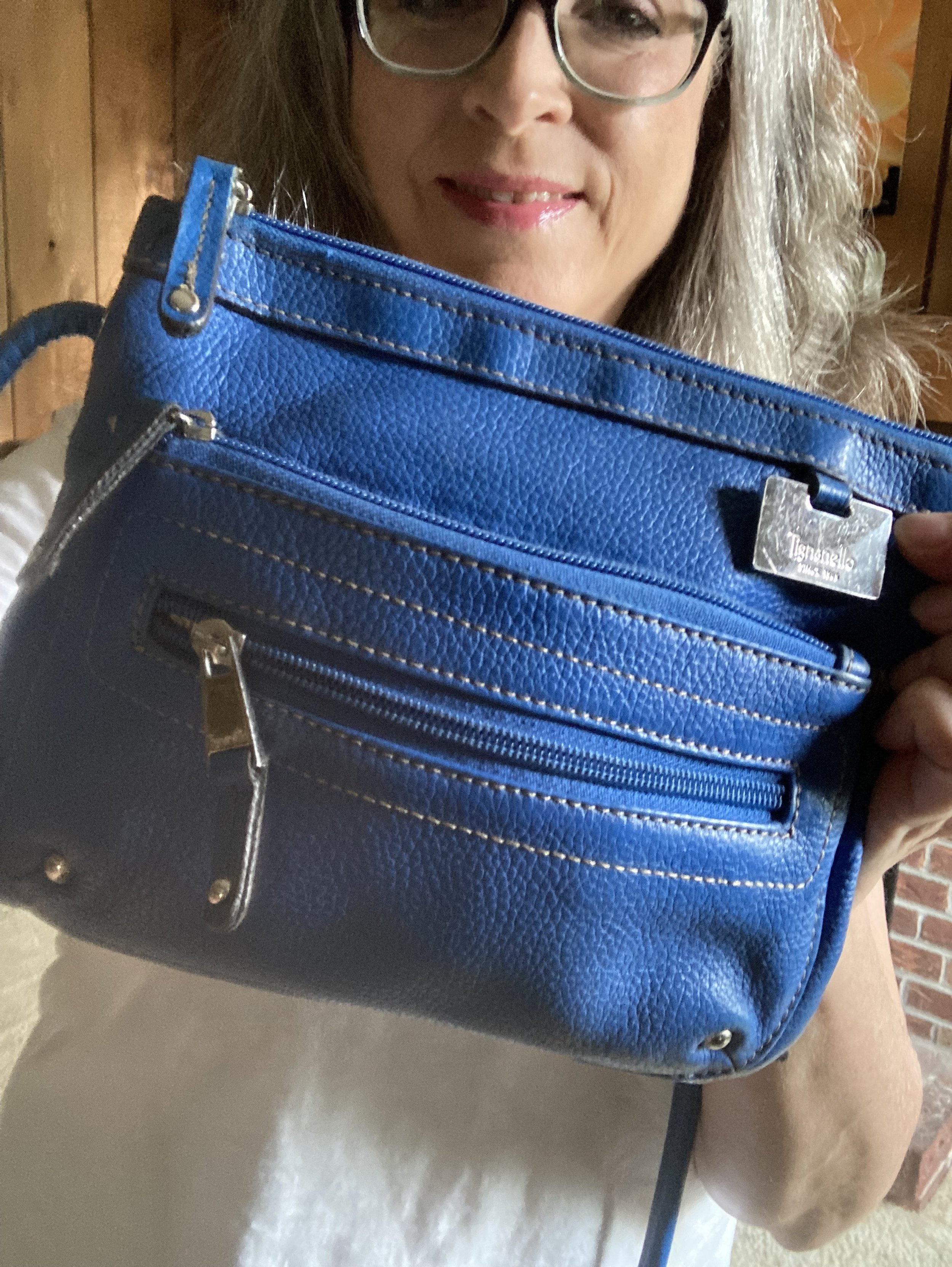
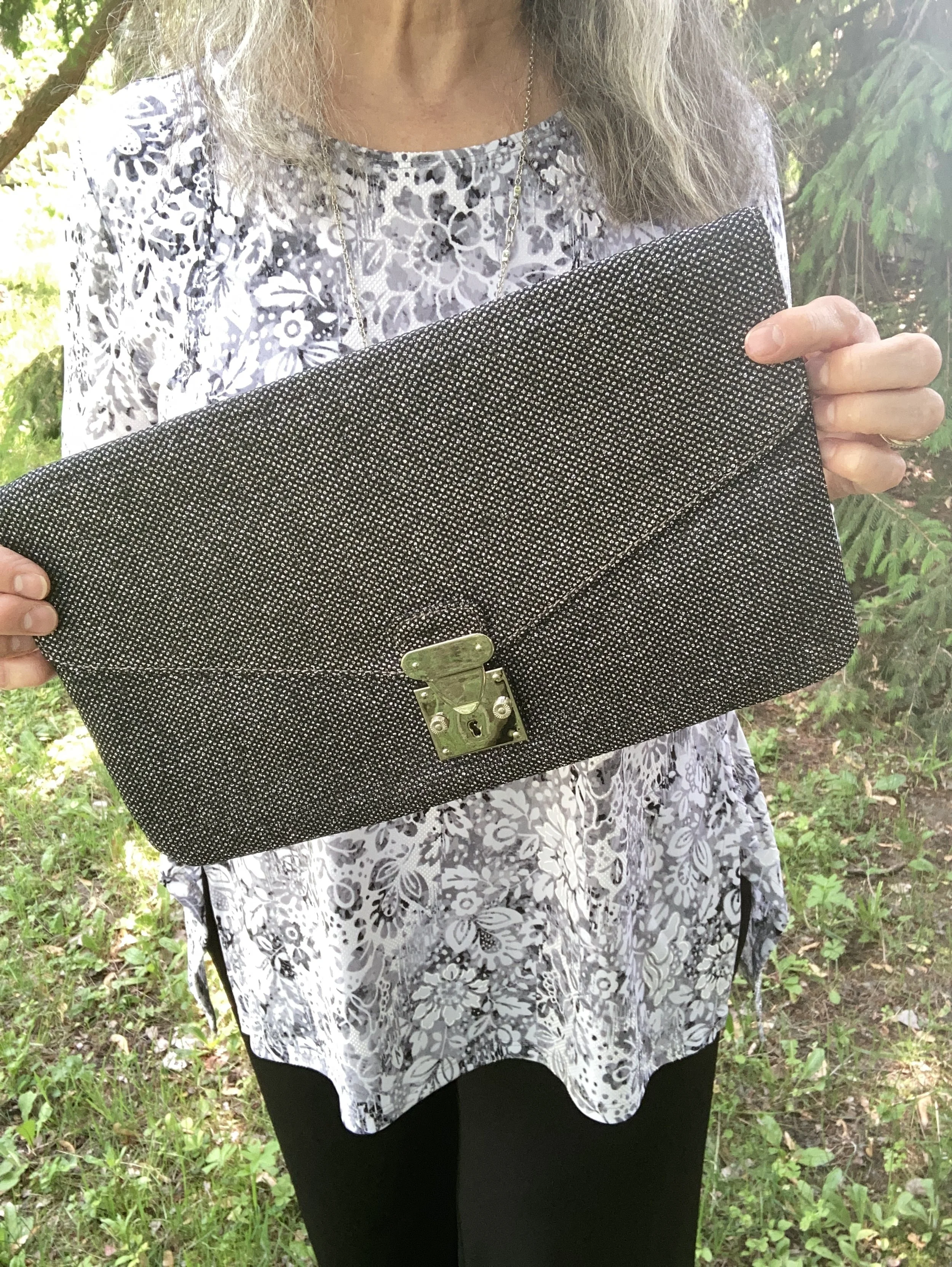
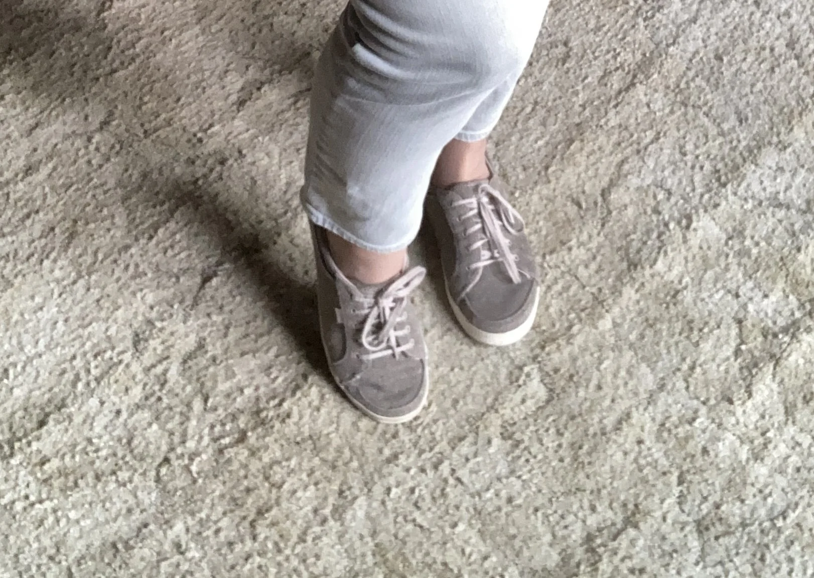
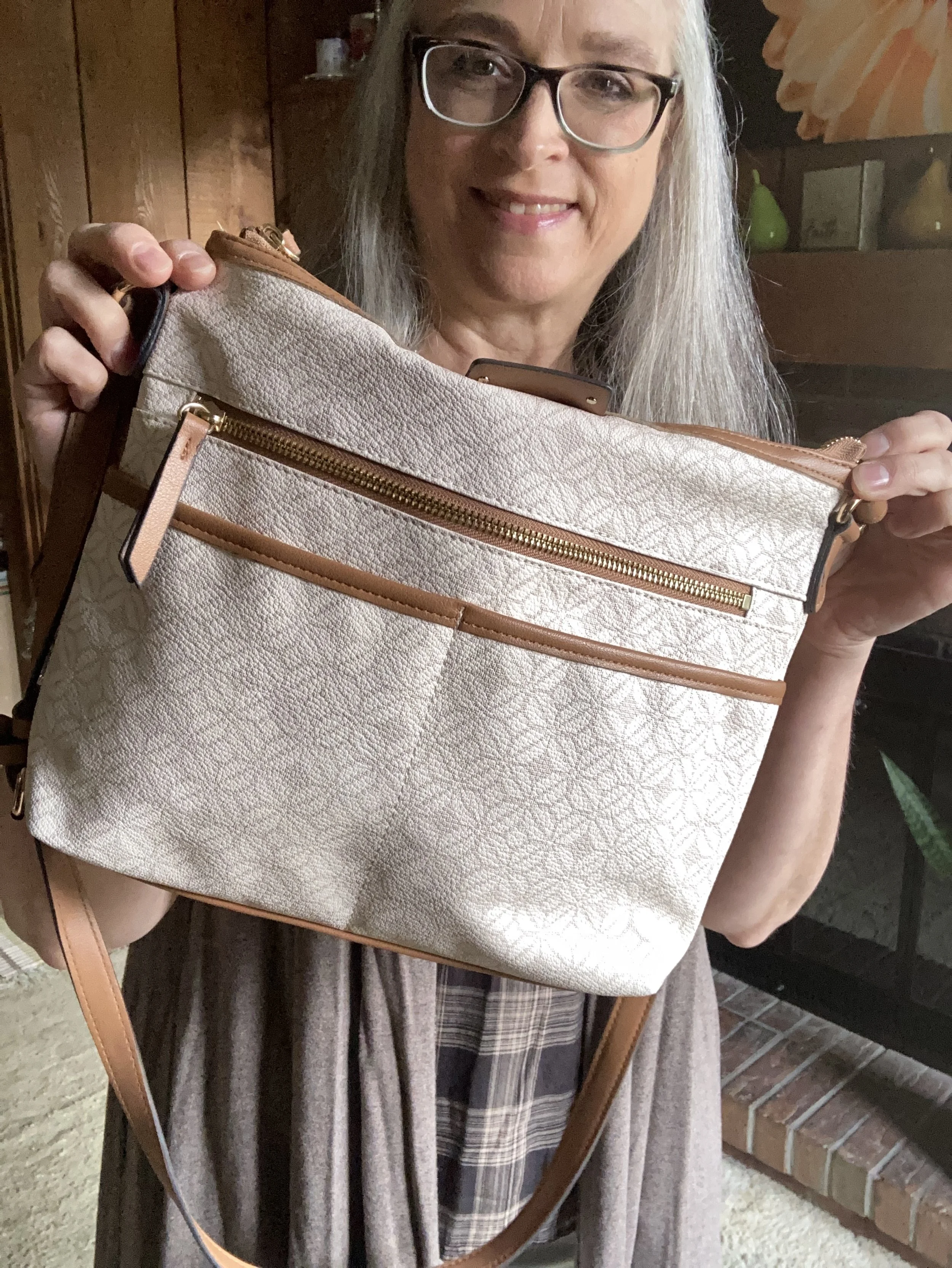
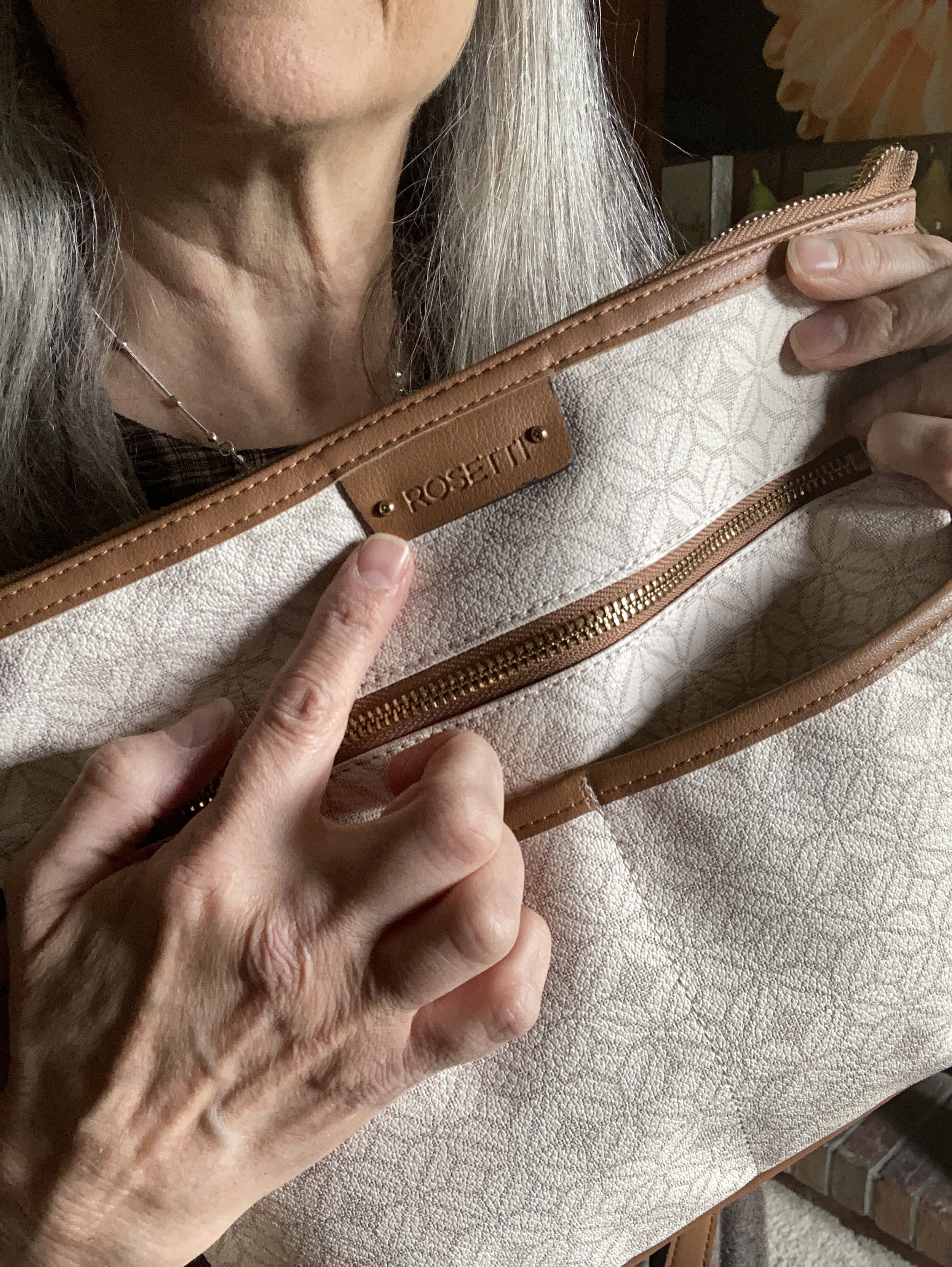
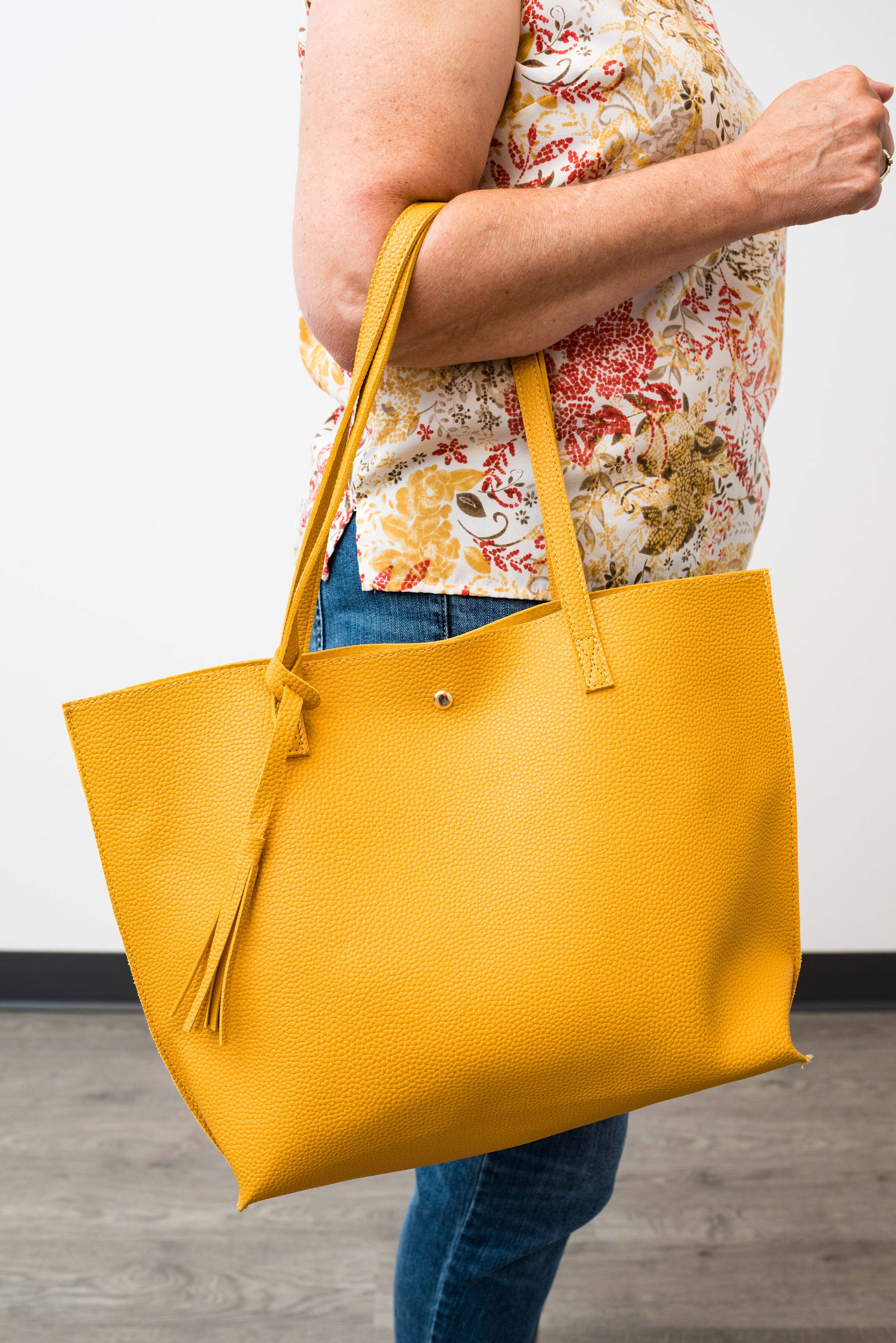
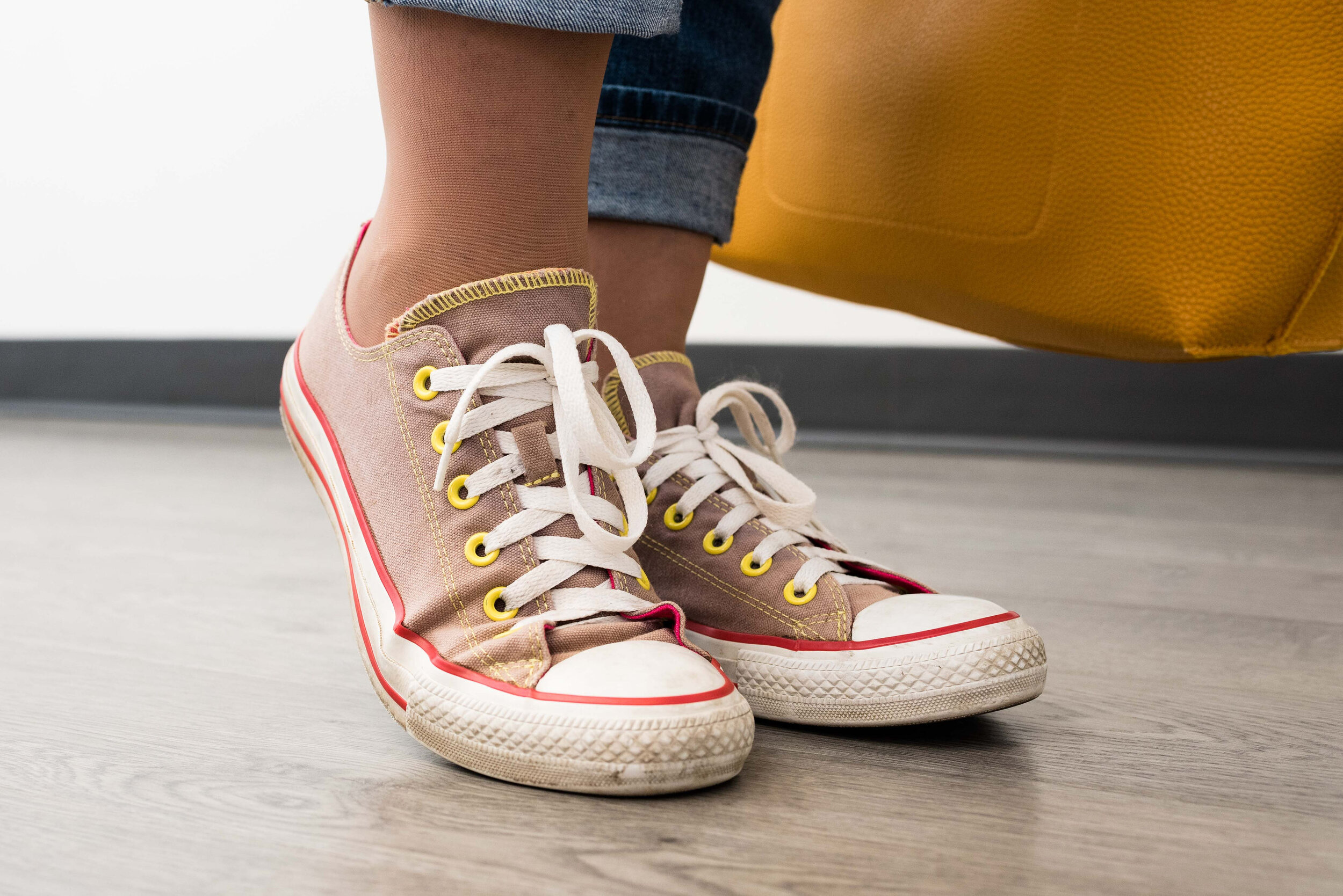
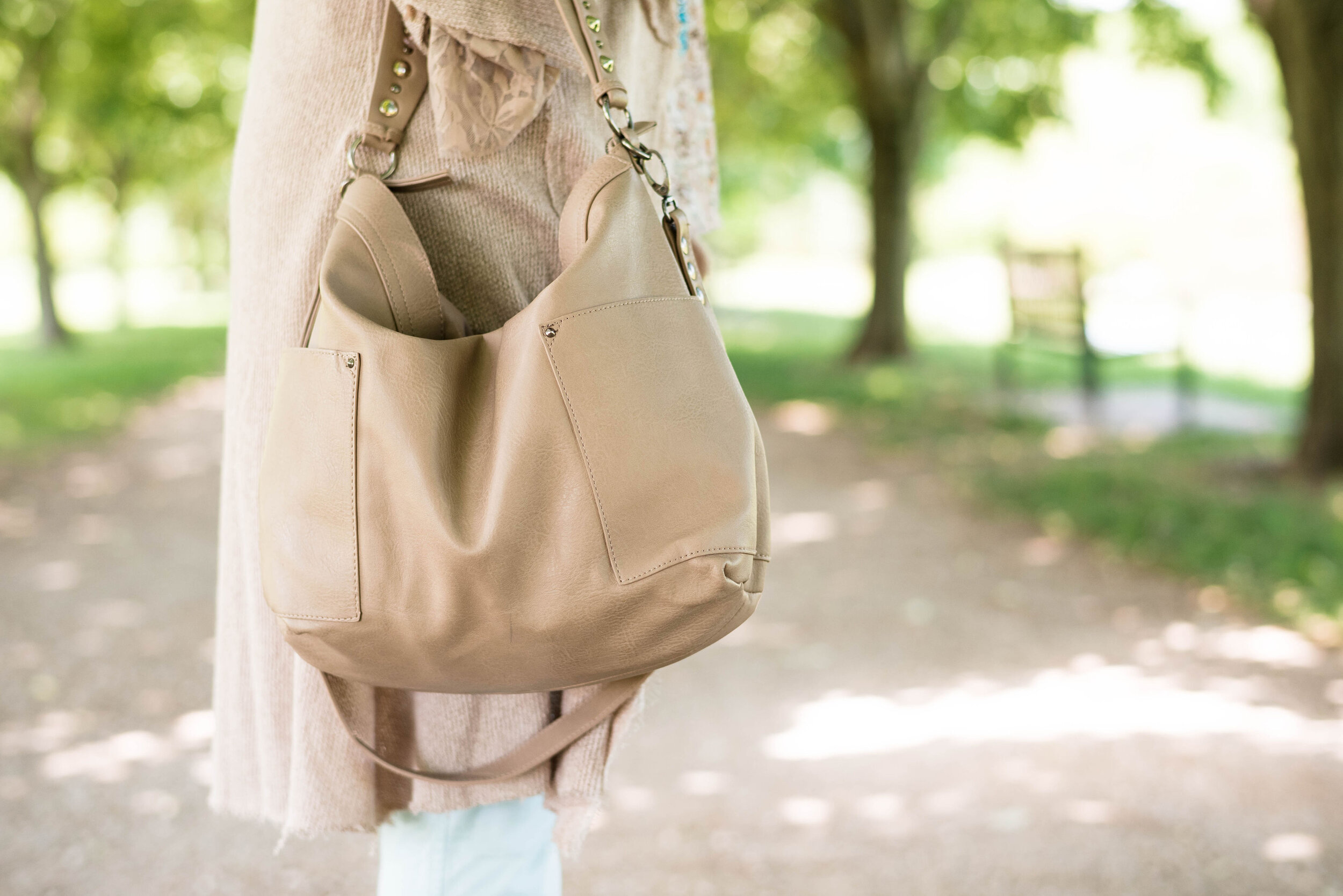
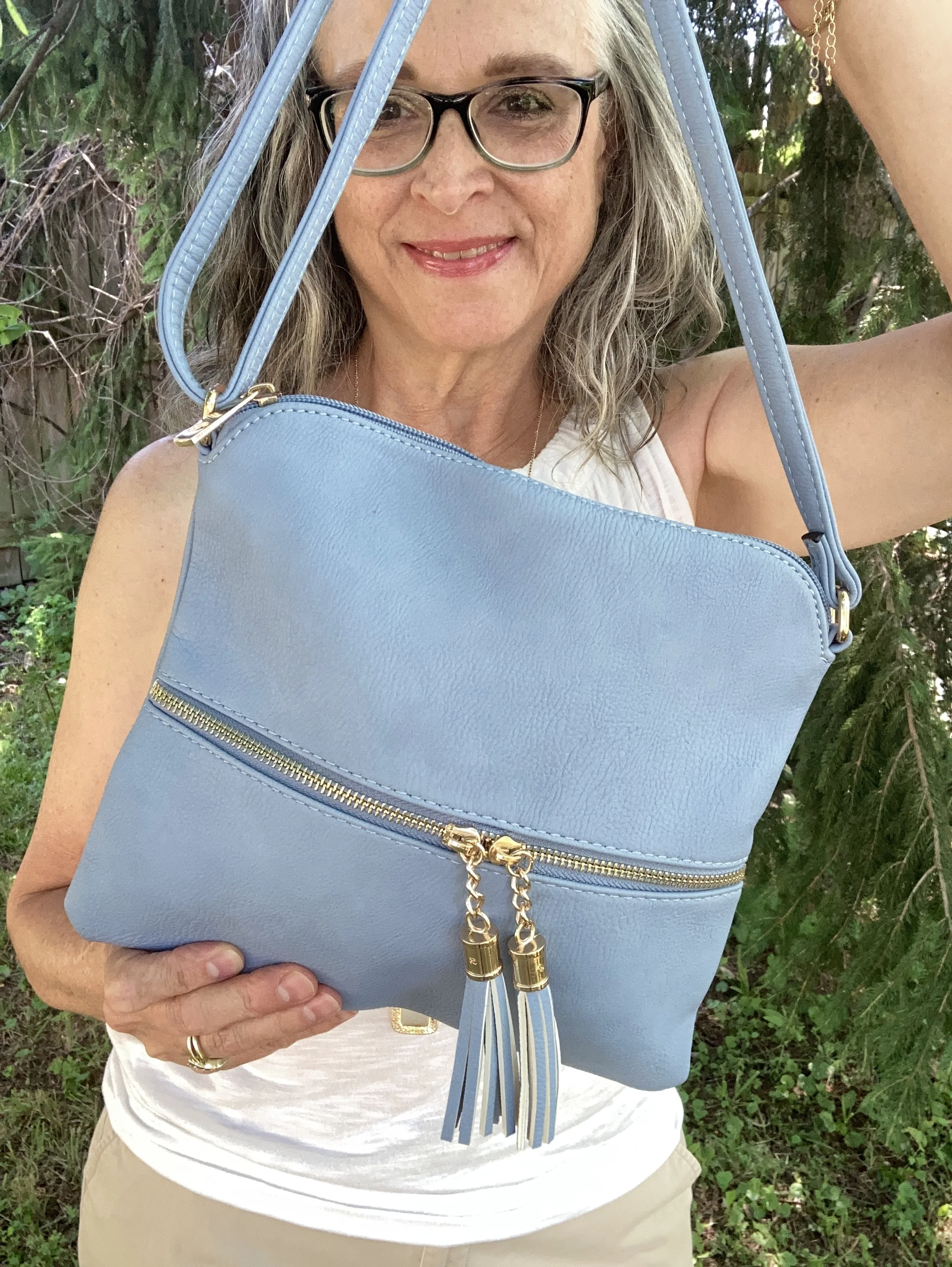
My gladiator sandals are older and Massini brand, and my bag was gift a number of Christmases ago from my younger daughter. I also added my woven hat as you can see in the final pictures below.

What do you think of this outfit? Do you think it is giving off coastal vibes? How would you do it differently? How would you make it your own? I love to have your feedback, so be sure to leave a comment or two below.


I have included shopping links with similar items for you to enjoy. These are affiliate links. If you purchase something through one of my links I get a little commission. I appreciate all your support.
Have a great week!