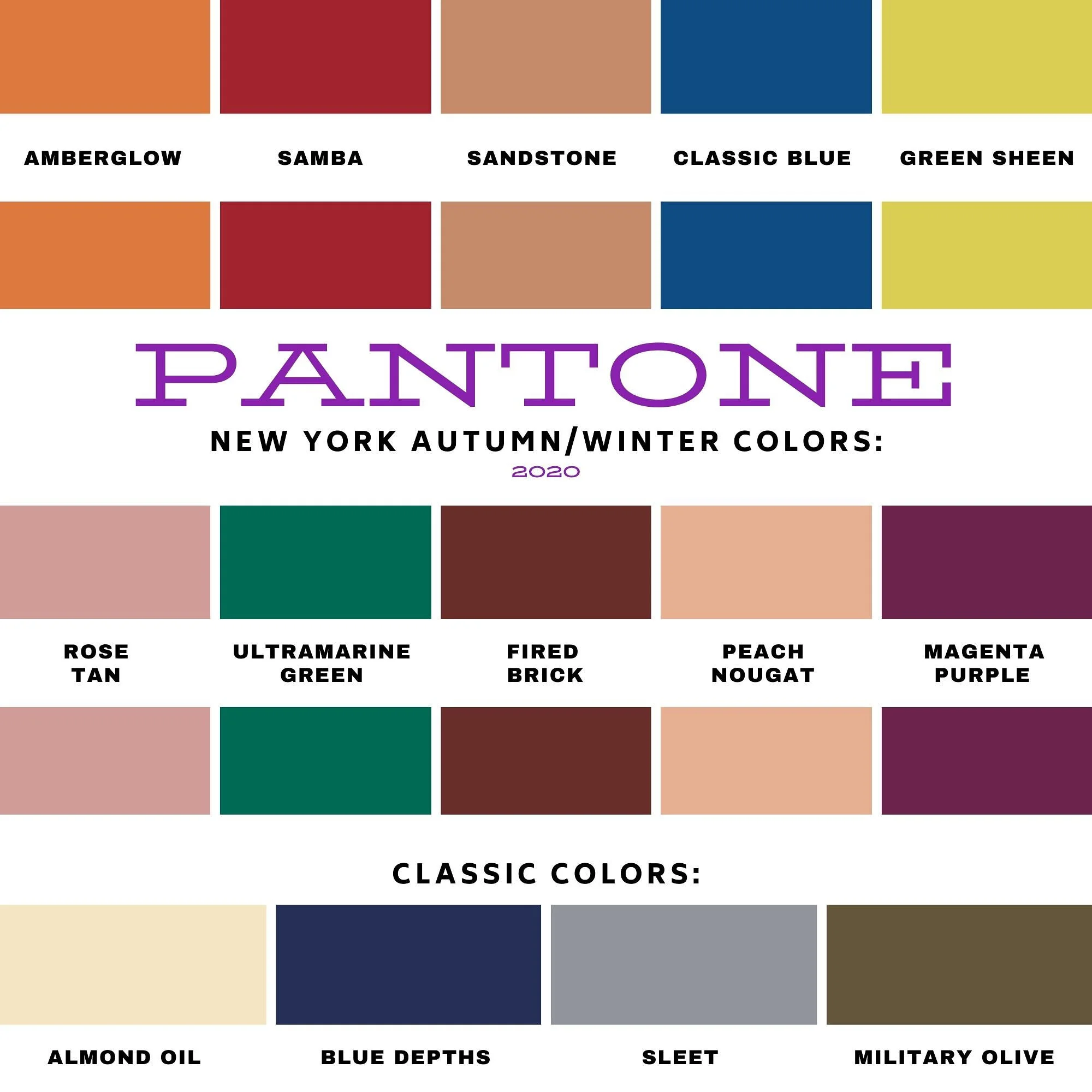
Pantone Autumn/Winter 2025 - New York Palette: Brandied Melon, Hot Chocolate and Bright White
Today I am showing you outfit #5 from my Pantone Autumn/Winter New York Palette series. This is the last trio of colors from this fall palette, and hopefully next week I’ll start the London color palette. You can see the original colors in this Pinterest pin.
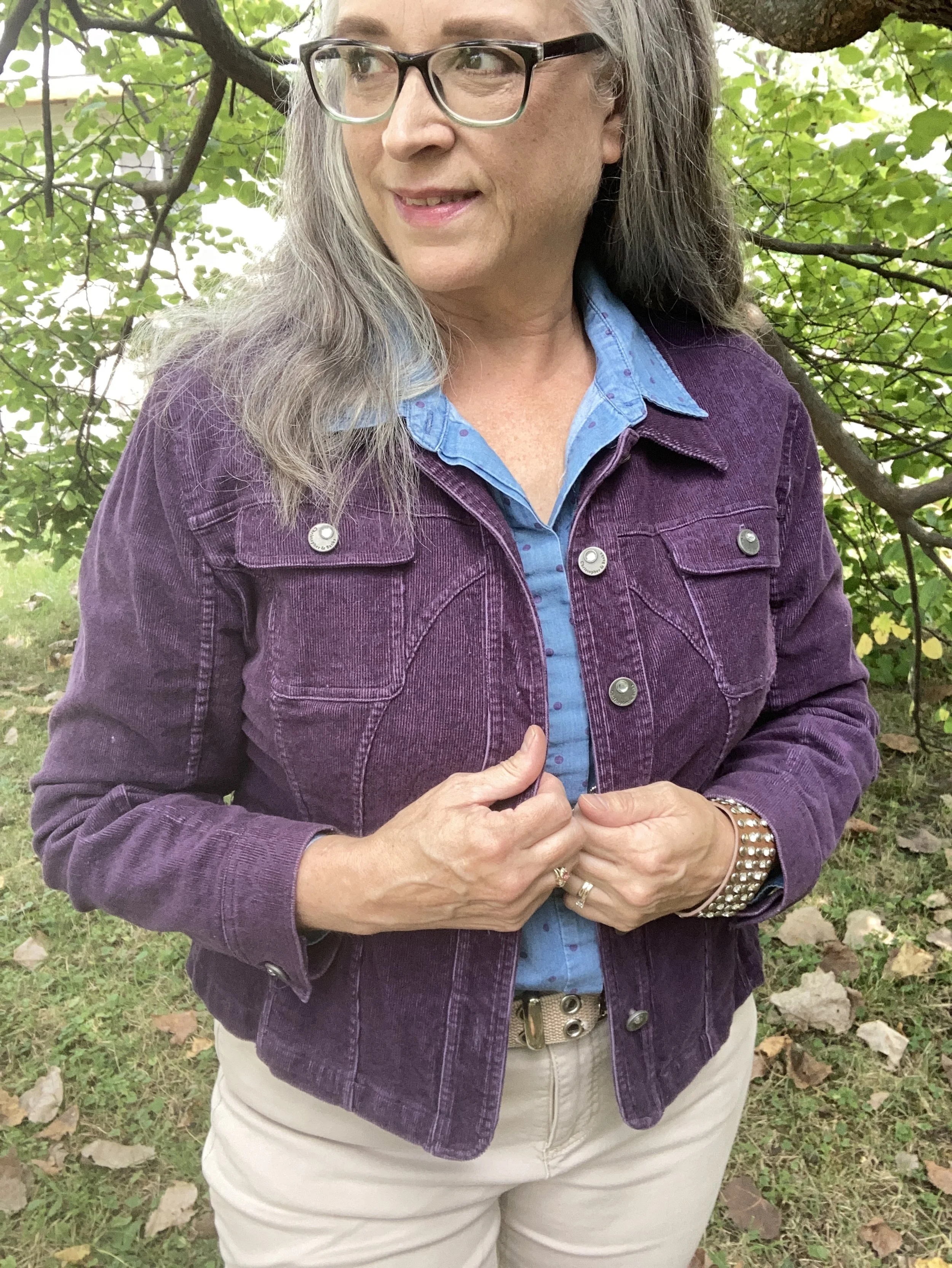
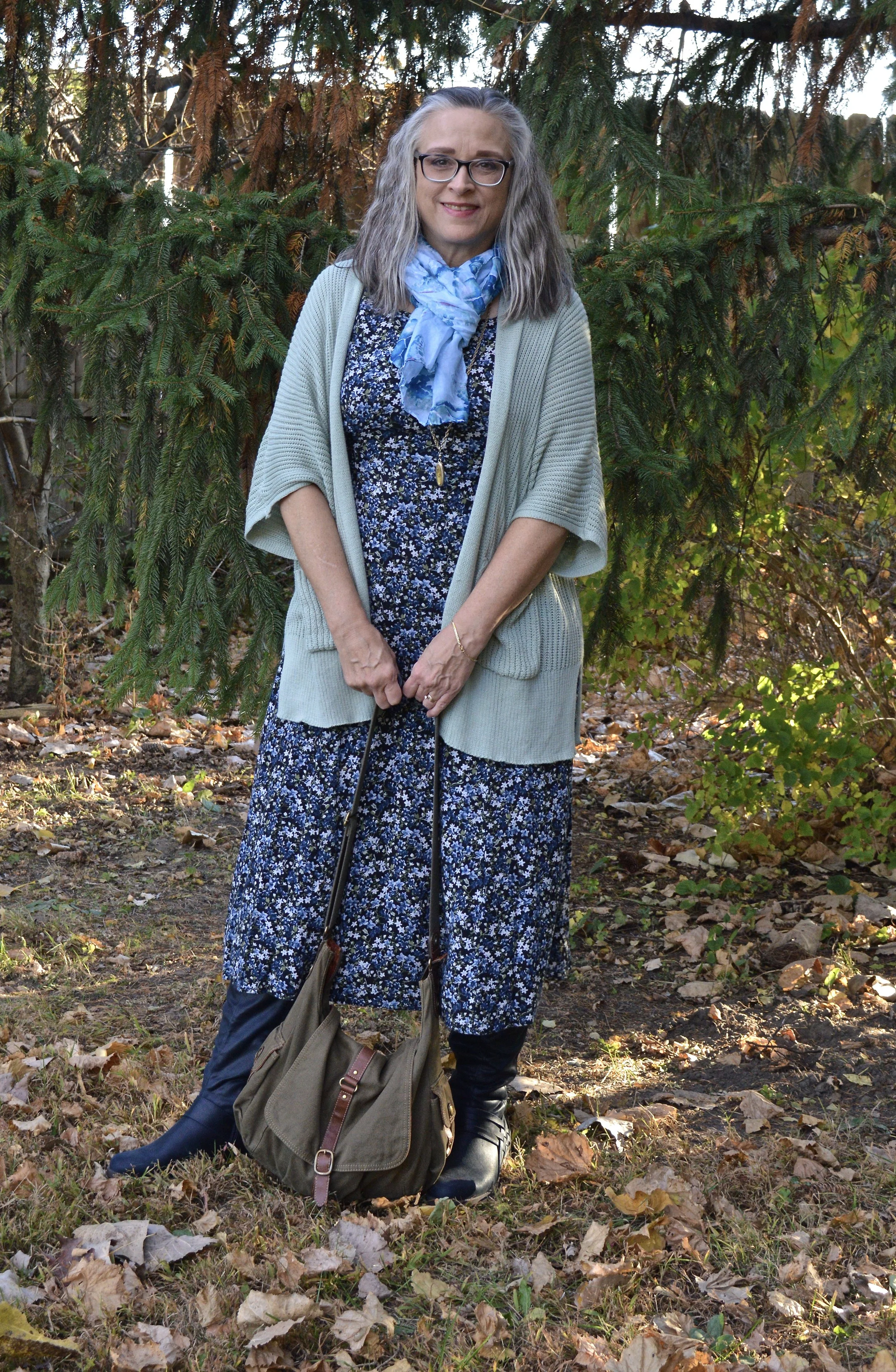
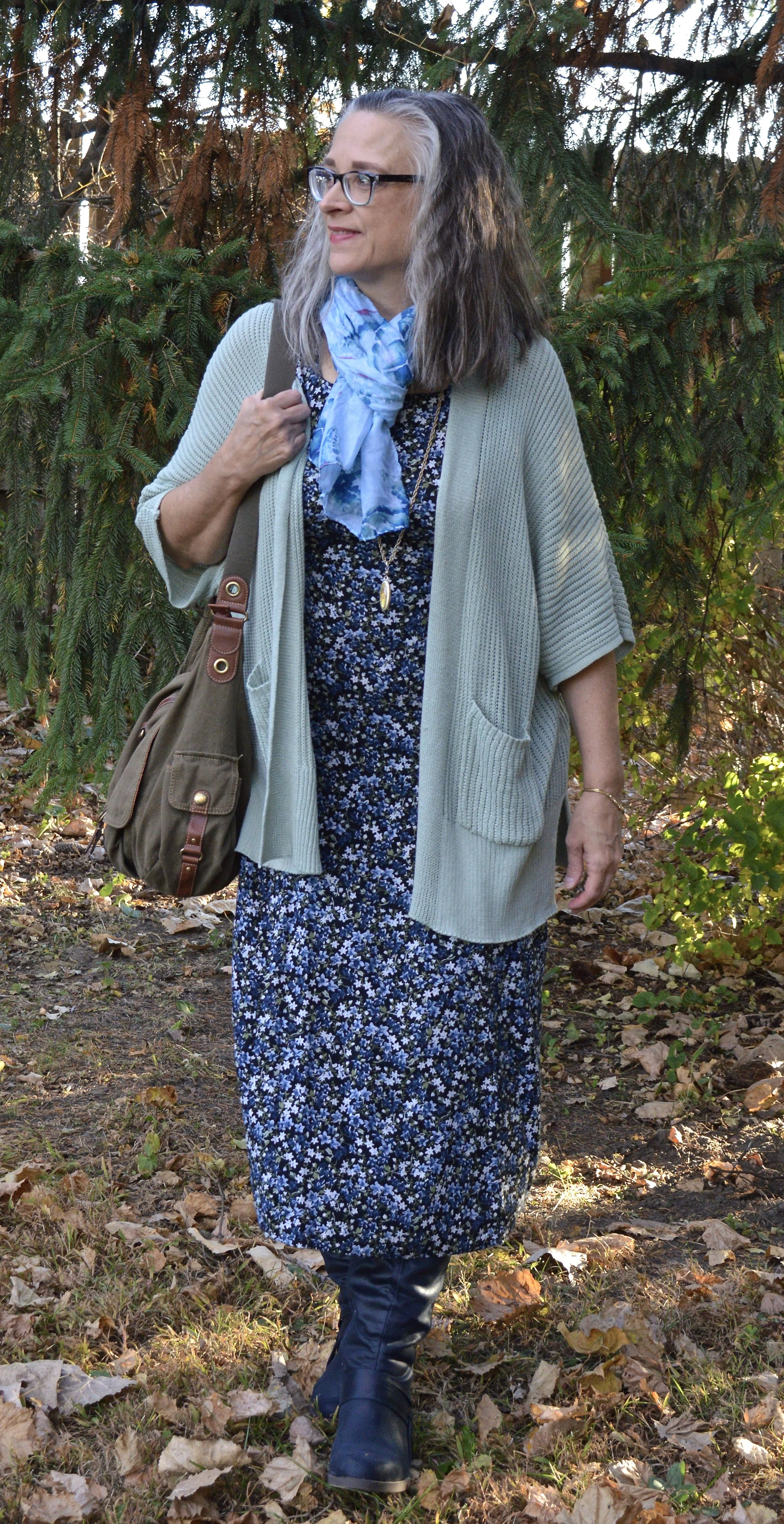
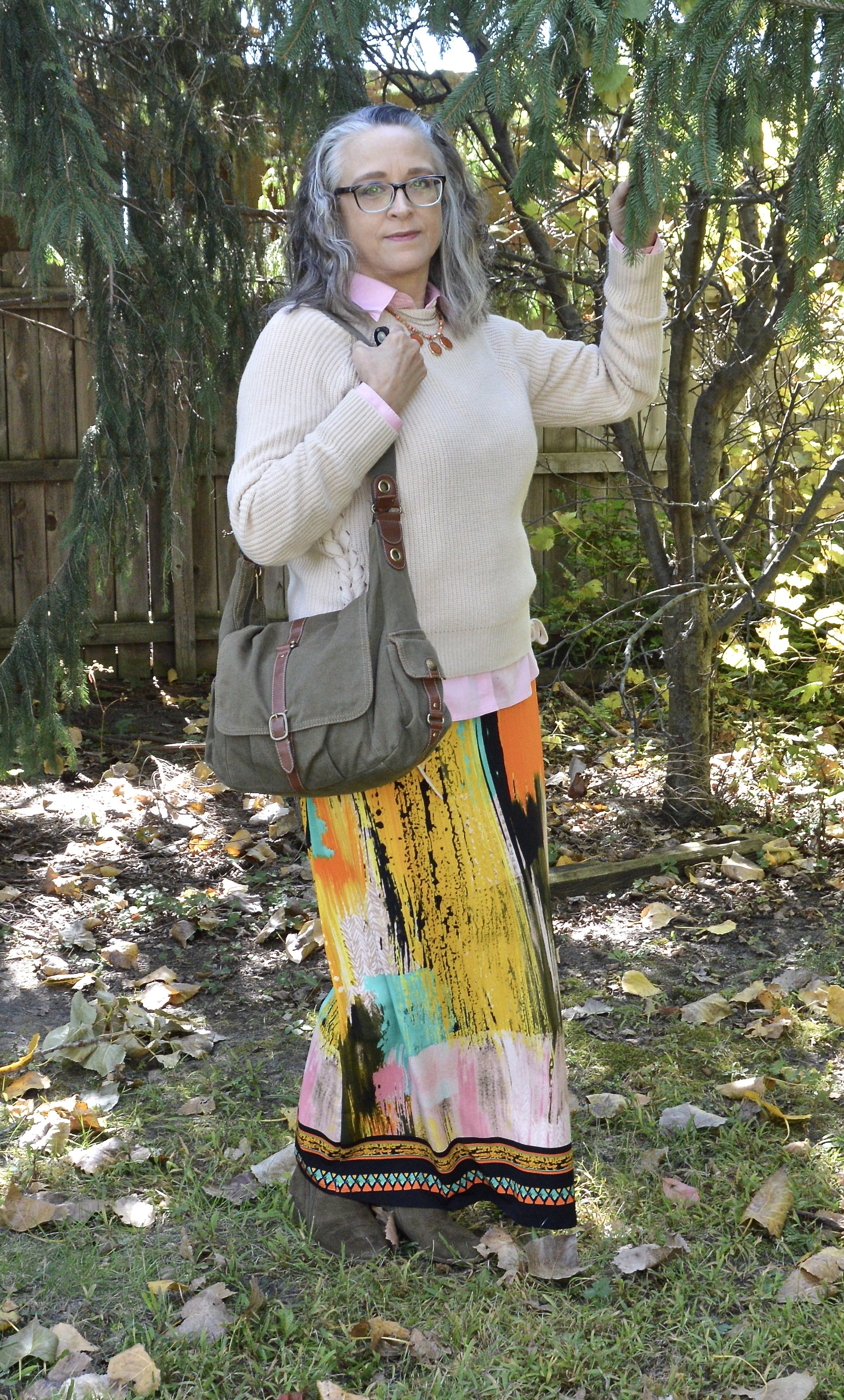
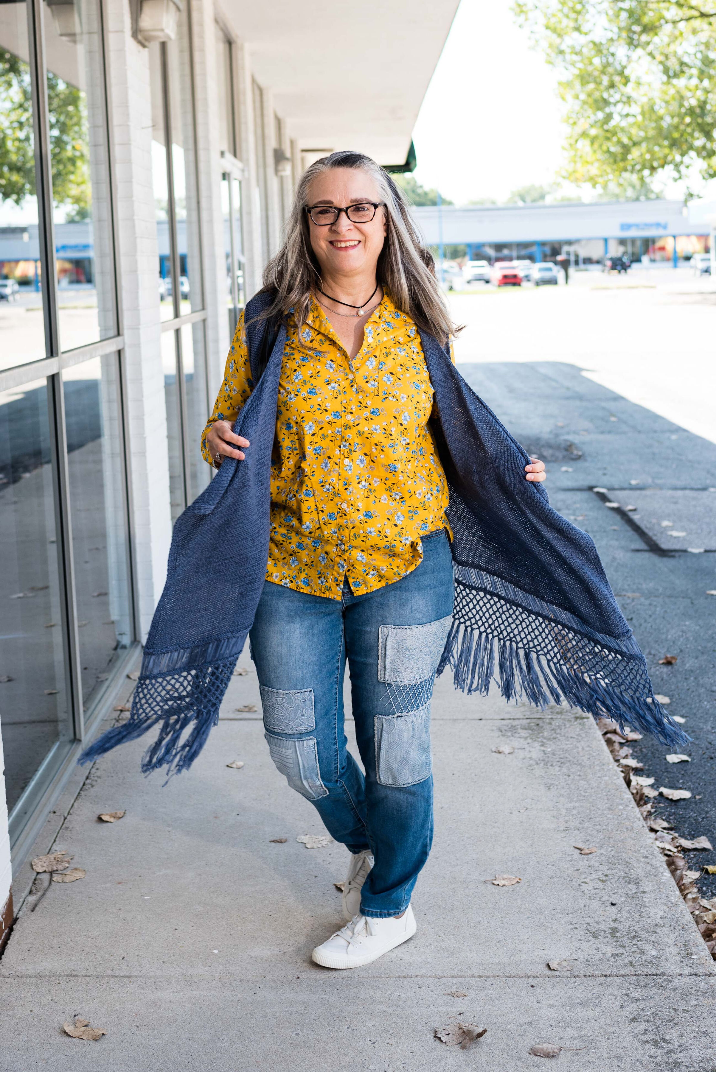
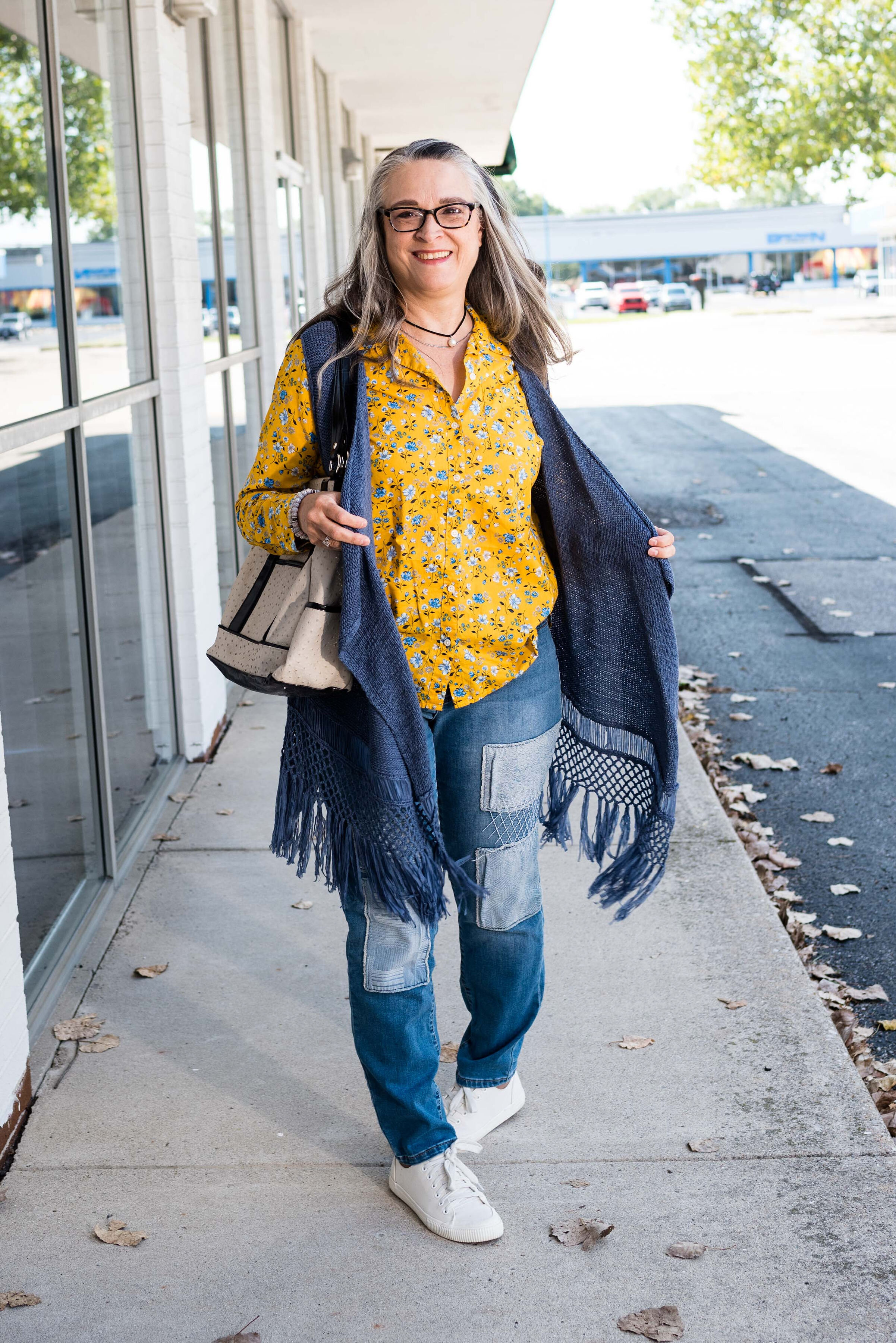
Today’s outfit revolves around a mellow orange named Brandied Melon, a soothing brown reminiscent of Hot Chocolate, and Bright White, mimicking the gorgeous clouds we see meandering through the late summer sky.
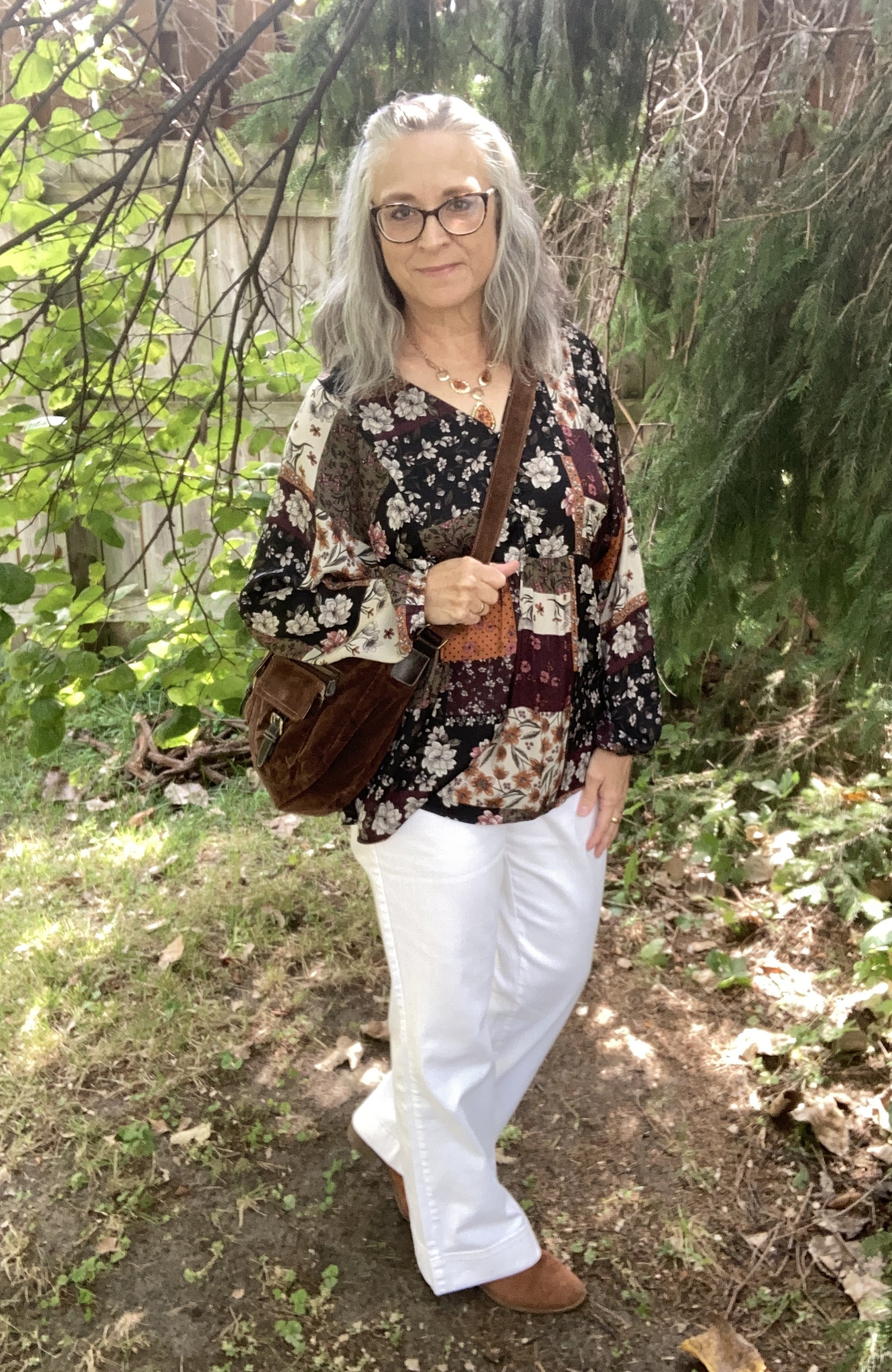
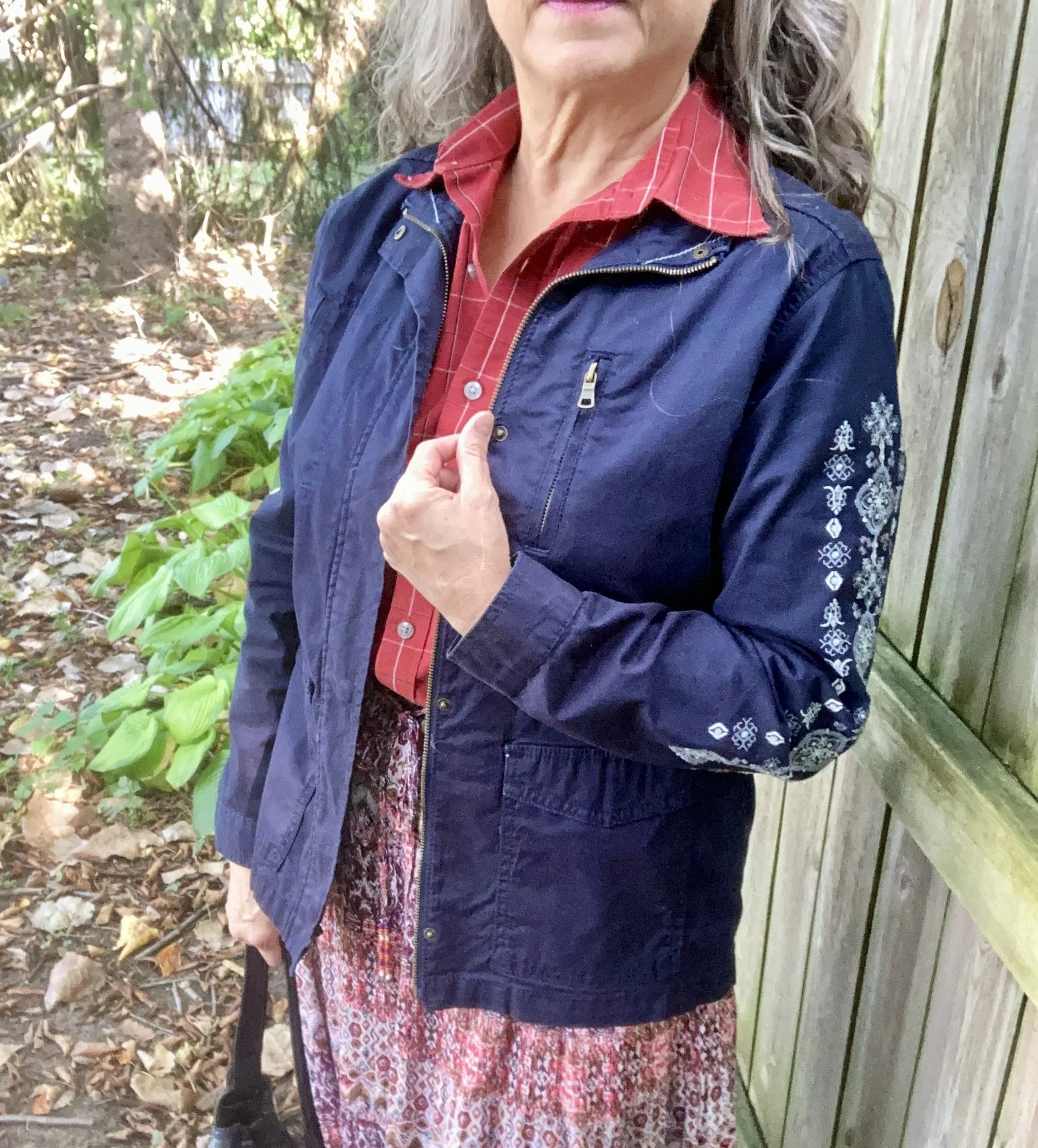
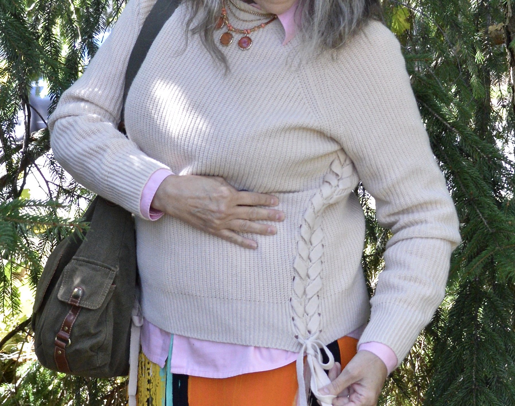
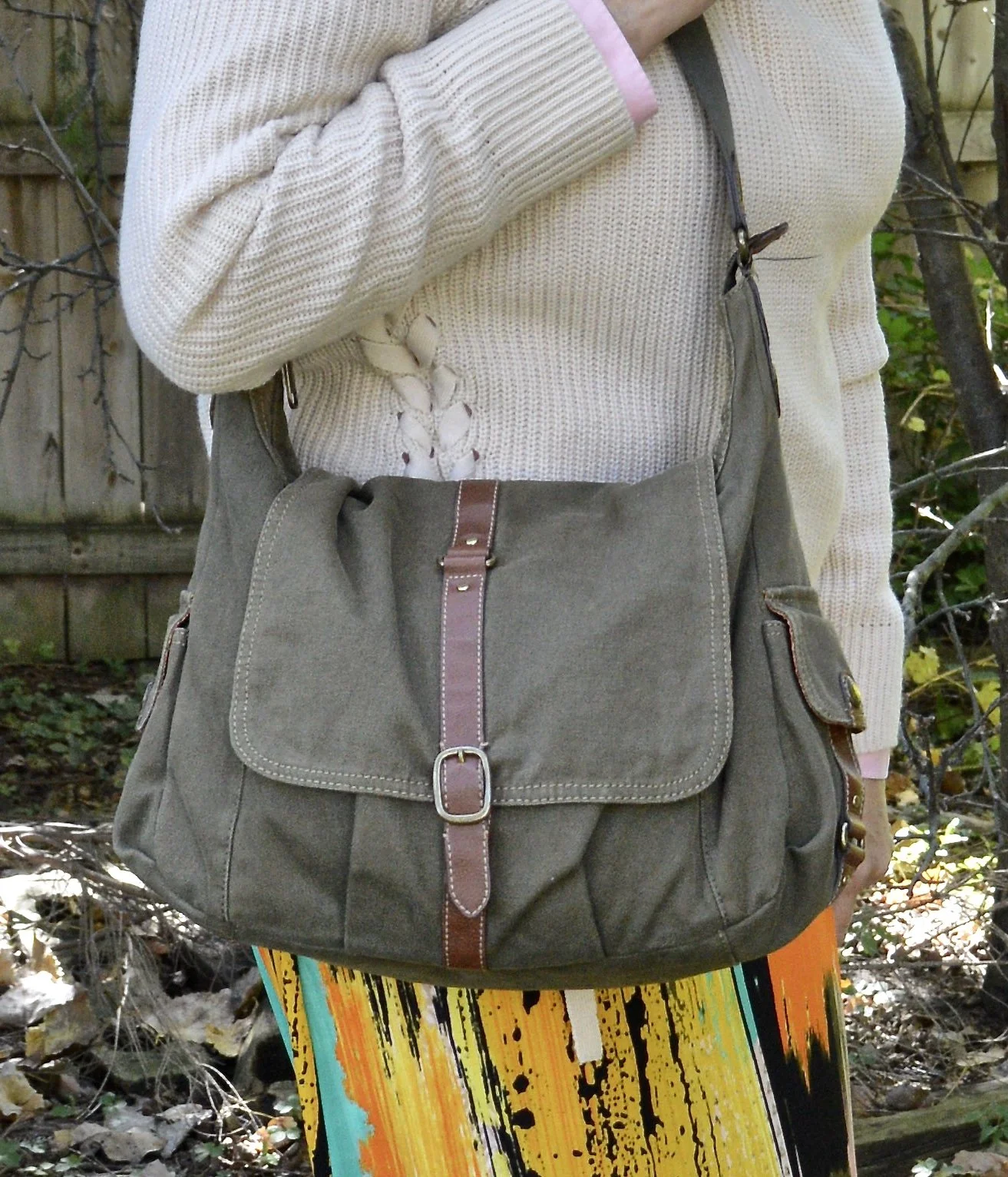
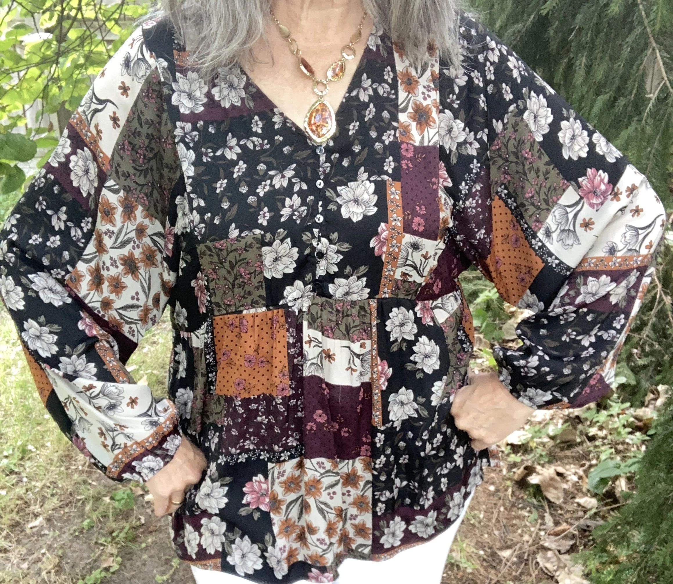
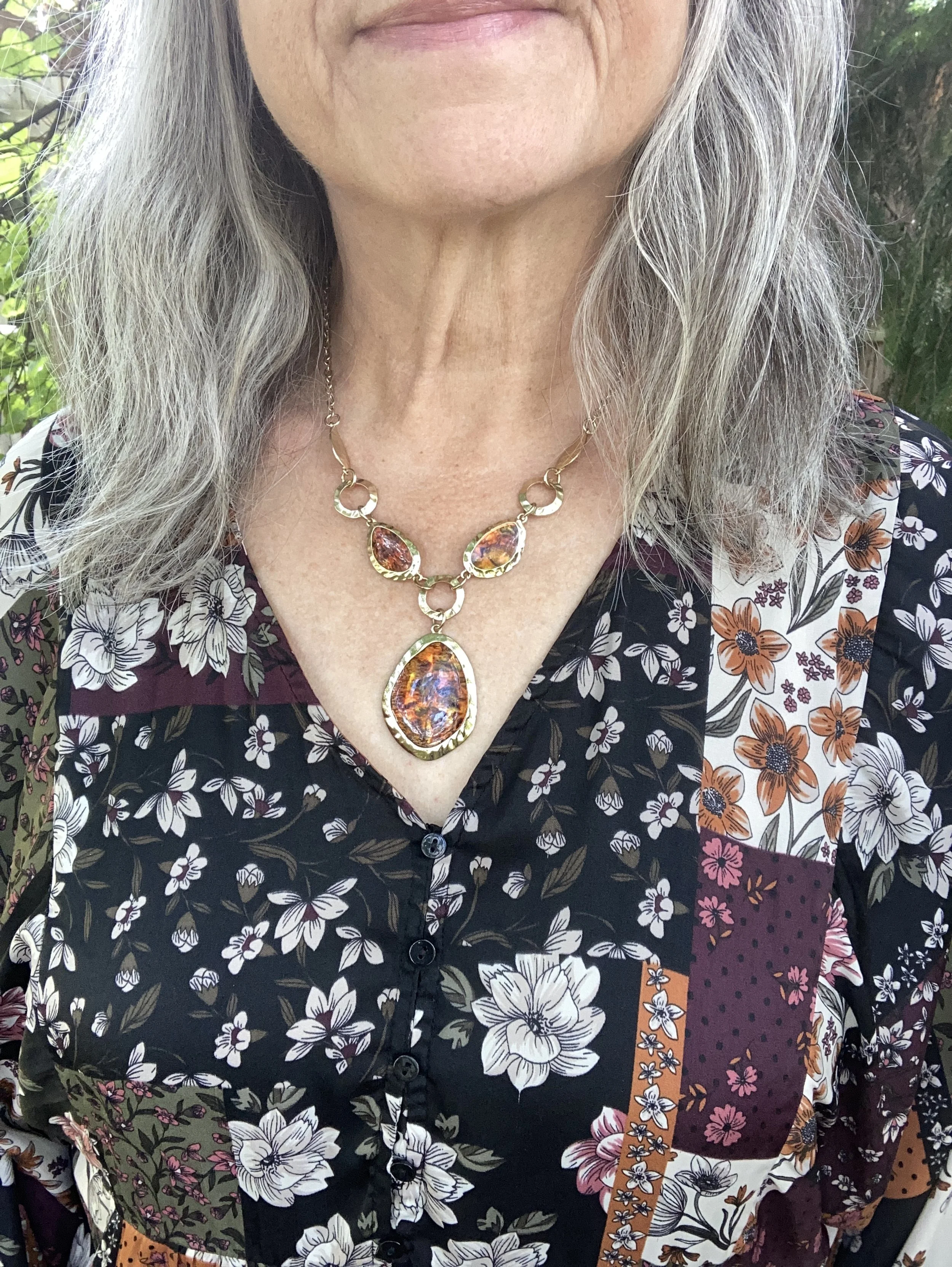
I chose this unique, thrifted patchwork top for the pops of Brandied Melon. I love the boho vibe and the variety of colors and print. I looked up this brand, Style & Co, and found that Macy’s was the original retailer. I always find it interesting that I will find a certain brand and then find more pieces of that brand as I thrift. I must be drawn to them for a reason.
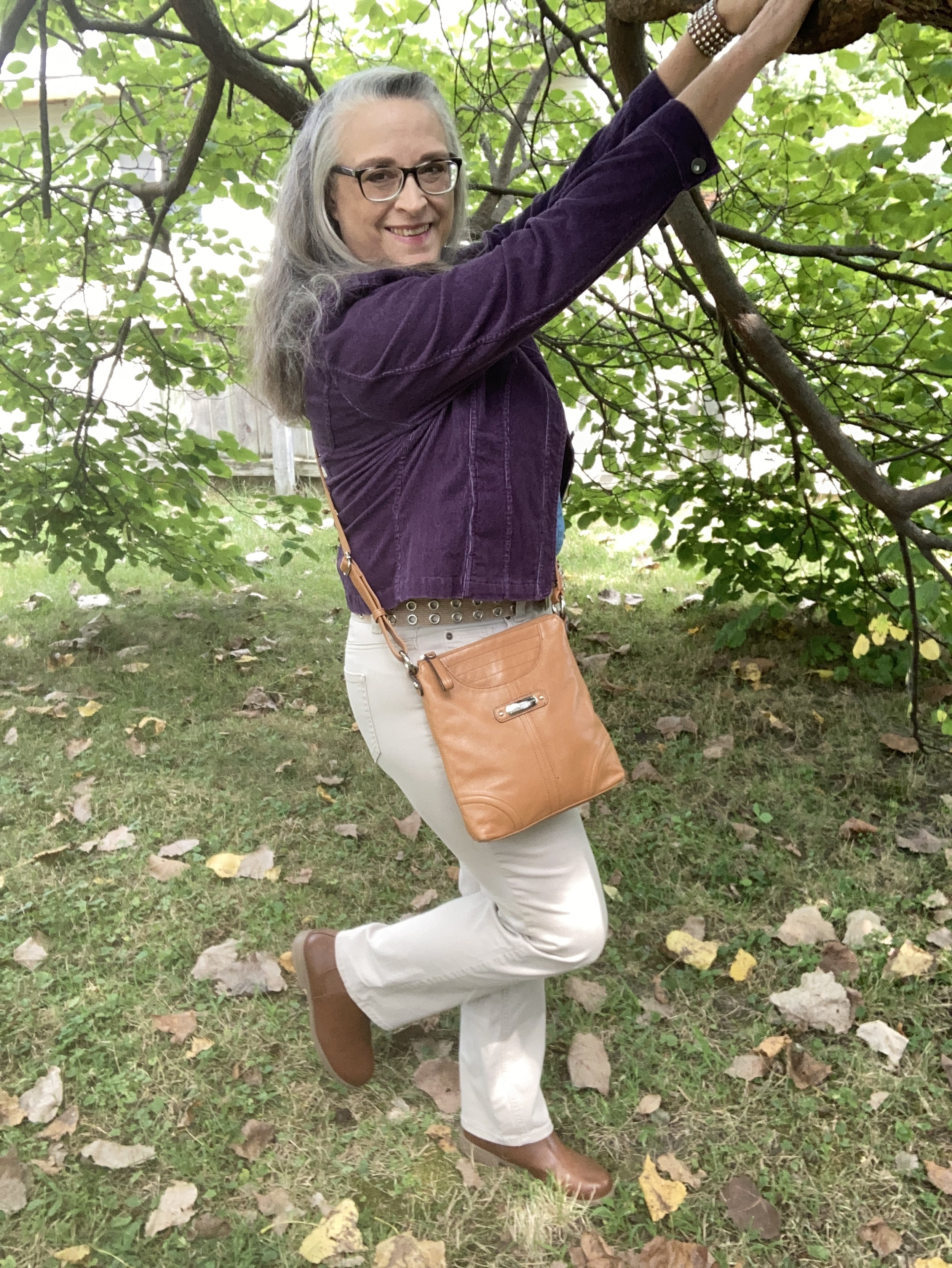
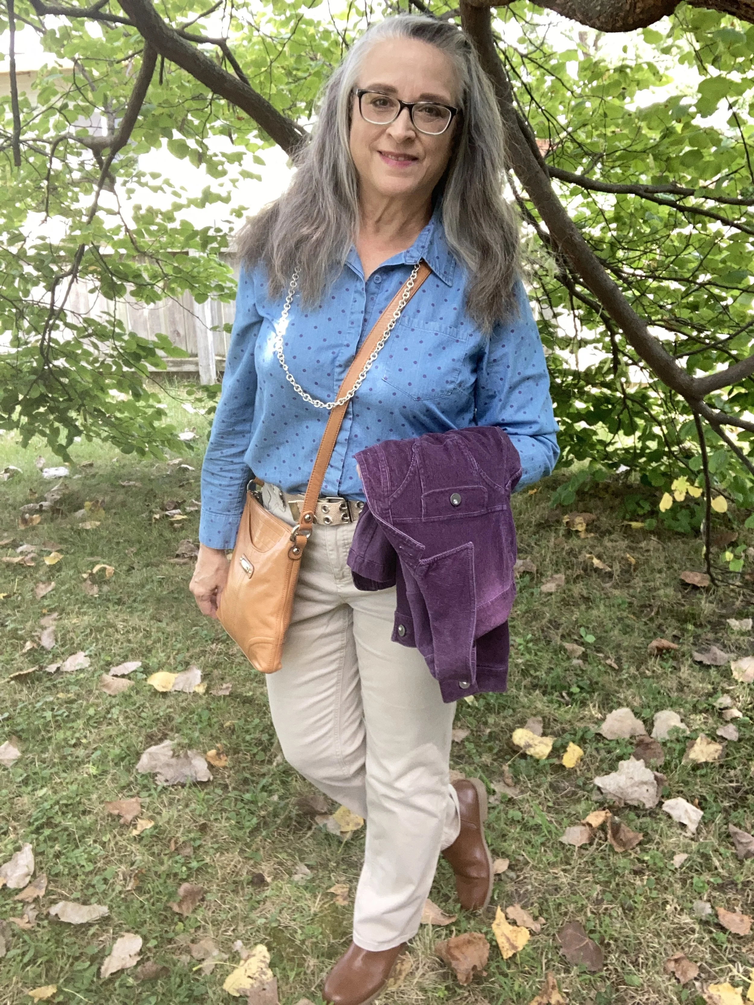
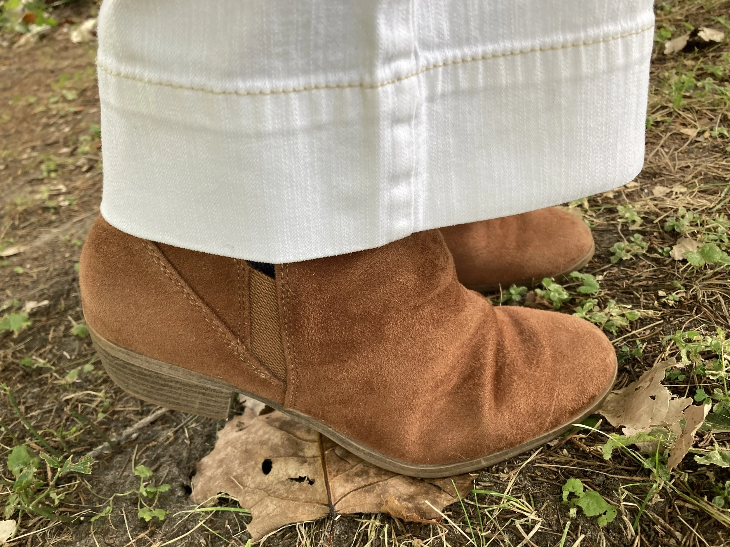
My Bright White Gloria Vanderbilt jeans have been around for years. I purchased them new at JC Penney, and use them whenever I need a pair of crisp, white pants that are both casual and dressy. I have a hard time photographing white, or any lighter colors outside. Oh well, not worries. You get the idea. You can see these jeans styled with a yellow sweater, a floral kimono, a velvet jacket, a fall jacket, with a white top and sweater, a black vest, and a multi print top. There are more, but you get the idea. White pants are not restricted by any season and go with every color.

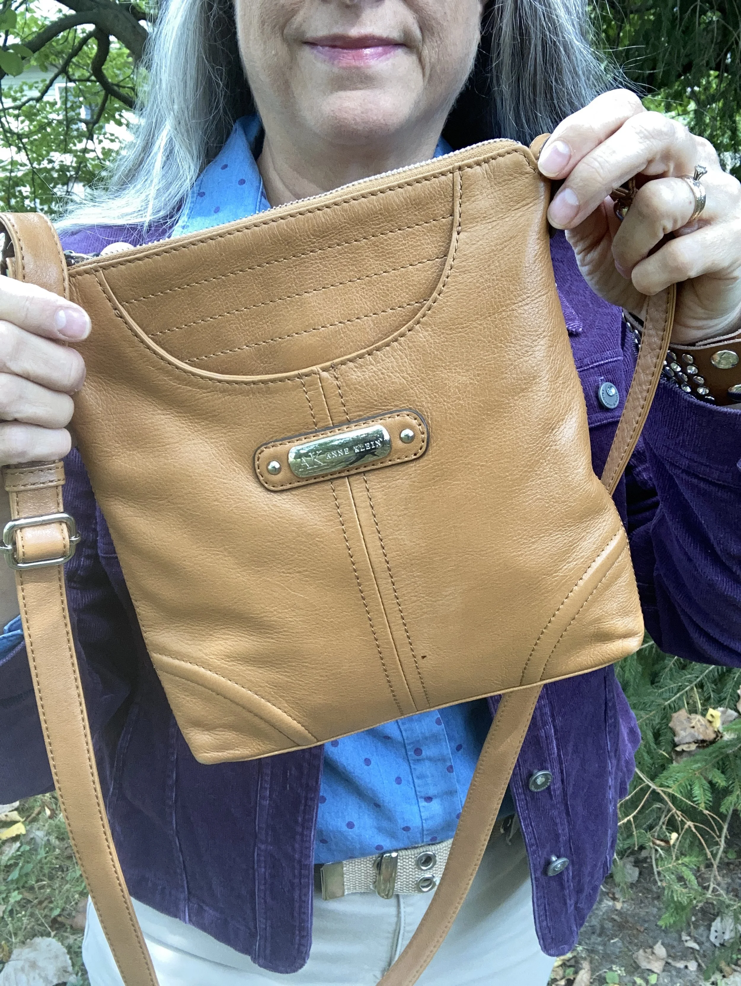
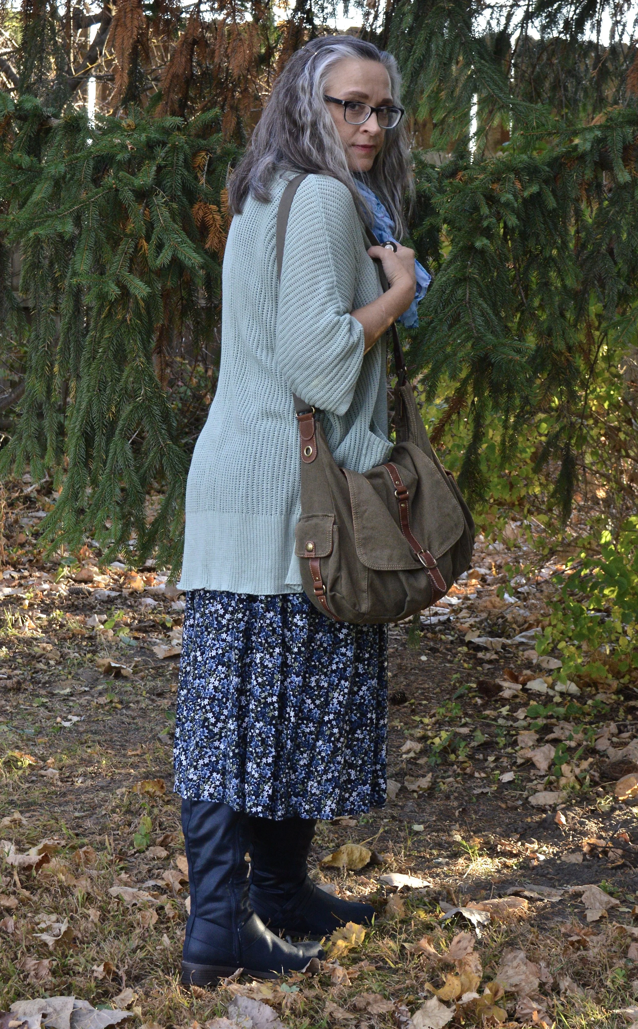
Since the top didn’t contain any browns, I added my thrifted Hot Chocolate corduroy bag. I love this roomy, casual bag, and the strap is long enough I can use it like a cross body bag.
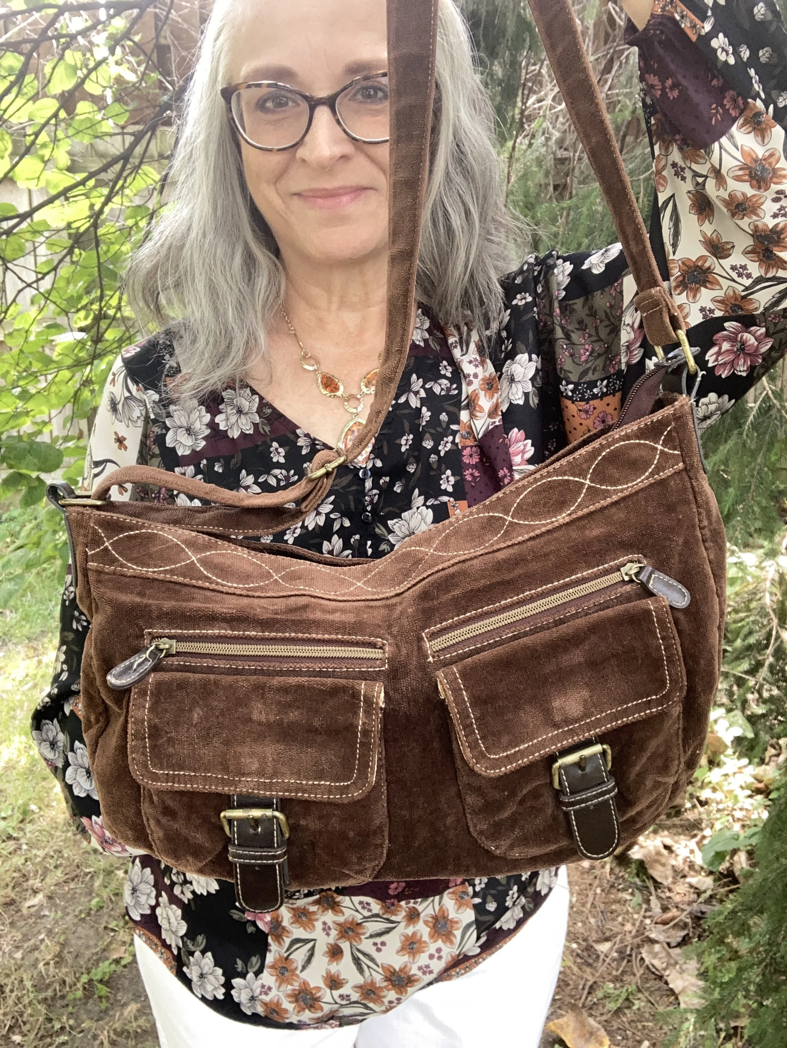
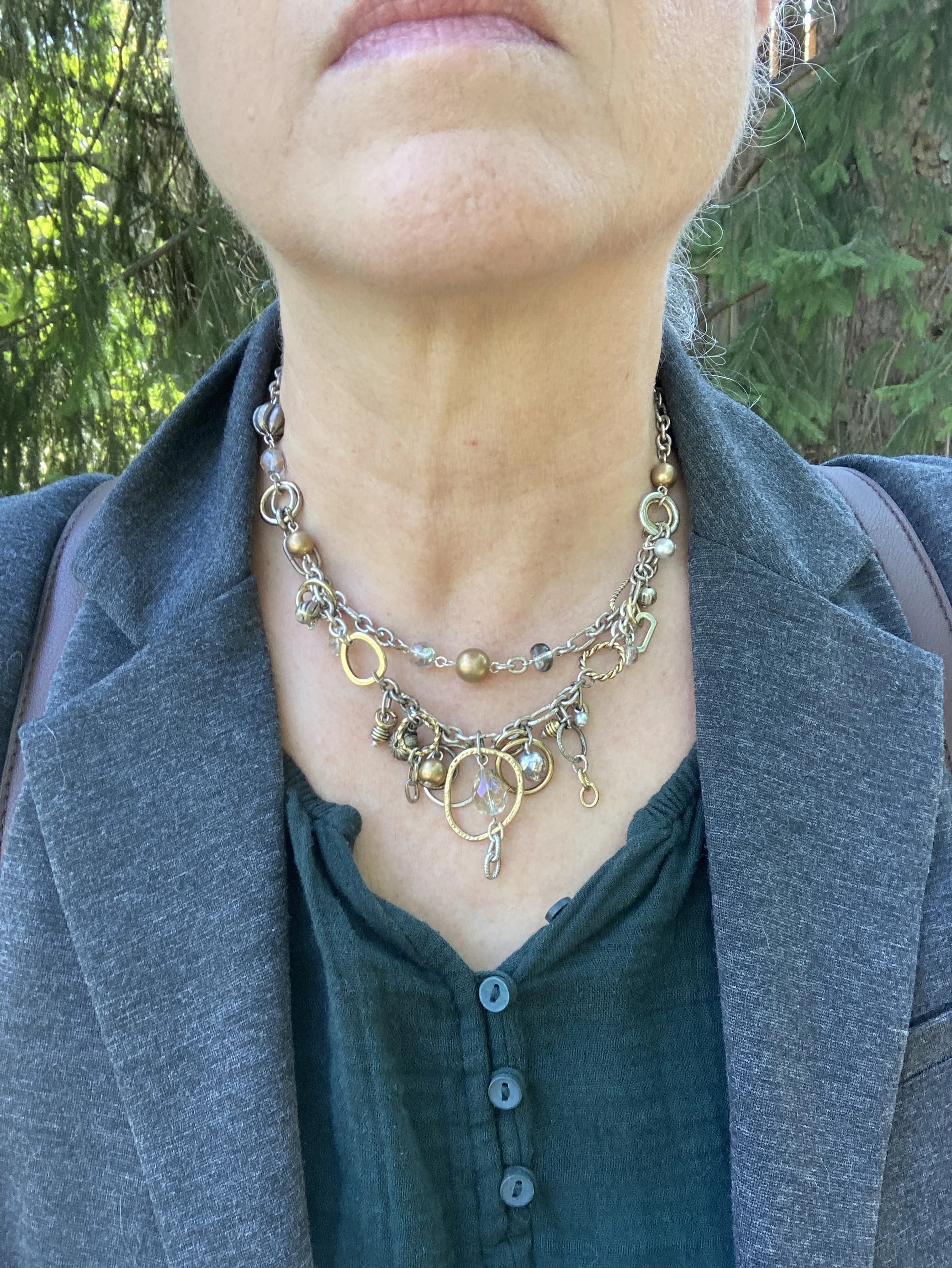
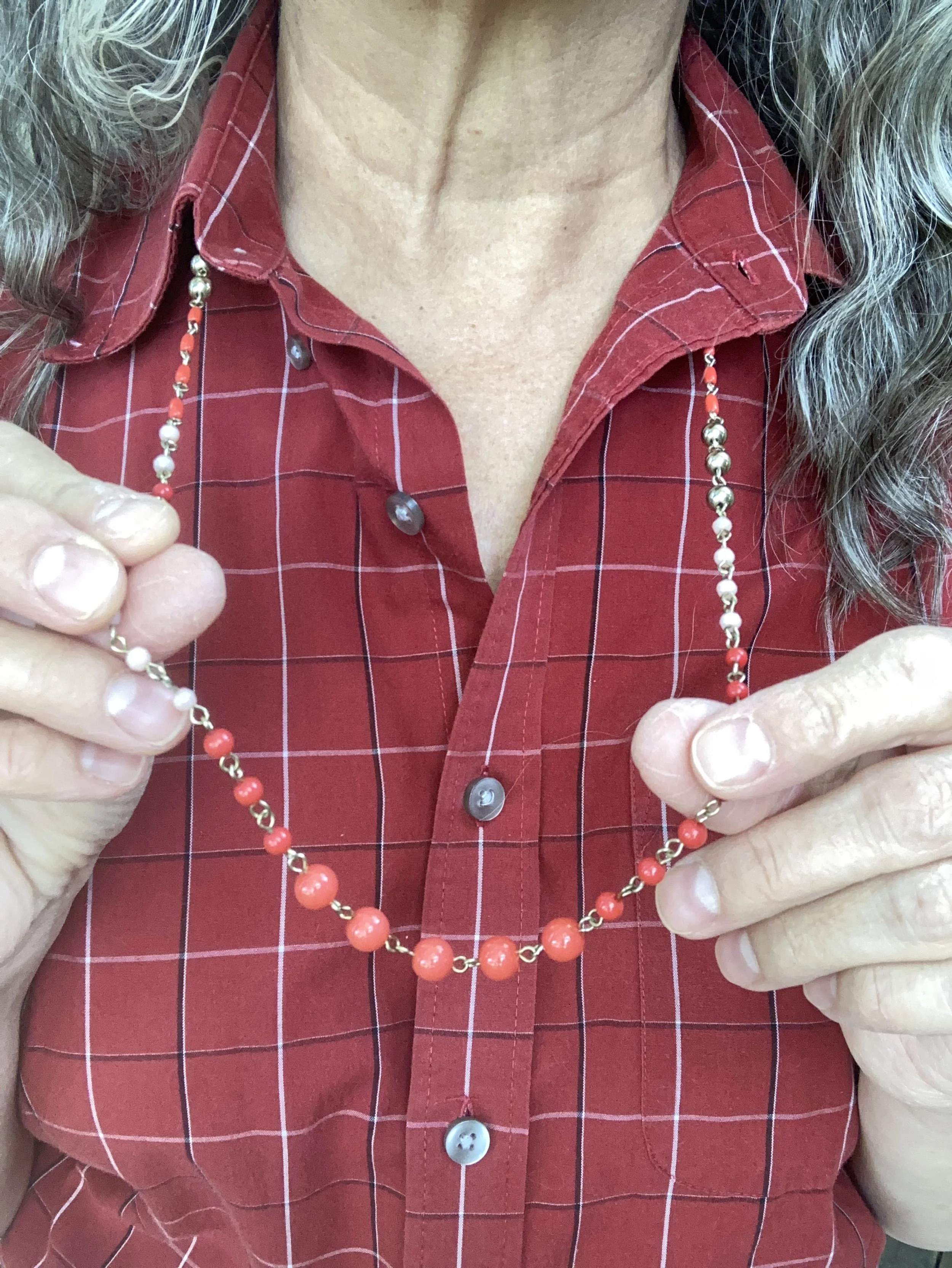
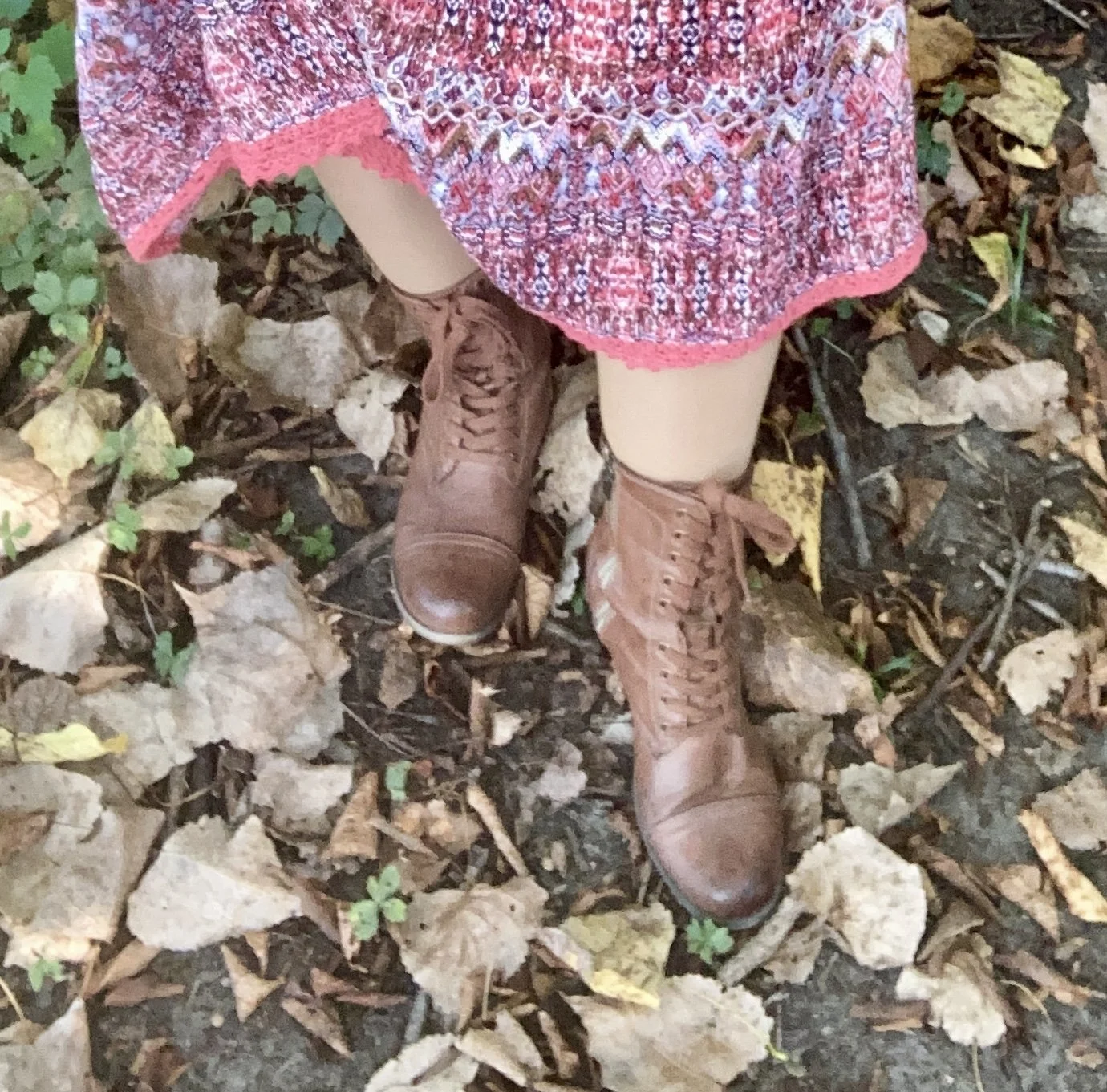
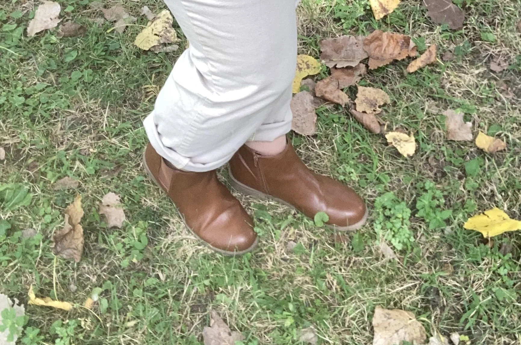
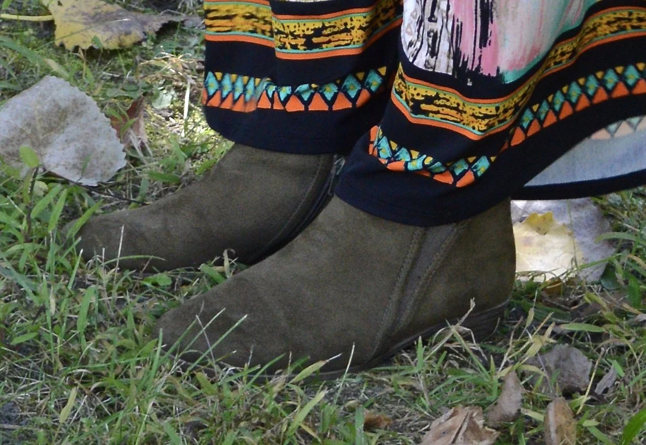
I kept my accessories simple. My faux suede, SO ankle boots were from Kohl’s a number of years ago. My necklace was from a few years ago.
If the weather was cooler, I could easily add a longer cardigan for another layer by picking another color in the top. It would look great with olive, black, white, and even the Mauve Wine (see my first outfit in this series, here.)

What do you think of these colors? Do you wear white all year round, or just in the warmer months? Please leave me your thoughts in the comments or leave a comment on FB. I love to hear your ideas.
I included a few shopping links under each item. These are affiliate links. All opinions are my own. I hope yo are having a great middle of September!