Outfit Inspiration - What Child is This?

I had good intentions of getting these last two posts done a few days ago, but it didn’t happen, so you will get these Christmas song inspired outfits after the fact of Christmas. I typed that and I am still having a hard time believing Christmas is over for another year. That always leaves me feeling a little sad, but that gives me a good excuse to extend the holiday for a little longer.

When I looked up the history of this song I was surprised to learn that the tune Greensleeves, to which the lyrics of What Child is This was set, was originally composed as a broadside ballad and registered with the London Stationer’s Company in 1580 by a man named Richard Jones. There are contrary ideas on the original lyrics of the ballad. One idea was that Lady Greensleeves was a prostitute or a promiscuous young lady. The idea of a lady’s clothing being green had to do with grass stains on her dress from rolling around on the grass having sex. Another idea was that a woman had green sleeves on her outfit and was mistakenly taken for a hussy, to which she snubs the advances of the one trying to take advantage of her position. Either way, I am surprised the tune, then became the basis for What Child is This.

In 1865, William Chatterton Dix, a manager for an insurance company, came down with a life threatening illness. During that time, he had a spiritual awakening and wrote a poem The Manger Throne. The poem, became the basis for What Child is This. The poem centered around the adoration of the shepherds when they came to the manger and baby Jesus. It is not clear at what point the poem was set to the tune Greensleeves, nor by whom, but in 1871 it was included in a collection of carols published in the United Kingdom.

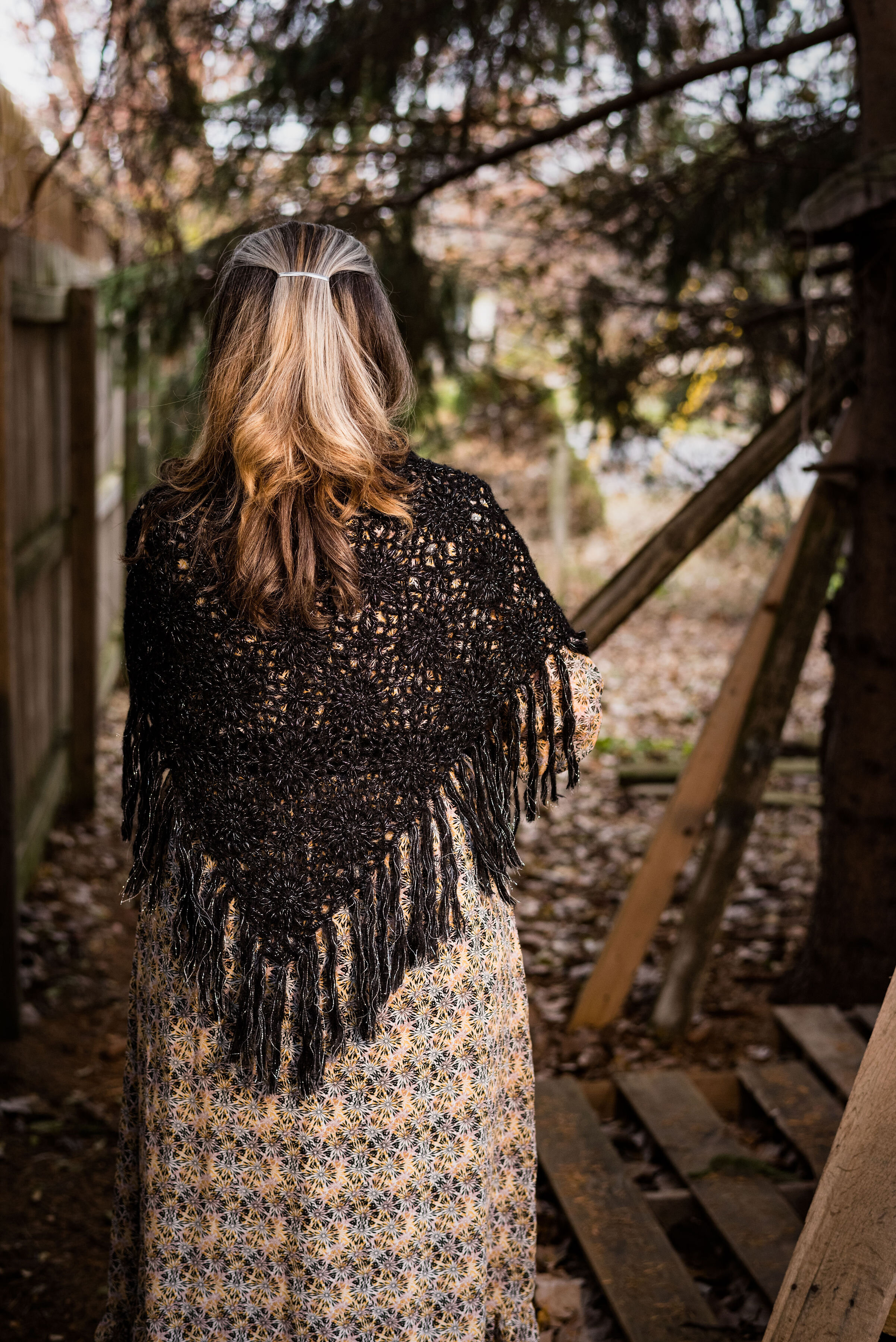
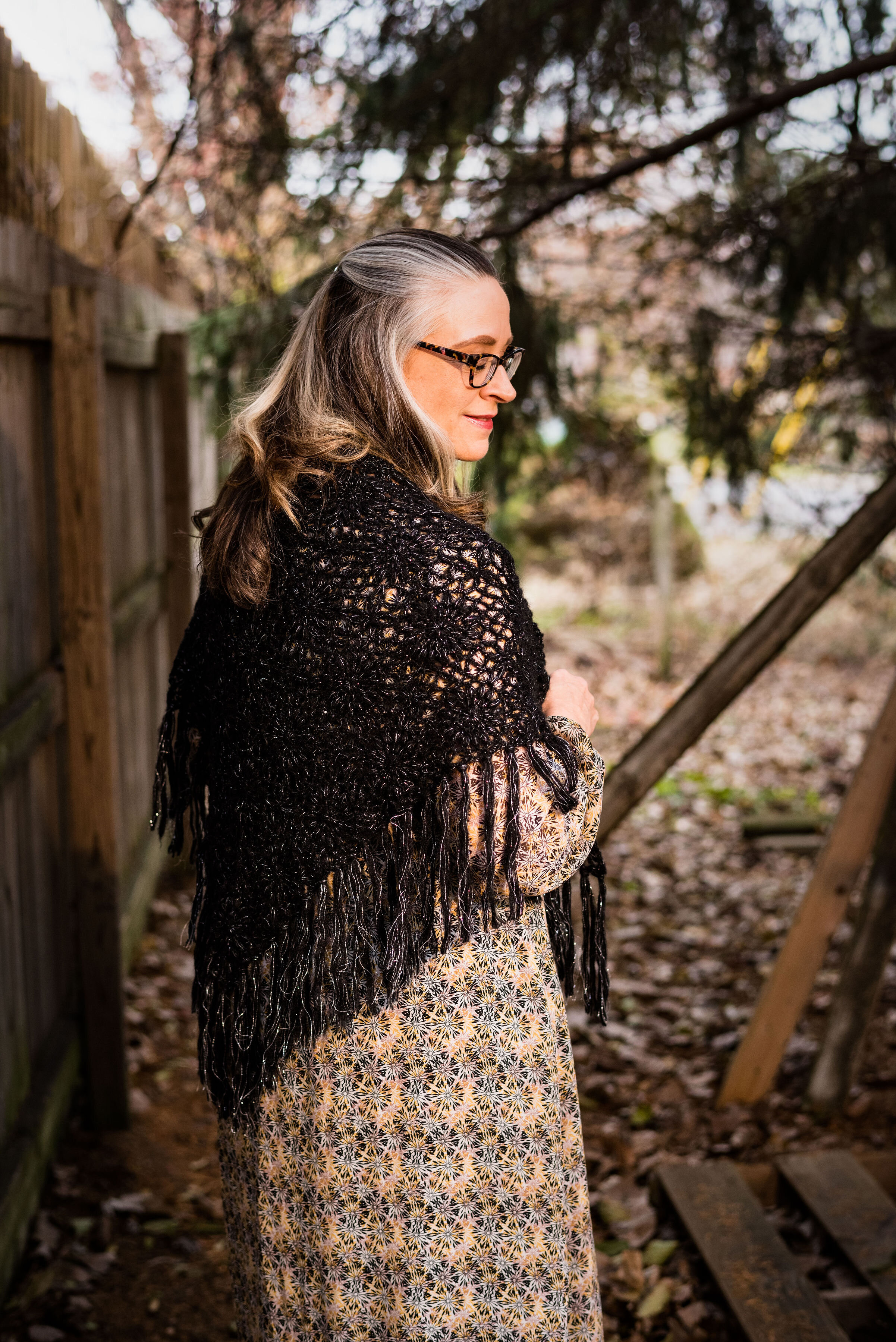
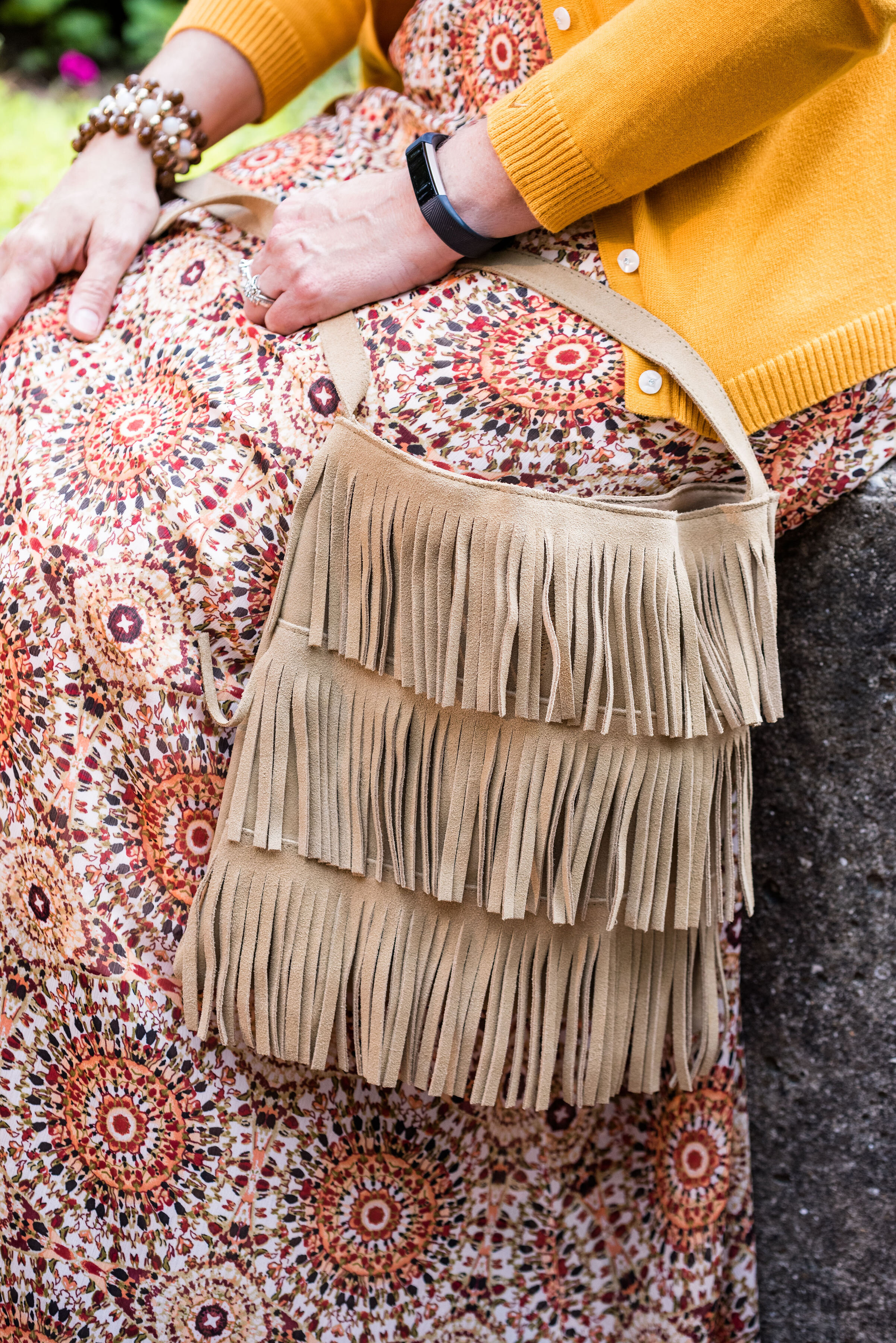
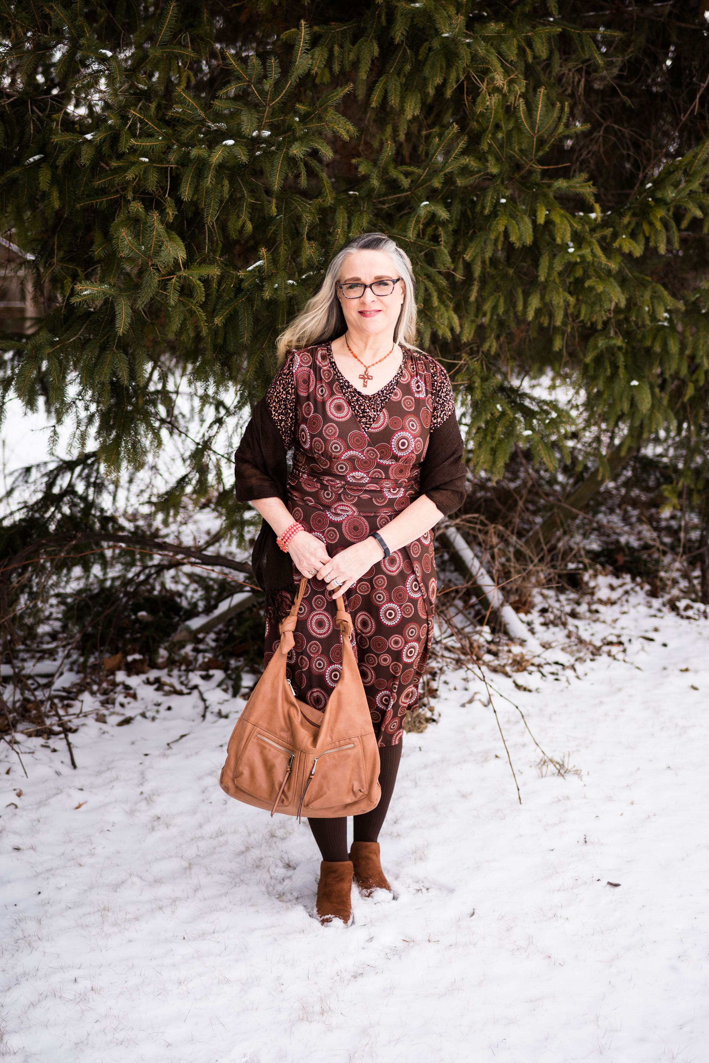
To me this song evokes a sense of simplicity and purity. Seen through the eyes of shepherds, the words create an image of the stark simple animal stable and the roughly crafted manger in which the baby Jesus lay. With this idea in mind I chose a simple prairie maxi dress that I found at a thrift store.

When I saw this dress, I immediately grabbed it, lest anyone else notice it and throw it in their cart. When you are thrifting, you have to grab a piece when you see it, otherwise it might be gone. You can always put it back before you check out if you decide to not buy it.

I love the floral pattern and the flounce at the bottom. The waist is gathered with elastic, but I decided to add a belt to add definition and texture. The cuffs on the sleeves are elastic as well. The dress is so simple. There are no buttons, ties or zippers. I just throw it on and go. It is also fully lined, so no worrying over a slip or cami.

You can just make out the elastic waist. It is almost an empire waist, but falls further below the bottom of the bust line. In my typical feminine with an edge stye, I added a wide black belt with plenty of metal. It has a sort of prairie goddess meets motorcycle mama vibe. Ha, ha.

In keeping with the simple theme, my accessories are not loud and other than the belt do not particularly draw attention. A black velvet choker, and a cross necklace give the old time vibe an updated look when worn together. The cross necklace is actually patterned on the front, so I turned it around to show only the black back.

The cognac colored bag was a Meijer clearance find and is perfect for this outfit. I’m also wearing my cognac colored SO booties from Kohl’s.

The final touch was to add my black shawl. It made the simple prairie vibe complete. I’ve had this fabulous piece for many, many years and I couldn’t tell you where I originally got it.

Would you wear a prairie dress like this? Why or why not? Not everyone can wear maxi’s and feel comfortable in them. Not everyone likes the prairie vibe. What sort of style do you like to wear? Are you more contemporary and like to follow the latest trends, or do you like styles from the past? I’d love to hear you thoughts.

Photo credit Rebecca Trumbull.

I am including a link to my most favorite version of What Child is This, as sung by Andrea Boccelli and Mary J. Blige. In my opinion this is one of the most worshipful and beautiful renditions I have every heard.

Outfit Inspiration - Santa Baby

There are two Christmas songs I would classify as sexy. The first inspired the outfit in today’s post, Santa Baby sung by Eartha Kitt. The second would be Elvis Presley’s Santa Claus is Back in Town. there is also a good version of that by Kurt Russell in his Christmas movie that came out last year called The Christmas Chronicles. That is a fun family movie, if you are looking for something different to watch.

Back to Santa Baby. This song was written by Joan Javits in 1953. It was meant to be a tongue in cheek look at the Christmas list of a a woman who wants expensive gifts from Santa such as furs, cars and a diamond ring. Eartha Kitt, a multi-talented actress, and singer recorded the song and it was a hit. She had a very distinct voice and that is part of why I love her version of the song. There have been several other artists who recorded the song since then, Madonna being one. Eartha rerecorded the song in 1963 with a more upbeat tempo. I personally, like the original version best. It is sassy and sexy and that is what I was trying to evoke with this outfit. See what you think.

When I thought about doing this song, I pushed the idea from my mind, because I am not a sexy person by nature. As many of you know, who have followed me since the beginning, I grew up with brothers and was a tomboy. I also grew up in a very conservative home, where affection was not regularly expressed and things like sexuality were not discussed. Unfortunately, that did affect how I related to my spouse once I was married. I feel rather silly trying to be sexy. I can pull it off once in a while with my hubby, but that stays in the bedroom. What I have for you is a much more subtle and modest attempt at sexy.
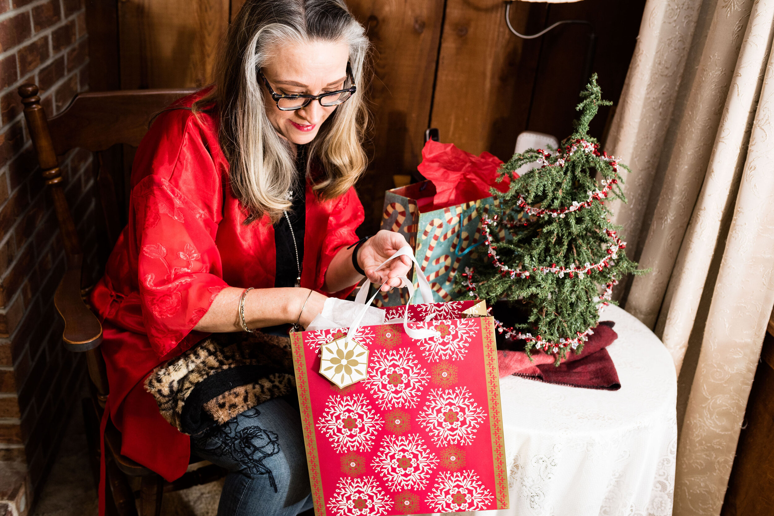
This pretty red kimono was a gift from my hubby in an attempt to make me more sexy, Ha, ha. It is a very pretty piece, so I thought why not use it for this outfit. The red is perfect for Christmas. The kimono is a brand called California Miss. I have no idea where my spouse bought it as that was a few years ago.

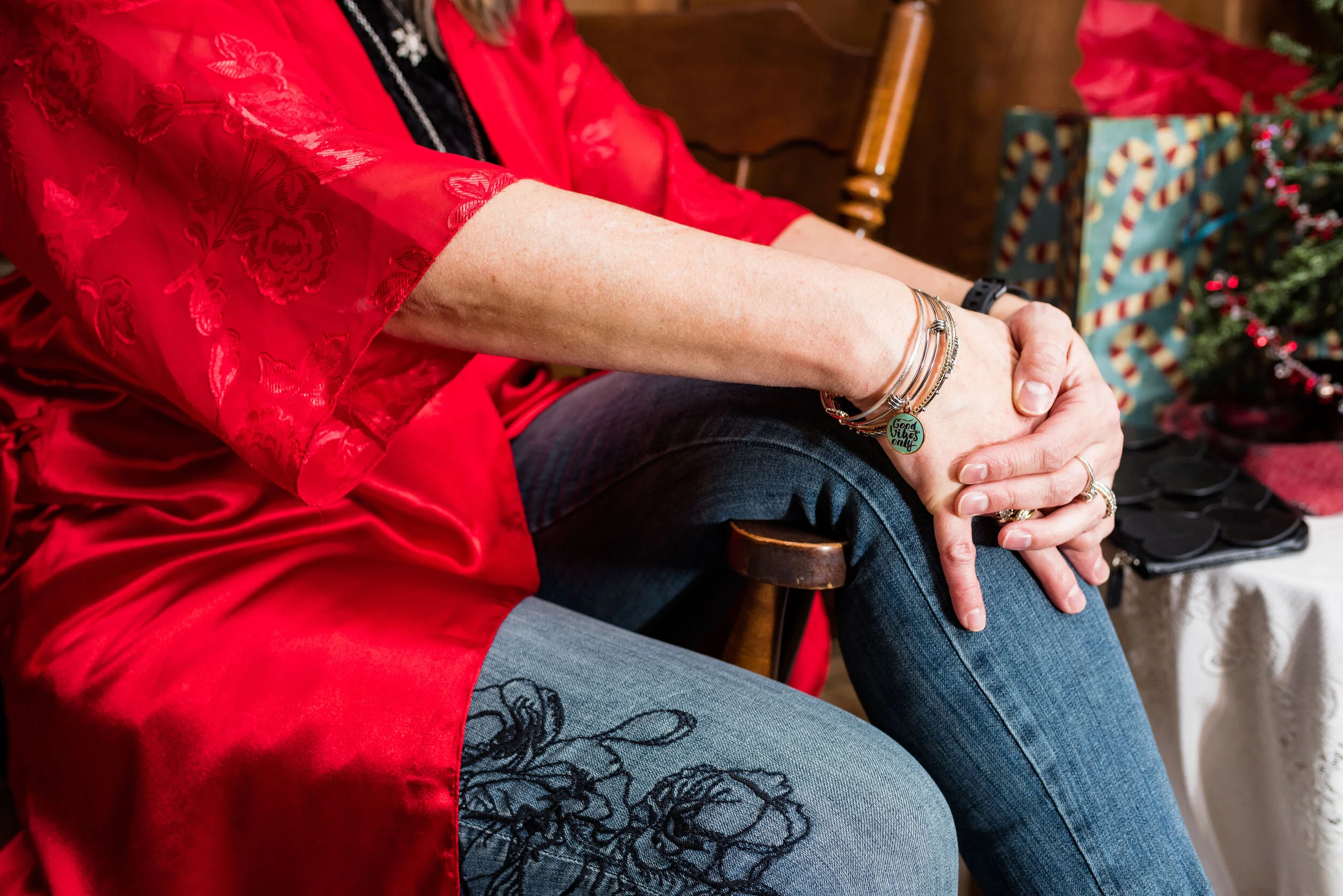
You can see the pretty floral detail on the sleeves of the kimono and how fun that it goes with the floral embroidery on my jeans. I just bought these jeans on clearance at Kohl’s. They are Simply Vera/Vera Wang brand. They fit well and have a good amount of stretch and the skinny legs will work great in boots.
My black velvet tee was a Christmas gift from my spouse last year. The tee is a brand called City Streets. One or both of my daughters usually go shopping at least once with him, to help him choose gifts. He had to do it all by himself when the girls were younger. How did he manage? Ha, ha. He usually does pretty well. My best ever gift was this computer from four years ago. I wouldn’t be blogging if he hadn’t gotten me this wonderful Apple. What is one of your favorite Christmas gifts?

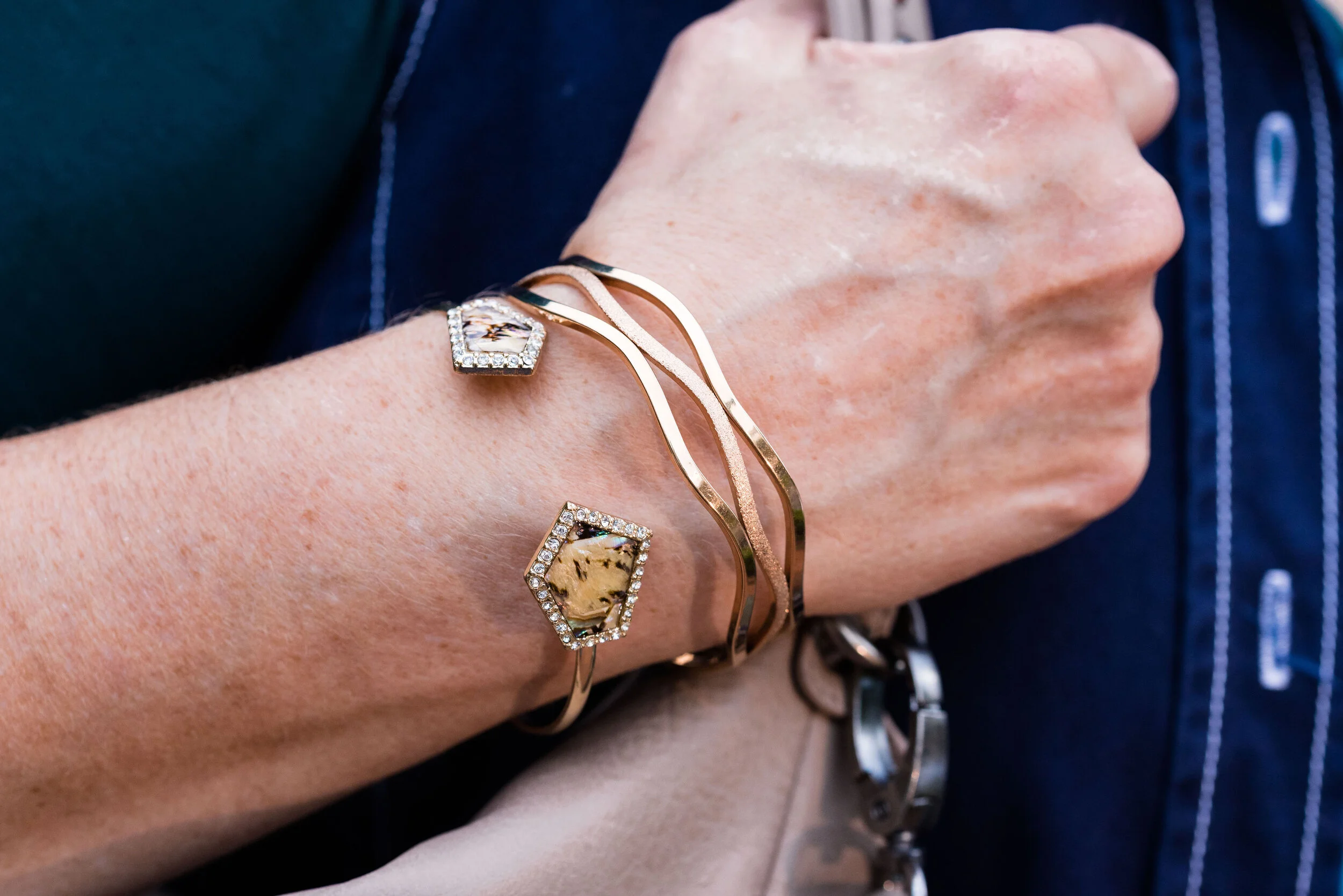
I went for silver and black for my accessories. My silver bangles you can see in the above picture. I also added two silver necklaces. A long fringe pendant and a snowflake pendant.

My little black heart embellished clutch and my Ralph Lauren boots are both thrifted.

Here are a few other pictures that I was inspired to throw in because of the song.

A sable, the keys and a deed. Ha, ha

I hope you enjoyed this post. Do you think this outfit worked for the song? I’d love to hear your thoughts, so leave me a comment or two.

It is hard to believe Christmas is in four days. Yikes! I have so much to do. My brother is coming into town tomorrow on his way to see my mom for a few days. I am glad he will be with her, since with this seasonal job I won’t be off contract until January 4h. I hope you are prepared for the upcoming holiday. I’ll have two more outfits, next week in this series, so keep a look out for those.

Have a great weekend!

Photo credit Rebecca Trumbull.

Enjoy this version of Santa Baby by Eartha Kitt.


Outfit Inspiration - Rockin' Around the Christmas Tree

One of my favorite Christmas tunes is Rockin’ Around the Christmas Tree by Brenda Lee. When I was in high school I hung out with a girl a grade ahead of me named Sherry. We had tons of fun together and had a very special friendship. Though our ways parted after high school, we still keep in touch through Facebook. Sherry and I were in my church’s youth group together and often found ourselves with other church friends at local restaurants. One particular pizza/sub shop had a juke box. Seeing as it was that time of year, Christmas songs had been added to the playlist. Sherry and I chose a few songs, and one of the ones she picked was Rockin’ Around the Christmas Tree. The funny thing was, Sherry decided to be silly and kept going up, inserting more change and playing that same song over and over. We all had a giggle fest as we ate our food. Now, every time I hear that song, I think of my dear friend and all the fun we had together.

The song, Rockin’ Around the Christmas Tree, was written by Johnny Marks and sung by Brenda Lee in 1958. The interesting thing about Brenda Lee was her age when she recorded the song. She was only thirteen. Her mature sounding voice lead her to a career in country music, but it is the blend of rockabilly and country style that makes this song a forever hit. To this day most radio stations from adult contemporary, to top 40, to country play Mark’s and Lee’s version of Rockin’ Around the Christmas Tree more than any other version.

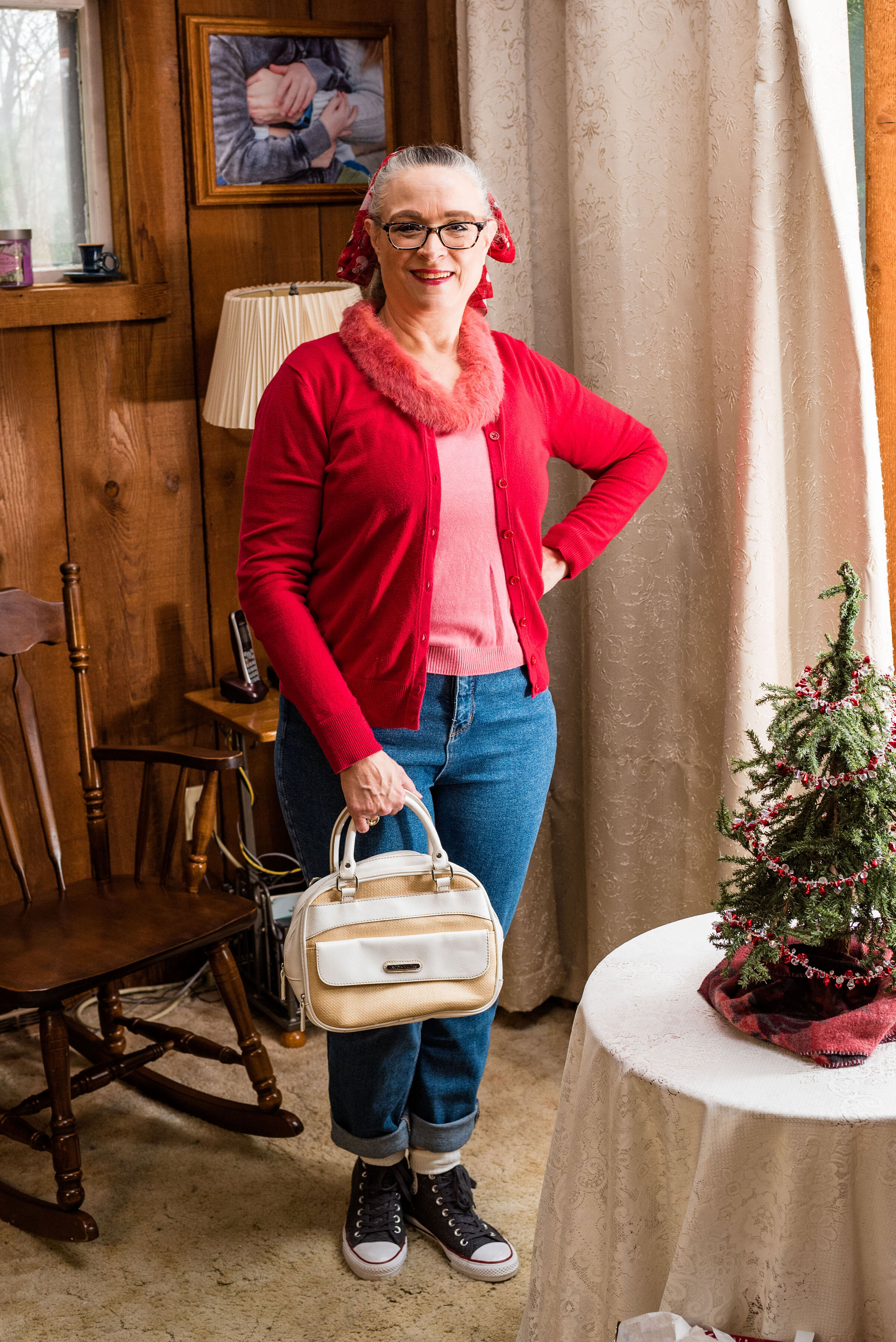
Of course with the 50’s rock and roll feel of the song, I had to dress with a 50’s vibe. Rolled up jeans, a mismatched sweater set and a ponytail with a fun Christmas scarf brought in the 50’s details, most of which I got from watching shows like Happy Days. Ha, ha. Probably not exactly historically accurate, but you get the idea.

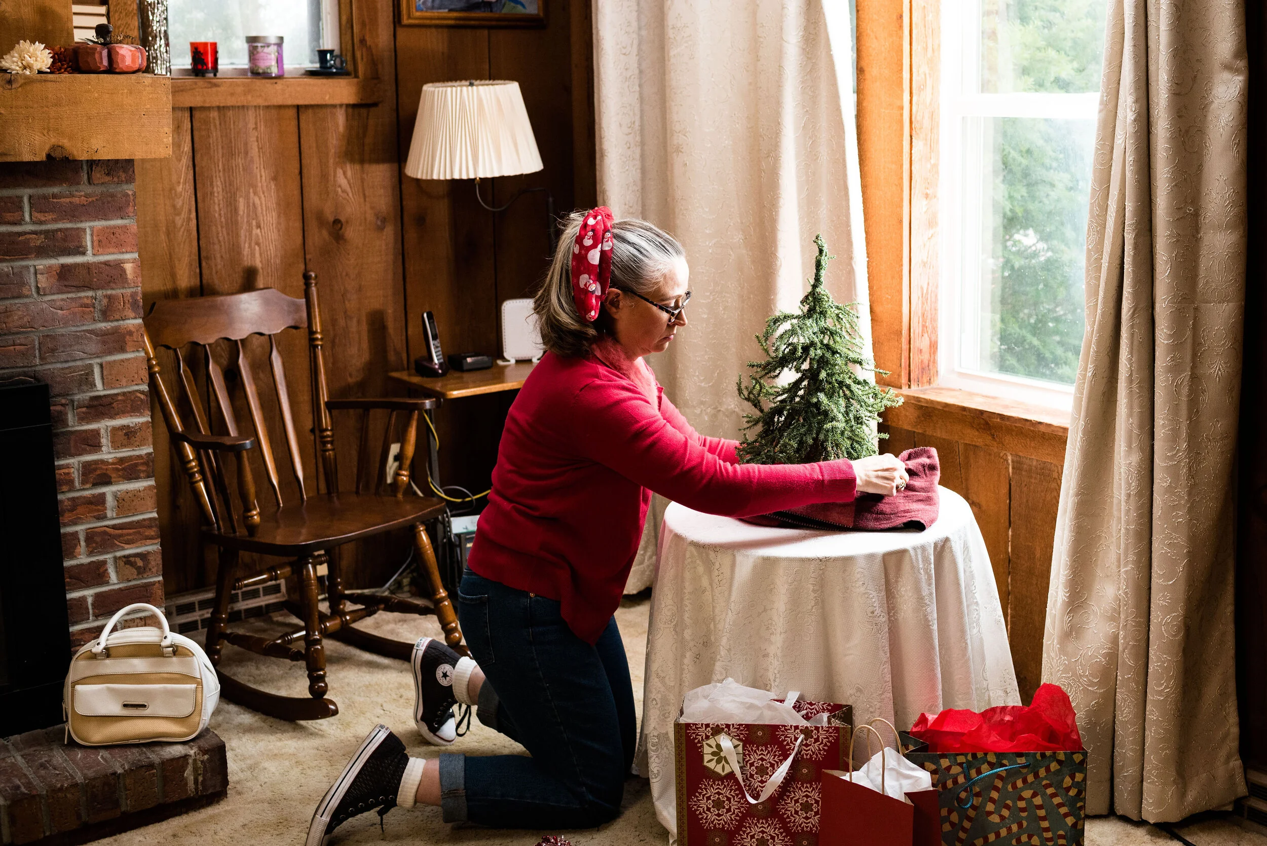
I hadn’t gotten my full sized Christmas tree up yet, but I wanted the pictures to look somewhat festive. When my daughters were both still living at home, we had gotten them each a tiny, Charlie Brown, type tree for their rooms. This one still resides at our house, so I thought it would add a touch of Christmas cheer to the pictures. Plus, how do you rock around the Christmas tree, if there isn’t one?

As you know, high waisted mom jeans are back in style. I had gotten rid of all of mine, not because they went out of stye, but because I gained weight and had to buy new jeans. Personally, I don’t really like the confines of high waisted jeans now that I have muffins to stuff into them. I prefer jeans that fall just below my belly button, but when I found this pair on clearance at Kohl’s, I thought I would add one pair of high waisted jeans back into rotation. These are Wild Fable brand. Target carries this brand and has a number of different washes, as well as various amounts of distressing.

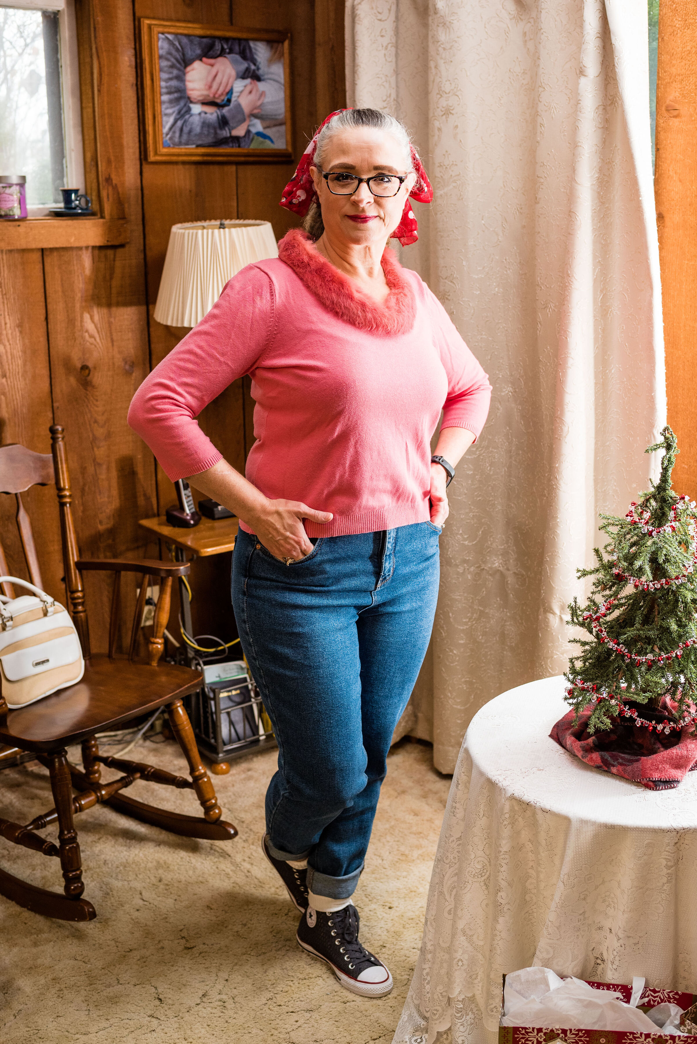
You may think pink and red an odd color combo for Christmas, but it just makes me think of candy canes, Christmas cookies and wrapping paper. Both of these pieces were thrifted. The red cardigan is Merona brand and the pink pullover with rabbit fur embellishment is Emma James (a Liz Claiborne company). I am not a proponent of real fur, but if I have the choice of saving a clothing item from a land fill and part or all of its component are real fur, then I am a fan. Here is a pic without the cardi.

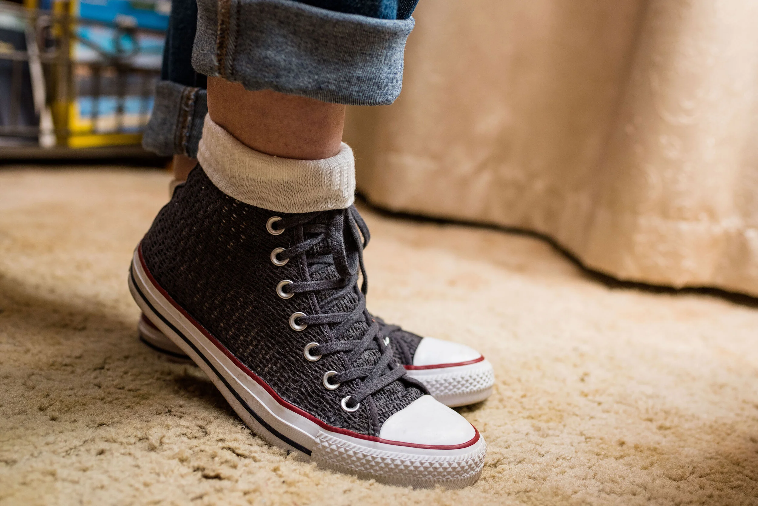
Since I wanted the outfit to be simple and fun I didn’t wear any jewelry. I don’t own a pair of saddle shoes, so the next best thing was a pair of Converse high tops. These are the only Converse I own. They typically do not fit my feet very well, but I found these on clearance at DSW. I popped on the white socks as a topper and it reminded me of how girls would wear their socks back in the 50’s.

Of course, in my opinion, no outfit is complete without a bag. What if you realize as you are rockin’ around the Christmas tree, baking cookies or decorating that you’ve run out of sugar or you’ve discovered another string of lights that won’t light (I swear, it happens every year)? You will need to run to the store. I chose this white, Jaclyn Smith satchel. This thrifted bag can be carried by the top handles and it also comes with a long strap to wear it as a cross body bag. This is also a thrift find.

My final addition was the scarf in my hair. Over the years I have collected a number of Christmas related pieces. I have a number of long sleeve tees, a couple sweaters and a few scarves. If you followed my Instagram feed last year, I featured most of those pieces in my “20 Days of Christmas series”. This cute snowman scarf is a narrow oblong scarf that works perfectly as a hair tie. I wore it to work yesterday around my neck, with a snowman pin.

What do you think of this outfit? Do you like high waisted mom jeans? Is Rockin’ Around the Christmas Tree a favorite song of yours? Do you think I did justice to the song with my outfit? I’d love to hear your thoughts.

Here is Brenda Lee singing Rockin’ Around the Christmas Tree.

I’m including a few shopping links. I hope you are having a good month leading up to Christmas. I especially hope that you do not feel stressed out and that you are staying healthy. Take care of yourself. There is only one beautiful you. Have a great week.

Photo credit Rebecca Trumbull.


Outfit Inspiration - It's the Most Wonderful Time of the Year

Christmas can truly be one of the most wonderful times of the year, but I know it can also be an extremely hard time for people who have gone through loss, are struggling with illness or things like financial strain and relationship stress. Often, the holidays become a mad race to get everything done that we feel we have to do and we end up feeling down and disappointed. Even amidst the struggle and the strains of life, I think we can still see Christmas as a very wonderful time.

Christmas is typically a time we reconnect with loved ones. It can also be a time to do things we find hard to do the rest of the year, like listening to special music, baking, attending holiday parties and other activities like Christmas shopping and gathering with friends. In the church environment there are also special services, kids programs and service activities like caroling and helping at the local food pantries and city missions. Yes, it is a very busy time, but I also believe that the basis for many of these activities is what makes it the most wonderful time of the year.

Serving others and thinking about that special gift we are going to buy for a friend or family member gets us outside our own boxes. It creates in us an others’ centered mentality and it is in that, that we find joy. Not only that, but the basis for Christmas from the very beginning was the unselfish act of an Almighty God, towards His fallen creation.

What I instantly think of when I hear Andy Williams’ It’s the Most Wonderful Time of the Year, are shopping malls and stores all decked out in Christmas garlands and lights while Christmas music plays overhead. It also makes me think of loud family gatherings around the Christmas tree opening presents with laughter and joy.

For this outfit I wanted to look festive, but also like myself. I wasn’t going to see the King, I was going to the mall to shop for my family. Ha, ha.

This wonderful red plaid Requirements blazer was a thrift store find. I just love the treasures I find at thrift stores. I could never have the large wardrobe I do if it weren’t for thrifting. I still shop quite regularly at full price retailers, but I have found some of my most special, unique pieces at thrift stores. Many of them, like this blazer are by brands that no longer exist; the added benefit of thrifting.

The fit and structure of this beautiful jacket is perfect and will definitely get used long past the holiday season. I am excited to try it with various colors and pieces. It is a wool blend, but fully lined so I don’t have to worry about my skin’s aversion to wool.

My black long sleeve embellished snowflake tee was purchased a number of years ago. I believe it is from Kohl’s and is a brand called MCCC Sportswear. You can see holiday sweatshirts from this same brand at Kohl’s by clicking on the link. They also have long sleeve tees here.

You can also see my Believe pin. If you have ever watched Miracle on 34th Street, then you know the significance of the word believe. I have noticed over the last few years, the word believe is popping up everywhere. Whether you believe in Santa, the Spirit of Christmas, the person of Christmas, Jesus Himself, or in yourself, the idea of belief in someone or something is pretty important in our world.

I personally believe in the birth, life, death and resurrection of Jesus Christ and that is what I think of when I see the word believe, but I also love that this idea of belief has become a positive message to all of us, especially young people, who are often told they will never measure up or amount to anything. The beauty and simplicity of the Gospel message is found in this idea of belief. God’s word says,

For the Scripture says, ‘Whoever believes in Him will not be disappointed.’
— Romans 10:11 (NASB)

At first I was going to wear knee high boots, but then I thought the pants didn’t really look right with them, so I opted for this pair of Sonoma booties from Kohl’s. I like the contrast of the gray, black and red with the taupe of the boots and bag. I didn’t bother with any other jewelry since I felt the embellishments on the top and bag, along with the pin, gave the outfit enough punch.

What do you like to wear when you shop? Do you dress up or do you prefer to just go out in your sweats? I’d love to hear your thoughts. What do you think about the word, believe? Is belief something that is important to you? Please leave me some love in the comments.

Here is my favorite version of It’s the Most Wonderful Time of the Year by Andy Williams. I’m not so sure about the music video, but it is colorful. Ha, ha

I’m including a few shopping links of all things plaid, for you to look at. Maybe you still have some Christmas shopping to do and one of these links will inspire you. These are affiliate links, which means if you click on a link, I get a few cents. If you purchase something through one of my links, I might get a little more. Every penny helps.

I hope these posts are inspiring you and bringing back memories of your own childhood Christmases. Have a great weekend and stay healthy for the holidays.

Photo credit Rebecca Trumbull.


Flat Lays in the Flesh - Animal Print

On Thanksgiving I will be starting a holiday series that I think you might find inspirational and interesting. That is all I am saying about that right now, just to whet your appetites. Until then I thought it might be fun to revisit a few of the Fall Trends 2019 that I talked about through the medium of flat lays. If you don’t know what a flat lay is, it is simply a way to show an outfit by laying out the pieces on a flat surface, rather than showing them on a person. I find so many flat lays look amazing, but I am always left wondering, what does the outfit look like on an actual person. I hope you don’t find this too repetitive, but I decided to take four of the flat lays I did for my Fall Trends 2019 series and show you what they look like, in the flesh. Let’s get started.

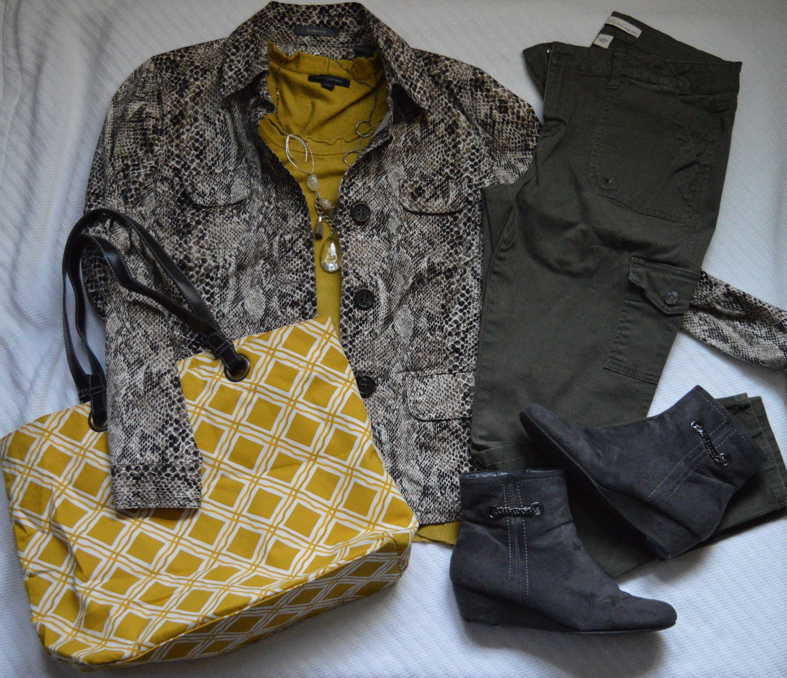
This first outfit features a snakeskin jacket that I found thrifting last spring. This was the flat lay from the original post, which focused on the fall trend of animal prints.

Photo by Amy D. Christensen

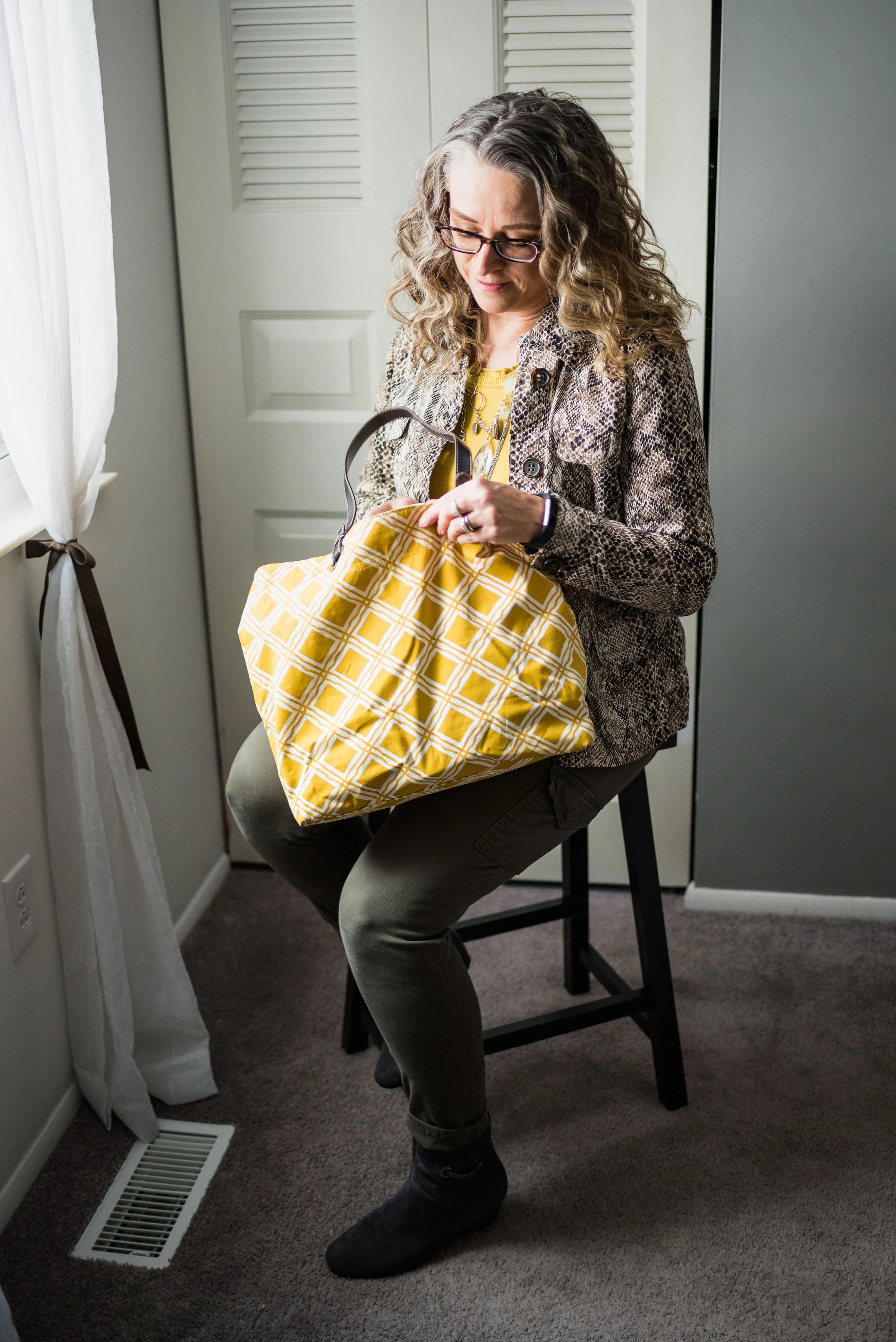
This is what the outfit looks like in the flesh.

It was only about 10 degrees outside and as much as I like to play the tough chick, I decided, forget that nonsense, so my daughter/photographer turned her spare bedroom into a studio. She is so good at being flexible and working with what we have. She does such a great job with natural light. There was no flash in any of these pictures.

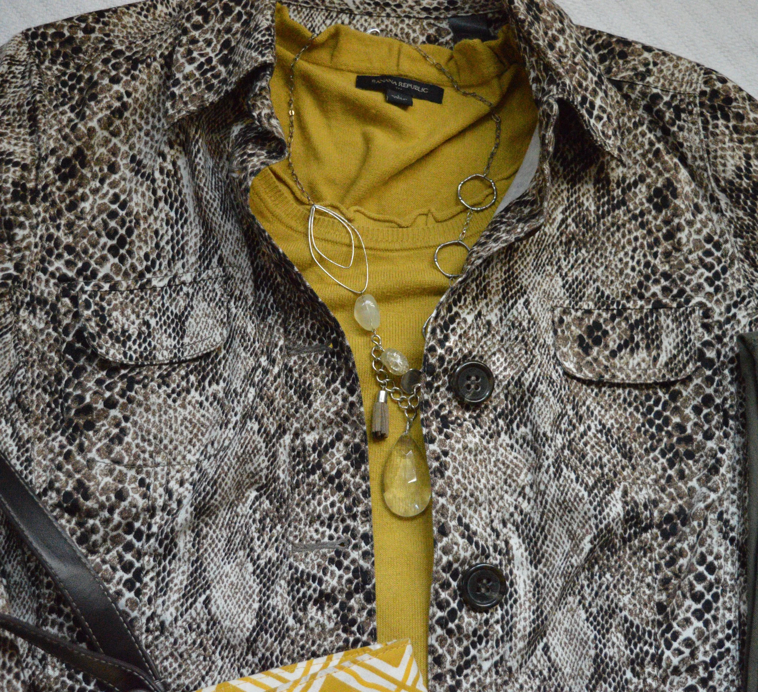
This Liz Claiborne snakeskin jacket has a little bit of stretch to it, making it very easy to move in. I paired it with a thrifted Banana Republic sweater for this outfit, but you could easily swap in other pieces like a button up blouse, a graphic tee or a lighter weight turtleneck for all manner of stylish vibes. A jacket like this is a work horse in your wardrobe and can be dressed up with a skirt or dress and heels; or dressed down with distressed jeans and sneakers.

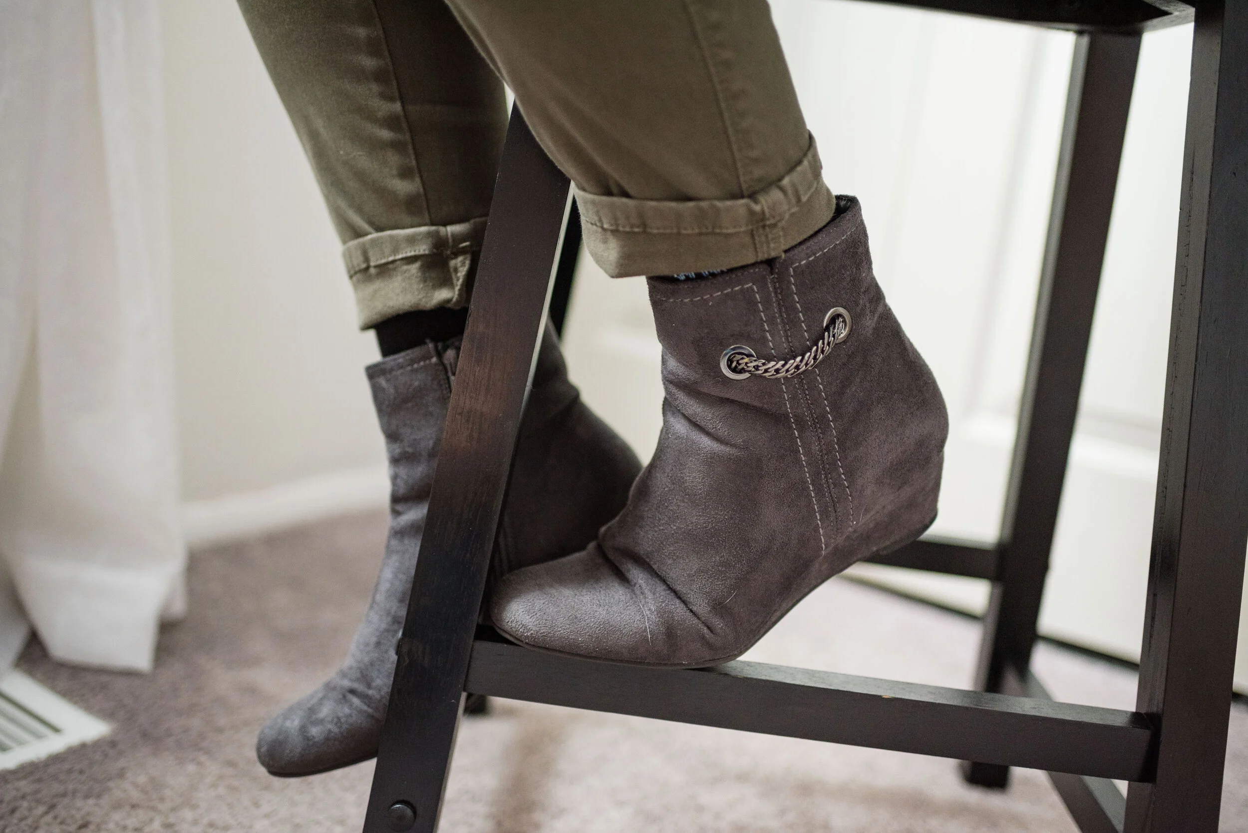
I went for a work wear look, pairing the sweater and jacket with my Gloria Vanderbilt cargo skinnies and my Impo wedge ankle boots.

I chose the yellow tote bag to enhance the sunshiny vibe of the outfit, making this a good combination for a cloudy, fall day. This was another thrifted piece.

I thought layering a few fun necklaces would make for an added statement. In the original flat lay I only had the shorter necklace, but just recently I found the long pendant necklace at JCPenney on the clearance rack. They don’t match, but I think the combination works well against the yellow back drop.

Do you think this flat lay turned out to be a good outfit? Do these pieces work well together? Why or why not? I’d love to hear your thoughts, so leave me a comment or two.

I’m leaving you with a few shopping links for fun animal print pieces. Remember Christmas is coming soon and there might be a person or two on your list, who would love an animal print piece. These are affiliate links, which means if you click on a link, I get a few pennies, and if you purchase something through one of my links I get a few more pennies. Ha, ha. I appreciate every penny I get.

Hope you all have a great weekend and thanks so much for taking the time to stop by the blog.

Photo credit (unless otherwise stated) Rebecca Trumbull.


Pantone - Autumn/Winter - Galaxy Blue and Hazel

I neglected to get my post done for Tuesday. Monday and Tuesday, my grandson had off from school. It was parent/teacher conference days. My daughter had her appointment right away on Monday morning and Quintin is doing very well. He is nationally high ranking in his reading ability and math, so this Grandma is proud of a certain nine year old.

This is the last outfit from the Pantone - Autumn/Winter - 2019 London Palette. Next week, I’ll have another recap post to show you all the London colors and then we will put the Pantone Institute aside until spring. For your information, the Spring/Summer colors for 2020 are already up on the website and have been for a couple of months, so if you are really curious, you can go the to the Pantone website and see what they look like. As for this blogger, you won’t get to view them here until spring.

Our last two colors are Galaxy Blue, which was also on the New York palette and a mellow brown called Hazel. This brown is not one I would regularly reach for. I like colors that are more rich and saturated. In the Crayola Crayon box, this color might be similar to Antique Brass. See the complete list of current crayon colors here. Talk about fun color names! Be sure to read some of those. They are not merely called red, pink or blue any more. Ha, ha.

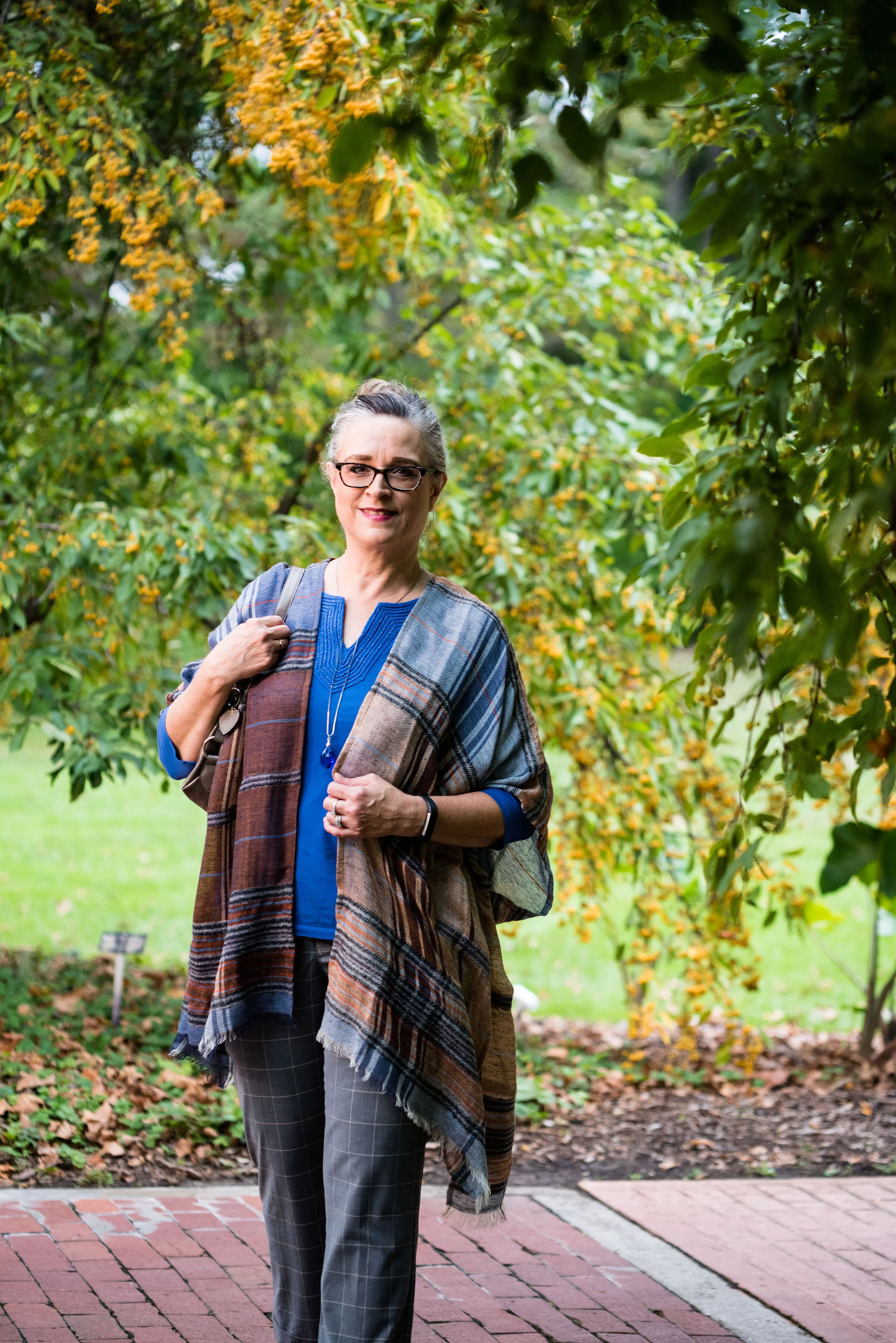
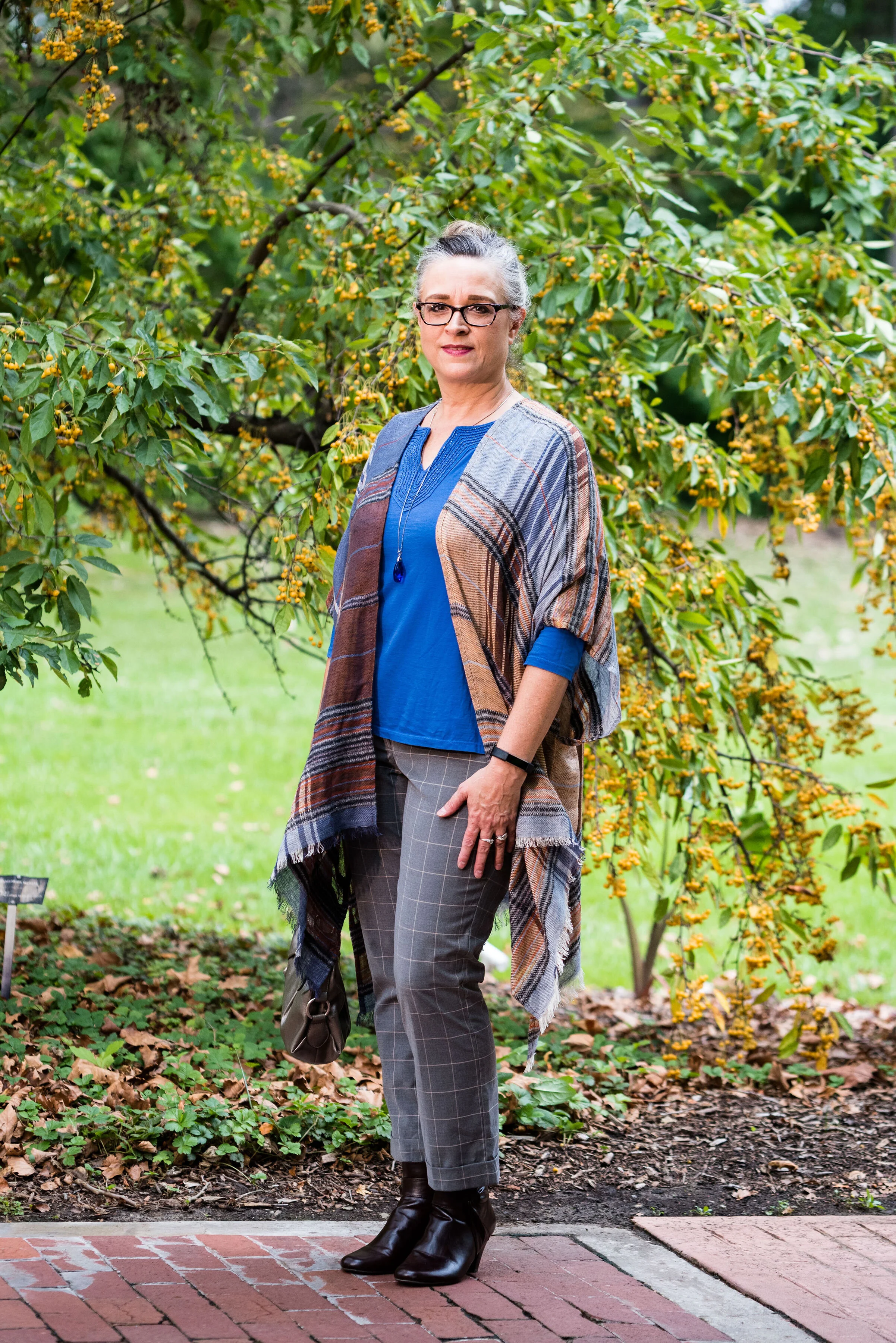
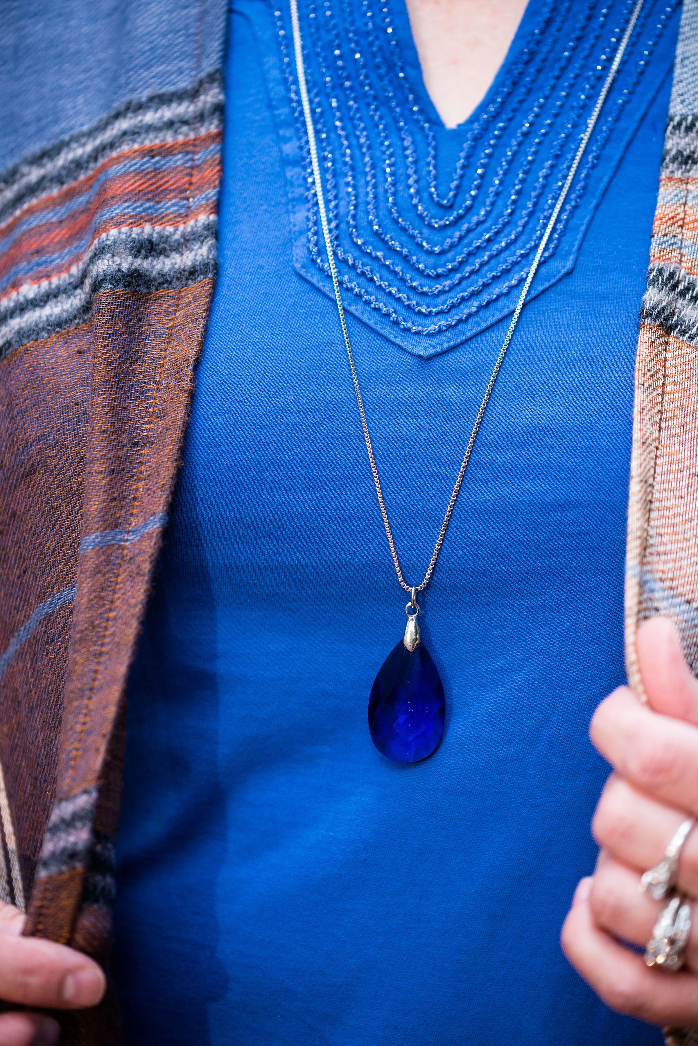
I decided to do some plaid print mixing in this outfit, as you can see with my ruana and my pants. I must tell you how I came to own this beautiful ruana. My hubby and I were out on a date. We try to go out once a week, usually for dinner and then to Barnes and Noble bookstore. We both love spending time around books and we usually end up getting a hot drink and sometimes a treat. On this particular night we went out for Mexican. After we were finished eating he told me that before we head to Barnes and Noble he had to stop at Bass Pro Shop and get something for his trailer hitch. I don’t even think twice about it. I don’t mind going to Bass Pro or Cabelas, because they both have fun things to look at, like mounted animals and clothing that I like, but would never purchase, because it is out of my price range.

We walked into the store and were heading down the center aisle. On the right side of the aisle are all the women’s clothes. We got to this lovely display where this ruana was styled over an ivory sweater. It immediately caught my eye. My husband said, “I thought you might like this.” I was shocked. Not only had he thought of me, but he had picked out something he thought I would both like and look nice in. He let me pick out a few other things besides the ruana to try on and just hung out while I did. I picked out the ruana and a rusty orange sweater, that I haven’t worn yet, but that looks great under the plaid. My husband does not do things like this very often, but it sure makes an impact on me, when he does.

My thrifted blue tee is Charter Club brand. It is a bit brighter than Galaxy Blue, but once again, you get the idea. I like the detailing around the neckline.

These gray pants are also thrifted and you can see how I styled them with a faux leather jacket, and with a pink sweater set.

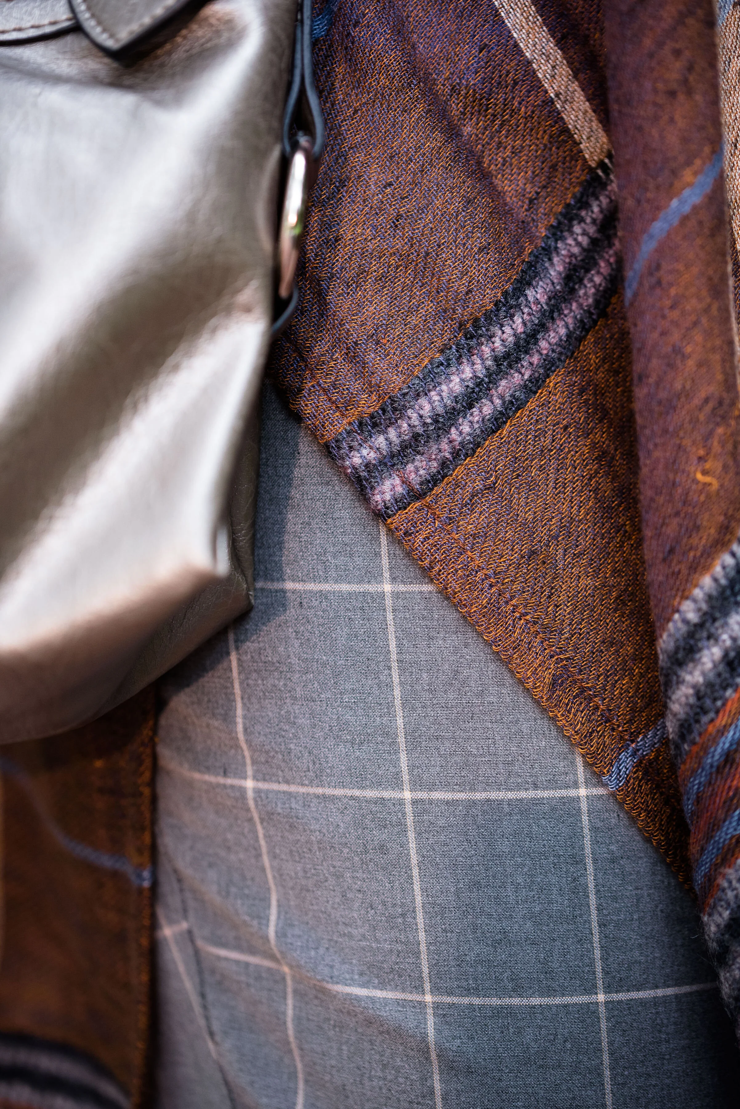
Here is a close up of my print mixing.

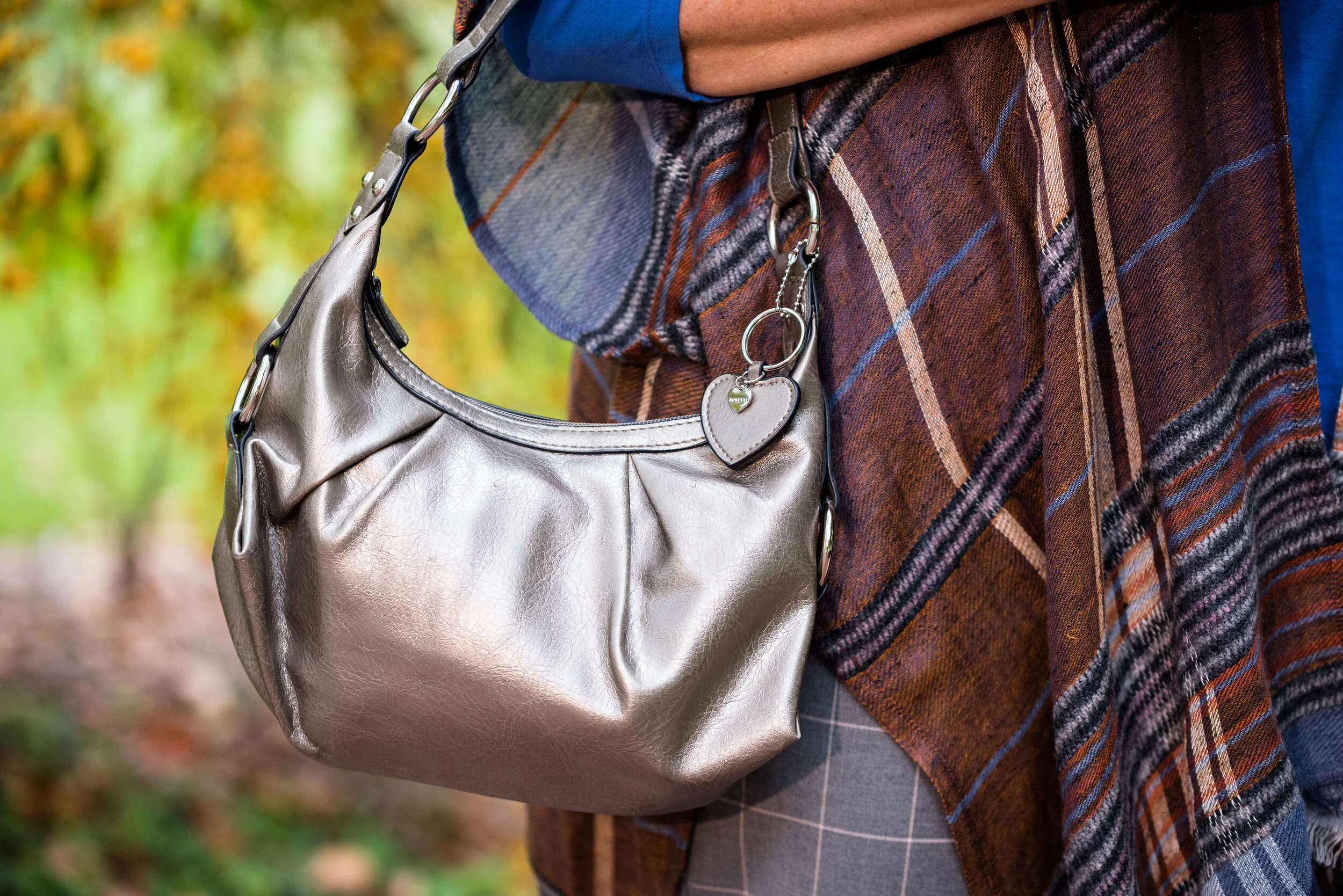
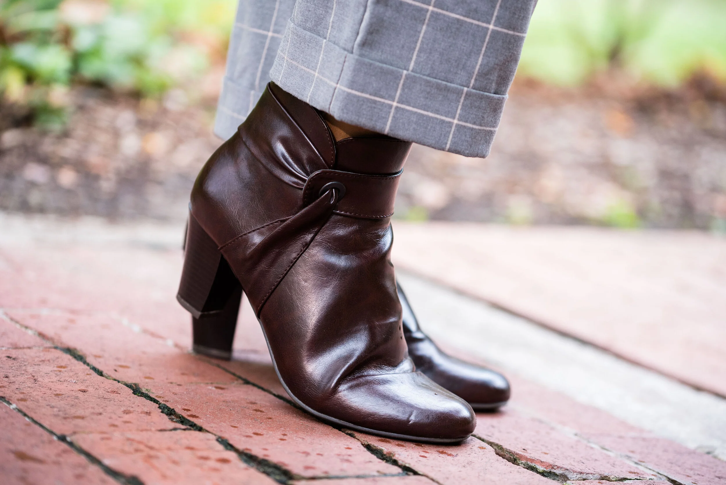
I kept my accessories simple since there was already so much going on in the outfit with the two plaids. A bright blue crystal pendant, a simple gray Rosetti bag, and these thrifted Lifestride maroon ankle boots.

What do you think of these colors? Do you like plaid? I’d love to hear your thoughts so be sure to leave me a comment or two. Your support and feedback mean a lot to me and help give me ideas and direction for the blog.

Graphic and photo credit Rebecca Trumbull.

I’ve included a few shopping links for you to peruse. With the holidays coming up maybe these will give you some inspiration for someone on your list. These are affiliate links. All opinions are my own.


Pantone - Autumn/Winter - 2019 - Summer Fig and Bluestone

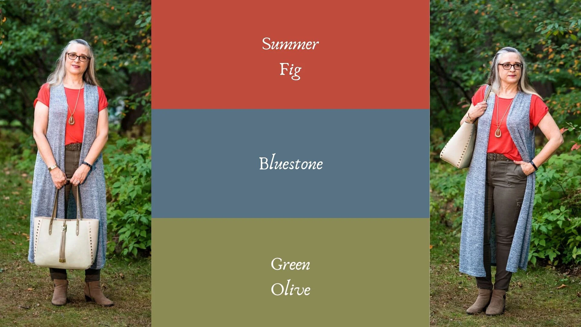
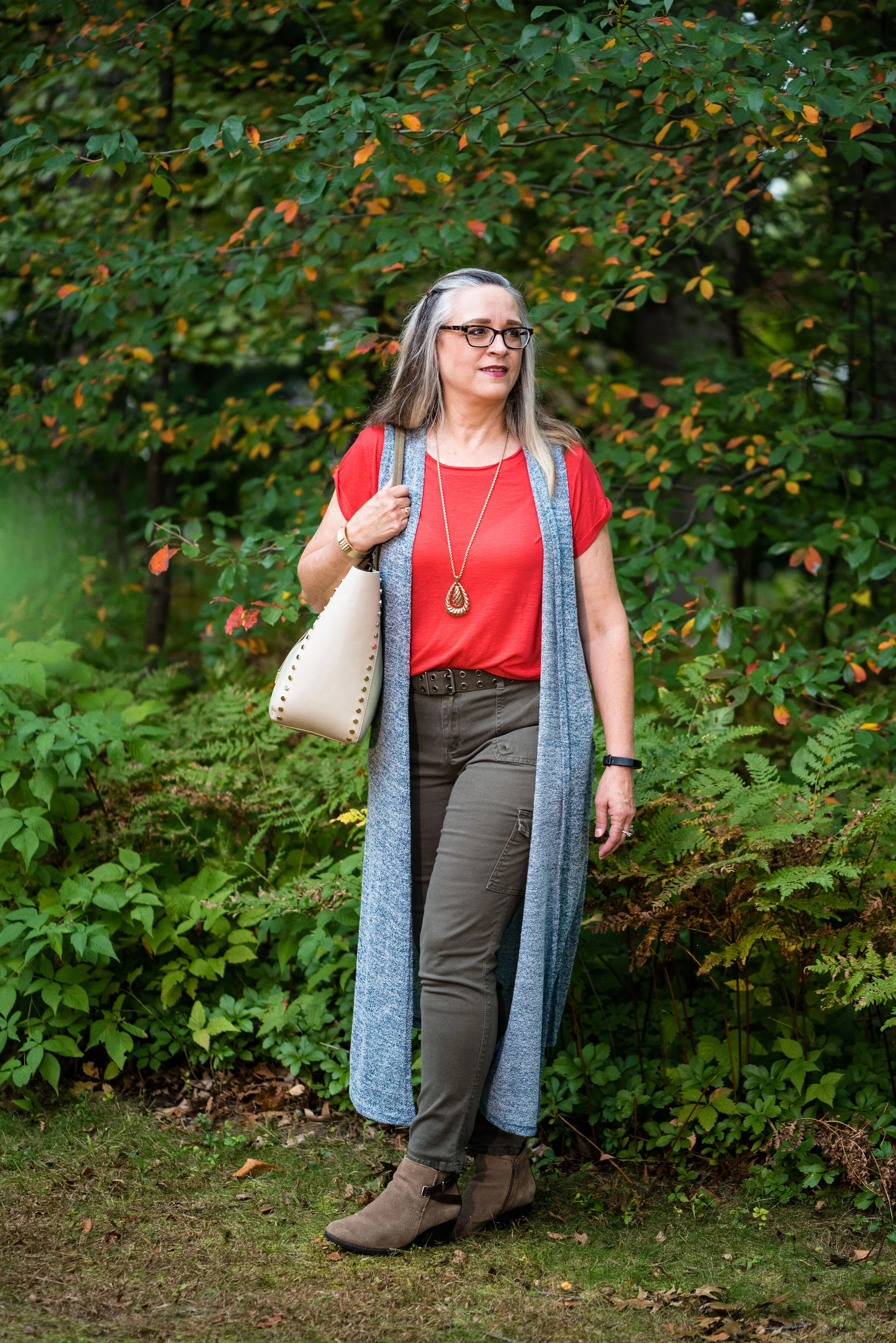
You’ll remember from the New York Pantone series the color Bluestone. This is one of only two colors that showed up on both palettes. I’m not sure how the Pantone Color Institute comes up with the colors they choose. Is there a committee? If so who is on the committee? How do they come up with the names for each of the colors? Yes, these are the things a fashion blogger wonders when she is tired and needing a burst of writing motivation. Ha, ha. I am speaking the truth when I say, I had to look up what a fig looked like to understand where they came up with this red color. This red coincides with the bright red interior of the fig fruit. I have never eaten a fig, have you?

This bright red tee is SO brand from Kohl’s. It is a few years old. I find Kohl’s and JCPenney my go to’s for things like short and long sleeve tees.

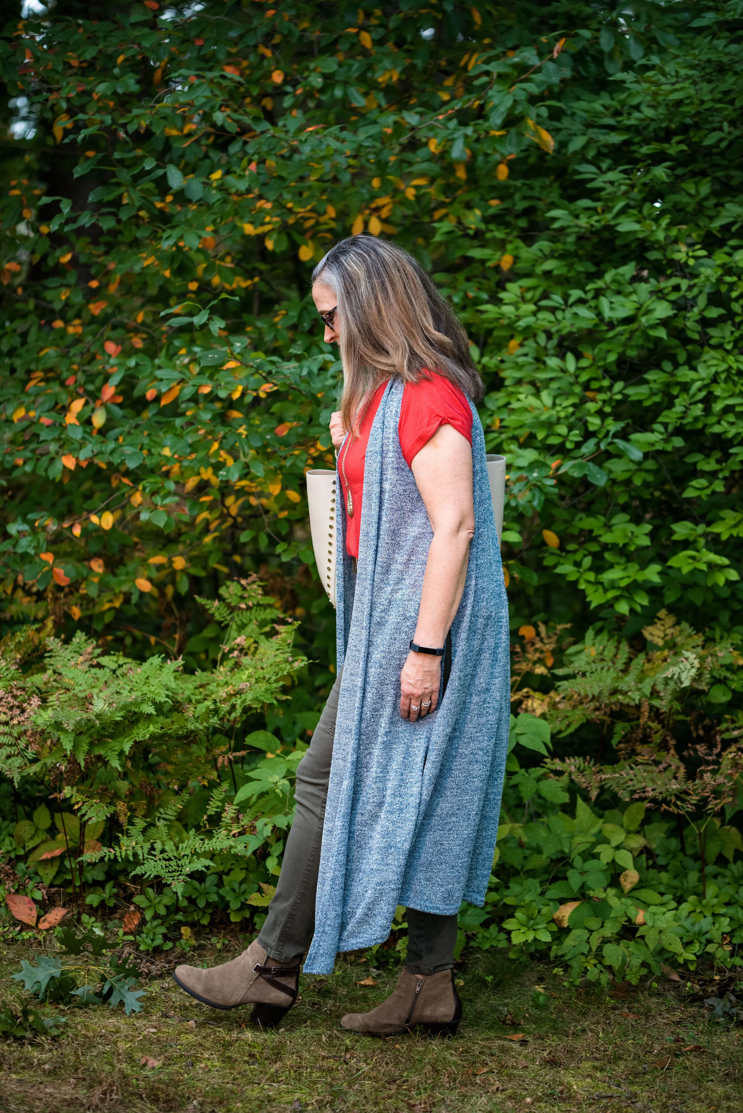
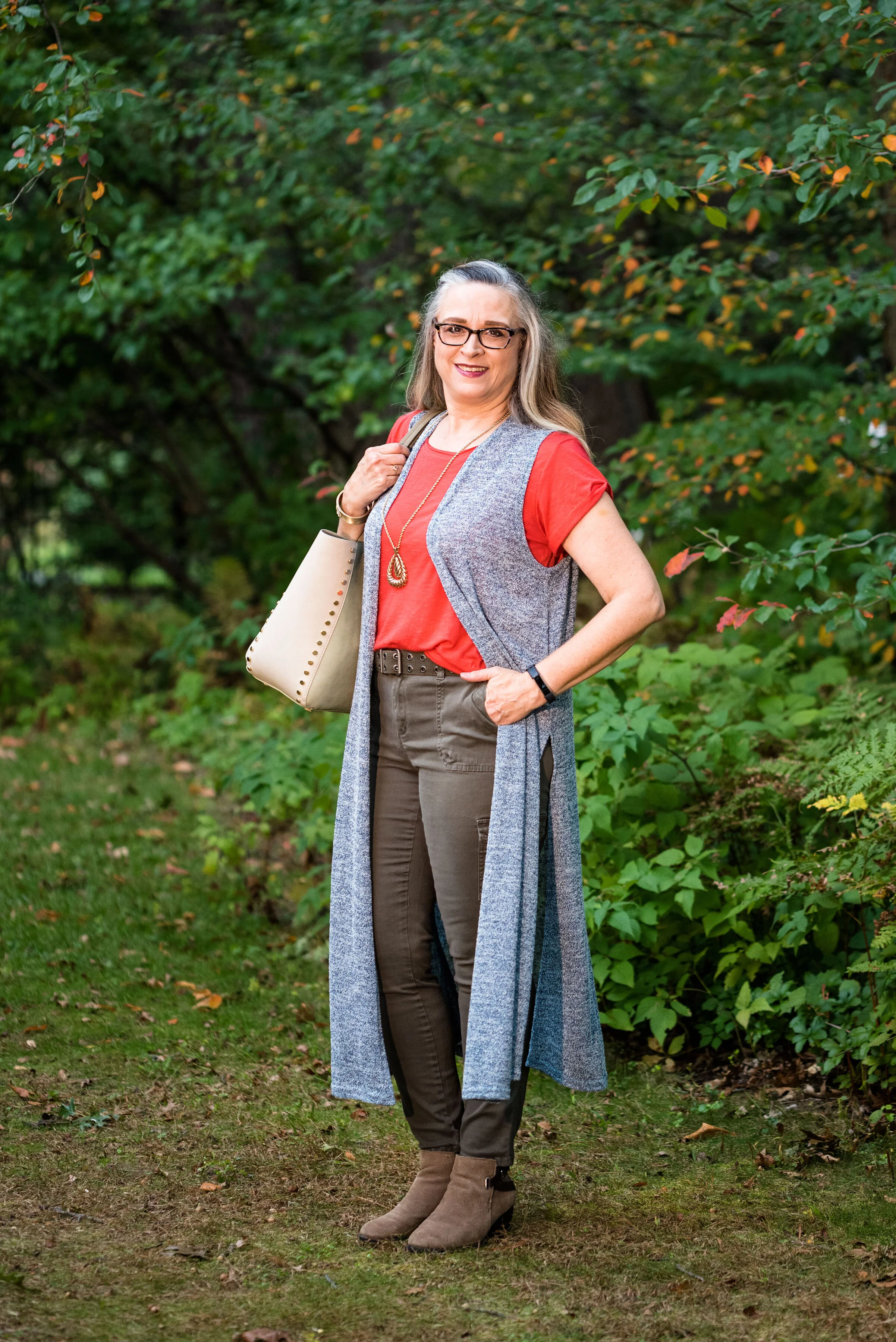
The Bluestone vest is a LuLaRoe piece. This particular style is called Joy. I like that some clothing companies name each of their styles. Not that I will remember what they are called, but I just think it adds another dimension to a retailer, that they have taken the time and effort to specify a certain line has a name. This is the only vest I have that is this length and I like how it looks in this outfit. The fabric has plenty of stretch, but doesn’t lose its shape.

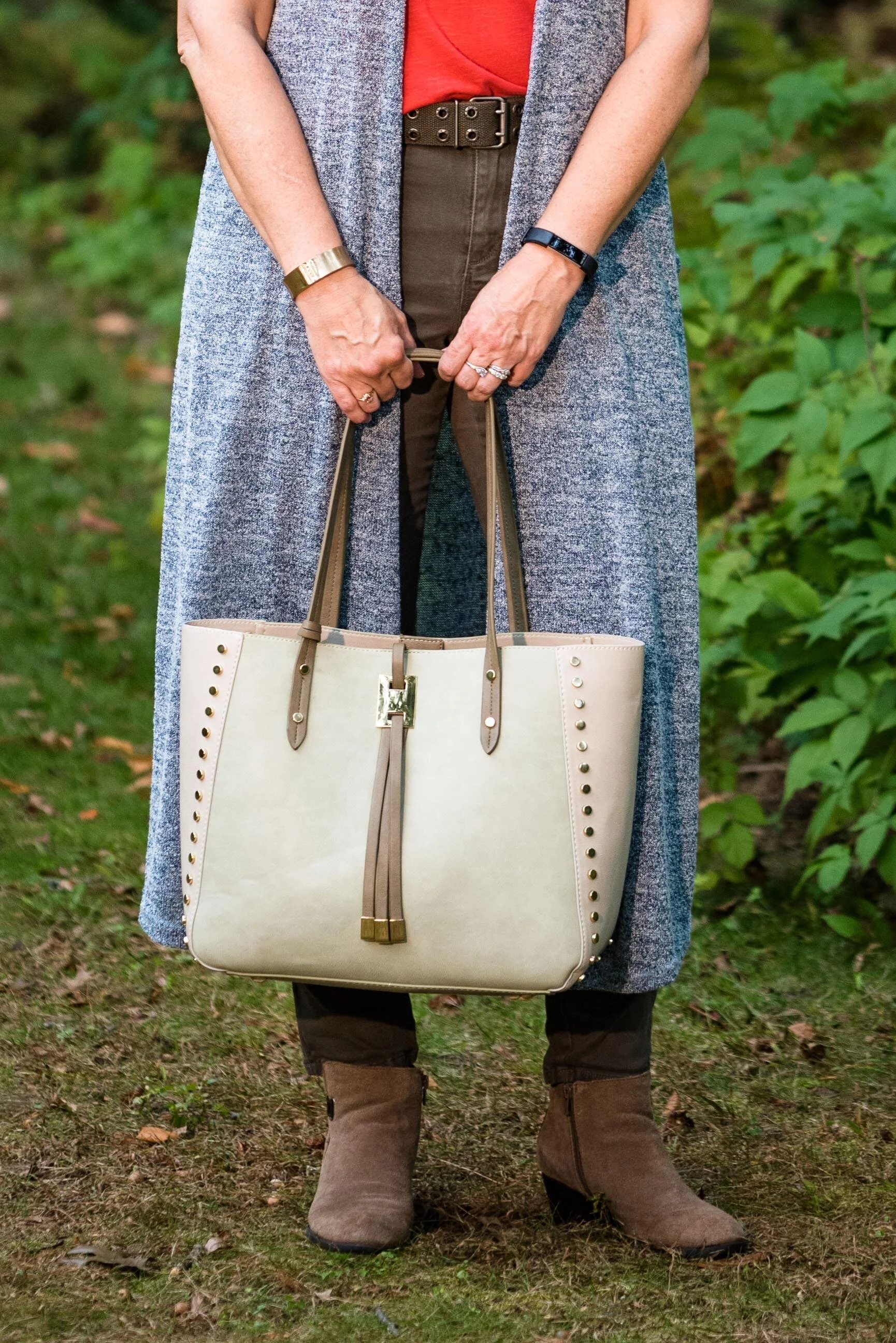
Once again, I turned to the classic color of Olive Green for my pants, bag, and belt. Olive just seems to be an easy color to pair other colors with and it grounds an outfit and keeps it looking chic with a bit of an edge. These utility pants are Gloria Vanderbilt brand and I’ve styled them before on the blog. You can see them styled with an olive utility vest here and in a flat lay with a snakeskin jacket here. I got the tote bag from Charming Charlie a couple years before they went out of business. Belts are so expensive, I usually try to pick them up at thrift stores.

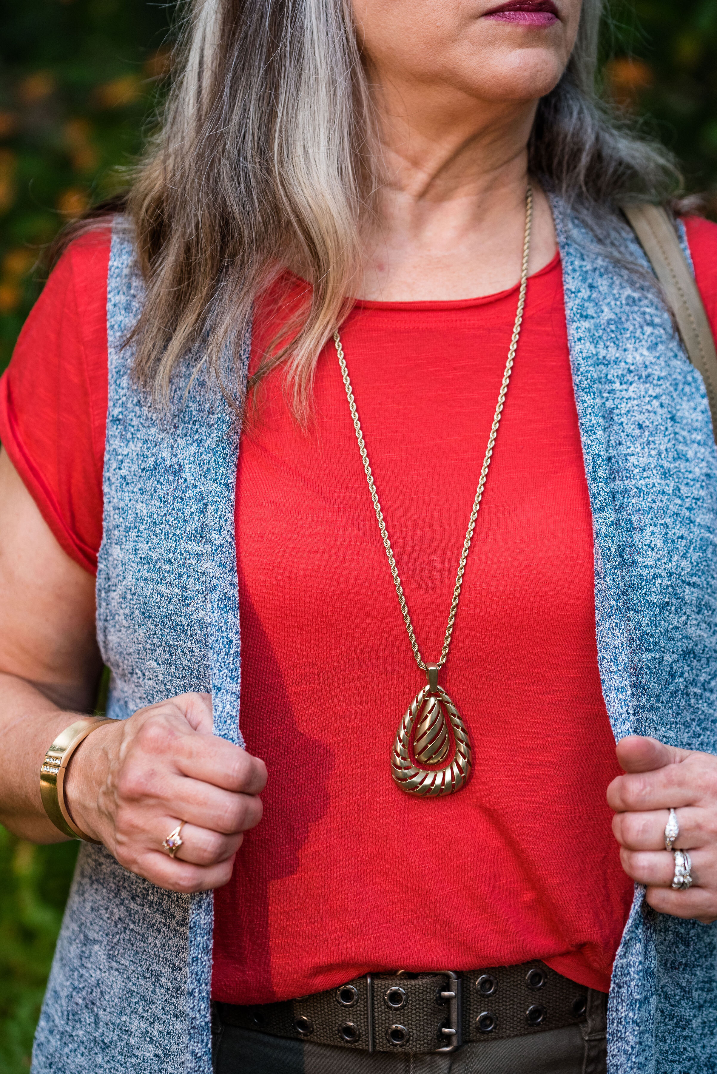
I kept the jewelry simple with a gold pendant necklace and a gold bracelet.

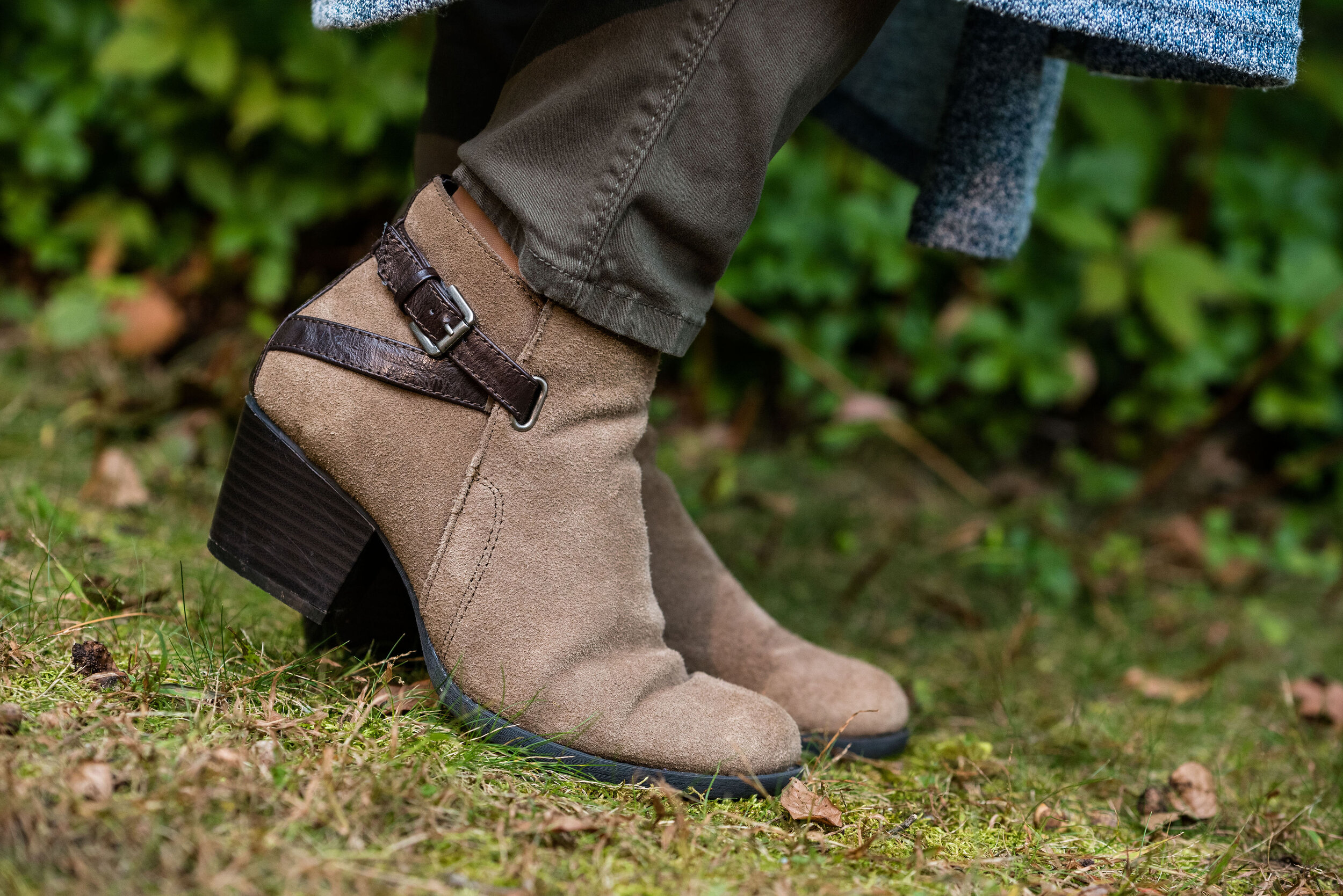
This old pair of Sonoma ankle boots has been with me for a while, but they are the perfect neutral finishing touch and the suede texture is just right for a fall outfit.

What do you think of these colors? They are very similar to the New York palette using Bluestone and Chili Pepper. Do you like to wear vests? Do you have a long one like this? What are some other ways you could style a long vest? I’d love to have your feedback.

I’m including a few shopping links. These are affiliate links. All opinions are my own.

Photo and graphic credit Rebecca Trumbull.


Pantone - Autumn/Winter - 2019 - Cranberry and Chicory Coffee

Hi everyone. The days are flying by and we are almost to Halloween. I haven’t even gotten out my decorations yet! That is how far behind I am. Maybe I should just skip Halloween and start decorating for Christmas. All the stores are doing it. Ha, ha . Well, I don’t think I’ll get that crazy, but this time of year does seem to go awfully fast. Do you get that feeling?

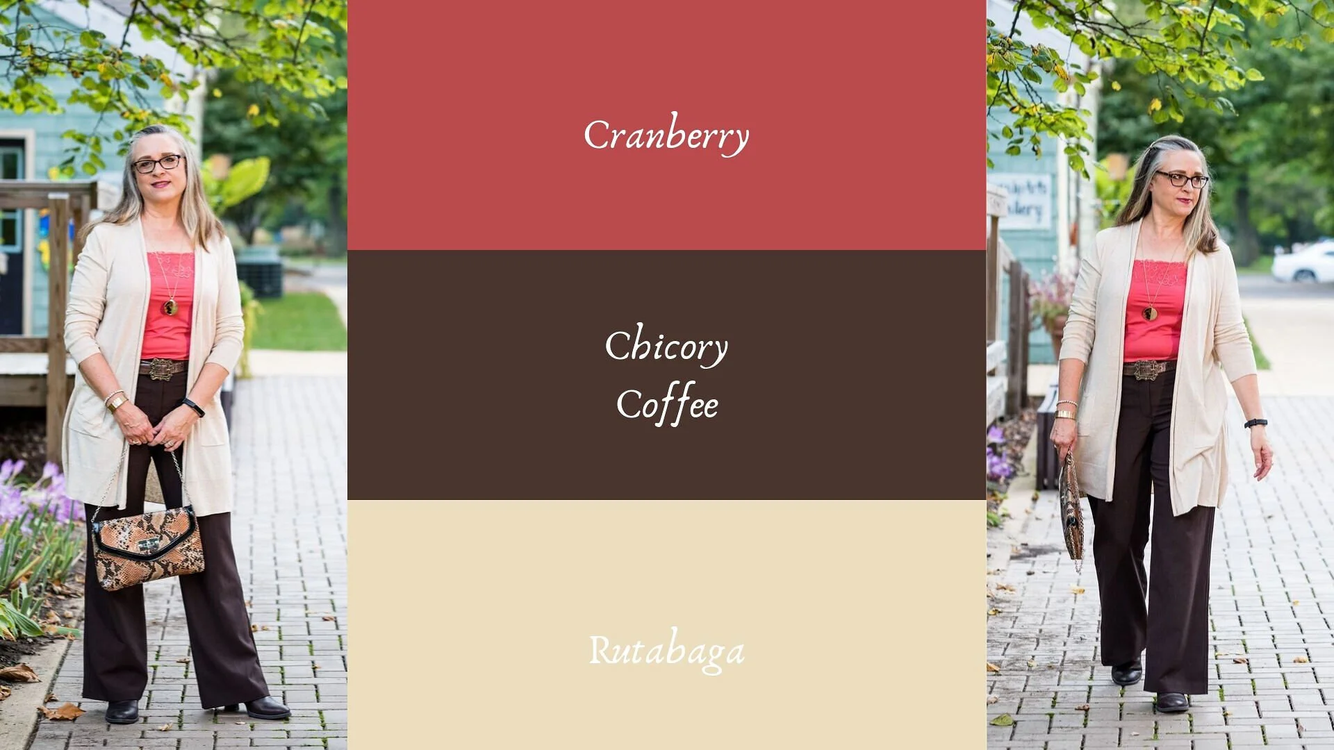
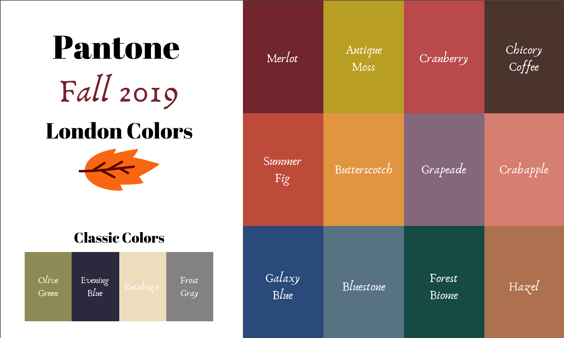
Today’s colors are what the Pantone Color Institute label a “vital red that adds a pungent punch to the palette,” and a “robust and tasteful” brown that, “introduces an element of heartiness.”

I was able to pull these pieces from my closet and decided to add the off white cardi that mimics Rutabaga from the London classic color palette.

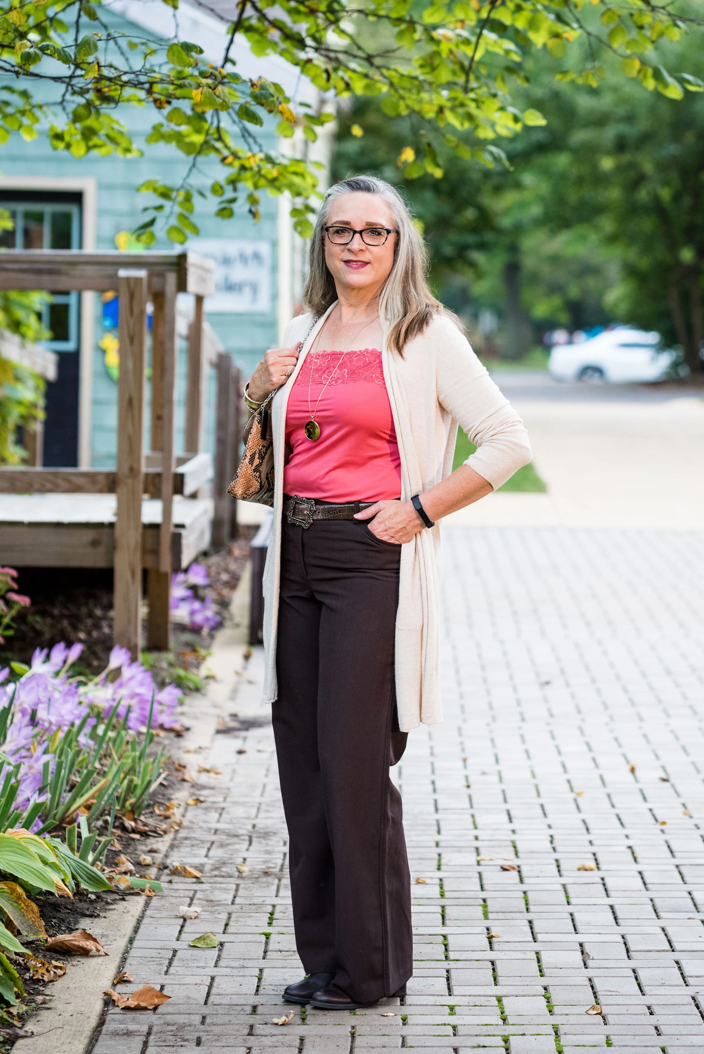
This Cranberry cami was a recent thrift purchase. Most of my camis are pretty tight and I wear them as layering pieces under long sleeve tops and sweaters. I do not wear them to be seen, but it occurred to me that it would be nice to have something I could have more visible under an open sweater. It is Maurice’s brand. I am becoming a fan of Maurice’s. I see pieces every so often at thrift stores and recently I bought what has become one of my favorite pairs of jeans on the clearance rack. What really drew me to this cami was the pretty lace detailing.

These trousers are Worthington brand from JCPenney. Do you know how hard it is to find brown slacks? Now maybe that has changed. I have seen rust, and that more yellowy brown called cognac, but real brown is hard to find, especially a dark brown like this one.

The off white open front cardigan is Chaps brand and another clearance rack find from Kohl’s. Chaps has some nice pieces, but they do have a higher price point than I would normally pay, thus my reasoning for waiting for them to go on clearance. If I thought a particular piece is really worth paying full price for, I would buy it, but for the most part there isn’t anything that I absolutely have to have. I could shop my closet for months and come up with all sorts of new combinations, because I have so many clothes. Truth!

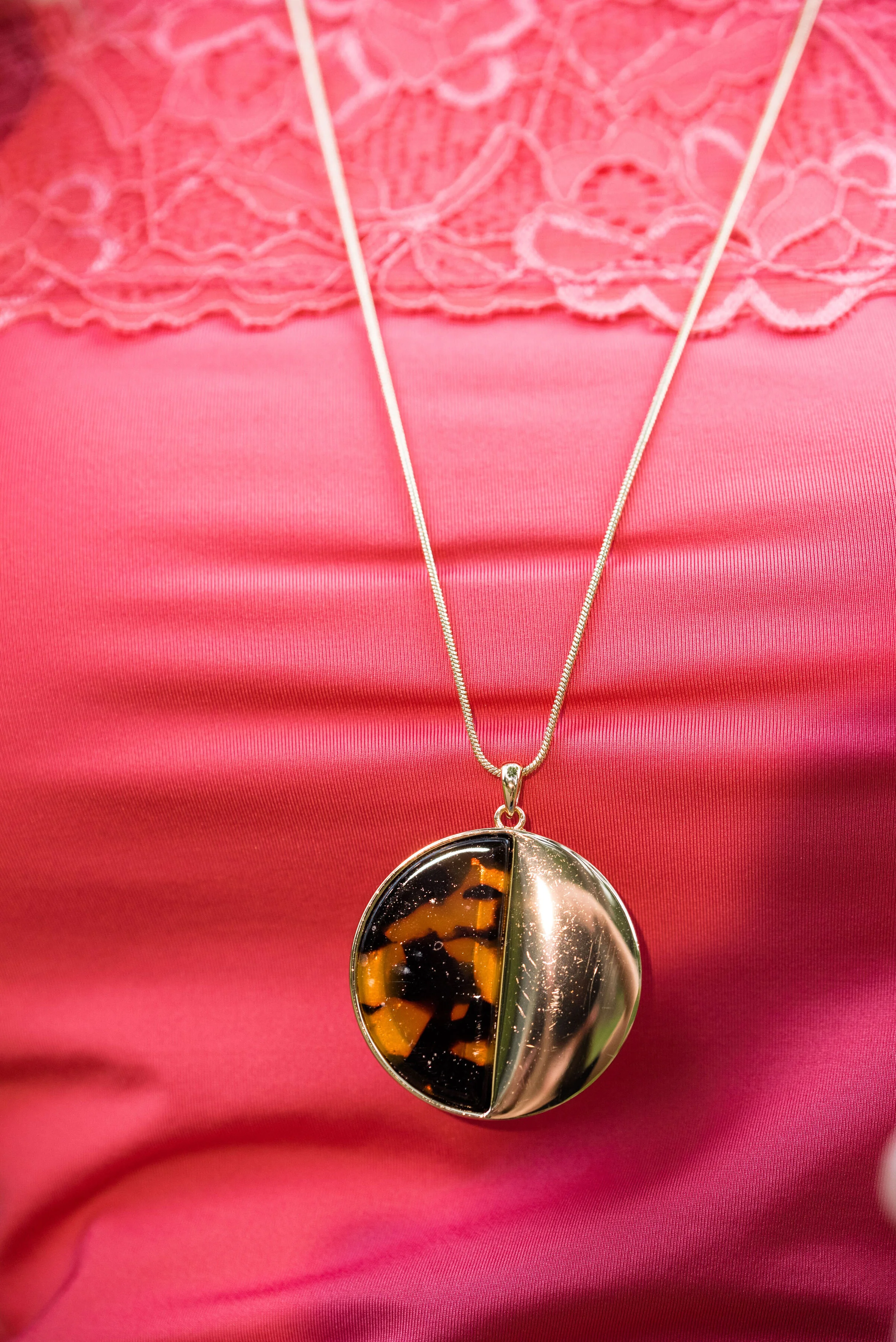
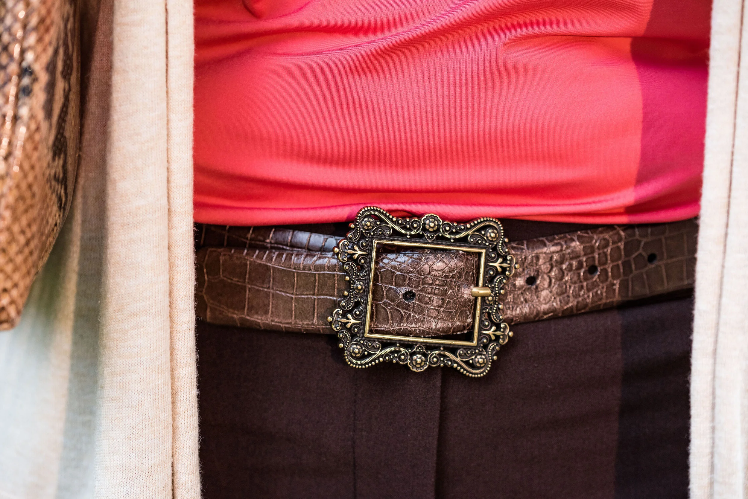
I kept the accessories minimal with my gold leopard print medallion necklace, a few gold bracelets, my snakeskin clutch, a brown belt, and brown boots. I thought this was a good outfit for complimenting with animal prints.

These are two colors that I can get behind. I love the combination and think these two work well together. What do you think? Do you have any of these colors in your closet? Do you wear camis a lot? Do you wear them more for layering or to be seen? I’d love to hear you thoughts, so leave me a comment or two in the comments section. I appreciate hearing from you and all your support.

I’m including a few shopping links for you to peruse. I hope that you find these helpful. Every click you do, gives me a few cents and I appreciate every one. These are affiliate links. All opinions are my own.

Photo and graphic credit Rebecca Trumbull.

Have a great day.


Pantone - Autumn/Winter - 2019 - London Palette - Intro

Past Pantone seasons, I have tried to combine both the New York and the London color palettes into one series. Most of the time there were plenty of overlapping colors, so I was able to take colors from both palettes to make my outfits. This fall there were only two overlapping colors, Galaxy Blue and Bluestone. It was for this reason, that I decided to break the series into two parts. We just finished the New York palette last week. You can see a recap of those outfits here.

Today’s post will introduce you to the London palette and give you a few sneak peeks at the upcoming outfits.

Both the New York and the London palettes included numerous fall yellows, reds and browns. They both included a green, some blues and hues with pink undertones, but the London palette is the only one to include purple, which I thought was interesting since purple is trending right now. Purple has always been one of my favorite colors, so I was excited to see it included on this palette.

In all honesty, I like this palette better than the New York one. I always veer towards richer more saturated colors, rather than pastels and I felt that I had an easier time finding pieces in my wardrobe that better personified the color palette. In this palette we find words like vital, fortifying, robust, delicious, rich, baked, arresting, mellow and distinctive to describe the colors.

I hope you will join me on Thursday as I take a closer look at the London color palette for this fall. Here are a few peeks at what is coming up.

I hope you will join me on Thursday for the start of this series and a look at the first two colors.

Have a great day.

Photo and graphic credit Rebecca Trumbull.


Pantone - Autumn/Winter - 2019 - Orange Tiger and Eden

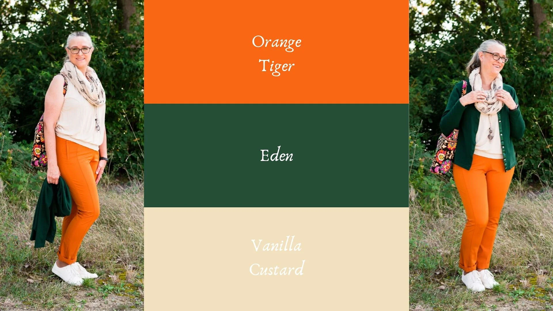
I mentioned in Tuesday’s post on Sugar Almond and Dark Cheddar, that not everyone can or wants to wear orange. I love orange, but it has to be the right shade for me to wear it near my face. Some oranges make me look sallow or washed out. Today’s colors are bold and what caused me to put these two colors together, was the contrast of dark with light, deep with bright. Today’s colors are a “fearless” Tiger Orange, and a rich “stately forest green” called Eden. I think Pantone’s description of these colors is perfect.

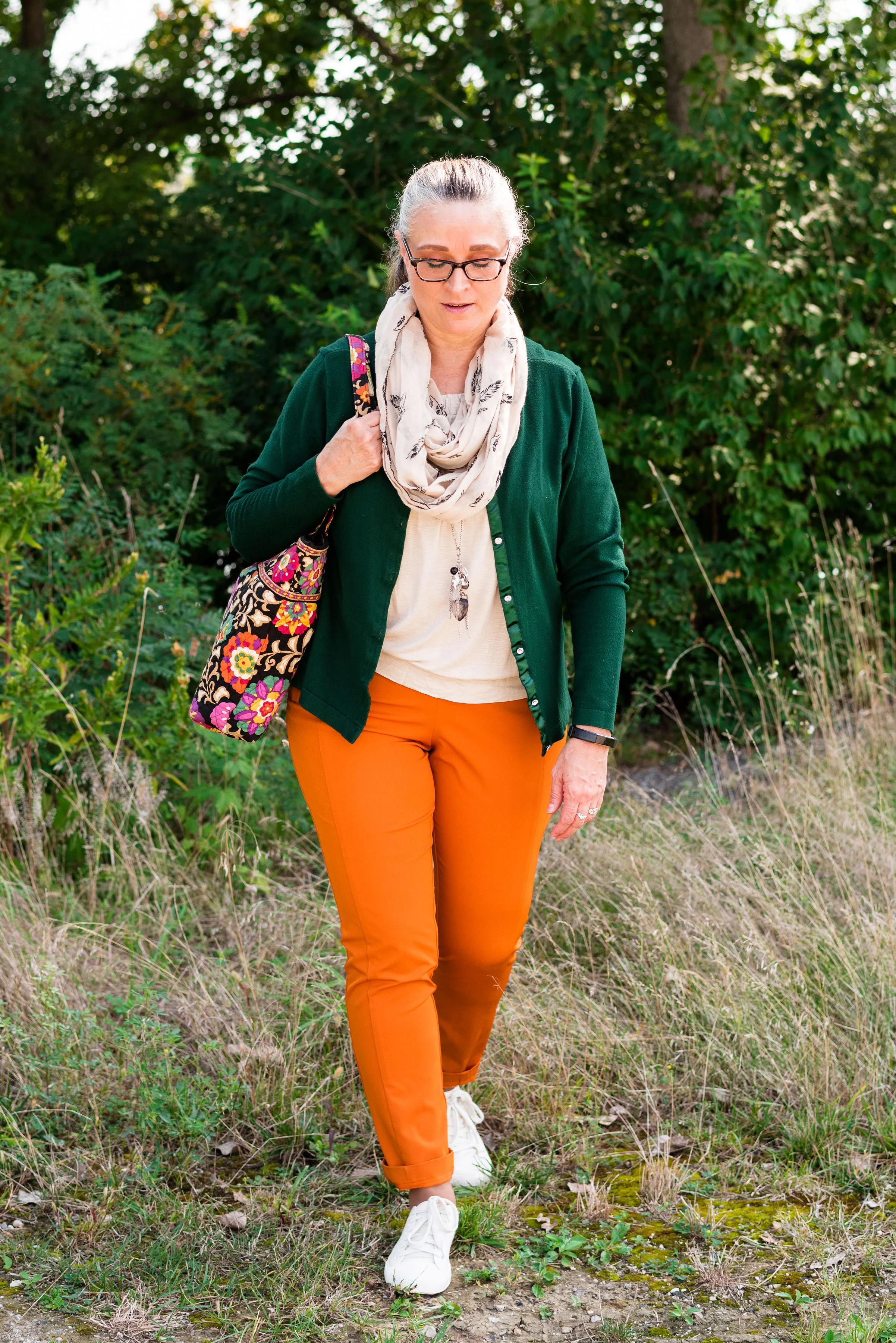
These two colors are the first in this series that I felt truly matched with the Pantone colors. I looked for a while in thrift stores for the perfect green and I really think this dark cardi nailed it. the sweater is Jaclyn Smith brand.

These bright orange pants are Worthington brand and I got them at JC Penney a number of years ago. These are more of a skinny leg trouser than a wide leg trouser. I got them for the bright color and do find occasions in the spring, summer and fall to wear them. You can see how I styled these with a floral tunic here.

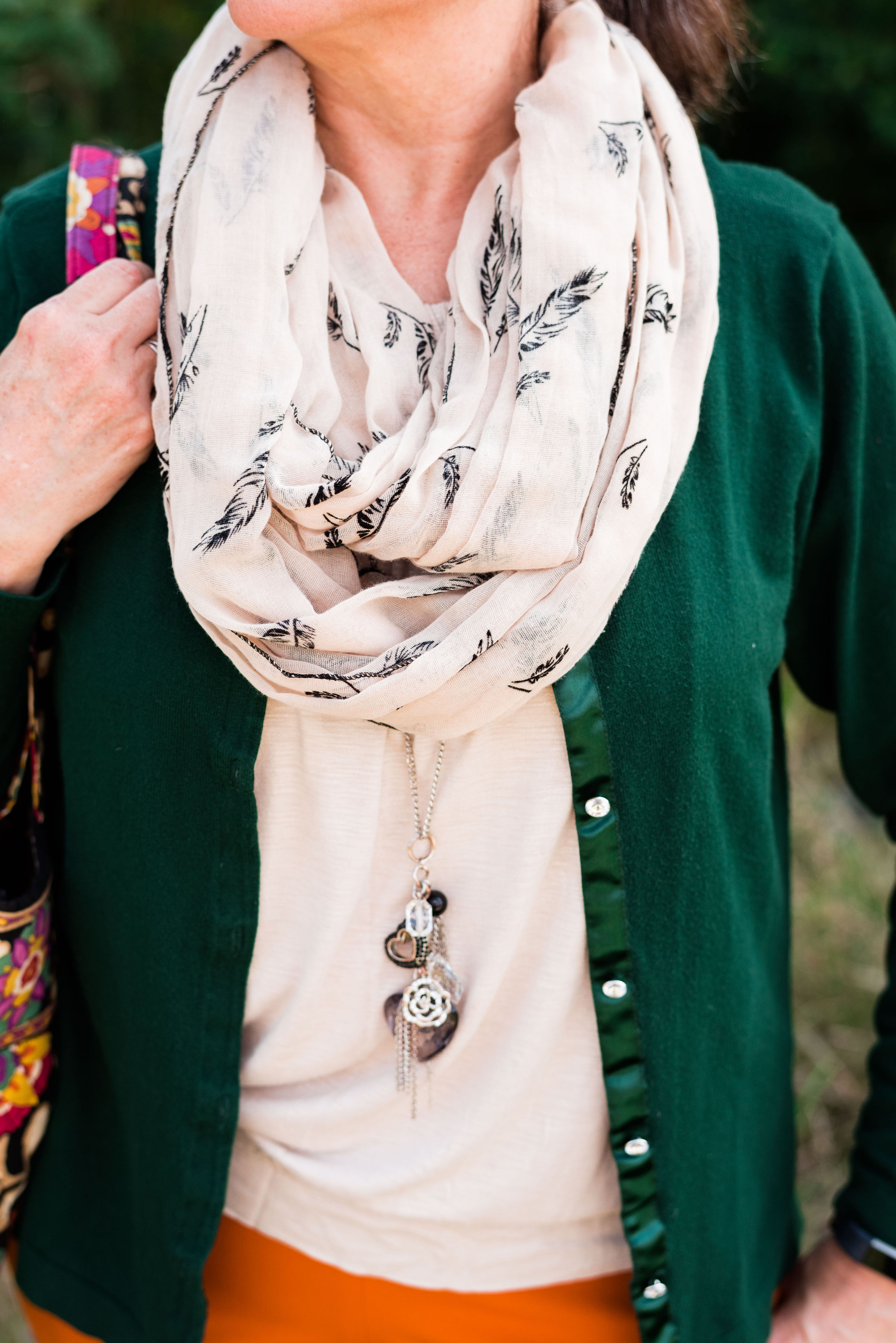
This cream colored tank top is a thrifted Loft piece. I actually have two of them, found on different occasions, but the exact same style. This one is a large and has a sheen to it, that you can’t really see in the picture. The other one I have is a medium and is more of a true white. Why do I need two of these? Comfort and ease of wear. They work perfectly for something like this, but I will also be able to use them as a light weight under layer when the temps grow cold. The piece is banded on the bottom, making for a great fit without showing off the bulges. Here are a few to look at.

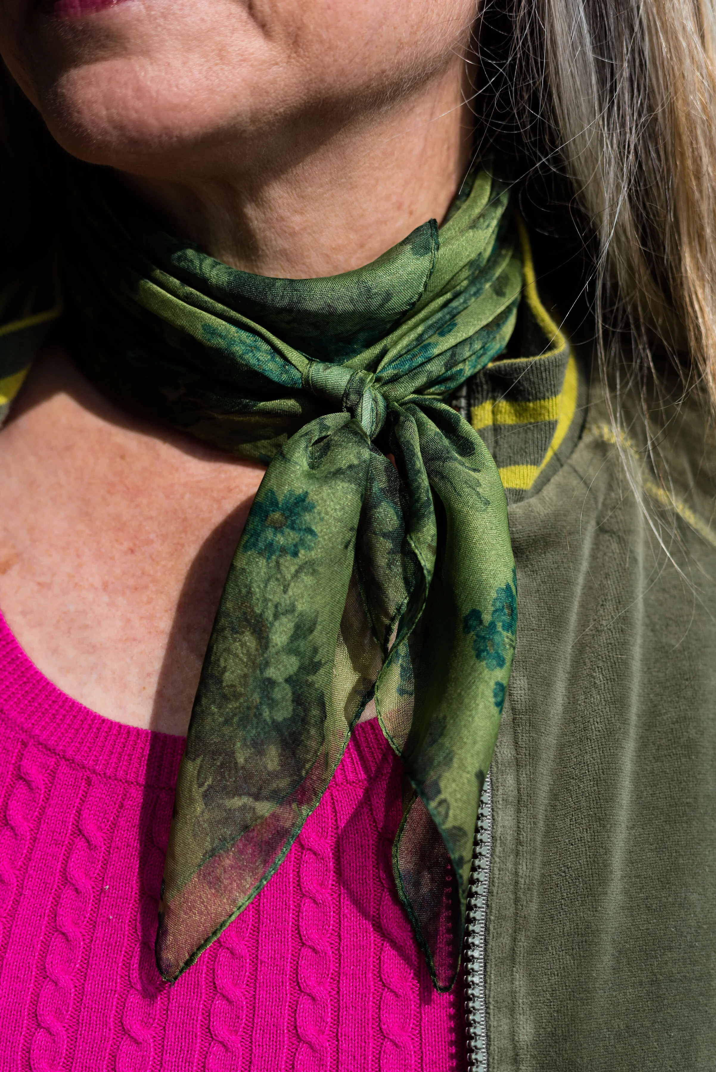
The scarf I added was another thrifted piece. I don’t have many pieces that are cream or ivory, like this. I am also looking for a cream fisherman sweater and/or turtleneck. I don’t need anything, because I am a clothes horse, but every now and then, I do realize I am lacking something I would love to incorporate into my closet. What about you? What pieces have you been hoping to add to your closet?

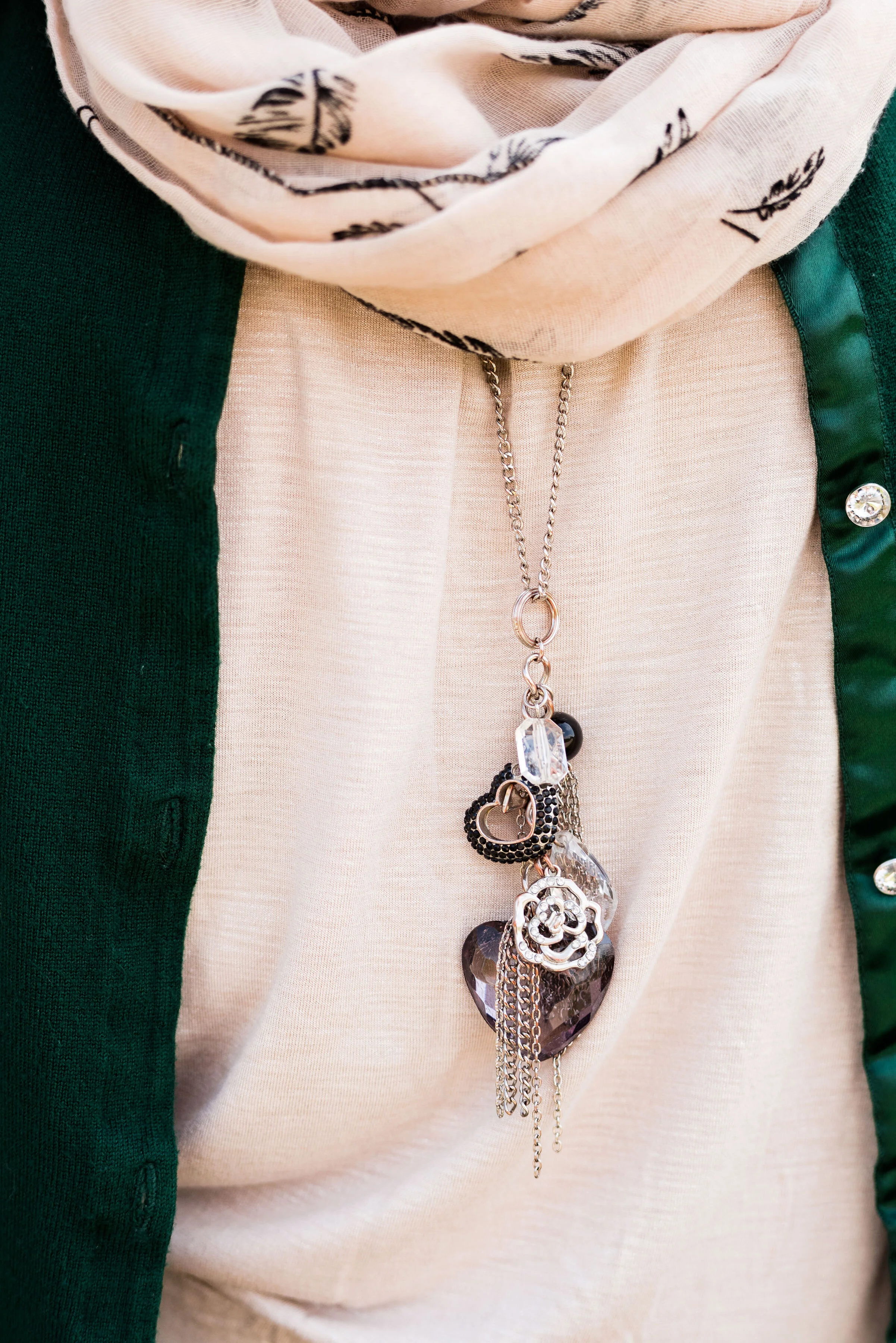
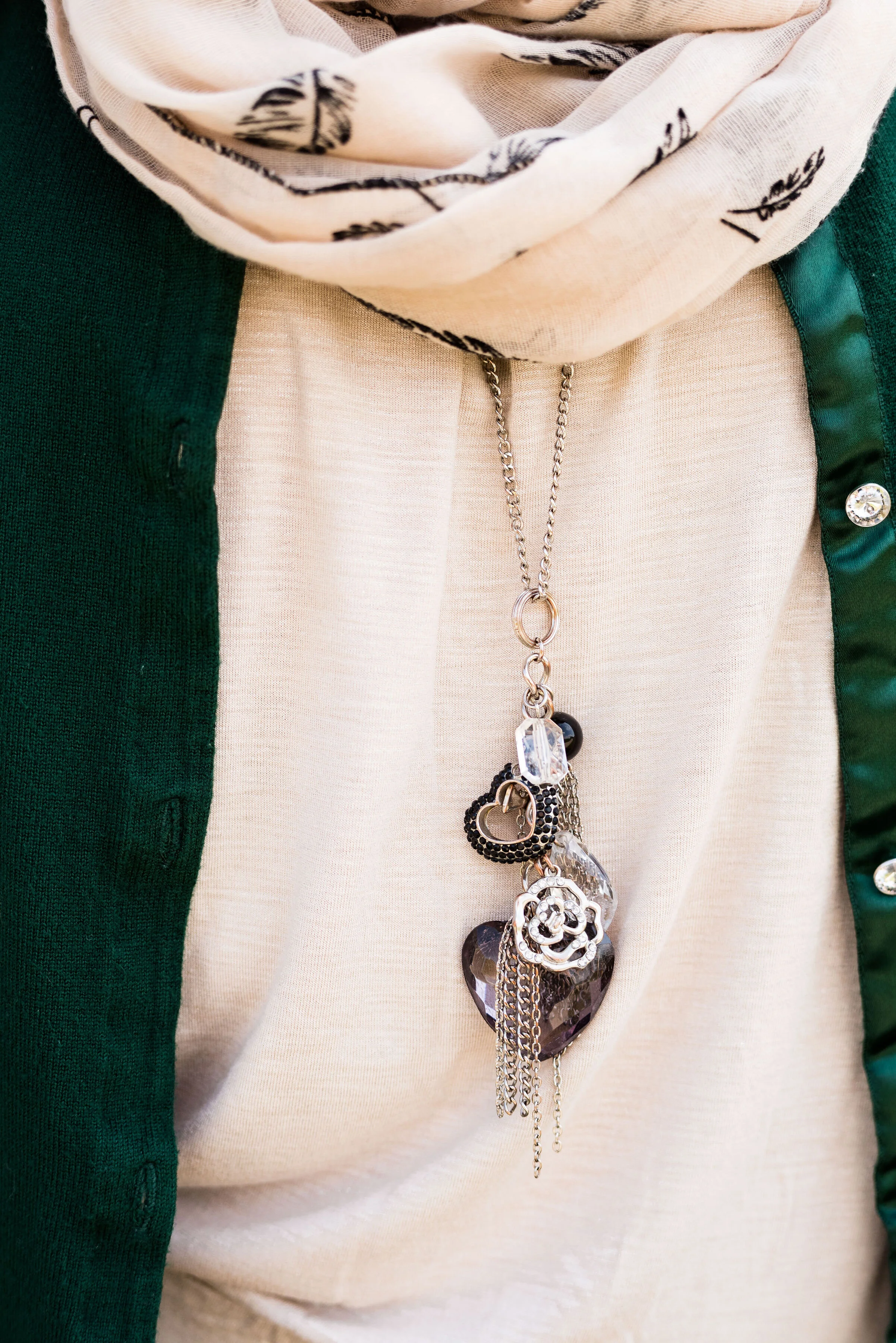
In addition to the scarf I wanted to add a long charm pendant necklace to break up the plain back drop of the tank. I think this outfit would have been equally good with a printed tank under the sweater.

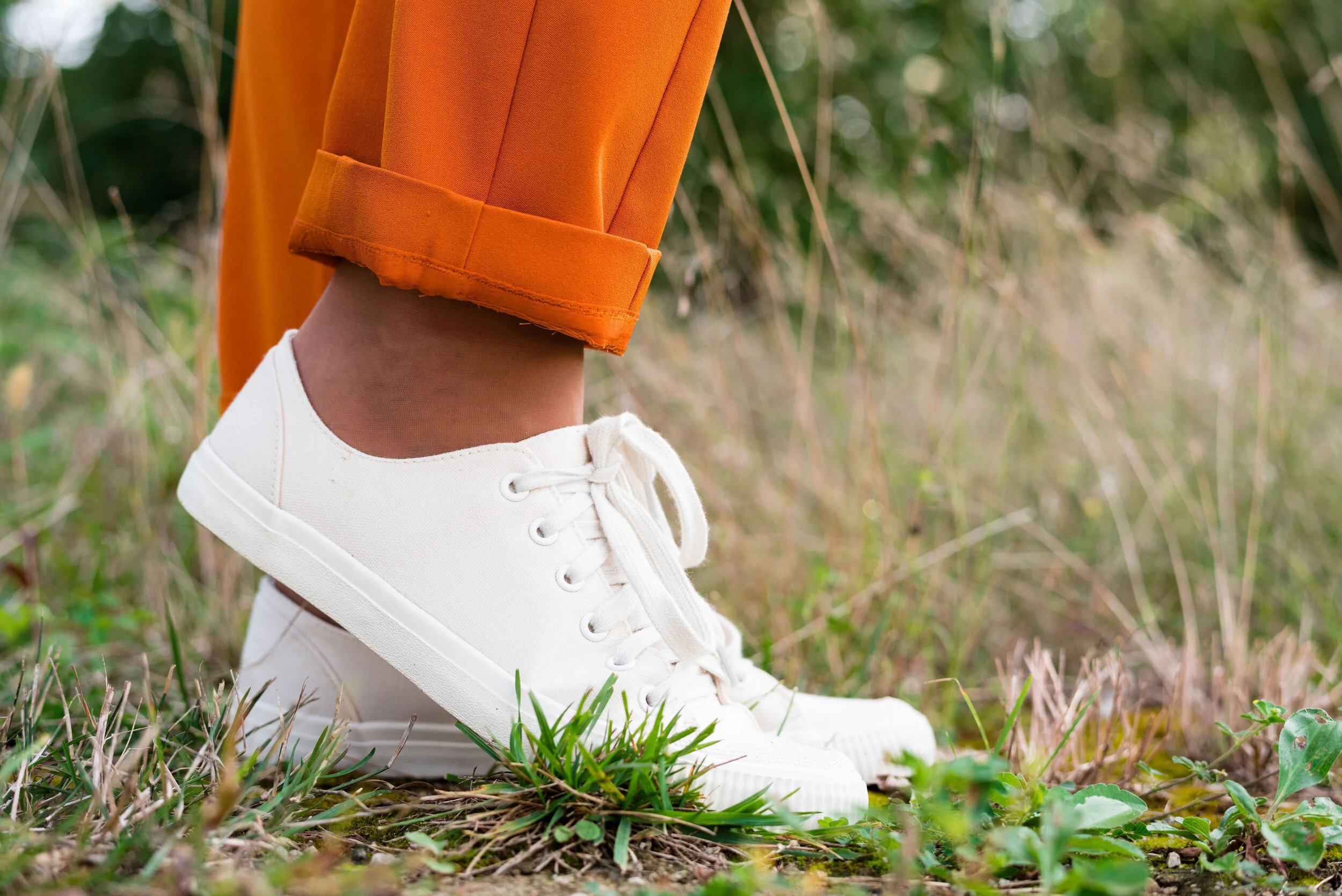
My other accessories included my Vera Bradley tote bag and my thrifted Mossimo sneakers.

What did you think of this outfit? Would you wear a pair of bright orange pants like this? What is the brightest color you have ever worn in pants or a skirt? I’d love to hear you thoughts, so leave me some love in the comments.

I’ve included a few shopping links. These are affiliate links. All opinions are my own.

Photo and graphic credit Rebecca Trumbull.

Have a great weekend, everyone!


Pantone - Autumn/Winter - 2019 - Crème de Pêche and Rocky Road

I am not sure how the Pantone Color Institute decides the colors they are going to feature for each of their palettes. If you have been following me for a few years now, you can probably tell that many of the colors that appear on the palette are very similar to another season’s palette and are just called a different name. For example Tuesday’s Galaxy Blue was very similar to last spring’s Princess Blue.

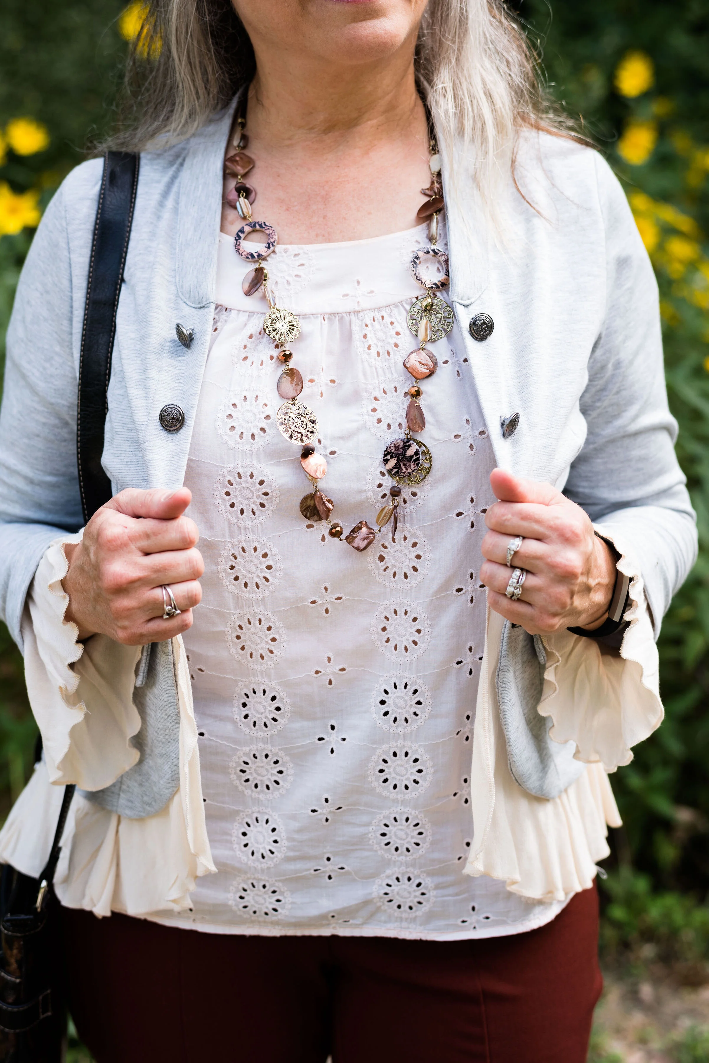
Today’s outfit features two colors called Crème de Pêche and Rocky Road. Once again, my versions of the colors, do not look much like the Pantone colors, but it still gives us inspiration to pair to fall type colors together and pull it all together with a light gray.

My Chico pants look much more orange in comparison to the Pantone color swatch, but I do like how this pair of pull on Ponte knit pants looks combined with the light peach top.

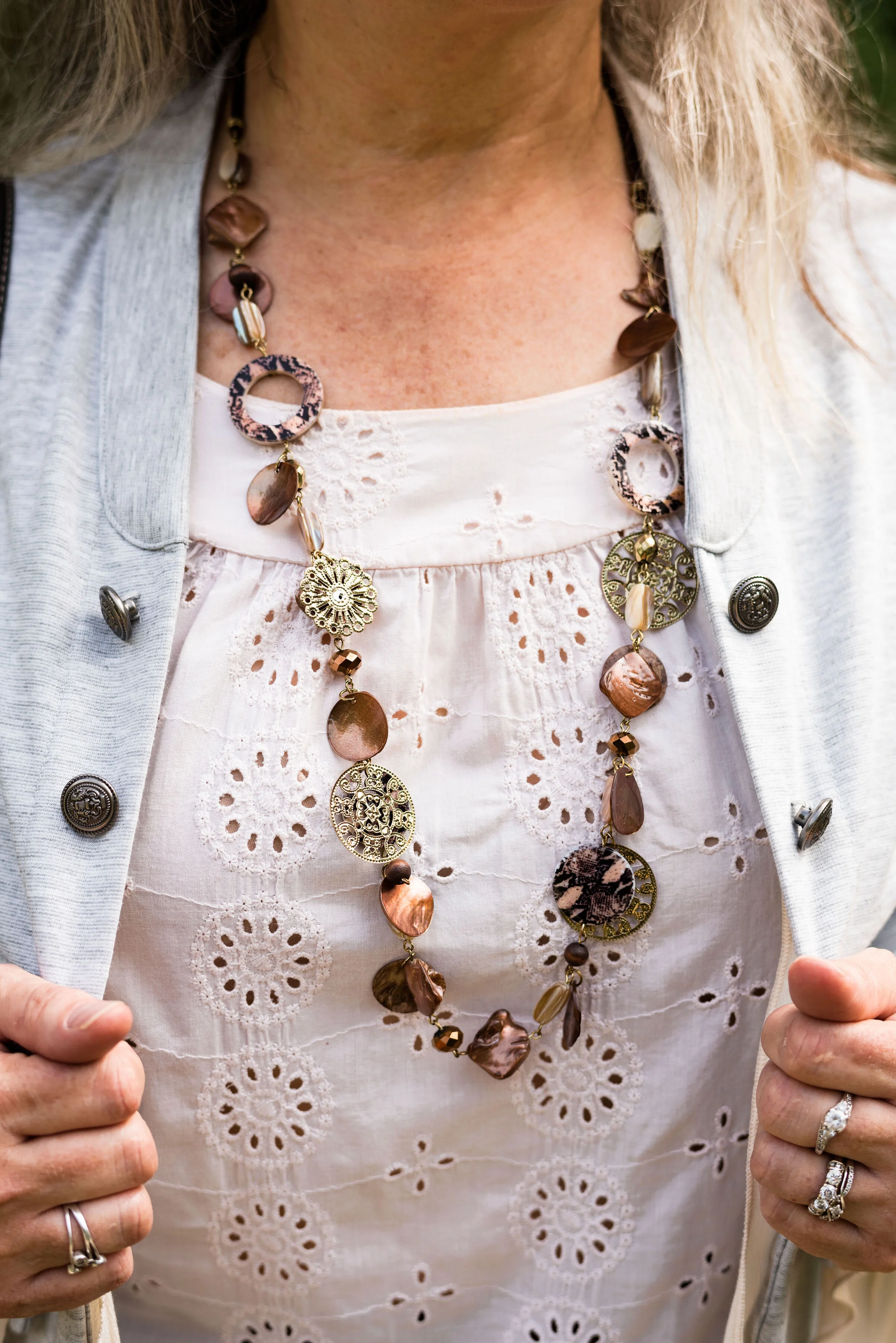
The light peach eyelet top was a thrift find and I wear it a lot in the warmer months. You can see a closer look at that and the necklace I chose in the picture below. I thought the necklace was a good compliment because of its similar colors.

This light gray, About A Girl, jacket was a fun find on the Kohl’s clearance rack. I like the military vibe of the buttons, but the surprising feminine detail of the ruffles on the hem and sleeves.

Another Kohl’s clearance find, I got these Sonoma boots at the end of last winter season. They are a faux suede and a different look that some of my others boots. I love the slouchy and buckle details. Yes, I do have too many pairs of boots, but can a woman who lives in the midwest, have too many? Ha, ha.

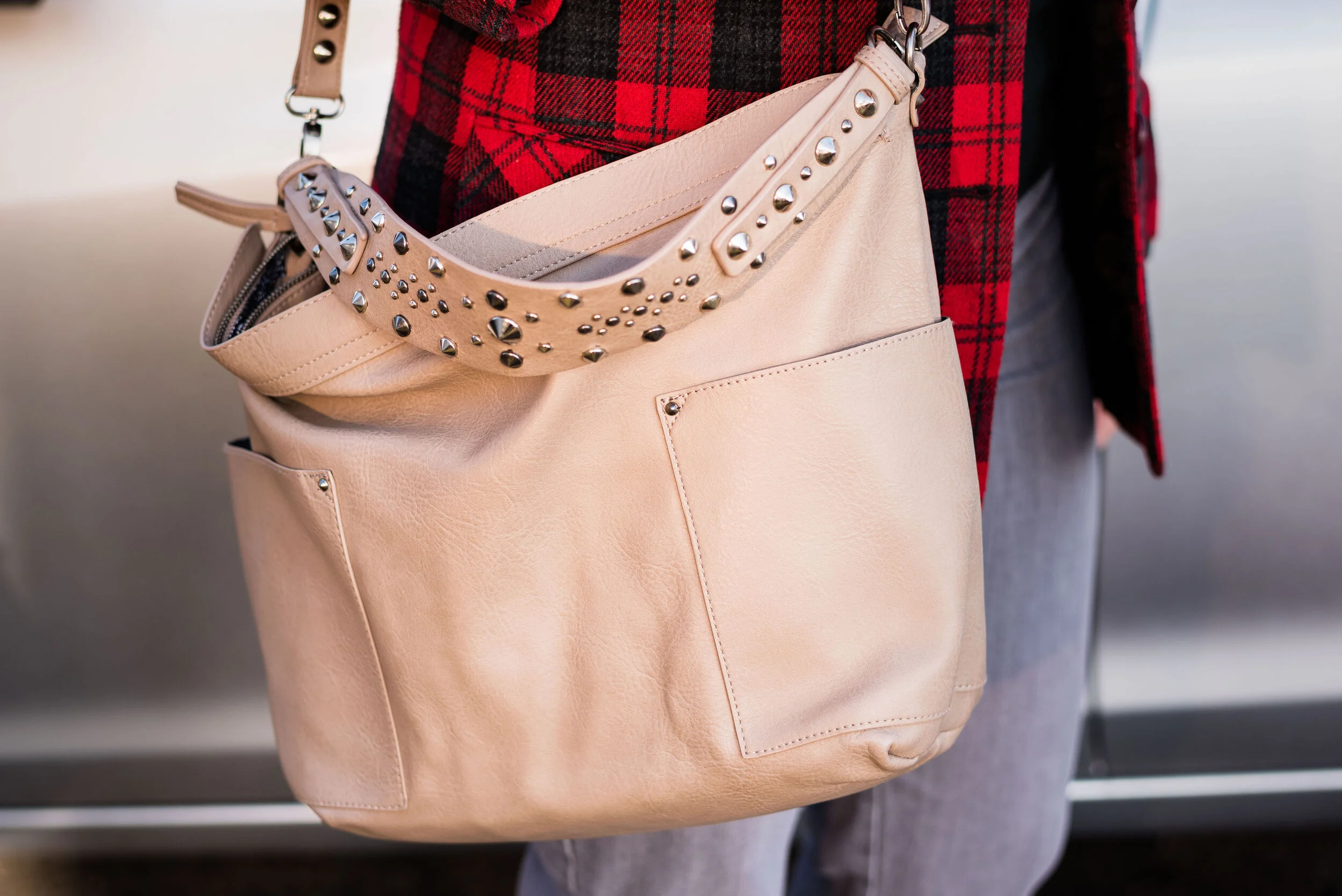
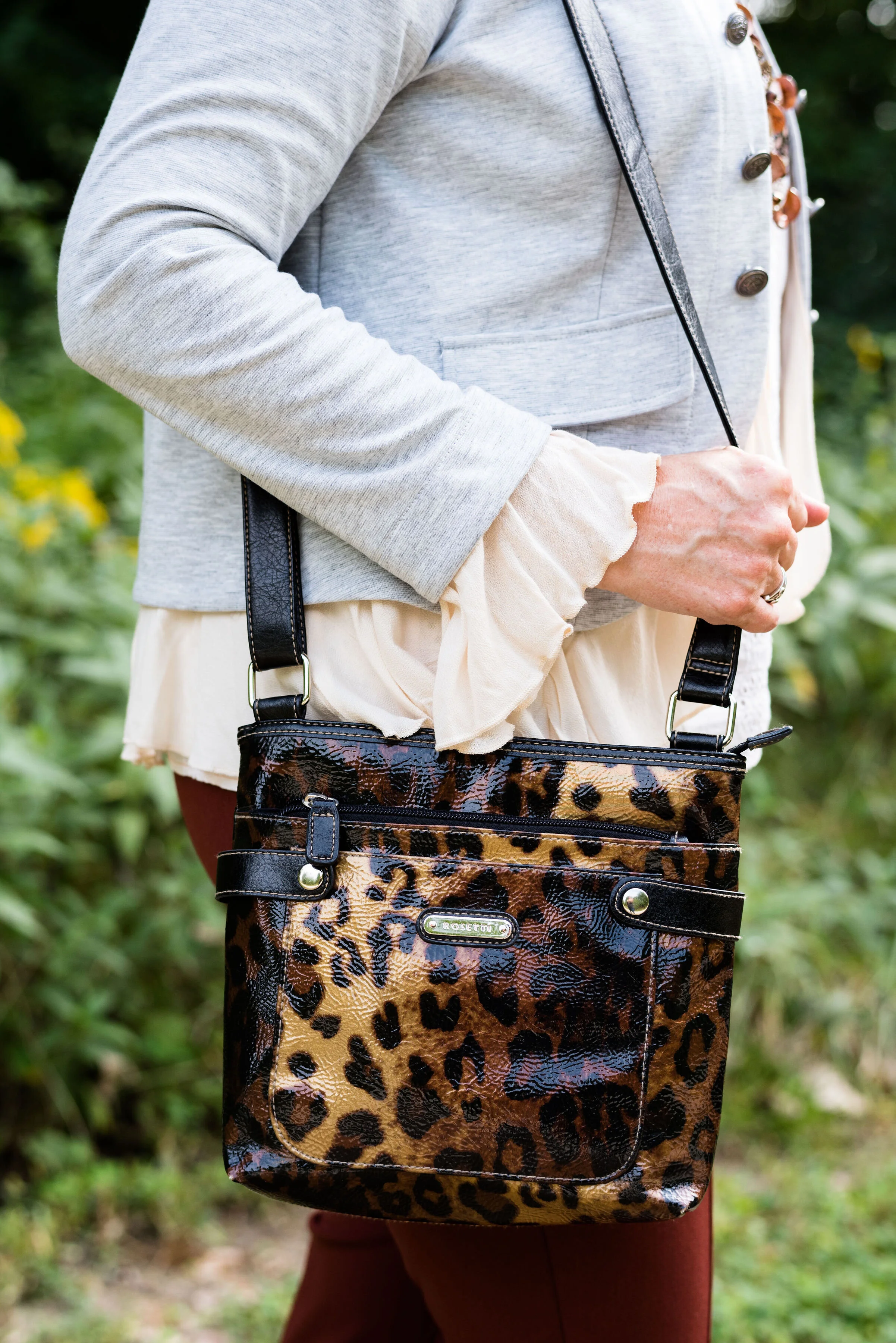
Here is the thrifted Rosetti leopard cross body again. I am planning on making this my “normal” every day bag, as soon as I get around to changing things over. How many of you change your purse on a regular basis? I have many more purses and bags than I actually use. I use them for the blog, so you can see the different styles and shapes, but more often than not, I carry a cross body bag like this. It is just so convenient for hands free shopping.

Here are a few more pictures. I really liked these photos, especially with the large rock and the yellow flowers in the background.

Although my colors were off, I hope you enjoyed this outfit. Do you have a favorite pair of boots you like to wear? What color are they? What do you think of these colors from the Pantone palette? Let me know your thoughts in the comments.

I hope you have a wonderful weekend!

Photo and graphic credit Rebecca Trumbull.

Pantone Autumn/Winter - New York Palette - Intro

For those of you who like my Pantone color series, you’ll will be glad to know, it is finally here. Due to scheduling issues my photographer and I finally got together to take the pictures and let me tell you, it was another scorcher! Ha, ha. I don’t know why, but it seems whenever we are scheduled to do pictures the weather is unreasonable. When we did the Pantone 2019 Spring/Summer shoot it was snowing. Now for the Pantone 2019 Autumn/Winter shoot it was sunny and hot. Oh well, there is no planning for the weather around here.

This year the color palettes between New York and London are quite varied, so I decided to do this in two separate series, rather than combining the palettes. Starting on Thursday i’ll be covering just the New York palette. When that palette is finished then I will cover the London palette.

This year’s New York palette is made up of colors described with terms like spicy, adventurous, extroverted and appetizing. Hopefully these descriptors will whet your appetites to follow along with this fall’s color series.

I really like this season’s colors. I feel like there is a good mix of tones that will give all skin colors lots of choices. The palette has a wide array of colors from classic blues, reds and green, to earthy browns and oranges to lighter pastels. Some of my favorites are Bluestone, Eden and Sugar Almond.

In addition, Pantone also includes a palette of classic colors which work well to use as the foundation of your outfit or as add on colors to tone down the brighter more jazzy color combinations. I can’t wait for you to see the outfits I came up with right out of my very own closet.

Here are a few sneak peeks. Join me Thursday for the start of the series.

Photo and graphic credit, Rebecca Trumbull.

Fall Trends 2019 - Part 4

I’ve been looking at various Fall Trends the last few weeks. There are so many fun fashion ideas out there and I wanted to let you know what a few of my favorites are. So far we have looked at Head to Toe Green and Metallics, Romance Gone Goth and Layering Knits, Head to Toe Prints and Dark Florals. You can see the original posts by clicking on the links.

Today we are going to look at two more trends that I like. The first is relatively easy for most women to tap into, because most of us have at least one animal print in our closet. Whether you have a leopard print skirt, a snakeskin bag, a zebra top or a giraffe sweater, all animal prints are in. If you don’t have any type of animal print, be sure to check out thrift stores before you head to the mall. I have seen plenty of animal print items in various places like Goodwill and Salvation Army stores and they are so much cheaper.

Trend 7 - Animal Prints

Since you have seen me wear leopard print in the the form of a skirt and a sweater, I thought I would show off my recently acquired snakeskin jacket. I found this brown and white Liz Claiborne print while I was thrifting.

This is a great piece for right now, as it is unlined. As the weather gets cooler, I will reach more for my lined jackets, but this will work well for work or just if I am running errands and need a light weight piece. I decided to pair the jacket with a thrifted, yellow, Banana Republic sweater.

I think yellow looks really good with this earthy brown. Since I was going for a more earth toned looked, I decided to pair the jacket and sweater with my olive, cargo, Gloria Vanderbilt, skinny pants. Cargo and utility looks are still on the radar for this fall, so pull out your utility jackets and cargo pants.

Gray seemed to be a good choice for boots with this outfit I love this dark Impo brand with the low wedge heel. The chains on the side make for a fun detail.

To go along with the yellow sweater, I added a yellow tote. I think the print mixing works well and the yellow pulls the whole look together.

I am going to try this outfit on and see how it looks. If I like it, I’ll probably wear it to work and I’ll post a picture on Instagram.

This next trend, is not something I typically would wear, but finding the right piece at a thrift store suddenly made this feel feasible.

Trend 8 - Capes

Probably most of you when you hear the word cape think ,either of a super hero donning blue spanx, or a dark figure drawing you in with his devilish eyes to have your blood for a night cap. While those individuals certainly did wear capes, and might even be said to be stylish, wearing a cape this fall is trendy.

Capes on the run way are leather trimmed, worn with trench coat flair and made of cashmere. Of course capes are not limited to what the big wigs in New York think. Capes can be made of many different fabrics and like the one I found at a thrift store, can be beautifully crafted pieces knitted or crocheted.

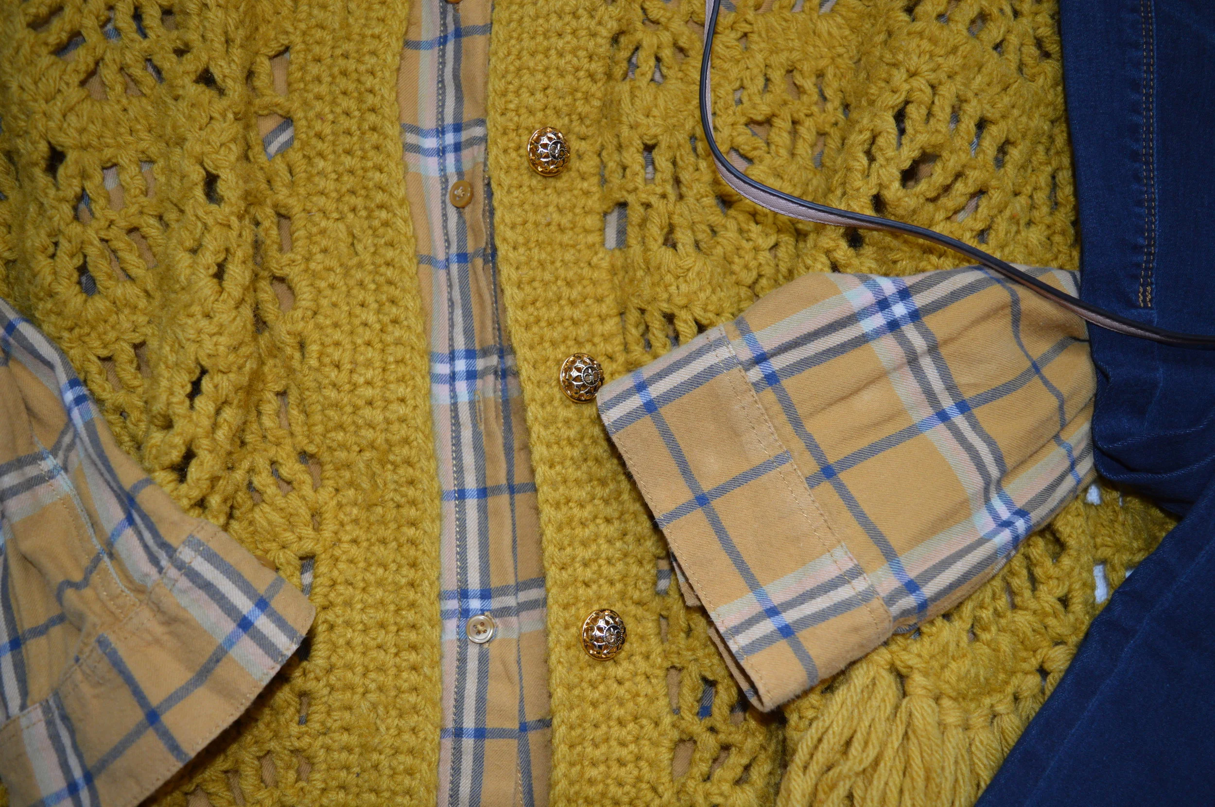
When I saw this sunny yellow cape, I knew I had to try it on. The American Cancer Society thrift store I frequent is just up the road and they always have something that I have to have. This was one of those pieces. Lucky me, they were having a sale that day, so I got this for an even better price. This looks like it was hand made as there are no brand tags or washing instructions inside.

You can see the symmetrical pattern of the knit and the pretty gold buttons. Sometimes a cape will only have one closure at the top, but I like the fact that this one buttons all the way to the bottom. I also love the fringe. I really speaks to my inner hippy and reminds me of the ponchos I used to wear as a girl.

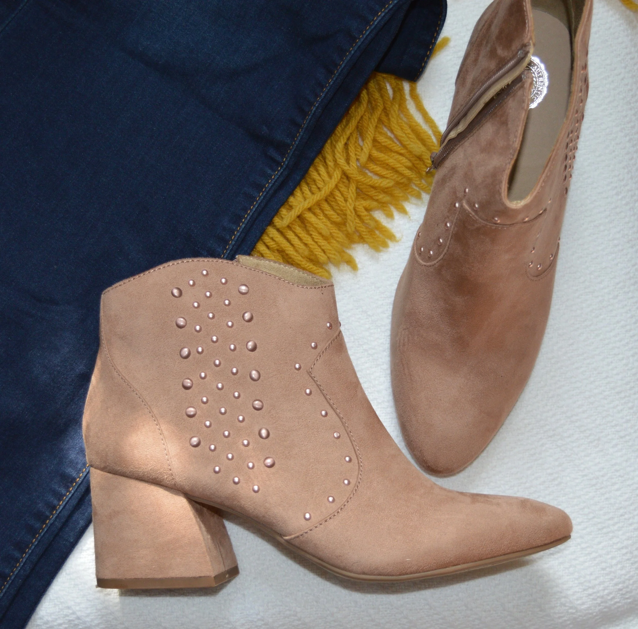
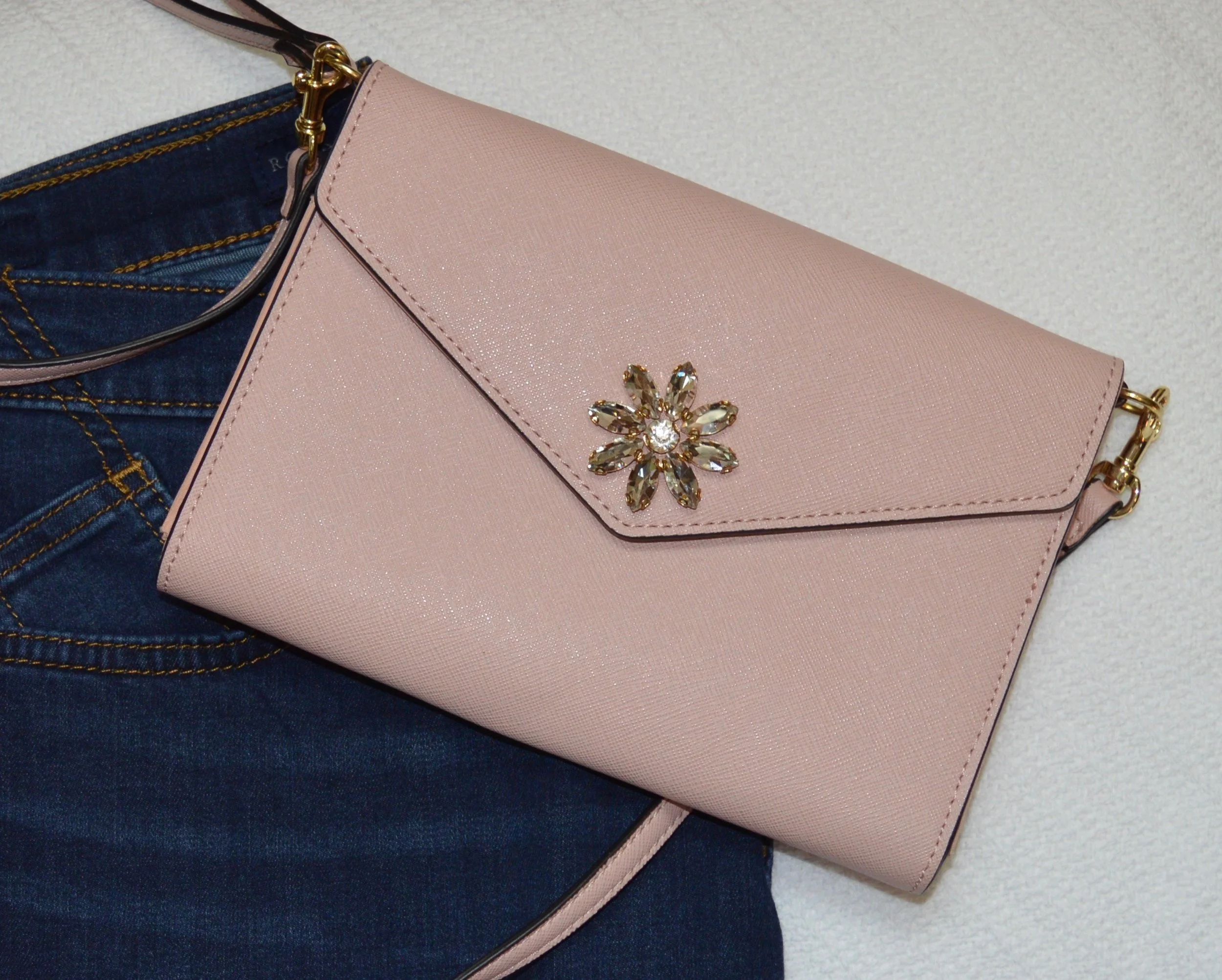
I paired this with a recently thrifted Divided H & M yellow plaid top. Yellow is definitely a new muse for me and I have accumulated quite a collection, more of which you will see in the coming weeks, both here and on IG. The top has just a hint of pink in it, so that is why I went for the blush boots and pink cross body clutch. The boots are SO brand on clearance at Kohl’s and the cross body bag was a clearance find at Meijer.

I thought jeans would be the perfect bottoms for this outfit. These dark wash, boot cut jeans are Rock & Republic brand and are from Kohl’s.

What did you think of these two fall trends? Do you like to wear animal prints? What kind do you have in your closet? Do you own a cape? I don’t know that a lot of people have one, and it may not be a trend that catches on, but it is fun to see what options are out there and how things are being worn.

For more info on these and other fall trends for 2019 check out these websites.

Marie Claire - 10 Fall Trends Everyone Will Be Talking About

Popsugar - The 9 Most Wearable Trends for Fall

Elite Daily - These Fall 2019 Fashion Trends….

There are plenty more. Just type in Fall 2019 Trends and numerous sites will pop up. I hope you enjoyed this look at some of the fun trends for this fall. Enjoy creating your outfits!


Wearing White - Long Pants

Today’s featured piece is a pair of white Gloria Vanderbilt jeans that I have had for a long time. They were a little big when I originally got them, so fortunately, they still fit. These are a heavy weight jean, so there is no fear of see through, but because they are white I still choose to wear neutral underwear. I find that a neutral color like beige or a light peach or blush are an even better choice under white garments, because they mimic the natural color of our skin. If you are a darker skinned individual a deeper neutral would still be the way to go when wearing white.

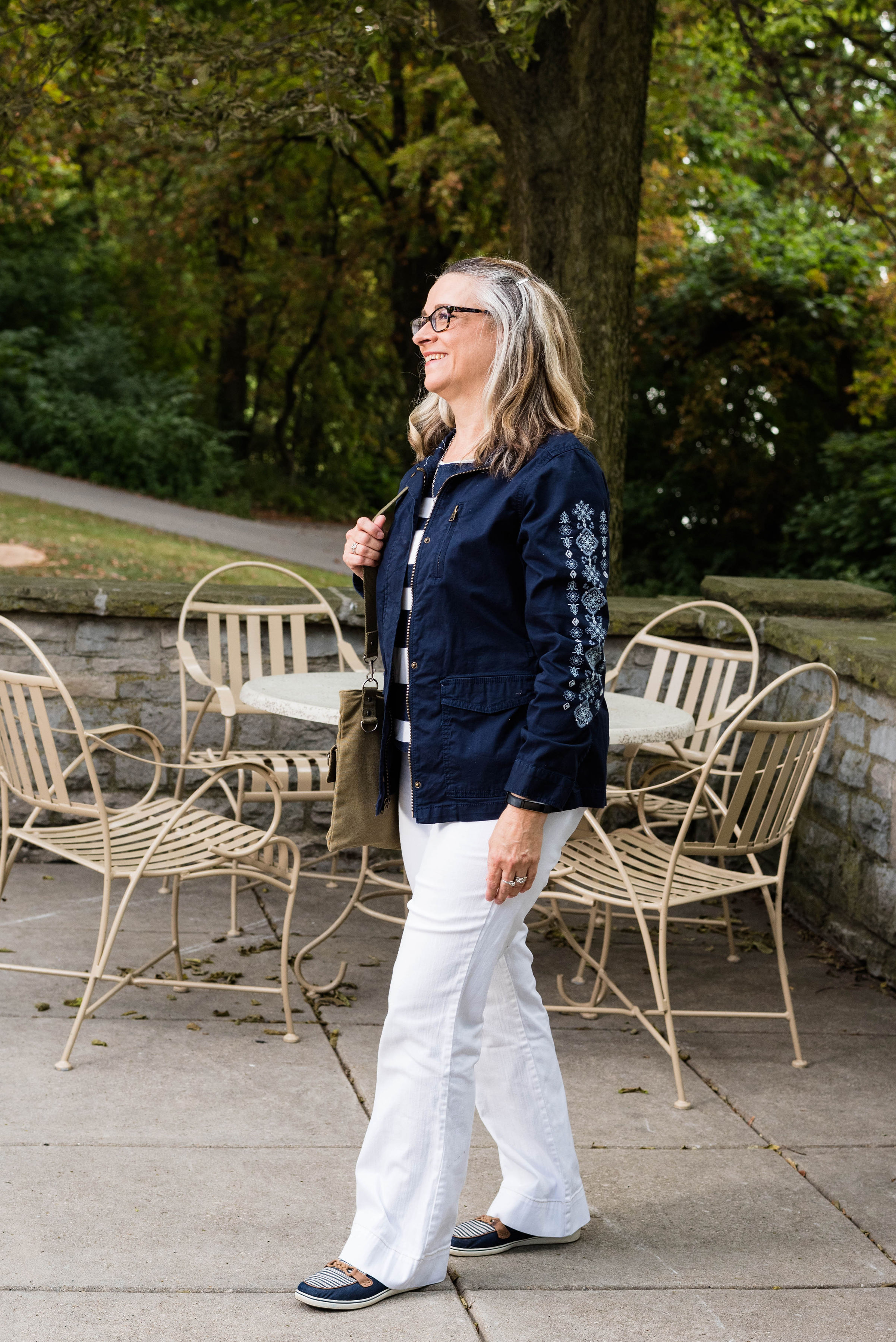
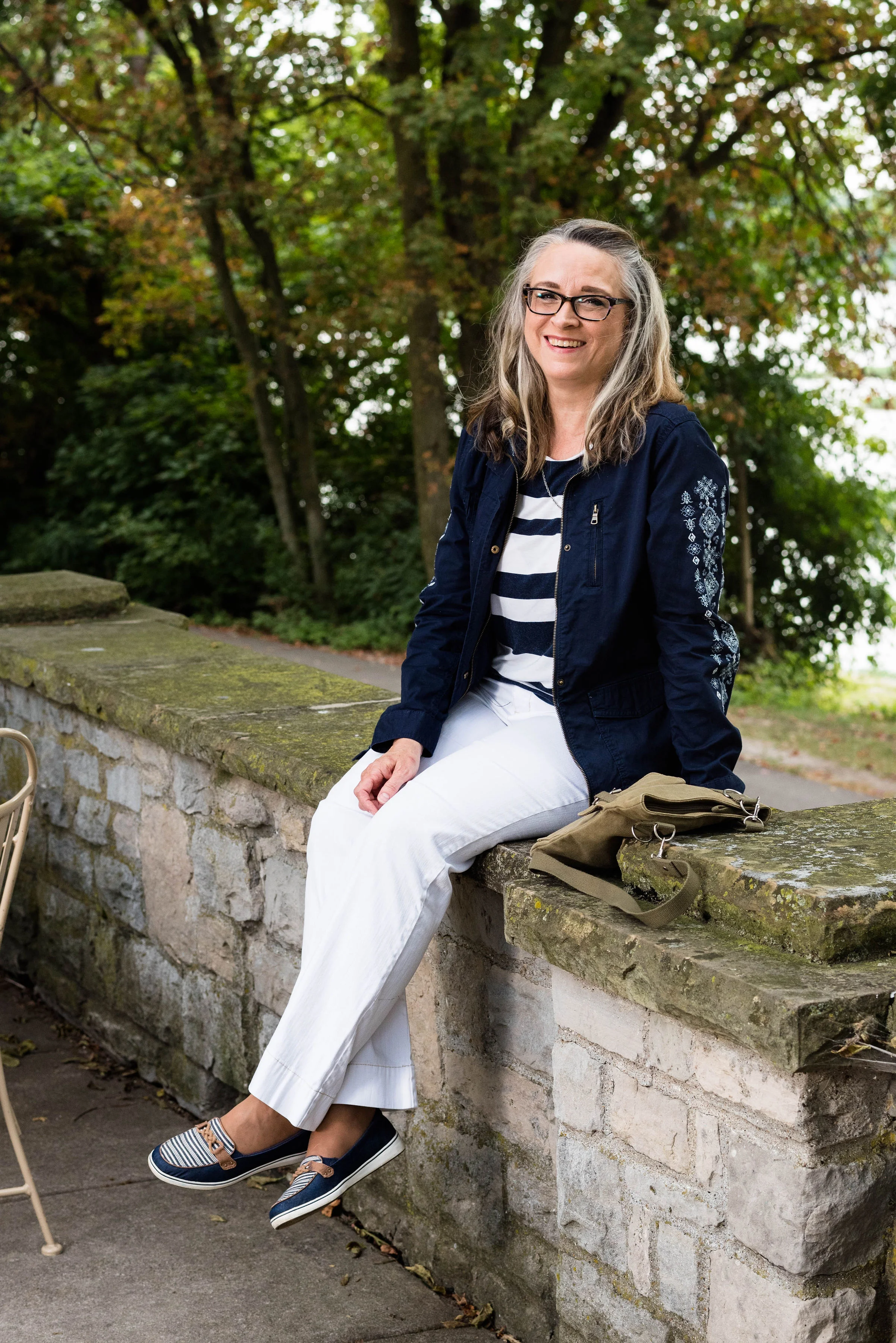
This is another classic look like Tuesday’s pairing with black and white, but this time I paired the white with navy. Navy and white always make me think summer, nautical and beach, for some reason. Isn’t it funny how we have preconceived ideas about color and color combinations? There is nothing wrong with that and sometimes it is good to embrace that which is classic, timeless and well known.

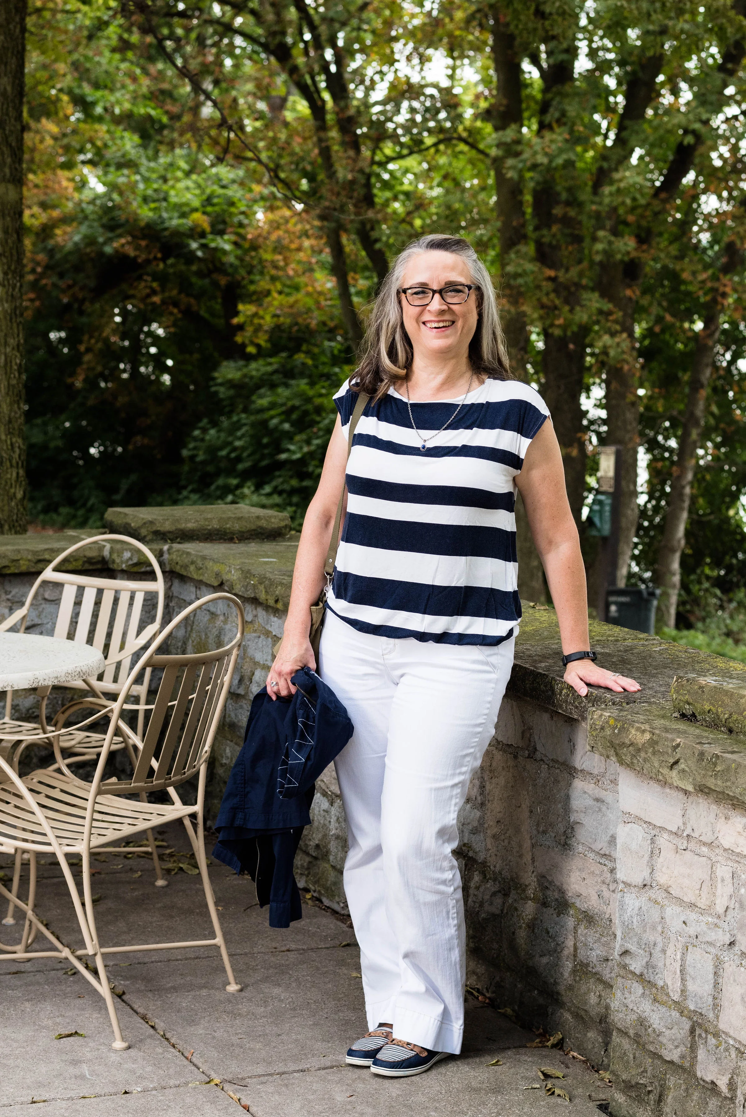
Another classic summer look is the striped tee with white pants. This Loft tee was a thrift store find. I like that it has wider stripes, just for a change of pace from my typical skinny striped tees. I also love the elastic bottom. Sometimes an elastic band can ride up, especially if you get a top that is too small. This is a large and in Loft wear, I probably could use a medium .5, ha, ha, if there was such a thing. However, for this top the large works well. The elastic keeps it in place and the extra room allows for less of my bulges to show.

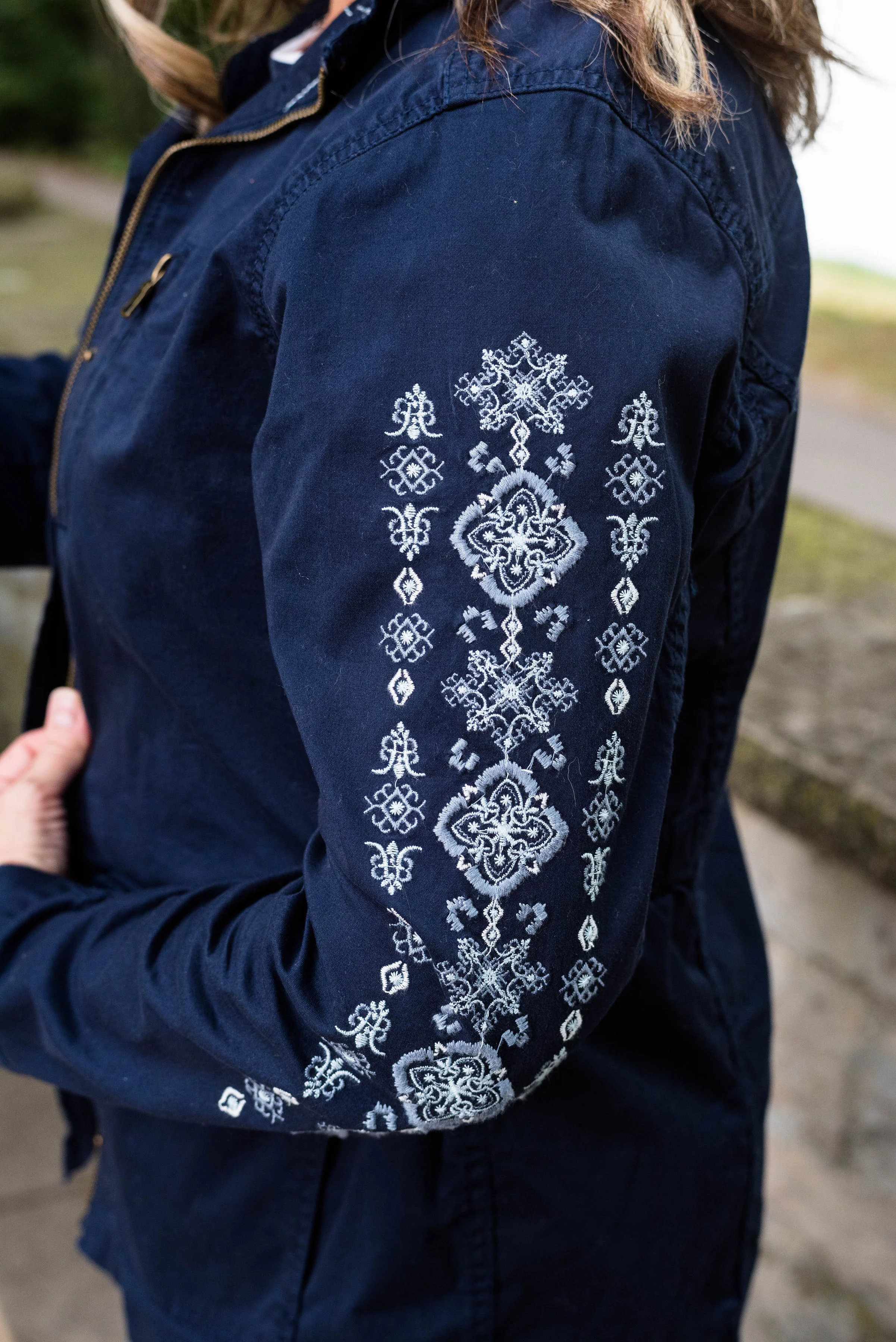
To make this a fall worthy, transitional outfit, I added the jacket. This Sonoma navy utility jacket has its own unique appeal. I have five utility jackets. You might wonder why I need so many. Truth be told, I don’t need any of them, but each one had something special about it that helped me decide to buy it. This green one was the classic olive style. This orange one is a color I love. Of course the wardrobe wouldn’t be complete without a camo one and an embroidered one. As if that was not enough, (you can see the others by clicking on the links), when I found this navy one with the embroidered sleeves, I knew it was coming home with me.

I kept my accessories simple once again, but you could have jazzed this outfit up with a bright, colorful scarf or bag. I went for a simple olive, crossbody, bag that seemed in keeping with the utility idea. This was a bag my daughter was getting rid of, so I snatched it up.

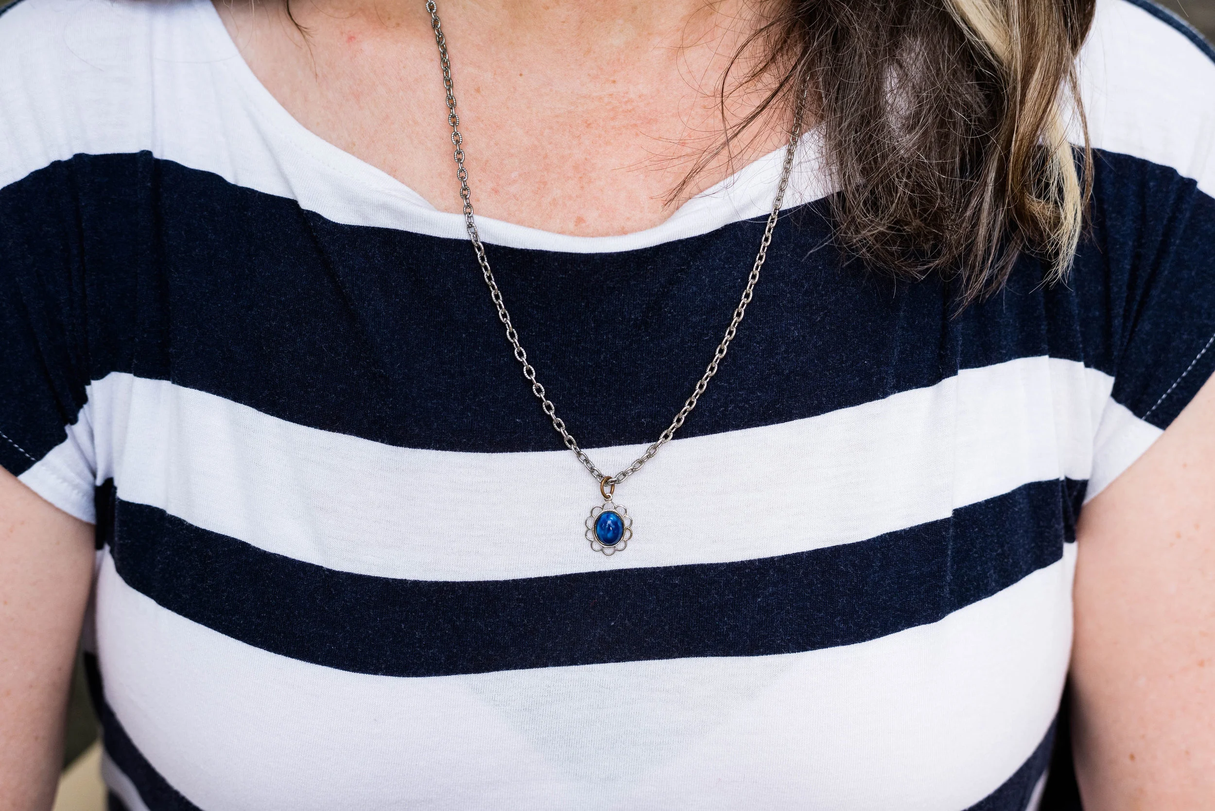
I tried on several necklaces and while I could have got completely without, I chose this simple blue flower on a silver chain. Do you think this small charm works with this outfit? Why or why not?

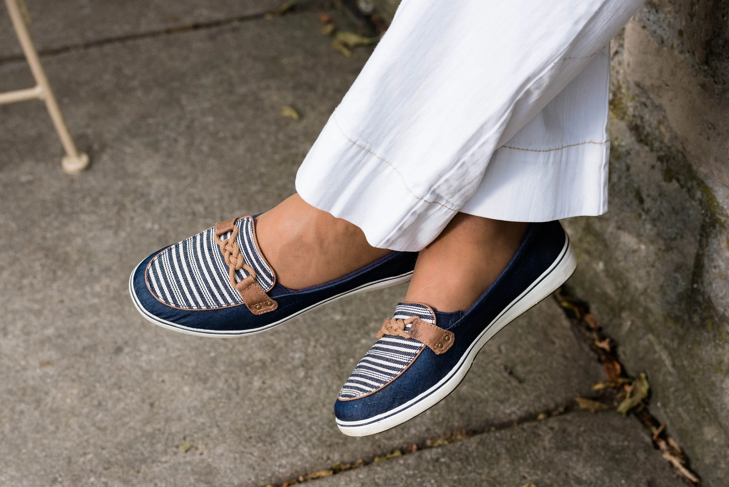
Once again, here are my navy Grasshoppers. These are such a classy and stylish shoe, perfect for warm weather and can be worn with skirts, cropped pants, shorts or jeans and they are amazingly comfy.

Finally, a post from me wouldn’t be complete without a blooper picture when I have one. The wind had picked up a bit on this very warm day, when we were taking pictures. When I tried to put my jacket on it kept blowing back into me. When I finally got it on, I was trying to flip my hair outside the collar and everything was sticking to me. The combination of sticky, windy and silly resulted in the this picture.

Overall, I like this outfit. What did you think? Do you wear white pants? Do you wear them all year round, or just in the summer. I love to hear your thoughts, so leave me some love.

I’ve included a few shopping links for utility jackets. If you don’t own one, now might be a good time to buy for fall. These are affiliate links. All opinions are my own.

Photo credit Rebecca Trumbull.

Friday linking up with Jennie of A Pocketful of Polka Dots.


Wearing White - Basic Tee

White has long been a staple for the summer months, and now it is worn all year round, even in the dead of winter. I don’t reach for white on a regular basis, so I thought I would do a short series on white with a few transitional outfits that could easily take me into fall.

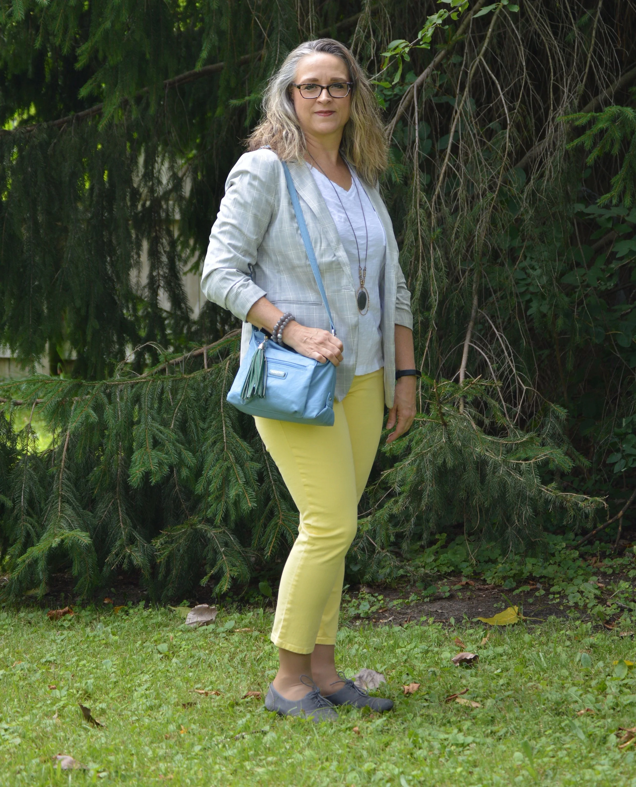
This first look features a white tee. A simple white tee is an easy and inexpensive piece to add to your wardrobe and can be dressed up or down. I wore this outfit to my younger daughter’s poster presentation for the final project of her summer research position with the University of Toledo.

In all honesty, I am not happy with my weight right now. After being down last year I have gained everything back plus extra. My pants are too tight. I don’t like the way I look or the way I feel. I have gotten back on the Fitbit bandwagon and am trying to keep track and walk, but it is a long process and I really suck at being disciplined. They say confession is good for the soul, so y’all get to hear mine. Ha, ha.

This jacket was a clearance find at H&M last season. You can see how I styled this before on the blog in my print mixing series, here. A light weight, lined jacket like this is a great way to start transitioning toward fall and cooler temps. Here in the midwest we might have days still in the 80’s well into October, but evenings will be cooler. Usually, we start doing the yo-yo thing with one day being 85 and the next day being 55, but thankfully, there should still be some summer type weather for at least another month or so.

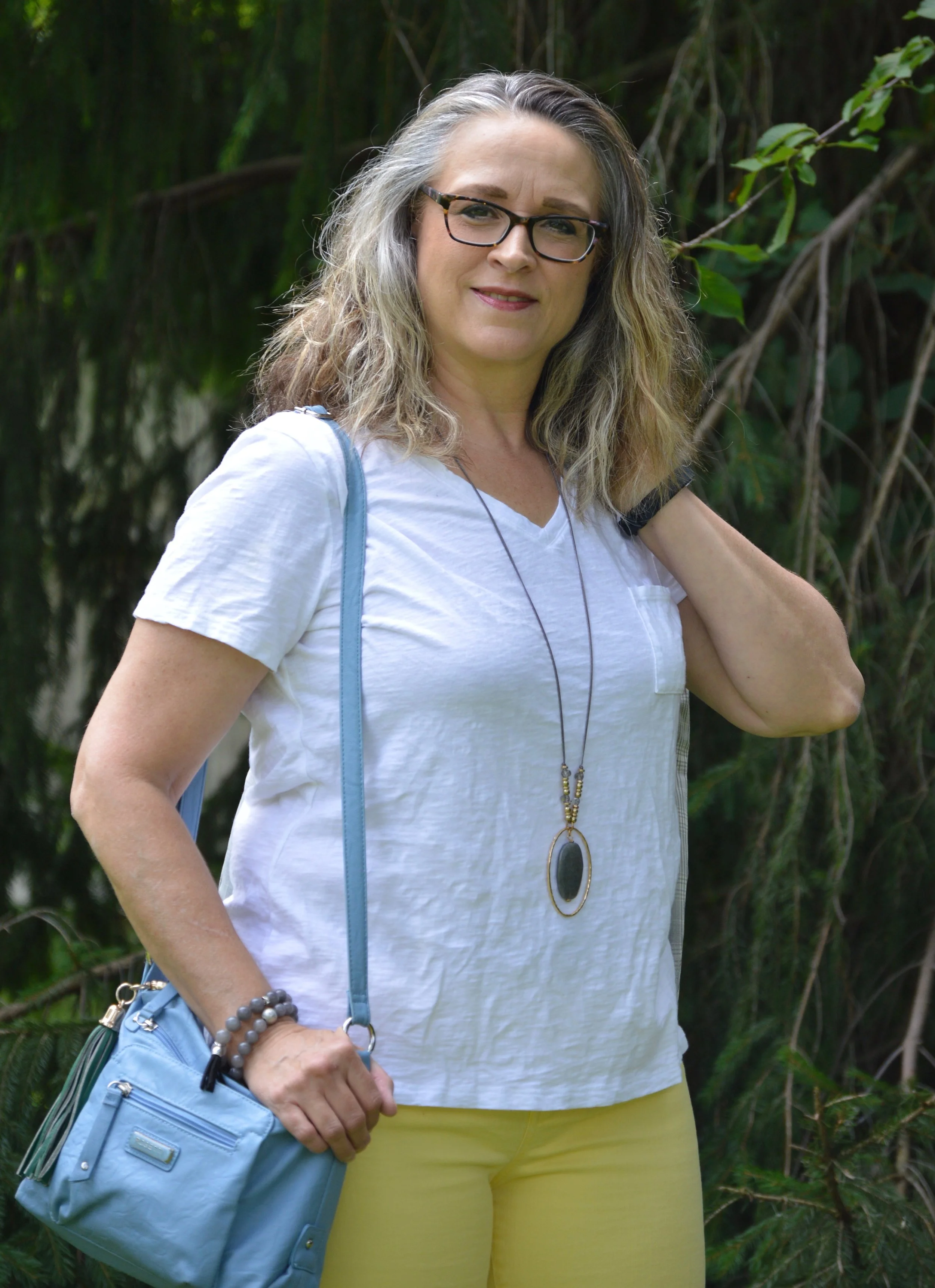
My white tee is from Walmart. If you want simple basics that have a great price point, Walmart is a good place to look. This brand is called Tried and Tru. The weight of this tee is medium and it has a relaxed silhouette, so isn’t too clingy in all the wrong places. I also don’t have to worry about it being see through. Obviously, if you were wearing a red or black bra, you could still see it, but for the most part, I won’t have to wear a cami under this tee.

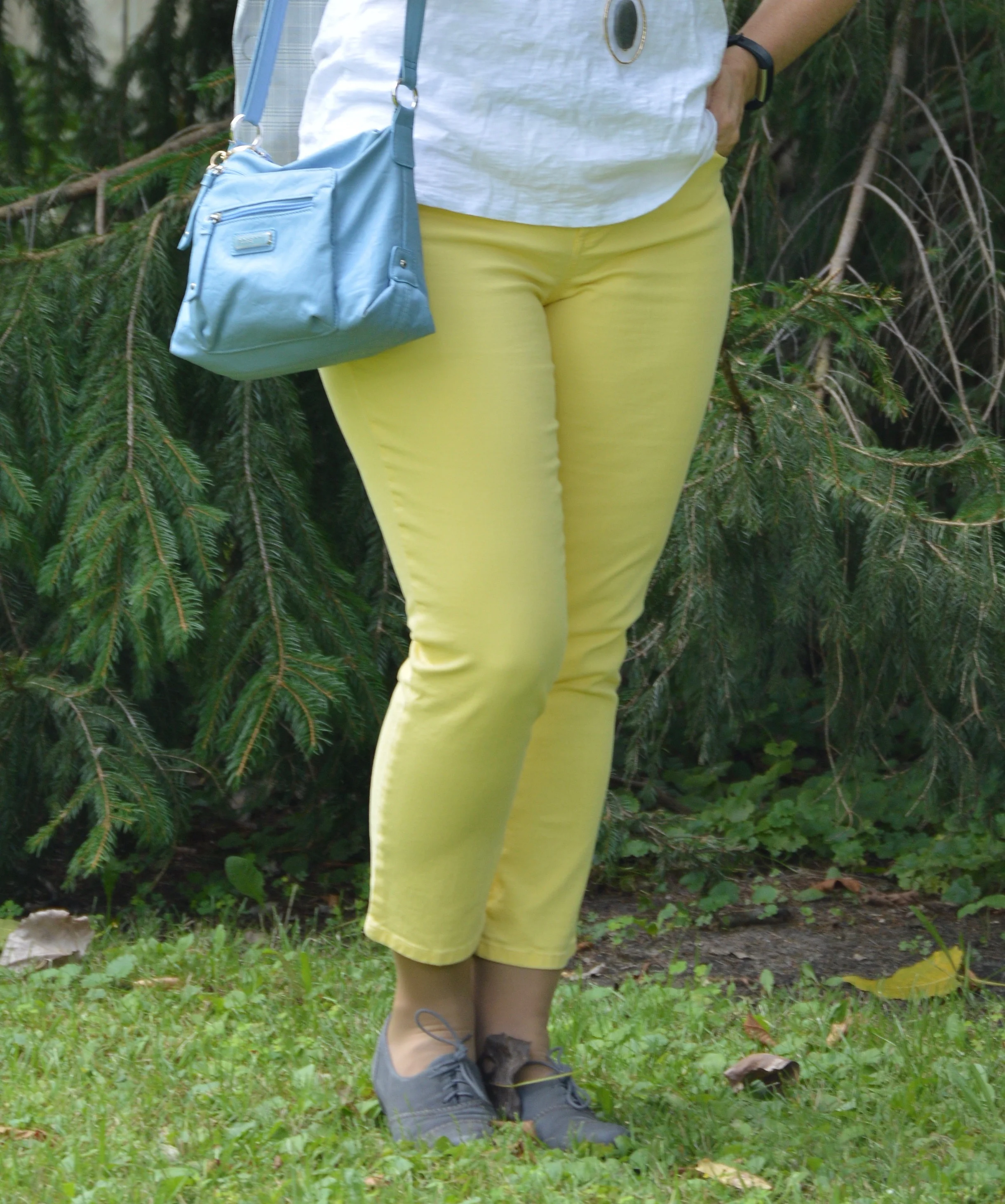
These yellow crop pants were thrifted and are Talbots brand. They are a medium weight denim and I do like that they are a totally different color than I usually wear. This bright yellow is great for spring, summer and fall. You can see how I styled these for a more fall look here.

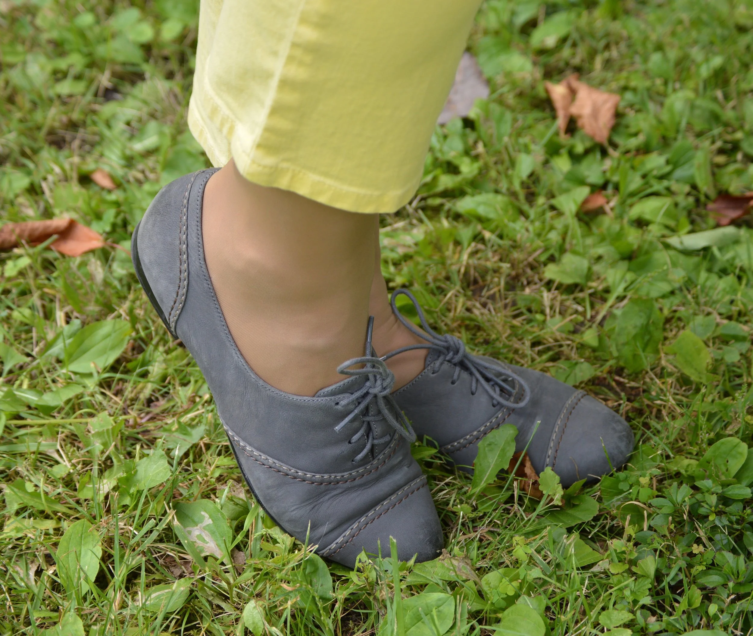
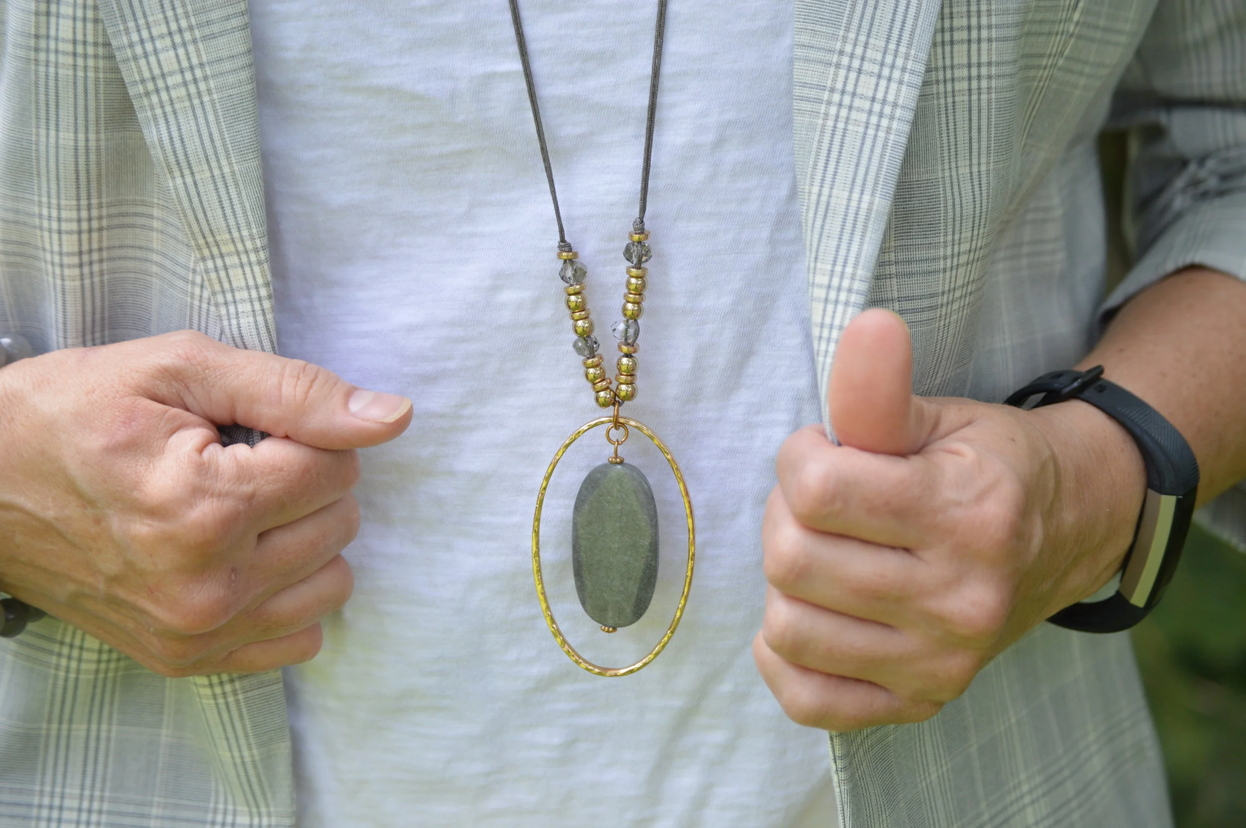
I decided to go with gray for jewelry and shoes to compliment the light gray jacket. These shoes are Naturalizer brand. I think oxfords are a nice alternative flat for general use and I have several pairs.

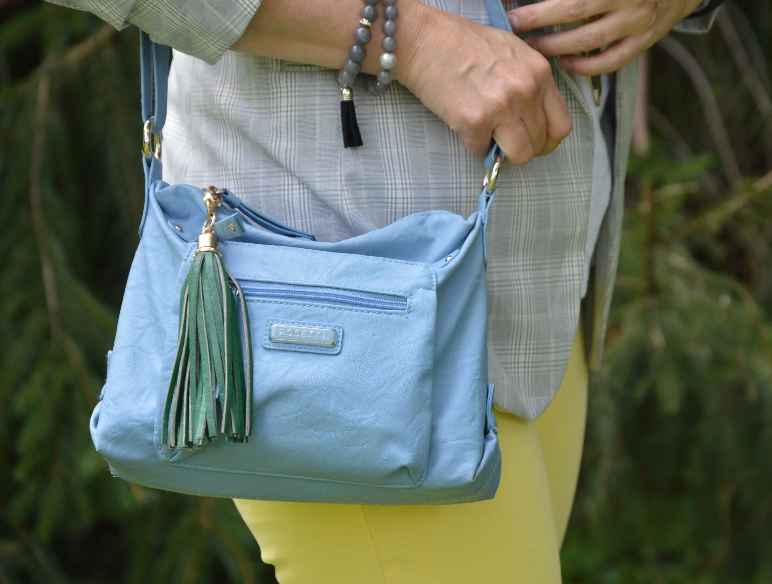
To bring it a little more color, I grabbed the current bag that I am carrying, a blue, cross body. I like the adjustable strap, the extra zippered compartments and I added the green tassel. This is Rosetti brand. Have you ever noticed how expensive purses are? I’m not even talking Coach, Dior or Kate Spade. I mean standard Kohl’s brands like Rosetti, Fossil, Dana Buchman and so on. I have found that I can find my best deals on the clearance racks at the end of the season. I know trends are important to people, and even staying on trend, which means they wear the trend before, or as it is happening, but I’m not all that worried about timing. I also like what I like and if it is a trend, great, and if it isn’t, so what. Wear what you like and carry the bag you like. This little number is pretty, practical and carries everything I need.

What do you think of this outfit? Do you have a white tee that you like to wear? How do you style yours? I’d love to hear you ideas and thoughts in the comments. I appreciate when you have the time to leave me some feedback. That means a lot.

Rebecca Trumbull took these pictures on my camera at our house, but I did the editing. We were heading out the door and just had time for a few quick shots.

Have a great weekend.


Denim Daze 2.0 - Pencil Skirt - Dressy

Tuesday you saw this dark wash, thrifted, pencil skirt styled with a pair of sneakers and a graphic tee. Today I want to show you how to style this same skirt for a look that would be night time and party ready. When you want to take a casual piece and make it more dressy, you need to think about the piece you are going to pair it with and the accessories. Bling and heels are always a quick way to bring a casual piece up a notch.

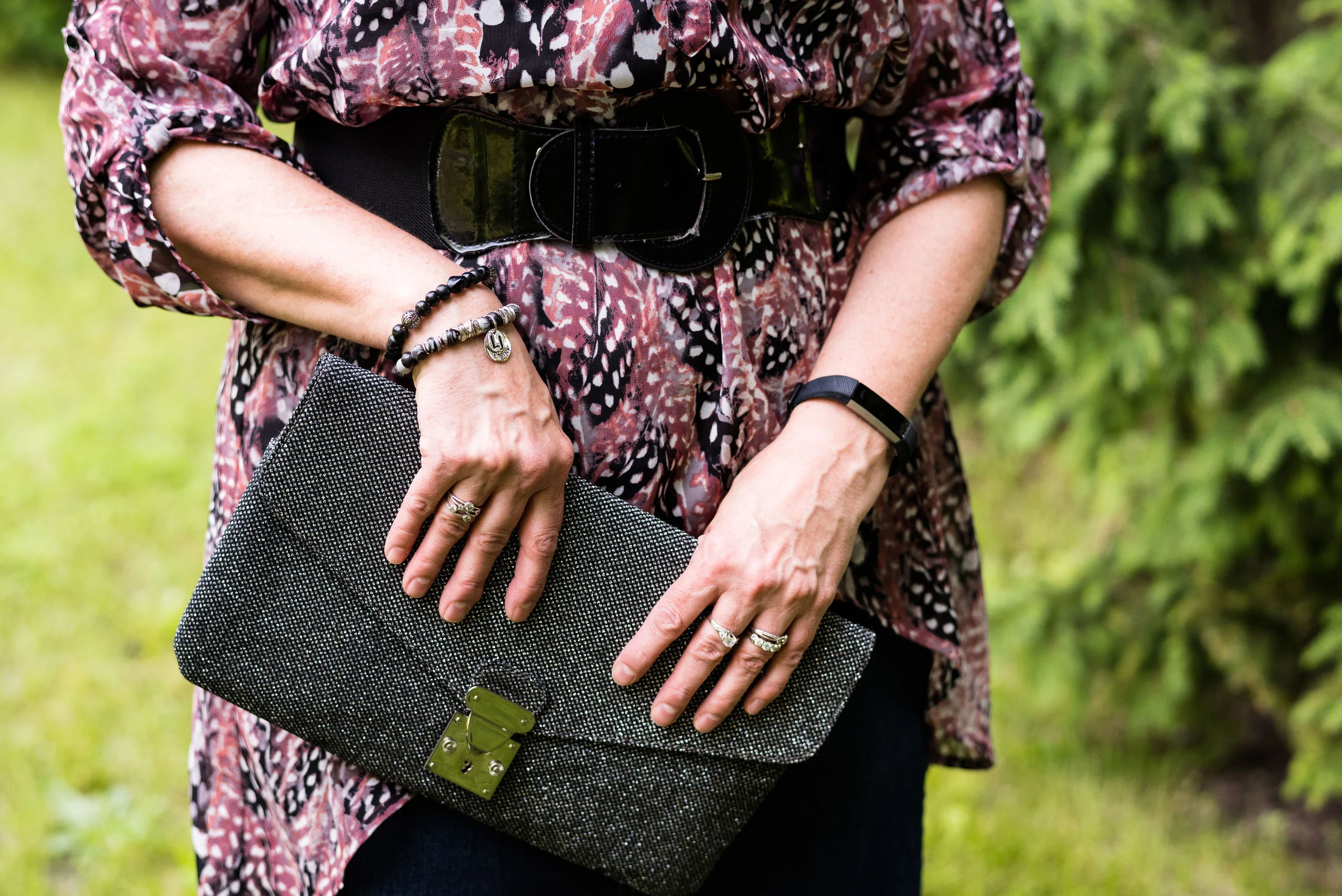
For this skirt, I decided to add an asymmetrical hem, tunic for a new and more upscale look. My daughter was getting rid of this Fred David tunic and I really liked the color of the print. The tunic is more free flowing and I’ve worn it with skinny jeans, boots and a turtle neck sweater underneath for a colorful cold weather look. You can see that look on my Instagram account here. This time I wanted to have a more feminine, body con look, so I chose to wear a wide black belt.

The high-low hem line allows the skirt to still be seen, so you could do this with any other skirt or even a dress for a different look.

Black seemed to be the right choice for accessories, but you could have also chosen shades of the pinky purple in the top, white, gray or even navy to tie everything together with the skirt.

This cute little necklace I found on a clearance rack some where. It has two layers and each of the little dangles holds a sparkly stone.

I chose my sparkly black clutch, as well. Sparkly, to me, always says dressed up, rather than dressed down. Don’t get me wrong, I have tee shirts with bling, but even those make me feel more dressed up, as opposed to a graphic tee like in Tuesday’s outfit.

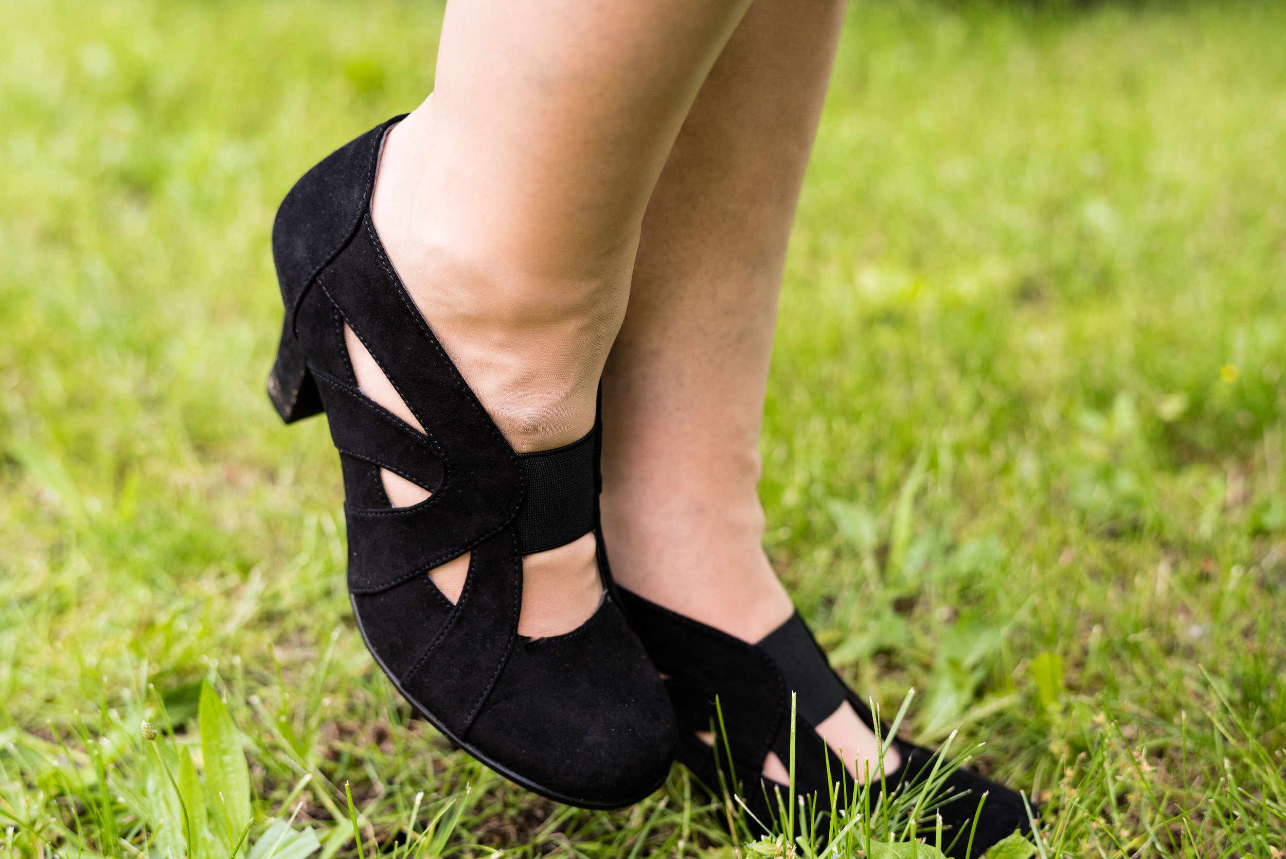
I haven’t had many opportunities to wear these cute shoes. They are Aerosoles brand and so comfy. The heel, for me is just the right height, and I like the band across the top. They are easy to get on and stay put.

Here is a look at the outfit from the side.

Do you own a denim skirt? Is it a pencil skirt, a-line, pillar or tiered? There are lots of options for denim skirts these days, especially if you go to thrift stores. They are not tied into the trends or seasons, so there are more options available. If you don’t own a denim skirt, you could do this same thing with any pencil skirt you own. Dress it down with a tee and sneakers or dress it up like I have done here with a flowy top and heels.

I’ve included a few shopping links for fun clothing pieces and accessories. I hope you enjoyed this post and that it inspired you to see what you have in your closet that you could play around with to make great outfits.

These are affiliate links. All opinions are my own.

Have a great weekend.

Photo credit Rebecca Trumbull. Make up Rachel Christensen.

Denim Daze 2.0 - Pencil Skirt - Casual

What could be more versatile than a denim skirt? You can wear it spring, summer, winter and fall. You can dress it up or dress it down. You can wear it with heels, flip flops, ballerina flats, and boots of every configuration. A good, pencil skirt in any fabric with stretch can be a great addition to your wardrobe. It can take you from work to date night and has unlimited potential for other outfits. When I found this stretchy denim pencil skirt at a thrift store. I knew I had found a piece that would get repetitive use.

This skirt is a brand called No Faze Jeans. This brand is no longer available, except for on Poshmark and other 2nd hand retailers. This is a case, where the brand is not as important as the type of skirt. As I said before, a pencil type skirt should have a little stretch in it for bending and sitting. While I like a medium wash in a jacket or vest, a dark wash is a good choice for bottoms. Darker usually gives a slimmer profile.

For this casual look I grabbed a thrifted No Boundaries tee with the word, happy, embellishing the front in different colors. This is a light weight semi-sheer tee, so great for summer, but opaque enough that you don’t need a cami, unless you are wearing a very bright or dark bra.

This next picture shows you the front tuck. The shirt is quite long. Doing a front tuck defines your waist and provides an interesting line from front to back. Some people call this the French tuck, as well. I have mentioned this before in an earlier post, but I like the front tuck because it allows me to show off a belt, yet doesn’t take as much effort as tucking the whole piece in.

Even though the belt doesn’t match any other colors in the shirt, I like how it makes the outfit look bright and cheery, after all, the shirt does say happy.

This choker was a clearance find either at Kohl’s or Penney’s. I like that it looks dressed up, but can also be worn with something casual like this. The faux pearls add just the right class. In addition I threw on a few faux pearl bracelets to match.

Besides a cross body bag, I like a small hobo bag like this, when I don’t want to carry my full load around. This small shoulder bag is just big enough for my wallet and a few other items.

Keeping the vibe casual called for my well worn pair of sparkly gray Keds. These sneakers see a lot of wear in the warmer months and have been through the washer numerous times. I’m not sure how much longer they will hold up. Ha, ha. Who doesn’t have a pair of well worn shoes that they pull on all the time?

This is a simple outfit formula: denim skirt, graphic tee, jewelry, bag and sneakers. If you wanted to, you could swap the graphic tee out for a plain colored one and wear layers of chains, pearls or even a scarf for a whole different vibe.

Thursday, I’ll show you how I chose to dress this skirt up.

Do you own a denim skirt? Do you like to wear it? How do you like to style it? As always, I love to have your feedback. Just leave a comment below. I always read and respond to your comments, so you can check back the next time you are on the blog to see how your comment helped me out.

I’ve included a few shopping links for denim skirts. I hope you see something you like. I usually try to stick to retailers I am familiar with and I also try to include at least one plus size option. These are affiliate links. I get a few pennies when you click on a link. All opinions are my own.

Have a great Tuesday!


Spring Outfit with ShopNational

I’m taking a brief break from my Pantone Spring/Summer 2019 series to introduce you to a clothing retailer called National. This is a sponsored post. National gifted me the clothing items in this post and gave me compensation for writing the post. All opinions are my own.

National is a family owned business that was started by Eddie Smith. After the influx of women into the workplace nearing the end of WWII, what started as a small mail order operation selling women’s stockings, has now grown into a prospering clothing platform specifically catering to women who like classic styles and clothes made for real life. National sells everything from cardigans and dresses to hosiery and bras. They have kept up with the times, moving from a strictly catalogue based clientele to the inclusion of a more recent online presence. Knowing the history of National, I am excited to bring this retailer to my readers.

The pieces I chose from National revolve around a spring theme, but will work well through the summer. The first few pictures will show the pieces as is, with the later pictures including my own accessories.

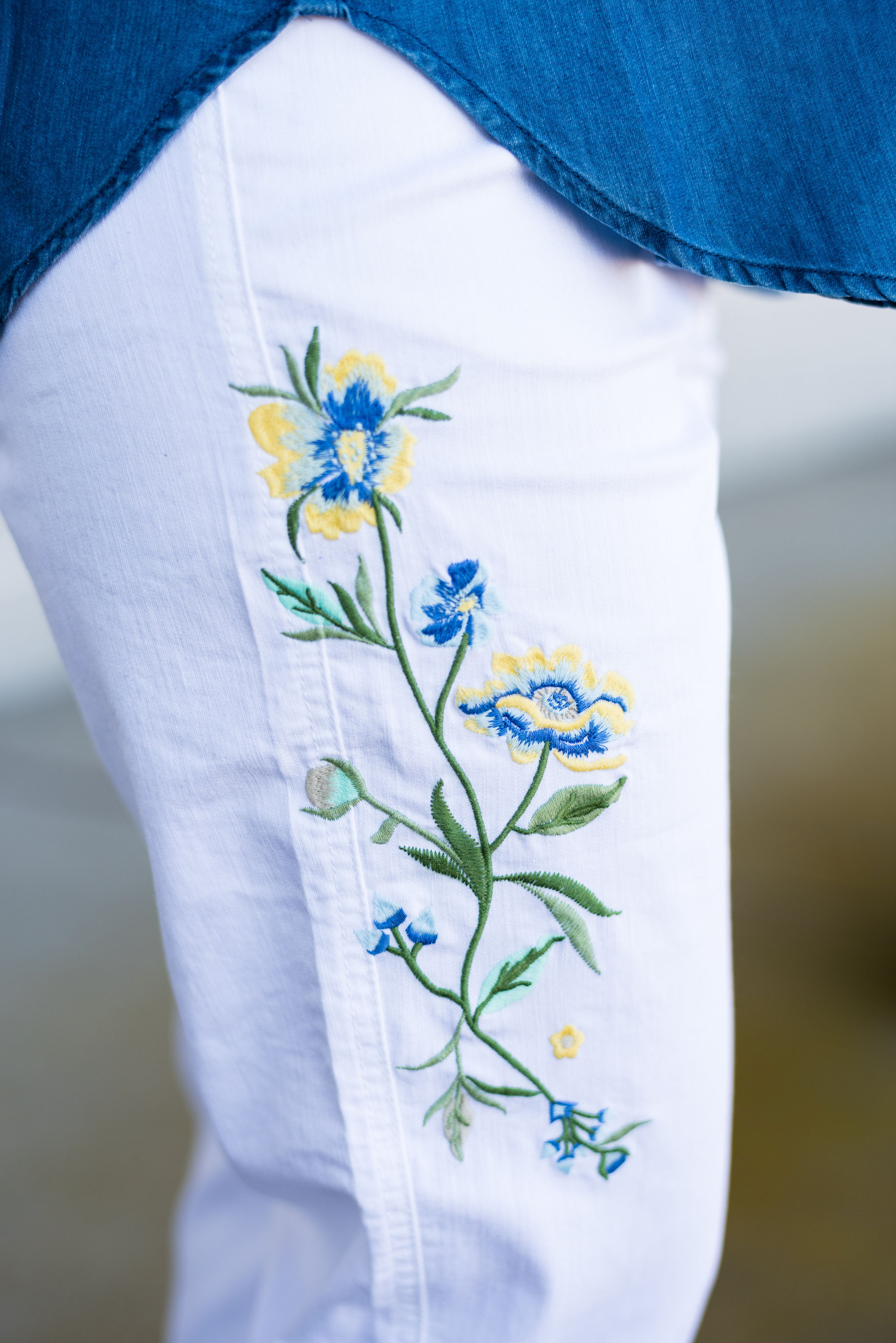
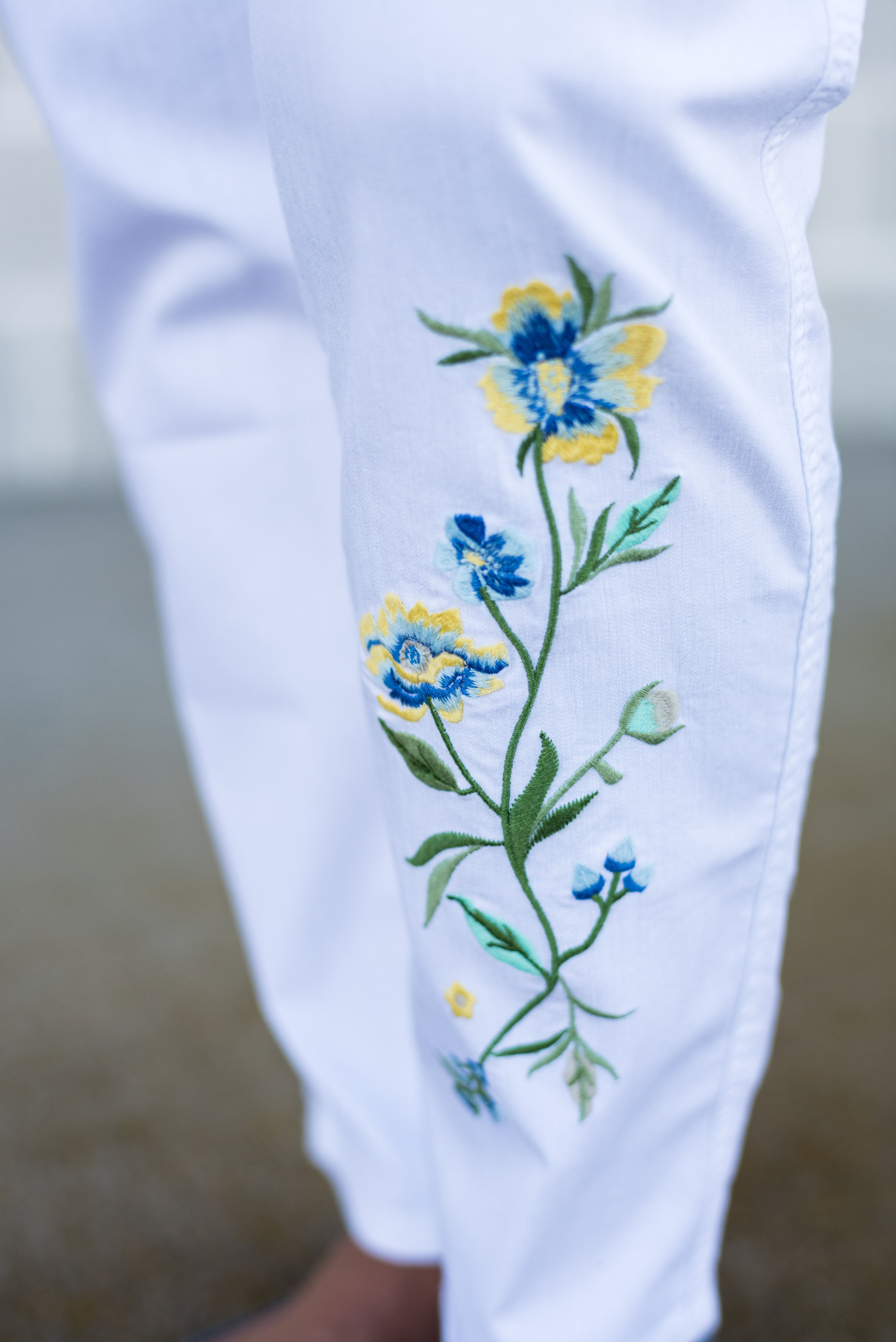
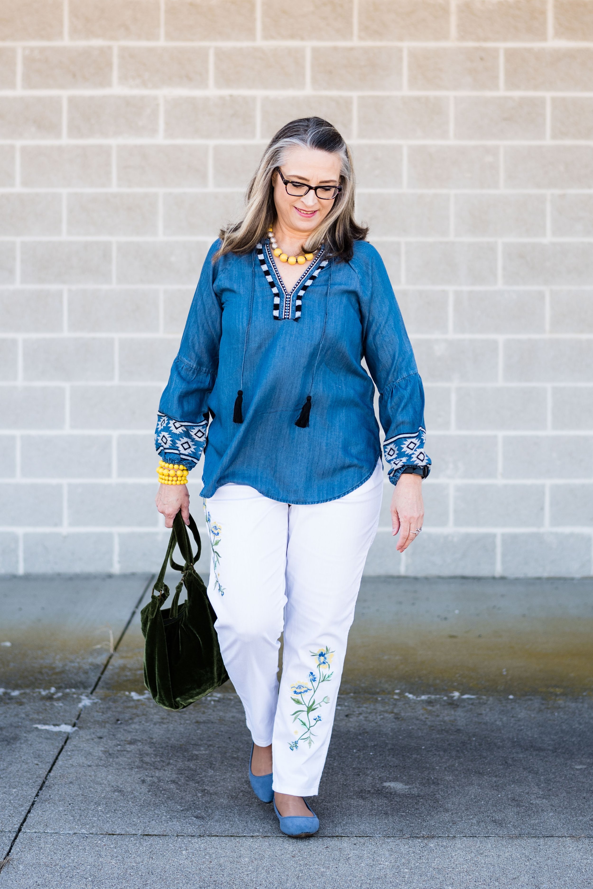
The two pieces I chose are the Southwest Embroidered Top and the Spring Blossoms Embroidered Jeans. i have always been a fan of embroidery. It adds both texture and interest to so many different clothing pieces and these two from National are no exception. I saw the jeans first when I was perusing their website, after they contacted me about a collaboration. I fell in love with the embroidery, especially the splashes of yellow and blue. You can see in the pictures below, the embroidery is both on the thigh of the right leg and the lower shin area of the left leg. I like that the floral images are on both legs, yet in different places.

These pants are light weight and have an elastic waist and slimming front panel. I was surprised at how well they fit and how flattering they were. The straight legs could also be worn rolled up for a more breezy summer look. The only drawback of these light weight pants in the white is they are a bit see through. I chose to wear nude underwear, so it was no problem. Just don’t wear those red, hot pink or black panties, or everyone will know. Ha, ha. I ordered these in a large and the fit was perfect.

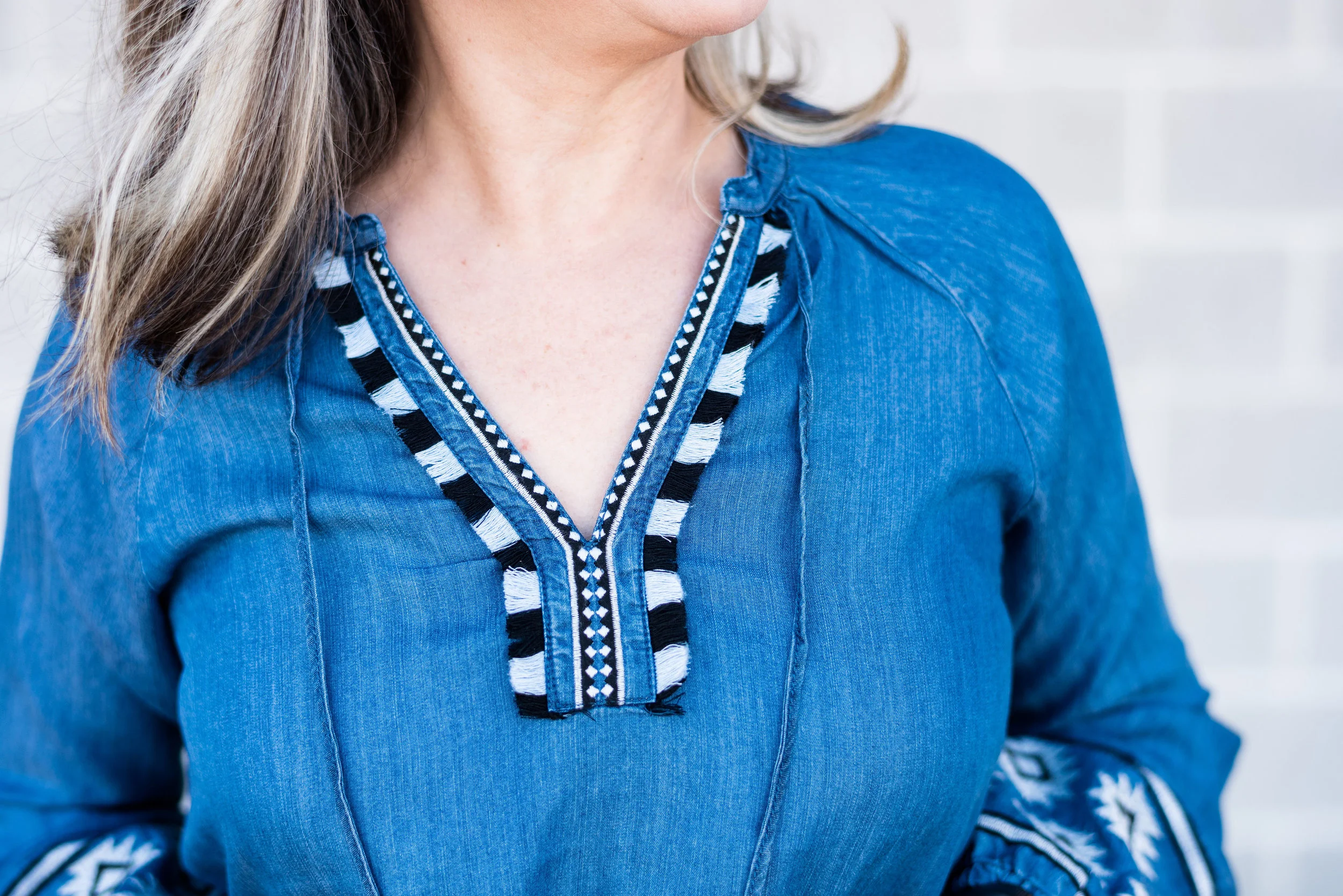
I chose the top because I thought the denim blue color went well with the blue in the pants. Once again, the embroidery was the selling point for me. This top has a southwest boho vibe, which I love. Look at all the details on this lovely piece.

The v-neck boasts embroidery detail and fun fringe.

The neck ties end in tassels.

The embroidery on the elastic gathered sleeves adds a black and white color contrast.

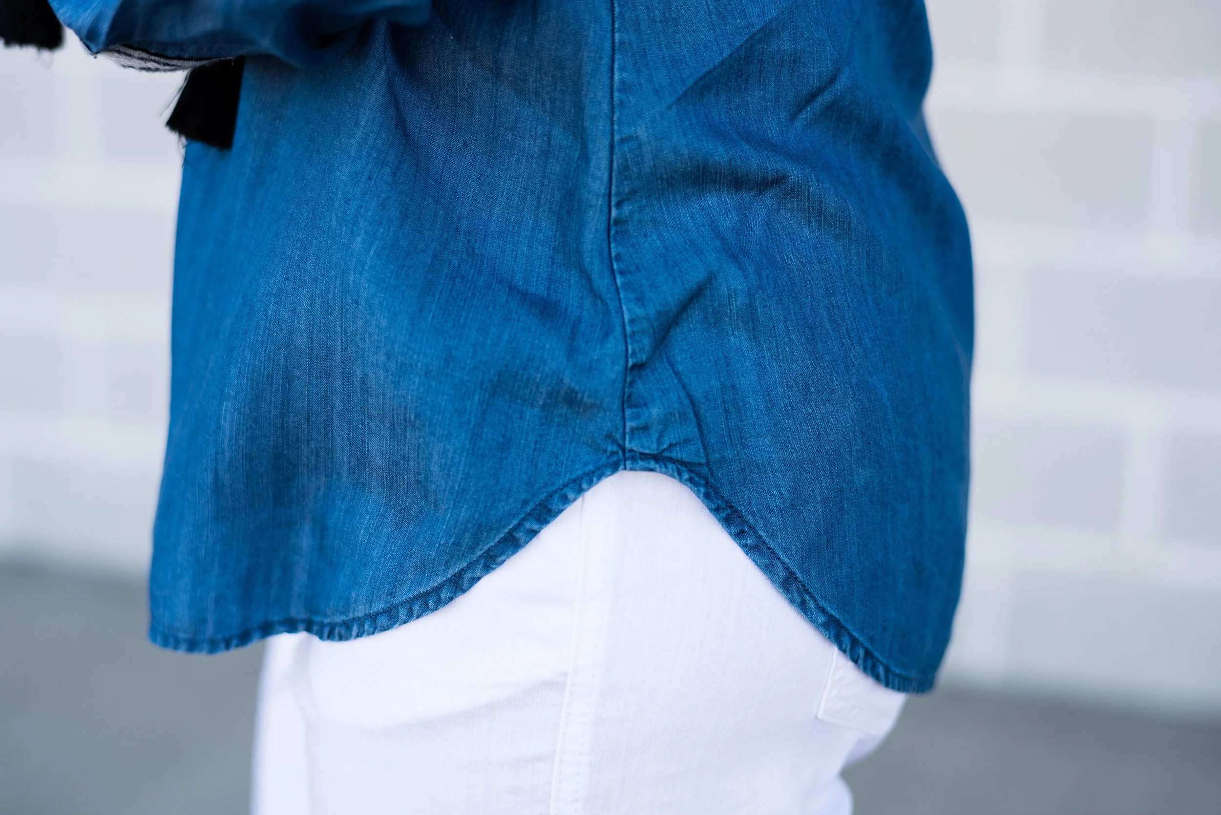
The shirt tail hem makes it perfect for wearing untucked.

The fabric this popover blouse is made of is a fabric called lyocell, which is a form of rayon. It is machine wash and dry, so easy to care for. However, the fabric is not stretchy and the bust area is a tad tight. I ordered a medium and think I would have felt a tad more comfortable in a large. Overall, another great clothing piece from National.

Here is the outfit with my own accessories.

I really like these pieces and was pleasantly surprised with National. I have never been a big catalogue shopper, but now that National is available on line, I have a feeling I will be purchasing from them again. It is convenient, easy and quick, and their clothing and accessories are classic pieces easily worn by busy women like us.

I hope you will check out National. Right now they are offering my readers a discount. If you use the code Natl20Amy you will get 20% off your entire order and free shipping. This would be a great time to give this family owned retailer a try.

Have a great day.


Pantone Spring/Summer - 2019 - Living Coral & Terrarium Moss

I want to take a moment to apologize for my absence this past week. I went to visit my mom and ended up bringing her home with me for a couple of weeks. We came back on Monday, and between unpacking, work and getting ready for Easter weekend, I just didn’t have the time or energy to get my blog posts done. I promise, I did try a few times, in the evening to get them written, but always ended up getting bleary eyed and needing to go to bed. Ha, ha. However, I hope to get back to a normal schedule this week, if I can get my computer to upload my pictures accurately. It’s always something!

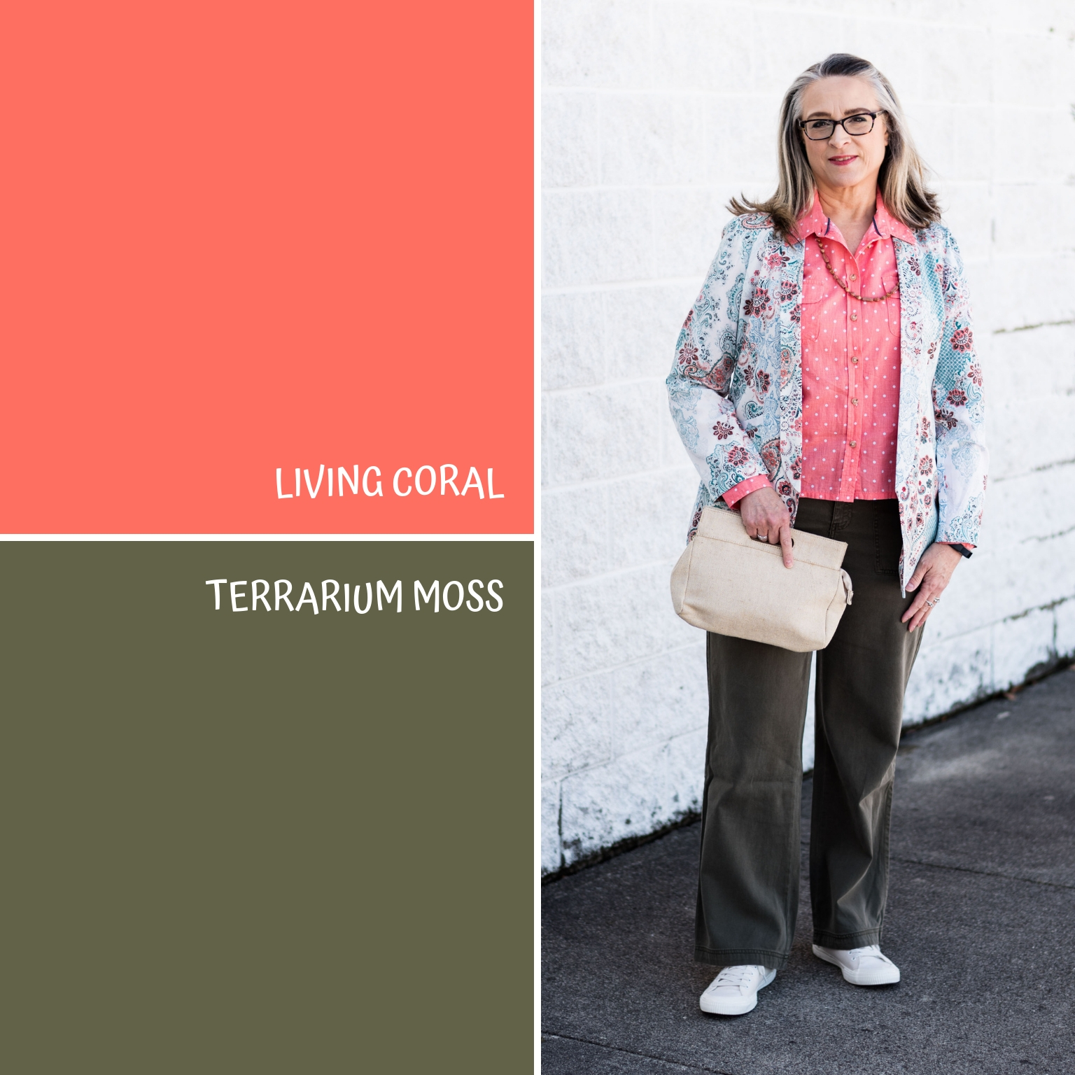
Every year the Pantone Color Institute puts together a palette of colors that are the basis for the fashion and interior design color choices. Since I started blogging three years ago, I decided to draw upon these palettes as a source of inspiration for putting outfits together. I do a series using these colors in both the spring and the fall, as these are the two palettes Pantone puts out each year. Pantone, also, chooses a color of the year. This year that color is Living Coral. I wanted to feature this pretty pinky orange color to kick off this spring’s Pantone series and decided to pair it with the darker green of Terrarium Moss.

For my Living Coral piece I chose a thrifted Liz Claiborne polka dot blouse. I actually have quite a bit of this color, so I was pleased that this was chosen as the color of the year. However, as lovely of a color as it is, it is not my favorite color, so I don’t reach for it with regularity. I’m not sure why, because it is a great color for spring and summer and it goes well with many other colors.

This fun paisley jacket was a recent clearance find at Chico’s. I don’t shop frequently at Chico’s as their prices are a bit higher than what I would normally pay for a single item of clothing. However, if you have a coupon and can use it on clearance, then you can find colorful and fun pieces like this at a significantly reduced rate.

My Sonoma pants were a clearance find from Kohl’s. They are a tad darker than the Terrarium Moss, but basically are an olive green. These are a nice weight for spring, not too heavy and not too light.

As I have done before, I wanted to incorporate one of the neutrals with each outfit. For this one I chose Sweet Corn. This is a light, airy color that reminds us of the lighter kernels of mouthwatering sweet corn. I used this canvas clutch and my thrifted Sonoma sneakers to represent this summery neutral.

What do you think of these two colors? I know many people who have Living Coral already in their closets. It is a good color for the warmer weather, as the sun begins to shine more regularly. It always makes me think of the seaside. Where as, Terrarium Moss makes me think of hiking under a canopy of trees in full leaf mode, in a place that is quiet and cool.

I’ve included a few shopping links for you to peruse featuring the colors Living Coral and Terrarium Moss. These are affiliate links, which means I get a few cents when you click on a link. I get a tiny bit more, when you make a purchase through my page. All opinions are my own.

Photo credit Rebecca Trumbull. Make up Rachel Christensen.

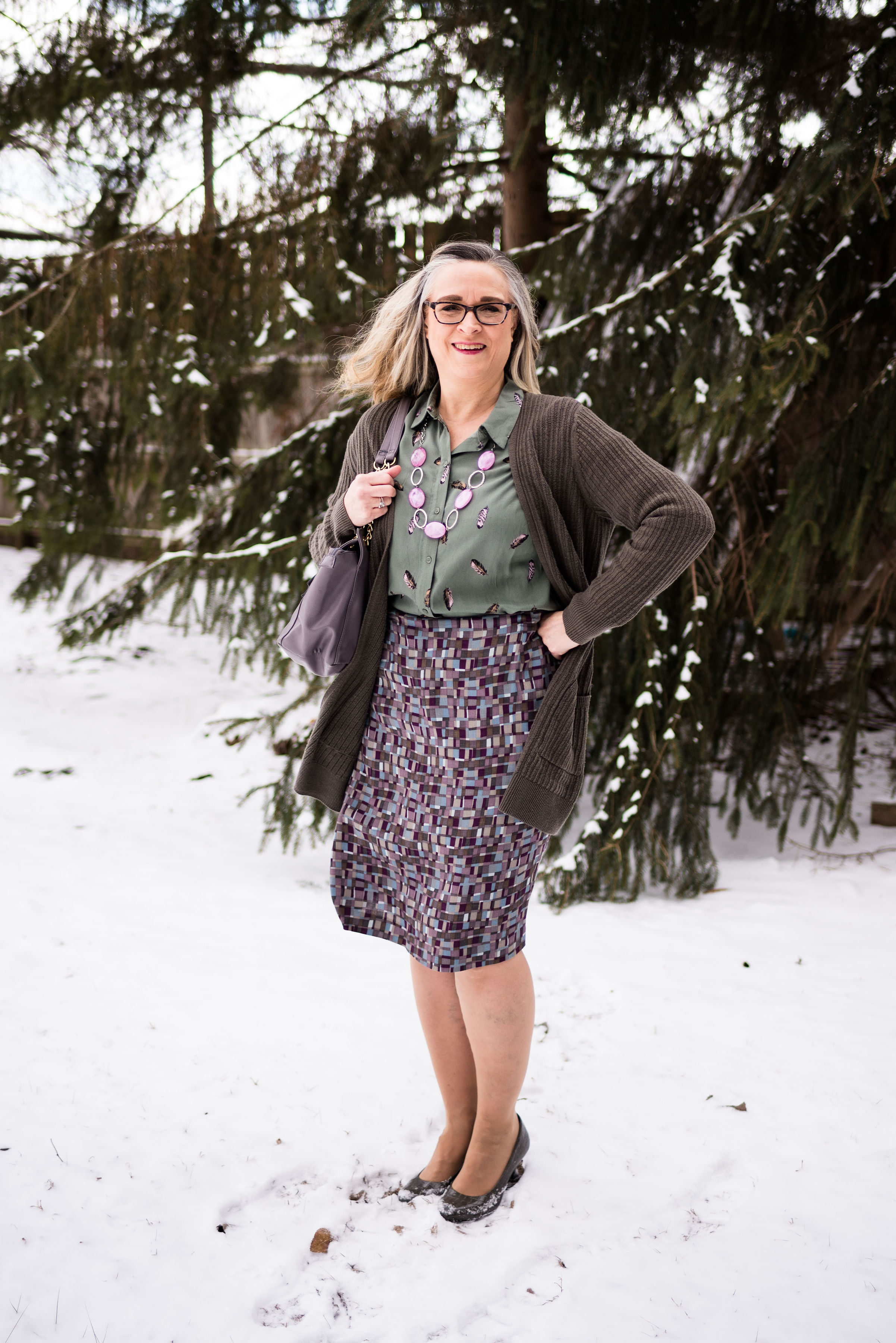
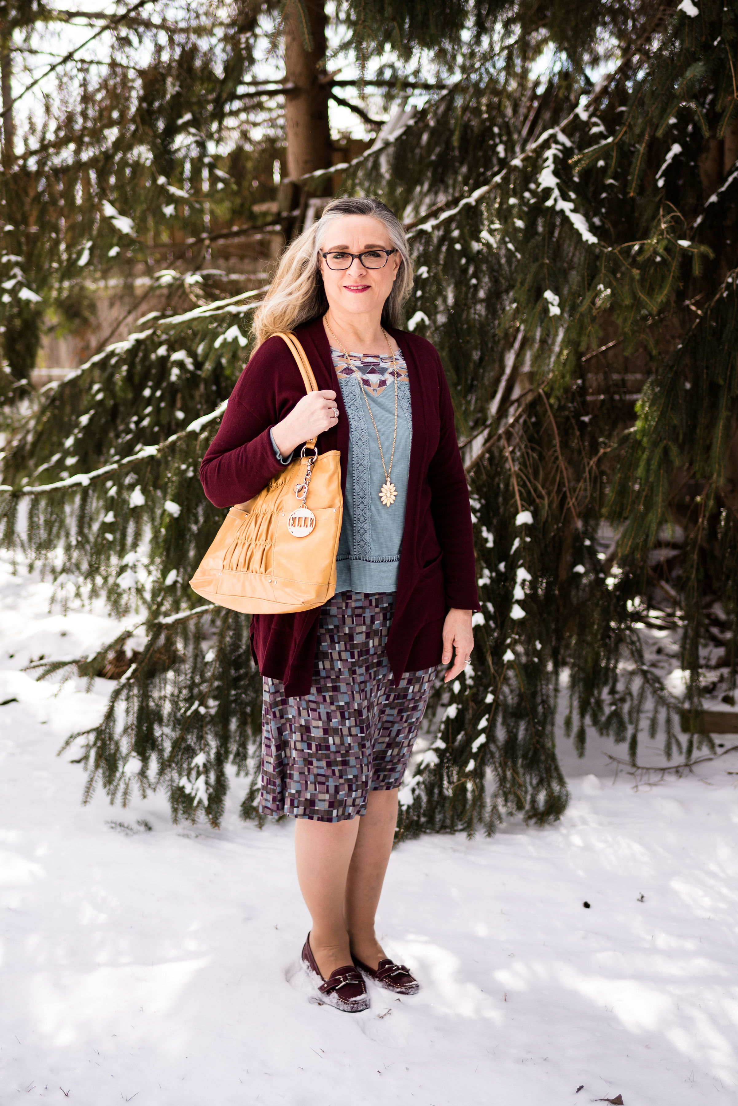
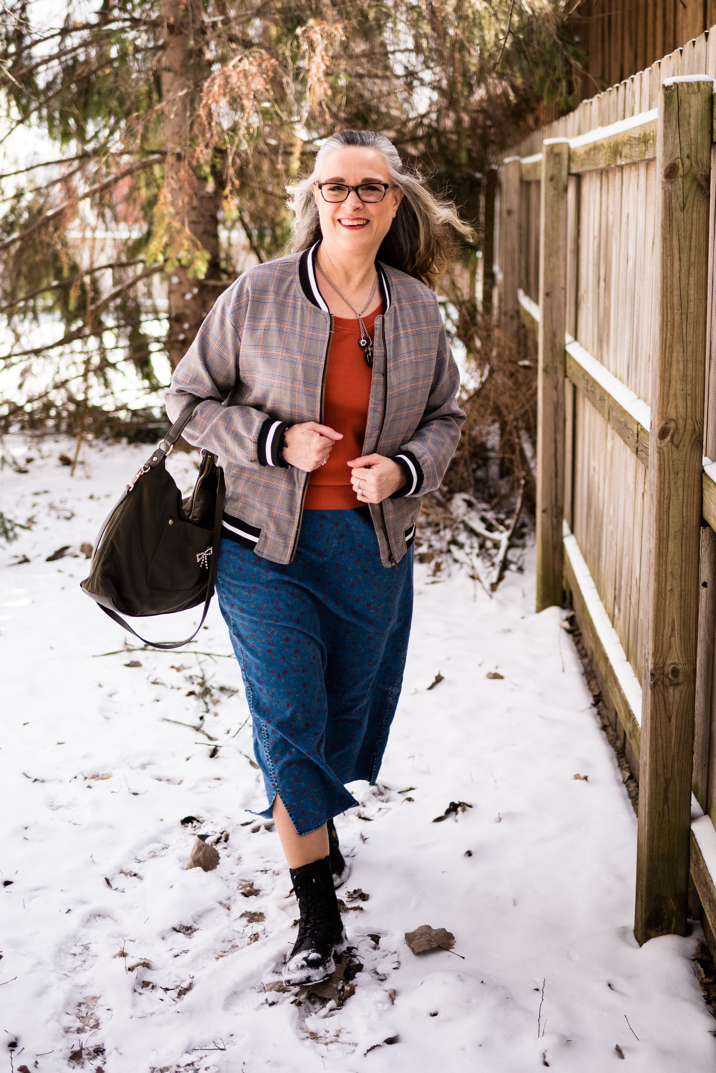
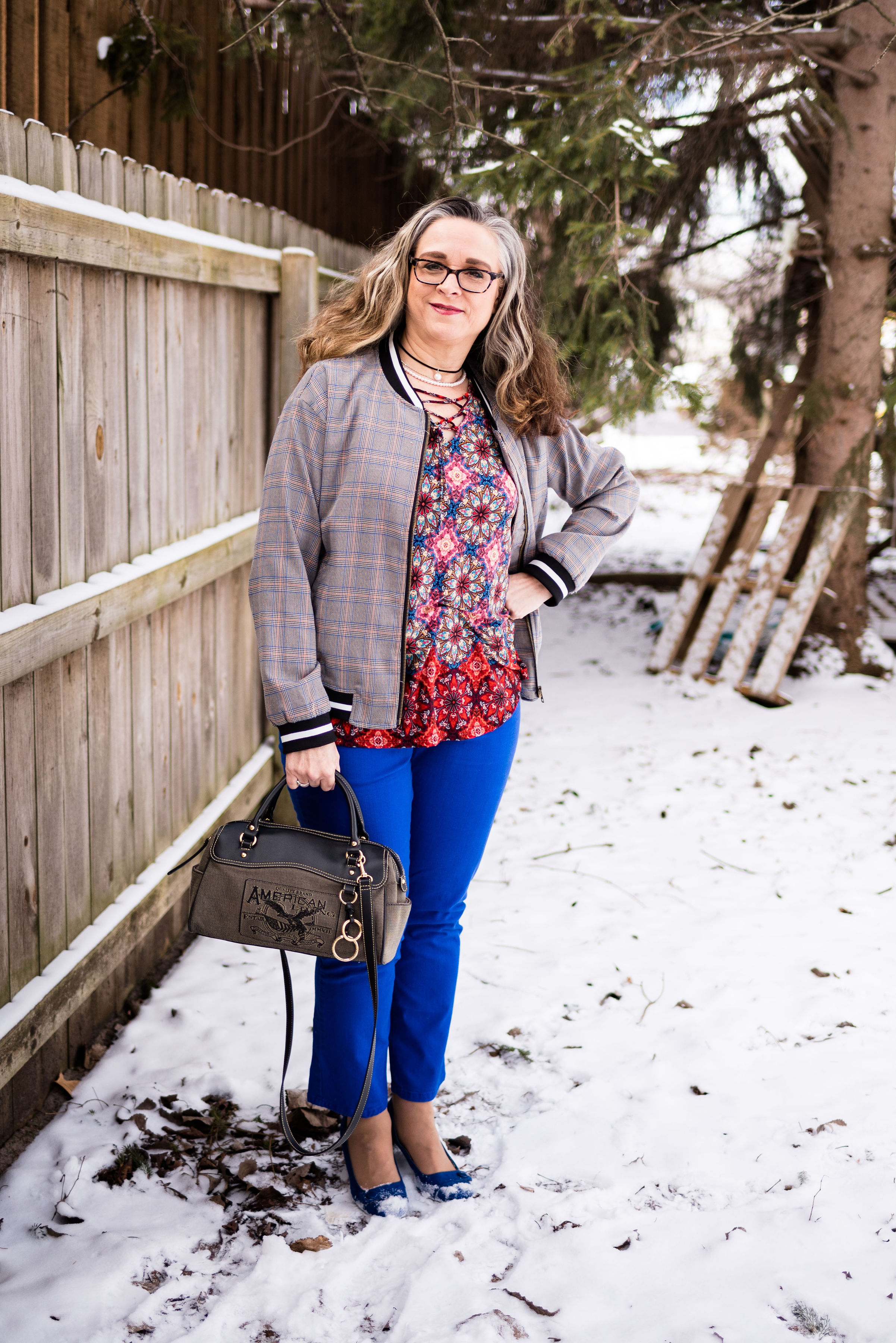
Print Mixing Mash Up - All the Outfits

After doing a longer series, like the one I just finished, I like to do a post that shows you all the outfits in one place, side by side. When I started this series, I let all of you know that I was a newcomer to print mixing when I started fashion blogging. The question could be asked, why even bother? Many people enjoy more solid colors, monochrome looks and outfits that incorporate prints in a more conservative manner, so why the push to print mix?

There are several rationales I have for learning how to mix prints and I’d like to take a moment to share these with you, before I do the recap of the past few weeks’ outfits.

1 - Print mixing challenges our brains.

I have a history of dementia in my family and understand that there is a very real possibility that I or one of my brothers, or all three of us, could end up with dementia later in life. The reality is I am much closer to that now, than I was 20 years ago. All the research has shown that there are factors that can help delay this unfortunate inevitability for many of us. Diet, exercise and using our brains by learning new things like taking a class, learning an instrument or a language can all prolong our brain health. Even the practice of putting outfits together helps our brains. Every time you challenge yourself to think outside the normal box you are helping your brain health. Print mixing is a great way to challenge your neural net to grow and expand.

2 - Print mixing is good for the environment.

There is a lot of focus these days on waste management. With the need for plastics and metals decreasing in other countries, we are now looking at a garbage and recycling dilemma in our own neighborhoods. Buying used clothing and being a consumer who makes better choices is a way to help our growing garbage problem. I’ve heard many people say, “Well, my not using a straw isn’t really going to make that big of a difference.” That may be true, but each individual who makes that choice, adds up to a great number. The same is true for clothing. Thrift stores are popping up all over, and with online retailers, like Poshmark, Thread Up and more, you can buy and sell used clothing with ease (something that is on my list to learn how to do).

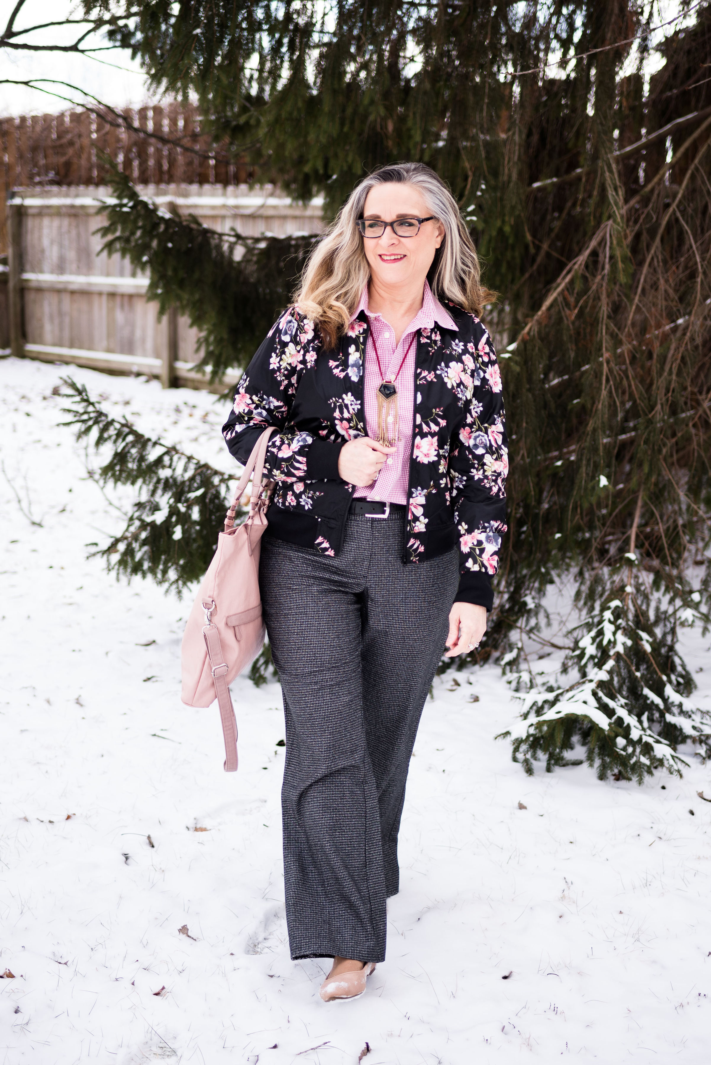
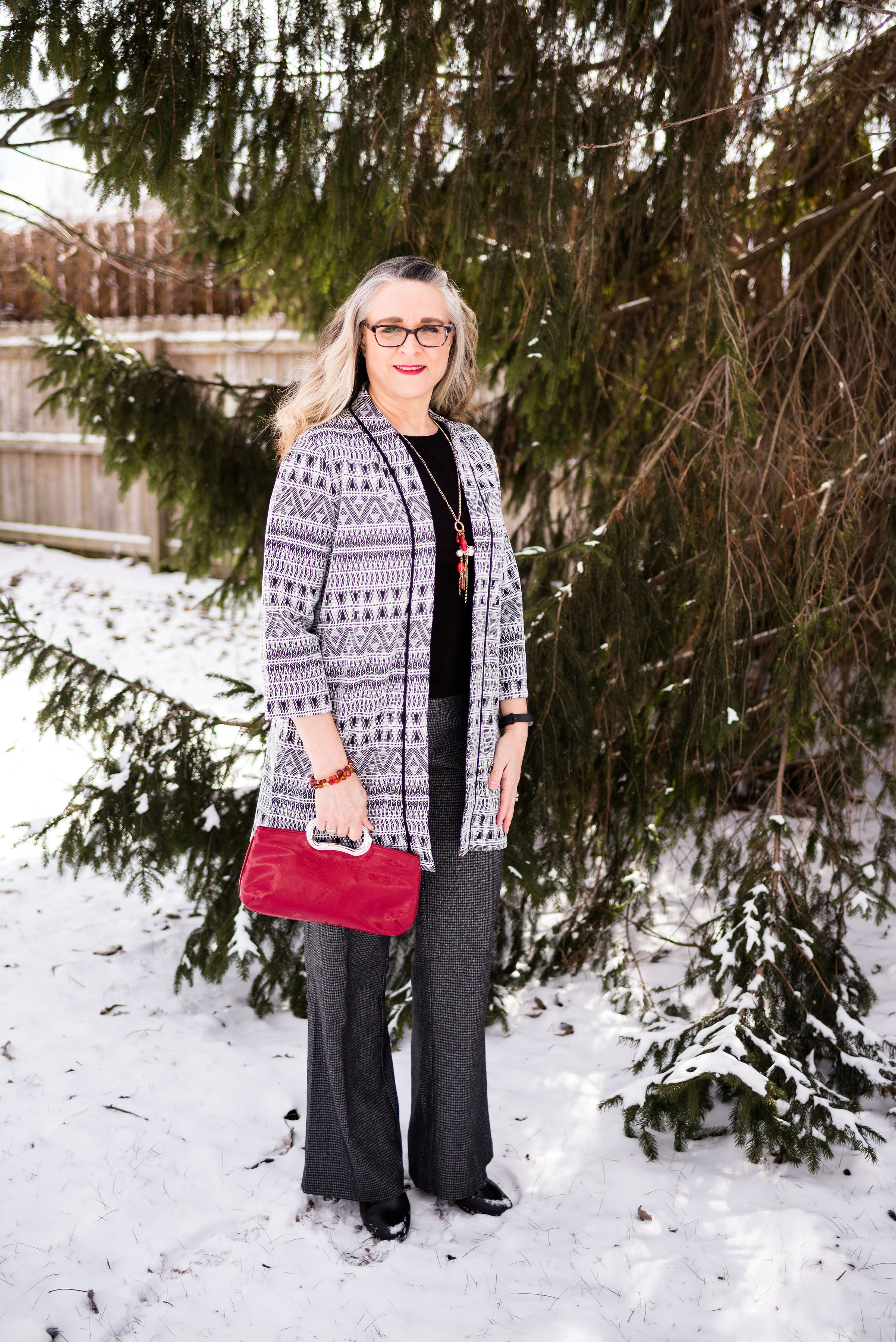
What does that have to do with print mixing? Think about your closet. What percent of your clothing are solids and what percent are prints? If you are like me, I have a plethora of prints. To only wear these fun pieces with solids, really does the piece a disservice. Think about how many more outfits you could have if you started mixing in prints with prints. And the best part is, you didn’t have to go out and buy anything. Your new outfit came entirely from your own closet.

3 - Print mixing is fun.

There is something about putting prints together that really appeals to my inner artist. Just like a interior decorator, a painter or a photographer like to create spaces and pictures that have a message or are aesthetically pleasing to the eye, putting outfits together can be a very satisfying activity. I’m sure you are all familiar with those adult coloring books that flooded the market a few years back. Probably a few of you got one or two for Christmas, or a birthday. I did. What is it that makes coloring so much fun? We might think of it as a rather mindless activity, but in reality, coloring is another way to exercise our brains. I love to put different colors together to see how they are going to look. I especially love putting colors side by side that I normally would not have thought to put together. like pink and orange, purple and red or black and navy.

I do hope that this series has prodded, inspired and encouraged you to look at your wardrobe in a whole new way. Here are all the outfits side by side.

Yellow striped tee.

Multiprint skirt.

Plaid bomber jacket.

Checked trousers.

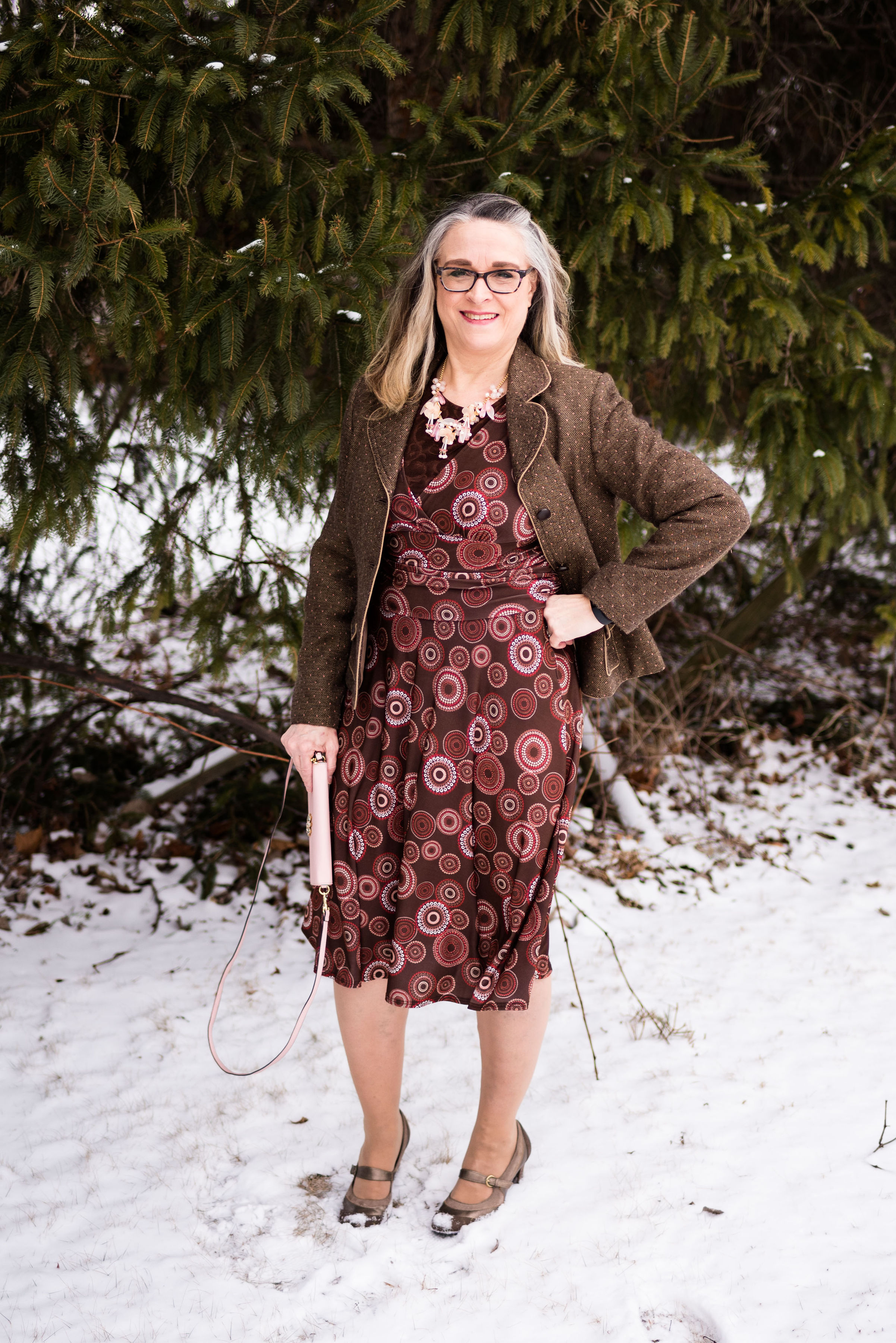
Printed dress.

I hope you enjoyed this look back at all of the outfits. Have a great Tuesday and be sure to check back on Thursday for the intro to this years Spring/Summer Pantone color series.

Photo credit Rebecca Trumbull.