A Look Back at 2019 - My Favorite Outfits

As we begin another year, I like to look back and see what I have accomplished over the past year. More often than not, it turns out that I didn’t accomplish anything new or life changing, but I did survive all that life threw our way. I wish I could say, I lost the weight I wanted to lose, or cleaned out that bedroom that needed to be freed of clutter, but in fact, what happened was, I gained a few extra pounds and the room got even more cluttered. Real life!

My husband always says, he won’t make any New Year’s resolutions because then he won’t feel disappointed when he doesn’t stick to them. I guess I can see the security in that mentality, but some of us want to have a goal to shoot for, even if we don’t attain it. I like having a second chance, or a third or fourth. There is something encouraging in the idea that I can start over, reboot and try again. I’ll save those thoughts for another post, but today, I want to take a look back at 2019, showing you my favorite outfits and explaining why. If you want to see the original post, just click on the link.

January

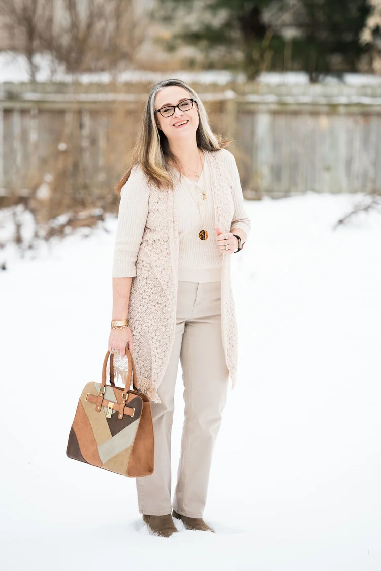
Spring Trend - Head to Toe Neutral

Why I like it: When we are in the midst of the mid-west winter, we are also in the throes of darkness and gloom. For this Seasonal Affective Disorder sufferer that means fatigue, lack of motivation, brain fog, major carb cravings and just a general feeling of anxiety and discouragement. I have found that choosing bright or light colors to wear, gives me a tiny little boost in the middle of the sadness. This creamy neutral outfit is a perfect color to lighten things up. I also love the textural elements in the vest, ribbed knit sweater and patchwork tote bag. In addition I like the way my accessories pop against the neutral back drop.

February

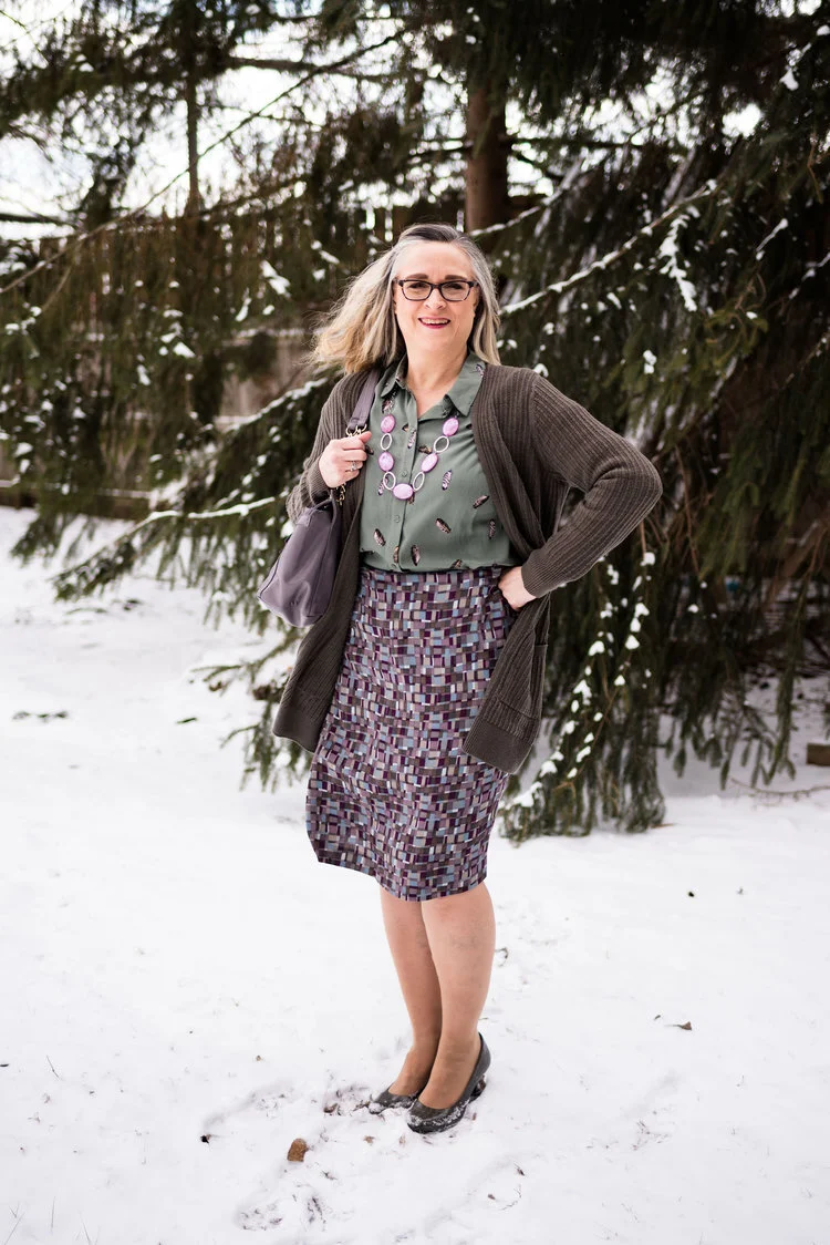
Spring Trend - Scarf Prints

Why I like it: What is not to like about an outfit that is crisp, structured and perfect for a date night or a day at work. I love the mix of prints. The polka dot blazer and the colorful scarf print top are the perfect compliments to each other. Add a bright white pair of trouser/jeans and you have a winning combination. The blue bag and classic patent leather block heels help as well.

March

Print Mixing Mash Up - Printed Skirt - Outfit 2

I loved the way these pieces came together for this print mixing post. All of these pieces were in my closet, which goes to show you don’t have to spend lots of money to have a fun, stylish wardrobe, as well as be a print mixing queen.

April

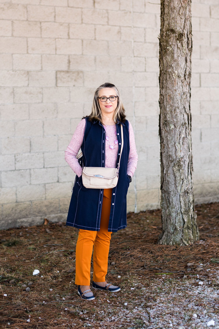
Pantone Spring/Summer - 2019 - Turmeric and Sweet Lilac

The thing I like about this outfit is how it made me think outside my norm. I would not normally think of pairing this bright orange with this more pastel pinky purple. Those colors always make me think of Easter eggs. Ha, ha. But of course, some of our fashion norms or rules or even preferences are meant to be broken, or at least experimented with. I think adding the dark navy vest and shoes kept the outfit from being to little girlish.

May

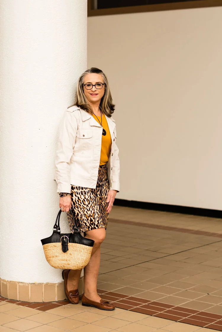
Pantone Spring/Summer - 2019 - Toffee and Mango Mojito

Why do I like this outfit? Leopard print skirt, check! Bright colored tee, check! Creamy denim jacket, check! Fun basket bag, check! It is casual and fun. You could change it up by wearing a black tee or a black jacket. You could wear tennis shoes or heels instead of loafers. Each little change you make, can change the whole persona of the outfit, yet you still keep the classic leopard print skirt.

June

When Summer Doesn’t Feel Like Summer

Photo credit Amy Christensen

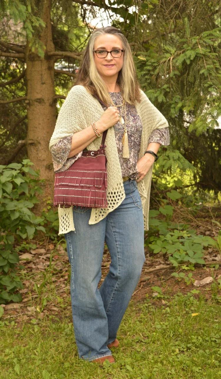
While this outfit picture was taken in June, the weather wasn’t begin very cooperative. It was cool, thus the layers. I really liked this look. The bell sleeve floral top, the crocheted ruana and the light wash denim gave the look a boho feel. Adding the fringe bag and cognac suede booties nailed it. This is definitely an outfit I am comfortable in.

July

Denim Daze 2.0 - Ruffled Chambray Top - Dressy

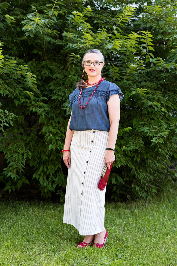
When I found this skirt at Christopher and Banks, I had to have it. I was in the midst of watching Miss Fisher’s Murder Mysteries, and absolutely loved the 20’s vibe and costumes in the show. This skirt made me think of those 20’s styles and I thought it would be a great summer piece. It was perfect for this 4th of July themed outfit.

August

Wearing White - White Sleeveless Sweater

I love this combination. Seeing as this was an outfit for transitioning into fall, I thought it worked very well. The white sleeveless sweater is a perfect topper for the swingy a-line printed skirt, but I really like the way the sweater gives the outfit that fall vibe. The colors go well together, even though the skirt and top didn’t contain any colors remotely similar to the sweater.

September

Pantone - Autumn/Winter - 2019 - Creme de Peche and Rocky Road

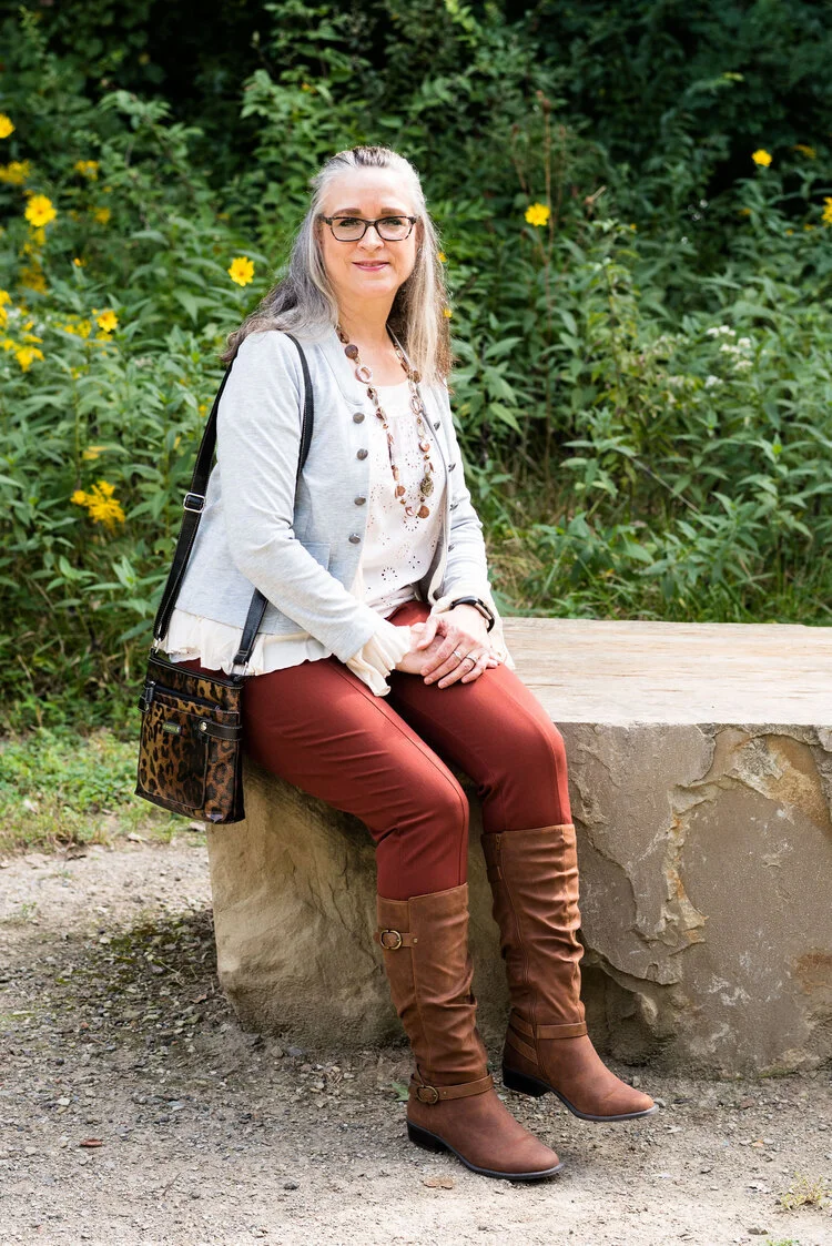
Even though these colors did not exactly match the Pantone colors, I really liked this outfit. The rusty color of the pants and boots were right in tune with fall color trends and the addition of the light peach eyelet top and gray jacket with ruffles gave the outfit a flirty, feminine feel. The leopard print bag and necklace with fall colored beads were lovely compliments.

October

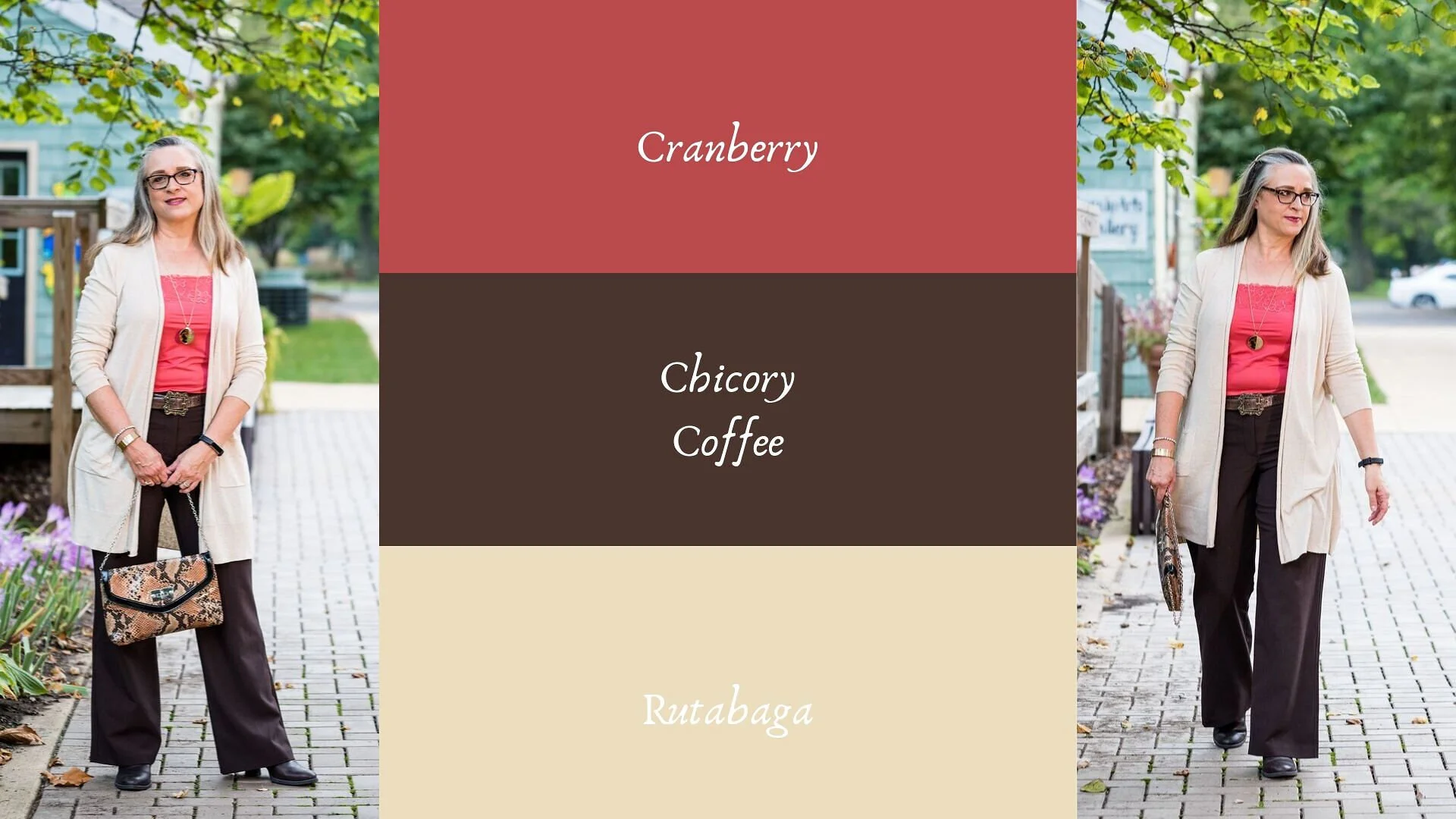
Pantone - Autumn/Winter - 2019 - Cranberry and Chicory Coffee

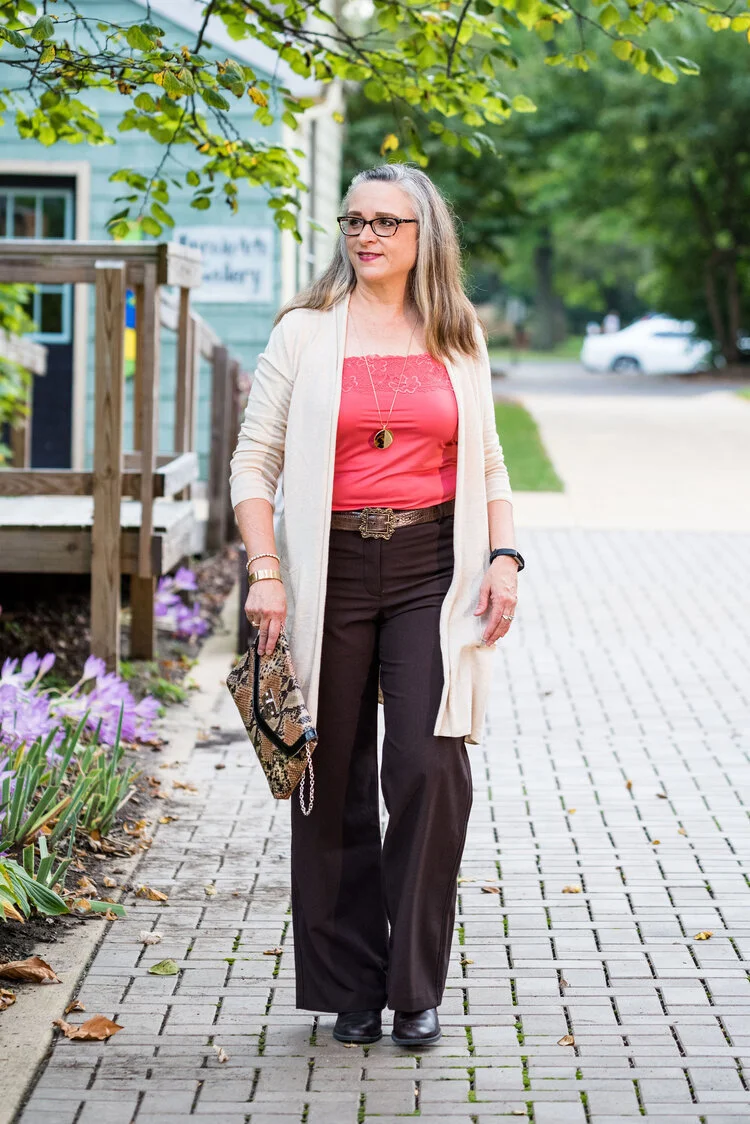
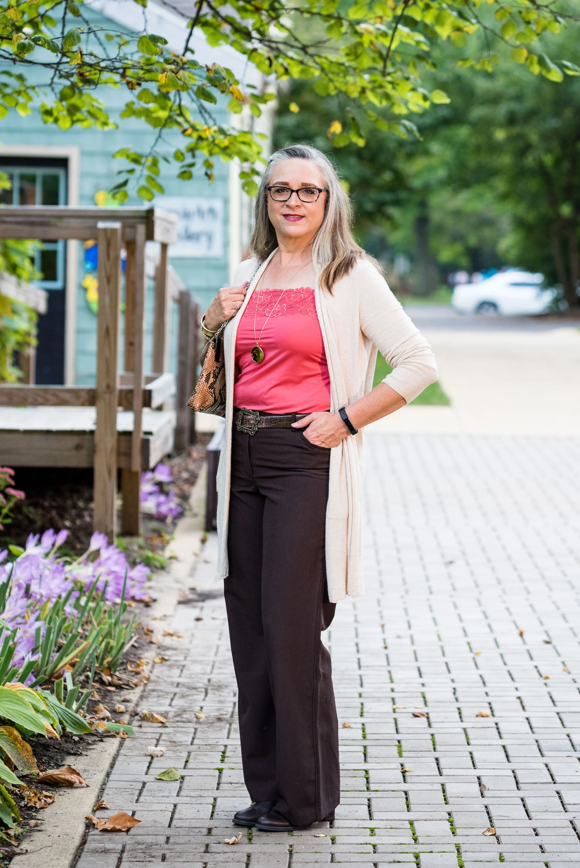
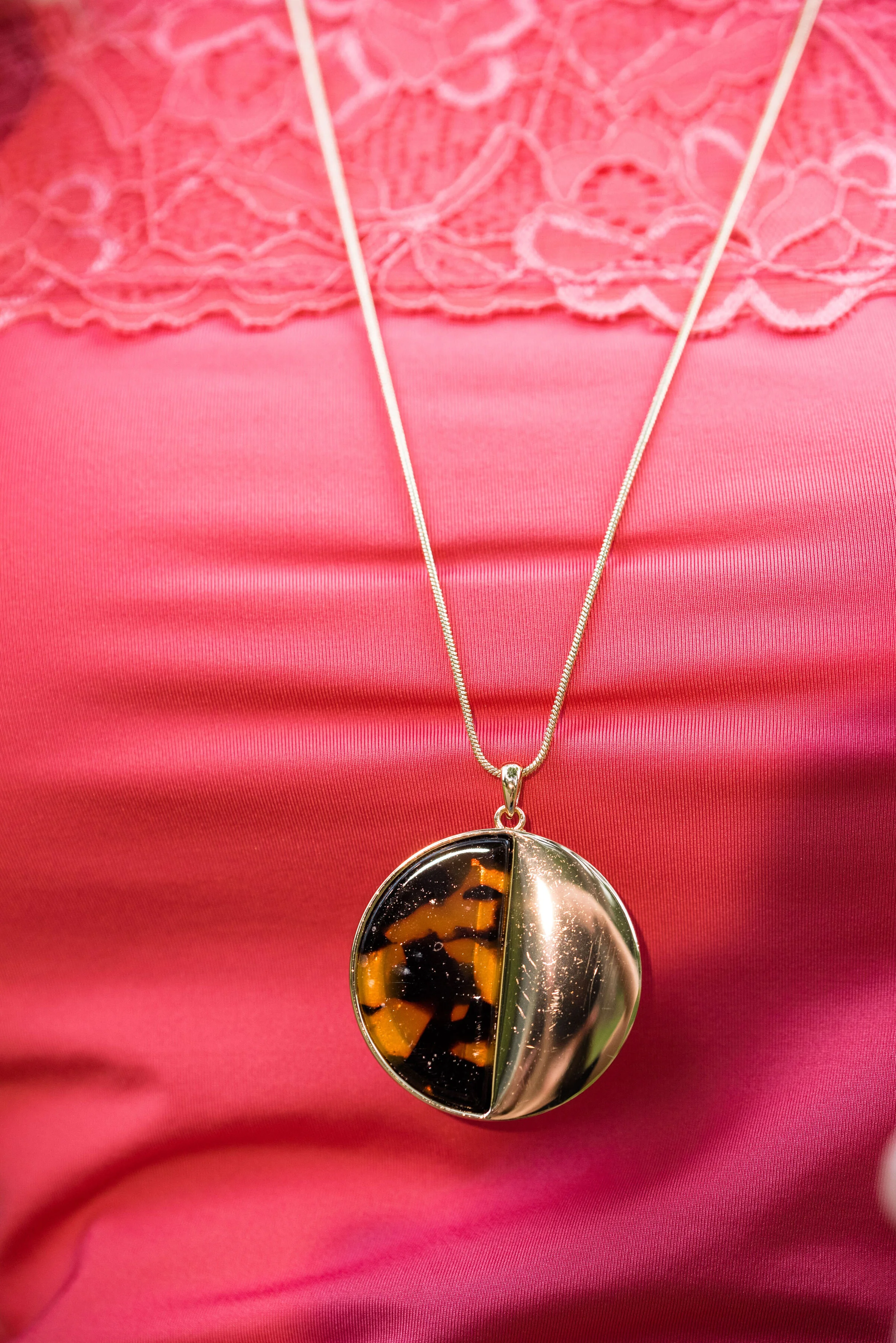
This is a great work wear look, or even a date night combo. I think the outfit elongates my whole body making me look slim and trim. The dark brown trousers and dark brown boots create a long line for my lower half. The dark color is also trimming. In addition to that, I like the longer open front cardi. It is a lighter weight, which doesn’t add bulk. The snakeskin bag, leopard print pendant necklace and the floral lace on the cami added just enough printed interest to keep the outfit from getting boring.

November

Outfit Inspiration - It’s Beginning to Look a lot Like Christmas

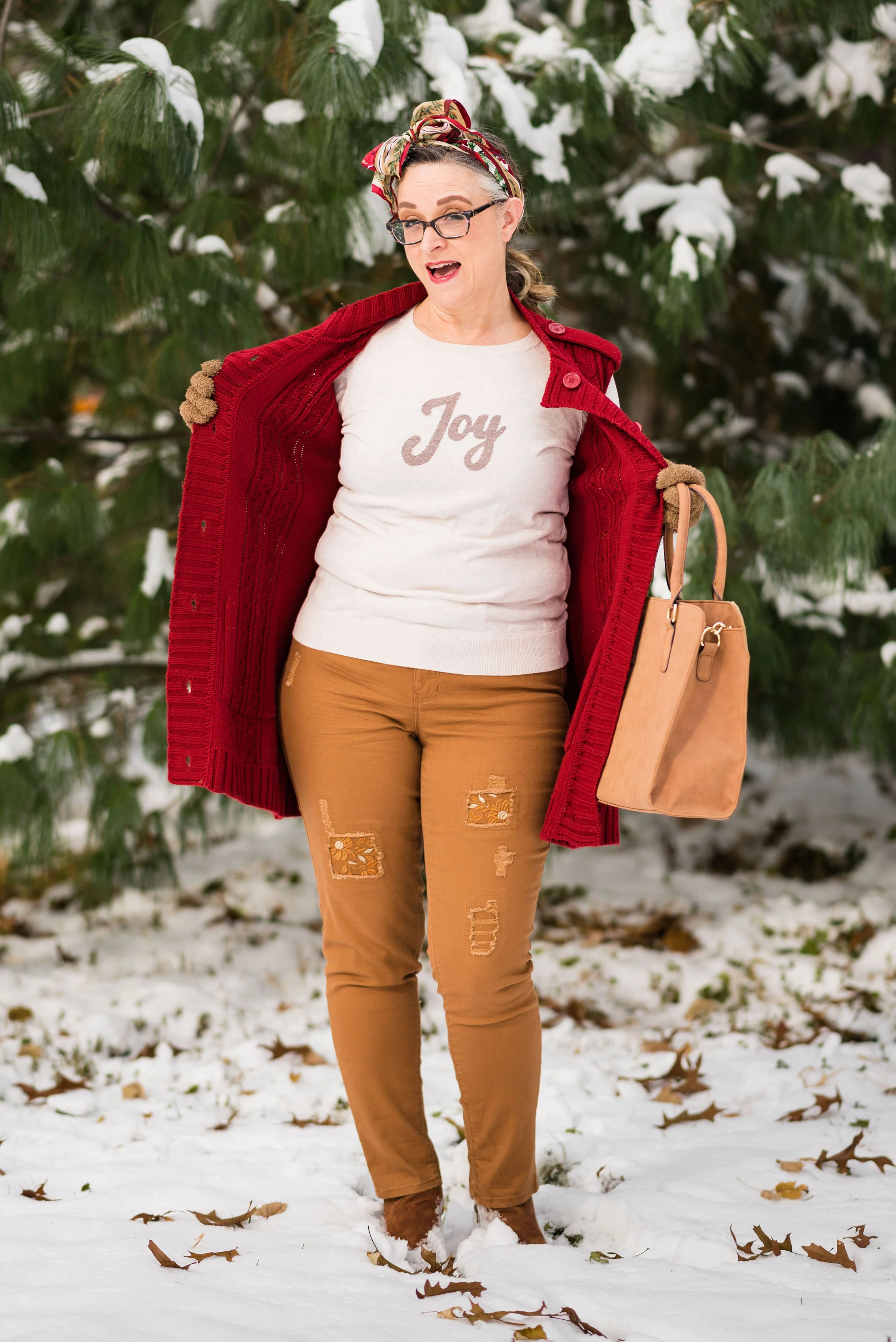
I just really like everything about this picture. It really says, “Christmas time is here.” I wanted my outfit to be Christmasy, but not over the top. The creamy thrifted “Joy” sweater is one of my favorites. I also love the pairing of the rusty yellow cognac color with bright red. The finishing touch was the Christmas scarf in my hair. It really gave the look a retro feel.

December

Outfit Inspiration - It’s the Most Wonderful Time of the Year

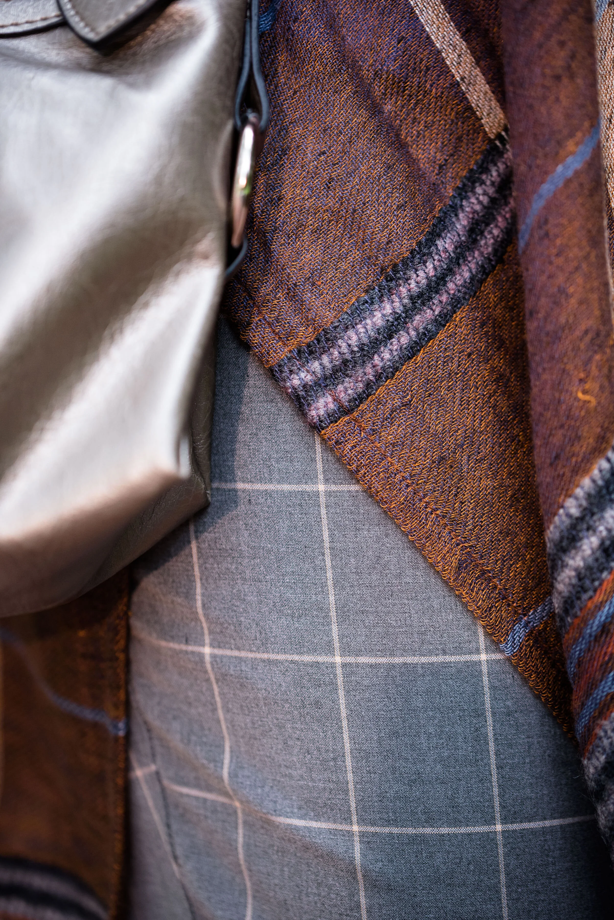
This is just such a me outfit. I love plaid. I love shearling and I really like how the gray looked with all of it. Turning up the cuffs on the jeans and wearing the tan, shearling lined boots gave the outfit a fun casual flair, while the snowflake tee and Believe pin kept the outfit on the Christmas theme. I’m going to have to wear this plaid blazer a few more times this winter, just for fun!

So there you have it, my favorite outfits from 2019. If you want to read the original posts, just click on the titles of each and it will take you there. Did you have a favorite outfit from my blog, this past year? If you did, I’d love to hear your thoughts.

I hope to have a new series up and running by next week, on layering light for these drab, gloomy days of winter. In addition to that, I am going to revamp my weekly columns, so every Thursday will be a specific area of fashion that I am wanting to post about. I hope you will join me for what’s ahead.

Have a great week.

Photo credit Rebecca Trumbull, unless specified under the picture.

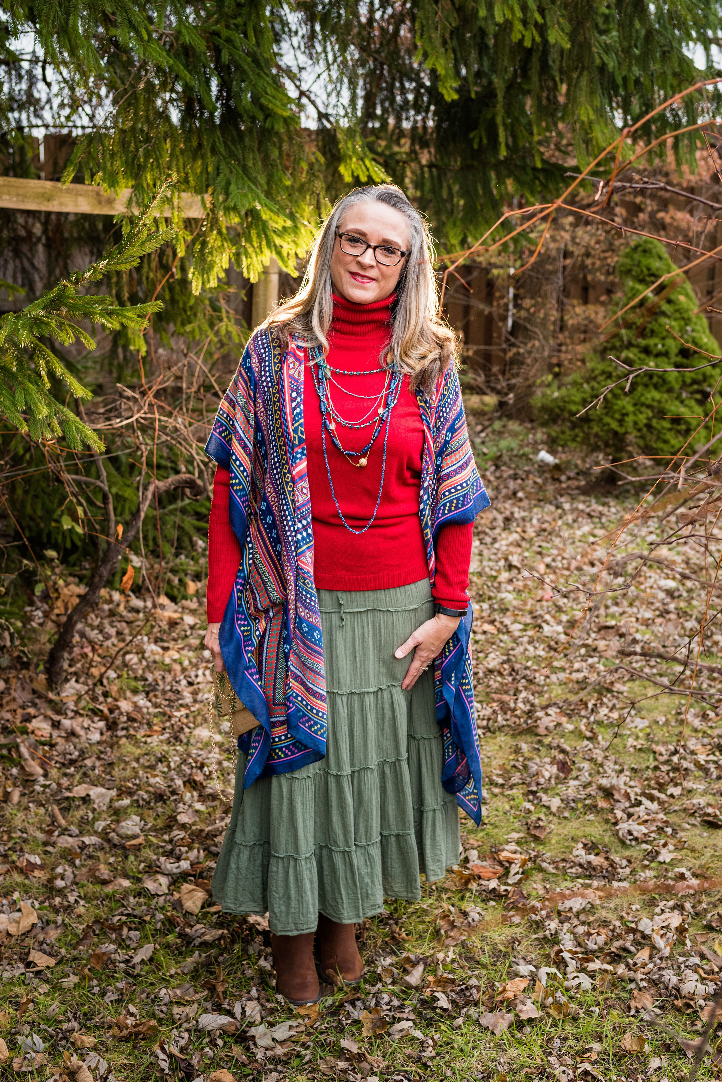
Outfit Inspiration - Feliz Navidad

This final installment in my Christmas outfit series was supposed to end on Christmas day and what better song to end it with, than Jose Feliciano’s, Feliz Navidad? It simply means, Merry Christmas in Spanish. The song is upbeat and perfect for the joy of Christmas day. Jose Feliciano wrote and recorded the song in 1970, and it regularly remains one of the most downloaded and aired Christmas songs.

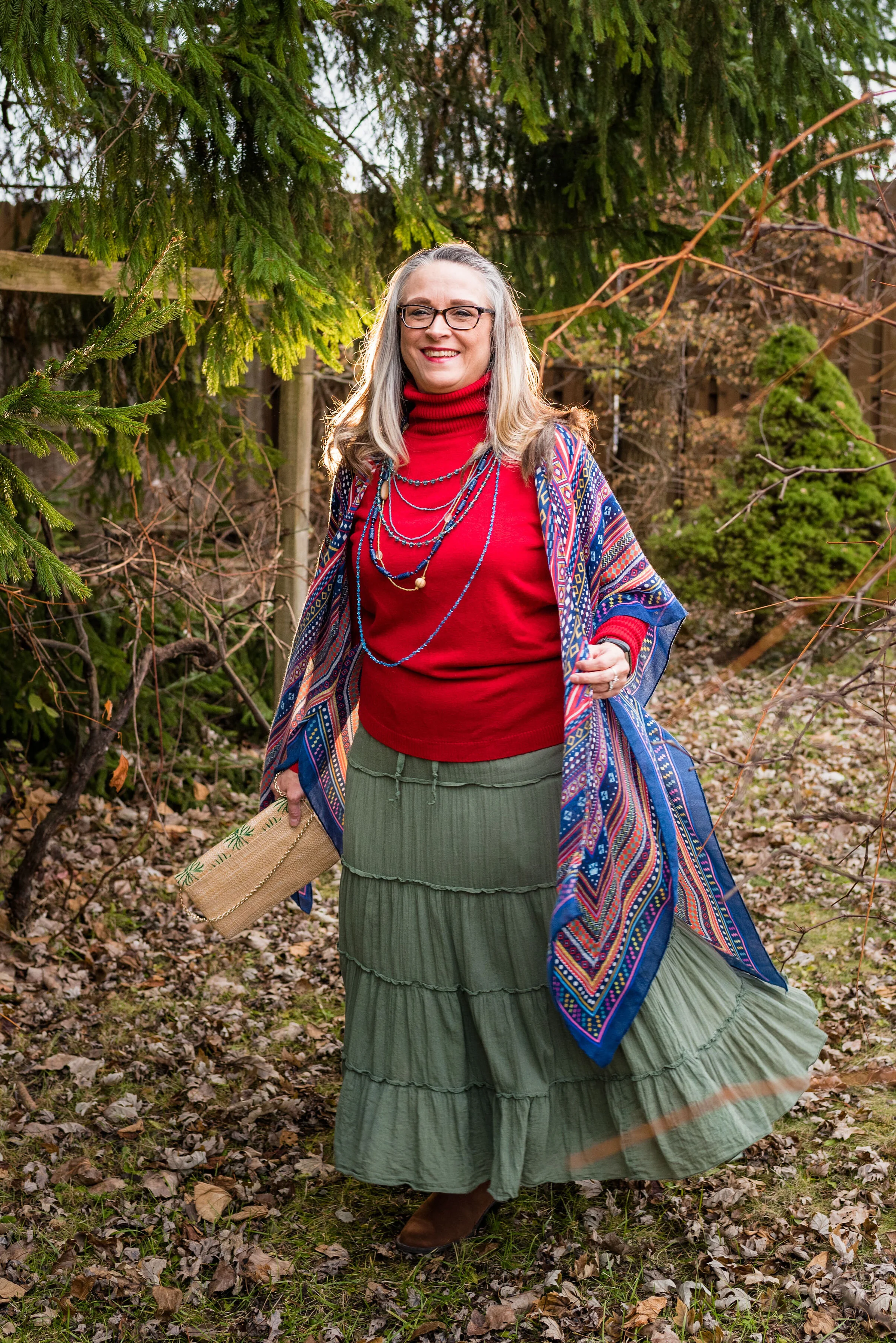
For a song with such an obvious party vibe, I wanted an outfit that was full of color. As you can see, I still kept the more traditional red and green Christmas colors intact, but went for an olive green rather than the true Christmas green. I also added my multi colored kimono and lots of colorful beads.

My kimono was a DSW clearance rack find and is a brand called Do Everything in Love. I styled this piece earlier this year in the Spring 2019 Pantone series. You can see that post here. It is such a fun, colorful piece and I am glad I added it to my wardrobe.

I love a soft turtleneck when the weather is cold, especially if my hair is up in a French braid or a bun. This thrifted one is a brand called Josephine Chaus and is a perfect Christmas red. It really shows off the array of colored beads quite well.

My green tiered skirt is an Old Navy thrift find. For some reason, I have always been drawn to the prairie skirt, or as you saw in my previous post, the prairie dress. The tiered skirt appeals to me as a somewhat casual skirt that offers comfort and ease of wear. I rather like the gypsy vibe of this tiered piece and the green color goes with many other things.

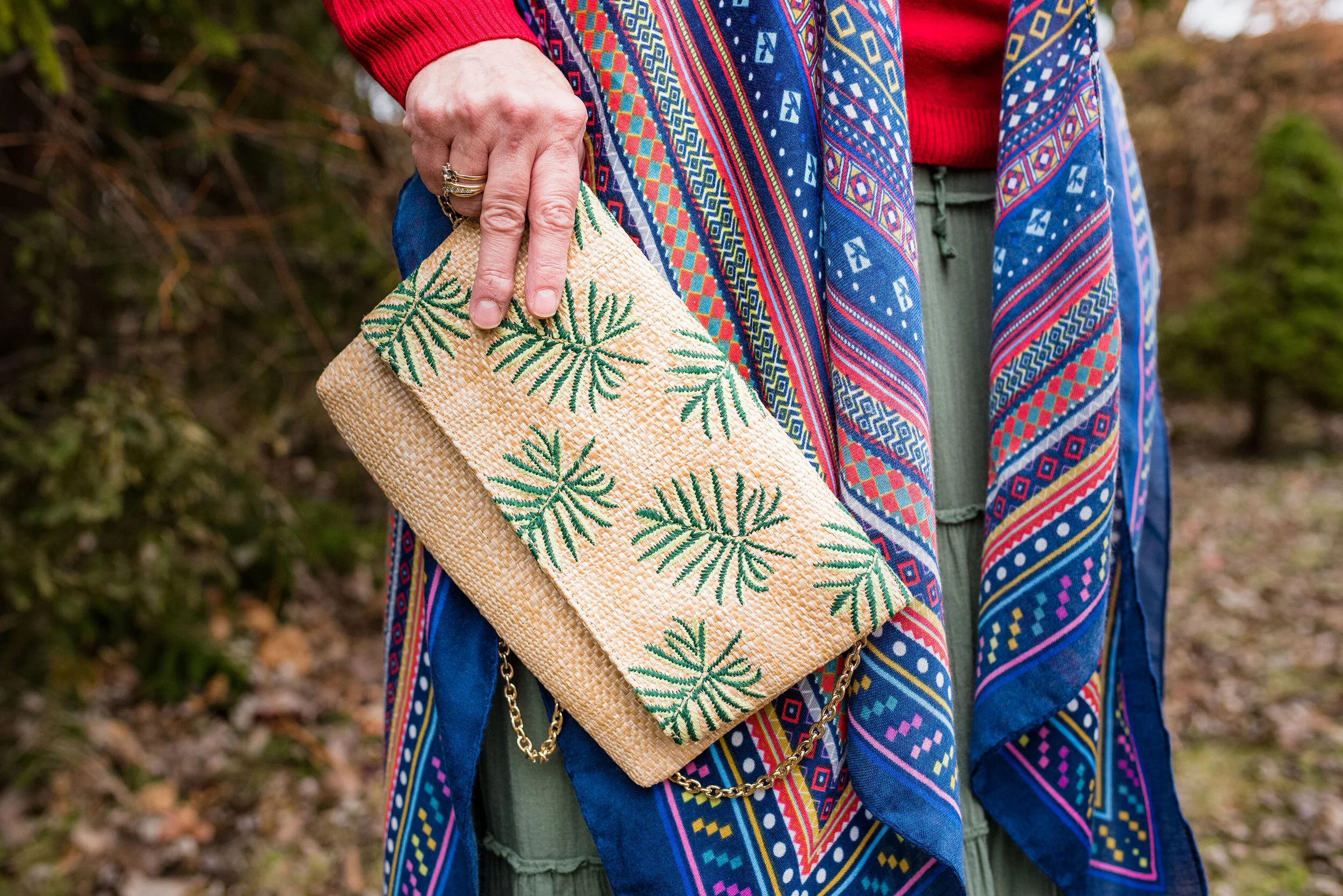
In keeping with the idea of Mexico and warm weather, I added my palm print clutch, which was also a DSW find.

While I wanted the outfit to represent a colorful, Mexican celebration of Christmas, I also wanted to keep it grounded to the reality of a mid-western winter where boots are a must, even if there isn’t snow. Boots are a great way to keep your legs and feet warm and when you are wearing a skirt, that is very important.

I found this pair of simple Sonoma rusty colored boots in the Kohl’s clearance area. Don’t be afraid to rifle through the clearance areas at your favorite stores. Between thrifting and clearance finds I rarely pay full price for any of my clothes. When you are on a budget as tight as ours and you like to shop, that is an absolute must.

I hope you don’t mind that I dragged out my holiday outfit posts. Working more, taking care of my grandson and Christmas gatherings used up most of the energy I had. I hope you all had a wonderful Christmas and will have a lovely New Year. I might try to post a Favorites from 2019 post some time this week, if I can.

I hope you are looking forward to a New Year. Happy celebrations and be safe!

Photo credit Rebecca Trumbull.


Outfit Inspiration - What Child is This?

I had good intentions of getting these last two posts done a few days ago, but it didn’t happen, so you will get these Christmas song inspired outfits after the fact of Christmas. I typed that and I am still having a hard time believing Christmas is over for another year. That always leaves me feeling a little sad, but that gives me a good excuse to extend the holiday for a little longer.

When I looked up the history of this song I was surprised to learn that the tune Greensleeves, to which the lyrics of What Child is This was set, was originally composed as a broadside ballad and registered with the London Stationer’s Company in 1580 by a man named Richard Jones. There are contrary ideas on the original lyrics of the ballad. One idea was that Lady Greensleeves was a prostitute or a promiscuous young lady. The idea of a lady’s clothing being green had to do with grass stains on her dress from rolling around on the grass having sex. Another idea was that a woman had green sleeves on her outfit and was mistakenly taken for a hussy, to which she snubs the advances of the one trying to take advantage of her position. Either way, I am surprised the tune, then became the basis for What Child is This.

In 1865, William Chatterton Dix, a manager for an insurance company, came down with a life threatening illness. During that time, he had a spiritual awakening and wrote a poem The Manger Throne. The poem, became the basis for What Child is This. The poem centered around the adoration of the shepherds when they came to the manger and baby Jesus. It is not clear at what point the poem was set to the tune Greensleeves, nor by whom, but in 1871 it was included in a collection of carols published in the United Kingdom.

To me this song evokes a sense of simplicity and purity. Seen through the eyes of shepherds, the words create an image of the stark simple animal stable and the roughly crafted manger in which the baby Jesus lay. With this idea in mind I chose a simple prairie maxi dress that I found at a thrift store.

When I saw this dress, I immediately grabbed it, lest anyone else notice it and throw it in their cart. When you are thrifting, you have to grab a piece when you see it, otherwise it might be gone. You can always put it back before you check out if you decide to not buy it.

I love the floral pattern and the flounce at the bottom. The waist is gathered with elastic, but I decided to add a belt to add definition and texture. The cuffs on the sleeves are elastic as well. The dress is so simple. There are no buttons, ties or zippers. I just throw it on and go. It is also fully lined, so no worrying over a slip or cami.

You can just make out the elastic waist. It is almost an empire waist, but falls further below the bottom of the bust line. In my typical feminine with an edge stye, I added a wide black belt with plenty of metal. It has a sort of prairie goddess meets motorcycle mama vibe. Ha, ha.

In keeping with the simple theme, my accessories are not loud and other than the belt do not particularly draw attention. A black velvet choker, and a cross necklace give the old time vibe an updated look when worn together. The cross necklace is actually patterned on the front, so I turned it around to show only the black back.

The cognac colored bag was a Meijer clearance find and is perfect for this outfit. I’m also wearing my cognac colored SO booties from Kohl’s.

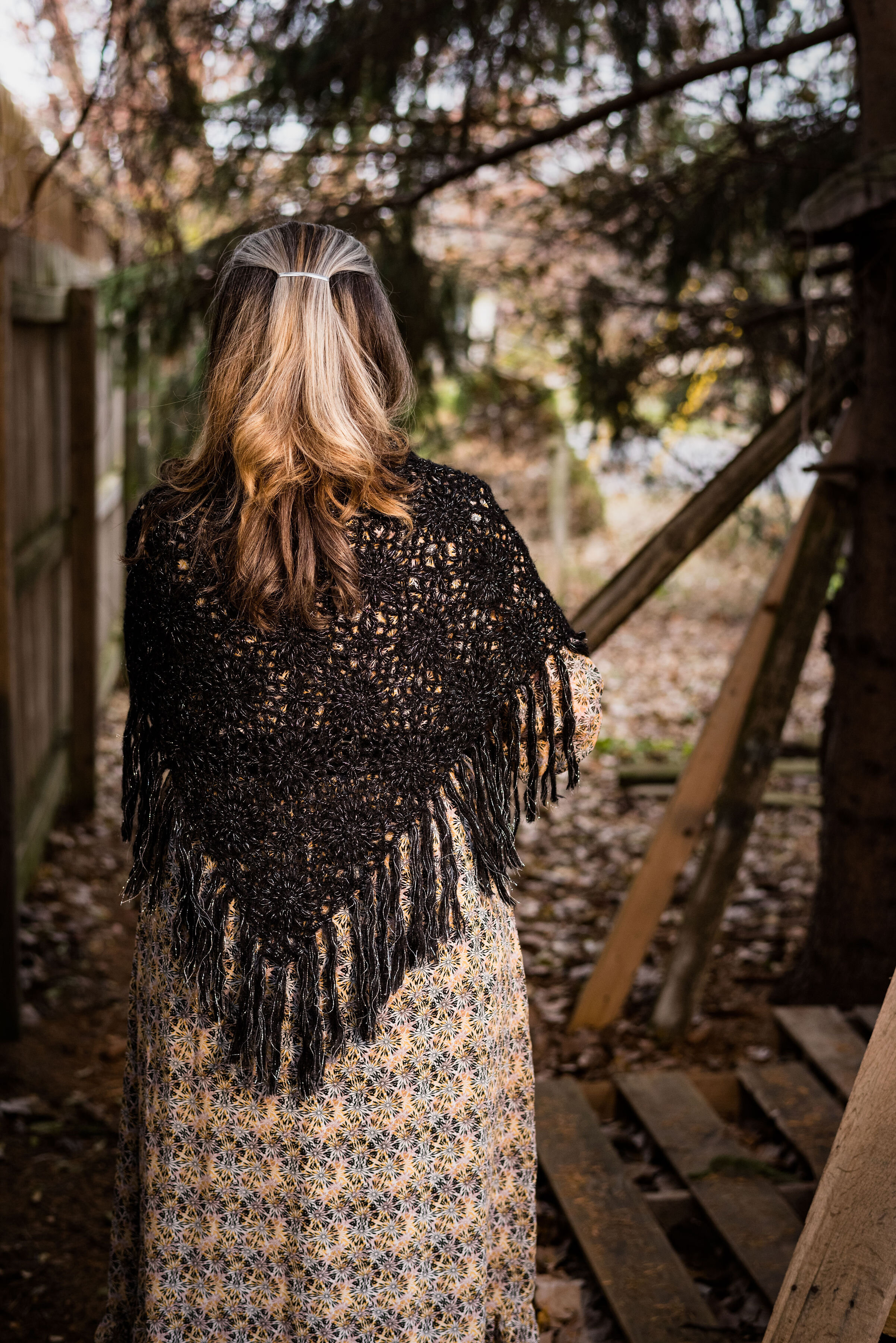
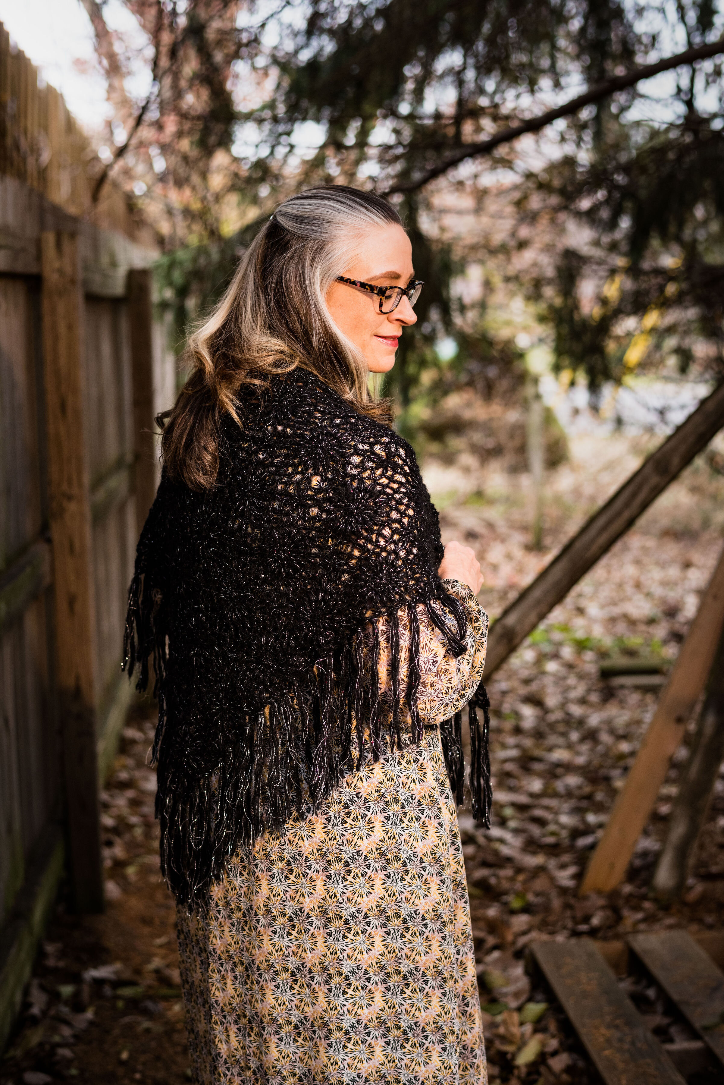
The final touch was to add my black shawl. It made the simple prairie vibe complete. I’ve had this fabulous piece for many, many years and I couldn’t tell you where I originally got it.

Would you wear a prairie dress like this? Why or why not? Not everyone can wear maxi’s and feel comfortable in them. Not everyone likes the prairie vibe. What sort of style do you like to wear? Are you more contemporary and like to follow the latest trends, or do you like styles from the past? I’d love to hear you thoughts.

Photo credit Rebecca Trumbull.

I am including a link to my most favorite version of What Child is This, as sung by Andrea Boccelli and Mary J. Blige. In my opinion this is one of the most worshipful and beautiful renditions I have every heard.

Outfit Inspiration - Santa Baby

There are two Christmas songs I would classify as sexy. The first inspired the outfit in today’s post, Santa Baby sung by Eartha Kitt. The second would be Elvis Presley’s Santa Claus is Back in Town. there is also a good version of that by Kurt Russell in his Christmas movie that came out last year called The Christmas Chronicles. That is a fun family movie, if you are looking for something different to watch.

Back to Santa Baby. This song was written by Joan Javits in 1953. It was meant to be a tongue in cheek look at the Christmas list of a a woman who wants expensive gifts from Santa such as furs, cars and a diamond ring. Eartha Kitt, a multi-talented actress, and singer recorded the song and it was a hit. She had a very distinct voice and that is part of why I love her version of the song. There have been several other artists who recorded the song since then, Madonna being one. Eartha rerecorded the song in 1963 with a more upbeat tempo. I personally, like the original version best. It is sassy and sexy and that is what I was trying to evoke with this outfit. See what you think.

When I thought about doing this song, I pushed the idea from my mind, because I am not a sexy person by nature. As many of you know, who have followed me since the beginning, I grew up with brothers and was a tomboy. I also grew up in a very conservative home, where affection was not regularly expressed and things like sexuality were not discussed. Unfortunately, that did affect how I related to my spouse once I was married. I feel rather silly trying to be sexy. I can pull it off once in a while with my hubby, but that stays in the bedroom. What I have for you is a much more subtle and modest attempt at sexy.

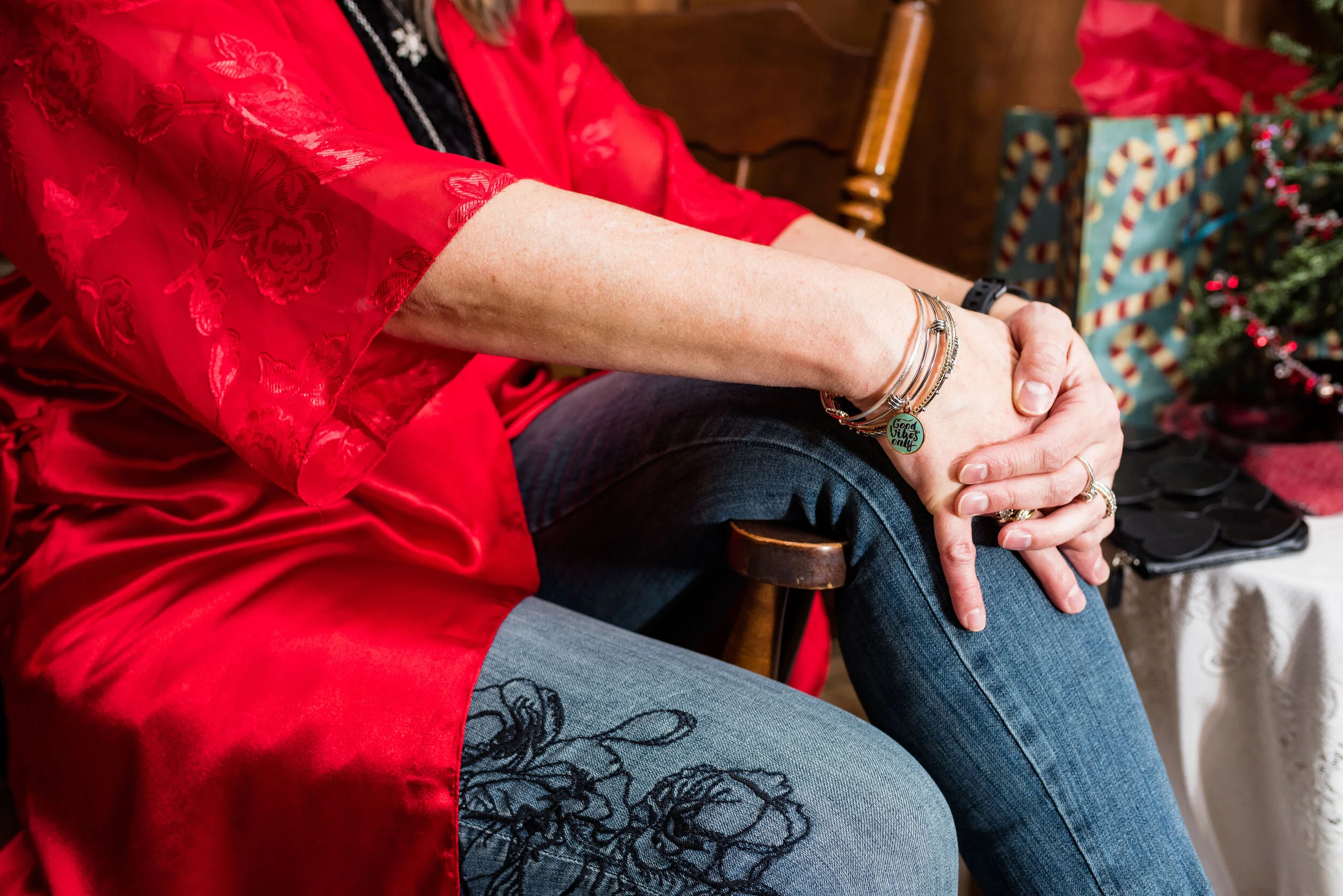
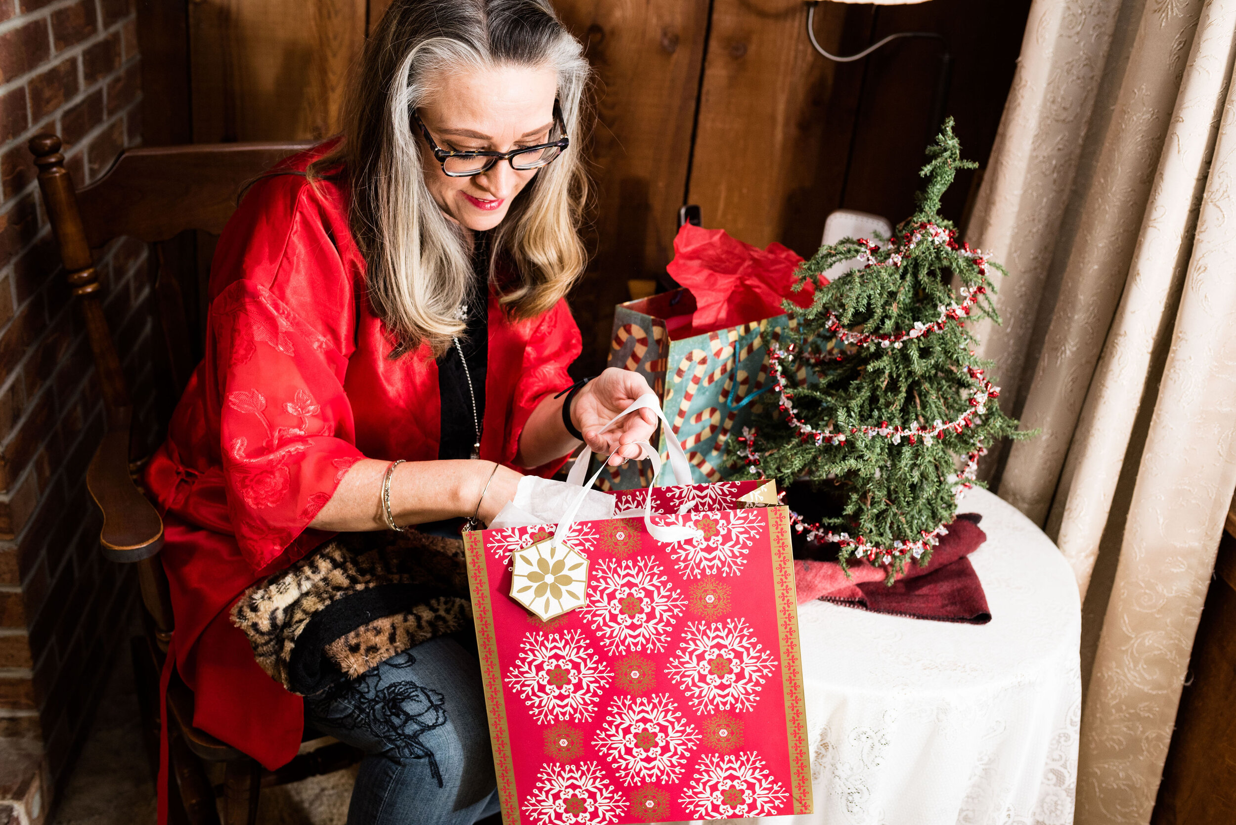
This pretty red kimono was a gift from my hubby in an attempt to make me more sexy, Ha, ha. It is a very pretty piece, so I thought why not use it for this outfit. The red is perfect for Christmas. The kimono is a brand called California Miss. I have no idea where my spouse bought it as that was a few years ago.

You can see the pretty floral detail on the sleeves of the kimono and how fun that it goes with the floral embroidery on my jeans. I just bought these jeans on clearance at Kohl’s. They are Simply Vera/Vera Wang brand. They fit well and have a good amount of stretch and the skinny legs will work great in boots.

My black velvet tee was a Christmas gift from my spouse last year. The tee is a brand called City Streets. One or both of my daughters usually go shopping at least once with him, to help him choose gifts. He had to do it all by himself when the girls were younger. How did he manage? Ha, ha. He usually does pretty well. My best ever gift was this computer from four years ago. I wouldn’t be blogging if he hadn’t gotten me this wonderful Apple. What is one of your favorite Christmas gifts?

I went for silver and black for my accessories. My silver bangles you can see in the above picture. I also added two silver necklaces. A long fringe pendant and a snowflake pendant.

My little black heart embellished clutch and my Ralph Lauren boots are both thrifted.

Here are a few other pictures that I was inspired to throw in because of the song.

A sable, the keys and a deed. Ha, ha

I hope you enjoyed this post. Do you think this outfit worked for the song? I’d love to hear your thoughts, so leave me a comment or two.

It is hard to believe Christmas is in four days. Yikes! I have so much to do. My brother is coming into town tomorrow on his way to see my mom for a few days. I am glad he will be with her, since with this seasonal job I won’t be off contract until January 4h. I hope you are prepared for the upcoming holiday. I’ll have two more outfits, next week in this series, so keep a look out for those.

Have a great weekend!

Photo credit Rebecca Trumbull.

Enjoy this version of Santa Baby by Eartha Kitt.


Outfit Inspiration - Let There Be Light

This series wouldn’t be complete without a contemporary song or two. Point of Grace is a Christian Contemporary group made up of three ladies, Shelley Breen, Denise Jones, and Leigh Cappillino. In 2005 they came out with a Christmas album called, “Winter Wonderland.” The song, Let There Be Light, became one of my favorites from that collection of both old and new Christmas songs. The song was sung by John David Webster with background vocals by the girls.

From the beginning the Father
Had a magnificent plan
Revealed through the law and the prophets
To fulfill the redemption of man
You spoke after centuries of silence
In the midst of a still, starry night
And Emmanuel came down among us
And the Father said, ‘Let there be light’
— Let There Be Light - Point of Grace

I love the imagery. We were walking in darkness, but God sent His son, the light. Indeed a magnificent plan. With those words in mind, I came up with an outfit full of shimmer and light.

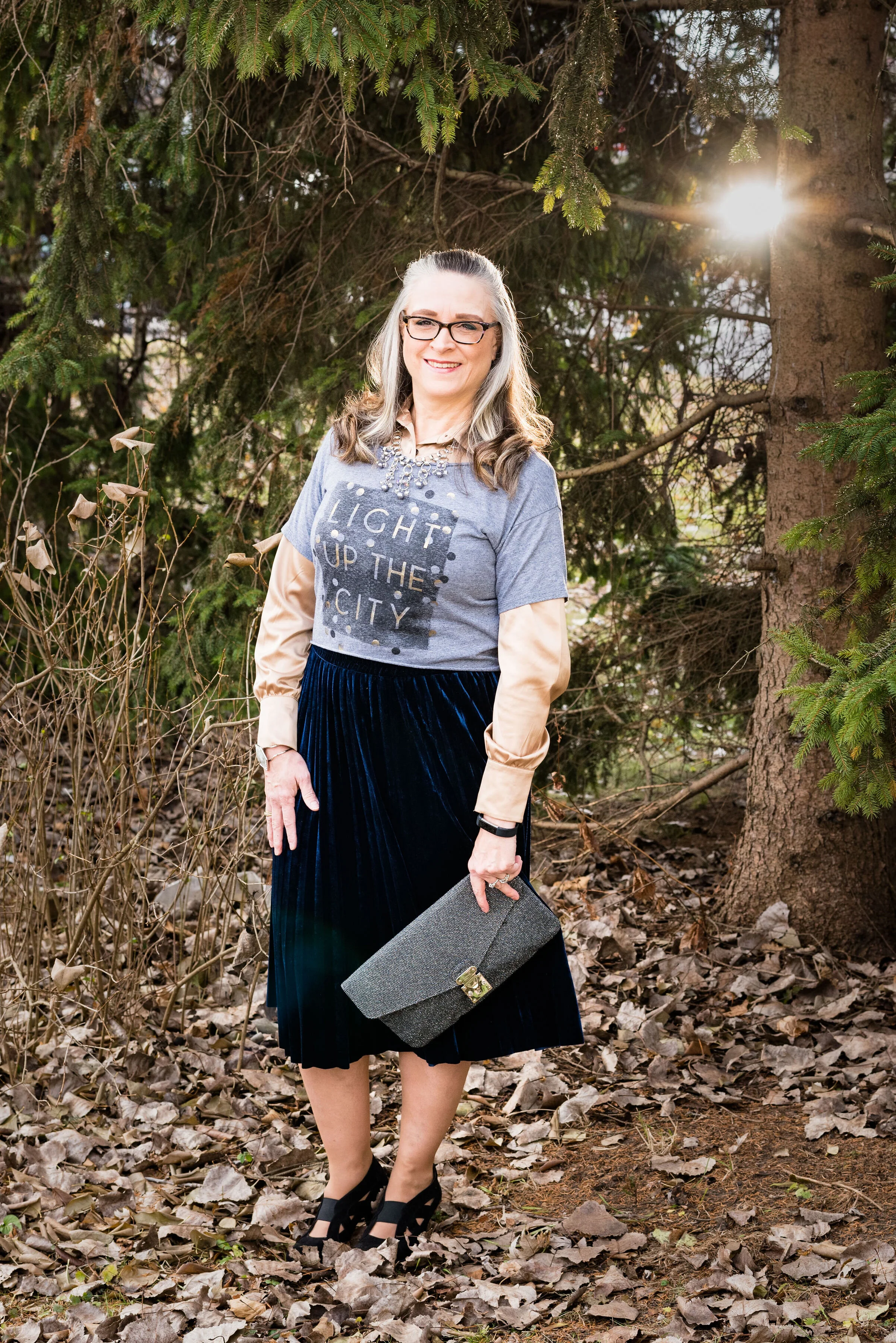
My Hollister, Light up the City crop tee was a thrift find. I don’t typically wear cropped tees or tops, but when I saw this one and the one in my O Holy Night outfit, I knew I could afford to purchase them and give them a try. This one boasts dots that make it look like there are splotches of light on the tee.

I wanted to have my arms covered so I added this thrifted gold George button up under the crop top. Originally, I was going to let the gold top hang out the bottom of the crop top, but it is a little small and didn’t look quite right, so I tucked it, instead.

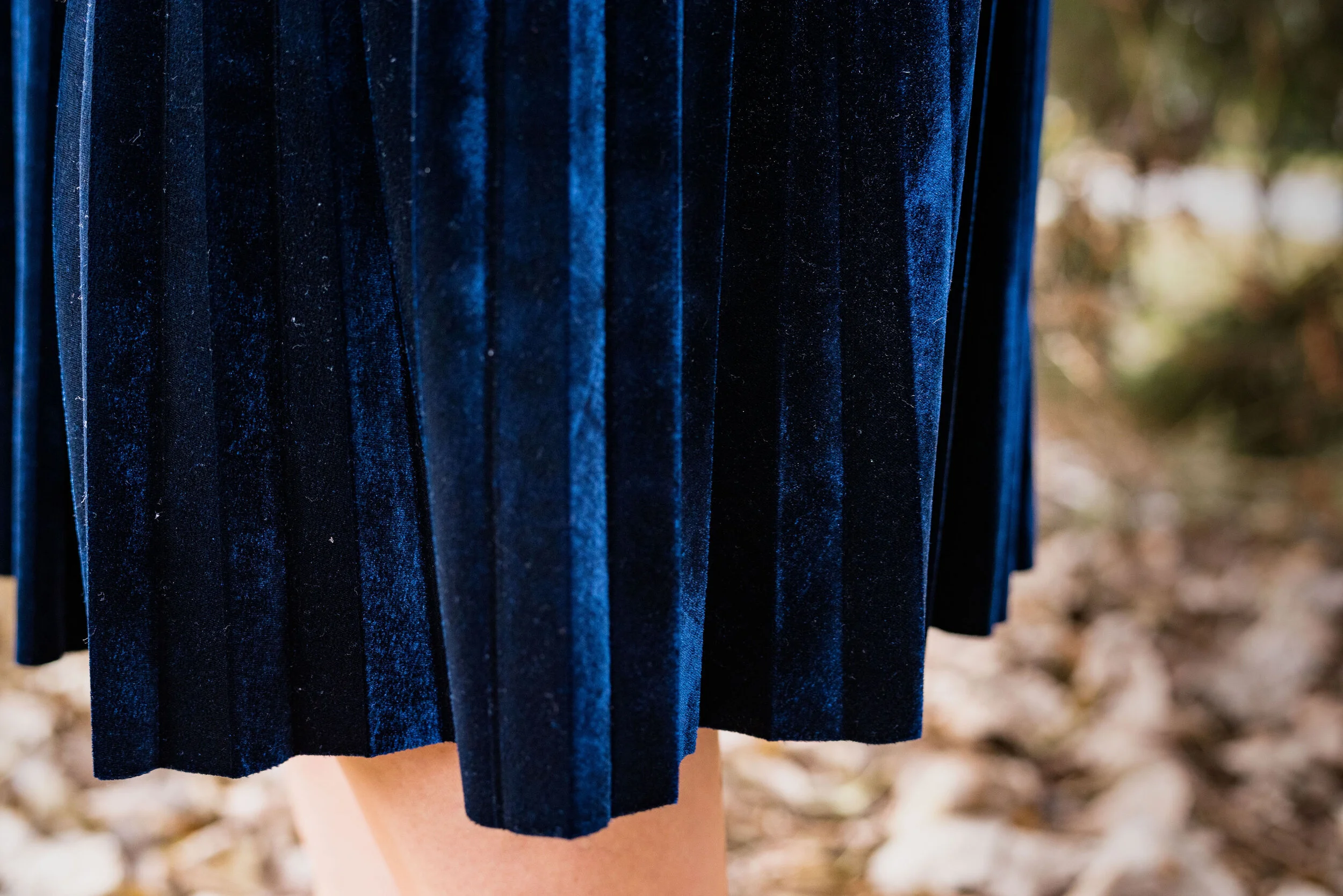
This pretty velvet skirt was a Kohl’s clearance find and is Chaps brand. I love some of the Chaps brand pieces, but they are typically a higher price point than I want to pay, so finding this on clearance was perfect. I really like the way the velvet has a light of it’s own and definitely takes the outfit up a notch. Once again, the dark blue makes me think of that night sky over the fields of Bethlehem, when baby Jesus was born.

You’ve seen these shoes a few times on the blog now. I think they are fun and classy and the black suede could be a first cousin to velvet, but without the shimmer and shine. These are Easy Spirit brand.

My accessories were meant to add further bling and light to the outfit. The multi strand bead and metal necklace, the gray stone and bling bracelet and the sparkly black envelope clutch all bring added light.

I love the light: sunshine, candles, Christmas lights, fairy lights, fireworks, fires in a fireplace, campfires, lamps in all their various shapes and forms. The light is so important to our lives and to our world. We couldn’t grow food without sunshine. We couldn’t see in the dark without a candle, flashlight or lamp, or at least the light of the moon. Light gives our lives meaning and purpose, especially the light that came into the world over two thousand years ago.

See what kind of love the Father has given to us, that we should be called children of God; and so we are.
— 1 John 3:1 (ESV)
For God so loved the world,[a] that he gave his only Son, that whoever believes in him should not perish but have eternal life.
— John 3:16 (ESV)
Jesus spoke to them, saying, “I am the light of the world. Whoever follows me will not walk in darkness, but will have the light of life.”
— John 8:12 (ESV)

What do you think of this outfit? Do you like to wear clothing that is luminous and reflects the light? What sort of light do you like? At Christmas do you decorate your house with lights? Where do you put them and do you have a lot of lights or just a few? I have enjoyed so much, reading your comments. People have been sharing their Christmas memories from going to get the tree with their family to Christmas caroling and giving out food. These just make me smile, so thank you everyone who has been willing to comment and share.

Here is the song, Let There Be Light by Point of Grace. Enjoy!

Photo credit Rebecca Trumbull.

Here are a few velvet skirts to look at.

Have a great week!


Outfit Inspiration - Rockin' Around the Christmas Tree

One of my favorite Christmas tunes is Rockin’ Around the Christmas Tree by Brenda Lee. When I was in high school I hung out with a girl a grade ahead of me named Sherry. We had tons of fun together and had a very special friendship. Though our ways parted after high school, we still keep in touch through Facebook. Sherry and I were in my church’s youth group together and often found ourselves with other church friends at local restaurants. One particular pizza/sub shop had a juke box. Seeing as it was that time of year, Christmas songs had been added to the playlist. Sherry and I chose a few songs, and one of the ones she picked was Rockin’ Around the Christmas Tree. The funny thing was, Sherry decided to be silly and kept going up, inserting more change and playing that same song over and over. We all had a giggle fest as we ate our food. Now, every time I hear that song, I think of my dear friend and all the fun we had together.

The song, Rockin’ Around the Christmas Tree, was written by Johnny Marks and sung by Brenda Lee in 1958. The interesting thing about Brenda Lee was her age when she recorded the song. She was only thirteen. Her mature sounding voice lead her to a career in country music, but it is the blend of rockabilly and country style that makes this song a forever hit. To this day most radio stations from adult contemporary, to top 40, to country play Mark’s and Lee’s version of Rockin’ Around the Christmas Tree more than any other version.

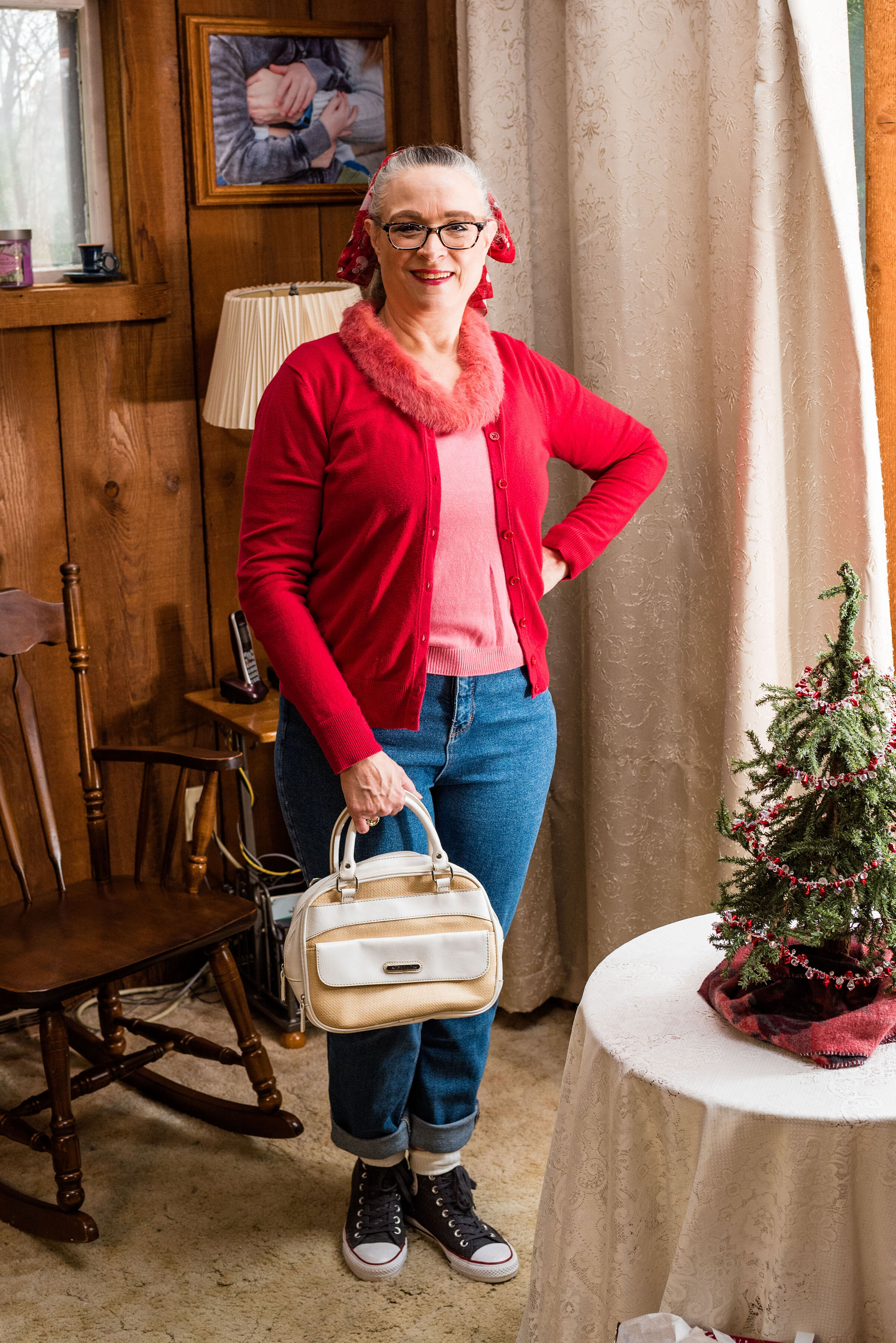
Of course with the 50’s rock and roll feel of the song, I had to dress with a 50’s vibe. Rolled up jeans, a mismatched sweater set and a ponytail with a fun Christmas scarf brought in the 50’s details, most of which I got from watching shows like Happy Days. Ha, ha. Probably not exactly historically accurate, but you get the idea.

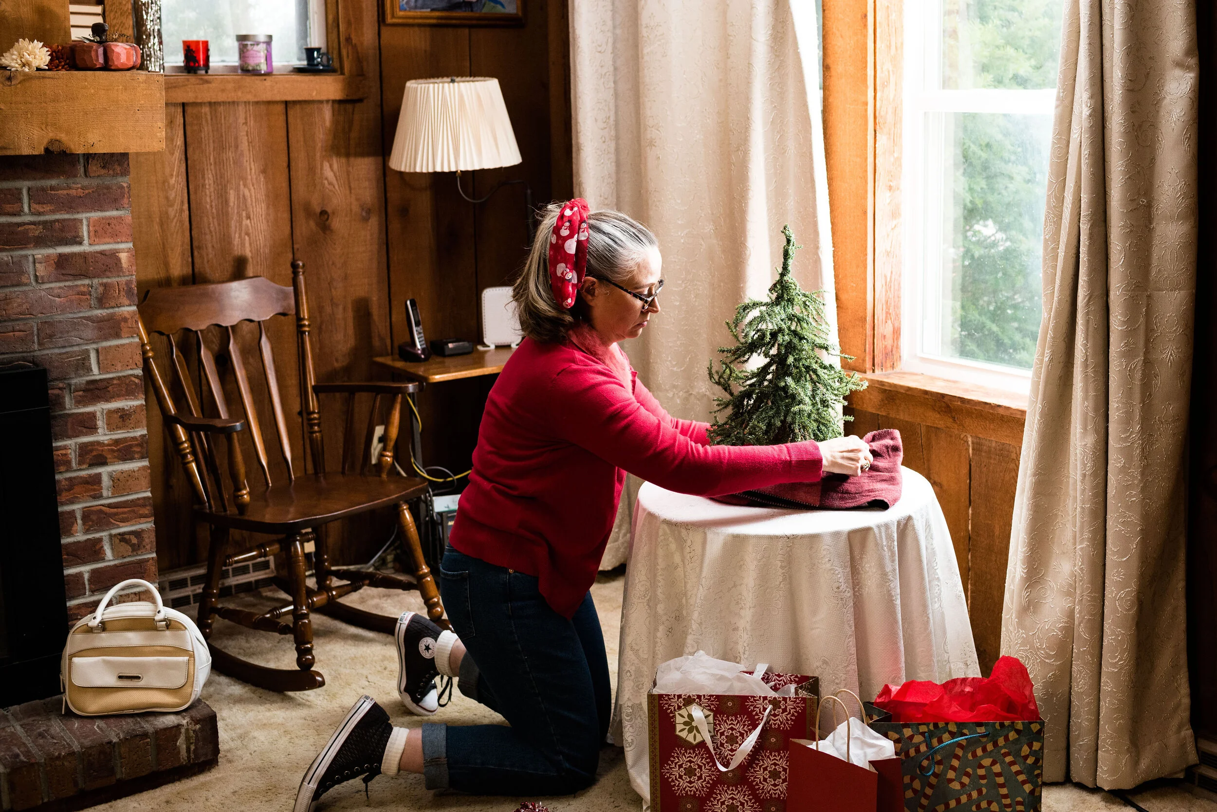
I hadn’t gotten my full sized Christmas tree up yet, but I wanted the pictures to look somewhat festive. When my daughters were both still living at home, we had gotten them each a tiny, Charlie Brown, type tree for their rooms. This one still resides at our house, so I thought it would add a touch of Christmas cheer to the pictures. Plus, how do you rock around the Christmas tree, if there isn’t one?

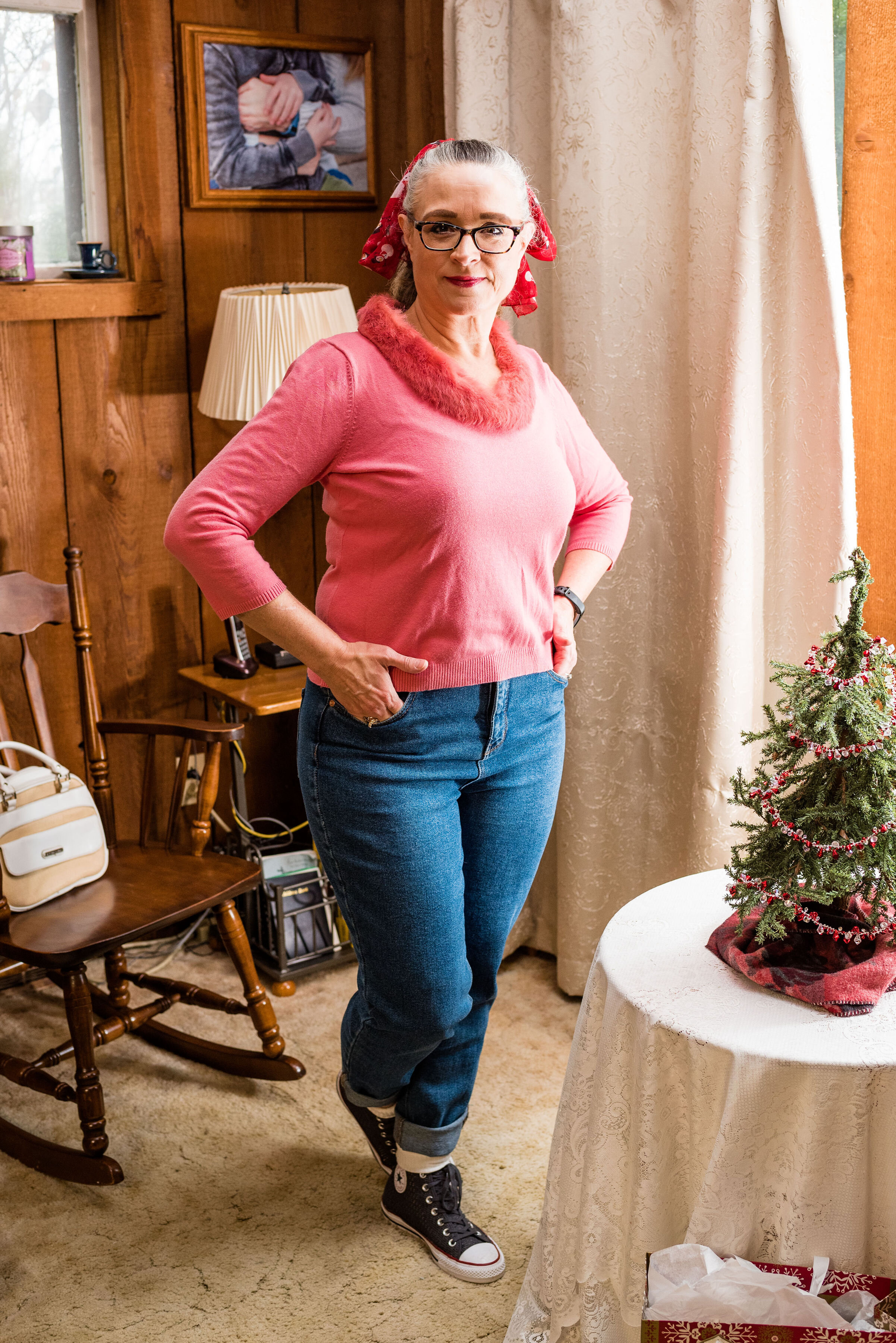
As you know, high waisted mom jeans are back in style. I had gotten rid of all of mine, not because they went out of stye, but because I gained weight and had to buy new jeans. Personally, I don’t really like the confines of high waisted jeans now that I have muffins to stuff into them. I prefer jeans that fall just below my belly button, but when I found this pair on clearance at Kohl’s, I thought I would add one pair of high waisted jeans back into rotation. These are Wild Fable brand. Target carries this brand and has a number of different washes, as well as various amounts of distressing.

You may think pink and red an odd color combo for Christmas, but it just makes me think of candy canes, Christmas cookies and wrapping paper. Both of these pieces were thrifted. The red cardigan is Merona brand and the pink pullover with rabbit fur embellishment is Emma James (a Liz Claiborne company). I am not a proponent of real fur, but if I have the choice of saving a clothing item from a land fill and part or all of its component are real fur, then I am a fan. Here is a pic without the cardi.

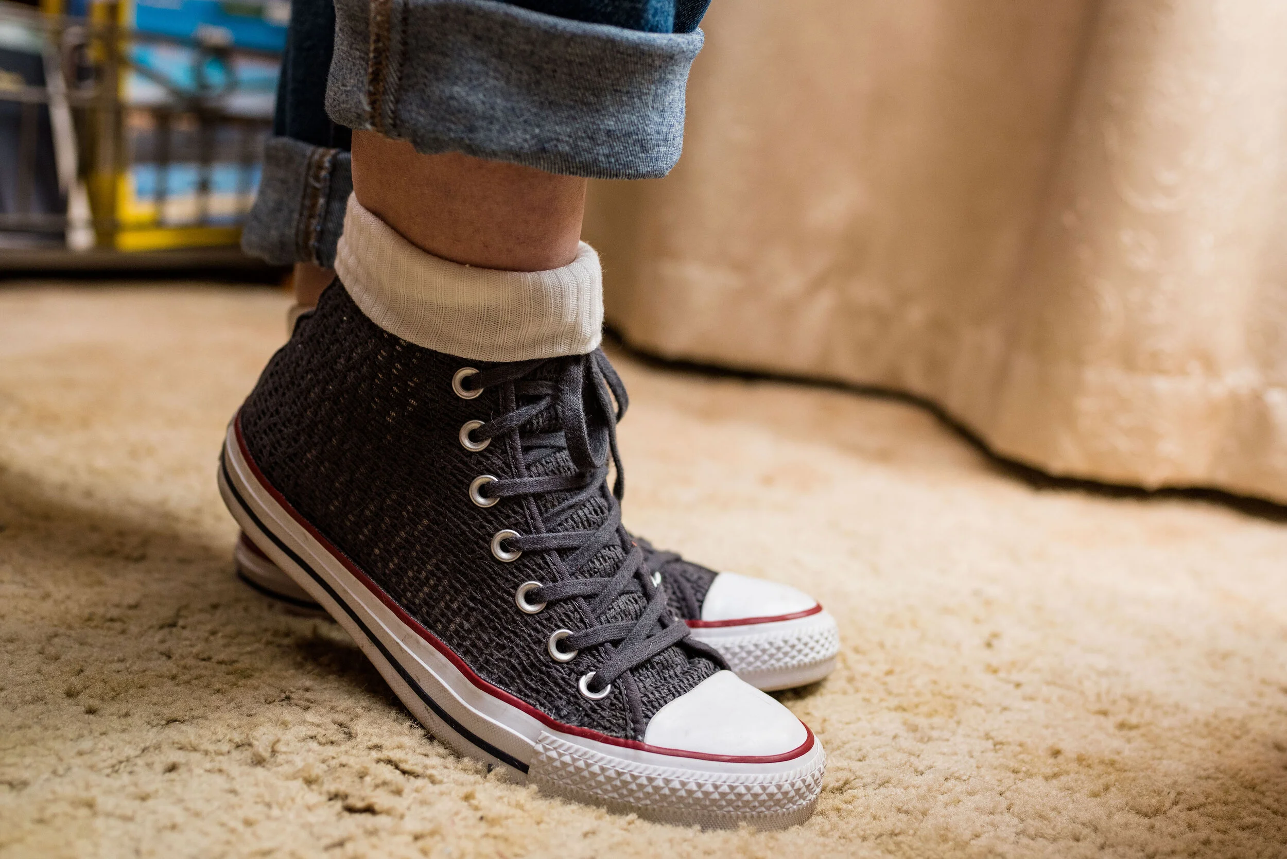
Since I wanted the outfit to be simple and fun I didn’t wear any jewelry. I don’t own a pair of saddle shoes, so the next best thing was a pair of Converse high tops. These are the only Converse I own. They typically do not fit my feet very well, but I found these on clearance at DSW. I popped on the white socks as a topper and it reminded me of how girls would wear their socks back in the 50’s.

Of course, in my opinion, no outfit is complete without a bag. What if you realize as you are rockin’ around the Christmas tree, baking cookies or decorating that you’ve run out of sugar or you’ve discovered another string of lights that won’t light (I swear, it happens every year)? You will need to run to the store. I chose this white, Jaclyn Smith satchel. This thrifted bag can be carried by the top handles and it also comes with a long strap to wear it as a cross body bag. This is also a thrift find.

My final addition was the scarf in my hair. Over the years I have collected a number of Christmas related pieces. I have a number of long sleeve tees, a couple sweaters and a few scarves. If you followed my Instagram feed last year, I featured most of those pieces in my “20 Days of Christmas series”. This cute snowman scarf is a narrow oblong scarf that works perfectly as a hair tie. I wore it to work yesterday around my neck, with a snowman pin.

What do you think of this outfit? Do you like high waisted mom jeans? Is Rockin’ Around the Christmas Tree a favorite song of yours? Do you think I did justice to the song with my outfit? I’d love to hear your thoughts.

Here is Brenda Lee singing Rockin’ Around the Christmas Tree.

I’m including a few shopping links. I hope you are having a good month leading up to Christmas. I especially hope that you do not feel stressed out and that you are staying healthy. Take care of yourself. There is only one beautiful you. Have a great week.

Photo credit Rebecca Trumbull.


Outfit Inspiration - We Three Kings

I have been listening to Christmas music since I was a toddler. Songs like Jingle Bells, I’m Dreaming of a White Christmas and so many others have been permanently embedded in my brain. There are a few songs that I remember, not so much because of their catchy tunes, but because of the pictures they created in my mind as a young person. We Three Kings is a perfect example of this kind of song.

Over the years We Three Kings became an icon of American Christmas carols. It was originally written by John Henry Hopkins, Jr. in 1857 for a Christmas pageant In New York City. He was the rector of Christ Episcopal Church in Williamsport, PA at the time. The song revolves around the three Magi who came to worship Jesus when He was a small child. You can read that Biblical account in Matthew 1:1-12. If I had more time, I would love to spend a little time discussing these interesting men and the gifts they bring the Christ child, but since this is a fashion post I won’t belabor the point.

You might be wondering, why did I choose this song. While it is clearly a traditional Christmas carol, it wouldn’t necessarily be a favorite of everyone out there. I love the story behind it. For years, these extremely wise men, who were obviously people of influence and wealth, but not necessarily kings in their own countries, studied the stars. They studied history and they may have even studied some version of Messianic prophecy. We can’t really say for sure, what caused them to take up their long trek to Bethlehem, but my imagination says it must have been a pulling of the Holy Spirit that led them to Herod and then to the baby Jesus.

I also love the dichotomy of shepherds on the night of His birth and these upper class men, some days later. It reminds me that we are all able to approach God, not because of our goodness and rightness, but because of Jesus.

I wanted this outfit to exude luxury, not that these wise men had all sorts of money, nor even dressed in a way that would attract attention, but the idea of kings, wise men and worshipping the King of Kings, made me want to dress as thought I was going to see the King myself.

This velvet jacket was a thrift store find. I was watching Merlin, a King Arthur series that was on a few years ago. When I saw this, I thought of Arthur Pendragon in all his finery and I knew I had to have it. I guess I should have taken the lint brush to it, before we took pictures. Ha, ha. I think the gold front closures are so fun. The brand is R & M Richards by Karen Kwong. It is obvious the style has an oriental flavor, which makes it perfect for my wisemen from the east.

At first I was going to go for a monochrome look, and pair the jacket with brown trousers, but then I thought of this Lauren Conrad skirt that I ordered from Kohl’s on clearance. It’s actually too big on me, so I had to safety pin the waist band for our photo shoot, but one of these days I will take it in. I thought the gold pleats and flowy feel made for a more luxe look.

In thinking about our three wise men, I chose gold to accent the entire outfit. My gold high-lo hemline tee, I got for Christmas last year from my husband. It is Dantelle brand from Marshalls. I tucked it in for this look and paired it with a wide gold belt that I found thrifting.

My jewelry and bag are gold with just a touch of bling. The little clutch with attached chain is also a thrift find.

I’ve worn these thrifted LifeStride brown ankle boots on the blog before and I thought they matched the jacket perfectly.

What would you wear to see a king? If we could afford it we would probably wear something a bit fancier than what I put together. Ha, ha. But that is part of the point of Christmas. The shepherds were able to see the King the night He was born and I’m sure they weren’t wearing their Sunday best. Jesus is happy to have us come as we are.

Today I am not going to include any shopping links, but here is one of the versions of We Three Kings that I like. For some reason I was not able to upload the video, so just click on the link and it will take you to the YouTube page with the video.

https://www.youtube.com/watch?v=_qmrRhVhKuw

Photo credit Rebecca Trumbull.

Outfit Inspiration - It's Beginning to Look A Lot Like Christmas

Happy Thanksgiving everyone, and welcome to my holiday series! This year my fashion posts leading up to Christmas will be inspired by a few of my favorite Christmas songs. I love Christmas music and I am guilty of starting to listen to it, the week before Thanksgiving. In my opinion, the season goes by so fast and I want to enjoy all the music, lights and trimmings for as long as I can. In addition to the outfit photos, I will also provide a few tidbits on the history of the song, as well as sharing a few of my own Christmas traditions. I also hope to connect my faith posts on Wednesday or Fridays (depending on which day I can get them done), to the songs that epitomize the original reason for the season. I hope you enjoy the series.

The first song I chose is It’s Beginning to Look a Lot Like Christmas. This song was written by Meredith Wilson in 1951. Mr. Wilson was an American flautist, composer, conductor, playwright and author. He is probably best known for the book, music and lyrics for the Broadway musical Music Man. This Christmas song is probably best remembered by us older folks as being performed by Perry Como, or Bing Crosby, but was also performed by Johnny Mathis. More recently Michael Buble did a version which has gained popularity over the last eight years when it first appeared on his album, Christmas.

As you can see, this first outfit and the setting are, indeed, beginning to look like Christmas. We were fortunate (?), to have snow for this first outfit. All the rest of them will be typical Northwest Ohio, browns and grays. Ha, ha.

This mid thigh length red sweater vest is a great piece for Christmas, or anytime the weather is cold and you need an extra layer over your core. This was a recent thrift store find and is a brand called one A. The vest has a full button front, roomy square pockets and a belt. For this outfit, I chose to leave it open and tied the belt at the back, so you could see my Joy sweater.

I’ve styled this cute, thrifted, Old Navy sweater on the blog in my Christmas series last year. In that post, I wore it with my burgundy pleated skirt. I’ve also styled it with a purple moto jacket. Just click on the links to see those posts.

Christmas is a season that brings me joy and that is part of the reason, I chose this song and this sweater. When I was a child, Christmas wasn’t about how much money we had, but about the traditions that went with the holiday season. My family celebrated Jesus birth. That was the central focus of the holiday. We would go to church, sing Christmas hymns and carols and enjoy good food with family. There were several things that brought me joy. The first was when my mother would begin to get out the Christmas decorations. We had a trio of red bells that lit up and we would hang those in our front door so you could see them from the street. I loved seeing those bells as they flashed, announcing to all the passersby that it was Christ’s birthday.

One of the other things that brought me joy was the Christmas tree. When I was really little, my dad would get the tree and he and my mom would decorate it after we went to bed on Christmas eve. My brothers and I would wake up to a magical tree complete with pretty wrapped packages from Santa under its scented pine boughs. As we got older we would go with my dad to pick out a tree and helped to decorate it after he put it in the tree stand. We have wonderfully amusing memories of crazy shaped trees.

These distressed cognac colored jeans were from Meijer a few years ago. They are a brand called Stitch Star. I’ve styled these on the blog before too. In that post they were a featured Pantone Fall 2017 color. I wore them in that post with a red sweater. I just love the combination of those two colors. This type of distressing is my favorite. No skin shows and they have added pretty embroidered embellishment.

For my accessories I added a Christmas scarf as a head band and tied it in a bow. I also grabbed my patchwork tote bag from Walmart and my SO cognac booties from Kohl’.s. The booties got a little bit snow covered. Ha, ha

Do you like Christmas music? What is your favorite song? What do you think of this outfit? Do you have Christmas traditions that you remember from your childhood? What sort of Christmas traditions do you have with your family? I’d love to hear your thoughts, so leave me a comment or two.

This last picture will hopefully bring you joy, as it is a photo of me being silly.

Since there is a few weeks until Christmas and because you might be stumped on what to get people on your list for Christmas, I am including a few shopping links and a few Black Friday deals. Be sure to check them out. These are affiliate links. All opinions are my own.

I hope you all had a lovely Thanksgiving Day. I had to work, but we are going to have dinner this evening.

Photo credit Rebecca Trumbull.

Here is a link to Michael Buble’s version of It’s Beginning to Look a Lot Like Christmas. That is my favorite version of the song. I hope you like it as well.


Flat Lays in the Flesh - Capes

This is the last of my Flat Lays in the Flesh outfits. I picked out the four that really appealed to me, but that doesn’t mean the other Flat Lays weren’t also interesting and possible “in the flesh” outfits. These four were the ones that appealed to me for various reasons and it has been fun to see how they actually looked on a person, namely me. For your information, so that you know how you might measure up, I am 5’5”, 171lbs. I would feel more comfortable in my skin if I was about 150 or 155, so that is a goal I am working towards, albeit very slowly.

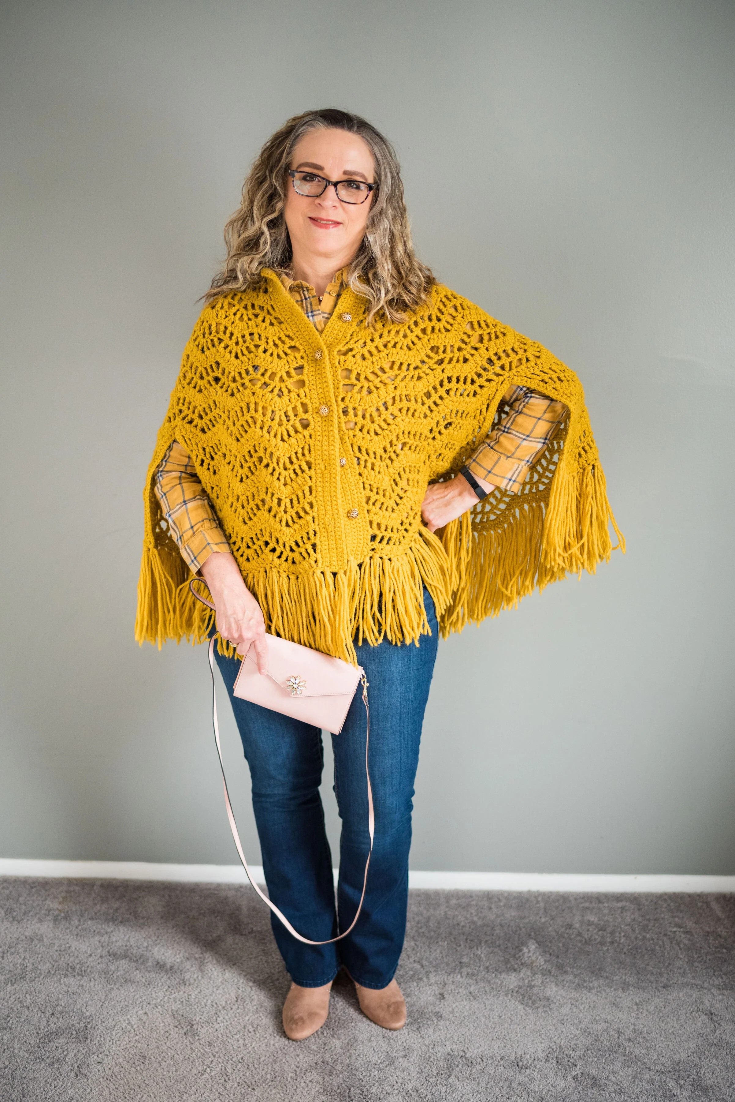
Today’s outfit in the flesh features the Fall 2019 trend of capes. I think capes were very popular back in the day, especially in Medieval Europe. They have come and gone over the years and typically when we hear the word cape we think of super heroes donning their spandex suits and adding a cape as a finishing touch; think Superman, Batman and Robin or even Thor. While capes came back this year, I personally haven’t seen very many of them floating around in the stores or donning women walking down the street.

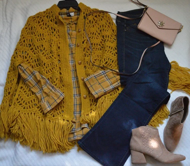
Flay lay and photo by Amy Christensen

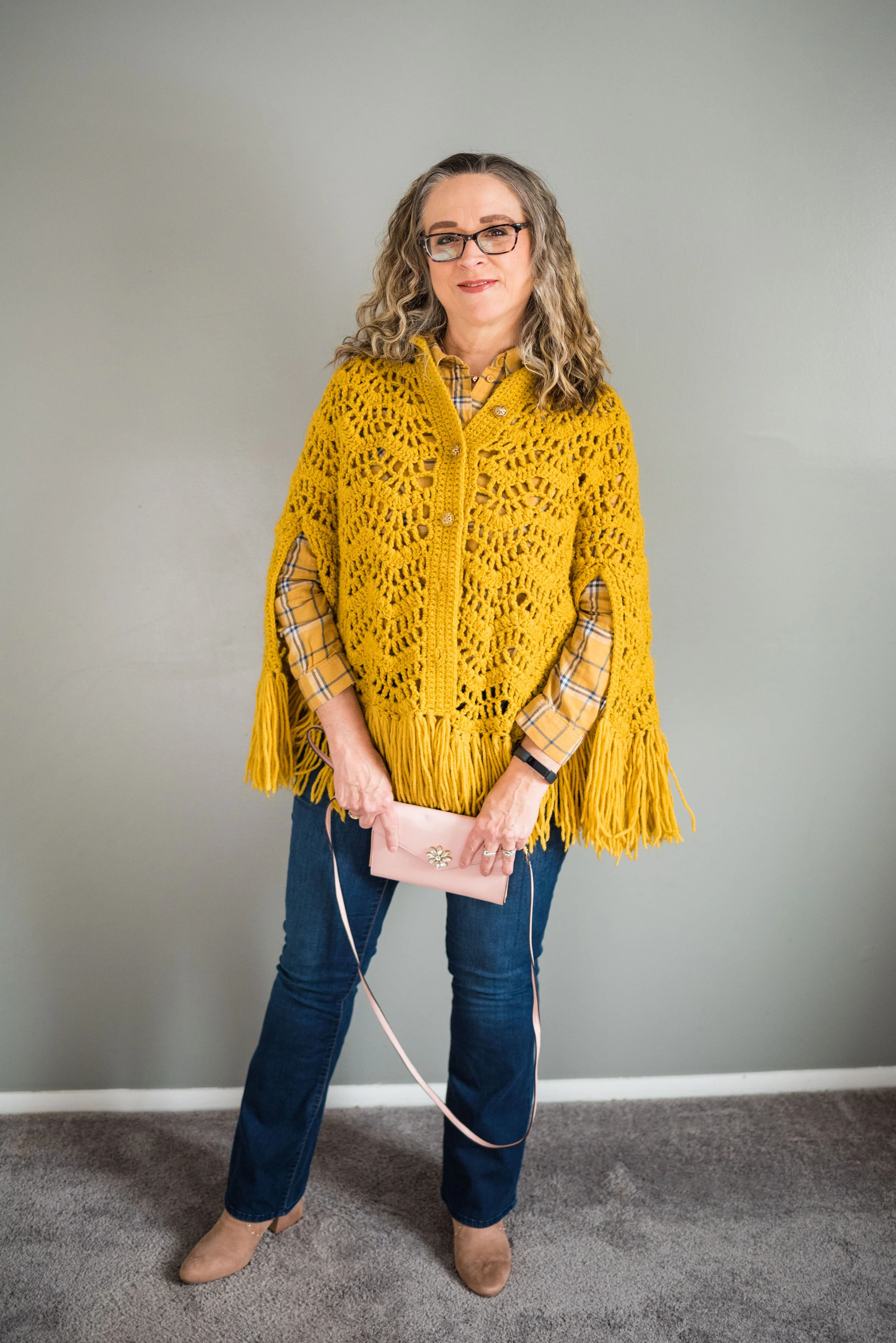
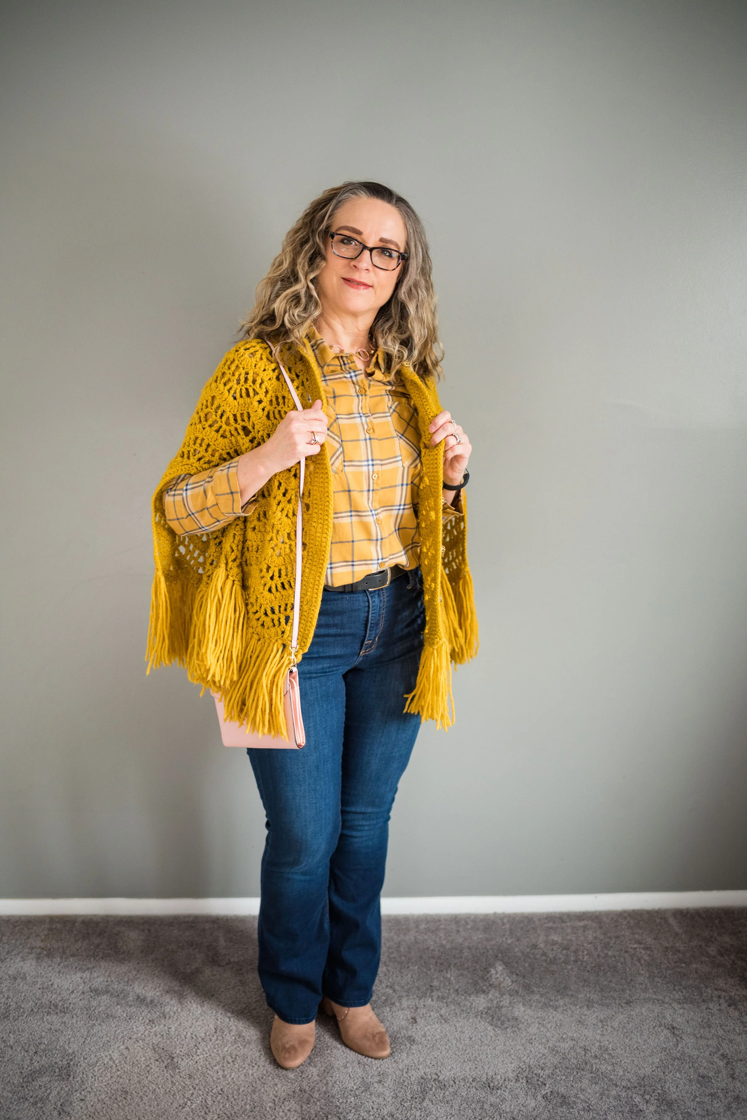
I know not everyone is buying into the mustard trend, but I really do like this rich sunflower yellow cape that I found while thrifting. I like that it is a crafted piece, made by hand and has the fringe, which is so indicative of a bohemian look. Here is the outfit in the flesh.

My yellow thrifted plaid shirt is Divided brand from H&M. I had no idea when I found it how well it would go with this knit cape. I love plaid and since I have been on the yellow train, it makes sense that I would buy a yellow plaid shirt, especially one from a thrift store. The plaid print includes a little blue, white and blush.

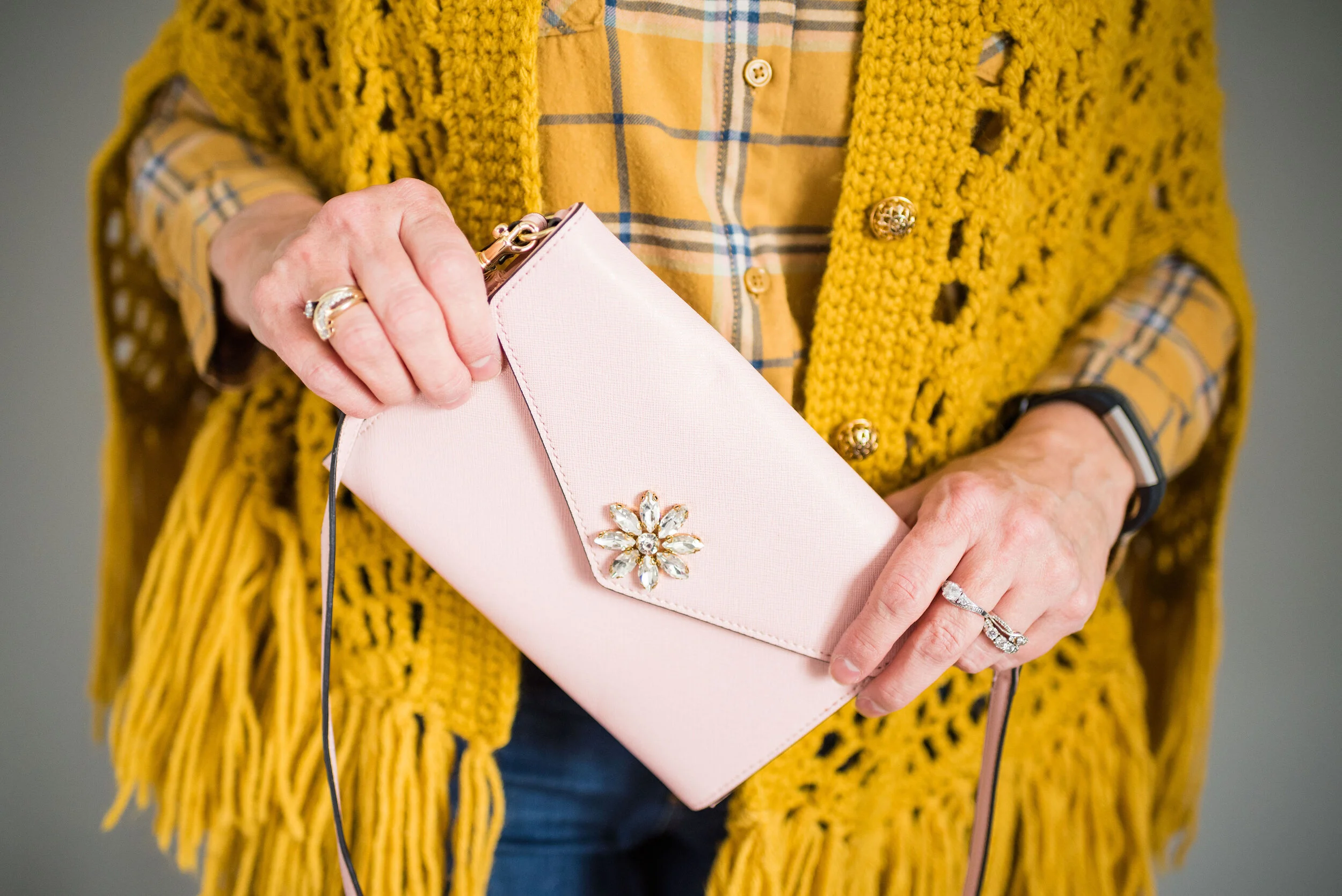
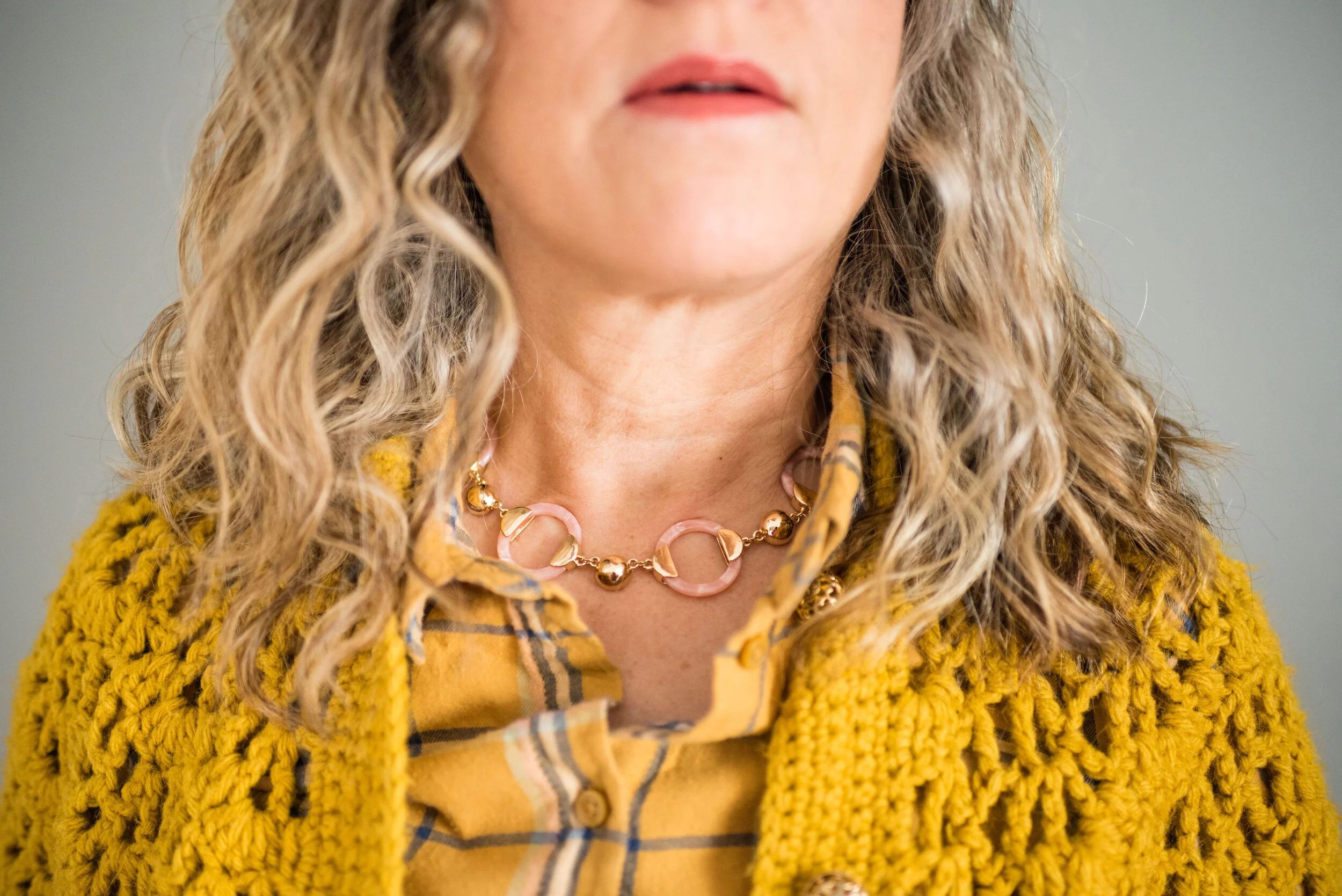
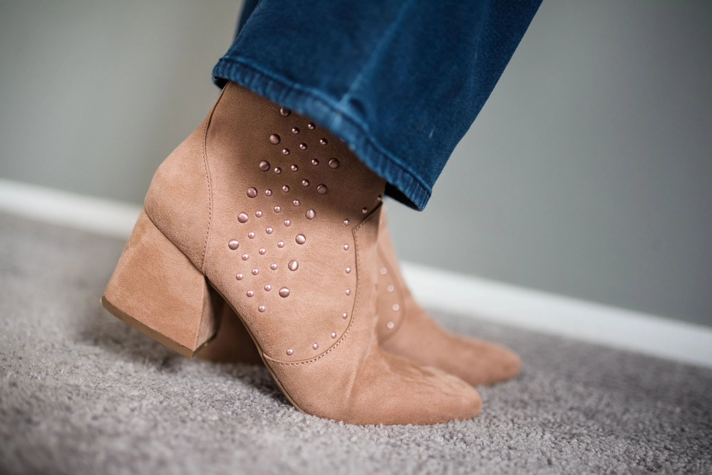
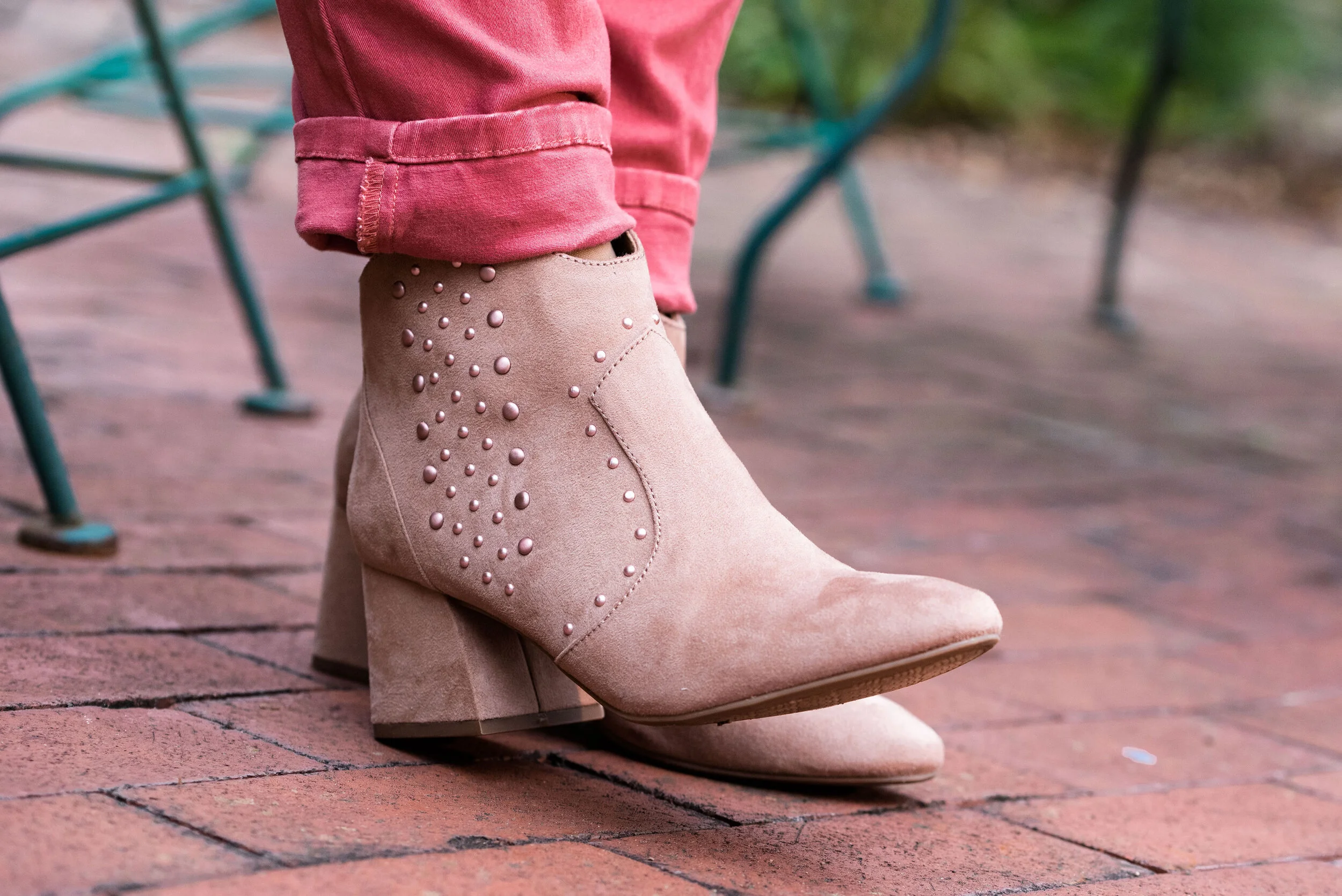
Drawing on the blush in the shirt, I went with blush accessories. My clutch I found on clearance at Meijer. My necklace was a JC Penney clearance find, and my SO ankle boots with the block heel, were a Kohl’s clearance purchase.

My Rock and Republic boot cut jeans are more like jeggings than jeans, but they have a zipper and button front, as well as regular pockets. They are just made from a stretchy fabric and are easy to move in.

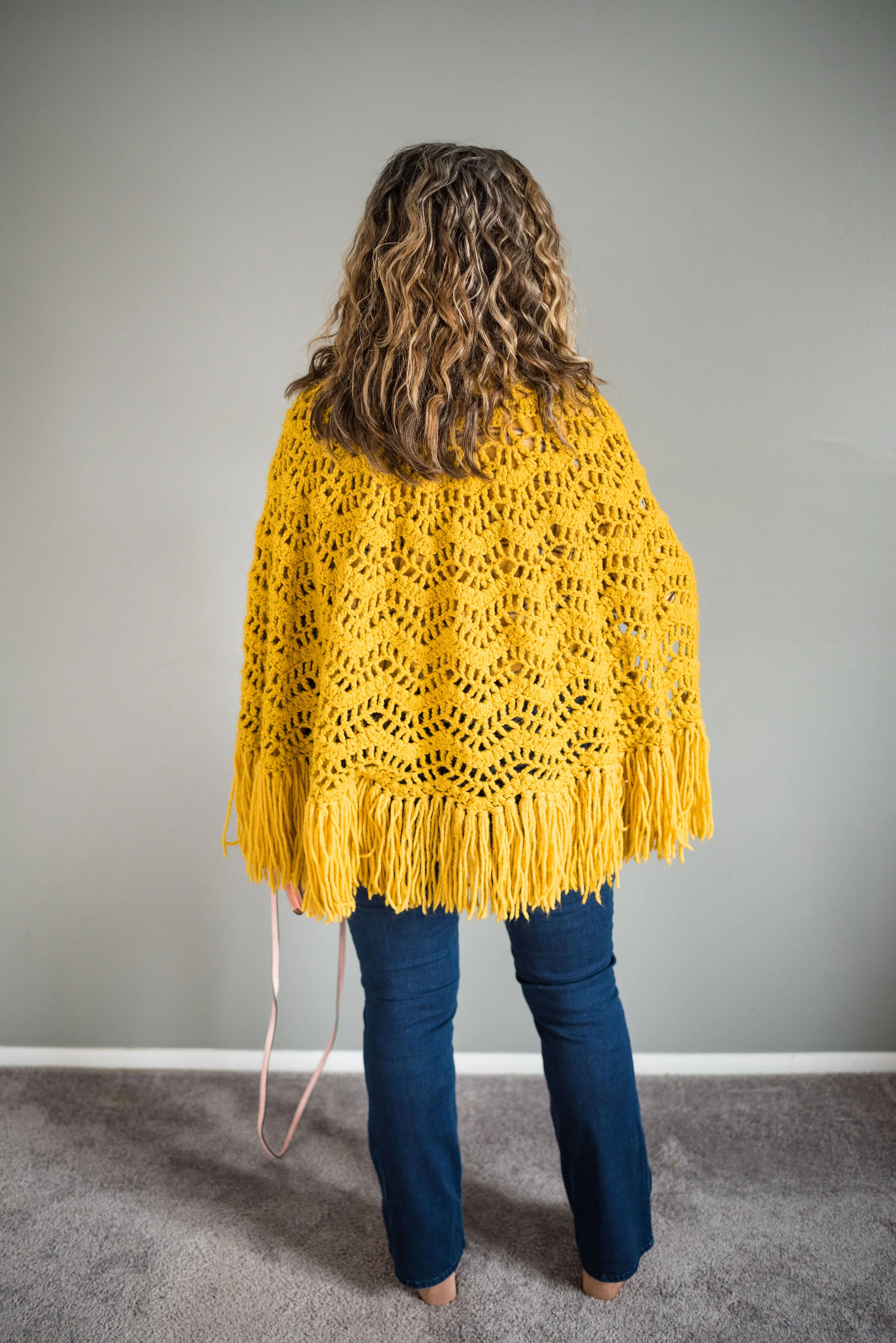
Here is a quick shot of the back of the cape. I just love the fringe around the bottom.

What do you think of this outfit? Would you wear a cape? Just to clarify, capes are usually shorter like this one and cloaks usually come past the knee, with some versions reaching the floor. Do you know how to knit or crochet? That is something I wish I had time to do, but not right now. My mom used to crochet afghans and doilies and I had an aunt that used to crochet stuffed animals like bears.

I’ve included a few shopping links for capes and for yellow pieces that I think are fun. I hope you are having a great Tuesday and thanks so much for stopping by the blog.

Photo credit, except where specified, Rebecca Trumbull.

These shopping links are affiliate links. When you click on a link, I get a few cents. If you purchase something through my site, I get a little bit more. All opinions are my own.


Flat Lays in the Flesh - Layering Knits

One of my favorite flat lays from my Fall Trends 2019 series was the one featuring layered knits. I’ve always been a fan of layering, especially in the winter time. I don’t like to feel cold, so laying is the obvious choice here in northwest Ohio. I know it might sound funny, but the other reason I like to layer is so that I can wear more of my clothes at the same time. Ha, ha. When I saw that layering knits was a trend for this fall, I was so excited. Finally, a trend I can really buy into.

Photo by Amy Christensen

Normally, I only layer knits on the top. I don’t typically wear leggings, but would be more likely to do this outfit with a pair of jeans. However, wanting to keep an open mind and use these LuLaRoe leggings my daughter got me, I decided to add them to the mix. Here is the look in the flesh.

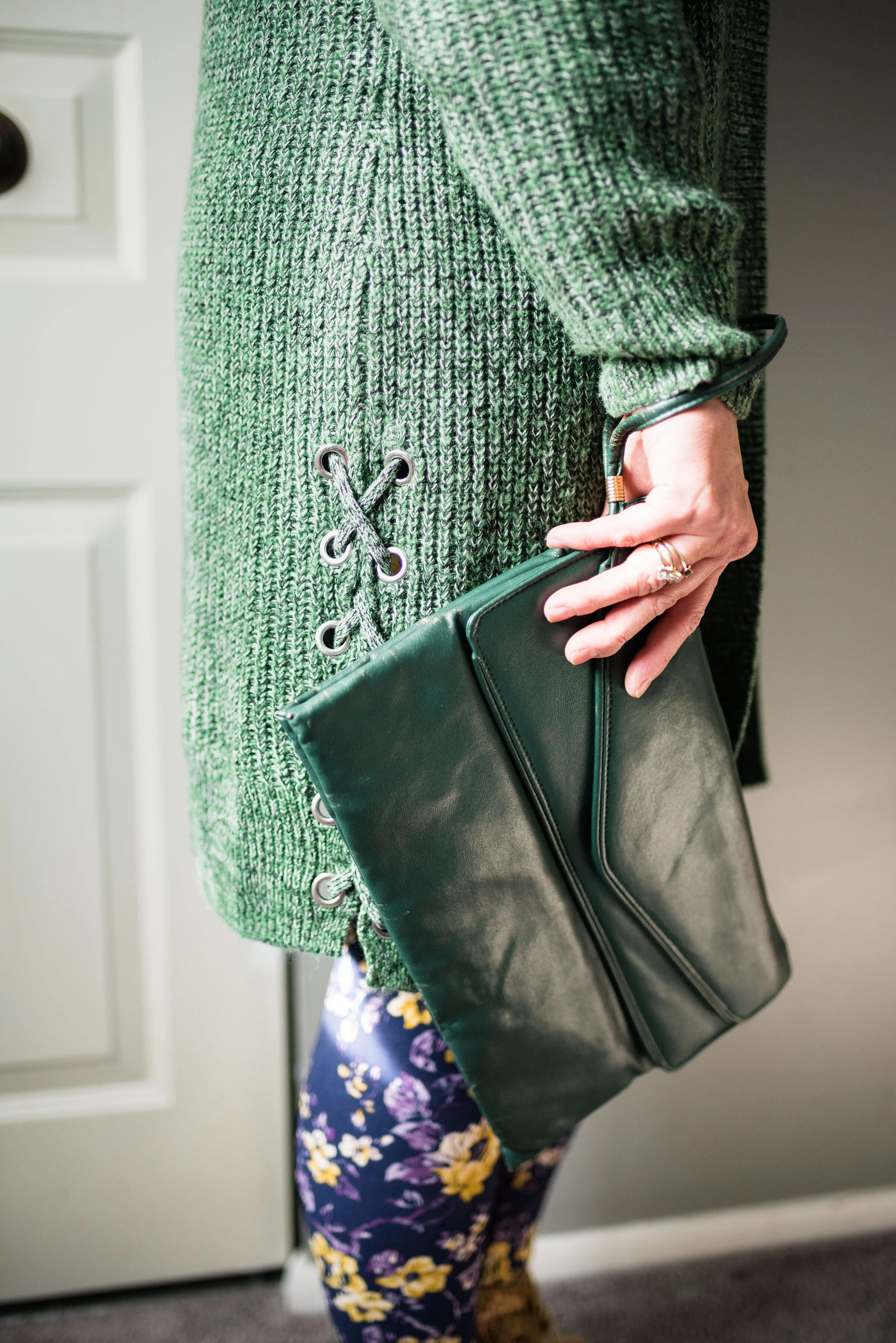
This long green sweater is from Christopher and Banks. They are having some good sales on sweaters right now, so check out their website or if you have one near you drop in. This sweater is medium weight and has no closures, so just hang open. I rather like that idea, because then I can wear something underneath and know that it will still be seen.

What you see underneath the sweater this time is my thrifted Merona bear sweatshirt. This is definitely not something you want to wear when you are going to be real active, but if you are sitting around watching a movie at home or want to be comfy when running to the store, this would be a great outfit. Mr. Bear looks a little wrinkly. Ha, ha.

I added the gingham scarf as a way to pull the purples together, making the outfit look a little more cohesive. I added a green envelope clutch and my Rock & Candy by Zigi thrifted boots.

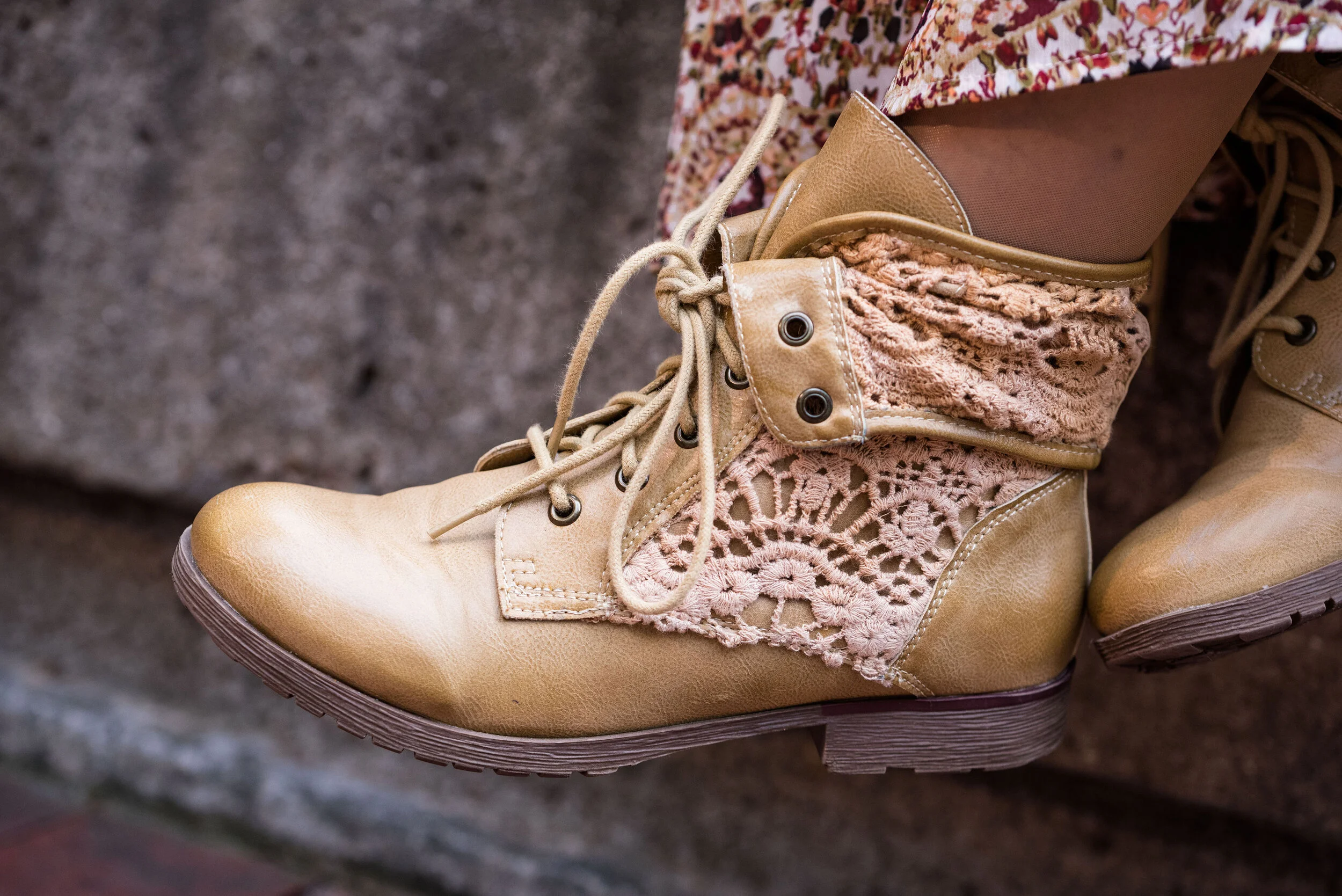
In the picture below, you can see the fun lace detail on the side of the sweater. Little details like those are what draw me to different pieces. It was the same way with the boots. I love the lace overlay giving them a unique texture.

I was a little disappointed with how this outfit looked in the flesh. Part of it might be the leggings. I think I would look better in leggings that were a solid color and preferably a darker color. I feel that these flowers are a little much for my pudgy gams. The other thing I do not like is the volume of the sweatshirt and the sweater together. It makes me look like some sort of pillar. Just being real here and analyzing this. When we think about what we are wearing and what works and what doesn’t we will begin to make better choices about how to put pieces together.

My verdict on this outfit is that it looks better as a flat lay, than in the flesh. What do you think? Please be honest. I love to hear your opinions and ideas.

I hope you all have a great weekend. See you next week.

I’ve included a few shopping links for sweaters. These are affiliate links. All opinions are my own.

Photo credit (except where noted) Rebecca Trumbull.


Flat Lays in the Flesh - Dark Florals

For those of you just joining me on the blog, I am doing a short series based on the Fall Trends 2019 flat lays that I did back in September. You can see those original posts by clicking on the links: Part 1, Part 2, Part 3 and Part 4. I’ve been discussing how a flat lay can present how an outfit might look, but only from a more two dimensional view. Actually putting a person into the outfit is three dimensional and helps you see how the pieces go together and fit on the human body. In this case it is my human body, with all of its lovely flaws. Ha, ha

Photo credit Amy Christensen

This week’s outfit was based on the dark floral trend which was prominent this fall. Dark florals are moody, mysterious and melodramatic and that is why I like them. Dark florals want to be noticed, but are just as happy being partially hidden under a jacket, sweater or blazer. So what does this flat lay look like in the flesh?

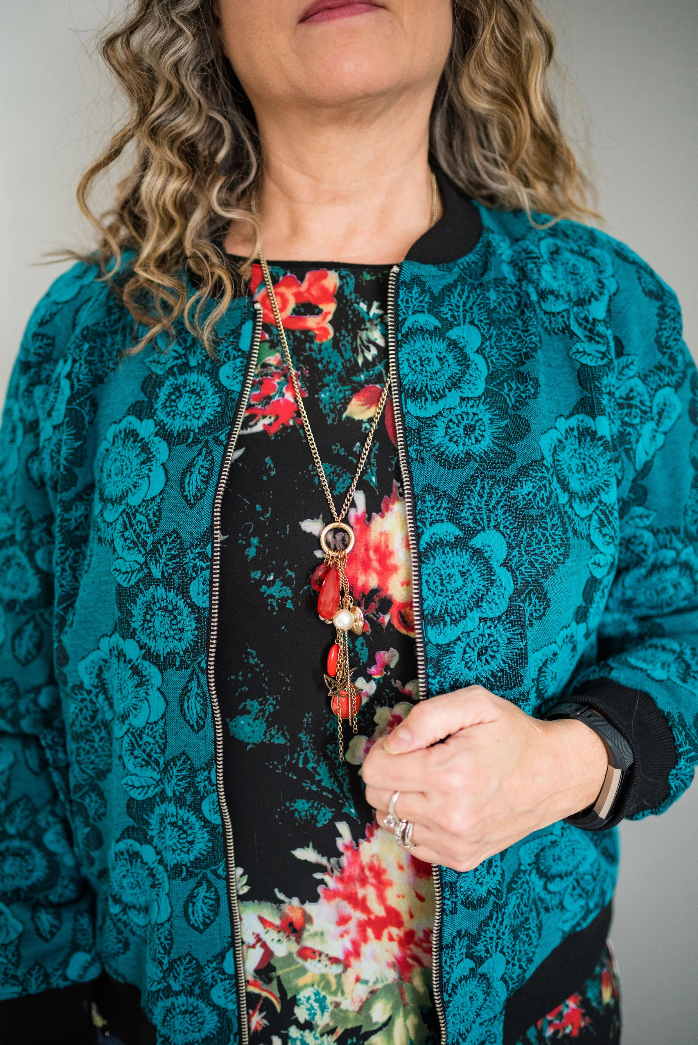
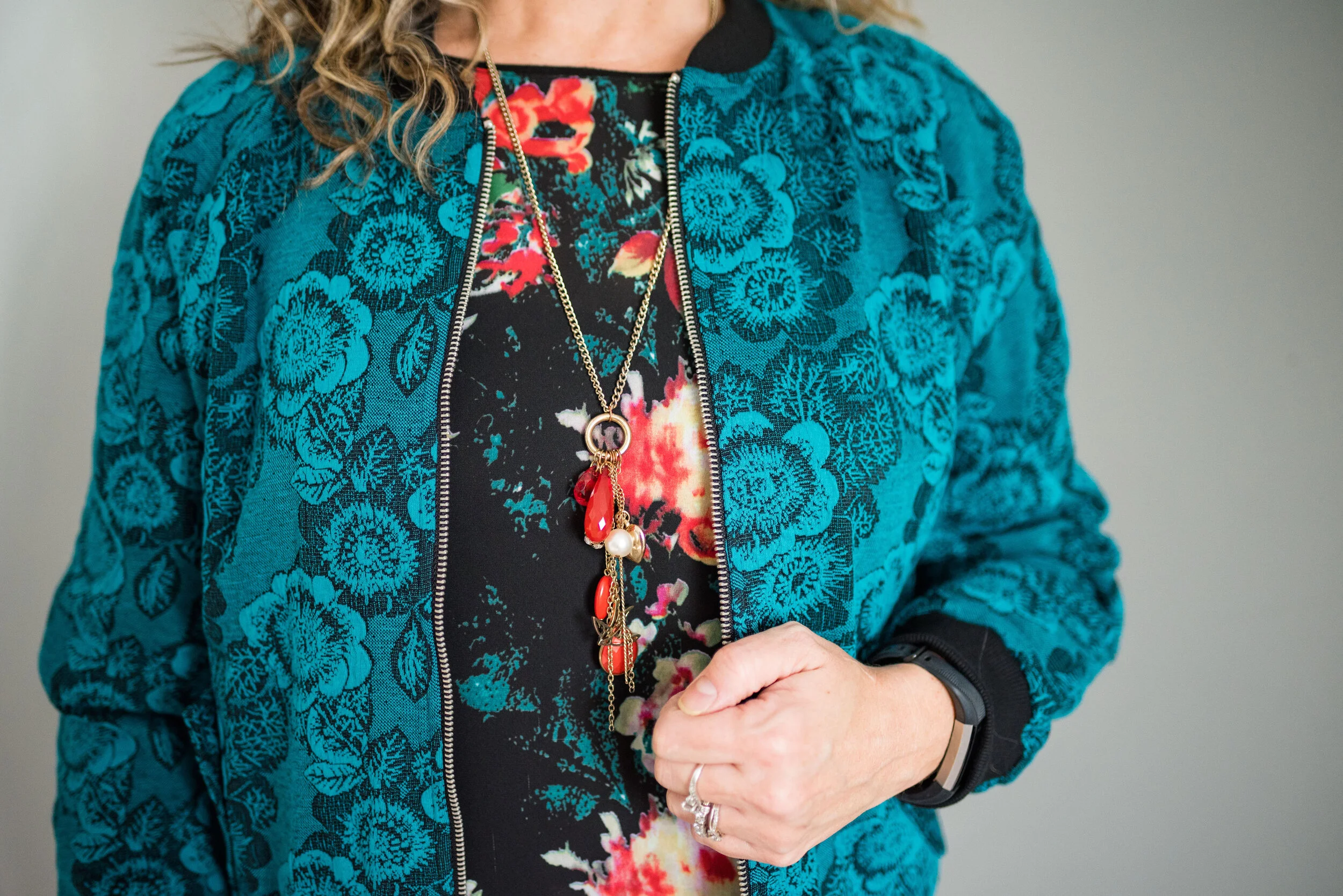
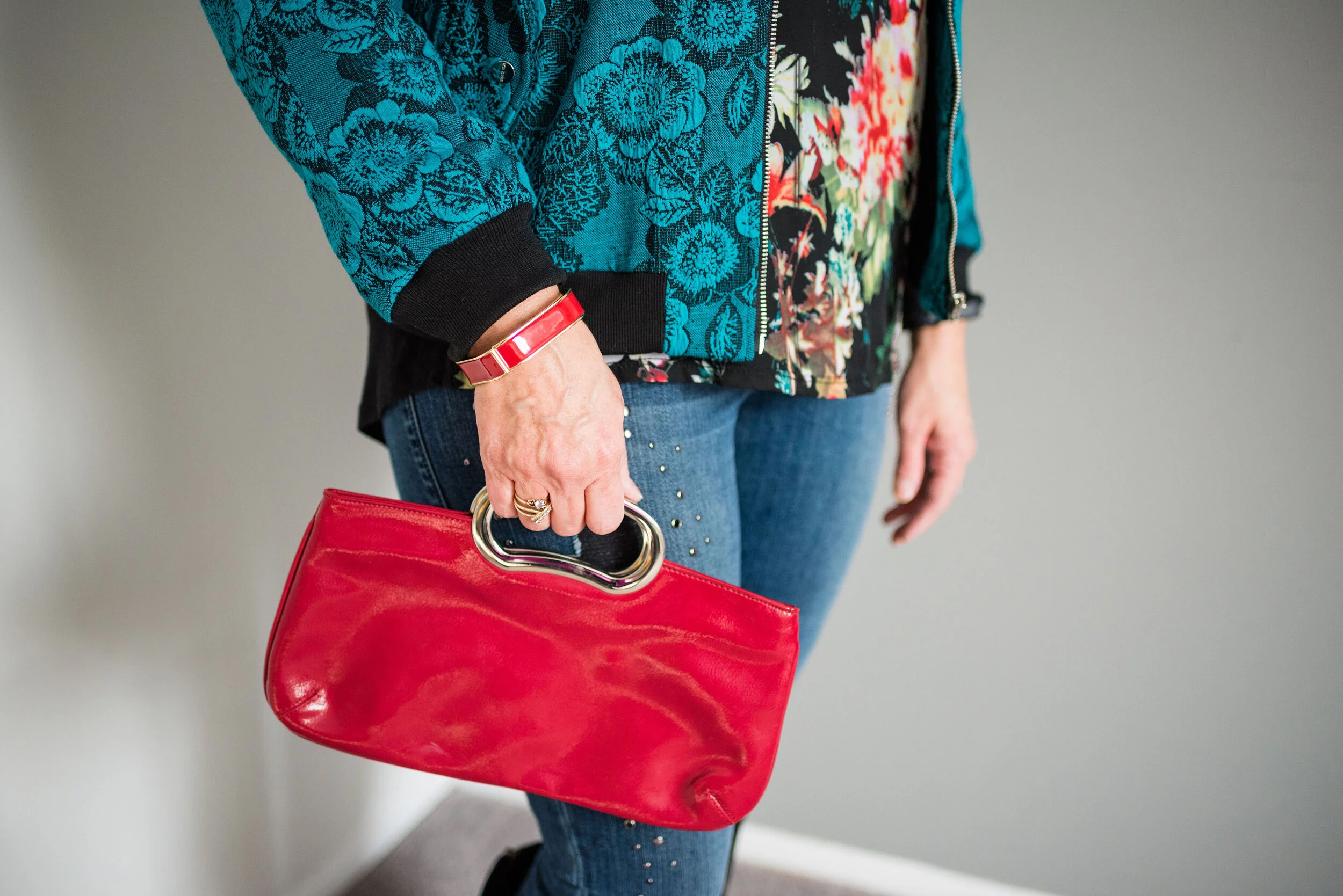
This teal floral bomber jacket was a late summer purchase from National an online women’s clothing retailer, that I did a sponsored post for back in May. You can see that original post here. After working with National, I regularly received their catalogues and had my eye on this fun jacket. I was able to purchase it at a good discount, so ordered it straight away. The jacket is fully lined, has soft banding around the neck, sleeves and bottom and a durable metal zipper that is easy to zip.
This thrifted Jeans by Buffalo floral tee goes perfectly with the color of the bomber jacket. You can see the same teal color in the top and they look like they were meant to be together. Here is a picture of the top without the jacket, just so you get an idea of the shape. I like the longer tunic length hi-low hem and the a-line cut of this top.

The pattern on the top is only on the front. The back and sleeves are a simple, basic black. I’ve been thinking of pairing this with a black button up or a turtleneck so I can have the warmer layers without covering up the pretty print. I think I’d also like to try this with white jeans and a red jacket. What do you think? The colors in the shirt make me think of Christmas, so this might be a good top to wear throughout the holiday season.

These Rock and Republic jeans from Kohl’s have a good deal of stretch, otherwise I would never fit into them. Ha, ha. I like the bling and the distressing and I figure as long as my bum is covered I can still wear these because they are very comfy, even though they are tight.

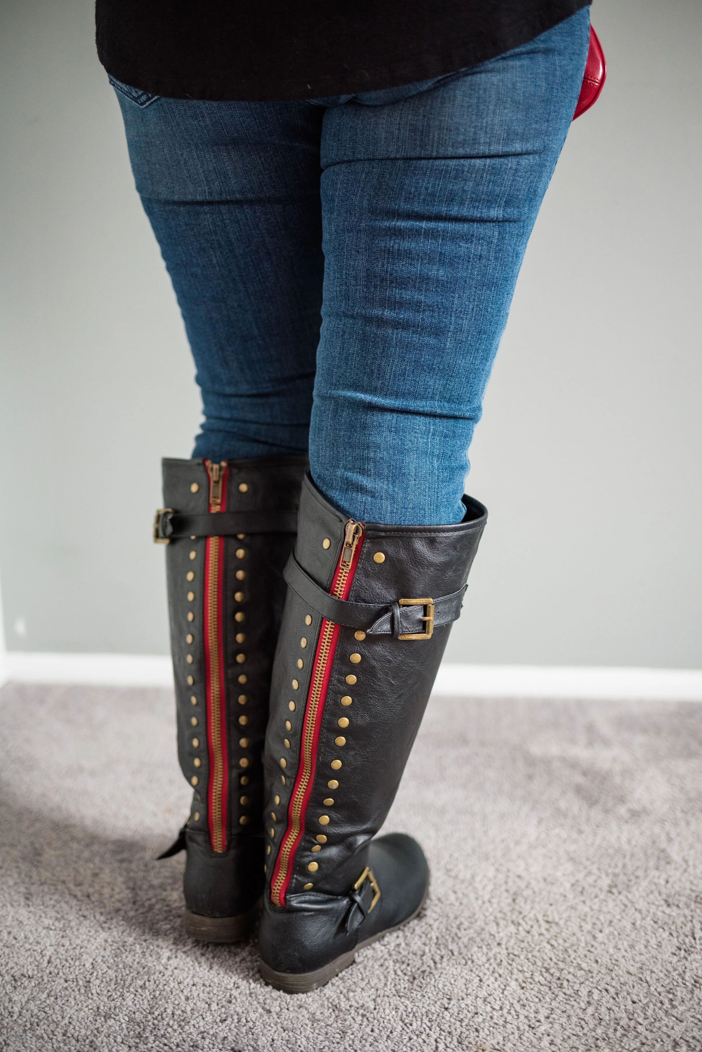
My tall black boots were a clearance find at DSW. Don’t you love the clearance racks? They are definitely worth checking out from time to time at any store you may shop at. i love the detailing on these and the bright red zipper casement along the back. Sorry about the cheeky bum!

I went with red for my other accessories, and even though the necklace doesn’t make a bold statement, I like the way the gold chain and charms give added texture to the top.

Do you think this flat lay worked in the flesh? What about it do you like? What don’t you like? I appreciate all your input and your support.

I’m including a few shopping links for some dark florals. Remember Christmas is right around the corner and shopping from home is so easy. Ha, ha. These are affiliate links. All opinions are my own.

Photo credit, unless specified, Rebecca Trumbull.


Flat Lays in the Flesh - Animal Print

On Thanksgiving I will be starting a holiday series that I think you might find inspirational and interesting. That is all I am saying about that right now, just to whet your appetites. Until then I thought it might be fun to revisit a few of the Fall Trends 2019 that I talked about through the medium of flat lays. If you don’t know what a flat lay is, it is simply a way to show an outfit by laying out the pieces on a flat surface, rather than showing them on a person. I find so many flat lays look amazing, but I am always left wondering, what does the outfit look like on an actual person. I hope you don’t find this too repetitive, but I decided to take four of the flat lays I did for my Fall Trends 2019 series and show you what they look like, in the flesh. Let’s get started.

This first outfit features a snakeskin jacket that I found thrifting last spring. This was the flat lay from the original post, which focused on the fall trend of animal prints.

Photo by Amy D. Christensen

This is what the outfit looks like in the flesh.

It was only about 10 degrees outside and as much as I like to play the tough chick, I decided, forget that nonsense, so my daughter/photographer turned her spare bedroom into a studio. She is so good at being flexible and working with what we have. She does such a great job with natural light. There was no flash in any of these pictures.

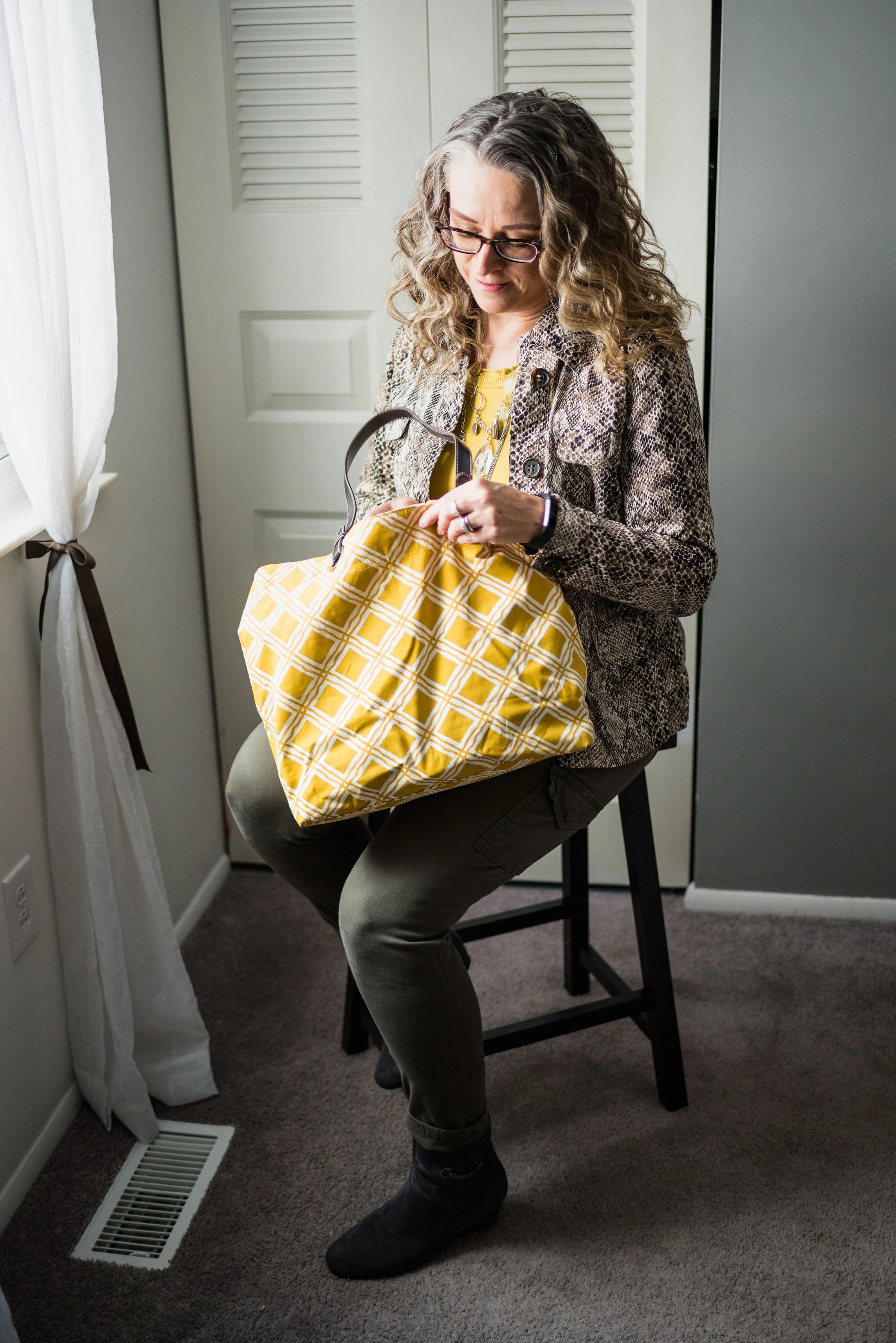
This Liz Claiborne snakeskin jacket has a little bit of stretch to it, making it very easy to move in. I paired it with a thrifted Banana Republic sweater for this outfit, but you could easily swap in other pieces like a button up blouse, a graphic tee or a lighter weight turtleneck for all manner of stylish vibes. A jacket like this is a work horse in your wardrobe and can be dressed up with a skirt or dress and heels; or dressed down with distressed jeans and sneakers.

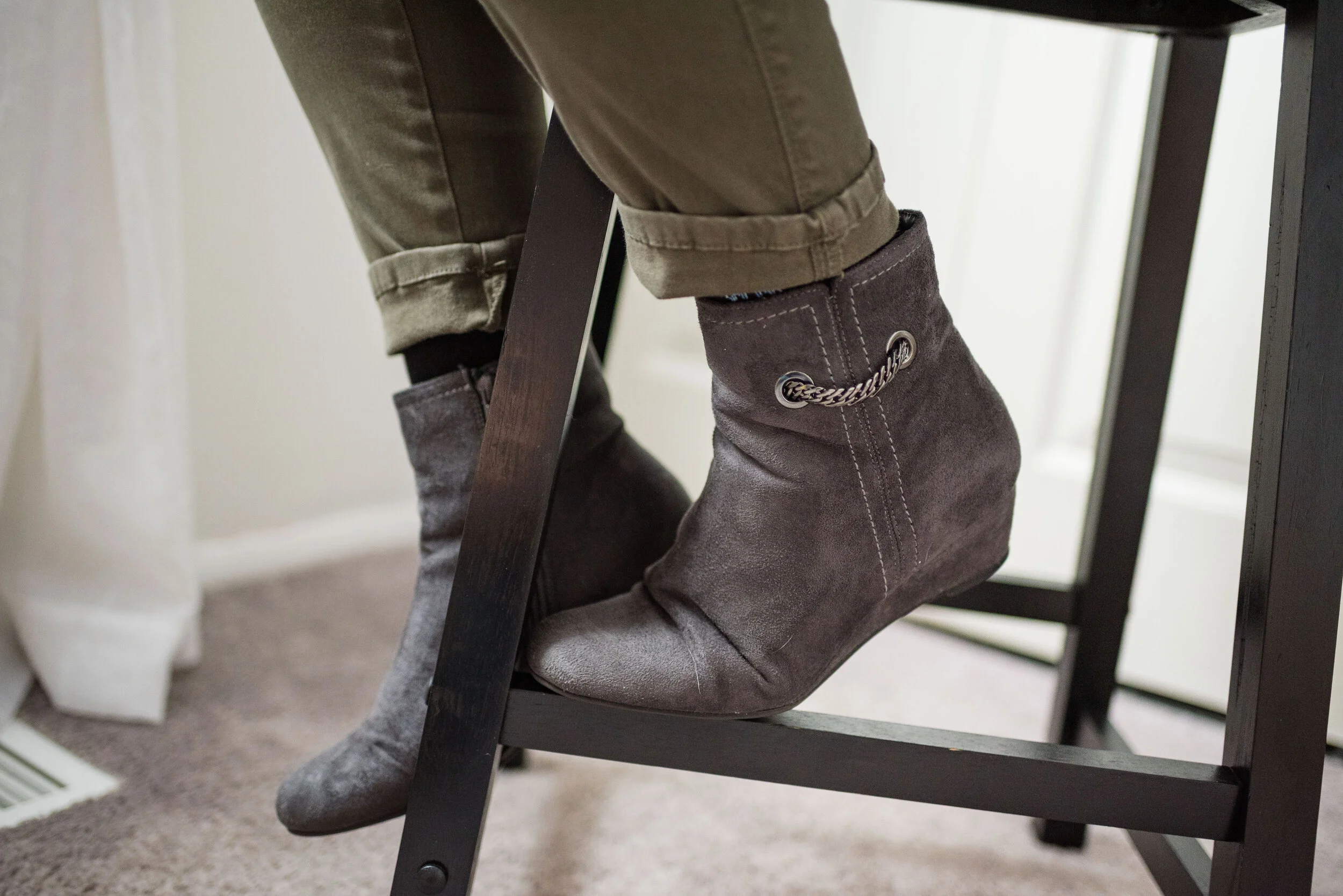
I went for a work wear look, pairing the sweater and jacket with my Gloria Vanderbilt cargo skinnies and my Impo wedge ankle boots.

I chose the yellow tote bag to enhance the sunshiny vibe of the outfit, making this a good combination for a cloudy, fall day. This was another thrifted piece.

I thought layering a few fun necklaces would make for an added statement. In the original flat lay I only had the shorter necklace, but just recently I found the long pendant necklace at JCPenney on the clearance rack. They don’t match, but I think the combination works well against the yellow back drop.

Do you think this flat lay turned out to be a good outfit? Do these pieces work well together? Why or why not? I’d love to hear your thoughts, so leave me a comment or two.

I’m leaving you with a few shopping links for fun animal print pieces. Remember Christmas is coming soon and there might be a person or two on your list, who would love an animal print piece. These are affiliate links, which means if you click on a link, I get a few pennies, and if you purchase something through one of my links I get a few more pennies. Ha, ha. I appreciate every penny I get.

Hope you all have a great weekend and thanks so much for taking the time to stop by the blog.

Photo credit (unless otherwise stated) Rebecca Trumbull.


Pantone - Autumn/Winter - 2019 - London Palette Recap

It’s time for a recap of the all the Pantone - Autumn/Winter -2019 - London Palette colors. There were things about these colors that I liked better than the New York Palette, but each of them had colors that I felt comfortable wearing. I’ll explain my favorite from this series after a review of the outfits.

Outfit 1 - Merlot and Antique Moss

Outfit 2 - Cranberry and Chicory Coffee

Outfit 3 - Summer Fig and Bluestone

Outfit 4 - Butterscotch and Grapeade

Outfit 5 - Crabapple and Forest Biome

Outfit 6 - Galaxy Blue and Hazel

I am having a hard time picking just one outfit from this series that I liked the best. I really liked Cranberry and Chicory Coffee. I have always been a fan of browns, but I just love the result when it is combined with the medium pinky red of Cranberry. I also like the long line of this outfit and I think the long Rutabaga open front cardi helped with the illusion.

My next fave would be the boho vibe of Butterscotch and Grapeade. If you would have asked me a few years ago if I would wear an outfit with these two colors together, I would have said no way. Yellow and purple? You have to be kidding, but there is something whimsical about this outfit and the color combination is only part of it. The colors are happy and fun, but the print of the skirt, the fringe bag and the fun textured boots really give this outfit its bohemian style.

Finally, I really like the last outfit. Even though, I wouldn’t necessarily wear a color like Hazel all on it’s own, I do like the way this color pairs so well with the grays and the blues in outfit. I also like the subtle plaid print mixing. It is obvious, but it doesn’t overwhelm the eye like some print mixing is capable of doing.

Well, I’ve told you my favorites, now tell me yours. I love to hear your feedback.

i hope you enjoyed this Pantone - Autumn/Winter series. If there is anything else you would like to see, with regards to the Pantone Color Institute you can check out their website. Just click on the link.

Have a great Tuesday!

Photo credit Rebecca Trumbull.


Pantone - Autumn/Winter - Galaxy Blue and Hazel

I neglected to get my post done for Tuesday. Monday and Tuesday, my grandson had off from school. It was parent/teacher conference days. My daughter had her appointment right away on Monday morning and Quintin is doing very well. He is nationally high ranking in his reading ability and math, so this Grandma is proud of a certain nine year old.

This is the last outfit from the Pantone - Autumn/Winter - 2019 London Palette. Next week, I’ll have another recap post to show you all the London colors and then we will put the Pantone Institute aside until spring. For your information, the Spring/Summer colors for 2020 are already up on the website and have been for a couple of months, so if you are really curious, you can go the to the Pantone website and see what they look like. As for this blogger, you won’t get to view them here until spring.

Our last two colors are Galaxy Blue, which was also on the New York palette and a mellow brown called Hazel. This brown is not one I would regularly reach for. I like colors that are more rich and saturated. In the Crayola Crayon box, this color might be similar to Antique Brass. See the complete list of current crayon colors here. Talk about fun color names! Be sure to read some of those. They are not merely called red, pink or blue any more. Ha, ha.

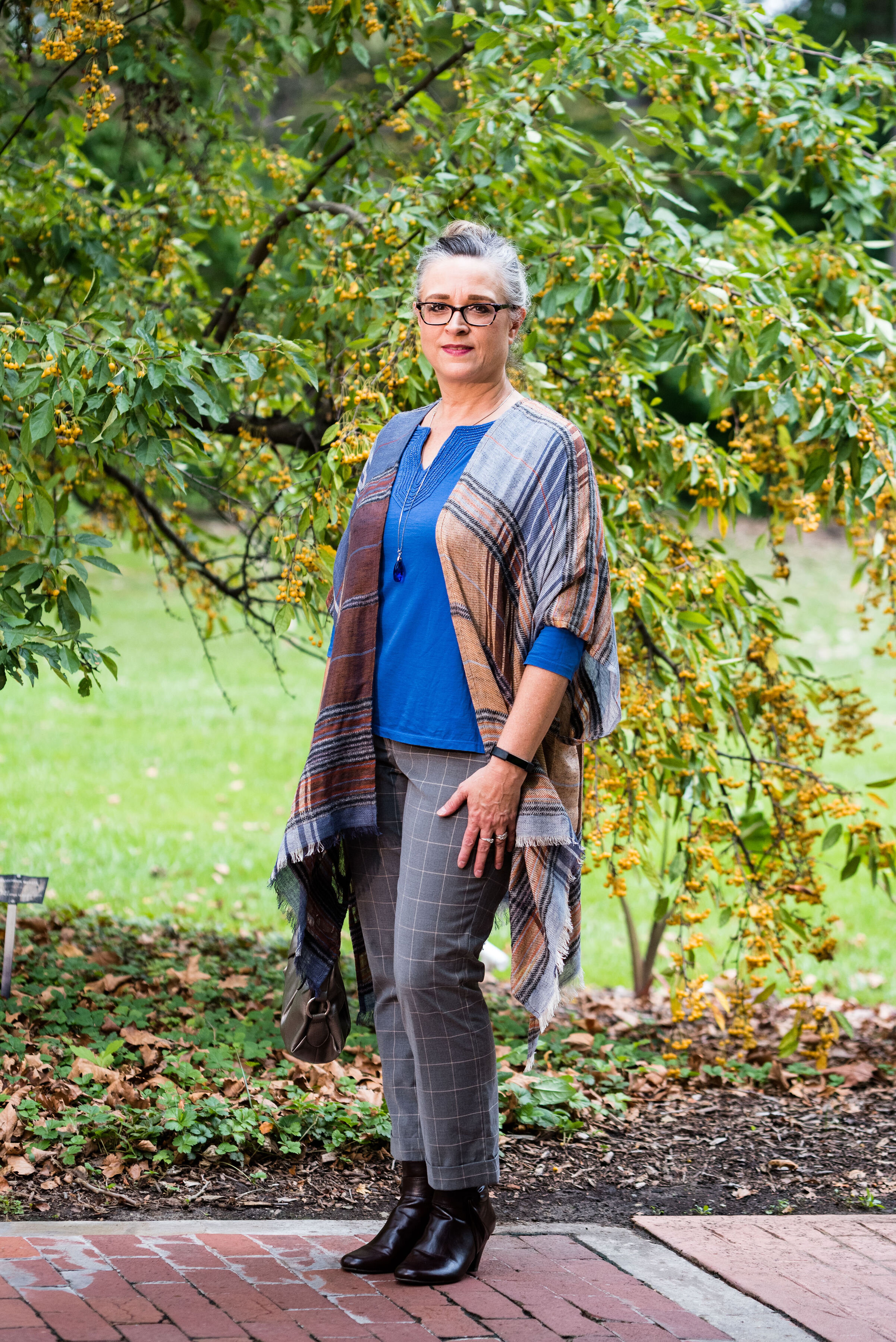
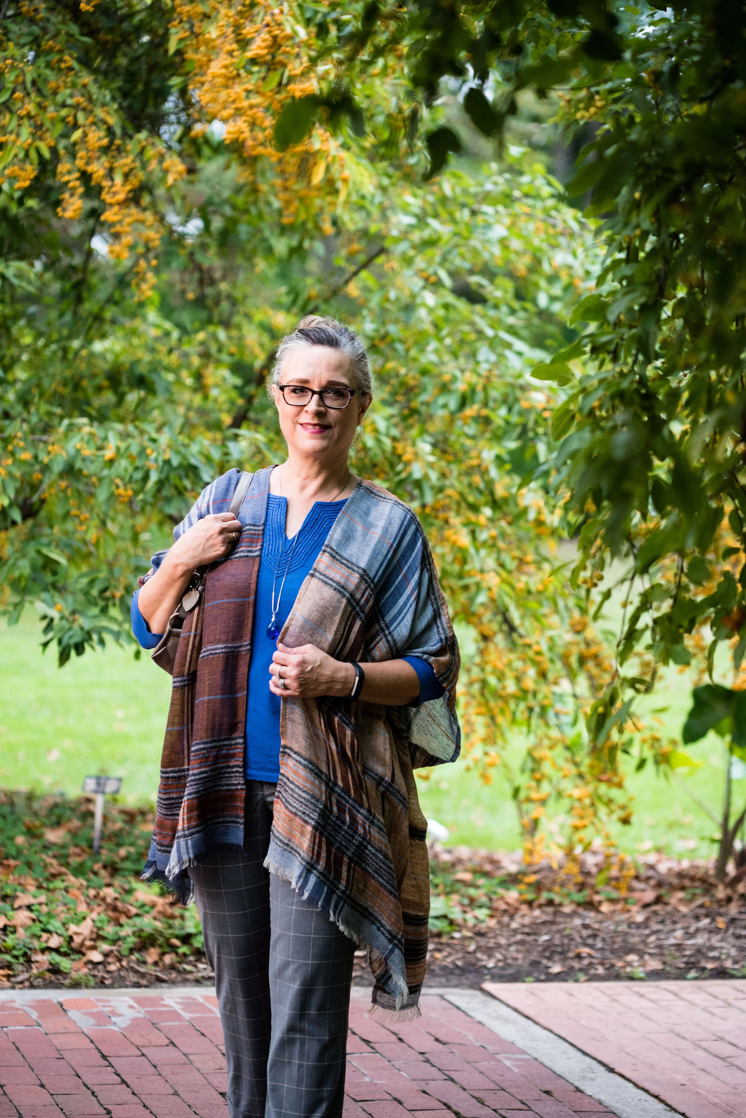
I decided to do some plaid print mixing in this outfit, as you can see with my ruana and my pants. I must tell you how I came to own this beautiful ruana. My hubby and I were out on a date. We try to go out once a week, usually for dinner and then to Barnes and Noble bookstore. We both love spending time around books and we usually end up getting a hot drink and sometimes a treat. On this particular night we went out for Mexican. After we were finished eating he told me that before we head to Barnes and Noble he had to stop at Bass Pro Shop and get something for his trailer hitch. I don’t even think twice about it. I don’t mind going to Bass Pro or Cabelas, because they both have fun things to look at, like mounted animals and clothing that I like, but would never purchase, because it is out of my price range.

We walked into the store and were heading down the center aisle. On the right side of the aisle are all the women’s clothes. We got to this lovely display where this ruana was styled over an ivory sweater. It immediately caught my eye. My husband said, “I thought you might like this.” I was shocked. Not only had he thought of me, but he had picked out something he thought I would both like and look nice in. He let me pick out a few other things besides the ruana to try on and just hung out while I did. I picked out the ruana and a rusty orange sweater, that I haven’t worn yet, but that looks great under the plaid. My husband does not do things like this very often, but it sure makes an impact on me, when he does.

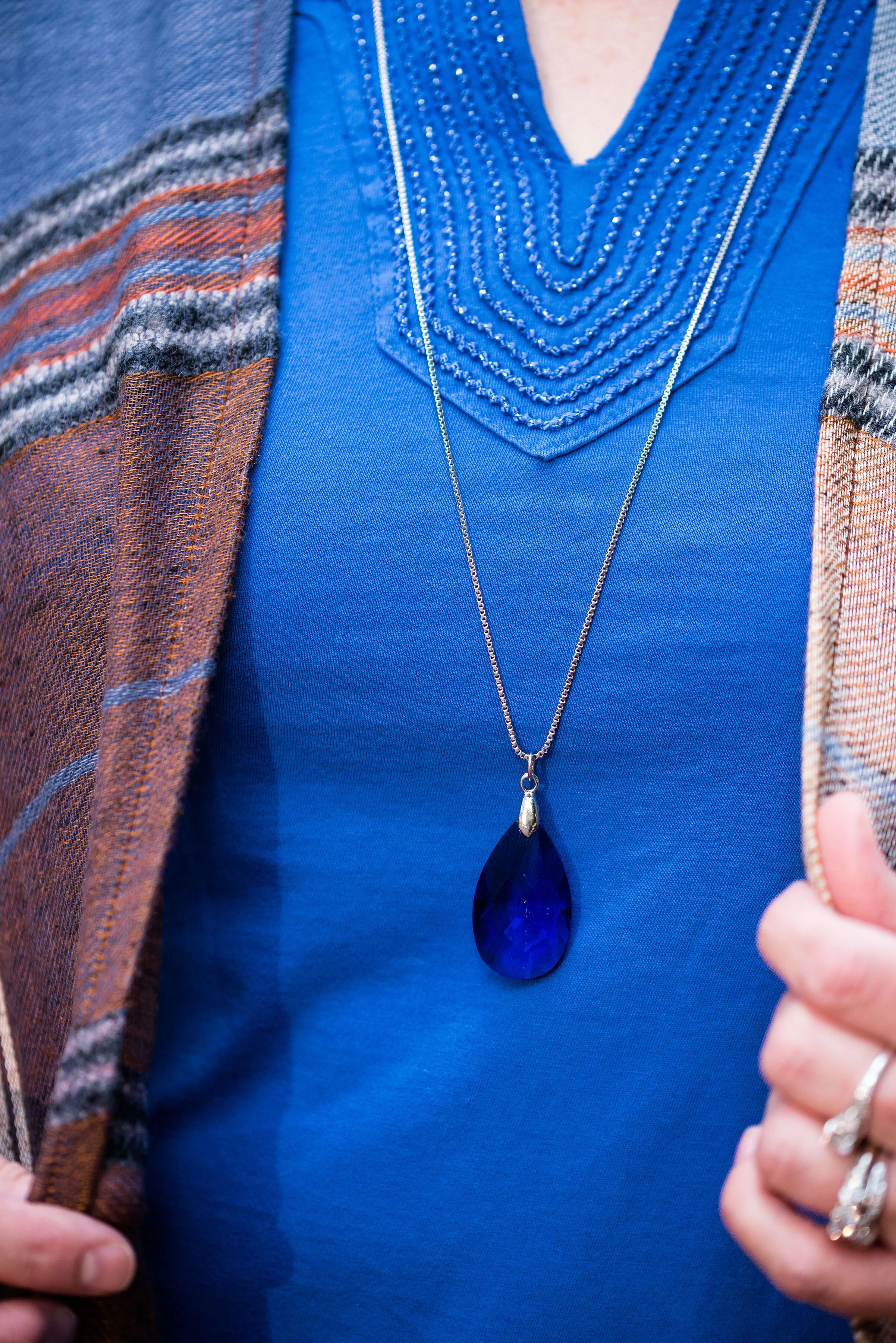
My thrifted blue tee is Charter Club brand. It is a bit brighter than Galaxy Blue, but once again, you get the idea. I like the detailing around the neckline.

These gray pants are also thrifted and you can see how I styled them with a faux leather jacket, and with a pink sweater set.

Here is a close up of my print mixing.

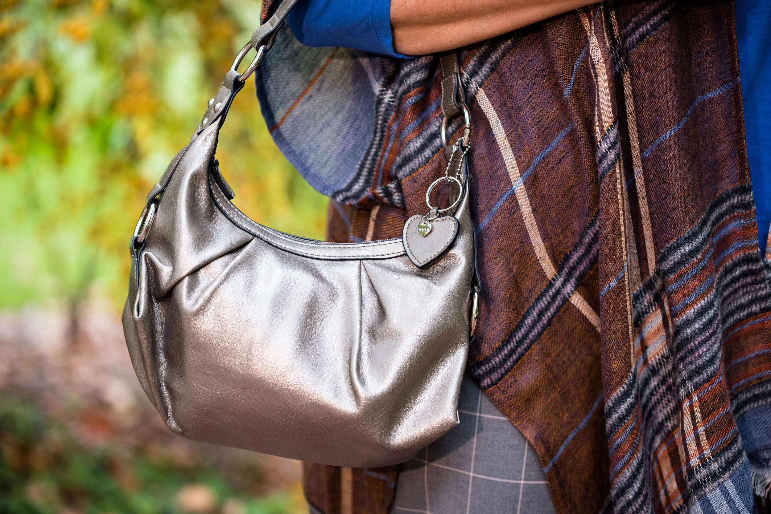
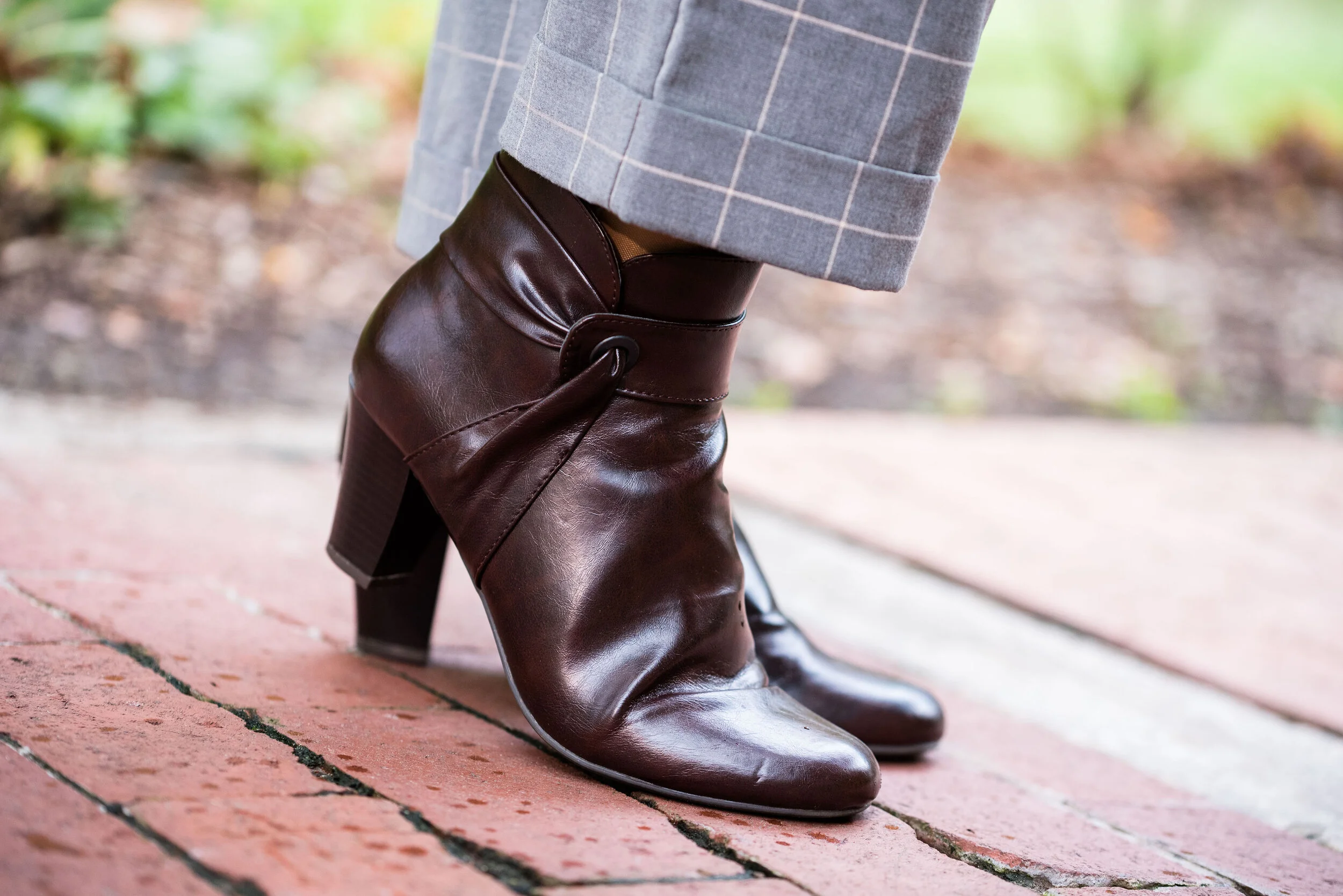
I kept my accessories simple since there was already so much going on in the outfit with the two plaids. A bright blue crystal pendant, a simple gray Rosetti bag, and these thrifted Lifestride maroon ankle boots.

What do you think of these colors? Do you like plaid? I’d love to hear your thoughts so be sure to leave me a comment or two. Your support and feedback mean a lot to me and help give me ideas and direction for the blog.

Graphic and photo credit Rebecca Trumbull.

I’ve included a few shopping links for you to peruse. With the holidays coming up maybe these will give you some inspiration for someone on your list. These are affiliate links. All opinions are my own.


Pantone - Autumn/Winter - 2019 - Crabapple and Forest Biome

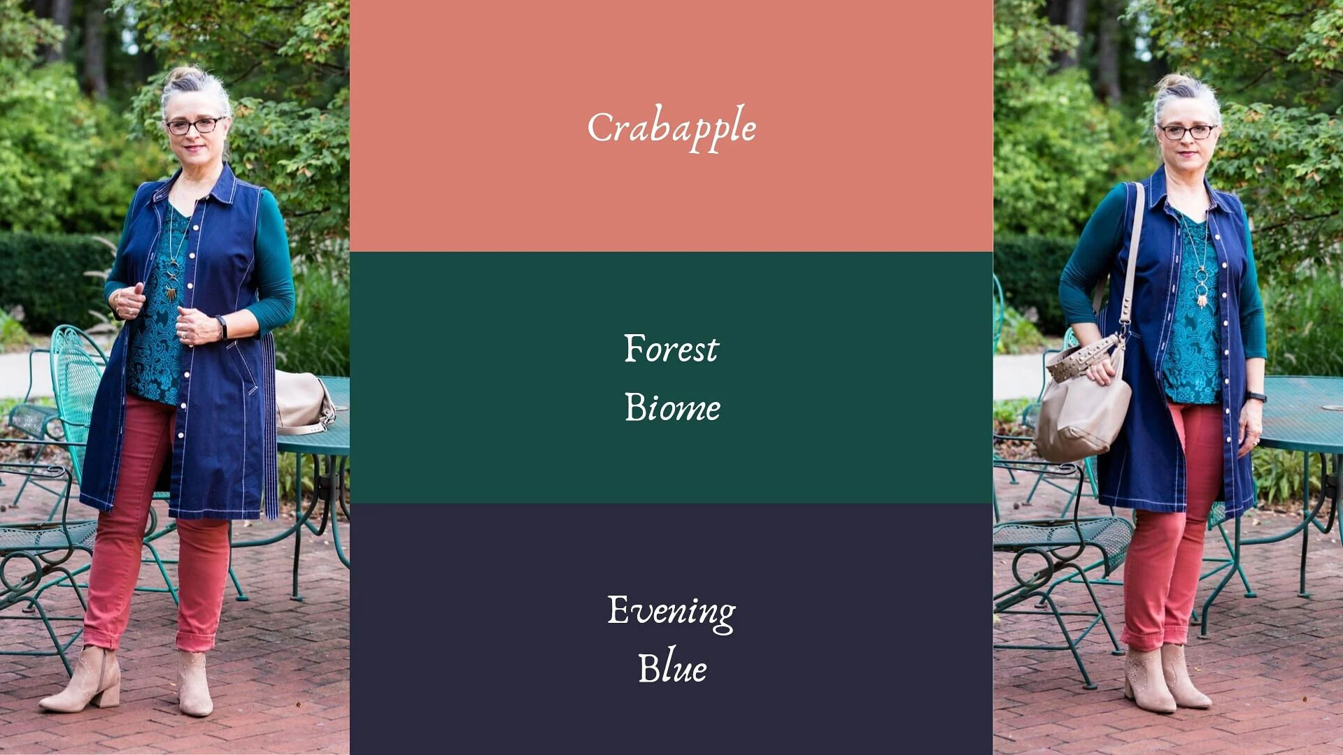
The next two colors in the Pantone - Autumn/Winter - 2019 - London Palette are Crabapple and Forest Biome. I grew up with crabapple trees in our back yard and I thought they were one of the prettiest of spring’s trees. We had a pink and a white, and they had a glorious scent that just floated on the air. Obviously this Crabapple color is meant to mimic, not only the pinky flowers, but the tiny little fruits that hang from the branches. As for Forest Biome, we know that it is a dark green, but I had to look up the word biome, to fully understand it. A biome is an ecological community system, such as a rain forest or dessert. Forest Biome, then would refer to an area of forested land probably brimming with pines and cedars and perhaps a few deciduous trees. Wherever they come up with the names for the colors and just what meaning they had in choosing the name, we don’t really need to know, but it is fun to think about.

My Forest Biome is a little more blue and my Crabapple is a bit more pink than their colors, but again, you get the idea. I thought Evening Blue would be a good classic color to pair the other two colors with.

This was a neat little sitting area at the Toledo Botanical Gardens where we took the pictures for this series. I’d love to have a patio like this with an English type garden all around, and fun outdoor furniture, but I have neither the resources, the time or the energy. They always say you will find time for the things you really want to do, but I think it would be more accurate to say, we can always find time for the things we know we should do. Ha, ha. My Grandson is a priority. Picking him up after school and hanging out with him when he has a day off are priorities. Do those things cause other things to be put off or put on the back burner? You bet, but that is what I choose to do because I love him and my daughter. What we really need to do, is stop beating ourselves up for all the other things we are not able to get to.

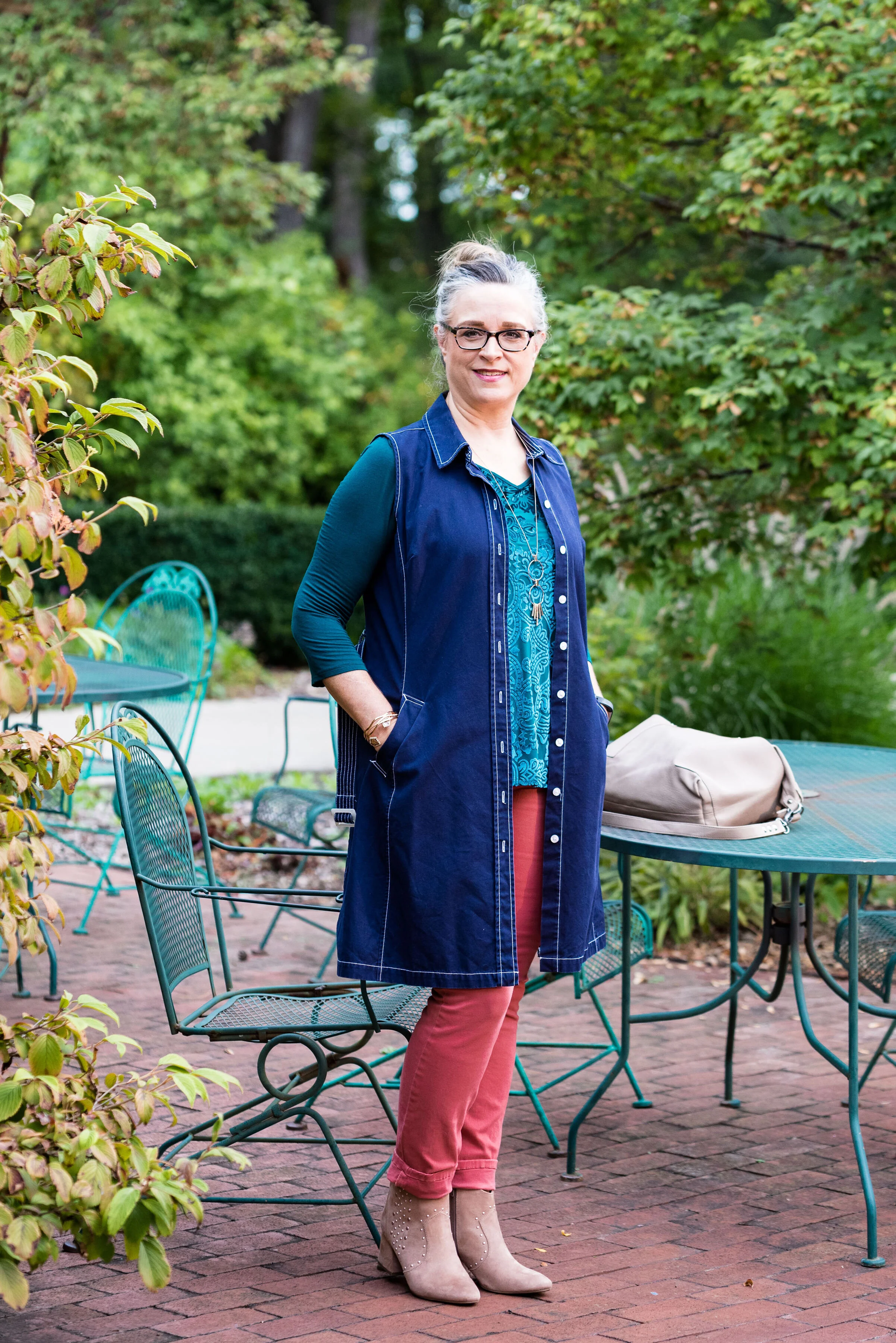
My jeans are W62 brand from dressbarn. They are very comfy and contain a good amount of stretch. I wear these again and again for work or when I just want a different color skinny jean.

This thrifted, embellished, 3/4 length sleeve top is Dana Buchman brand. I do love the swirling pattern and glistening sheen of the front portion of the top. The sleeves and the back are more like a plain jersey knit.

The dark navy vest is really a belted dress that I found at a thrift store a while ago. It is Issac Mizrahi brand and if I was thin enough, I might consider wearing it as a dress, but it works beautifully as a vest. What do you think?

I went with a little metallic bling with my accessories including a rose gold pendent and bracelets, a Madden bag that I got on clearance at Kohl’s and my SO heeled boots, which were also a clearance purchase at Kohl’s.

What do you think of these colors? Would you wear an outfit like this? I’d love to hear from you.

I’m leaving you with a few shopping links. These are affiliate links. All opinions are my own.

Have a great weekend.

Photo and graphic credit Rebecca Trumbull.


Pantone - Autumn/Winter - 2019 - Butterscotch and Grapeade

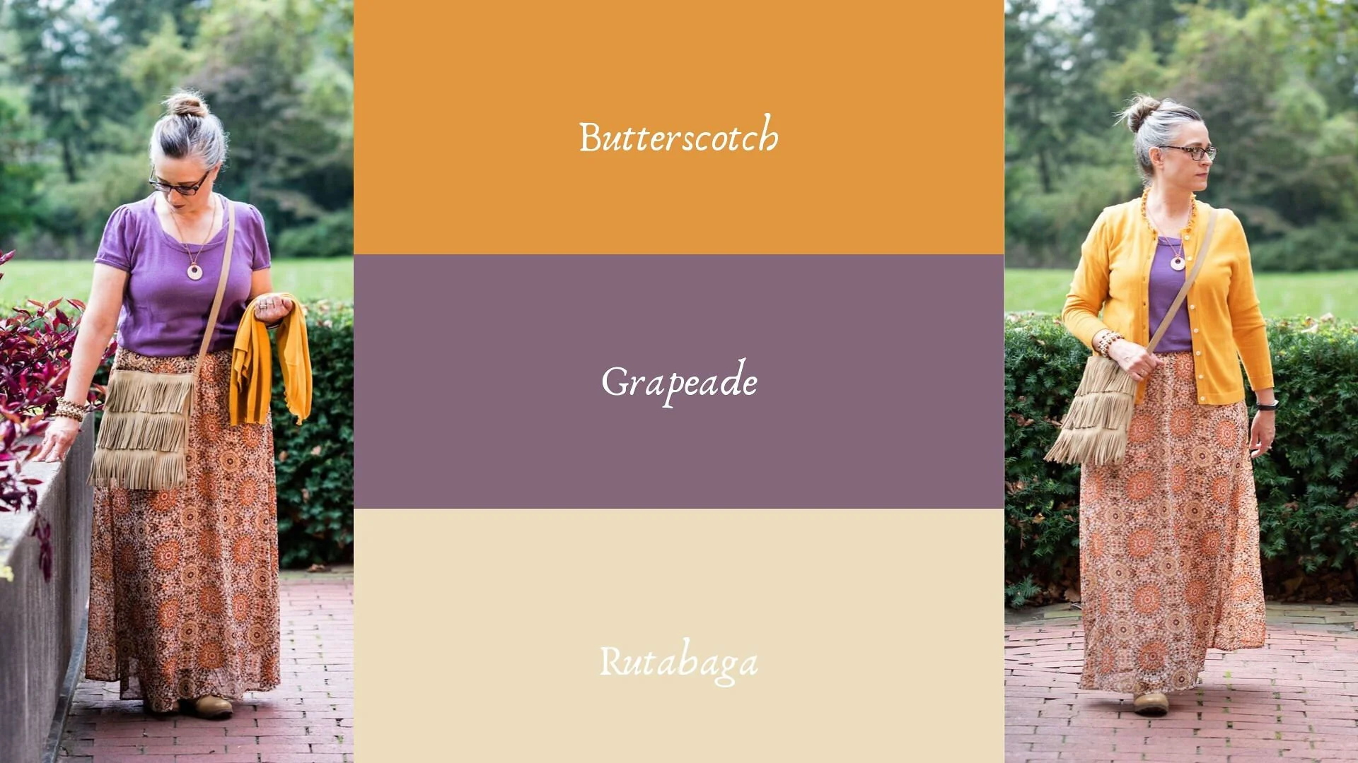
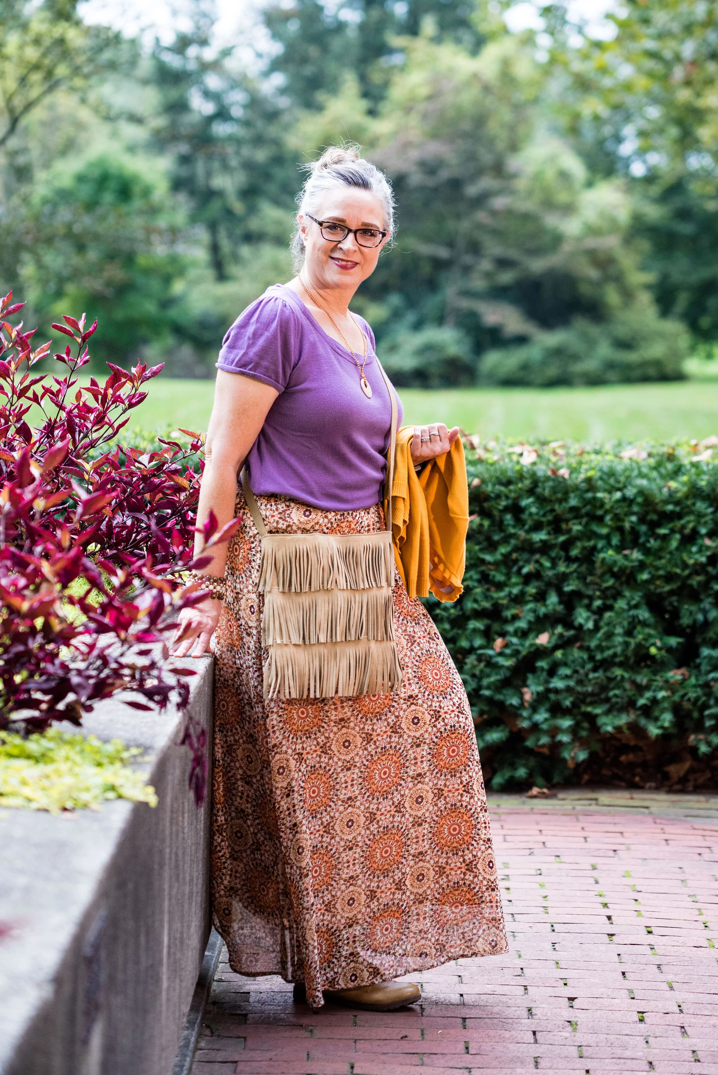
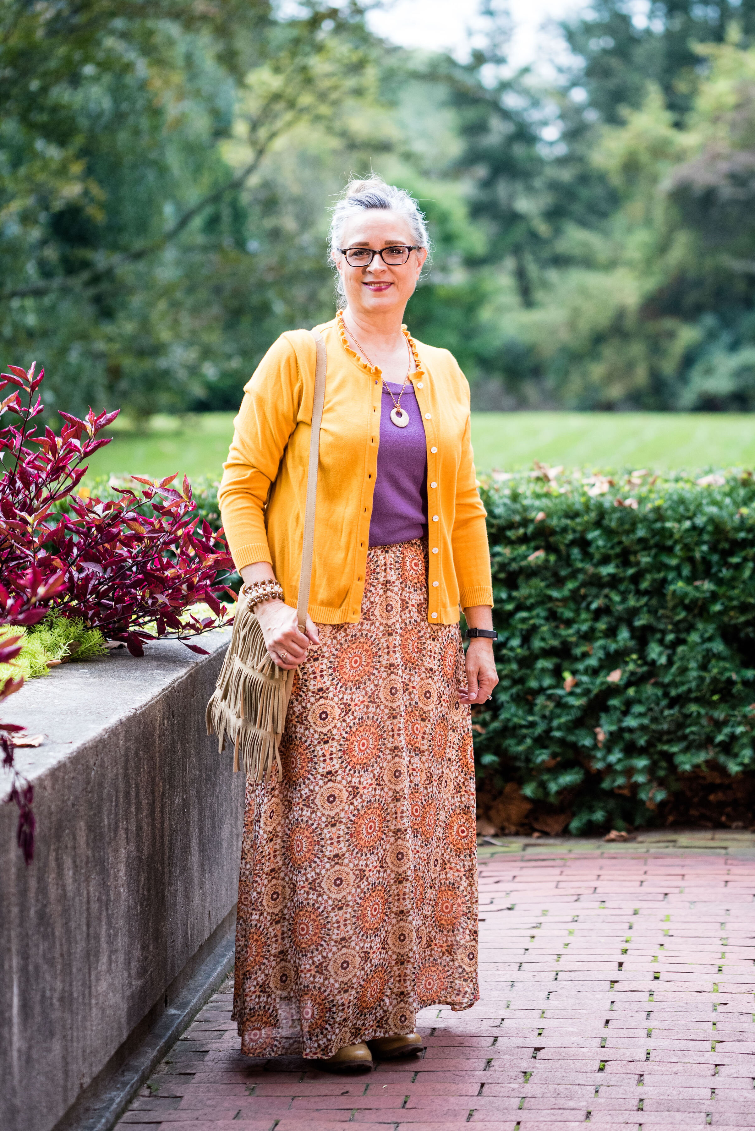
Today’s outfit features two colors from the London Autumn/Winter palette that Pantone describes as a “deliciously appealing golden yellow” and a “notable muted mauve tone.” You might wonder why I would pair purple with yellow. There was just something about this combination that I loved and when I paired them with the printed maxi skirt, I felt I had a winning outfit. Take a look.

This outfit says several things. First, it says I’m not afraid to try unusual color combinations. Second, it says you can make up your own style. The short sleeve sweater with a cardigan topper is a more classic combination, but the medallion print skirt, beaded jewelry and fringe bag scream boho. Let’s talk details.

The purple short sleeve sweater is a thrifted Loft piece. I like the scoop neck and it has plenty of stretch, but still holds its shape. I also love purple, which is trending this fall.

The Butterscotch thrifted cardigan is a brand called Callaway. When I looked it up, it appears to be a clothing brand for golfing, selling things like polo shirts, pants, jackets and other golf related pieces. The brand also has their own website which features golfing equipment like drivers, putters and bags. Neither my hubby, nor I play golf. He calls it “cow pasture pool.” He’s always got a name for everything. You can see Callaway clothing on Amazon, and on their own website, Callaway Apparel.

I may not be a golfer, but I know a quality sweater when I see one. I love the women’s fit of this cardi and the ruffle treatment around the neckline. It makes the sweater very feminine and fun.

I’ve styled this medallion print Roz & Ali brand skirt on the blog before. I got this at Dressbarn a few years ago. While it is a summer weight skirt, it is fully lined, so good for cooler temps and if you pair it with leggings or heavy tights you could wear it all winter. You can see how I paired the skirt with both an orange tank and a gold top here, and with another lighter purple color here.

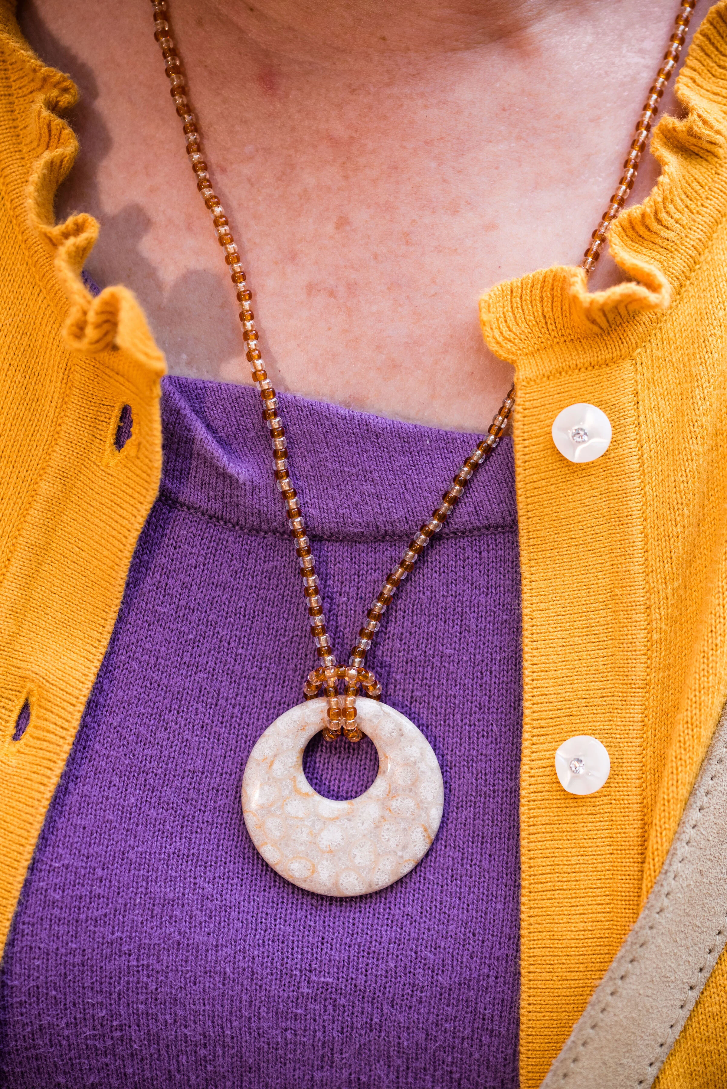
In keeping with the boho feel of the outfit, I went for a hand crafted look with my jewelry and bag. The necklace was actually made by my oldest. She was into beading as a teen and made some fun pieces, of which I still have a few.

This beaded bracelet was probably a Kohl’s or JCPenney piece from the clearance rack. I’ve had it for a while, so I don’t remember.

I found this fringe bag at a thrift store and knew I had to have it. It looks like it was hand made and there is no label inside. I like that it is a neutral color and long enough to be a cross body bag.

My ankle boots are another thrift store find and I thought paired well with the boho theme of the outfit. These are a brand called Rock Candy by Zigi.

What do you think of these colors? Do you have these in your closet? Would you wear yellow and purple together? I’d love to hear your thoughts. Leave me some love in the comments.

i’m including a few shopping links for things purple and yellow. The holidays are coming up. How many of you have started your Christmas shopping? I’m guilty! Life is so busy, I can’t afford to wait until the last minute. These are affiliate links. All opinions are my own.

Photo and graphic credit Rebecca Trumbull.


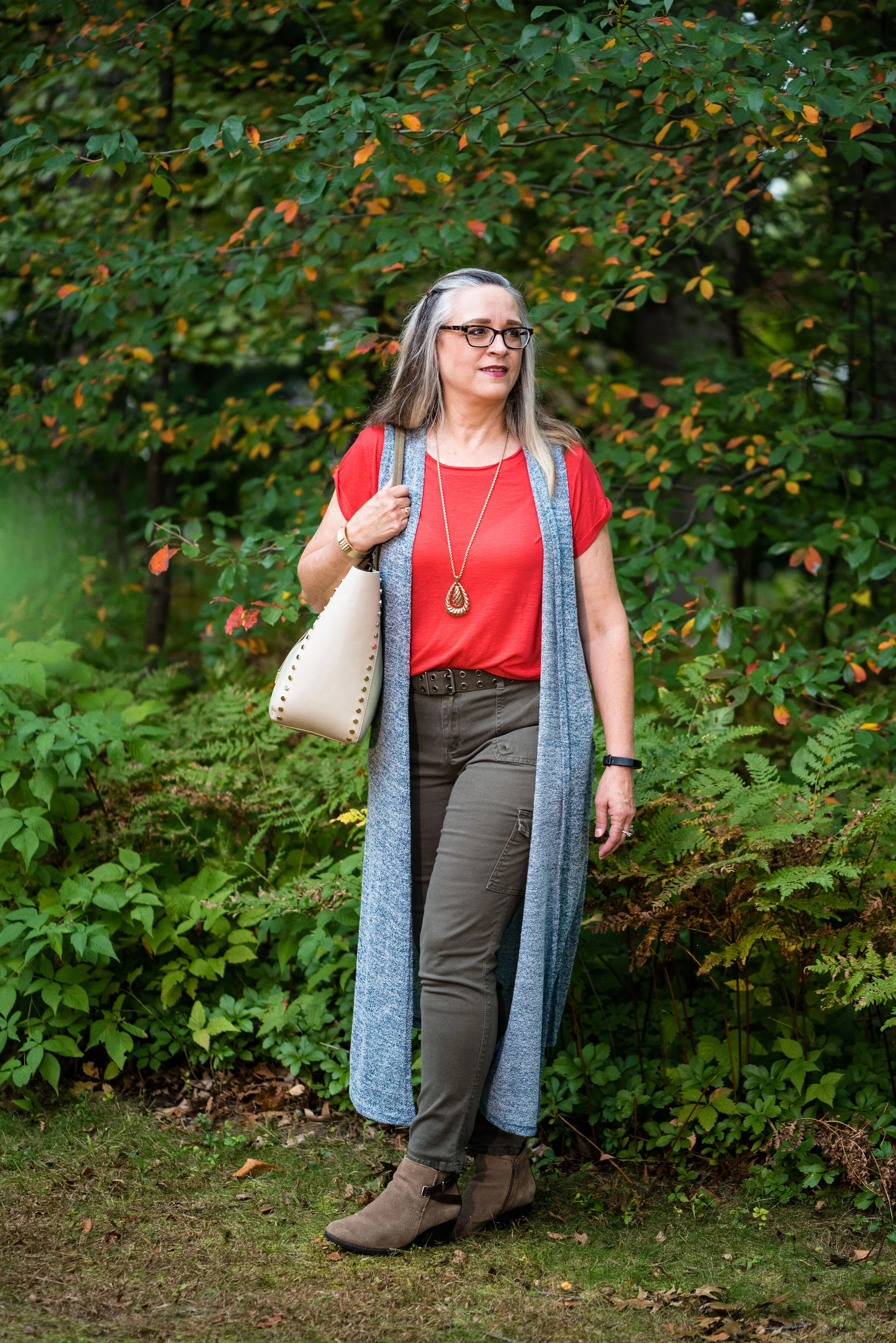
Pantone - Autumn/Winter - 2019 - Summer Fig and Bluestone

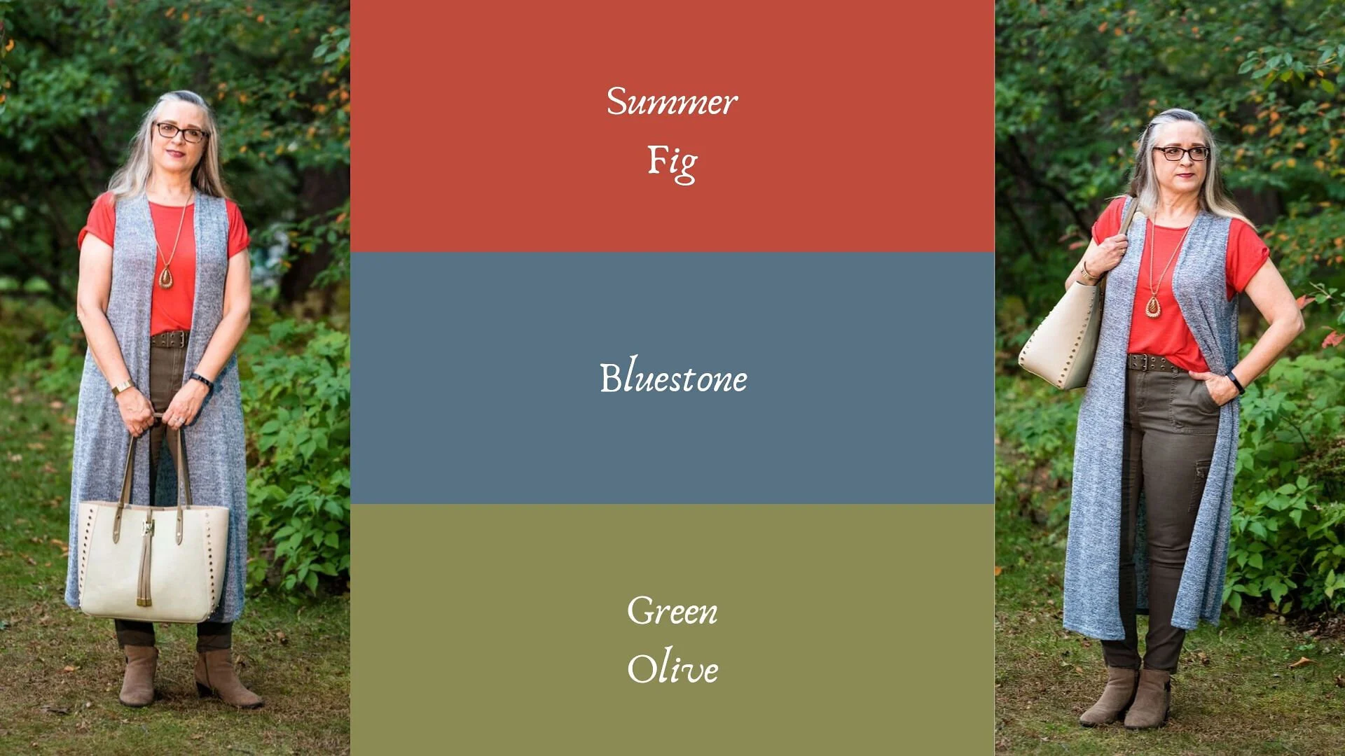
You’ll remember from the New York Pantone series the color Bluestone. This is one of only two colors that showed up on both palettes. I’m not sure how the Pantone Color Institute comes up with the colors they choose. Is there a committee? If so who is on the committee? How do they come up with the names for each of the colors? Yes, these are the things a fashion blogger wonders when she is tired and needing a burst of writing motivation. Ha, ha. I am speaking the truth when I say, I had to look up what a fig looked like to understand where they came up with this red color. This red coincides with the bright red interior of the fig fruit. I have never eaten a fig, have you?

This bright red tee is SO brand from Kohl’s. It is a few years old. I find Kohl’s and JCPenney my go to’s for things like short and long sleeve tees.

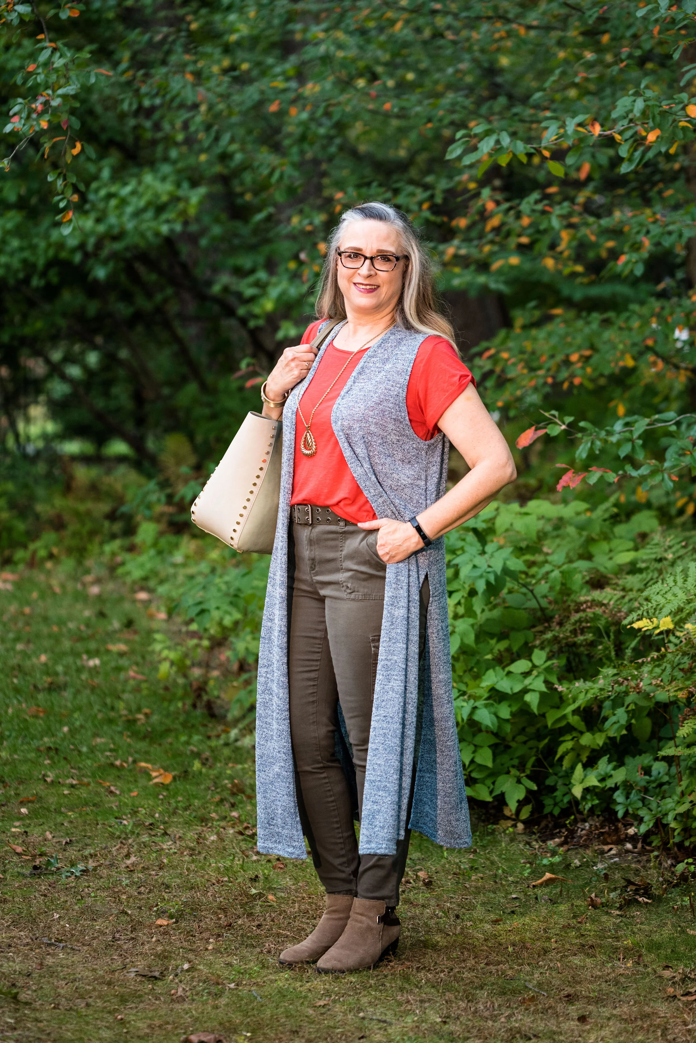
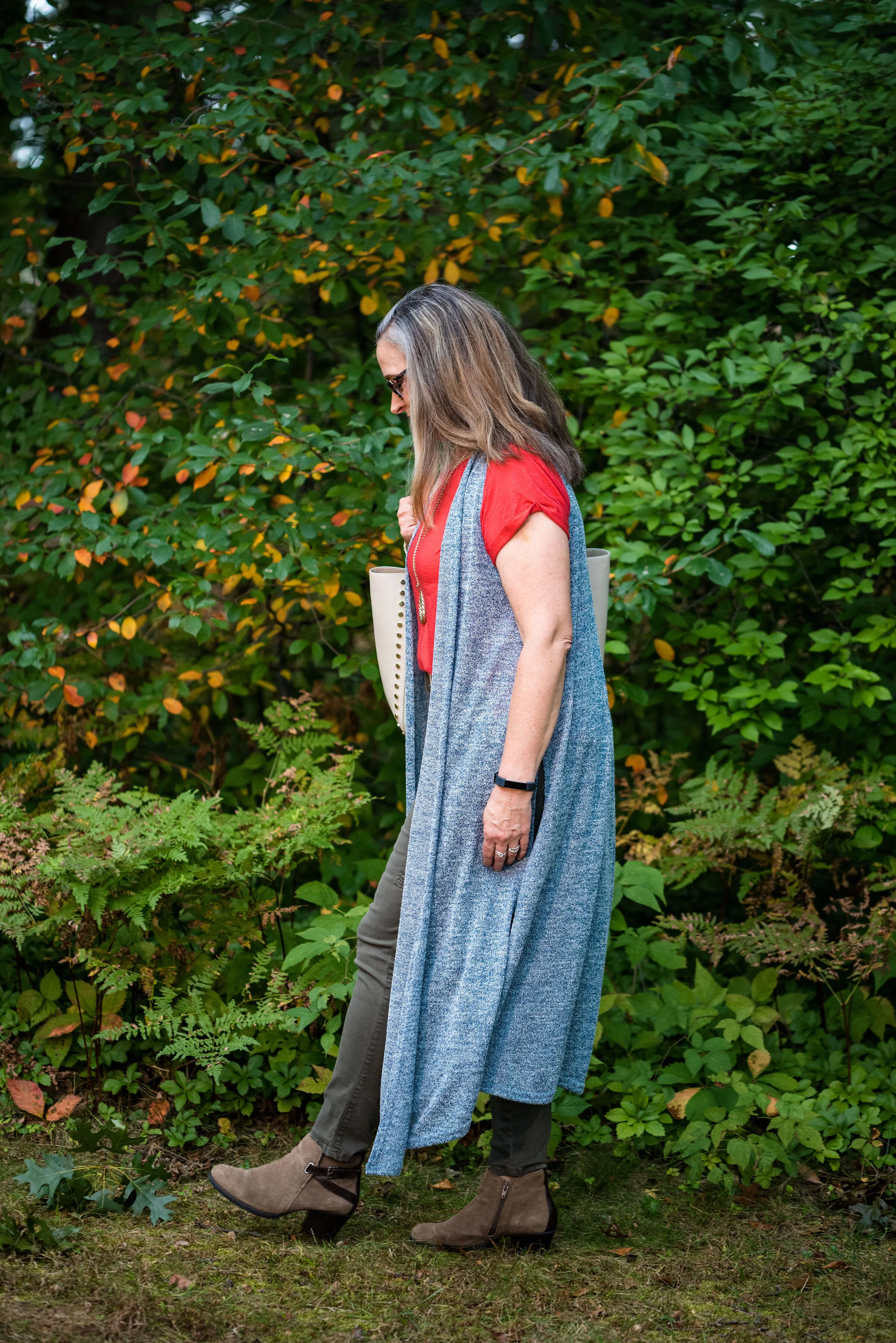
The Bluestone vest is a LuLaRoe piece. This particular style is called Joy. I like that some clothing companies name each of their styles. Not that I will remember what they are called, but I just think it adds another dimension to a retailer, that they have taken the time and effort to specify a certain line has a name. This is the only vest I have that is this length and I like how it looks in this outfit. The fabric has plenty of stretch, but doesn’t lose its shape.

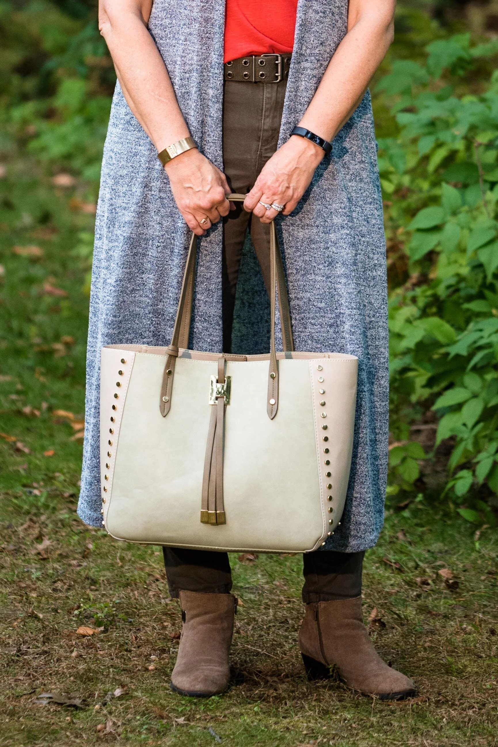
Once again, I turned to the classic color of Olive Green for my pants, bag, and belt. Olive just seems to be an easy color to pair other colors with and it grounds an outfit and keeps it looking chic with a bit of an edge. These utility pants are Gloria Vanderbilt brand and I’ve styled them before on the blog. You can see them styled with an olive utility vest here and in a flat lay with a snakeskin jacket here. I got the tote bag from Charming Charlie a couple years before they went out of business. Belts are so expensive, I usually try to pick them up at thrift stores.

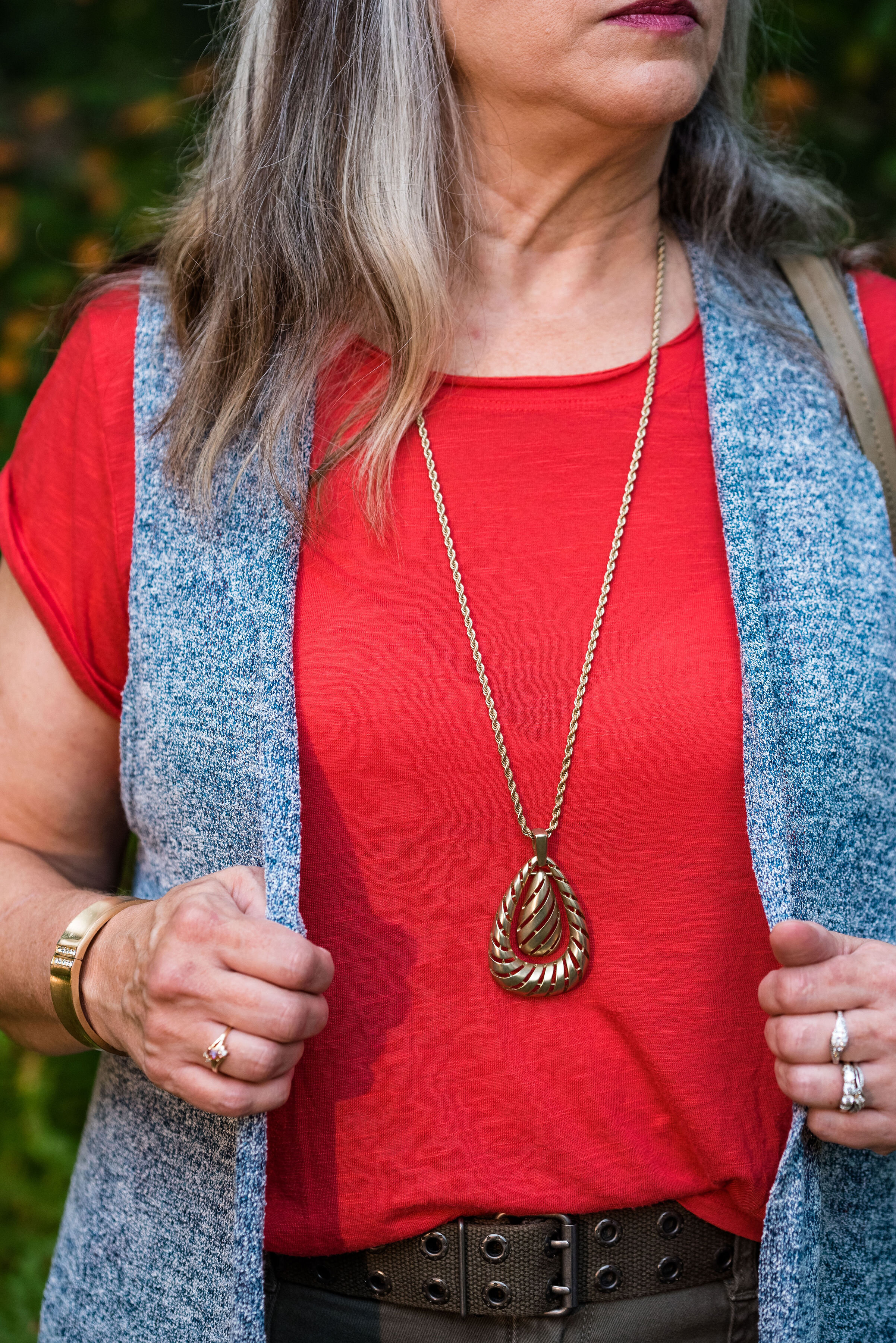
I kept the jewelry simple with a gold pendant necklace and a gold bracelet.

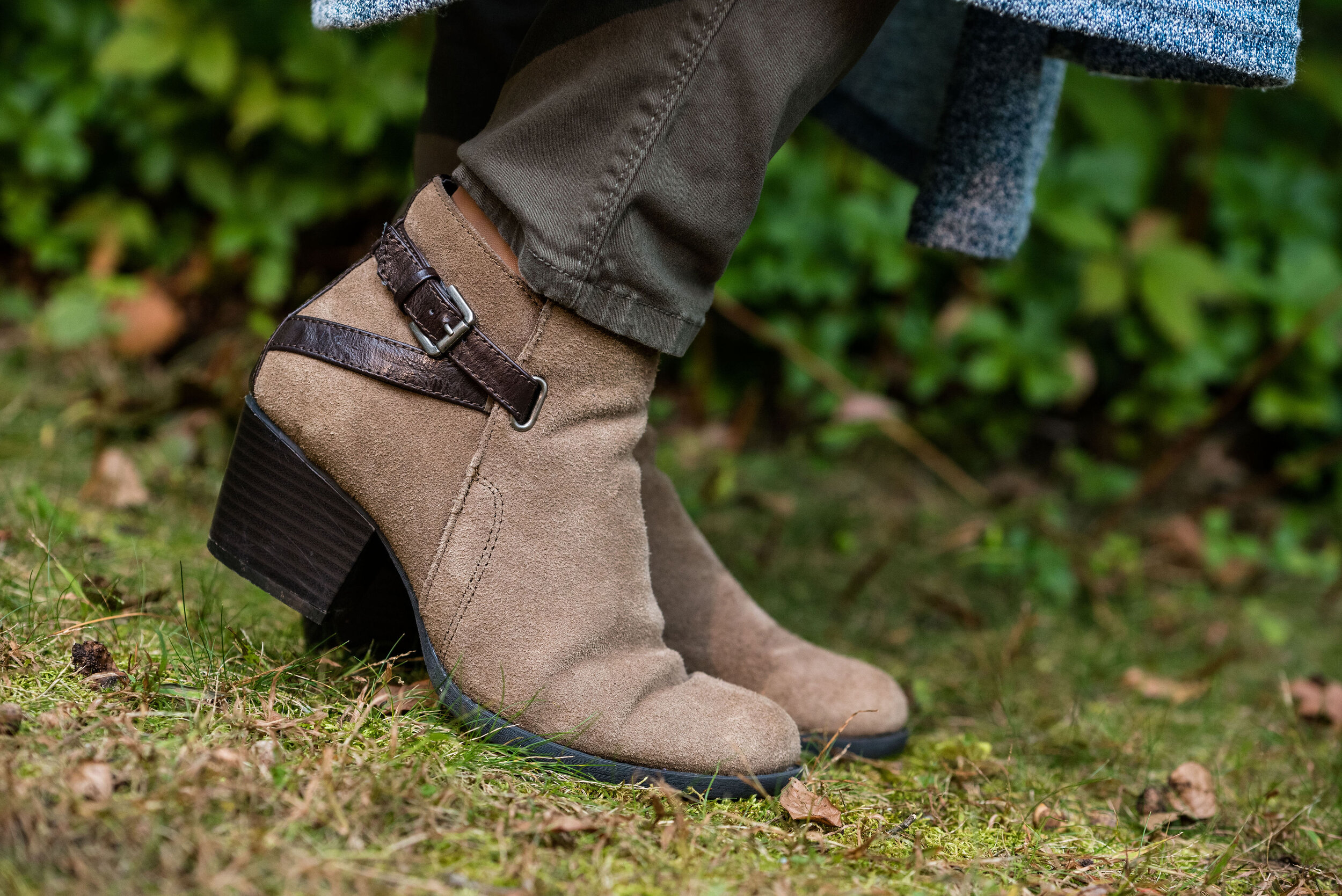
This old pair of Sonoma ankle boots has been with me for a while, but they are the perfect neutral finishing touch and the suede texture is just right for a fall outfit.

What do you think of these colors? They are very similar to the New York palette using Bluestone and Chili Pepper. Do you like to wear vests? Do you have a long one like this? What are some other ways you could style a long vest? I’d love to have your feedback.

I’m including a few shopping links. These are affiliate links. All opinions are my own.

Photo and graphic credit Rebecca Trumbull.


Pantone - Autumn/Winter - 2019 - Cranberry and Chicory Coffee

Hi everyone. The days are flying by and we are almost to Halloween. I haven’t even gotten out my decorations yet! That is how far behind I am. Maybe I should just skip Halloween and start decorating for Christmas. All the stores are doing it. Ha, ha . Well, I don’t think I’ll get that crazy, but this time of year does seem to go awfully fast. Do you get that feeling?

Today’s colors are what the Pantone Color Institute label a “vital red that adds a pungent punch to the palette,” and a “robust and tasteful” brown that, “introduces an element of heartiness.”

I was able to pull these pieces from my closet and decided to add the off white cardi that mimics Rutabaga from the London classic color palette.

This Cranberry cami was a recent thrift purchase. Most of my camis are pretty tight and I wear them as layering pieces under long sleeve tops and sweaters. I do not wear them to be seen, but it occurred to me that it would be nice to have something I could have more visible under an open sweater. It is Maurice’s brand. I am becoming a fan of Maurice’s. I see pieces every so often at thrift stores and recently I bought what has become one of my favorite pairs of jeans on the clearance rack. What really drew me to this cami was the pretty lace detailing.

These trousers are Worthington brand from JCPenney. Do you know how hard it is to find brown slacks? Now maybe that has changed. I have seen rust, and that more yellowy brown called cognac, but real brown is hard to find, especially a dark brown like this one.

The off white open front cardigan is Chaps brand and another clearance rack find from Kohl’s. Chaps has some nice pieces, but they do have a higher price point than I would normally pay, thus my reasoning for waiting for them to go on clearance. If I thought a particular piece is really worth paying full price for, I would buy it, but for the most part there isn’t anything that I absolutely have to have. I could shop my closet for months and come up with all sorts of new combinations, because I have so many clothes. Truth!

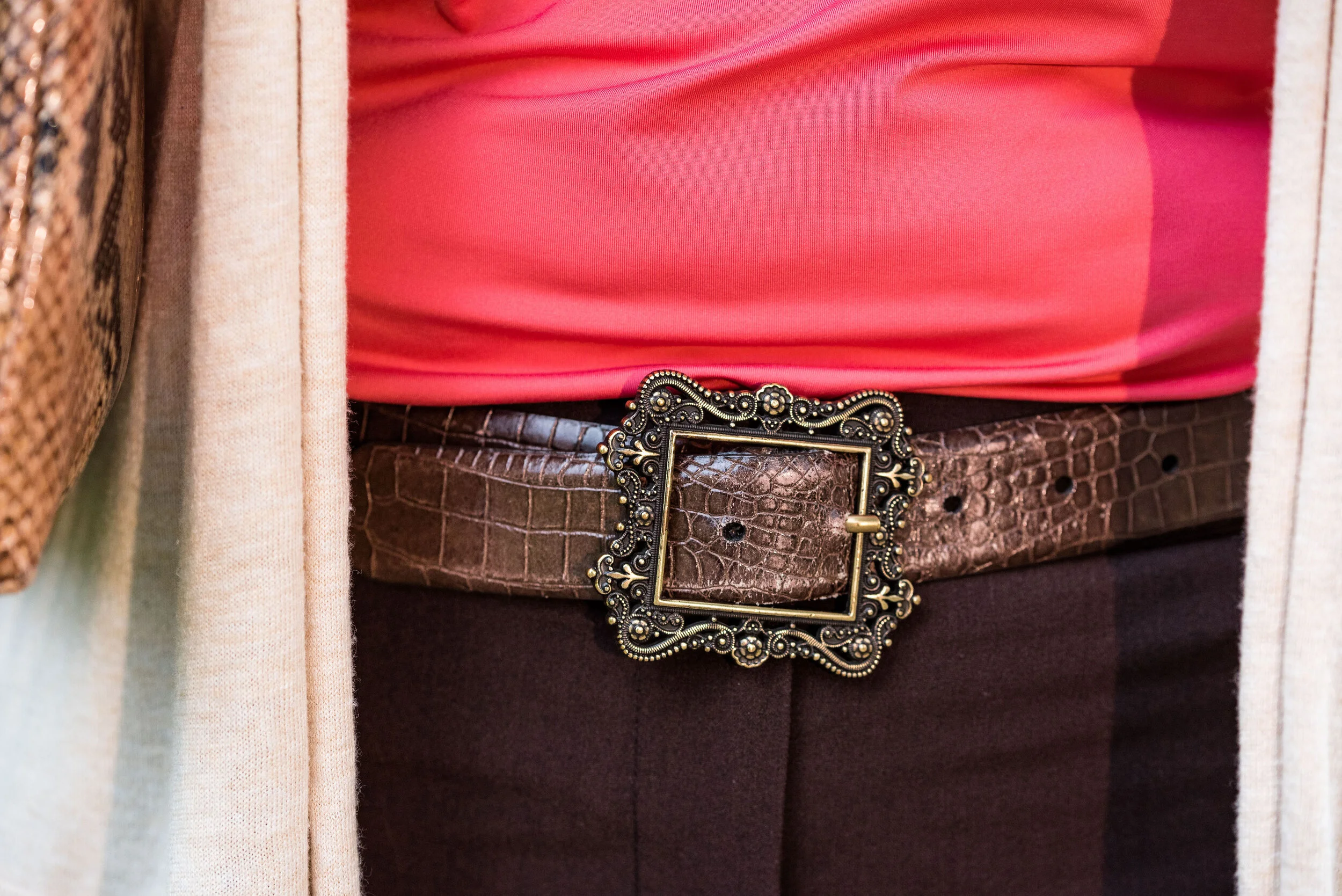
I kept the accessories minimal with my gold leopard print medallion necklace, a few gold bracelets, my snakeskin clutch, a brown belt, and brown boots. I thought this was a good outfit for complimenting with animal prints.

These are two colors that I can get behind. I love the combination and think these two work well together. What do you think? Do you have any of these colors in your closet? Do you wear camis a lot? Do you wear them more for layering or to be seen? I’d love to hear you thoughts, so leave me a comment or two in the comments section. I appreciate hearing from you and all your support.

I’m including a few shopping links for you to peruse. I hope that you find these helpful. Every click you do, gives me a few cents and I appreciate every one. These are affiliate links. All opinions are my own.

Photo and graphic credit Rebecca Trumbull.

Have a great day.


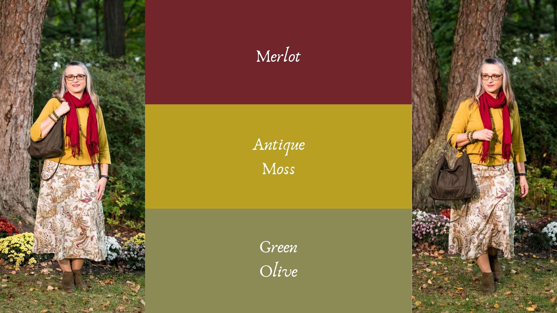
Pantone - Autumn/Winter - 2019 - Merlot and Antique Moss

The first two colors from the Pantone - Autumn/Winter - London palette that I am featuring are Merlot and Antique Moss. As you can imagine, Merlot, like the wine is a rich burgundy red, while Antique Moss is a yellowy green. Often when we think of pairing red and yellow, we are concerned we will come out looking like an advertisement for McDonald’s, but let me reassure you these two colors pair in a perfectly un-Ronald like way and I love the combination.

The London color palette classic colors were just a bit different. Green Olive is comparable to Guacamole from the New York palette, with a little more of a gray tinge. My version of olive in my accessories is much darker, but you get the idea.

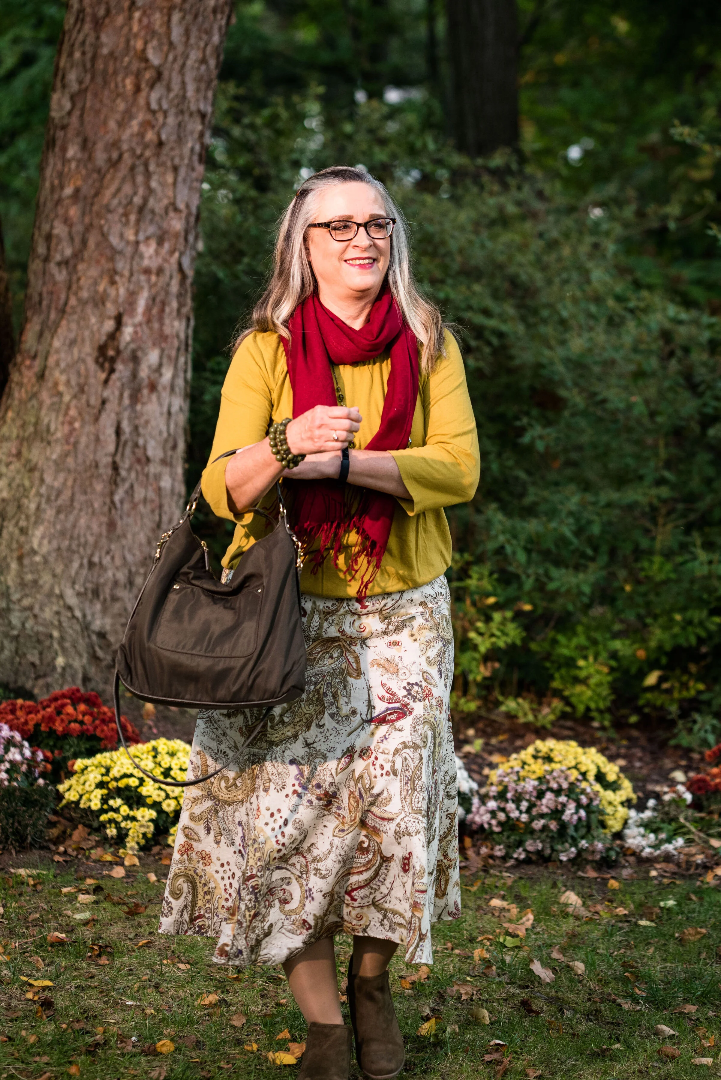
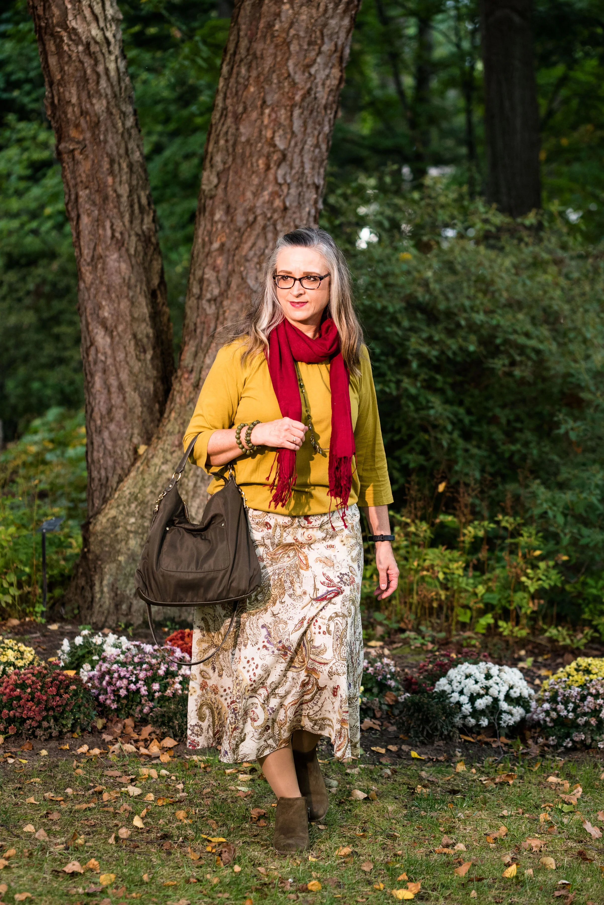
This Jones Wear skirt you’ve seen on the blog before. I styled it for the Pantone Fall 2017 New York Palette in a very similar fashion. I even used the same dark olive bag. Ha, ha. You can see that post here. I also used it this past spring for the Pantone Spring/Summer 2019 colors. You can see that post here. In addition you can see it with a green cardigan, here. I keep coming back to this skirt, because it works so well for these color schemes due to the reds and greens in the print of the skirt. I could easily used this printed skirt for a Christmas outfit as well, so you might see it come up again later this year. I love a versatile piece and when I purchased this skirt, I never knew how often I would use it for the blog.

We took the pictures for this series at the Toledo Botanical Gardens, which are just down the street from where my daughter lives. The gardens are beautiful in all seasons and with walking paths through the grounds, it is a lovely place to visit and I don’t do it nearly enough. In the picture below, I am watching several bus loads of kids scramble on to the grounds and thinking, “Oh boy!” Ha, ha.

I obtained this red scarf from a friend’s closet. It looked a little more like Merlot, when it was in the low light of my closet, but here it looks much brighter. However, It is not a true red, but more of a burgundy. My 3/4 sleeve tee, I’ve worn on the blog before too. It is a thrifted Sonoma piece and has elastic on the bottom, which allows for freedom of movement and bulge camouflage. Ha, ha. You can see the tee styled with boyfriend jeans and a leopard print skirt here, and with a snakeskin print skirt here.

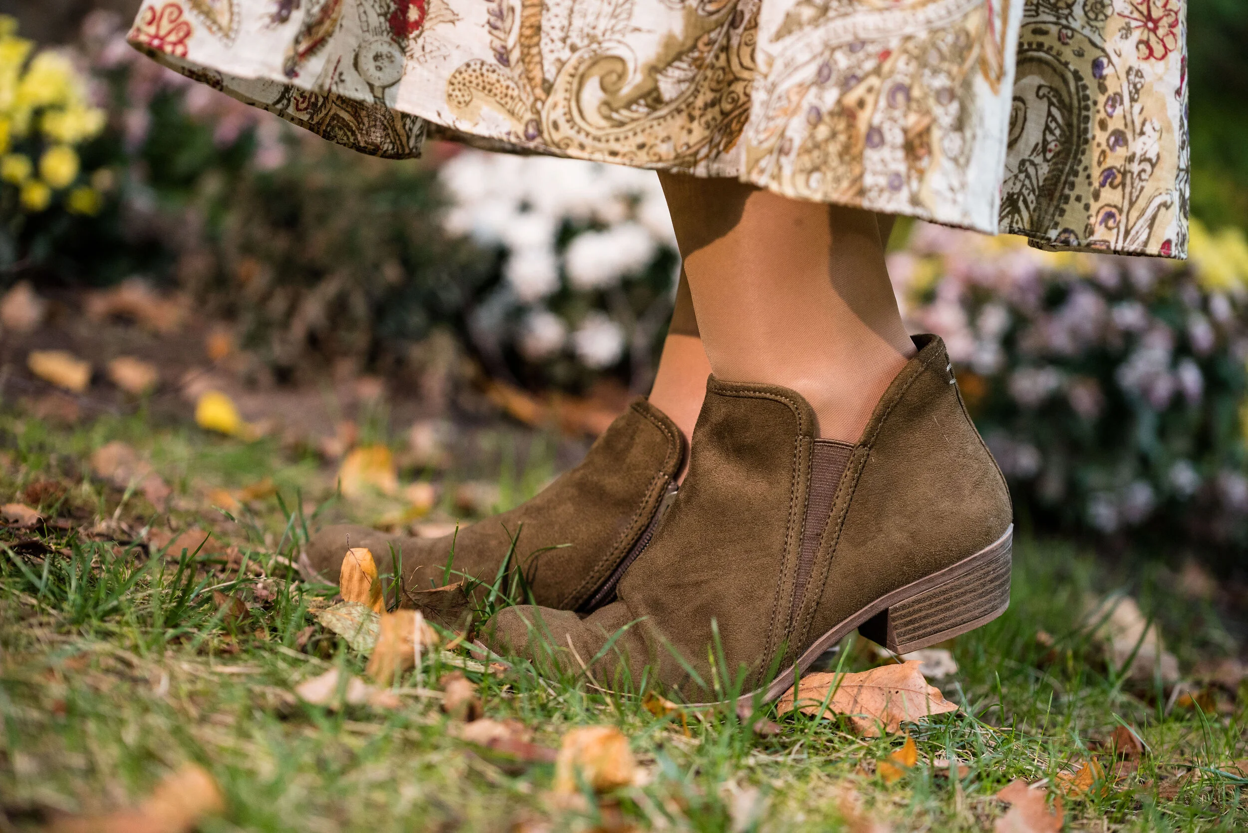
As I said earlier, I opted for olive green accessories which included my necklace, bracelets, thrifted bag and SO booties.

What do you think of these colors? Would you wear either of these? Would you wear them together? I’d love to have your feedback. Your support means a lot to me. I always respond to your comments. Just check back in a few days if you are interested in my reply.

I’m including a few shopping links for Merlot and Antique Moss if those colors got you excited. These are affiliate links, which means I get a few cents when you click on a link. All opinions are my own.

Photo and graphic credit Rebecca Trumbull.


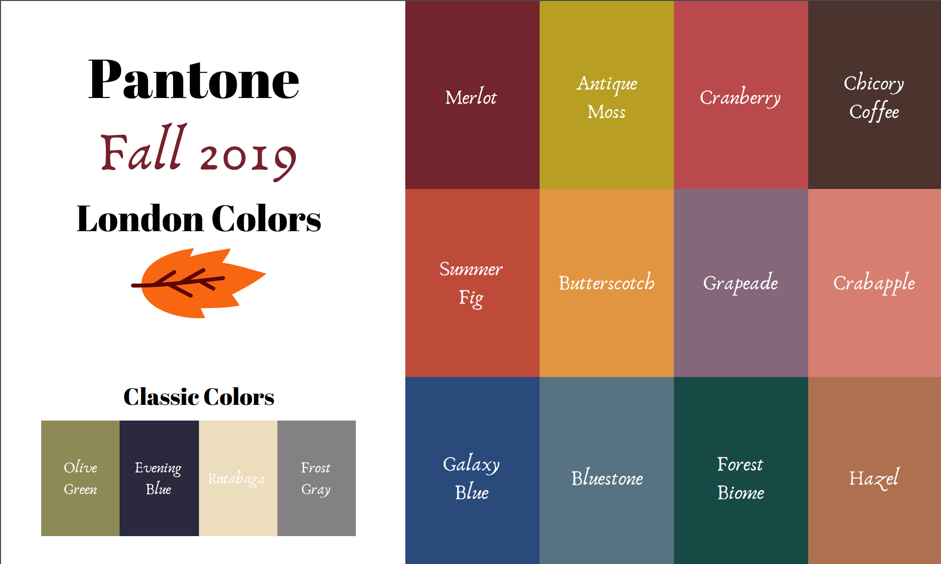
Pantone - Autumn/Winter - 2019 - London Palette - Intro

Past Pantone seasons, I have tried to combine both the New York and the London color palettes into one series. Most of the time there were plenty of overlapping colors, so I was able to take colors from both palettes to make my outfits. This fall there were only two overlapping colors, Galaxy Blue and Bluestone. It was for this reason, that I decided to break the series into two parts. We just finished the New York palette last week. You can see a recap of those outfits here.

Today’s post will introduce you to the London palette and give you a few sneak peeks at the upcoming outfits.

Both the New York and the London palettes included numerous fall yellows, reds and browns. They both included a green, some blues and hues with pink undertones, but the London palette is the only one to include purple, which I thought was interesting since purple is trending right now. Purple has always been one of my favorite colors, so I was excited to see it included on this palette.

In all honesty, I like this palette better than the New York one. I always veer towards richer more saturated colors, rather than pastels and I felt that I had an easier time finding pieces in my wardrobe that better personified the color palette. In this palette we find words like vital, fortifying, robust, delicious, rich, baked, arresting, mellow and distinctive to describe the colors.

I hope you will join me on Thursday as I take a closer look at the London color palette for this fall. Here are a few peeks at what is coming up.

I hope you will join me on Thursday for the start of this series and a look at the first two colors.

Have a great day.

Photo and graphic credit Rebecca Trumbull.