Color Play: Trending Spring Colors - Pistachio and Petal Pink

I thought I would cover two of the spring color trends that are being talked about, because you know I love color. The thought that these two colors would look good together was obvious to me and certainly is a nod to spring. Click here to read more about Glamour’s 10 Key Spring 2025 Fashion Trends.

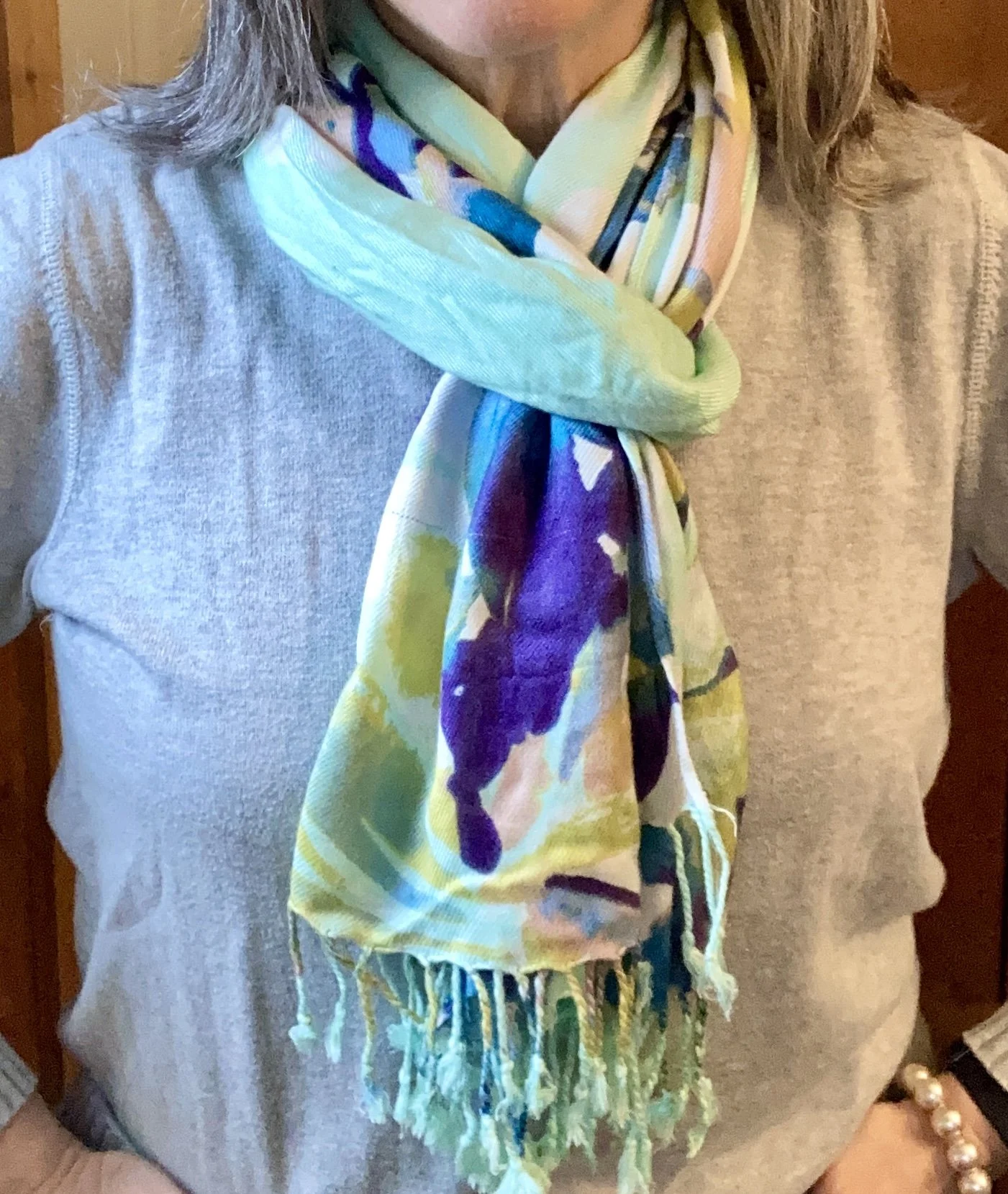
Pistachio is a light green that is a bit different from mint in that it leans more toward yellow, thought not as yellow as olive. I think it is a pretty color and, as with many colors, comes in differing hues and shades.

Petal pink is a pretty spring time pink with purple undertones.

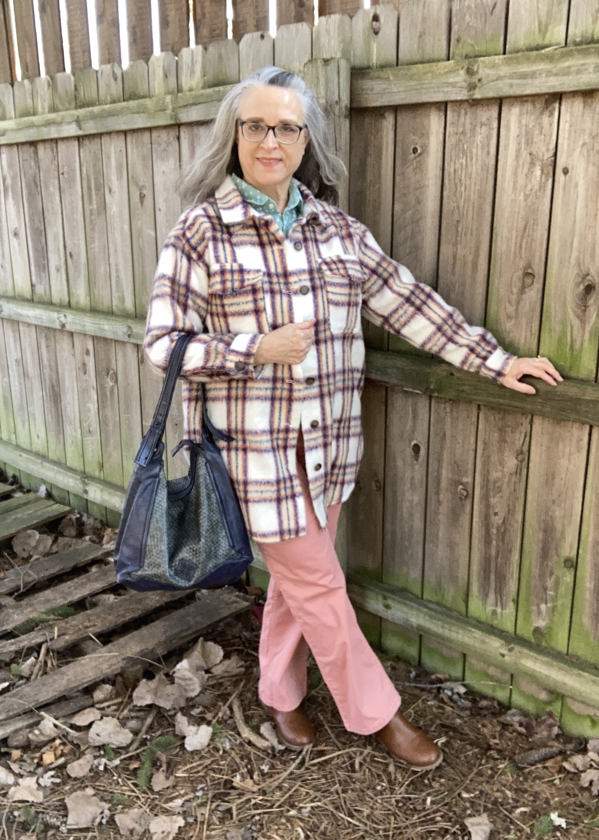
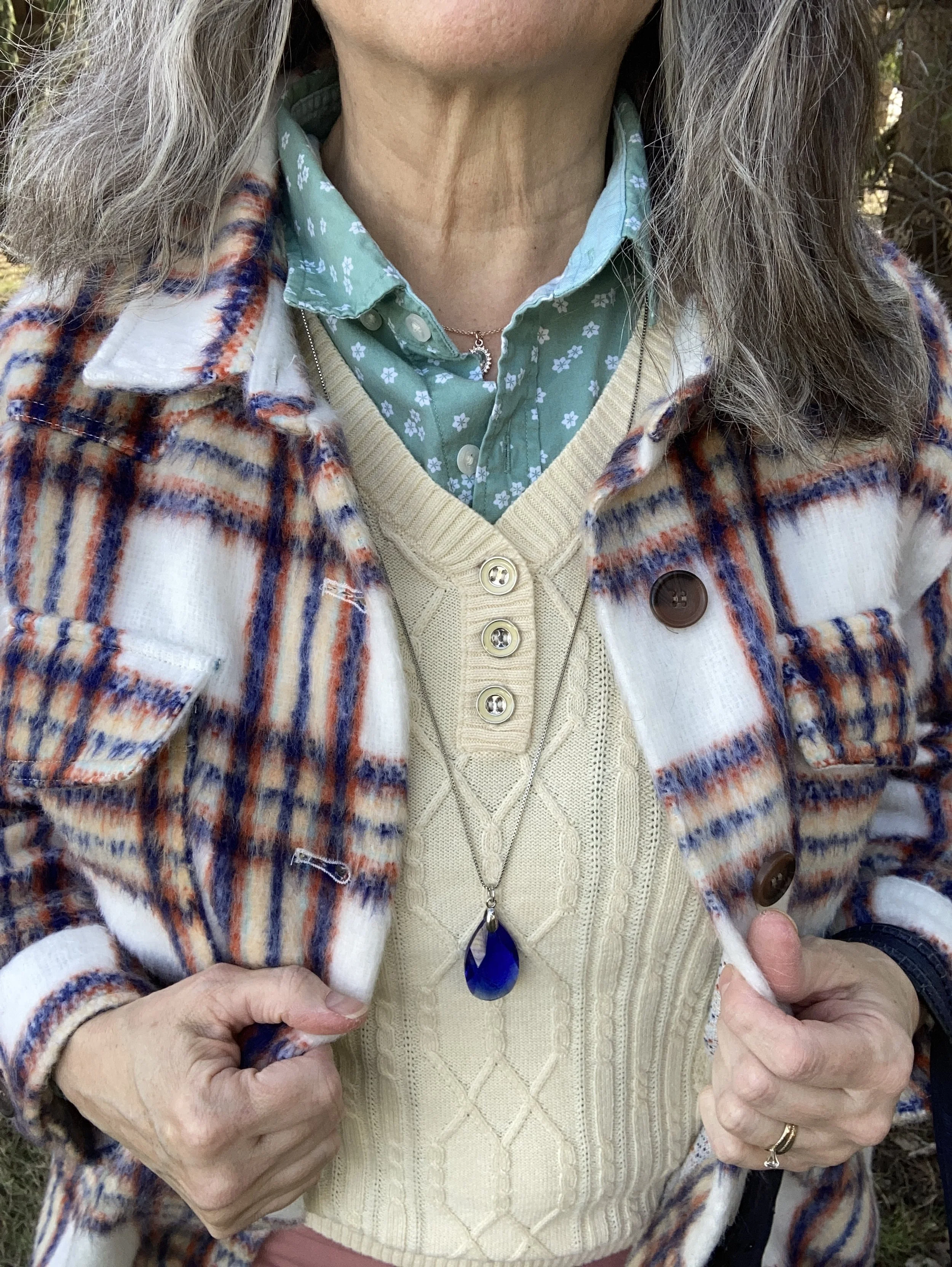
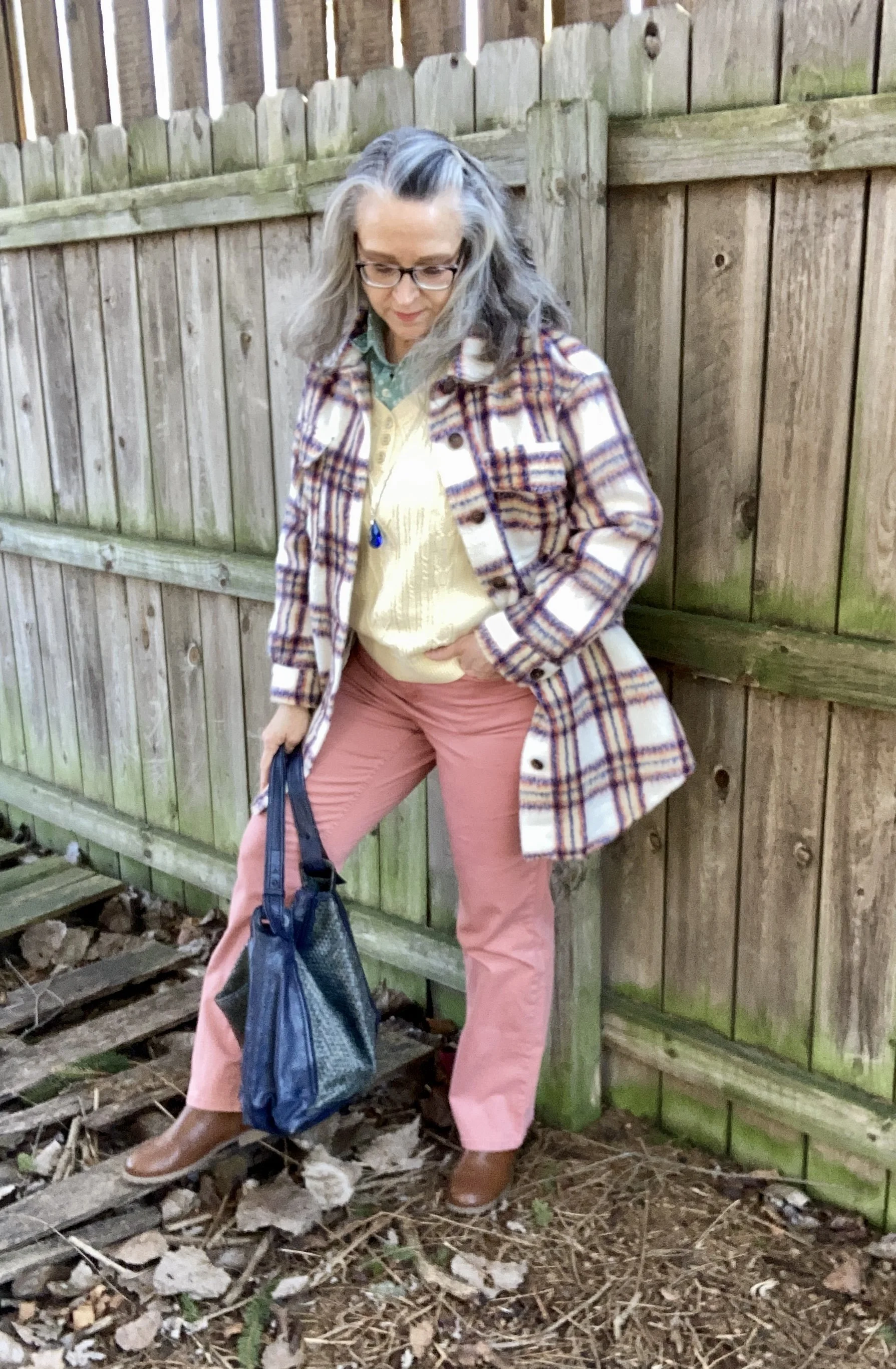
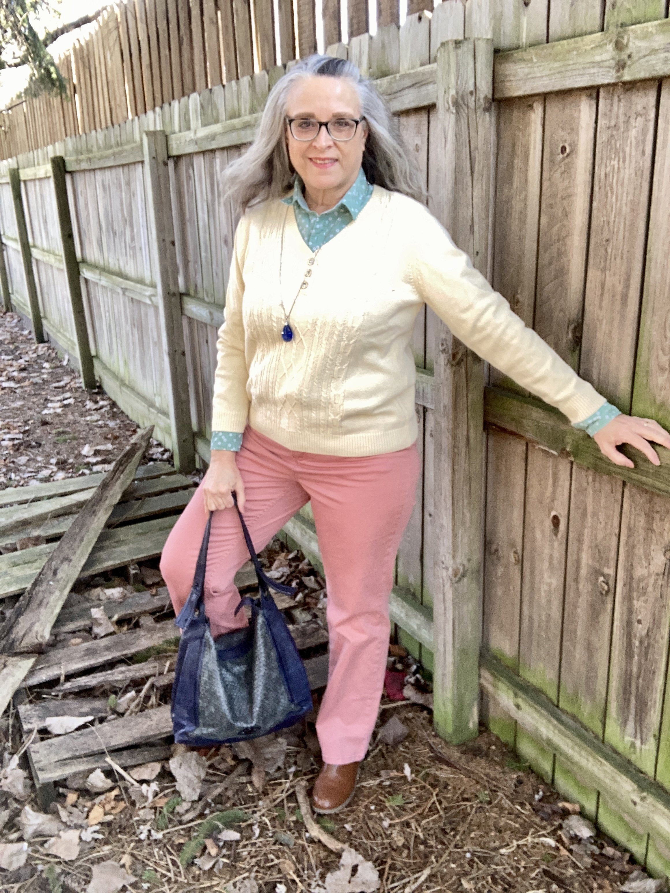
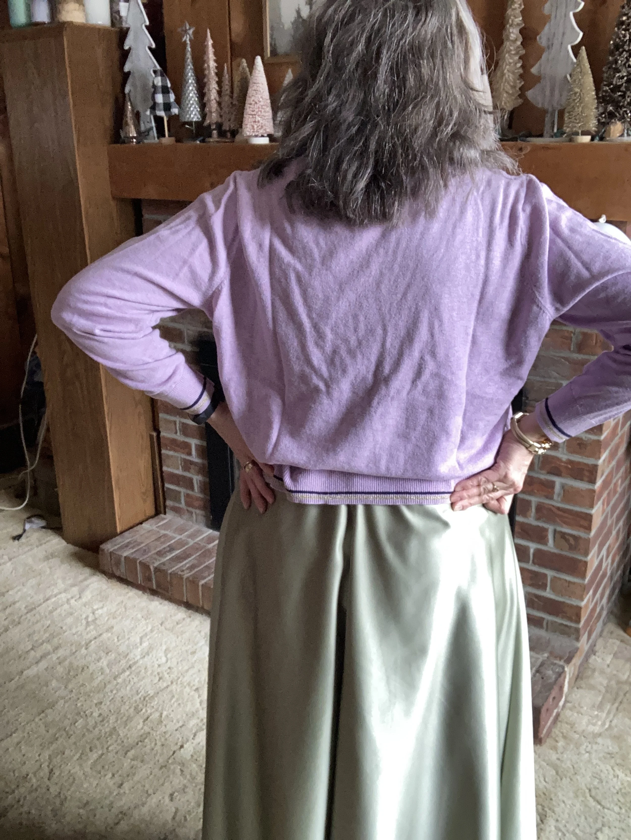
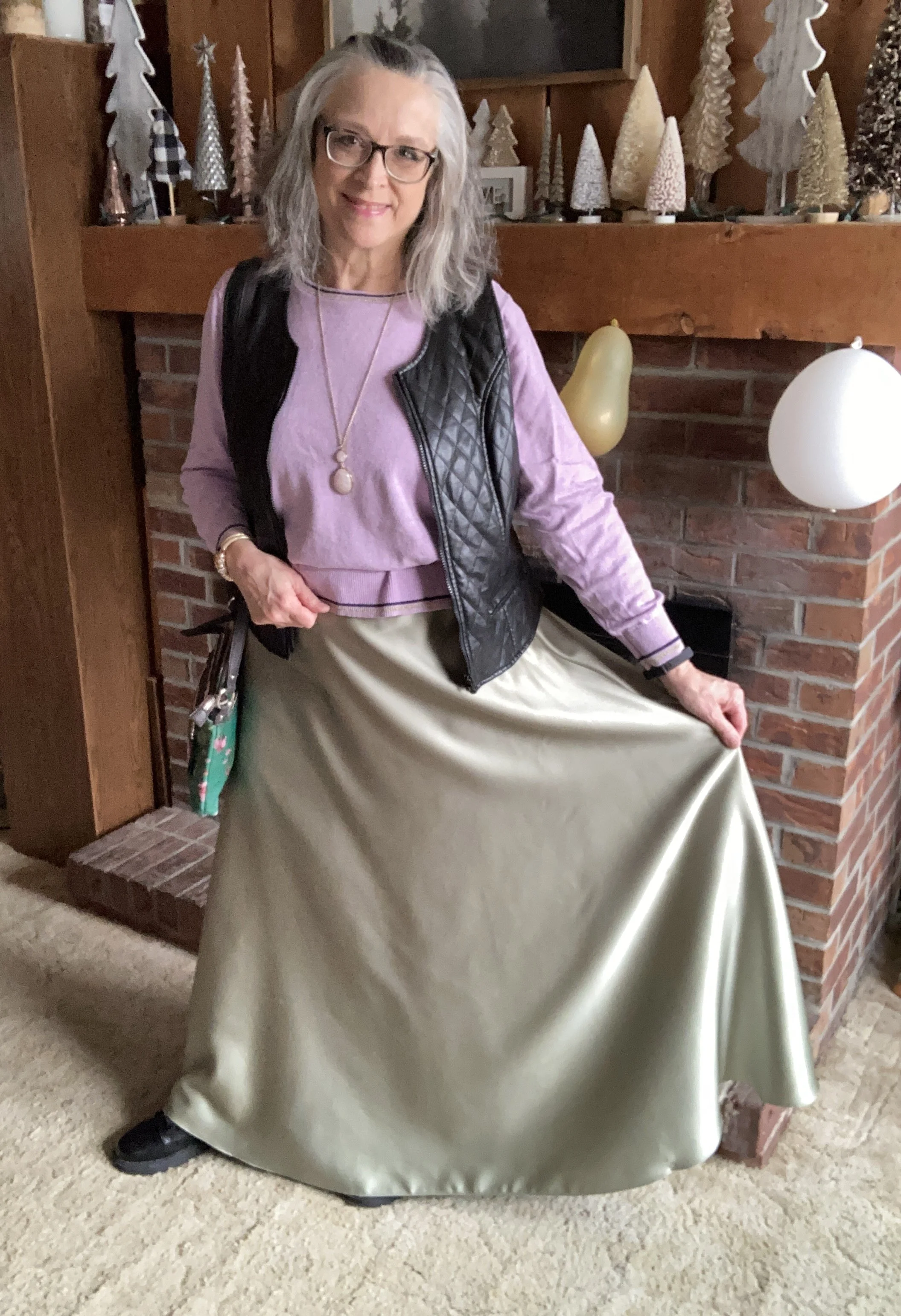
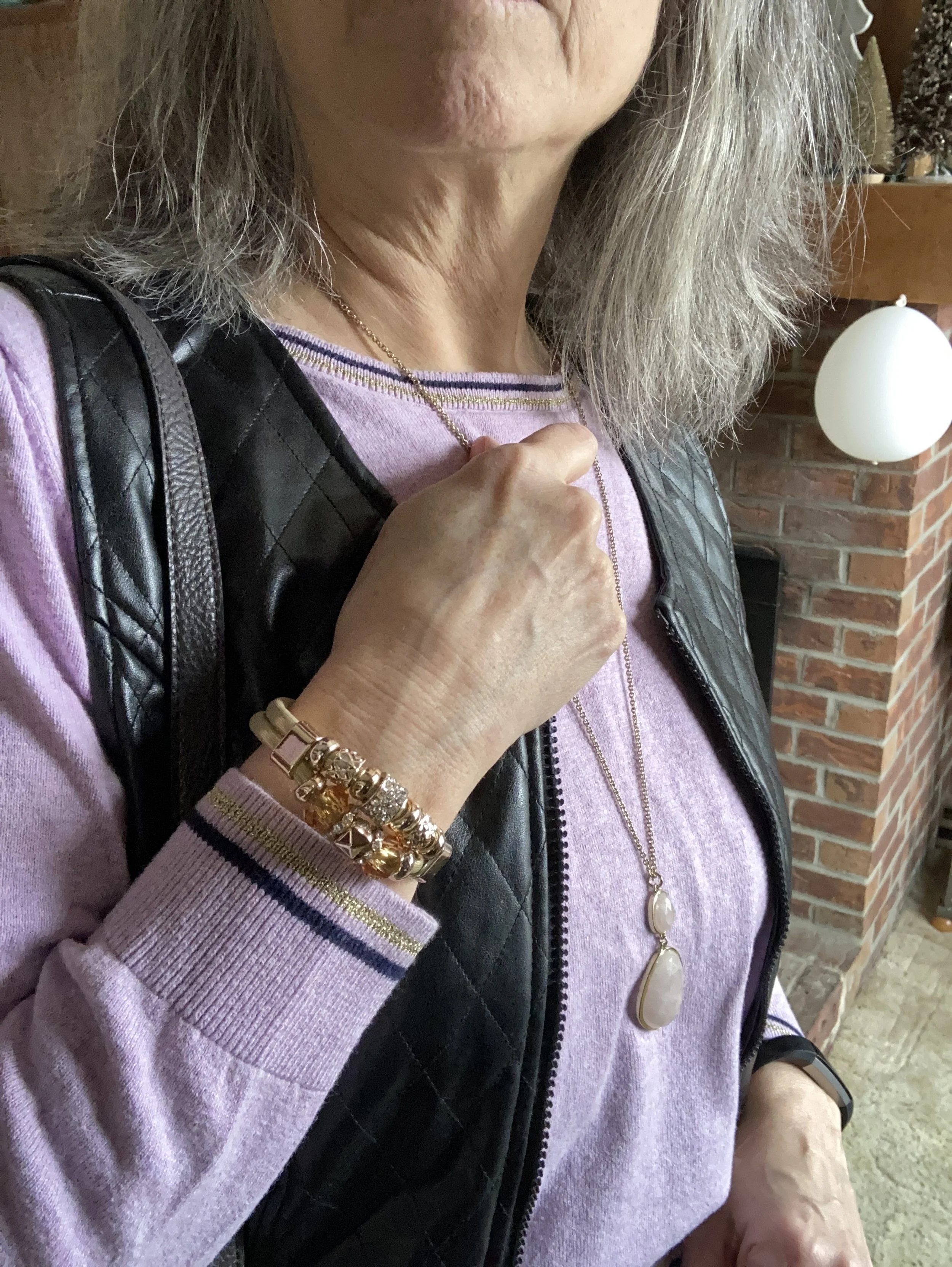
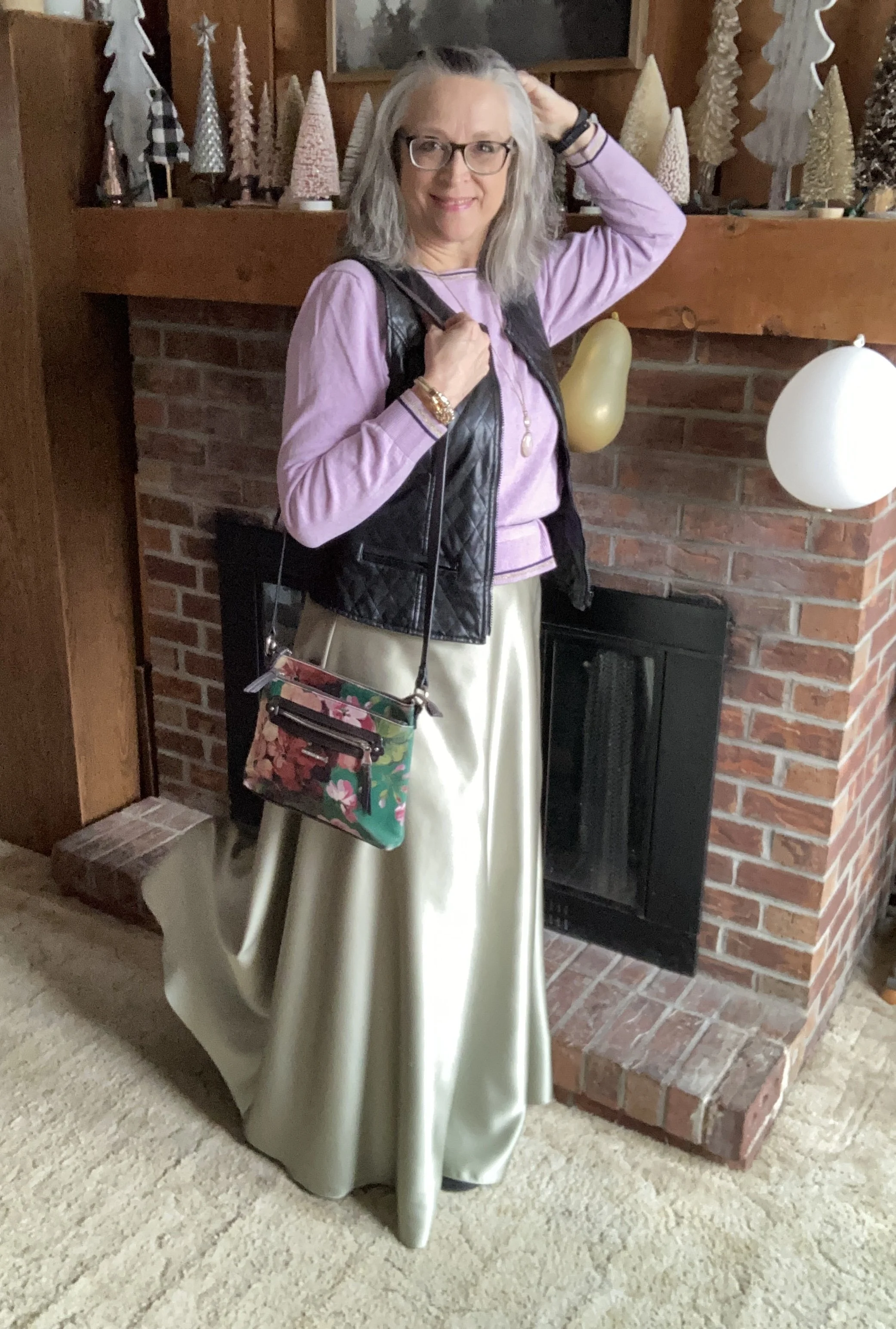
Today’s outfit was built from thrifted pieces in my closet. The sweater is a bit more purple than the Petal Pink color, but if you could see the actual piece it definitely has pink undertones throughout.

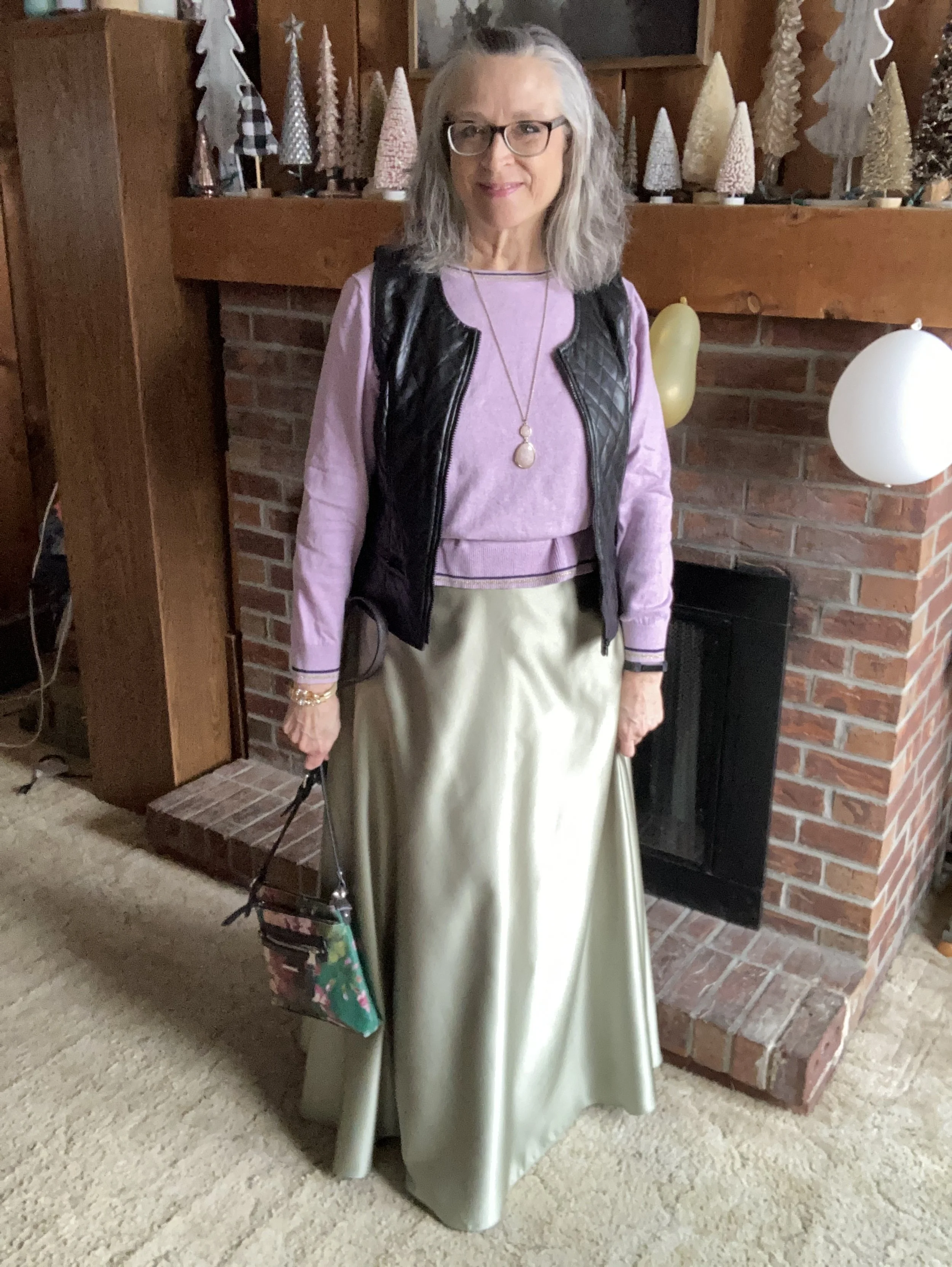
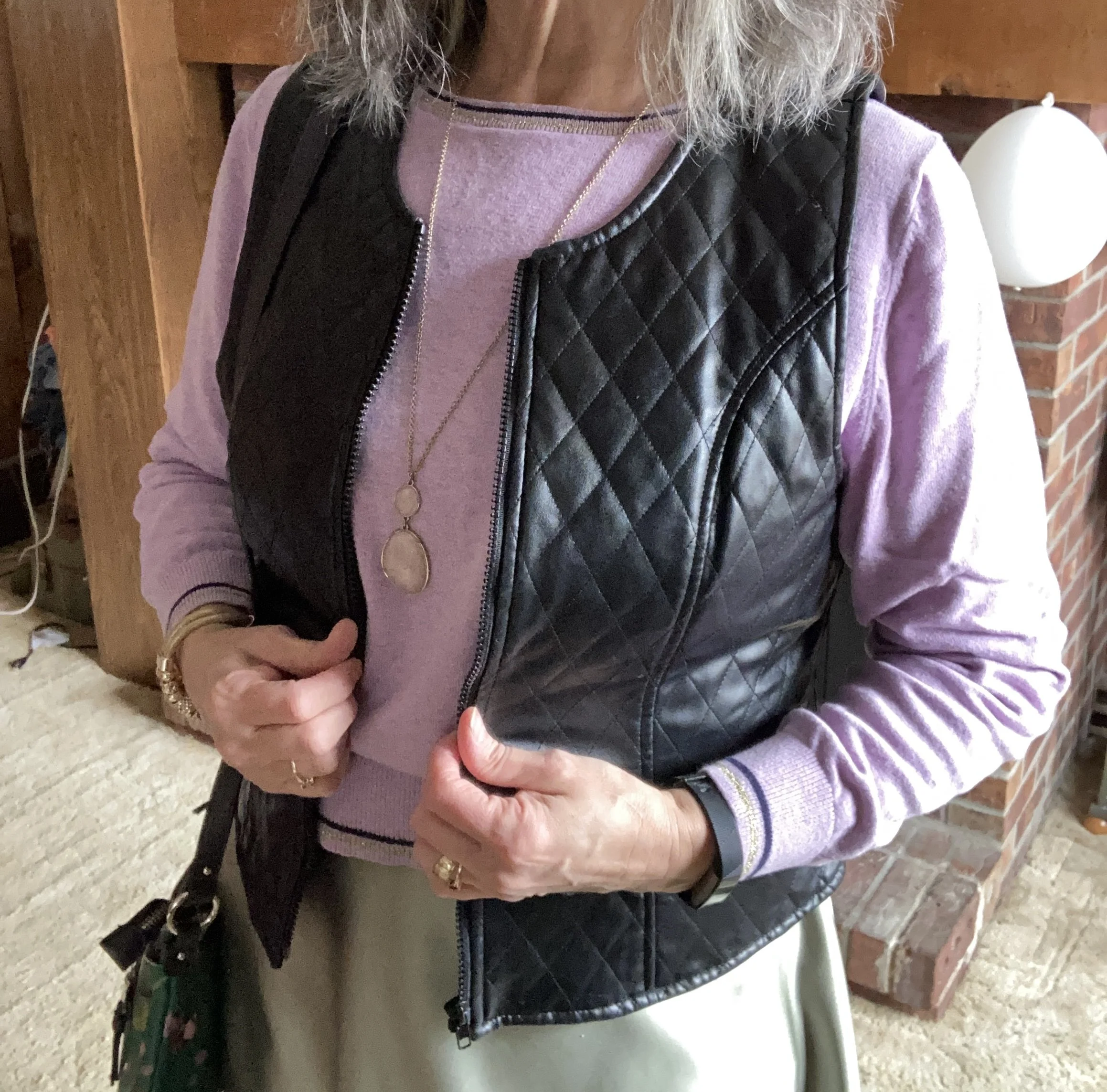
My pullover sweater is an unknown brand as the label was cut off. It is a boxy cut, so I decided to try a trick I have seen a number of bloggers and Instagram gals use. I took a belt and put it over the sweater at about my natural waist. I then proceeded to pull the top half of the sweater up and fold the resulting extra over the belt. Voila, a peplum top, of sorts!

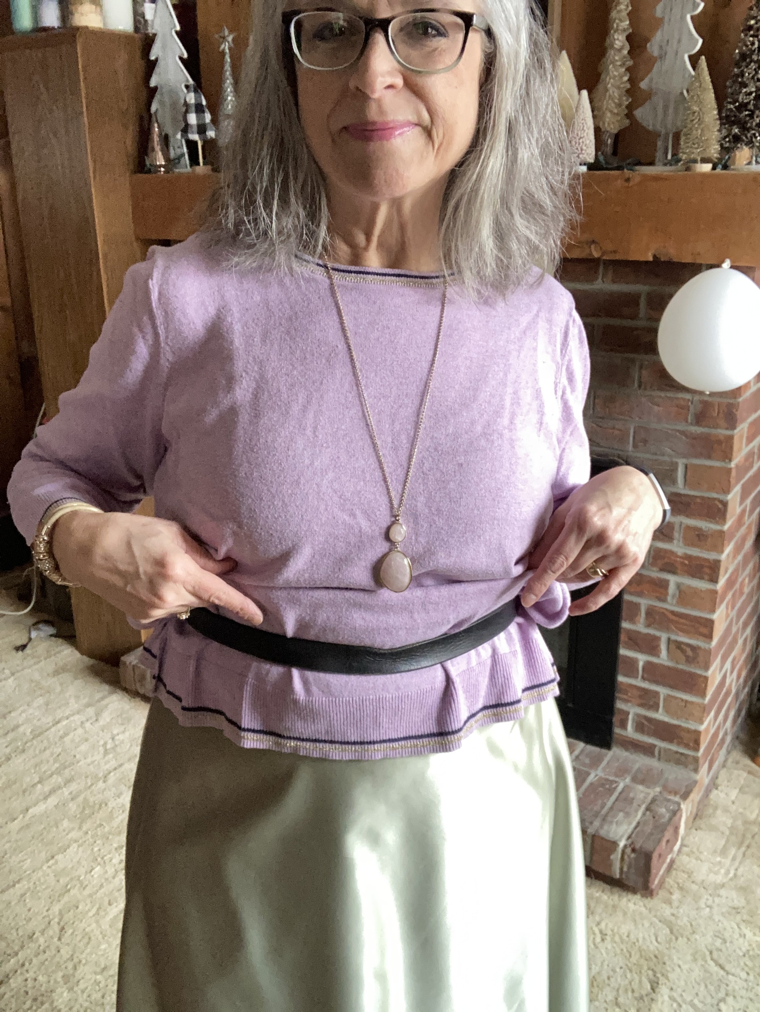
Style Tip: Don’t be afraid to try different things to make your clothes work for you. If you don’t already follow Jodie from Jodie’s Touch of Style, she is the queen of giving you tips and tricks to make your clothes really work for you. Be sure to check out her blog. Alterations are great if you know how to sew, but using a hair clip, or a belt like the above example, is a way to make a top, skirt or dress fit a little better without seamstress style alterations.

My thrifted maxi skirt looks like it was a bride’s maid dress in a previous life, but someone cut the top off and gave it a proper waistband with elastic in the back to make it a wonderful full length skirt. Silky skirts are in for spring, so this was a great find when I purchased it a few months ago.

Style Tip: Do you still have a bride’s maid dress hanging around that you just don’t want to get rid of? Why not think about making it into something new, like a skirt, a top, or even a vest. Be creative!

I decided to add this thrifted faux leather quilted vest to add an edgy element to an otherwise soft and feminine look. It is a brand called Selene Sport. In addition, with spring not officially here for a few more weeks and the warmer temps even slower to follow, a vest adds a warm layer around you core.

Style Tip: Use a vest to add warm and interest to any outfit. It is also a great piece to add when an outfit needs a bit of cinching in at the waist, especially the more fitted waist coat types of vests.

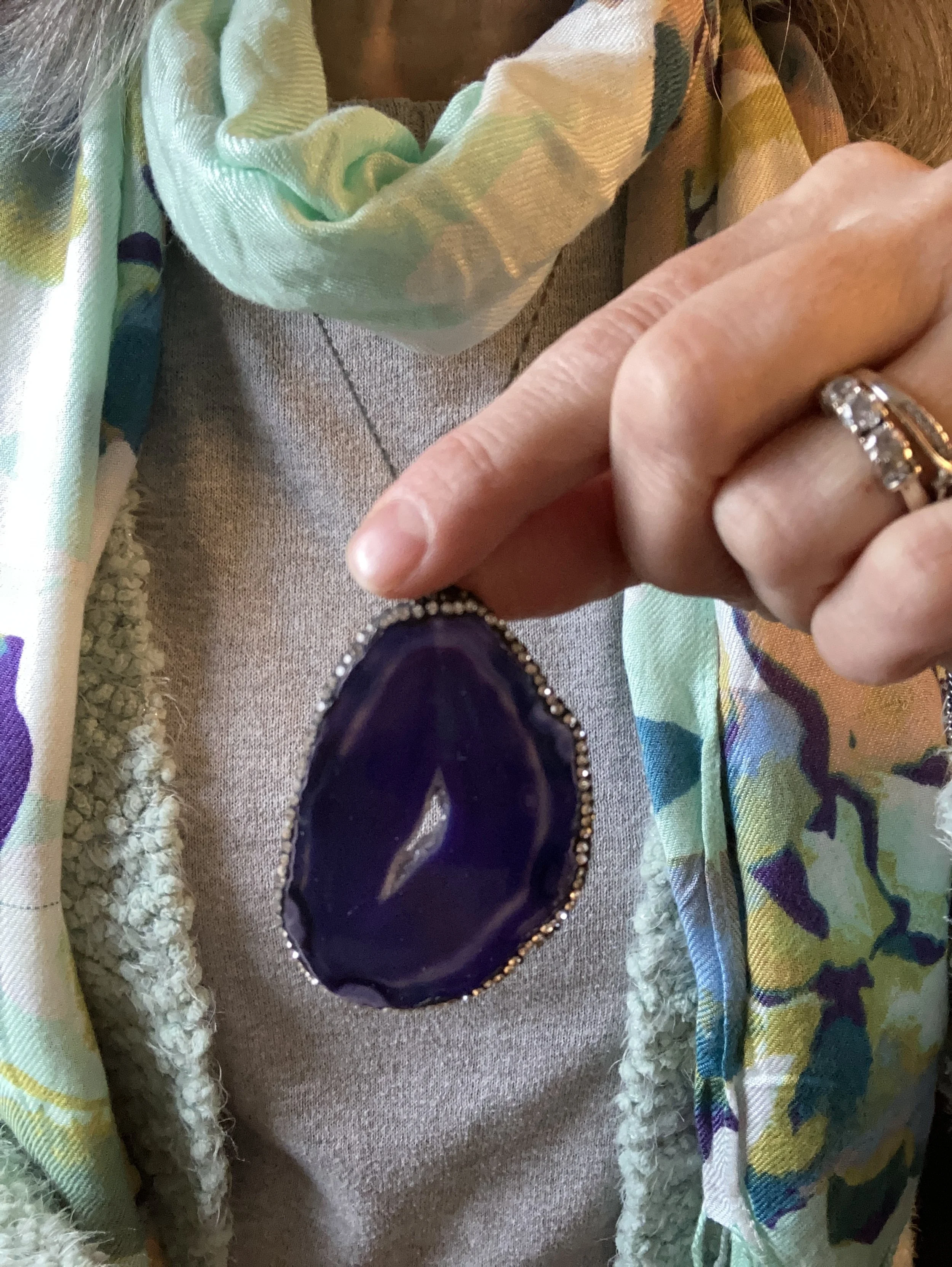
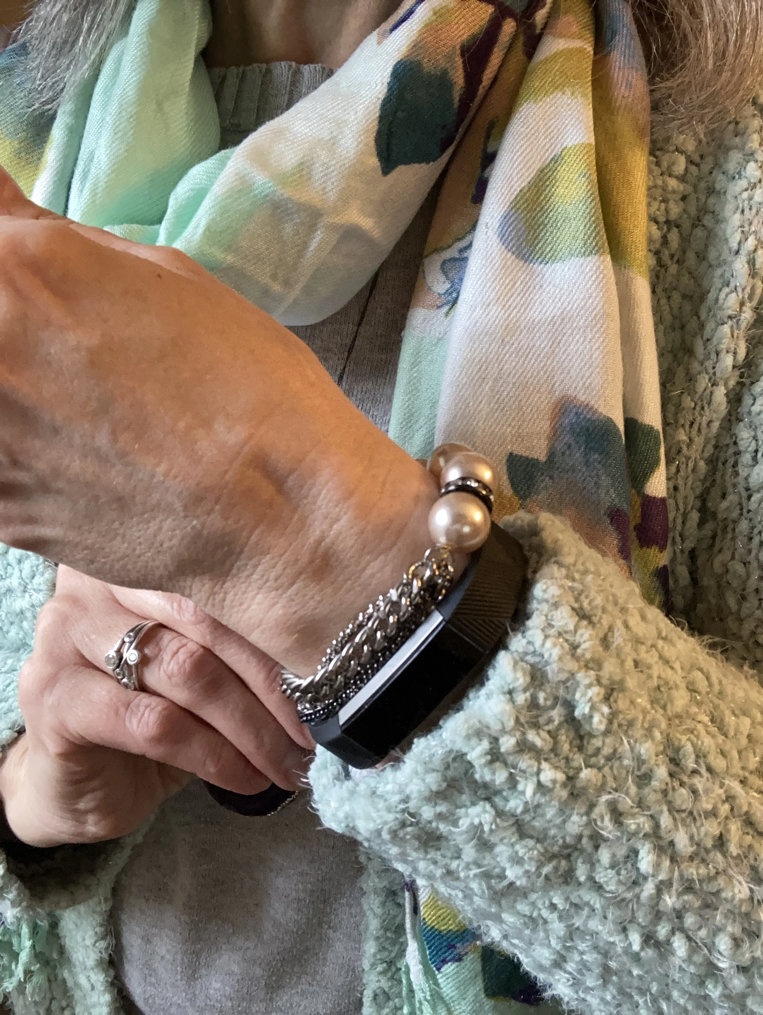
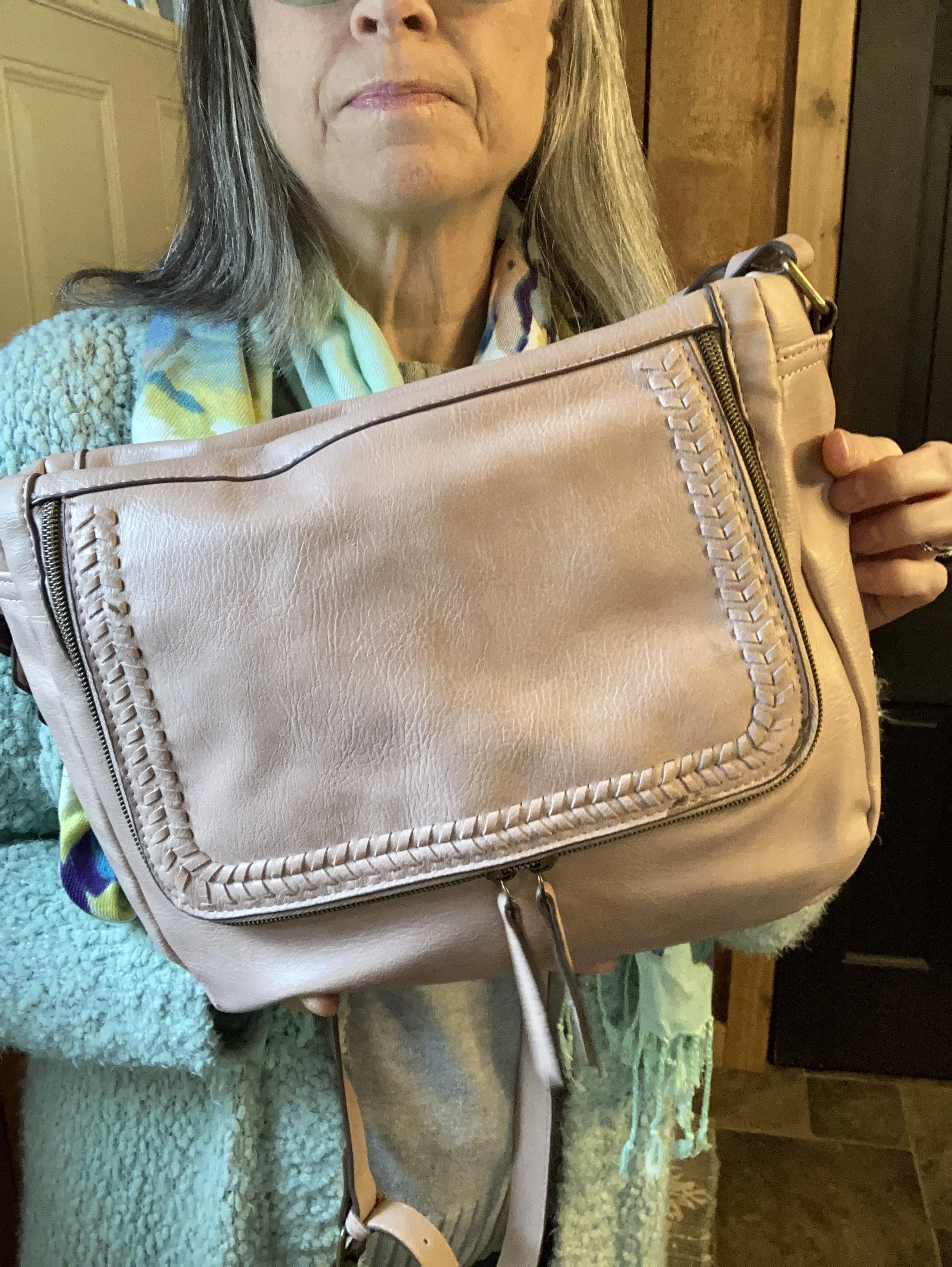
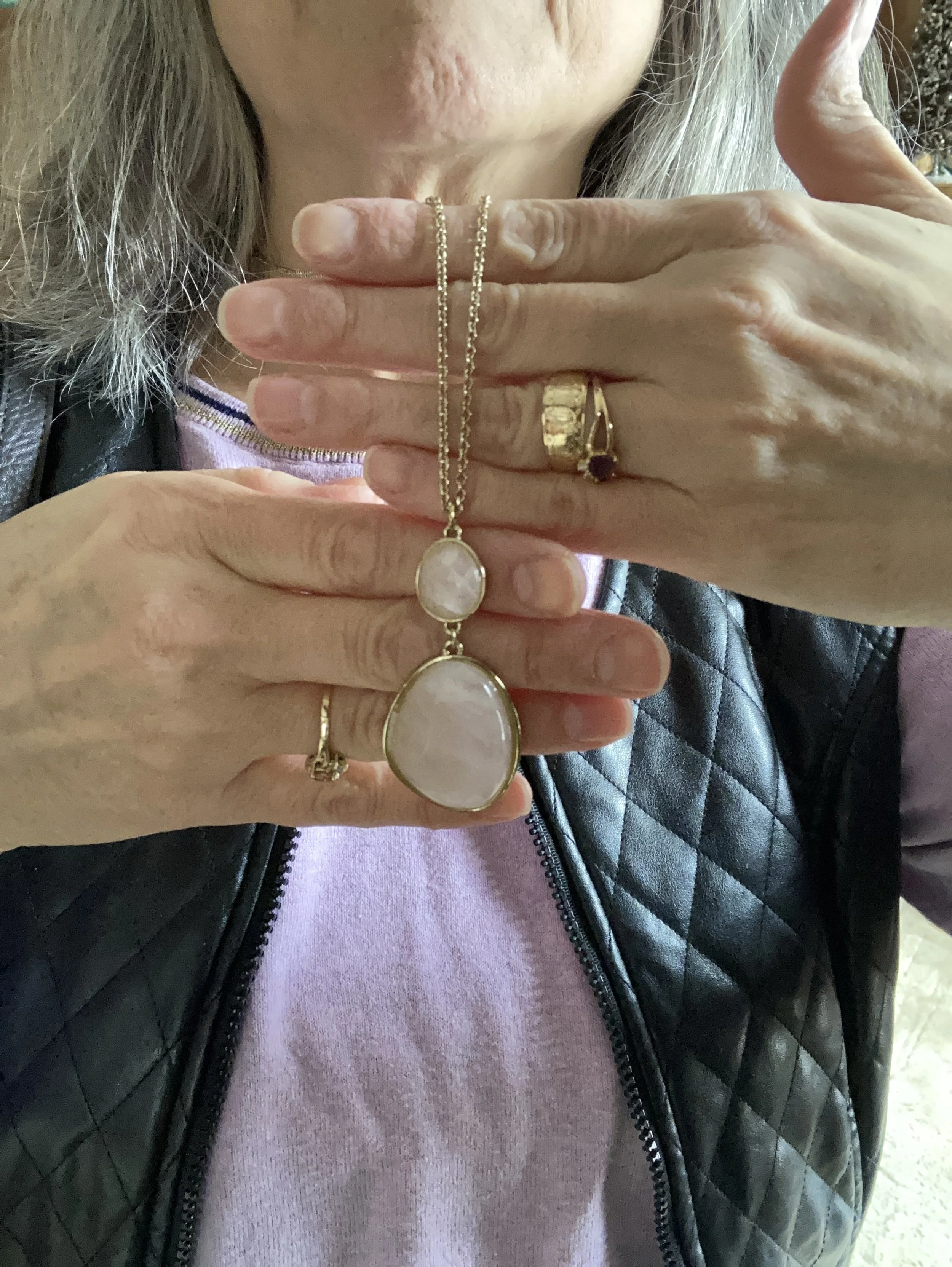
I kept my accessories relatively simple. The longer, pendant in a soft shade of pink, and the gold beaded bracelet keep the outfit feminine and refined. The tall, black, SO lace up boots add a bit more edgy vibe with the vest, and the floral, Dana Buchman bag is a direct nod to spring.

What do you think of this outfit? Would you wear something like this? Do you have any clothes that you have altered to make different pieces? I love to hear you thoughts and ideas so be sure to leave me some love in the comments.

I’ve included a few shopping links. These are affiliate links brought to you at no extra cost. All opinions are my own.

Have a great week!

Outfit Inspiration: Pinterest - Winter Pastels

I turned to Pinterest again to search my boards for outfit inspiration. I finally chose this outfit. I typically use these pins as spring boards to build an outfit. While the outfit from Pinterest is lovely and I could totally see myself wearing something like it, I wanted to do something a little bit different. Unfortunately, I am not real thrilled with how this turned out. I decided to post it anyway, because we are ever changing human beings and we are not always spot on, no matter what social media influencers make you think.

I have always wanted to keep this blog real. I am a real person with health issues, mental struggles and emotional ups and downs. This affects my content. It affects how often I post and how put together my outfits look. This past weekend when I took these pictures I was really struggling with fatigue. Being still undiagnosed with what caused my health crisis back in 2021 my body seems to struggle with being at “full health” most of the time. It’s okay. This is life and I am thankful I can still do things and still bring you content even if it is not always perfect.

That being said, I am currently on a journey to do what I can to be healthier. At the suggestion of my digestive health doctor, due to a hiatal hernia, I am trying to lose a few pounds and eat healthier. I joined Weight Watchers and it is helping me to make better choices, as well as lose weight through tracking and portion control. I left in the picture of my pants, even though they look silly, but you can see they are a bit baggy and slouchy due to some of the weight loss.

I decided to use my pastel green, open front, Christopher and Banks sweater instead of a similar colored pullover that I could have used. I love this light colored, textured piece.

Style Tip: If you are getting tired of the darker colors we often reach for in the colder months try changing things up a bit by throwing in a few pastels or super bright colors to give your day a boost.

My thrifted Oxford gray, Sonoma pullover sweater is a light weight piece that works much like a long sleeve tee, but has the fun detailing of the ribbed bottom, boat neck, and wrists.

Style Tip: Look for light weight sweaters at thrift stores or end of season sales to add to your basics pile of layering pieces.

These Stitch Star jeans from Meijer are definitely showing their wear and will probably need to be passed along one day soon.

I wanted a similar scarf to the original pin with a touch of another pastel color. Theirs was more of a purply pink, so I pulled out a scarf that had the light green, but also some splashes of purple and pale pink,

I chose pale pink for my other accessories, except my necklace which is dark purple agate. My cross body bag and my metallic Circus by Sam Edelman combat boots are both thrifted.

I thought I would add pictures to show you a few other ways to wear the scarf with this outfit.

What do you think of this outfit? I think the overall concept is a good one: cardigan, light weight sweater, pants/jeans, scarf and accessories. However, if I did it again I think I would swap out the the faded jeans for a dark black pair. I am also still not sold on the metallic combat boots. I am not sure why. I think they are adorable when I look at them, but when I put them on I feel unsettled. Ha, ha. Yes I do have an emotional relationship with my clothes.

Let me know what your thoughts are. I always love your feedback.

No shopping links this week. Be sure to stop by the blog on Thursday for another Mulling it Over Post where I continue to dive deep into Romans 8.

Color Play: Building an Outfit Around a Jacket

It has been a while since I have done a Color Play post. You know I love color and finding creative ways to put colors together that might not be typical color combo choices. Today’s look revolves around a heavy weight plaid shacket that I got from Maurice’s last year when they had end of the season clearance. They always have such good prices on their clearance items, but you have to act fast because sizes and styles disappear quickly.

We are having such weird weather here in the midwest. It is February and it is acting like late March or April. Today as I write this it is supposed to be almost 70 degrees (F). I don’t like the drastic changes and they don’t do anything for headache and allergy sufferers, let alone for all the viruses and bacteria that keep making our grandkids get sick.

This plaid shacket has the shirt vibe, but it is heavy enough to wear as a coat on the chillier spring days. When I decided to use this piece for my color inspiration, I decided to lean towards pastels rather than the more primary blue, orange and yellow. You can see the colors better in this close up shot. Do you see the very faint minty green line?

With these colors in mind, I plaid with two variations, but the pastels won out. It seemed appropriate as we move towards spring.

All three pastel pieces are thrift store finds. The coral pants are Croft & Barrow. Theses are a light weight cotton blend, so they will be great for the warmer months.

The men’s button down shirt is Express brand. It has tiny white flowers on it, and I love how it goes withe the pale yellow and the coral .

The yellow pullover is a brand called Karen Scott. I her brand used to be sold at Macy’s and perhaps Walmart. Not sure if they still are. I don’t wear pale color too often near my face, but the minty green does the job of providing a border between my skin and the pale yellow.

Style Tip: I will never tire of saying, you can wear all colors. If a certain color doesn’t look good right next to your face, just add a scarf or some statement jewelry, or layer a collared shirt under or over it. That doesn’t mean certain colors won’t look better with your skin tone, but if you love a color wear it.

My navy blue bag was a thrifted Simply Vera by Vera Wang piece. Big tote bags are back in for spring, so dig around in your closet and find those larger bags.

My tan, ankle boots are Sonoma brand and were a pre-winter purchase online from Kohl’s.

I kept my jewelry simple with a blue bead, pendant necklace.

What do you think of this outfit? Do you like pastels? How do find color inspiration for your outfits?

Thanks for hanging out on the blog. I am including a few shopping links for you to look over. These links are brought to you at no additional cost. These are affiliate links. All opinions are my own.

Have a great week!