Pantone Spring/Summer 2026 - New York Palette: Tea Rose, Acacia, and Sycamore
If you are new to my blog, I typically do a series twice a year on the Pantone seasonal colors. The Pantone Color Institute is an entity that works with the world of fashion, art, and interior design, sharing their seasonal color choices twice a year: Spring/Summer and Autumn/Winter. The two major fashion venues of New York and London each have their own set of colors, though there is often some overlap. Last week I started with the New York Palette. Click on the NY link and you’ll see a Pinterest pin of the colors. My colors may not be an exact match to the palette colors, but I provide these combos to give you an approximation of colors that you might already have in your closet.
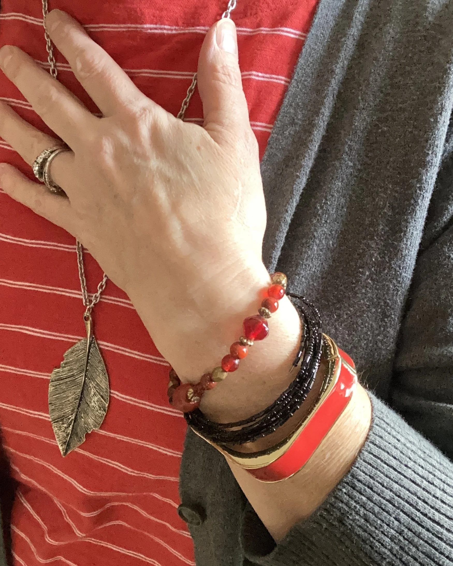
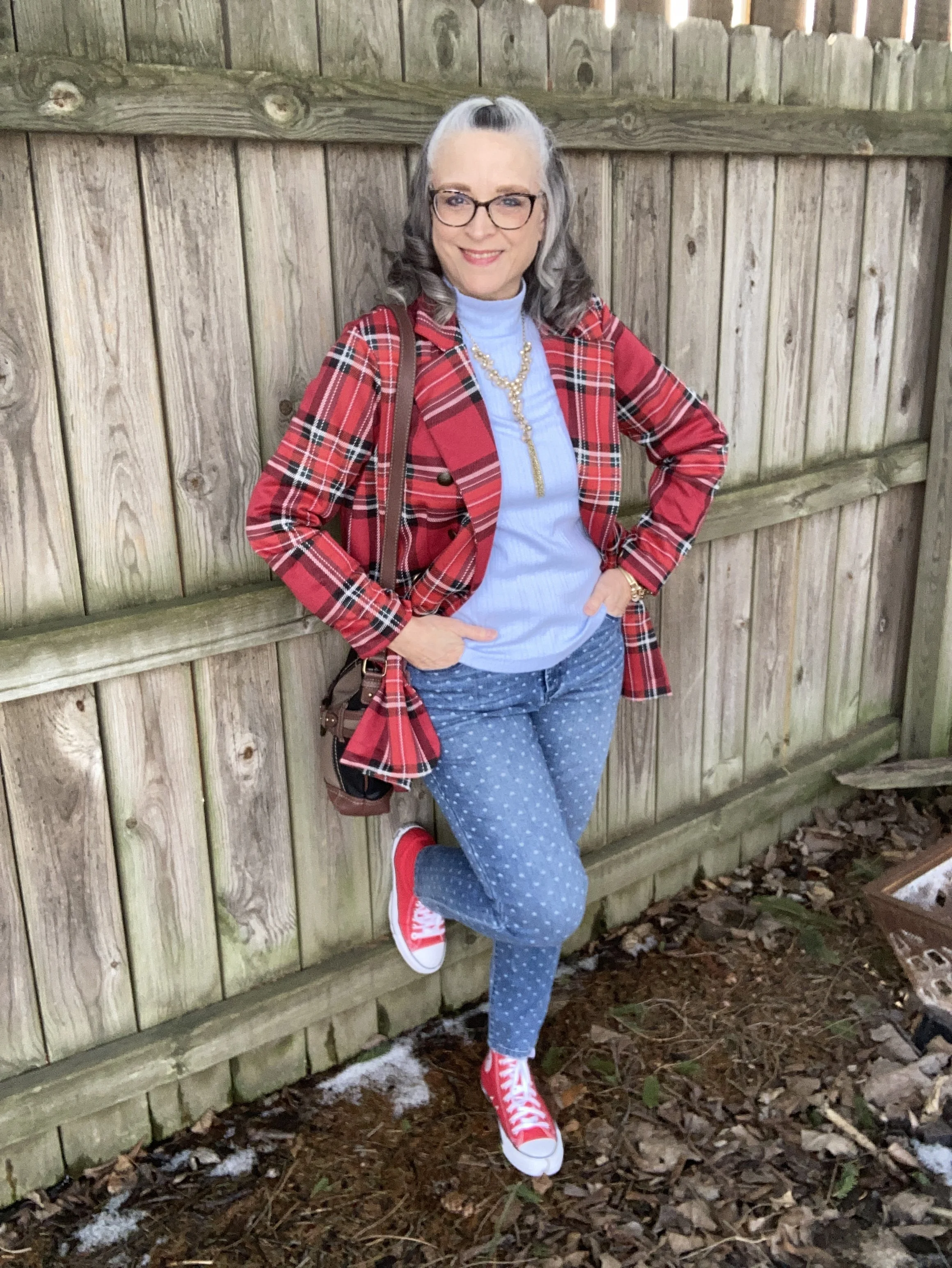
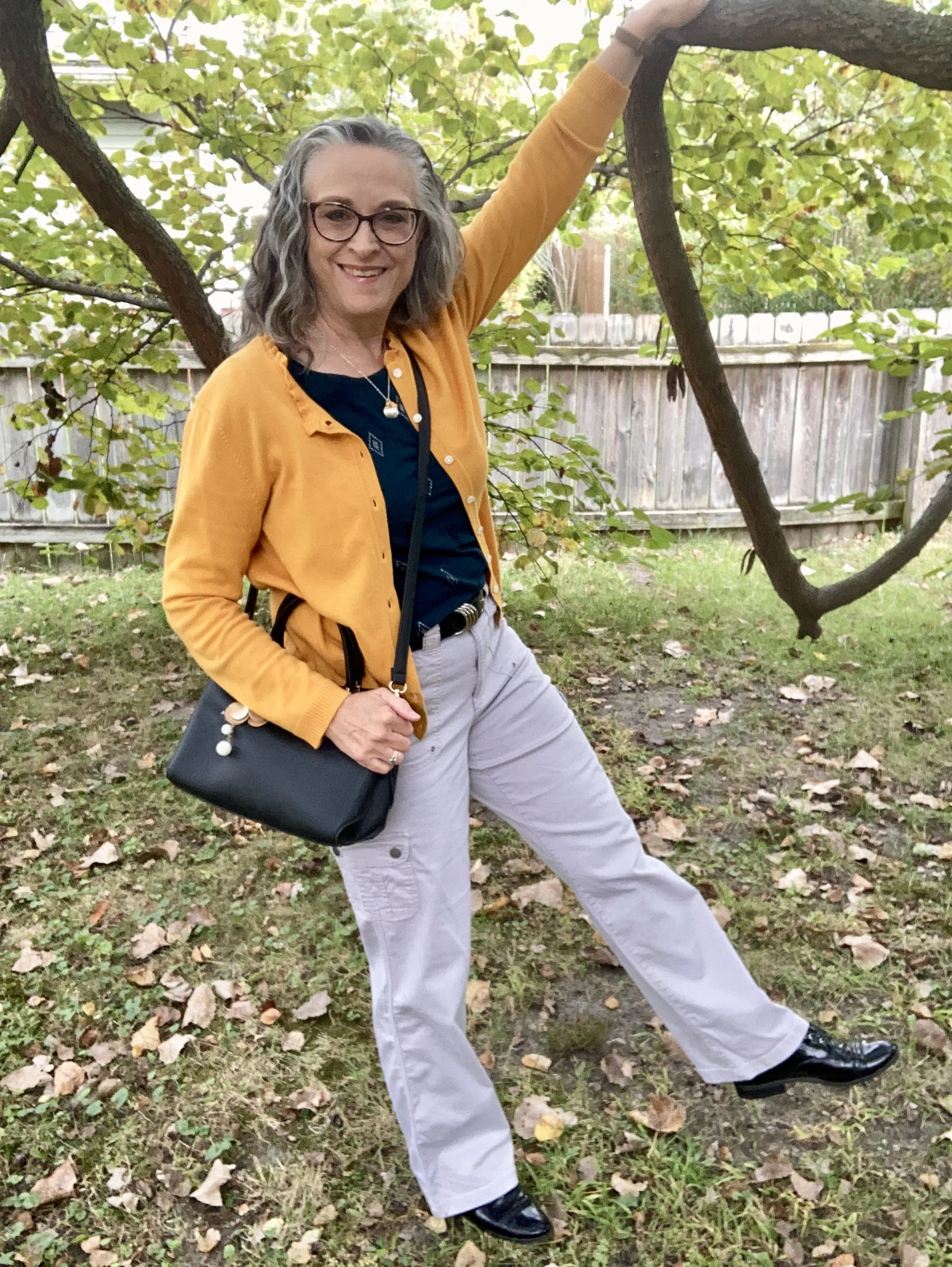
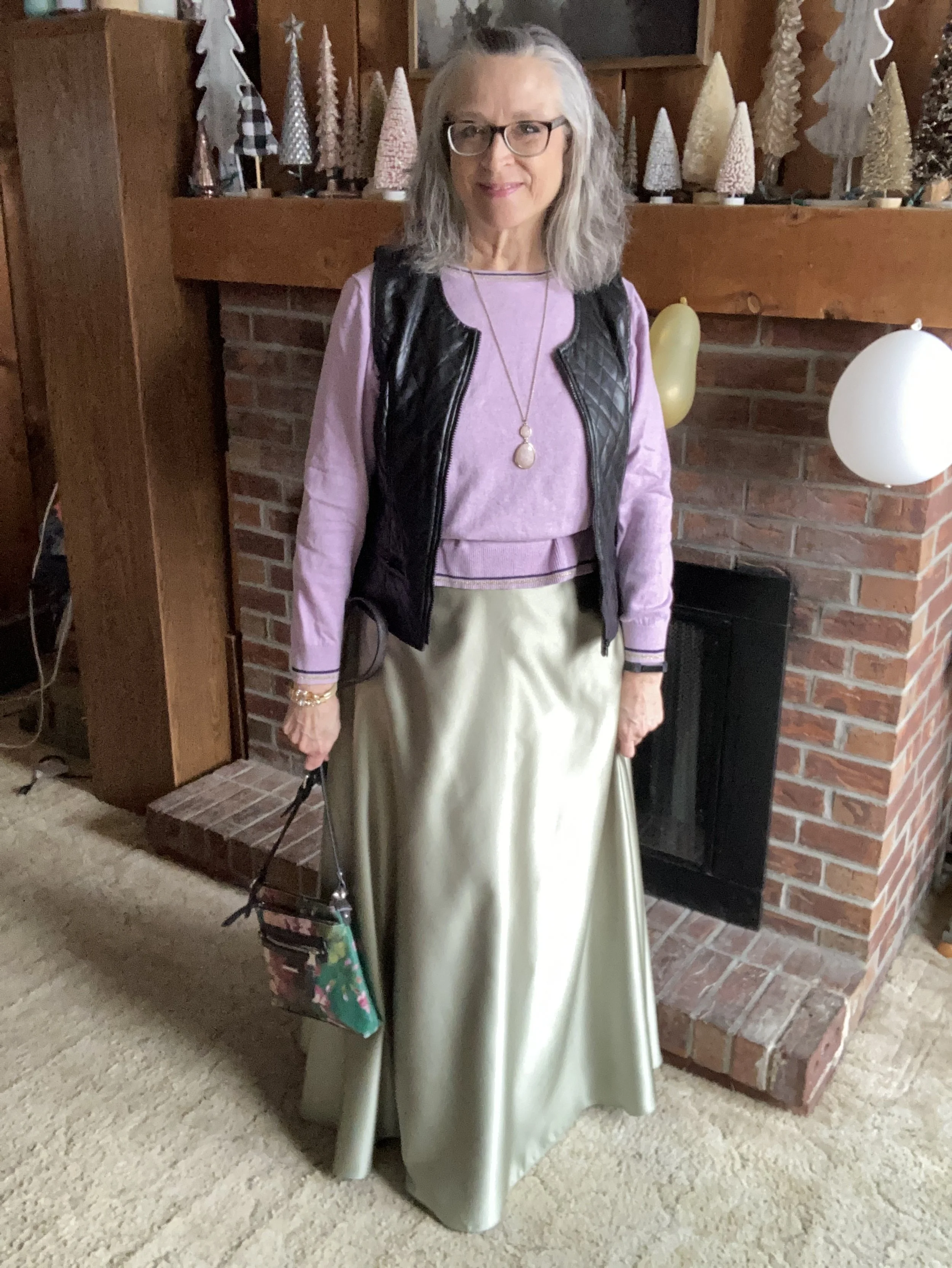
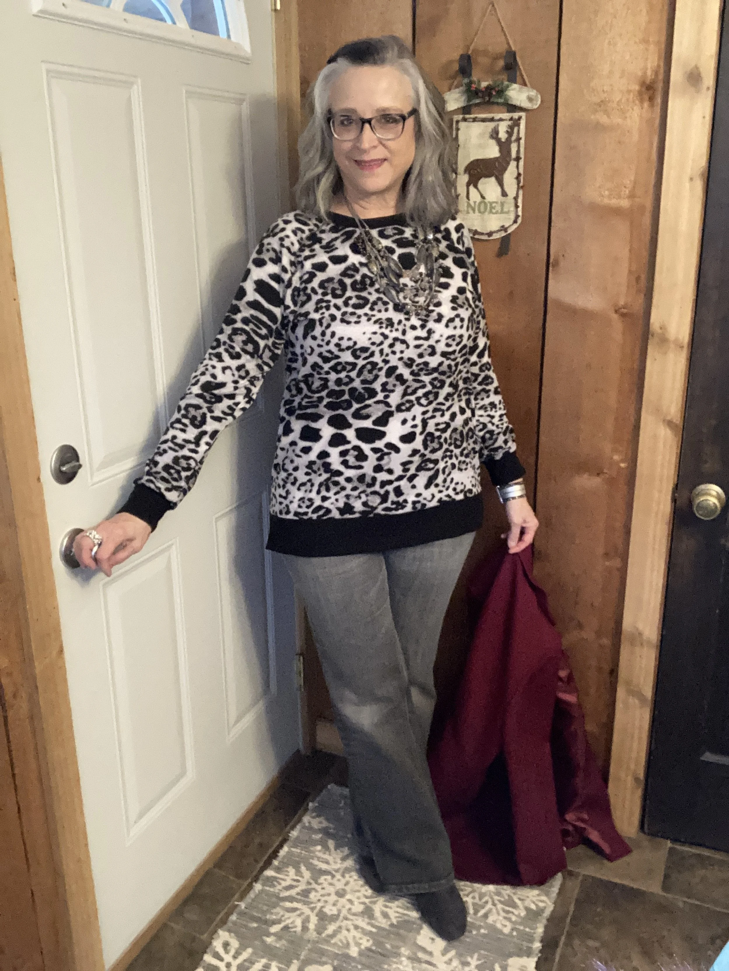
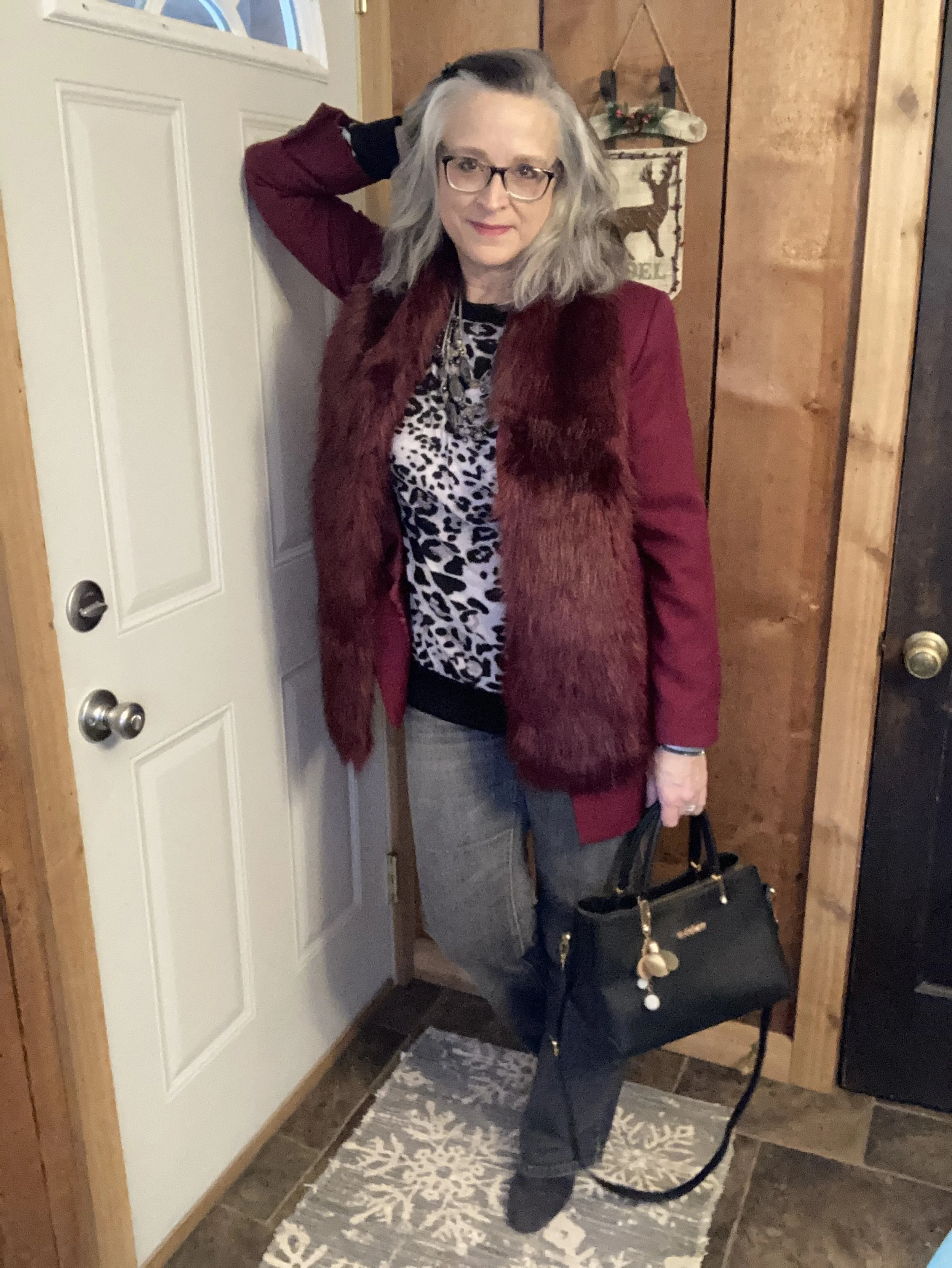
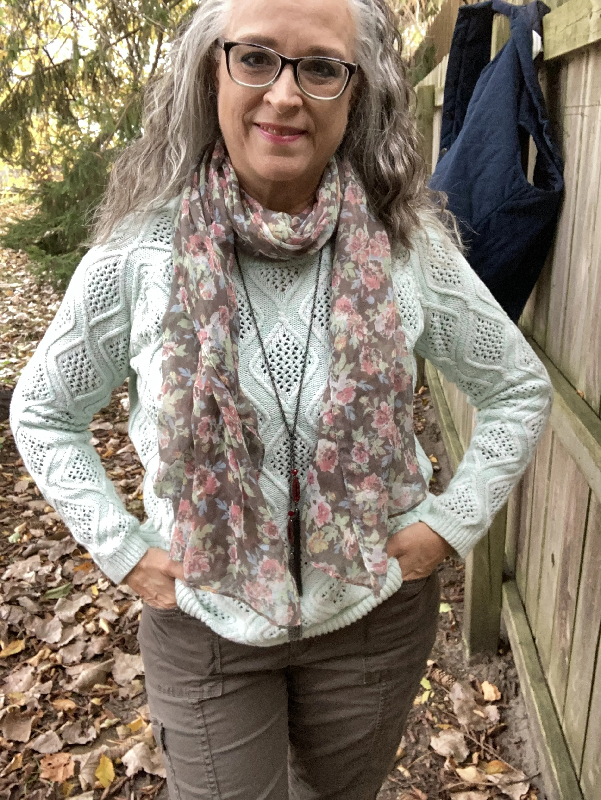
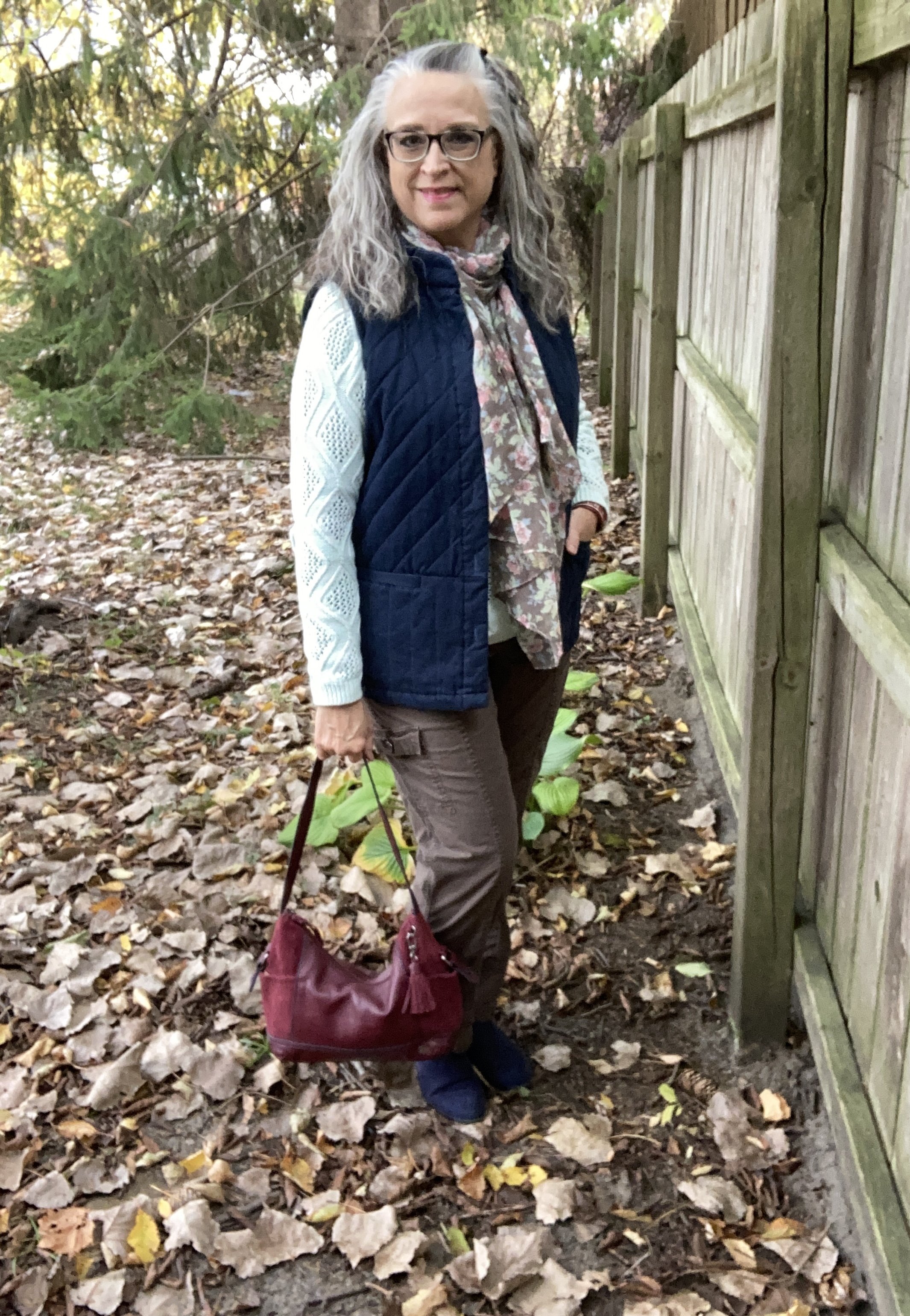
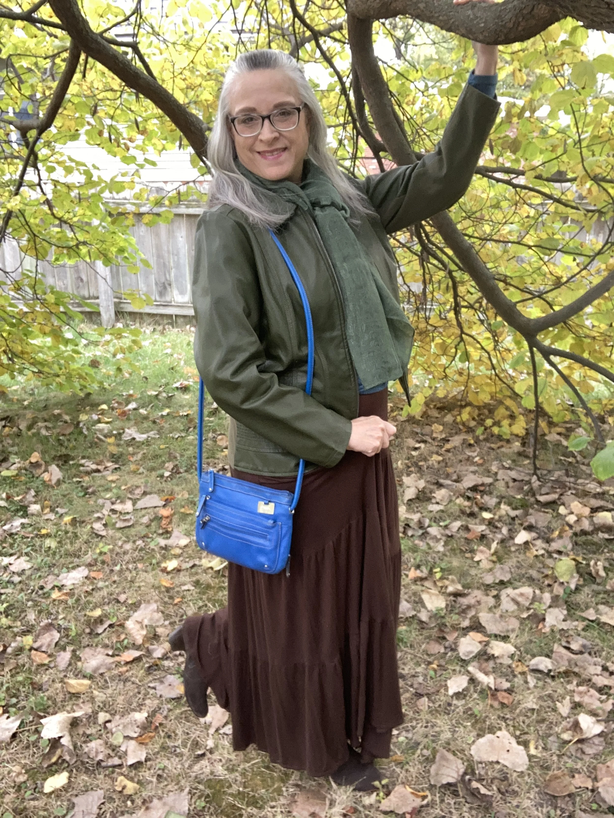
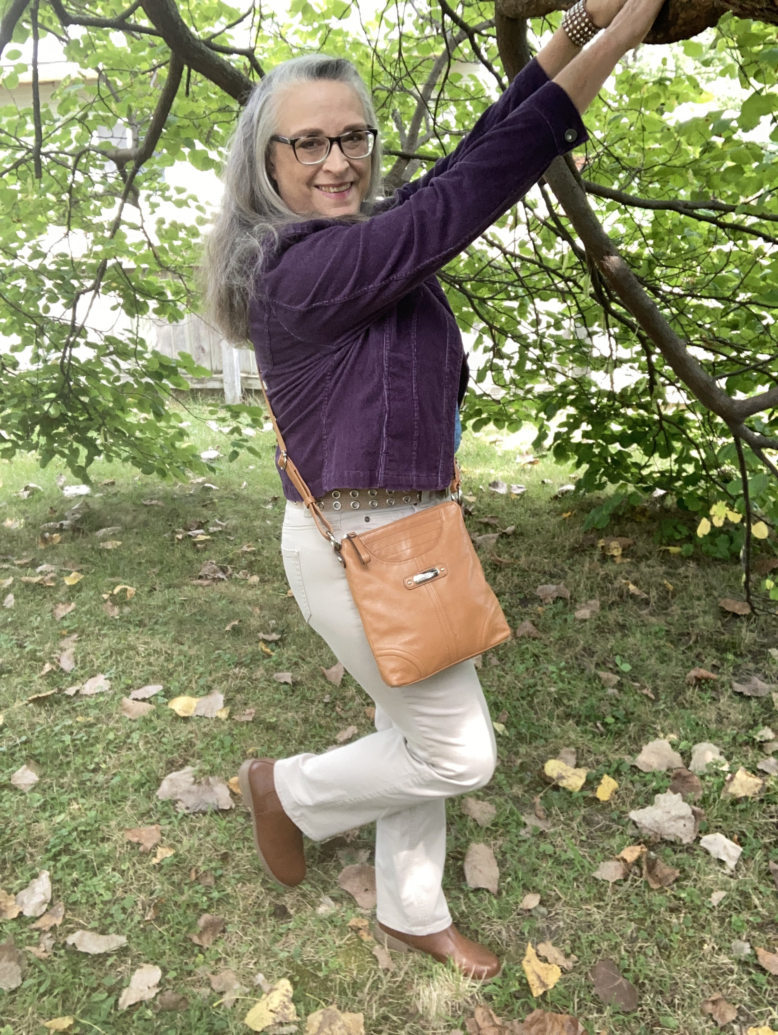
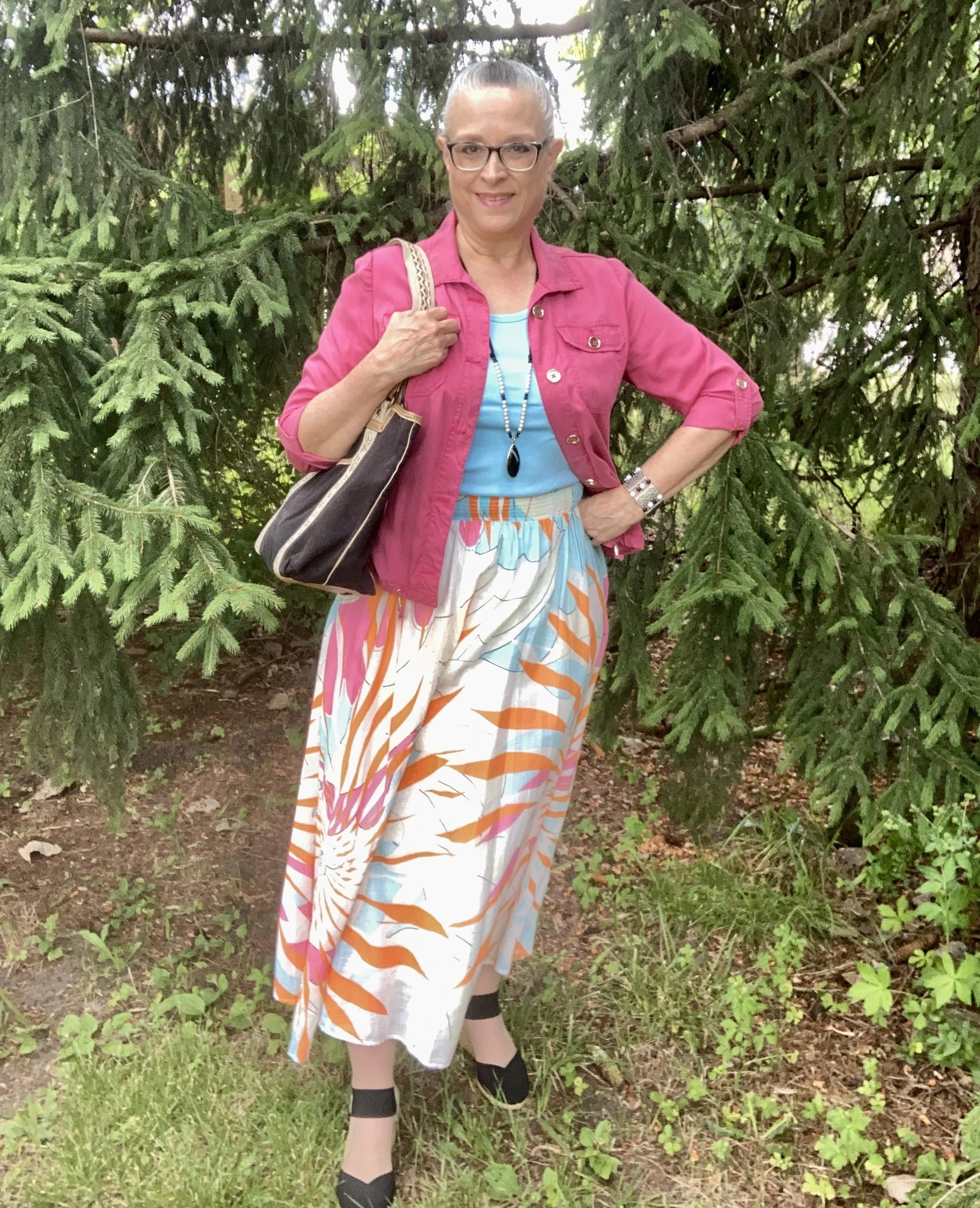
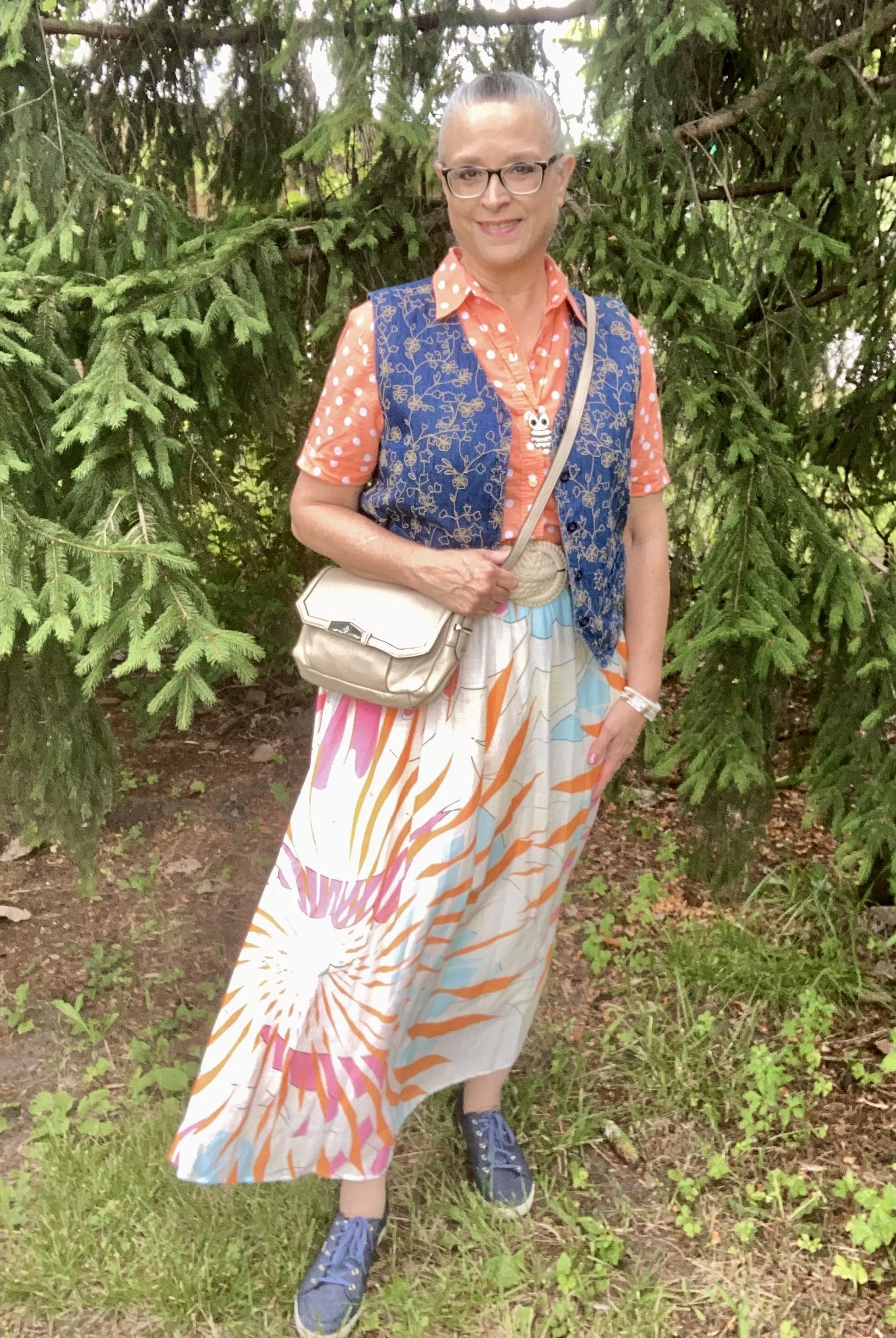
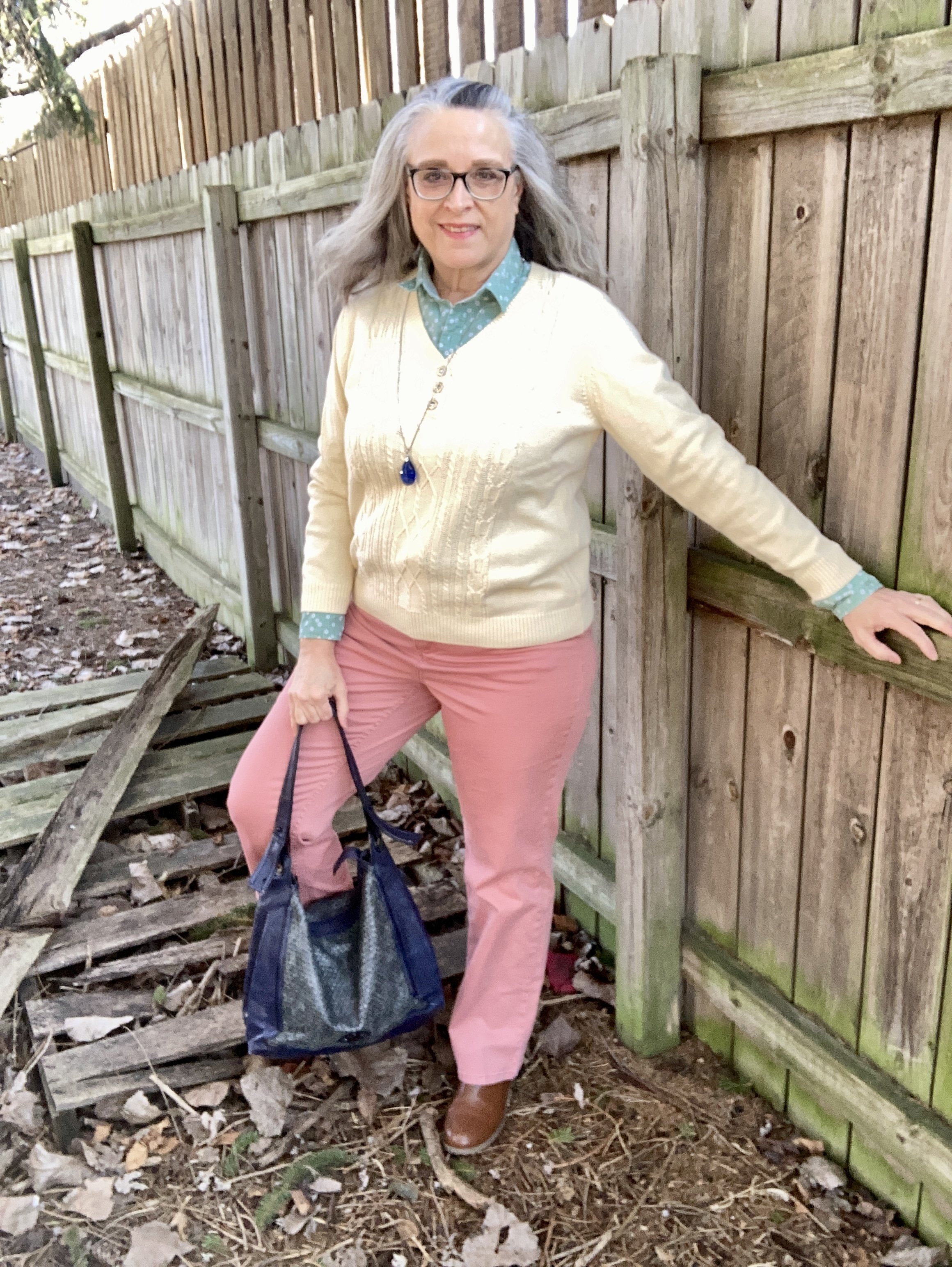
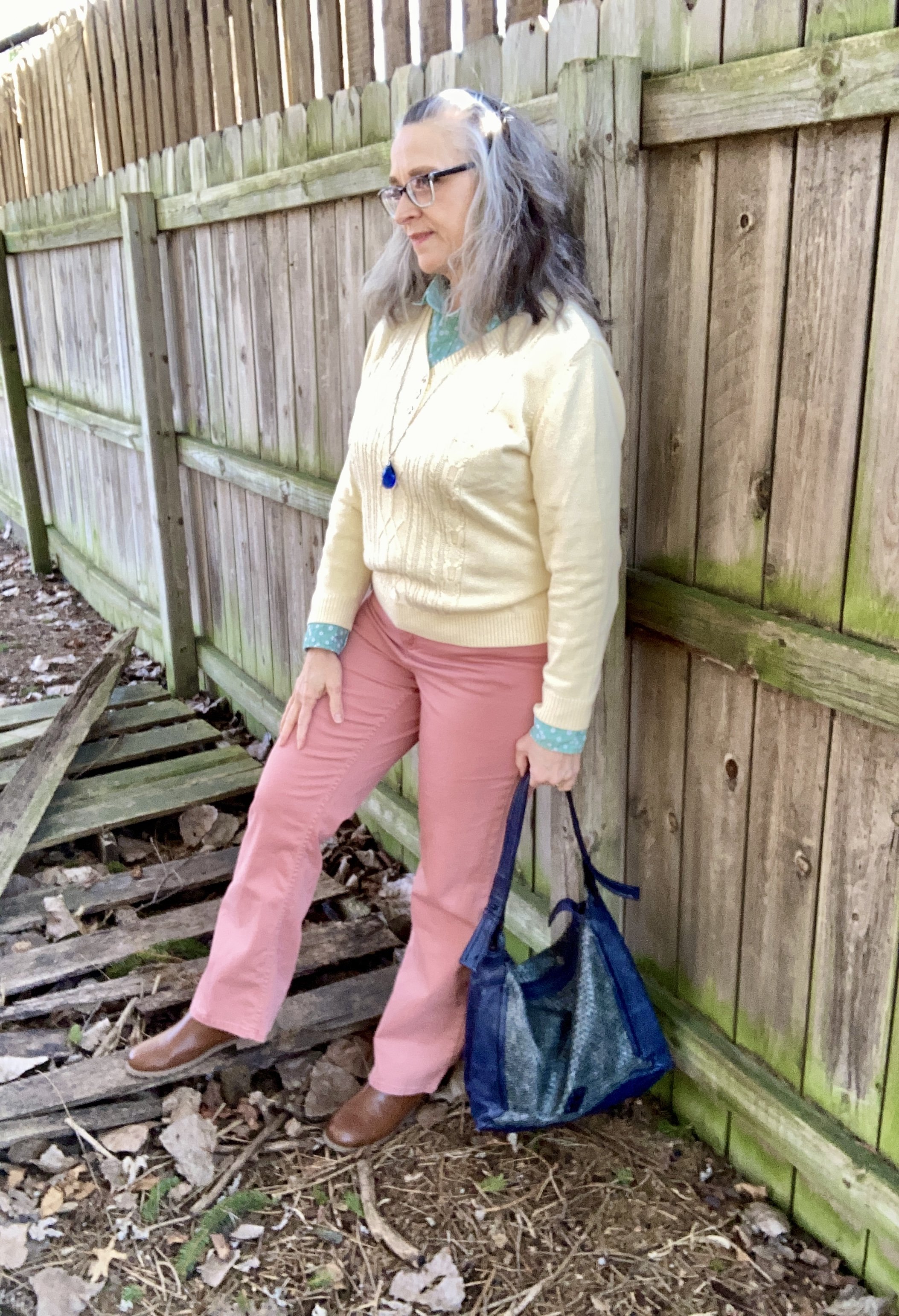
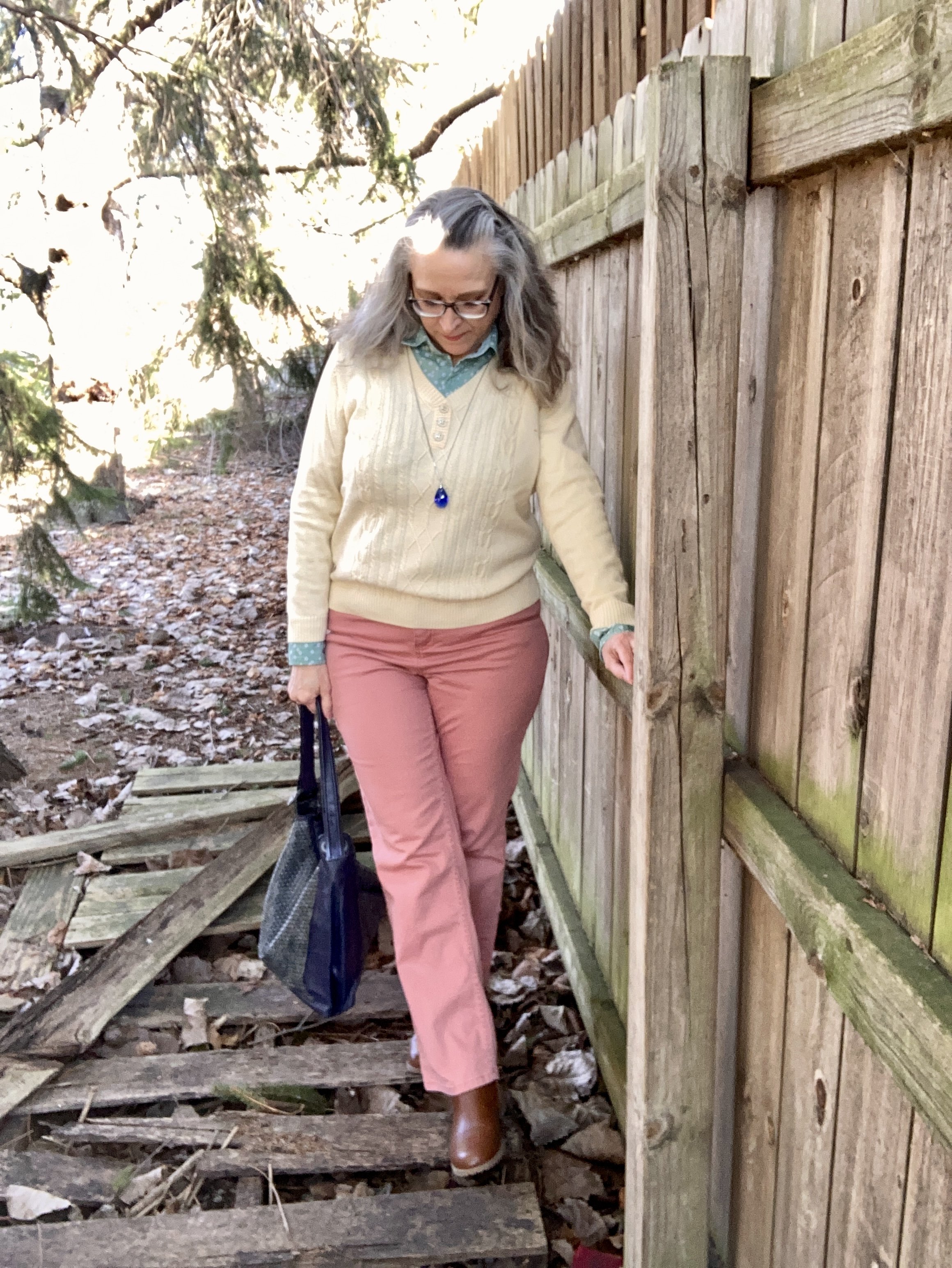
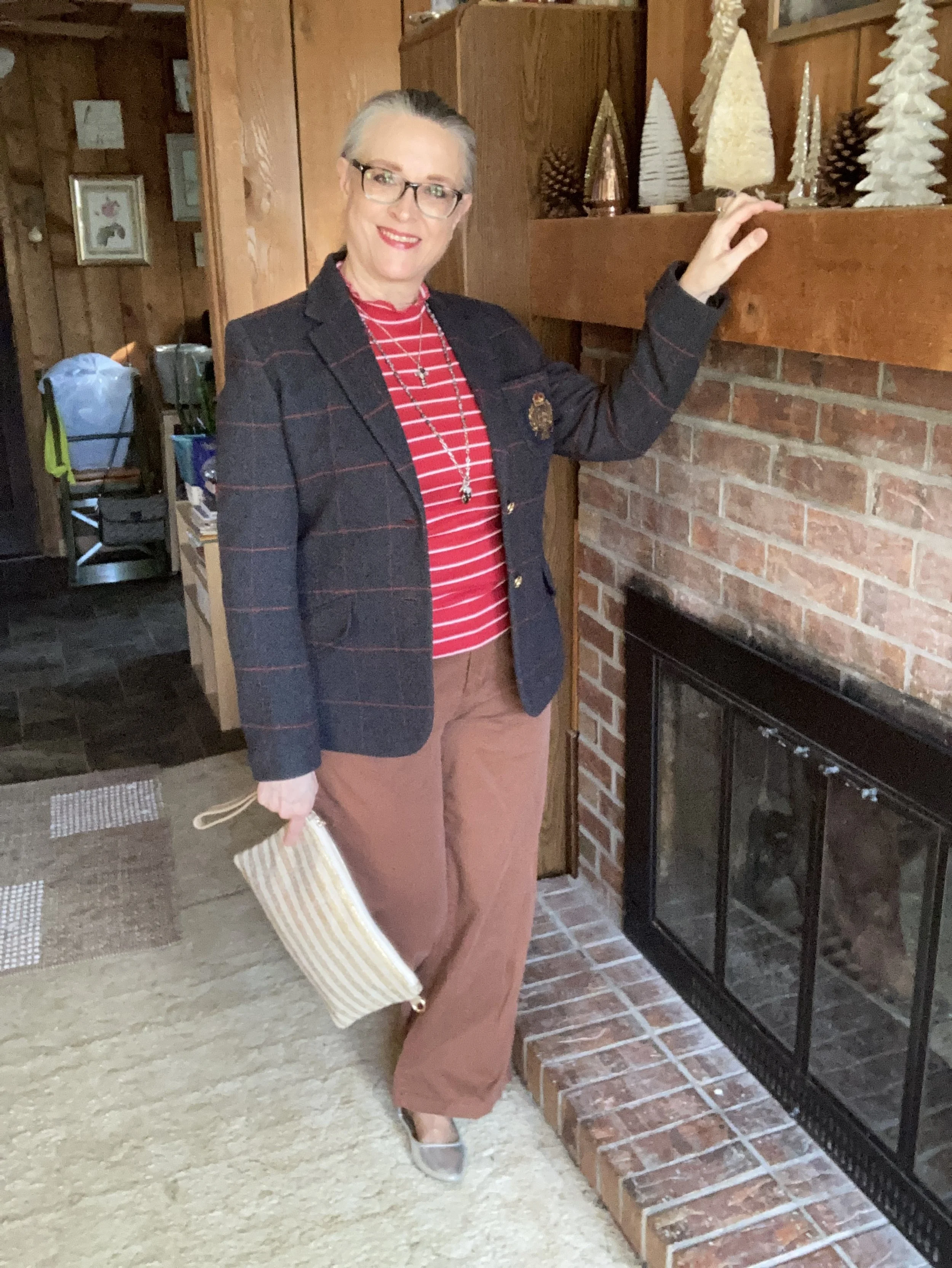
Today I am combining Tea Rose, Acacia, and Sycamore. It seems any more color palettes do not strictly lean towards what we once thought was traditionally spring or what we traditionally thought of as fall. Now we see dark tones on the spring palette and light pastels on the fall palette. The biggest challenge is getting my own brain to accept these colors for each of these seasons. I like my dark greens, rich burgundies and earthy golds in the fall, but I too am still open to learning and change, although it is harder than it used to be.
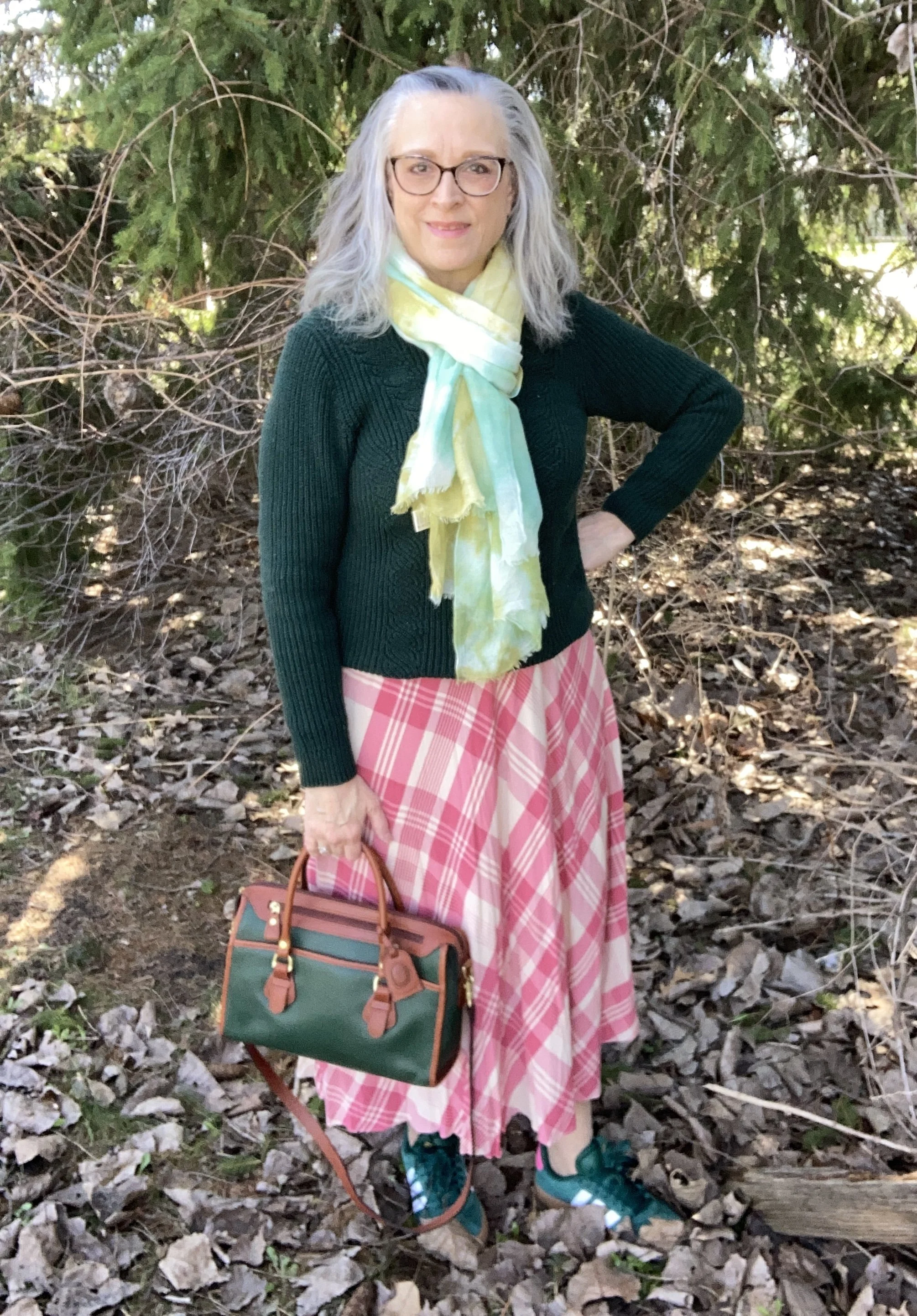
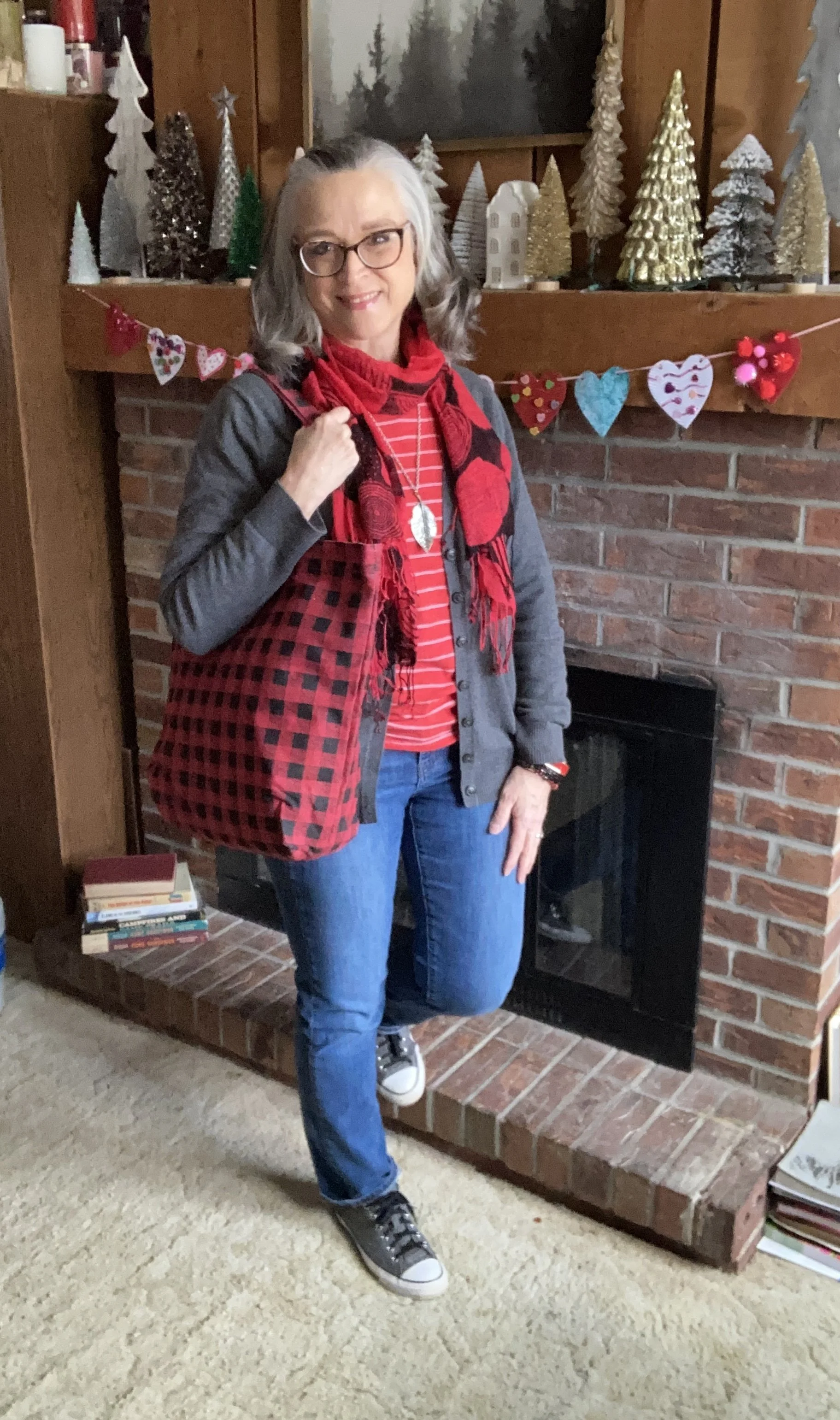
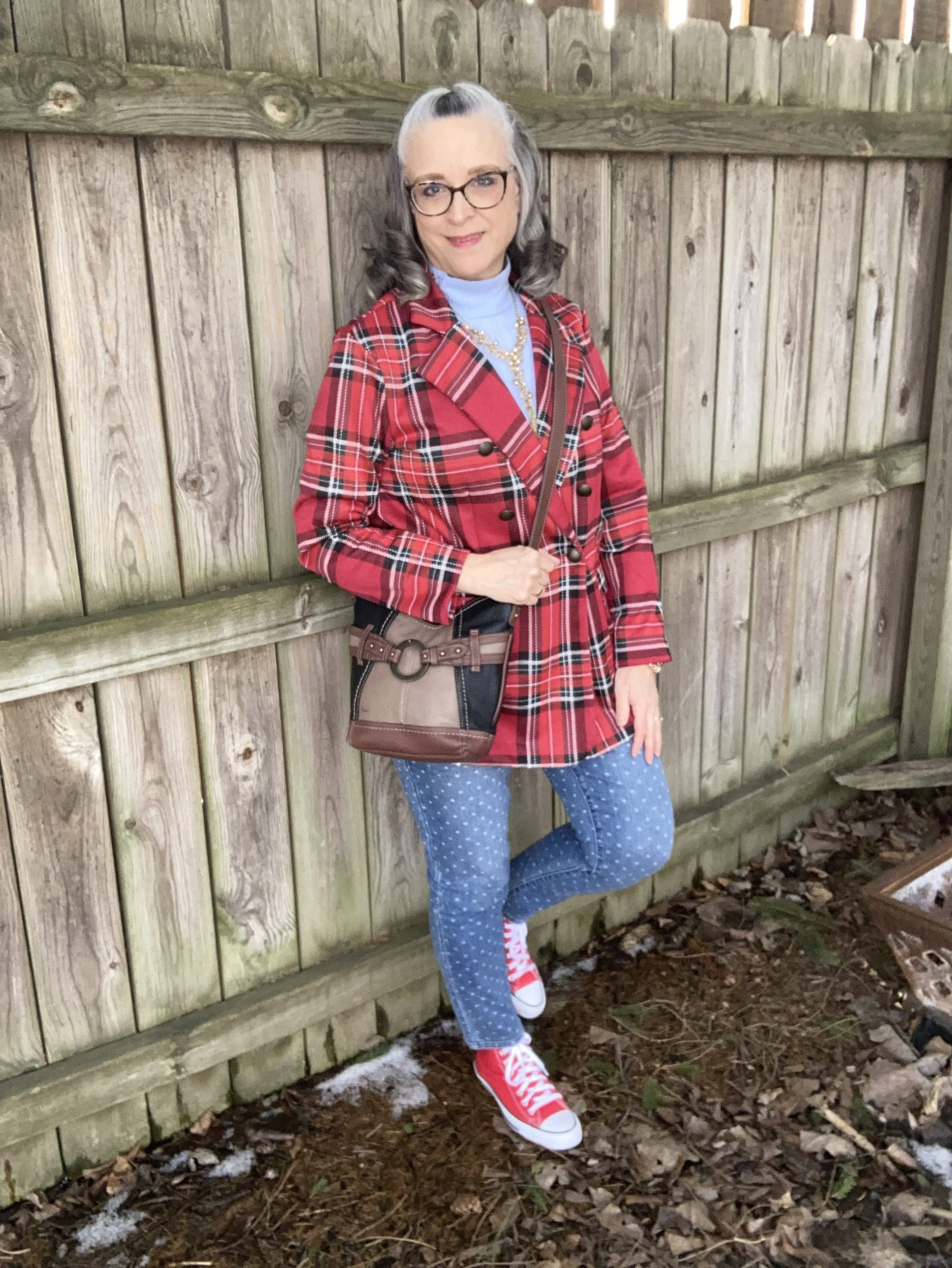
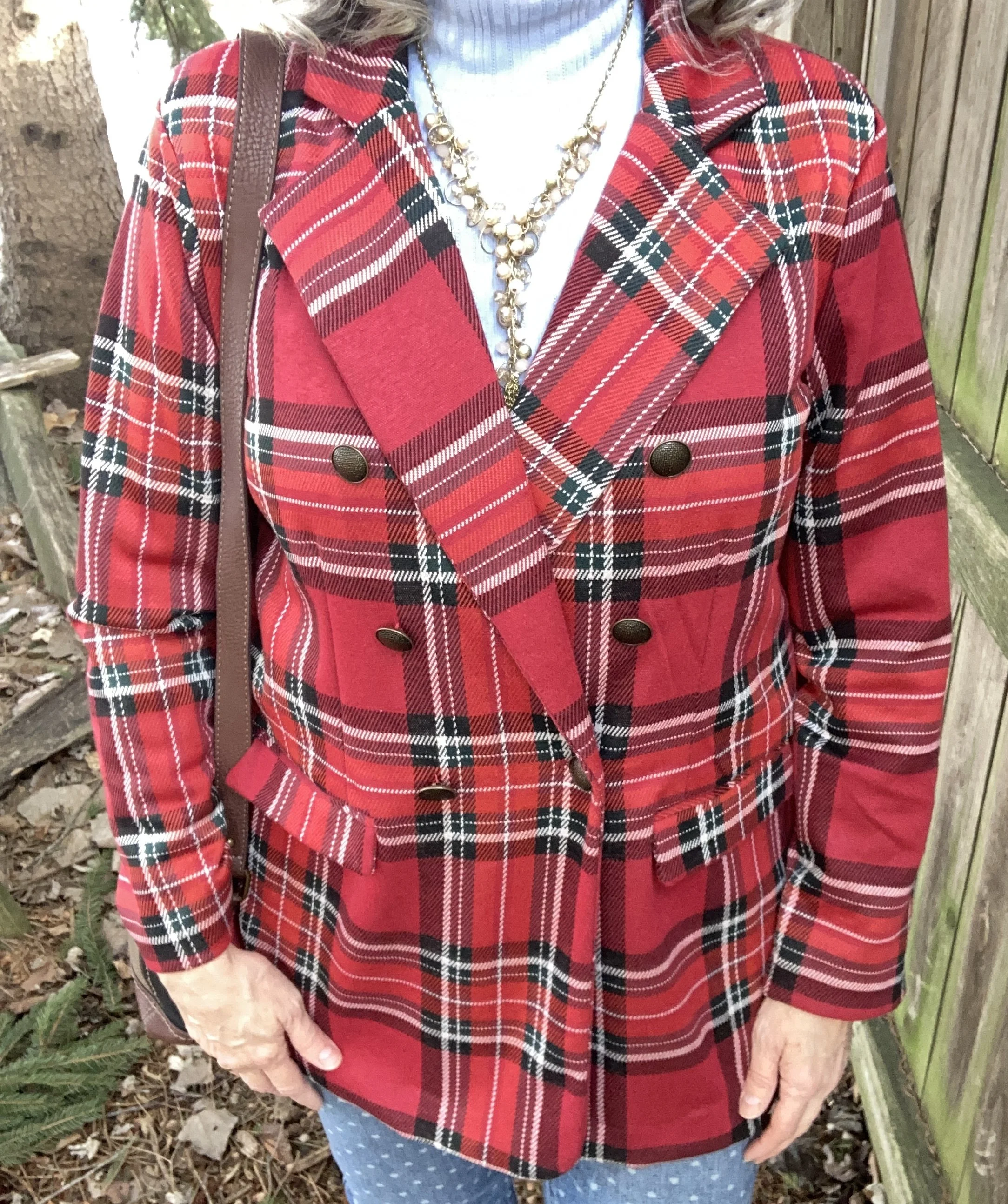
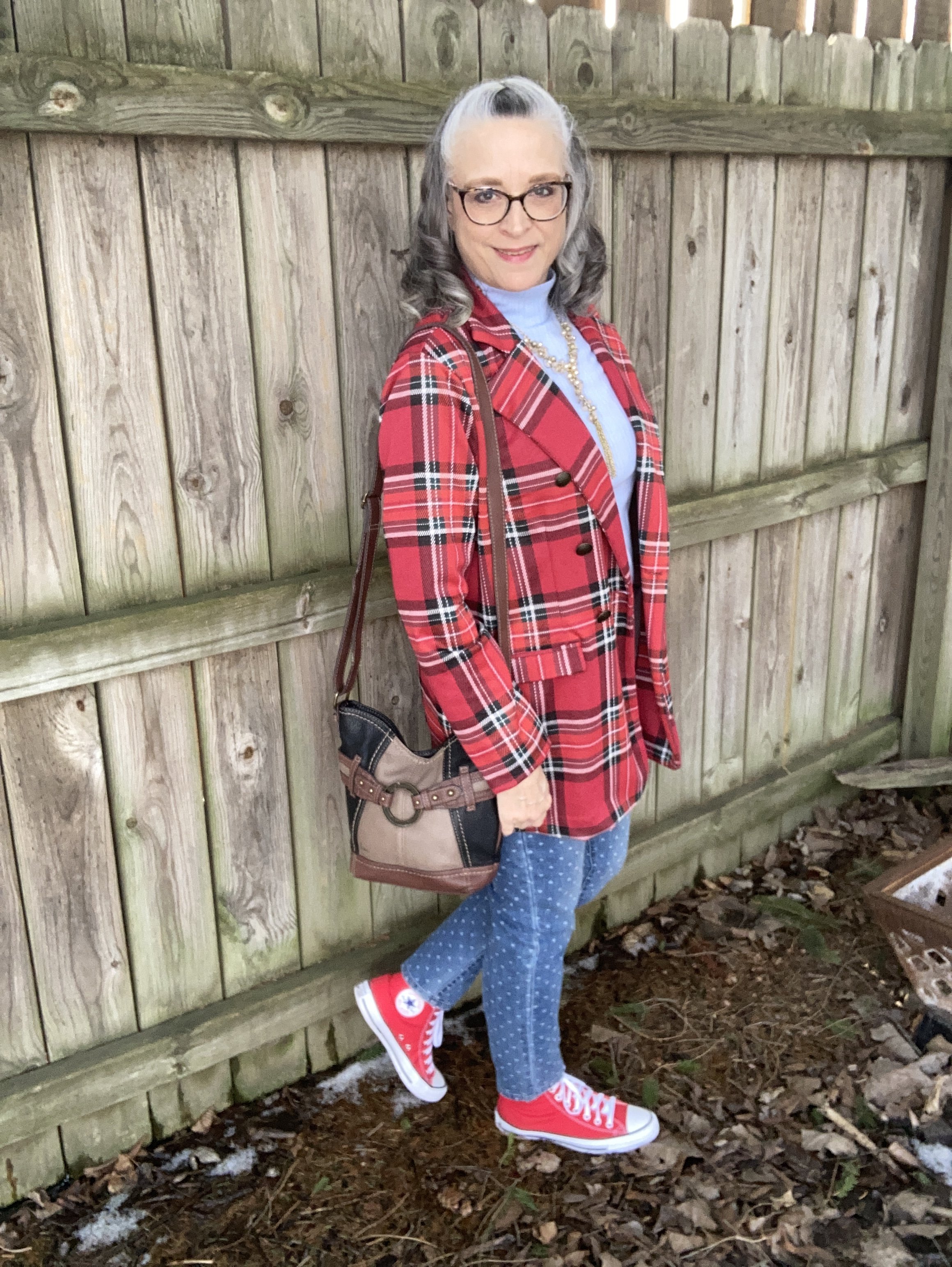
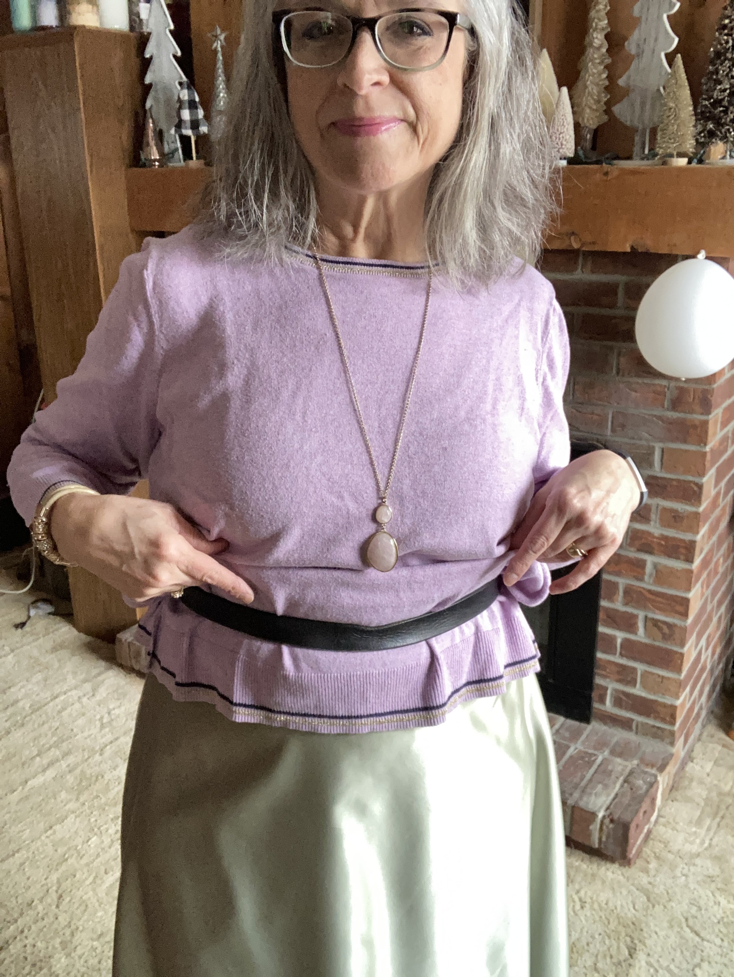
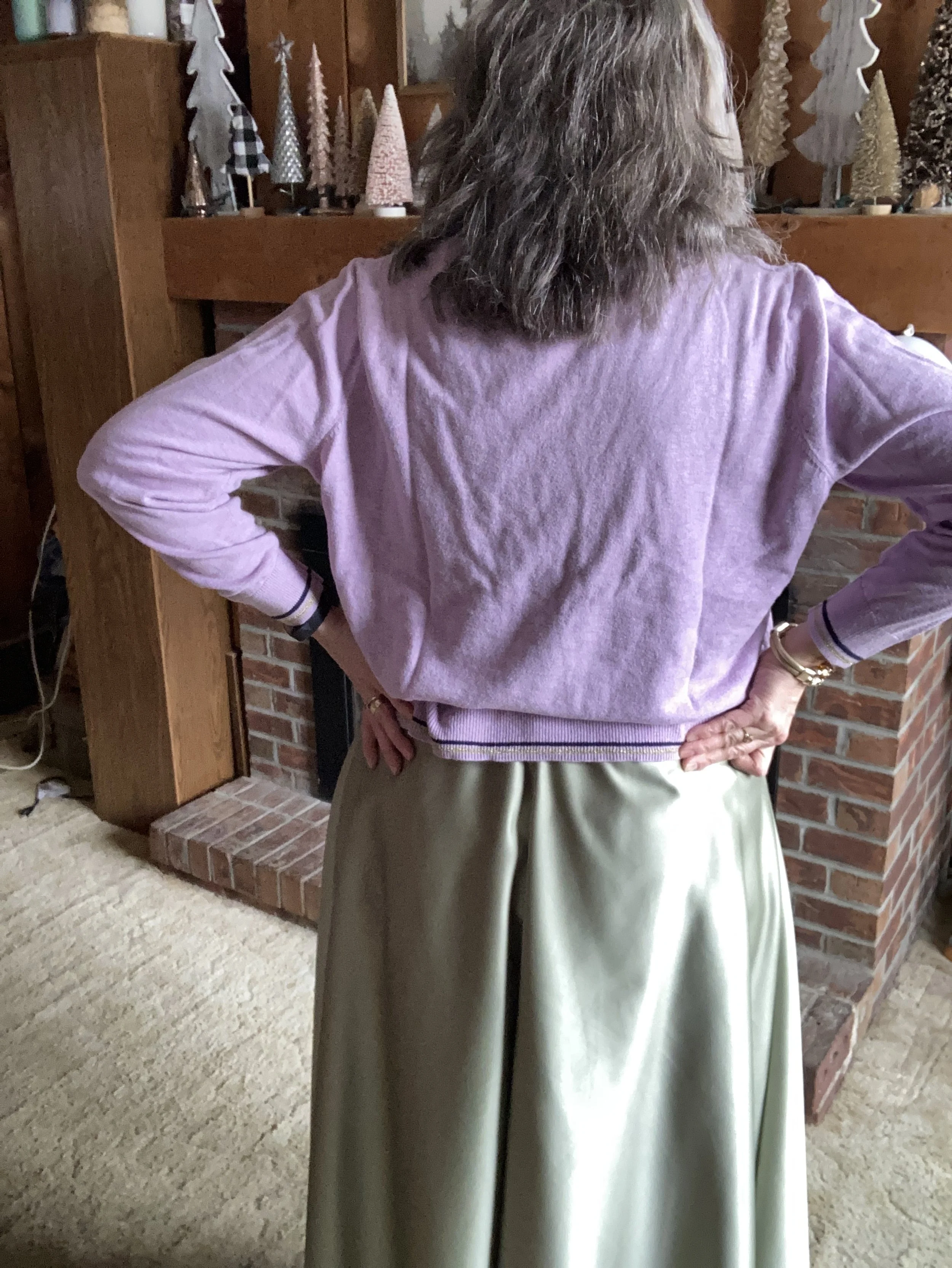
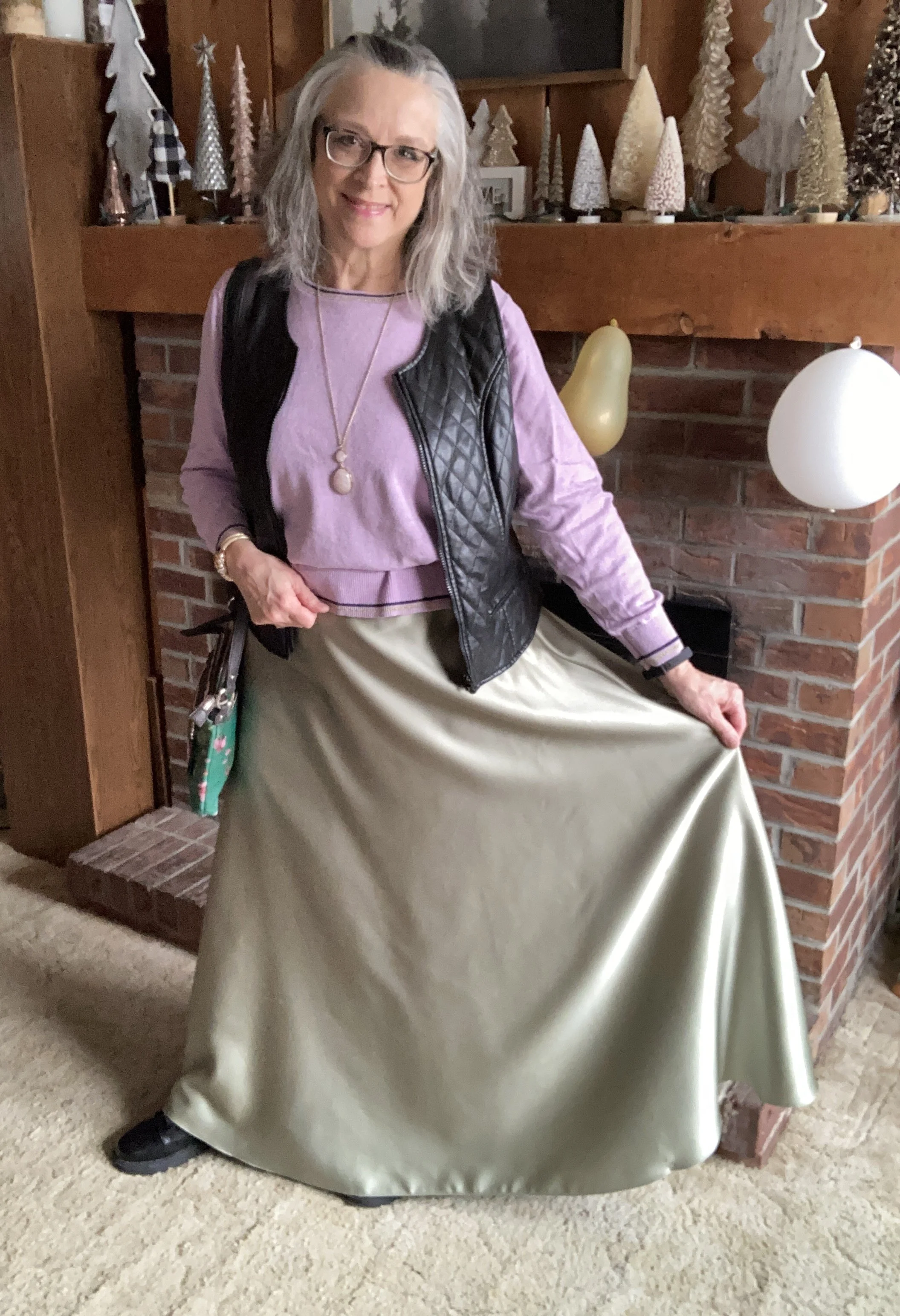
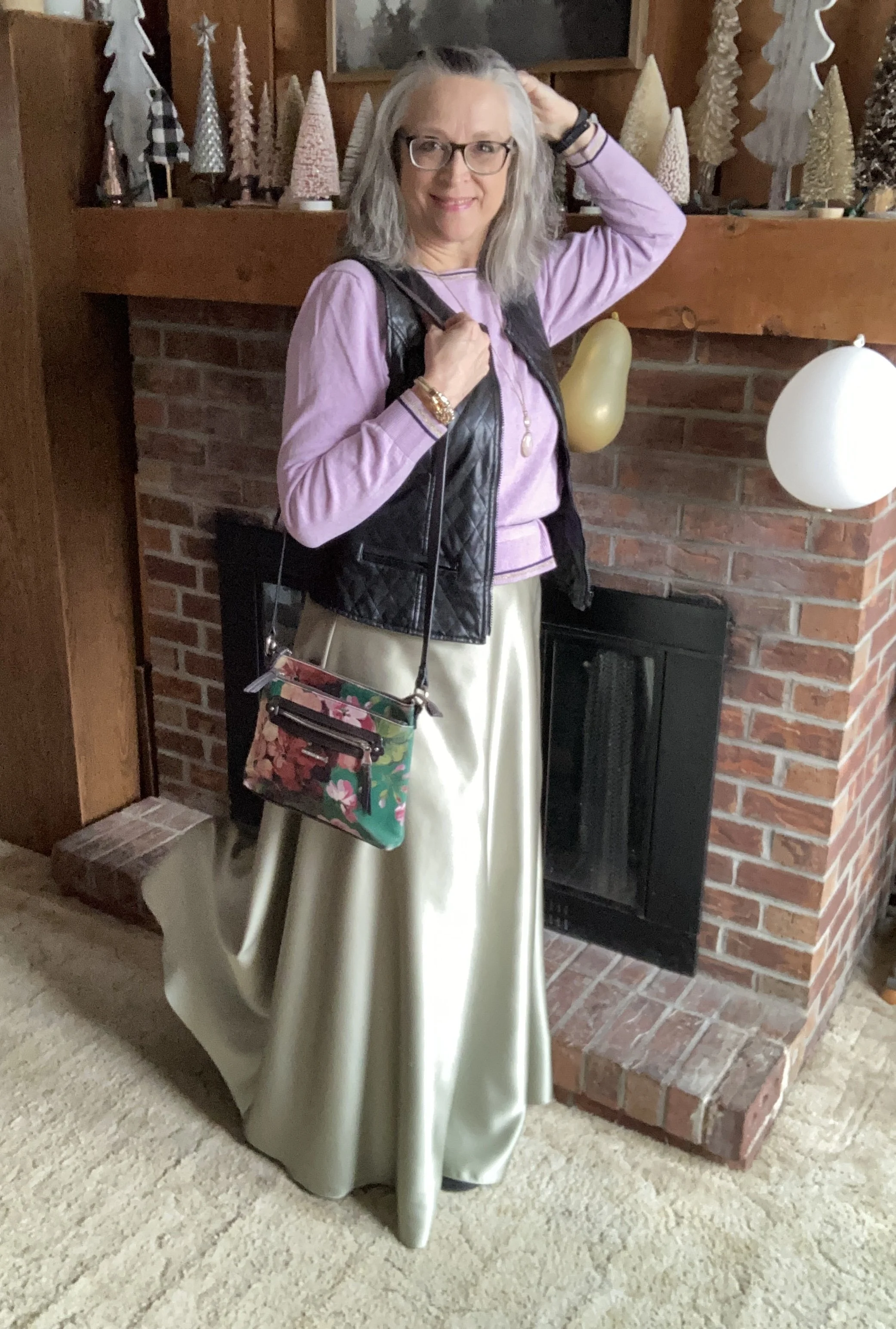
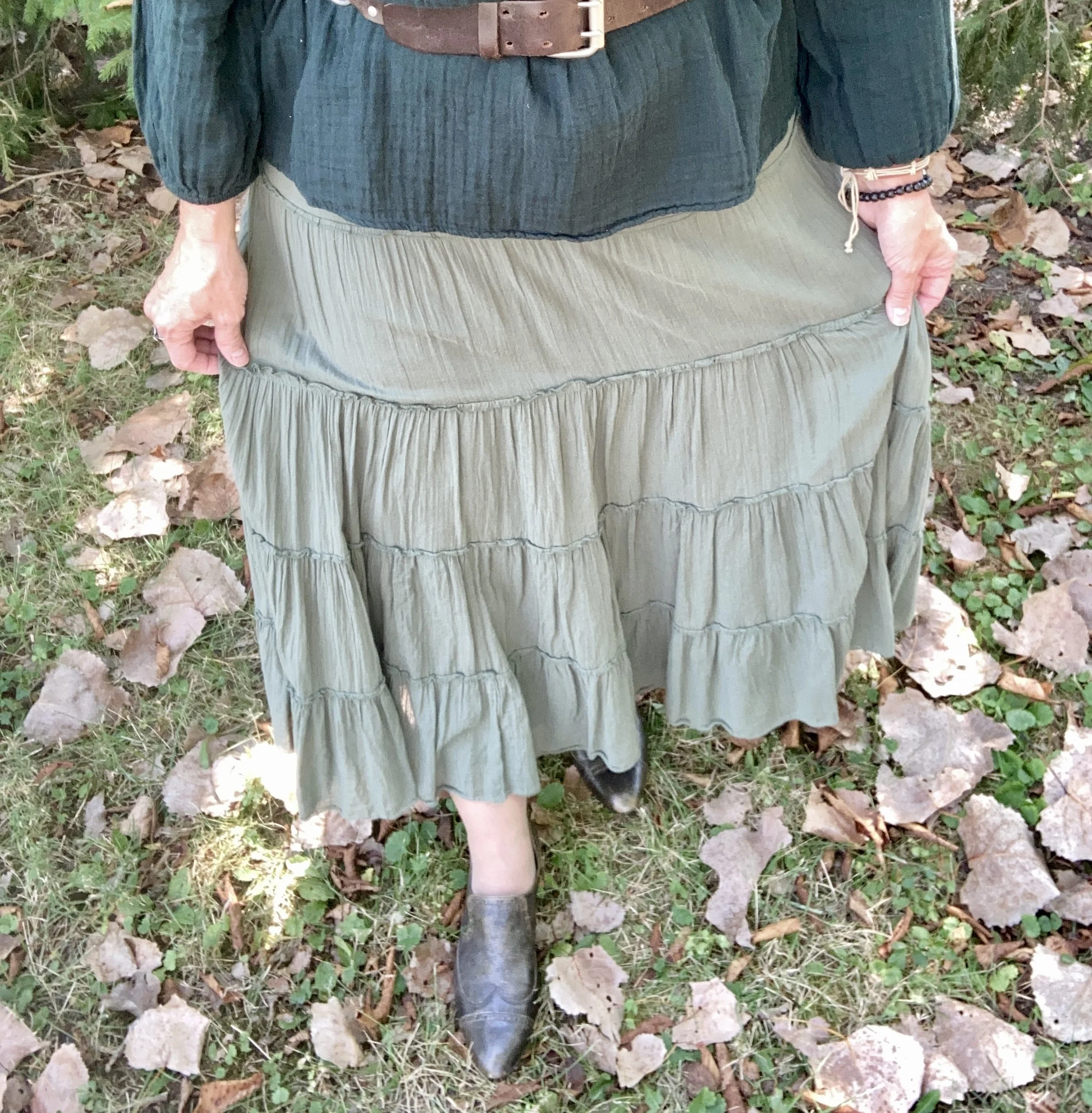
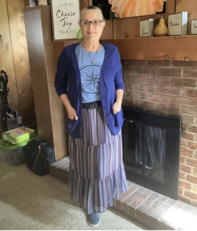
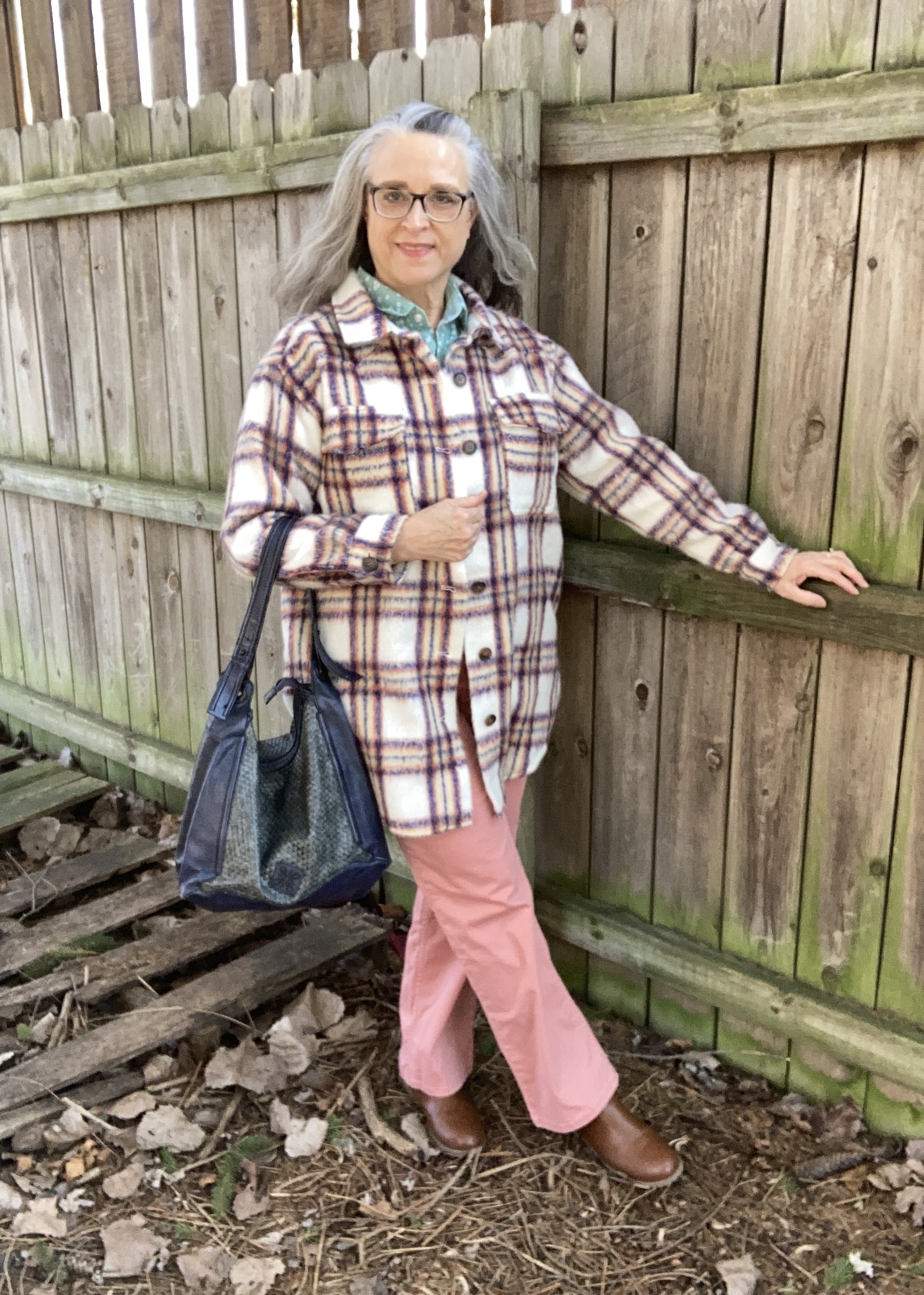
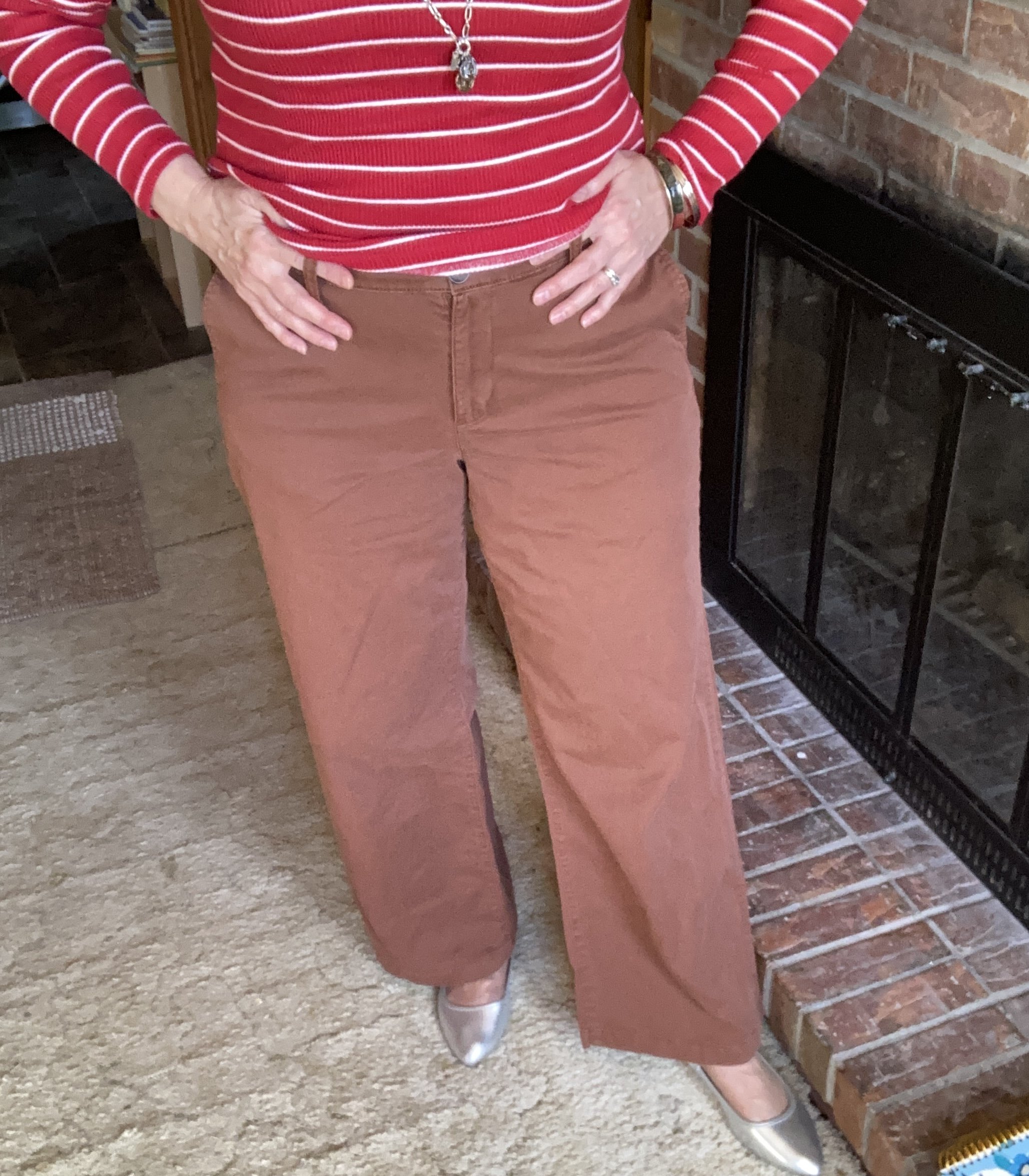
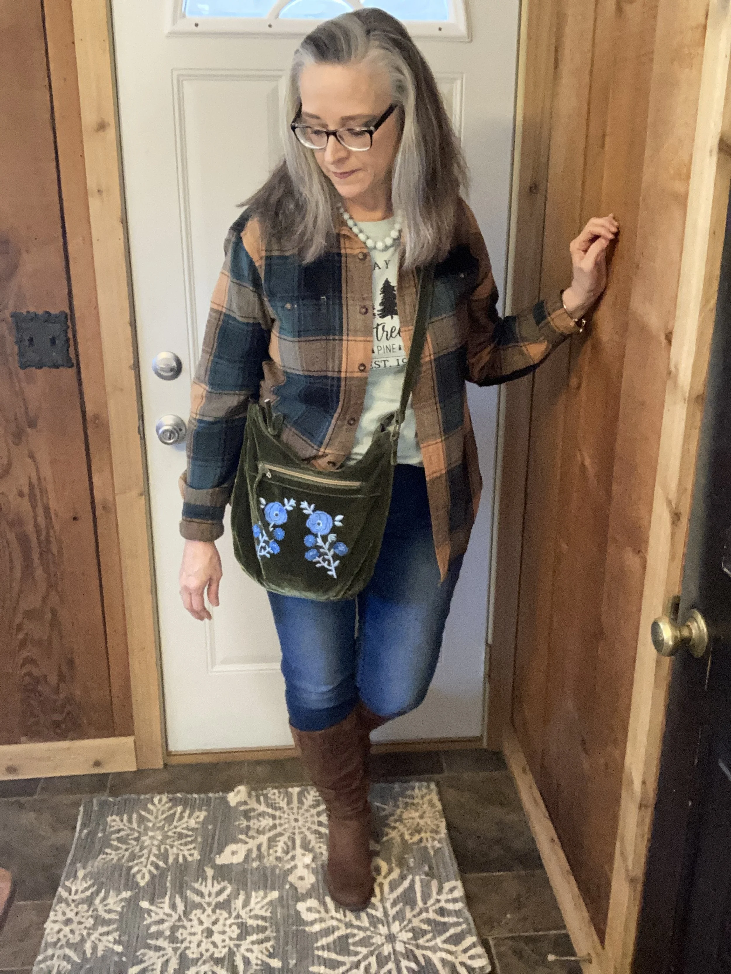
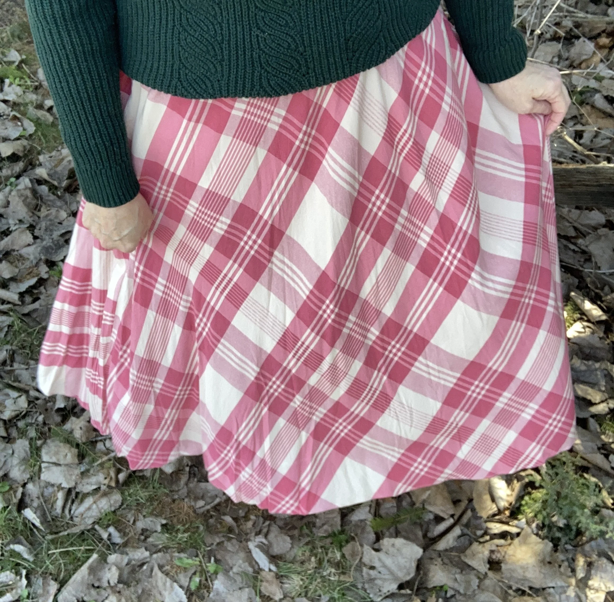
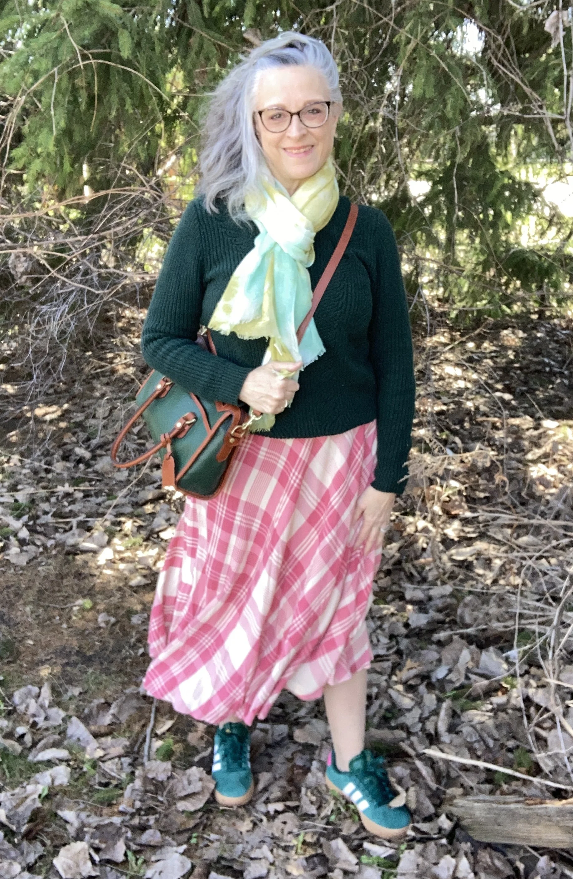
For the pretty Tea Rose pink I chose this Chaps, plaid skirt that I found on clearance at Kohl’s. My mom used to have tea roses growing in her yard many years ago. She had a yellow, a white, and a pink variety. The pink was very similar to this color, and they had such a beautiful smell. You can see how I styled this same skirt for a transitional summer to fall outfit here. For a few plaid skirt options, check out these on Amazon.
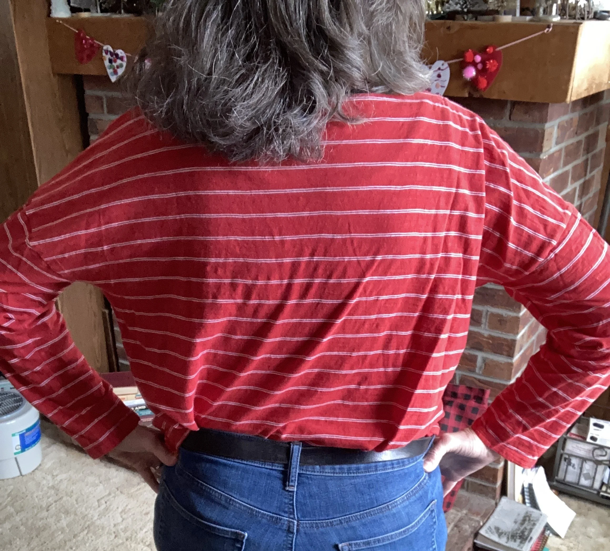
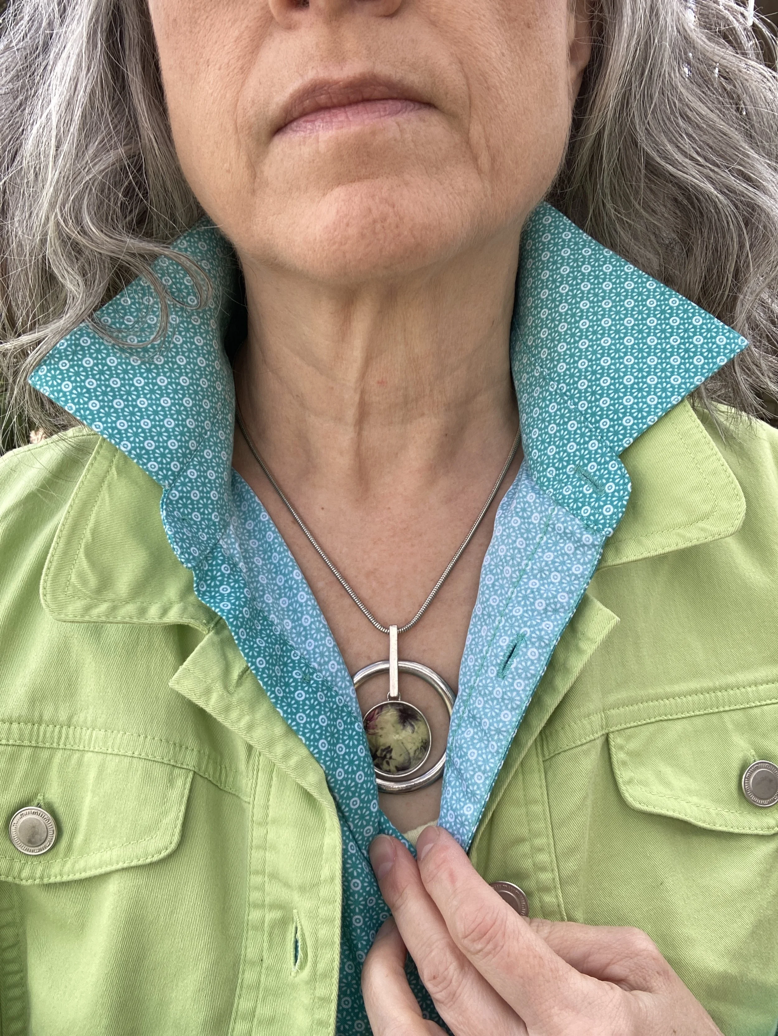
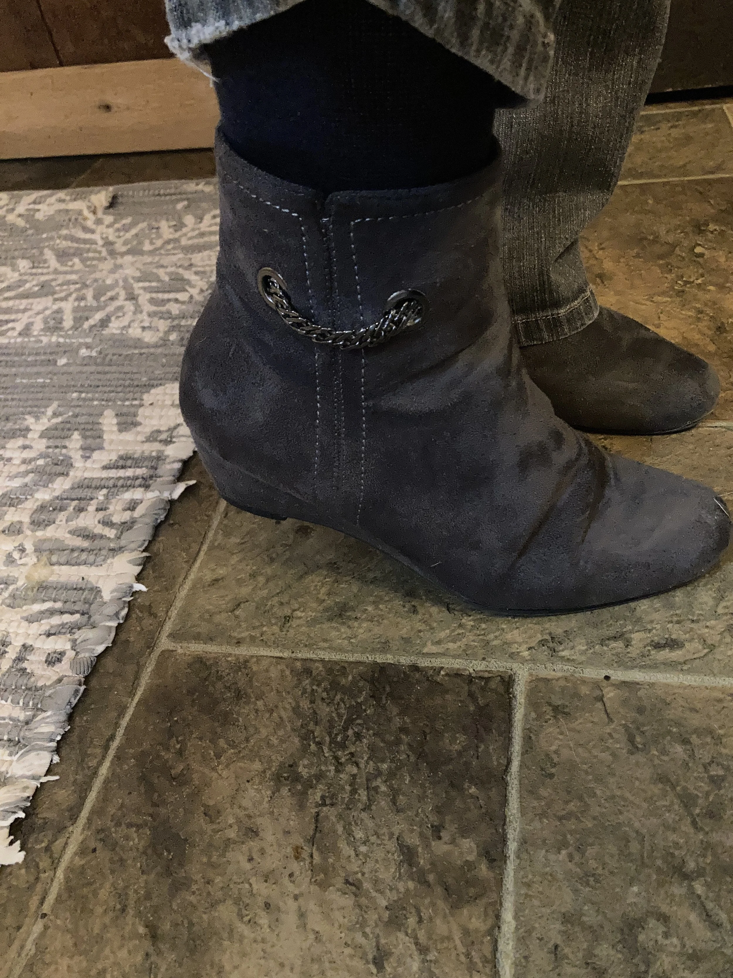
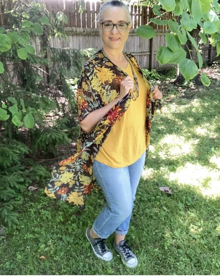
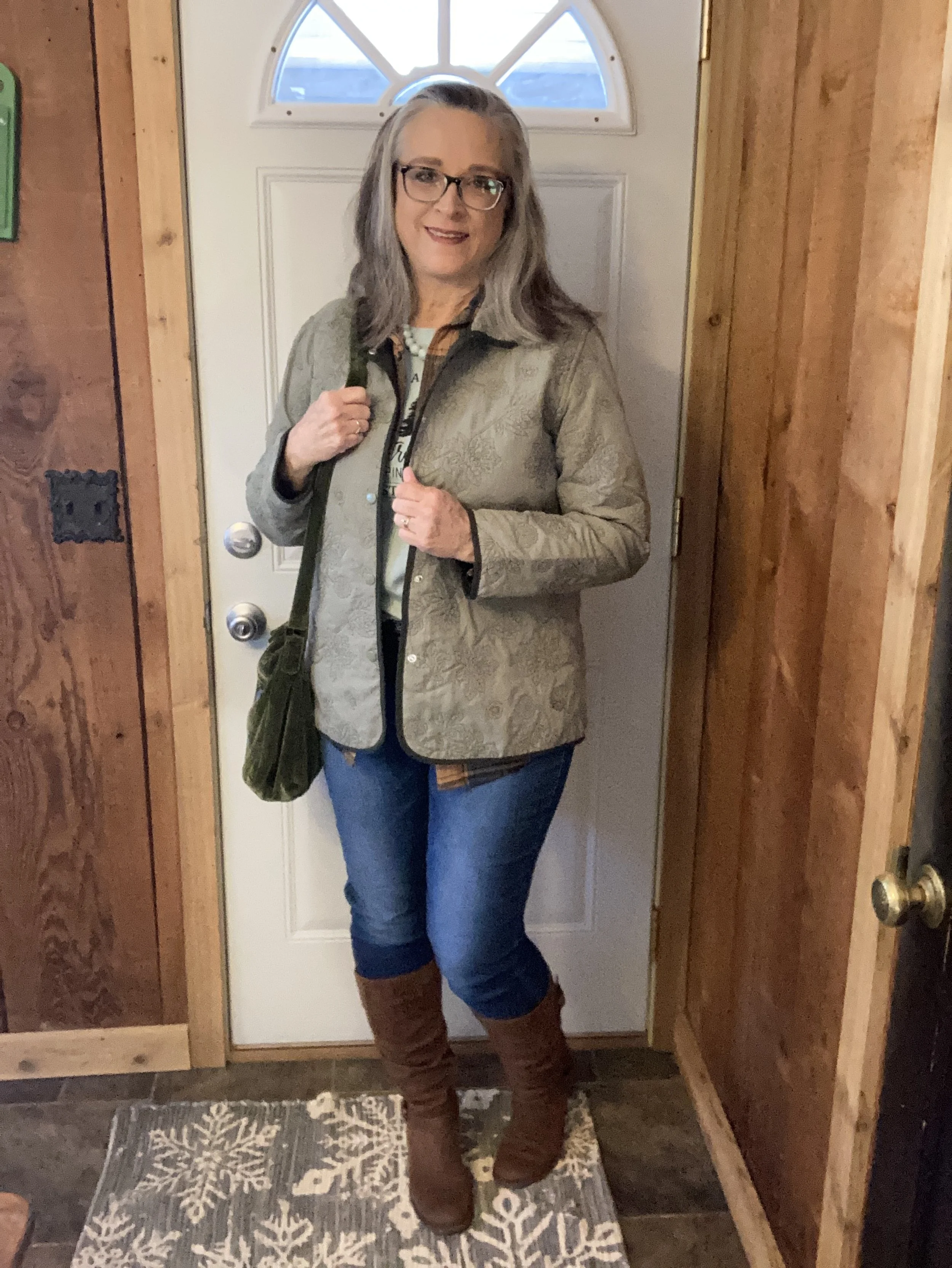
It was windy and cold when I took these, so I didn’t spend too much time trying to get perfect shots. Ha, ha.
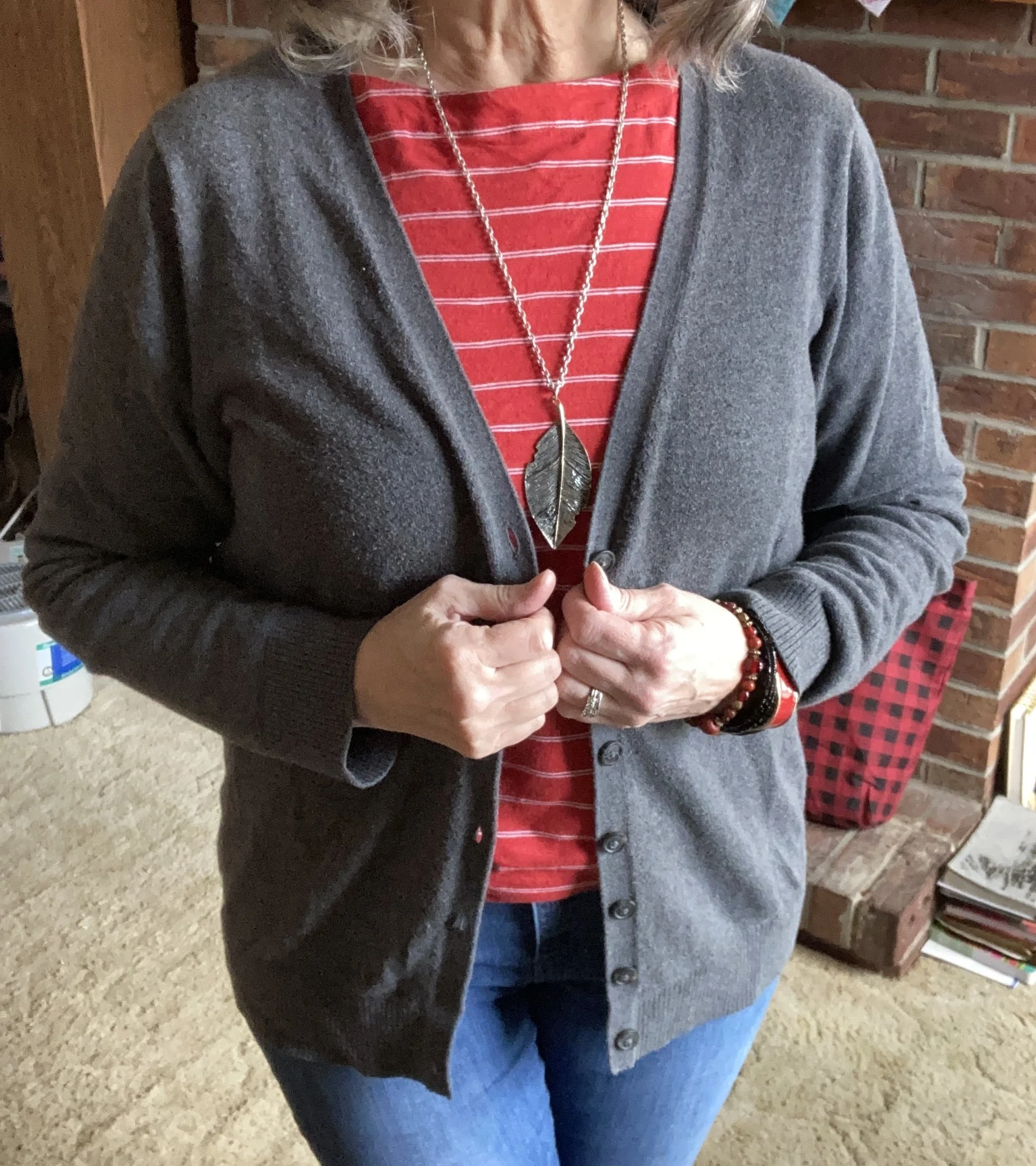
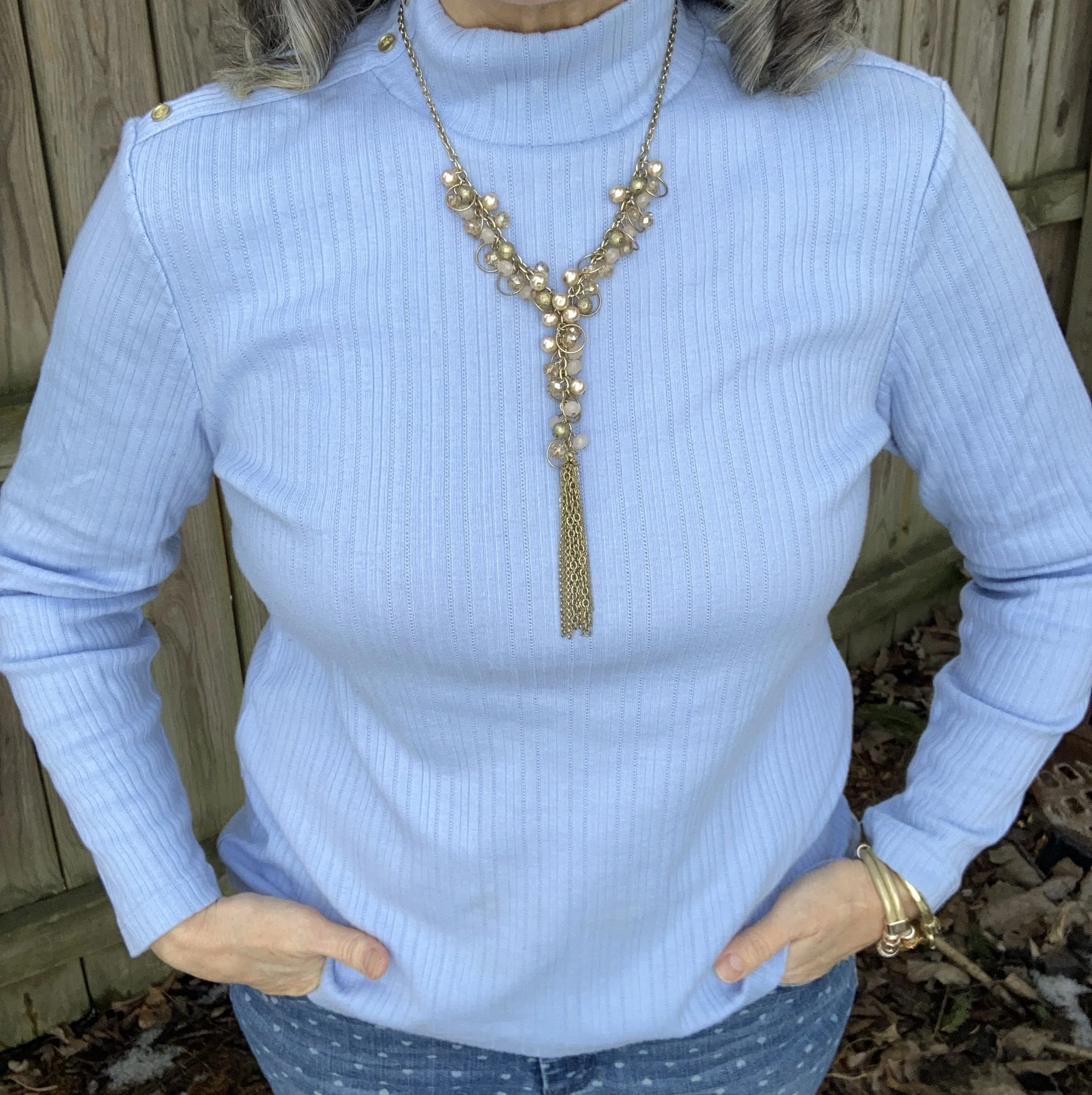
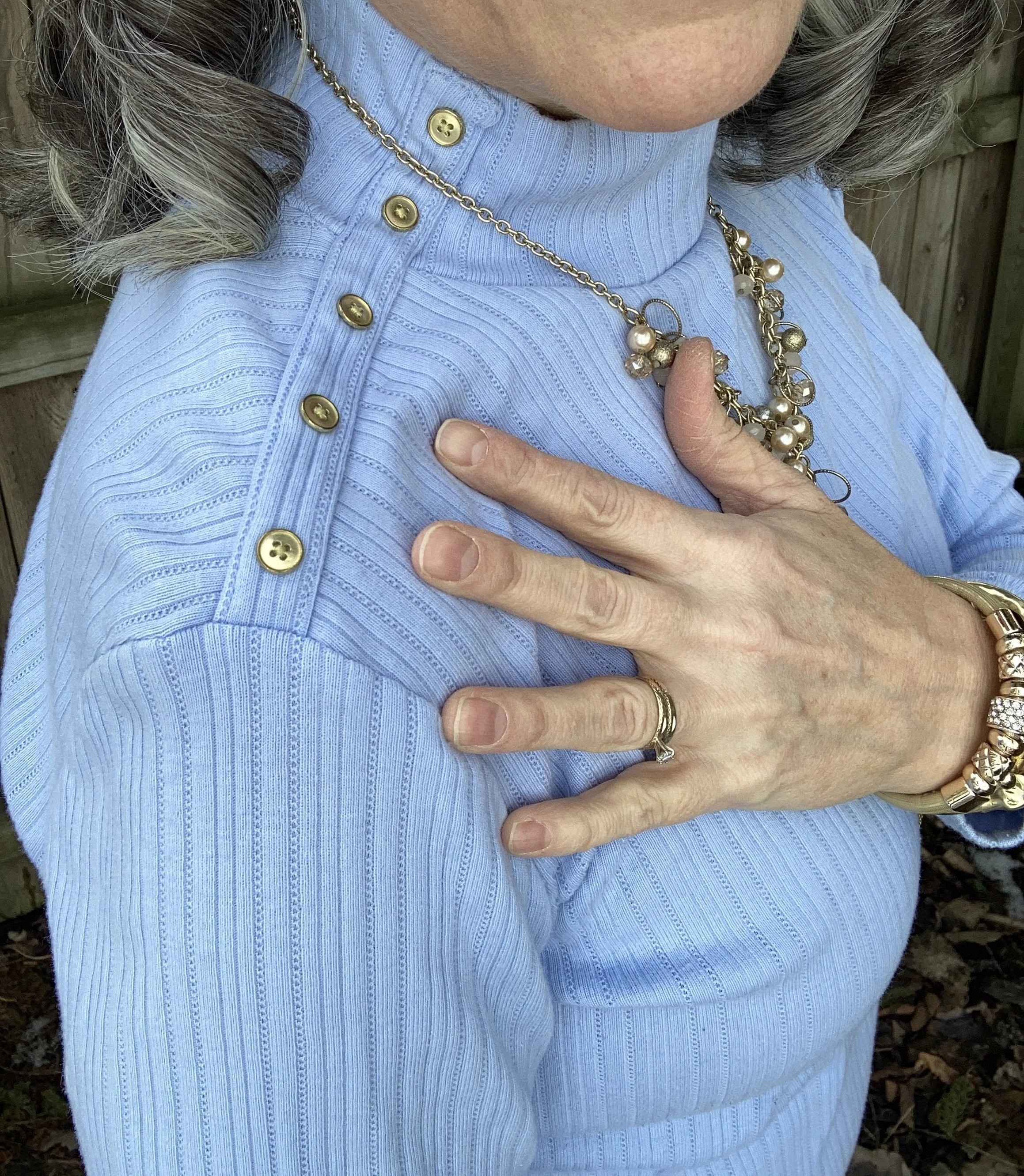
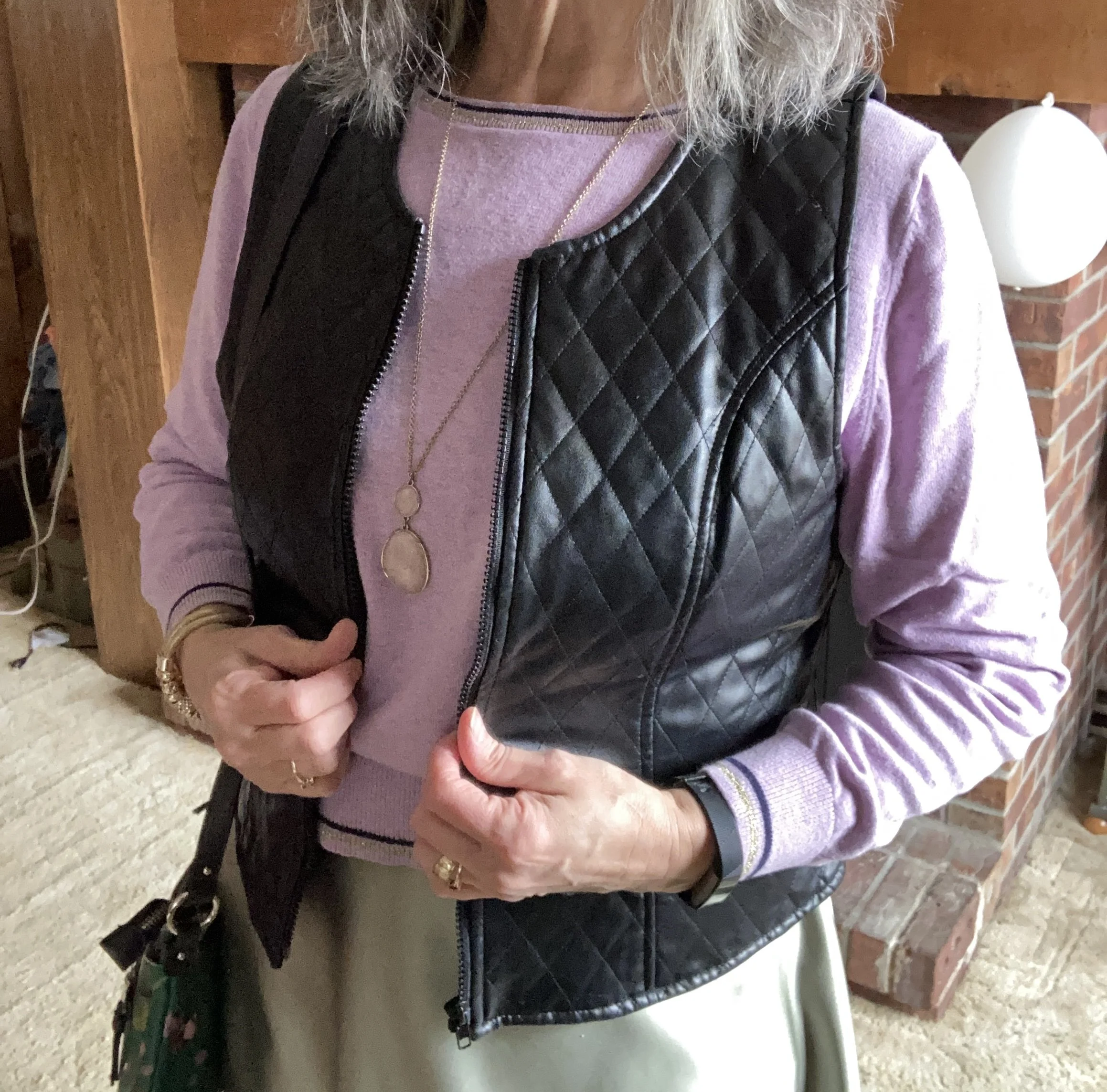
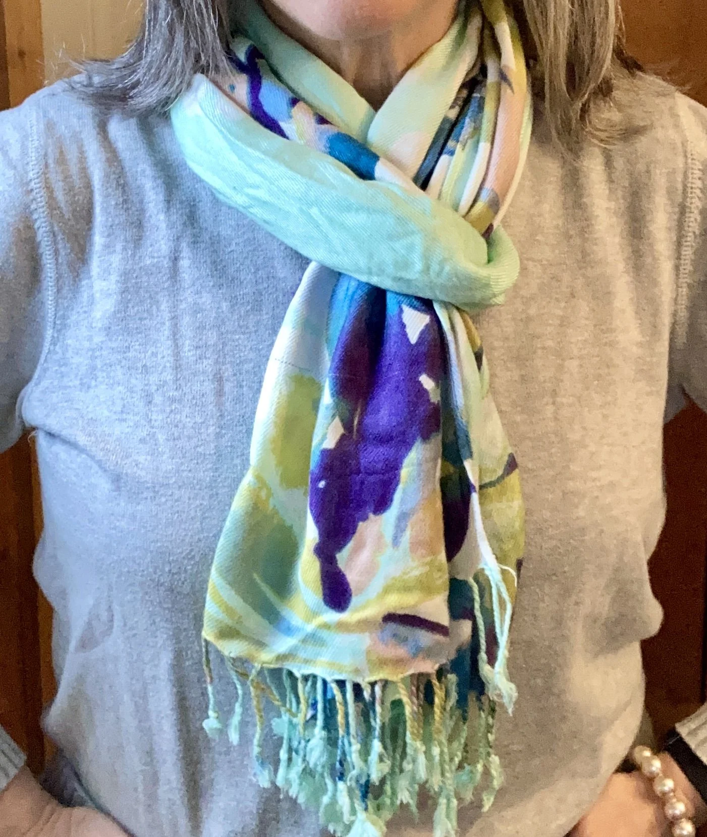
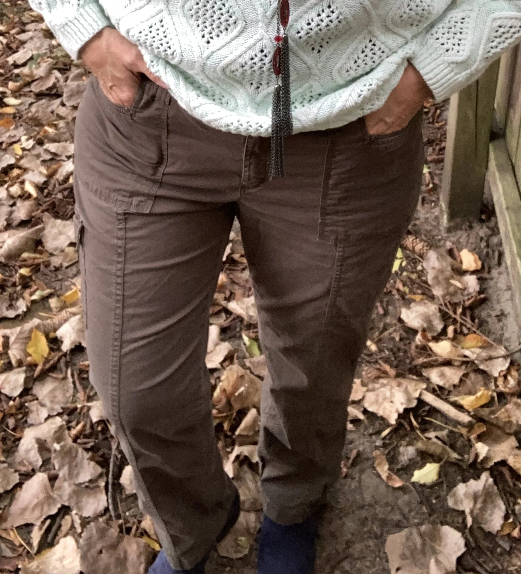
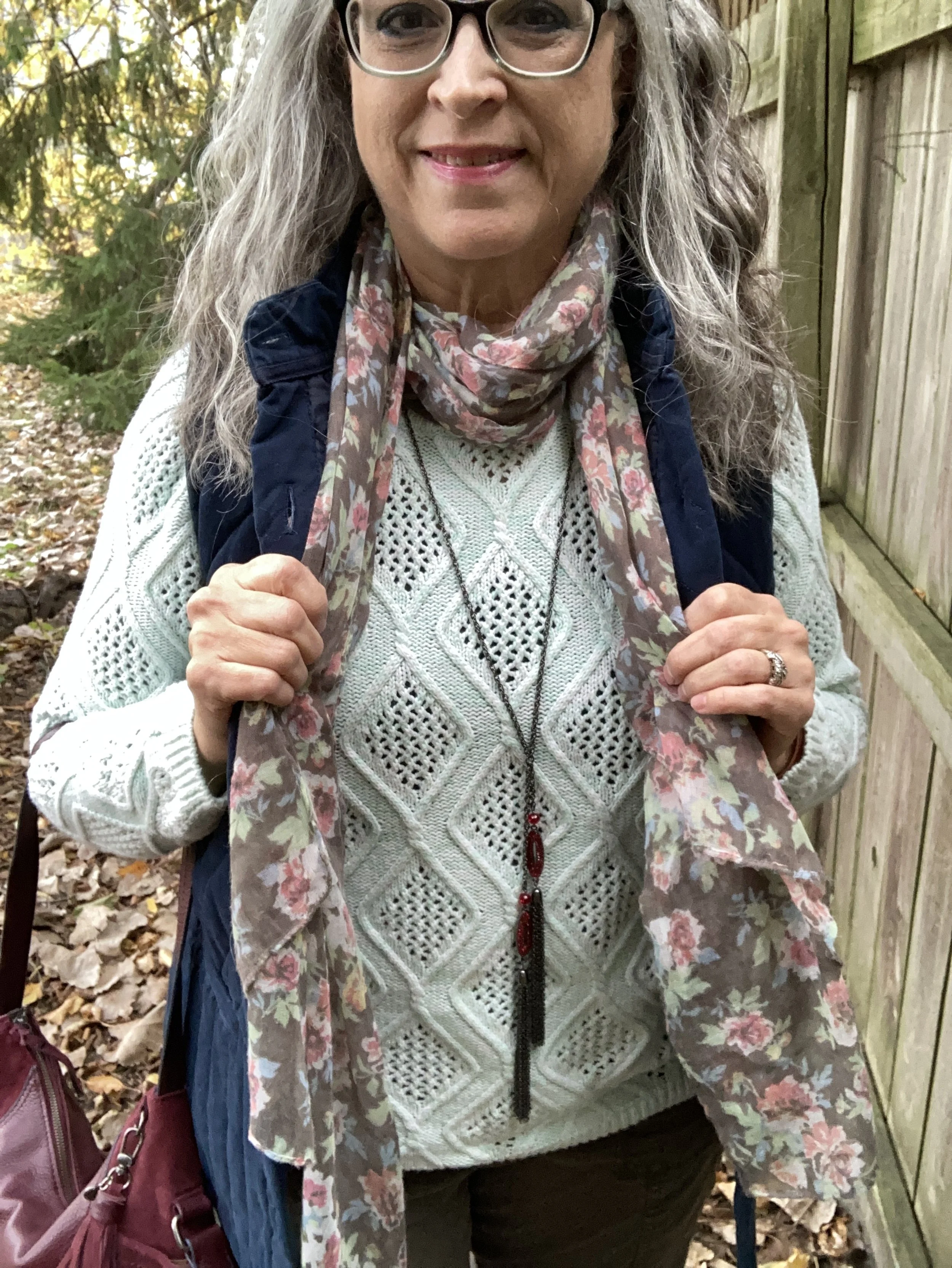
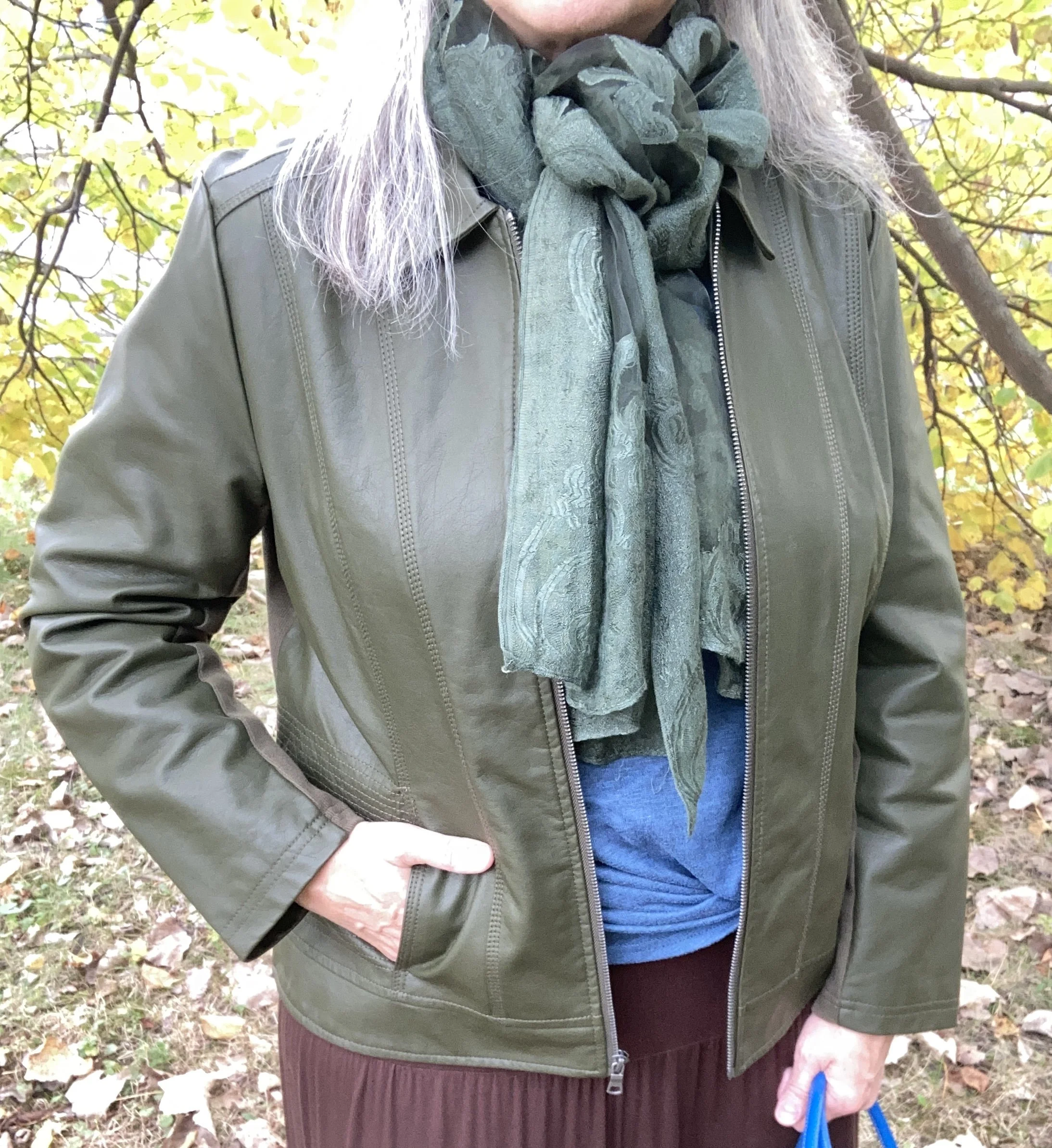
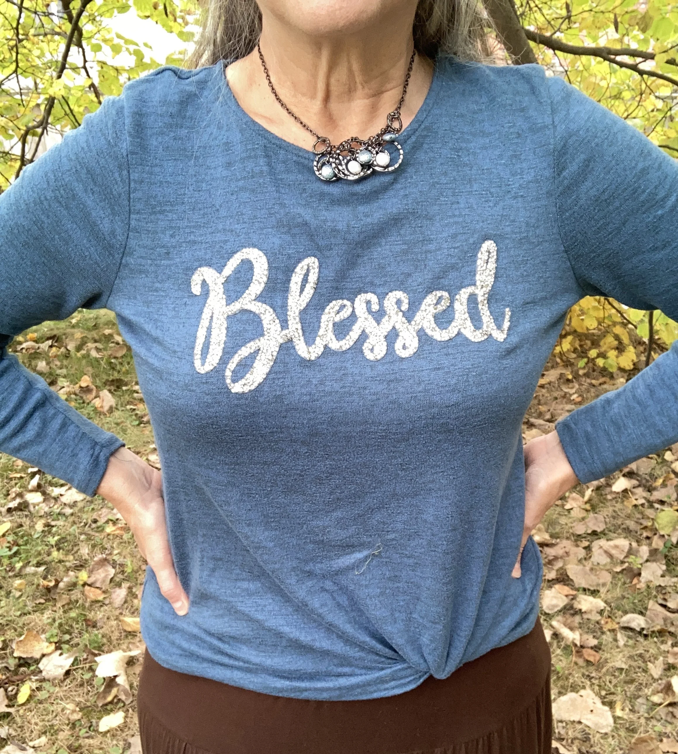
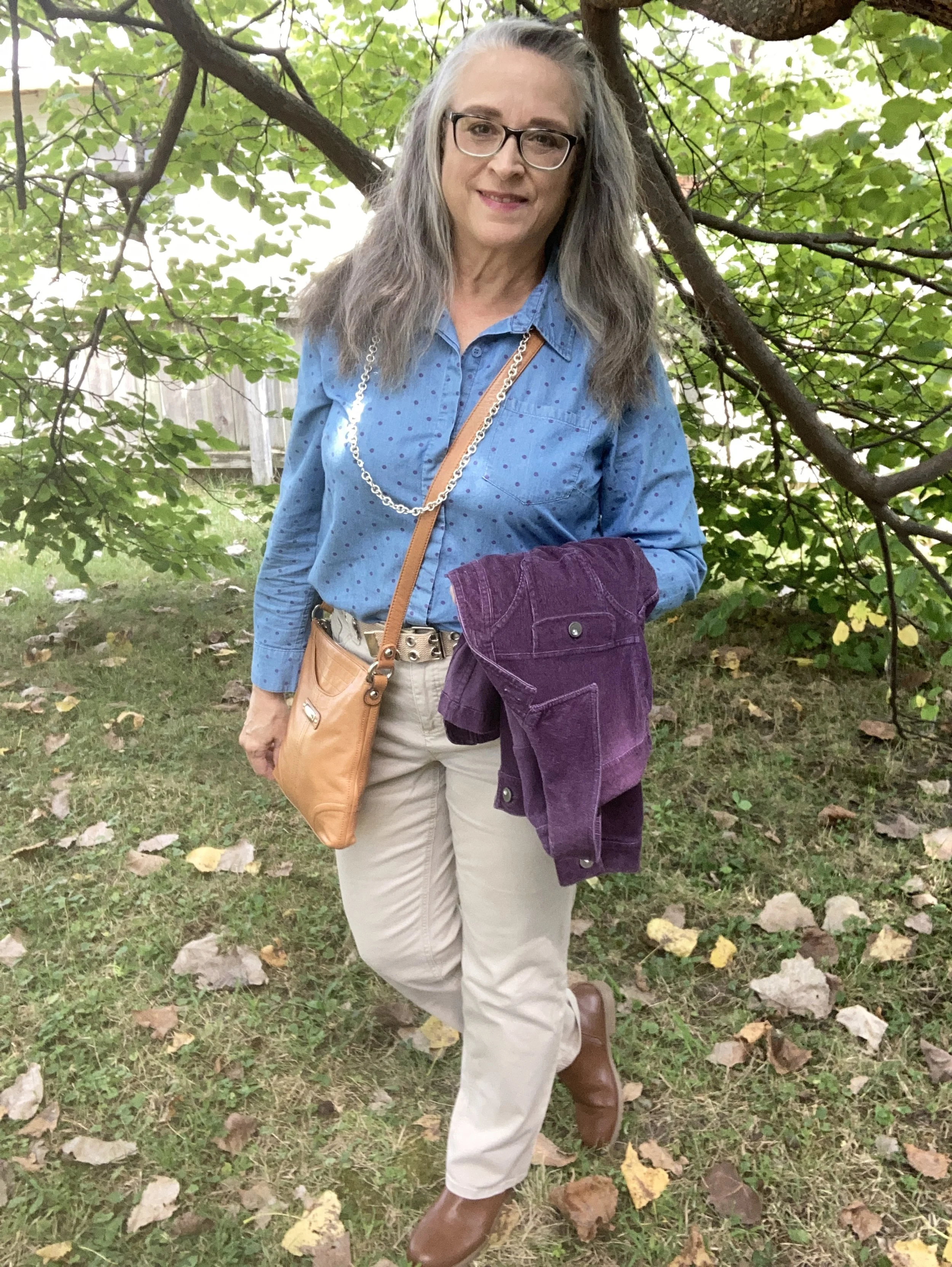
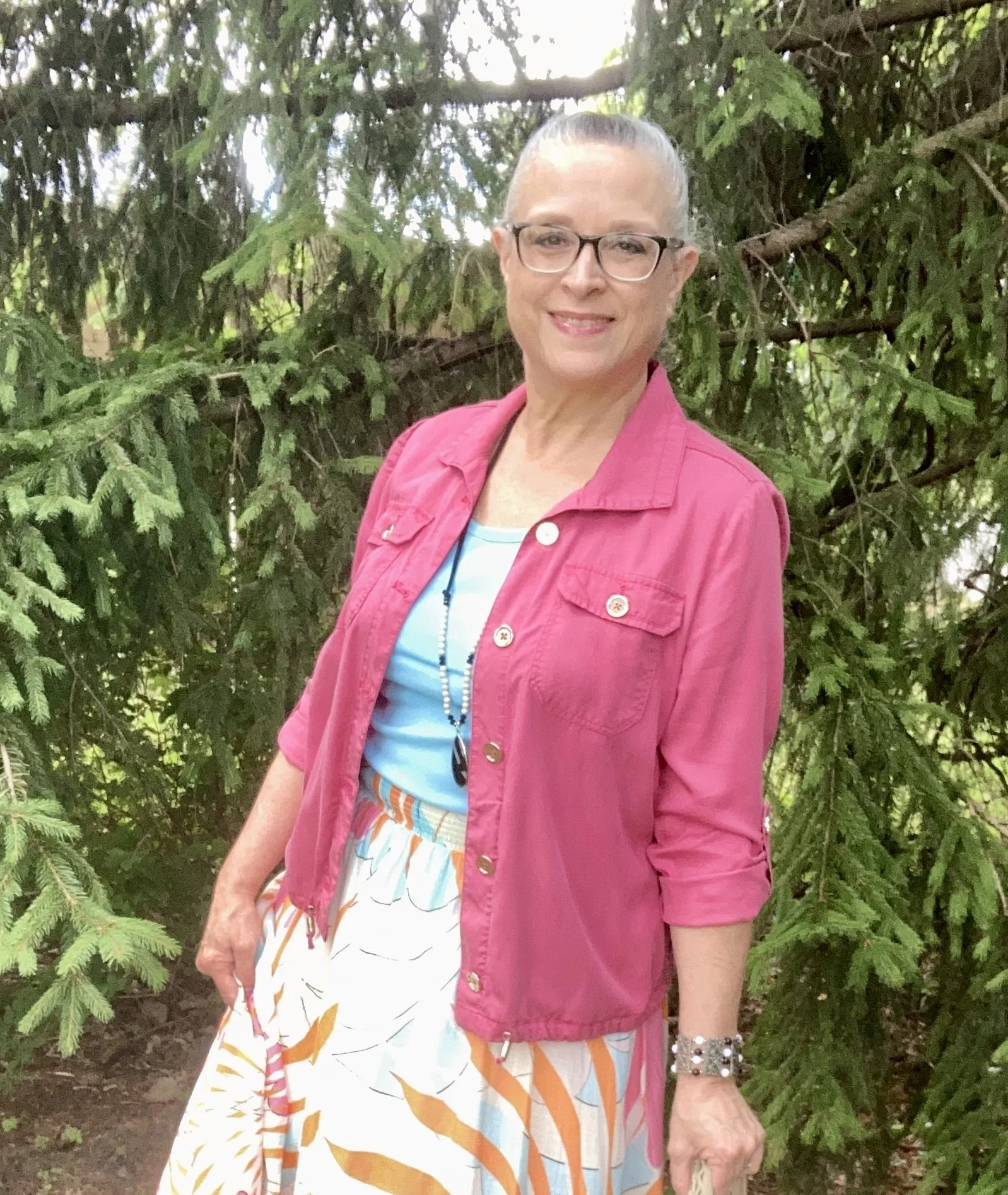
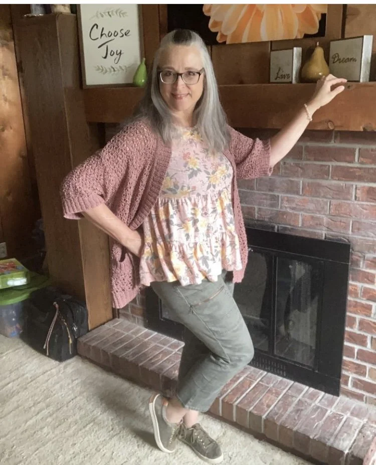
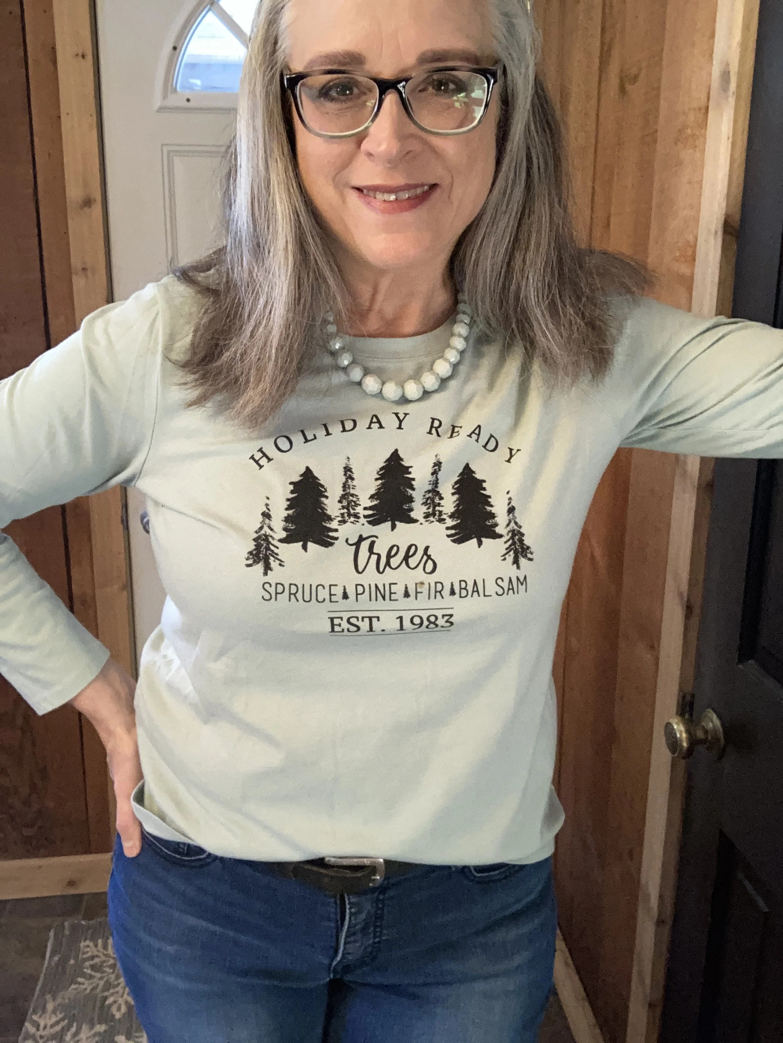
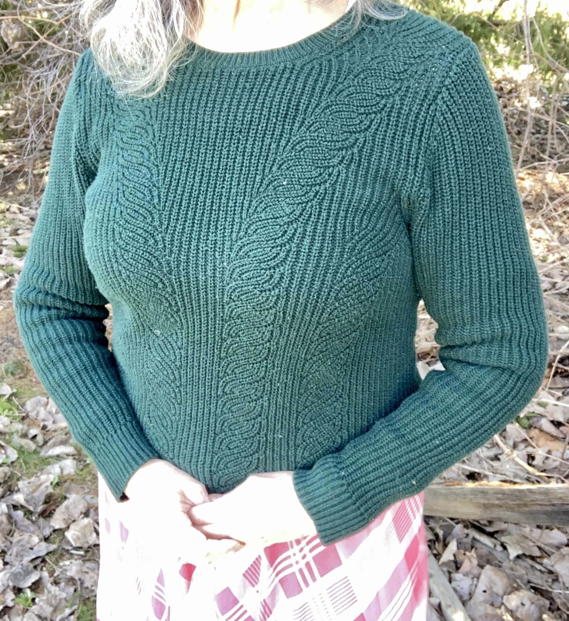
My Sycamore colored sweater is Croft and Barrow brand and was a thrift find. The lighting was definitely playing with the color of this sweater. It is much darker, but you can see the picture was very bright, even though I was in the shade. Check out this pretty Lauren Conrad sweater from Kohl’s, and this Natural Reflections one from Bass Pro.
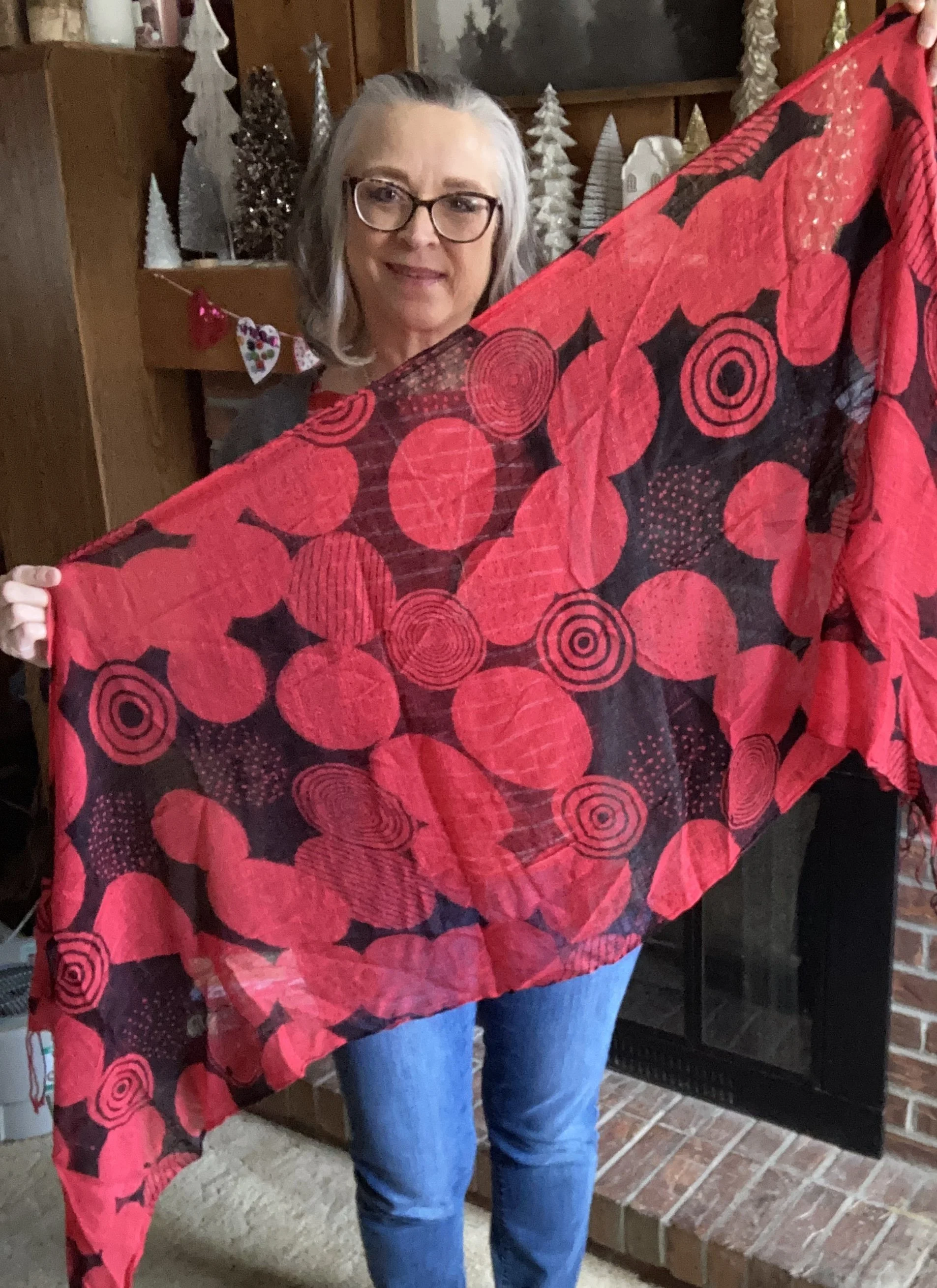
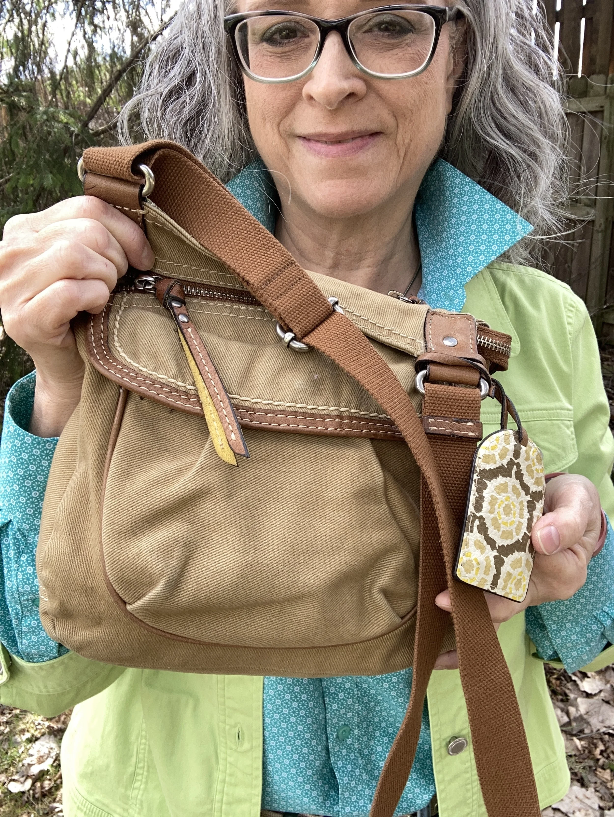
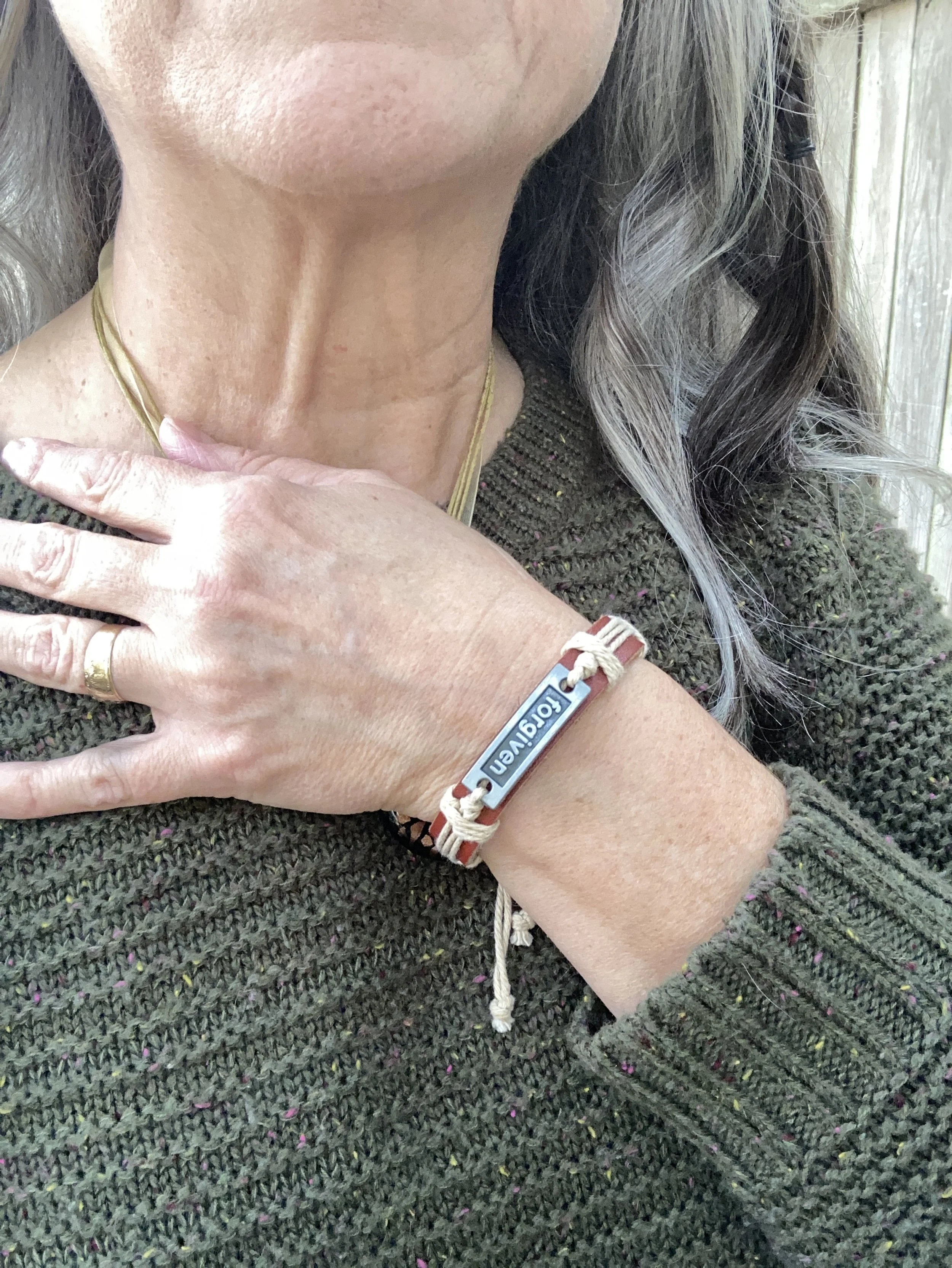
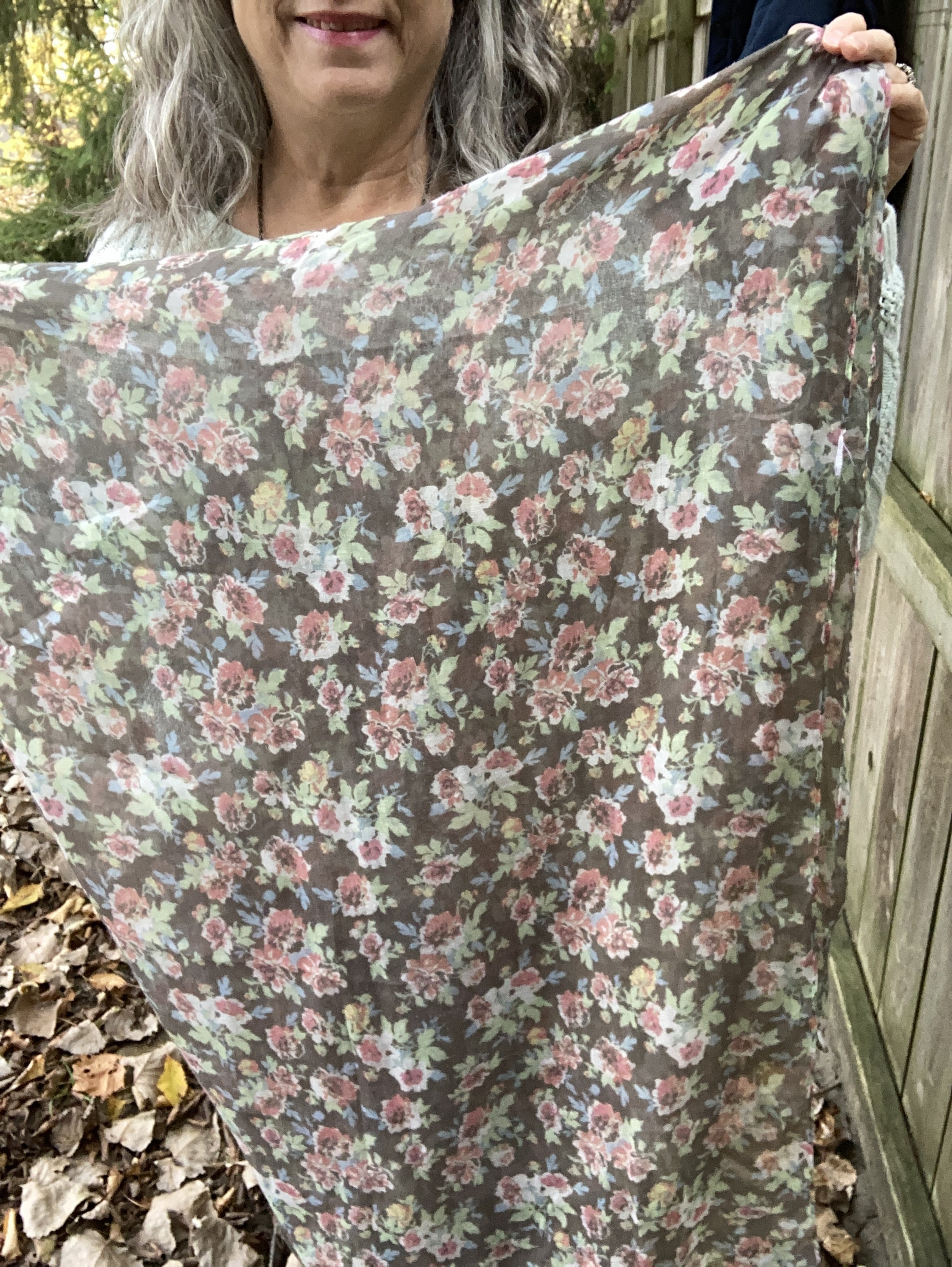
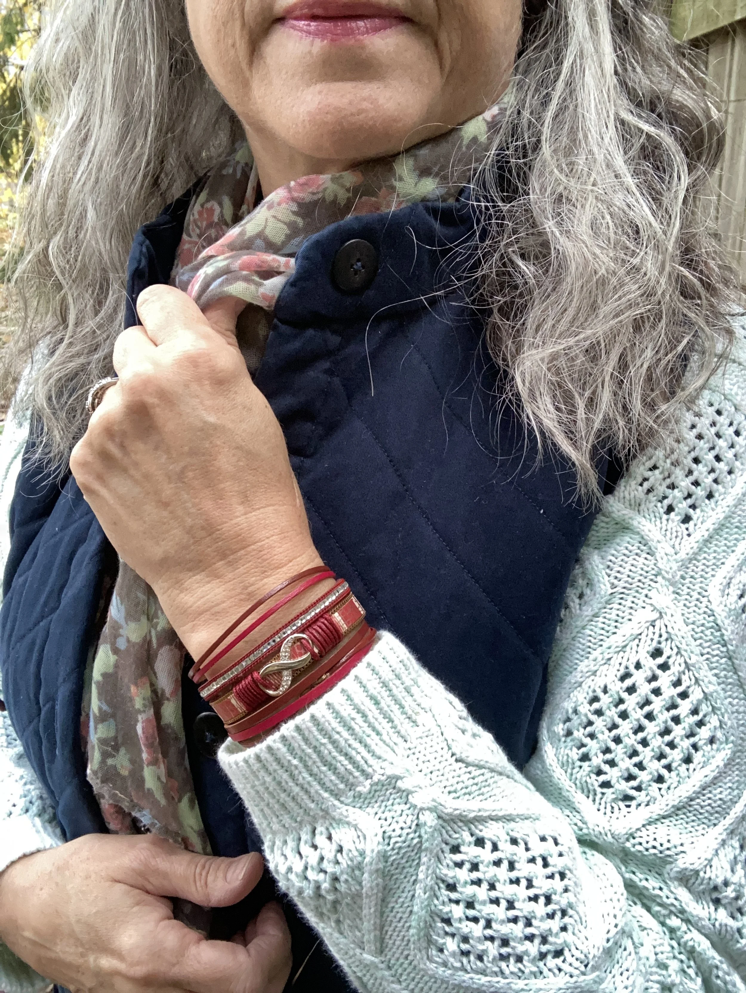
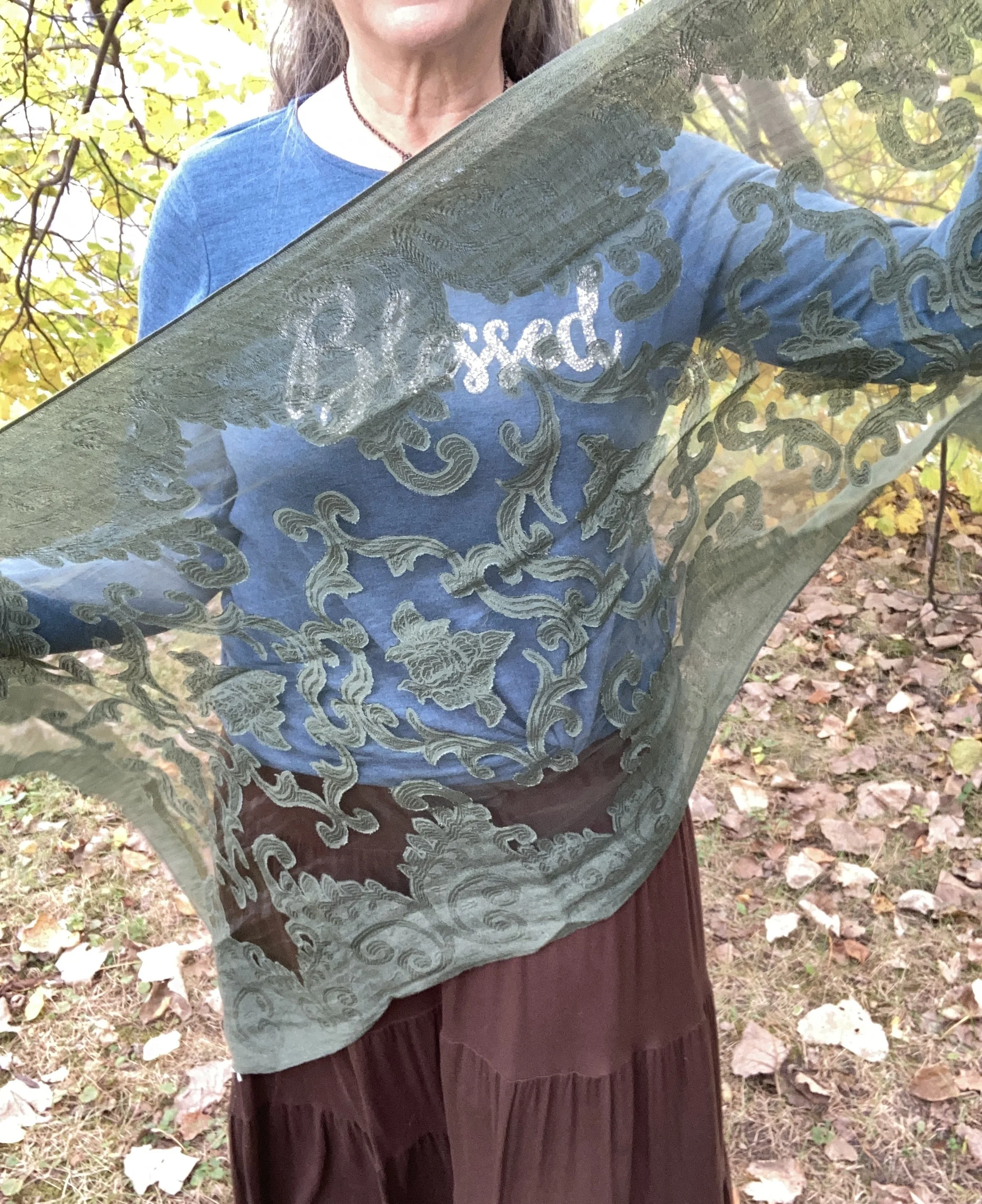
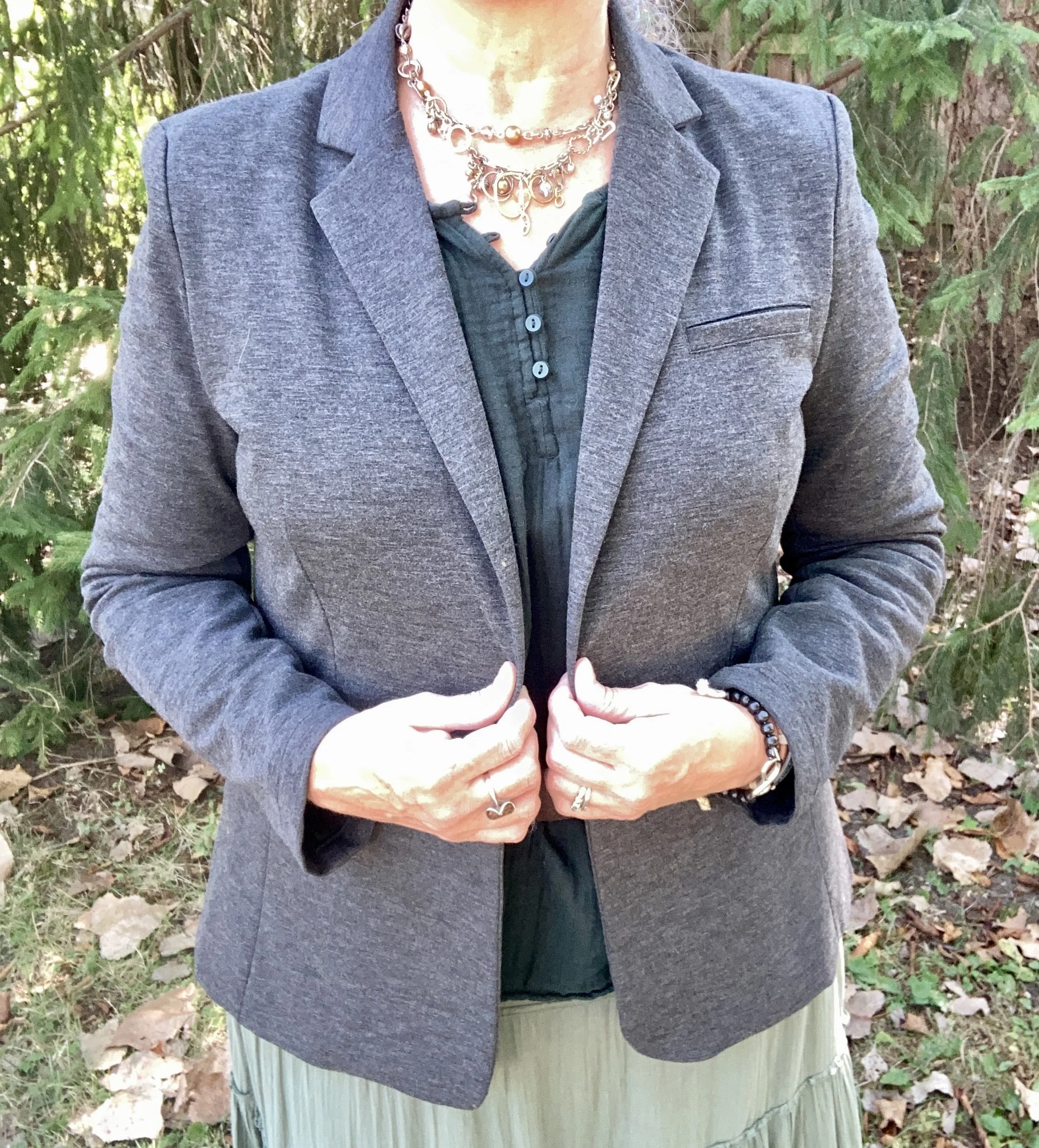
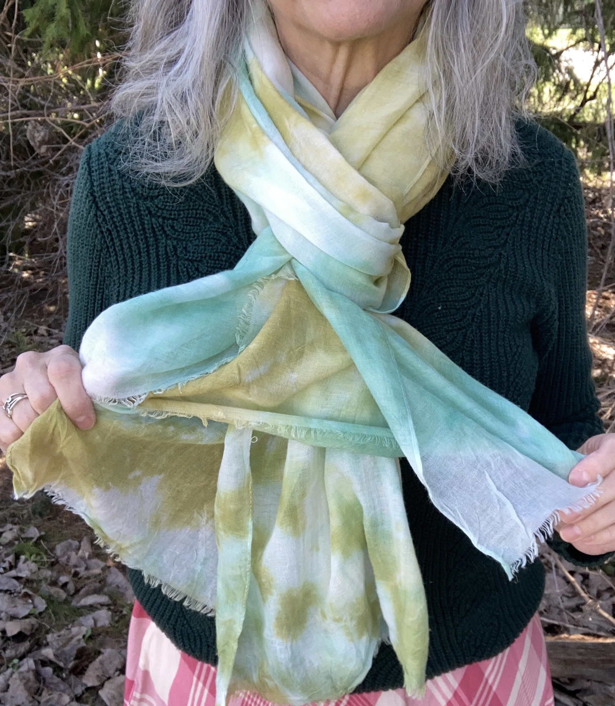
I am not a huge fan of the Acacia color. It is an odd yellowy green, or greenish yellow, depending on how you want to look at it. The only thing I had with this odd color were a couple of scarves and this is the one I settled on as I thought it went well with the sweater, and wasn’t too overwhelming for the skirt.
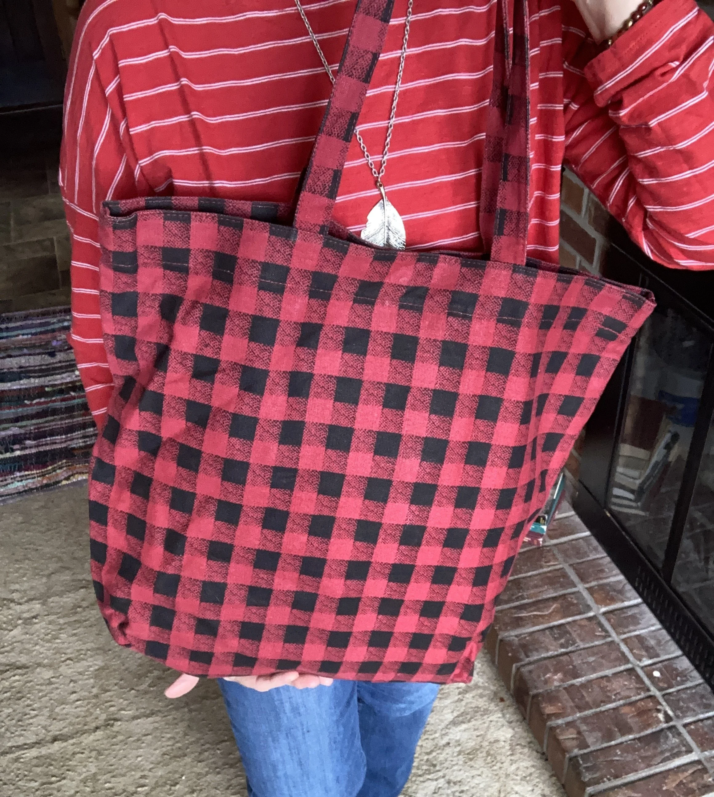
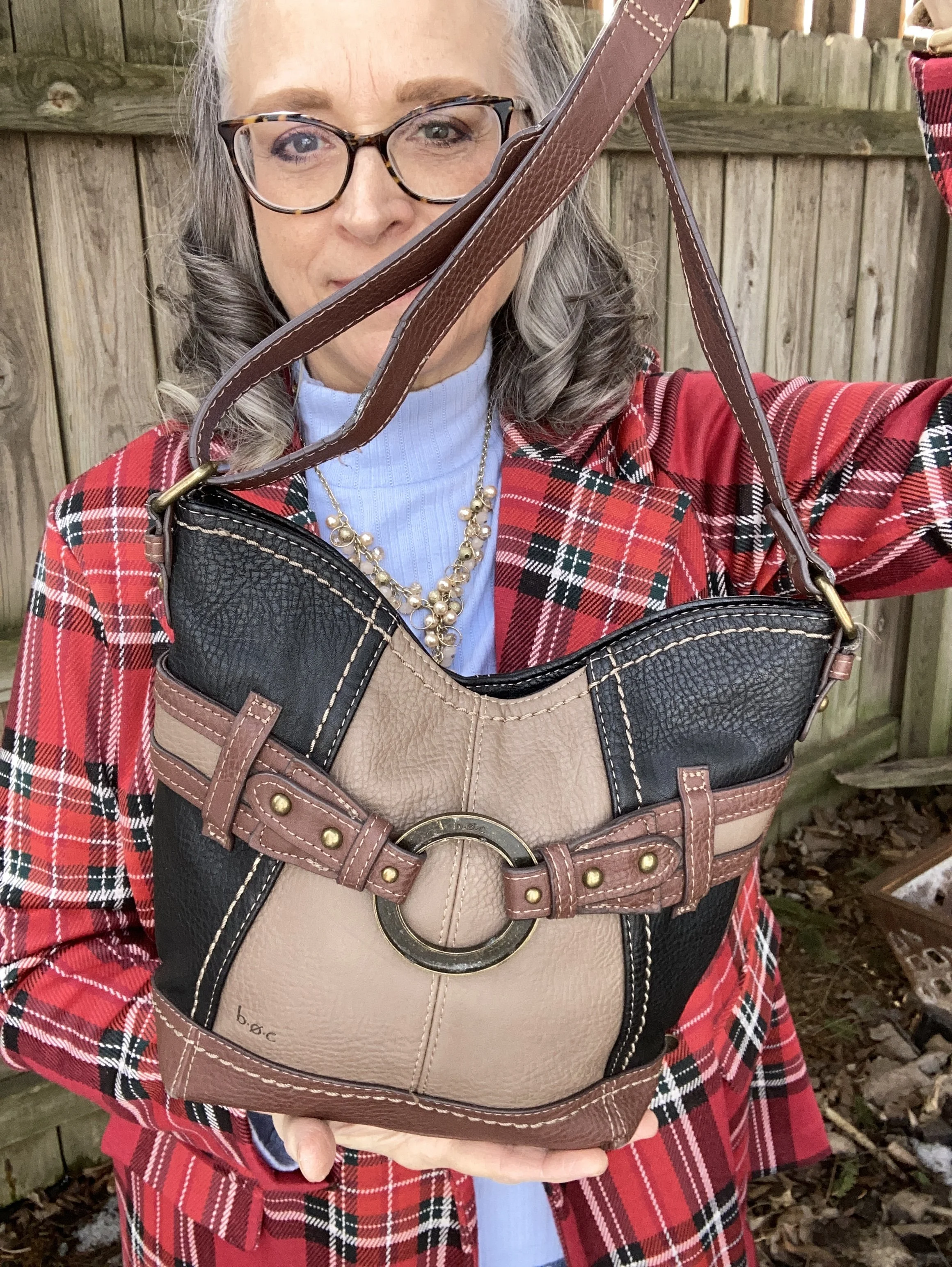
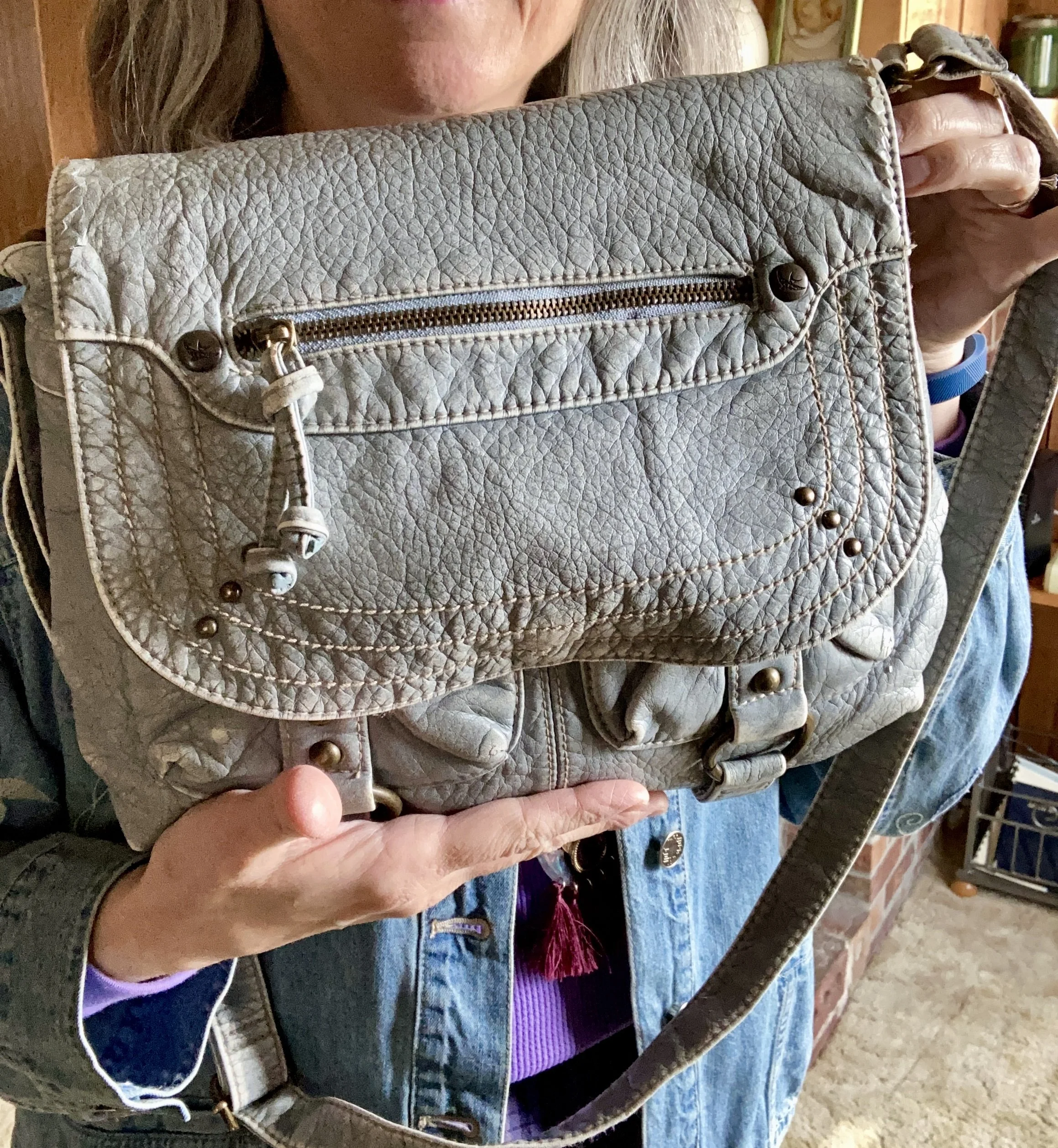
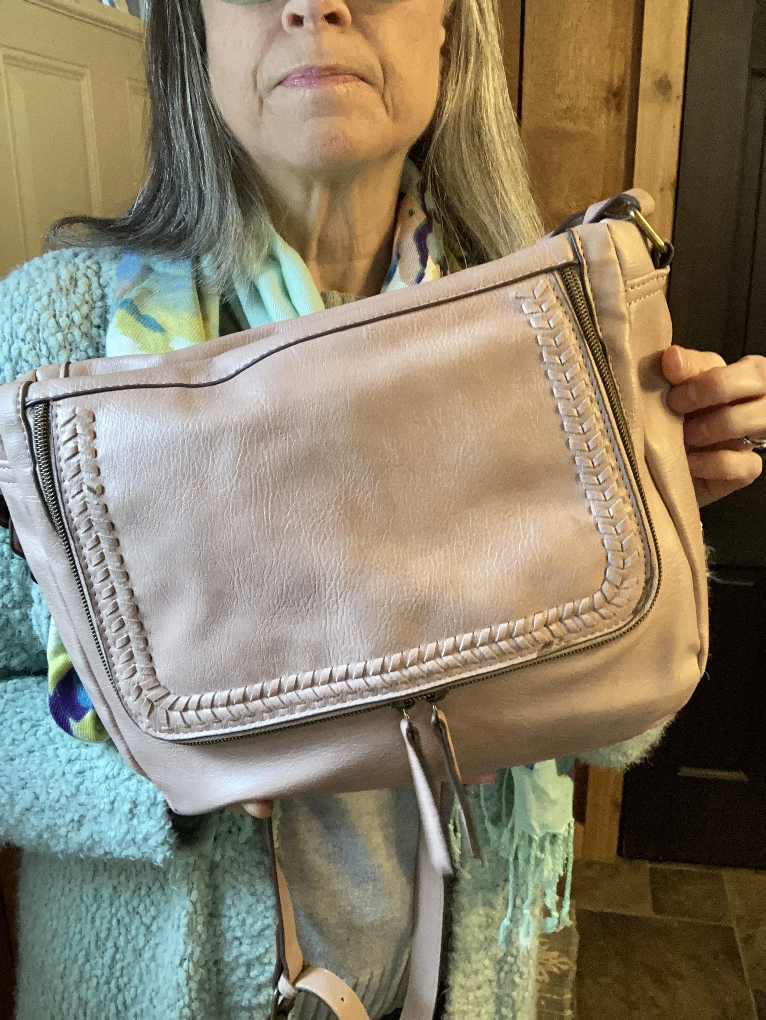
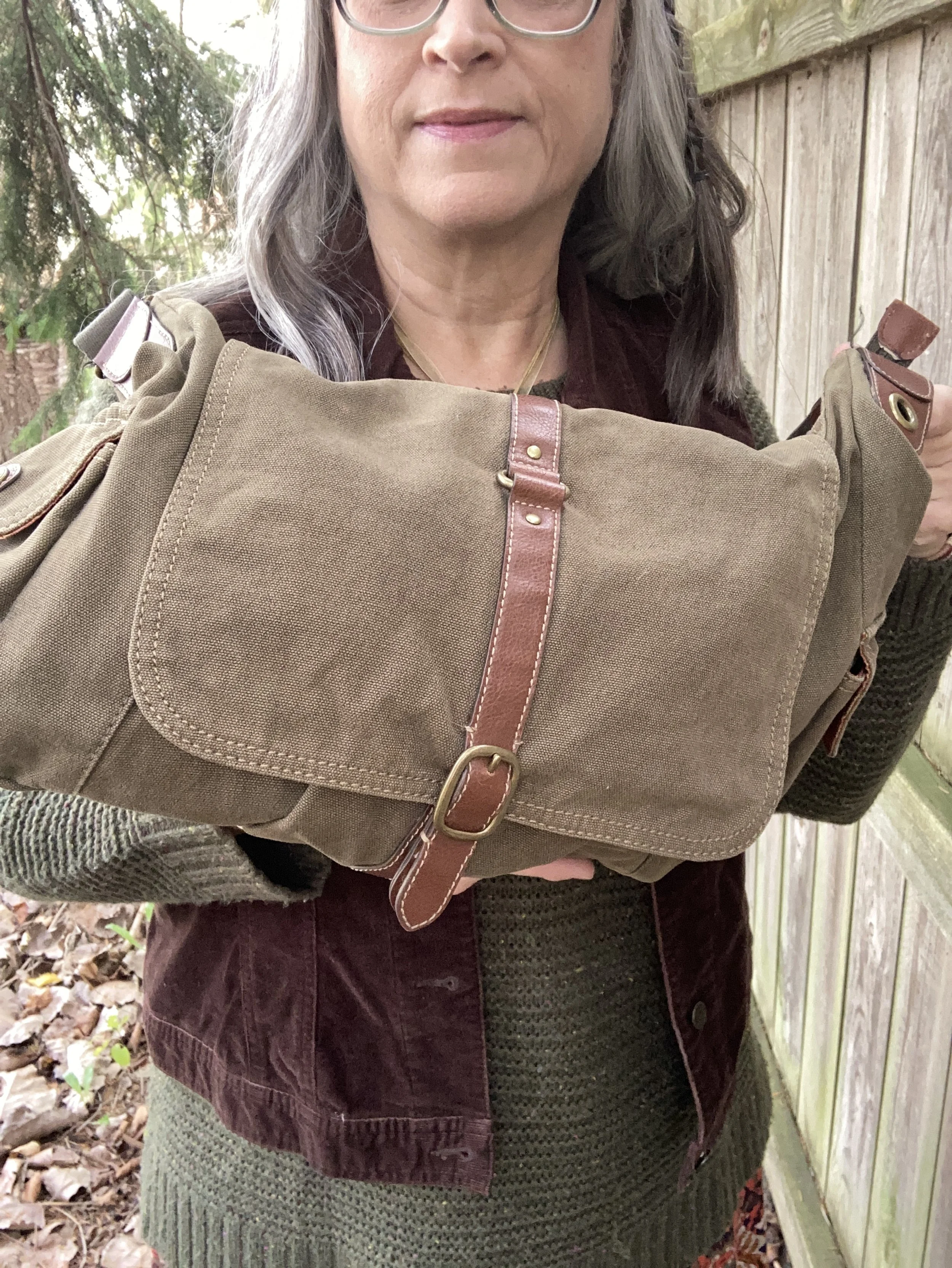
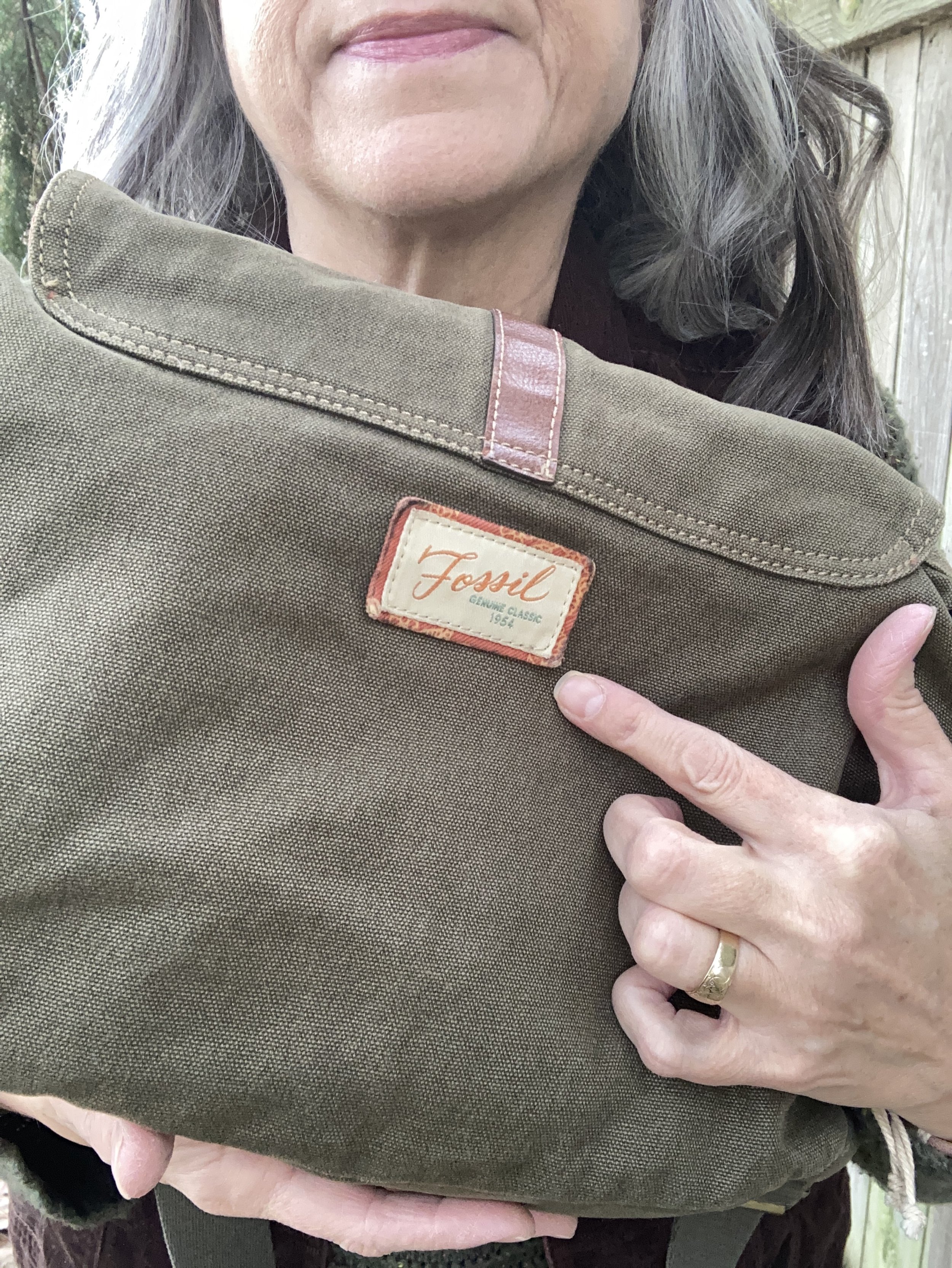
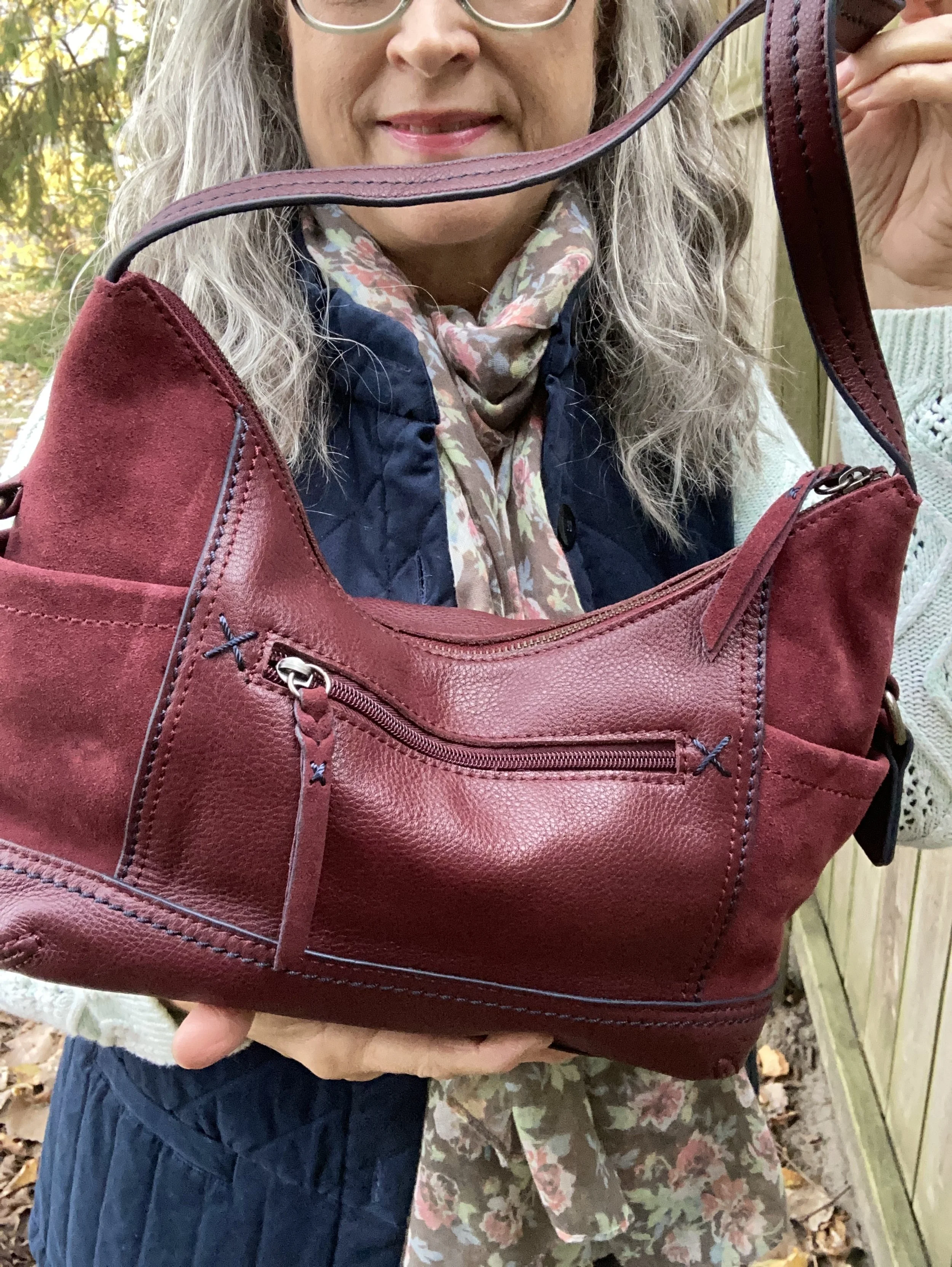
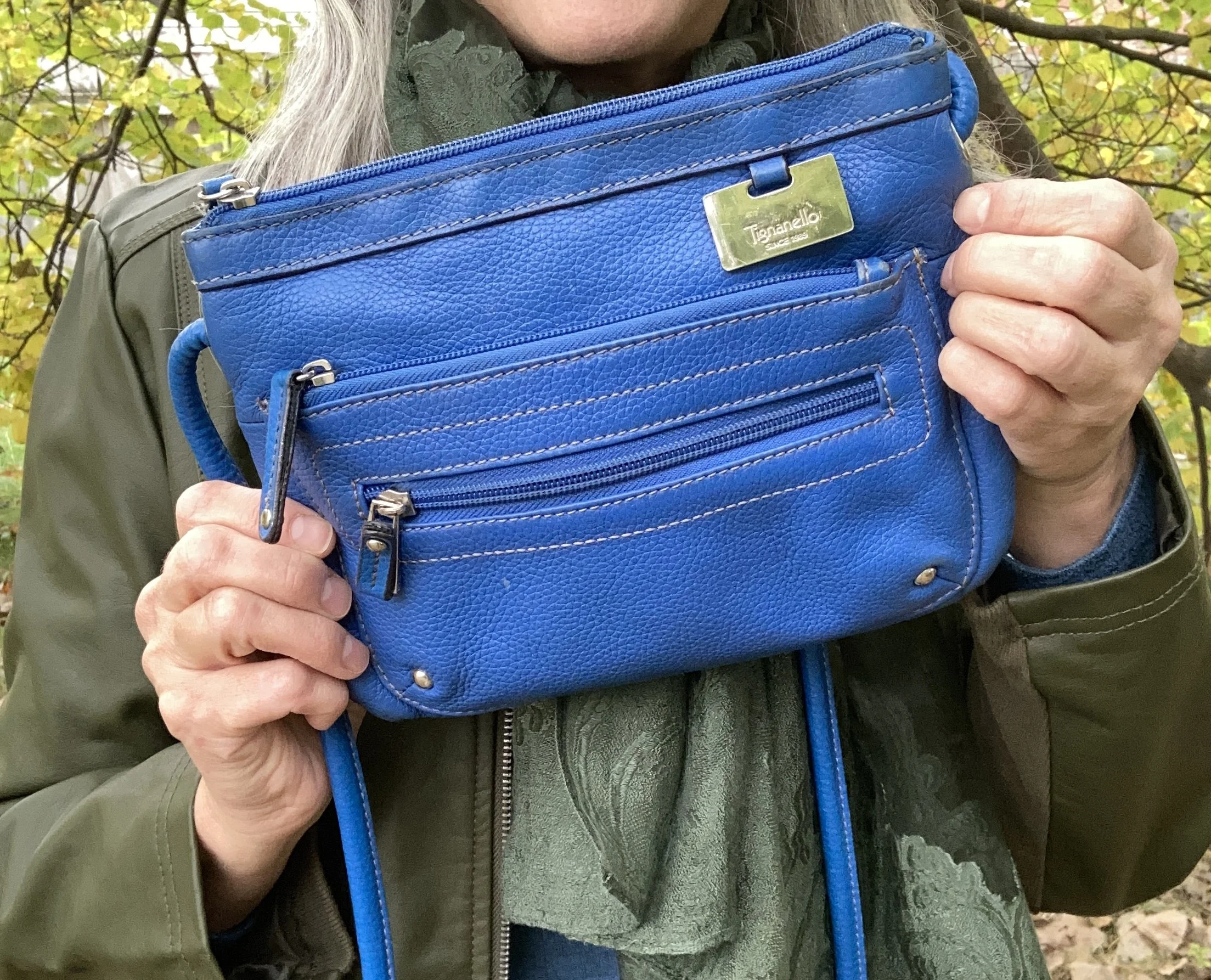
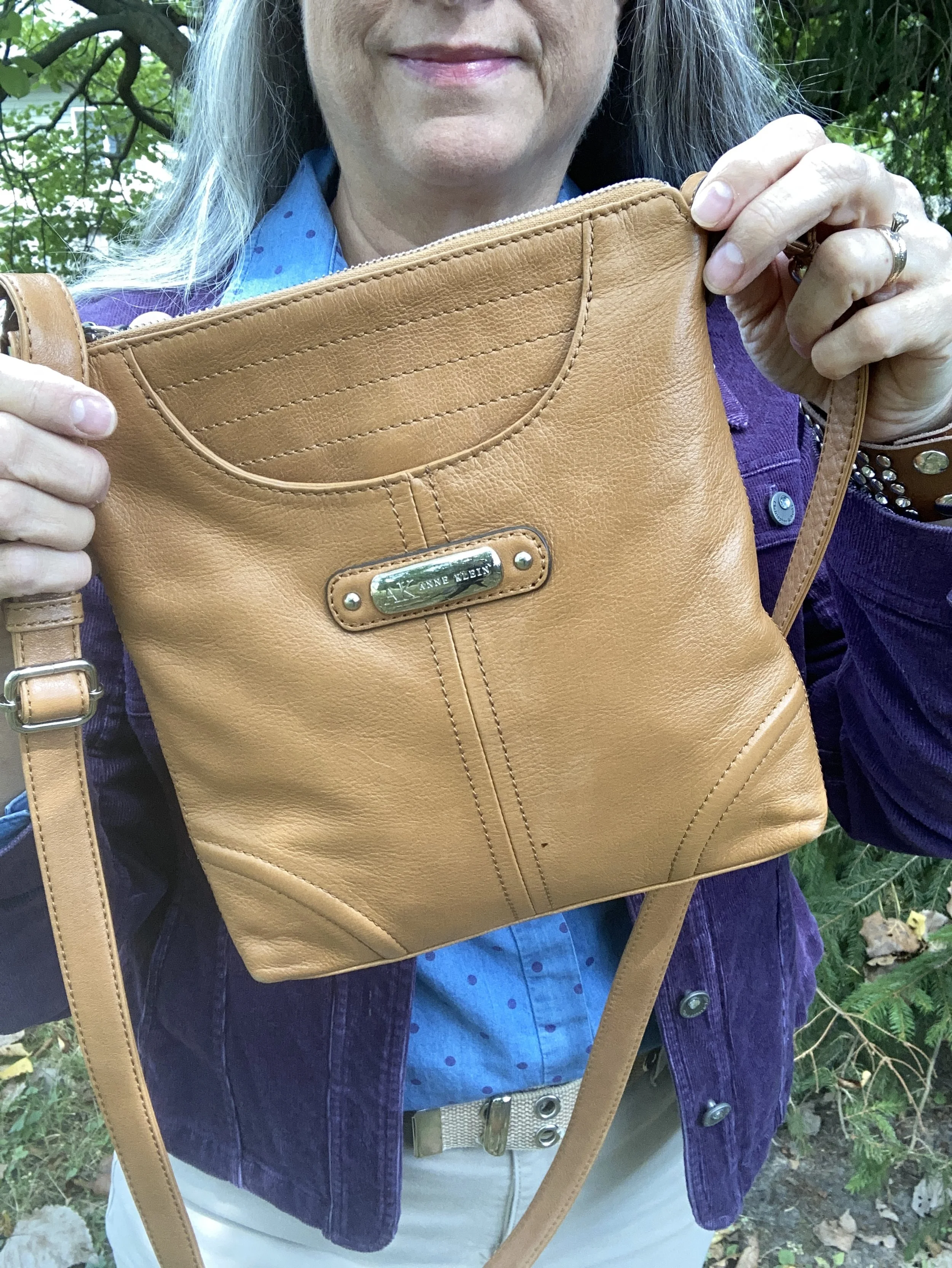
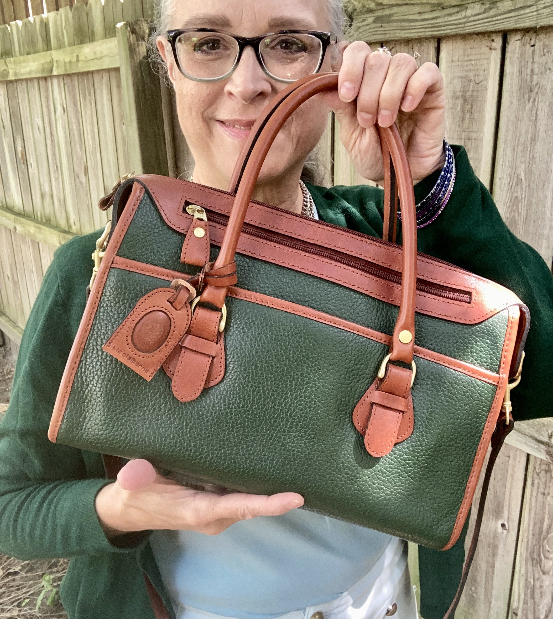
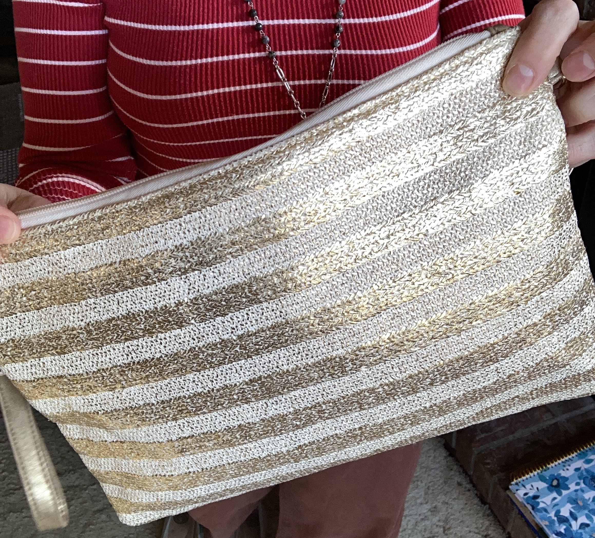
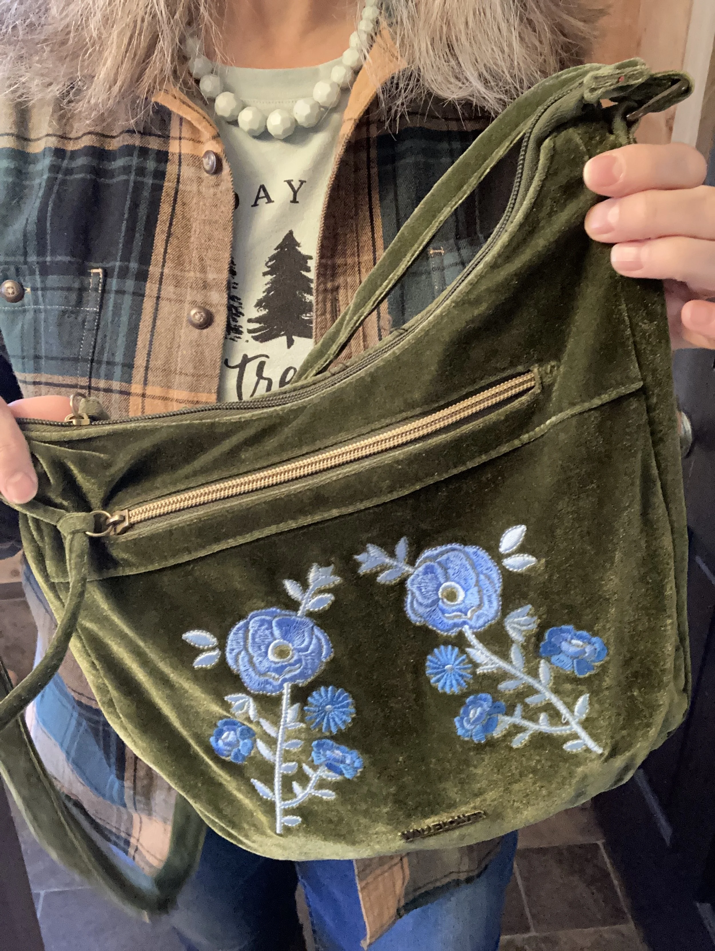
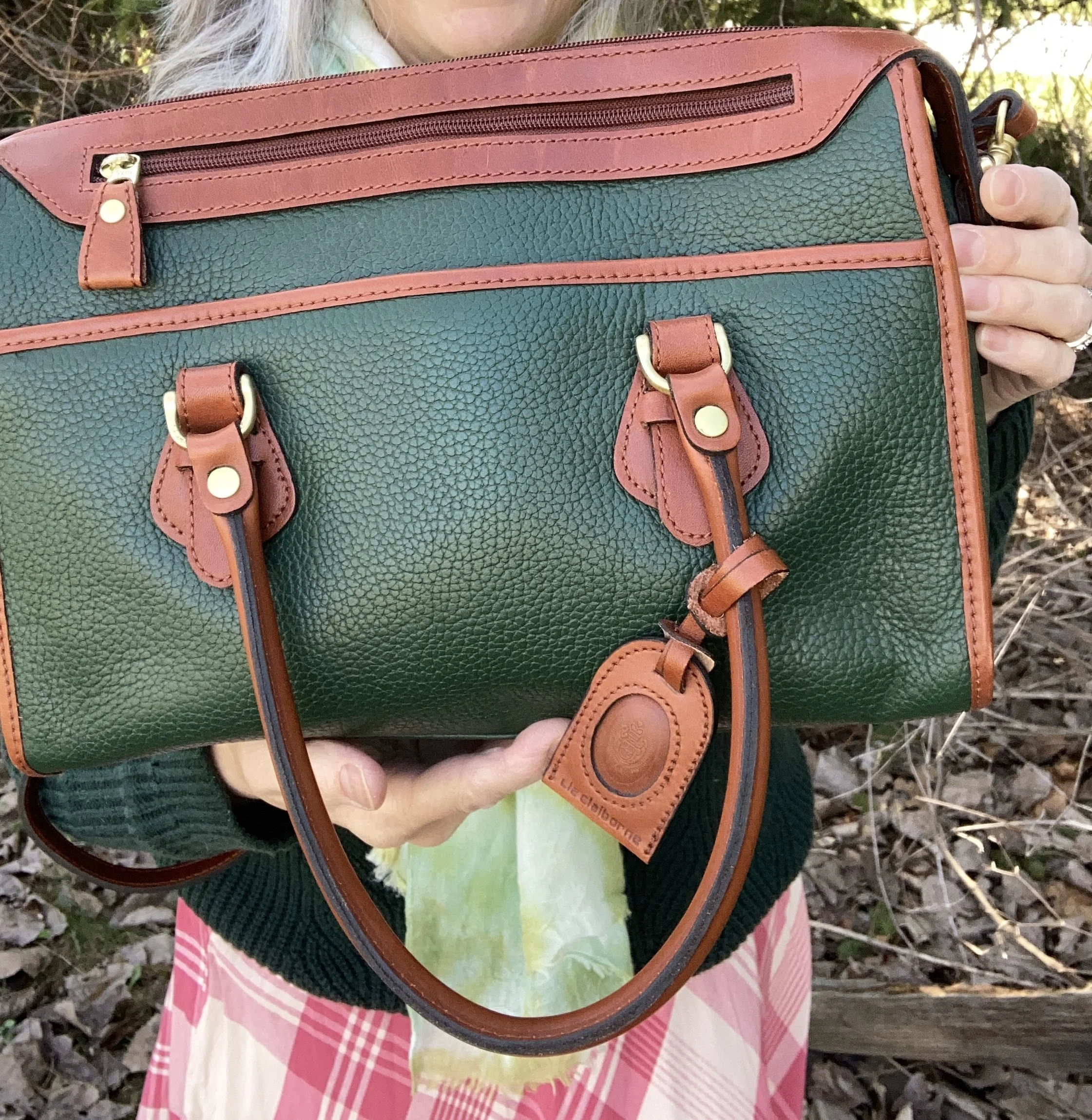
My bag is a thrifted Gloria Vanderbilt piece. Check out these green bags at Kohl’s, Portland Leather, and Target.
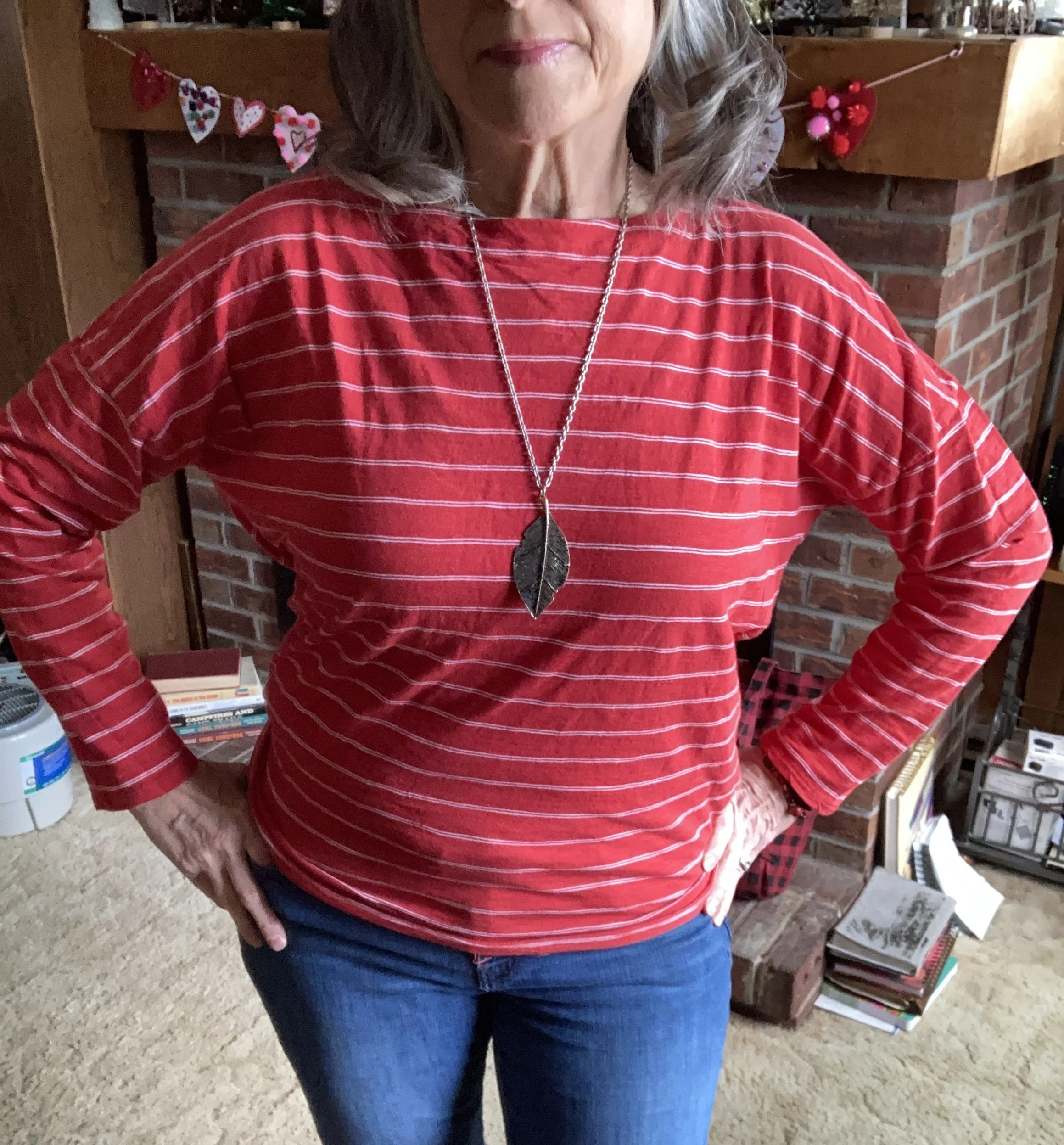
What do you think of these colors? Do you like the mix of dark with light? How do you feel about darker colors in the Spring and lighter colors in the fall? I’d love to hear your thoughts so be sure to leave a comment or two. I leave you with a picture of my crazy, wind blown hair. Ha, ha.
I’ve included a few shopping links. I do not make any money off of these links, but I want you to have options for purchasing in a color you like.
Have a great day!