Pantone Autumn/Winter 2025 - New York: Primrose Pink, Damson, and Mauve Wine
I am making an attempt to get back on track on my Fashion page, by introducing the Pantone Autumn/Winter 2025 color palettes. I thought if I started a little earlier, you could take the inspiration and actually shop your closets for some of these colors to wear this fall. Starting with the New York palette, I hope to also cover the London Palette next month.
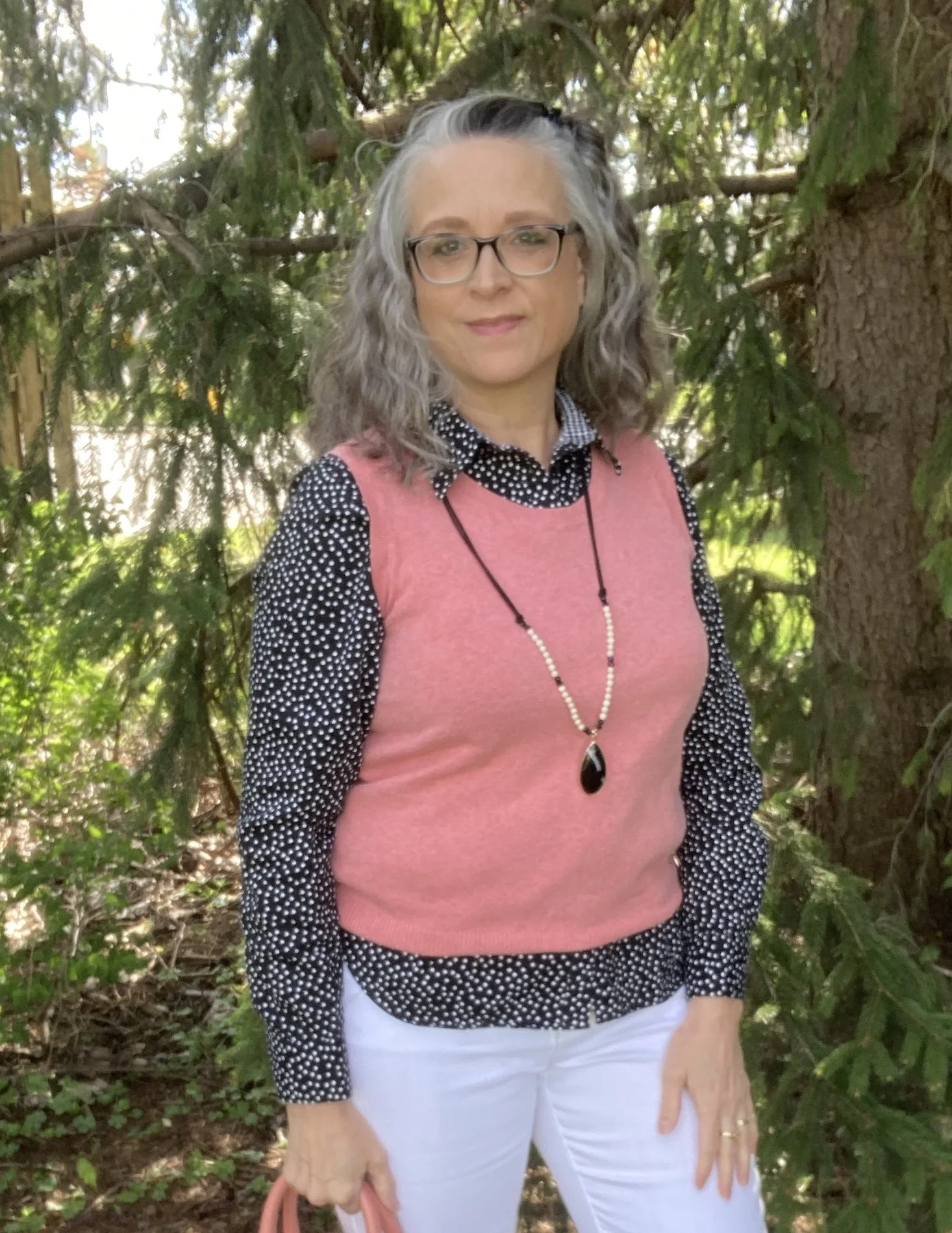
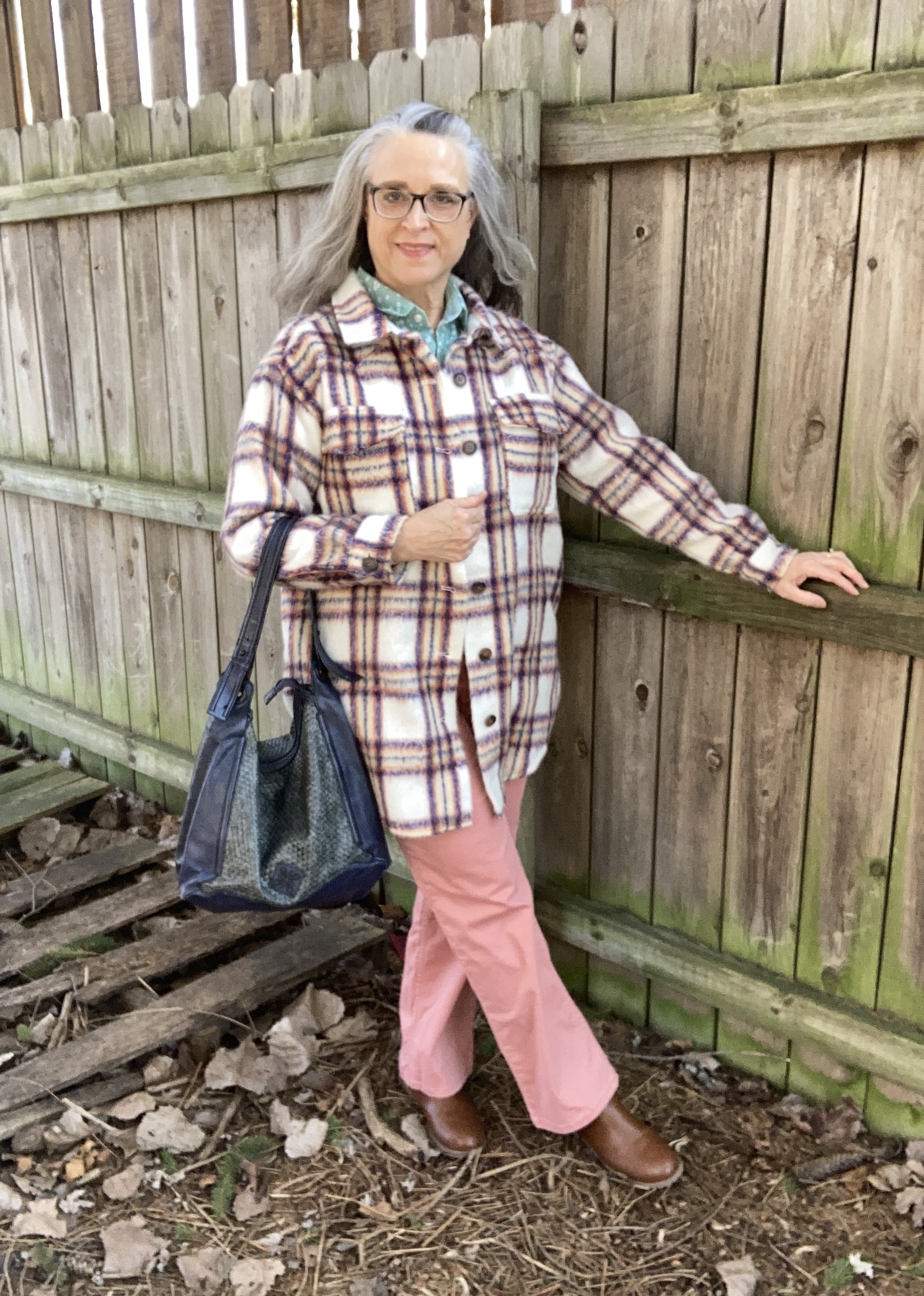
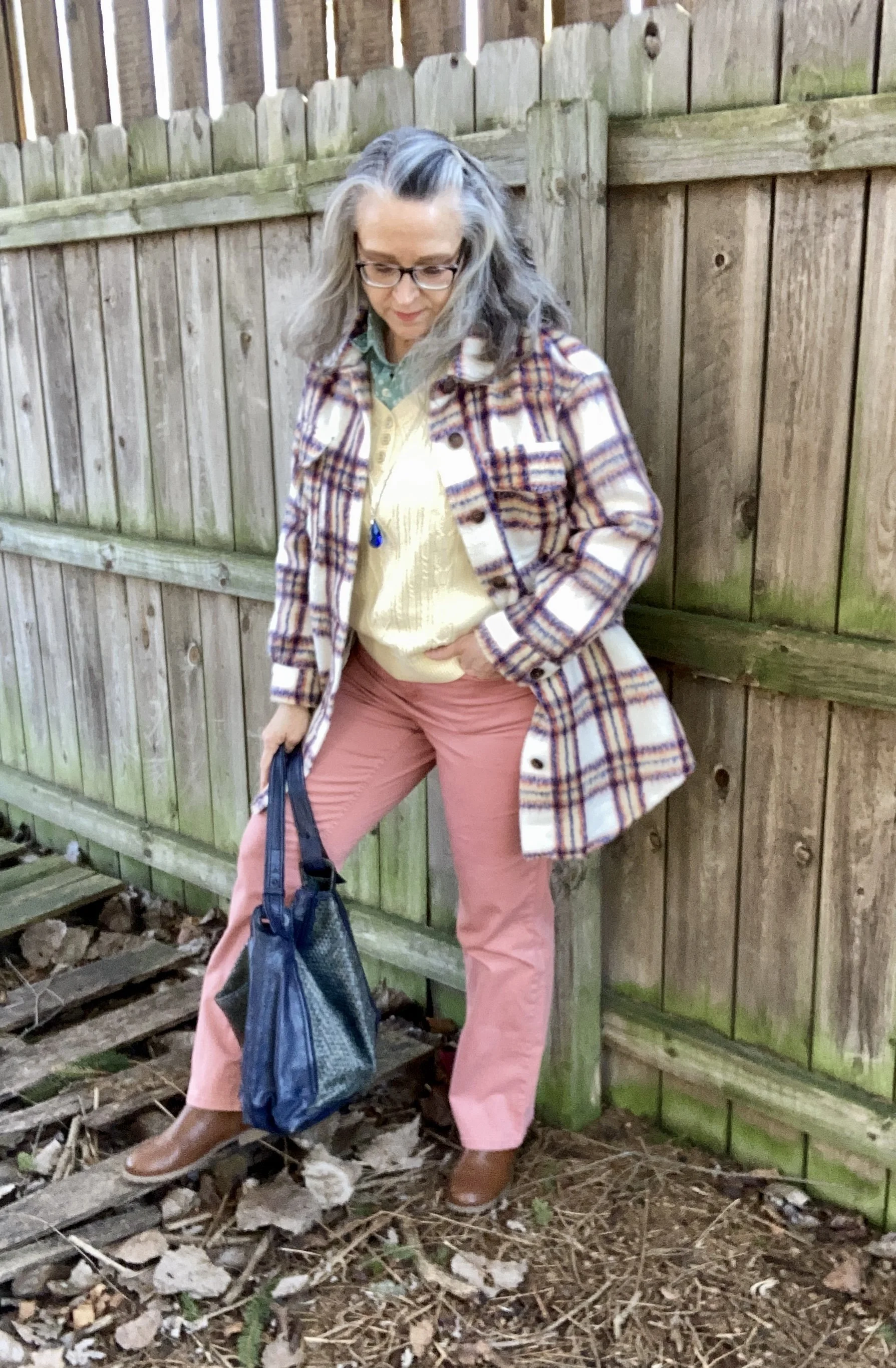
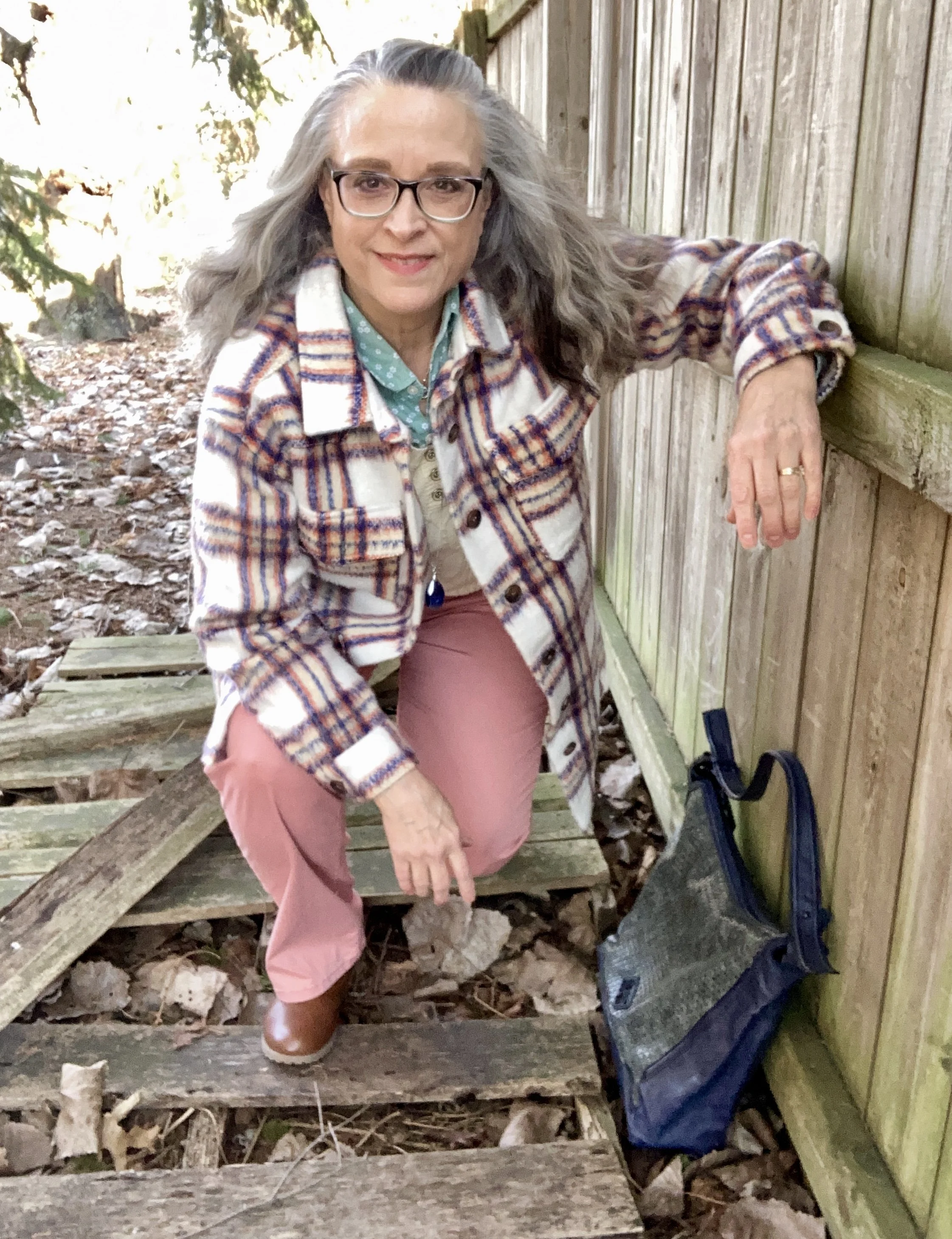
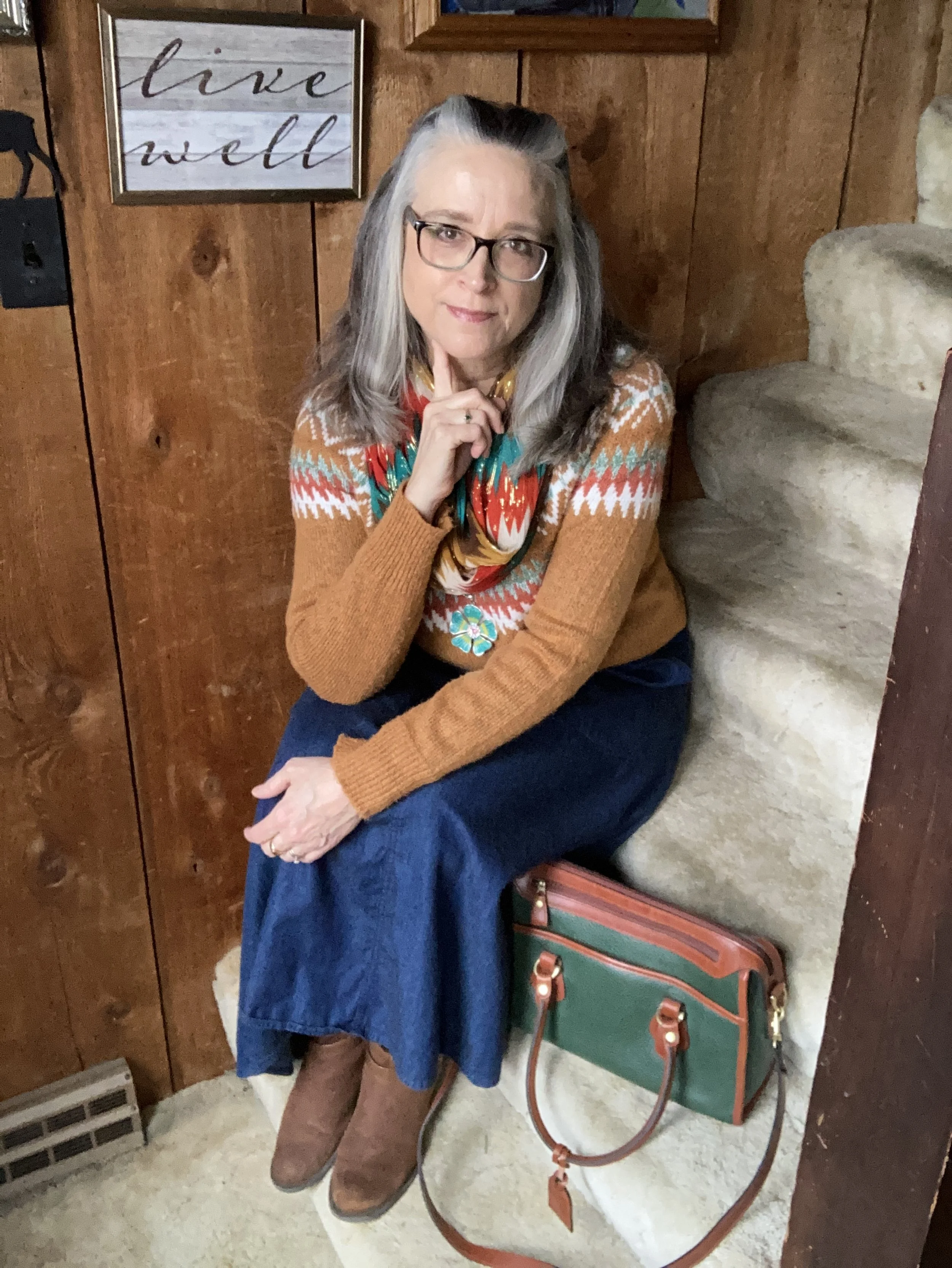
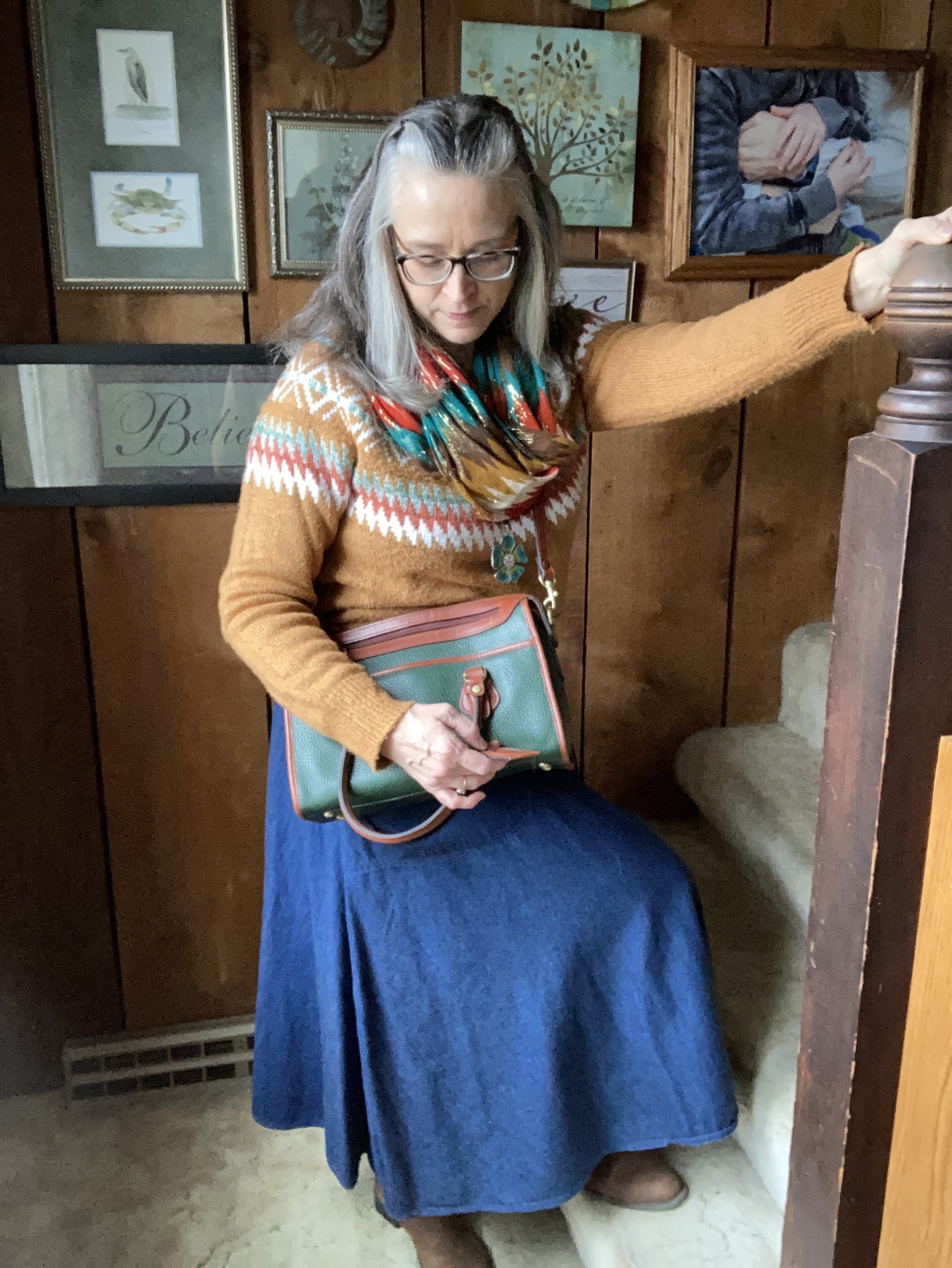
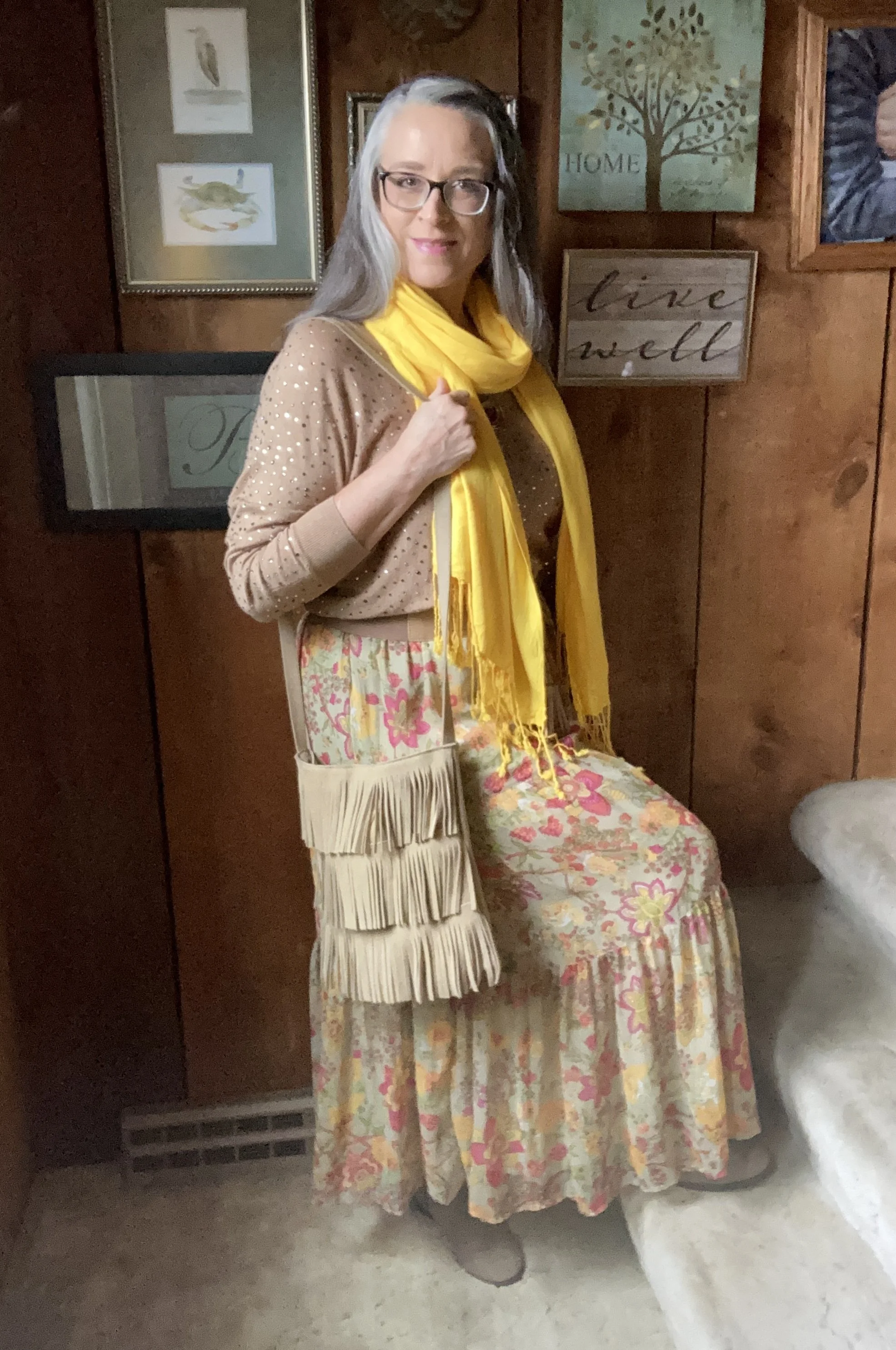
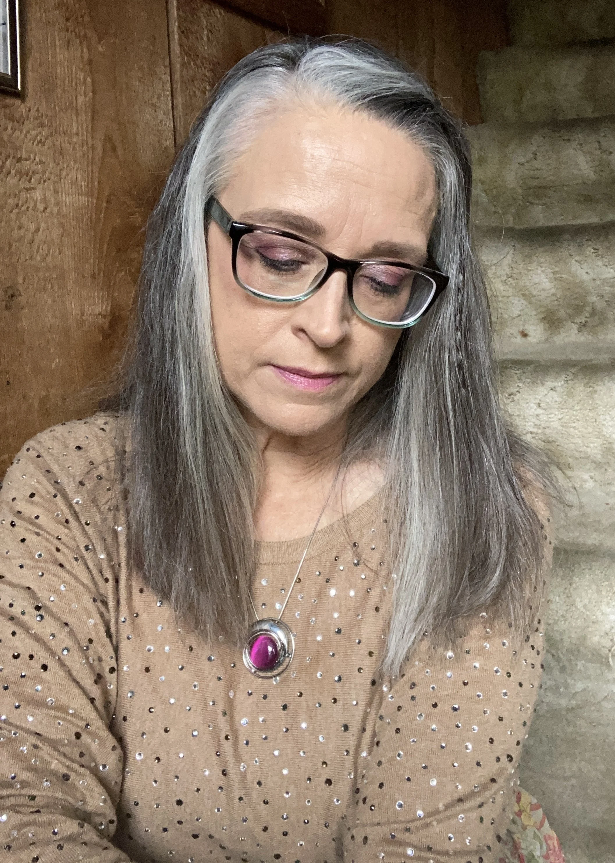
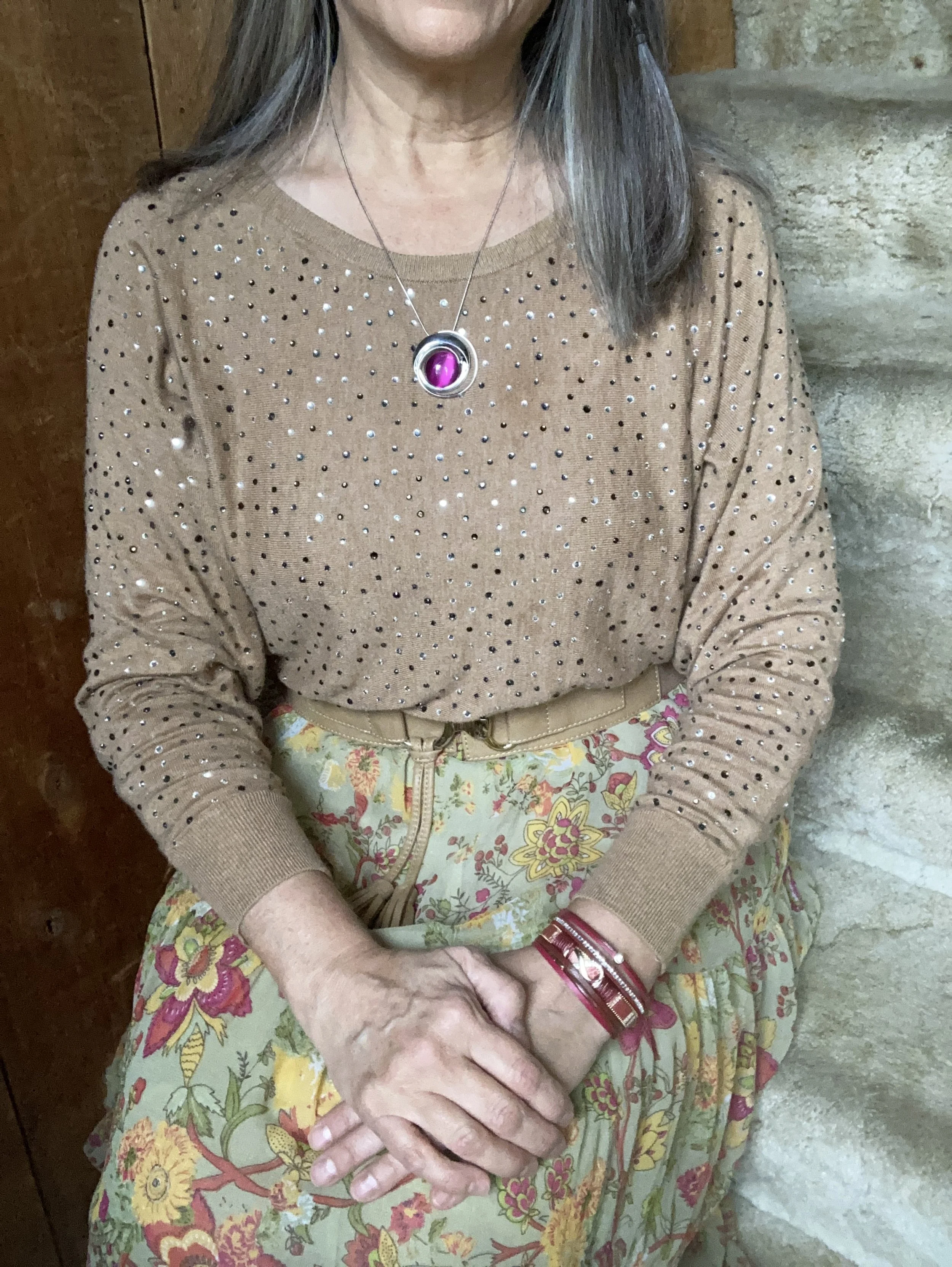
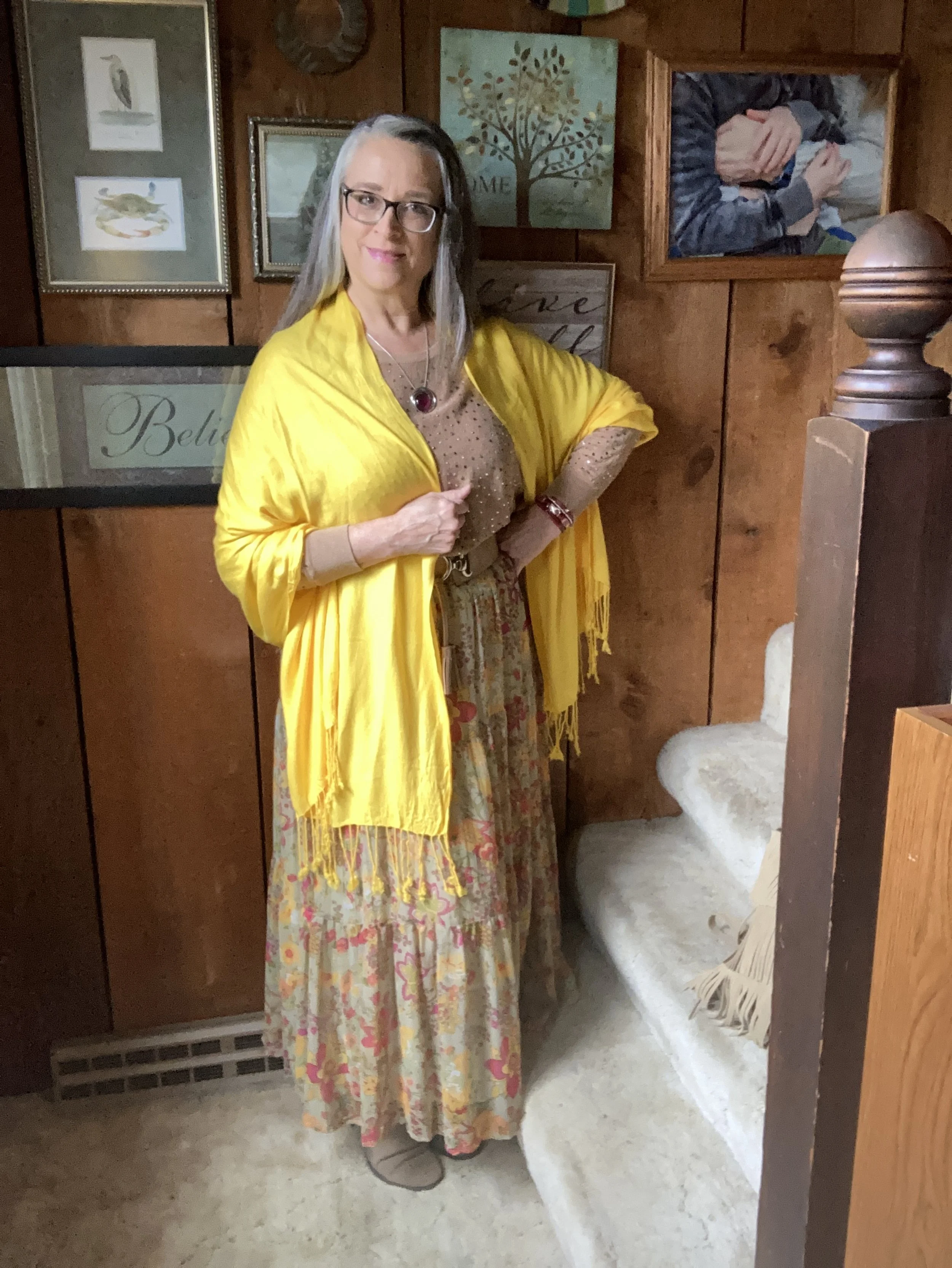
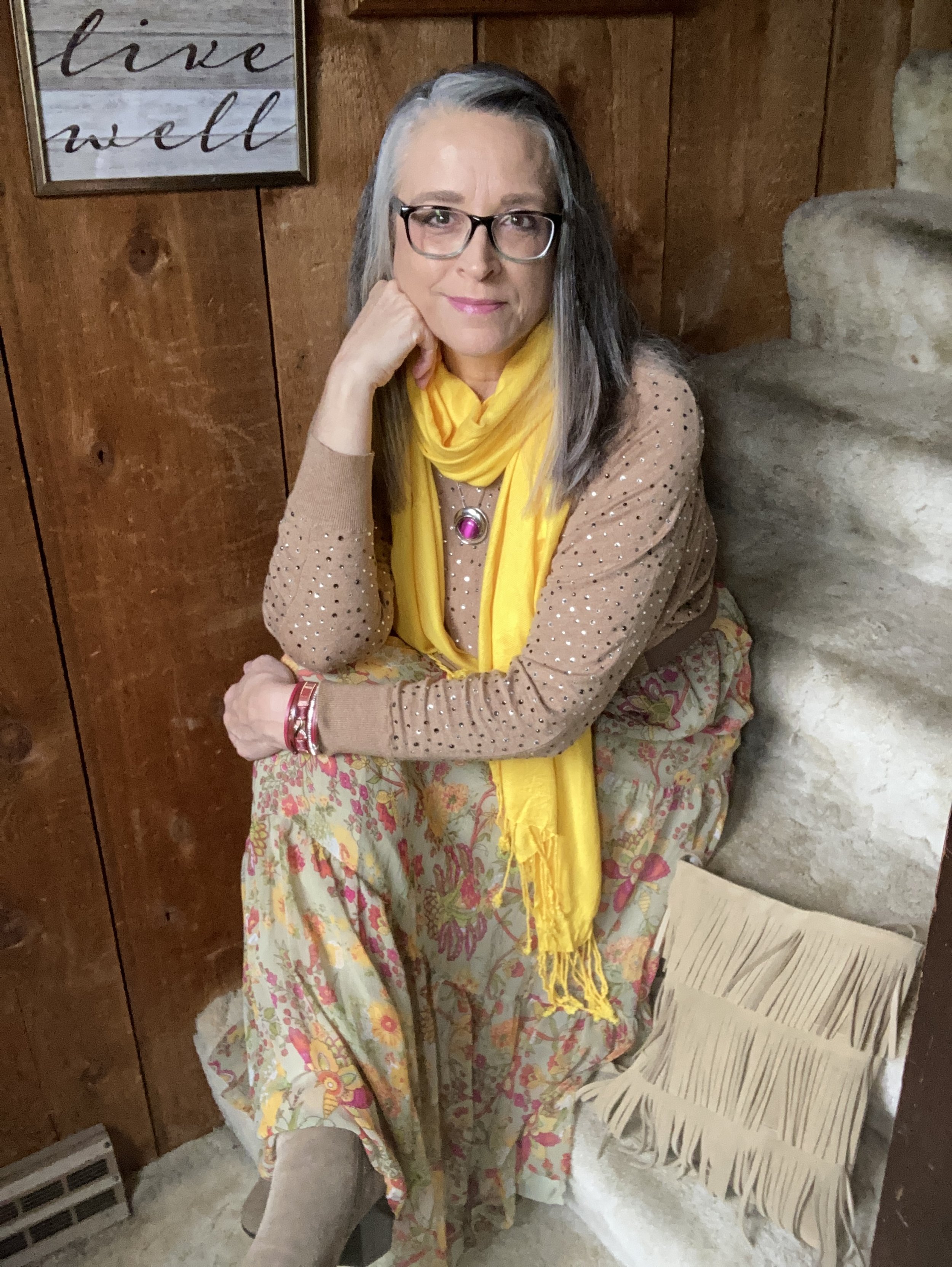
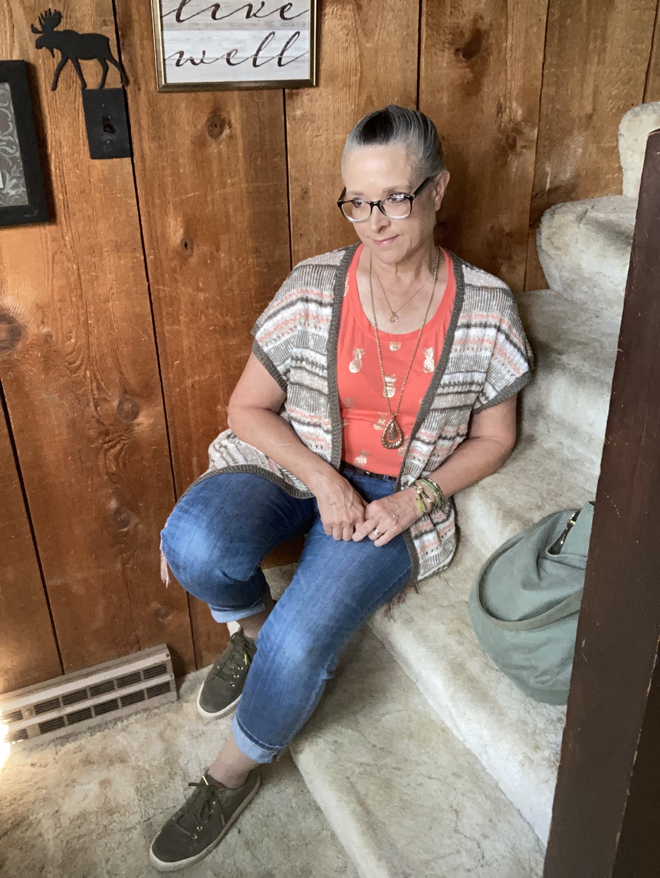
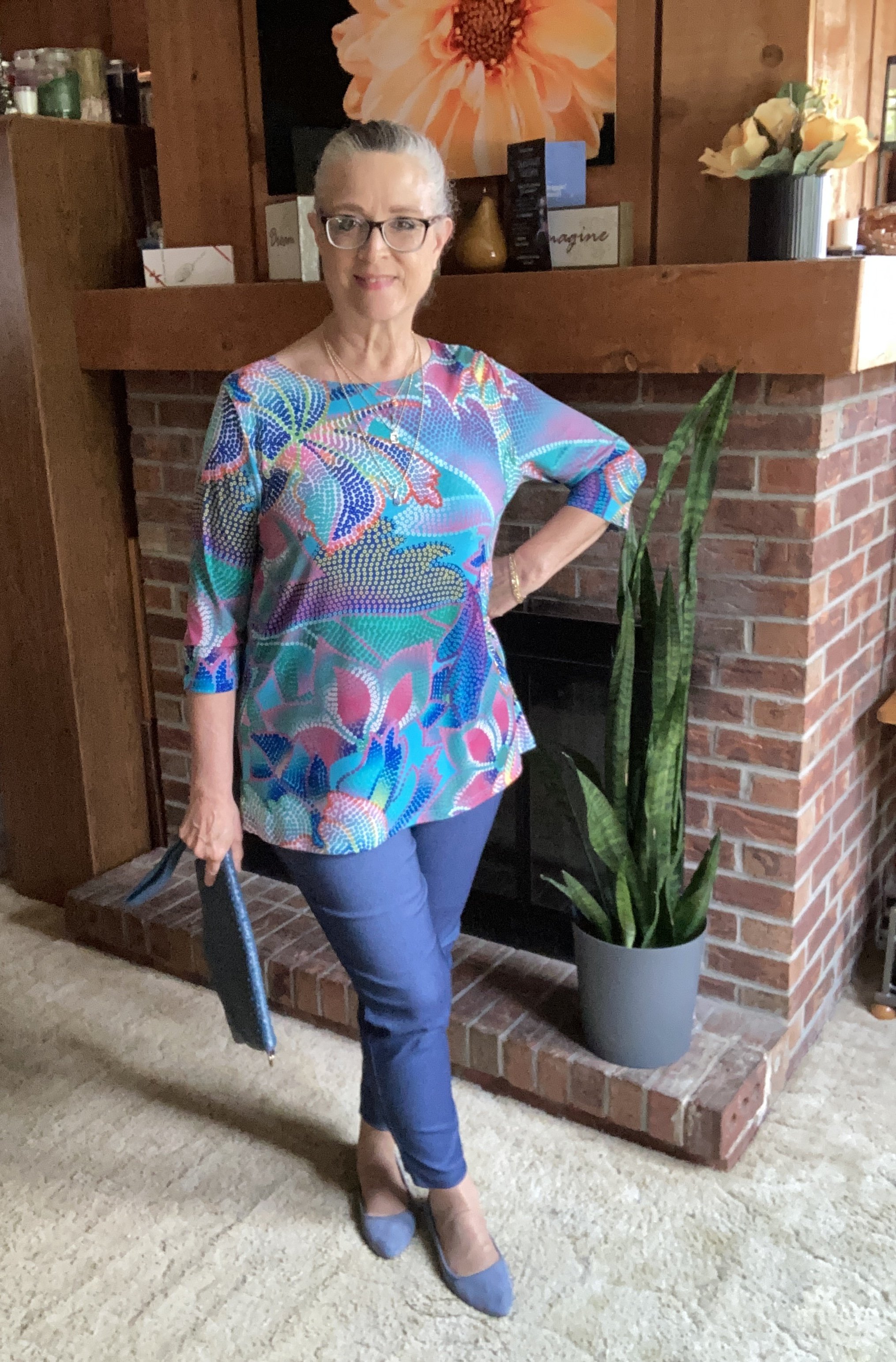
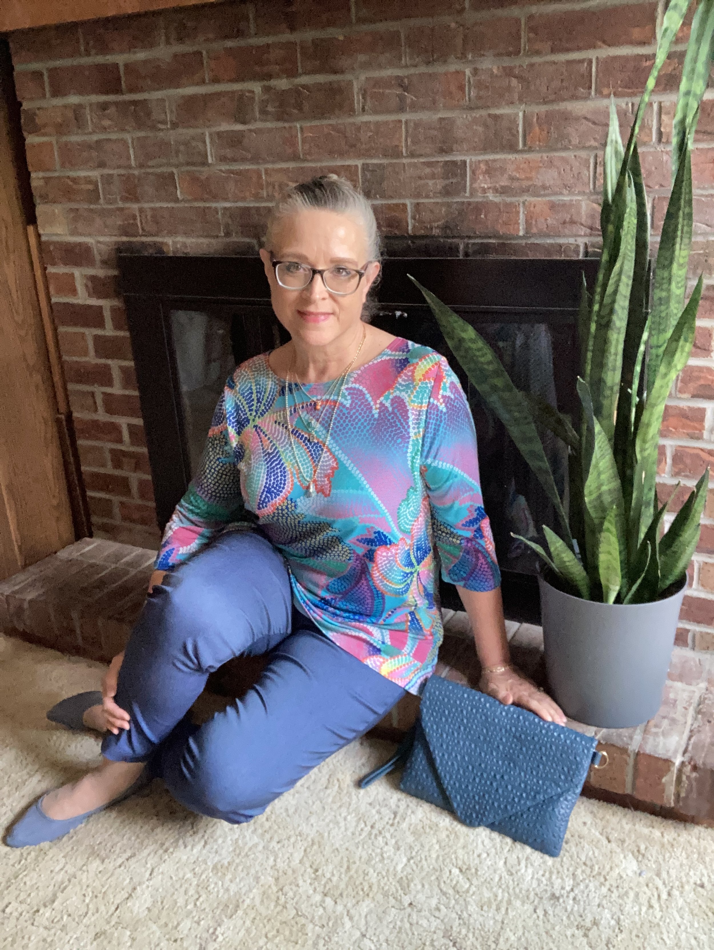
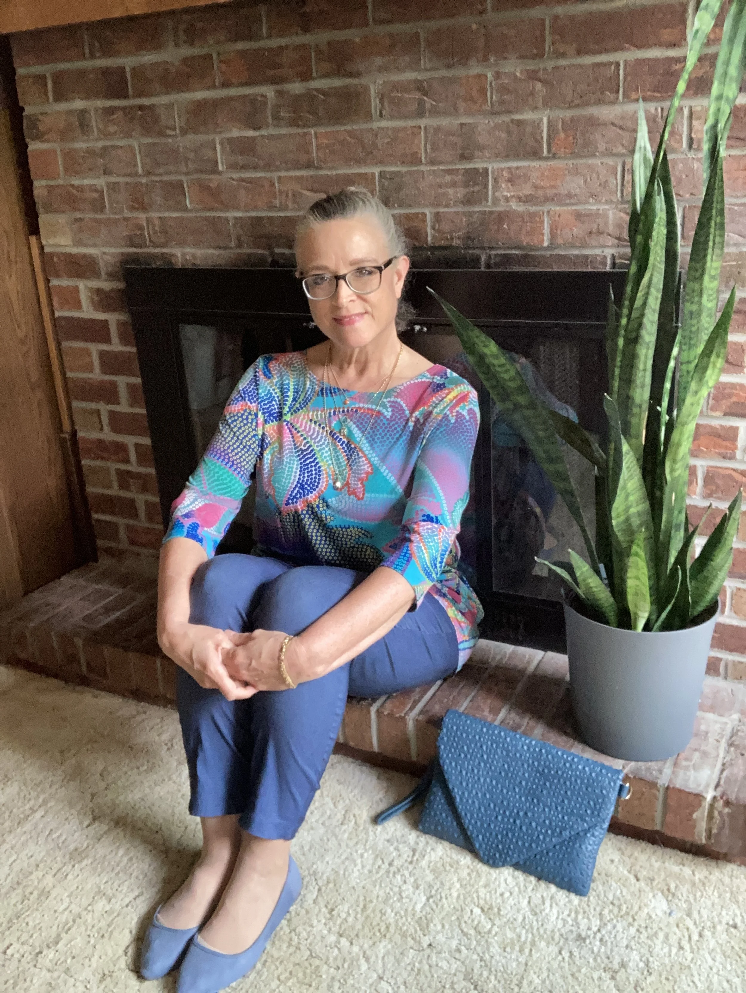
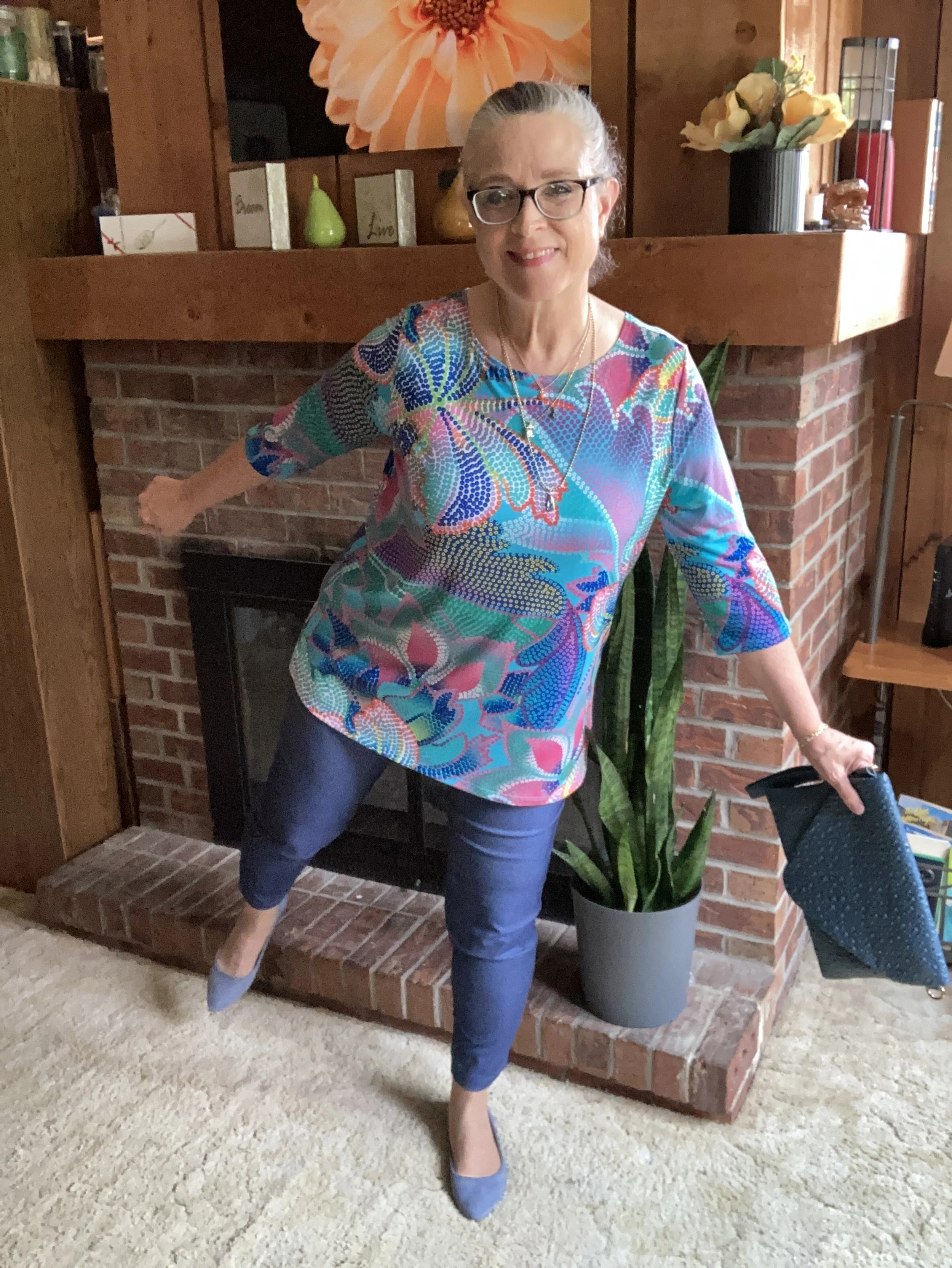
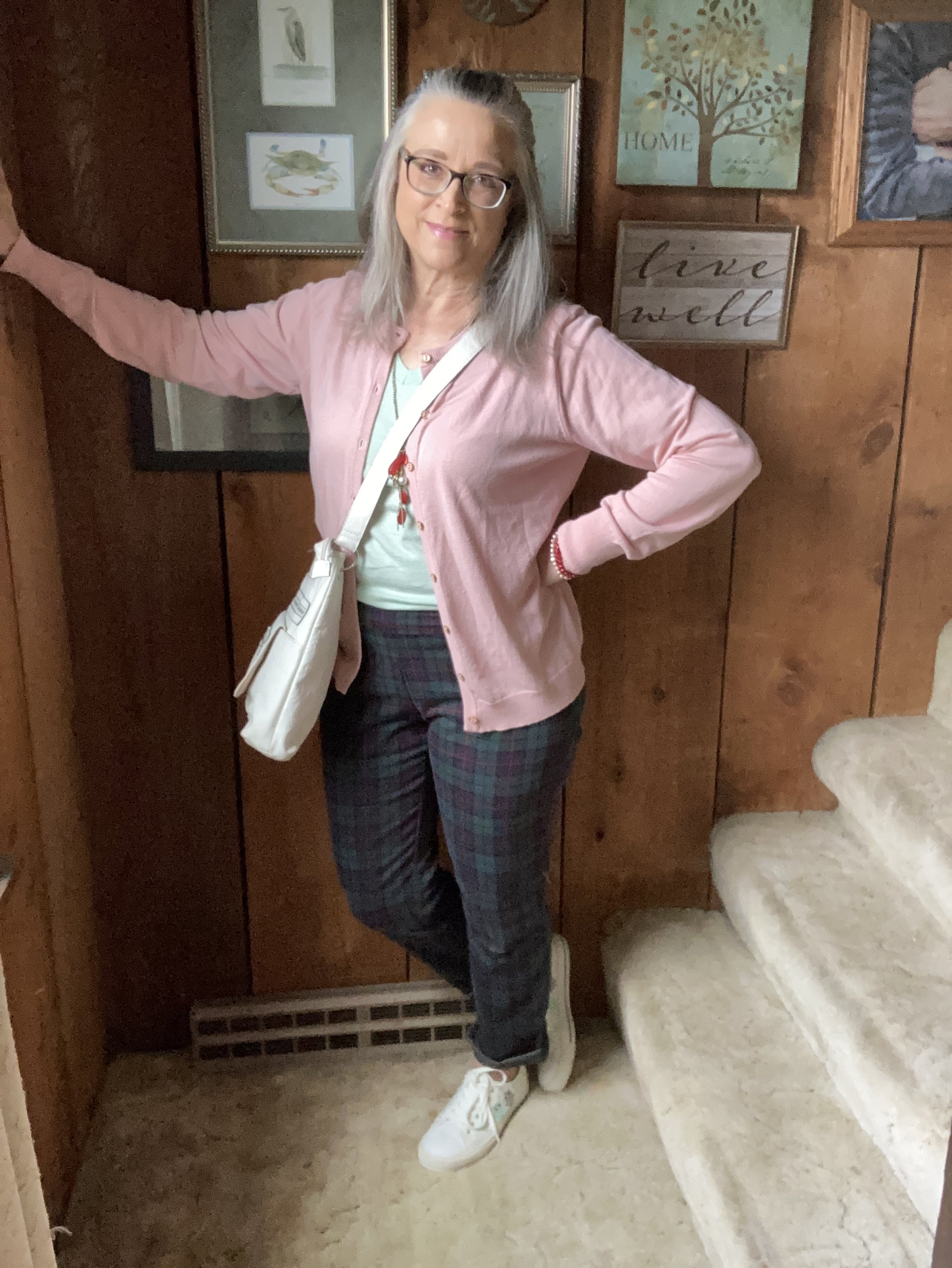
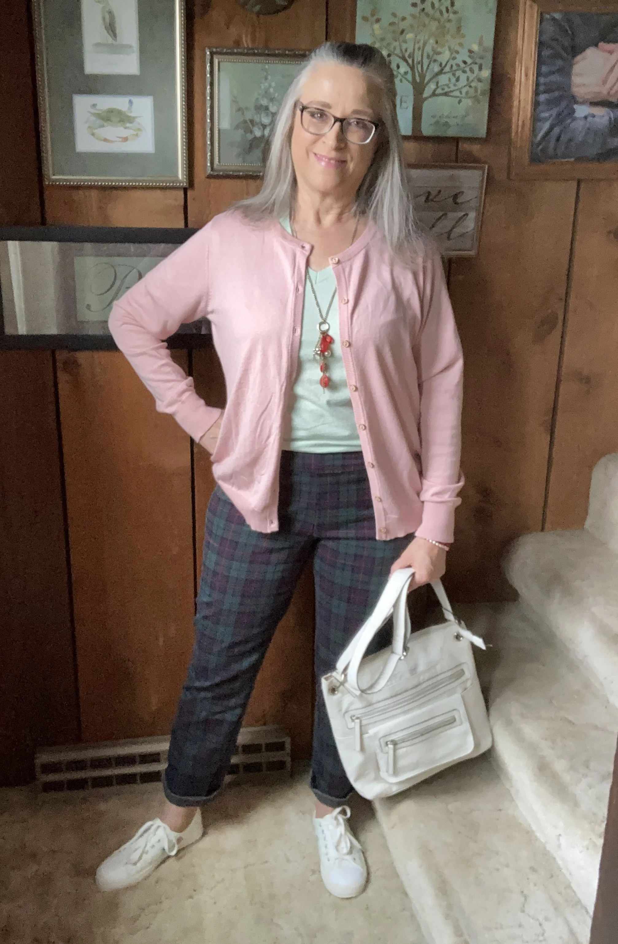
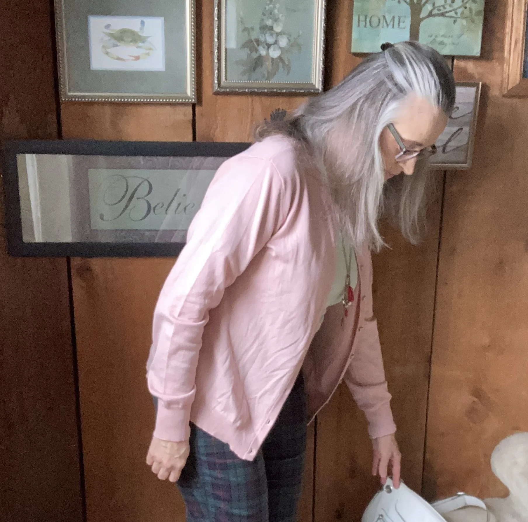
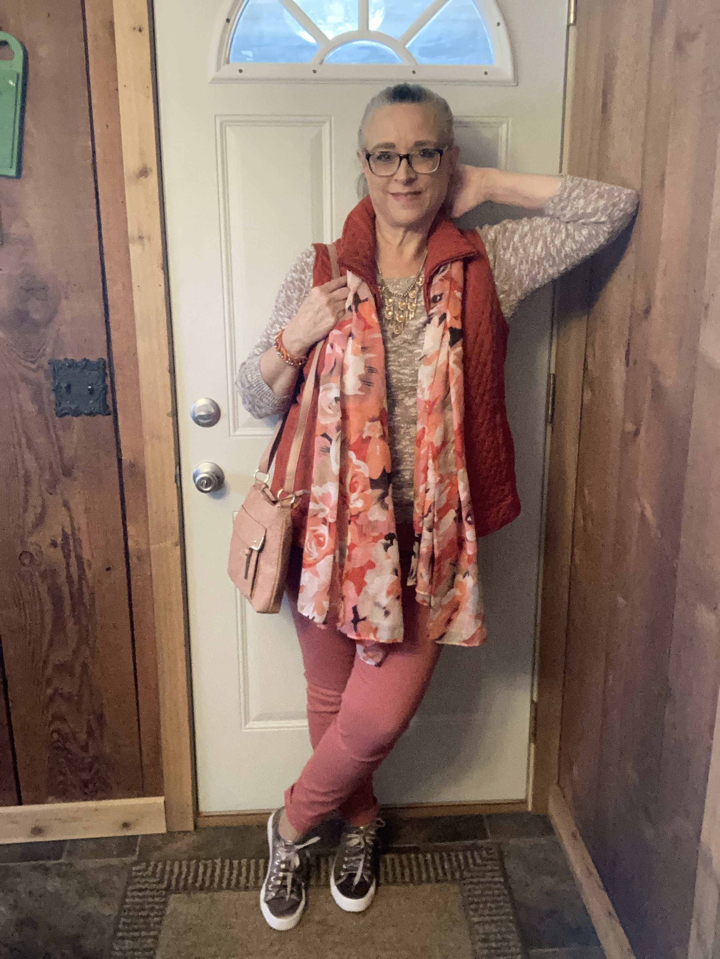
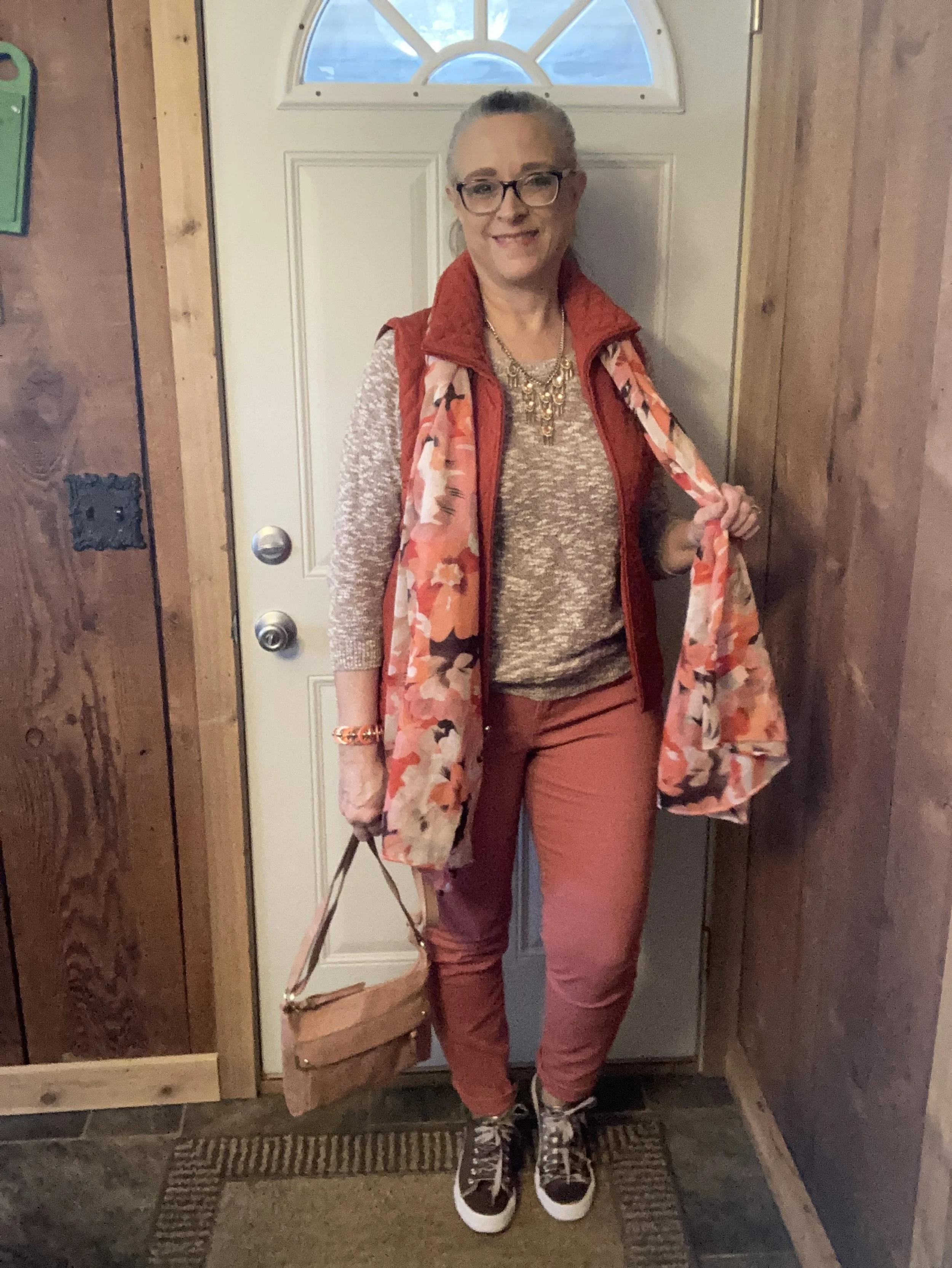
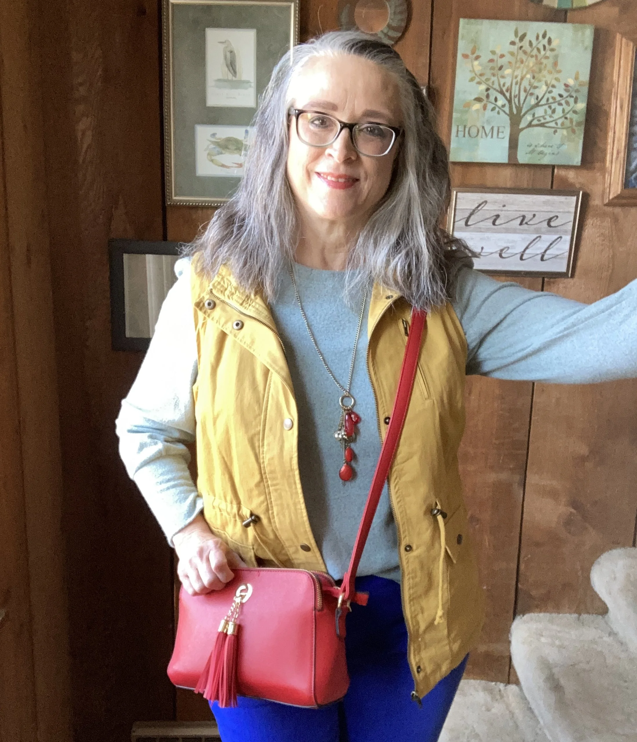
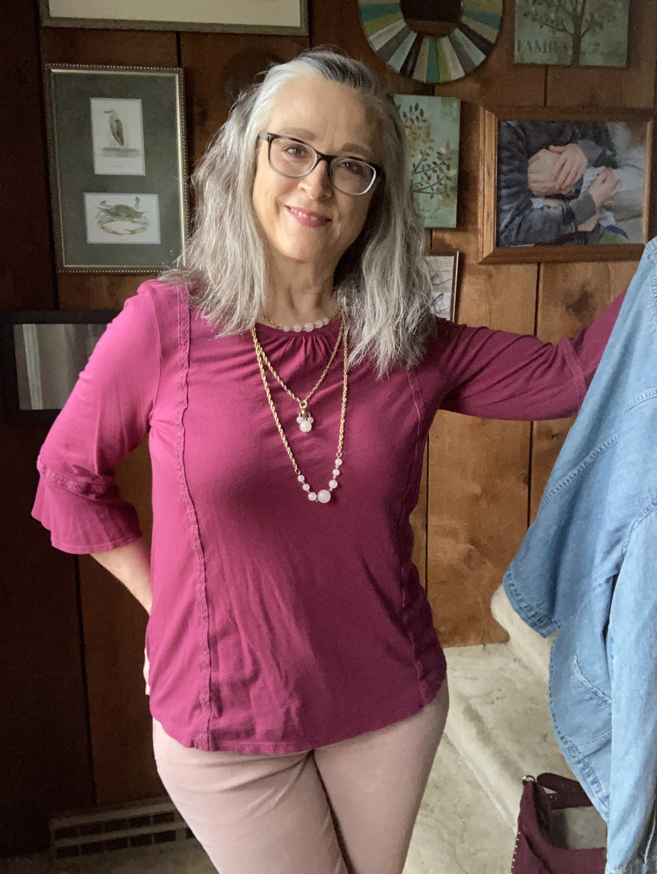
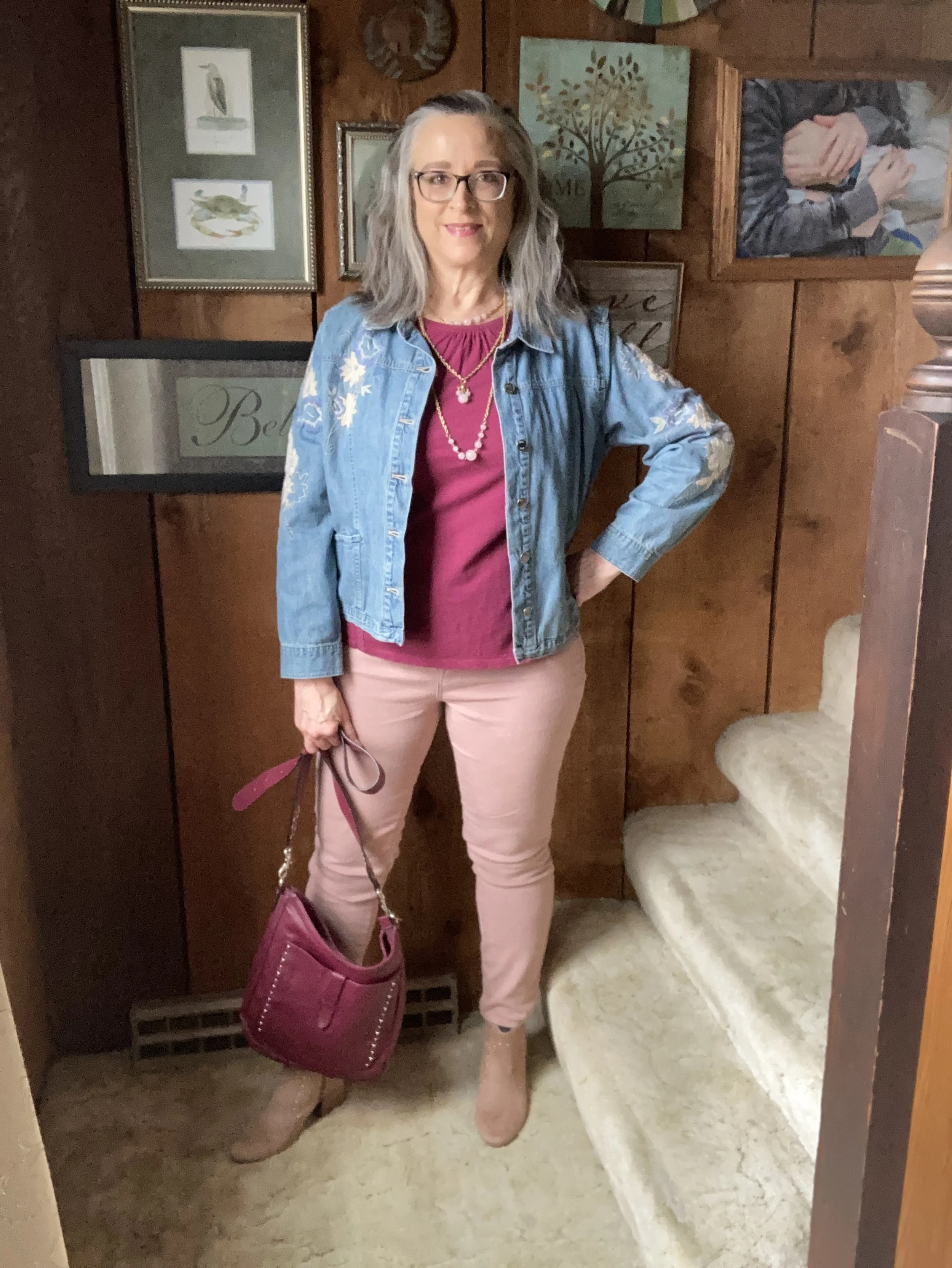
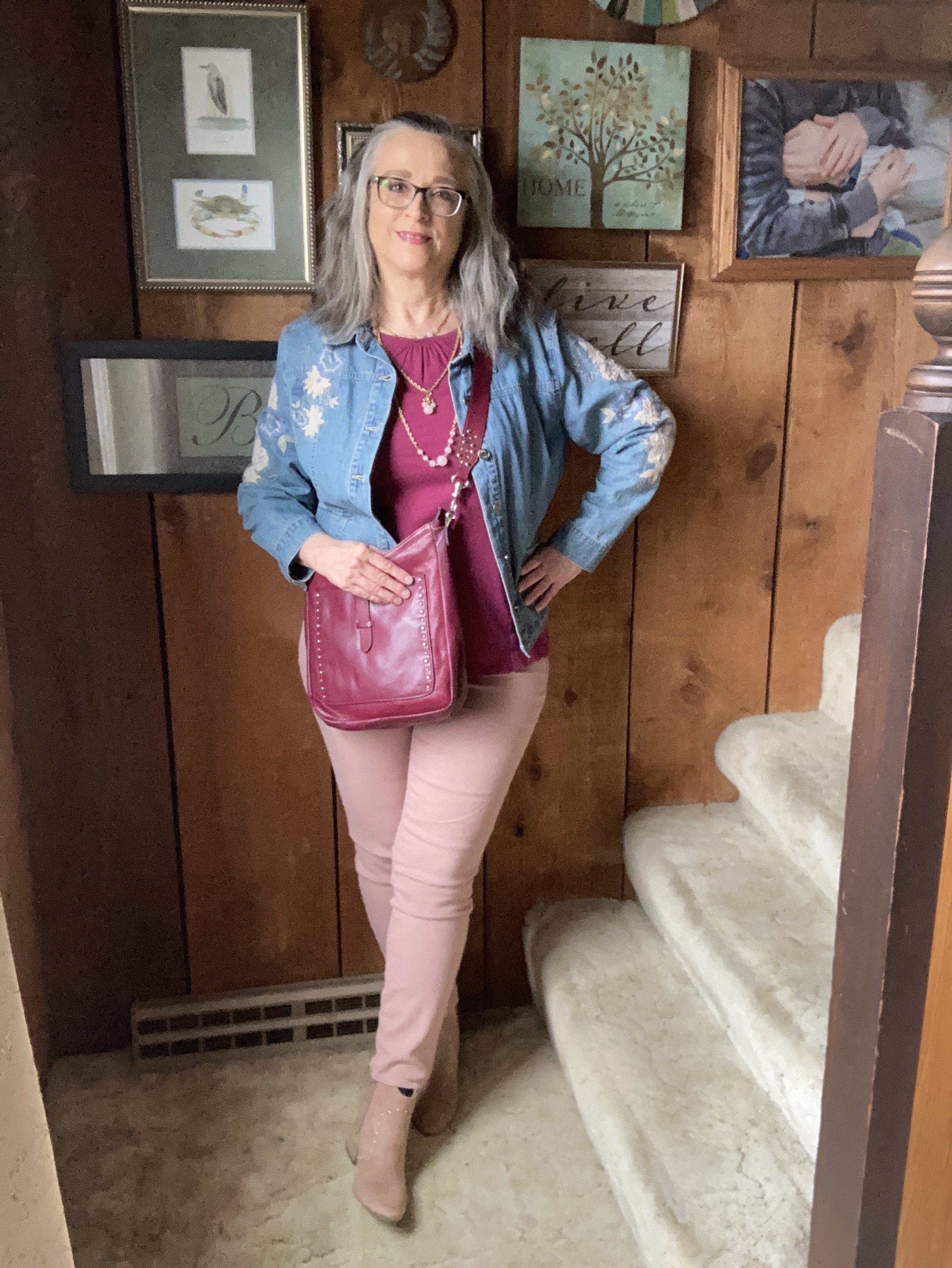
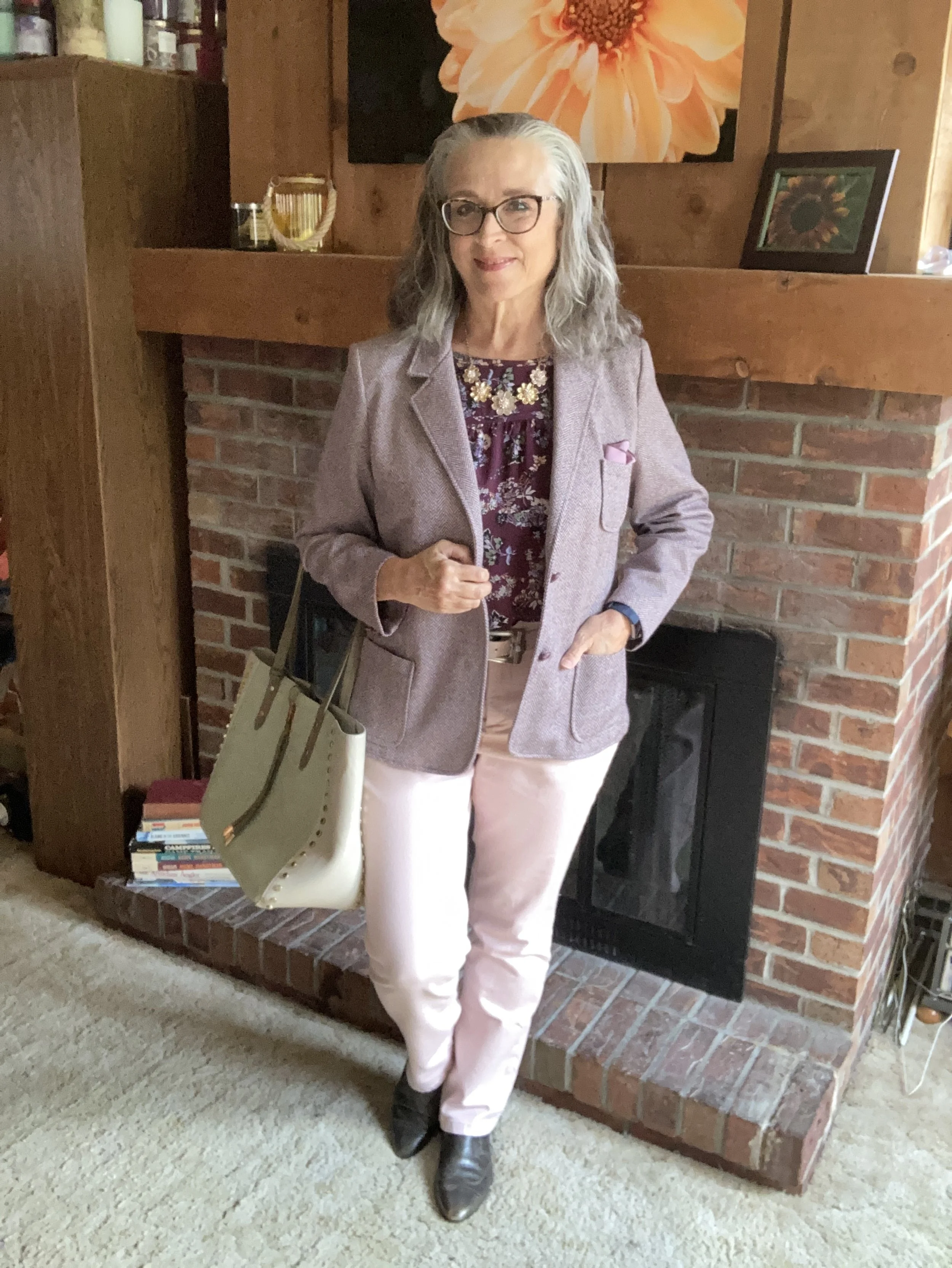
Today’s outfit is a pretty work wear look that uses the palette’s lightest color Primrose Pink, paired with the medium Damson purple and the darker Mauve Wine. I really like how these colors work together, giving a nod to the parting pastels of summer and to the incoming darker hues of fall. You can see the actual colors in one of the Pantone pins on my Pinterest board here.
I got dressed, did my makeup and was all set to take pictures outdoors and then it decided to pour. By the time I took these shots the sun was coming out again, but the grass and trees were soaked, so I decided to stay in doors.
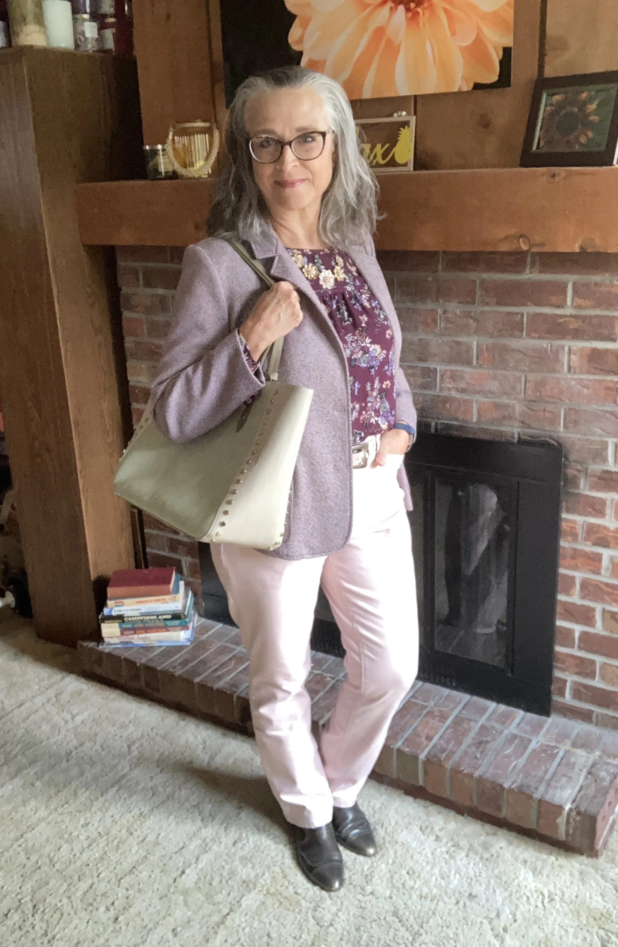
I went through a few color combination iterations before I finally settled on this trio, but I really like how it turned out. Let’s look at all the pieces.
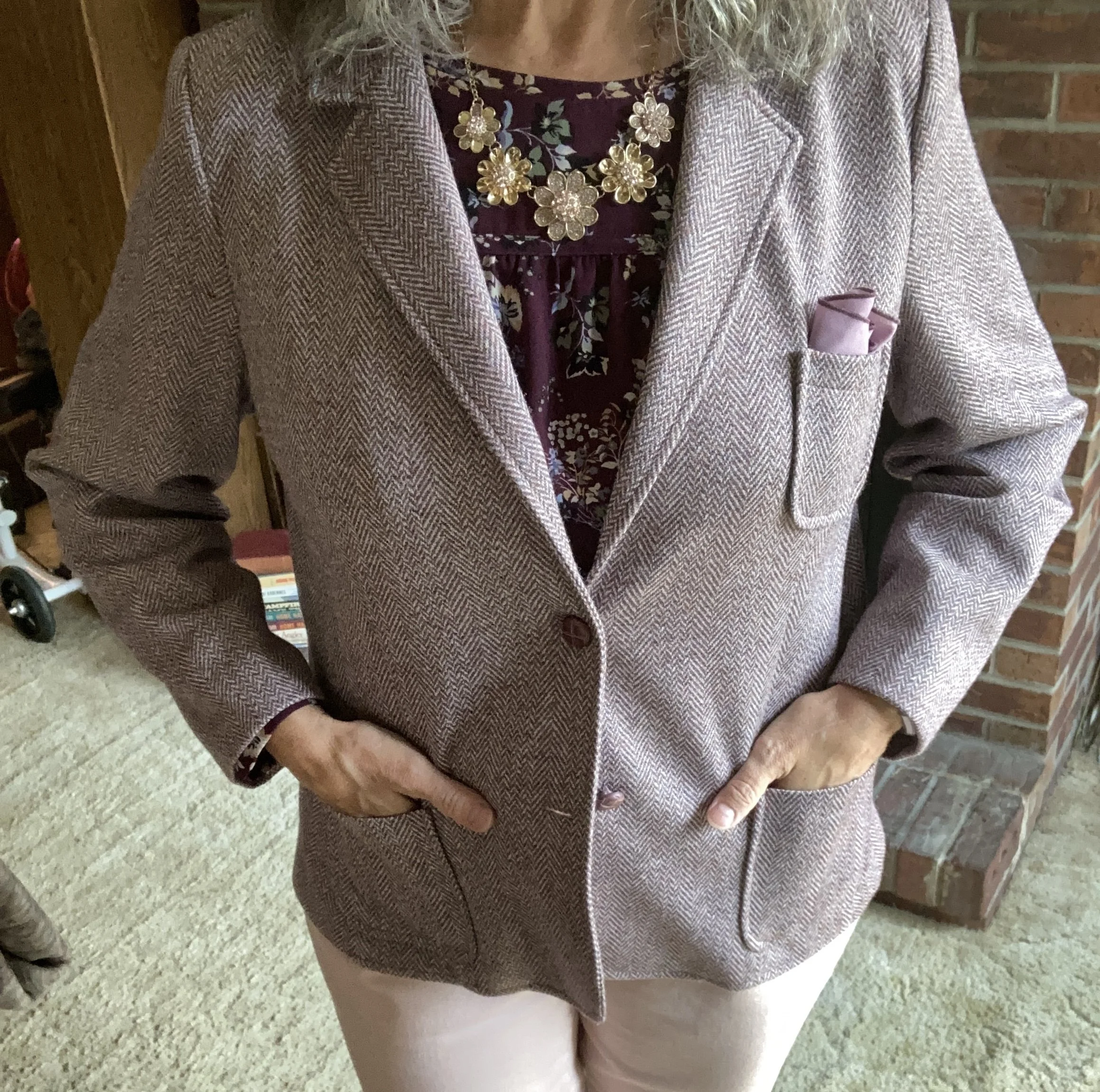
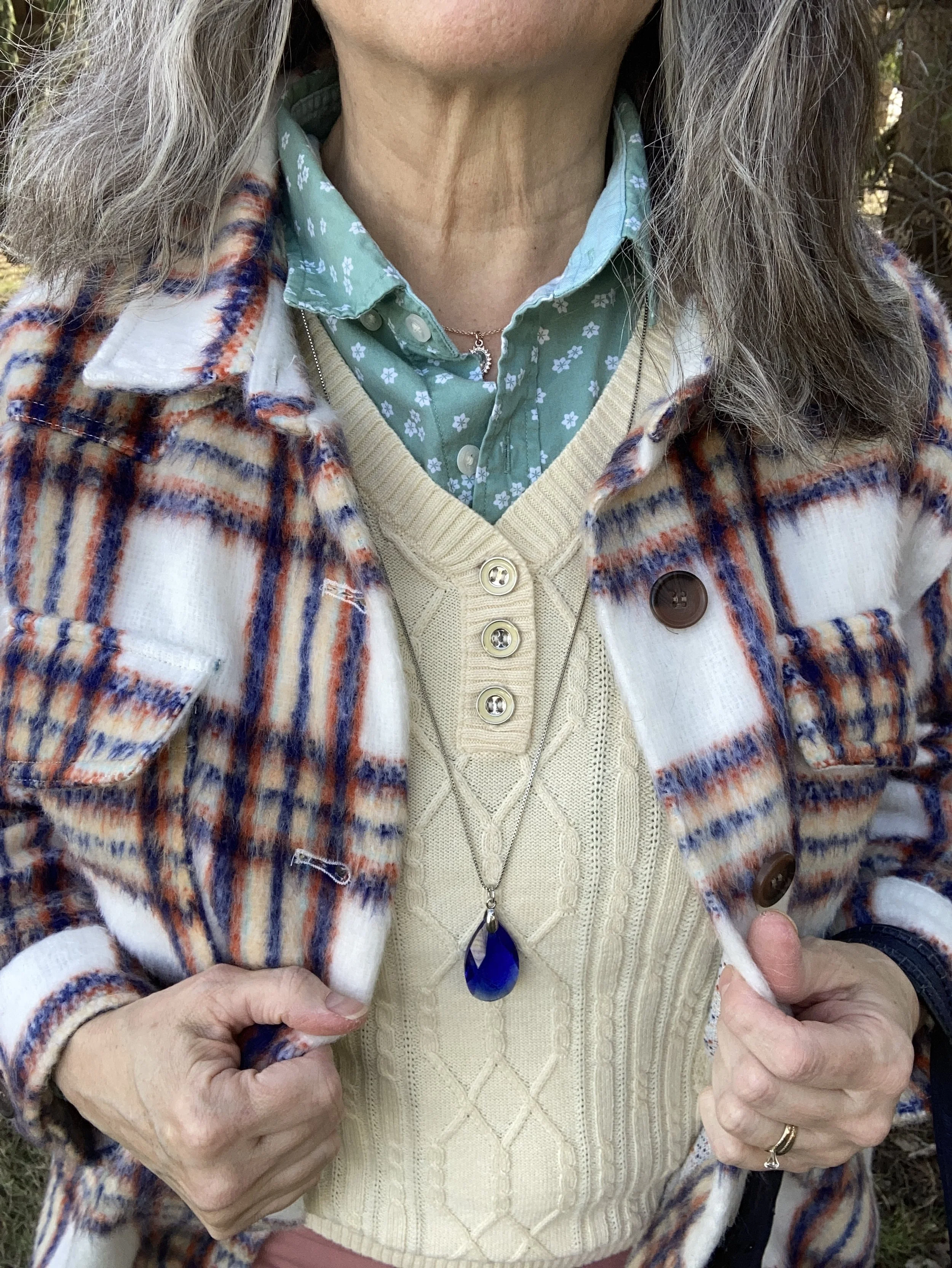
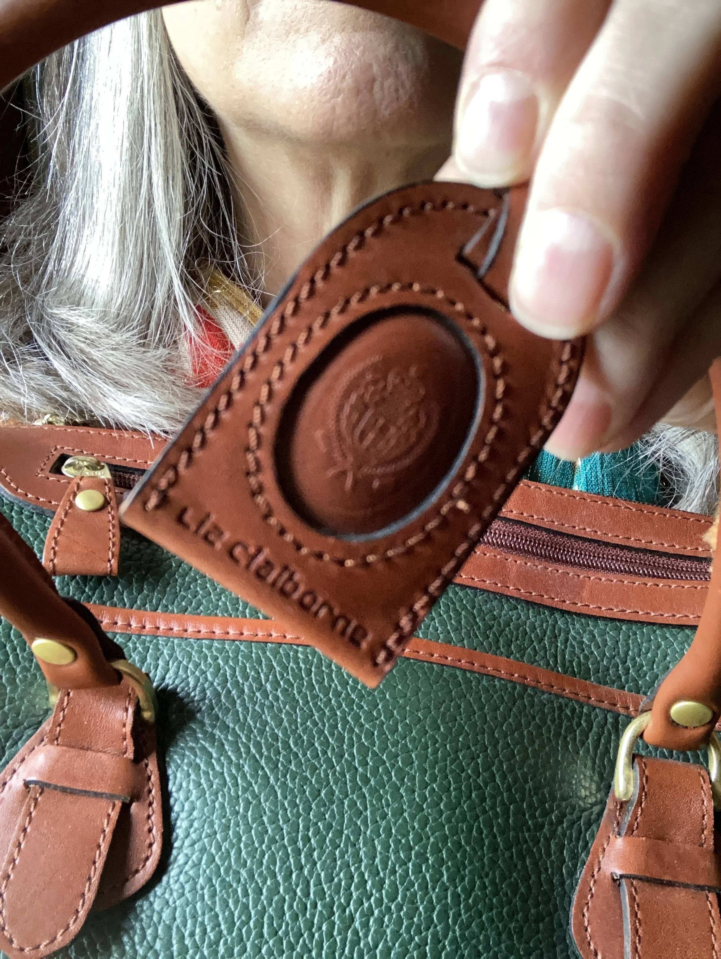
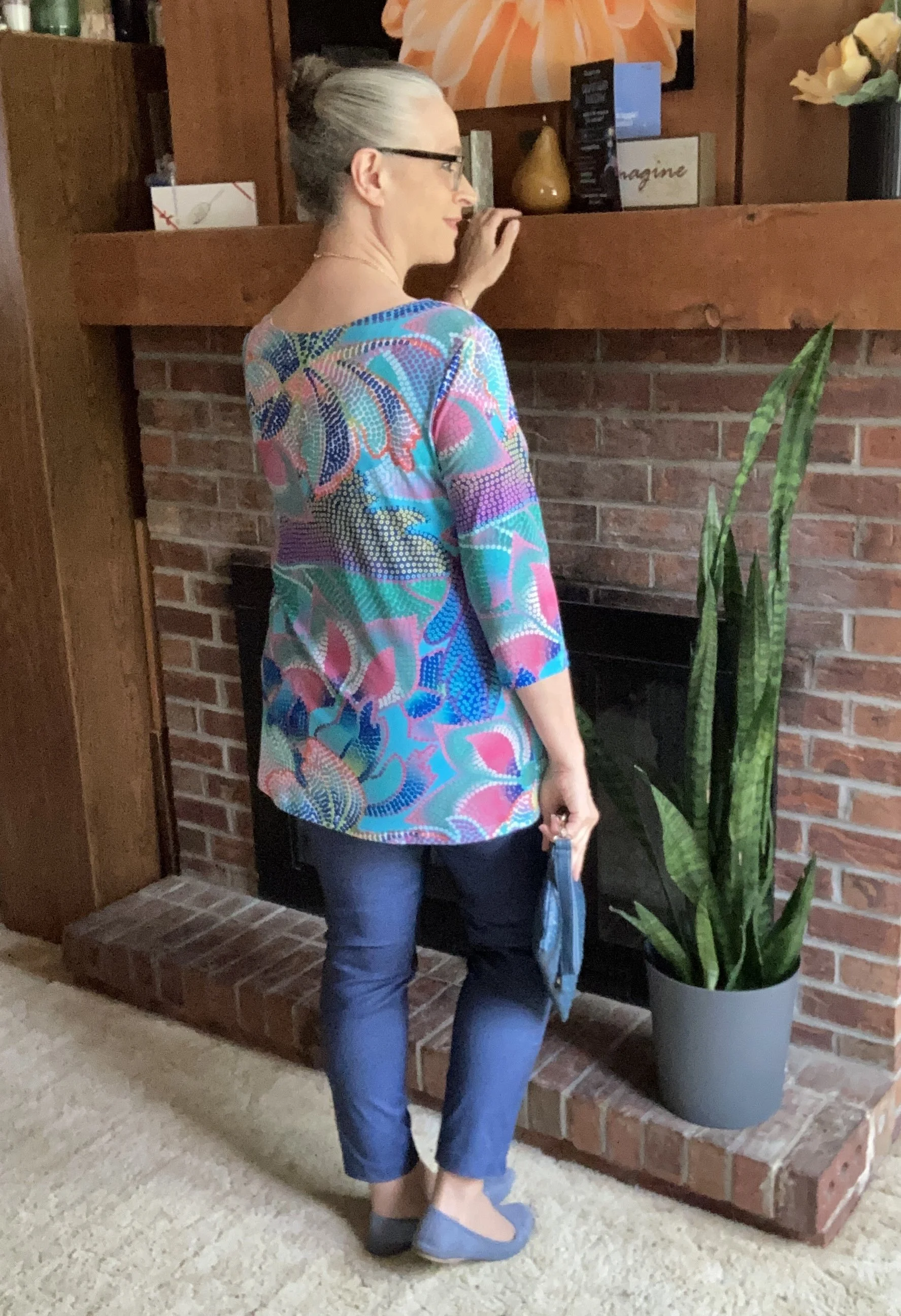
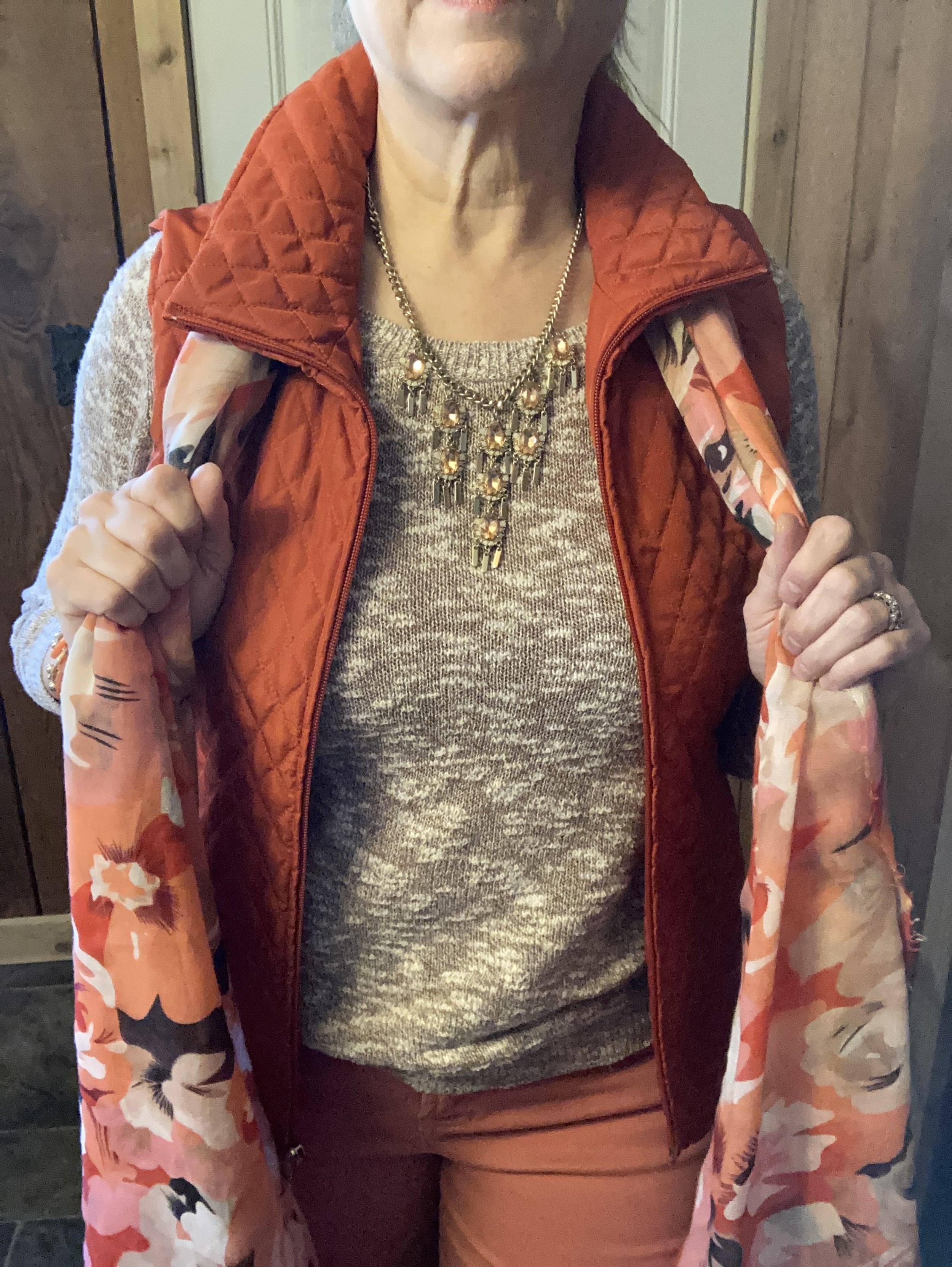
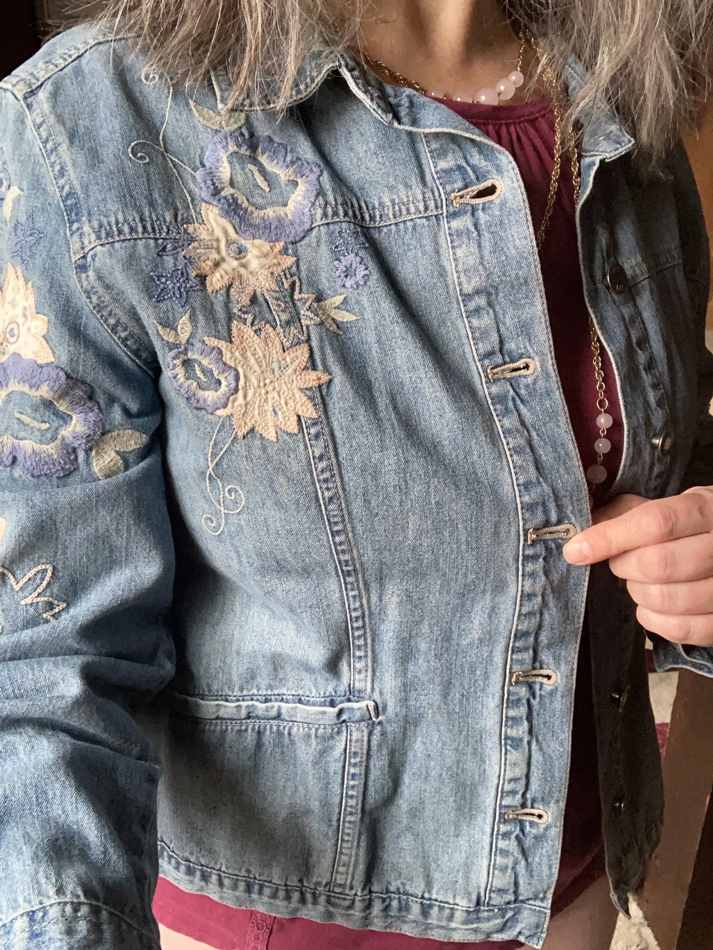
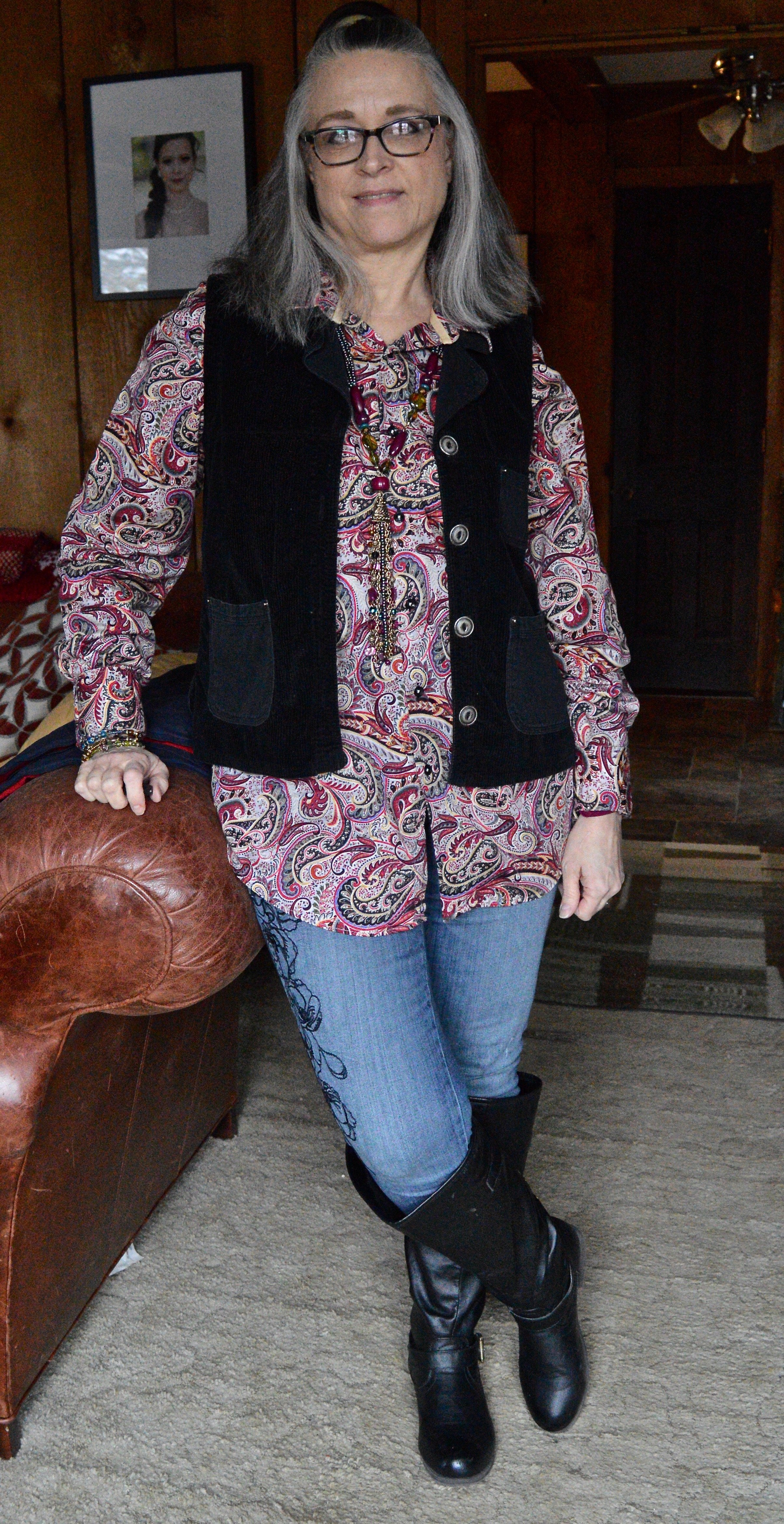
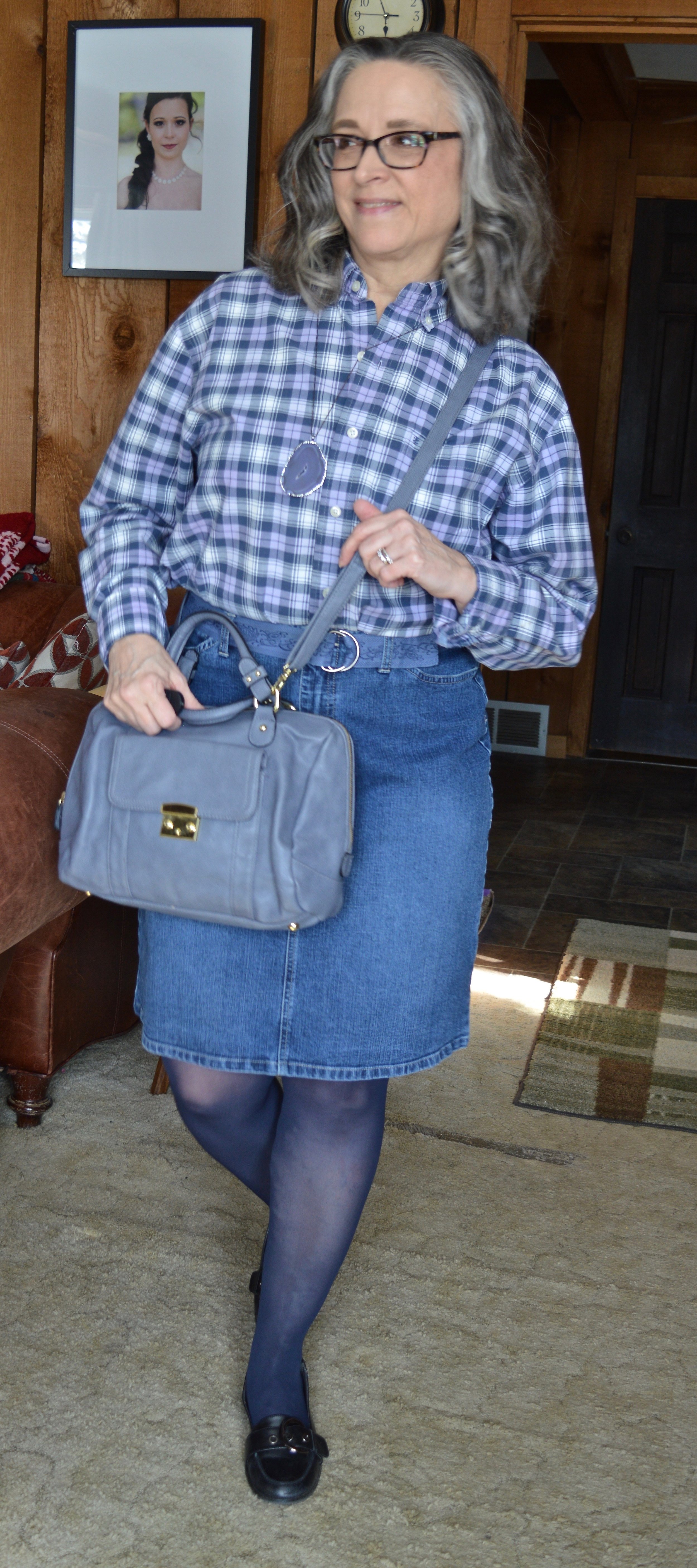
I decided to use this thrifted herringbone blazer for the Damson medium purple color. My photos don’t do the purple color justice, but it is what it is. This is a vintage piece from a U.S. manufacturer called Cape Cod Match Mates. The research I did said these were made in the 1970’s and 80’s. The pieces are easy wear, durable, and a stretchy polyester blend that holds its shape well. It also said they mostly made patterns that were bold and fun. I have one other blazer by them that is a darker blue and red plaid. You can see that on my Instagram page, here.
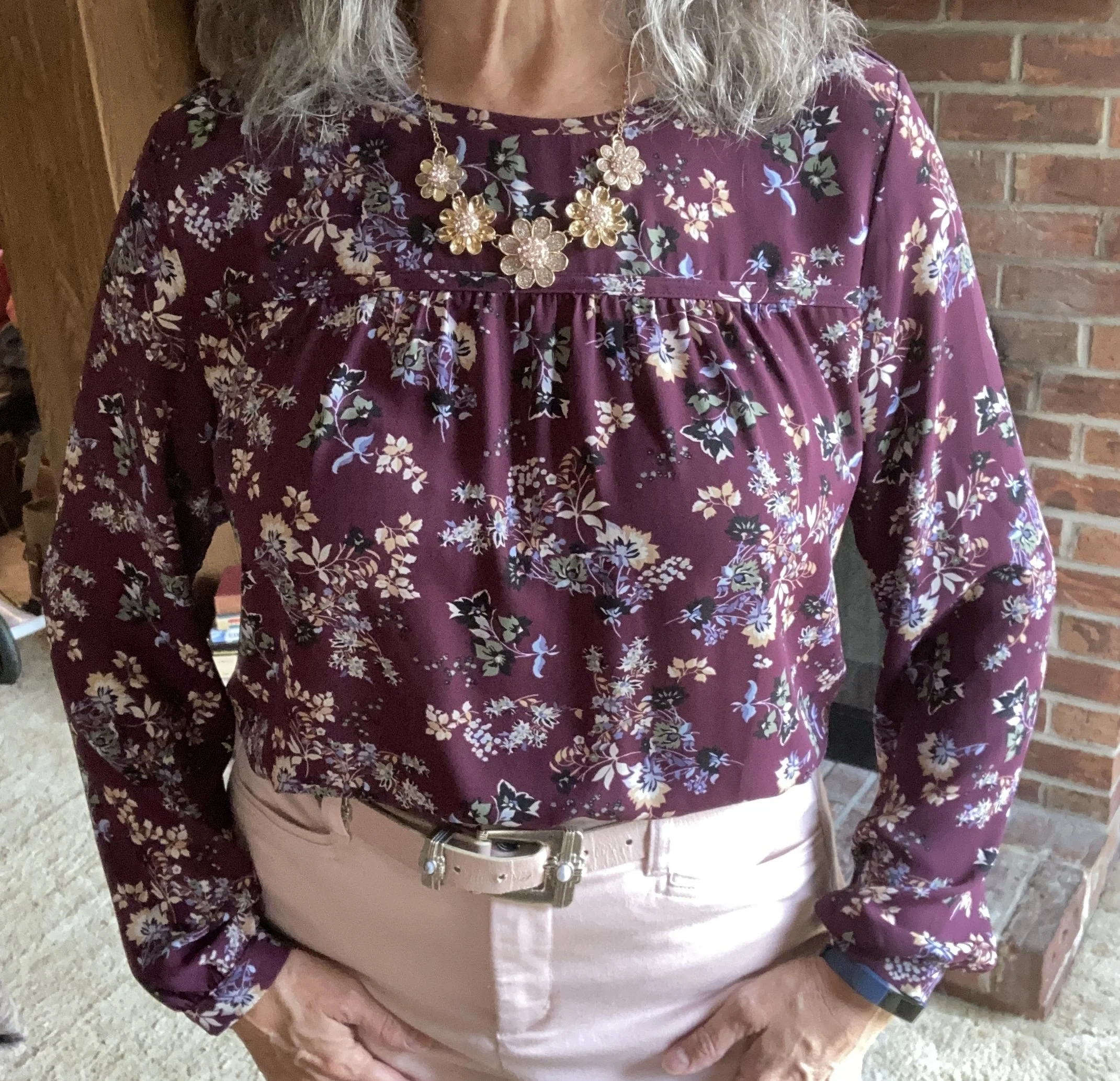
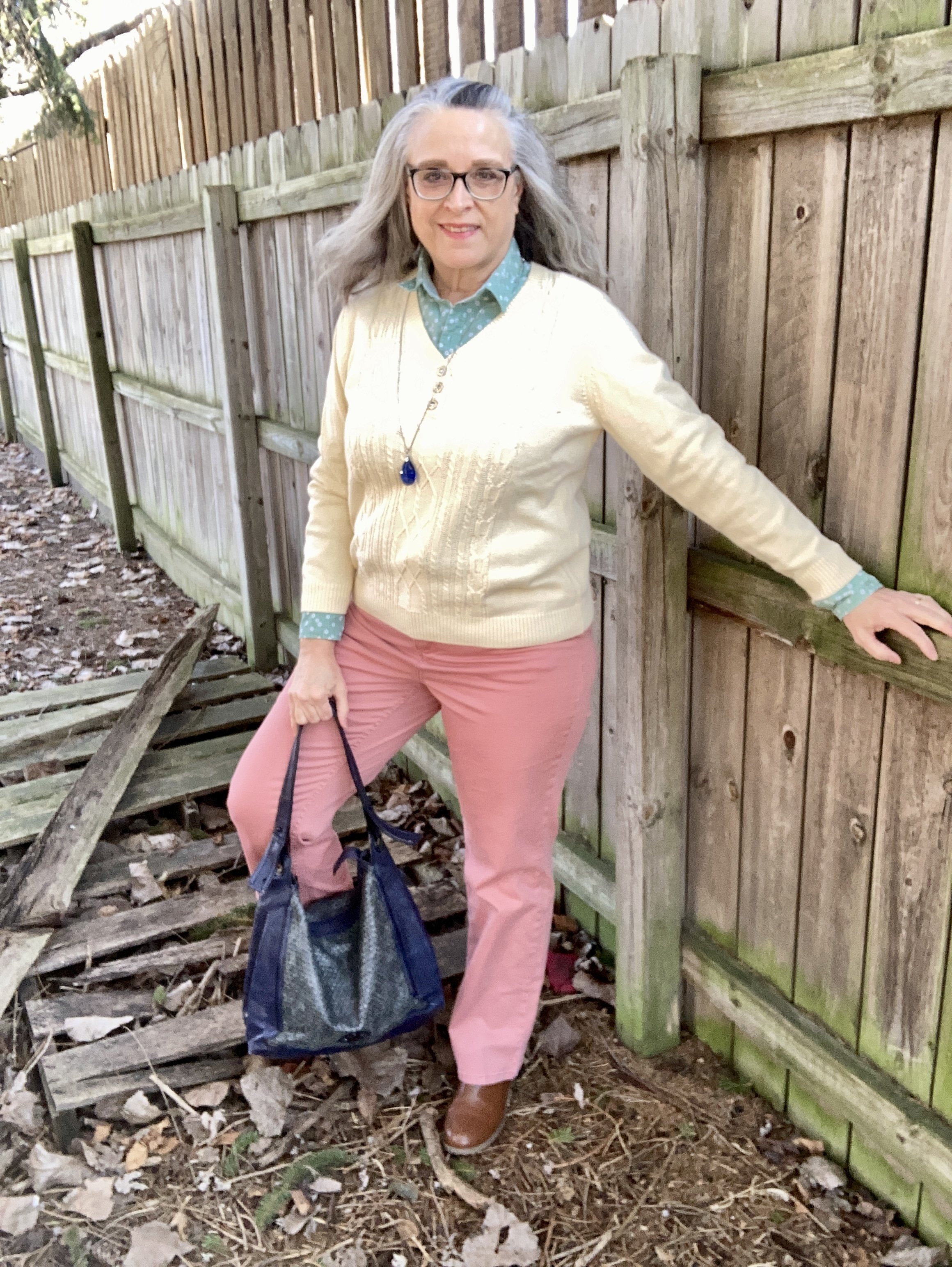
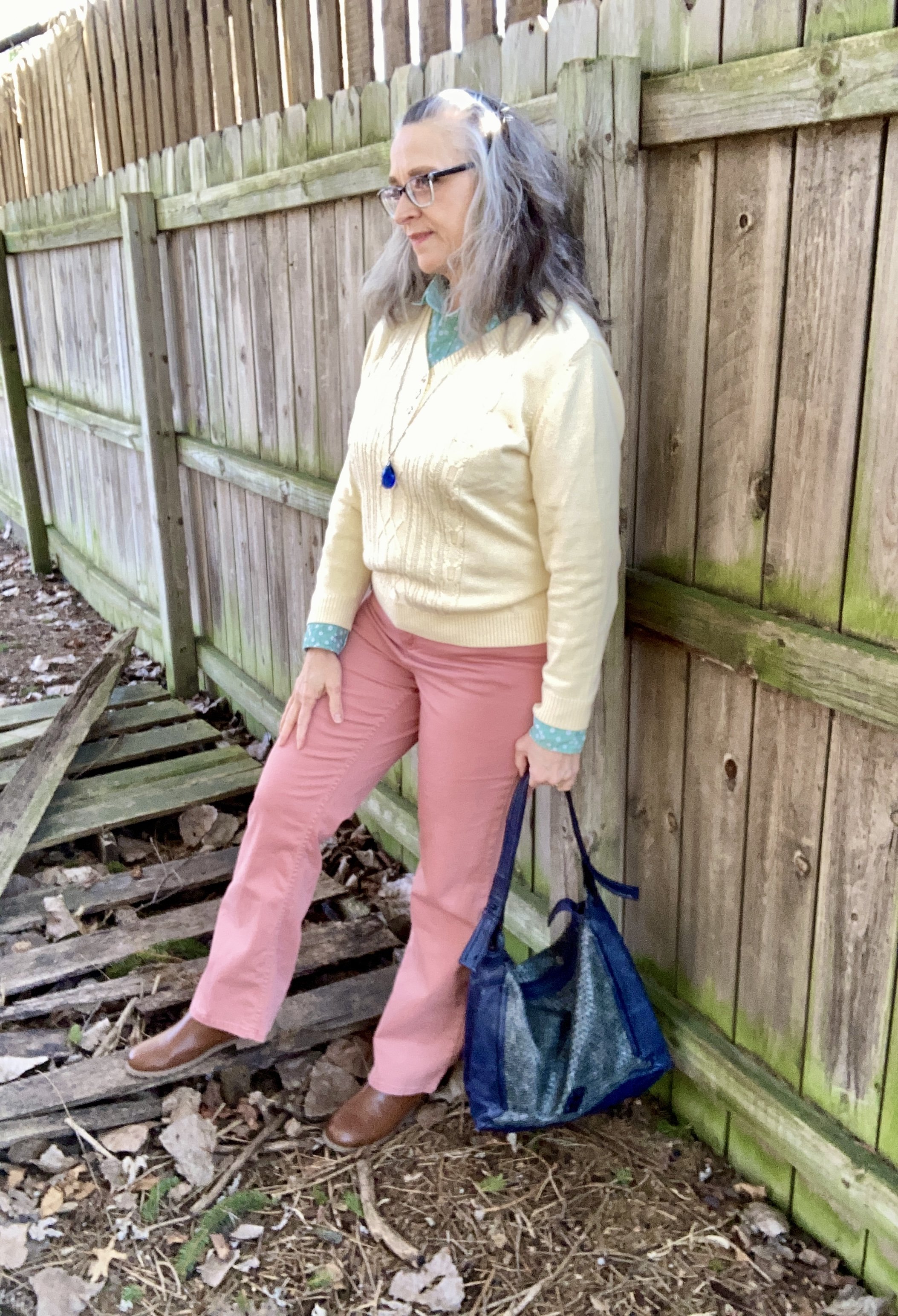
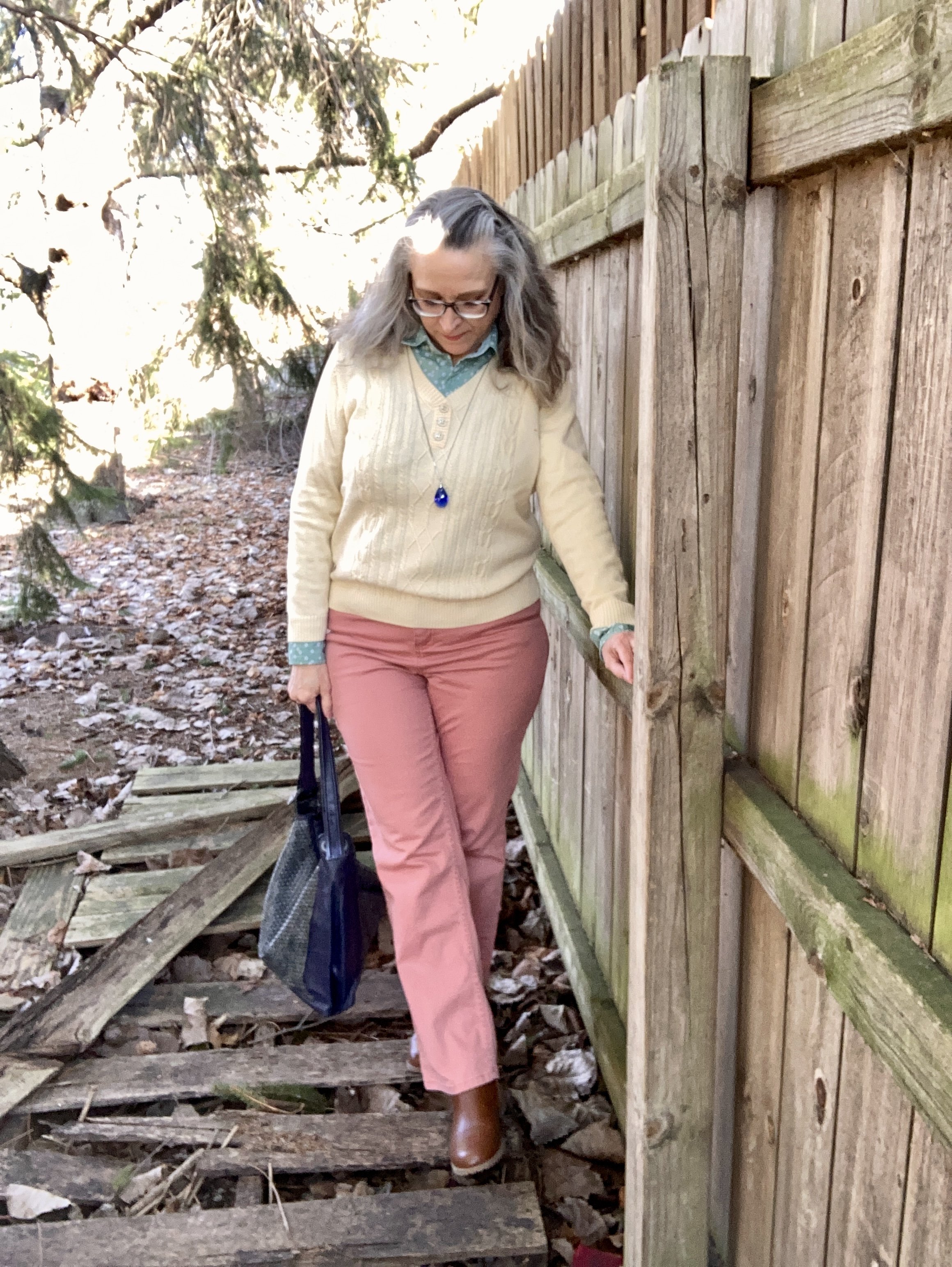
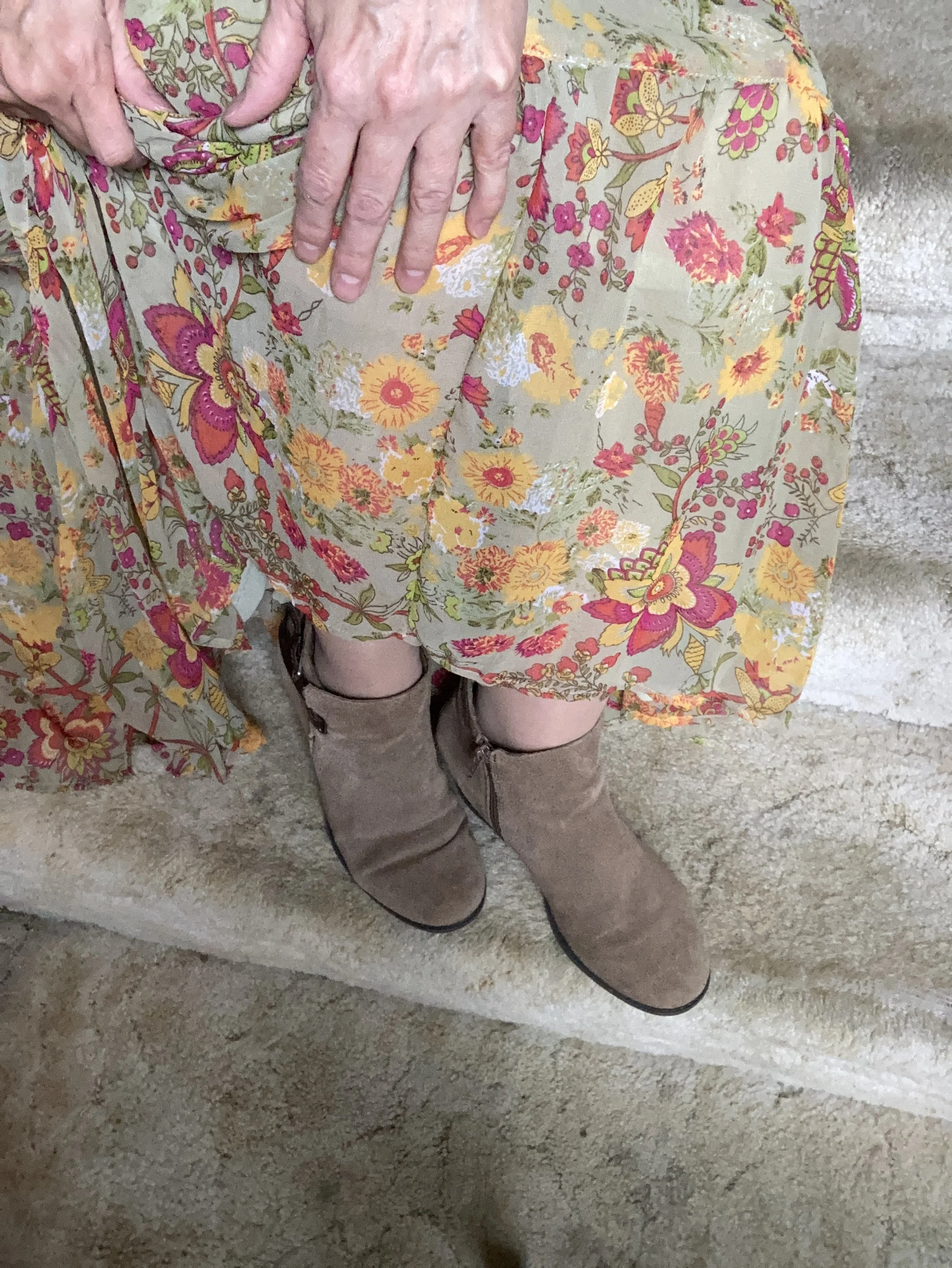
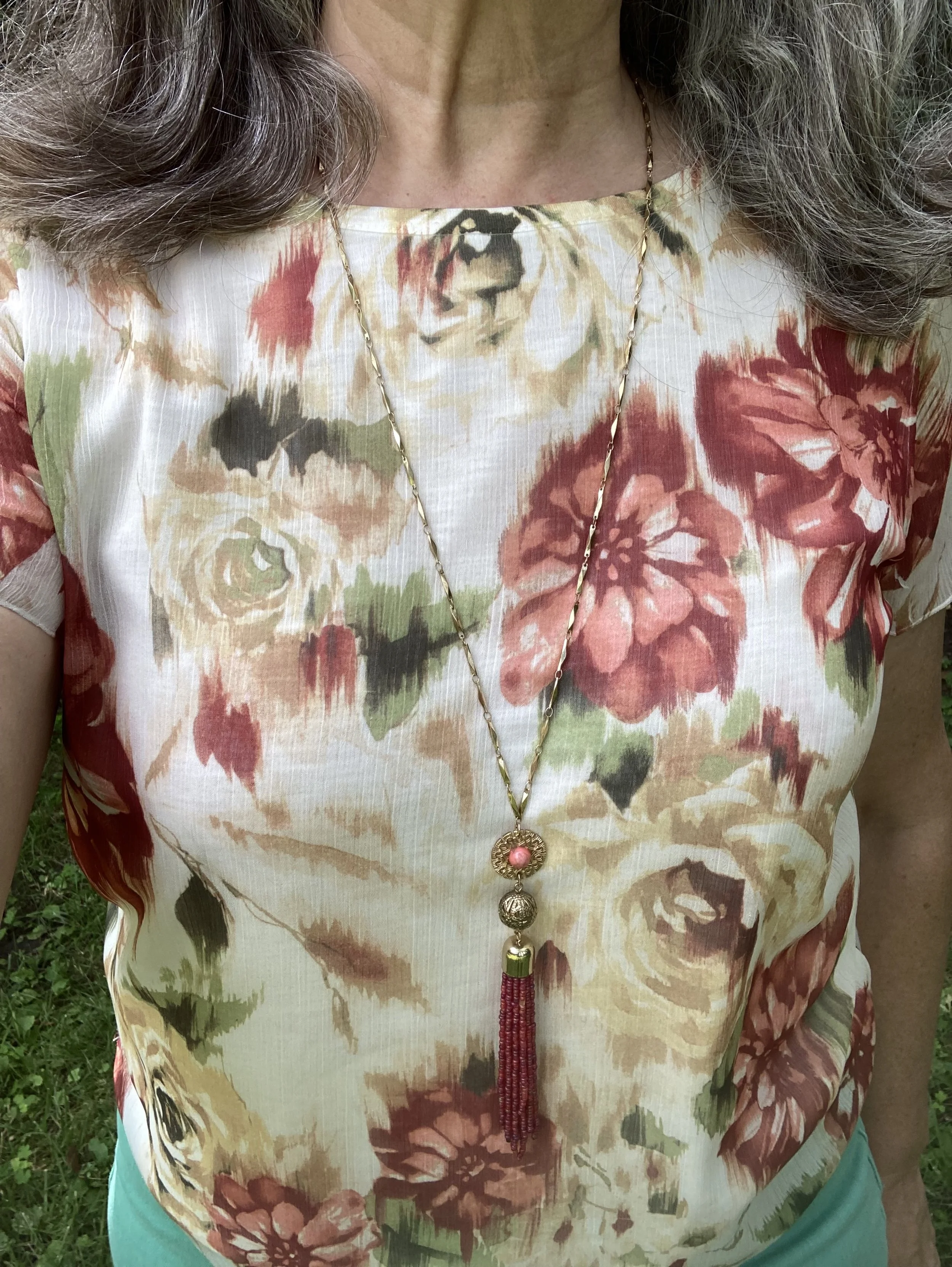
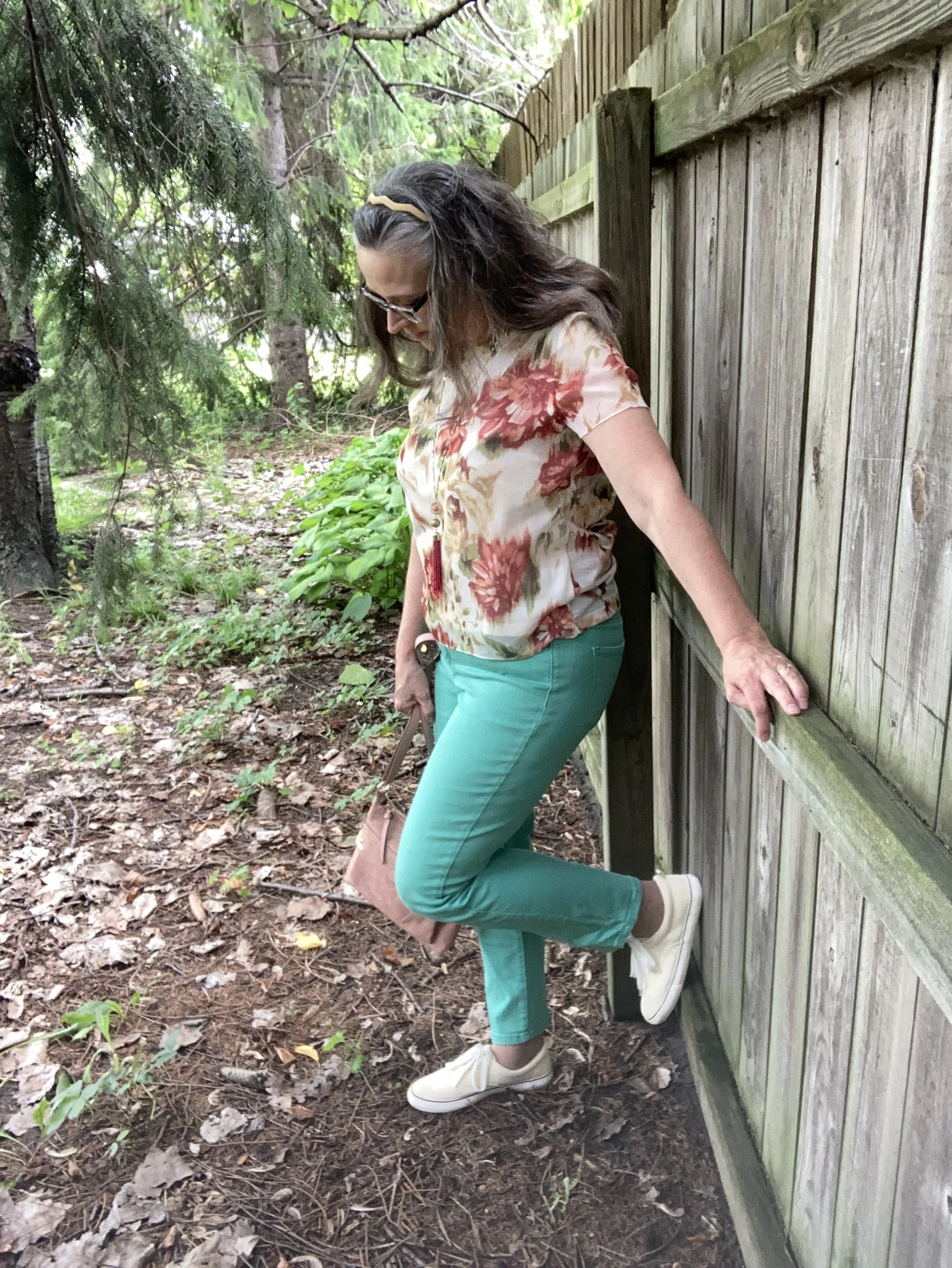
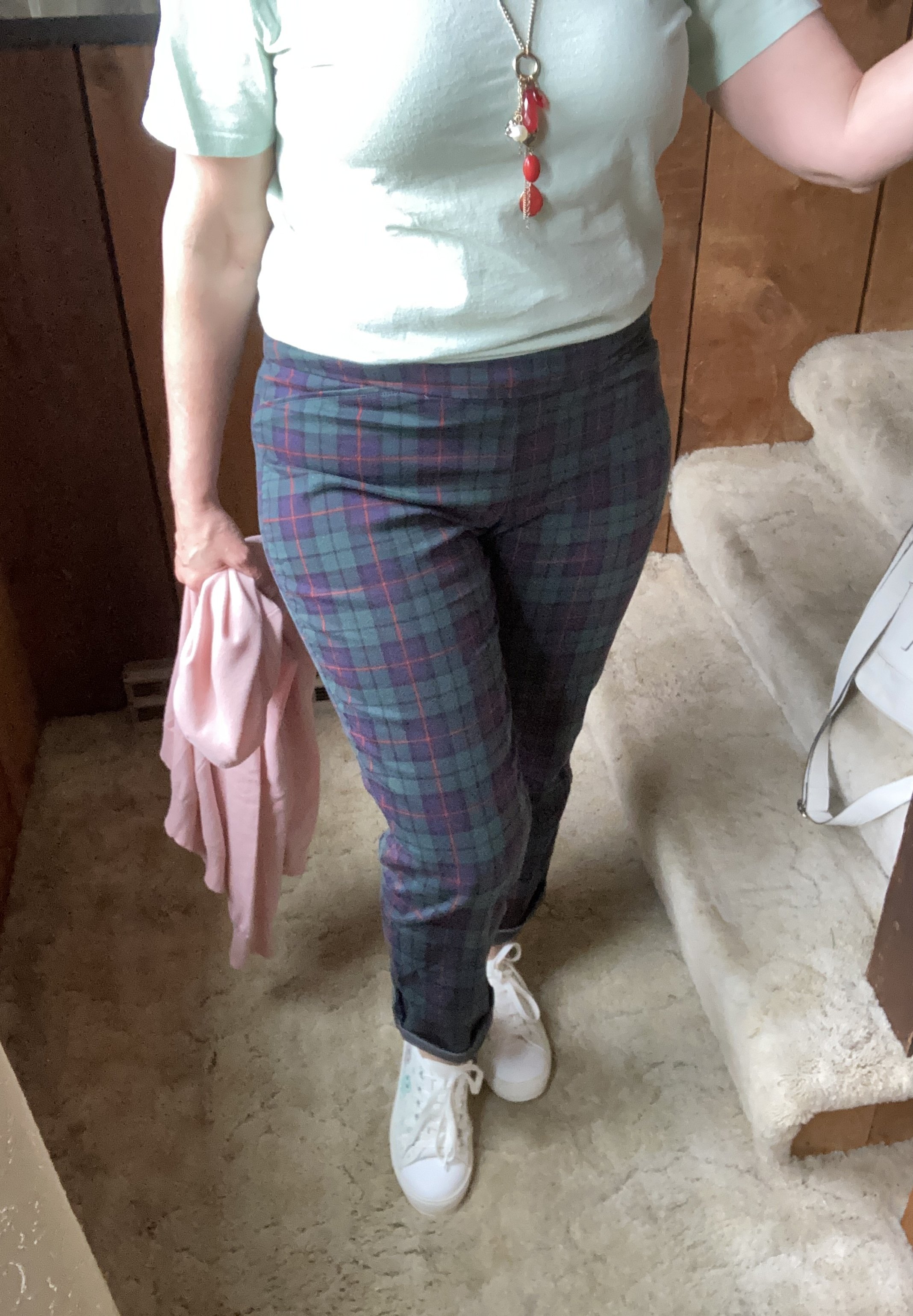
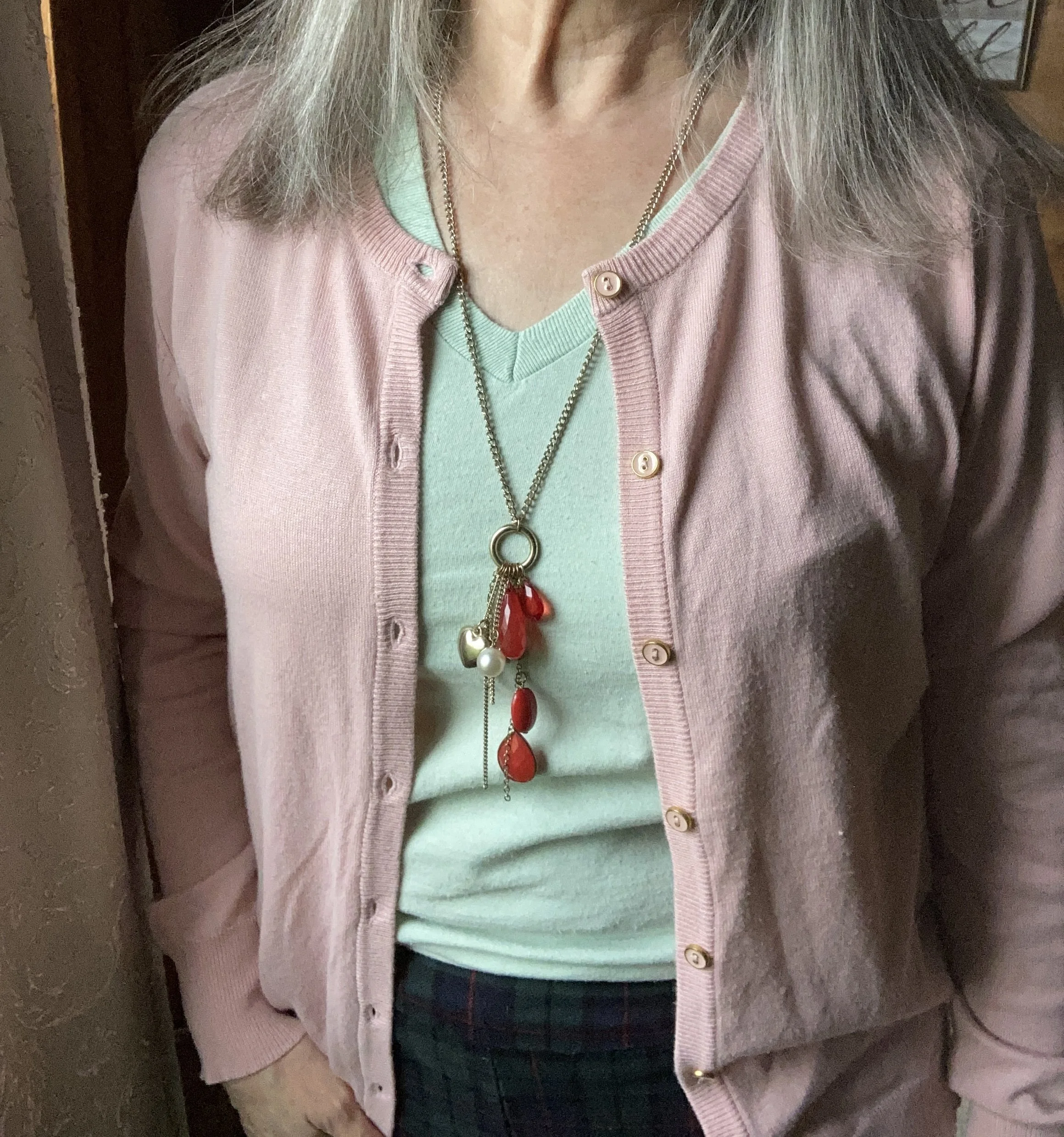
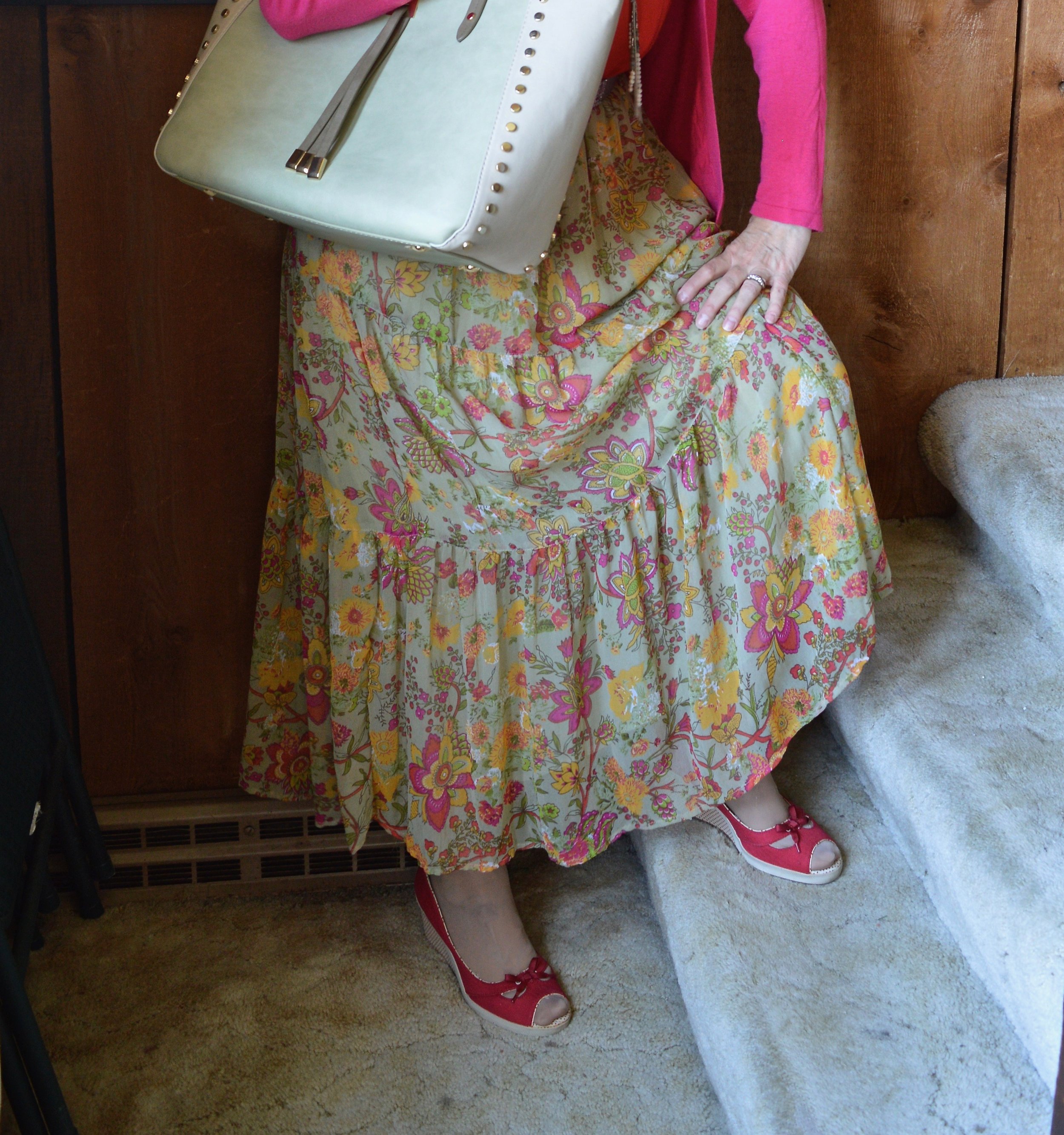
The Mauve Wine color of my floral blouse is actually under the Classic Colors on the New York palette. I was surprised. Usually, the classics are more neutrals or dark navy blues or black. It was nice to have a different option and this color is one I love for the fall and winter. This piece is a second hand Loft brand. Dark florals are always a winner for fall.

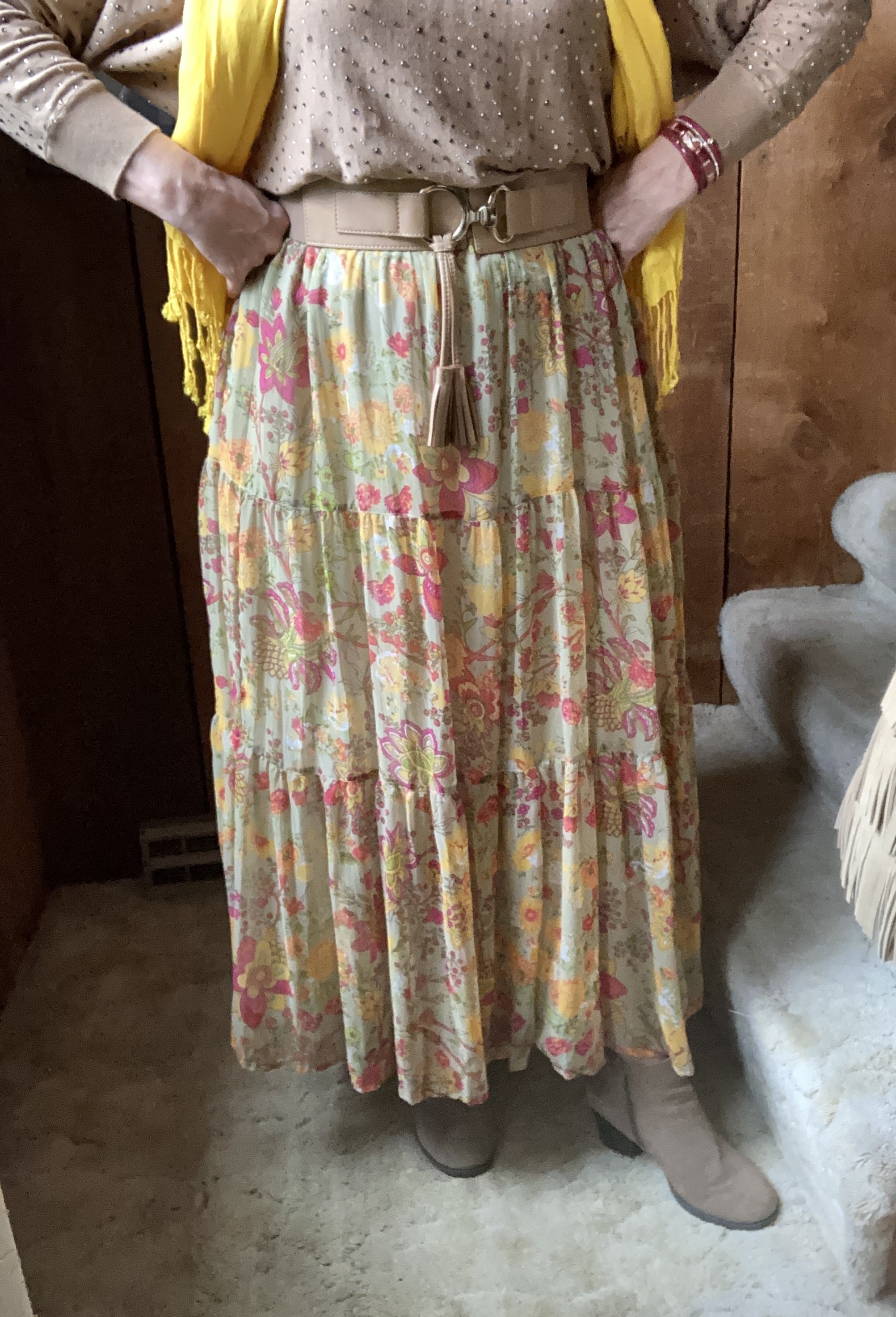
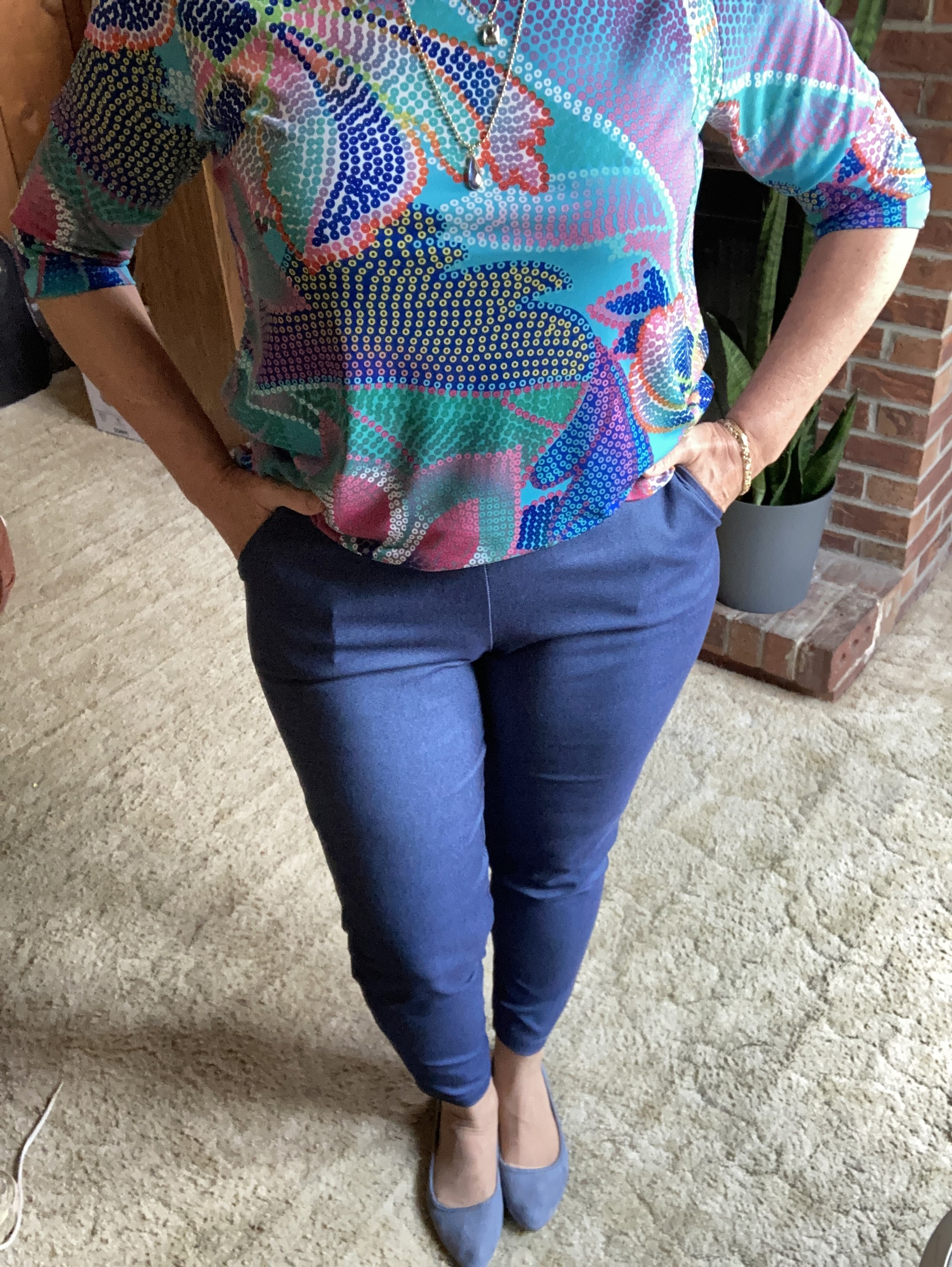
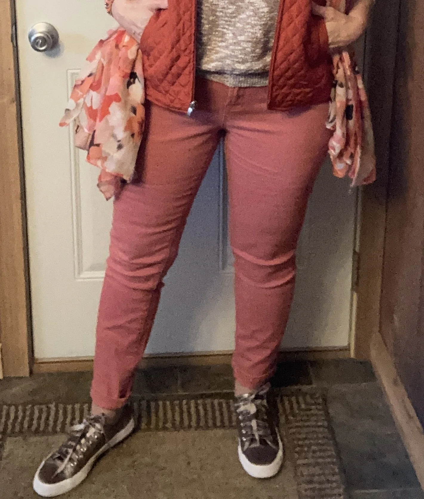
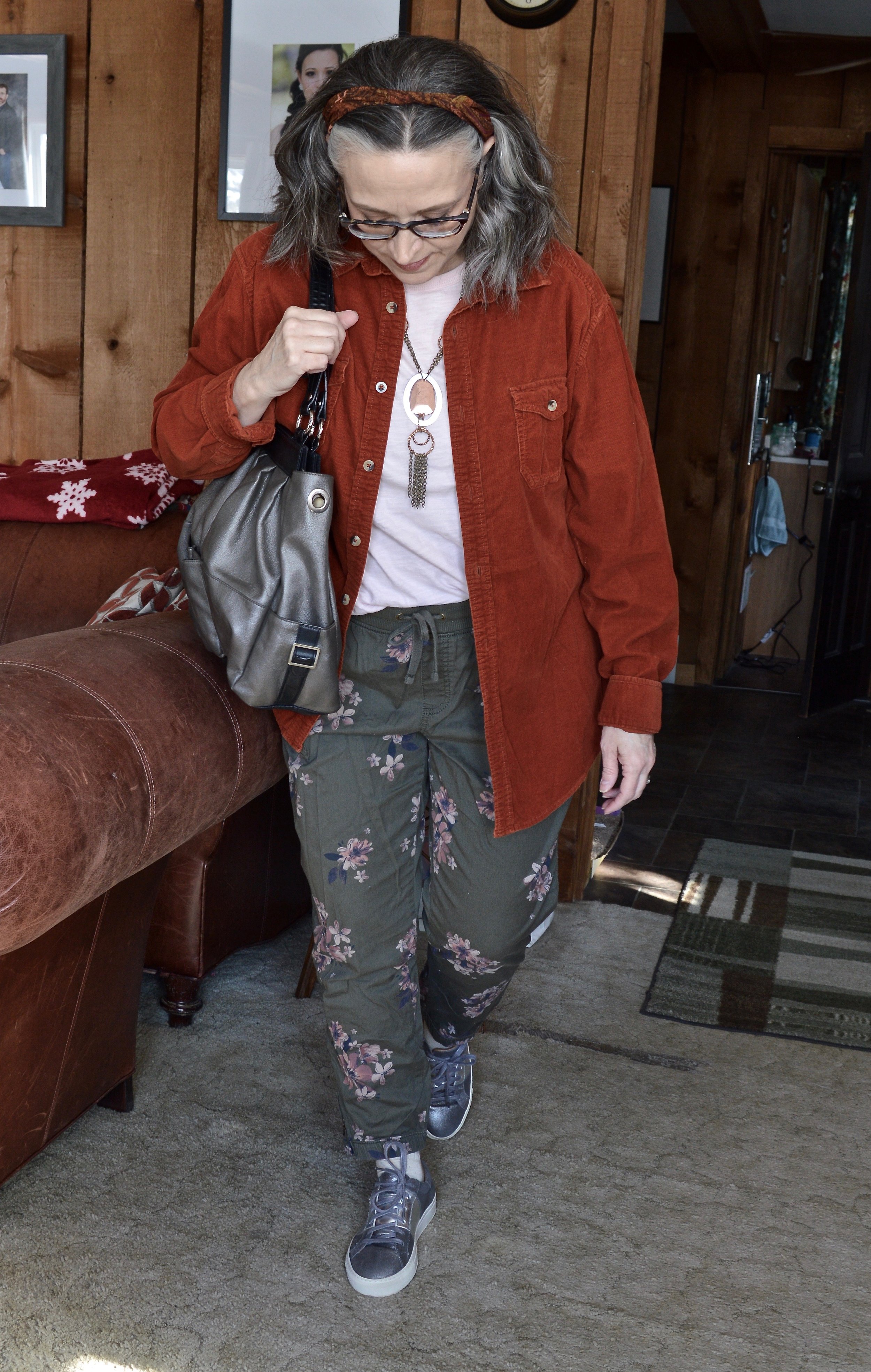
My Primrose Pink pants have made an appearance on the blog before. These Christopher and Banks trousers are a great choice when I want to look a little more dressy. You can see them styled here in a casual Easter outfit,
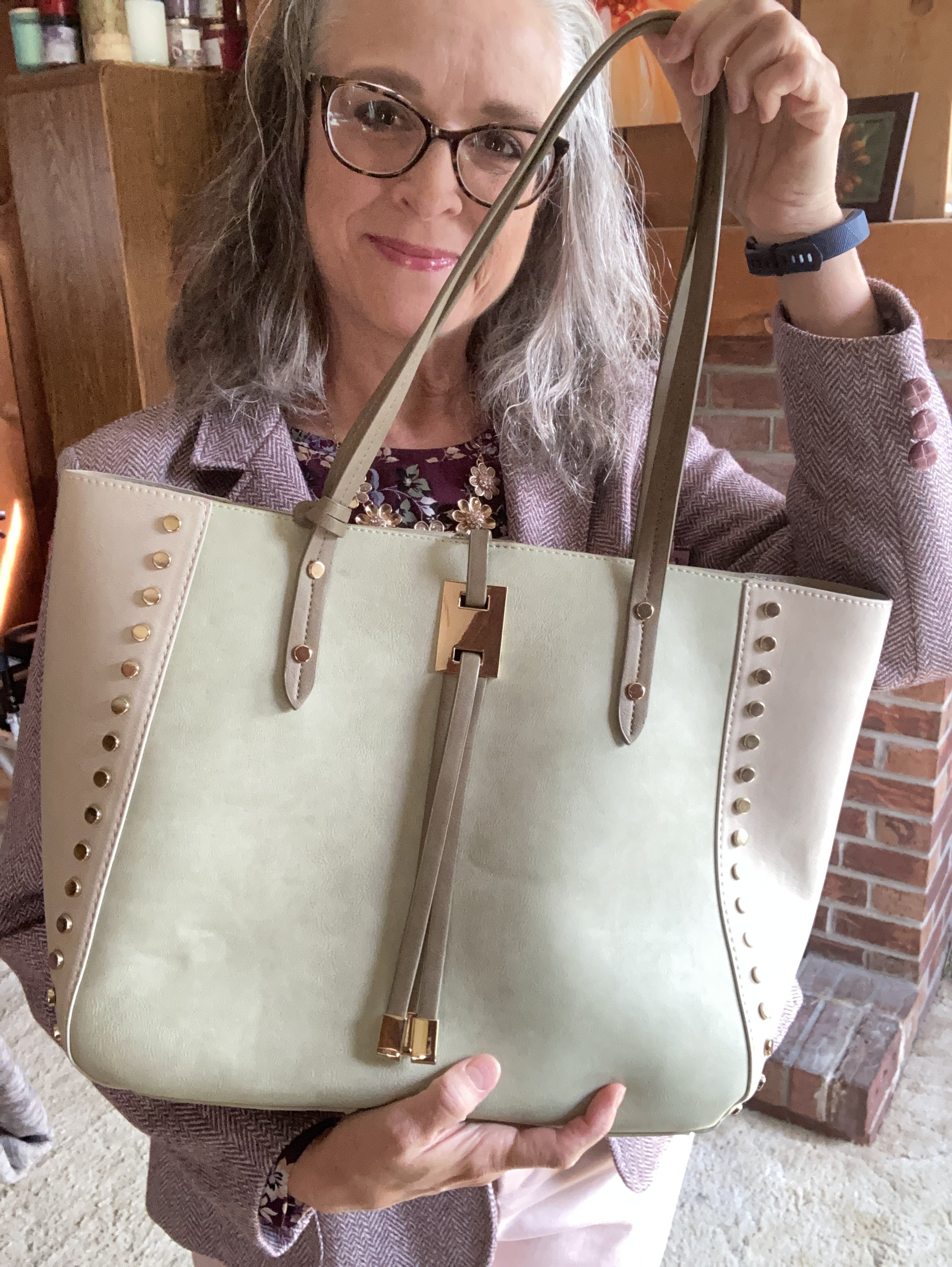
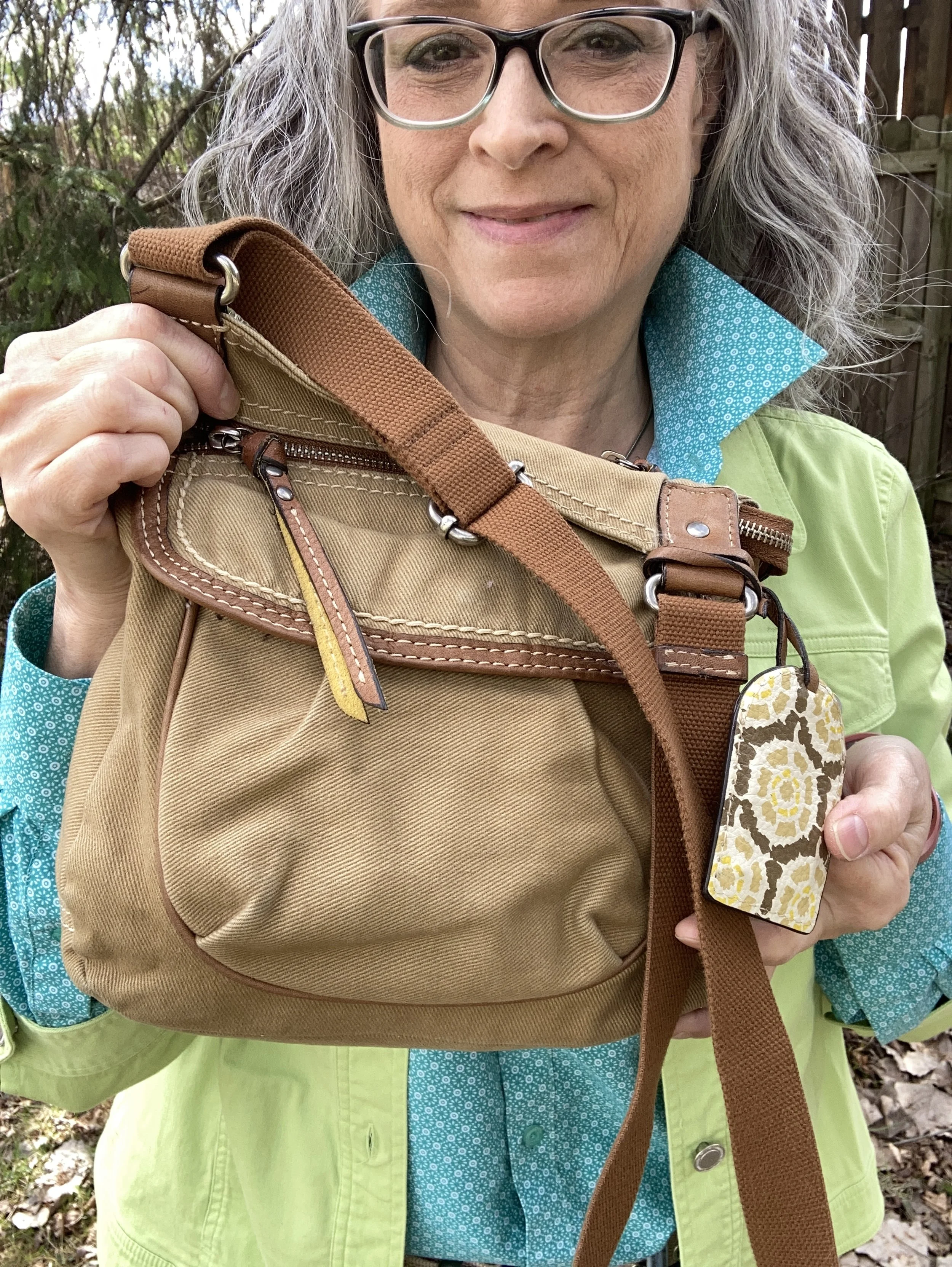
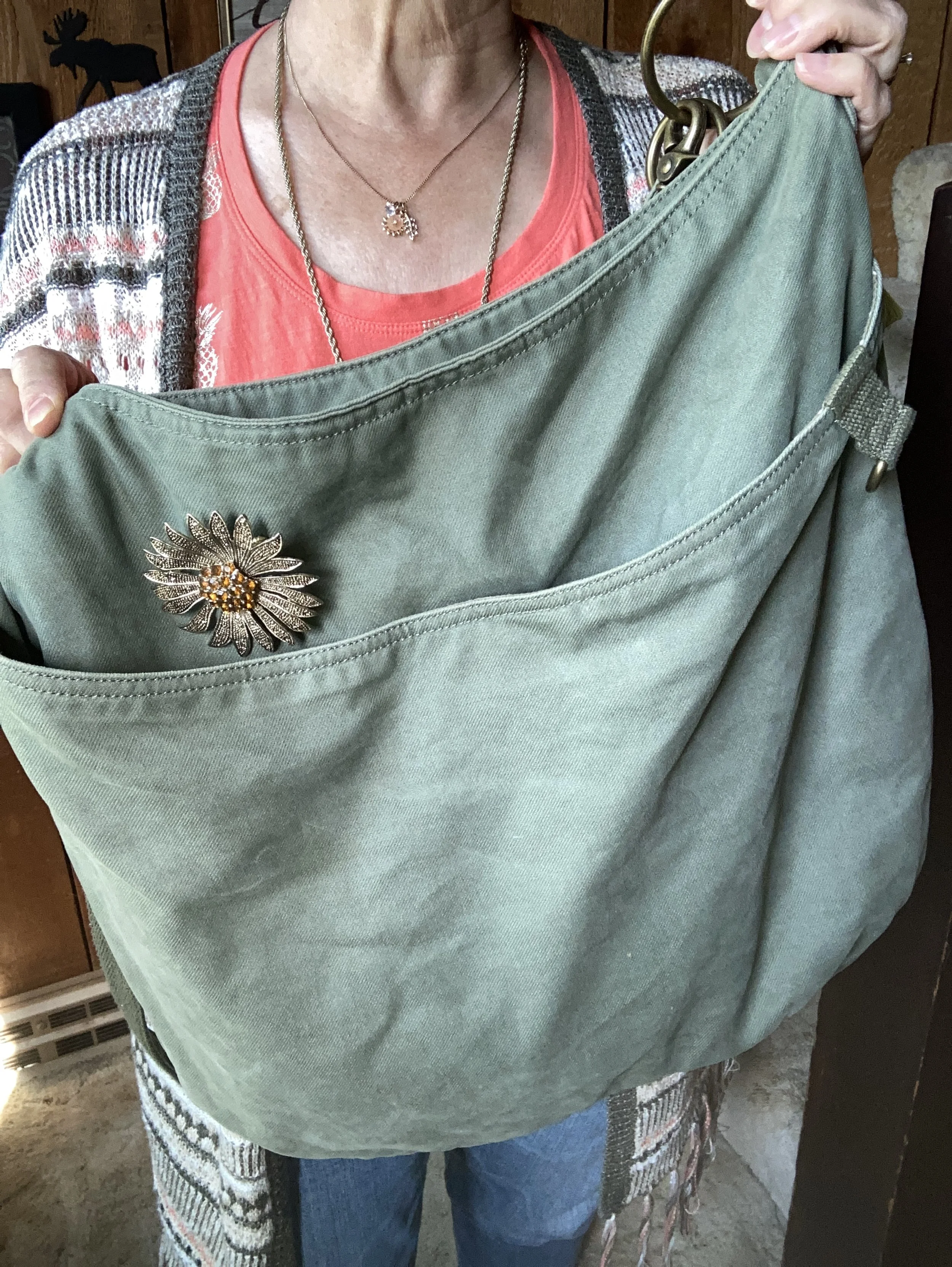
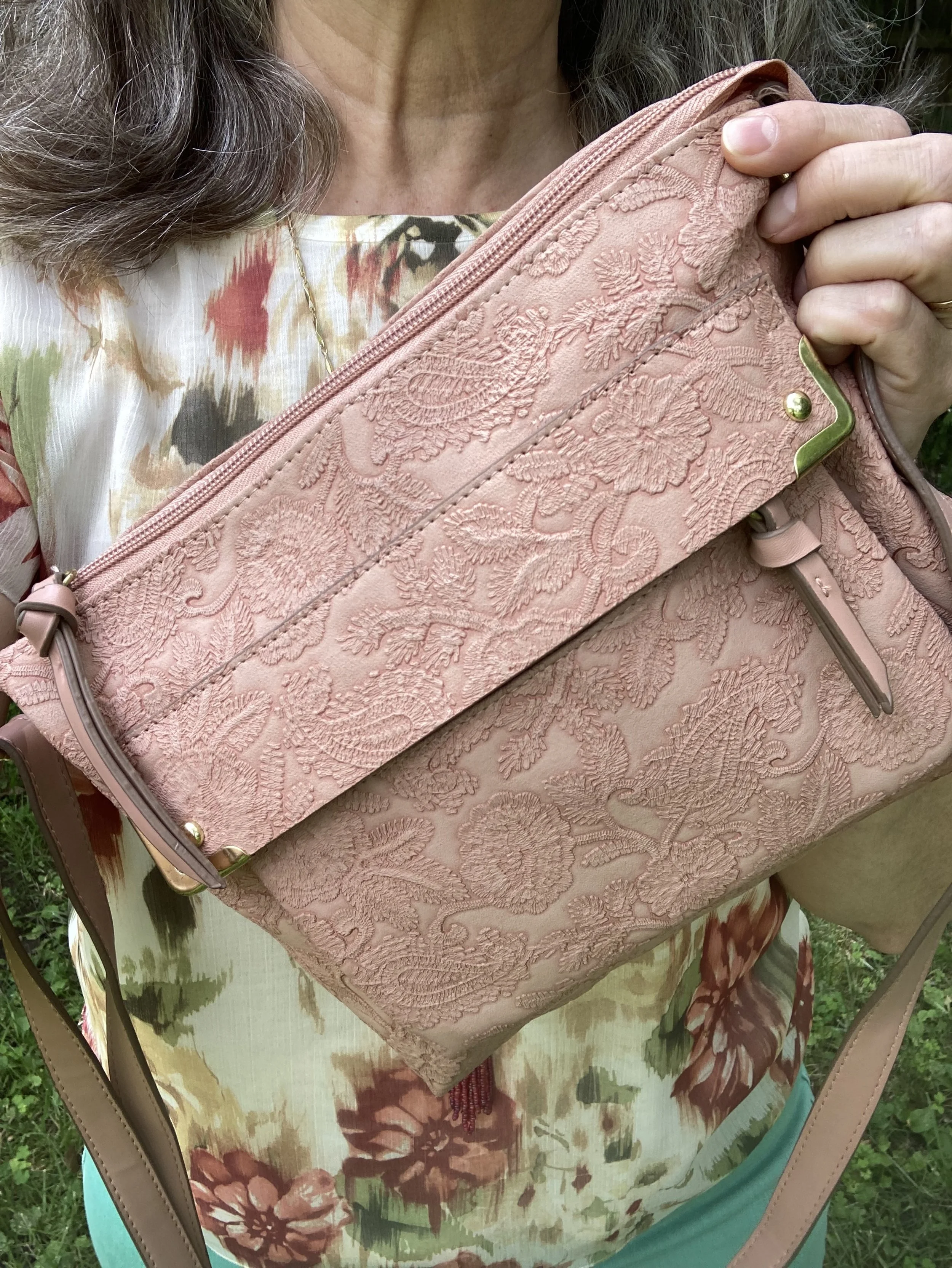
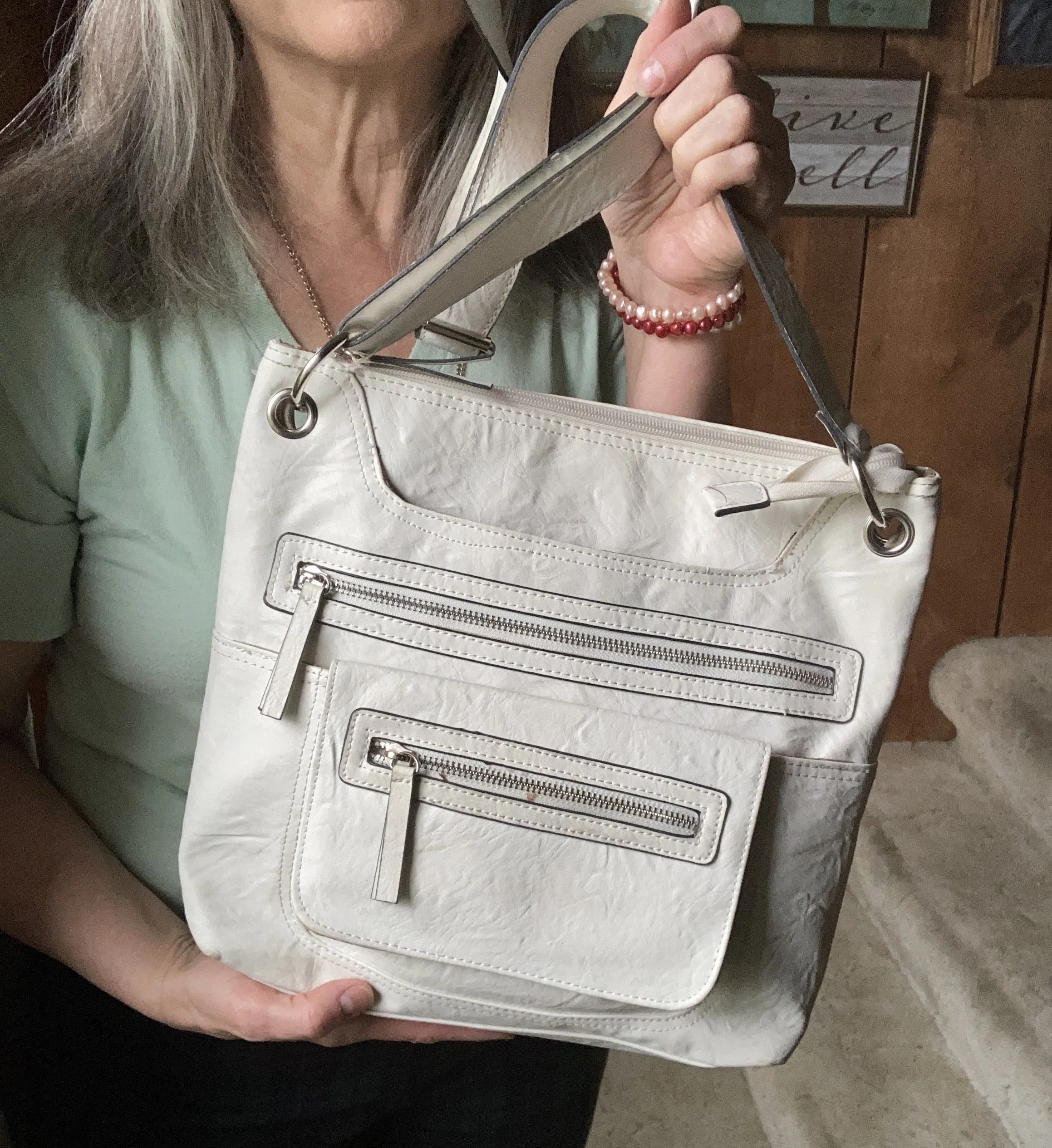
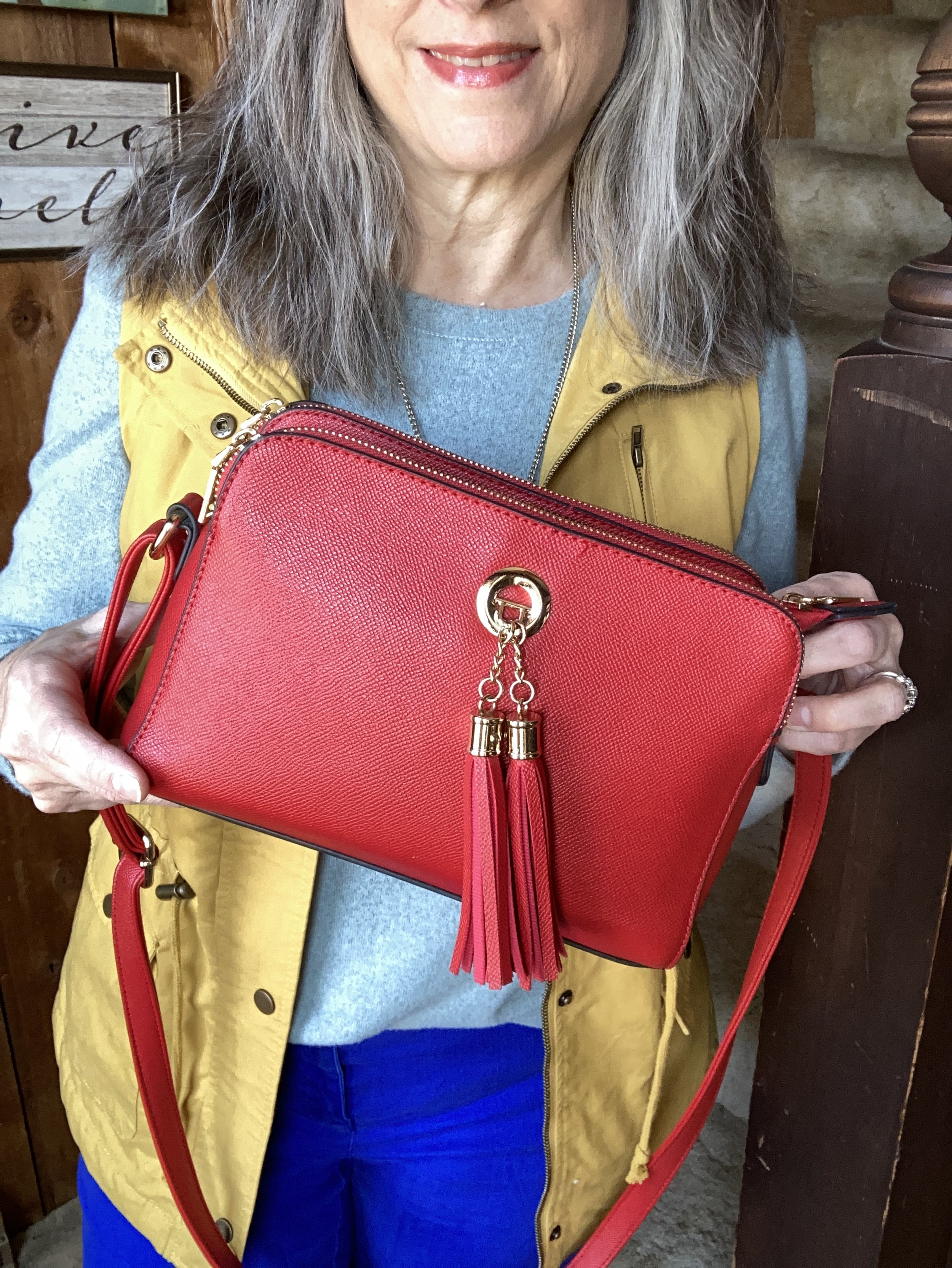
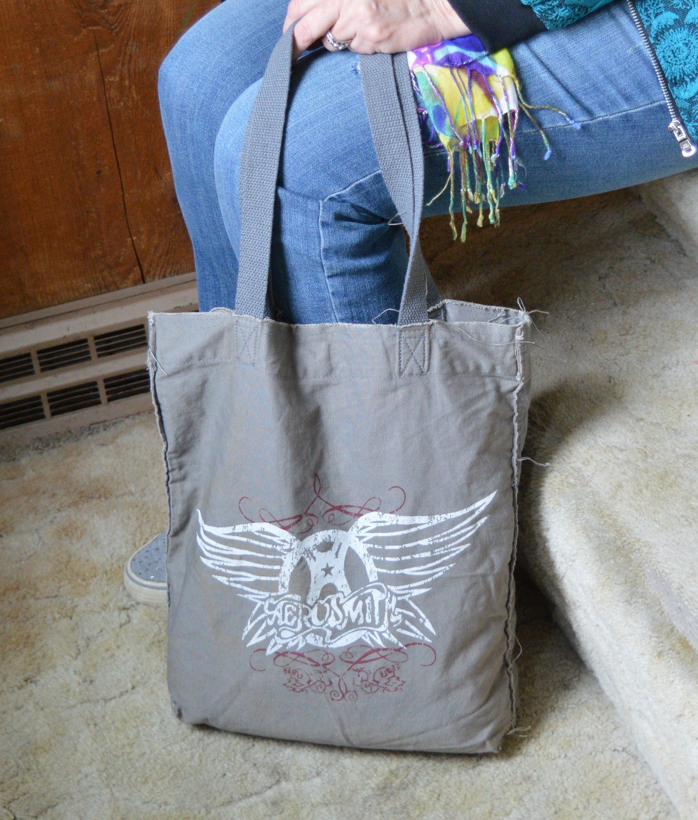
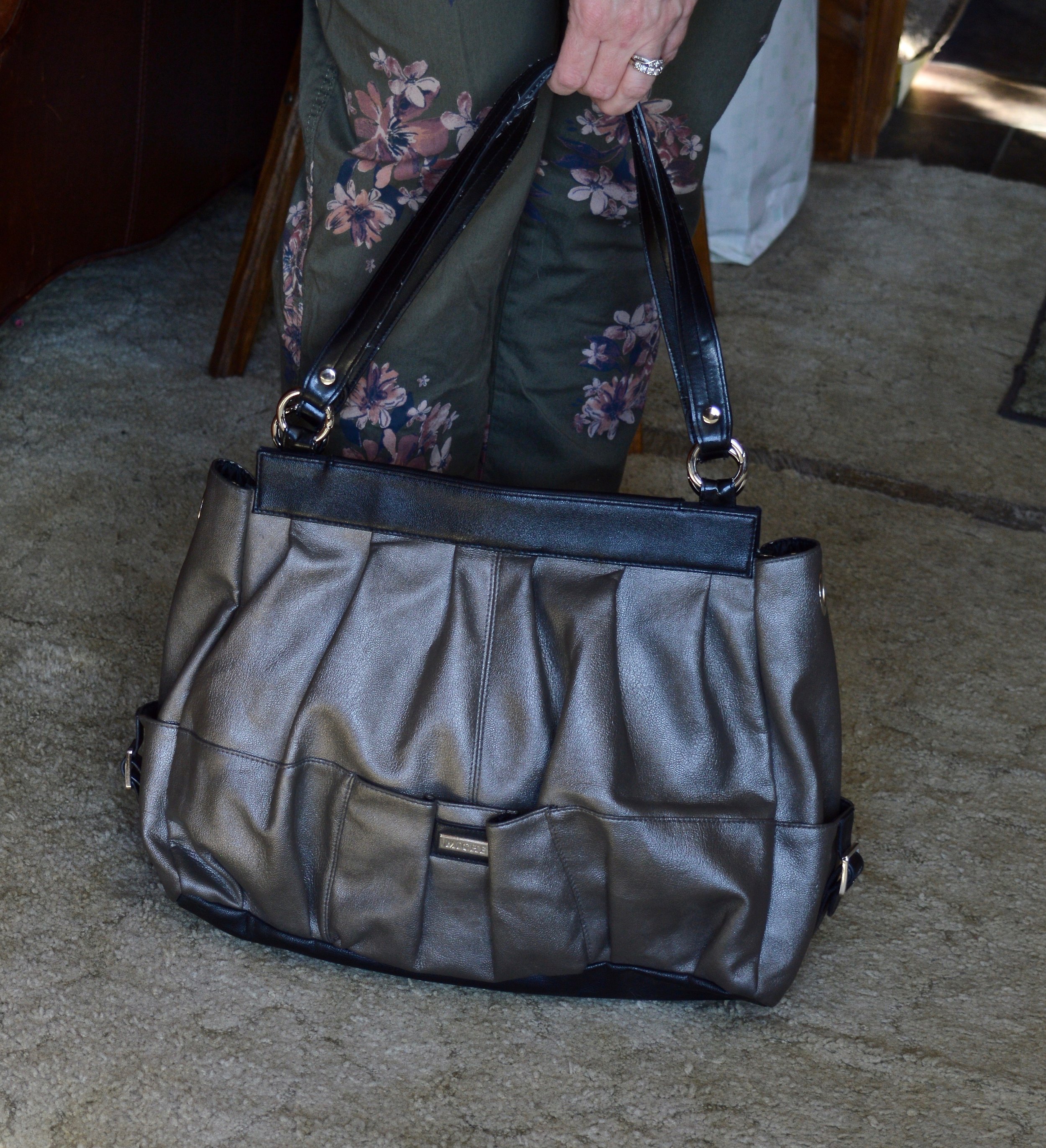
Since there was a tiny bit of green in my blouse, I reached for this Charming Charlie tote bag that I have had for a few years. I thought it keeps the summer element in the outfit along with the pink pants, after all we have about five more weeks of summer before the actual seasonal change.
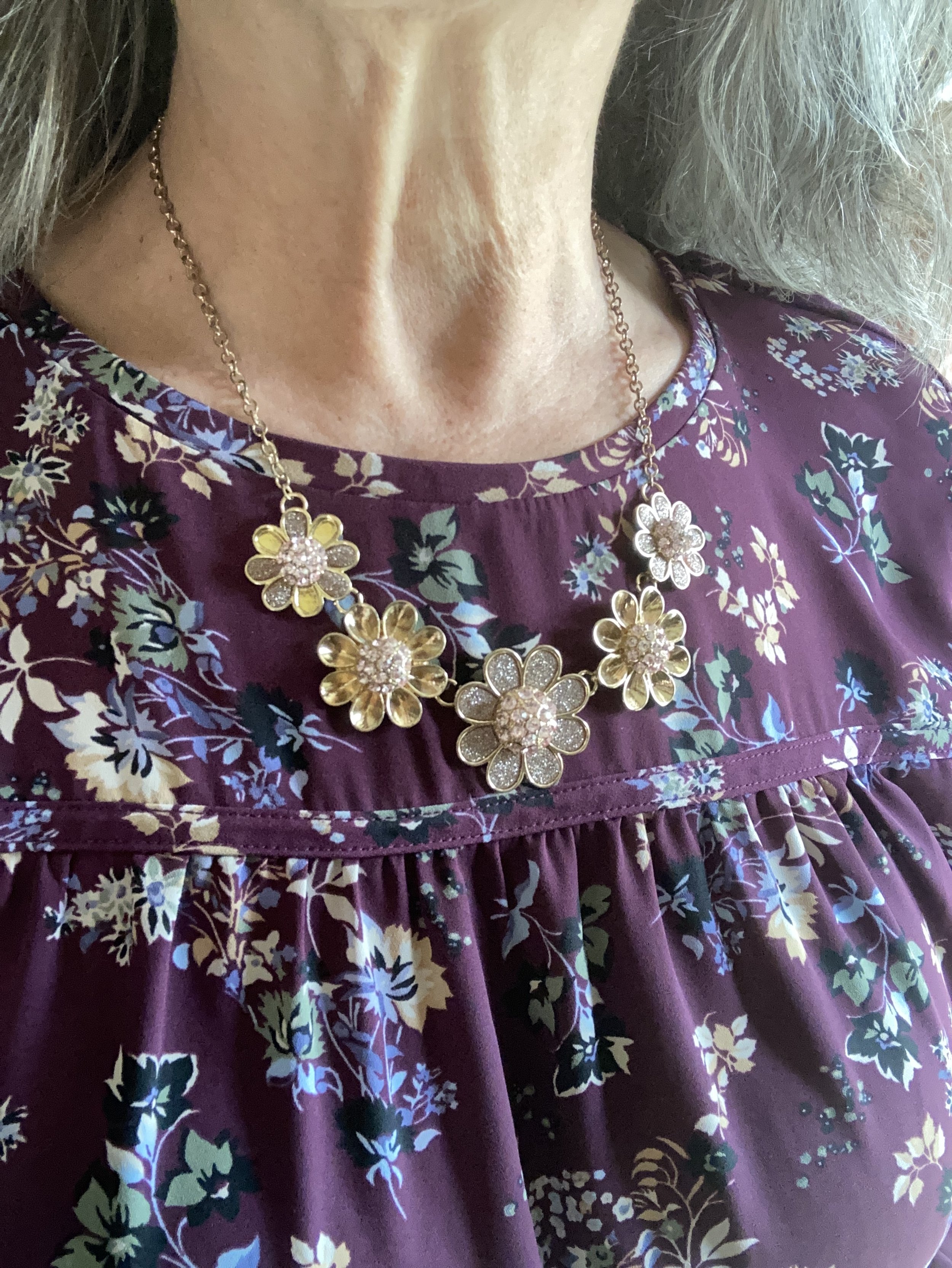
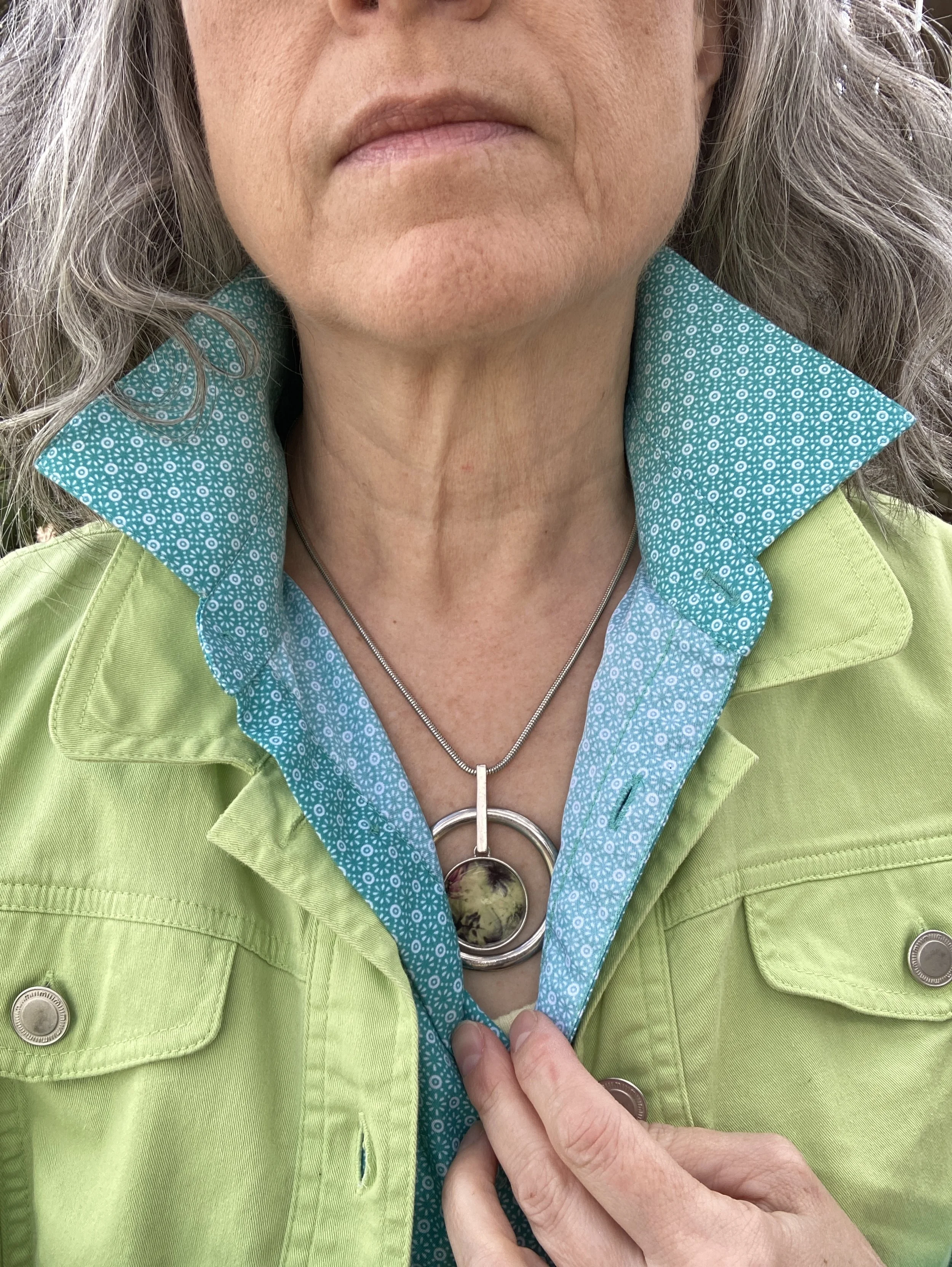
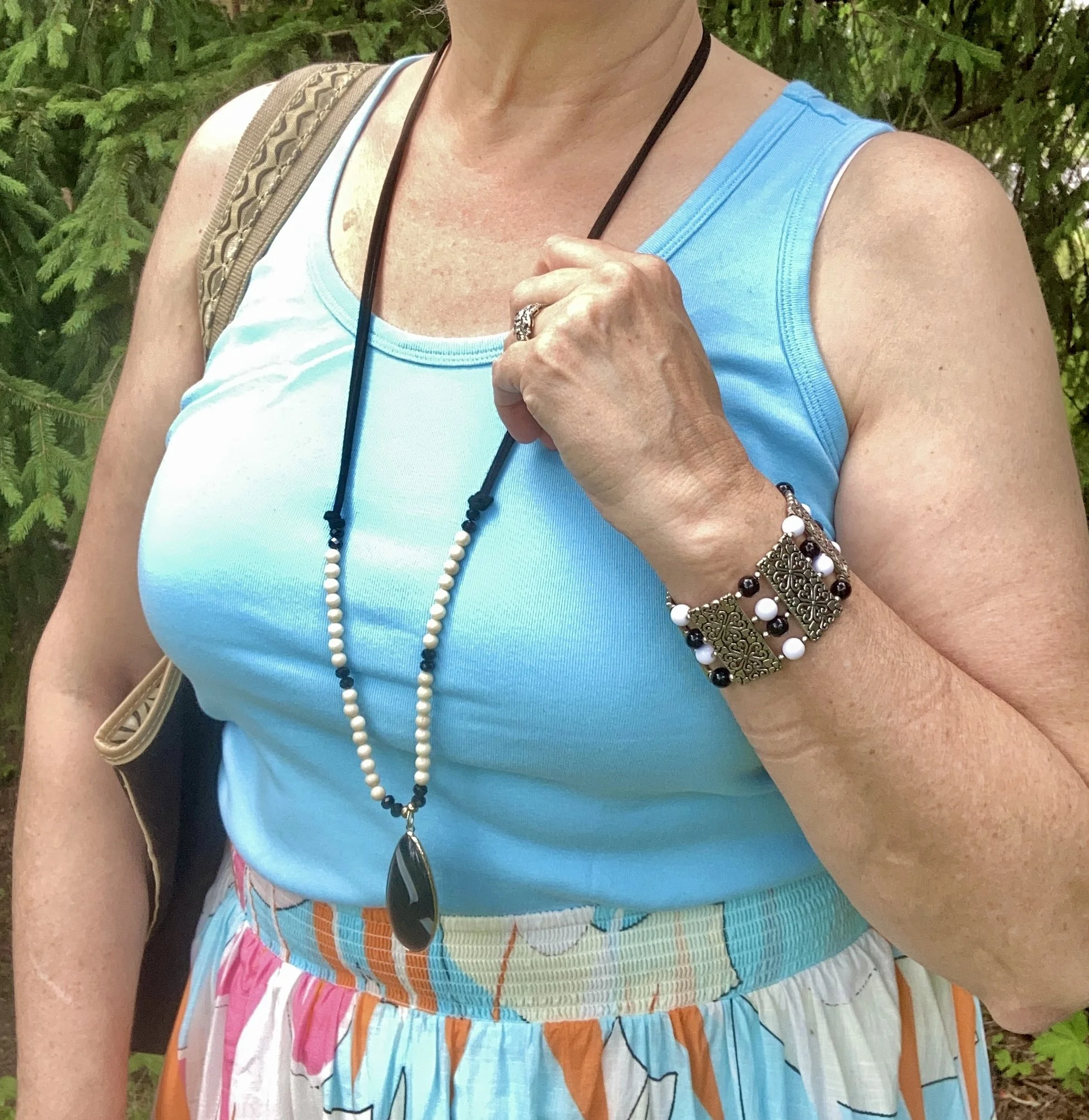
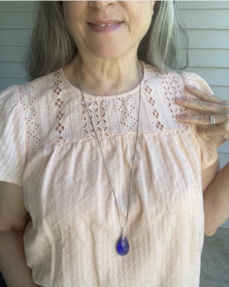
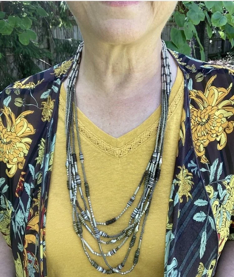
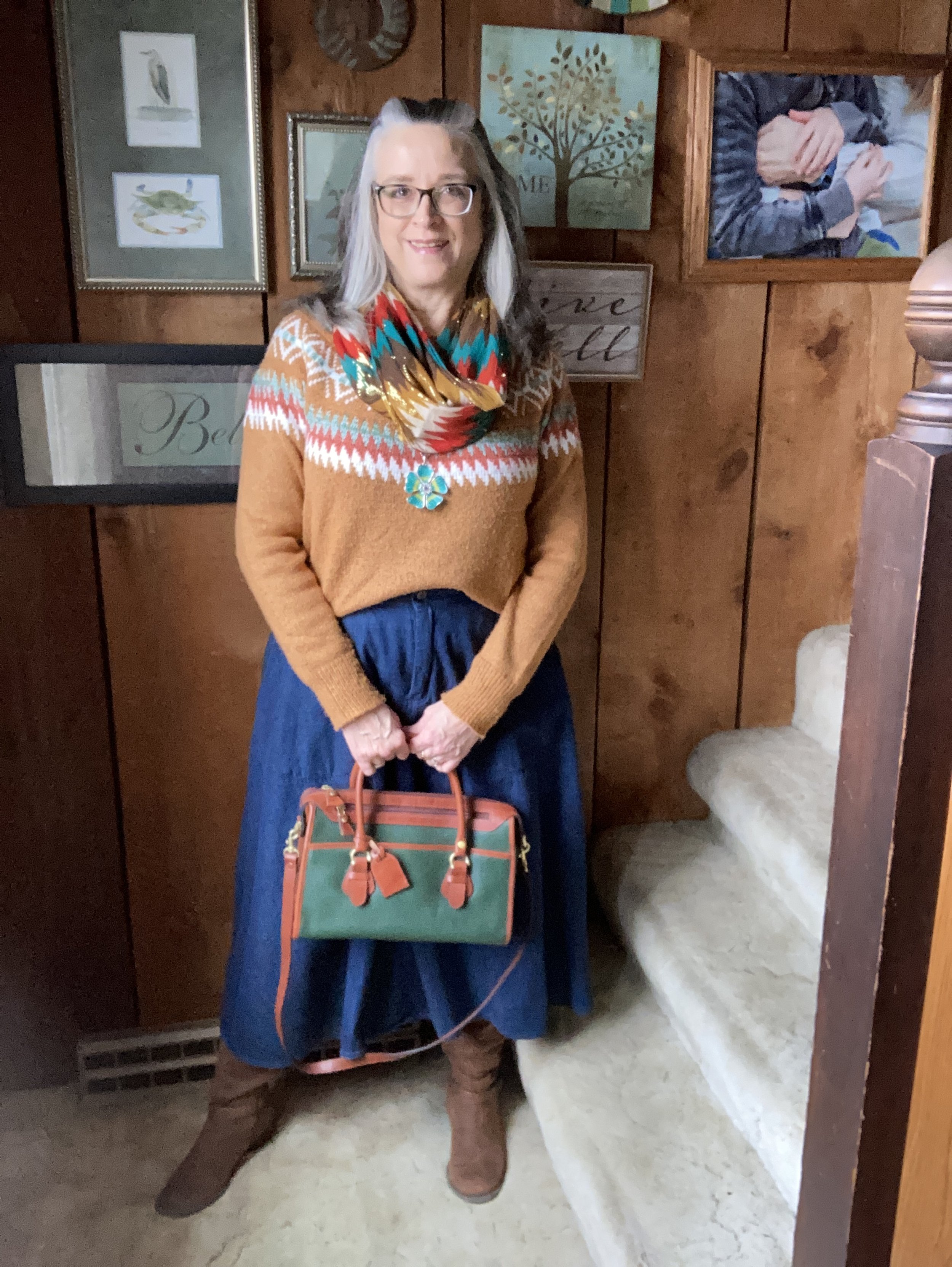
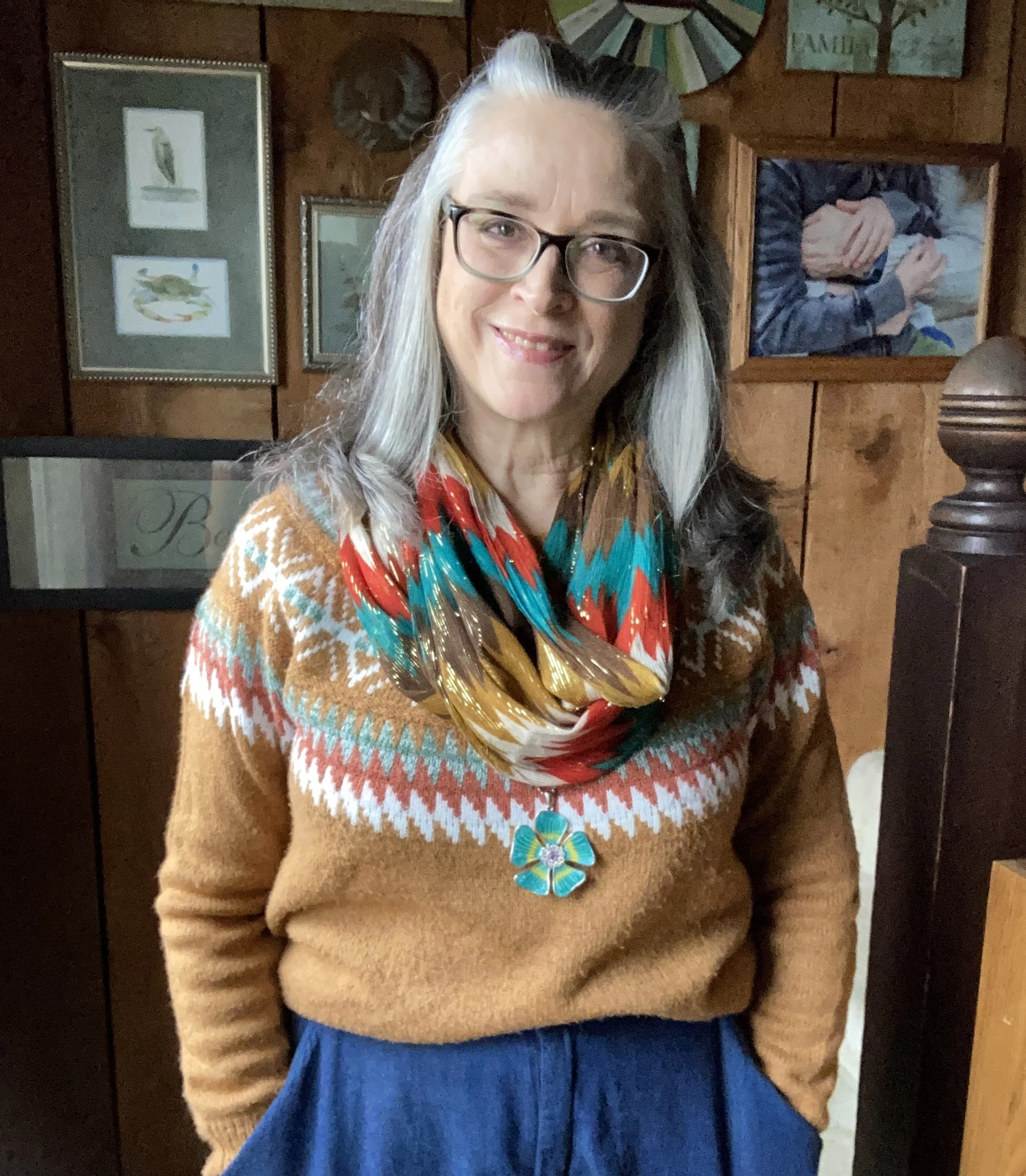
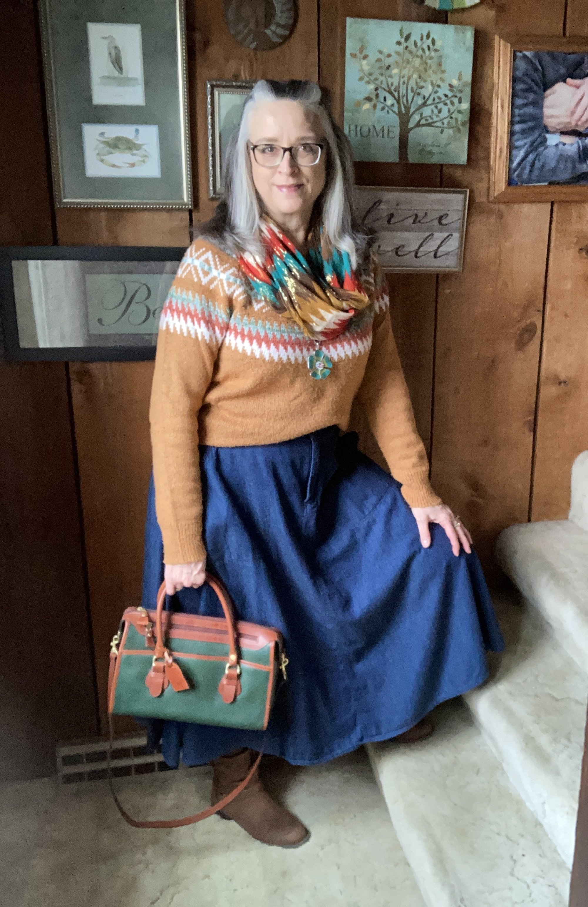
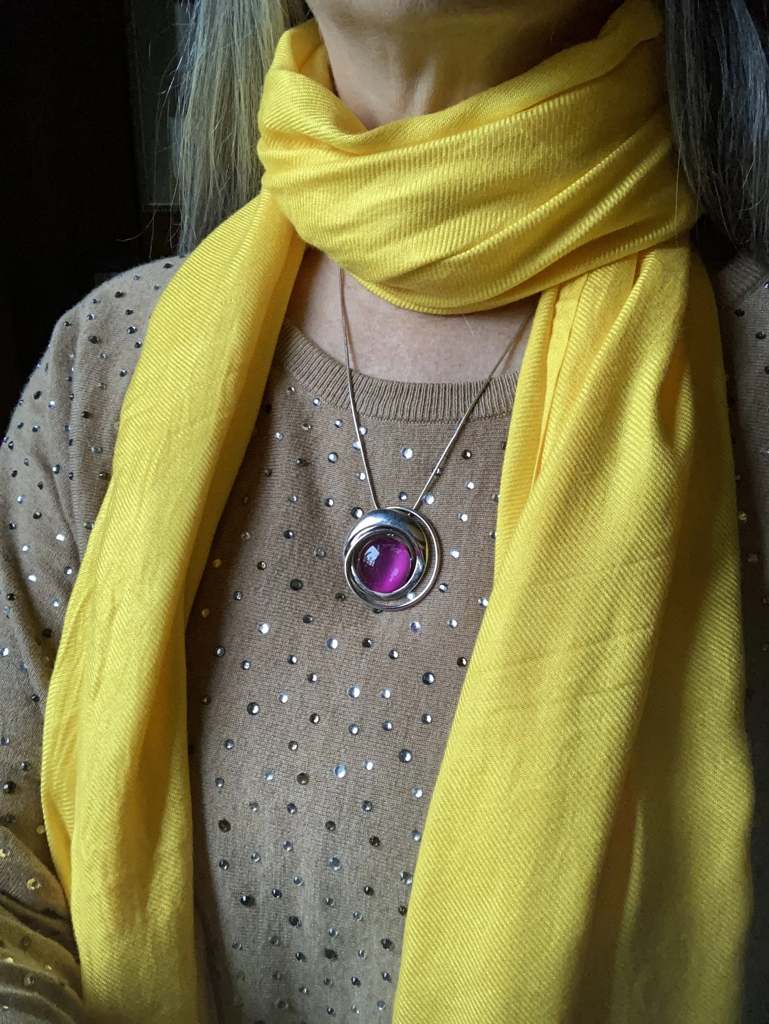
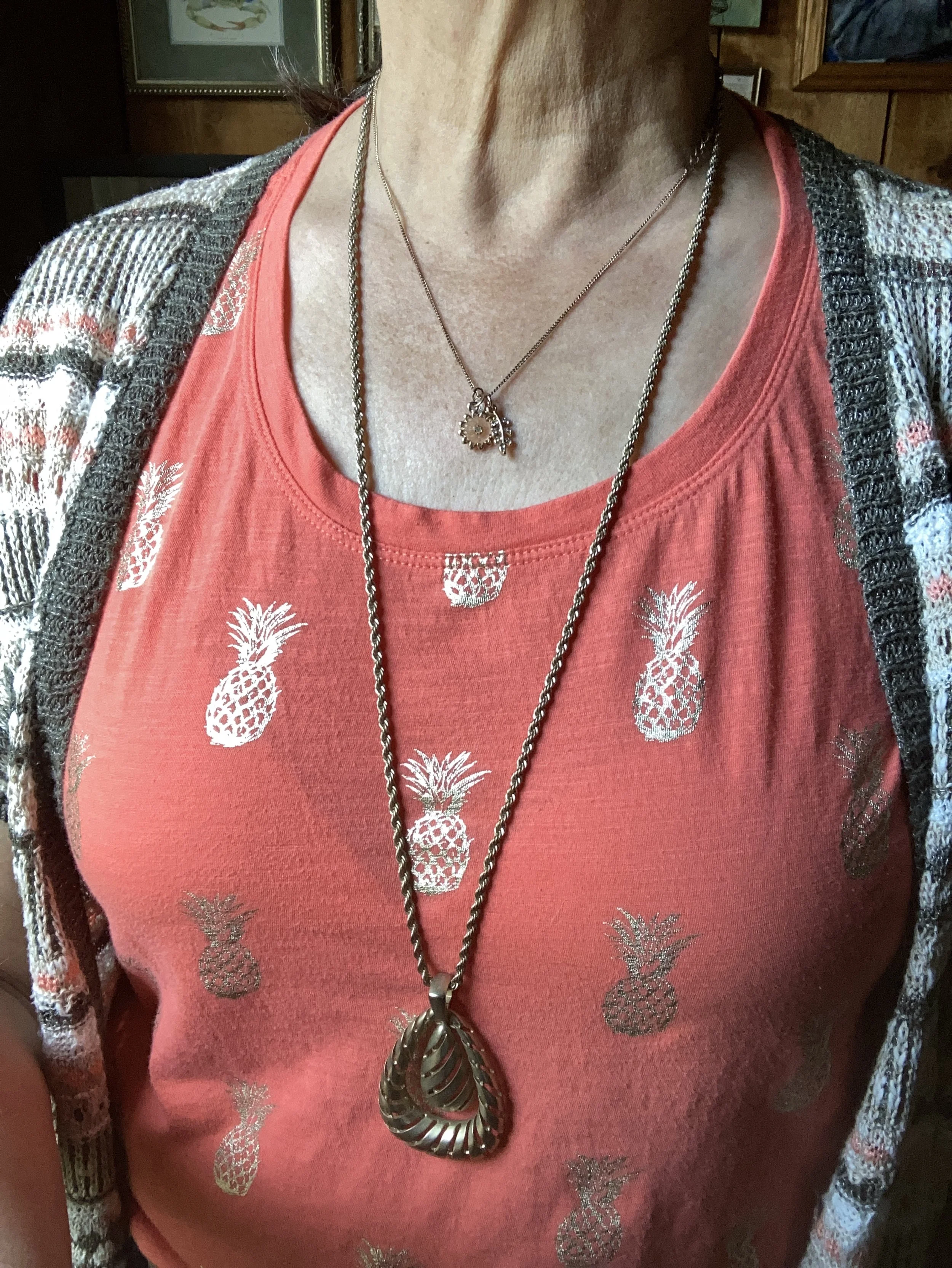
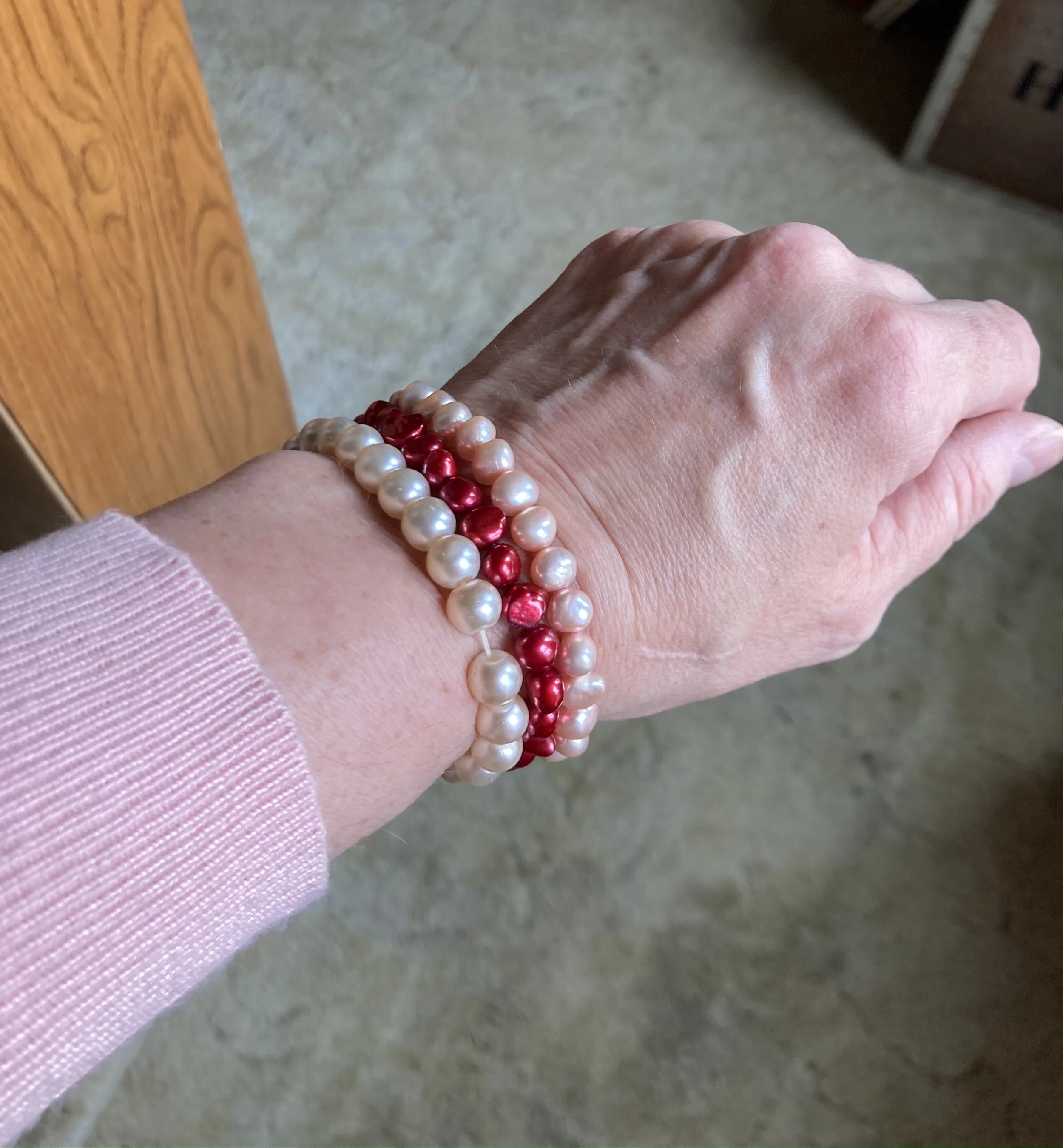
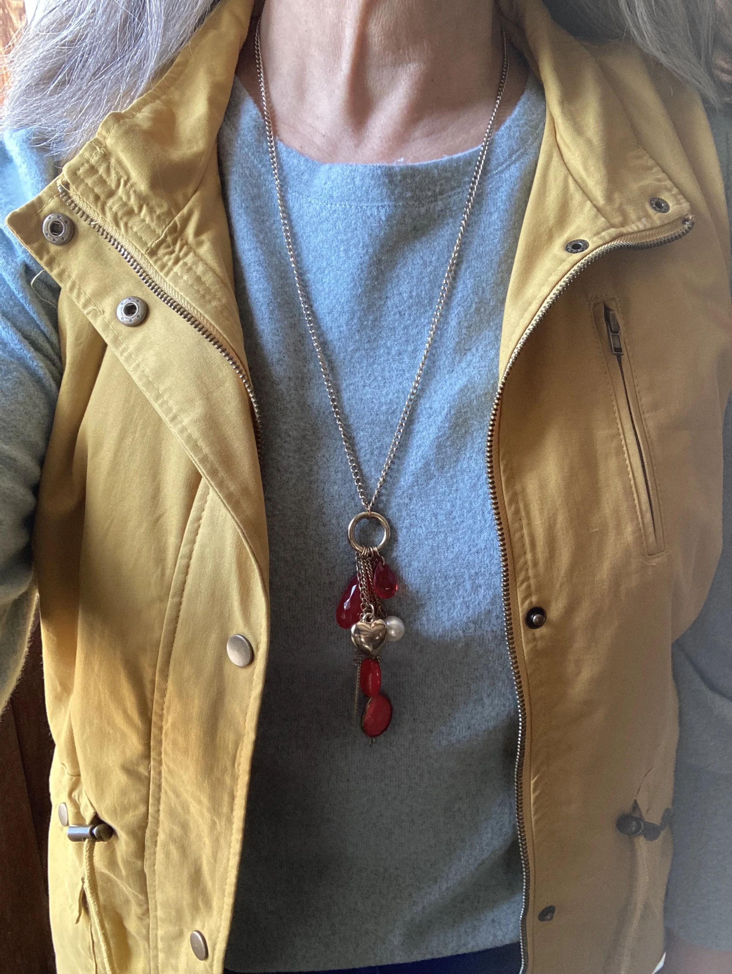
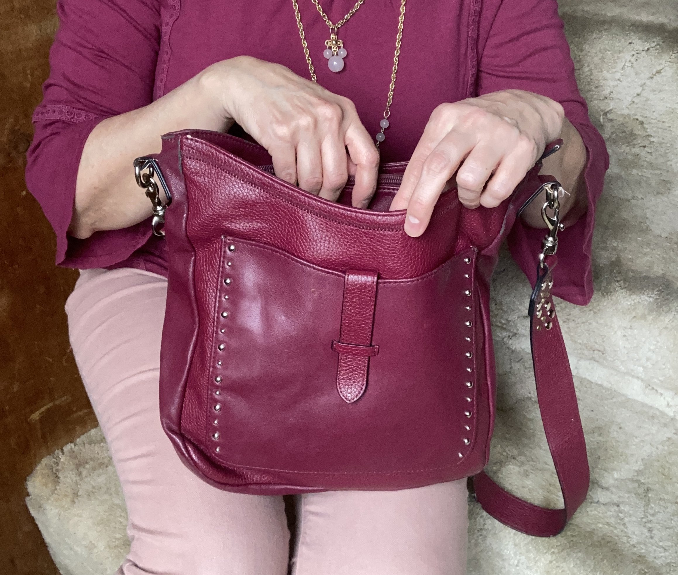
I added a sparkly necklace just to add a bit of pizzazz!
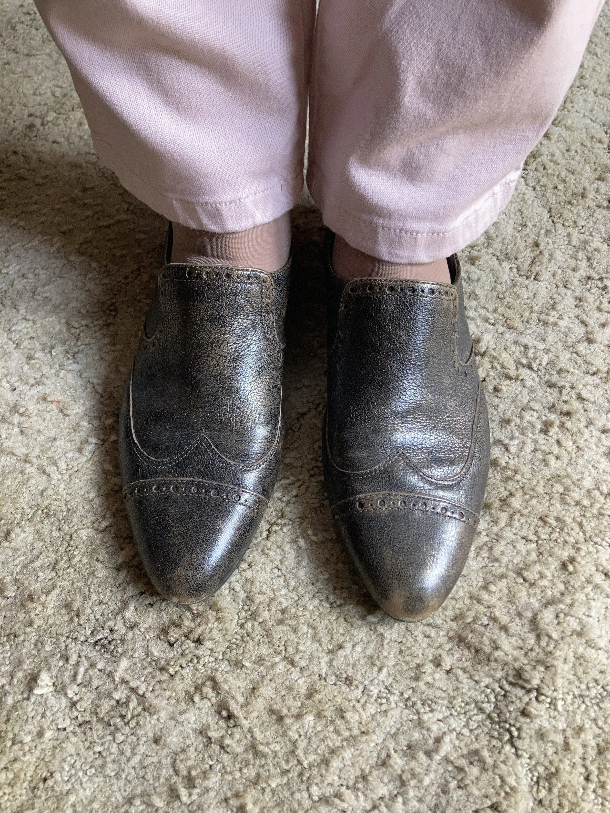
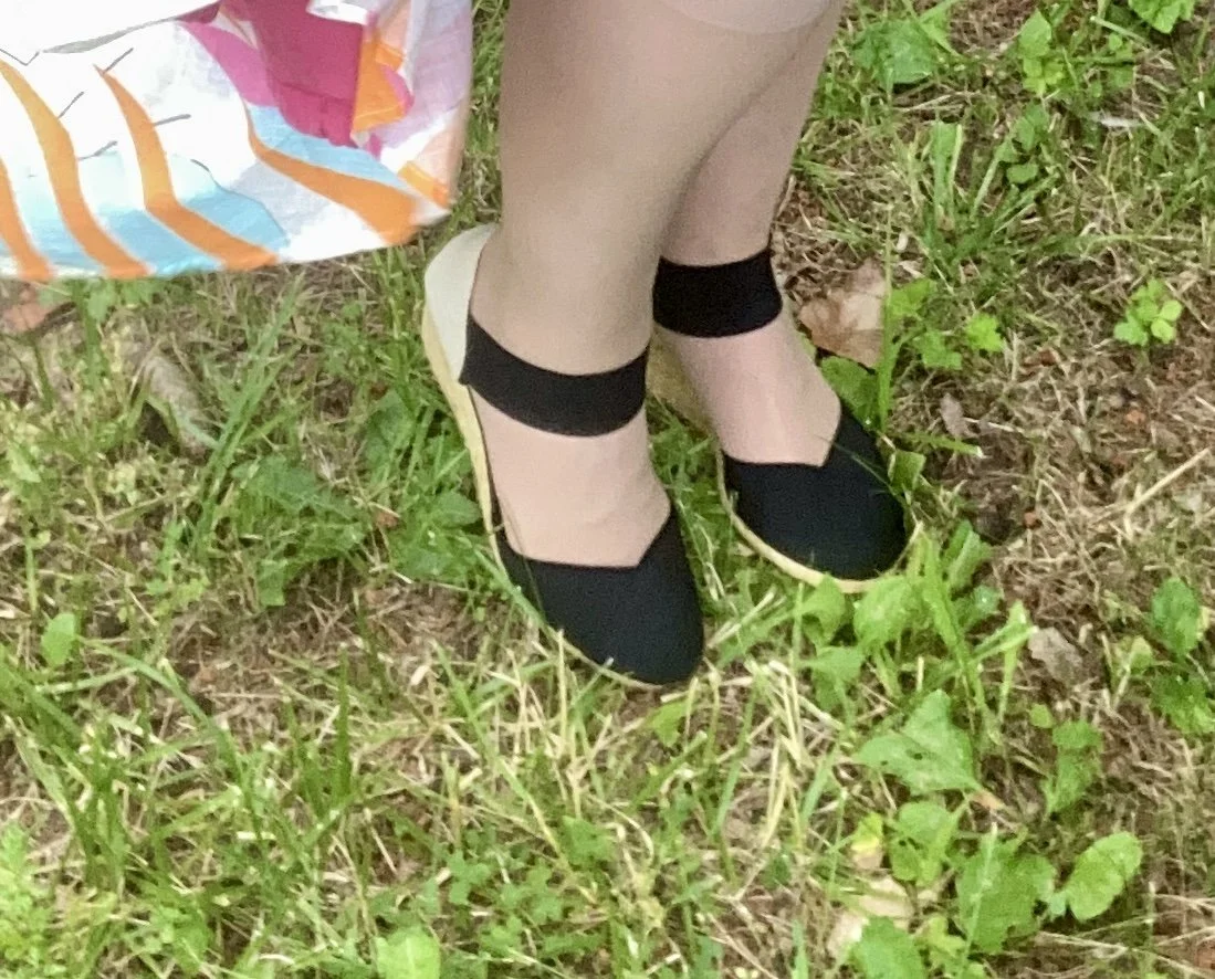
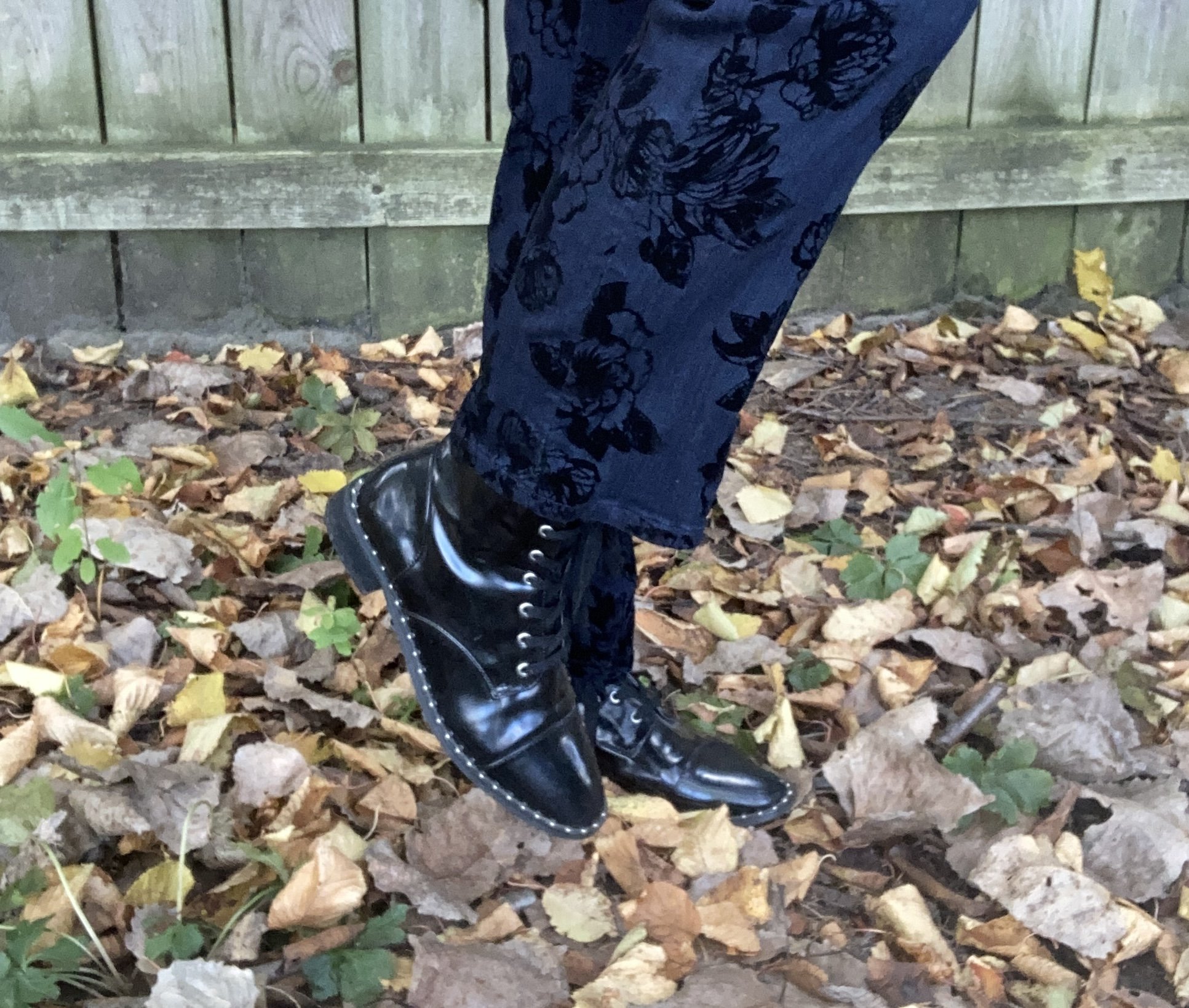
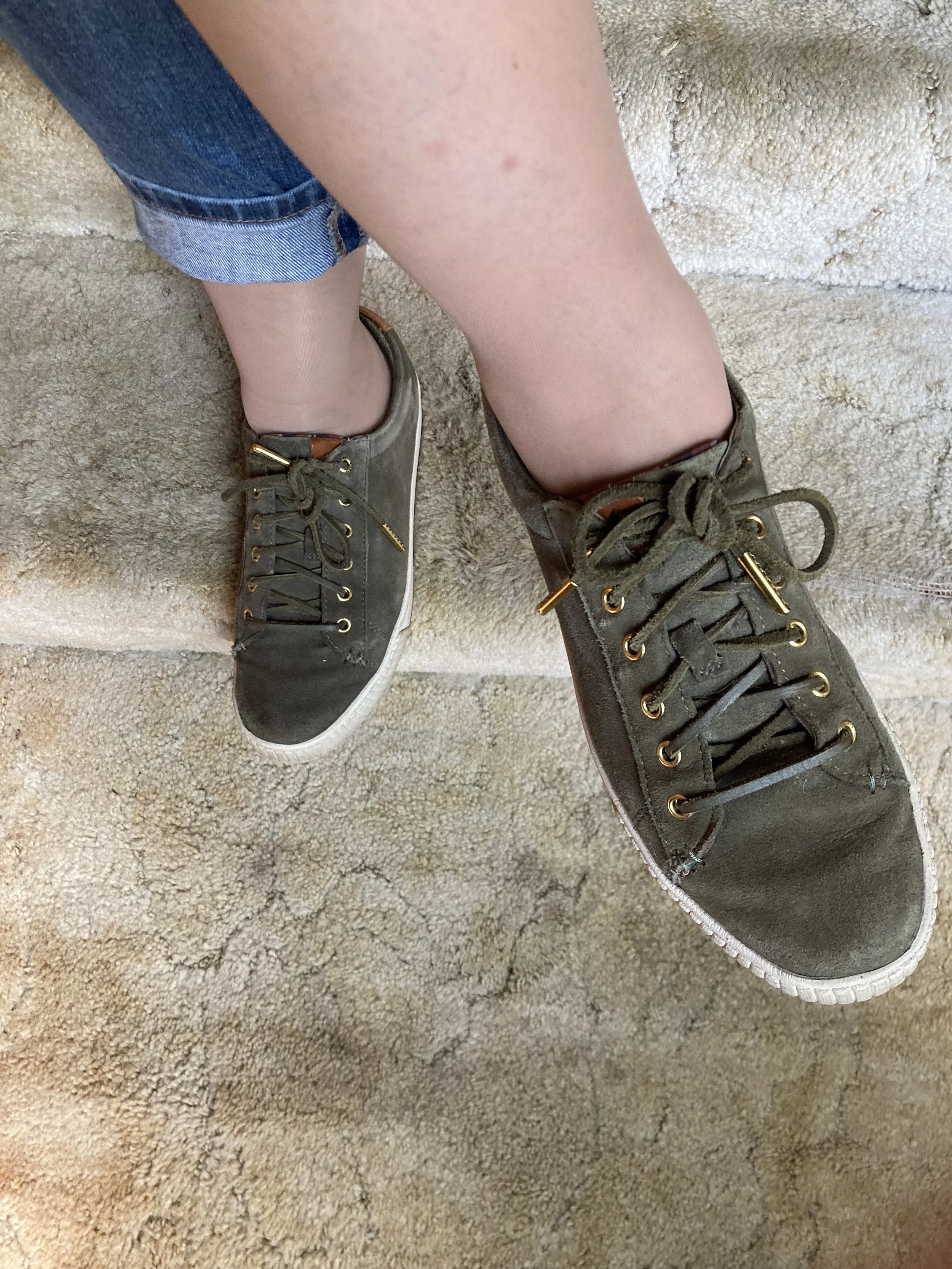
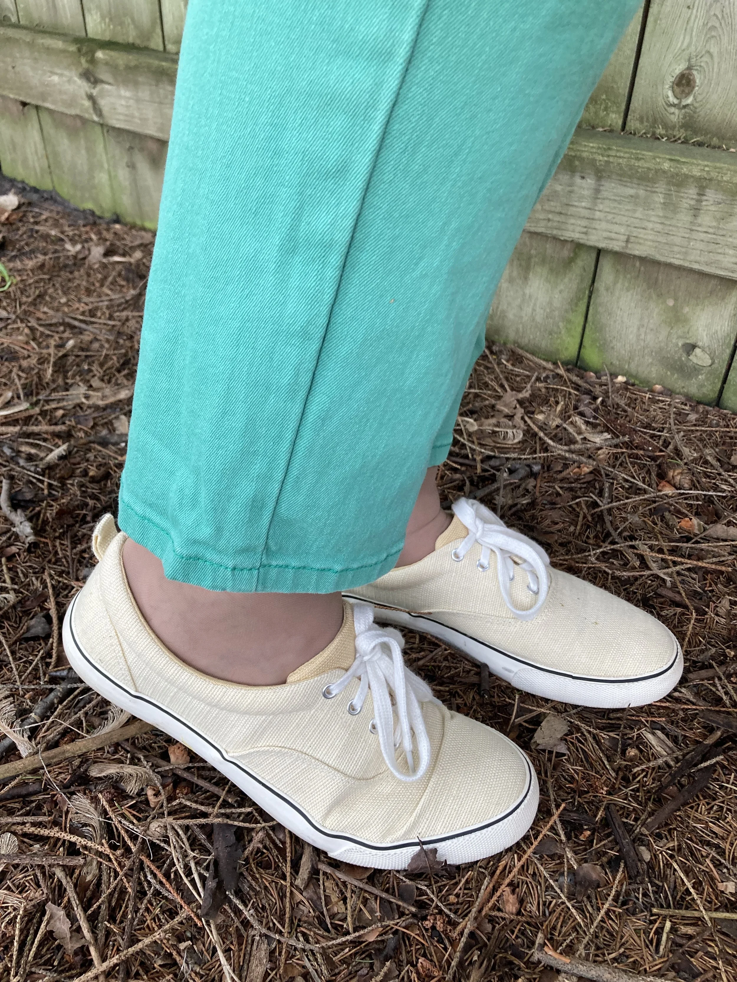
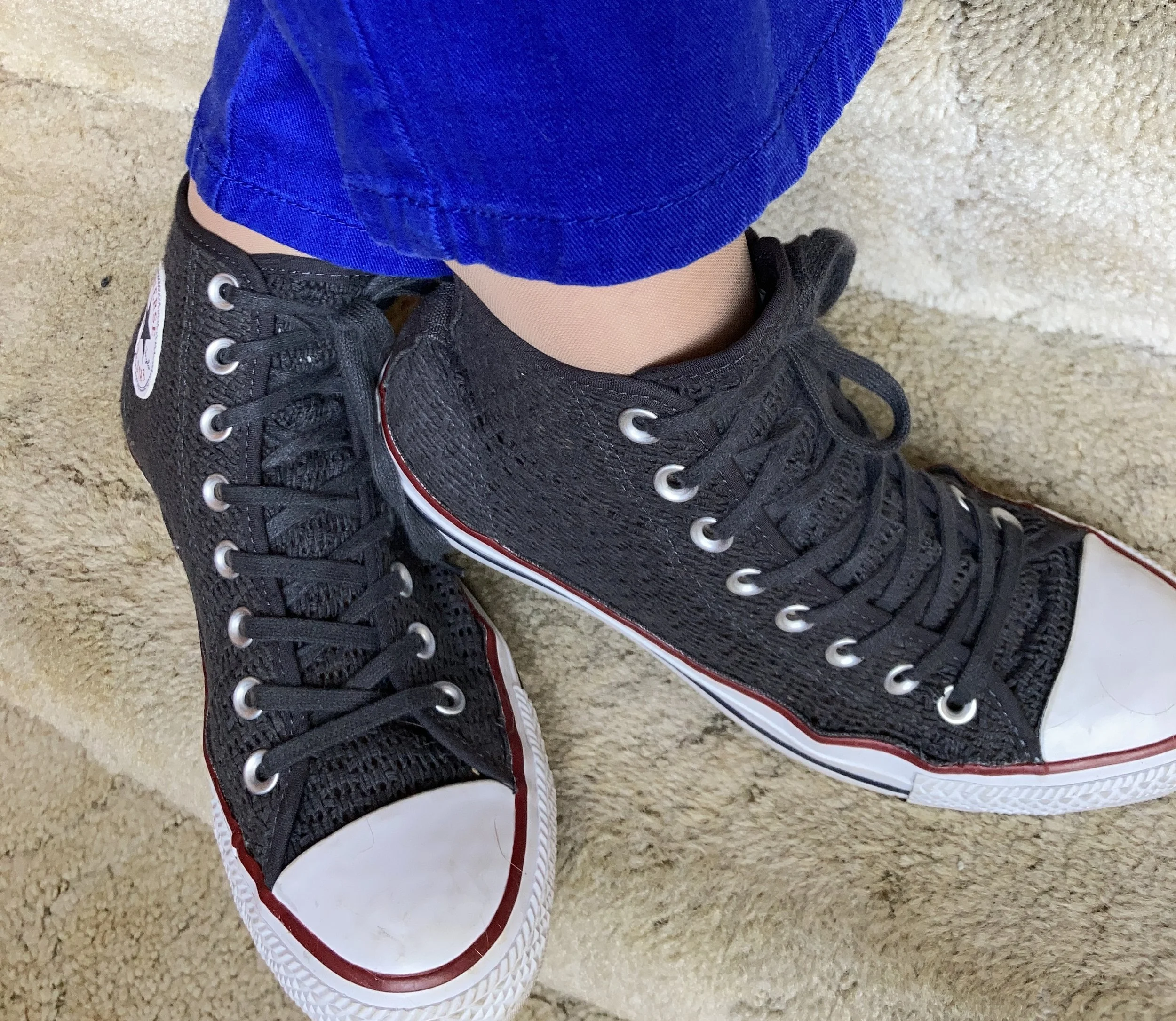
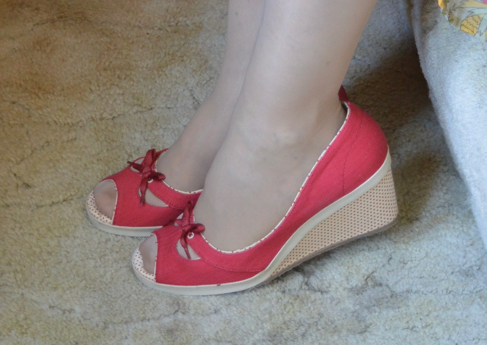
These slip on Oxfords are an older second hand find and brand called Enzo-Angiolini. I don’t often wear anything other than casual shoes like sneakers and my Converse since I no longer have an office job, but I do hang on to shoes like these so I have options if I ever need to dress up a bit.

What do you think of these colors? Which of these three do you like the best? I always enjoy getting your feedback so leave me a comment or two.
I’ve included a few shopping links for you to look through. These links are brought to you at no cost. These are affiliate links. If you purchase an item through my link I get a small commission. I appreciate all you support. All opinions are my own.
Have a great week!