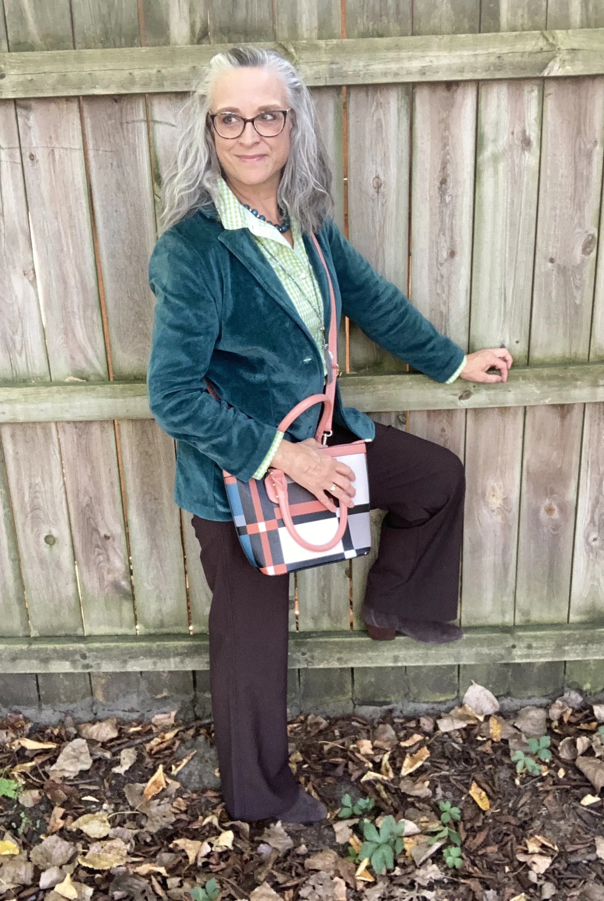
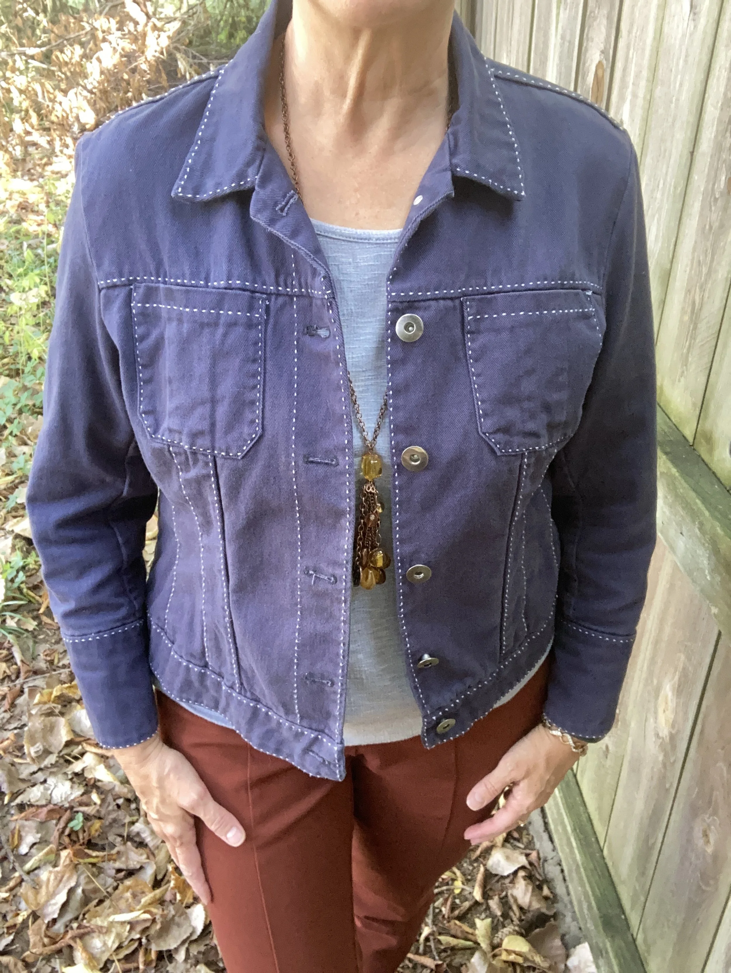
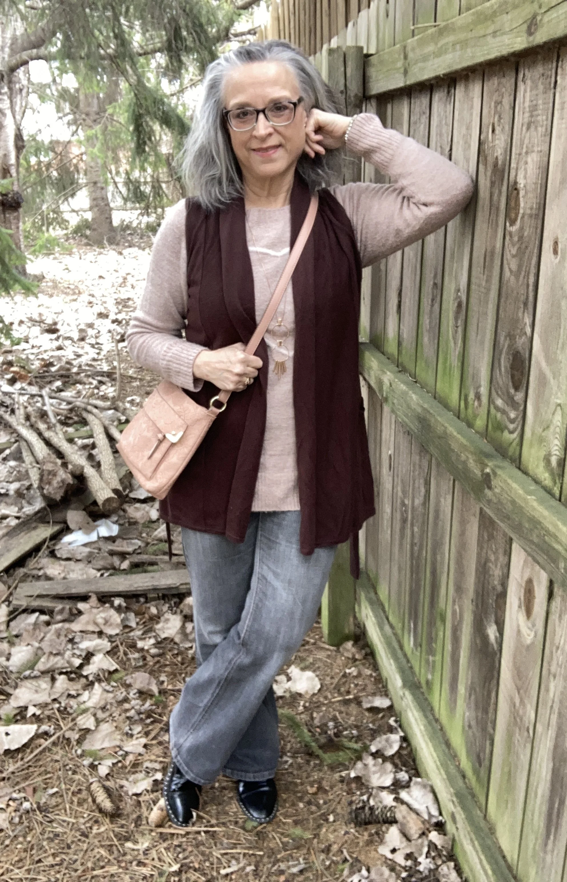
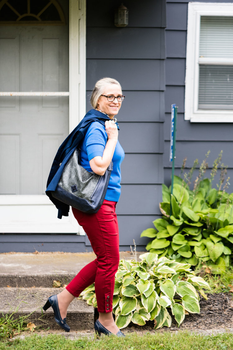
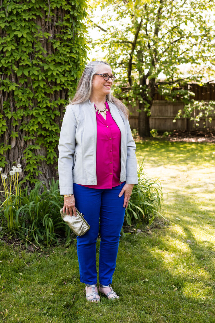
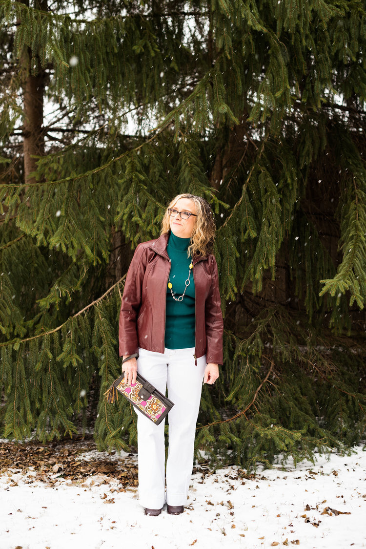
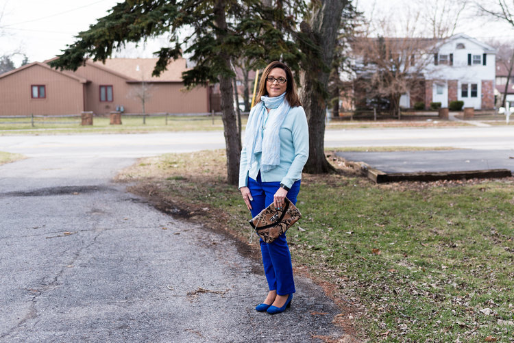
Color Play - A Pinterest Fall Color Palette

I have been collecting color palettes on Pinterest for quite a while, so I thought it would be fun to revisit that board and see what I could pull up for a fun fall color combination. This is the pin I drew my inspiration from and I used the swatch labeled Fall Fashion. I liked all the color combos, but I guess I wasn’t feeling overly adventurous, so went with the more conservative of the bunch.

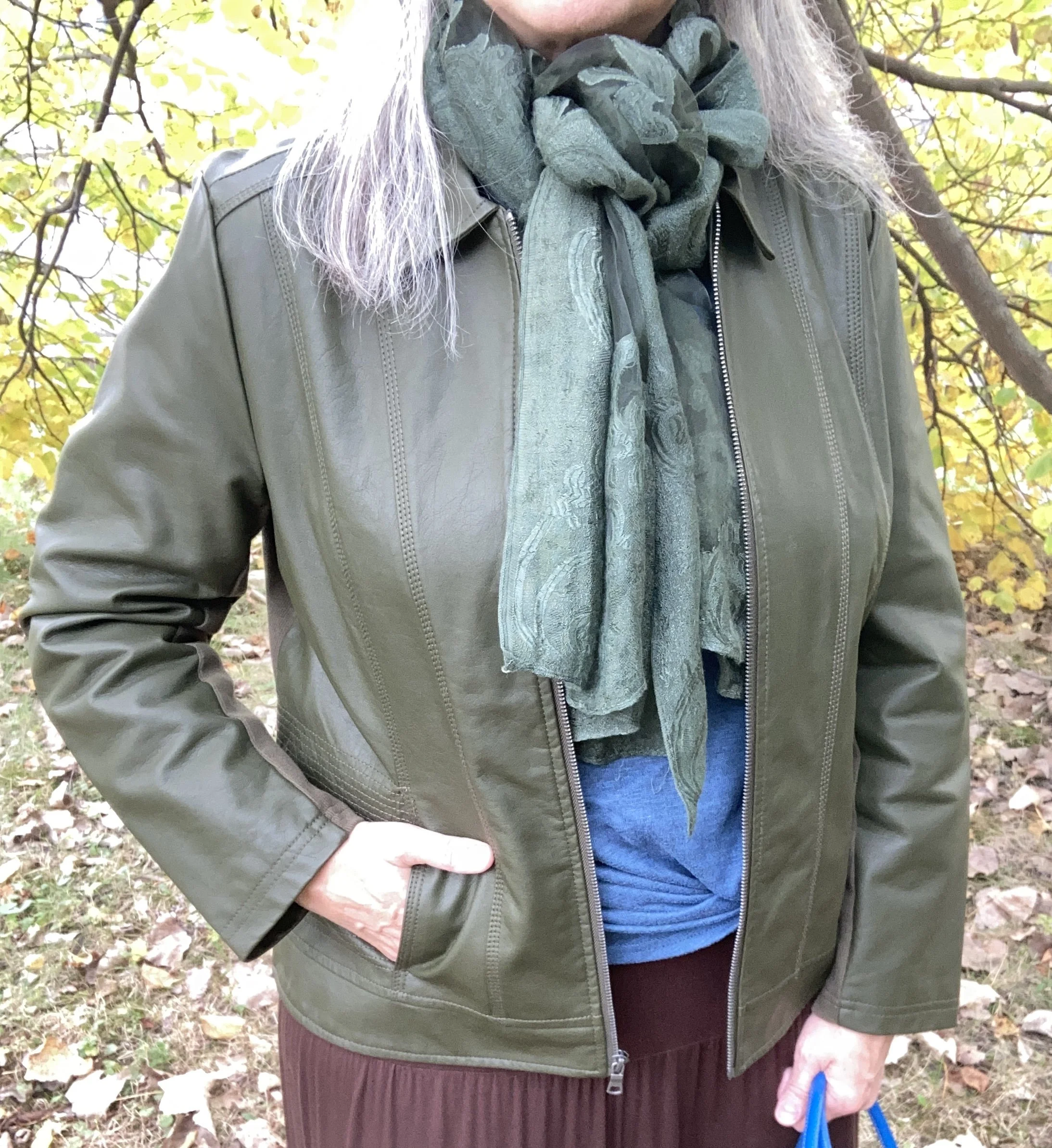
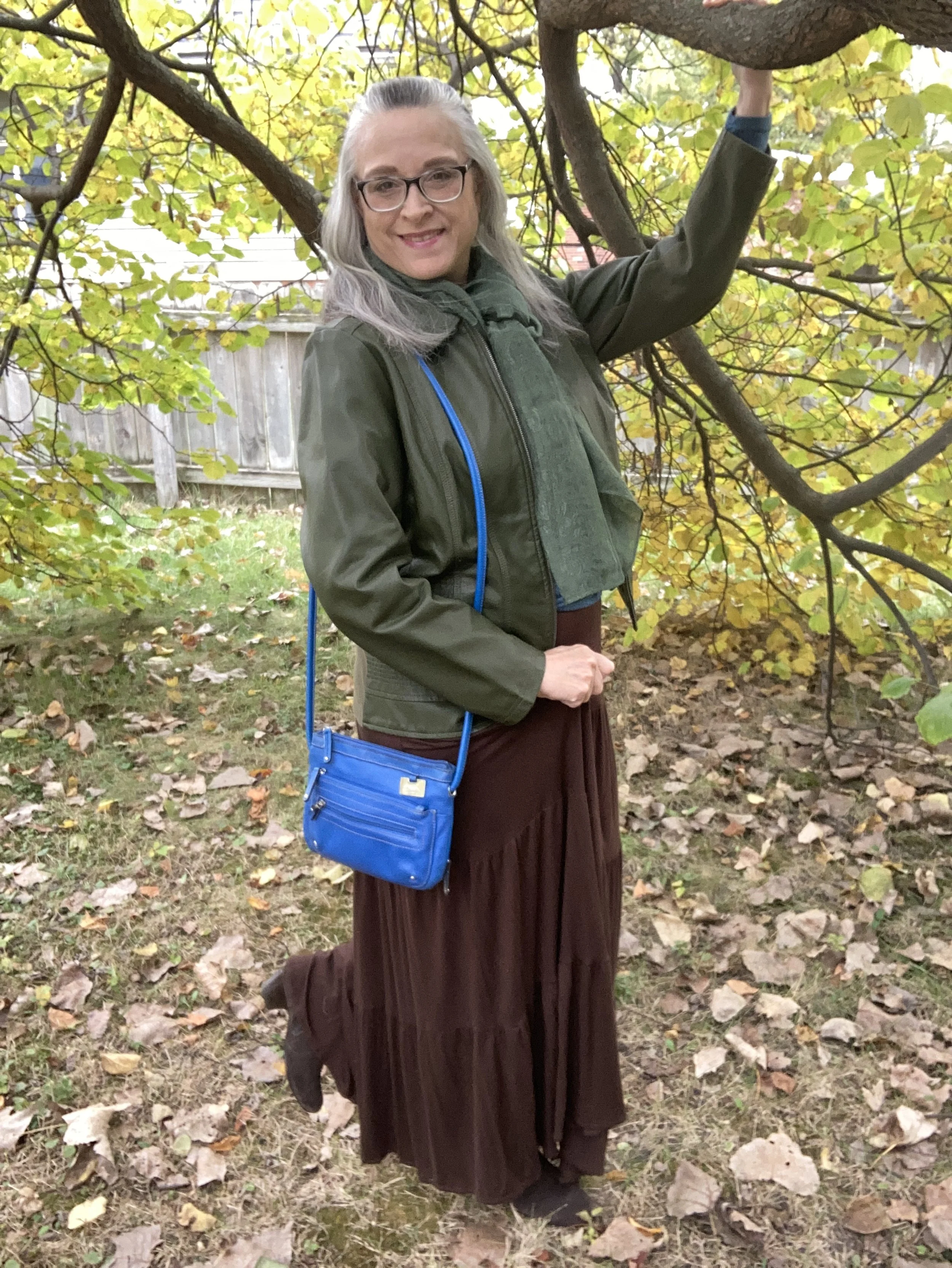
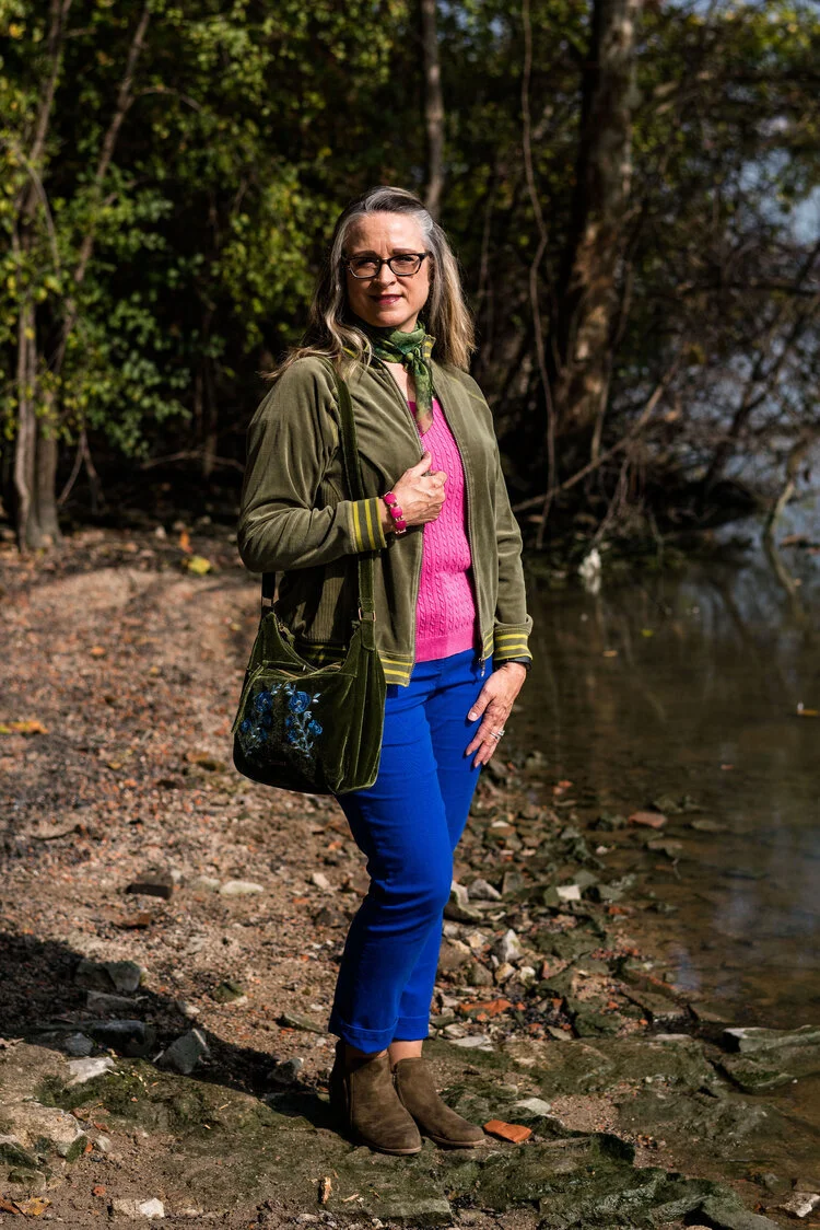
This is a rich, earthy combination for fall, and I like how the green and brown are more sedate while the bright blue is a lovely pop of color. When I saw the color swatch I knew the olive would be a good color choice for a topper, as I have a number of sweaters and jackets in that color.

My faux leather moto jacket is an older Christopher and Banks piece. I like that it is simple, light weight and it has stretchy cloth panels on both sides and along the backs of the sleeves. They no longer seem to make these types of jackets, but always keep an eye out at thrift stores. In addition, real leather is always more suitable for longer wear and tear. Be sure to check out the Jacket Maker website for quality leather pieces at more reasonable prices.

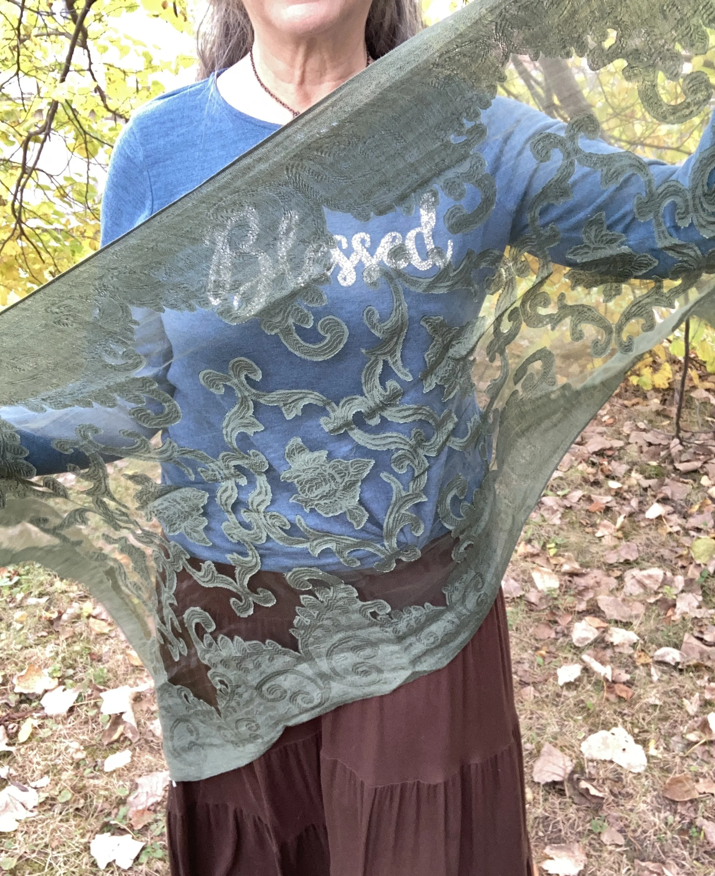
I added this thrifted green scarf, because fall is always a good time for a scarf! This was a fun find as I didn’t have too many green scarves and I love the delicate look of it.

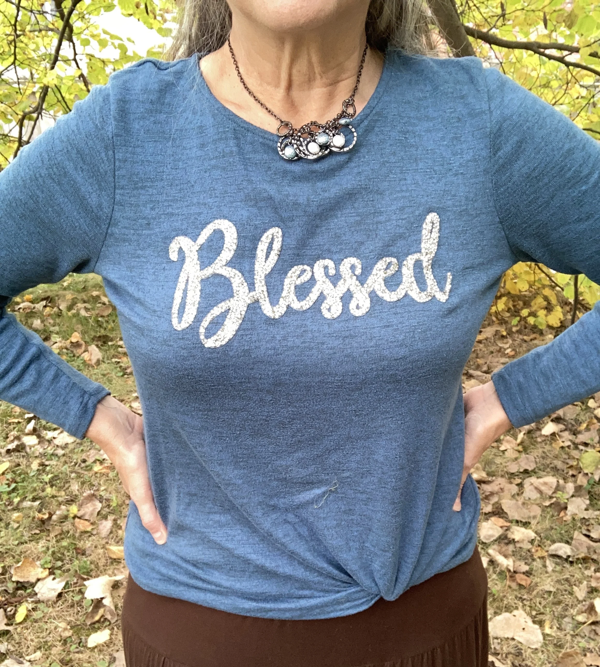
I was also dressing for an Instagram challenge today and the theme had to do with bling. This cute joei & iBlessed” top was a gift from my oldest a few years ago and I do love it. It is the perfect weight for a cool fall day, and the sparkle makes it top notch in my book. You can also see the necklace I added. One can never have too many accessories on at one time, right? Ha, ha. In reality, if this was a work outfit, I would most likely take the jacket and scarf off while at the office, so the necklace works.

I have worn this skirt multiple times on the blog. It is St. John’s Bay brand and was purchased from JCPenney a number of years ago. You can see this skirt paired with a spotted tee, a bookish vest, and more recently a fringe vest.

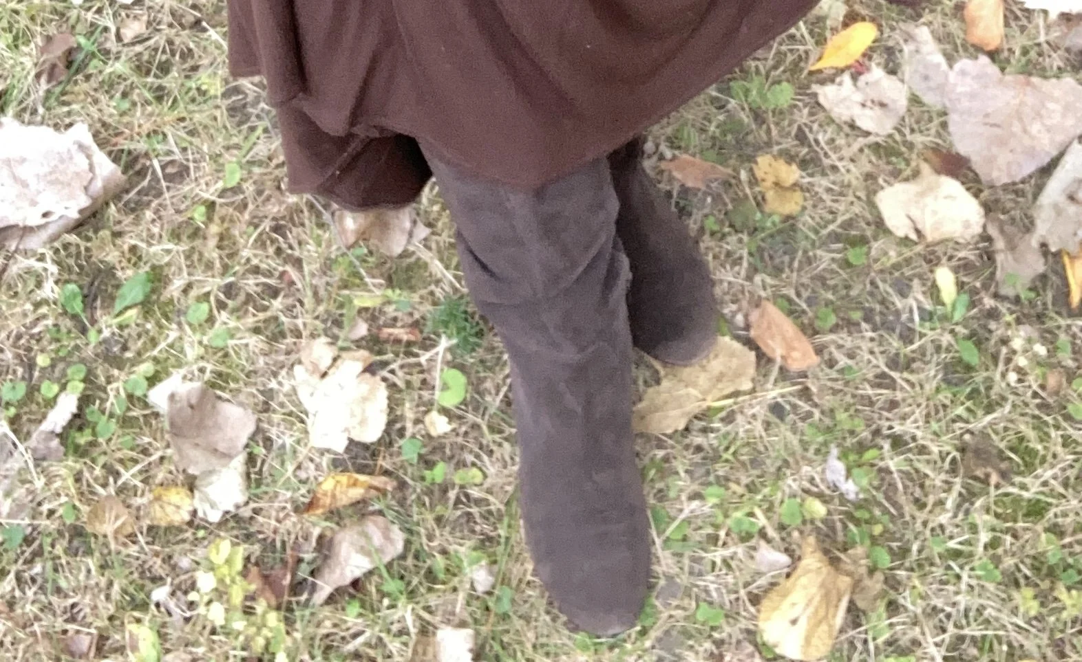
My boots are second hand old, but they are real suede, so with a little TLC I will keep them indefinitely. They are a brand called Kelly & Katie.

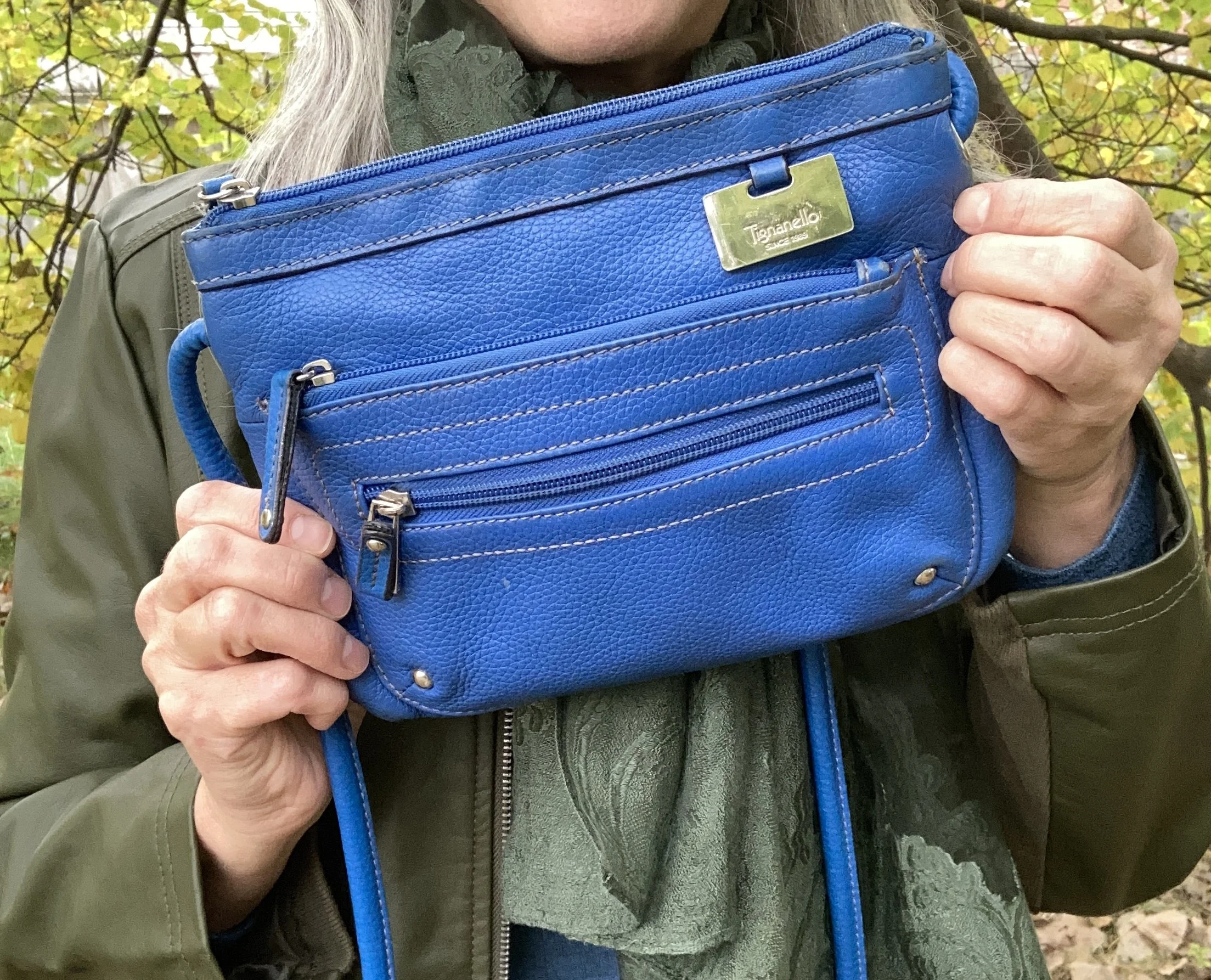
My blue cross body bag is thrifted Tignanello brand.

Do you think these colors work well together? What colors from the Pinterest Autumn palette did you like best? Please leave a comment or two. I appreciate your input.

I’m including a few shopping links for block heeled boots, tiered skirts and faux leather moto jackets. These are affiliate links brought to you at no extra cost. All opinions are my own.

I hope you are having a great week!

Color Play: Building an Outfit Around a Bag

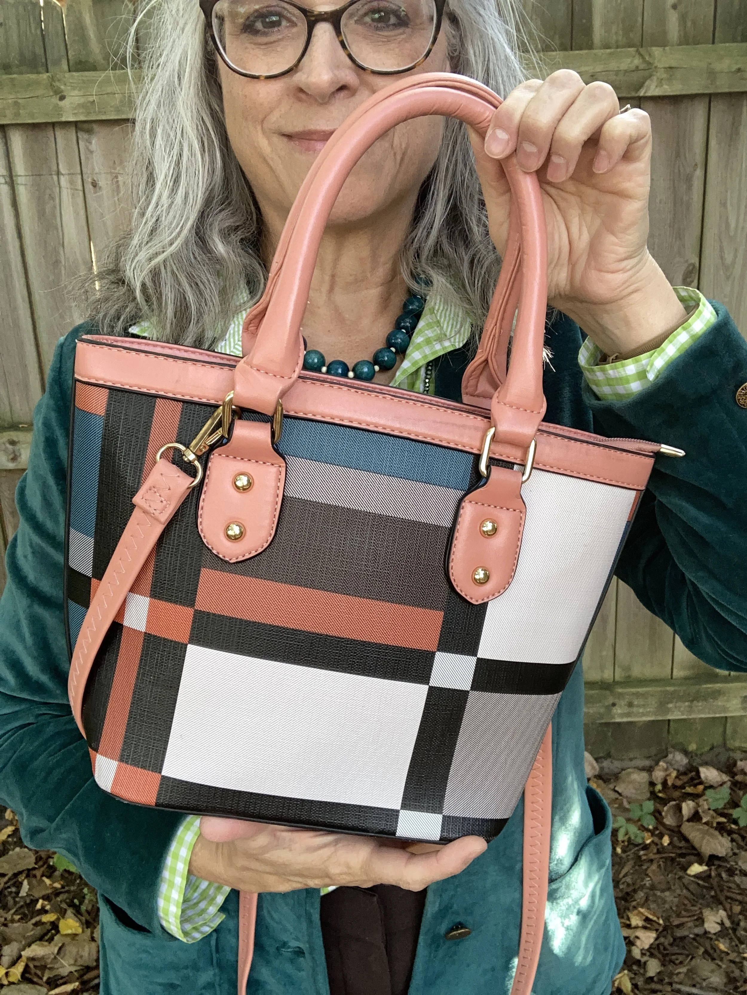
When I found this cute color block bag on a recent thrift store run, I knew I had to style an outfit around it. The colors are perfect for spring, summer and fall, and for me, the size is just right. I have gotten away from carrying large bags, because they tend to bother my shoulders. Even a cross body bag that is larger becomes problematic because I put too much stuff in it. You know the saying, “If it’s big, fill it up!” Ha, ha. I may have just made that up.

Aren’t the colors on this piece so cute? This has no brand name on it anywhere.

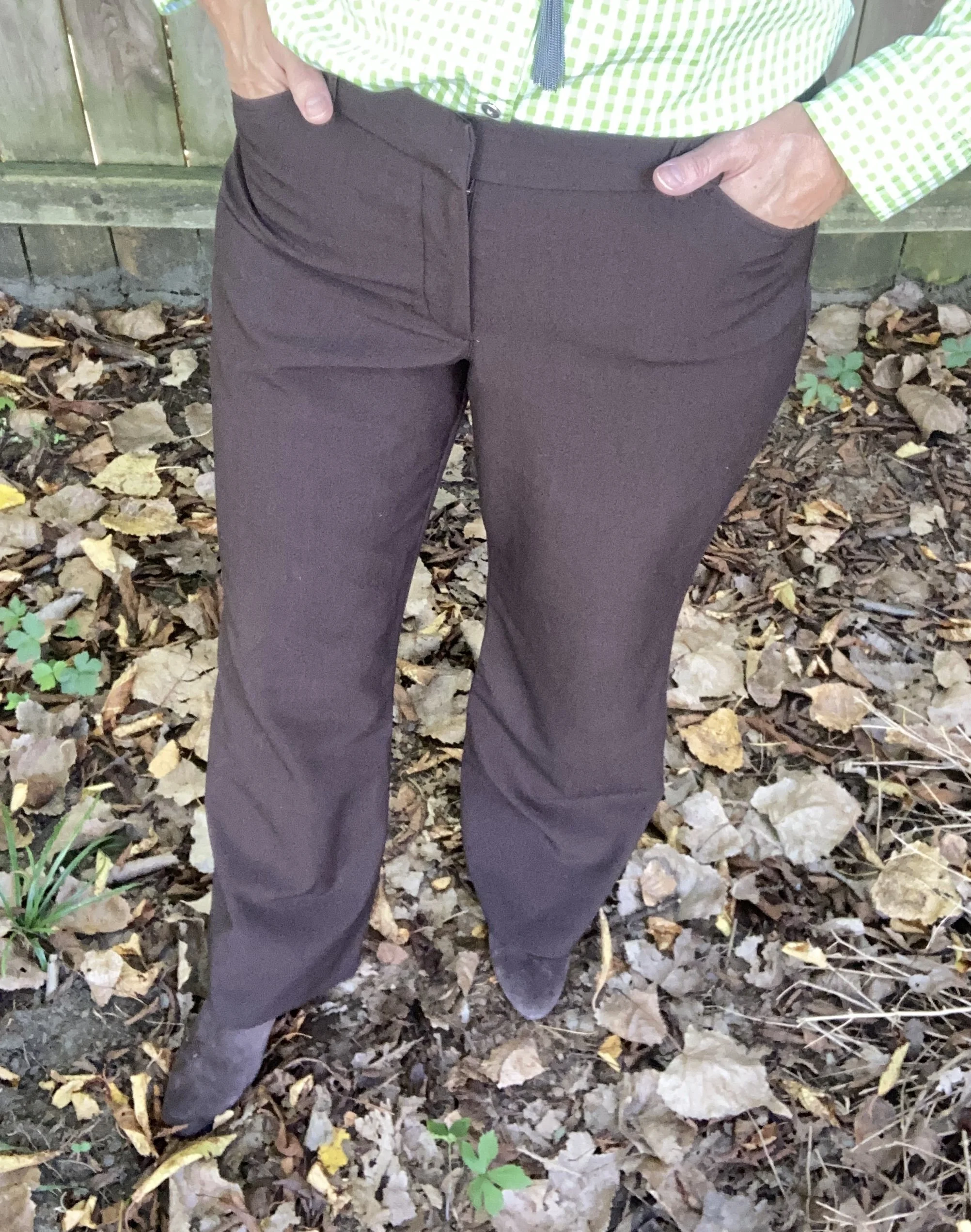
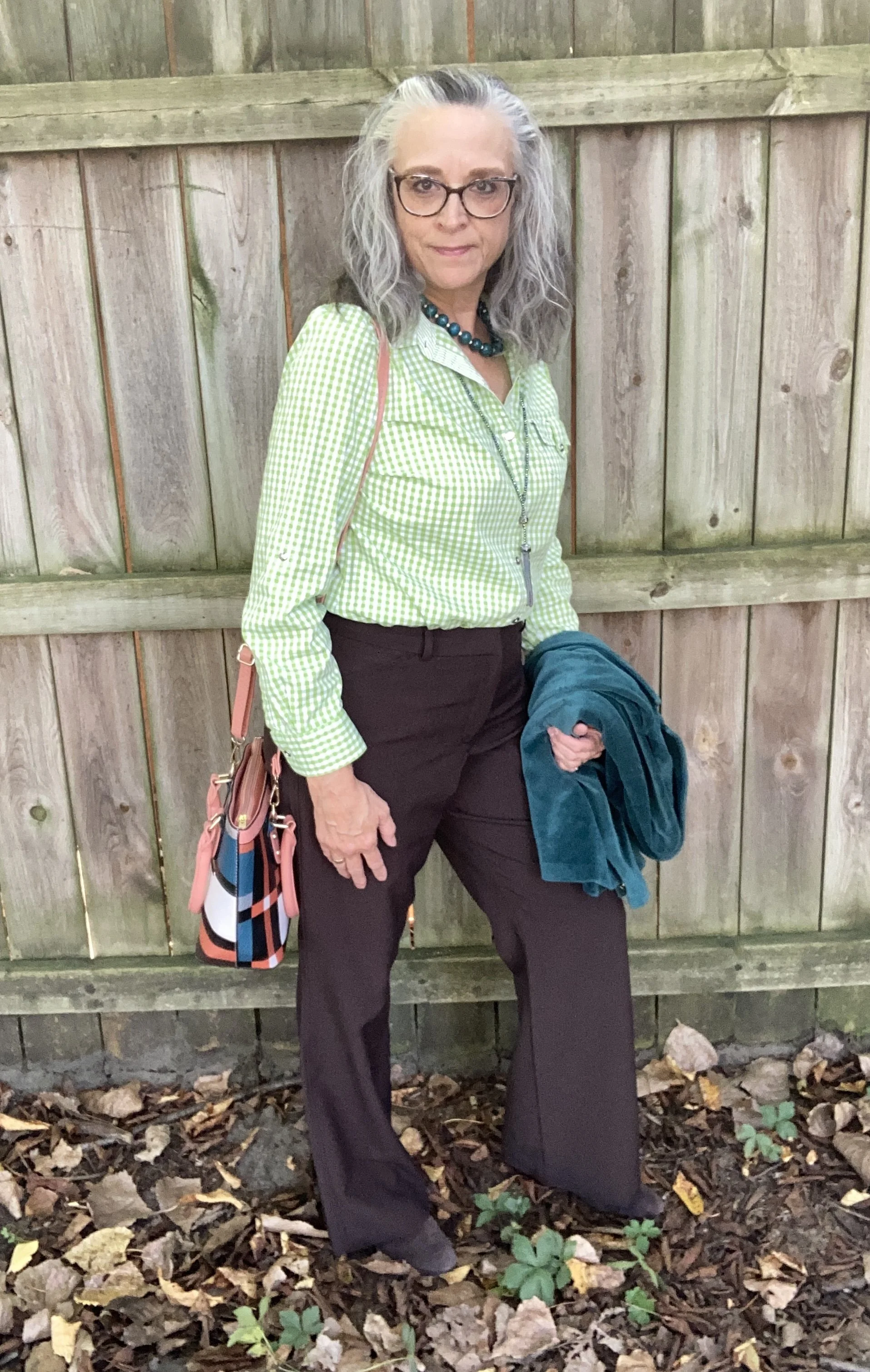
There were lots of choices I could have went with for an outfit. For a little while I was looking at a white maxi, but decided to save that for another day. I also pulled out a pair of coral pants, but ended up with the look you see here.

For this look I decided to have a similar color block vibe to the bag. I am looking forward to using this bag again for inspiration with a print mixing outfit.

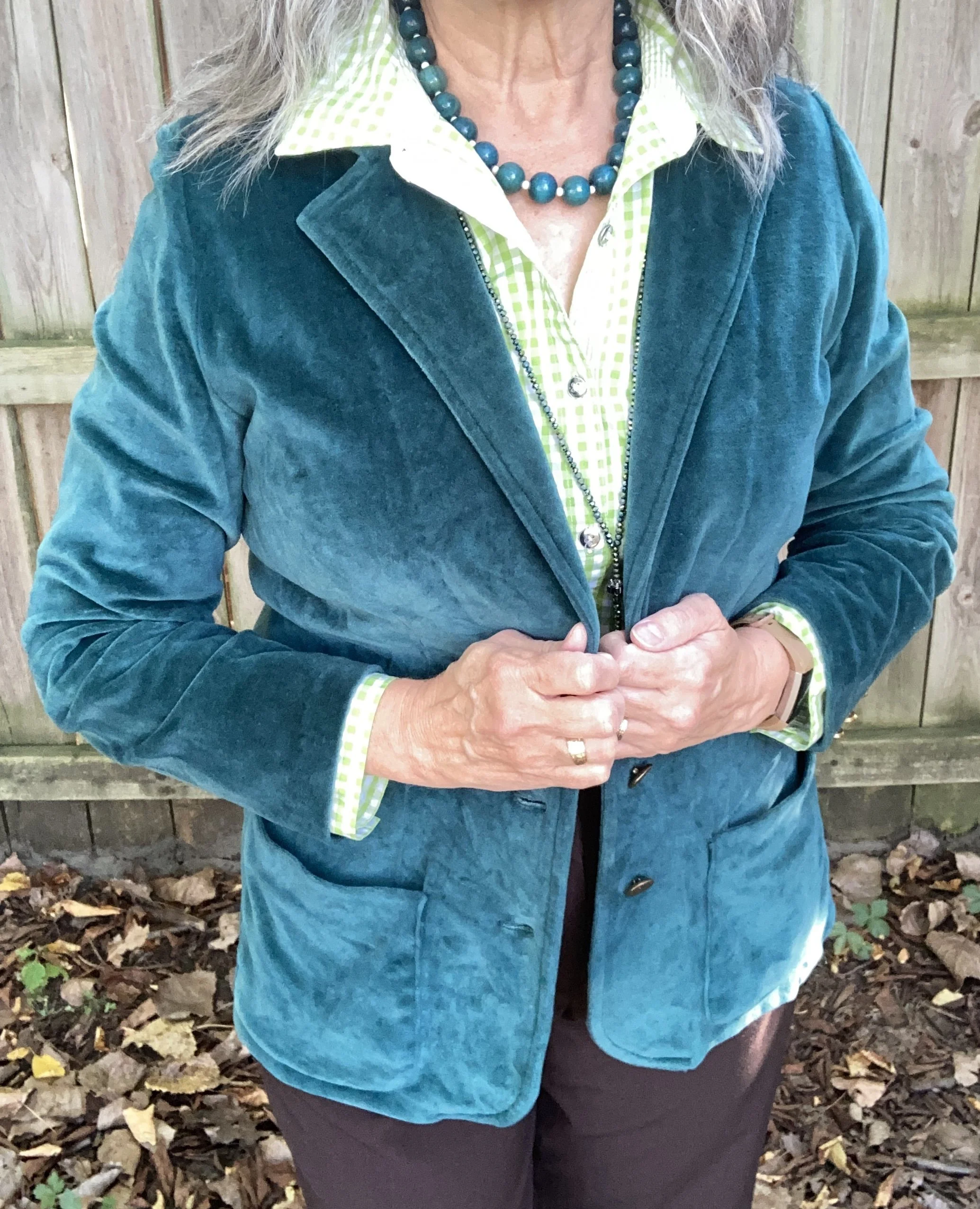
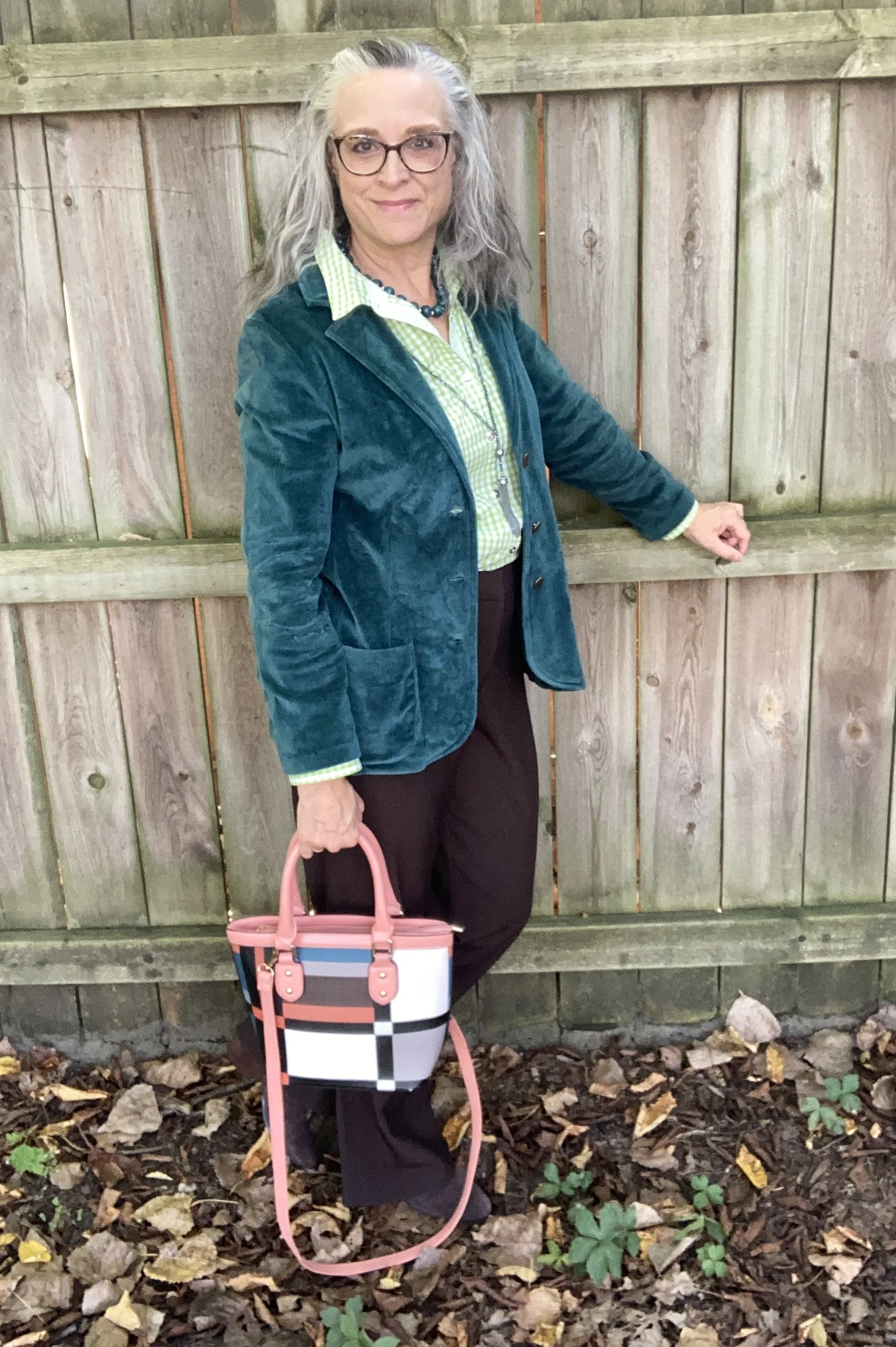
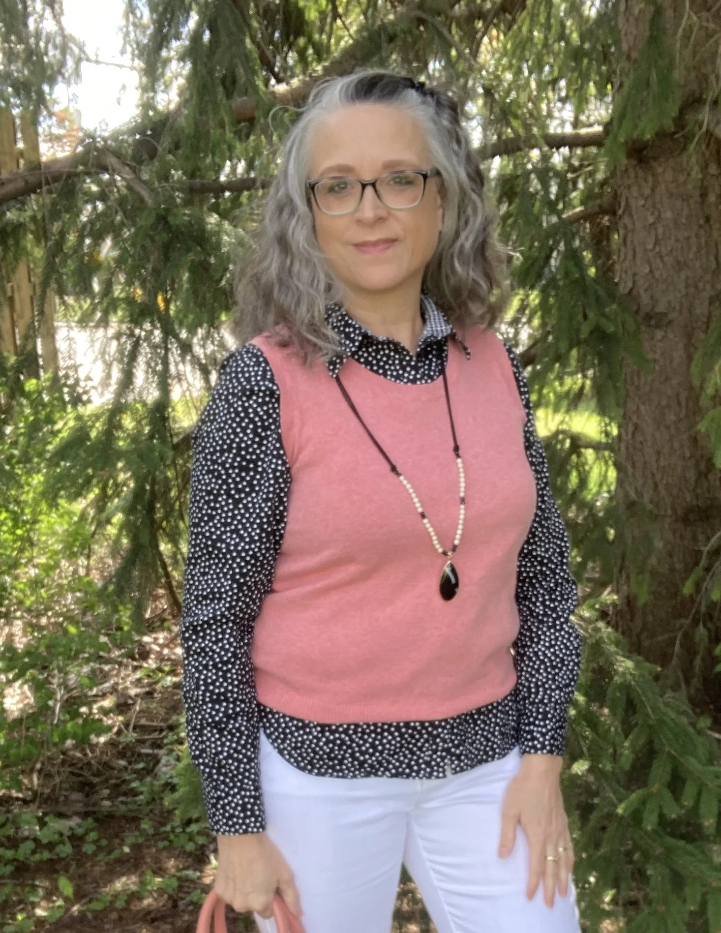
I was pretty sure I wanted to use this thrifted teal blazer as it matched so well with the bag. Obviously this is a great outfit for these spring days where the temps fluctuate, but once summer hits the heavier layers will disappear. This blazer is a brand called Weekenders. It is a medium weight with a longer silhouette, and textured cuffs that match the shawl lapels.

Once I decided on the white Gloria Vanderbilt jeans that I have had for years, and can still squeeze into…and I do mean squeeze…I knew I wanted a coral piece to match the coral in the bag, so I chose this thrifted Cherokee shell, which I decided to use as a knit vest.

I also wanted to add a little black, so decided on this thrifted Chaps blouse with polka dots. Once I had that the only jewelry I added was this fun pendant necklace I found at the second hand shop around the corner.

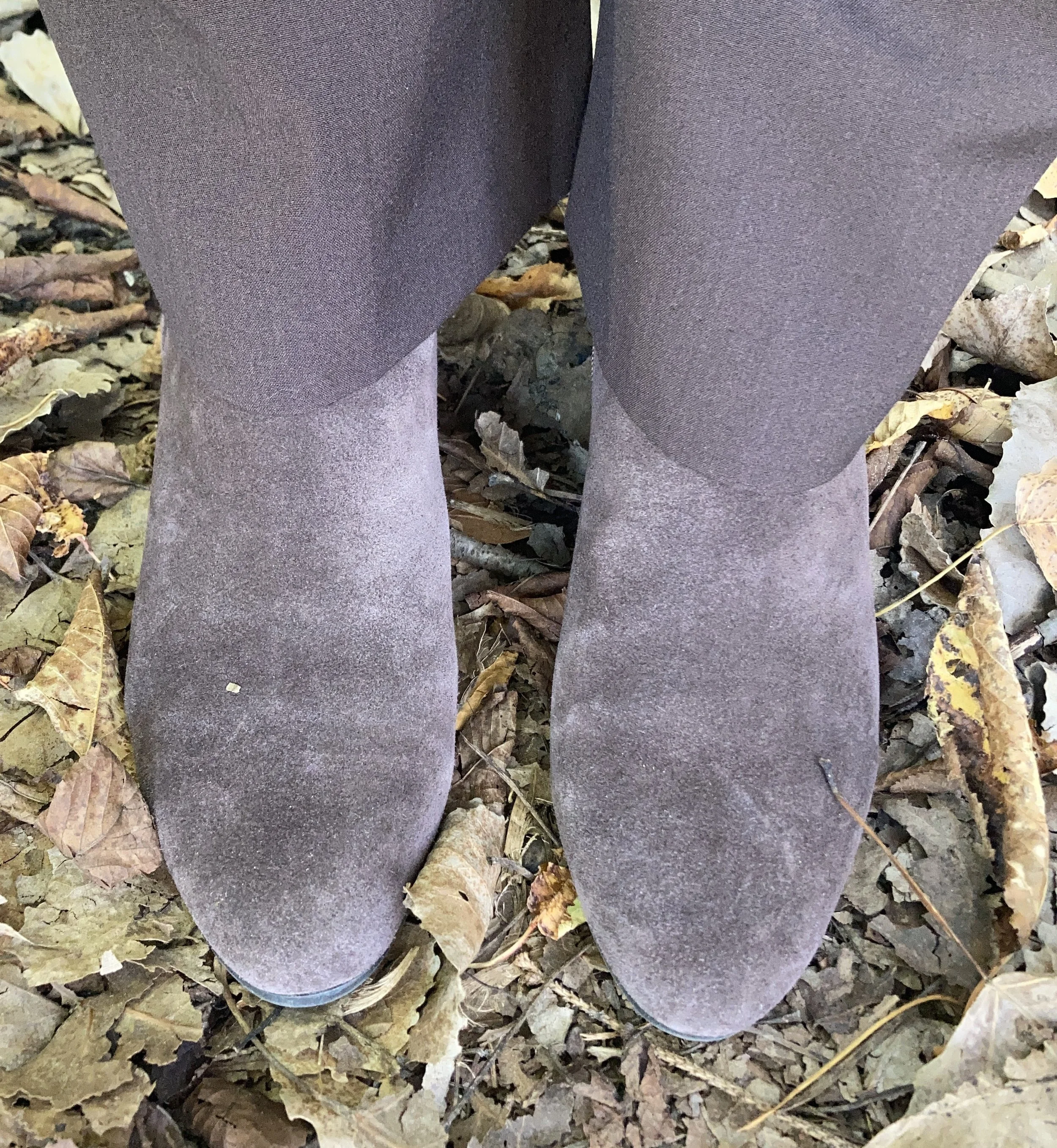
I have always like the classy look of oxford shoes, so I pulled out this black patent leather pair I have from my days as an assistant manager at the bookstore. These are a brand called Sugar.

Do you have a bag that you can use to inspire an outfit? Have you ever tried building an outfit around a fun, colorful bag? What do you think of this outfit? Would you wear something like this? I would love to hear your thoughts.

I’m including a few shopping links for you. I bring these to you at no extra cost. These are affiliate links which means I get a few cents if you click on a link, and a bit more if you purchase something through one of the links I provide. I appreciate all your support. All opinions are my own.

Have a super week!

Color Play: Building an Outfit Around a Jacket

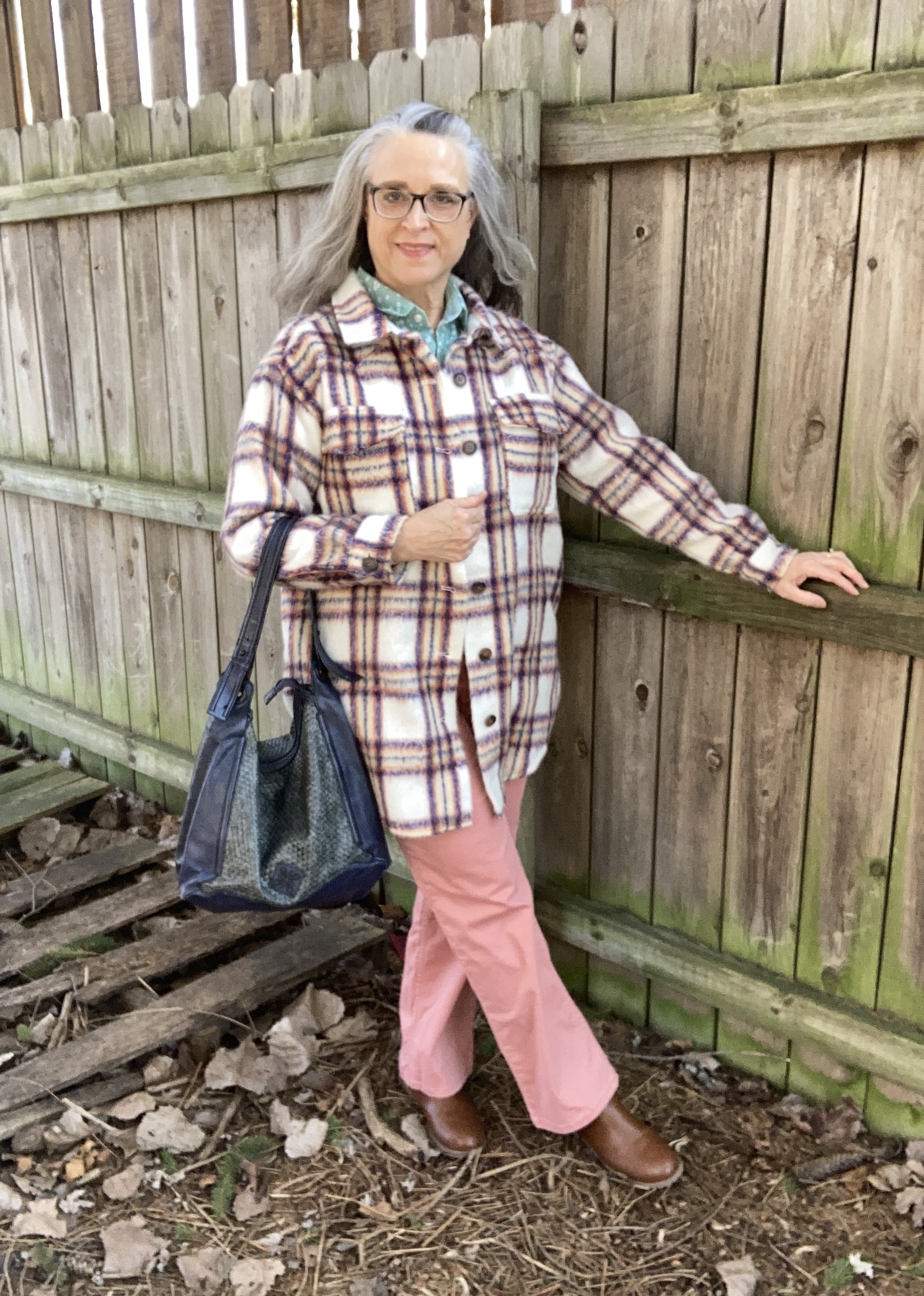
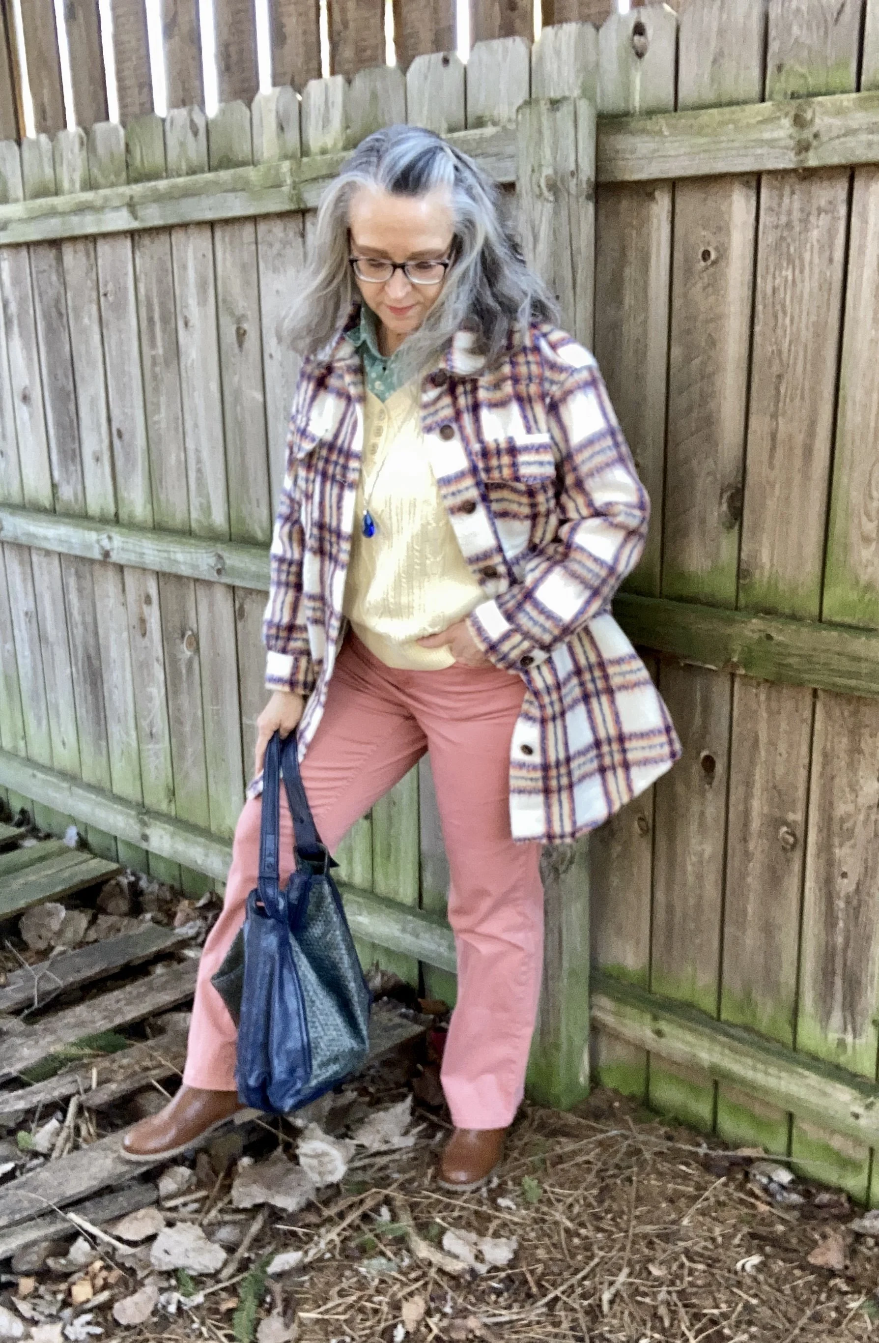
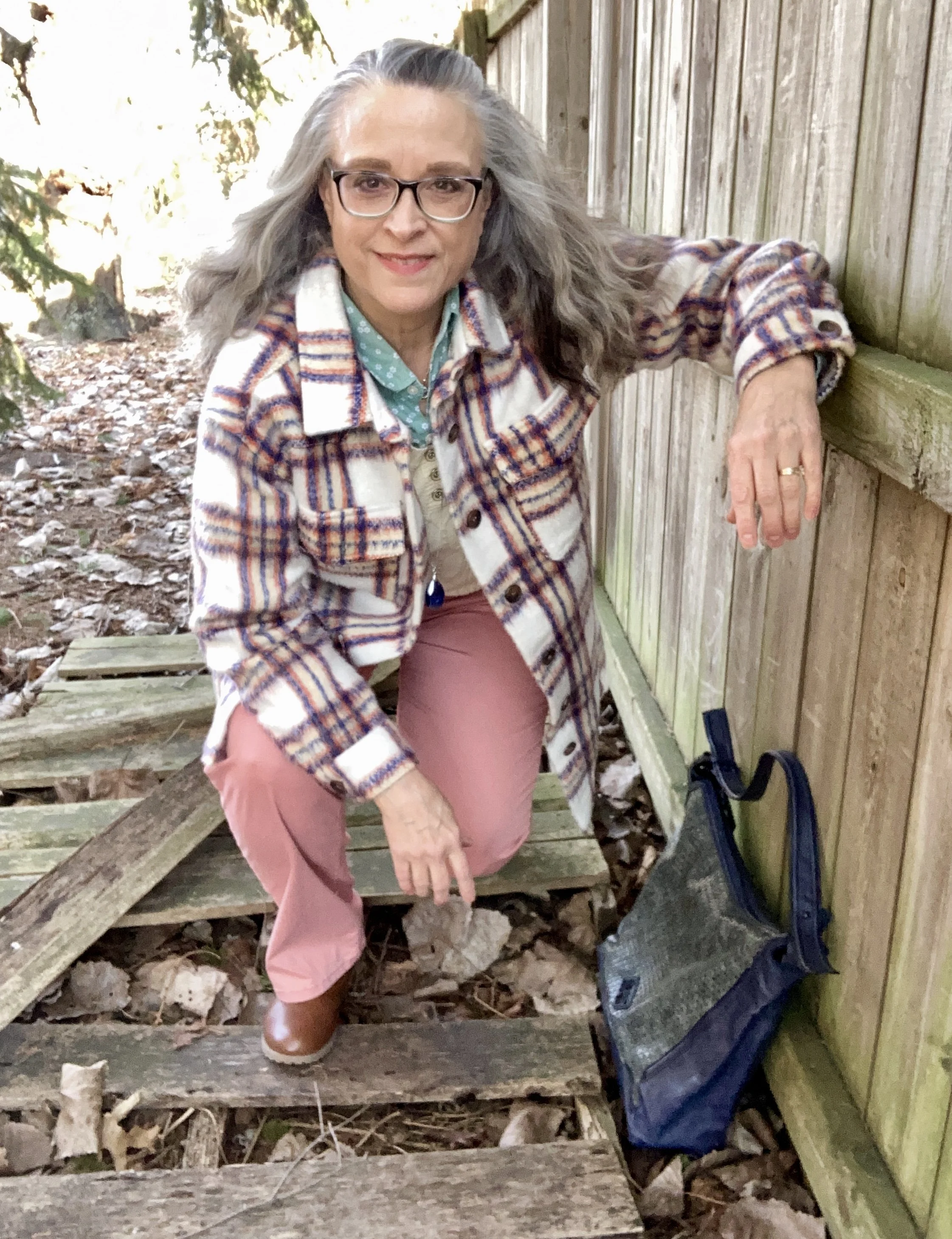
It has been a while since I have done a Color Play post. You know I love color and finding creative ways to put colors together that might not be typical color combo choices. Today’s look revolves around a heavy weight plaid shacket that I got from Maurice’s last year when they had end of the season clearance. They always have such good prices on their clearance items, but you have to act fast because sizes and styles disappear quickly.

We are having such weird weather here in the midwest. It is February and it is acting like late March or April. Today as I write this it is supposed to be almost 70 degrees (F). I don’t like the drastic changes and they don’t do anything for headache and allergy sufferers, let alone for all the viruses and bacteria that keep making our grandkids get sick.

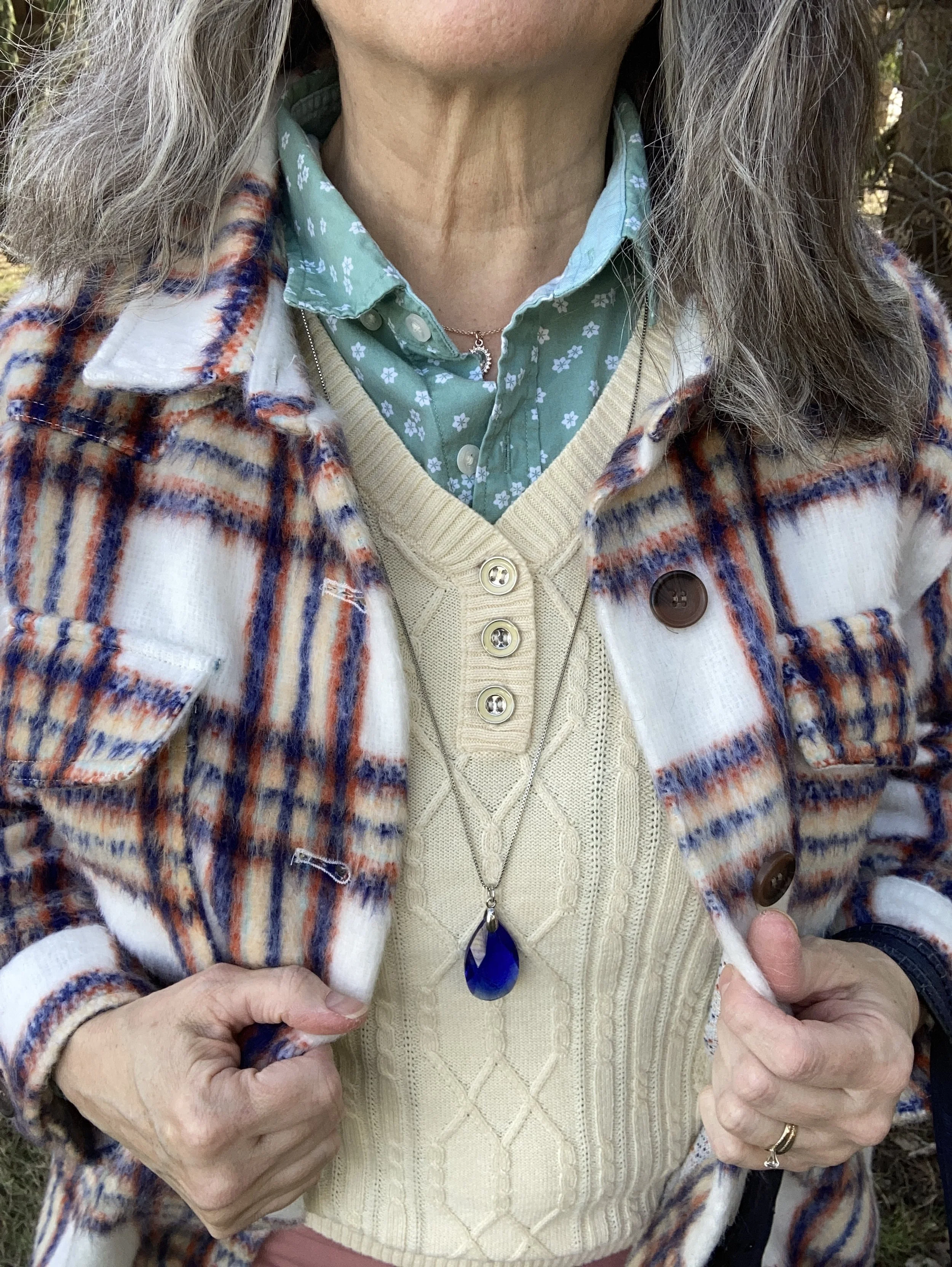
This plaid shacket has the shirt vibe, but it is heavy enough to wear as a coat on the chillier spring days. When I decided to use this piece for my color inspiration, I decided to lean towards pastels rather than the more primary blue, orange and yellow. You can see the colors better in this close up shot. Do you see the very faint minty green line?

With these colors in mind, I plaid with two variations, but the pastels won out. It seemed appropriate as we move towards spring.

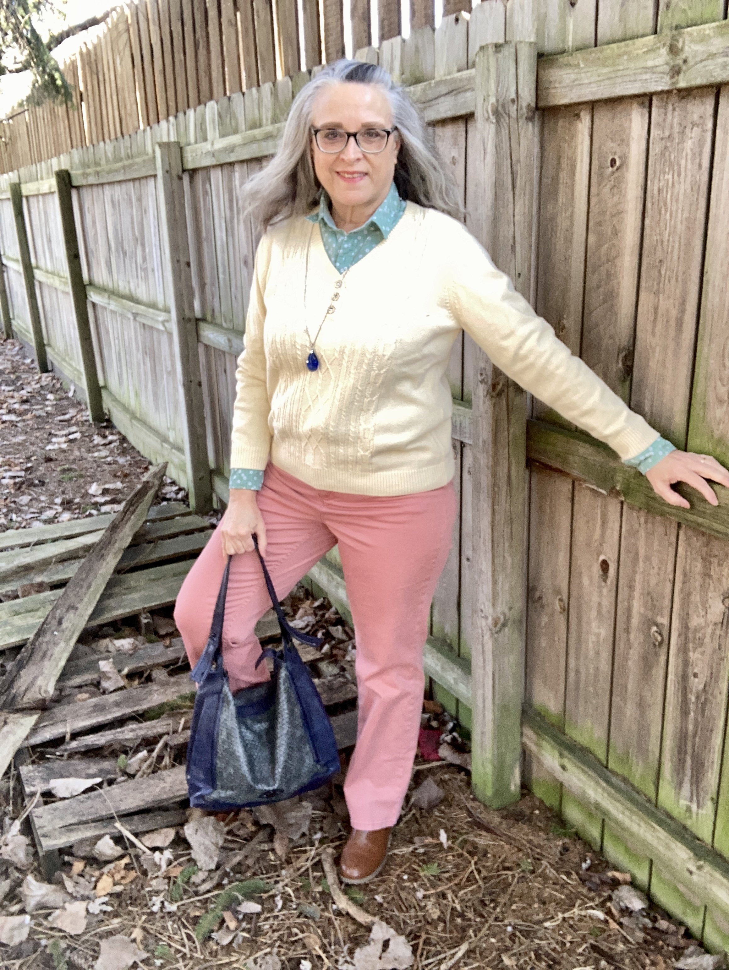
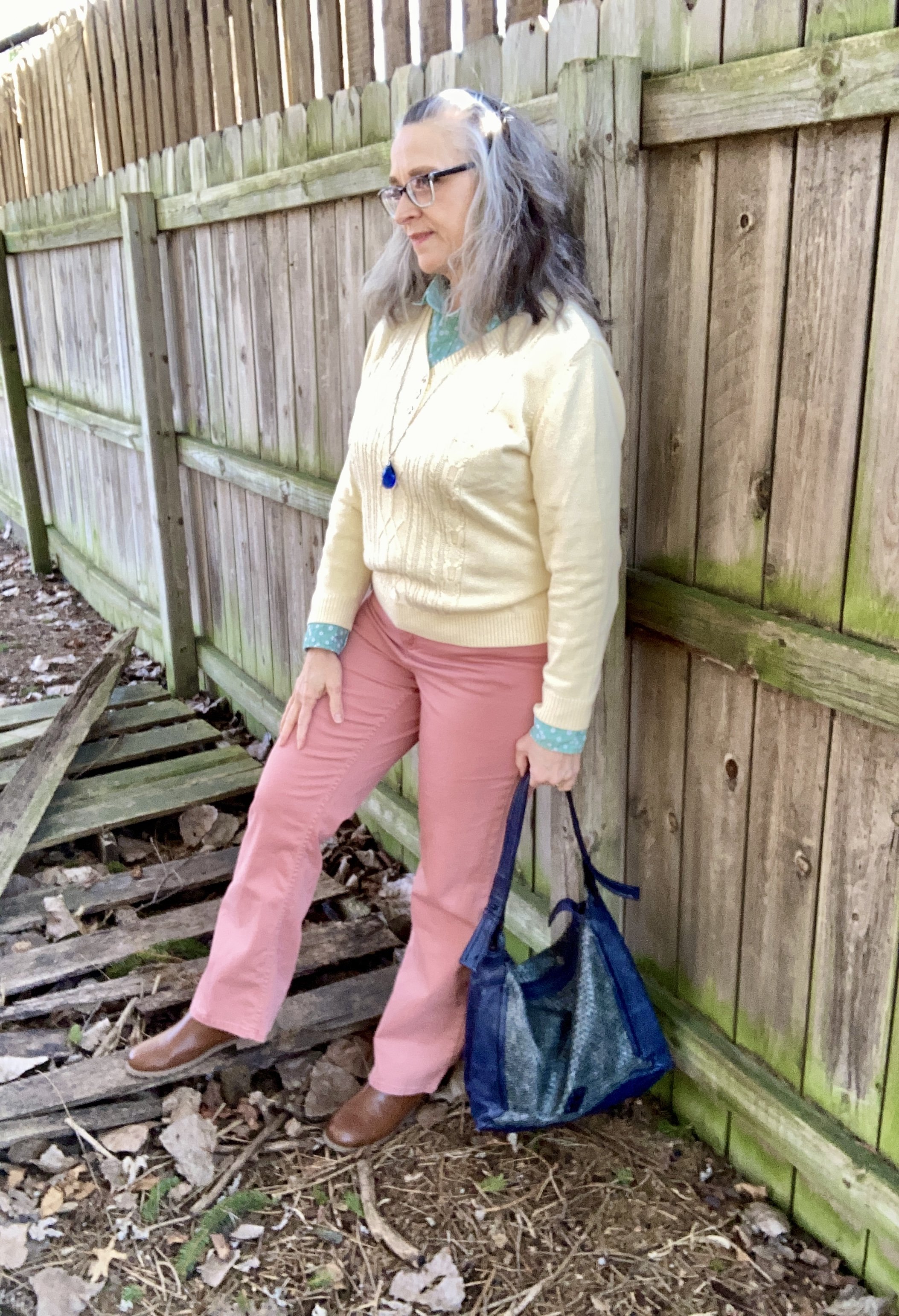
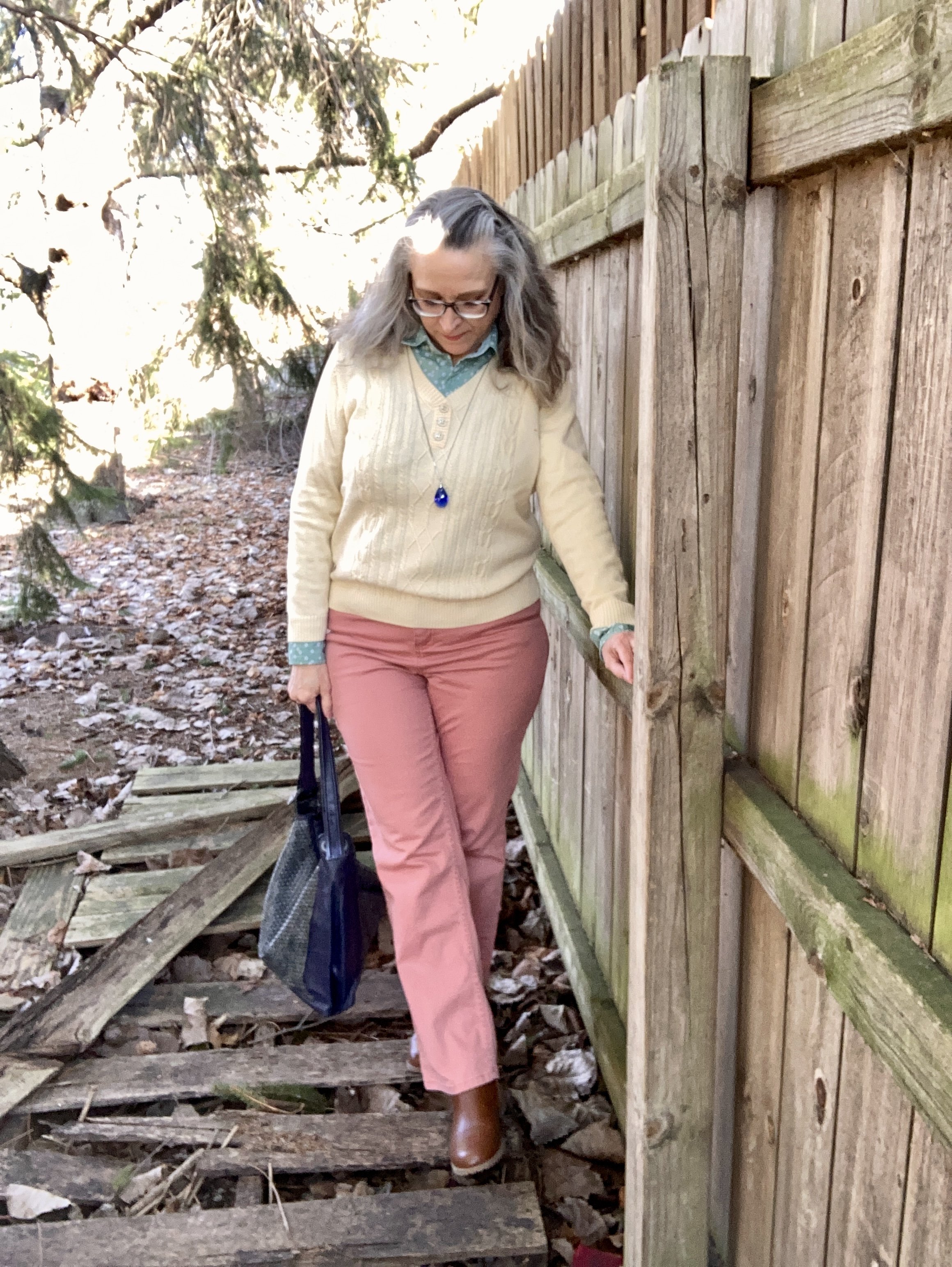
All three pastel pieces are thrift store finds. The coral pants are Croft & Barrow. Theses are a light weight cotton blend, so they will be great for the warmer months.

The men’s button down shirt is Express brand. It has tiny white flowers on it, and I love how it goes withe the pale yellow and the coral .

The yellow pullover is a brand called Karen Scott. I her brand used to be sold at Macy’s and perhaps Walmart. Not sure if they still are. I don’t wear pale color too often near my face, but the minty green does the job of providing a border between my skin and the pale yellow.

Style Tip: I will never tire of saying, you can wear all colors. If a certain color doesn’t look good right next to your face, just add a scarf or some statement jewelry, or layer a collared shirt under or over it. That doesn’t mean certain colors won’t look better with your skin tone, but if you love a color wear it.

My navy blue bag was a thrifted Simply Vera by Vera Wang piece. Big tote bags are back in for spring, so dig around in your closet and find those larger bags.

My tan, ankle boots are Sonoma brand and were a pre-winter purchase online from Kohl’s.

I kept my jewelry simple with a blue bead, pendant necklace.

What do you think of this outfit? Do you like pastels? How do find color inspiration for your outfits?

Thanks for hanging out on the blog. I am including a few shopping links for you to look over. These links are brought to you at no additional cost. These are affiliate links. All opinions are my own.

Have a great week!

Hello 60! Being a Grandma.

When I got married, I didn’t think about the fact that one day I would have grandchildren. At the time, I wasn’t even thinking about children. My husband and I had discussed kids, and we both agreed that we wanted to have them at some point in time, but we figured that was maybe four or five years in the future. Two years later I had our daughter, Rebecca. Nineteen months later her sister Rachel came along. Neither of our daughters was planned, at least not by us, but God, the master planner has it all figured out.

In the same way, eighteen years after we had our youngest, she had our grandson Quintin. I won’t tell you it was a beautiful time. Our daughter had walked away from the belief system we had raised her in, and she struggled to figure out who she was. When that little guy came along, all of our worlds were upended, and she was in the throes of becoming an adult, but still needing to be a child, and having a child to now be responsible for. Eleven years later, our oldest had our next grandson, Lewis.

My mother-in-law used to tease me when the girls were young. She’d say, “Just you wait until you become a grandma. There is nothing quite like it.” The first time I got to hold Quintin in the hospital, the proverbial lightbulb came on and I realized she was right. Having grandchildren is something very different than having your own children. You love your kids, and would die for them, but grandkids, well, that love just goes a bit deeper. Maybe it is the fact that grandchildren and grandparents now have a common enemy. Ha, ha. I don’t know how many times I have muttered under my breath, “Pay back,” when my younger daughter bemoans something about her newly turned teen, or when my older daughter complains about how much work it is having a toddler. Not a very Christian attitude, I know, and as I grow closer to the One, these thoughts come less frequently.

Being a grandmother is awesome. I have had the privilege to be part of both of my grandsons’ lives on a very regular basis. I helped my single daughter take care of Quintin from the time he was very small. Now, he’s moved into the time of school, video games, and friends and grandma doesn’t see him very often, but I am still here if he needs to be picked up from school, or if mom wants him to hang out with us for a few hours when she has a long shift at the hospital. I also watch Lewis once a week, or sometimes more if needed. I have enjoyed every minute with both of them.

Style for grandmothers is a bit different than it was when I was a child. My grandmother wore dark, floral dresses, often with an apron over the top, sturdy block heeled shoes, and never got down on the floor to play with us. She did, however, make a mean pot roast with gravy and mashed potatoes. These days you can’t tell who is a grandmother and who is not. Most women have been influenced by the anti-ageism movement, as well as social influencers and bloggers who remind them to wear what they want and age is just a number.

When I’m on grandma duty, I dress in an outfit that is stylish and comfortable. I want to be stylish in case I need to run to the store, the mall or somewhere else with the boy(s). I also want to be comfortable so I can get down on the floor to play or move furniture around to make a fort. Quintin is much more likely to just want to sit on the couch watching YouTube videos, but occasionally we will venture out to a movie or to get lunch at the mall. The toddler loves to go outside, play with Play Dough, and pull things out of grandma’s drawers and cupboards. I do a lot of bending, lifting and getting up and down when he is here.

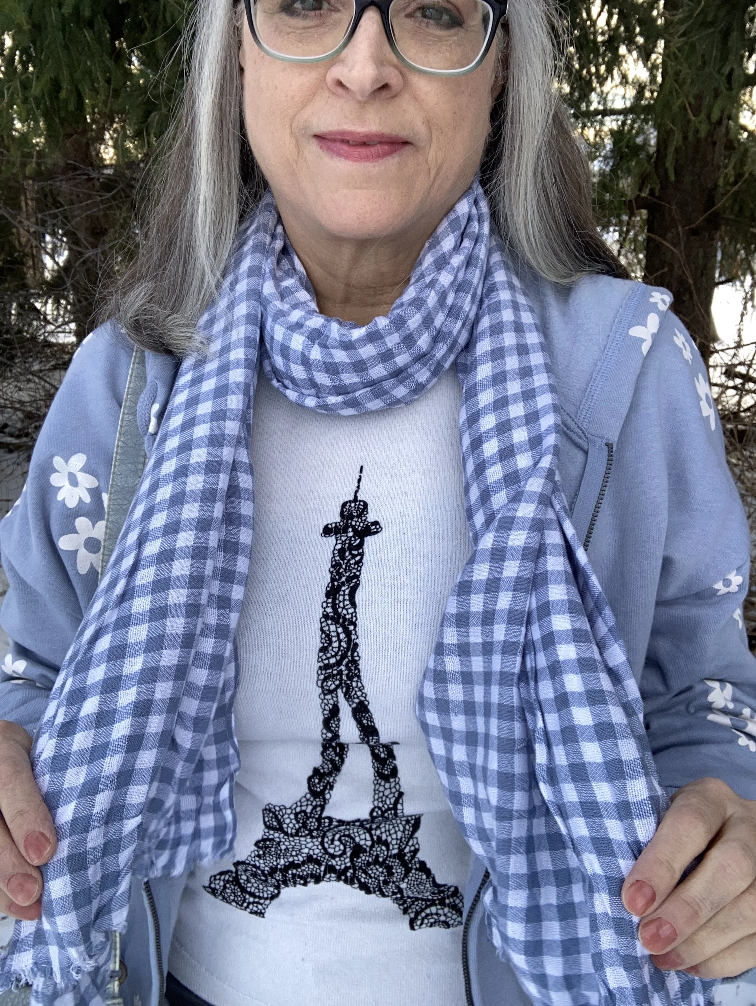
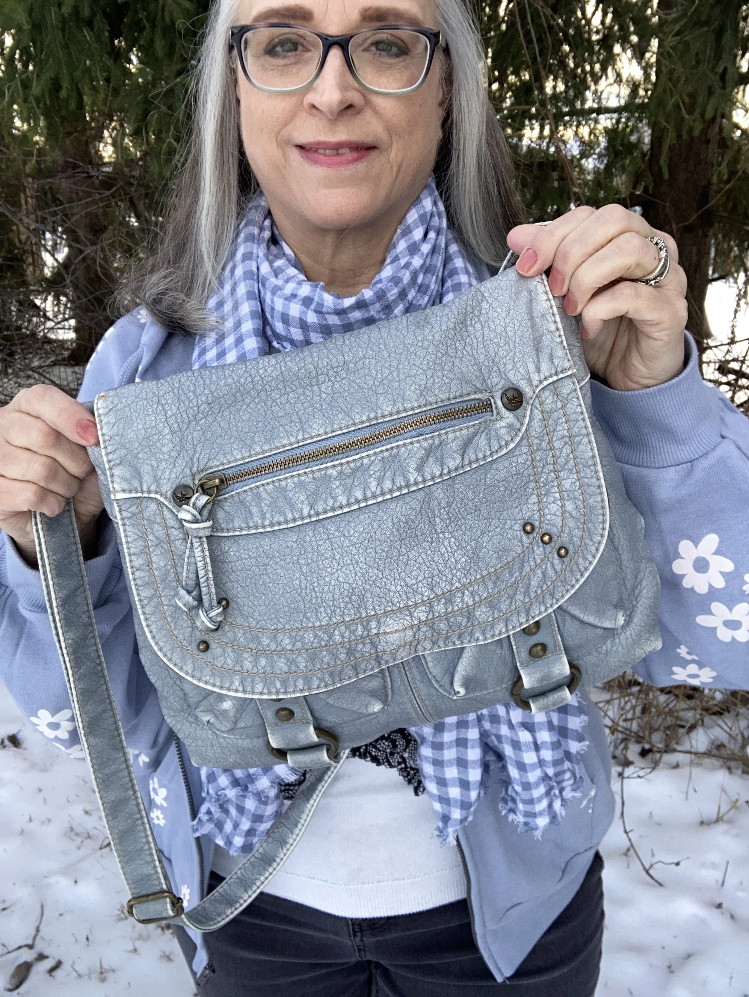
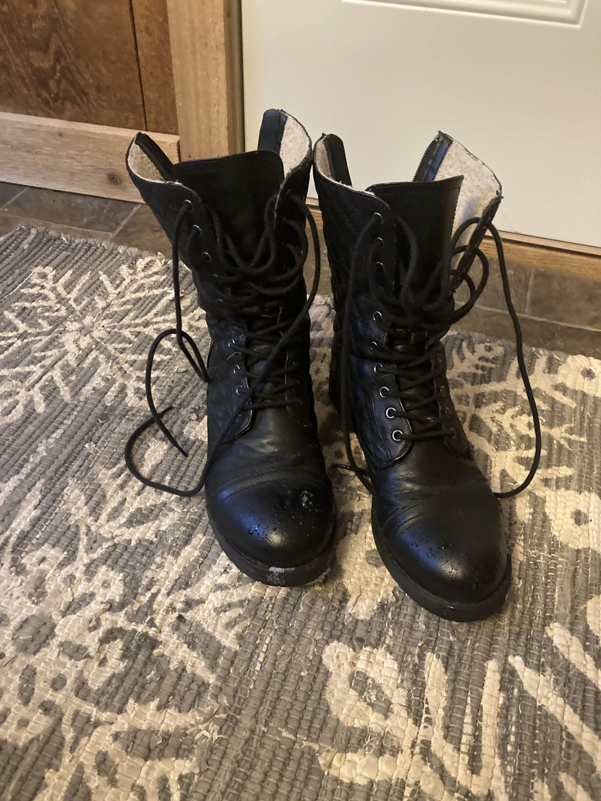
My 70’s style SO hoodie was a recent purchase from Kohl’s. I saw it and fell in love. The black, distressed Stitch Star jeans were from Meijer. The boots, scarf and bag were all thrifted. The Eiffel Tower sweater is Elle brand and has been around for a while and I think was also from Kohl’s.

I hope you enjoyed this little look at the Grandma side of me. I have been enjoying sharing with you more about the person I have become. Don’t worry. February will be back to my regular Fashion posts and not nearly so wordy. Ha, ha.

Pantone Autumn/Winter 2023 - NY Palette: Tender Peach, Red Dahlia, and Silver Birch

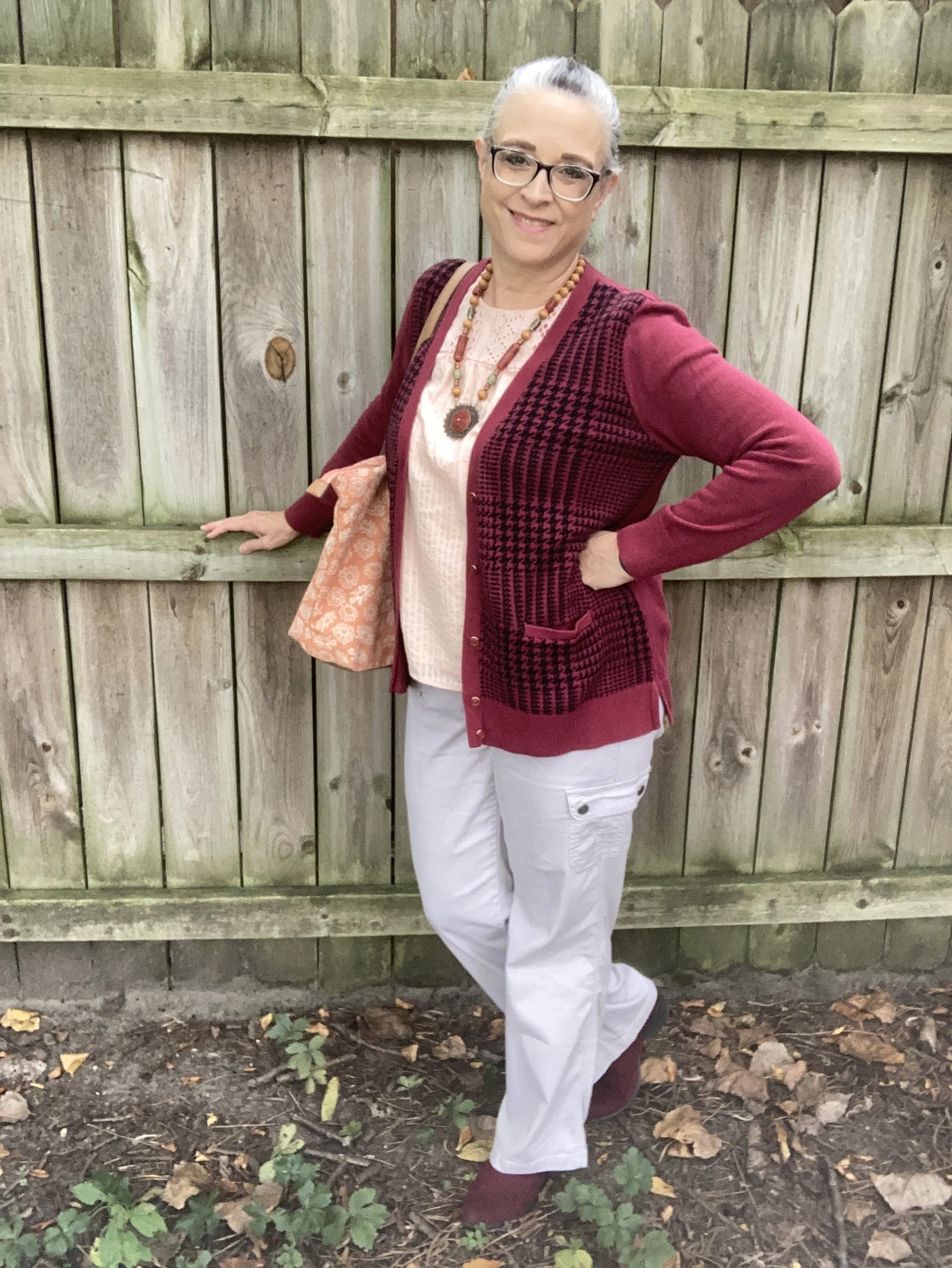
It was fun last week to hear your thoughts on how to combine these Pantone colors. I had my outfits already picked out, otherwise I might have tried some of your suggestions. Today’s outfit takes two of the more subdued colors and pairs them with a darker hue for an outfit that’s perfect for work, a child’s school event or even a casual date night with your significant other.

It is always fun shopping my closet for these colors. Everything in today’s outfit is thrifted except the boots and the bag. Let ‘s look at each piece in color order.

Tender Peach

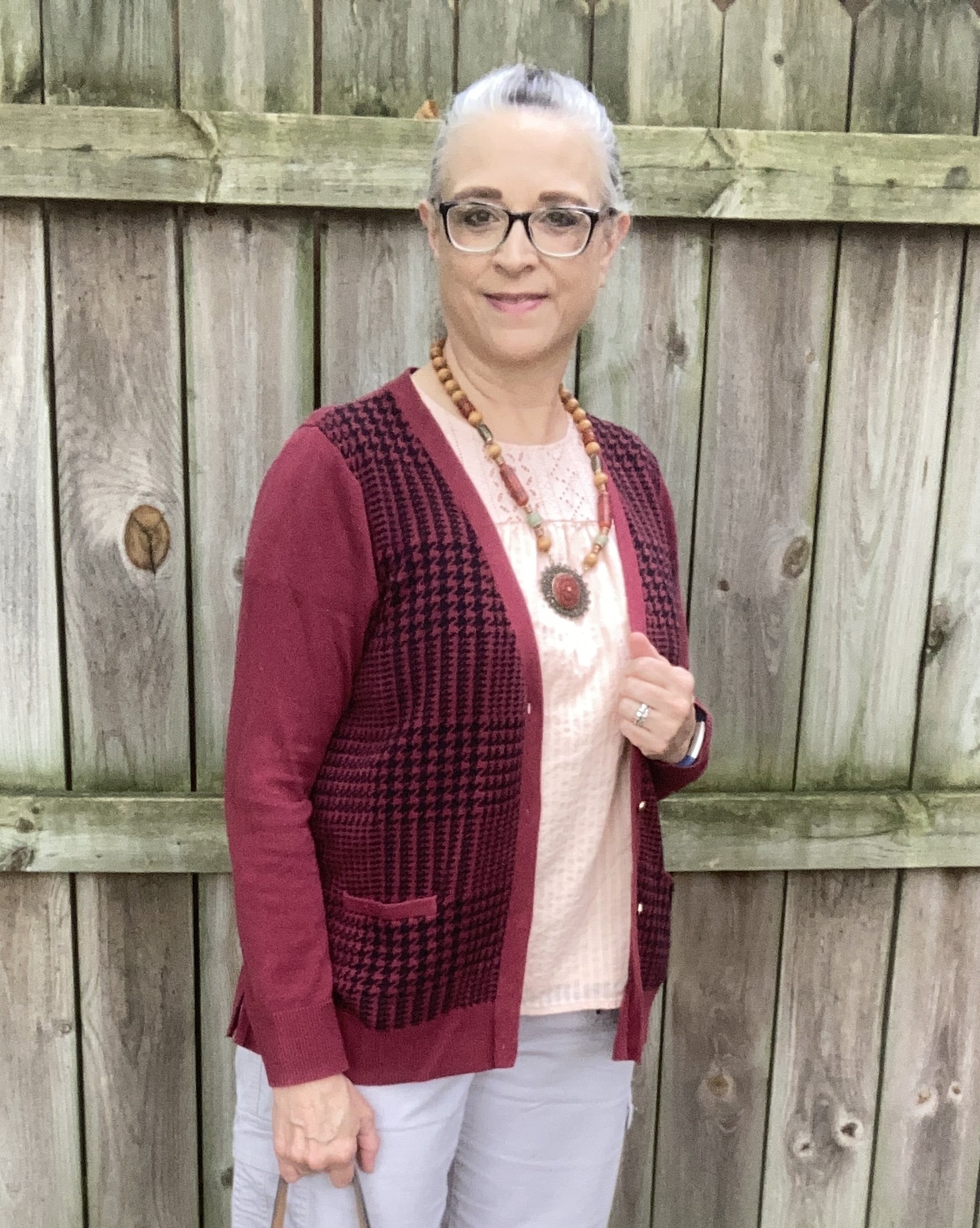
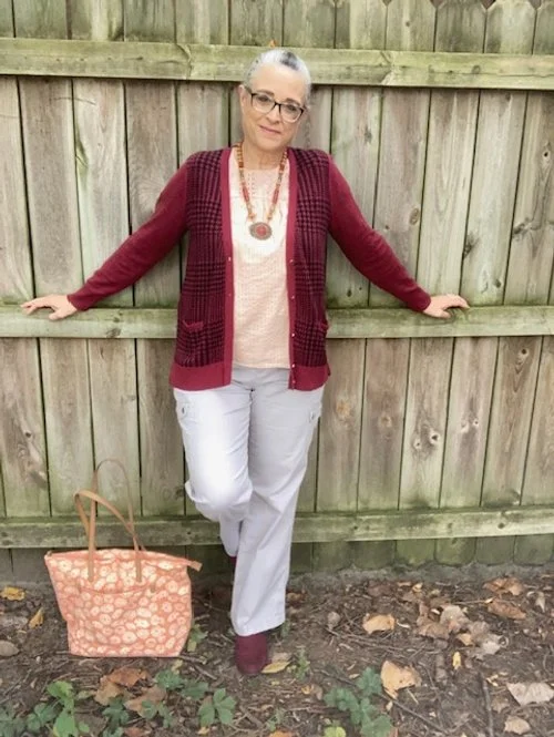
I found this top last spring thrifting. I fell in love with the eyelet across the top around the neckline. It is a cotton fabric and fully lined making an under layer unnecessary. The bell sleeves make it a great summer piece, but obviously it works well for spring and summer as well.

Style Tip:

If you struggle with wearing solid colors choose pieces that have texture to create interest and draw the eye away from areas that might make you more self conscious.

Red Dahlia

This color is a staple in my fall and winter wardrobe. No matter what you call it: maroon, berry, Red Dahlia…it is a color that adds depth and classiness to any outfit. This cardigan with its black houndstooth pattern and gold toned buttons was a great addition to my closet and since pulling it out for this series, I’ve decided it really needs more time out it public.

Style Tip:

Adding a few patterns like houndstooth, herringbone, or chevron to your closet can boost your closet’s outfit potential. Try finding pieces in the forms of jackets, vests, cardigans or skirts that can quickly put together with other pieces to make simple looks that exude classic style.

Silver Birch

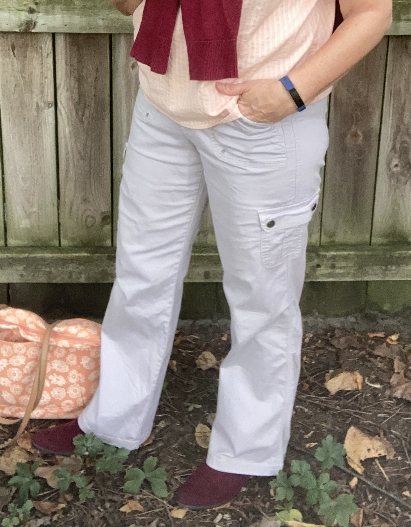
These cargo pants are actually a tad light for the Pantone Silver Birch color, but you get the idea. Silver Birch is a light gray, like oxford, but even lighter with a different hue. The cargo pants keep the outfit looking casual, but not as casual as my distressed jeans.

Style Tip:

Never say never when it comes to color. I have heard many older women say, “I can’t wear gray.” Gray is a great neutral and you most certainly can wear it on your bottom. In addition, try out various shades and hues of gray and you will realize not all colors are created equal. Oxford, cobalt, charcoal, steel, silver are all shades of gray, but each one has it’s own tones and hues. Find the one that works for you. If that doesn’t work, remember you CAN wear the gray, just add a scarf near your face that compliments your coloration.

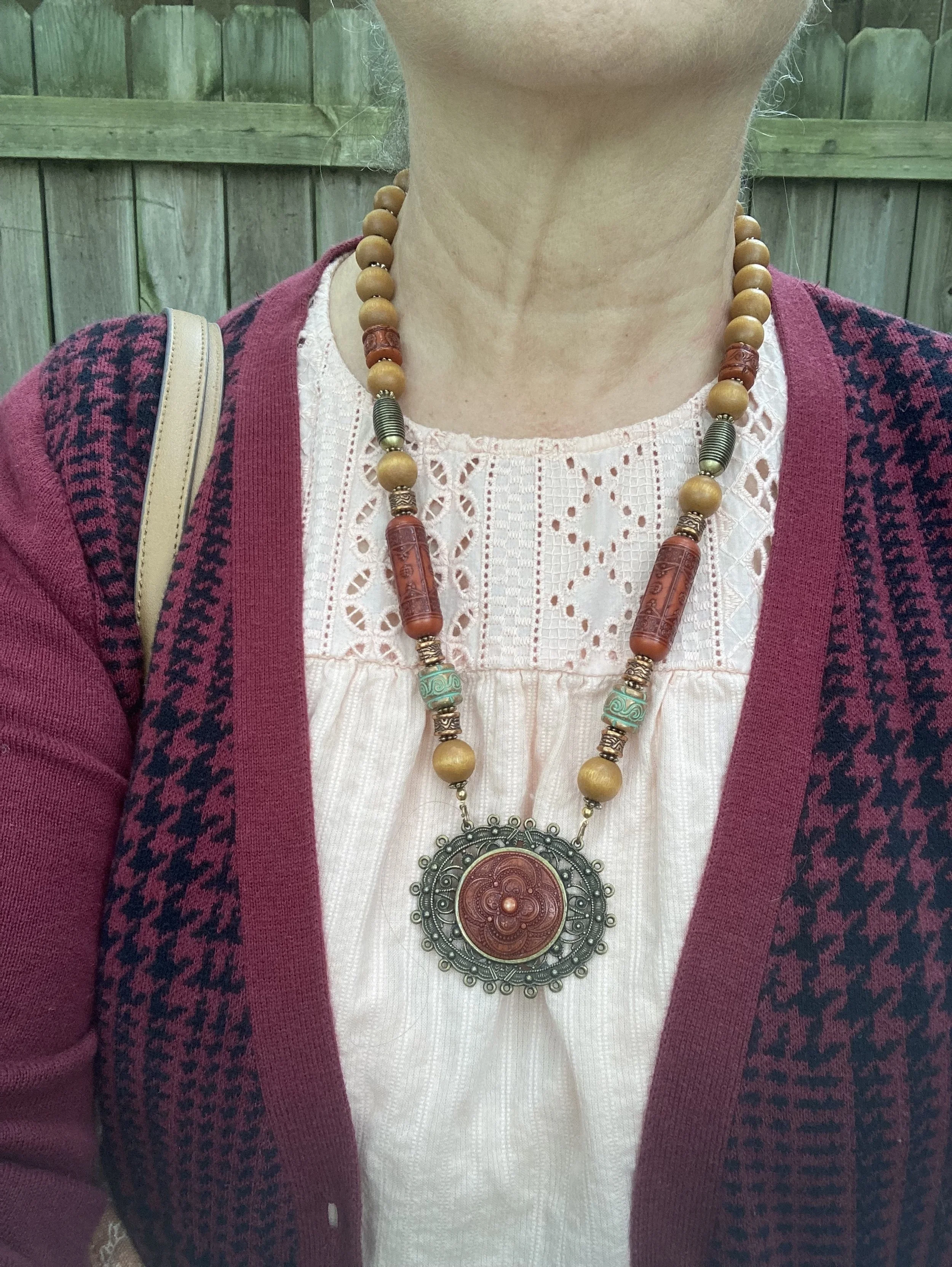
The rest of my outfit came together with my accessories. The necklace was actually given to me by my spouse who found it at a garage sale. He knows I love costume jewelry, so every once in a while he will surprise me with a special piece he found.

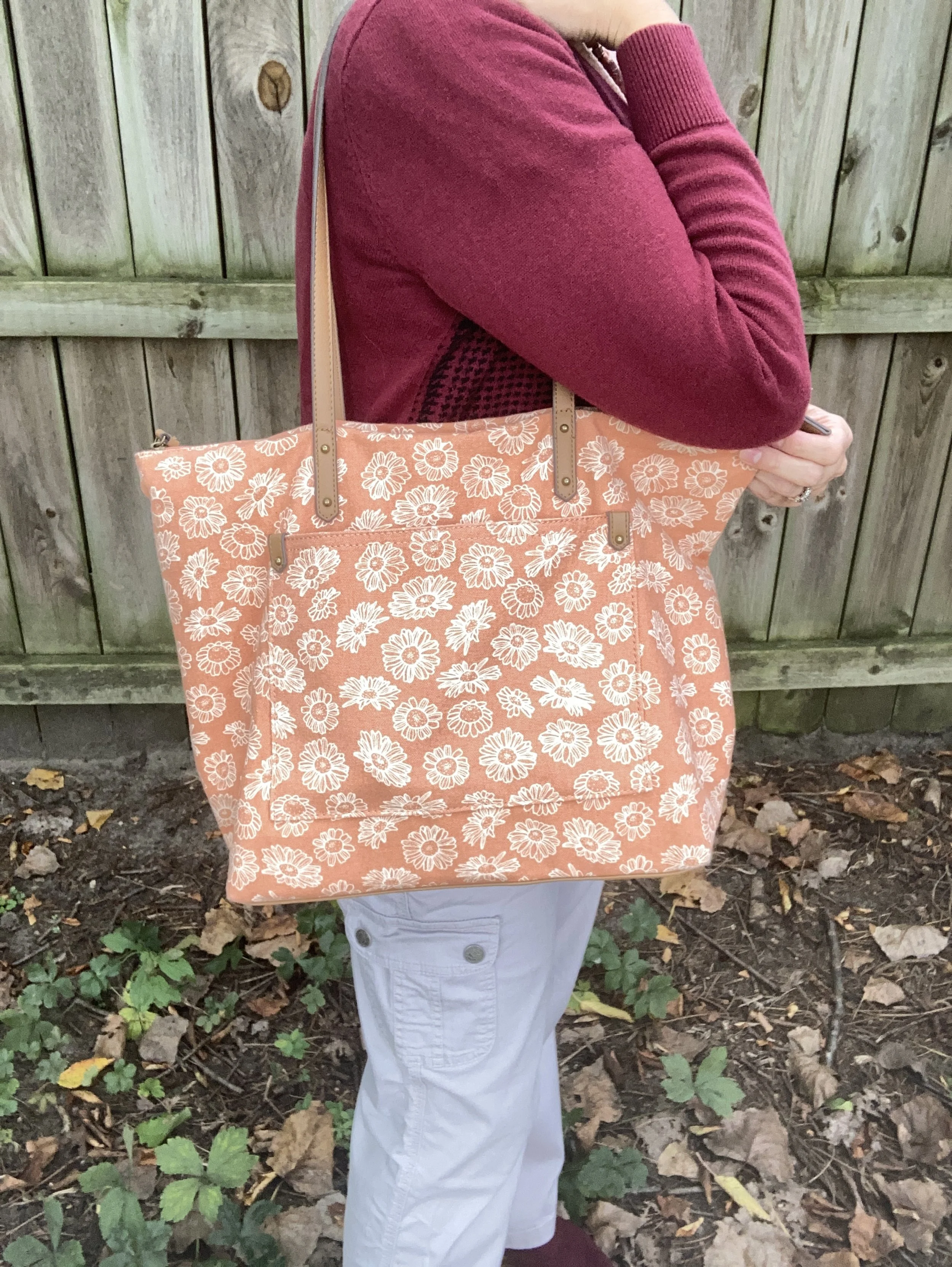
I bought my Sonoma bag a few years ago on Clearance from Kohl’s. It’s just a roomy tote bag, but I thought the peachy, orange pattern went well with the Tender Peach color of the top.

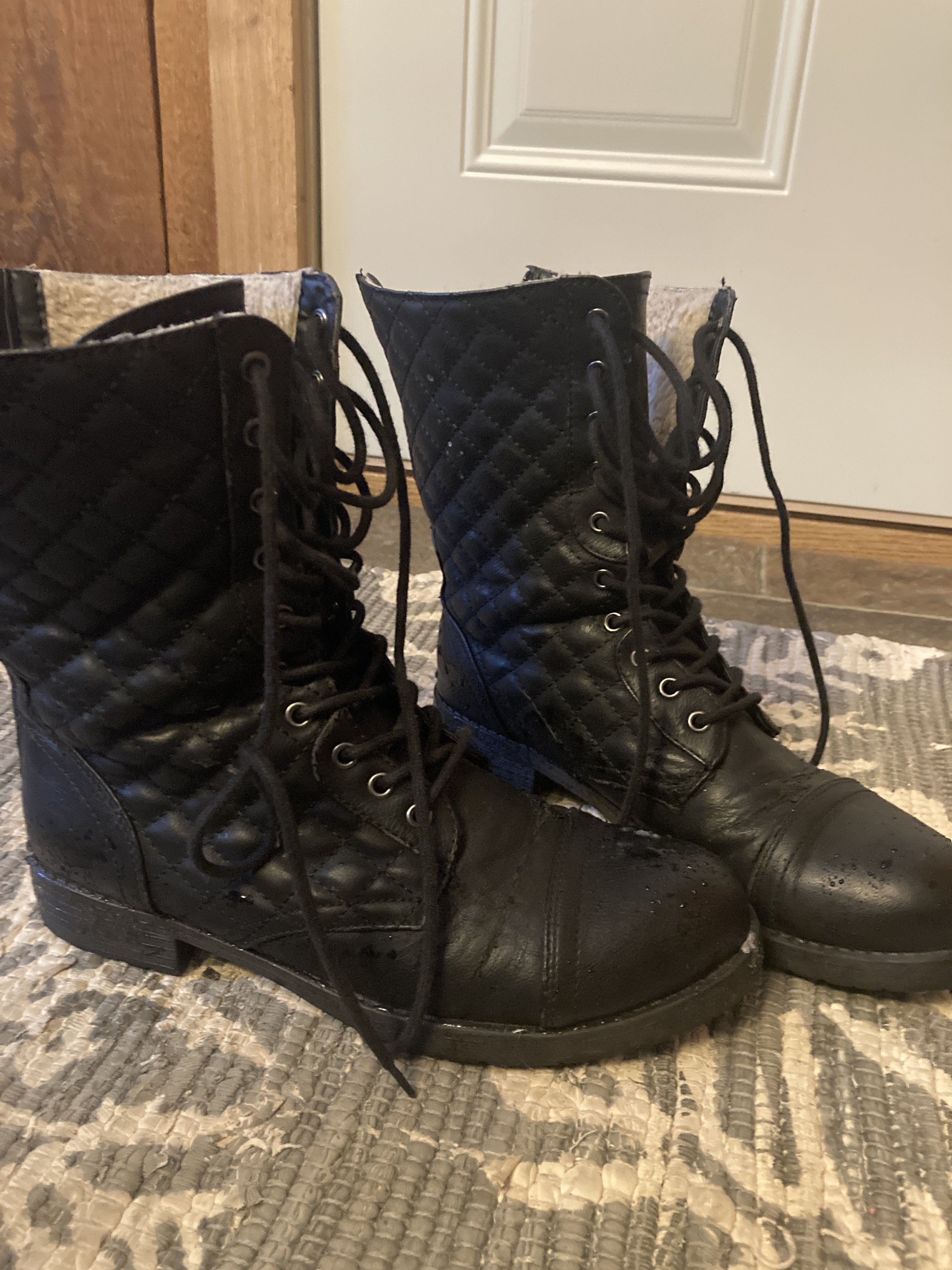
I am always excited to be able get out my ankle boots in the fall. These ESpirit burgundy boots are regularly worn all through the fall and winter.

So what did you think of this color combination? What Pantone colors would you have combined with either Tender Peach or Red Dahlia? I’d love to hear your thoughts.

I’m including a few shopping links to look at. These are affiliate links. All opinions are my own.

Have a great day!
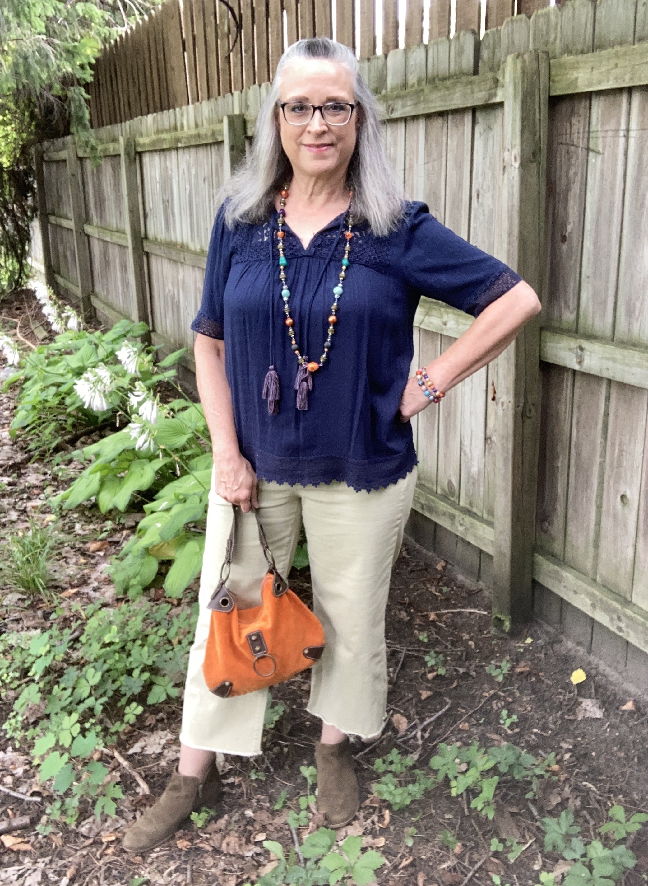
Color Play - Building an Outfit Around Jewelry

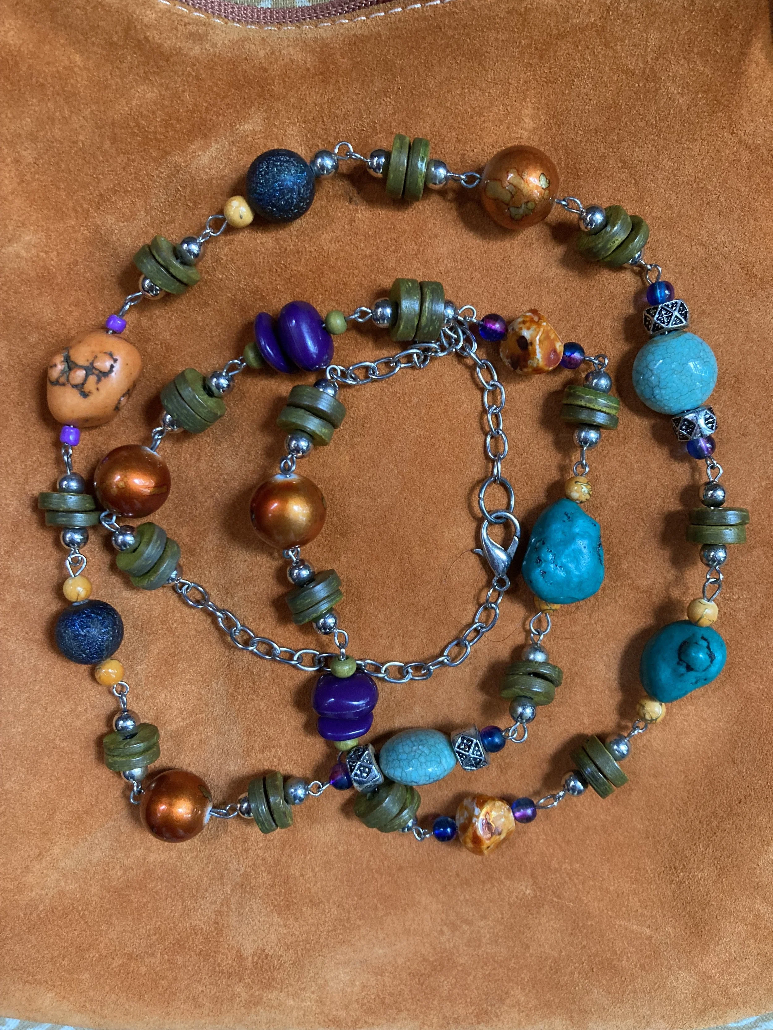
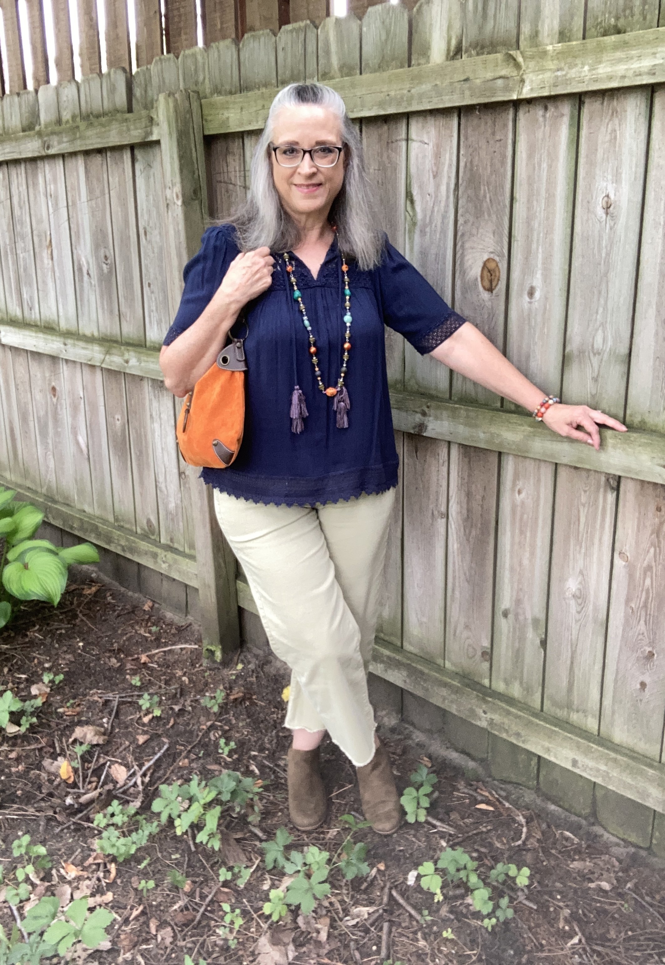
Since my Color Play column can encompass all aspects of color, I thought it would be fun to show you how I build an outfit around a colorful piece of jewelry. Let’s face it, not all of us are into fine jewelry. Yes, I do have a few silver and gold items that my spouse gave me over the years, but those are mainly rings and a few chain necklaces. Most of my jewelry is costume jewelry that I have either found on clearance at regular retail stores like Kohl’s, JC Penney, or Maurice’s, or it is from a thrift store. The piece I will be using today was actually gifted to me by a friend.

I love all the colors in this piece, but it does make it more difficult to combine with printed pieces, of which I have many. However, that makes it more challenging, which I love. Today, I decided to go for more of a color block style, and used solid colors for each of the pieces in my outfit. Take a look.

I am grooving on my wide leg cropped pants right now, so if they are not your cup of tea, then just swap them out for your own version of pants. You could also just as easily choose a skirt. Remember my job is to inspire you to look at your own clothes in a new and innovative way, to make them work for you and your style preferences.

Today’s style tips are going to cater to styling an outfit around a piece of jewelry.

Style Tip 1 - Choose a piece of jewelry that makes a statement, then figure out how to monopolize on that statement effect.

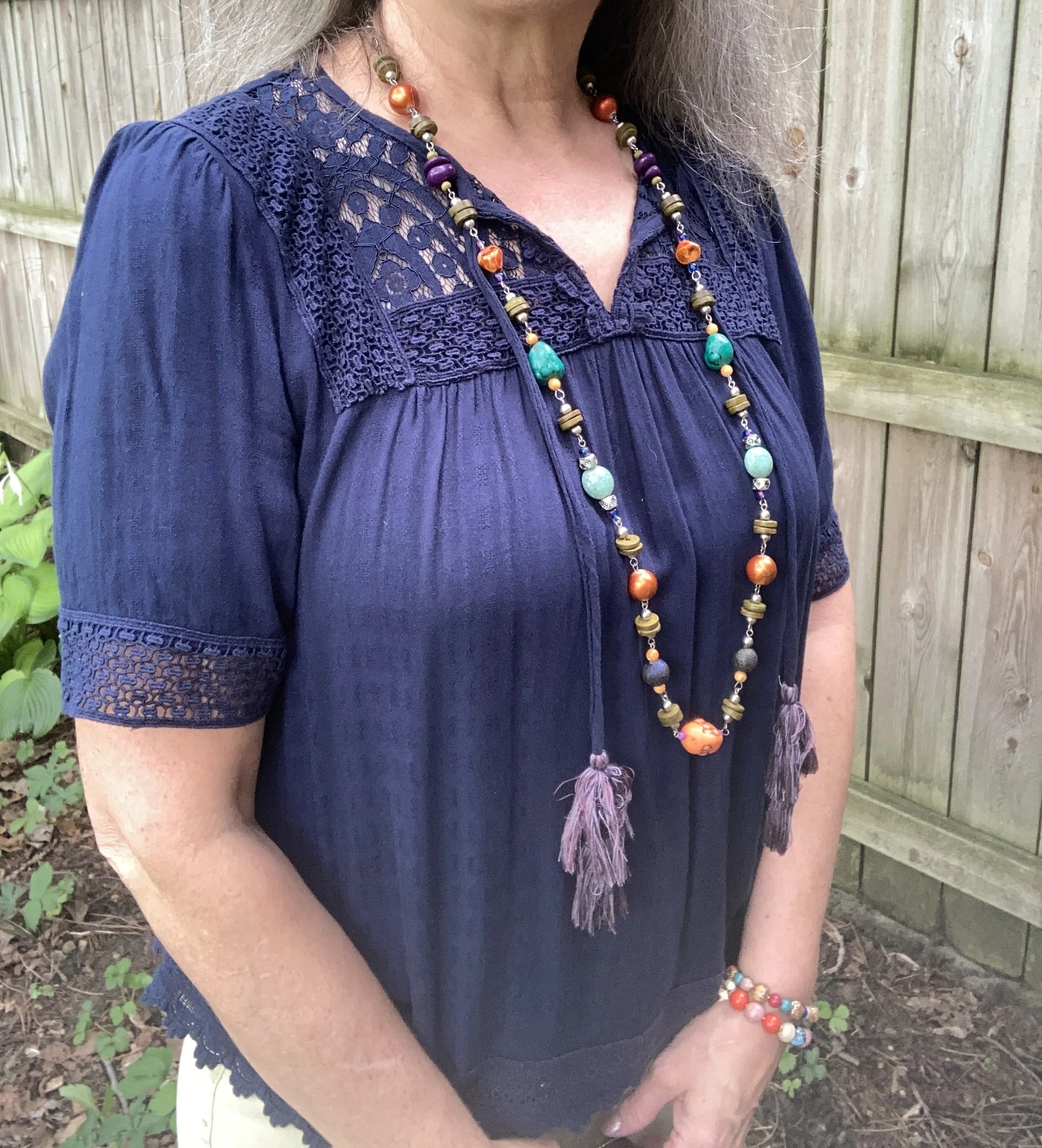
As you can see in the first picture my necklace contains so many colors: orange, dark blue, turquoise, or aqua, purple, olive, light green, orange and a light yellowy orange. If I wore this piece with a printed top it might easily get lost, but pairing it with this navy popover blouse was the perfect way to make the colors of the necklace pop. You could have used any of the colors in the necklace, but I love the way it looks against the navy.

I have two of these Knox Rose tops. The other is a pale purple color. I love the lace, the longer length short sleeves and the flowy silhouette. The trim on the bottom is pretty as well. I honestly can’t remember if I found these on the clearance rack at Target, or at a Goodwill store where I often find like new Knox Rose items.

Style Tip 2 - Choose pieces that go with the colors in the jewelry or at least compliment it.

The navy top almost matched exactly the navy beads on the necklace. However, I chose to wear a pair of pants that was less matchy and more complimentary. The light green borders on olive, but not exactly. It’s almost a very pale chartreuse. I know in the picture they look more gray or beige than green, but believe me they have a green cast to them.

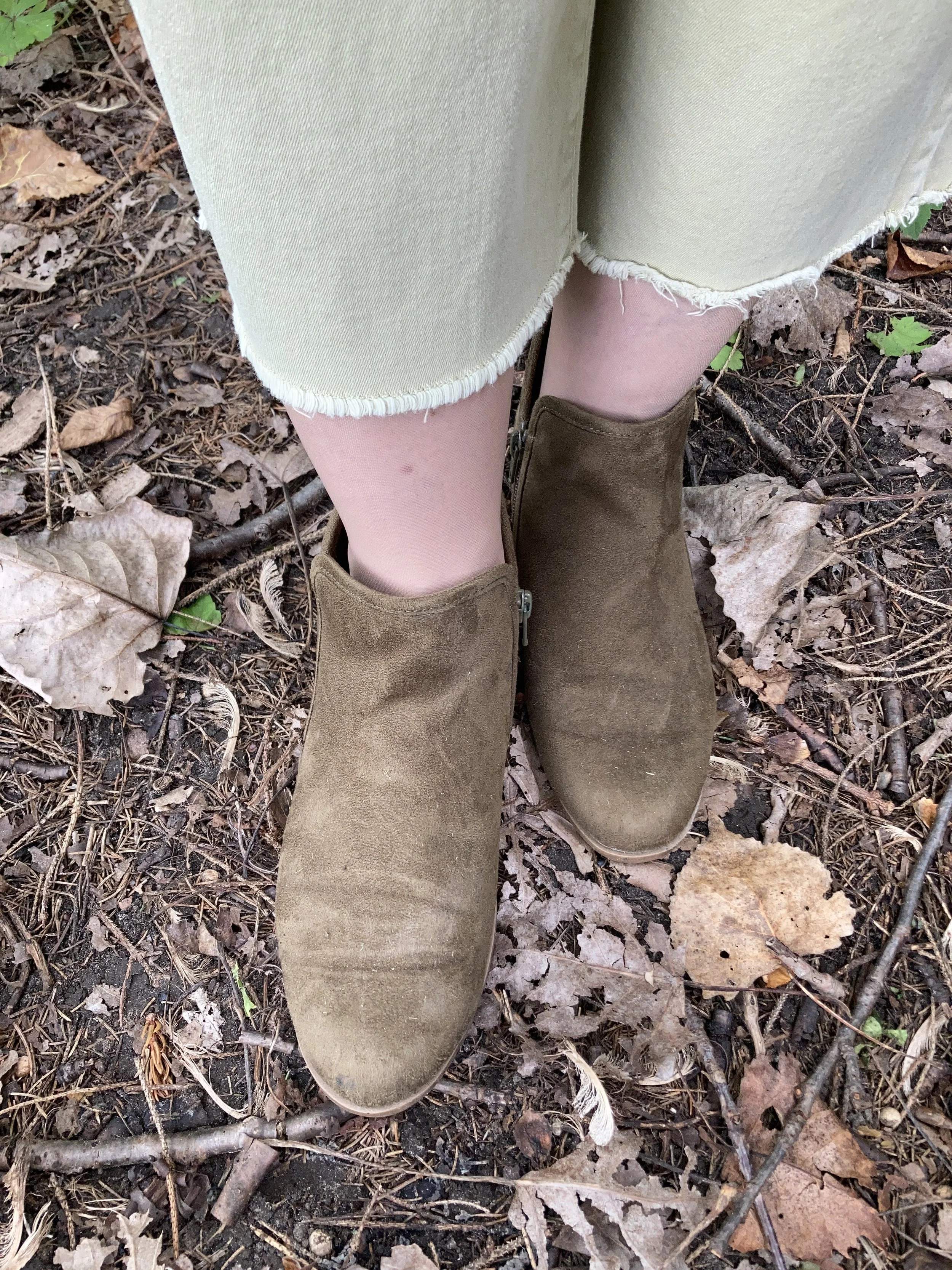
These raw hem jeans are Sonoma brand and they were a clearance find at Kohl’s a summer season ago.

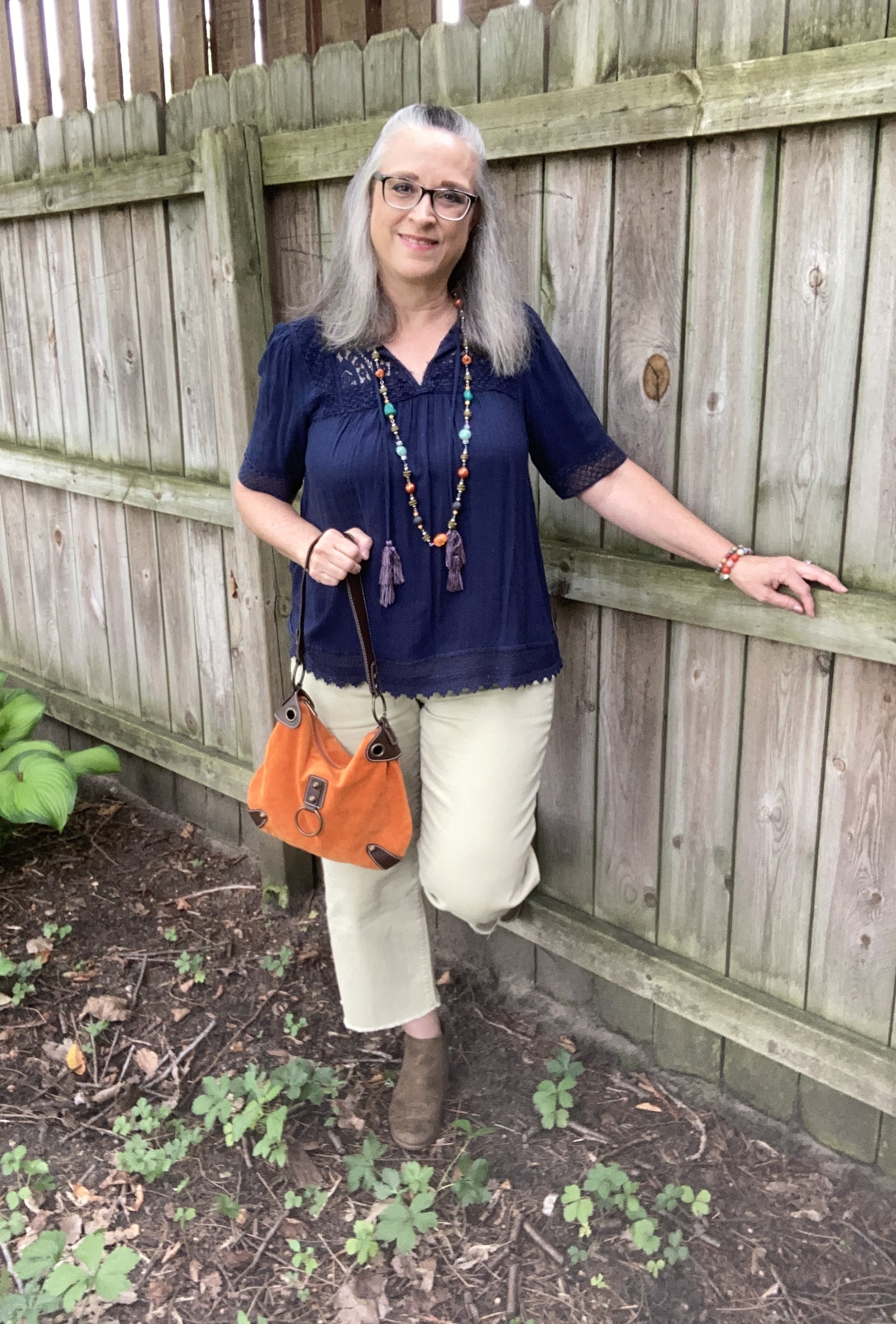
After choosing my main two pieces I decided on shoes and a bag. I also added a few other bright beaded bracelets for fun. My SO ankle boots have been around for a while. I thought it appropriate to start throwing in a few fall like pieces since we all know it is coming at some point. My thrifted orange suede bag is not one I use very often, but I simply love the bright color, and it works so well as an accent piece.

Style Tip 3 - Pull in one or two other colors from you chosen piece of jewelry (if it has more than two colors) by adding them in as accessories: shoes or boots, bags, scarves or a sweater or jacket.

I thought about adding a sweater to this, but I wanted to still look summery, and it was nearing 90F when I took these pictures. I was already beginning to sweat. Ha, ha.

What do you think of this outfit? Have you ever styled an outfit around a piece of jewelry? If so, what was it? I’d love to hear your thoughts. You feedback is always welcome, good or bad.

I’m including a few shopping links for fun necklaces. These are affiliate links. All opinions are my own. Have a great day!

Color Play - Pantone Spring 2023 - NY Palette: Fiery Red, Empire Yellow, Blue Perennial, Light Aqua

Today I am looking at a color combining technique that is known as color blocking. Color blocking is the combination of solid colors creating distinct blocks of color. I don’t use the color block technique very often because I love prints. Many times I will combine something like a pair of jeans with a vest or sweater in a solid color, combined with a print top. I guess in that case I am almost always doing a type of color blocking. However, jeans are a type of material that don't typically look solid. Does that make sense to anyone else out there besides myself? Ha, ha.

This outfit is bright and colorful and a great ensemble for the crazy fluctuating temperatures of spring.

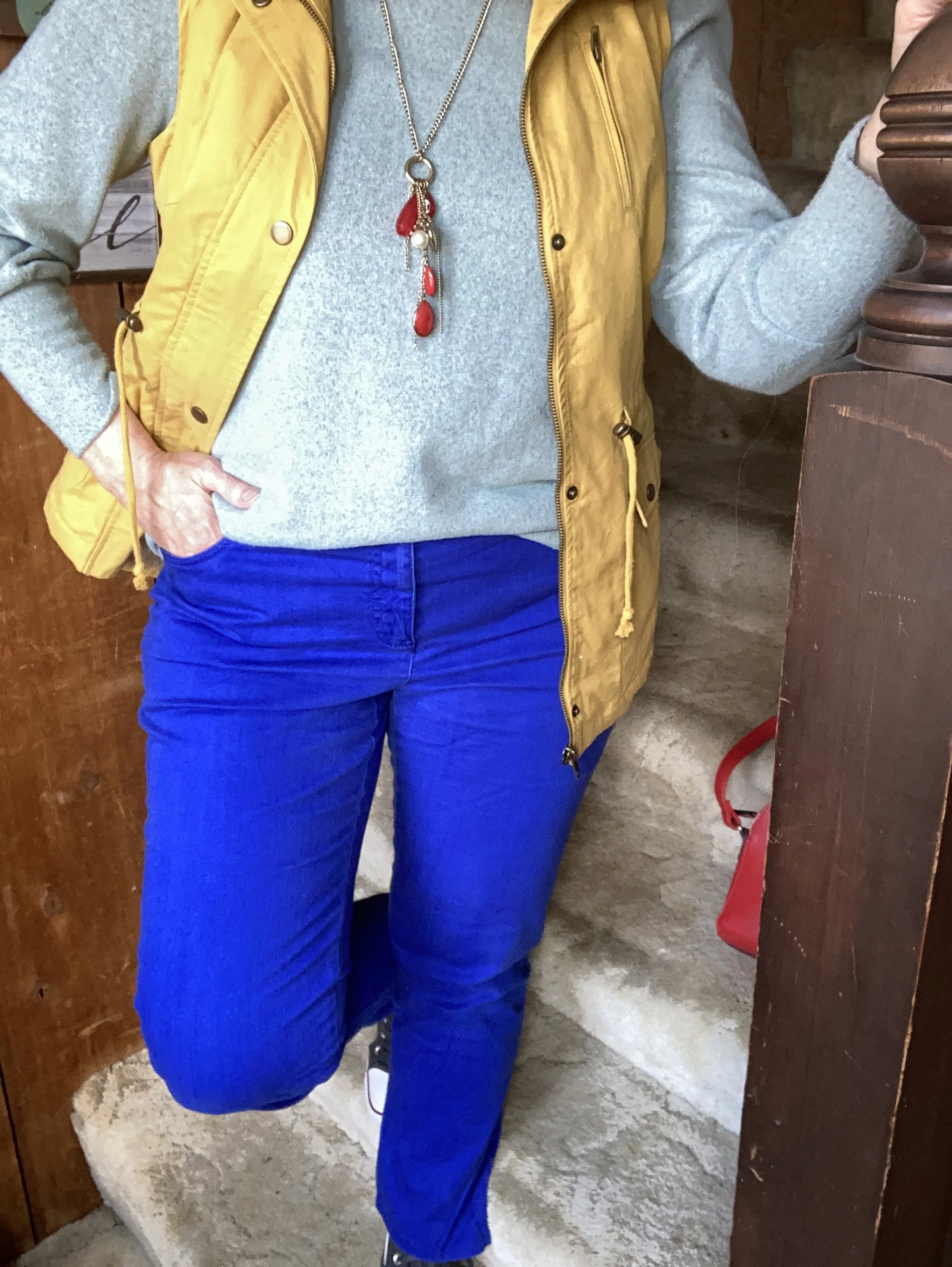
The color block technique is a great way to combine one color with another without worrying if they match. The whole point is to combine different colors to create a fun, statement worthy outfit. All of these pieces have been in my closet for a while. I have worn each of them separately, and I have worn the vest and pants together before, but not this combination.

My Light Aqua top is Massini brand and was a clearance find from Kohl’s a few years ago. It is a medium weight knit with a cozy feel.

My secondhand pants have made numerous appearances on the blog and are Ruby Rd. brand. You can see a number of my posts in this one post, Why You Should Have a Pair of Colored Pants - Bright Blue. While I don’t pull these out real frequently for my day to day outfits. I have used them over and over for a special occasion or for the blog.

This yellow vest is a brand called Love Tree. I really like this piece. It came with a detachable hood, and the inside of the vest has a fuzzy, warm sherpa lining. I think I got this at a local boutique, but I actually cannot remember. I know, I know! Too many clothes. I’ll save my clothing muses for another day.

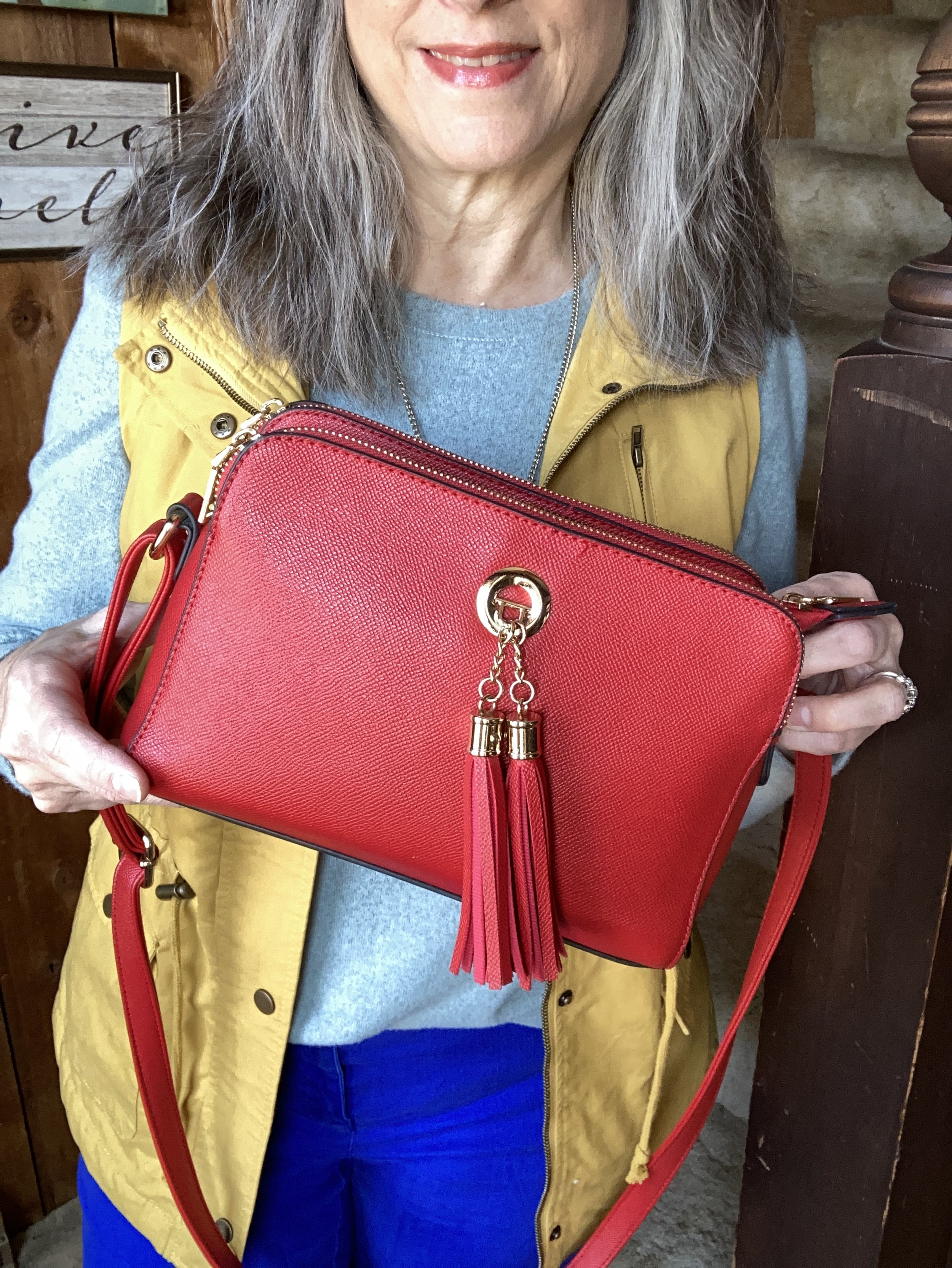
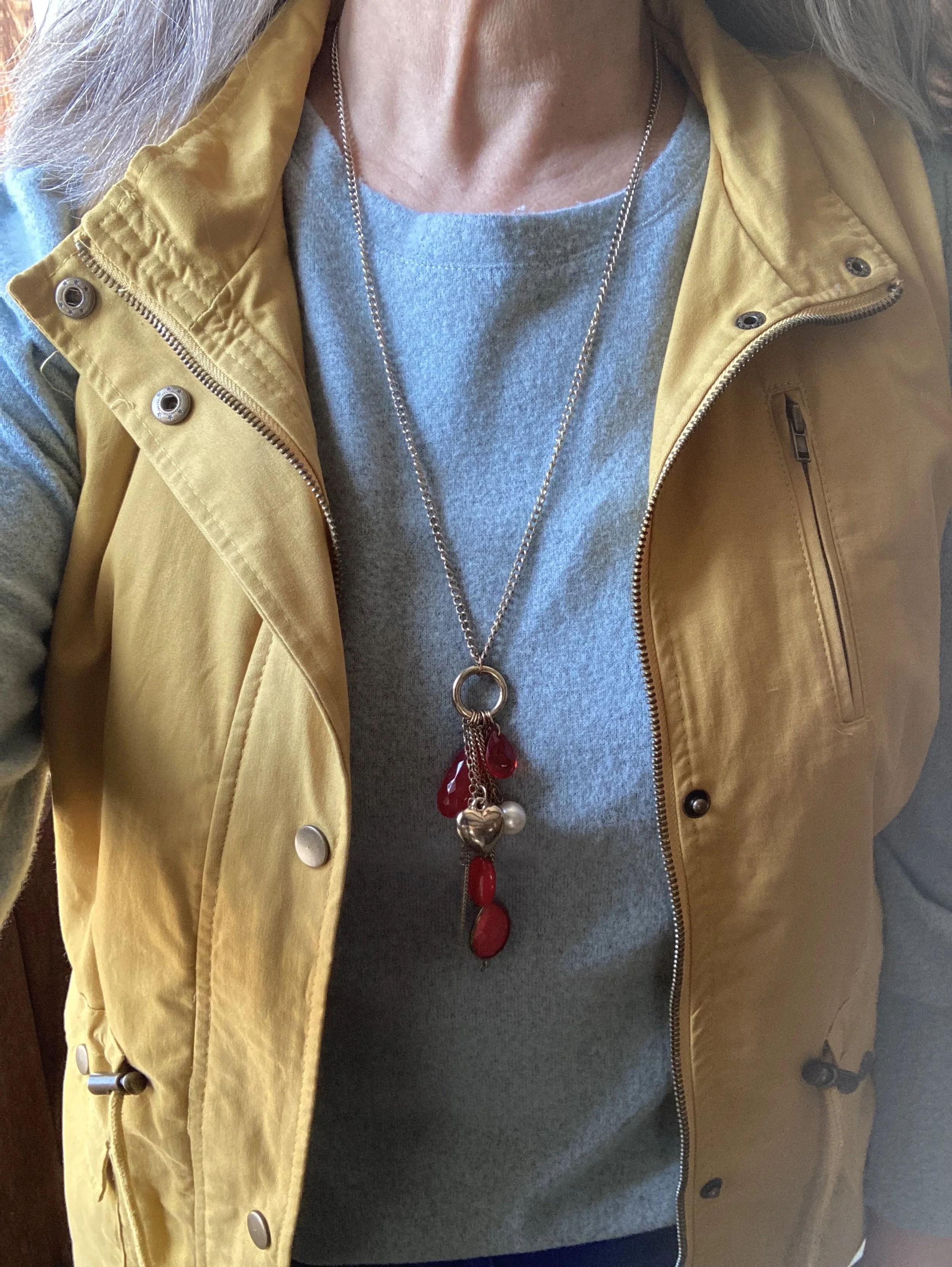
I decided to focus on Fiery Red as an accent color, so my bag, and my pendant charm necklace do the trick. Isn’t it cool, how the red pops against this already colorful outfit? I have this crossbody bag in a similar style, but different brand (both from Amazon), in black. They are great bags with three separate compartments to keep all your things organized. They are not huge, but big enough for the essentials. I’ll give a few shopping links below. A crossbody bag has become my regular go to, because I like the hands free approach. This is especially helpful when you are chasing grandkids, or shopping.

I really wasn’t sure which shoes to wear, and the only reason I ended up with my high top mesh Converse was due to the red stripe around the sole. Ha, ha. Really, my thought process for putting an outfit together is not all that complex. I tried the outfit with a pair of white sneakers first, but it just didn’t look right. I think the heaviness of the fabrics and the vest needed something a little less springy, but I also didn’t want to use knee high boots as those seemed too wintery…thus the Converse.

So what do you think of this outfit? Do you like the color blocking technique? Tell me about an outfit where you have used it. Your comments mean so much to me. You are the reason I keep this blog going, so it is wonderful to hear from you.

Please feel free to show your support for me and the blog by using my Buy Me a Coffee link. When you contribute to my page I can use that money to buy a treat when I am working on the blog at a coffee shop. I appreciate all your support.

I’m including a few shopping links. I only make money off of these links if you purchase something through a link, however, I bring these to you to give you ideas. All opinions are my own.

Have a great Tuesday!

Why You Should have a Pair of Colored Pants - Orange

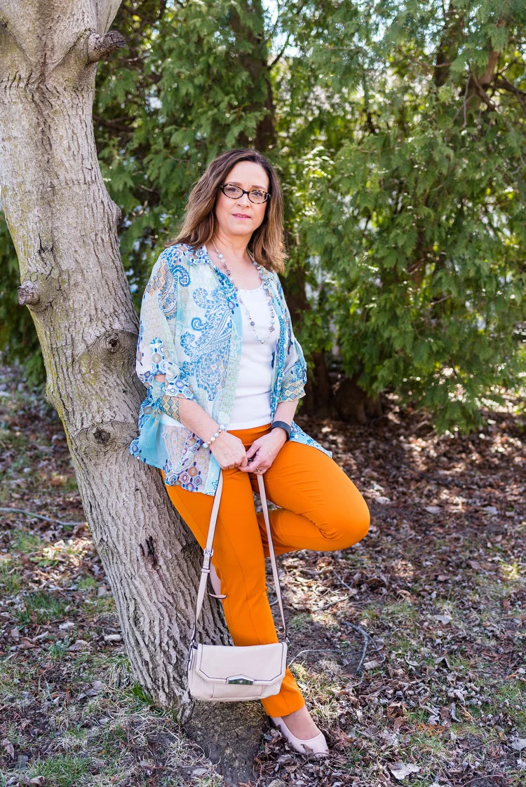
I thought I would do one more week on colored pants. This denim wearing diva, never imagined in all my years that I would learn to love brightly colored pants, but I have. I do remember when I was young, being a child of the sixties and seventies, I had a pair of bright red, cuffed bell bottom pants that I loved to wear to school. I am not sure what drew me away from the bright colored bottoms, except maybe that feeling of not wanting to be noticed or seen. I still struggle with that bit, but now I don’t worry so much about what other people are thinking or looking at. That is not my problem. I do try to dress modestly, but I love my bright colors and think they help to make me happy. This week I want to focus on my orange pants.

These orange pants were a clearance purchase at JC Penney about four years ago. They are Worthington brand, have a side zipper and an extra seam towards the front, giving the leg a long, lean line and less bulk around the middle, for a more streamlined look. The waist sits near my natural waist, so a little less of the spare tire problem. Here are past posts from the blog where I used these pants.

Outfit 1 - Orange with Sheer Light Blue Top

Pantone+Spring+2017+-+Island+Paradise.jpeg

I love the summery vibe of this outfit. The light blue, sheer top over the white tank combined with the bright orange pants seems very fitting for dinner under the palm trees at a tropical resort.

Outfit 2 - Orange Pants with a Dress

Spring+Transition+-+floral+dress.jpeg

This is one of my favorite outfits with these pants. It just happened that I found this dress at H&M and that the orange in the dress matched perfectly with the pants. I have no problem with women wearing shorter dresses. I know lots of women who will wear them with bike shorts underneath, so nothing is revealed if they blow up or if they bend over. I personally do not have the legs to wear a shorter dress, so wearing pants with a dress has become something I do more often. It is a fun way to display a short piece without any worry of revealing veiny legs or other leg flaws.

Outfit 3 - Orange with Bright Purple and Gray

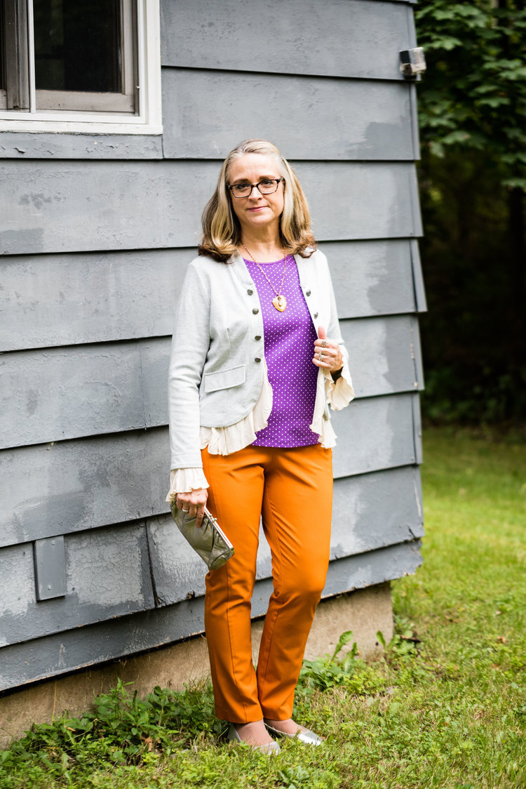
Pantone+Fall+2018+-+Russet+Orange,+Ultra+Violet+and+Quiet+Gray.jpeg

Who would have thought to pair bright purple with orange? Well, I did and I think it turned out perfectly. I think the light gray jacket over the top helps to pull this whole look together. The pretty leaf necklace ties the orange pants to the purple top. This is a trick you can do to bring cohesiveness to an outfit that might seem a little outside the color box.

Outfit 4 - Orange with Dark Green

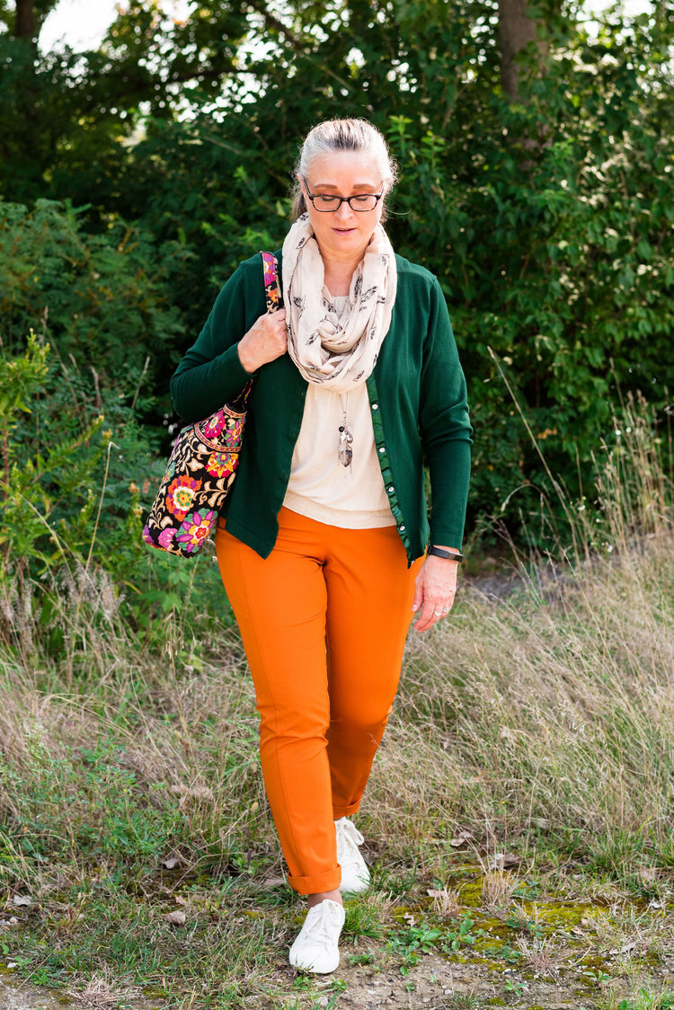
Pantone+-+Autumn_Winter+-+2019+-+Orange+Tiger+and+Eden.jpeg

Once again, you see a color block pattern, but one that is complimented by the printed accessories in the form of a leaf print scarf and a Vera Bradley tote bag. Since this was a more casual look, I added a hem roll to the bottom of the pants. This would be a great outfit to wear for an early fall shopping trip.

Outfit 5 - Orange with Marled Black Vest

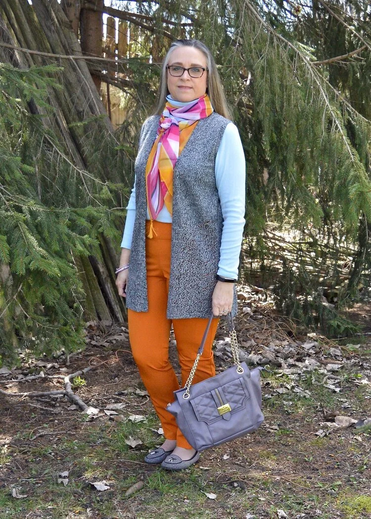
Transitional+spring+outfit.jpeg

Vests are a great way to transition from cooler seasons to warmer ones and warmer ones to cooler ones. They keep our cores warm, but our arms from being bound under bulky sweaters or coats. The focal point of this outfit, was not the pants, but the scarf, but I drew on the colors in the scarf to create the complete look.

Outfit 6 - Orange with an Asymmetrical Vest

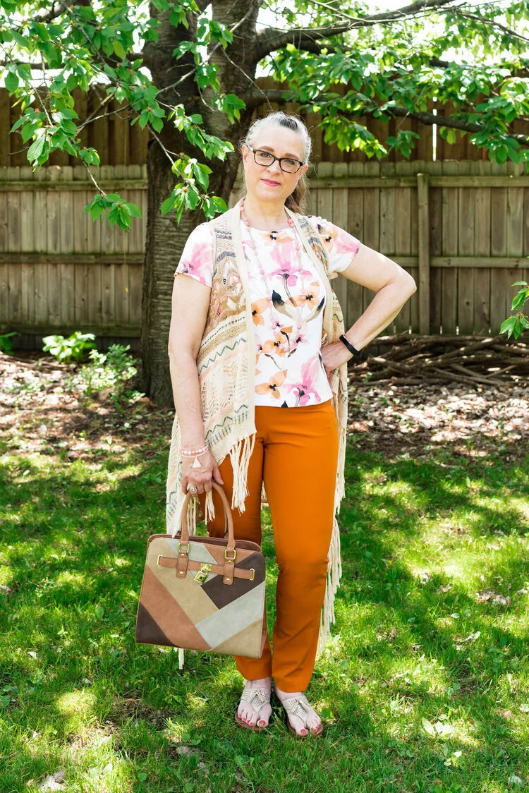
Pantone+Spring_Summer+2020+-+Flame+Orange,+Blossom+and+Cuban+Sand.jpeg

The solid colored orange pants are the grounding point in this outfit that is filled with busy prints. The floral tee, the open weave asymmetrical vest and the patchwork bag would probably be too much, if the pants were also printed. The bright orange once again announces that summer is just around the corner.

Outfit 7 - Orange with Teal, Gray and Yellow

Pantone+-+Autumn_+Winter+-+2020+-+London+Palette+-+Exuberance,+Ultramarine+Green+and+Sleet.jpeg

Here we are, back to fall. Orange is a no brainer for fall outfits, but we often reach for rust or darker versions of orange. However, I think I have shown that this bright orange is perfect spring through fall. You probably could even dress it up for winter with a chunky fisherman sweater and some suede ankle boots. This particular pair of pants is lighter weight, so if I wore them in the winter, I might put a pair of tights underneath.

So what do you think of orange pants? For all practical purposes I think more women would choose a bright blue pair rather than the orange, but what I wanted to show you is that there are so many different ways to style a bright colored pair of pants and still have a classy outfit that you can wear for a night out with the hubby, a lunch with friends or to a summer picnic. Pick your favorite color and get a pair of bright colored pants now.

I plan on showing you another outfit on Thursday with these same pants that has a more work oriented feel. Be sure to check back then.

I am leaving you with shopping links for a variety of bright colored pants. I hope you find a pair that will be perfect for you. These are affiliate links. All opinions are my own.

Photo credit Rebecca Trumbull.

Why You Should have a Pair of Colored Pants - Bright Blue

I am going to take a temporary hiatus from the Pantone series until my daughter and I can get together for a real photo shoot. I just think the pictures look so much better when she does them. She is the professional after all. In the mean time, I thought I would take the opportunity to talk about a few different clothing pieces that I think are essential to every woman’s wardrobe.

This week I would like to look at colored pants. I know many of us like to wear darker colors on the bottom to draw less attention to that part of our body. We usually have black, navy and perhaps a dark brown. Those who are a bit more bold might venture into the neutral category with tan or beige colored pants. Some will even dare to wear white in the warmer weather. If you are like me, you wear jeans more than anything else, even in the summer time, but I want to encourage you to purchase a pair of pants in a bolder, brighter color.

Today, I want to look back at a few of my outfits from the last few years of blogging. I want to show you why having a pair of bright blue pants is a way to expand your closet and give you additional outfit ideas. I got these pants from shopping a friend’s closet. They are not my favorite pair of pants due to the fit of the waist, so I usually only use them for blog pictures. However, if I ever come across a pair that fits better, I will definitely make the investment, so I can wear them on a more regular basis.

Outfit 1 - Bright blue with light blue.

Chasing+away+the+winter+blues+-+bluer+than+blue.jpeg

If you have been following my blog since the beginning you will probably recognize these outfits. The beauty of a bright blue pair of pants is that they look so classy whether you are dressing them up, like this outfit or dressing them down. I love this combination of bright, bold blue with the lighter pastel blue of the sweater and scarf. The bright blue still makes my lower half look slimmer and doesn’t draw extra attention to that area. See the original post here.

Outfit 2 - Bright blue with a print.

Print+Mixing+-+spring+2019.jpeg

I like having the option of pairing a pretty print top with something other than jeans and these bright blue pants were the perfect compliment to this top and the bomber jacket. Remember, things don’t have to match, though I personally love it when things have some color in common. I think it makes an outfit look more polished and cohesive, but that is just my personal opinion. You can see the original post here.

Outfit 3 - Bright blue with a print kimono.

Pantone+Spring_Summer+-+2019+-+Fiesta+&+Princess+Blue.jpeg

Once again we are pairing the bright blue with a pretty print. An observation I want to make is the color blocking trend. Color block is not one of my favorite ways to style an outfit, but when you do something like this where you take two solid colors and top it with a fun, summer time print, you come up with an outfit that would be perfect for a graduation party, a picnic or a dinner date. Obviously, you could do this with a white, black or navy pair of pants, but doesn’t the bright blue just make this outfit so much more fun? See the original post here.

Outfit 4 - Bright blue with olive.

Pantone+-+Autumn_Winter+-+2019+-+fruit+dove+and+galaxy+blue.jpeg

I am all about olive. I think olive is such a great neutral and it really goes with any other color. I love the cozy vibe of pairing bright blue with the more muted military olive. This is a great combination for fall as the weather is changing, and becoming cooler. The bright blue still gives the outfit a summer feel, but pairing it with olive makes me think of shorter days and crispy leaves. See the original post here.

Outfit 5 - Bright blue with color blocking.

Pantone+Spring_Summer+2020+-+Classic+Blue,+beetroot+purple+and+oyster+mushroom.jpeg

This outfit was an attempt at color blocking. Again, it is not my favorite thing to do, but once again, I think the bright blue pants takes this outfit up a notch. You could definitely do a similar look with navy, black or white, but the bright blue adds a dimension of color and pizzazz to the look that other colors will not. There are occasions that call for black, especially when you want to look more elegant and classic, but for most of us the events we are going to attend are more conducive to a look that is a bit more relaxed and fun. See the original post here.

Outfit 6 - Bright blue with dark blue.

Pantone+Fall_Winter+2020+-+New+York+Palette+-+Classic+Blue,+Ultramarine+Green+and+Blue+Depths.jpeg

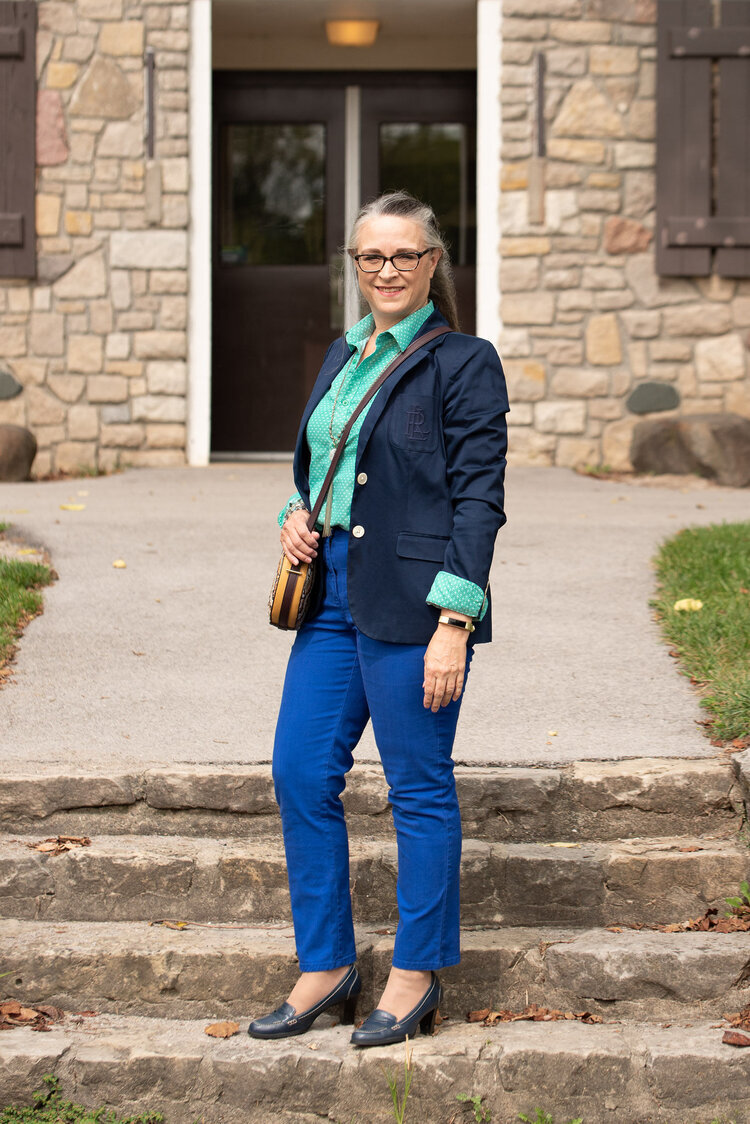
The last outfit I want to share pairs my bright blue pants with a navy blazer. I like this combination. Just like the pairing of the bright blue with pastel blue, this look creates a pretty contrast between two completely different blues. This is a great look for the office. The bright blue is not garish or overdone when paired with the navy blazer. The whole look epitomizes polish and professionalism. If I still had an office job, I would definitely wear this look. See the original post here.

Do you have a bright blue pair of pants in your closet? If not, does this post make you think differently about wearing them? I am going to include a few shopping links for bright blue pants, just in case you are now convinced you need a pair. Ha, ha. These are affiliate links. All opinions are my own.

Photo credit Rebecca Trumbull.


Winter Trend - My Take on Color Block and Shearling

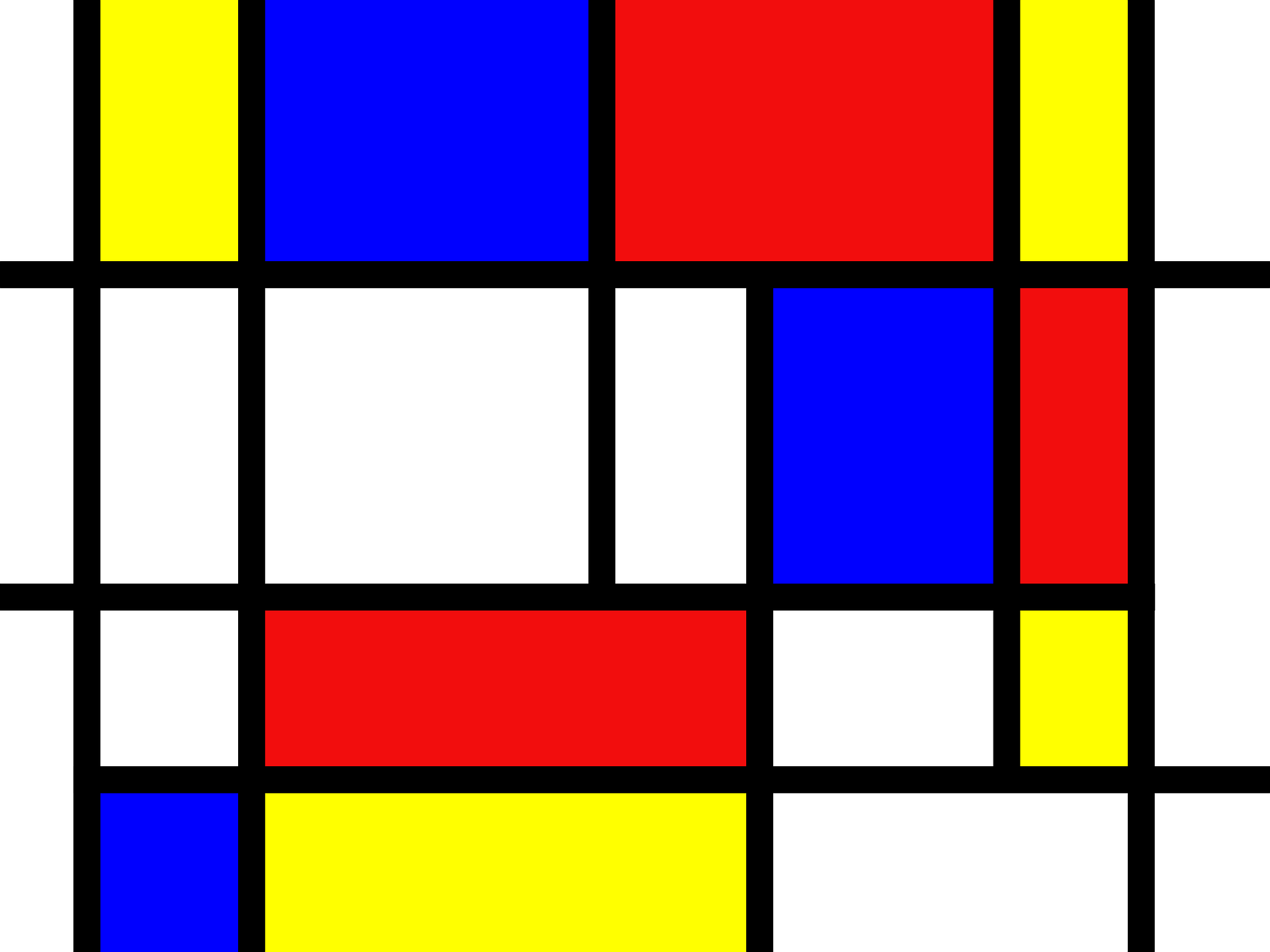
The trend of color block isn’t new. It has been around for a very long time. Some attribute the inspiration for color blocking to Piet Mondrian, an artist who used dark lines and bright colors to form paintings with block like components in the late 1800’s and early 1900’s. In fact, in 1966, Yves Saint-Laurent designed a line of dresses called Mondrian dresses, after the work of the late artist.

Image by Andrew Martin from Pixabay

Image by Andrew Martin from Pixabay

Often when color blocking is done, it follows a formula of sorts, where one color will be paired with an opposite color from the color wheel, creating a bold, bright outfit that really stands out and makes a statement. You can easily make your own color block outfit by combining solid colored pieces from your closet.

I am not a huge fan of color blocking, because I love patterns and textures so much. I did, however, find a beautiful color block sweater when my girls took me out birthday shopping, so that is what I built today’s outfit around.

Winter trend - color block and shearling

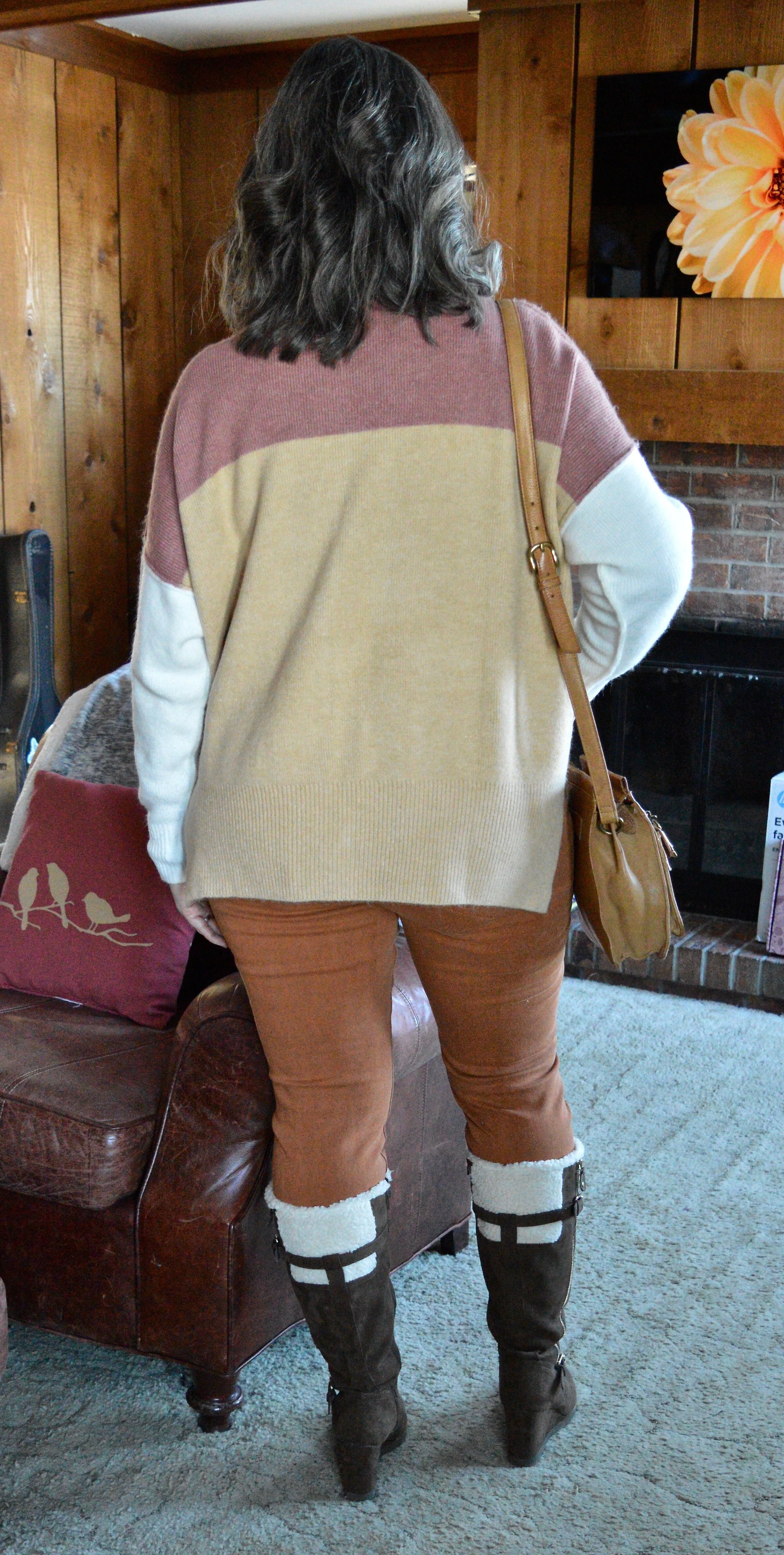
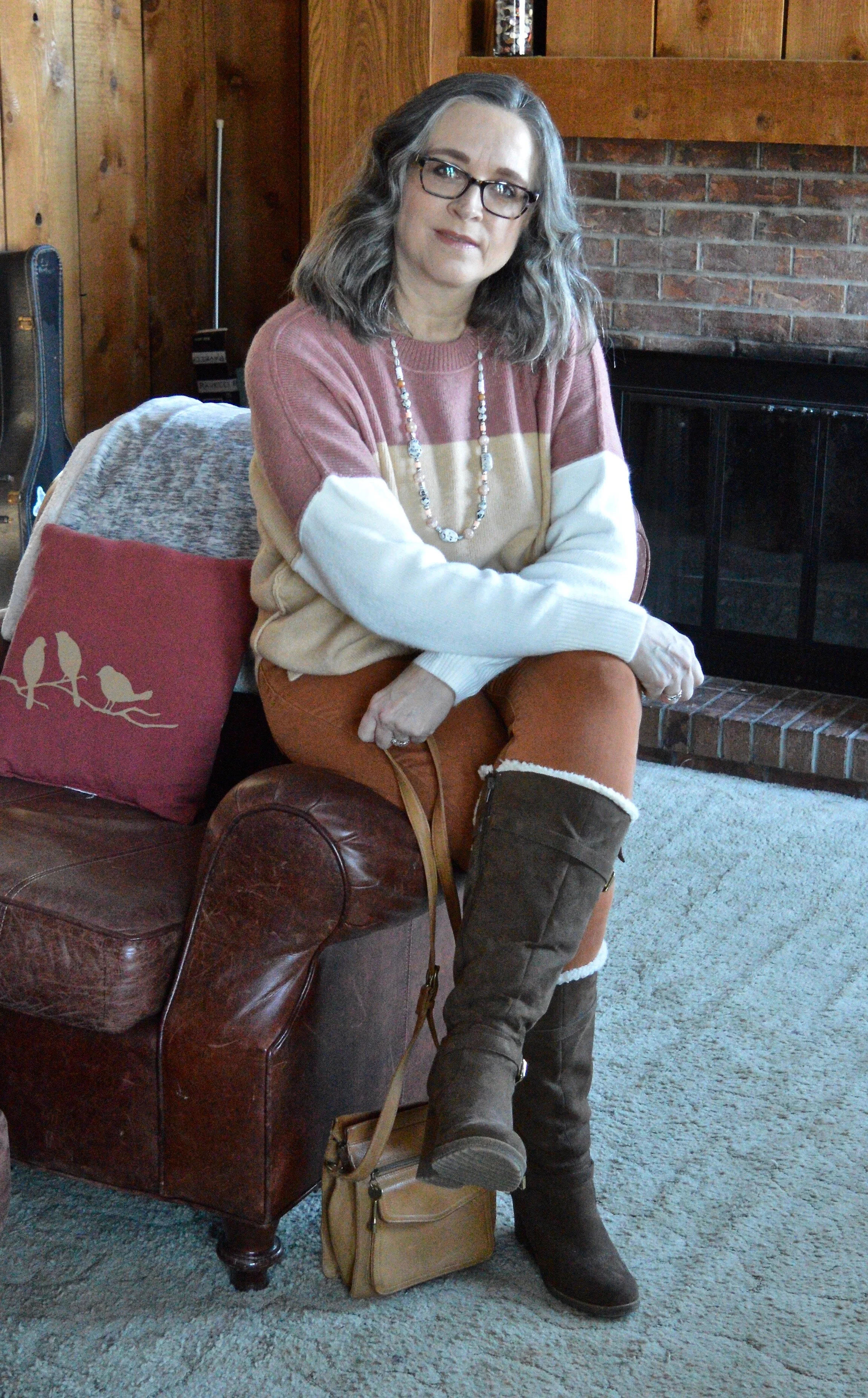
I bought this glam brand, color block sweater at Eden Fashion Boutique. As soon as I saw it, I knew I had to try it on. It is so soft and cozy. We have some below freezing temps coming down the pike and I know I will be wearing this to stay warm. I also like the drop shoulder sleeves and the more neutral color tones. I’ve included a shot of the back. As you can see the back is a little longer than the front.

DSC_0032.jpg
Winter trends - color block and shearling

My cognac colored pants are another pair of thrifted jeans. They are Michael Kors brand. I like the color and feel it is one of those colors you can use for all seasons.

Winter trends - color block and shearling

You can also get a closer look at my thrifted Unisa wedge heeled shearling boots. I have not really had the opportunity to wear these for anything other than the blog, but they are so cute, I can’t stand the thought of letting them go. For now they still have a home with my many other boots. You can see the fun side decorative gold zipper and the shearling trim in the next picture.

Winter trends - color block and shearling

You can see how I styled these on the blog with a fringe vest, and with a floral dress.

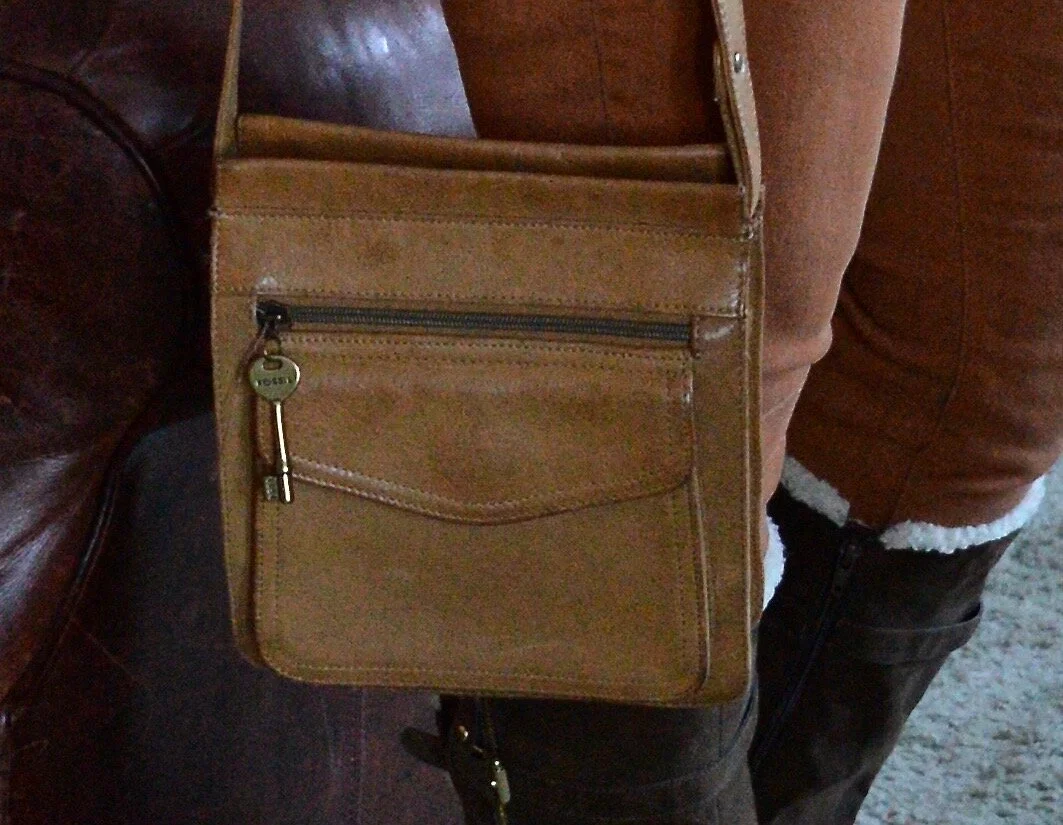
My thrifted, leather, Fossil bag is making another appearance in this post. This bag is so durable and goes with everything, plus it is a cross body bag which is my go to when I am going out shopping.

Winter trends - color block and shearling

The only jewelry I added was this necklace which was a clearance purchase when I made my Christopher & Banks store closing run. I love the peachy coral colors on the beads. This will be a nice piece for spring and summer.

Winter trends - color block and shearling

You noticed that these pictures were taken inside (sorry about the glare on my glasses). I just didn’t have the energy to trudge out into the snow with the camera in tow and take pictures. My incision is starting to heal, and it occasionally hurts a little. I have no complaints, because I think the doc did a great job getting rid of my little fatty tumor, but I decided to take it easy this week, until my appointment on Monday for a recheck.

Winter trends -

Here are a few other posts I did, that show off how you can do color blocking with solid pieces from your wardrobe. These do not follow any particular formula as far as colors go, but you get the idea. If you don’t particularly like print mixing and have lots of solid colors in your closet, this is a great way to create outfits that are colorful, fun, stylish and trendy.

I hope you enjoyed this post. I am including a few shopping links for you to enjoy. Have fun with it. These links are affiliate links and are brought to you at no cost. If you click on a shopping link I get a few cents and if you purchase something through my links, I get a little bit more. Think of it as a way to get yourself something special and buy me a cup of tea. Ha, ha.

Have a great day everyone. Be sure to check back Thursday for a post on how you know it is time to get rid of certain pieces in your wardrobe.

Photos in photo grid Rebecca Trumbull.