Pantone Autumn/Winter 2025 - New York Palette: Lemon Grass, Chili Oil, and French Roast

This week brings you another collection of colors from the Pantone Autumn New York color palette. Remember, I am combining colors as they inspired me, but you can take any of the colors from the palette and put them together, or maybe there are only one or two colors that you like and plan on adding to your wardrobe. This is always about what you like and how you can be inspired to look at your closet differently.

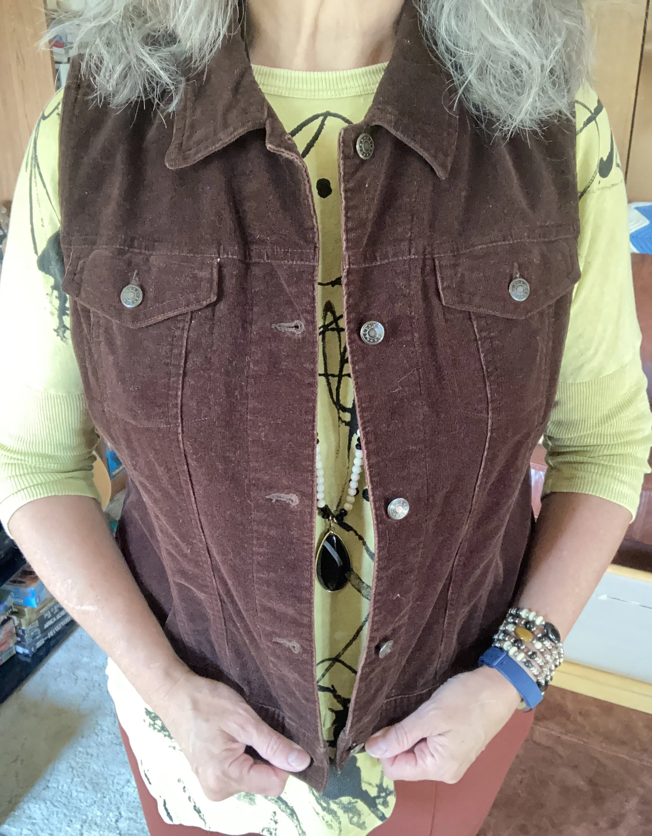
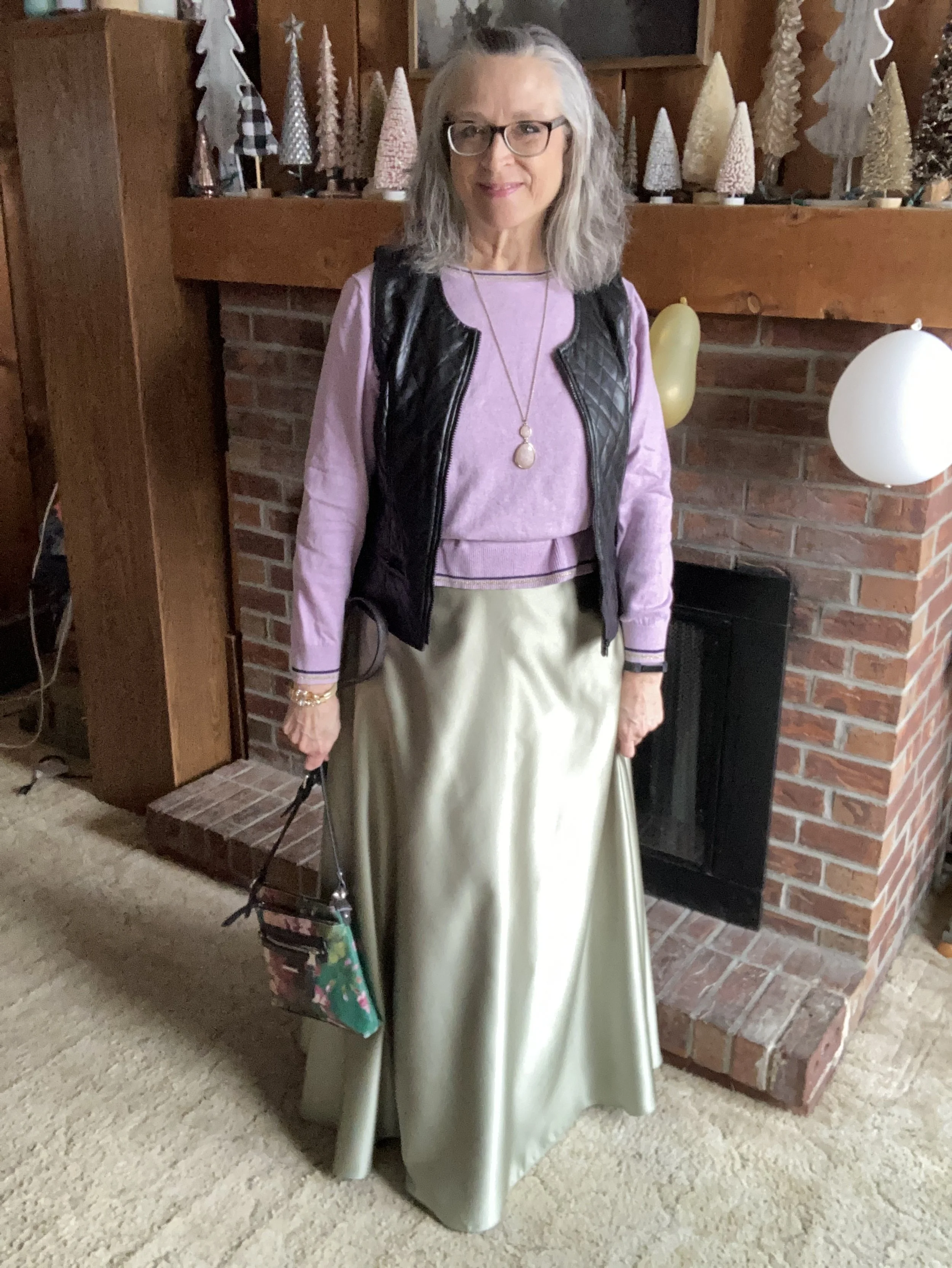
Today’s outfit is a contrast of light and dark combining the yellowy green of Lemon Grass with the classic French Roast along with the spice of Chili Oil. You can see the actual Pantone colors here.

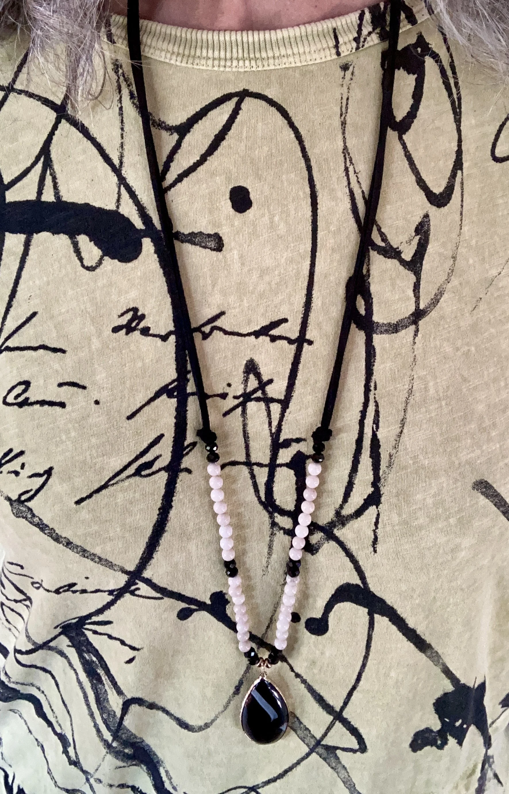
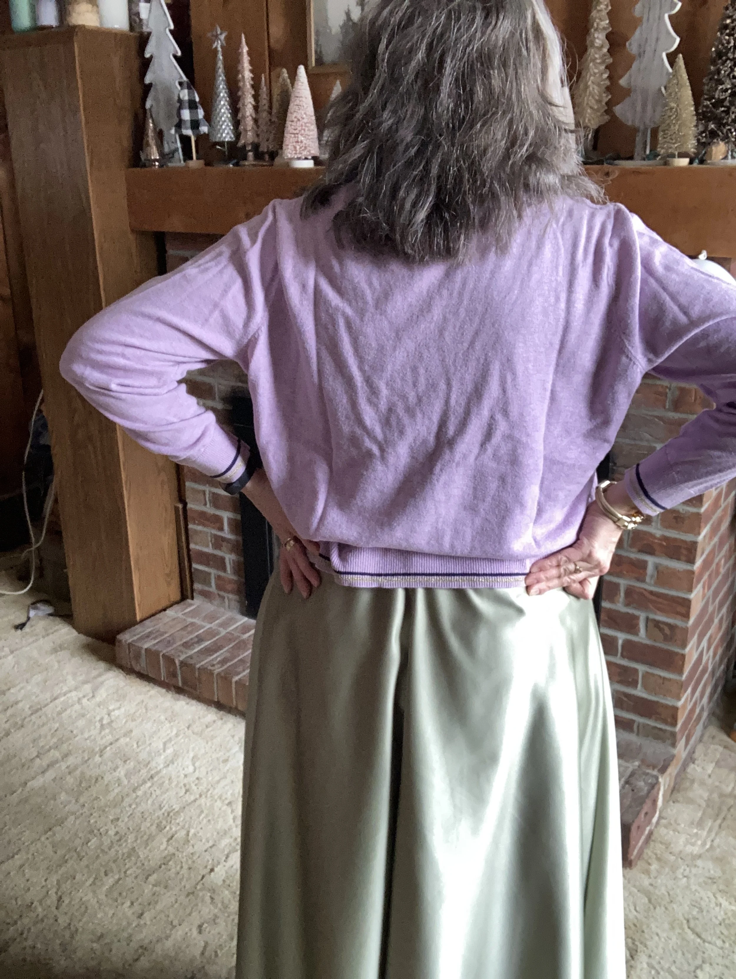
This pale yellow top, is not a true yellow, but has just a hint of green, making it the perfect selection from my closet for the Pantone Lemon Grass. I found this a few years ago while thrifting and it is a brand called Jess & Jane. I discovered that Jess & Jane is a California based wholesale clothing company who only sells to specialty boutiques, so who knows where this piece originated from. It’s kind of fun to think of the roads some of our second hand pieces have traveled. I like the asymmetrical hemline and the funky ink spray pattern on the front. I also like the sleeve length, which is perfect for the transitional days between summer and fall.

I remembered that I still had these rusty, Chili Oil, Chico’s So Slimming ponte pants that I had purchased on sale a few years ago. Ponte pants are made from a thick, stretchy, double-knit fabric called Ponte di Roma. They offer a more flattering line than regular leggings due to the specially made seams and more support. I don’t wear dress pants very often these days as I no longer have an office job, but I hang onto things for now, because who knows when I may have to go back to work outside the home.

To add a bit of texture and a layer for cooler temps I reached for this thrifted Crazy Horse by Liz Claiborne corduroy vest. It does a fairly good job of mimicking the French Roast dark brown color on the New York classic palette. I love this piece as it is structured, but also has a bit of stretch making it easier to wear.

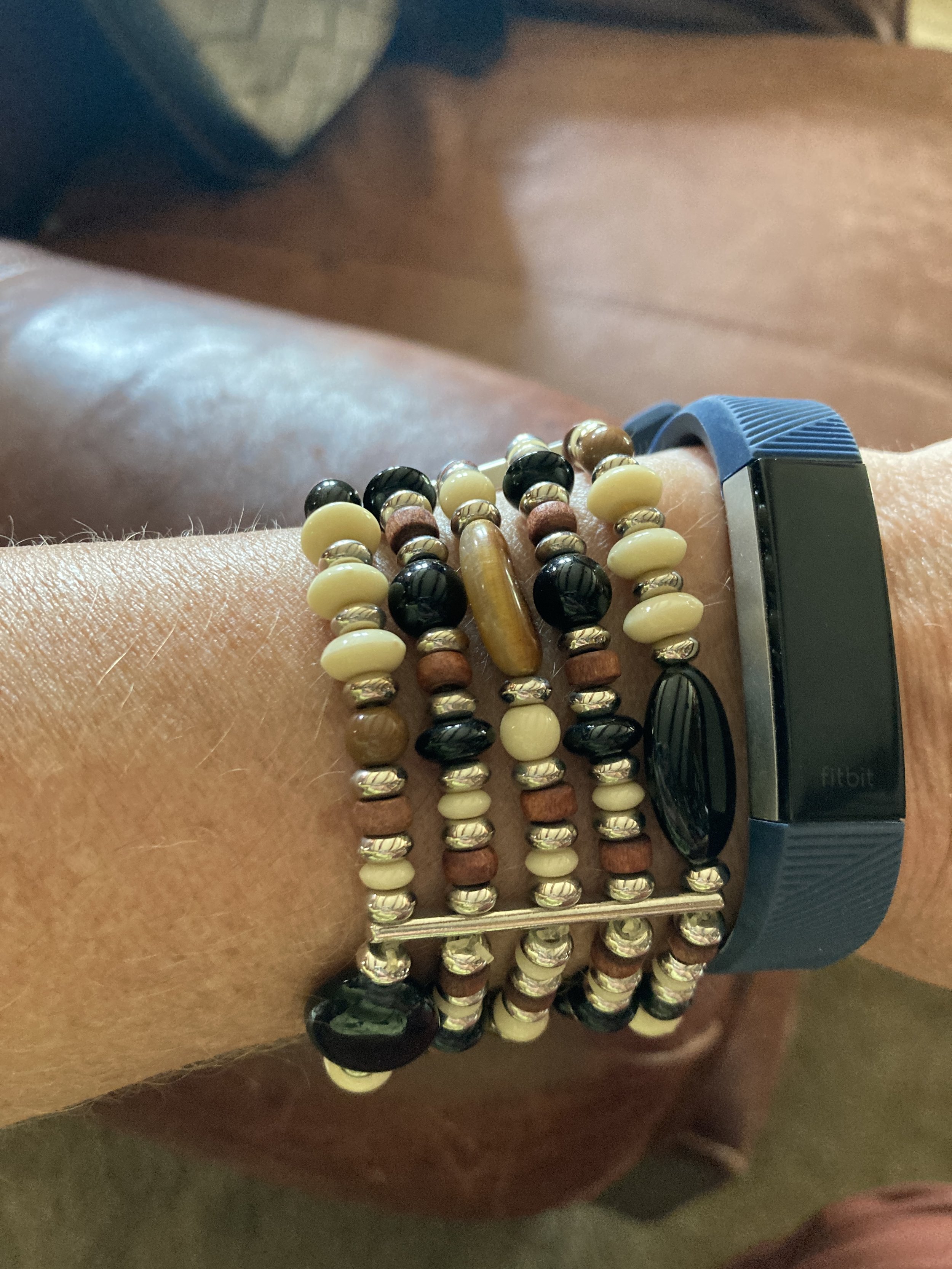
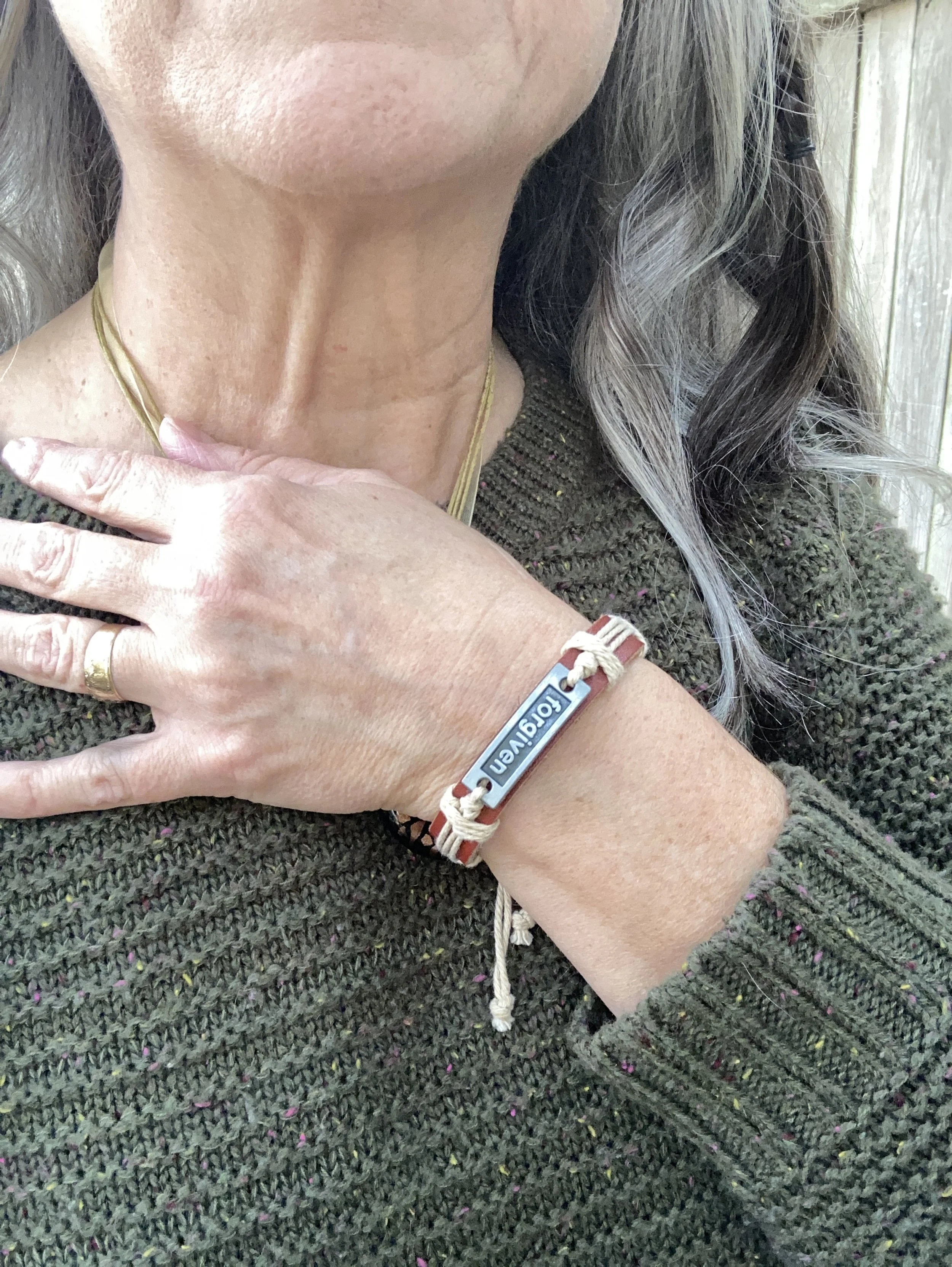
I kept my jewelry simple, as the top, vest and pants do the talking. A long black and white, beaded pendant necklace, and a stack, bead bracelet with browns, creams, blacks and a touch of yellow threw in a bit more texture and interest. I didn’t think to swap out my blue Fit Bit band for a brown or white one. Ha, ha.

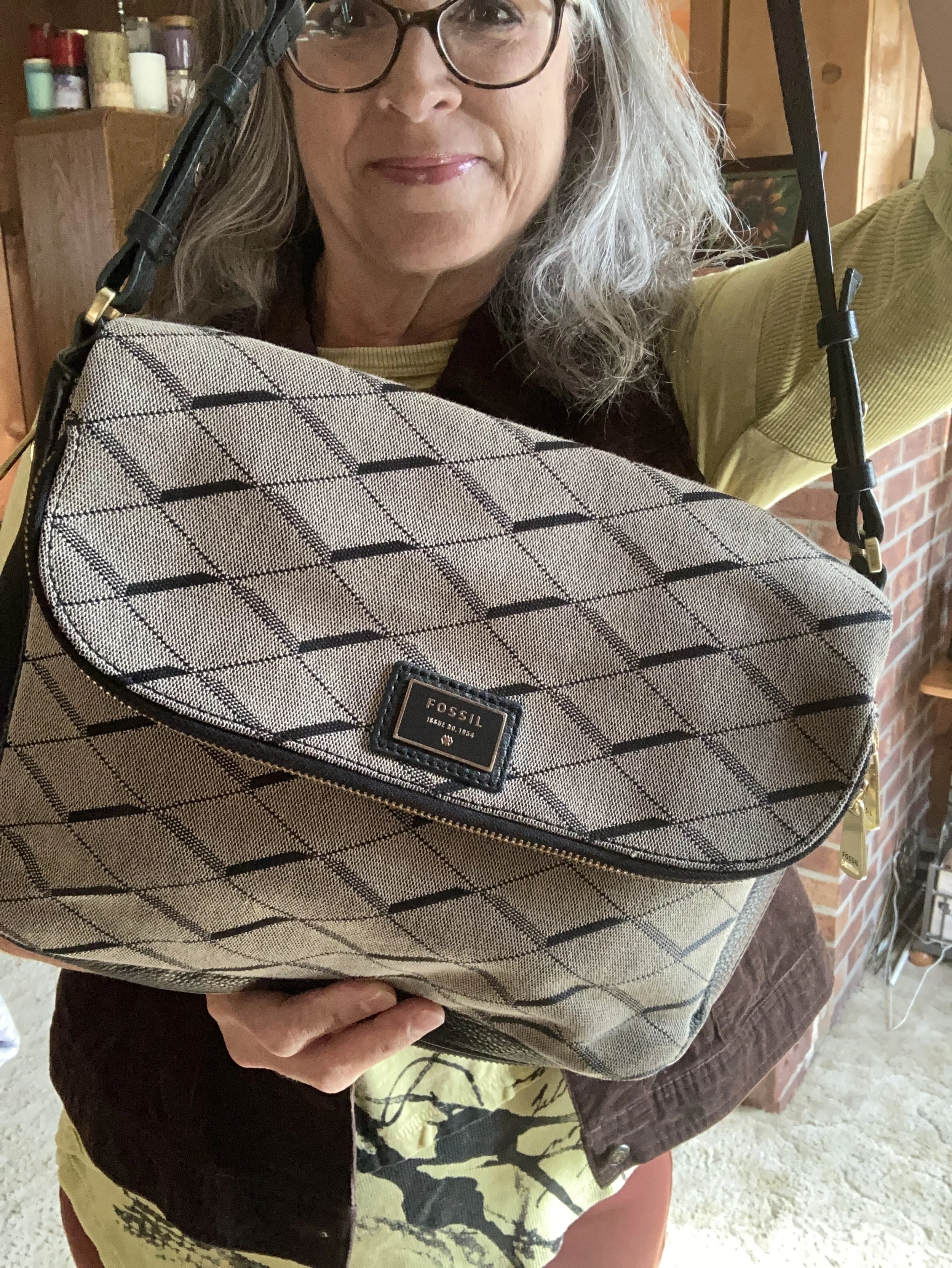
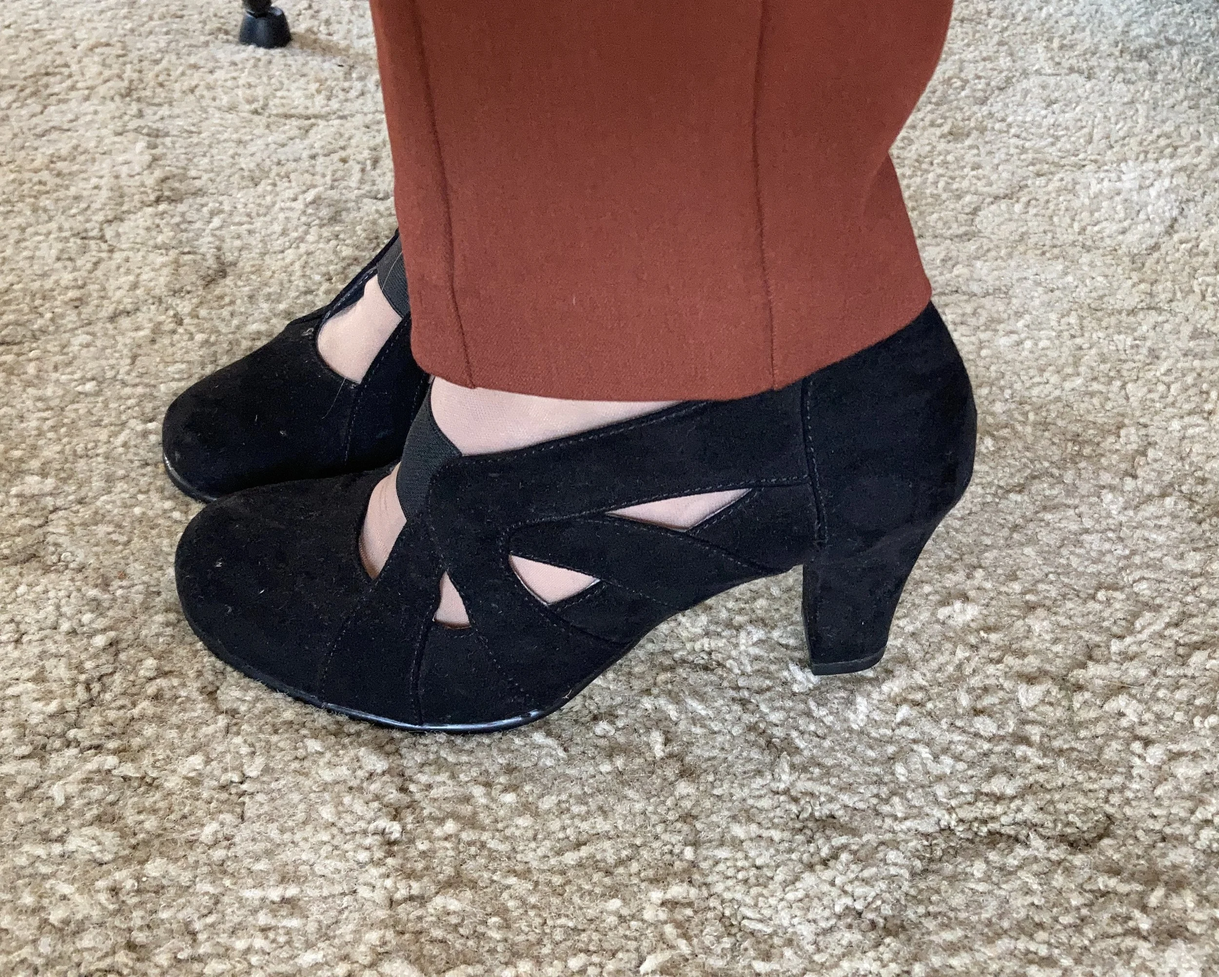
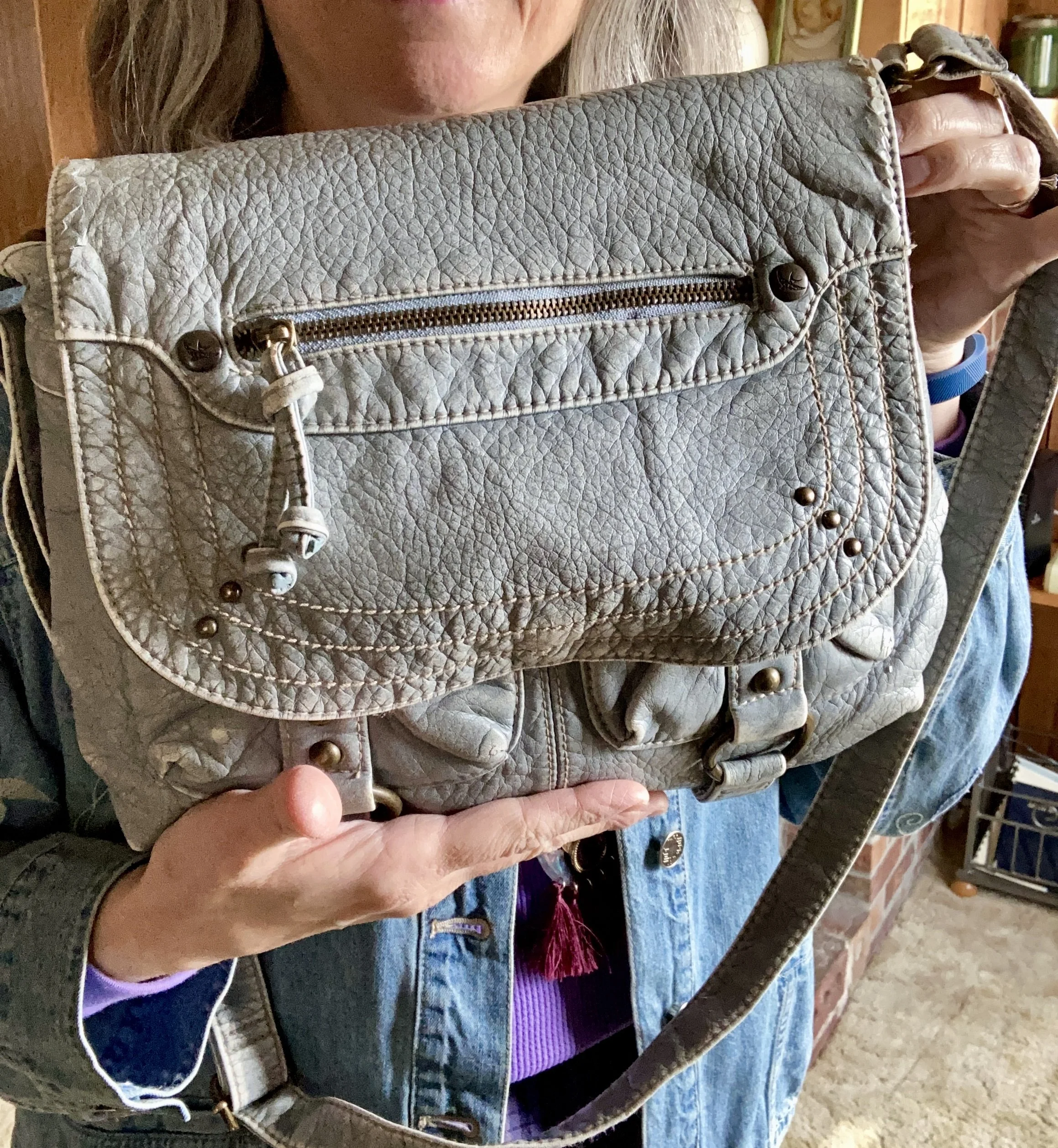
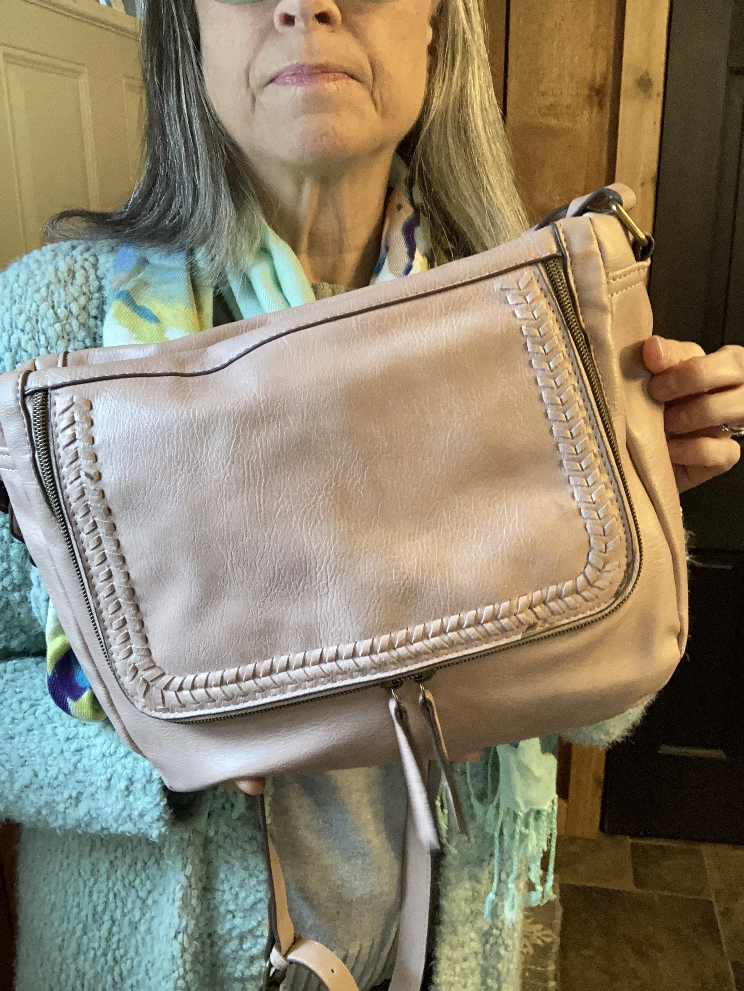
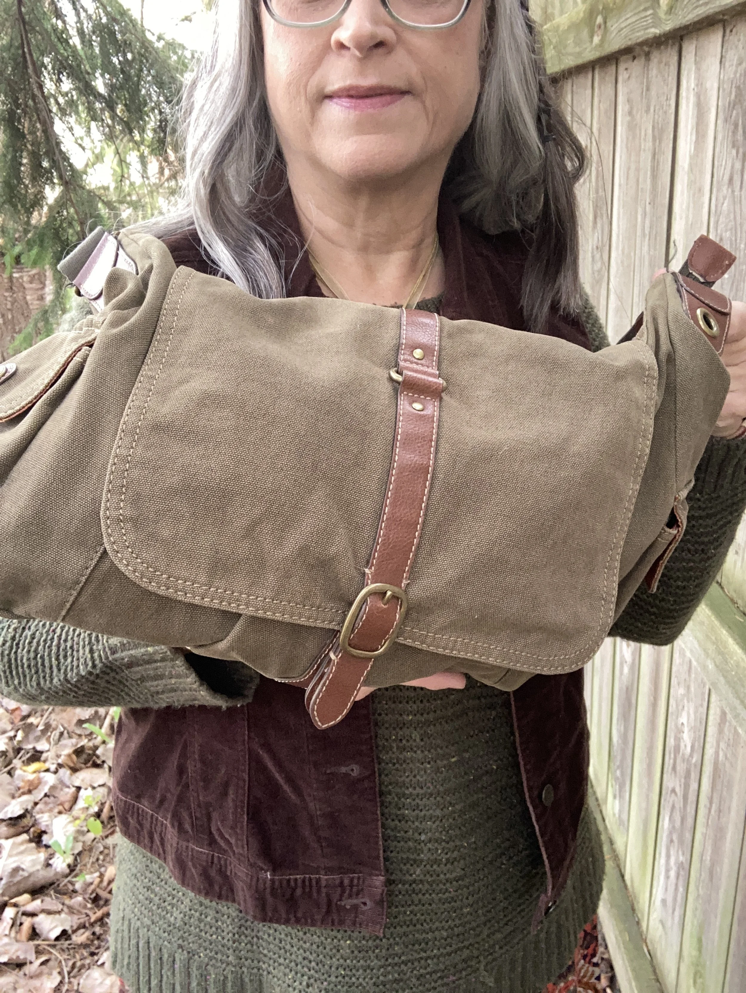
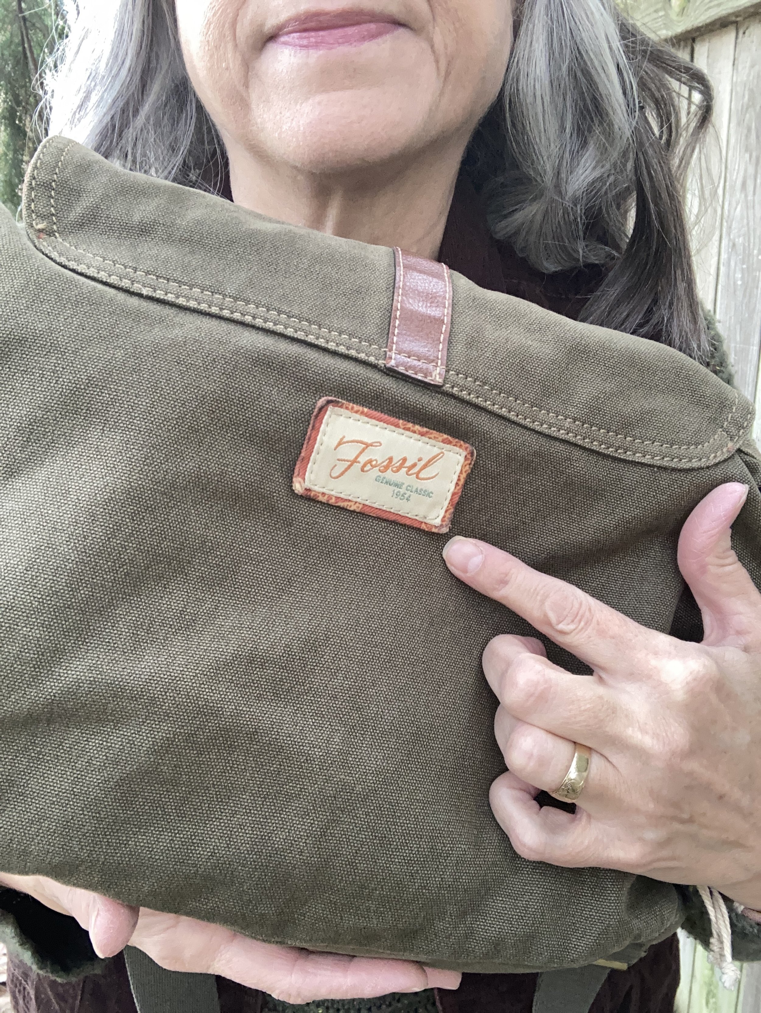
I chose black for my shoes and bag to tie to the black print on the top. My bag is a thrifted Fossil shoulder bag, and my shoes are Aerosoles that I purchased a number of years ago from DSW. I really like both of these. The bag is a great fall and winter choice, and the heels are comfortable (for as comfy as a heeled shoe can be when you don’t wear them very often - ha, ha).

What do you think of these Pantone colors? Would you wear these colors together? Do you like Lemon Grass, Chili Oil or French Roast the best? Which of these colors do you already have in your closet? Leave me a comment or two. It helps my blog to grown and reminds me why I do this!

I have included a few shopping links. Thank you so much for making an occasional purchase through my links. That gives me a tiny bit of income. I cherish all of your support. These are affiliate links brought to you at no cost. All opinions are my own.

I hope you are having a great week!

Shopping Our Closets: Featuring Pantone 2025 London Palette Colors - Airy Blue and Passion Flower

I will no longer be featuring a series on the twice yearly Pantone color palettes, because it is no longer free to access. This year they have stopped showing the colors in their articles unless you sign up for an account. This was apparently due to an disagreement between Pantone and Adobe the platform that provided the color palettes. Pantone wanted customers to have direct access to the color libraries, but now it costs a subscription price of $15/month or $90/year. This is unfortunate for those of us who enjoy seeing the new colors. However, I was able to find a pin on Pinterest that shows the colors and you can see that here.

It is hard for me to show you warm weather looks when it is still so chilly outside, but I made an attempt with this outfit’s bright colors and fun denim jacket. It just happened that this purple which they are called Passion Flower is one of my favorite colors. I thought it paired well with the lighter Airy Blue of the denim and my vintage-ish shoulder bag. Let’s take a closer look at the details.

There are two stars in this outfit.

Star #1 - Embroidered Denim Jacket

You may have seen this beautiful, thrifted J. Jill Denim piece on the blog before. Click to see it styled with a head to toe denim outfit, a floral maxi dress, pink pants and a berry top, and a white maxi skirt. This is definitely a piece that I will be hanging on to.

Star #2 - Pleated Skirt

I bought this the last time I went thrifting before I started the #75hardstylechallenge . It was a tad tight around the waist, but I had started Weight Watchers and was hopeful that it would fit better as I lost weight, and indeed it does. It is still a tad snug, so no sit ups while I am wearing it, but who would be doing sit ups in a skirt anyway? Ha, ha.

This gorgeous piece is Pendleton brand, so very well made. I wish I could afford their clothing, but I will just have to keep my eye out when I start thrifting again. I did have two other Pendleton pieces, a blazer I still have which you can see here and here, and another blazer, here, which I do not have any longer.

I had this purple Time and Tru, thermal long sleeve tee from a previous thrifting occasion and it matches perfectly.

I added this pendant necklace and love how it pulls in the berry colors from the skirt. That also allowed me to add my Vionic suede combat boots, a clearance find at DSW, to pulled it all together.

Finally, my light blue shoulder bag, another thrift find is a brand called Sparrow True. On the label inside it says, “Inspired by Vintage Treasures of an Undiscovered Past.” I like that.

What do you think of this outfit? Do you own any Pendleton products? What has been your best find either at a thrift store or a regular retail store? I’d love to hear from you. Your input and feedback always makes my day and helps me to keep posting.

I’ve included shopping links for you to peruse. These are affiliate links. All opinions are my own.

Have a great week everyone and thanks for following along on the blog.

Color Play: Trending Spring Colors - Pistachio and Petal Pink

I thought I would cover two of the spring color trends that are being talked about, because you know I love color. The thought that these two colors would look good together was obvious to me and certainly is a nod to spring. Click here to read more about Glamour’s 10 Key Spring 2025 Fashion Trends.

Pistachio is a light green that is a bit different from mint in that it leans more toward yellow, thought not as yellow as olive. I think it is a pretty color and, as with many colors, comes in differing hues and shades.

Petal pink is a pretty spring time pink with purple undertones.

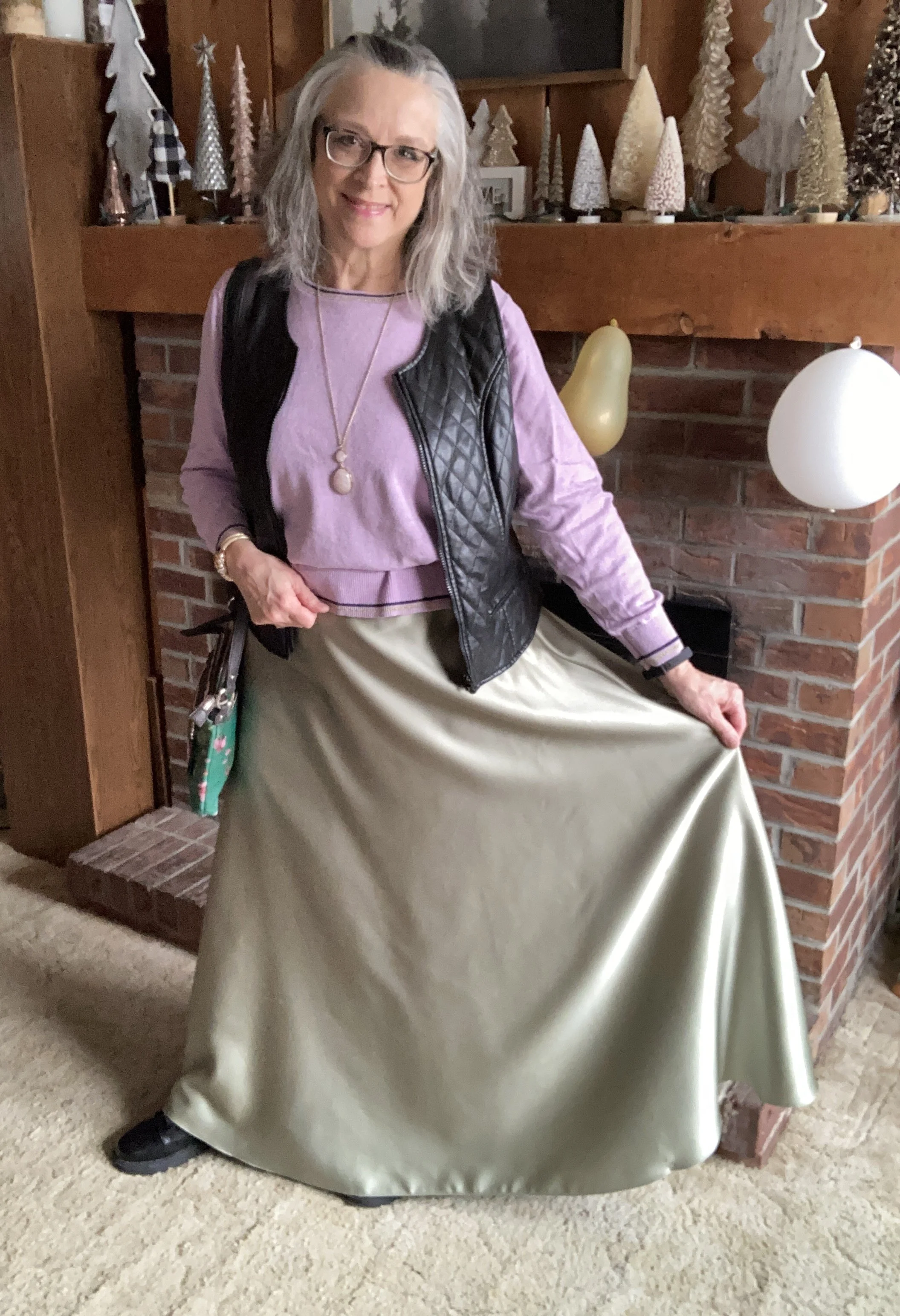
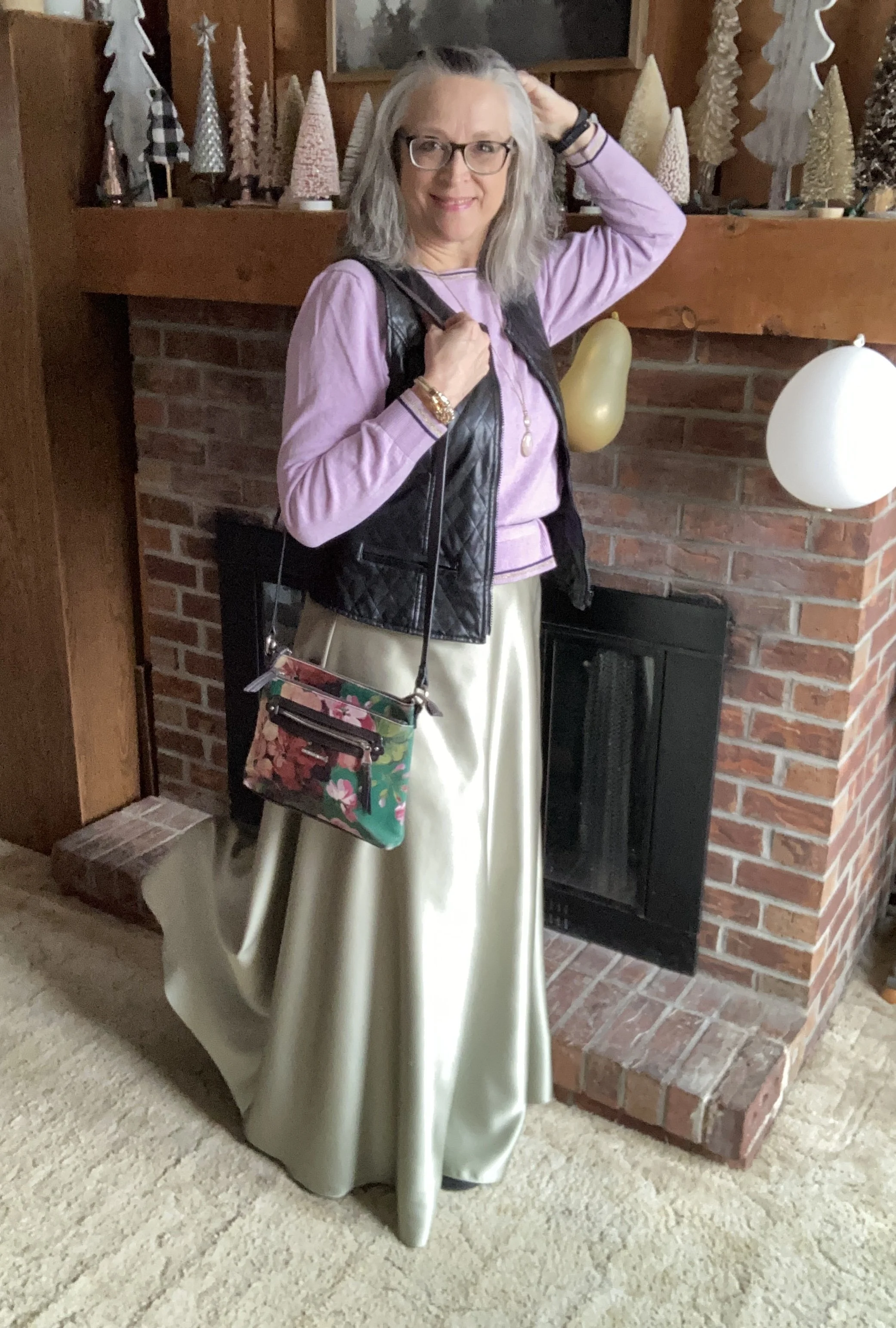
Today’s outfit was built from thrifted pieces in my closet. The sweater is a bit more purple than the Petal Pink color, but if you could see the actual piece it definitely has pink undertones throughout.

My pullover sweater is an unknown brand as the label was cut off. It is a boxy cut, so I decided to try a trick I have seen a number of bloggers and Instagram gals use. I took a belt and put it over the sweater at about my natural waist. I then proceeded to pull the top half of the sweater up and fold the resulting extra over the belt. Voila, a peplum top, of sorts!

Style Tip: Don’t be afraid to try different things to make your clothes work for you. If you don’t already follow Jodie from Jodie’s Touch of Style, she is the queen of giving you tips and tricks to make your clothes really work for you. Be sure to check out her blog. Alterations are great if you know how to sew, but using a hair clip, or a belt like the above example, is a way to make a top, skirt or dress fit a little better without seamstress style alterations.

My thrifted maxi skirt looks like it was a bride’s maid dress in a previous life, but someone cut the top off and gave it a proper waistband with elastic in the back to make it a wonderful full length skirt. Silky skirts are in for spring, so this was a great find when I purchased it a few months ago.

Style Tip: Do you still have a bride’s maid dress hanging around that you just don’t want to get rid of? Why not think about making it into something new, like a skirt, a top, or even a vest. Be creative!

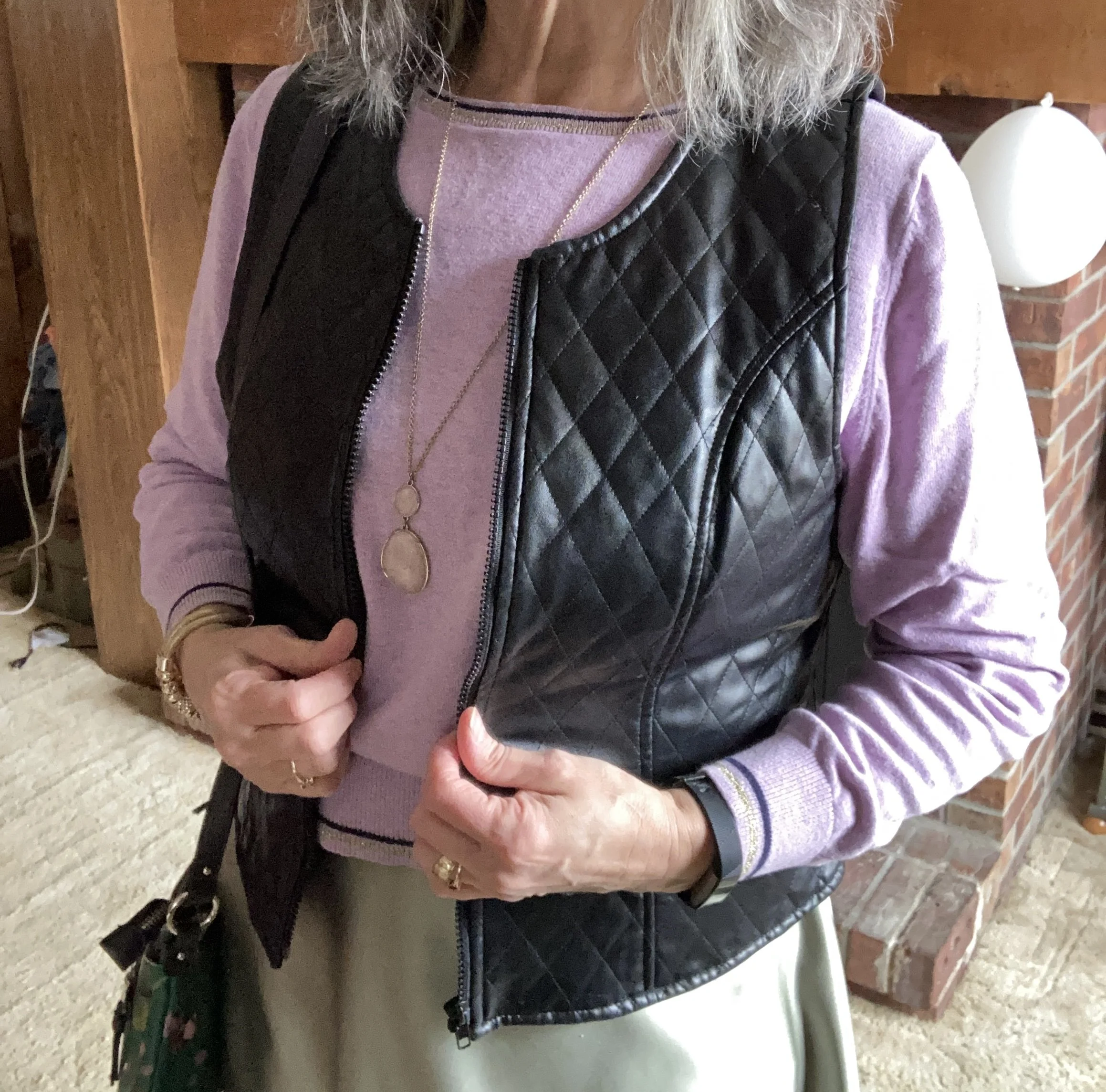
I decided to add this thrifted faux leather quilted vest to add an edgy element to an otherwise soft and feminine look. It is a brand called Selene Sport. In addition, with spring not officially here for a few more weeks and the warmer temps even slower to follow, a vest adds a warm layer around you core.

Style Tip: Use a vest to add warm and interest to any outfit. It is also a great piece to add when an outfit needs a bit of cinching in at the waist, especially the more fitted waist coat types of vests.

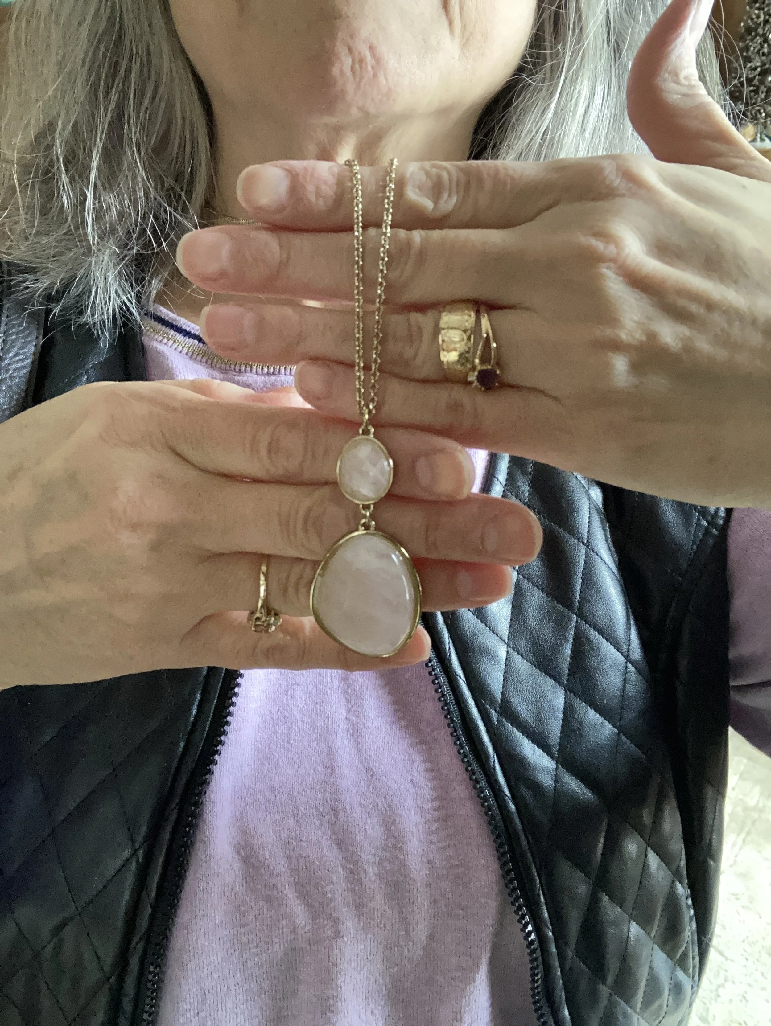
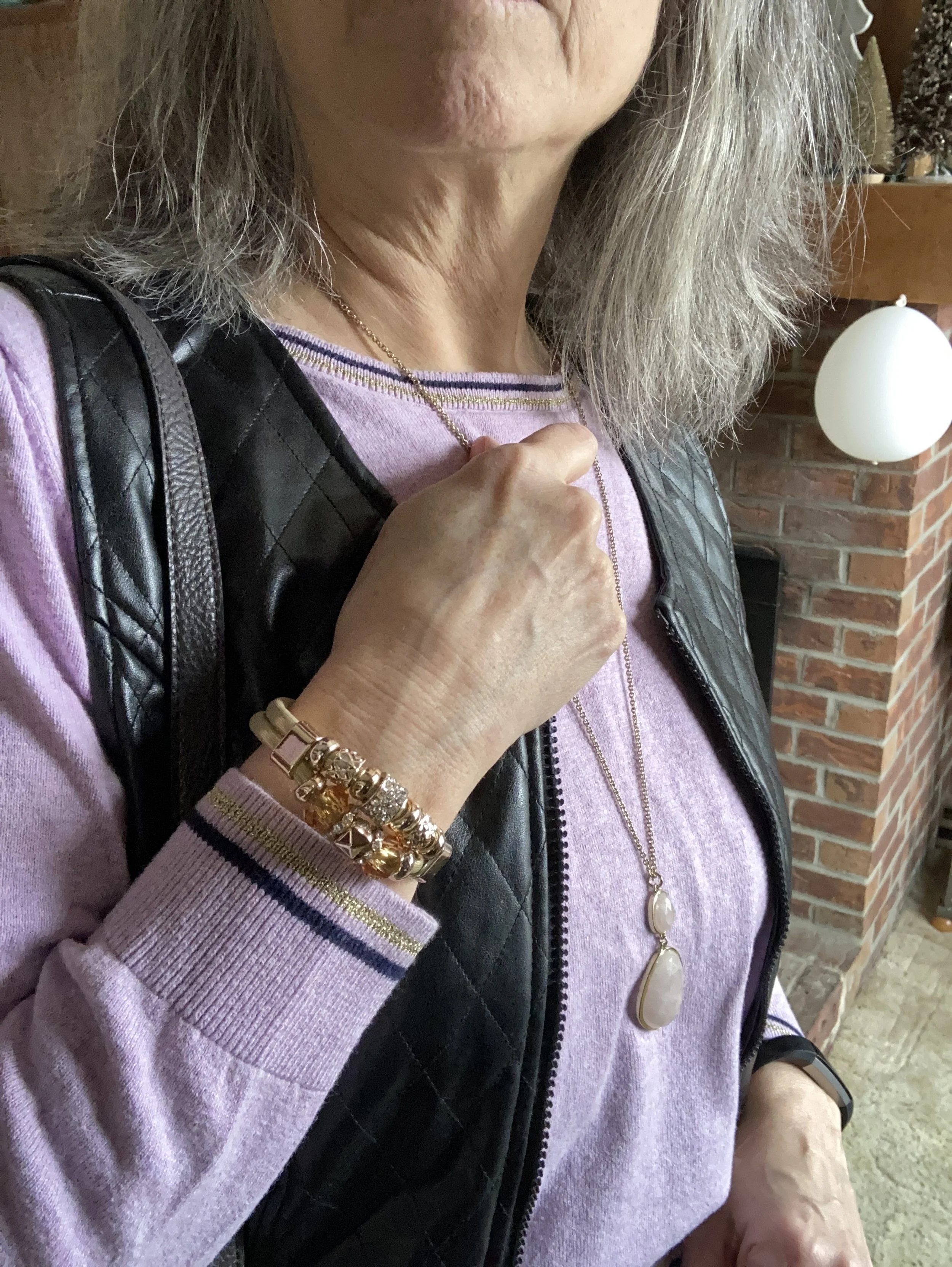
I kept my accessories relatively simple. The longer, pendant in a soft shade of pink, and the gold beaded bracelet keep the outfit feminine and refined. The tall, black, SO lace up boots add a bit more edgy vibe with the vest, and the floral, Dana Buchman bag is a direct nod to spring.

What do you think of this outfit? Would you wear something like this? Do you have any clothes that you have altered to make different pieces? I love to hear you thoughts and ideas so be sure to leave me some love in the comments.

I’ve included a few shopping links. These are affiliate links brought to you at no extra cost. All opinions are my own.

Have a great week!

Outfit Inspiration: Pinterest - Winter Pastels

I turned to Pinterest again to search my boards for outfit inspiration. I finally chose this outfit. I typically use these pins as spring boards to build an outfit. While the outfit from Pinterest is lovely and I could totally see myself wearing something like it, I wanted to do something a little bit different. Unfortunately, I am not real thrilled with how this turned out. I decided to post it anyway, because we are ever changing human beings and we are not always spot on, no matter what social media influencers make you think.

I have always wanted to keep this blog real. I am a real person with health issues, mental struggles and emotional ups and downs. This affects my content. It affects how often I post and how put together my outfits look. This past weekend when I took these pictures I was really struggling with fatigue. Being still undiagnosed with what caused my health crisis back in 2021 my body seems to struggle with being at “full health” most of the time. It’s okay. This is life and I am thankful I can still do things and still bring you content even if it is not always perfect.

That being said, I am currently on a journey to do what I can to be healthier. At the suggestion of my digestive health doctor, due to a hiatal hernia, I am trying to lose a few pounds and eat healthier. I joined Weight Watchers and it is helping me to make better choices, as well as lose weight through tracking and portion control. I left in the picture of my pants, even though they look silly, but you can see they are a bit baggy and slouchy due to some of the weight loss.

I decided to use my pastel green, open front, Christopher and Banks sweater instead of a similar colored pullover that I could have used. I love this light colored, textured piece.

Style Tip: If you are getting tired of the darker colors we often reach for in the colder months try changing things up a bit by throwing in a few pastels or super bright colors to give your day a boost.

My thrifted Oxford gray, Sonoma pullover sweater is a light weight piece that works much like a long sleeve tee, but has the fun detailing of the ribbed bottom, boat neck, and wrists.

Style Tip: Look for light weight sweaters at thrift stores or end of season sales to add to your basics pile of layering pieces.

These Stitch Star jeans from Meijer are definitely showing their wear and will probably need to be passed along one day soon.

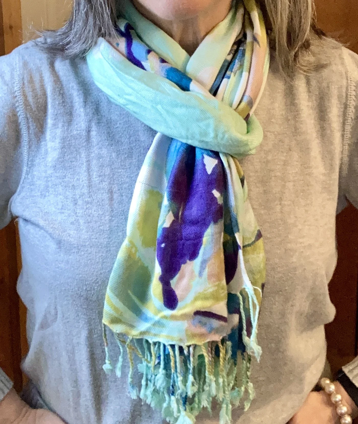
I wanted a similar scarf to the original pin with a touch of another pastel color. Theirs was more of a purply pink, so I pulled out a scarf that had the light green, but also some splashes of purple and pale pink,

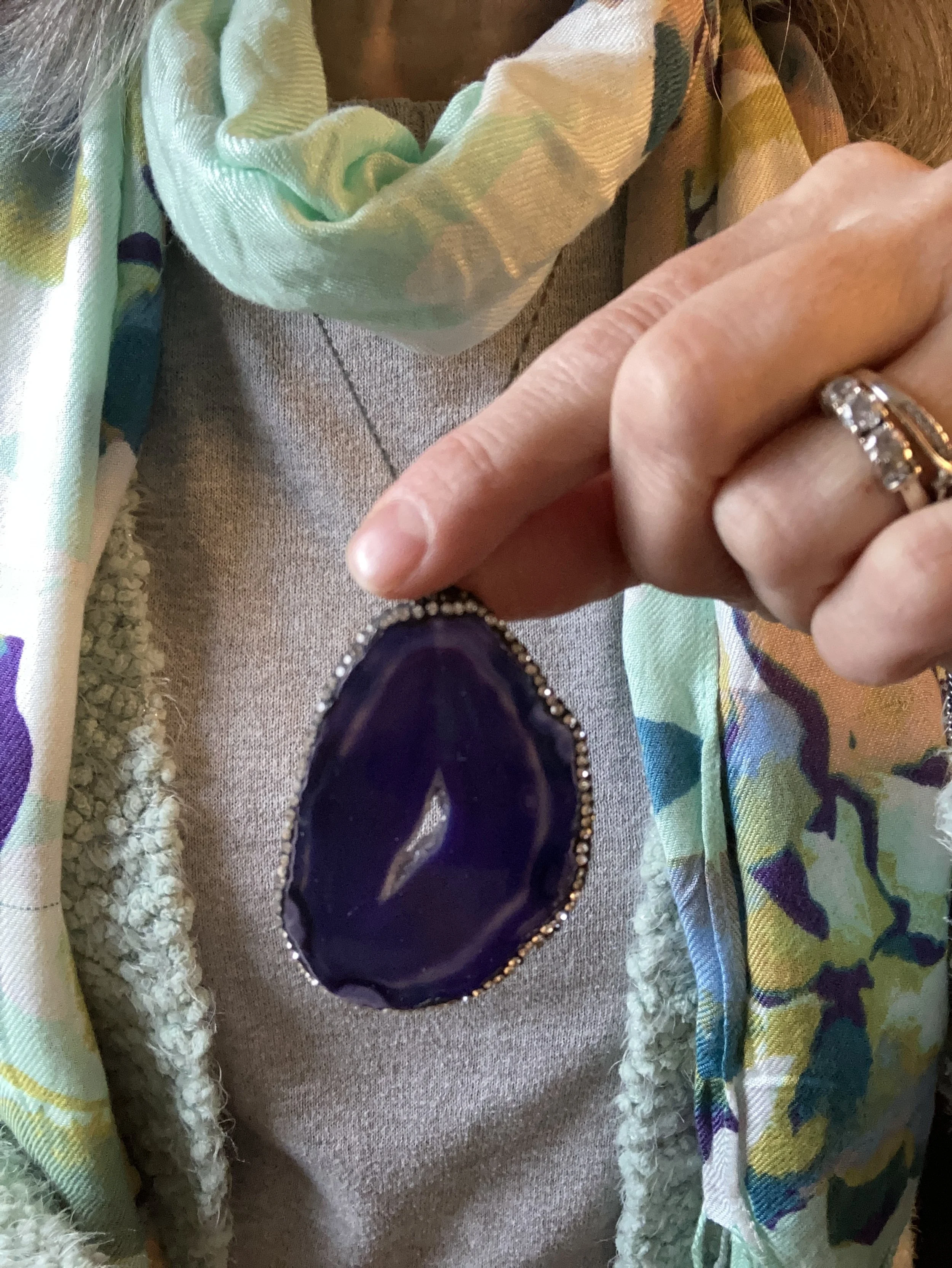
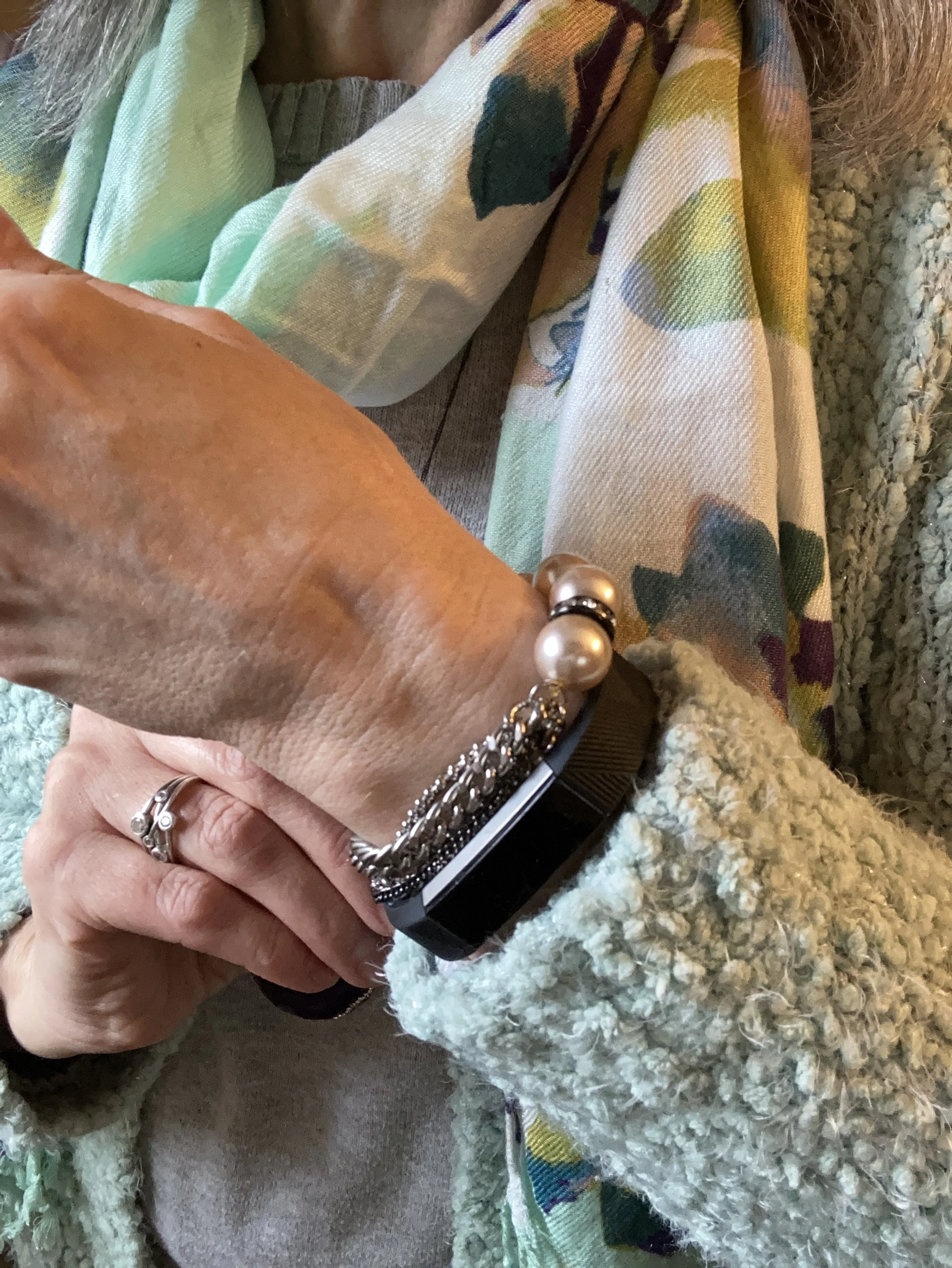
I chose pale pink for my other accessories, except my necklace which is dark purple agate. My cross body bag and my metallic Circus by Sam Edelman combat boots are both thrifted.

I thought I would add pictures to show you a few other ways to wear the scarf with this outfit.

What do you think of this outfit? I think the overall concept is a good one: cardigan, light weight sweater, pants/jeans, scarf and accessories. However, if I did it again I think I would swap out the the faded jeans for a dark black pair. I am also still not sold on the metallic combat boots. I am not sure why. I think they are adorable when I look at them, but when I put them on I feel unsettled. Ha, ha. Yes I do have an emotional relationship with my clothes.

Let me know what your thoughts are. I always love your feedback.

No shopping links this week. Be sure to stop by the blog on Thursday for another Mulling it Over Post where I continue to dive deep into Romans 8.

My Style: Goblin Core

You are probably looking at my title and thinking, what in the world is Goblin Core? I am so glad you asked. Ha, ha. Goblin Core is a newer aesthetic similar to Cottage Core, with its whimsical fancy, but with a darker, earthier vibe. For a refresher on Cottage Core check out this post I did on Cottage Core with an Edge.

I first learned about Goblin Core when I was perusing Pinterest and looking at Dark Academia aesthetics. You can see my Goblin Core board by clicking on the link. I only have six pins so far. If you look up style types you won’t typically find this style, but you might find something similar called Natural/Earthy. If I had to define Goblin Core I would say it is earthy with an edge, but the colors primarily revolve around earth tones and also embrace the idea of life and living things, so browns and greens. Wardrobe pieces are comfortable, even to the point of oversized or baggy and are robust with textures and details. Overalls, corduroy, baggy sweaters, combat boots, Mary Janes, patterned socks, grandpa style sweaters, and vintage pieces are all part of the Goblin Core style. I was drawn to the greens and browns of this style, so that is what I chose as I put my outfit together.

I feel like there is a bit of Gypsy influence in this style, perhaps due to the earthy colors, or the tiered skirts and vests. It has a similar feel to Bohemian style, but perhaps more grounded.

When I started putting the outfit together, I knew I wanted to pair green and brown, so the sweater came first. This is an older, thrifted Faded Glory piece. It is definitely getting pilly, but I still haven’t found an adequate way to get rid of pills that actually does a decent job. If you know of something, let me know! It is a great sweater with plenty of room, a little longer body, and nice textured stripes.

I then thought about a topper of sorts wondering if I should do a similar colored cardigan, utility jacket, or blazer, but the idea of brown kept coming back to me and I remembered I had this stupendous corduroy vest. This is a Liz Claiborne off shoot called Crazy Horse. This is a great vest with structure, but added stretch. I love it.

I initially had no intentions of using a skirt for my lower half. I was looking at jeans with embroidery, but then when I saw this skirt I knew I had the right combination. This has made multiple appearances on the blog and is a brand called Notations. I honestly do not remember what store I bought this at. It has been a while. You can see how I styled this piece with a graphic tee, in a Pantone outfit, and with a yellow jacket.

I decided to wear knee high boots instead of combat boots, or Mary Janes, because I’m me. These boots are recently thrifted XoXo brand, and seem to be in good shape. No they are not real leather, but I will hopefully get some wear out of them before they start to peel. I decided that if we can wear distressed jeans, why not distressed boots? Ha, ha.

I kept my accessories simple, as Goblin Core doesn’t seem to over embellish. My necklace was a thrift find and my bracelet was purchased from somewhere, which I also can’t remember. Eye, yie, yie. My brain!

My bag is another thrifted Fossil piece, and another one I really like. Olive will go with any other color, so definitely a versatile piece.

Looking back at these photos, I wish I would have used a better looking sweater, but it is what it is. I hate to get rid of something that still has plenty of wear. As I said, I need to find a way to eliminate pills.

I hope you enjoyed learning more about the Goblin Core style aesthetic. I like sharing these ideas with you and even if you don’t necessarily like a particular style I hope that it will still inspire you to be creative with your own clothes, making new outfits from the pieces already living in your closet.

I’m including a few shopping links for you to look over. Remember with Christmas on the way these also might be ideas for the loved once on your gift list. If you make a purchase through my site I get a few pennies. These shopping links are brought to you at no extra cost and all opinions are my own.

Have a great day!

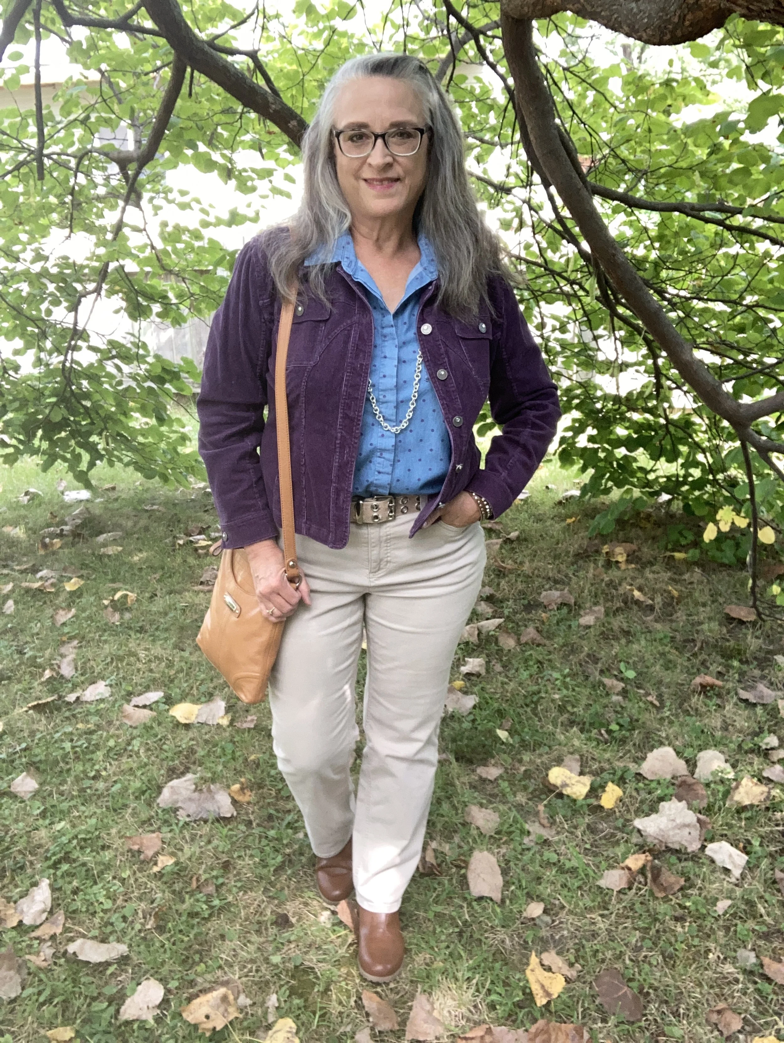
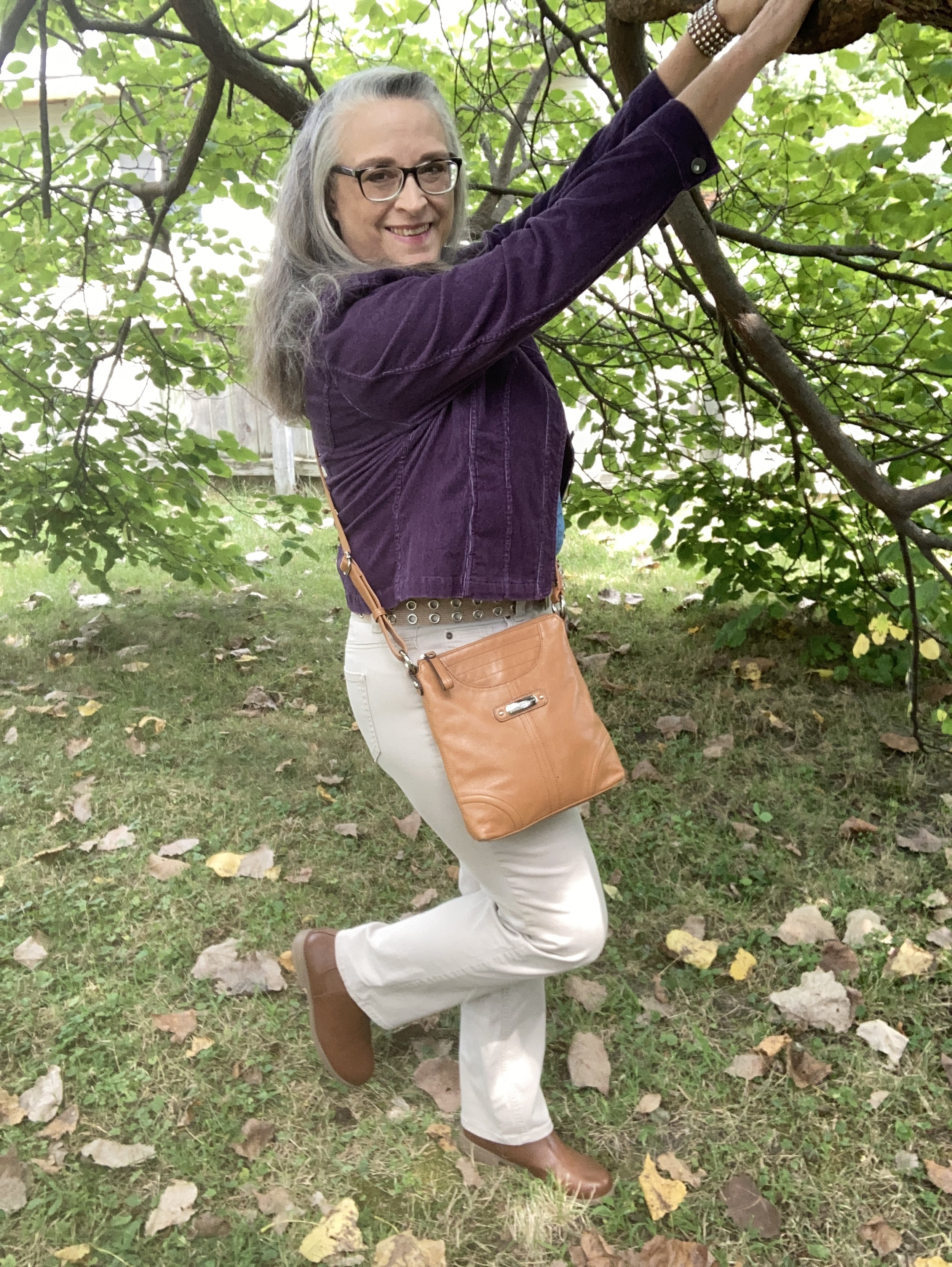
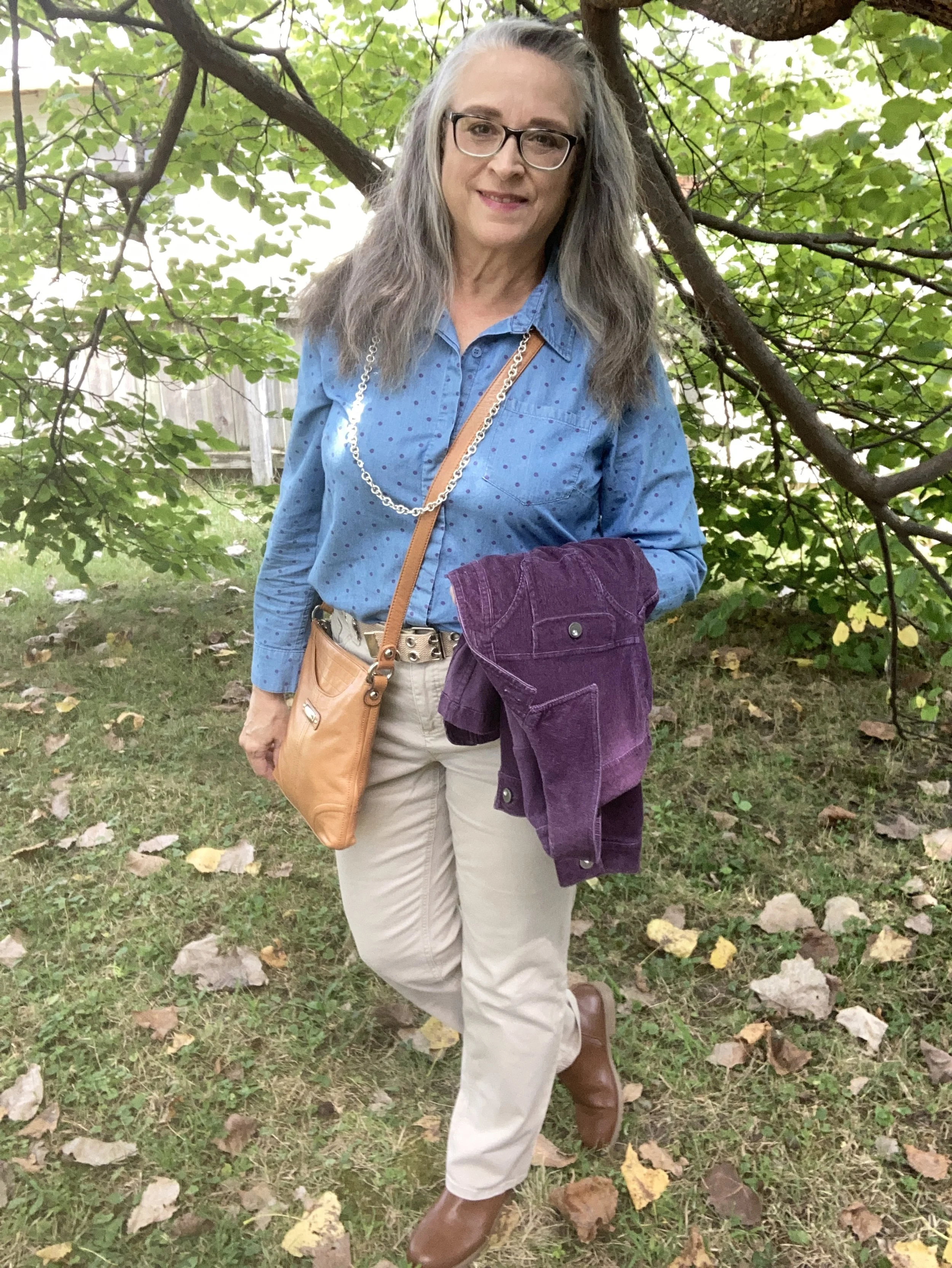
Outfit Inspiration: Pantone Autumn/Winter 2024 NY Palette: Italian Plum, Winter Sky, and White Swan

This week’s inspiration came from the Pantone Color Institute’s Autumn/Winter 2024 New York Palette. The three colors I am featuring were fairly easy to find in my wardrobe. My colors may not match spot on, but they are close enough. Feel free to look at the exact colors as given by the Pantone company by clicking on the above link. This week the two main palette colors are the dark purple called Italian Plum, and the blue called Winter Sky. The creamy color is from the classics palette and is called White Swan.

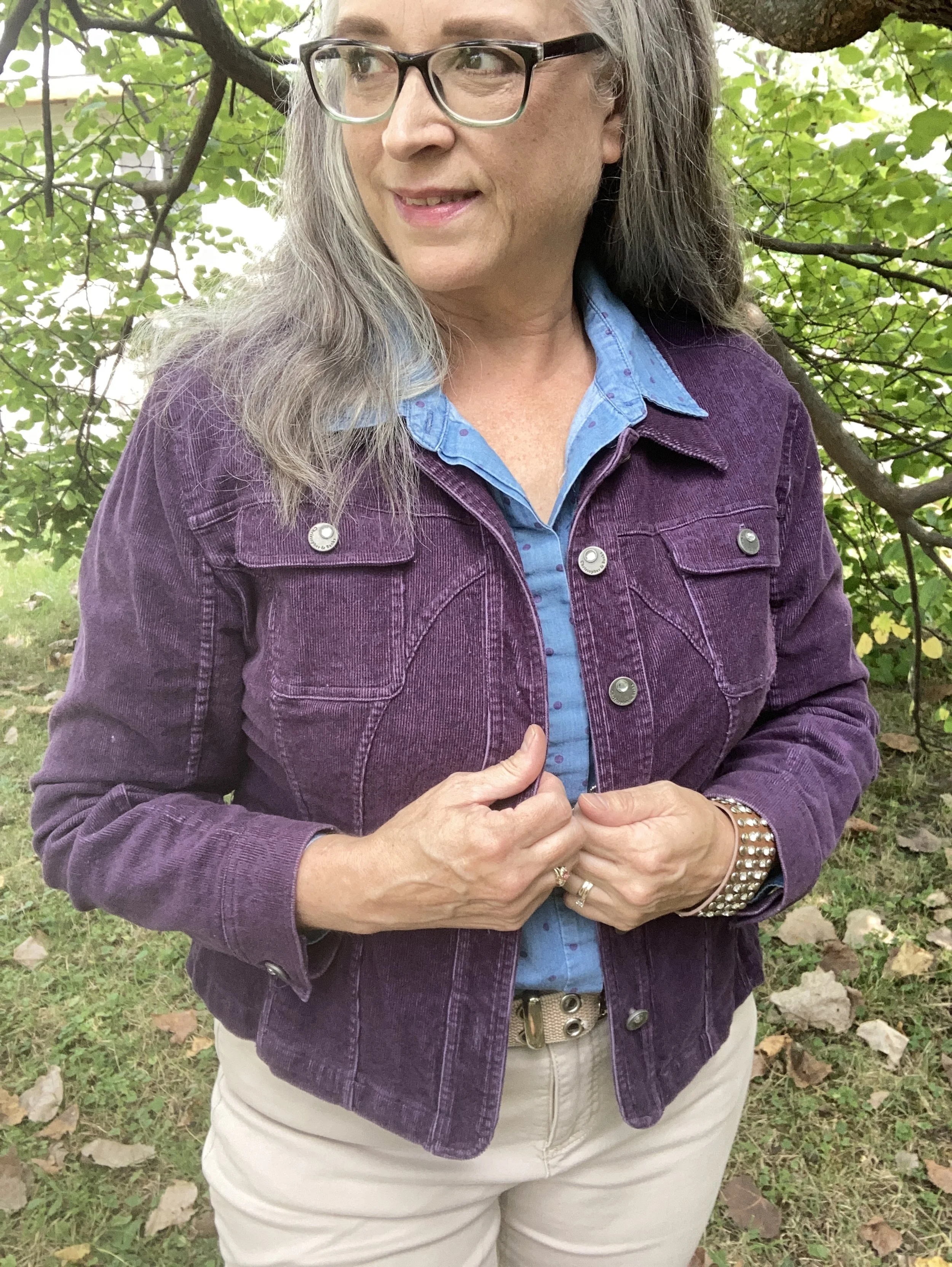
My Italian Plum corduroy jacket is a thrifted Christopher & Banks piece. It is actually a petite large, but I like that it has more of a cropped look. I like the different seams on this piece, and corduroy is perfect for cooler weather.

Style Tip: Shop sizes outside your normal because sizing is different across many manufacturers, and you might like how the piece looks if it is a bit shorter, longer or oversized.

Here are a few possibilities, but there isn’t much out there in this color.

My polka dot Winter Sky top is another Christopher & Banks piece that I bought on a sale back when we had a store in our area. A chambray piece the purple dots were a fun addition to the normal denim style shirt.

My light colored White Swan pants are Croft & Barrow brand from Kohl’s clearance a few years ago. They are plain and simple and sometimes that is just what an outfit calls for.

Style Tip: Not every outfit needs pants or skirts that are texturized or embellished. Sometimes, the simpler the better. Plain pants are typically better for work if you don’t have a uniform provided by the company.

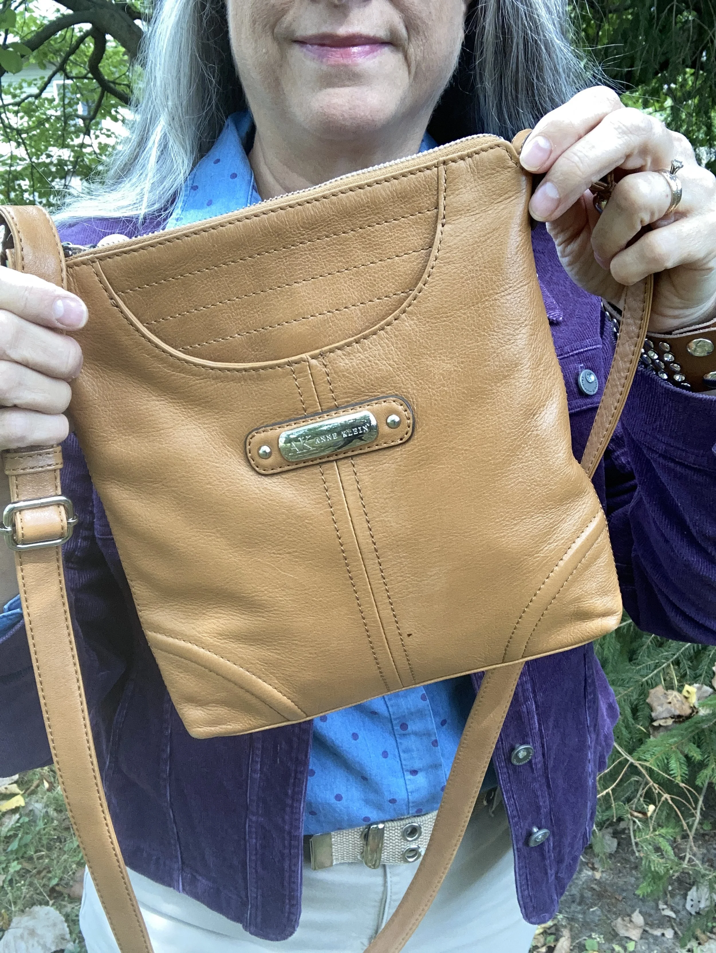
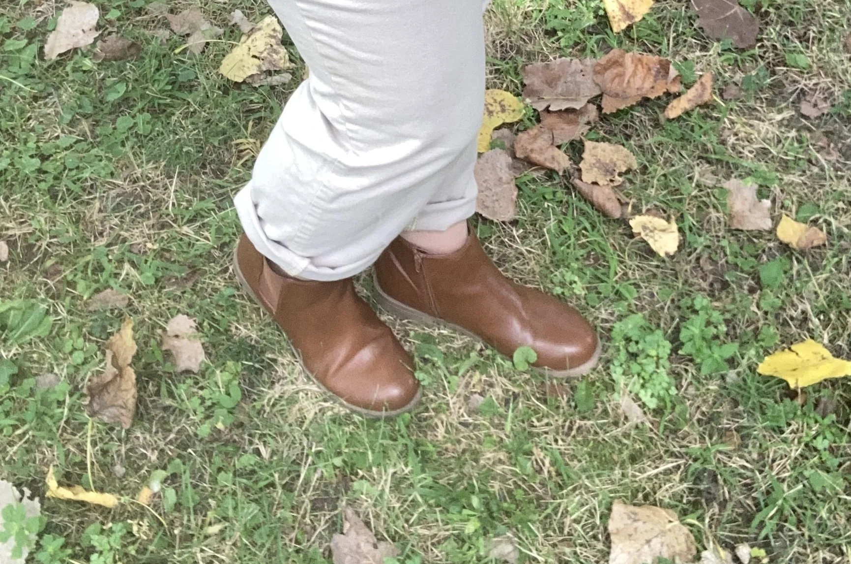
I kept my accessories fairly simple as well. I opted for tan as my color of choice for both my bag and boots since that seems to be trending this fall. I also chose silver as my jewelry color.

What do you think of these Pantone colors? I love purple anyway, so this darker color is a fave, especially for fall. Do you think the a chambray shirt would have worked with this purple jacket and lighter colored pants even if it didn’t have the purple dots on it?

I hope you enjoyed this post. Let me know your thoughts on these colors. Have a great week!

Shopping links are affiliate links, but all opinions are my own.

Color Play: Pantone Autumn/Winter 2024 - Golden Palm, Lucent White and Raw Umber

I have decided to revisit the Pantone Color series that I have done in the past. You know how I love color and trying new ways of combining colors in outfits that not only stand out, but that make us feel comfortable and confident. I am going to start with the New York Palette, after which I will decide if I am going to continue with the London Palette or move on to other things.

If you are not familiar with the Pantone Color Institute, they are “recognized globally as a leading source of color expertise.” (Pantone home page.) They work across many disciplines and areas to provide color inspiration and education. The fashion industry is just one of many areas where Pantone has input. Every year they typically post two seasonal color palettes, one for Spring/Summer and one for Autumn/Winter. These palettes vary between two main fashion centers - New York and London.

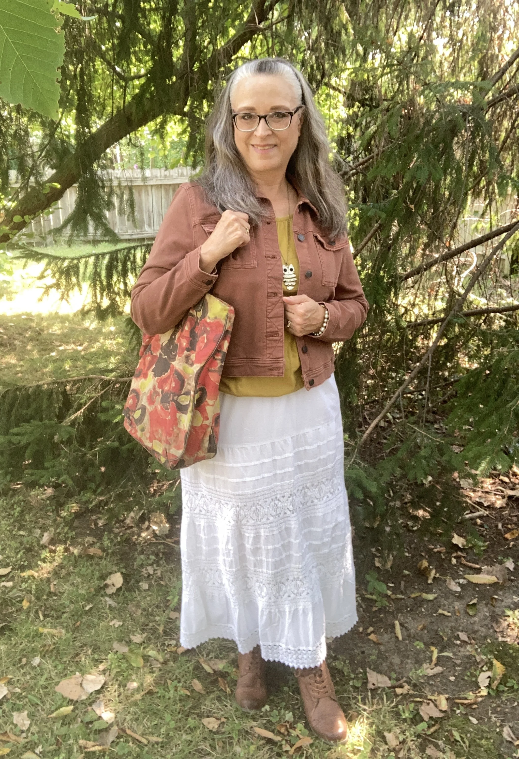
As I have done in the past, I am going to combine three colors in each outfit; two from the main color palette and one from the classics color palette. Today’s outfit revolves around the following colors: Golden Palm, a bright mustardy yellow; Lucent White, a bright, pure white; and Raw Umber, a medium earthy brown.

It always seems to be the case that when I am going to take pictures of fall outfits it is hot and humid! Ha, ha. It was almost 90 when I took these pictures, so if I seem to be glowing that is why.

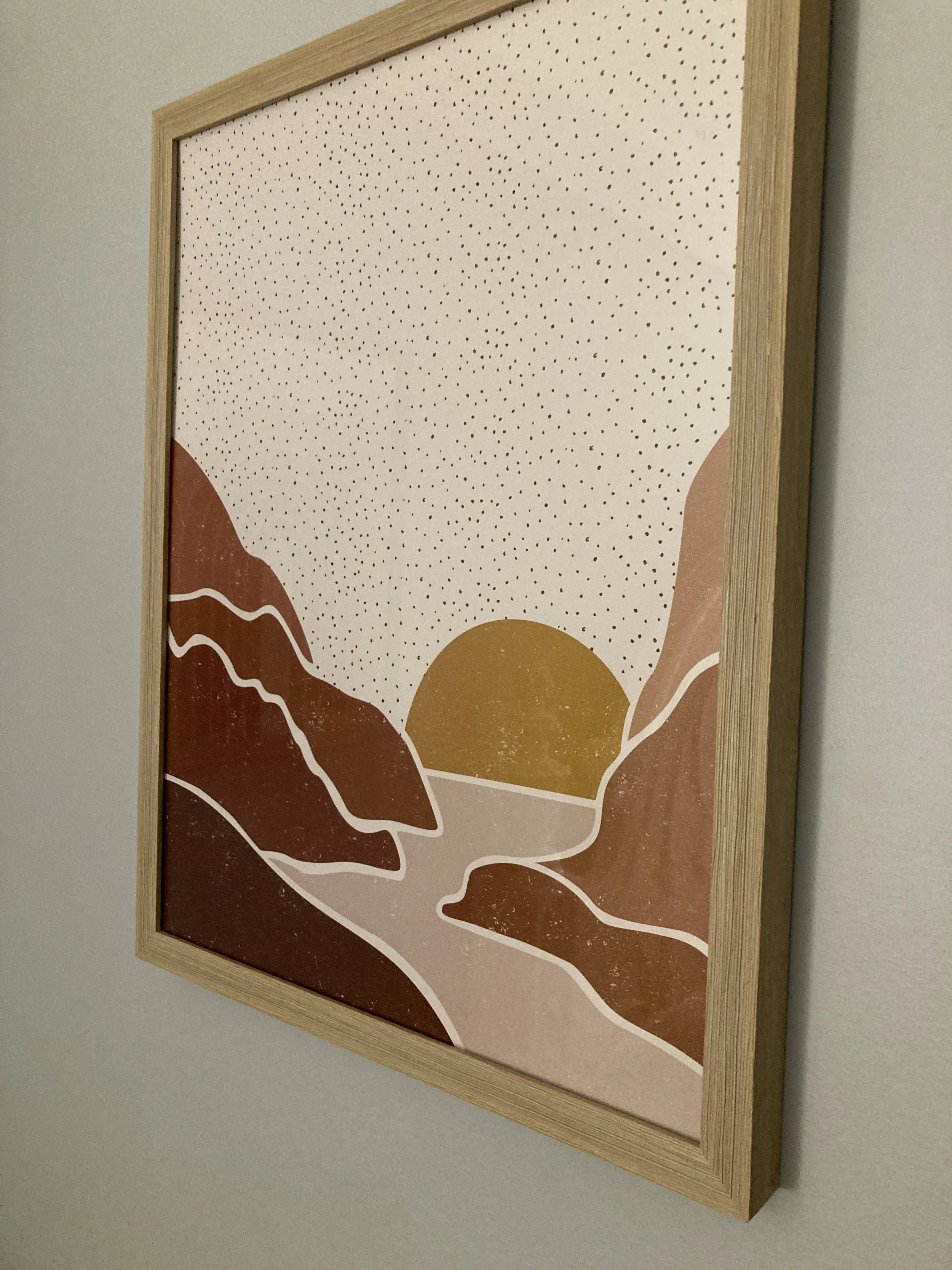
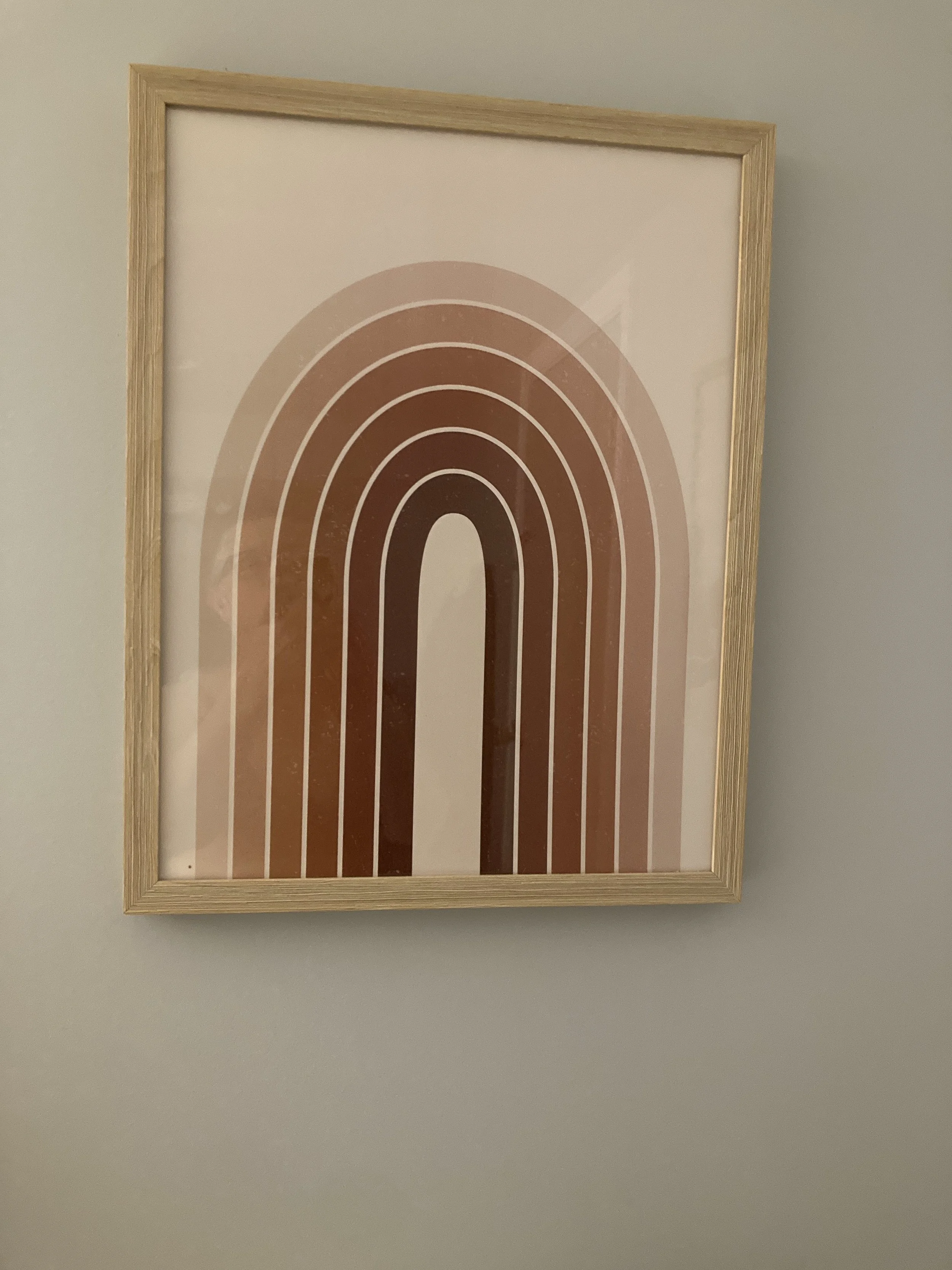
The inspiration for this outfit actually came from a piece of artwork hanging in the little apartment we rented on our last getaway to central Ohio. These two pieces of artwork hung in the bedroom, and so I took a couple of pictures, knowing I would use them for outfit inspiration at some point. How fun that three of the colors were on the Pantone Autumn/Winter 2024 New York Palette!

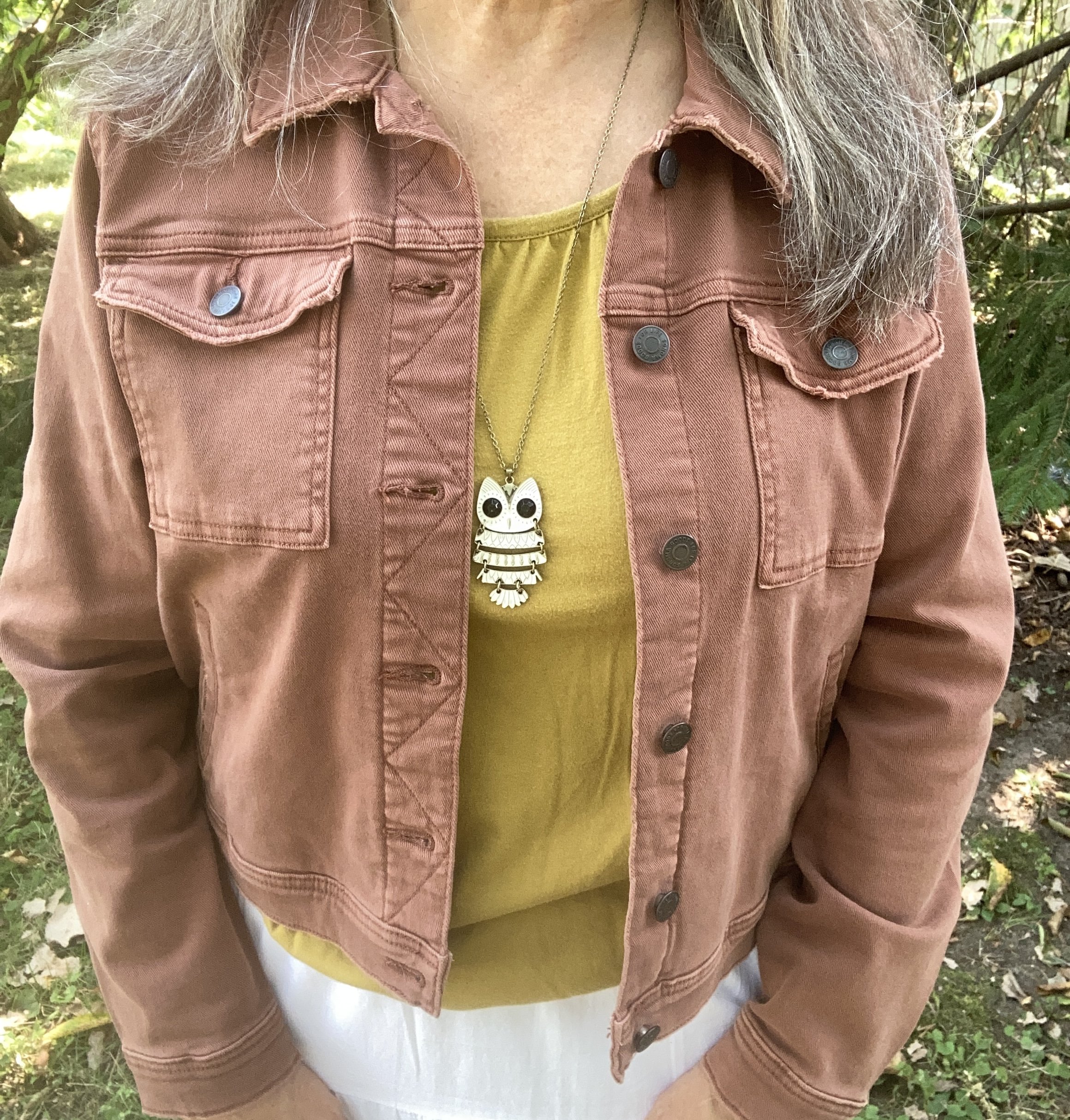
The first piece I chose for this outfit was the Golden Palm Sonoma tee. I have had this for years. A thrifted piece, I have used it in other outfits on the blog. You can see it with a brown cardigan, a snakeskin print skirt, a purple skirt, and an embroidered denim jacket.

This picture also shows you a close up of the jewelry I chose for this look. I thought the white owl, and the pearly gold mix of the bracelets tied in quite well with the skirt.

My Lucent skirt is another piece I have had for a number of years. I love a tiered maxi as it speaks to my inner boho soul. This one is especially fun with its lace and textured details. This is St. John’s Bay from JC Penney. You can see how I styled this on the blog before with a striped tee, a pink striped sweater, a green top and jacket, and a brown moto jacket.

My cropped, Raw Umber, denim jacket is a newer piece. I bought this last year from Kohl’s and it is Sonoma brand.

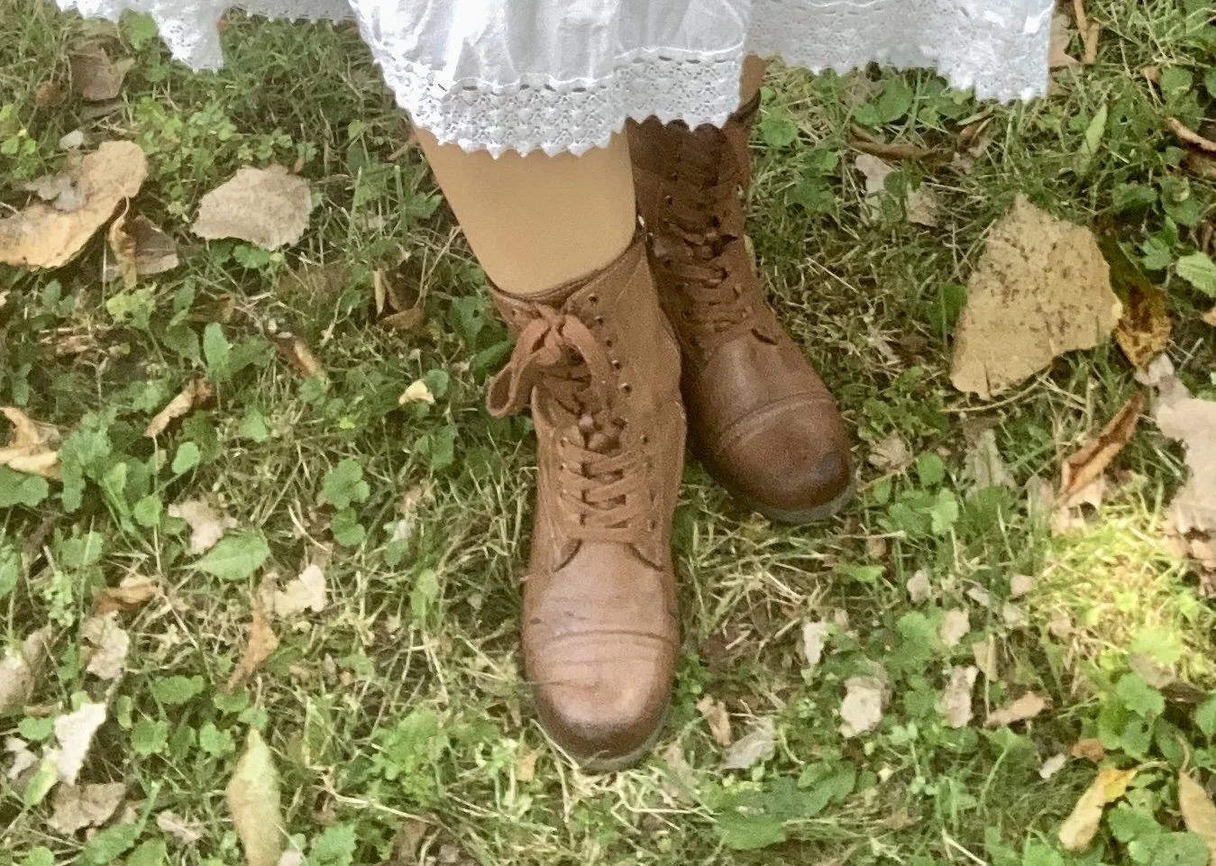
For my accessories, besides my white jewelry, I chose my colorful, fall-ish tote bag. This is a Simply Vera, by Vera Wang piece that I found on clearance at Kohl’s a number of years ago. I also added my thrifted brown combat boots.

What do you think of Golden Palm, Lucent White and Raw Umber? Do you have any of these colors in your closet? What other colors do you think any of these would look good with? Let me know your thoughts in the comments. I always enjoy hearing from you!

I am providing a few shopping links for similar items. These shopping links are brought to you at no additional cost. These affiliate links which when purchased through a link gives me a few cents as a commission. All opinions are my own.