Pantone Spring/Summer 2026 - New York Palette: Muskmelon, Marina, and Sage Green
Hi everyone! It is time for another Pantone color series. If you are new to my blog, every spring and every fall the Pantone Color Institute comes out with a palette of colors for the coming season. Due to life being relentless, I usually don’t cover these colors until we are well into the spring and/or fall season, but I have had many of you tell me that you enjoy this series, so I decided to just keep doing it even if I am a bit behind.
Instead of trying to put together the colors on the palette by my own choices I made it easy on myself and simply went down the column of colors on the Pinterest pin which you can see here. As you can see in the first column we have today’s colors: Muskmelon, Marina and Sage Green. As per usual the first ten colors on the palette are the new colors for the season and the last six are the classic colors. Both the New York and the London palette contain a color named White Onyx, which I may or may not include in an outfit or two. I feel that white is a personal choice when it comes to fashion. Some women look better in cream, others look better in a crisp white, so I leave the whites for you to decide.
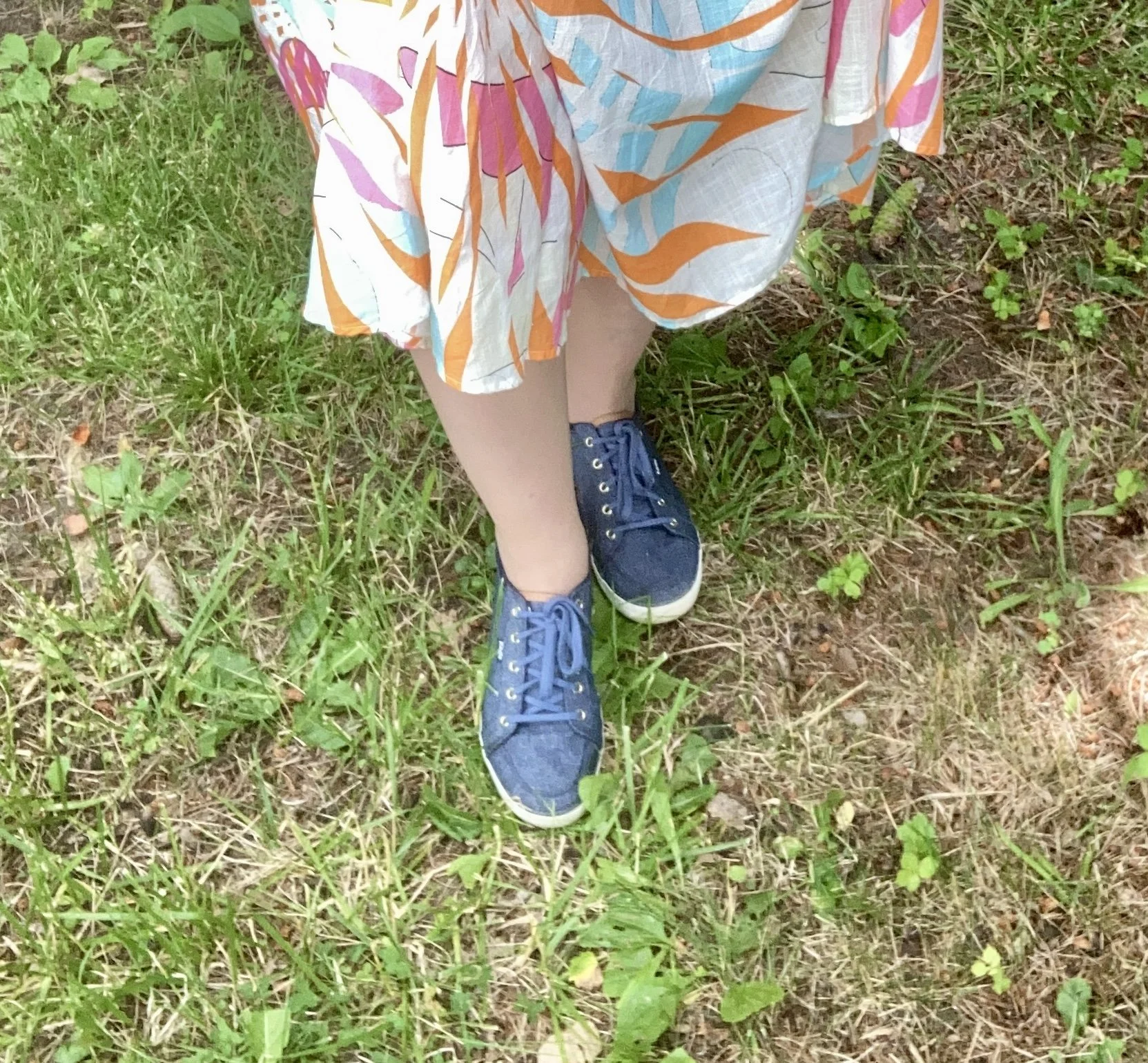
Style Tip: You can easily add white, in whatever variation you like to wear, to an outfit in the form of a bag, beads, a scarf, or a pair of sandals or sneakers.
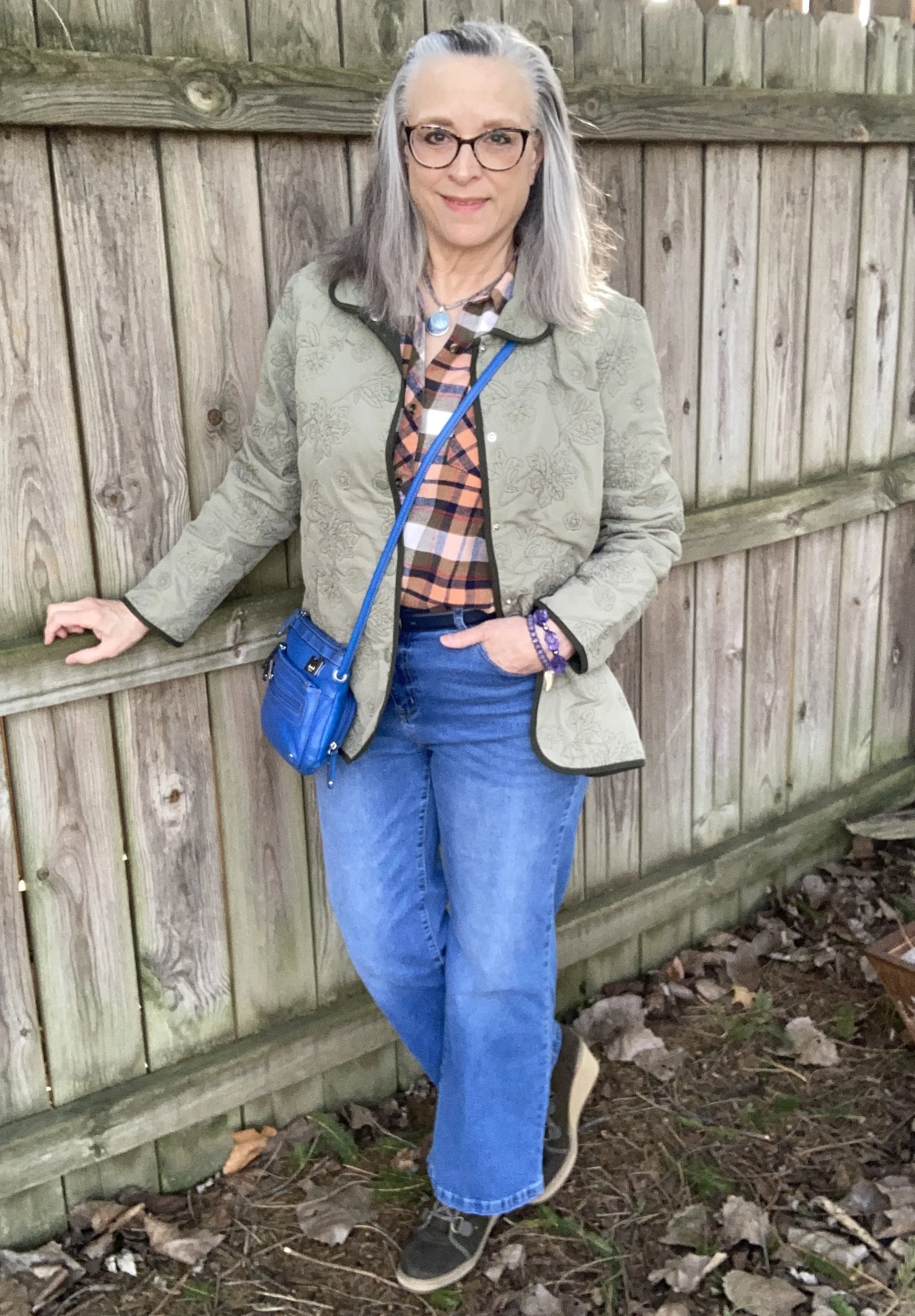
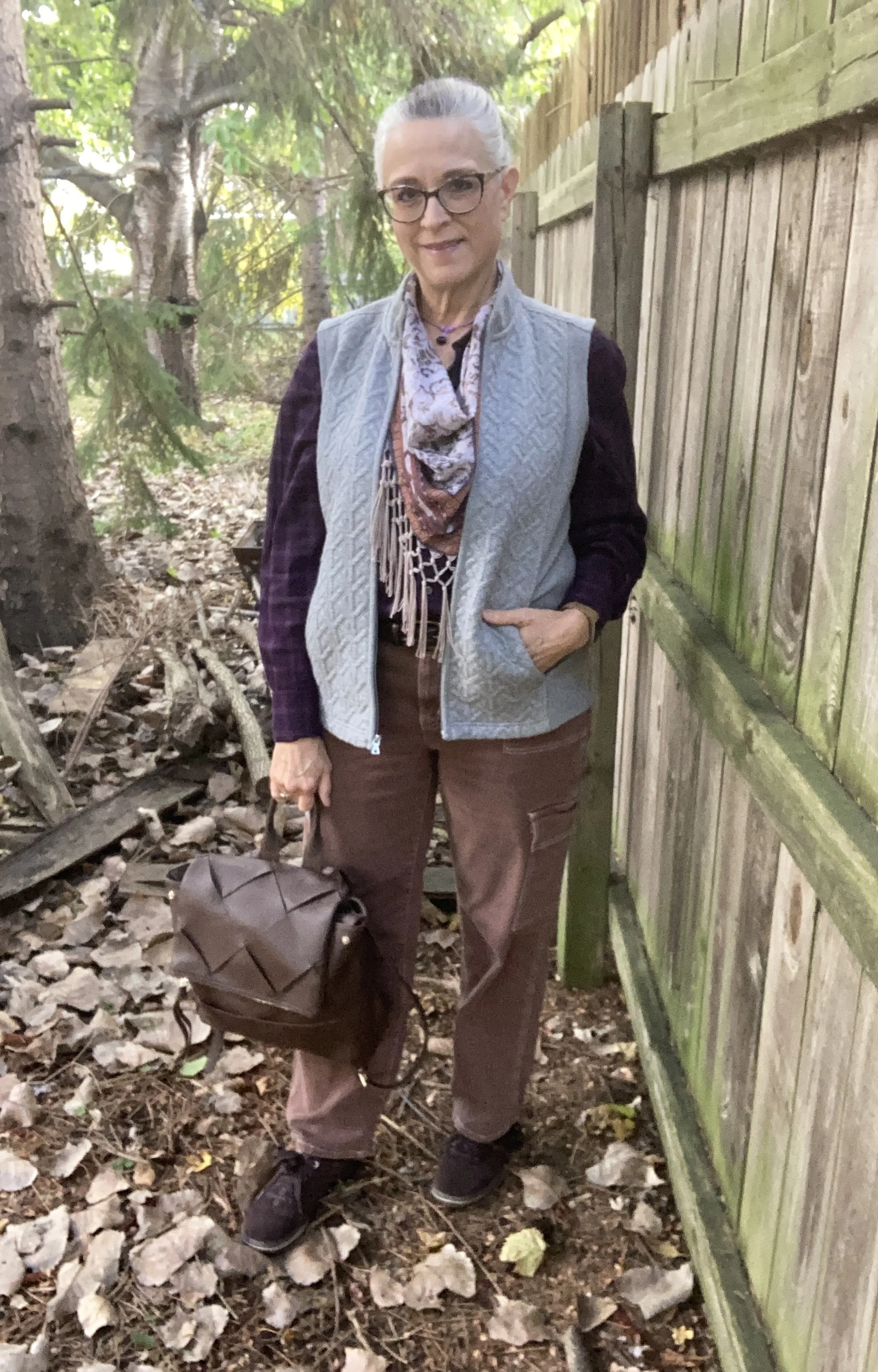
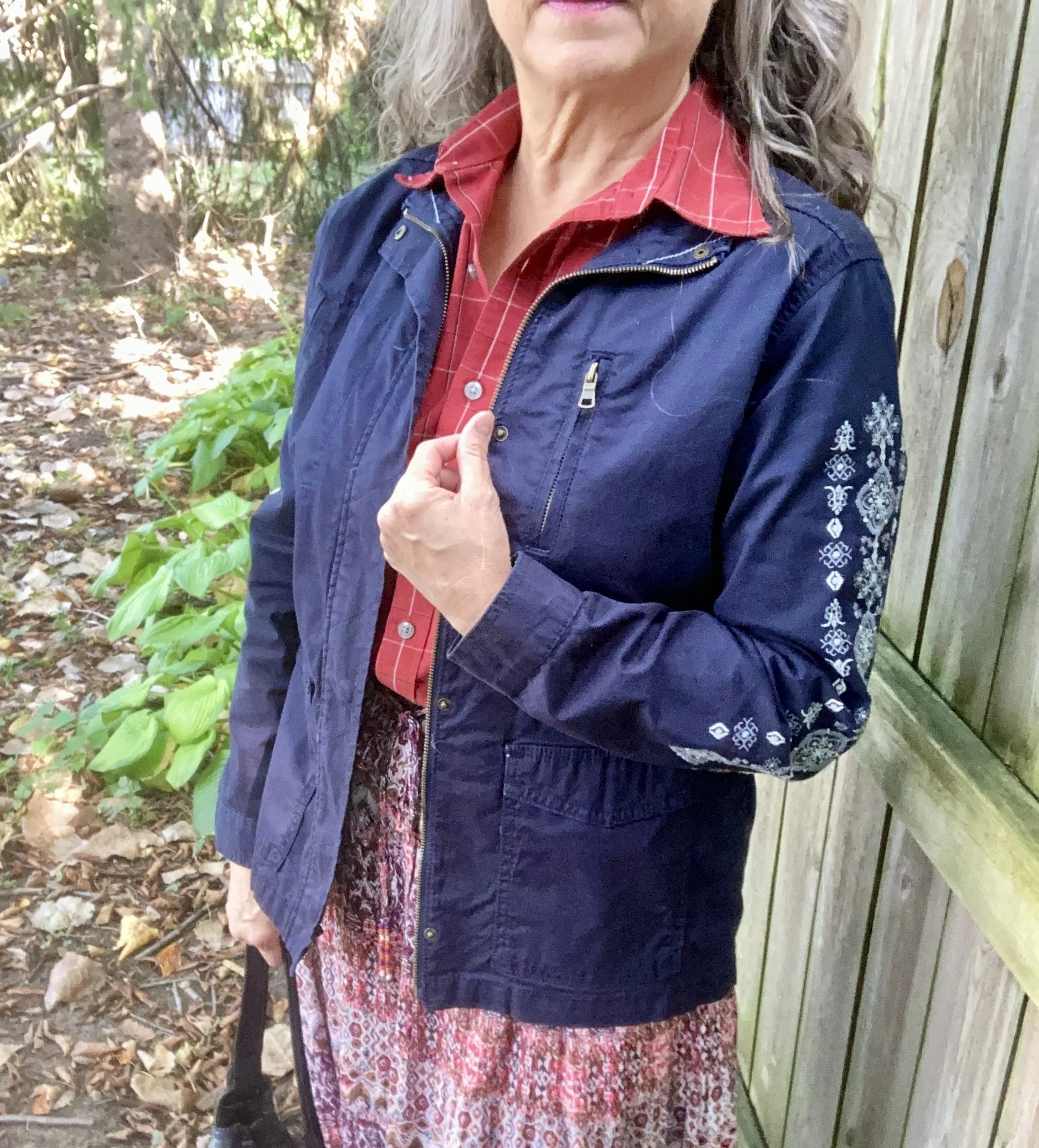
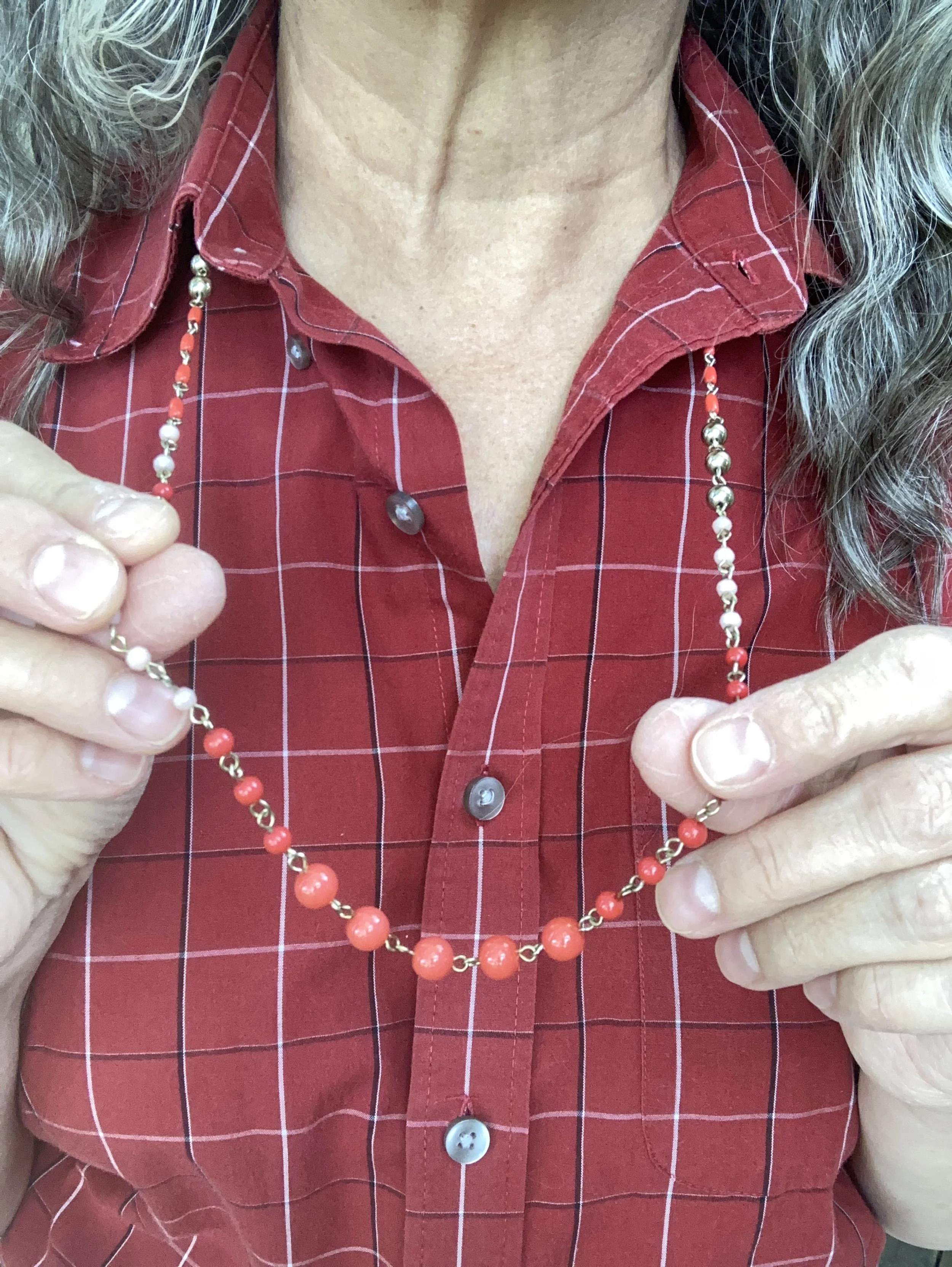
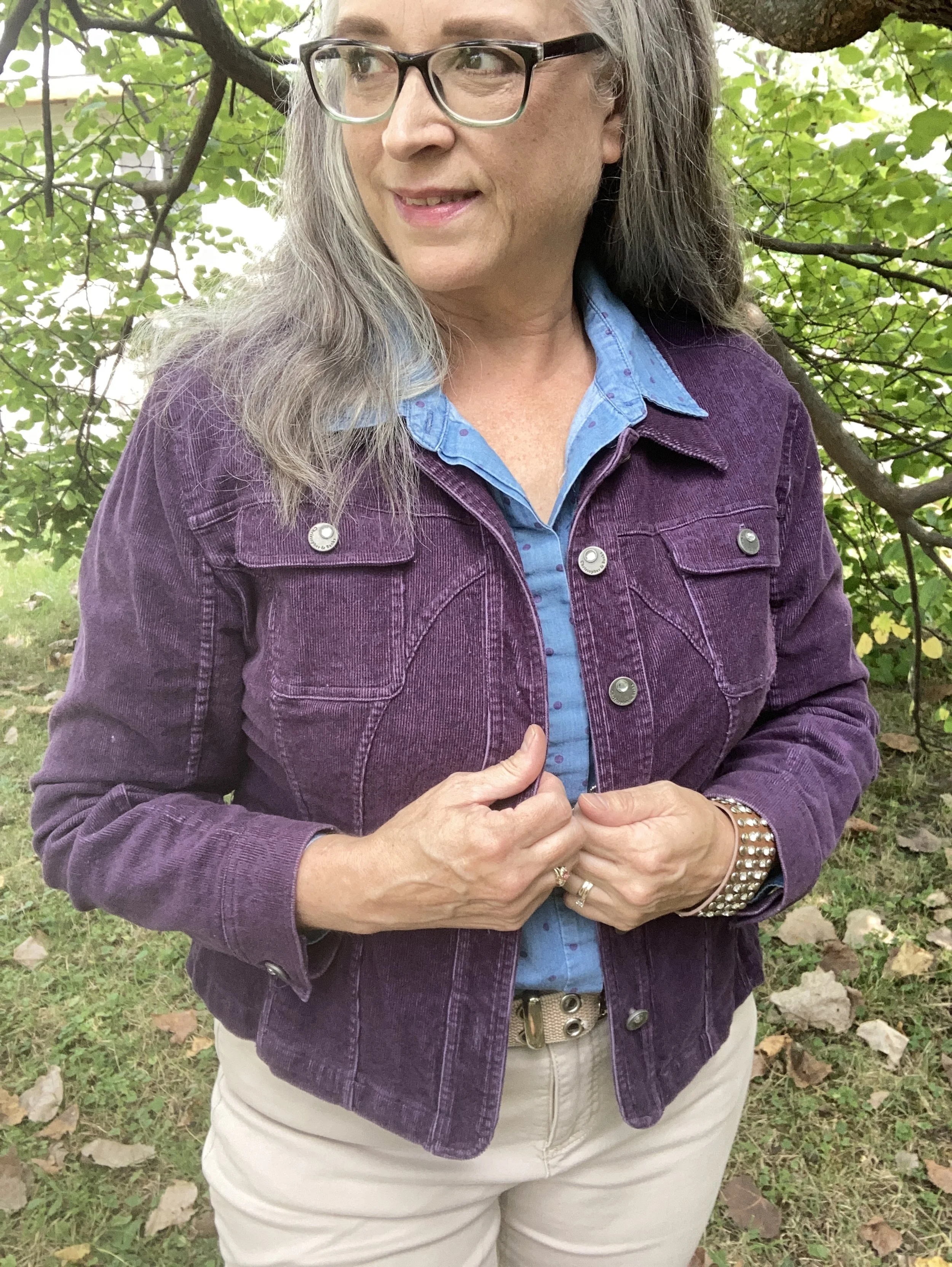
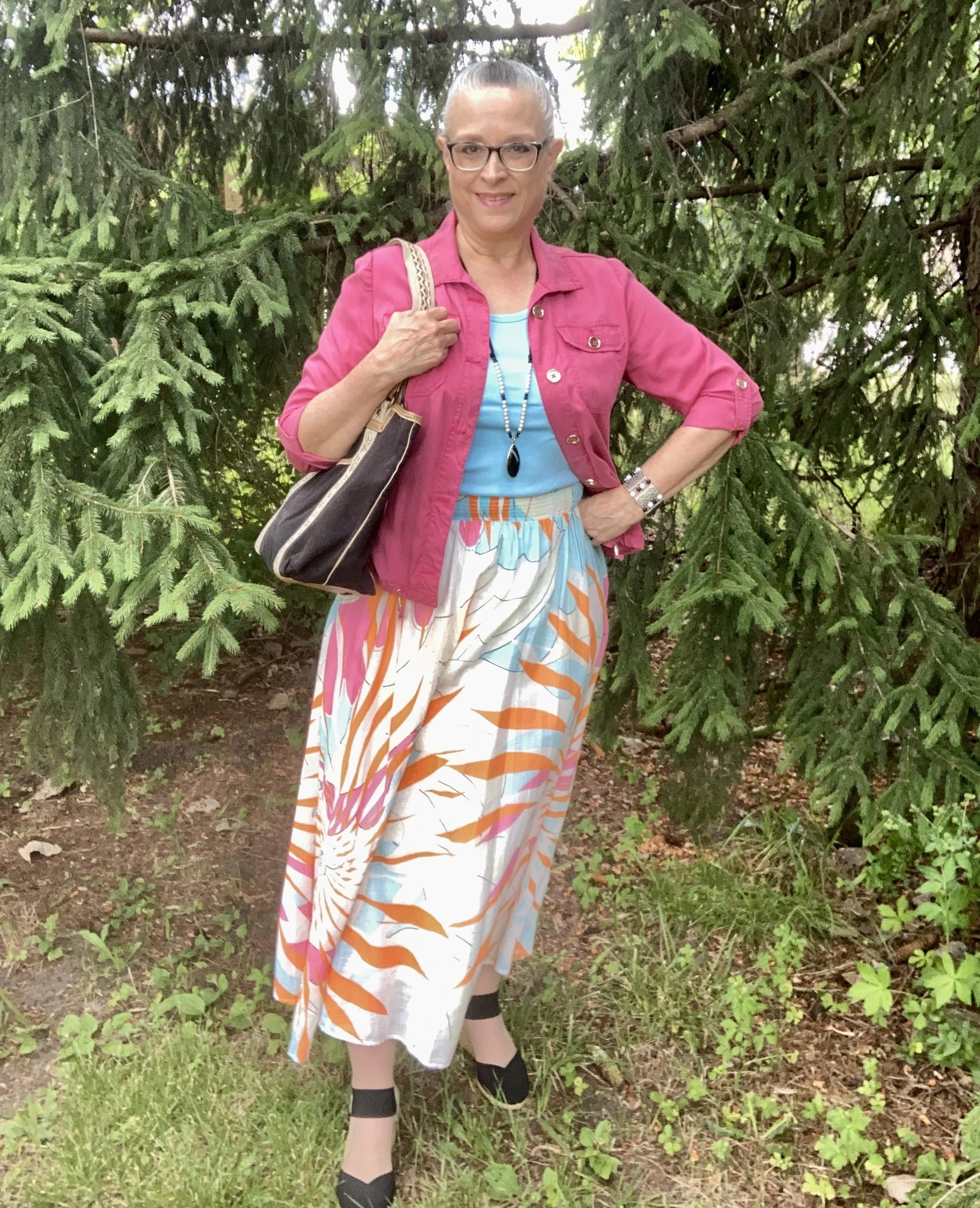
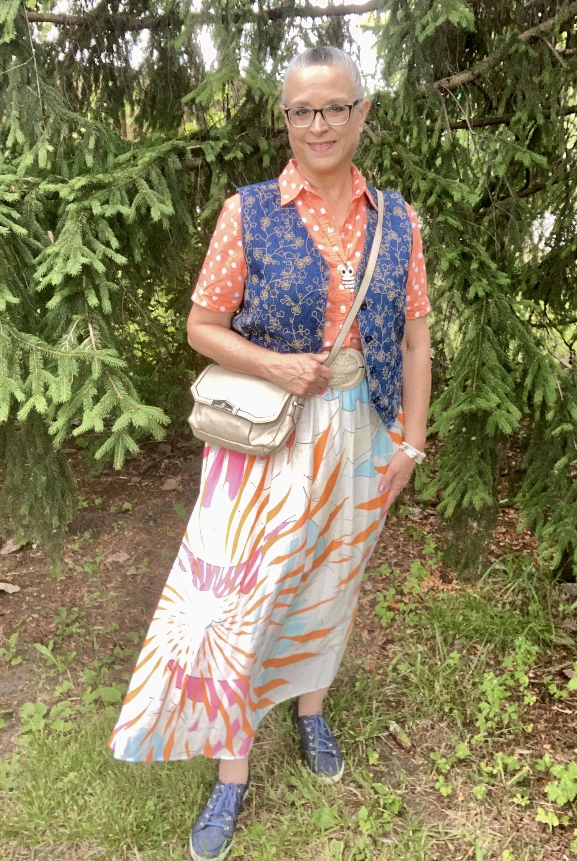
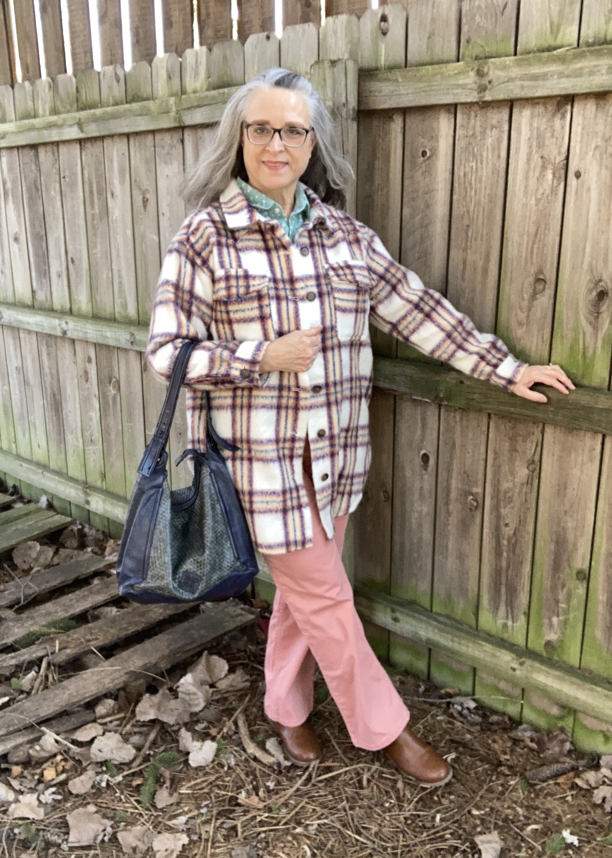
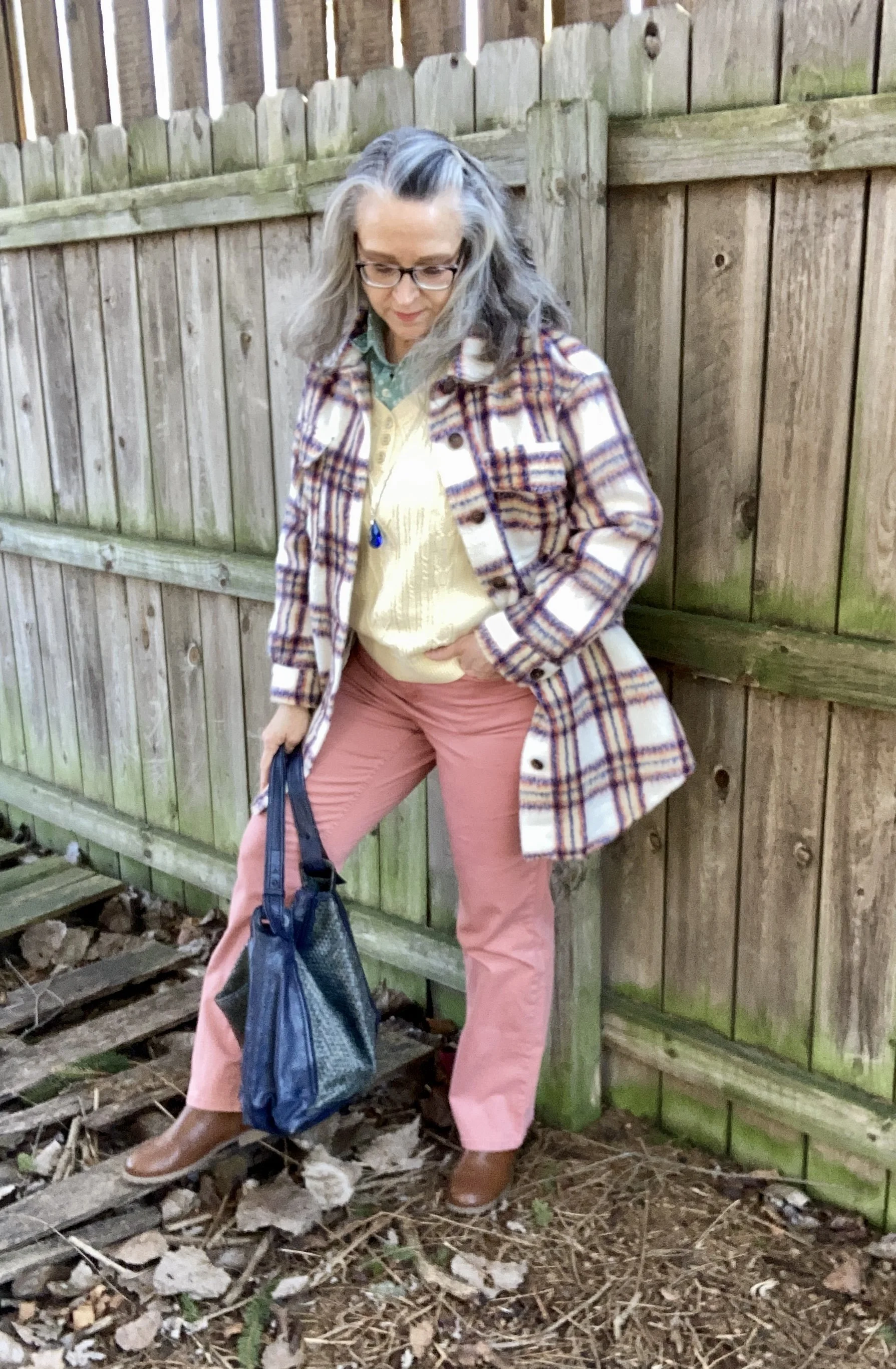
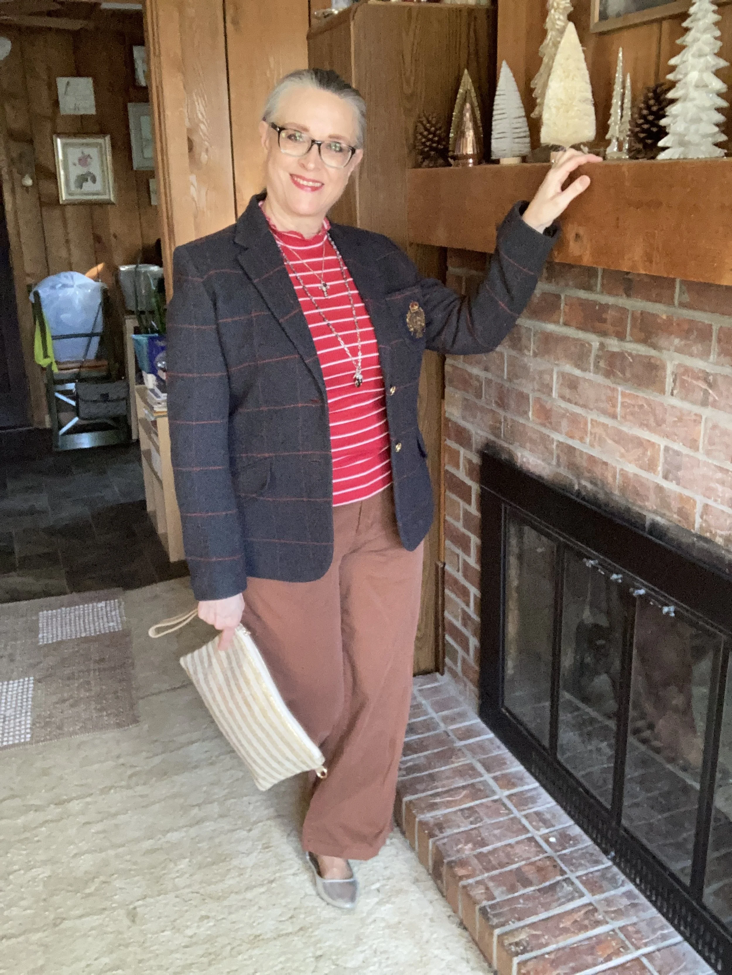
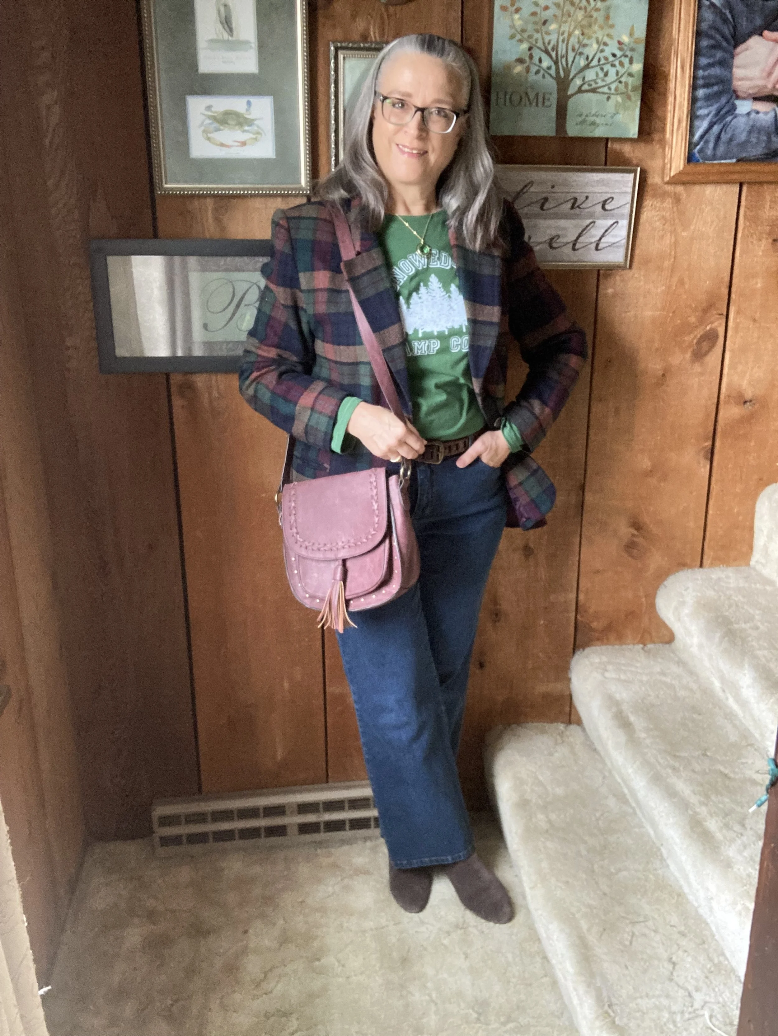
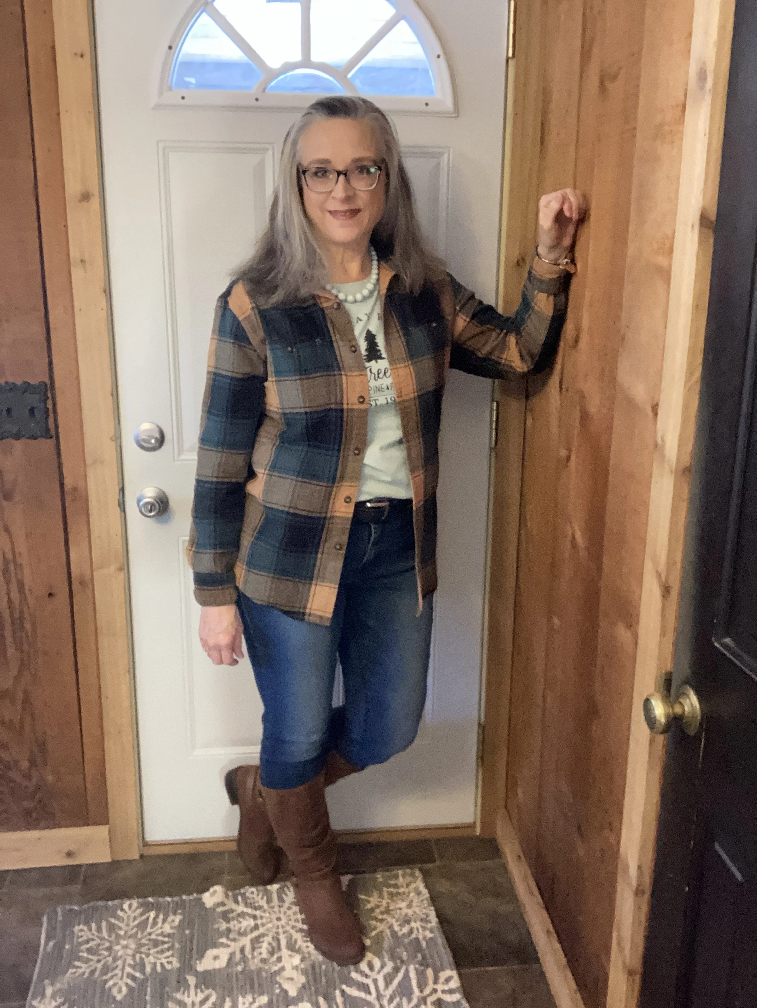
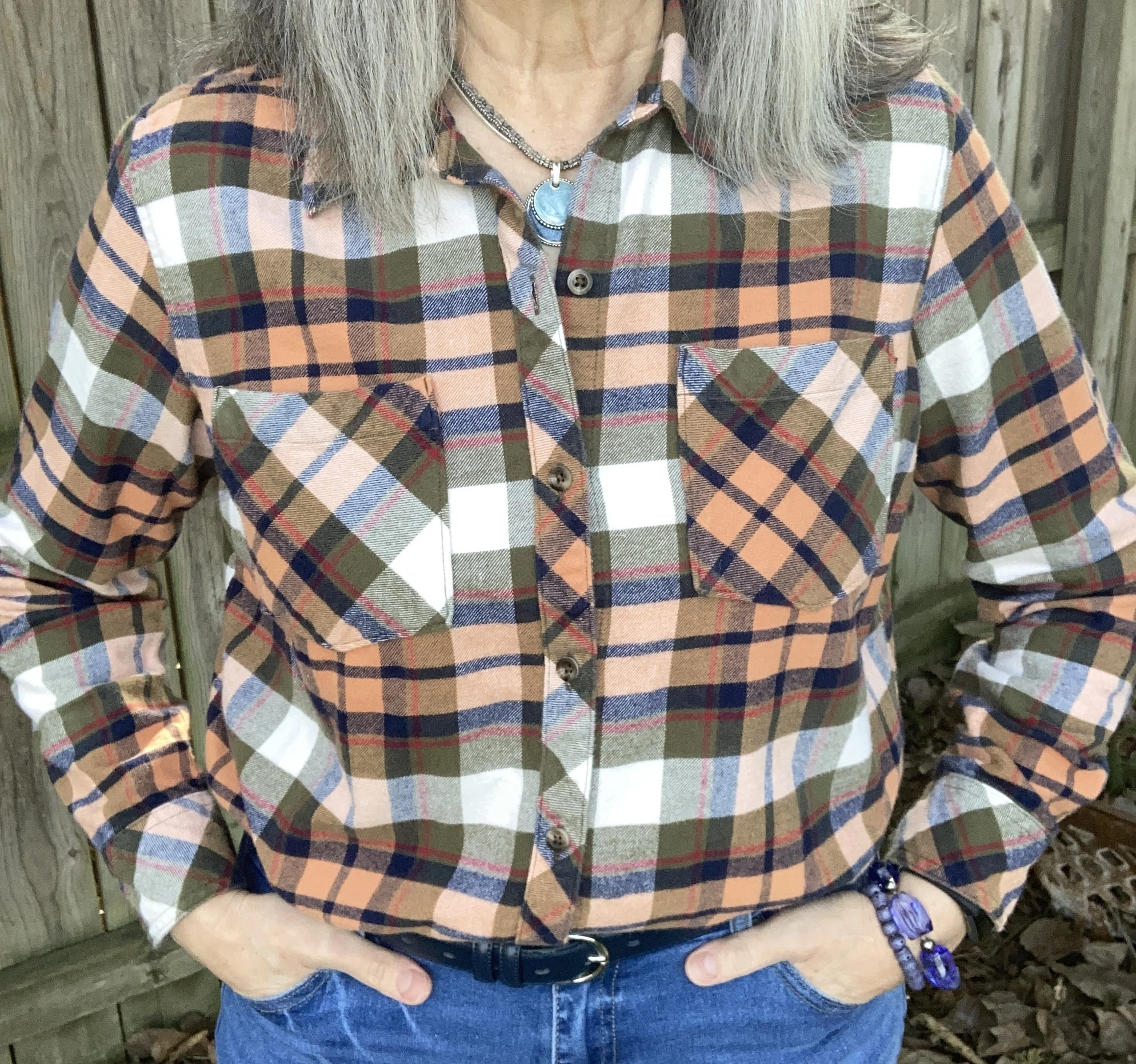
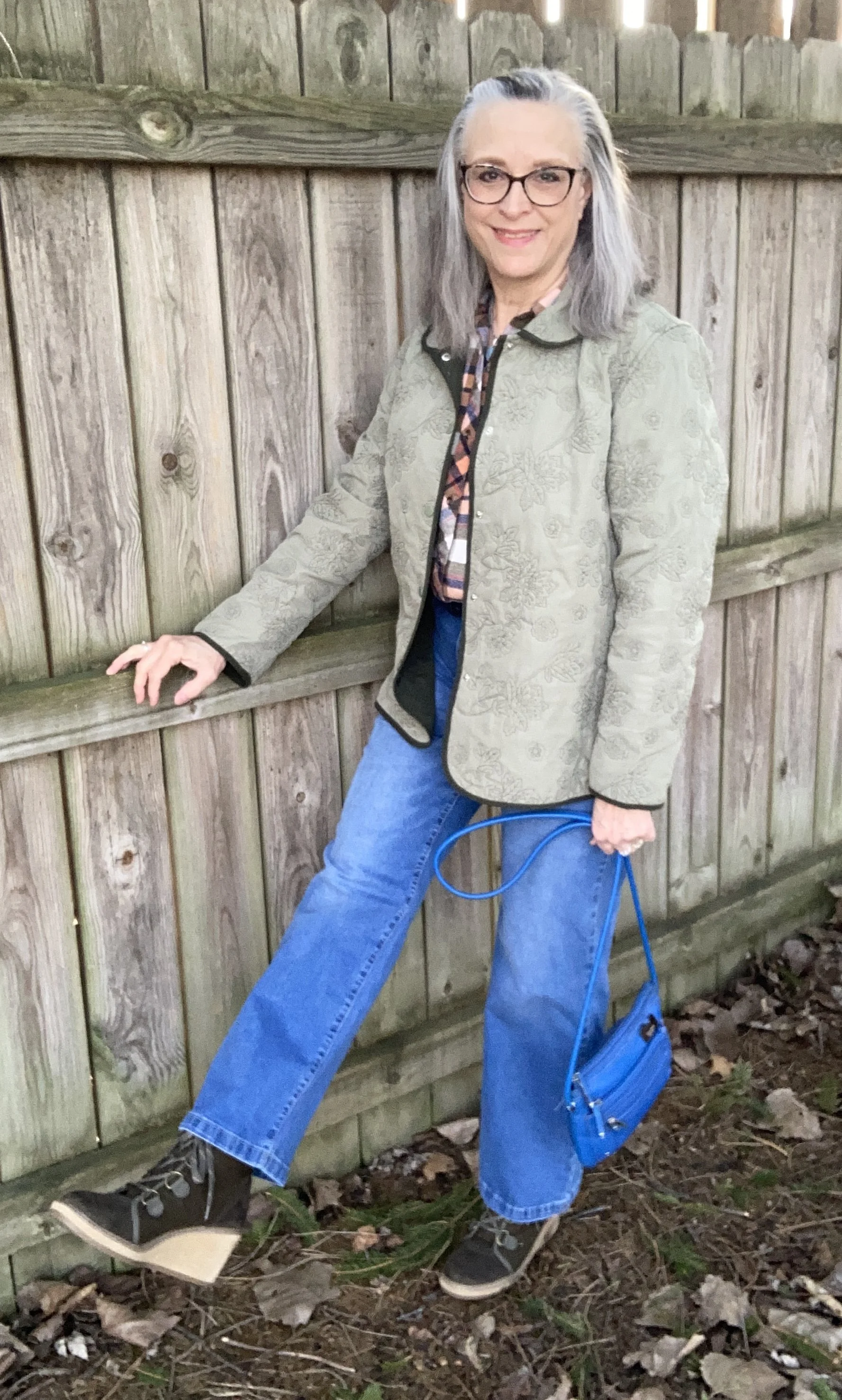
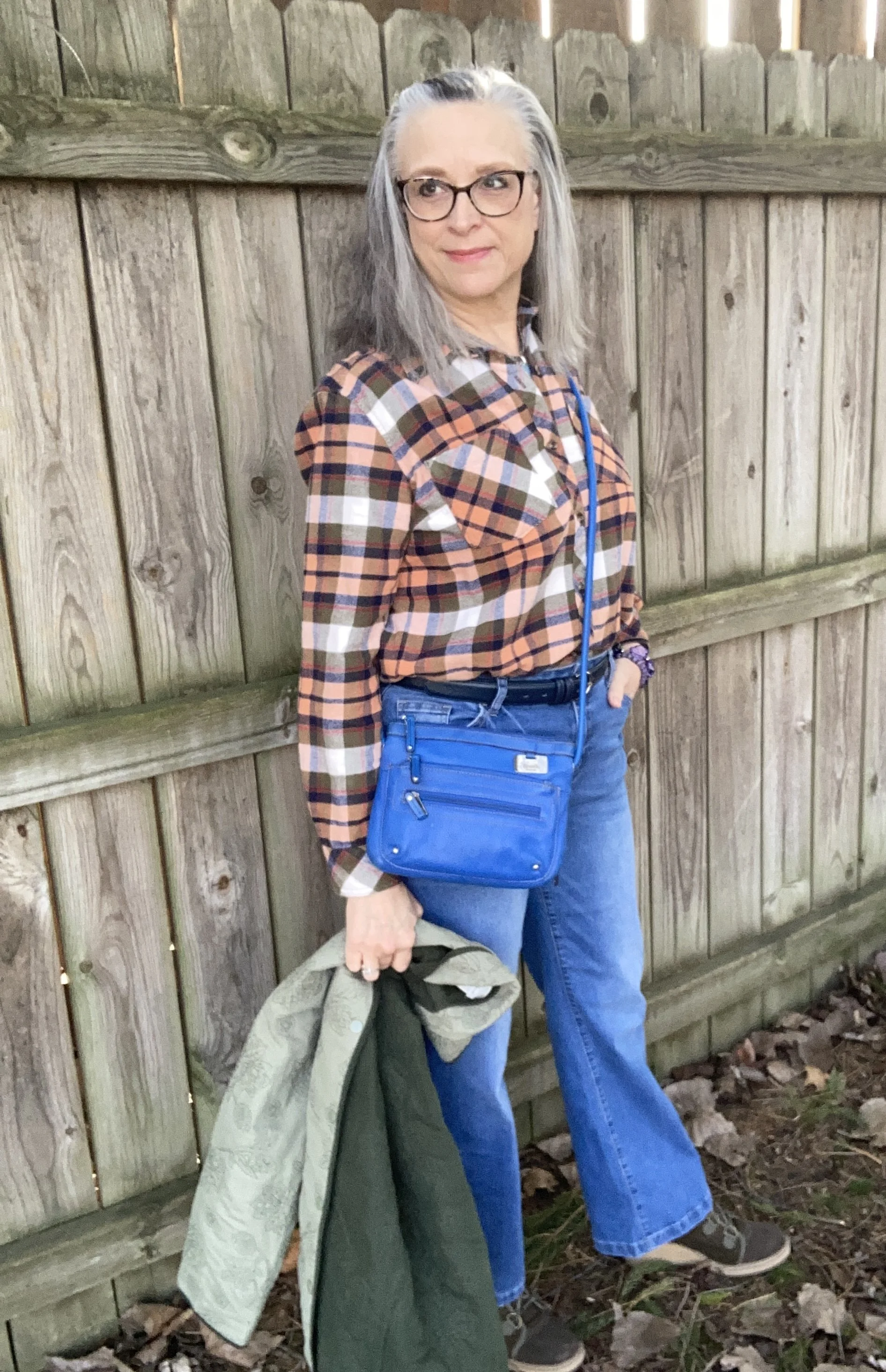
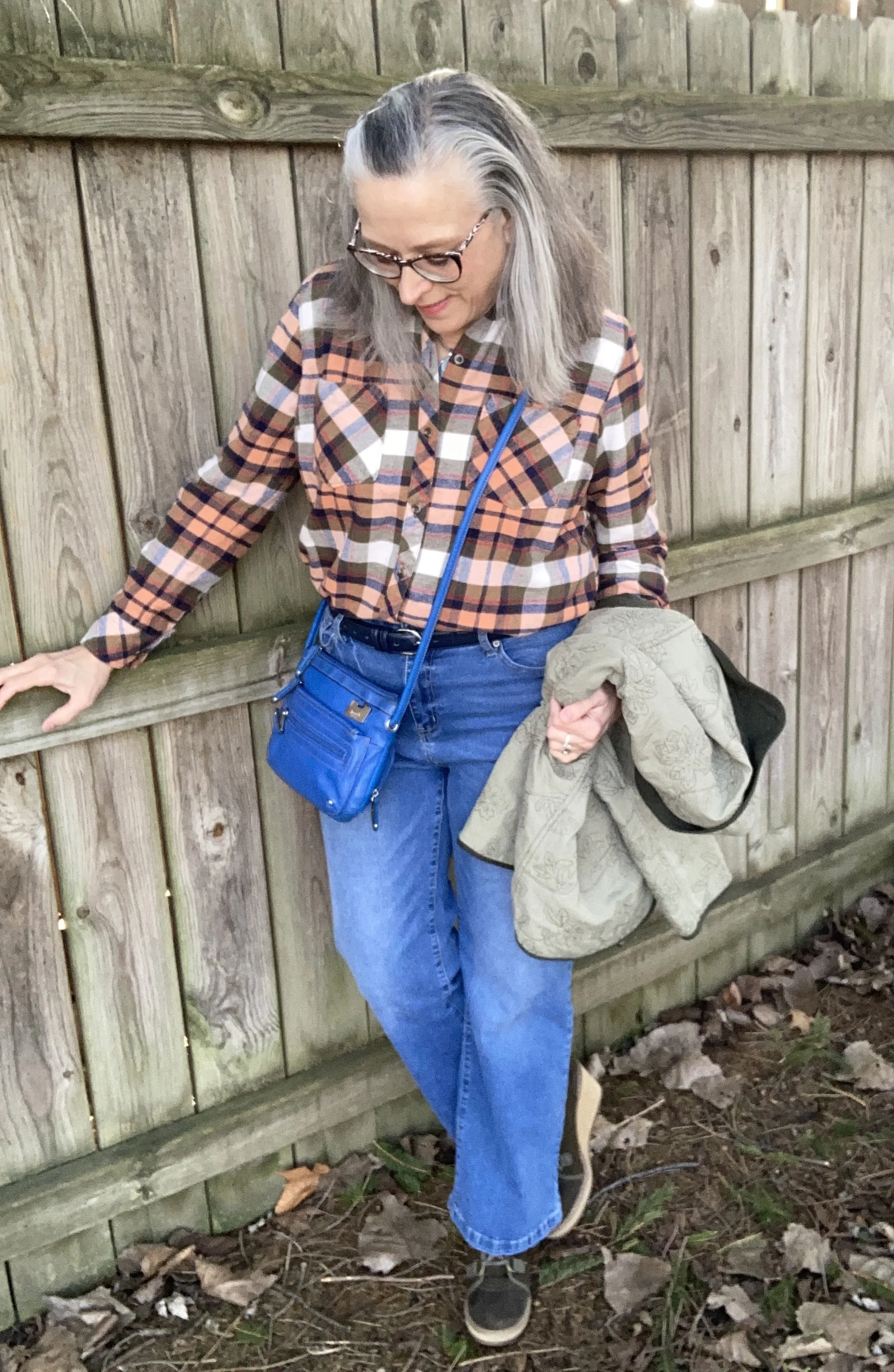
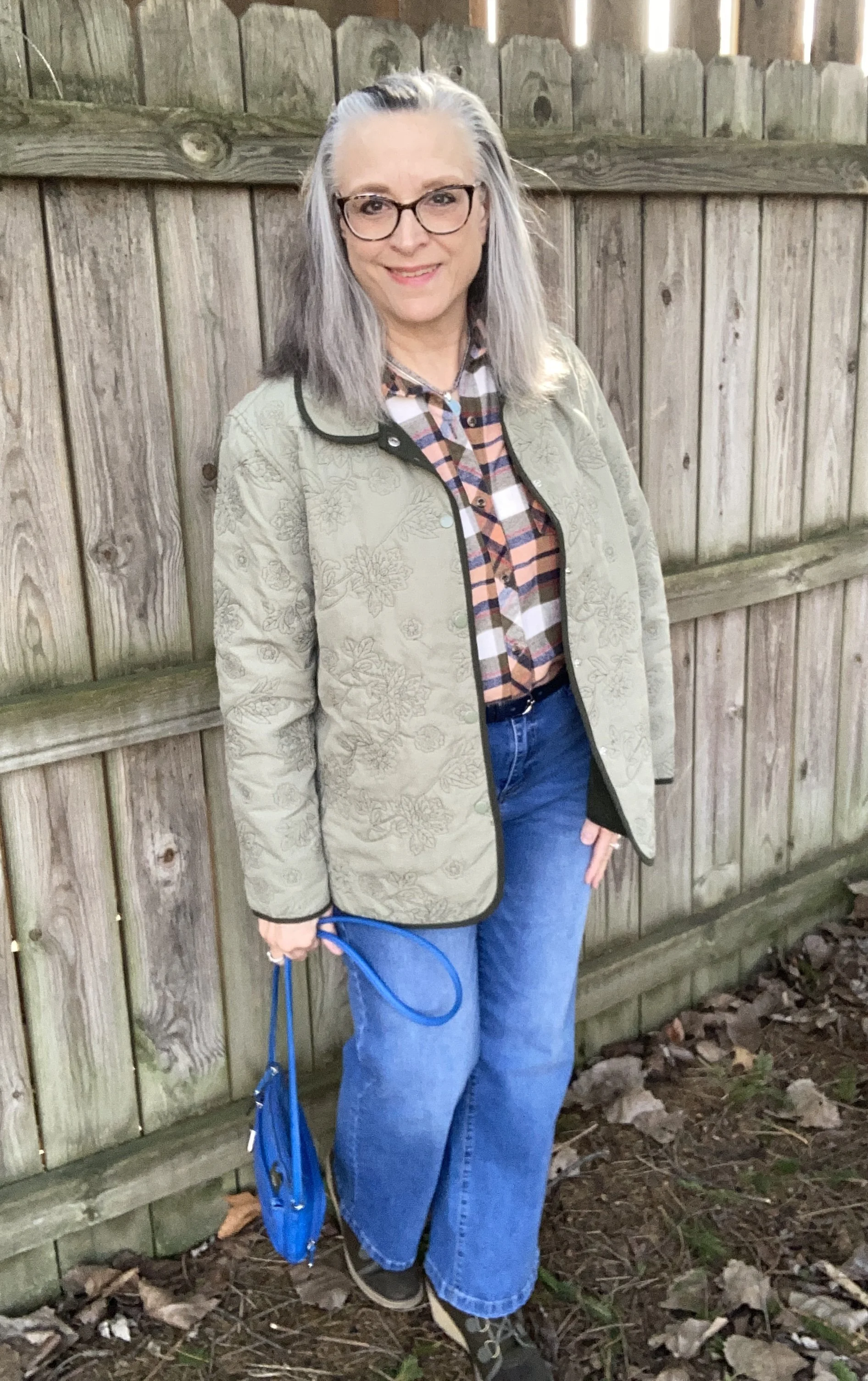
Let’s start with this pretty Muskmelon orange. It is not pink, but also not as orange as an orange would be. I think this one has been named appropriately. I chose my Natural Reflections flannel shirt from Bass Pro Shops, due to the color and the cozy factor. It might say spring on the calendar, but in my area spring is here one day and gone the next. Right now Bass Pro has a number of flannel shirts on clearance. It is a good time to stock up. See more here. Kohl’s is also having a good clearance sale right now, so check them out too.
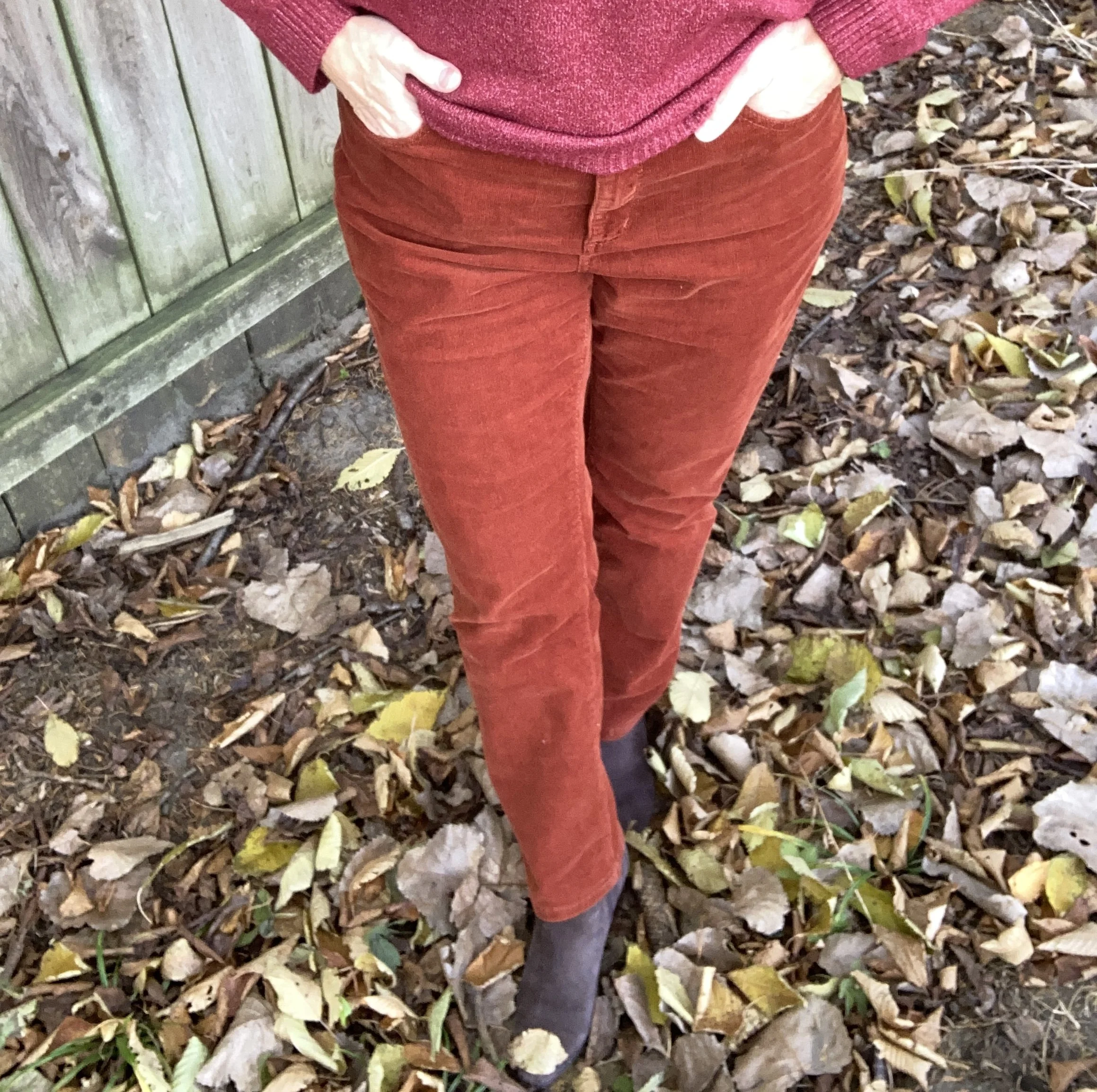
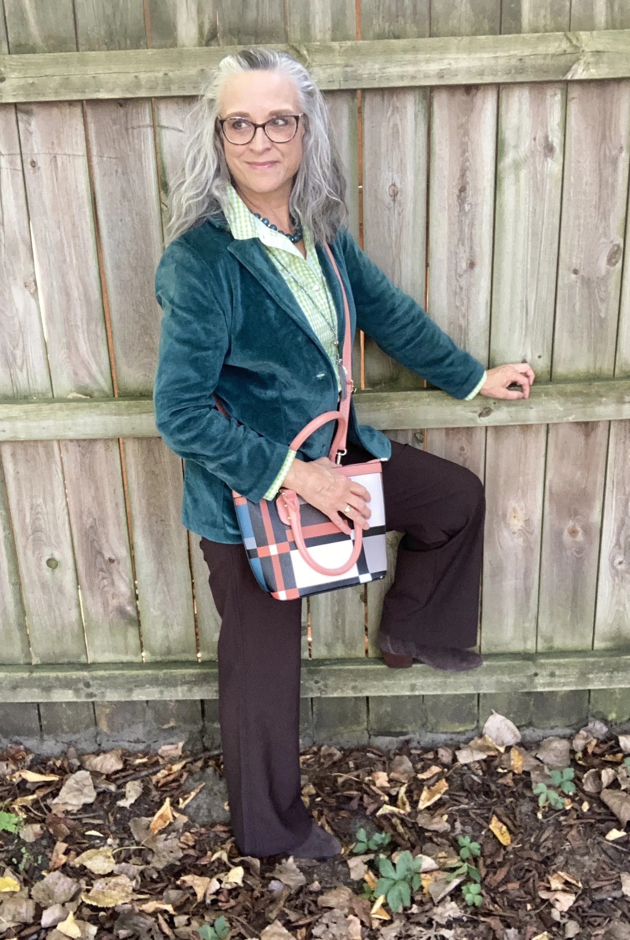
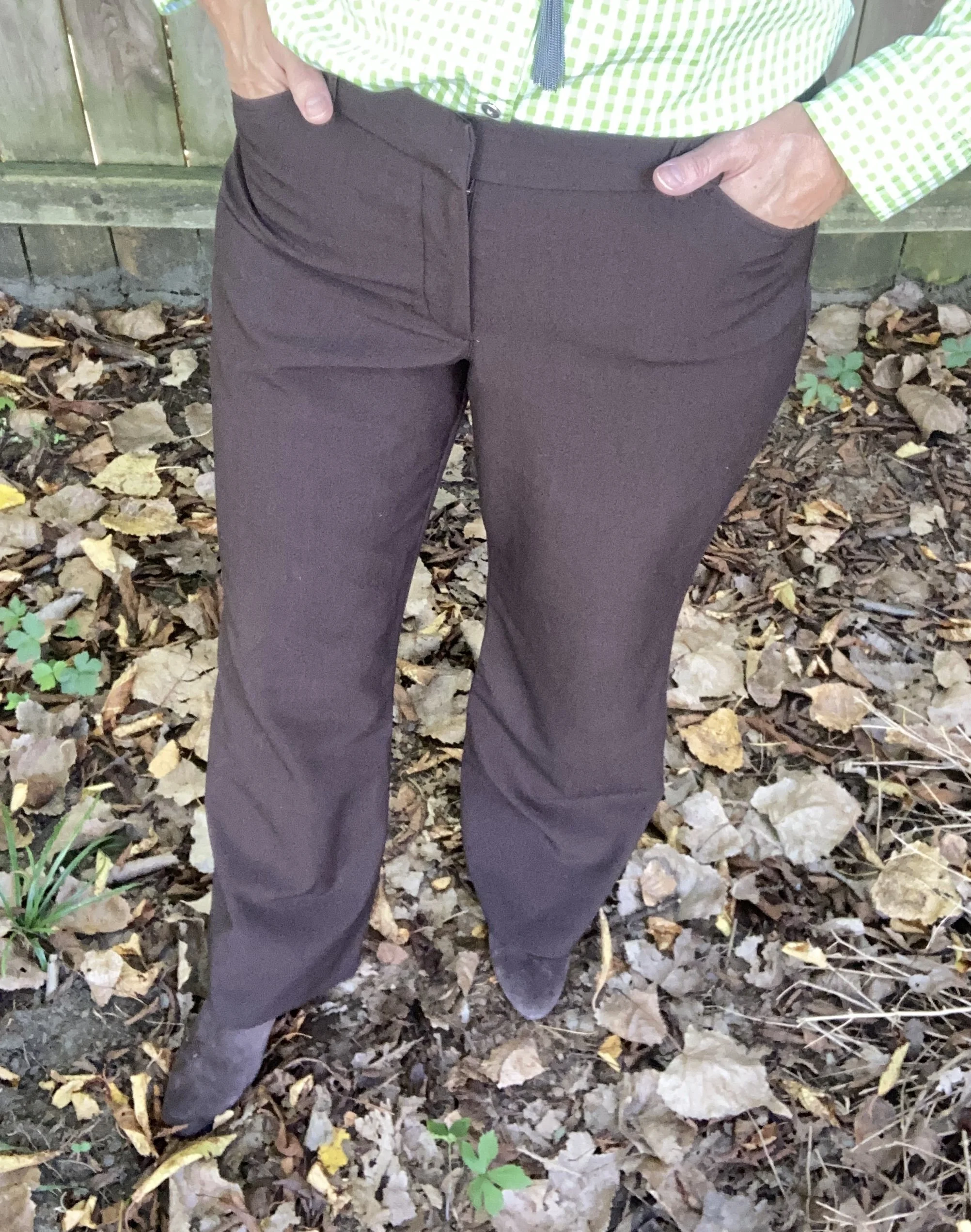
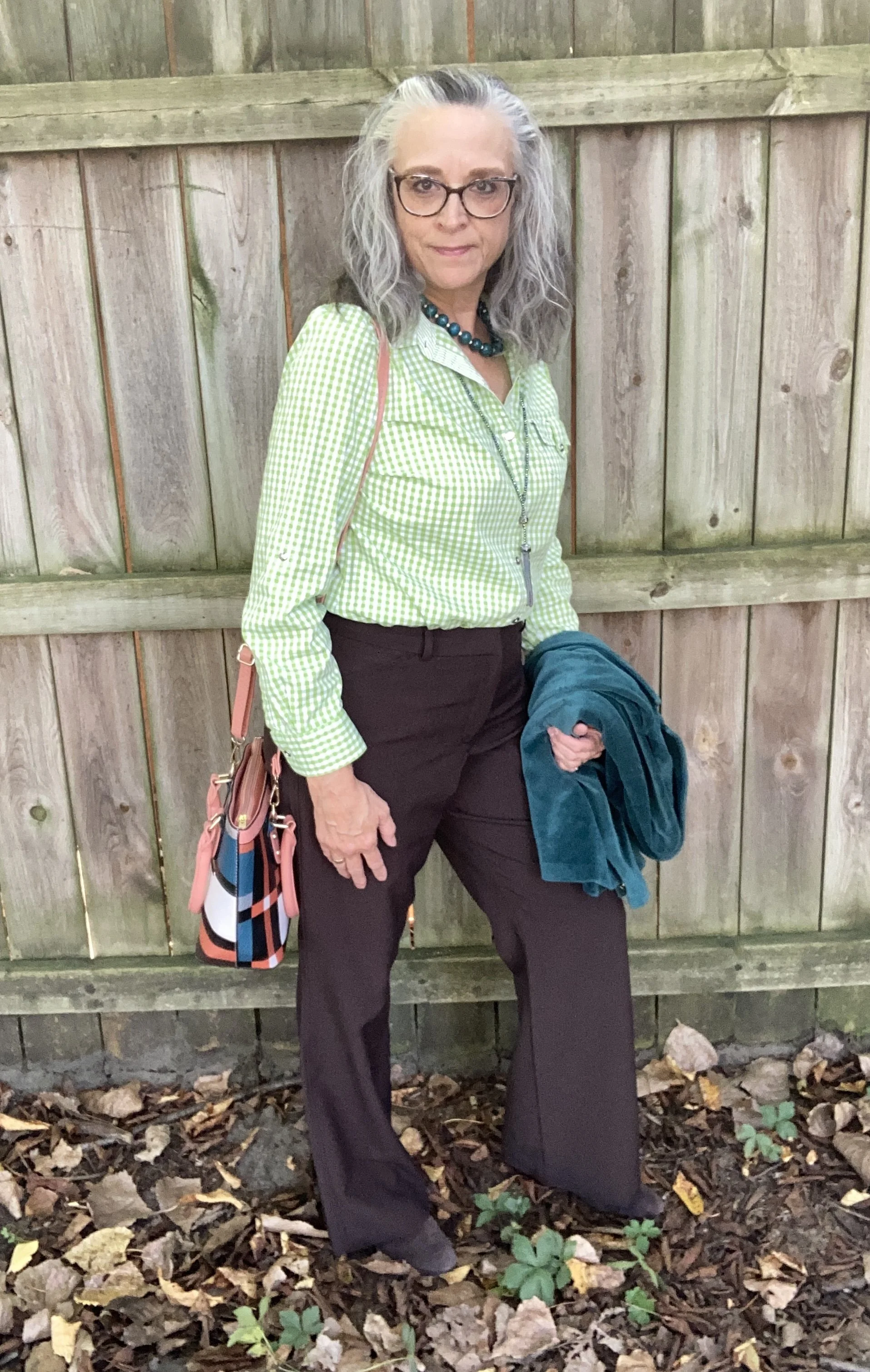
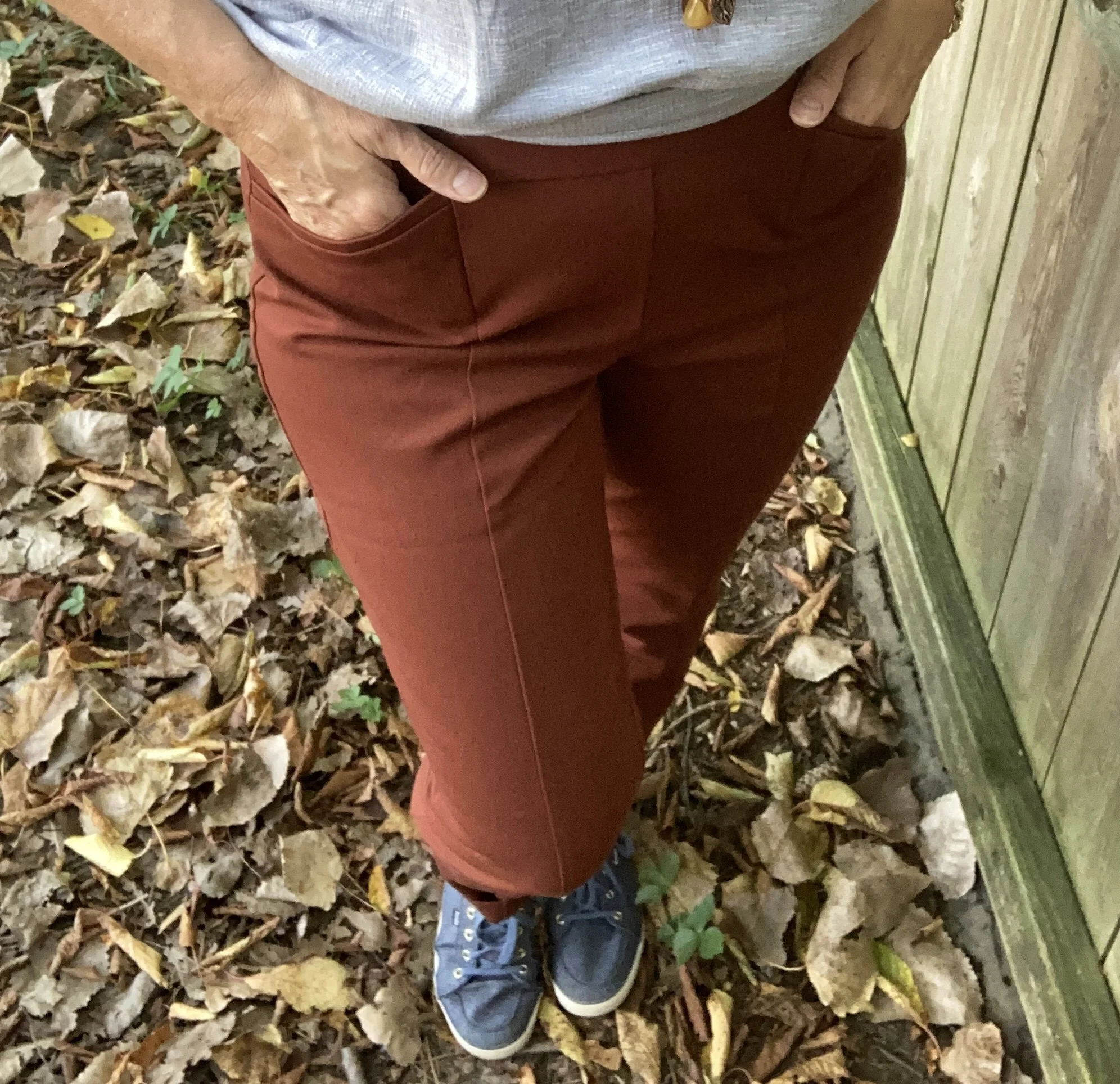
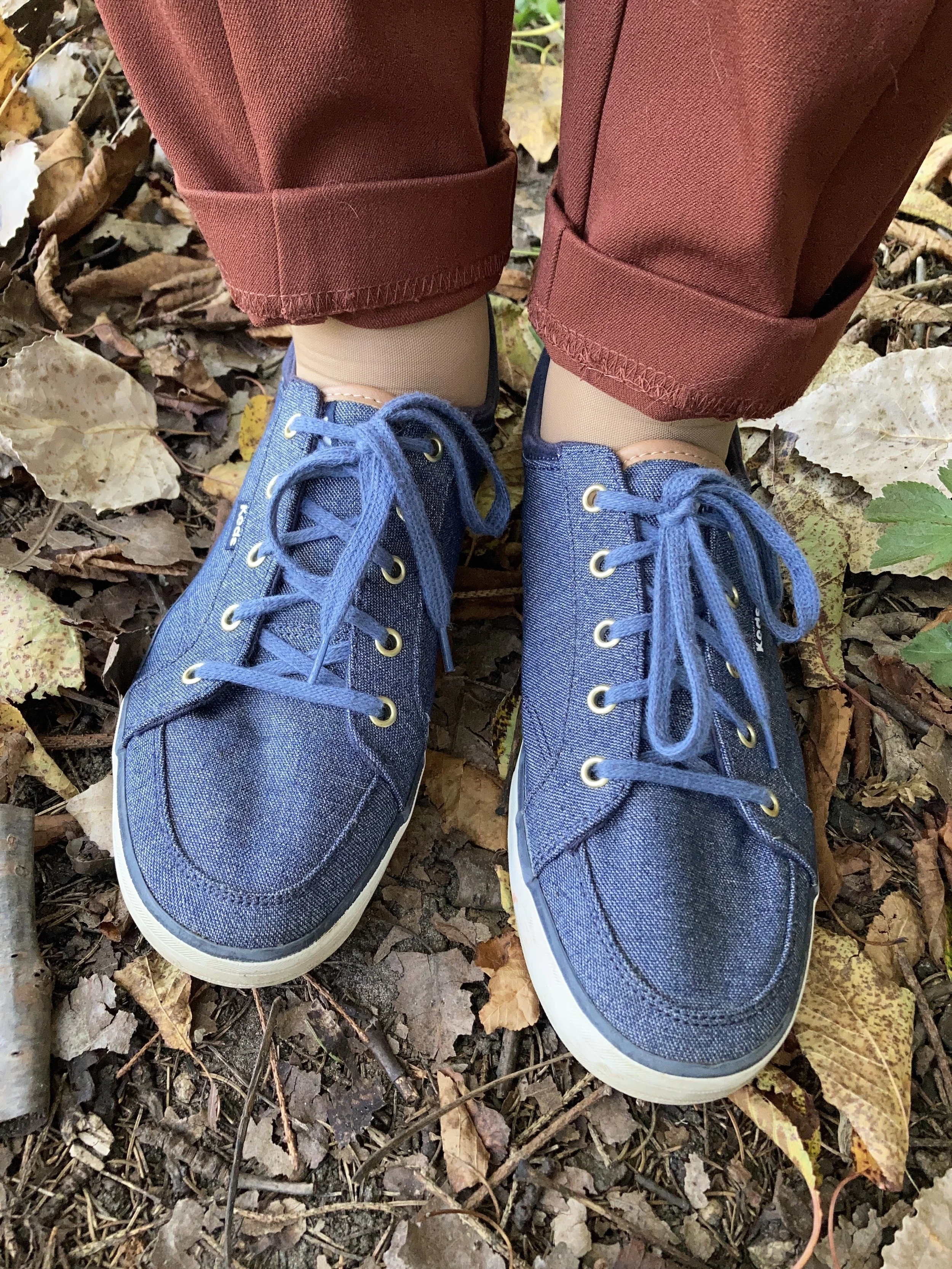
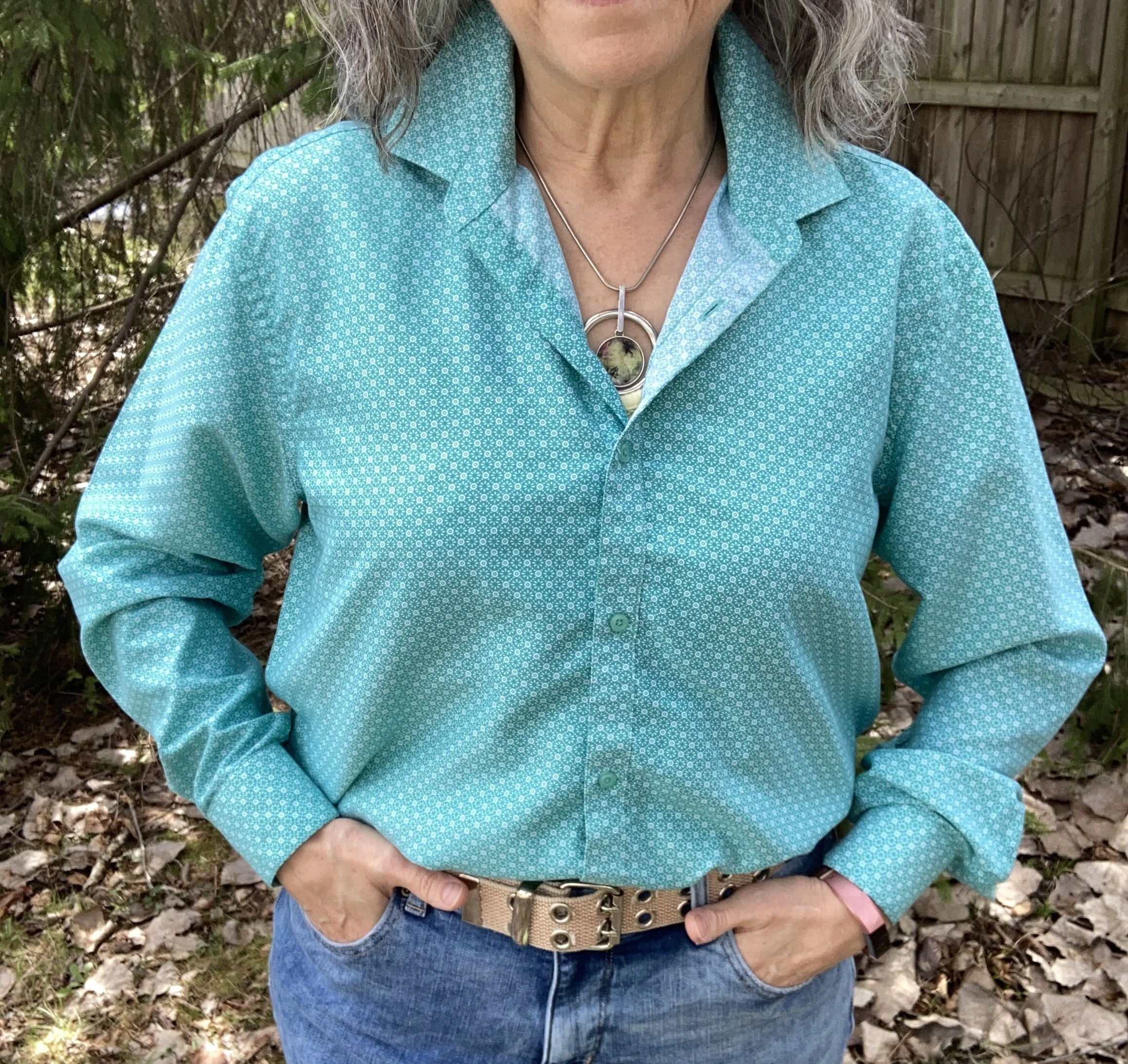
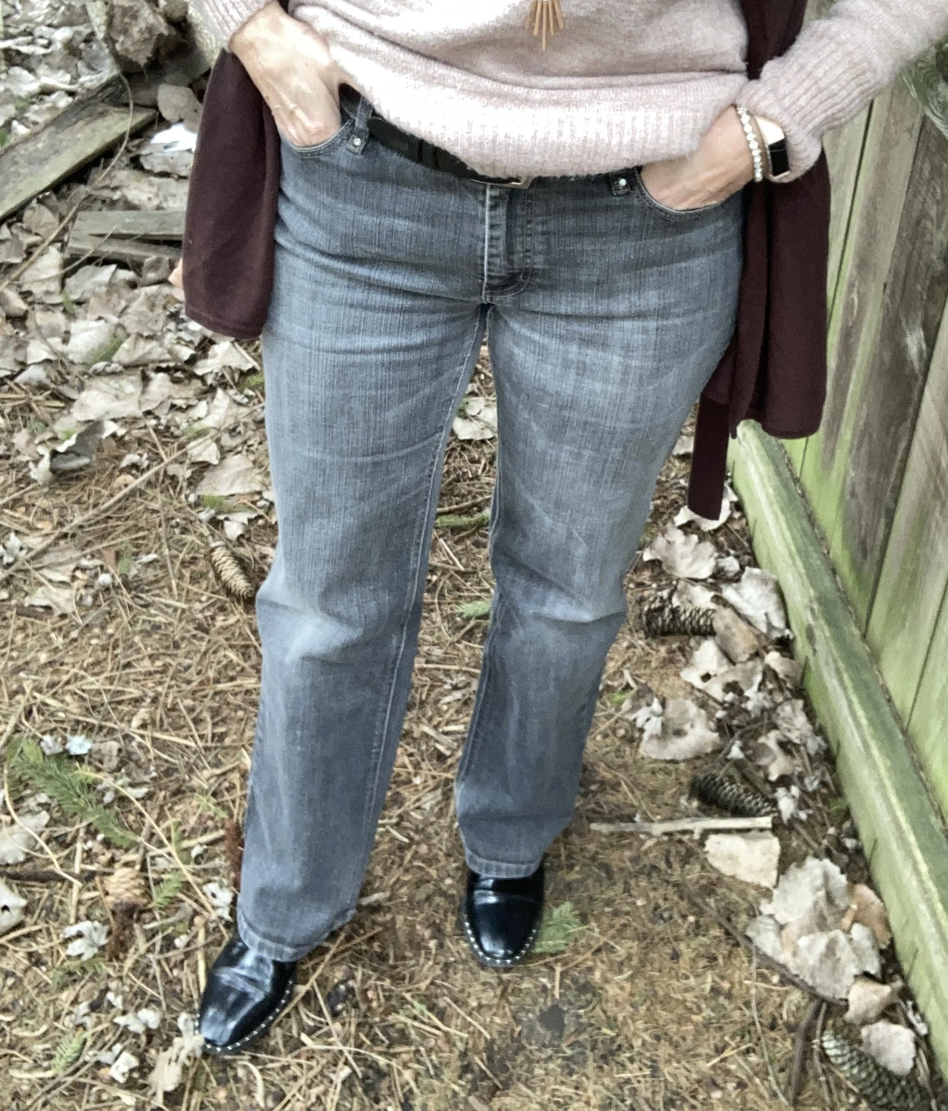
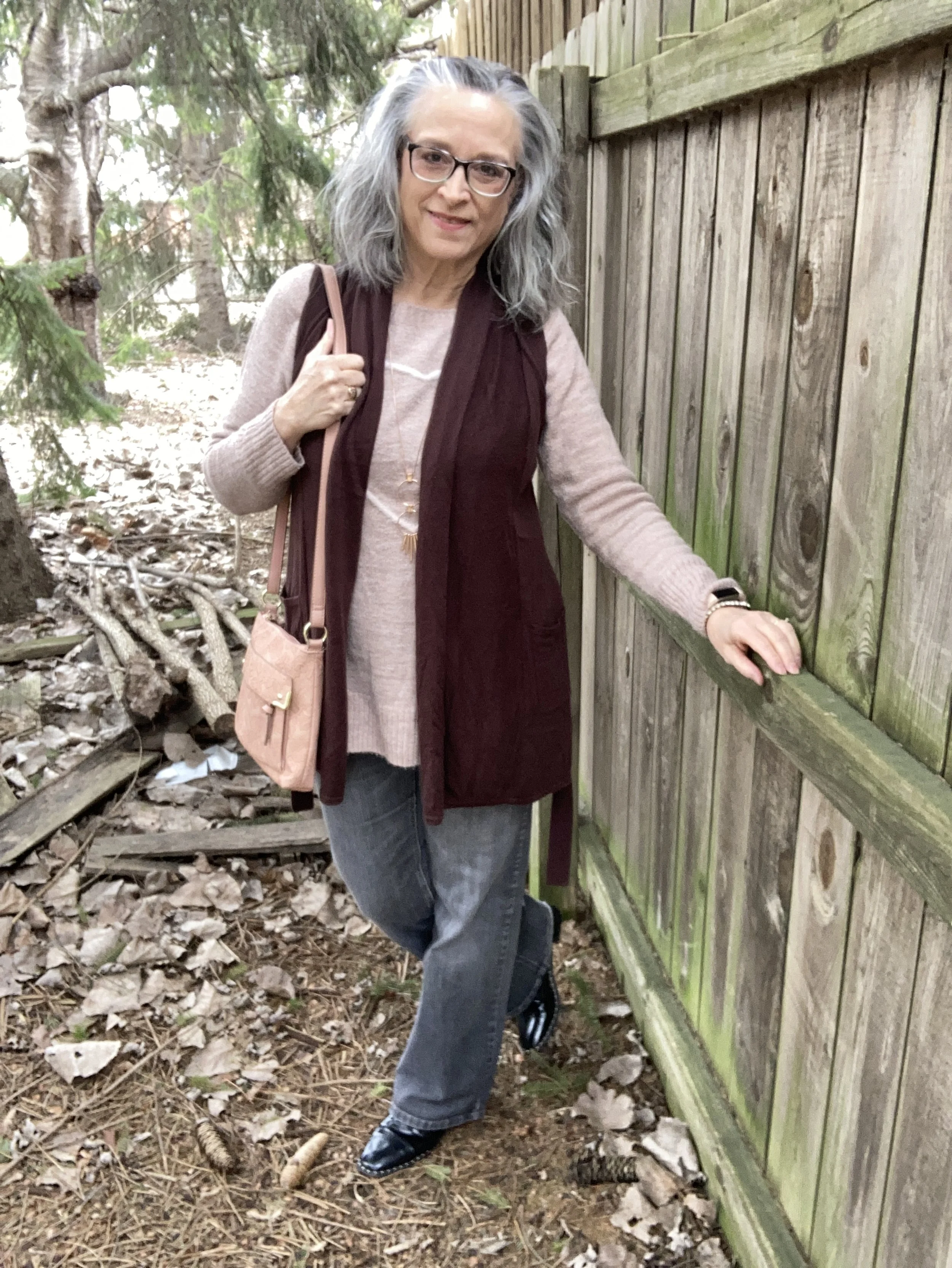
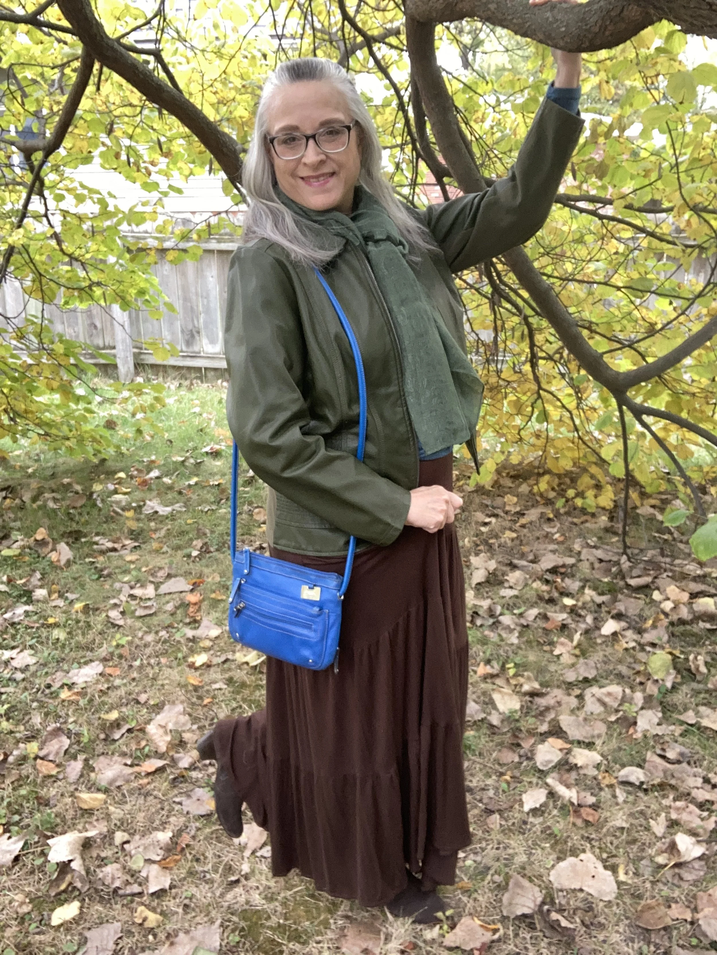
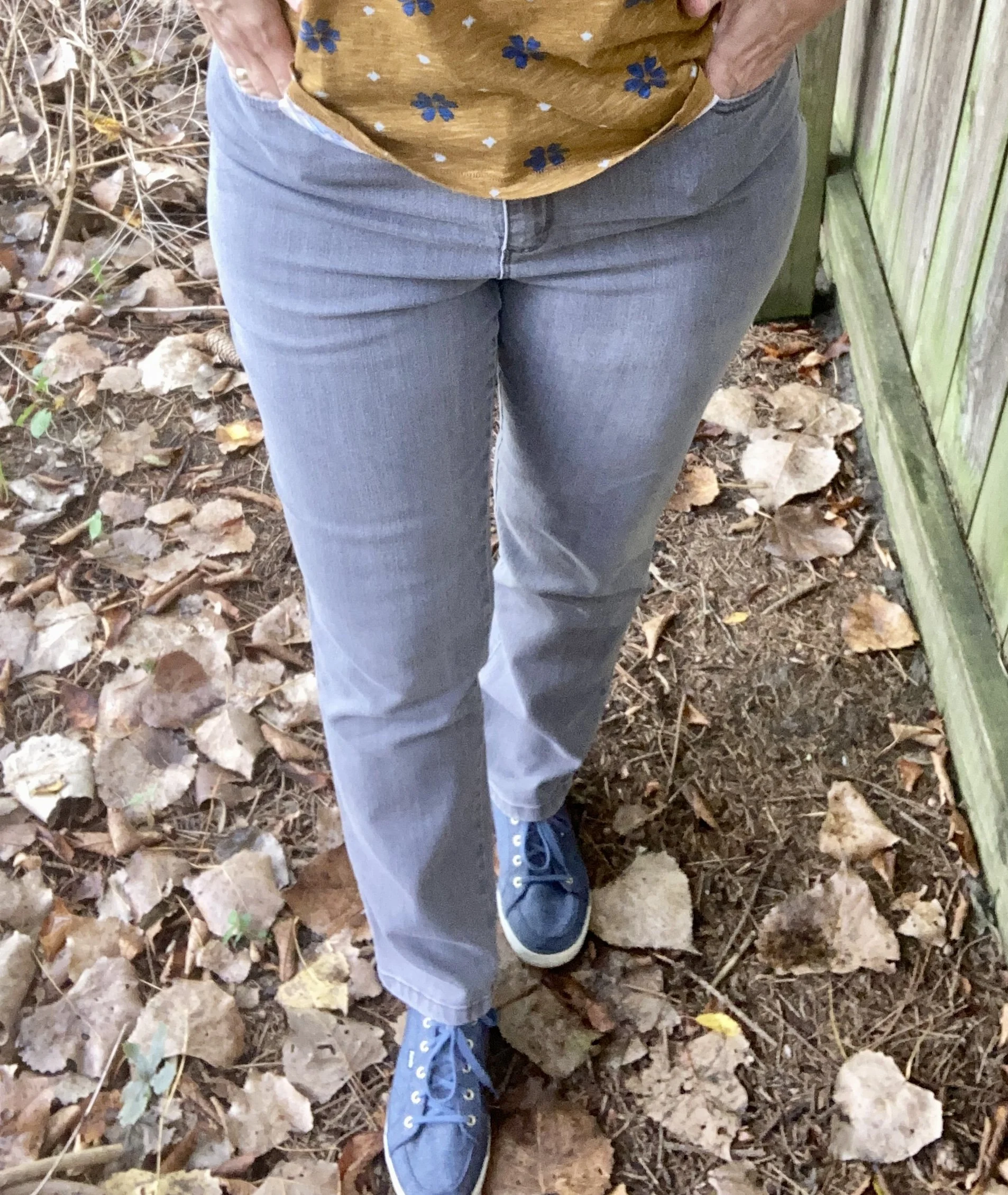
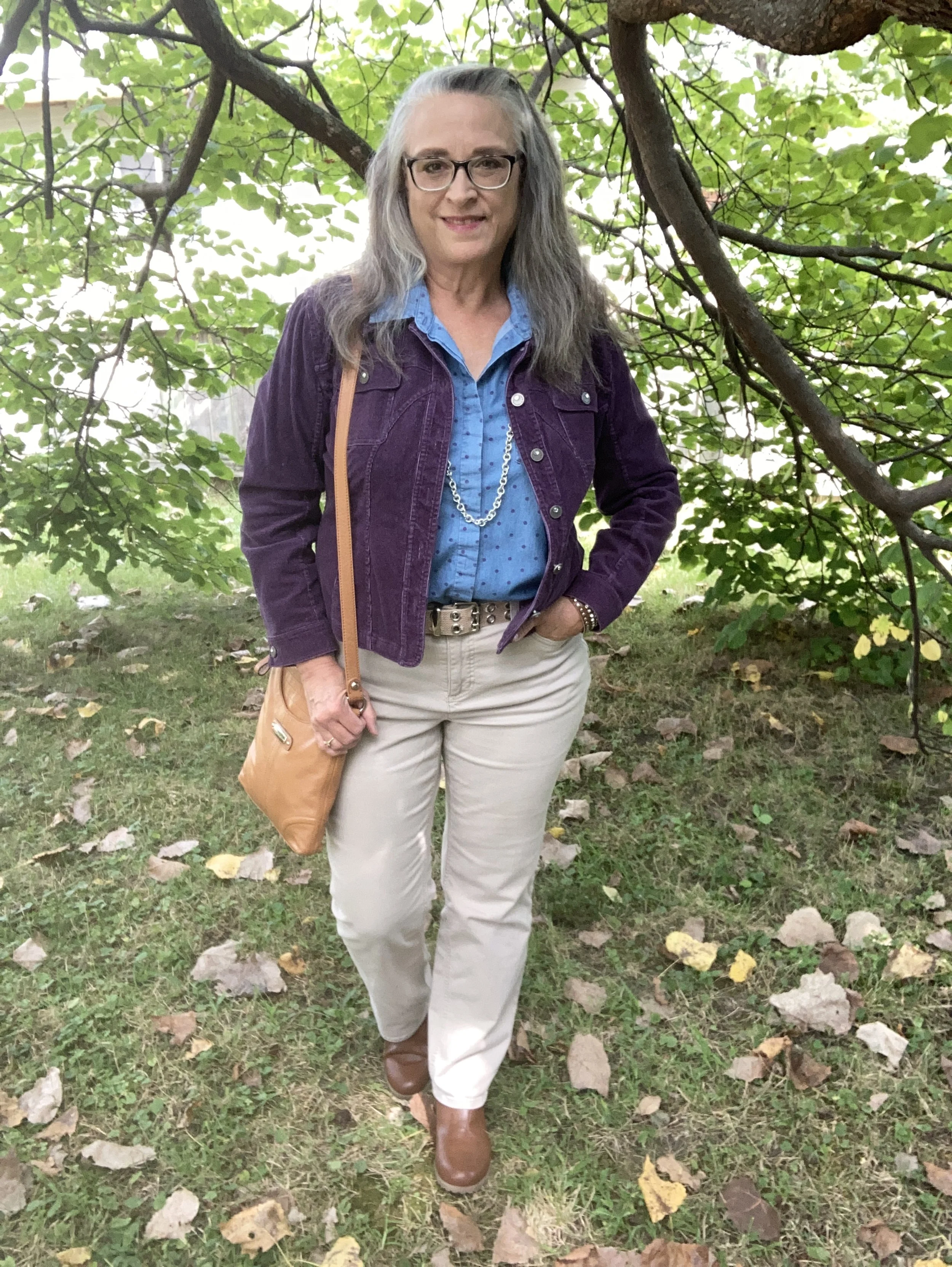
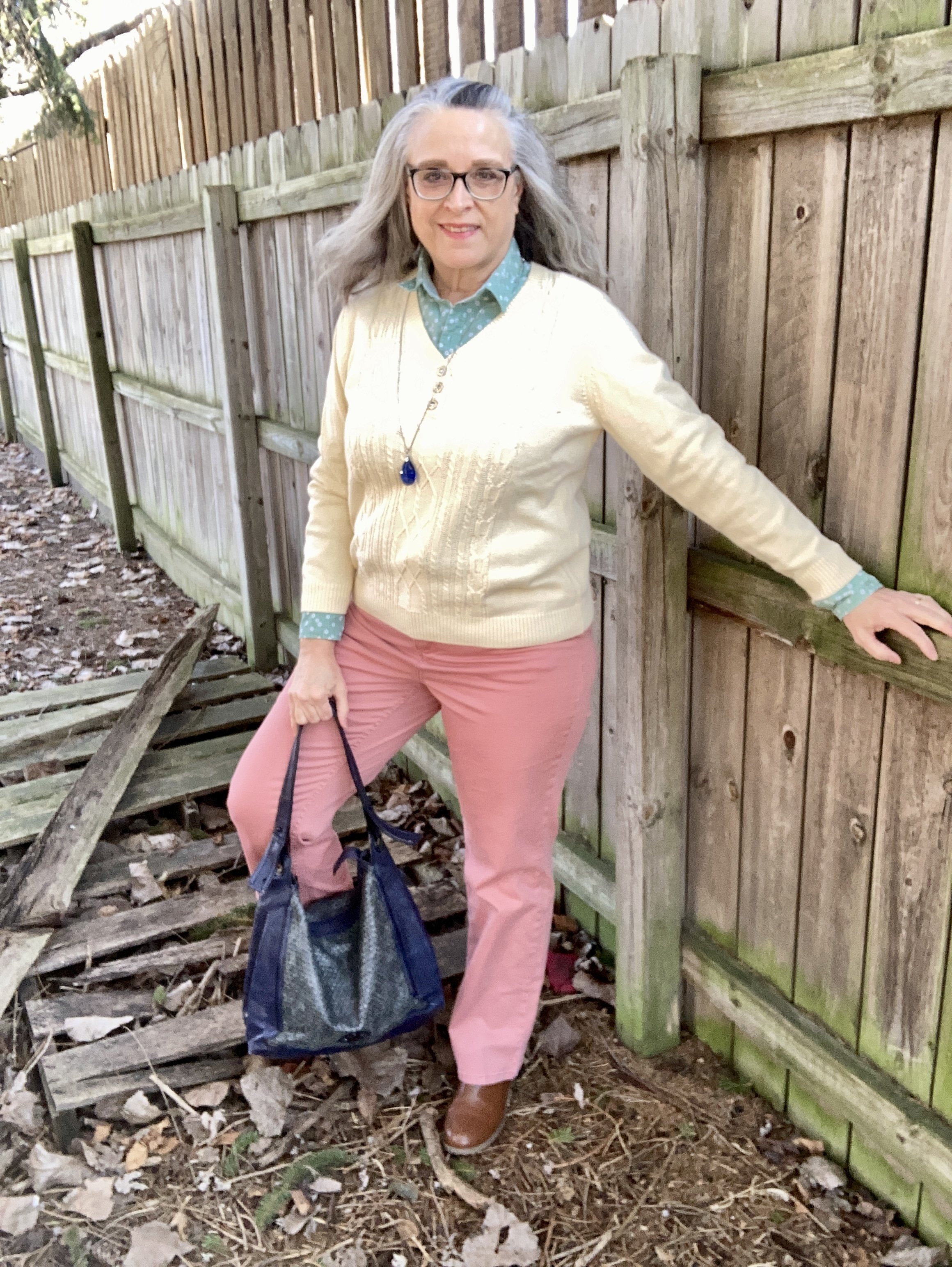
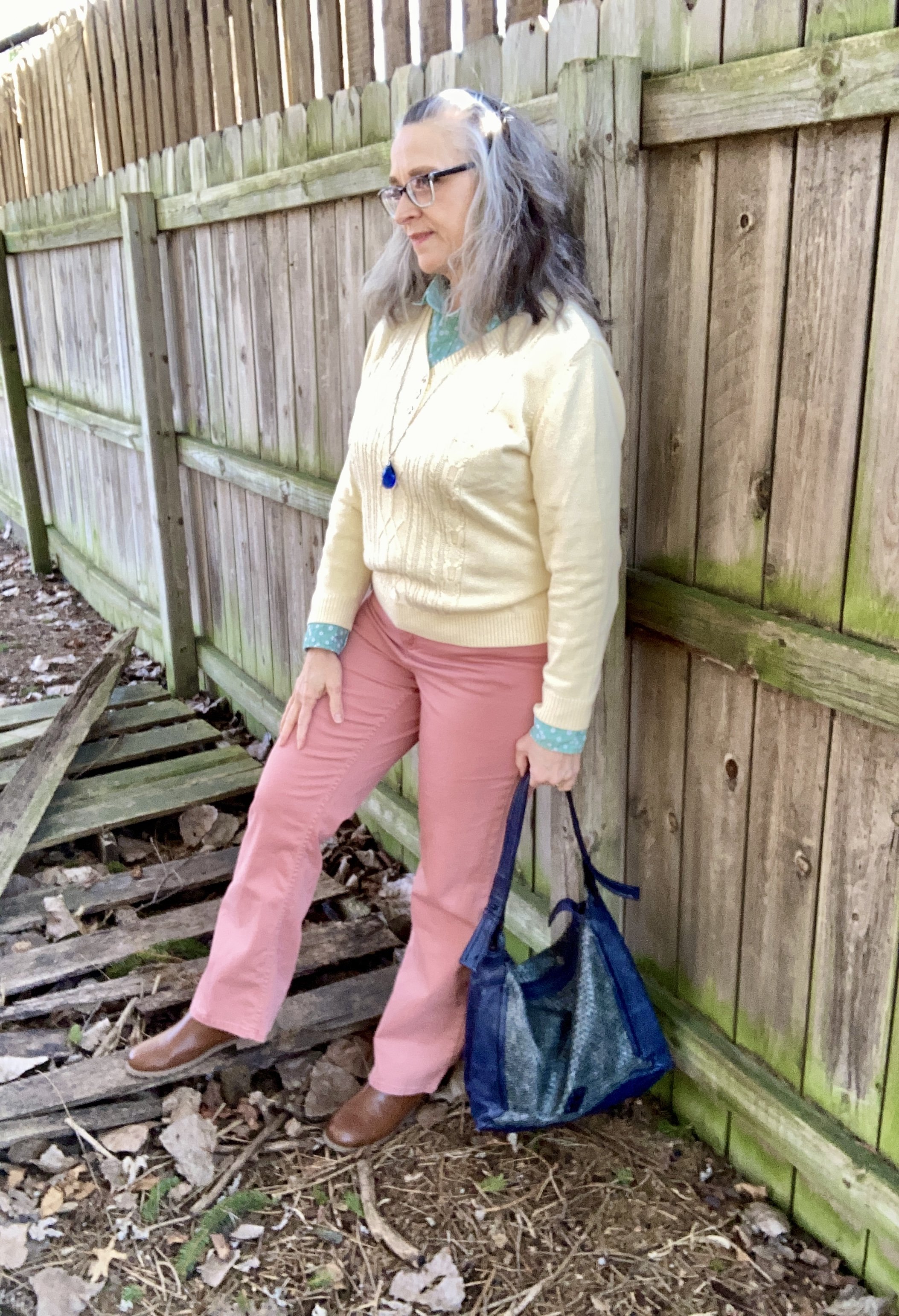
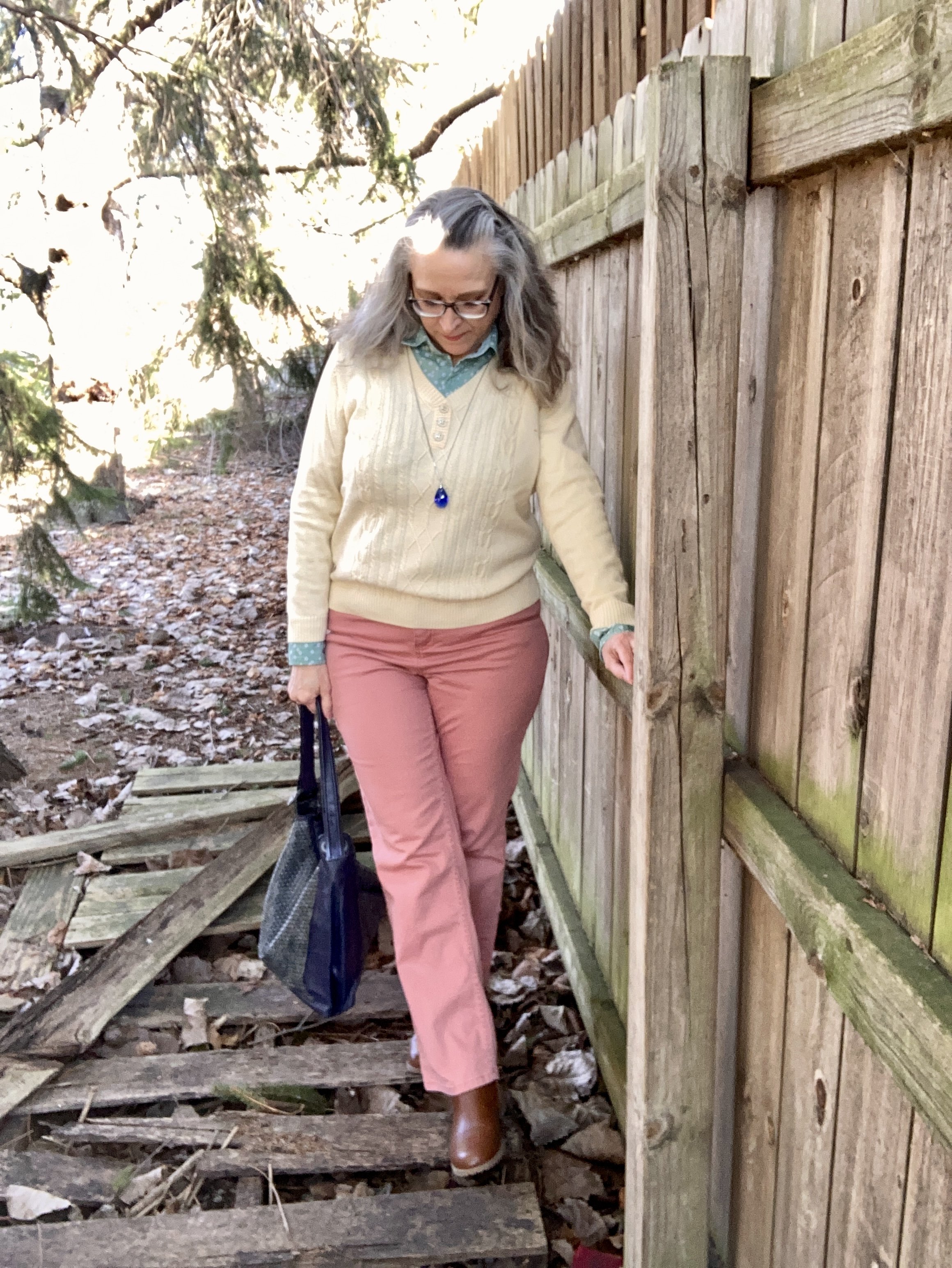
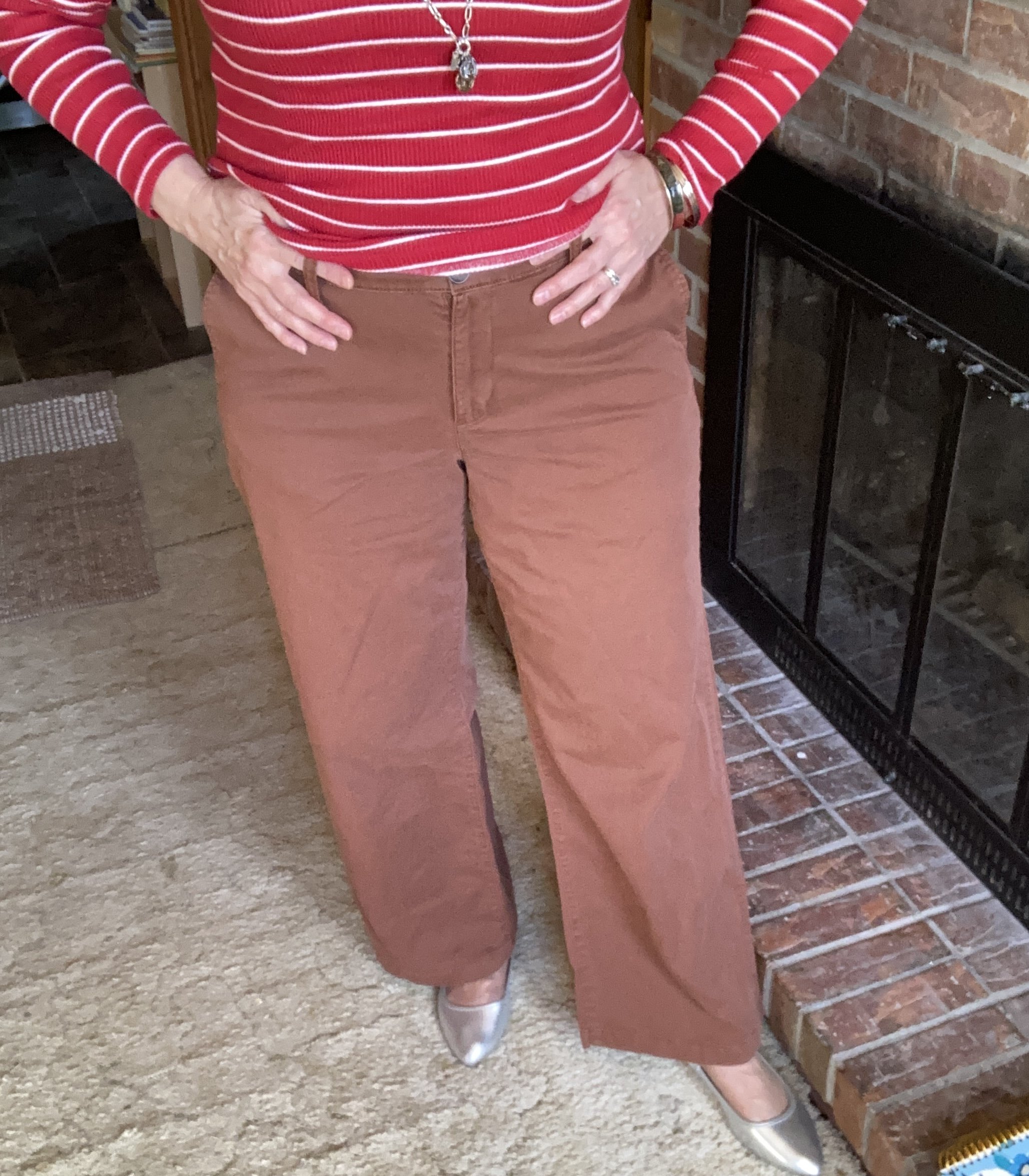
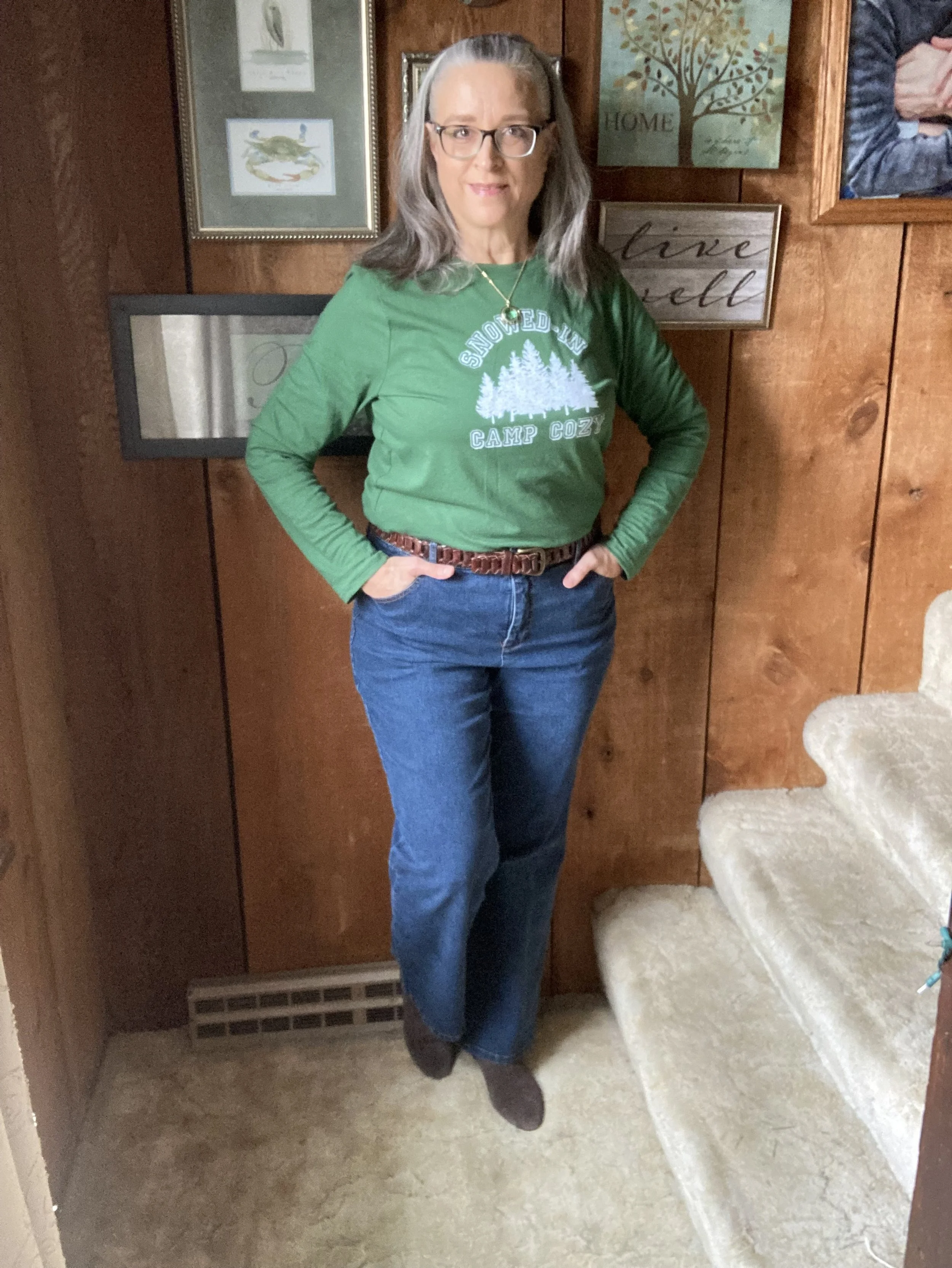
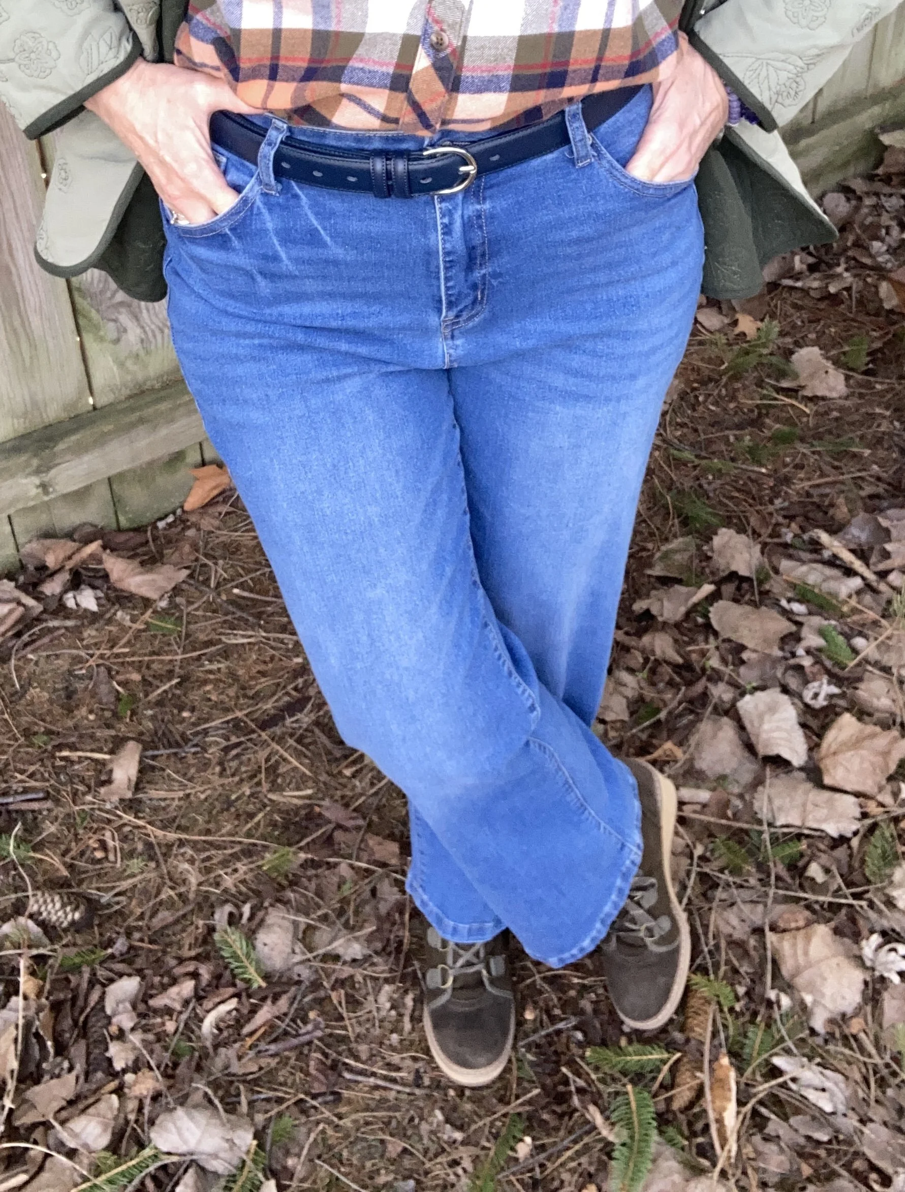
For the Marina blue, I decided to use these thrifted Sidefeel jeans. These have a wider leg, and a bit of stretch, which makes them comfortable, but also a tad bit dressier. I had never heard of this brand before, but if you click on the link you can check out their website. I know nothing about where their products are manufactured, but I get a feel they are a fast fashion retailer due to the low pricing and the statement that they purchase their items “in bulk.” I prefer to stay away from the fast fashion manufacturers and retailers, but I am also a thrifter, so I feel there are plenty of gently used items that need a new home. However, I realize not everyone wants to thrift and everyone also needs to buy according to their own budget.
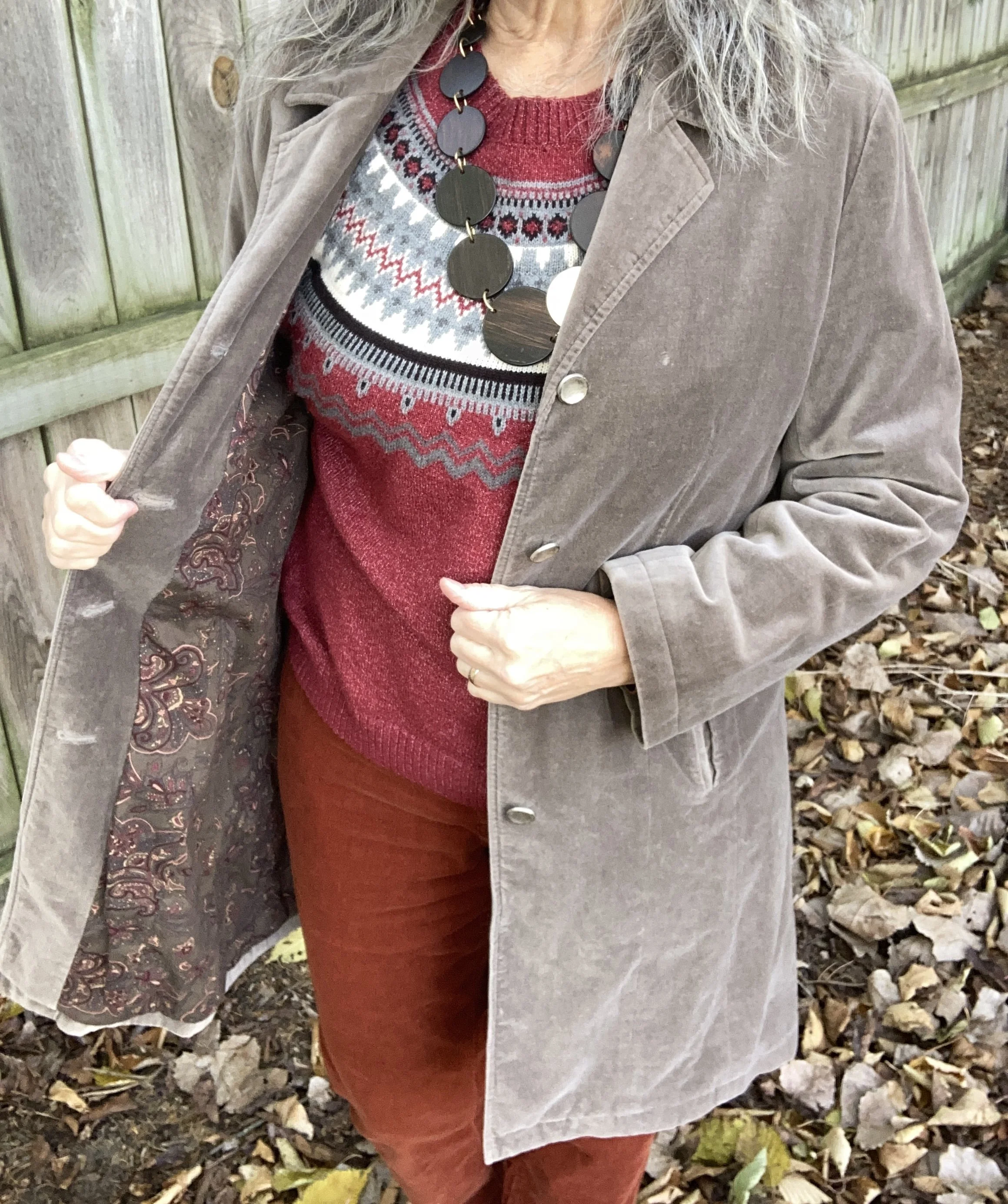
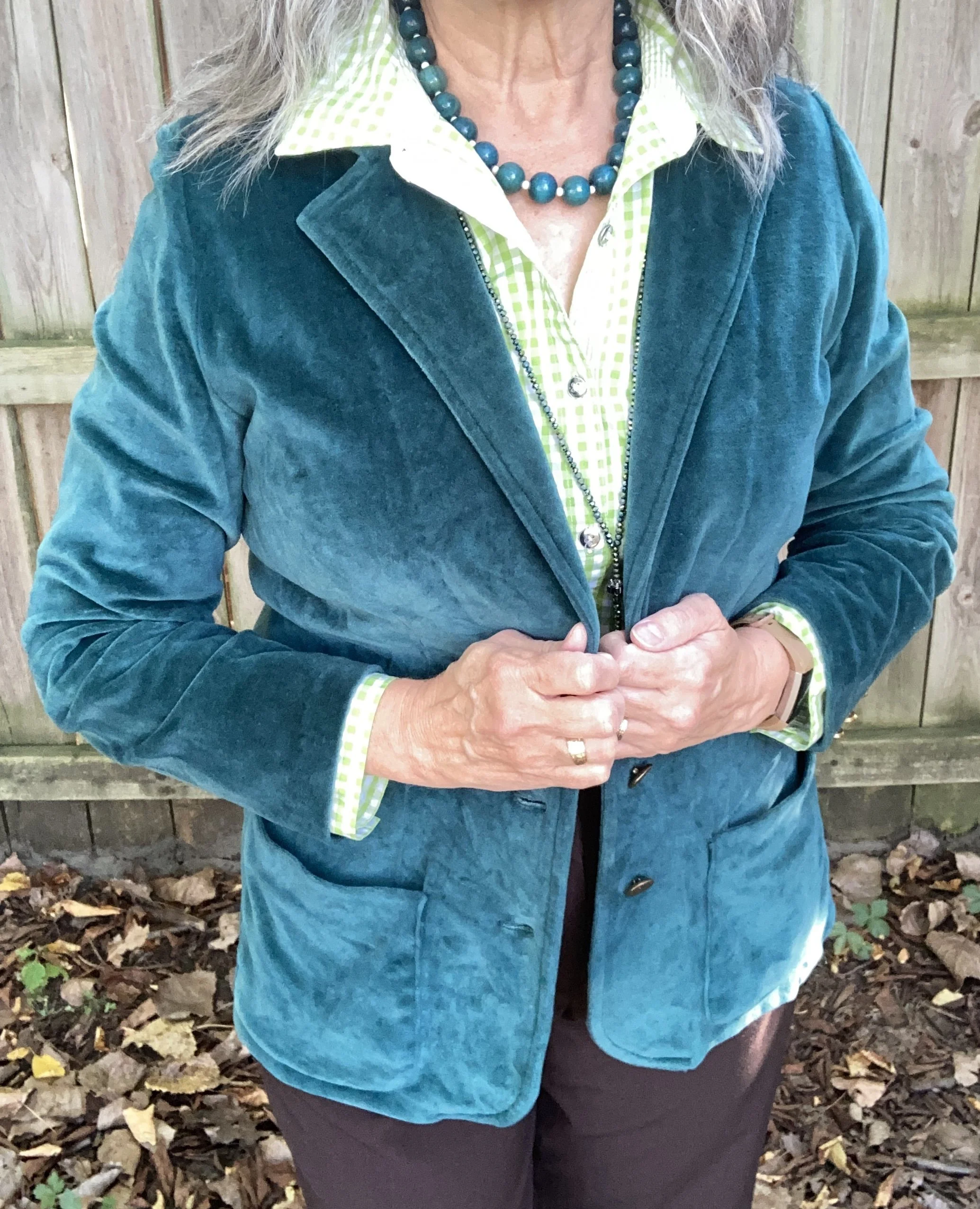
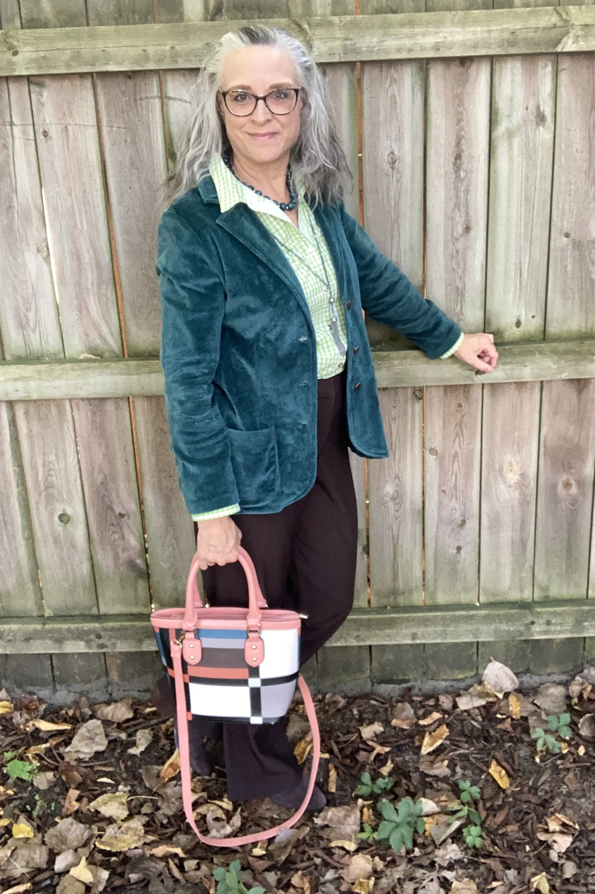
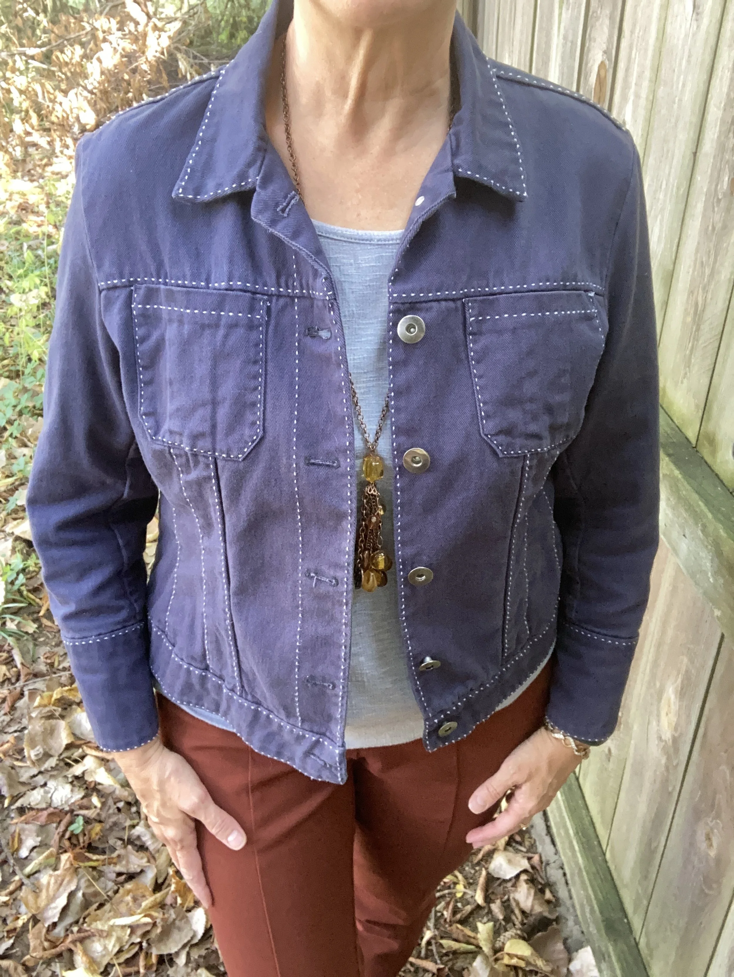
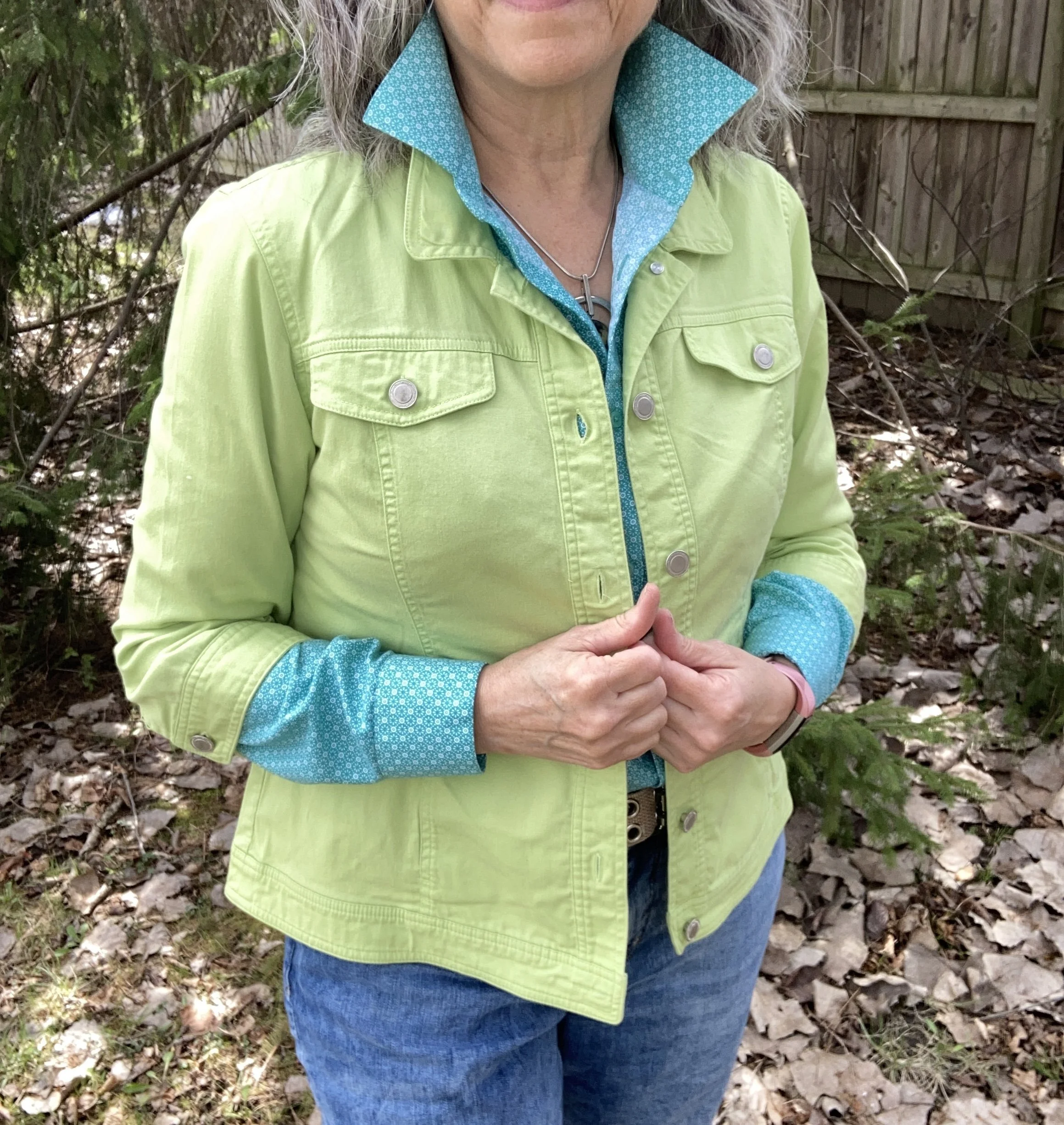
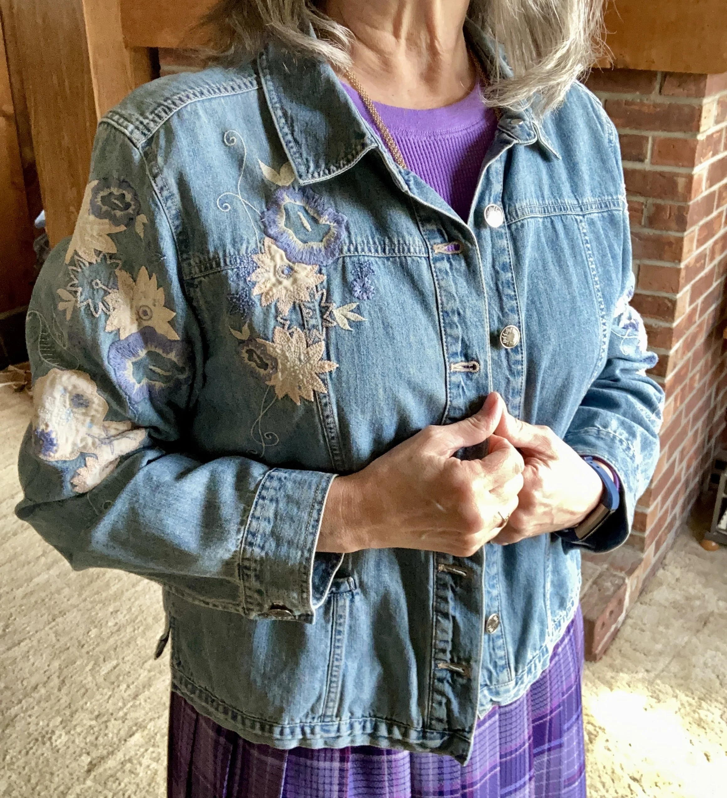
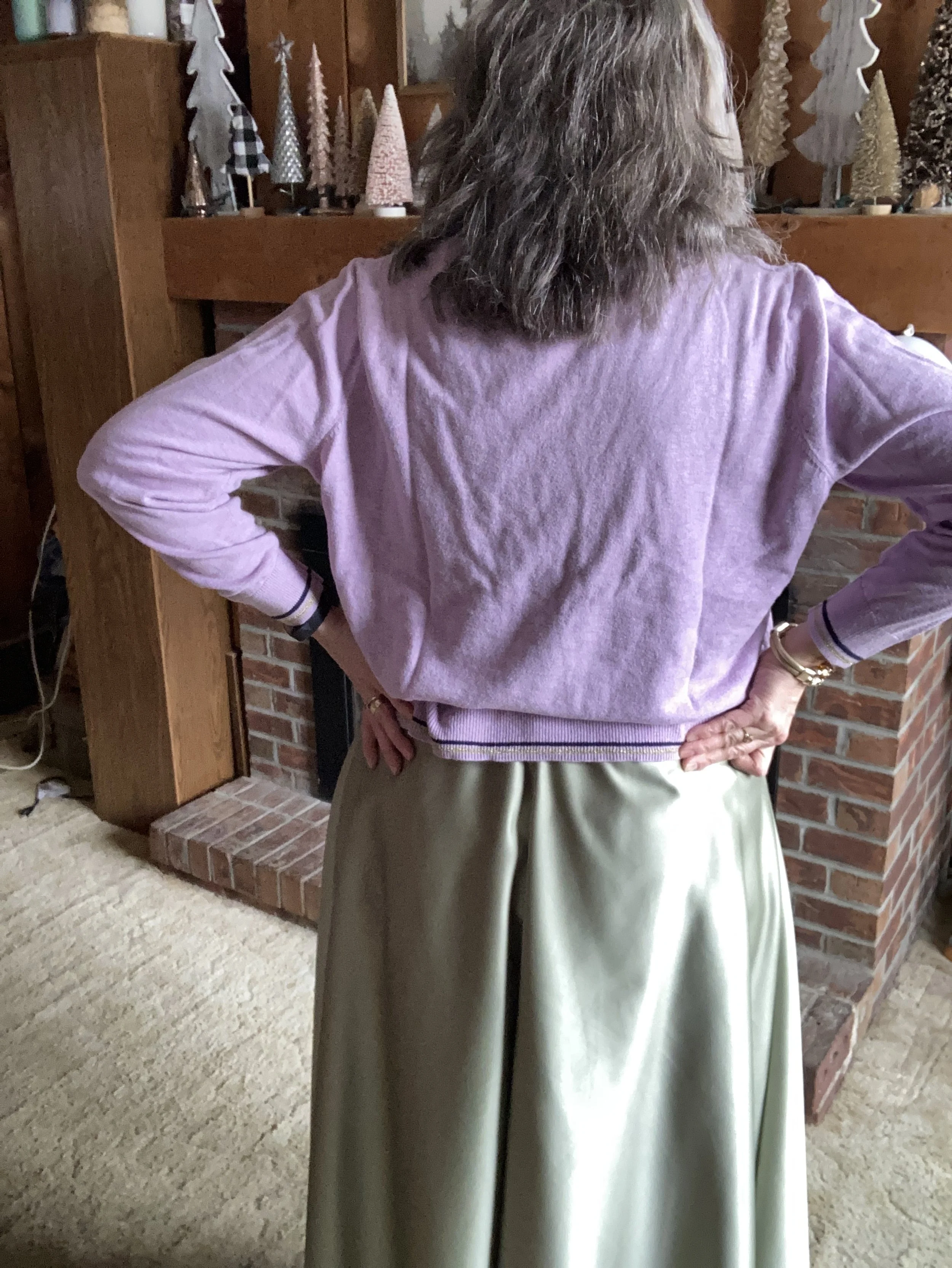
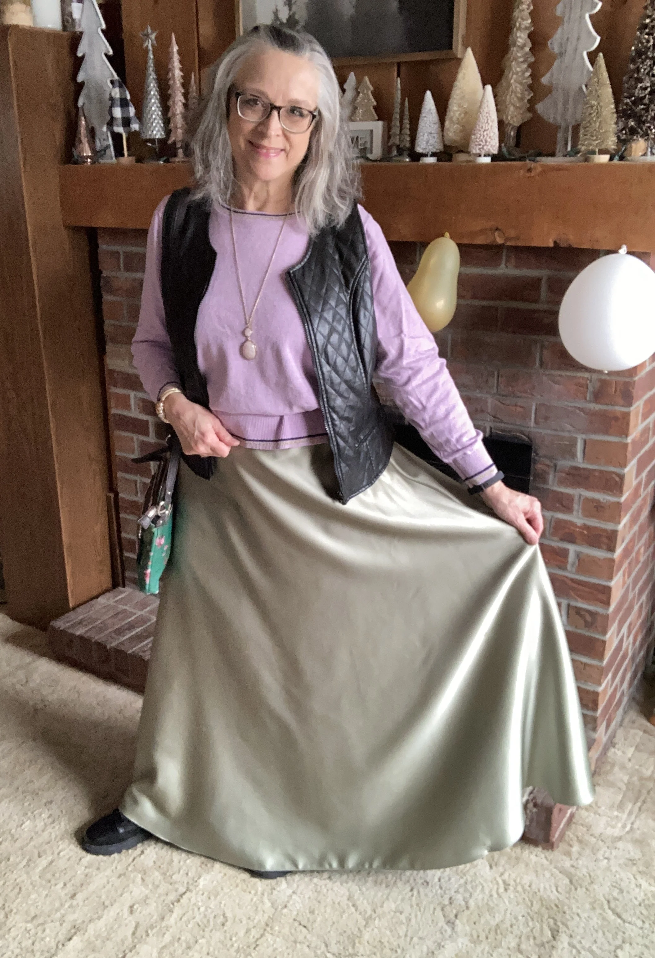
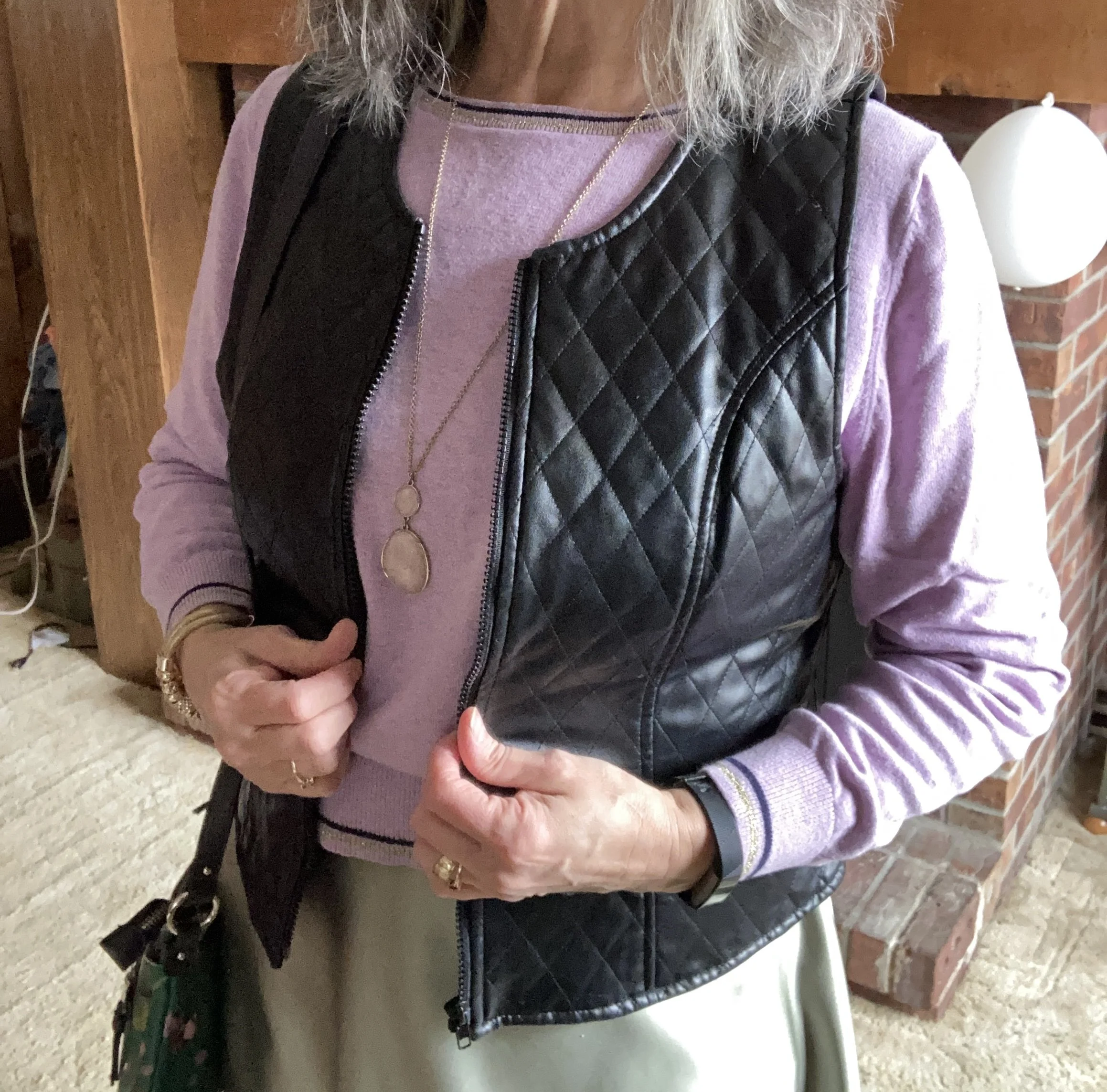
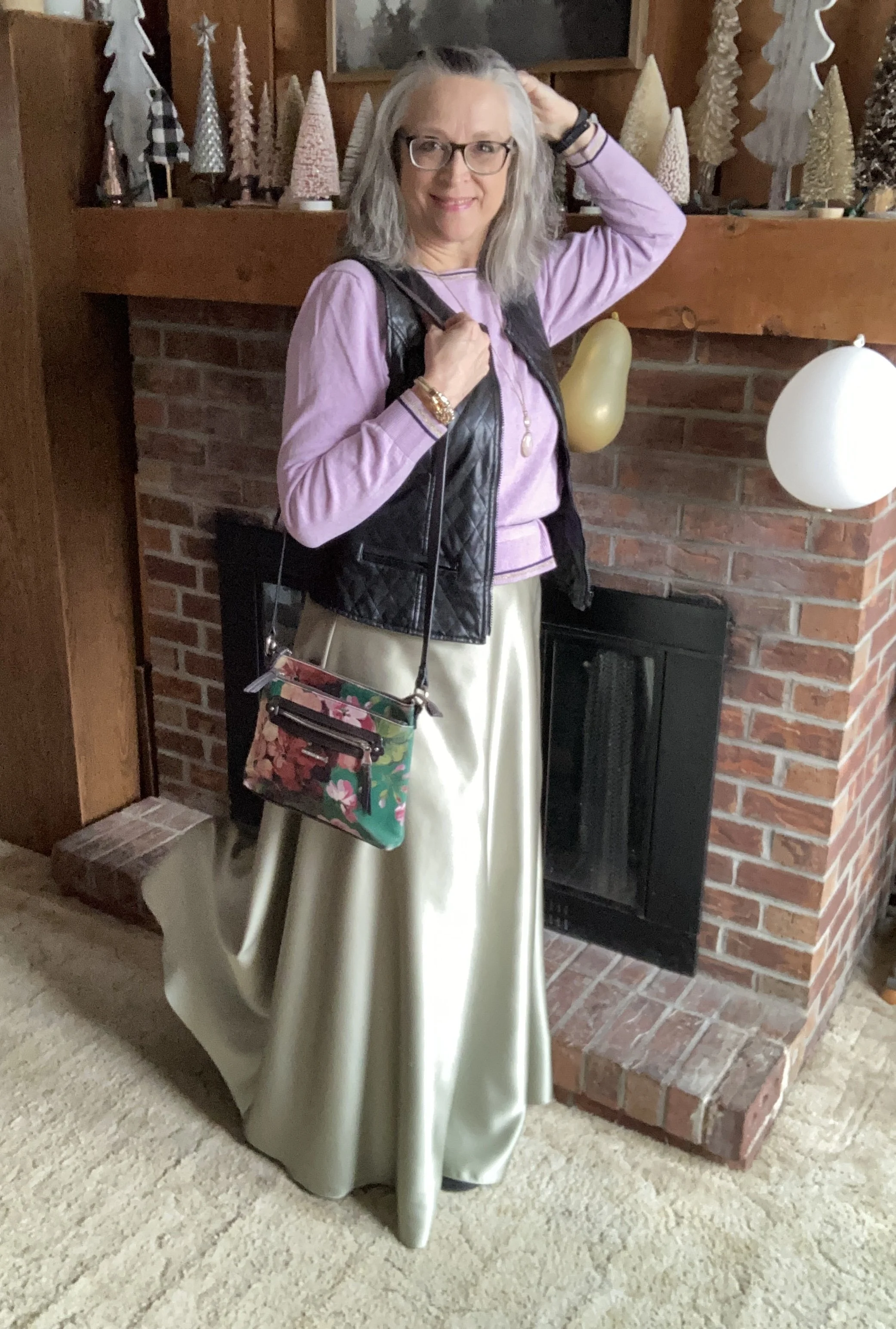
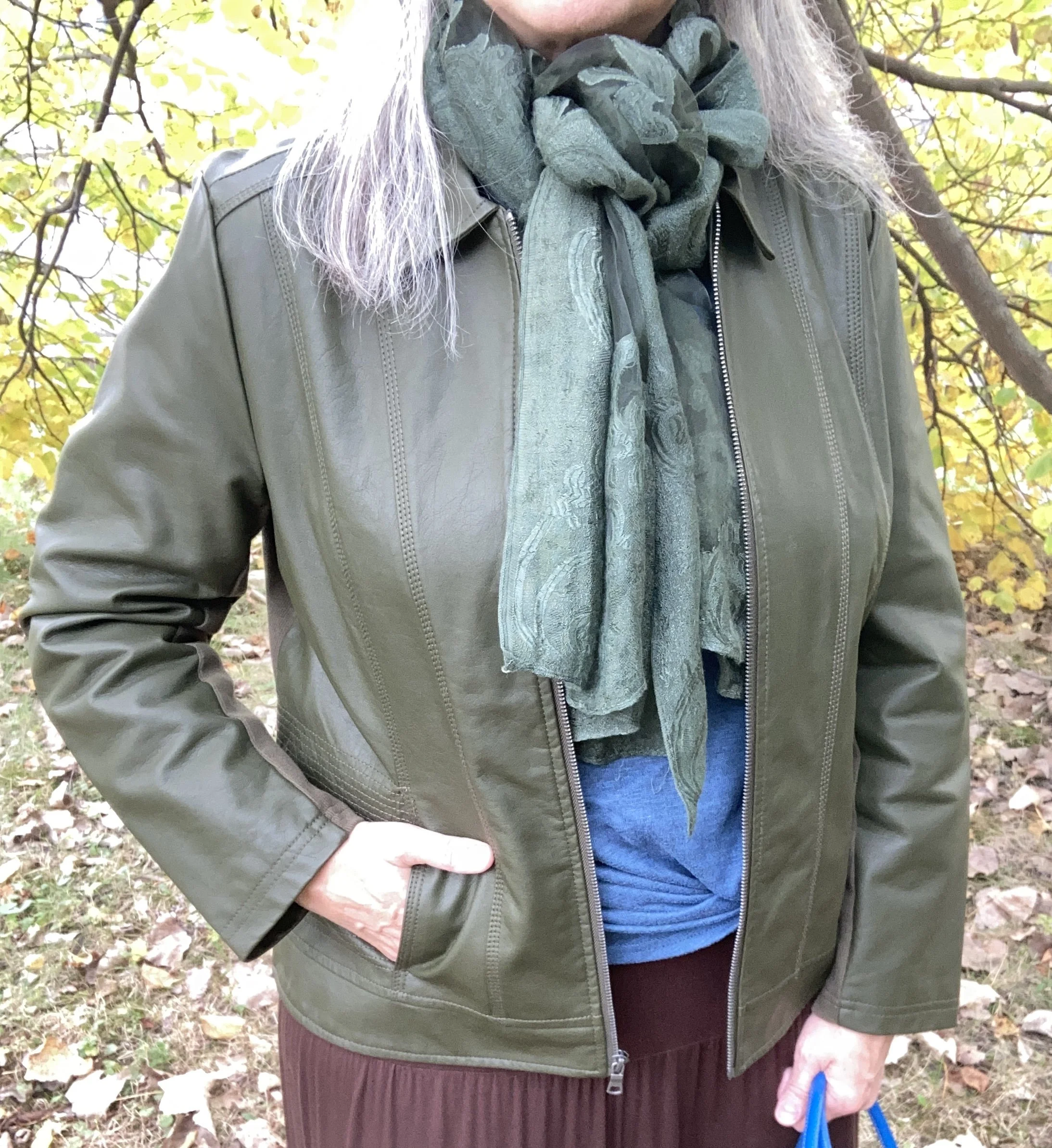
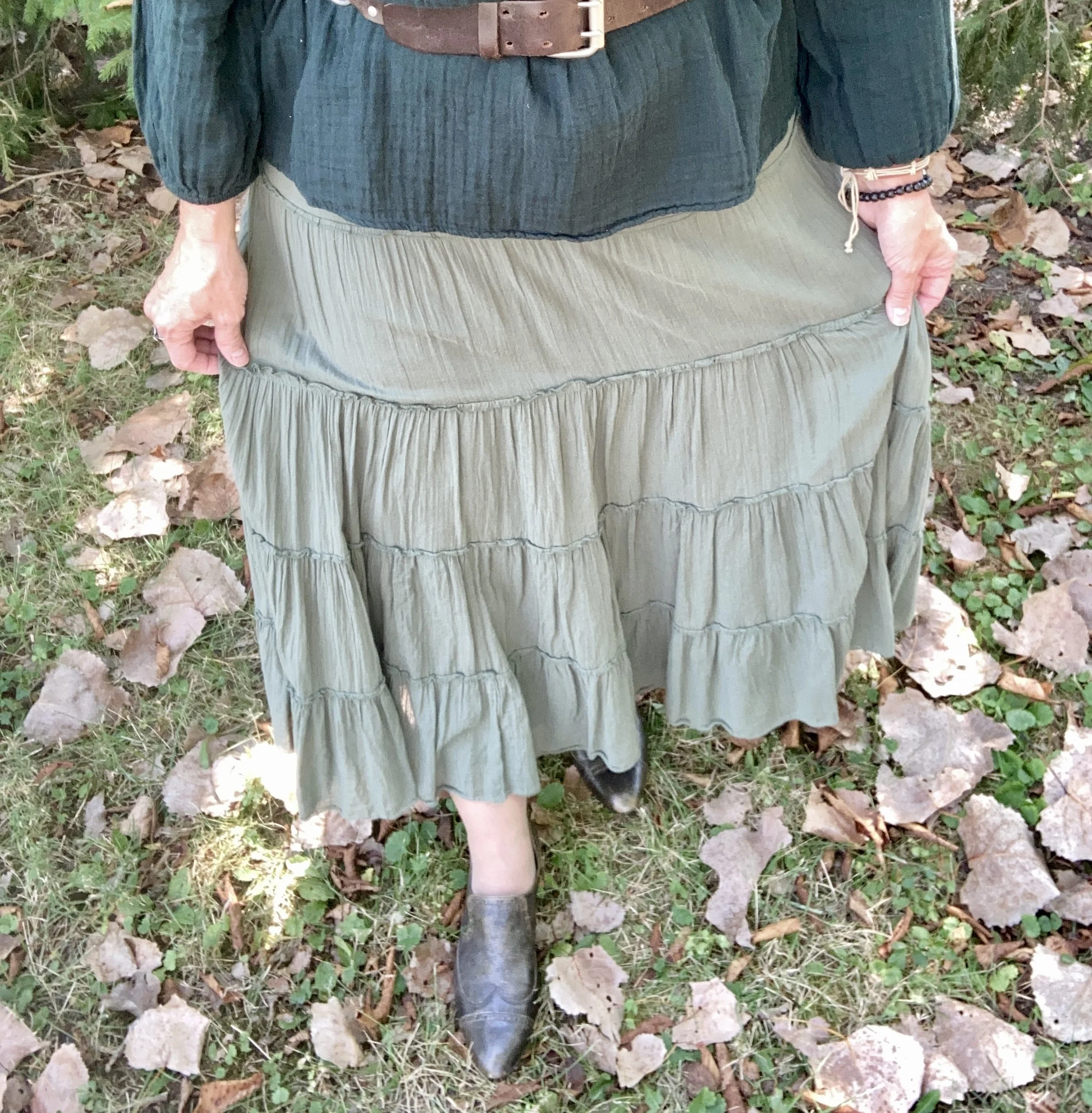
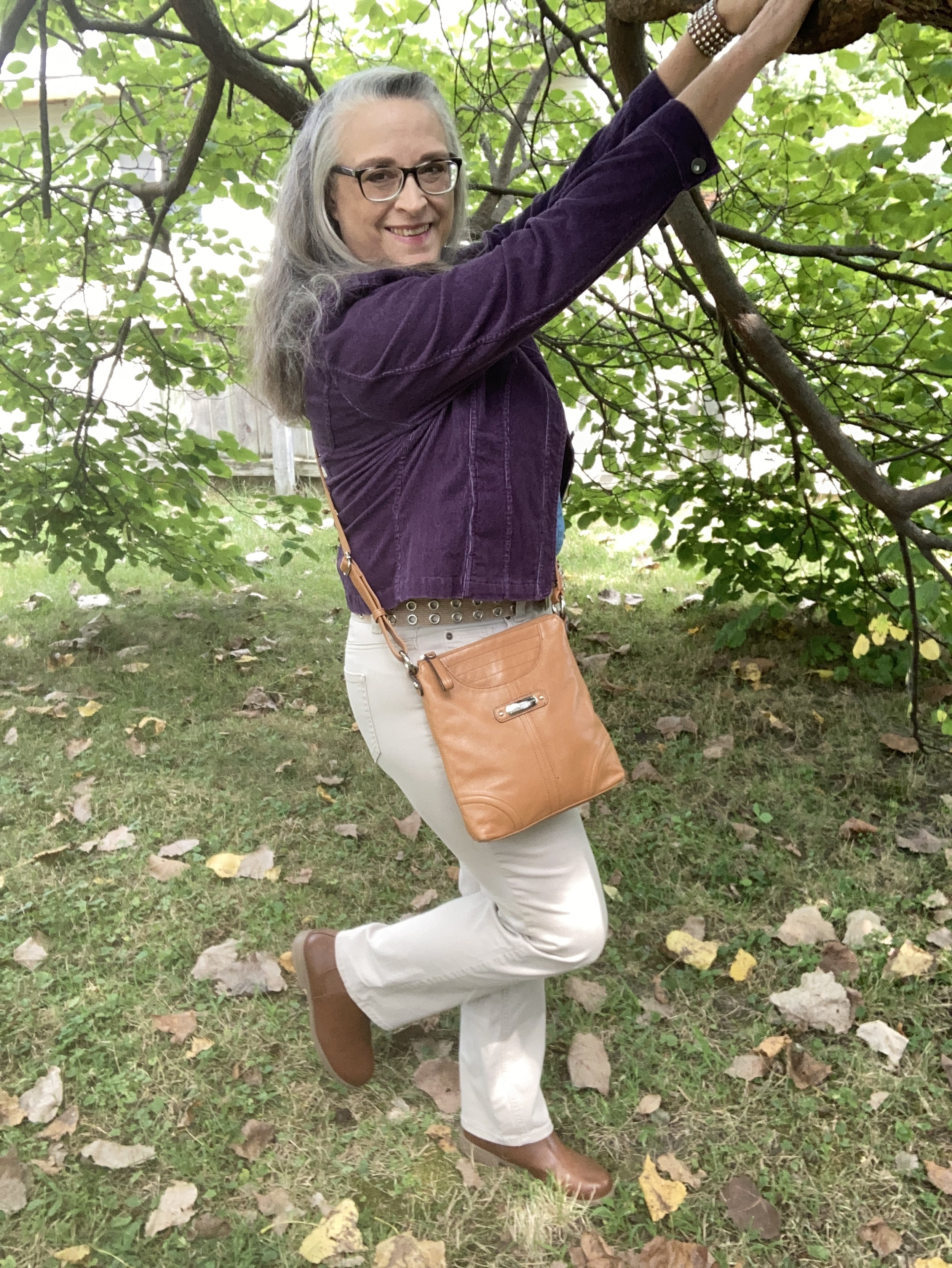
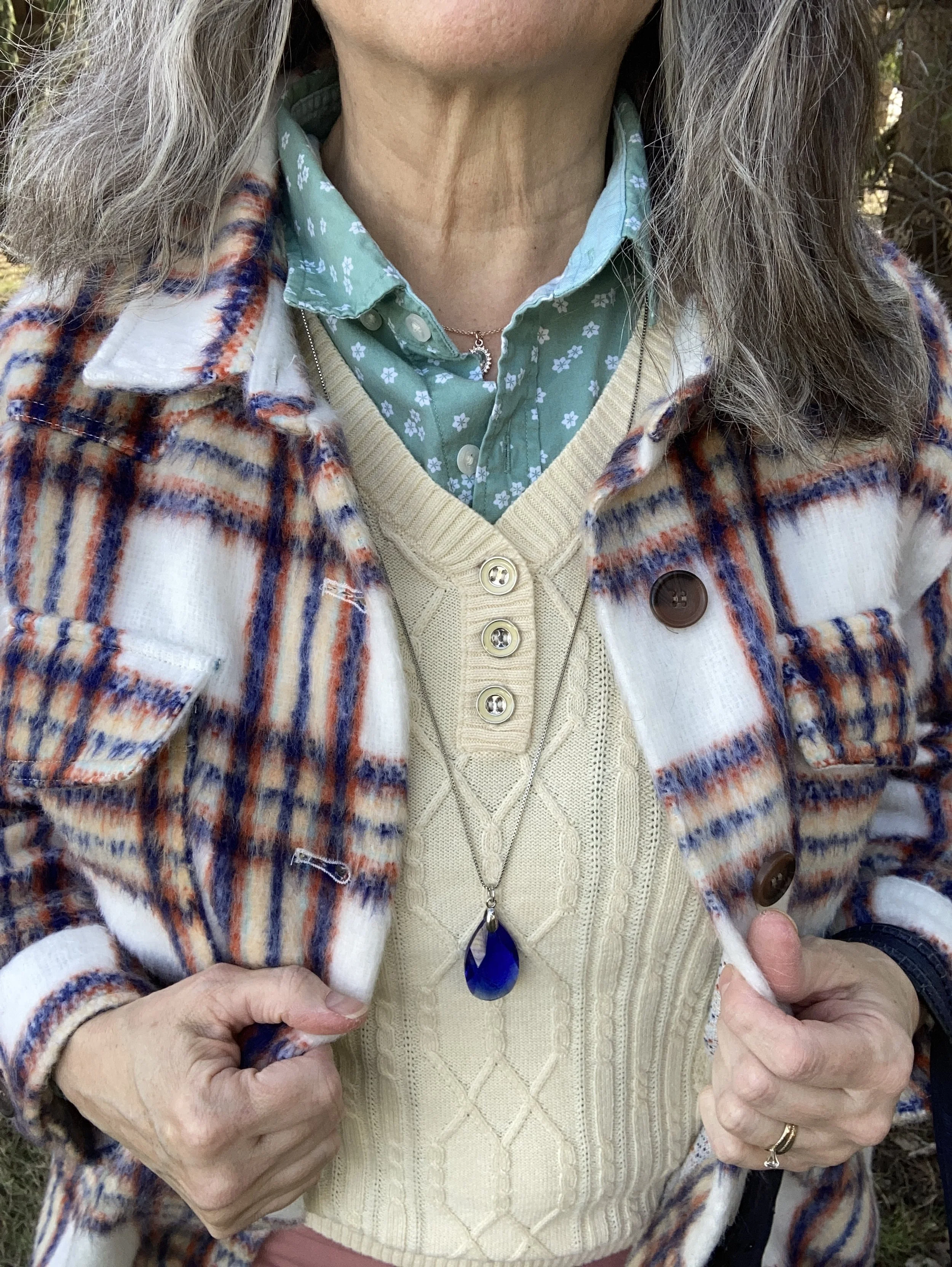
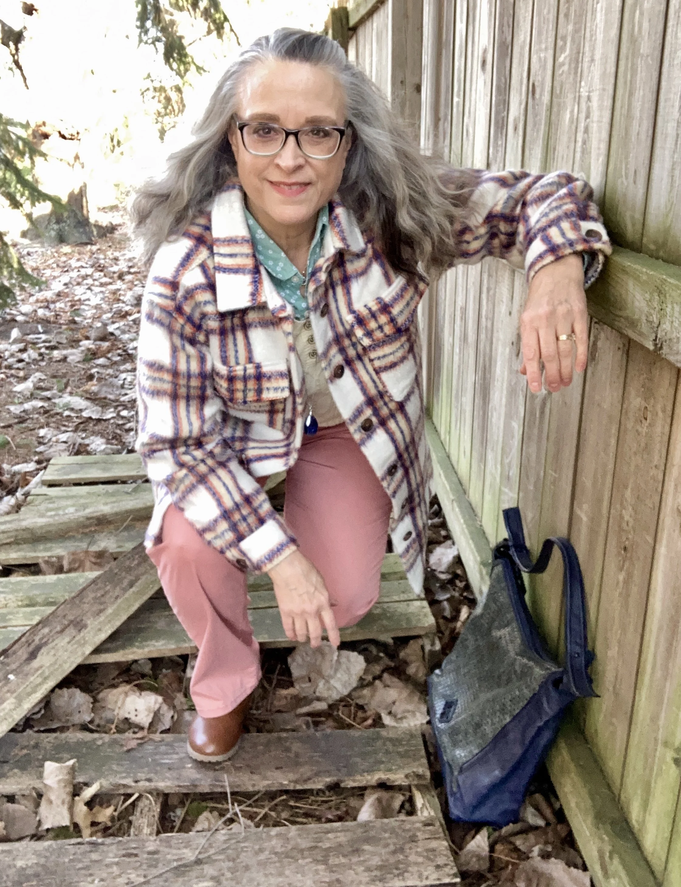
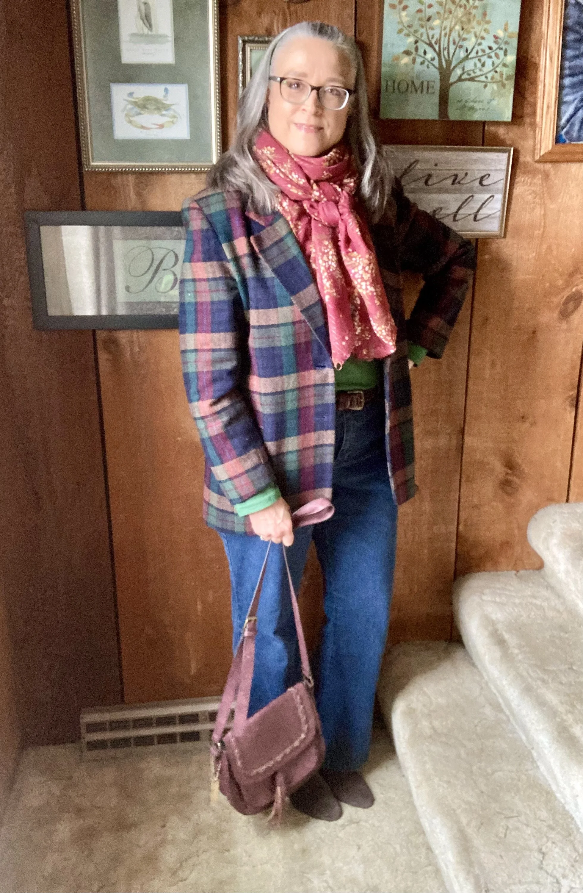
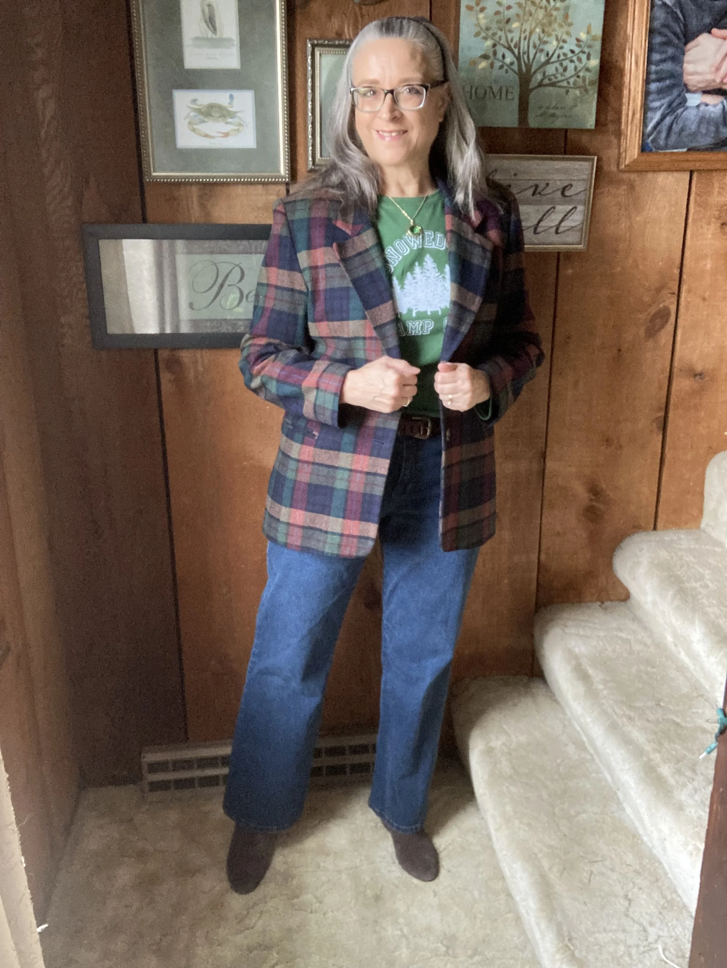
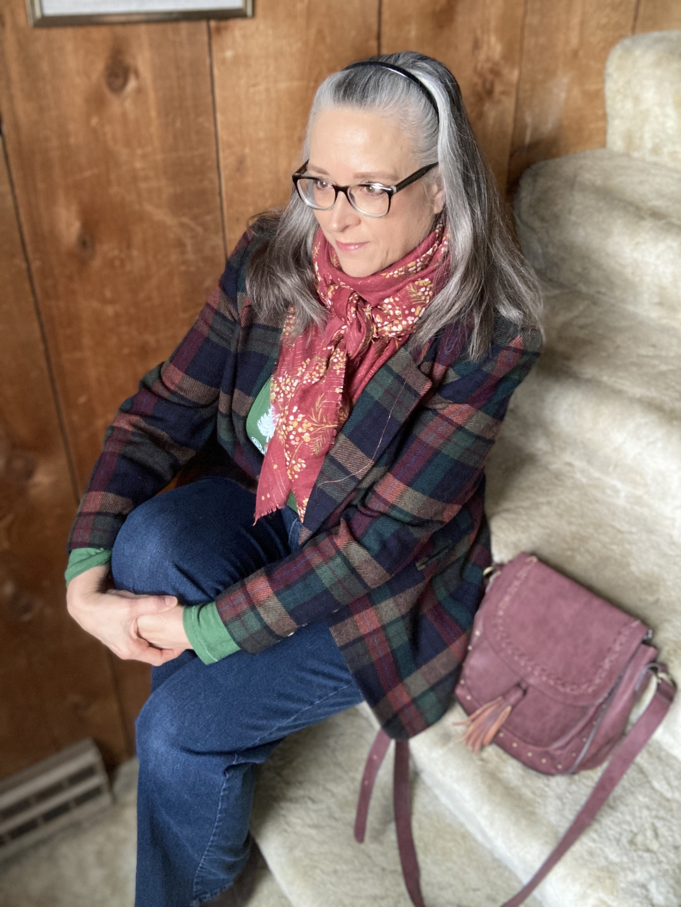
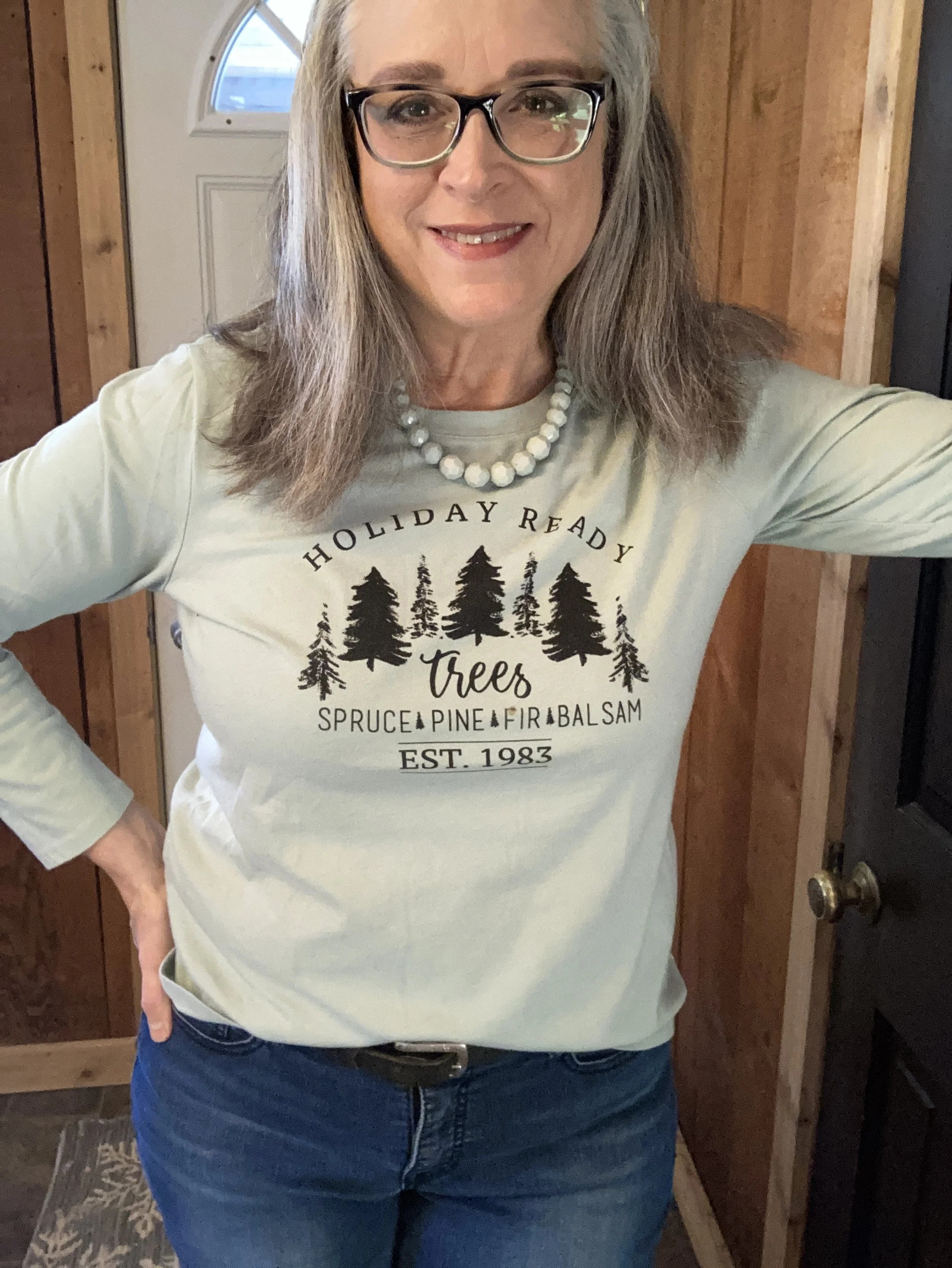
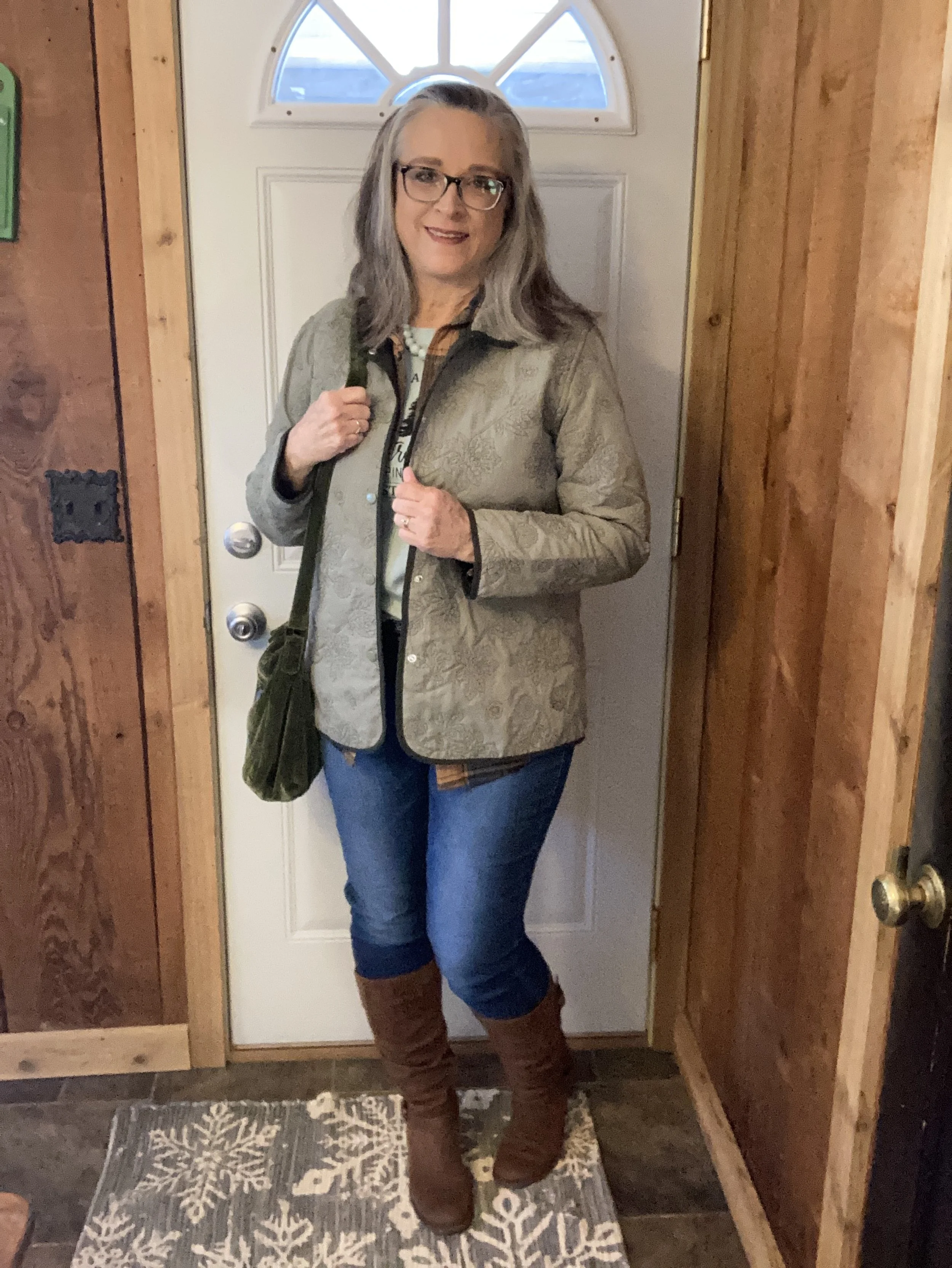
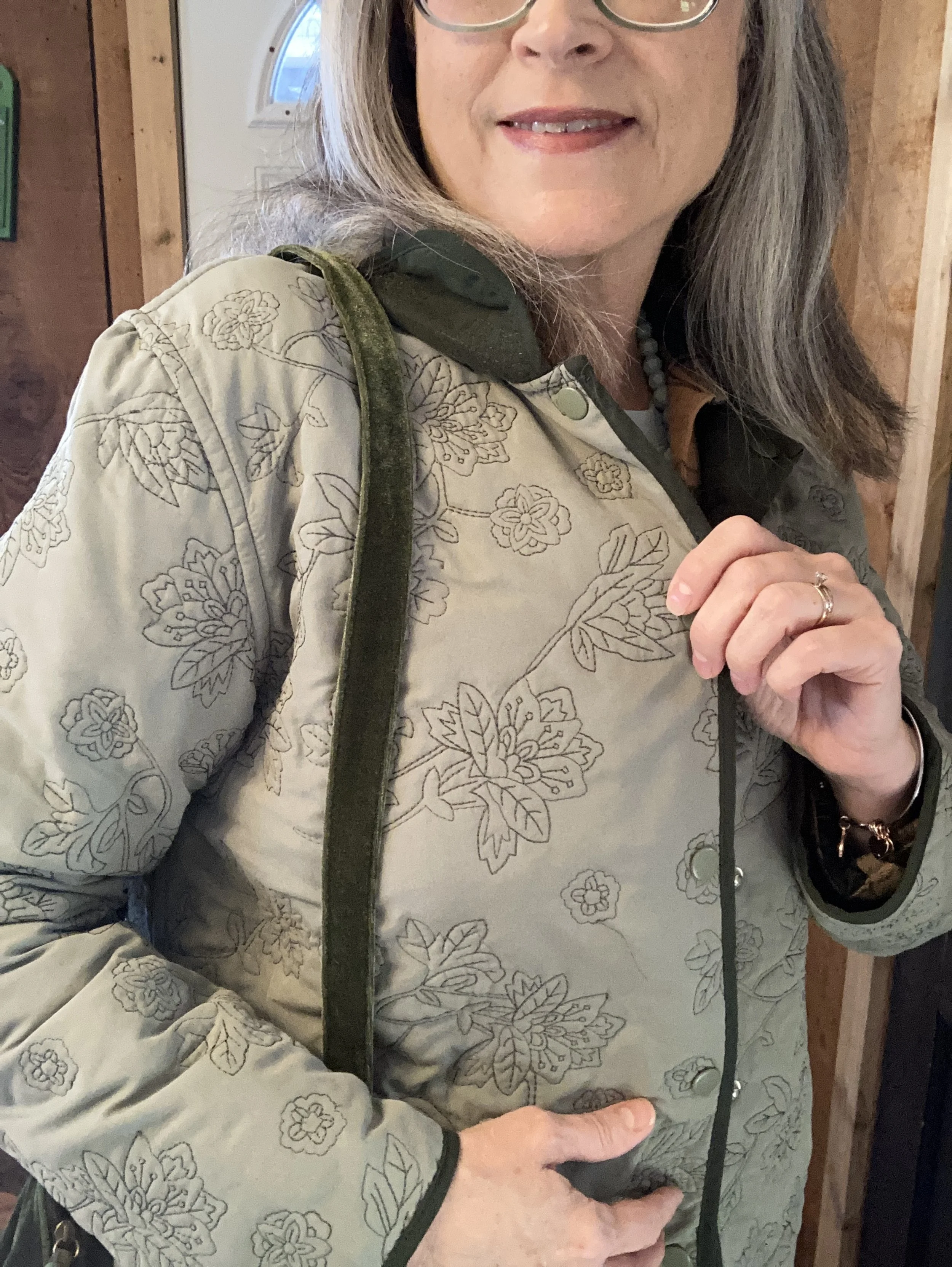
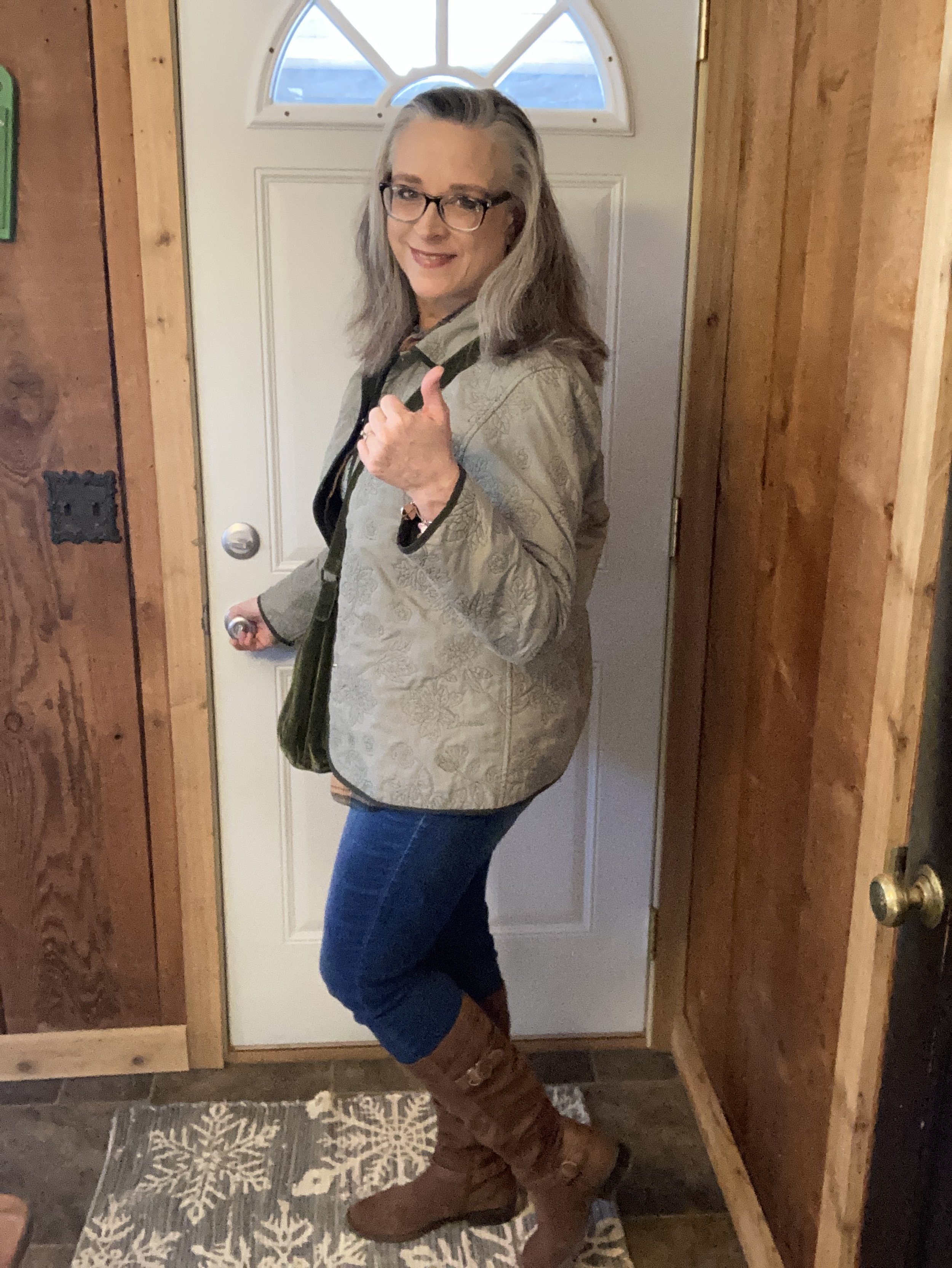
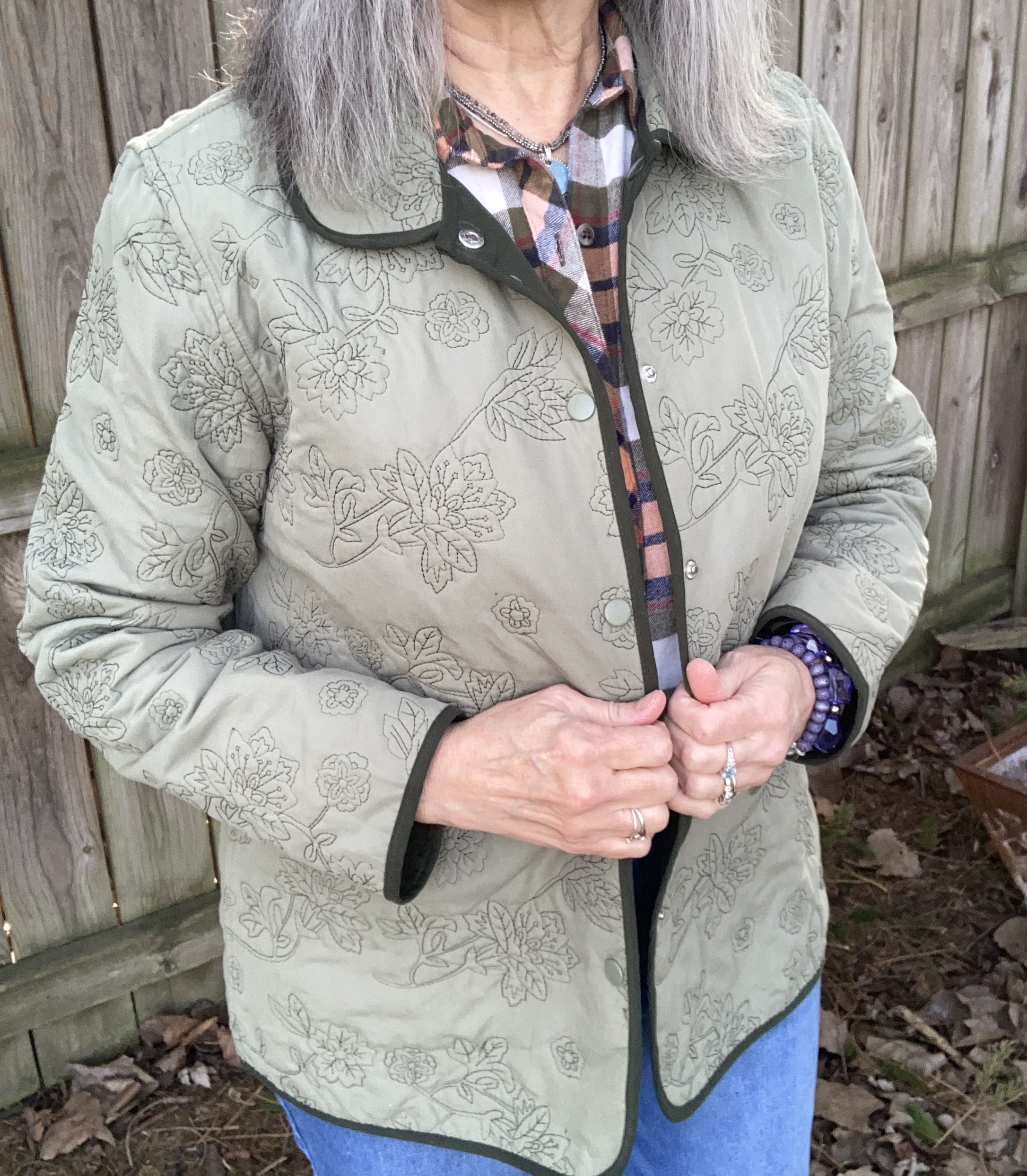
For my Sage Green color I chose this thrifted Jenny Buchanan quilted jacket. I love this piece, and it is reversible, so it can be worn with the sage green out or switch it and it will be a pretty forest green. My biggest complaint about this piece is that it doesn’t have pockets. Ha, ha. Here is a very pretty quilted jacket from Kohl’s, not in the same color, but a fun piece.
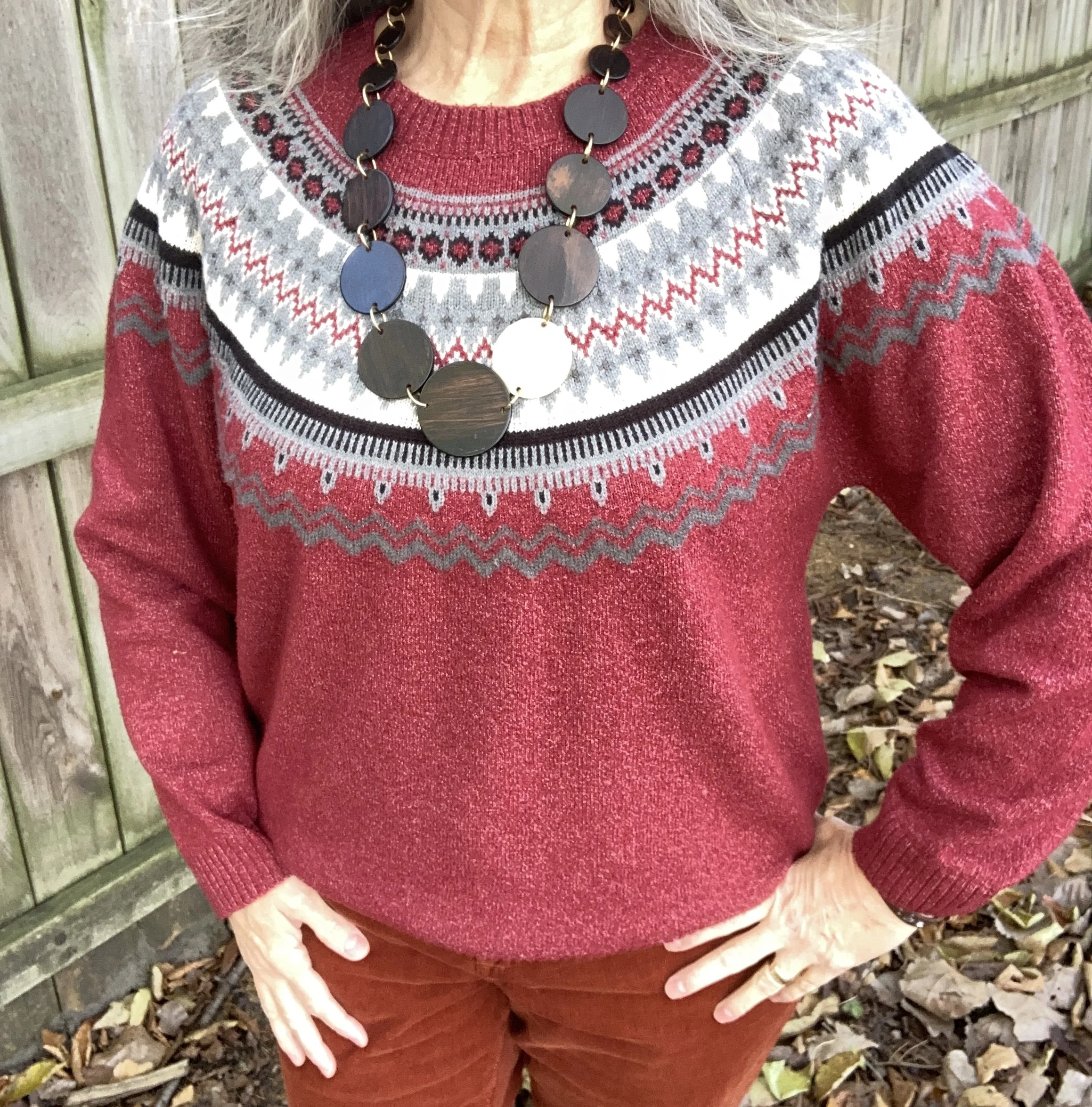
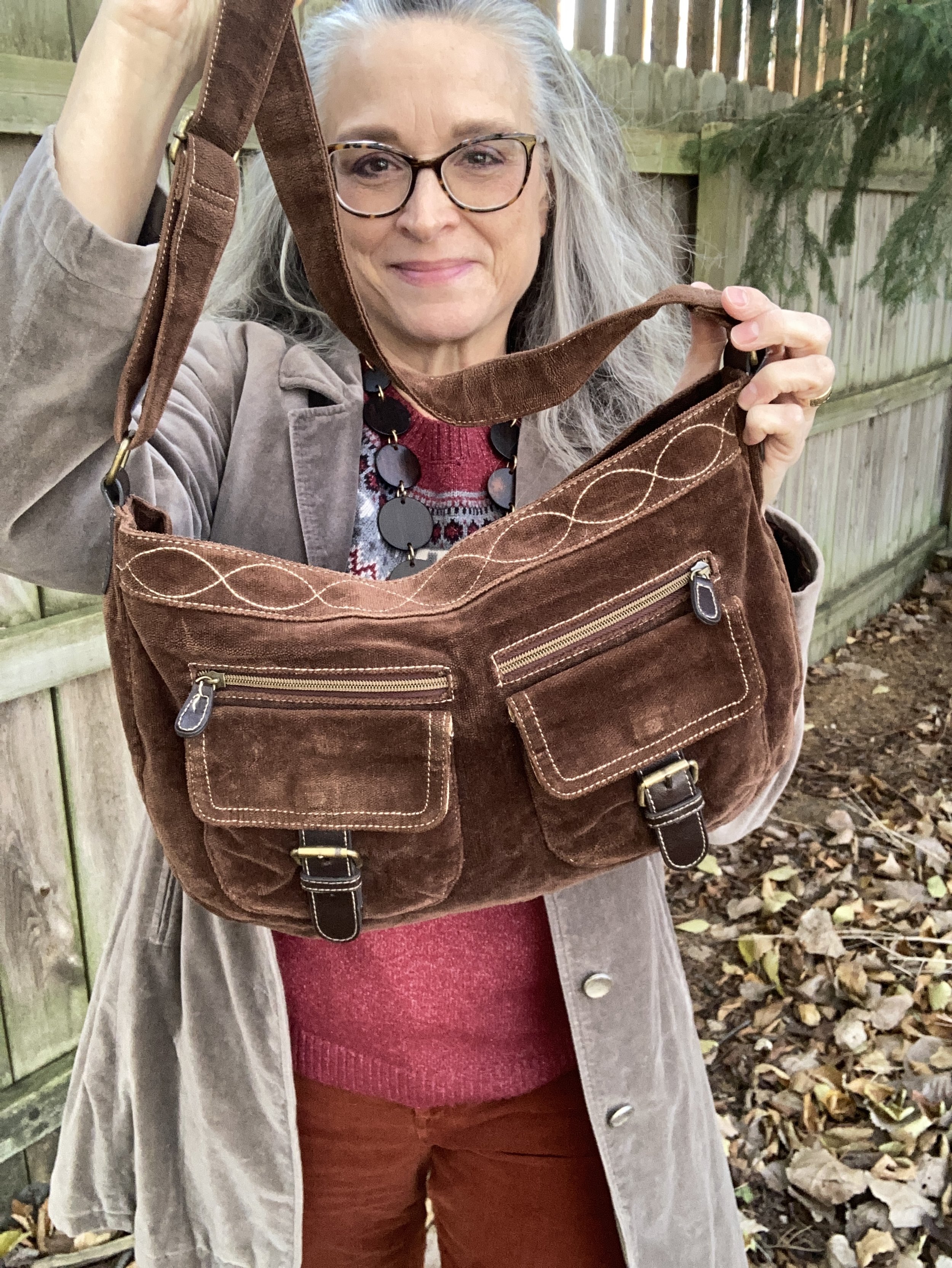
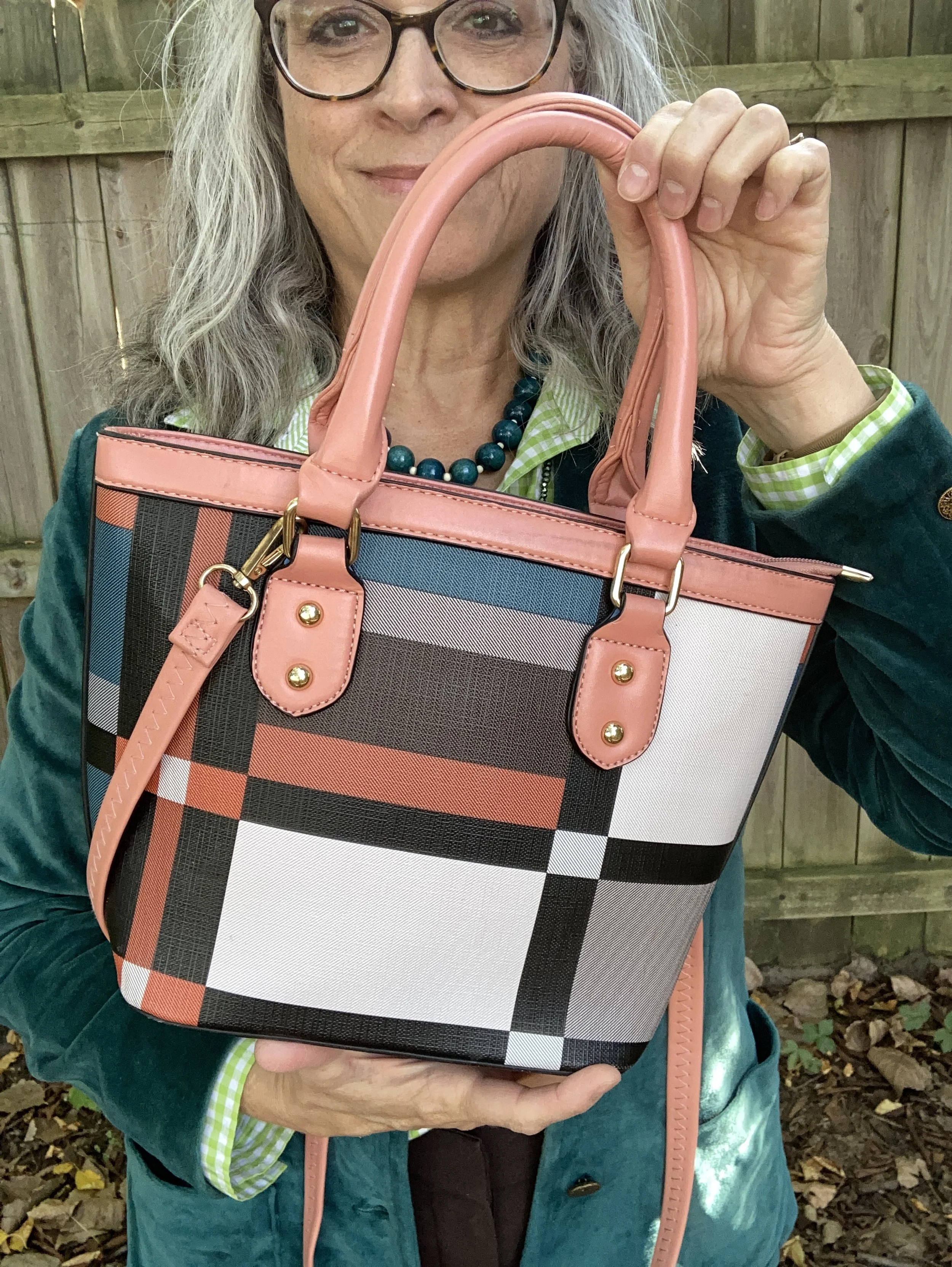
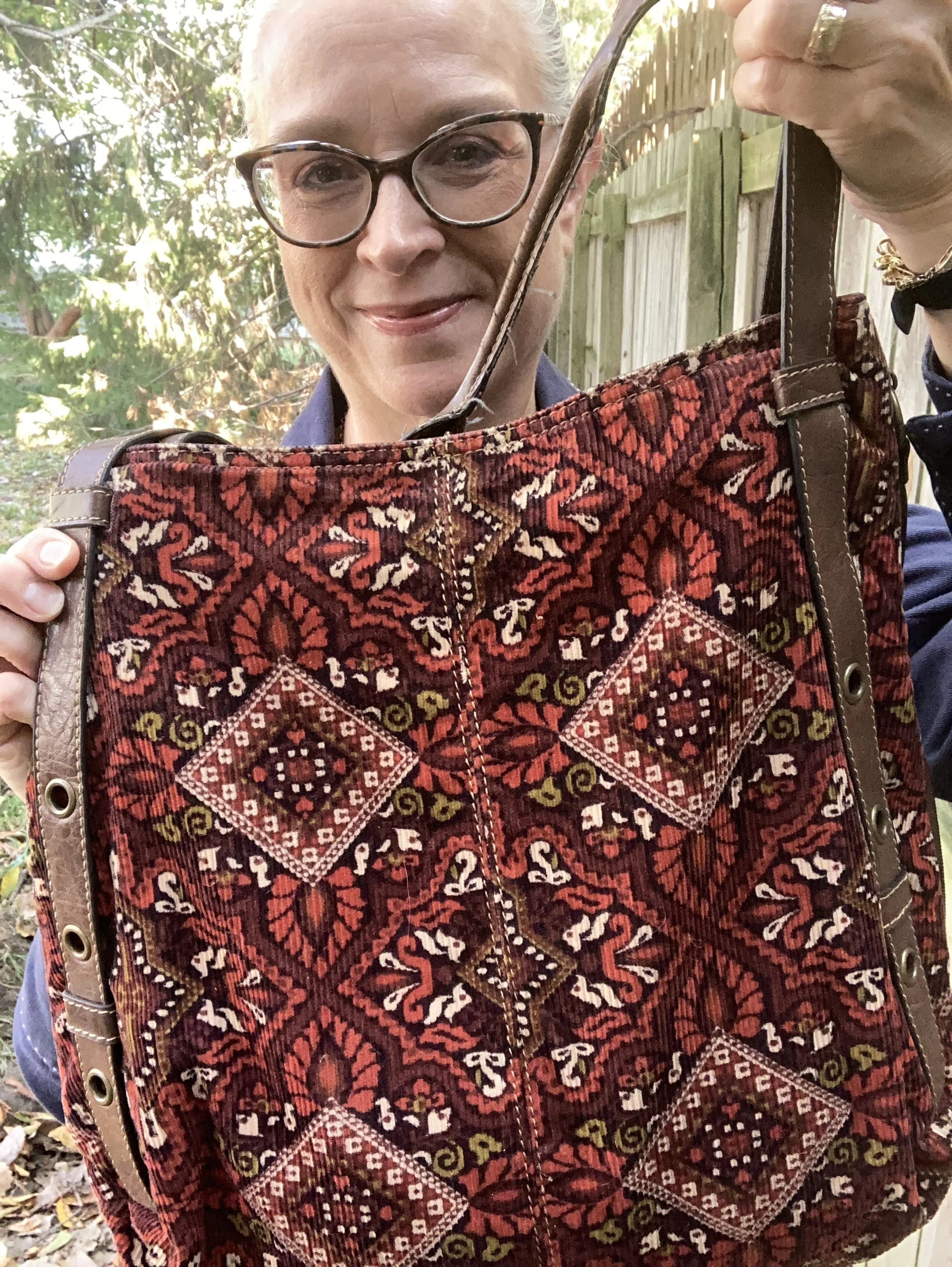
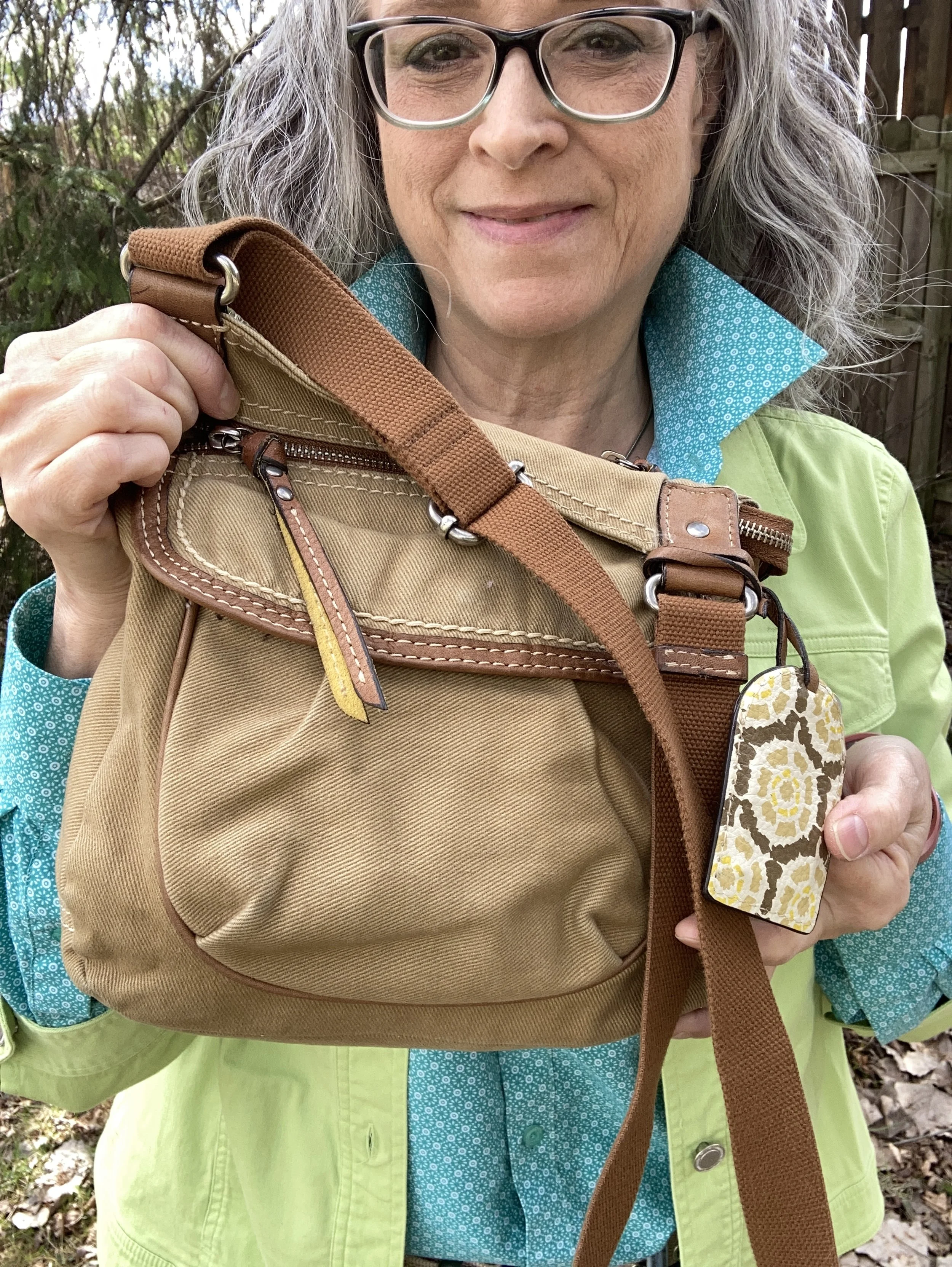
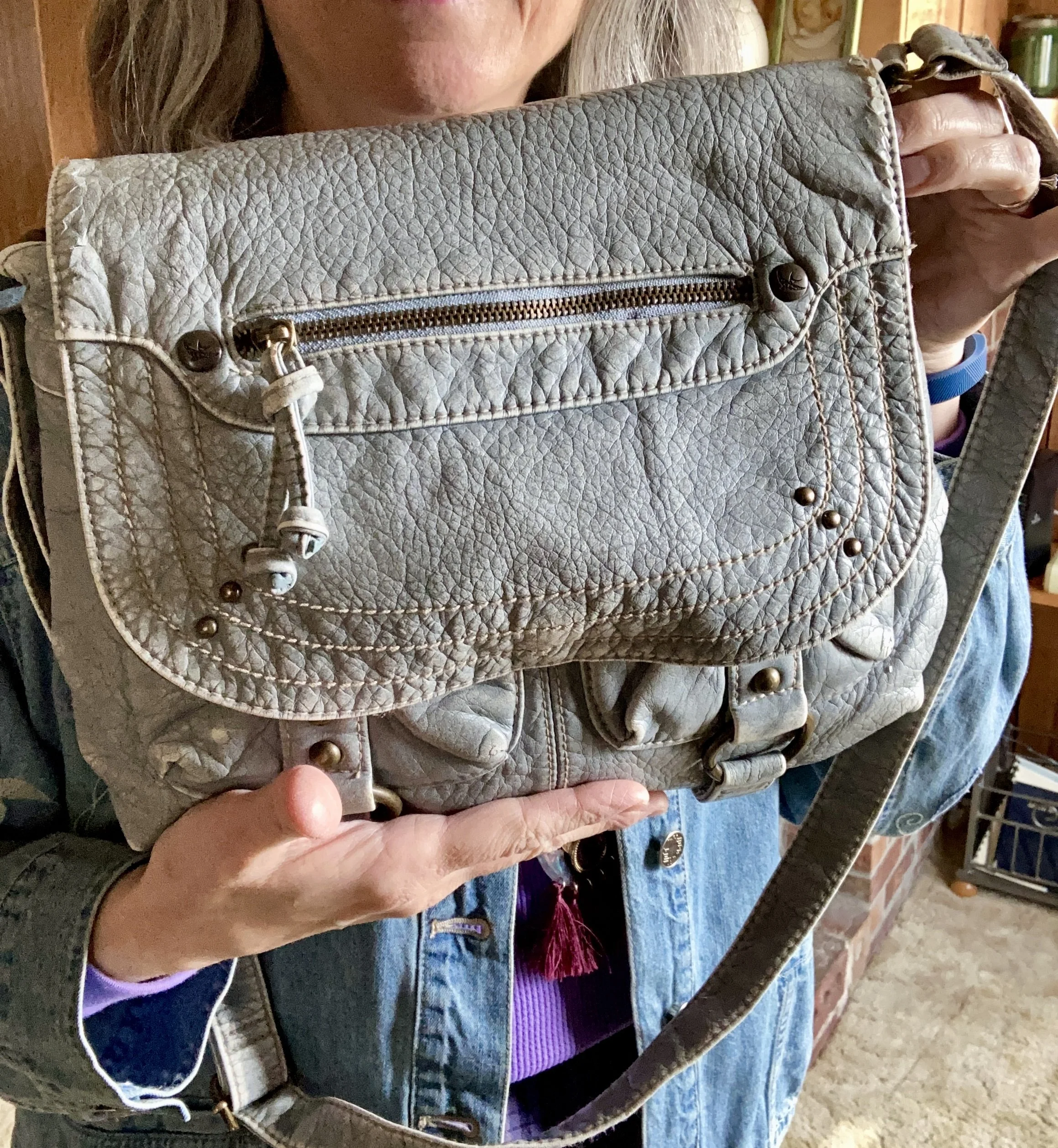
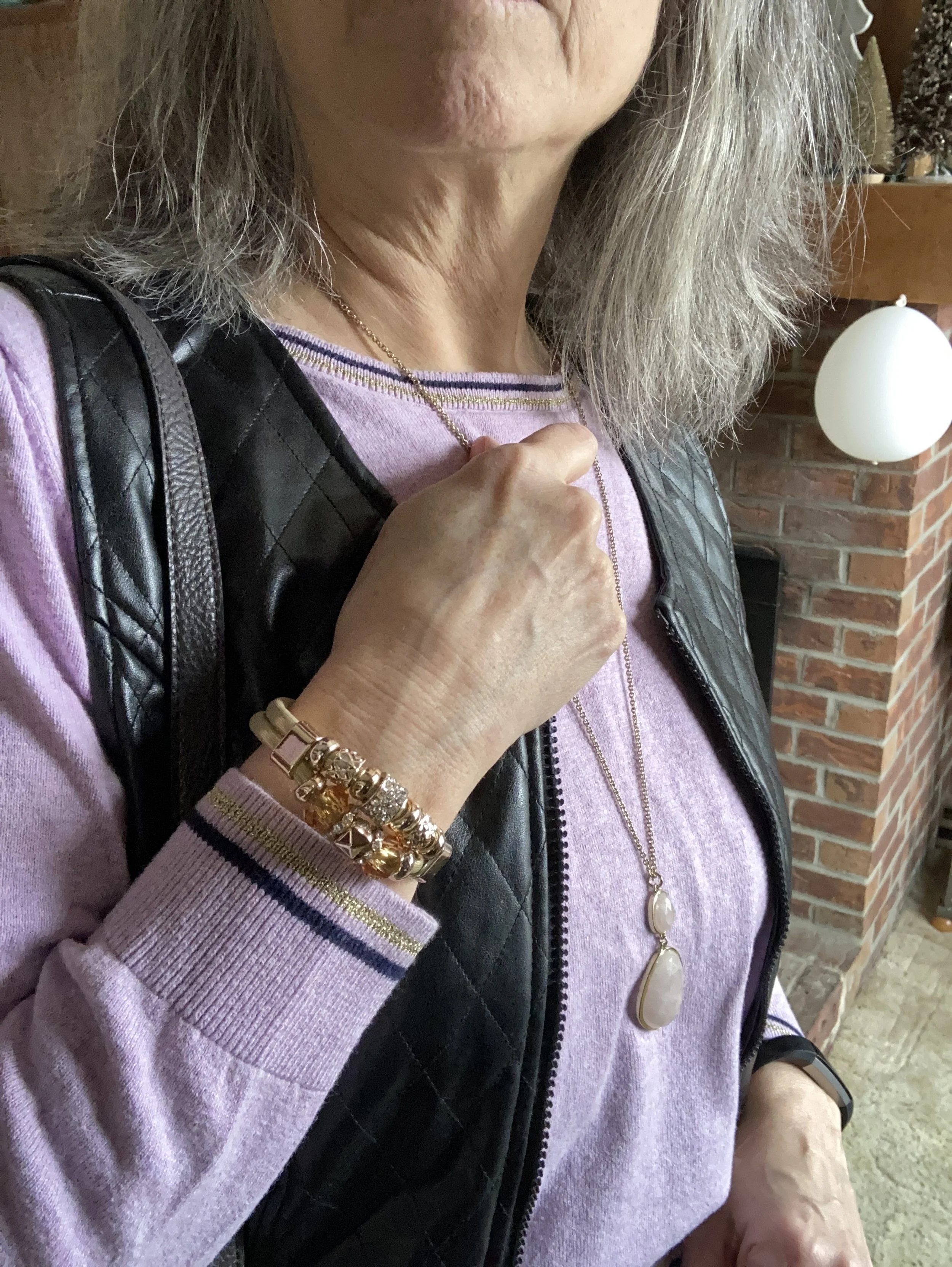
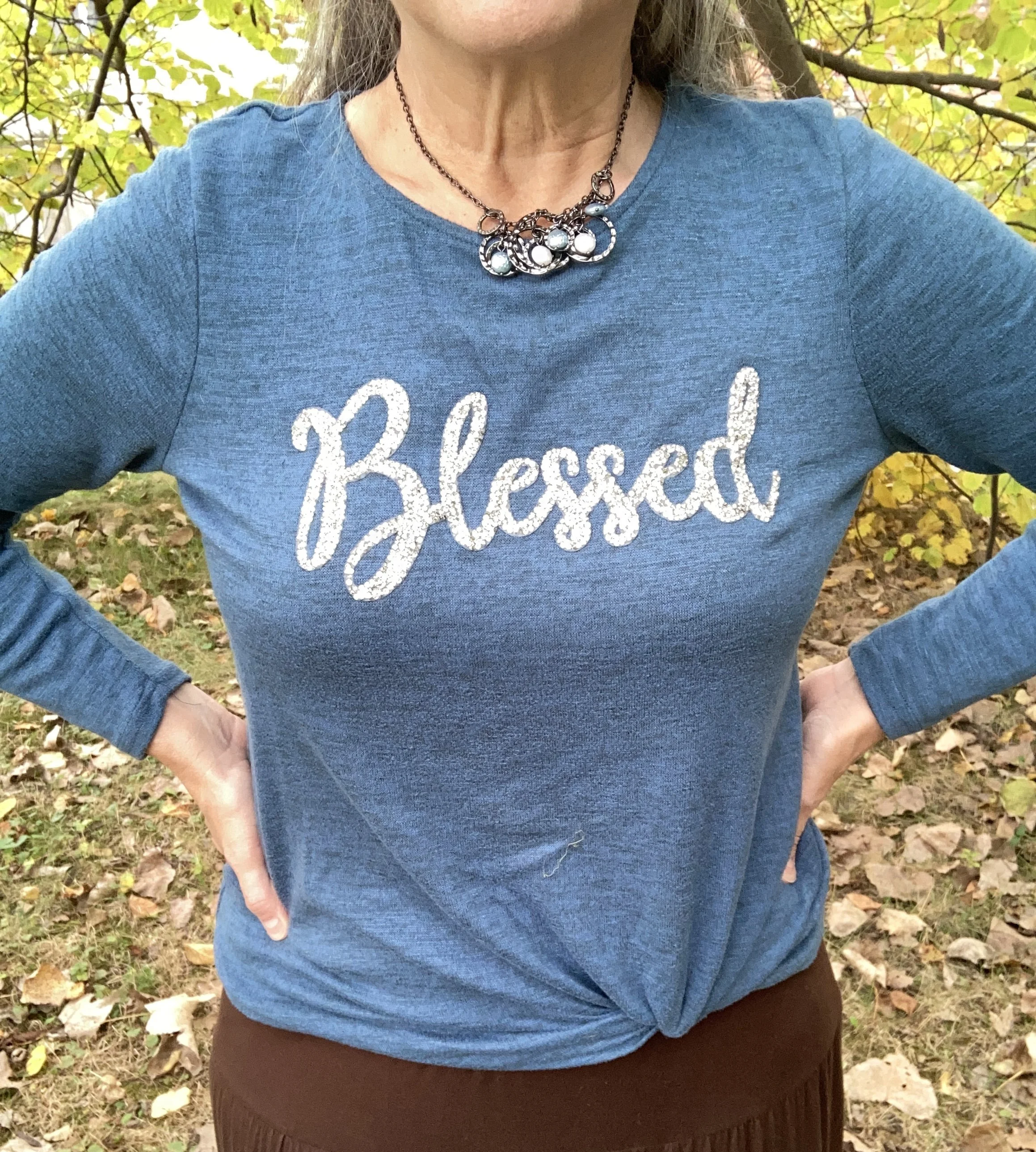
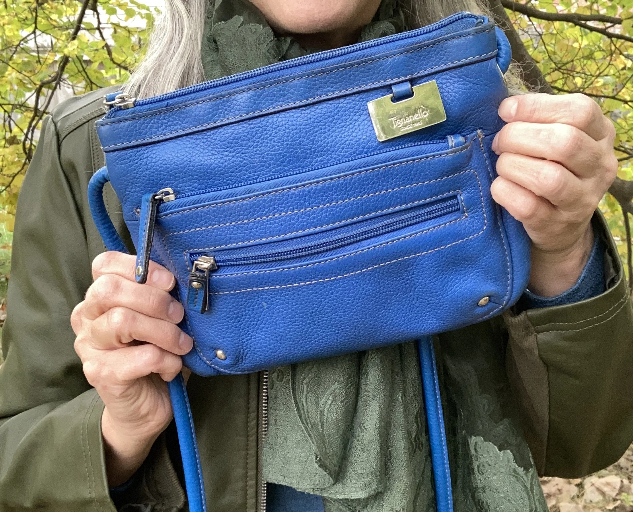
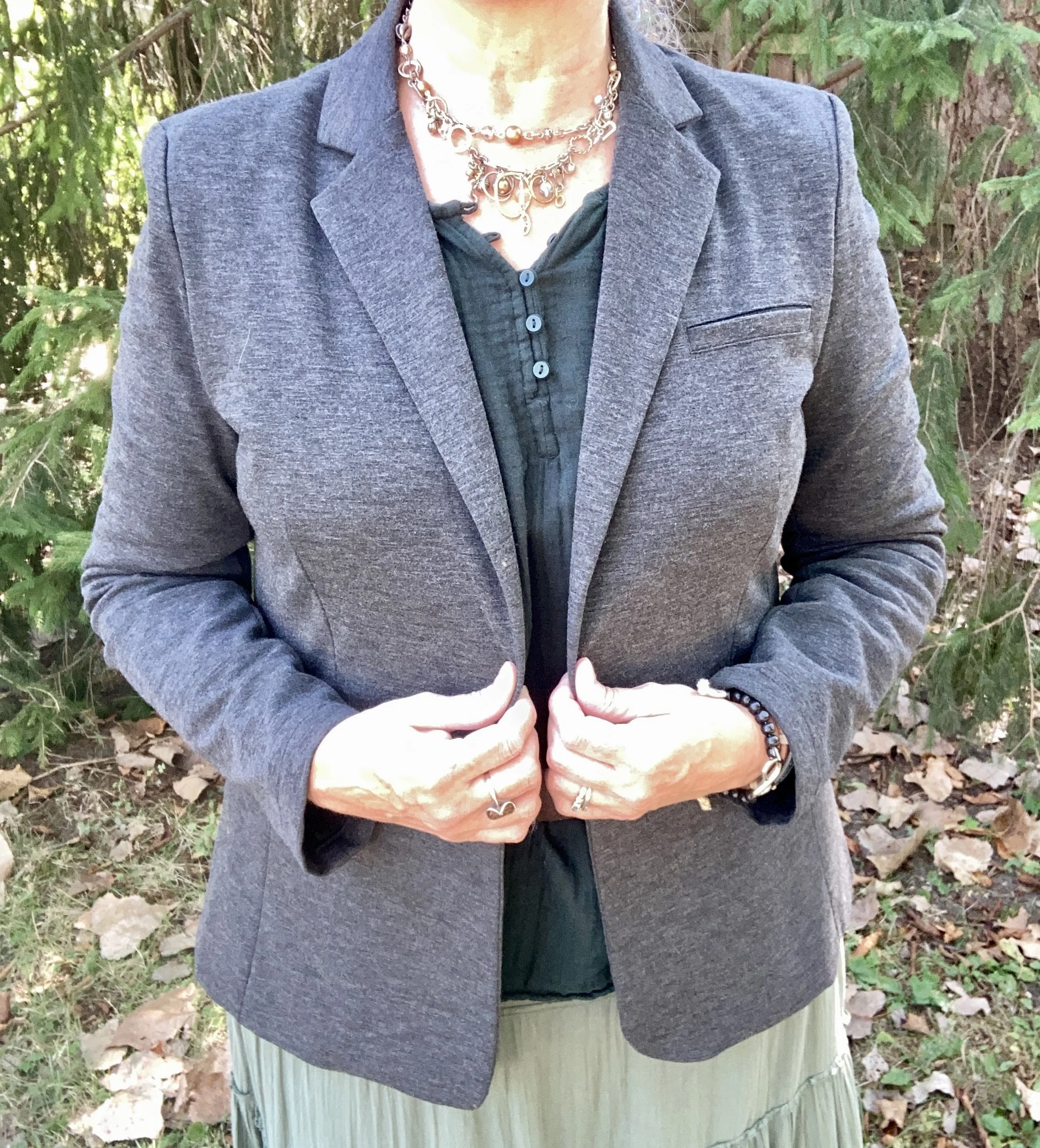
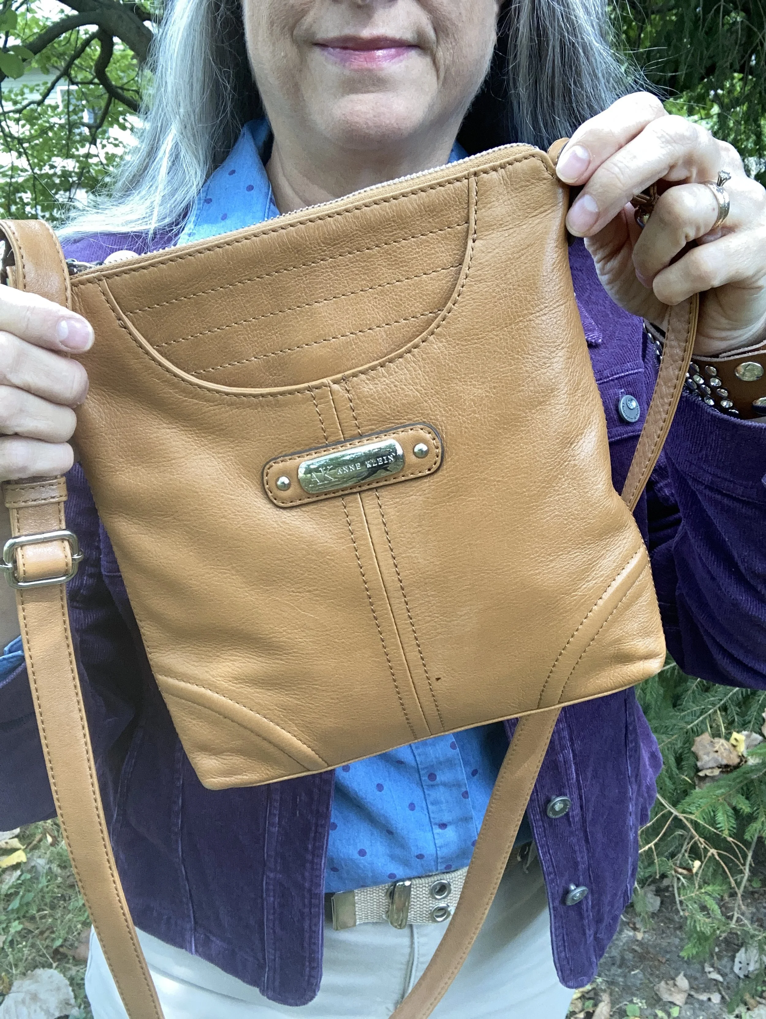
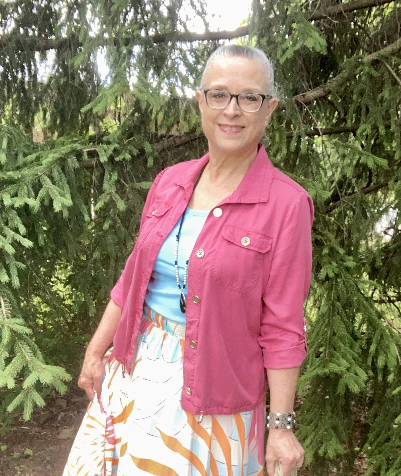
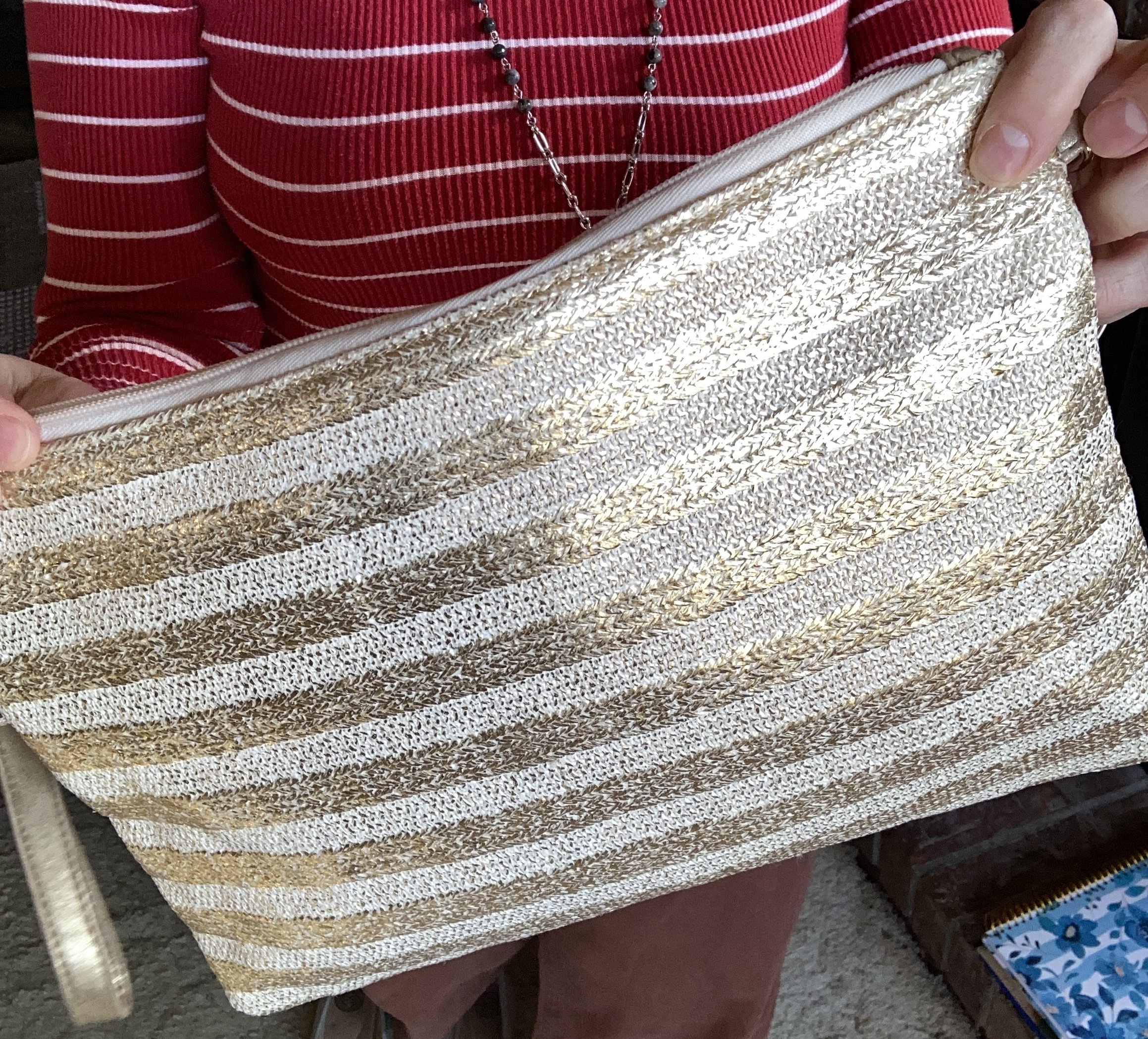
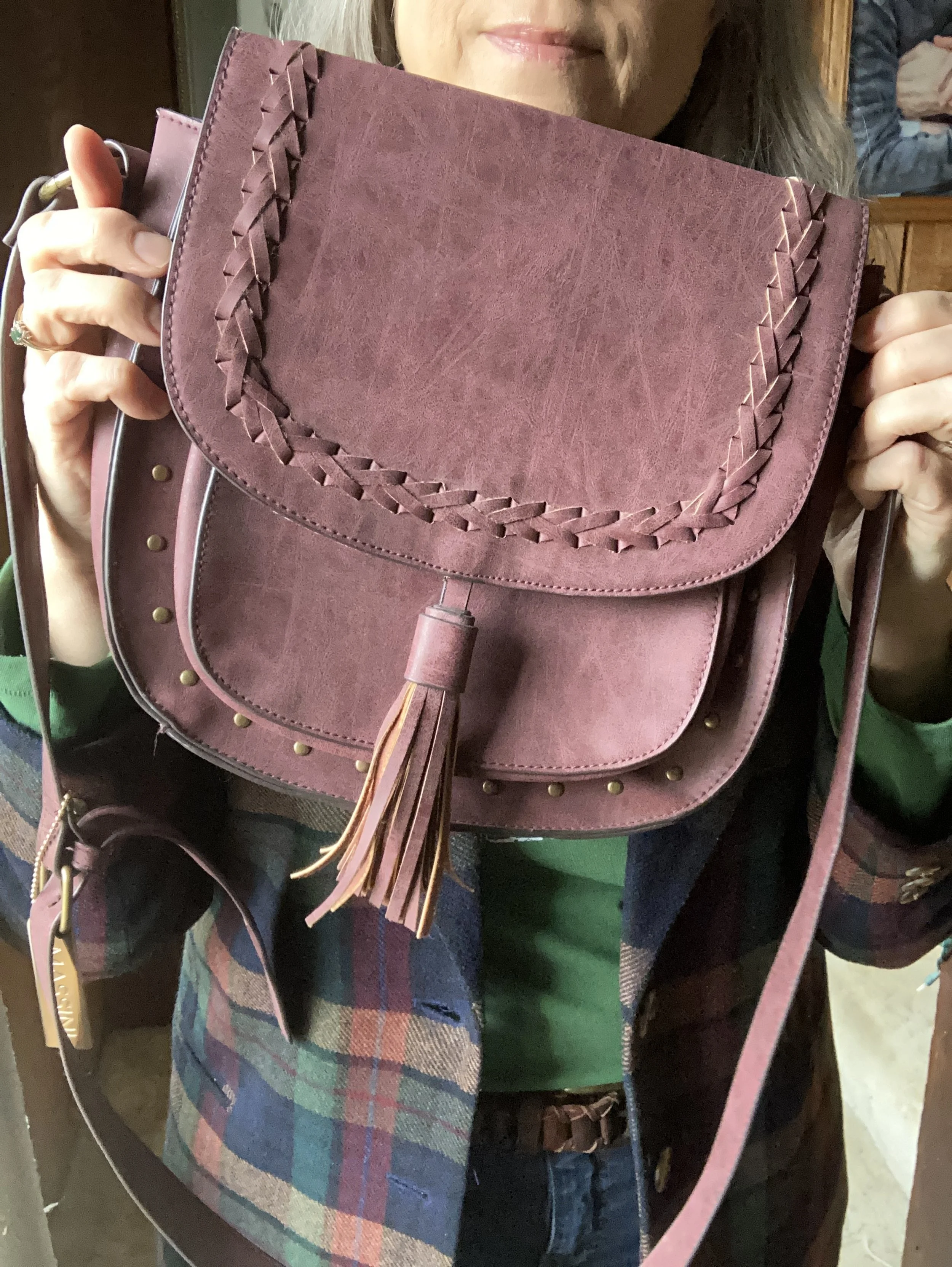
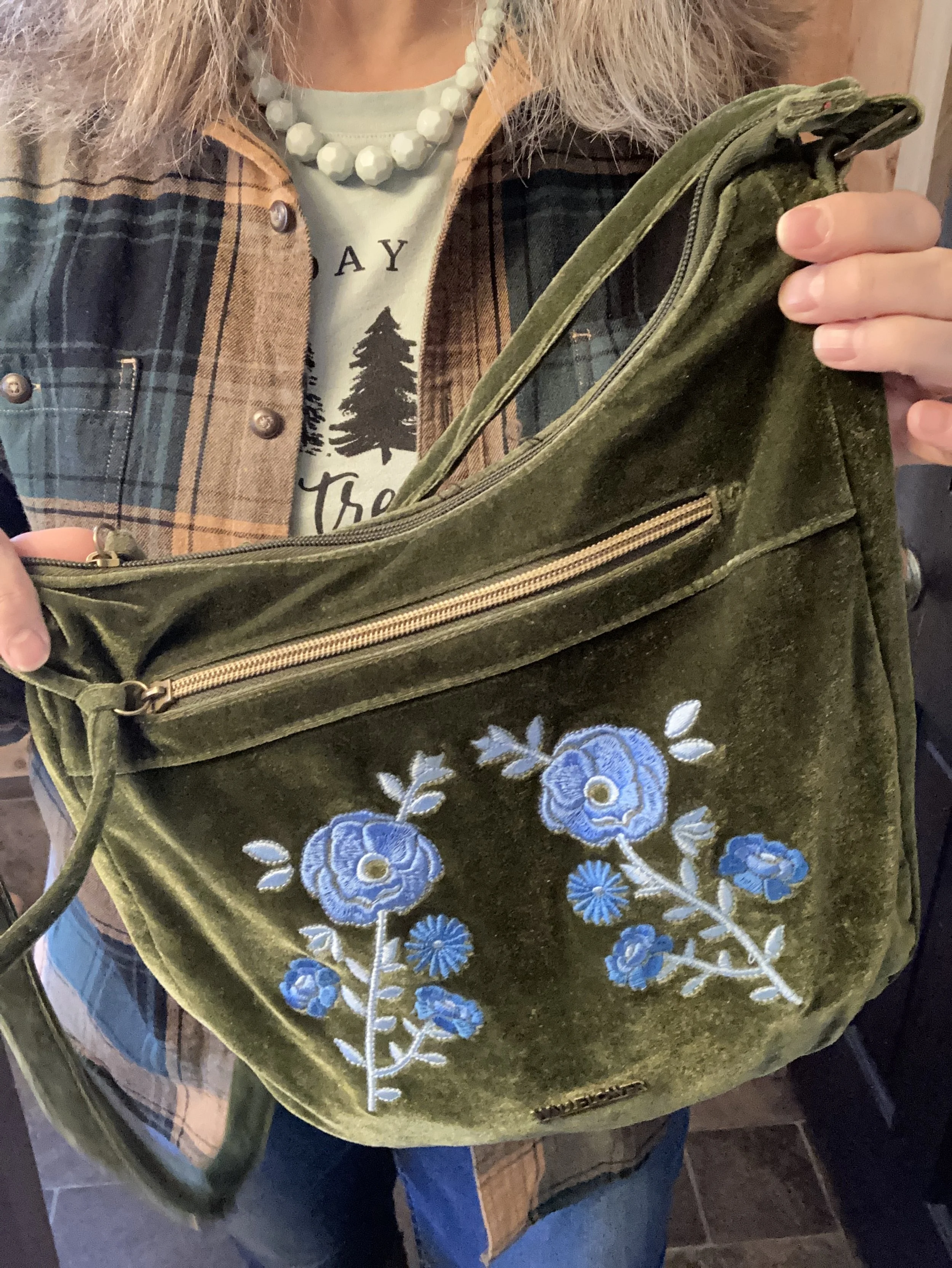
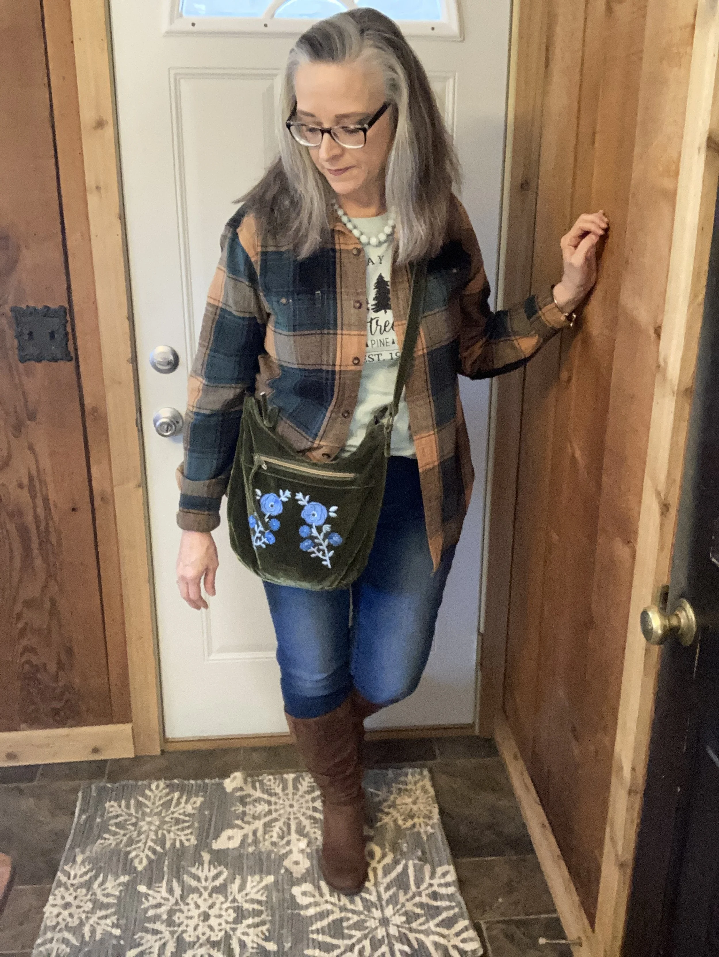
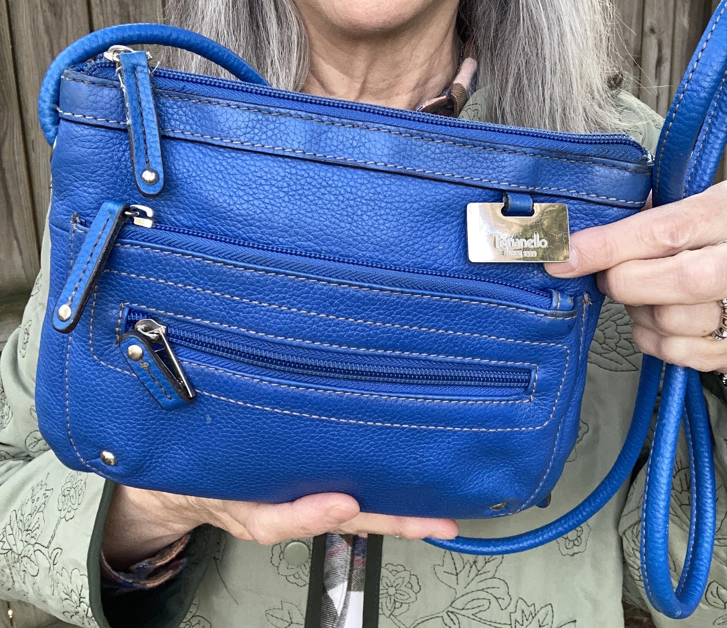
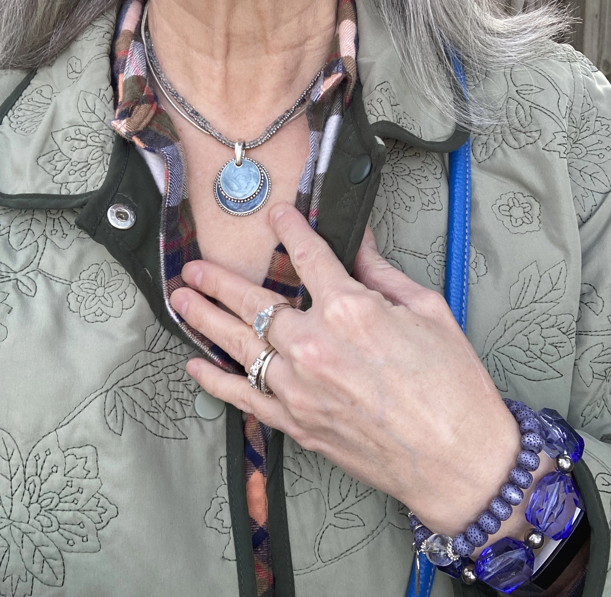
I felt there was enough going on in the outfit between the plaid and the quilting on the jacket that I didn’t need to overdo the accessories. My second hand Tignanello bag was like a brighter version of the Marina blue.
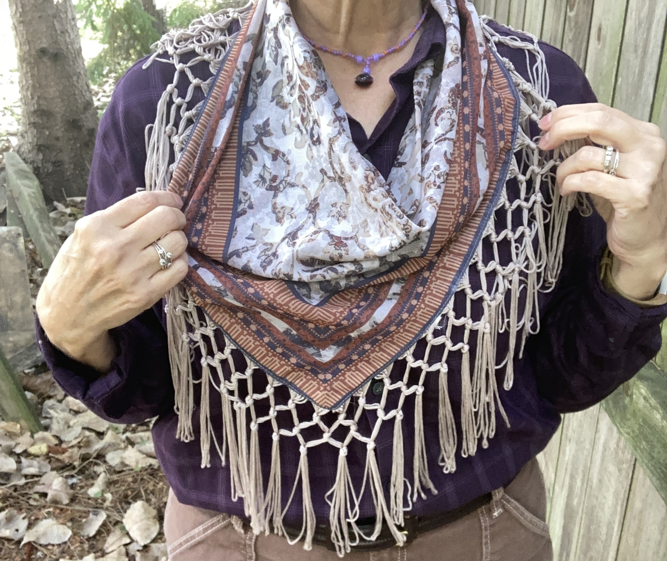
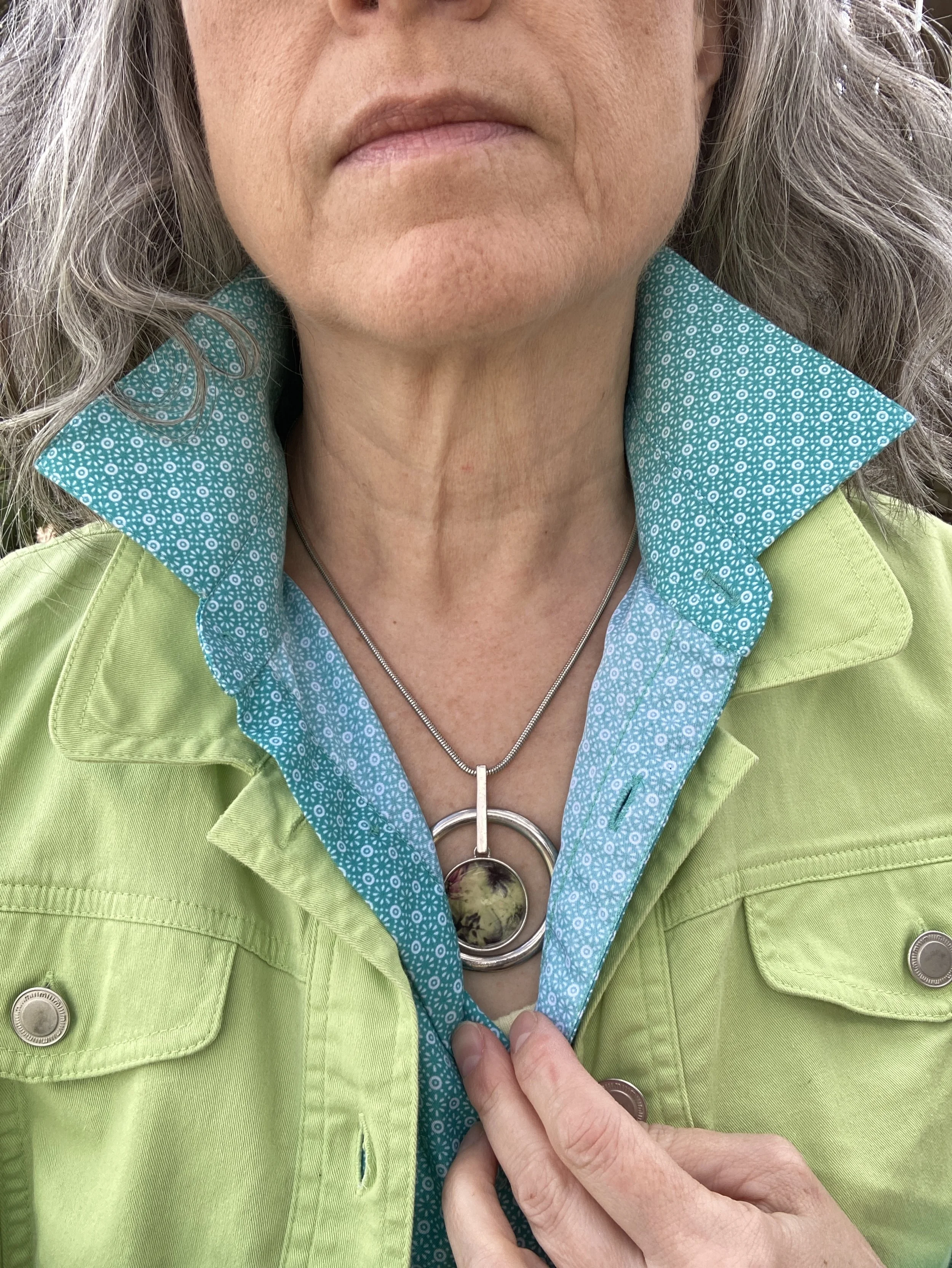
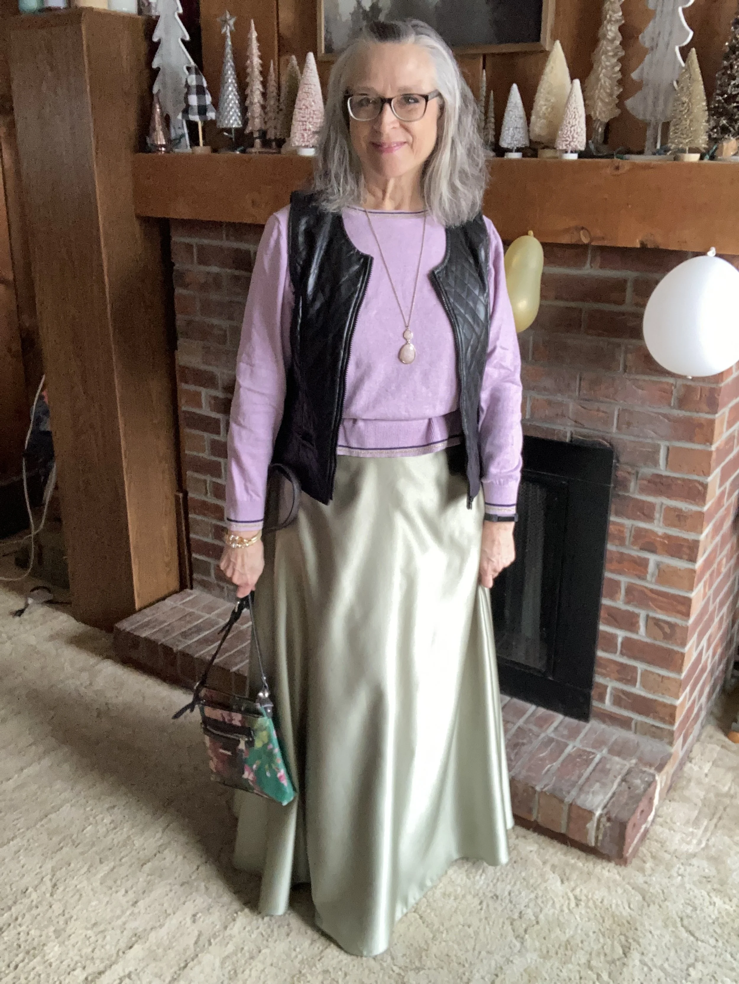
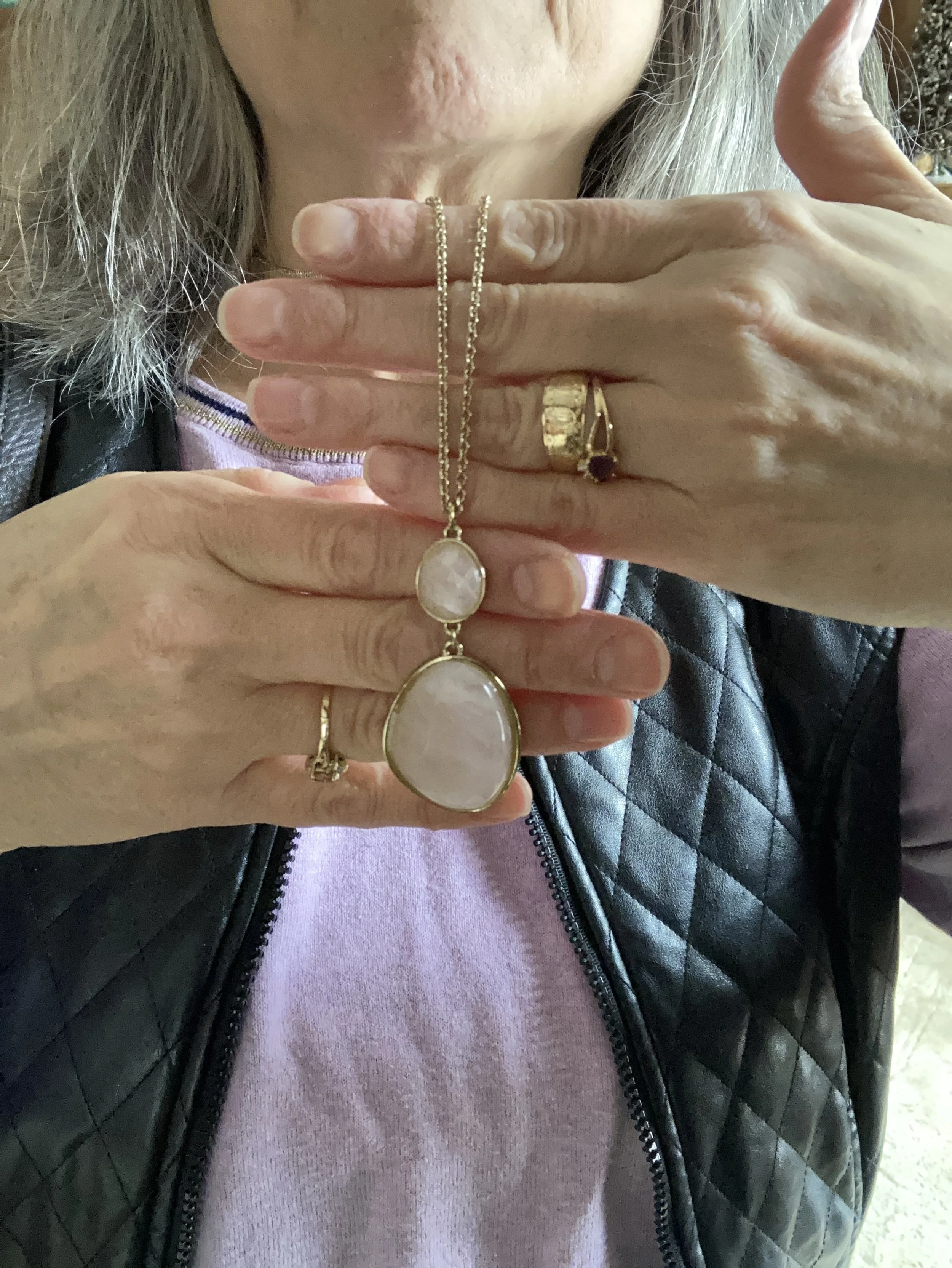
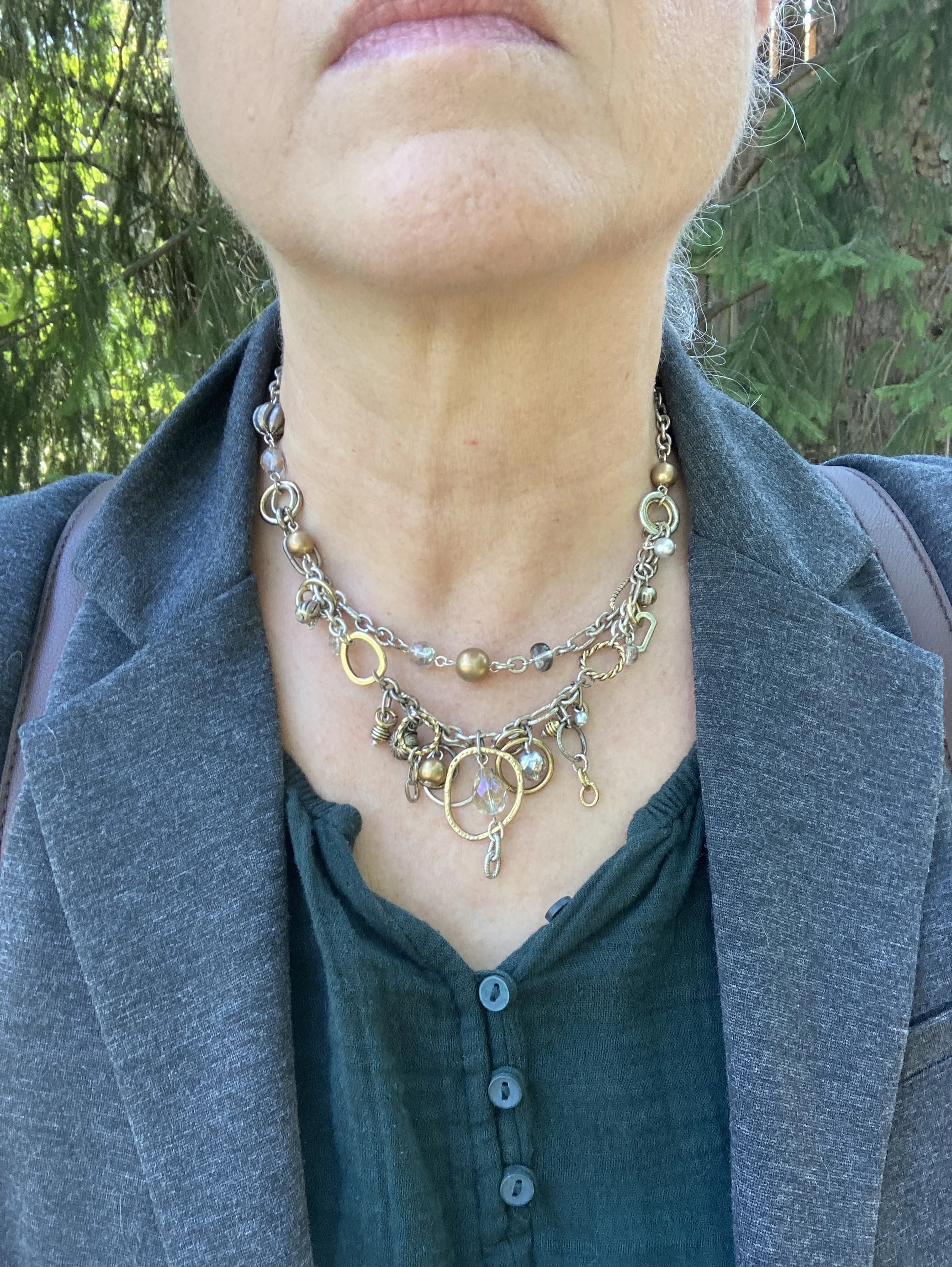
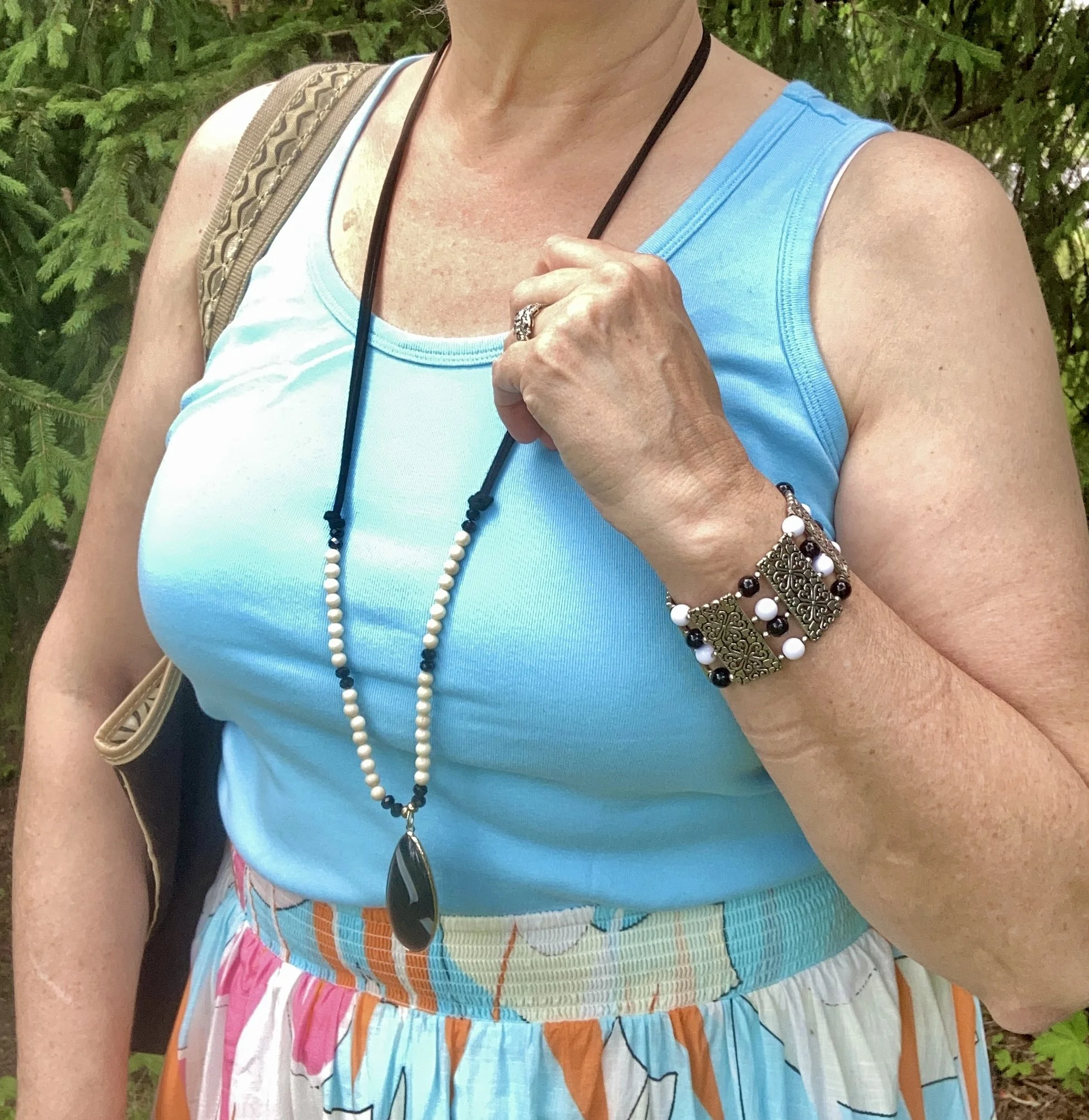
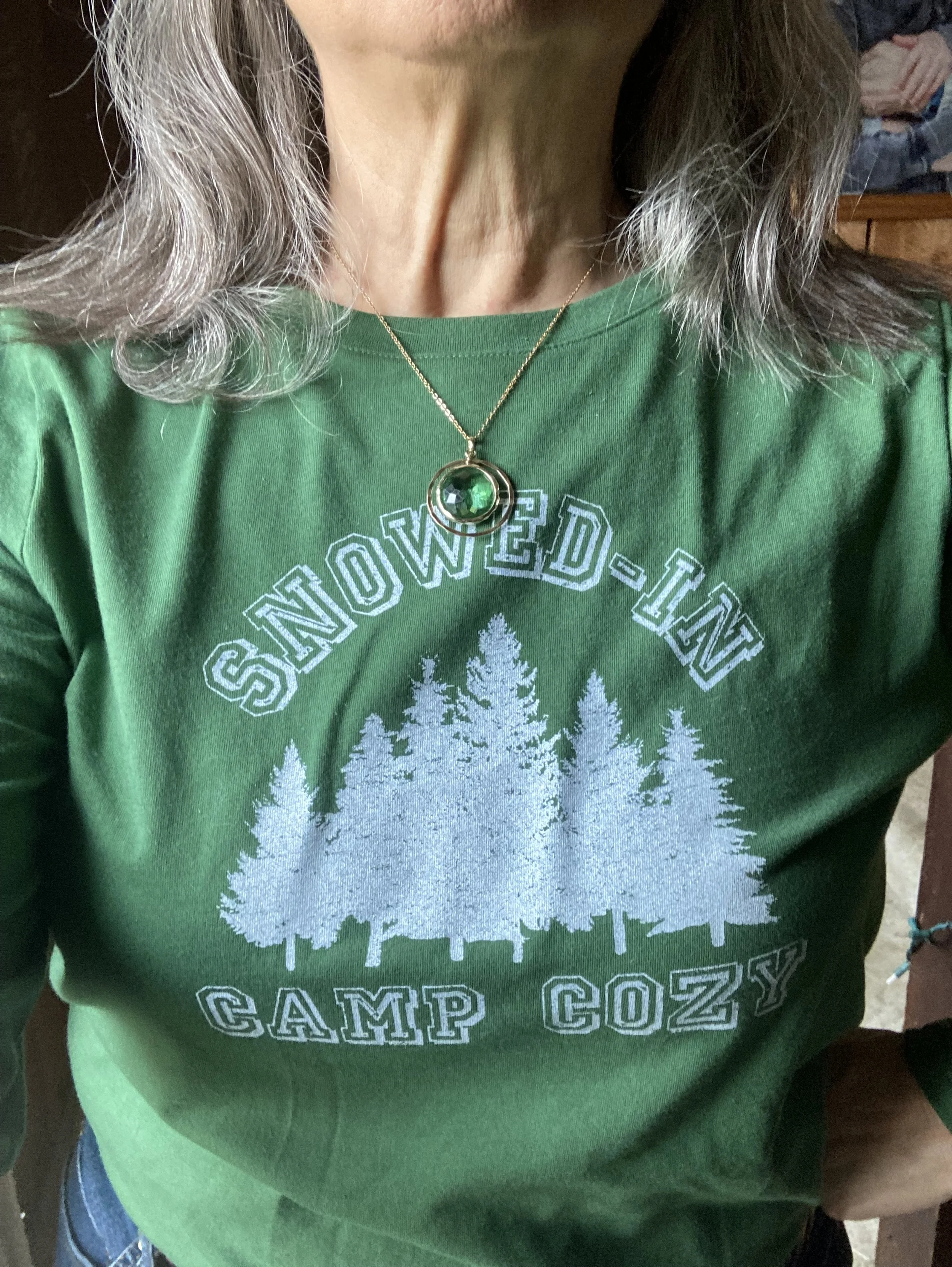
My jewelry was all over the place as far as the blue color was concerned and I almost feel I should have went with something orange to bring out more of the Muskmelon color, like a scarf, but I didn’t have anything that was close to that color. It is obvious my bracelets were too much of a purple color. Oh well. :)
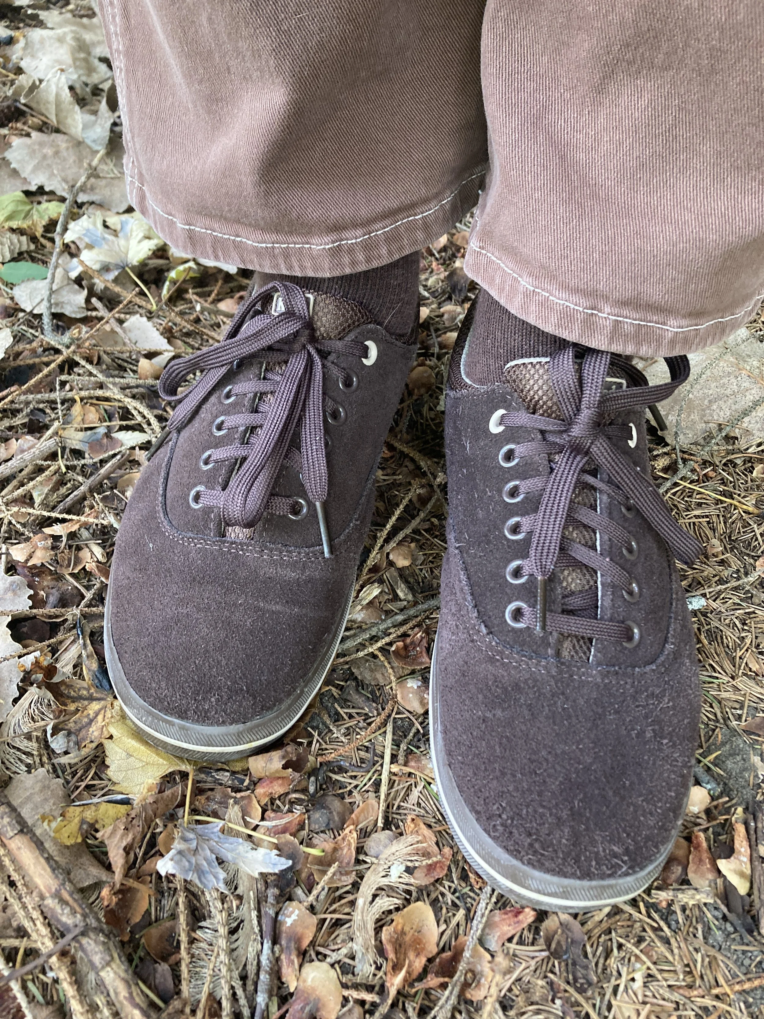
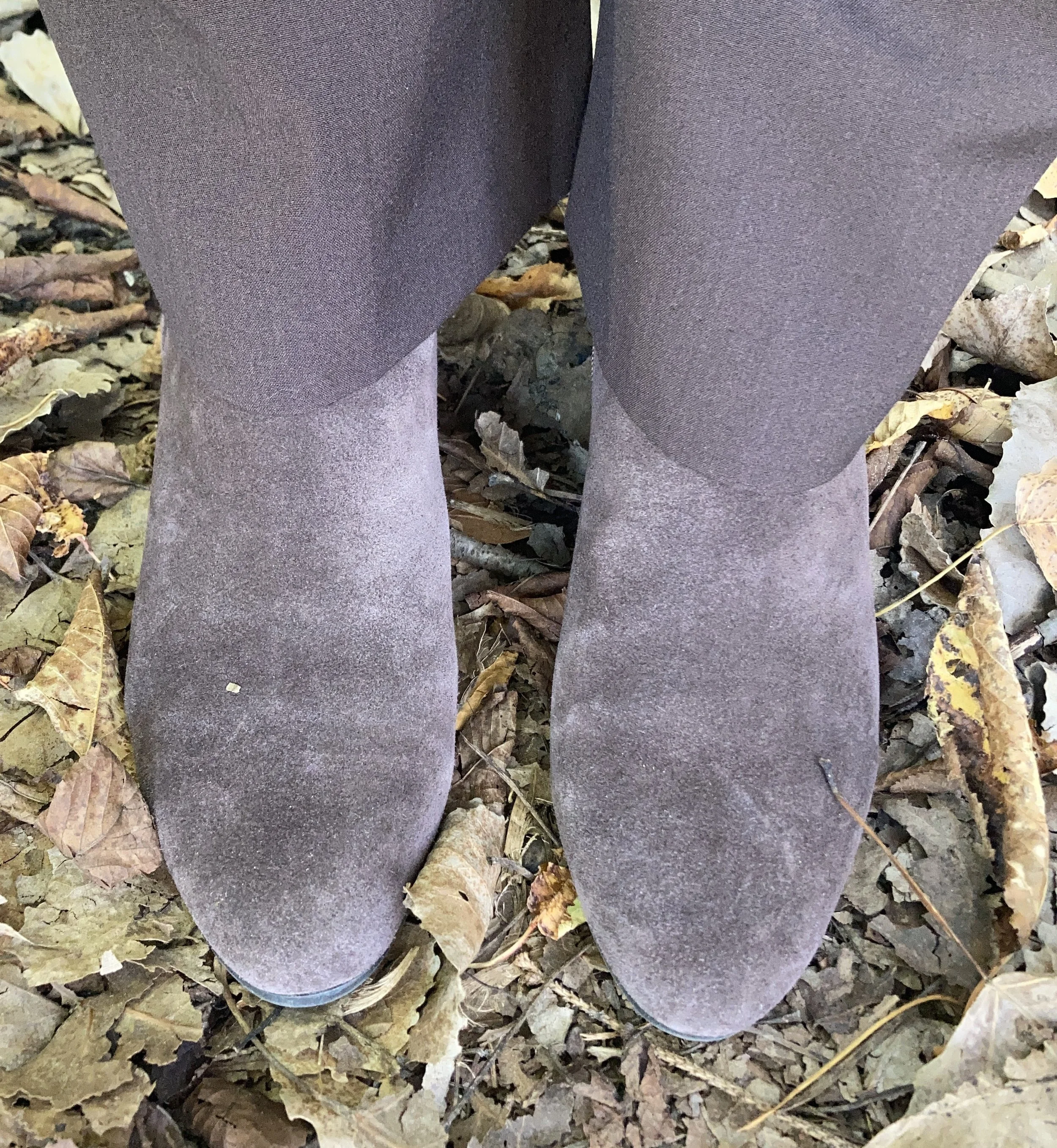
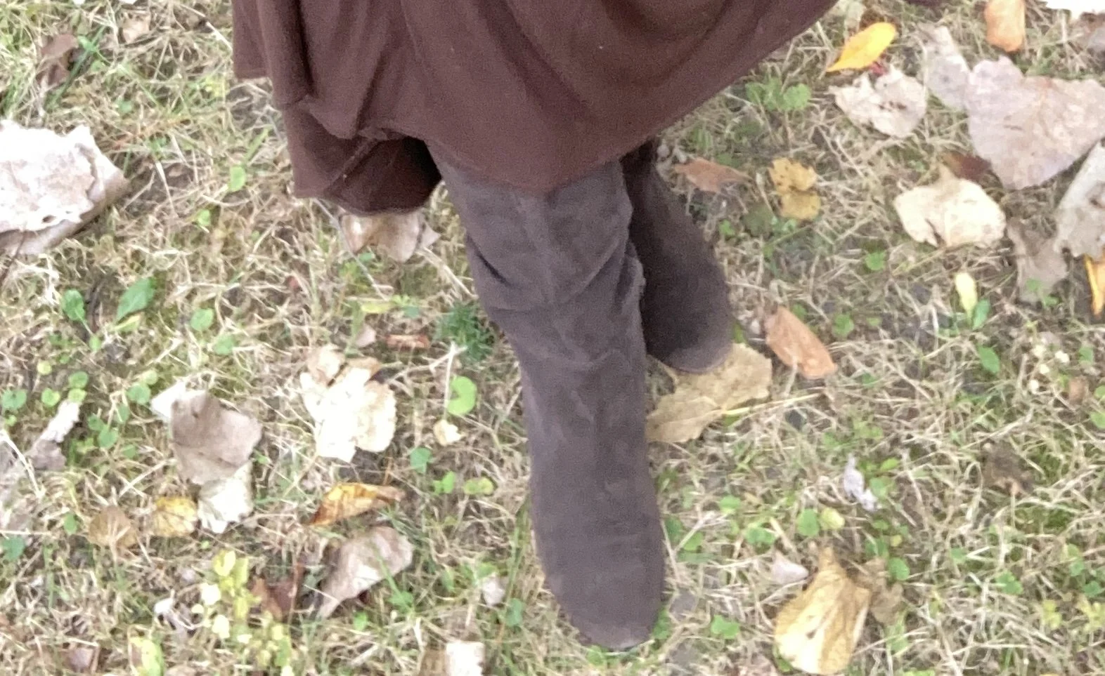
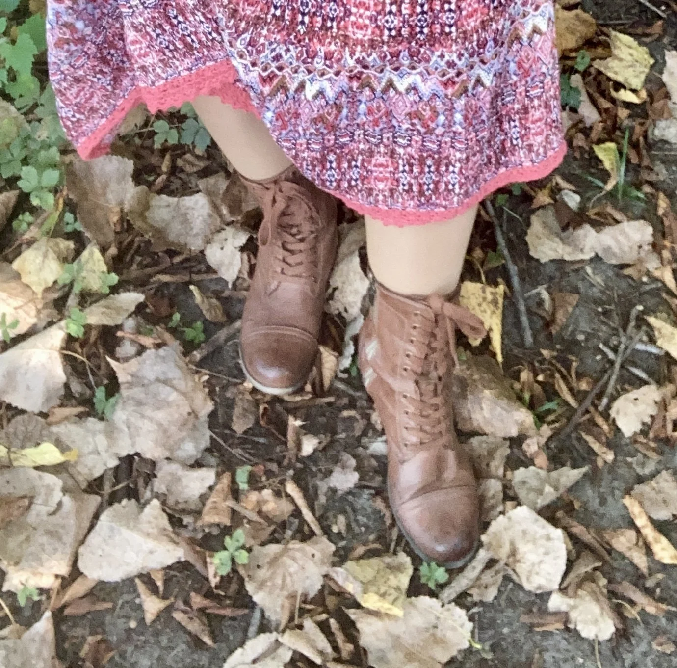
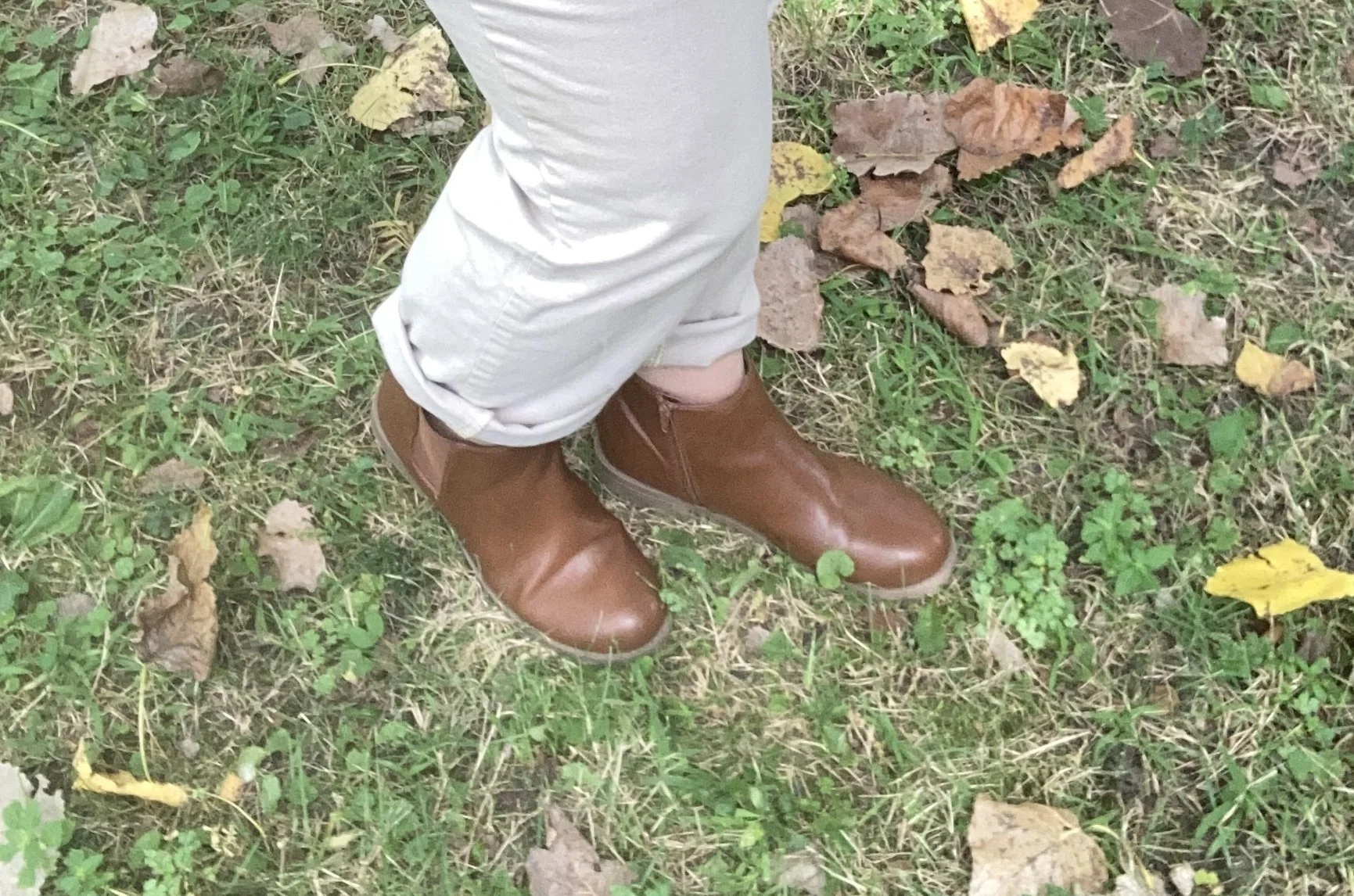
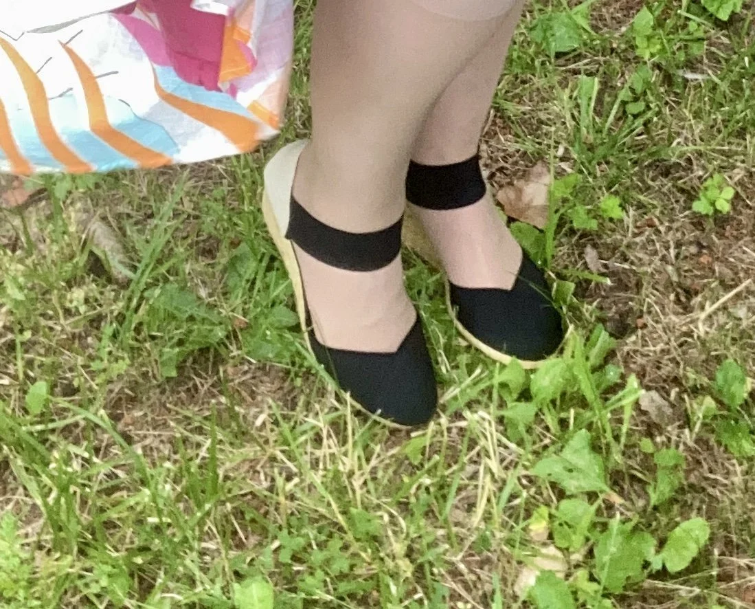
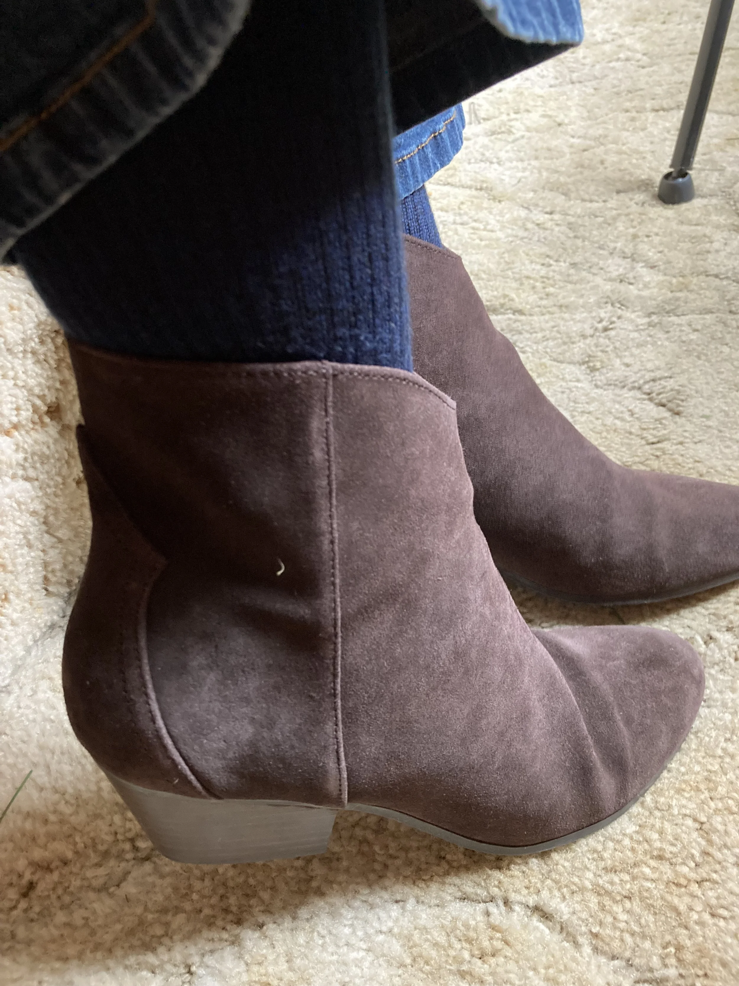
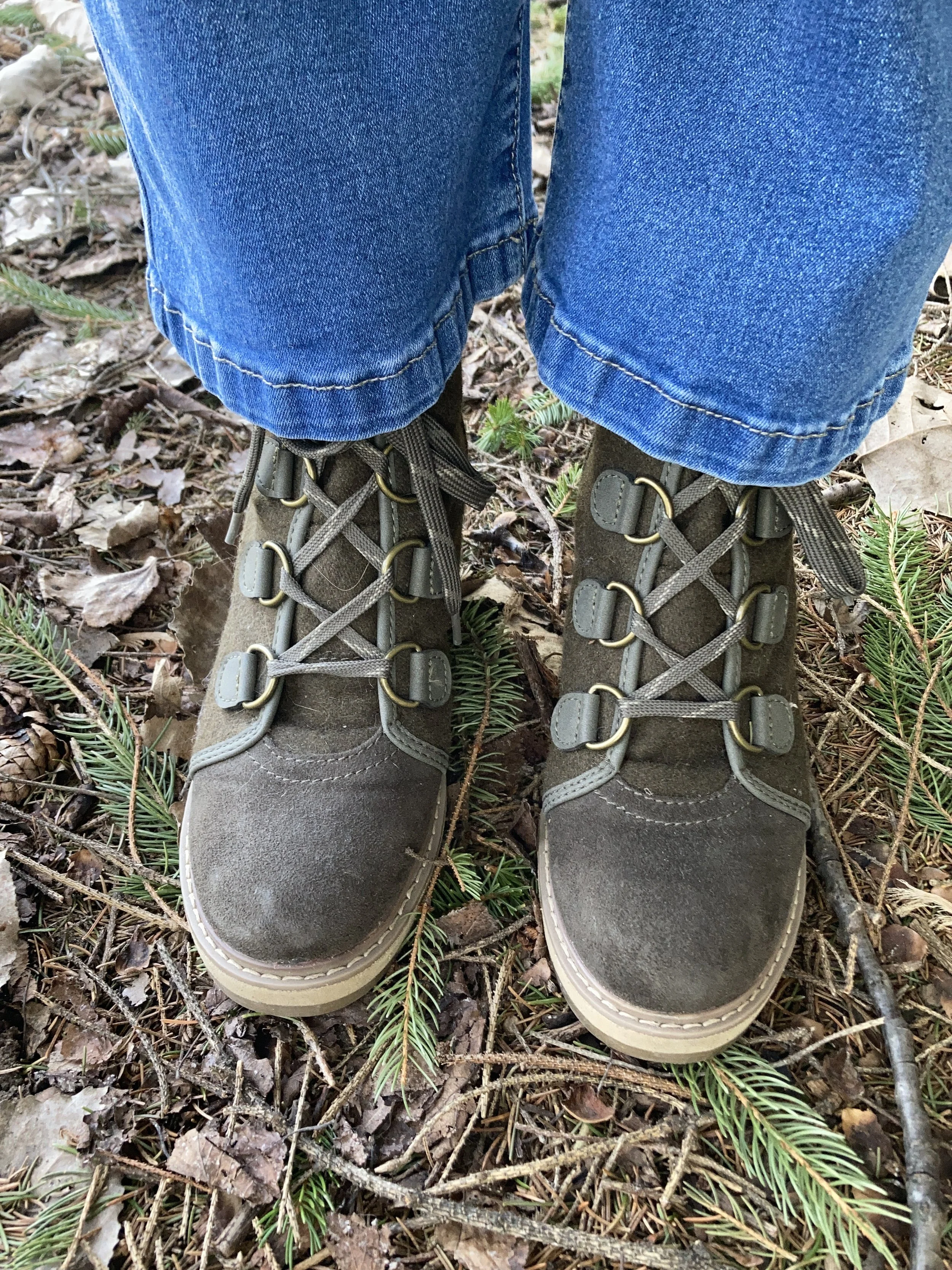
My booties were a thrift purchase last spring and I haven’t really worn them, but they are so cute. They are Merona brand and actually wool. I love the wedge heel. I am also amazed that they are as comfortable as they are. I need to remember these next fall to wear with skirts.
What do you think of these colors? Do you have any of these in your closet?
I hope you enjoyed this post. If you have a moment leave me a comment or two. I always love to hear from you and your feedback helps keep my blog alive.
I am also still looking at possible affiliate links for you to have shopping options, but for now I have included a few links within the text as possible options. Thank you for your patience and support.
Have a great day.