Spring/Summer Trends 2026: Another Bright Color Combo and Romantic Details

I have been taking a look at the spring and summer trends for this year, and while I might be a little behind, as usual, these are definitely ideas that will take you well into fall. As I mentioned a few weeks ago, the bright color combinations are trending. Me being a lover of color, I decided to look at another of these combos and add another of the spring trends, romantic details.

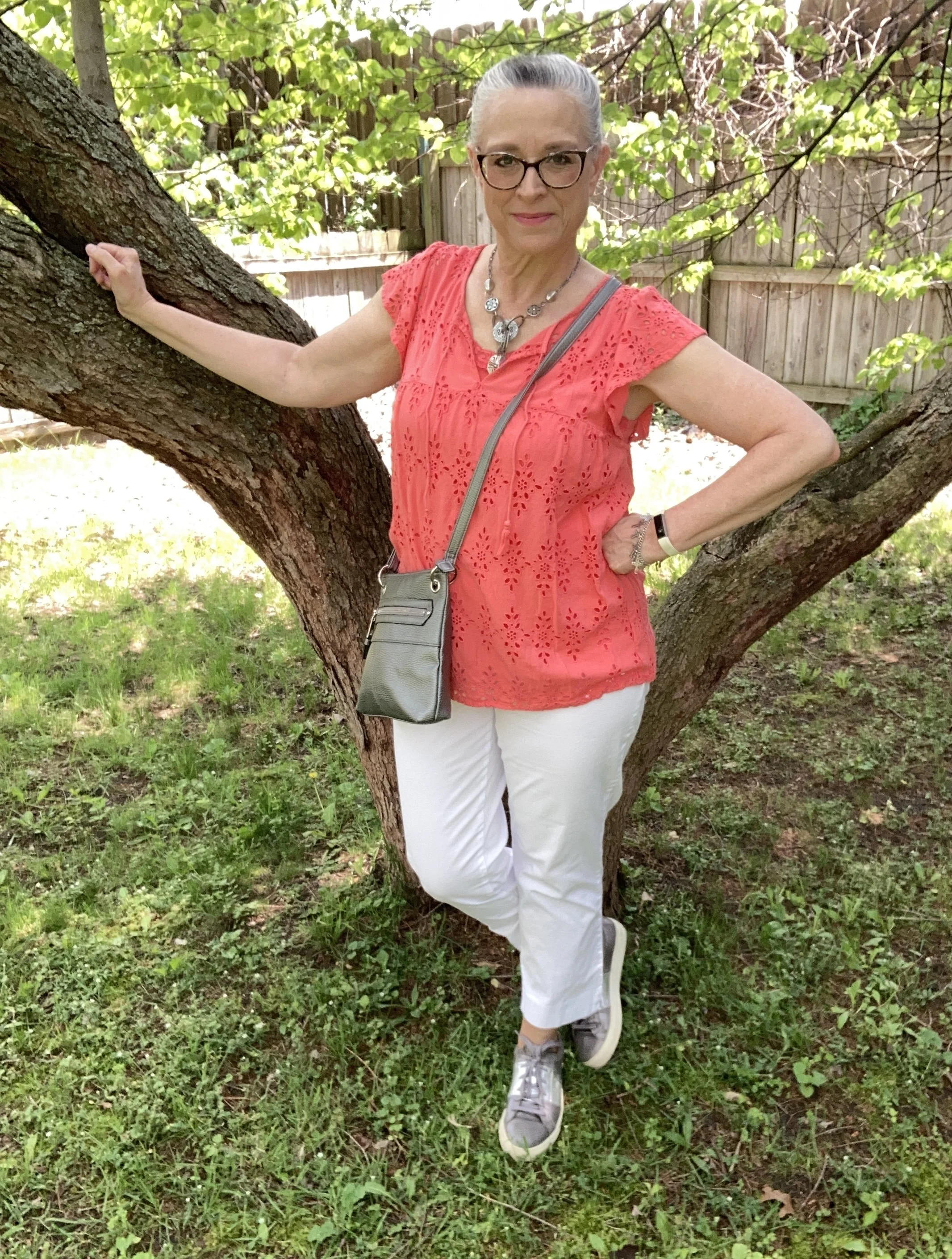
Today’s color combo is orange and white, although the fashion gurus also mentioned orange and gray, so I decided to incorporate all three colors into this color block outfit ( another trend for the warm weather season), and we will also talk about what gives an outfit a bit more of a soft, romantic vibe.

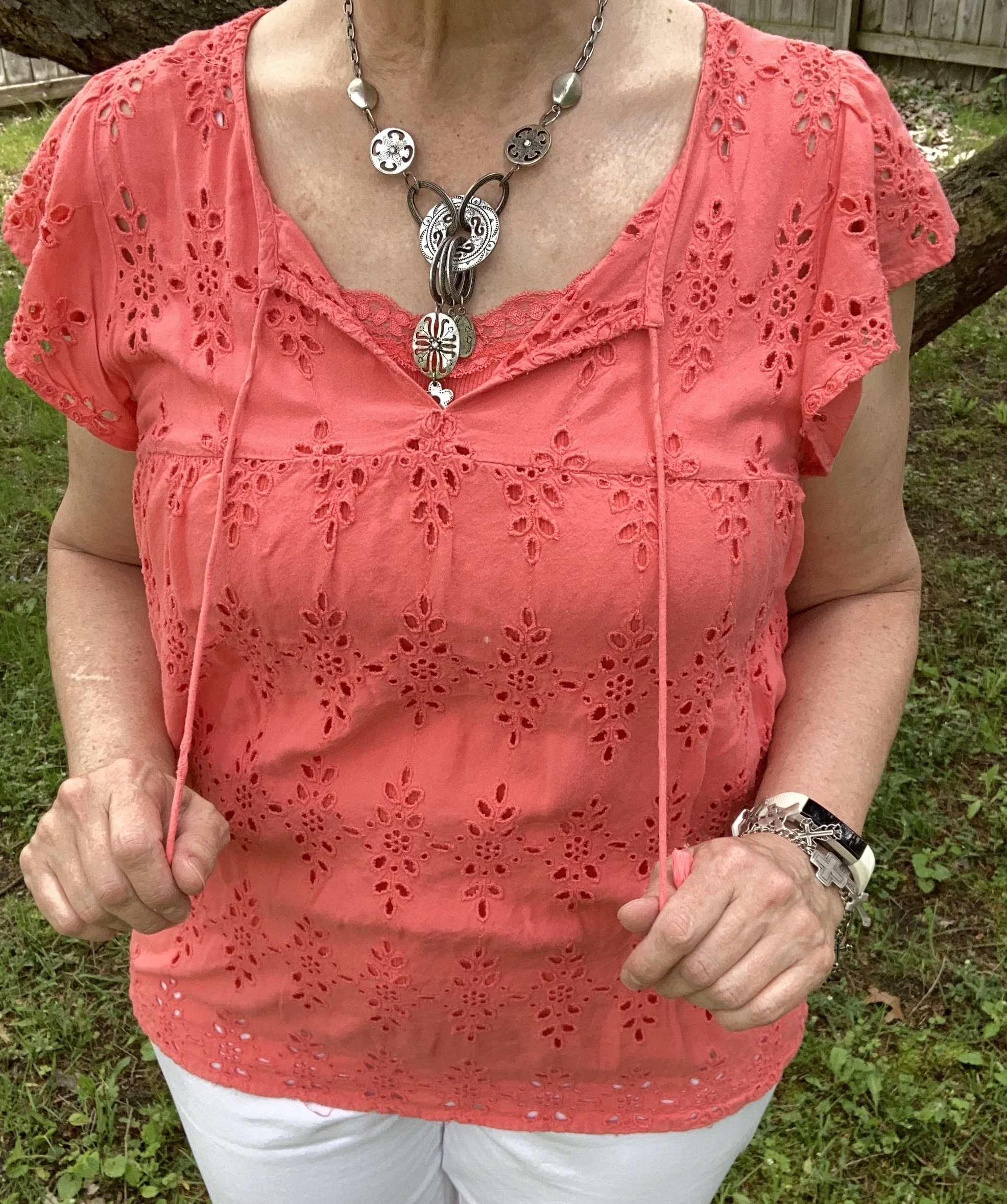
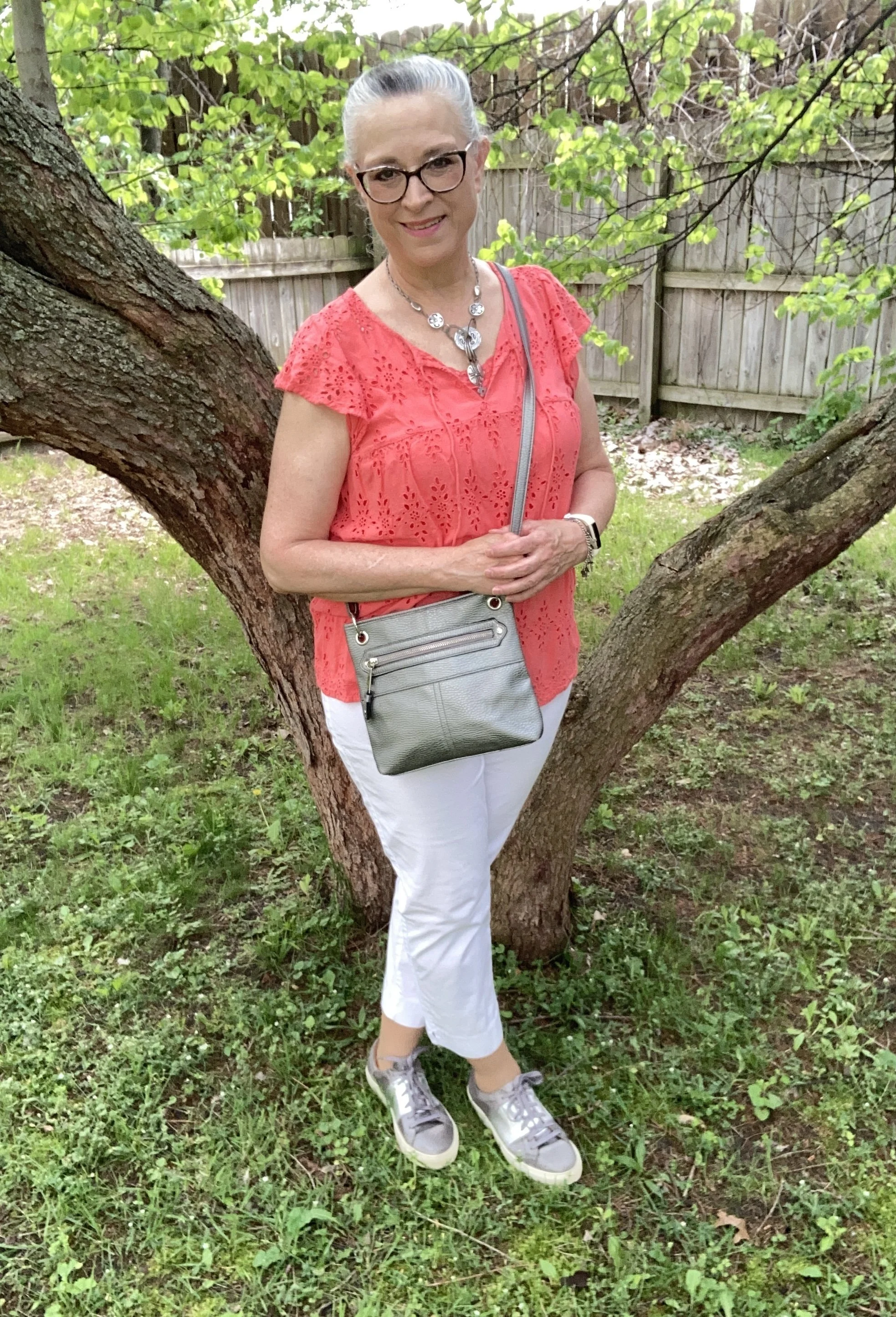
Since I knew I wanted the color orange and also wanted a look that had more romantic vibe I searched my closet for a good starting piece. This Old Navy eyelet top was just the thing. I have had this for a few summers now and have worn it every warm weather season since I thrifted it. I love eyelet. I think it is one of the textures and fabrics that whispers romance without having to be overly frilly or immodest. I added a Faded Glory tank underneath for coverage, but you could certainly just wear a nude colored bra for a cohesive color underneath. Since the tank has lace trim I think it works perfectly.

Style Tip: Whether you are wearing jeans or a satin skirt you can upgrade you look to include romance by making a few simple choices. Choose lace, eyelet, tulle or silky fabrics. These speak volumes to making an outfit more feminine and fun. You can also add embellishments like embroidery, ruffles, and pearls in the form of buttons or jewelry. My personal opinion is less is more…not less fabric or coverage, but less embellishments and textures. Here is are similar colors from Shein, Ann Taylor, Bloom Chic, and Macy’s.

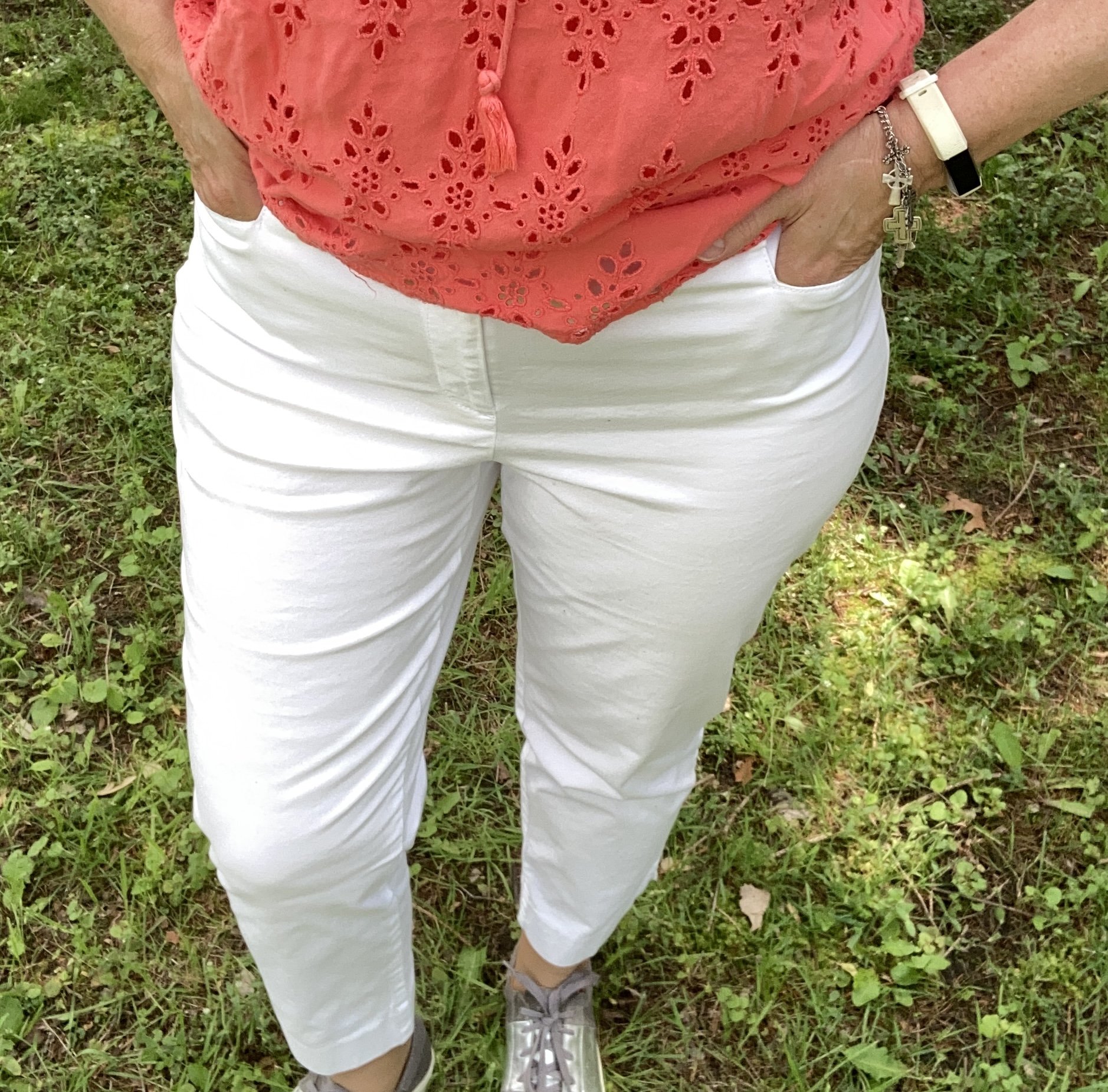
I knew I want to have white pants or a skirt and opted for these lighter weight cropped pants that I thrifted last year. These are Talbots brand and very comfortable for the warm weather season. Capris are back in style. I won’t go back to those, but some people really like them. I might if my legs were pretty, but they are not, so I accept that and move on. Here are some from JCPenney, Macy’s, and Chico’s. Here are a few pairs of ankle pants too: JCPenny, Old Navy, and Macy’s.

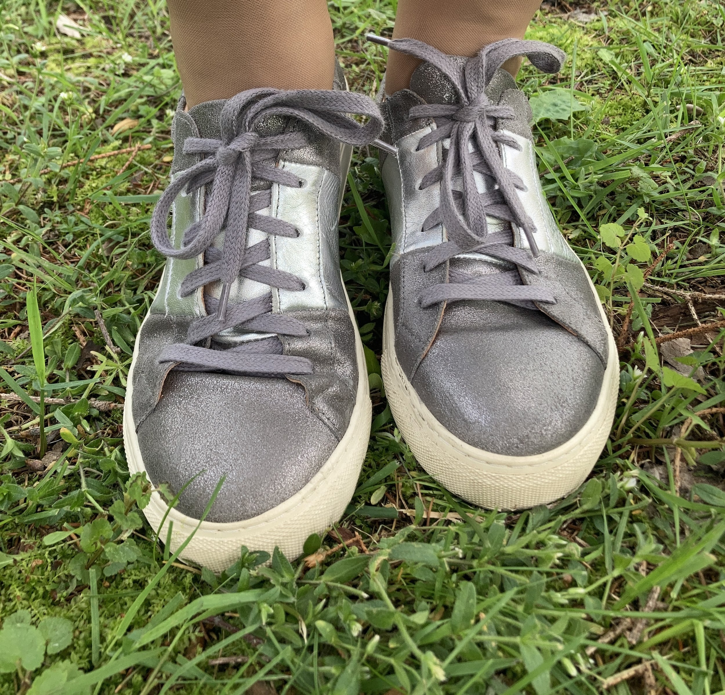
When I decided to incorporate the color gray as well, I knew I wanted gray shoes, a bag and jewelry. I have several pairs of sneakers in different grays and this pair of medium gray Skechers seemed the most complimentary with the white and orange. I bought this pair at Gabes a number of years ago. I keep them around, because they are cute, although not the most comfortable. It baffles me how a pair of sneakers can be uncomfortable, but they can be! Ha, ha.

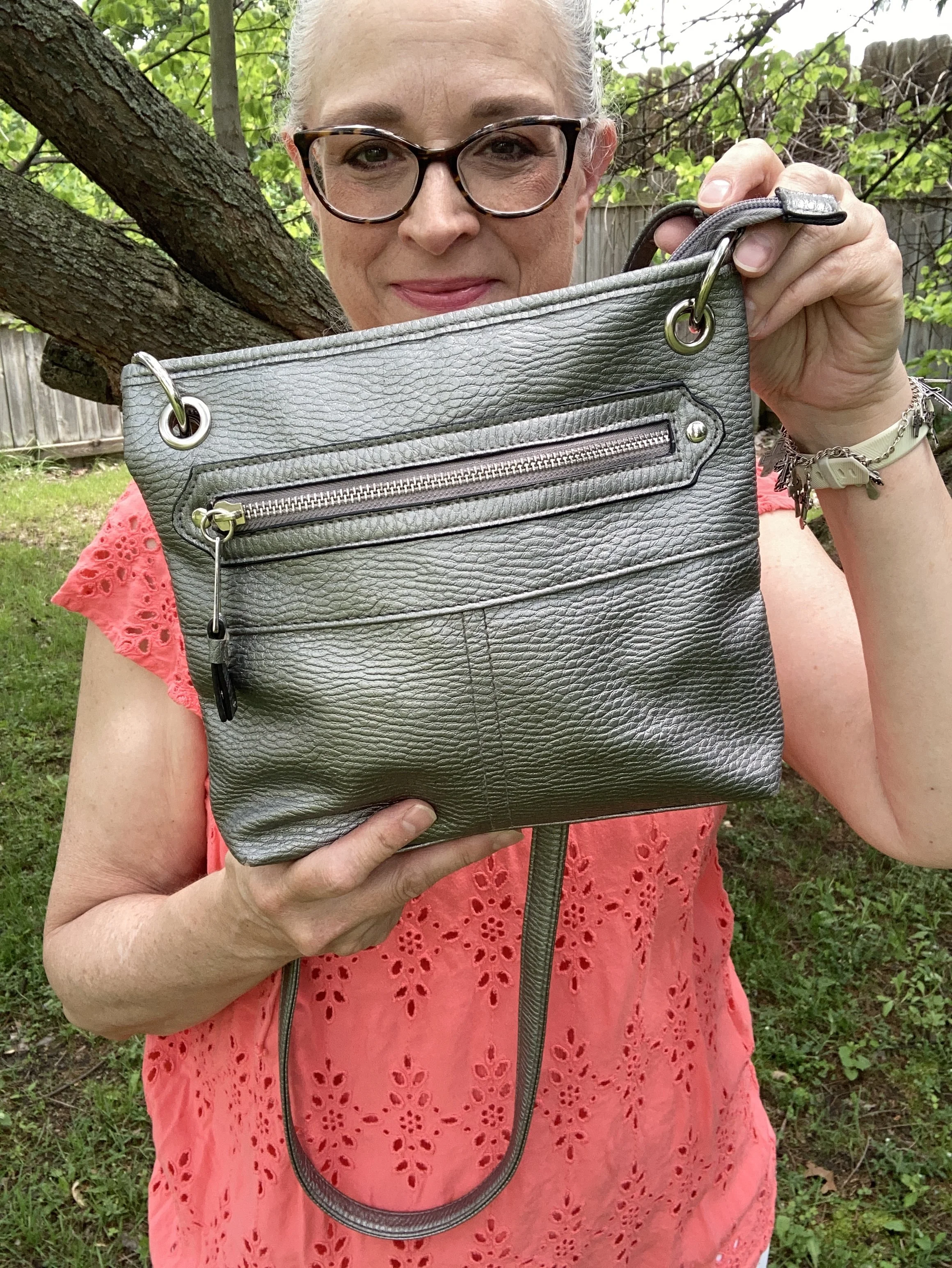
My bag was a thrift find and has no identifiable tag as to what brand it is. I love a cross body bag all year round, but a light weight bag is perfect for summer. This seemed perfect with the sneakers and the jewelry. Here are a few gray options from Kohl’s.

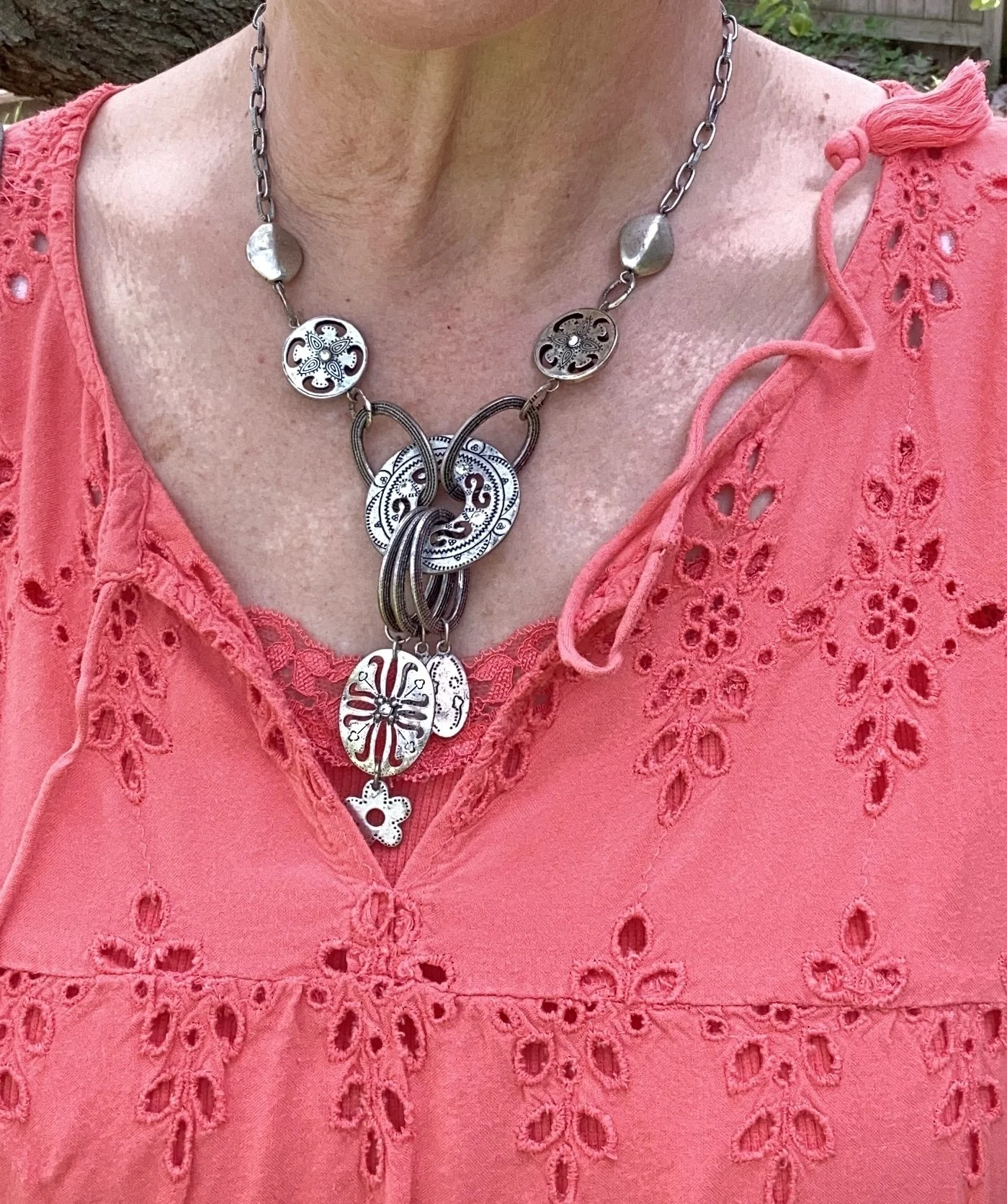
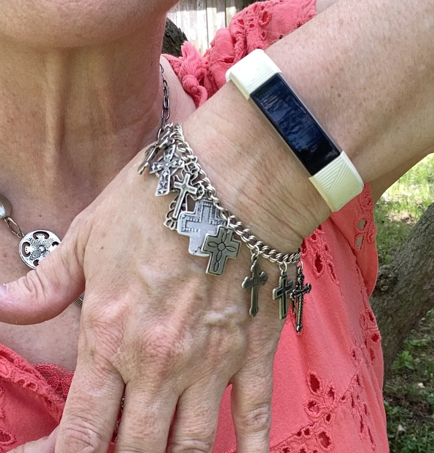
The two pieces of jewelry are both second hand. The necklace was from my bestie in NY, and the bracelet was a recent thrift find. I love both of these pieces for their interesting blend of metal shapes and textures. The bracelet is a reminder to me every time I wear it of what Christ did for me on the cross.

What do you think of this color combination? Do you wear bright white in the summer? How about all year round? I tend to lean more toward the creamy, winter whites in the cold weather and bright whites in the summer. I’d love to hear from you, so please leave a comment or two.

Have a wonderful Tuesday!

Pantone Autumn/Winter 2025 - New York Palette: Bronzed Brown, Winterberry and Vapor Blue

I hope you are enjoying this Pantone color series. For the actual colors check out this pin on my Pinterest board. The Pantone Color Institute is the entity that people turn to for the trending colors for both fashion, architecture and home decor. I enjoy seeing what the colors are for each season, however, they have made it harder and harder to actually see the colors without having an account, so I appreciate those who do sharing their findings on Pinterest and other platforms.

Today’s colors are what I would call a little more reminiscent of what we tend to think of when we talk about the autumn season. Bronze Brown is a golden brown making me think of changing maple leaves and colorful sunsets, while Winterberry gives a nod to aromas soon to fill the air like cranberry and cinnamon, and Vapor Blue looks like wispy jet trails across a fading fall sky.

This seemed a bit of an odd pairing with the Bronze Brown and Winterberry, but after I put it together, I really liked how it turned out.

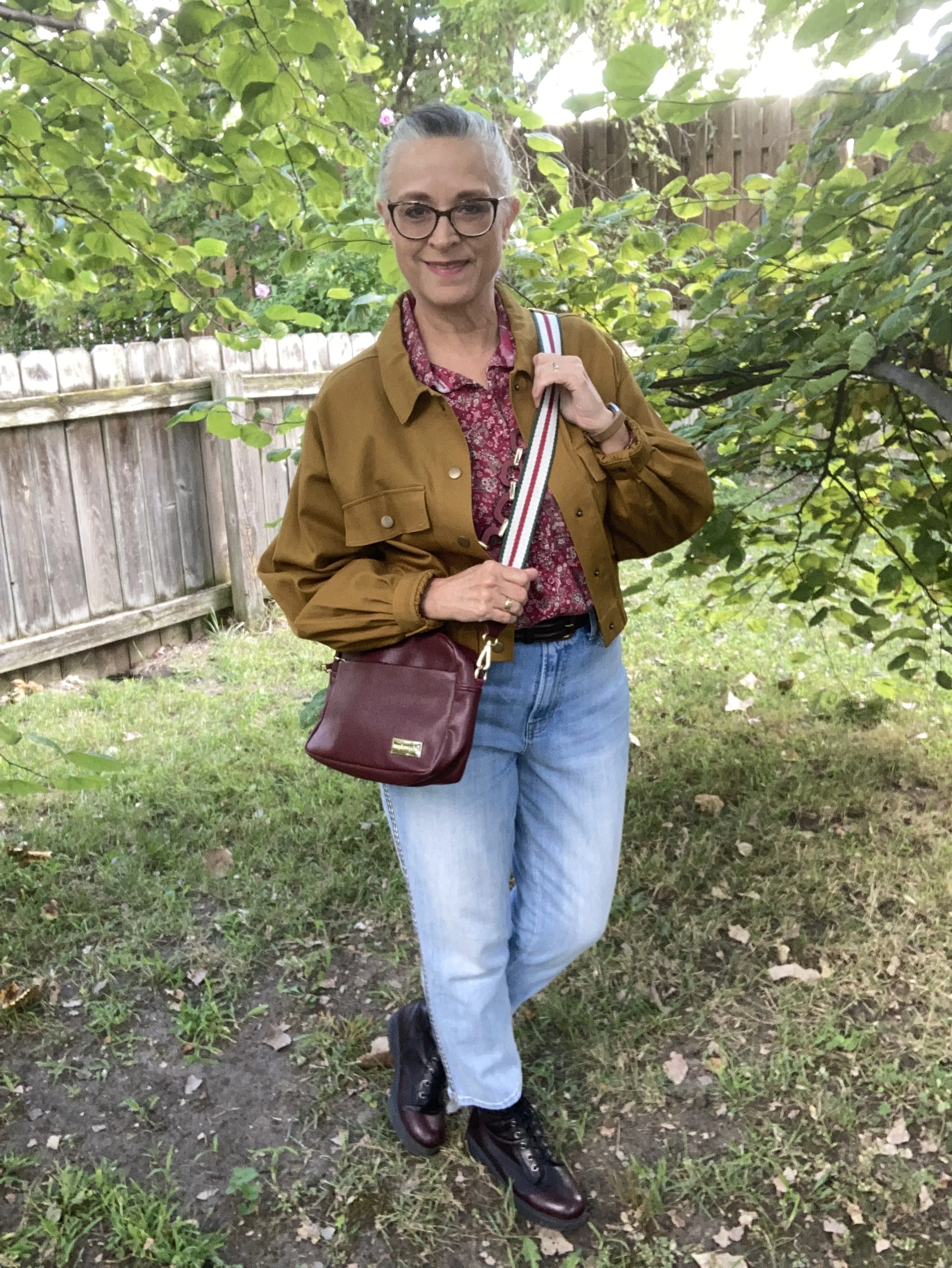
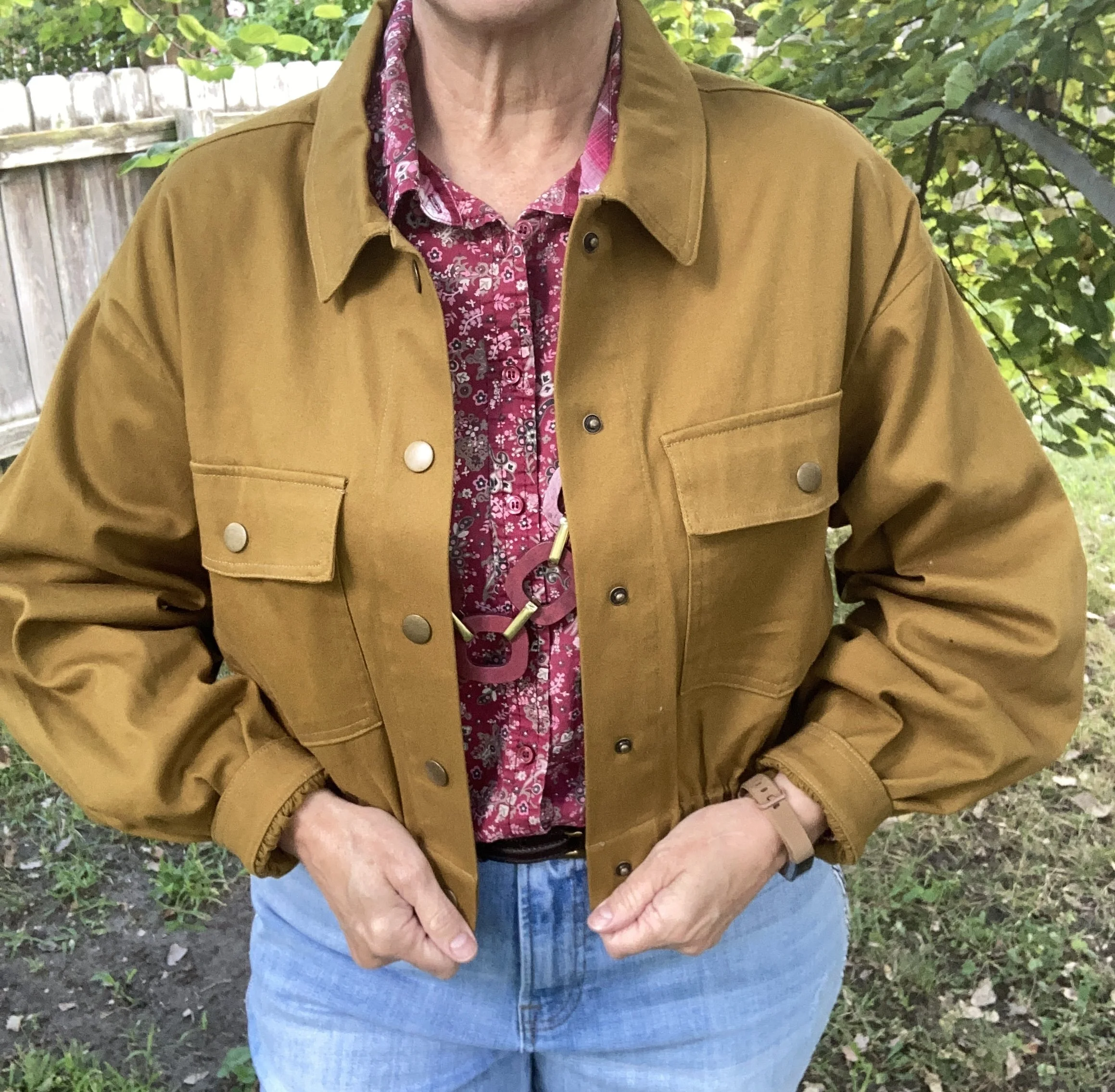
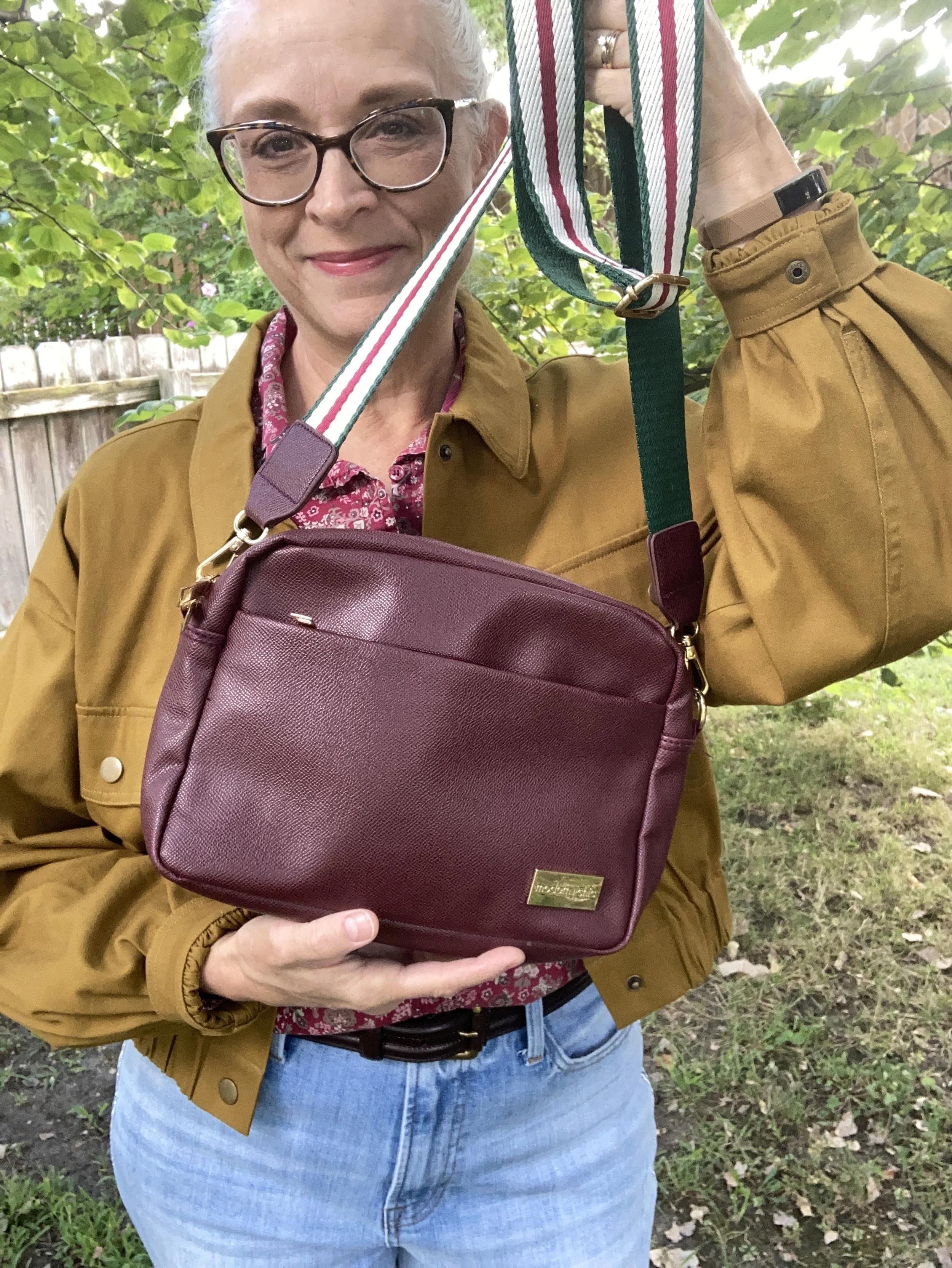
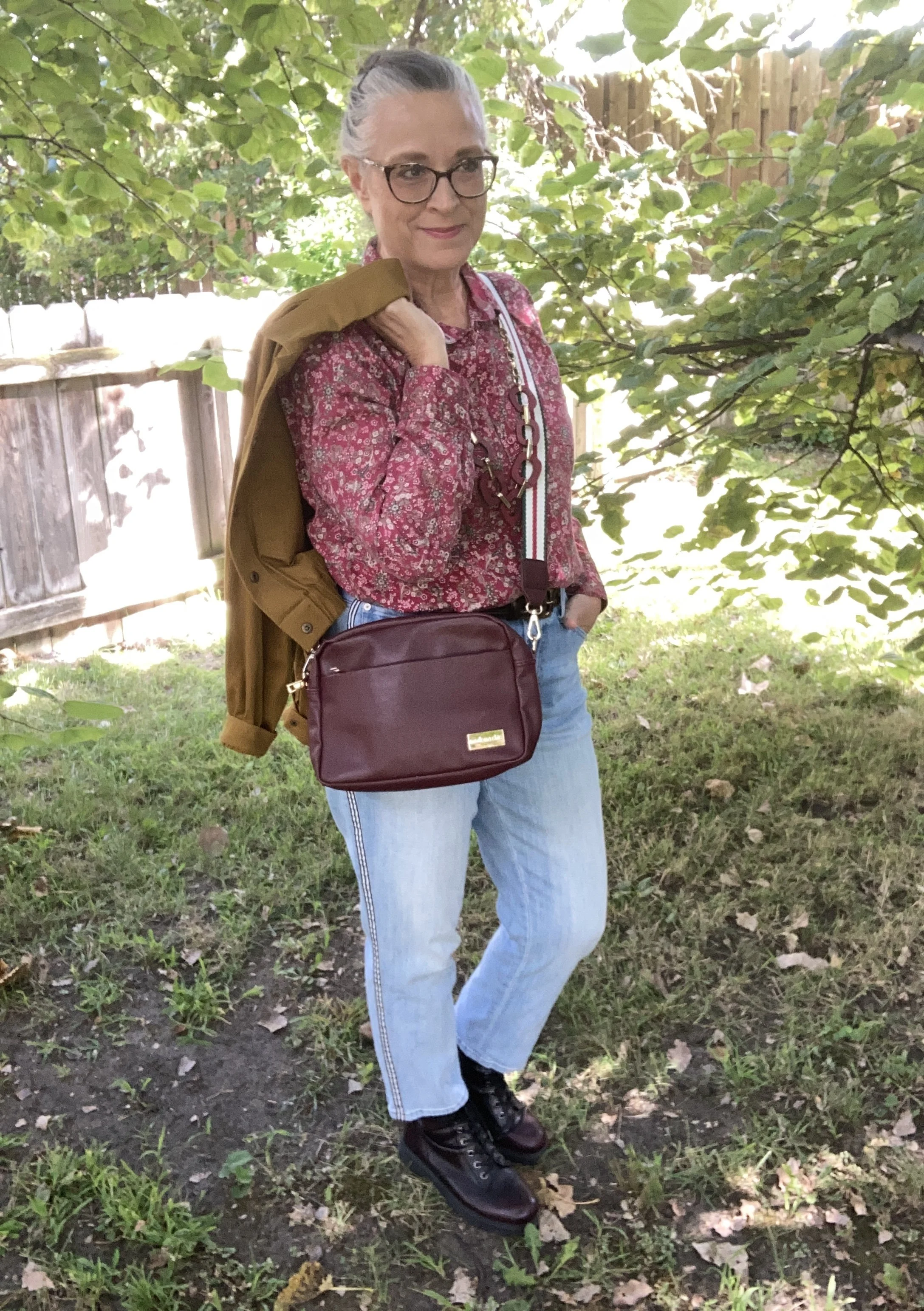
The Bronze Brown, Ophelia Roe jacket was a piece I got on clearance at Meijer. It actually had a pair of pants that went with it, that I bought at a later time. However, the pants seem to be a bit off. I should have taken them back right away, but sometimes you can’t tell right away something is cockeyed or sewn improperly. They are in the donation pile. I do, however, like the jacket with its utility, bomber style silhouette.

This Faded Glory floral blouse I have had for years. I don’t know why I don’t wear it more often, because I do like it. I just go right from shorts sleeves to fuzzy sweaters and sweatshirts and forget about the in between time. I honestly don’t remember if I bought it at Walmart, or if I found it at a second hand store.

You can also see my chunky berry and gold necklace, a gift from one of my daughters. I thought it went well with the casual vibe of the outfit. I also added a dark brown, almost burgundy colored leather belt that I recently thrifted. I know the trend has been no belts, but I always feel that a belt gives an outfit that finished feel, specifically when tucking a shirt in. Apparently the half tuck is no longer trendy and we are back to a full tuck or no tuck.

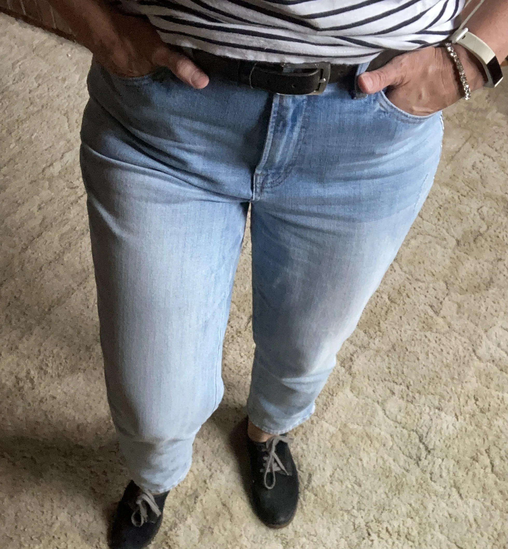
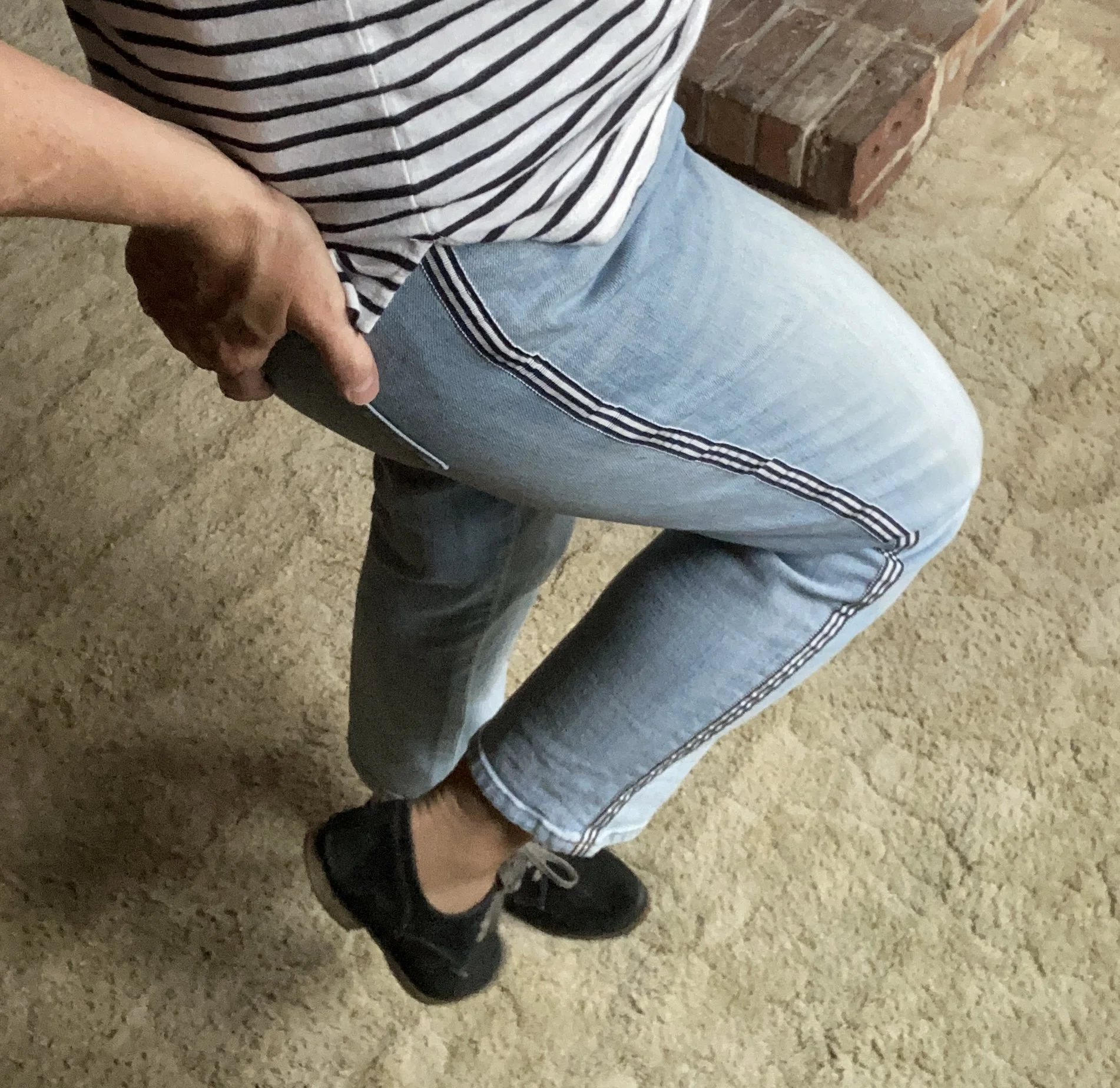
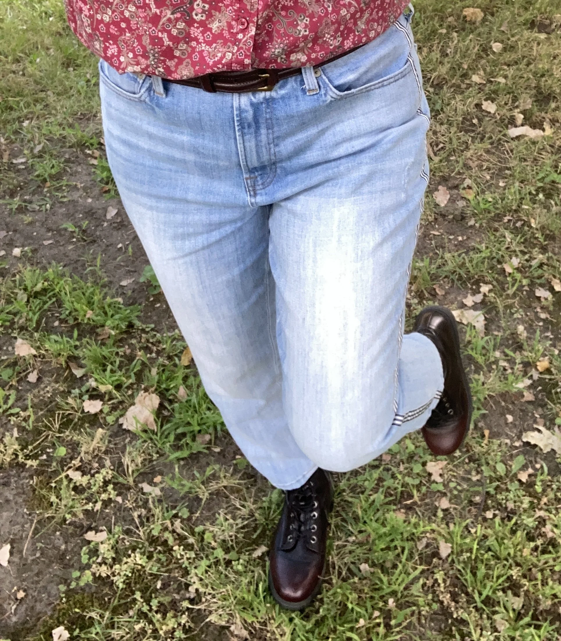
These Talbots jeans are also a thrift store find from this past spring/summer. If you look at the Pantone color for Vapor Blue, it really looks like a very light gray, but I feel that these jeans were representative of that faded blue sky we often see in the early morning or late evening. If the Pantone gurus say it’s blue, well okay, and this was my take! Ha, ha. I love the black and white pin striping down the outside seams of the legs.

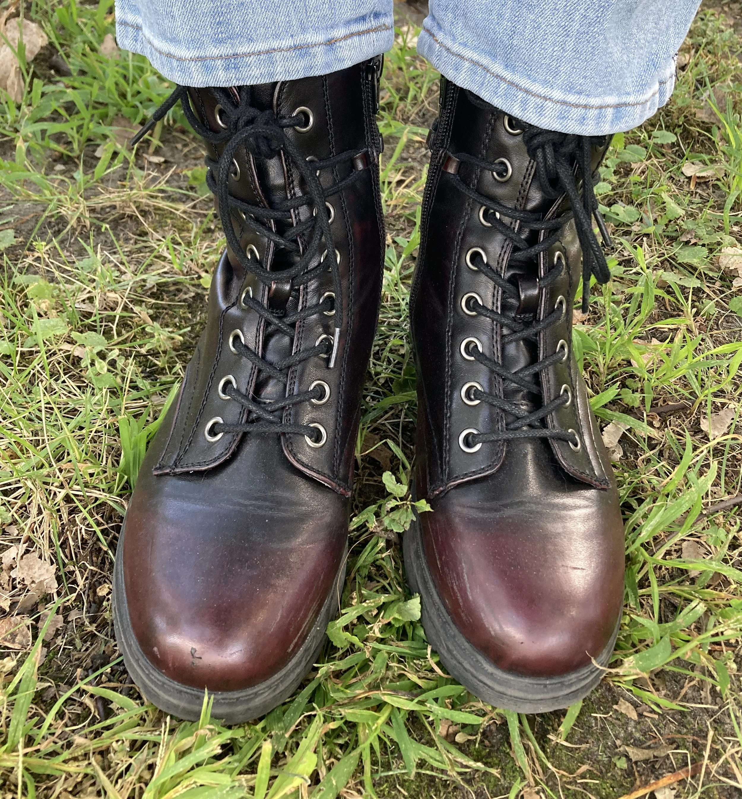
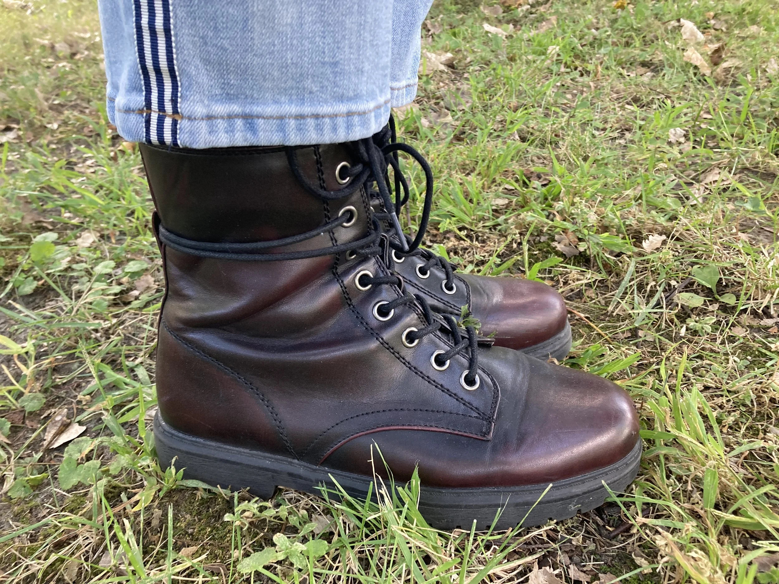
Once I put the outfit together, I was struck by the thought that I actually could start styling boots again, so I grabbed these SO burgundy combat boots that I scored at Kohl’s a few seasons ago.

I just found this cute crossbody bag a few weeks ago when I was thrifting with my bestie back in New York. We always hit the thrift stores together, which is great fun. This is a brand called Modern Chic. I love the guitar strap vibe.

What do you think of these colors? Do you like how I put this outfit together? What would you have done differently? Please leave me some love in the comments. I appreciate my faithful few who try to comment on the regular. You always remind me why I keep doing this! Hugs to all of you.

I have included a few shopping links for you to look through. These are affiliate links which means when you purchase something through one of my links, I get a small commission. I appreciate all of your support, but most of all I appreciate that you stopped by the blog to hang out for a while.

Have a great week!

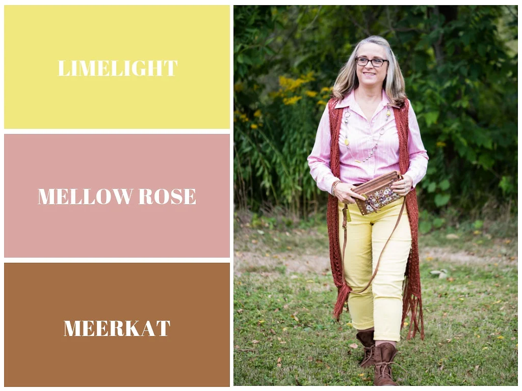
Pantone Fall 2018 - Limelight, Mellow Rose and Meerkat

Of all the colors on the Pantone Fall 2018 palette, I felt Limelight and Mellow Rose were the least fall-like colors. Once again, I had to think outside the box when pairing these two light pastels together, to make the outfit seem more in keeping with a fall theme. In order to do this, I thought it would be best to pair them with Pantone’s classic color, Meerkat. Meerkat is a warm, orange brown and while it could be used in any season, It makes me think of fall leaves, bonfires and warm apple cider.

Mellow Rose is actually one of two colors that is only found on the London Palette. I am not sure why they added this and Crocus Petal, the two extra colors on their palette, but they are light, airy and more spring like. Maybe it was an attempt at bridging the gap between the seasons and reminding people that the old rules are gone and colors are seasonless.

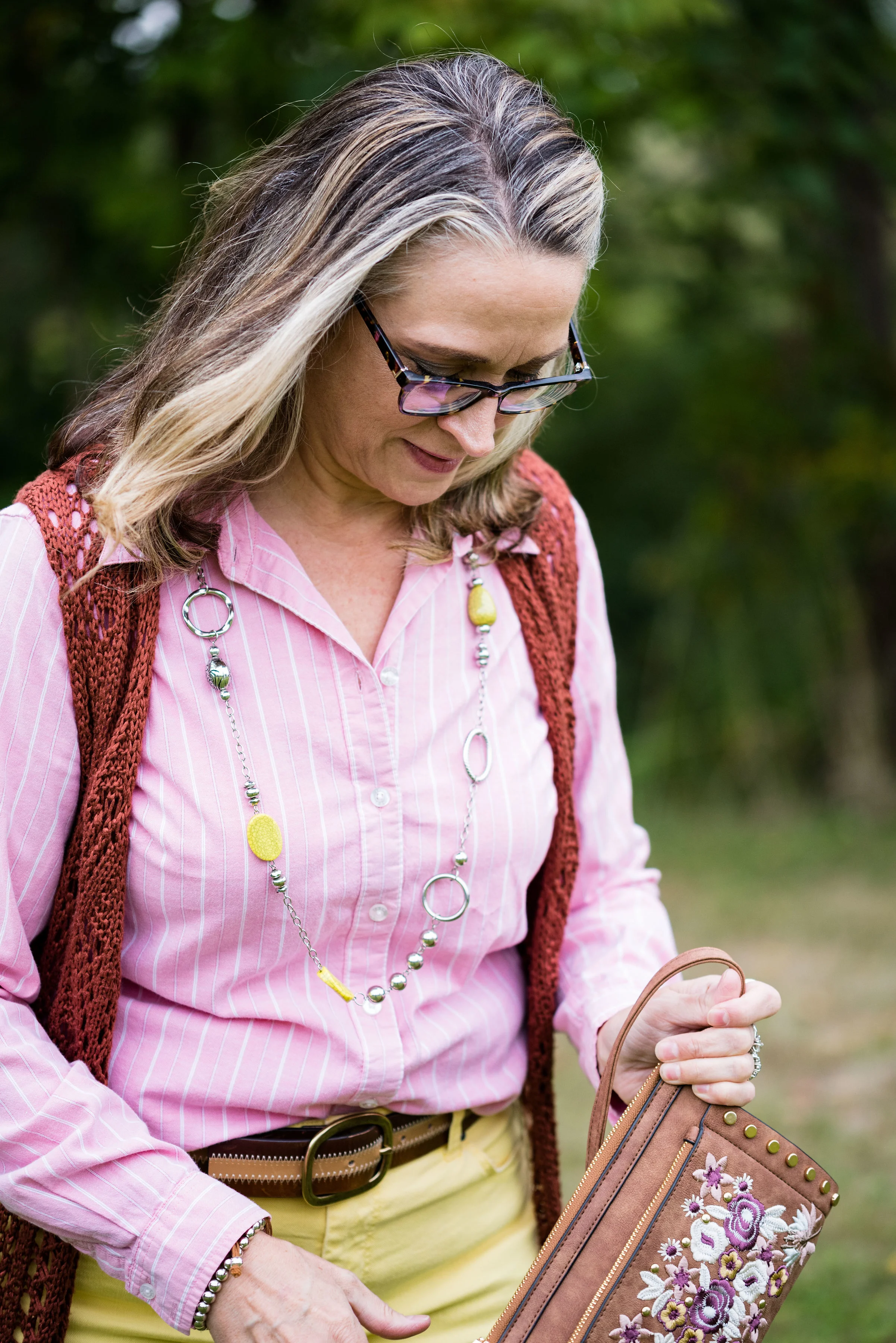
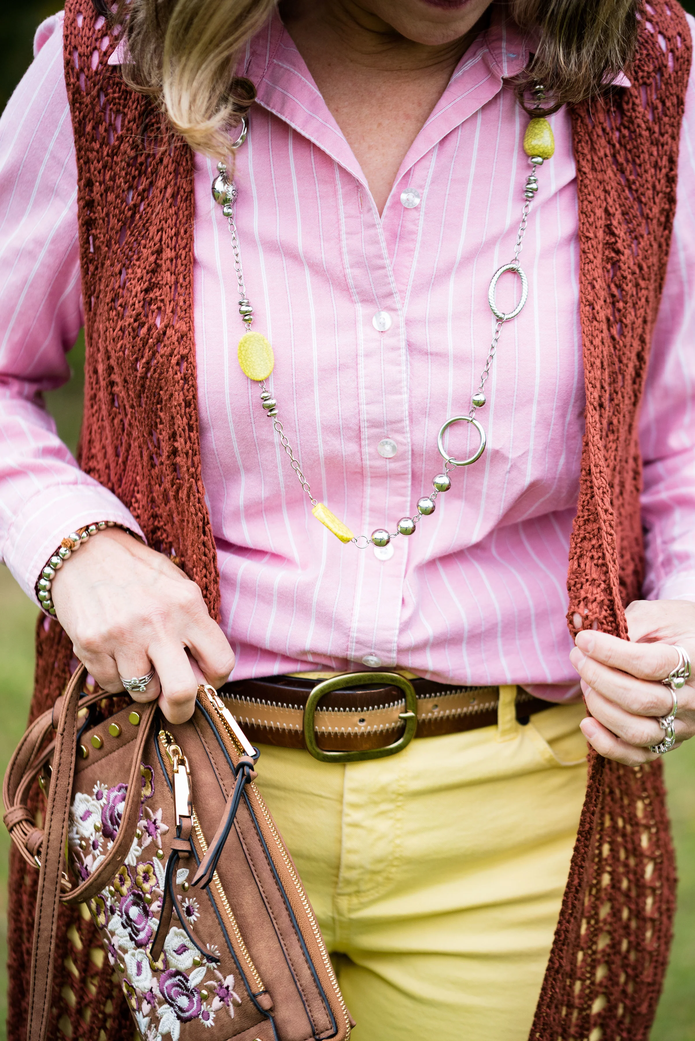
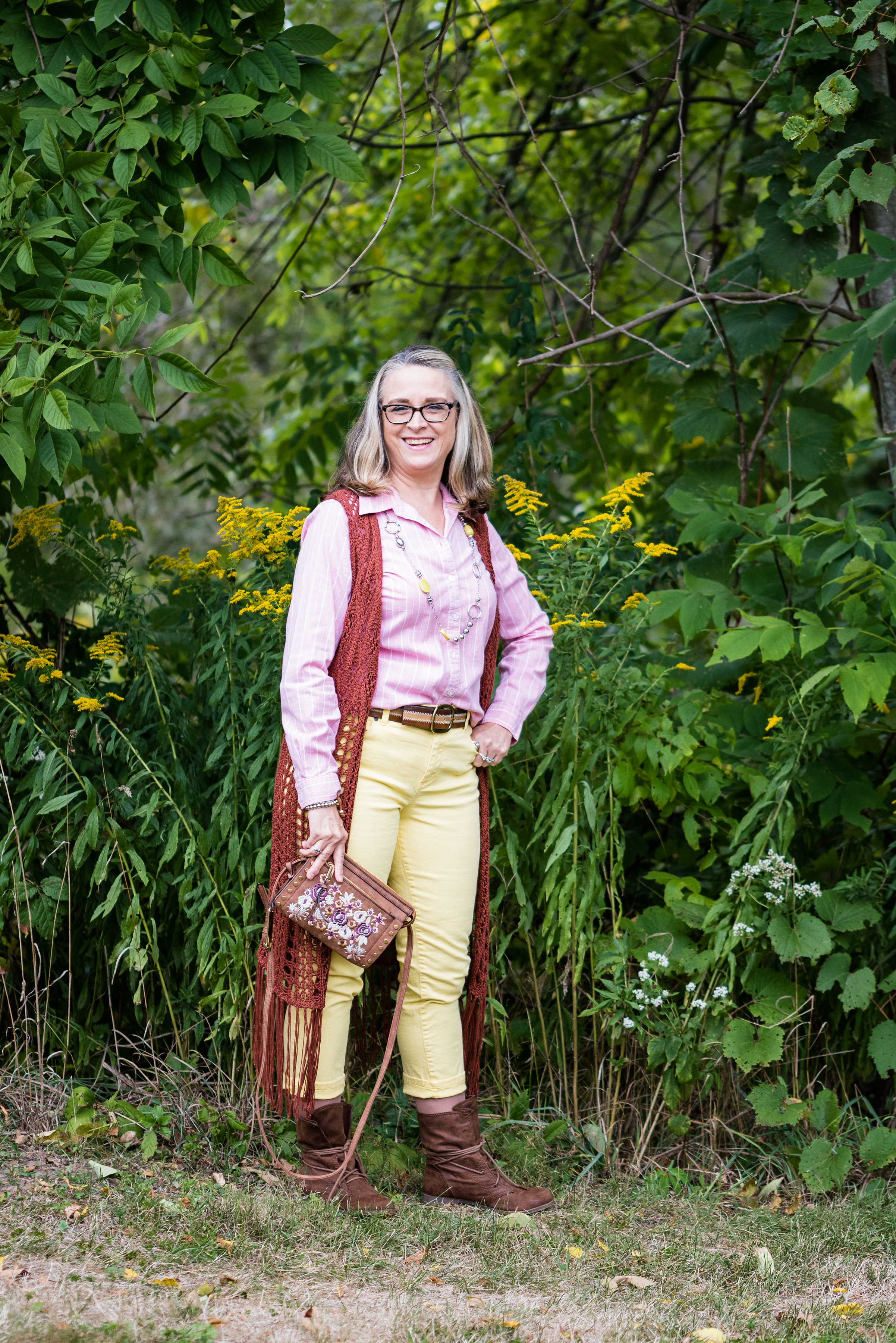
All of the pieces in this outfit were thrifted except the bag and the boots. The Limelight colored jeans are Talbots brand and are really an ankle pant that I rolled up, so they stop at the top of my boots. The Mellow Rose button up is Izod brand and the long fringe knit vest is a brand called Sun and Shadow. I’ve styled this vest several times before. You can see those posts here and here.

I don’t remember where I got the belt, but I thought it tied in with the boots and bag quite well. I just did a front tuck with the shirt.

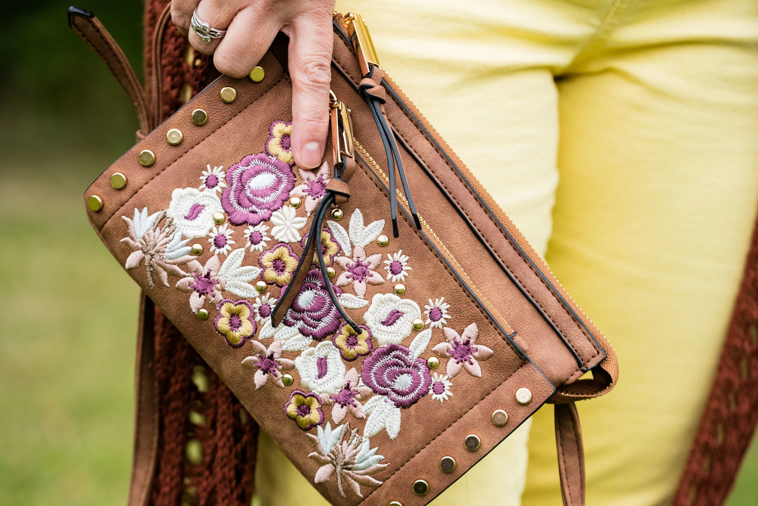
This bag I got at Meijer and I am not sure of the brand. It is a nice cross body bag and the embroidery on the front adds interesting color and texture. I think this can be used for all seasons.

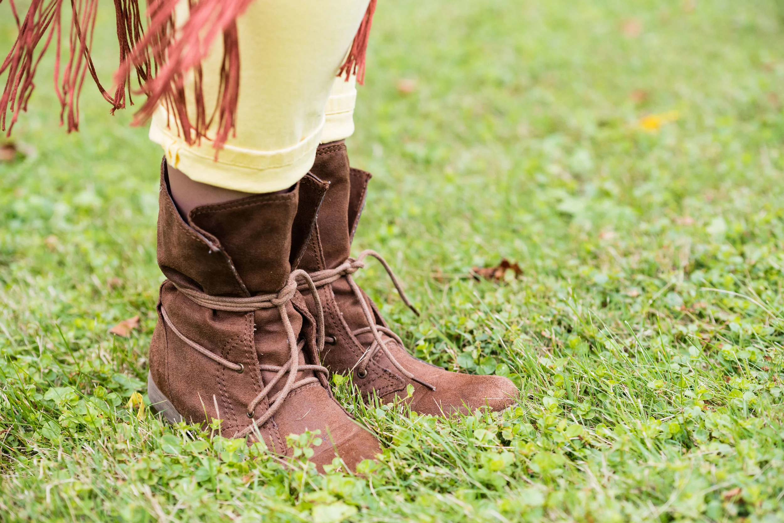
These boots are a brand called Sugar and I got them at Kohl’s a few years ago. They are made of a suede type material and add a different look to an outfit because of the single, long, wrap tie.

I just added a simple bead and metal necklace and a bracelet for jewelry. This might be fun with a scarf or even some layered necklaces for a more bohemian look.

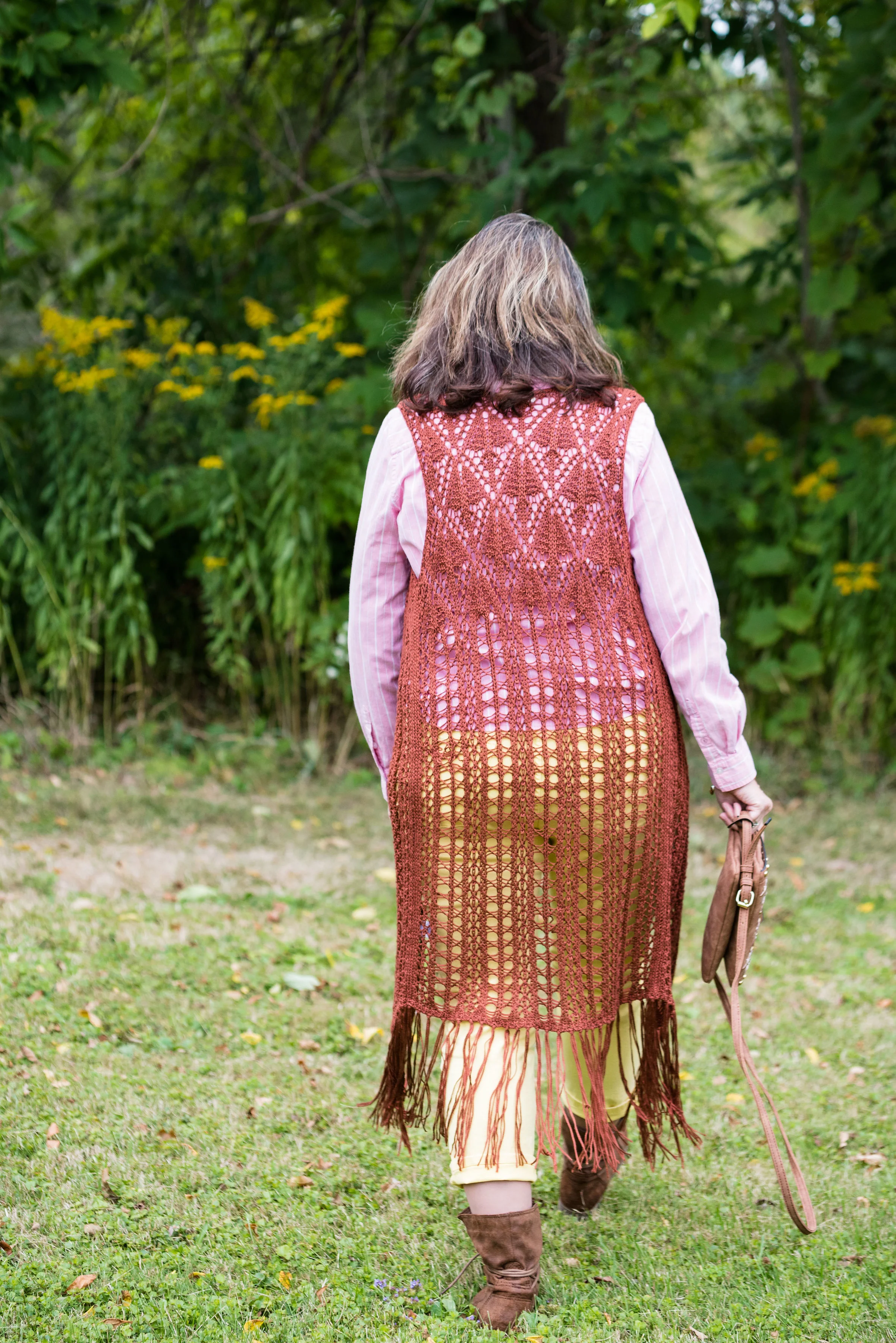
Here is a full length view of the vest from behind.

This is the second outfit in this series that I am not completely happy with. These colors are great, just not necessarily together, or for the season of fall. I know, I know, we can wear whatever, whenever, but if I’m not happy with it, then I’m not going to wear it. I’ve worn both of these pieces in the spring and summer. My color leanings are more bold and bright, but if you are a pastel kind of girl, then follow my friend Liz at With Wonder and Whimsy. She loves pastels and wears them all year round!

That’s all for today. Hope you are having a great Tuesday!