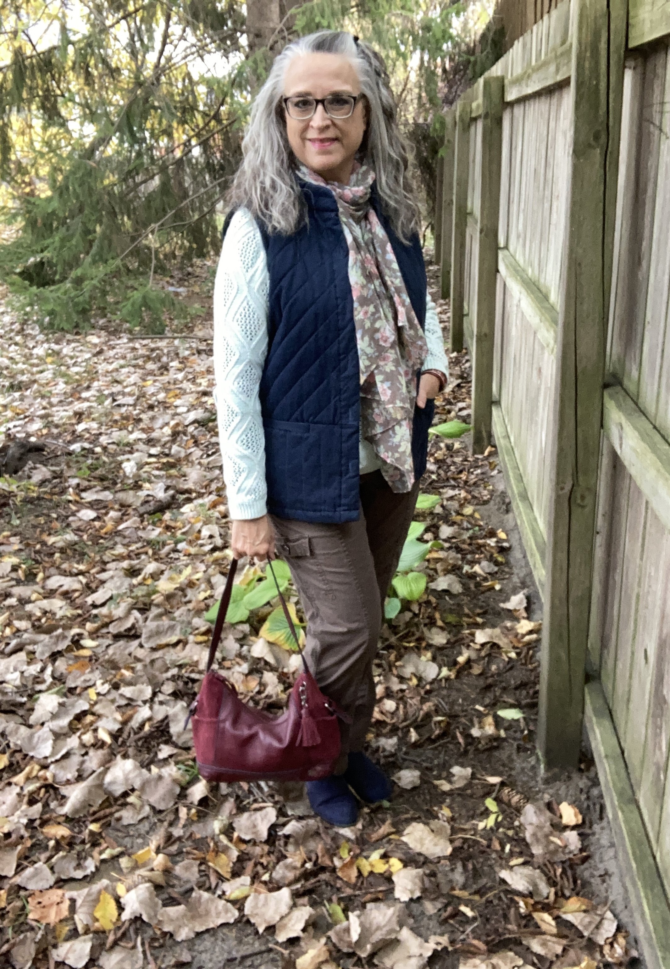
Thanksgiving Day Look

I wanted to give you a post this week specifically for Thanksgiving Day. It isn’t very often we need to get dressed up any more, at least for those of us who are not working, or who are working from home, so I thought it would be fun to pull out all the stops and show you a fun, semi-dressy look that would be perfect for Thanksgiving with the family, or a Friendsgiving with your besties.

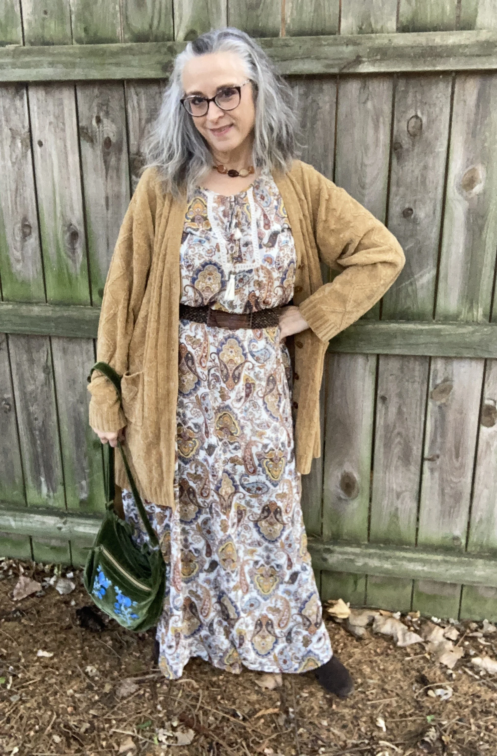
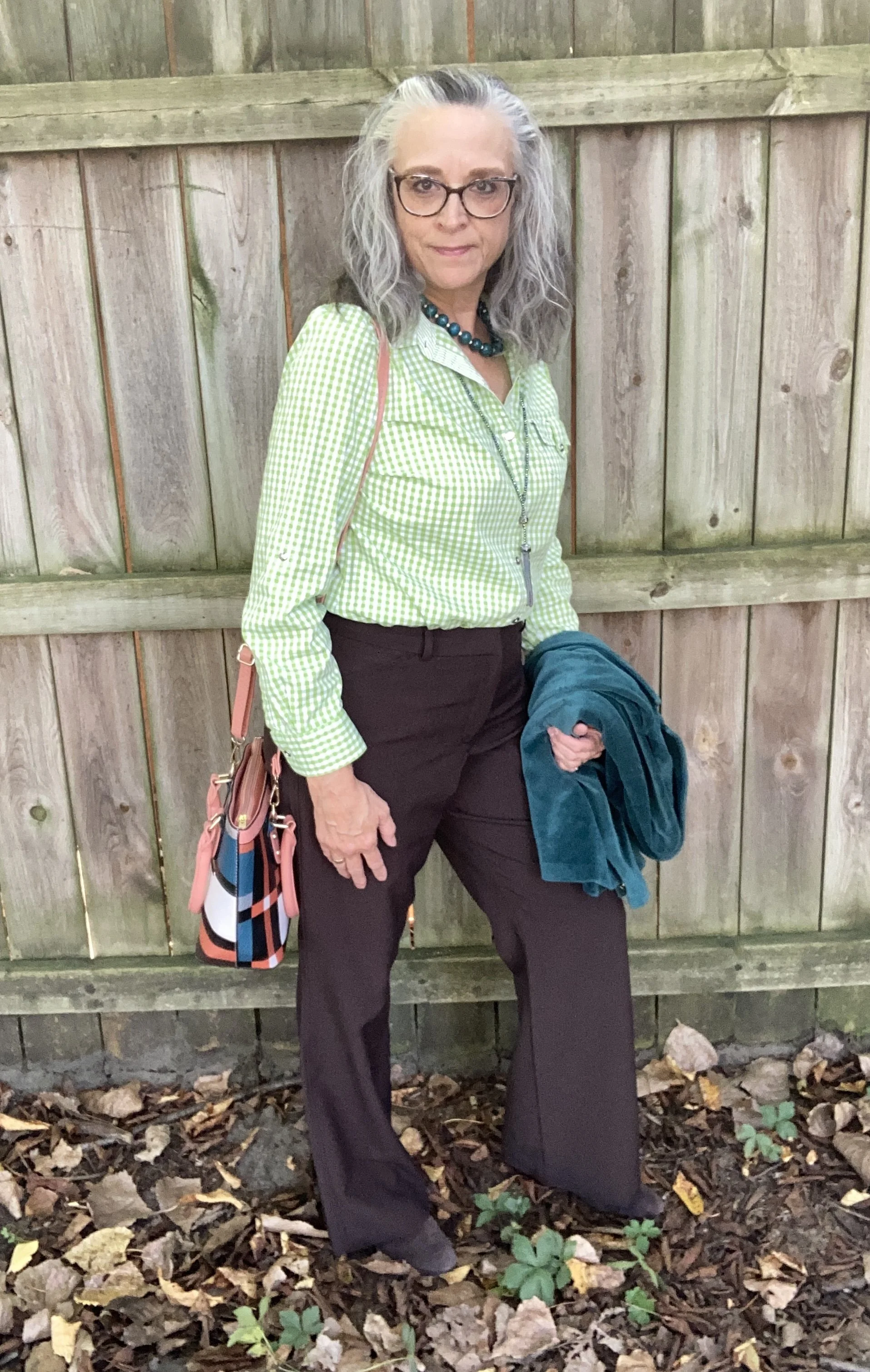
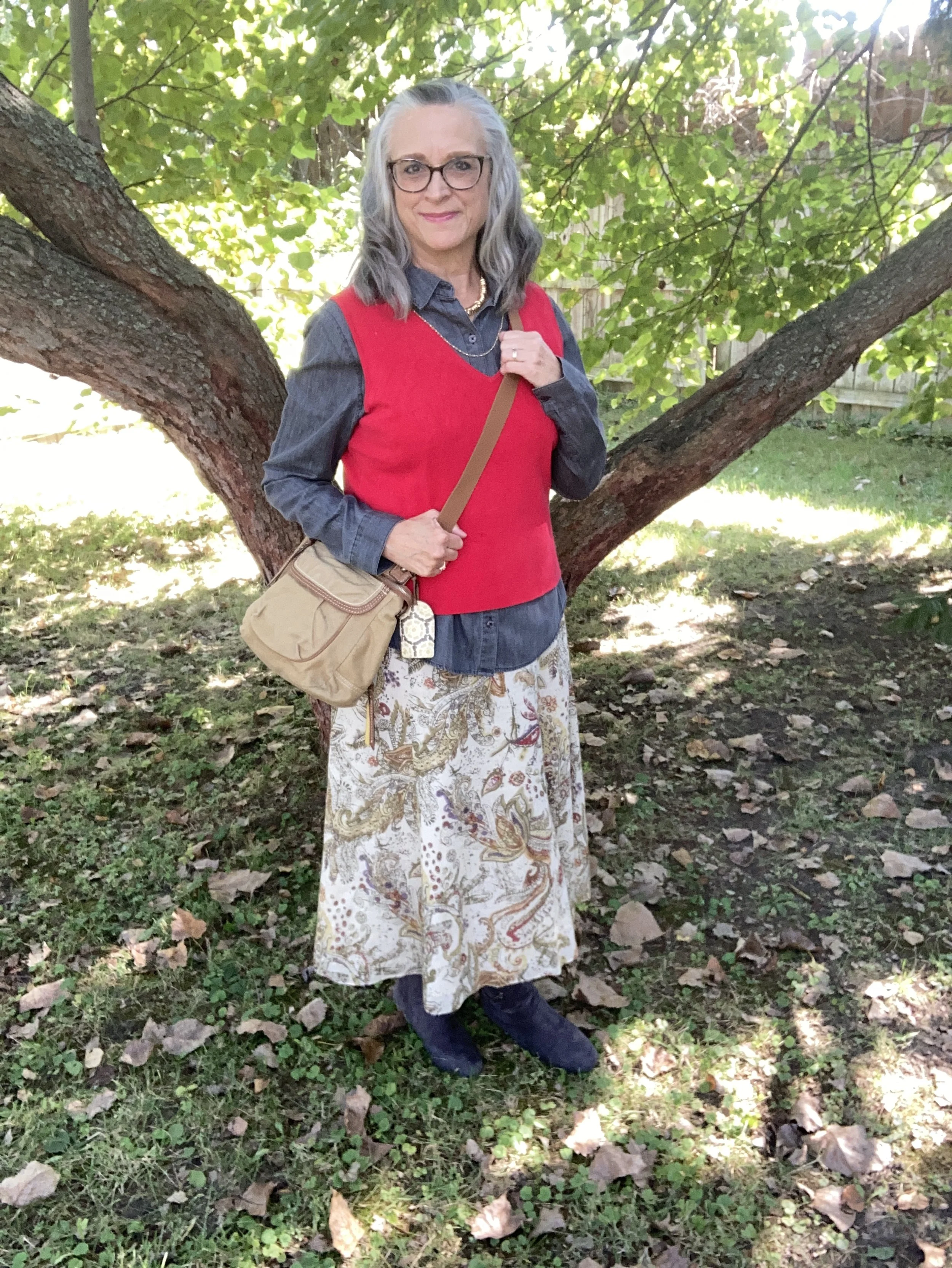
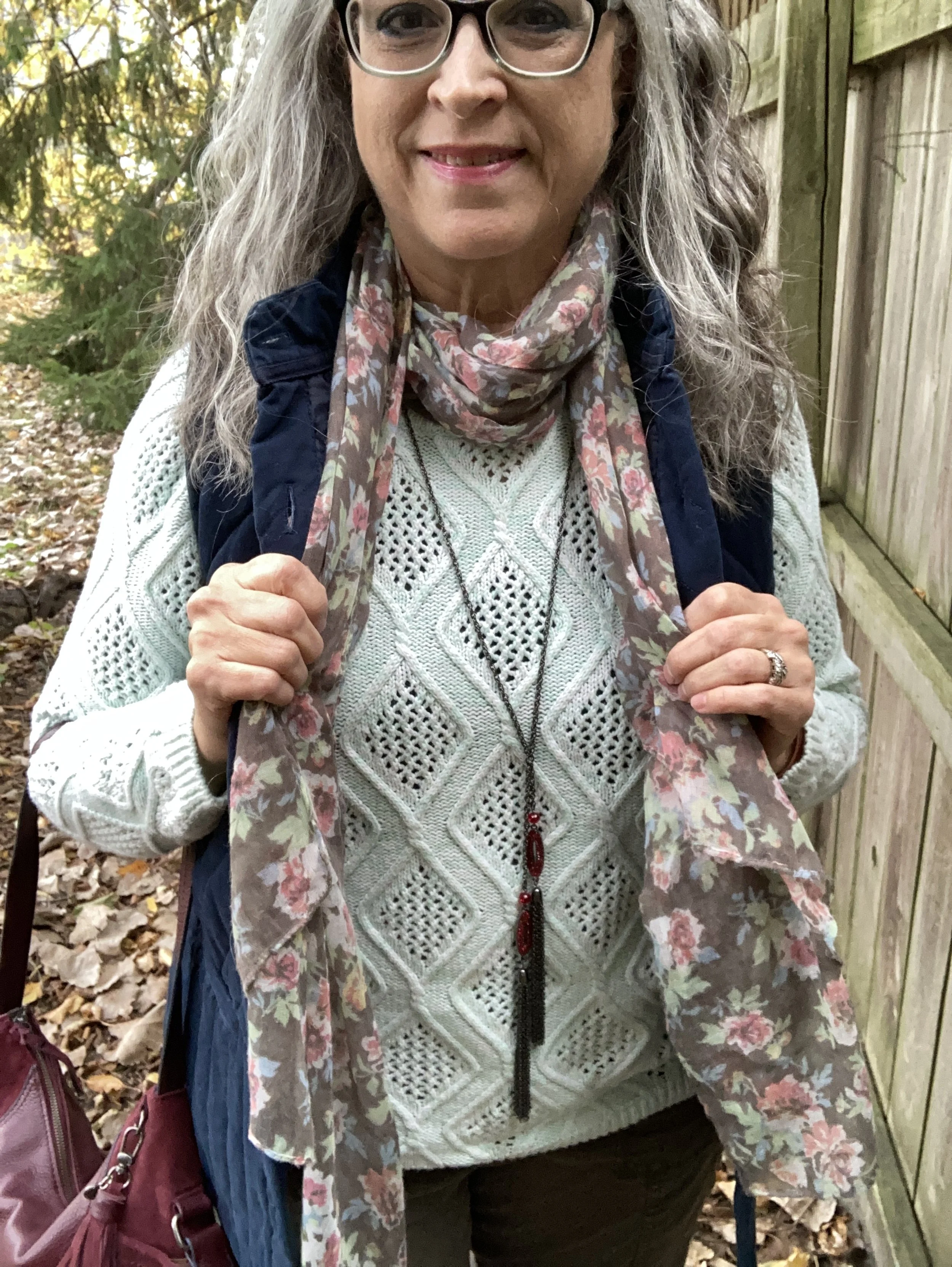
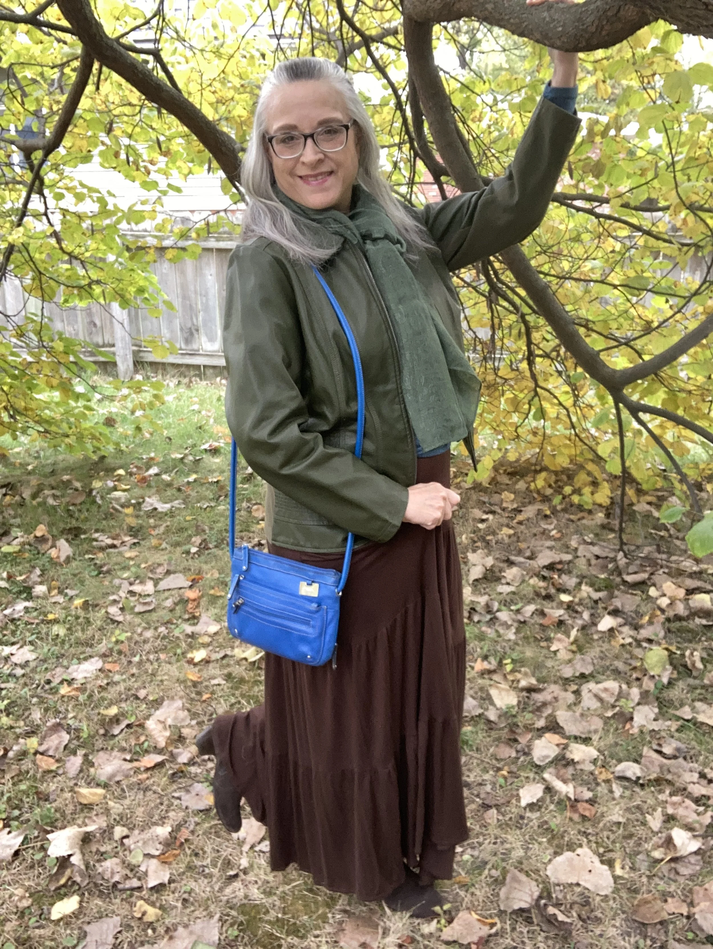
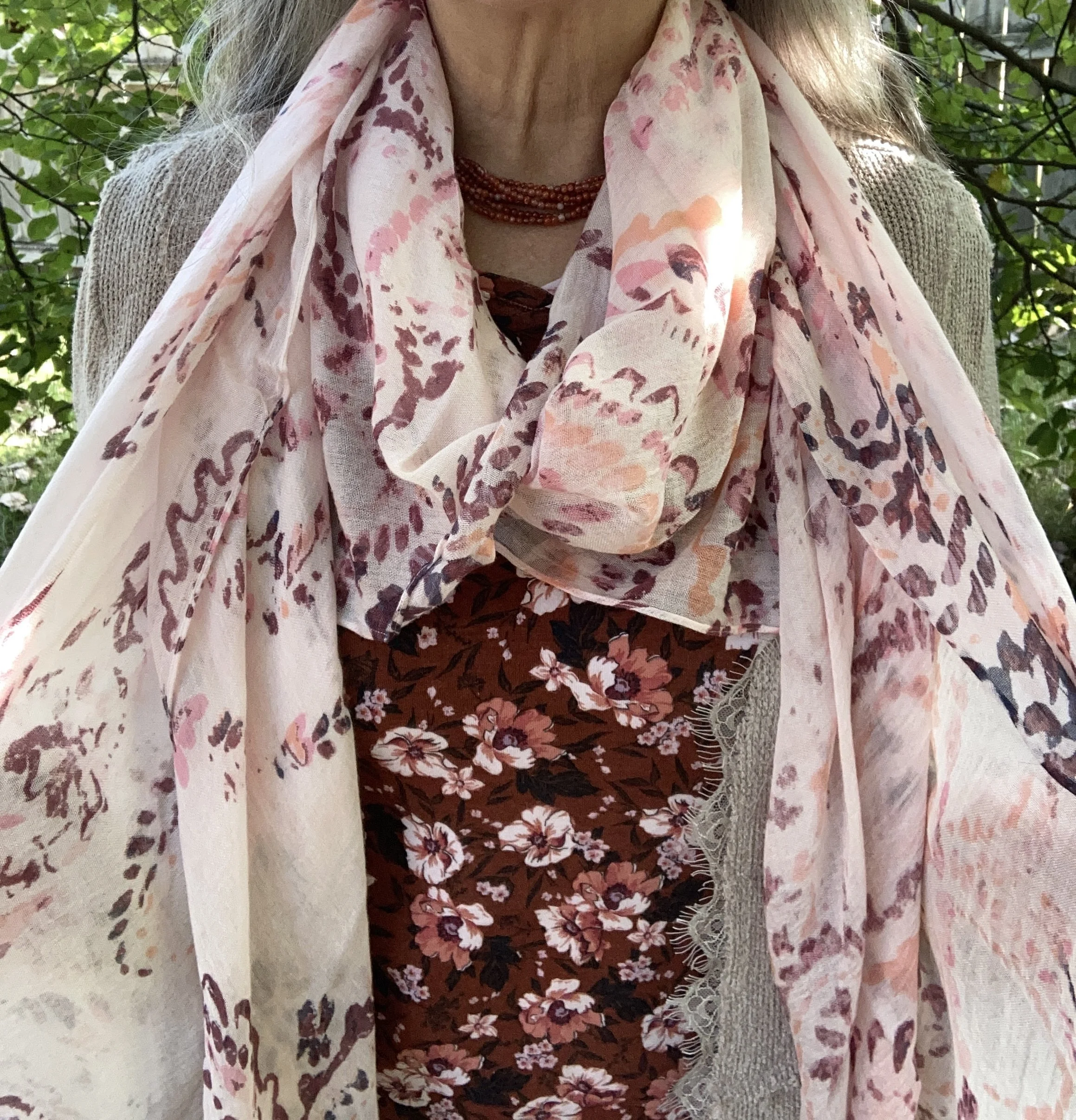
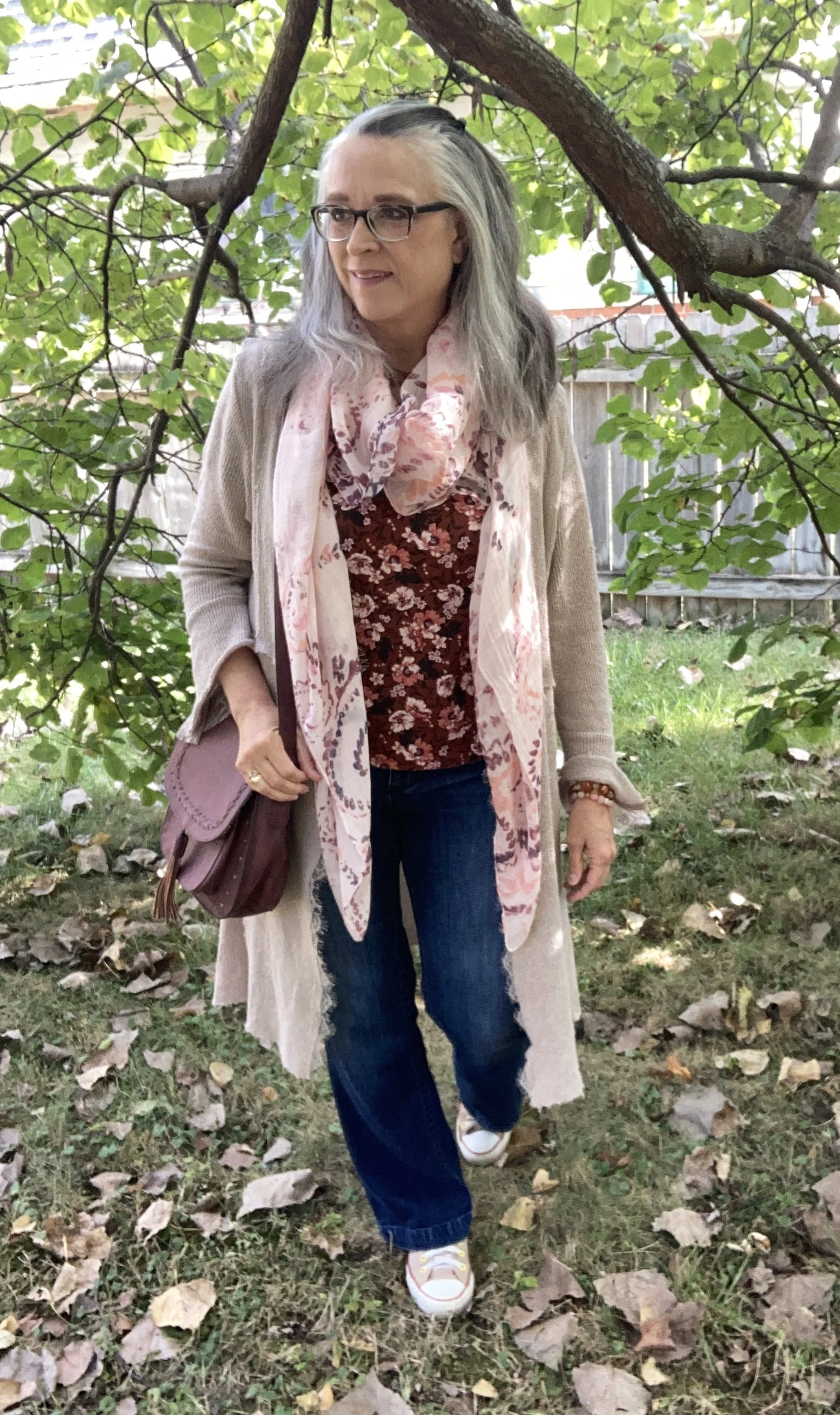
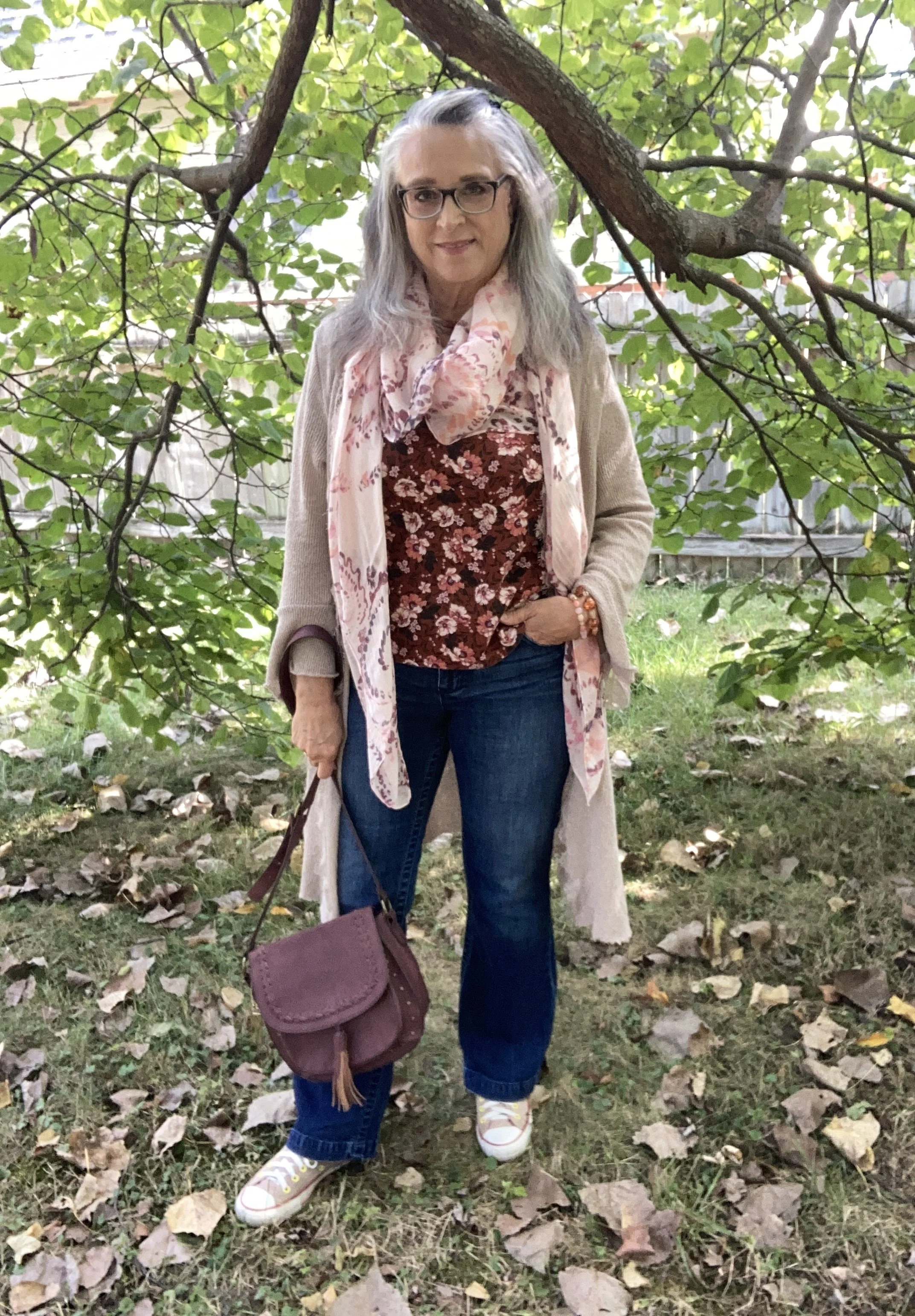
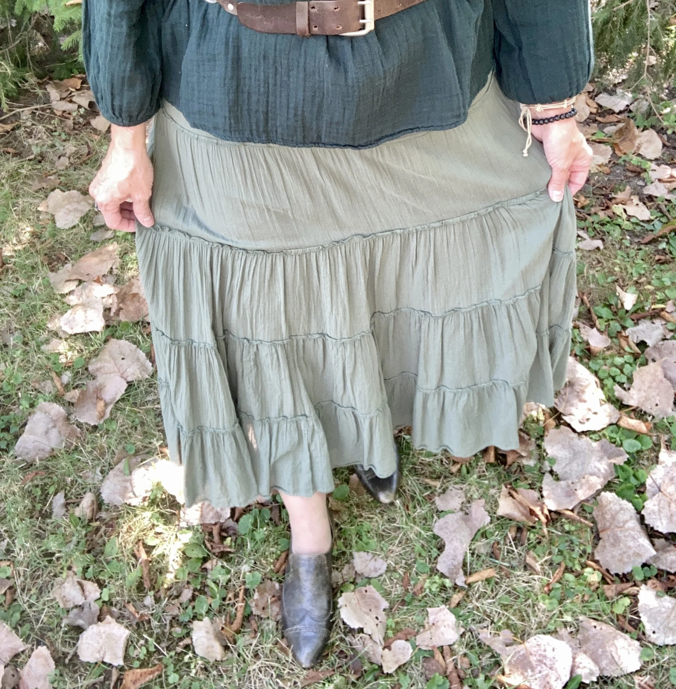
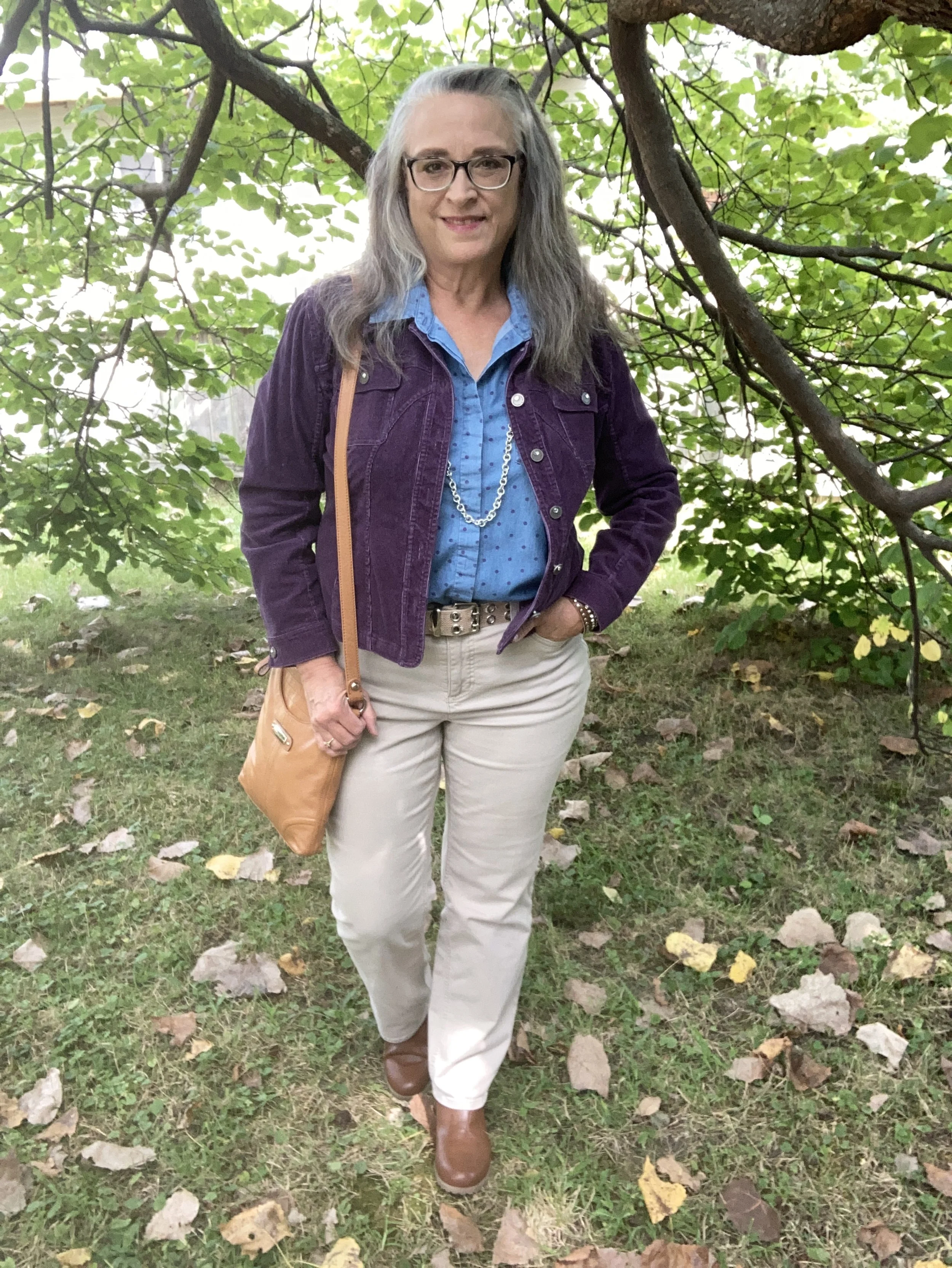
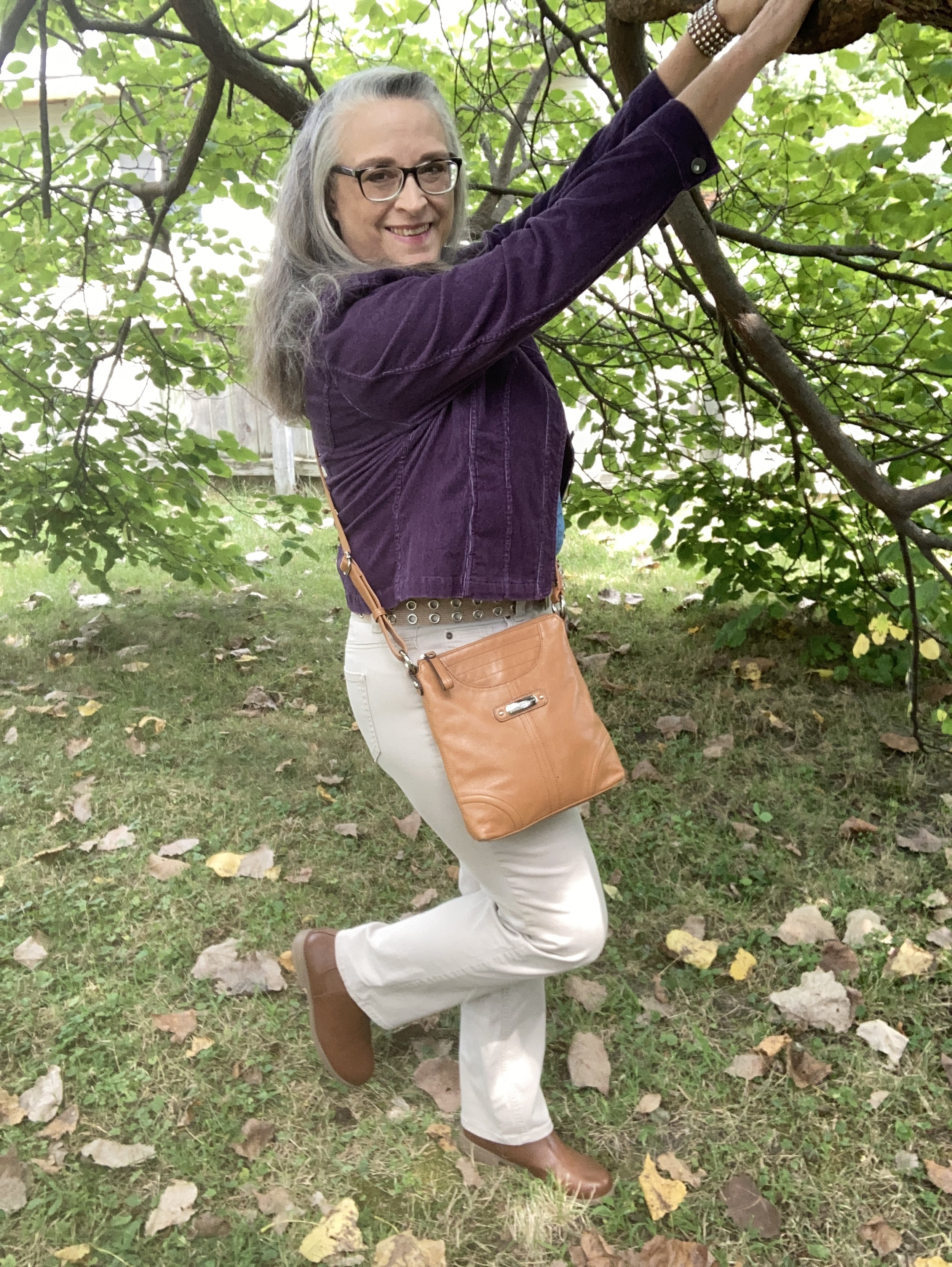
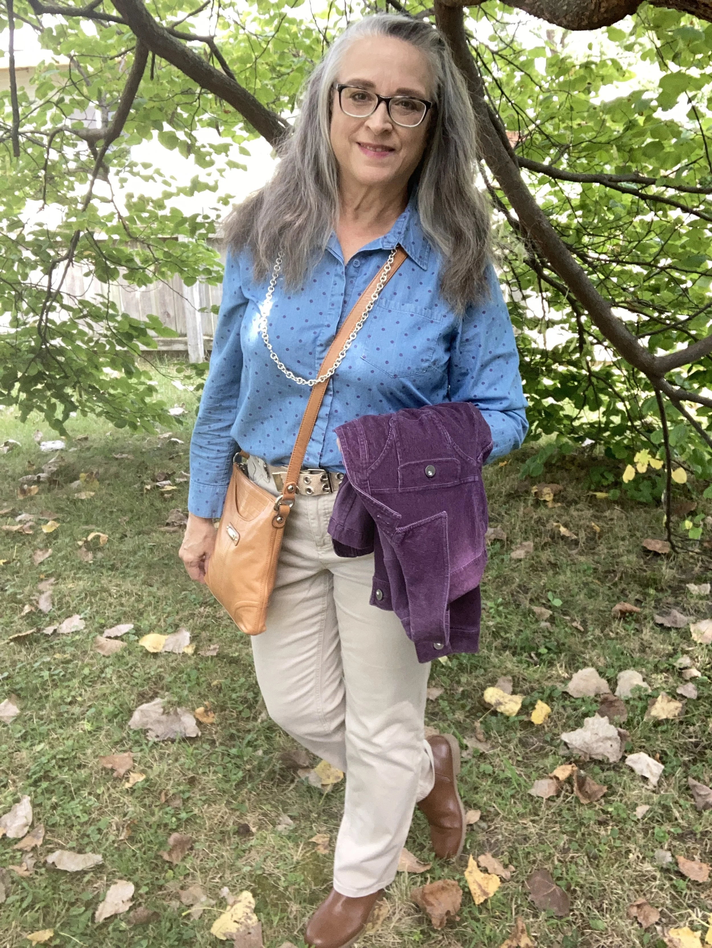
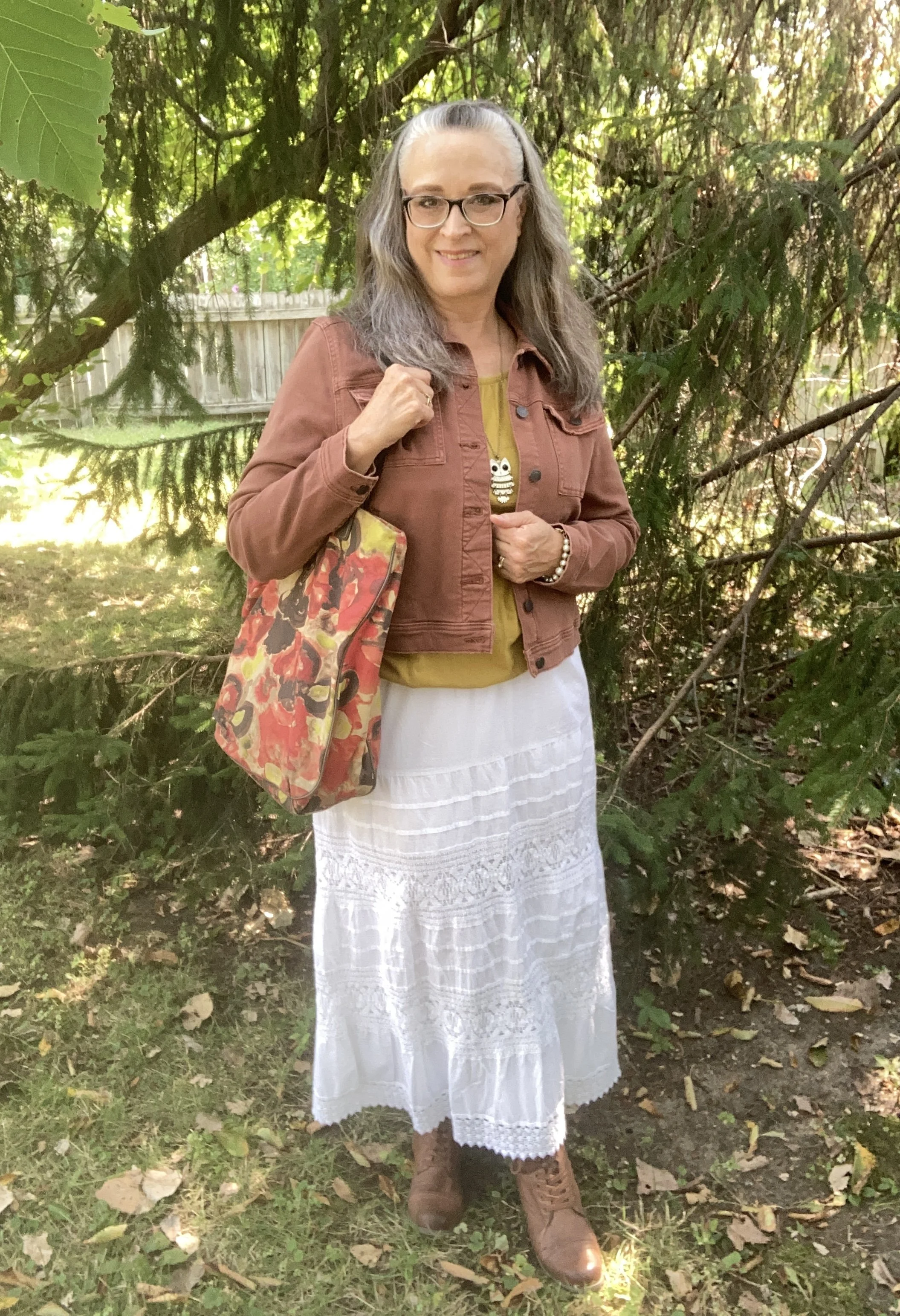
I got this maxi dress from Nordstrom Rack back in 2018. I have little reason to wear it, but I thought it would be perfect for a Thanksgiving day gathering, or even a Friendsgiving get together. One thing I like about a maxi dress is the simplicity of it. It’s one and done. Slip it over your head and voila you have a whole outfit. Of course you can add a few accessories to liven it up. See how I styled this same dress for a summer look, and for a different fall look.

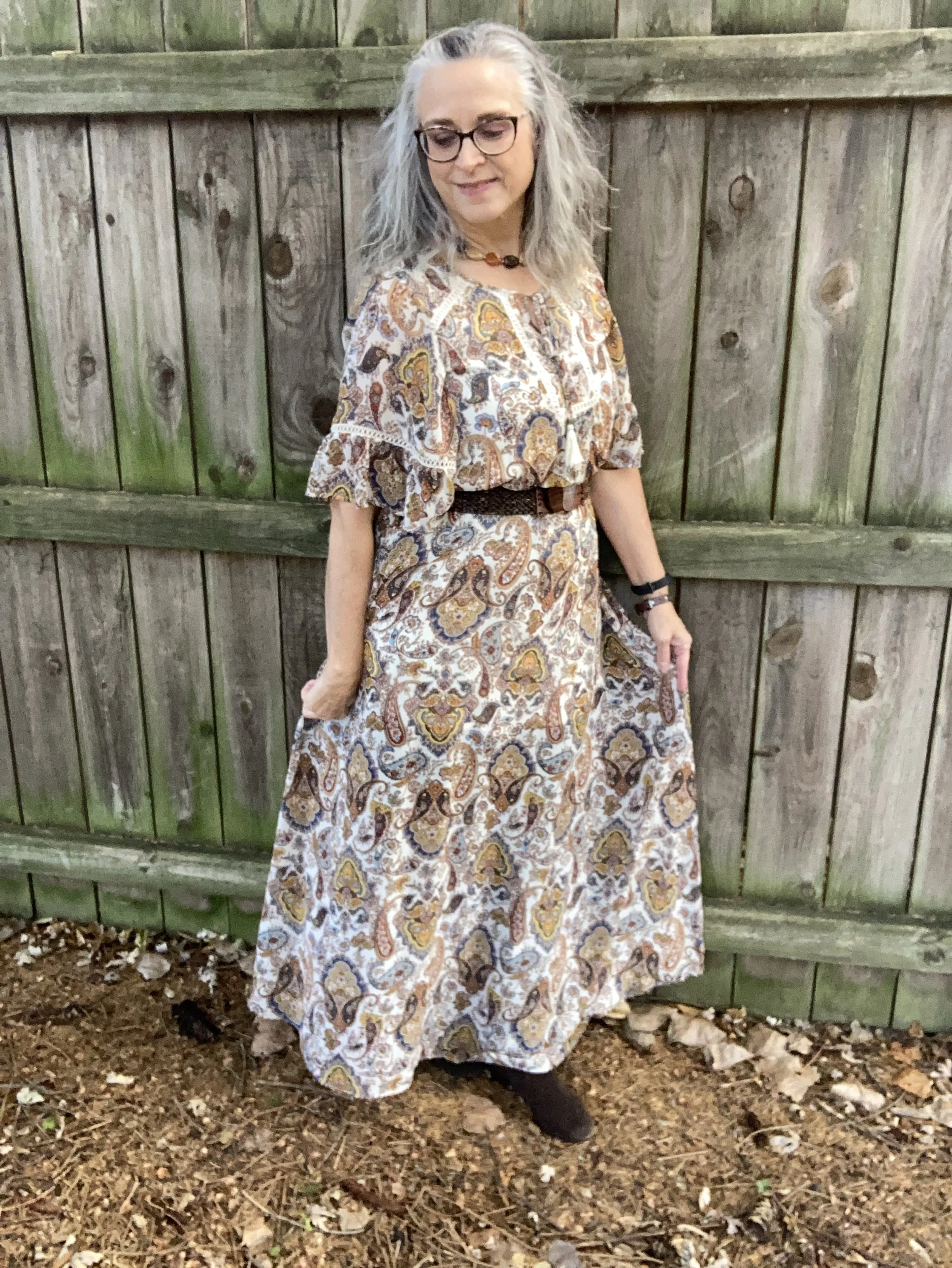
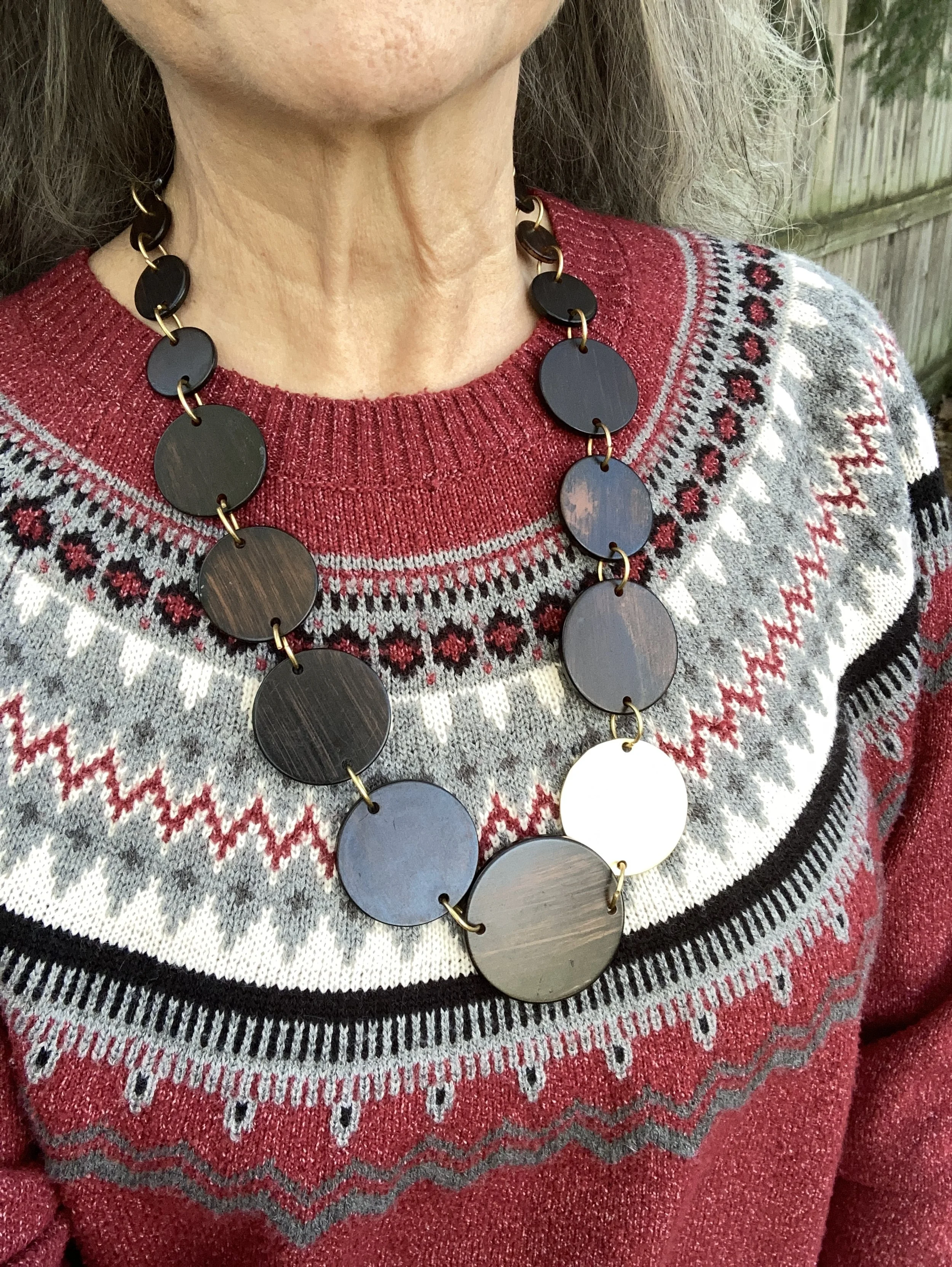
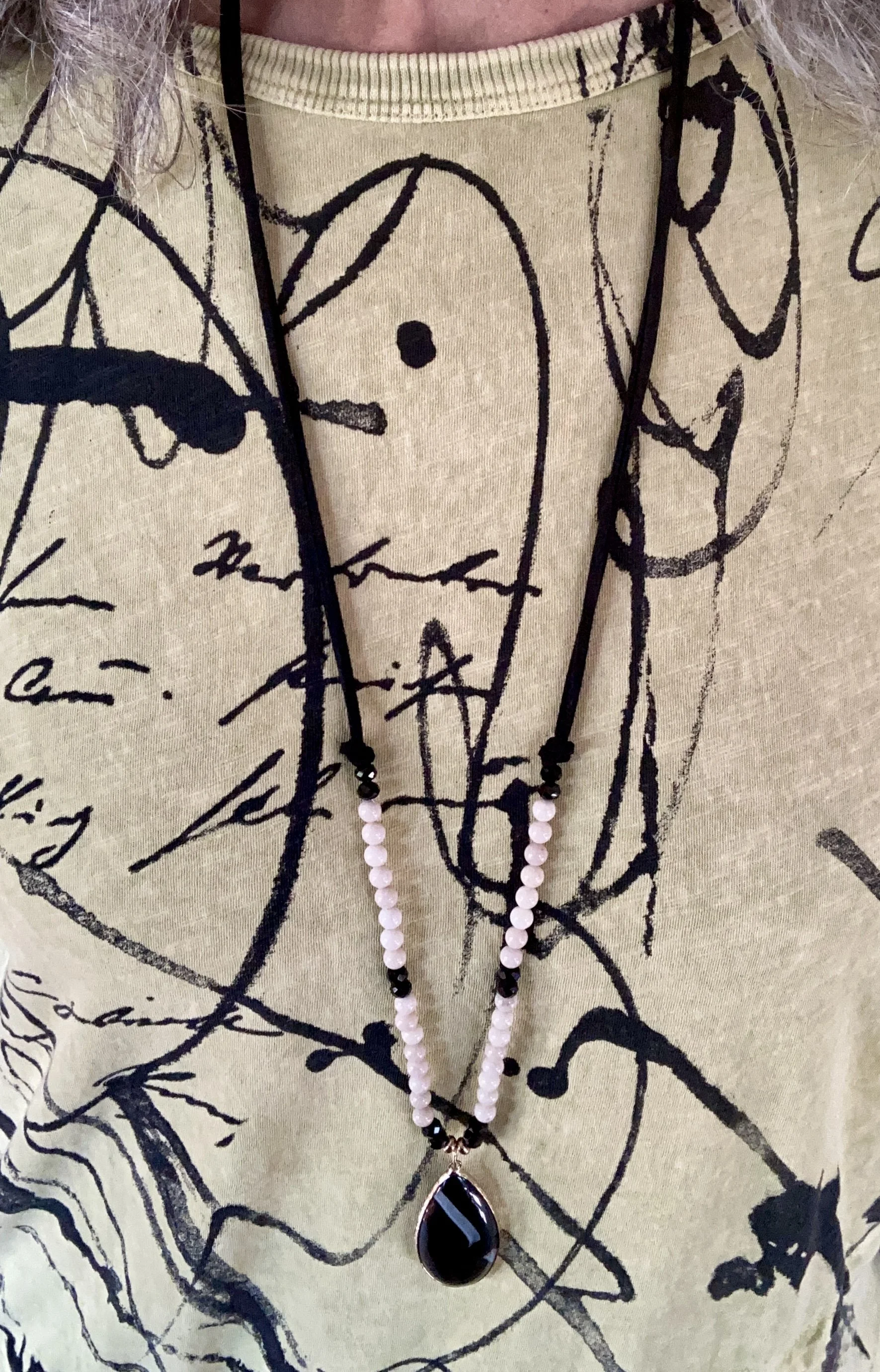
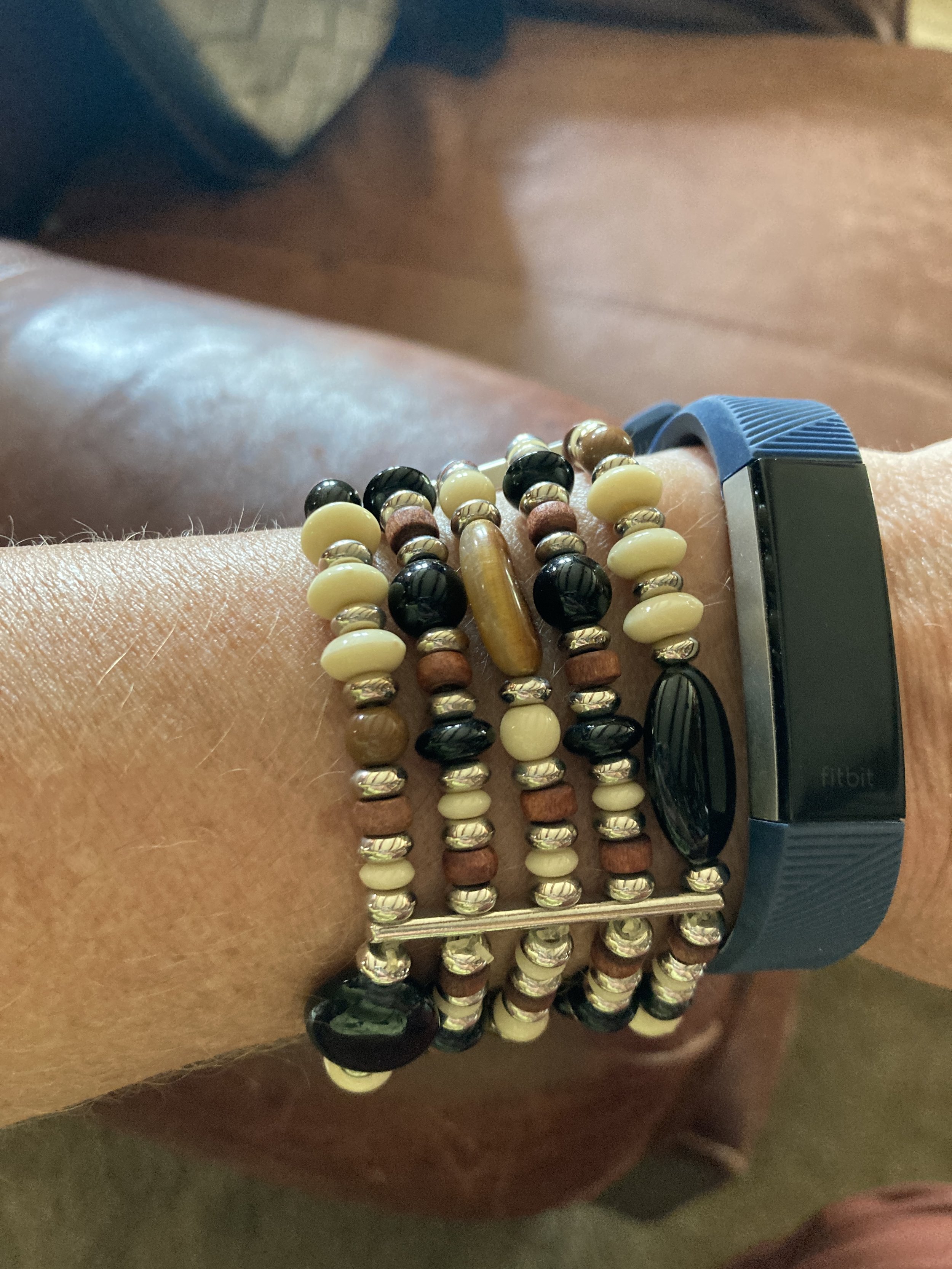
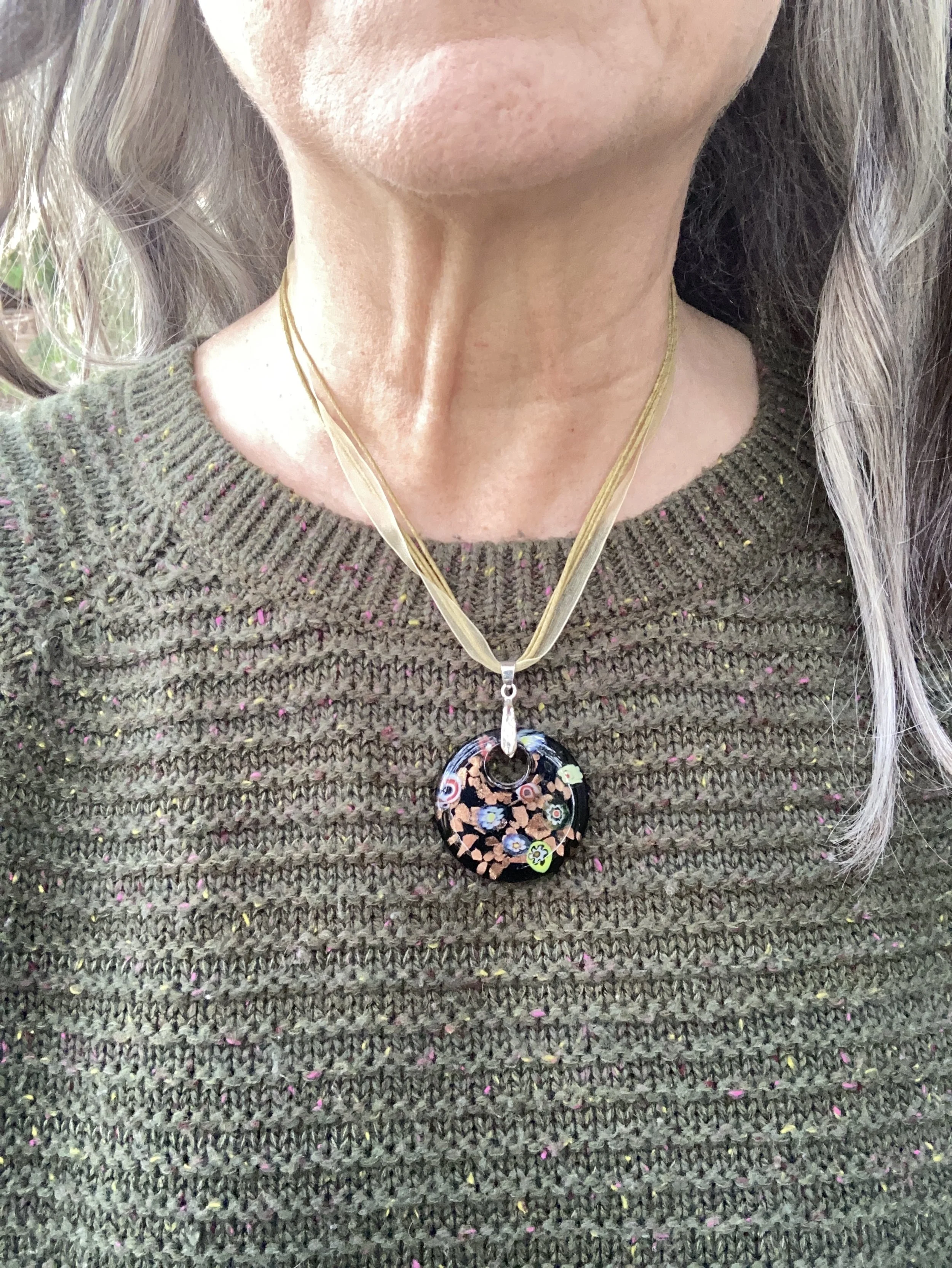
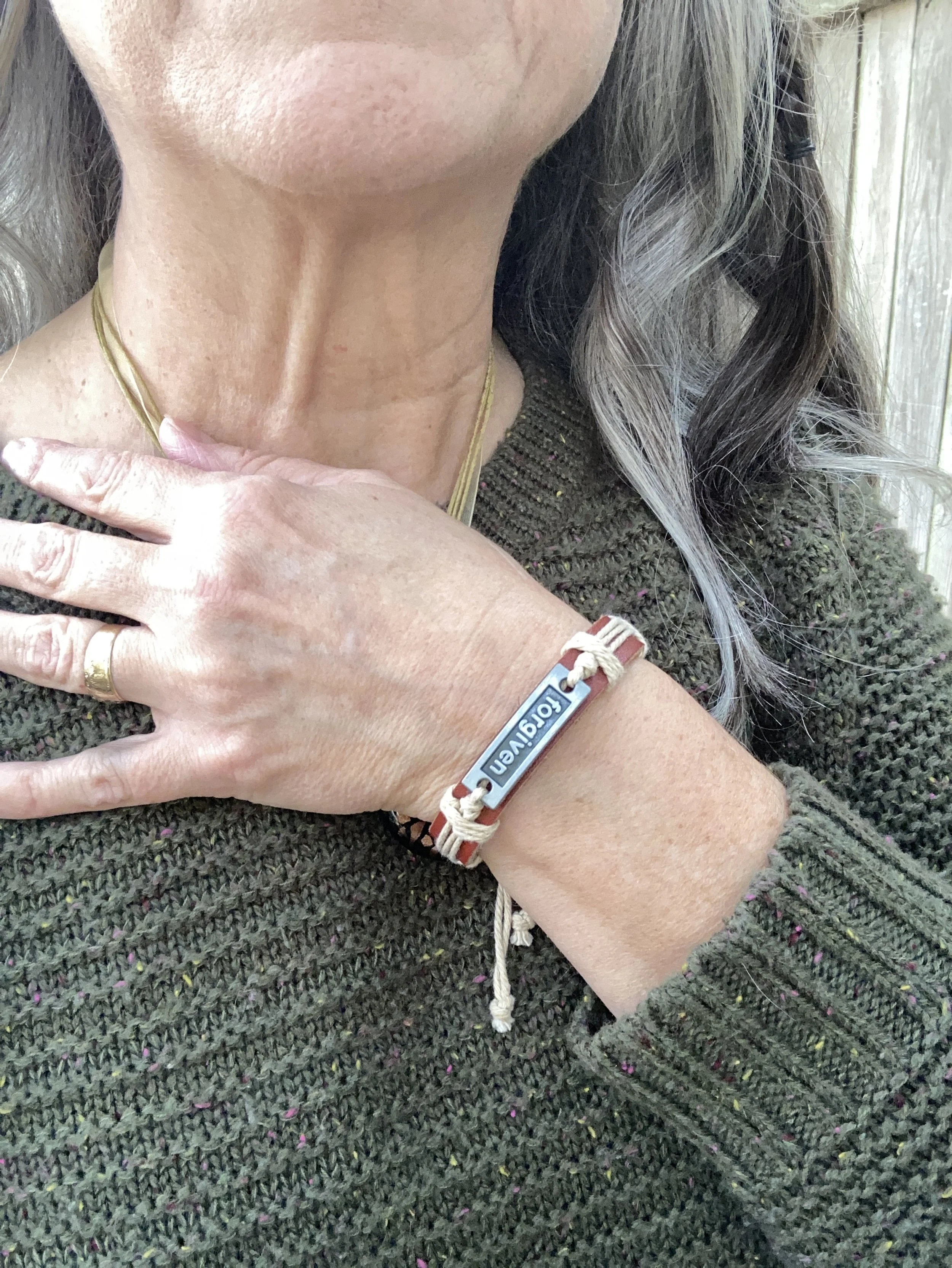
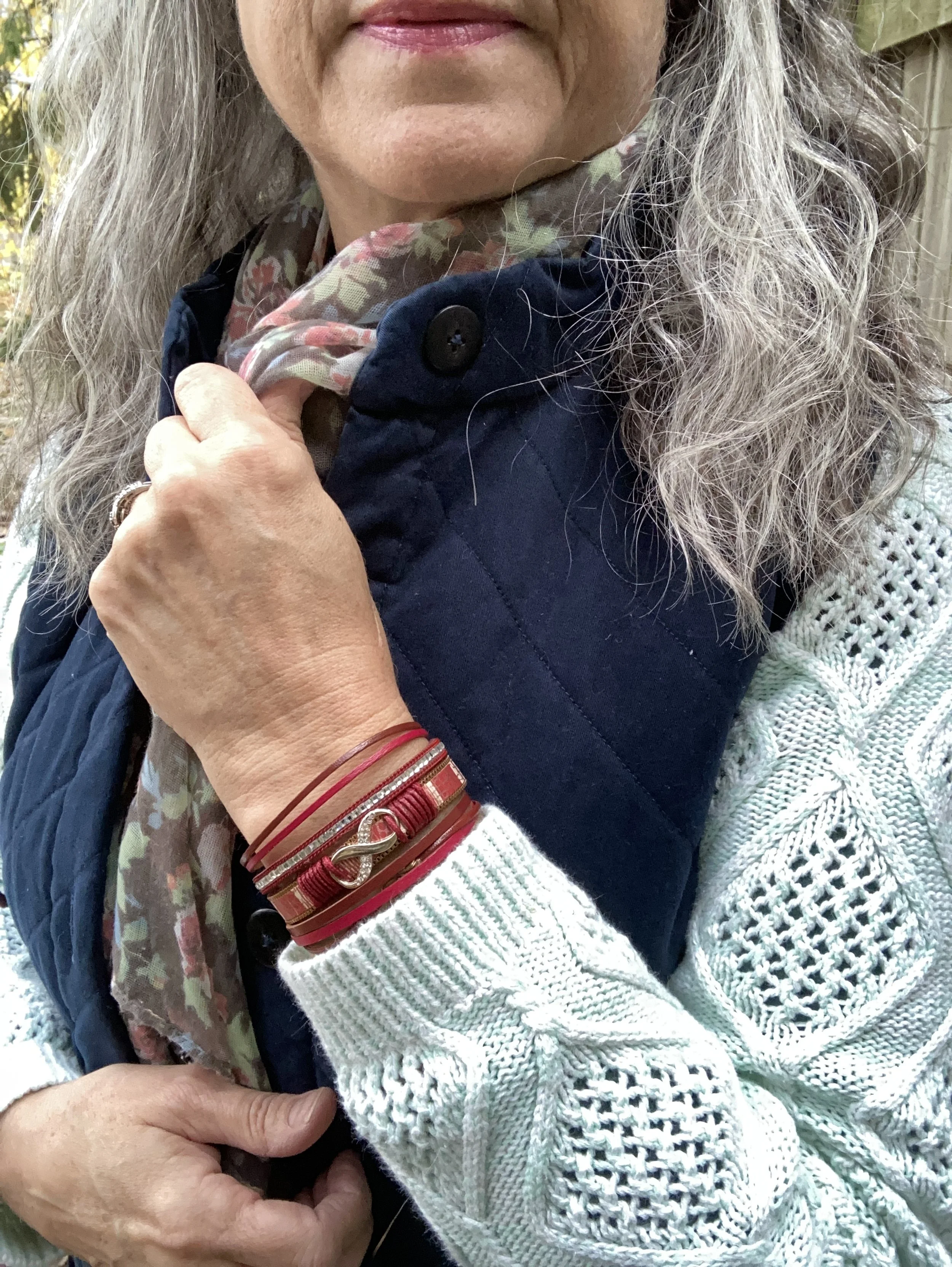
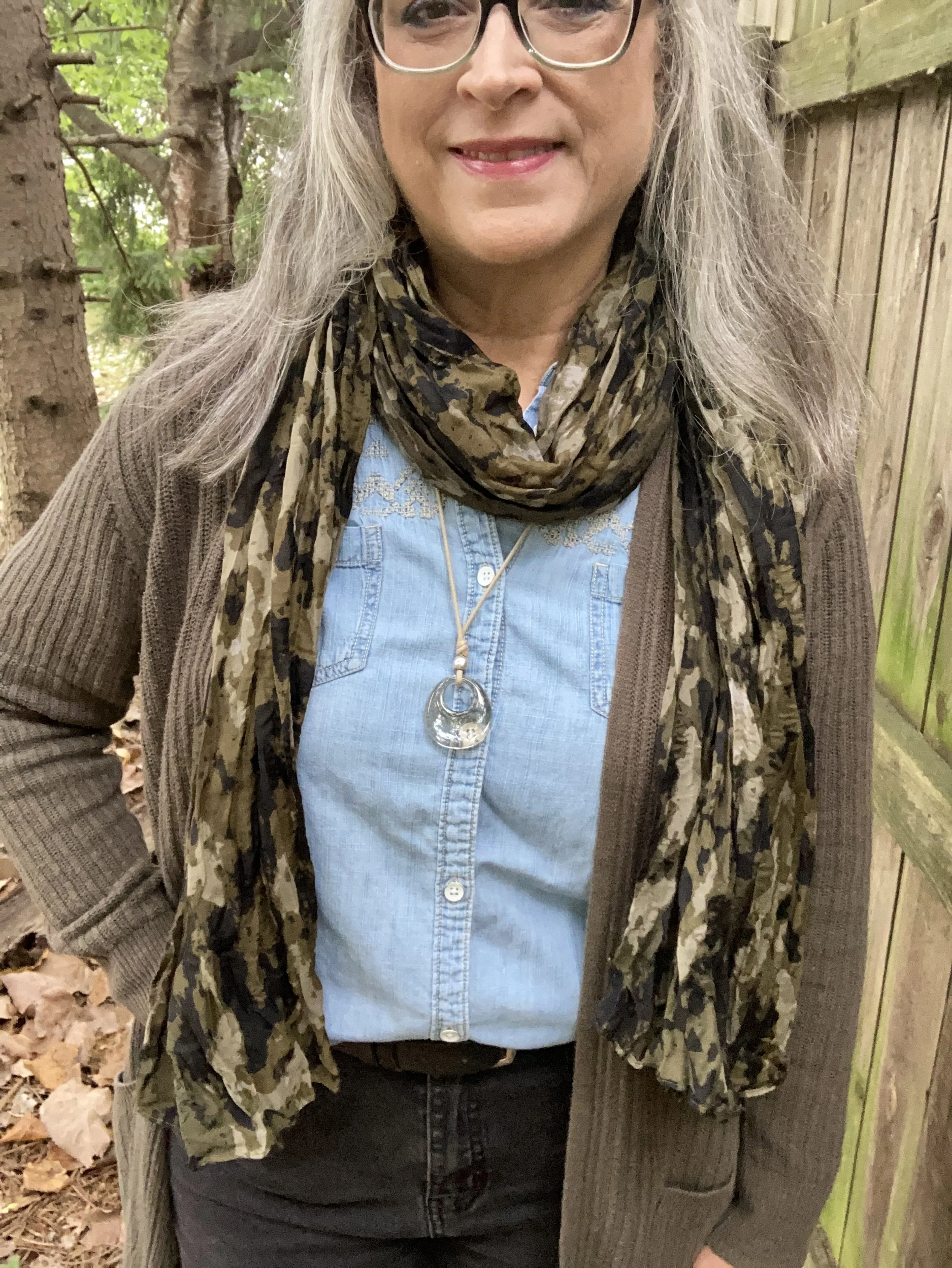
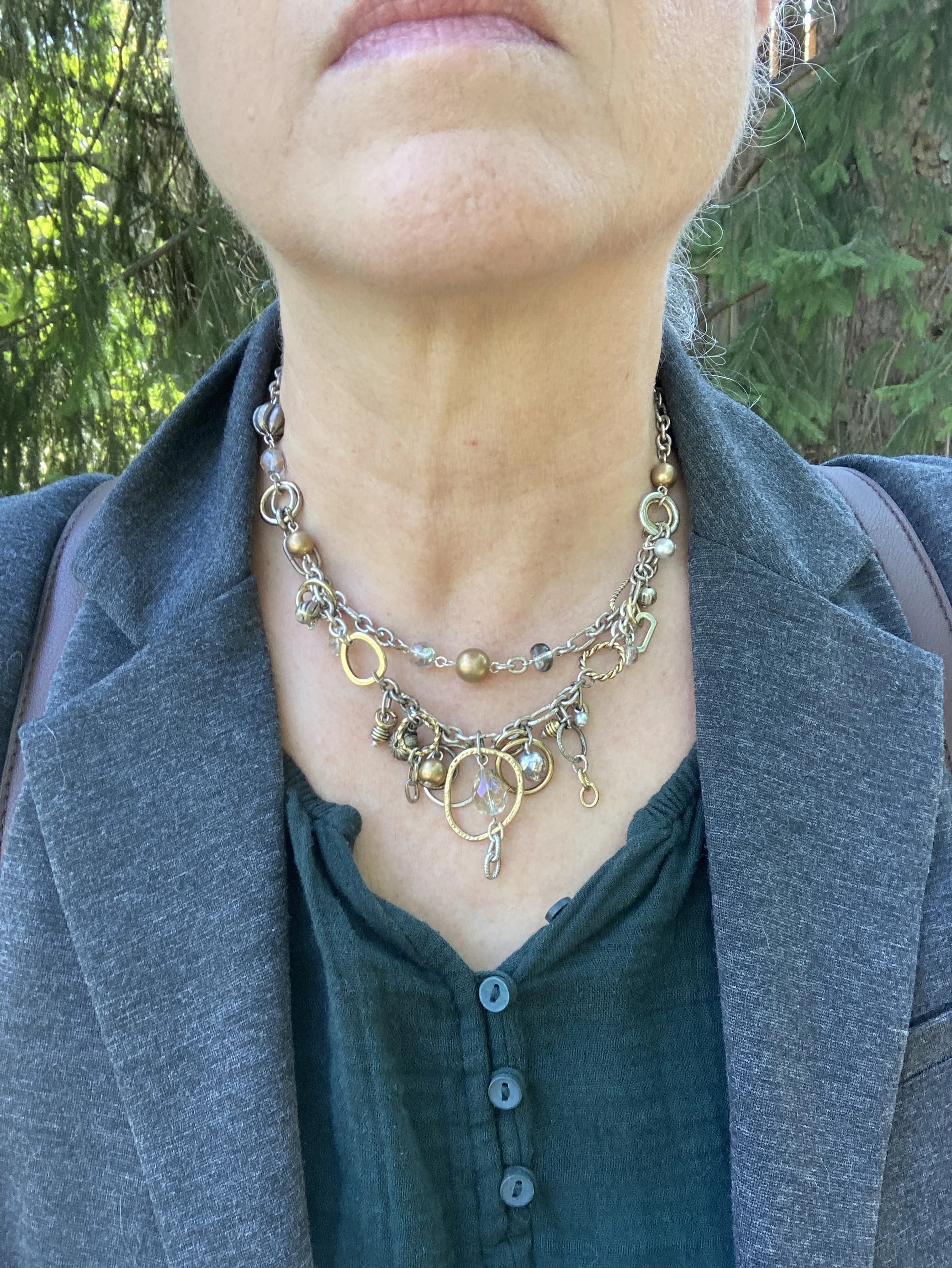
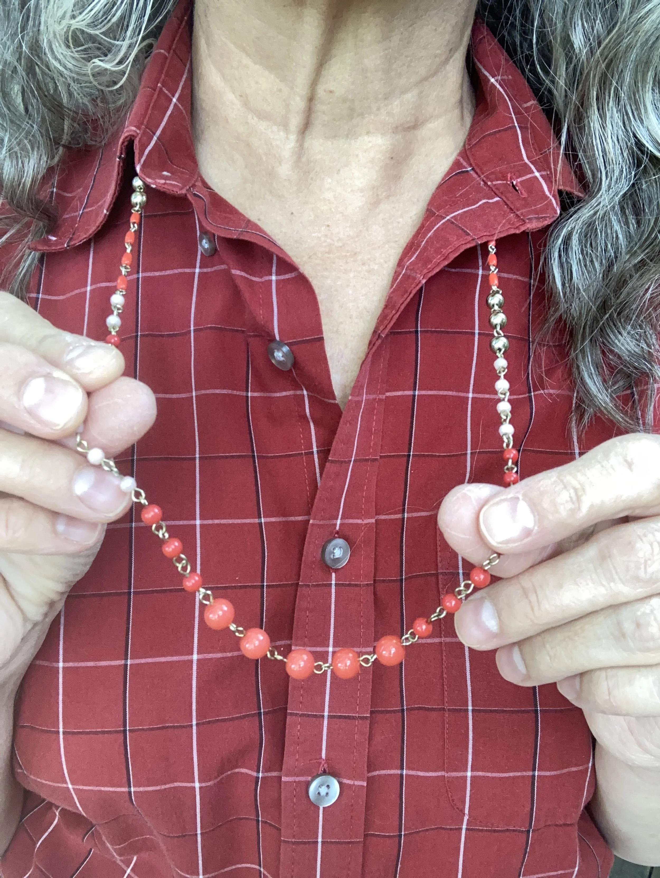
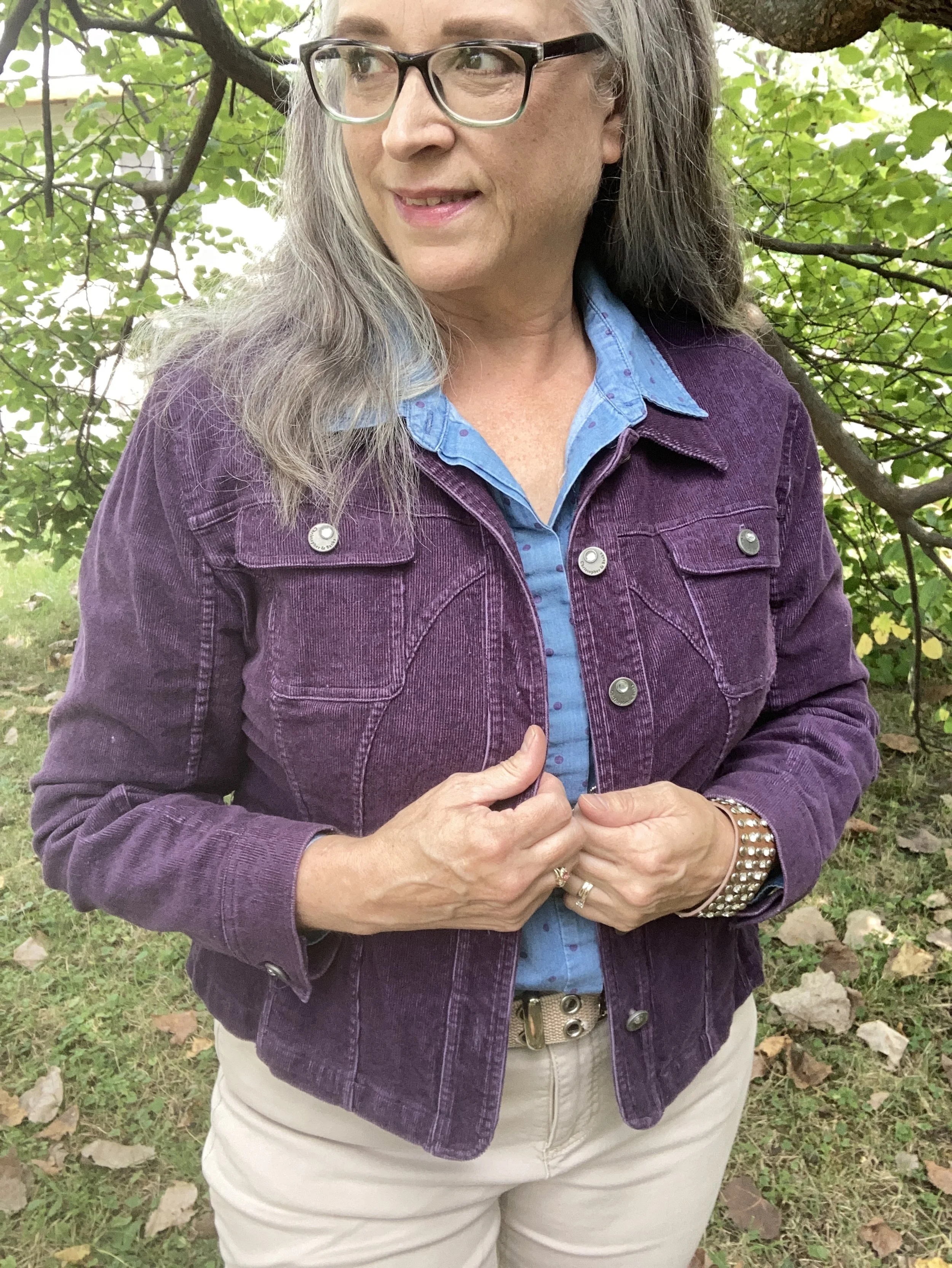
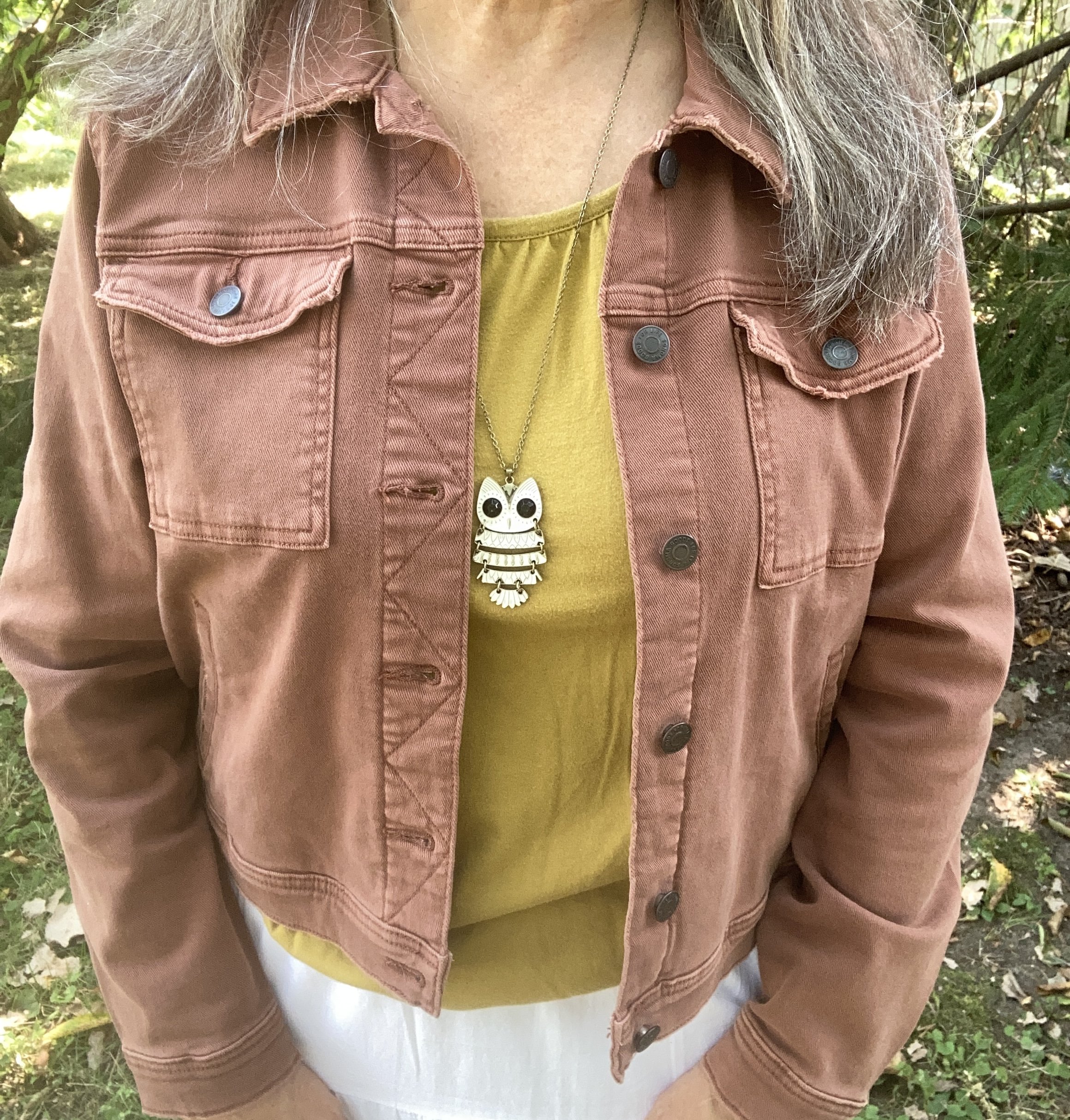
I decided on brown and golden accents, so my thrifted belt, boots, necklace, and bracelet give a bit of grounding to the dress. In addition, the dress is quite long, so the belt helps to hold up the skirt so I am not stepping on it or it dragging across the ground. The dress is gathered with elastic at the waist, so a belt also helps to cover that up and accentuate the waistline. This belt is made of wood, but has a stretchy aspect to it.

Style Tip: Think of belts, not just as a way to hold up your pants, but as a way to add interest to an outfit. In addition, a belt can help create an waistline where you might not have one, or gather a more voluminous piece in at the waist. Since belts come in all sorts of textures, widths, and colors they can definitely add a kick to your outfit.

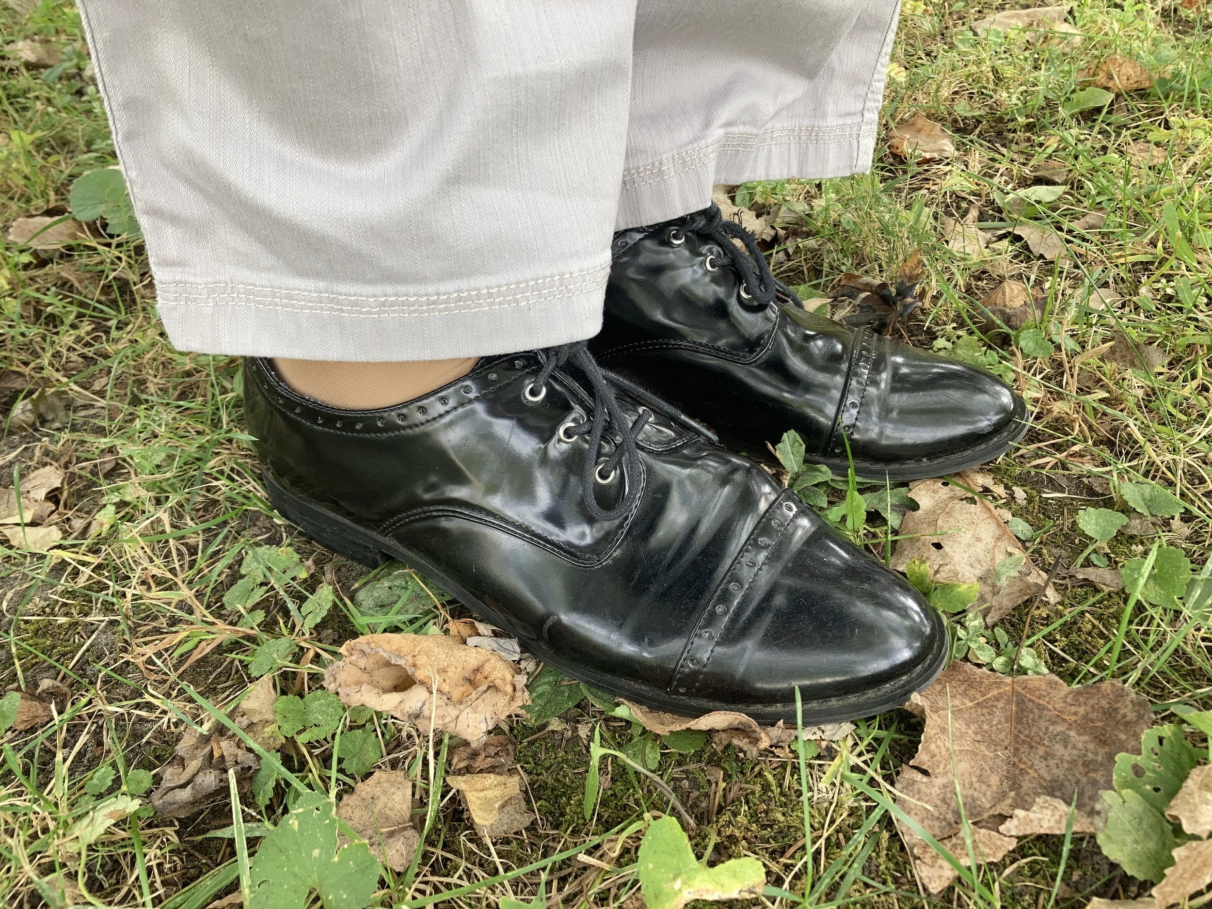
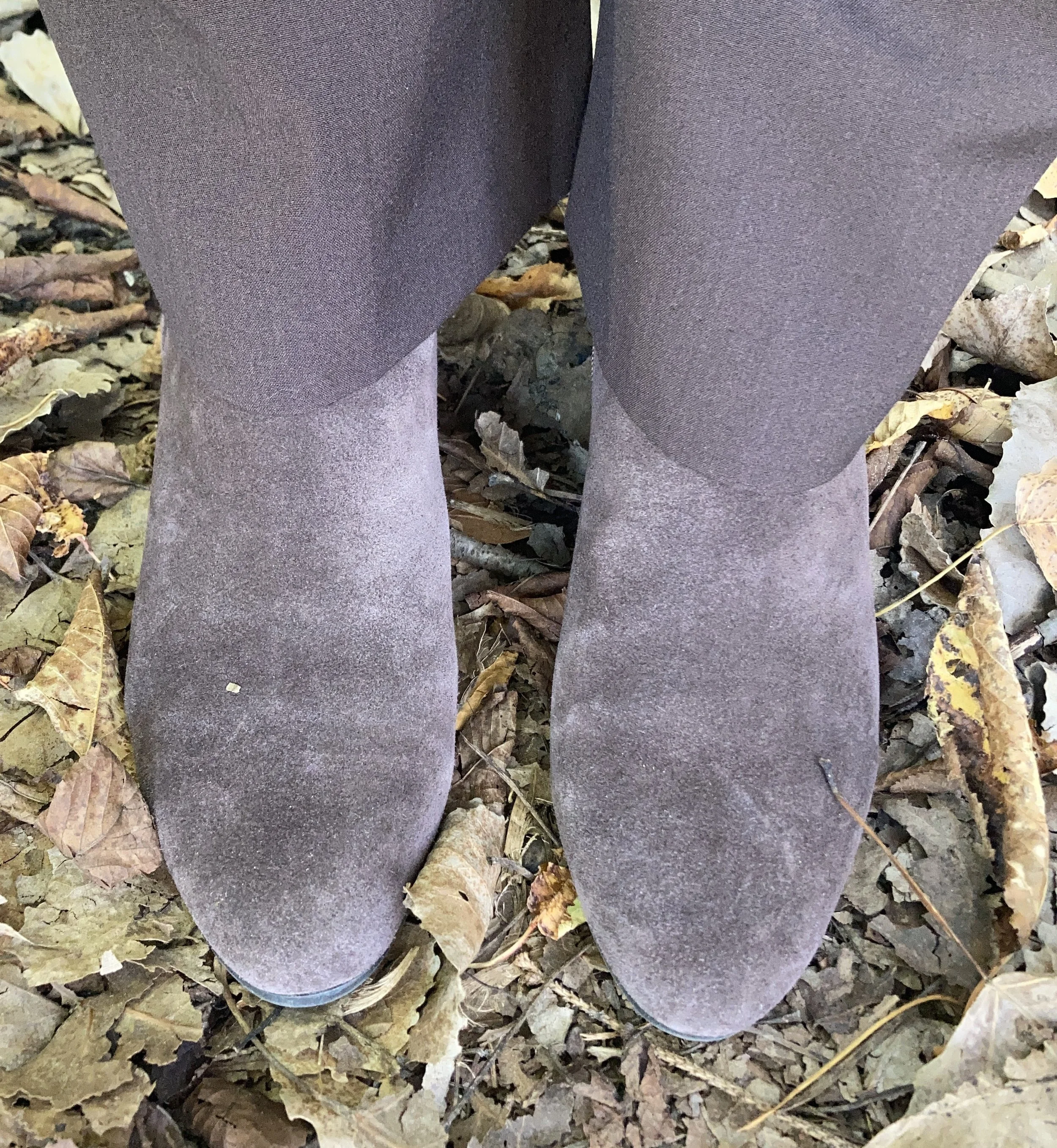
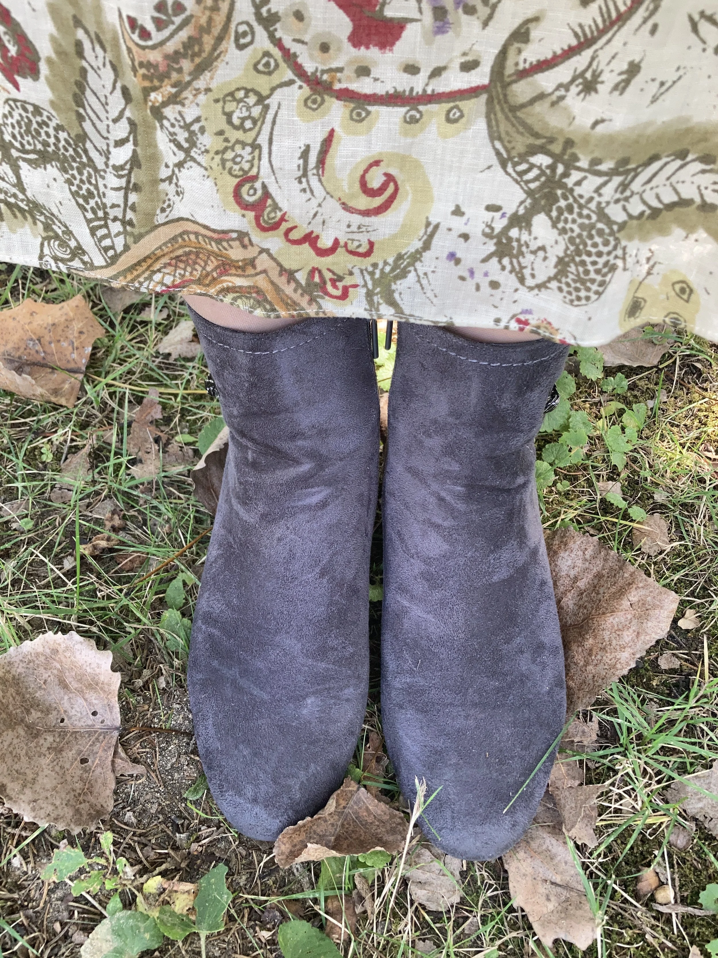
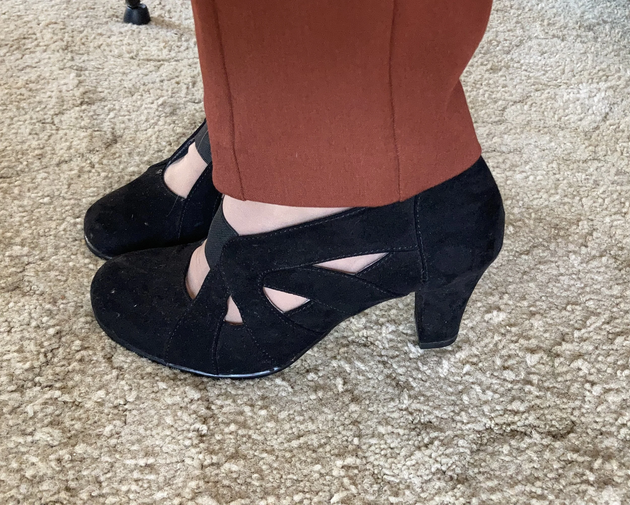
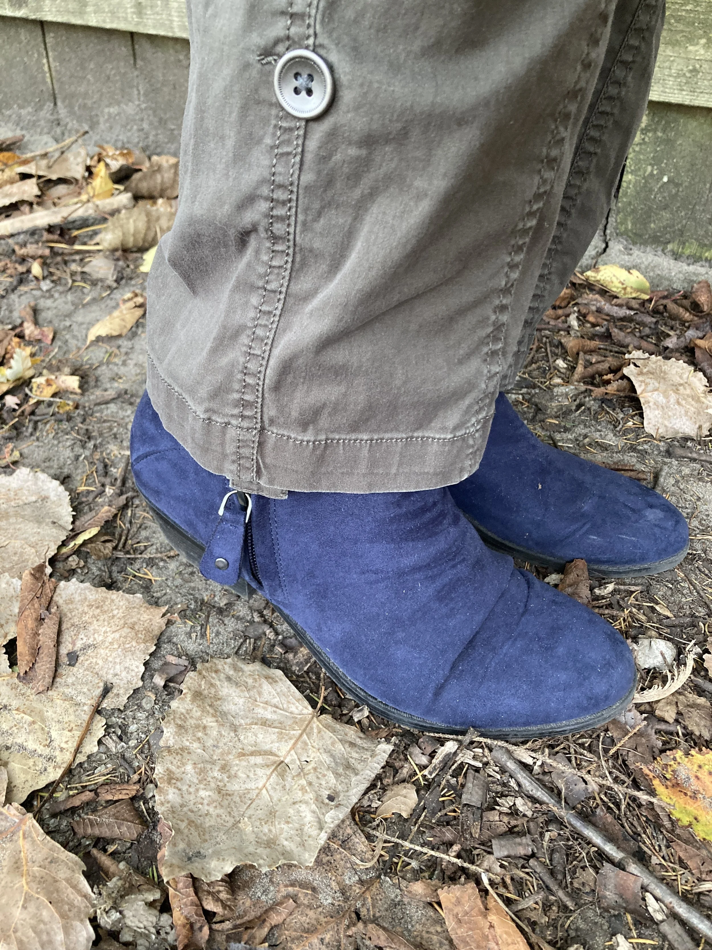
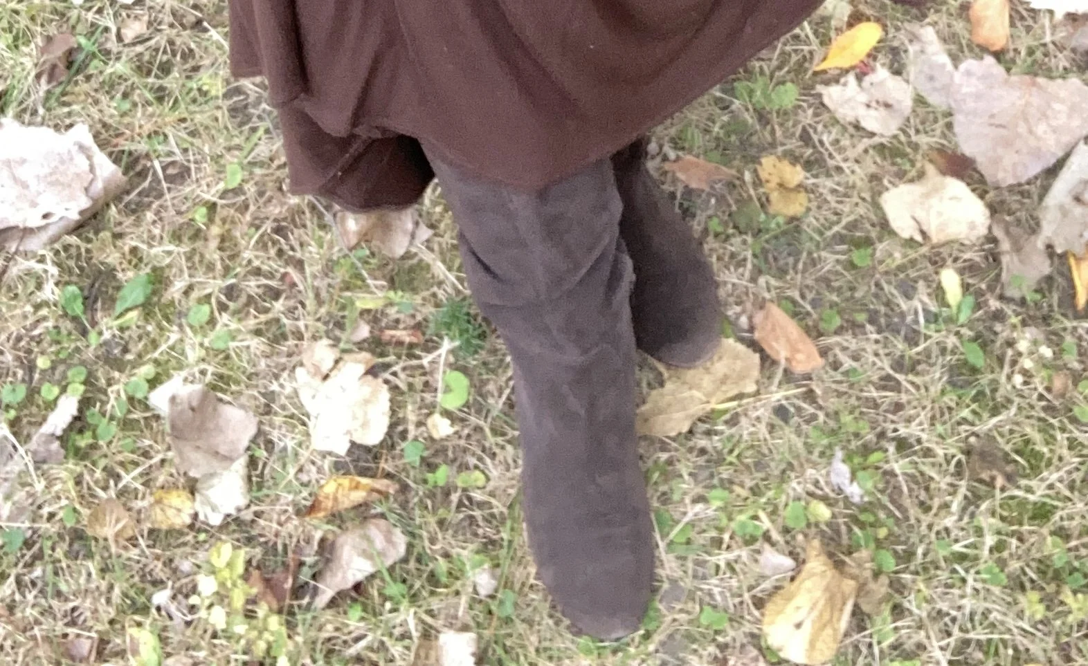
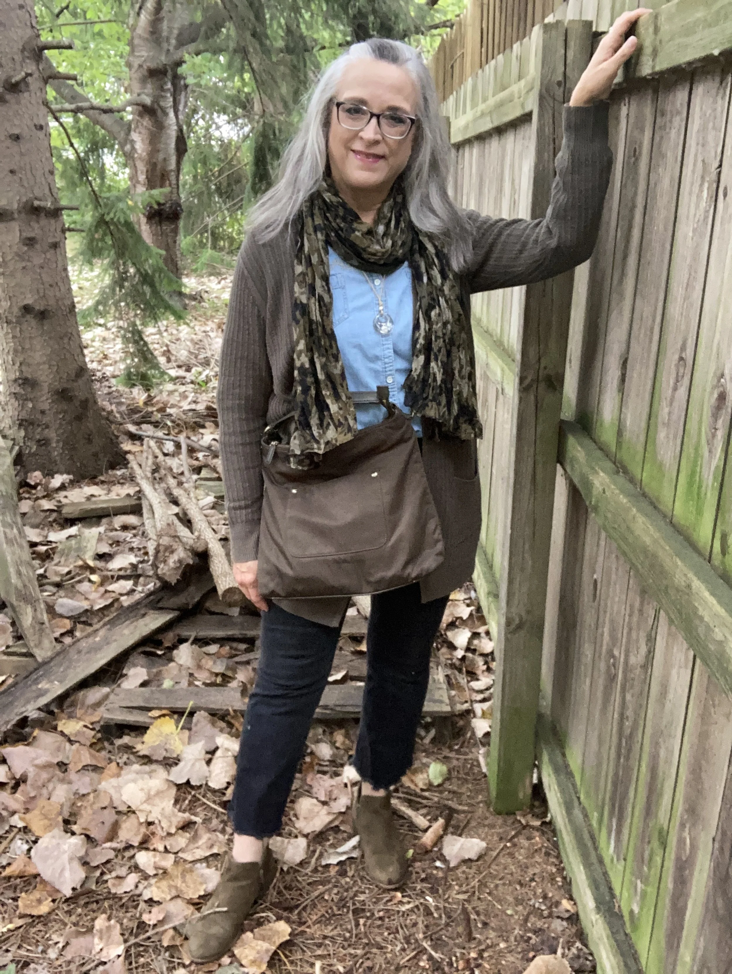
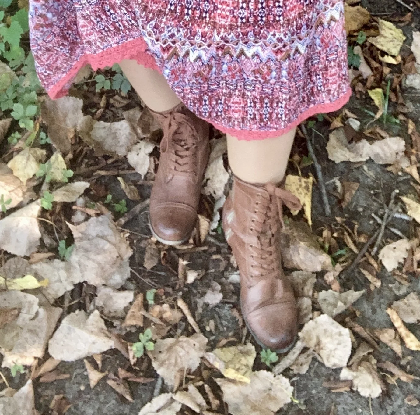
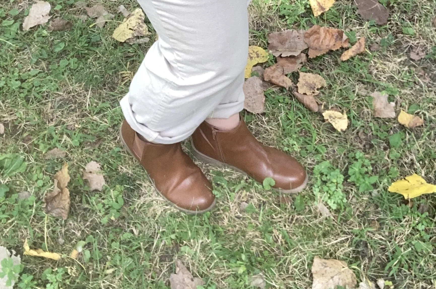
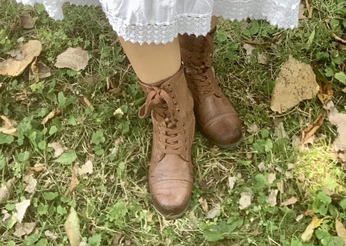
I love these 80’s style slouchy, suede, Kelly & Katie boots with the low heel, and yes I did add a pair of leggings under my dress, because it is cold. Heavy tights would work just as well.

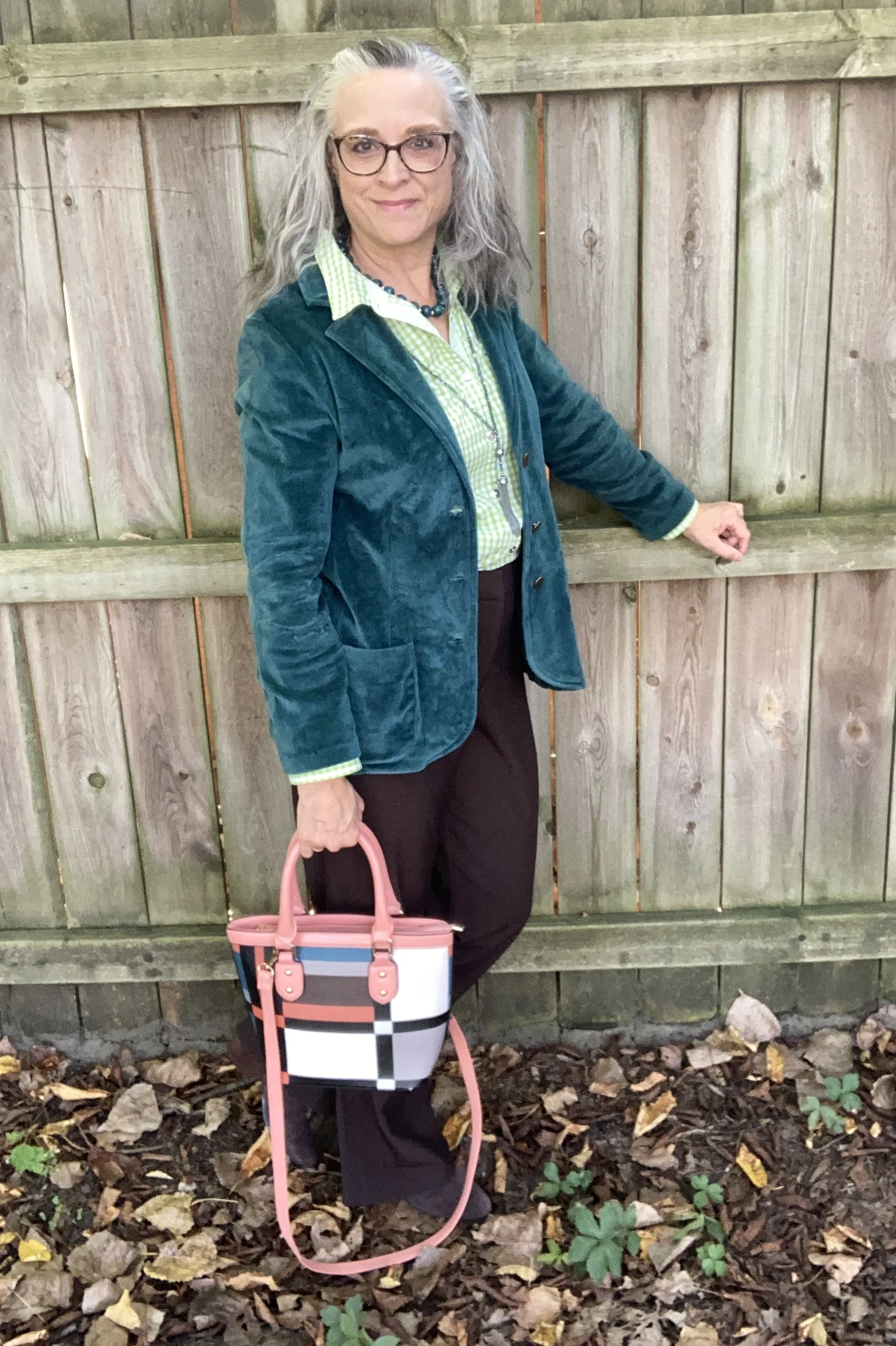
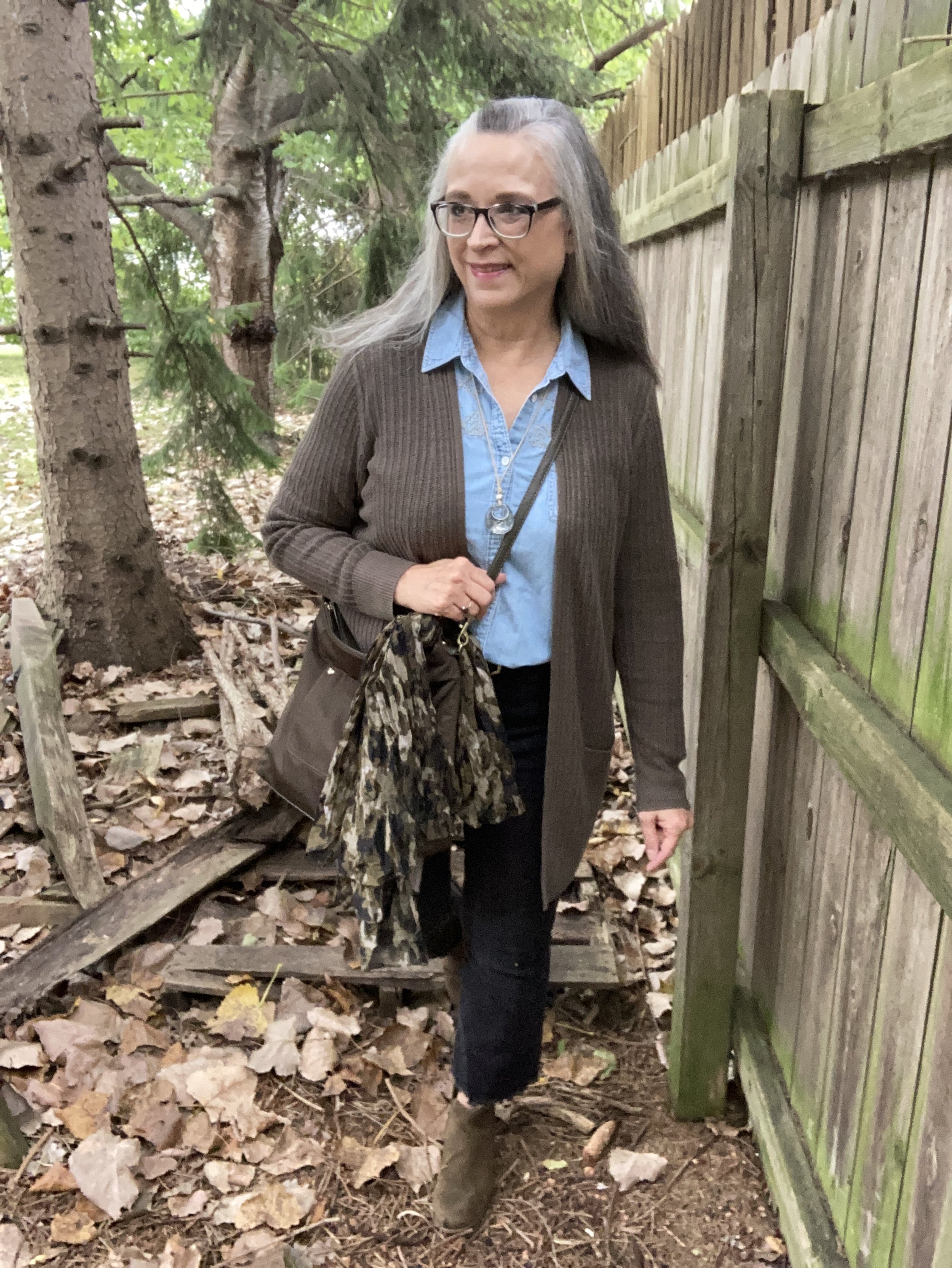
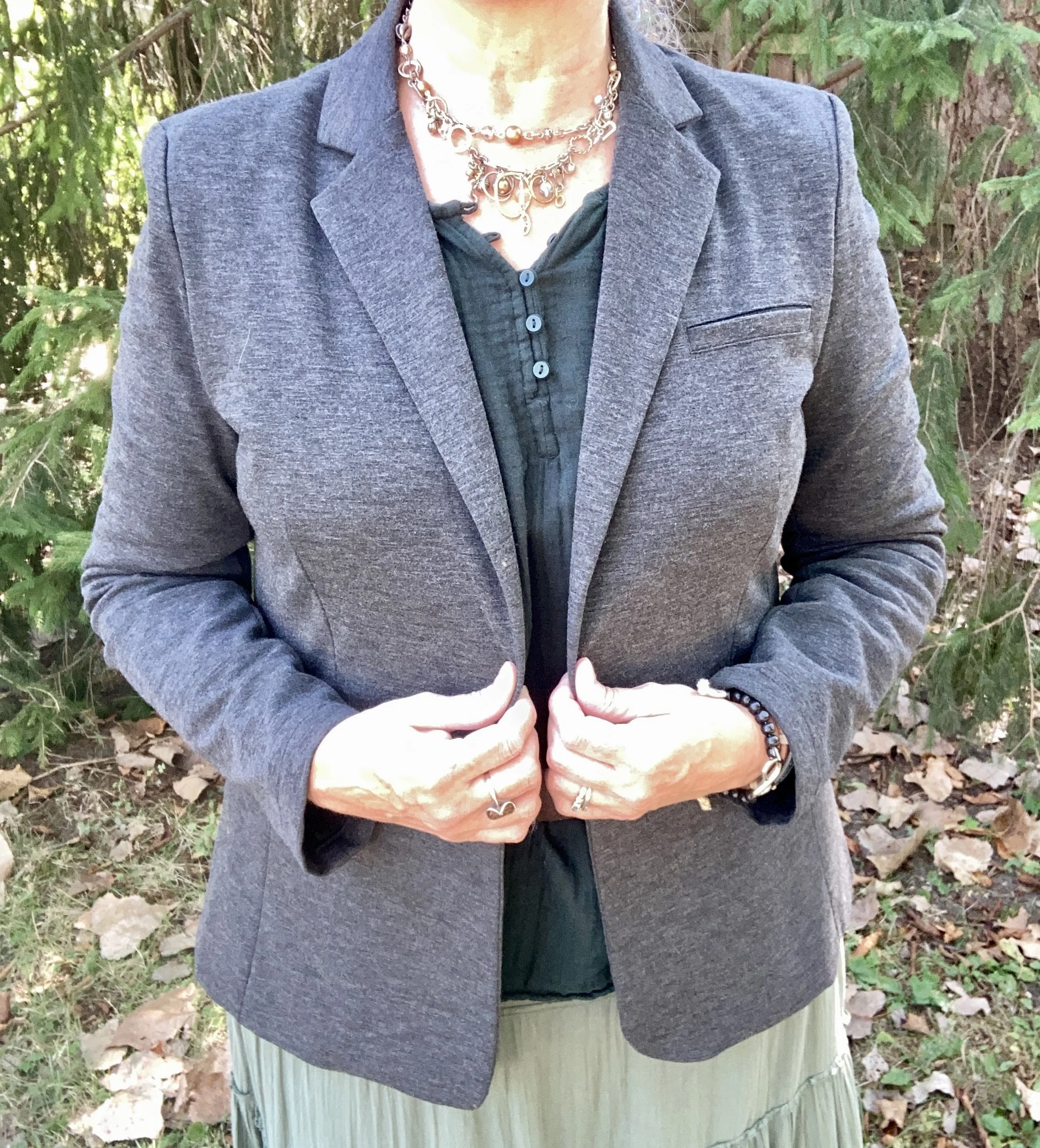
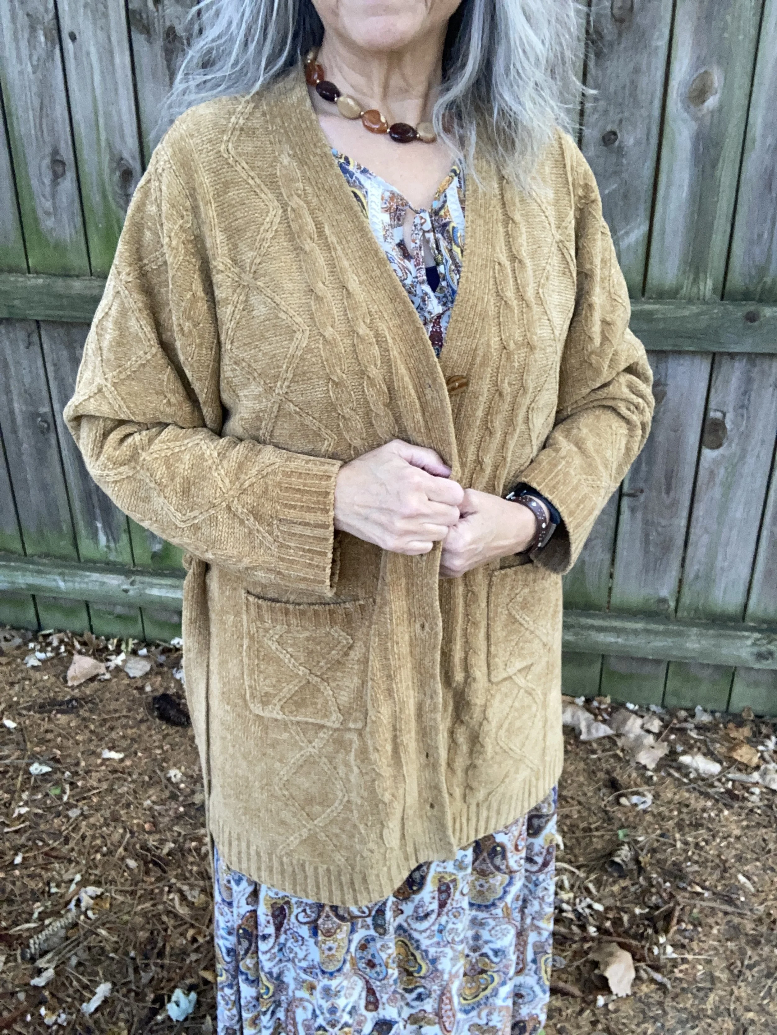
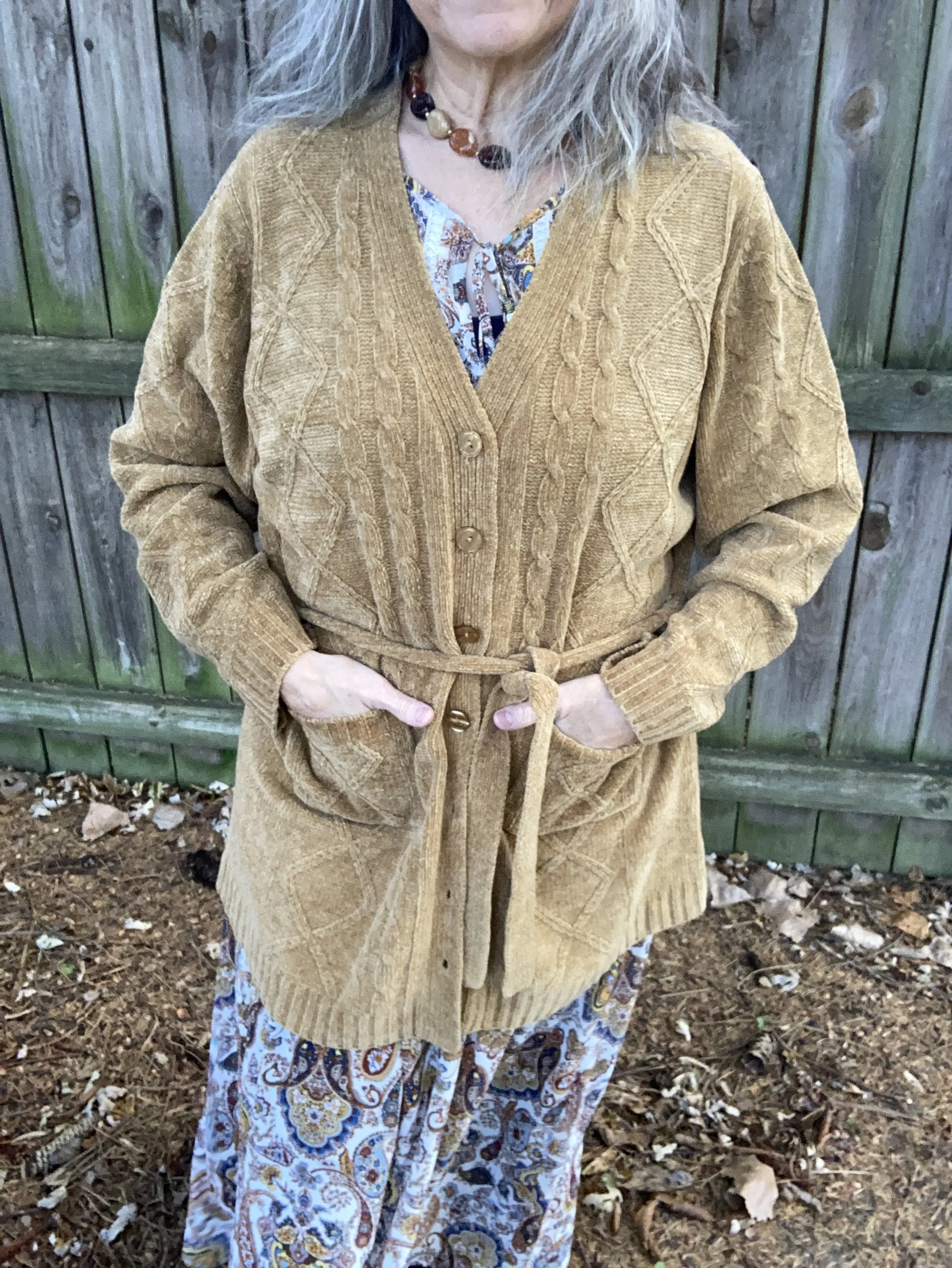
The final piece I added to this outfit is the over sized, knee length, Denim & Co cardigan. This piece was another thrift treasure, and I am using it a lot this fall, as a coatigan. It is a heavy weight chenille, and includes both buttons and a tie. I like how it looks open, better, but I am thinking I might like it closed with a different belt.

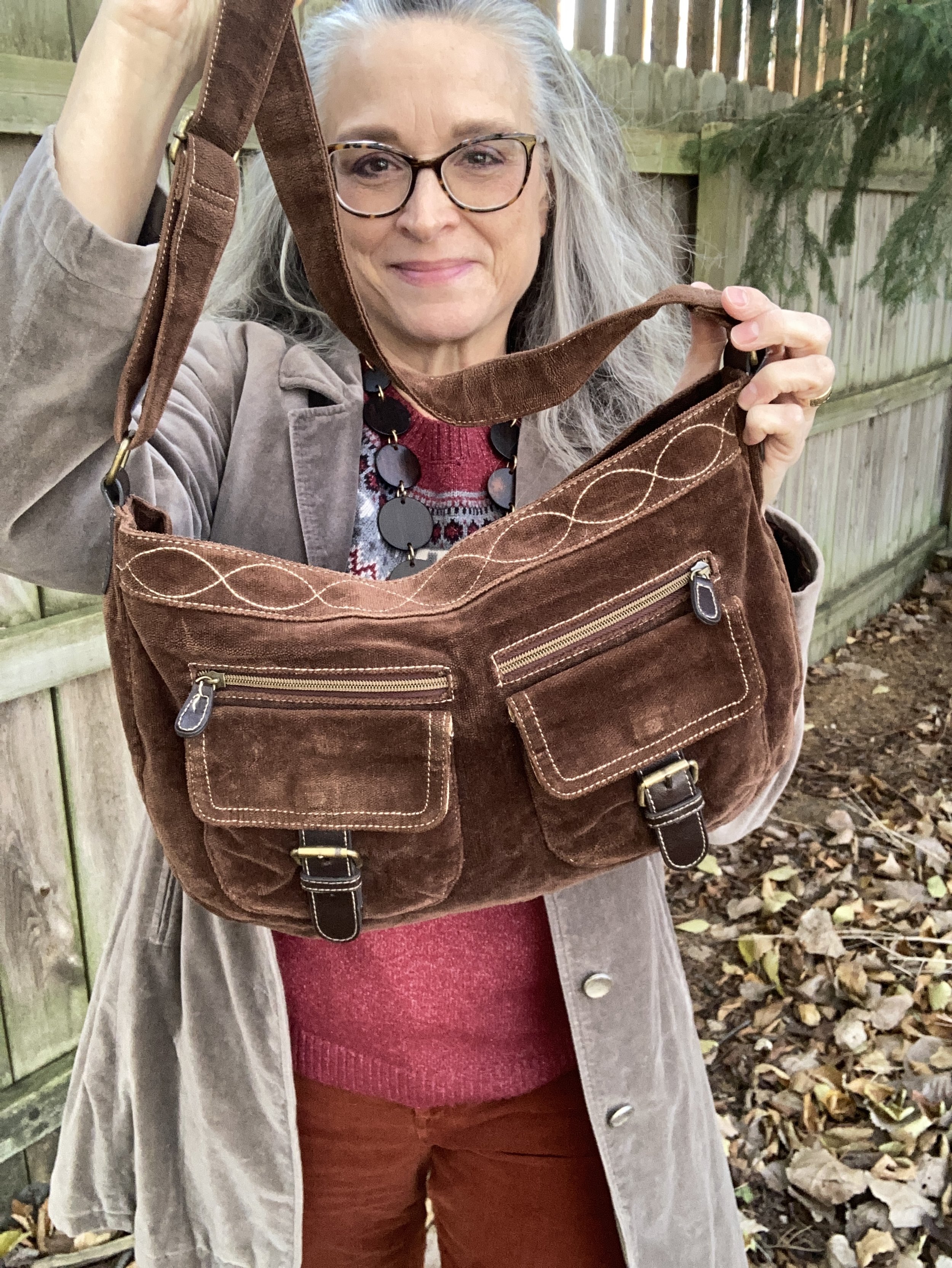
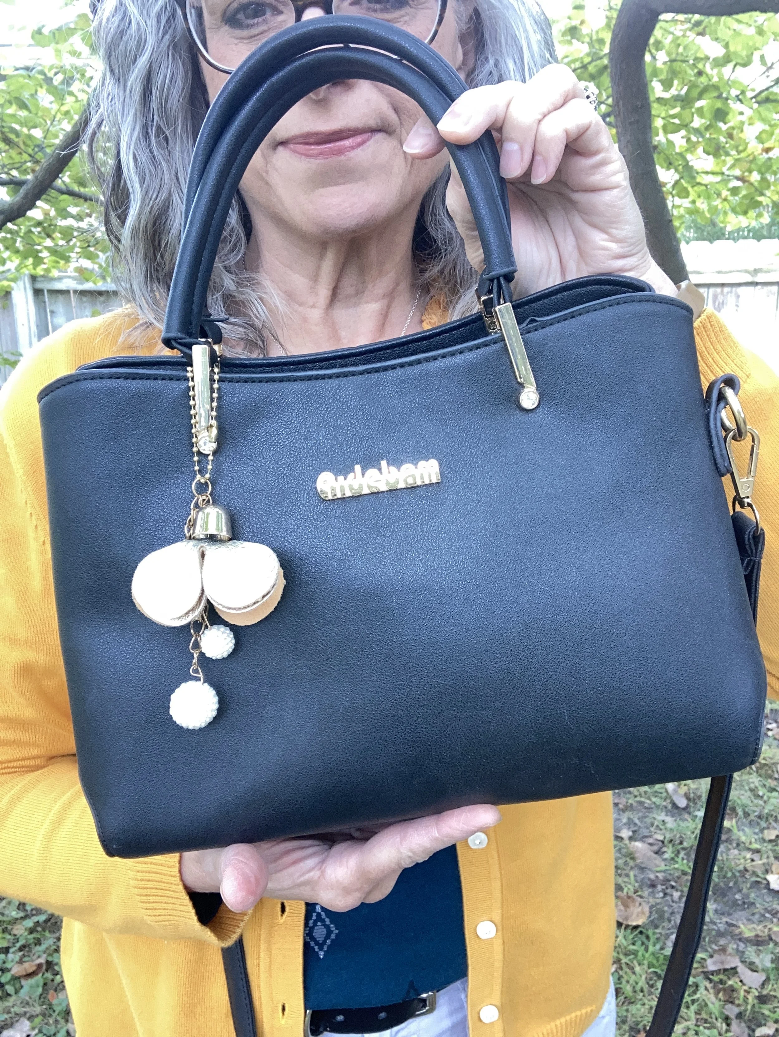
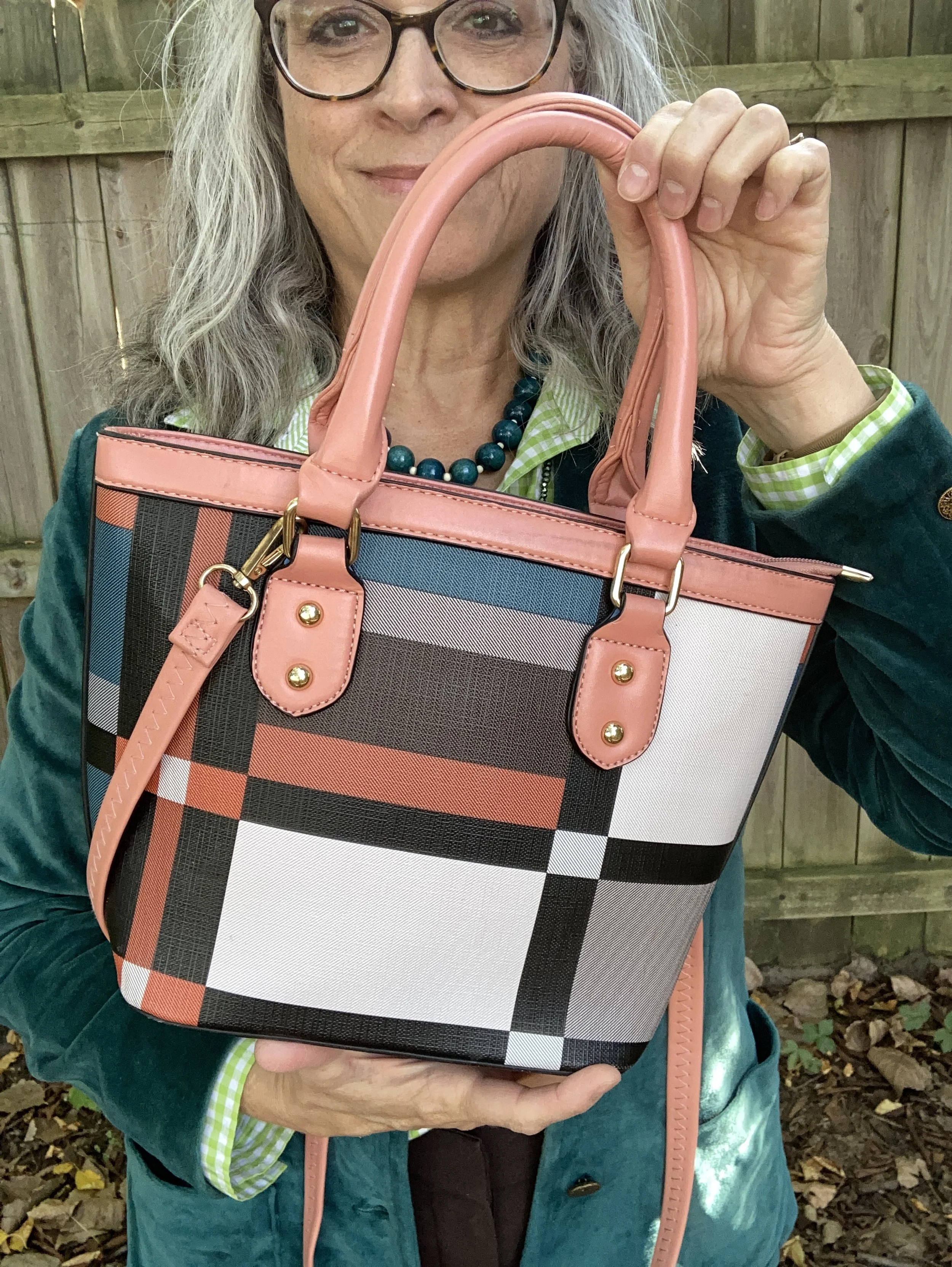
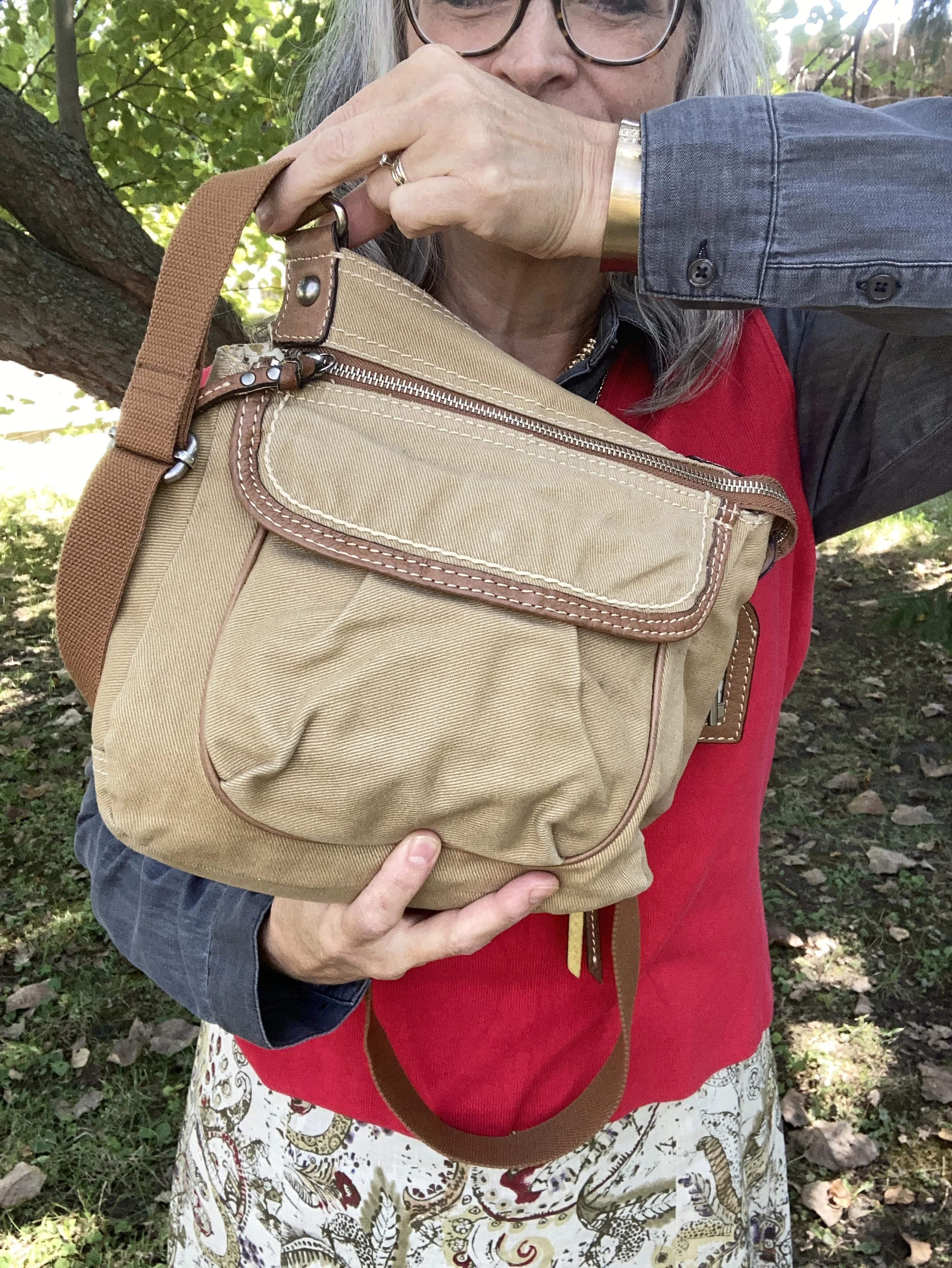
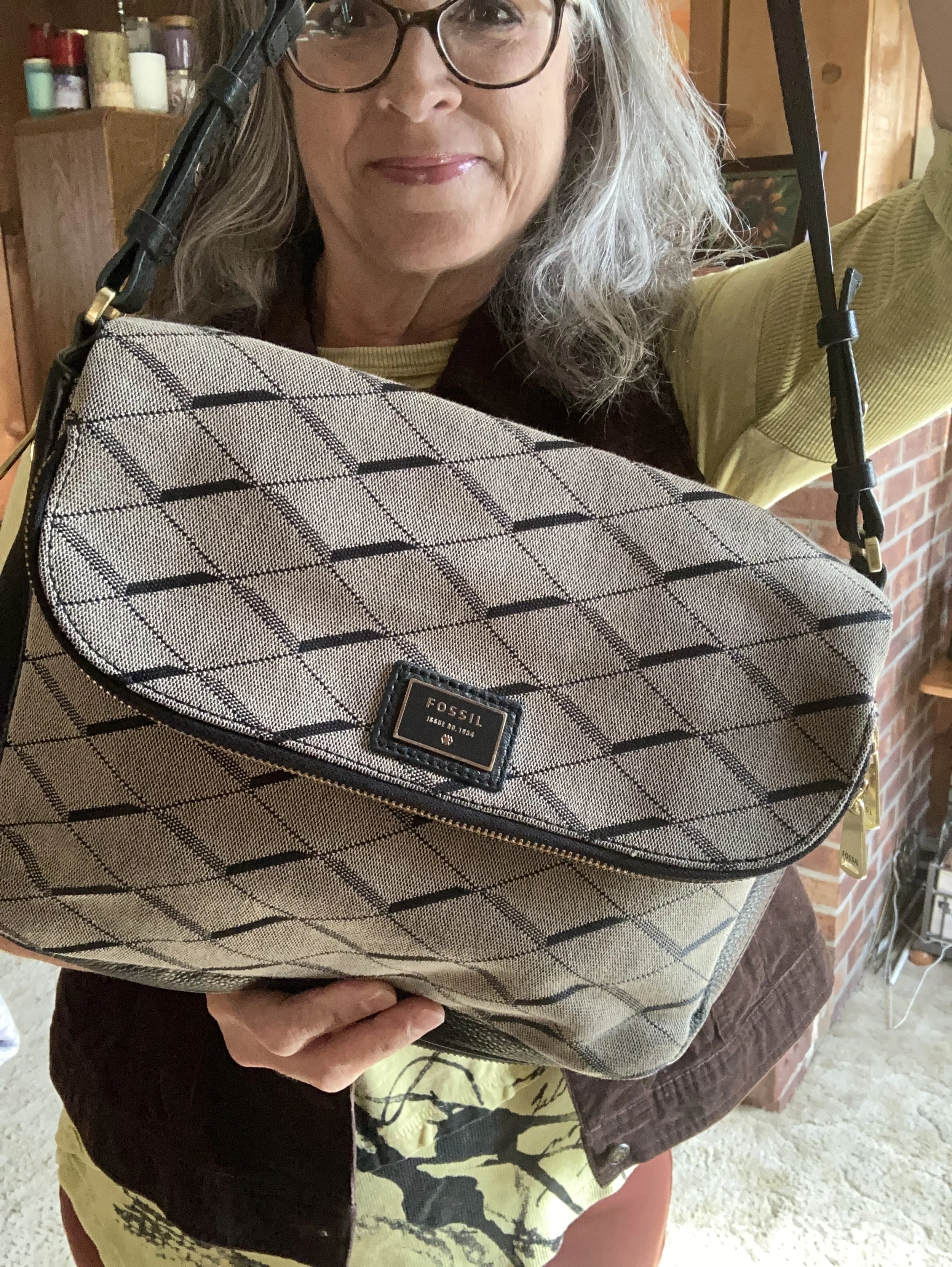
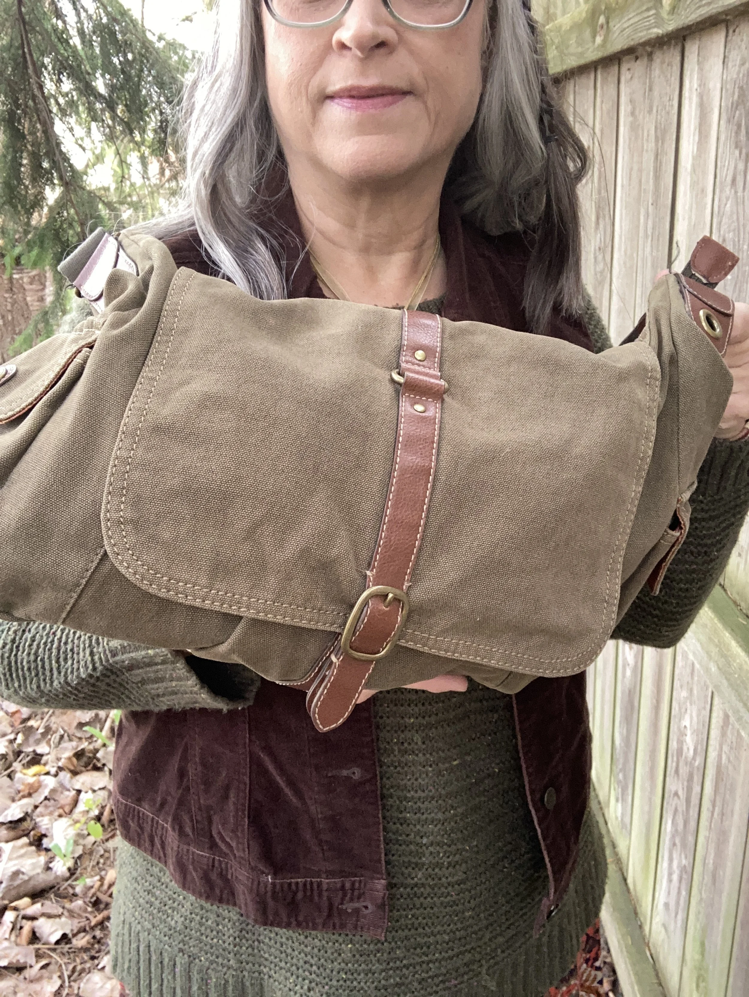
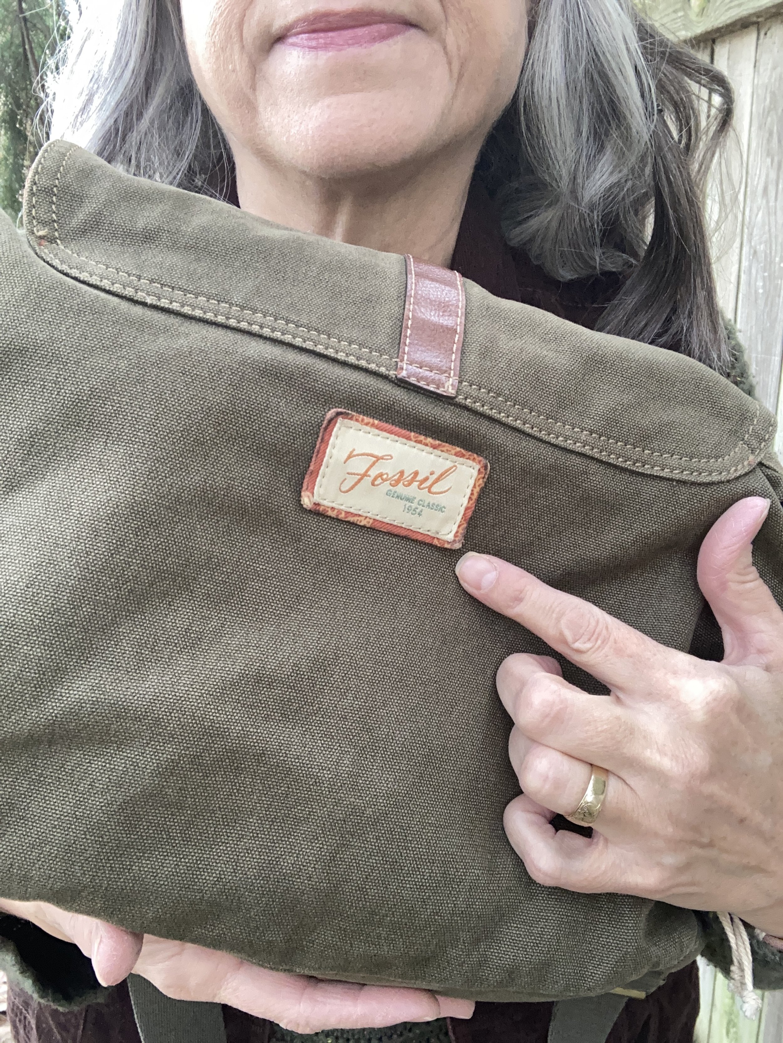
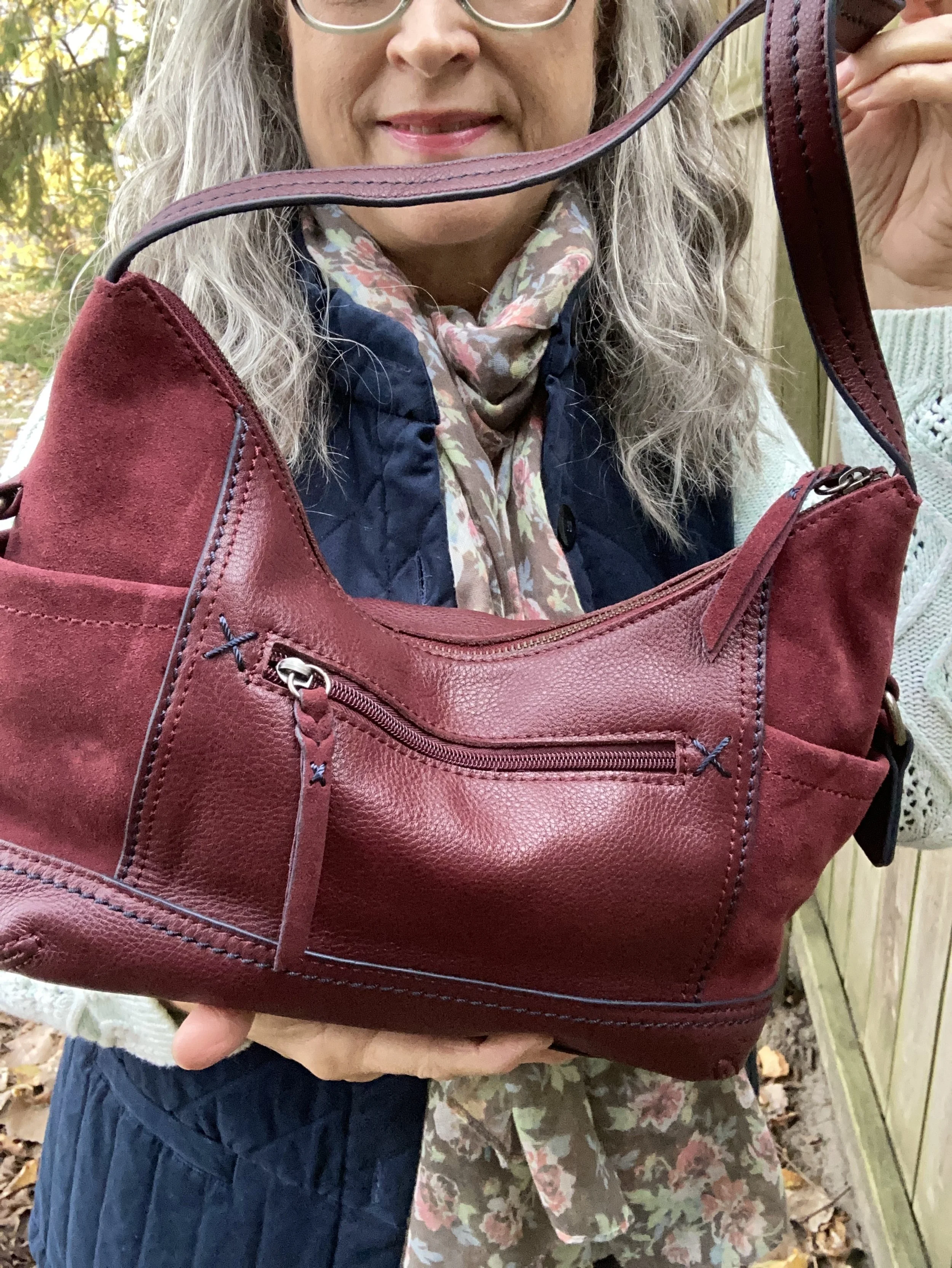
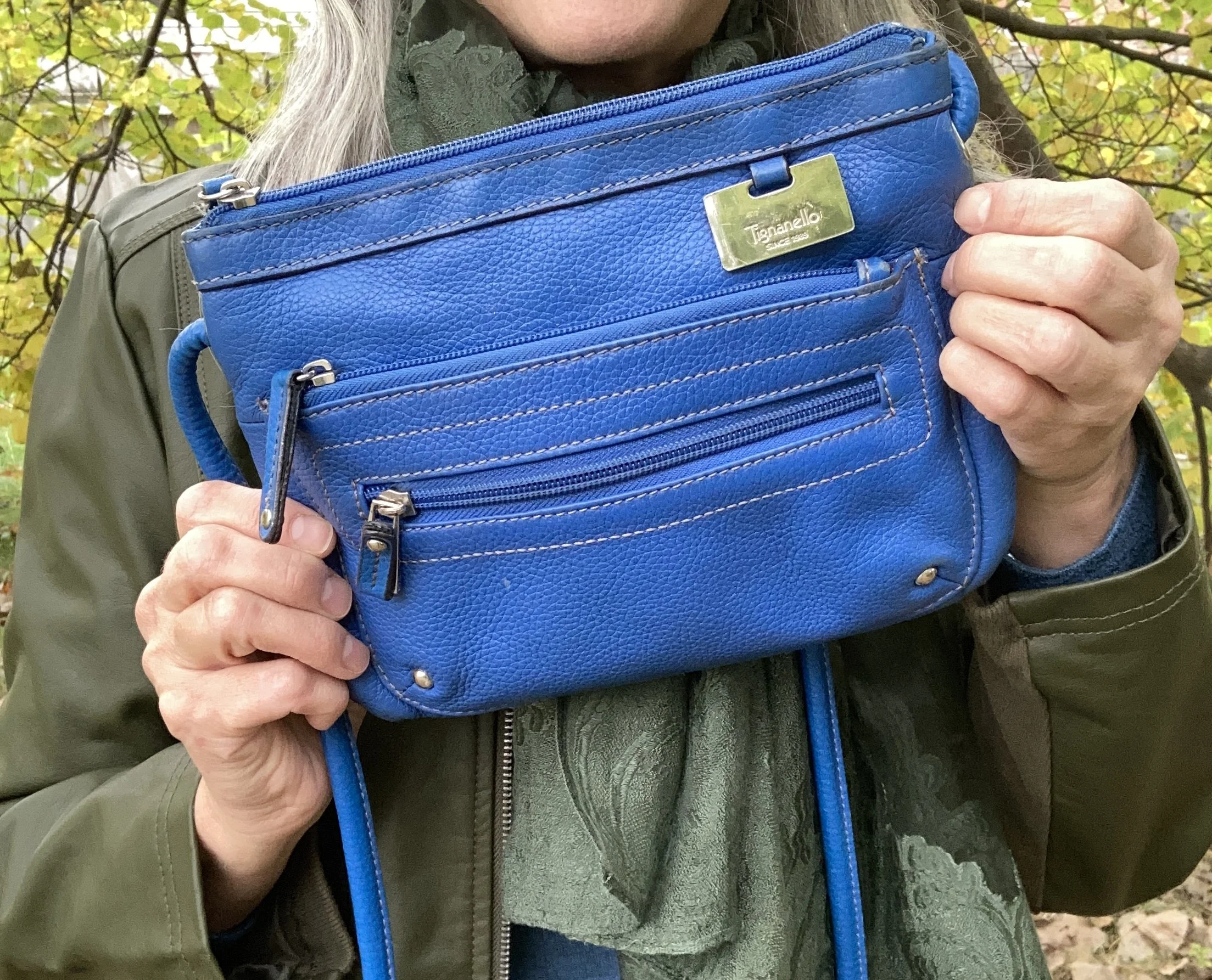
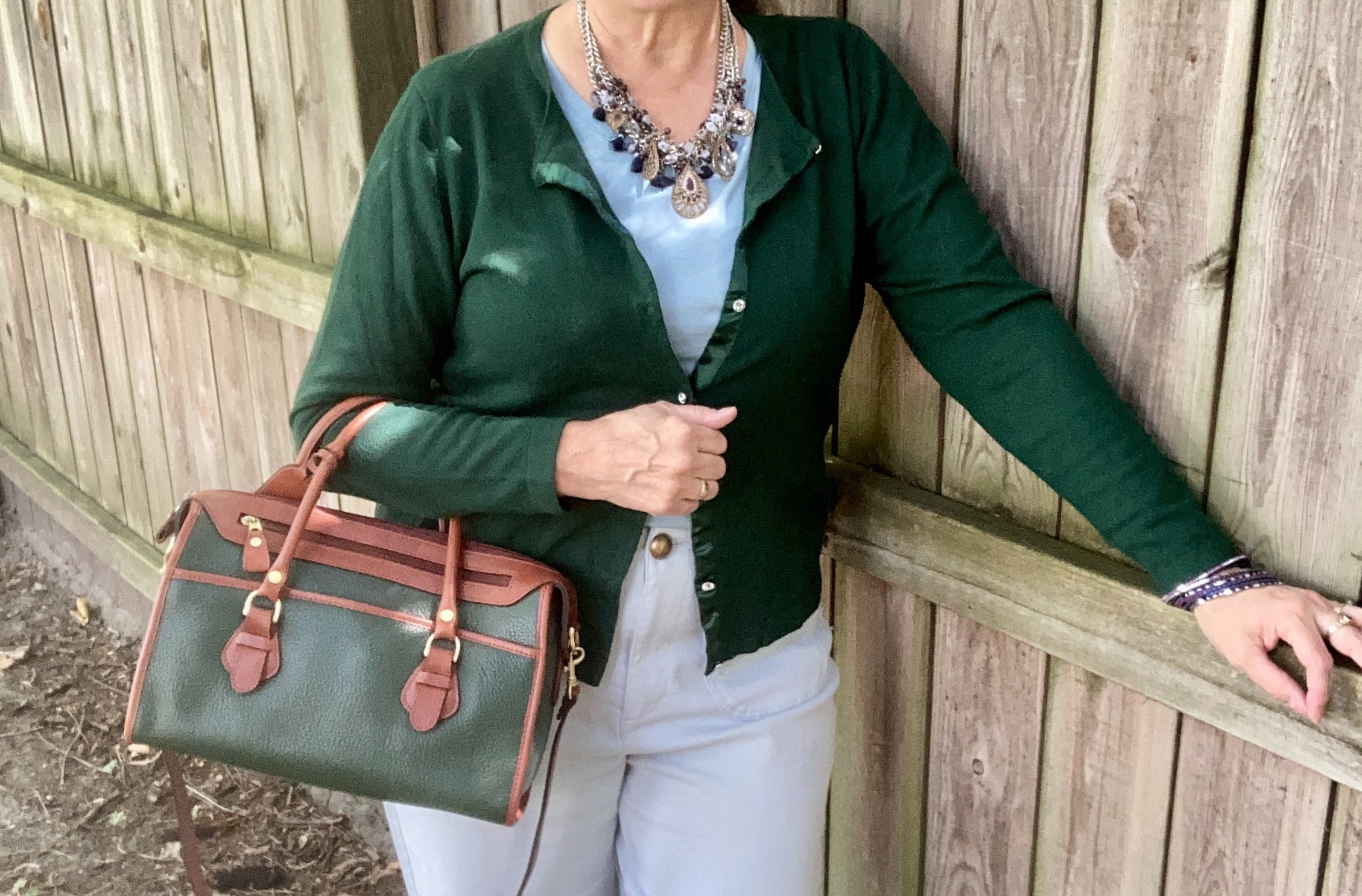
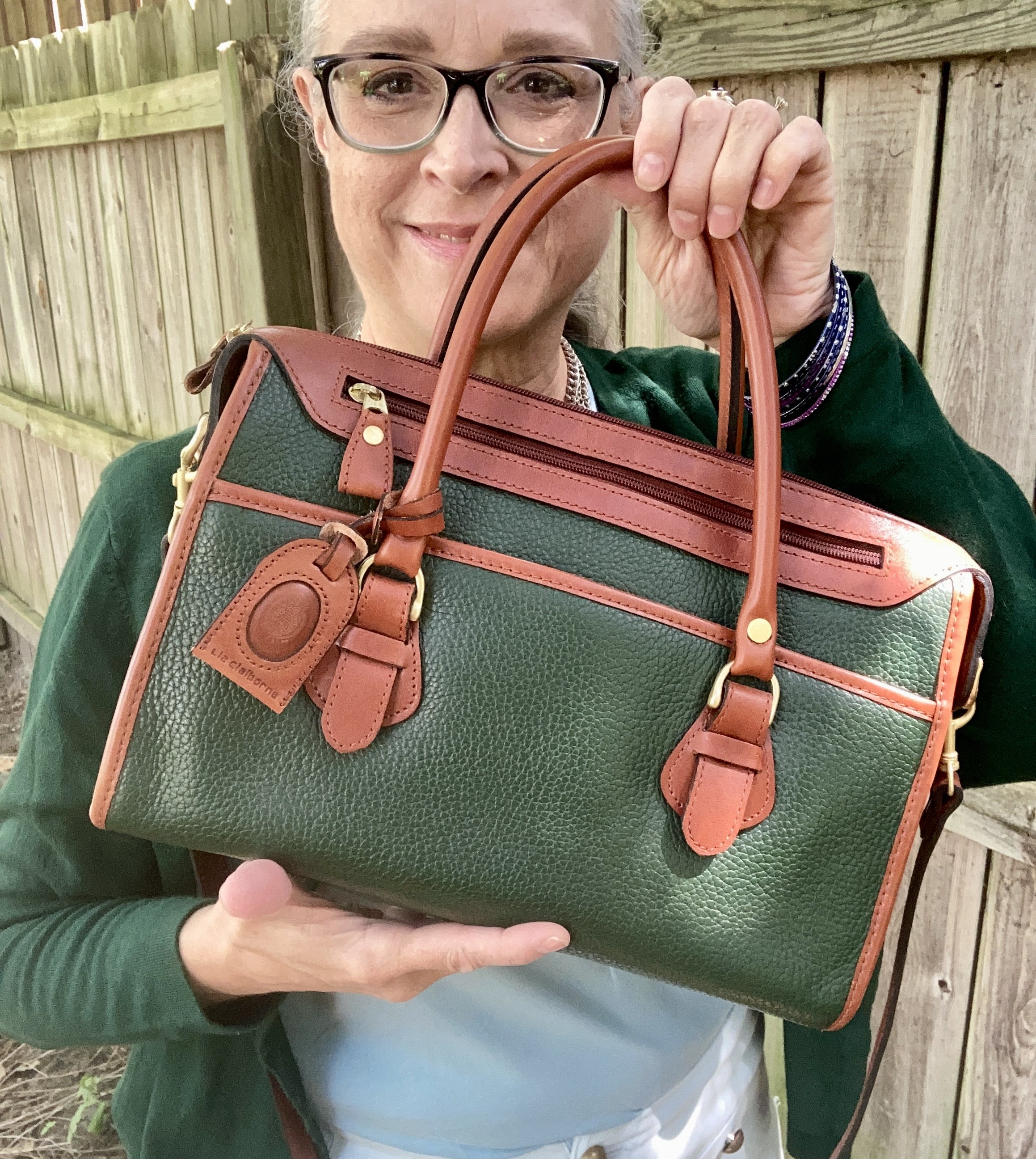
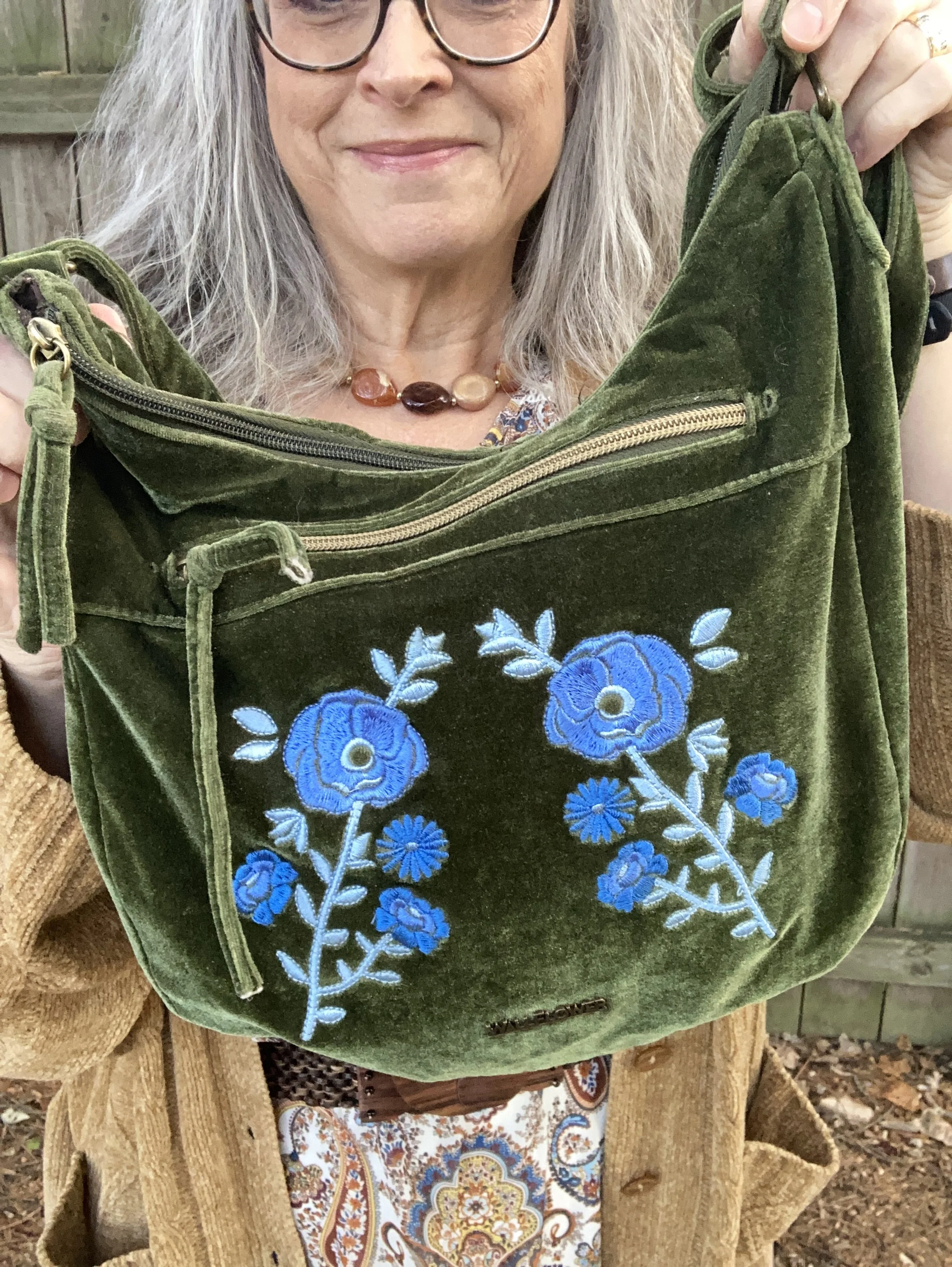
The final piece I chose was my green Wallflower purse. I chose the green just for an interesting color pop. this is a fun cold weather piece and I wanted to make use of it.

What do you think of this look? Is this the type of thing you would wear to a Thanksgiving get together? As always, I love to hear your thoughts and ideas, so leave me a comment or two.

I’m including a few shopping links for maxi dresses. These are affiliate links brought to you at no extra cost. If you purchase something through one of my links, I get a little commission. All opinions are my own.

Thank you for all you support, and have a very happy Thanksgiving!


November Styles - Fair Isle, Corduroy and Suede

For today’s outfit I looked again at my list of what was trending for Fall 2025. It is hard to even think about fall, as for many of us the leaves are already off the trees, we have had a ground covering snowfall, and we are barreling towards Christmas. However, it is still fall and I won’t pull out my Christmas tees and sweaters until the day after Thanksgiving. Ha, ha.

One of the trends that popped up for this fall was unusual color combinations. Think pink with red, mint with brown, or light blue with purple. They all sound like lovely combinations to me, but not necessarily everyone’s cup of tea. I decided to try an unusual pairing that is understated rather than bold, and combine it with a neutral gray and an earthy brown. Say hello to rust and red.

Fair Isle seems to be back on the radar as far as retailers go. I saw a number of pretty pieces at Kohl’s when I visited recently. I found this red number at a thrift shop and grabbed it straight away. I love Fair Isle patterns, though I personally can’t wear wool, so my pieces are a mix of man made fabrics. This sweater is a brand called Original Weatherproof Vintage. It is so soft and a little oversized, so very comfy.

Corduroy material is also on the docket this fall, and as far as I am concerned should be a fall and winter staple. It is a lovely fabric that adds extra warmth due to the waling. A narrow wale will give a more luxurious look, while a wide wale is more casual. I found these last year on Black Friday at JCPenney. I love the color and the fit. These are St. John’s Bay brand.

My gray jacket is a beautiful J.Jill piece that I found thrifting a few years back. I don’t wear it a lot, but once in a while it is just the right piece for the occasion. It has a beautiful printed lining. It could also be worn as a fully lined, longer style blazer. It has a velvety feel and can be dressed up or down. I linked a few velvet style blazers below.

The color brown has also seen an uptick for this fall, especially in suede accessories like shoes and bags. I chose my Nine West ankle boots from Kohl’s and my thrifted corduroy bag as a nod to this particular trend.

The only thing I added to this look was the large, wooden circle bead necklace, which I thought tied the whole vibe together.

What do you think of this outfit? This is an outfit I would wear for Thanksgiving day, whether visiting or working in the kitchen. I think it also makes a cozy, work wear look, or a great outfit for a casual night out to dinner and the movies.

I hope you enjoyed this post. Let me know your thoughts on this or on other things you have seen trending for this fall? I hope you are having a great week.

I have included a few shopping links for you to look over. These are affiliate links which are brought to you at no extra cost. If you click on a link and purchase an item through it, I get a tiny commission. I appreciate everything you do to support this little blog.

Happy Tuesday!

Pantone Autumn/Winter 2025 - Desert Sun, Magical Forest, and Wispy Clouds

This week we are looking at three more colors from the Pantone London Palette for Autumn/Winter 2025. Today’s colors include, Desert Sun, a rich, golden yellow; Magical Forest, a dark green reminiscent of the deepest woods, and a light, airy grayish white called Wispy Clouds. You can see the actual colors in this pin.

My Desert Sun cardigan is a brand called Callaway V and was a thrift find a few years ago. I love the fun details on this piece including the ruffle around the neck line and the tiny jewels at the center of each button. My phone does not do closeups well, so I didn’t bother trying to get a photo, but trust me those tiny jewels are there. Ha, ha. This golden yellow is a perfect color for fall. You can see how I styled this cardigan with a multi print maxi dress here.

It was hard to find any cardigans in this color so I added a few other Desert Sun items.

My Magical Forest tee is Sonoma brand and was a piece I found at Kohl’s a few seasons ago. Being a not-so-basic sort of girl, most of my basics have to have a few details like interesting prints and even a bit of bling.

I thought these second hand, Gloria Vanderbilt utility pants were a close match to Wispy Clouds. They are a lighter weight so will be put away for the winter, but they are a great pair of pants for a dressy casual vibe. The utility details of extra pockets and rivets make it more casual, but the wider legs give them a dressier trouser vibe.

I kept my jewelry minimal with my fall themed, silver pumpkin necklace. This is a fun piece, with an orange leaf and an orange bead, making it perfect to wear all fall long. I honestly can’t remember where I got this. Ha, ha.

I chose black for my shoes, belt and bag. Honestly, I like how matching a shoe and bag, or a belt with a bag makes an outfit look polished and finished off, but that is just my opinion. Matching is a matter of personal taste these days, so do what works for you.

My belt was thrifted. My bag was a gift from my daughter and is Aidebam brand. My shiny Oxfords are a brand called Sugar. I have had these for a number of years, because I used to wear them to work and I haven’t worked at the bookstore since fall of 2019. Yikes! It’s been six years since I lost my job. Wow! Where does the time go?

What do you think of these colors? Do you like this combination? What colors would you have combined with this golden yellow or this dark green?

I have included a few shopping links. These are affiliate links brought to you at no cost to give you possible shopping options for similar items or colors. Not every color is easy to find, so that is where your closet or a thrift store come in handy. You would be surprised how often I have these colors in my closet, or a close enough match to make it unnecessary to go shopping…although I enjoy that too. Ha, ha.

Thank you for following along on the blog. I appreciate all your support. Have a great day.

Pantone Autumn/Winter 2025 - London Palette: Salted Lime, Fanfare and Chocolate Martini

We are well into October and the last four days have felt like the middle of July rather than fall. We are hopefully heading into a cool down in a day or two. Midwest weather has always been rather chaotic with fluctuating temperatures, times of endless rain, or months of drought. Right now things are very dry, the trees have hardly any color to them, and our cars are regularly covered with dust.

For today’s look I wanted to combine the two greens on the Pantone Autumn/Winter London palette. Just like I combined Lavender Blue and Crown Blue, today I am pairing Salted Lime, a medium, citrus green, and Fanfare, a tealy green. I chose Chocolate Martini for my classic color and I like the earthy vibe of this look. You can see the London palette colors by clicking on this link.

The star of this show is the Fanfare, velvet jacket that I recently thrifted. While not true velvet, it certainly looks the part. I found this piece and immediately threw it into my cart. When I tried it on, I knew it was coming home with me. It was obviously hand made as it still had the rough, inner seams with no finished edges, and no label of any kind.

Salted Lime is not a color I have a lot of. When it comes to greens I like the darker more moody hues of olive and forest green. I also like deep tones like emerald and jungle green. However, I do keep a few pieces that are this lime color. This thrifted, Jaclyn Smith, gingham button down has been around for a number of years. You can see this top as a shacket over a graphic tee, worn under a graphic tee, and worn with a plaid skirt,

My Chocolate Martini pants were purchased new when I was still working as an assistant manager at a university bookstore. These are Worthington brand and I got them at JCPenney. They have a wider leg and are a bit long so I like to pair them with something that has a small heel.

I chose my Nine West heeled ankle boots, which match the pants perfectly. A tip for making your legs look longer and leaner is to match your pants and your shoes. I got these a couple of years ago at Kohl’s.

I went for a layered jewelry look with a short wood bead necklace and a long beaded pendant necklace with fringe.

I wanted to add a pop of color and remembered this cute color block bag I had thrifted last year. It is just a cheap bag and has no brand name in it, but I thought it was extremely cute and fun. I think it works beautifully to add an element of extra color to this outfit.

What do you think of these colors? Do you have any of these in your closet? If not, which one would you like to add? Be sure to leave a comment or too. It helps my blog and it always encourages me.

This picture below, definitely needs a caption! What would you put on it?

I have included a few shopping links. These are affiliate links and are brought to you at no extra cost. These are retailers that are available through the affiliate and I cannot speak as to the quality of the pieces offered, so just be sure before you order something that you know the retailer’s return policy. If you purchase an item through my blog using one of my links, I get a little commission. I appreciate all your purchases as they help me keep the blog going. All opinions are my own.

Have a great week!

Pantone Autumn/Winter 2025 - London Palette: Poppy Red, Bronze Mist and Dark Gull Gray

Can you believe September is almost over? Here in the midwest it doesn’t exactly feel like fall. The leaves are changing, the sun’s angle is different and the days are growing shorter and shorter, but our temps have been summery. I really don’t mind the blue skies and high 70’s or low 80’s, but I am ready for the cool down, and the return to all that is cozy, including hot tea and cocoa, baking things in the oven and the sweet layers of sweaters and scarves.

We are looking at another trio of colors from the Pantone London Autumn/Winter 2025 color palette. You can see the colors in this Pinterest pin.

Today’s look gets a power punch from Poppy Red. You might remember this color from the New York palette. It is definitely a mood lifter. You can see the New York post here. Today I decided to pair this bright red with Bronze Mist, which is a similar color to the NY Bronze Brown, just a bit more yellowy green. I also chose the color Dark Gull Gray from the classic palette. I styled the shirt two ways, left out and tucked in, so I will include pictures for both.

I found this bright Poppy Red, Sandra knit shell at a thrift store and thought it would work perfectly for a knit vest. I paired it with a second hand Dark Gull Gray, Falls Creek button down. I believe this may be a man’s shirt as it is quite big on me for a large, but who knows. Sizes are so different these days.

This Jones Wear skirt I have styled multiple times on the blog and even though I don’t wear skirts very often, this is still one I reach for. I chose this for the snippets of Bronze Mist color in the pattern. It is fully lined, but light enough to wear in the warmer weather, and warm enough to wear in the winter with tights and a pair of boots. You can see it with a maroon cardigan, a green suede jacket, a yellow top, and a green pullover sweater.

Since I was using the Dark Gull Gray color I chose my Impo ankle boots that I bought on clearance at DSW a few years ago, to balance the look out. Even though fall is the time we put our flip flops away and get out our boots, it is still too warm here to keep boots on for very long…at least for me. I love ankle boots in the cooler weather, and when it gets really cold, then I pull out the taller boots.

I chose this thrifted Fossil bag, as I thought it gave a nod to the Bronze Mist color, even though it isn’t a perfect match.

Do you like these colors together, or do you think they are odd? Do you have this bright Poppy Red in your wardrobe? Which version of this outfit do you like better, tucked in or left out? I love to hear your thoughts so leave me some love.

I’ve included a few shopping links for a few of the pieces to give you some similar color choices, but it was hard to find any sort of skirt in a similar color. These are brought to you at no extra cost. These are affiliate links. All opinions are my own.

I hope you are having a great week!

Pantone Autumn/Winter 2025 - London Palette: Lavender Blue, Chili Oil and Crown Blue

As we start the London Color Palette this week you will recognize a few of the same colors that were on the New York Palette. Chili Oil and Crown Blue are two of those. You can see the London palette colors by checking out this pin on my Pinterest board. For today’s look and a one other look from this palette I decided to combine colors that fall into the same color category. Today I combined the pastel Lavender Blue with the classic Crown Blue, along with Chili Oil for a casual chic color block look.

The leaf is not part of the outfit! Ha, ha. Watch the following and you’ll know why. We have an immense Cottonwood tree in our yard and the leaves start to carpet the grass from the beginning of August. Even with all the leaves on the ground there are still leaves on the tree…and the sticks!! Eye, yie, yie. The stick shed from Cottonwoods is crazy.

You saw this Crown Blue thrifted Coldwater Creek piece just a few weeks ago. See the post here in case you missed it. This is a retailer that has many pretty and practical pieces, but they are a touch out of my price range, that is why I like to find different brands at thrift stores to try them out.

Lavender Blue is the London pallet’s pastel. I have two pullover tops in this color. It is a purply blue that is hard to match with anything, so an outfit like this allows it to stand on its own. This piece is Apt. 9 and was purchased at Kohl’s a number of years ago. I had to show off the beautiful lace inset on the back, even though it was concealed under the jacket. You can see how I styled this in another fall outfit with a white skirt.

My Chili Oil pants are Chico’s So Slimming, which I bought on sale a number of years ago. These are ponte pants. I never thought I would like a knit pant like this, but I do. I do not wear them often as I look at them more as a dress or work pant, but it was fun to get them out for this outfit. You saw them a few weeks ago when I styled them with Lemon Grass and French Roast.

I felt like keeping it casual, and thought it would be a nice contrast to the previous look with these pants which was more dressed up. It is amazing how accessories like shoes and bags can change a look. I chose my denim Keds as a nod back up to Crown Blue jacket. I also gave the pants a cuff, which in this look keeps it a bit more casual.

My corduroy axcess bag is very old, but I love the colors and keep it hanging around, even though my current go to’s for bags are cross body and smaller.

My jewelry is a simple pendant charm necklace. I like that the coppery color goes with the Chili Oil vibe of the pants, and makes the pastel top seem more fall appropriate.

What do you think of this outfit? Do you like these colors? Do you like to wear a color block look?

I am including a few shopping links for you. These are affiliate links and are provided to give you ideas, inspiration and possible shopping options. If you use one of my links to make a purchase, I get a little commission, and believe me at this point in time, all the pennies count.

Have a super Tuesday!

Pantone Autumn/Winter 2025 - New York Palette: Bronzed Brown, Winterberry and Vapor Blue

I hope you are enjoying this Pantone color series. For the actual colors check out this pin on my Pinterest board. The Pantone Color Institute is the entity that people turn to for the trending colors for both fashion, architecture and home decor. I enjoy seeing what the colors are for each season, however, they have made it harder and harder to actually see the colors without having an account, so I appreciate those who do sharing their findings on Pinterest and other platforms.

Today’s colors are what I would call a little more reminiscent of what we tend to think of when we talk about the autumn season. Bronze Brown is a golden brown making me think of changing maple leaves and colorful sunsets, while Winterberry gives a nod to aromas soon to fill the air like cranberry and cinnamon, and Vapor Blue looks like wispy jet trails across a fading fall sky.

This seemed a bit of an odd pairing with the Bronze Brown and Winterberry, but after I put it together, I really liked how it turned out.

The Bronze Brown, Ophelia Roe jacket was a piece I got on clearance at Meijer. It actually had a pair of pants that went with it, that I bought at a later time. However, the pants seem to be a bit off. I should have taken them back right away, but sometimes you can’t tell right away something is cockeyed or sewn improperly. They are in the donation pile. I do, however, like the jacket with its utility, bomber style silhouette.

This Faded Glory floral blouse I have had for years. I don’t know why I don’t wear it more often, because I do like it. I just go right from shorts sleeves to fuzzy sweaters and sweatshirts and forget about the in between time. I honestly don’t remember if I bought it at Walmart, or if I found it at a second hand store.

You can also see my chunky berry and gold necklace, a gift from one of my daughters. I thought it went well with the casual vibe of the outfit. I also added a dark brown, almost burgundy colored leather belt that I recently thrifted. I know the trend has been no belts, but I always feel that a belt gives an outfit that finished feel, specifically when tucking a shirt in. Apparently the half tuck is no longer trendy and we are back to a full tuck or no tuck.

These Talbots jeans are also a thrift store find from this past spring/summer. If you look at the Pantone color for Vapor Blue, it really looks like a very light gray, but I feel that these jeans were representative of that faded blue sky we often see in the early morning or late evening. If the Pantone gurus say it’s blue, well okay, and this was my take! Ha, ha. I love the black and white pin striping down the outside seams of the legs.

Once I put the outfit together, I was struck by the thought that I actually could start styling boots again, so I grabbed these SO burgundy combat boots that I scored at Kohl’s a few seasons ago.

I just found this cute crossbody bag a few weeks ago when I was thrifting with my bestie back in New York. We always hit the thrift stores together, which is great fun. This is a brand called Modern Chic. I love the guitar strap vibe.

What do you think of these colors? Do you like how I put this outfit together? What would you have done differently? Please leave me some love in the comments. I appreciate my faithful few who try to comment on the regular. You always remind me why I keep doing this! Hugs to all of you.

I have included a few shopping links for you to look through. These are affiliate links which means when you purchase something through one of my links, I get a small commission. I appreciate all of your support, but most of all I appreciate that you stopped by the blog to hang out for a while.

Have a great week!

Pantone Autumn/Winter 2025 - New York Palette: Poppy Red, Lyons Blue and Crown Blue

Happy Uno Septembo! In other words happy September, happy fall and all the good things that go with it: pumpkin muffins, hot chocolate, changing leaves and football. Our weather here in the Midwest is already feeling more like fall, although there is sure to be a few more warm days before the official start of fall and even after. I have heard rumors that we are supposed to have a cold winter and these early chill days may be a forewarning to that.

Today’s outfit takes three more colors from the New York Palette and combines them in a bright, cheerful look that would be perfect for a drab fall day. Poppy Red, Lyons Blue and Crown Blue combined seamlessly when I was working on outfits for this Pantone color series. It was a natural progressions to put these three saturated colors together. To see the actual Pantone colors check out this Pinterest pin.

This whole look is thrifted, except the sneakers. It is always fun to shop my closet and find that so many of the things I bought second hand are easily useable for the current trending colors and styles. So what if a few things are slightly outdated, or not currently on as far as the fashion gurus are concerned. It’s my closet and my style, as it is your closet and your style.

Let’s take the outfit apart. The first piece I chose was this paisley button down that I have had for years. The blue colors were a good match for the Lyons Blue color which is a deeply tinted blue teal. This thrifted piece is Jones Wear Sport. I have thought numerous times of getting rid of this piece, but then I end up wearing it for some reason or other. I do love a good paisley print, just like I love my plaids!

You can also see in this photo I chose a teal necklace that leans a bit more in the green direction, but I like the contrast. In addition, for this fall statement belts are trending, so I decided to create my own statement using an old silver colored chain belt that I have had laying around for decades. It didn’t really help to hold my baggy pants up, but I like how it looks!

After the shirt I chose the pants. It seemed the perfect choice as this bright red pair are perfectly Poppy Red. I thrifted these this year as I had been looking for a red pair of pants. These are Bandolino brand. They are actually a little big now, but I don’t mind and the baggy look is another thing that is trending this fall for jeans, so get comfortable ladies!

I then remembered I had thrifted this blue jacket recently and realized it was a perfect choice for the classic color Crown Blue. This piece is Coldwater Creek brand. This is actually a petite, which I can sometimes get away with. It just gives the jacket a more cropped silhouette, which I occasionally like. I love the contrasting white stitching around the edges. I had a hard time finding anything in this exact color, but I’ve included a few links for darker denim jackets.

I decided to go with silvery gray for my accessories. I wanted something different from red, to match the pants or blue to match the jacket. I do have a bit of a matchy, matchy gene, so I was trying to push myself outside that box. While I did end up matching the bag, and the shoes with the belt, I like how it pulls the whole look together. The sneakers are Skechers and I got them a while back on clearance at Gabes. I hardly ever go into that store, but once in a while my daughter wants to make a stop there and it is fun to look. My bag was thrifted and has no label.

What do you think of these colors? Do you like them together, or would you like them each separately? It is fun to try new combinations and I hope these posts inspire you to expand your thinking on how you put colors together. Leave me some feedback in the comments.

Enjoy the many poses of Amy! Ha, ha.

I hope you are having a great beginning to the month of September! I have included a few shopping links, but these colors are hard to find, so I would say add a color you like to your thrifting list! These are affiliate links, brought to you at no extra cost. If you shop a link through me, I get a tiny commission for your purchase. I appreciate all the support. All opinions are my own.

Have a great day!

Pantone Autumn/Winter 2025 - New York Palette: Lemon Grass, Chili Oil, and French Roast

This week brings you another collection of colors from the Pantone Autumn New York color palette. Remember, I am combining colors as they inspired me, but you can take any of the colors from the palette and put them together, or maybe there are only one or two colors that you like and plan on adding to your wardrobe. This is always about what you like and how you can be inspired to look at your closet differently.

Today’s outfit is a contrast of light and dark combining the yellowy green of Lemon Grass with the classic French Roast along with the spice of Chili Oil. You can see the actual Pantone colors here.

This pale yellow top, is not a true yellow, but has just a hint of green, making it the perfect selection from my closet for the Pantone Lemon Grass. I found this a few years ago while thrifting and it is a brand called Jess & Jane. I discovered that Jess & Jane is a California based wholesale clothing company who only sells to specialty boutiques, so who knows where this piece originated from. It’s kind of fun to think of the roads some of our second hand pieces have traveled. I like the asymmetrical hemline and the funky ink spray pattern on the front. I also like the sleeve length, which is perfect for the transitional days between summer and fall.

I remembered that I still had these rusty, Chili Oil, Chico’s So Slimming ponte pants that I had purchased on sale a few years ago. Ponte pants are made from a thick, stretchy, double-knit fabric called Ponte di Roma. They offer a more flattering line than regular leggings due to the specially made seams and more support. I don’t wear dress pants very often these days as I no longer have an office job, but I hang onto things for now, because who knows when I may have to go back to work outside the home.

To add a bit of texture and a layer for cooler temps I reached for this thrifted Crazy Horse by Liz Claiborne corduroy vest. It does a fairly good job of mimicking the French Roast dark brown color on the New York classic palette. I love this piece as it is structured, but also has a bit of stretch making it easier to wear.

I kept my jewelry simple, as the top, vest and pants do the talking. A long black and white, beaded pendant necklace, and a stack, bead bracelet with browns, creams, blacks and a touch of yellow threw in a bit more texture and interest. I didn’t think to swap out my blue Fit Bit band for a brown or white one. Ha, ha.

I chose black for my shoes and bag to tie to the black print on the top. My bag is a thrifted Fossil shoulder bag, and my shoes are Aerosoles that I purchased a number of years ago from DSW. I really like both of these. The bag is a great fall and winter choice, and the heels are comfortable (for as comfy as a heeled shoe can be when you don’t wear them very often - ha, ha).

What do you think of these Pantone colors? Would you wear these colors together? Do you like Lemon Grass, Chili Oil or French Roast the best? Which of these colors do you already have in your closet? Leave me a comment or two. It helps my blog to grown and reminds me why I do this!

I have included a few shopping links. Thank you so much for making an occasional purchase through my links. That gives me a tiny bit of income. I cherish all of your support. These are affiliate links brought to you at no cost. All opinions are my own.

I hope you are having a great week!

My Style: Goblin Core

You are probably looking at my title and thinking, what in the world is Goblin Core? I am so glad you asked. Ha, ha. Goblin Core is a newer aesthetic similar to Cottage Core, with its whimsical fancy, but with a darker, earthier vibe. For a refresher on Cottage Core check out this post I did on Cottage Core with an Edge.

I first learned about Goblin Core when I was perusing Pinterest and looking at Dark Academia aesthetics. You can see my Goblin Core board by clicking on the link. I only have six pins so far. If you look up style types you won’t typically find this style, but you might find something similar called Natural/Earthy. If I had to define Goblin Core I would say it is earthy with an edge, but the colors primarily revolve around earth tones and also embrace the idea of life and living things, so browns and greens. Wardrobe pieces are comfortable, even to the point of oversized or baggy and are robust with textures and details. Overalls, corduroy, baggy sweaters, combat boots, Mary Janes, patterned socks, grandpa style sweaters, and vintage pieces are all part of the Goblin Core style. I was drawn to the greens and browns of this style, so that is what I chose as I put my outfit together.

I feel like there is a bit of Gypsy influence in this style, perhaps due to the earthy colors, or the tiered skirts and vests. It has a similar feel to Bohemian style, but perhaps more grounded.

When I started putting the outfit together, I knew I wanted to pair green and brown, so the sweater came first. This is an older, thrifted Faded Glory piece. It is definitely getting pilly, but I still haven’t found an adequate way to get rid of pills that actually does a decent job. If you know of something, let me know! It is a great sweater with plenty of room, a little longer body, and nice textured stripes.

I then thought about a topper of sorts wondering if I should do a similar colored cardigan, utility jacket, or blazer, but the idea of brown kept coming back to me and I remembered I had this stupendous corduroy vest. This is a Liz Claiborne off shoot called Crazy Horse. This is a great vest with structure, but added stretch. I love it.

I initially had no intentions of using a skirt for my lower half. I was looking at jeans with embroidery, but then when I saw this skirt I knew I had the right combination. This has made multiple appearances on the blog and is a brand called Notations. I honestly do not remember what store I bought this at. It has been a while. You can see how I styled this piece with a graphic tee, in a Pantone outfit, and with a yellow jacket.

I decided to wear knee high boots instead of combat boots, or Mary Janes, because I’m me. These boots are recently thrifted XoXo brand, and seem to be in good shape. No they are not real leather, but I will hopefully get some wear out of them before they start to peel. I decided that if we can wear distressed jeans, why not distressed boots? Ha, ha.

I kept my accessories simple, as Goblin Core doesn’t seem to over embellish. My necklace was a thrift find and my bracelet was purchased from somewhere, which I also can’t remember. Eye, yie, yie. My brain!

My bag is another thrifted Fossil piece, and another one I really like. Olive will go with any other color, so definitely a versatile piece.

Looking back at these photos, I wish I would have used a better looking sweater, but it is what it is. I hate to get rid of something that still has plenty of wear. As I said, I need to find a way to eliminate pills.

I hope you enjoyed learning more about the Goblin Core style aesthetic. I like sharing these ideas with you and even if you don’t necessarily like a particular style I hope that it will still inspire you to be creative with your own clothes, making new outfits from the pieces already living in your closet.

I’m including a few shopping links for you to look over. Remember with Christmas on the way these also might be ideas for the loved once on your gift list. If you make a purchase through my site I get a few pennies. These shopping links are brought to you at no extra cost and all opinions are my own.

Have a great day!

Outfit Inspiration: Navy and Green Color Combo

Right now Pinterest seems to be the source of inspiration for many of my recent blog posts. I do use the occasional Instagram challenge to also find inspiration, and there are lots of places, people and things to inspire our clothing combinations. However, as you know, convenience often weighs heavily when life is busy or we are feeling tired. This is the pin that inspired today’s look.

Unlike the Pinterest pin, I used a vest, rather than a jacket, and there are other differences in accessories, and so on, but as I have said before, the point is to be inspired. I think something an fellow Instagram user posted makes sense. We want to be inspired, not influenced. Inspiration allows us to shop our own closets and put together similar looks without necessarily having to copy the look. Being influenced might include the pull to purchase pieces we don’t need or won’t actually wear.

This Christopher & Banks vest is from a couple years ago. It is a great piece and the quilting definitely gives it a warm, cozy feel. I like that it is a bit longer than many of my other quilted vests, and that it has buttons instead of a zipper. I rarely wear any of my vests closed, but it is nice to have different options.

Style Tip: Before you purchase vests or jackets think about collars. Ask yourself if you prefer the collar to lay flat or stand up, or be able to do both. Think about what you will be wearing it for and how you will be styling it with your other clothing. For today’s outfit, the stand up collar works great, but those are not my first choice. I typically like a collar to lay flat, or be something similar to a shawl type collar, or in the cold weather a turtleneck will do.

This minty green sweater is a thrifted Sonoma piece. The color and the texture were different than the other pullovers I have, so I snatched this one up. I added the reddish pendant necklace and bracelet, along with my bag as an after thought, but I think the darker reds help define the outfit as a fall look.

Style Tip: When it comes to transitional outfits, you may find yourself reaching for the same pieces which brings the option of pairing them together again. With a few easy adjustments you can make a fall outfit work for spring, or a spring outfit work for fall. To make this outfit passable for spring I would choose lighter colored accessories, possibly in a pastel pink.

These thrifted Sonoma utility pants look brown in this picture, but they are an olive drab. I thought they worked well for this overall casual outfit.

I played around with a few different scarves, one of which was a dark blue with pink and burgundy tones. I thought of pairing burgundy pants with the vest and sweater, but then decided I wasn’t quite ready for the darker colors. Thus when I saw this scarf and liked how it went with the other pieces I opted for burgundy accessories to still bring in the darker tone of fall, and I thought the burgundy went well with the pinks in the scarf.

My bag is The Sak brand and it was given to me by my thrifting bestie.

My ankle boots were purchased at Kohls and are SO brand. I have had them for several years.

Style Tip: Should you match your shoes to your pants, your top or not at all? I think variety is the spice of life, as they say, so why not do all three. Today, I matched my shoes to my vest. Other days I might wear shoes that look more like my pants to create that longer, leaner line from hip to toe. Still on other days, I might wear a basic brown, or black boot, or I might just wear sneakers and they don’t have to match at all. Your outfit, your way, so however you want to do it is fine. The point is to be comfortable, pulled together and confident in what you are wearing.

I hope you enjoyed this post, and that it inspired you to build an outfit that combines colors, textures and accessories to make you feel good when you are in it.

I am including a few shopping links for you to look over. Think ahead, and use these links to start your Christmas shopping. These are affiliate links. All opinions are my own.

Have a wonderful Tuesday!

Color Play - A Pinterest Fall Color Palette

I have been collecting color palettes on Pinterest for quite a while, so I thought it would be fun to revisit that board and see what I could pull up for a fun fall color combination. This is the pin I drew my inspiration from and I used the swatch labeled Fall Fashion. I liked all the color combos, but I guess I wasn’t feeling overly adventurous, so went with the more conservative of the bunch.

This is a rich, earthy combination for fall, and I like how the green and brown are more sedate while the bright blue is a lovely pop of color. When I saw the color swatch I knew the olive would be a good color choice for a topper, as I have a number of sweaters and jackets in that color.

My faux leather moto jacket is an older Christopher and Banks piece. I like that it is simple, light weight and it has stretchy cloth panels on both sides and along the backs of the sleeves. They no longer seem to make these types of jackets, but always keep an eye out at thrift stores. In addition, real leather is always more suitable for longer wear and tear. Be sure to check out the Jacket Maker website for quality leather pieces at more reasonable prices.

I added this thrifted green scarf, because fall is always a good time for a scarf! This was a fun find as I didn’t have too many green scarves and I love the delicate look of it.

I was also dressing for an Instagram challenge today and the theme had to do with bling. This cute joei & iBlessed” top was a gift from my oldest a few years ago and I do love it. It is the perfect weight for a cool fall day, and the sparkle makes it top notch in my book. You can also see the necklace I added. One can never have too many accessories on at one time, right? Ha, ha. In reality, if this was a work outfit, I would most likely take the jacket and scarf off while at the office, so the necklace works.

I have worn this skirt multiple times on the blog. It is St. John’s Bay brand and was purchased from JCPenney a number of years ago. You can see this skirt paired with a spotted tee, a bookish vest, and more recently a fringe vest.

My boots are second hand old, but they are real suede, so with a little TLC I will keep them indefinitely. They are a brand called Kelly & Katie.

My blue cross body bag is thrifted Tignanello brand.

Do you think these colors work well together? What colors from the Pinterest Autumn palette did you like best? Please leave a comment or two. I appreciate your input.

I’m including a few shopping links for block heeled boots, tiered skirts and faux leather moto jackets. These are affiliate links brought to you at no extra cost. All opinions are my own.

I hope you are having a great week!

Shopping Our Closets: Fall Florals

I don’t know about you, but I love the rich, vibrant colors of fall. Unlike spring and summer when we focus more on white, navy and all manner of pastels, fall allows us to indulge in dark maroons and earthy browns; golden yellows and rusty oranges. I love floral pieces in any season, but I especially love the dark florals of fall and winter. I am hoping you have a few fall florals in your closets and you will join me in putting together an outfit with those pieces as a focal point. Whether it is a top, a scarf, a bag or a skirt, fall florals make for outfits that are fun, whimsical and stylish.

For my fall floral I chose a thrifted Croft & Barrow tee. The rusty background, pinky reds in the flowers and the black leaves are a perfect choice for this fall look.

This top is just a basic Croft & Barrow tee. It fits well, and is perfectly comfy. It is a great piece for these early fall days where the temps are starting to get cooler, but it isn’t yet full on sweater weather yet.

I also chose simple beaded jewelry in similar fall tones.

I was going for a casual look, so chose jeans as my bottoms, but you could easily dress this up with a pair of black dress pants, or a rust or white colored skirt. These thrifted, boot-cut jeans are Apt. 9 brand.

My fun duster was a purchase from Cracker Barrel General Stores a few years ago. They always have beautiful holiday displays of their products and fun seasonal clothing. I would buy many more pieces there, but I just have a hard time paying full retail prices for anything I don’t really need. This is a brand called Linda Anderson.

My accessories really completed this casual look. I chose my thrifted Converse sneakers, my burgundy saddle bag purse, and an oversized, light weight, thrifted scarf. I like how the scarf has a similar color vibe to the tee, yet it is completely different. It also makes for a fun print mix.

What do you think of this outfit? Do you have any fall florals in your closet? If so, what sort of pieces do you have? I think it would be fun to style a fall outfit around a floral bag, scarf, skirt or dress. Let me know you thoughts.

I hope you enjoyed this post and that it provided a bit of inspiration for you in shopping your closet to build a fall outfit around a fall floral piece.

I’m including a few fall florals, bags and scarves below. These are affiliate links brought to you at no extra cost. If you purchase an item through one of my links, I get a few cents. I appreciate all you do to support the blog.

I hope you are having a great week!

Outfit Inspiration: Fall Look Inspired by Pinterest

As I finished up the Pantone Autumn/Winter 2024 NY Palette last Tuesday, I thought about where I wanted to go from there. Should I follow that up with the Autumn/Winter 2024 London Palette, or do I just let that go and do posts that are fall oriented, but of my own making? For today I chose to create my own outfit with just a little inspiration from Pinterest.

As you will see, I drew inspiration from the pin in the black pants and chambray top, but I opted to use a different color for the cardi, boots and bag, and I added a scarf.

Style Tip: Use things like Pinterest, art, magazines, and other inspiring ideas as a jumping off point. If you want to copy the style or the colors exactly that’s great, but leave room for you own interpretations. Not every style is for every woman, and not every woman wears every color, and so on. Inspiration is to be just that, something from which you get ideas and direction on where you want your style to go.

I started with my long sleeve chambray shirt. This Sonoma button down has been a work horse for years every since I purchased it at Kohl’s. I just love the embroidery on this piece.

Style Tip: Chambray comes in various washes, just like any denim, so don’t be afraid to experiment with various shades to see what works best for you and for the outfit you are trying to put together. I liked the contrast of the black with this lighter shade.

These black, cropped, raw hem jeans were a thrift find. They are very stretchy and have a higher waist, so are great if I want a smoother look under a top or sweater.

Style Tip: Be aware that most black jeans will look “weathered” after a number of washings, but here is an article on how to keep them looking top notch. In addition, if you want to keep a black pant truly black, and don’t want to re-dye them, look for a trouser with fabrics like polyester, rayon or viscose. These fabrics hold their color better than cotton or cotton blends.

My olive duster has also been one that gets regular wear in the cooler weather. This is another Sonoma piece from Kohl’s. The weight of this piece is perfect for these transitional temperatures, and it has pockets!

As I said previously I opted for all olive colored accessories: SO Ankle boots, thrifted hobo bag, and thrifted camo scarf. However, you could easily take this outfit formal and change up the color and style of sweater, boots and bag and have a completely different look.

Unfortunately, it has been too warm here in the midwest to wear an outfit like this. I did wear the pants, boots and button down the rest of the day, but it was too warm for a scarf and sweater. Okay summer, you can go now! Ha, ha.

Would you wear an outfit like this? What is the weather like where you are?

I hope you enjoyed this outfit. How would you style an outfit like this? Would use olive, tan, gray or some other color to top black pants and a chambray shirt? As always, I love to hear your thoughts.

I’m including a few shopping links for you to look over. These are affiliate links brought to you at no additional charge. If you purchase an item through one of my links I get a little commission. All opinions are my own.

I appreciate all you support. Thank you for continuing to following the blog.


Color Play: Pantone Autumn/Winter NY Palette - Tomato Cream, Moonstruck and Buckthorn Brown

Today I am combining the last three colors from the Pantone Autumn/Winter 2024 New York Palette. Tomato Cream will definitely remind you of the familiar soup. I still have cans of Campbell’s Tomato Soup in my pantry and use them regularly. My mom always used water to make the soup when I was growing up, but when I got married to a Wisconsin man who loved dairy I learned to use half a can of milk and half a can of water, or if I have skim milk, I use a full can. It makes the soup creamier and it takes on this orangey red color.

Moonstruck is a medium gray and reminds me of the gray skies of fall and winter that just hang around, but don’t produce any rain or snow. For this sufferer of Seasonal Affective Disorder those gray clouds are the worst! Just rain or snow, already. Ha, ha.

Buckthorn Brown is an earthy sunshine color. It tends towards yellowish gold, but is not truly yellow. I think their idea was buckskin, but without the bad press that animal skins or prints have for many people. I do not have an issue with leather, but I do prefer it is sustainably and responsibly sourced. Fast fashion is not good for our environment and certainly not for animals who are used just to make a buck…pardon the pun! That being said, I do like this color. It is a nice change from our darker browns, and gives our wardrobes a peppy vibe.

My outfit for these last three colors is very casual. This is more in line with my every day looks, so for those of you who are not working, or are working from home, this might be for you.

To see the actual Pantone Autumn/Winter 2024 New York Palette colors just click on the link. I do the best I can to match the colors with what I have in my closet, so they differ slightly.

My Tomato Cream Tahari open front cardigan was a clearance find from TJMaxx a few years ago. You can see how I styled that with a white sleeveless sweater, a fall graphic tee, and in a monochrome fall look from last year.

My Gloria Vanderbilt Moonstruck jeans have been around for a while. It seems every time there is a Pantone series, I bring these out as there is always some sort of gray. You can see them styled with a red and white striped tee, and with a red plaid blazer.

Buckthorn Brown is really more of a brownish gold or yellow, but I thought this Sonoma tee from Kohl’s was a pretty good match. Kohl’s has always been a great place to find basics like short and long sleeve tees, pullover sweaters for the cooler weather and fun tees with holiday motifs. I don’t shop there much any more due to my lack of need for clothing, and due to my love of thrifting. Ha, ha.

I kept my accessories pretty minimal. My necklace was a more recent thrift find, and might seem a little to fancy for this casual look, but I like the contrast of dressy and casual, and the color goes well with the Tomato Cream cardi.

I chose blue for my bag and my sneakers, just to play off the blue flowers in the tee. My bag is an old thrift find, a brand called Nine & Co. My sneakers are Keds.

What do you think of these colors? What did you think of this fall’s New York palette? What colors were your favorites? I’d love to get your feedback, so leave me a comment or two.

I’m including a few shopping links. These are affiliate links. All opinions are my own.

Have a great weekend, everyone!

My Style: Pantone Autumn/Winter 2024 NY Palette - Fern, Adventurine, and Dark Gull

I wanted to continue the Pantone color series, but I also wanted to stick to my monthly posts, so for today’s look I am combining three of the Pantone NY palette colors into another style I like, but haven’t as much experience in: Dark Academia.

Academia fashion draws their ideas from university influences both real and imagined. Think of looks combining plaids, tweeds, cozy sweaters, pleated skirts, houndstooth patterns and other vibes associated with higher education. Dark Academia (click on the links to see a few of my pins on Pinterest) uses the darker, moodier end of the color spectrum, while Light Academia chooses pastels, and lighter shades, but in similar textures, styles and patterns. While some looks may include preppy, these are not specifically prep school leanings. I think of Dark Academia as outfits with a Detective Noir slant, but with more fun accessories like back packs, boots and plaid skirts.

This is my take on the Dark Academia style using the colors Fern, Adventurine, and Dark Gull.

To start off, I chose this thrifted, Old Navy, tiered Fern skirt. Tiered skirts are not really part of the academic vibe, but at the current moment I don’t have anything green in pants or a skirt that would have fit both the color and the style. However, I think this worked pretty well. You can see how I styled this skirt before on the blog with a colorful kimono, with a sheer floral top, and with a colorful fall jacket.

This second hand, Old Navy green top I chose is a tad darker than the Adventurine color, but it is pretty close. I found this gauzy piece recently at the second hand shop around the corner. I have always loved gauze tops. They are so pretty, comfortable, and while we often think of them as warm weather pieces they are perfect to layer a jacket or sweater over.

This thrifted, Mossimo, Dark Gull blazer was a hand-me-over from my daughter. I have always liked a dark gray, better than a light gray, so I am naturally drawn to pieces this color. To me they are classy looking, but aren’t black, so a good choice when you don’t want to go as formal as black.

On Pinterest most of the accessories revolving around academic fashion are simple pendant necklaces, leather, or faux leather boots, loafers and oxfords and back packs or bags. There are also scarves, but our weather is still too hot for those. I decided to focus on silver as the belt over my shirt has silver links and buckles. I also chose a thrifted pair of shoes, a brand called Enzo Angiolini, that are like loafers, but also like oxfords. Ha, ha. And yes my collar is crooked in the first two pictures. Ha, ha.

What do you think of these three Pantone colors? Do you like the Dark Academia vibe? How would you change this type of outfit to make it your own? I’d love to hear your thoughts, so leave me some love in the comments below.

I’m including a few shopping links for pieces that would fall into the Dark Academia style. These are affiliate links brought to you at no extra cost. All opinions are my own.

Shopping Our Closets: Pantone Autumn/Winter 2024 NY - Red Orange, Scarlet Smile and Baritone Blue

The best part about having a closet full of color is that I can almost always come close to matching the Pantone color palettes, whether for spring or fall. I do try to come as close as possible to the palette colors, but it is not a science. It is meant to be a fun exercise in trying new color combinations that you might not normally try.

Today’s outfit is a fun combination of Red Orange, Scarlet Smile, and Baritone Blue. I think this look would be great for work, or for a fall festival or party.

For this outfit I started with this recently thrifted Notations prairie skirt. It has the Red Orange color throughout. I am a sucker for tiered maxi skirts and especially like the boho feel of the fall colored print. Seeing as the skirt has a variety of colors I am looking forward to trying out a few other ways to style this. It is light weight, so for this shoot I added a slip, but that’s just my personal preference. In the cooler weather I would also add heavier tights.

I had a different top picked out that leaned more towards a reddish pink, but looking at Scarlet Smile again, I opted for this men’s Van Heusen, plaid, short sleeve number. It gives the look a touch of a masculine feel. You certainly could make it much more feminine by choosing a top with ruffles, lace or puffy sleeves.

To bring in the darker classic Baritone Blue, which is basically navy, I chose my Sonoma utility jacket from Kohl’s with the embroidered sleeves. I thought the embroidery added a nice element and pulled the whole look together.

Once I had the outfit figured out, it was an easy choice to add a simple bead and metal necklace in the Red Orange color, my brown, thrifted combat boots, and my thrifted Simple Vera, Vera Wang, bag. Unfortunately, once I was finished with the shoot this bag went in the dumpster. I know of no way to stop the fake leather bags from peeling. If anyone knows a cure, let me know. Ha, ha.

What do you think of these colors? do you have any of these in your closet? Would you wear these colors together? I love to hear your thoughts, so be sure to take the time to comment.

I’m including a few shopping links for you to look at. These are affiliate links. All opinions are my own.

Have a great day!

Outfit Inspiration: Pantone Autumn/Winter 2024 NY Palette: Italian Plum, Winter Sky, and White Swan

This week’s inspiration came from the Pantone Color Institute’s Autumn/Winter 2024 New York Palette. The three colors I am featuring were fairly easy to find in my wardrobe. My colors may not match spot on, but they are close enough. Feel free to look at the exact colors as given by the Pantone company by clicking on the above link. This week the two main palette colors are the dark purple called Italian Plum, and the blue called Winter Sky. The creamy color is from the classics palette and is called White Swan.

My Italian Plum corduroy jacket is a thrifted Christopher & Banks piece. It is actually a petite large, but I like that it has more of a cropped look. I like the different seams on this piece, and corduroy is perfect for cooler weather.

Style Tip: Shop sizes outside your normal because sizing is different across many manufacturers, and you might like how the piece looks if it is a bit shorter, longer or oversized.

Here are a few possibilities, but there isn’t much out there in this color.

My polka dot Winter Sky top is another Christopher & Banks piece that I bought on a sale back when we had a store in our area. A chambray piece the purple dots were a fun addition to the normal denim style shirt.

My light colored White Swan pants are Croft & Barrow brand from Kohl’s clearance a few years ago. They are plain and simple and sometimes that is just what an outfit calls for.

Style Tip: Not every outfit needs pants or skirts that are texturized or embellished. Sometimes, the simpler the better. Plain pants are typically better for work if you don’t have a uniform provided by the company.

I kept my accessories fairly simple as well. I opted for tan as my color of choice for both my bag and boots since that seems to be trending this fall. I also chose silver as my jewelry color.

What do you think of these Pantone colors? I love purple anyway, so this darker color is a fave, especially for fall. Do you think the a chambray shirt would have worked with this purple jacket and lighter colored pants even if it didn’t have the purple dots on it?

I hope you enjoyed this post. Let me know your thoughts on these colors. Have a great week!

Shopping links are affiliate links, but all opinions are my own.

Color Play: Pantone Autumn/Winter 2024 - Golden Palm, Lucent White and Raw Umber

I have decided to revisit the Pantone Color series that I have done in the past. You know how I love color and trying new ways of combining colors in outfits that not only stand out, but that make us feel comfortable and confident. I am going to start with the New York Palette, after which I will decide if I am going to continue with the London Palette or move on to other things.

If you are not familiar with the Pantone Color Institute, they are “recognized globally as a leading source of color expertise.” (Pantone home page.) They work across many disciplines and areas to provide color inspiration and education. The fashion industry is just one of many areas where Pantone has input. Every year they typically post two seasonal color palettes, one for Spring/Summer and one for Autumn/Winter. These palettes vary between two main fashion centers - New York and London.

As I have done in the past, I am going to combine three colors in each outfit; two from the main color palette and one from the classics color palette. Today’s outfit revolves around the following colors: Golden Palm, a bright mustardy yellow; Lucent White, a bright, pure white; and Raw Umber, a medium earthy brown.

It always seems to be the case that when I am going to take pictures of fall outfits it is hot and humid! Ha, ha. It was almost 90 when I took these pictures, so if I seem to be glowing that is why.

The inspiration for this outfit actually came from a piece of artwork hanging in the little apartment we rented on our last getaway to central Ohio. These two pieces of artwork hung in the bedroom, and so I took a couple of pictures, knowing I would use them for outfit inspiration at some point. How fun that three of the colors were on the Pantone Autumn/Winter 2024 New York Palette!

The first piece I chose for this outfit was the Golden Palm Sonoma tee. I have had this for years. A thrifted piece, I have used it in other outfits on the blog. You can see it with a brown cardigan, a snakeskin print skirt, a purple skirt, and an embroidered denim jacket.

This picture also shows you a close up of the jewelry I chose for this look. I thought the white owl, and the pearly gold mix of the bracelets tied in quite well with the skirt.

My Lucent skirt is another piece I have had for a number of years. I love a tiered maxi as it speaks to my inner boho soul. This one is especially fun with its lace and textured details. This is St. John’s Bay from JC Penney. You can see how I styled this on the blog before with a striped tee, a pink striped sweater, a green top and jacket, and a brown moto jacket.

My cropped, Raw Umber, denim jacket is a newer piece. I bought this last year from Kohl’s and it is Sonoma brand.

For my accessories, besides my white jewelry, I chose my colorful, fall-ish tote bag. This is a Simply Vera, by Vera Wang piece that I found on clearance at Kohl’s a number of years ago. I also added my thrifted brown combat boots.

What do you think of Golden Palm, Lucent White and Raw Umber? Do you have any of these colors in your closet? What other colors do you think any of these would look good with? Let me know your thoughts in the comments. I always enjoy hearing from you!

I am providing a few shopping links for similar items. These shopping links are brought to you at no additional cost. These affiliate links which when purchased through a link gives me a few cents as a commission. All opinions are my own.

My Style: Business Casual

I have been doing a series in this monthly column of different style types that I borrow from. As I have said in the past, I do not have one particular style, although often I choose Casual as my current go to. This said, I do like to borrow from other style types when I am feeling particularly adventurous, or if I have a particular event or style challenge that I am participating in on Instagram. So far I have looked at Classic, Boho, and Grunge. Click on those links to see how I interpret each of those styles. Today I am going to look at the Business Casual style.

Business Casual revolves around pieces you can wear to the work place that are both comfortable and classic in style. Think of blazers, tees, trousers or wide leg denim, structured bags, simple cardigans and shoes from loafers to sneakers. For this outfit I chose items from my closet that were bought new and thrifted.

I actually started this outfit with this Jaclyn Smith sweater and Liz Claiborne bag. Both are thrifted pieces. The green color is trending for fall, and the Pantone color palettes for both London and NY contain a few greens. I believe the London palette color called Rain Forest comes closest to this dark, rich green.

The next piece I chose were these wide leg, Ophelia Roe jeans that I found on clearance at our local Meijer a few seasons ago. That was when wider leg pants were coming back in style and I knew I didn’t have any. I liked the lighter color and the no belt loops waistline. I also like the gold buttons and front patch pockets.

My simple, blue, thrifted, Time and Tru v-neck tee seemed the perfect pairing for this outfit that became, basically, a two color combo of light blue and dark green. To me it symbolizes the beautiful blue skies of late summer and early fall, and the dark greens of the last summer days against those blue skies.

With the addition of a gorgeous statement necklace that I acquired a number of years ago from Christopher and Banks this outfit really stands out. I also added a few metal bangle bracelets in similar colors of silver, blue and purple.

Here is a closer look at this great, green and brown, Liz Claiborne satchel bag that I found thrifting about a year or so ago.

Finally, I went with my older white and navy Keds for my shoes. I also have a pair of brown loafers, a similar brown to that of the bag, that would have went well with this look as well.

Sorry for the poor pictures. I have gotten lazy and use my phone for pictures, that and my computer no longer has room to hold pictures from my camera. The poor Apple is getting old. I will be looking at replacing it in the, hopefully, not too distant future once I have a bit of money saved up. However, the phone, as great as it does, doesn’t allow for adjusting the lighting, and if the light isn’y perfect then neither are the pictures.

So what did you think of this outfit? Do you have Business Casual pieces in your closet? Is this a go to style for you? I love to hear your thoughts so leave me a comment or two.

I’m including a few shopping links for you to look over. These are affiliate links. All opinions are my own.

Have a great day everyone!