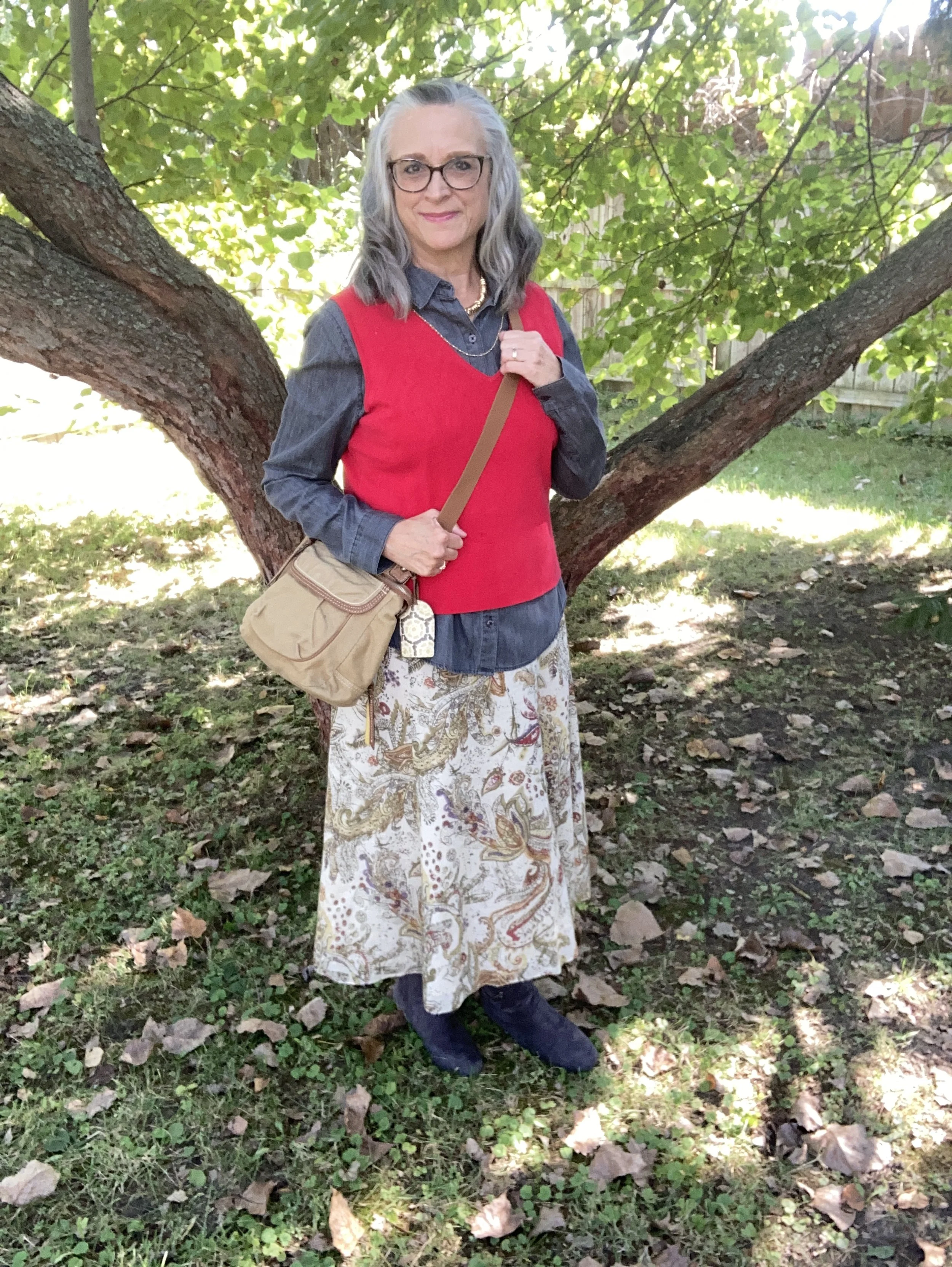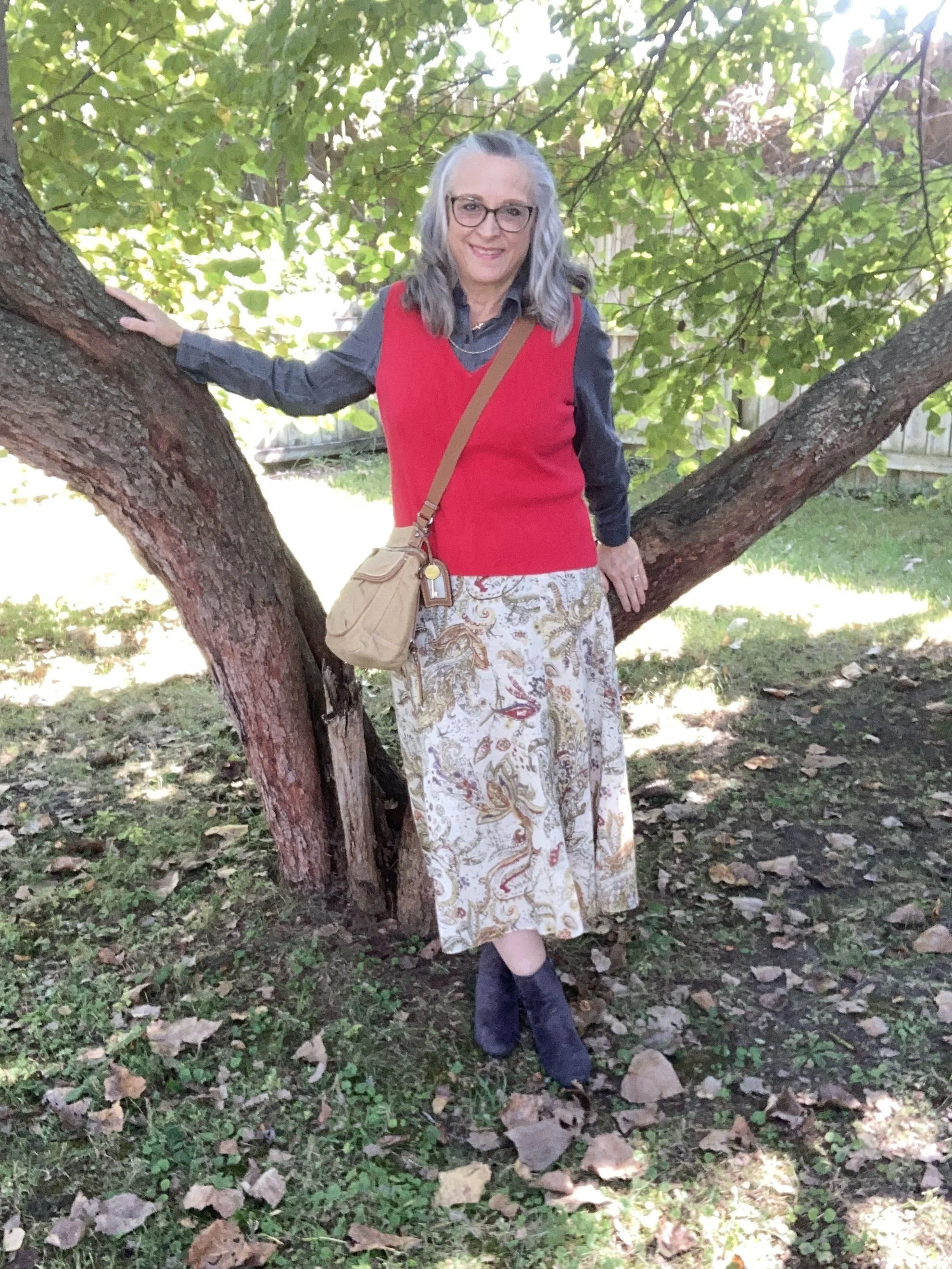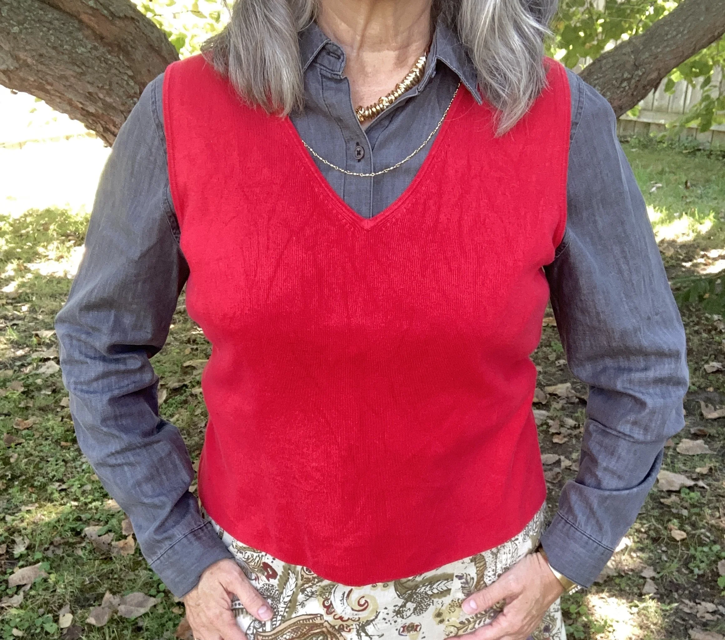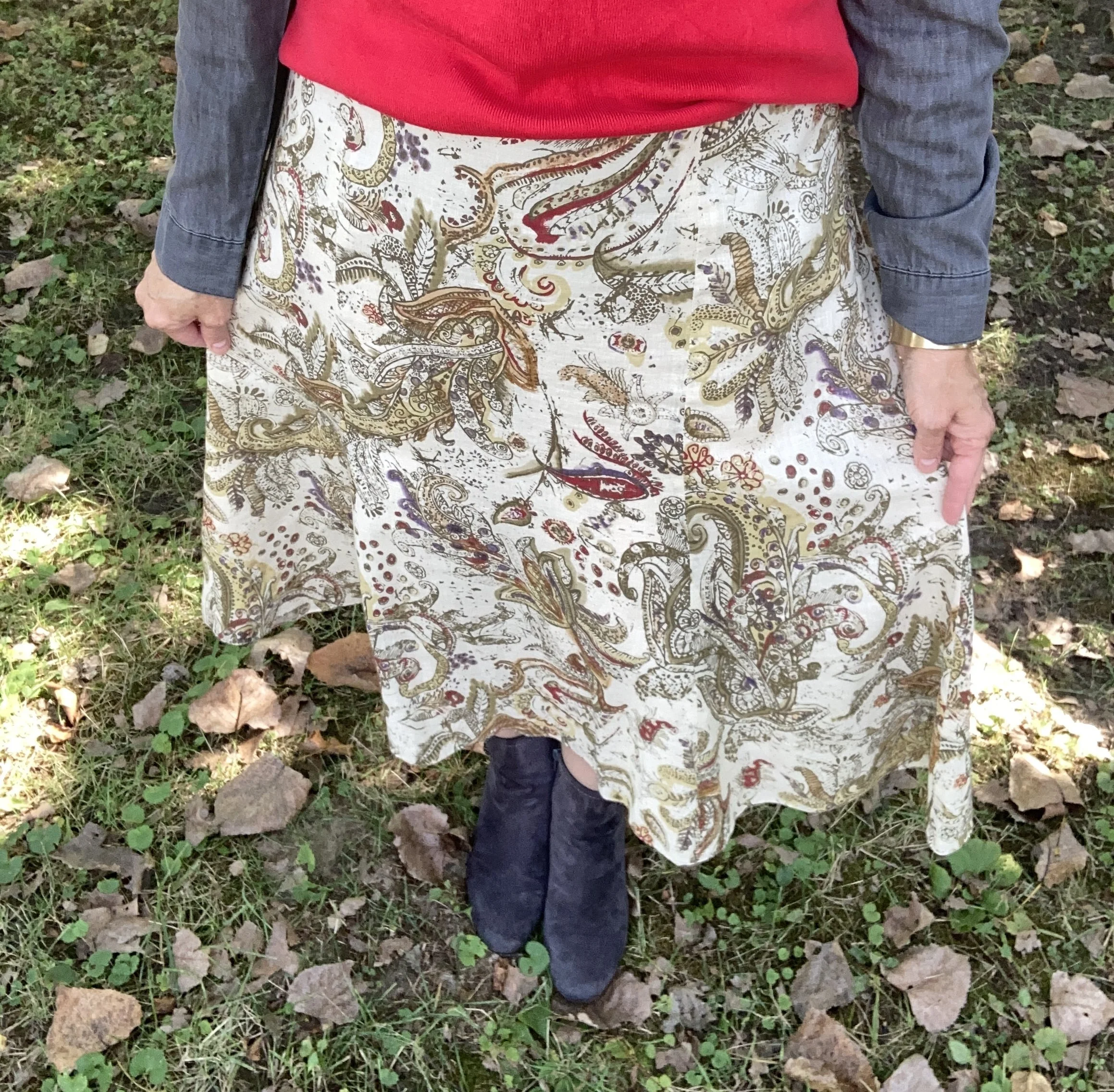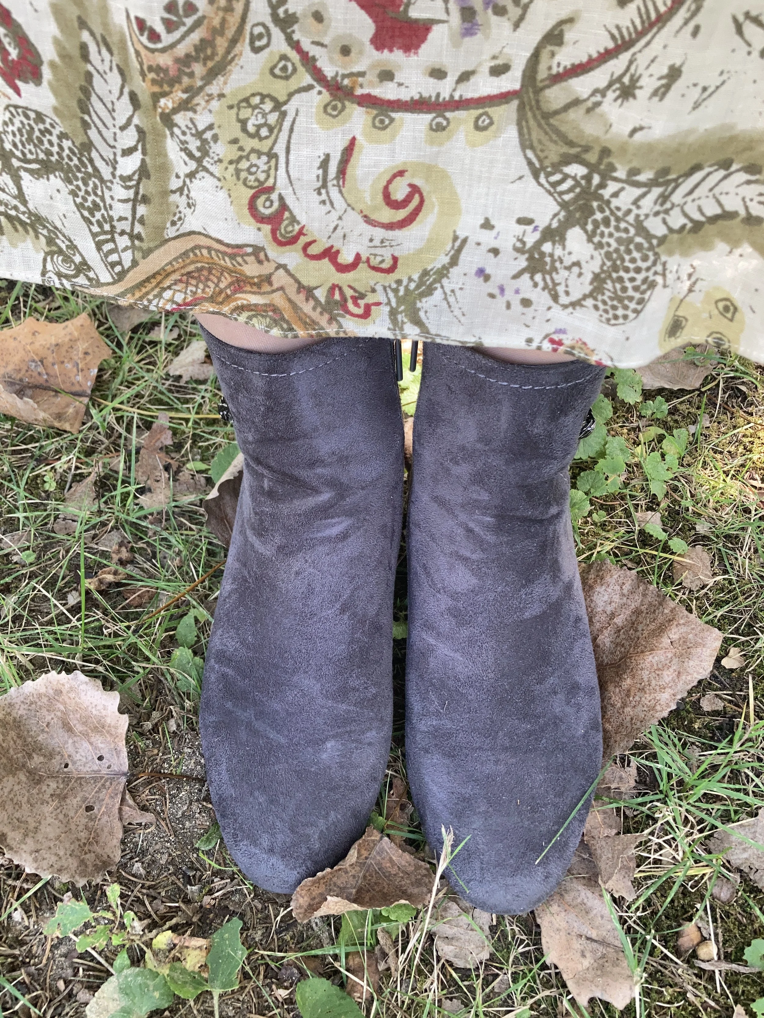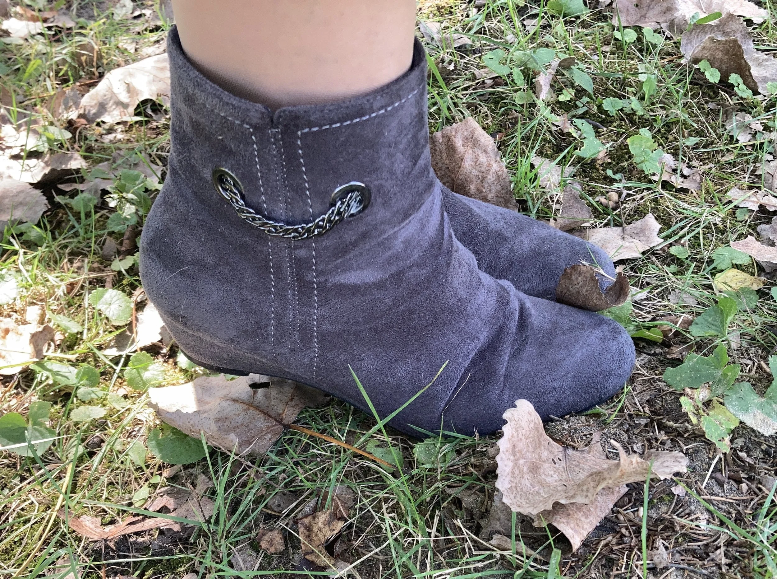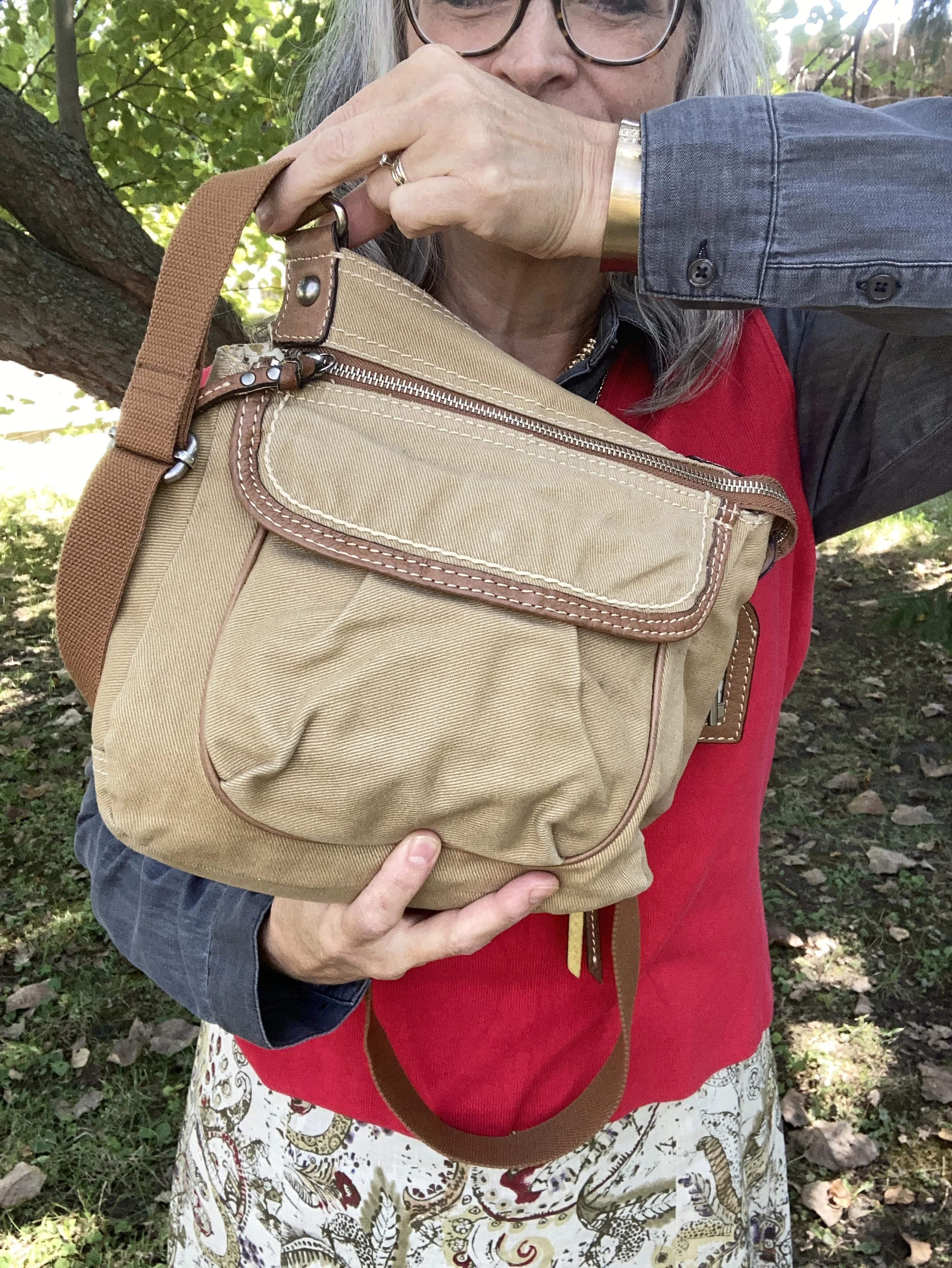
Shopping Our Closets: Casual Fall Look with Print Mixing

I am honestly trying to get back to regular posting, but 2026 has been kicking our butts. I have been struggling with my health symptoms as per usual, but yesterday I felt like I was getting a full blown sinus infection. The problem with these types of infections is that they simmer for weeks before actually turning into an actual infection. Unfortunately during that simmer time I feel extremely fatigued and unable to do anything extra. Yesterday, besides the pressure and pain in my head and face, I also had the congestion and the fatigue was overwhelming. I actually laid on the couch at one point in the afternoon and took a power nap just to get through the day. I started using colloidal silver in my neti pot yesterday morning and today, I already am feeling a little better. Hopefully, the upward progress will continue.

For today’s post I am using an outfit I wore one day last week and thought to take pictures of. I was going to post last week, but we were just too busy, so I gave myself some leeway. When you are already stressed because of what life is bringing to the table, you certainly don’t need to add getting down on yourself for all the things you feel you are not doing.

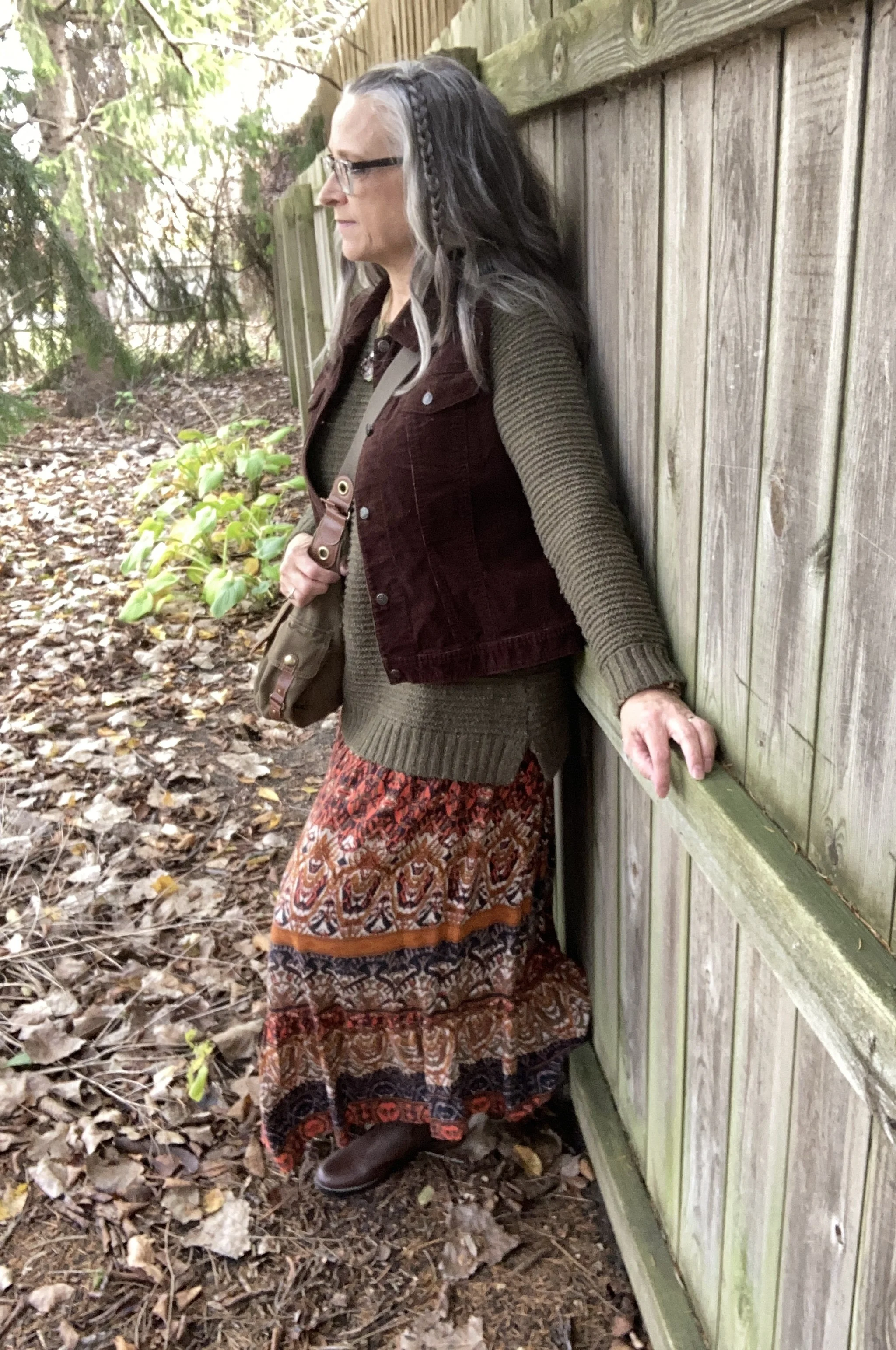
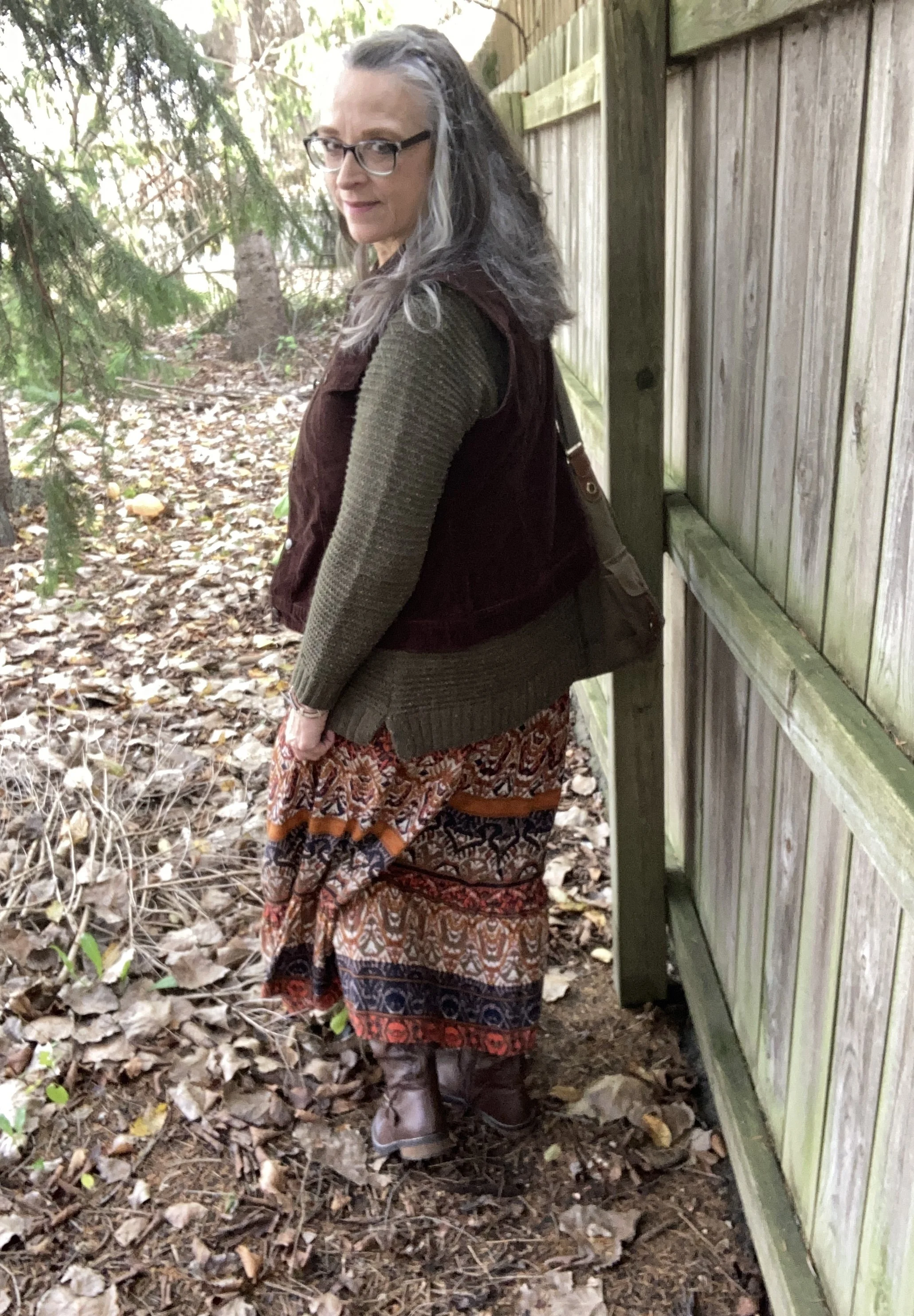
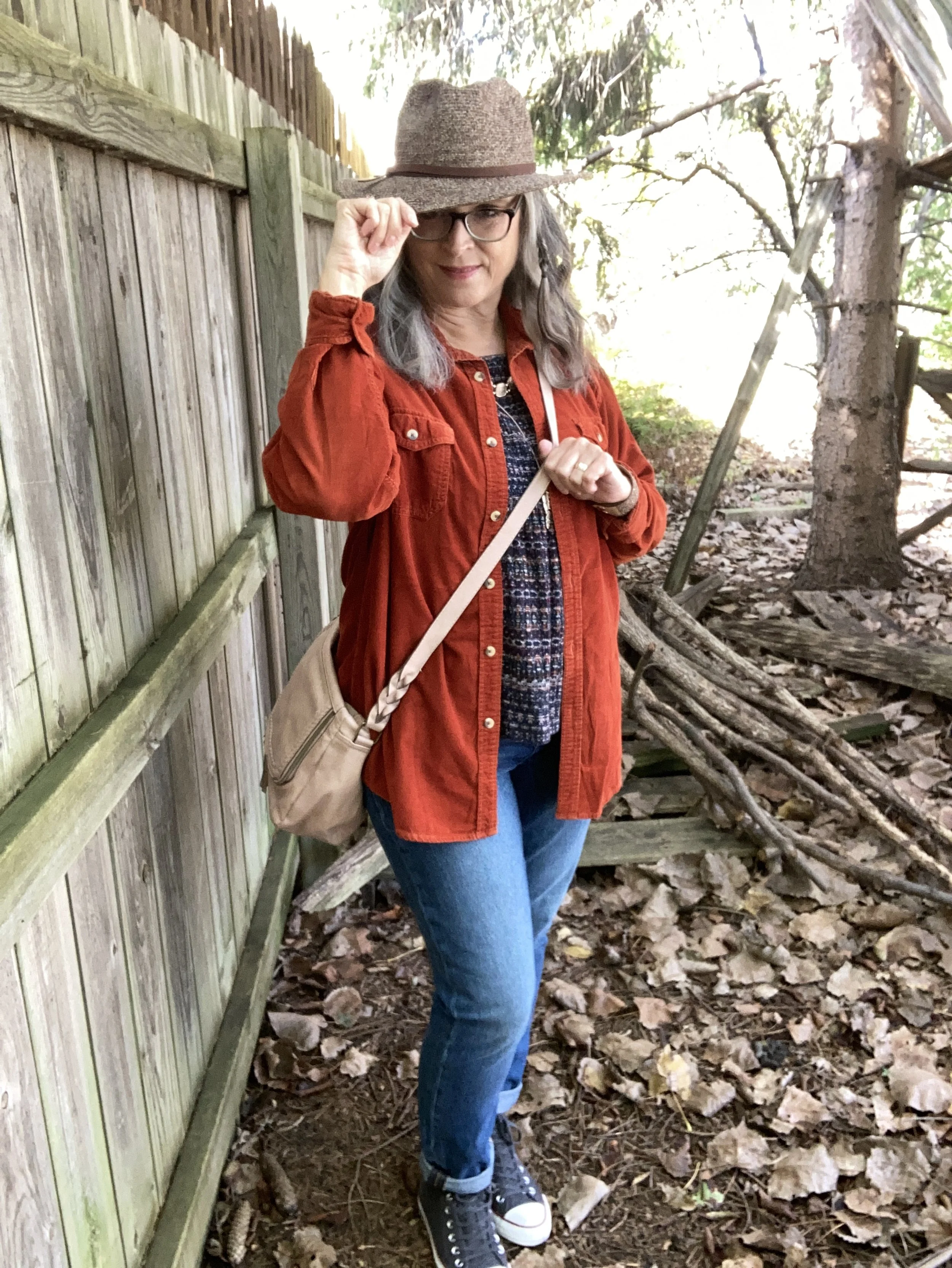
Since my Autumn/Winter Pantone series is over I decided to get back to my regular monthly columns. Today we are shopping our closets for simple easy printed pieces that can be combined for a fun, casual and comfortable look that is perfect for watching the grandkids, running to get groceries, or just hanging out at home.
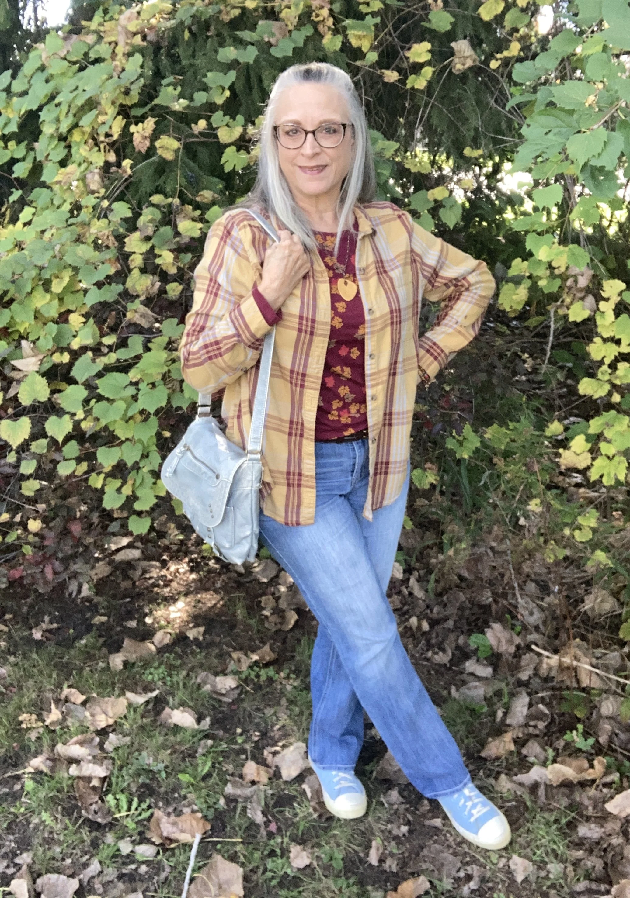
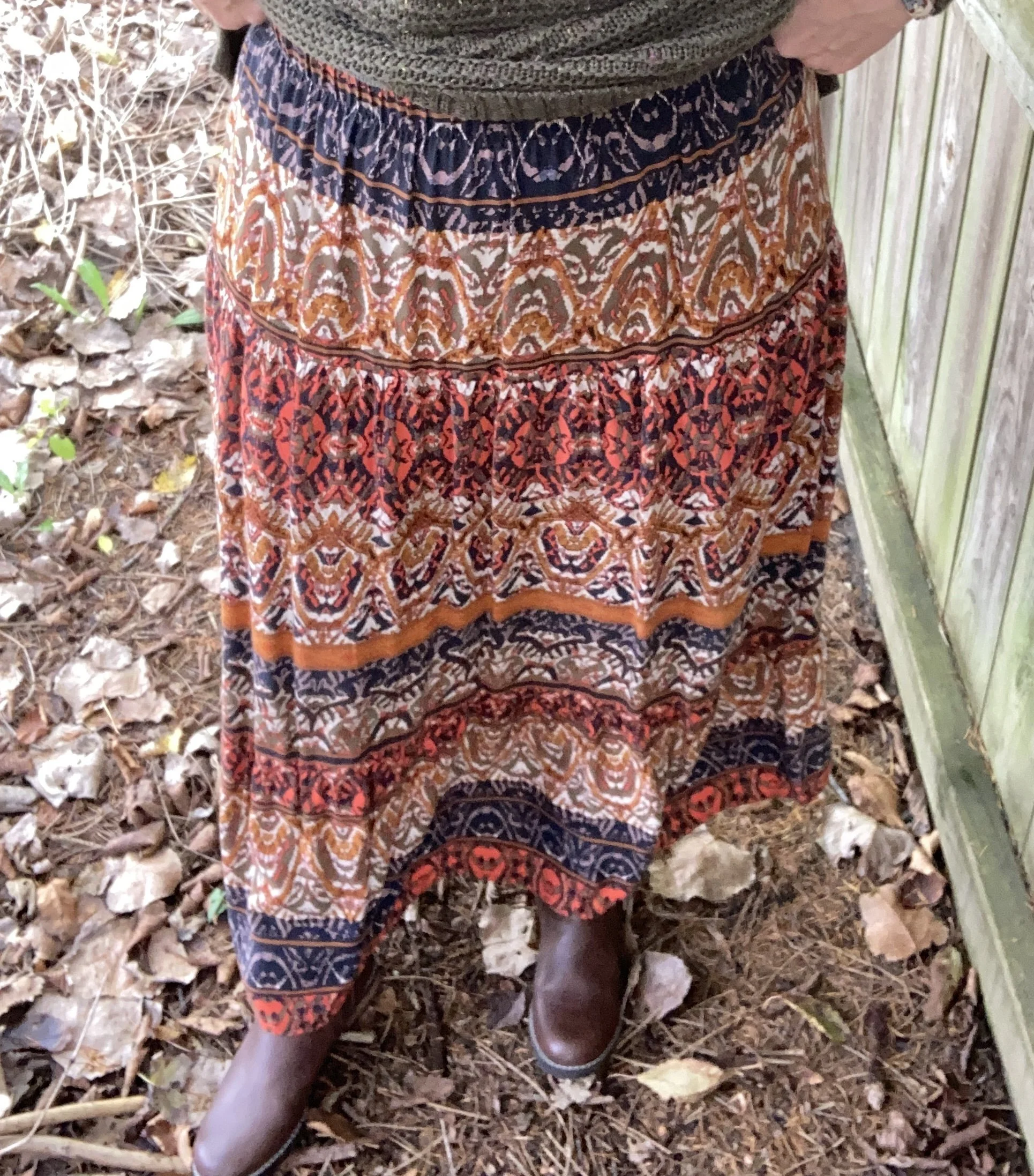
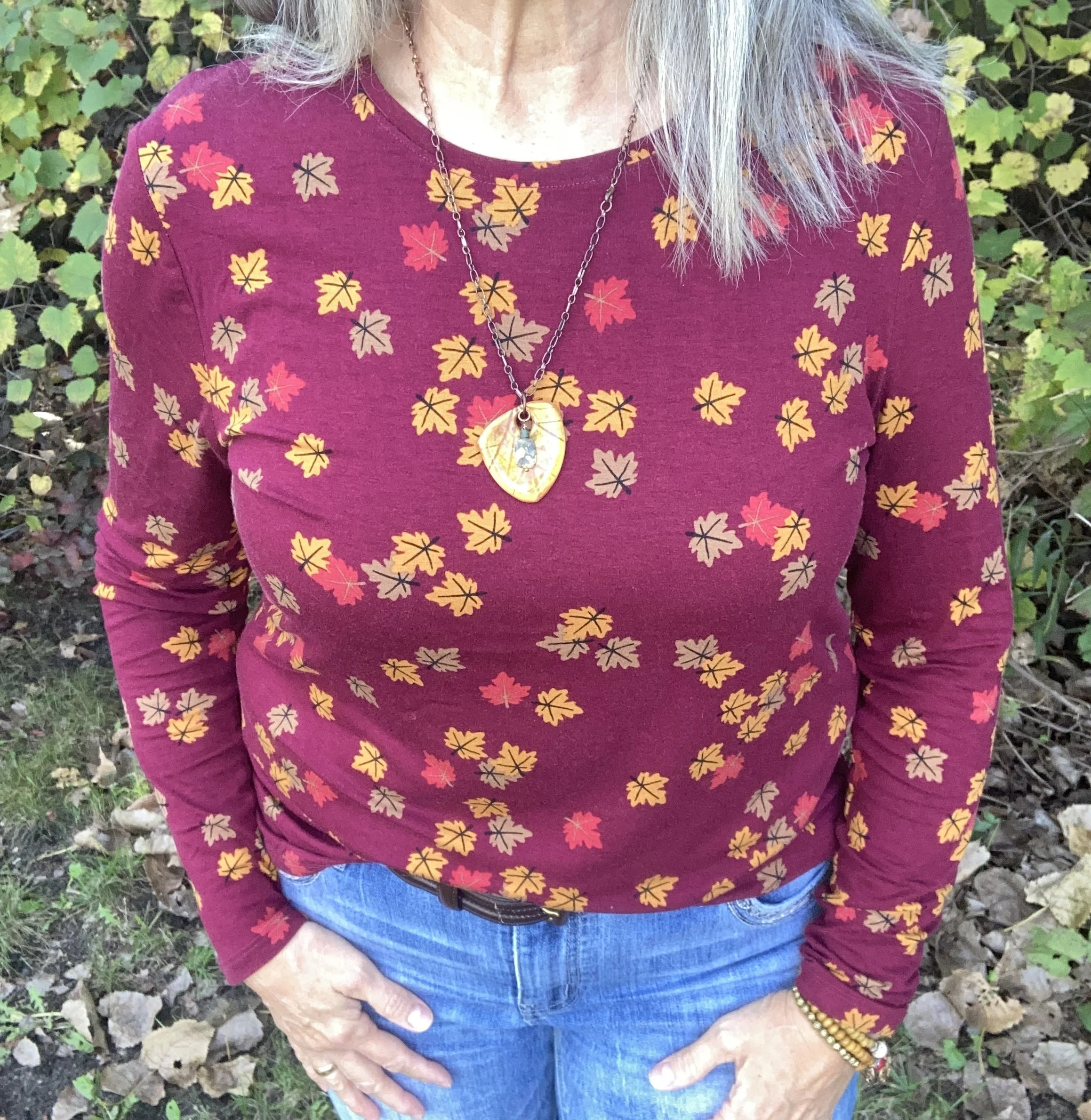
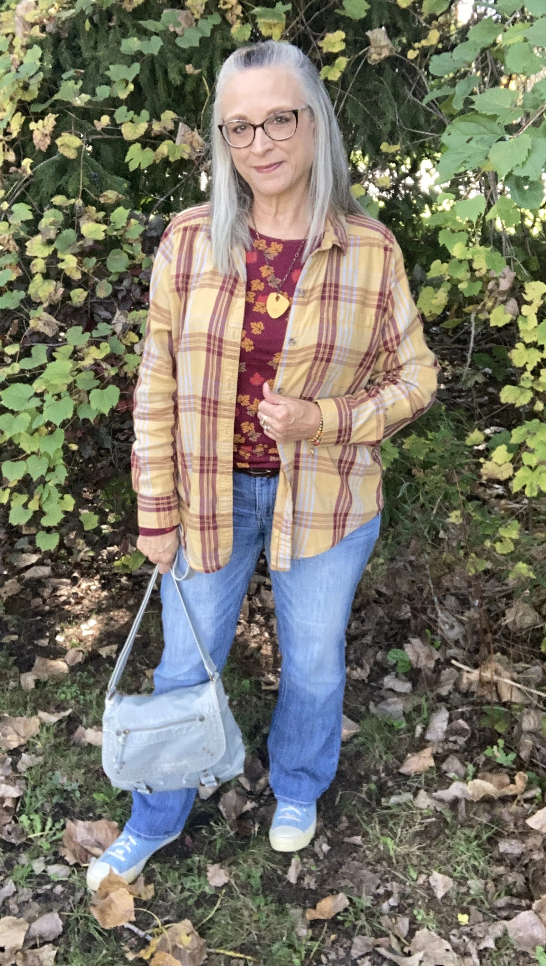
If you have been reluctant to get on the print mixing wagon, now is the time to try it out. Fall is perfect for layering, and fun fall prints like dark florals, rich plaids and holiday graphics are just waiting to be seen together. For this outfit I chose plaid and autumn leaves for a color clash that seems like it was made to go together.

Style Tip: When mixing prints try to pull similar colors from both pieces. Also, pairing a larger print with a smaller print usually makes a more eye pleasing mix.
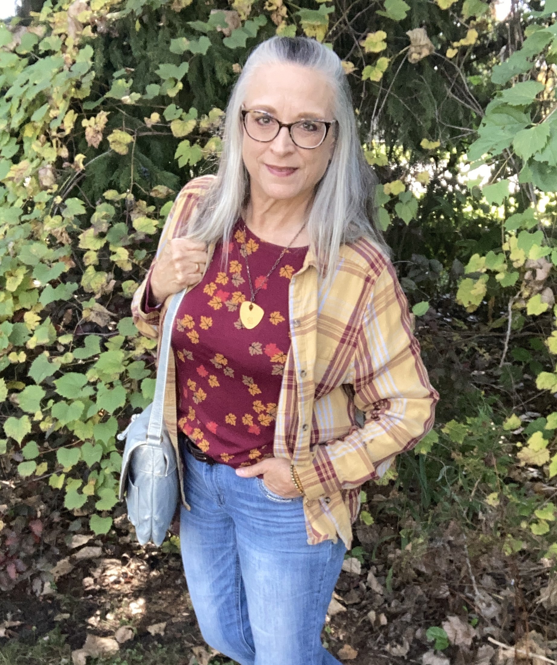
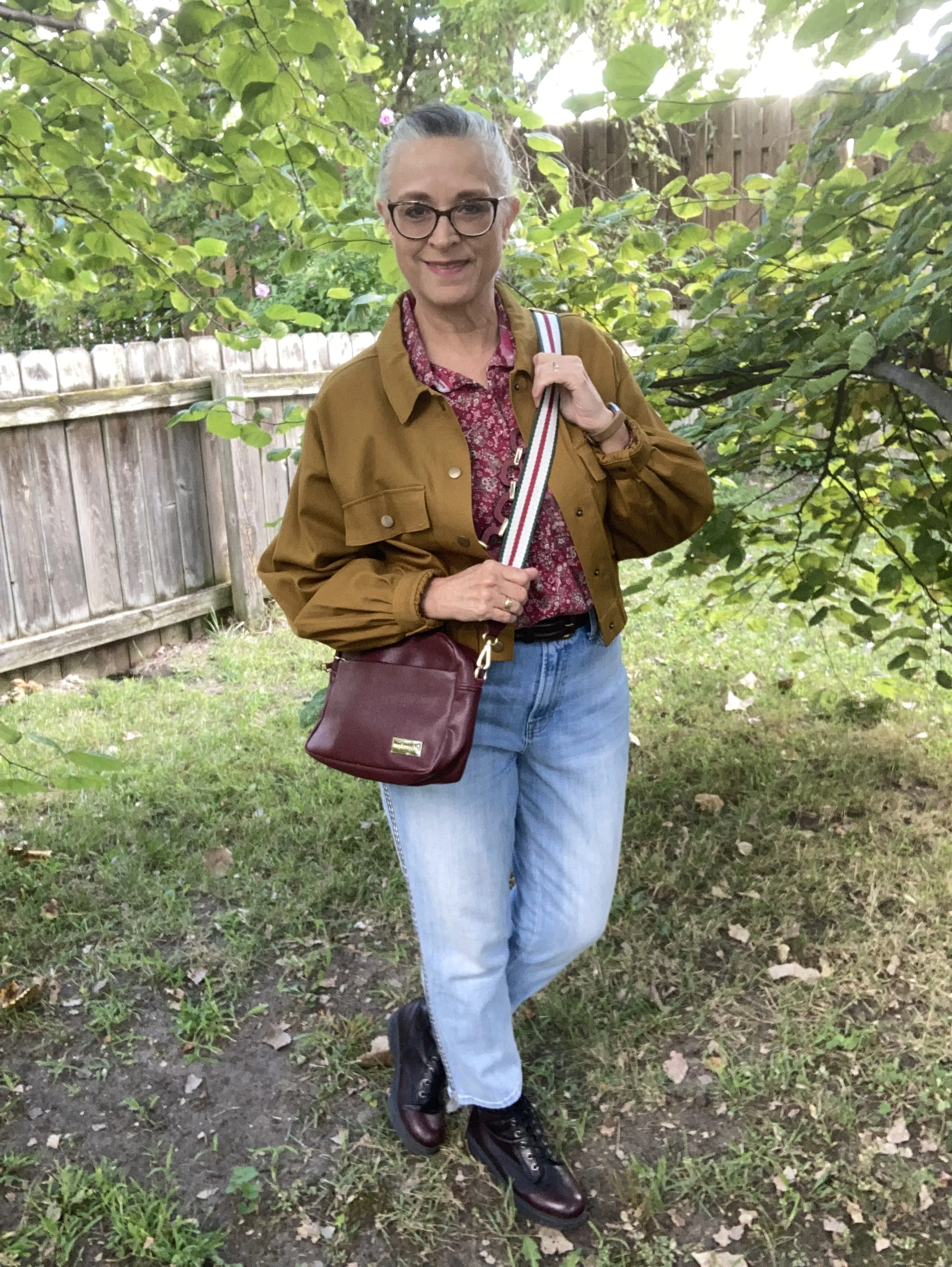
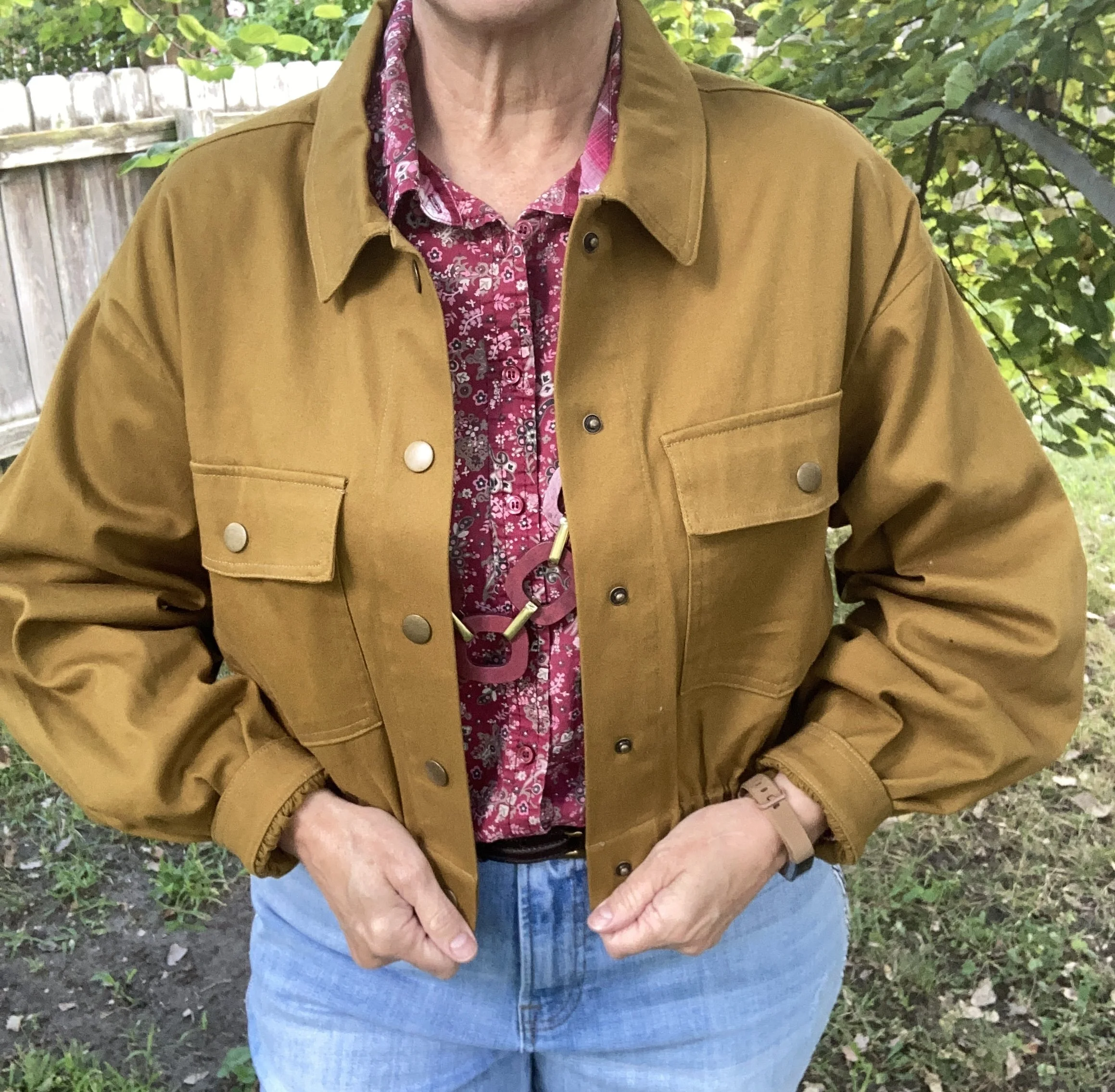
For this look the first piece I chose was this fun leaf print tee that I thrifted at the end of the summer. This is a brand called Hybrid. I love the burgundy background color and the pretty red, gold and light brown leaves. It is a light weight, stretchy knit so perfect for layering under other pieces. Even though the front tuck seems to be on again, off again I still use it to help disguise my love handles. I lost those pesky things when I lost weight. Unfortunately, I have gained it all back so they thought it necessary to return. Ha, ha. Here are a few long sleeve fall tee options from Cabelas, Kohl’s, and Talbots.
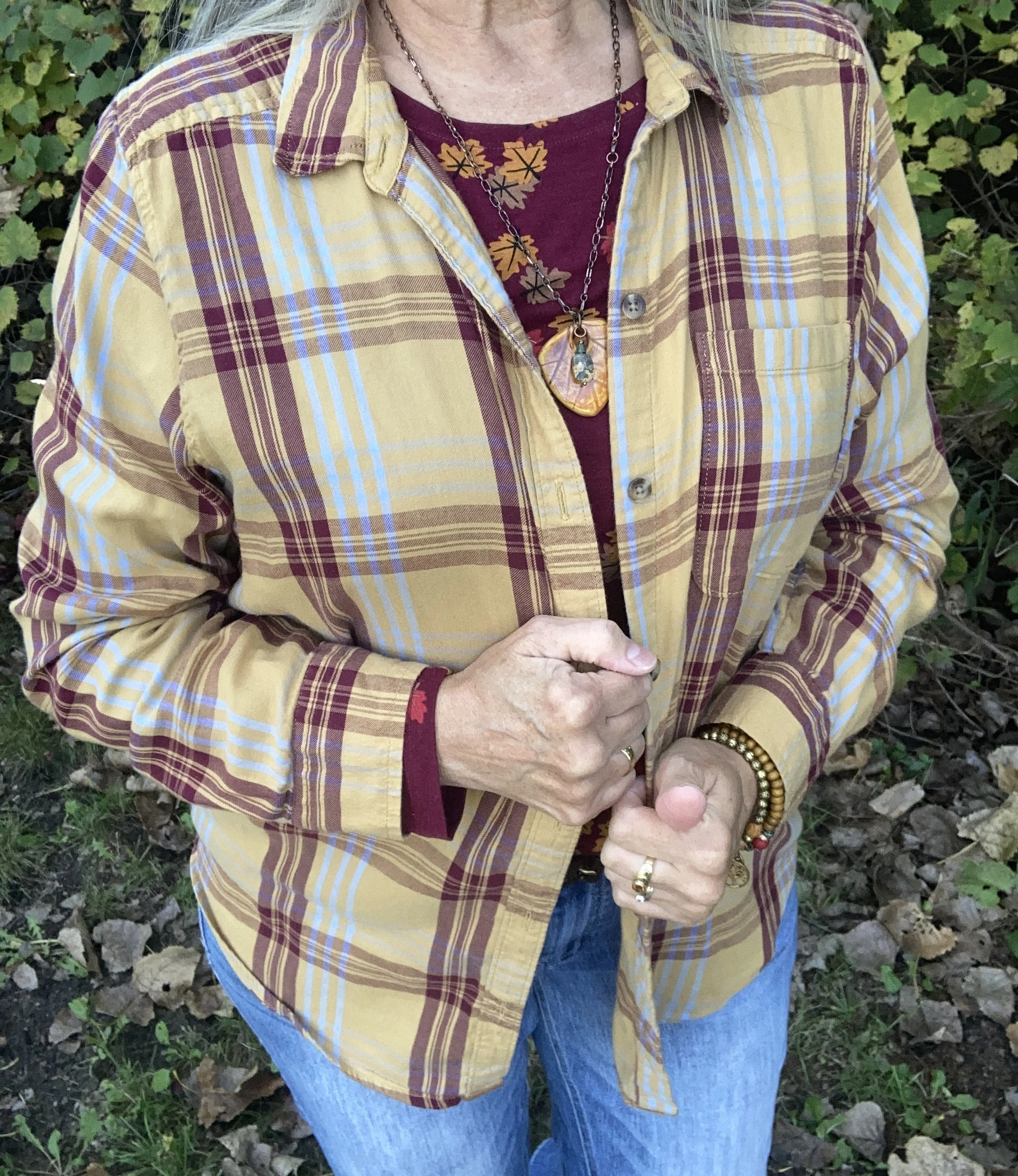
Once I chose the long sleeve tee I remembered this yellow and burgundy, SO plaid that I thrifted a few years ago. I was so tickled that these two pieces when together so well. Here are some options from Kohl’s, Land’s End, JCPenney, Old Navy, Walmart, and Amazon.

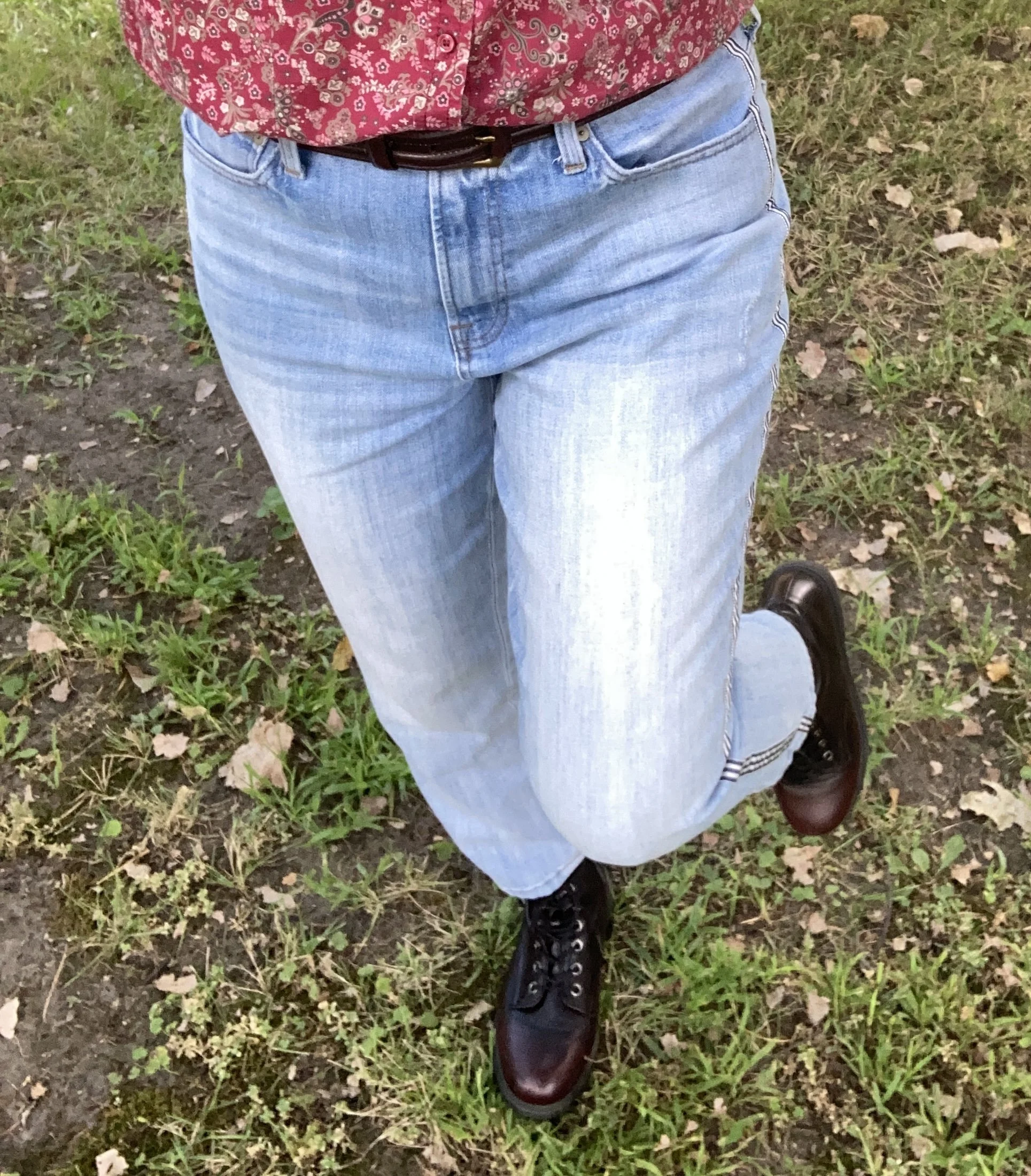
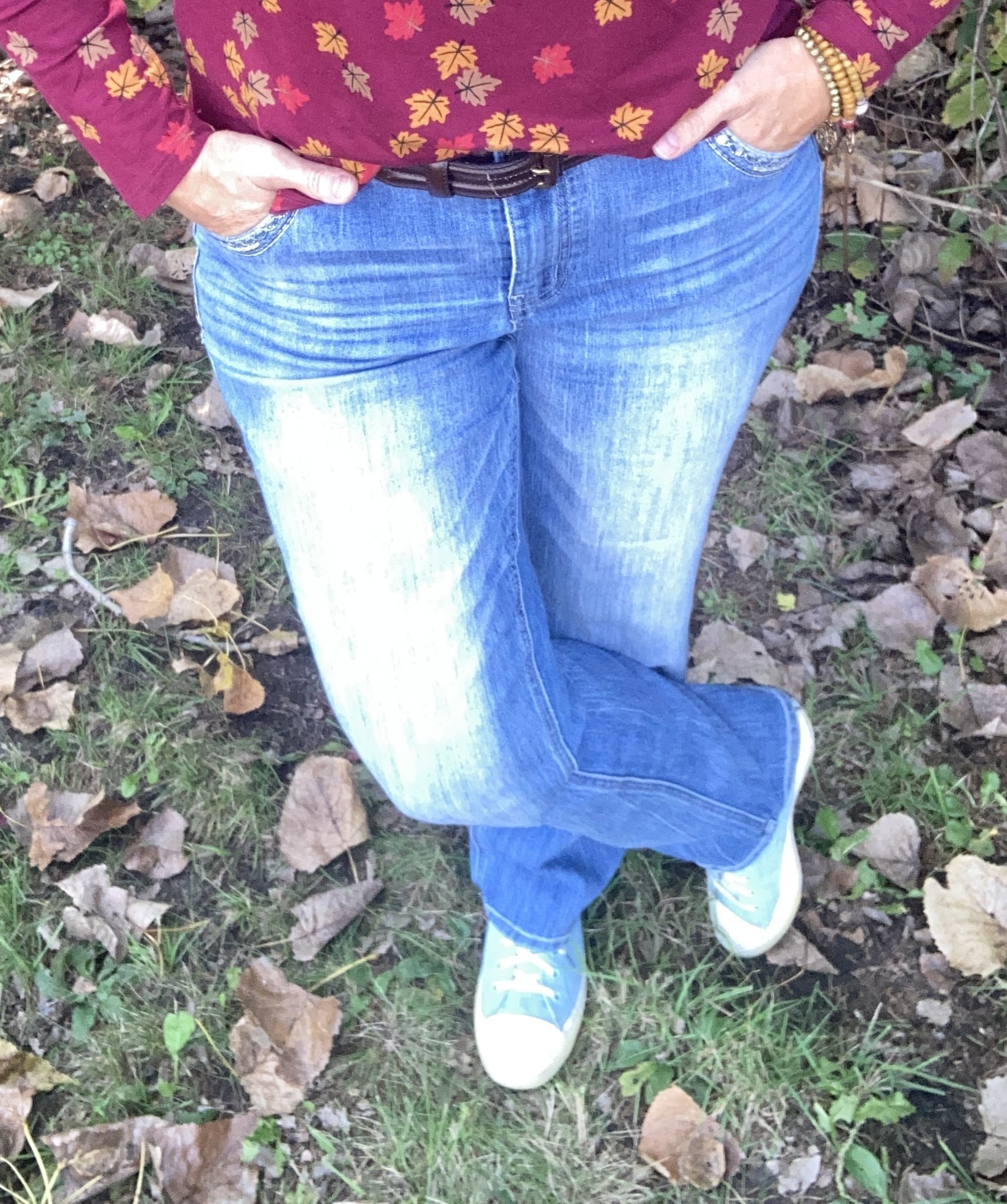
As you can see in the above picture there are light blue stripes in the shirt, thus my reason for choosing light wash jeans, and light blue accessories. My jeans were a sale purchase at Maurice’s a few years ago. These are a great in between seasons jean as they are lighter weight, and quite comfortable due to the stretch factor. These pics are a bit washed out due to the bright sunshine. Usually the best light for my phone is deeper shade. Check out some of Maurice’s jeans.
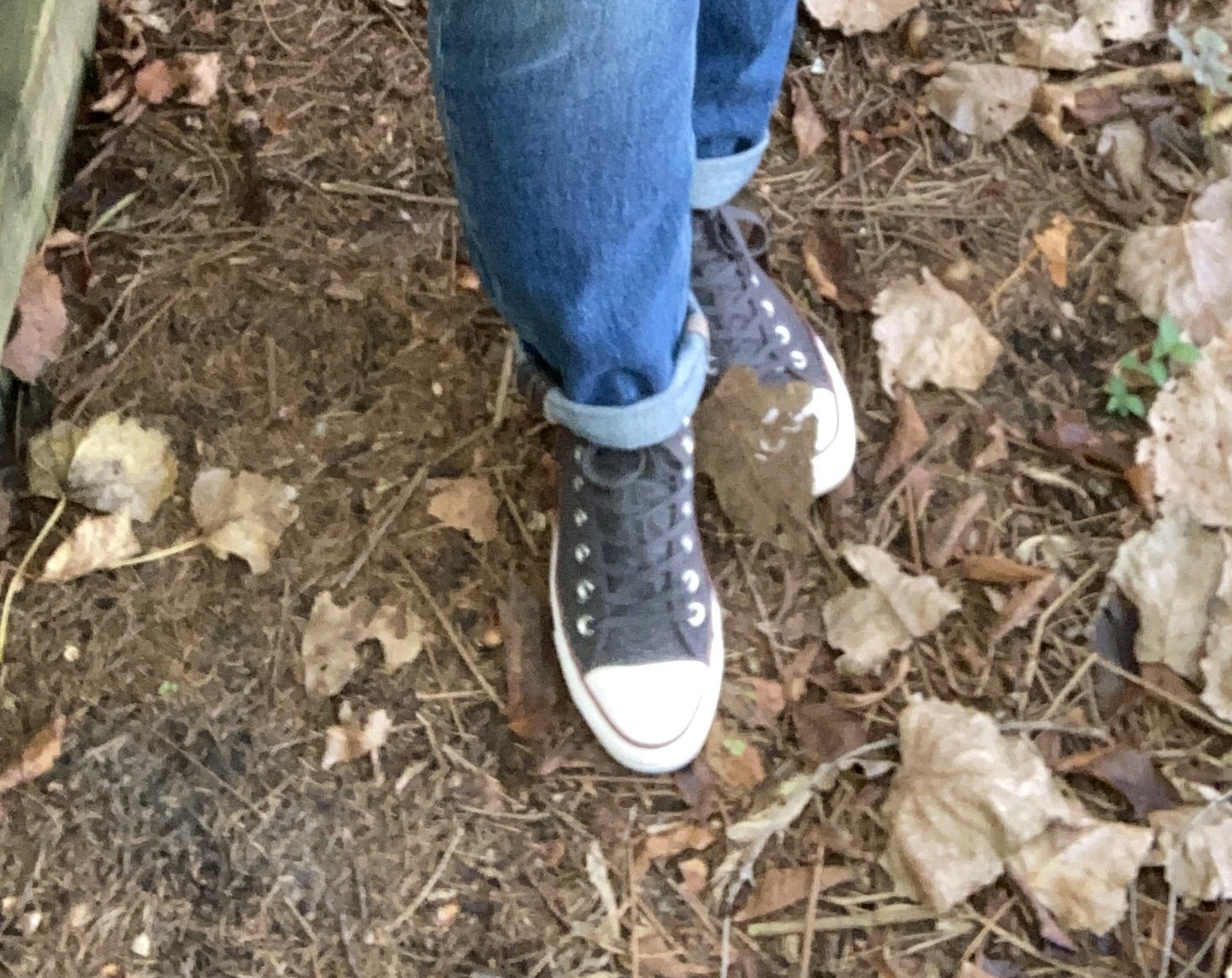
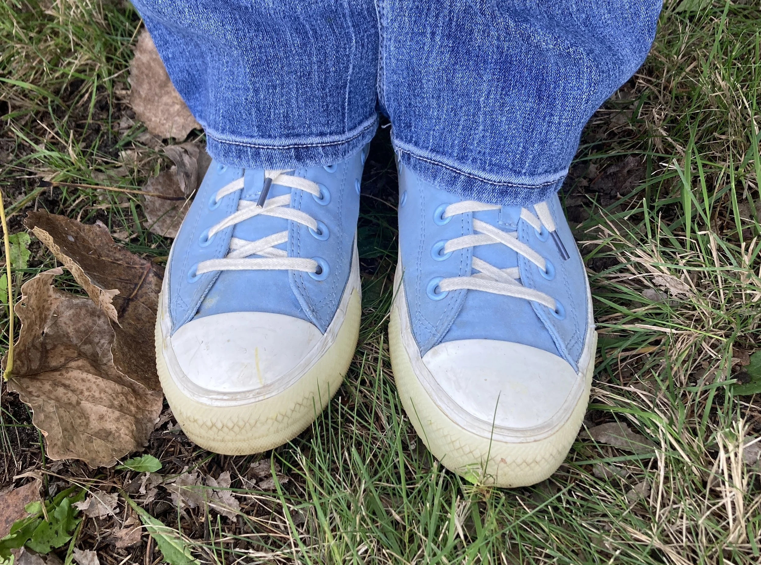
You’ve seen these Converse sneakers plenty of times since I got them on sale at DSW. The light blue is a great color for spring, summer and into fall, but I will put them away once the temps decide to be more fall like. Boots are my norm for the cooler weather. Here are some Converse sneakers from DSW.
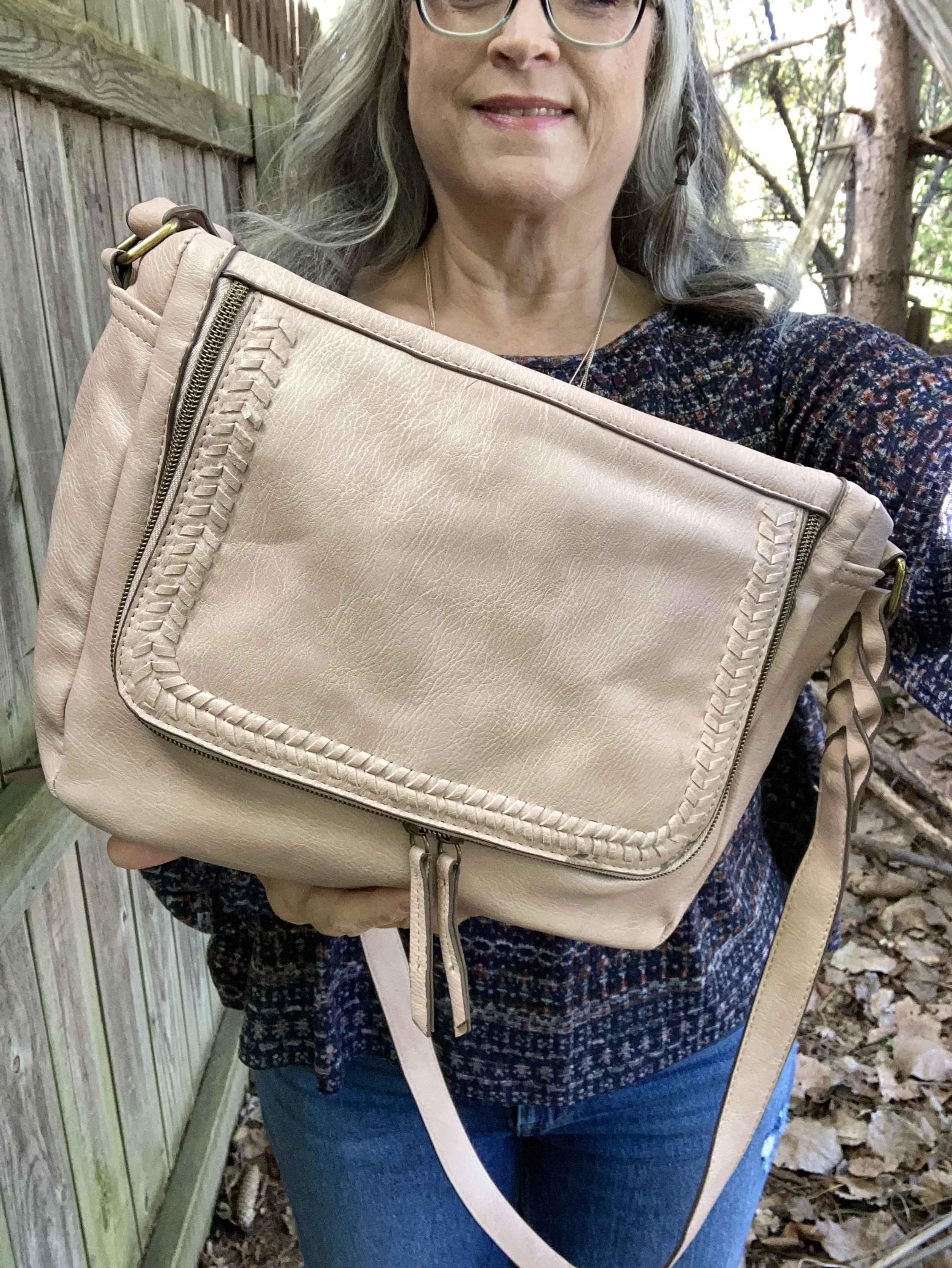
My bag was a thrift find. I like the distressed, almost denim look to the material. Cross body bags are my bag of choice since I like to have my hands free when I am out and about. Here are a number of blue crossbody bags also from DSW.
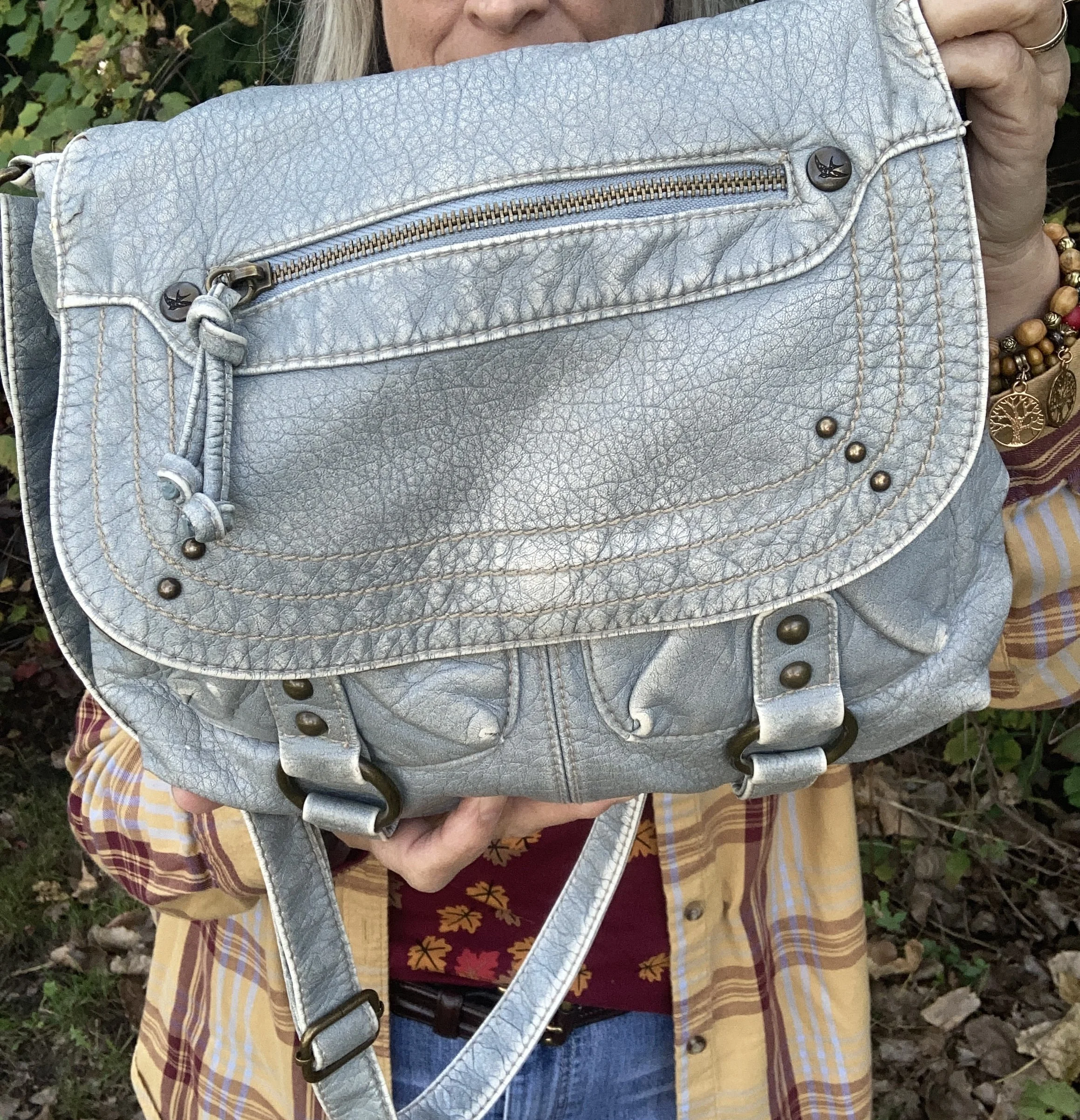
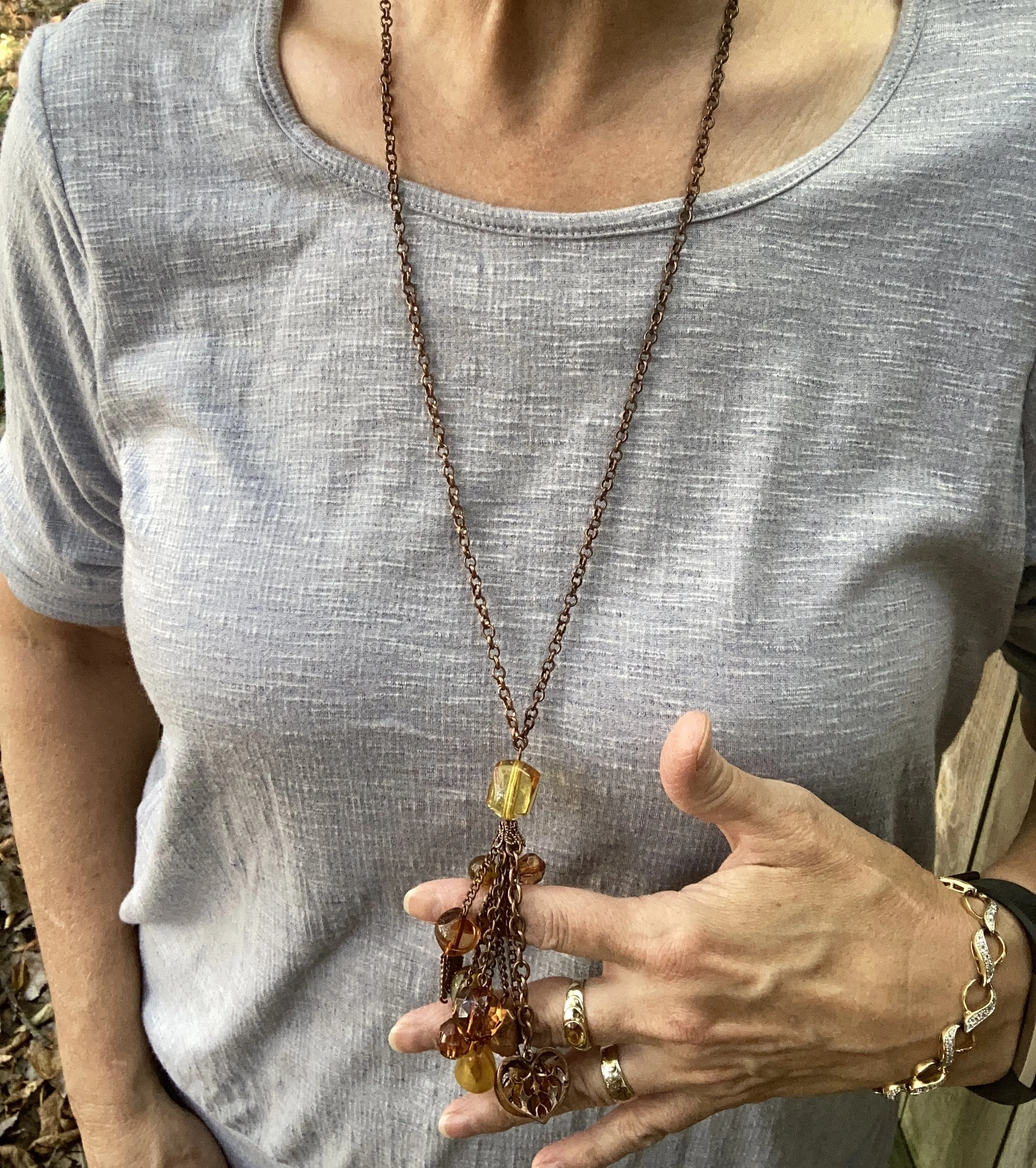
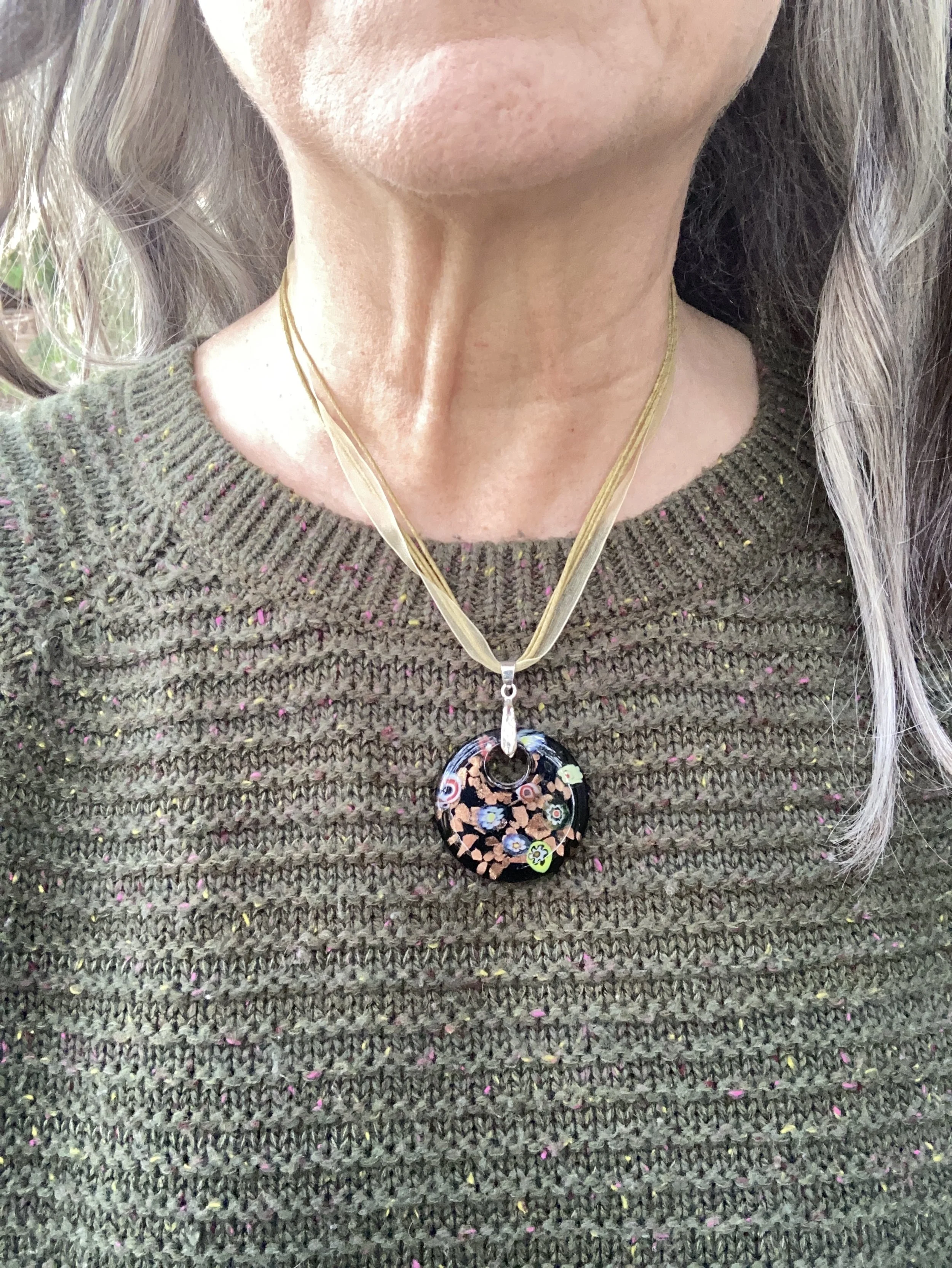
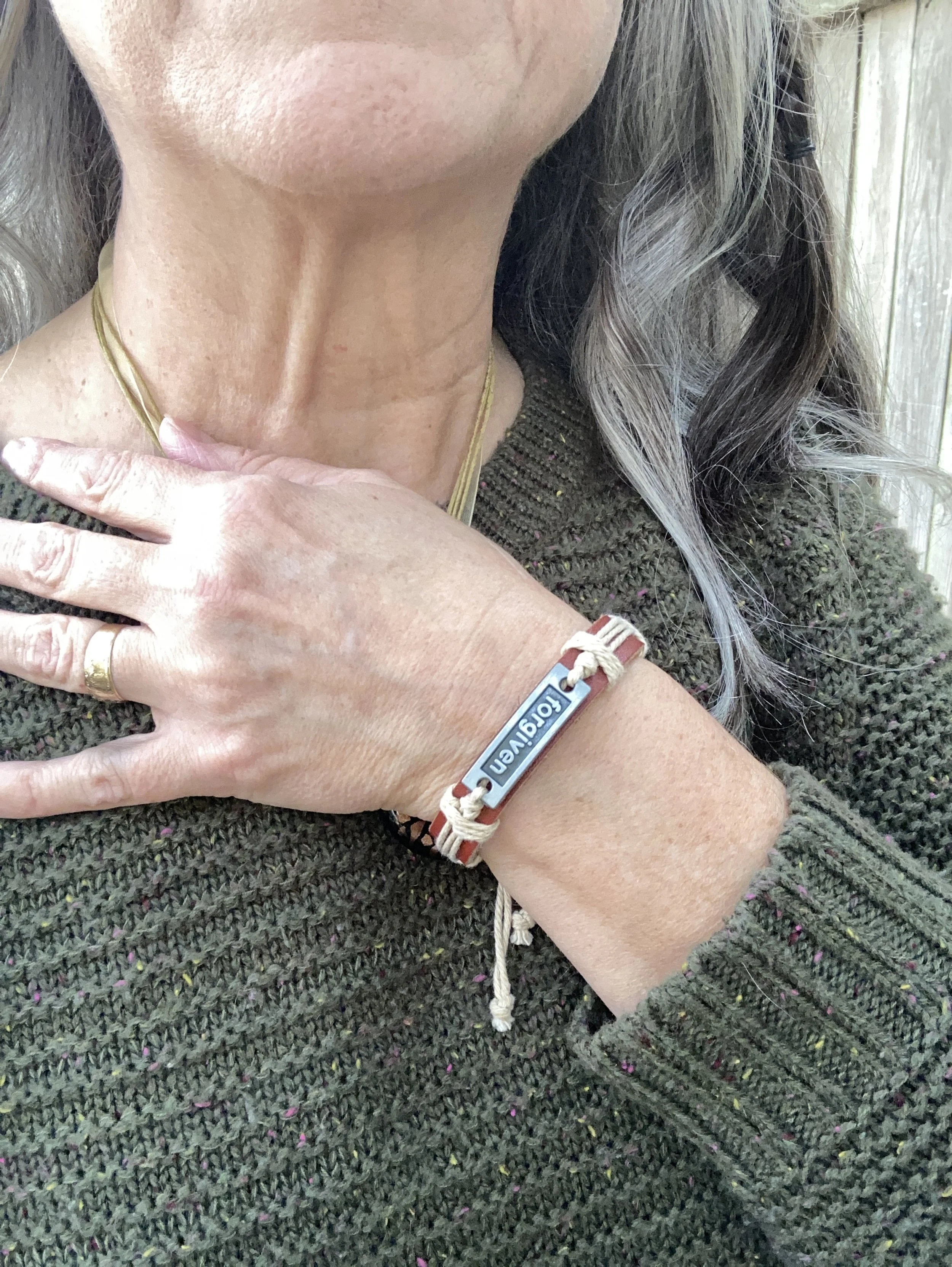
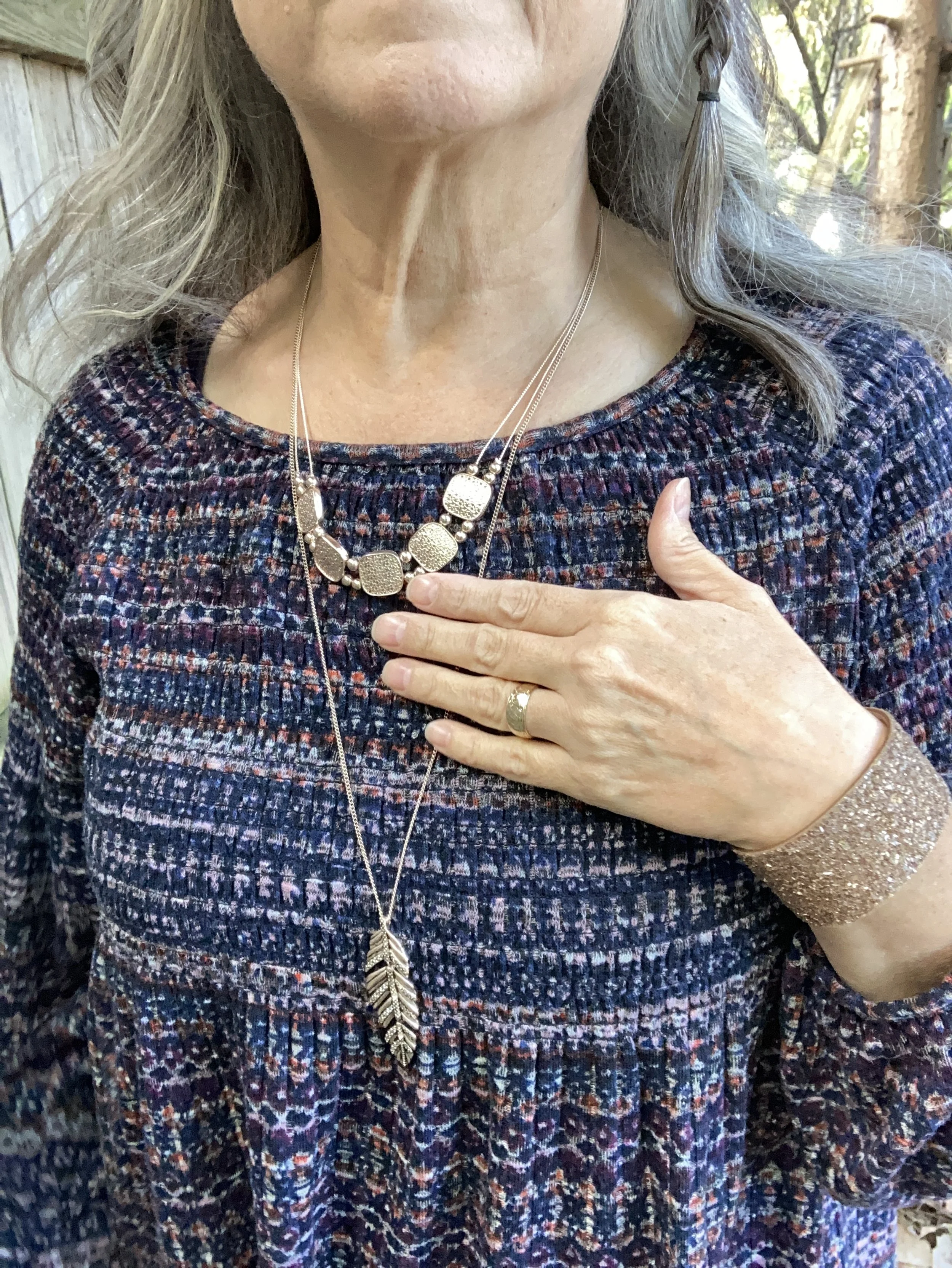
My jewelry was blend of pieces. The leaf necklace I purchased up north at an art gallery a few years ago. The bracelets are pieces I have collected over the years mostly clearance purchases.
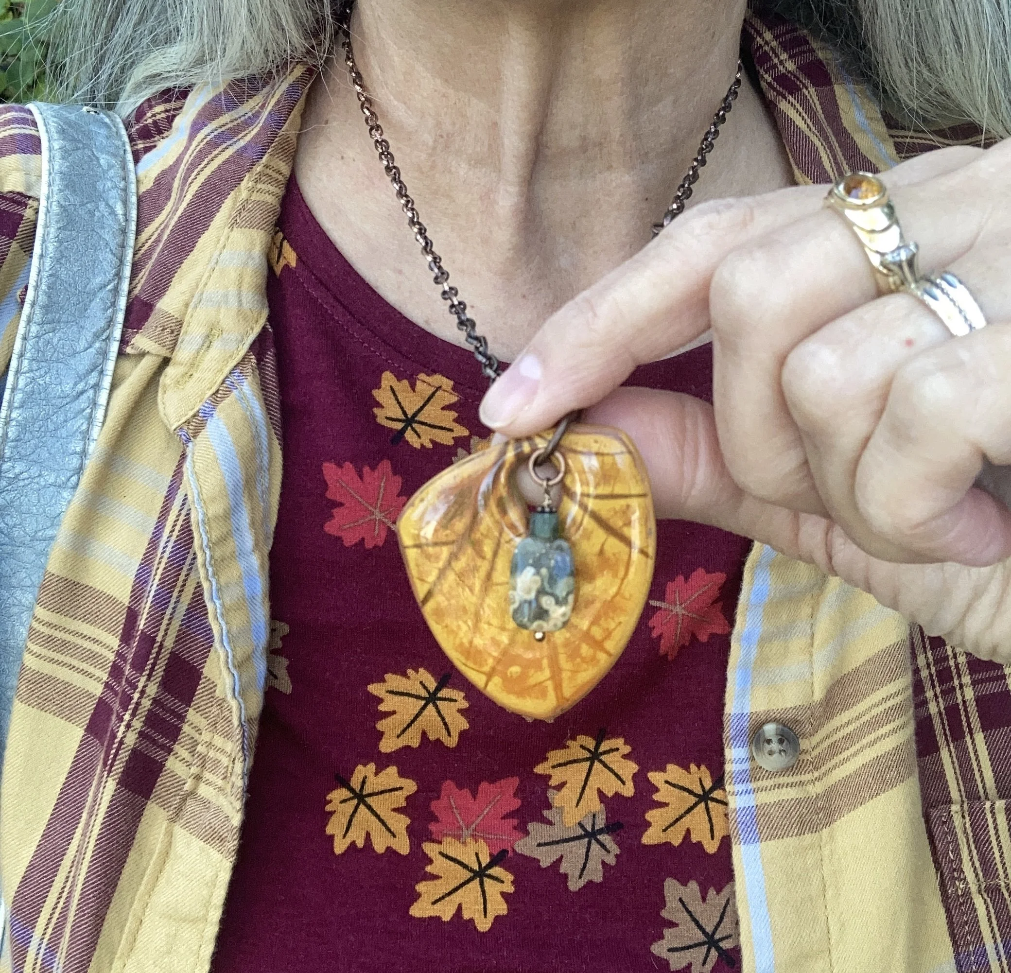
If you are interested in a leaf necklace or pendant for fall here are some beautiful options from Etsy.
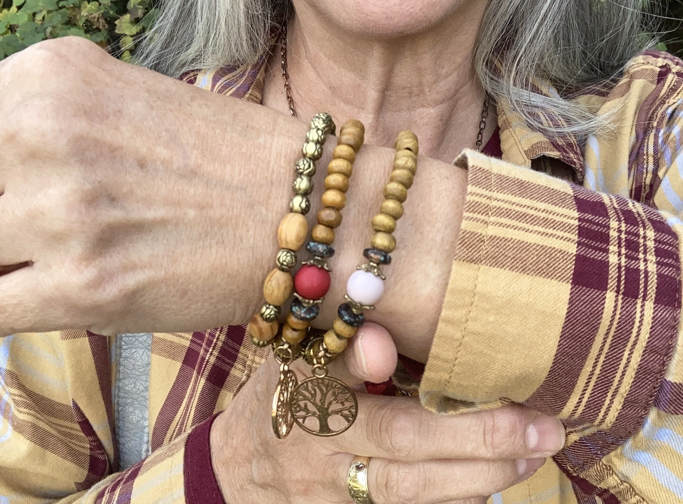
What do you think of this outfit? Would you be able to put something together like this by shopping your closet? I’d love to hear your thoughts so leave me some love in the comments.
Shopping links are included for you to enjoy. These are brought to you at no additional cost and I do not receive any money through these sites.

Have a great week.
Pantone Autumn/Winter 2026: Muted Clay, All Aboard and Poseidon

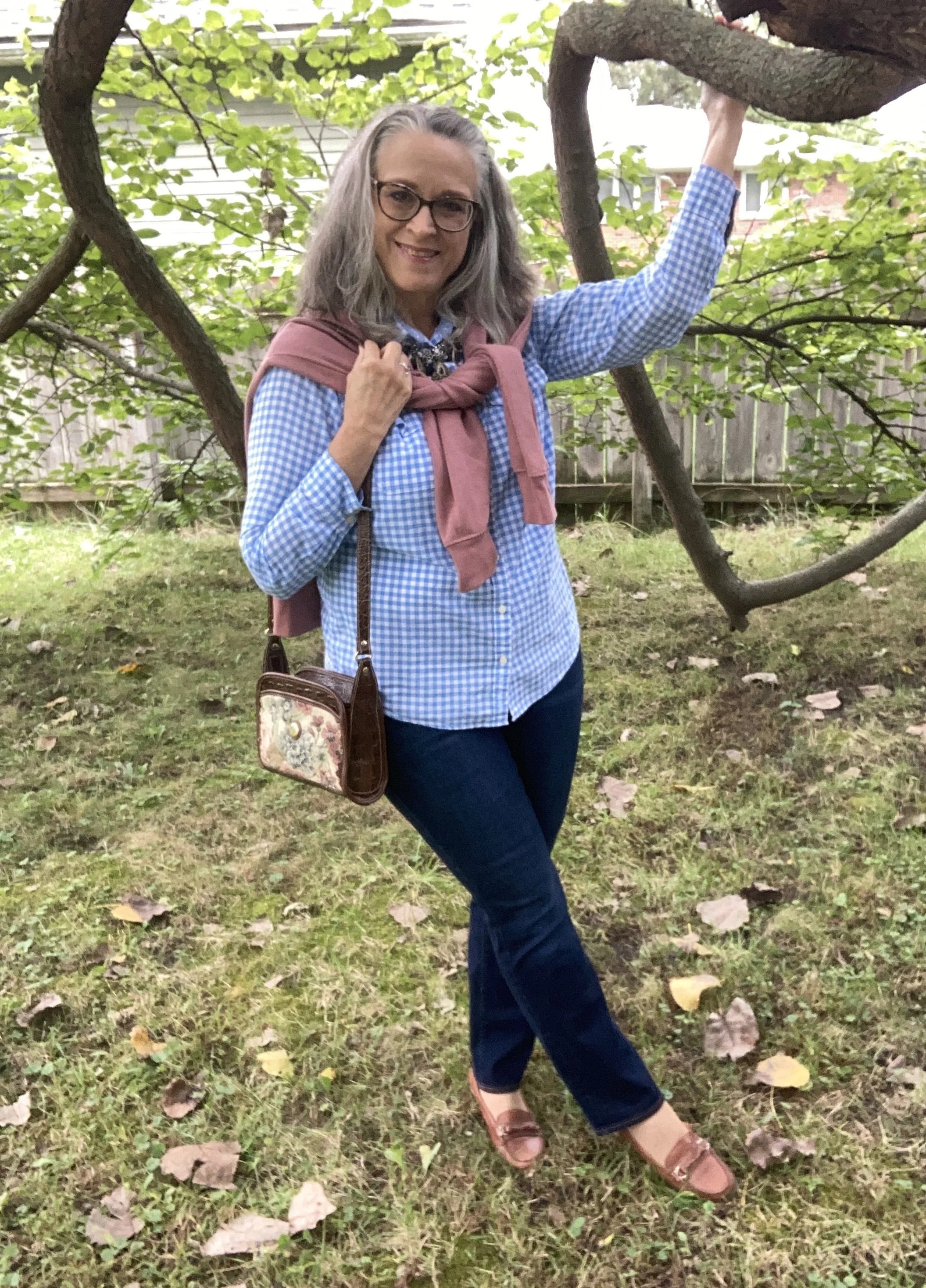
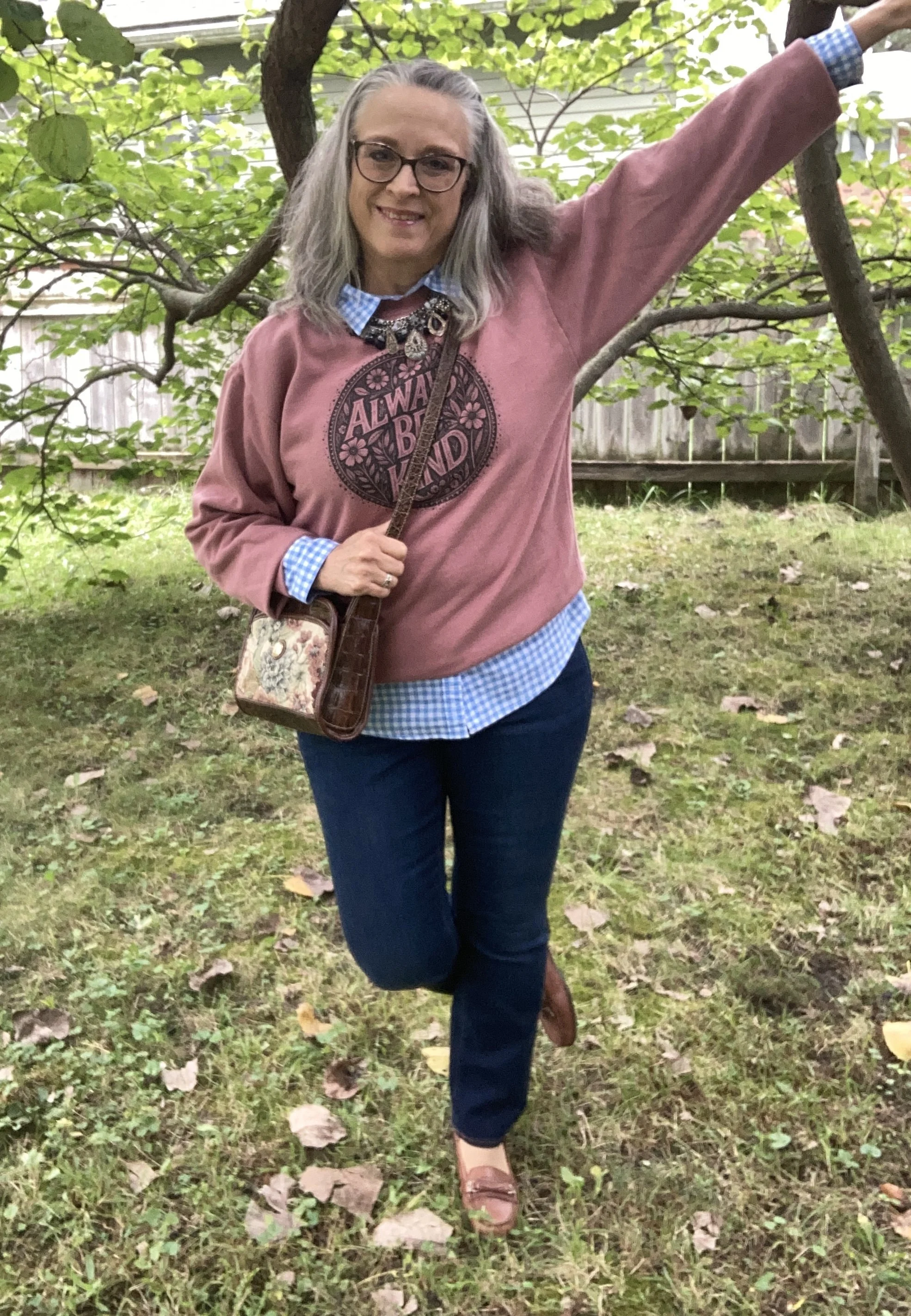
This is the last outfit for this Autumn/Winter 2026 New York Palette. Today’s look combines a grounded pinky orange called Muted Clay; a pretty light blue named All Aboard, and a dark blue called Poseidon. You can see the actual Pantone palette here.

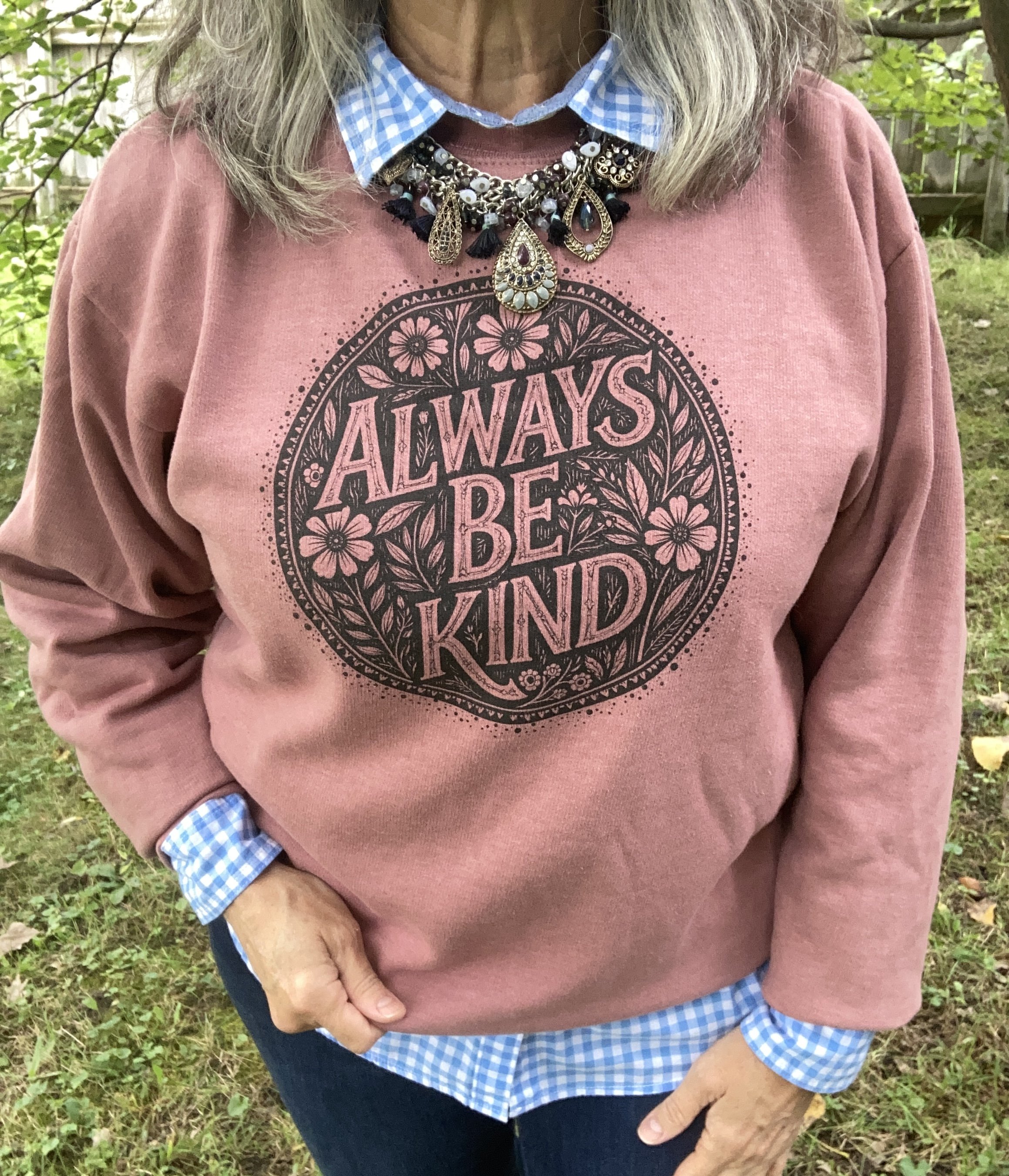
I struggled to find Muted Clay in my closet, but then I remembered I had this Always Be Kind sweatshirt from Love in Faith. Yes, I do buy a lot of tees and sweatshirts from them, but I am always pleased with their quality and their designs. The prices are great too, especially when they have a sale. Be sure to check them out as they already are selling Christmas designs.

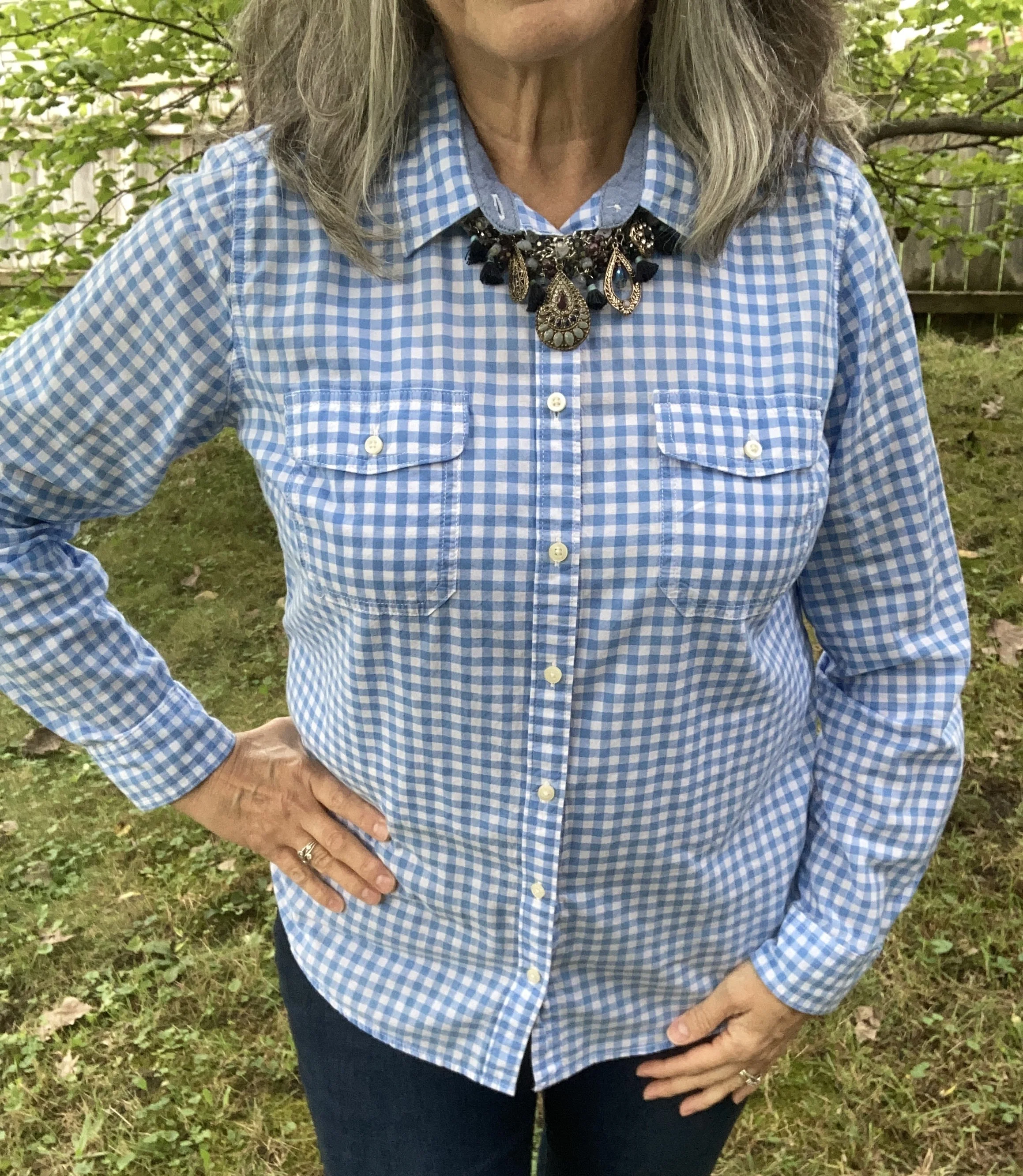
For All Aboard I decided on this blue gingham button down blouse that hasn’t seen a lot of wear. It is a very nice shirt and I got it on clearance from JC Penney. It is St. John’s Bay brand. I decided to roll up the sweatshirt sleeves by tucking the wrist band under, pulled out the collar and left out the tails to give a bit of checked whimsy to the look. Here is a similar long sleeve version from Walmart, a dark blue version from Land’s End, and another style from Shein.

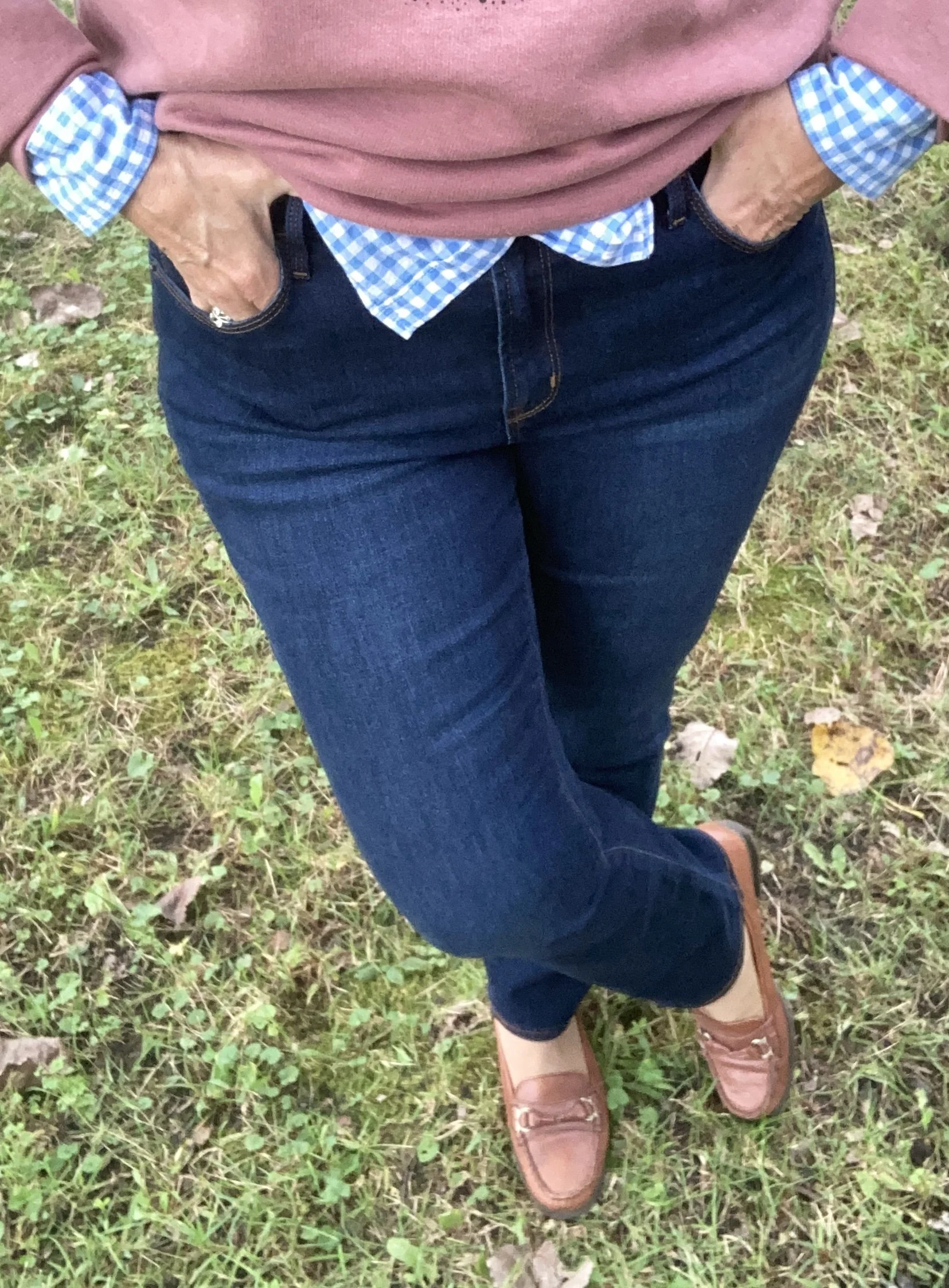
My Poseidon jeans were a recent thrift find. They are definitely more of an ankle pant on me, but would look equally cute with ankle or combat boots in the cooler weather. These are Old Navy. Here is a wider leg pair from JCPenney, a straight leg pair from Kohl’s, and a slim leg pair from Chico’s.

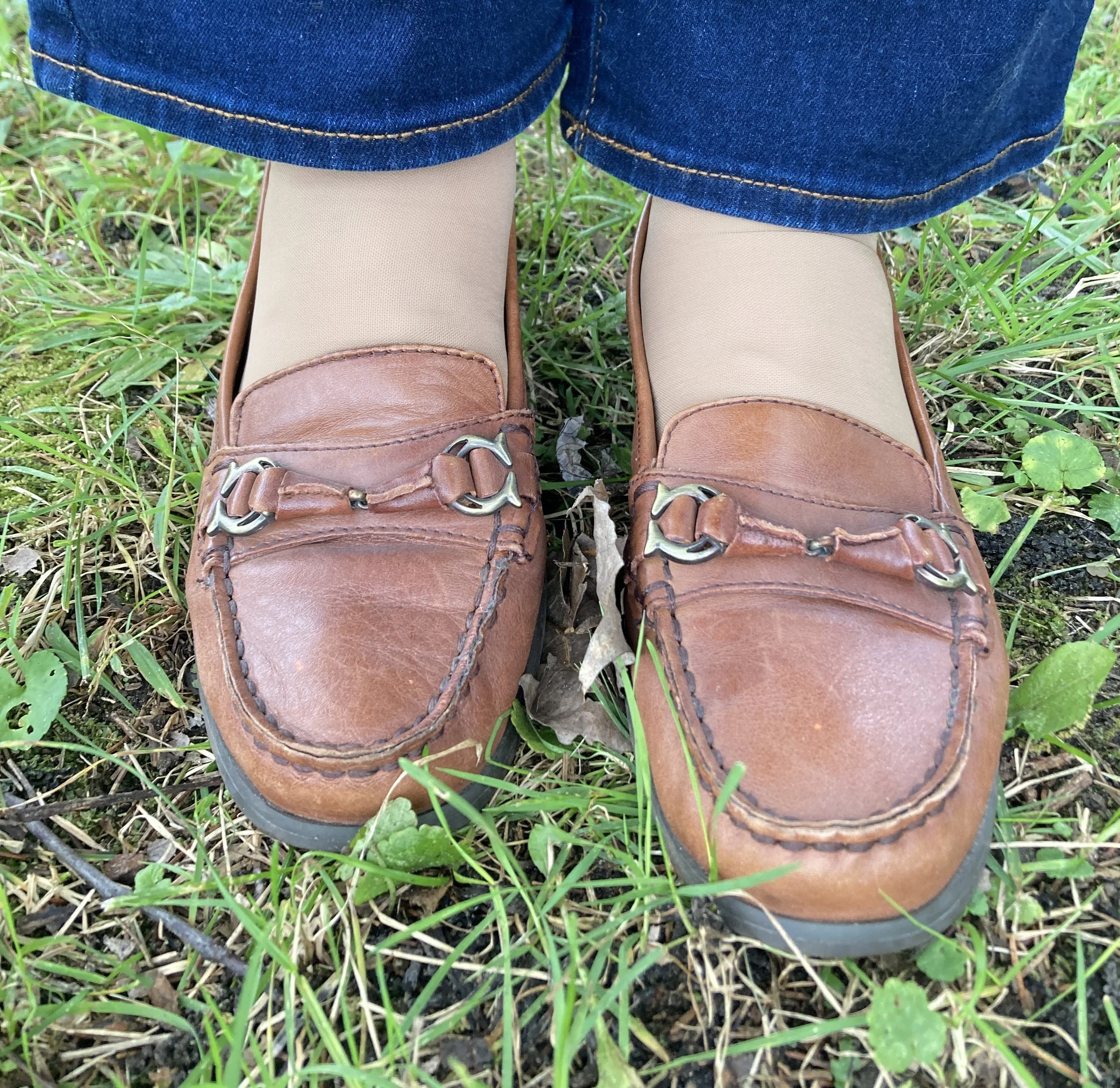
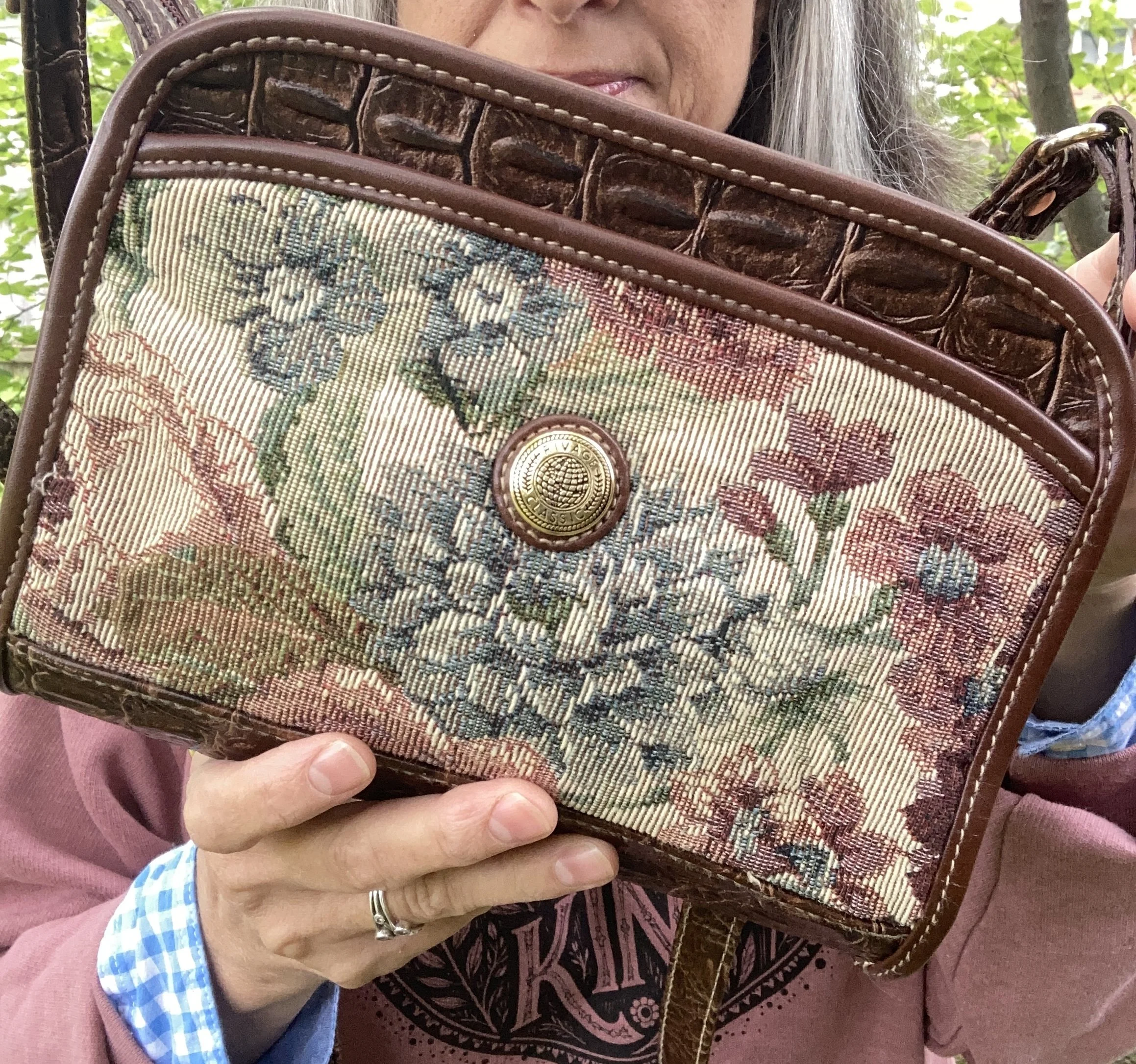
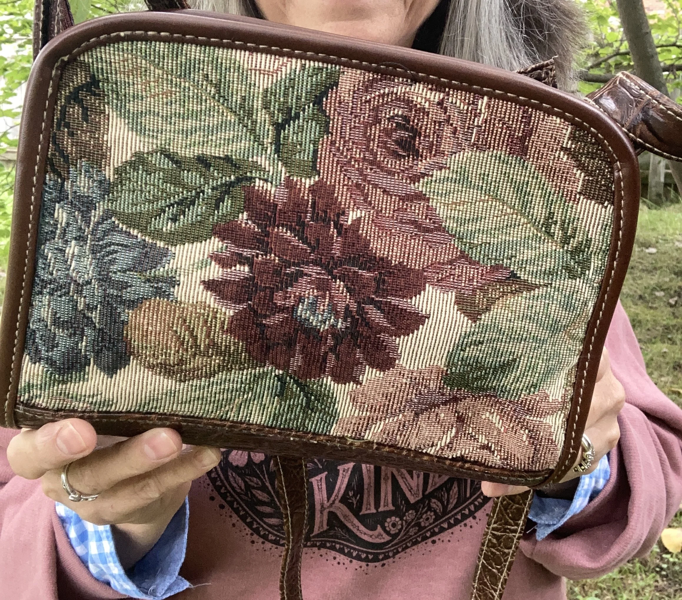
I decided on brown leather accessories for my shoes and bag. My shoes are an older pair of loafers and are a brand called Etienne Aigner Luxe. My bag is new to me. I was immediately drawn in by the needlepoint print on both sides. This is a brand called Rivage Classic. Both the loafers and the bag were thrift finds.

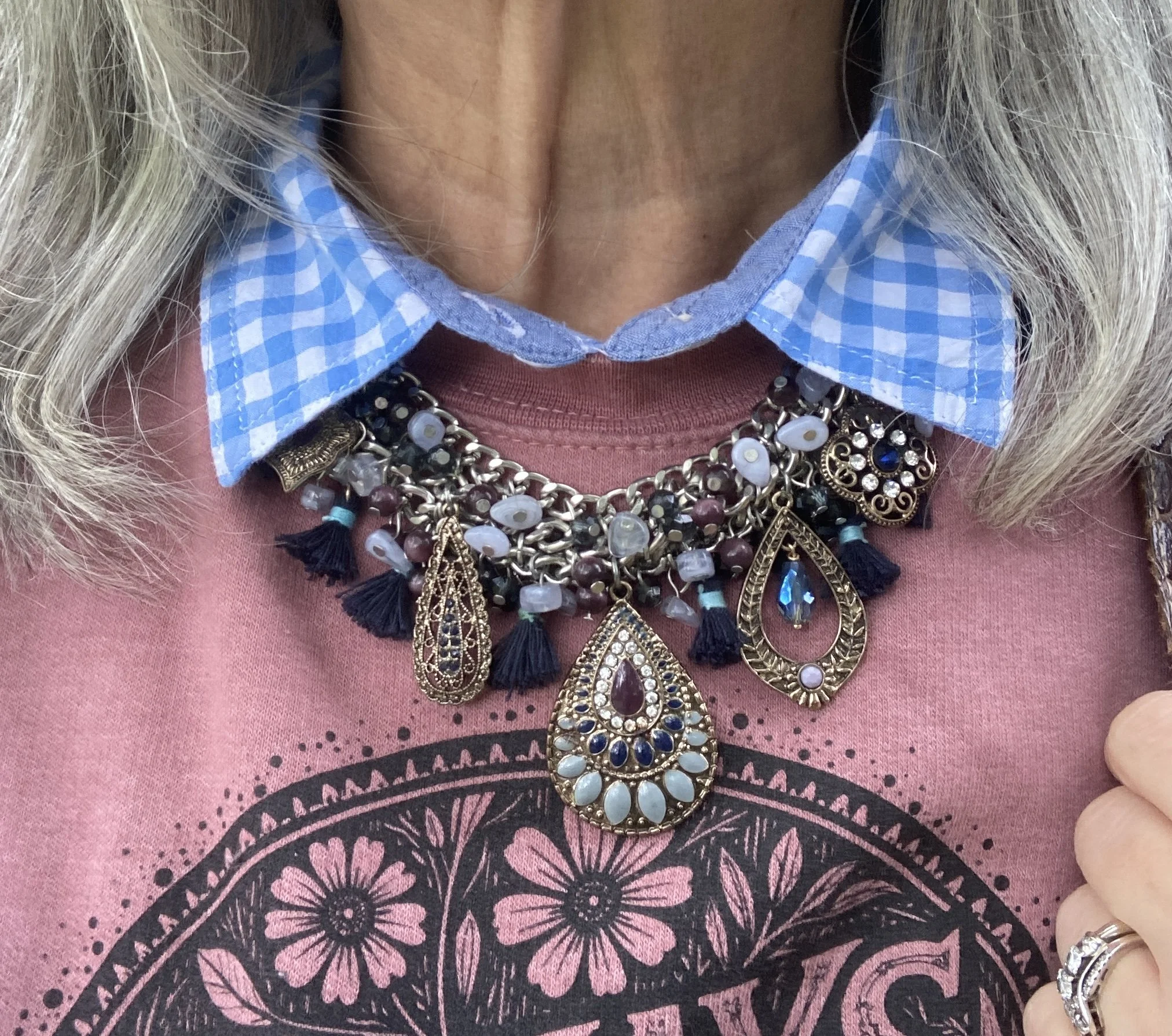
My necklace was a Christopher and Banks piece back when we used to have a brick and mortar store here in my area. I used to love to shop there and was very sad when they closed. They still have an online store, but it just doesn’t appeal to me like the actual store did. Here is a look at their accessories.

What do you think of these colors? Do you have any of these in your closet? How would you put these colors together, or would you combine one of these with a few other colors? I always love to hear you thoughts, so leave me some love in the comments.

I’ve included a few shopping links for you to look at. These are just for your use. I do not make any money off of those links. I try to give you samples from retailers that have a more reasonable price point, but I also strongly recommend checking out second hand stores. Not only do you save money, but you are also helping to keep clothing out of a landfill which helps our planet.

Have a great week!

Pantone Autumn/Winter 2026: Green Envy, Foxglove, and Candied Ginger

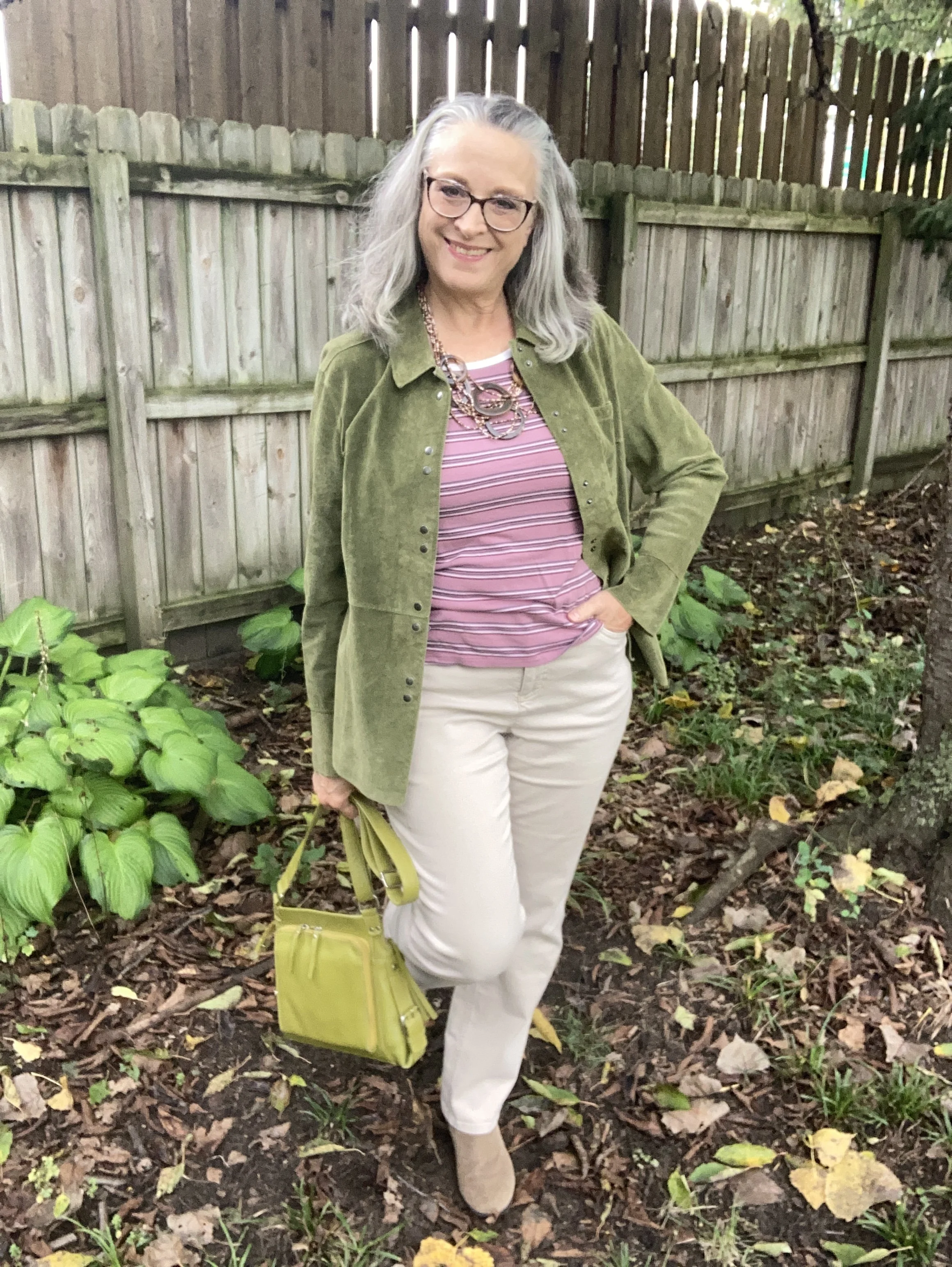
Happy first day of fall! It looks and feels like an autumn day with clouds, wind and a chill in the air. If you hop on over to my Instagram account you’ll see I pulled out one of my favorite flannel button downs and am wearing it as a shacket, which is perfect for today’s temps.

Today on the blog I am featuring another trio of Pantone colors from the Autumn/ Winter New York Palette. Today’s colors are Green Envy, a darker yellow green than our early feature of Acacia; Foxglove, a pretty pinky purple that falls in the mauve category; and Candied Ginger, a soft neutral medium tan. You can see the original Pantone colors here.

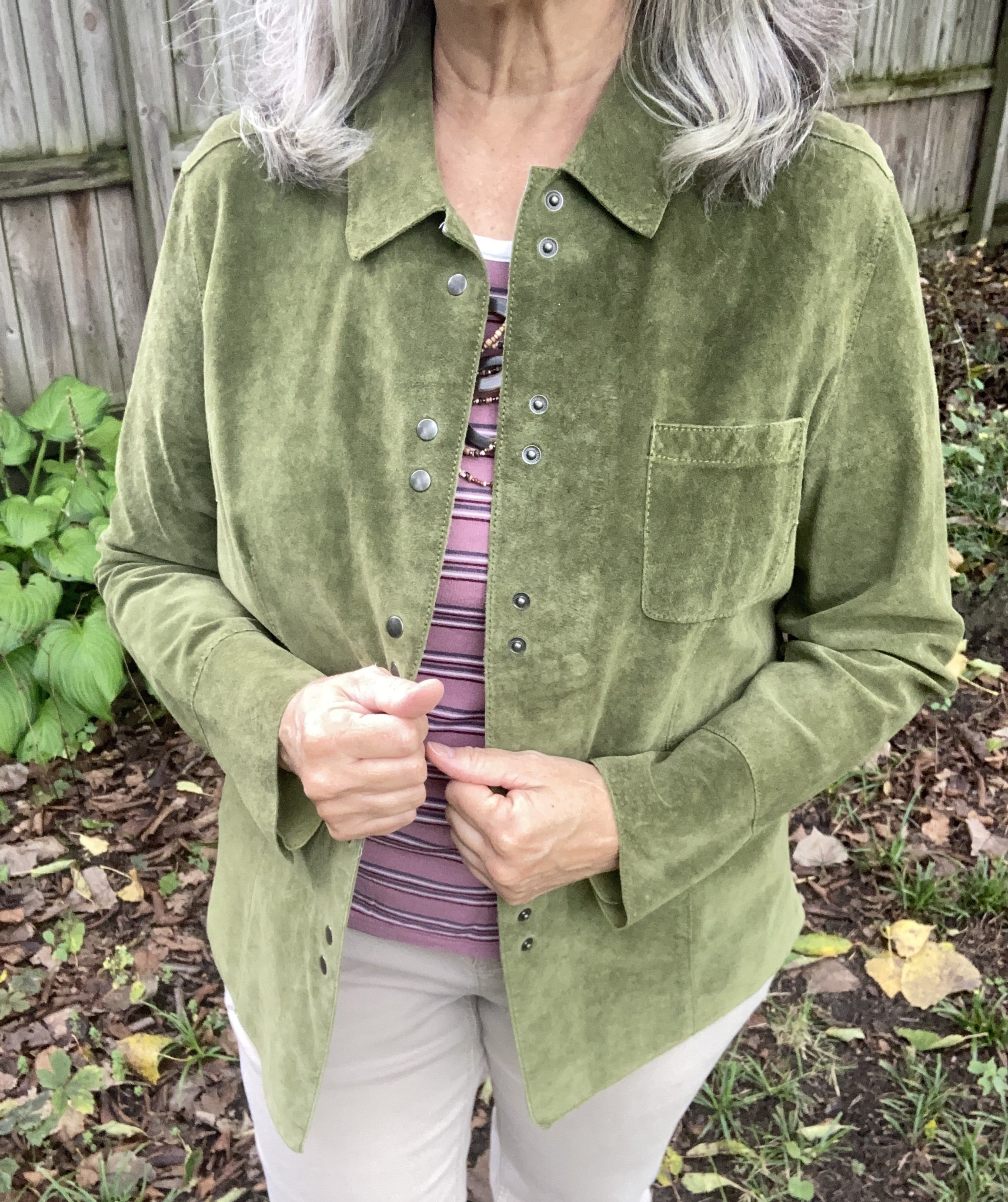
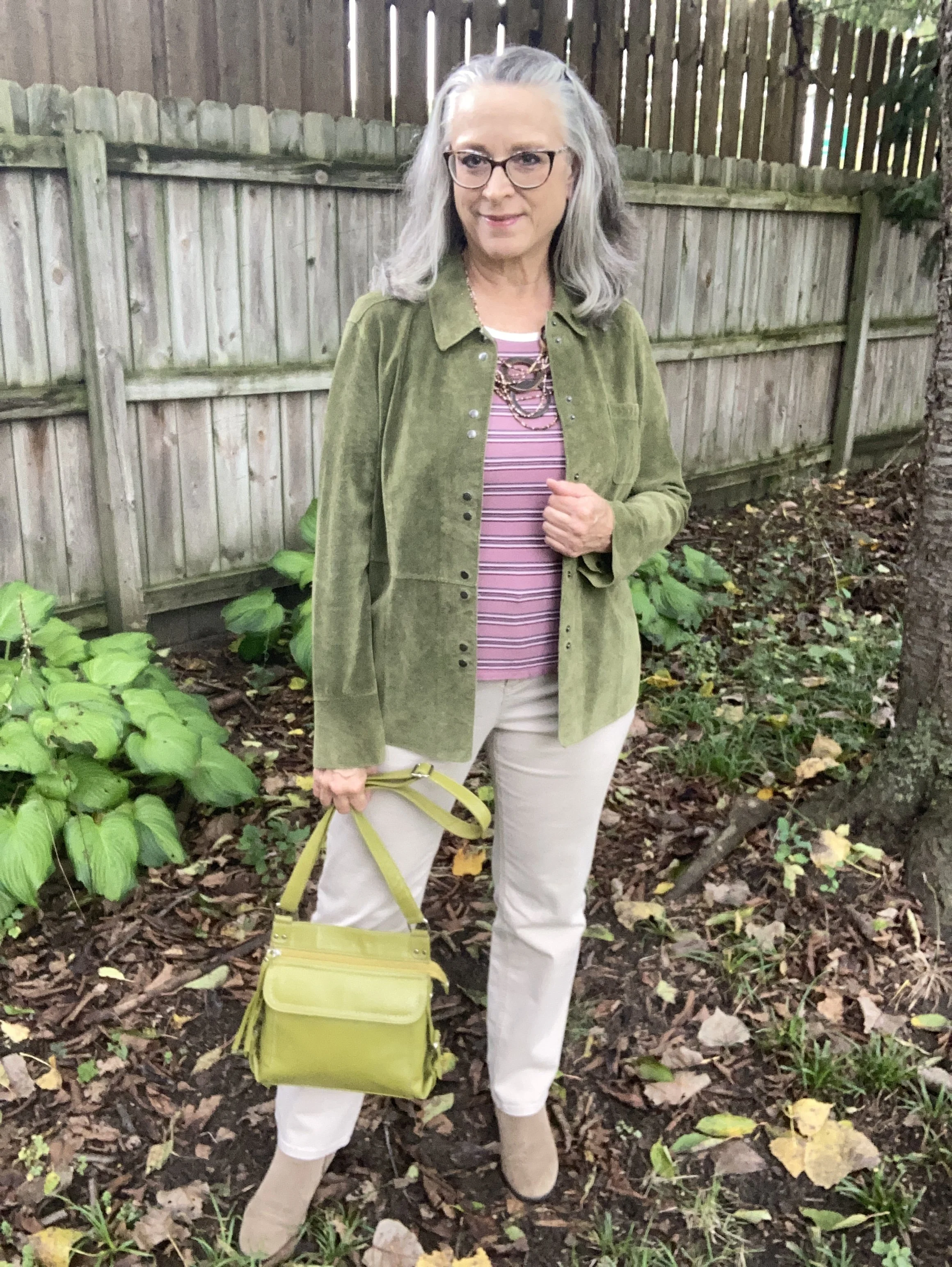
Once again let me say my pieces do not match the colors exactly. My jacket is a darker green, and my pants are definitely lighter. My bag and boots are probably a little closer to the actual colors. Again, this is just for fun, to try different color combinations by shopping the clothes we already have in our closets.

I thrifted this Fieldgear suede jacket years ago. I have thought about getting rid of it, but it is really a well made piece and a pretty color so I keep it around and wear it once in a while. I use it more like a blazer than an actual jacket, although for this in between wear it is a nice weight. Here’s a cute wrap jacket from Old Navy; here’s a pretty option from Shein; and Walmart has this short blazer option.

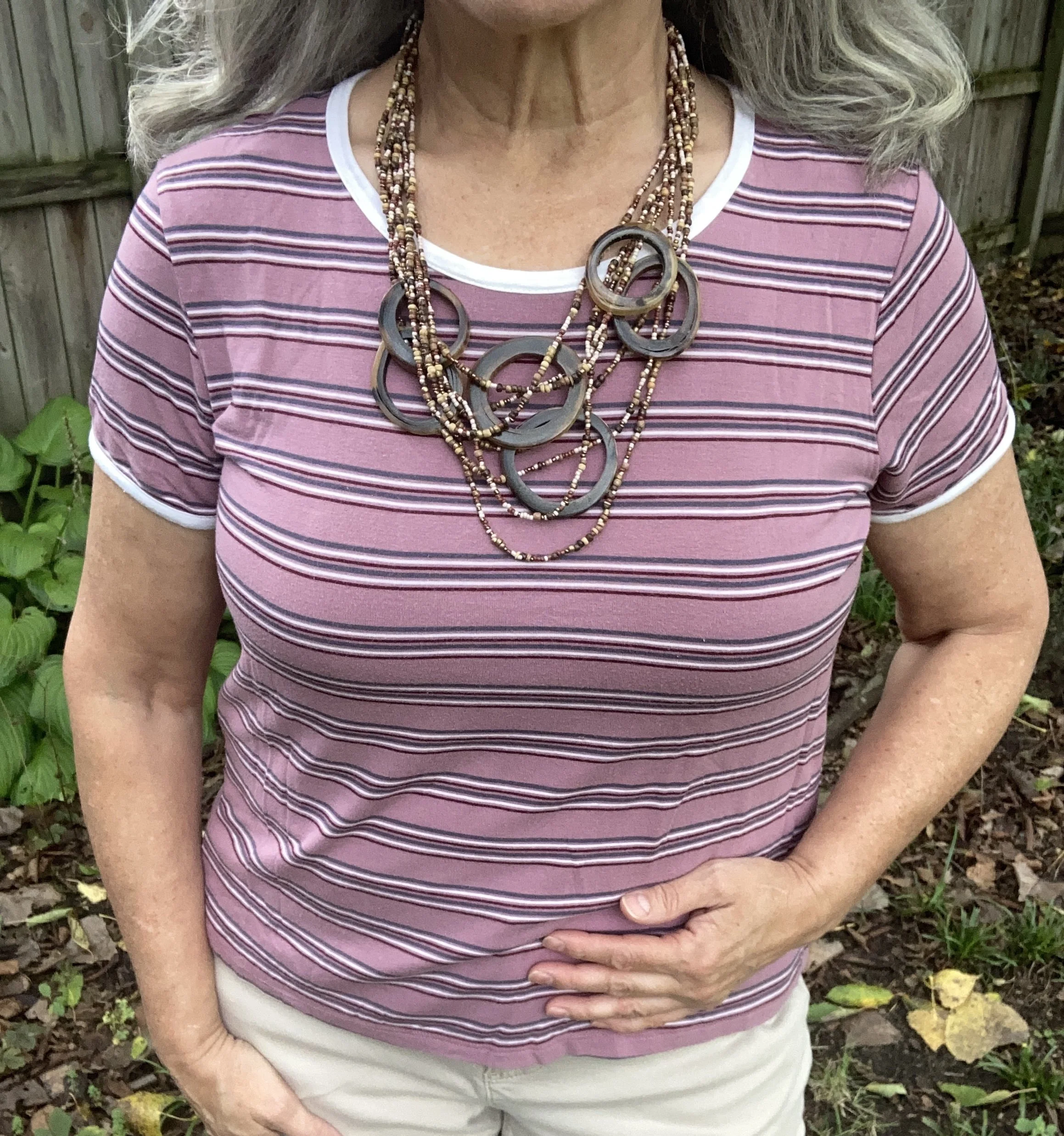
I really struggled with finding a piece in my closet that was close to the Foxglove color. Everything was either too pink or too purple. However, I finally came upon this tee in my tee pile and had to change the whole look to work around it, but I really wanted this color to stand out. This is Pink Republic brand and I got it a few years ago at Kohl’s. Here are a few solid versions from Life is Good, LLBean, and Gap.

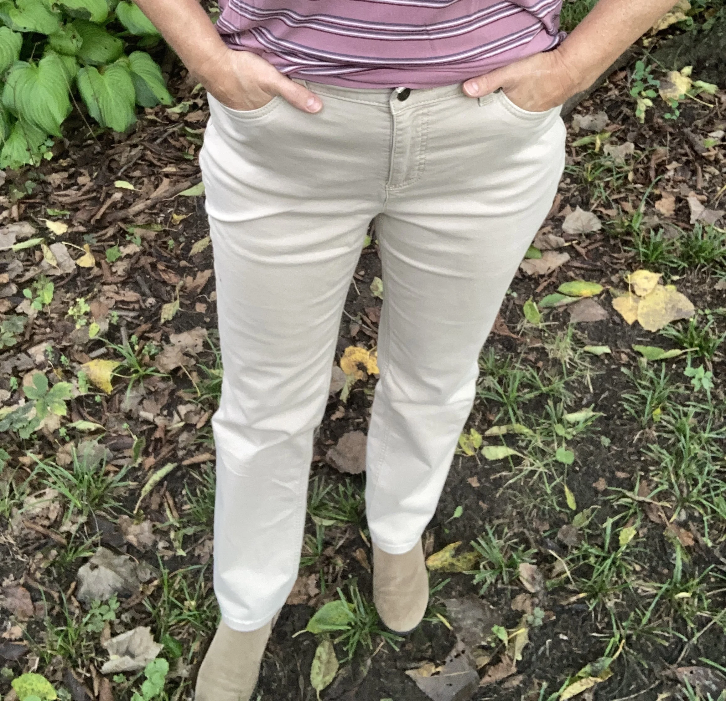
Originally I had a leopard print pleated skirt picked out for this post whose spots matched the Candied Ginger color perfectly, but as I mentioned above, I had to switch things out when I picked the tee. I chose this pair of Croft & Barrow pants that I bought from Kohl’s a few years ago. They definitely have a tan or beige vibe, but they look almost cream or white in these pictures. Oh well! Here is a pair from Land’s End; Old Navy; Maurice’s; and JCPenney.

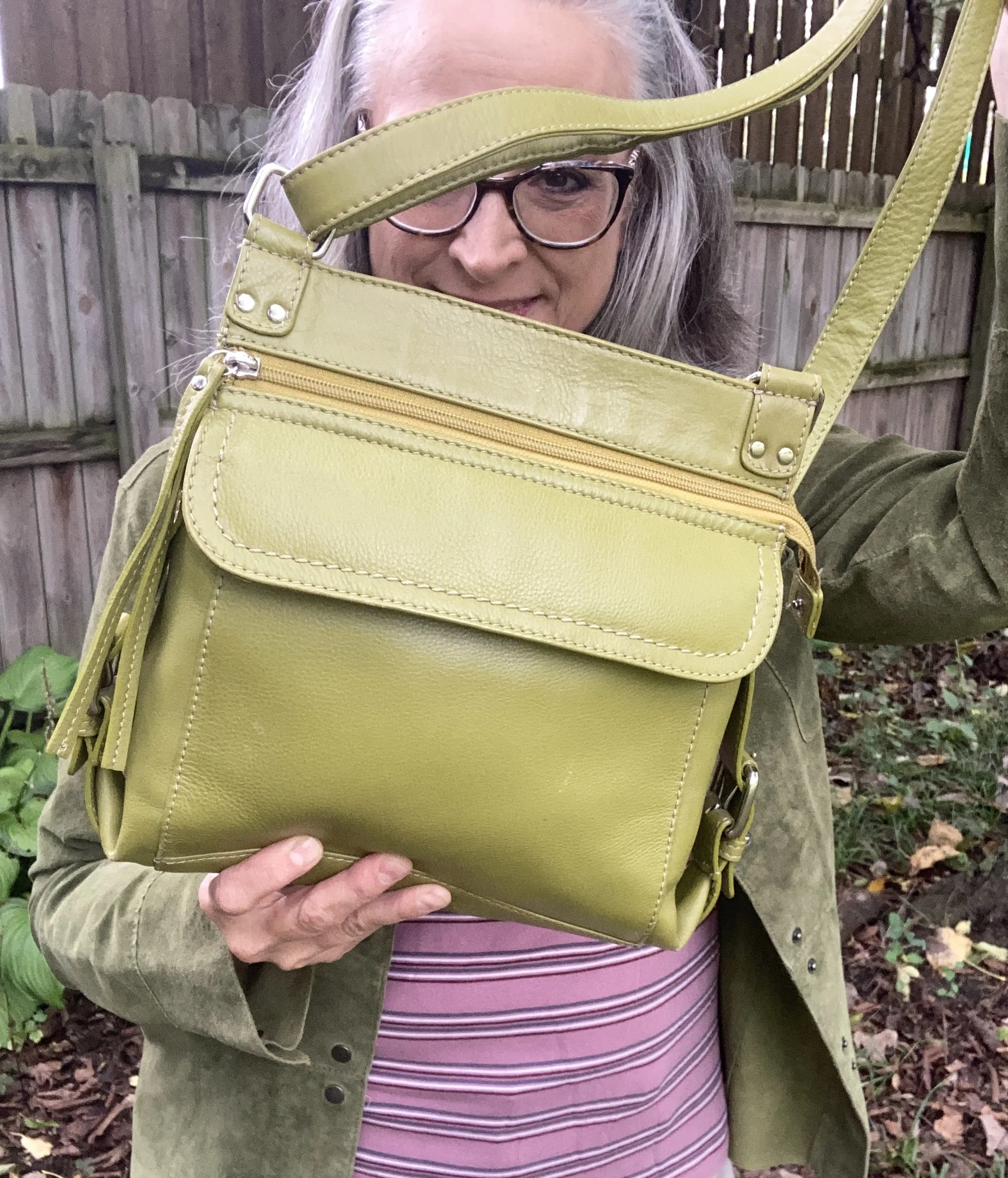
I chose this leather ILI NY bag because it was a similar color. This is a great bag. I prefer a cross body shoulder bag so when I am out I can be hands free. To me it just seems more secure. This one also has a number of extra pockets. I would give you a few shopping links for bags this color, but they all top out at around $100. If you are interested in an odd colored bag like this be sure to check out the thrift stores.

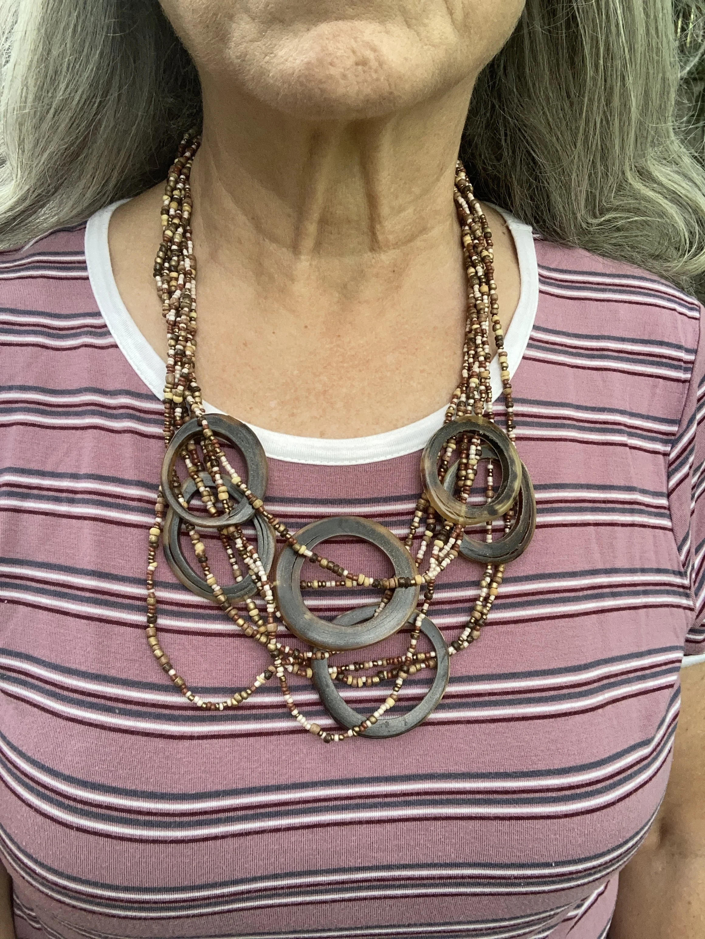
I decided to wear this layered bead and antler necklace. I thought it was a good way to bring in the tan of the pants and the boots. Plus I thought it did a good job of grabbing attention against the stripes of the tee. I can’t remember where I got this, but it is a fun piece.

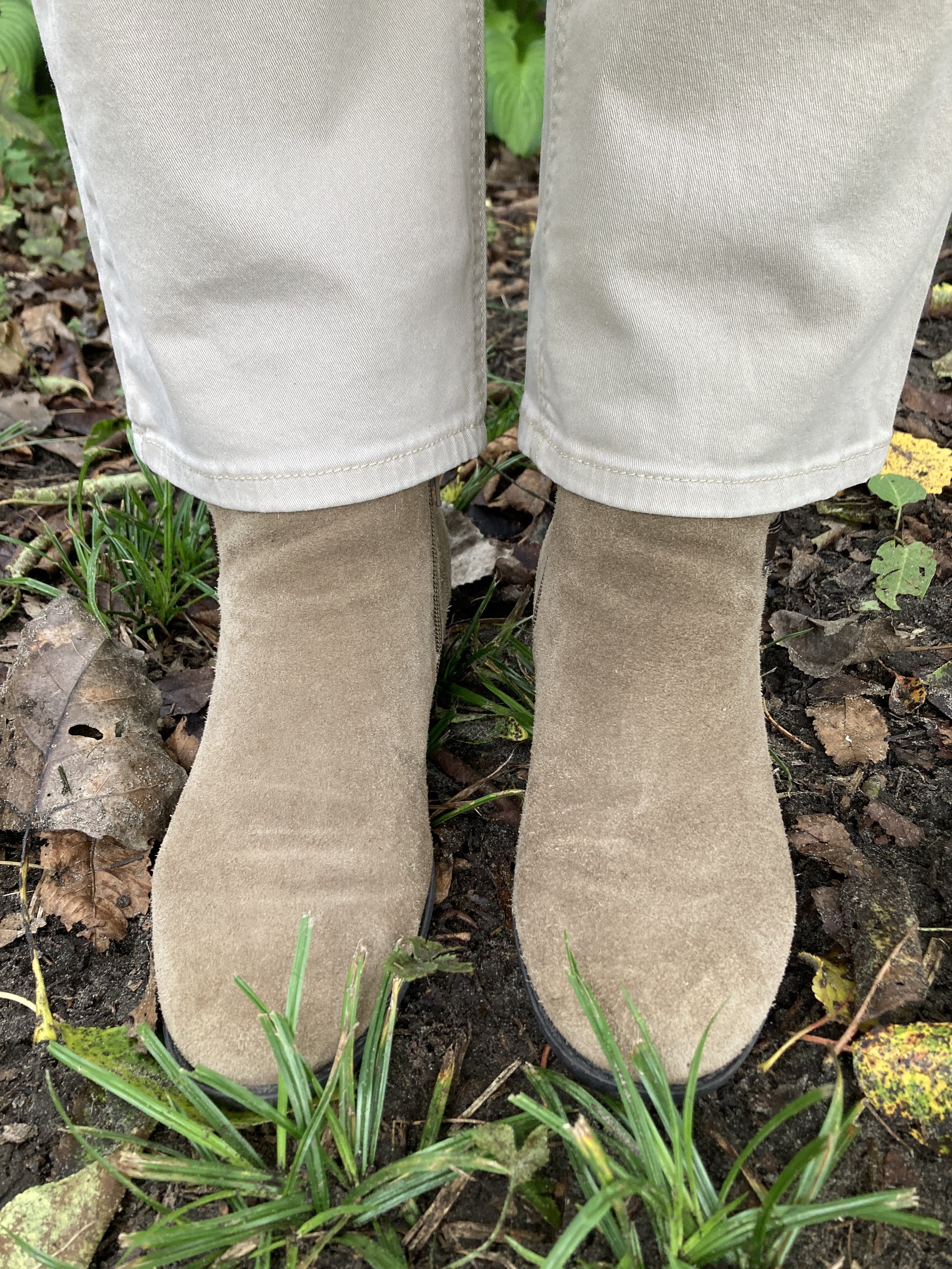
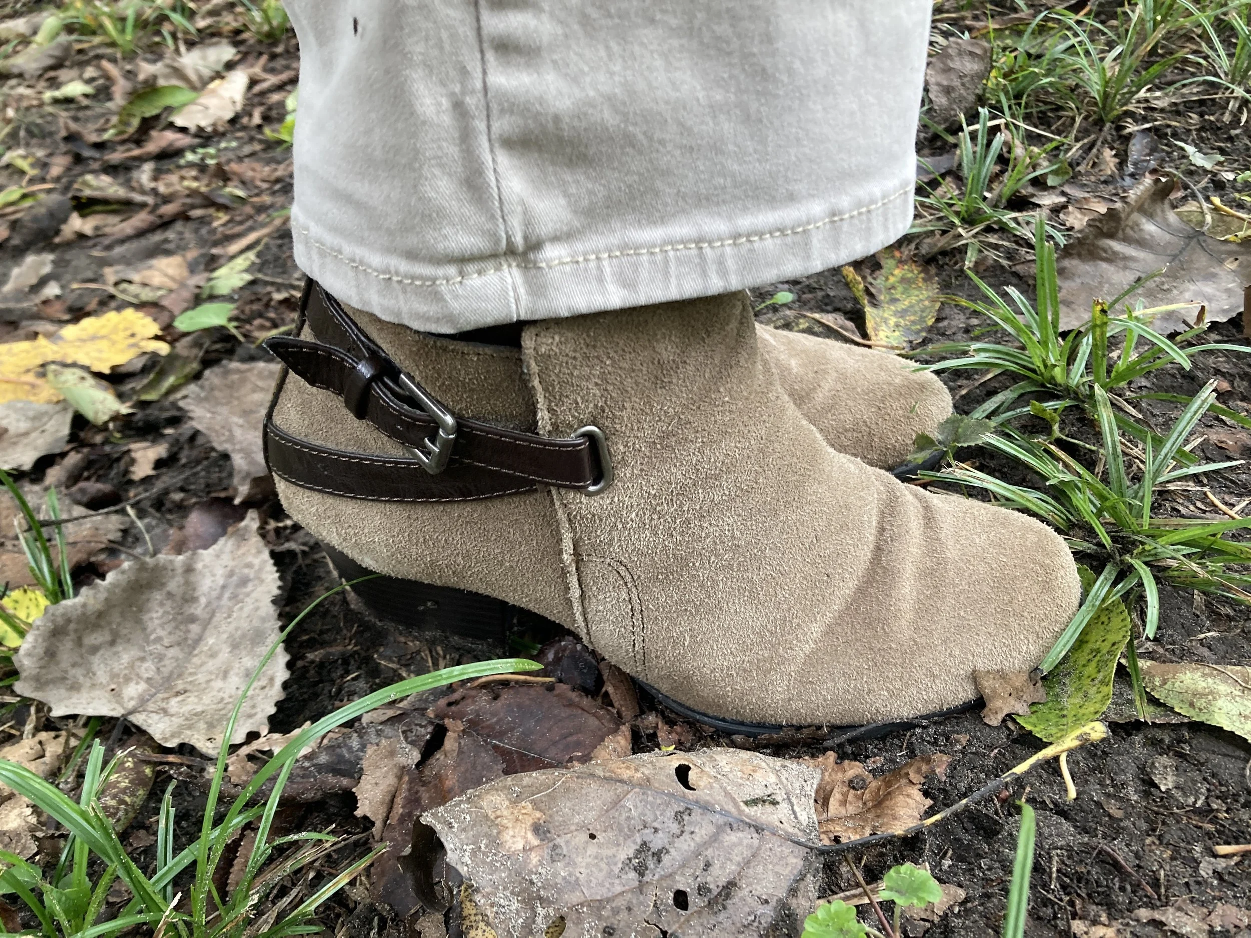
I have had these Sonoma boots for a long time. Made of real suede and leather with a block heel I keep them around as a way to dress up a pair of jeans in the cool weather. I don’t wear heels at all any more, but an occasional date with these stacked heels works well. Here is a page of options from DSW.

What do you think of these colors? Do you have any of these in your closet? What other colors do you think would look good with Foxglove or Green Envy? I always love to get your feed back so be sure to leave a comment or two. I appreciate it.

Shopping links are included for you. I do not make any money off of these links and they are offered to you at no cost unless, of course, your purchase something. Ha, ha.

I hope you are having a fabulous week!

Pantone Autumn/Winter 2026: Neptune Green, Festival Fuchsia, and Toffee

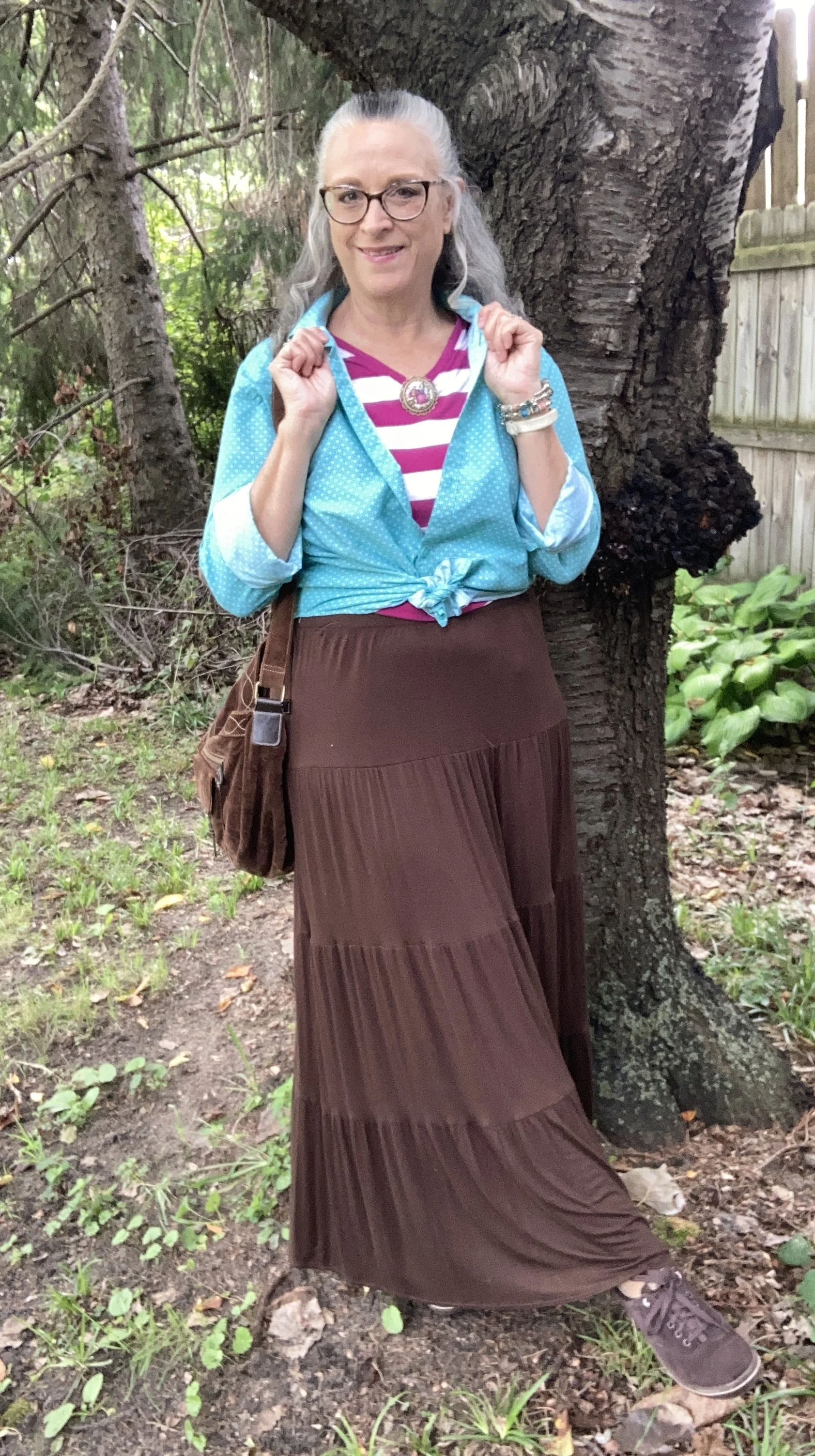
Today I am showing you another outfit with three more colors from the New York, Autumn/Winter palette. Today’s outfit includes Neptune Green, a bright green similar to a sea foam; Festival Fuchsia, a party ready purple, and Toffee, a classic medium brown. I wouldn’t naturally think to put these colors together, though I could easily see the green with the brown, or even the purple with the brown. Combining bright colors like Neptune Green and Festival Fuchsia has never been easy for me, but I love when other people are not afraid to wear the bold, bright colors. This is one way, I have been trying to get outside my own outfit “rut”. You can see the actual Pantone colors here.

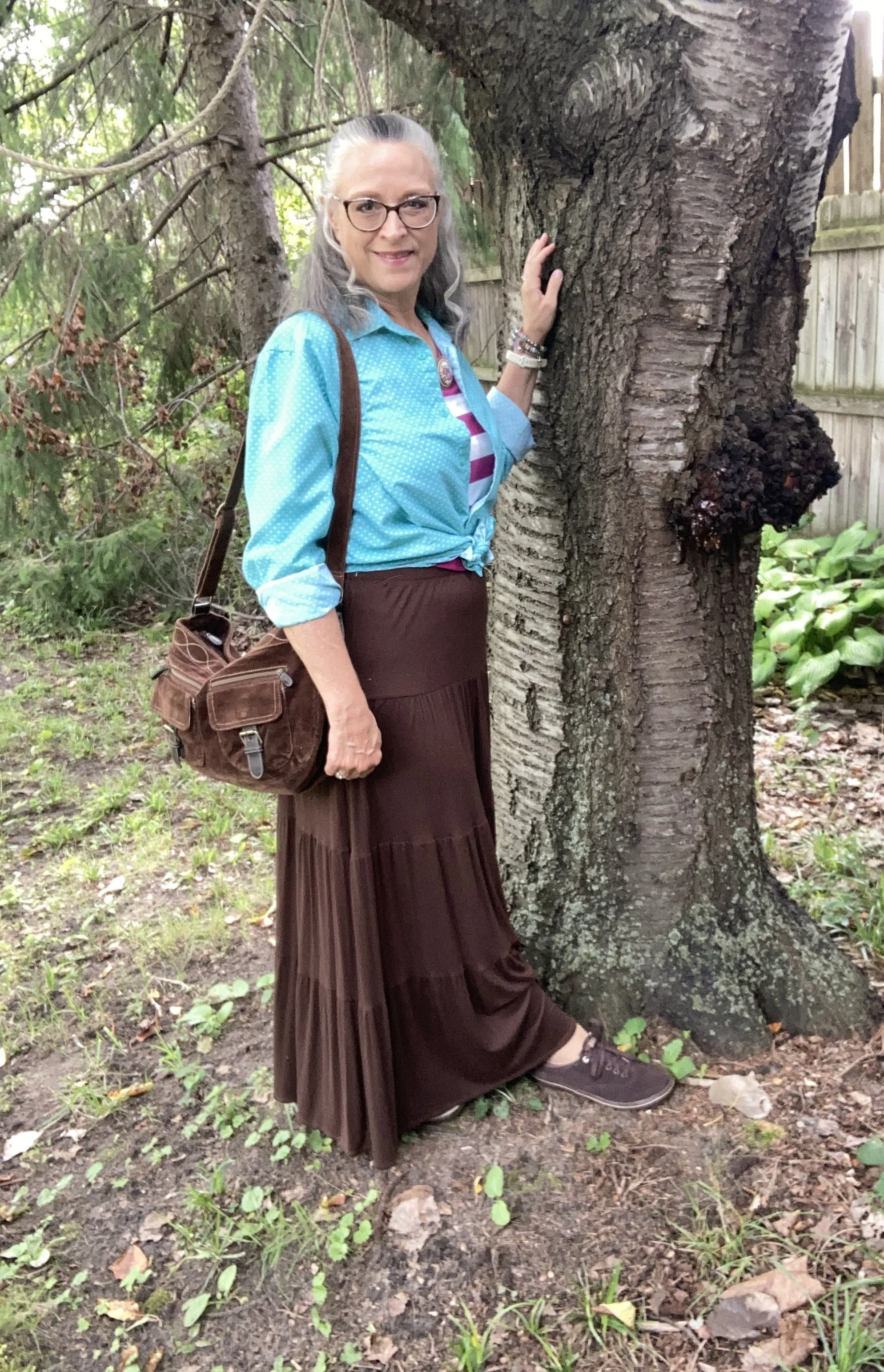
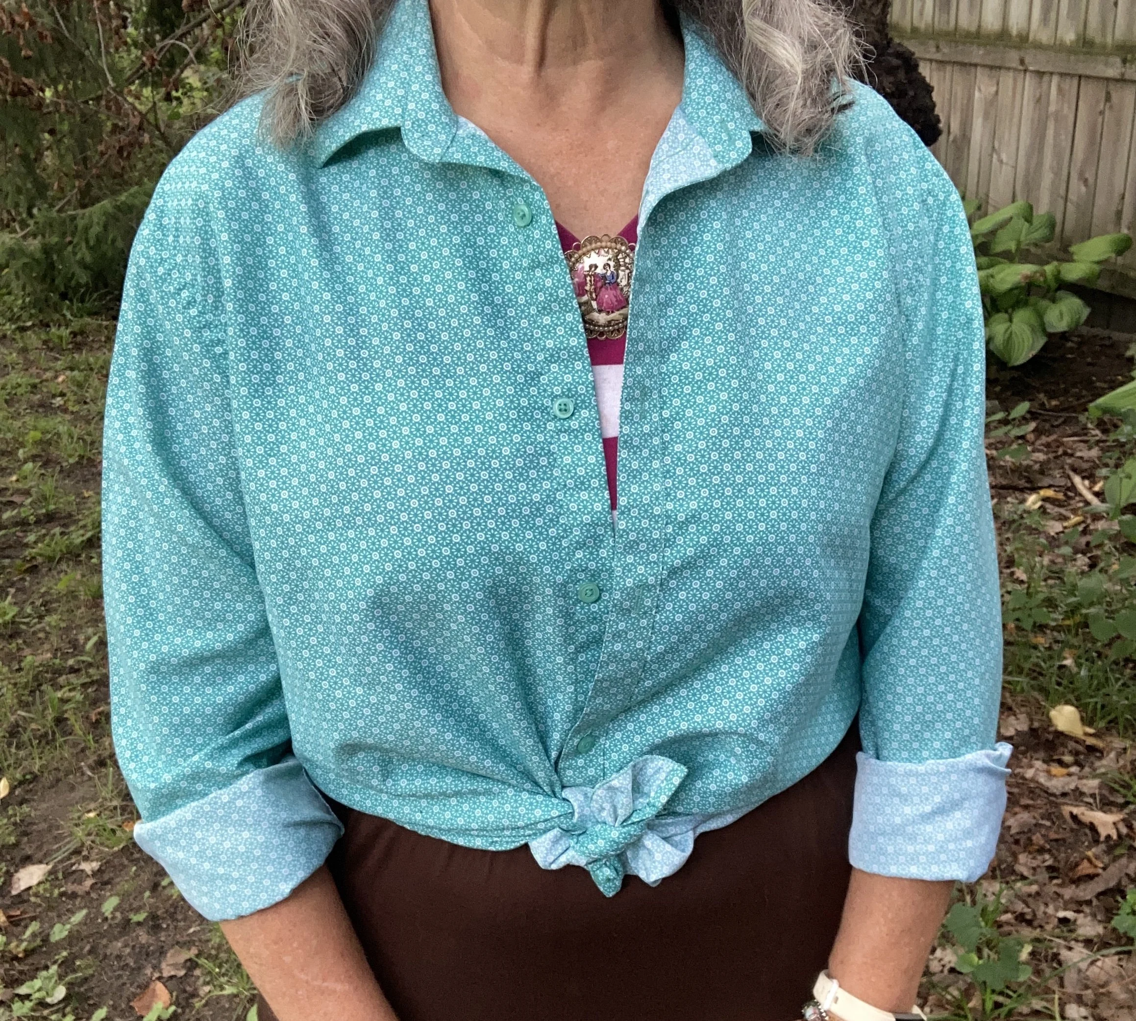
For Neptune Green I chose my thrifted Zylos men’s button down. I do like this color. It is not your typical grass, olive, or forest green. My personal “color brain” - yes, I just made that up - thinks this is a better color for spring and summer.

Personal Fashion Philosophy: Let me just sit here for a moment. I guess it is true that for most of our lives, those of us who grew up in the mid twentieth century, were trained to accept certain seasonal color choices: white for summer, rust and burgundy for fall, black and orange for Halloween, red and green for Christmas, icy blues for winter, and pastels for spring and Easter. How many of you know what I am talking about?

Now, let me take that a little further. We all know that certain smells, sights and sounds remind us of certain holidays, childhood experiences and so on. What if part of my “color brain” is my own way of finding peace, coziness and hope during seasonal change? To me there is just something about digging into those dark, rich colors for the fall season as life begins a transition from long, sunny days spent outside to the shorter, cooler months of spiced cider, snuggly layers and blankets, and gatherings in doors. Just something to think about. Let me hear your ideas about seasonal color change.

This is a darker long sleeve choice from Cabela’s; a short sleeve tee, closer to the actual Pantone color from Old Navy (and not a bad price currently); and I really like this print tee from Life is Good. There is also this 3/4 length sleeve tee from LLBean.

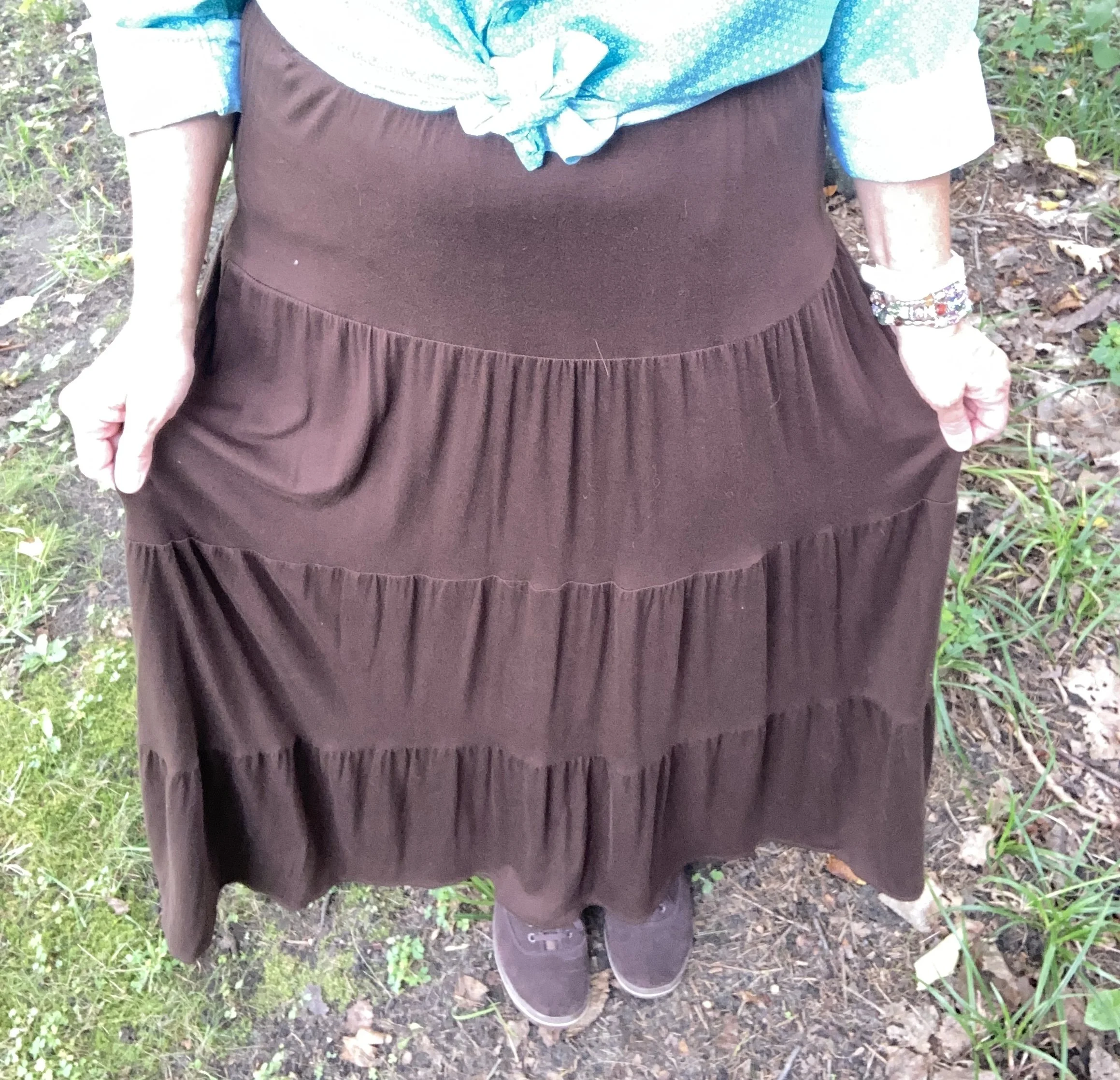
The next piece I chose was the skirt. It seems whenever brown is once again on the Classic palette I reach for this skirt. I have many times thought of getting rid of it since I rarely wear skirts, but it always gets pulled out for something or other. My skirt is a bit darker than the actual Pantone Toffee color, but you get the idea. I do this series to inspire you to shop your closet, not match the color palette’s exactly. This skirt is St. John’s Bay brand from JC Penney and is old. Here is a few versions from Target, a patterned print from Natural Life, a midi length from JC Penney, and a pull on faux suede version from a place called The Vermont Country Store.

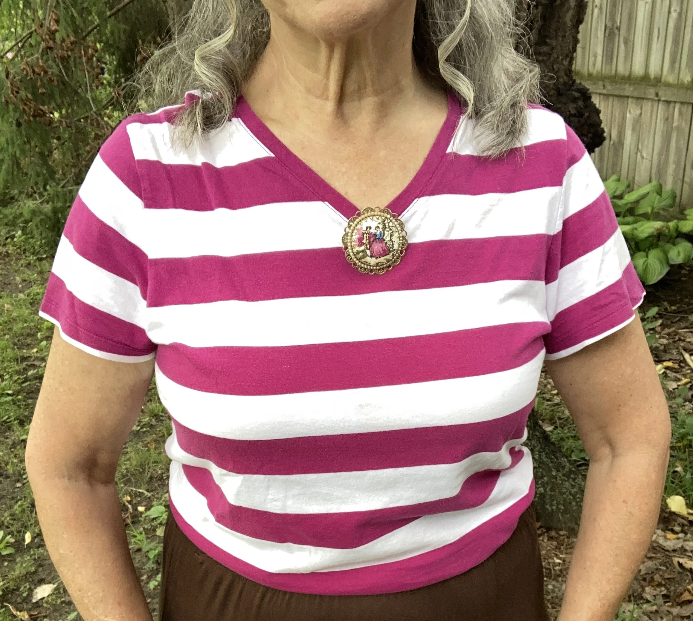
I chose this thrifted Faded Glory striped tee for Festival Fuchsia. The combination of Neptune Green and this pretty purple is a fun vibe, though I certainly wouldn’t think of it for fall. Here is a striped boat neck version from JCPenney; an embellished top from Kohl’s; and a peasant style from JC Penney.

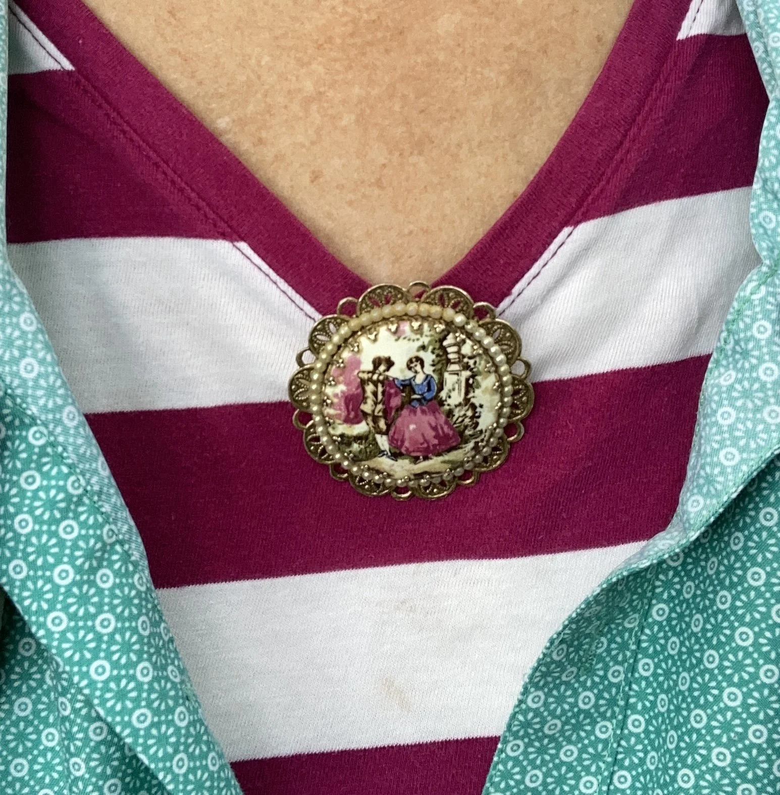
Instead of a necklace I chose a large brooch and pinned it right at the point of the v. I like how it looks. What do you think. I want to incorporate my pins and brooches more often, as they are such fun pieces to use, but often get overlooked.

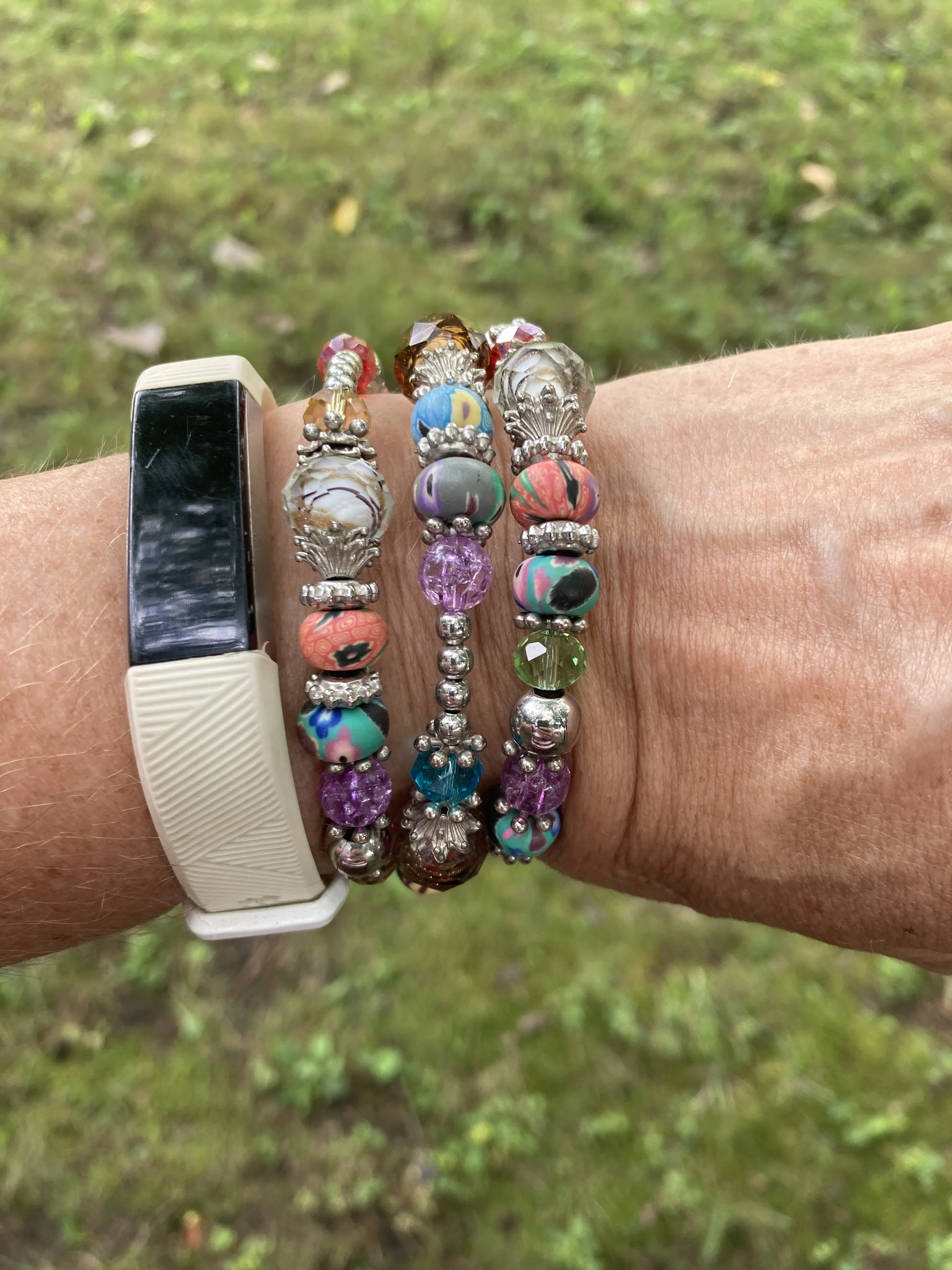
My wrap bracelet was a fun thrift find from a few years ago. I like all the different colors of the beads, so it can be worn with many different things.

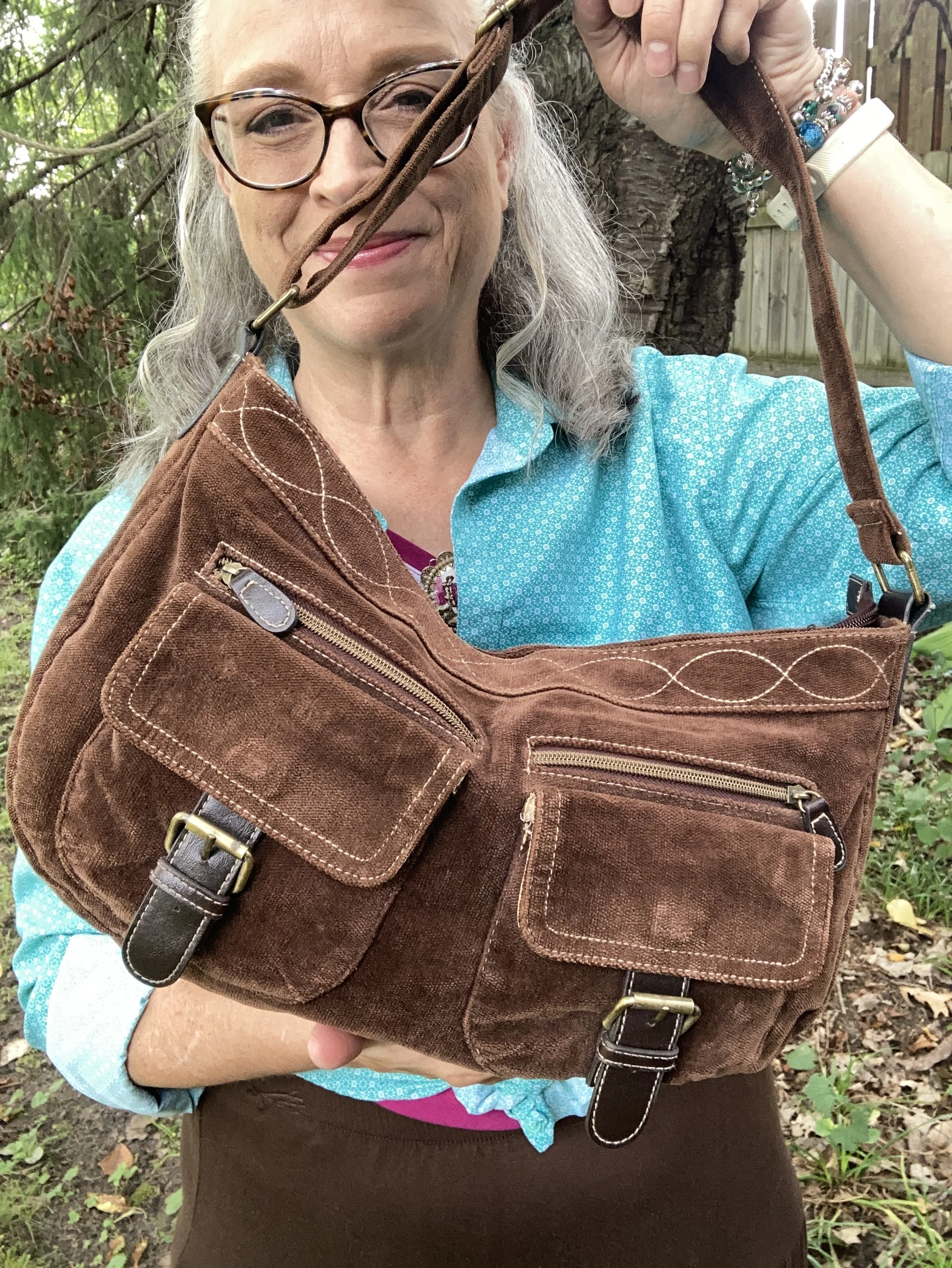
If you have been following me for a while then you know I have had this thrifted corduroy hobo bag for a number of years. Here are a few different ones: Kohl’s, JCPenney, and DSW.

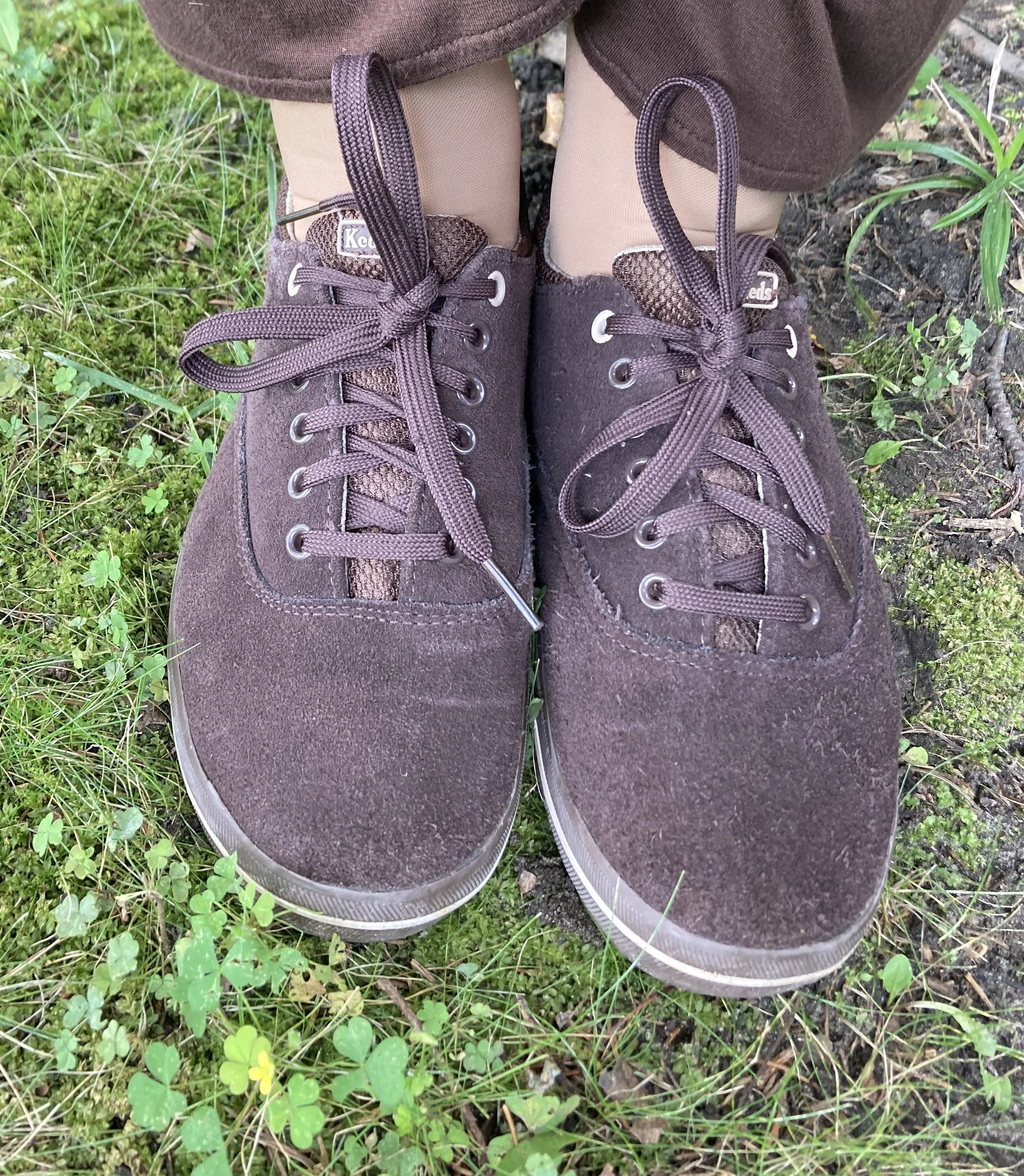
My second hand, brown, suede Keds are getting old, but I still use them regularly. I should probably try to spiff them up with a brush and some suede spray. Here are numerous brown sneaker/shoes from DSW.

What do you think of these colors? Do you suffer from “color brain” like I do? What are some things that are part of your fashion philosophy? If you are interested here is an article I wrote a few years ago on what is behind my Fashion Philosophy. I would love it if you stopped by and read that article too, and leave a comment or two!

I have included a few shopping links for you to look over. These are just suggestions and I do not make any money through them. I do, however, appreciate so much when you leave a comment on the blog. Your thoughts and friendship really do warm my soul and remind me I am not doing this just for myself. Thank you.

Have a wonderful day!

Pantone Autumn/Winter 2026: Arabian Spice, Acacia, and Underworld

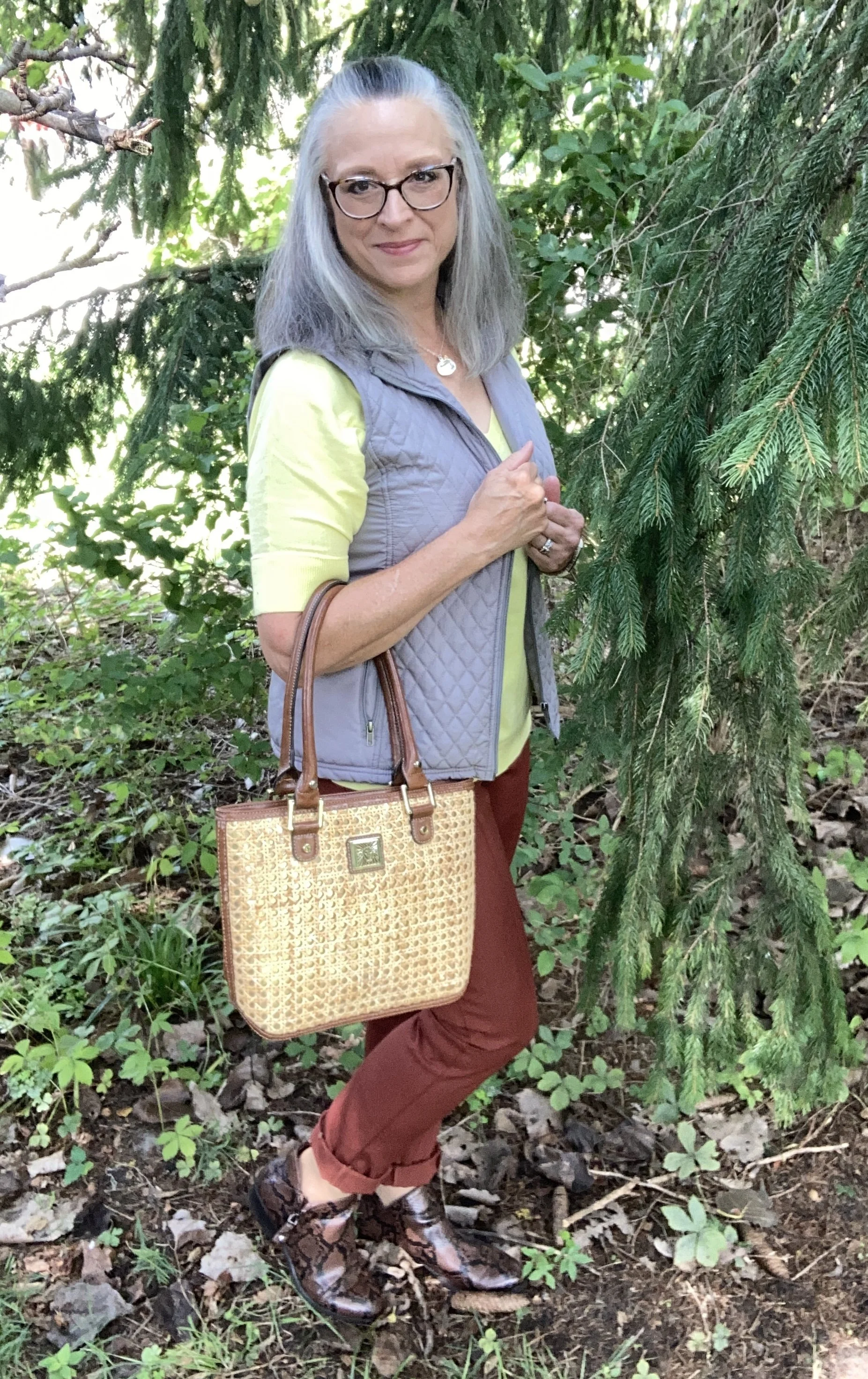
This week we are looking at three more of the New York Autumn/Winter Pantone colors. You can see the actual colors by clicking here. Today’s outfit is a color block style of sorts and uses the colors Arabian Spice, a warm, earthy brown with a little heat; Acacia, a green infused yellow, and Underworld, a medium gray. Let’s take a look.

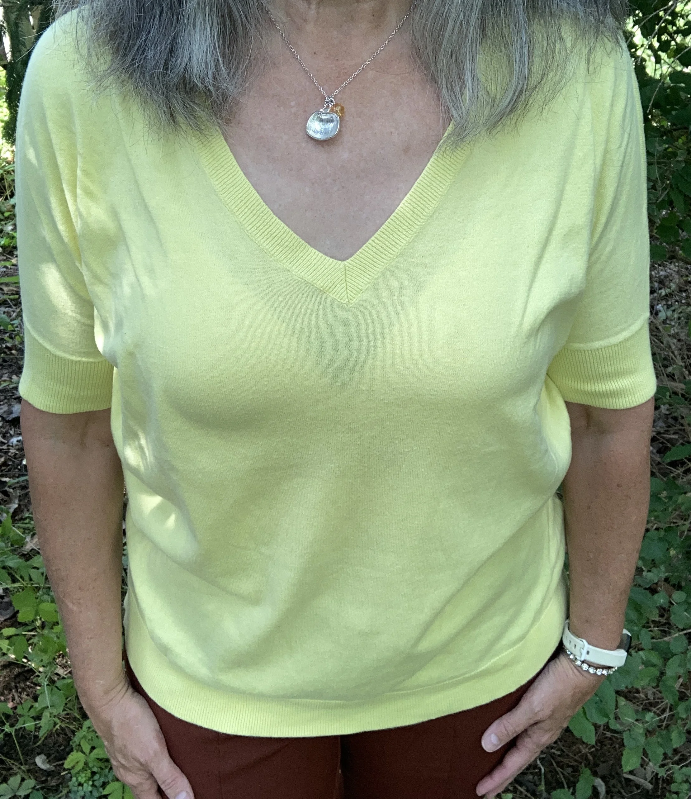
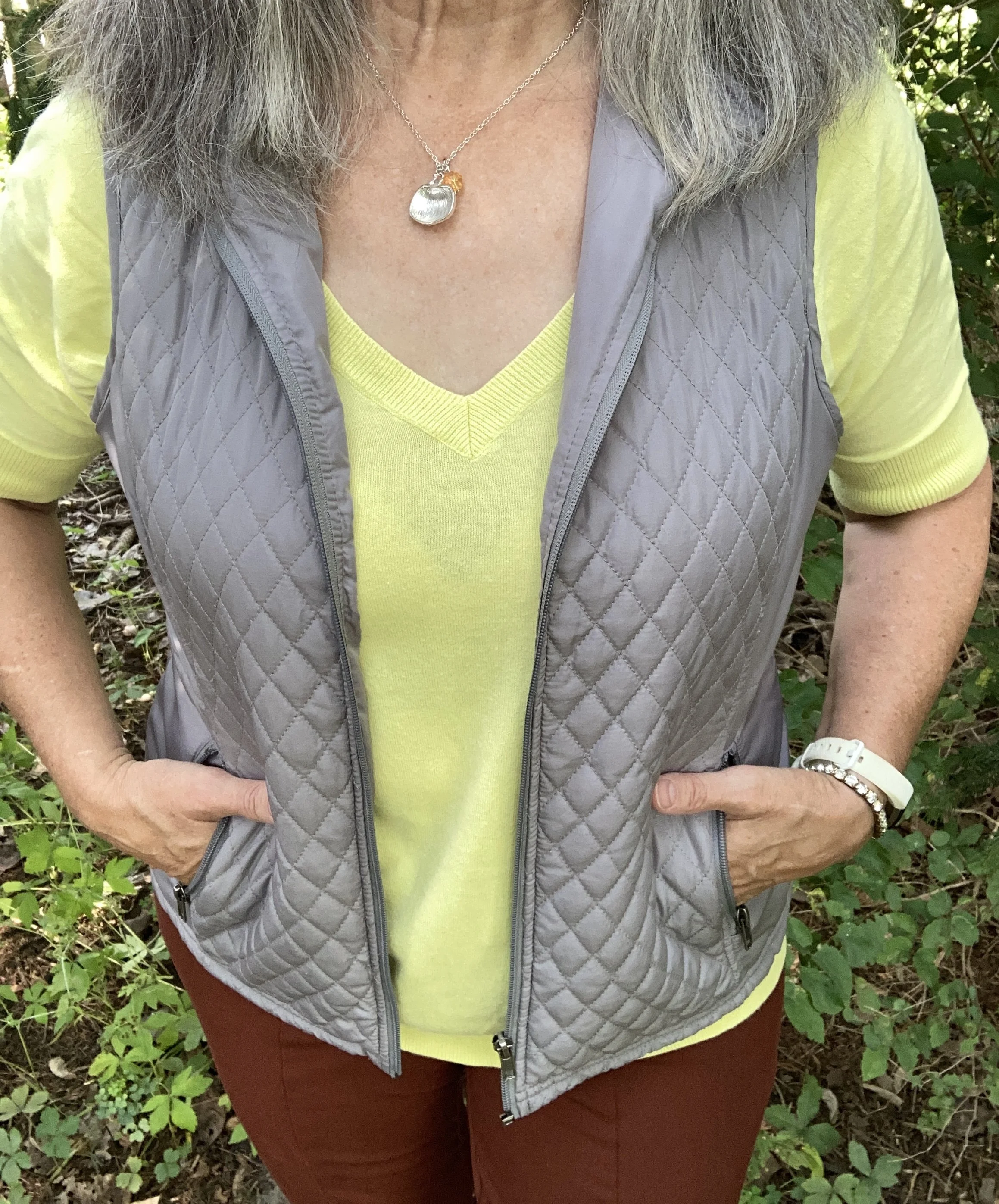
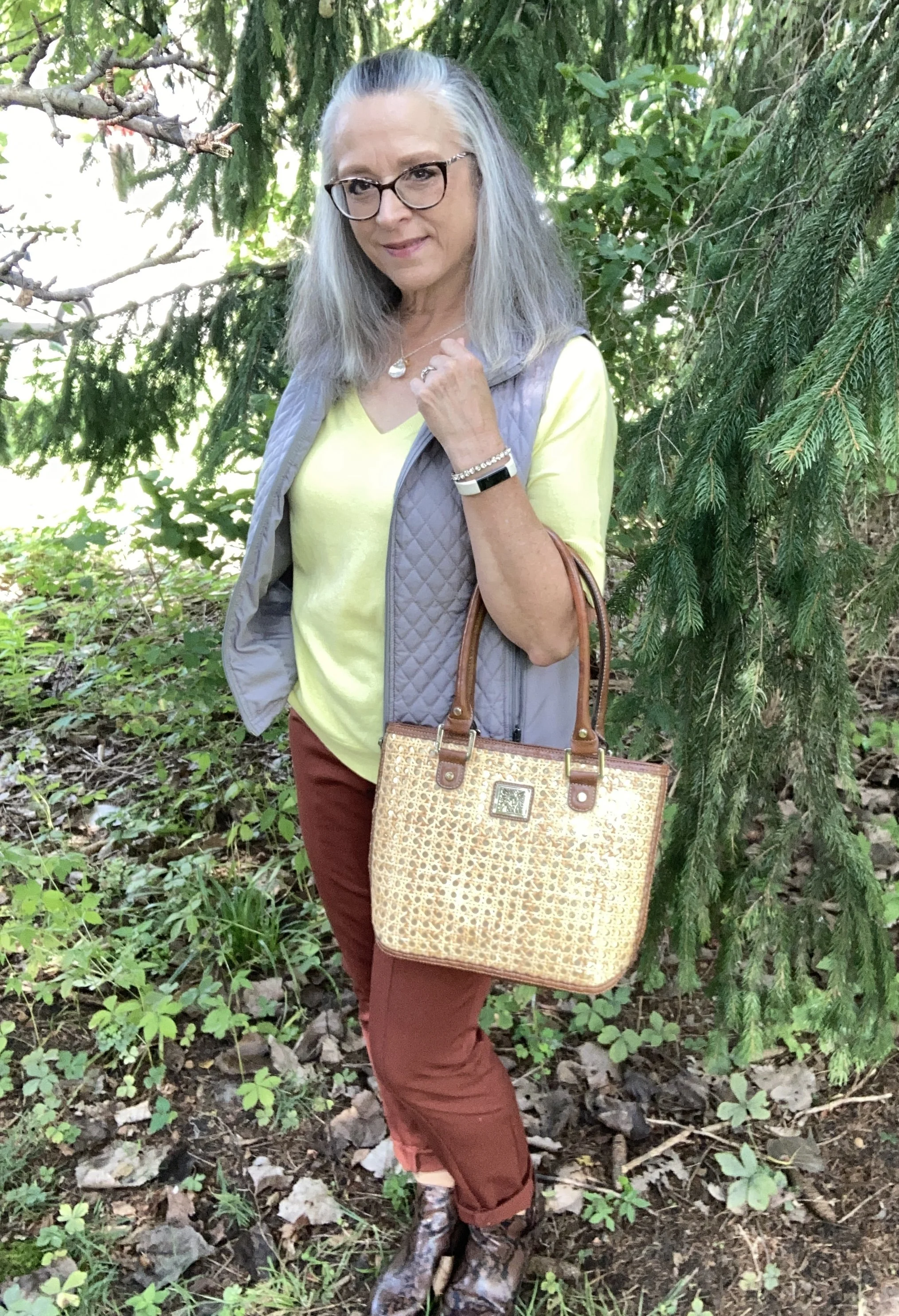
I really had a hard time finding a piece in my closet that closely resembled Acacia. Greenish yellow is not a color that I lean towards. I don’t have a lot of light or bright yellow. With my coloring I typically lean more towards dark or sunny yellows. The first piece I picked out was too green, so after several more attempts I remembered I still had this thrifted, v-neck, short sleeve sweater by Gap. It still seems a bit lighter than the Pantone color, but you get the idea. Here is a possible long sleeve piece from Kohl’s, and a cardigan from Banana Republic,

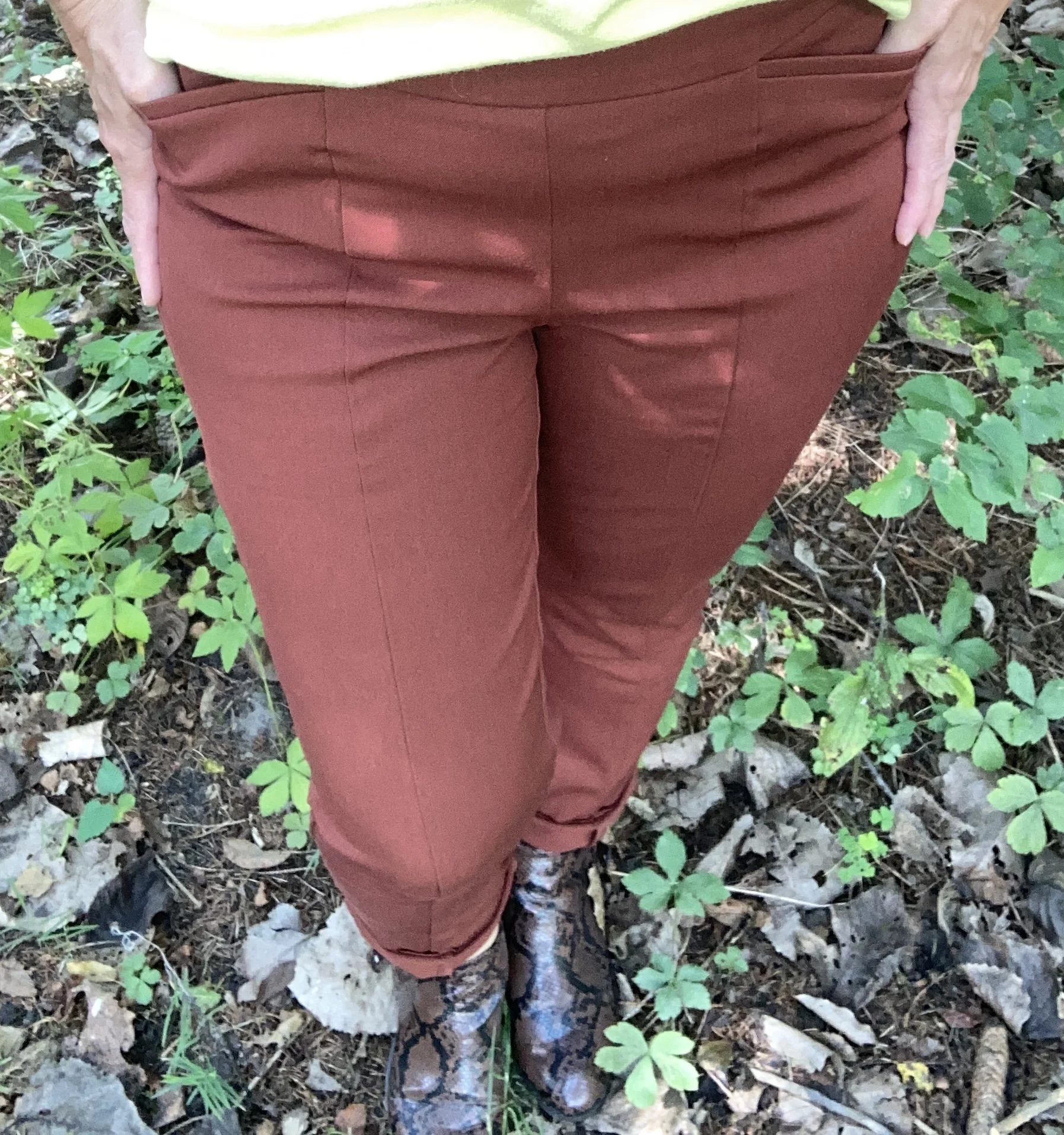
I pulled out these Chico’s So Slimming Ponte knit pants that I bought on sale a number of years ago. Since I no longer have an office job I rarely wear dress pants, but this is a pair I hang onto because they are dressy, but easy to pull on and there are no belt loops or zippers. Those are sun spots on my pants, not bleach stains. Ha, ha. I had the worst time on this day trying to find a spot in the shade that didn’t have dappled sunlight. Here is a straight leg jean from Cabela’s, a pull on pair from JC Penney’s, and a corduroy pair from Kohl’s.

My Underworld vest was a recent thrift purchase. Again, I had to look through a number of pieces in my closet to find the gray that was closest to this color. Gray’s like olives have various undertones and shades. This is Relativity brand. I love vests, especially as the weather cools. The day I took these pictures was not cool!! If you don’t mind a higher price point this is a pretty one with a unique hemline from Coldwater Creek, a fleece one from L.L. Bean, a vintage waistcoat from Kohl’s, and this quilted one from a retailer called 32 Degrees.

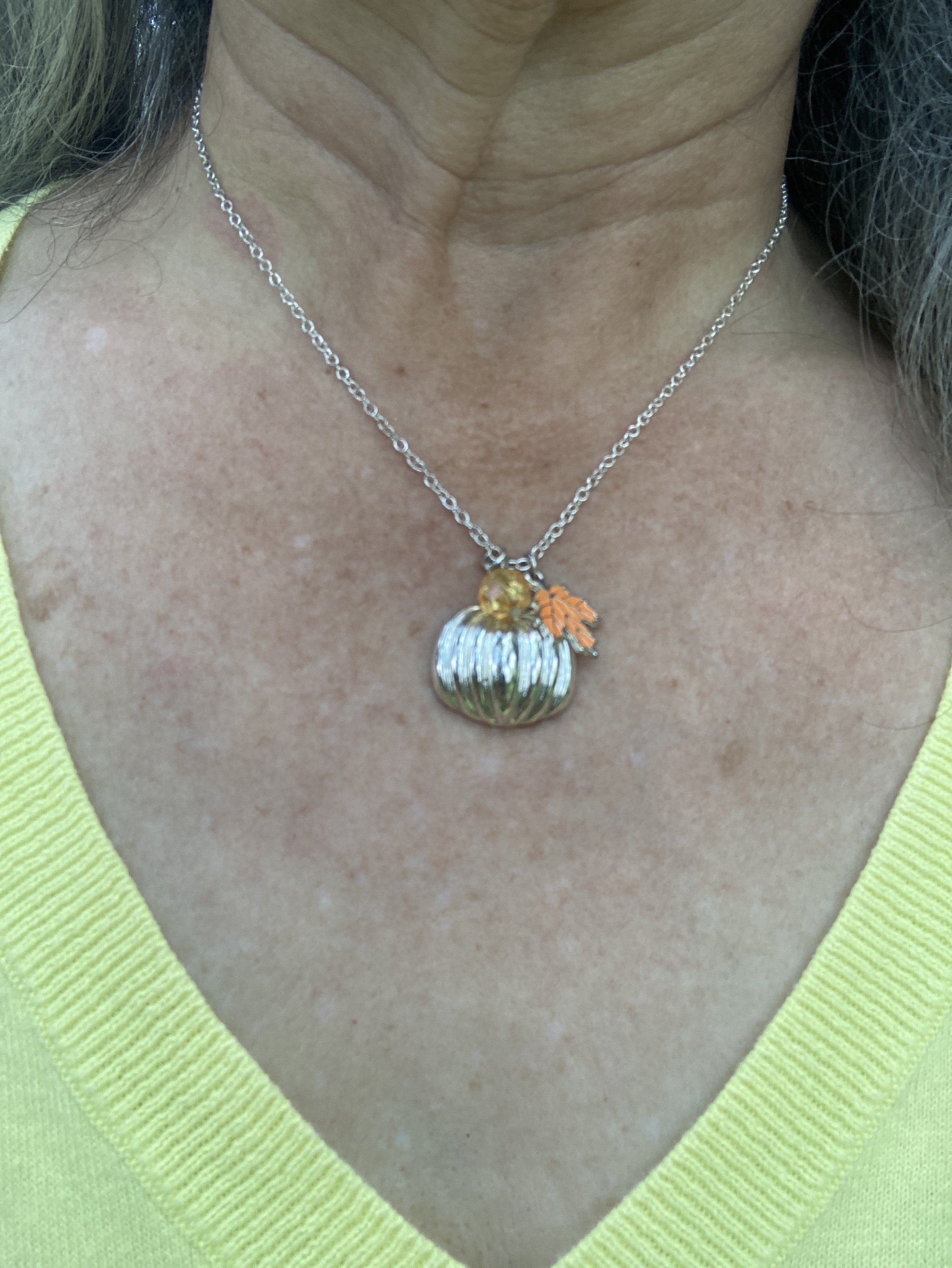
I chose a simple silver, seasonal necklace that has a pumpkin, an orange bead, and leaf. I think I got this a couple years ago at Maurice’s.

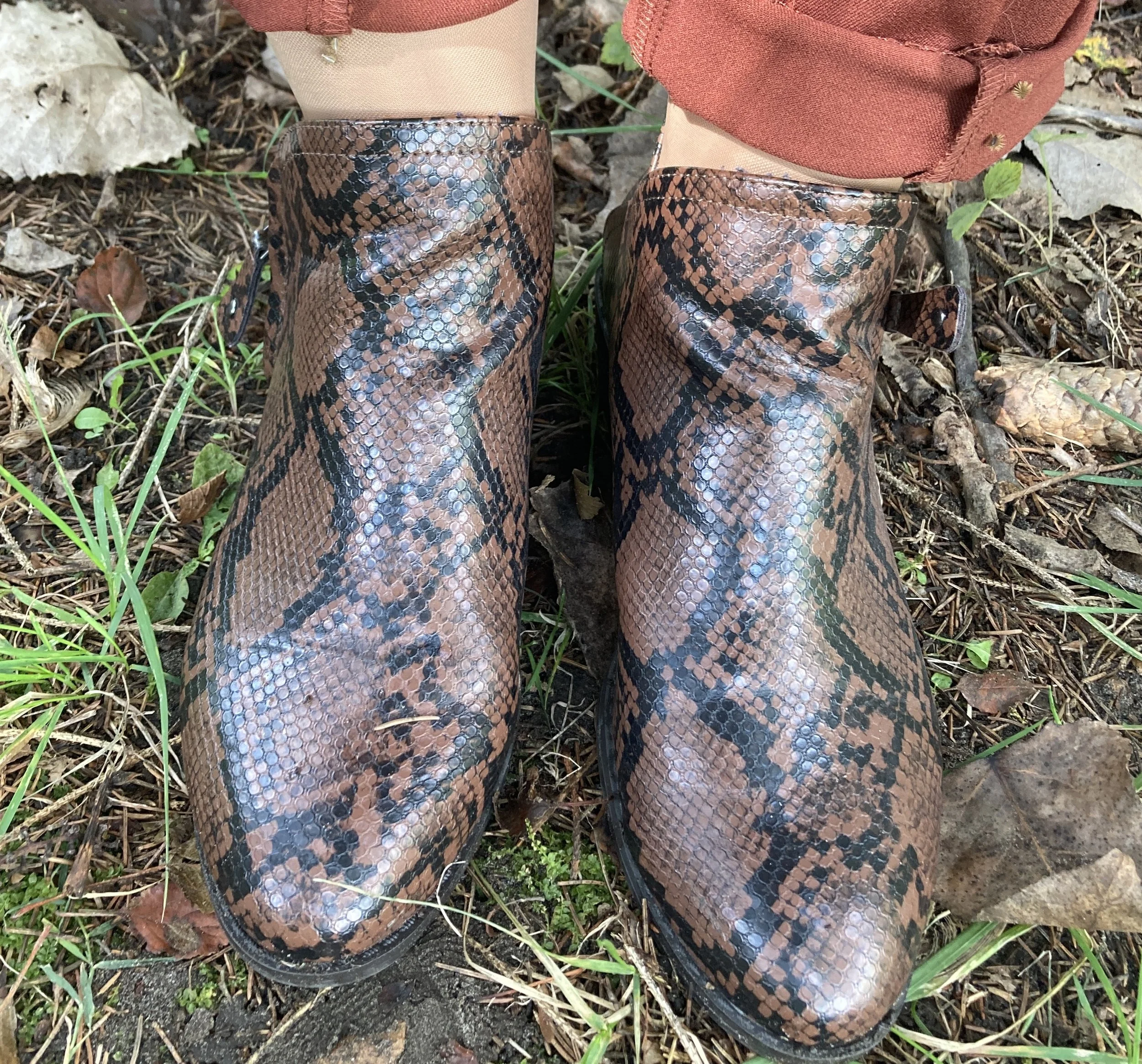
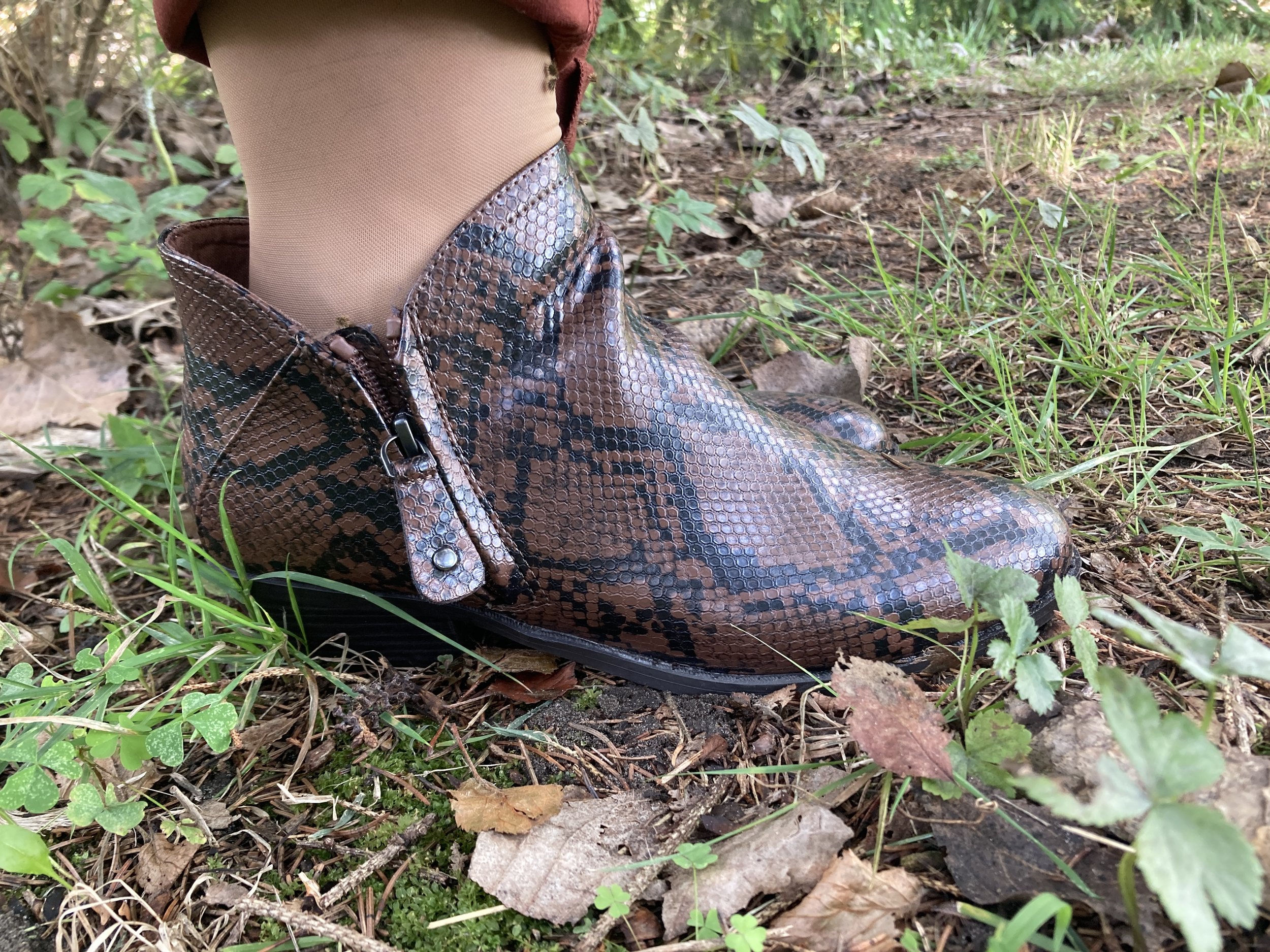
For my shoes I chose one of my many pairs of SO ankle boots from Kohl’s. This pair has a black snake print pattern with a brownish background. Here is a page from DSW with a number of snake print patterned boots.

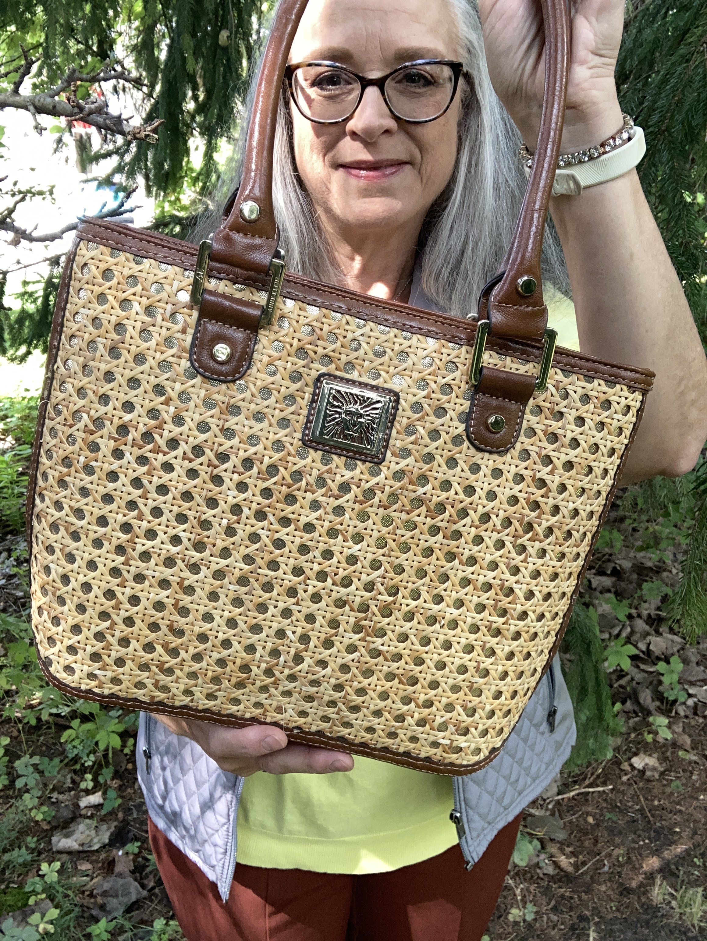
My Anne Klein bag was a thrift find this past spring. I love to look at purses and if you talk to my spouse he will tell you I have too many purses. What nonsense! Ha, ha. Unfortunately, it’s true, so these days I do try to steer clear of the purses so I am not tempted. However, I did grab this cute bag.

I would have never thought to put these colors together, but that is part of what makes this color series so fun. I hope you enjoyed learning more about Arabian Spice, Acacia and Underworld!

Leave me some love in the comments. I always like to hear your thoughts on these colors and on my outfits. I hope you have a wonderful week.

Pantone Autumn/Winter 2026: Red Mahogany, Burnt Olive and Egret

Happy September, everyone! It has been a very long time since I have been regularly posting on the blog, and I hope starting this Pantone series for fall will be the catalyst to bringing this little blog back to life and bringing me back to the things I am most passionate about: fashion, faith and writing. I will be sharing more on my Faith page on the difficulty we have had over the last six months, so if you are interested you can visit there later this week. I hope to get back to my regular posting schedule of Fashion on Tuesdays, Faith on Thursdays and perhaps an occasional post on a different day of the week when time and energy allows.

While access to the Pantone Fashion Week colors seems to be getting harder and harder to find, I was able to find a link to the original article so you can see those colors by clicking on the link here. These fall colors are interesting, and I will be the first to admit that I rather like these bright colorful hues and noticed a few that remind me of colors I like to wear in the fall and winter like Arabian Spice, Red Mahogany, Toffee, and Poseidon.

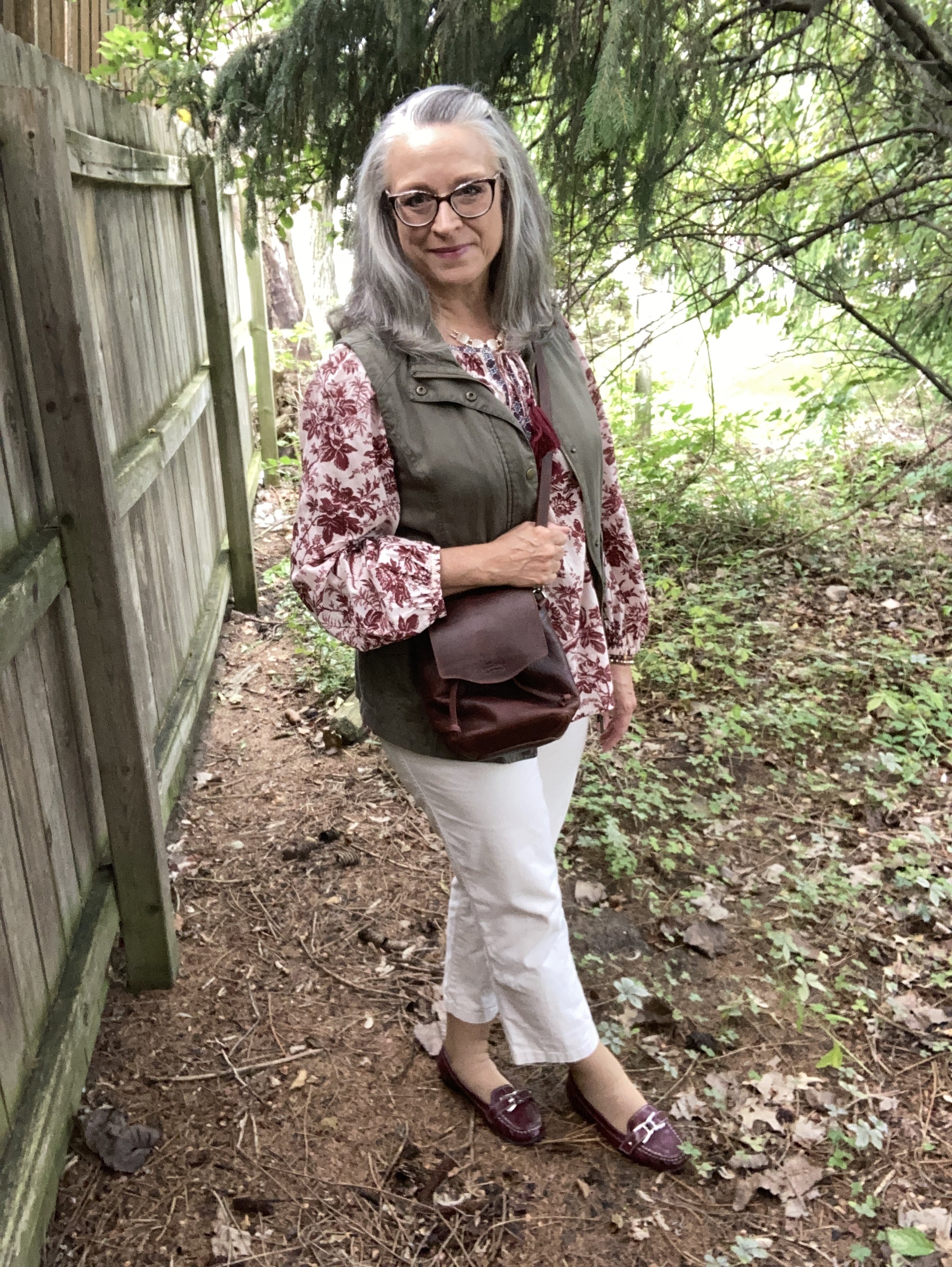
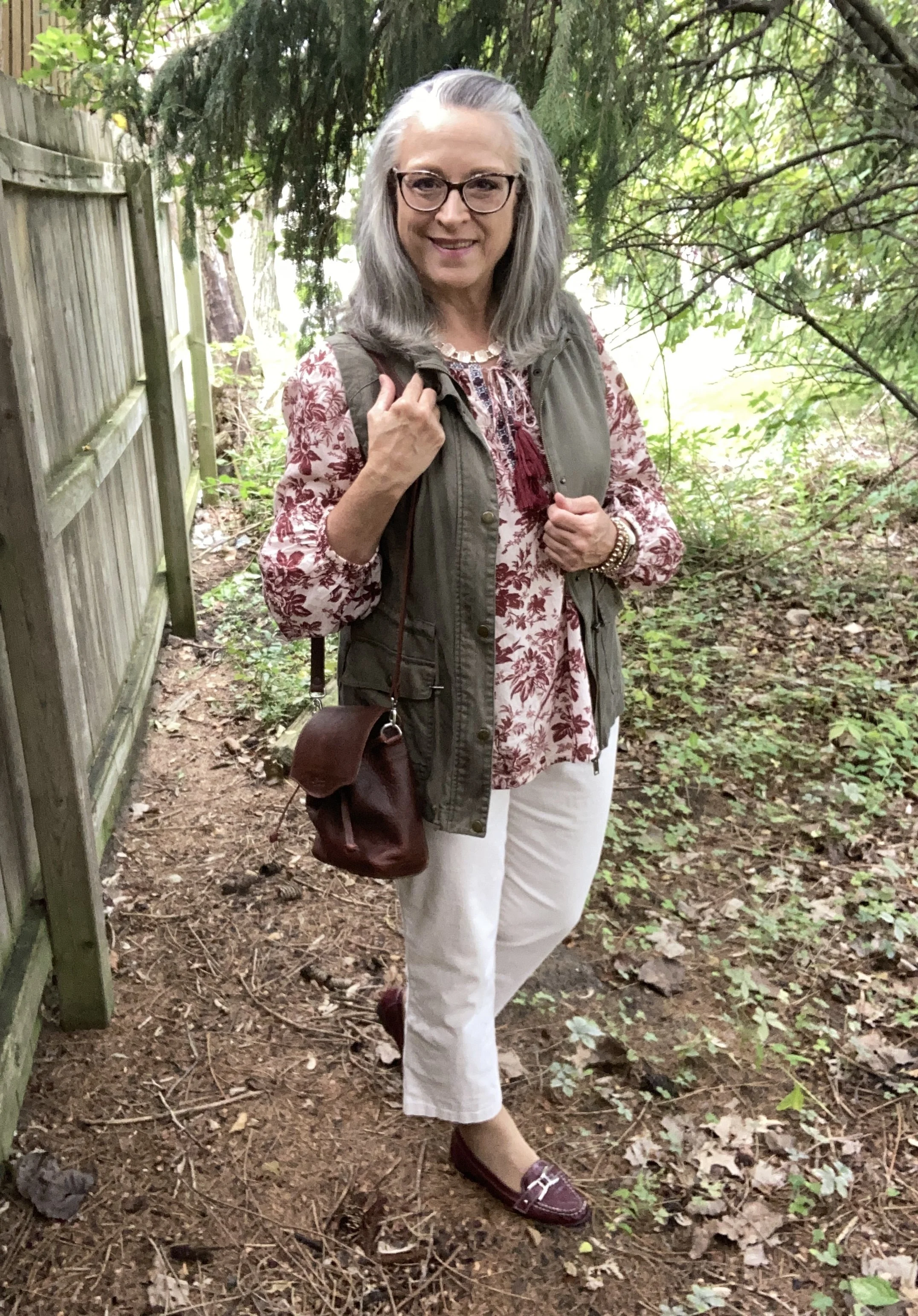
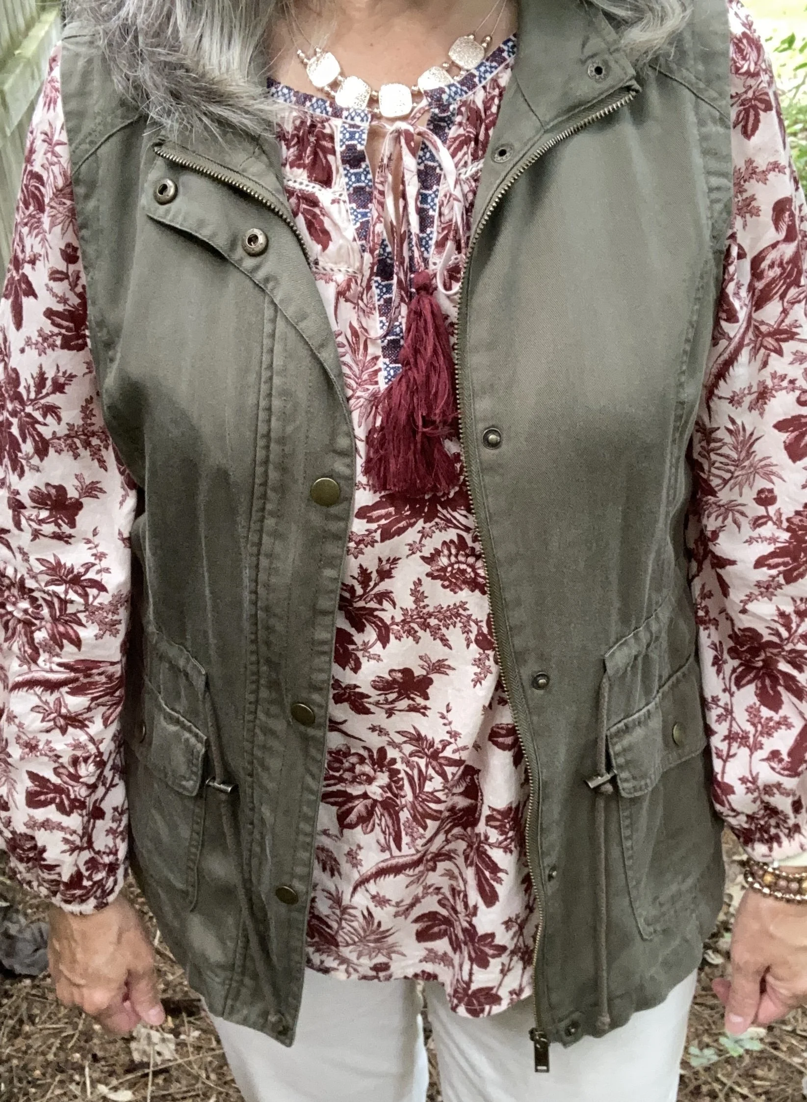
You will see that most of the looks in this series try to incorporate transitional pieces. For those of us who live in the midwest, the transition from summer to fall often means cool mornings and evenings with the heat returning in the late morning and throughout the afternoon. We have to be able to layer light weight fabrics in a way that accounts for the midday heat and the still working air conditioners. In this first look I layer a light weight utility vest over a light weight peasant top, along with lighter weight crop pants.

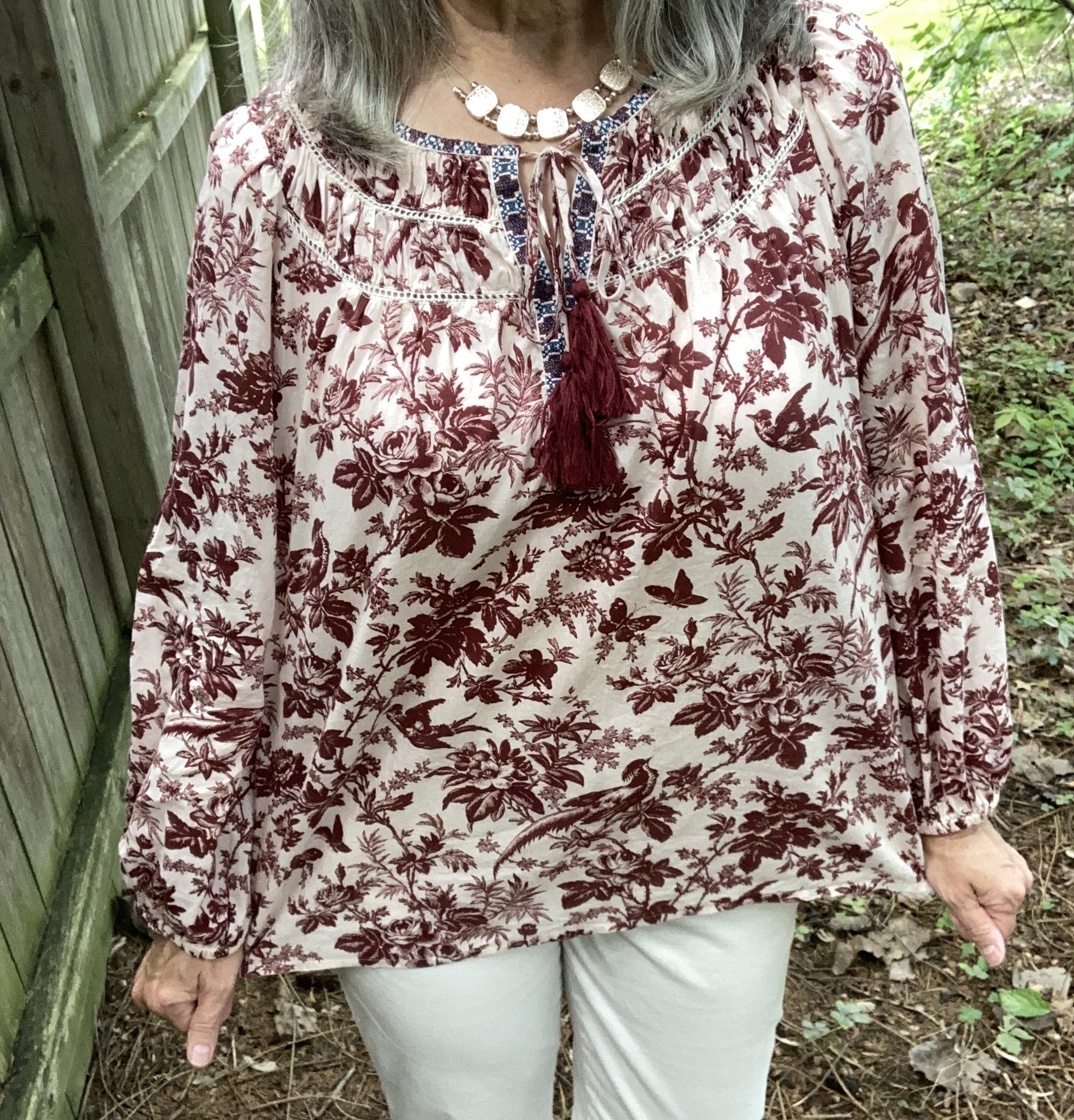
Red Mahogany is dark, rich burgundy color and we often see this color come back in the fall and winter seasons. I chose a peasant top that I discovered last spring at a thrift store. I love the pretty floral and bird pattern, the embroidery around the neckline and the shirring along the neck and shoulders. It definitely has a feminine and Boho vibe which is a fun alternative to my practical tees, sweatshirts and flannels for cooler weather. This is a brand called Sundance. Here is a pretty solid colored piece from Lucky Brand; a floral version from Natural Life; and a Croft & Barrow version from Kohl’s.

Interesting Tidbit: Robert Redford founded the original Sundance clothing company in 1969 in Utah with a paper catalogue coming out in 1989. Pieces were originally crafted with interesting prints and Bohemian vibes. In 2004, Redford sold the company in 2004, and in 2025 the company closed. There is a current Sundance Boutique based in Cape Cod that features skirts and dresses with a coastal influence.

Since the top is rather voluminous, I opted for a vest rather than a belt or tuck. I have had this Mudd piece for a number of years. I used to shop more frequently at Kohl’s in the past, but not as much these days. The changes they have made, the increase in prices and more recently their involvement in political issues has me less likely to shop there. I have no problem with others shopping there and I will still occasionally check out their sales for Christmas or birthdays, but I personally would rather shop at a second hand store.

This piece falls easily into the Burnt Olive color. In my opinion olive can have a yellow undertone or a gray undertone. Burnt Olive seems to lean more towards the gray, and many of my olive pieces fall into this category. Here is one from Walmart, a shorter, insulated version from Duluth Trading, and a actual utility jacket from LL Bean.

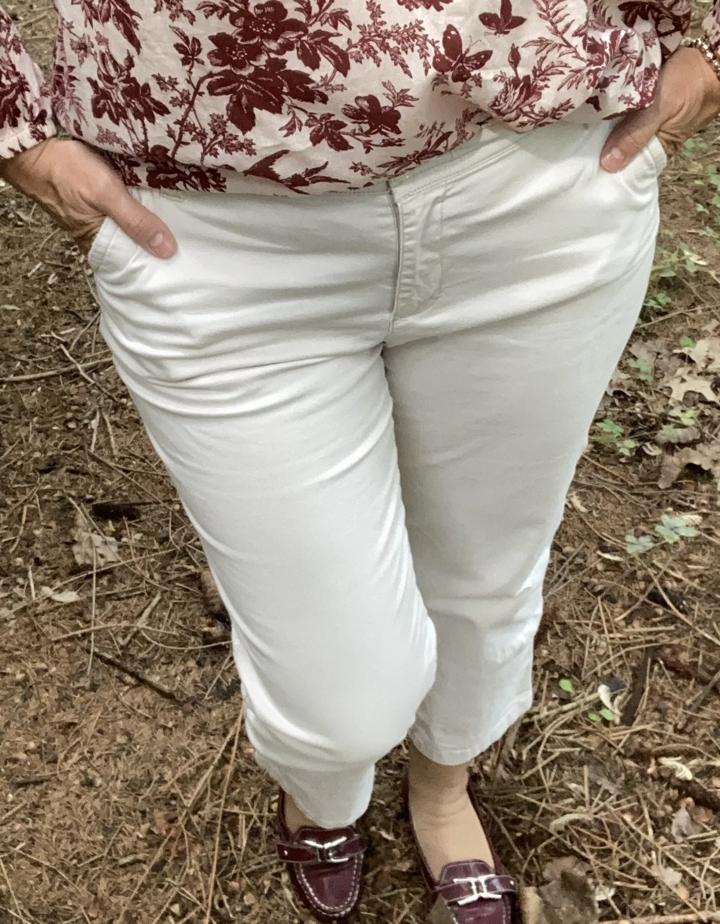
I decided to use my copped pants for the Pantone classic color called Egret. I have had these thrifted St. John’s Bay pants for a number of years. They get pulled out every summer, and will continue to be worn with frequency as long as I can still fit into them. Ha, ha. This looks like a nice pair from Coldwater Creek; a barrel shaped pair from Land’s End, and a capri length pair from Kohl’s.

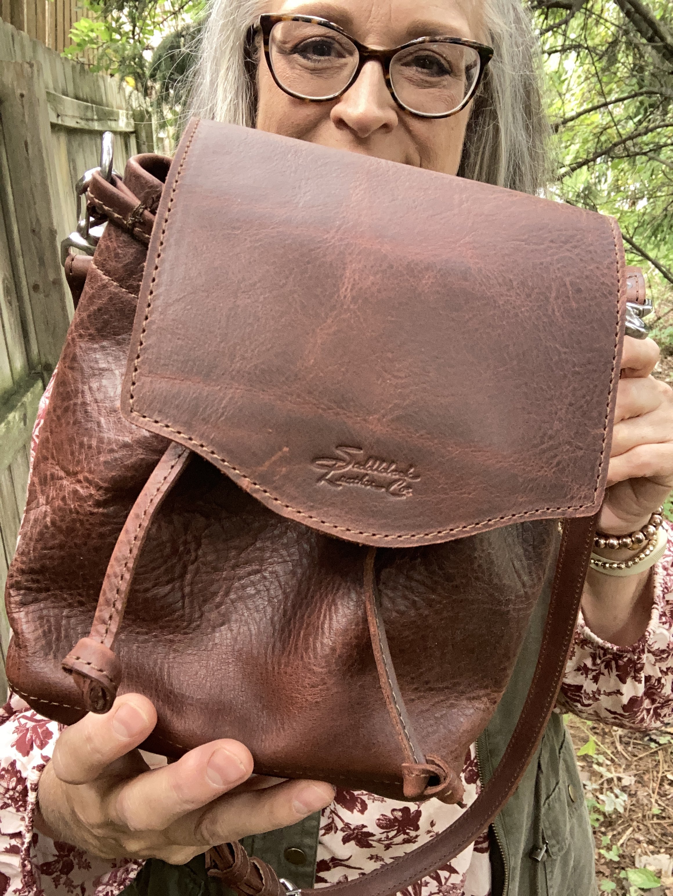
For my accessories I chose gold for my necklace and a sparkly bracelet, both of which I forgot to take pictures of. My bag was a gifted piece from a company called Saddleback Leather, and you can see my review for that here. It is a fun little piece if you want something easy to carry that doesn’t take up much space; perfect for a wallet and few odds and ends.

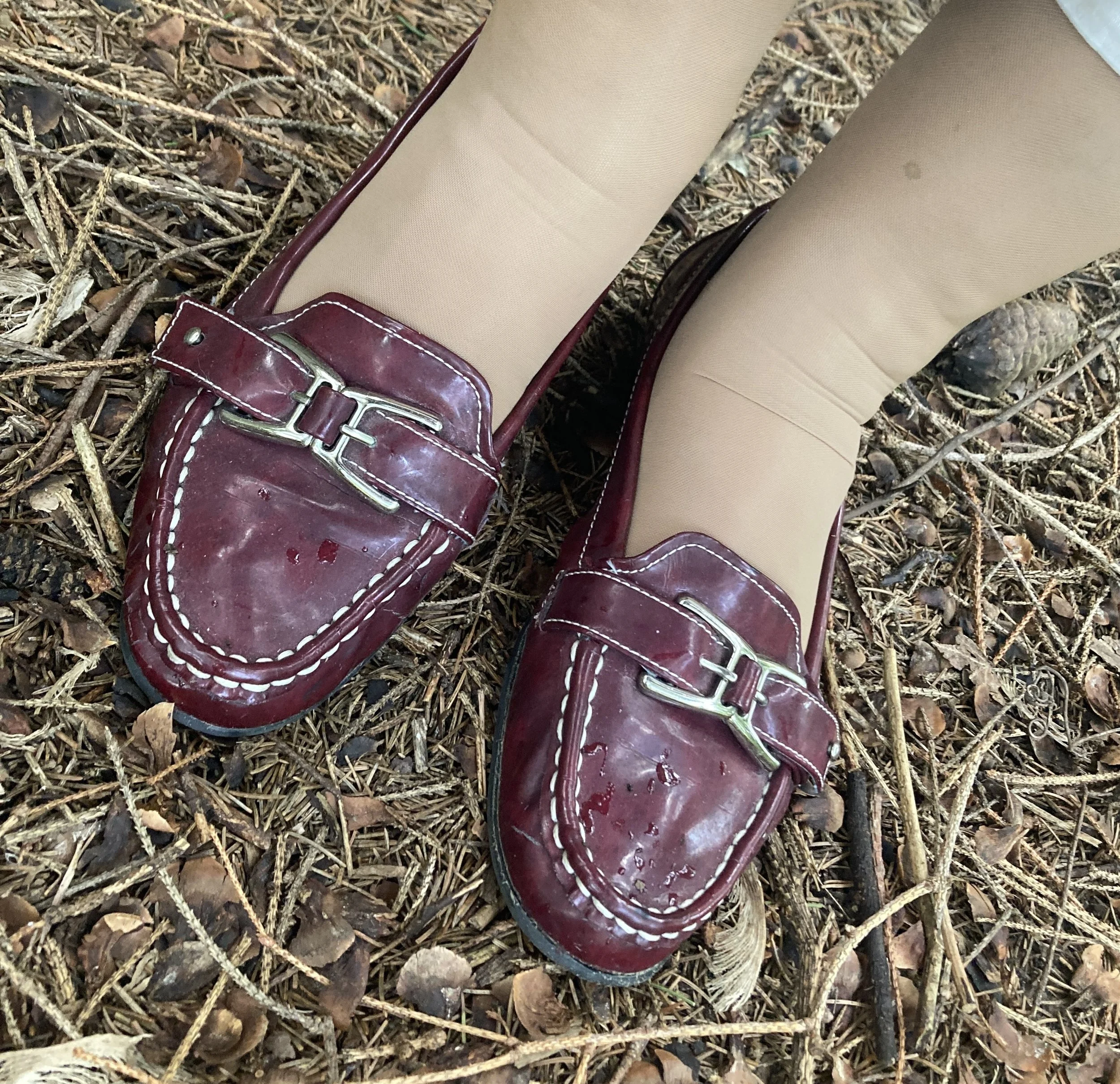
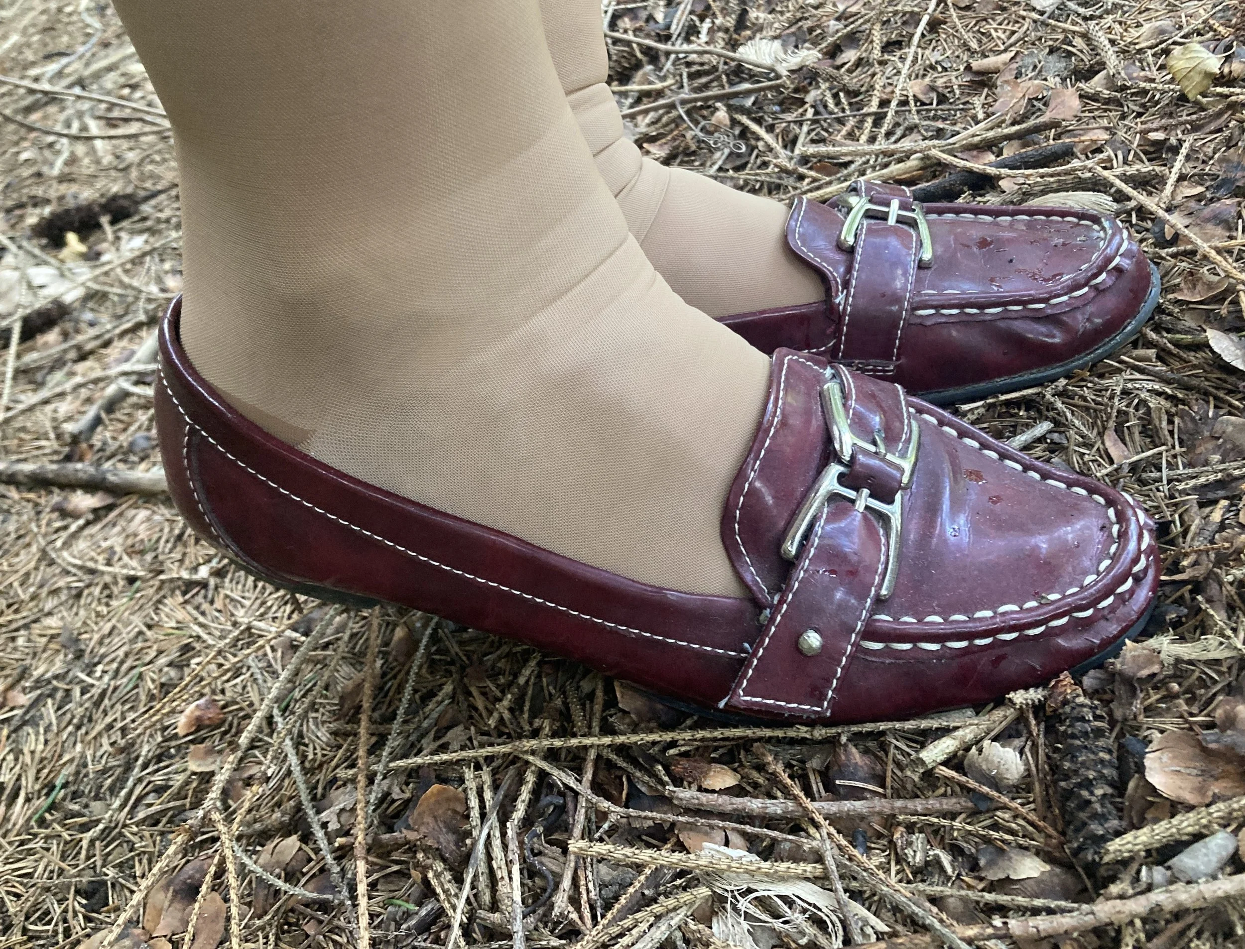
My Natural Soul loafers are also a second hand find from quite a few years ago. Sorry for my wrinkly elephant ankles! Wearing compression hose in the summer is not any fun, but it is better than seeing my pasty, purple and blue, bulgy veins. Ha, ha. Here are a page of options from DSW.

What do you think of these colors? Do you have any of these in your closet? It’s that time of year again to start wearing your fall colors. Isn’t it crazy how fast time flies by. Leave me a comment or two. I love to hear from you.

I hope you are having a great week. Be sure to stop by on Thursday for a new series on my Faith page. Hugs!
November Styles - Flannel, Denim and Fur

For the month of November, I decided to take a closer look at some of the prints, colors, and textures that are trending this fall. It is hard to slow down and not let our minds go straight from Halloween to Christmas, but I want to take a deep breath and just enjoy fall before winter sets in. We’ll have time for holiday vibes in a few weeks, but for now just sit back and enjoy the changing leaves as they begin their descent to the ground, and savor the scents and tastes that come back around this time of year, like cider, pumpkin, and the outdoor smells of the changing season.

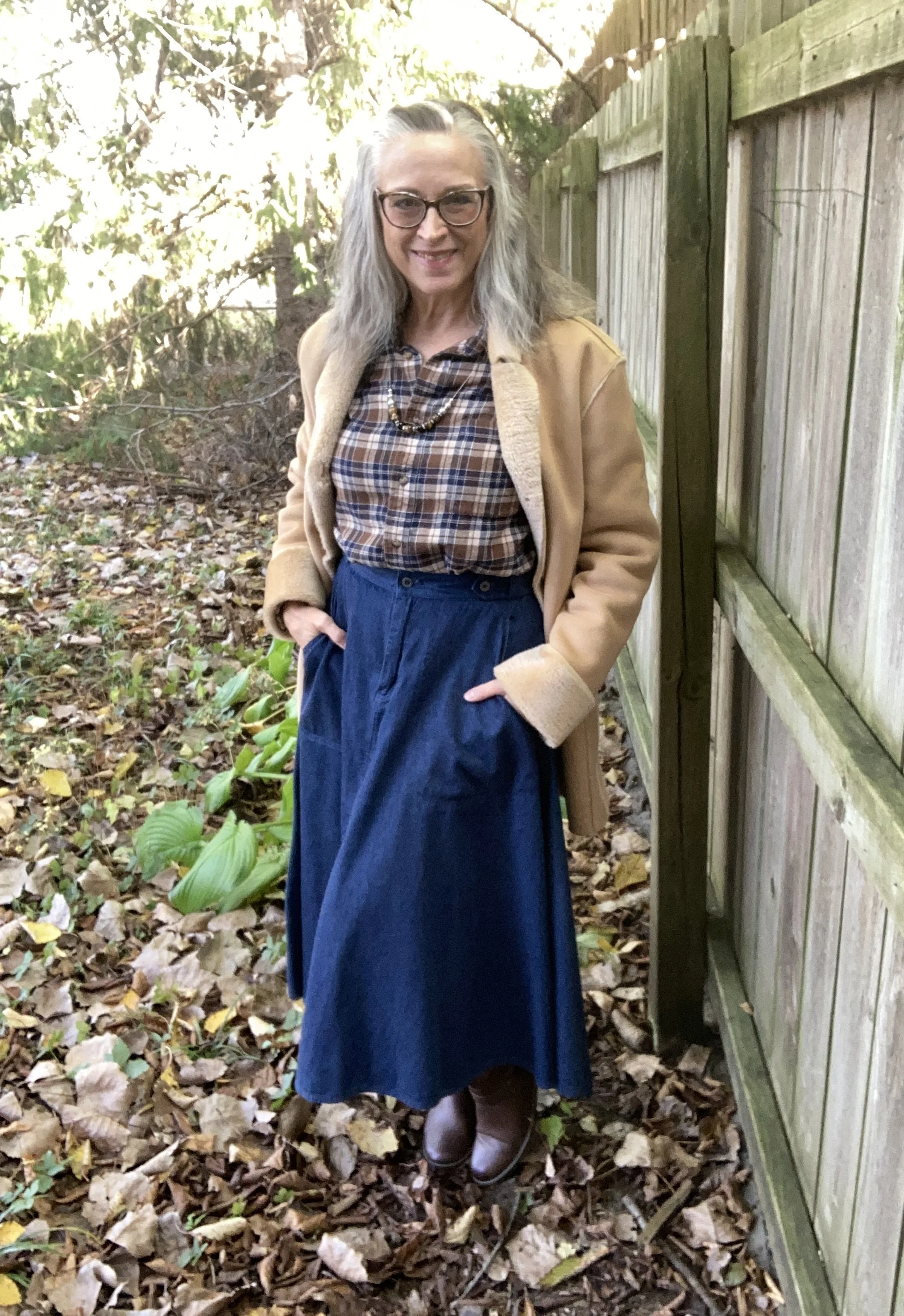
For today’s outfit I am drawing on three pieces of inspiration from a few of the fashion gurus on what was trending for Autumn 2025: earthy plaids, full skirts and luxuriously textured outerwear.

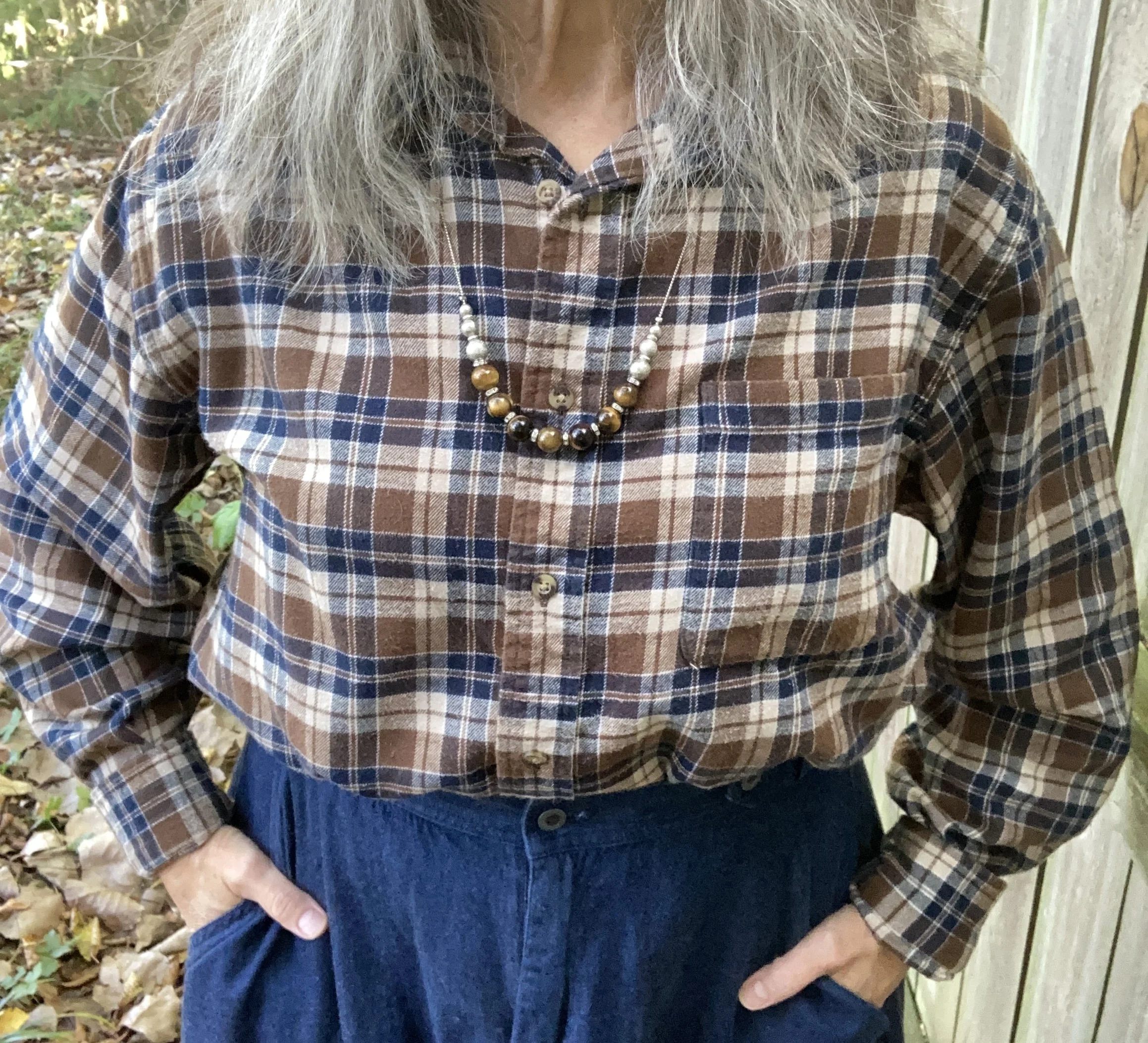
Plaid always comes around for fall, at least in my closet it does. I love my flannel shirts, my wool blazers and my plaid pants and skirts. This year plaid is back in earthy browns and rusts on the runway. See this article from Glamour. I guess you could say I was going for the Town and Country Chic vibe with this outfit.

For this look, I started with the plaid, flannel shirt. It is a men’s Croft & Barrow shirt from Kohl’s. It actually belonged to my hubby, but he never wore it, so I confiscated it. Ha, ha. I love flannel, oversized shirts and while this one is not very feminine, I enjoyed the challenge of making it into a more feminine look by adding the skirt. The shirt has both the dark, earthy brown and the dark blue, so it seemed perfect for the look I was trying to achieve. I also added the silver and brown beaded necklace for a little extra femininity.

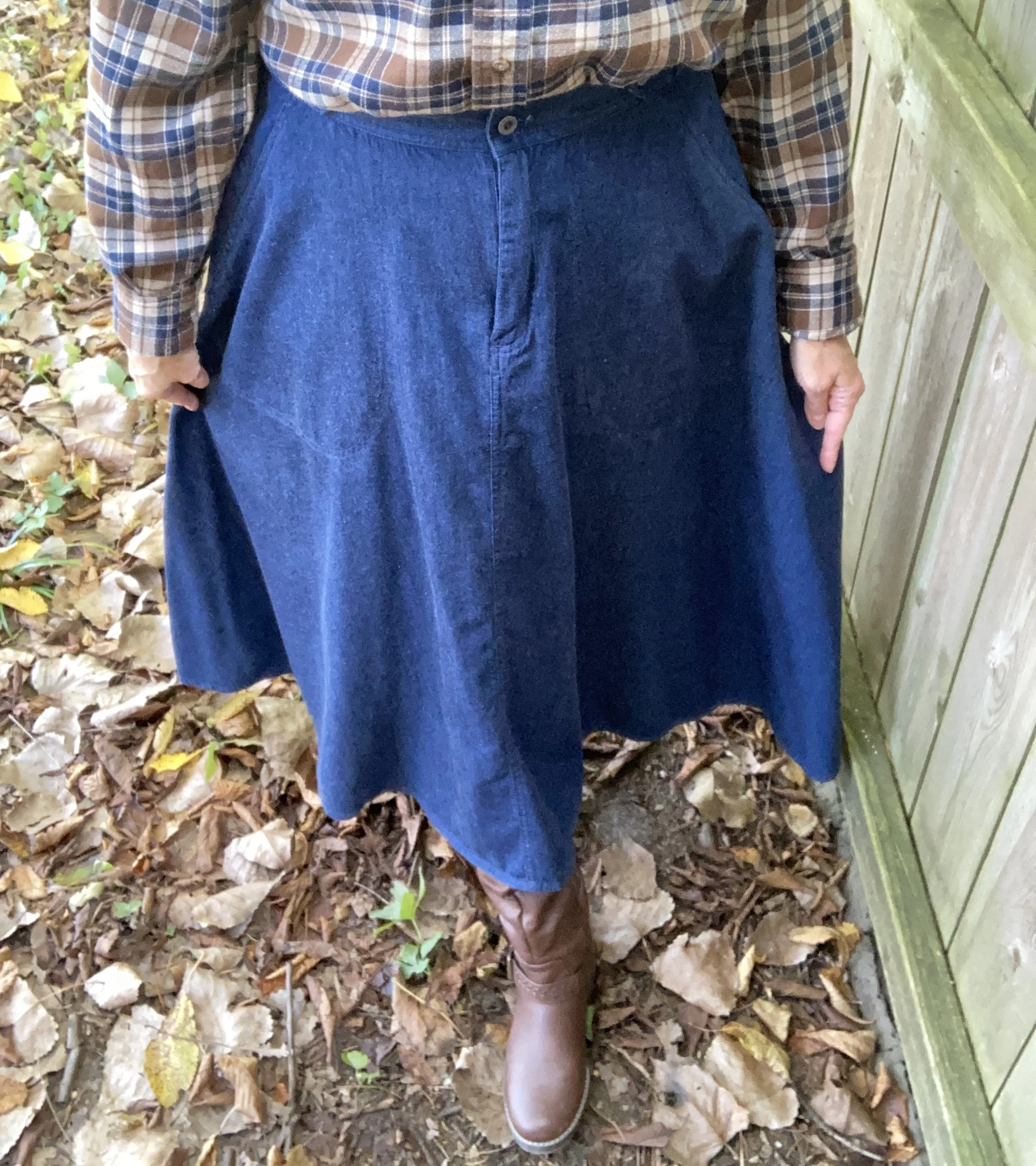
My dark wash denim skirt was a thrift find a few years ago. It is a Liz Claiborne - Liz Sport piece. What’s not to love about this full, midi length skirt? It even has pockets. It is a medium weight so easily wearable all year round, and perfectly twirl worthy. You can see this piece styled previously on the blog with a fair isle sweater, and with an olive military jacket.

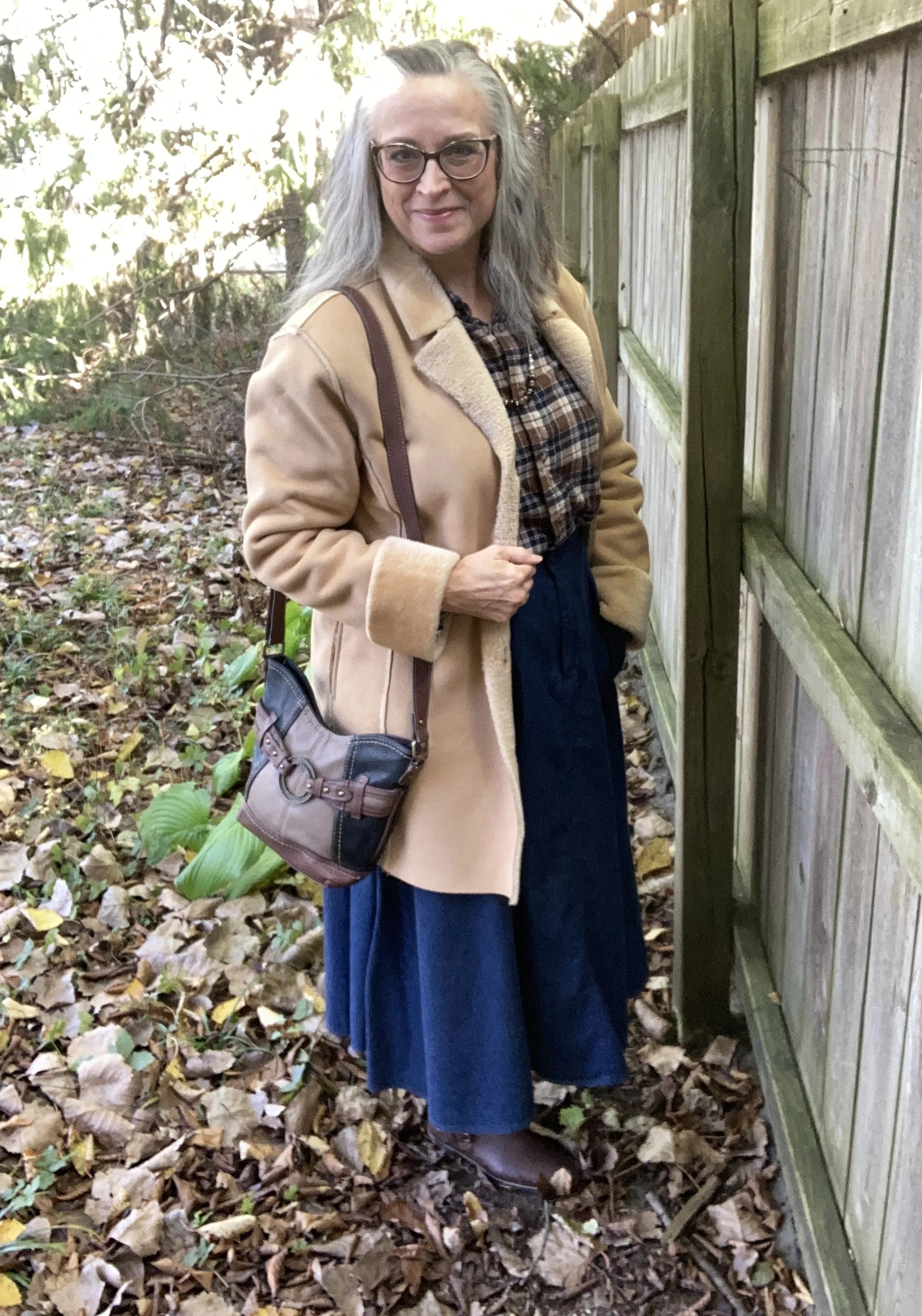
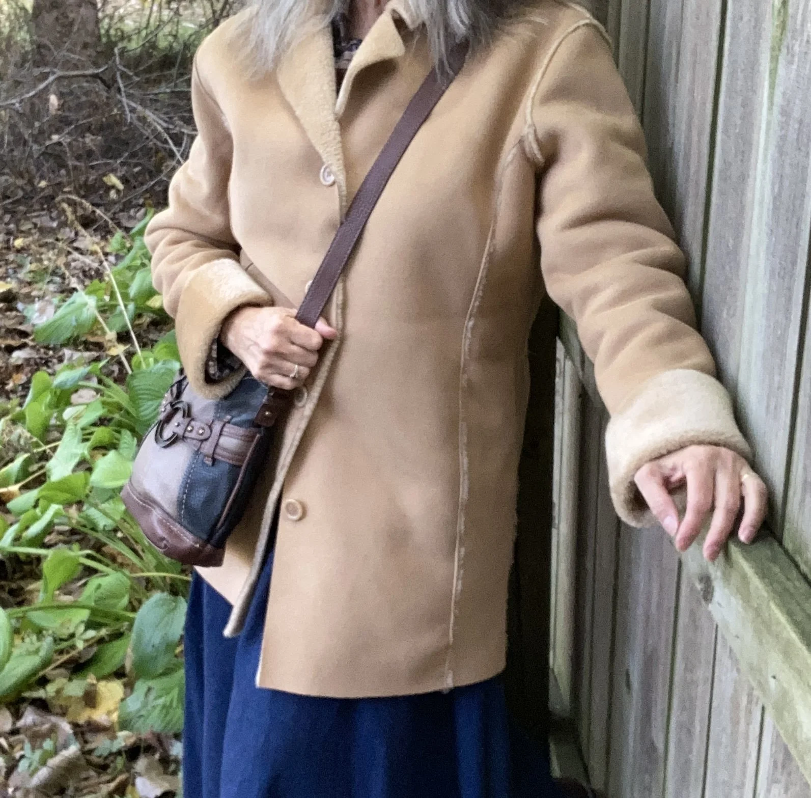
My Emma James, (an older offshoot of Liz Claiborne) faux fur and faux suede coat is another second hand find. I nabbed this one four years ago as soon as I found it and tried it on. I love the way these types of jackets can be used dressed up or down and the neutral color means it can go with anything. You can see another outfit I wore this coat with here.

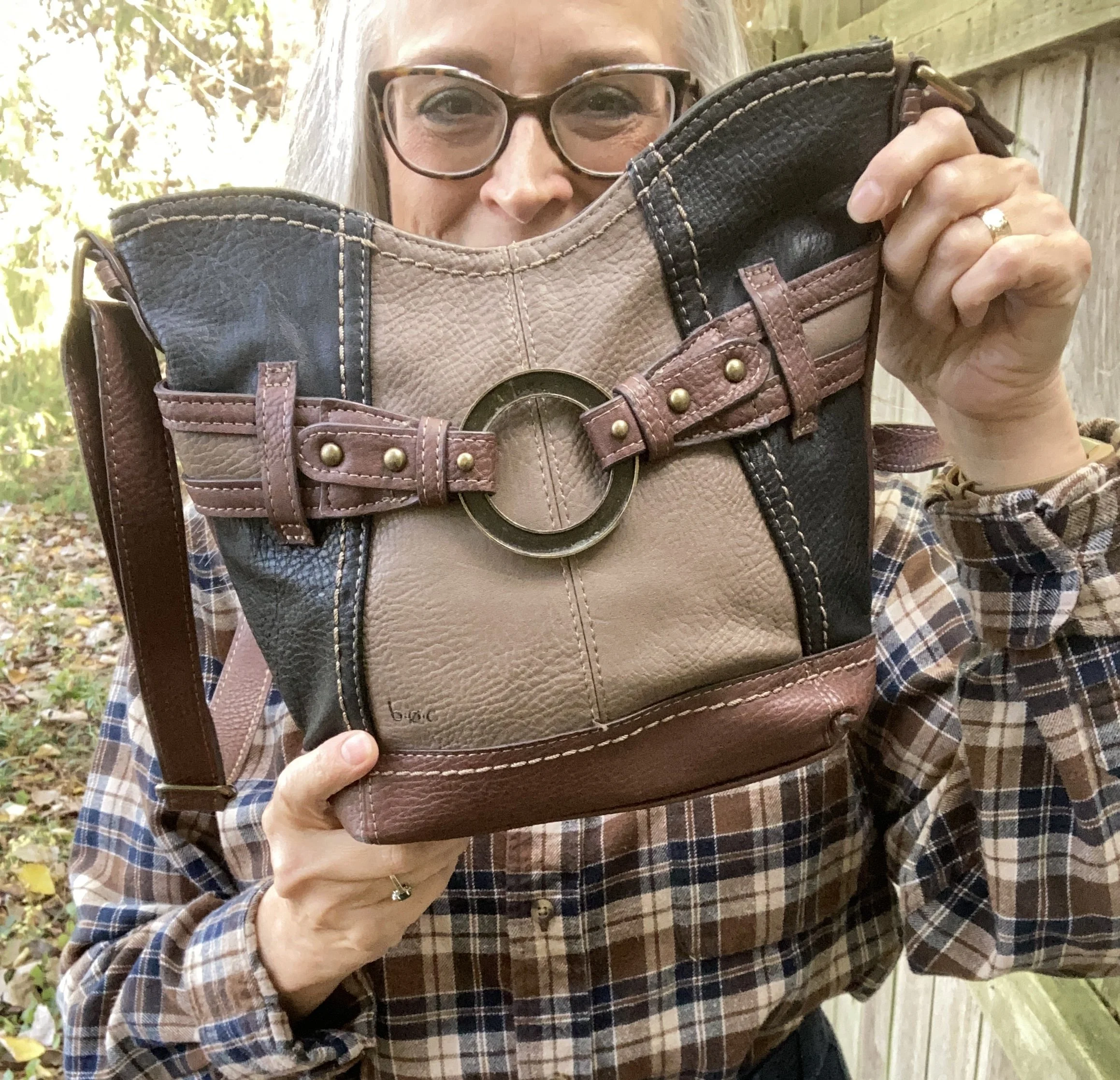
I kept my accessories minimal to keep the focus on the outfit. My b.o.c. bag was a hand me over from my best girlfriend in NY. She is an avid thrifter too, and always finds great things, some of which she passes my way.

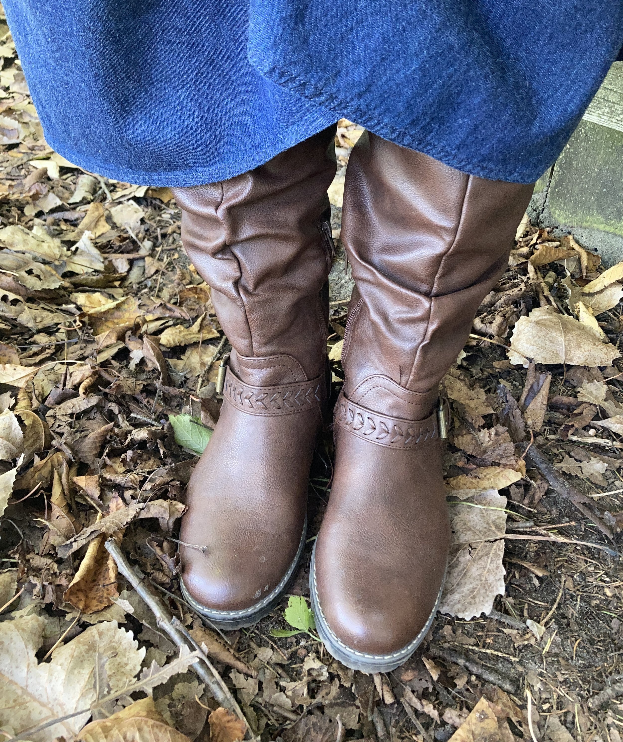
My boots are thrifted. I find a lot of boots at second hand stores when I am not looking for boots. Right now I am looking for a few new pairs of combat boots and do you think I can finding anything second hand? Nope! I also haven’t been thrifting in a while so that might be another reason. Ha. ha. These are a brand called XOXO. The are faux leather, but still look pretty good so they were a good find. Apparently, you can find this brand on Amazon.

What do you think of this outfit? Do you think I hit the Town and Country vibe? I’d love to hear your thoughts, so leave me a comment or two. I always appreciate your interactions with my little blog.

I’m including a few shopping links for you to look over. These are affiliate links brought to you at no extra cost. If you purchase an item through one of my links I get a little commission. I appreciate every think you do to support me and the blog.

Have a great week!

Pantone Autumn/Winter 2025 - Desert Sun, Magical Forest, and Wispy Clouds

This week we are looking at three more colors from the Pantone London Palette for Autumn/Winter 2025. Today’s colors include, Desert Sun, a rich, golden yellow; Magical Forest, a dark green reminiscent of the deepest woods, and a light, airy grayish white called Wispy Clouds. You can see the actual colors in this pin.

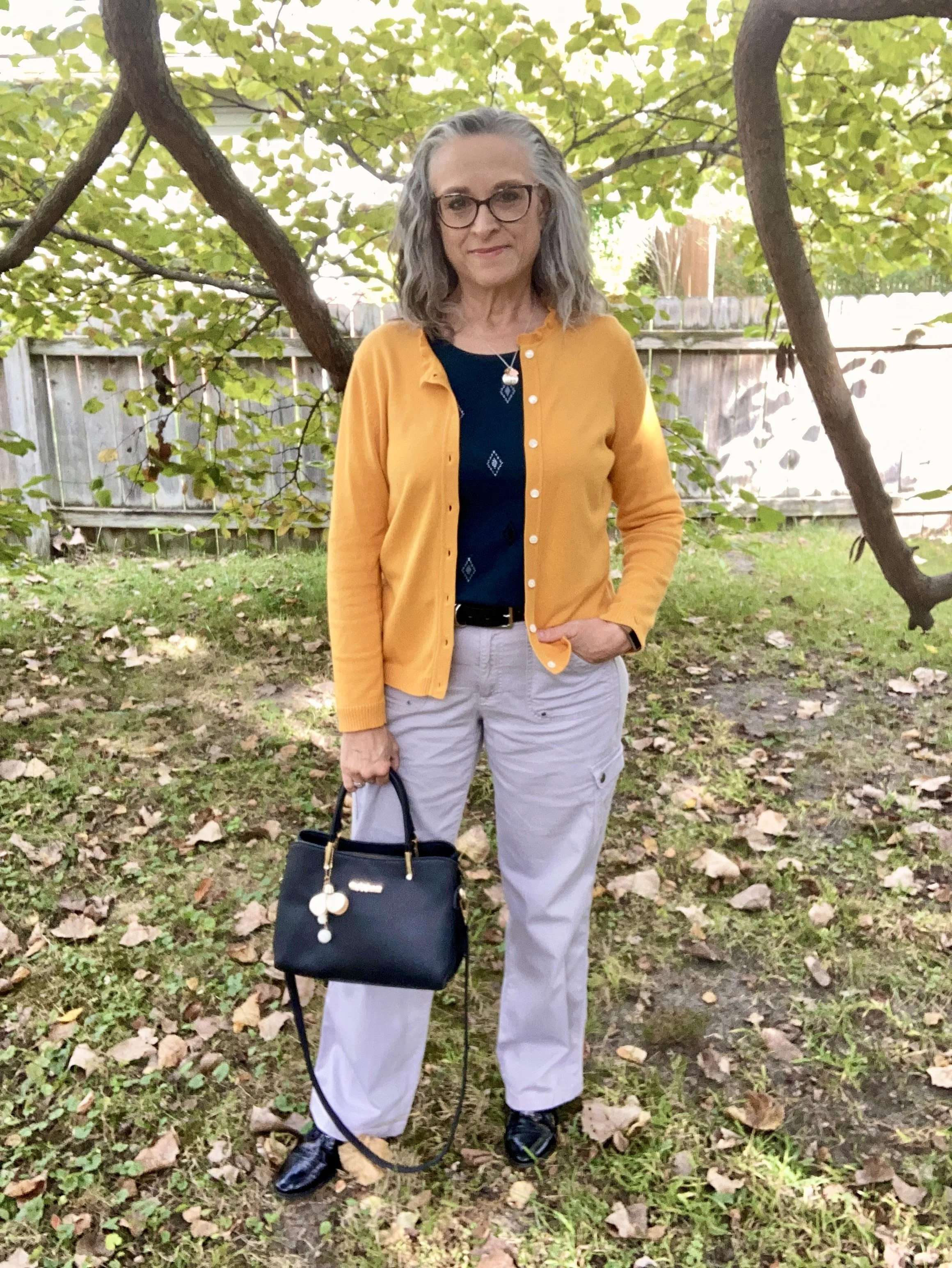
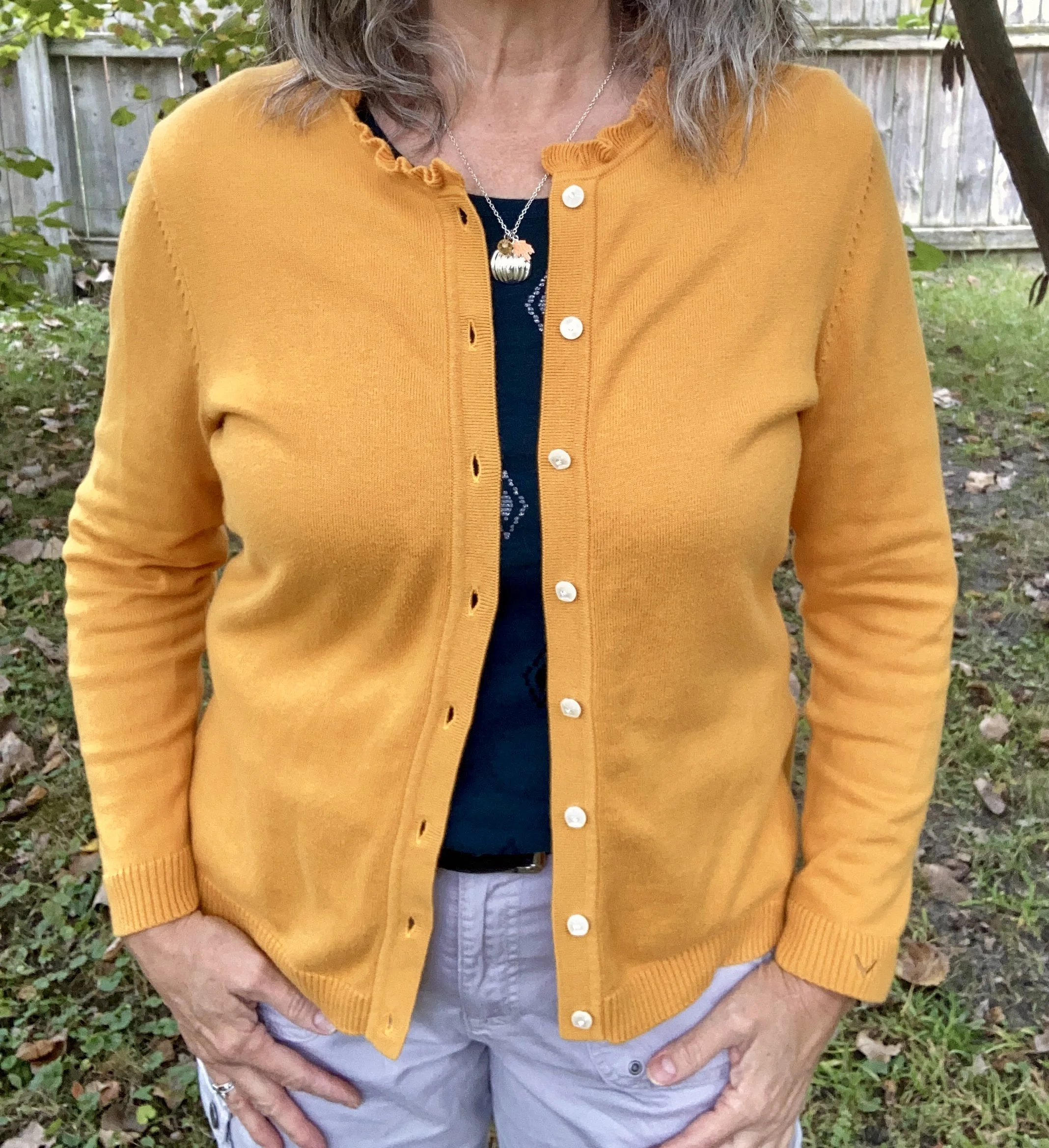
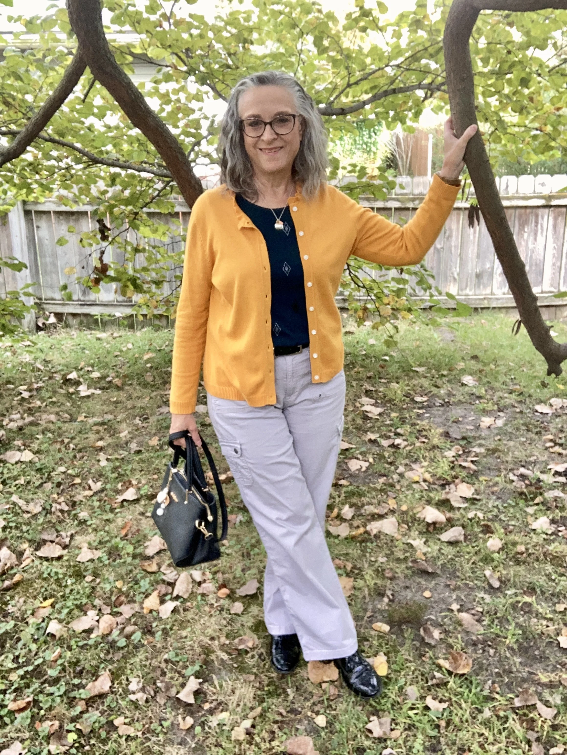
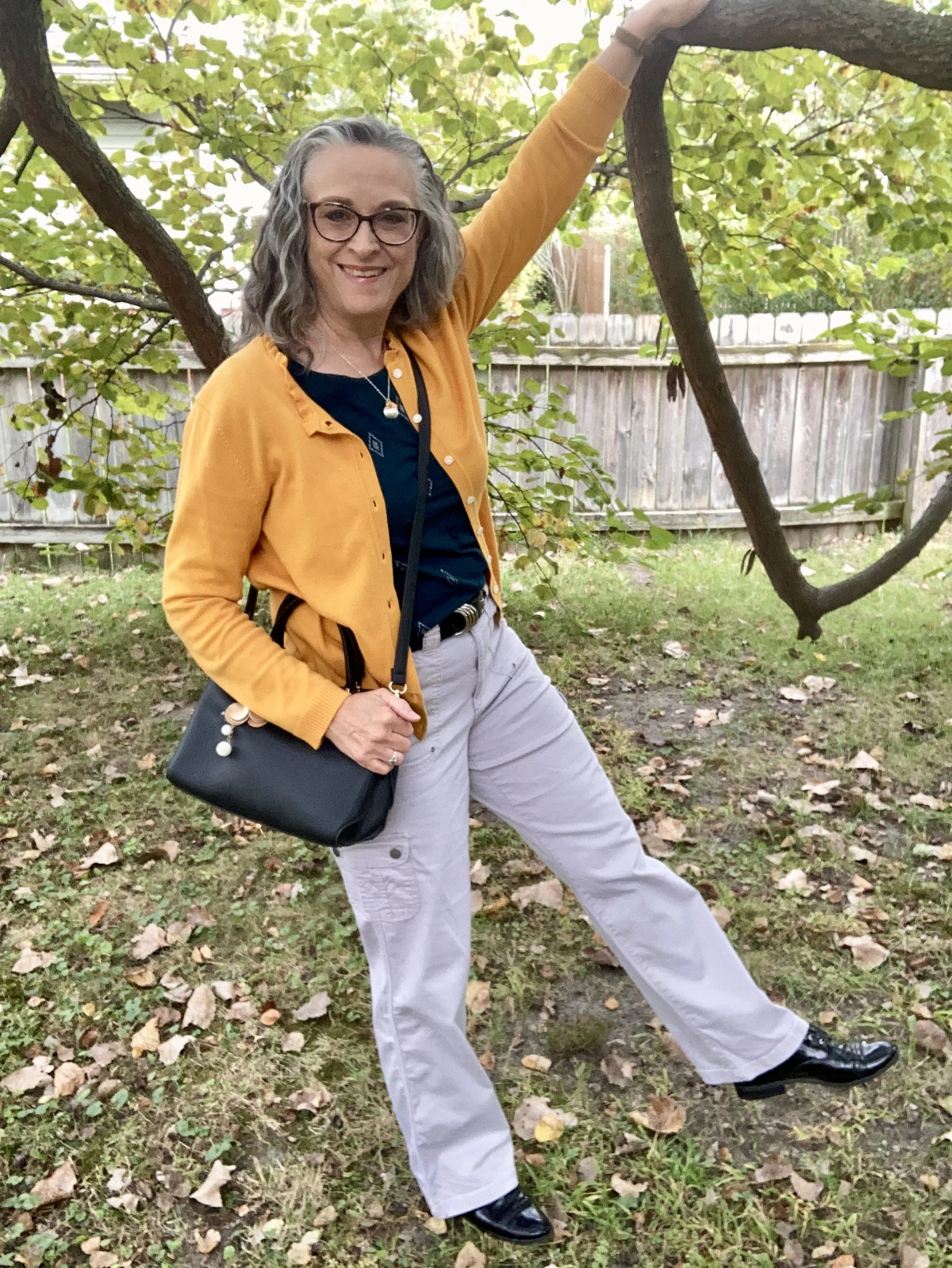
My Desert Sun cardigan is a brand called Callaway V and was a thrift find a few years ago. I love the fun details on this piece including the ruffle around the neck line and the tiny jewels at the center of each button. My phone does not do closeups well, so I didn’t bother trying to get a photo, but trust me those tiny jewels are there. Ha, ha. This golden yellow is a perfect color for fall. You can see how I styled this cardigan with a multi print maxi dress here.

It was hard to find any cardigans in this color so I added a few other Desert Sun items.

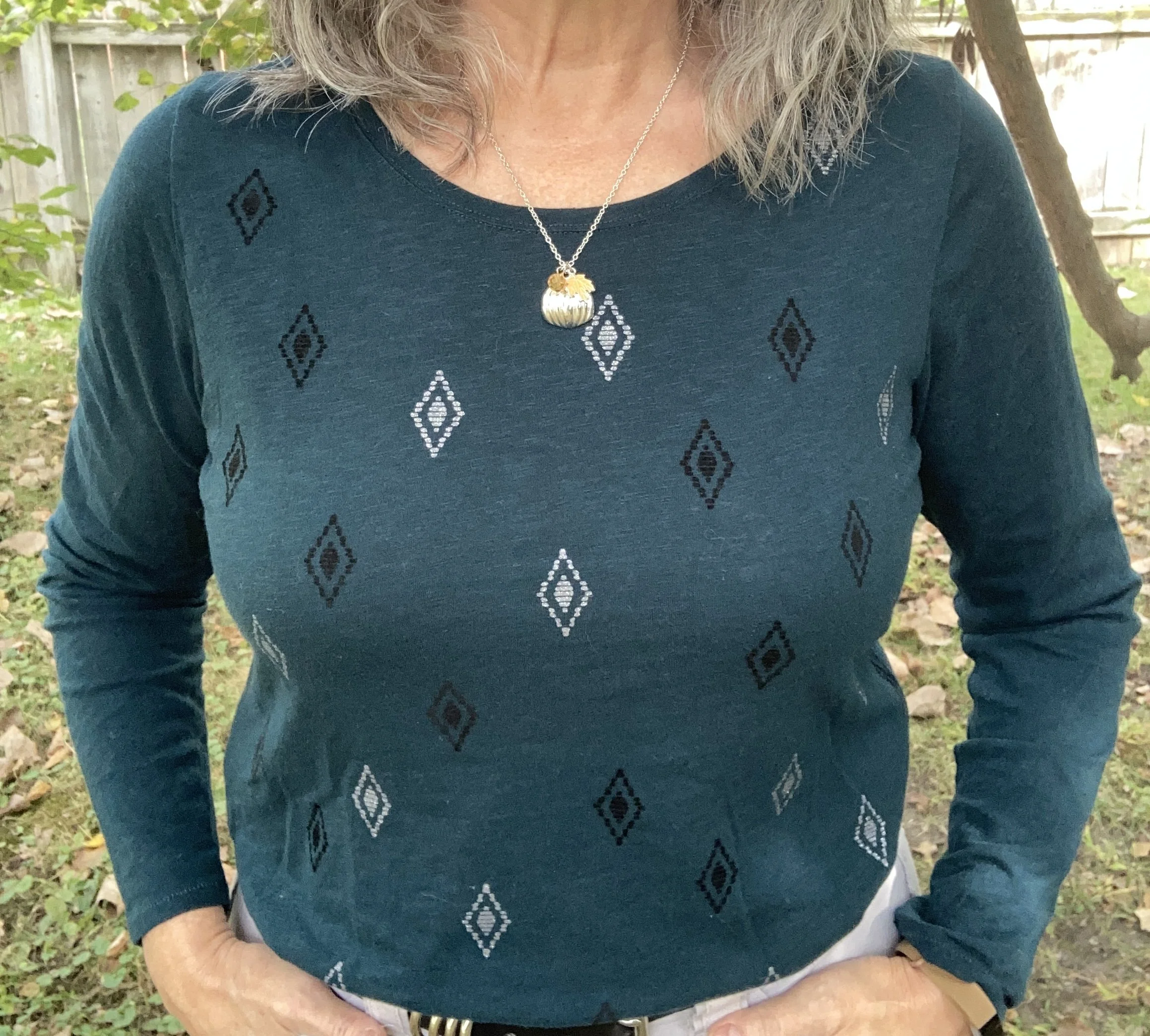
My Magical Forest tee is Sonoma brand and was a piece I found at Kohl’s a few seasons ago. Being a not-so-basic sort of girl, most of my basics have to have a few details like interesting prints and even a bit of bling.

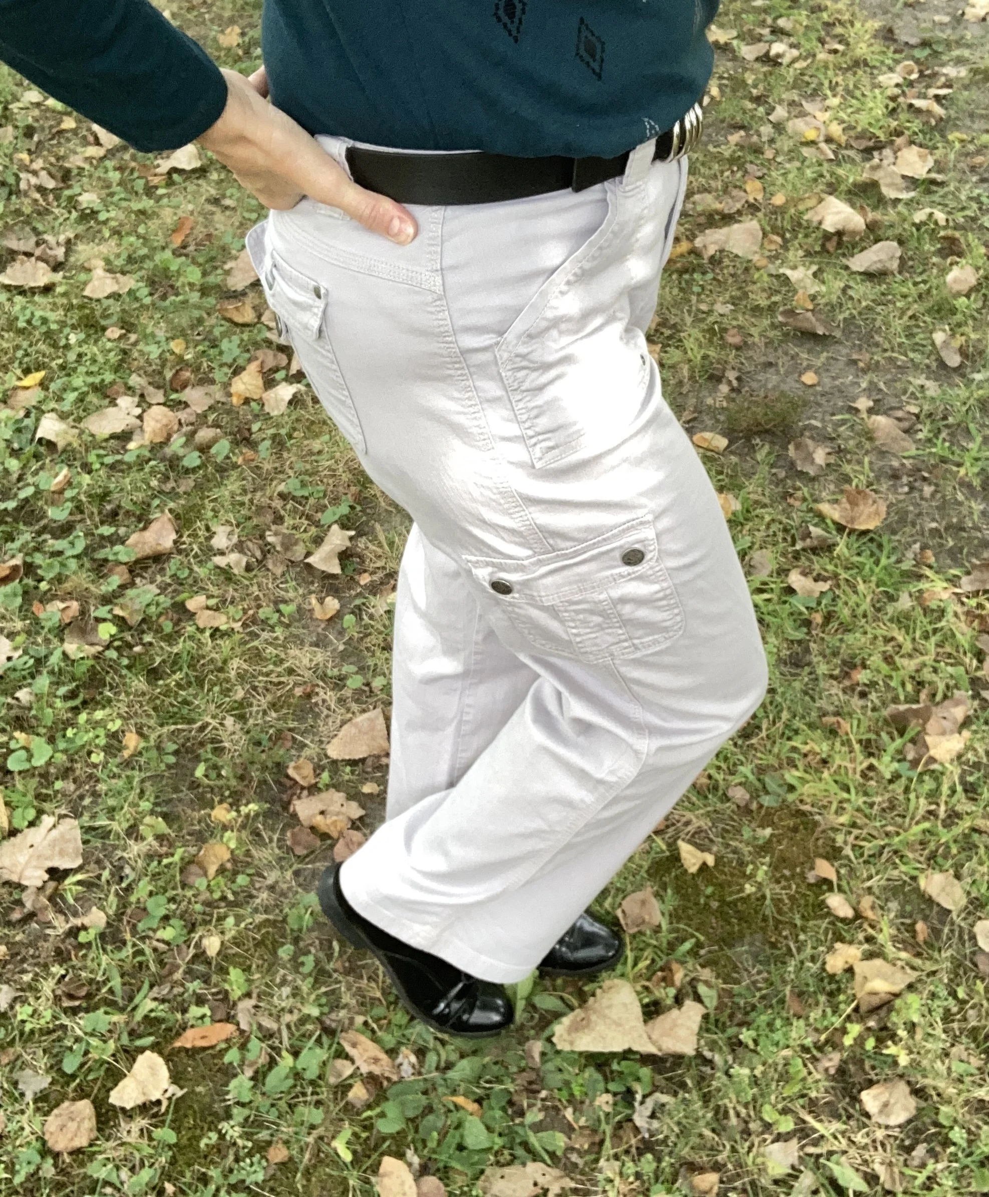
I thought these second hand, Gloria Vanderbilt utility pants were a close match to Wispy Clouds. They are a lighter weight so will be put away for the winter, but they are a great pair of pants for a dressy casual vibe. The utility details of extra pockets and rivets make it more casual, but the wider legs give them a dressier trouser vibe.

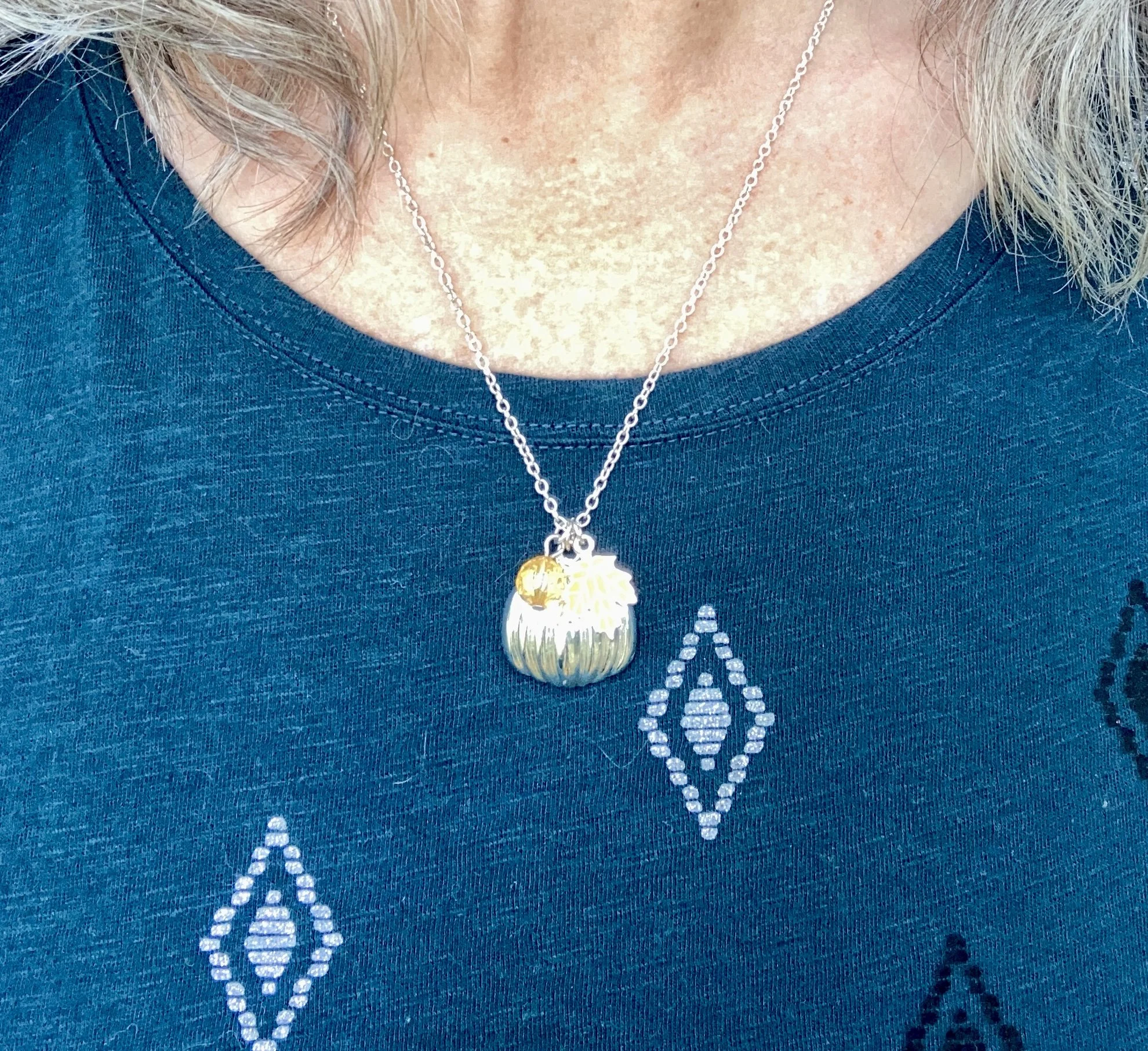
I kept my jewelry minimal with my fall themed, silver pumpkin necklace. This is a fun piece, with an orange leaf and an orange bead, making it perfect to wear all fall long. I honestly can’t remember where I got this. Ha, ha.

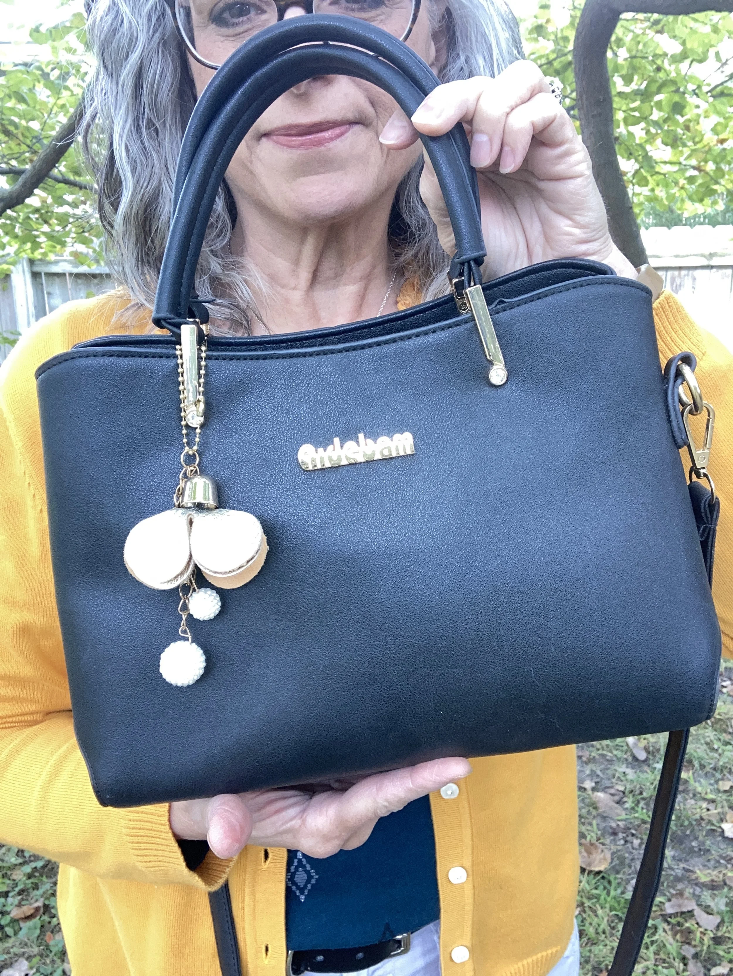
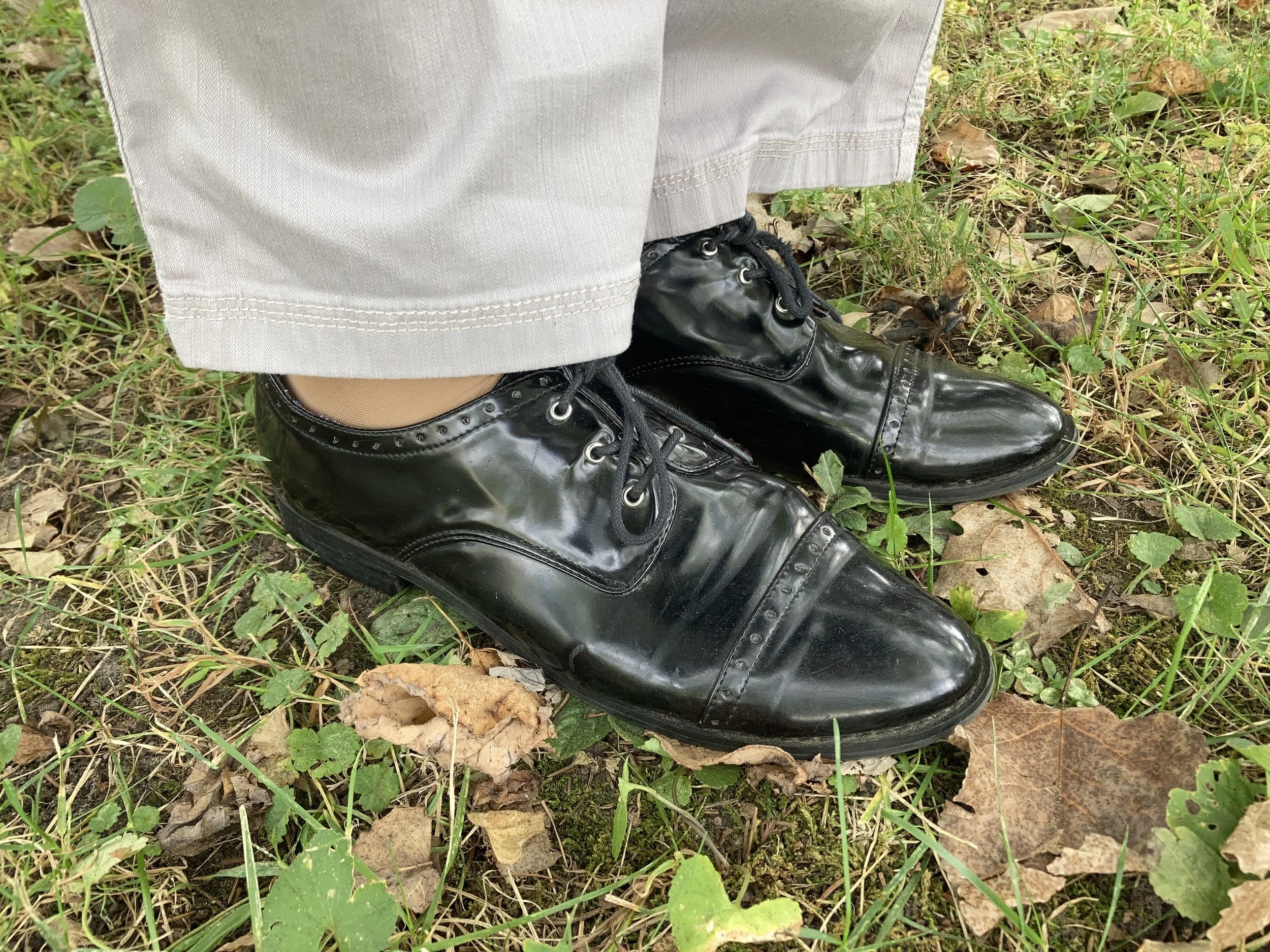
I chose black for my shoes, belt and bag. Honestly, I like how matching a shoe and bag, or a belt with a bag makes an outfit look polished and finished off, but that is just my opinion. Matching is a matter of personal taste these days, so do what works for you.

My belt was thrifted. My bag was a gift from my daughter and is Aidebam brand. My shiny Oxfords are a brand called Sugar. I have had these for a number of years, because I used to wear them to work and I haven’t worked at the bookstore since fall of 2019. Yikes! It’s been six years since I lost my job. Wow! Where does the time go?

What do you think of these colors? Do you like this combination? What colors would you have combined with this golden yellow or this dark green?

I have included a few shopping links. These are affiliate links brought to you at no cost to give you possible shopping options for similar items or colors. Not every color is easy to find, so that is where your closet or a thrift store come in handy. You would be surprised how often I have these colors in my closet, or a close enough match to make it unnecessary to go shopping…although I enjoy that too. Ha, ha.

Thank you for following along on the blog. I appreciate all your support. Have a great day.

Pantone Autumn/Winter 2025 - London Palette: Salted Lime, Fanfare and Chocolate Martini

We are well into October and the last four days have felt like the middle of July rather than fall. We are hopefully heading into a cool down in a day or two. Midwest weather has always been rather chaotic with fluctuating temperatures, times of endless rain, or months of drought. Right now things are very dry, the trees have hardly any color to them, and our cars are regularly covered with dust.

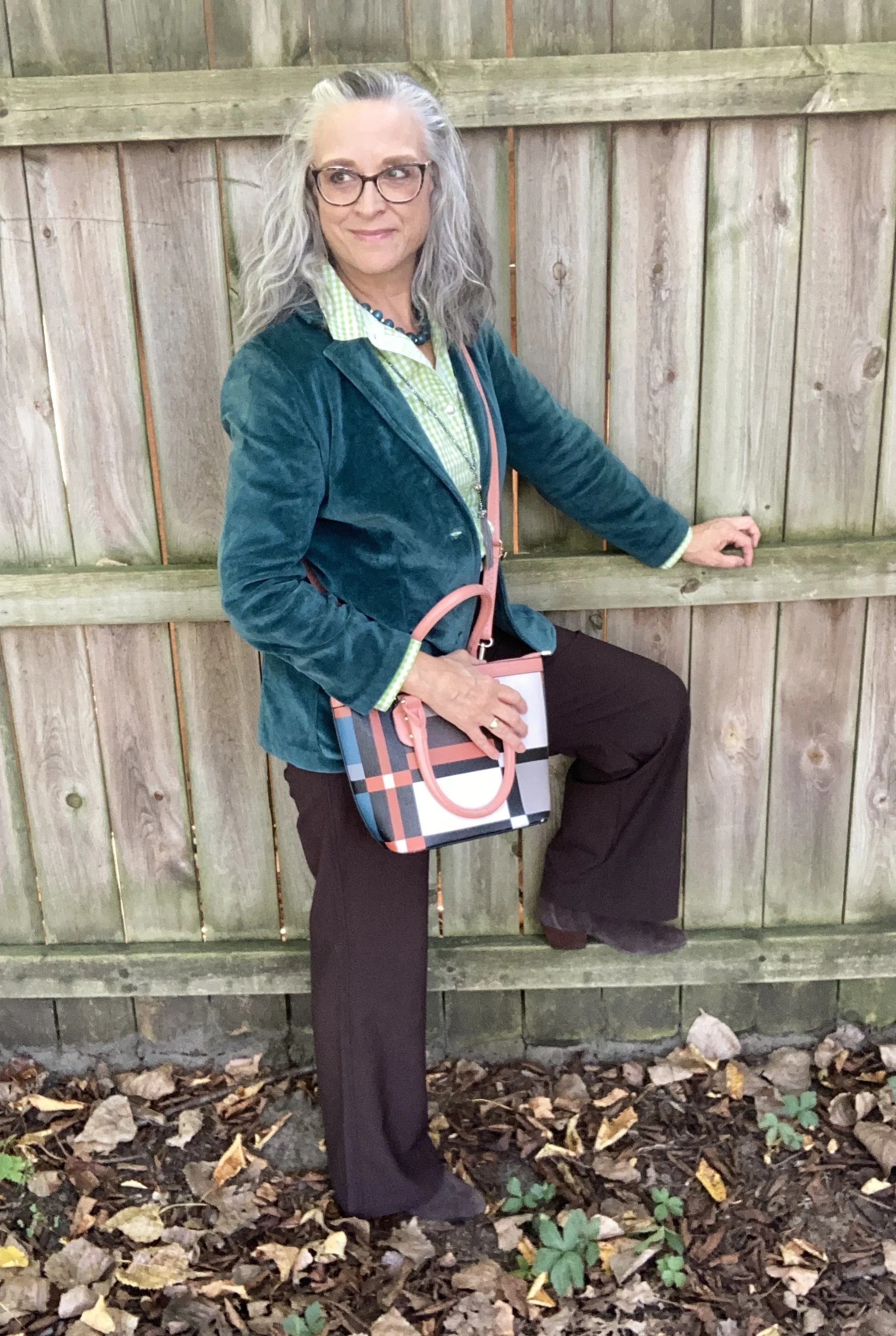
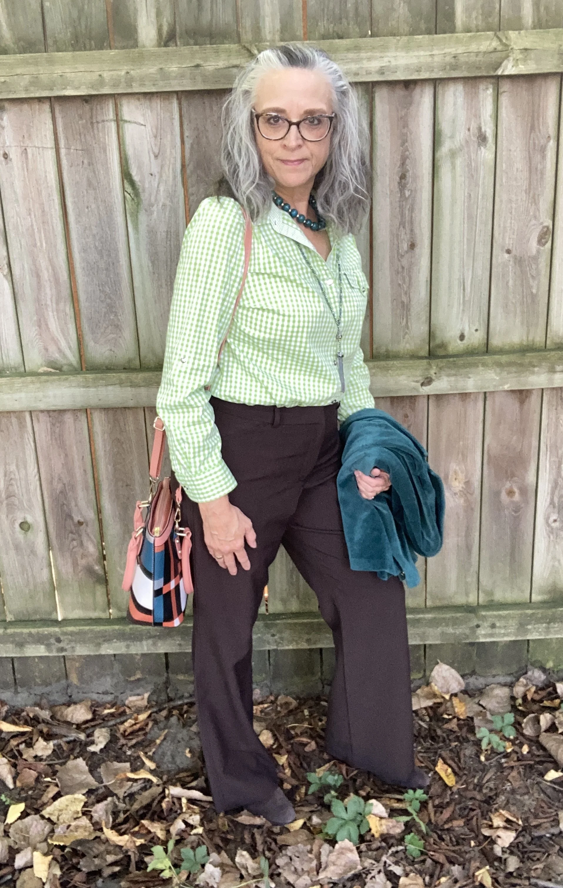
For today’s look I wanted to combine the two greens on the Pantone Autumn/Winter London palette. Just like I combined Lavender Blue and Crown Blue, today I am pairing Salted Lime, a medium, citrus green, and Fanfare, a tealy green. I chose Chocolate Martini for my classic color and I like the earthy vibe of this look. You can see the London palette colors by clicking on this link.
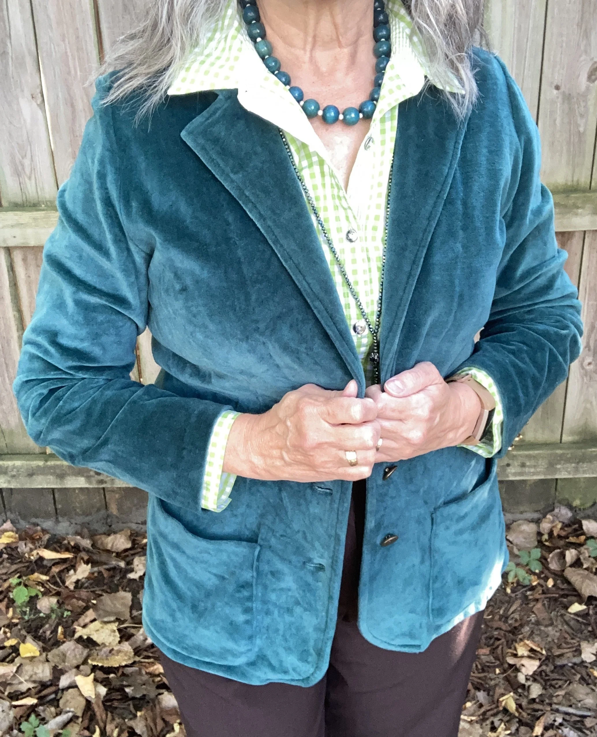
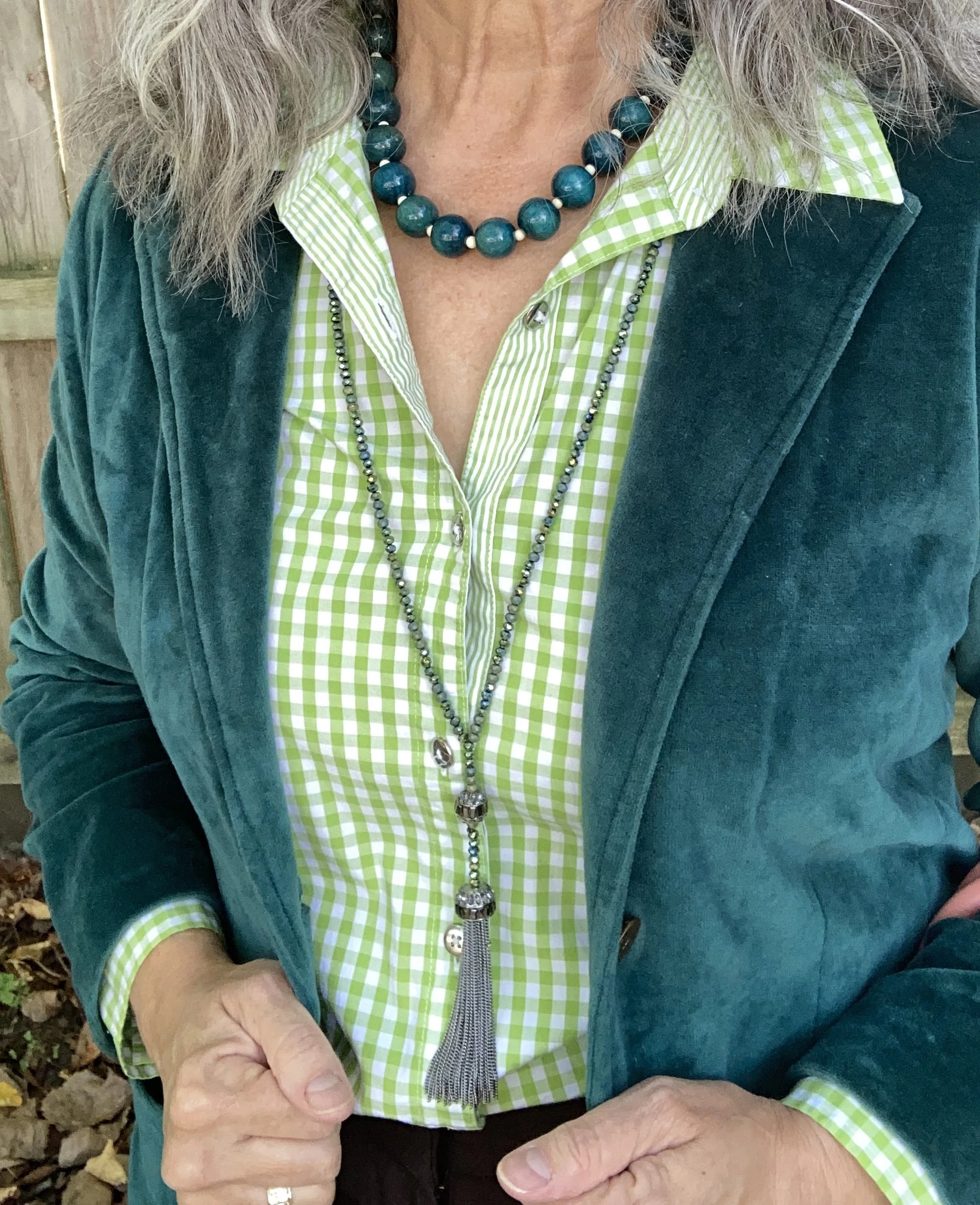
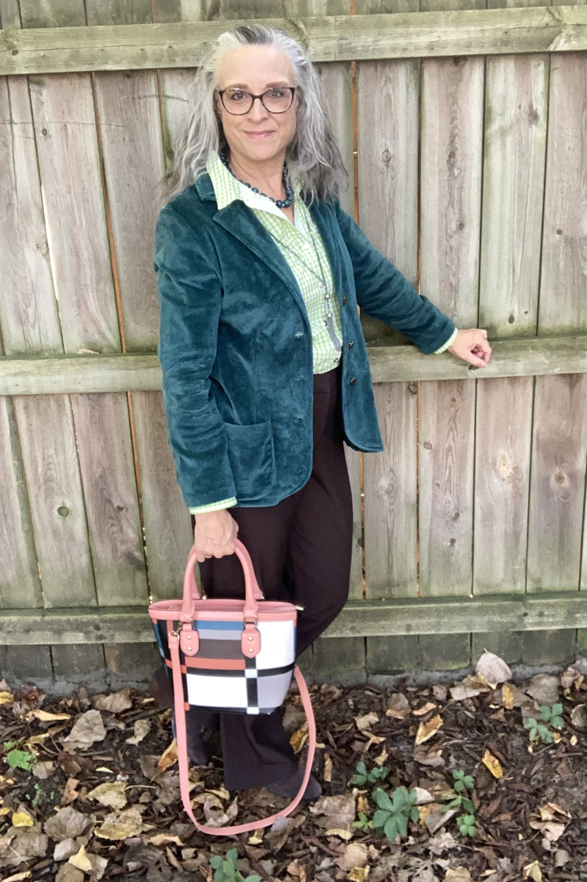
The star of this show is the Fanfare, velvet jacket that I recently thrifted. While not true velvet, it certainly looks the part. I found this piece and immediately threw it into my cart. When I tried it on, I knew it was coming home with me. It was obviously hand made as it still had the rough, inner seams with no finished edges, and no label of any kind.

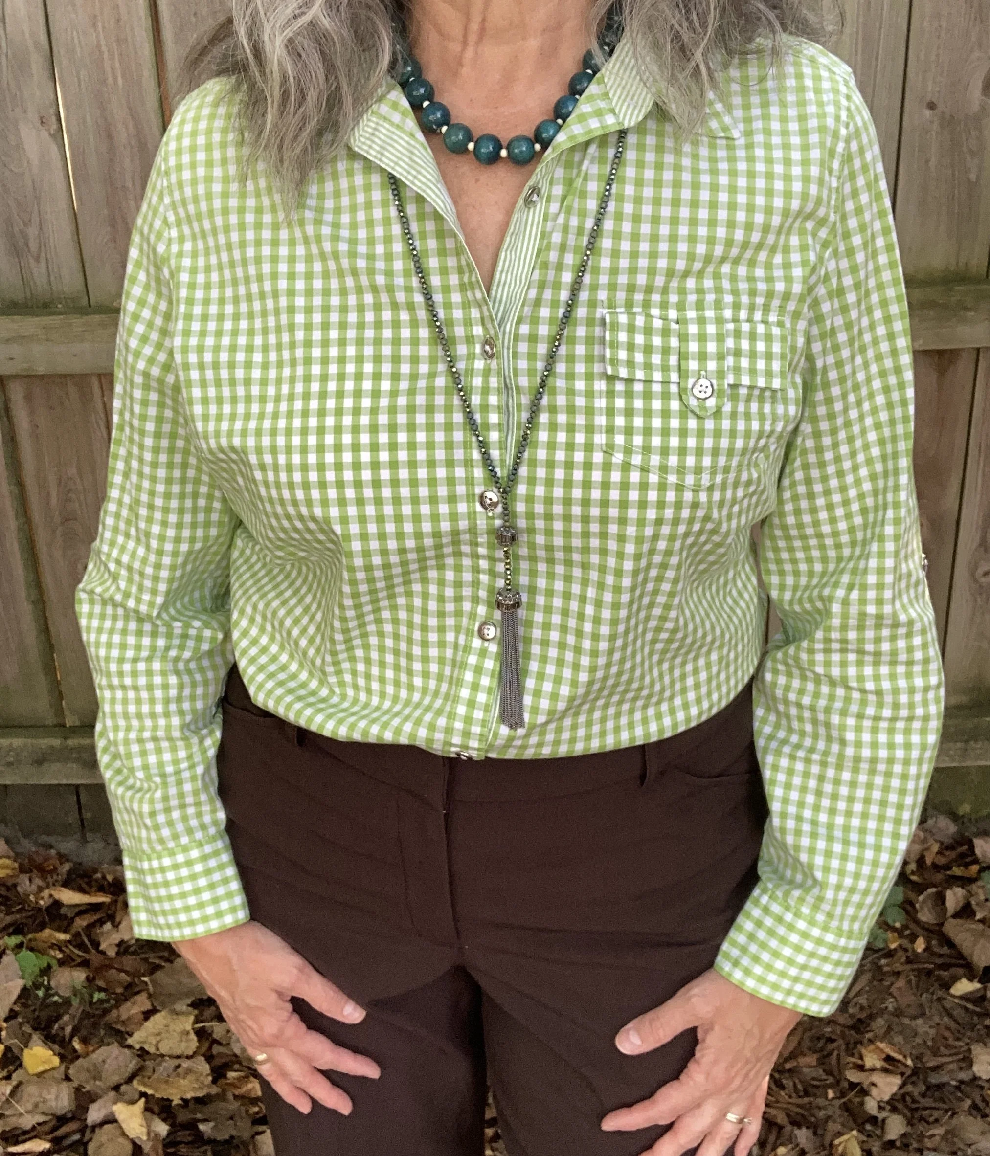
Salted Lime is not a color I have a lot of. When it comes to greens I like the darker more moody hues of olive and forest green. I also like deep tones like emerald and jungle green. However, I do keep a few pieces that are this lime color. This thrifted, Jaclyn Smith, gingham button down has been around for a number of years. You can see this top as a shacket over a graphic tee, worn under a graphic tee, and worn with a plaid skirt,

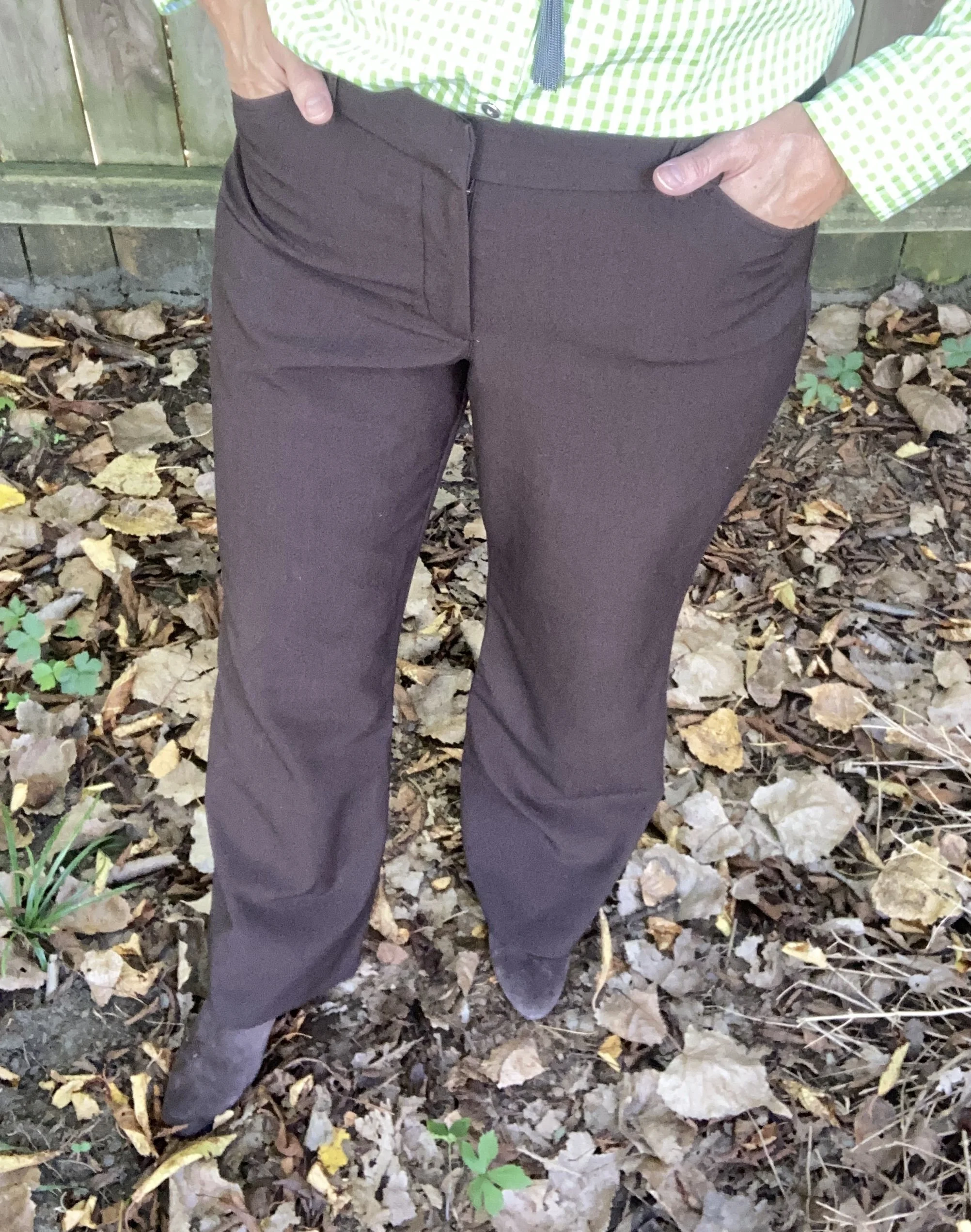
My Chocolate Martini pants were purchased new when I was still working as an assistant manager at a university bookstore. These are Worthington brand and I got them at JCPenney. They have a wider leg and are a bit long so I like to pair them with something that has a small heel.

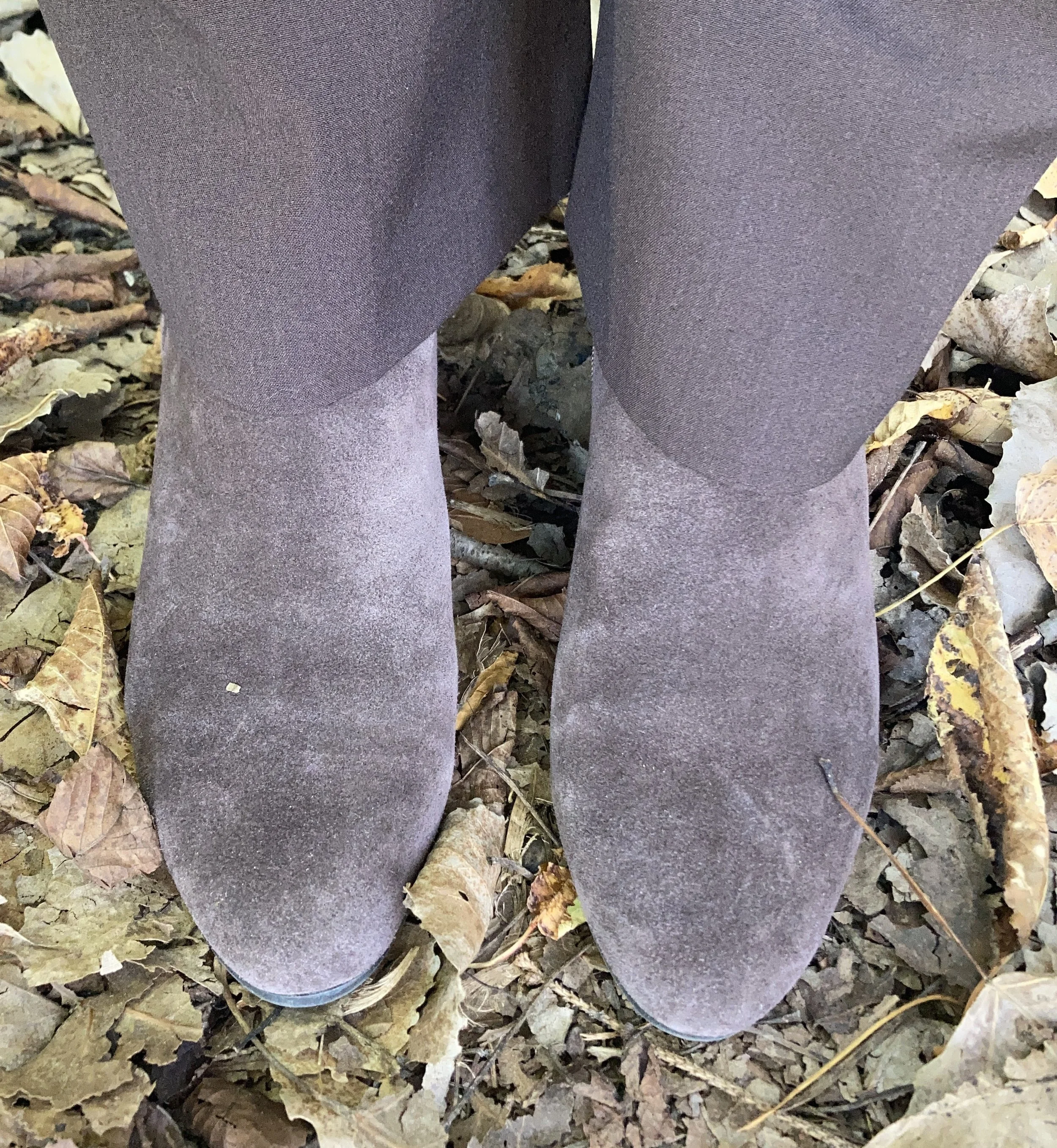
I chose my Nine West heeled ankle boots, which match the pants perfectly. A tip for making your legs look longer and leaner is to match your pants and your shoes. I got these a couple of years ago at Kohl’s.

I went for a layered jewelry look with a short wood bead necklace and a long beaded pendant necklace with fringe.

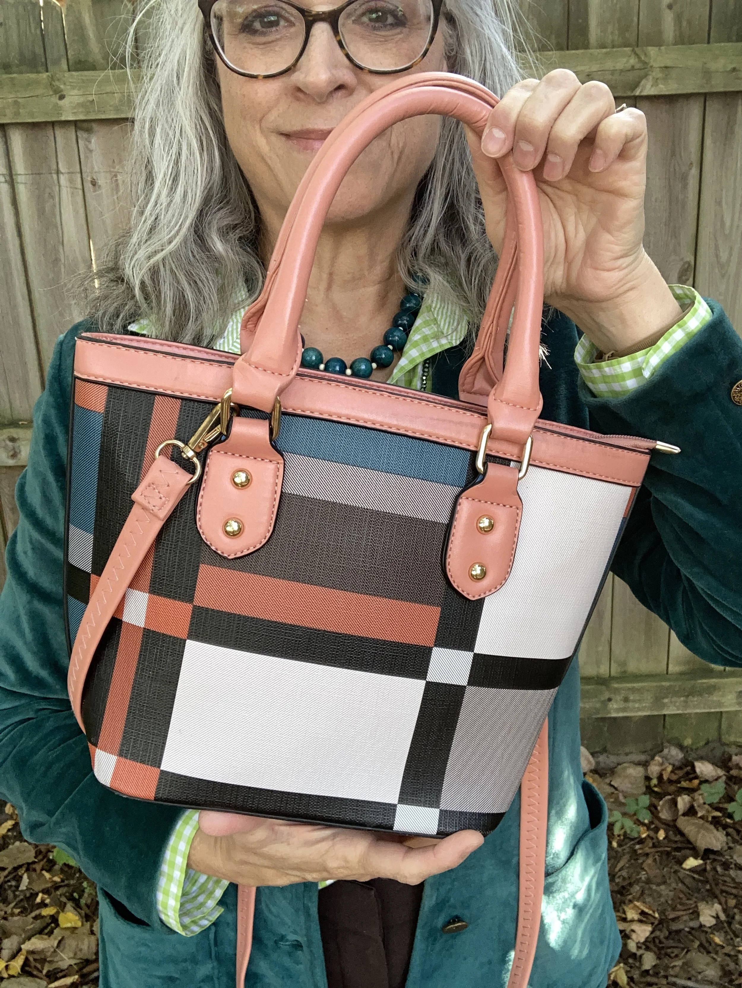
I wanted to add a pop of color and remembered this cute color block bag I had thrifted last year. It is just a cheap bag and has no brand name in it, but I thought it was extremely cute and fun. I think it works beautifully to add an element of extra color to this outfit.

What do you think of these colors? Do you have any of these in your closet? If not, which one would you like to add? Be sure to leave a comment or too. It helps my blog and it always encourages me.

This picture below, definitely needs a caption! What would you put on it?

I have included a few shopping links. These are affiliate links and are brought to you at no extra cost. These are retailers that are available through the affiliate and I cannot speak as to the quality of the pieces offered, so just be sure before you order something that you know the retailer’s return policy. If you purchase an item through my blog using one of my links, I get a little commission. I appreciate all your purchases as they help me keep the blog going. All opinions are my own.

Have a great week!

Pantone Autumn/Winter 2025 - London Palette: Poppy Red, Bronze Mist and Dark Gull Gray

Can you believe September is almost over? Here in the midwest it doesn’t exactly feel like fall. The leaves are changing, the sun’s angle is different and the days are growing shorter and shorter, but our temps have been summery. I really don’t mind the blue skies and high 70’s or low 80’s, but I am ready for the cool down, and the return to all that is cozy, including hot tea and cocoa, baking things in the oven and the sweet layers of sweaters and scarves.

We are looking at another trio of colors from the Pantone London Autumn/Winter 2025 color palette. You can see the colors in this Pinterest pin.

Today’s look gets a power punch from Poppy Red. You might remember this color from the New York palette. It is definitely a mood lifter. You can see the New York post here. Today I decided to pair this bright red with Bronze Mist, which is a similar color to the NY Bronze Brown, just a bit more yellowy green. I also chose the color Dark Gull Gray from the classic palette. I styled the shirt two ways, left out and tucked in, so I will include pictures for both.

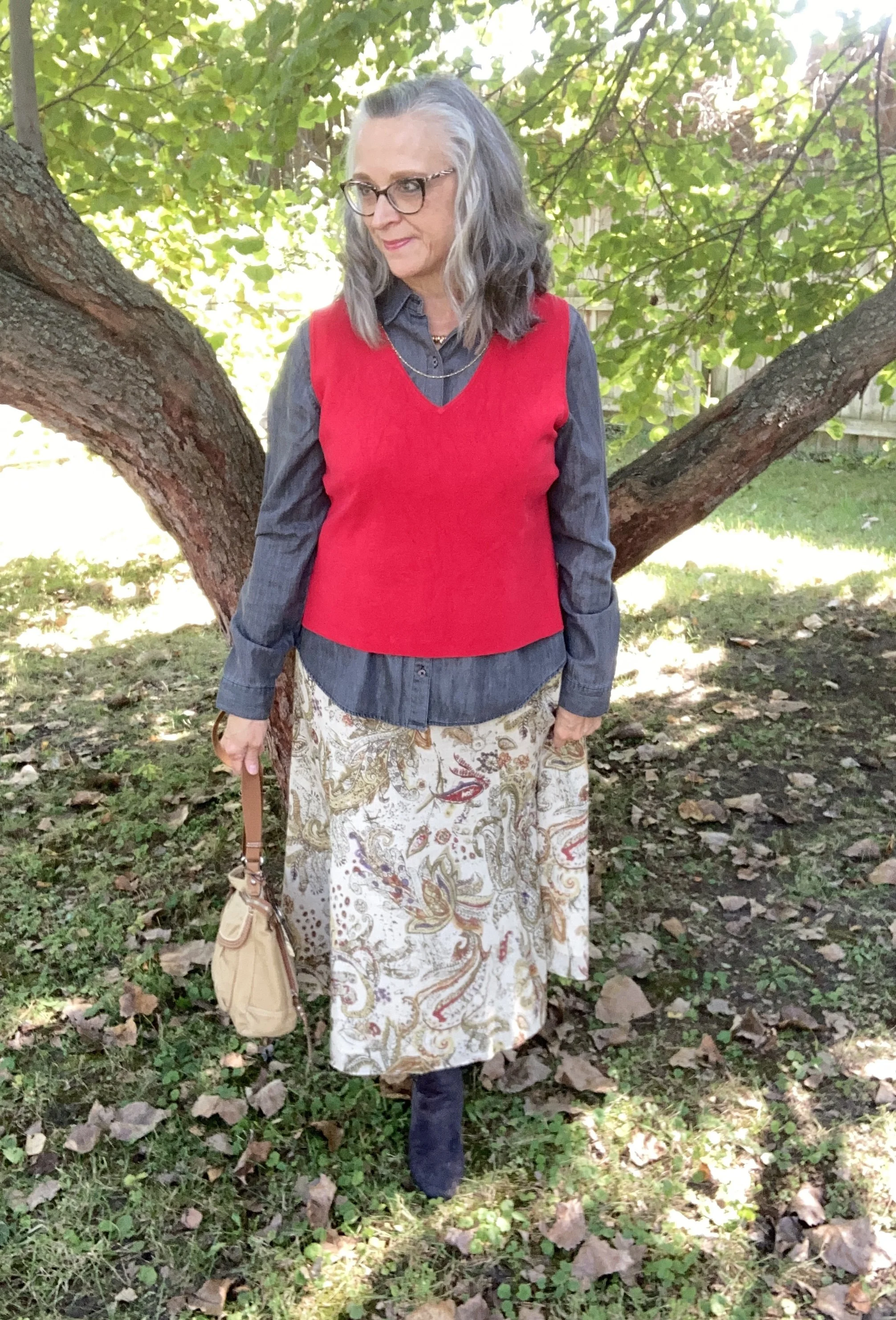
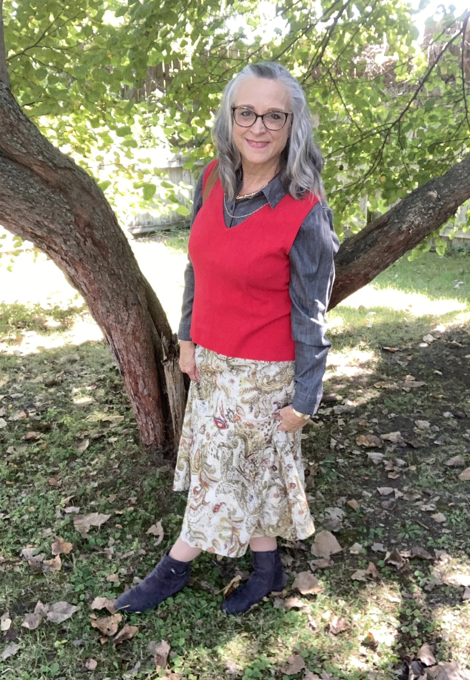
I found this bright Poppy Red, Sandra knit shell at a thrift store and thought it would work perfectly for a knit vest. I paired it with a second hand Dark Gull Gray, Falls Creek button down. I believe this may be a man’s shirt as it is quite big on me for a large, but who knows. Sizes are so different these days.

This Jones Wear skirt I have styled multiple times on the blog and even though I don’t wear skirts very often, this is still one I reach for. I chose this for the snippets of Bronze Mist color in the pattern. It is fully lined, but light enough to wear in the warmer weather, and warm enough to wear in the winter with tights and a pair of boots. You can see it with a maroon cardigan, a green suede jacket, a yellow top, and a green pullover sweater.

Since I was using the Dark Gull Gray color I chose my Impo ankle boots that I bought on clearance at DSW a few years ago, to balance the look out. Even though fall is the time we put our flip flops away and get out our boots, it is still too warm here to keep boots on for very long…at least for me. I love ankle boots in the cooler weather, and when it gets really cold, then I pull out the taller boots.

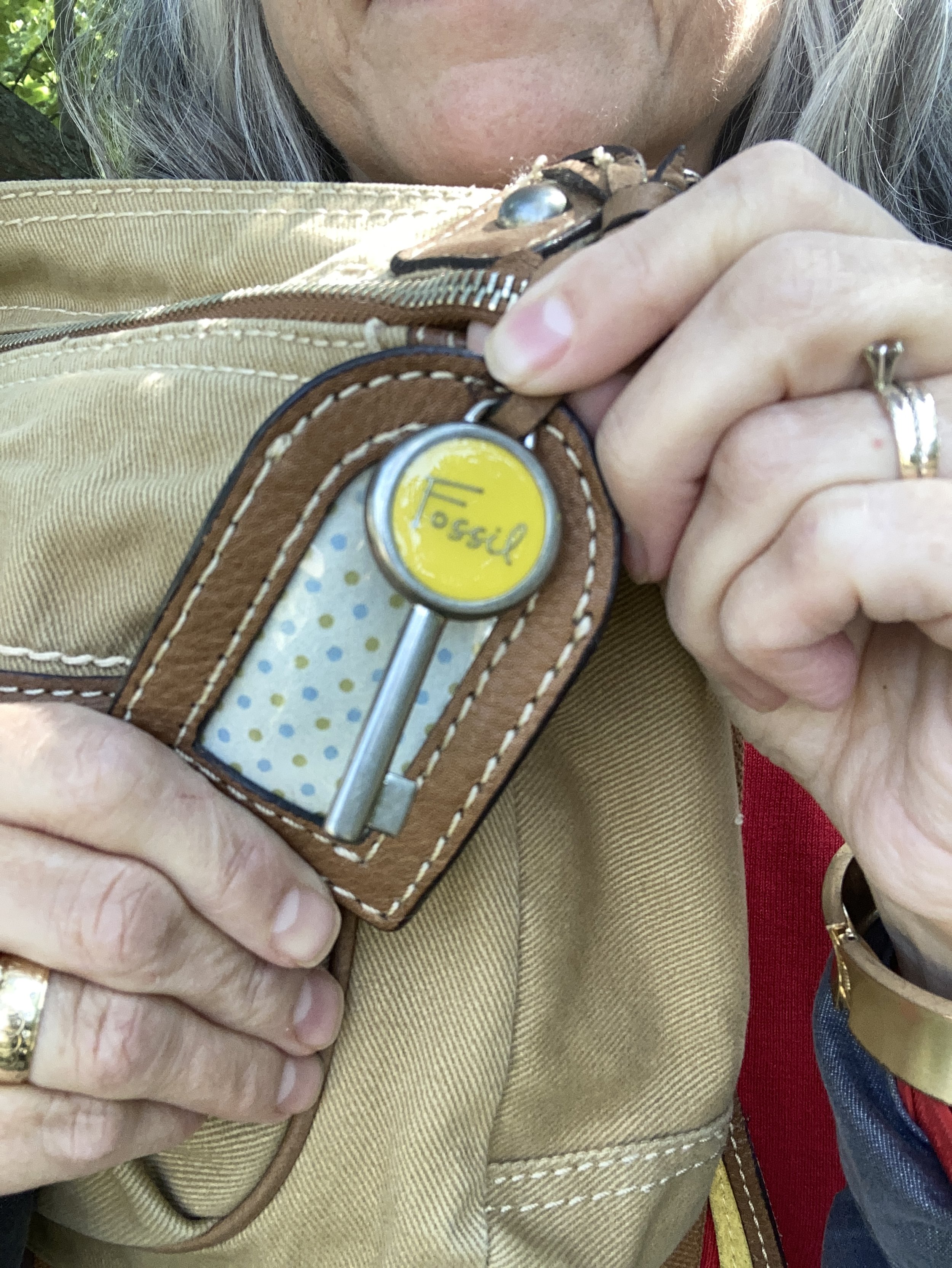
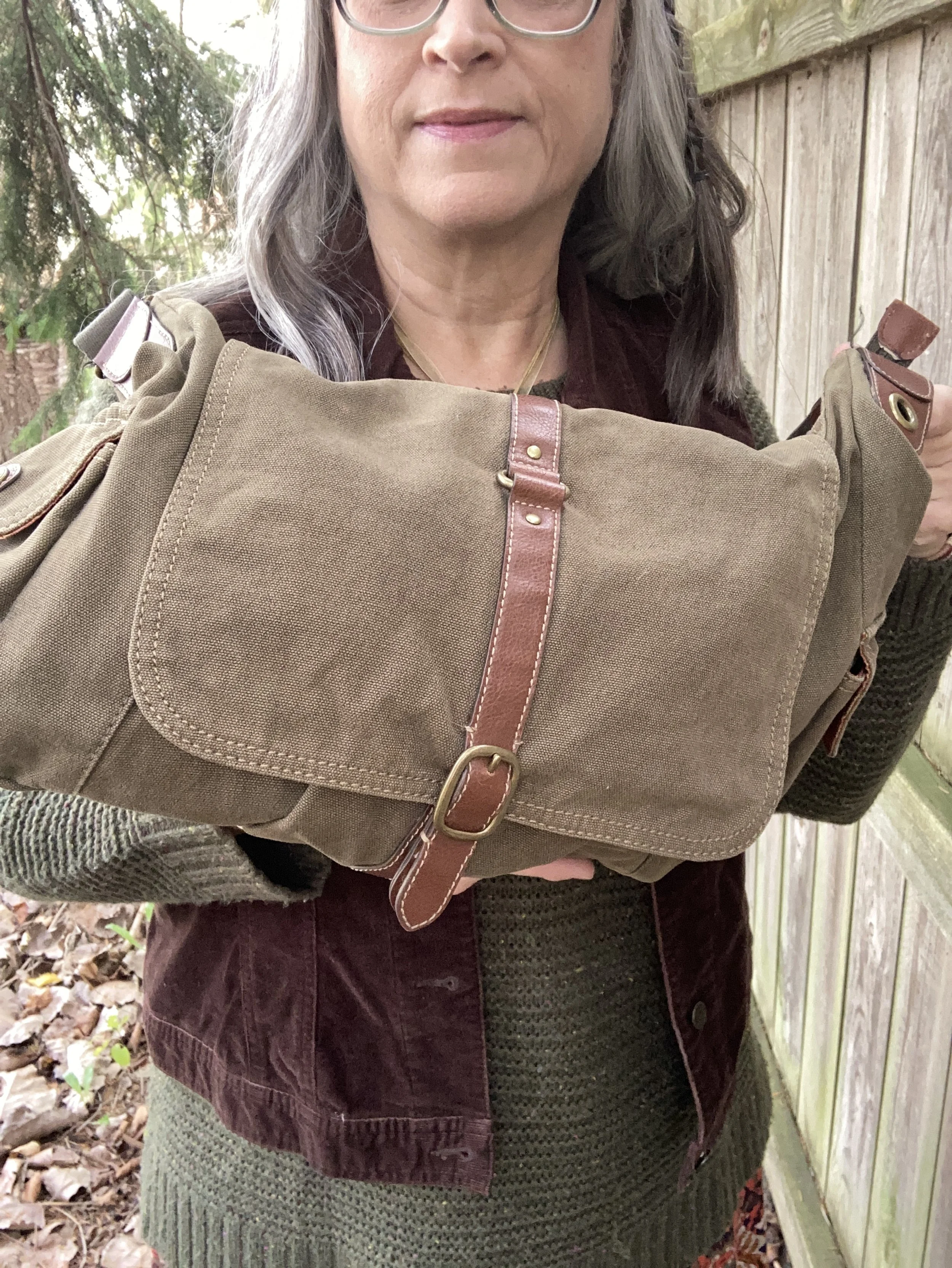
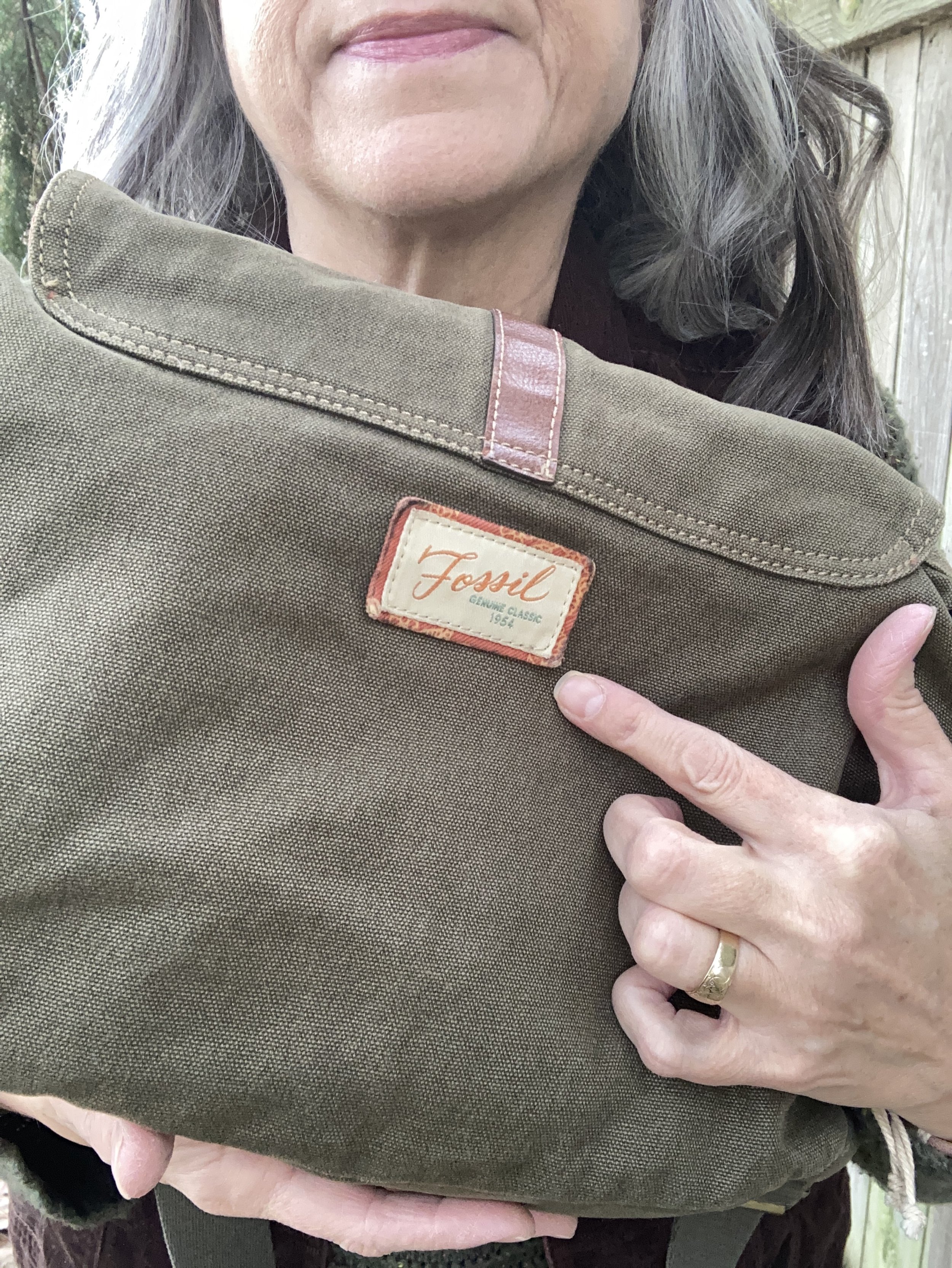
I chose this thrifted Fossil bag, as I thought it gave a nod to the Bronze Mist color, even though it isn’t a perfect match.

Do you like these colors together, or do you think they are odd? Do you have this bright Poppy Red in your wardrobe? Which version of this outfit do you like better, tucked in or left out? I love to hear your thoughts so leave me some love.

I’ve included a few shopping links for a few of the pieces to give you some similar color choices, but it was hard to find any sort of skirt in a similar color. These are brought to you at no extra cost. These are affiliate links. All opinions are my own.

I hope you are having a great week!

Pantone Autumn/Winter 2025 - London Palette: Lavender Blue, Chili Oil and Crown Blue

As we start the London Color Palette this week you will recognize a few of the same colors that were on the New York Palette. Chili Oil and Crown Blue are two of those. You can see the London palette colors by checking out this pin on my Pinterest board. For today’s look and a one other look from this palette I decided to combine colors that fall into the same color category. Today I combined the pastel Lavender Blue with the classic Crown Blue, along with Chili Oil for a casual chic color block look.

The leaf is not part of the outfit! Ha, ha. Watch the following and you’ll know why. We have an immense Cottonwood tree in our yard and the leaves start to carpet the grass from the beginning of August. Even with all the leaves on the ground there are still leaves on the tree…and the sticks!! Eye, yie, yie. The stick shed from Cottonwoods is crazy.
You saw this Crown Blue thrifted Coldwater Creek piece just a few weeks ago. See the post here in case you missed it. This is a retailer that has many pretty and practical pieces, but they are a touch out of my price range, that is why I like to find different brands at thrift stores to try them out.

Lavender Blue is the London pallet’s pastel. I have two pullover tops in this color. It is a purply blue that is hard to match with anything, so an outfit like this allows it to stand on its own. This piece is Apt. 9 and was purchased at Kohl’s a number of years ago. I had to show off the beautiful lace inset on the back, even though it was concealed under the jacket. You can see how I styled this in another fall outfit with a white skirt.

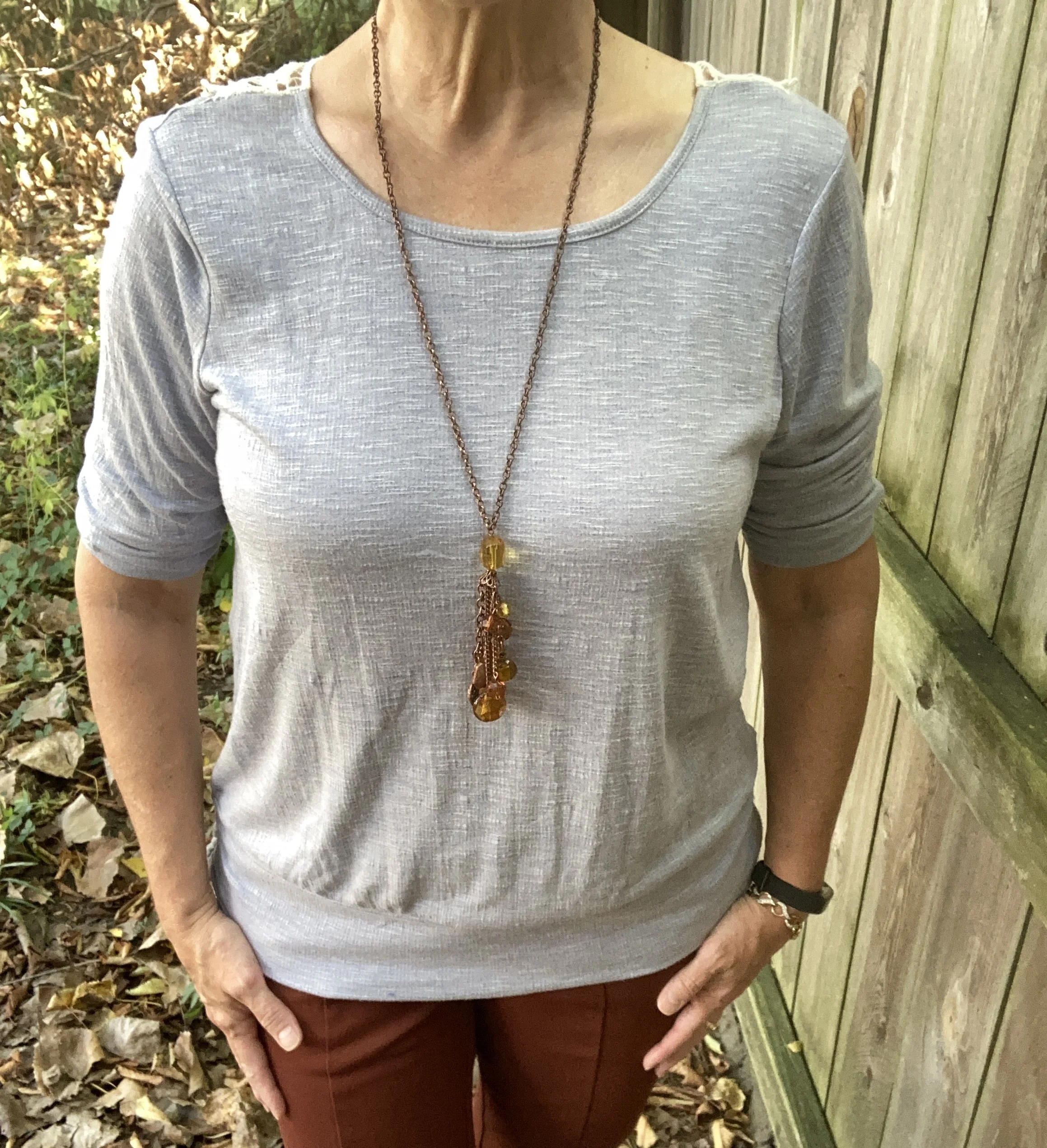
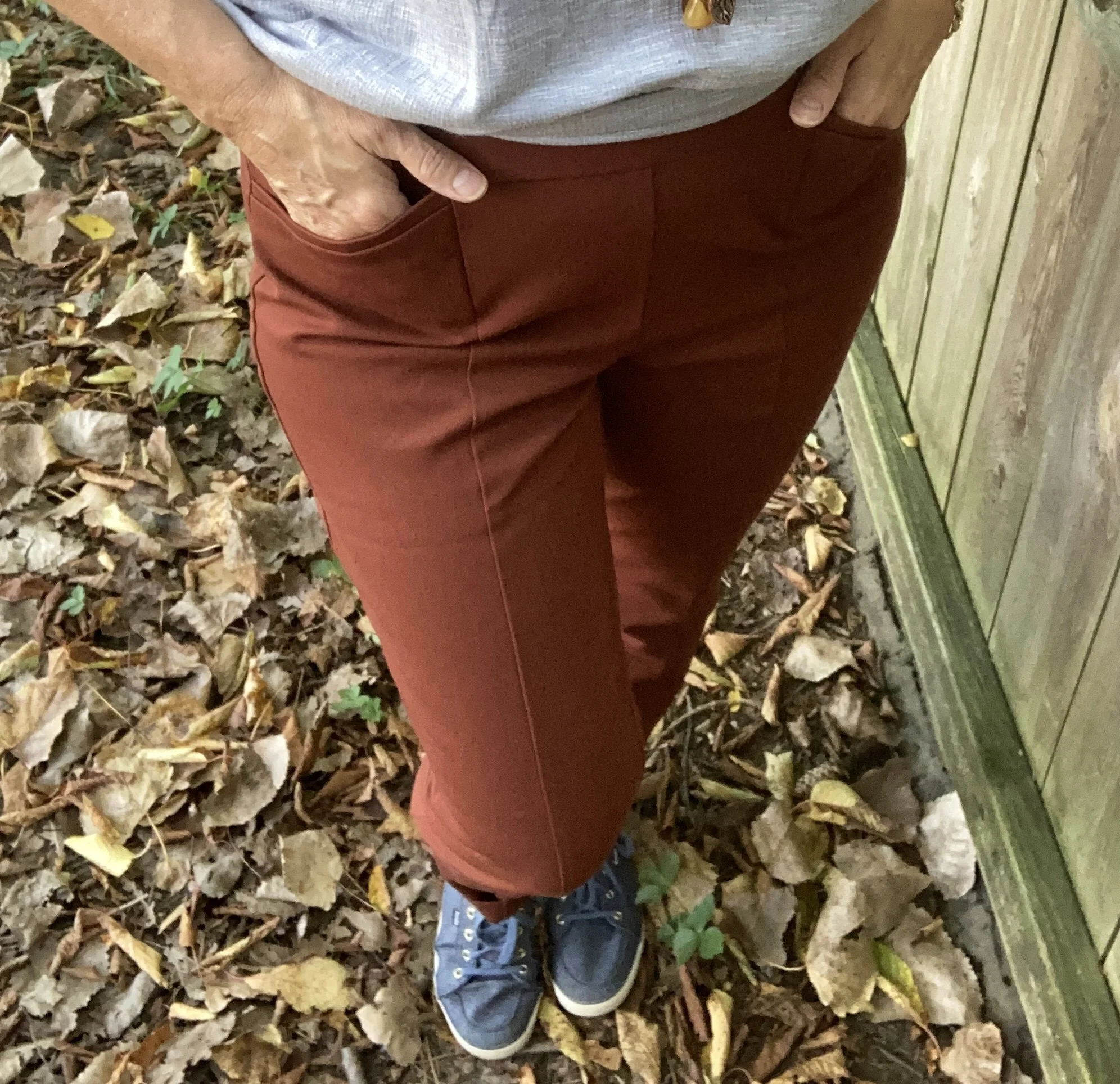
My Chili Oil pants are Chico’s So Slimming, which I bought on sale a number of years ago. These are ponte pants. I never thought I would like a knit pant like this, but I do. I do not wear them often as I look at them more as a dress or work pant, but it was fun to get them out for this outfit. You saw them a few weeks ago when I styled them with Lemon Grass and French Roast.

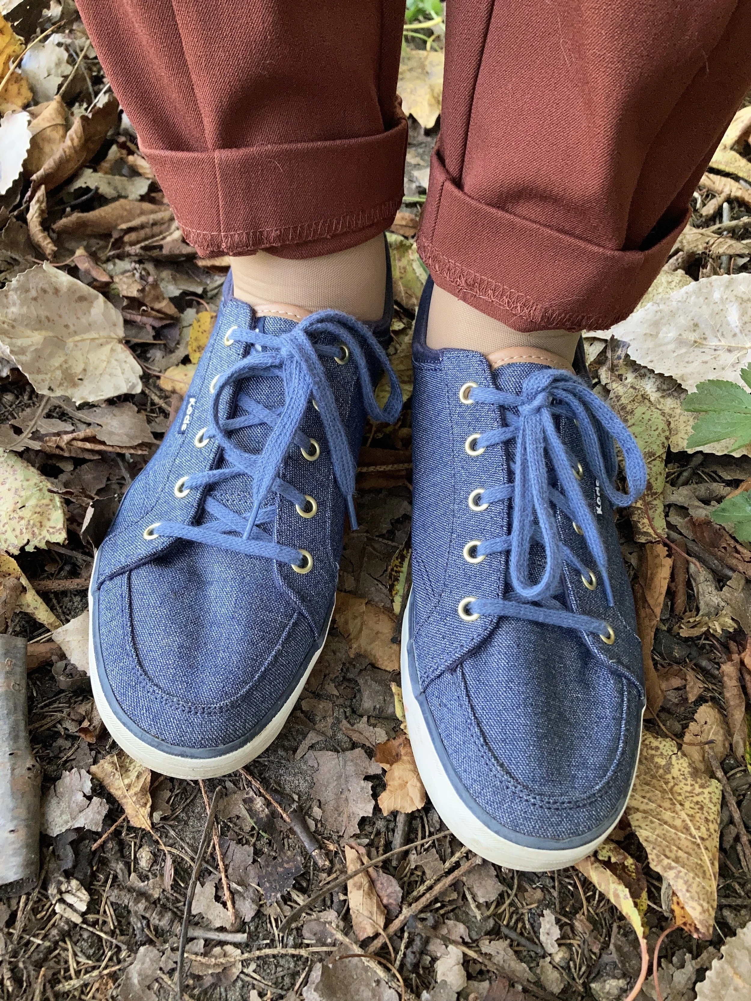
I felt like keeping it casual, and thought it would be a nice contrast to the previous look with these pants which was more dressed up. It is amazing how accessories like shoes and bags can change a look. I chose my denim Keds as a nod back up to Crown Blue jacket. I also gave the pants a cuff, which in this look keeps it a bit more casual.

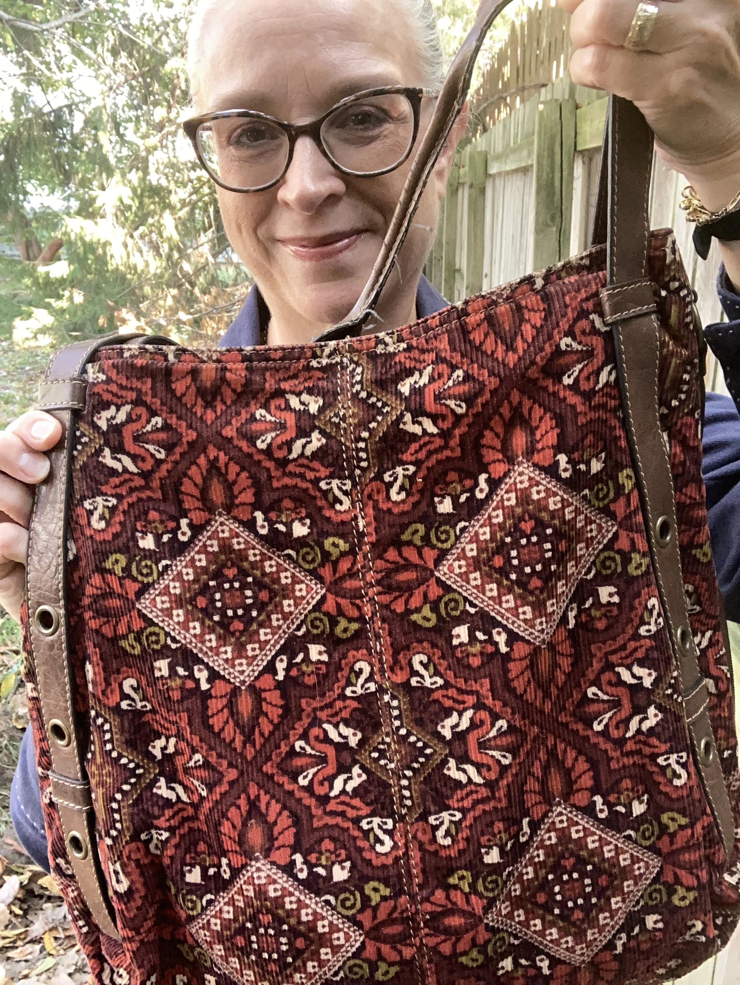
My corduroy axcess bag is very old, but I love the colors and keep it hanging around, even though my current go to’s for bags are cross body and smaller.

My jewelry is a simple pendant charm necklace. I like that the coppery color goes with the Chili Oil vibe of the pants, and makes the pastel top seem more fall appropriate.

What do you think of this outfit? Do you like these colors? Do you like to wear a color block look?

I am including a few shopping links for you. These are affiliate links and are provided to give you ideas, inspiration and possible shopping options. If you use one of my links to make a purchase, I get a little commission, and believe me at this point in time, all the pennies count.

Have a super Tuesday!

Pantone Autumn/Winter 2025 - New York Palette: Bronzed Brown, Winterberry and Vapor Blue

I hope you are enjoying this Pantone color series. For the actual colors check out this pin on my Pinterest board. The Pantone Color Institute is the entity that people turn to for the trending colors for both fashion, architecture and home decor. I enjoy seeing what the colors are for each season, however, they have made it harder and harder to actually see the colors without having an account, so I appreciate those who do sharing their findings on Pinterest and other platforms.

Today’s colors are what I would call a little more reminiscent of what we tend to think of when we talk about the autumn season. Bronze Brown is a golden brown making me think of changing maple leaves and colorful sunsets, while Winterberry gives a nod to aromas soon to fill the air like cranberry and cinnamon, and Vapor Blue looks like wispy jet trails across a fading fall sky.

This seemed a bit of an odd pairing with the Bronze Brown and Winterberry, but after I put it together, I really liked how it turned out.

The Bronze Brown, Ophelia Roe jacket was a piece I got on clearance at Meijer. It actually had a pair of pants that went with it, that I bought at a later time. However, the pants seem to be a bit off. I should have taken them back right away, but sometimes you can’t tell right away something is cockeyed or sewn improperly. They are in the donation pile. I do, however, like the jacket with its utility, bomber style silhouette.

This Faded Glory floral blouse I have had for years. I don’t know why I don’t wear it more often, because I do like it. I just go right from shorts sleeves to fuzzy sweaters and sweatshirts and forget about the in between time. I honestly don’t remember if I bought it at Walmart, or if I found it at a second hand store.

You can also see my chunky berry and gold necklace, a gift from one of my daughters. I thought it went well with the casual vibe of the outfit. I also added a dark brown, almost burgundy colored leather belt that I recently thrifted. I know the trend has been no belts, but I always feel that a belt gives an outfit that finished feel, specifically when tucking a shirt in. Apparently the half tuck is no longer trendy and we are back to a full tuck or no tuck.

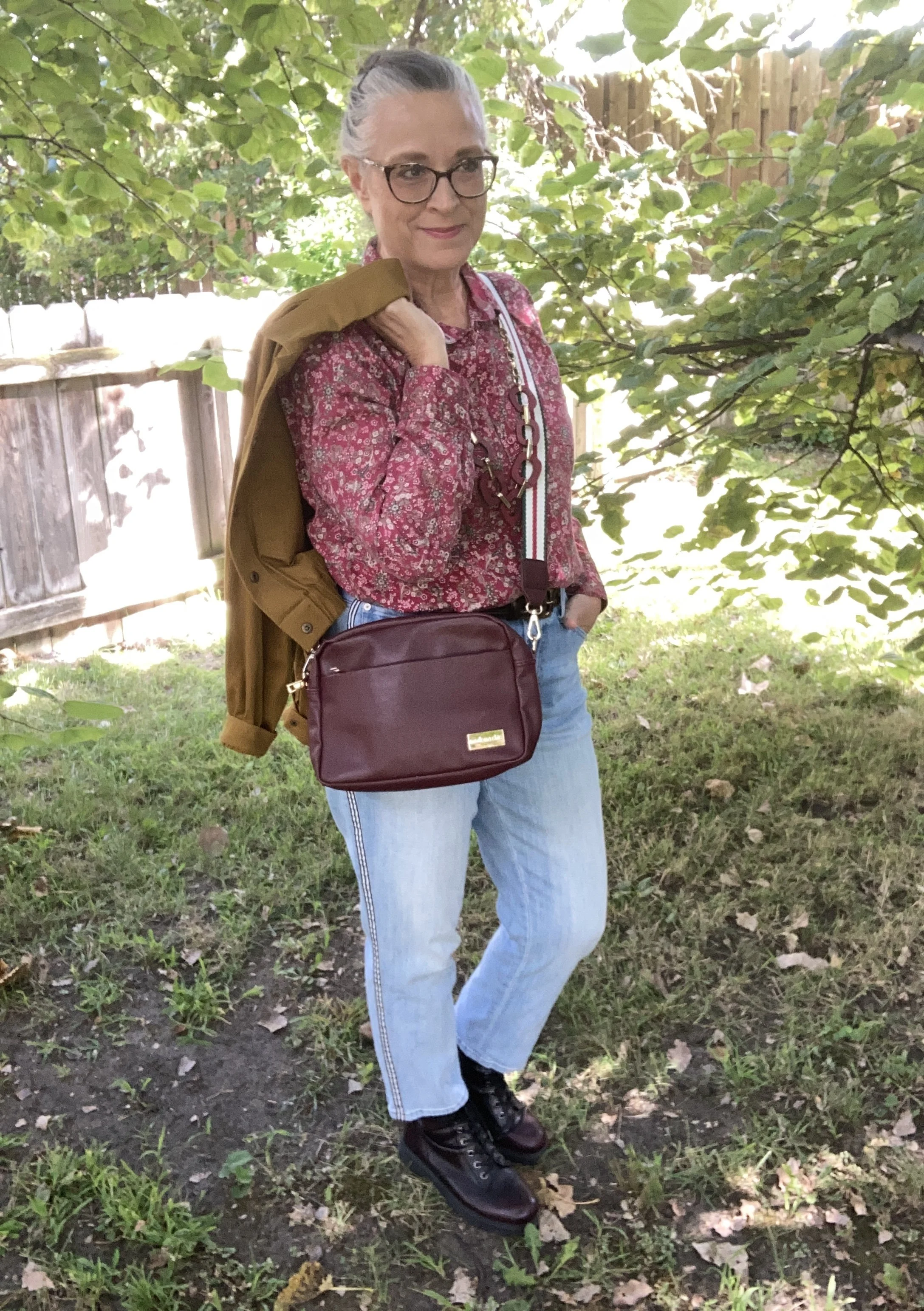
These Talbots jeans are also a thrift store find from this past spring/summer. If you look at the Pantone color for Vapor Blue, it really looks like a very light gray, but I feel that these jeans were representative of that faded blue sky we often see in the early morning or late evening. If the Pantone gurus say it’s blue, well okay, and this was my take! Ha, ha. I love the black and white pin striping down the outside seams of the legs.

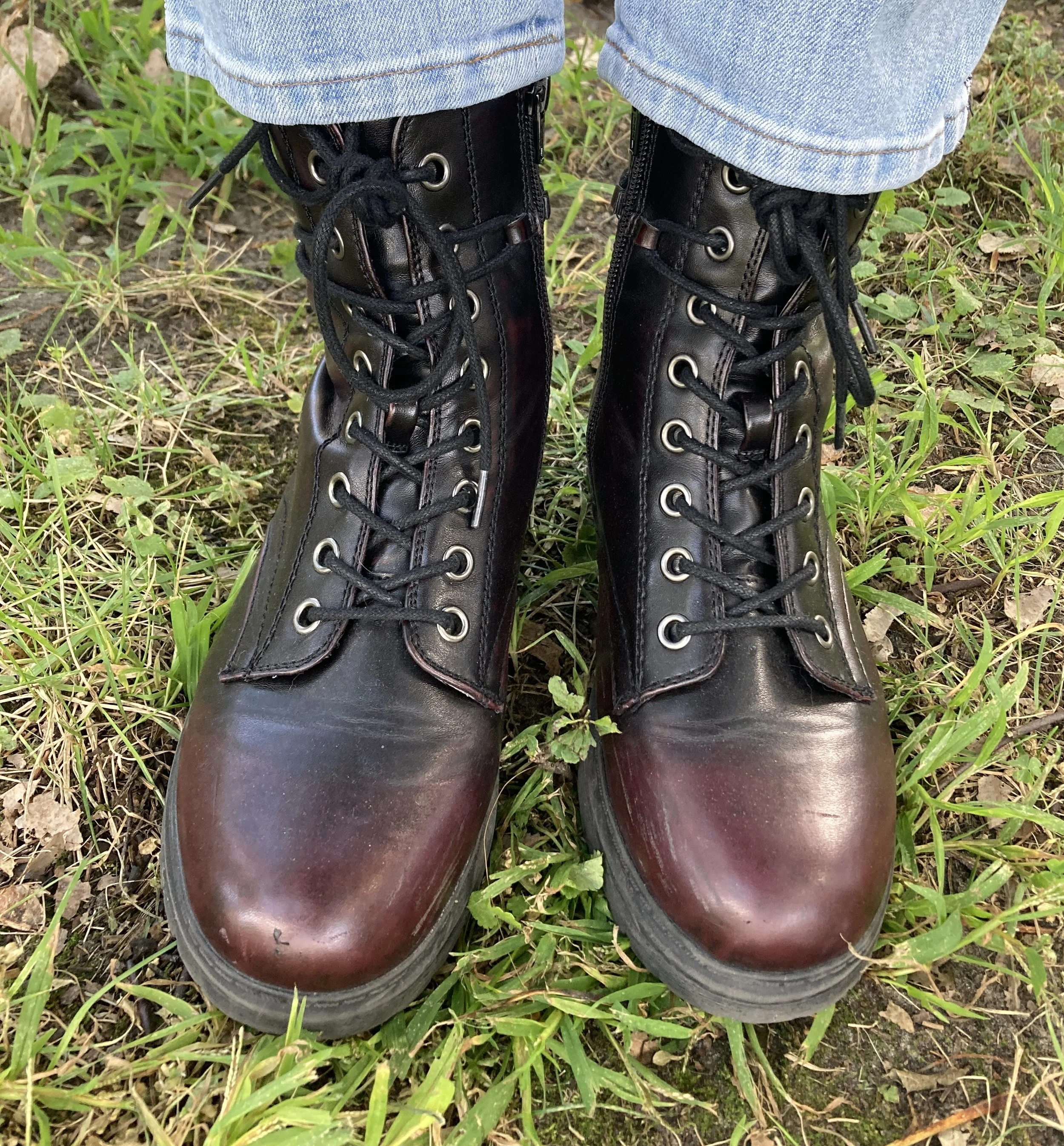
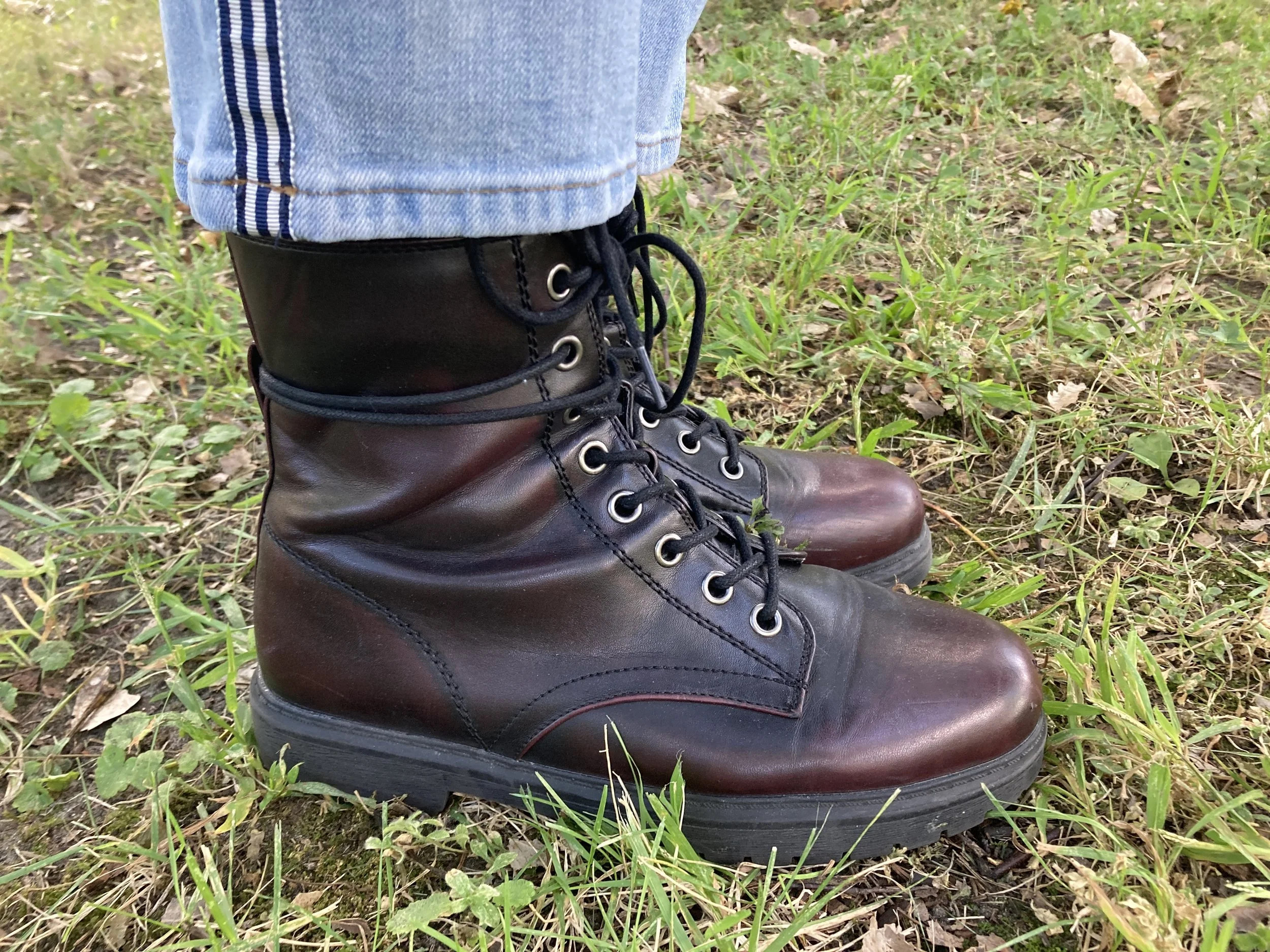
Once I put the outfit together, I was struck by the thought that I actually could start styling boots again, so I grabbed these SO burgundy combat boots that I scored at Kohl’s a few seasons ago.

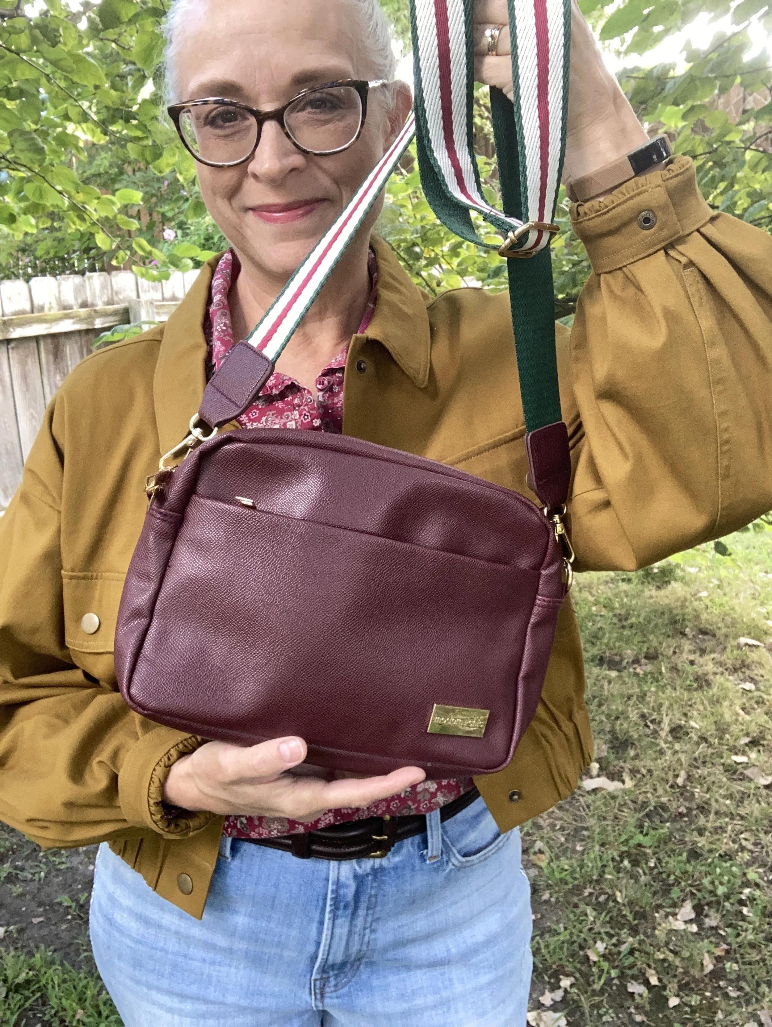
I just found this cute crossbody bag a few weeks ago when I was thrifting with my bestie back in New York. We always hit the thrift stores together, which is great fun. This is a brand called Modern Chic. I love the guitar strap vibe.

What do you think of these colors? Do you like how I put this outfit together? What would you have done differently? Please leave me some love in the comments. I appreciate my faithful few who try to comment on the regular. You always remind me why I keep doing this! Hugs to all of you.

I have included a few shopping links for you to look through. These are affiliate links which means when you purchase something through one of my links, I get a small commission. I appreciate all of your support, but most of all I appreciate that you stopped by the blog to hang out for a while.

Have a great week!

Pantone Autumn/Winter 2025 - New York Palette: Lemon Grass, Chili Oil, and French Roast

This week brings you another collection of colors from the Pantone Autumn New York color palette. Remember, I am combining colors as they inspired me, but you can take any of the colors from the palette and put them together, or maybe there are only one or two colors that you like and plan on adding to your wardrobe. This is always about what you like and how you can be inspired to look at your closet differently.

Today’s outfit is a contrast of light and dark combining the yellowy green of Lemon Grass with the classic French Roast along with the spice of Chili Oil. You can see the actual Pantone colors here.

This pale yellow top, is not a true yellow, but has just a hint of green, making it the perfect selection from my closet for the Pantone Lemon Grass. I found this a few years ago while thrifting and it is a brand called Jess & Jane. I discovered that Jess & Jane is a California based wholesale clothing company who only sells to specialty boutiques, so who knows where this piece originated from. It’s kind of fun to think of the roads some of our second hand pieces have traveled. I like the asymmetrical hemline and the funky ink spray pattern on the front. I also like the sleeve length, which is perfect for the transitional days between summer and fall.

I remembered that I still had these rusty, Chili Oil, Chico’s So Slimming ponte pants that I had purchased on sale a few years ago. Ponte pants are made from a thick, stretchy, double-knit fabric called Ponte di Roma. They offer a more flattering line than regular leggings due to the specially made seams and more support. I don’t wear dress pants very often these days as I no longer have an office job, but I hang onto things for now, because who knows when I may have to go back to work outside the home.

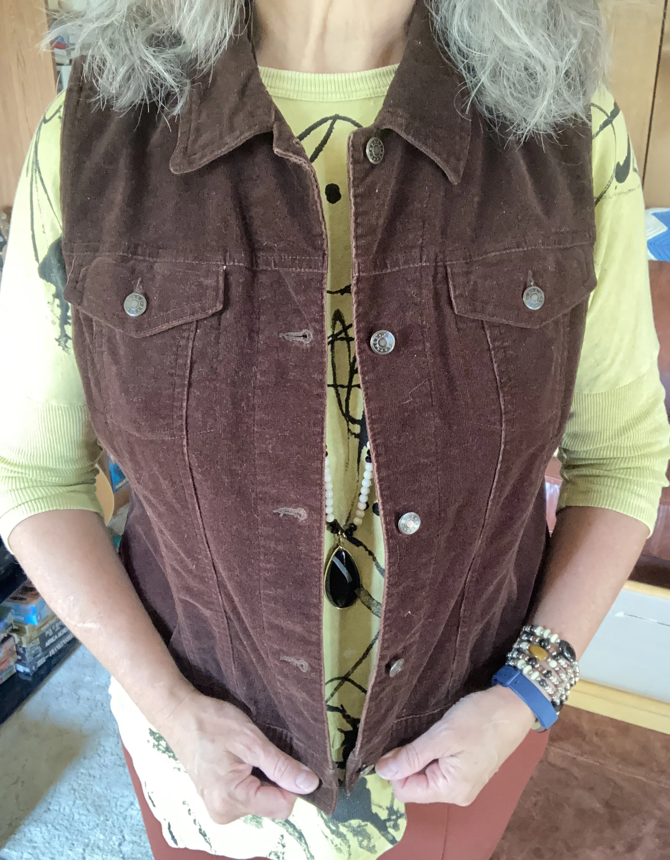
To add a bit of texture and a layer for cooler temps I reached for this thrifted Crazy Horse by Liz Claiborne corduroy vest. It does a fairly good job of mimicking the French Roast dark brown color on the New York classic palette. I love this piece as it is structured, but also has a bit of stretch making it easier to wear.

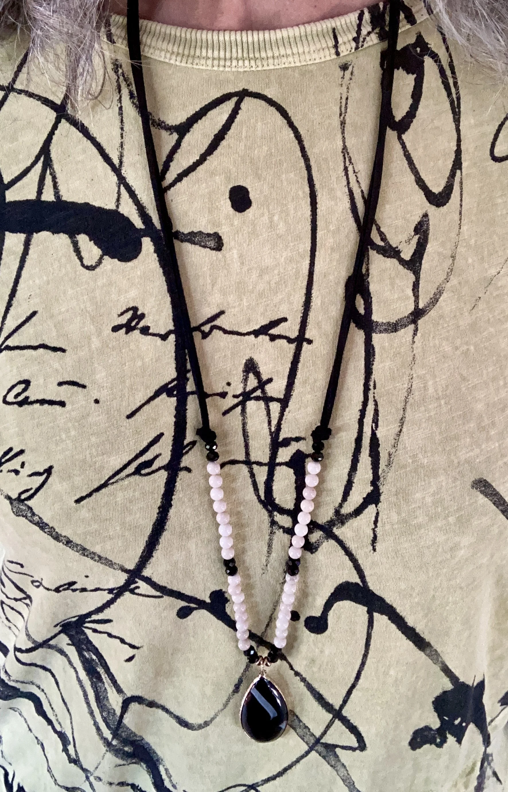
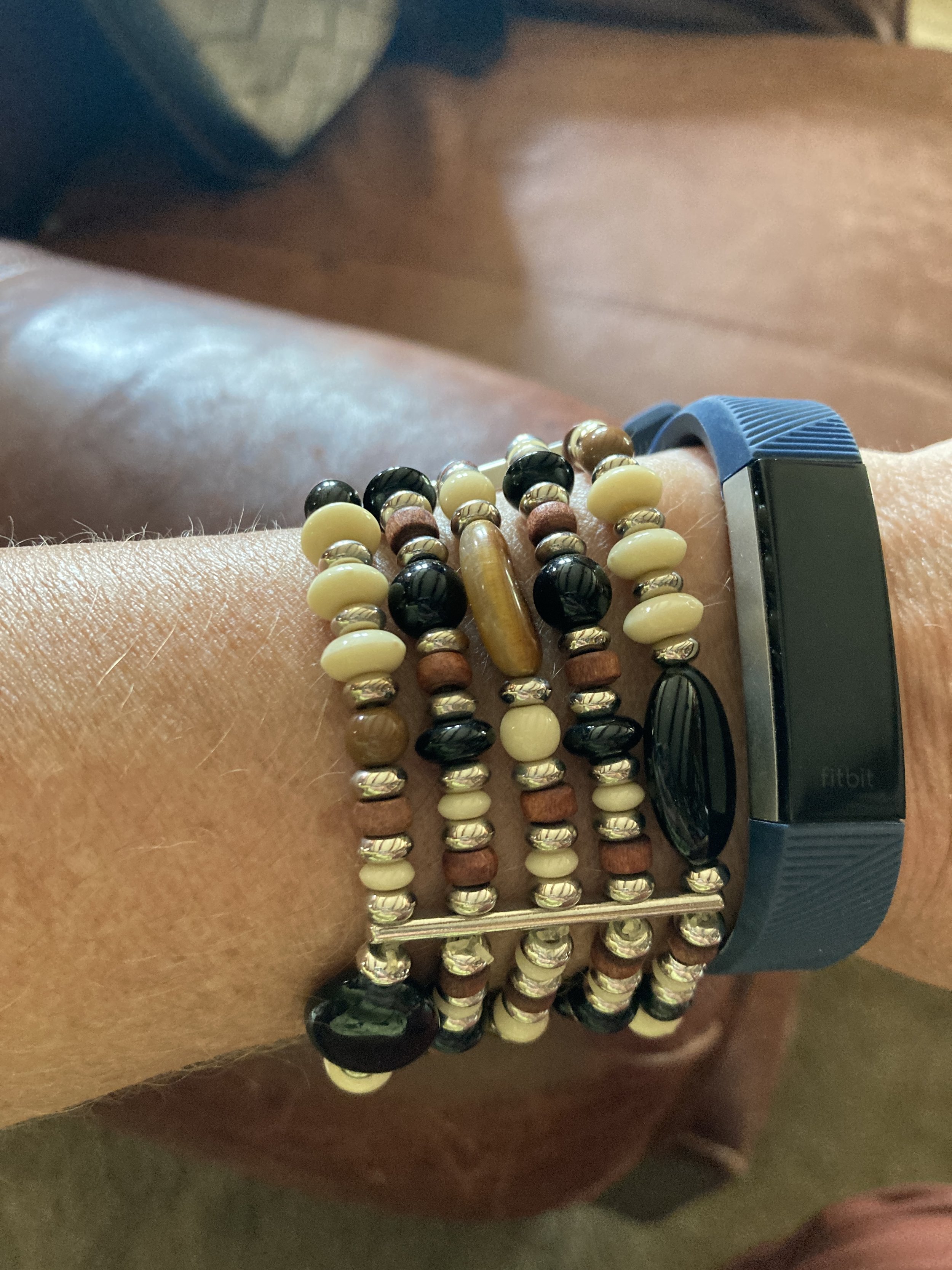
I kept my jewelry simple, as the top, vest and pants do the talking. A long black and white, beaded pendant necklace, and a stack, bead bracelet with browns, creams, blacks and a touch of yellow threw in a bit more texture and interest. I didn’t think to swap out my blue Fit Bit band for a brown or white one. Ha, ha.

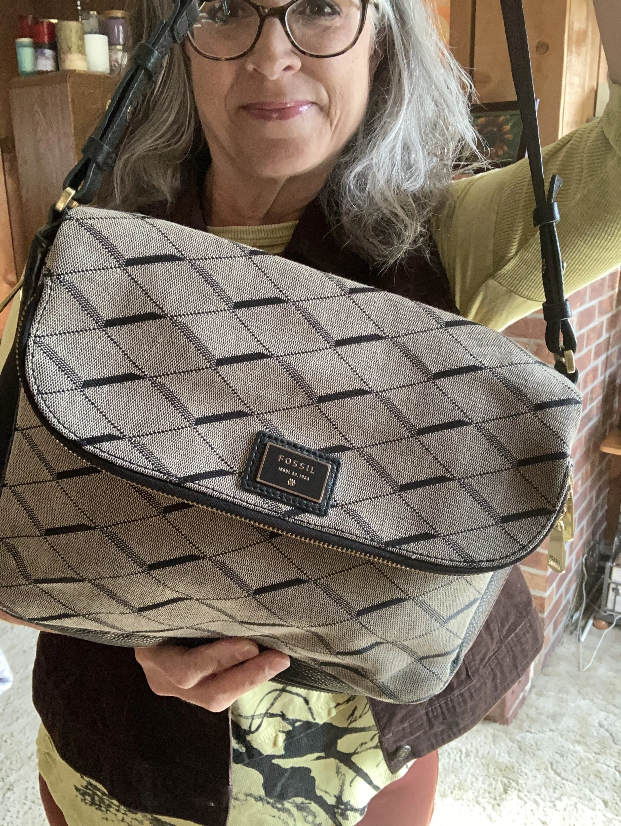
I chose black for my shoes and bag to tie to the black print on the top. My bag is a thrifted Fossil shoulder bag, and my shoes are Aerosoles that I purchased a number of years ago from DSW. I really like both of these. The bag is a great fall and winter choice, and the heels are comfortable (for as comfy as a heeled shoe can be when you don’t wear them very often - ha, ha).

What do you think of these Pantone colors? Would you wear these colors together? Do you like Lemon Grass, Chili Oil or French Roast the best? Which of these colors do you already have in your closet? Leave me a comment or two. It helps my blog to grown and reminds me why I do this!

I have included a few shopping links. Thank you so much for making an occasional purchase through my links. That gives me a tiny bit of income. I cherish all of your support. These are affiliate links brought to you at no cost. All opinions are my own.

I hope you are having a great week!

Pantone Autumn/Winter 2025 - New York: Primrose Pink, Damson, and Mauve Wine

I am making an attempt to get back on track on my Fashion page, by introducing the Pantone Autumn/Winter 2025 color palettes. I thought if I started a little earlier, you could take the inspiration and actually shop your closets for some of these colors to wear this fall. Starting with the New York palette, I hope to also cover the London Palette next month.

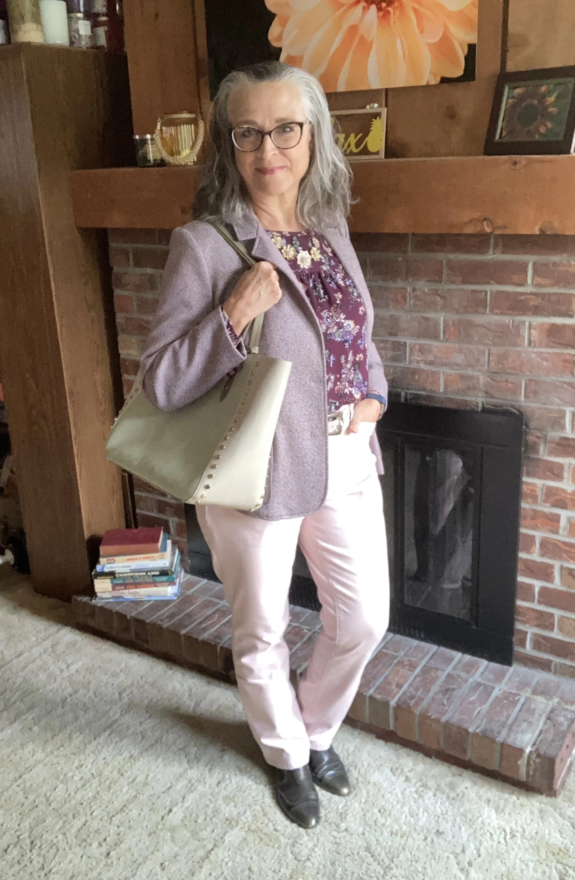
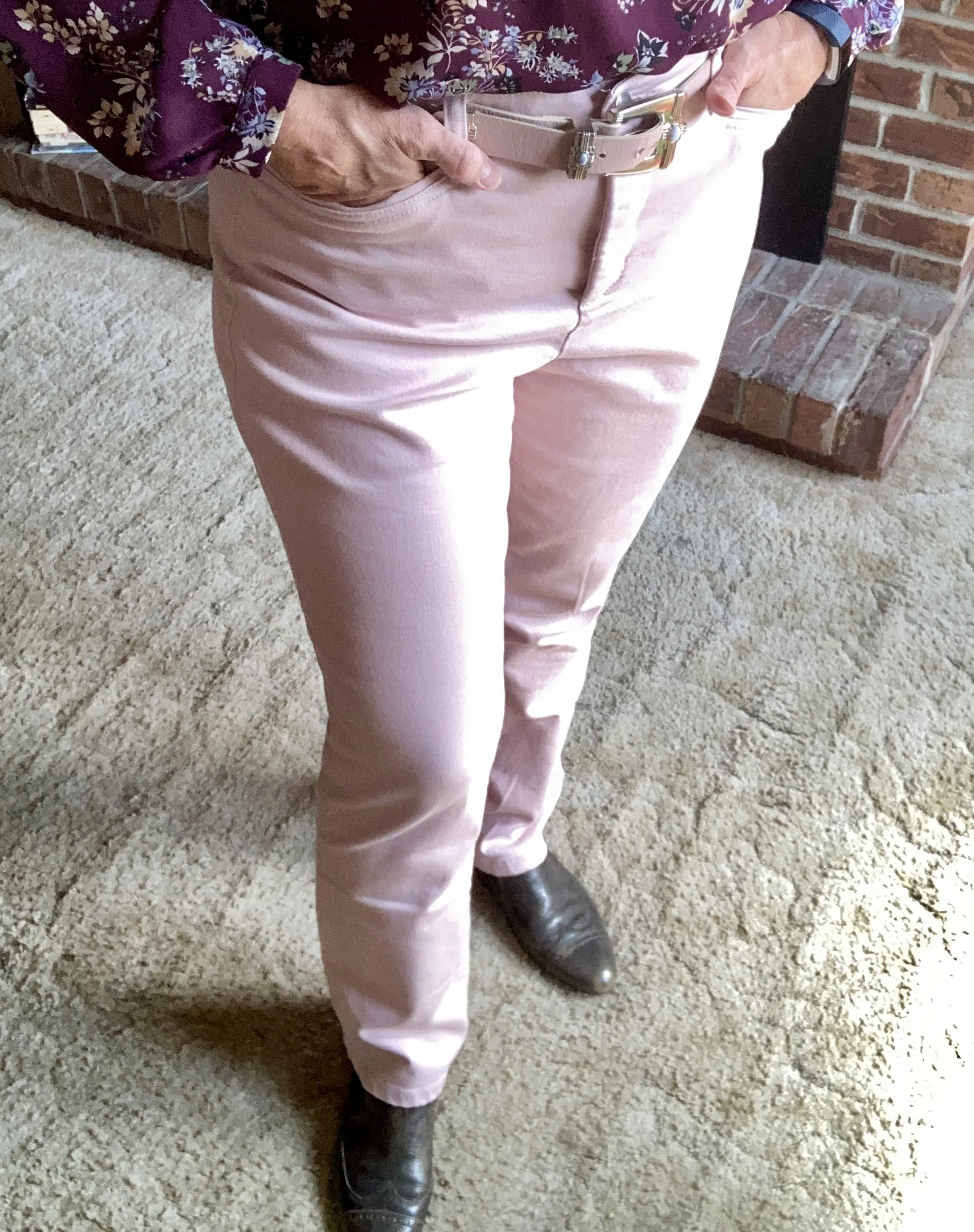
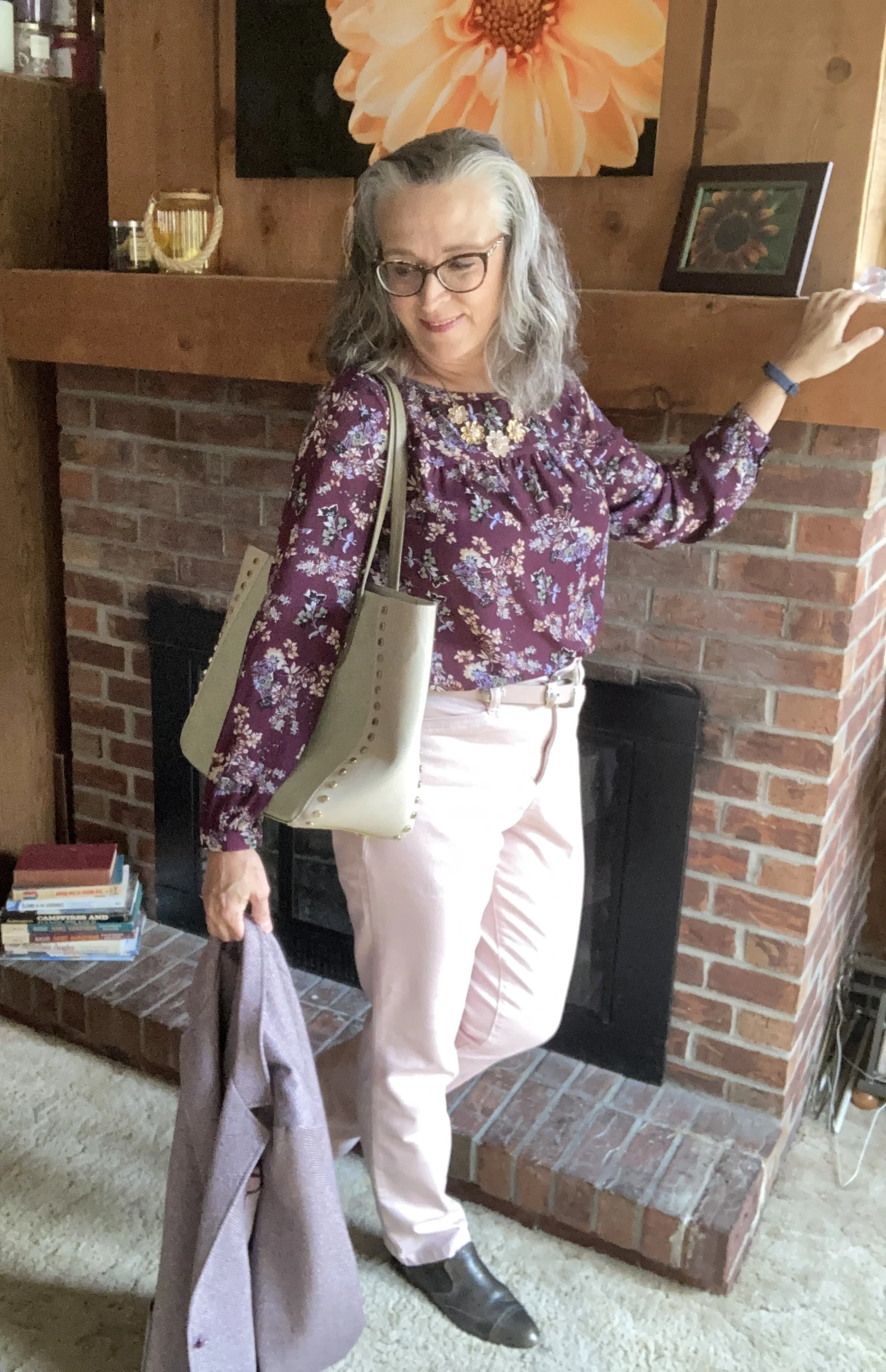
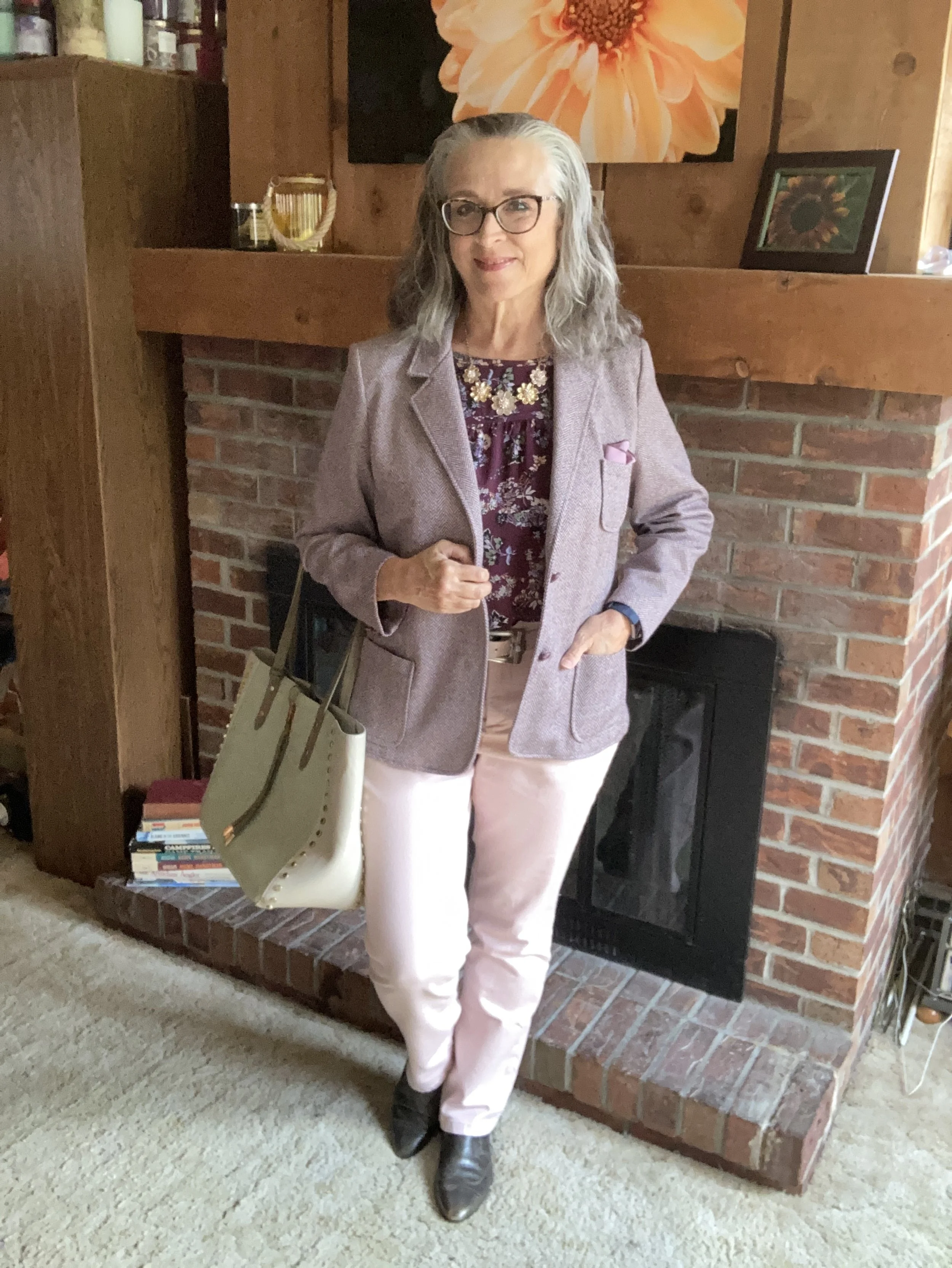
Today’s outfit is a pretty work wear look that uses the palette’s lightest color Primrose Pink, paired with the medium Damson purple and the darker Mauve Wine. I really like how these colors work together, giving a nod to the parting pastels of summer and to the incoming darker hues of fall. You can see the actual colors in one of the Pantone pins on my Pinterest board here.

I got dressed, did my makeup and was all set to take pictures outdoors and then it decided to pour. By the time I took these shots the sun was coming out again, but the grass and trees were soaked, so I decided to stay in doors.

I went through a few color combination iterations before I finally settled on this trio, but I really like how it turned out. Let’s look at all the pieces.

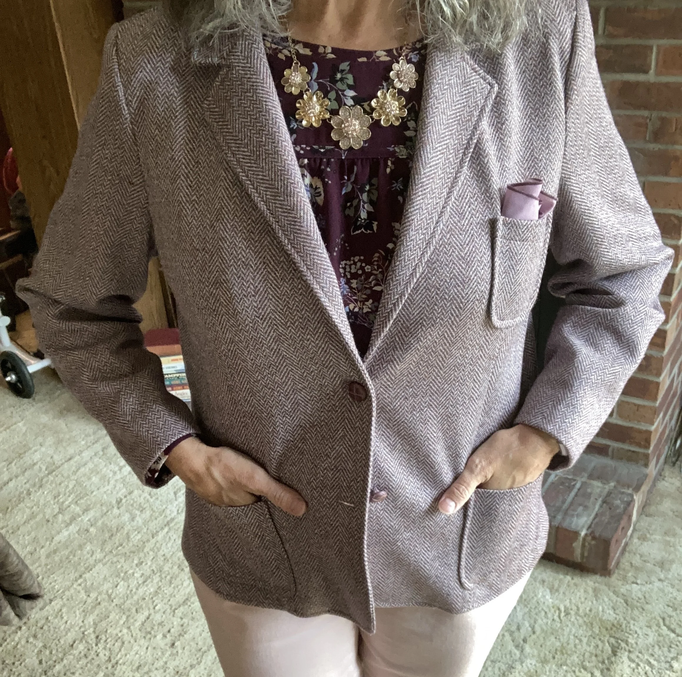
I decided to use this thrifted herringbone blazer for the Damson medium purple color. My photos don’t do the purple color justice, but it is what it is. This is a vintage piece from a U.S. manufacturer called Cape Cod Match Mates. The research I did said these were made in the 1970’s and 80’s. The pieces are easy wear, durable, and a stretchy polyester blend that holds its shape well. It also said they mostly made patterns that were bold and fun. I have one other blazer by them that is a darker blue and red plaid. You can see that on my Instagram page, here.

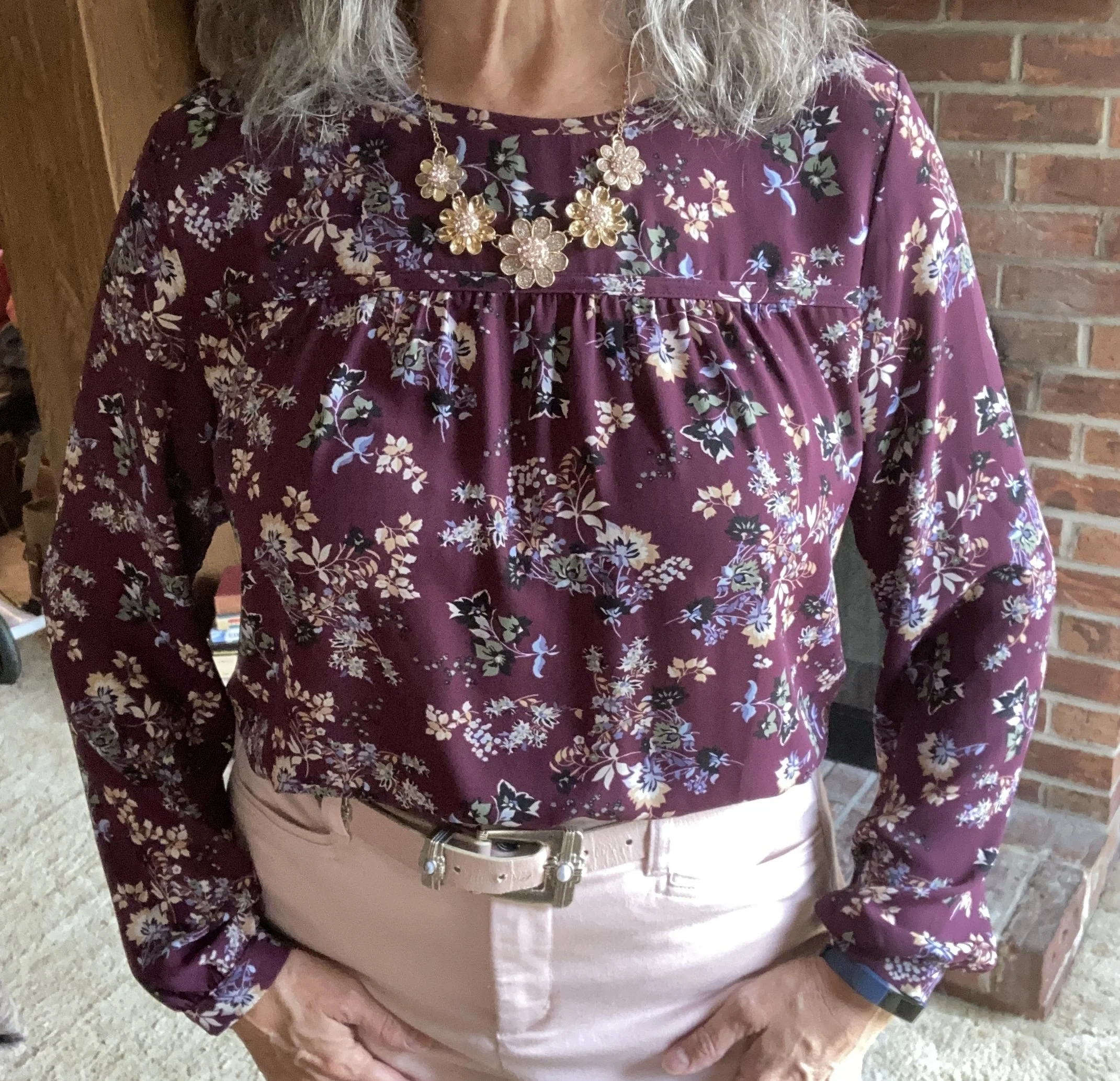
The Mauve Wine color of my floral blouse is actually under the Classic Colors on the New York palette. I was surprised. Usually, the classics are more neutrals or dark navy blues or black. It was nice to have a different option and this color is one I love for the fall and winter. This piece is a second hand Loft brand. Dark florals are always a winner for fall.

My Primrose Pink pants have made an appearance on the blog before. These Christopher and Banks trousers are a great choice when I want to look a little more dressy. You can see them styled here in a casual Easter outfit,

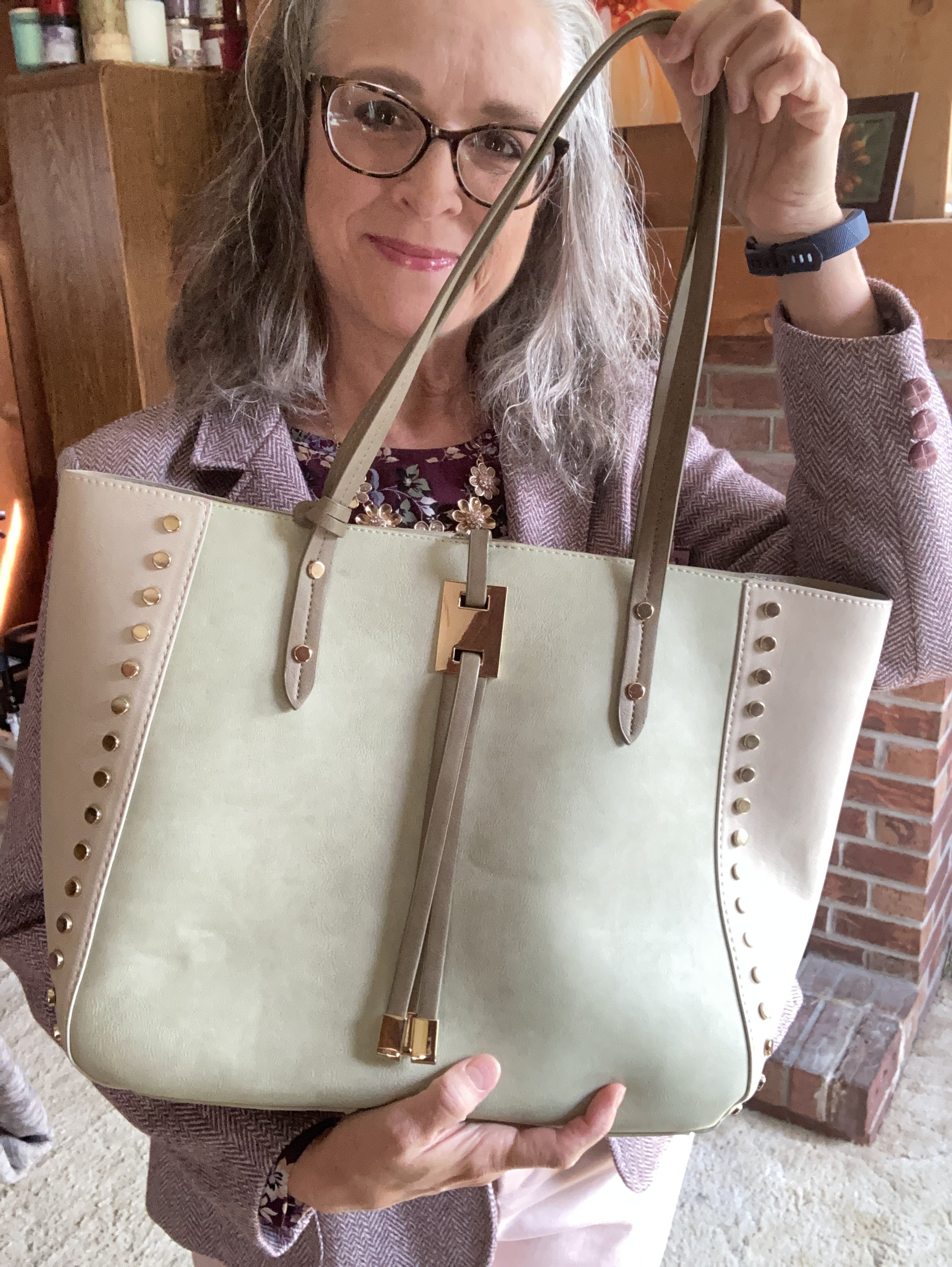
Since there was a tiny bit of green in my blouse, I reached for this Charming Charlie tote bag that I have had for a few years. I thought it keeps the summer element in the outfit along with the pink pants, after all we have about five more weeks of summer before the actual seasonal change.

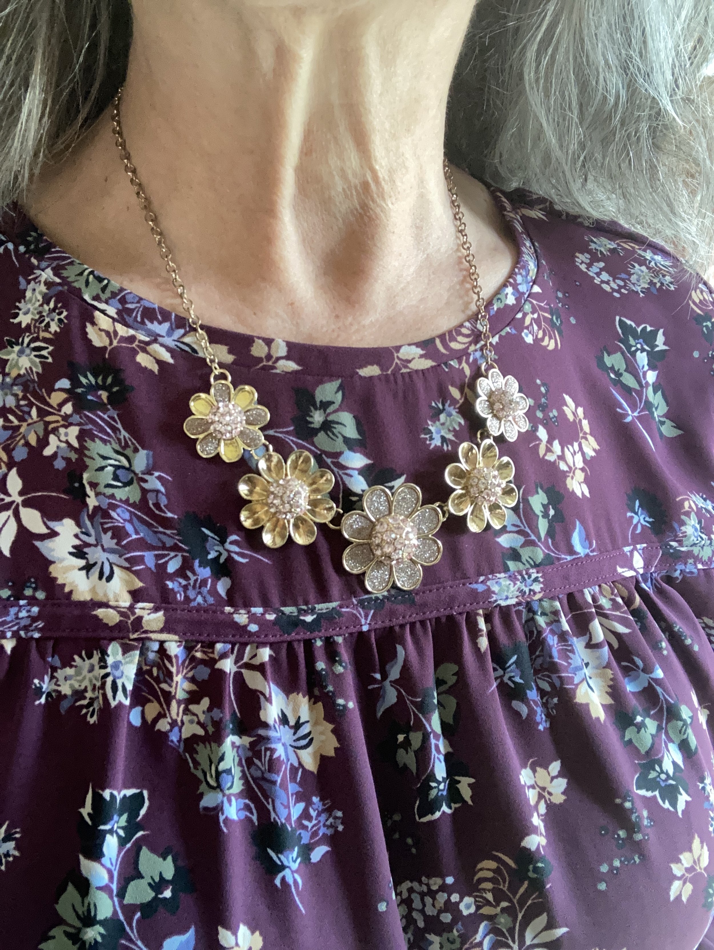
I added a sparkly necklace just to add a bit of pizzazz!

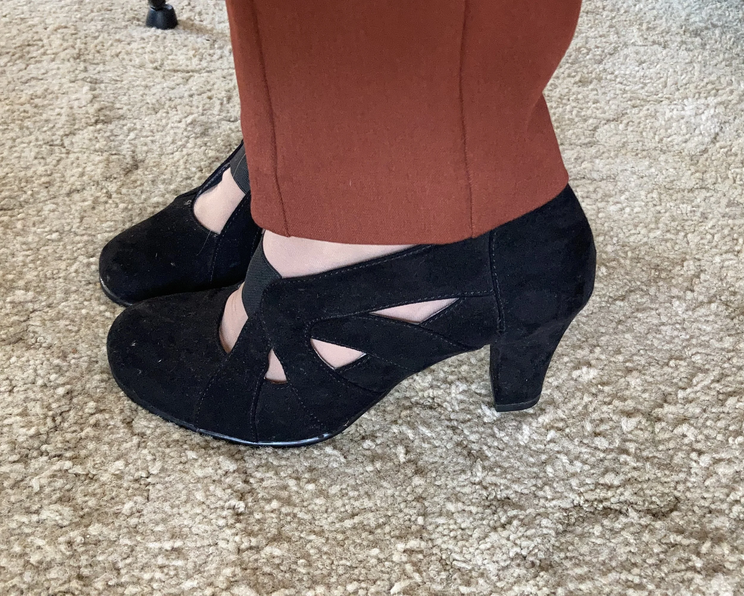
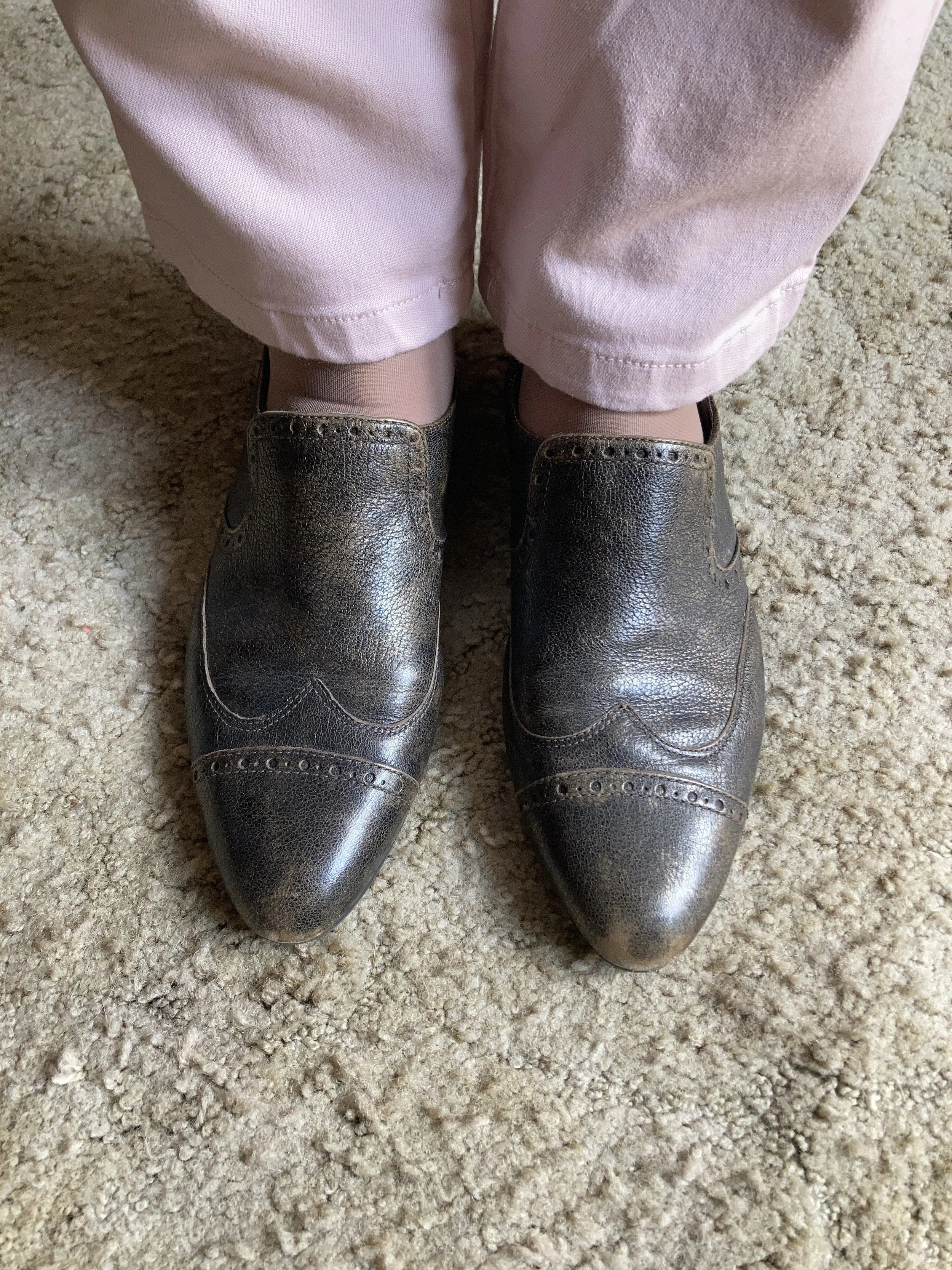
These slip on Oxfords are an older second hand find and brand called Enzo-Angiolini. I don’t often wear anything other than casual shoes like sneakers and my Converse since I no longer have an office job, but I do hang on to shoes like these so I have options if I ever need to dress up a bit.

What do you think of these colors? Which of these three do you like the best? I always enjoy getting your feedback so leave me a comment or two.

I’ve included a few shopping links for you to look through. These links are brought to you at no cost. These are affiliate links. If you purchase an item through my link I get a small commission. I appreciate all you support. All opinions are my own.

Have a great week!

My Style: Goblin Core

You are probably looking at my title and thinking, what in the world is Goblin Core? I am so glad you asked. Ha, ha. Goblin Core is a newer aesthetic similar to Cottage Core, with its whimsical fancy, but with a darker, earthier vibe. For a refresher on Cottage Core check out this post I did on Cottage Core with an Edge.

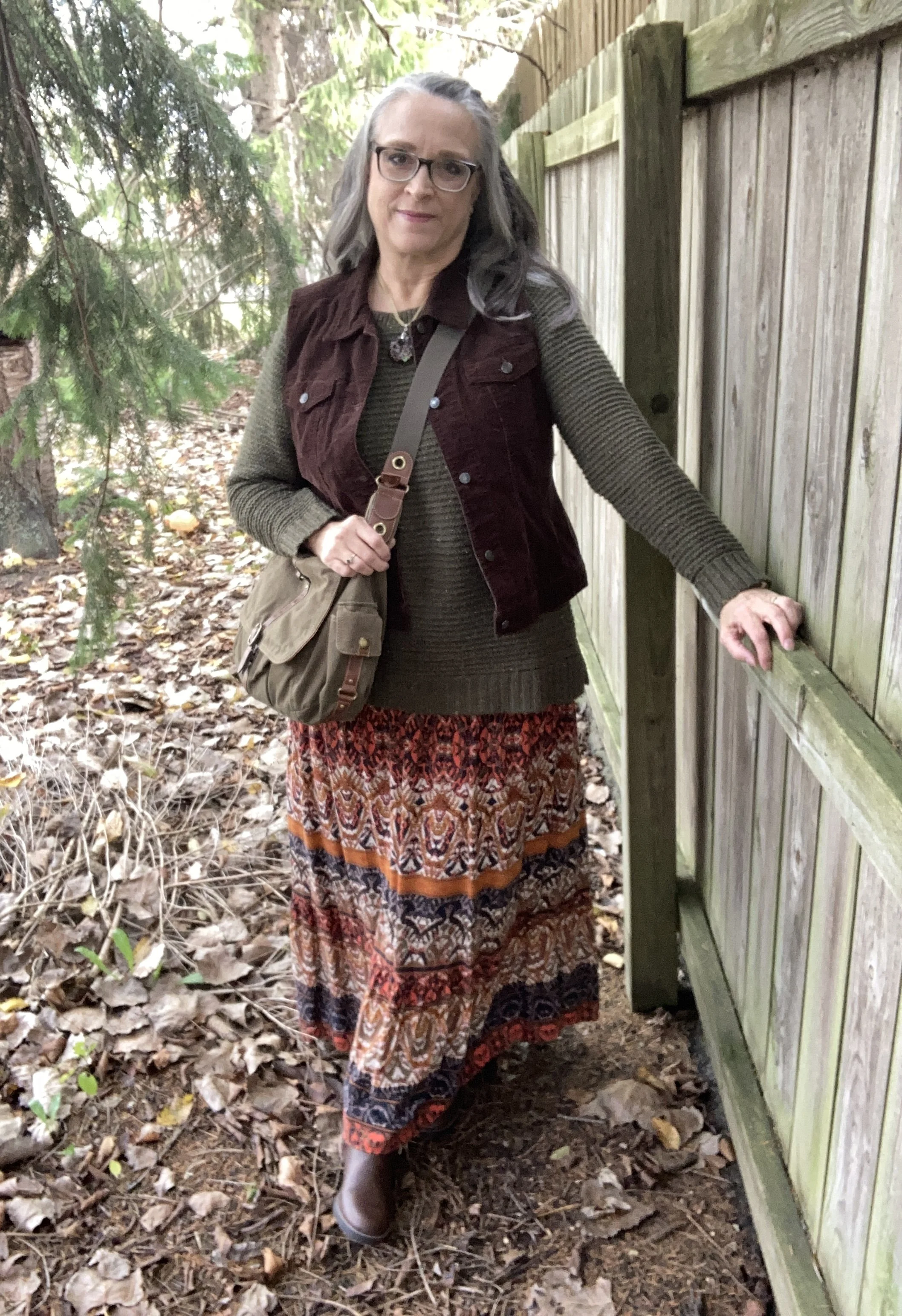
I first learned about Goblin Core when I was perusing Pinterest and looking at Dark Academia aesthetics. You can see my Goblin Core board by clicking on the link. I only have six pins so far. If you look up style types you won’t typically find this style, but you might find something similar called Natural/Earthy. If I had to define Goblin Core I would say it is earthy with an edge, but the colors primarily revolve around earth tones and also embrace the idea of life and living things, so browns and greens. Wardrobe pieces are comfortable, even to the point of oversized or baggy and are robust with textures and details. Overalls, corduroy, baggy sweaters, combat boots, Mary Janes, patterned socks, grandpa style sweaters, and vintage pieces are all part of the Goblin Core style. I was drawn to the greens and browns of this style, so that is what I chose as I put my outfit together.

I feel like there is a bit of Gypsy influence in this style, perhaps due to the earthy colors, or the tiered skirts and vests. It has a similar feel to Bohemian style, but perhaps more grounded.

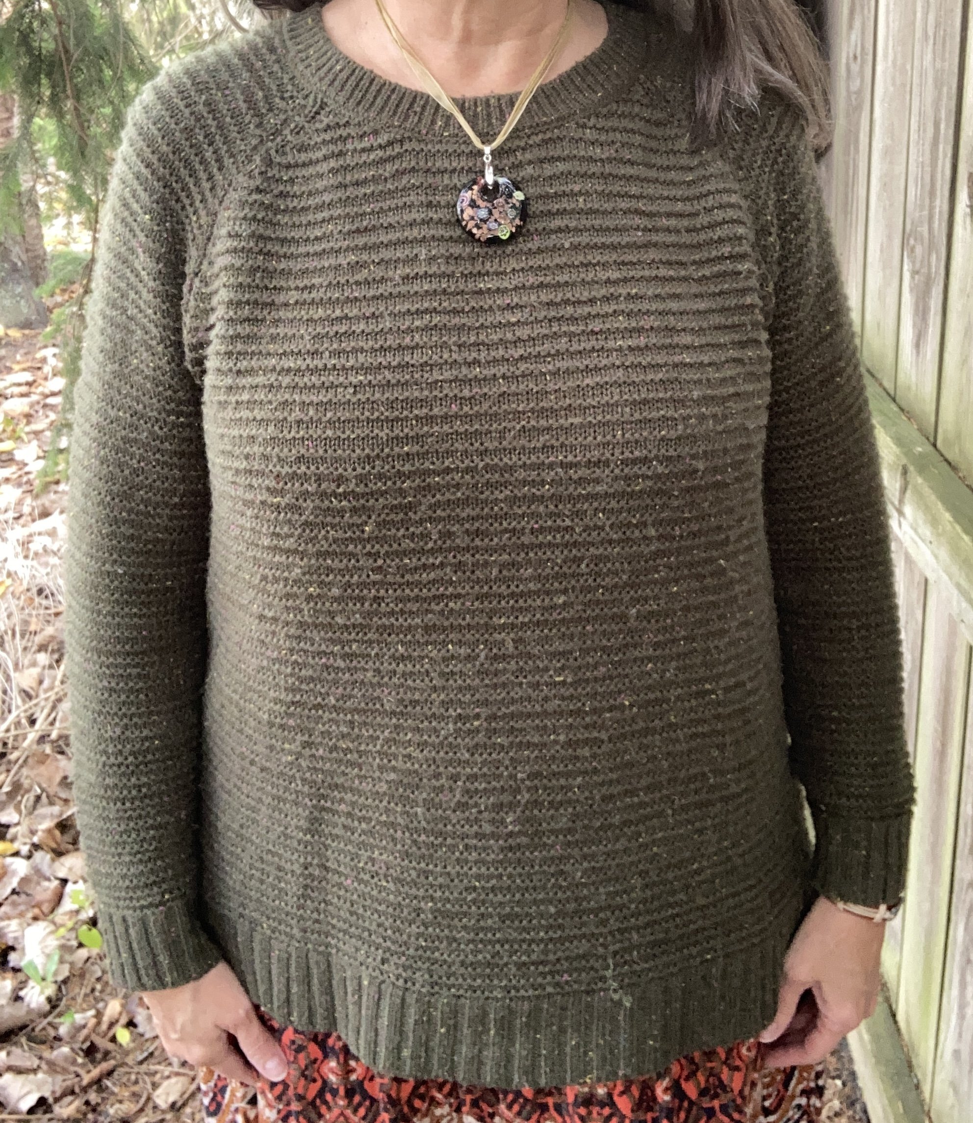
When I started putting the outfit together, I knew I wanted to pair green and brown, so the sweater came first. This is an older, thrifted Faded Glory piece. It is definitely getting pilly, but I still haven’t found an adequate way to get rid of pills that actually does a decent job. If you know of something, let me know! It is a great sweater with plenty of room, a little longer body, and nice textured stripes.

I then thought about a topper of sorts wondering if I should do a similar colored cardigan, utility jacket, or blazer, but the idea of brown kept coming back to me and I remembered I had this stupendous corduroy vest. This is a Liz Claiborne off shoot called Crazy Horse. This is a great vest with structure, but added stretch. I love it.

I initially had no intentions of using a skirt for my lower half. I was looking at jeans with embroidery, but then when I saw this skirt I knew I had the right combination. This has made multiple appearances on the blog and is a brand called Notations. I honestly do not remember what store I bought this at. It has been a while. You can see how I styled this piece with a graphic tee, in a Pantone outfit, and with a yellow jacket.

I decided to wear knee high boots instead of combat boots, or Mary Janes, because I’m me. These boots are recently thrifted XoXo brand, and seem to be in good shape. No they are not real leather, but I will hopefully get some wear out of them before they start to peel. I decided that if we can wear distressed jeans, why not distressed boots? Ha, ha.

I kept my accessories simple, as Goblin Core doesn’t seem to over embellish. My necklace was a thrift find and my bracelet was purchased from somewhere, which I also can’t remember. Eye, yie, yie. My brain!

My bag is another thrifted Fossil piece, and another one I really like. Olive will go with any other color, so definitely a versatile piece.

Looking back at these photos, I wish I would have used a better looking sweater, but it is what it is. I hate to get rid of something that still has plenty of wear. As I said, I need to find a way to eliminate pills.

I hope you enjoyed learning more about the Goblin Core style aesthetic. I like sharing these ideas with you and even if you don’t necessarily like a particular style I hope that it will still inspire you to be creative with your own clothes, making new outfits from the pieces already living in your closet.

I’m including a few shopping links for you to look over. Remember with Christmas on the way these also might be ideas for the loved once on your gift list. If you make a purchase through my site I get a few pennies. These shopping links are brought to you at no extra cost and all opinions are my own.

Have a great day!

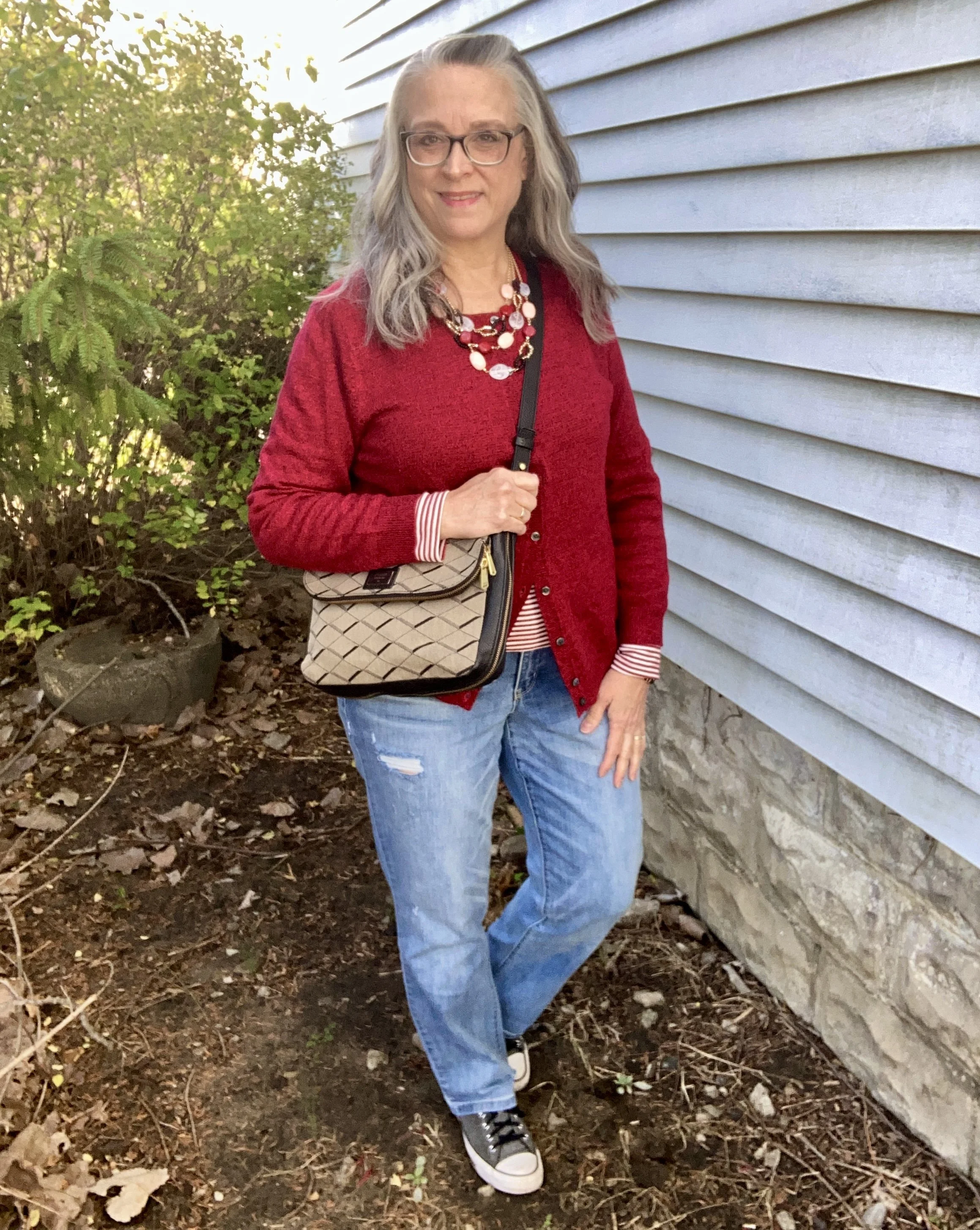
Shopping Our Closets: Cool Weather Basics

I think most of us veer towards certain pieces when the temperatures start to cool down. Even though our temps have been taking their time about cooling off, we know the chilly days are inevitable, and we will be reaching for our long sleeve tees and sweaters. Today I thought it would be fun to talk about these basic pieces and show you how I put together a simple, casual outfit that would be perfect for anyone’s busy lifestyle.

When I hear the word “basics” my mind automatically goes to things like underwear and socks, but everyone has their own likes on those so we’ll just leave that alone. The basics I wanted to talk about today are long sleeve tees, cardigans and jeans. Obviously, these basics can vary from piece to piece. Long sleeve tees can be v-neck, scoop neck, boat neck, crew neck or even turtle necks. The same is true of cardigans. Basic cardigans most often have crew or v-neck and buttons down the front, but cardigans come in a variety of lengths, styles, textures, fabrics and even embellishments. Maybe your basic cardigan is an open front knee length duster. Someone else maybe consider a sweater with a zipper and a fold over collar to be their basic piece. Basics really depend on your personal taste and what you are doing. A work wardrobe is going to be different than a casual, stay at home wardrobe.

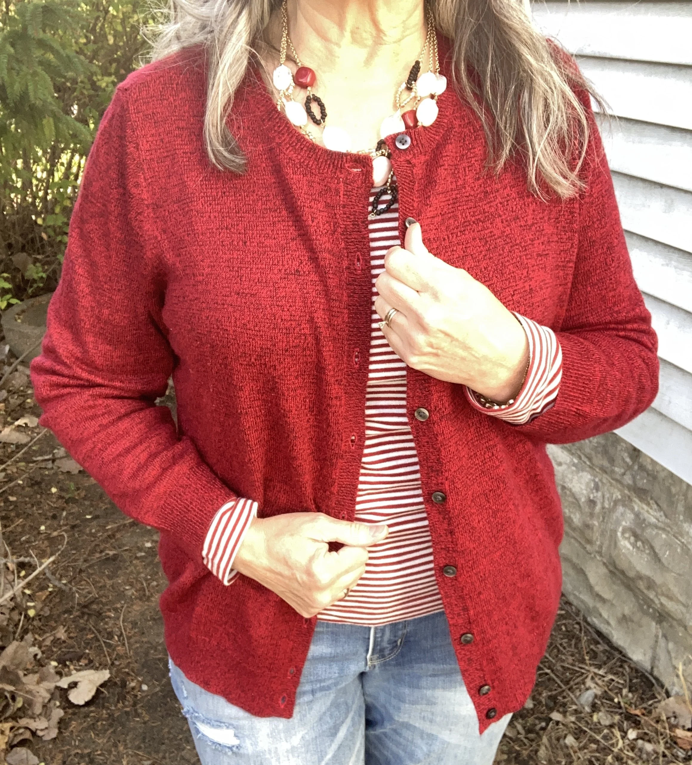
As you can well imagine, I have cardigans in a variety of colors, but I chose red as a nod to the weeks ahead leading up to Christmas. It is coming whether we want it to or not. I personally love Christmas, but I also acknowledge that life is already very busy, then throw in the busyness of the holidays and trying to come up with outfits might be a bit overwhelming. However, when you stick to your basics you can’t go wrong. You will still look put together, and you can embellish with jewelry, scarves, bags and shoes and be ready for any holiday shopping or get together you need to attend. Here are a few basic cardigans from Kohl’s, JC Penney, Macy’s, and Amazon.

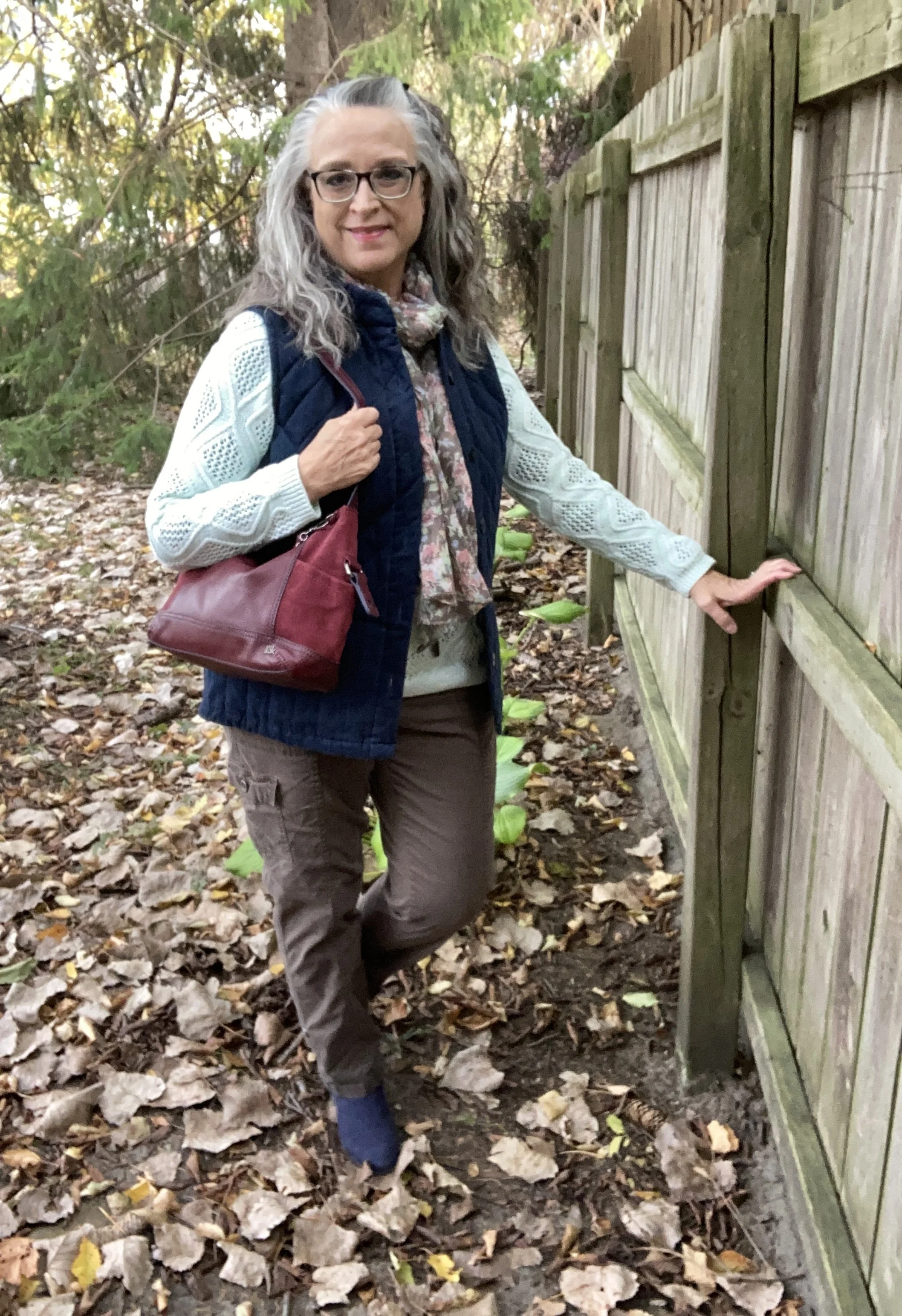
For this outfit I started with this thrifted red cardigan. I found this in the last couple of years. It is a medium weight, so great for these cooler days that are still above freezing.

Style Tip: When building an outfit around your basic pieces it really doesn’t matter what piece you start with. You could choose your tee first, your sweater, or even your pair of jeans and build your outfit around that. Mood is a realistic part of getting dressed, but instead of not getting dressed I think it is essential to take a shower and put on clean clothes. That is part of what makes having basics to important. If you are feel exhausted, or down if you can at least manage a tee, a cardi and a clea pair of jeans you are doing good.

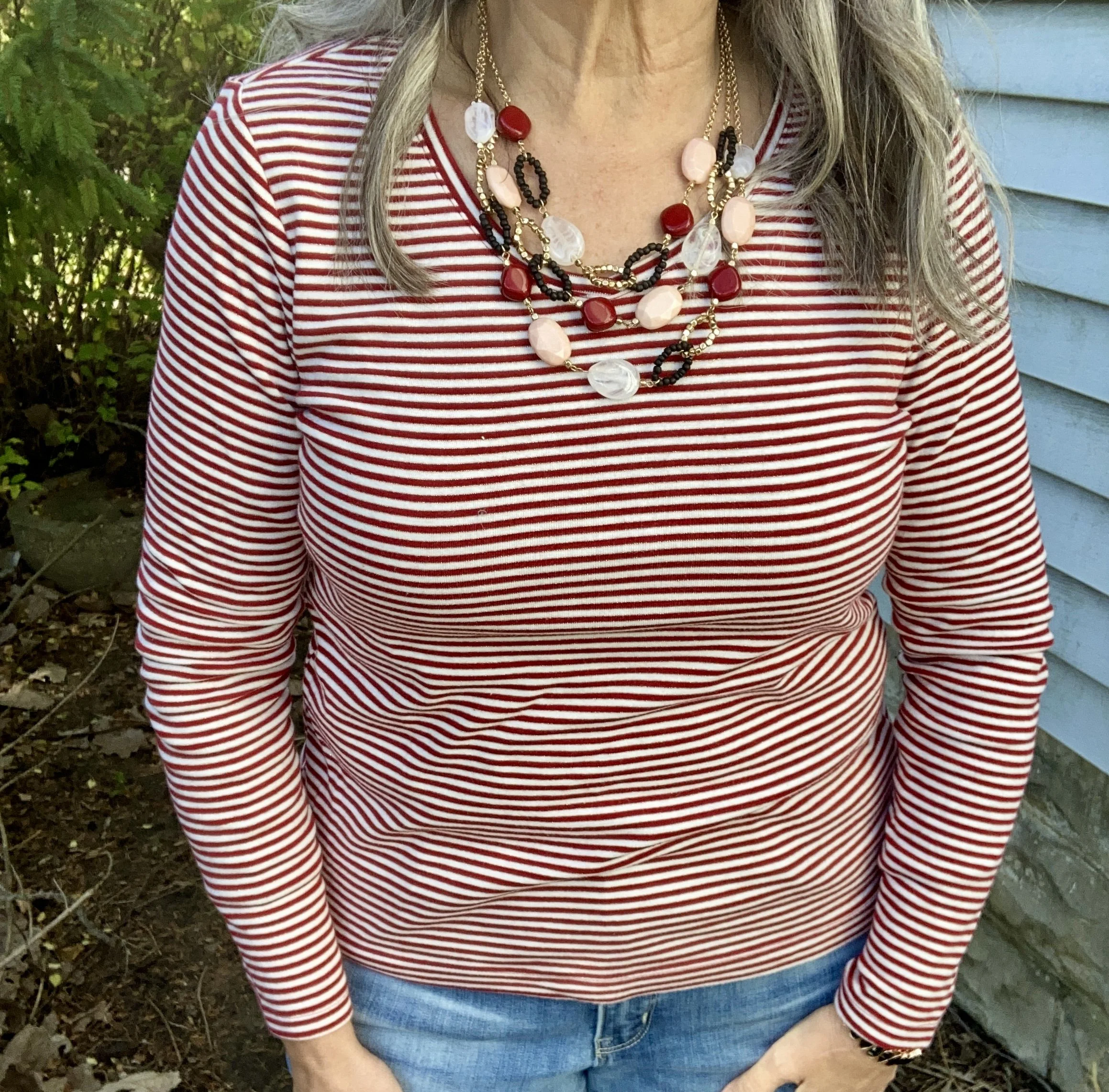
I grabbed this red and white striped tee for my top. These basic tees from Kohl’s by Sonoma are perfect for layering under a cardigan. Here are a few other basic long sleeve tees from JC Penney, Maurice’s, Target, and Amazon.

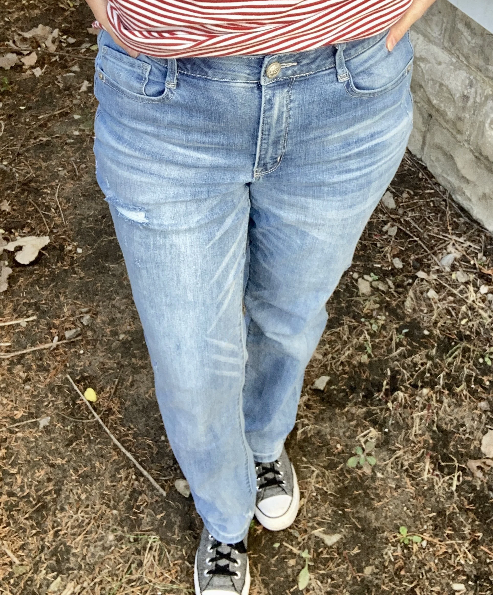
These jeans were purchased at Maurice’s in the late summer. They are incredibly comfortable, a lighter wash and heavier so perfect for the cold weather. The mild distressing makes them great for both casual and dressier looks.

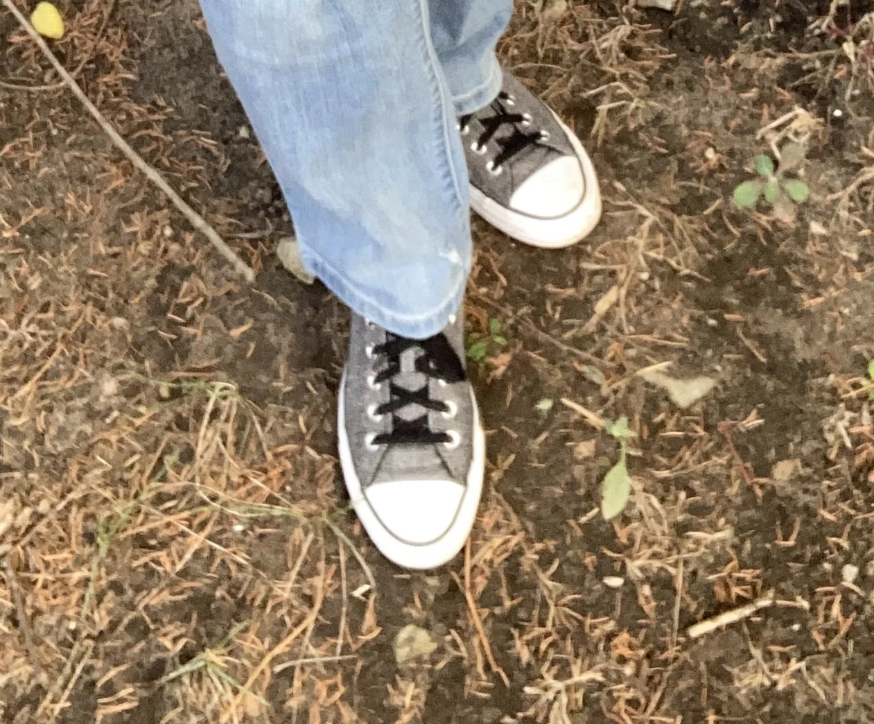
Style Tip: Once you have your basics chosen feel free to embellish as much or as little as you want. An outfit like this will allow your pretty necklaces and scarves to really pop and take center stage. I kept my look simple and casual with the choice of my Converse, but if I would have went with a low heeled boot it would have taken it up a notch taking it from busy grandma, to cute date night look.

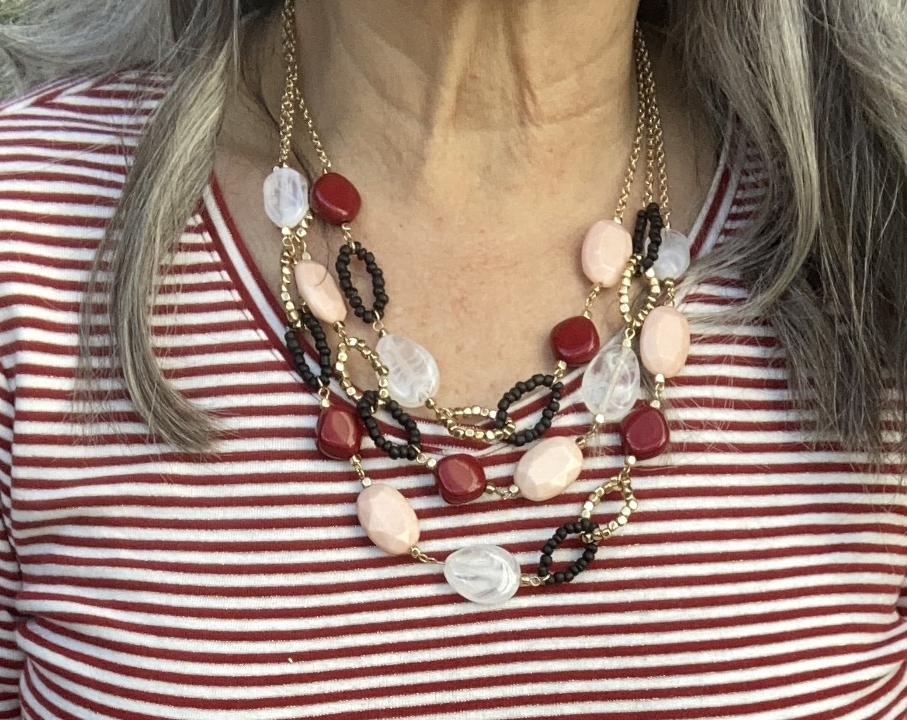
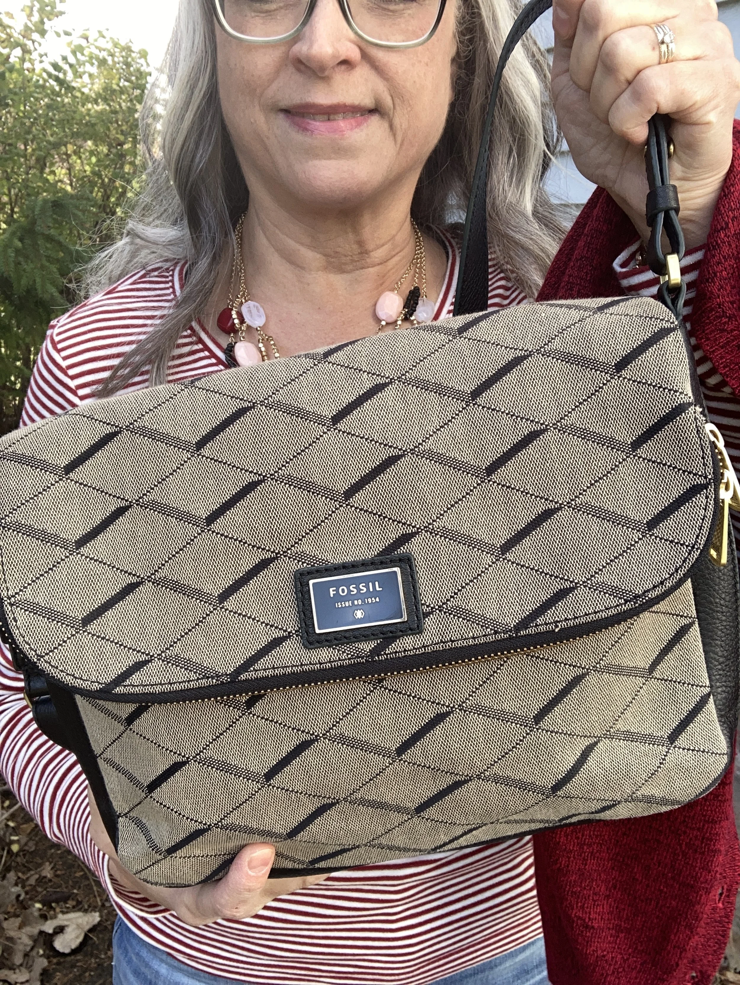
I have been looking for an excuse to wear this layered bead necklace, so I was happy it looked so nice with this outfit. You can also see my Fossil bag which was another second hand score. One of the things I like about these heavier cloth bags is that you don’t have to worry so much about the issues with peeling that the nylon or faux leather bags have.

Do you like using basics like these to build an outfit? How do you most often use your basic pieces? How do you dress basics up to make them more work, or event worthy? I’d love to hear your thoughts, so leave a comment or two below.

I’m adding a few shopping links for you to look over. These are affiliate links. If you click on a link or buy a product through the link I get a little commission. These are brought to you at no extra cost. Thank you for all your support.

Have a great week!

Outfit Inspiration: Navy and Green Color Combo

Right now Pinterest seems to be the source of inspiration for many of my recent blog posts. I do use the occasional Instagram challenge to also find inspiration, and there are lots of places, people and things to inspire our clothing combinations. However, as you know, convenience often weighs heavily when life is busy or we are feeling tired. This is the pin that inspired today’s look.

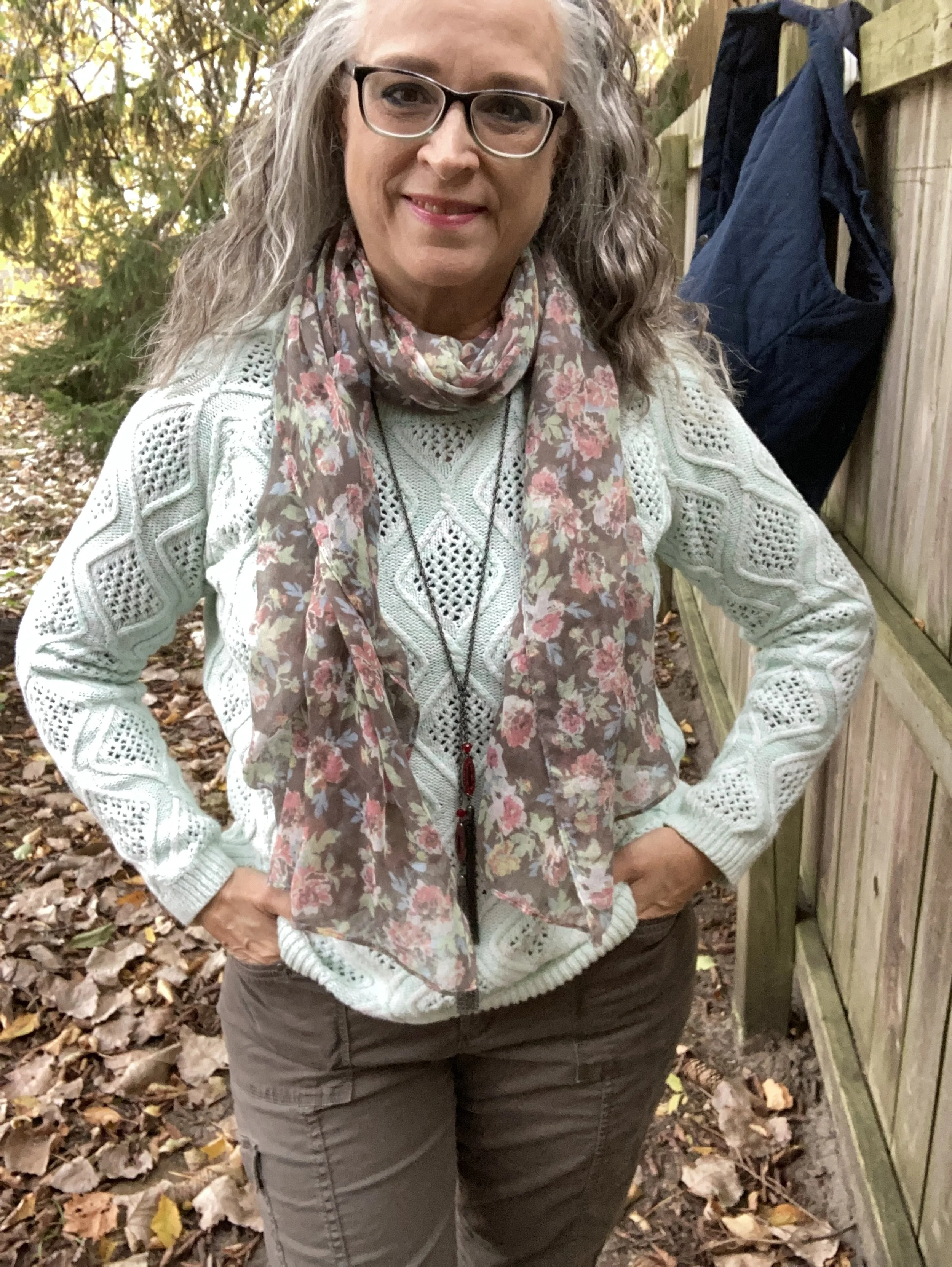
Unlike the Pinterest pin, I used a vest, rather than a jacket, and there are other differences in accessories, and so on, but as I have said before, the point is to be inspired. I think something an fellow Instagram user posted makes sense. We want to be inspired, not influenced. Inspiration allows us to shop our own closets and put together similar looks without necessarily having to copy the look. Being influenced might include the pull to purchase pieces we don’t need or won’t actually wear.

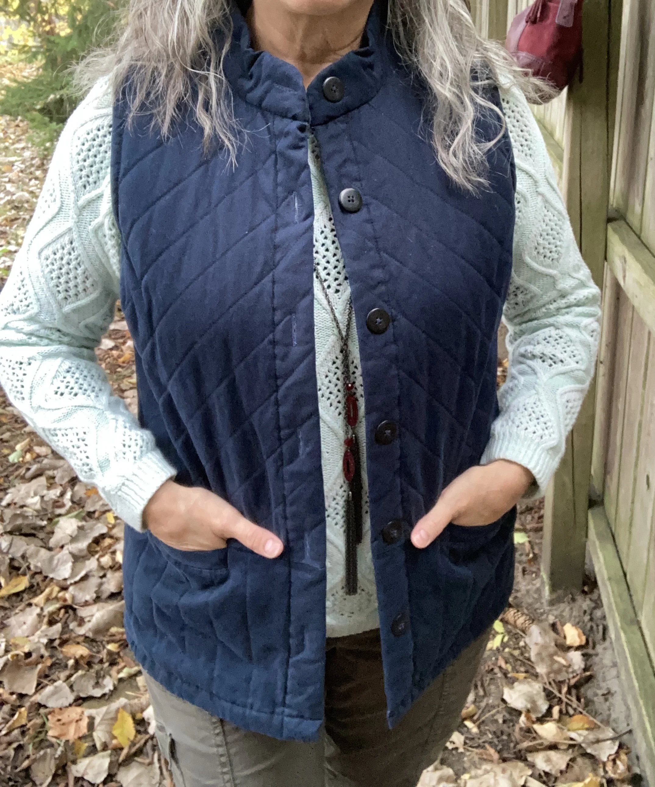
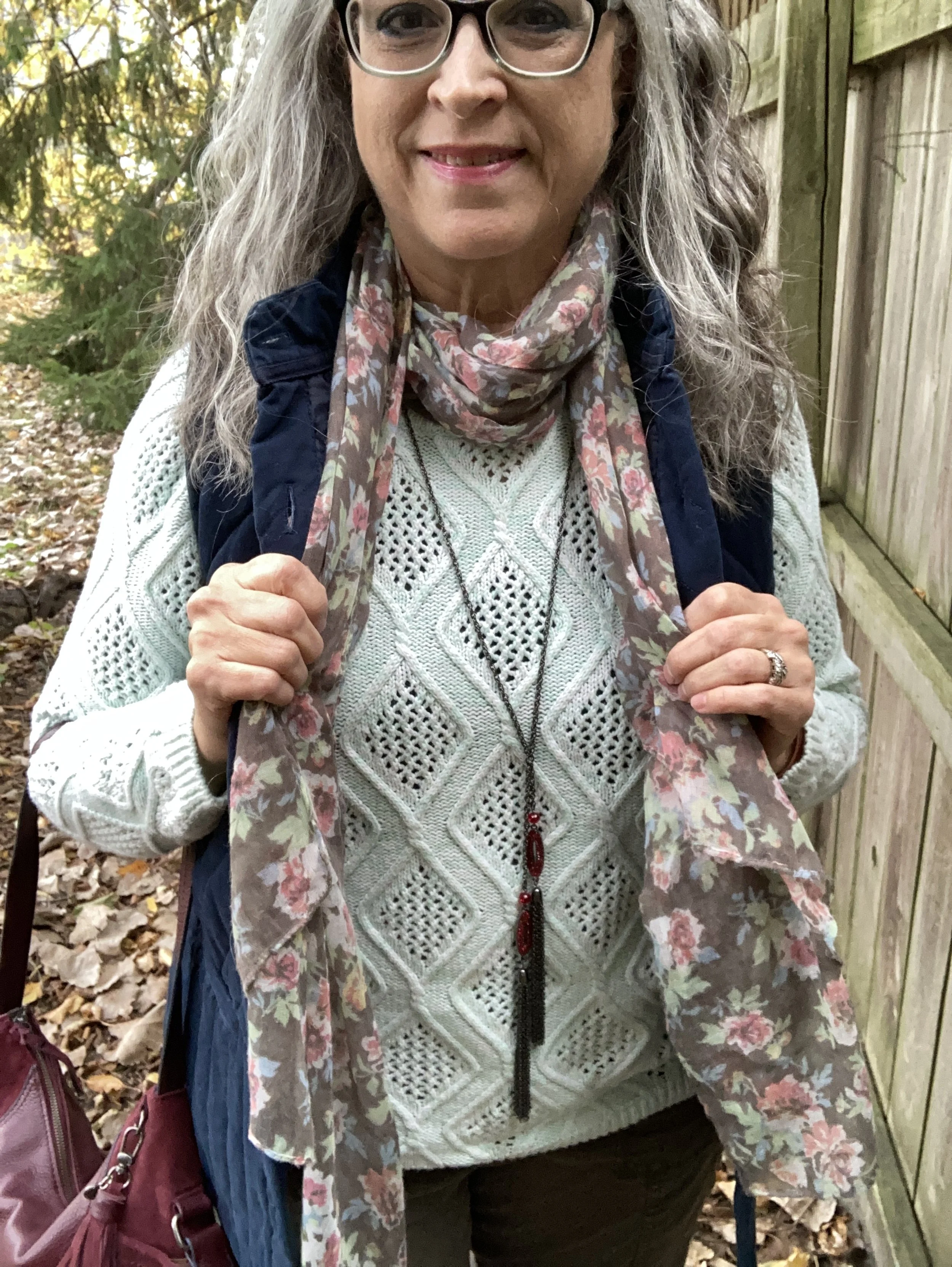
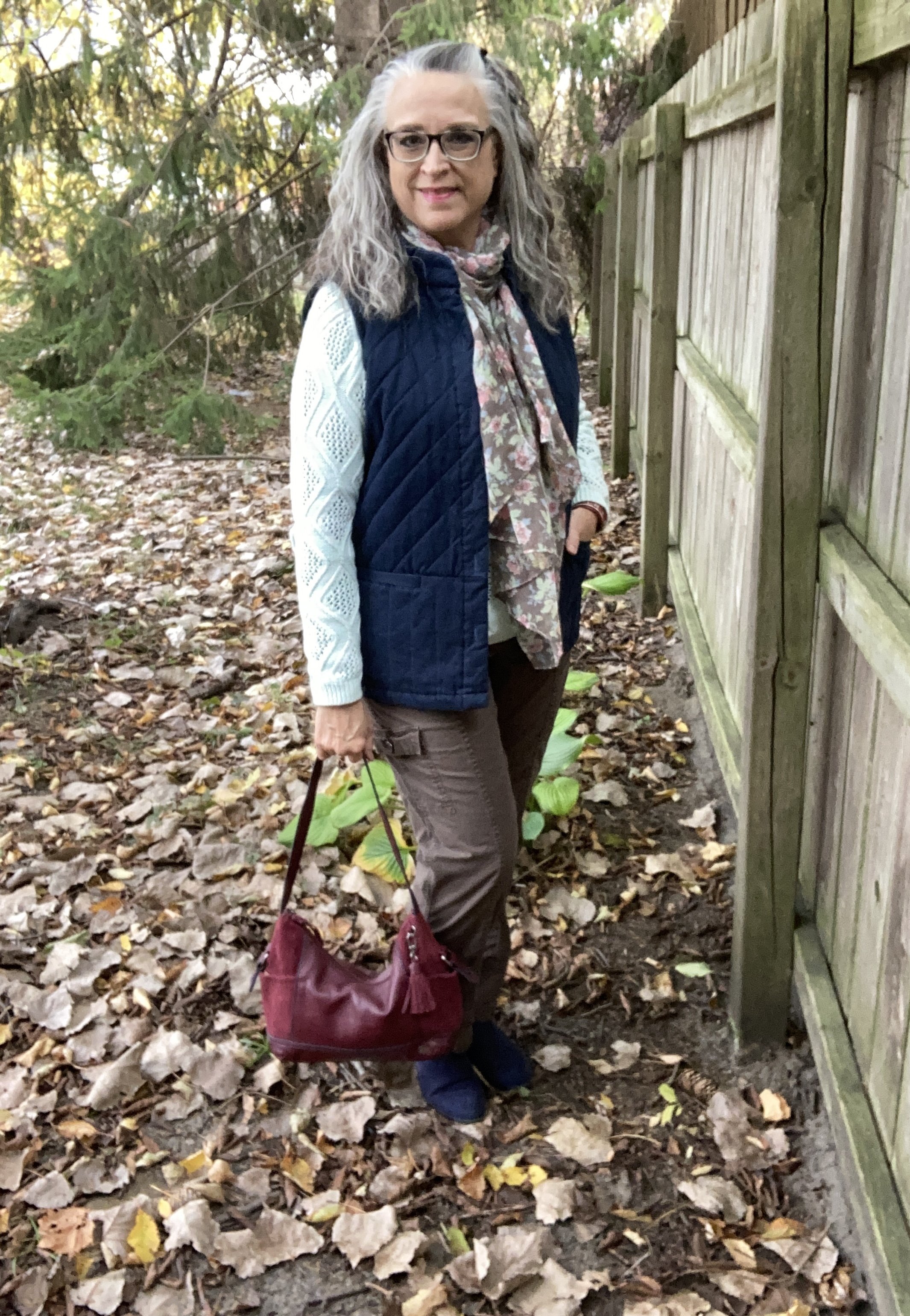
This Christopher & Banks vest is from a couple years ago. It is a great piece and the quilting definitely gives it a warm, cozy feel. I like that it is a bit longer than many of my other quilted vests, and that it has buttons instead of a zipper. I rarely wear any of my vests closed, but it is nice to have different options.

Style Tip: Before you purchase vests or jackets think about collars. Ask yourself if you prefer the collar to lay flat or stand up, or be able to do both. Think about what you will be wearing it for and how you will be styling it with your other clothing. For today’s outfit, the stand up collar works great, but those are not my first choice. I typically like a collar to lay flat, or be something similar to a shawl type collar, or in the cold weather a turtleneck will do.

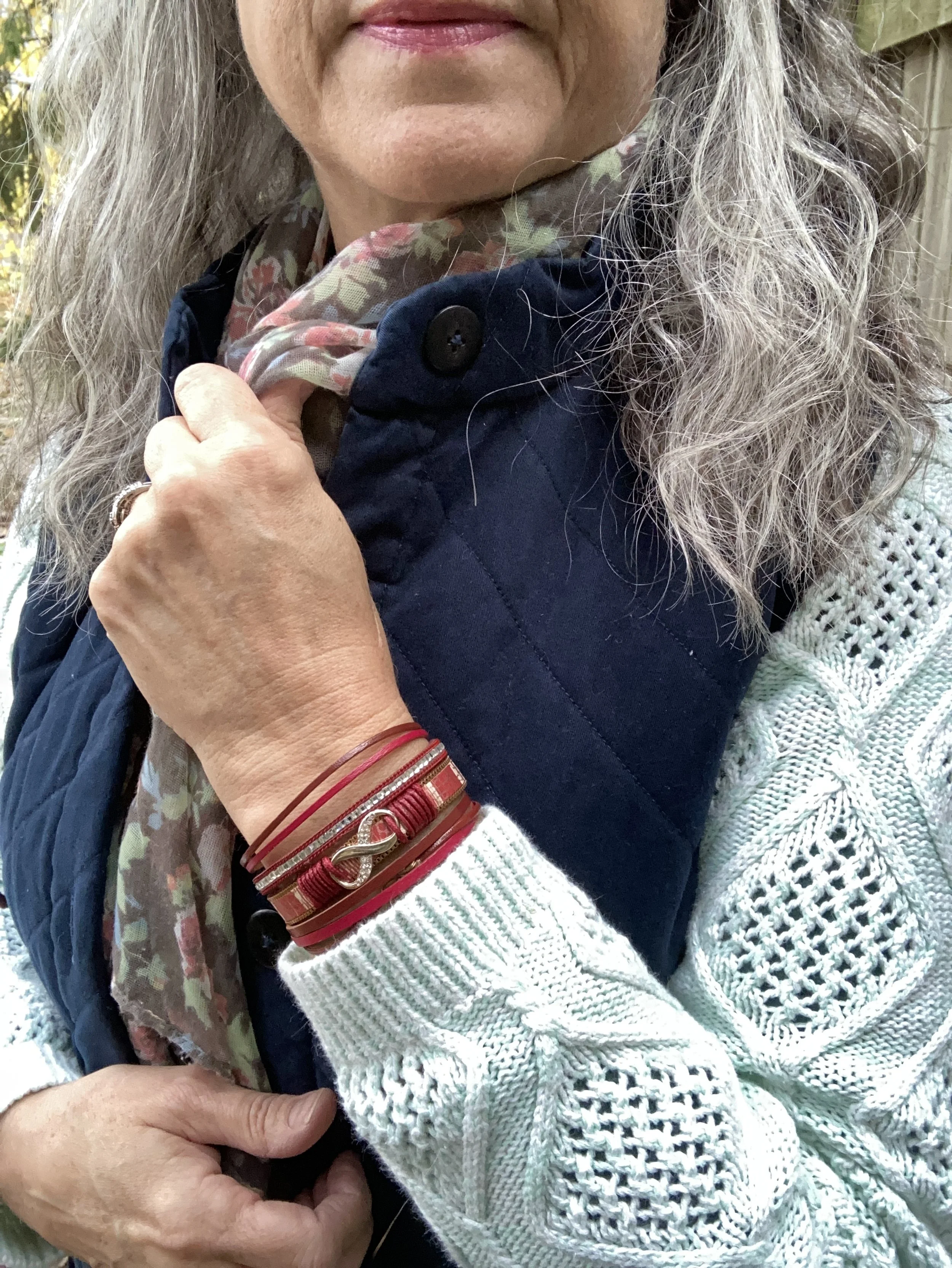
This minty green sweater is a thrifted Sonoma piece. The color and the texture were different than the other pullovers I have, so I snatched this one up. I added the reddish pendant necklace and bracelet, along with my bag as an after thought, but I think the darker reds help define the outfit as a fall look.

Style Tip: When it comes to transitional outfits, you may find yourself reaching for the same pieces which brings the option of pairing them together again. With a few easy adjustments you can make a fall outfit work for spring, or a spring outfit work for fall. To make this outfit passable for spring I would choose lighter colored accessories, possibly in a pastel pink.

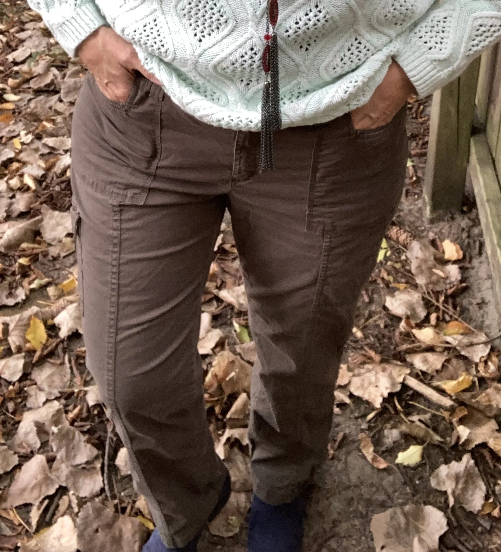
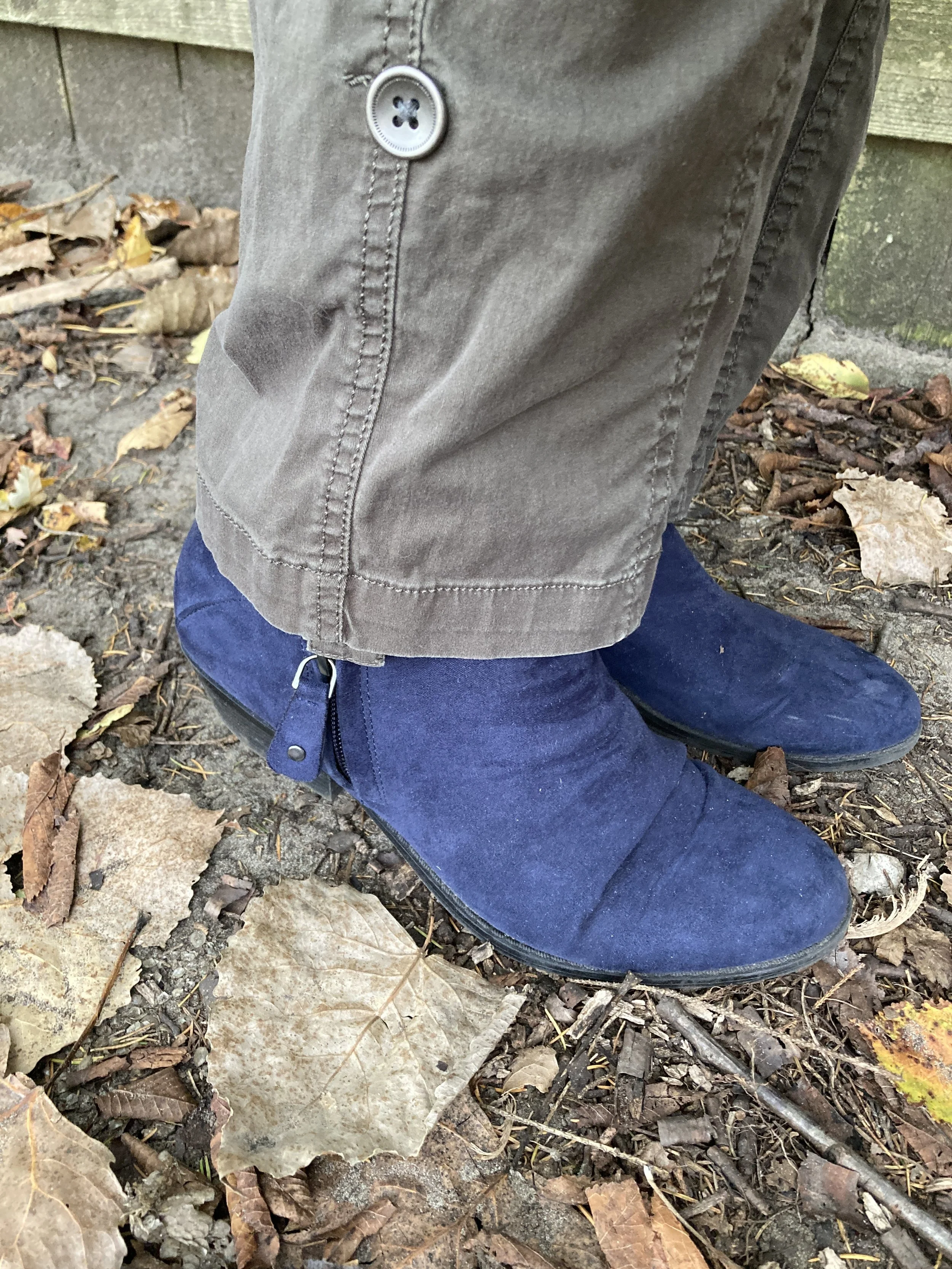
These thrifted Sonoma utility pants look brown in this picture, but they are an olive drab. I thought they worked well for this overall casual outfit.

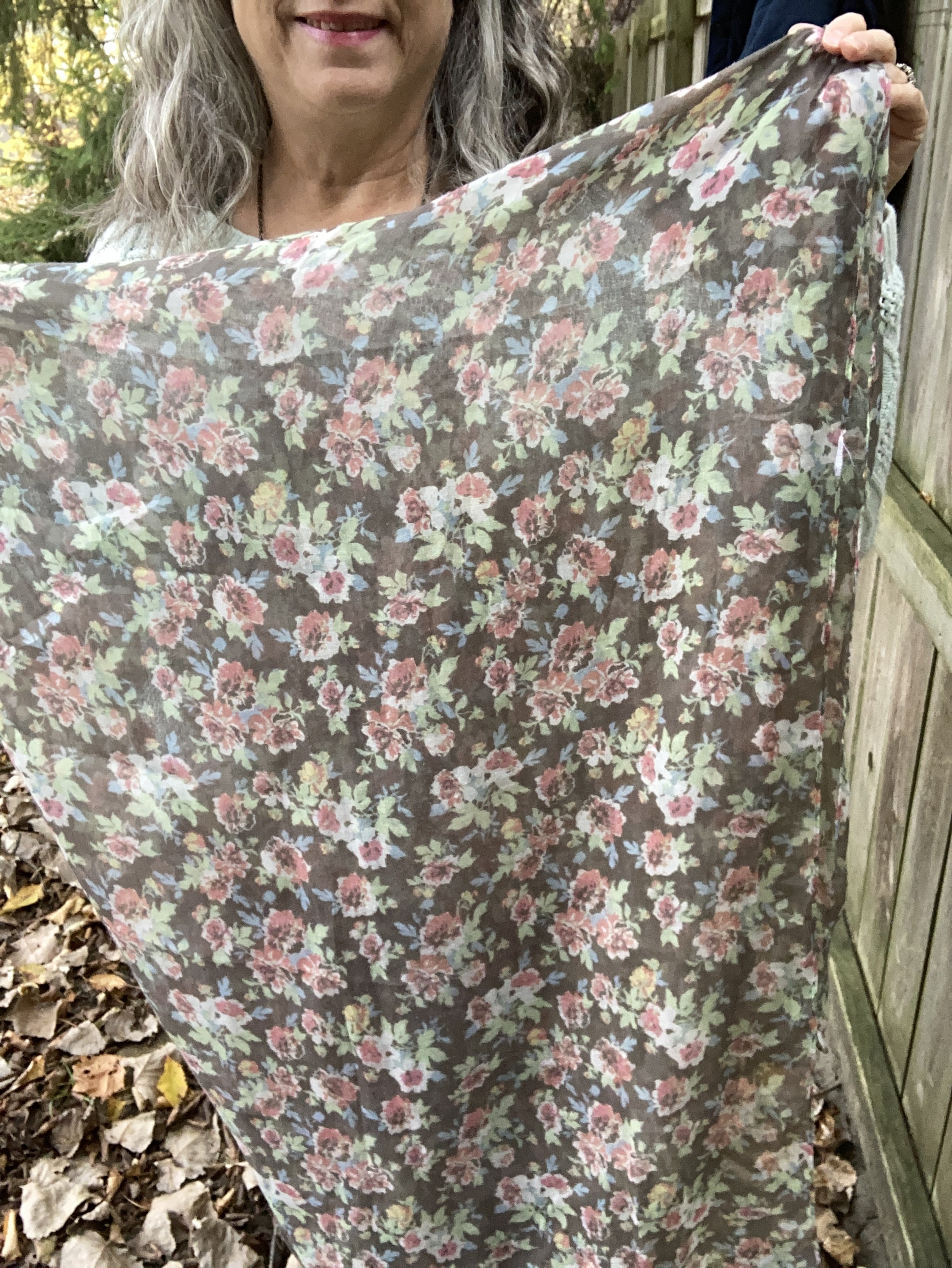
I played around with a few different scarves, one of which was a dark blue with pink and burgundy tones. I thought of pairing burgundy pants with the vest and sweater, but then decided I wasn’t quite ready for the darker colors. Thus when I saw this scarf and liked how it went with the other pieces I opted for burgundy accessories to still bring in the darker tone of fall, and I thought the burgundy went well with the pinks in the scarf.

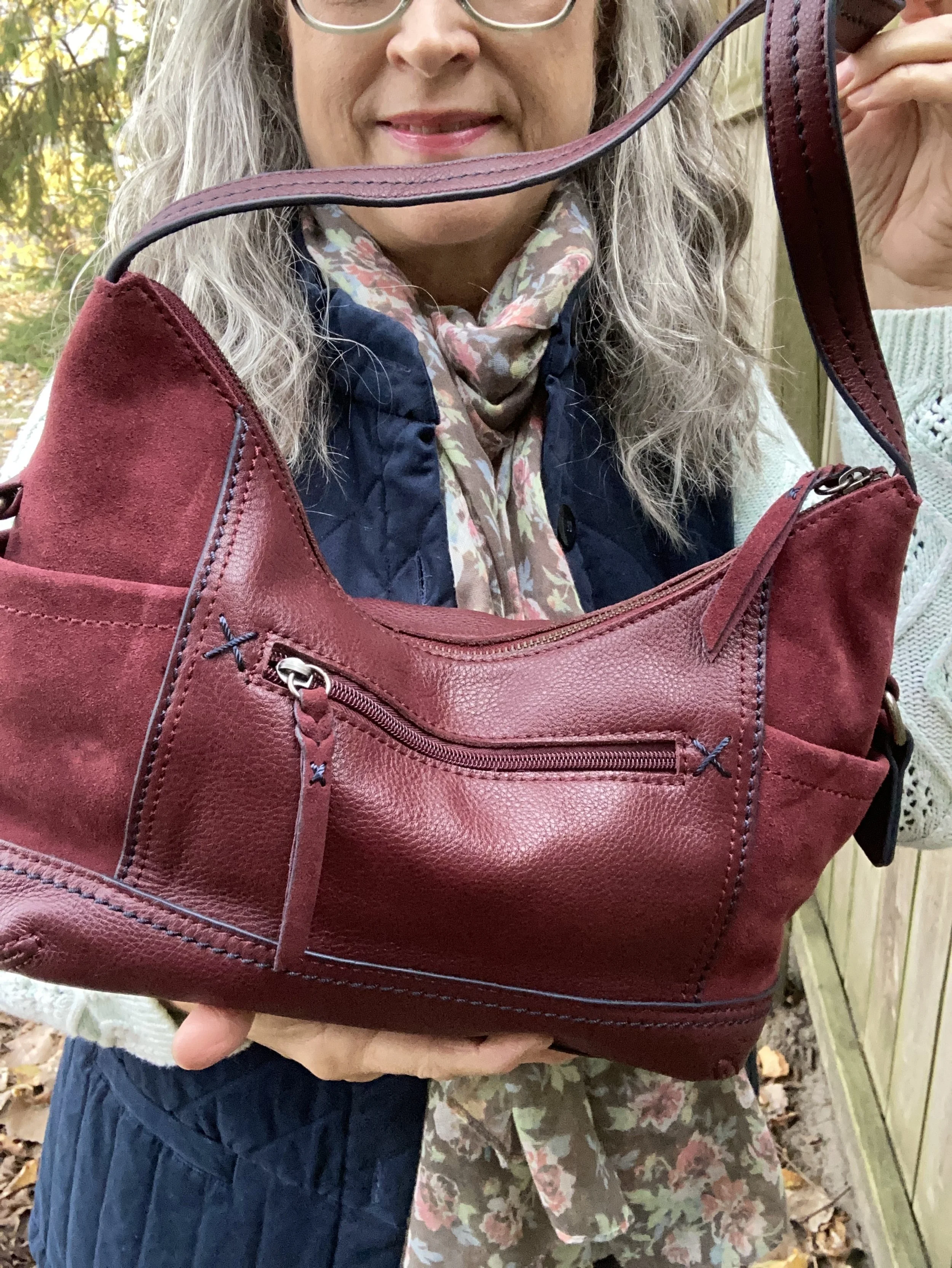
My bag is The Sak brand and it was given to me by my thrifting bestie.

My ankle boots were purchased at Kohls and are SO brand. I have had them for several years.

Style Tip: Should you match your shoes to your pants, your top or not at all? I think variety is the spice of life, as they say, so why not do all three. Today, I matched my shoes to my vest. Other days I might wear shoes that look more like my pants to create that longer, leaner line from hip to toe. Still on other days, I might wear a basic brown, or black boot, or I might just wear sneakers and they don’t have to match at all. Your outfit, your way, so however you want to do it is fine. The point is to be comfortable, pulled together and confident in what you are wearing.

I hope you enjoyed this post, and that it inspired you to build an outfit that combines colors, textures and accessories to make you feel good when you are in it.

I am including a few shopping links for you to look over. Think ahead, and use these links to start your Christmas shopping. These are affiliate links. All opinions are my own.

Have a wonderful Tuesday!

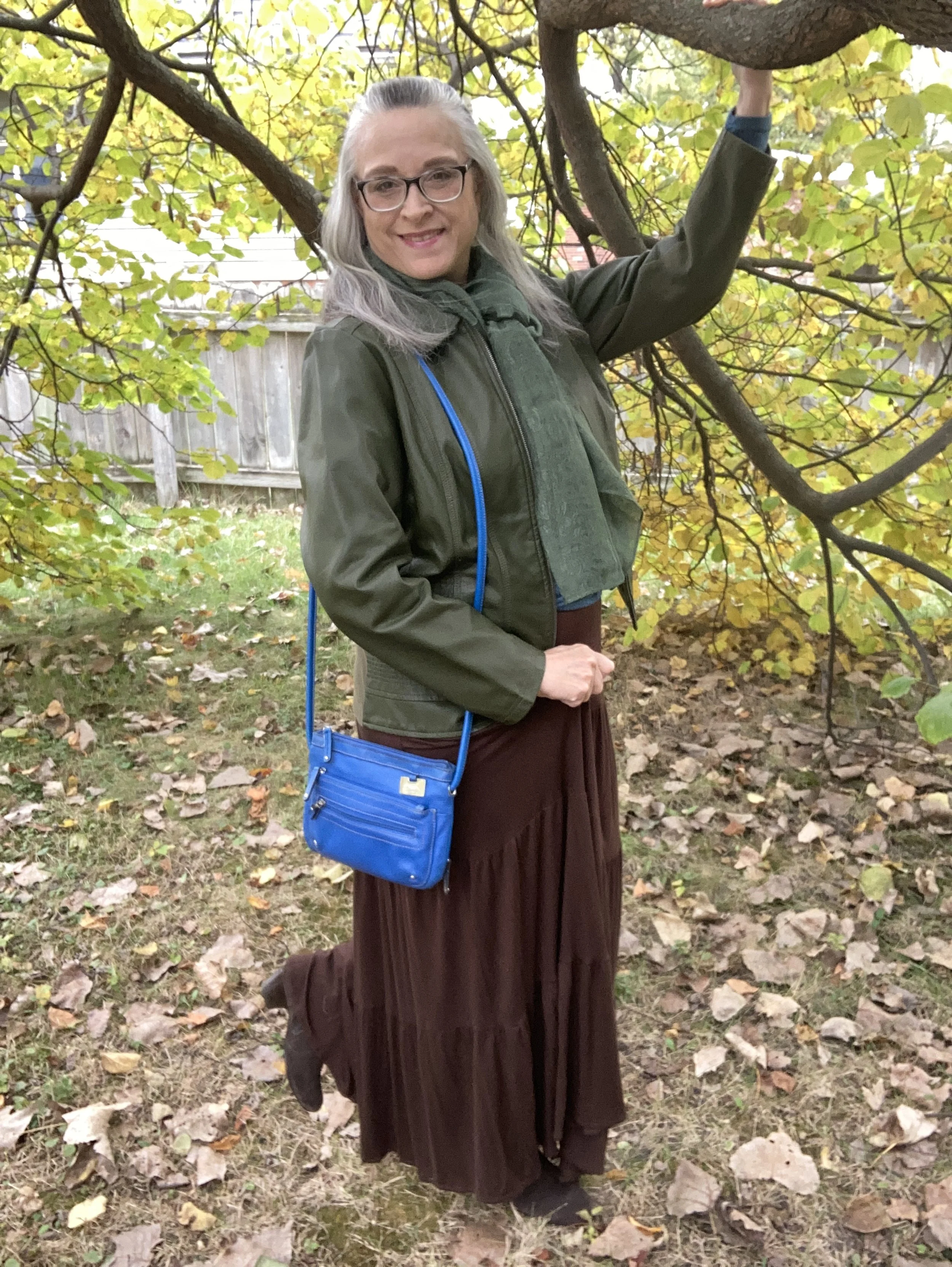
Color Play - A Pinterest Fall Color Palette

I have been collecting color palettes on Pinterest for quite a while, so I thought it would be fun to revisit that board and see what I could pull up for a fun fall color combination. This is the pin I drew my inspiration from and I used the swatch labeled Fall Fashion. I liked all the color combos, but I guess I wasn’t feeling overly adventurous, so went with the more conservative of the bunch.

This is a rich, earthy combination for fall, and I like how the green and brown are more sedate while the bright blue is a lovely pop of color. When I saw the color swatch I knew the olive would be a good color choice for a topper, as I have a number of sweaters and jackets in that color.

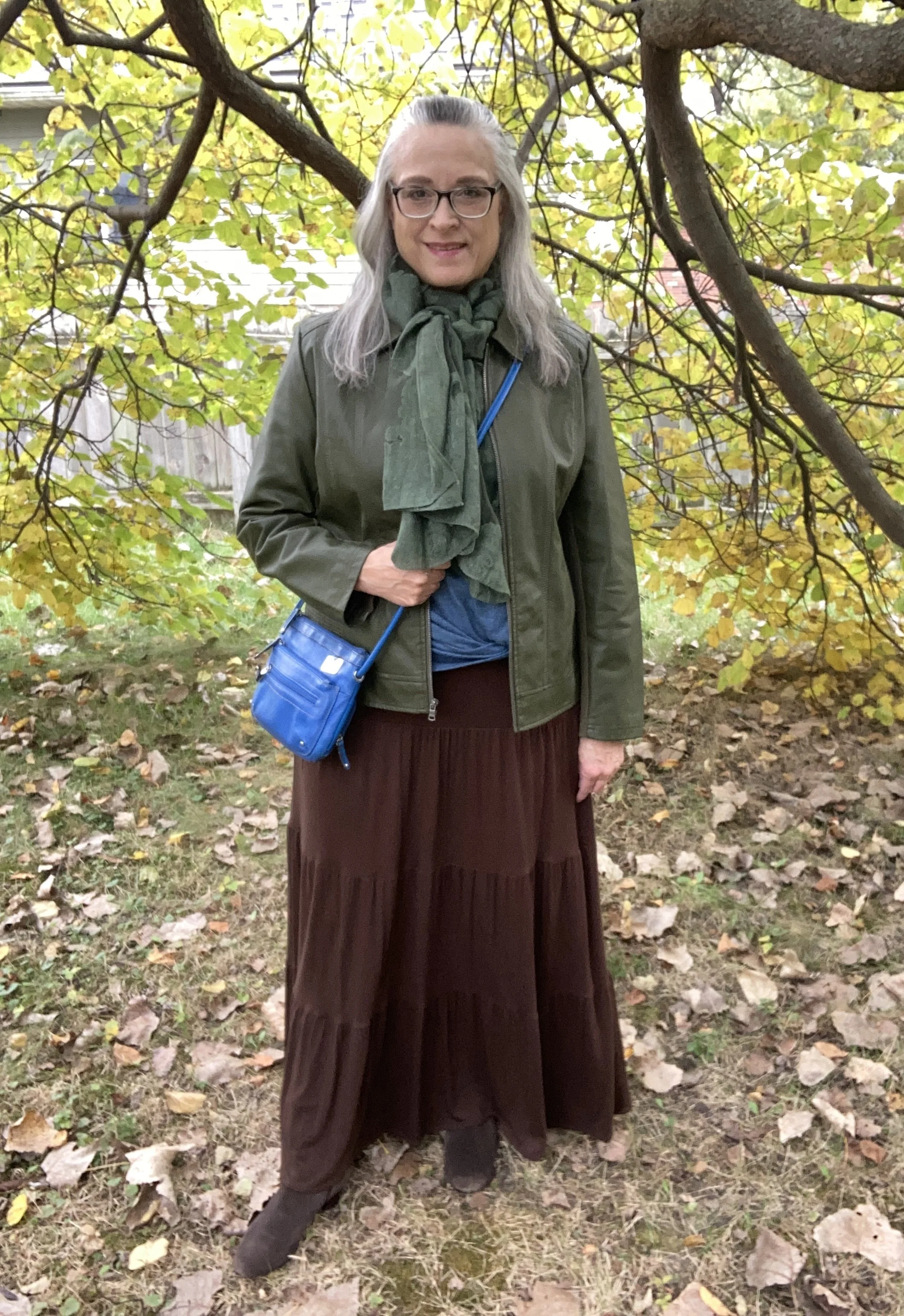
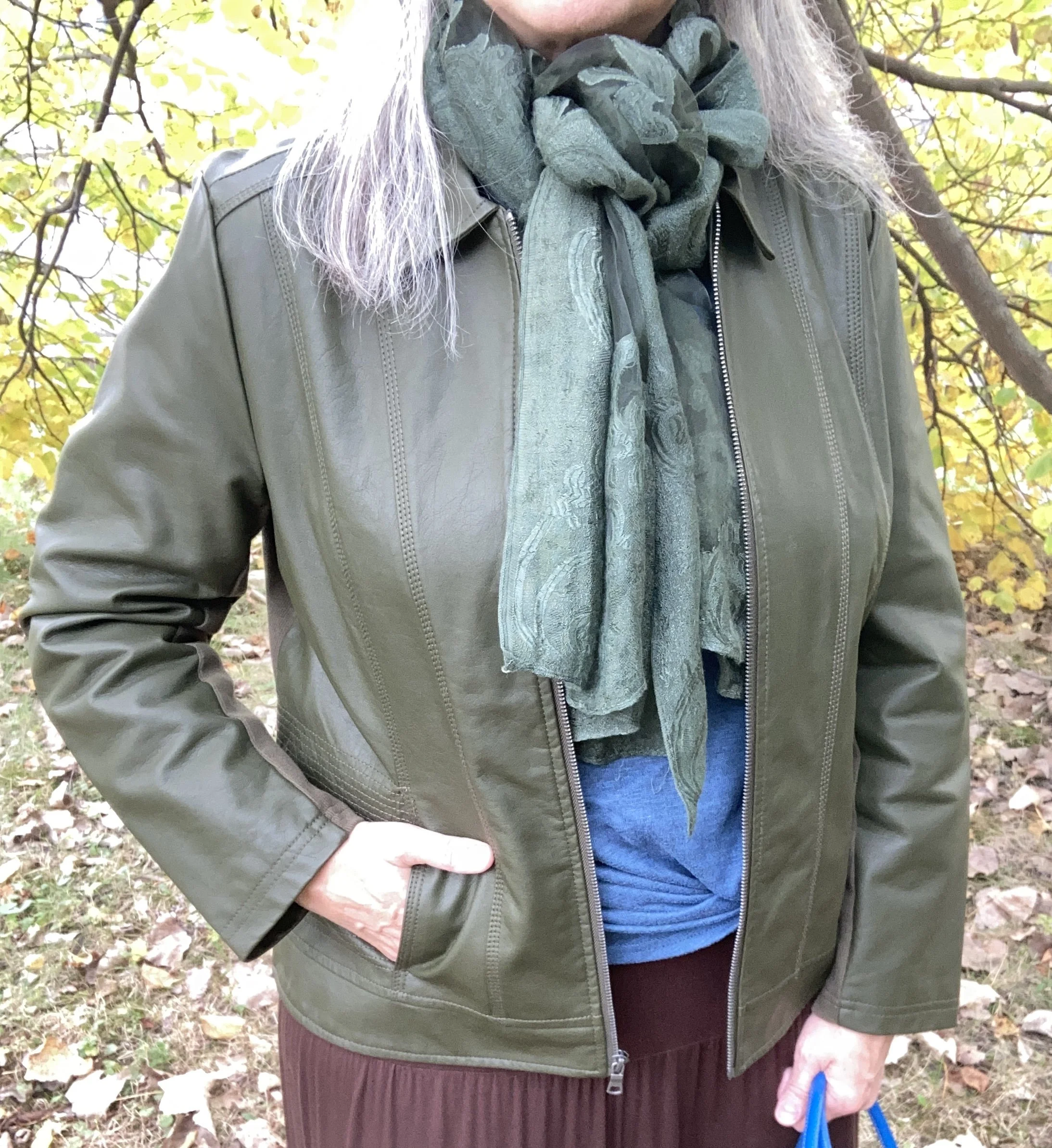
My faux leather moto jacket is an older Christopher and Banks piece. I like that it is simple, light weight and it has stretchy cloth panels on both sides and along the backs of the sleeves. They no longer seem to make these types of jackets, but always keep an eye out at thrift stores. In addition, real leather is always more suitable for longer wear and tear. Be sure to check out the Jacket Maker website for quality leather pieces at more reasonable prices.

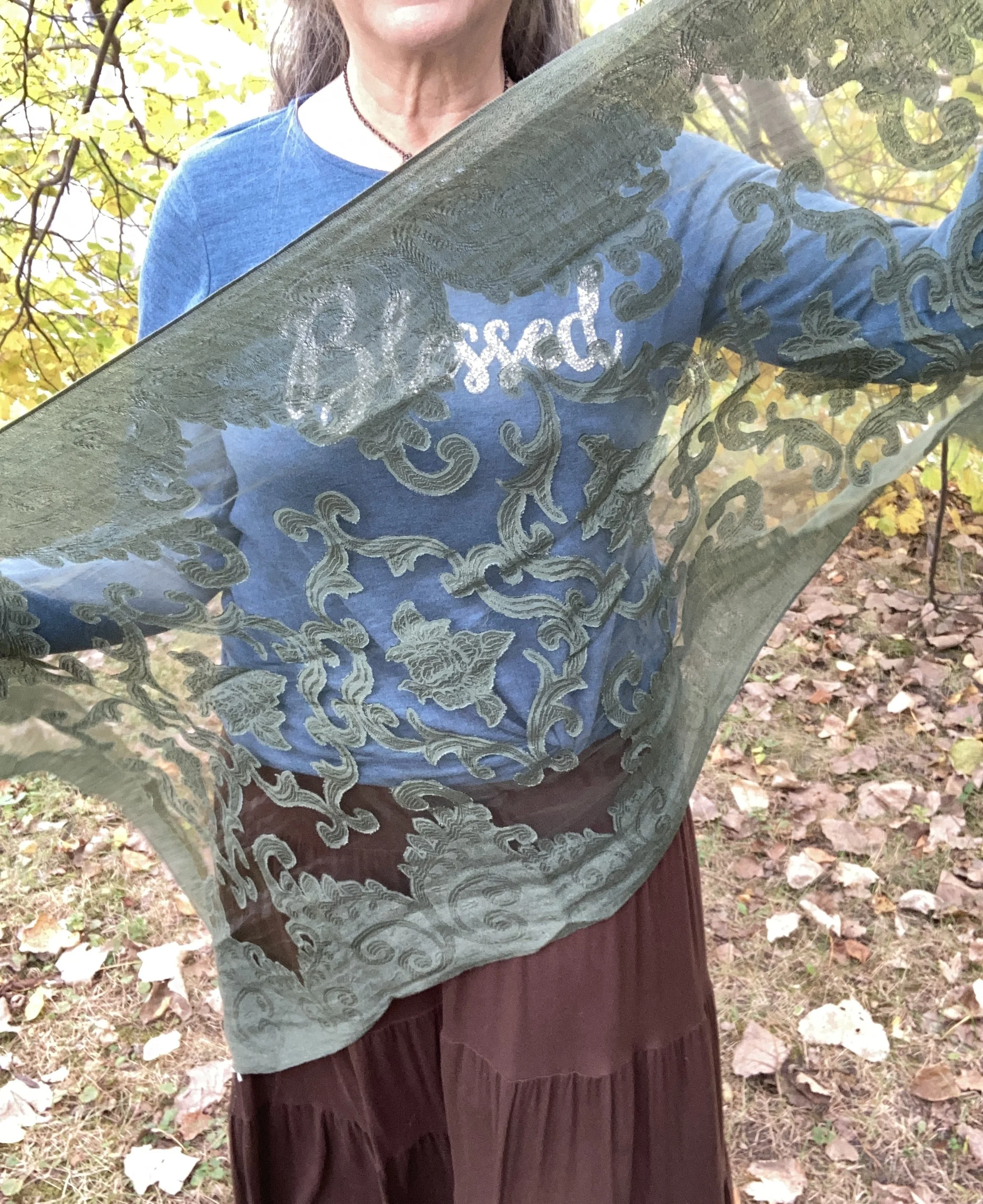
I added this thrifted green scarf, because fall is always a good time for a scarf! This was a fun find as I didn’t have too many green scarves and I love the delicate look of it.

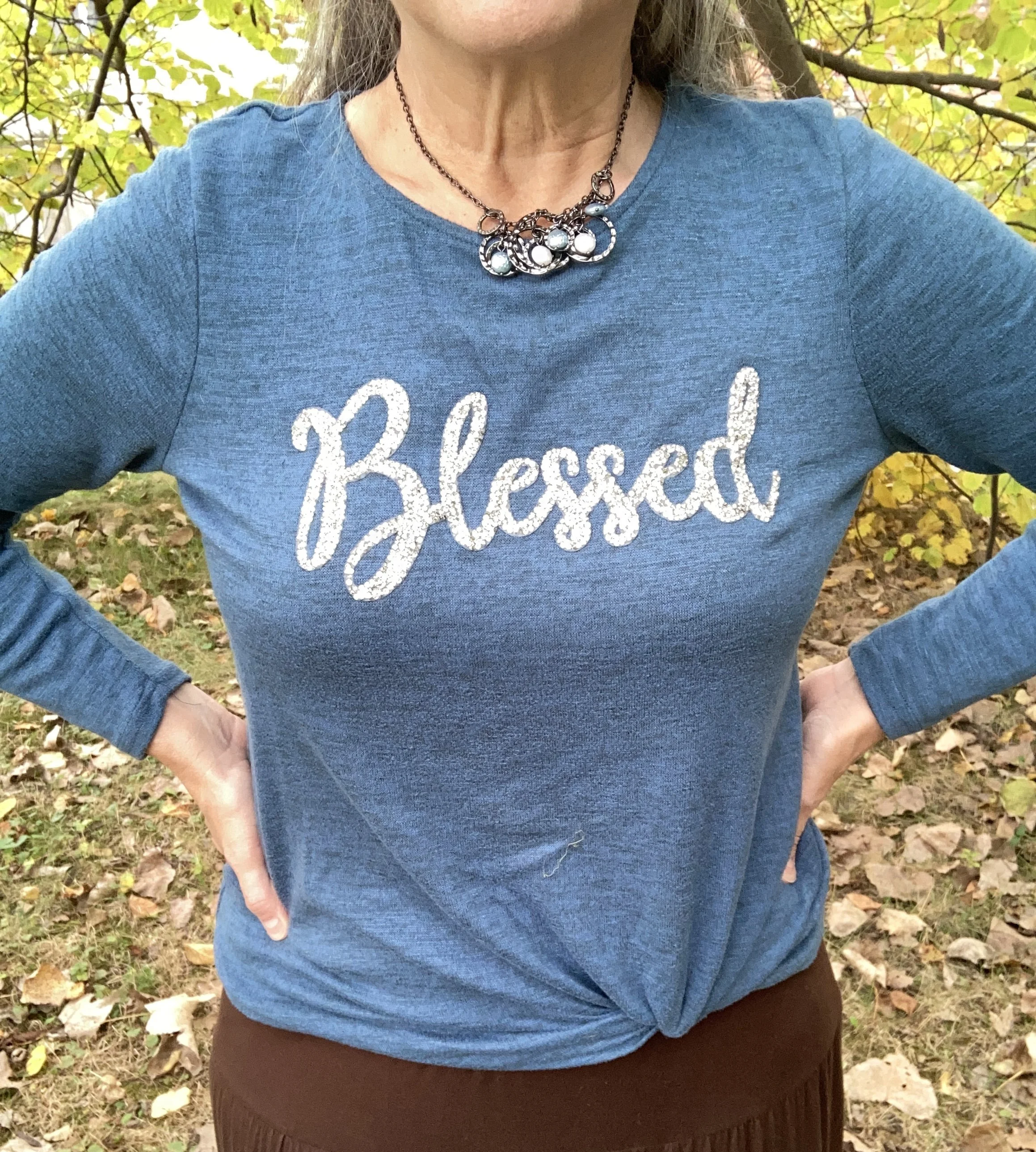
I was also dressing for an Instagram challenge today and the theme had to do with bling. This cute joei & i “Blessed” top was a gift from my oldest a few years ago and I do love it. It is the perfect weight for a cool fall day, and the sparkle makes it top notch in my book. You can also see the necklace I added. One can never have too many accessories on at one time, right? Ha, ha. In reality, if this was a work outfit, I would most likely take the jacket and scarf off while at the office, so the necklace works.

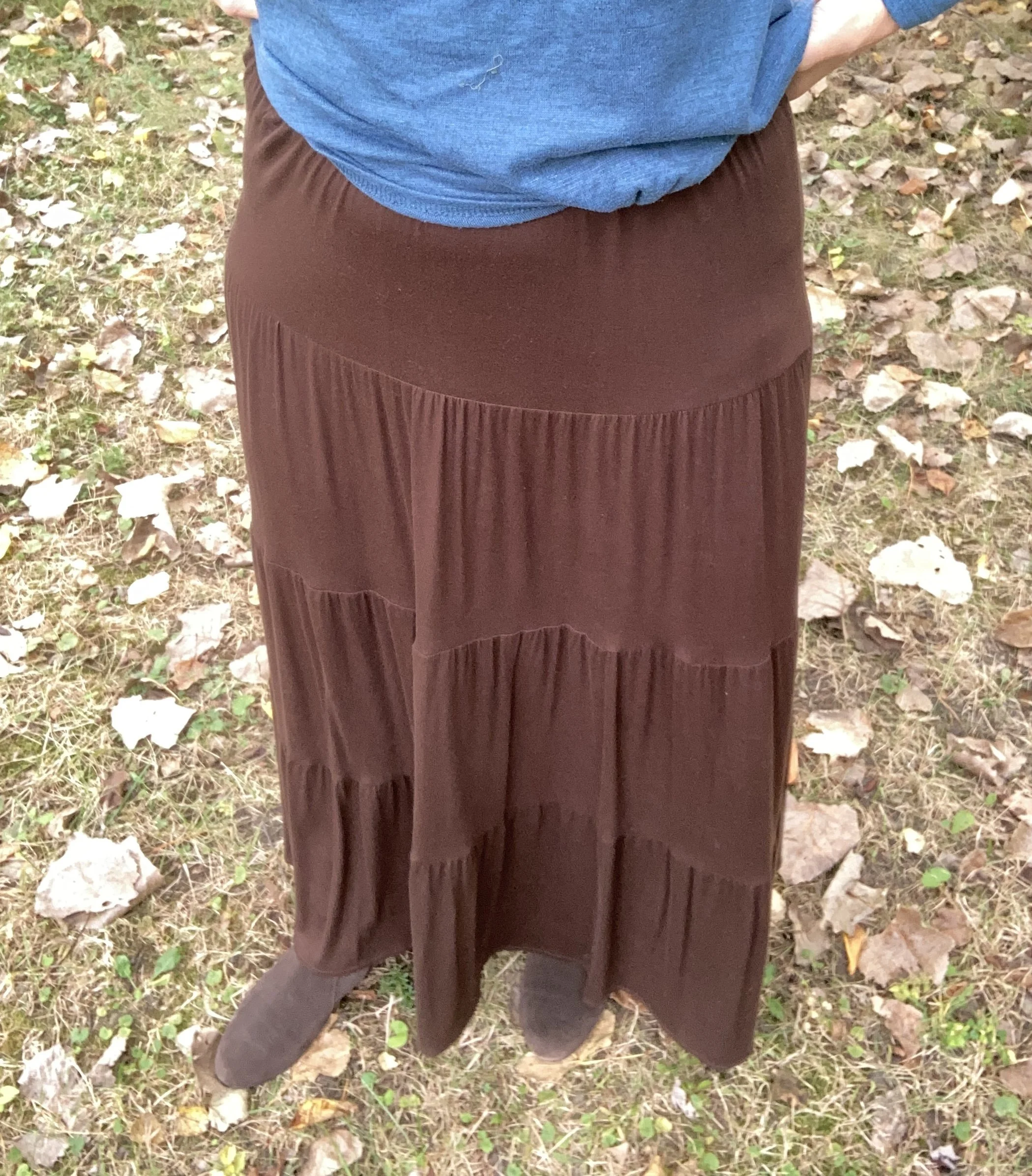
I have worn this skirt multiple times on the blog. It is St. John’s Bay brand and was purchased from JCPenney a number of years ago. You can see this skirt paired with a spotted tee, a bookish vest, and more recently a fringe vest.

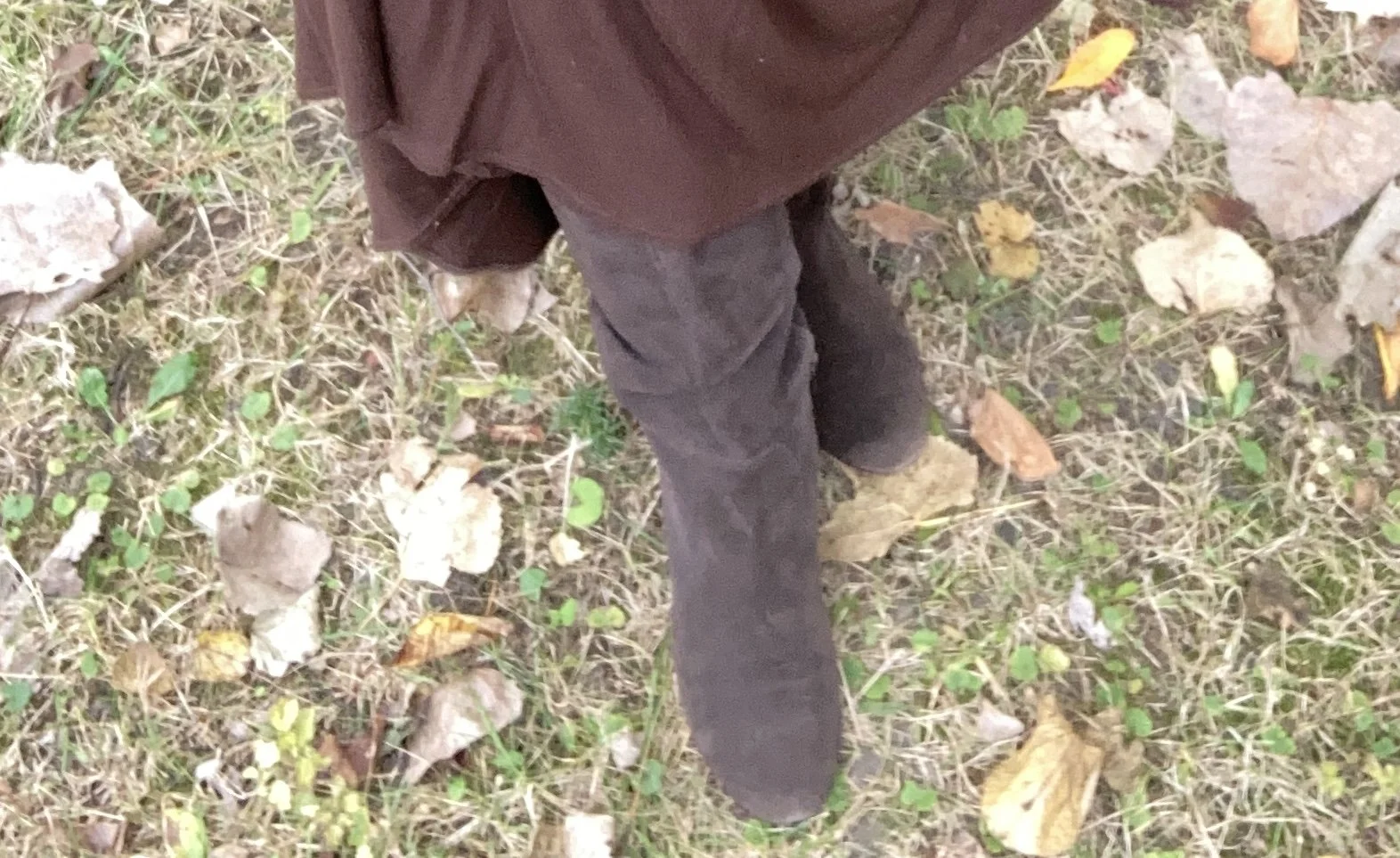
My boots are second hand old, but they are real suede, so with a little TLC I will keep them indefinitely. They are a brand called Kelly & Katie.

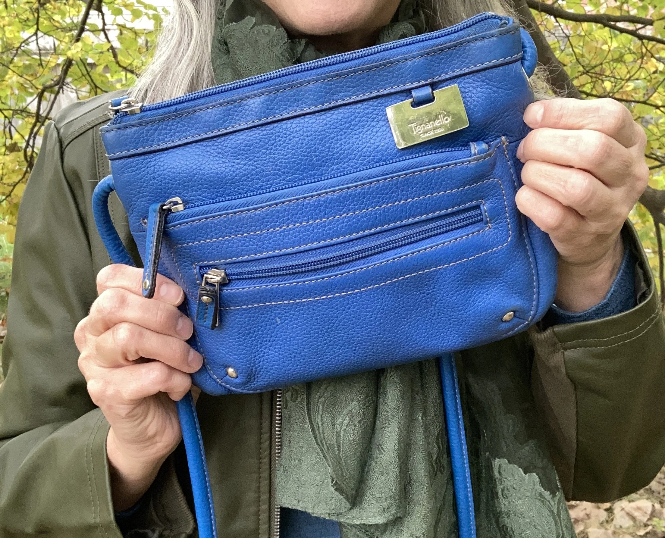
My blue cross body bag is thrifted Tignanello brand.

Do you think these colors work well together? What colors from the Pinterest Autumn palette did you like best? Please leave a comment or two. I appreciate your input.

I’m including a few shopping links for block heeled boots, tiered skirts and faux leather moto jackets. These are affiliate links brought to you at no extra cost. All opinions are my own.

I hope you are having a great week!

My Style: Tomboy/Tomboy Femme

Tomboy or Tomboy Femme style is a mix of masculine and feminine elements that involves pieces as simple and casual as flannel shirts and sneakers to ones more classic and complex like trousers and button downs. I have always deemed myself a tomboy. I loved chasing after my older brothers when I was growing up, especially when they were riding dirt bikes in the field near our house. I would follow them on my bicycle, longing for the day when I could join them on their noisy, dirty motorcycles.

While my longing to race motorcycles never came to fruition, to this day I love the rumble of a Harley Davidson, and all the leather and denim that goes along with it. I enjoy playing outdoors whether it be hiking, camping, fishing or even hunting, occasionally, with my spouse.

When puberty came with all of its teenage angst, it also came with a full swing into things that were girly. I did play with dolls growing up and definitely loved Barbie and all of her friends, but after puberty I noticed I became acutely aware of clothes, boys, and hair styles. Make up came later when I was in college.

To this day, I still prefer jeans and sneakers to dresses and heals. I can totally dress up for a special event, but the bulk of the time I feel most confident when I am wearing a casual look that involves both feminine and masculine vibes.

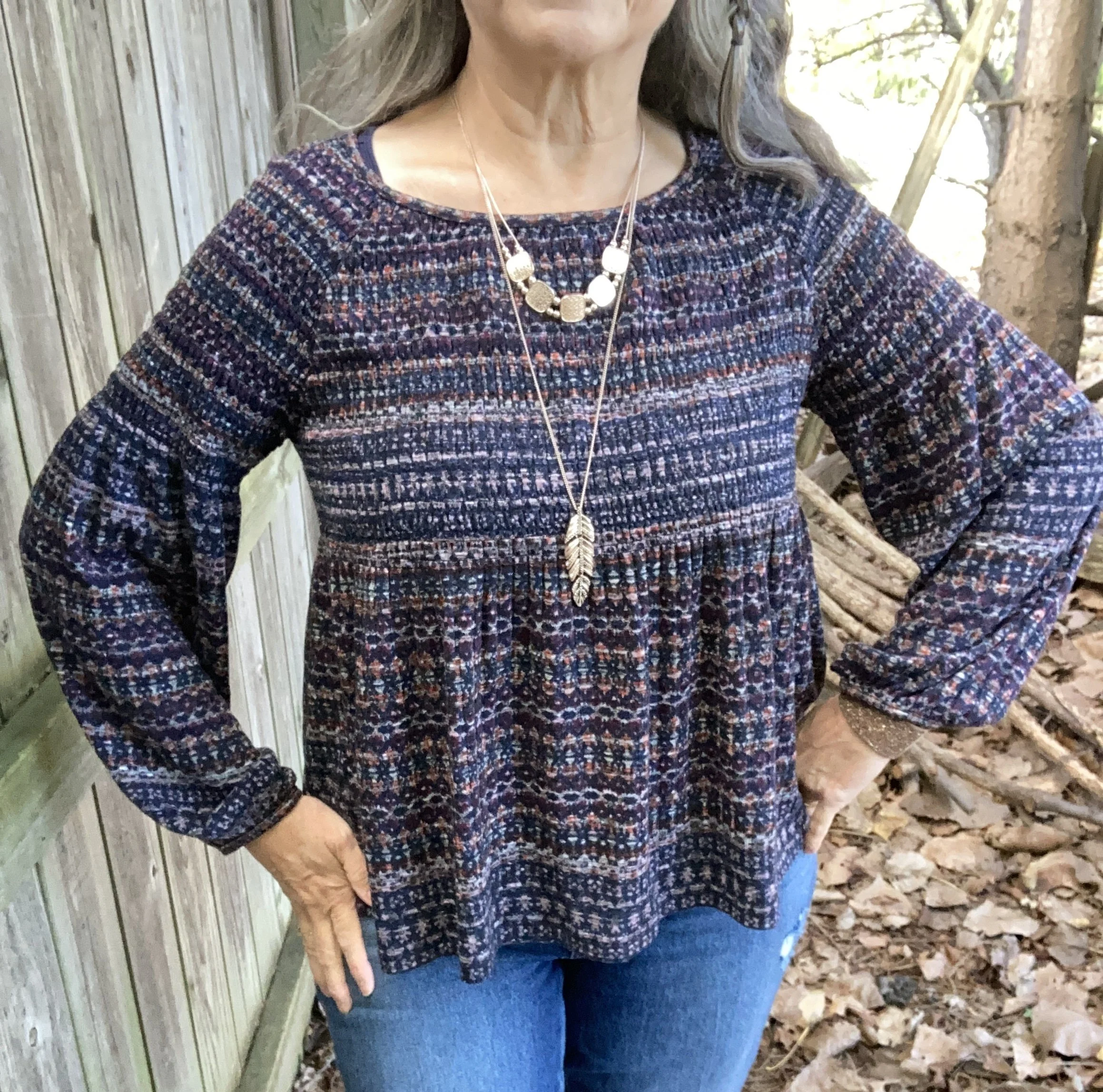
This look came together after I picked out this multi-print babydoll top with peasant sleeves. This is a fun piece I thrifted a while back, but it is definitely made for cold weather as it is a heavy weight material. I wore a tank top underneath to keep the chilly air from coming up under the top. This is definitely a feminine piece by its silhouette, but the colors keep it more grounded and even masculine in nature.

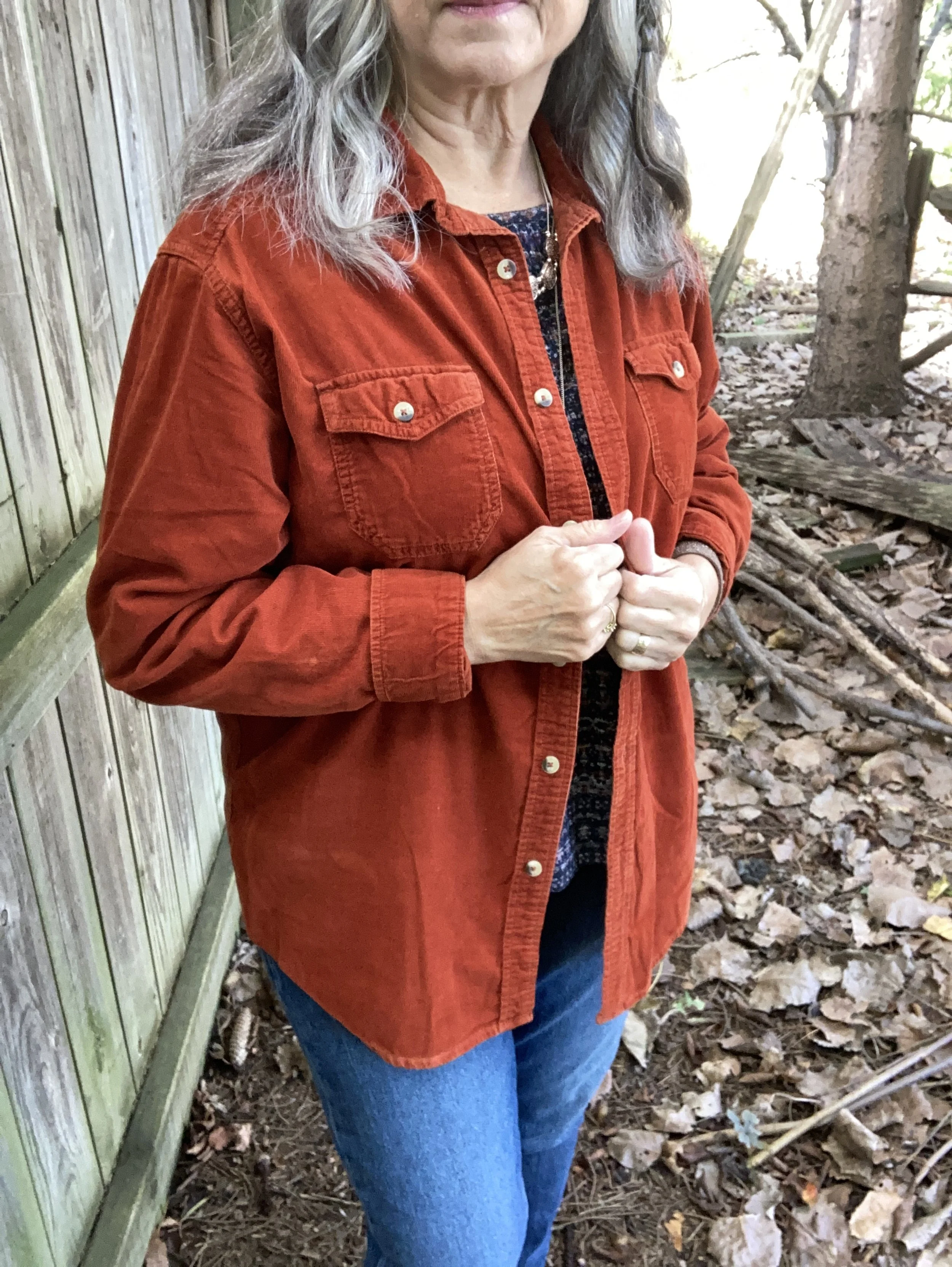
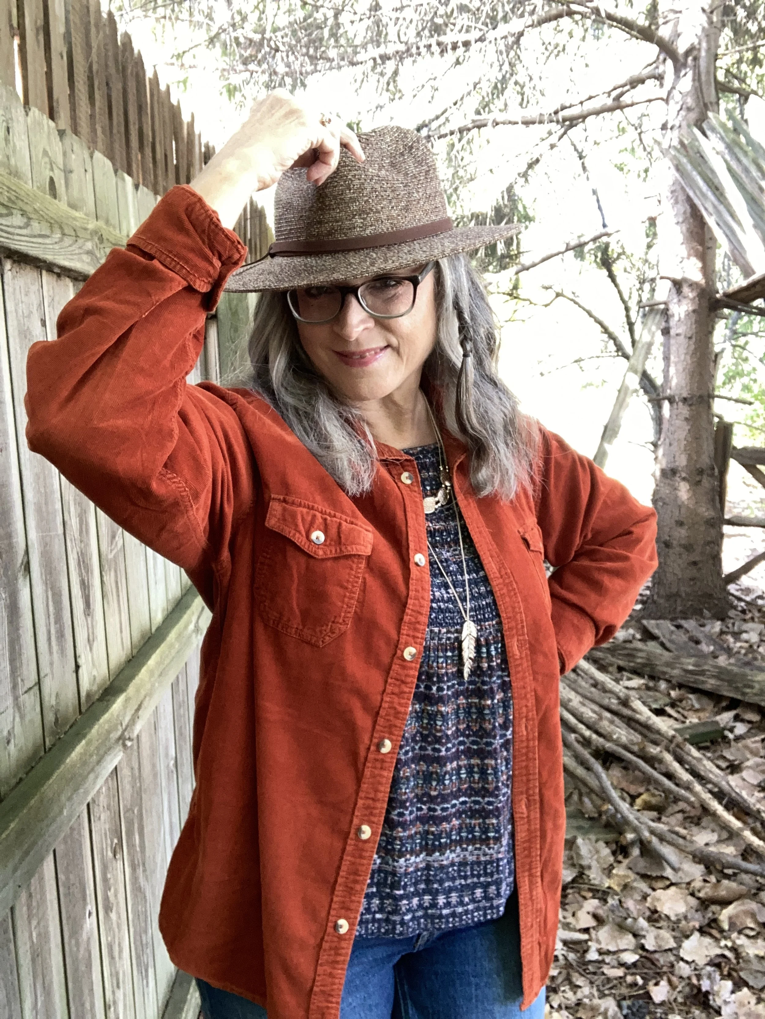
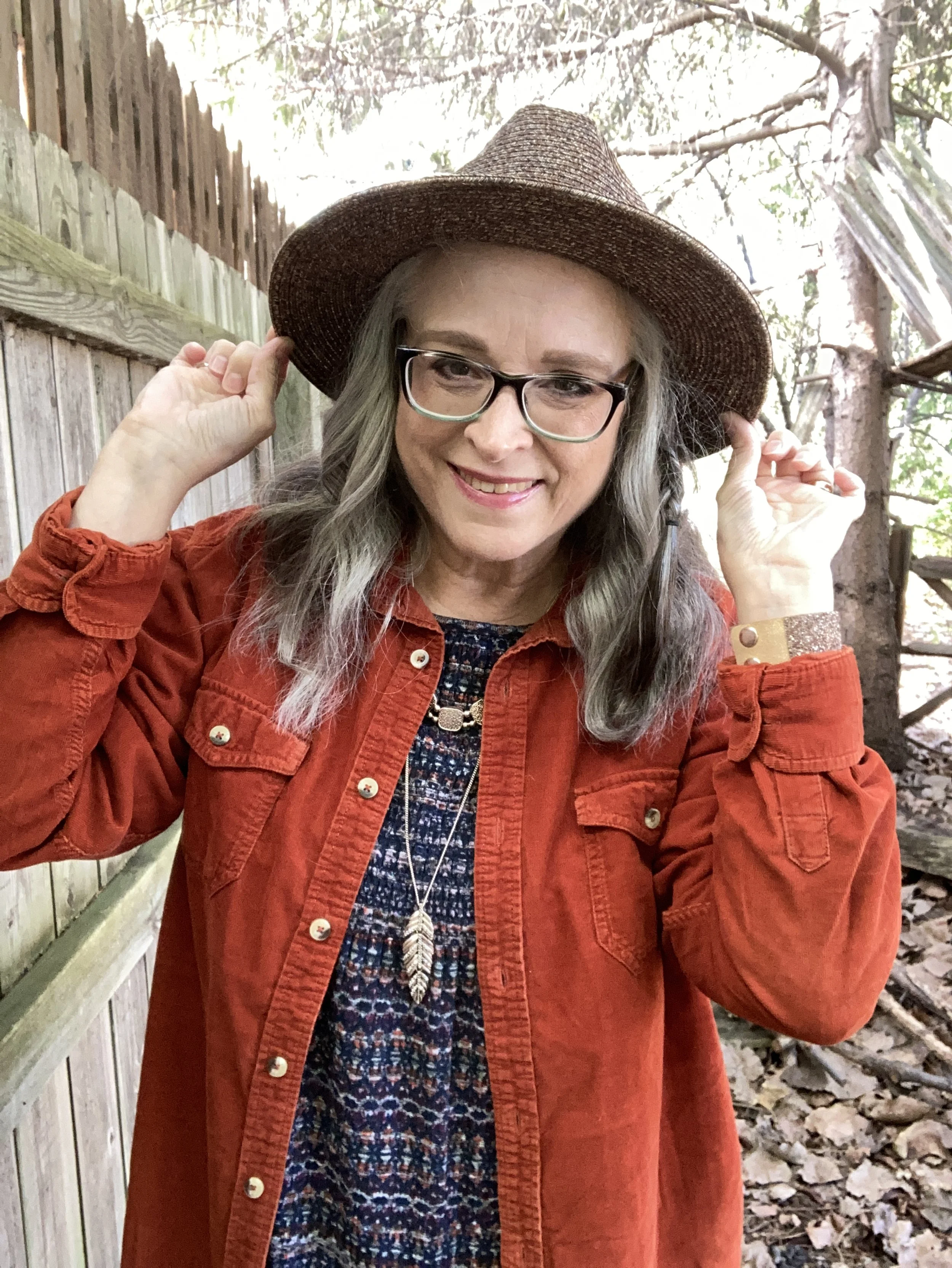
After I picked the top I knew I wanted to use an oversized button down to hone in on the tomboy nature of the look. I remembered I had this wonderful thrifted corduroy shirt so I dug through my cold weather clothes, which are slowly being transitioned back into my closet after their summer hiatus. This piece matched perfectly with the rusty orange in the top.

Style Tip: Look for heavy weight, oversized button downs in the men’s section at thrift stores. You will most likely find a few gems. Use these like a cardigan, blazer or jacket for a casual, relaxed tone.

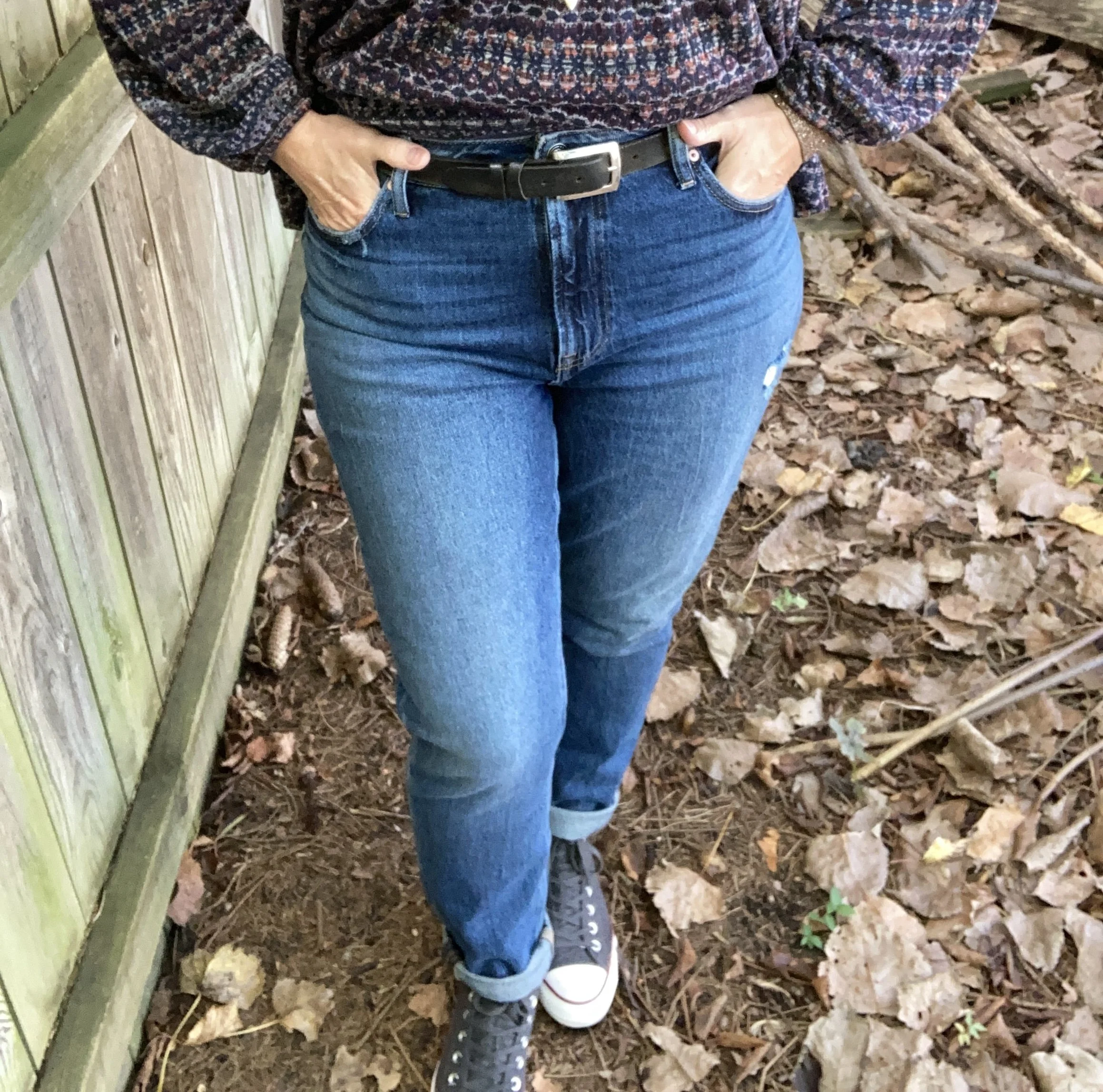
Knowing my top half was going to be more bulky and oversized I wanted to go for a slimmer leg jean. I grabbed this slightly distressed, high waisted pair from Maurice’s on clearance. I rolled the hems to add to the tomboy demeanor, but I look forward to wearing these with boots later this season and into winter.

My high top Converse seemed the perfect choice to drive home the tomboy nature of this look, however I wanted a few more feminine touches so chose a pastel pink cross body bag, and two rosy gold necklaces that my bestie gave to me a while back. She gave me a box with multiple necklaces and scarves that she was no longer using, so I finally pulled it out of my closet and took everything out so I can use it. I love the layered look these two necklaces provide. I also added my sparkly rose gold faux leather bracelet.

Do you think I pulled off the tomboy, or tomboy femme look? Do you wear outfits like this? Do you have pieces like this in your closet? Do you own a corduroy button down? Be sure to leave me a comment or two. I always love to hear from you.

I was also participating in an Instagram challenge yesterday that involved our favorite hat, so I added my hat to the outfit and took a few more pics.

I am including a few shopping links. These are affiliate links. All opinions are my own. Note I included a few men’s corduroy button downs as they will provide a bigger, oversized look. I typically get a men’s Medium or Large so there is a bit more room in the hip area, but if you are petite order a small.

Have a great week!

Shopping Our Closets: Fall Florals

I don’t know about you, but I love the rich, vibrant colors of fall. Unlike spring and summer when we focus more on white, navy and all manner of pastels, fall allows us to indulge in dark maroons and earthy browns; golden yellows and rusty oranges. I love floral pieces in any season, but I especially love the dark florals of fall and winter. I am hoping you have a few fall florals in your closets and you will join me in putting together an outfit with those pieces as a focal point. Whether it is a top, a scarf, a bag or a skirt, fall florals make for outfits that are fun, whimsical and stylish.

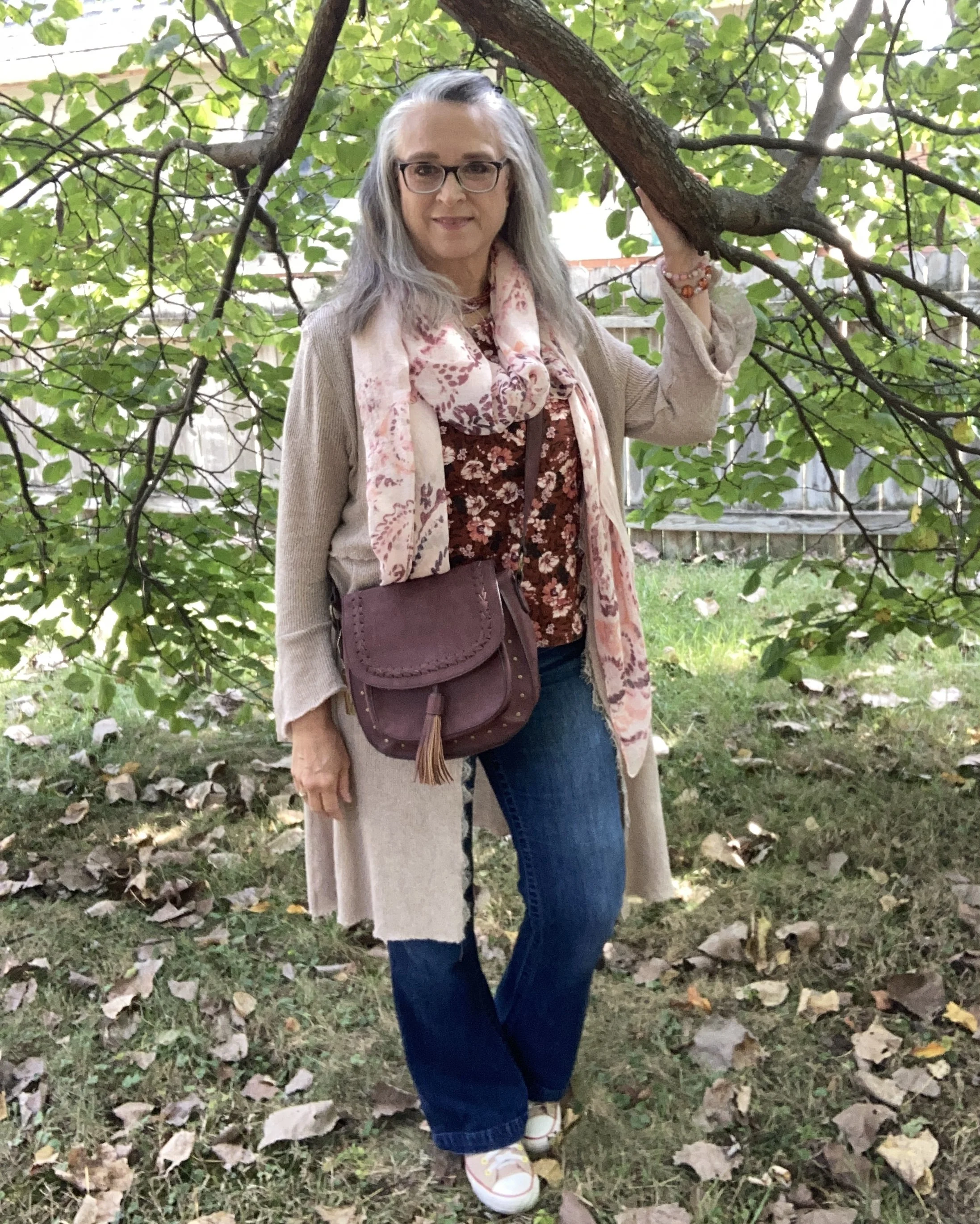
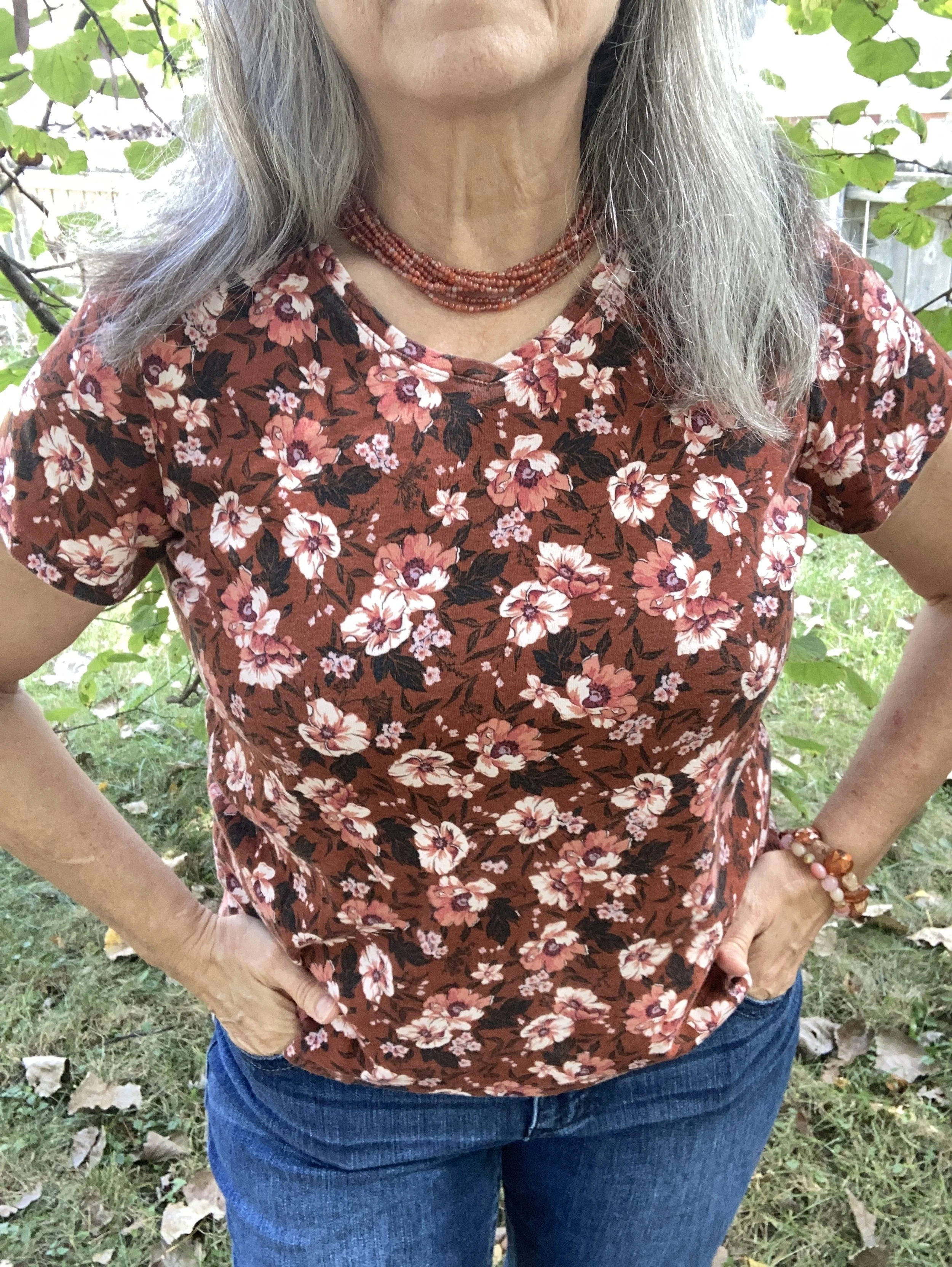
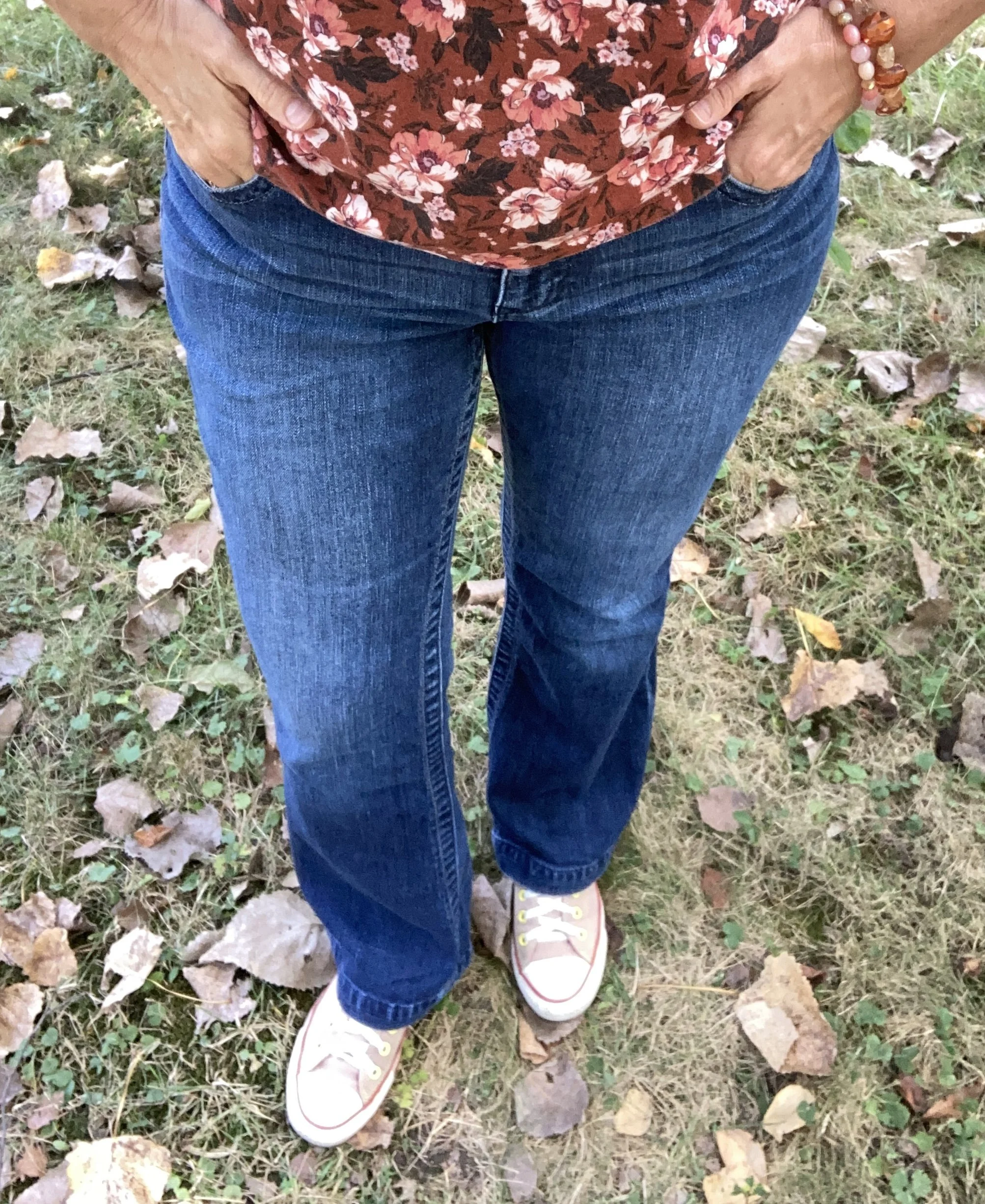
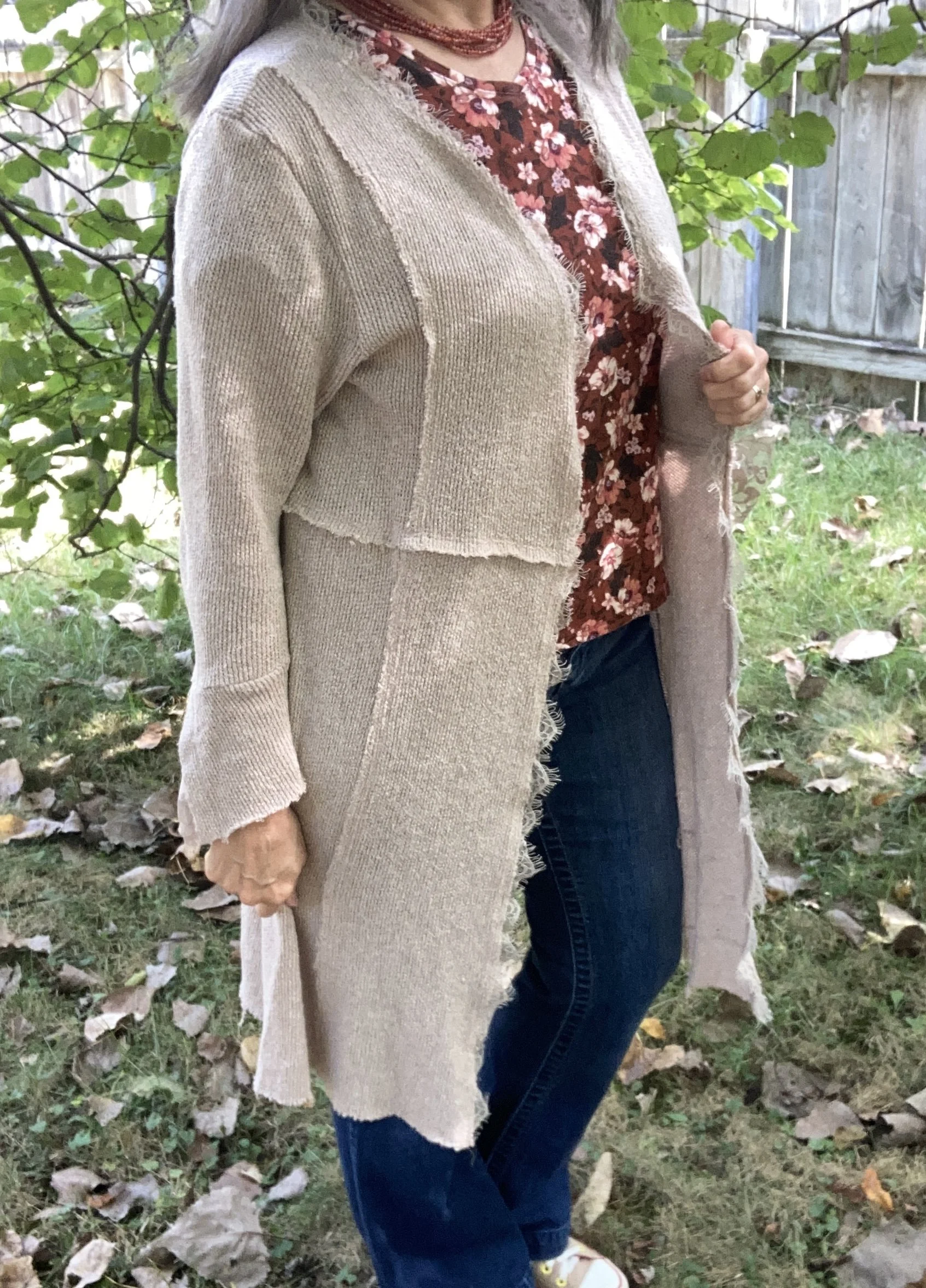
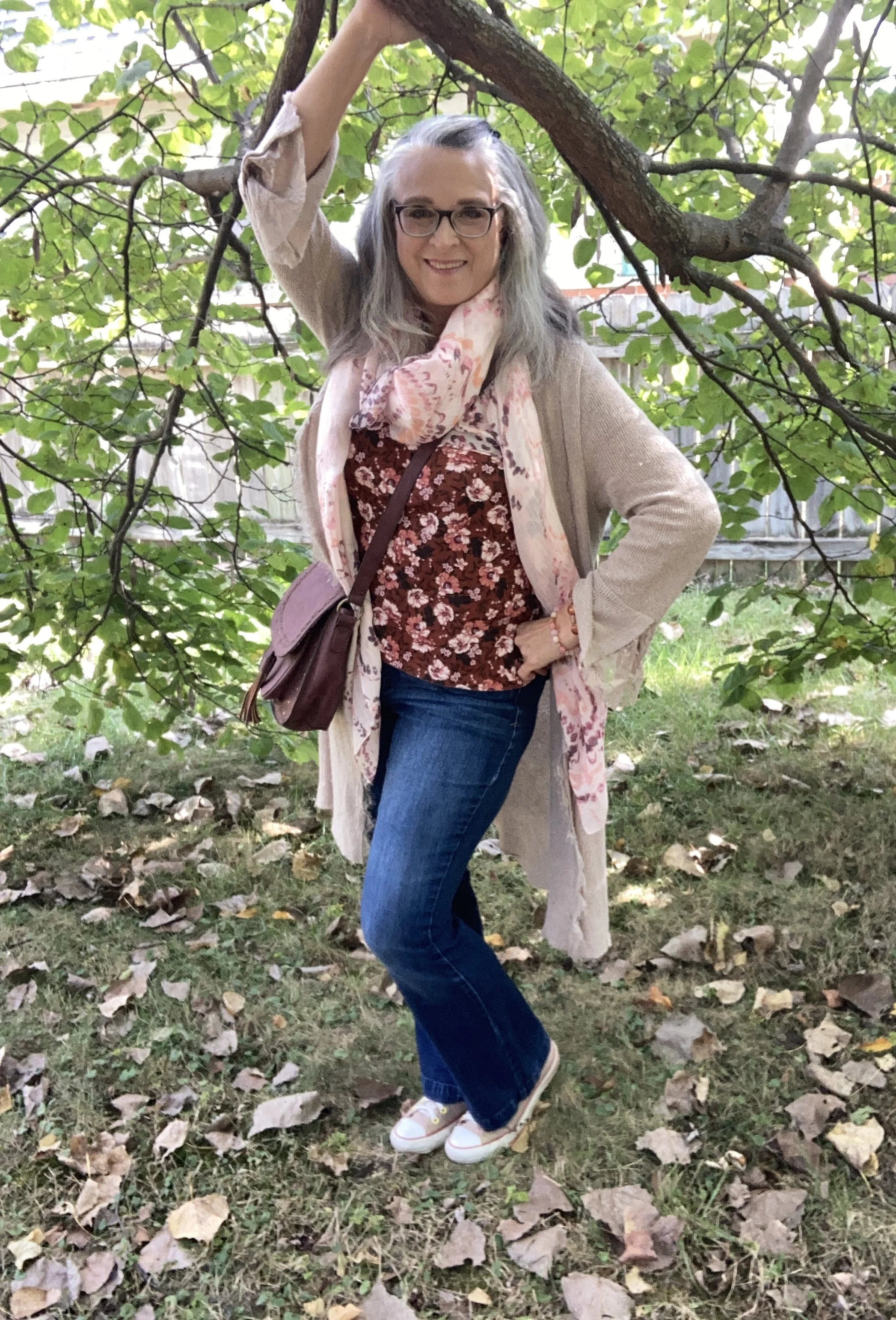
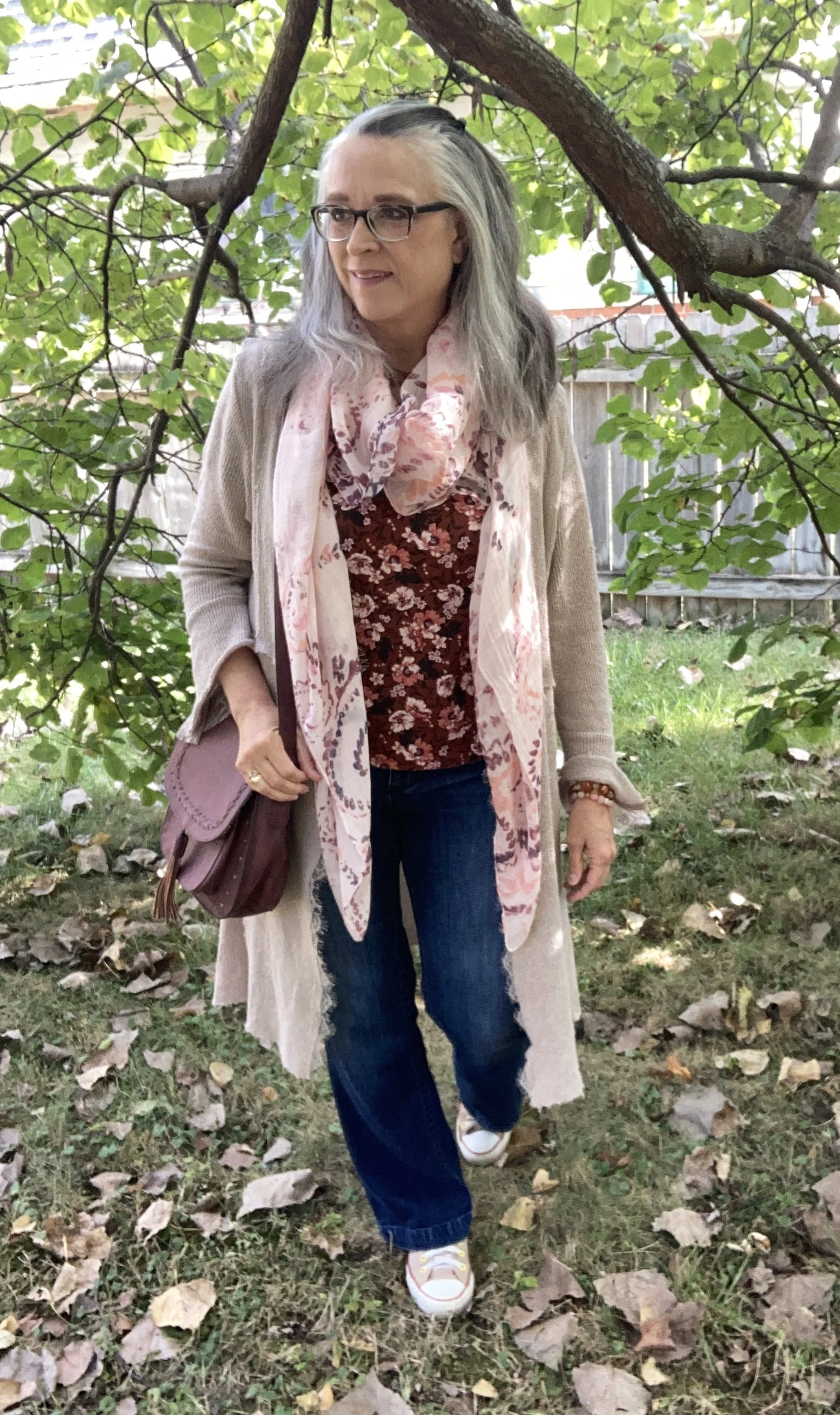
For my fall floral I chose a thrifted Croft & Barrow tee. The rusty background, pinky reds in the flowers and the black leaves are a perfect choice for this fall look.

This top is just a basic Croft & Barrow tee. It fits well, and is perfectly comfy. It is a great piece for these early fall days where the temps are starting to get cooler, but it isn’t yet full on sweater weather yet.

I also chose simple beaded jewelry in similar fall tones.

I was going for a casual look, so chose jeans as my bottoms, but you could easily dress this up with a pair of black dress pants, or a rust or white colored skirt. These thrifted, boot-cut jeans are Apt. 9 brand.

My fun duster was a purchase from Cracker Barrel General Stores a few years ago. They always have beautiful holiday displays of their products and fun seasonal clothing. I would buy many more pieces there, but I just have a hard time paying full retail prices for anything I don’t really need. This is a brand called Linda Anderson.

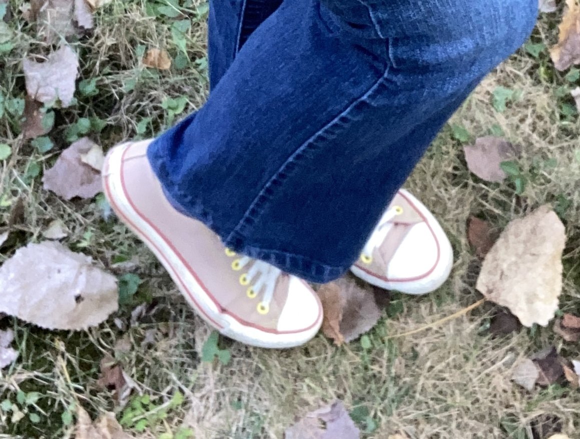
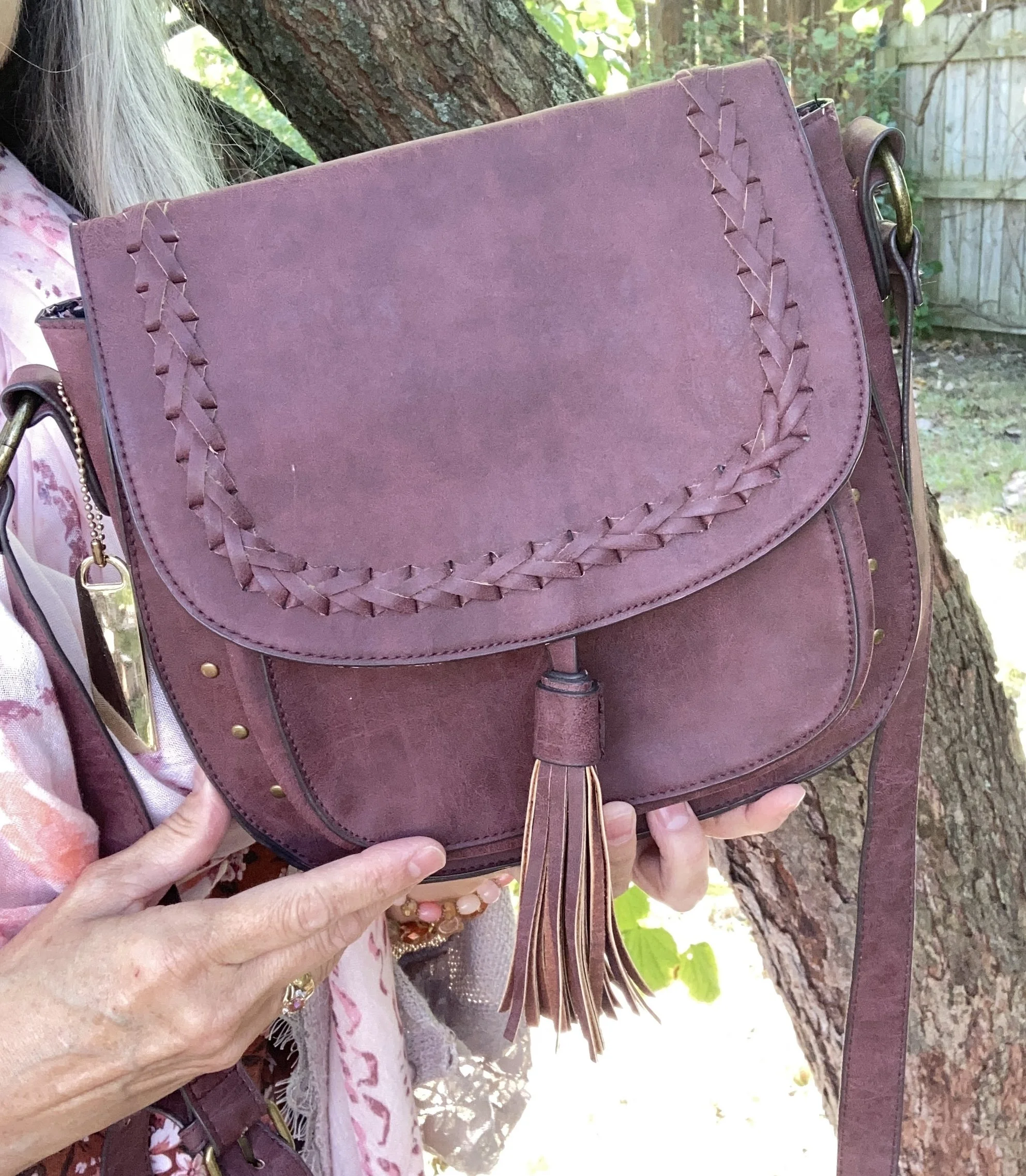
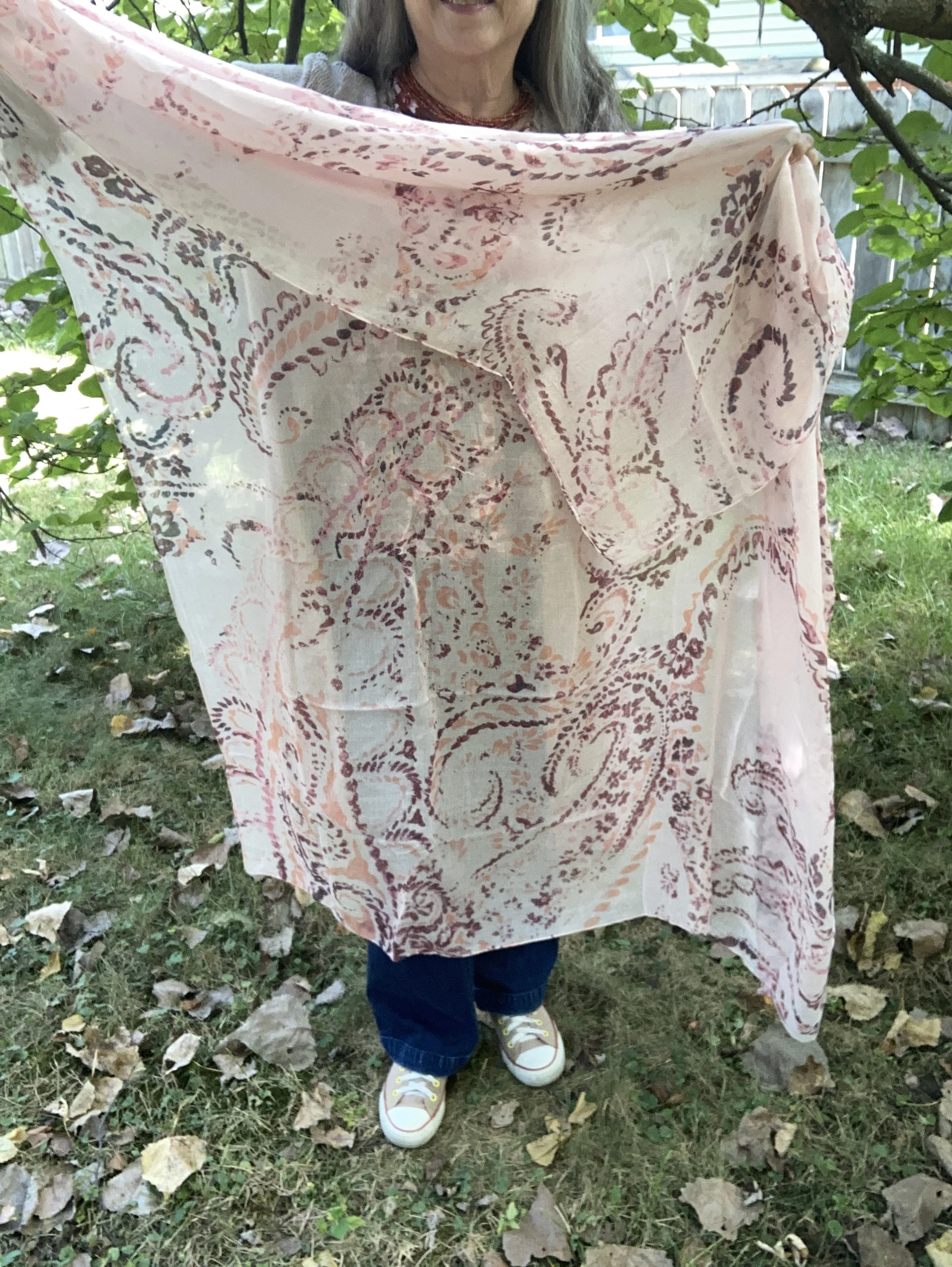
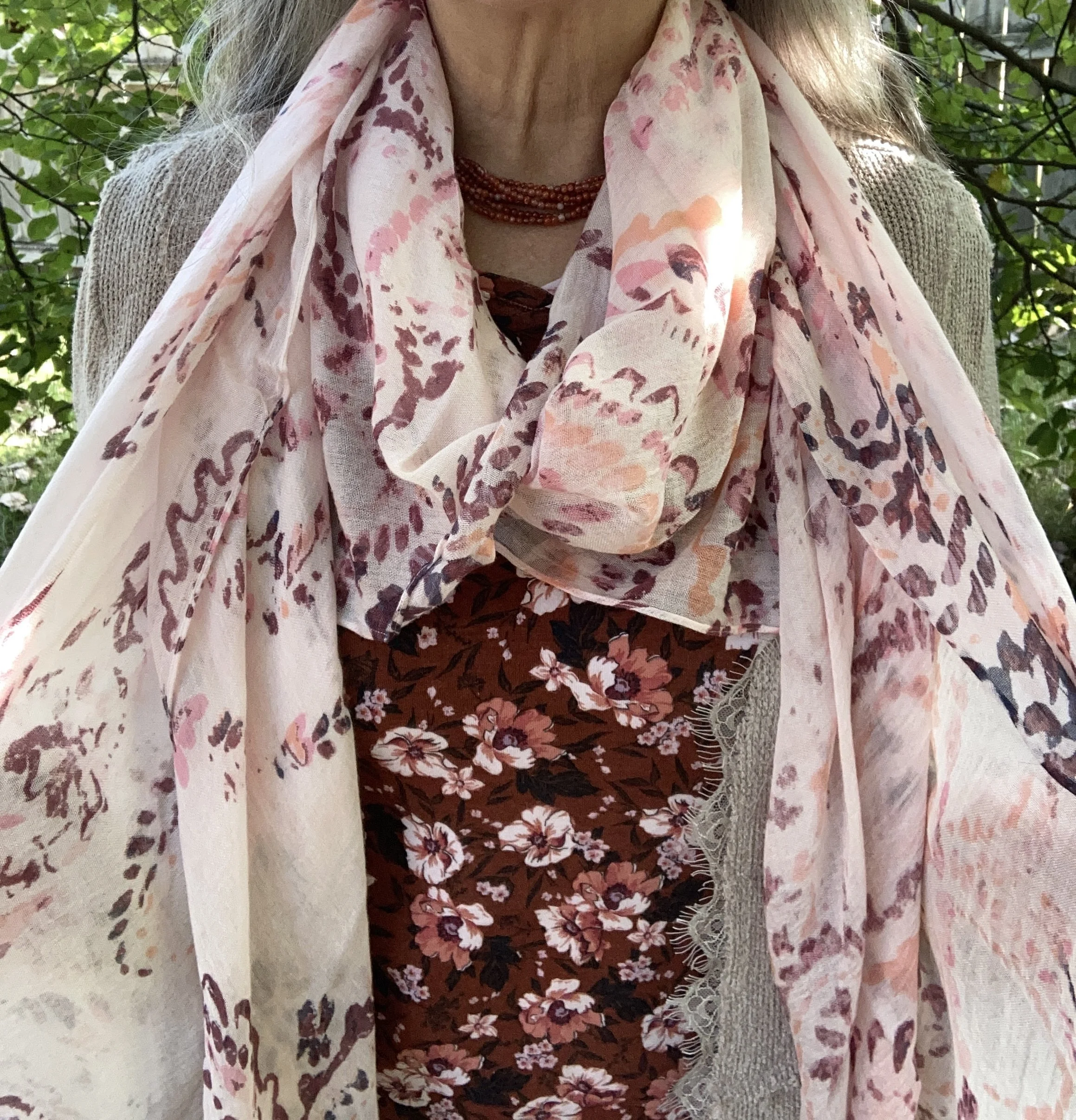
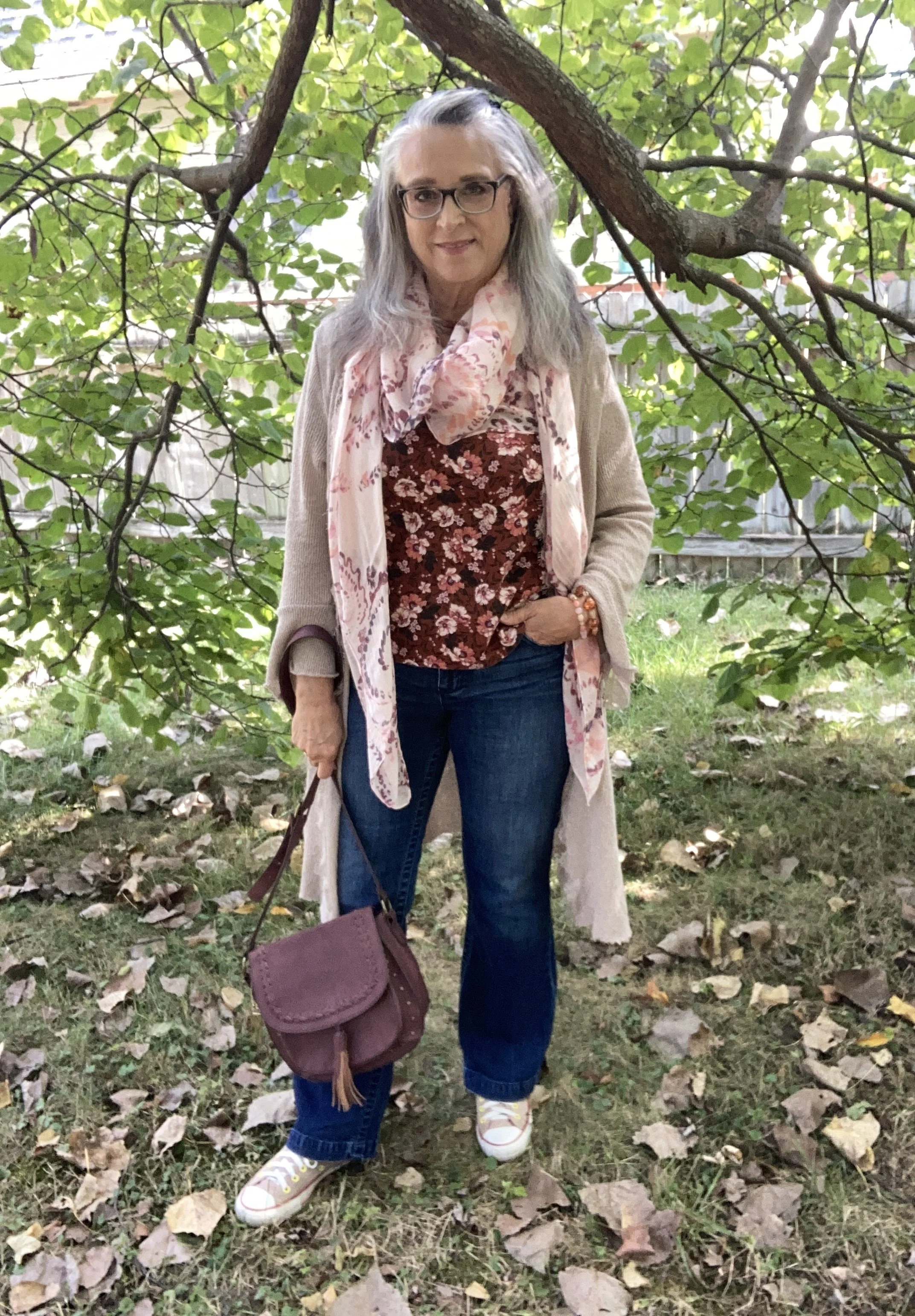
My accessories really completed this casual look. I chose my thrifted Converse sneakers, my burgundy saddle bag purse, and an oversized, light weight, thrifted scarf. I like how the scarf has a similar color vibe to the tee, yet it is completely different. It also makes for a fun print mix.

What do you think of this outfit? Do you have any fall florals in your closet? If so, what sort of pieces do you have? I think it would be fun to style a fall outfit around a floral bag, scarf, skirt or dress. Let me know you thoughts.

I hope you enjoyed this post and that it provided a bit of inspiration for you in shopping your closet to build a fall outfit around a fall floral piece.

I’m including a few fall florals, bags and scarves below. These are affiliate links brought to you at no extra cost. If you purchase an item through one of my links, I get a few cents. I appreciate all you do to support the blog.

I hope you are having a great week!