Color Play - 2 - Pantone Spring 2023 - NY Palette: Tangelo, Peach Pink, Machiatto

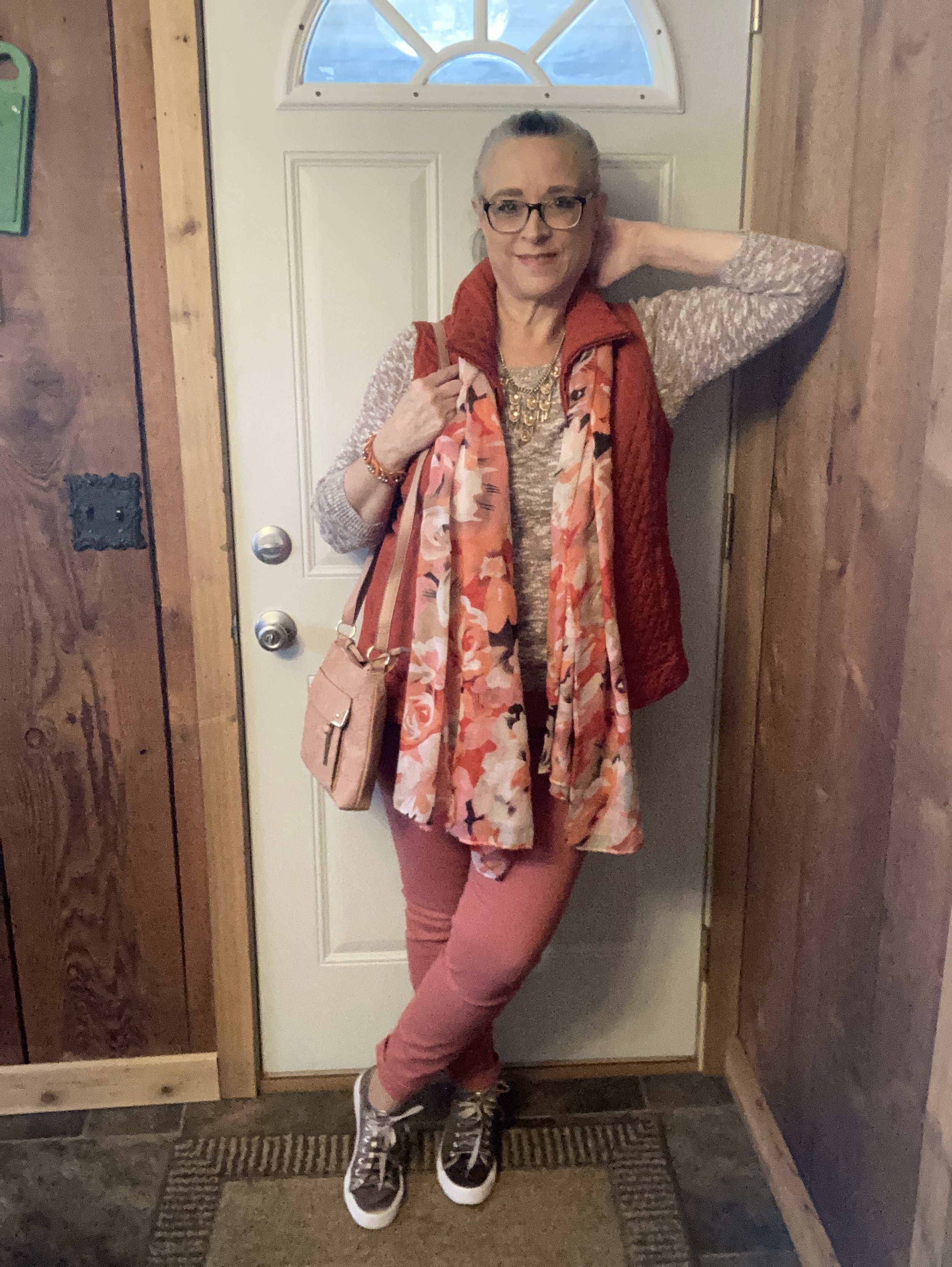
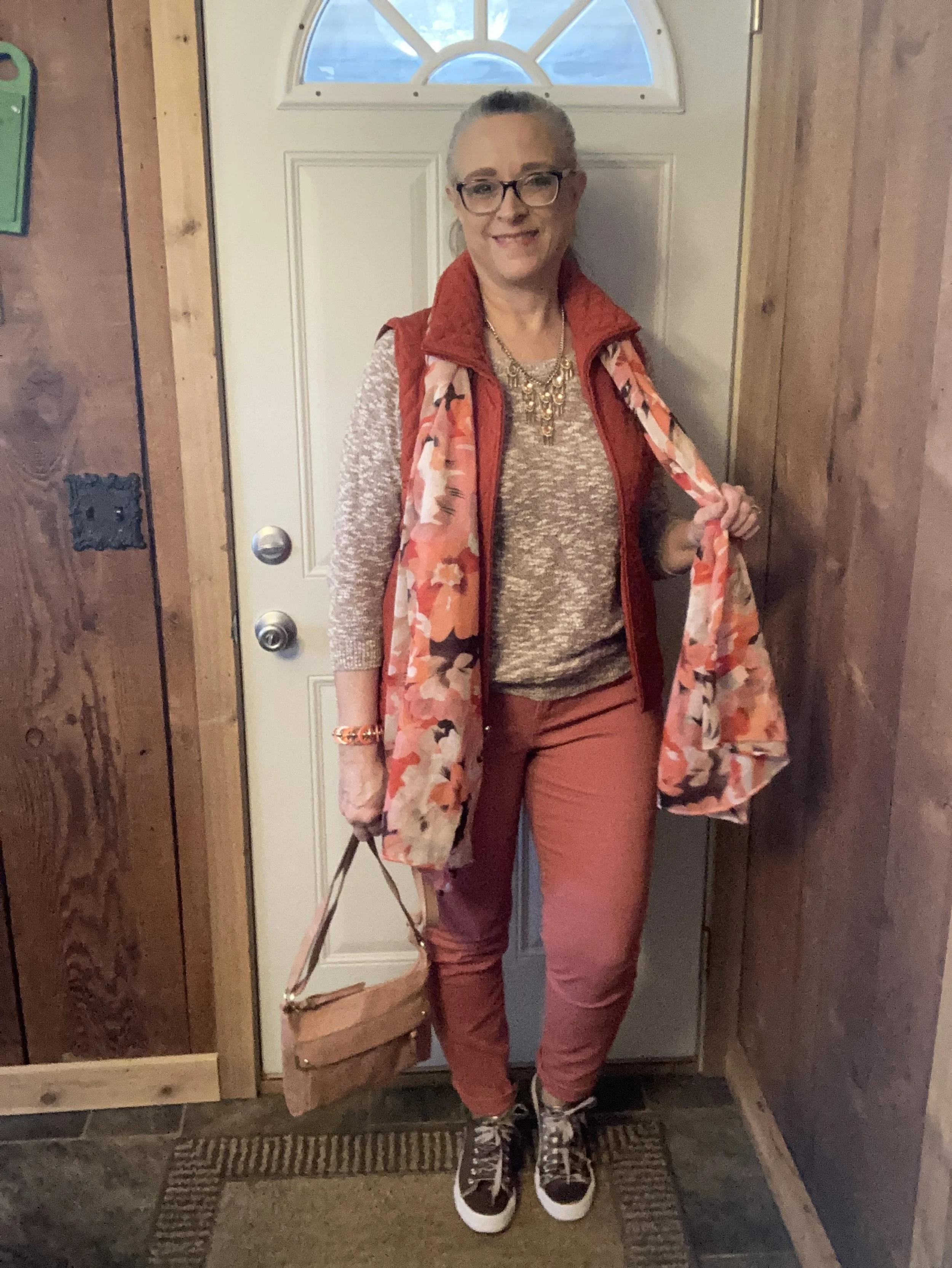
These are the final three colors from the Pantone Spring 2023 NY Palette and I wanted to let you see them. This is also going to be a color block outfit, though not as distinct as the previous one with the more primary colors. These colors are softer and make me think more of light spring showers and Easter flowers. This outfit has almost a monochromatic feel as the colors are similar in their hues.

With Easter only a week away, I thought it might be nice to focus on an outfit that would work for a casual Easter get together. It used to be we dressed up for this holiday, and I think many people still do, but while many are still donning their white shoes and pretty spring dresses, there are others who will reach for a more casual, practical outfit for a day of cooking and preparing treats for the grandkids’ Easter hunts.

This outfit is made up of three main components: bottom, top and accessories. I am including the vest in with the accessories because it is not essential to the outfit. You could easily wear a top and bottom without a topper like a vest or blazer. For this outfit, the vest was representing another of the Pantone colors and not only does it add an element of warmth, but an element of texture and interest.

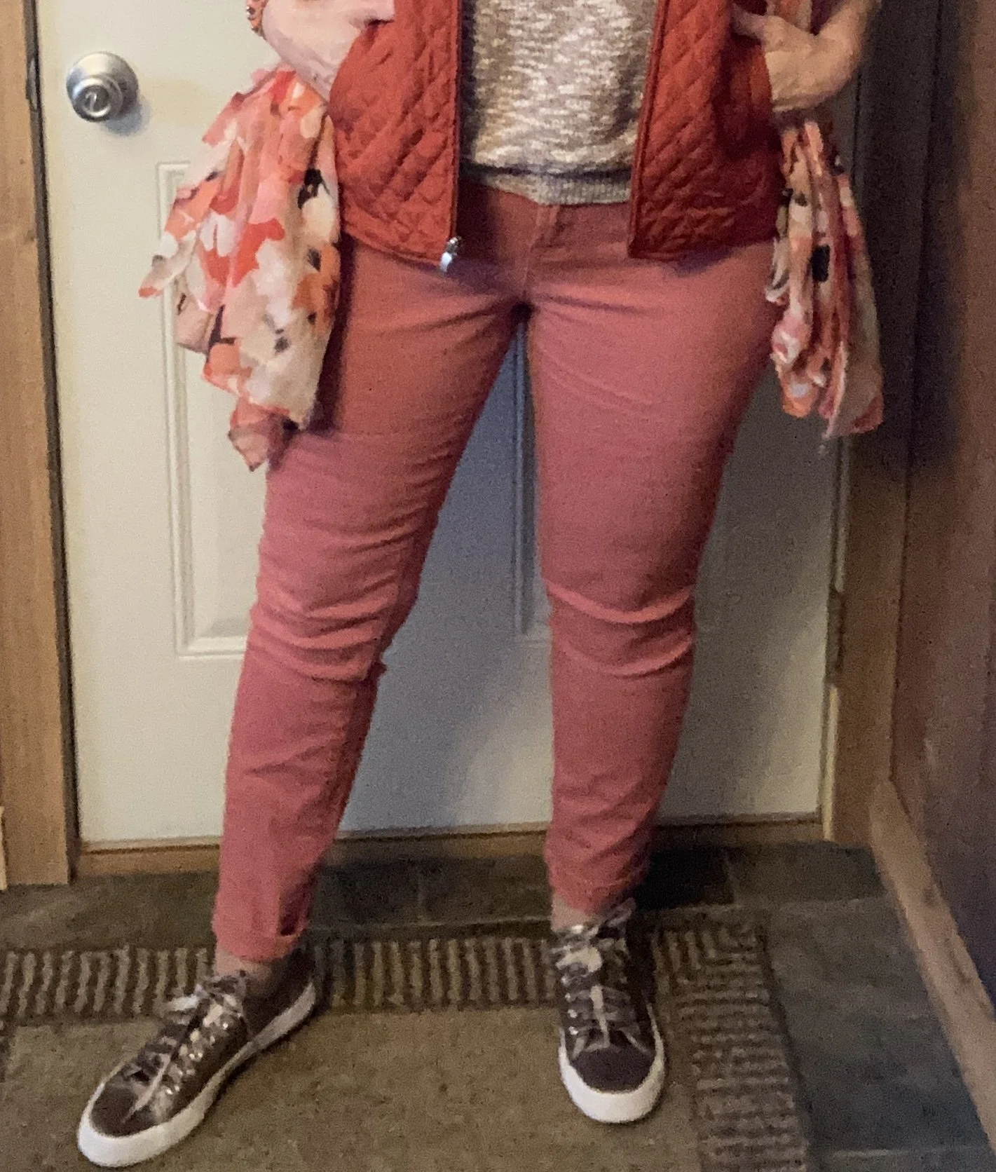
My Peach Pink pants are W62 brand and I believe were from Dress Barn. I have styled these on the blog before. You can see them styled here in a monochrome look, with a red moto jacket, with a pastel pink cardigan, with a LuLaRoe tee, with a cropped blazer, and with a different set of Pantone colors,

Sorry for the poor picture quality. Phone pictures are great, but not so much when it comes to editing.

My Tangelo vest was a Christopher and Banks purchase a few years ago. I love the deep orange color and it serves well for both spring and fall.

You can also see in the above picture my thrifted Old Navy sweater top. I had a Machiotto colored jean jacket picked out, but I didn’t have any other orange that worked as well as my vest. Even though there is a distinct marled print you can see the brown color throughout.

I added the scarf as a way to pull the entire look together.

My daughter was getting rid of this pretty, statement necklace, so I snatched it up. I thought it went great with this outfit.

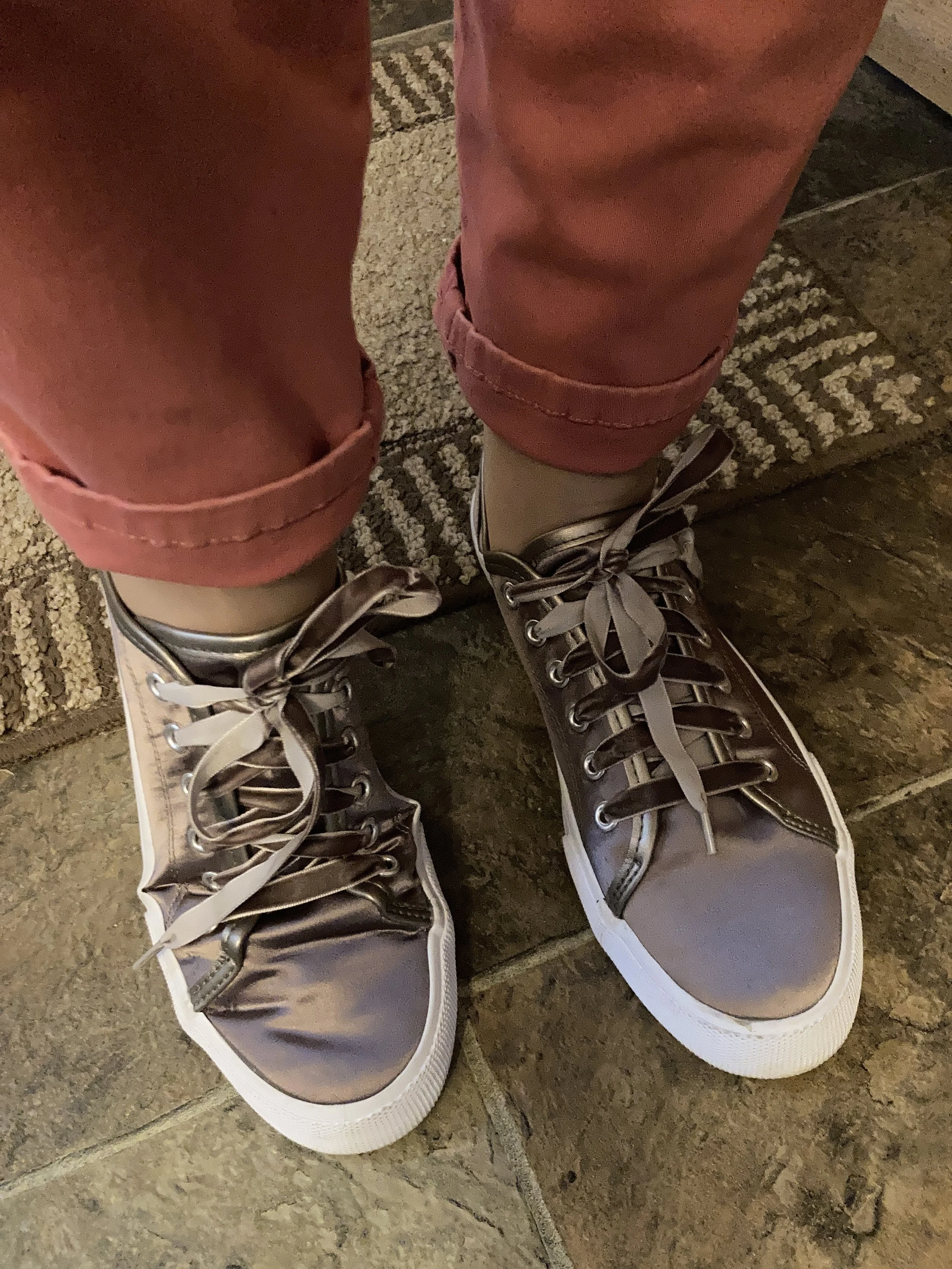
My sneakers are Mossimo and were thrift find. They also mimic the Machiotto color almost perfectly and add another bit of shine to the look.

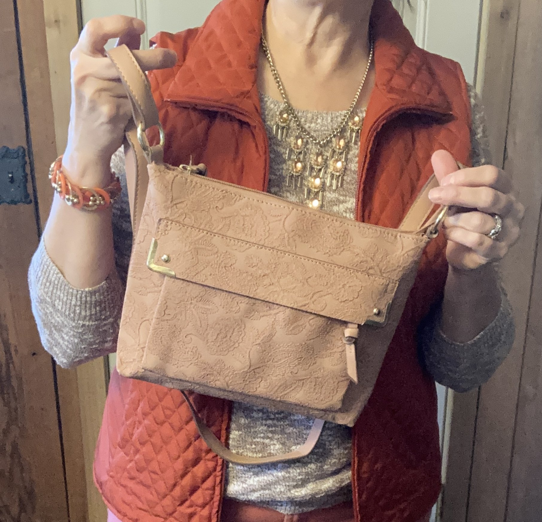
My bag was a gift from my daughter. Both my girls know I love purses, so I am always excited when I get a new one as a gift. I love the embellished detail on this piece.

What do you think of these colors? Would you wear these together? What are you going to wear for your Easter Day celebration?

I’m not sharing any shopping links to day, but hope you have a marvelous weekend.

Buy Me A Coffee.

Pantone - Autumn/Winter - 2021 - New York Palette: Mykonos Blue, Spring Lake and Coconut Cream

It seems that every Pantone color palette that comes through the Institute has at least one, if not two blues on it. Blue is a color that everyone can wear, whether you wear dark classic navy, casual comfortable chambray or tropical hues that take you to the beaches of the Caribbean. I have a lot of blue in my closet, but then, I have a lot of every color in my closet. Ha, ha. Blue is great for pairing with many other colors. I pair denim with every color and denim definitely falls in the range of blues. Today’s blues are wearable and most likely already in your wardrobe.

SpringLake.jpg

My colors did not really line up with these blues. Oh well, that is part of the challenge of doing this series. I don’t always get the match spot on, but that is okay. The point is to take things you already have and do something similar. It doesn’t matter if your blues are a perfect match or not. All of these pieces were things I already had.

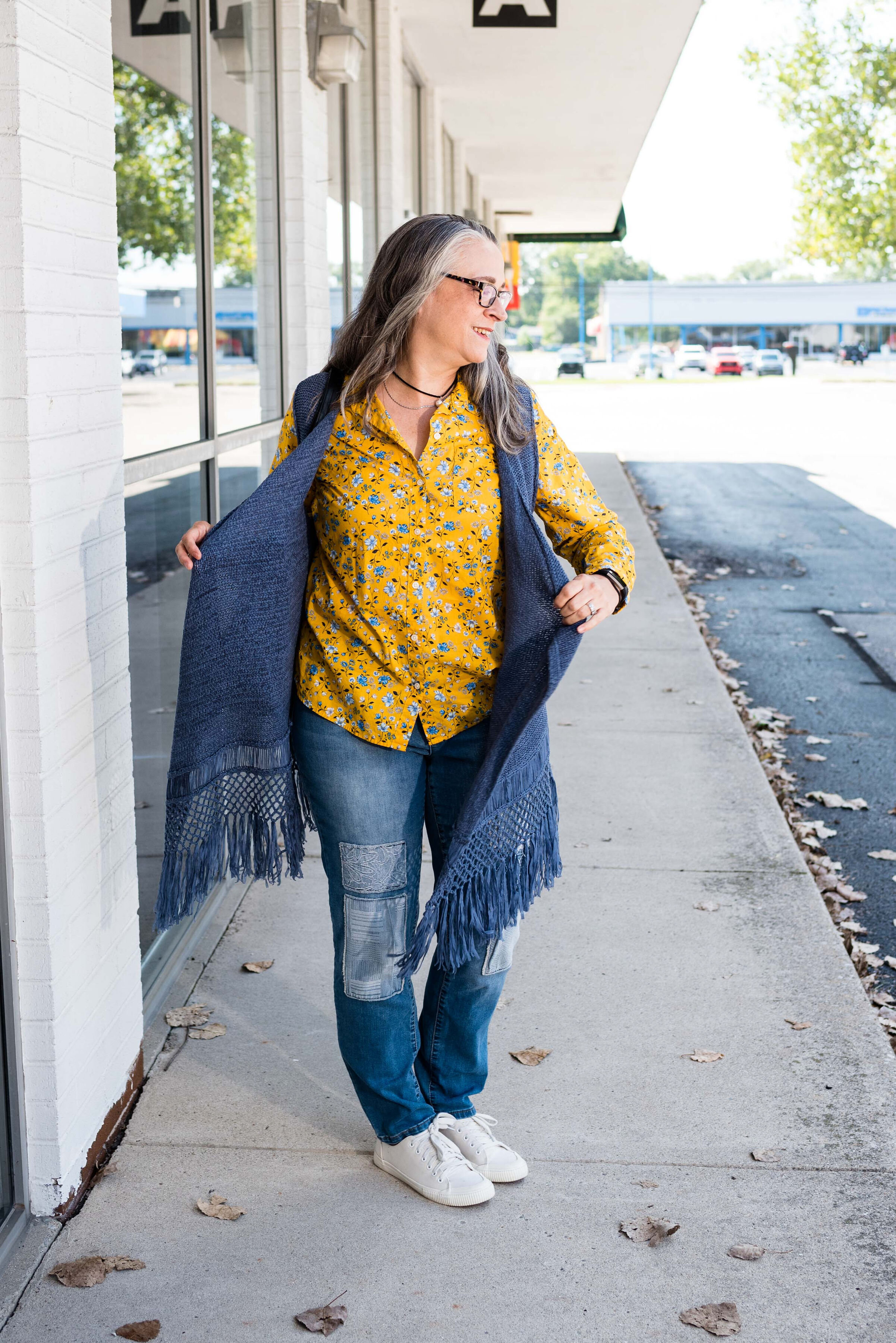
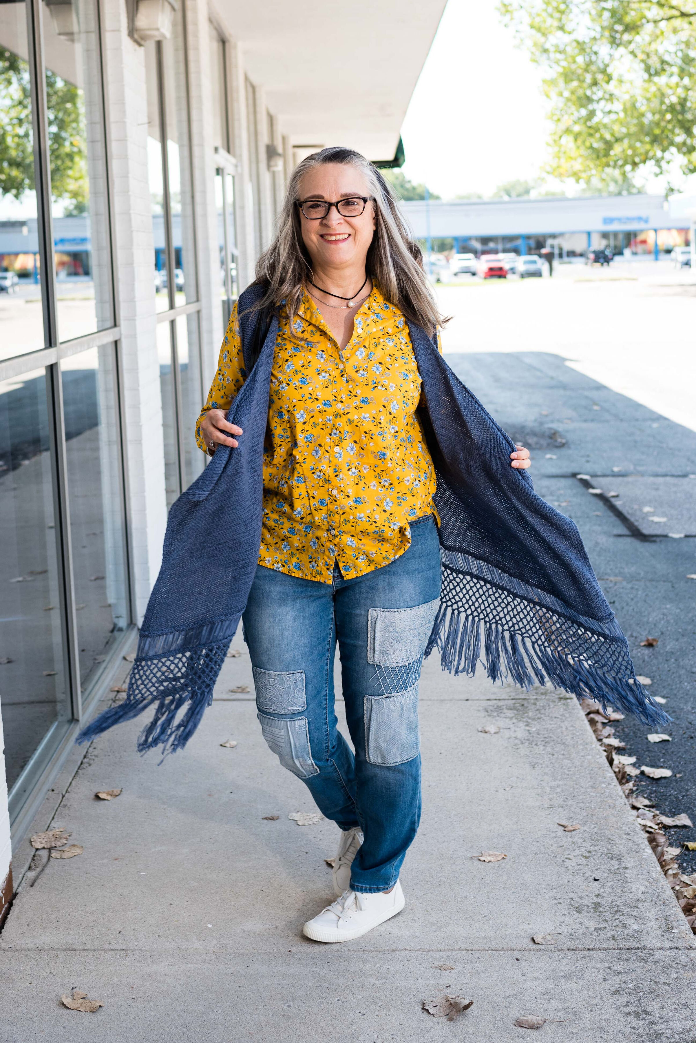
When I picked out these pieces I really thought the pants and the vest would have matched better to Spring Lake, but now looking at the picture the pants seem to match better with the Mykonos Blue. The vest, which does seem to lean a little bit toward a gray undertone, was too dark to match the Spring Lake color. However, the patches on the pants seem to lean a little more in that direction.

pantonefallcolortrendsspringlake-2.jpg
pantonefallcolortrendsspringlake-20.jpg

The vest is a thrifted Relativity piece. I have styled this on the blog before. You can see it worn with a graphic tee. The jeans which I have styled on the blog before are thrifted and a brand called Est. 1946 Denim. You can see how I wore them with a graphic tee and cozy sweater here. Looking at the above picture, I should have rolled up the cuffs on the jeans.

When you have an asymmetrical vest with fringe, you just have to twirl!

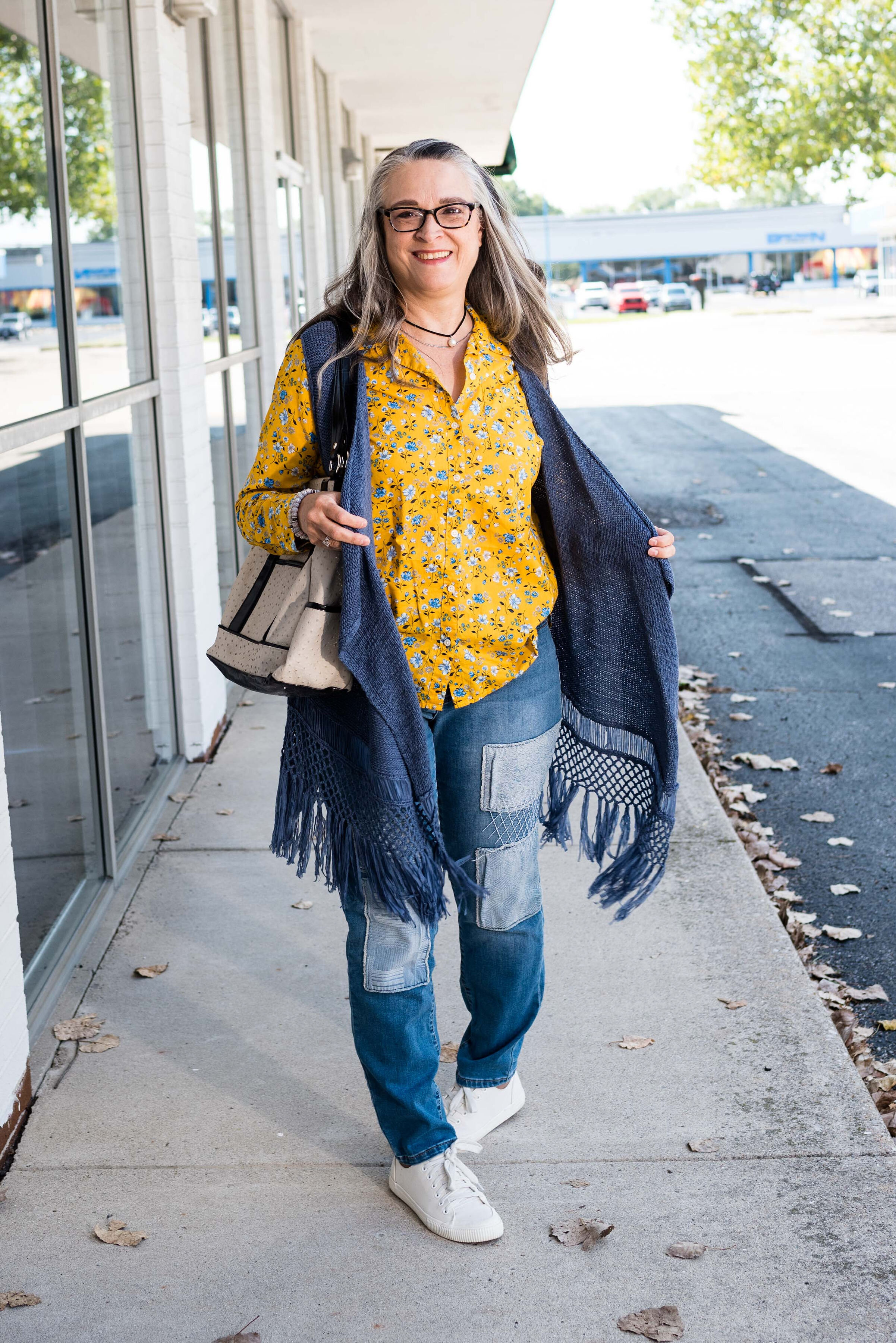
My yellow mini floral print button down is a thrifted Old Navy piece. I decided to leave it completely untucked to add to the ultra casual vibe of this outfit.

pantonefallcolortrendsspringlake-5.jpg

I was trying to go for the Coconut Cream idea in my accessories, but again, things didn’t match up exactly. My bag was a hand-me-over from my daughter. This Miche brand bag actually has interchangeable outer shells, so for this look I used the cream colored one.

pantonefallcolortrendsspringlake-14.jpg
pantonefallcolortrendsspringlake-16.jpg

My sneakers are thrifted Mossimo.

pantonefallcolortrendsspringlake-17.jpg

What do you think of these colors? Do you like to wear blue? What color blue is your favorite?

pantonefallcolortrendsspringlake-8.jpg

Thanks for following along with the blog. I appreciate all of your clicks, likes and comments.

I am including a few shopping links for you to look over. These are affiliate links. All opinions are my own.
Have a great day.

Photo credit Jessica Trumbull with Rebecca Trumbull.

Thinking About Fall - Transitional Style - Lightweight Skirt

When we start thinking about fall, we are probably starting to yearn for our cozy sweaters, scarves and boots. As the weather begins its journey through the waning days of summer we know the days will still be plenty warm, but the evenings might start cooling off, especially after the sun goes down. That is a good time to think about layers. Why not pull out a few of your medium weight sweaters and a couple pairs of ankle boots and start using them, even though the start of fall on the calendar is not for another month?

Today’s outfit revolves around a light weight skirt that I picked up just a few weeks ago at Kohl’s on the clearance rack. It is obviously from this past spring, perhaps even related to Easter style, so I thought this would be a good piece to take from warm summer day, to cool weather appropriate with just a few simple changes.

DSC_0077.jpg

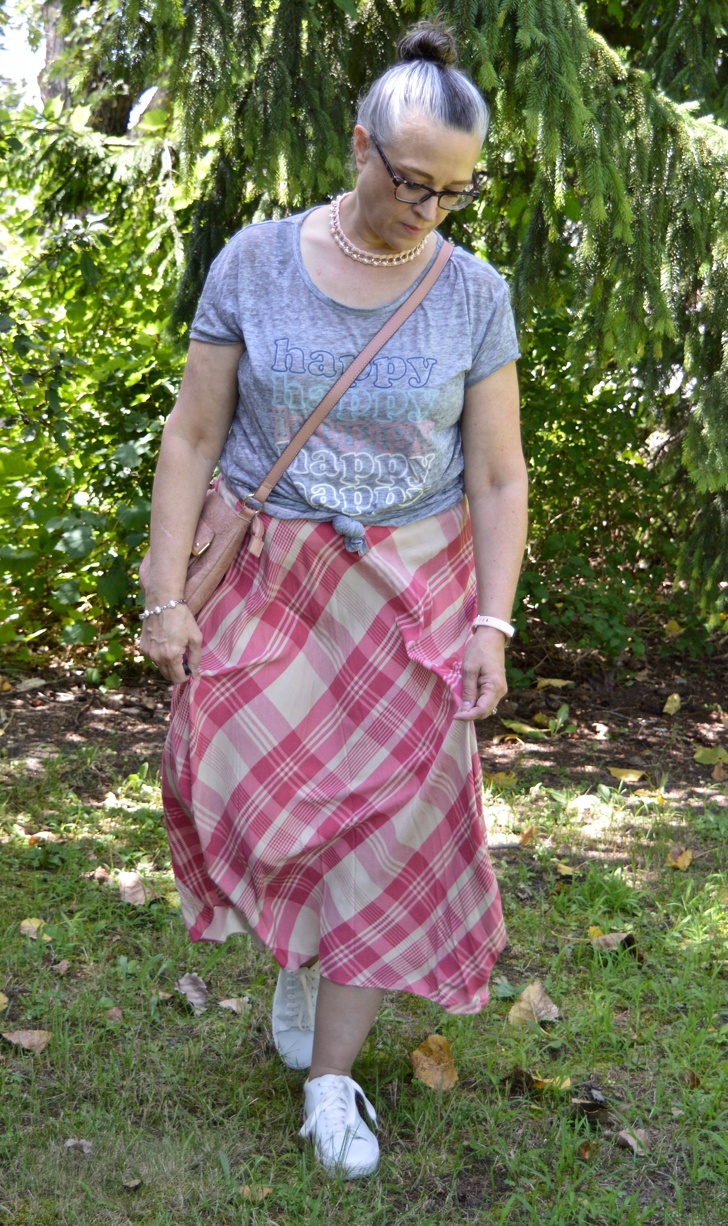
For a cute, breezy, summer look I thought this Chaps plaid skirt would pair well with a fun graphic tee. You have see this thrifted No Boundaries tee on the blog before. You can see it styled with a denim pencil skirt, and a fringe vest. Isn’t it funny that I did the front knot with the fringe vest as well? The shirt is a little over sized and very stretchy, so knotting it is easy. The skirt is not lined, but I wasn’t going anywhere and it is not sheer, so unless I had on a pair of dark panties, there was no show through worries.

DSC_0088.jpg

I wanted to highlight the pink and the white letters in the tee, so chose pink and pearl accessories.

DSC_0086.jpg
DSC_0083.jpg

I thought the Steve Madden white tennis shoes a good choice to keep the look fun and casual.

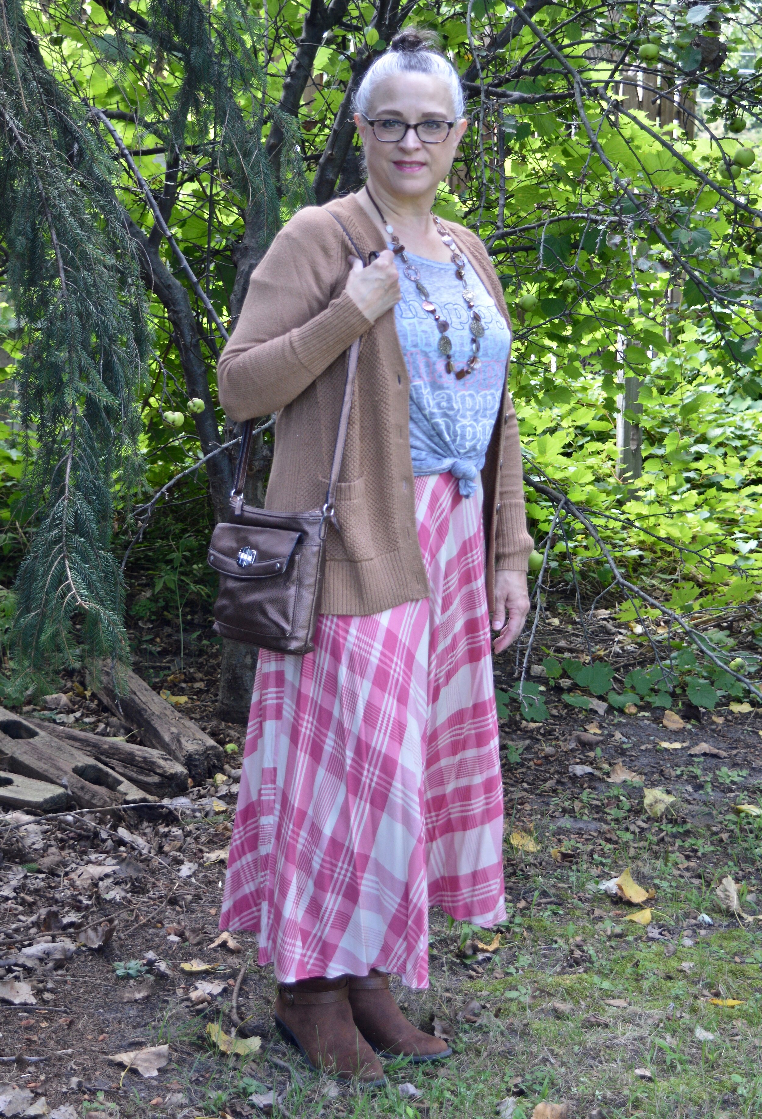
To make the transition to cooler weather, I once again reached for the color brown. I love brown in the fall. My husband likes the color brown on me, so I have been trying to incorporated it into a year round color, but it is often hard to find. For this look, instead of a jacket I chose my cozy, thrifted Old Navy cardigan.

DSC_0091.jpg

Once again, I chose a more chunky necklace with shades of brown, gold, and coppery bronze. I really wasn’t sure how I felt about this look, but now that I see it, I like it. Brown and pink are always a winning combo and the contrast of the gray tee gives it interest and keeps it from being overly two-toned.

DSC_0096.jpg

I went with my taller Sonoma suede boots, because I liked the more slouchy look with this casual outfit. They give it a bit more of a boho vibe. Most of the boots I own, that I have bought new I got at Kohl’s. I like both So and Sonoma brand. They fit my feet well and allow room for socks or tights. They are ultra casual, but still make an outfit look polished and complete. I’ll provide a few shopping links at the end if you are thinking about a new pair for fall.

DSC_0097.jpg

My bronze cross body bag is another staple in my closet. I bring this one out every fall.

DSC_0098.jpg

Here are the two looks side by side.

Do you have a summer skirt that you would like to wear longer? What can you add to make that skirt still useable in the cooler weather? I’d love to hear your thoughts, so leave me a comment or two.

I’m including a few shopping links. These are affiliate links. All opinions are my own

Have a great Tuesday!

Pantone - Spring/Summer - 2021 - London Palette - Purple Rose, Lava Falls and Baby's Breath

Today’s colors are a blend of pastel purple, bold red and creamy off white. I have always loved purple, but it really isn’t a color I regularly wear. I easily got on board with Purple Rose which is a medium purple that goes well with many other colors, especially things like brown, olive and navy. Why, then did I decide to pair it with a fierce red like Lava Falls? Because I always like to show you things outside the box. It is not very often, that I think to put purple and red together.

purplerose.jpg

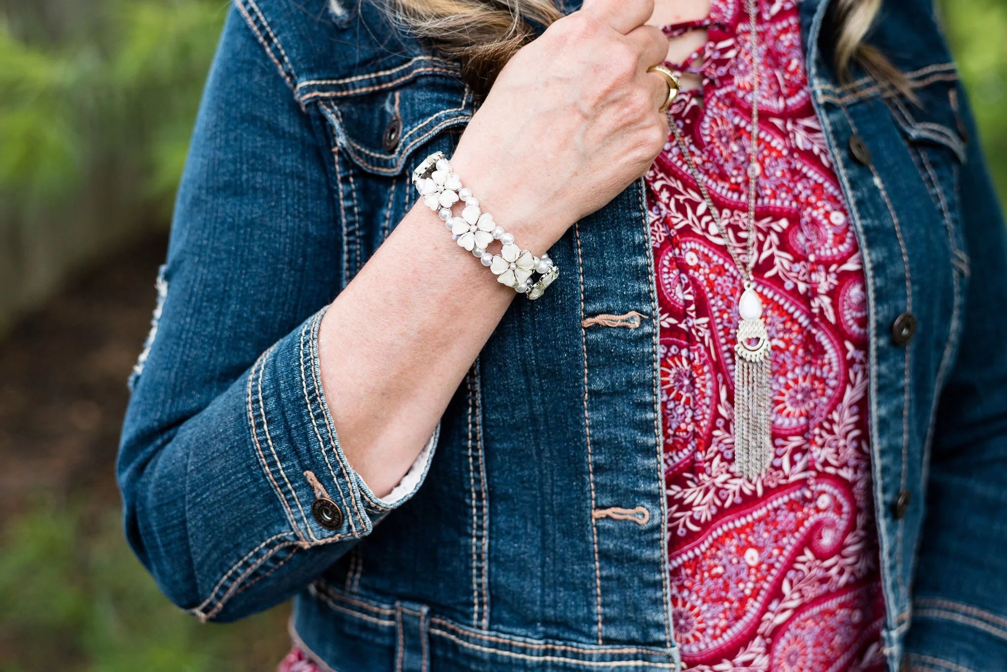
The factor that clinched the deal on putting these colors together, was that my thrifted Old Navy, Lava Falls, paisley popover top had both of these colors in it. How fortuitous was that? Ha, ha. This is a fun, tunic type shirt that has short sleeves, and the interesting details of a shirt tail hem line and a lace up v-neck. I love the paisley print too, which always reminds me of the 70’s.

The Croft and Barrow cardigan is older and I like I said, doesn’t get a lot of regular wear, but i just love the color so I keep it around.

purplerosepantoneoutfitideas-2.jpg

You’ve seen these creamy, Baby’s Breath, thrifted, St. John’s Bay ankle pants on the blog before. I really think this look would have been cuter with a creamy denim pencil skirt or a pair of Bermuda shorts, but I don’t have either of those. I am not as fond of the silhouette, but it is okay, just not great.

purplerosepantoneoutfitideas-7.jpg

I didn’t need to wear a necklace and this long opera length beaded strand is exactly the same color as the top, but sometimes I like the subtle texture and shine of a piece, even if it is a similar color. Wrapping this long strand of beads around my neck makes it look like I have on a choker.

purplerosepantoneoutfitideas-8.jpg

I added a few beaded bracelets with similar reds, although there is plenty going on in the top, so it wasn’t really needed. Often, less is more.

purplerosepantoneoutfitideas-9.jpg

My thrifted Simply Vera, Vera Wang cross body bag is making another appearance. This is a great little bag for the warmer months. The off white color goes perfectly with the Baby’s Breath color of the pants.

purplerosepantoneoutfitideas-10.jpg

These Steve Madden platform sneakers were a new purchase from DSW. I had a coupon and I had been looking at this type of sneaker since last summer. I finally took the plunge. They are not something I would use for walking, but they are cute for a casual day of picnicking or window shopping.

purplerosepantoneoutfitideas-4.jpg

What do you think of these colors? Do you think you would ever combine red with purple? I’d love to hear your thoughts, so leave me some love.

I am including a few shopping links in these colors, so if you have time, give those a look. I hope you have a wonderful weekend!

Graphic and photo credit, Rebecca Trumbull.

Color Play - More Fall Mixing

My daughter has come into her very busy season and has numerous editing projects on her plate from all sorts of clients, so my Pantone - Autumn/Winter - London Palette series is going to be delayed for a little bit. In the mean time I am falling back to my Thursday columns, so today’s is based on, of all things, fall colors. You just aren’t going to get away from my obsession with color. Ha, ha.

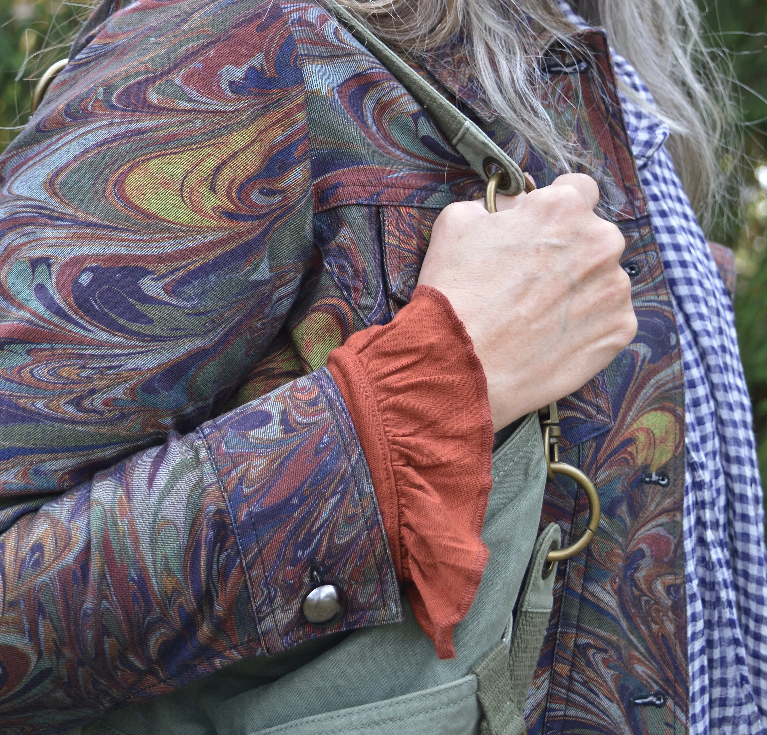
Today’s outfits are centered around a thrifted Christopher and Banks jacket. I absolutely love the muted frenzy of colors and I knew it would be something I could wear repeatedly throughout fall, winter and spring. This is the back of the jacket. It is shaped and feels somewhat like a denim jacket, though the material seems a little less stiff. I paired the jacket with a rusty colored long sleeve tee that I got last year at Maurices. I am going to show you three ways these two pieces can be styled for different looks.

DSC_0034.jpg

Look 1 - With Jeans

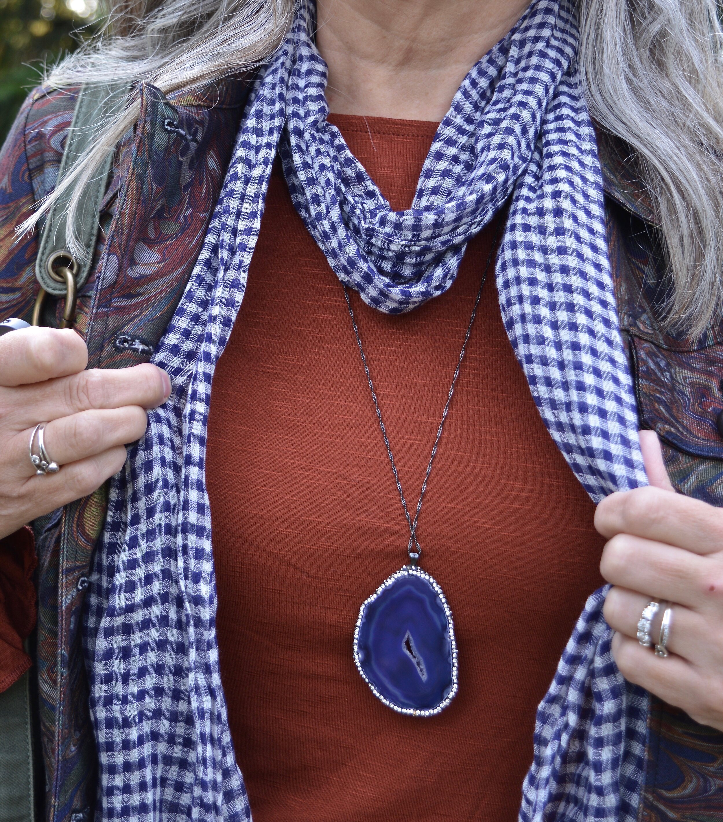
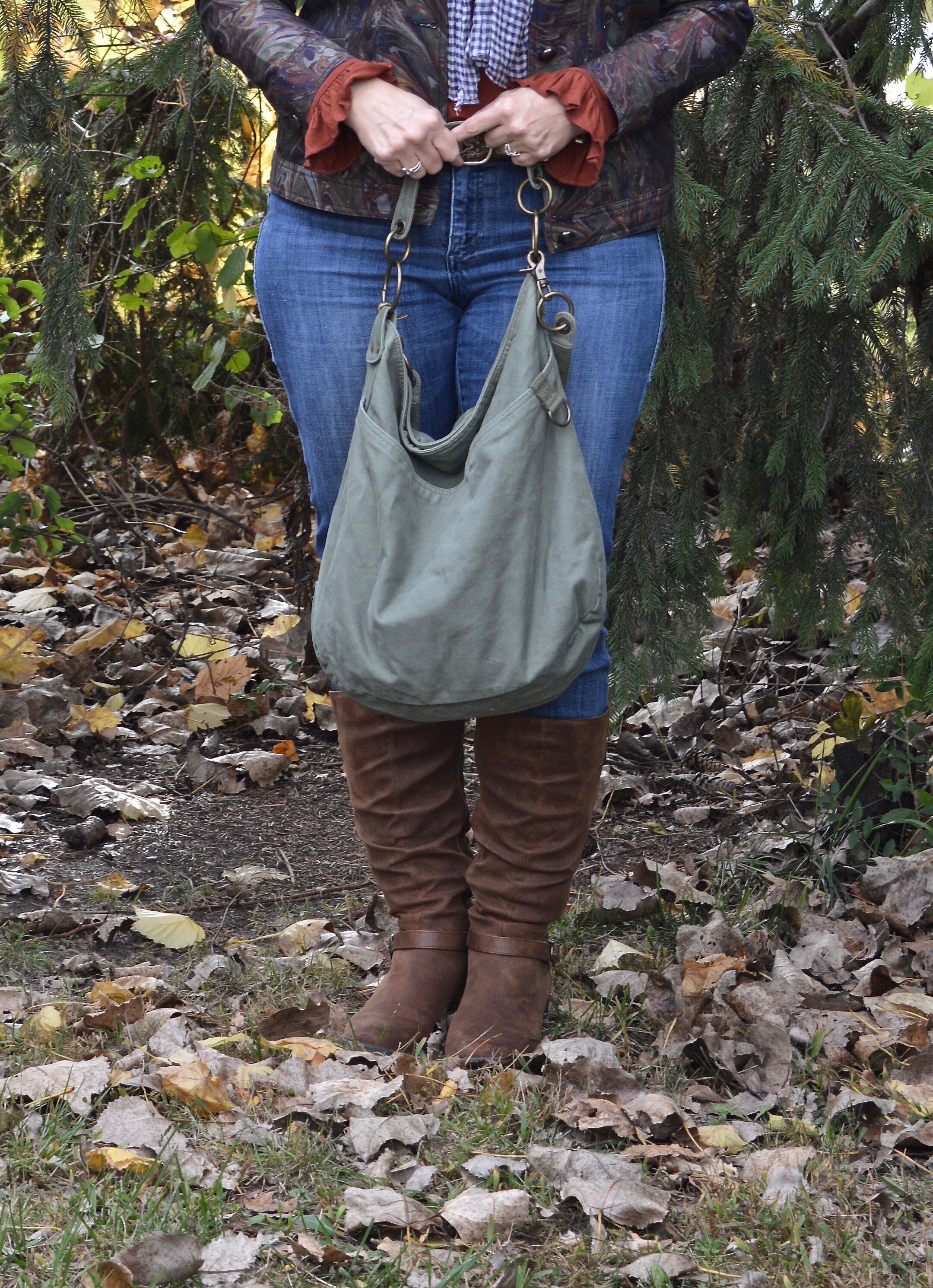
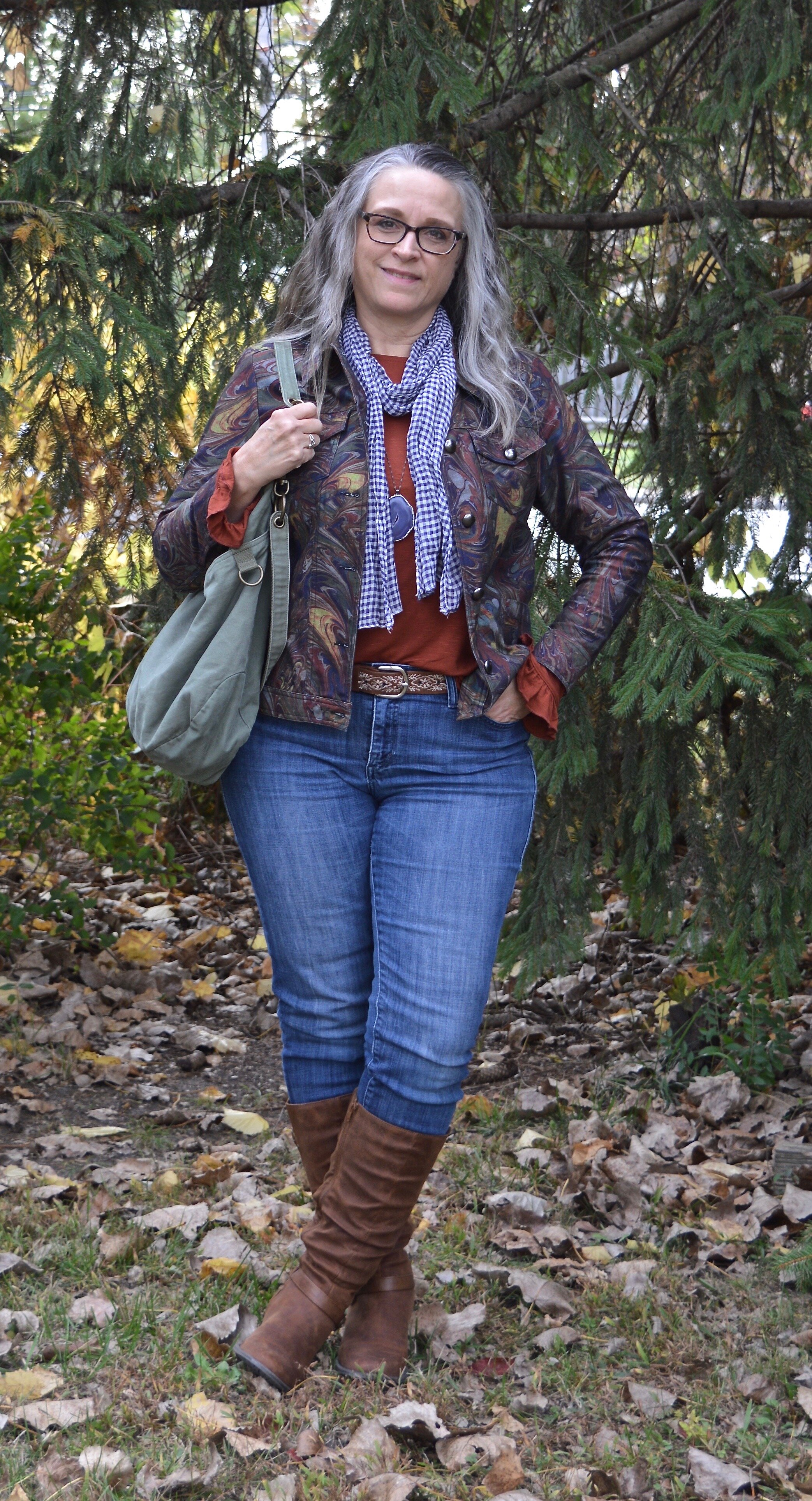
This first look was what I wore on the day I took these pictures. This is a simple look with my Rock & Republic jeans that I have had for years. I added my Sonoma faux suede boots to keep the fall color scheme intact, then I added my purple agate pendant necklace and a purply blue gingham scarf. The last piece to add was the thrifted olive hobo bag. I love the little ruffle on the sleeve hem on the tee. The sleeves on this jacket were the perfect length to let the sleeves stick out.

DSC_0004.jpg
Color play - fall mix
Color Play - fall mix

Look 2 - With White Jeans

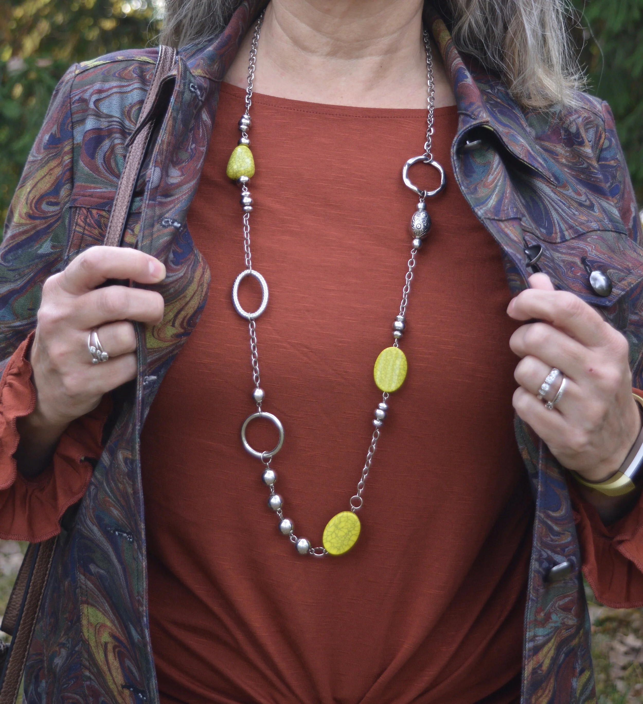
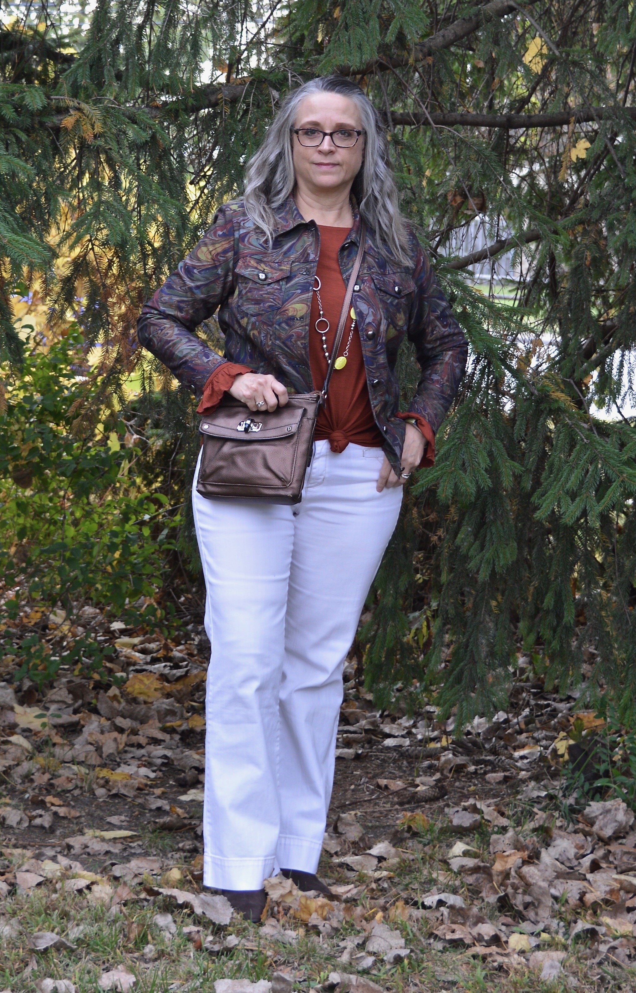
For this look I swapped out the regular jeans fro my white Gloria Vanderbilt pair. I also removed the scarf, put on a different necklace and changed the bag and boots. White all year round is simple the rage, and that is one trend I am willing to put up with. These jeans are especially suited to the cooler weather, because they are a heavier weight. They also have a wider leg, so it is easier to get taller boots under them.

Color play - fall mix
Color Play - fall mix

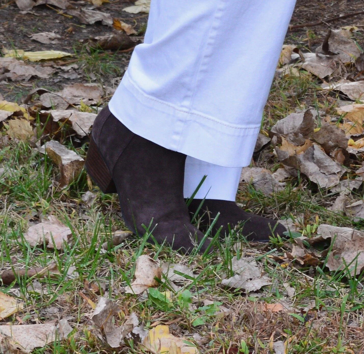
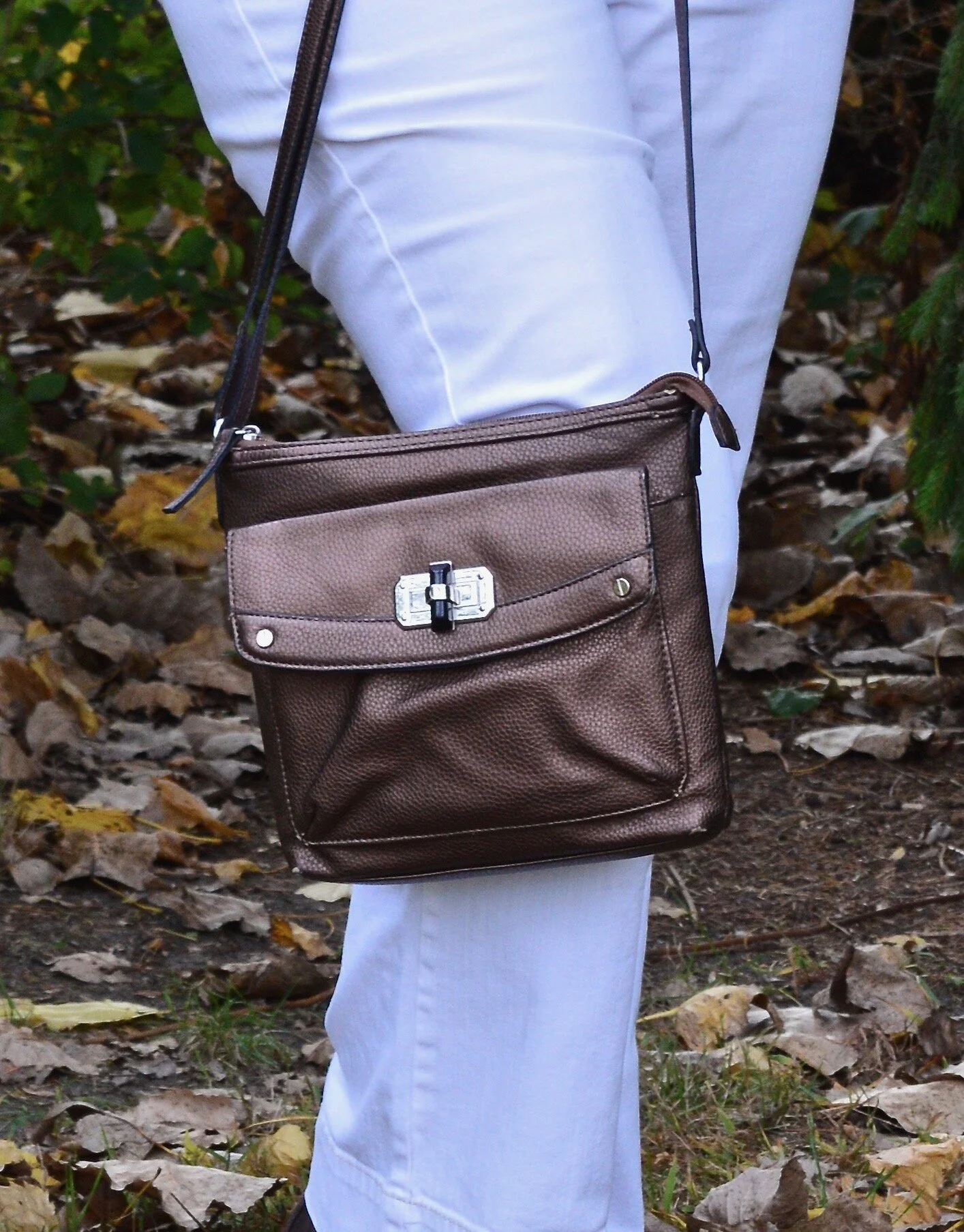
These brown ankle boots are a new pair I ordered from Kohl’s. I just love my suede and faux suede ankle boots and wear them all the time. I decided to add this dark brown Nine West pair to my collection because they were on sale and I had a coupon. To go with the boots I chose my thrifted bronzy colored shoulder bag.

Color Pay - fall mix
Color Play - fall mix

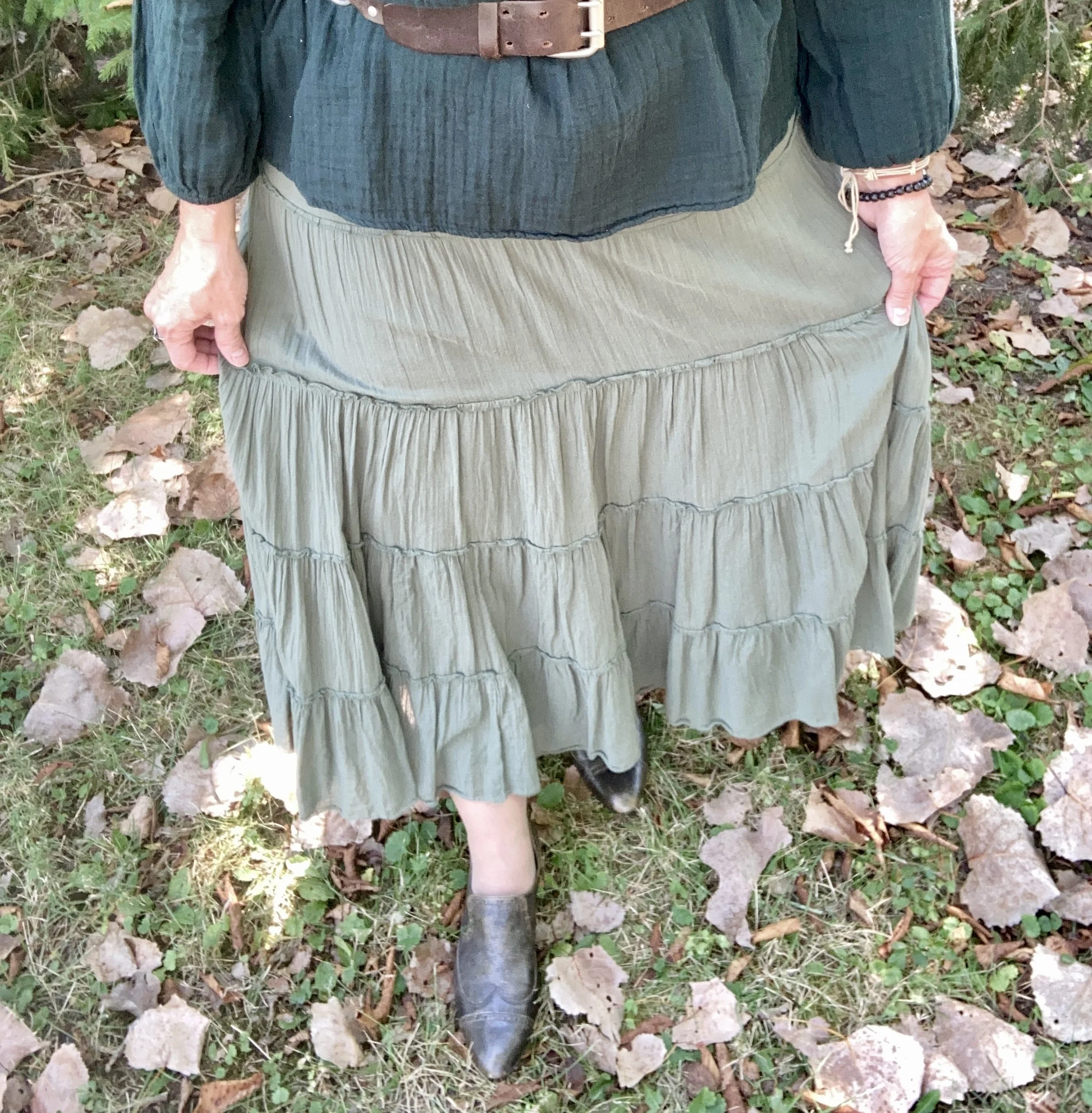
Look 3 - Green Skirt

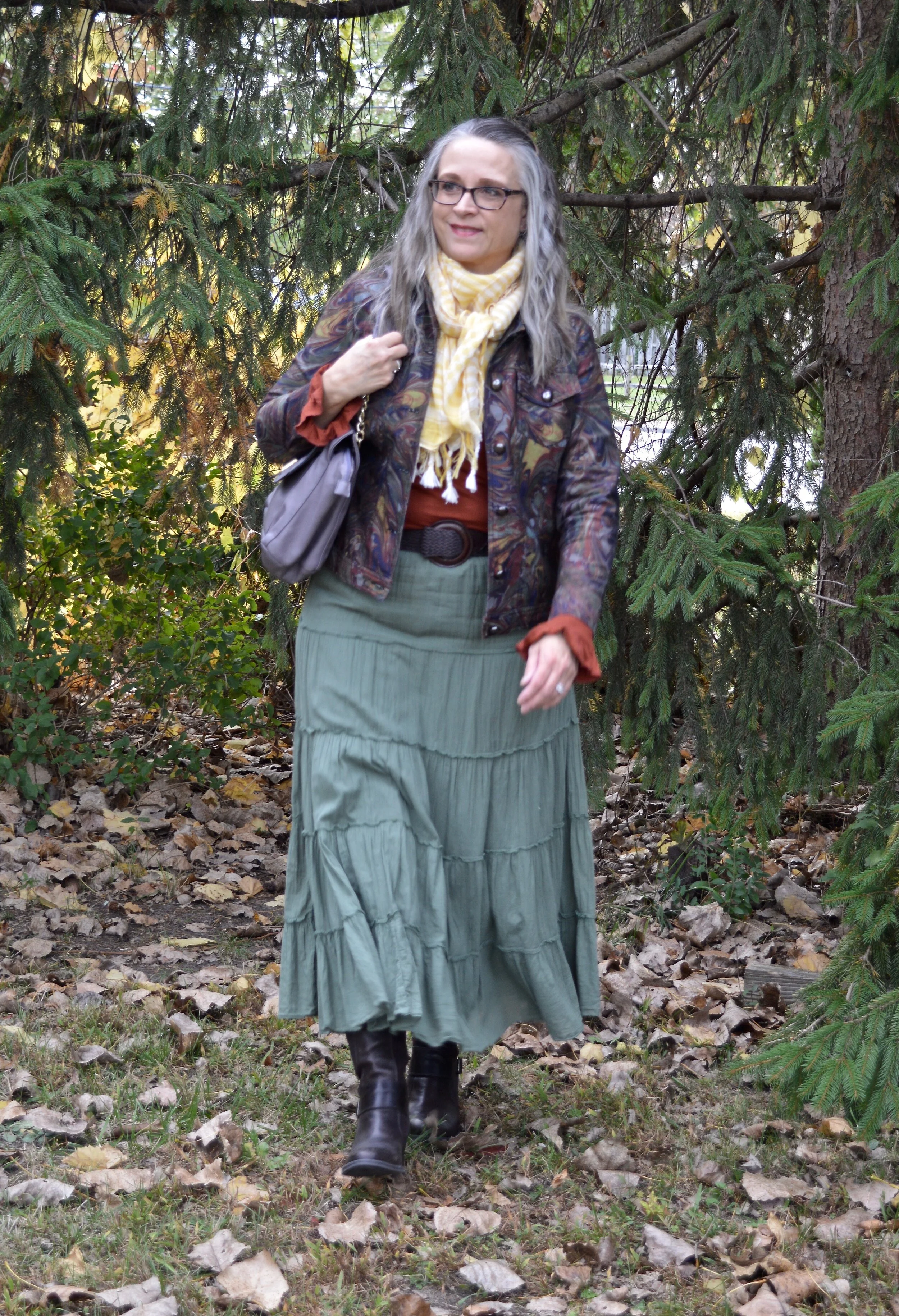
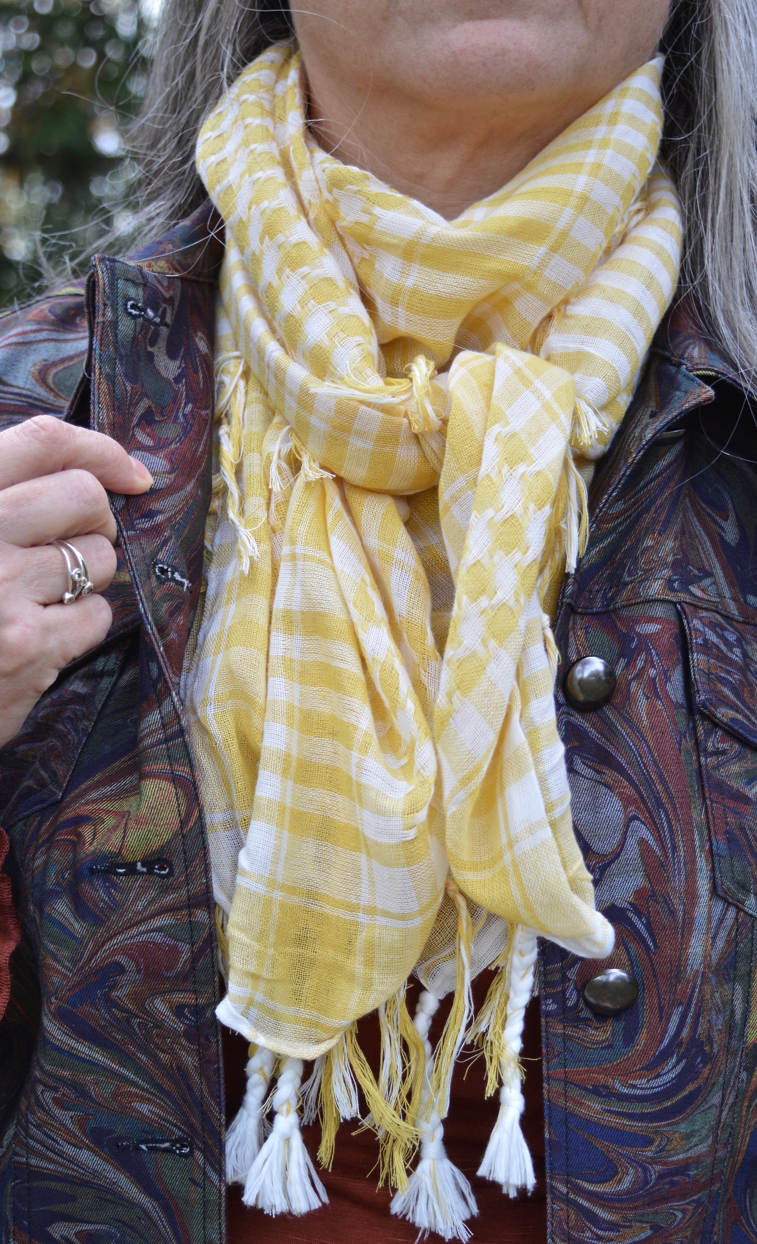
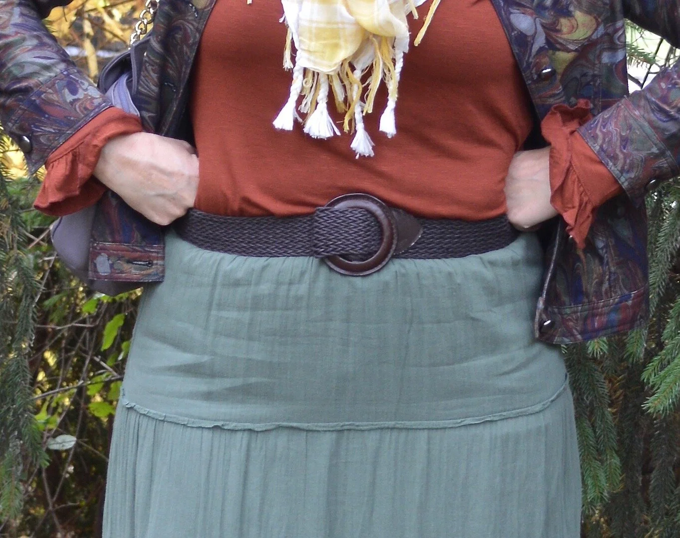
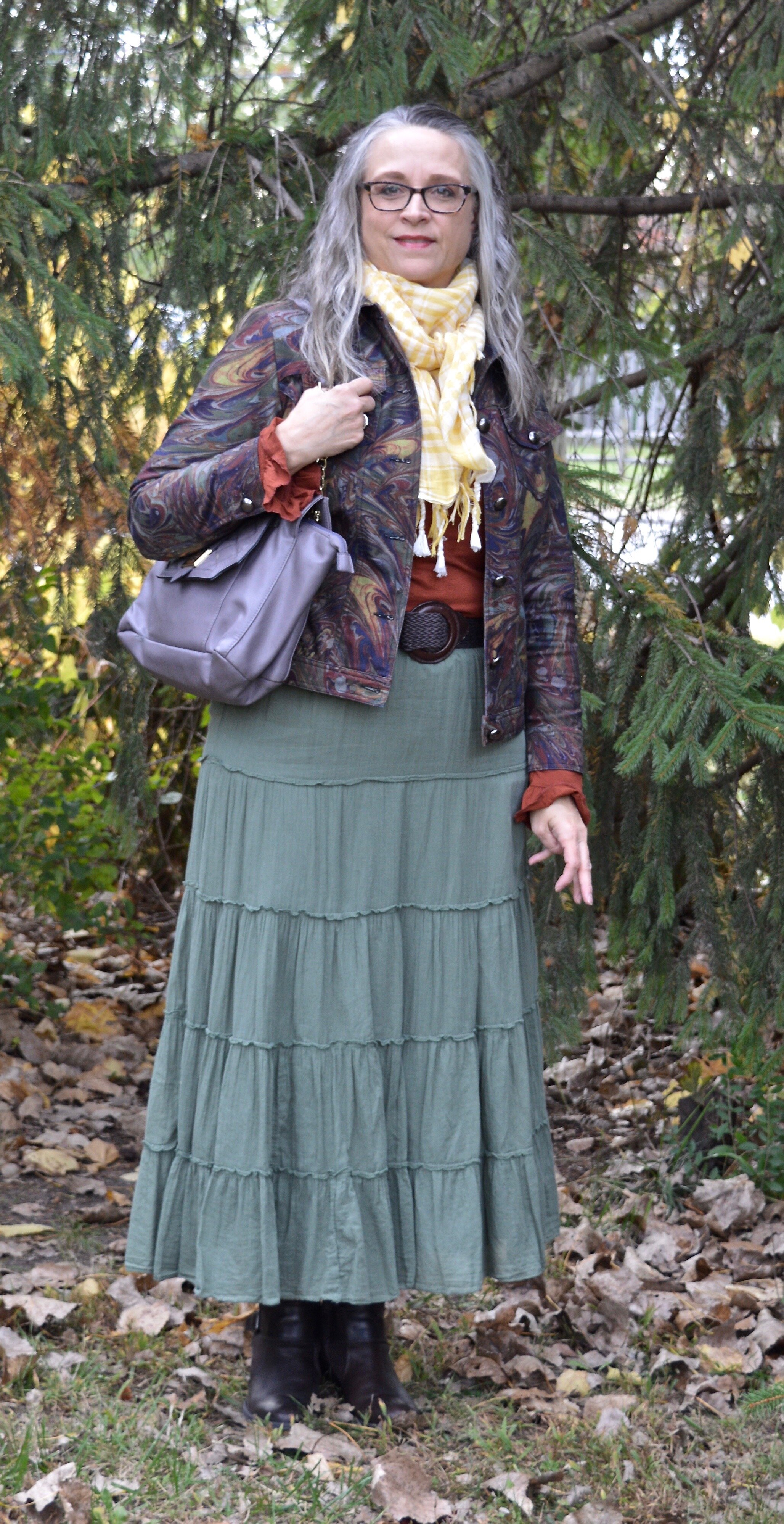
In the final look I chose my thrifted Old Navy tiered skirt, which I have styled numerous other times on the blog. I also added a pale yellow gingham scarf that I bought from the Jacket Society three years ago. Nora always has such unique and beautiful pieces. Be sure to check out the scarves and wraps here. I swapped out my bronze bag for this purple Nicole bag with gold chain handle accents, and my ankle boots for these thrifted mid-calf leather heeled boots. You can see I also added a woven belt that goes with the boots, just for some fun added texture and contrast.

Color play - fall mix
DSC_0031.jpg
Color play - fall mix
Color Play - fall mix

Here are all three outfits side by side. Which one do you like best? Do you have a colorful jacket that you were thinking of getting rid of because you never wear it? How about trying some of these ideas and making your wardrobe work for you?


I hope you enjoyed this post. Let me know your thoughts on these outfits. Tomorrow I will have a new Faith post on the blog, so be sure to stop by and check that out.

Have a great day!

I’ve included a few shopping links for printed jackets. These are affiliate links. It does not cost you anything to click on a link to shop, but it might pay me a few cents. Enjoy!


Pantone Spring/Summer - 2020 - Blush Beauty, Bossa Nova and Blanc de Blanc

Today’s two bright colors might seem like an unlikely pairing, but then if you have been following me for a while, you know the crazier the color combo the more I want to try it. In some ways these colors combined almost make the outfit seem monochrome. Blush Beauty is a pinkish orange, so we might say it is like salmon or coral. Bossa Nova is a dark red with a little bit of a brown undertone. I added a Classic color Blanc de Blanc which is white by any other name. I know that there are shades of white, but for all intents and purposes, white is white. That’s my story and I’m sticking to it.

Pantone - Spring/Summer 2020 - Blush Beauty, Bossa Nova and Blanc de Blanc

My paisley short sleeve tunic top is a thrifted Old Navy piece. It has a lace up detail that is just for show, but the print is what drew me to it. I have always like paisley. It just makes me think of the 60’s and 70’s and lots of my Dad’s old ties. Ha. ha. Here is a look at the outfit without the jacket so you get a better view of the top.

Pantone Spring/summer 2020 - Blush Beauty, Bossa Nova and Blanc de Blanc

My pants are W63 from dressbarn. I’ve styled these on the blog before. You can see them worn with a coral sweater, a multi print jacket, and with a LuLaRoe perfect tee. One thing I noticed as I looked back at these pictures and the one above, these pants are always wrinkled when I wear them. Part of that may be the material as it sticks to my legs, and part of it may be my chunky legs. Ha, ha.

Pantone Spring/Summer 2020 - Bossa Nova, Blush Beauty and Blanc de Blanc

Here you can see the lace up detail on the top and the thrifted distressed Rue 21 cropped jean jacket. This is another piece that has gotten frequent wear on the blog. See it with a floral midi dress and a maxi dress, a high-waisted skirt, dark wash jeans, and with a leopard print skirt.

Pantone Spring/Summer 2020 - Blush beauty, Bossa Nova, and Blanc de Blanc

I thought the white accessories were a good compliment to go with the white in the top. The Jaclyn Smith bag was thrifted and the Keds were a Kohl’s clearance purchase a year or two ago.

Pantone Spring/Summer 2020 - Blush Beauty, Bossa Nova and Blanc de Blanc
Pantone Spring/Summer 2020 - Blush beauty, bossa nova and blanc de blanc

What do you think of these colors together or even separately? Do you like Bossa Nova or Blush Beauty better? How are your clothes fitting these days? Ha, ha.

Pantone Spring/Summer 2020 - Blush Beauty, Bossa Nova, Blanc de Blanc

I hope you all are doing well and that you have a great weekend. Thank you all so much for following along and especially for your lovely comments. If there is ever anything you’d like to see or have me talk about on the blog, let me know. I have had someone suggest I do a video on how to tie scarves, so maybe I’ll try something like that in the fall.

I’ve included some shopping links to look over, so if you have the time, check those out. You never know when you might need something new. These are affiliate links. All opinions are my own.

Have a wonderful weekend!

Photo and graphic credit Rebecca Trumbull.

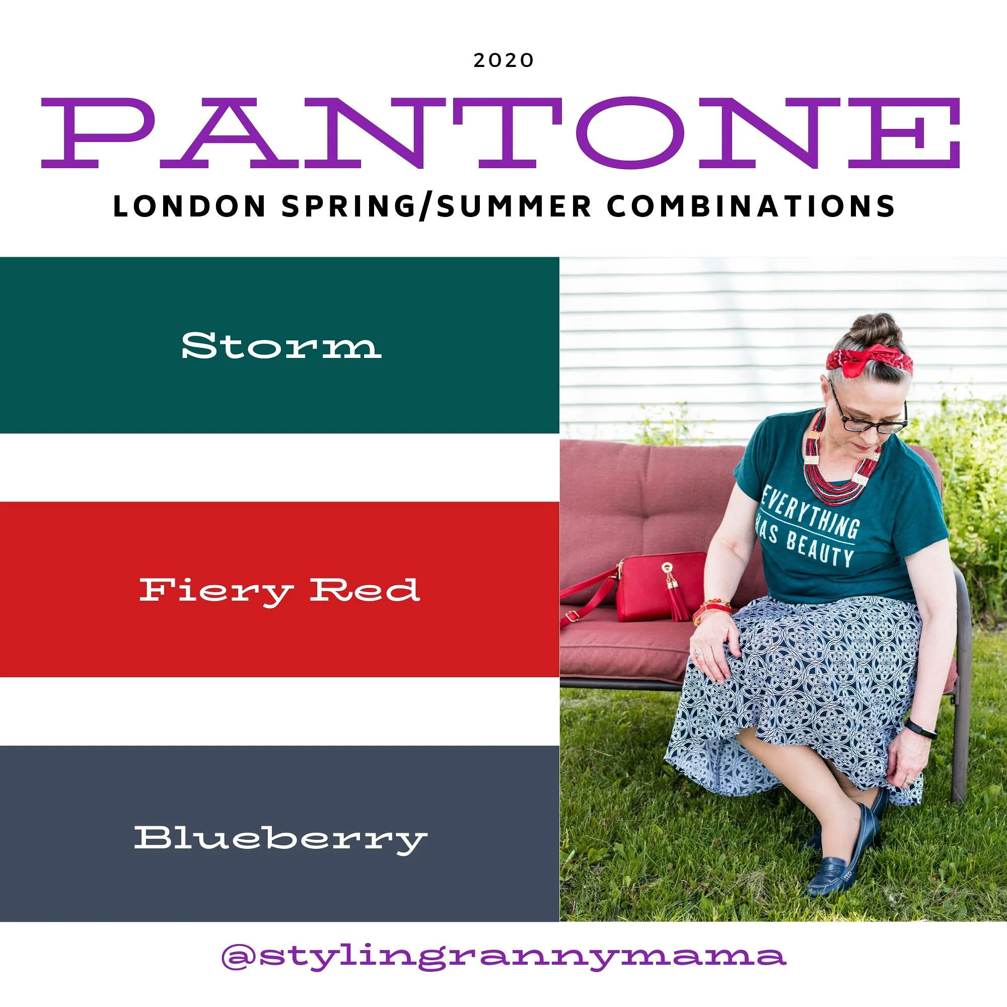
Pantone Spring/Summer 2020 - Storm, Fiery Red and Blueberry

Last week I was really struggling with all that was going on in the world and in our country, so I only posted once, and never did send out an email. I apologize for that. Sometimes, life is like a sucker punch to the gut and you have to step back and try to catch your breath. I am going to approach the subject of all that is happening and my own response to it on my Faith page tomorrow, so just know that I do feel this is important enough to talk about, but I do not think it needs to be done on my Fashion page. Be sure to look for that post tomorrow.

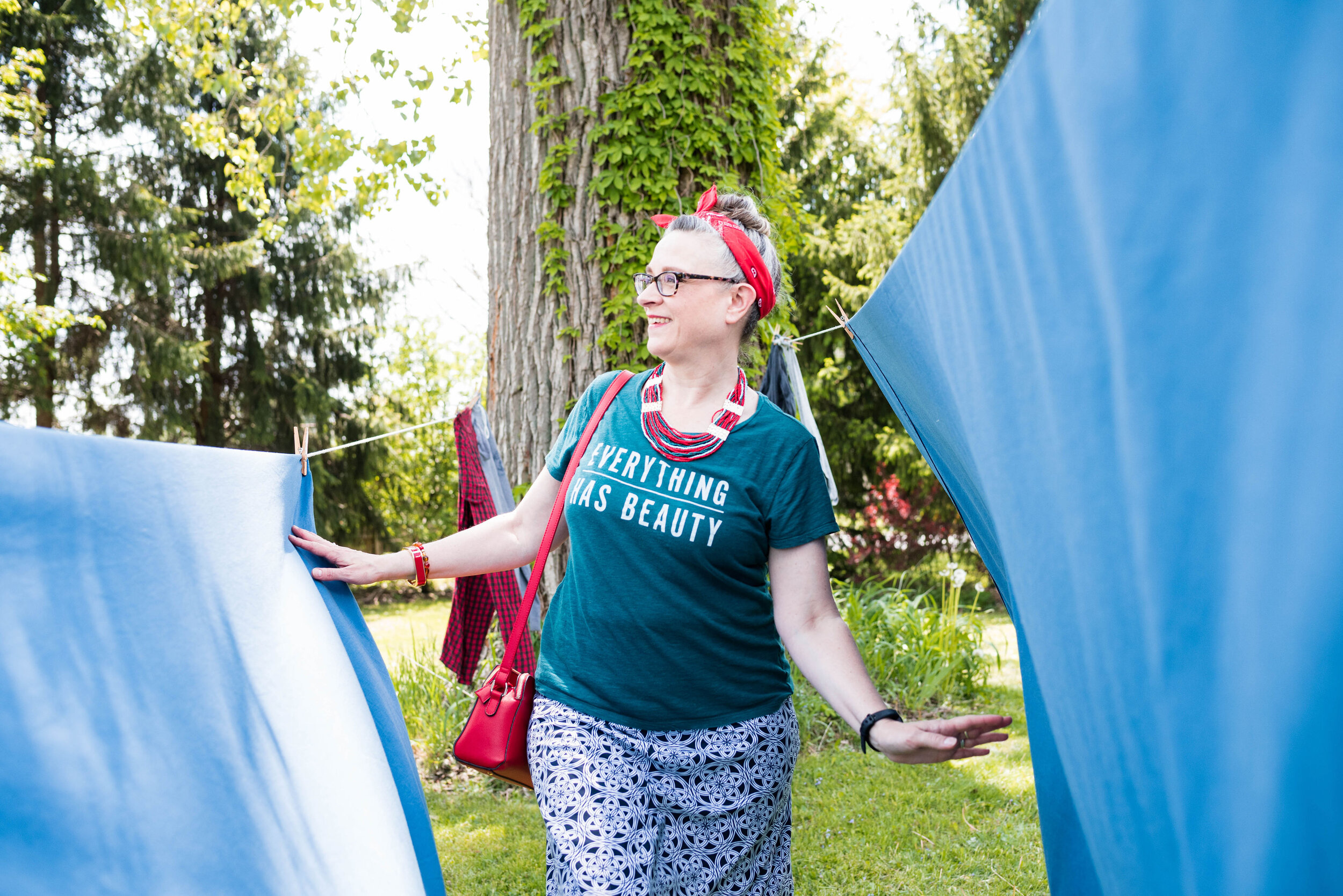
Today we are looking at two very bright and bold colors. When I thought about pairing Storm with Fiery Red, I knew I wanted to keep it as far away from looking Christmasy as possible. Obviously, Storm would never be mistaken for the typical Christmas green that we usually associate with that holiday, but things have changed. Christmas green and red are no longer the only color combinations in holiday decor. Still, I wanted this look to evoke a feeling of fierce femininity, so let me know what you think.

Pantone Spring/Summer 2020 - Storm, Fiery Red and Blueberry

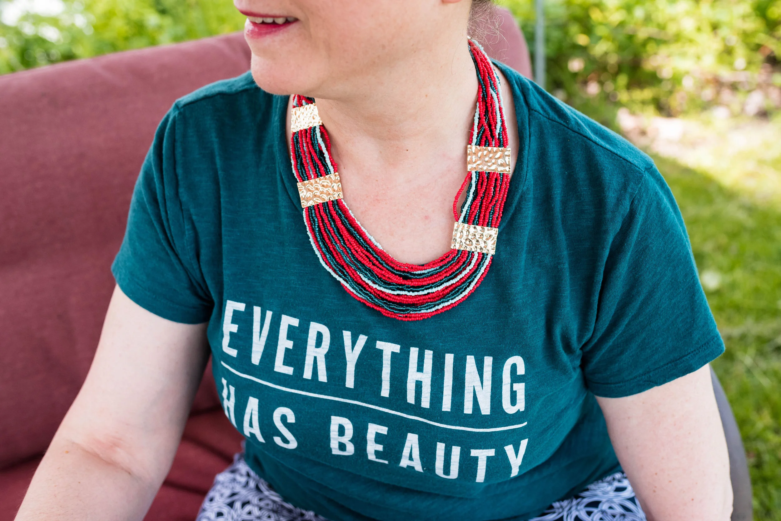
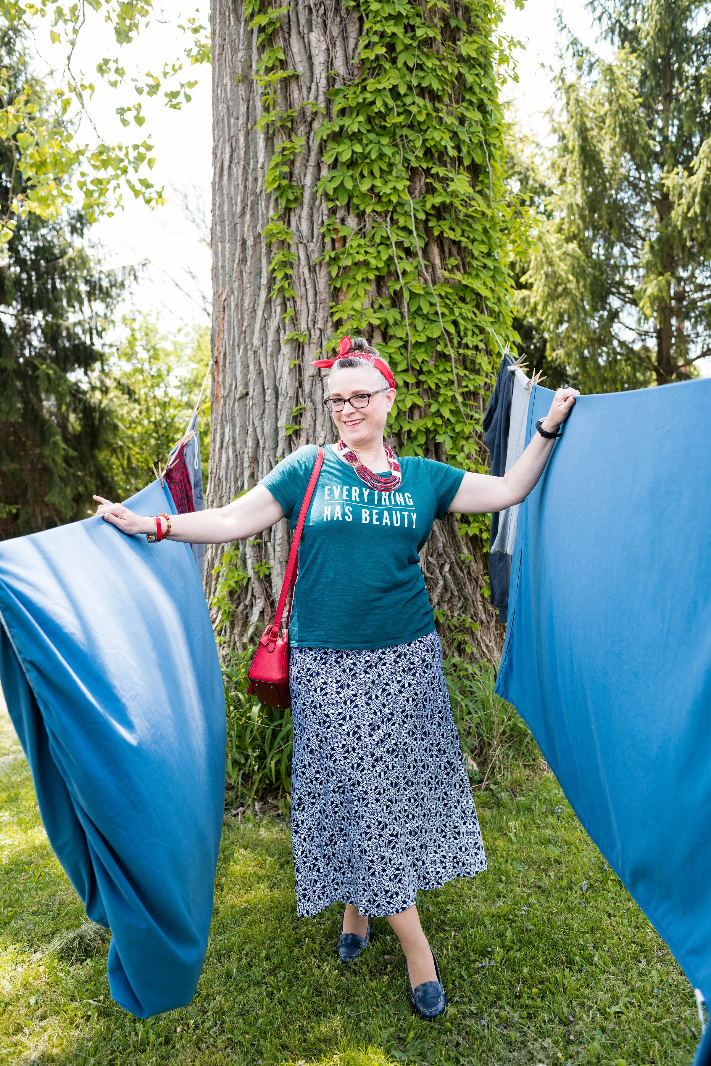
This thrifted, graphic tee from Old Navy is the perfect green and considering everything we have been going through, I love its positive message. Everything has beauty, we just need to look for it.

Pantone Spring/Summer 2020 - Storm Fiery Red and Blueberry

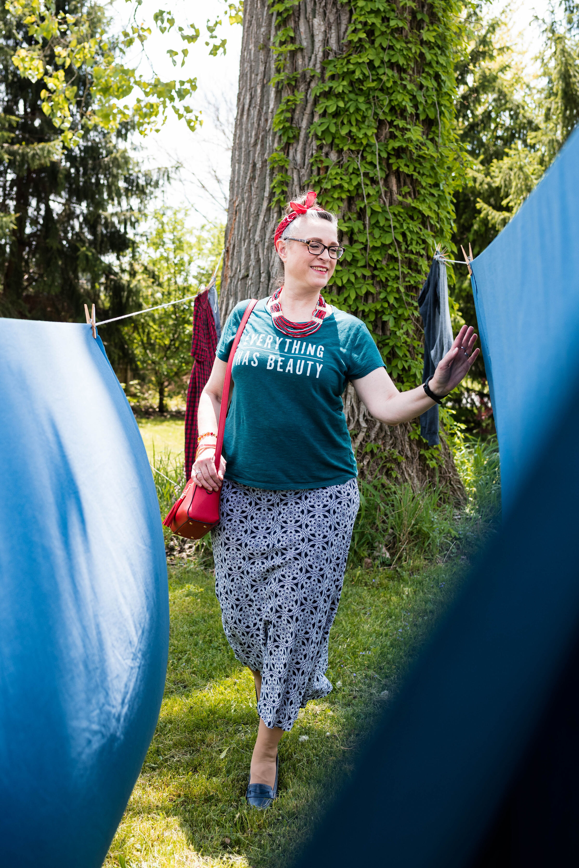
I had some sheets hanging out on the line on the day we took these pictures, so we had a little fun with it.

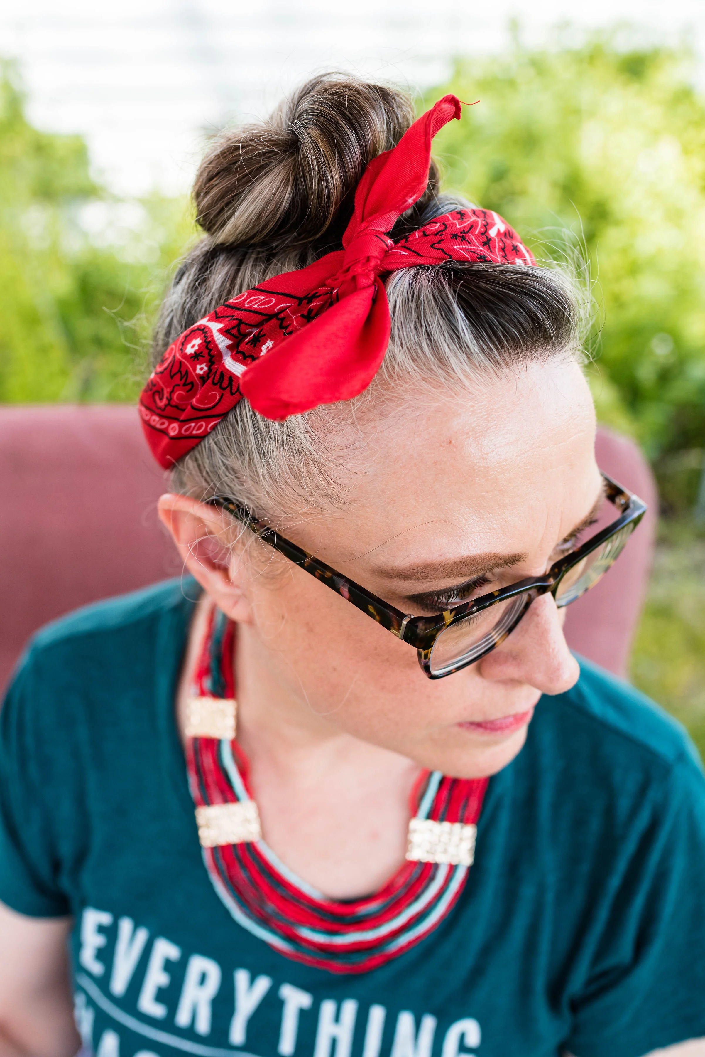
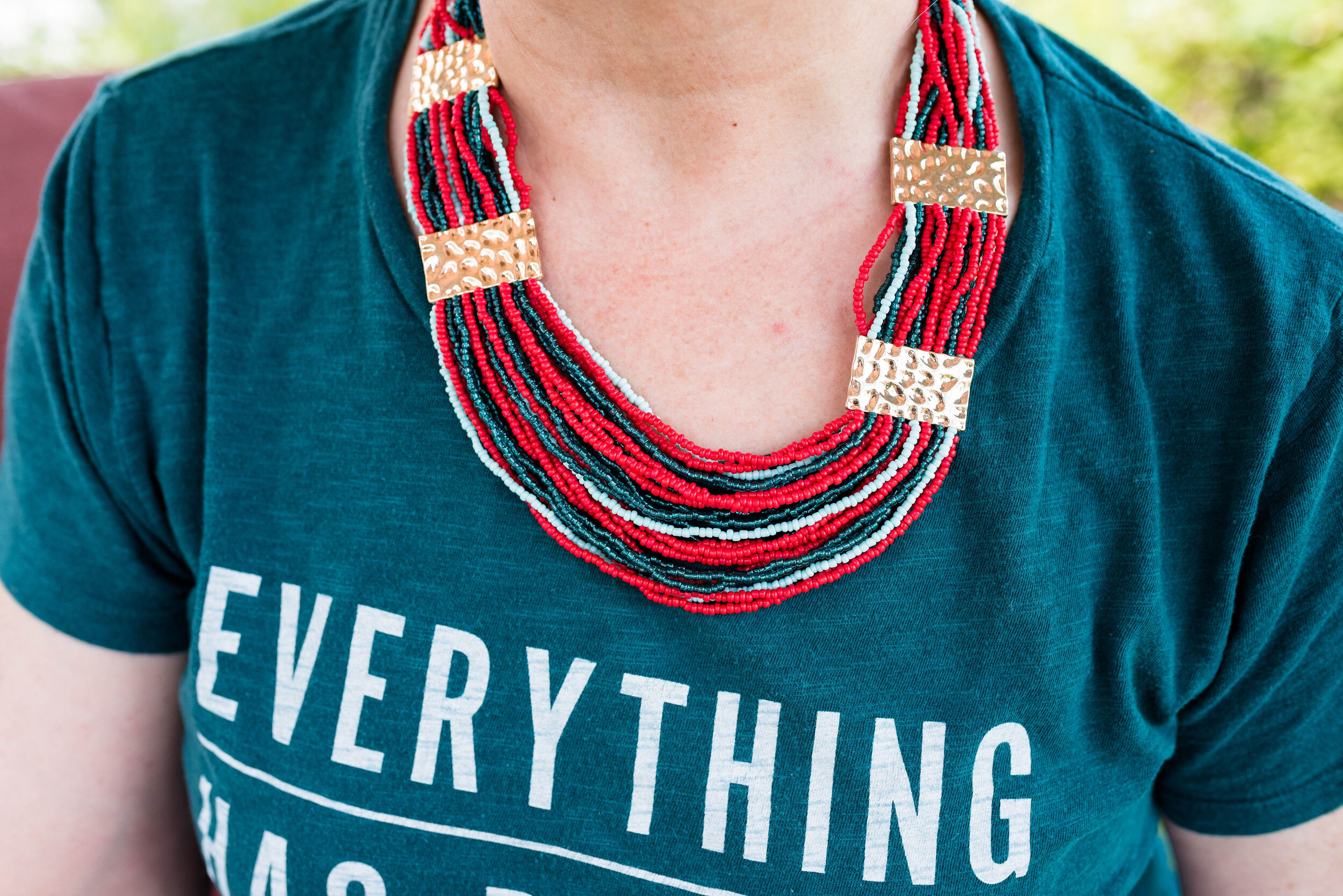
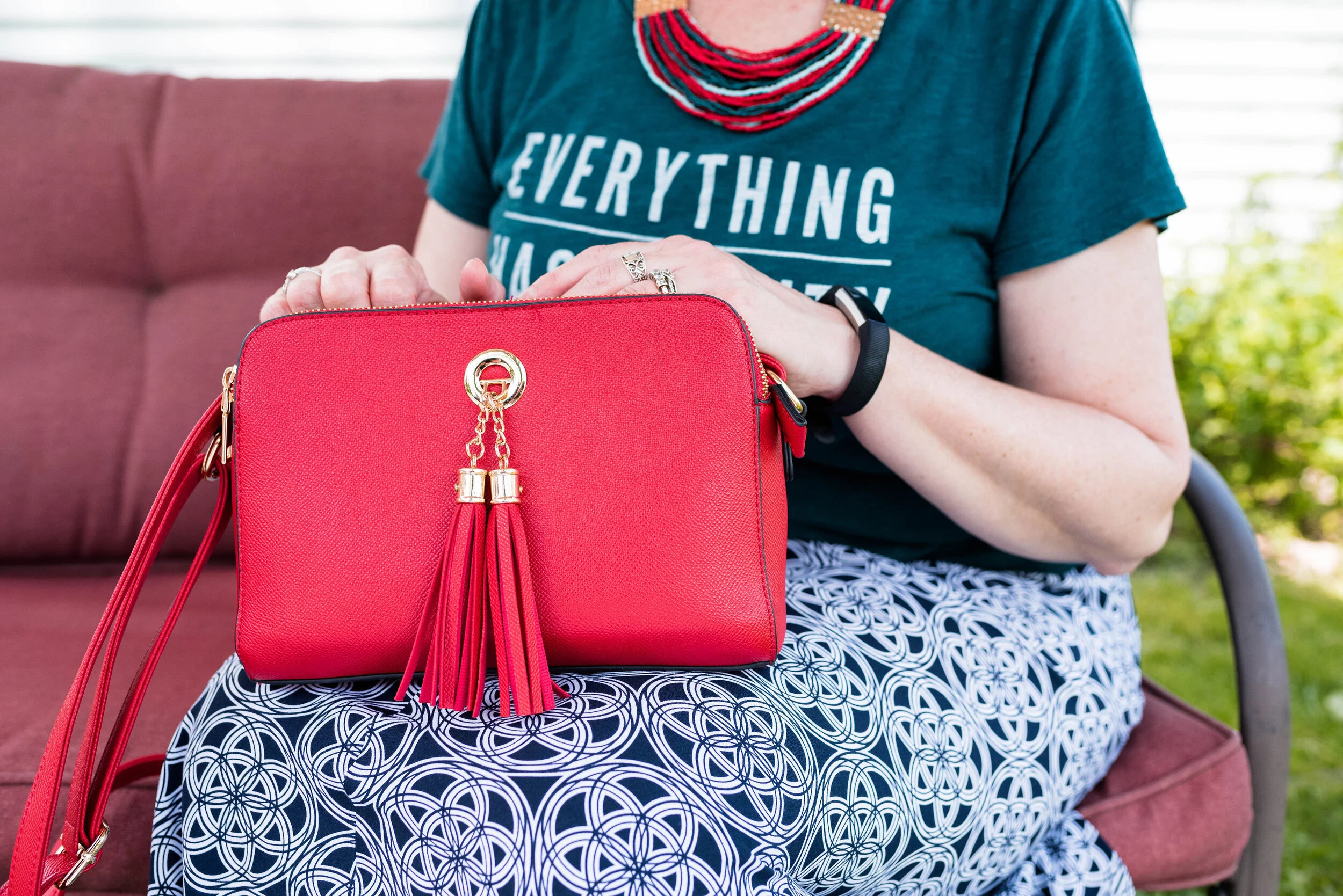
Rather than create an outfit with a full red piece, I thought I would show you an outfit where you use one color just in your accessories and wow, what a statement it makes! The Fiery Red bandana in my hair, the jewelry and the bag, add that bright red color, without being overwhelming. Some people feel less comfortable wearing bright colors and prefer to just stick to the classics, like navy, gray or black. Adding a bright color really boosts the overall look of an outfit.

Pantone Spring/Summer - Fiery Red, Storm and Blueberry
Pantone Spring/Summer 2020 - Storm, Fiery Red and Blueberry

My medallion print skirt is from Christopher and Banks last year. I like that it is light weight, and yet not at all see through. Win, win. I felt that it was a good match for the Blueberry Pantone classic color.

Pantone Spring/Summer 2020 - Storm, Fiery Red and Blueberry

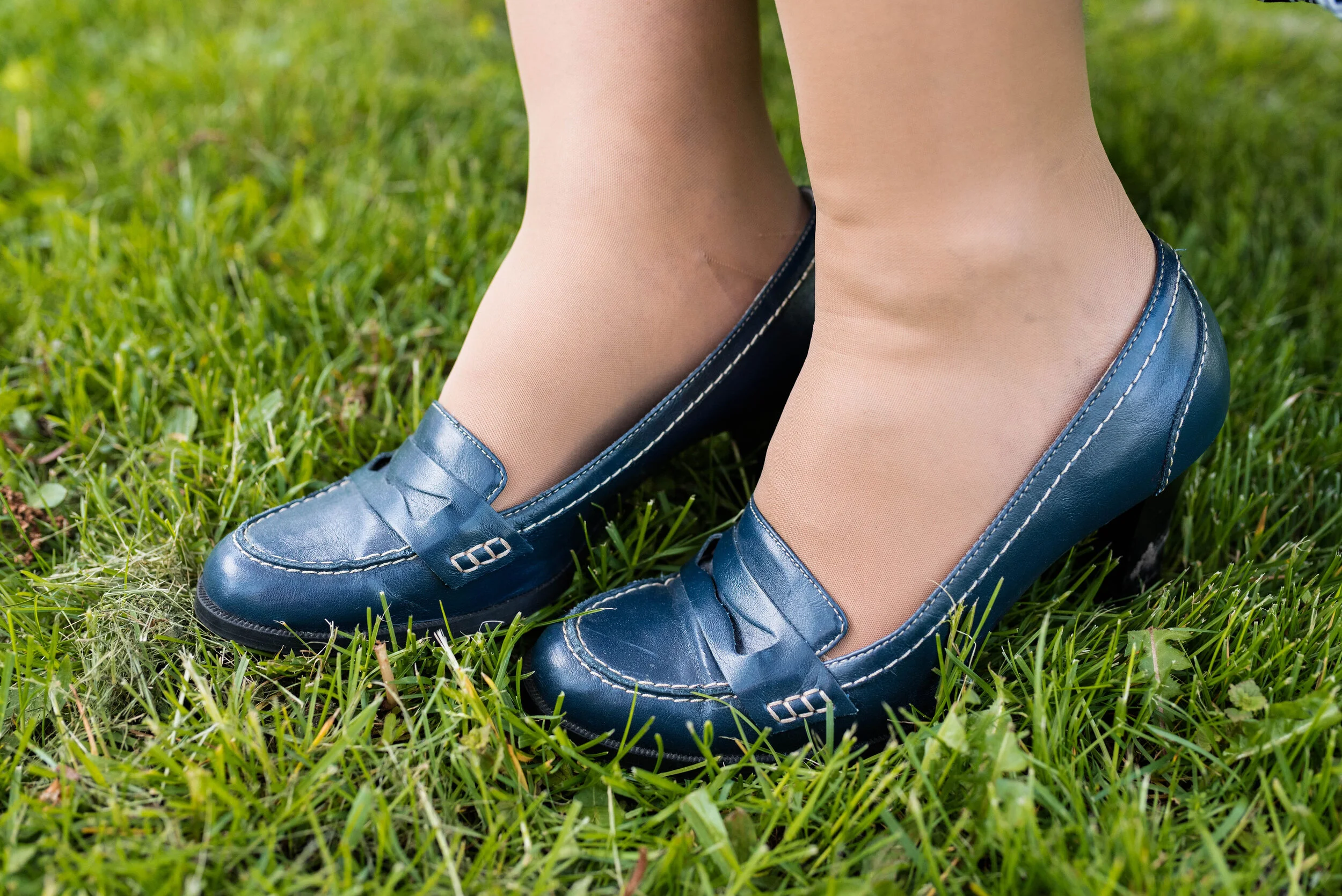
You’ve seen these loafer heels numerous times on the blog before. I got these thrifting and have had them for years, but they still look pretty good. The plus side of real leather. These are Relativity brand.

Pantone Spring/Summer 2020 - Storm, Fiery Red and Blueberry

What do you think of these colors? Do you think this was a good combination? Do you where skirts in the summer? What length skirt do you like to wear; mini, knee, midi or maxi? I would love to hear your thoughts. Thank you to all of you who regularly comment on my posts. I always look forward to your insights and of course the positive feedback is wonderful, but your negative feedback is welcome too.

I’m including a few shopping links for you to look over. I hope you are staying safe and healthy wherever you are!

Photos and graphic Rebecca Trumbull.

These shopping links are affiliate links which means I get a few pennies when you click on a link. Thanks for those clicks. All opinions are my own.


Transitional Spring Outfit

Spring time in my area is a carousel ride of fluctuating temperatures and weather which makes getting dressed any given morning like playing the lottery. The best way I have found to adapt to these changeable days is to think layers. As opposed to winter layering that is full of heavy long sleeved tees and bulky sweaters, spring layering is more about lighter layers. Fabrics like cotton or cotton polyester blends are ideal for light layers and still give you mobility while keeping you warm.

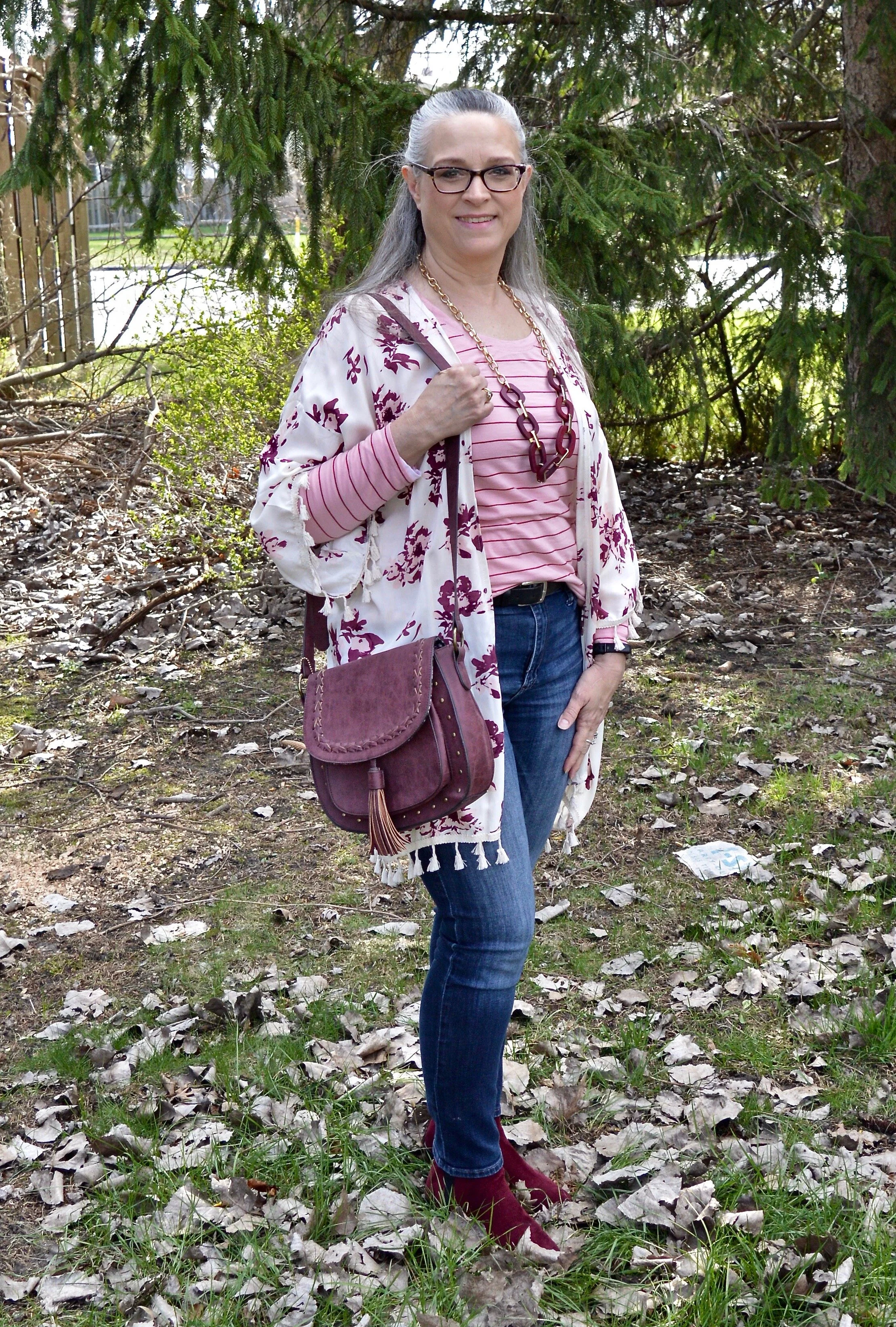
Today’s outfit was what I wore on Saturday for our Easter celebration. I wanted something casual and comfortable, but still flexible enough to cook a big dinner and do all the clean up afterwards. I also wanted layers that would be warm, but not so warm I would be peeling them off when the oven was on cooking the turkey.

Transitional dressing usually means you are moving from one season to another and you are in between one wardrobe and another. The move from winter to spring in my area is usually still chilly and even downright cold. Rain, snow showers and wind are common place during the months of March, April and once in a rare while into May. Many people who have a capsule type wardrobe can have all of their clothes in their closet at one time. For those of us who are clothes horses, we need to move out the winter wardrobe and move in the summer wardrobe. I usually don’t do this until the weather is consistently above 65 degrees Fahrenheit. Cold weather clothes spend much more time in my closet than my warm weather clothes, unfortunately. Ha ha.

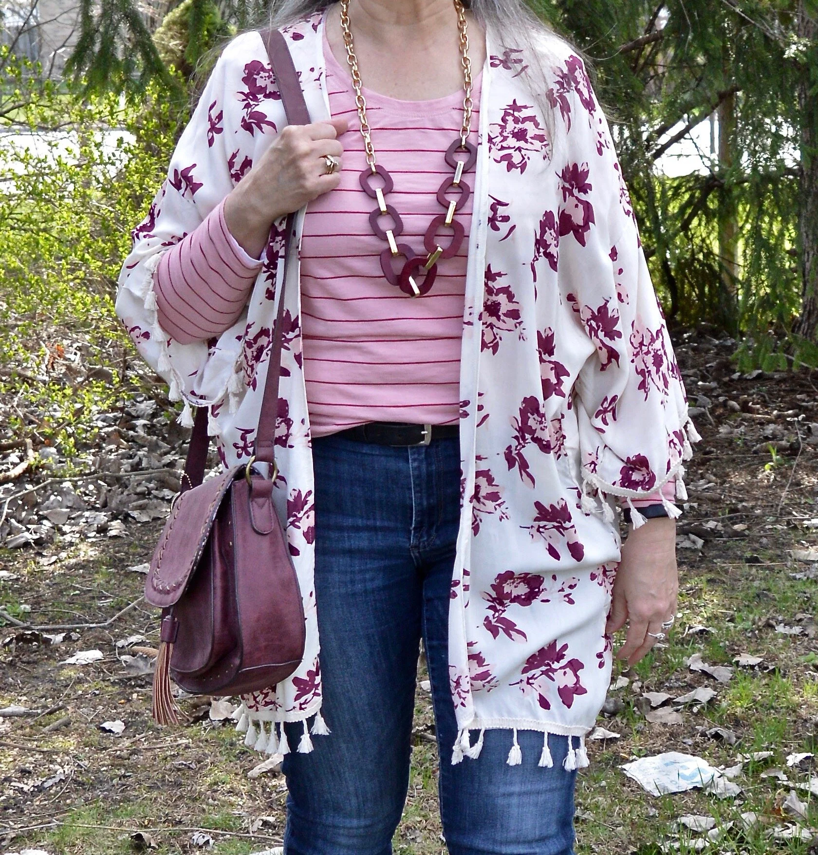
In this outfit I am wearing two lightweight cotton long sleeve tees. The striped tee you can see is a.n.a. brand and was a purchase this past fall from JC Penney. They had a good sale on long sleeve tees and I bought a few. Underneath the striped tee is along sleeve thrifted light pink tee which is Old Navy brand.

My pretty floral kimono is David & Young brand and a DSW clearance find. Don’t be afraid to look at the accessory sections at different stores. You never know what you might find. The thing that drew me to this piece was the print, the colors and the tassels.

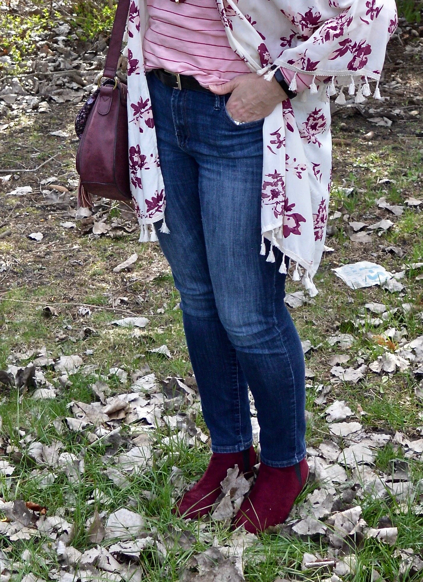
My jeans are Rock & Republic from Kohl’s. I have several pairs of these and love all of them. These are more stretchy and like jeggings rather than jeans. My other pairs are regular denim.

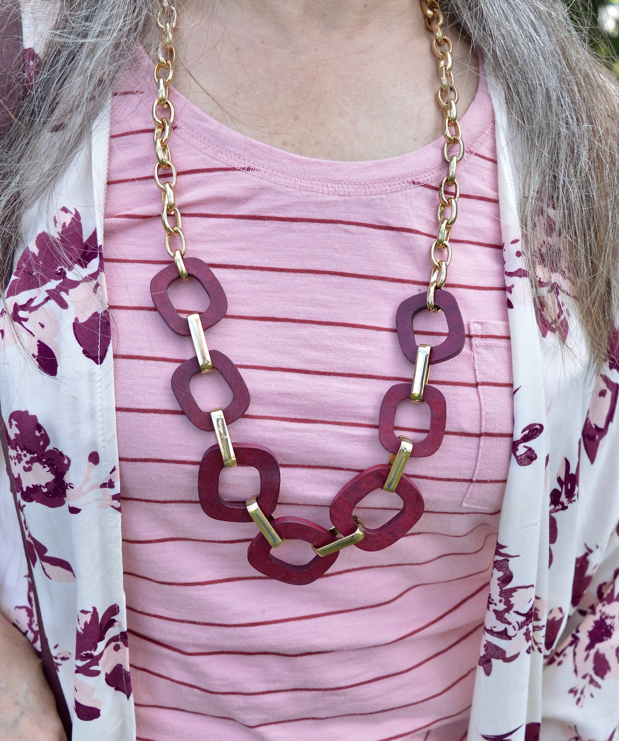
Once again, my chunky burgundy necklace is making an appearance. I love the way it looks with this outfit and I also love the print mix of this outfit. Stripes and florals are one of the easiest and most popular print mixes.

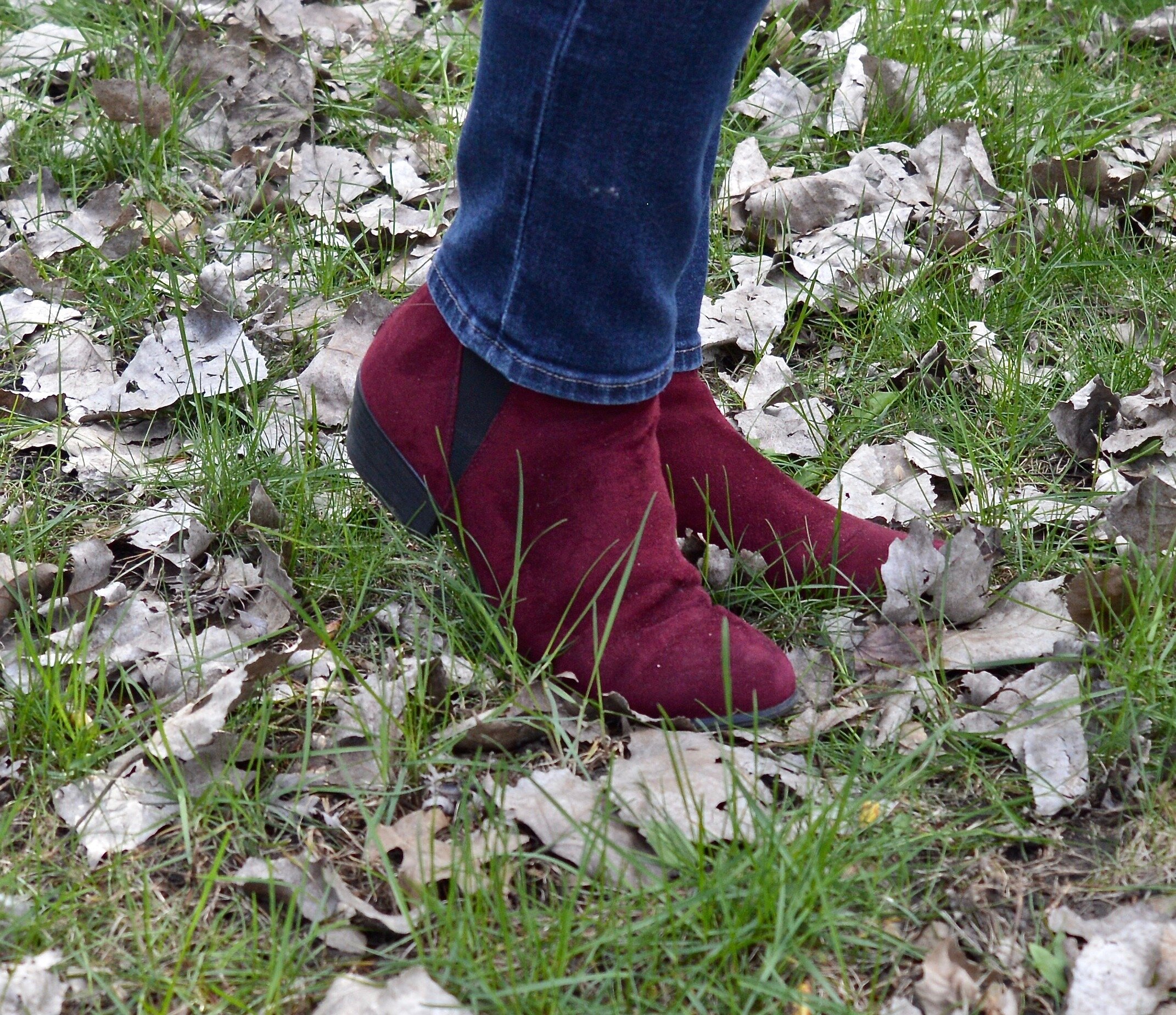
I thought these Spirit ankle boots were a good choice for this look. They are comfortable and yet stylish with a faux suede finish and low heel.

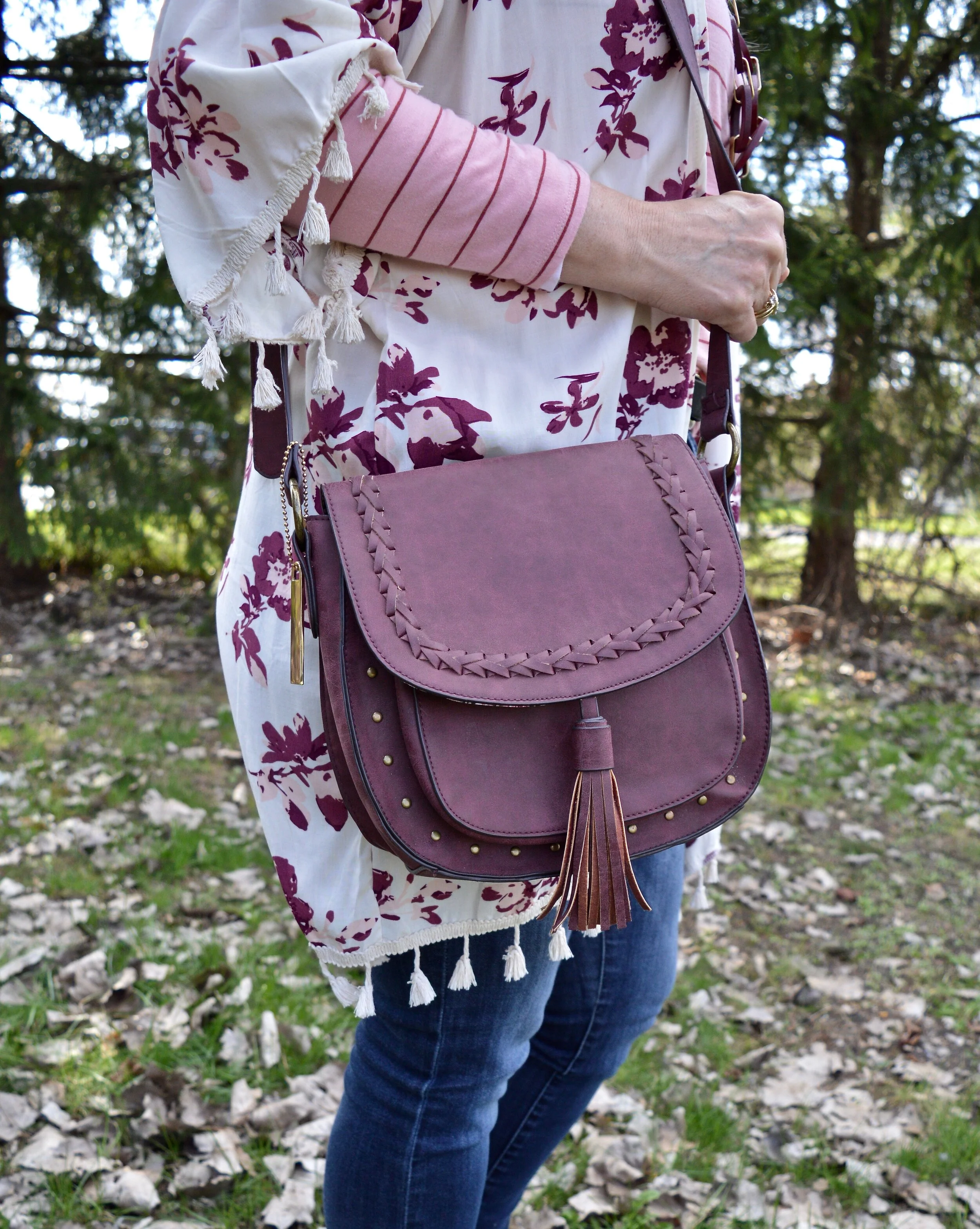
This Massini saddle bag was purchased from clearance at Meijer a while back. I’ve styled this with an outfit before on the blog. You can see that post here.

I hope you enjoyed this outfit. What do you wear to transition from winter to spring? Are you still wearing layers where you are, or is it warm? I’d love to hear from you, so be sure to leave a comment below.

I hope you all are well and managing to stay healthy and mentally sound, which isn’t easy to do in these times we are in. I have good days and bad days, but we all need to give ourselves grace. These are difficult times, so set small goals and try to get outside.

I’m including a few shopping links. These are affiliate links, but all opinions are my own. Thanks for stopping by the blog.


Seeing Red - Outfit Inspiration - 4 Year Bloggiversary Giveaway

Happy Bloggiversary to me! This month makes four years that I have been writing about faith and fashion. Though my consistency hasn’t been perfect, I have tried to show you a variety of outfits that are meant to be inspirational. From the start my blog was meant to be encouraging. I desire to lift up the average woman, the ones who don’t always get the recognition, the ones who don’t always have a close friend to ask, “Does this make me look fat?” Ha, ha. I never was the popular one at school. I never got involved in student activities, other than a poetry club. I was shy and I didn’t fit the popularity norm.
The force that drove me to start a blog, was the desire to write. It really doesn’t matter what I write, but just the process of typing out words and expressing ideas through letters and sentences gives me a thrill. However, I knew as I was living life as a wife, mother and believer, I often felt alone. Even though we were involved in a good church, I still never felt like I quite fit in. Those are the women I am writing to and for.

I wanted women to know they were accepted. I wanted them to feel they could go into their closets and put together an outfit because I had shared something on the blog that inspired them. I wanted them to be able to read a faith post and feel that they had finally met someone who got it and who could encourage them to walk the walk. I hope I am succeeding.

Today, in addition to an outfit, you get a give away. Once again, I am offering a $30 Target gift card. The rules for entering the giveaway are at the end of the post. In order to be entered into the giveaway you need to be a subscriber and comment on this blog post. If you want an extra entry you can comment on the Facebook post of this blog post. I’ll announce the winner next Tuesday.

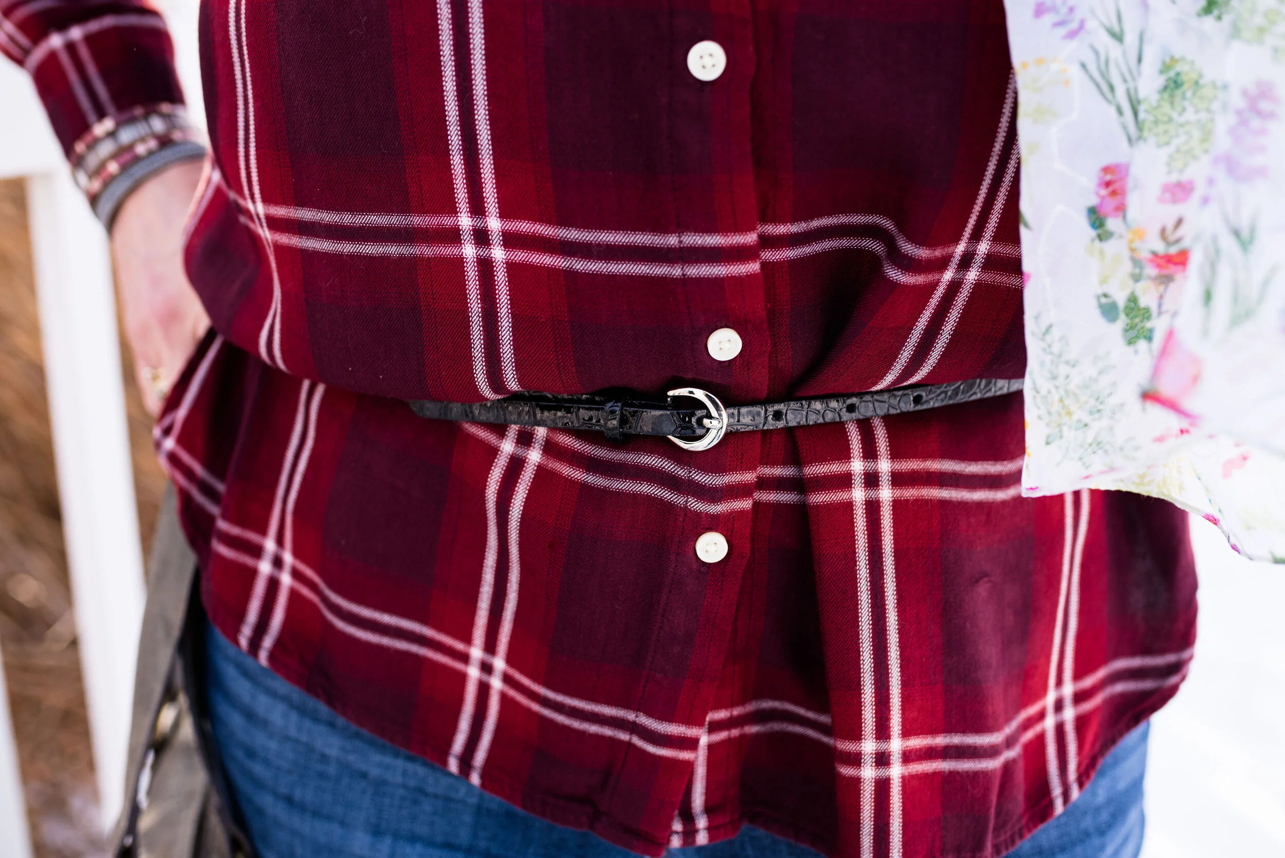
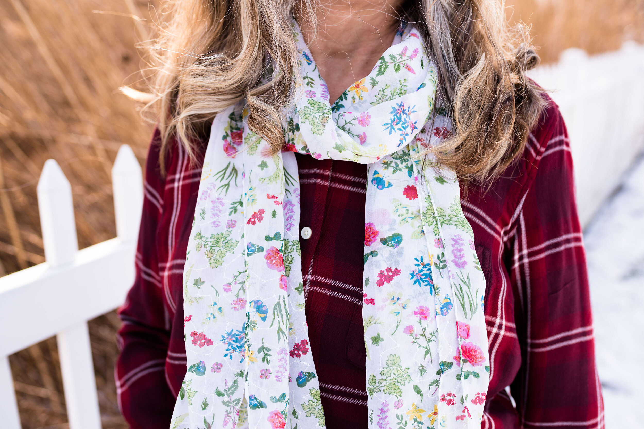
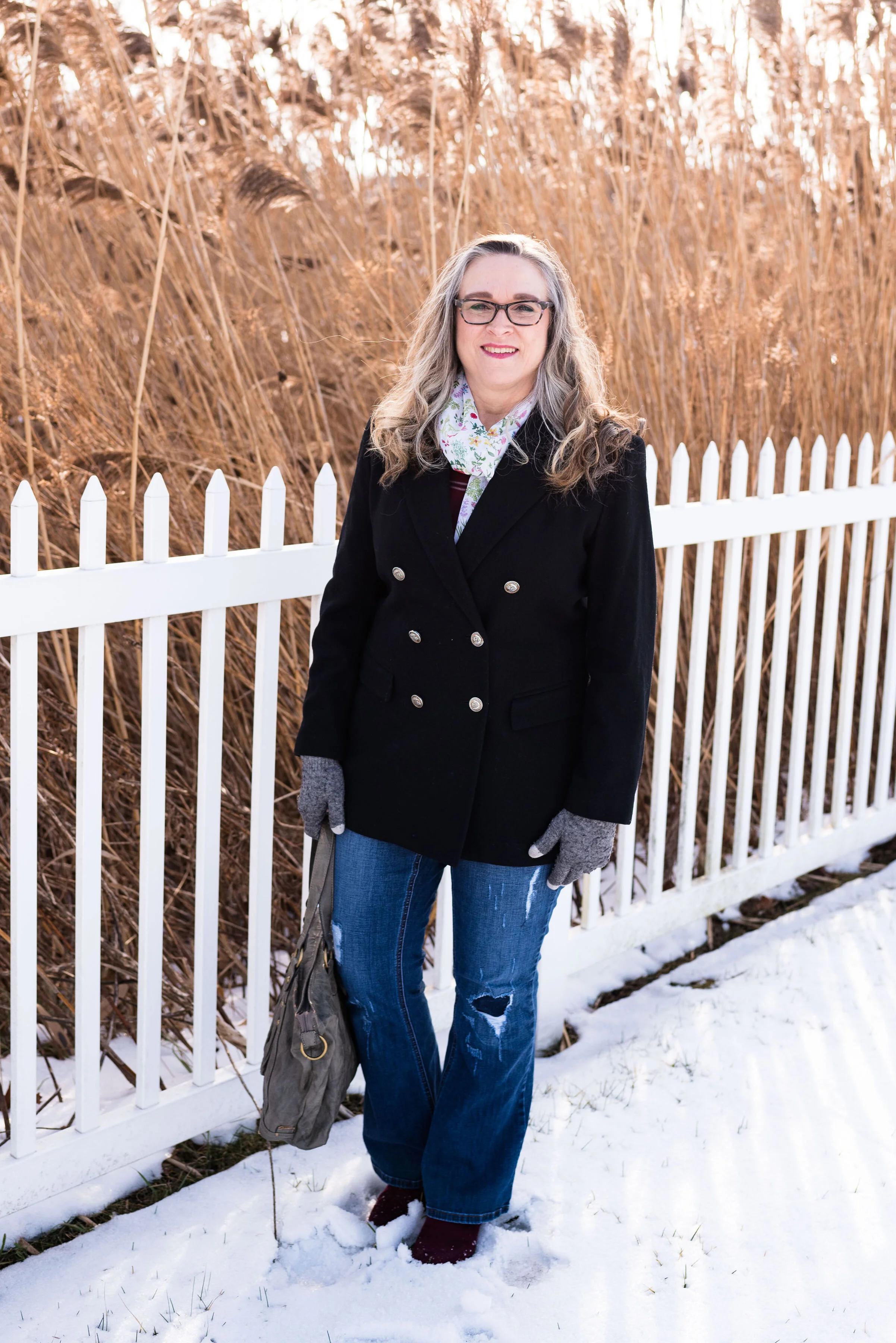
Today’s outfit was inspired by another ad that I received in the mail, this time from Christopher and Banks. The outfit featured a burgundy, plaid button up shirt, styled with some distressed jeans and a floral scarf. This is my take on the outfit.

My plaid shirt is Old Navy brand. I usually don’t shop at Old Navy, but a few years ago at Christmas I ordered some gifts online and got this shirt for myself. I love the color.

My jeans are a recent thrift find. I only have a few distressed items in my coset, but I wanted to add a few more. They are fun to wear for a trendy, casual look. This pair is Lane Bryant brand and have a slight boot cut.

The original model cinched in her waist with a simple belt, so I did the same with this thin, black patent leather one.

In the original ad, the model also featured a darker floral print scarf. I didn’t have anything that color, so I decided to go with the light, white floral print. I thought it went well with the shirt because of the white stripes.

I’ve read that large tote bags are back this spring, so I chose this thrifted Style & Co. bag. You can also see my fun bracelet.

My burgundy Spirit brand ankle boots went perfectly with the outfit. I know my shoes don’t have to match my shirt, but once in a while, I just love that they do.

Before we ran out the door to take these photos I threw on this double breasted wool blazer, just to keep me cozy, while we walked a little ways to where we were going to take the shots. It’s a an older thrifted piece, that I don’t wear a lot, but I like to keep it around, because it looks classy and I love how it looks with these distressed jeans.

Be sure to enter the giveaway to win a $30 Target gift card.

A special thank you to everyone who follows along and subscribes to my blog. I appreciate all of your support, comments, suggestions and prayers. You are what keeps this blog going.

Have a wonderful day and a great weekend.

Photo credit Rebecca Trumbull.