Pantone Autumn/Winter 2026: Neptune Green, Festival Fuchsia, and Toffee

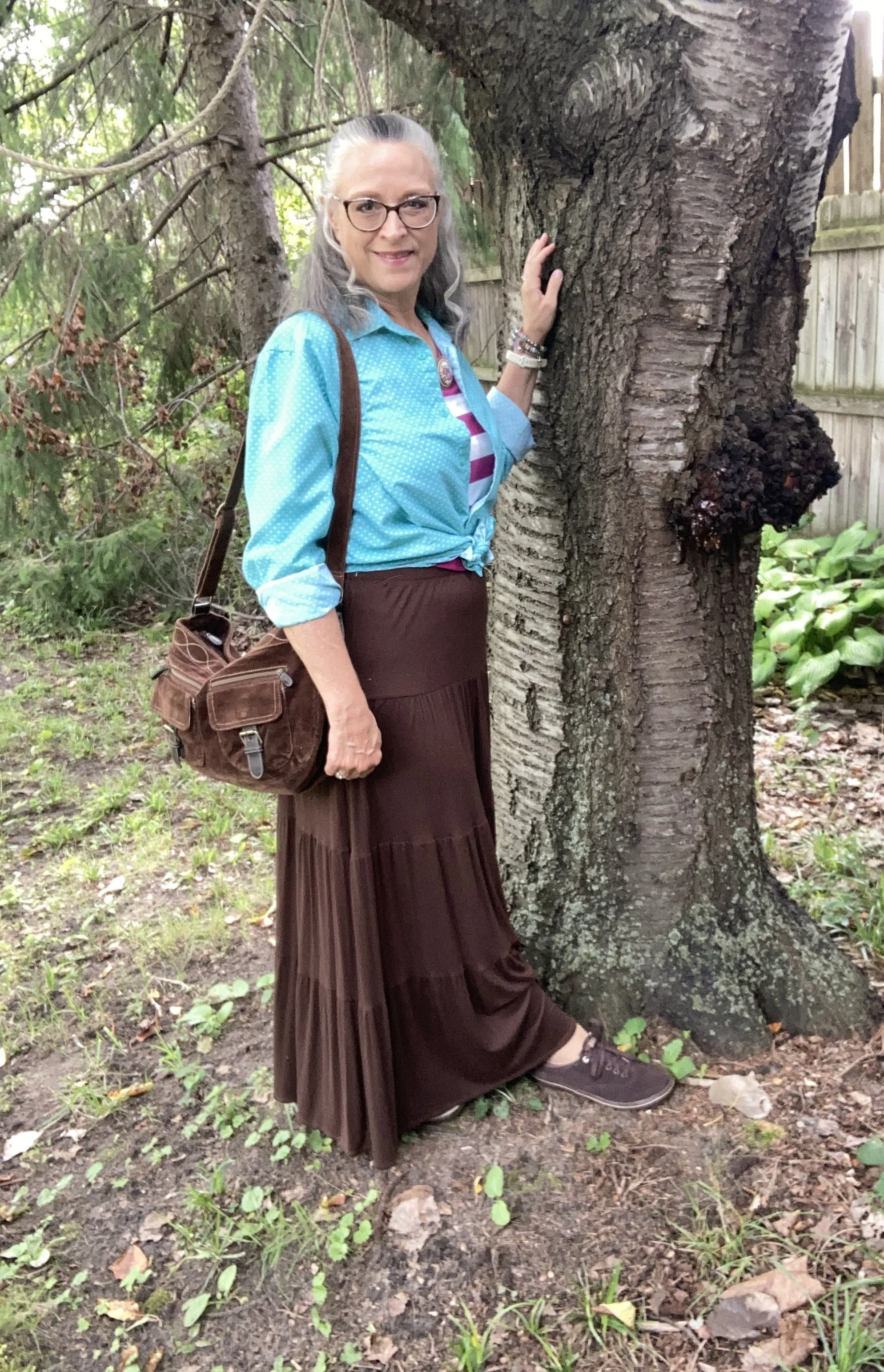
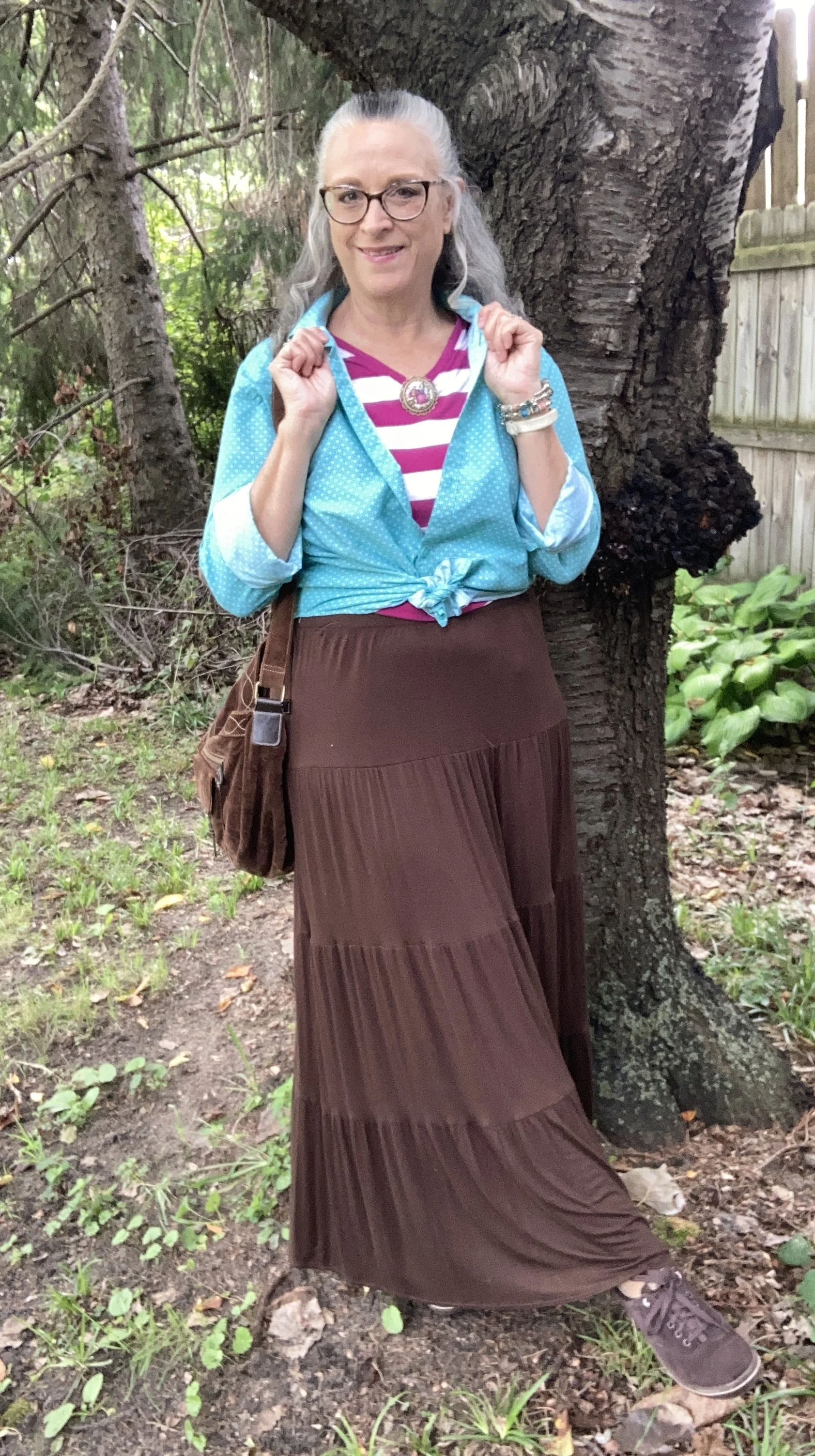
Today I am showing you another outfit with three more colors from the New York, Autumn/Winter palette. Today’s outfit includes Neptune Green, a bright green similar to a sea foam; Festival Fuchsia, a party ready purple, and Toffee, a classic medium brown. I wouldn’t naturally think to put these colors together, though I could easily see the green with the brown, or even the purple with the brown. Combining bright colors like Neptune Green and Festival Fuchsia has never been easy for me, but I love when other people are not afraid to wear the bold, bright colors. This is one way, I have been trying to get outside my own outfit “rut”. You can see the actual Pantone colors here.
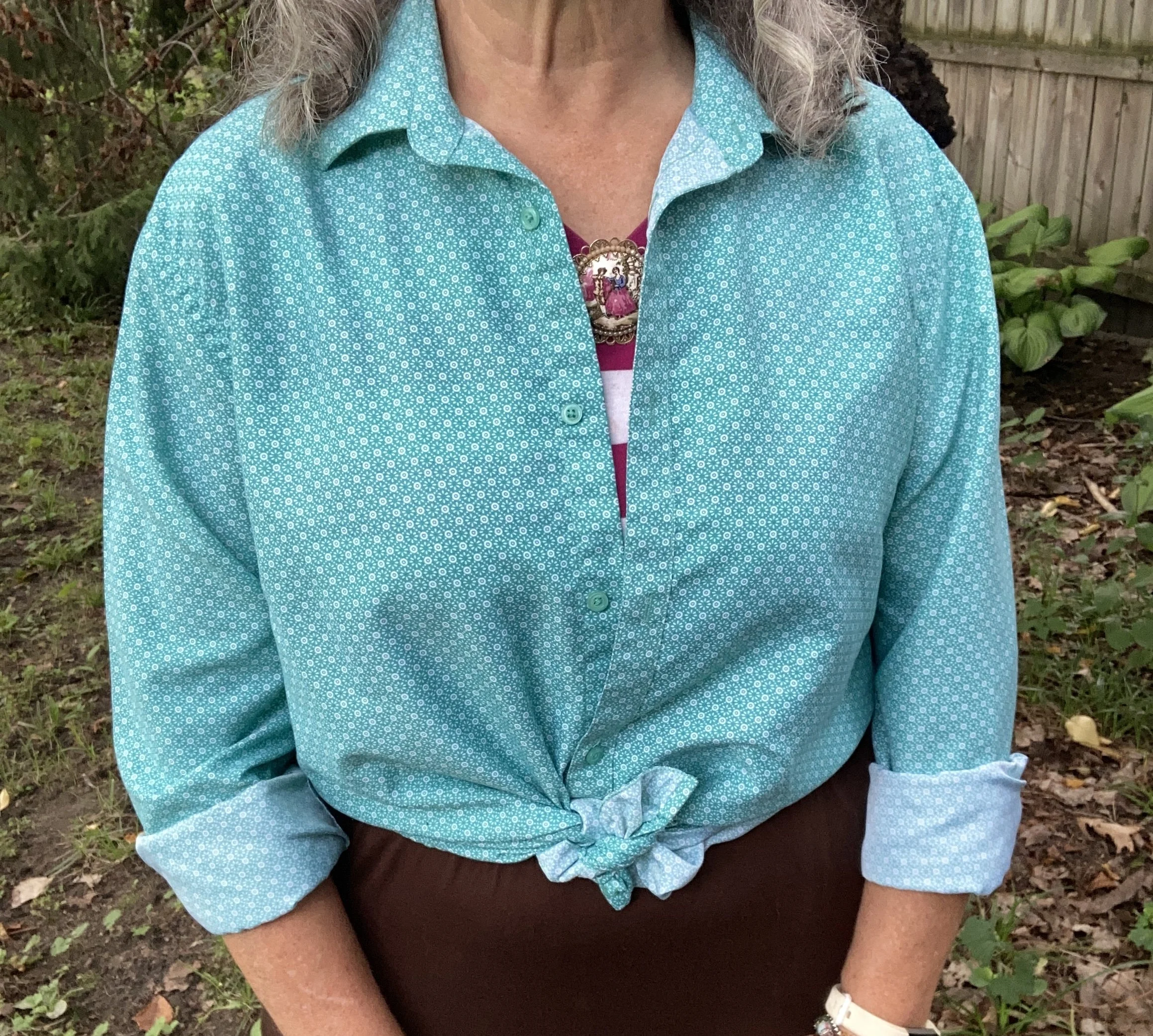
For Neptune Green I chose my thrifted Zylos men’s button down. I do like this color. It is not your typical grass, olive, or forest green. My personal “color brain” - yes, I just made that up - thinks this is a better color for spring and summer.

Personal Fashion Philosophy: Let me just sit here for a moment. I guess it is true that for most of our lives, those of us who grew up in the mid twentieth century, were trained to accept certain seasonal color choices: white for summer, rust and burgundy for fall, black and orange for Halloween, red and green for Christmas, icy blues for winter, and pastels for spring and Easter. How many of you know what I am talking about?

Now, let me take that a little further. We all know that certain smells, sights and sounds remind us of certain holidays, childhood experiences and so on. What if part of my “color brain” is my own way of finding peace, coziness and hope during seasonal change? To me there is just something about digging into those dark, rich colors for the fall season as life begins a transition from long, sunny days spent outside to the shorter, cooler months of spiced cider, snuggly layers and blankets, and gatherings in doors. Just something to think about. Let me hear your ideas about seasonal color change.
This is a darker long sleeve choice from Cabela’s; a short sleeve tee, closer to the actual Pantone color from Old Navy (and not a bad price currently); and I really like this print tee from Life is Good. There is also this 3/4 length sleeve tee from LLBean.

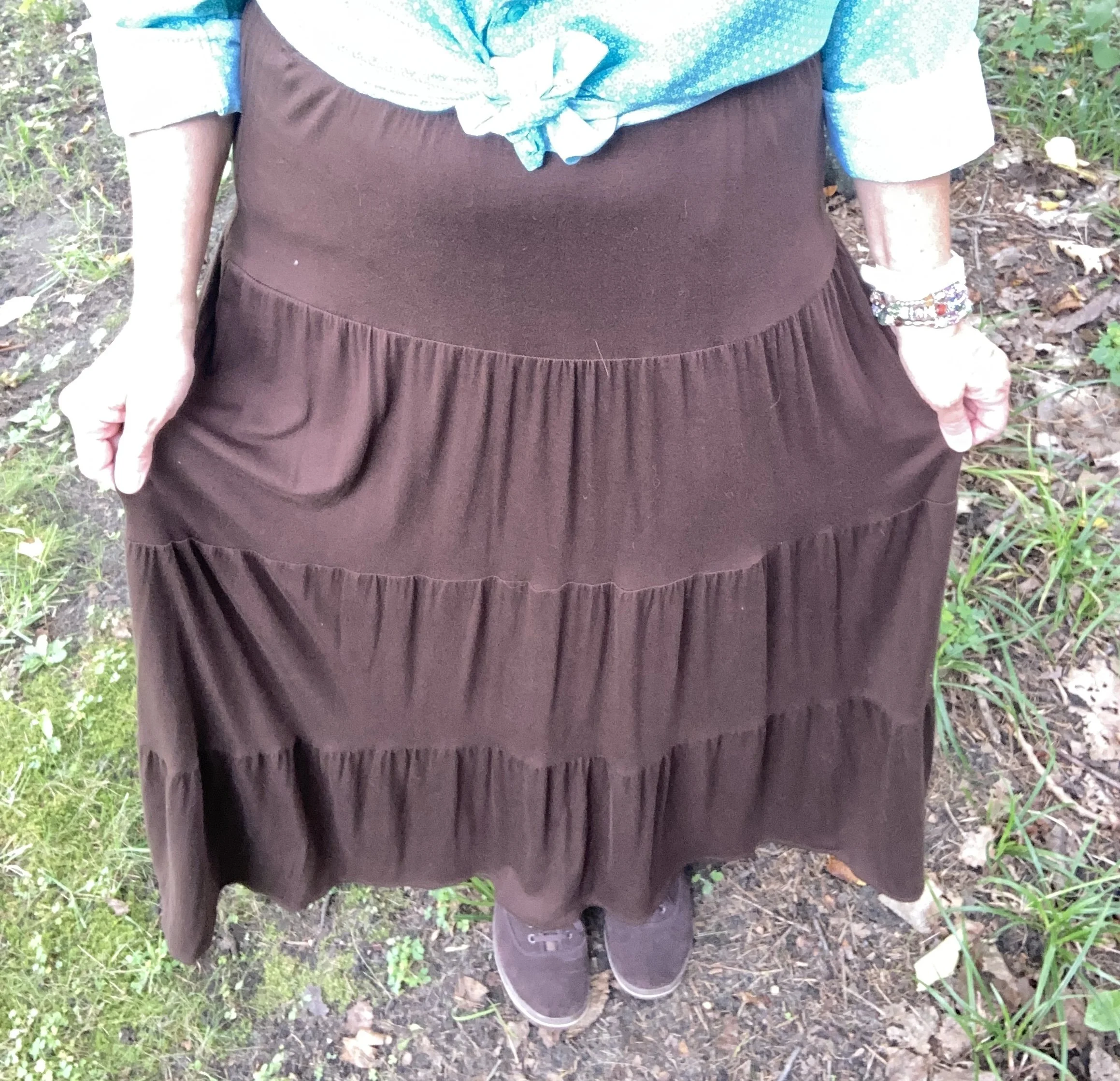
The next piece I chose was the skirt. It seems whenever brown is once again on the Classic palette I reach for this skirt. I have many times thought of getting rid of it since I rarely wear skirts, but it always gets pulled out for something or other. My skirt is a bit darker than the actual Pantone Toffee color, but you get the idea. I do this series to inspire you to shop your closet, not match the color palette’s exactly. This skirt is St. John’s Bay brand from JC Penney and is old. Here is a few versions from Target, a patterned print from Natural Life, a midi length from JC Penney, and a pull on faux suede version from a place called The Vermont Country Store.
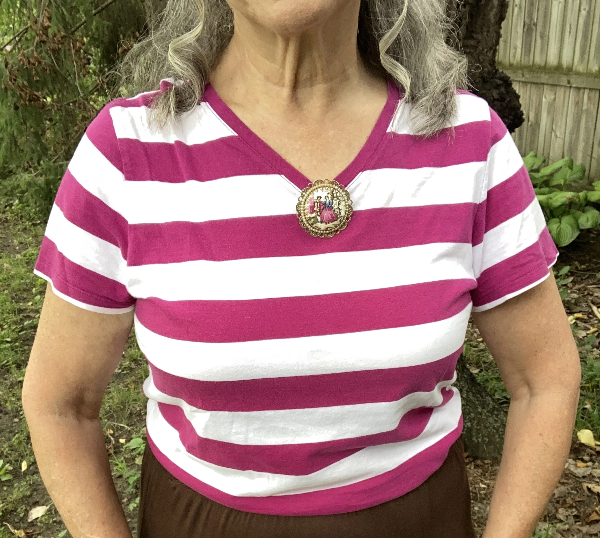
I chose this thrifted Faded Glory striped tee for Festival Fuchsia. The combination of Neptune Green and this pretty purple is a fun vibe, though I certainly wouldn’t think of it for fall. Here is a striped boat neck version from JCPenney; an embellished top from Kohl’s; and a peasant style from JC Penney.
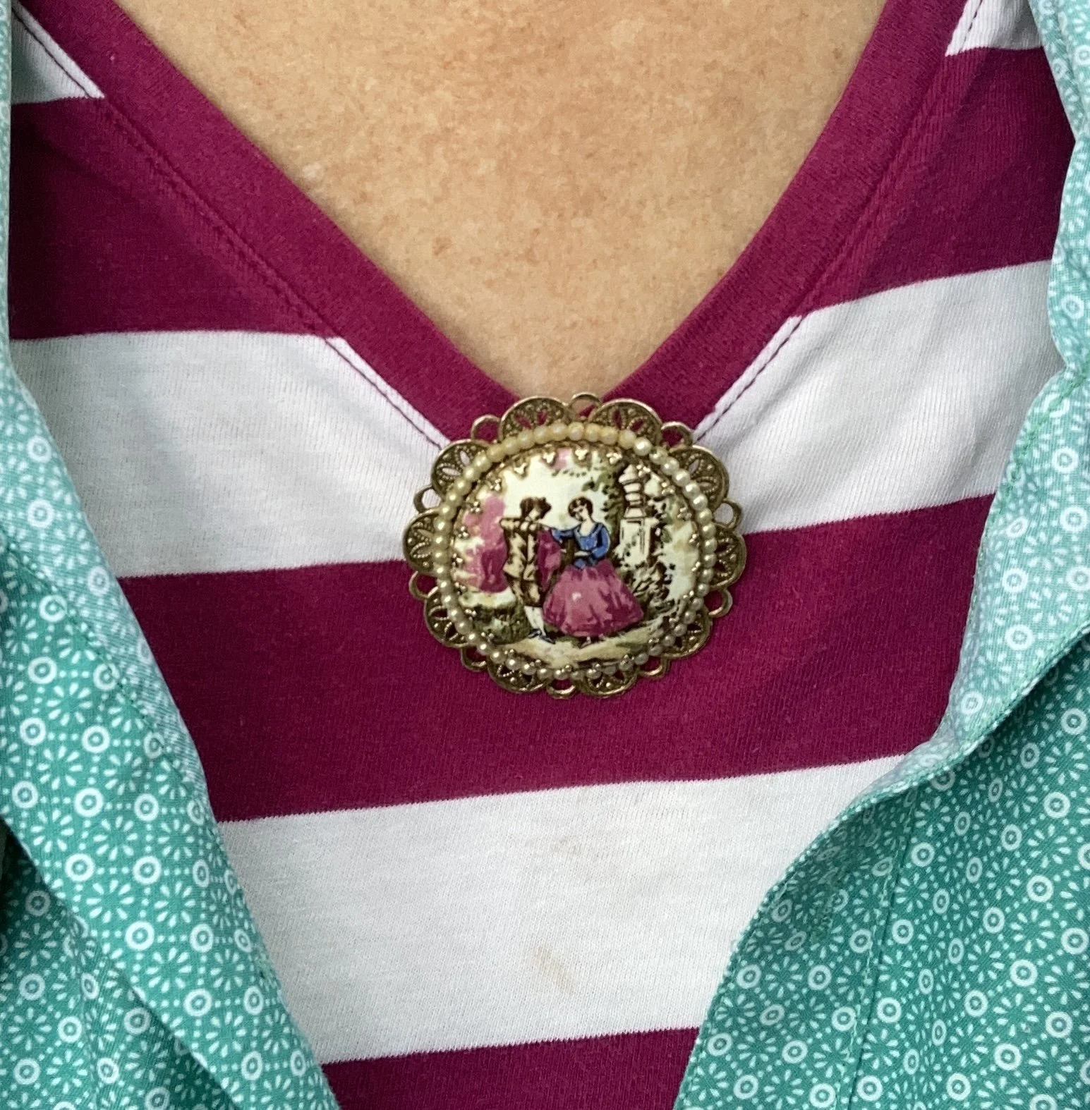
Instead of a necklace I chose a large brooch and pinned it right at the point of the v. I like how it looks. What do you think. I want to incorporate my pins and brooches more often, as they are such fun pieces to use, but often get overlooked.
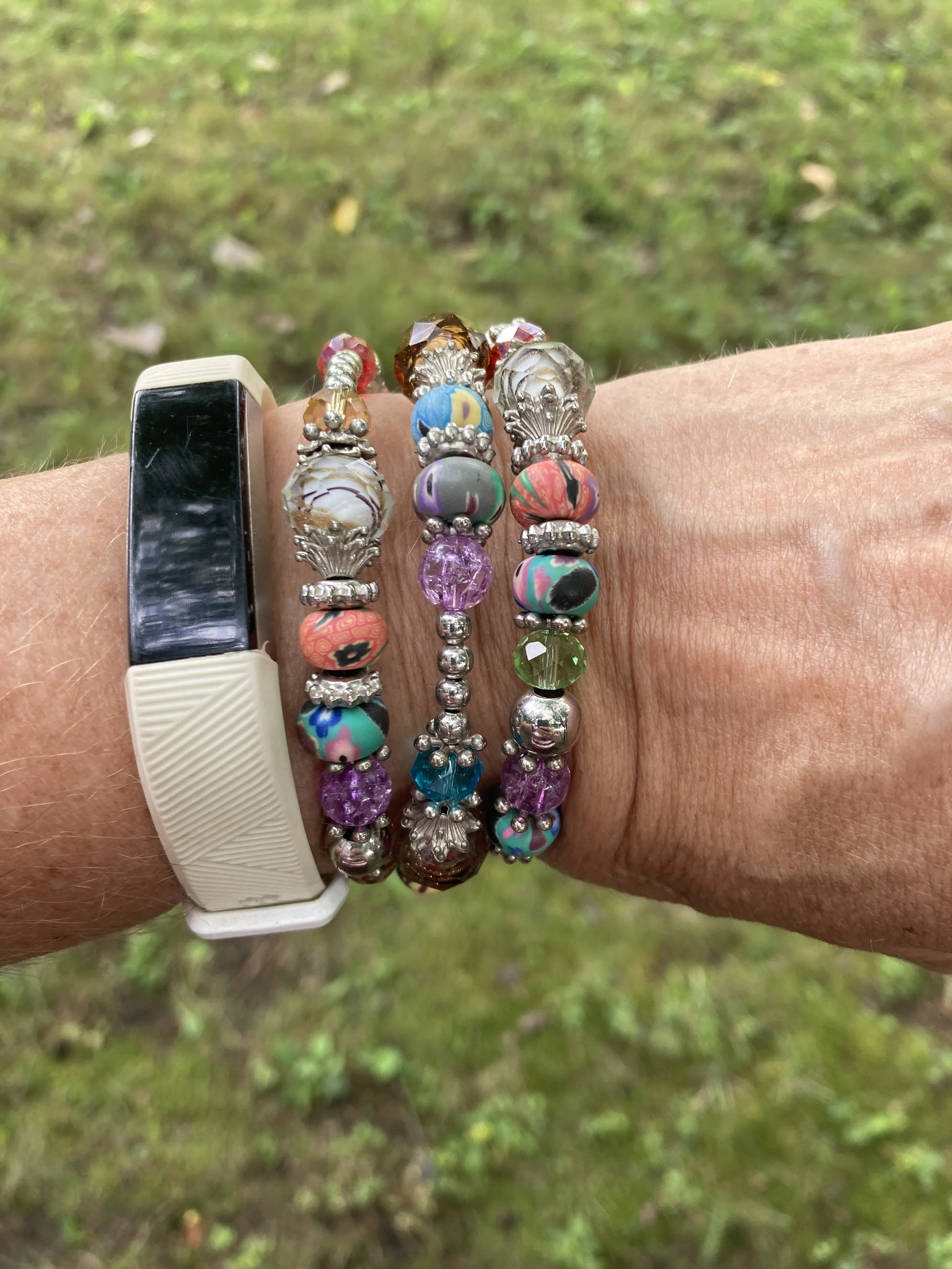
My wrap bracelet was a fun thrift find from a few years ago. I like all the different colors of the beads, so it can be worn with many different things.
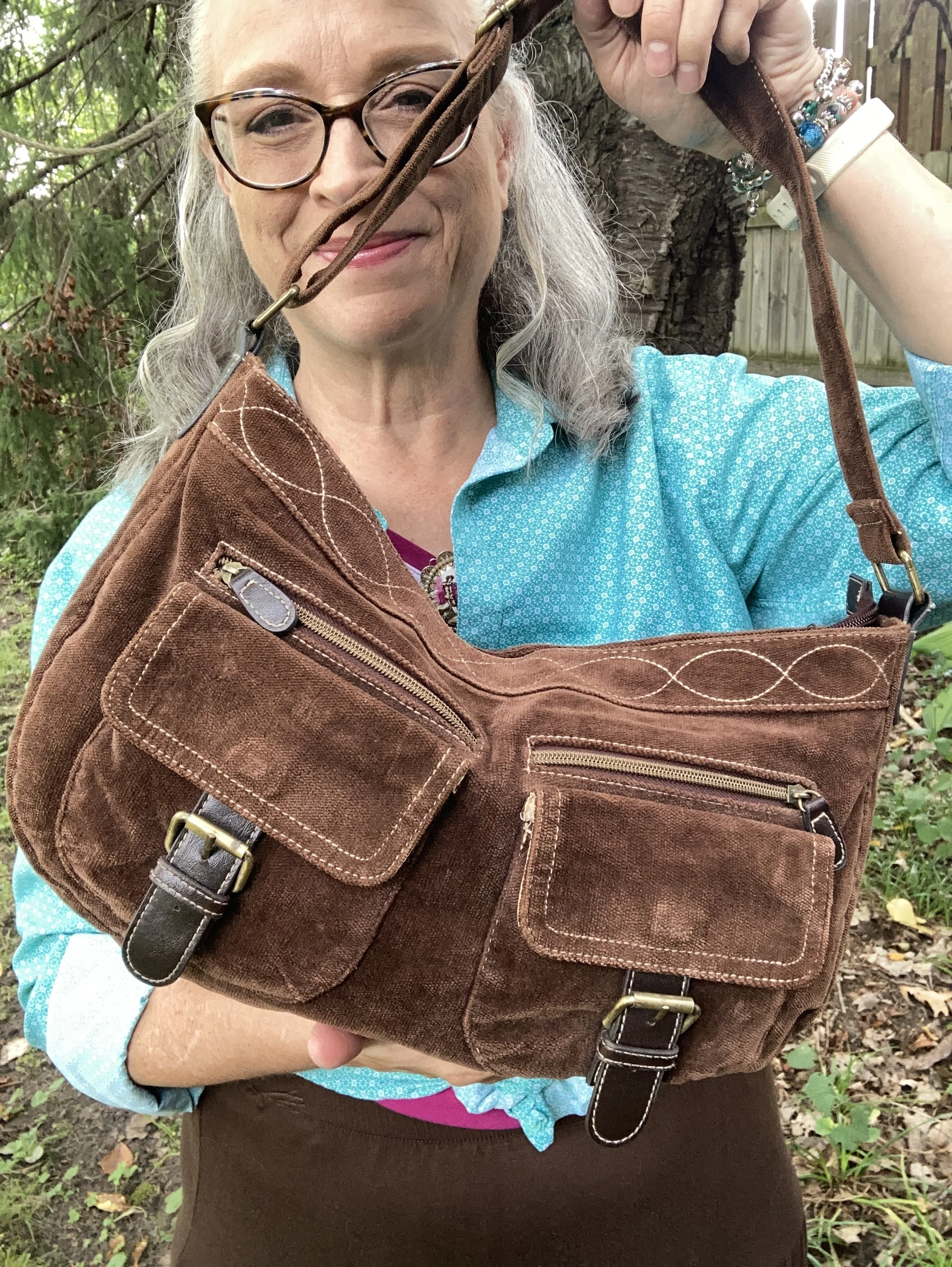
If you have been following me for a while then you know I have had this thrifted corduroy hobo bag for a number of years. Here are a few different ones: Kohl’s, JCPenney, and DSW.

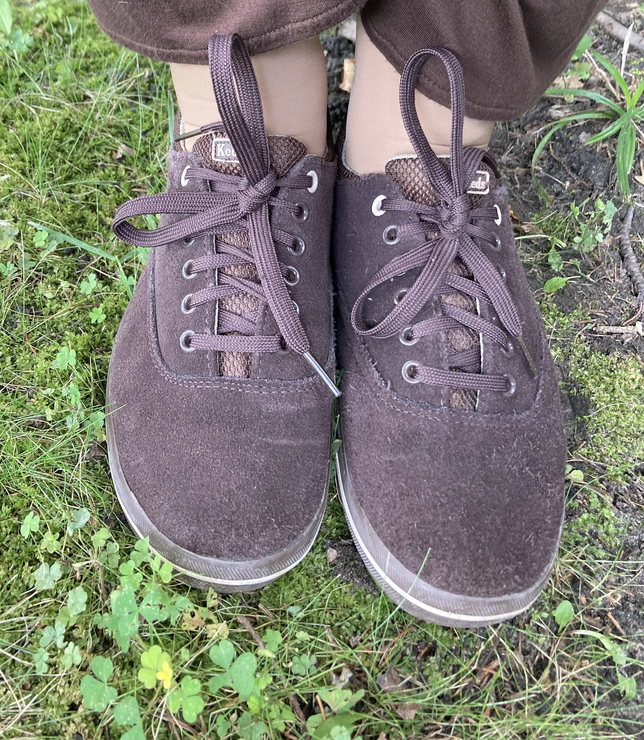
My second hand, brown, suede Keds are getting old, but I still use them regularly. I should probably try to spiff them up with a brush and some suede spray. Here are numerous brown sneaker/shoes from DSW.
What do you think of these colors? Do you suffer from “color brain” like I do? What are some things that are part of your fashion philosophy? If you are interested here is an article I wrote a few years ago on what is behind my Fashion Philosophy. I would love it if you stopped by and read that article too, and leave a comment or two!
I have included a few shopping links for you to look over. These are just suggestions and I do not make any money through them. I do, however, appreciate so much when you leave a comment on the blog. Your thoughts and friendship really do warm my soul and remind me I am not doing this just for myself. Thank you.

Have a wonderful day!
Pantone Autumn/Winter 2025 - New York Palette: Bronzed Brown, Winterberry and Vapor Blue

I hope you are enjoying this Pantone color series. For the actual colors check out this pin on my Pinterest board. The Pantone Color Institute is the entity that people turn to for the trending colors for both fashion, architecture and home decor. I enjoy seeing what the colors are for each season, however, they have made it harder and harder to actually see the colors without having an account, so I appreciate those who do sharing their findings on Pinterest and other platforms.

Today’s colors are what I would call a little more reminiscent of what we tend to think of when we talk about the autumn season. Bronze Brown is a golden brown making me think of changing maple leaves and colorful sunsets, while Winterberry gives a nod to aromas soon to fill the air like cranberry and cinnamon, and Vapor Blue looks like wispy jet trails across a fading fall sky.

This seemed a bit of an odd pairing with the Bronze Brown and Winterberry, but after I put it together, I really liked how it turned out.

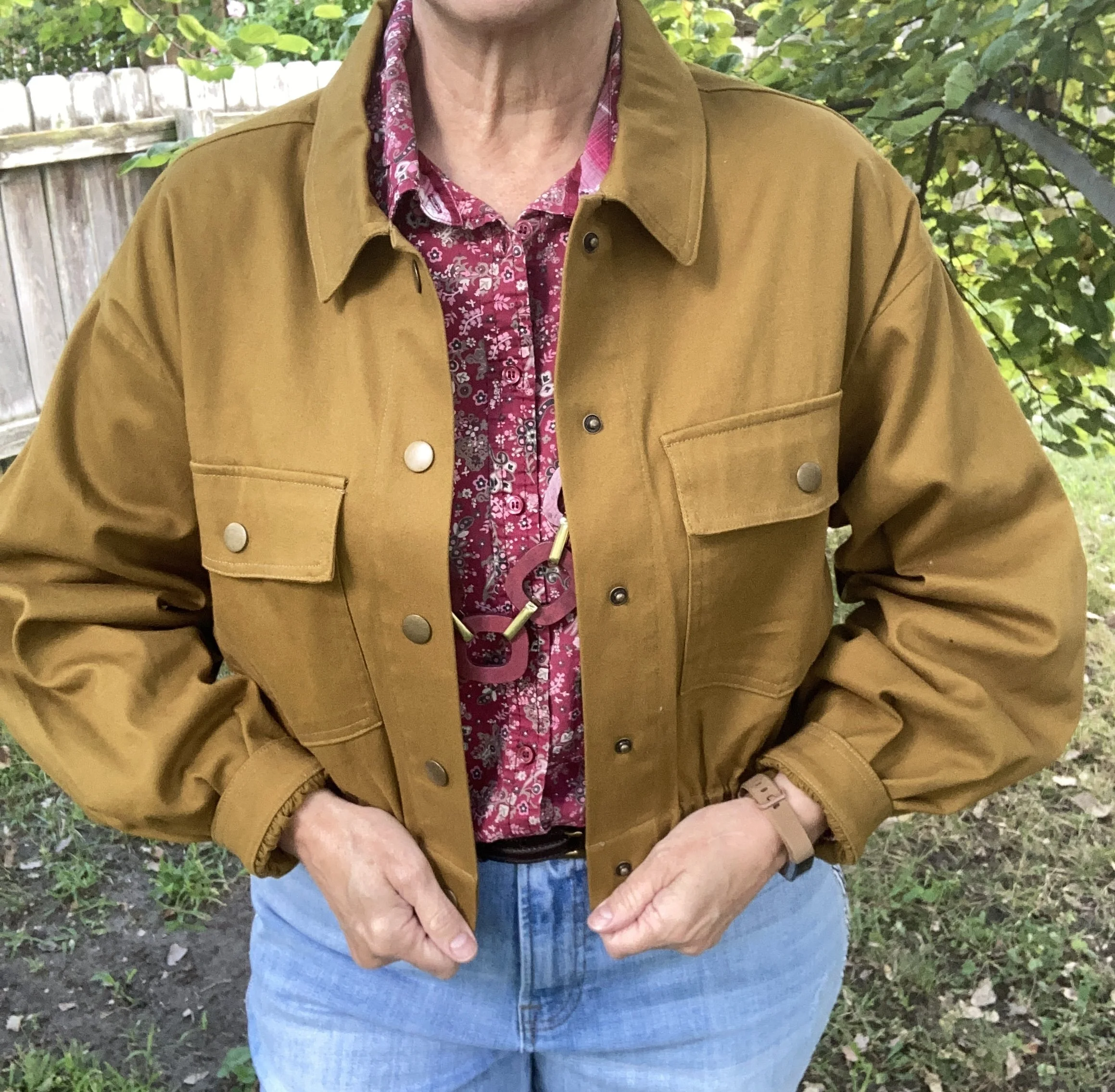
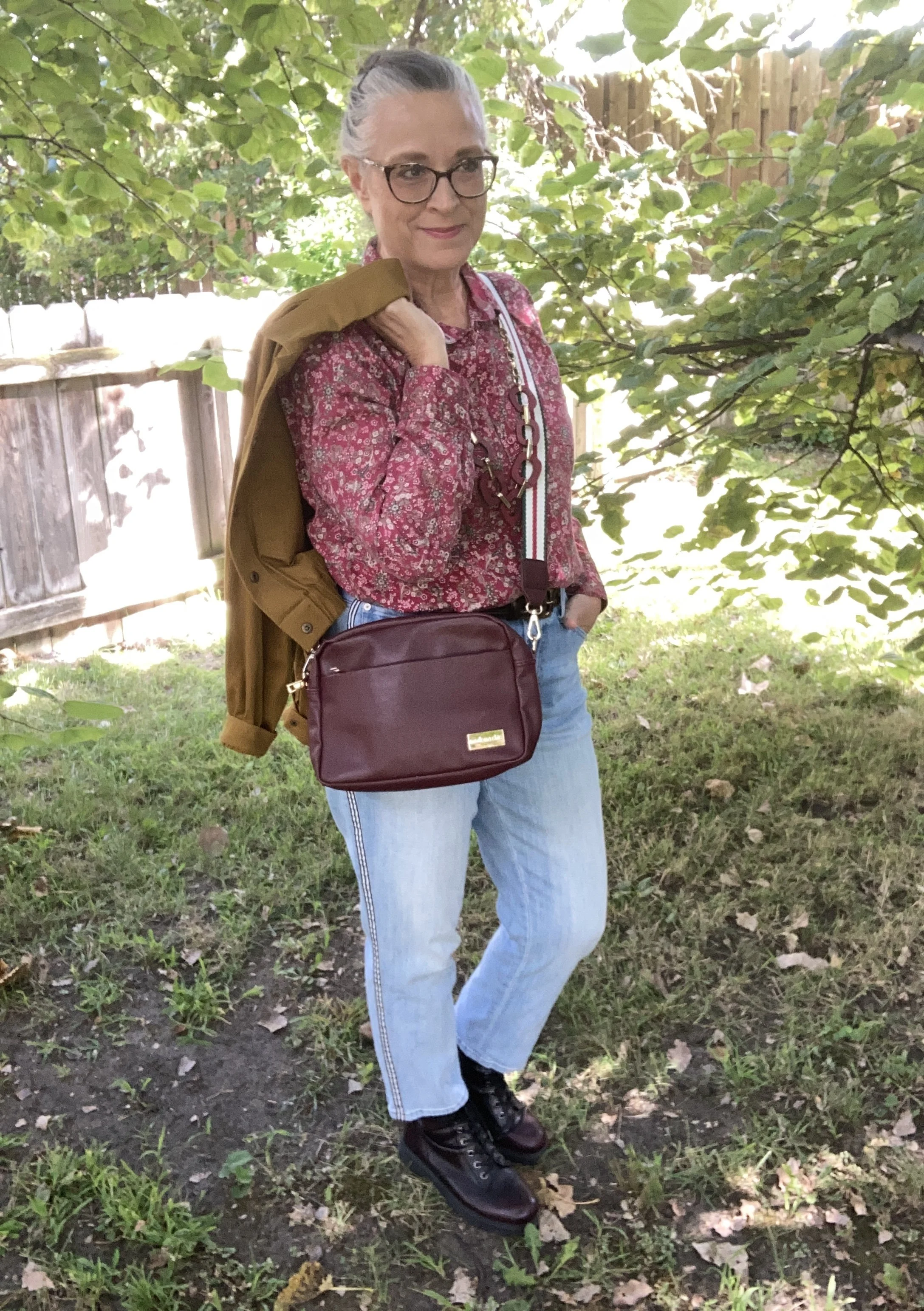
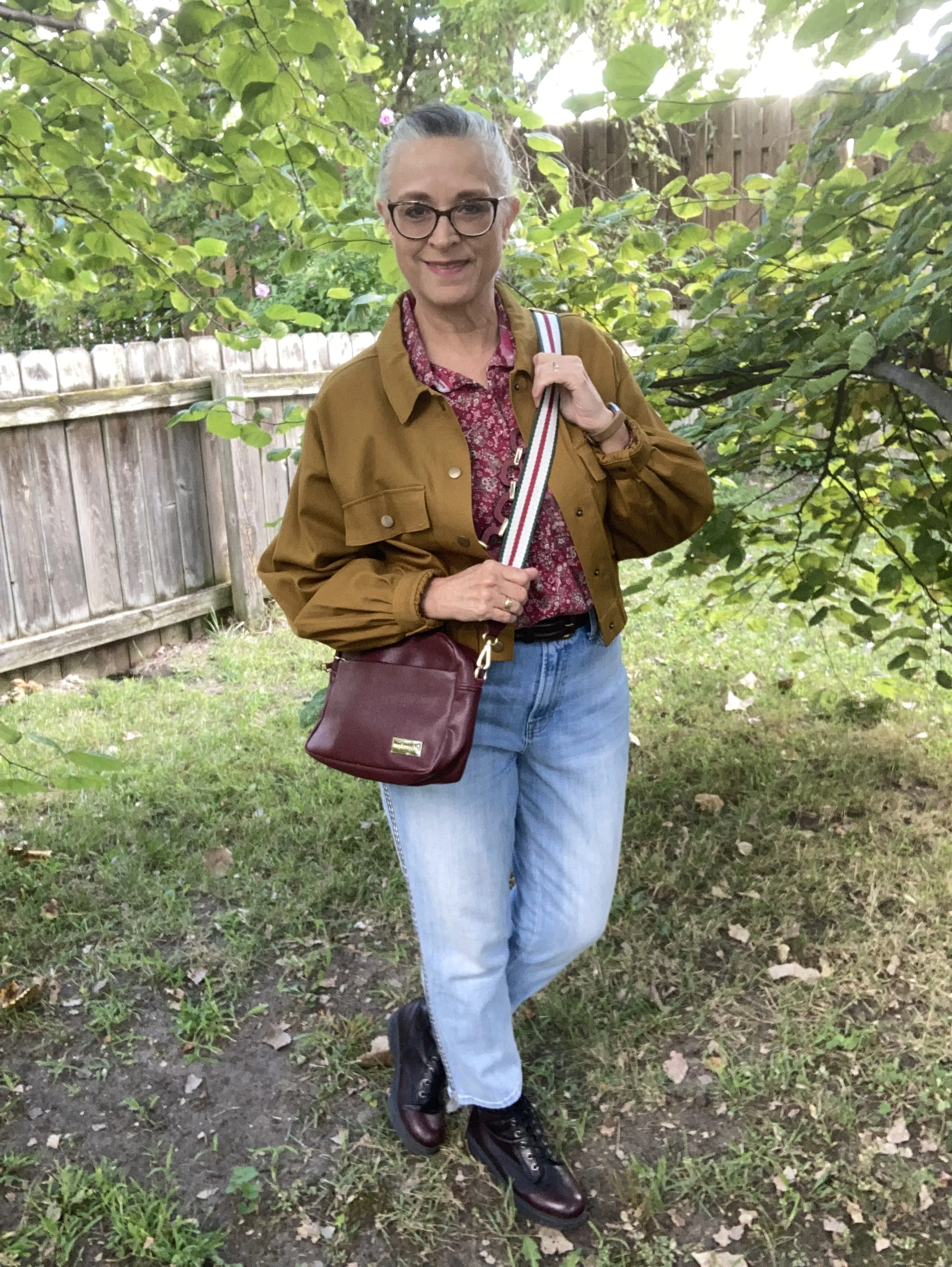
The Bronze Brown, Ophelia Roe jacket was a piece I got on clearance at Meijer. It actually had a pair of pants that went with it, that I bought at a later time. However, the pants seem to be a bit off. I should have taken them back right away, but sometimes you can’t tell right away something is cockeyed or sewn improperly. They are in the donation pile. I do, however, like the jacket with its utility, bomber style silhouette.

This Faded Glory floral blouse I have had for years. I don’t know why I don’t wear it more often, because I do like it. I just go right from shorts sleeves to fuzzy sweaters and sweatshirts and forget about the in between time. I honestly don’t remember if I bought it at Walmart, or if I found it at a second hand store.

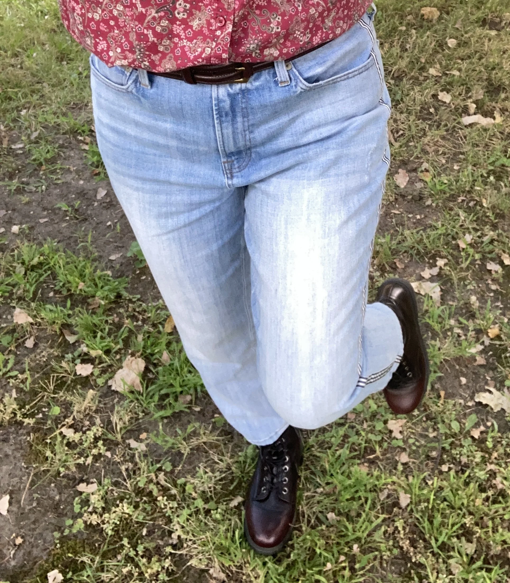
You can also see my chunky berry and gold necklace, a gift from one of my daughters. I thought it went well with the casual vibe of the outfit. I also added a dark brown, almost burgundy colored leather belt that I recently thrifted. I know the trend has been no belts, but I always feel that a belt gives an outfit that finished feel, specifically when tucking a shirt in. Apparently the half tuck is no longer trendy and we are back to a full tuck or no tuck.

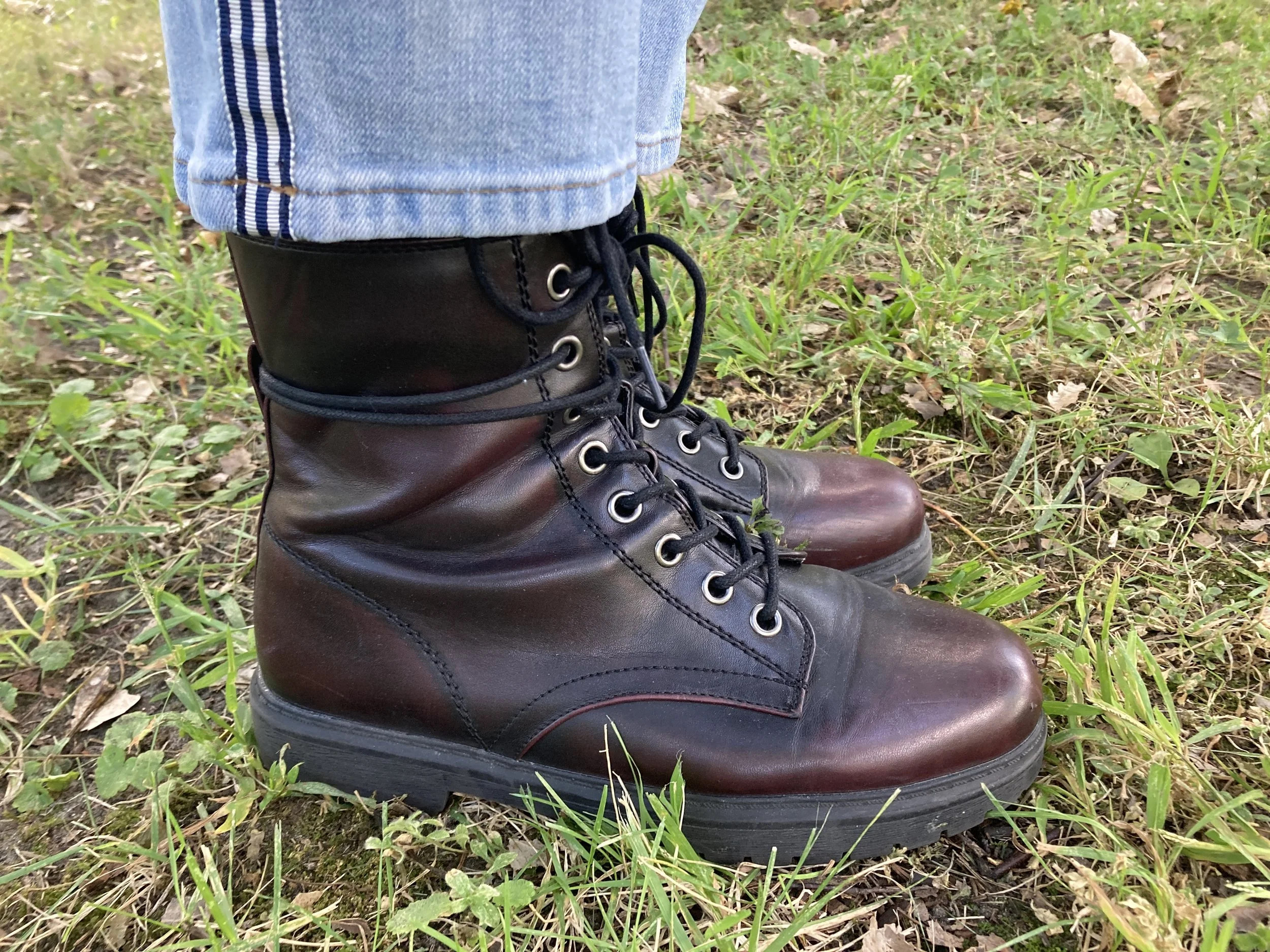
These Talbots jeans are also a thrift store find from this past spring/summer. If you look at the Pantone color for Vapor Blue, it really looks like a very light gray, but I feel that these jeans were representative of that faded blue sky we often see in the early morning or late evening. If the Pantone gurus say it’s blue, well okay, and this was my take! Ha, ha. I love the black and white pin striping down the outside seams of the legs.

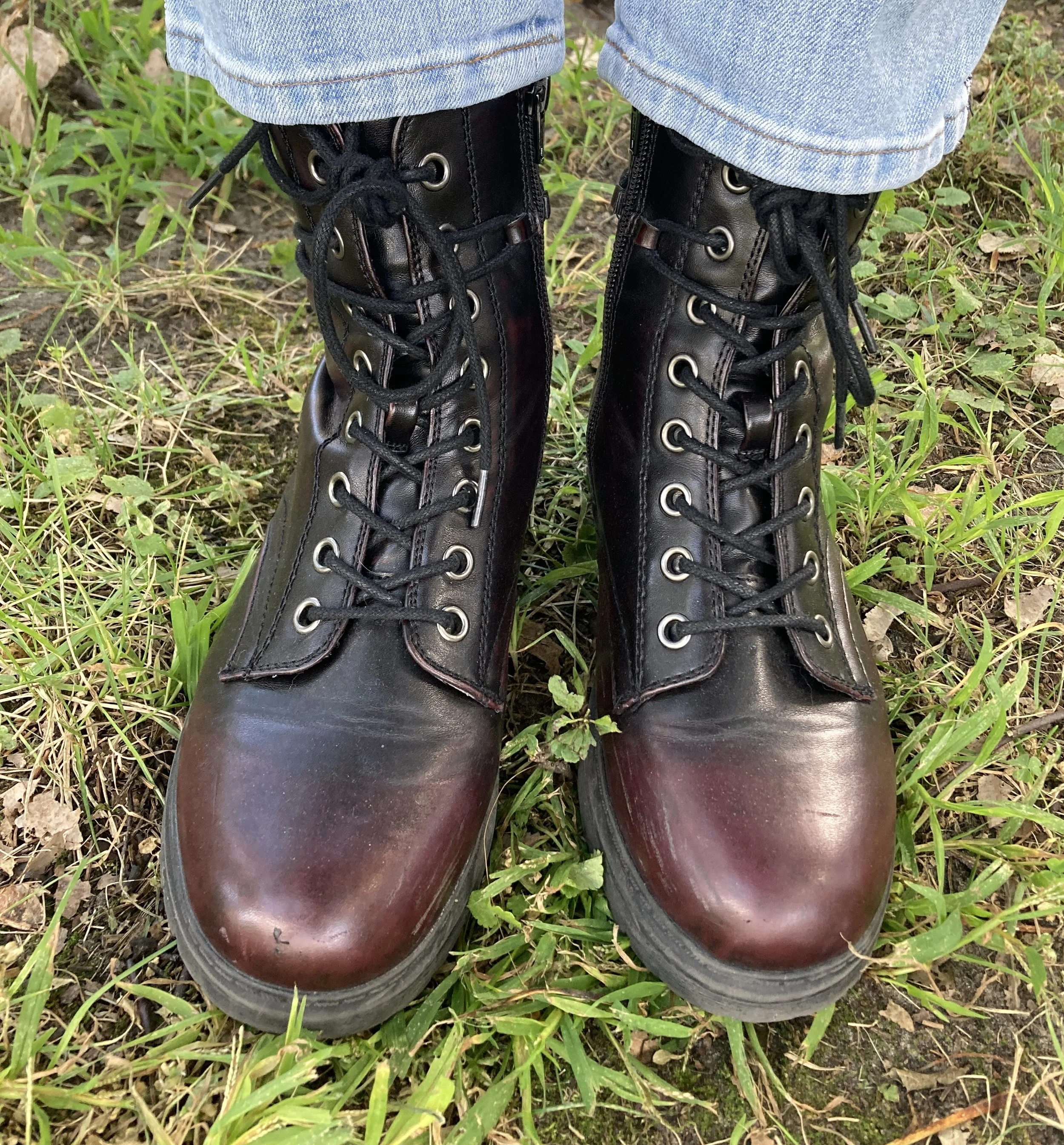
Once I put the outfit together, I was struck by the thought that I actually could start styling boots again, so I grabbed these SO burgundy combat boots that I scored at Kohl’s a few seasons ago.

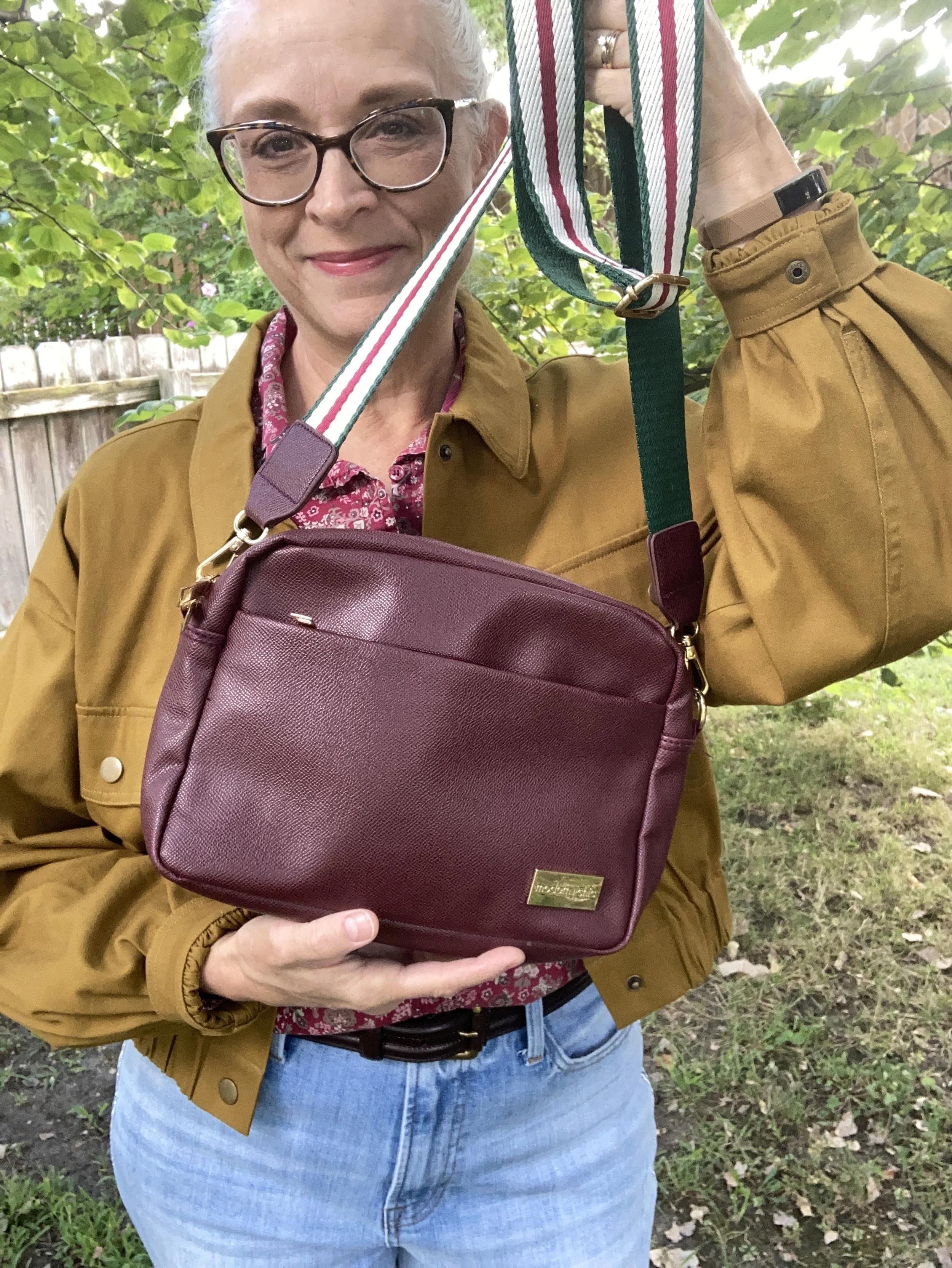
I just found this cute crossbody bag a few weeks ago when I was thrifting with my bestie back in New York. We always hit the thrift stores together, which is great fun. This is a brand called Modern Chic. I love the guitar strap vibe.

What do you think of these colors? Do you like how I put this outfit together? What would you have done differently? Please leave me some love in the comments. I appreciate my faithful few who try to comment on the regular. You always remind me why I keep doing this! Hugs to all of you.

I have included a few shopping links for you to look through. These are affiliate links which means when you purchase something through one of my links, I get a small commission. I appreciate all of your support, but most of all I appreciate that you stopped by the blog to hang out for a while.

Have a great week!

Pantone - Autumn/Winter - 2021 - London Palette: First Blush, Ibiza Blue and Ultimate Gray

Due to my longer than usual absence from the blog because of my illness, I am going to bypass the wrap up of the New York Palette and the Intro to the London Palette for the Pantone 2021 color series and jump right into the London Palette, so that I can get this series concluded and get on with new content. I have been trying to give a more daily content on Instagram, which now also shows up on my regular Facebook account, but unfortunately, I have not been posting over on my Granny page. I guess I should start doing that as well. You would think all of these things would just be linked together. A few of the meds I am on are making my brain a bit dopey, so bear with me as I try to get things back into some sort of regular routine.

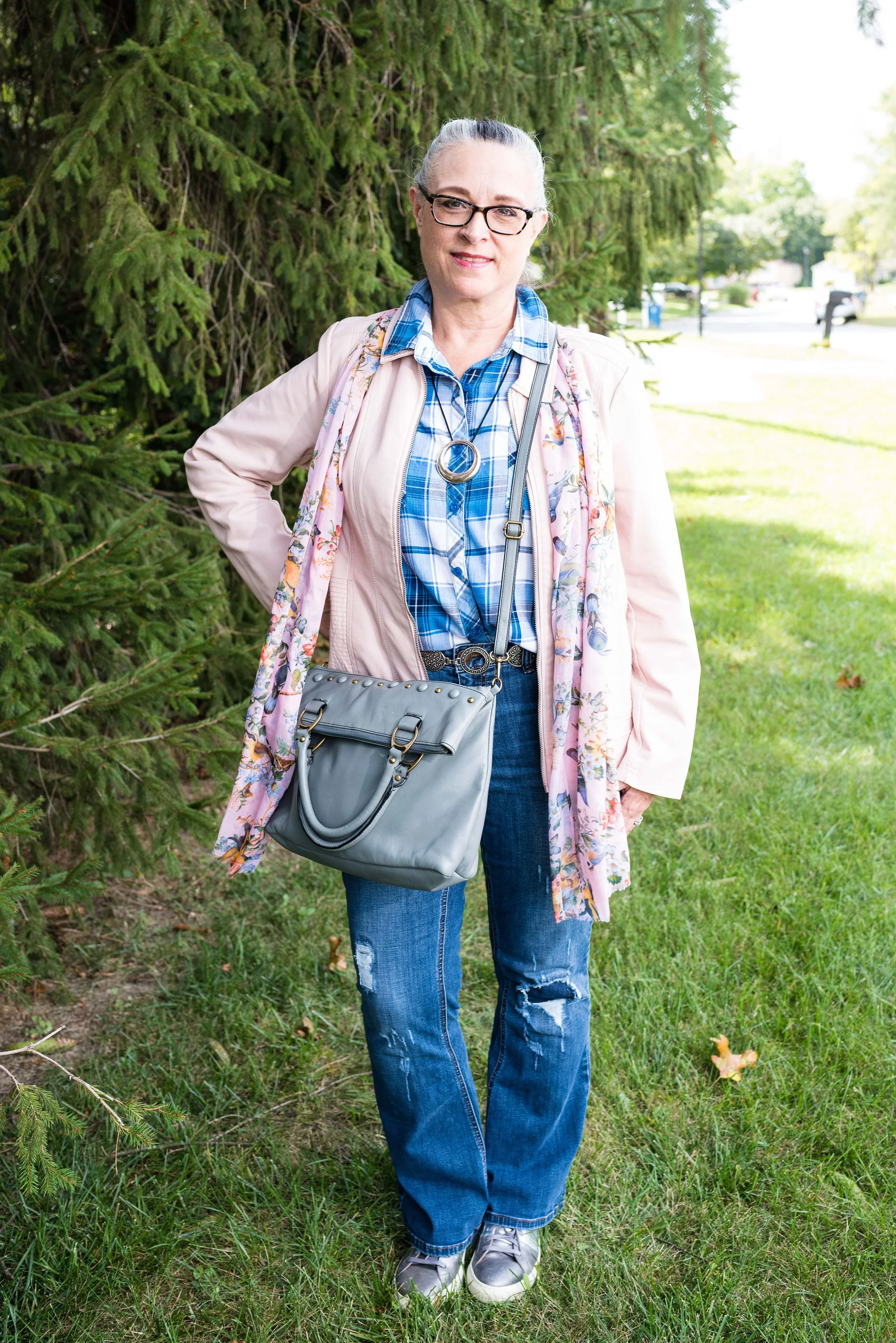
Here we are again, looking at a pastel pink on the fall color palette. I know pastels in fall are no longer taboo, but my brain still looks at this and thinks, “What a great spring outfit!” Maybe I should have paired First Blush with one of colors that seem more Autumnal to me, like Tomato Cream or Downtown Brown, but I liked the combination of blue and pink, so this is what you get.

My Ibeza Blue plaid shirt is a thrifted Faded Glory piece. I used this same plaid shirt in the spring for the French Blue color that was on the New York Palette. You can see that post here. You’ve seen these thrifted, distressed Lane Bryant jeans numerous times on the blog as they are one of my faves.

My First Blush jacket is also a repeat from my closet. Originally a Christopher and Banks purchase, this faux leather piece has some knit panels on the sides and under the arms to allow ease of movement and stretch. I added the scarf to bring in a little bit of added interest and additional color, plus with this being a fall outfit, the need for a scarf seemed more likely.

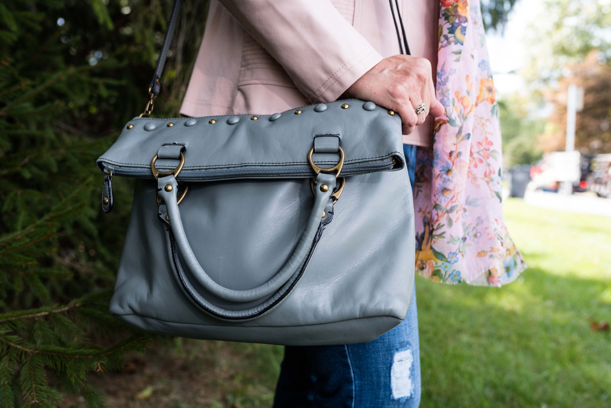
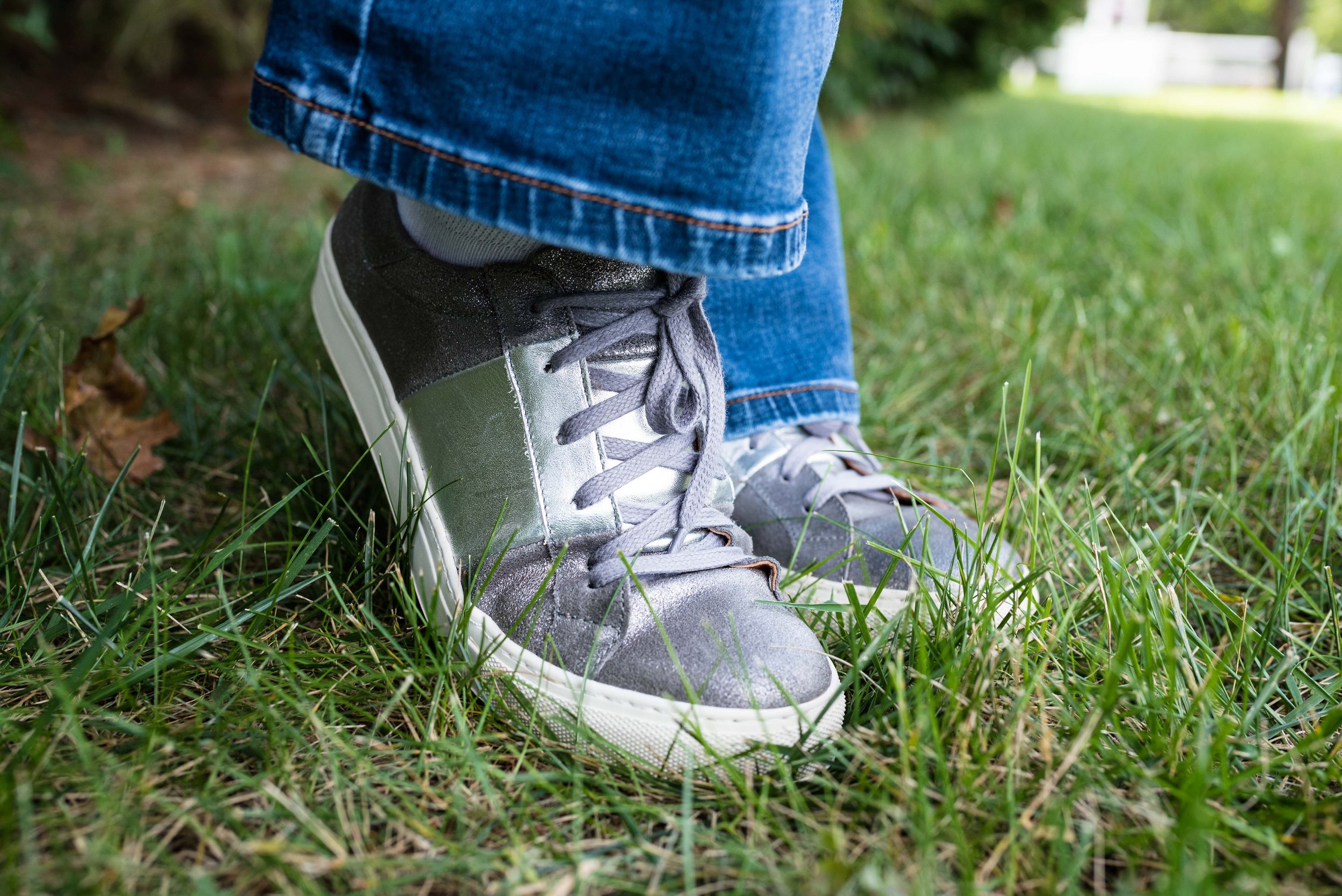
Ultimate Gray, once again makes its appearance on the London Palette, so I used this for my accessories in the metal chain belt, thrifted fold over bag and my silver sneakers. The only thing I did differently was the rose gold pendant. I just liked the way the color popped against the blue plaid.

While this look is certainly not what we would typically think of for the holidays, if you are more into pastel colors, this is a great casual look for that Thanksgiving celebration, especially if it involves a bit of shopping afterwards.

I’m including a few shopping links for you to look over. Remember to order soon for Christmas. We have all heard how things are taking longer and some things are back logged so be sure to get your orders in, or even better, don’t deal with that added stress and try to buy local. That is what I am thinking about doing at least for part of my shopping this year.

These are affiliate links. All opinions are my own.

Photo credit Jessica Trumbull with Rebecca Trumbull.

Spring Trends 2020 - Color Play - Neon

When playing with color I have found the biggest obstacle to overcome is the fear that something won’t go together; that it might look silly or clownish if I have too many colors boldly blasting their way down the street. Obviously, right now, it really doesn’t matter what we are wearing because most of us aren’t going anywhere. I still like to get up, shower, put on make up, do my hair and at least put on a pair of jeans and a top and sweater or sweatshirt. A few days I have even put on jewelry, just because I could. It really doesn’t matter if anyone else sees us. It comes down to what makes you feel happier and more comfortable during this difficult time.

Since neon is once again trending on the runways this spring and summer, I decided to look to Pinterest for some inspiration. As most of you know, when you want to find something on Pinterest you just go to the website and search. I put in neon outfits and got all sorts of ideas, some of which were definitely way outside my style zone. Since I couldn’t find exactly what I was looking for, I made up my own outfit. This is what I came up with.

This outfit would be perfectly acceptable at most work establishments and certainly helps to brighten up a drab, gloomy day. These bright red thrifted Faded Glory pants made their blog debut a few weeks ago in last months Color Play post.

This pale neon yellow short sleeve v-neck sweater was a Gap thrift find a few years ago. It is a very comfortable piece and I purposely chose the oversized look. As I told you last week, I have been getting into more oversized pieces. They are comfortable and if chosen carefully don’t add the illusion of extra pounds, but actually hide some of the more prominent bulges. Ha, ha.

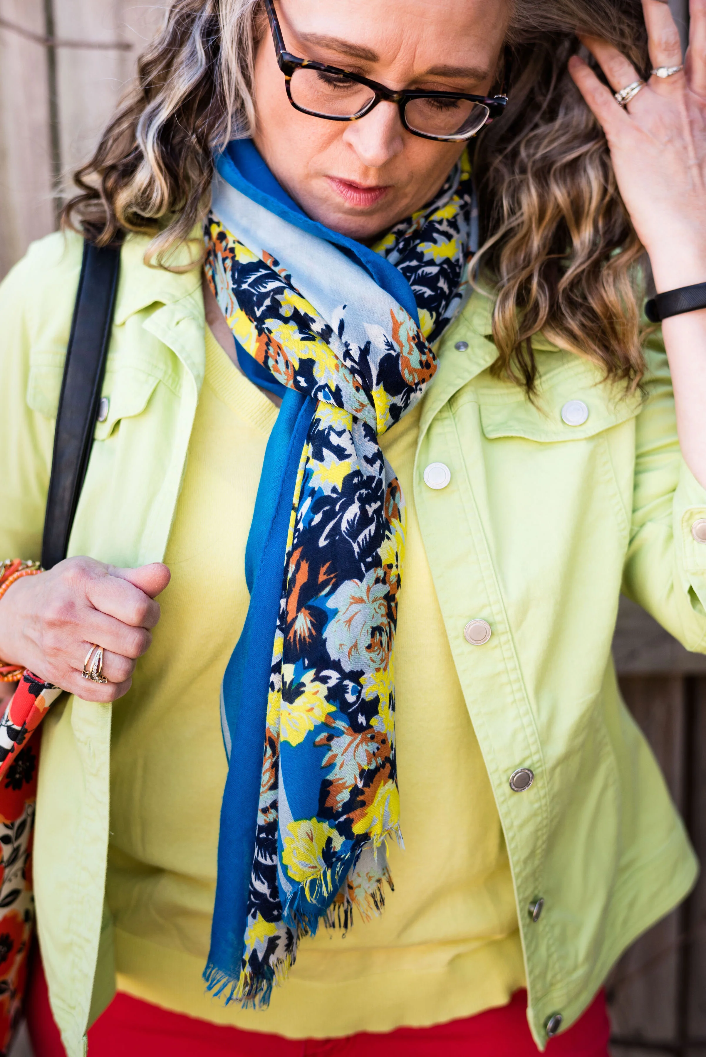
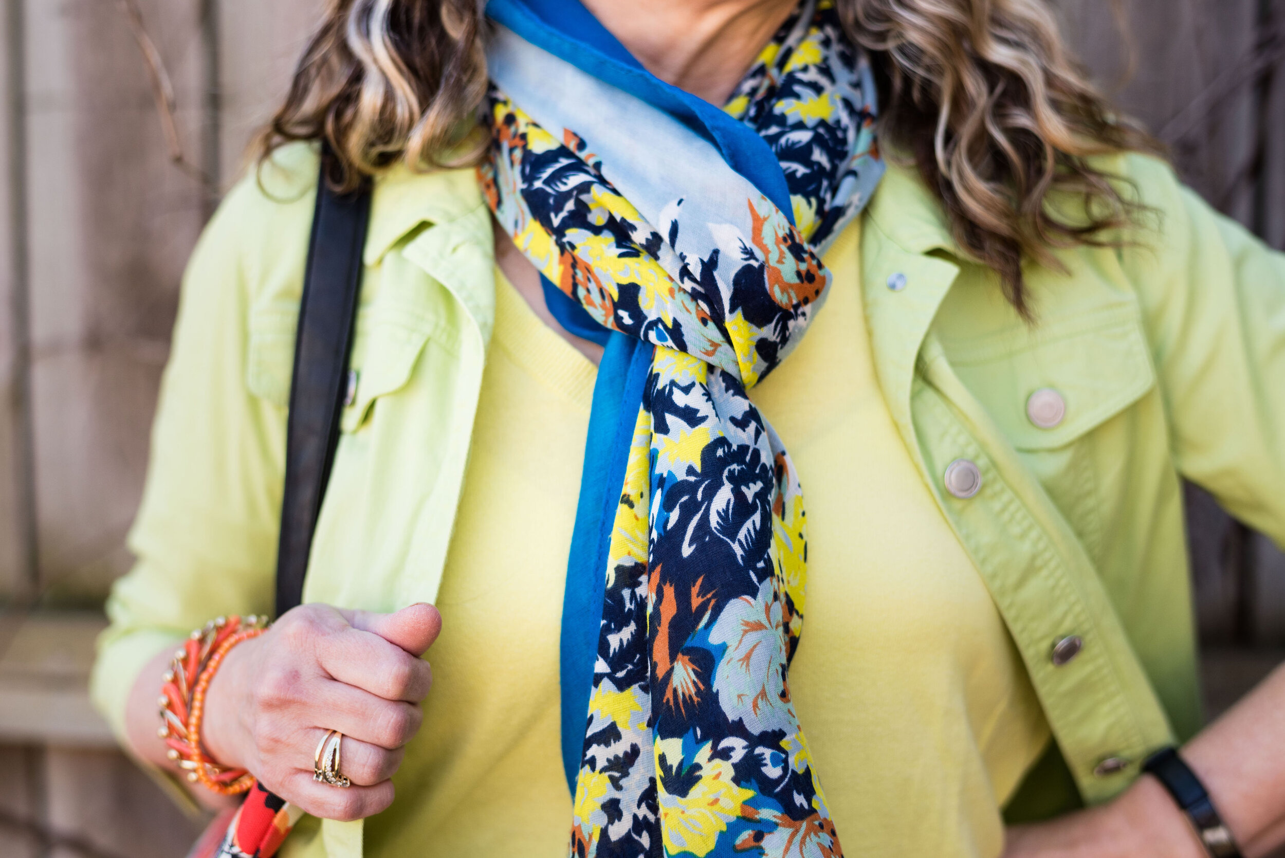
My pale neon green jacket is a thrifted Christopher and Banks piece. The 3/4 length sleeves make it a great piece for spring and even for summer, when you need a little something extra for overly air conditioned offices and restaurants.

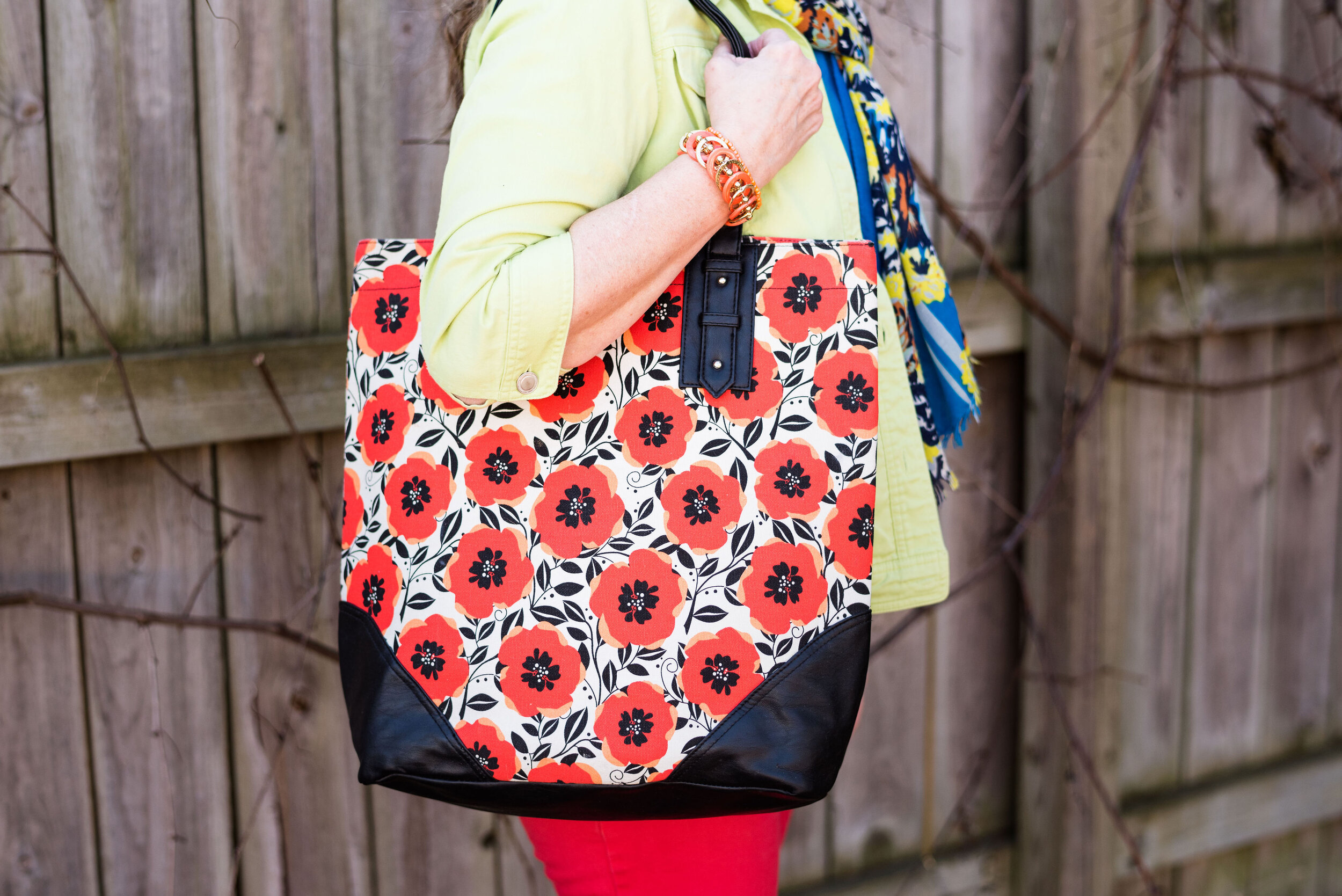
I thought the addition of this scarf was the perfect way to pull the pieces together. You could think of the this outfit as a type of color blocking, where you wear two or three plain colors next to each other. The addition of a printed scarf and bag add a touch of visual interest.

I have had this large tote bag for a long time. I don’t even remember where I got it, although I think it may have been something JC Penney’s carried in their luggage department a number of years ago and they were phasing it out. I believe I got it quite cheap. It is very roomy and easily fits my computer bag, notebooks and other writing necessities. Now that I think about it, I need to switch over to this bag from my buffalo check tote that I am currently using.

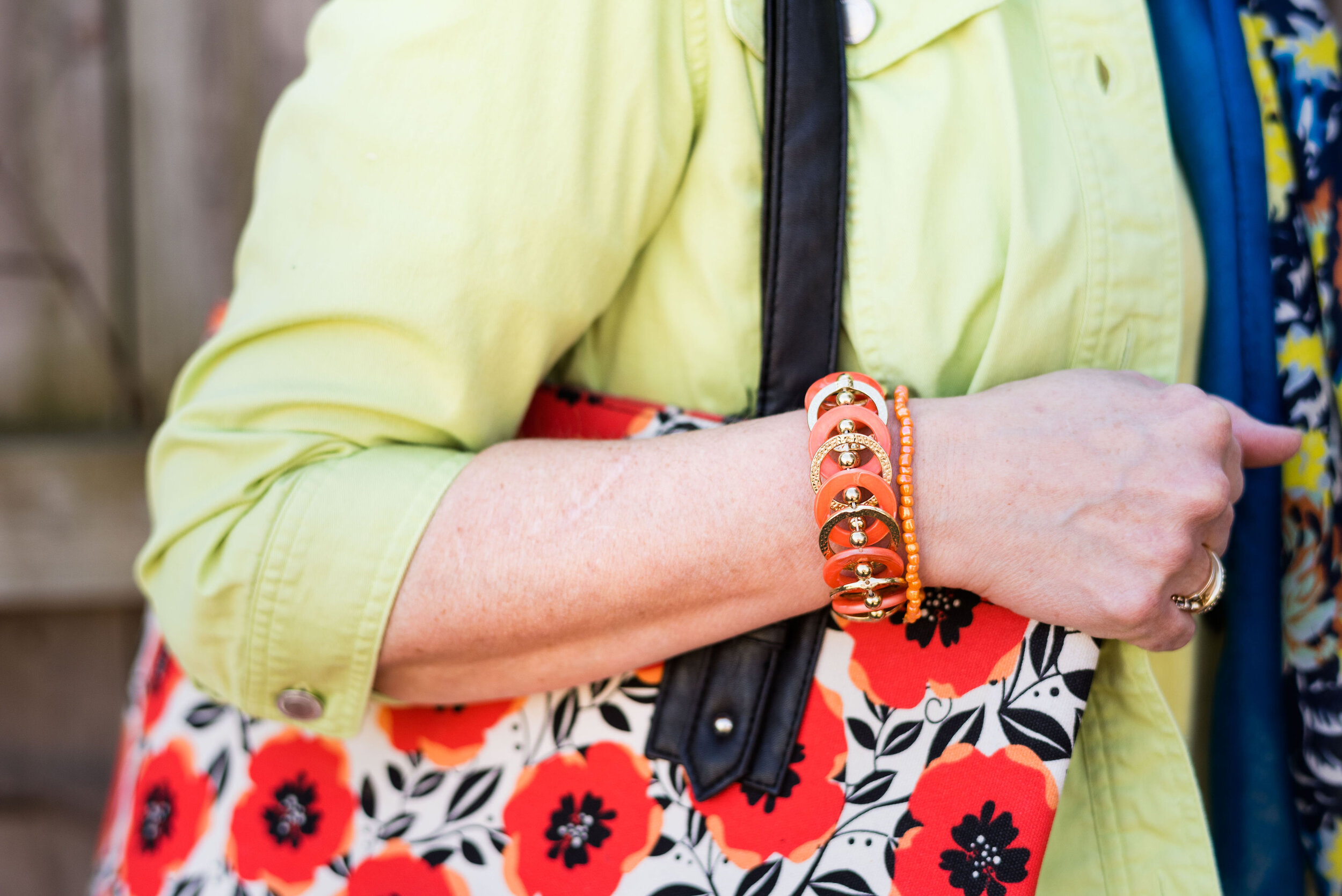
I threw on a few neon orange bracelets, just for fun.

Once again, I am featuring loafers, as they are trending right now. These are a thrifted pair of Nine West brand. Kohl’s started carrying Nine West brand clothing and shoes last fall, so I was pleasantly surprised when I pulled these out and realized they were that brand. I’m trendy and didn’t even know it. Ha, ha. I’ll include a few shopping links at the end if you are interested in adding a cute pair of loafers to your shoe collection.

Would you wear an outfit like this? Do you like neon colors? If you want to add neon to your wardrobe, but don’t want to go all out, look for a bright neon scarf, sweater or bag. I’ve provided a few shopping links below for a few fun neon items.

These are affiliate links. All opinions are my own.

Photo credit Rebecca Trumbull.