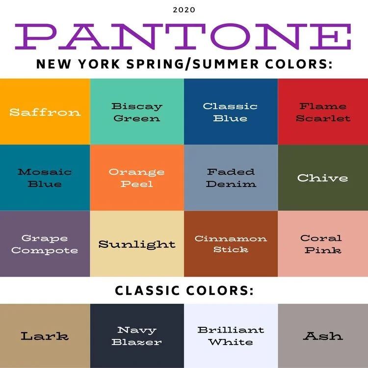
Pantone Autumn/Winter 2025 - New York Palette: Bronzed Brown, Winterberry and Vapor Blue

I hope you are enjoying this Pantone color series. For the actual colors check out this pin on my Pinterest board. The Pantone Color Institute is the entity that people turn to for the trending colors for both fashion, architecture and home decor. I enjoy seeing what the colors are for each season, however, they have made it harder and harder to actually see the colors without having an account, so I appreciate those who do sharing their findings on Pinterest and other platforms.

Today’s colors are what I would call a little more reminiscent of what we tend to think of when we talk about the autumn season. Bronze Brown is a golden brown making me think of changing maple leaves and colorful sunsets, while Winterberry gives a nod to aromas soon to fill the air like cranberry and cinnamon, and Vapor Blue looks like wispy jet trails across a fading fall sky.

This seemed a bit of an odd pairing with the Bronze Brown and Winterberry, but after I put it together, I really liked how it turned out.

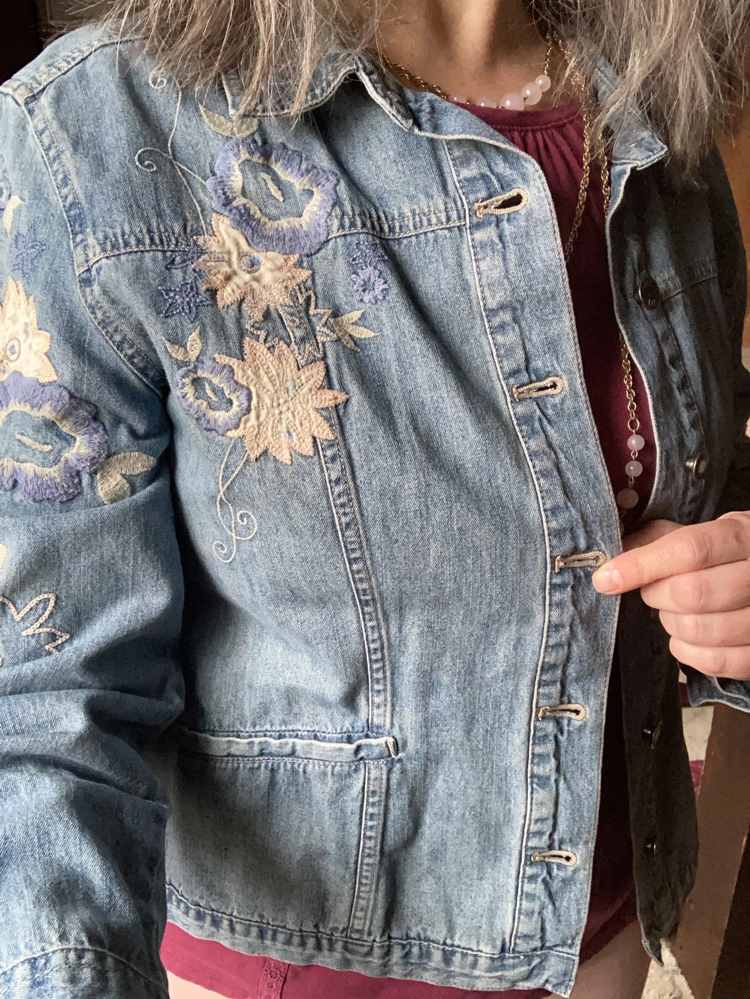
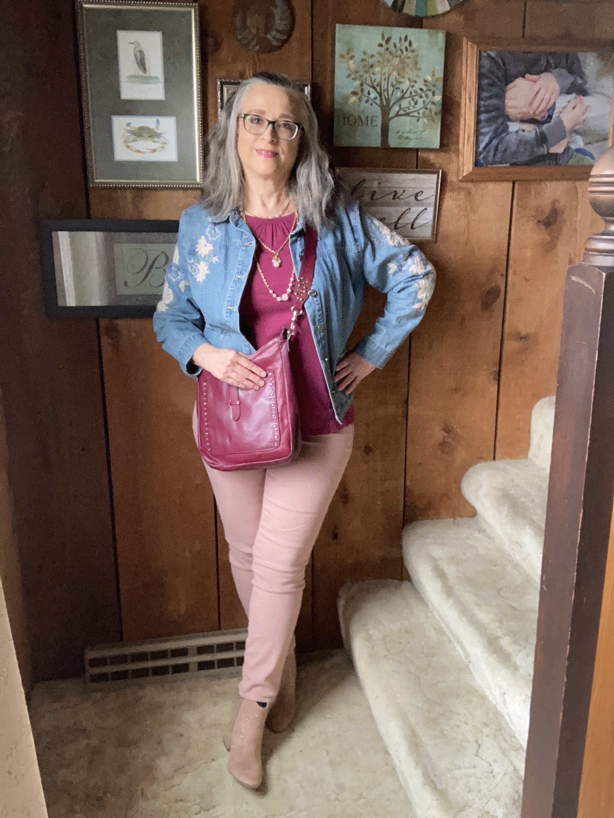
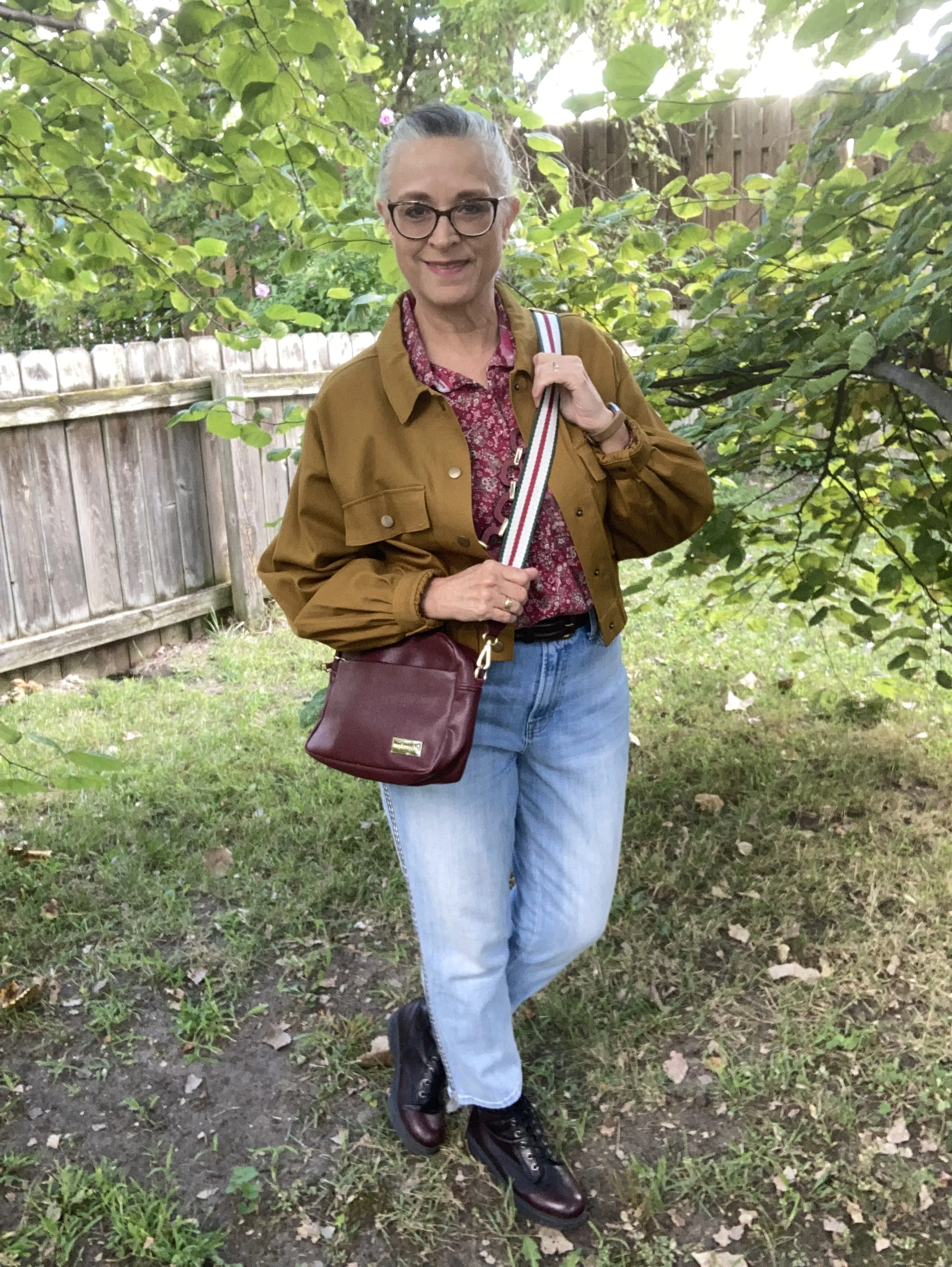
The Bronze Brown, Ophelia Roe jacket was a piece I got on clearance at Meijer. It actually had a pair of pants that went with it, that I bought at a later time. However, the pants seem to be a bit off. I should have taken them back right away, but sometimes you can’t tell right away something is cockeyed or sewn improperly. They are in the donation pile. I do, however, like the jacket with its utility, bomber style silhouette.

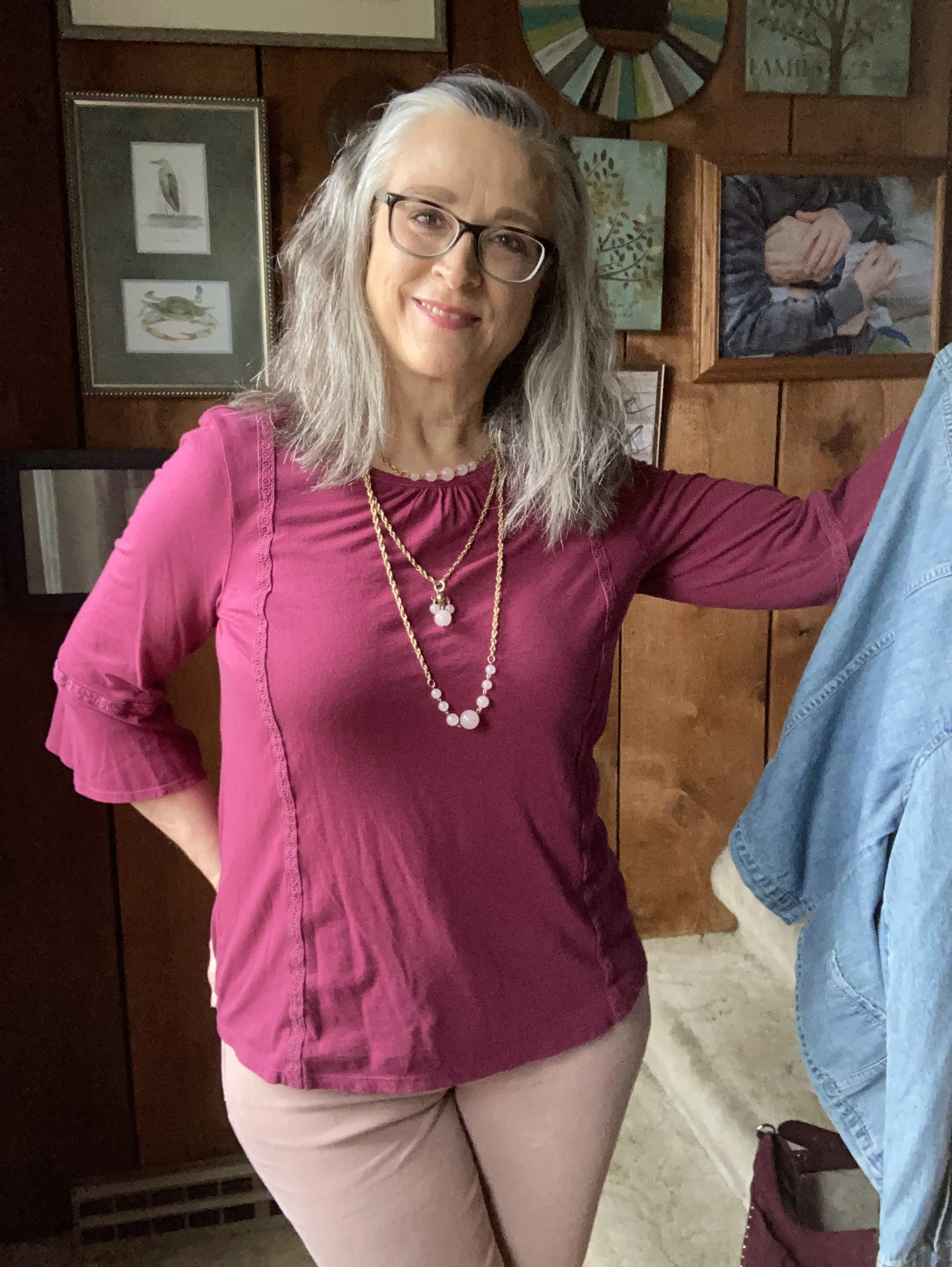
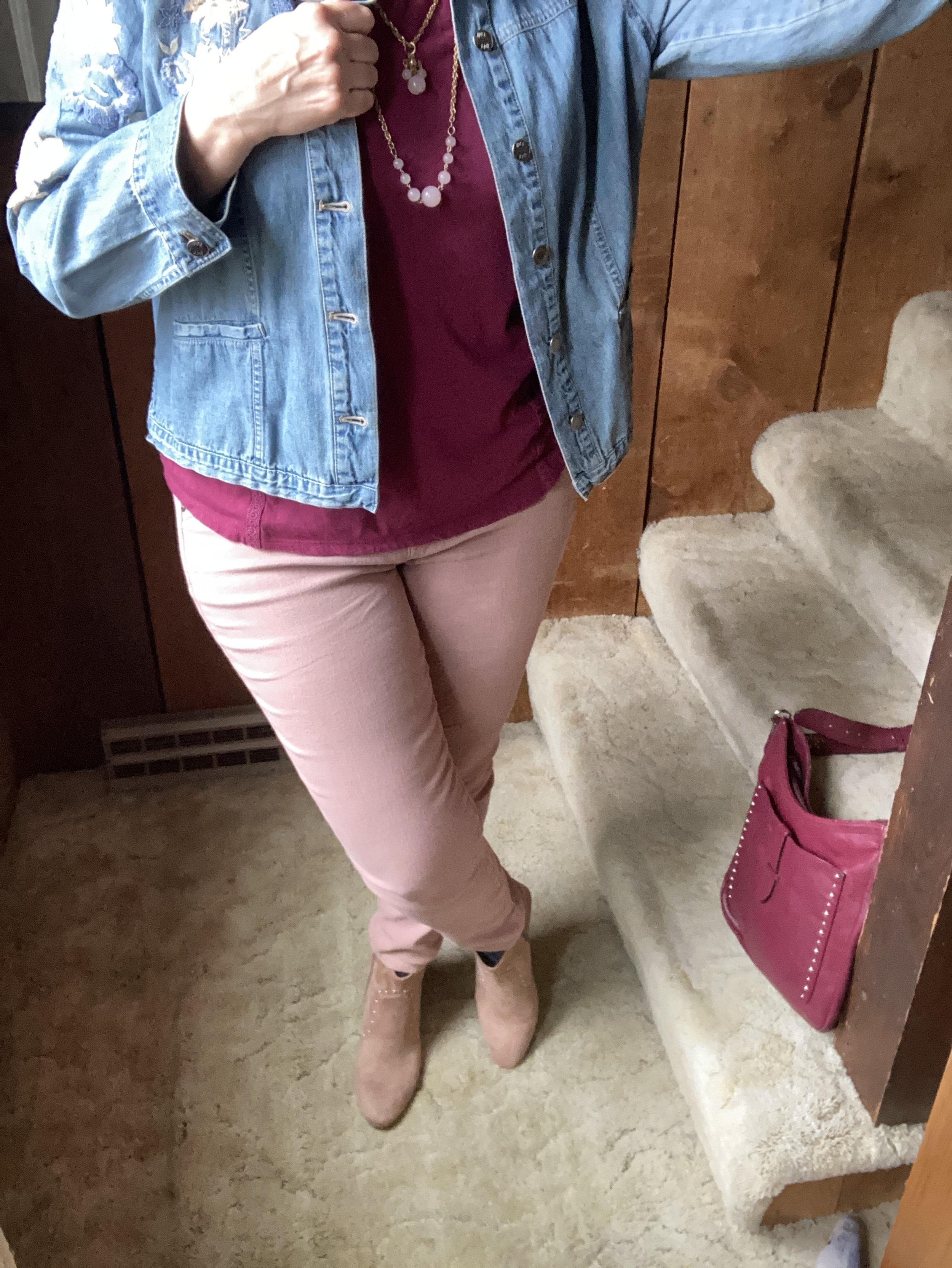
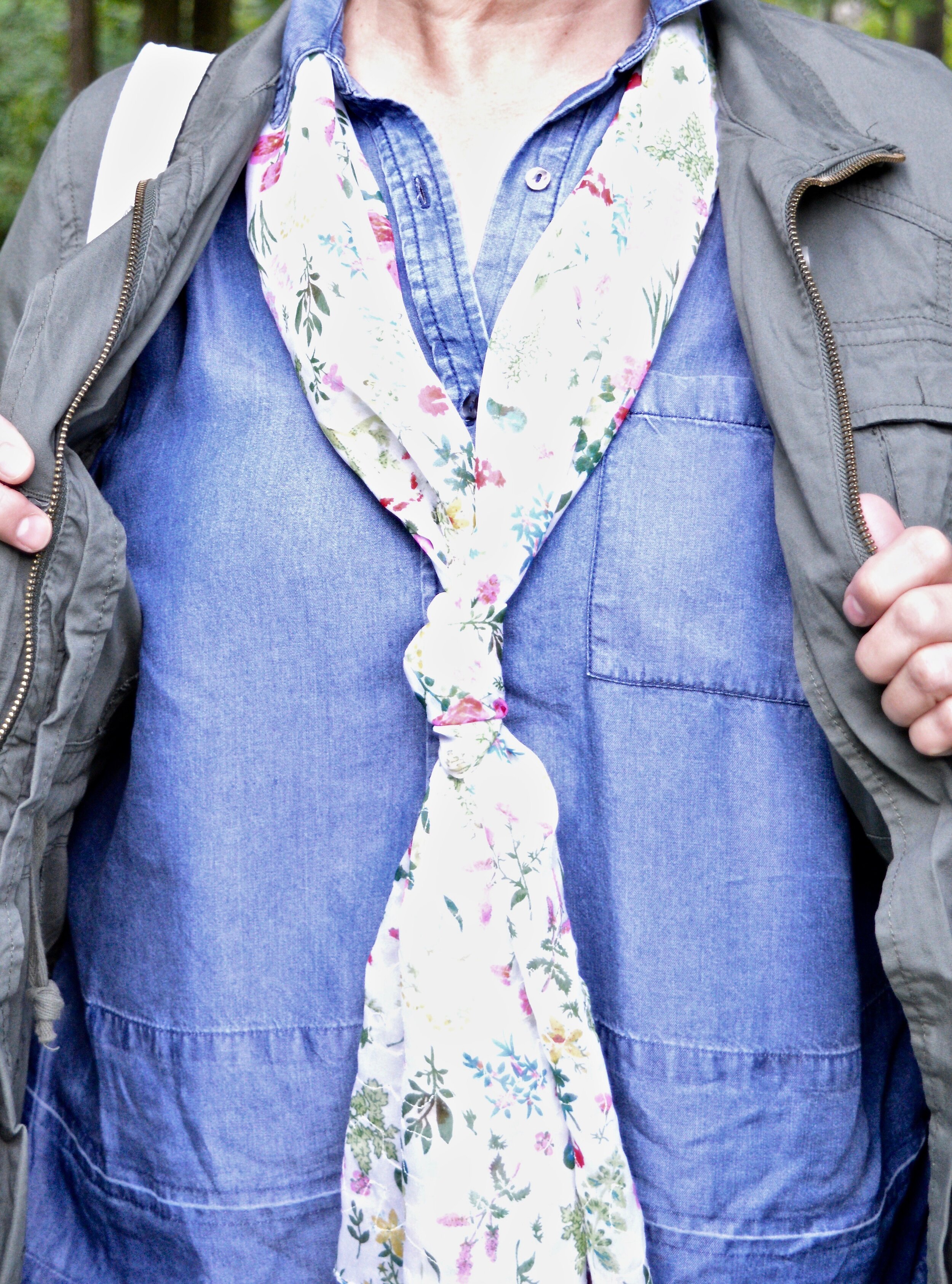
This Faded Glory floral blouse I have had for years. I don’t know why I don’t wear it more often, because I do like it. I just go right from shorts sleeves to fuzzy sweaters and sweatshirts and forget about the in between time. I honestly don’t remember if I bought it at Walmart, or if I found it at a second hand store.

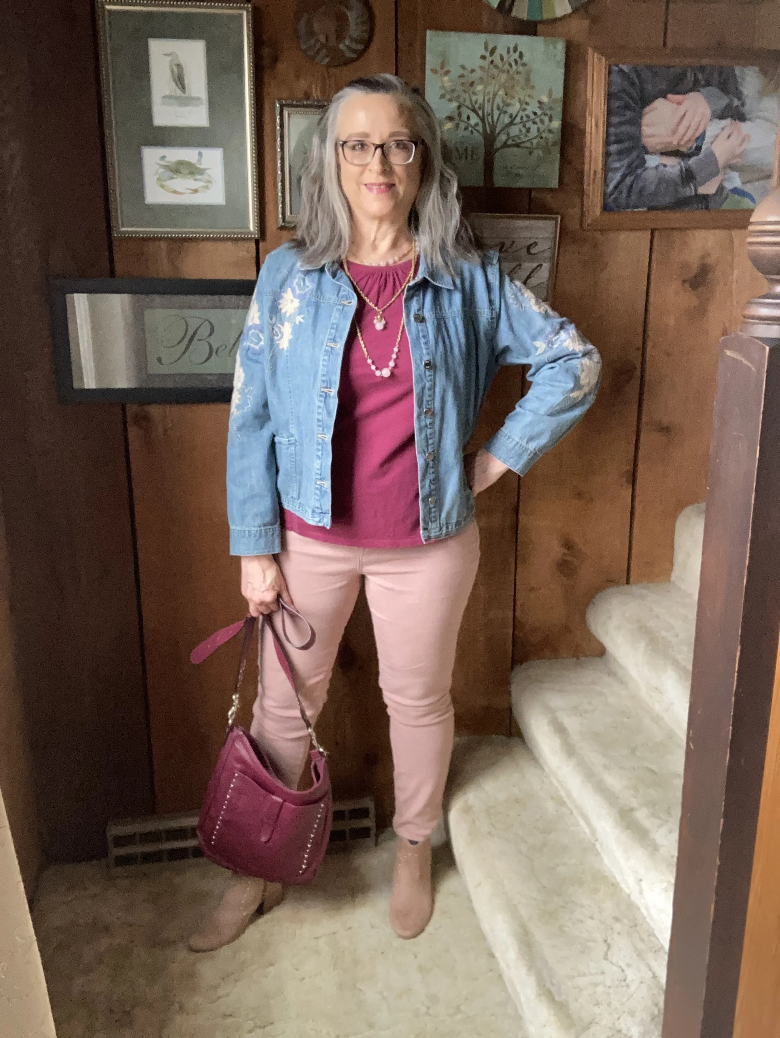
You can also see my chunky berry and gold necklace, a gift from one of my daughters. I thought it went well with the casual vibe of the outfit. I also added a dark brown, almost burgundy colored leather belt that I recently thrifted. I know the trend has been no belts, but I always feel that a belt gives an outfit that finished feel, specifically when tucking a shirt in. Apparently the half tuck is no longer trendy and we are back to a full tuck or no tuck.

These Talbots jeans are also a thrift store find from this past spring/summer. If you look at the Pantone color for Vapor Blue, it really looks like a very light gray, but I feel that these jeans were representative of that faded blue sky we often see in the early morning or late evening. If the Pantone gurus say it’s blue, well okay, and this was my take! Ha, ha. I love the black and white pin striping down the outside seams of the legs.

Once I put the outfit together, I was struck by the thought that I actually could start styling boots again, so I grabbed these SO burgundy combat boots that I scored at Kohl’s a few seasons ago.

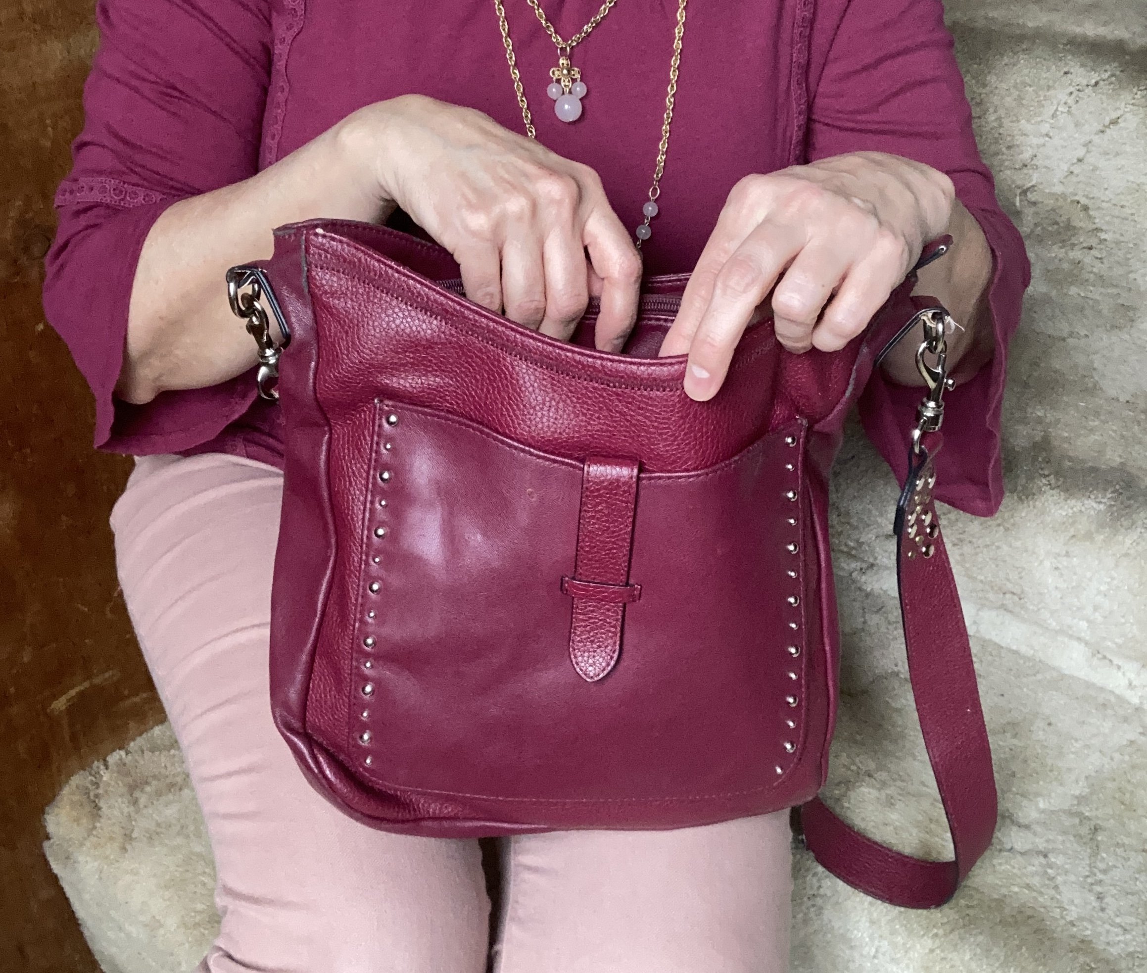
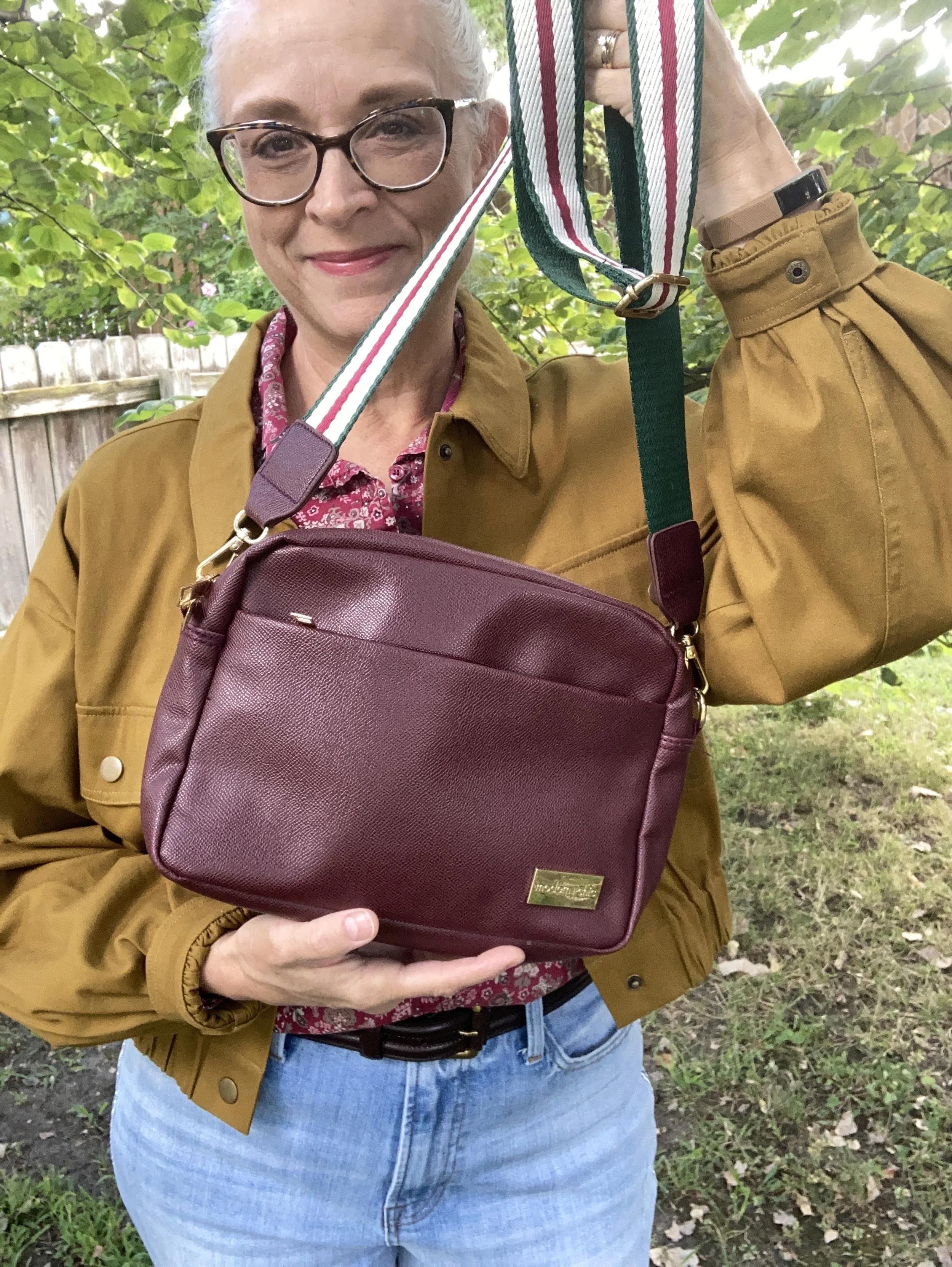
I just found this cute crossbody bag a few weeks ago when I was thrifting with my bestie back in New York. We always hit the thrift stores together, which is great fun. This is a brand called Modern Chic. I love the guitar strap vibe.

What do you think of these colors? Do you like how I put this outfit together? What would you have done differently? Please leave me some love in the comments. I appreciate my faithful few who try to comment on the regular. You always remind me why I keep doing this! Hugs to all of you.

I have included a few shopping links for you to look through. These are affiliate links which means when you purchase something through one of my links, I get a small commission. I appreciate all of your support, but most of all I appreciate that you stopped by the blog to hang out for a while.

Have a great week!

Outfit Inspiration: Pantone's Color of the Year - Viva Magenta

I still want to bring you a look at the Pantone Color Institutes color selections for this year, so this month I am going to feature a few of the New York Palette Spring/Summer 2023 colors for each of my monthly columns. The Pantone website has become increasingly user unfriendly for just the average joe. If you want to buy their services and products they are great, but I can no longer get specific color info. If you look at their page for the Palettes, the colors are now featured as these tiny, almost imperceptible to the human eye, swatches. Ha, ha.

Before I start, let me reiterate, these are my interpretations of the Pantone colors. They are not exact matches, but correspond as closely as I am able to make them with my limited information from the website and my limited wardrobe.

Viva Magenta is a bright, rich pinky red that easily catches the eye. It is a pretty color that can be combined with loads of other shades for a spring and summer worthy outfit palette. I don’t have a lot of pieces this color in my closet, so I was glad to see I had this Sonoma 3/4 bell sleeve top and the thrifted Libby Edelman shoulder bag.

I decided to combine the Viva Magenta with two of the other colors from the Spring New York Palette. Summer Song is a soft, light blue that reminds me of a light wash denim, which is why I chose my thrifted J. Jill - Out of the Blue embroidered, jacket as a topper. I love the embroidered details on this piece. I’ve worn this on the blog before. You can see it with a white skirt for summer, and with a pair of wide leg jeans.

Vanilla Cream is one of the classic colors on the palette this year. I would say it is a cross between a pale pink and a pale coral. The Crayola Crayon box might call this one Flesh, ha, ha! These thrifted Refuge jeggings, seemed to come pretty close to the Pantone color. I don't typically wear leggings or jeggings without a longer top, but these have back pockets and do look more like jeans than leggings, even though they are incredibly soft and stretchy. You can see how I styled these with a black floral top, a belted orange tank top, in a pink monochrome look, and in a flat lay.

My SO ankle boots were a clearance find from Kohl’s a number of years ago. You can see how I styled them with my cognac jeans, a yellow knit cape, dark pink cords, and gray plaid cropped pants.

Are you a fan of Pantone’s color of the year, Viva Magenta? Do you like it combined with these other spring Pantone colors? Do you have any of these colors in your wardrobe? Leave me a comment or two. I always love to hear your thoughts. I do try to respond to all of your comments, so be sure to check back after a few days.

I am including a few shopping links for you to look over. I do apologize that I have not yet gotten linked up with some other affiliate partners. It’s all about the research which takes time. I haven’t given up, but for now I will keep bringing you at least some possible options through my ShopStyle affiliate program. These are brought to you at no additional cost, unless you purchase something of course. Ha, ha.

My Style - Blue Jeans and Plaid Blazer

Nothing says comfort and style like a good pair of jeans and a fun blazer. This is the kind of style I love and dressing like this always makes me feel stylish, and confident. An outfit like this can be worn on casual Friday’s at the office, out for lunch with your gal pals, or for a casual date night with your significant other.

In keeping with my month long attempt to use mainly Valentine’s colors in my outfits I had to showcase this recent purchase from Maurice’s. I got this red plaid blazer and a few other fun items at great prices as they are moving fall and winter stuff out to make room for spring and summer. This piece may just be wearable for at least three seasons if not all four. It is a medium weight knit, but still structured enough that it lays well. It has a double breasted feel, with a one button closure.

My jeans are oldies that I have worn for many blog posts and Instagram photos. They are a brand called Kikit, and like many of my favorite jeans are beginning to show their wear. Do you have a few pairs of favorite jeans that you always find yourself reaching for over and over?

I thought this Elle brand, Eiffel Tower sweater would be a good mix with the black and white in the blazer. While this interpretation of the French tourist attraction is by no means symmetrical, I like the way it is filled in with the black velvet paisley swirls, flowers, and lace.

Since I was going for a casual, fun look I opted for my thrifted black marled Converse sneakers. My jewelry was simple with a short chain necklace with blingy globes and the burgundy twist bracelet. Last, I chose my black top handle/cross body bag, which was from Amazon.

Do you like to wear a blazer with jeans? What is your go to style for a casual Friday look or going out with friends? Let me know in the comments below. I love to get your feedback.

I’m including a few shopping links for you to look over. These are affiliate links, which means I get a few cents when you click on a link. I appreciate every click. All opinions are my own and you are not charged anything extra to make a purchase through my links. I supply these links mainly to give you ideas and options for outfit pieces you may not already have. I appreciate all you clicks and purchases.


Oh, Olive! Utility Jacket - Casual

I am back from visiting my mom and ready to get back to posting here on the blog. I wasn’t feeling well, the first couple of days after I got home, but I think most of it was fatigue and allergies. They seem to be beating on everyone this year. While I was at my mom’s I didn’t have internet, but I was able to get some photos taken and was pretty pleased with the result. I hope you will be as well.

I am continuing my look at a few of my different olive pieces and how they can be used with just about any outfit and any color. I do like to think outside the box, at least my box, so I hope you will find some of these outfits inspirational for your own wardrobes. The week before last I showed you a casual and a workwear look using an olive pair of pants. Today and Thursday, I want to take a look at ways to style an olive utility jacket. You can see how I styled this same jacket on the blog before with a striped tee and distressed jeans, another striped tee, and a polka dot chambray top.

Another thing, I decided to add to this little series, is to give you a few peaks at what is trending for fall. I’ll point it out as we go along. Let’s take a look at the olive utility jacket.

DSC_0011.jpg

I have had this olive utility piece for a number of years now. St. John’s Bay brand, I got it at JCPenney. Since then I have accumulated a few other utility jackets in other colors. I like that they are so versatile. In fact, I may have to do a post on that at a future date. Most of my pieces, including this one are lighter weight, so a great topper for spring, summer and fall. While they do tend towards more casual, I will show you on Thursday how to make one look appropriate for work.

What makes a piece utility? I think it has to do with the pockets and the details like drawstrings, snaps and metal zippers. Next week I will be showing you an olive utility vest.

Fall Trend Alert - Denim on Denim

Once again, it seems denim with denim is trending for fall. While I wouldn’t wear this regularly, it does have a casual appeal. Monochrome is always a good way to get a longer, sleeker line. Most of what I saw on the runway were pieces of the same wash. See this post on Fall 2021 trends from Marie Claire. However, there is a sense of personal creativity in putting together pieces with different washes, as I did in this outfit.

DSC_0010.jpg

My chambray top is a thrift find from earlier in the summer. It is a brand called Cremieux. Apparently, Daniel Cremieux started a men’s clothing line in Saint Tropez, on the French Riviera in the mid 70’s. It looks like he designed women’s clothing for a time as well. Both lines were sold at Dillards, but the women’s line is no longer available in the US. The fun things you find when you thrift.

You’ve seen my thrifted, distressed Simply Vera, Vera Wang jeans plenty of times on the blog. They are getting rattier looking as time goes along, but I guess that is the point. Ha, ha. If the holes get to big for my comfort zone, I may make a few patches, which actually could be fun.

DSC_0013.jpg

I decided to add this floral mini print scarf just for a little extra color. I don’t use my scarves much in the heat of the summer. I sweat just sitting still on these humid days. Last night, I was working on this post and I was dripping with sweat. Of course we hadn’t turned our air conditioners on. Sometimes, we have to choose between a little bit of inconvenience and being able to pay the electric bill. My husband always runs colder, so he’s not as hot unless he is doing yard work or something. Today is supposed to be even warmer. I think the air will be on later, so this woman doesn’t get too cranky. Ha, ha.

If you follow my Instagram account, you may have seen that I rearranged my scarves. Just like with all of my clothes, I have way more than I need, but I am trying to make everything more accessible and visible, so it is easier to sort through and find. Do you have a special way of arranging your scarves?

DSC_0014 (1).jpg

My blue Converse are making another appearance. While I still think this brand of sneaker makes me look even more like I have ski feet, I am trying to embrace those long skinny things on the ends of my legs.

The last accessory I have is my white cross body bag. This was another thrift find. I like that it is a little bit larger than many cross body bags, so I can actually fit everything in it, without having to squeeze it in. I am not sure what the brand is, but it was still very clean and unworn, so I snatched it up.

DSC_0015 (1).jpg

Do you own an olive utility jacket? How do you like to wear it? I love hearing from you, so be sure to leave me some love in the comments. I hope your summer is going swimmingly well!

DSC_0019.jpg

I’m including a few shopping links for denim pieces and utility jackets. I hope you’ll look those over. Every time you click on a link, I get a few cents and I appreciate it. All opinions are my own.

Have a great Tuesday!

Pantone Spring/Summer 2020 - Recap

I hope you have enjoyed this Pantone color series. Today I just want to show you a recap where you can see all the outfits in one post. Here we go.

New York Palette

Pantone Spring/Summer 2020 - New York Palette

Classic Blue, Chive and Navy Blazer

Faded Denim, Orange Peel and Lark

Sunlight, Flame Scarlet and Ash

Biscay Green, Saffron and Brilliant White

Mosaic Blue, Coral Pink and Brilliant White

Cinnamon Stick, Grape Compote and Navy Blazer

London Palette

Pantone Spring/Summer 2020 London Palette

Classic Blue, Beetroot Purple and Oyster Mushroom

Pantone Spring/Summer - London Palette

Flame Orange, Blossom and Cuban Sand

Pantone Spring/Summer 2020 - London Palette

Yellow Iris, Rose Brown and Cuban Sand

Pantone Spring/Summer 2020 - London Palette

Storm, Fiery Red and Blueberry

Pantone Spring/Summer 2020 - London Palette

Blush Beauty, Bossa Nova and Blanc de Blanc

Pantone Spring/Summer 2020 - London Palette

Tanager Turquoise, Heritage Blue and Blanc de Blanc

Pantone Spring/Summer 2020 - London Palette

Which color palette was your favorite? Which outfit did you like the best? I would love to hear your thoughts. I hope you all have a wonderful weekend. We will be celebrating Father’s Day with our kids on different days, since schedules wouldn’t allow for everyone getting together. God bless each of you with peace and joy.

All graphics and London color palette photos by Rebecca Trumbull.