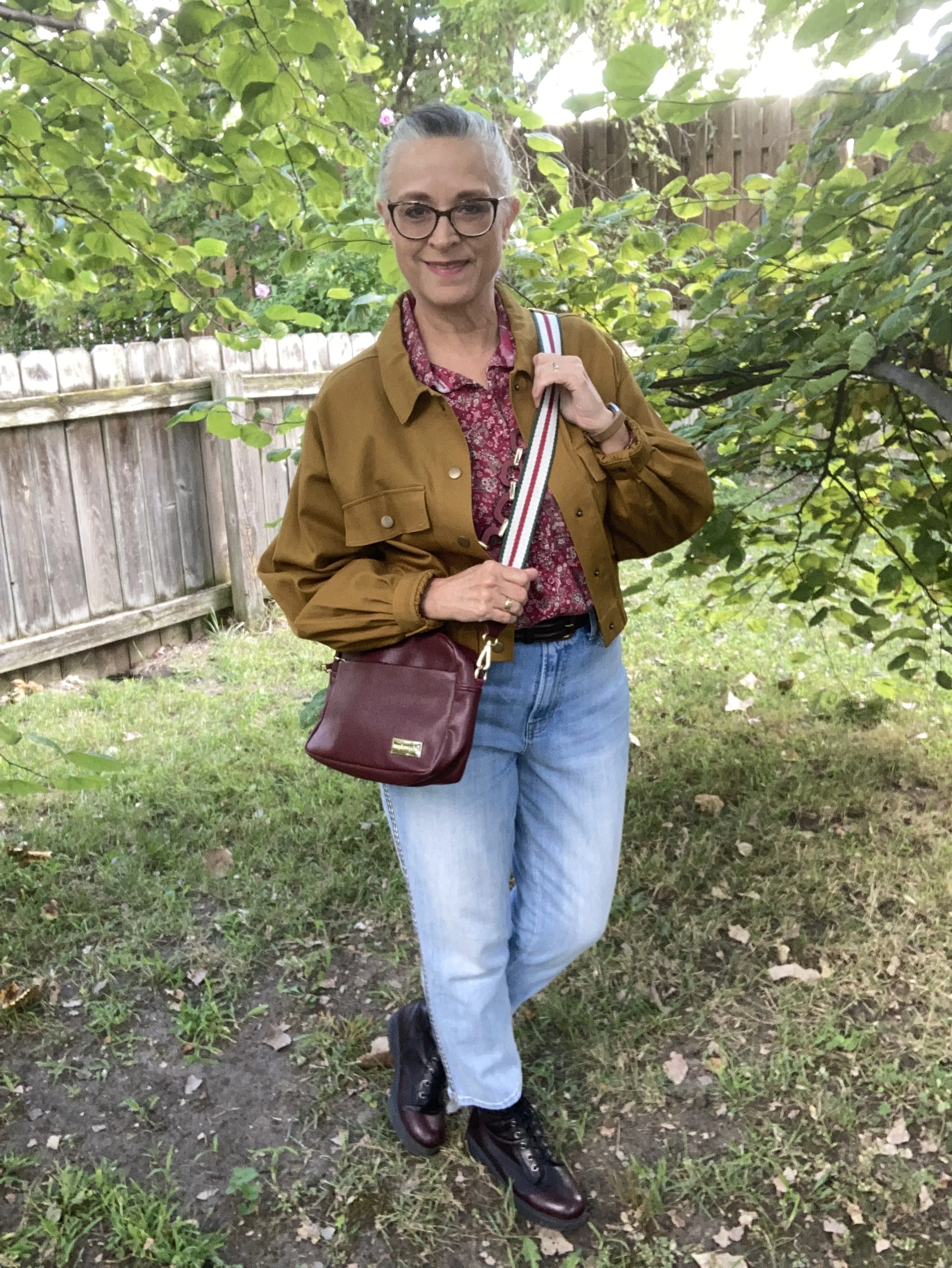
Spring/Summer Trends 2026: Another Bright Color Combo and Romantic Details
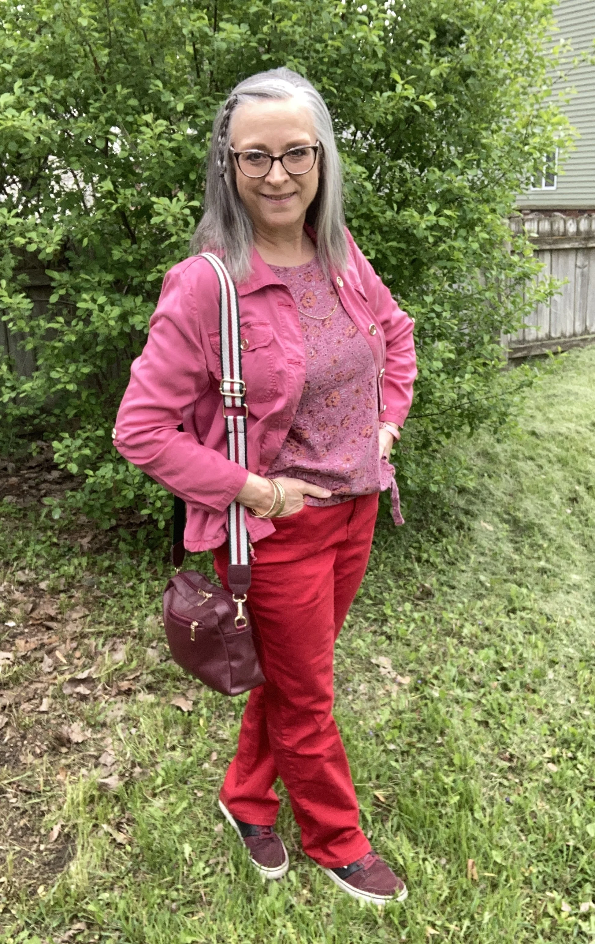
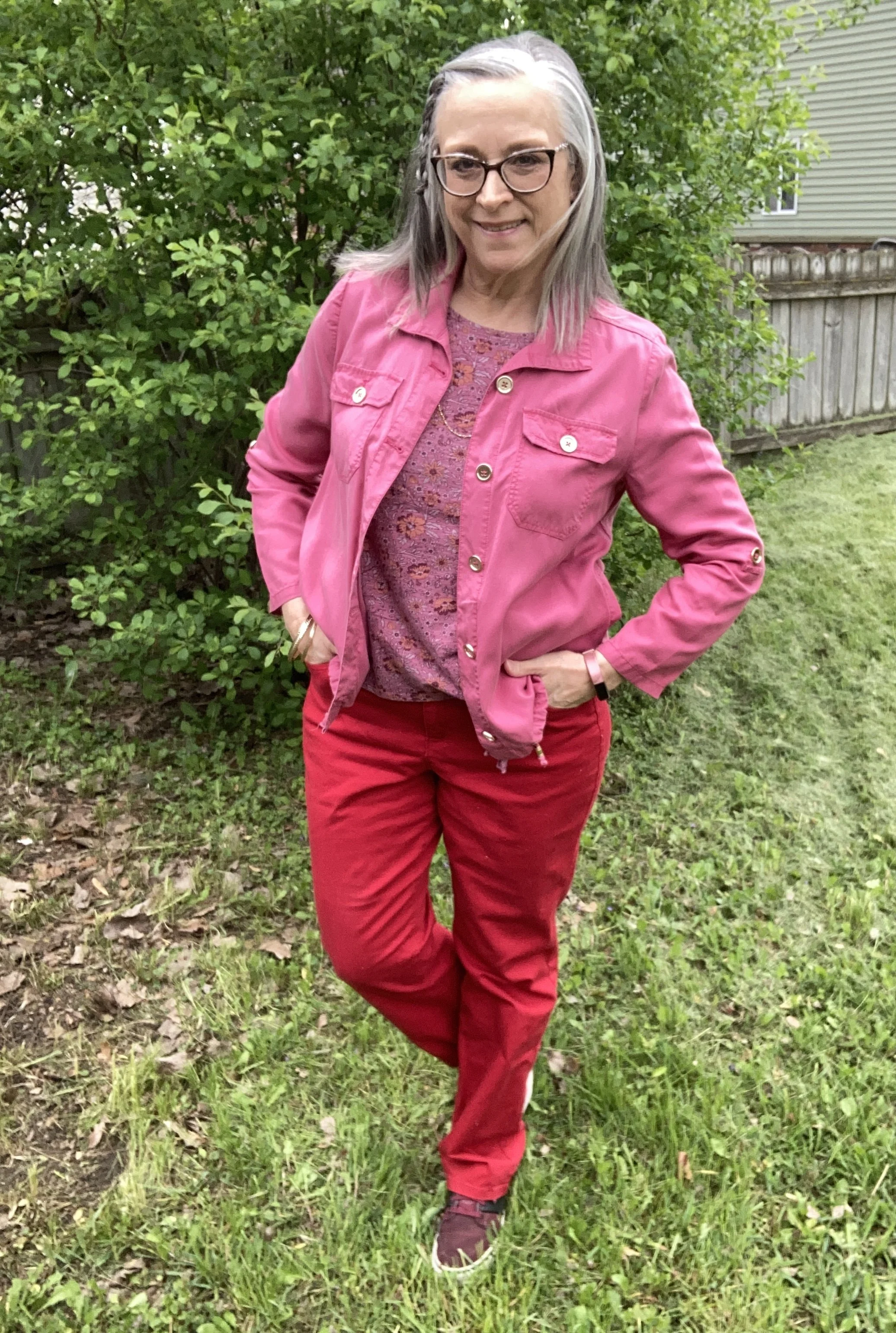
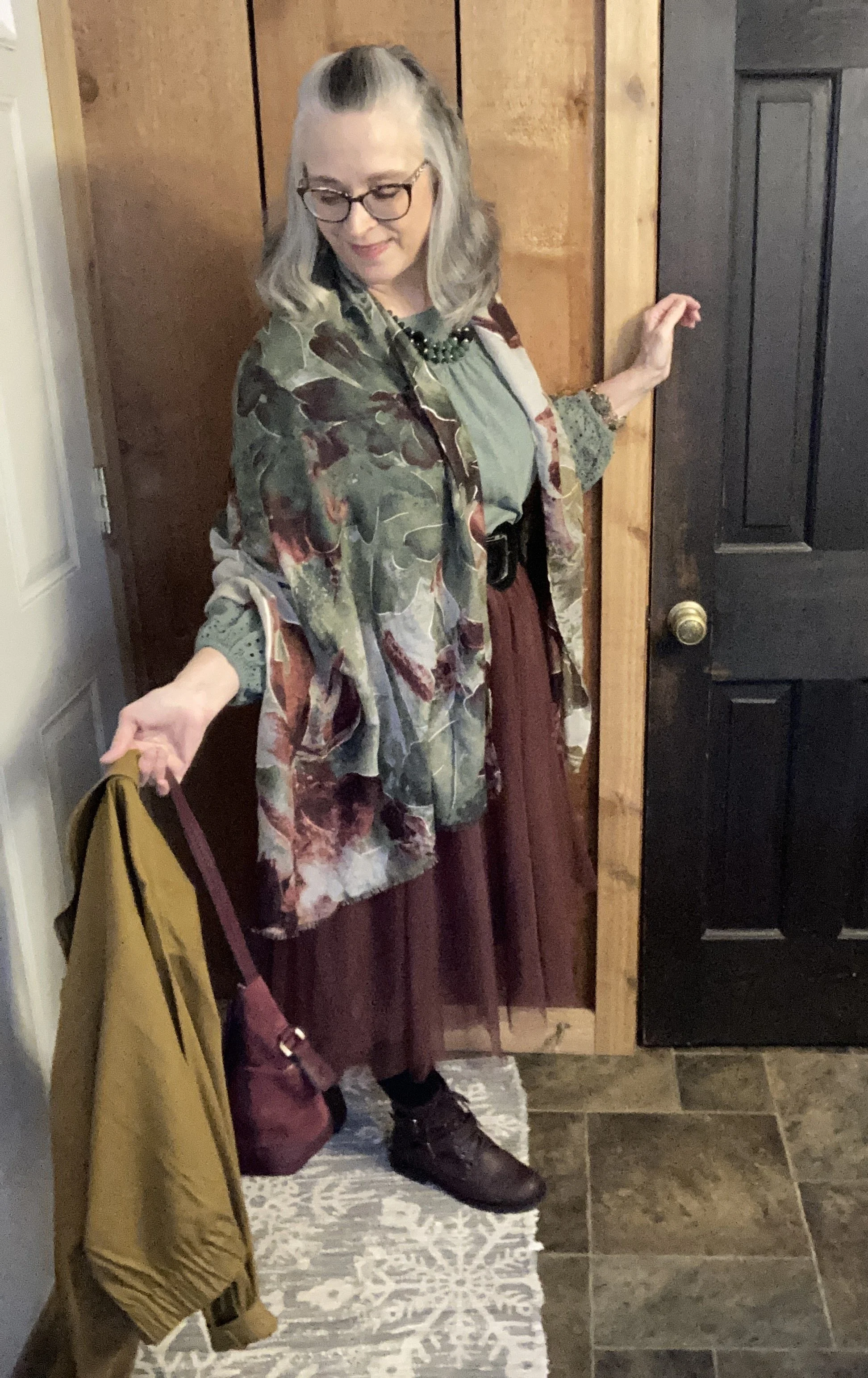
I have been taking a look at the spring and summer trends for this year, and while I might be a little behind, as usual, these are definitely ideas that will take you well into fall. As I mentioned a few weeks ago, the bright color combinations are trending. Me being a lover of color, I decided to look at another of these combos and add another of the spring trends, romantic details.
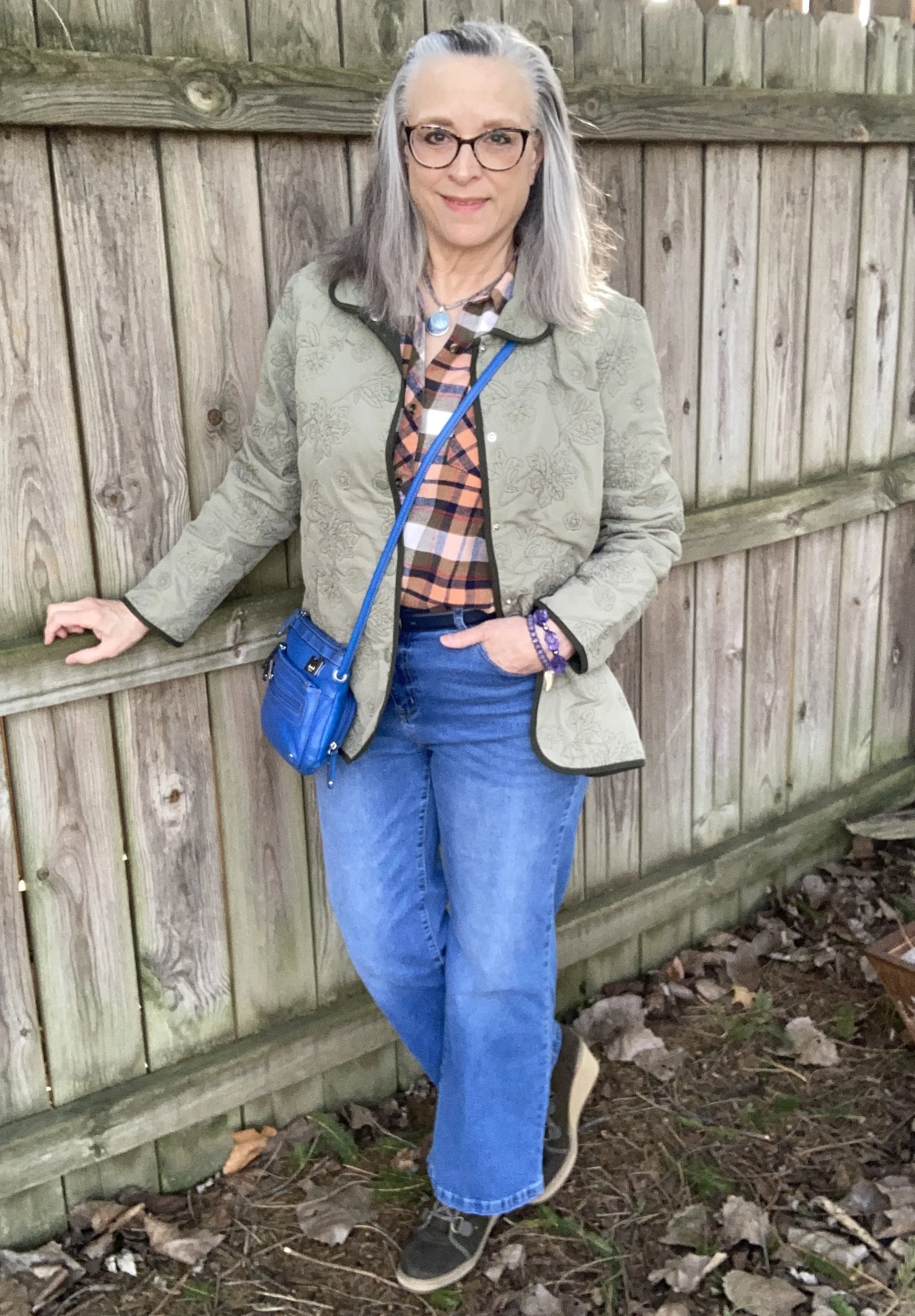
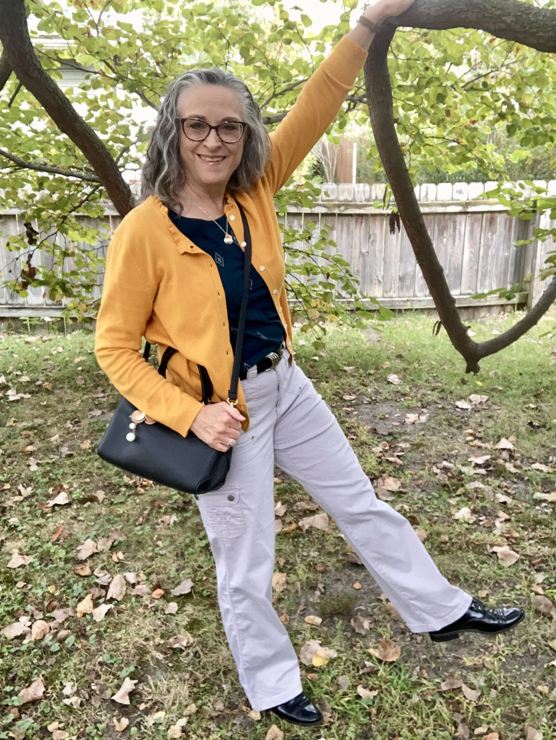
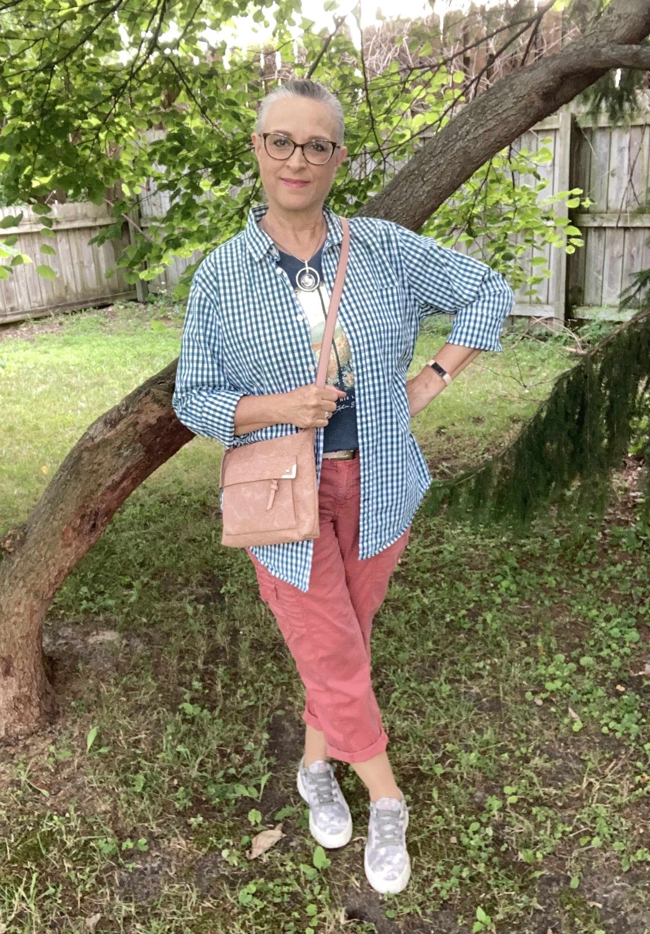
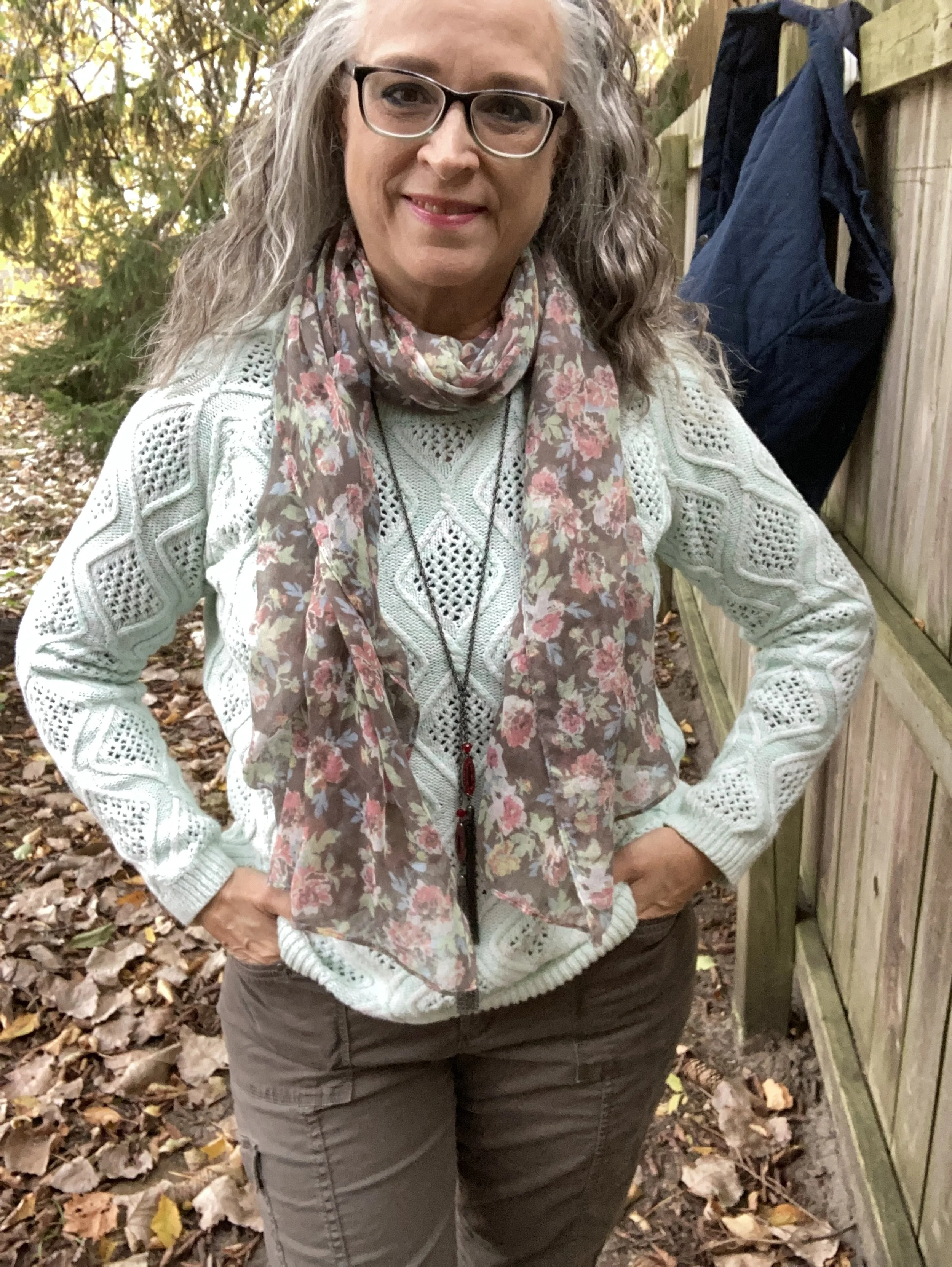
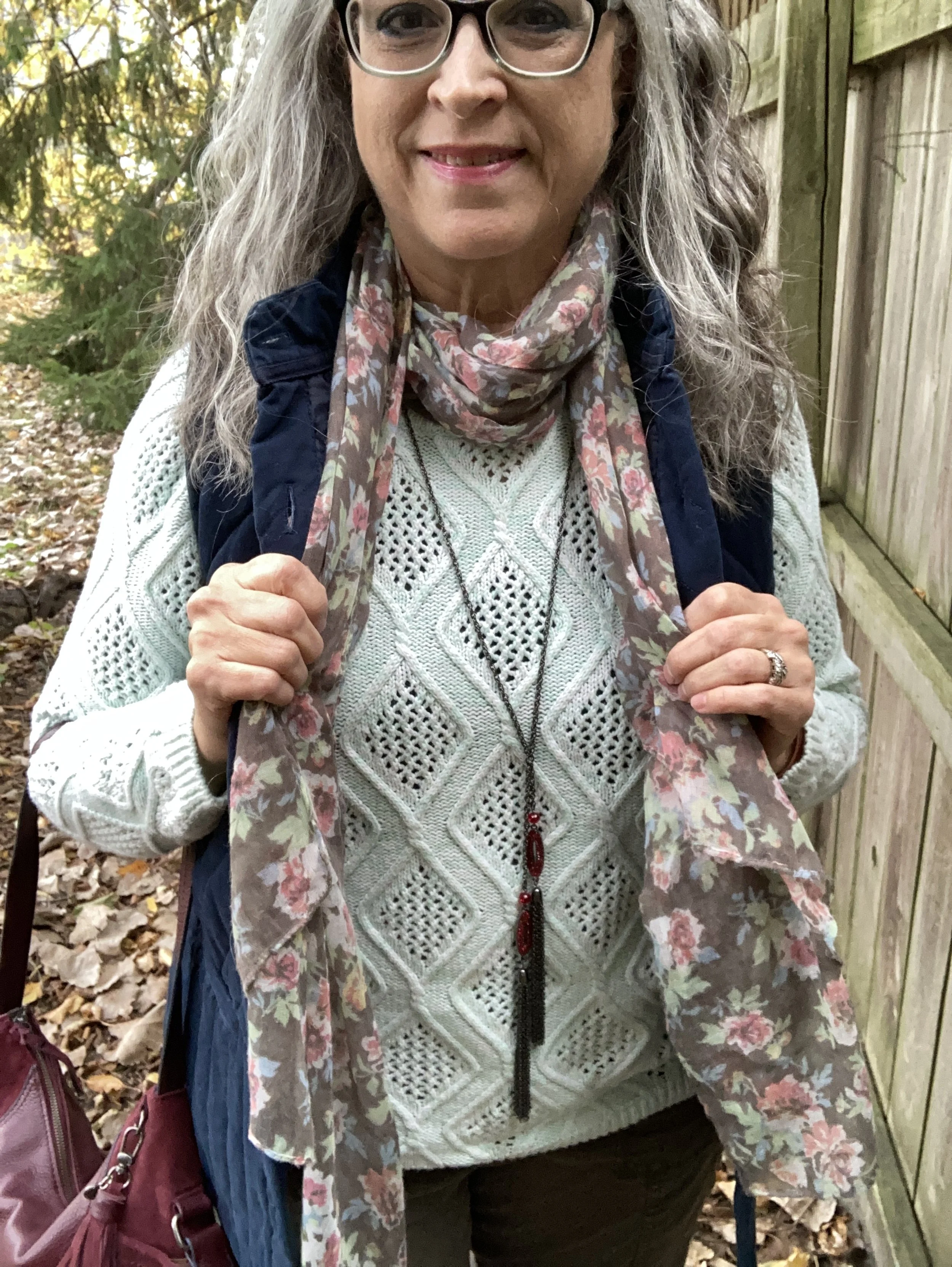
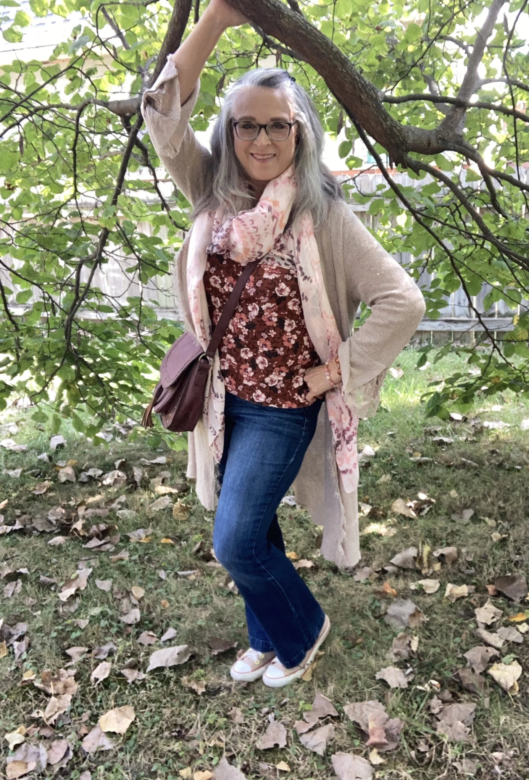
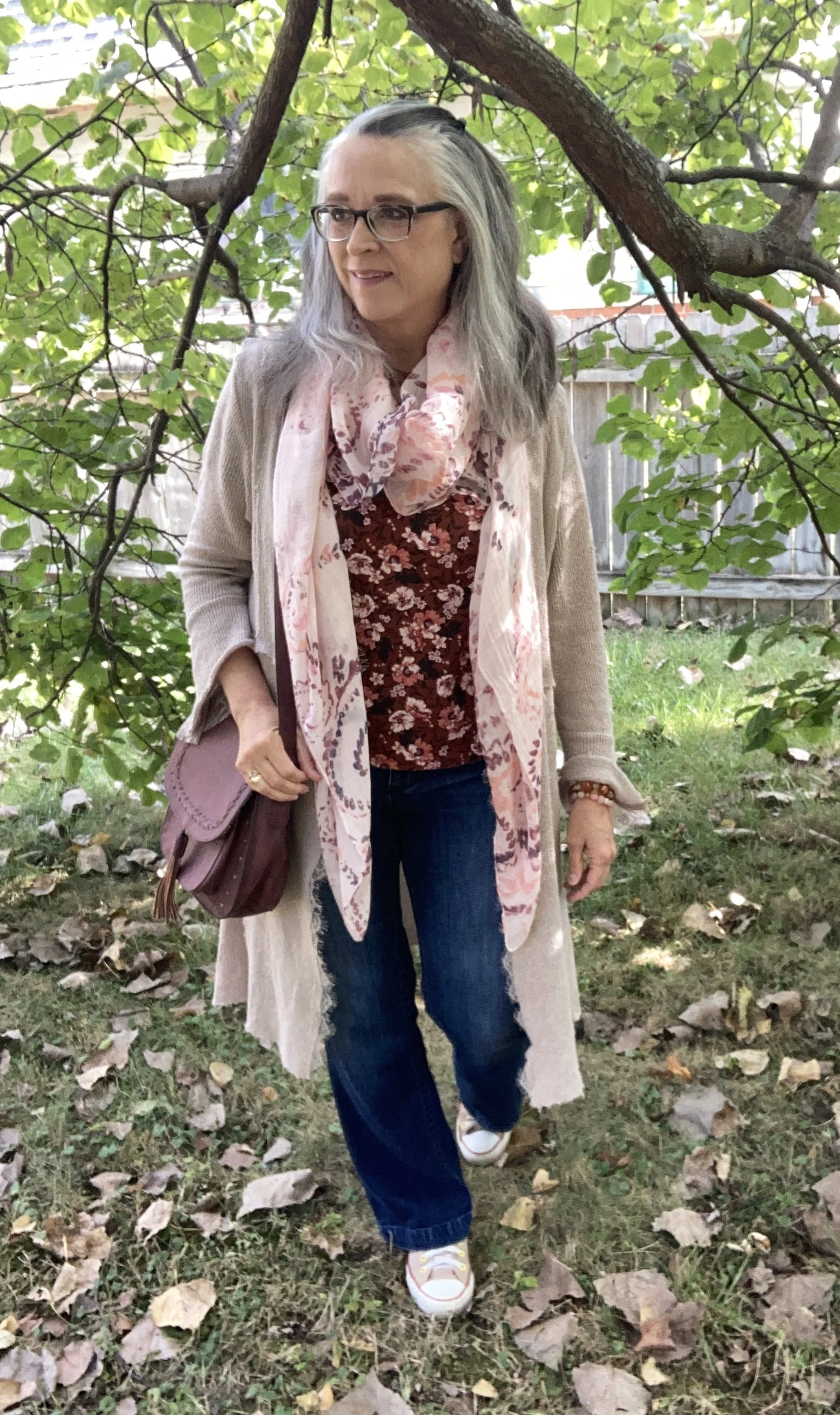
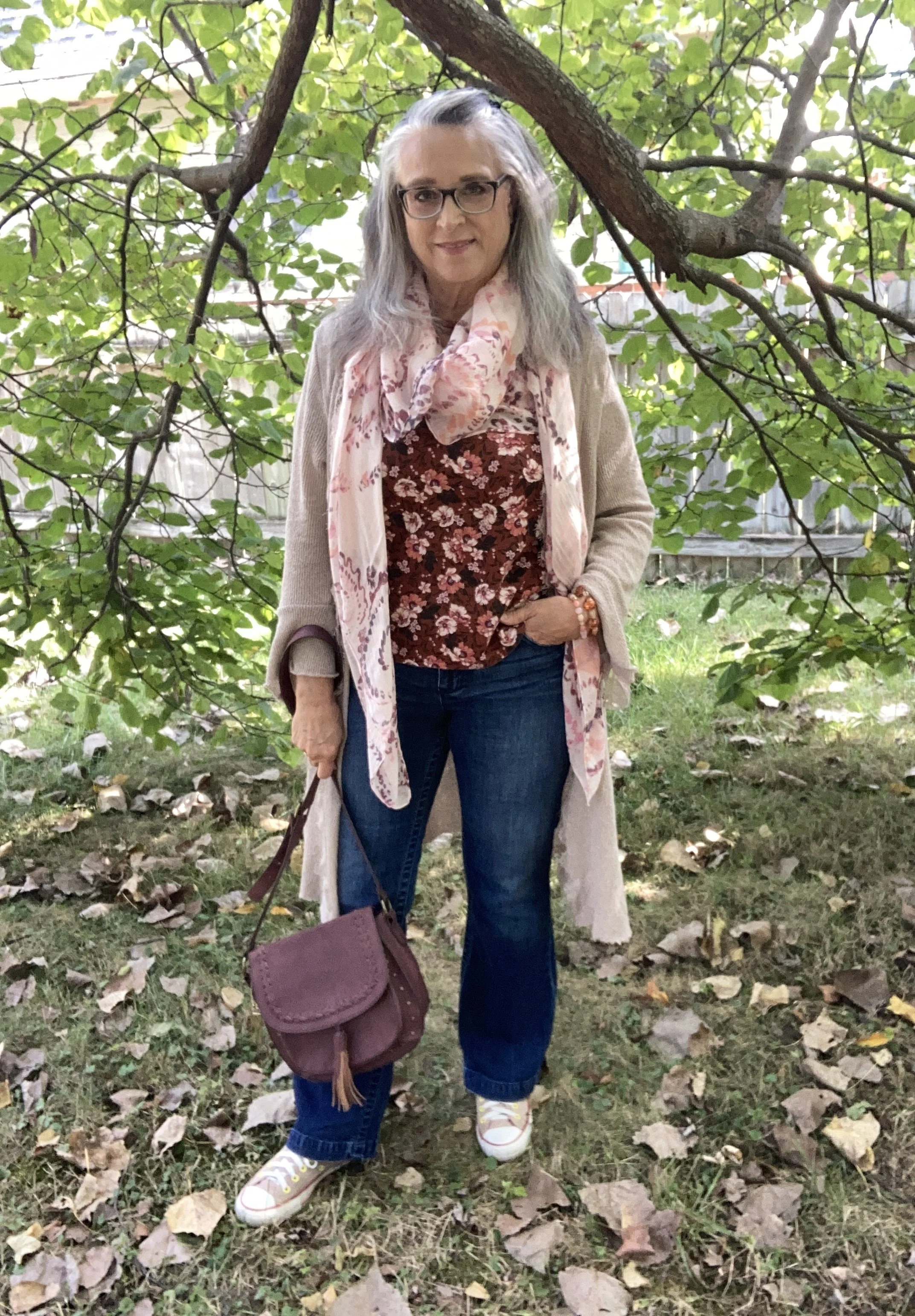
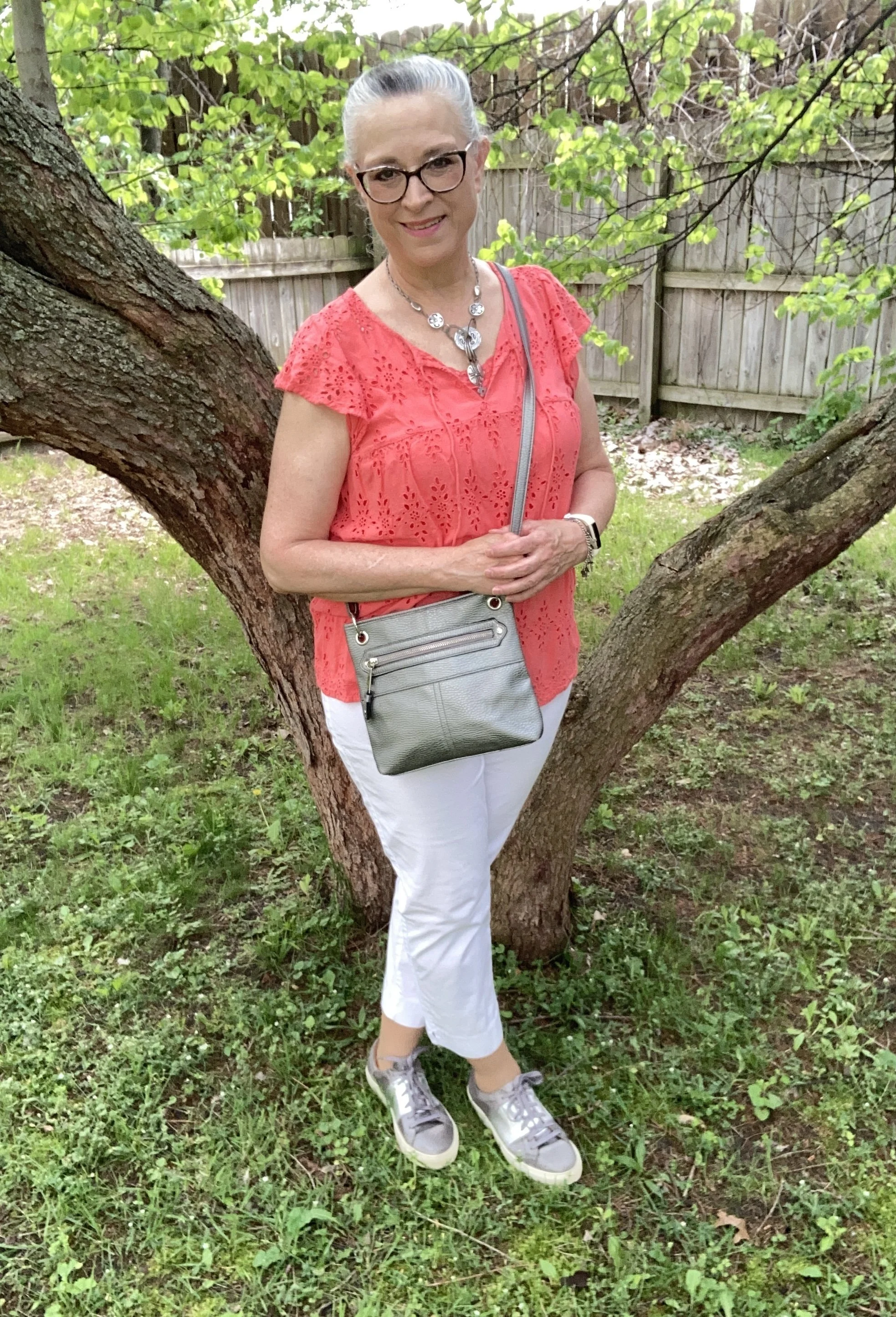
Today’s color combo is orange and white, although the fashion gurus also mentioned orange and gray, so I decided to incorporate all three colors into this color block outfit ( another trend for the warm weather season), and we will also talk about what gives an outfit a bit more of a soft, romantic vibe.
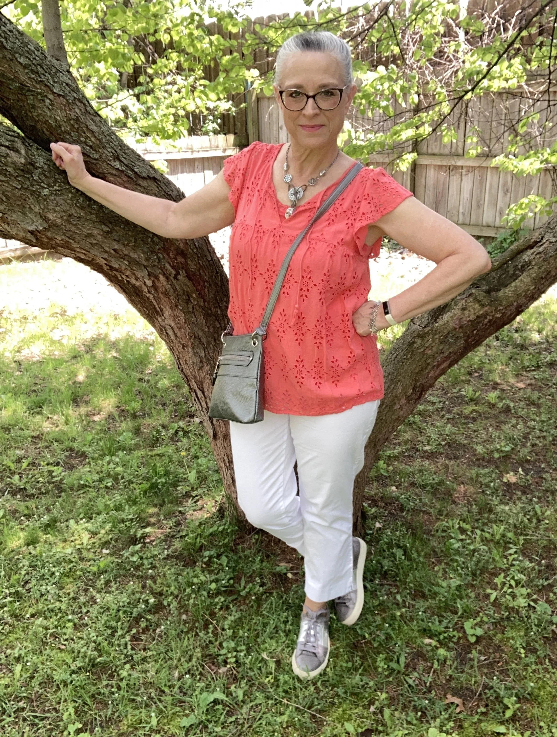
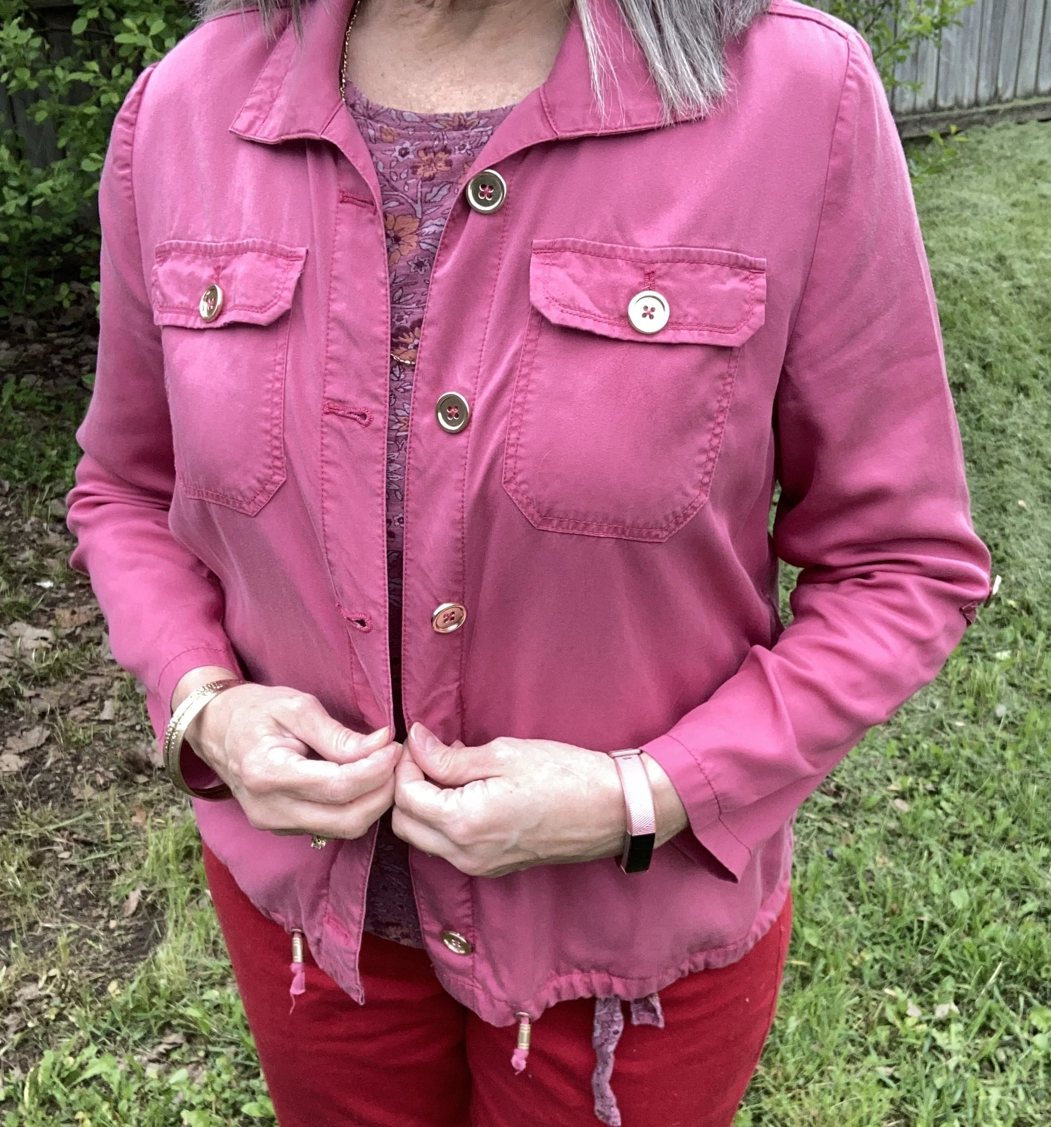
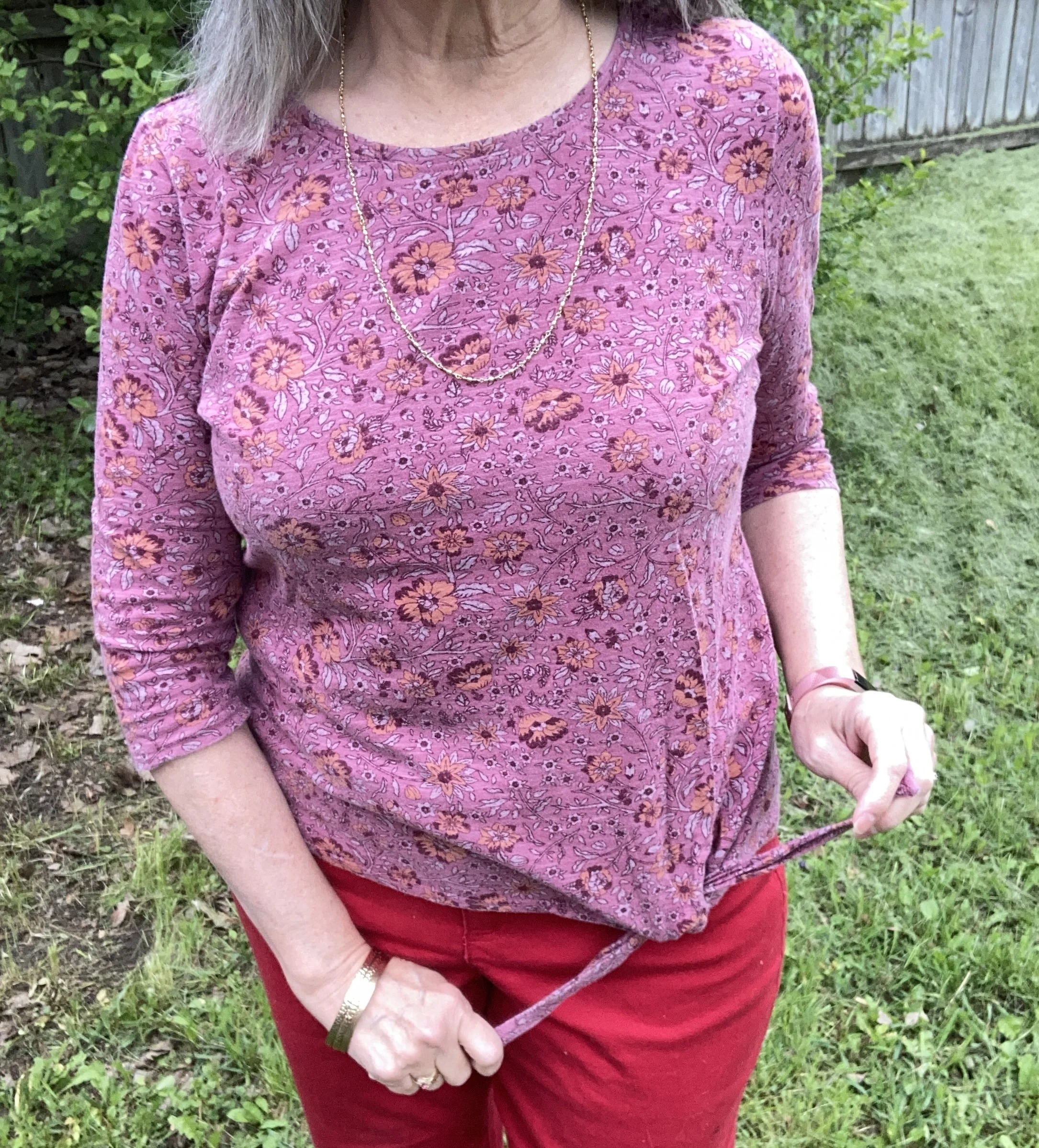
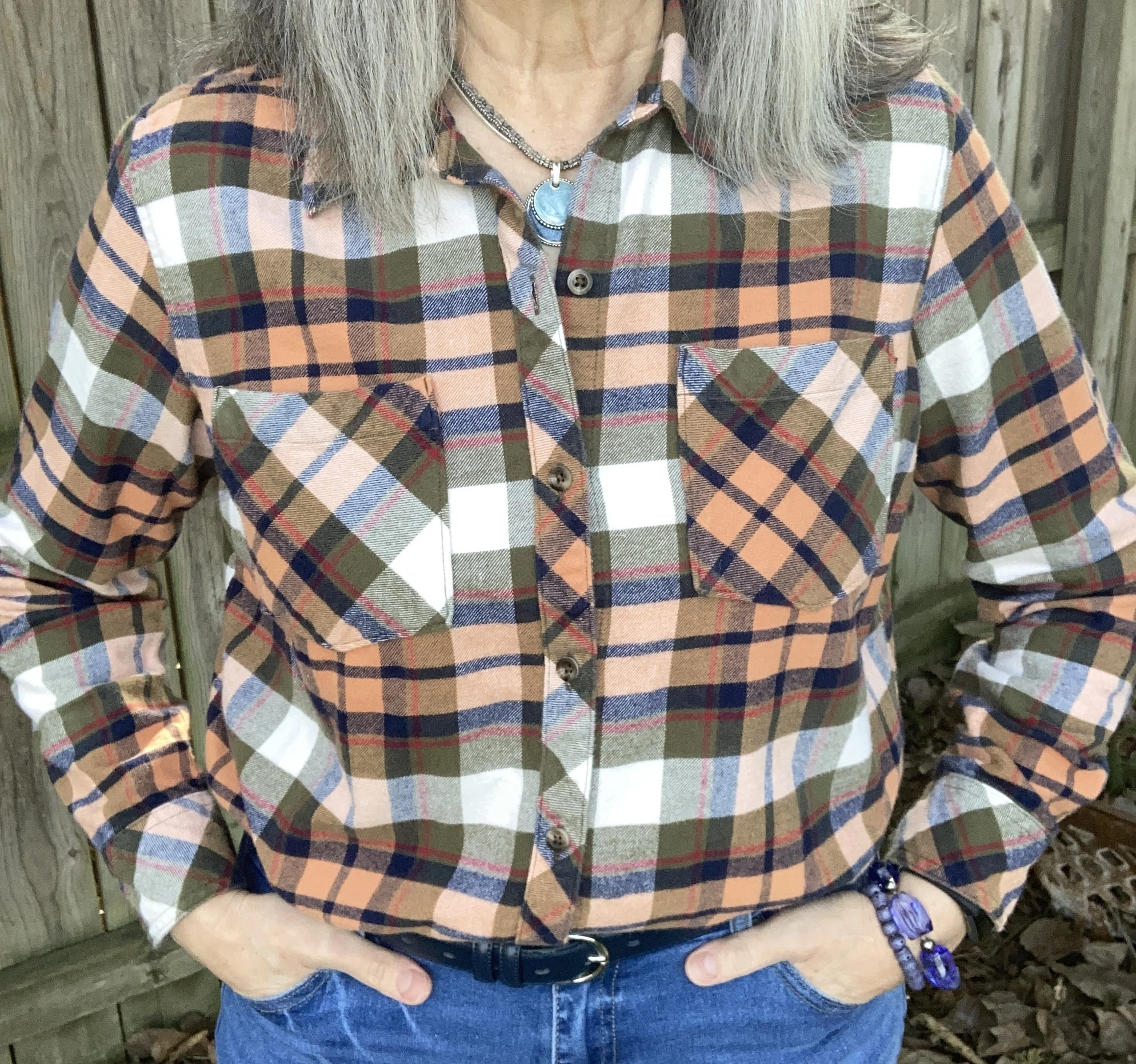
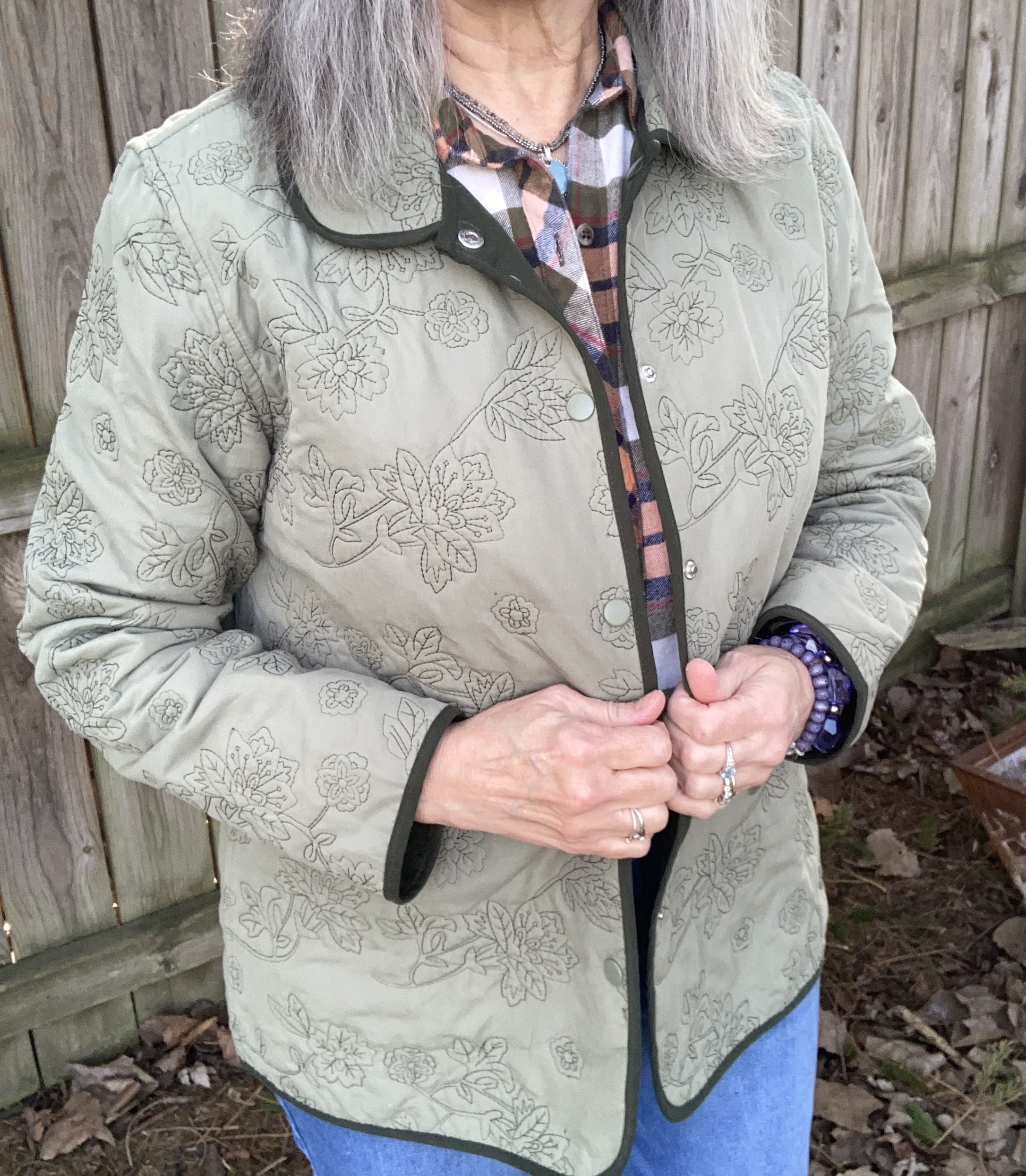
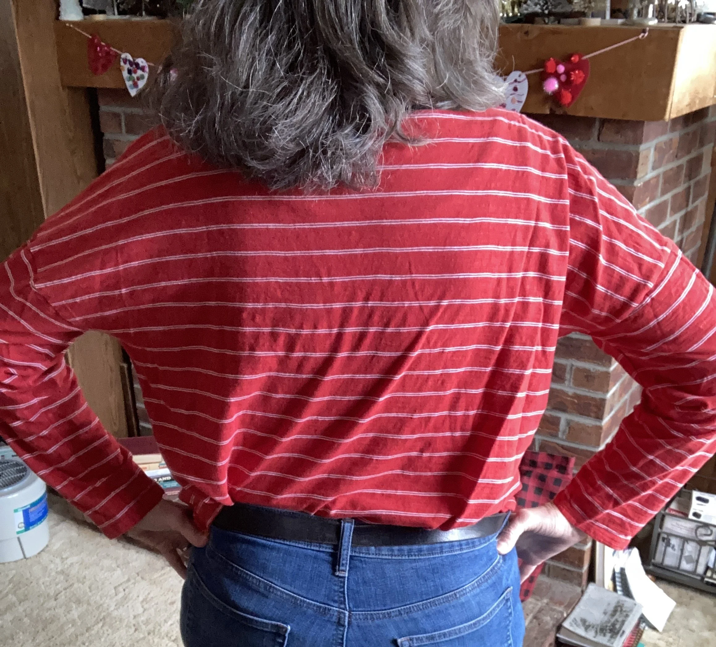
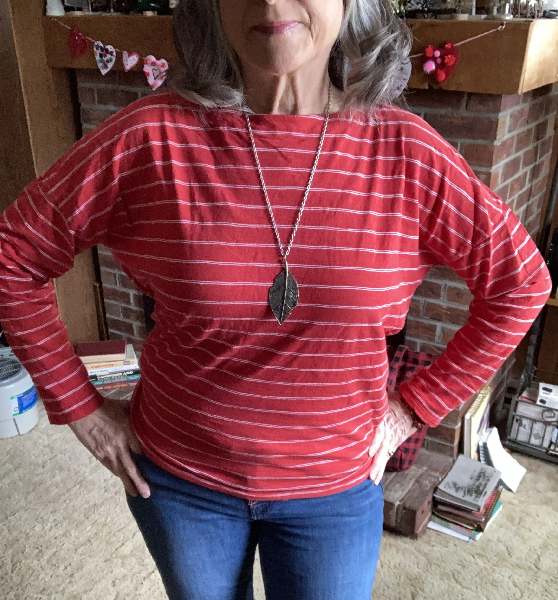
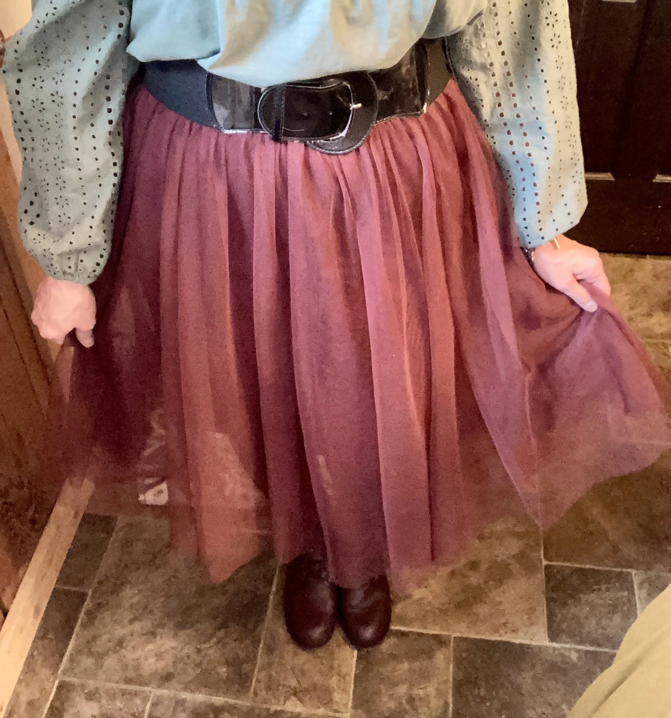
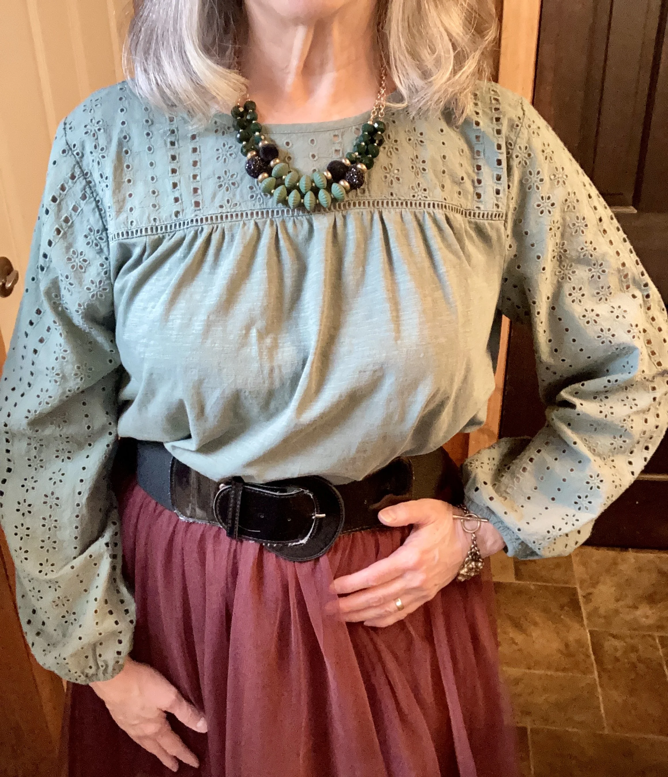
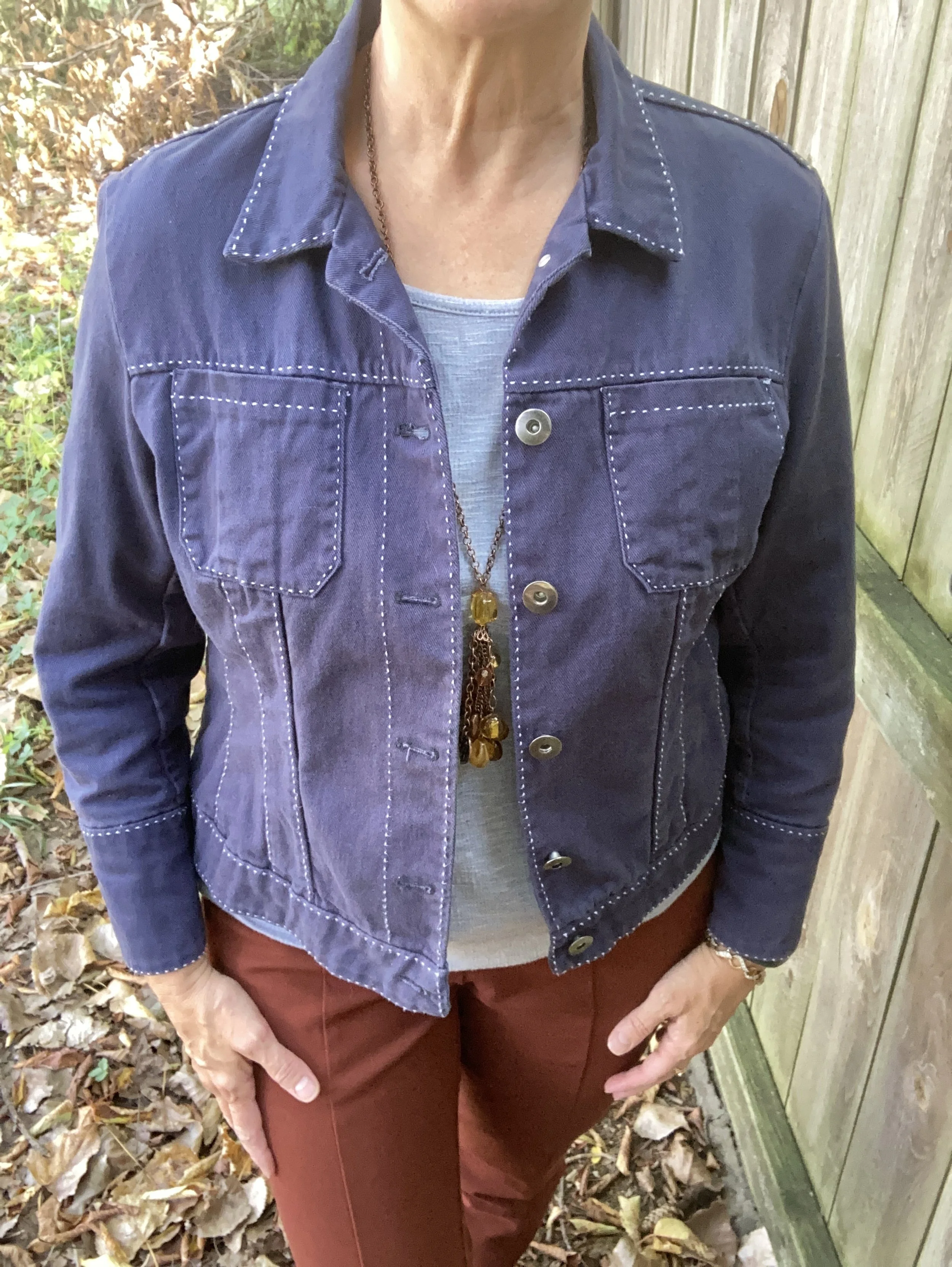
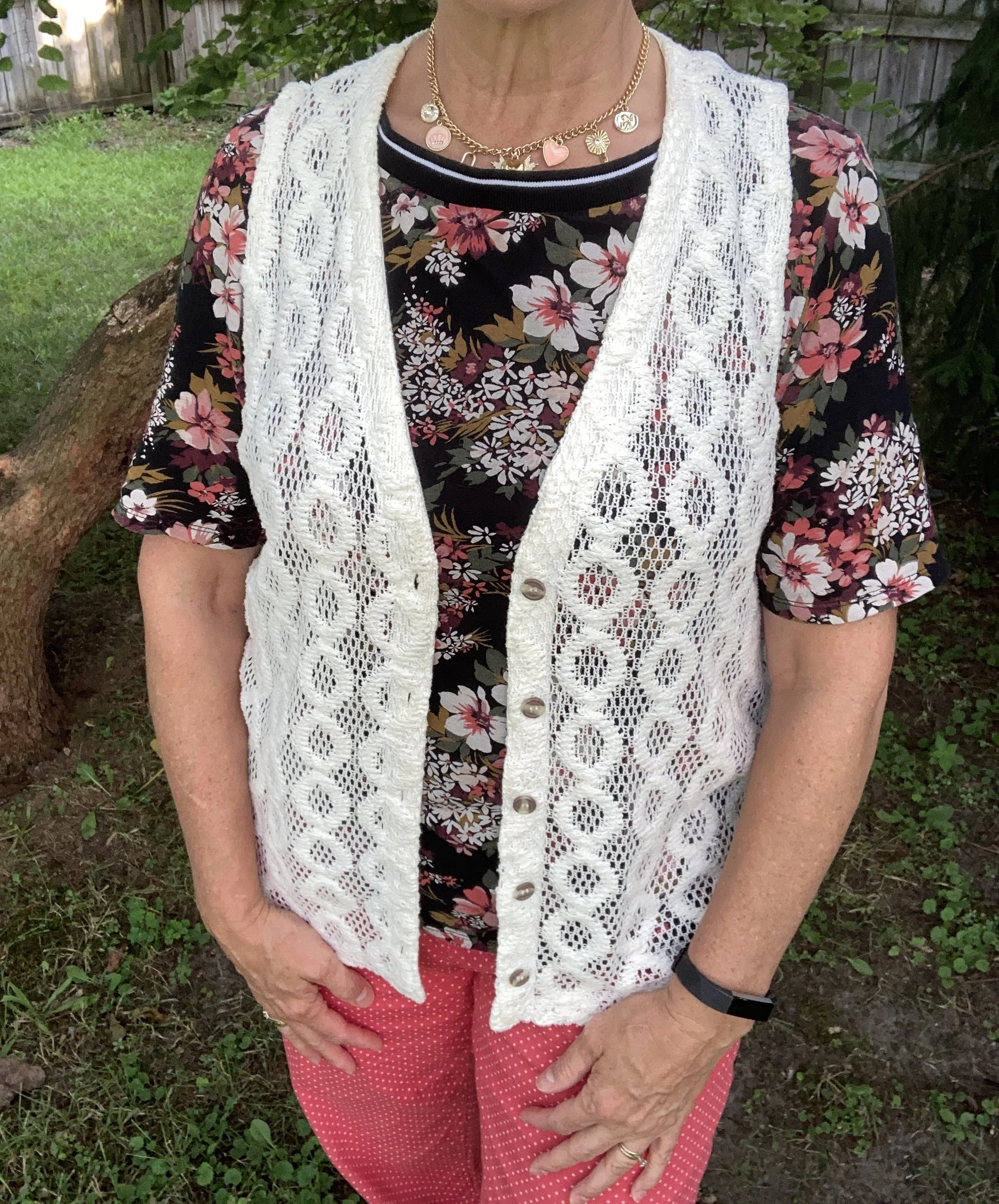
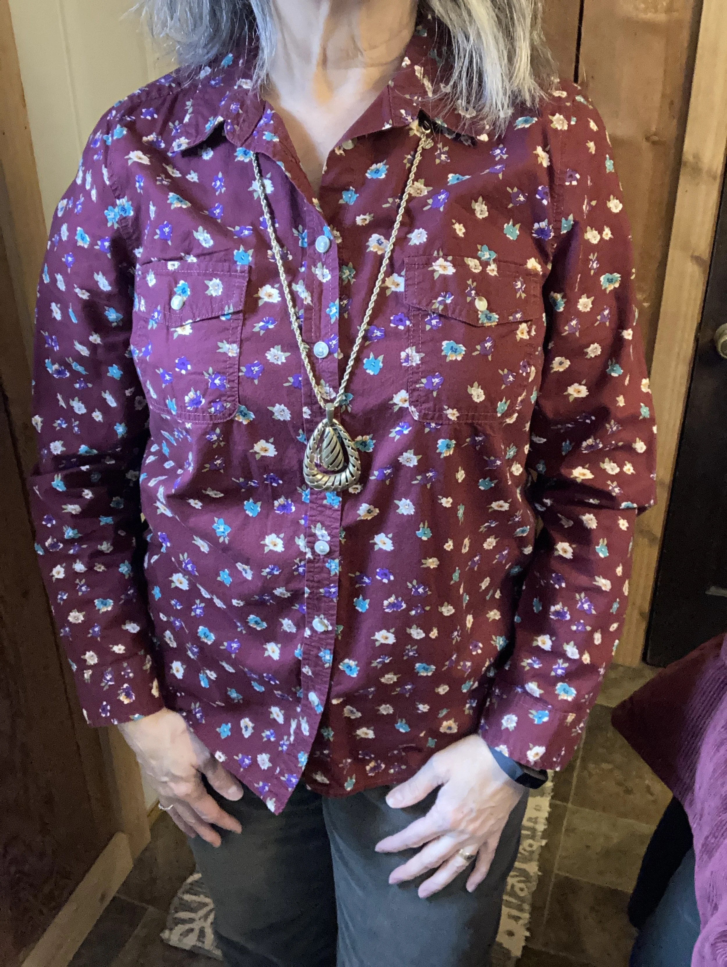
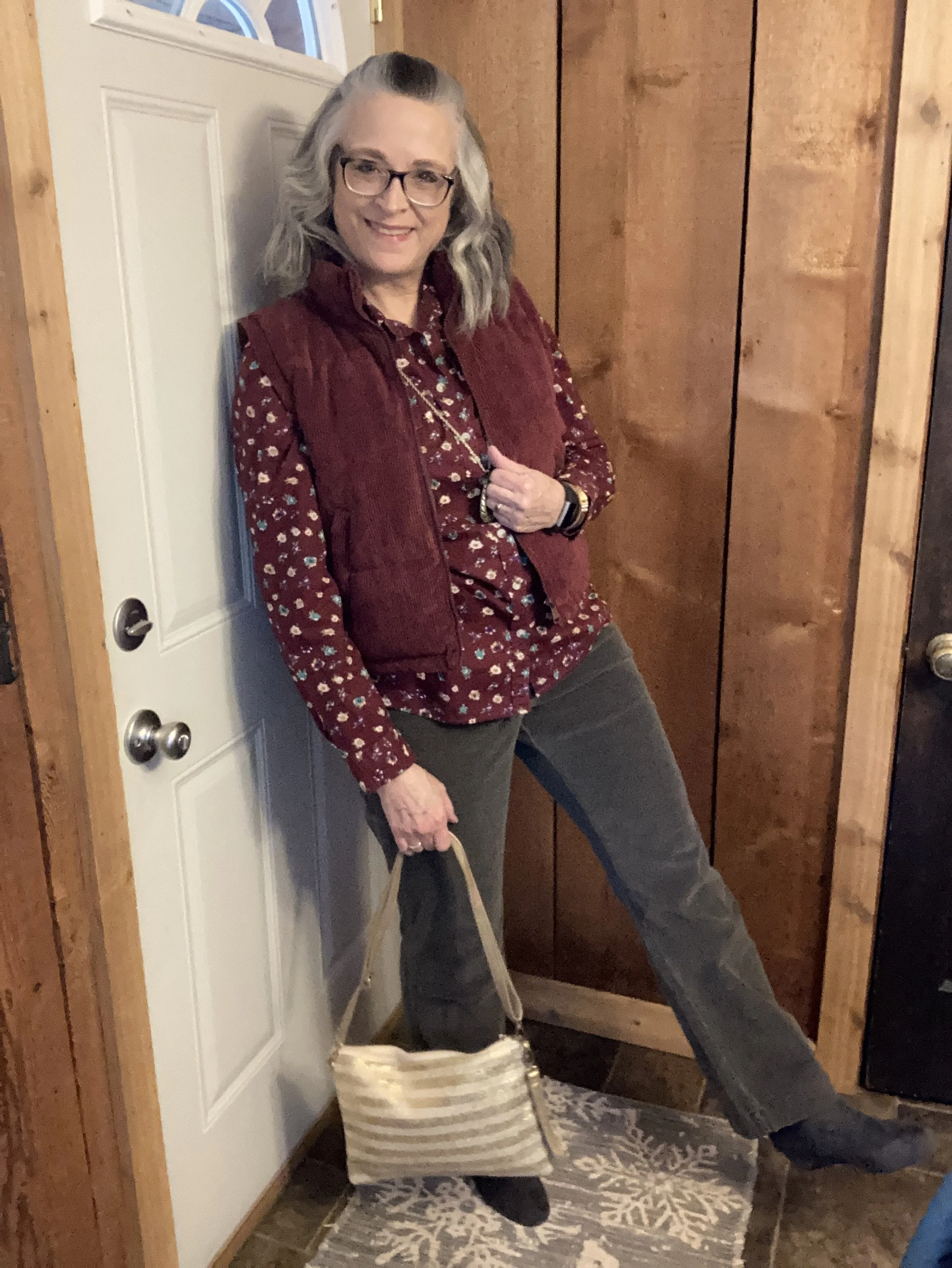
Since I knew I wanted the color orange and also wanted a look that had more romantic vibe I searched my closet for a good starting piece. This Old Navy eyelet top was just the thing. I have had this for a few summers now and have worn it every warm weather season since I thrifted it. I love eyelet. I think it is one of the textures and fabrics that whispers romance without having to be overly frilly or immodest. I added a Faded Glory tank underneath for coverage, but you could certainly just wear a nude colored bra for a cohesive color underneath. Since the tank has lace trim I think it works perfectly.
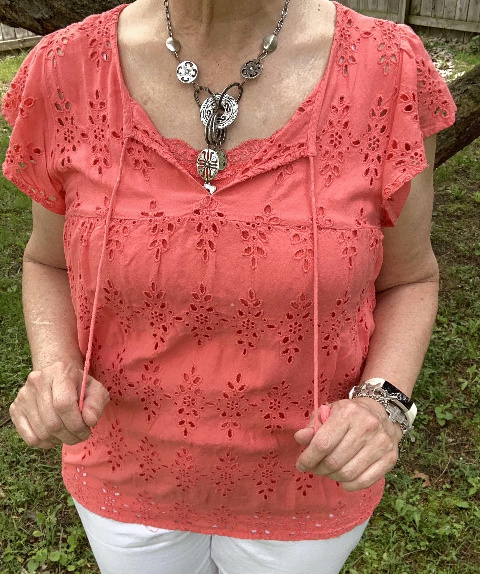
Style Tip: Whether you are wearing jeans or a satin skirt you can upgrade you look to include romance by making a few simple choices. Choose lace, eyelet, tulle or silky fabrics. These speak volumes to making an outfit more feminine and fun. You can also add embellishments like embroidery, ruffles, and pearls in the form of buttons or jewelry. My personal opinion is less is more…not less fabric or coverage, but less embellishments and textures. Here is are similar colors from Shein, Ann Taylor, Bloom Chic, and Macy’s.
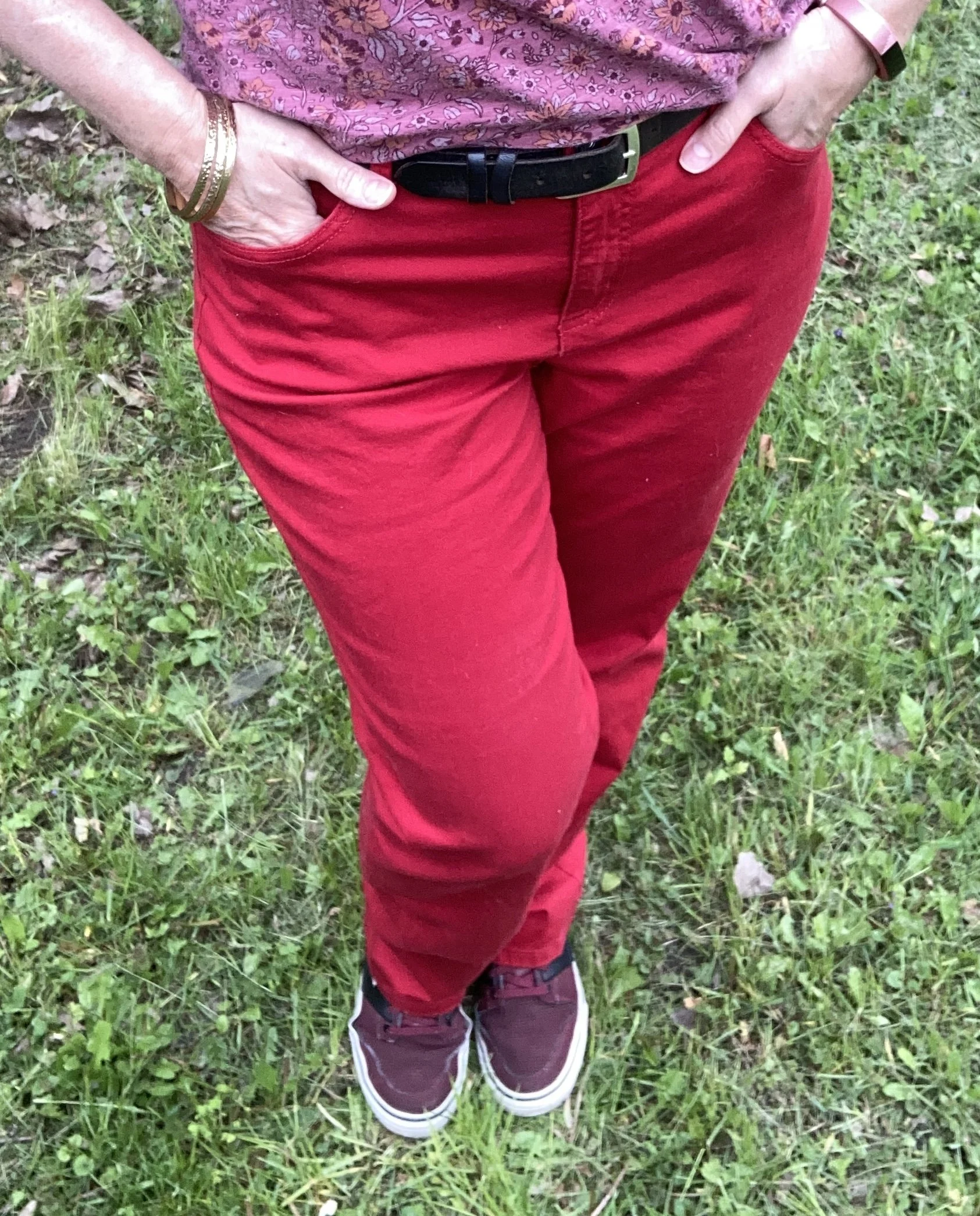
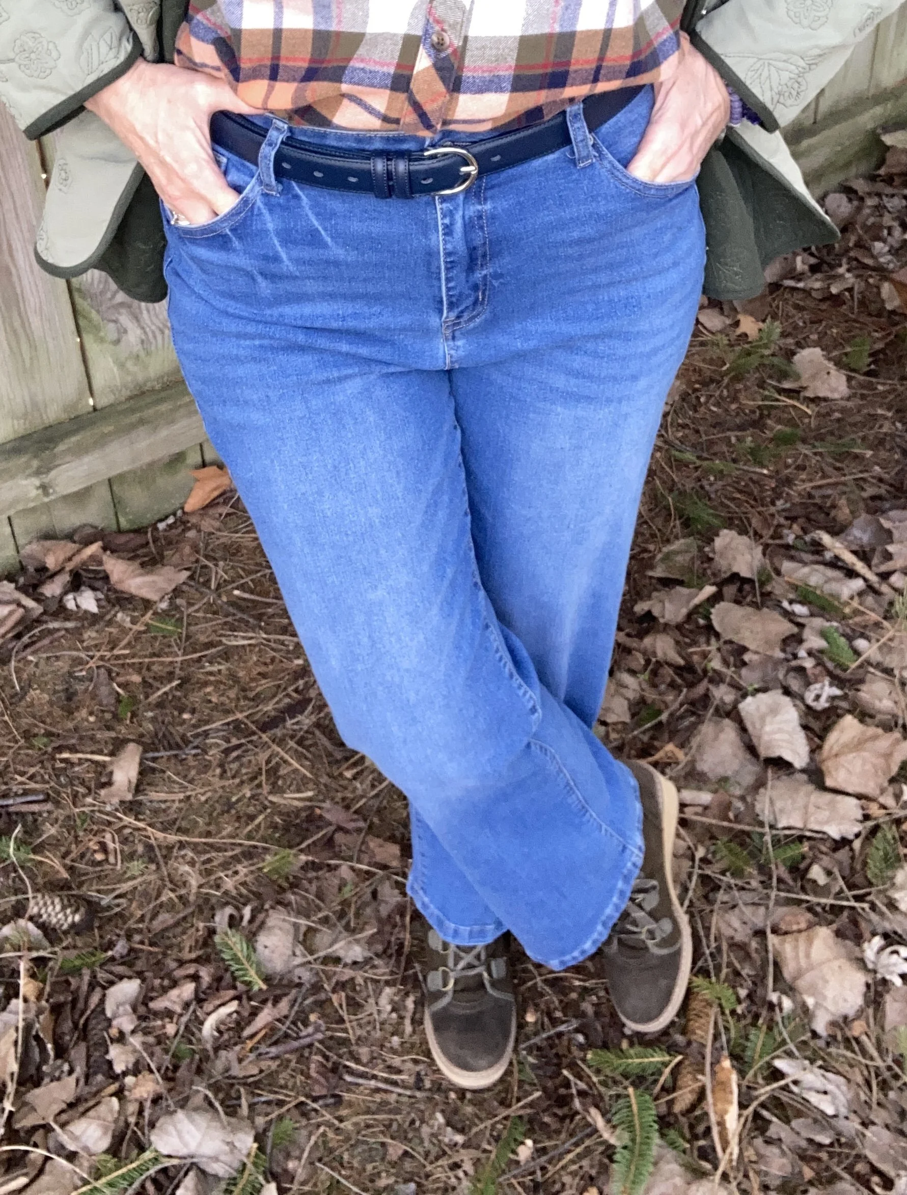
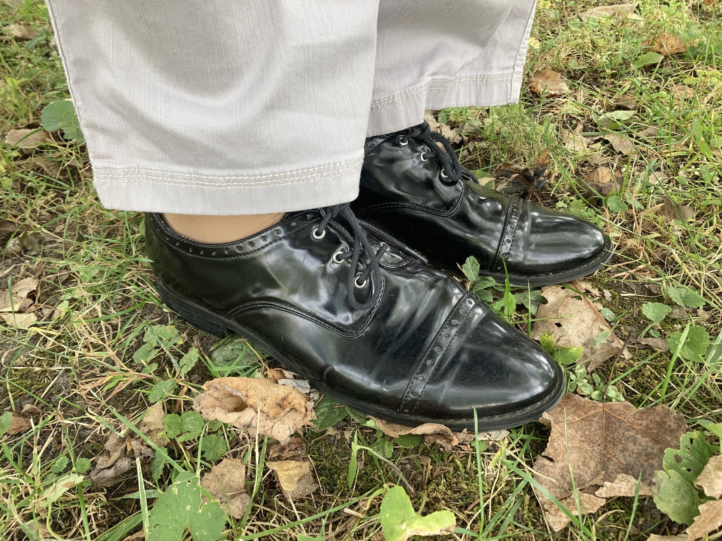
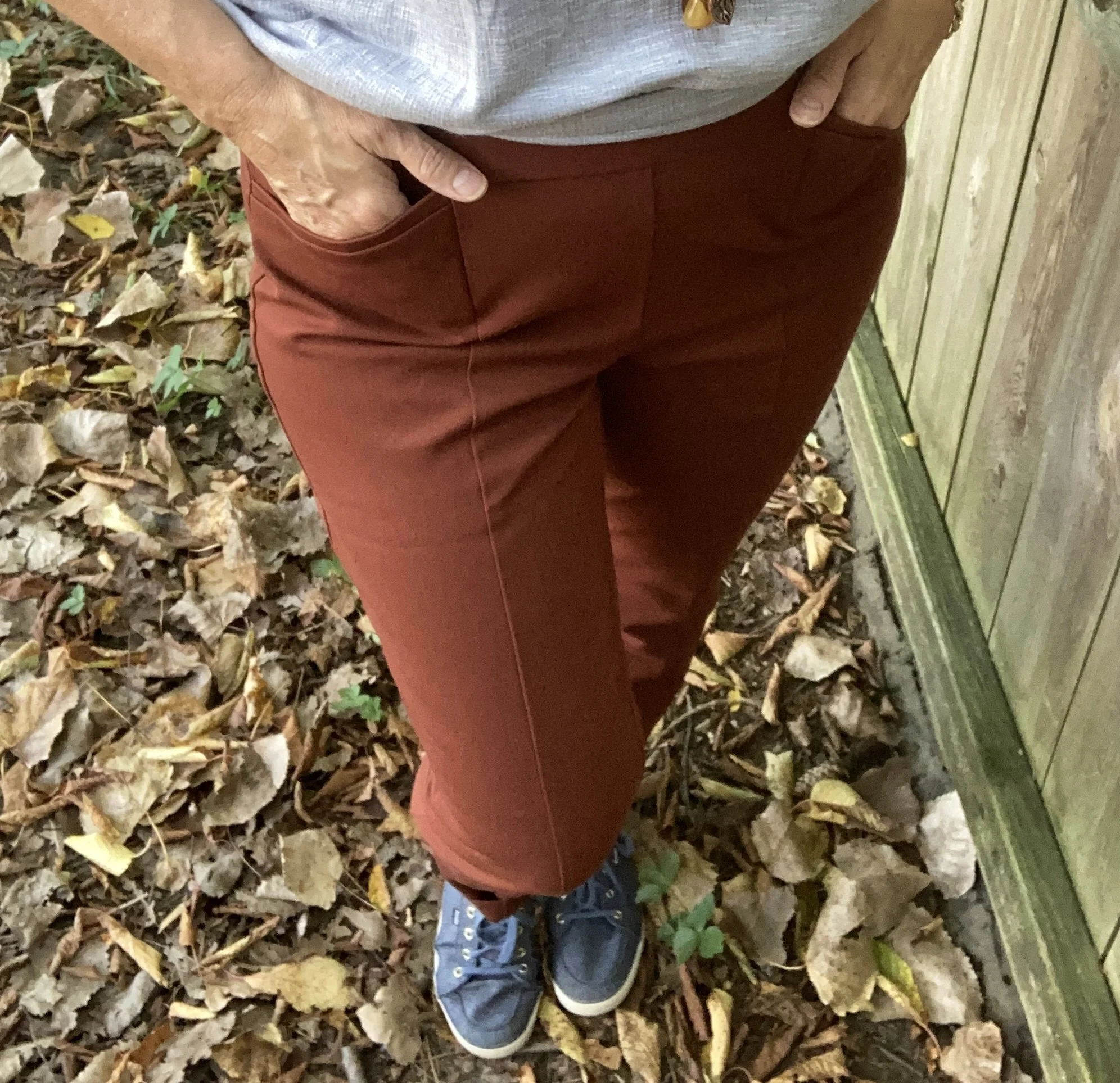
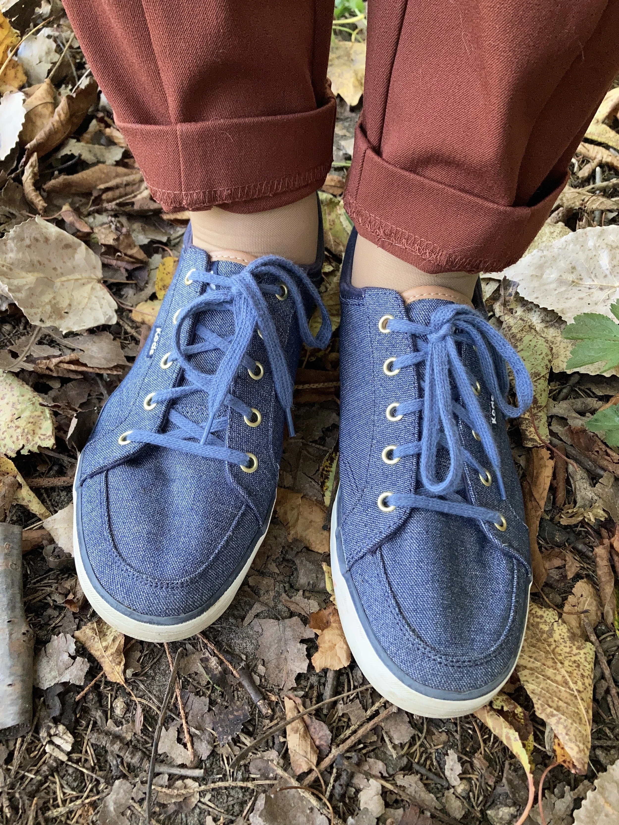
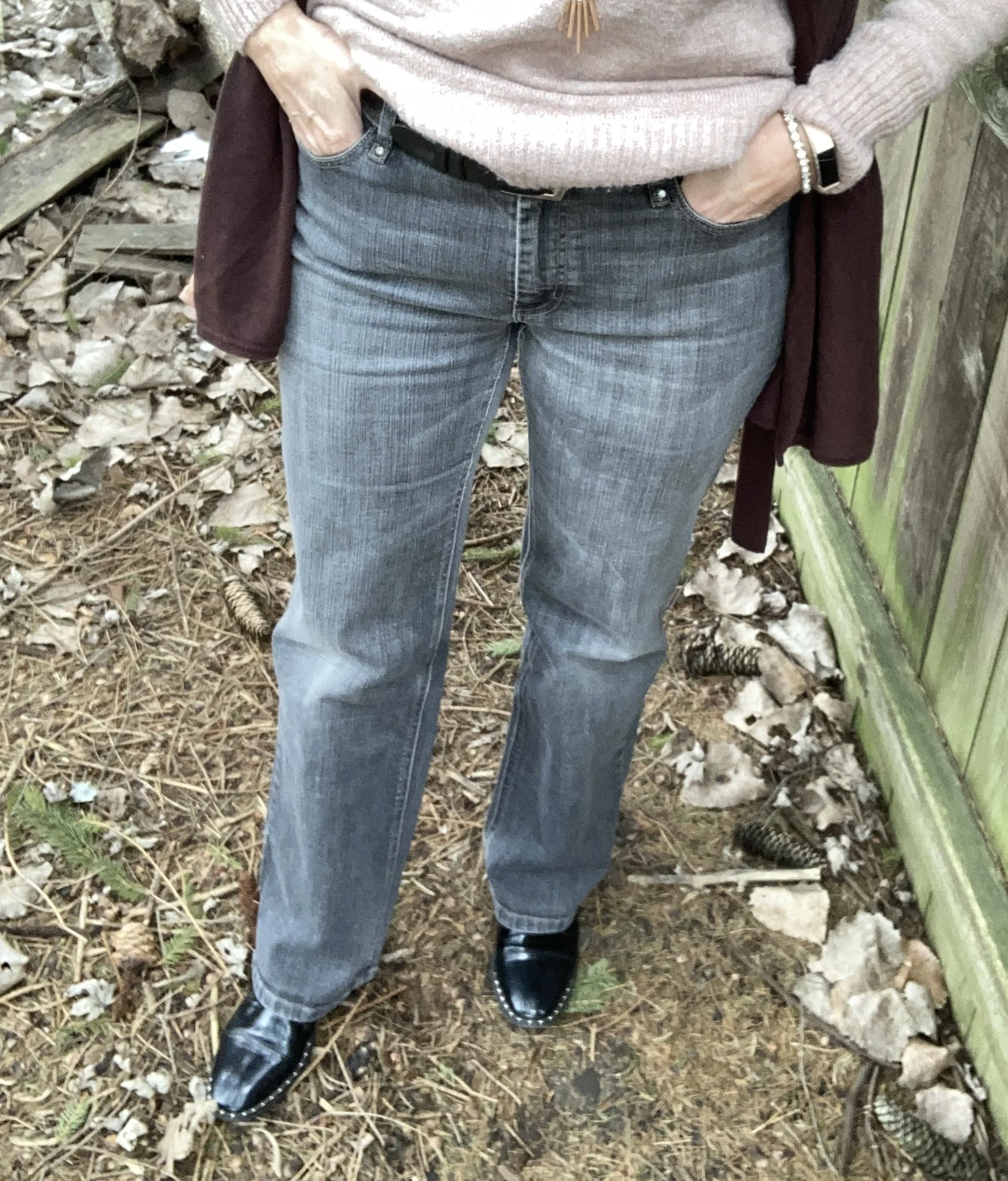
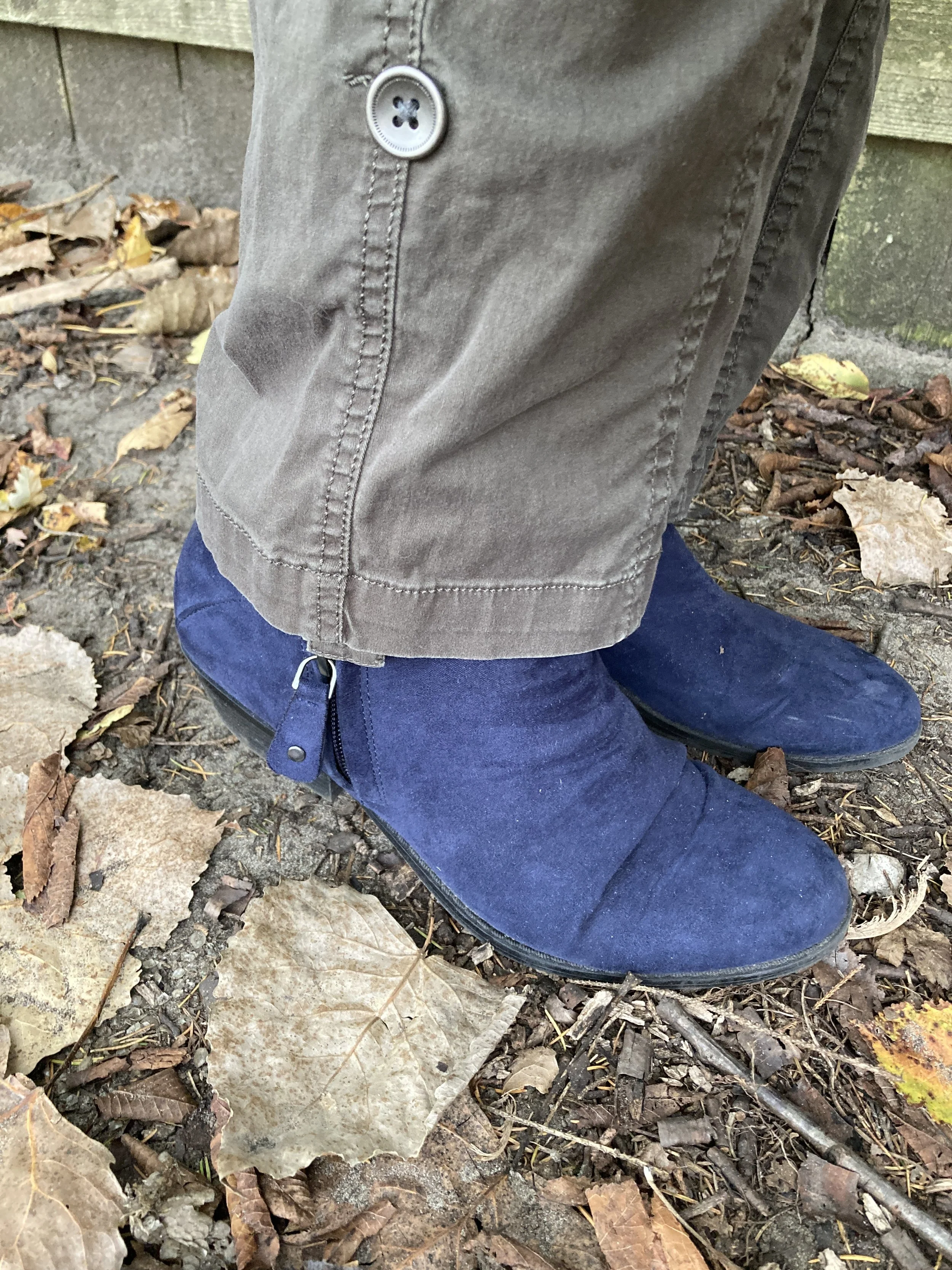
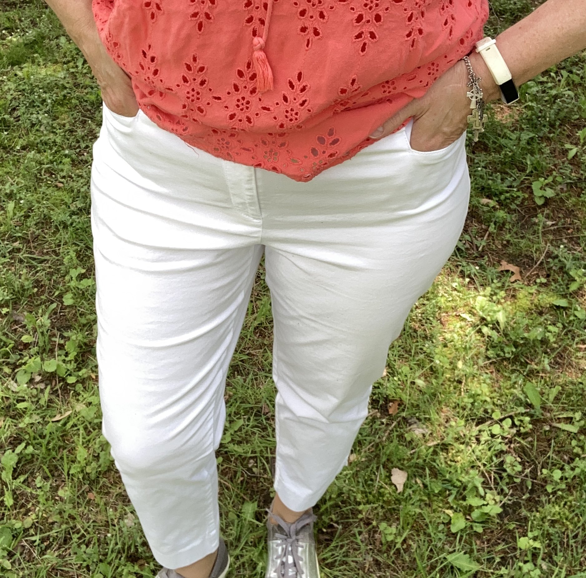
I knew I want to have white pants or a skirt and opted for these lighter weight cropped pants that I thrifted last year. These are Talbots brand and very comfortable for the warm weather season. Capris are back in style. I won’t go back to those, but some people really like them. I might if my legs were pretty, but they are not, so I accept that and move on. Here are some from JCPenney, Macy’s, and Chico’s. Here are a few pairs of ankle pants too: JCPenny, Old Navy, and Macy’s.
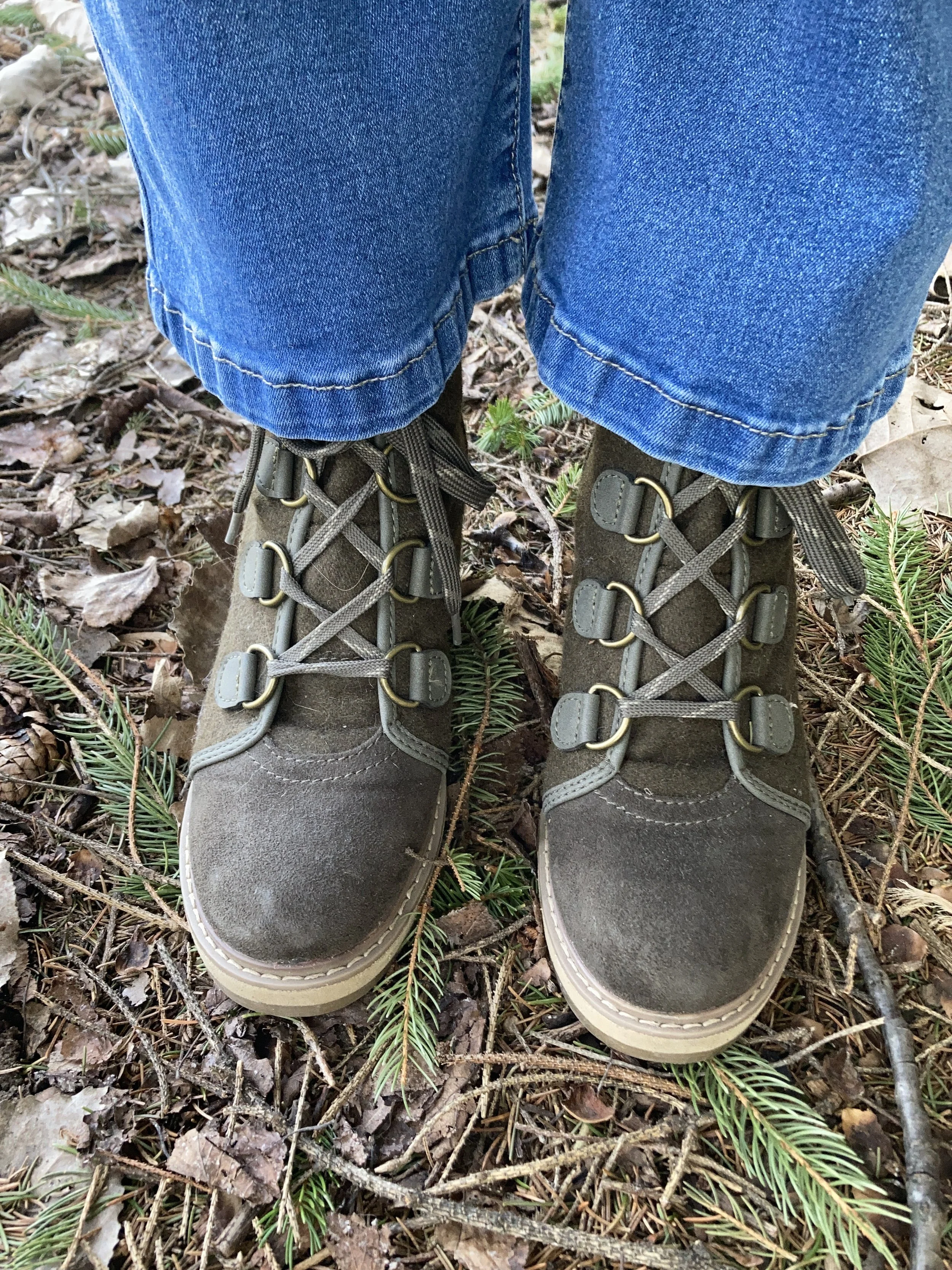
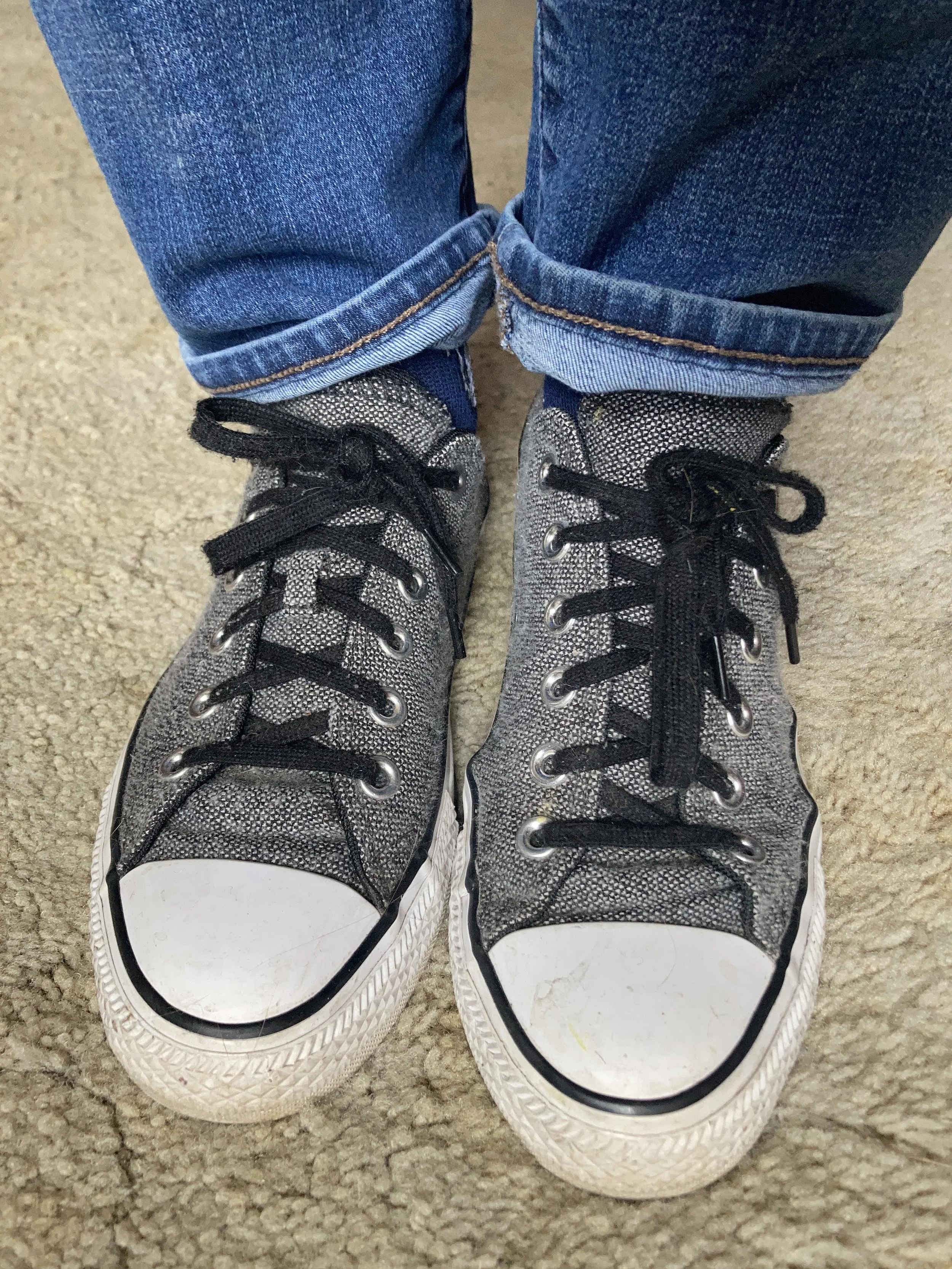
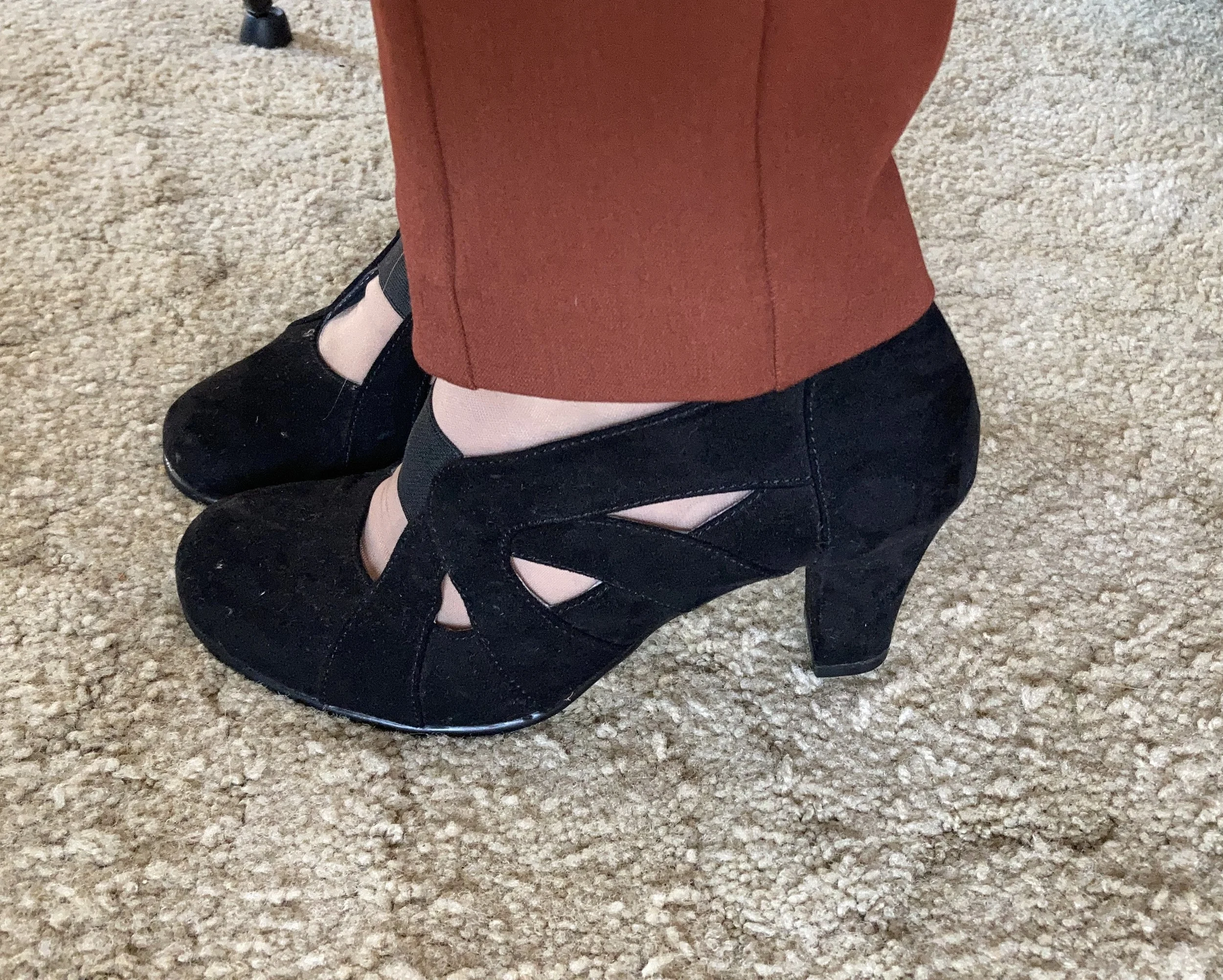
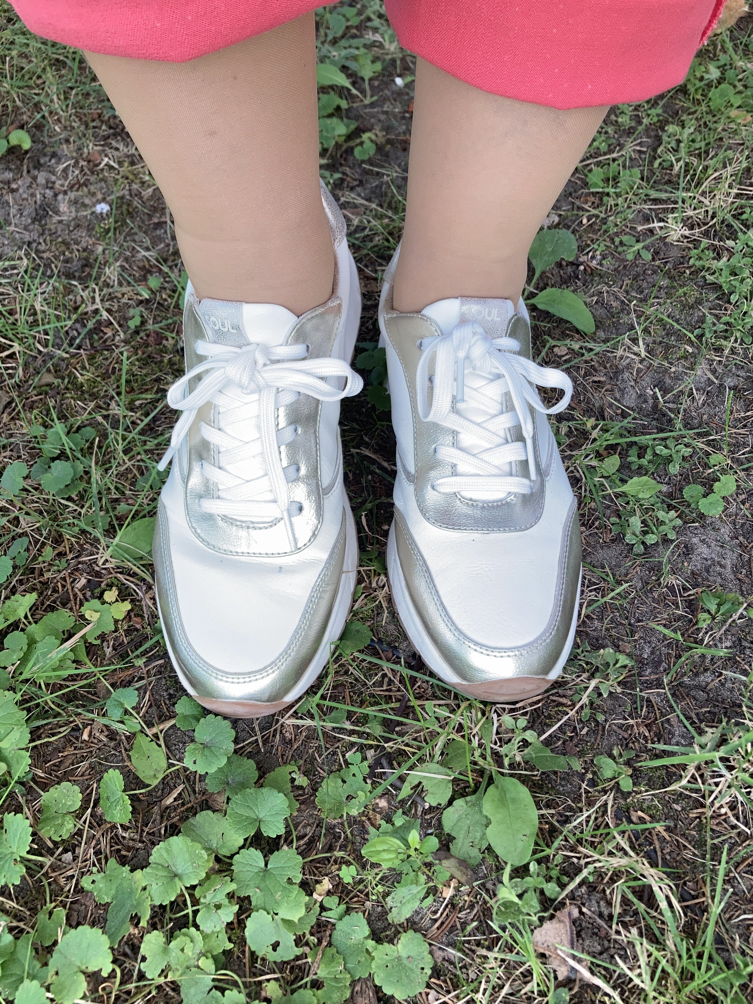
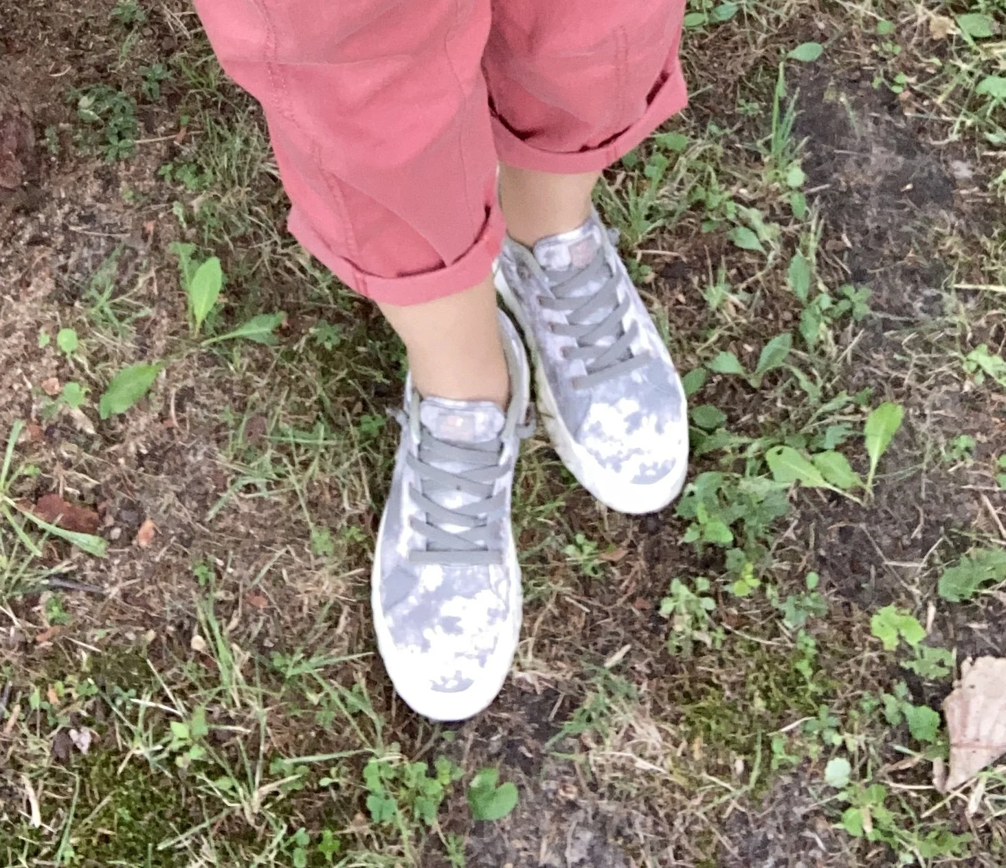
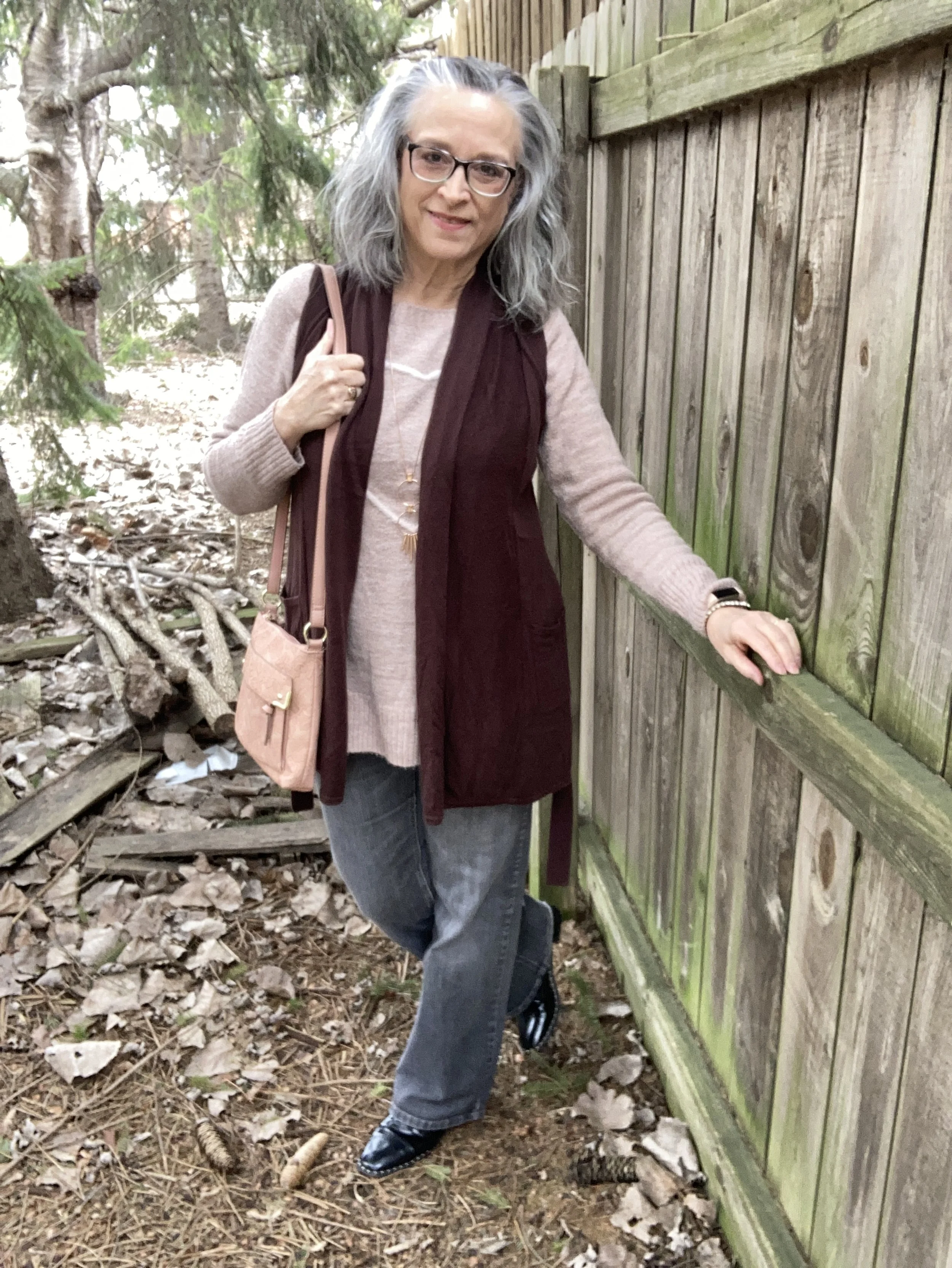
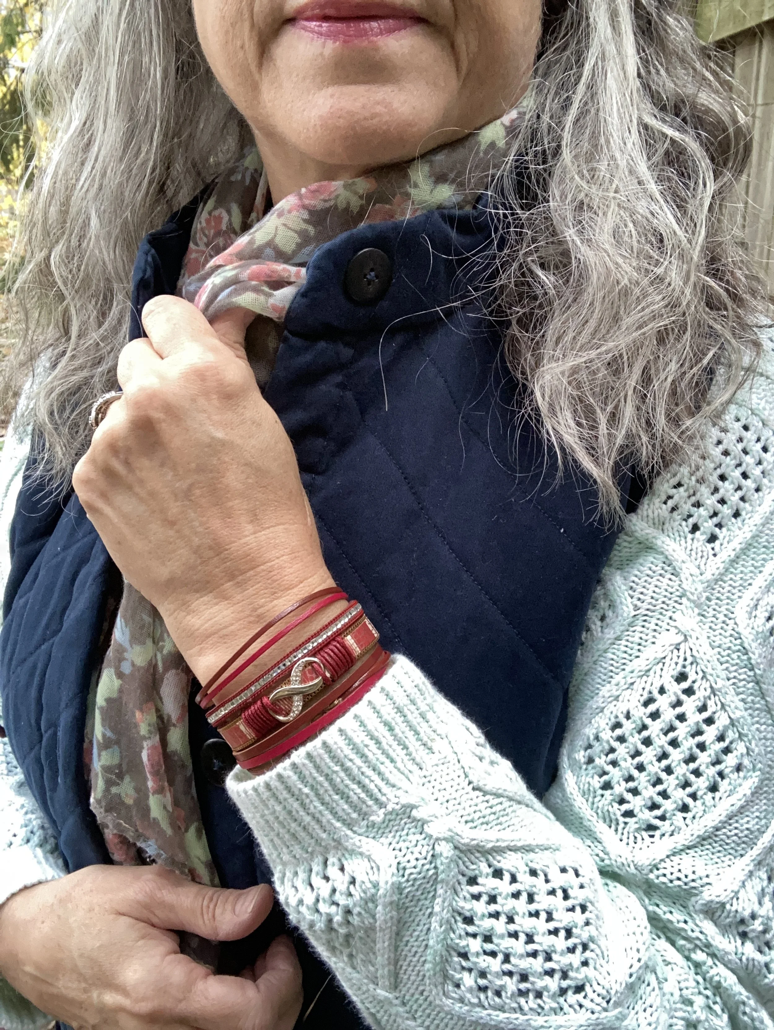
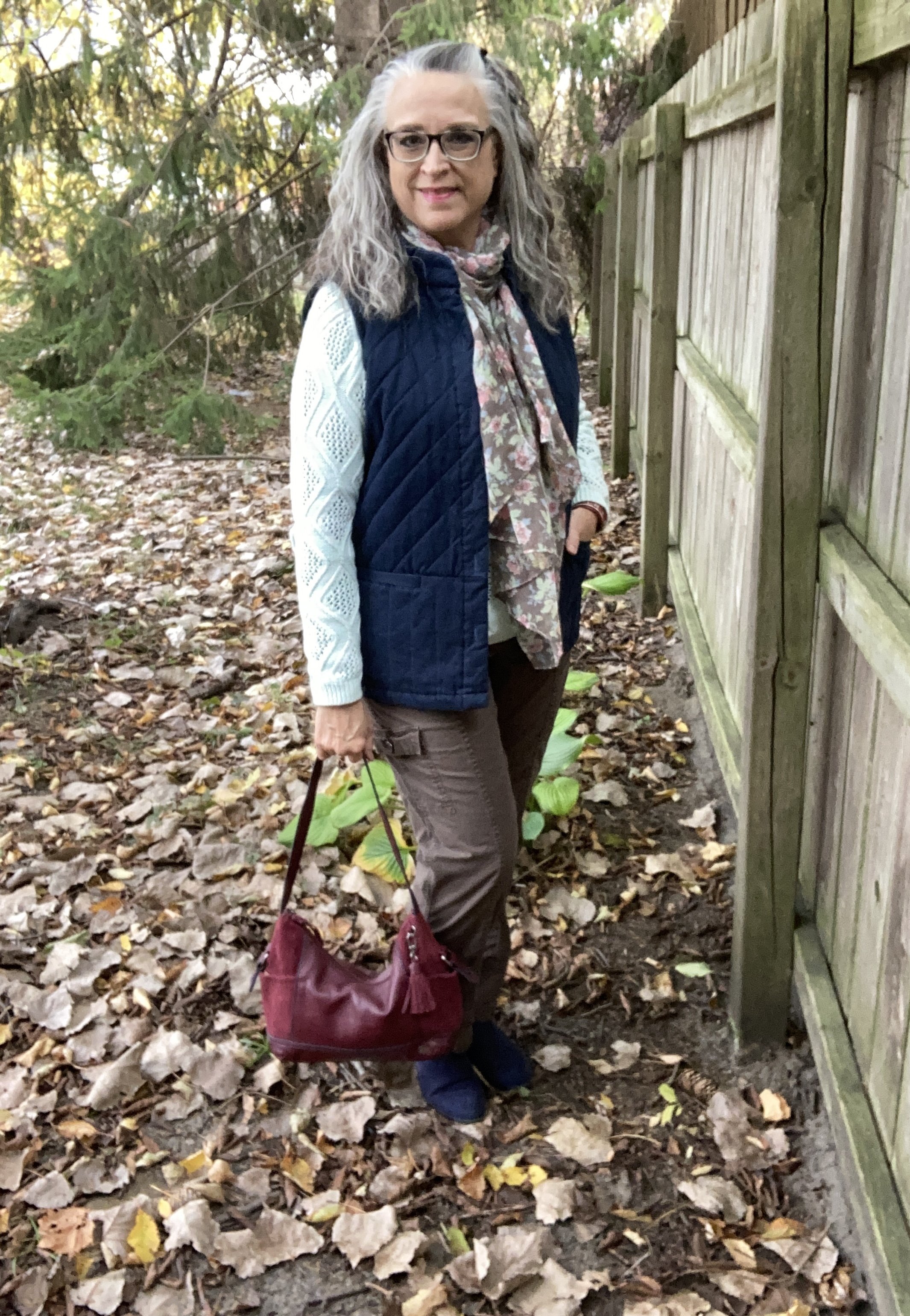
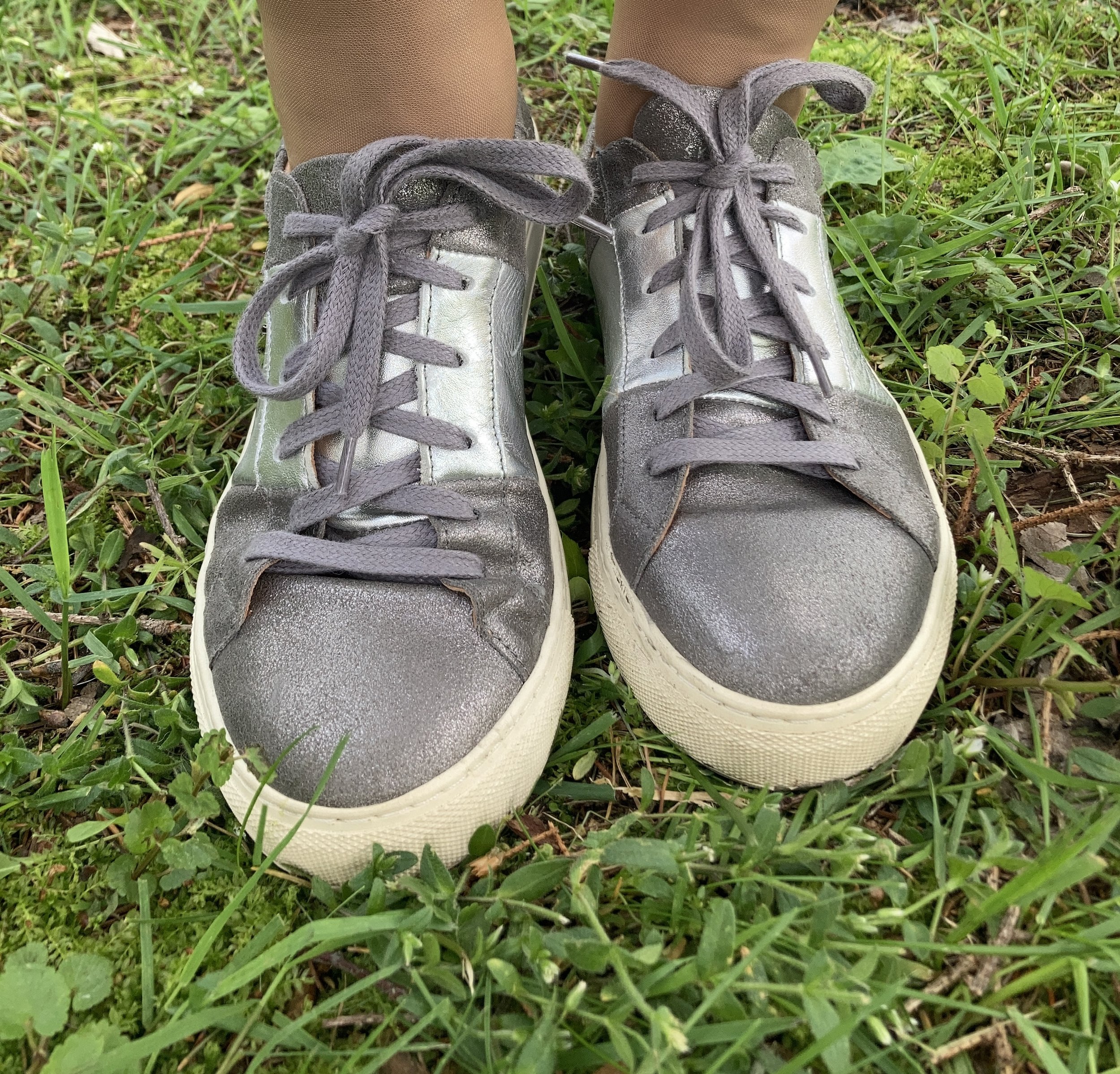
When I decided to incorporate the color gray as well, I knew I wanted gray shoes, a bag and jewelry. I have several pairs of sneakers in different grays and this pair of medium gray Skechers seemed the most complimentary with the white and orange. I bought this pair at Gabes a number of years ago. I keep them around, because they are cute, although not the most comfortable. It baffles me how a pair of sneakers can be uncomfortable, but they can be! Ha, ha.
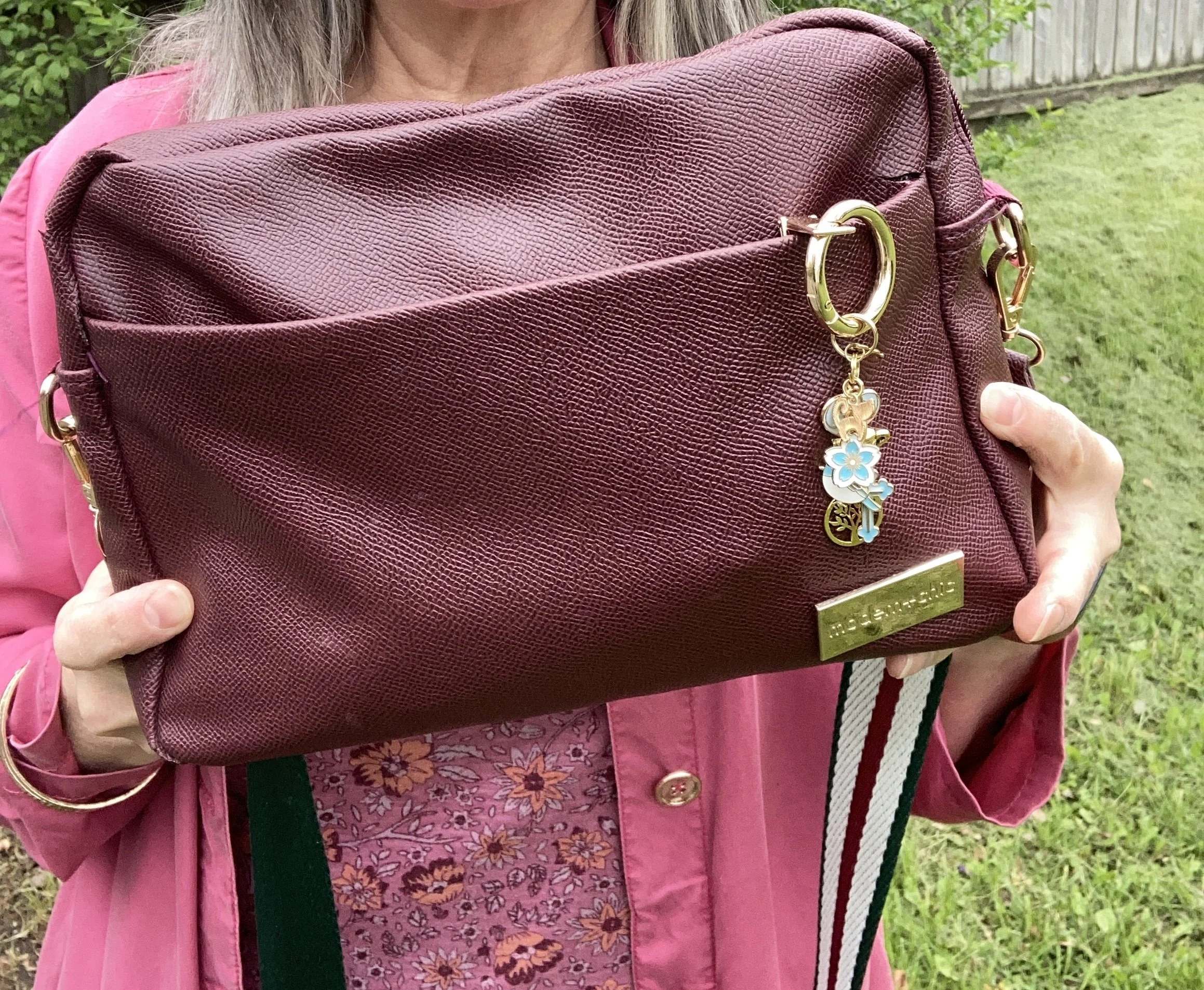
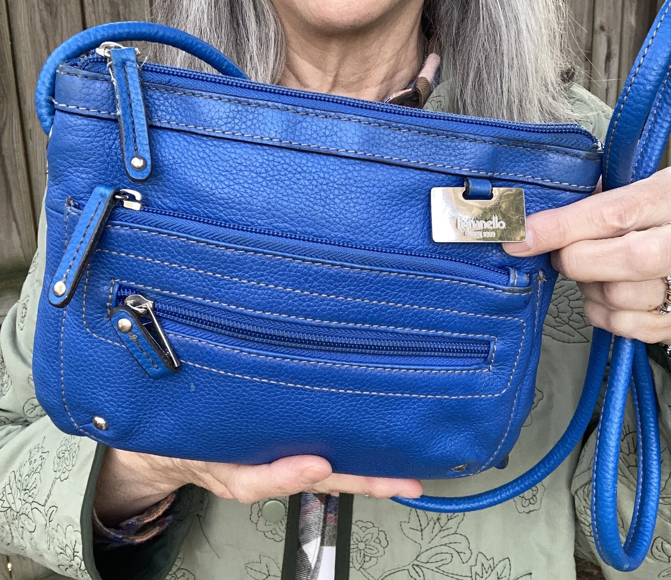
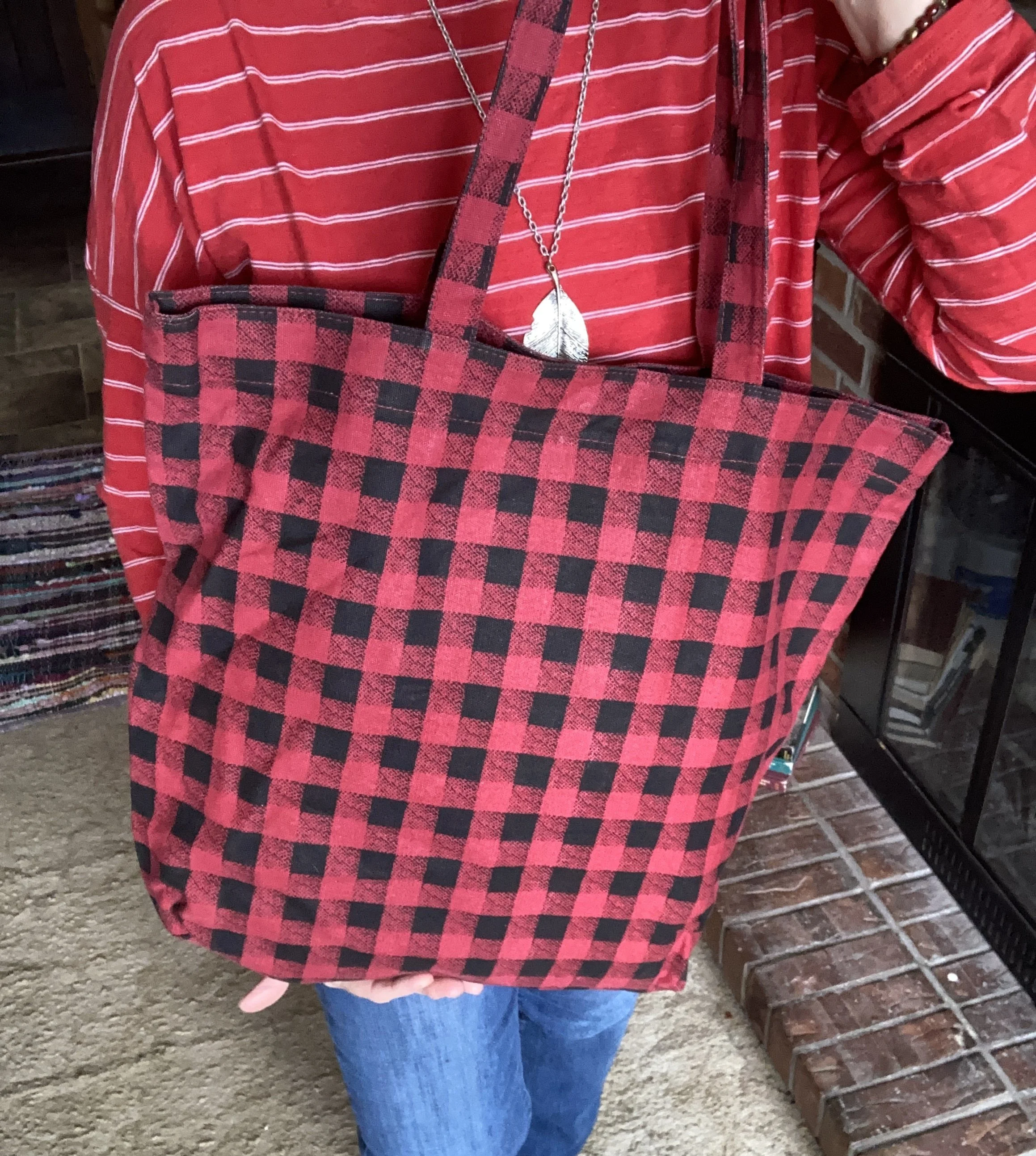
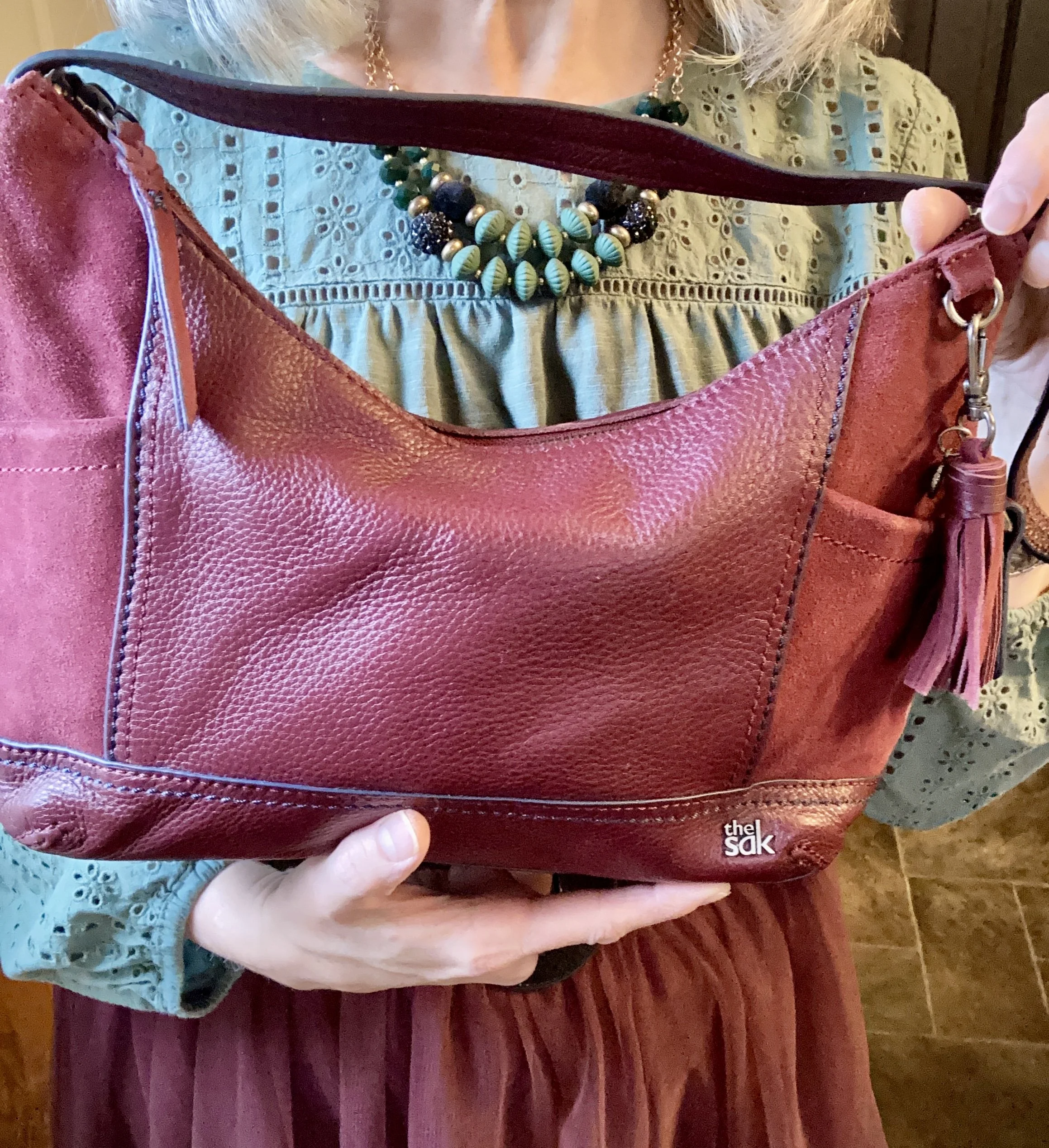
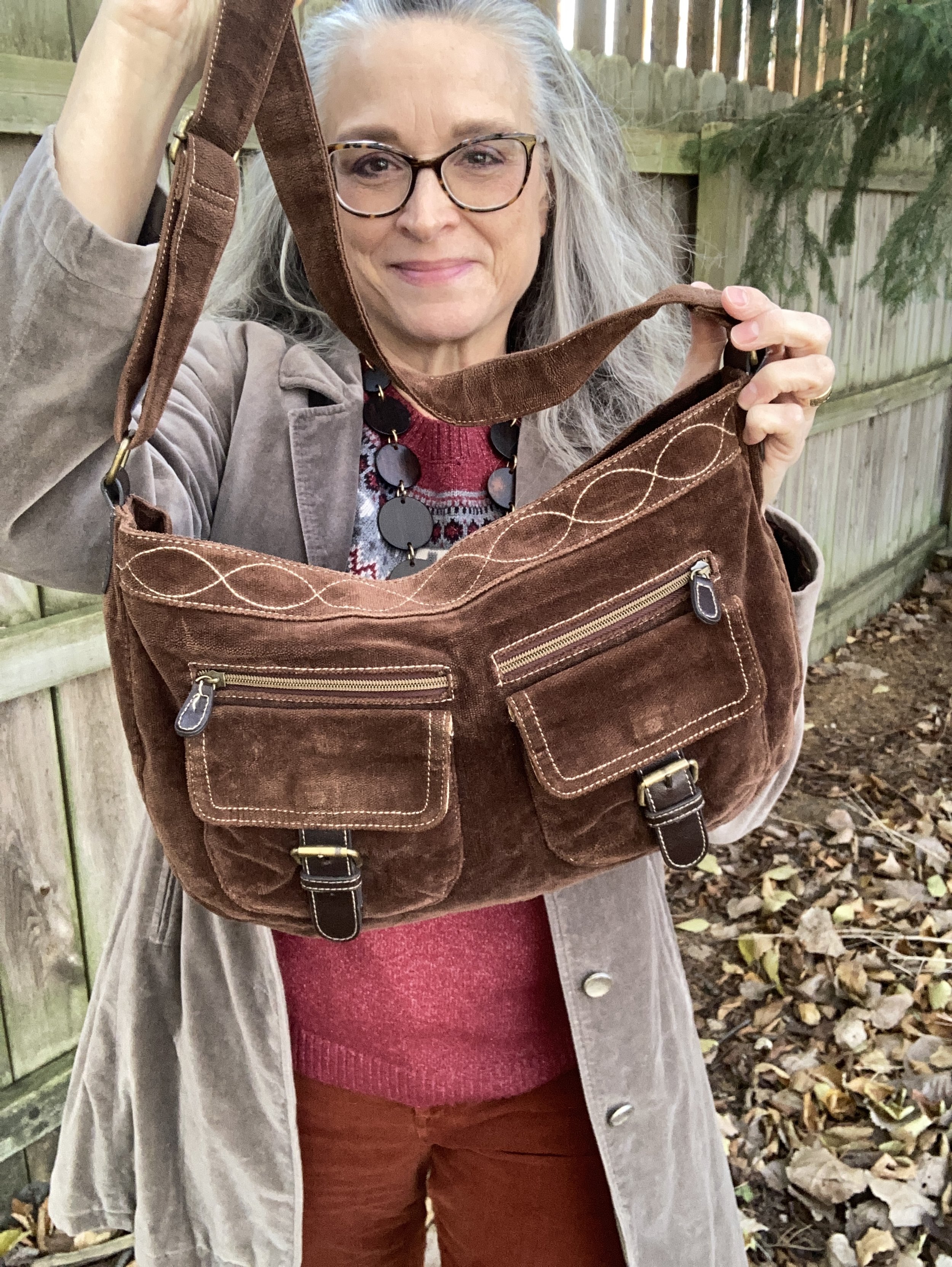
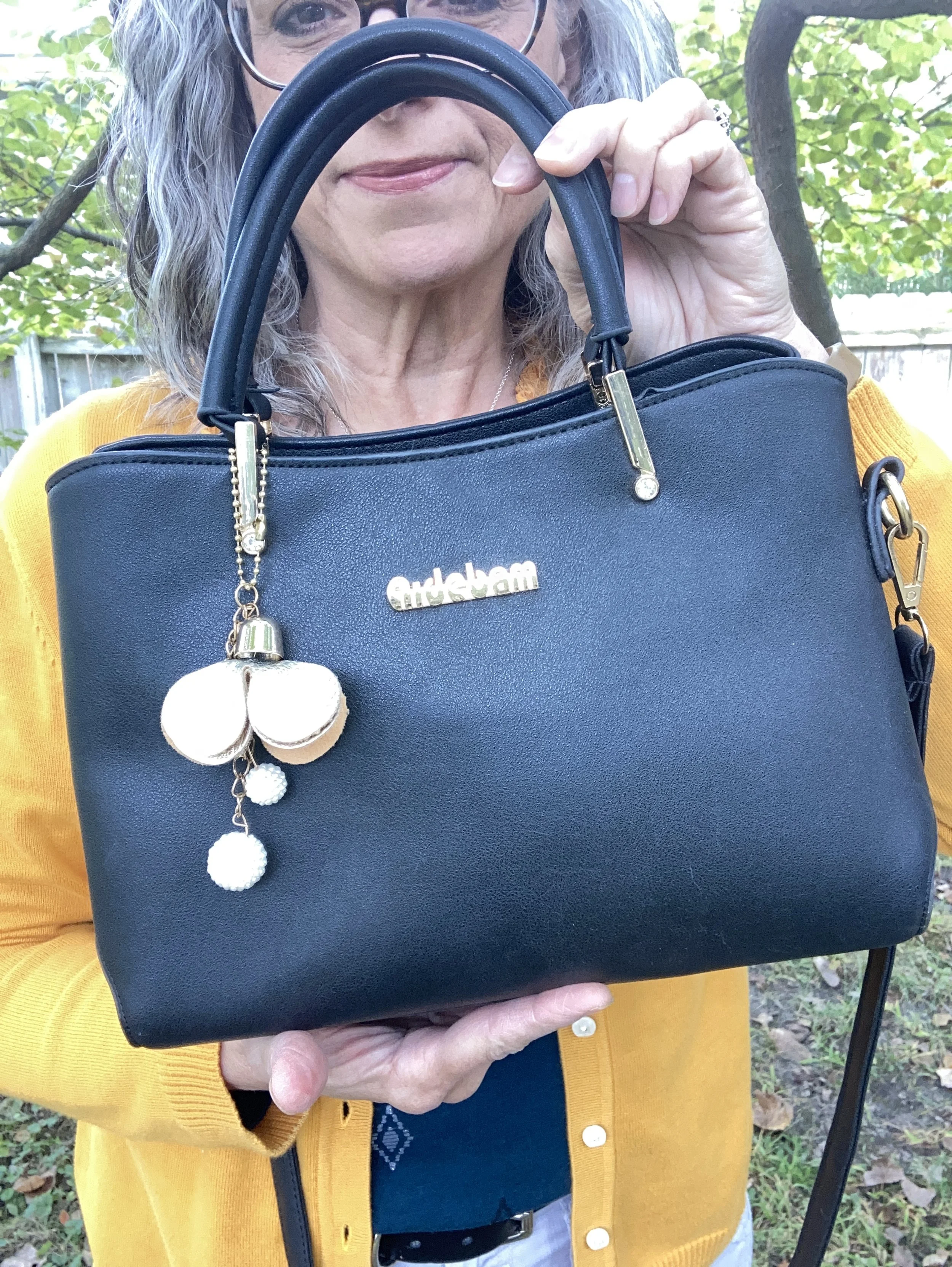
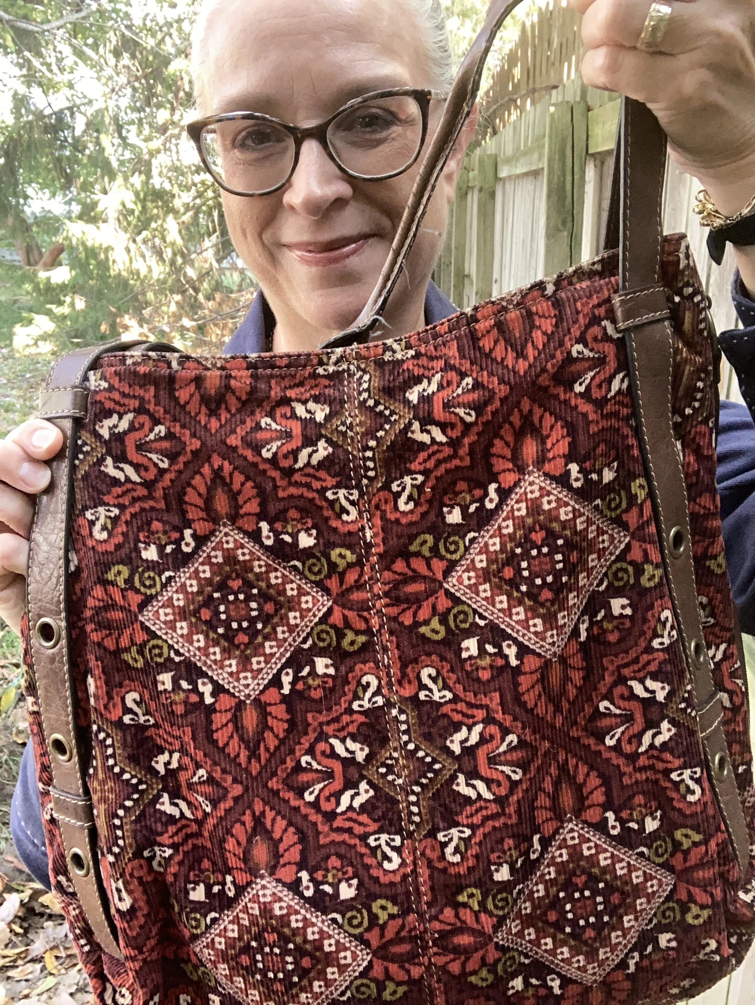
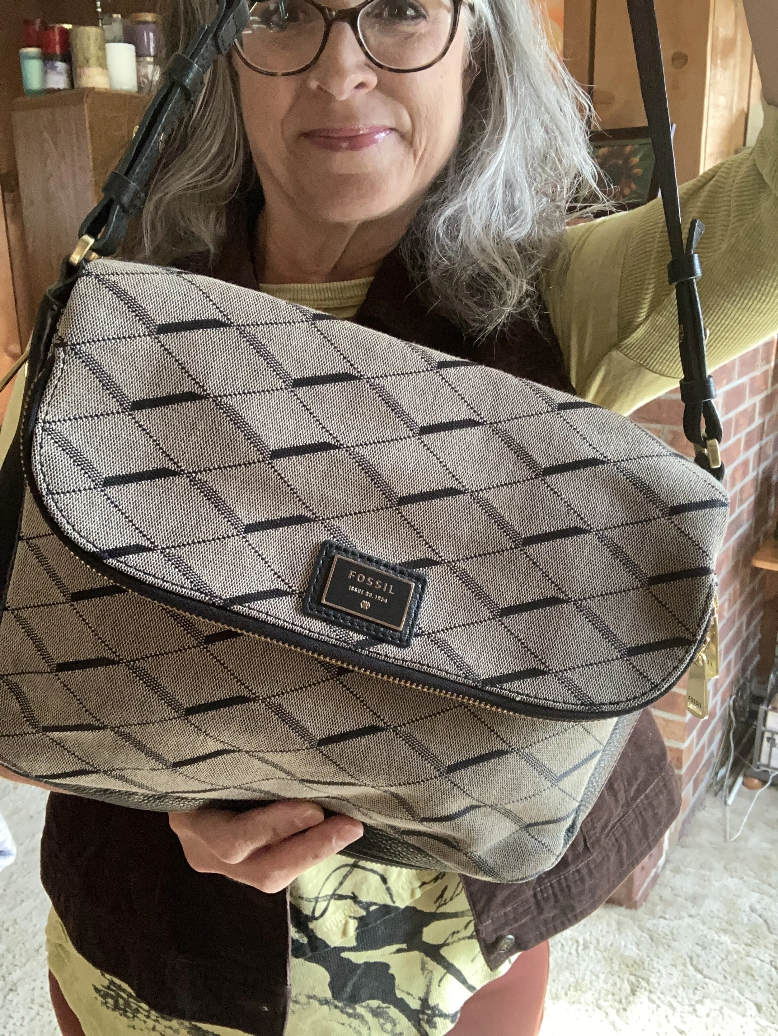
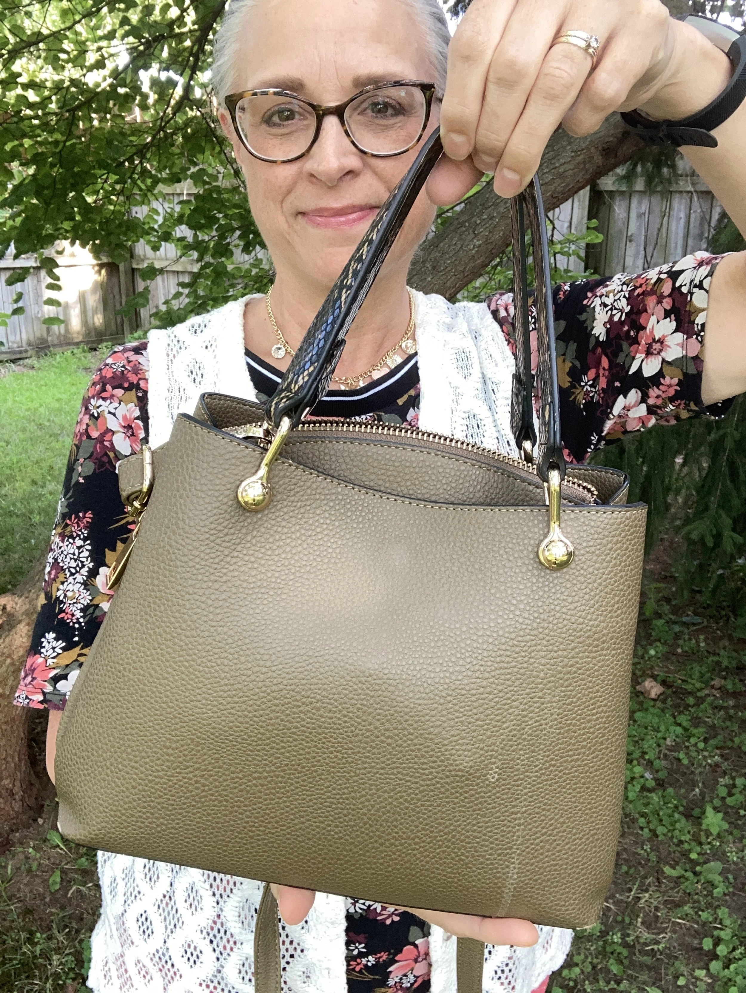
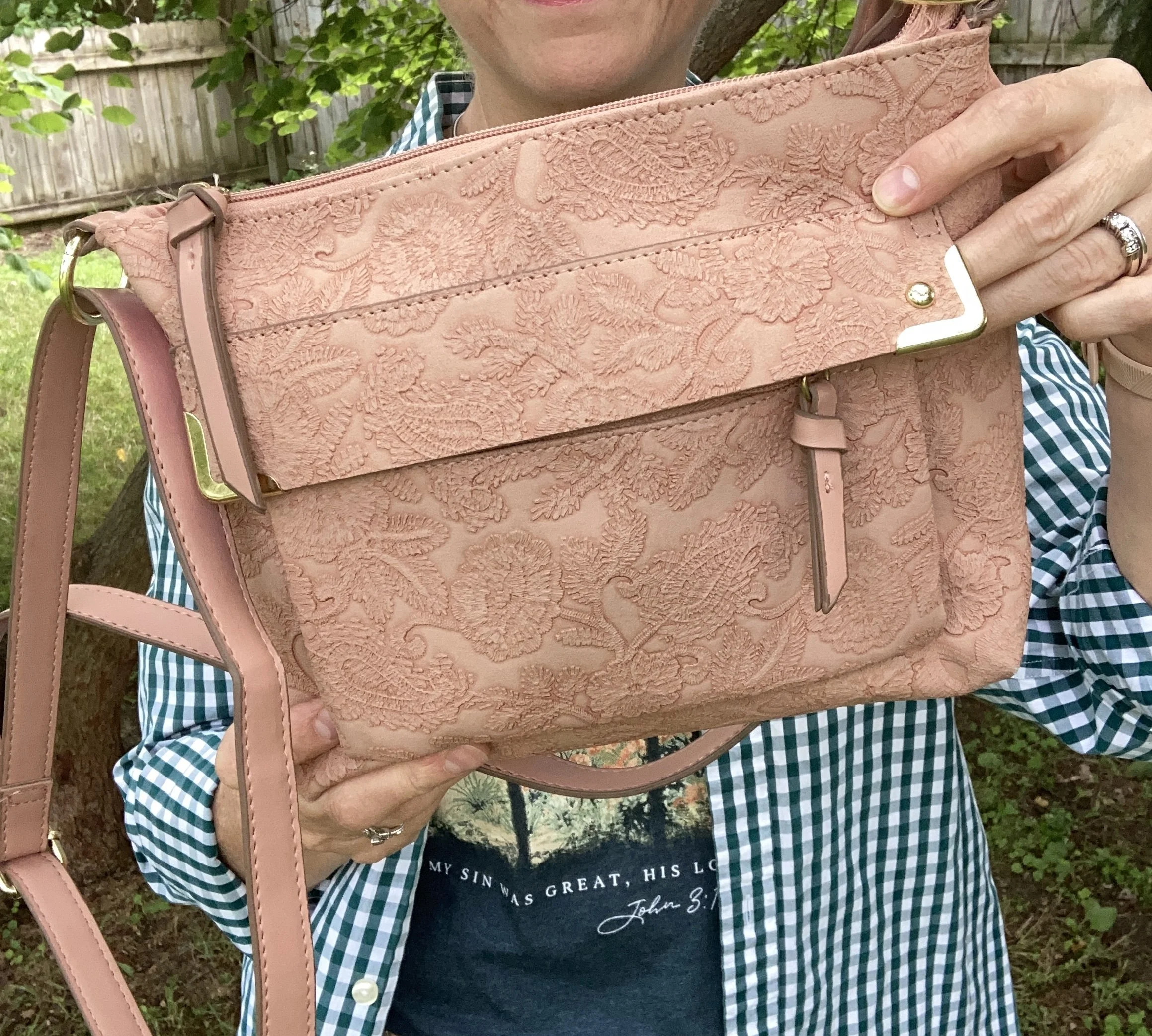
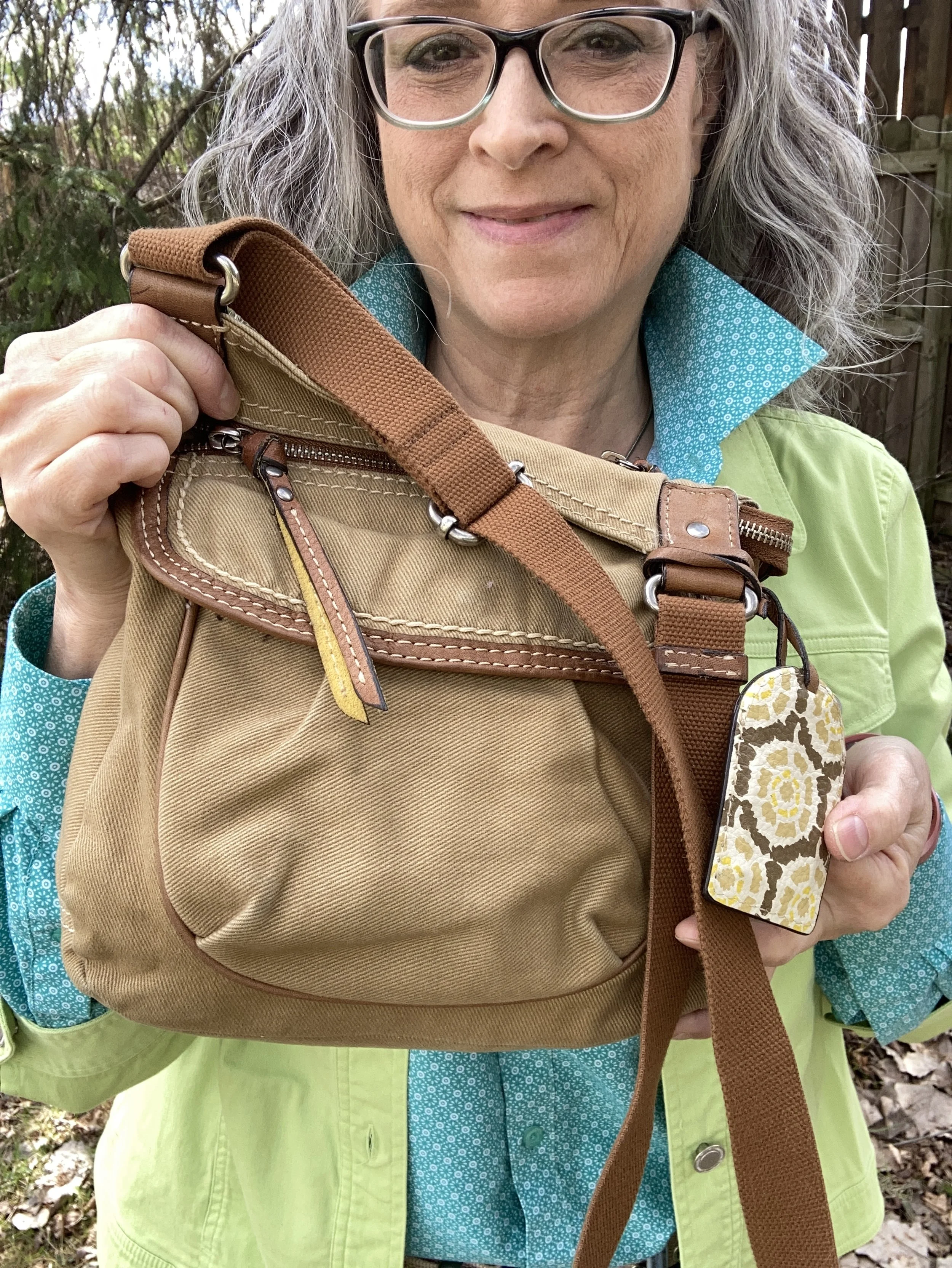
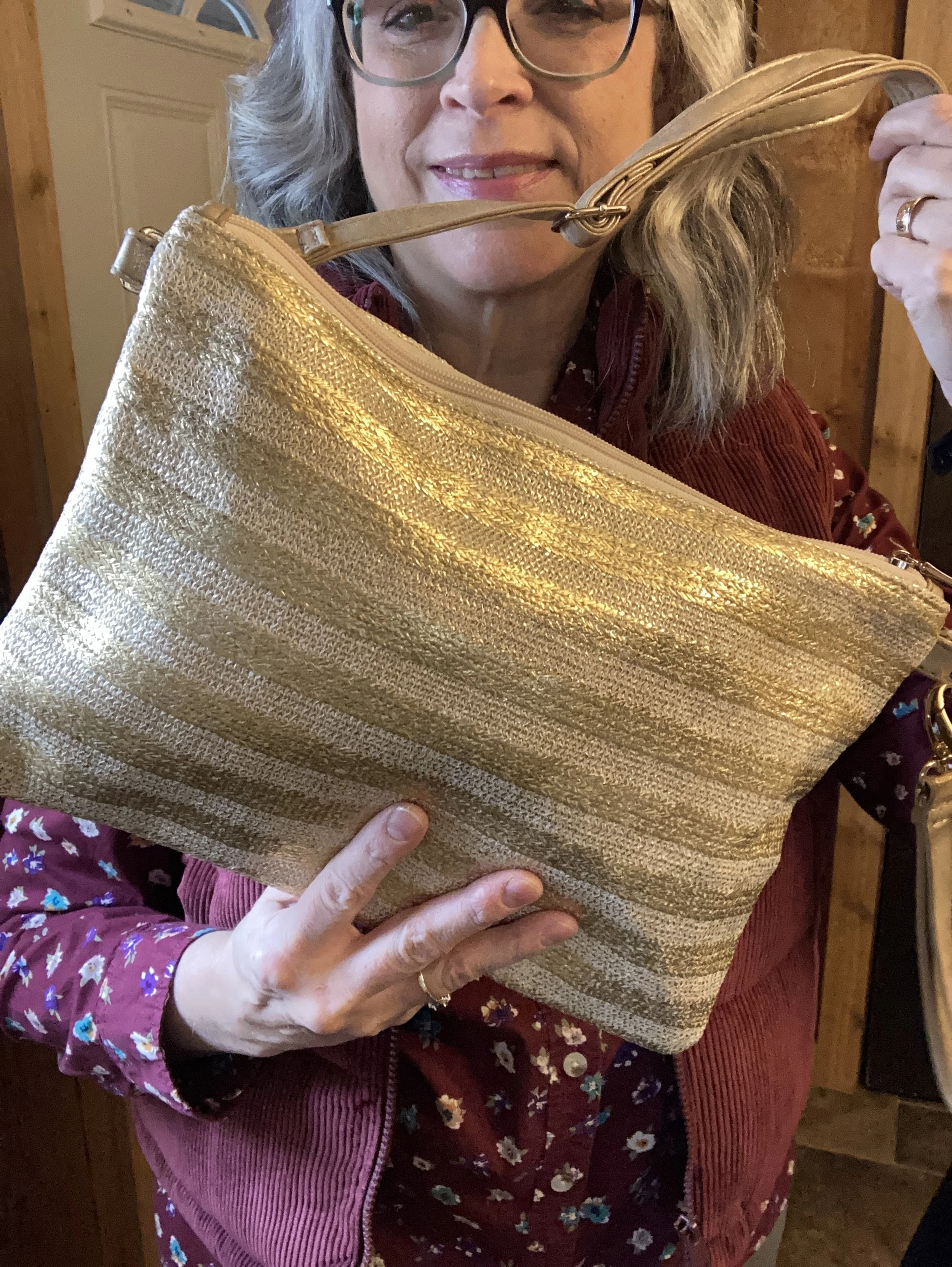
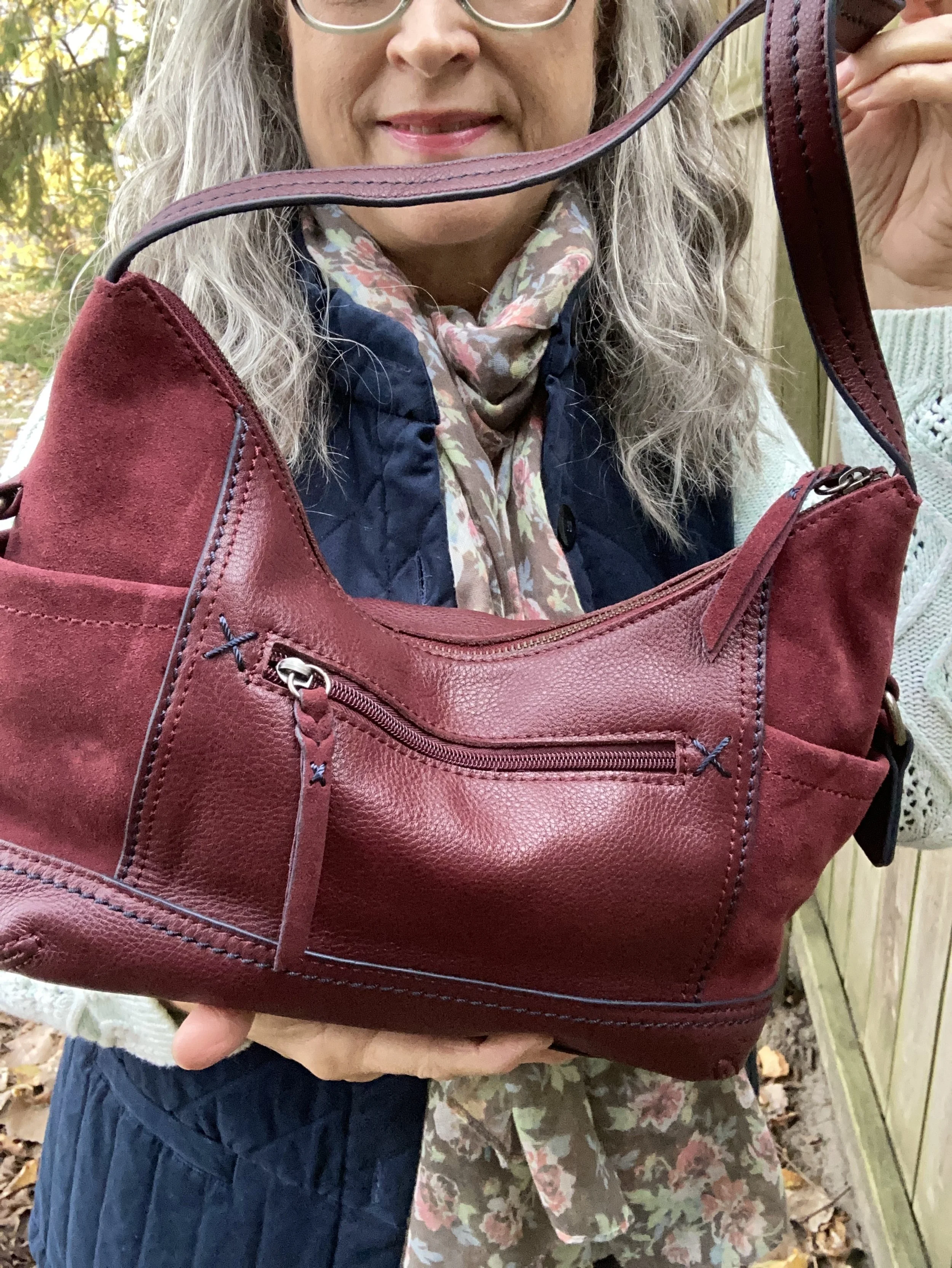
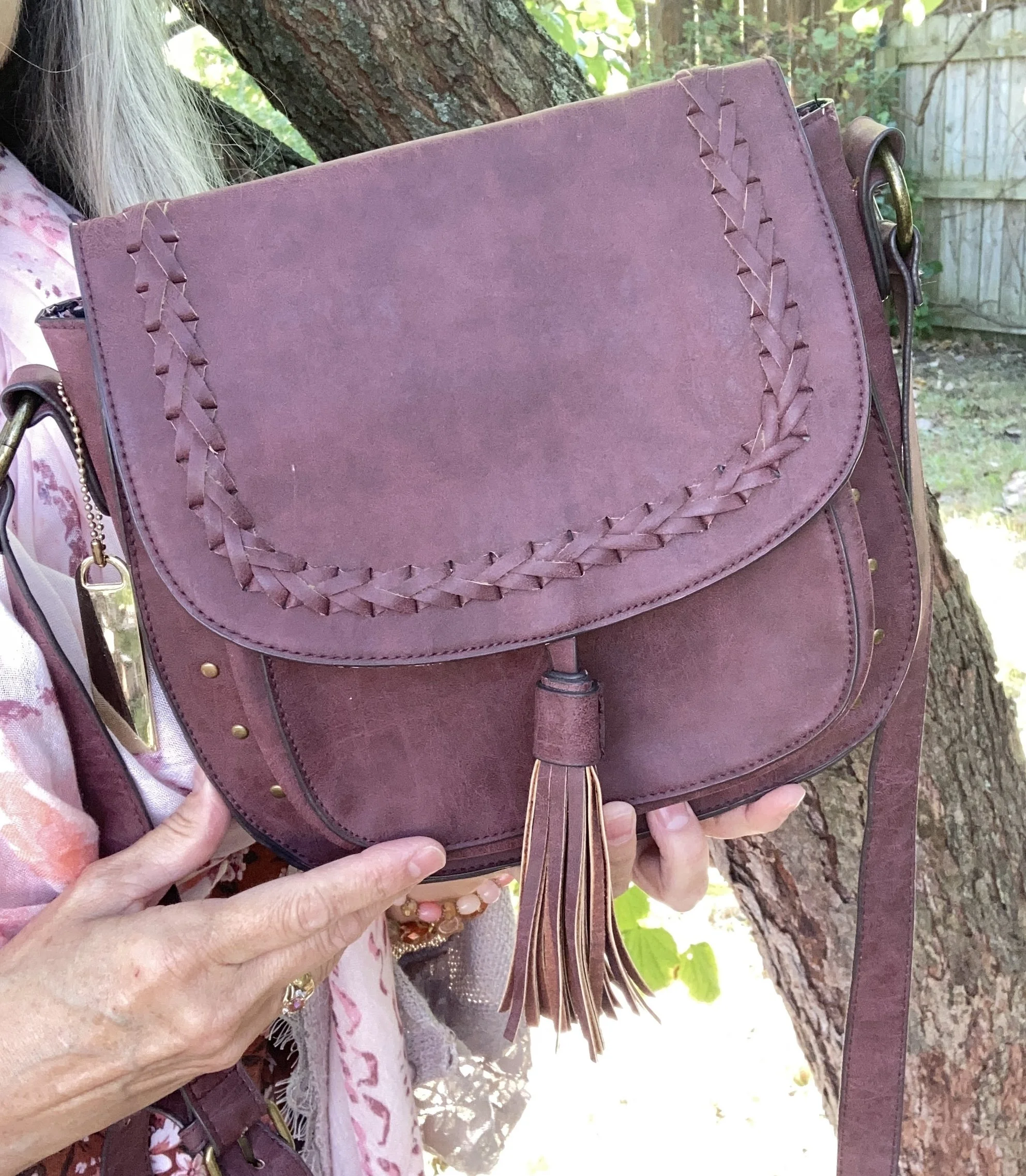
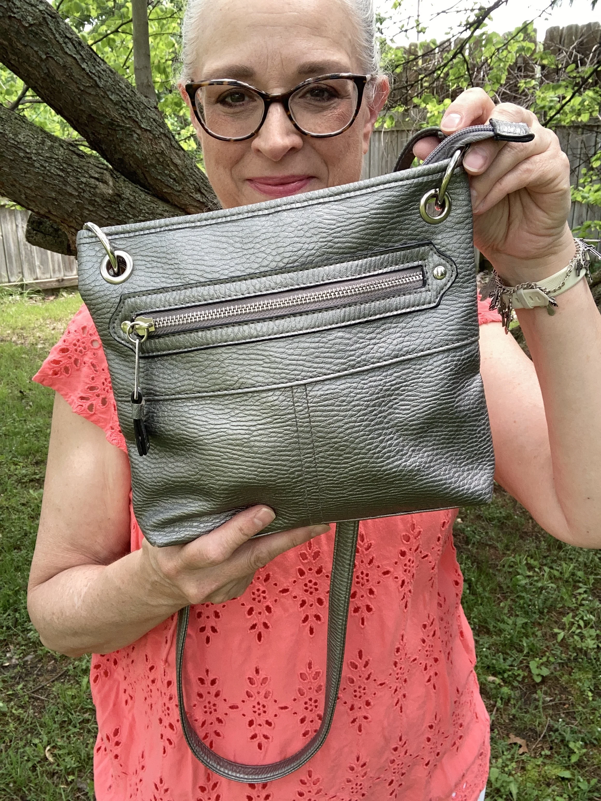
My bag was a thrift find and has no identifiable tag as to what brand it is. I love a cross body bag all year round, but a light weight bag is perfect for summer. This seemed perfect with the sneakers and the jewelry. Here are a few gray options from Kohl’s.
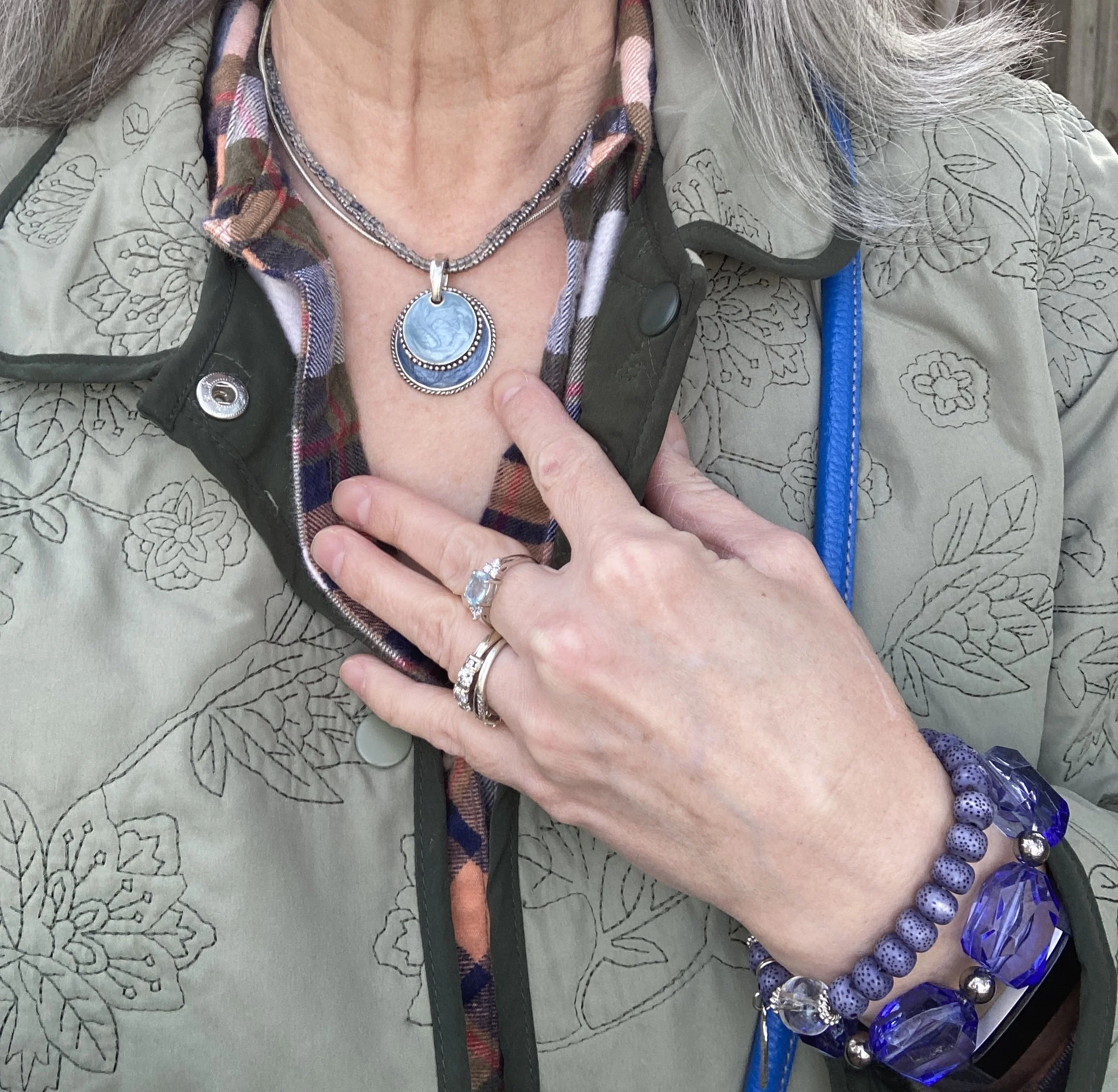
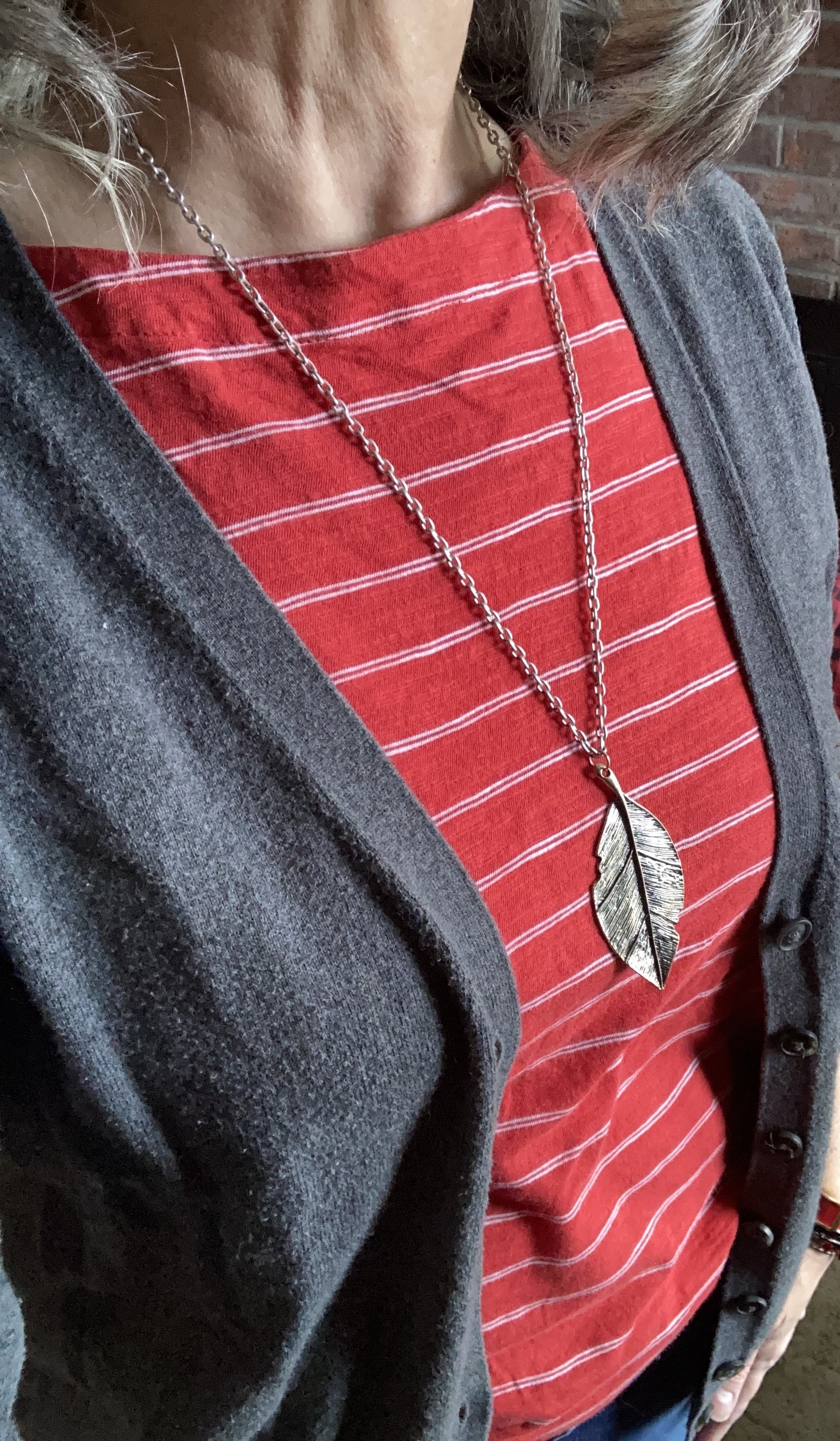
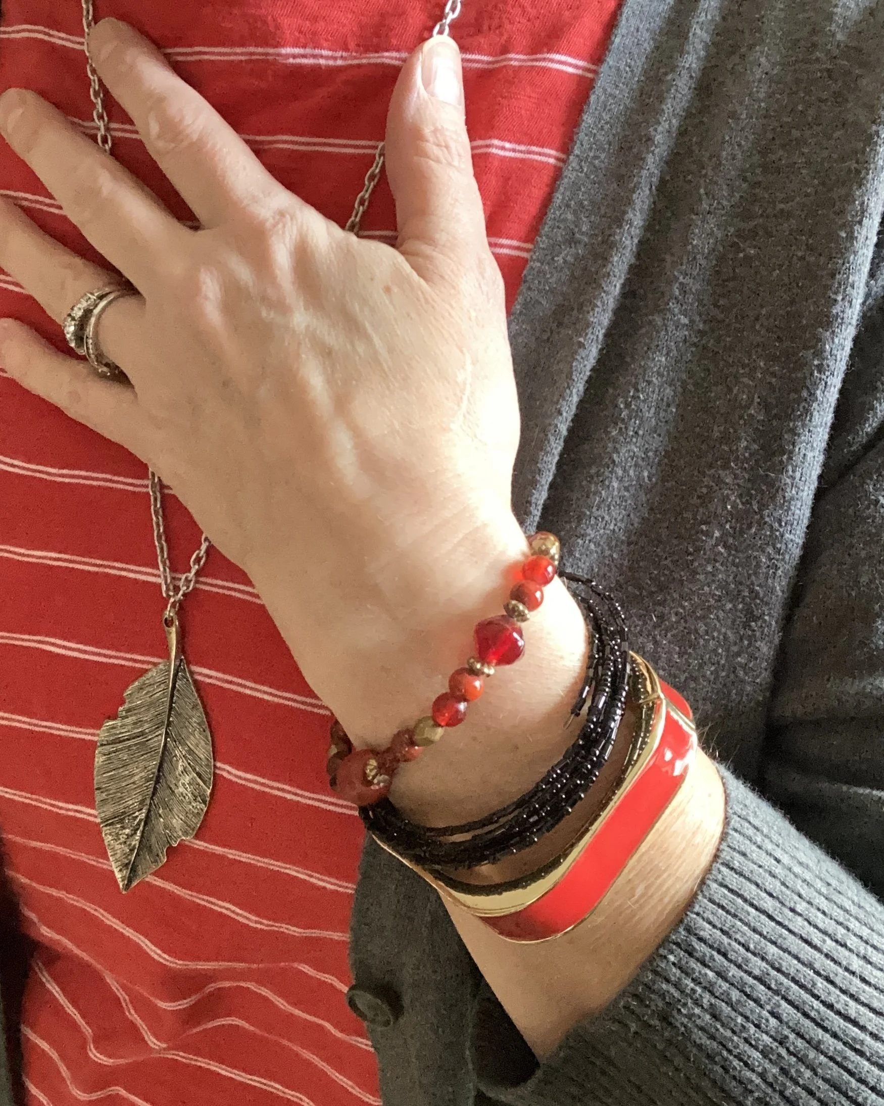
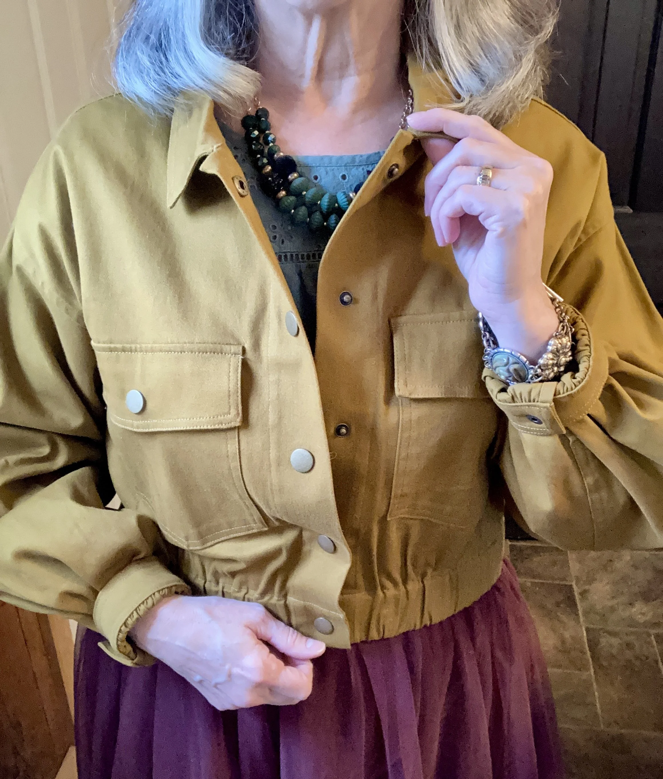
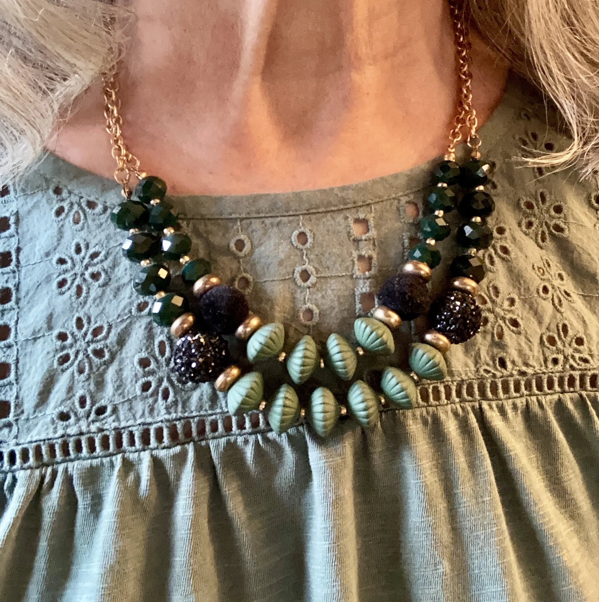
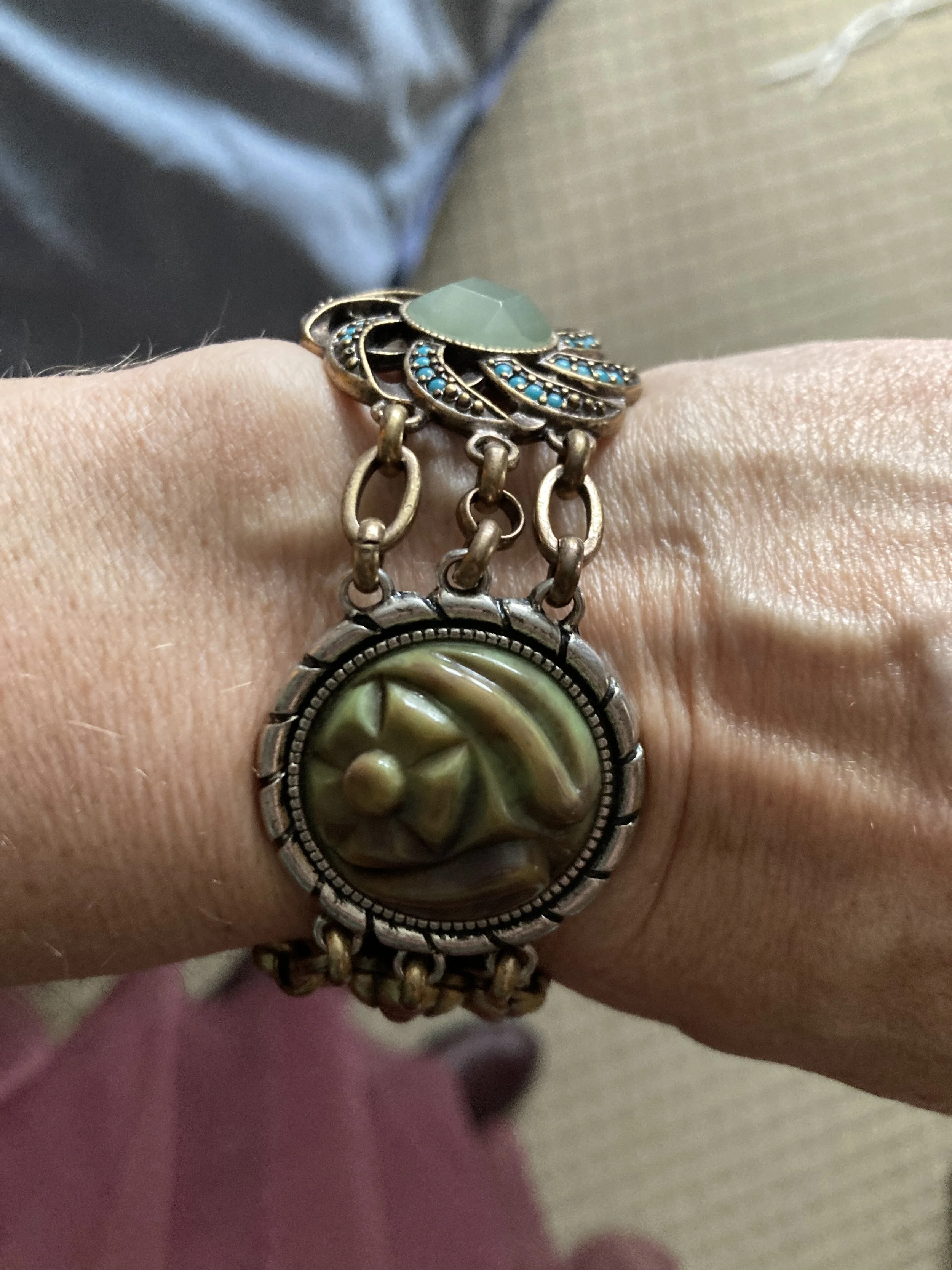
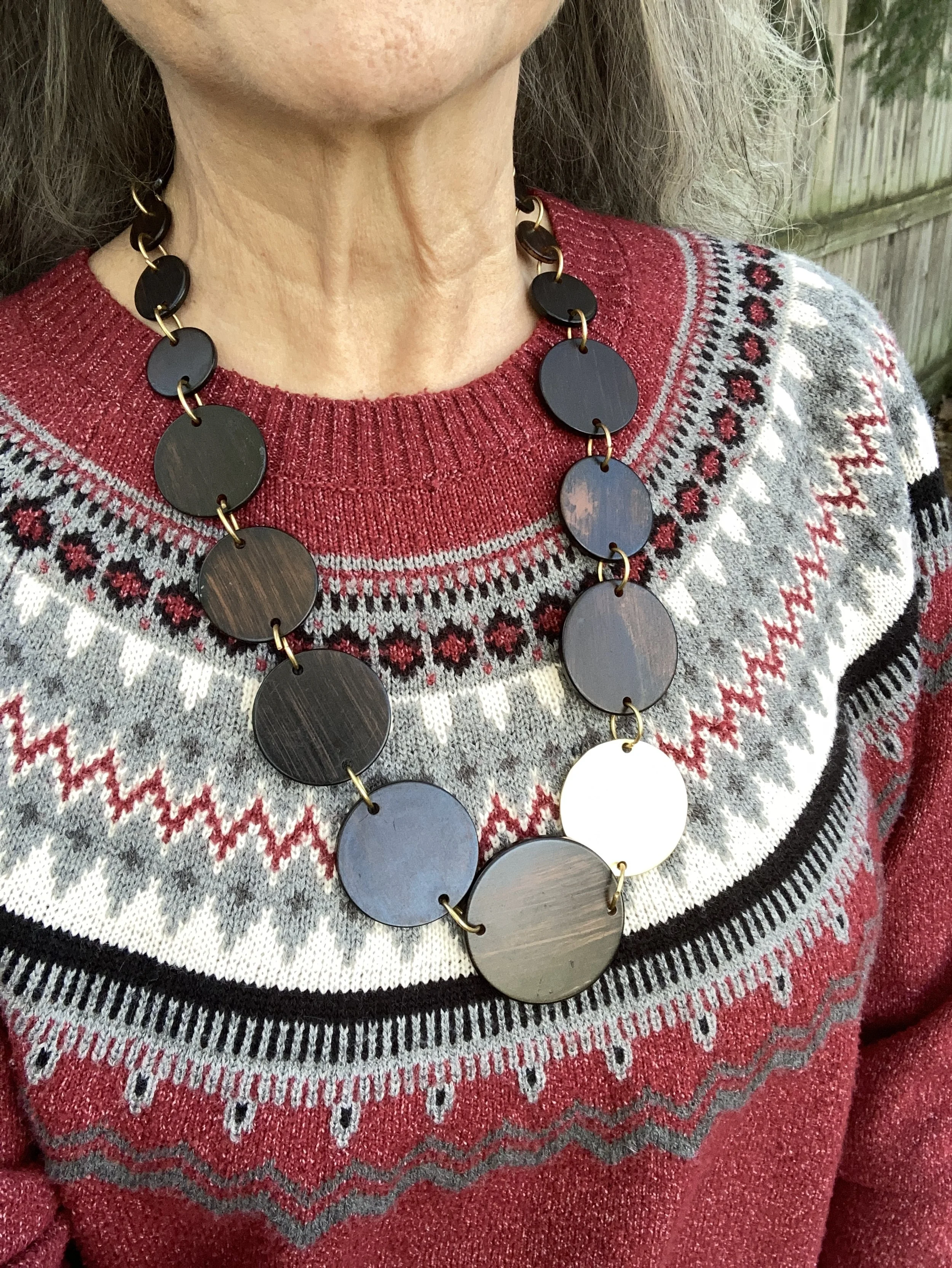
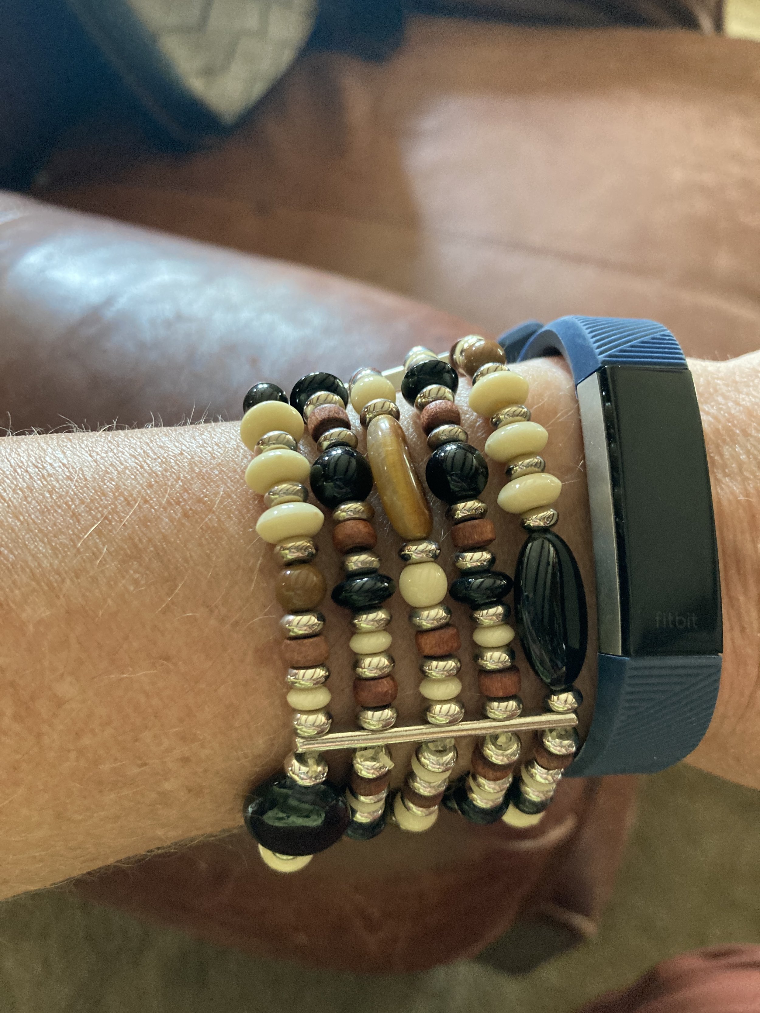
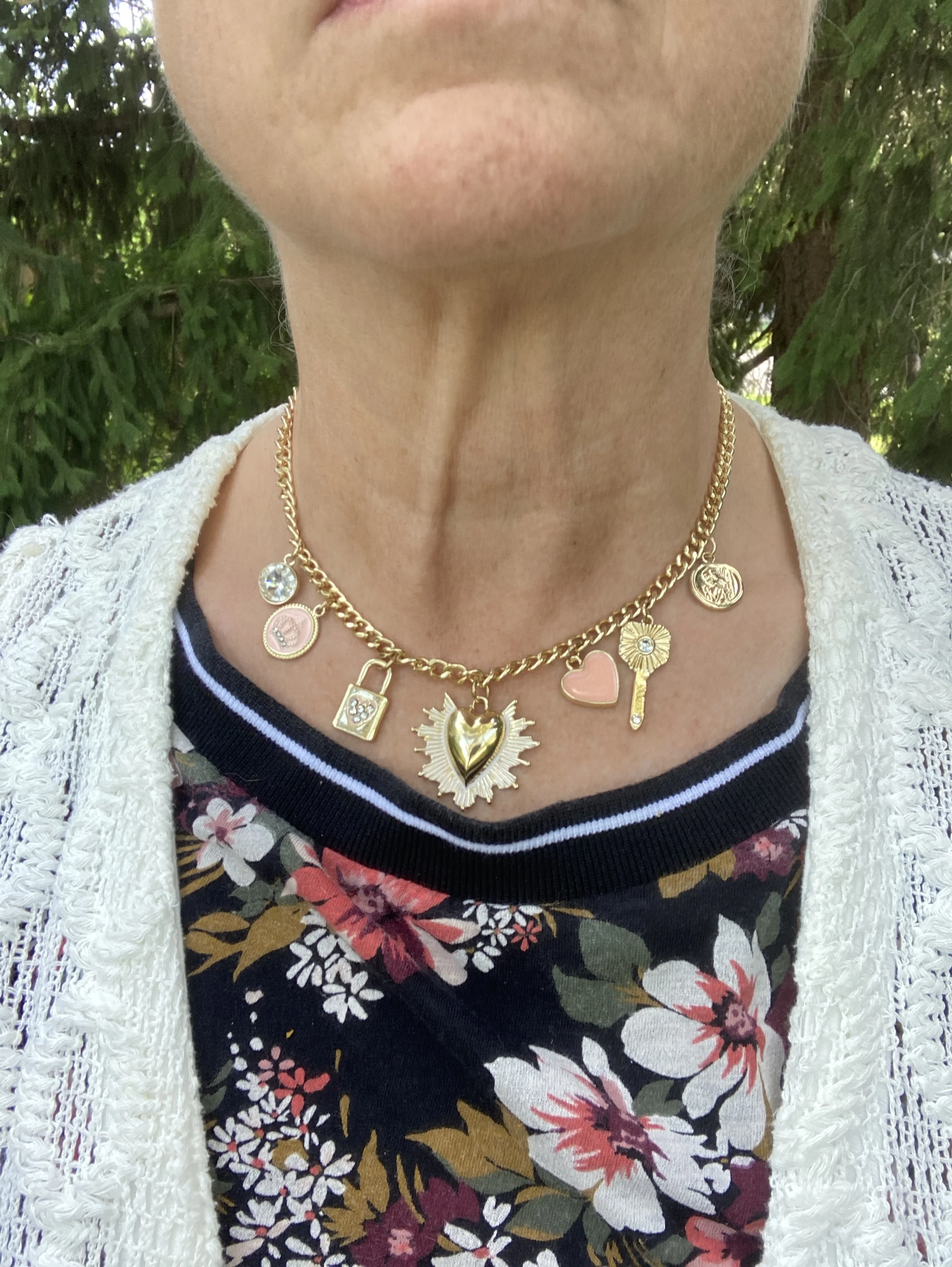
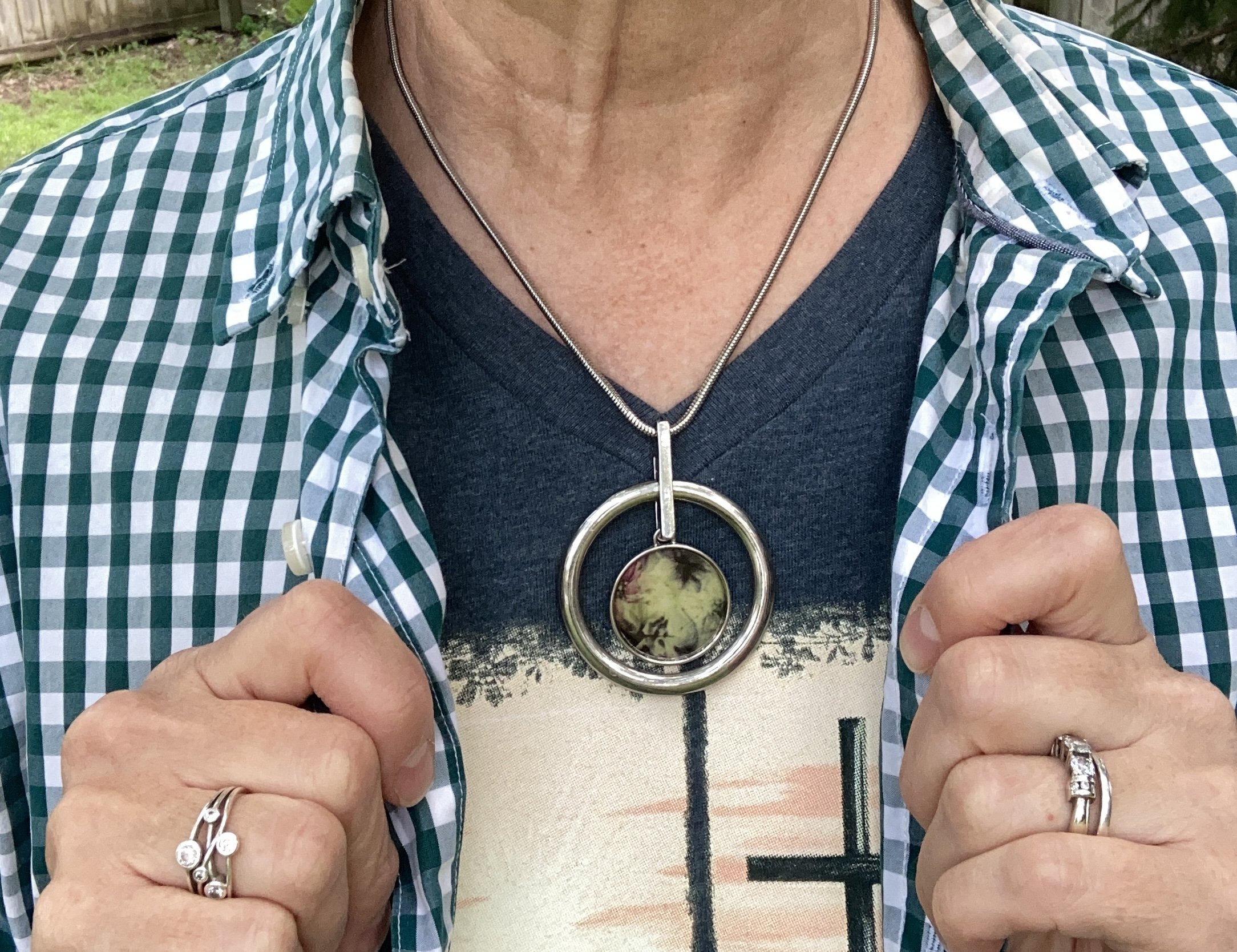
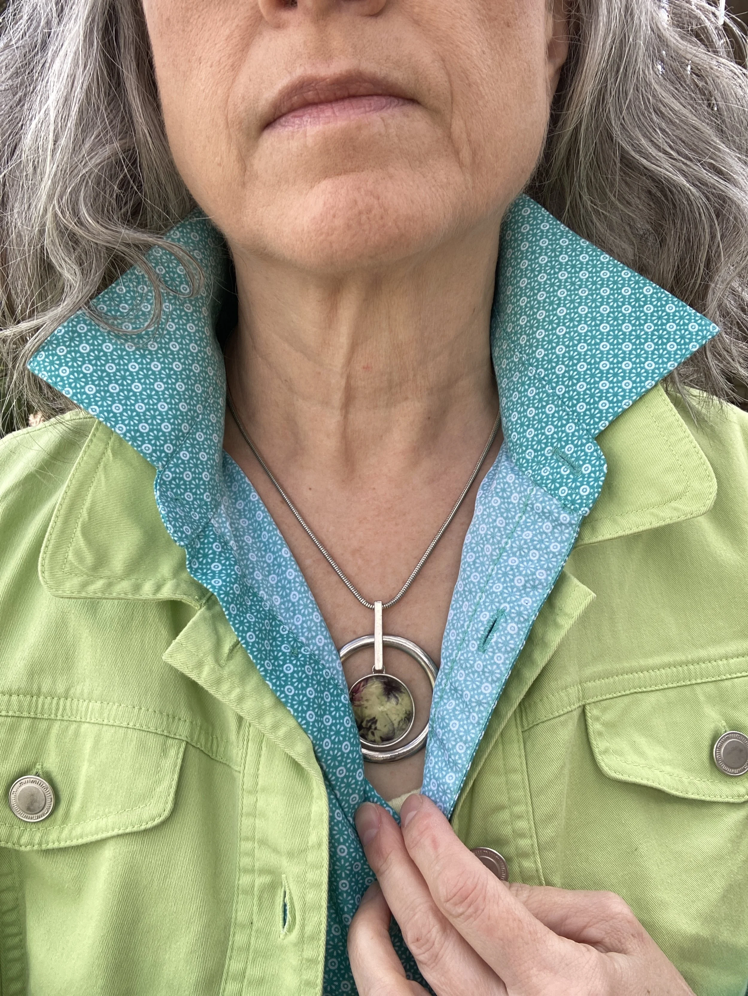
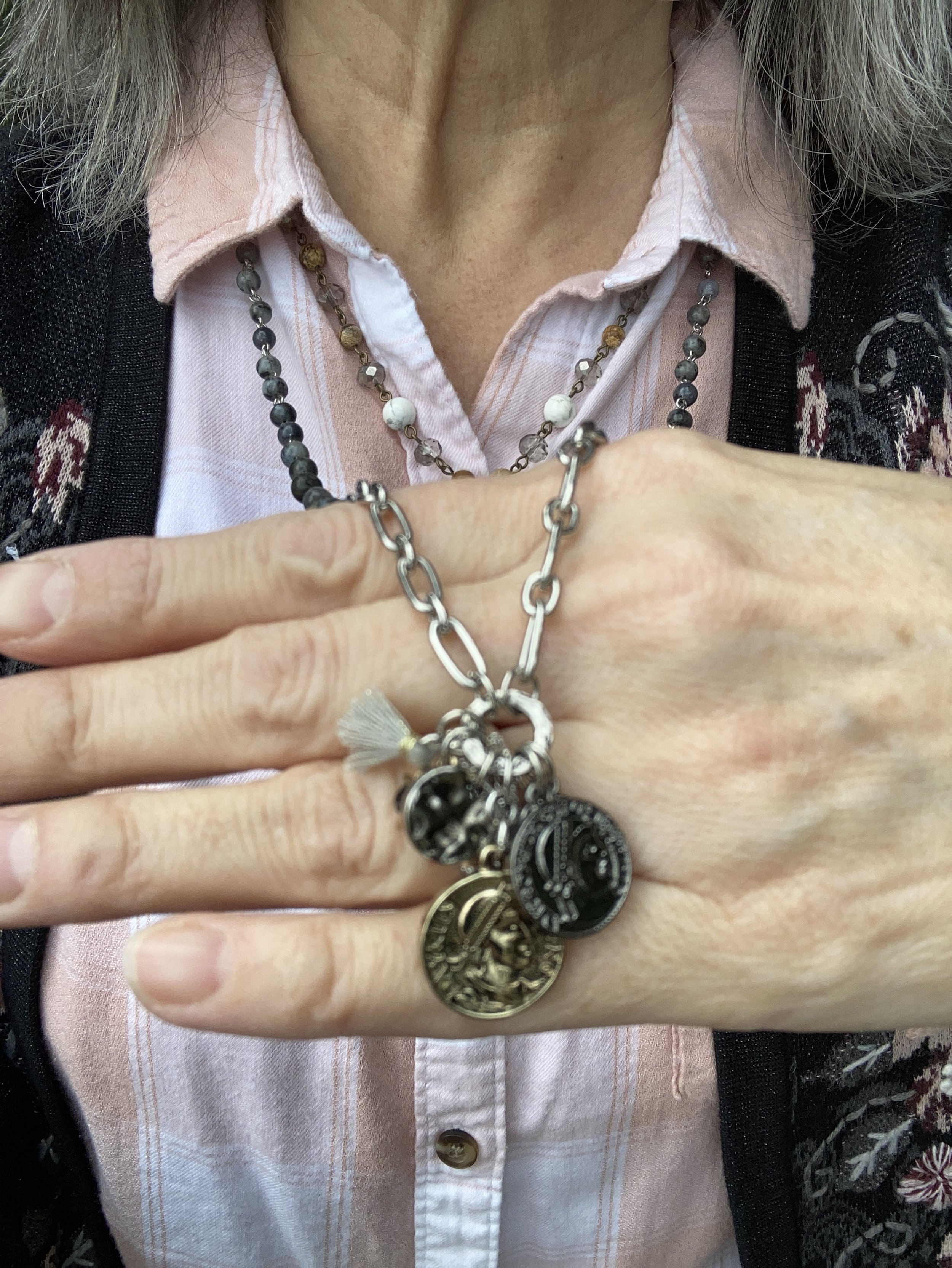
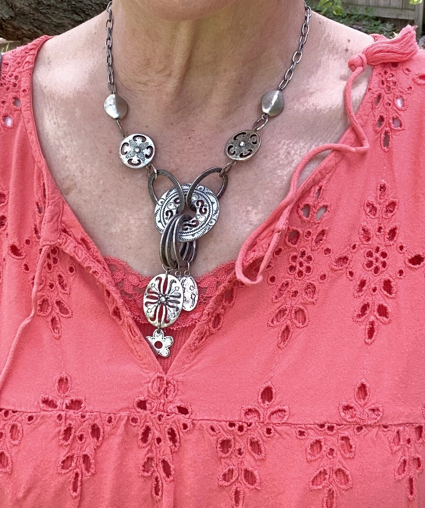
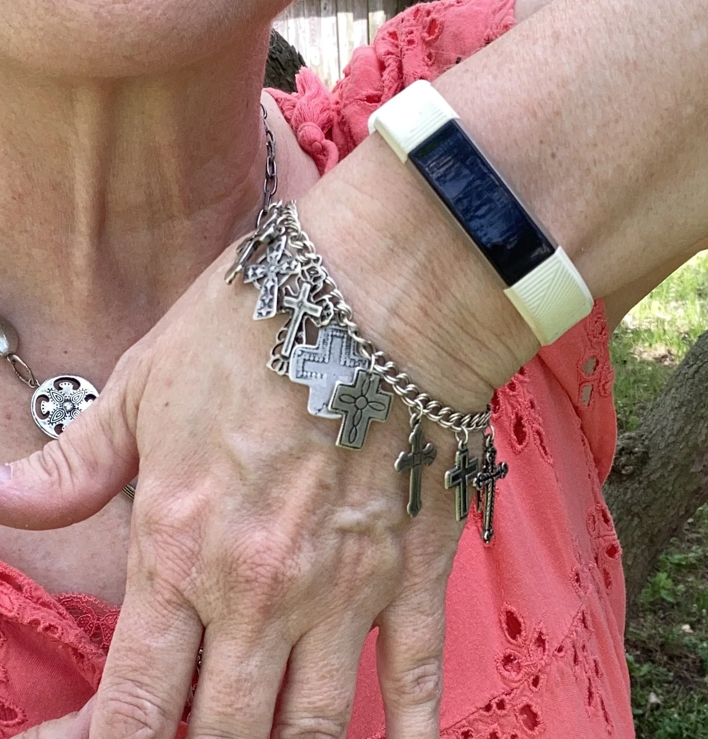
The two pieces of jewelry are both second hand. The necklace was from my bestie in NY, and the bracelet was a recent thrift find. I love both of these pieces for their interesting blend of metal shapes and textures. The bracelet is a reminder to me every time I wear it of what Christ did for me on the cross.
What do you think of this color combination? Do you wear bright white in the summer? How about all year round? I tend to lean more toward the creamy, winter whites in the cold weather and bright whites in the summer. I’d love to hear from you, so please leave a comment or two.
Have a wonderful Tuesday!