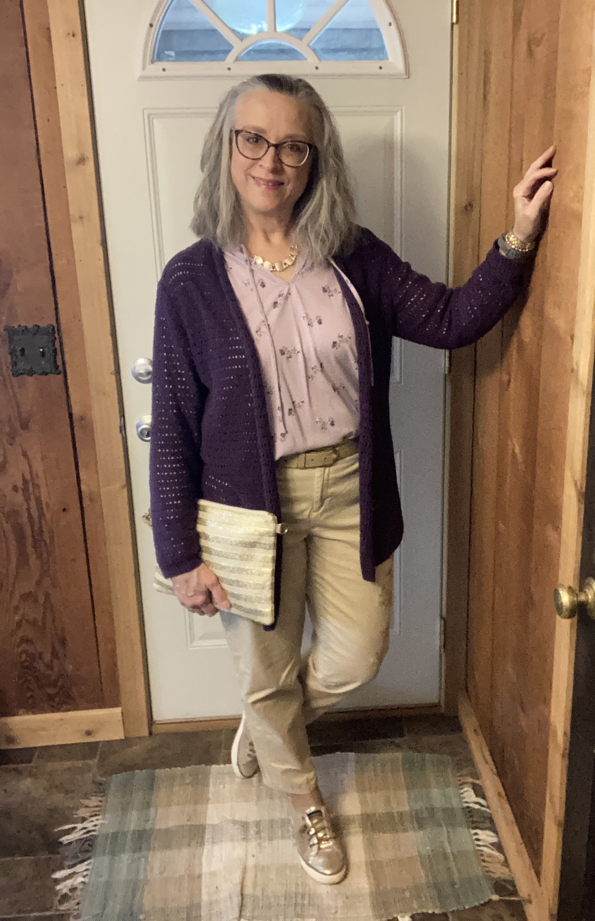
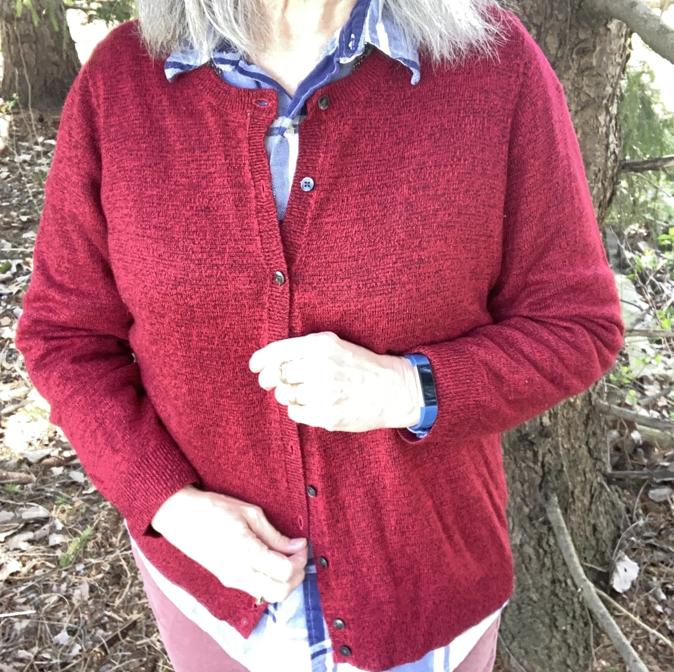
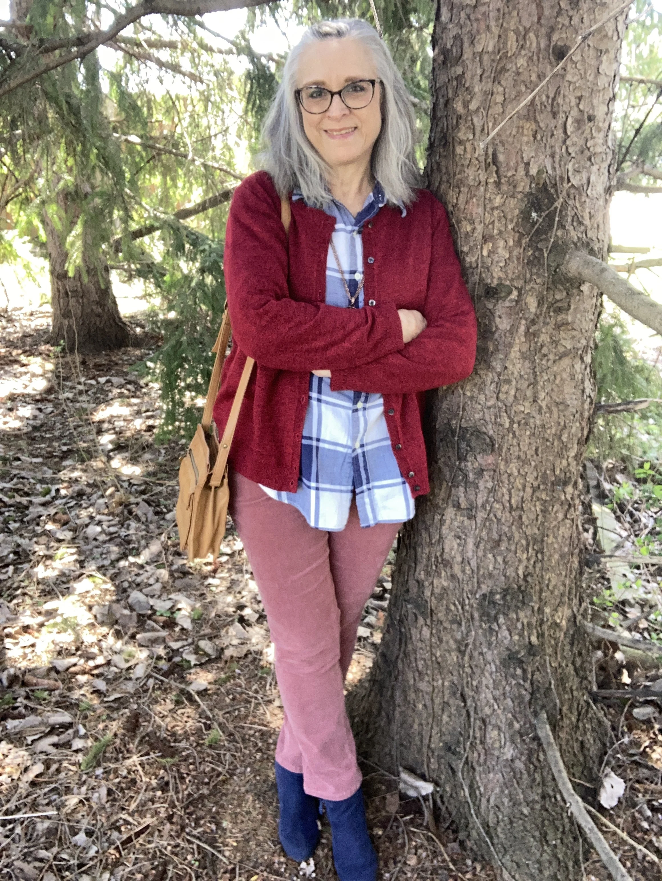
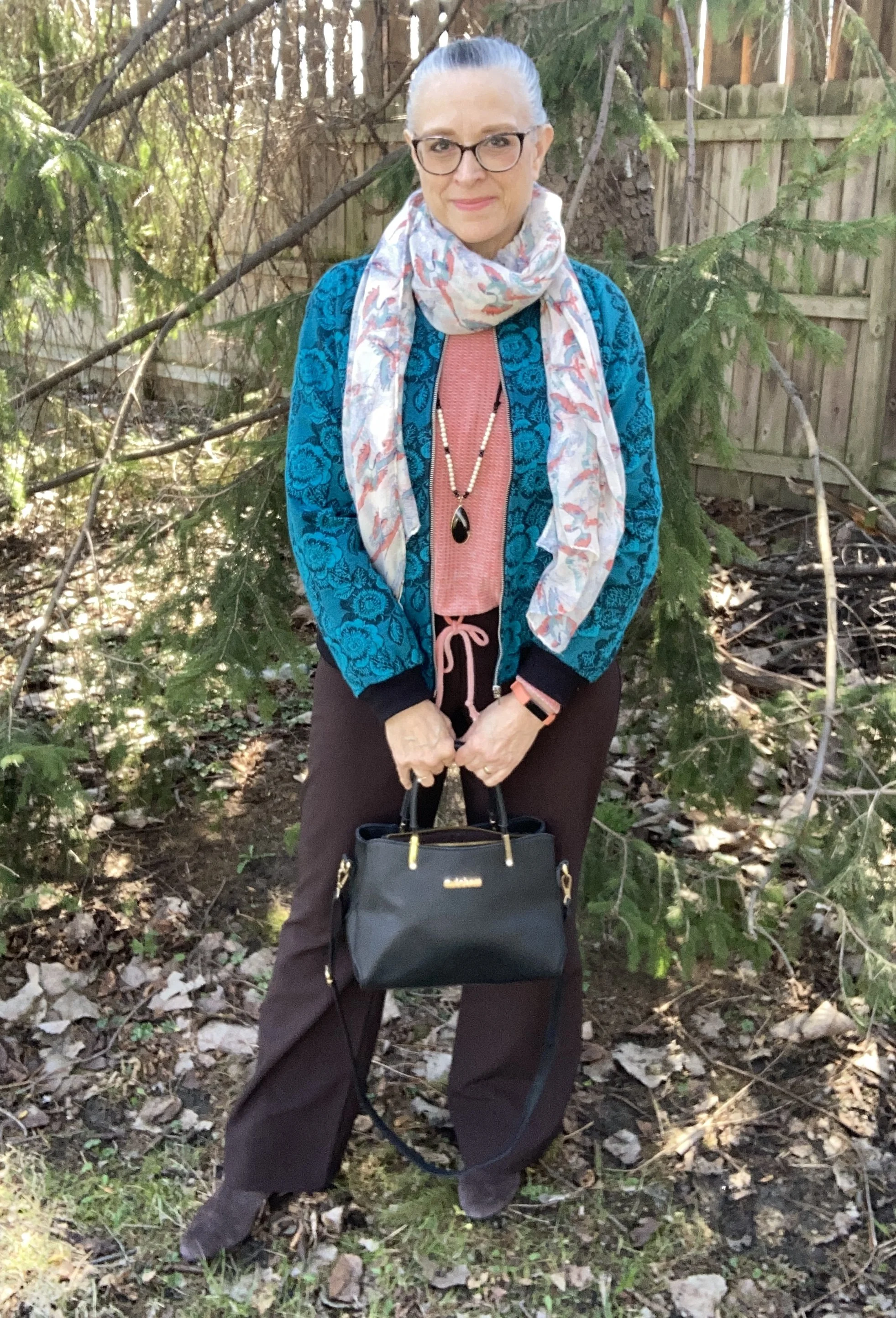
What I Have Been Wearing Lately
Hi everyone. It has been a crazy few weeks since I last posted on this page. Since I don’t have an outfit picked out for today, I thought I would just share a few of my Instagram outfits, just for some content until I can get back to regular posting. My spouse and I are making progress on his retirement, but it has been one roadblock after another. Who would have thought getting all the things in place for retirement would be a full time job, and a job without all the perks! Ha, ha.
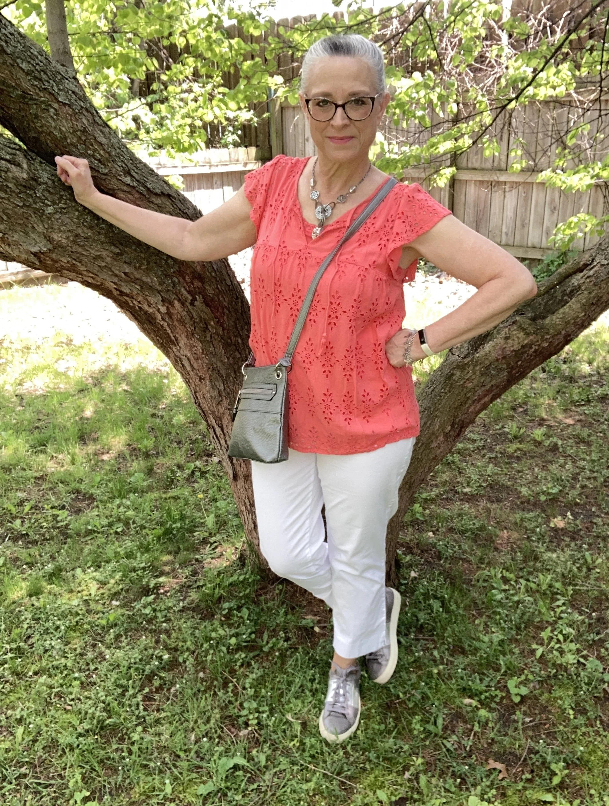
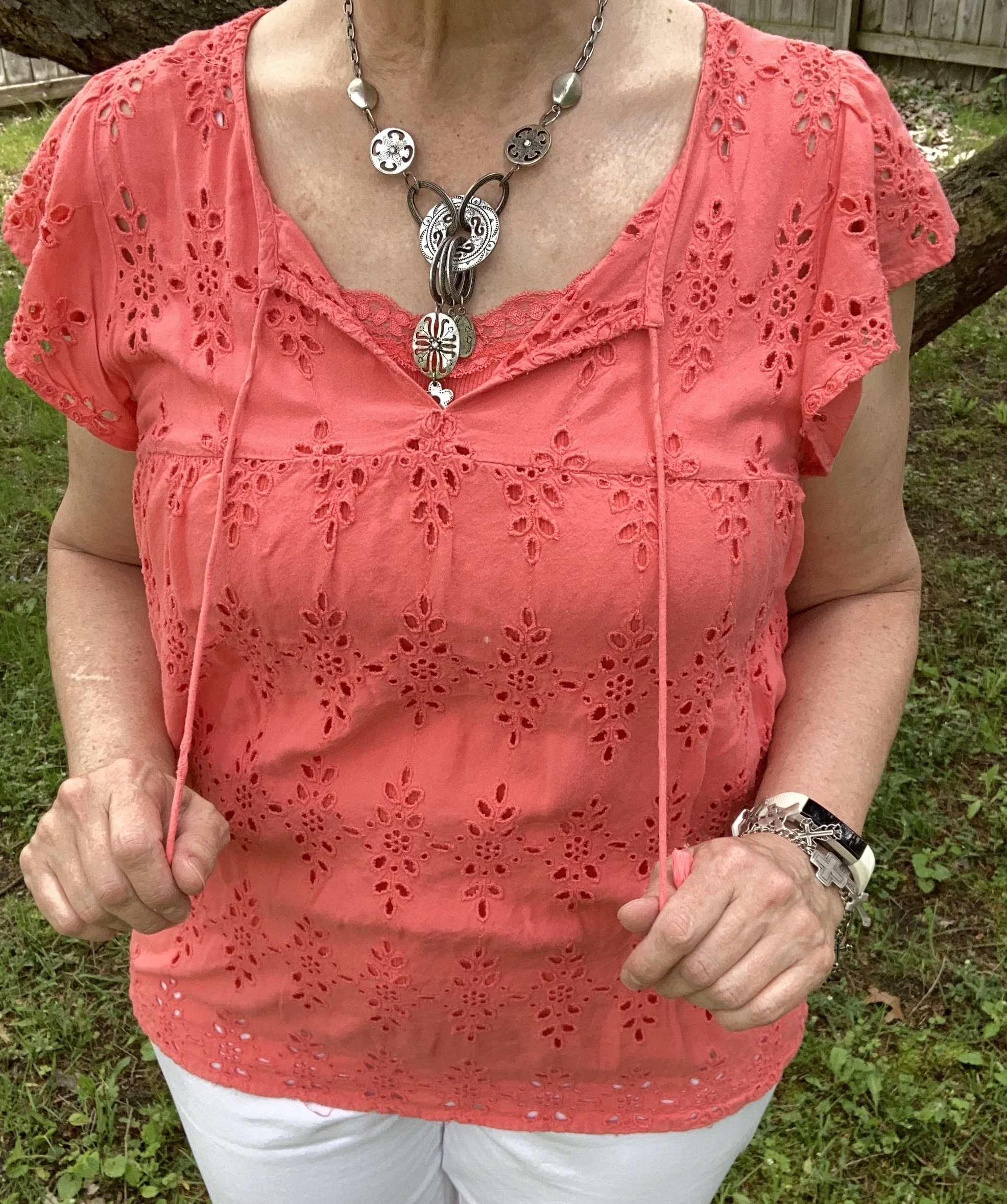
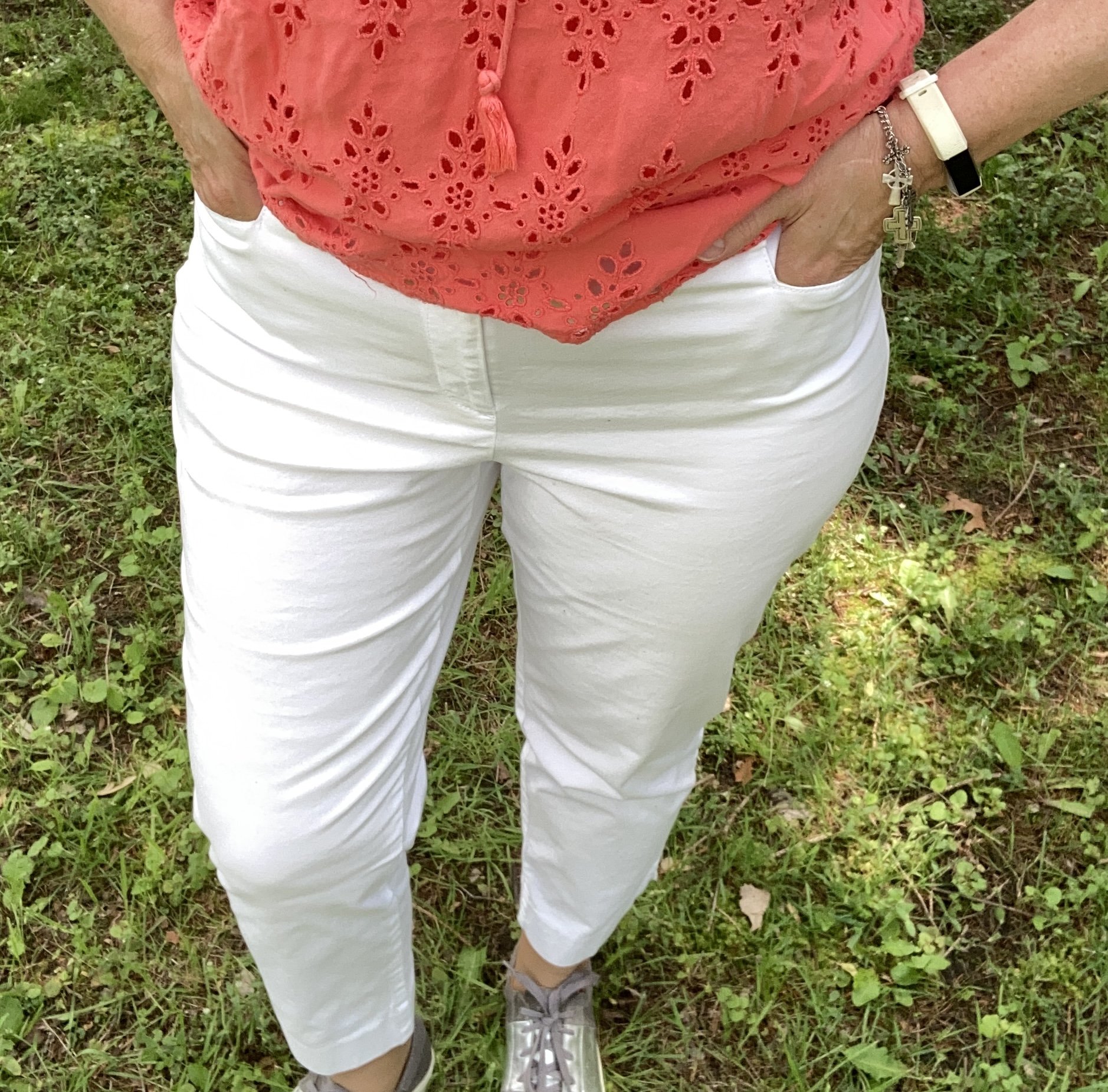
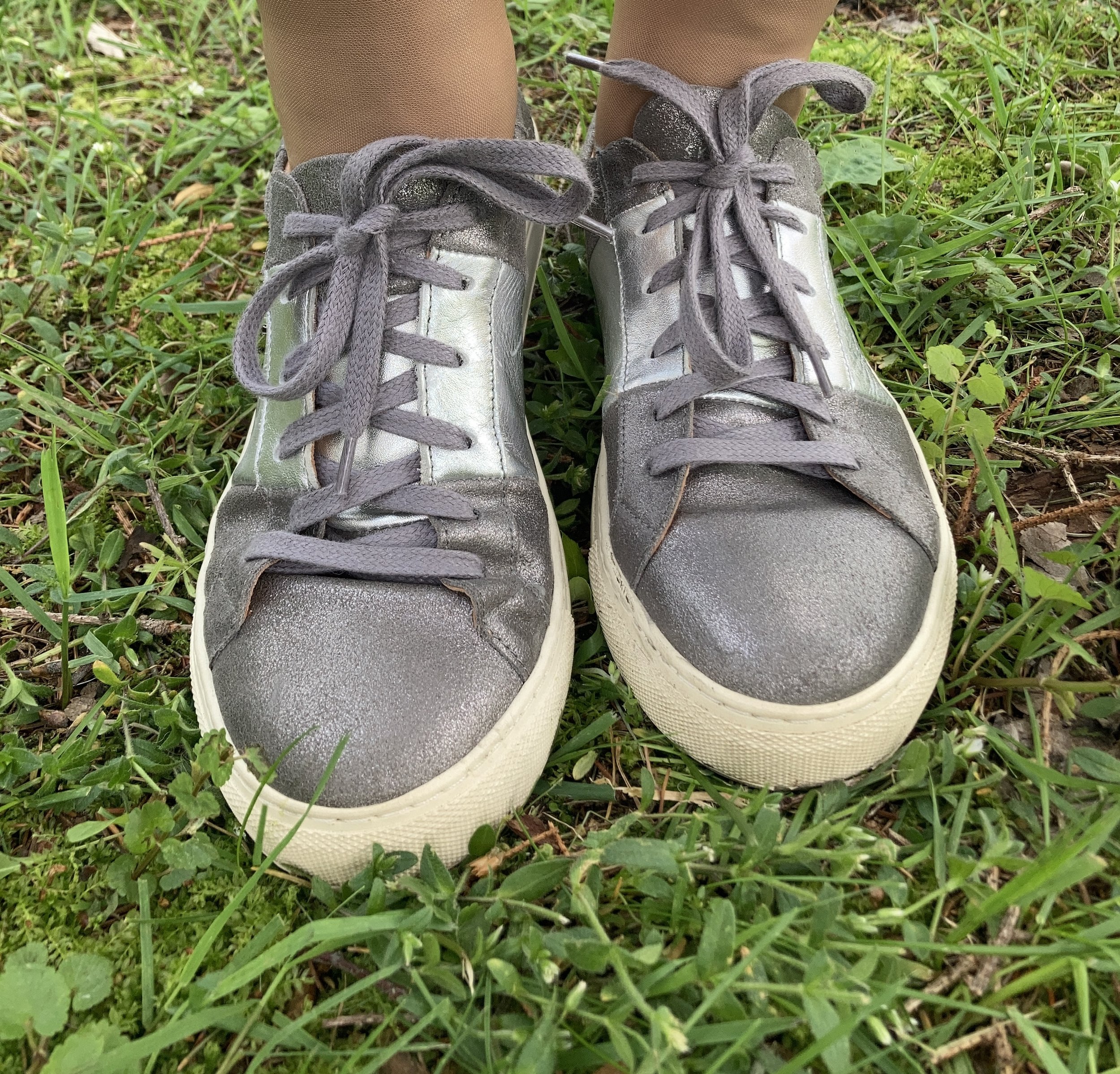
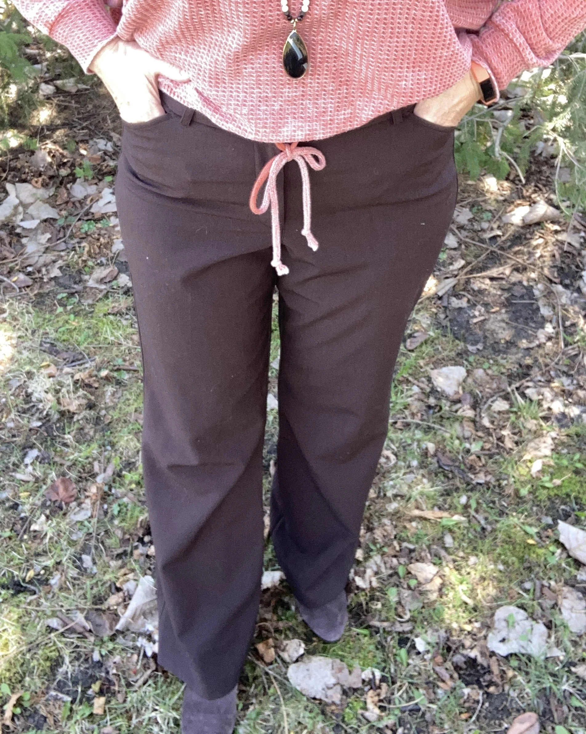
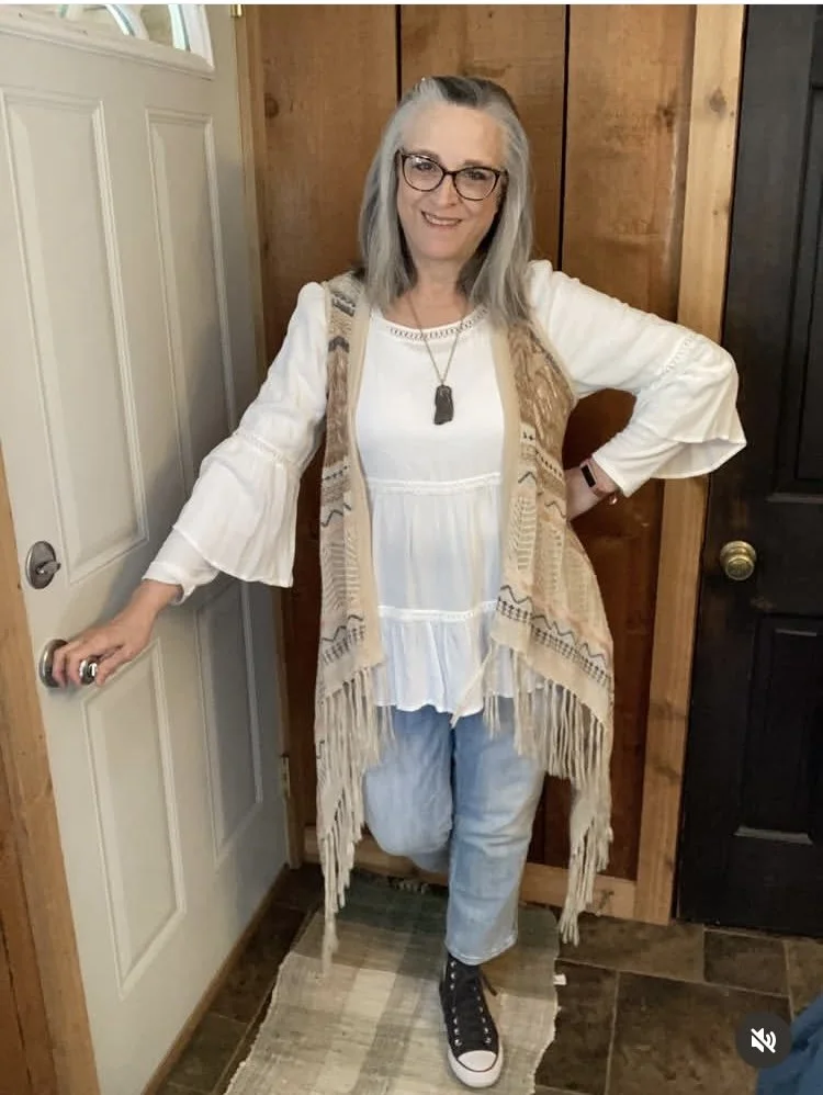
A Little Bit Boho
Most of these outfits were put together for a monthly Instagram challenge, but I have also been trying to challenge myself to wear things I don’t regularly reach for. This tiered blouse was a thrift find a number of years ago. On the day I wore this it was chilly so I added a long sleeve tee underneath. The asymmetrical vest is older, but I bring it out every warm weather season since it is lighter weight.
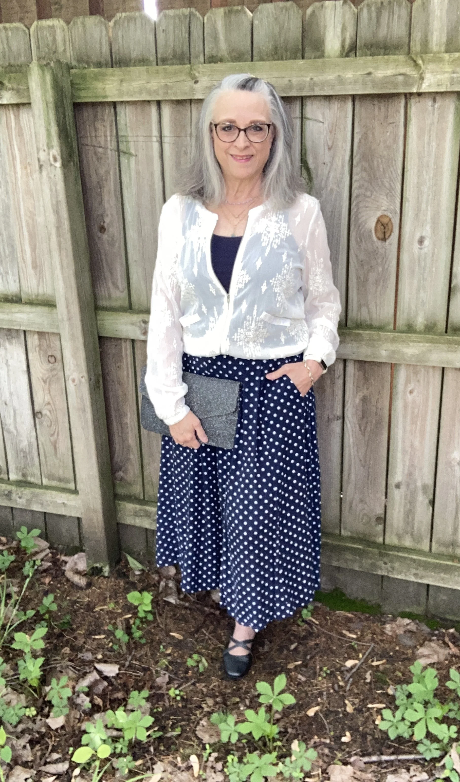
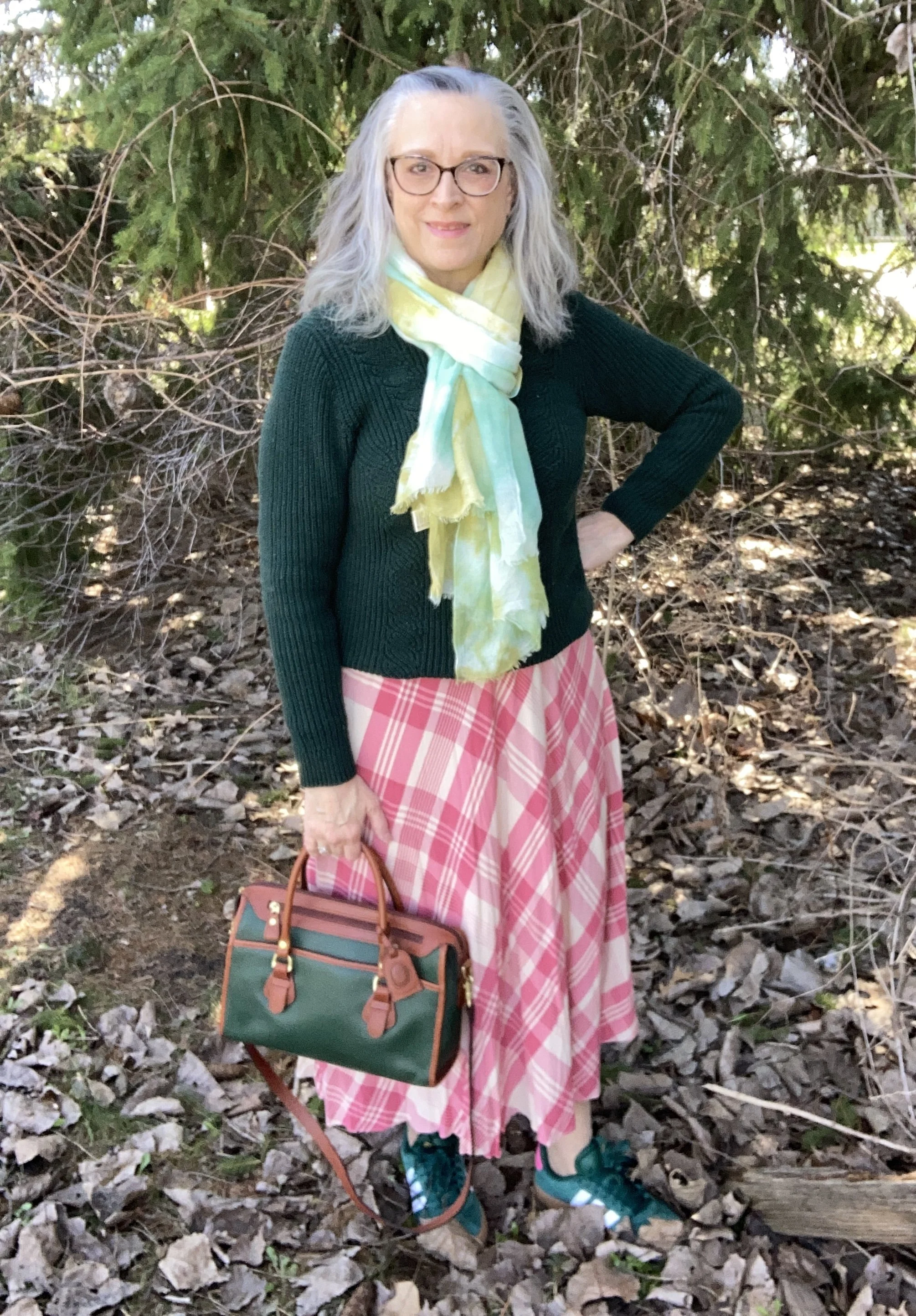
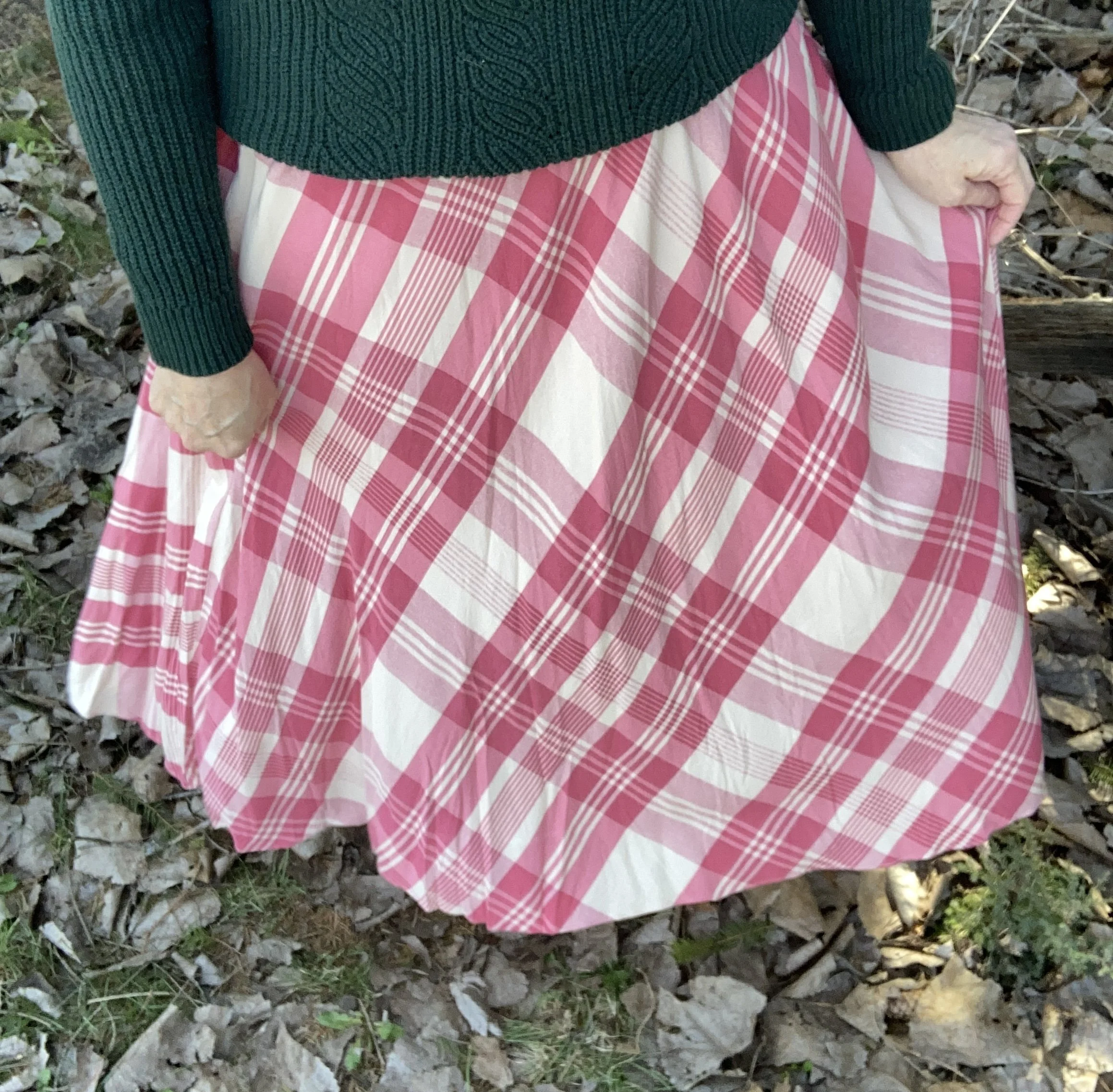
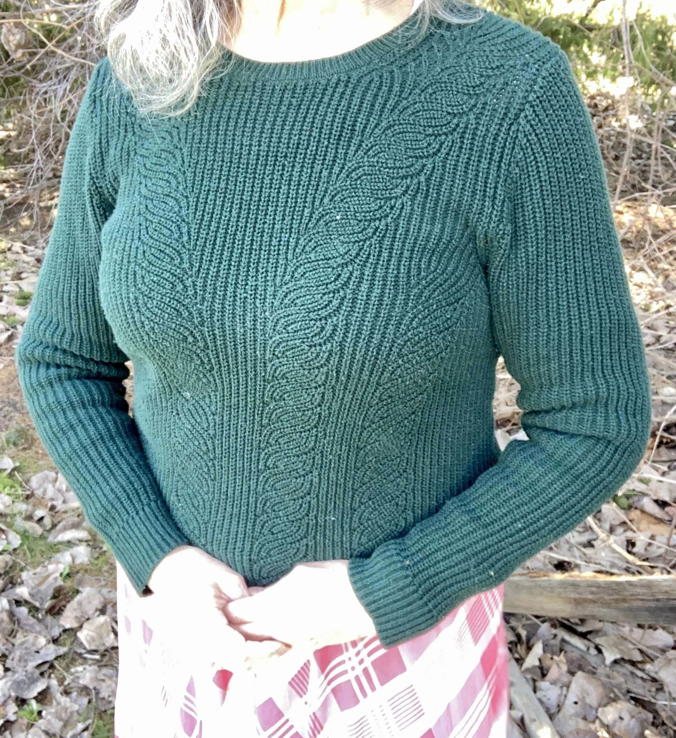
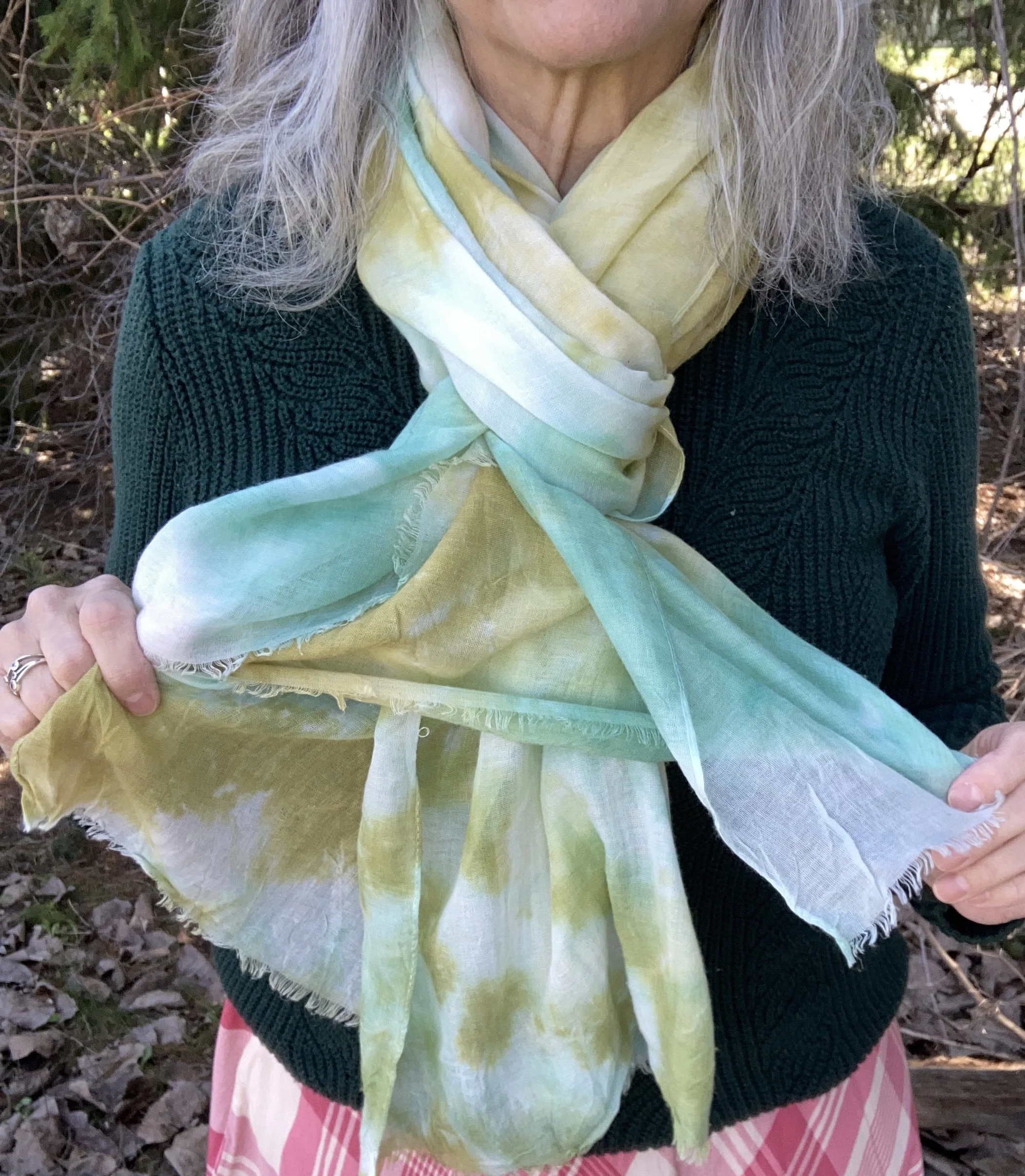
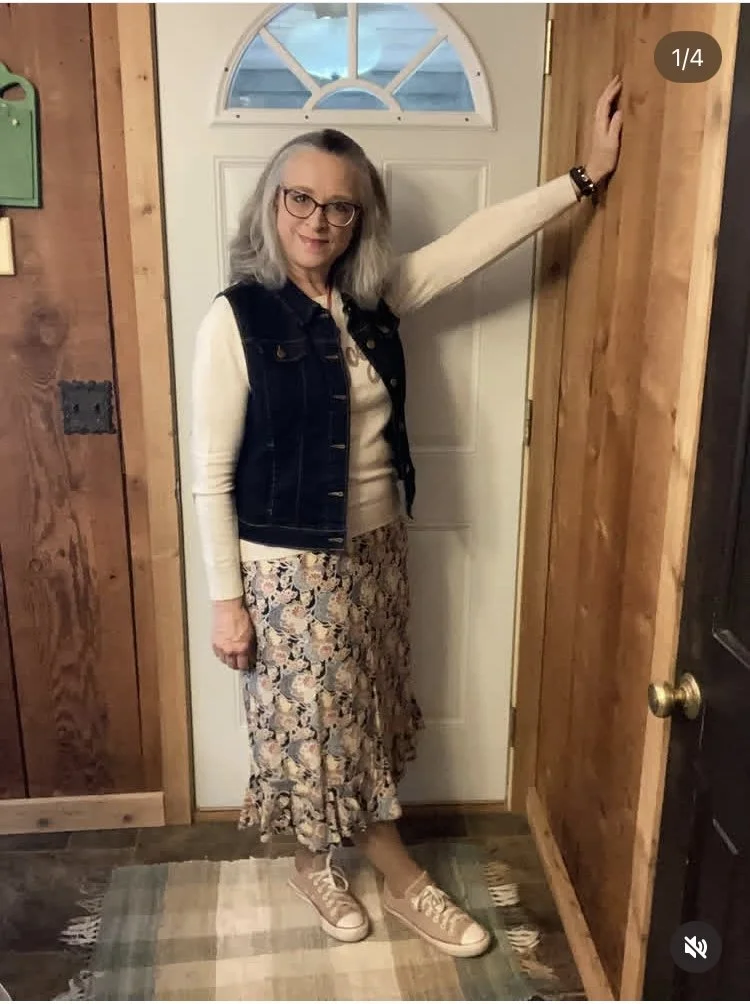
Floral Midi Skirt and Denim Vest
This combo includes a Christopher and Banks skirt that I fell in love with before our brick and mortar store closed. I love that it contains so many fun colors and is light weight making it perfect for summer. On this day it was cool, so I added my Joy light weight sweater that I have had for a number of years, and a dark wash denim vest that I thrifted more recently. My Converse were also thrifted.
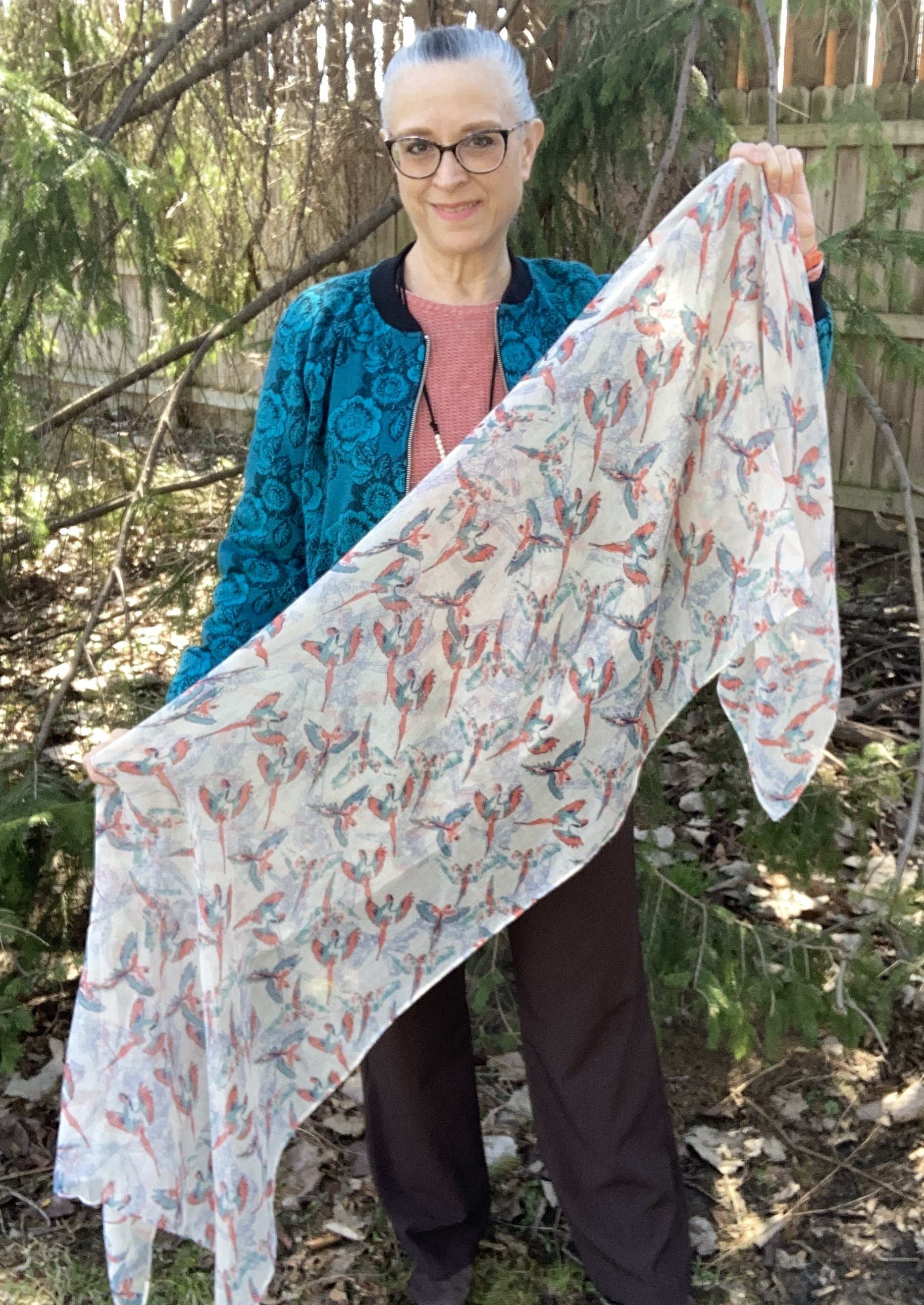
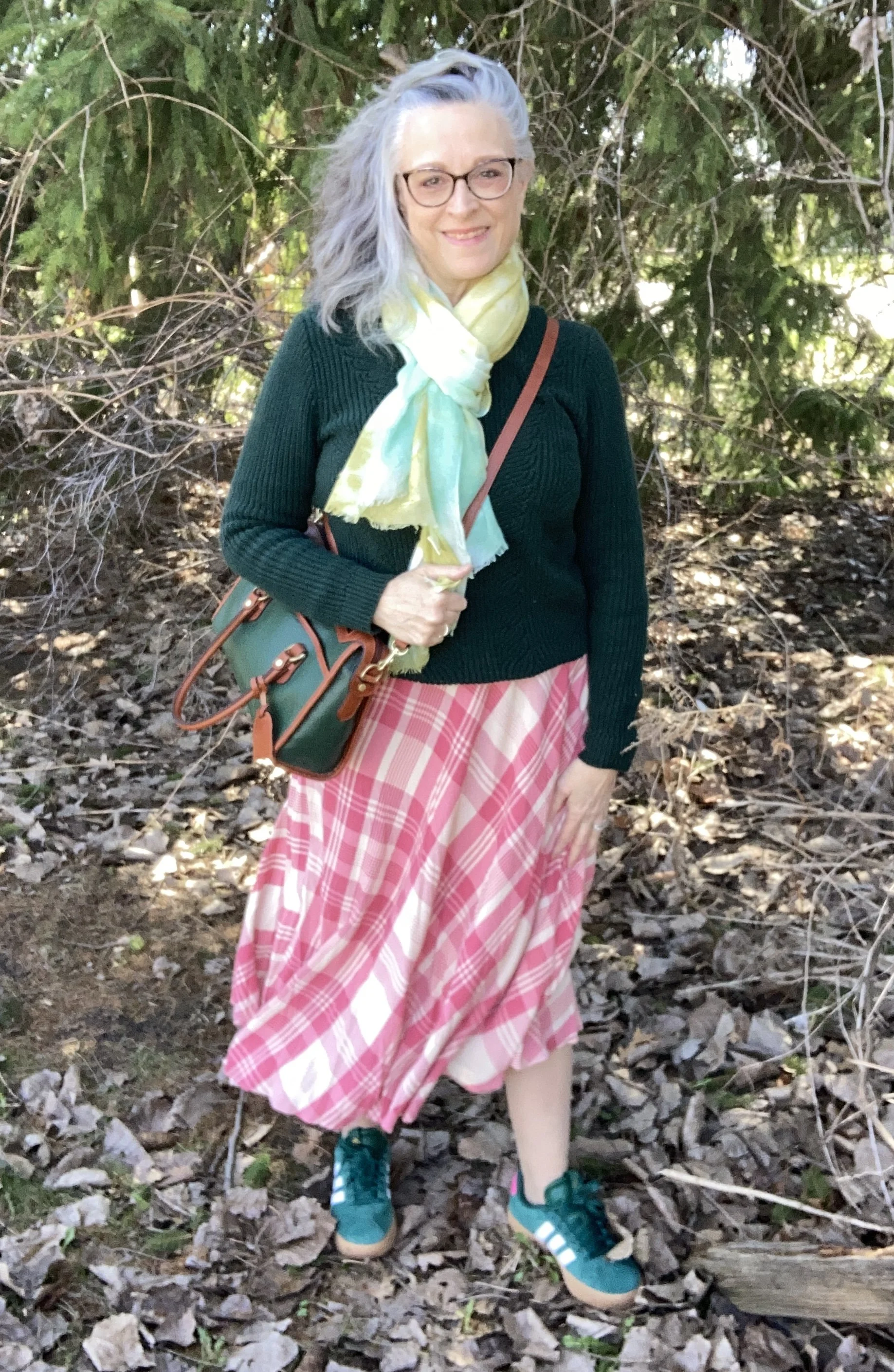
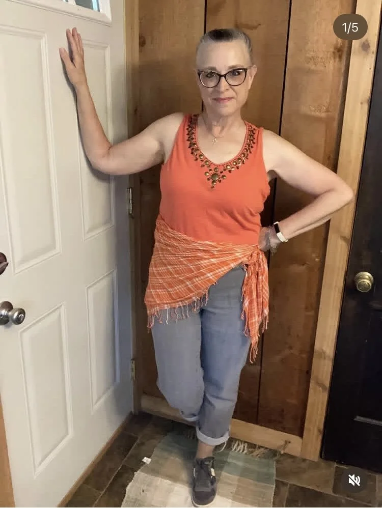
Wearing a Scarf a Different Way
One of the Instagram prompts was to wear a scarf, not around your neck, so I decided to used this square plaid piece as an interesting addition to my waist with a thrifted embellished tank top, thrifted gray jeans and my older Saucony sneakers.
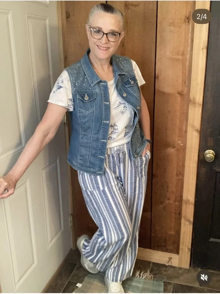
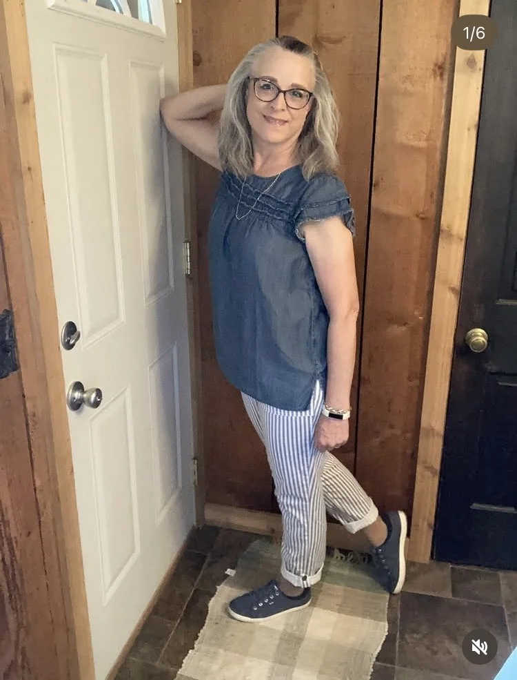
Linen Pants Outfit
This look revolved around my striped linen pants. Linen is one of those fabrics most of us have a love hate relationship with. It is a marvelous fabric for the hot weather months, but it wrinkles terribly. Most people don’t worry about the wrinkles and wear their linen pieces with pride and less sweat. Others of us look for pieces that won’t show the wrinkles quite as much and these striped pants fit the bill. This is another Christopher and Banks piece that I have had for a while. For this outfit I paired them with a tropical print tee and a denim vest, also C & B.
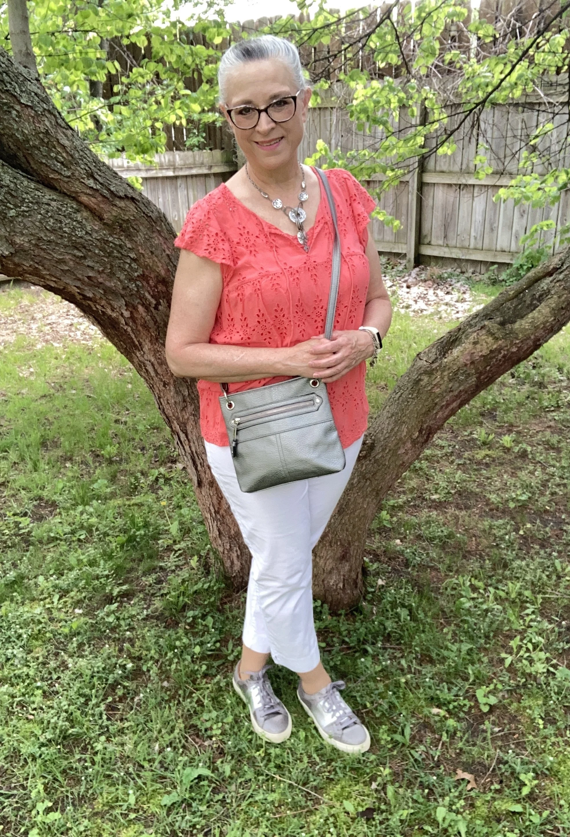
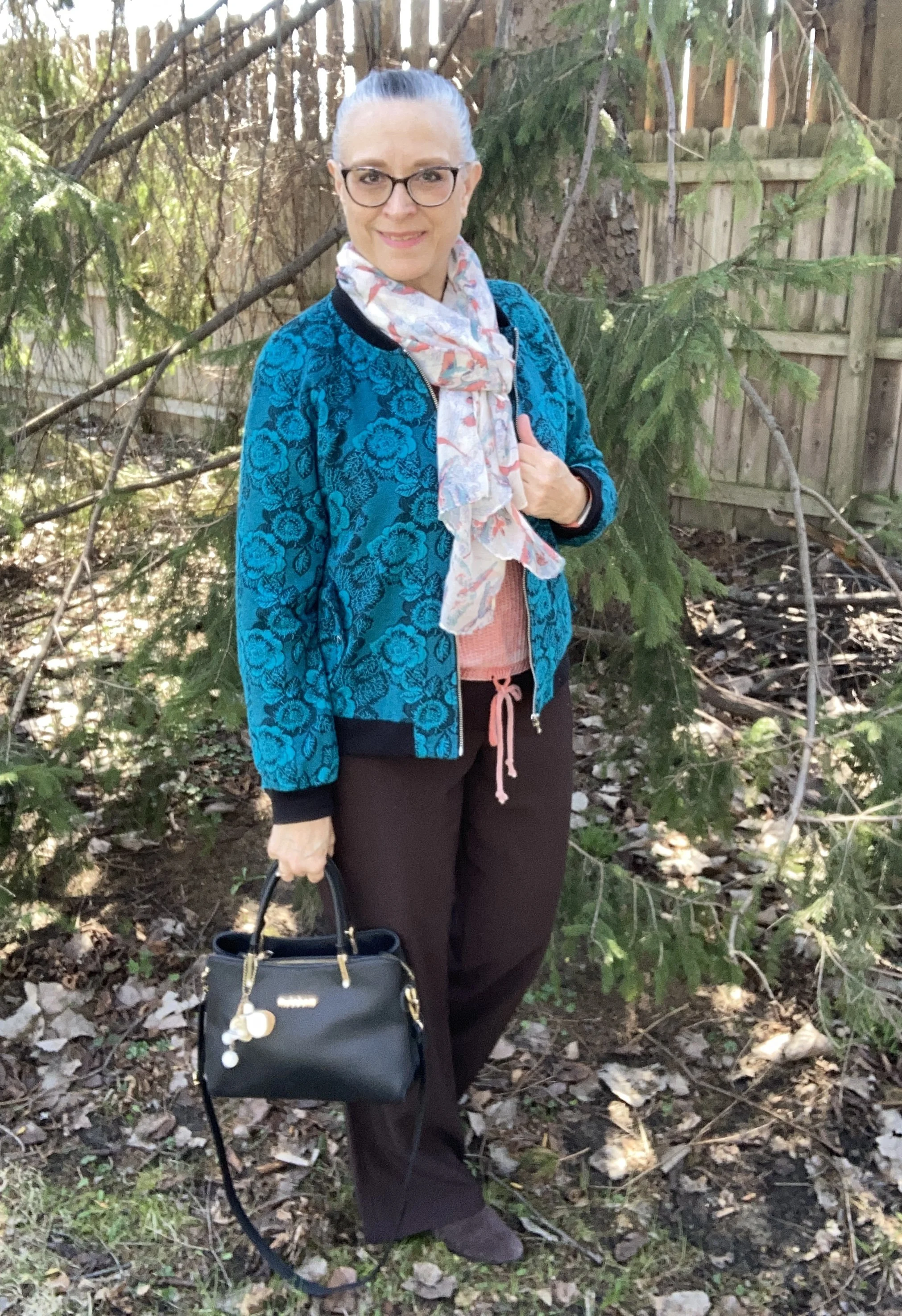
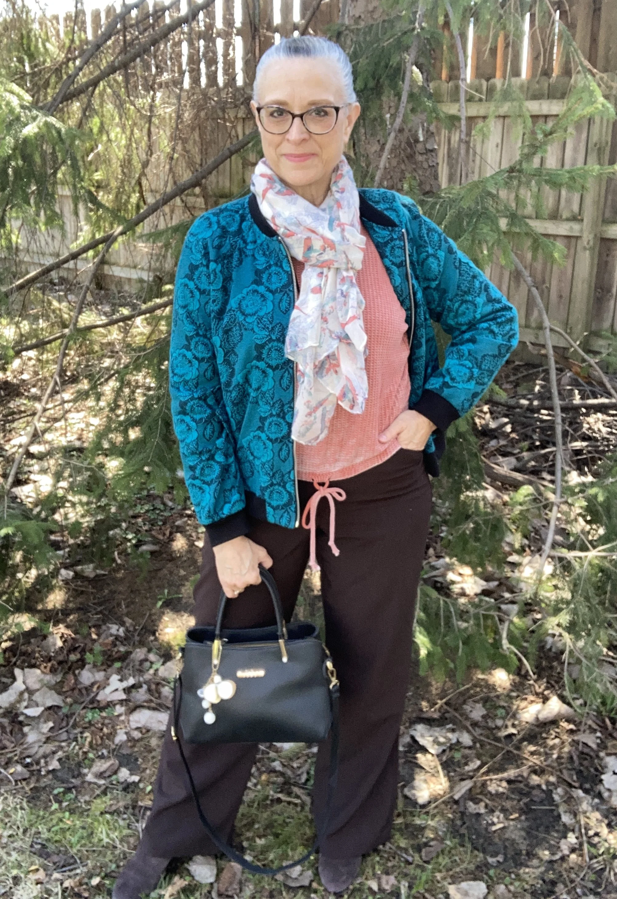
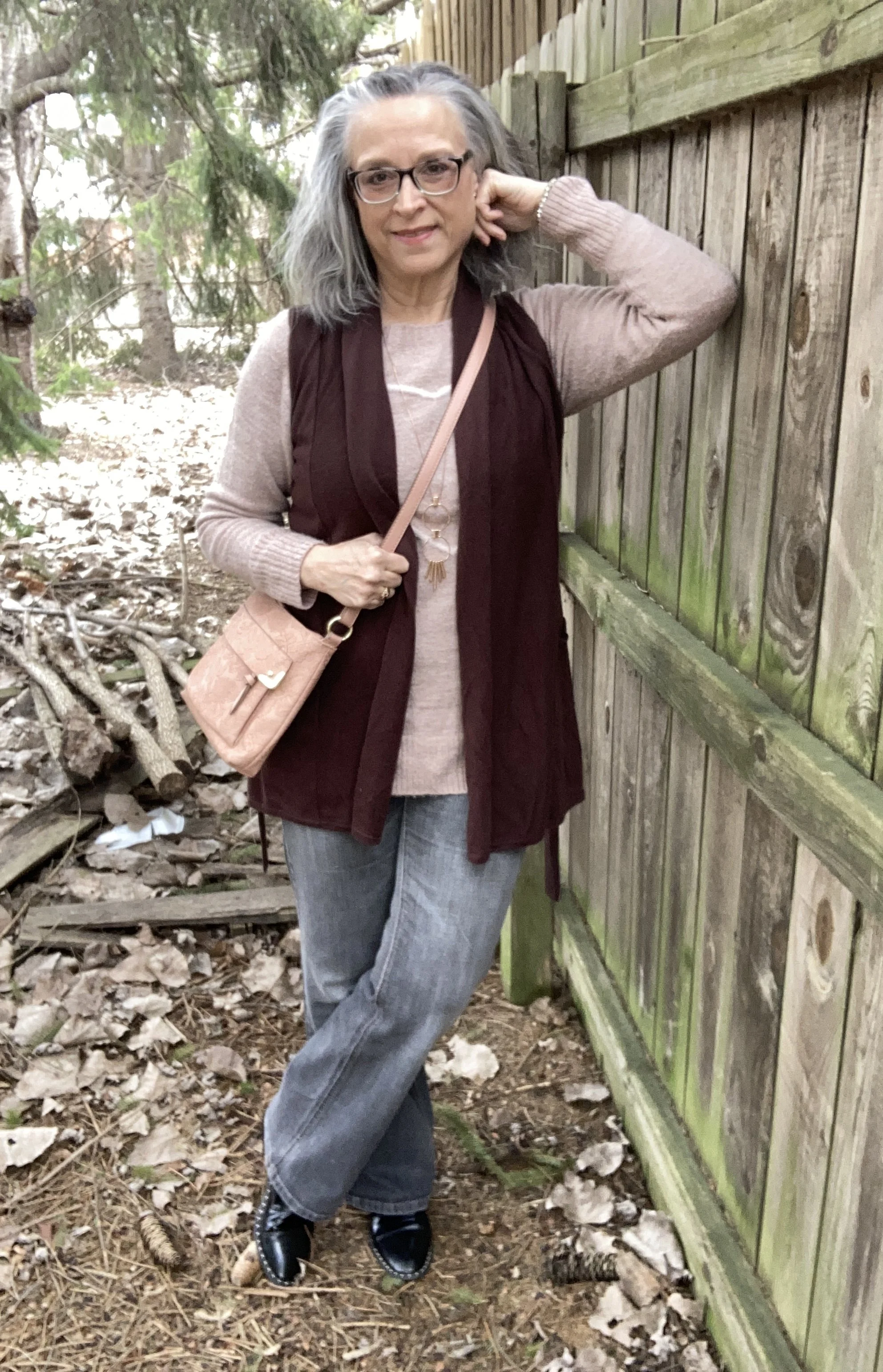
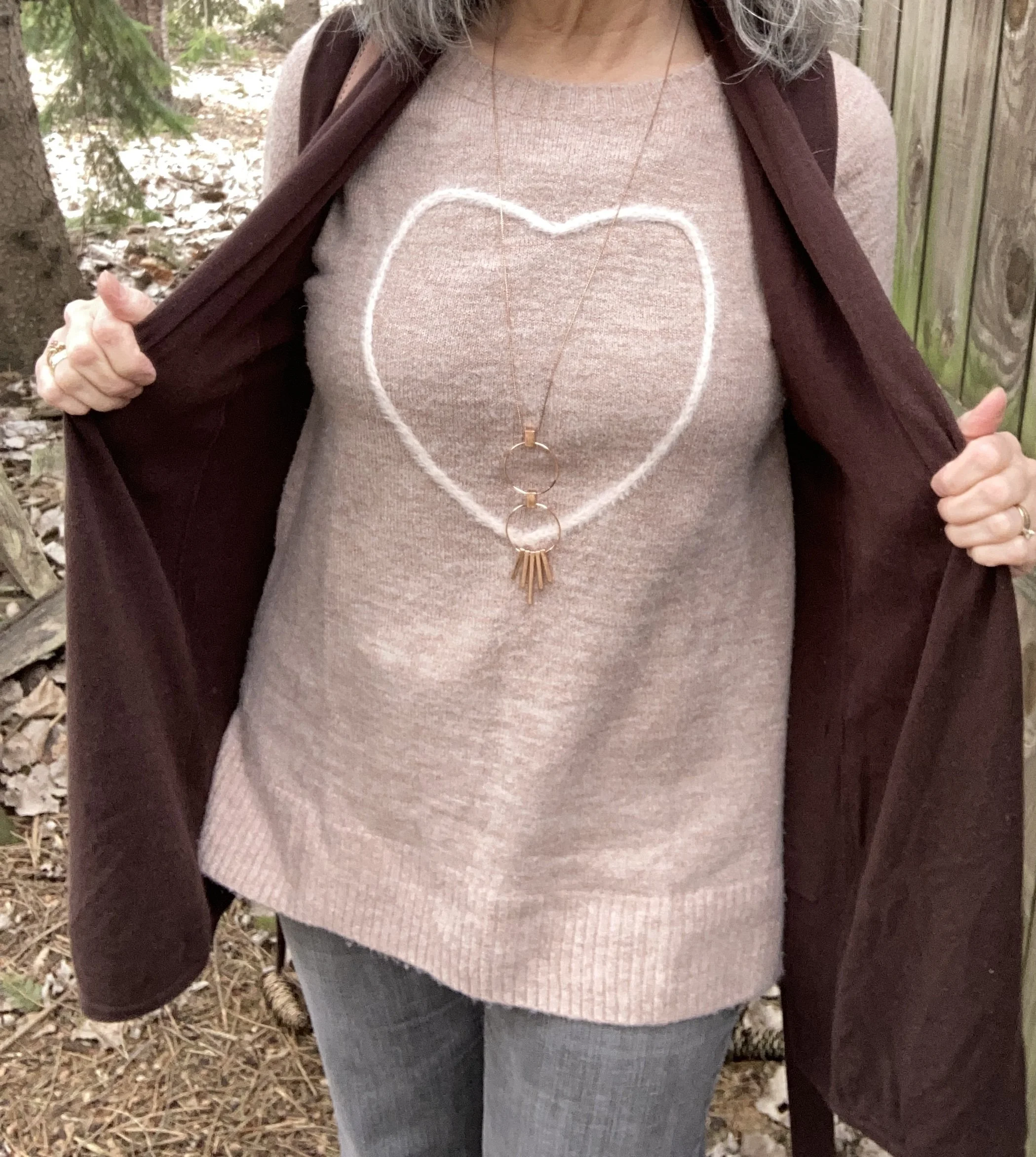
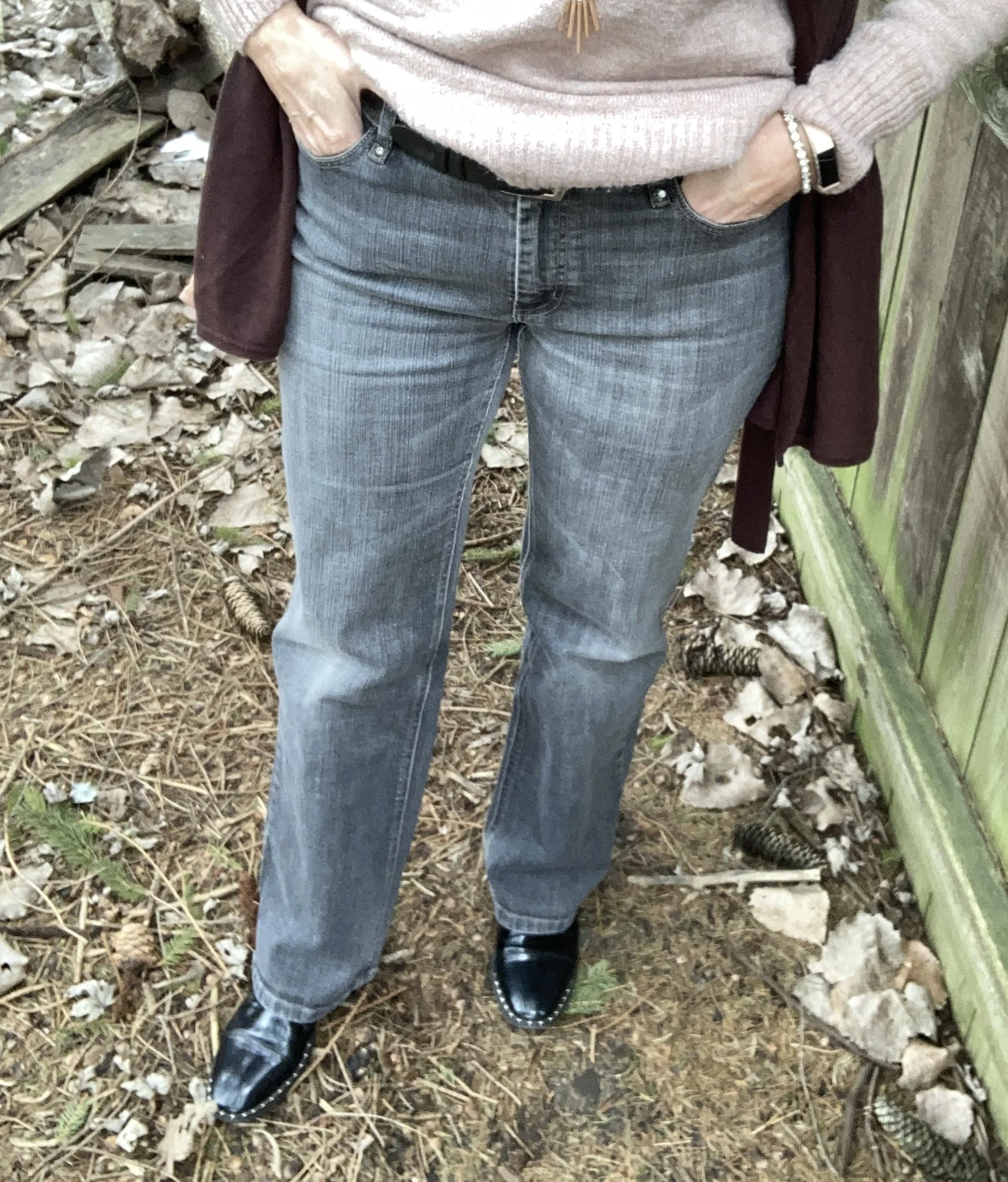
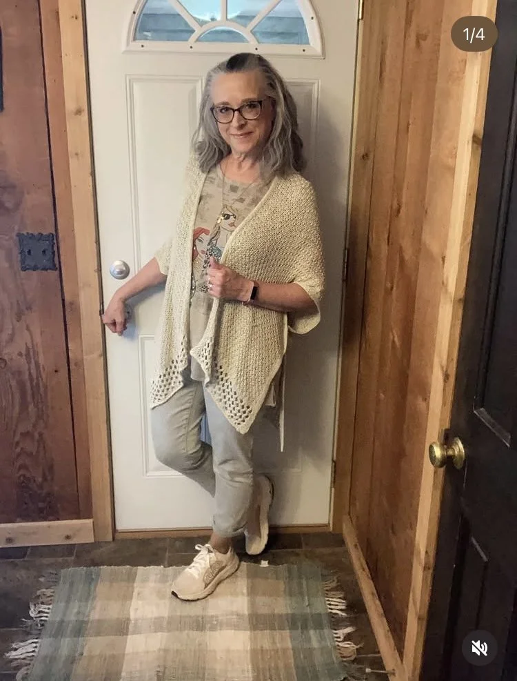
Airy Neutrals
I don’t reach for my neutral pieces enough, but when I do I always like the way the outfit turns out. This prompt gave me the opportunity to wear this cute “fashion girl” tunic tee, the knit ruana, and the light colored Chico’s pants all together. The tee was thrifted, and the pants were a hand-me-over from my besties in NY.
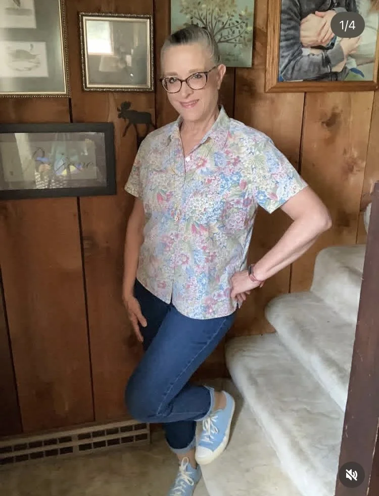
Floral Button Down Casual Style
This pretty floral top is a recent thrift find. I fell in love with it because it reminded me of my mom. She always wore these types of collared button downs during the summer months along with her culottes. Due to my veiny legs I no longer wear anything short, but I made it my own style with my dark wash jeans and another pair of Converse sneakers. Yes, I do seem to be accumulating Converse, a shoe I never thought I would own! Ha, ha.
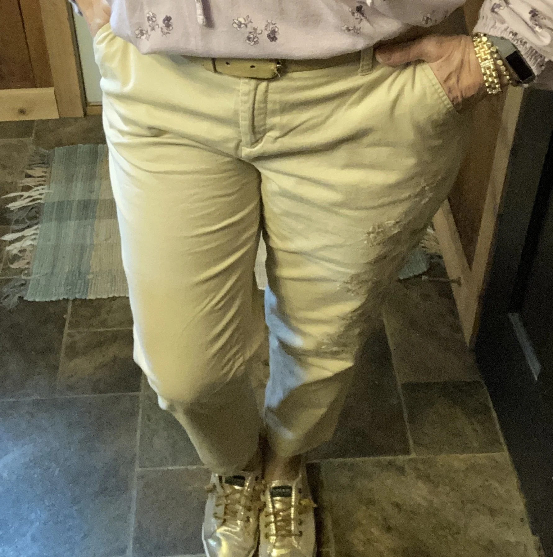
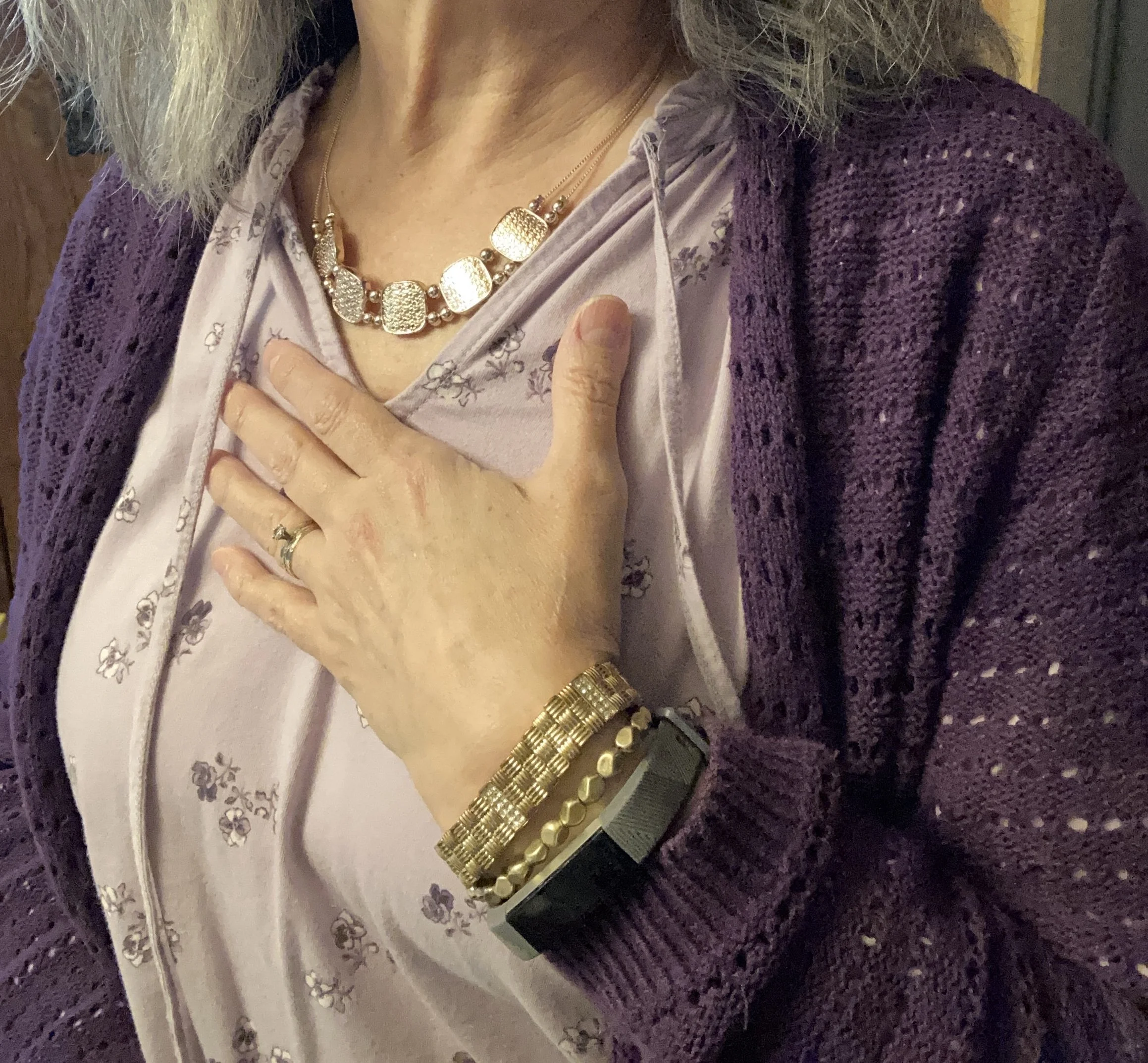
Striped Pants Outfit
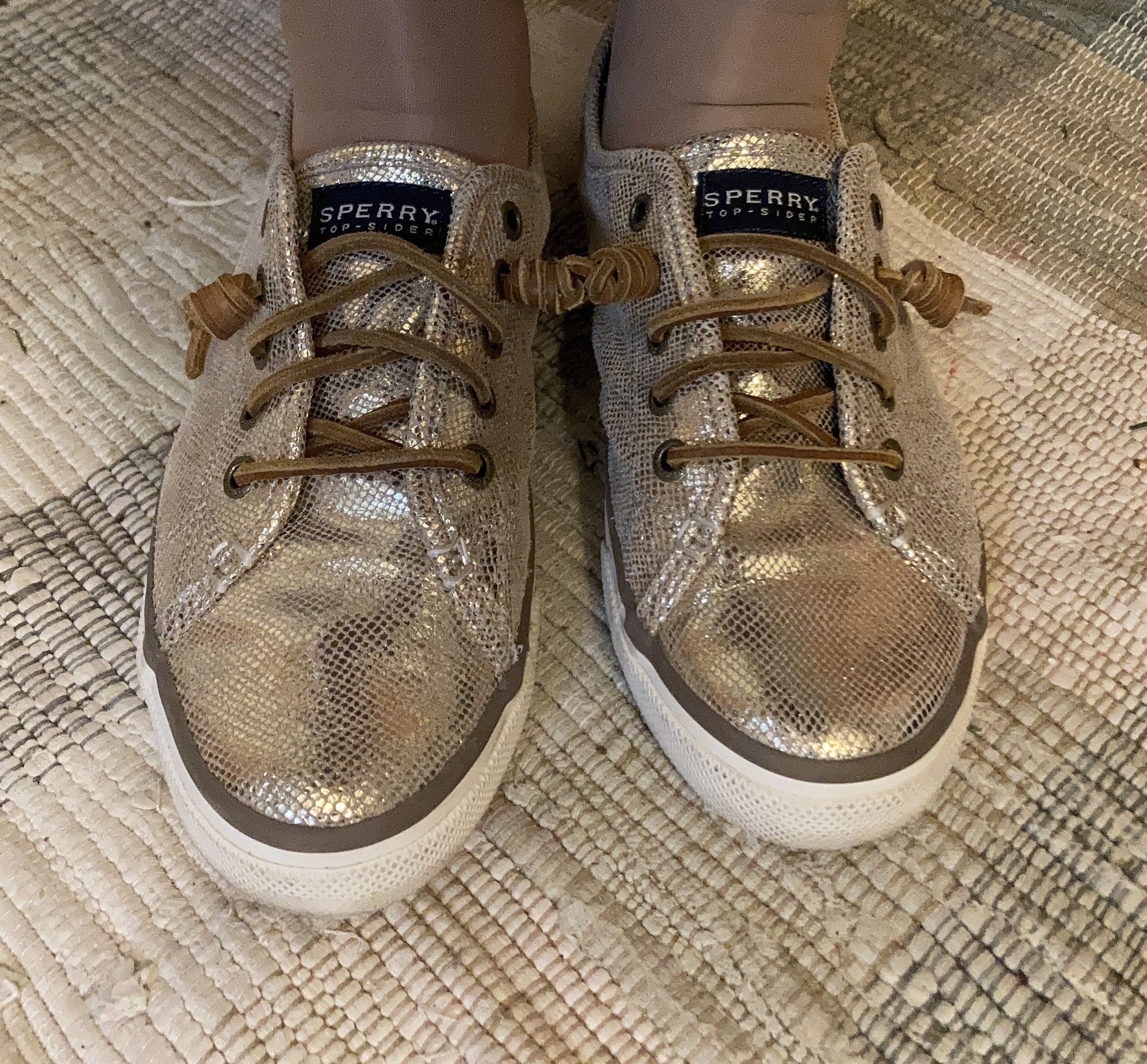
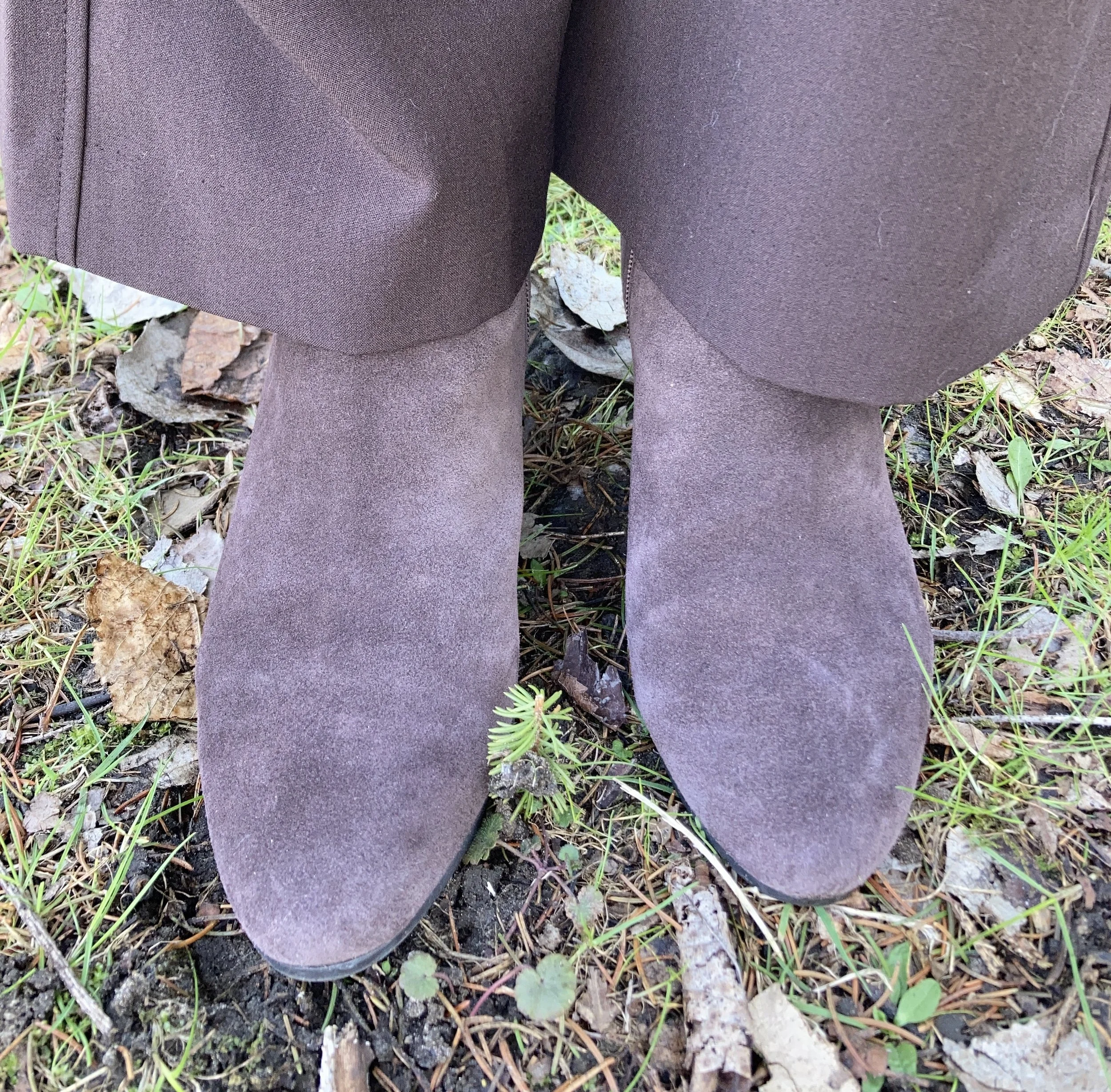
I found these St. John’s Bay striped pants last fall, and I knew they would be perfect for the warm weather months. I wasn’t completely sure how I felt about them, but now that I have taken them for a spin around the block I love them and will definitely be styling them again for summer and maybe early fall. They fit great, have pockets, and a roll up hem. The one side is missing the snap to hold the tab in place, but I just used a safety pin to keep it in place. My top is a few years old and is Liz Claiborne brand from JC Penney. My Keds sneakers are also a few years old.
I hope you have enjoyed this look at what I have been wearing. These are outfits I actually wore. I post on Instagram almost every day, so these are definitely outfits that allow me to live my life.
I hope to get back to some regular posting in the next few weeks, and I will also give you an update on all the things my spouse and I have had to deal with. I appreciate your support, and hope you are having a fabulous Tuesday!