Pantone - Spring/Summer - 2021 - London Palette - Beach Glass, Blue Atoll and Macchiato

We’ve reached the end of the Pantone - London Palette series with these last three colors which make me think of tropical seas and sandy beaches. Like Tuesday’s post, where I combined two different greens from the palette, today’s post combines two summery blues for a light, airy, warm weather look.

beachglass.jpg

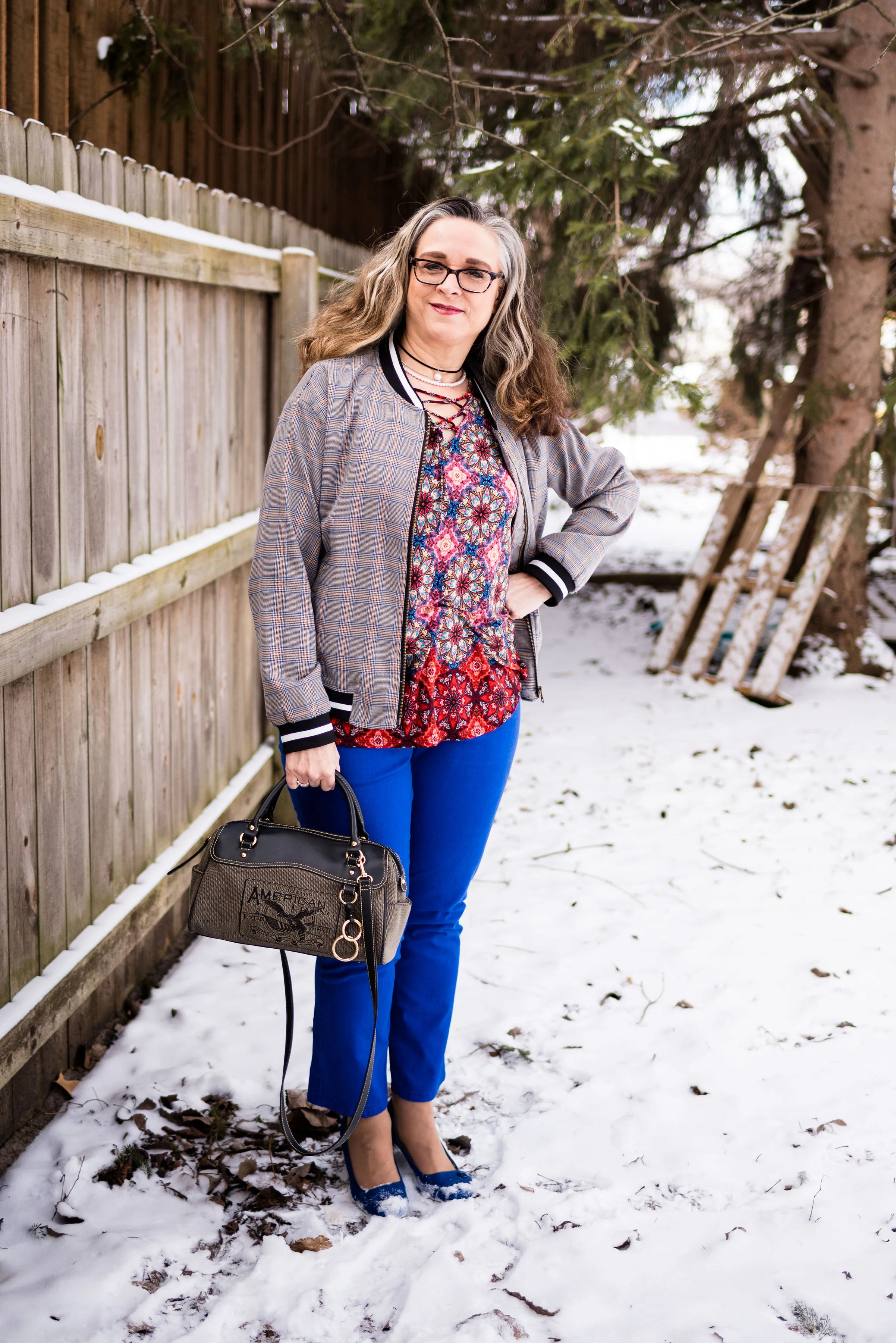
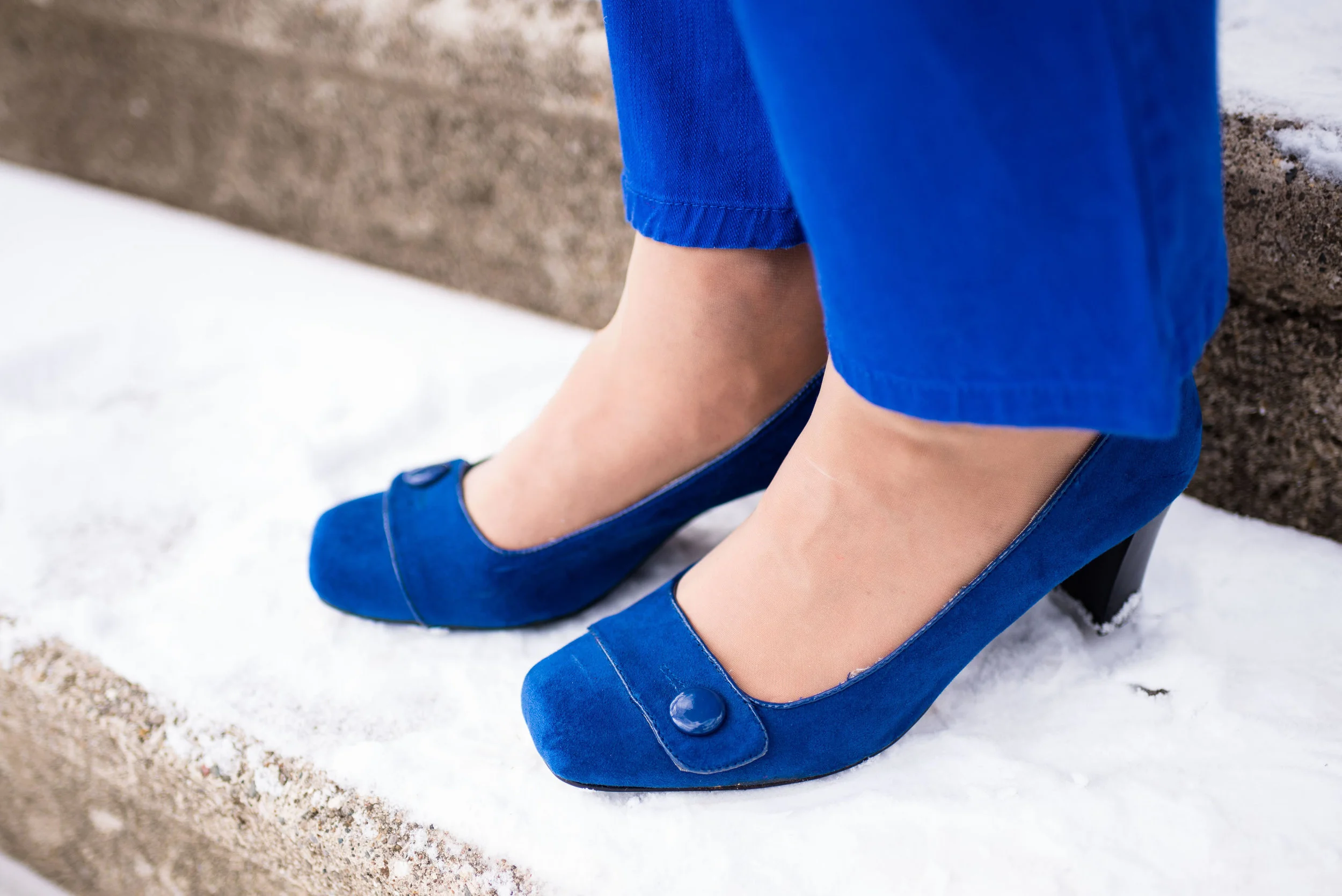
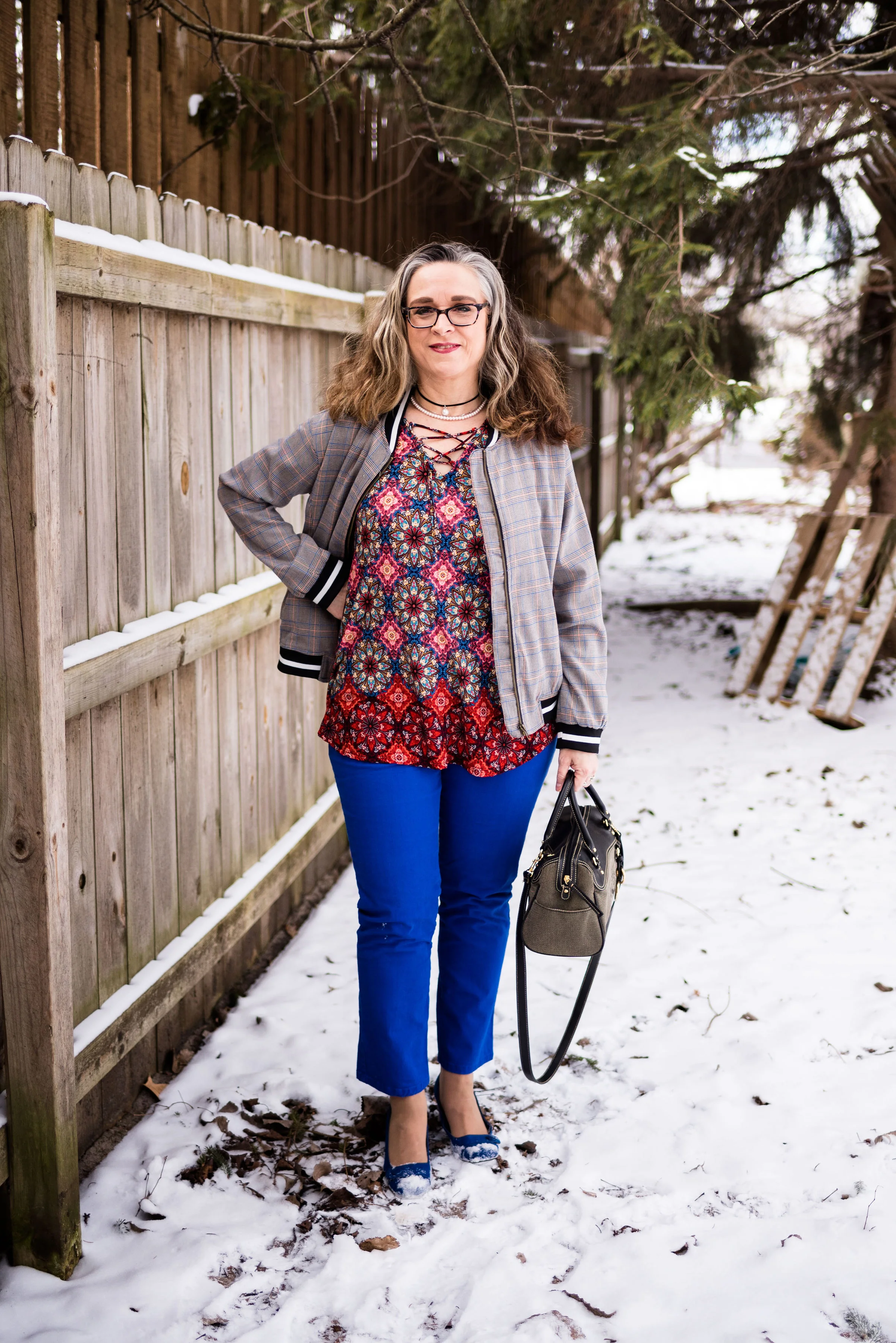
I started figuring this outfit out with my light blue, thrifted Sonoma crop pants. Though they are a bit lighter than the Beach Glass color, I think they still work. I pull these out every spring and summer as a light weight alternative to denim.

beachglasspantoneoutfitideas-1.jpg

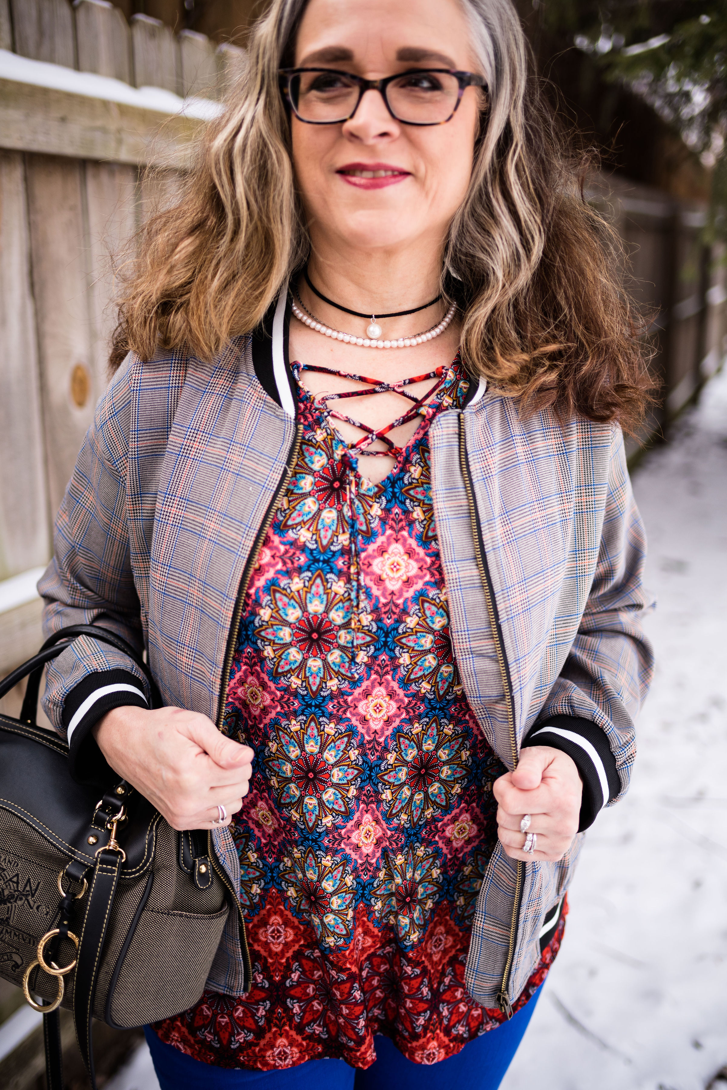
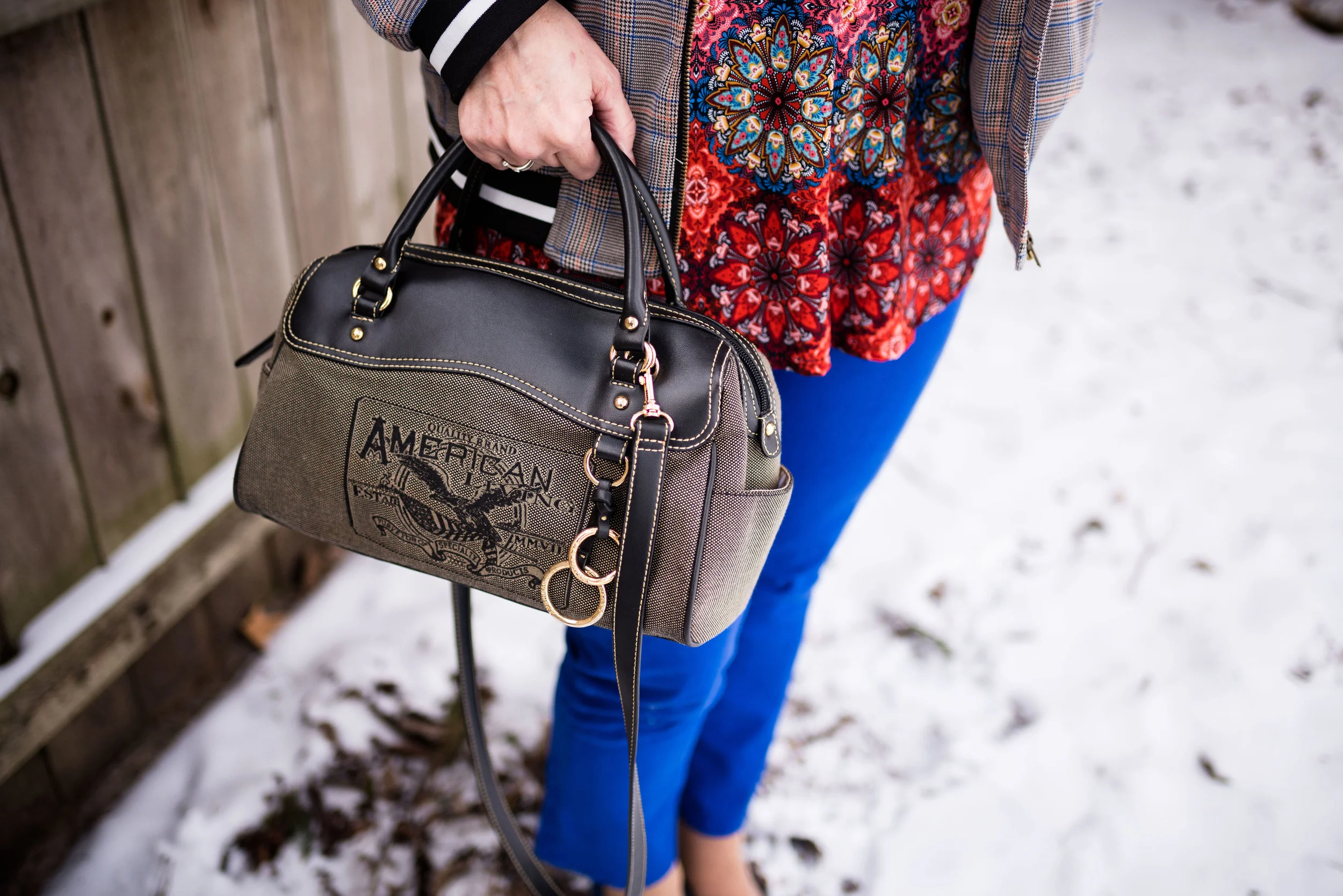
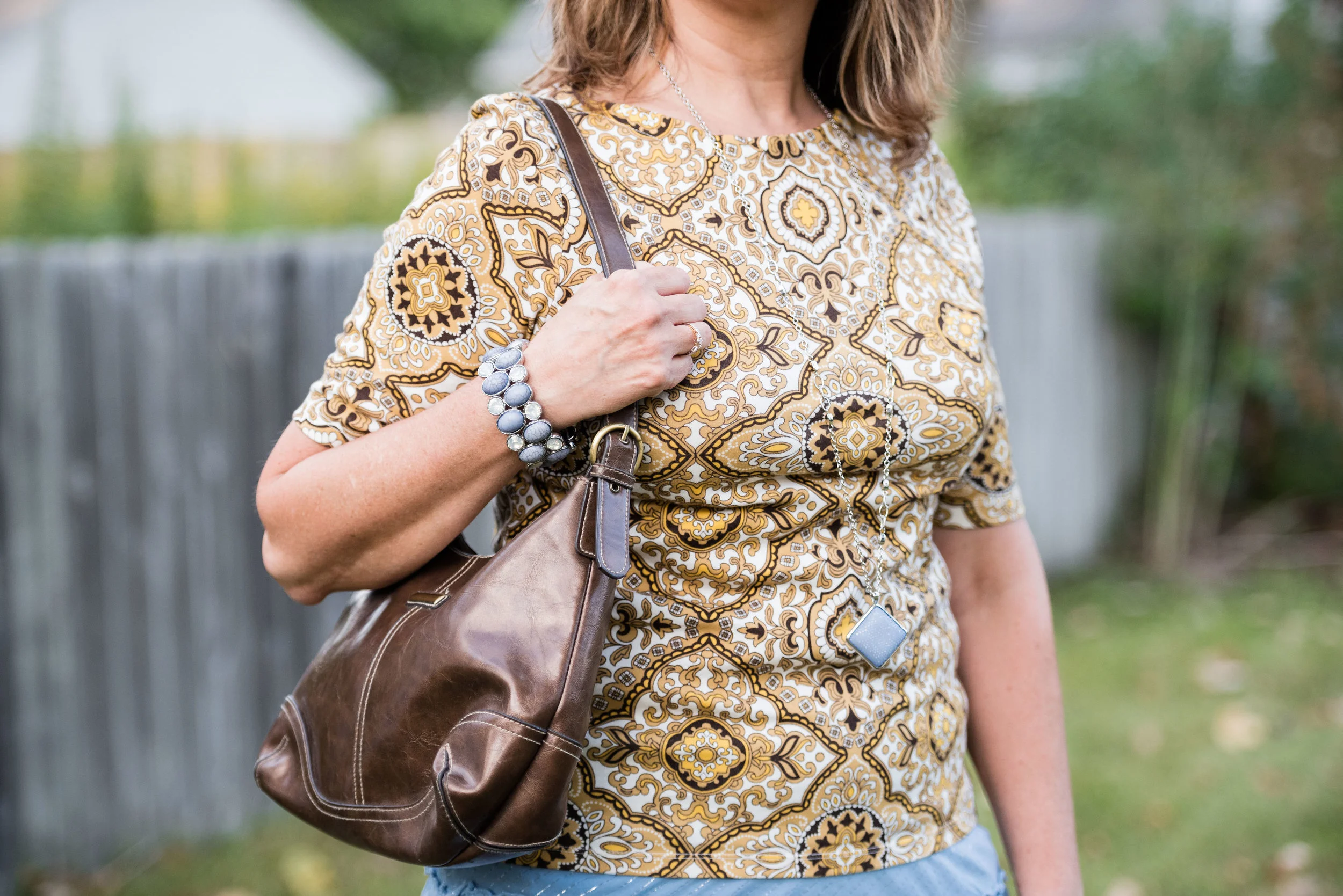
My multi-print top is another thrift store find. I just loved the soft colors and print on this popover blouse. It has no tag in it, so I have no idea what the brand was. The print has the light Beach Glass blue, as well as the darker Macchiato.. You’ll see a close up in the next photo.

For the darker Blue Atoll color I decided to add a few pieces of jewelry. I had some long, opera length beads and decided to do some layering with the necklaces. I also added a beaded bracelet, that appears to better match the Beach Glass color.

beachglasspantoneoutfitideas-7.jpg

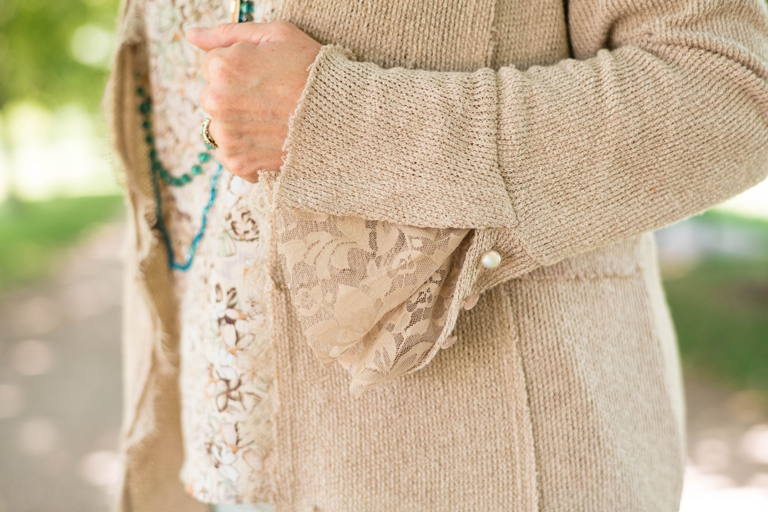
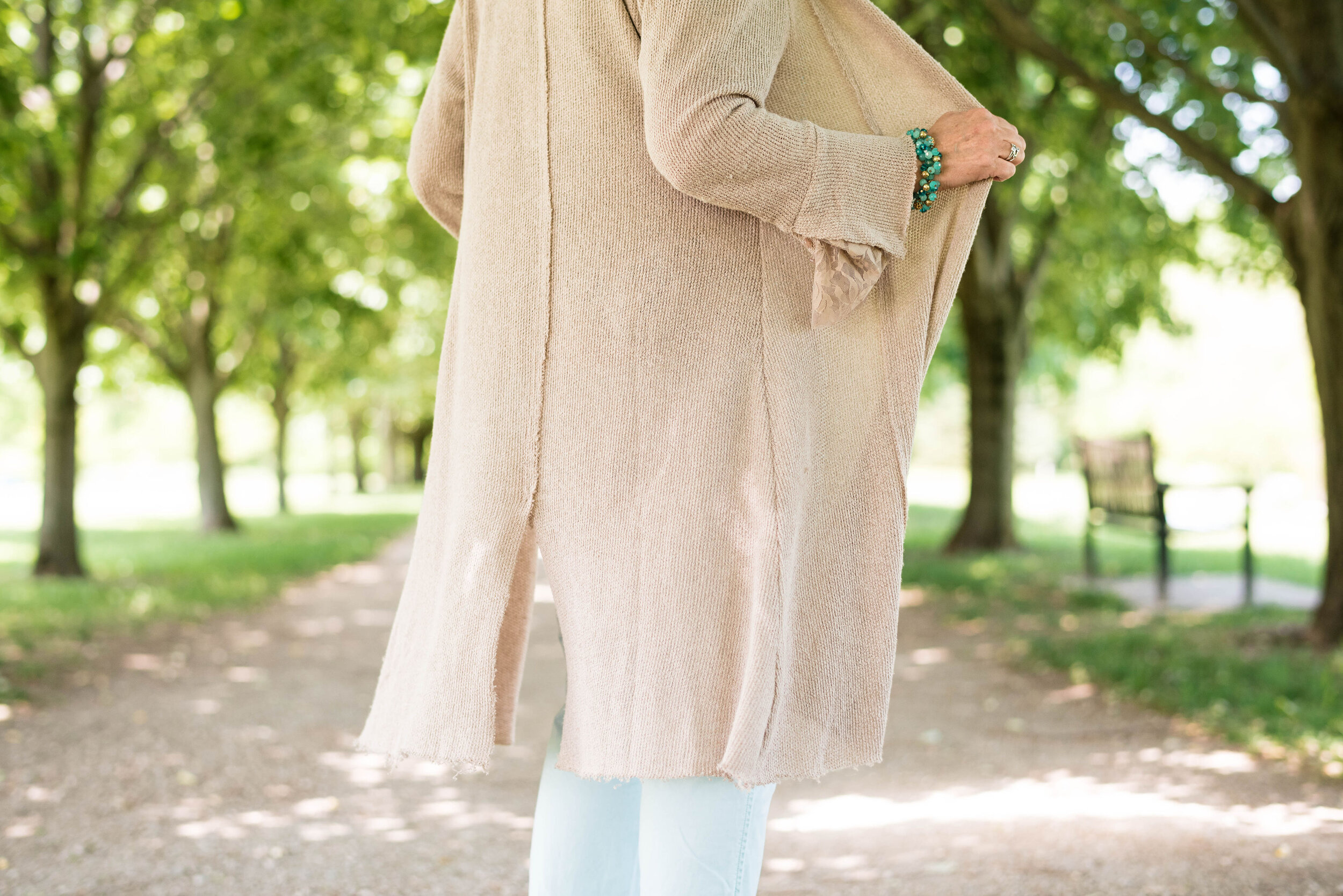
For the Macchiato color, I played around with several pieces, but everything seemed too yellow. This longer sweater was a recent purchase from Cracker Barrel. While they are a restaurant, they also have what they call an Old Country Store. The store is filled with all sorts of items from old fashioned candy, beautiful home decor, quilts, jewelry, cards, music and clothing. If you click on the link, it will take you to the sweater and it is on sale. Whoo, hoo. If you like it snatch it up. Here are a few photos to show you the details of this pretty piece and the movement. It is a light weight material, so it will be great for spring, summer and fall.

beachglasspantoneoutfitideas-13.jpg
beachglasspantoneoutfitideas-14.jpg
beachglasspantoneoutfitideas-15.jpg
beachglasspantoneoutfitideas-16.jpg
beachglasspantoneoutfitideas-17.jpg
beachglasspantoneoutfitideas-18.jpg

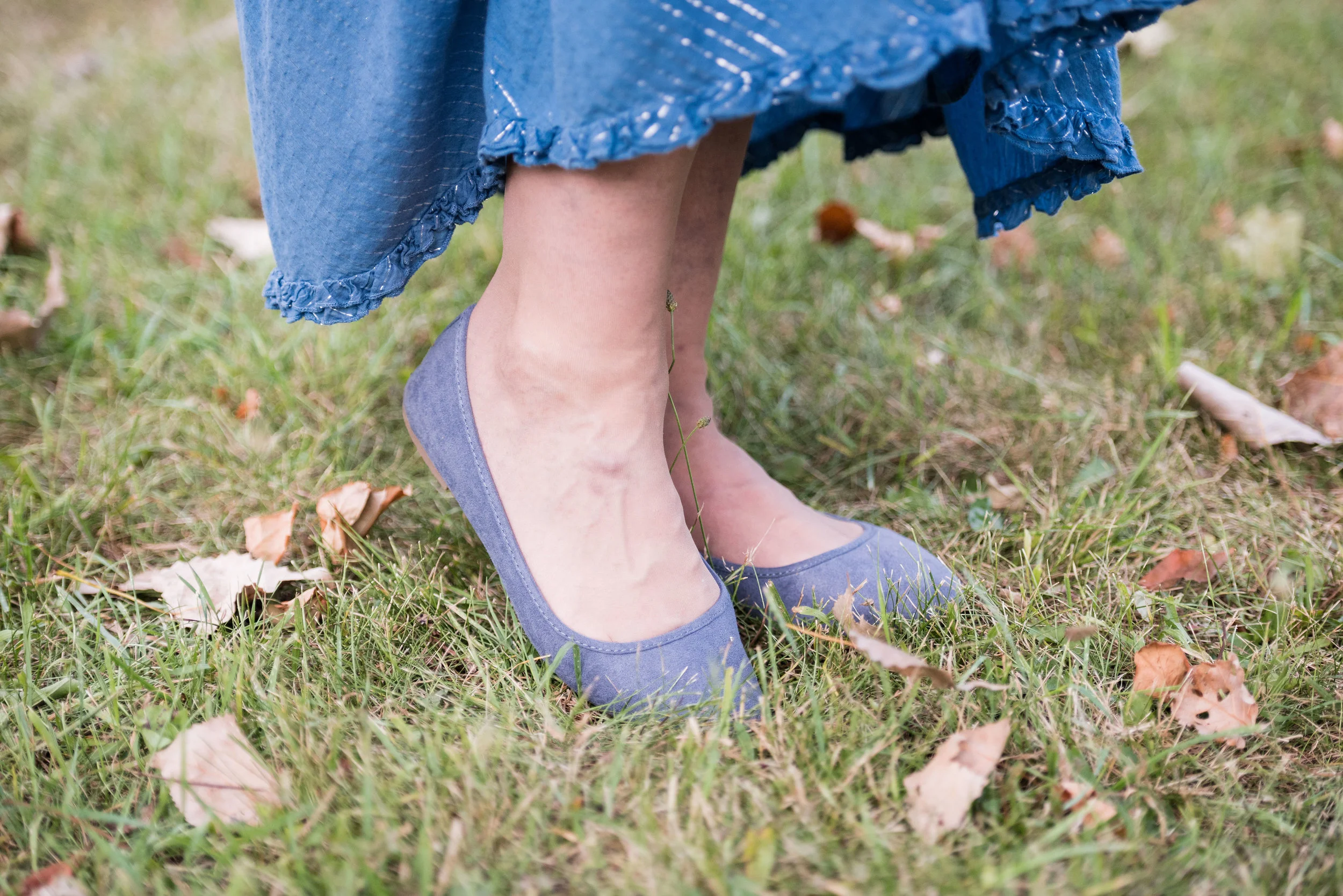
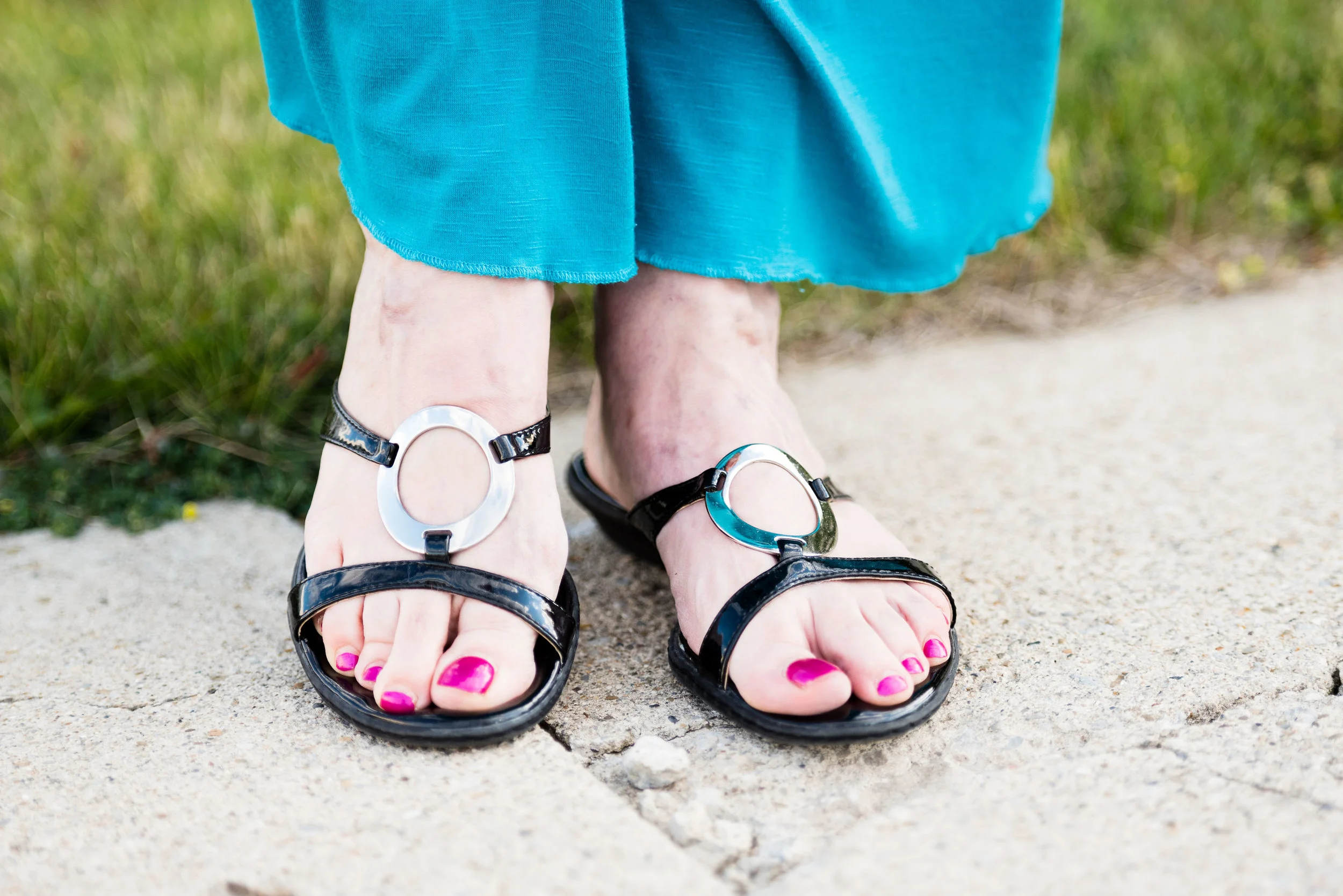
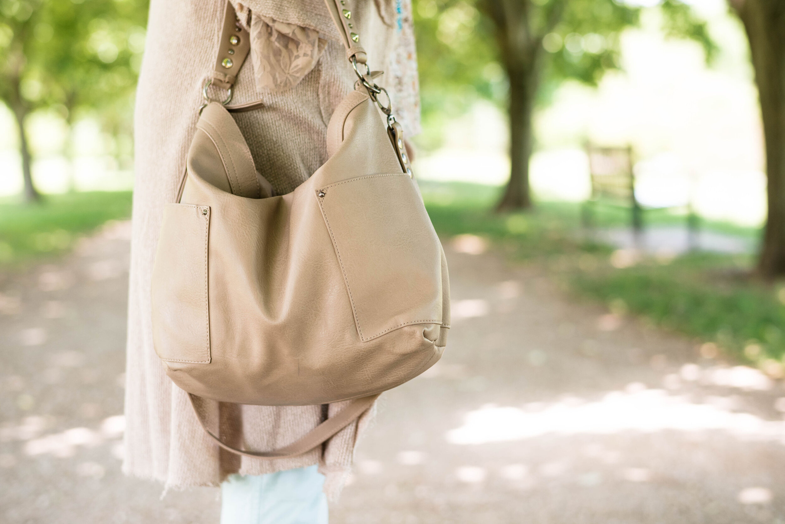
My bag is Madden brand; a clearance find from Kohl’s. My perforated peep toe shoes are Sonoma brand and another Kohl’s purchase from a few years ago.

beachglasspantoneoutfitideas-9.jpg
beachglasspantoneoutfitideas-11.jpg
beachglasspantoneoutfitideas-12.jpg

What do you think of these three colors? I really like how this outfit turned out and think the color combination is great for summer. Do you have these colors in your closet?

beachglasspantoneoutfitideas-6.jpg

I’m including a few other shopping links for you to look over. The Cracker Barrel sweater link is not part of the affiliate program, but I wanted to offer it to you, in case you really like the sweater. The rest of the shopping links are through the affiliate program. Every time you click on a link I get a few pennies, and I appreciate every click.

Have a great weekend!

Graphic and photo credit Rebecca Trumbull.

Print Mixing Mash Up - Plaid Bomber Jacket - Outfit 2

This second look featuring my plaid bomber jacket from Eden Fashion Boutique, might seem a tad overwhelming if you are new to print mixing. Some might say there is too much going on, but I think it works. In fact, it was this combination that inspired me to use the plaid bomber as a print mixer in the first place. Besides, why not get a little crazy once in a while!

When I saw this multi print tunic hanging in my closet, I thought this might be a good opportunity to get it out. This festive, colorful roz & Ali piece is a past purchase from dressbarn. I think of it as a party shirt. It seems so bright, cheery and happy, that it just wants to dance and party. That’s a little bit of a contrast to my more subdued, introverted nature, but it is good to get out of our comfort zones once in a while.

Pairing it with the plaid jacket, I let it hang around for a while and kept looking at it, wondering how I could make it work for this print mixing series. Then I remembered my thrifted, cobalt blue, Gloria Vanderbilt jeans.

You can see more of the details in this photo. The tunic has a lace up v-neck. Since there is already so much going on with the print, I opted for shorter necklaces in a more classic style. Rev it up and tone it down. I know some might go for bright beads in various lengths, but my objective with this outfit was to party, but party conservatively. That’s me in a nutshell. I don’t drink, but I do like to dance. I also liked the way the pearls and black cord on the choker, compliment the black and white stripes on the jacket.

Funny story about these cobalt shoes. I have had these shoes for a long time. I’ve worn them on the blog before with various outfits and I really like that they are so bright. The last time I remembered wearing them for the blog was summer of last year. My daughter and son-in-law were in the process of moving out of their apartment into a house and we had planned a shoot at the apartment complex so I could help do some packing. That was the last time I ever saw them (the shoes, not my daughter and son-in-law). I thought for sure, they had gotten thrown away in the chaos of helping to pack and purge at the apartment. I gave them up for lost, even though I searched my house all over thinking I may have just misplaced them when I got home to put things away after the shoot.

The other day when I was working on outfits for this series, I was going through shoe boxes looking for some of the pairs I had put away that were more spring/summery. Lo and behold there my shoes were in a box in my closet. Ha, ha, ha. Maybe I am starting to lose the plot, as my hubby likes to say. Dementia is highly likely with my family history, but I just pray I’ll be sweet!


This bag is another thrift store find. I like the style. Now, being a fashion blogger, I do have a few Pinterest boards, that I like to play with. I need to do more with those, but there are only so many hours in a day, as everyone of you know. However, I do have a board that is called Fashion Vocabulary and I put things on there like different types of bag styles, dress styles, skirt lengths, heel heights and so on. Anyway, I looked for the proper name for this bag and I would say that it is a hybrid between a doctor bag and a barrel bag. A true doctor bag style would have a metal frame connected to the opening. So now you know.

I personally feel, what makes this outfit work is the bright blue pants and shoes. Obviously, you could have done the same thing with black pants or a skirt, or orange. The solid color ties the two pieces together, and compliments the blues in each pieces.

What do you think? Am I helping you to get over your fear of print mixing? I certainly hope that these posts are inspiring you to think outside your fashion box.

Photo credit Rebecca Trumbull.

I’ve included a few shopping links for you to have fun with. These are affiliate links. If you click on a link I get a few pennies. All opinions are my own.

Pantone Fall 2017 - The London Palette - Blue Bell and Lemon Curry

Last week I looked at two colors with more of an orange hue from the Pantone Fall 2017 London palette. This week I am going to introduce you to one of the two yellow hues on the palette. Lemon Curry is a spicy yellow that can add a bit of zing to your fall color combinations. I decided to combine this yellow with Blue Bell, a light soothing color. The combination results in an outfit that has both pizzazz and peacefulness. 

My daughter had to teach me a few things about photography when she first sent me this grouping of pictures. The reality is that a camera does not see things the way the human eye does. Our human eye, unless they are unable to translate properly, see colors as they really are. A camera and the image it imprints onto a digital card is affected by lighting, exposure and other factors. 

When I saw these pictures, I texted my daughter and said, "This skirt does not look like it looks in real life." We went back and forth on it for a while and I finally told her to leave it alone. When we got together for my grandson's birthday party yesterday, she took the time to explain to me that a camera, no matter how fancy picks up what it thinks it sees, not necessarily what is really the fact. Who da thunk? Obviously the hombre skirt contains an underlying tone that the camera translates to more of an aqua blue, when in reality it is more of a navy or gray blue. Rebecca was able to adjust the pictures to make the skirt look more like the original color and I learned a few things about digital images. 

For this post, it doesn't really matter, because the blue I am trying to match with the Blue Bell color is the top tier of the skirt, rather than the bottom tier. 

Once again, for this color combination I shopped my closet. I've had this tiered skirt for a while and usually wear it a few times over the summer months, as it is light weight, but also lined. The tee I've had for a long time. I love the pattern, the fit and the longer short sleeves, but I hardly ever wear it. When I came across it looking for something yellow, I realized this would be the perfect piece to represent Lemon Curry.

Even though the top contains some black and white you can clearly tell is has the spicy Lemon Curry vibe. 

To pull the look together I wore Blue Bell colored jewelry including my pendant necklace from Kohls and my bracelet from Chico's. I decided to used a brown bag to keep the look more grounded and earthy.

For shoes, I chose my simple SO flats. Yes, I know I keep wearing these for various outfits, but they are just so cute and comfy!

What do you think of the pairing of these two colors? Which color do you like better?

I think these two colors are perfect for fall and transition easily from summer. 

Photo credit Rebecca Trumbull. Make up Rachel Christensen

The following are few shopping links for possible items in Blue Bell and Lemon Curry. This post contains affiliate links. All opinions are my own. 


Thanks for stopping by the blog. Hope to see you back again soon.


Color Crash Course - On the Bright Side

I love color, as some of you already know. However, there are times when I can be a little fearful of putting certain colors together, or of wearing too much dark or too much bright. I decided to challenge myself for today's post and put together a combination of bright colors to see if it is not only pleasing to the eye, but able to get me past my fear of brights. 

For this outfit, I combined two bright blues, a royal blue for the top and an aqua blue for the skirt. Once again I am styling a maxi skirt. These are a great way to keep your legs covered, but still look summery. See my Marvelous Maxi series, by clicking on the links: Pleasantly Pleated, Playing it Straight,  and Wearable White. There will be one more post in that series, next week. 

To add a touch more bright, but also add some pizzazz to the outfit I added this colorful zip up top that I found at thrift store. My royal blue embellished short sleeved tee is from Christopher and Banks. 

To keep the look from getting too colorful, I added black accessories, which drew from the black in the zip up top. I found my black velvet choker at Kohl's, the bracelet was something my daughter had and the little black clutch with heart appliques was another thrift store find. It is really more the size of a large wallet, but it is big enough for a phone, some cash or a credit card and keys. What more do you need?

Here is a closer look at my choker. I love the vintage style of this piece. For my shoes, I opted for a pair of patent leather slip on sandals with silver trim.

What do you think of this outfit? It was really windy when we were taking pictures, so I look a bit wind blown. Ha, ha. Do you like to wear bright colors like this? What is your favorite color combination?

I had to add a silly picture too! I get pretty silly

I hope you enjoyed this post. I appreciate all of your support. Be sure to check out my Facebook page, Instagram and Pinterest. I am still a work in progress, but I keep trying! 

Have a great weekend!

Photo credit Rebecca Trumbull. Make up Rachel Christensen.

Sunday linking up with Rena of It's All Fine. Whatever.... Friday linking up with Jennie of A Pocketful of Polka Dots.