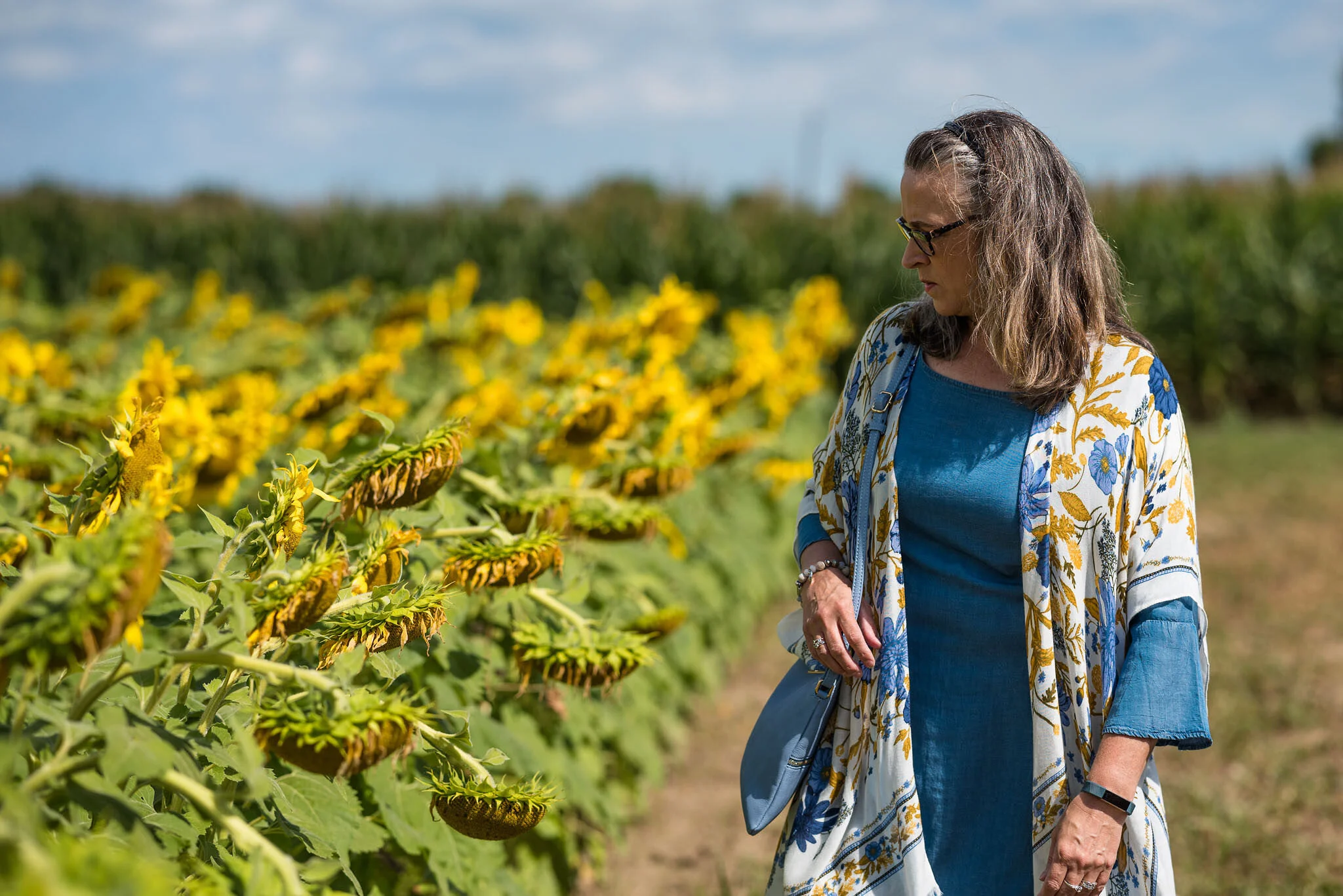
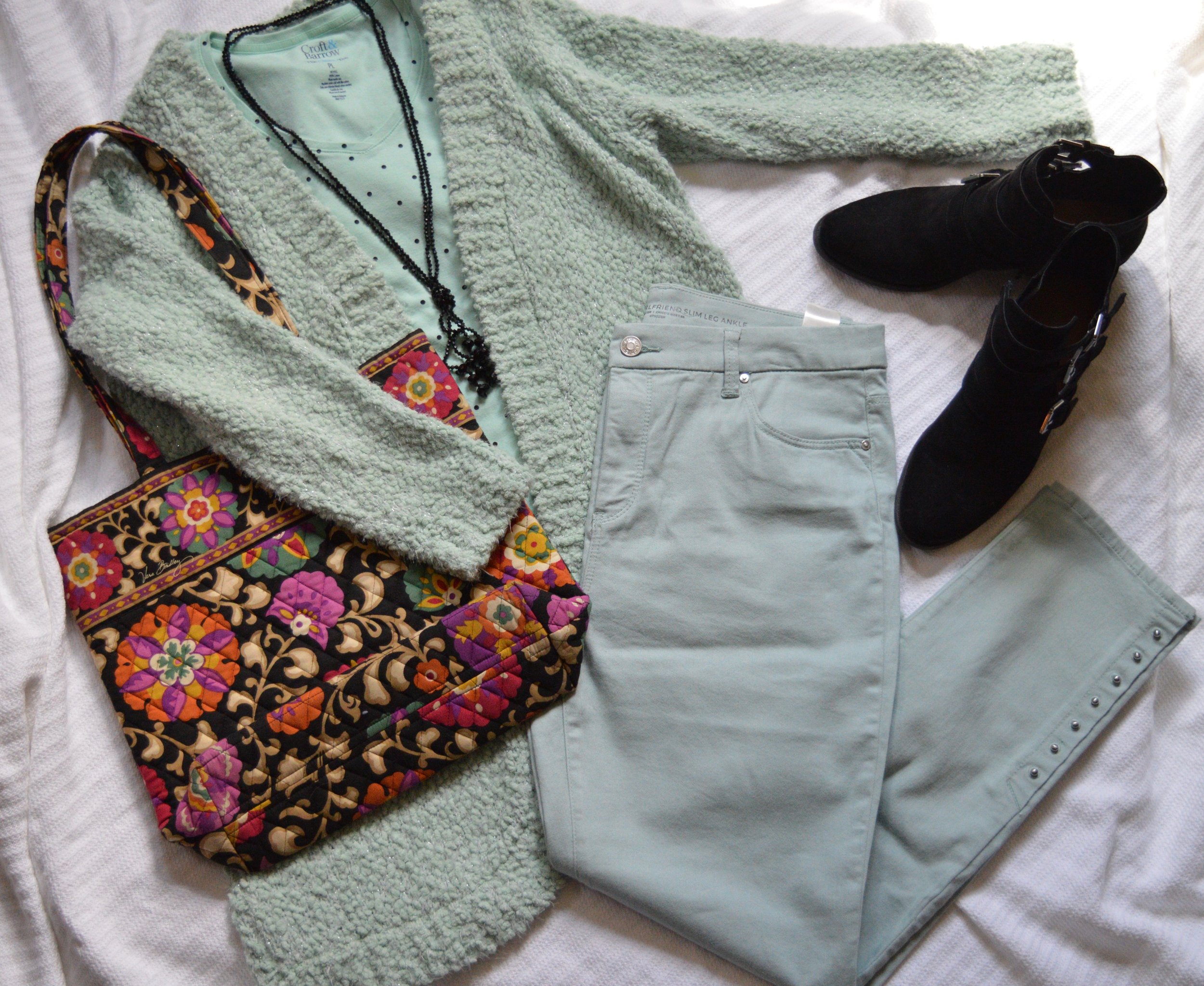
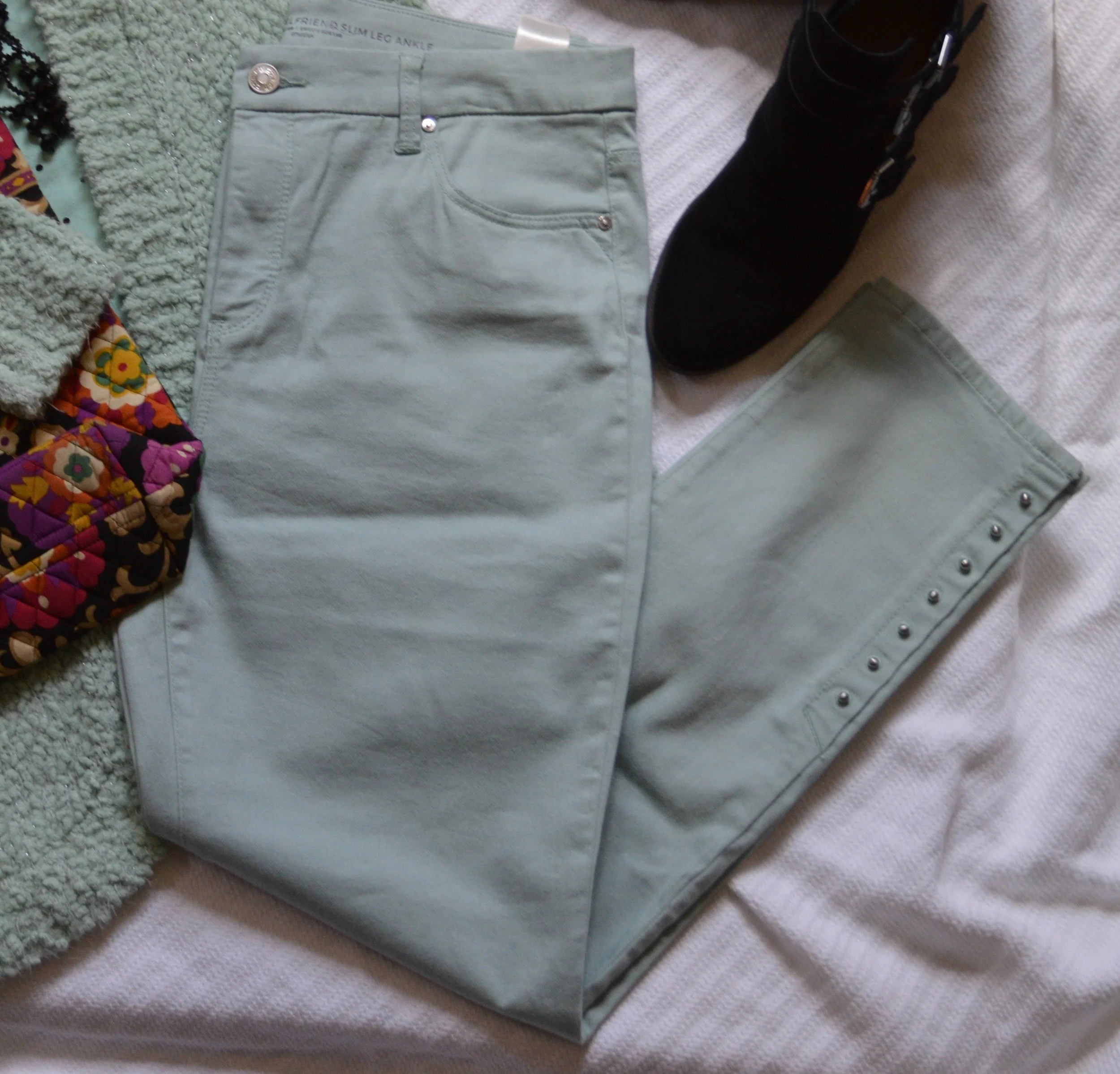
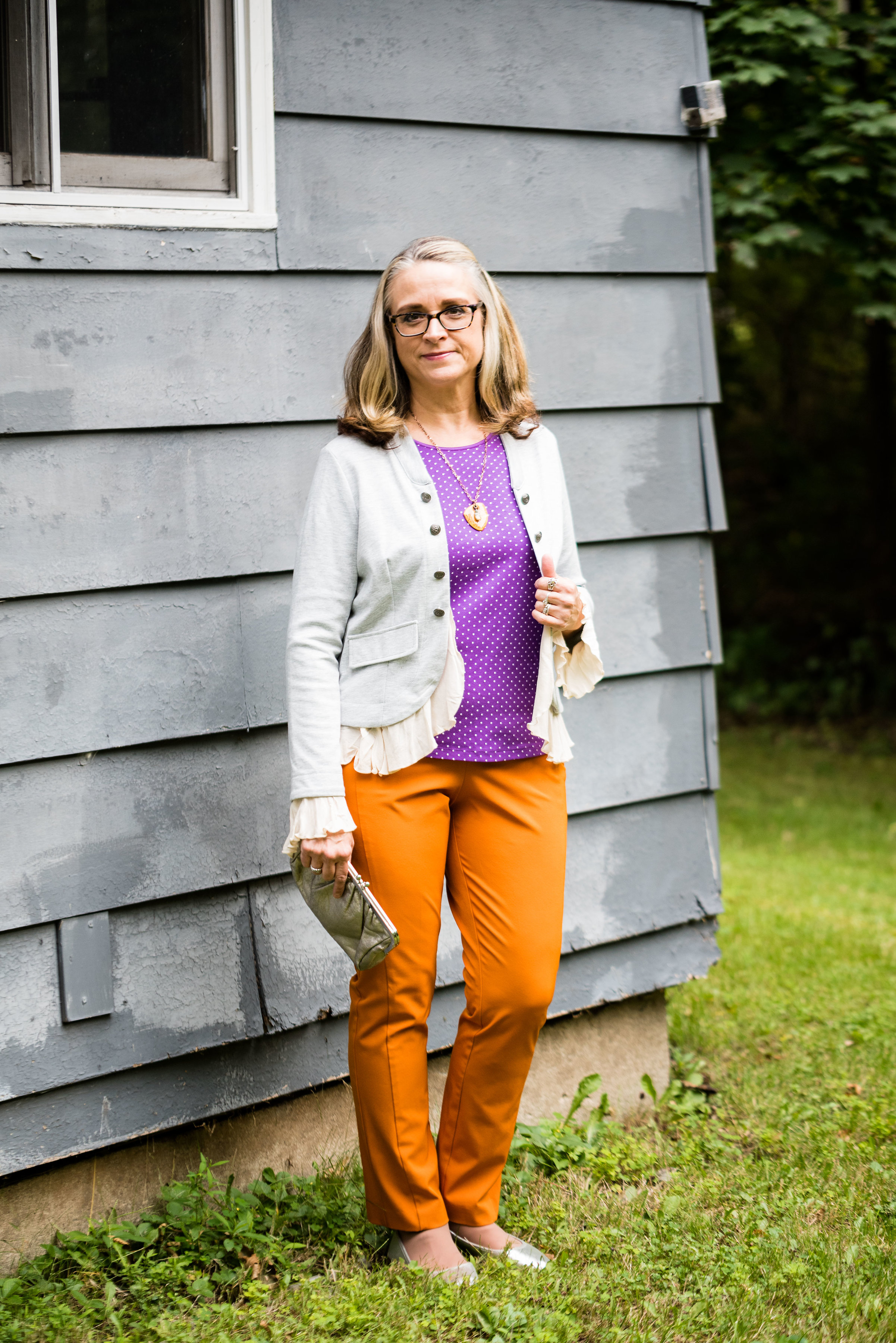
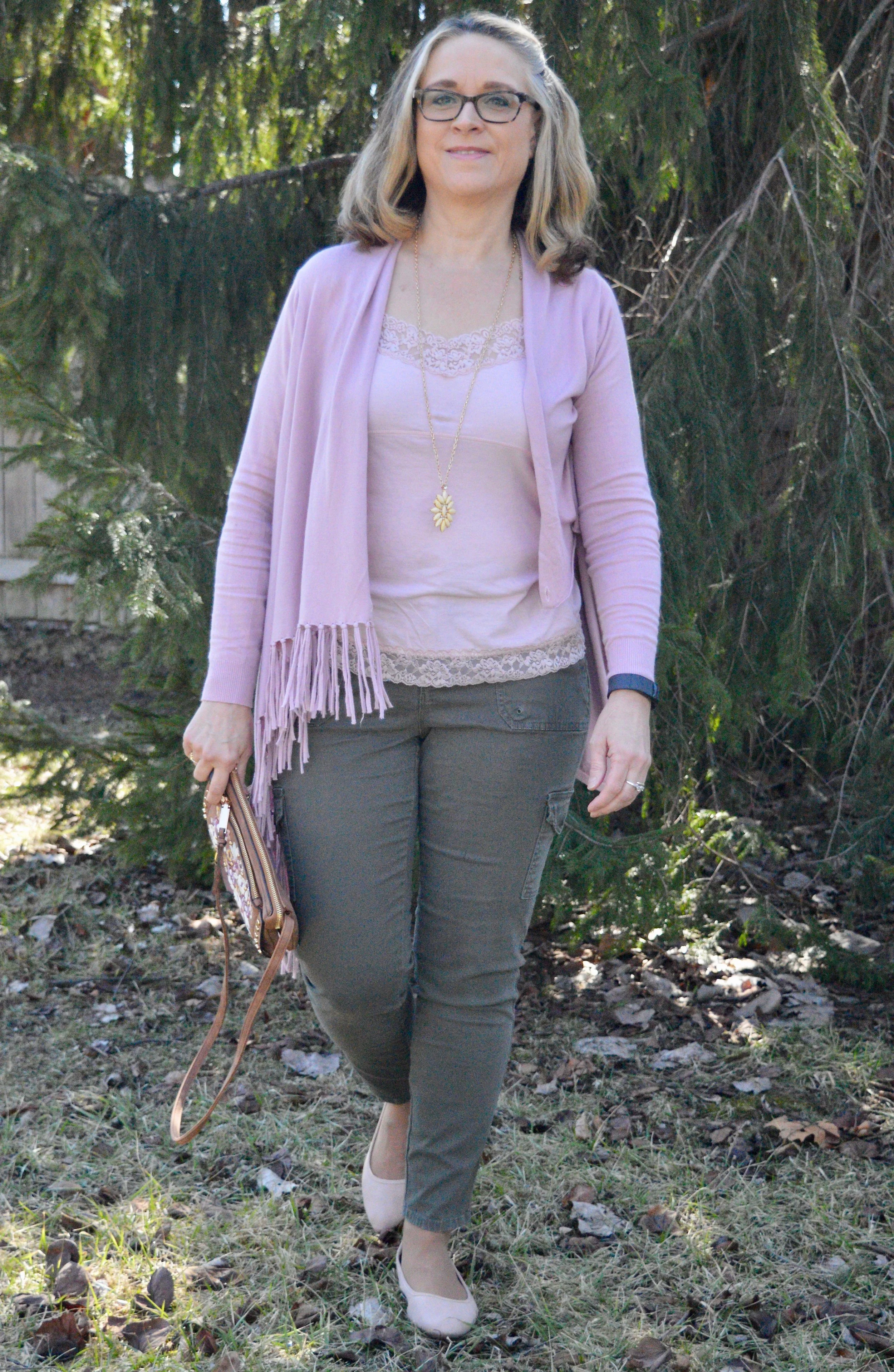
Spring Outfit with Bright Blue Pants

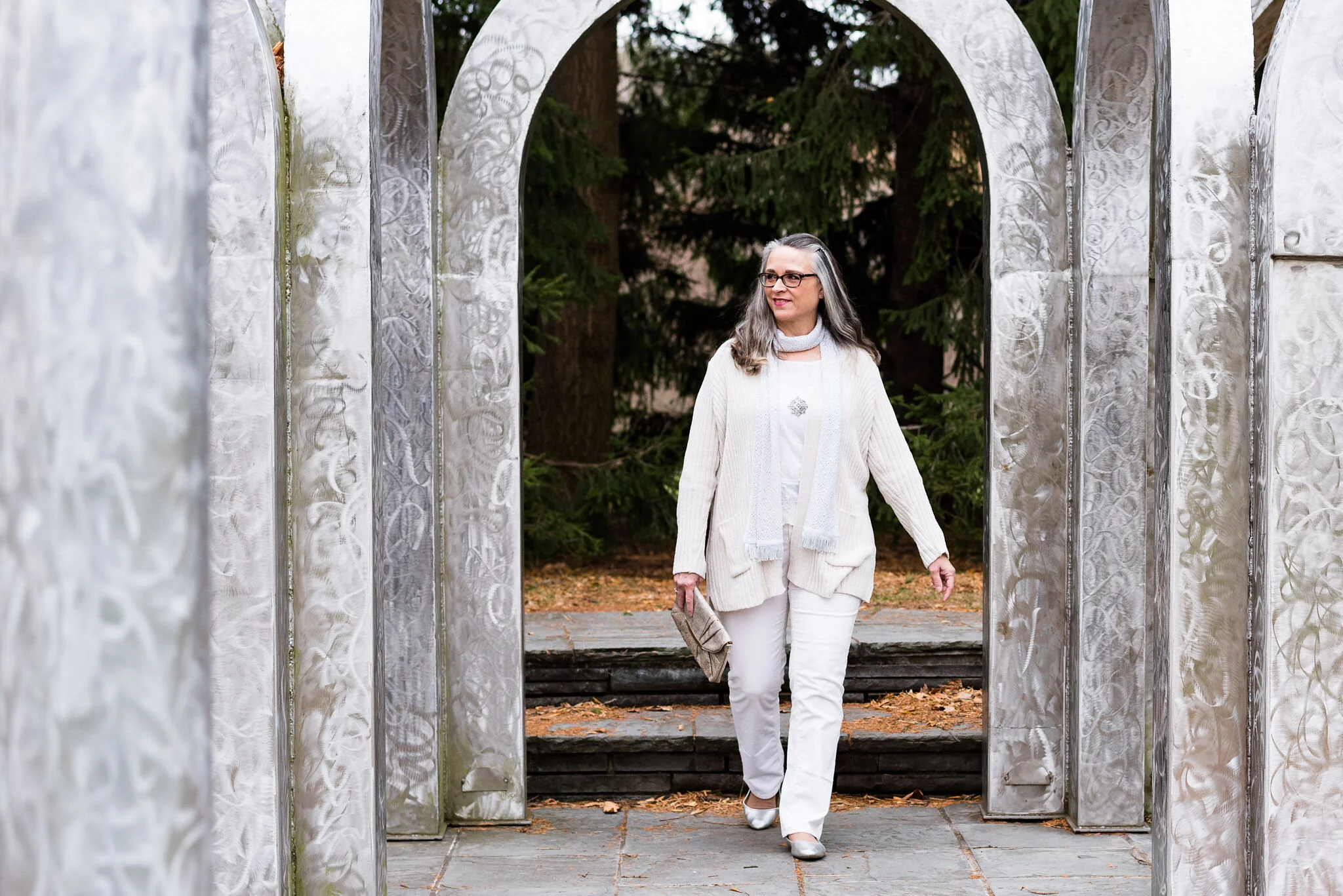
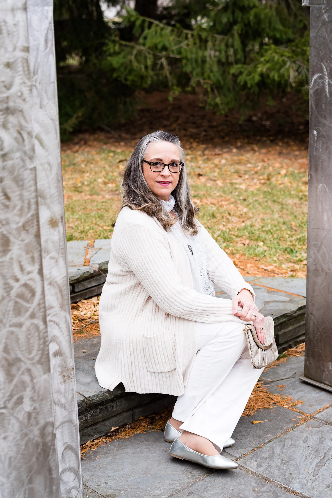
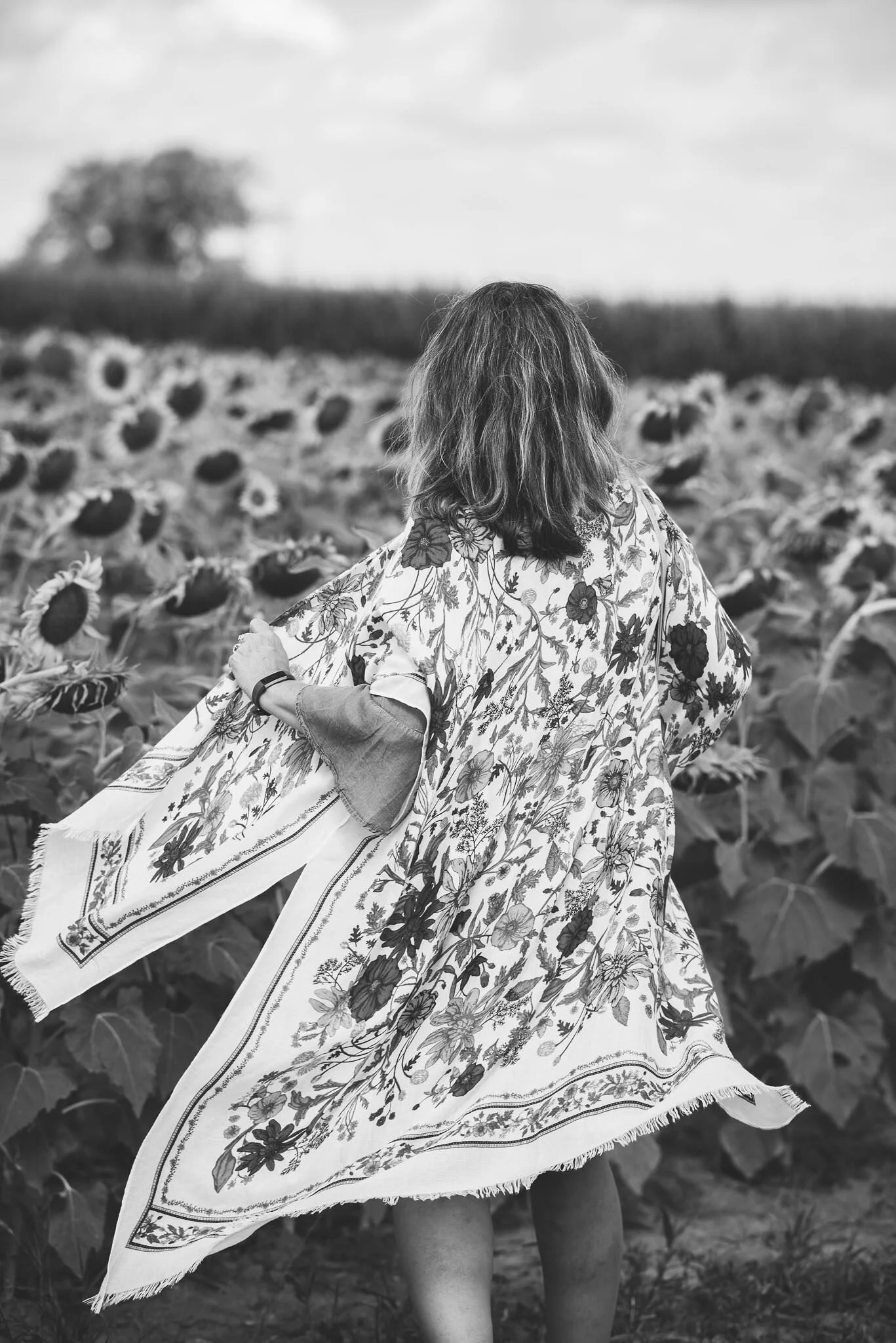
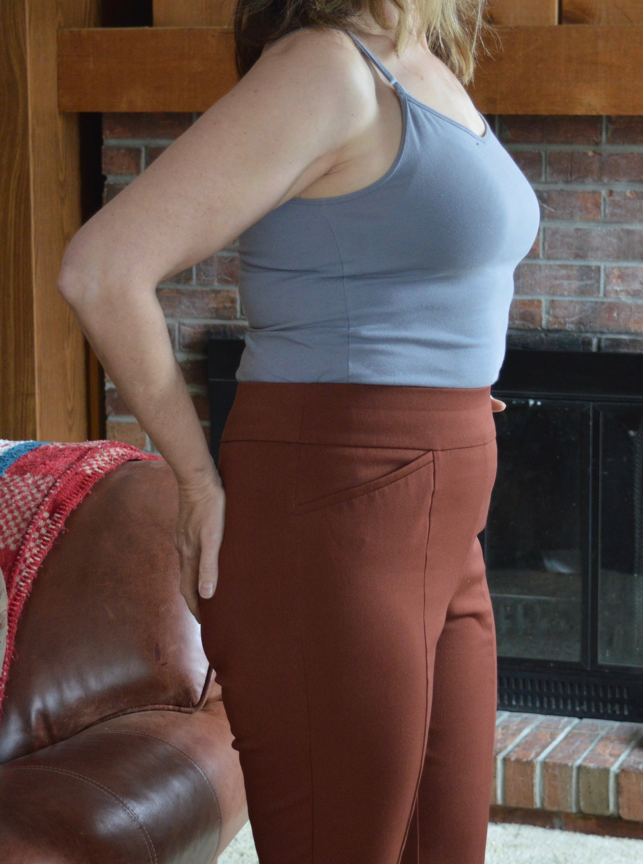
I thought I would come up with another outfit using my thrifted, bright blue, Ruby Rd. pants, since I was just talking about them on Tuesday. It was a beautiful day, so I managed to snap a few pictures for this post. They are never as good as my daughter’s pictures, but that is okay. This is real life, right? I never want to come across to you all as having it all together. There are so many bloggers and people who post on Instagram and it is easy to feel like we don’t measure up to their fabulous outfits, looks, or homes, but I know reality. It is messy, hard, busy and many times overwhelming. So I am trying to be as real as possible and not so great pictures are my reality, and so is my wide bottom. Ha, ha.

DSC_0005.jpg

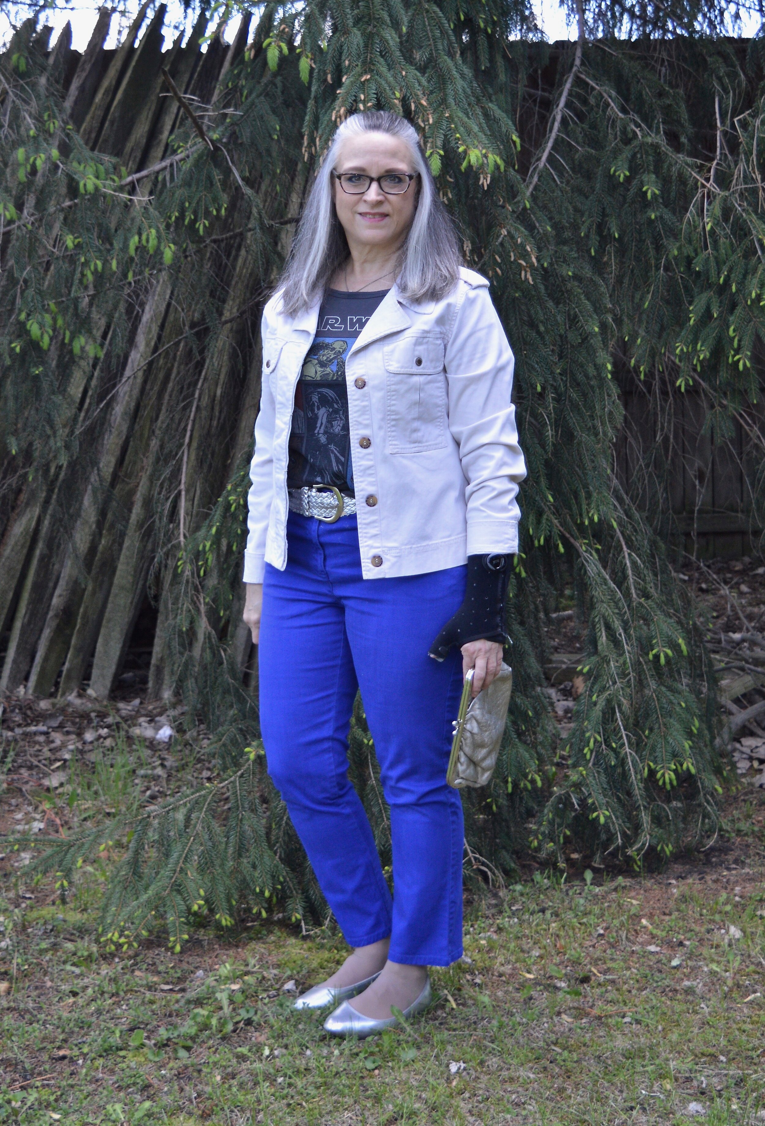
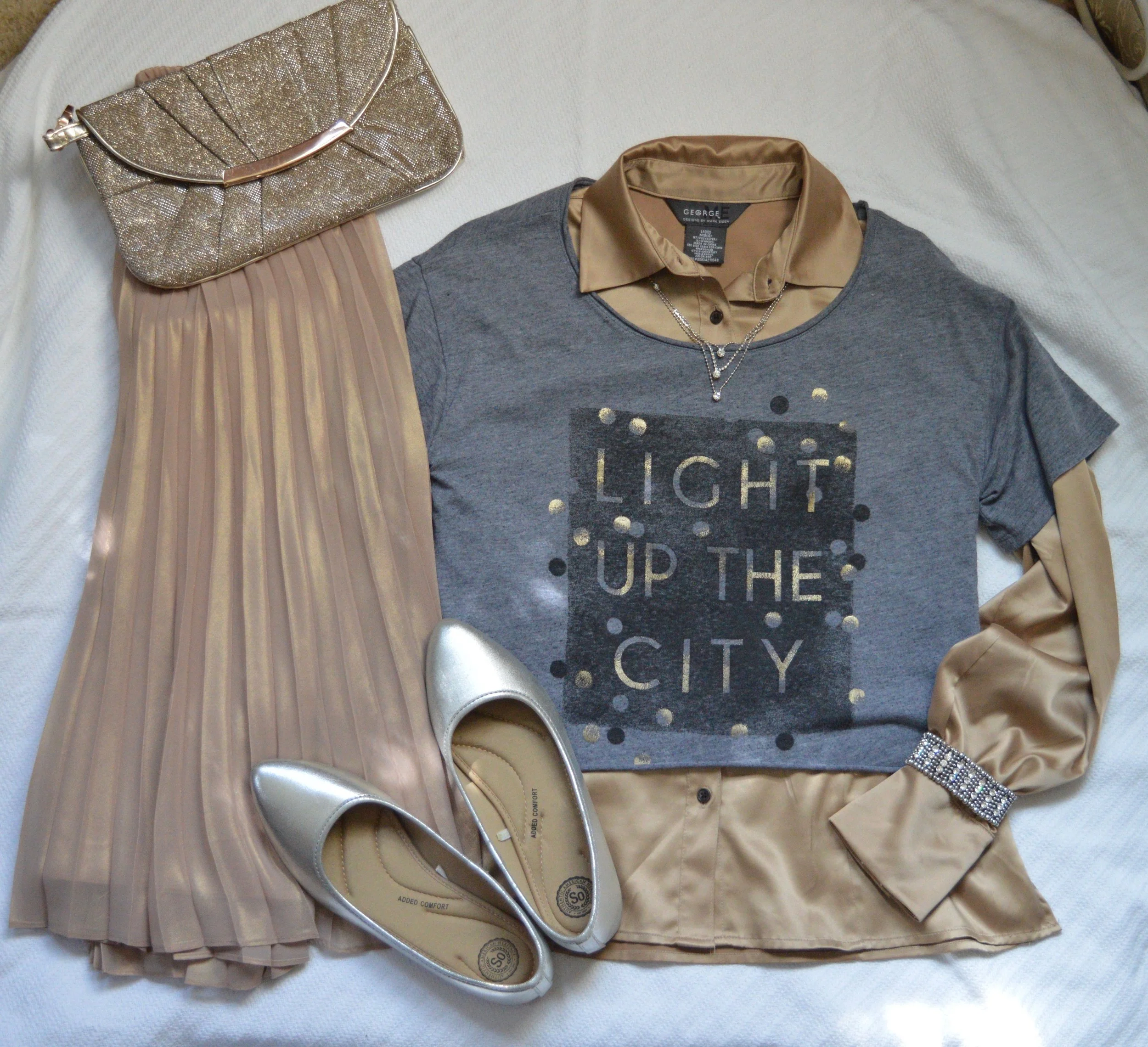
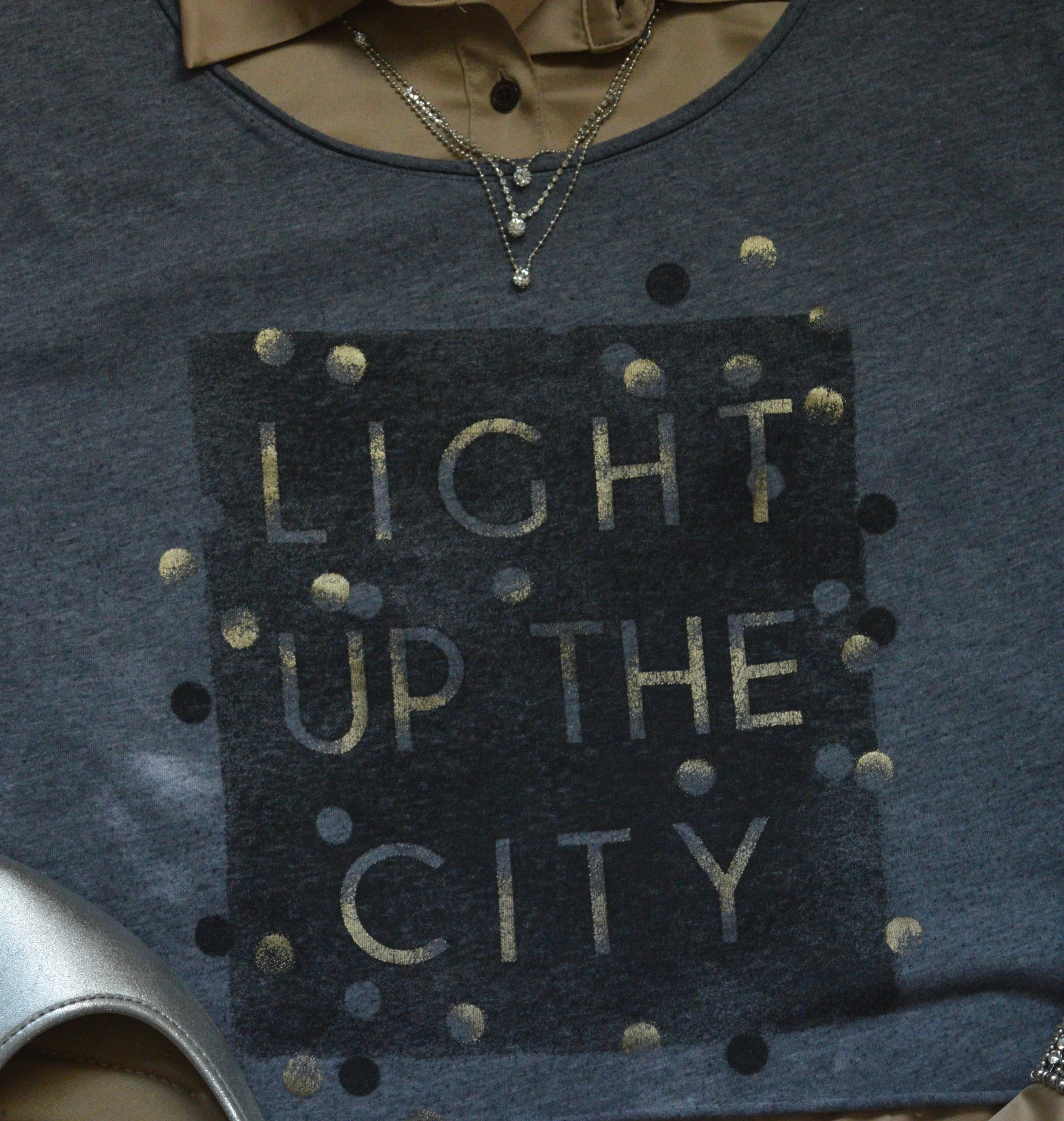
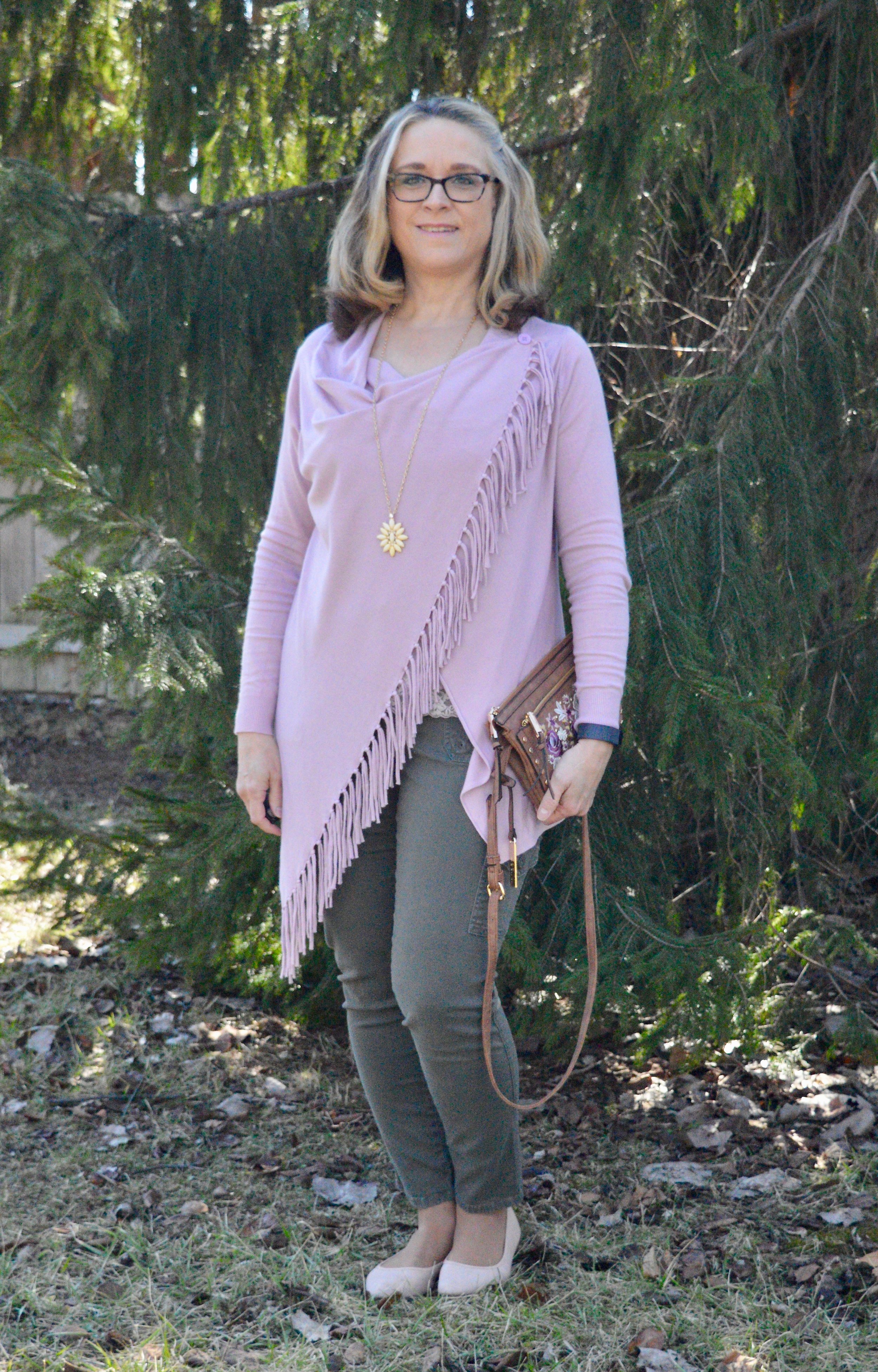
I wanted to create a look that was casual with just a touch of sass. My Star Wars tee belonged to my oldest daughter and she didn’t want it any more. I’m all for fun graphic tees and certainly am a Star Wars fan. I am actually a bigger Star Trek fan, but Star Wars is a close second.

DSC_0012.jpg

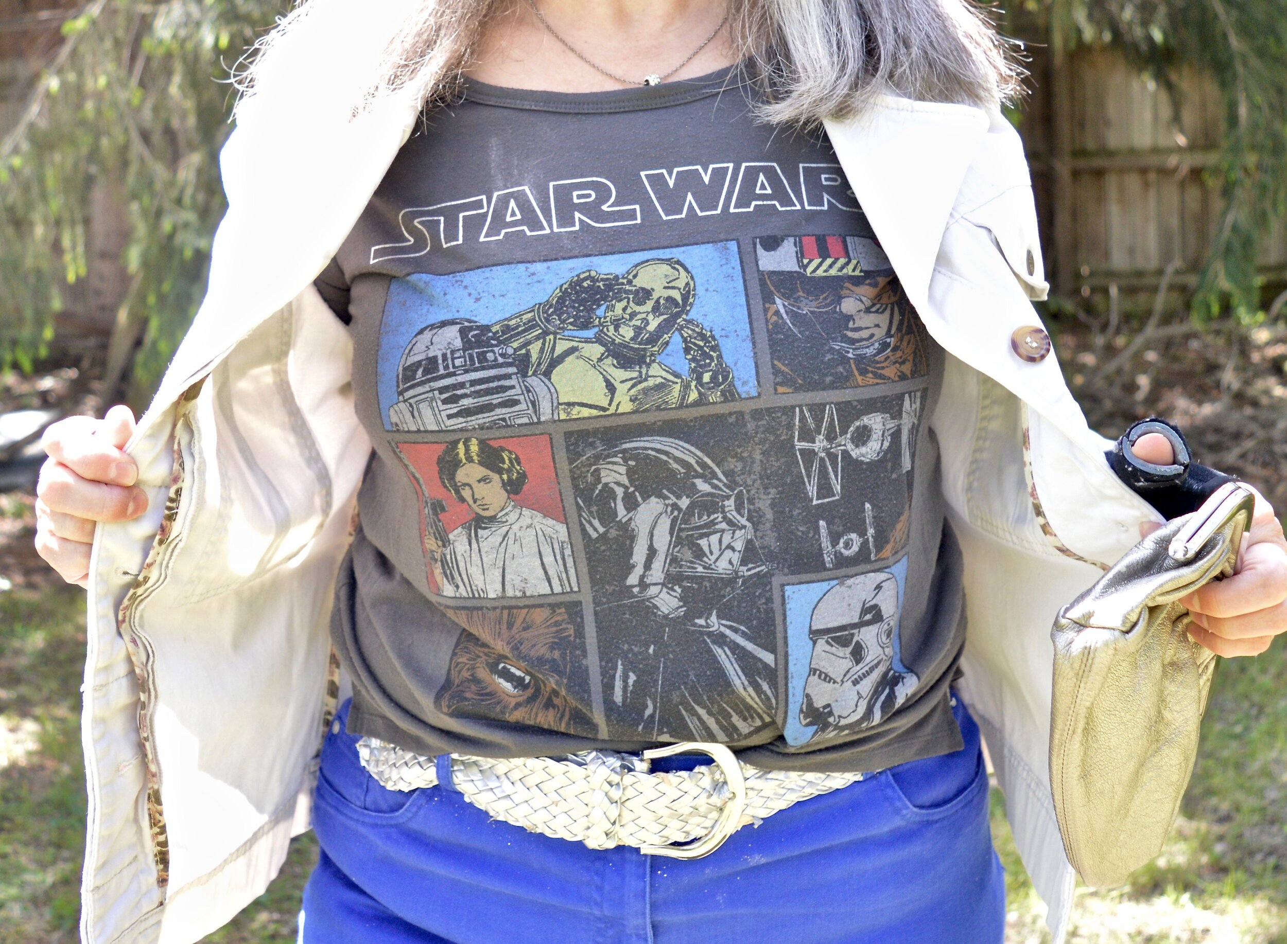
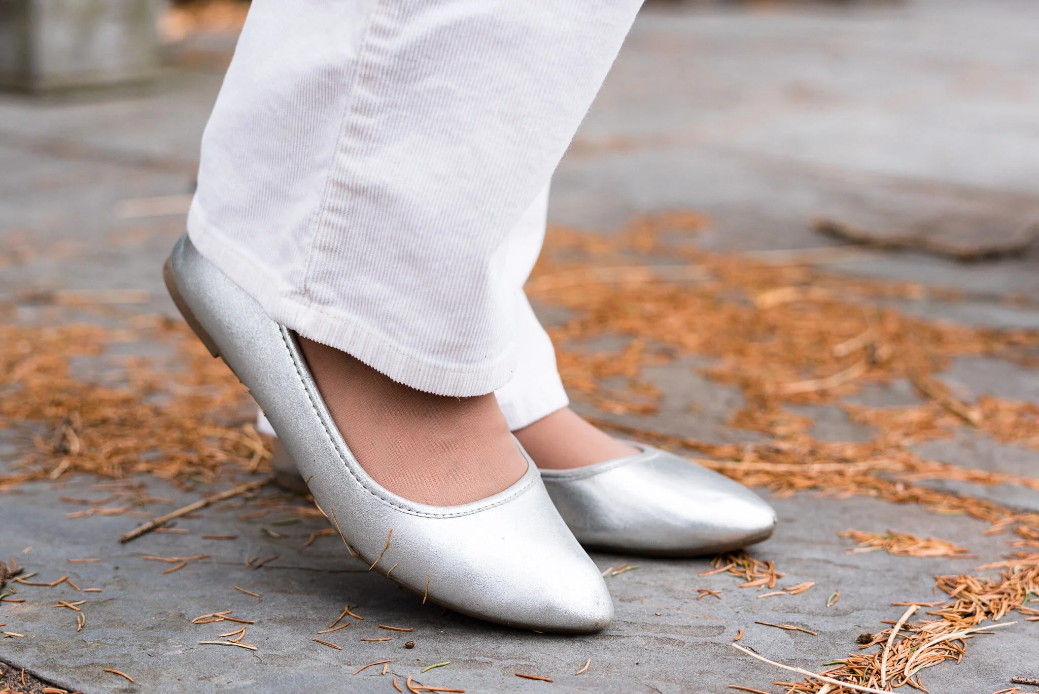
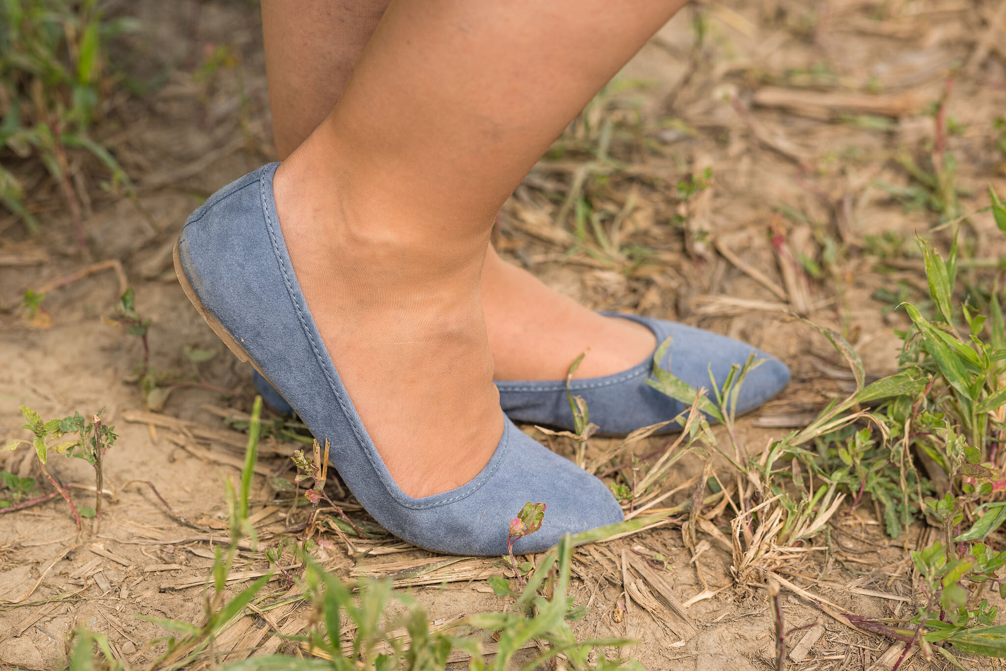
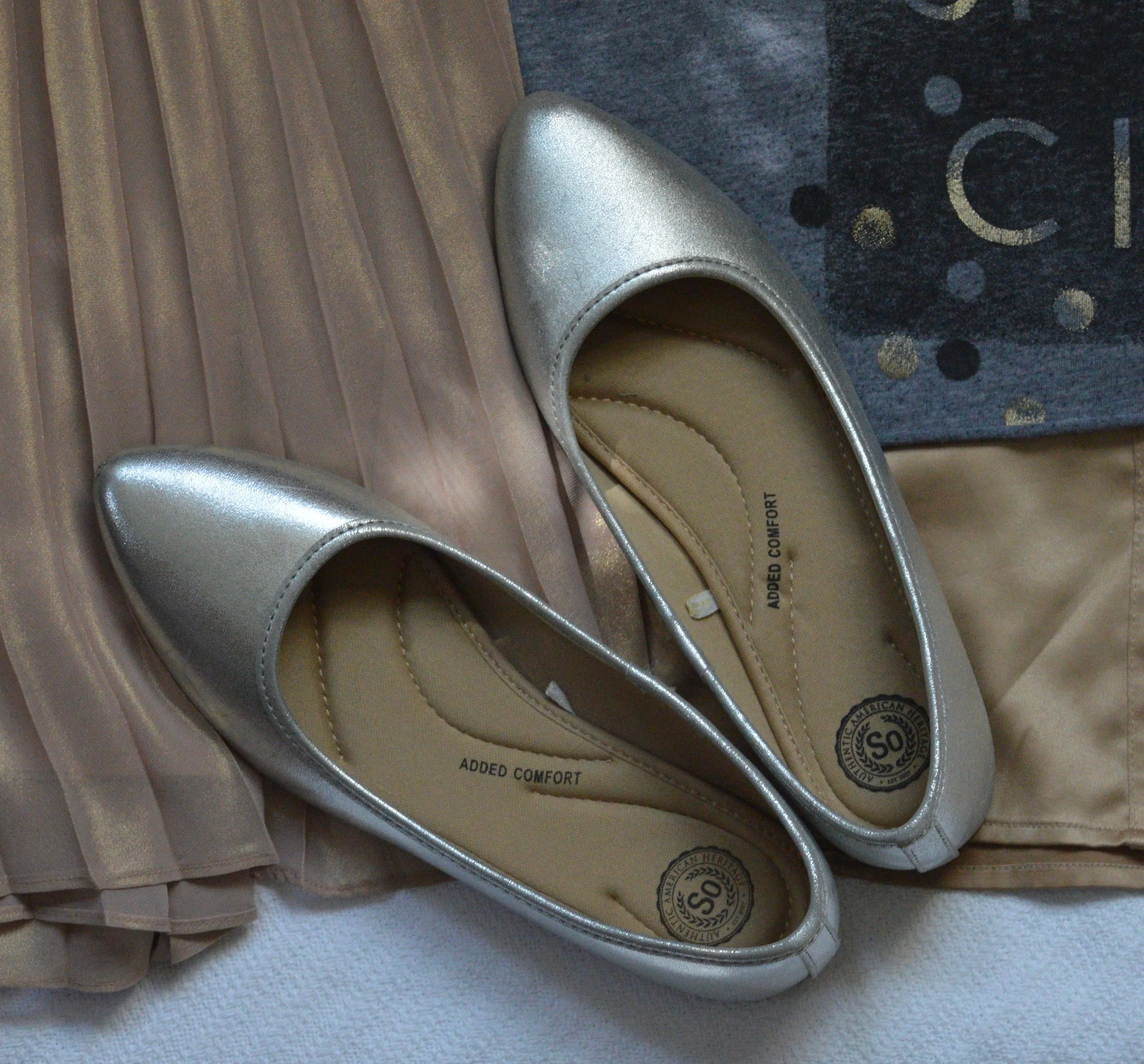
Funny story about my thrifted silver belt. I chose the silver belt and my silver SO ballerina flats to jazz the look up a little bit, and it went with the silver lettering on the tee. When I went to pull the belt through the first belt loop a ton of the silver flaked off. I had silver dust all over my pants and my rug. Needless to say, I threw the belt in the trash when I was done with the pictures. I was disappointed, as I had great plans for that belt. Oh well, like I said, real life.

DSC_0010.jpg

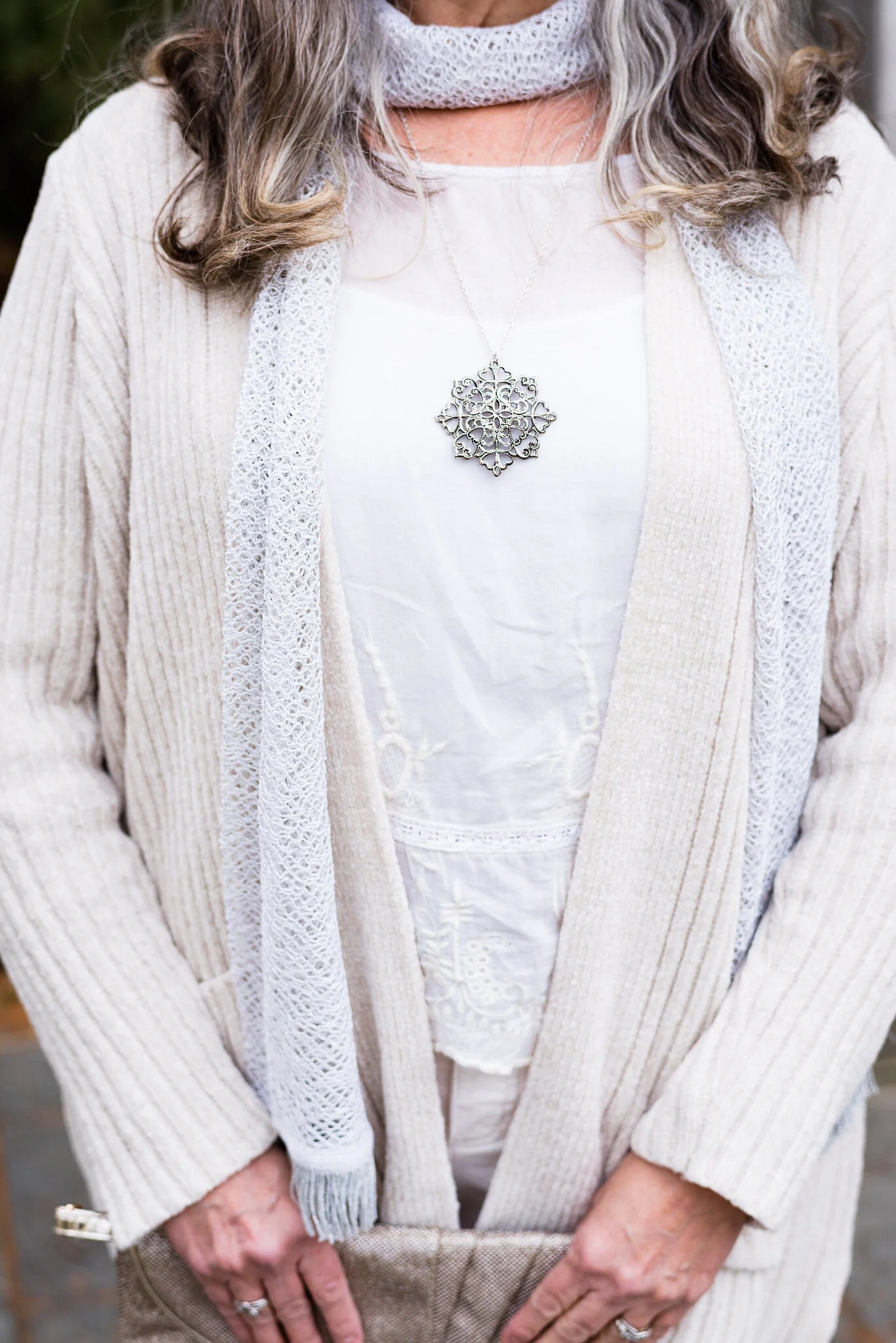
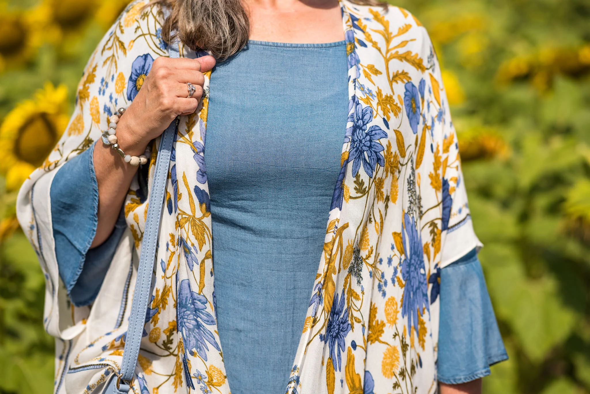
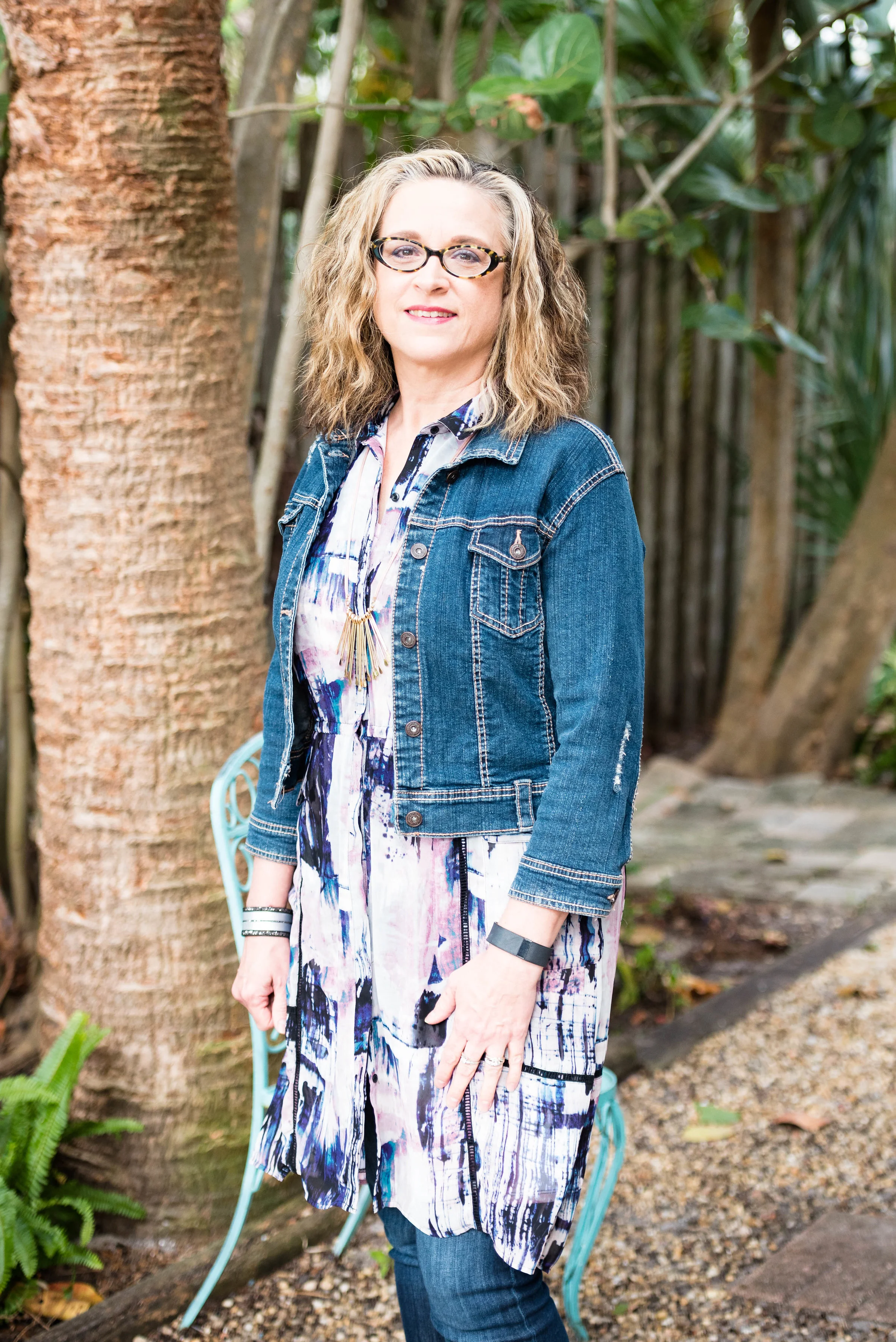
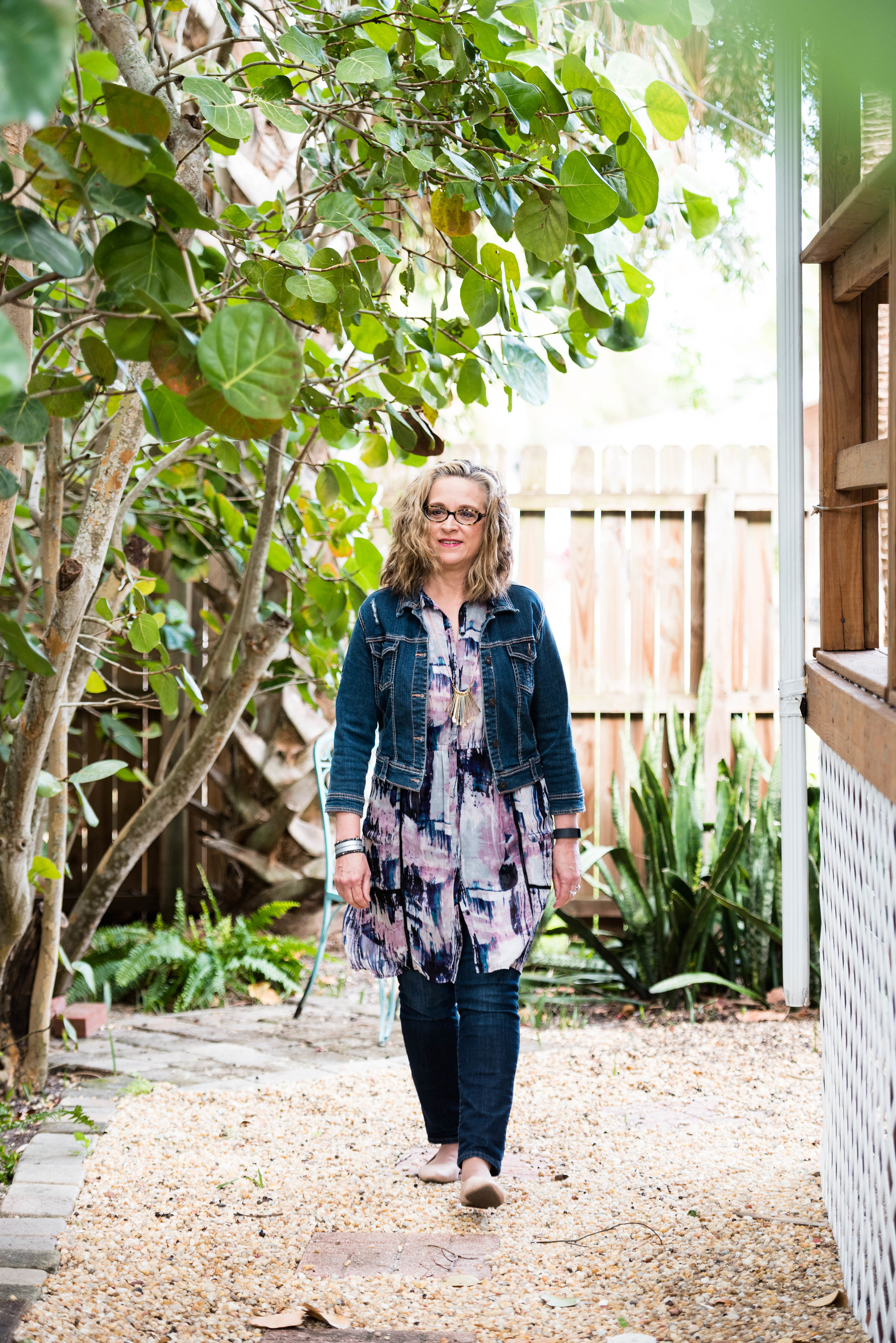
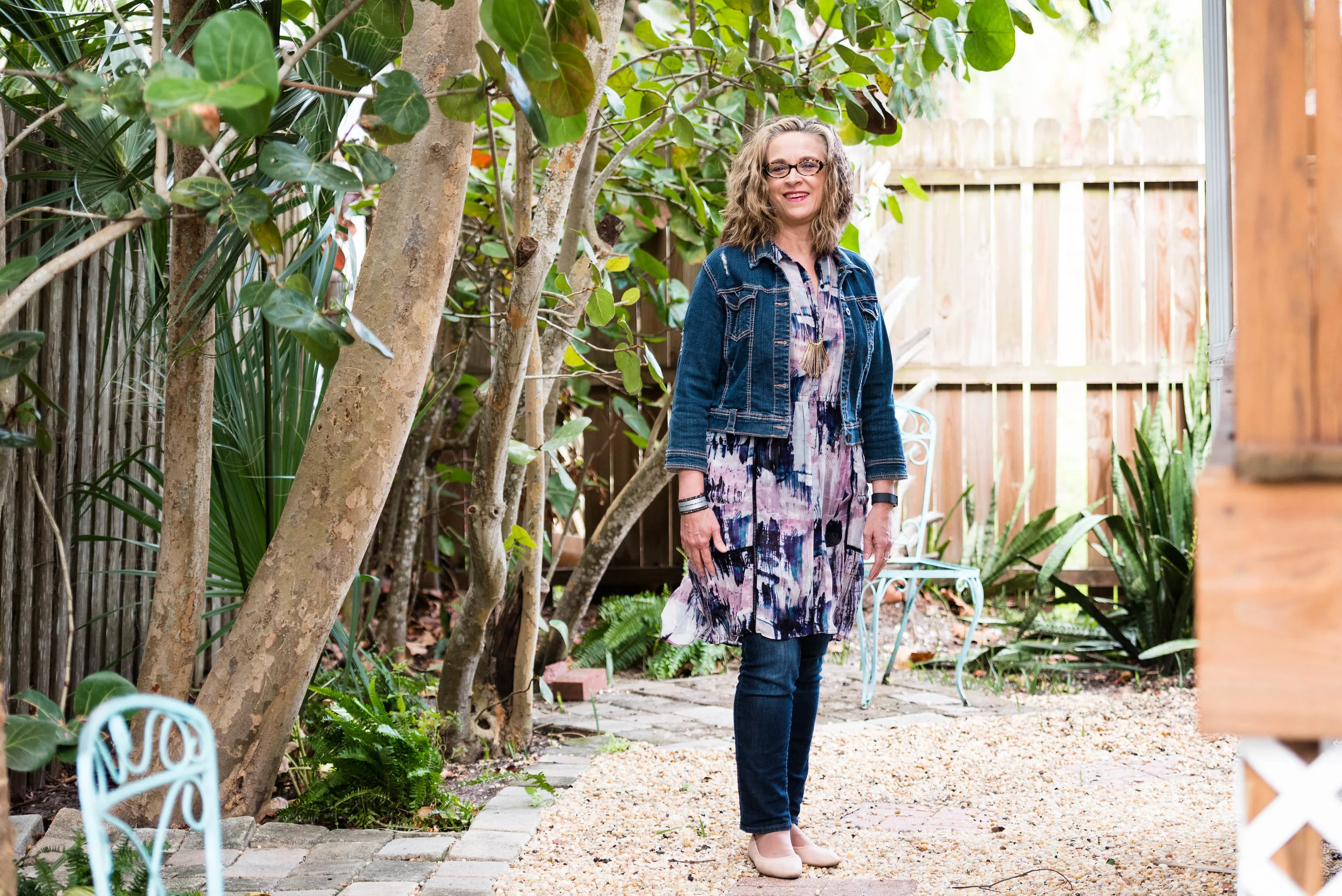
I’ve styled this thrifted, white, Sanctuary, jean jacket one other time on the blog. You can see how I styled it with a leopard print skirt. This jacket is not truly denim, it is a thicker cotton material, but doesn’t have the same characteristics of denim. However, I really like it and it is a good piece for the warmer weather and something different from the traditional jean jacket.

DSC_0004.jpg

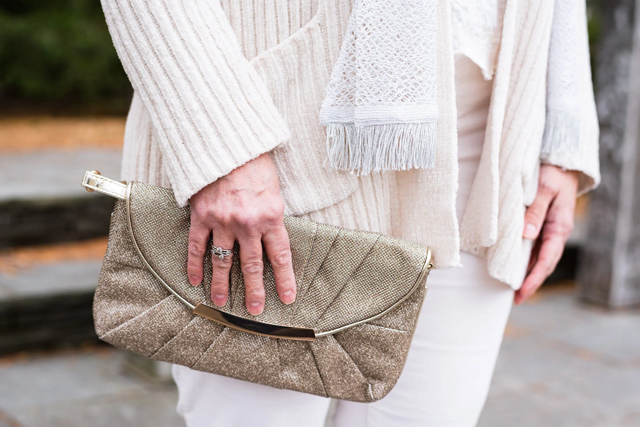
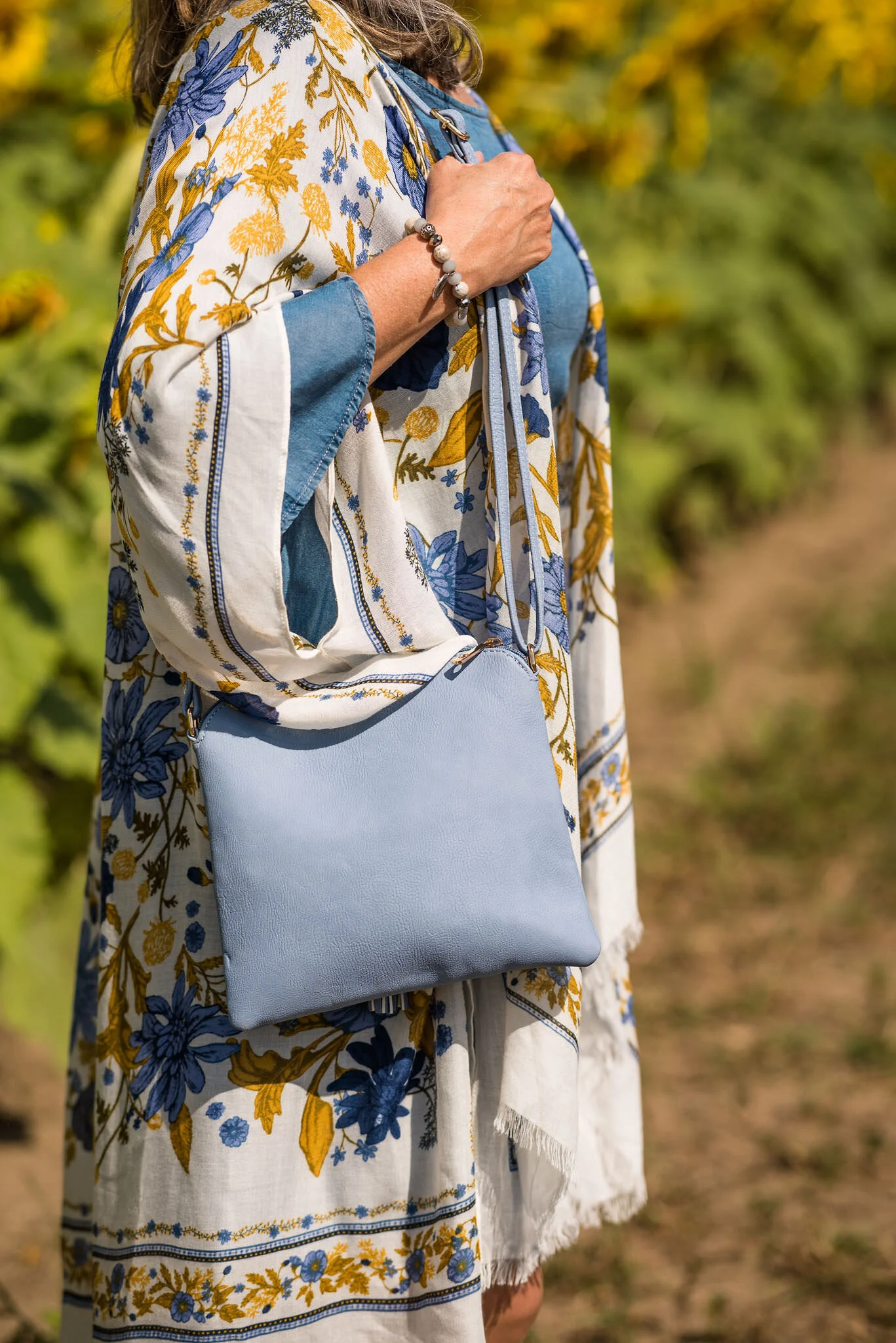
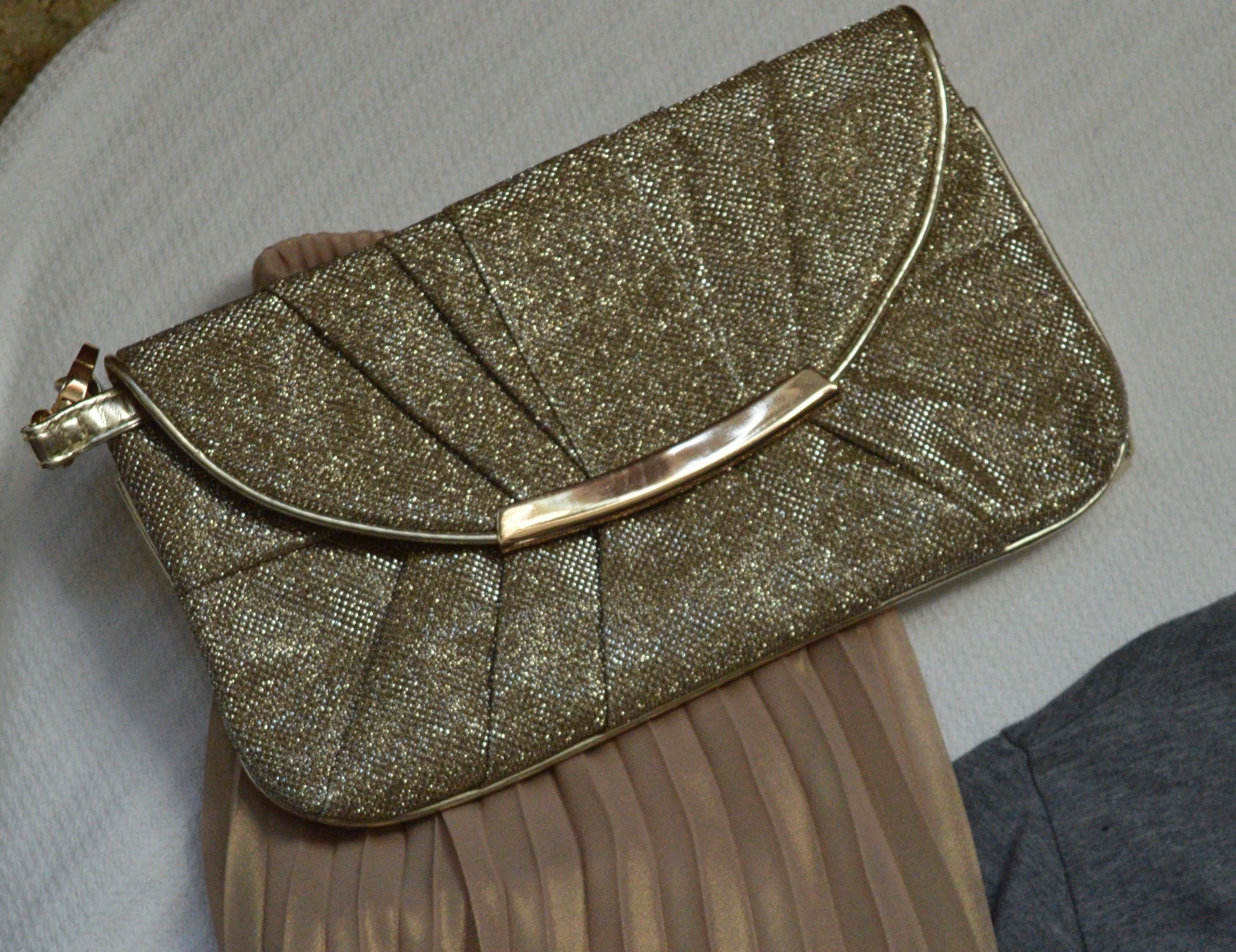
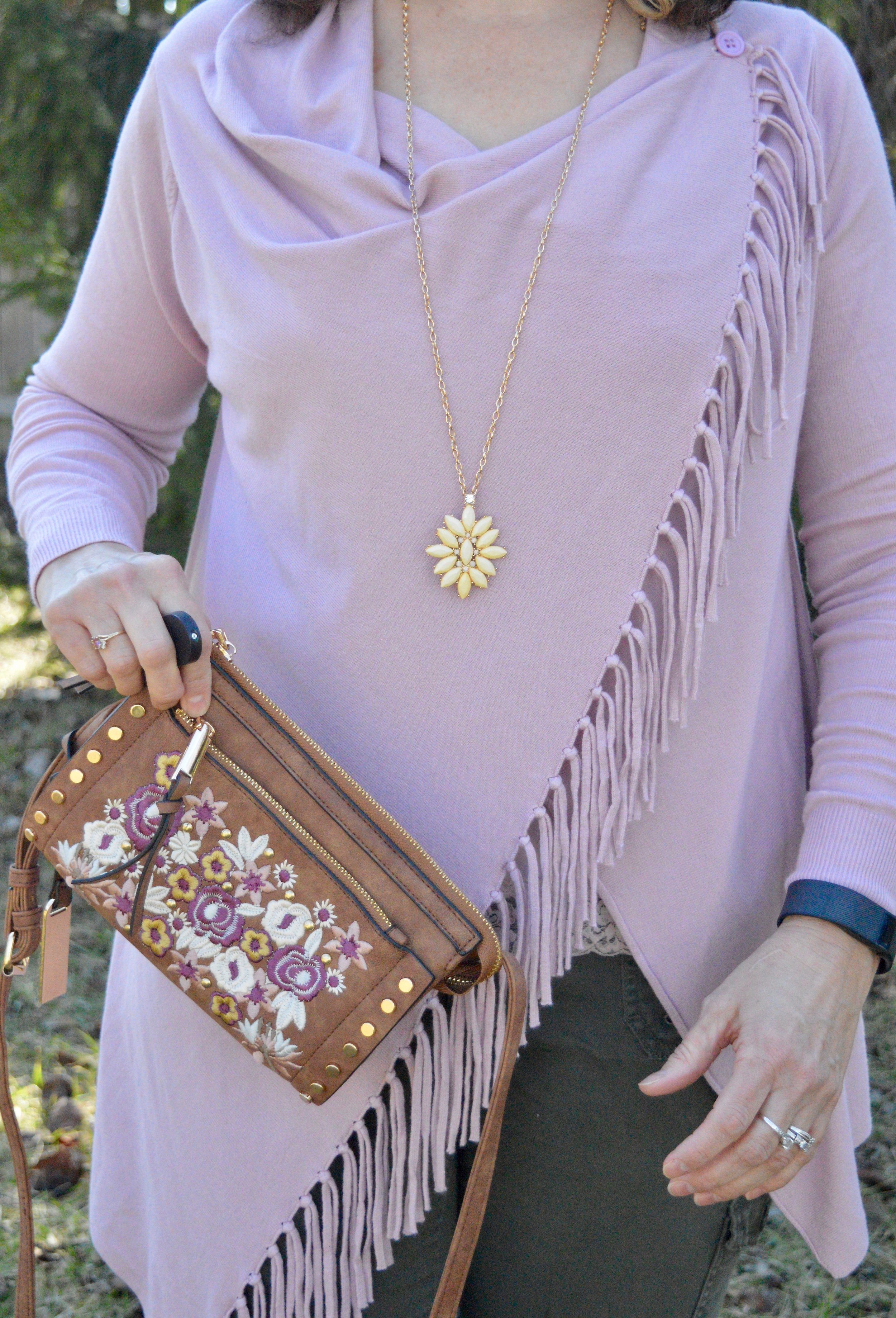
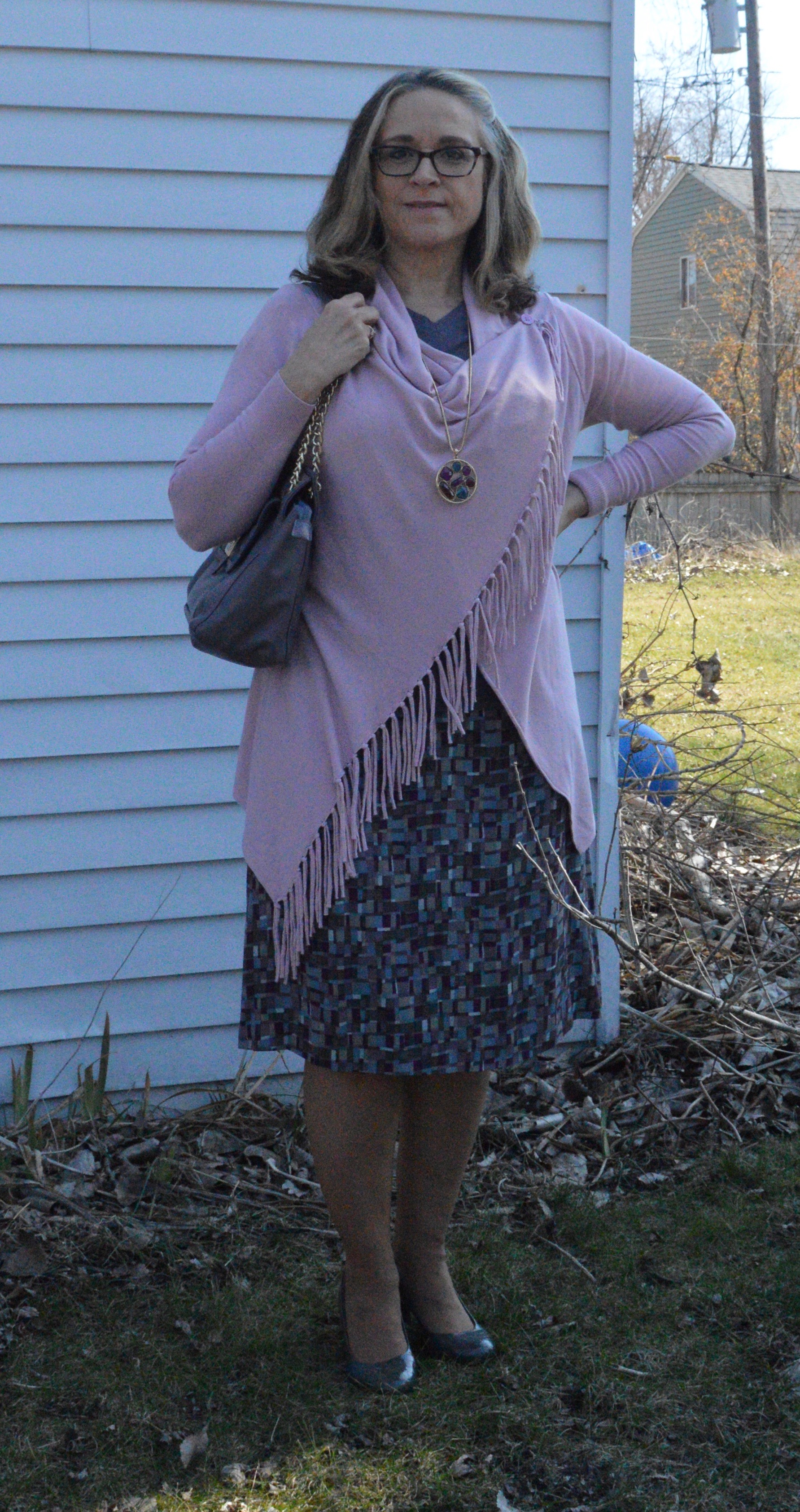
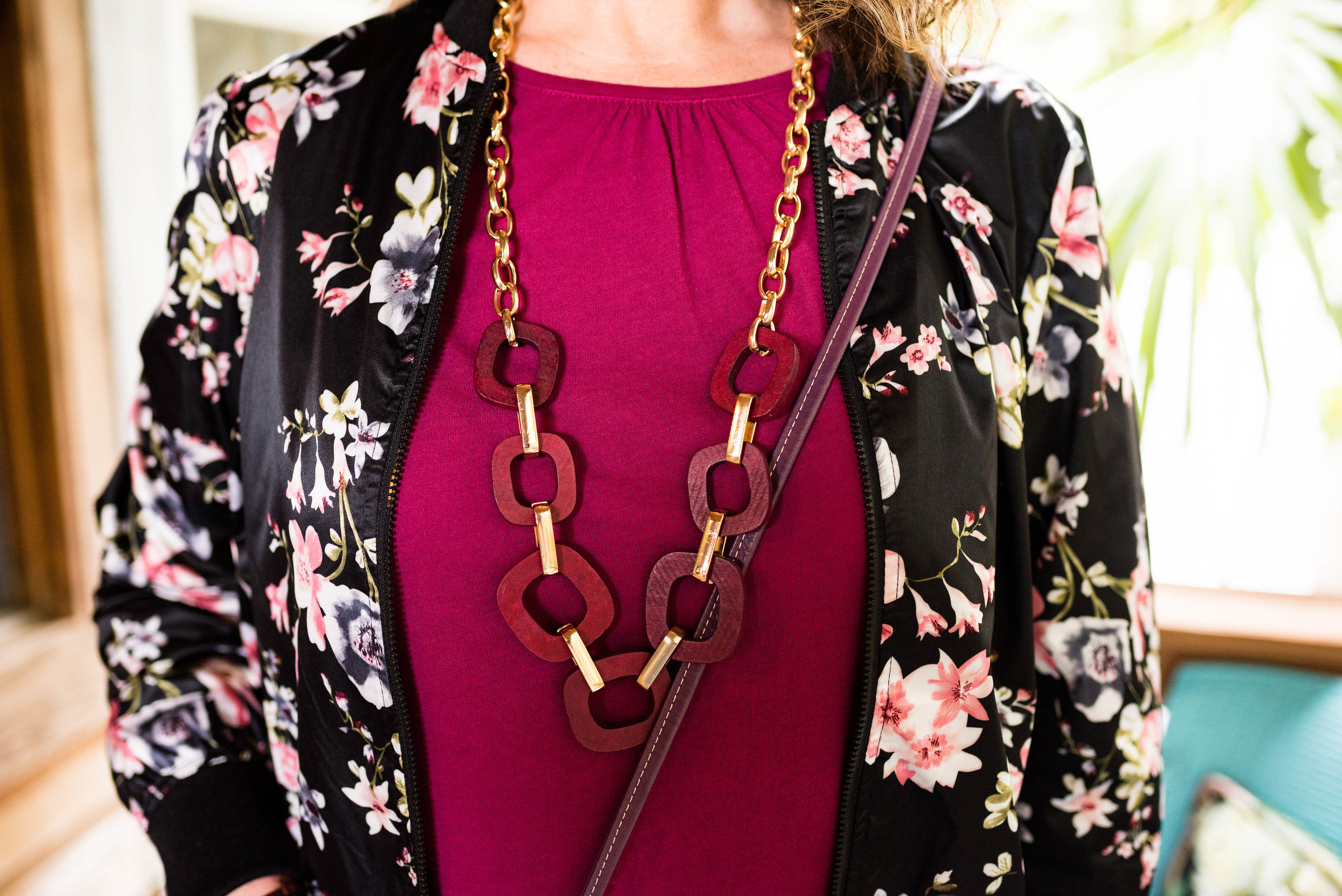
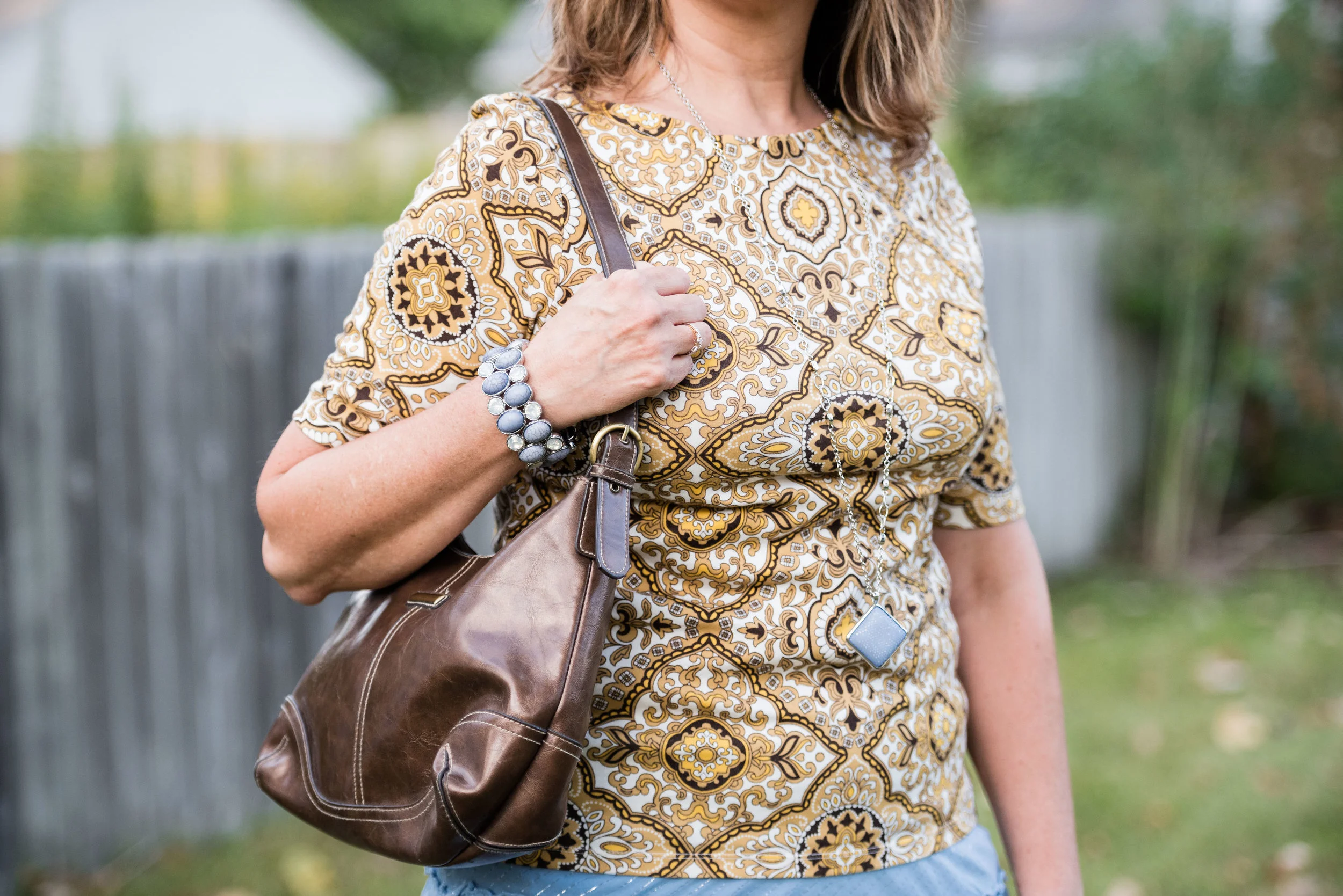
I didn’t take a picture of my little silver clutch, but you have seen it on the blog before. I chose it because it went with the belt and shoes. I do like things to match, but it is okay to not have things match as well. Many of our old fashion rules have gone by the wayside. I always go back to the idea, do what is best for you. If you like things to match, then make them match. If you want to wear purple shoes, carry a red bag and wear a green belt, you go girl! As bloggers, we are only here to give you inspiration, not tell you how you have to dress.

DSC_0015.jpg

I want to know if you have gotten yourself a pair of bright blue pants? Ha, ha. Actually, they are a little hard to find, but if you thrift shop, be sure to check there. Thrift stores will often have loads of brightly colored pants, because they are no longer trending.

I hope you enjoyed this post and one more idea on how to style those bright blue pants.

I’m including a few shopping links just for fun. These are affiliate links brought to you at no added cost. If you click on a link I get a few cents. I appreciate every click. All opinions are my own.

Have a great weekend everyone!

A Dickens' Christmas - The Ghost of Christmas Past

Today’s outfit draws its inspiration from Charles Dickens’ ghostly apparition of Christmas Past. Before the visitation of the three ghostly characters, Scrooge is visited by the ghoulish presence of his former business partner in life, Jacob Marley. Jacob warns Scrooge that he will be visited by three spirits, for the hopeful purpose of his redemption. The first of these paranormal beings makes their appearance when the bell tolls one.

The idea of drawing fashion inspiration from a ghost, might seem a stretch of the imagination, but I do like a challenge. If you have watched a version of A Christmas Carol, you probably saw the Ghost of Christmas Past as a being dressed in white garments, sometimes shining and sometimes in an unearthly, ethereal manner as if floating and flowing in some unseen breeze. Two of my favorite movie versions of A Christmas Carol are the 1984 drama with George C. Scott, and the 1992 musical, The Muppet Christmas Carol. Surprisingly, the Muppet version stays fairly true to the original tale by Charles Dickens. Both versions are filled with amazing scenery, typical old time London and excellent veteran actors, (the Muppet version stars Michael Caine as Scrooge).

A Dickens' Christmas - The Ghost of Christmas Past

We often shy away from white in the colder weather. It has long been a color we wear in spring and summer. Obviously, things have changed immensely over the last decade, especially as more and more women have access to fashion blogs and more reasonably priced clothing. White is now a year round color choice. It stands true to reason, that if we live in colder areas in the winter, our white pieces will have to be compatible for those frigid temps. This is where layering, fabric choices and textures all come into play.

My daughter and I didn’t have a lot of time for pictures, so we went, once again, to the Toledo Botanical Gardens. They have so many interesting sculptures, garden areas and small buildings used for various events. These metal arches provided the perfect backdrop for an other worldly vibe.

A Dickens' Christmas - The Ghost of Christmas Past

When I started thinking about an all white outfit, I knew that most of my pieces were not a true white. Not everyone can wear a crisp white near their face, but most people can pull off an ivory or a cream. All of these pieces, except the scarf, have more of a cream, or ivory tint to them.

A Dickens' Christmas - The Ghost of Christmas Past

My long, Apt. 9, chenille sweater was a piece my daughter was getting rid of. It wasn’t really her style, so when I saw it, I took it home, figuring I could always just wear it around the house as a cozy topper for casual days. As I thought about how to make this outfit look flowing, but also updated and fashionable, I knew this sweater would be perfect.

A Dickens' Christmas - The Ghost of Christmas past

The blouse I have on under the sweater is a recent thrift store find and will be more useful in the warmer weather, but the color went well with everything else. The brand is called Mango, and when I saw the embroidery on it, I knew it was calling my name.

I also added this white scarf from The Jacket Society, that I bought a few years ago. You can’t see it in this photo, but the scarf has tiny silver threads through out, so I thought it added an extra element of texture and shine.

The silver snowflake pendant just seemed appropriate for a ghostly, Christmas outfit.

A Dickens' Christmas - The Ghost of Christmas Past

I chose silver for my accessories, to represent the shimmering appearance that many of the Ghosts of Christmas past seemed to have. Perhaps the shimmering details represented good memories from Christmases long ago; or maybe the light represents the idea that we can learn from our past, thus becoming better people. Whatever your interpretation of the details, I think silver looks very pretty with white.

My silver, sparkly clutch has been a regular on the blog. My SO ballerina flats are from Kohl’s.

A Dickens' Christmas - The Ghost of Christmas Past

My cream colored St. John’s Bay corduroys have been around for a few years and were an original purchase at JC Penney.

A Dickens' Christmas - The Ghost of Christmas Past

I really like this outfit. It is something I would feel completely comfortable and warm in and could be worn to a special Christmas outing or just a family dinner, where I don’t have to do the cooking. If I cooked in this it wouldn’t be white anymore. Ha, ha. Here are a few other fun pictures from our shoot.

A Dickens' Christmas - The Ghost of Christmas Past

The wind was helping me look a little more ghostly. Too bad we didn’t have fog. Ha, ha.

What did you think of this outfit? Do you think I pulled off showing how taking inspiration from the Ghost of Christmas Past translated into a chic, modern look that could be worn to work, out on a date or to a Christmas concert?

I’m including a few shopping links for you to look over. These are affiliate links. All opinions are my own.

Be sure to stop back on Thursday for another Christmas movie inspired outfit.

Photo credit Rebecca Trumbull.


Kickin' It with Kimonos - Looks like Sunflowers

I came across another Ohio blogger, recently on instagram named Shannon Solt. She inspired me to check out Hirzel Farms and their sunflower fields. Since she did a fashion post in front of the pretty blooms, I thought that would be a great idea and texted my daughter about getting some pictures in before the heavy seeded sunflower heads started to droop. Being the practical minded person that I am, I wanted to come up with an outfit where I would be able to get more than one blog post. I finally decided on using one piece styled three different ways.

The piece I chose to revolve all three outfits around is this Massini chambray dress that I found on the clearance rack at Target. I have styled this on the blog before as seen with a denim vest.

kickin' it with kimonos - blue and Yellow print

It was a bright day, but with plenty of fluffy clouds flying over, so the sun would shine and then it would go behind a cloud. This can be a problem for taking pictures, but I thought my daughter did a great job. We both prefer shade or clouds for pictures.

Kickin' it with kimonos - yellow and blue print

I found this fabulous kimono, or in actuality a ruana, at maurices. I love the color combination and once again it is a floral print. You can see in these pictures the sunflowers are already getting heavy with seeds. This was about two weeks ago and now they are completely brown and drooping so their heads face the ground. At this point each individual stalk can be cut. Once further dried the seeds can be harvested, or the stalks can be left outside and the seeds become food for all sorts of critters.

Kickin' it with kimonos - blue and yellow floral

Doesn’t it look like the flowers are bowing to me as I walk by? Ha, ha.

Kickin' it with kimonos - blue and yellow floral

I would have had a yellow pendant necklace if i hadn’t forgotten it at home. Ha, ha. The joys of taking pictures somewhere other than home. I can’t just run back into the house if I forgot something. Anyway, there is plenty of activity going on in the kimono and in the back ground, so it is probably okay that I don’t have a necklace on.

Kickin' it with kimonos - yellow and blue floral

I did have this bracelet for another outfit, so I threw that on. I really like the little owl charm.

Kickin' it with kimonos - yellow and blue floral

If you have been following for a while, you know I love these SO ballerina flats. They are comfortable, light weight and so easy to slip on and off. They tend to mold to your foot, so don’t slip off when I am walking.

Kickin' it with kimonos - blue and yellow flora

I’ve used this light blue bag on the blog before too. Unfortunately, in this picture the bag is backwards and you can’t see the pretty gold zipper and blue tassels on the front. I really need to pay more attention to the details.

Here is a fun black and white photo for you. I love the contrast of grays, whites and blacks in this picture.

Kickin' it with kimonos - blue and yellow flora

What do you think of this outfit? Do you own a chambray dress, or a fit and flare dress like this? Do you like to wear bell sleeves? I’d love to hear your thoughts

Kickin' it with kimonos

I’m including a few shopping links. These are affiliate links. All opinions are my own.

Photo credit Rebecca Trumbull.


Fall Trends - 2019 - Part 1

Time has gotten away from us and life threw us a few curve balls, so my daughter and I have not been able to connect to take pictures for my Fall Pantone series. It is still on the docket, but will be put off for a week or two. In the mean time, I thought this would be a good opportunity to talk about a few of the fall trends. I touched on a few of them in my last Wearing White post, but now I will address them more in depth.

When it comes to fashion, I am not a big trend follower, but I do like to see what is current and pick and choose what trends I find most fitting for my personality and my style . This week I am going to cover two. These are flat lays I put together and these are clothes from my own closet. Once again, I encourage you to shop your own closet before going out to purchase new items to follow the trends. Often times we have things in our closets that we forget about, that fit perfectly with the trends that are current. I think this is especially important when it is a trend that isn’t going to be lasting - things like tie-dye, see through rain coats, bags and shoes and other very specialized trends.

Trend 1 - Head to Toe Green

I am simply calling this head to toe green, but it is most specific to a light green in the manner of pistachio, sea foam or colors of that nature.

This warm, fuzzy, knee length, open front cardi was a Christopher and Banks purchase at the end of the spring season. I fell in love with the color and its soft coziness. After making that purchase I found myself drawn to other pieces with that same light green color. I would probably say these are closer to a mint. In fact, take the pants away from the sweater and they actually look more like a very light blue. I love when colors have an almost chameleonic effect when they are near other colors.

These straight leg jeans are from Chico’s and I found them on the clearance rack. The silver studs on the bottom portion of the pant leg are part of what drew me to them. That, and they have a soft, stretchy feel. These are So Slimming Girlfriend Ankle Jeans.

This v-neck, thrifted, Croft and Barrow tee has black polka dots, so I decided to make my accessories black. this black beaded tassel necklace, I have had for a while.

I wish I would have thought to lay one of these booties on the side. They have a neat cut-out along the outside where the buckles attach. They are easy on and off with an inside zipper. I got these at Bass Pro Shop when my hubby was looking for a pair of hiking boots. These were marked down and yes my husband did get a pair of shoes too. Ha, ha. These are Natural Reflection brand.

Of course I had to include a bag in my flat lay, so I decided to add another Fall Trend, dark florals. The bookstore where I work used to sell various Vera Bradley products, but not any more. I get a few of these bags at extremely good discounts.

Trend 2 - Metallics

Why do I feel that metallics come around every fall, just in time for the holidays? I like metallics, but they are a trend that I personally feel you have to limit. For fall the push is for head to toe everything, so head to toe green, head to toe metallics and on it goes. I say do what works for you. I like subtlety with metallics, so the following flat lay, would probably be a bit more than I would normally go for, but I think it works well.

Lauren Conrad is famous for a line of clothes that is rich with pastels and feminine details. This skirt is no exception. The metallic sheen makes it party and holiday ready, but it exudes femininity. I need to figure out how to take it in a bit, because it is a little big.

The gold button up was thrifted and I have had it for a long time. George brand clothing is carried by Walmart. When I found this blue cropped tee with the metallic words and dots, I knew I could wear it over this gold blouse. This thrifted piece is Hollister brand. Hollister is not a brand I would normally buy, as they seem to be geared to younger people, but I will say, I don’t care who makes it when I am thrifting. If it fits and I like it, I buy it.

Keeping in the metallics theme I chose my SO silver flats, and my sparkly pewter clutch. The final piece was a metal beaded bracelet.

What do you think of these trends? Will these be trends you will try this fall? I’d love to hear your thoughts.

Have a great weekend.

Pantone Fall 2018 - Russet Orange, Ultra Violet and Quiet Gray

This week’s Pantone Fall 2018 colors are a bright pumpkin orange and a deep purple we met last spring, that won Color of the Year. Russet Orange is an easy color on the eye and reminds us of those beautiful Maple trees that boast red, yellow and orange leaves. Ultra Violet might be part of your Halloween decorating. Since the combination of orange and purple has become a less dark and more party friendly Halloween pairing, I thought it would be fun to put these two colors together.

These pants I’ve worn on the blog before, here, here and here. They are Worthington brand from JC Penney. These have a side zipper and sit higher on the waist, so help to create a more smooth silhouette.

My top is an older tee from Christopher & Banks. I love the color of this top. To keep the bright colors from being too overwhelming, I chose the Pantone color Quiet Gray as a topper to polish off the look. This fun piece is from the Kohl’s clearance rack and is a brand called About A Girl. I really like the double breasted look and the feminine detailed ruffles.

I kept my accessories fairly simple. This lovely leaf necklace I found at a shop in Grayling, MI called The Main Branch Gallery. Boasting art work and crafts from local artisans it is a great place to visit if you are ever up that way.

I then finished off the look with my silver clutch and silver SO flats that I recently added to my SO shoe collection from Kohl’s. Here is a link if you are interested in other colors. They are on sale right now for only $21.99, which is a good deal for a fairly comfortable shoe that makes any outfit look a little more dressed up. I normally wear an 8.5 or a 9 and I get these in a 9.

What do you think of these two colors? Would you wear Russet Orange and Ultra Violet together? I’ve included a few shopping links below. These are affiliate links, but all opinions are my own.

Is It a Kimono or a Ruana? Week 4

Here I am, once again, taking a look at kimonos versus ruanas. Both of these over pieces are excellent additions to your wardrobe. They help spruce up a more plain outfit and add a lovely, interesting, layer to a work outfit or a date night look. The lighter layers not only add interest, but a little extra warmth for those overly air conditioned offices and restaurants. If you didn't see my previous three posts you can look at those by clicking on the link. Week 1, Week 2 and Week 3. Week 2 gives a good overview of the difference between the kimono and the ruana, if you were wondering.

This week's post centers around a hybrid piece that I am going to call a "kiana", as I feel it has both the cut and fit of a ruana, but the essence of the kimono. This is another online purchase from Christopher and Banks that I got for a good deal. 

For this outfit, I wore a pair of Sonoma olive trousers, a cream colored St. John's Bay tank, and my blue SO flats. 

I am calling this a "kiana" because it is shaped like a ruana, but is sewn on the sides, creating the illusion of sleeves, thus the kimono. Once again, you can see that the outfit by itself is rather plain, but adding this sheer over piece makes the outfit really pop.

I received this fun textured clutch for Christmas from my younger daughter a few years ago. I love the color and the texture. Texture is another way to add interest to an outfit. Think about adding texture in the form of a jacket, a scarf or a bag like this one. Jewelry can also be a way to add more texture. Think pendant necklaces with fringe or even a beaded bracelet like this one I am wearing that I found in a clearance basket at Chicos

Here is another look at the entire outfit. 

What do you think of this piece? Do you think calling it a "kiana" is a good name? What are some ways you style your kimonos or ruanas? What are some ways you add texture to your outfits? I'd love to hear your feedback in the comments section below. 

I've included a few shopping links below for you to peruse. These are affiliate links. All opinions are my own. 

Have a wonderful day. 

Photo credit Rebecca Trumbull. Make up Rachel Christensen

Spring Transition - Floral Dress

When dressing for spring in the mid-west, one must think in terms of layers. Either the layers need to be in the form of things like jackets or sweaters that can be taken off, or they need to be in the form of light weight fabrics that will be easy to wear even as the day warms up. My first two posts in this series centered around outfits with jackets. The first was a light weight quilted jacket from Christopher and Banks. You can see that post here. The second used a light weight bomber jacket for the top layer. You can see that post here

For this post, I am leaving the jackets behind and wearing a light weight, long sleeve floral tunic. The dress/tunic is from H & M, but I found it in a thrift store. I love the navy blue back ground and the orange, blush and light blue print. I am pairing the tunic with my pumpkin orange pants from JC Penney. I wore my same blue SO flats that I wore in my Outfit Inspiration post from last Thursday. For jewelry I kept it minimal since the top is so busy. I'm wearing a beaded choker. My bag is from Kohl's last summer season. A large woven tote, it is perfect for the beach or for travel, when you want to throw in a book or magazine. 

When the weather warms up just leave the pants behind and throw on a pair of flip flops and use this as a swimsuit cover up. I could also see this paired with white cropped pants and a pair of Keds or Converse sneakers. There are lots of options when you have a dress/tunic like this and it will cross seasons. I'm sure I will be wearing this often. 

Would you wear a piece like this? Do you have a dress in your closet that you are not sure how to wear? Try thinking outside the box, by pairing it with jeans or leggings. 

Photo credit Rebecca Trumbull

I've included a few shopping links for other pretty tunic type dresses. This post contains affiliate links. All opinions are my own. 


Pantone Spring 2018 - Spring Crocus, Almost Mauve and Little Boy Blue

This is already week four of my Pantone Spring 2018 series. You can check out the previous weeks' posts by clicking on the links: Week 1, Week 2, and Week 3. This week I am featuring the colors: Spring Crocus, Almost Mauve and Little Boy Blue.

Since my daughter and I have to arrange time to get together for photos, we often shoot as many outfits as we can fit in at a time. If you follow me regularly you already know these pictures were all shot on a wintery day. Not very spring like, but then spring is taking its sweet time to make an appearance this year, so I guess this is appropriate. 

I found this Chaps maxi skirt on the clearance rack at Kohl's back in January. When I began looking for pieces for this Pantone series, I thought the flowers on the skirt were a good representation of both Spring Crocus and Almost Mauve. 

My NY & Co tee is also Almost Mauve. I tucked the tee in to give more definition to my waist and topped it with an H & M Harbor Mist cardigan. Pantone has included four classic foundational colors with their palette this year, which serve as a great way to keep an outfit from getting too overwhelmed with color.

I decided to add the Little Boy Blue color as a bright pop against the floral back ground. It makes me think of a sunny blue spring sky. The crossbody bag is Rosetti brand. My SO flats are also blue and probably a tad bit closer to the actual Little Boy Blue color. 

For jewelry I wore a necklace and bracelet with light blue colored beads and silver embellishments. 

Here are a couple of pictures of me being cold! Ha, ha. Don't I make the goofiest faces? I have always thought I could mimic Lucille Ball and some of her funniest looks. Sound like a future blog post.

The things we do for the blog! Ha, ha. This was the last picture we took outside that day, so the next three weeks you'll see indoor pictures. We had had enough. 

I hope you enjoyed this look at three more of the Pantone Spring 2018 colors. Which one do you like the most? I really love Spring Crocus, but Almost Mauve makes a great neutral that can be paired with almost any color. Little Boy Blue will be great color for the transition from spring into summer. 

I've included a few shopping links. These are affiliate links, which means I get a few cents if you click on a link. I really don't make any money on this blog, but your clicks will add up, so that maybe in the future I will. I appreciate all your support. All opinions are my own. 

Photo credit Rebecca Trumbull. Make up by Rachel Christensen

Monday linking up with Catherine of Not Dressed as Lamb. Tuesday linking up with Jess of Elegantly Dressed and Stylish and Shelbee of Shelbee on the Edge

Outfit Inspiration - Eva Trends - Asymmetrical Tassel Knit Sweater

I was contacted a month or so ago, by Eva Trends, a online retailer that features trendy, over size pieces including tops, sweaters, dresses and more. They asked me to feature their products on my blog and gifted me three fun and unique pieces that I was able to choose from their large selection of styles. This is the first of those items. These items were given to me, but all opinions are my own. 

This pretty pinky mauve tassel knitted sweater top is made of light weight knit fabric and will be perfect for spring and summer. The feel is silky soft. I was inspired to style this as two different outfits: casual and more dressy. 

Casual Look

For this look, which I decided to pair the sweater top with my Gloria Vanderbilt olive skinny jeans, a lace trim cami, my SO flats and a new Massini crossbody bag from Meijer. 

This is what the sweater looks like left open. Unfortunately, when I took the pictures I didn't realize the one side was hitched up behind me. Oops! However, the sweater is fairly symmetrical when open. The fringe side hangs a tad bit longer due to the fringe, but it looks nice open. I'll show you another picture when I show you the dressier outfit. 

In this photo you can see how the sweater buttons at the top opposite corners making the criss cross front. I like the way this drapes at the neck and how the fringe cascades down the front. For this casual look I added my yellow pendant necklace to tie in the yellow flowers on the bag. 

Dressy Look

Because this sweater is a pinky purple, it looks great with pieces that are pink, blush or purple, but it would also look fabulous with navy, gray and brown. This time I paired it with a Faded Glory gray tee, a plaid skirt, my Life Stride gray heels, and a purple gray tote. 

Here is another view of the sweater open. I like it both ways. 

I wanted to show you this cute necklace I got on the clearance rack at JC Penney. It goes perfectly with this sweater outfit.

I was very impressed with how Eva Trends packaged their pieces when they arrived. Each item was in its own durable zip lock bag, a great way to protect them from the element. Items are shipped from China. 

These are the three pieces I received, but you'll just have to wait to see how I style the other two. 

Here is my casual and dressy outfit side by side. 

I am pleased with my gifts from Eva Trends so far. I haven't washed anything yet, so I will let you know how that goes in a future post. The company does give washing instructions on their site, and most items are hand wash or delicate wash, so that is something to consider. 

Eva Trends is offering a 15% discount off your entire order. Just use the code AC15 check out. Be sure to head over to their site to check our their unique, trendy pieces. There is something for everyone! And stay tuned for my other two pieces from Eva Trends, coming up in a few weeks. 

Have a great weekend. 

Friday linking up with Shelbee of Shelbee on the Edge, Nancy of Nancy's Fashion Style

A Fun Casual Valentine's Look

I am going to take a break from my series on Working Undercover, to post a couple of Valentine's looks this week and next. After that I am going to start the Pantone Spring 2018 series. Don't worry, I will get back to more posts on hiding our "flaws" at a later date.  

Today's outfit revolves around a summer dress by Vera Wang. I got this fun watercolor print from Kohl's a few summer's ago and thought my Florida trip in December would be the perfect place to wear it. Unfortunately, the temps were not conducive to wearing it as a dress, so I chose to style it as a longer tunic over a pair of skinny jeans.  Take a look. 

I added a light pink tee to wear underneath for extra warmth. It was the perfect combination and went with the light pink in the dress. In addition I threw on the SO flats. I am not as much a sandal type of girl due to my vein issues (yes varicose veins can cover the feet too). So I like to wear ballet flats or sneakers in the warmer months. 

I have been intrigued by Vera Wang's Simply Vera, line of clothing at Kohl's since I first became acquainted with it a number of years ago. I love that she chooses patterns and colors that are out of the ordinary. I am not a big fan of everything she puts out on the run way, but she does have many cute pieces that are available to the average shopper. Many of her pieces have unique and interesting details. The prices aren't too bad and even better when you can score something off the clearance rack. 

I added the distressed cropped jean jacket as another layer. I kid you not, it was only about 50 degrees. so I not only added the cropped jean jacket, but before we left to go play mini golf, I also added a wind breaker. Ha. ha. 

Here are a few silly pictures of me being cold. 

In addition to the jean jacket I decided to wear the dress over my Rock and Republic jeans. 

I think this outfit would work well for a casual Valentine's date. The dress is flirty and feminine, but I made it my own, by adding the edginess of denim. I also wore minimal jewelry to let the dress take center stage. 

What do you think of this outfit? Would you wear something like this? Do you like Vera Wang's line of fashion? I'd be interested in hearing your thoughts. 

I hope you enjoyed today's post. Check back on Thursday for the start of a new monthly column. I think you will enjoy it. 

Below are a few links to a few other Vera Wang pieces. This post contains affiliate links, which means if you click on a link, I get a few cents. If you purchase something through a link in my post, I might get a little commission. As usual all opinions are my own. 

Have a great day!

Photo credit Rebecca Trumbull.

Photo credit Rebecca Trumbull.

Monday linking up with Catherine of Not Dressed as Lamb. Tuesday linking up with Jess of Elegantly Dressed and Stylish. Friday linking up with Jo-Lynne of Jo-Lynne Shane

Working Undercover - Battle of the Bulge - Part 2

For any of you who may have missed last week's post, I am doing a series on covering our flaws. Most of us are not completely satisfied with our own bodies, although it is good to try to accept ourselves and our flaws. I created this series for those of us who are still in the self acceptance stage. 

Last week I showed you my own bulges and a series of waist lines, specifically on dresses that help to cover those extra flabs. The waist lines would work on tops as well. If you want to read that post click on the link here: Battle of the Bulge - Part 1

Before I get to that here is another outfit from my Florida trip.

I'll talk more about this outfit after we discuss a few other things.

This week I want to show you a few other ideas for covering those stubborn bulgy areas. 

1. Banded pants.

Instead of jeans or trousers with a zipper and belt loops there are now pants that ride higher on the waist that are overall stretchy and cling more tightly through the hips and waist. You might wonder how something that is tighter can actually cover the bulges instead of making them worse. Take a look at this pair of pants from Chico's.

This is the So Slimming Slim Leg Pants. I happened to walk in, on a sale day, so I got this pair for $29.99 as opposed to the normal price of $89.00. They are definitely worth the money. This is the first pair I have had, and I love them. They pull on and they stay up. I have a few other banded waist pants and they have a tendency to sag throughout the day, but these stay put and are very comfortable. They are also made of a heavier bi-stretch fabric, so great for the cooler months. 

This type of pant works well under tighter fitting tops and because it rides higher it covers some of the those problematic tummy bulges. 

2. Waist bands that sit on top of your pelvic bones.

Another waist band to look for are those that rest just on top of your pelvic bones. Rather than cinching you right where the bulges pop, pants that rest just below that point, and are not too tight give a smoother look. These pants are a Kohl's clearance and are actually wide leg cropped pants, so i am excited to feature them in a future post. For now, you only get the waist band. Ha, ha.

Obviously, if your main problem is a tummy, you will be better off with a higher waisted pant, like the ones above. It really is a matter of trying different brands and styles until you find the ones that fit and work for you.

3. Two ways to wear tees. 

Tee shirts are always a conundrum for me. If I get them in my normal size they are usually too tight around my bulges. If I size up, in many styles they are too big on the top. I have come to the conclusion that when it comes to tees, I have to try different styles and different sizes in those styles. 

The next two tees i recently bought at Kohl's in the Junior's department. I usually stay away from that department, because so many of the clothes do not fit my over middle age body. However, I will be the first to admit they do carry cute things that you don't always see in the regular Misses department. If you read my Layering Love post last Thursday then you know, I found that cute duster vest at the same time I found these tees. You'll also see the first tee below in that same post. 

For these graphic tees I sized up. I can wear a medium with confidence at a store like Christopher and Banks. Those clothes are made for "average" sized women. In the Junior's department I size up to a large or in this case an extra large. This worked great for these tees. They run smaller through the bust and shoulders, but wider through the middle. This tee is Wonder Woman.

This next one is from Harry Potter. I love the color. It is a bit longer, so I could wear it long, or do a front tuck. I show you both ways. 

i'm glad I tried these on and I expect these will get some wear as the weather gets warmer. 

4. Wear a vest or a jacket. 

These are two easy ways to give yourself extra coverage when you are feeling less than confident. 

This brings me back to my Florida outfit.

This outfit includes a tee, which I'll show without the jacket next, and a jacket. It was a bit chilly in the Sunshine State while we were there, so a light jacket was appropriate. 

I love this top so much that I bought two of them. I think it is fun, romantic and figure flattering. The seams up the front give the tee shape, but it skims, rather than clinging to the bulges. Another clearance find at Kohl's. The tee tops my Rock and Republic jeans.

I bought this little purse a few years ago (Kohl's clearance....yes I have issues - ha, ha), and it is the perfect size for a day at the shops. I love the little bird and thought the colors went well with my floral bomber jacket from JC Penney. You can see wear I wore this jacket before in this post from fall. 

I also wore my layered bracelet and my chunky wood bead necklace. 

And of course, my blue SO flats. 

I hope you are enjoying this series and that you are finding it helpful. Obviously, there is so much information out there on how to dress and everyone is different. The tips I am giving might work for some of you, but not for others. The best advice I can give is try things on and see how you feel in them. 

I'll be back next week with a few more tips for working undercover. Be sure to check back Thursday for more layering love!

Monday linking up with Catherine of Not Dressed As Lamb. Tuesday linking up with Shelbee of Shelbee on the Edge and Jess of Elegantly Dressed and Stylish

Pantone Fall 2017 - The New York Palette - Ballet Slipper and Neutral Gray

This week's color combo is a blend of soft shades of pink and gray. When I first saw the Pantone Fall 2017 color line up for both London and New York, I was surprised to see light pink featured on both palettes. Looking back I now realize that blush, which is all the rage right now, really is a very light version of pink. Light pink seems to be another neutral that can be paired with just about any color. For this look I chose to pair Ballet Slipper with Neutral Gray.

I really am in love with this neutral combination. There are so many shades of gray out there, think names like oxford, charcoal, heather and steel. The beauty of this gray is in its ability to go with any other color. It really is a neutral. I personally don't wear oxford gray very often. I feel it is too light. Steel gray is sometimes too blue and charcoal can be too dark for some people. Neutral gray seems like a perfect go-to choice when looking for a gray to pair with any color.

I put this outfit together thinking it would be a prefect choice for a work day. The Neutral Gray crop pants from New York & Co. are fairly light weight and work well for these still warm days that we are having here in the mid-west. I've styled these before here and here

To capture the Ballet Slipper pink I found this Neiman Marcus silk sweater set at a thrift store a few months ago. This is one reason I shop thrift stores so often. I would have never shopped Neiman Marcus as they are way above my pay grade, however I was able to find this beautiful set in a trending color for only a few dollars and it is in great shape. I have never had a sweater set before, For some reason they never appealed to me, or maybe I thought they weren't my style. However, when I saw this and then felt its smooth softness, I knew it would be the perfect addition to my wardrobe. 

To give the outfit more of a fall feel, I decided to add a bag and necklaces that herald a coppery orange color. 

Once again, I chose my SO ballet flats. For work I almost always wear a flat shoe. Heels just aren't as practical for moving heavy textbooks. Here is the same style and it comes in a variety of colors at Kohl's.

What do you think of these colors? Do you think they are too summery or do you feel they work well for a transitional outfit?

While we tend to move toward darker colors for fall, I think it is important to remain open to new ways of looking at our wardrobes and the colors we are used to wearing for each season. Either one of these colors would pair well with the rusty oranges, deep wines or dark pines that we are used to seeing in the fall. Be creative and try pairing your pink top with those burgundy skinny jeans. Or pull out that chunky neutral gray sweater and wear it over a dark green pair of leggings. You'll suddenly find you have even more outfits than you thought. 

I always appreciate your comments. Be sure to leave me some love below. Also check out my Instagram and Pinterest pages too. 

Photo credit Rebecca Trumbull. Make up Rachel Christensen.

This post contains affiliate links. All opinions are my own.

Pantone Fall 2017 - The London Palette - Blue Bell and Lemon Curry

Last week I looked at two colors with more of an orange hue from the Pantone Fall 2017 London palette. This week I am going to introduce you to one of the two yellow hues on the palette. Lemon Curry is a spicy yellow that can add a bit of zing to your fall color combinations. I decided to combine this yellow with Blue Bell, a light soothing color. The combination results in an outfit that has both pizzazz and peacefulness. 

My daughter had to teach me a few things about photography when she first sent me this grouping of pictures. The reality is that a camera does not see things the way the human eye does. Our human eye, unless they are unable to translate properly, see colors as they really are. A camera and the image it imprints onto a digital card is affected by lighting, exposure and other factors. 

When I saw these pictures, I texted my daughter and said, "This skirt does not look like it looks in real life." We went back and forth on it for a while and I finally told her to leave it alone. When we got together for my grandson's birthday party yesterday, she took the time to explain to me that a camera, no matter how fancy picks up what it thinks it sees, not necessarily what is really the fact. Who da thunk? Obviously the hombre skirt contains an underlying tone that the camera translates to more of an aqua blue, when in reality it is more of a navy or gray blue. Rebecca was able to adjust the pictures to make the skirt look more like the original color and I learned a few things about digital images. 

For this post, it doesn't really matter, because the blue I am trying to match with the Blue Bell color is the top tier of the skirt, rather than the bottom tier. 

Once again, for this color combination I shopped my closet. I've had this tiered skirt for a while and usually wear it a few times over the summer months, as it is light weight, but also lined. The tee I've had for a long time. I love the pattern, the fit and the longer short sleeves, but I hardly ever wear it. When I came across it looking for something yellow, I realized this would be the perfect piece to represent Lemon Curry.

Even though the top contains some black and white you can clearly tell is has the spicy Lemon Curry vibe. 

To pull the look together I wore Blue Bell colored jewelry including my pendant necklace from Kohls and my bracelet from Chico's. I decided to used a brown bag to keep the look more grounded and earthy.

For shoes, I chose my simple SO flats. Yes, I know I keep wearing these for various outfits, but they are just so cute and comfy!

What do you think of the pairing of these two colors? Which color do you like better?

I think these two colors are perfect for fall and transition easily from summer. 

Photo credit Rebecca Trumbull. Make up Rachel Christensen

The following are few shopping links for possible items in Blue Bell and Lemon Curry. This post contains affiliate links. All opinions are my own. 


Thanks for stopping by the blog. Hope to see you back again soon.


InVESTments: Wearing Vests in the Summer - Asymmetrical Hem

I have always liked to wear vests. I know for some women, vests just aren't a piece of clothing they consider wearing. Today, however there are so many more options. Rather than the structured denim and stiff cotton fabrics of my childhood, vests come in all manner of materials, lengths and styles. In this series I would like to show you a variety of vest types and ways to style each of them for the summer months.

This week I am featuring a vest with an asymmetrical hem line. Asymmetrical means that the hem is not the same all the way around. This vest is shorter in the front and longer in the back. This vest is Say What? brand which can be found a numerous retailers including Target, Macy's and Kohl's. I know I found this on clearance, but I actually can't remember where. Ha, ha. My brain just isn't what it used to be! 

The looks in this series will revolve around a more casual style. This outfit would be perfect for work.

For this look I wore a pair of checked ankle pants that are New York & Co brand. Here is a cute polka dot pair. 

I wanted to keep the palette a soft neutral so I chose an off white Faded Glory tee that I've had for a few years. Here is a cute lace front one from Walmart. 

For accessories I just threw on a couple of beaded necklaces that drew in the soft pinks, grays and tans of the vest.

I found this bag at one of my favorite thrift stores called Savers. The brand is New Directions which is found at the retailer Belk. Here is a similar one currently in stock. I bought the bag because I loved the soft hobo bag styling and the buttery rum color. I'm sure I'll be using this in the fall. 

You've seen these cute SO flats before that I got at Kohl's. I loved them so much that I ordered two more pairs, a light blue and a floral. They will probably show up on the blog sooner or later! Click here to see these and many other colors. 

The open weave of this vest makes it a perfect addition to a summer outfit, but I can see styling it with long sleeves, skinny jeans and boots for fall. Do you like vests? How do you like to wear yours?

This post contains affiliate links. If you click on a shopping link below, I will get a few cents. I appreciate all the support you give to me. I wouldn't have a blog without subscribers and readers like you. Thank you!

All opinions expressed are my own.

Photo credit Rebecca Trumbull. Make up Rachel Christensen.

Monday linking up with Catherine of Not Dressed as Lamb. Tuesday linking up with Shelbee in the Spread the Kindness link up. Wednesday linking up with Sara and Hannah of The Perfect Storm. Linking up with Jo-Lynne Shane in the Fashion Friday link up.