Pantone Autumn/Winter 2022 - New York Palette: Rose Violet, Caramel Cafe, and Polar Night
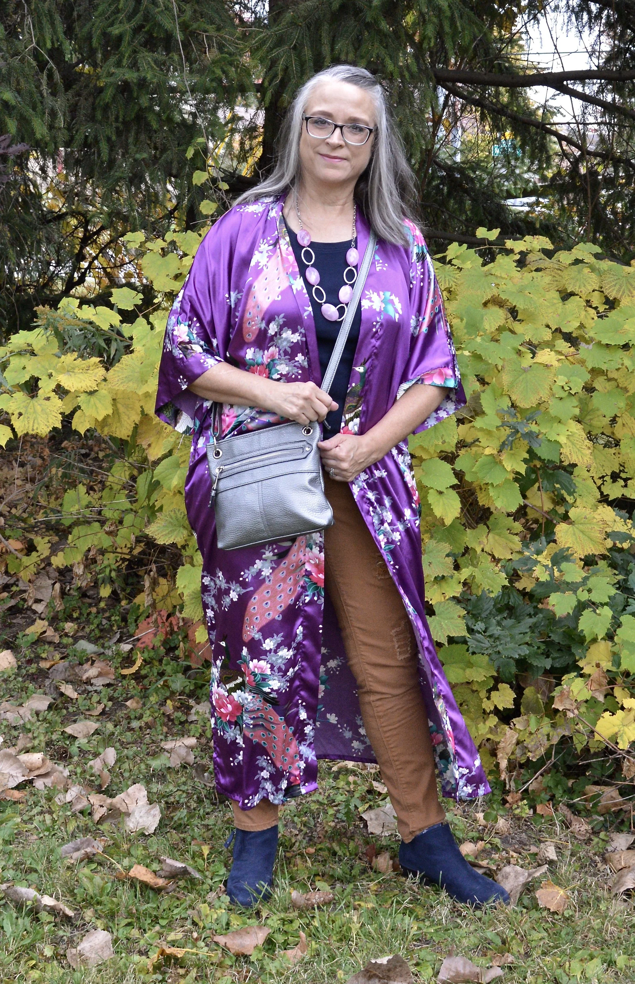
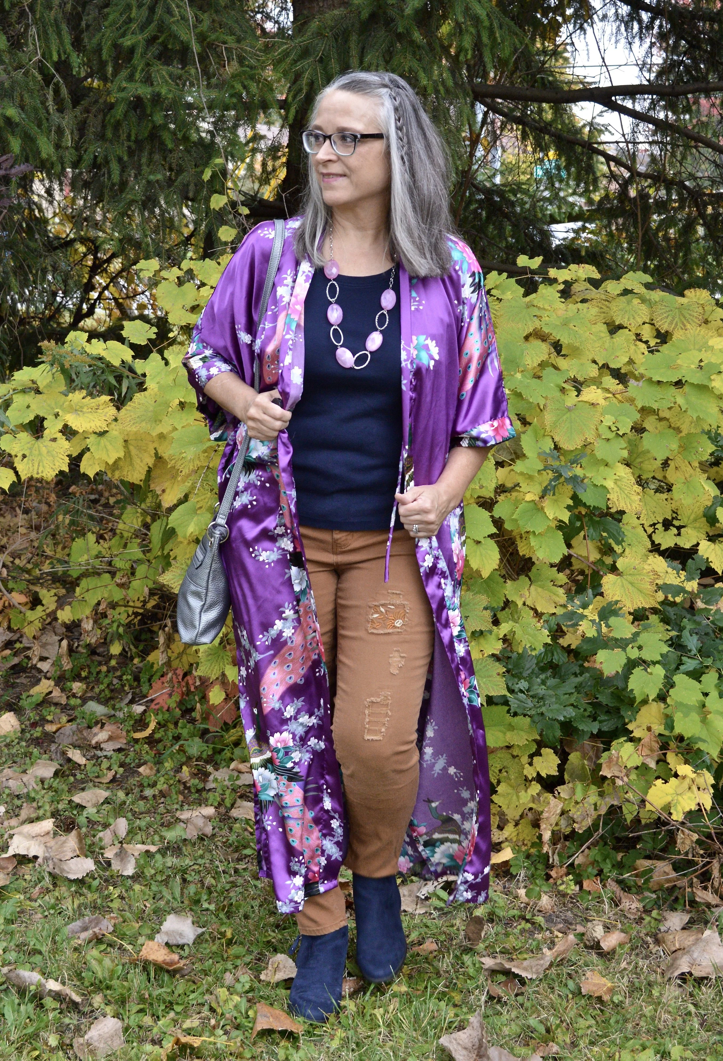
As I continue the Pantone Autumn/Winter color series, I want to remind you my graphics are interpretations of the colors and do not match exactly. I have provided links to the Pantone website and the colors, so you can see what they actually look like. This week’s colors are a combination of a bright pinky purple, an earthy caramel brown and a deep navy. My Rose Violet is definitely too purple. If you click on the link you can see it really is more of a Fuchsia pink than purple. I don’t know why I thought my kimono was the right color. Oh well, I still think it makes for a bright, interesting outfit, even if the colors aren’t exact.
I received this beautiful silk robe from my younger daughter when she and her sister gave me my spa day for my birthday this past January. I really only wear robes in the winter when it is cold, so I thought this pretty piece deserved to be showcased.
Style Tip: Think outside the box when it comes to your clothing pieces. A bathrobe might suddenly be the perfect topper for a holiday party, or your cute checked pj pants might be a great addition to your casual Friday work wear routine.
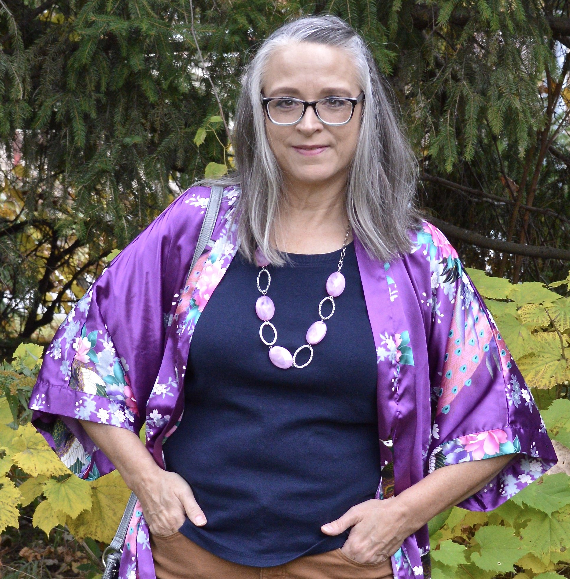
I was having a hard time smiling when I took these pictures. I still feel tired and the dreary weather wasn’t helping my sinus headache. My hair is a bit fly away too. Oh well, you don’t follow me so that I’ll show you fake pictures and phony smiles. This is the real me, so thanks for loving me anyway! Ha, ha.
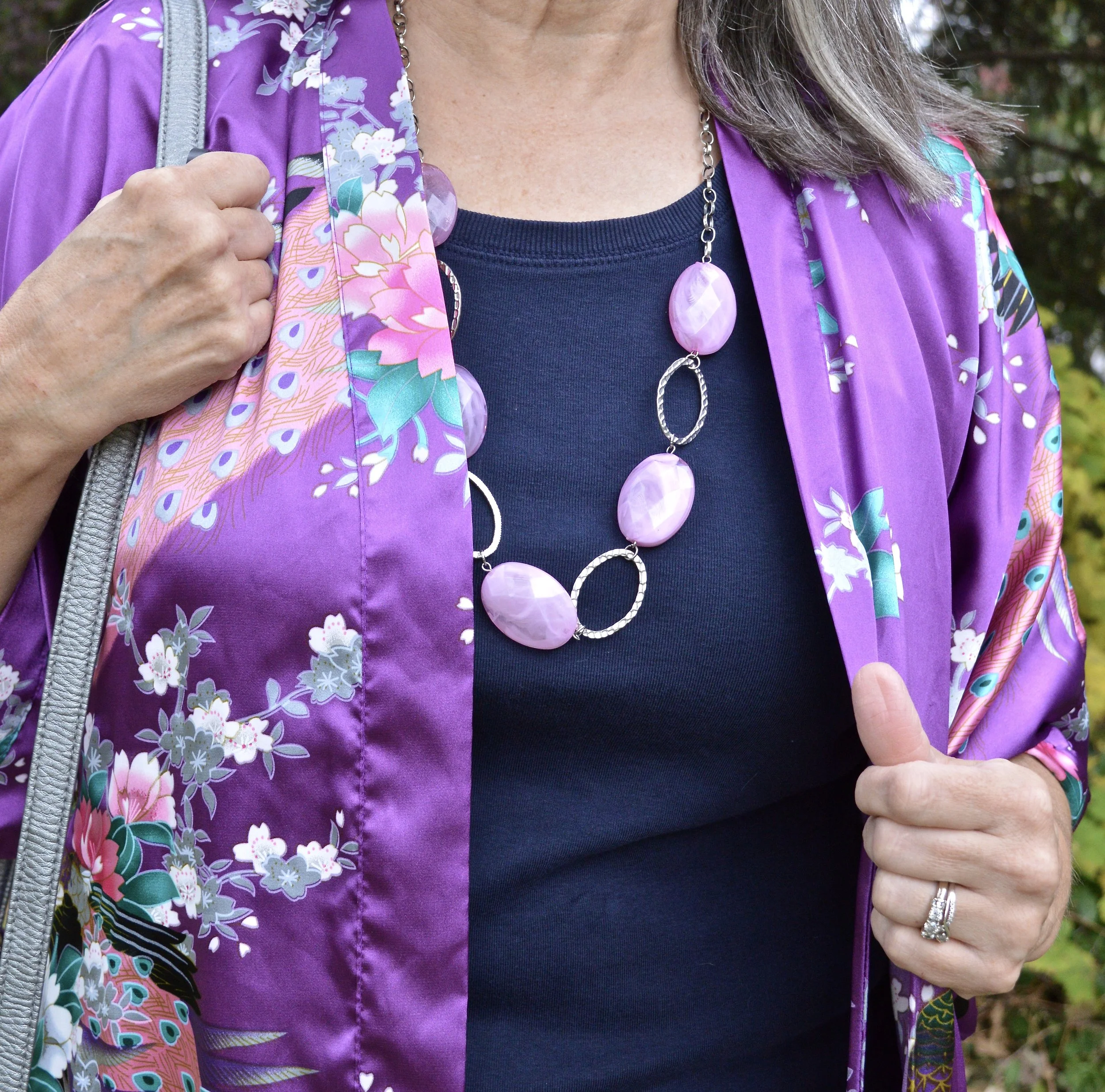
My Polar Night tee is an older Christopher and Banks piece. I like to have multiple solid colored tees in short sleeve and long sleeve versions strictly for the purpose of layering, either under pieces like this or just for added warmth under a pullover sweater.
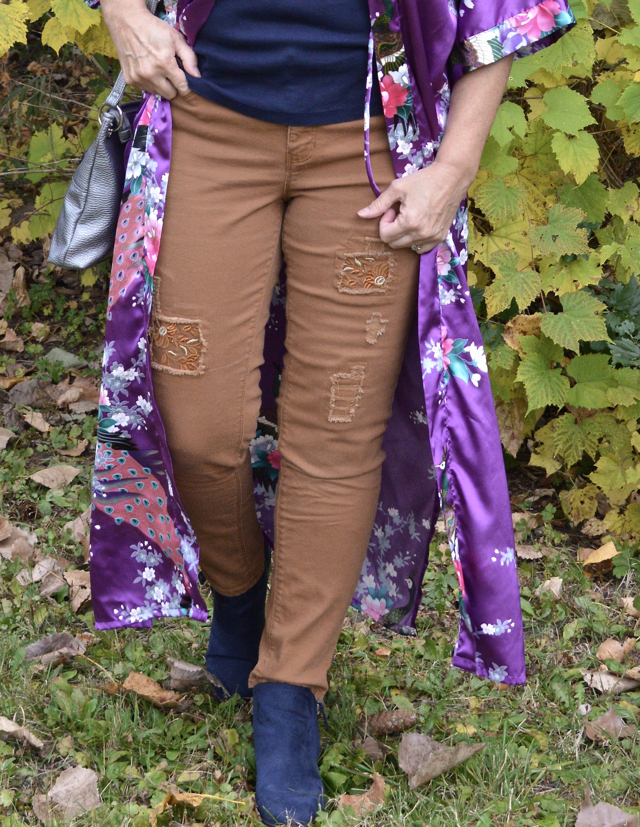
You’ve seen these Stitch Star patchwork jeans on the blog before. I think they worked well for the Caramel Cafe color. The last two times I combined them with red. See the red sweater, and the red knit vest. I think they work well with the purple and with the navy colors.
Style Tip: Don’t be afraid to try new color combinations. You might find you like something even better than your regular go to choices, plus it makes you feel almost a bit daring stepping outside your comfort zone.
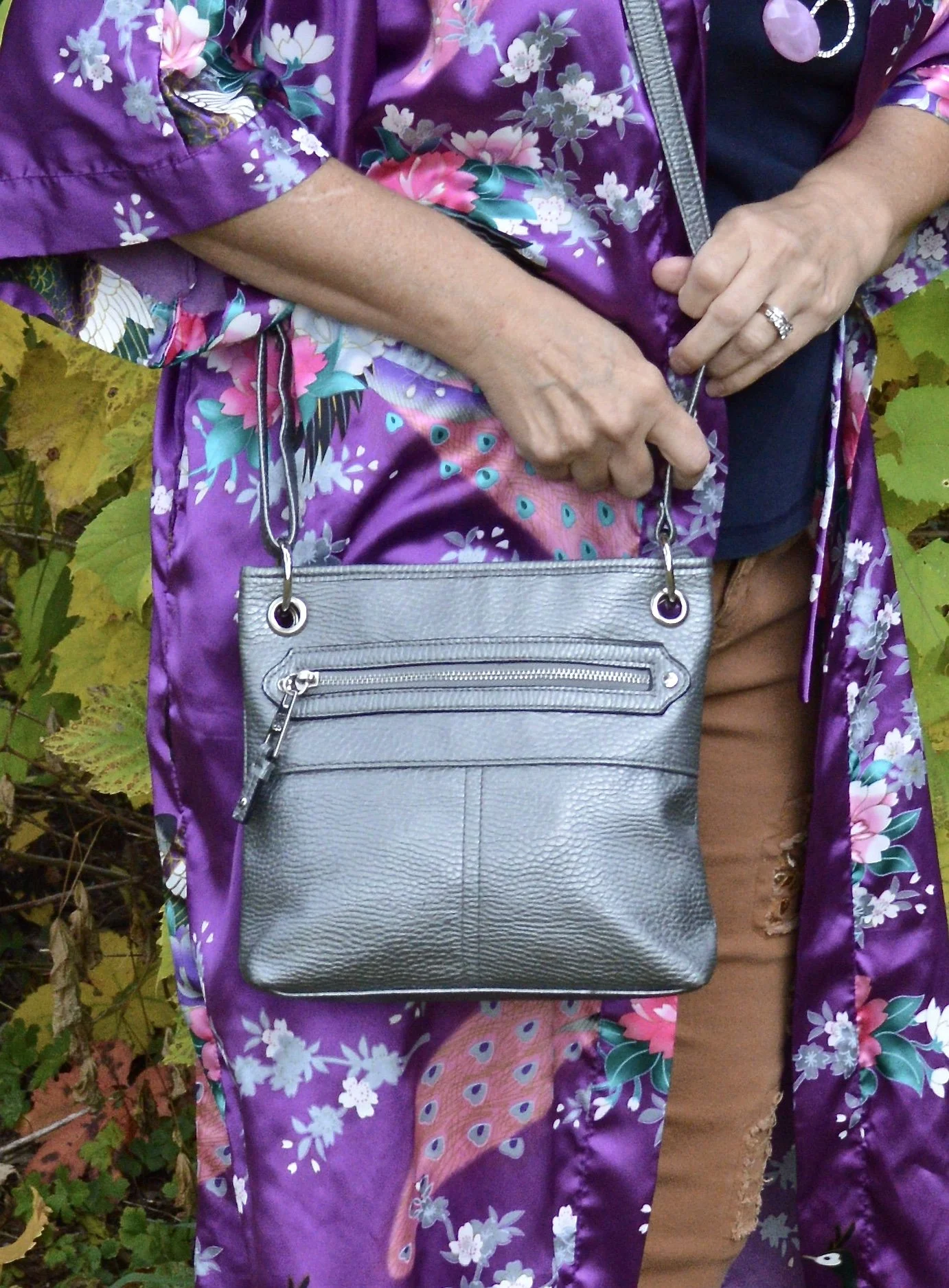
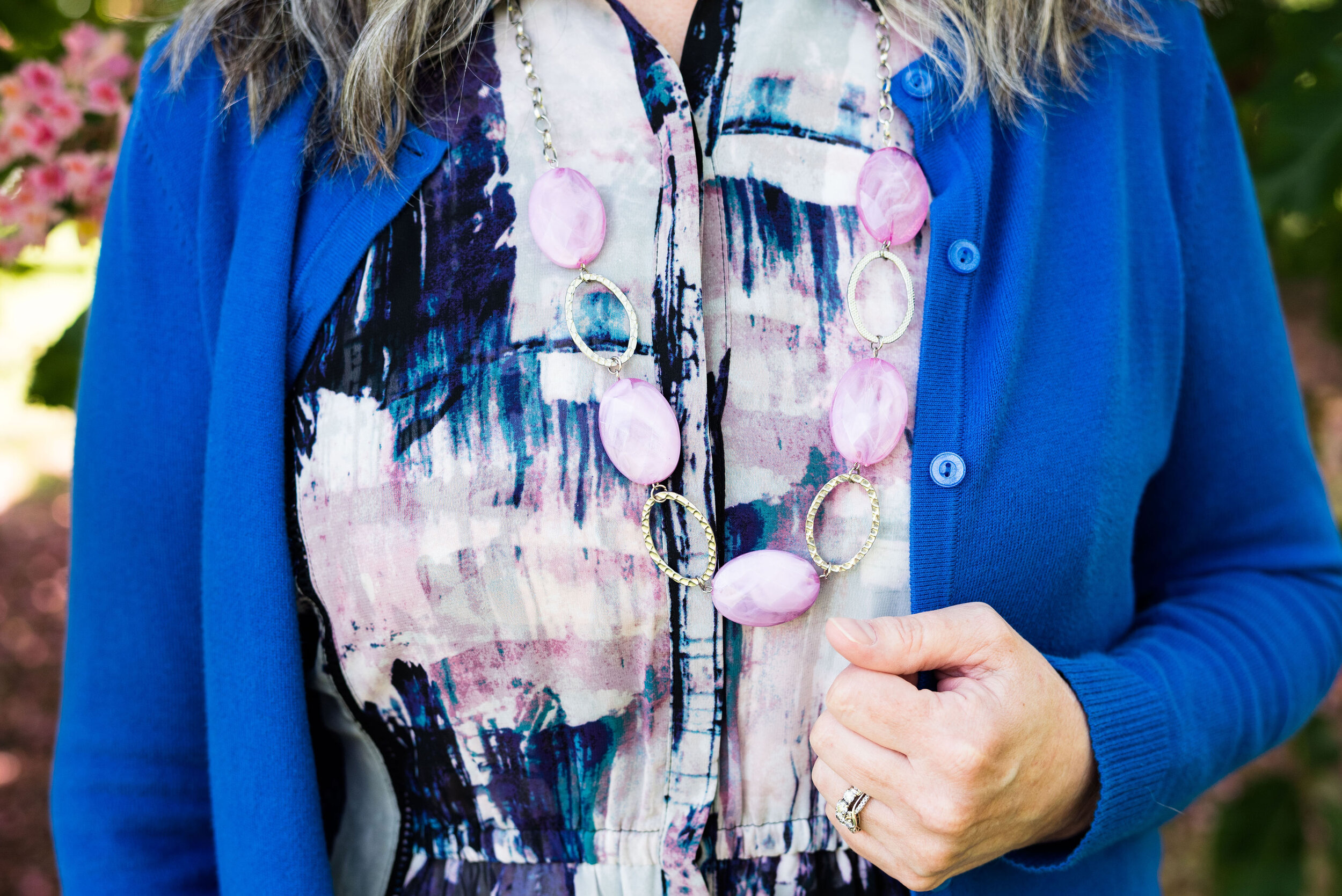
I kept my accessories simple. I liked the contrast of the navy tee with the pale purple necklace. I also chose my thrifted silver cross body bag.
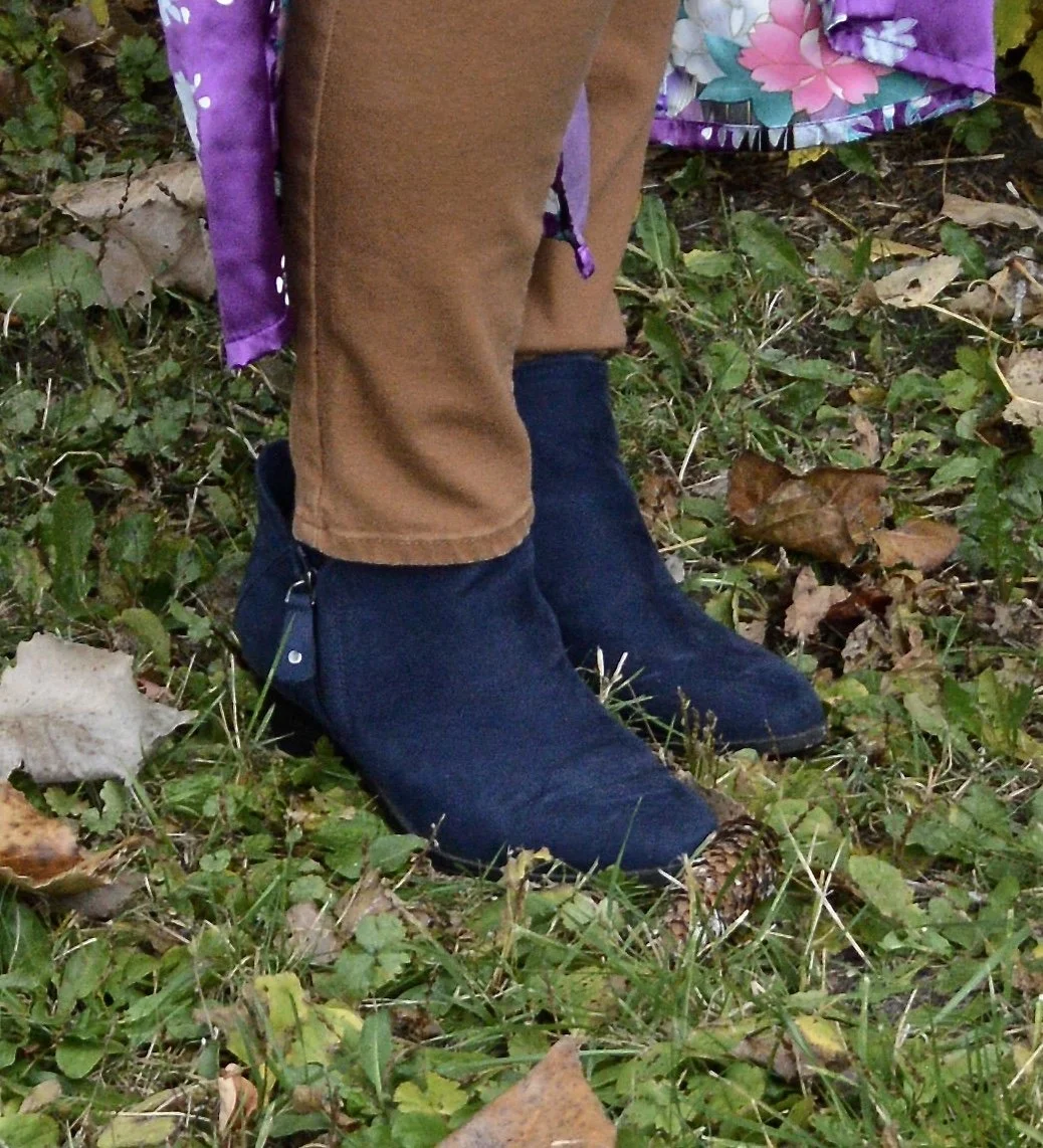
I thought the navy SO ankle boots were a compatible choice with the navy tee, but a pair of caramel or cognac colored books would have worked too and the similar color would elongate the leg.
What do you think of these colors? Would you wear a kimono like this anywhere but the house? I’d love to hear your thoughts. I’m including a few shopping links. Enjoy shopping and remember these are affiliate links brought to you at no added cost. If you click on a link I get a few cents. I appreciate all your clicks.
I hope you are having a wonderful October. We have had some beautiful days and the leaves have been just gorgeous. I will not be posting next week as we are taking a few days away with our family, but look for more posts on the blog the following week and as usual I will be posting regularly on Instagram and Facebook.
Have a great weekend!


