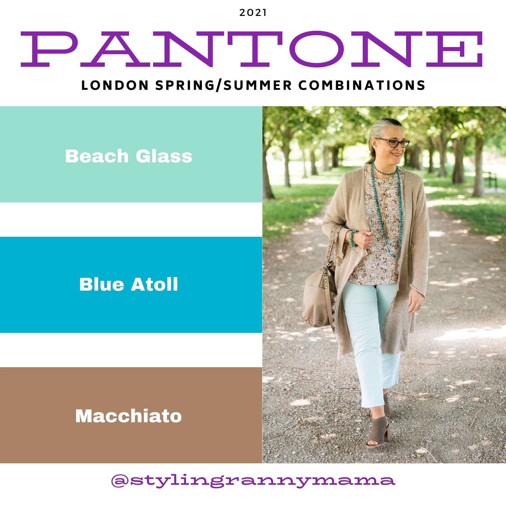
My Style: Featuring Pantone 2025 London Palette Colors - White Grape, Veridian Green and Curds & Whey
I had one of my subscribers comment that she would like to see White Grape and Veridian Green together, so Sally this is for you. You can see these colors along with the other Pantone 2025 London Spring/Summer colors here. Thank you for those of you who take the time to comment. I know everyone is so busy and frankly, if you are like me, you feel inundated with too much information. However, I do want you to know that it means a lot when you take time to comment. I reminds me that what I am doing has a purpose and is seen.

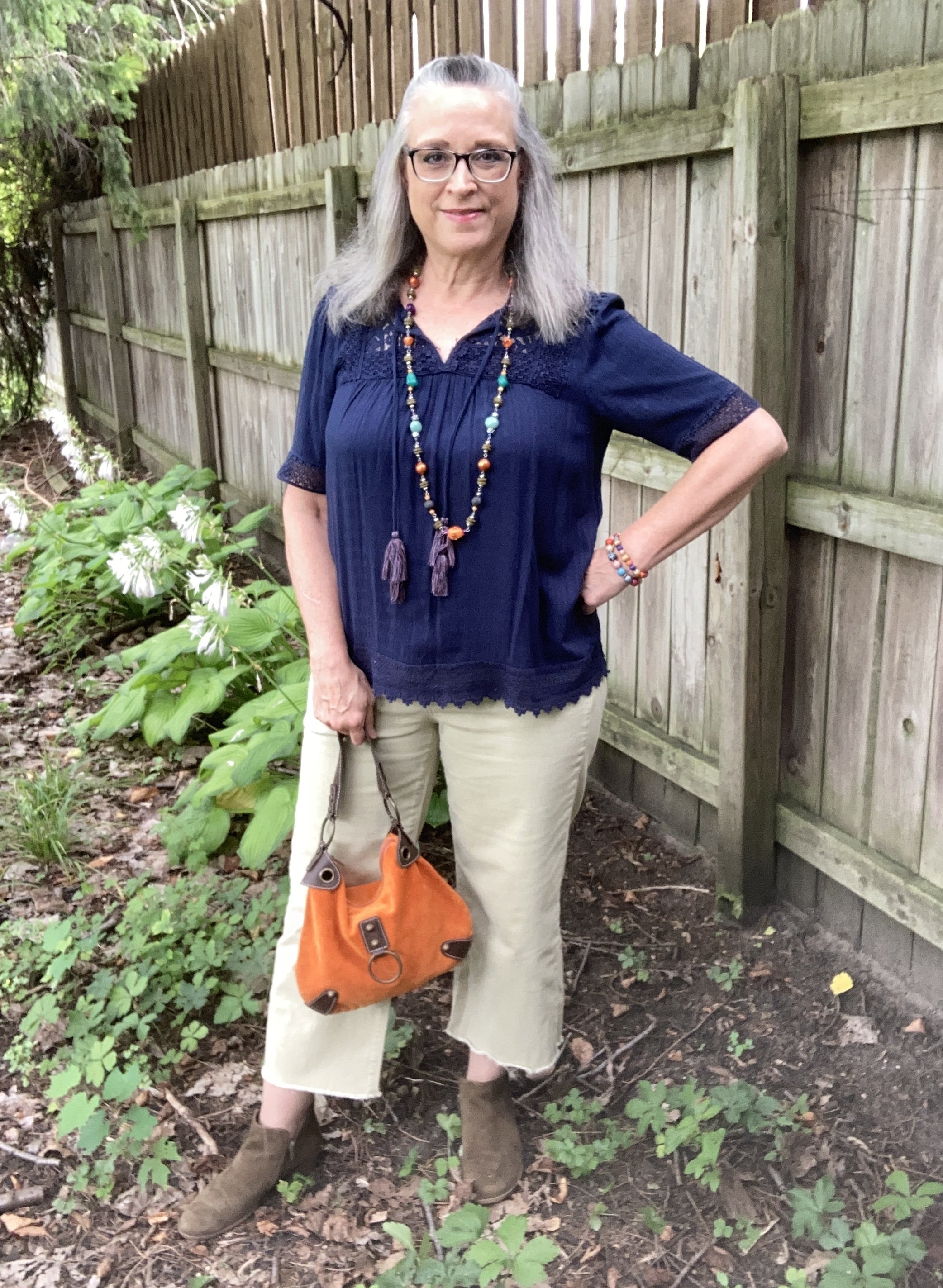
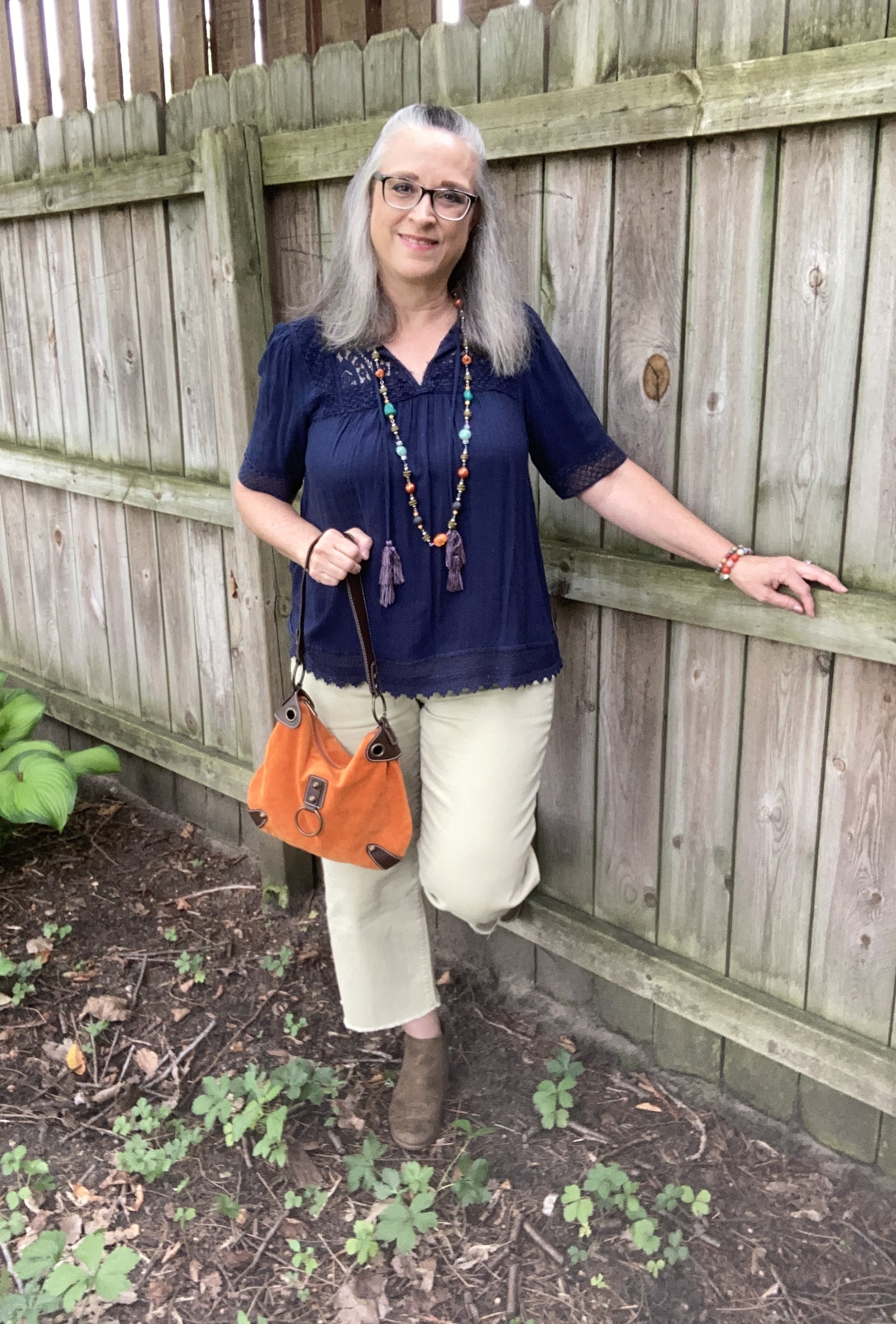
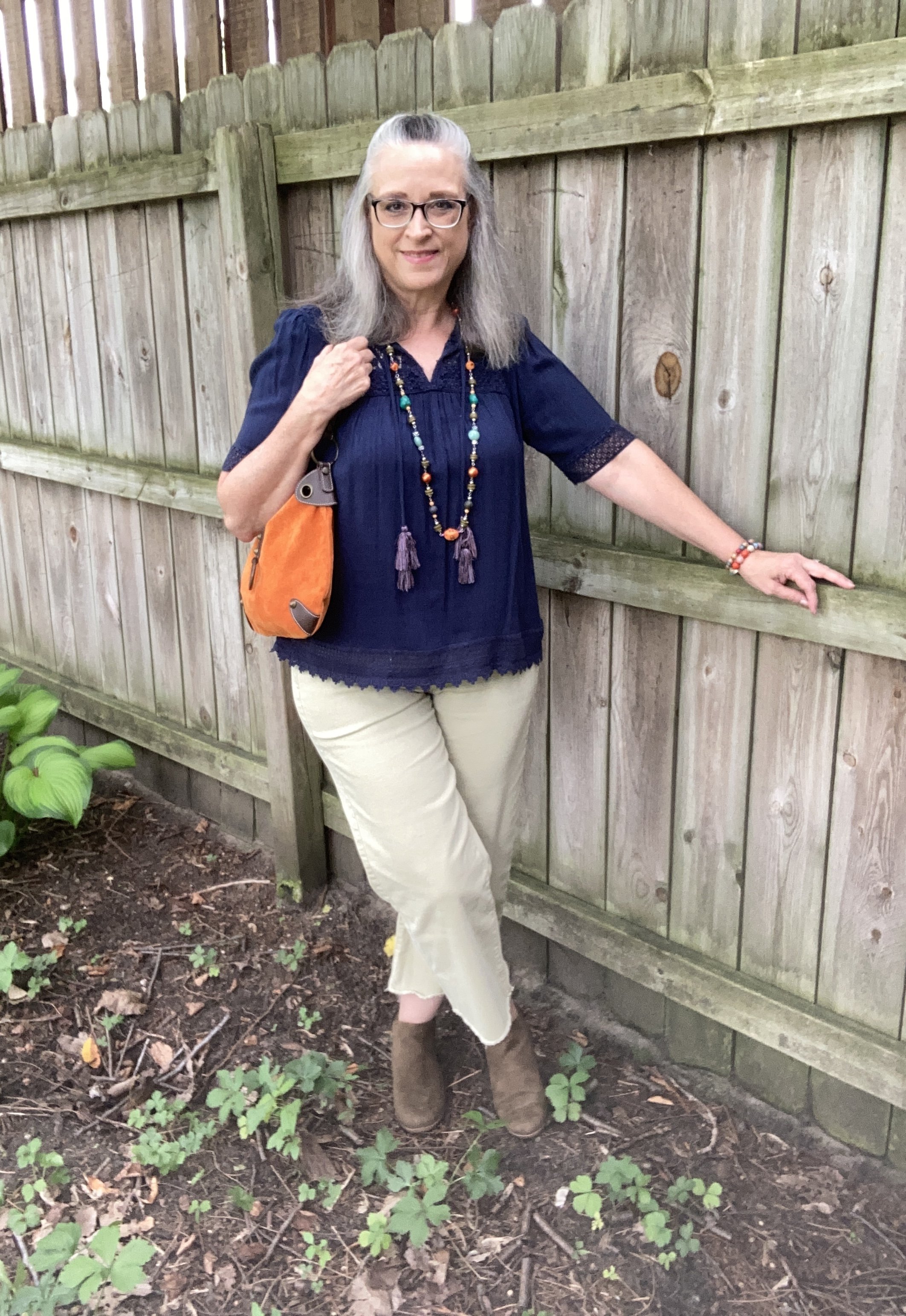
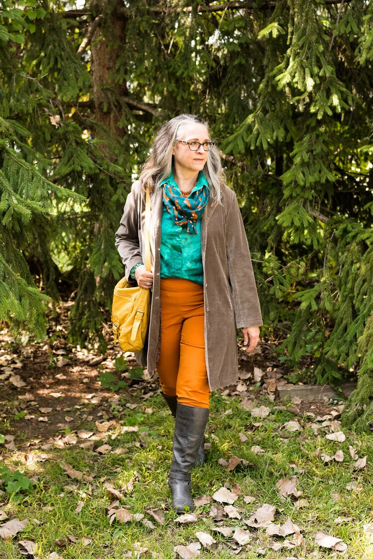
I shopped my closet for these colors and had to open a few of my warm weather bins to find clothes that would look more spring-like. I thought it would be a fun change to layer a long sleeve shirt under a 3/4 length sleeve light weight jacket. I like how this turned out. Be sure to tell me what you think of this color combination and of the outfit in general.
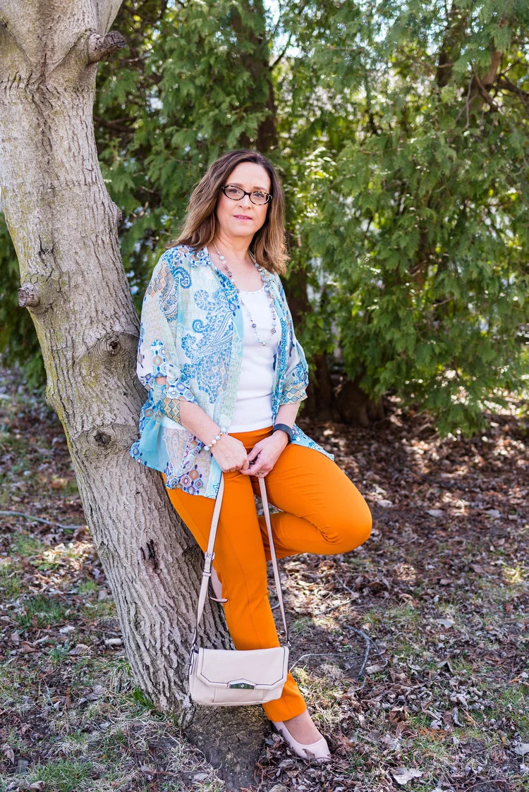
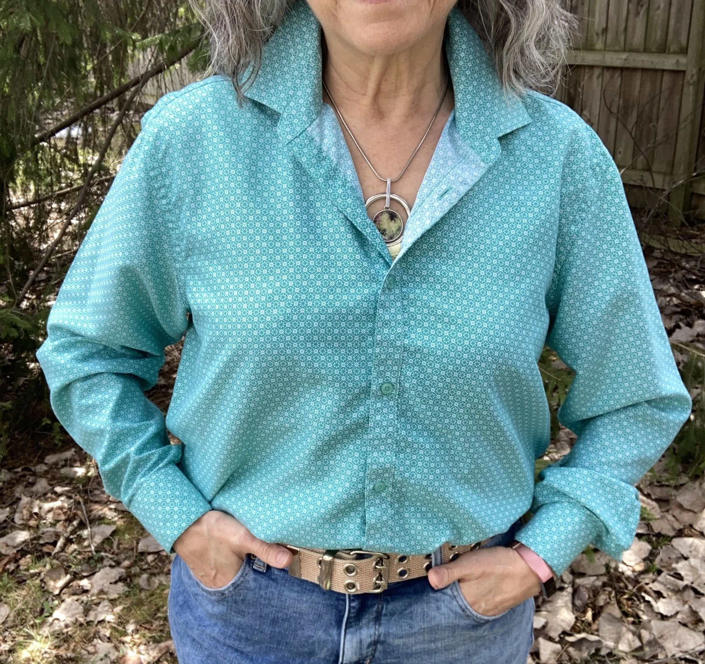
I had to play around with a few pieces before I settled on these, but I found this combination came the closest to the palette colors. I started with this men’s button down as my Veridian Green layer. This is a brand called Zylos and it was thrifted a few years ago. I do like this deep aqua color, and it is perfect for the warm weathers months.
Next I found this thrifted Christopher and Banks piece, also a number of years ago. I thought about getting rid of it, as I don’t wear 3/4 sleeves very often, especially in jackets, but the color and fit kept it in my rotation. It is a great topper for chilly places when the air conditioners start to come on. The lighting was a bit persnickety, so the photo doesn’t do the color justice, but it definitely has that White Grape vibe.
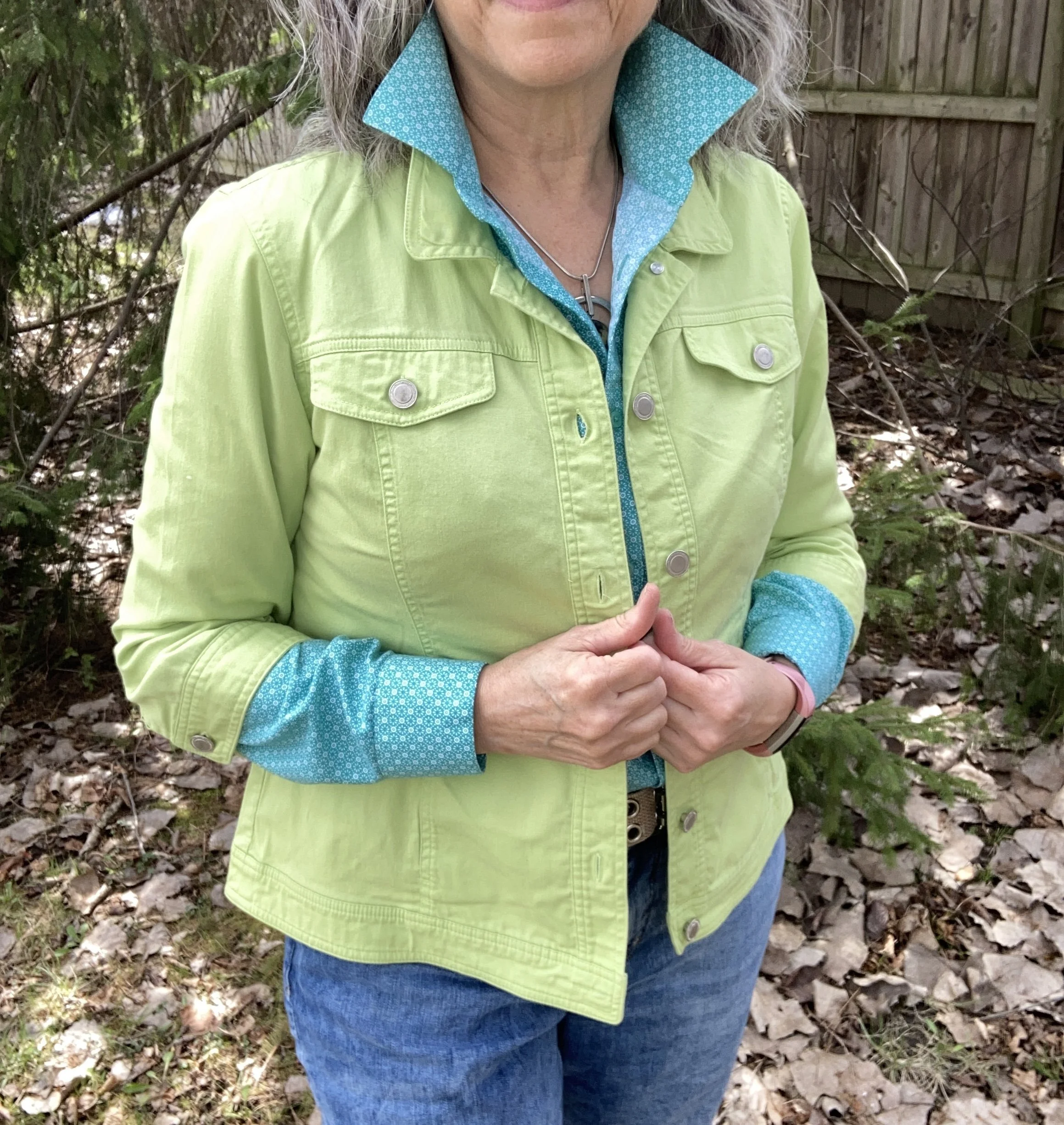
I knew I wanted a casual look, as it is My Style, so jeans were my top choice. It took me a few try ons before I decided on this cropped, cuffed, St. John’s Bay pair from JC Penney a few Christmas seasons ago.

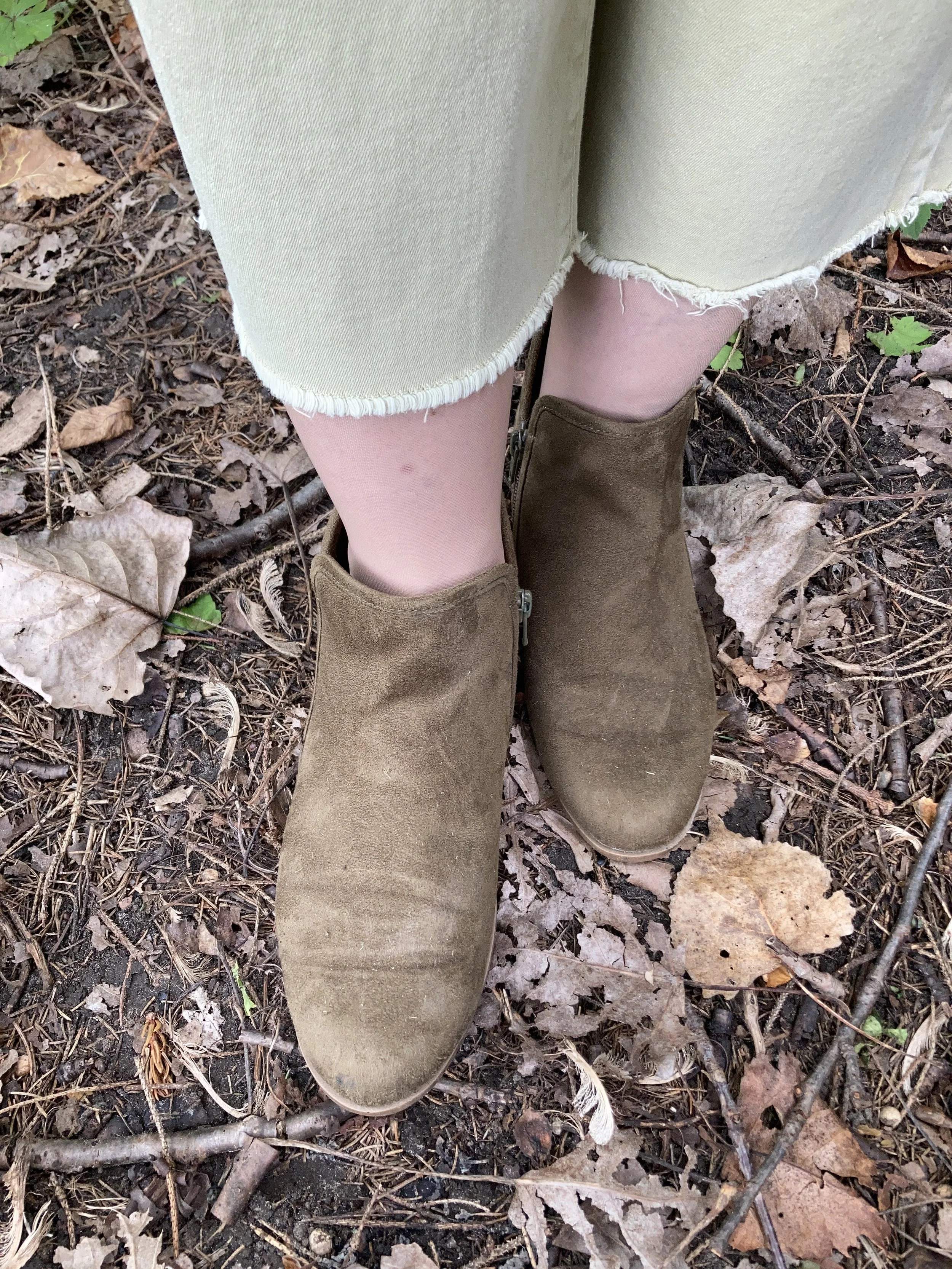
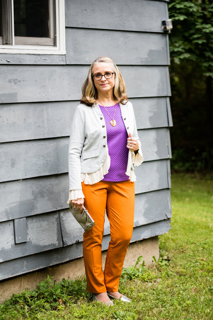
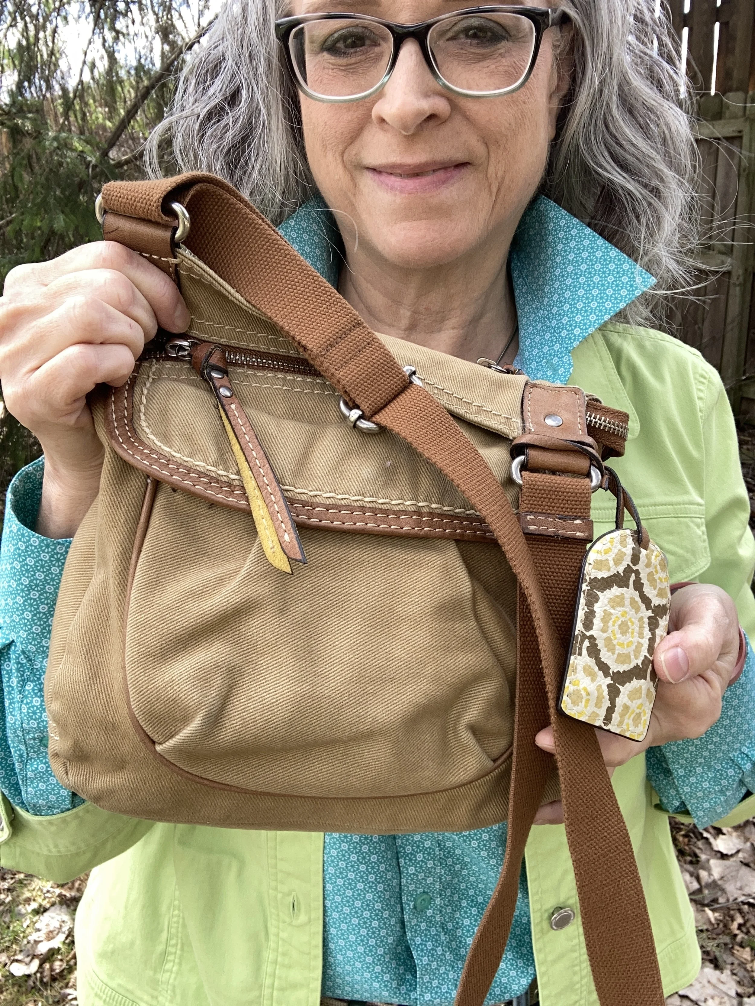
It occurred to me to check the classic colors on the Pantone palette to see what might work with this colorful look and I opted for Curds & Whey as I had my bag, belt and shoes that all fit with that color. I like this color as a different option to beige or tan for the summer months. All these pieces were second hand and obtained over the last few years. The bag is Fossil brand and the boat shoes, which are trending for summer, are Sperry’s.

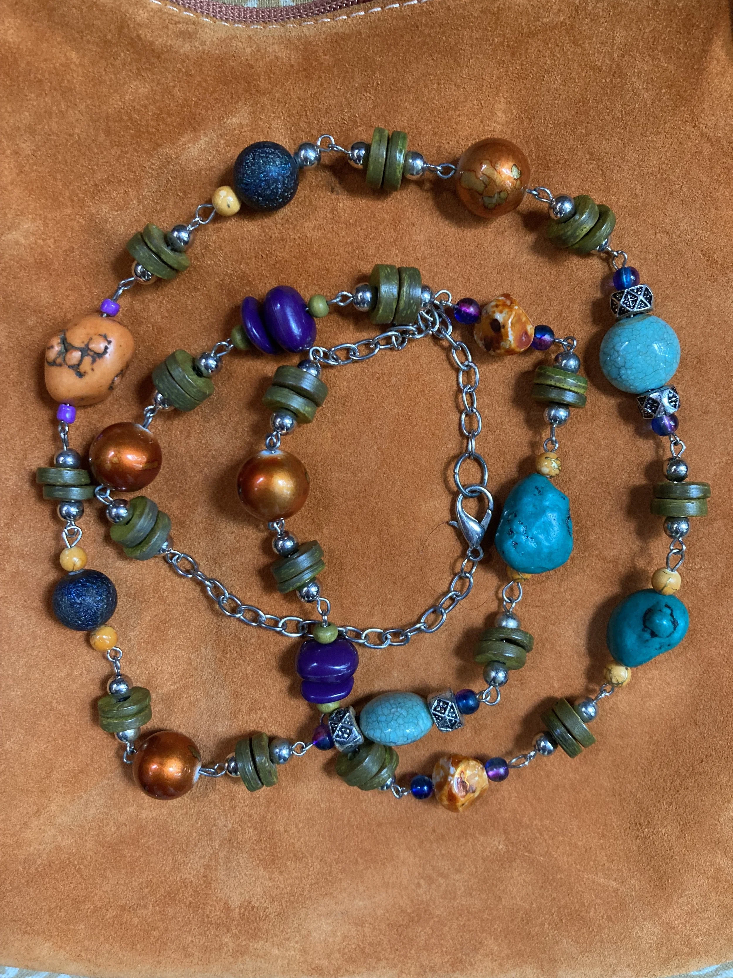
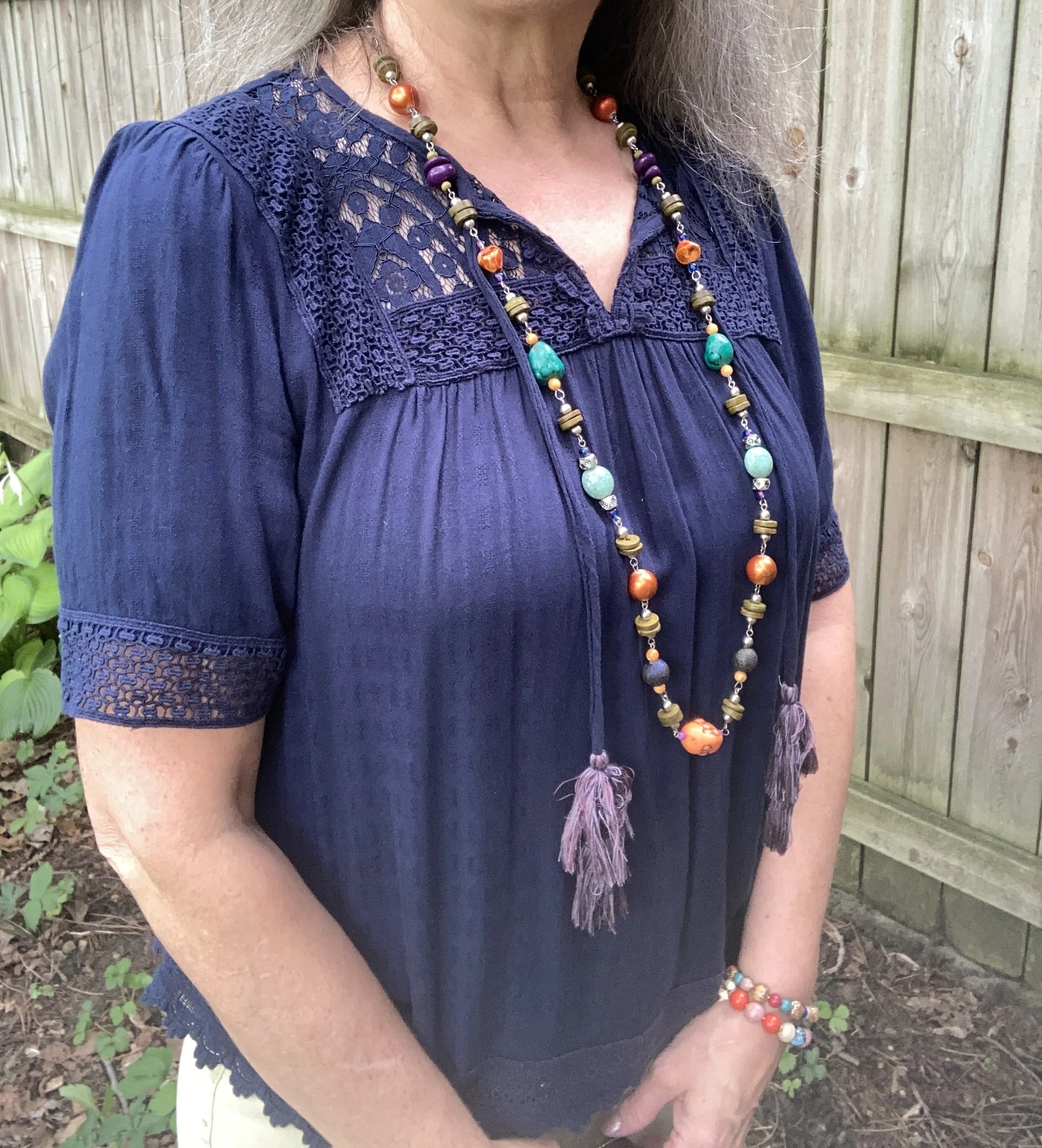
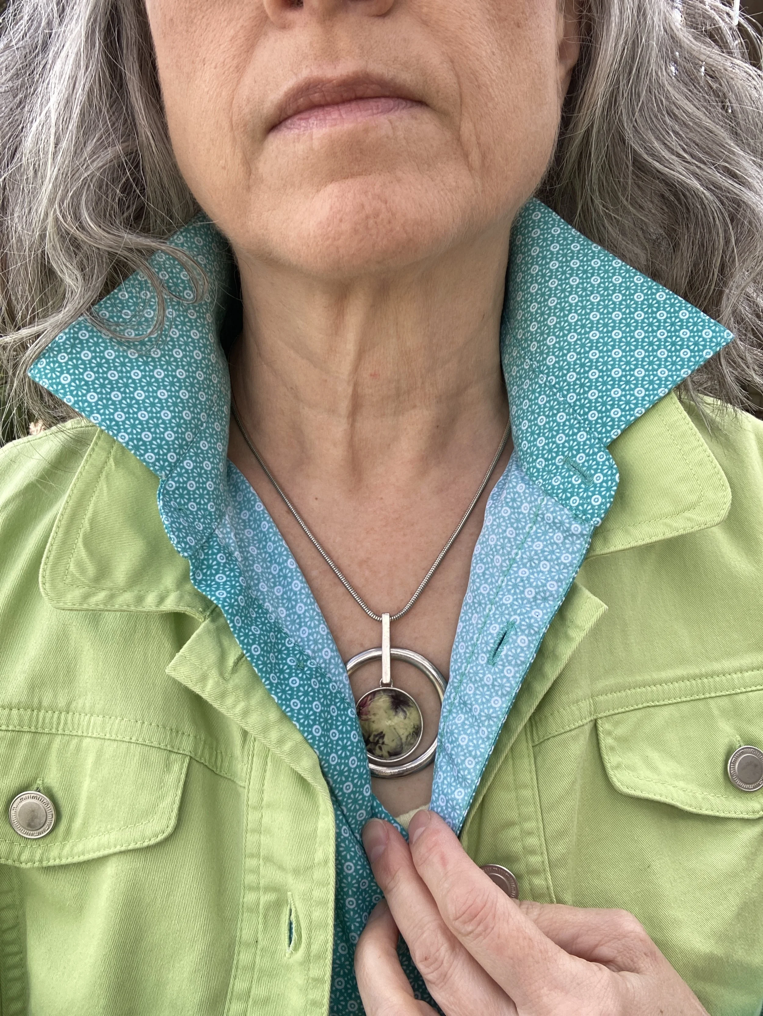
I also added this necklace which did well to pull it all together.
Let me know what you think of these colors together. Do you like these greens? I’m not including any shopping links today, but let me know if you have seen these colors at any retailers other than thrift stores. Do you have these colors in your closet?
Have a great week!