Pantone Autumn/Winter 2025 - New York Palette: Poppy Red, Lyons Blue and Crown Blue
Happy Uno Septembo! In other words happy September, happy fall and all the good things that go with it: pumpkin muffins, hot chocolate, changing leaves and football. Our weather here in the Midwest is already feeling more like fall, although there is sure to be a few more warm days before the official start of fall and even after. I have heard rumors that we are supposed to have a cold winter and these early chill days may be a forewarning to that.
Today’s outfit takes three more colors from the New York Palette and combines them in a bright, cheerful look that would be perfect for a drab fall day. Poppy Red, Lyons Blue and Crown Blue combined seamlessly when I was working on outfits for this Pantone color series. It was a natural progressions to put these three saturated colors together. To see the actual Pantone colors check out this Pinterest pin.

This whole look is thrifted, except the sneakers. It is always fun to shop my closet and find that so many of the things I bought second hand are easily useable for the current trending colors and styles. So what if a few things are slightly outdated, or not currently on as far as the fashion gurus are concerned. It’s my closet and my style, as it is your closet and your style.
Let’s take the outfit apart. The first piece I chose was this paisley button down that I have had for years. The blue colors were a good match for the Lyons Blue color which is a deeply tinted blue teal. This thrifted piece is Jones Wear Sport. I have thought numerous times of getting rid of this piece, but then I end up wearing it for some reason or other. I do love a good paisley print, just like I love my plaids!
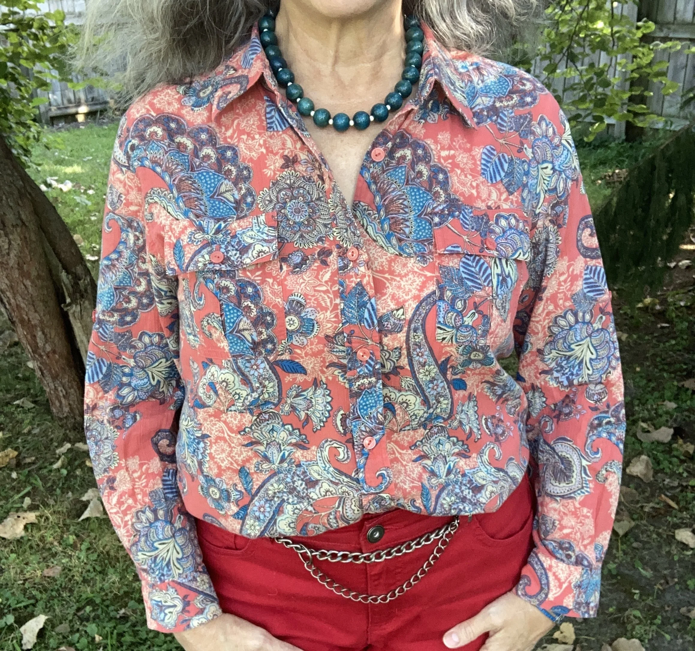
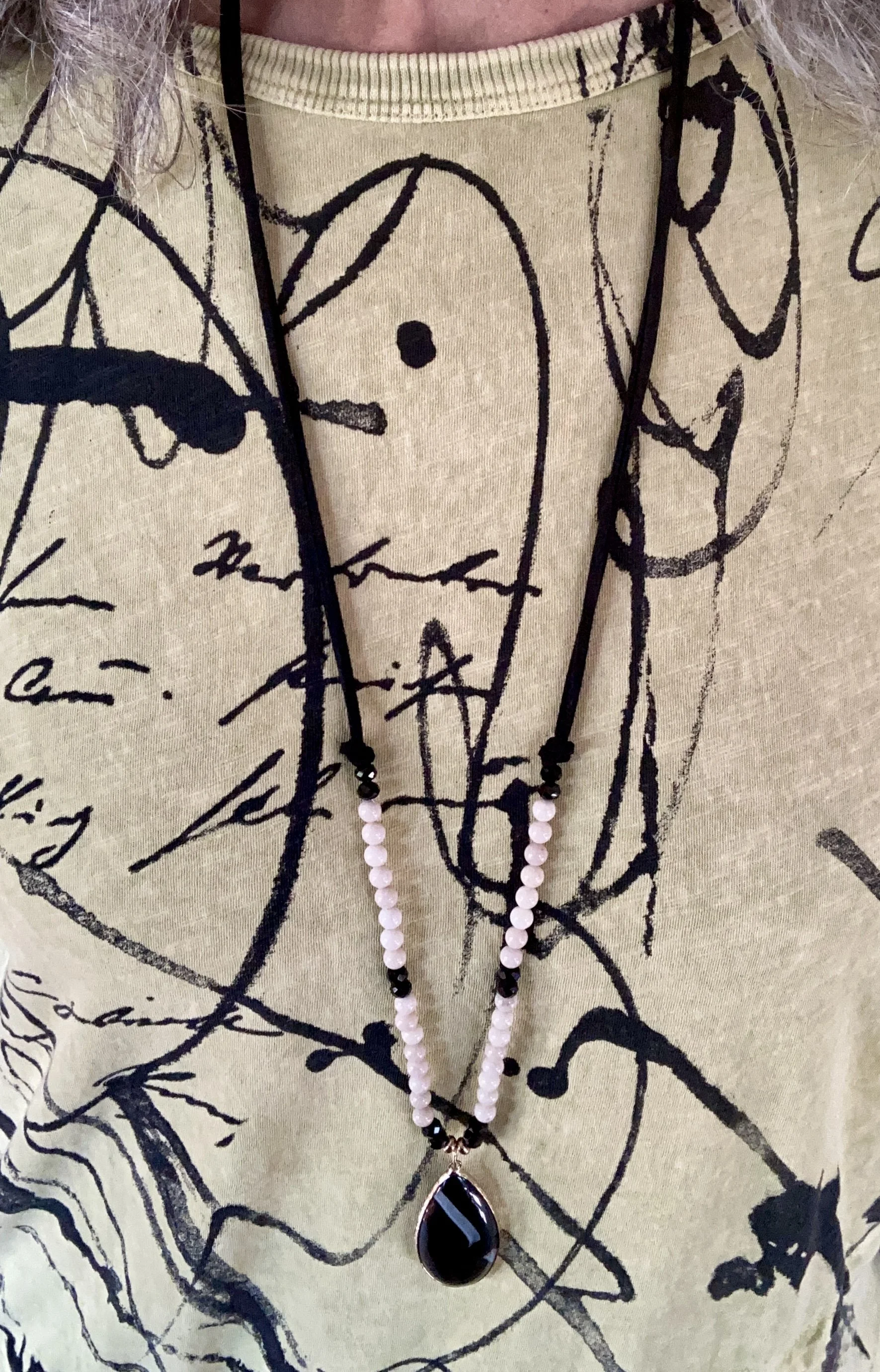
You can also see in this photo I chose a teal necklace that leans a bit more in the green direction, but I like the contrast. In addition, for this fall statement belts are trending, so I decided to create my own statement using an old silver colored chain belt that I have had laying around for decades. It didn’t really help to hold my baggy pants up, but I like how it looks!
After the shirt I chose the pants. It seemed the perfect choice as this bright red pair are perfectly Poppy Red. I thrifted these this year as I had been looking for a red pair of pants. These are Bandolino brand. They are actually a little big now, but I don’t mind and the baggy look is another thing that is trending this fall for jeans, so get comfortable ladies!

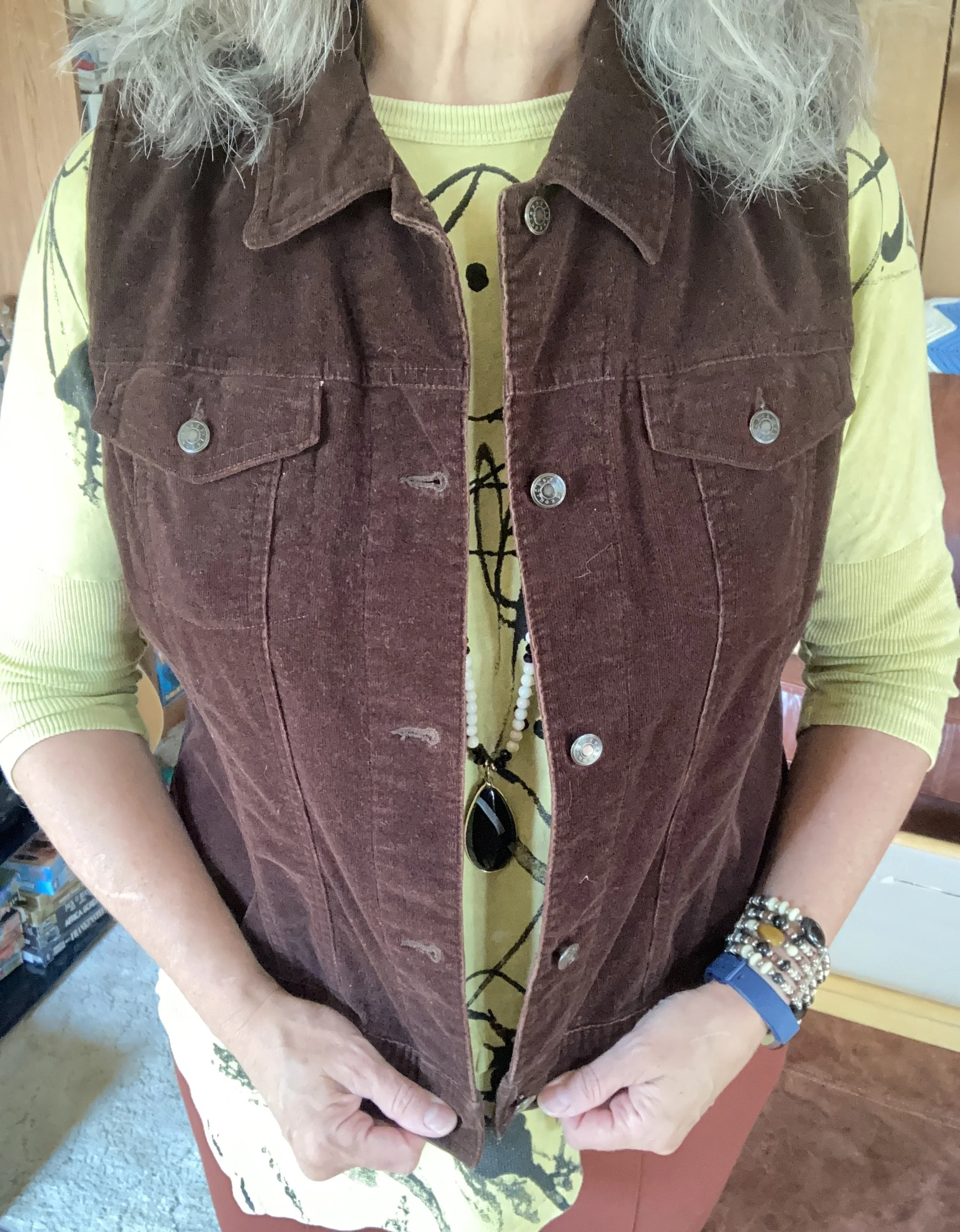
I then remembered I had thrifted this blue jacket recently and realized it was a perfect choice for the classic color Crown Blue. This piece is Coldwater Creek brand. This is actually a petite, which I can sometimes get away with. It just gives the jacket a more cropped silhouette, which I occasionally like. I love the contrasting white stitching around the edges. I had a hard time finding anything in this exact color, but I’ve included a few links for darker denim jackets.

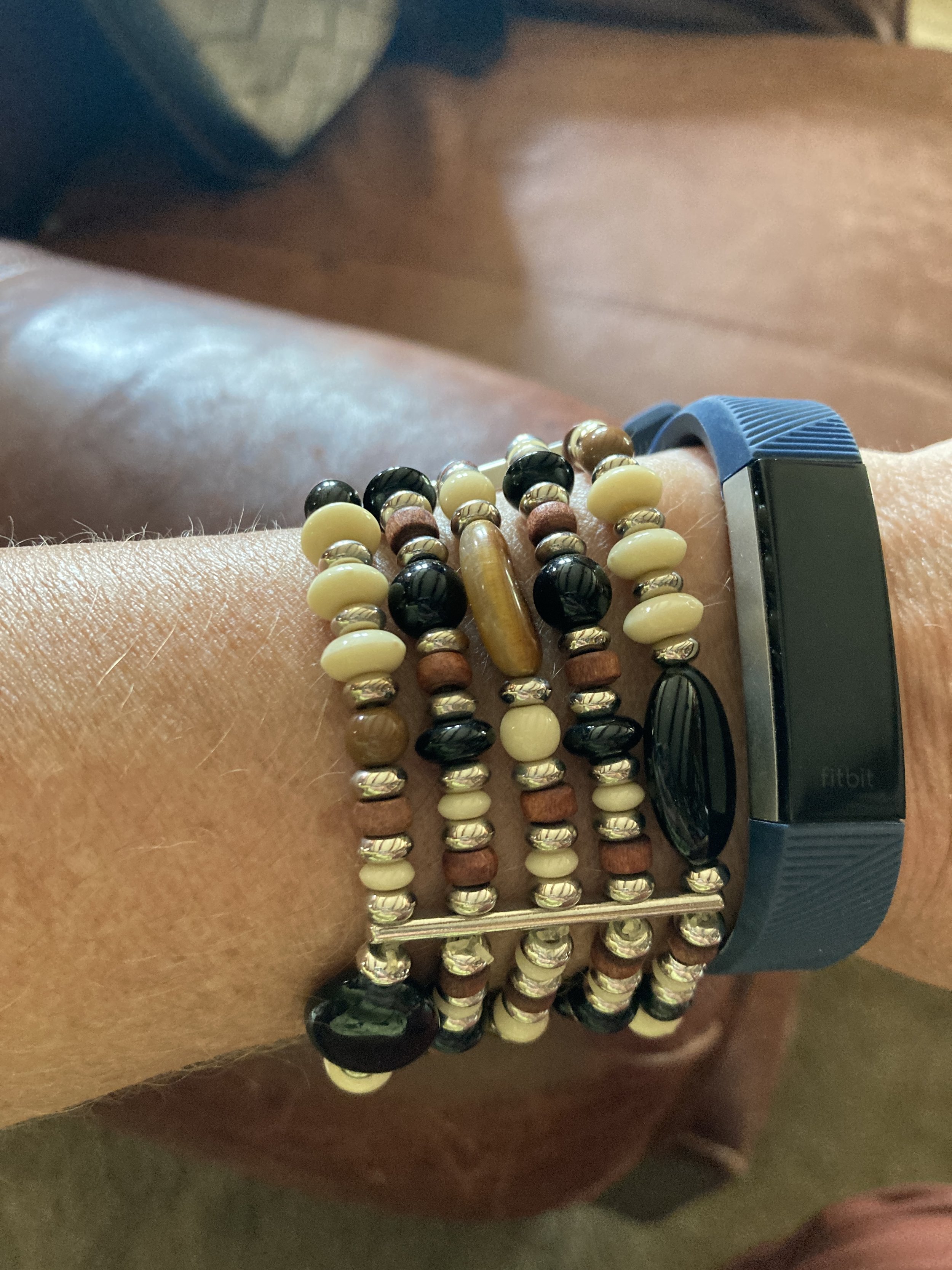
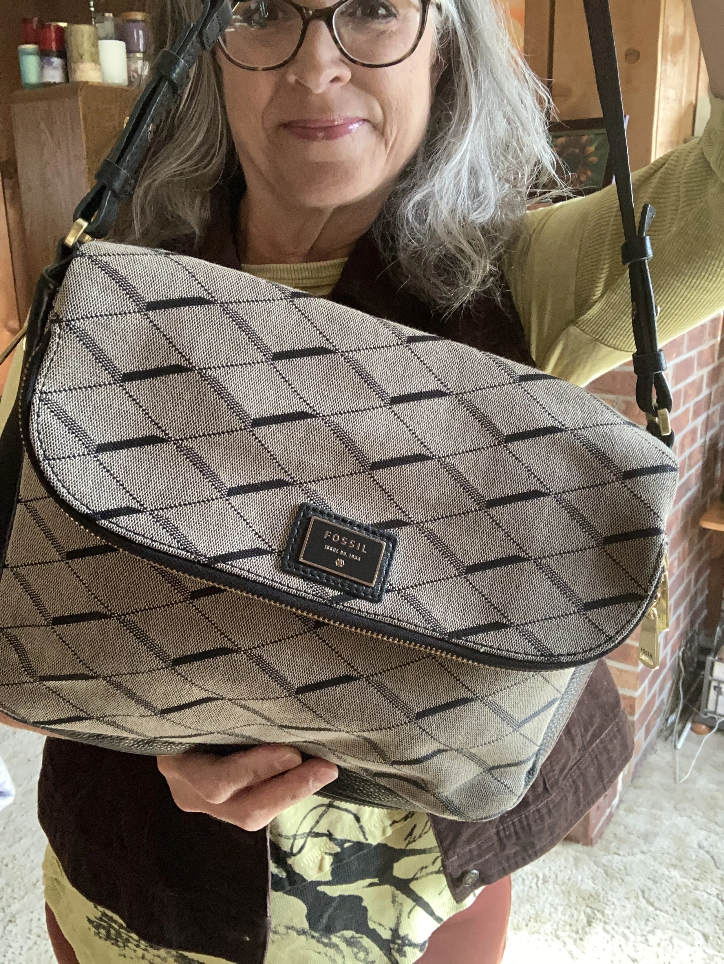
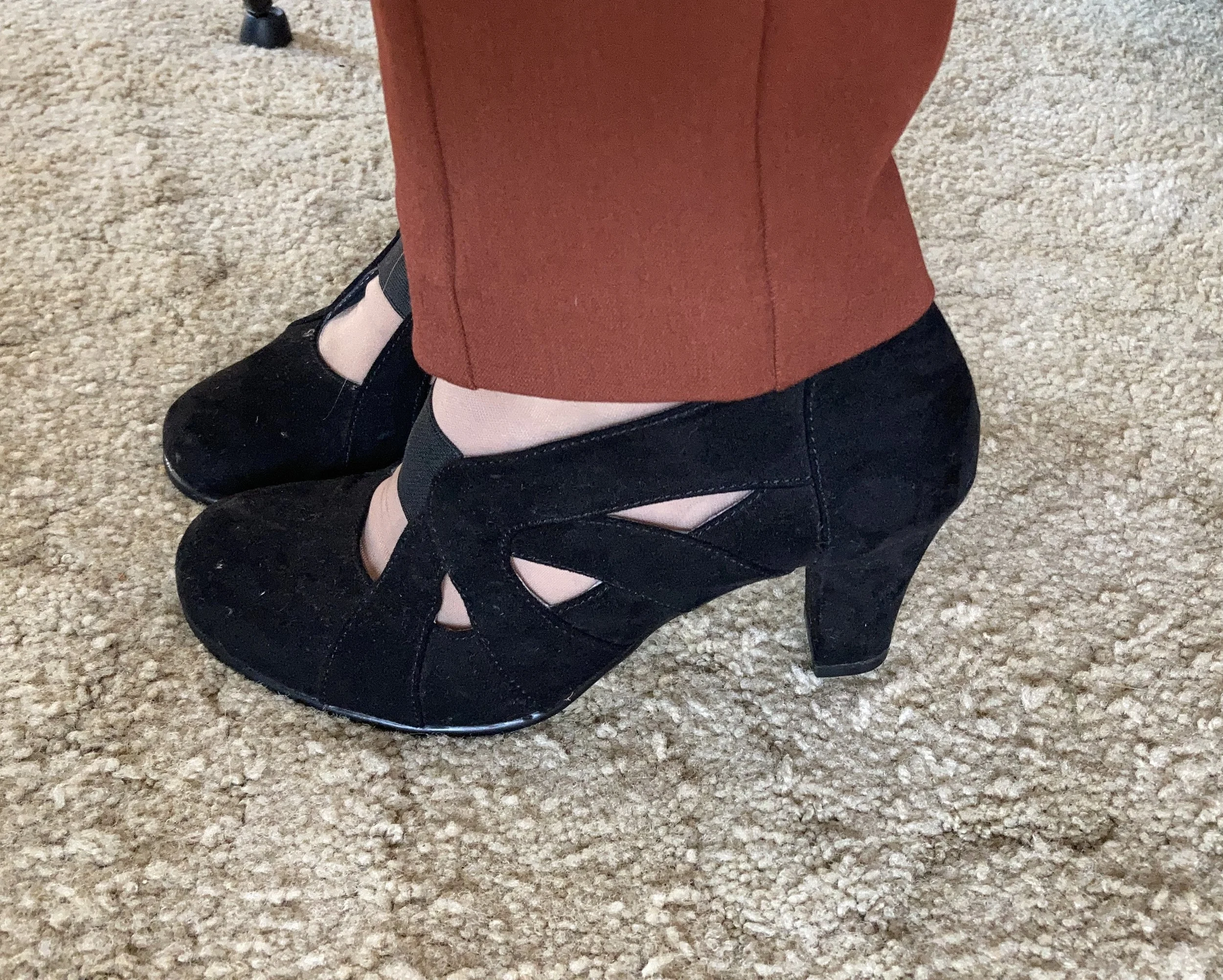
I decided to go with silvery gray for my accessories. I wanted something different from red, to match the pants or blue to match the jacket. I do have a bit of a matchy, matchy gene, so I was trying to push myself outside that box. While I did end up matching the bag, and the shoes with the belt, I like how it pulls the whole look together. The sneakers are Skechers and I got them a while back on clearance at Gabes. I hardly ever go into that store, but once in a while my daughter wants to make a stop there and it is fun to look. My bag was thrifted and has no label.


What do you think of these colors? Do you like them together, or would you like them each separately? It is fun to try new combinations and I hope these posts inspire you to expand your thinking on how you put colors together. Leave me some feedback in the comments.
Enjoy the many poses of Amy! Ha, ha.


I hope you are having a great beginning to the month of September! I have included a few shopping links, but these colors are hard to find, so I would say add a color you like to your thrifting list! These are affiliate links, brought to you at no extra cost. If you shop a link through me, I get a tiny commission for your purchase. I appreciate all the support. All opinions are my own.
Have a great day!