Pantone Color of the Year - Classic Blue

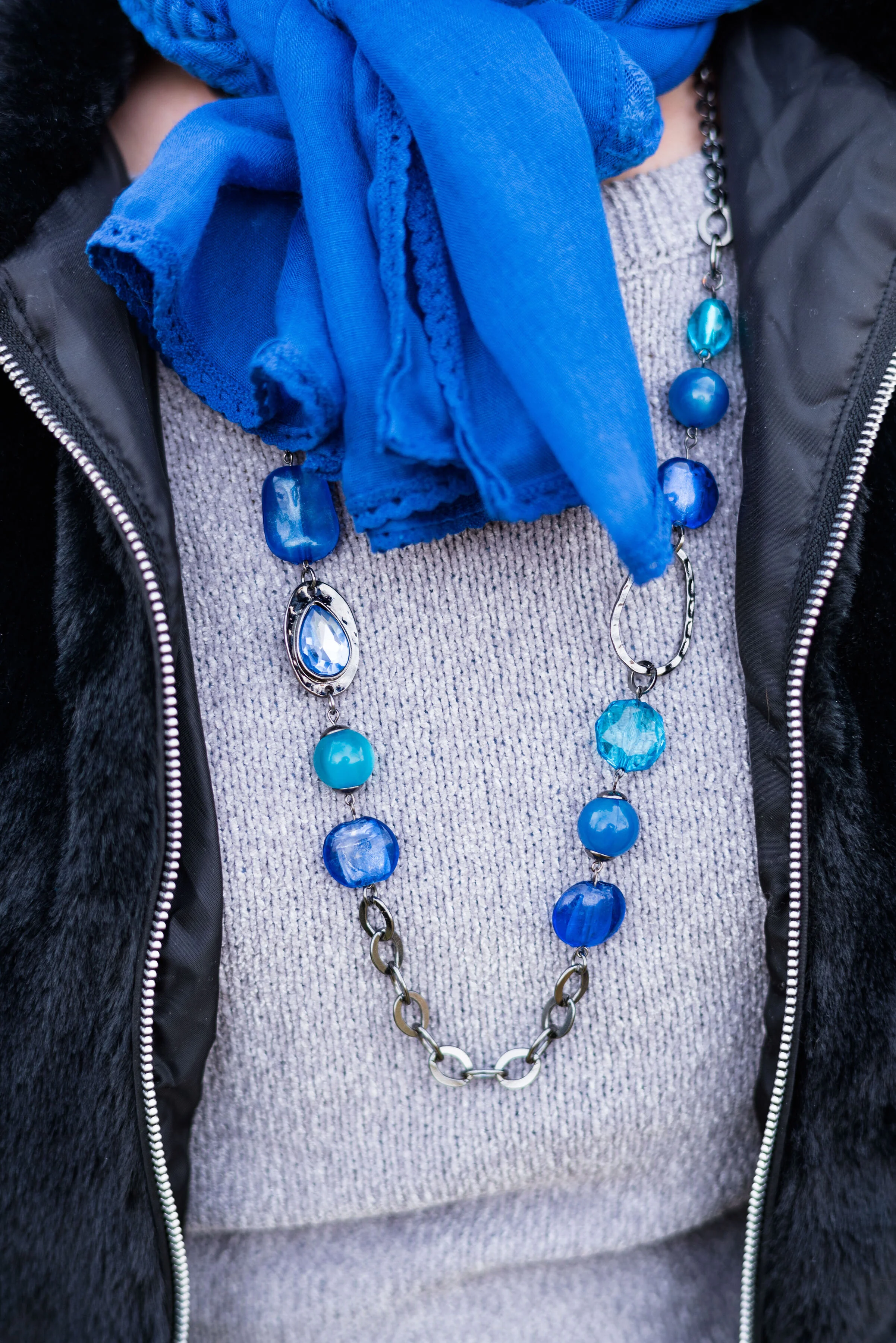
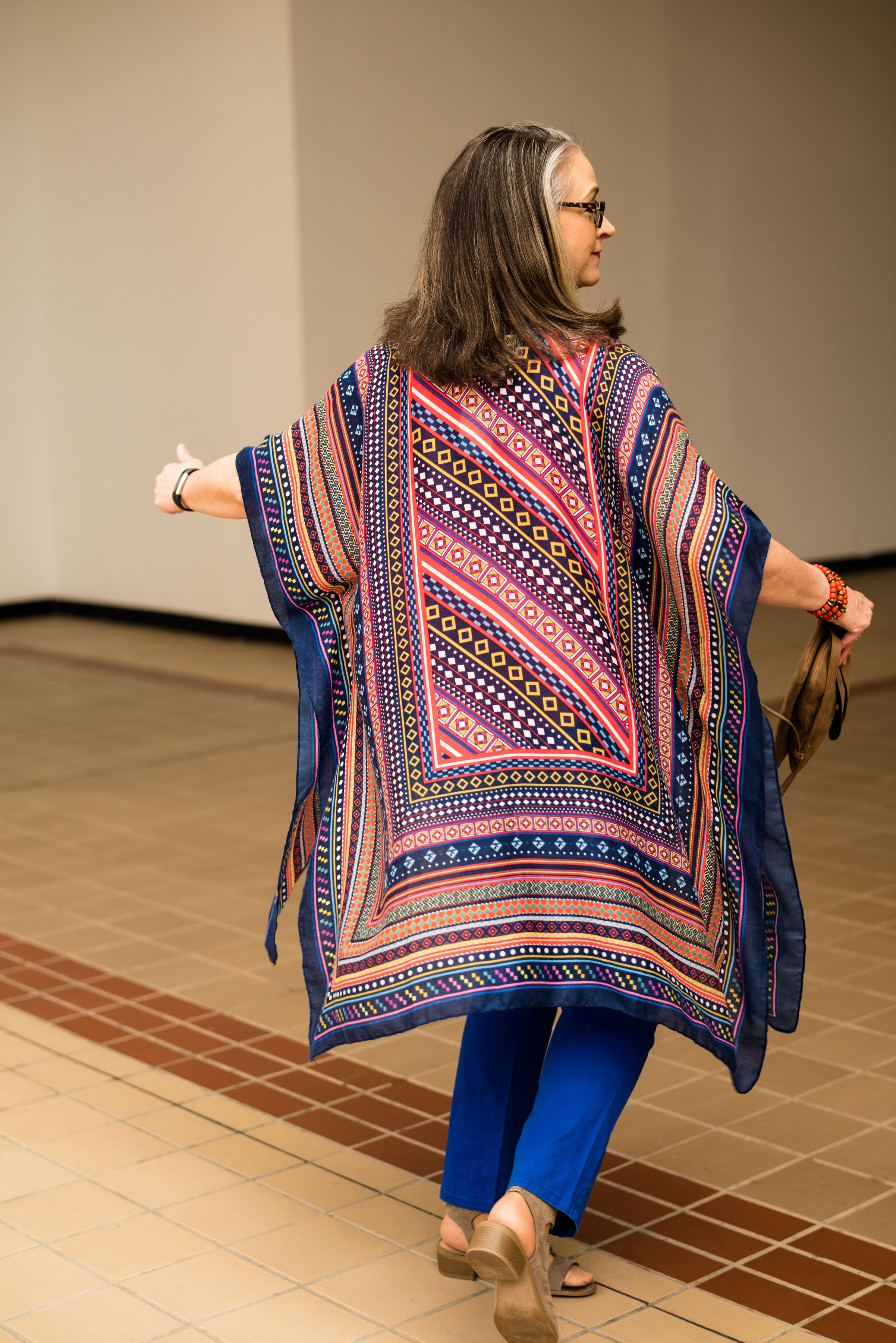
Since I do the Pantone Color Series twice a year, it seemed to make sense that I introduce the Color of the Year. For the year 2020, blue is the chosen color. Classic Blue, as it is called is a medium, dusky blue reminiscent of the the evening sky. Pantone describes it this way:

An expansive presence, Classic Blue is evocative of the vast and infinite evening sky opening a world of possibilities.
— Pantone Website

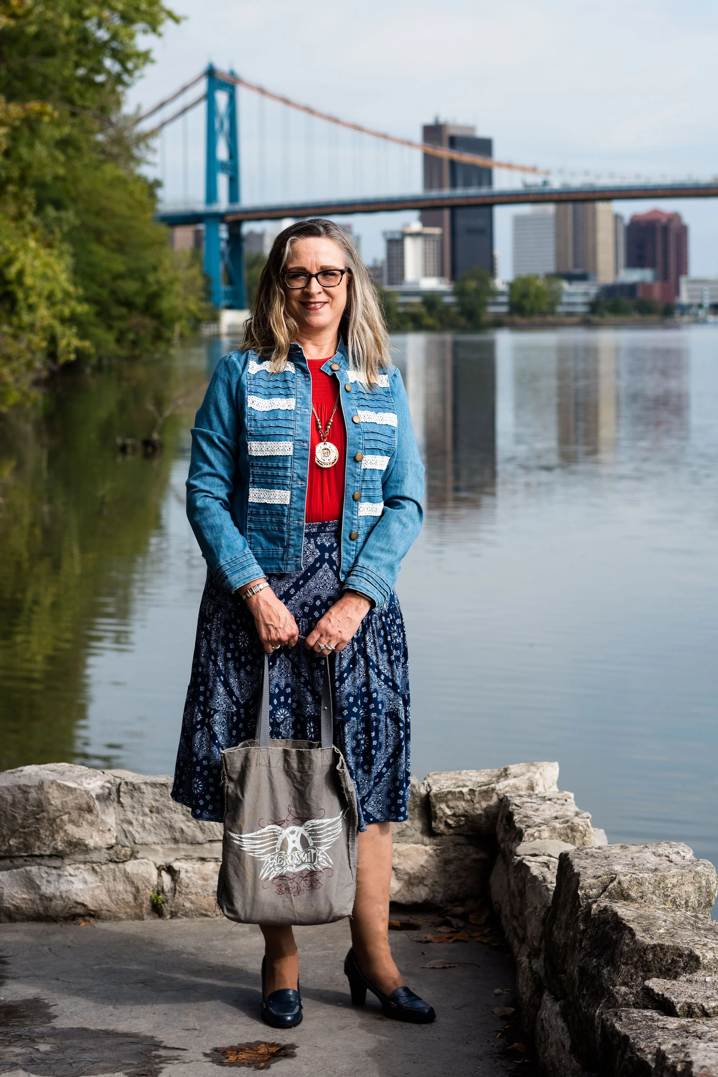
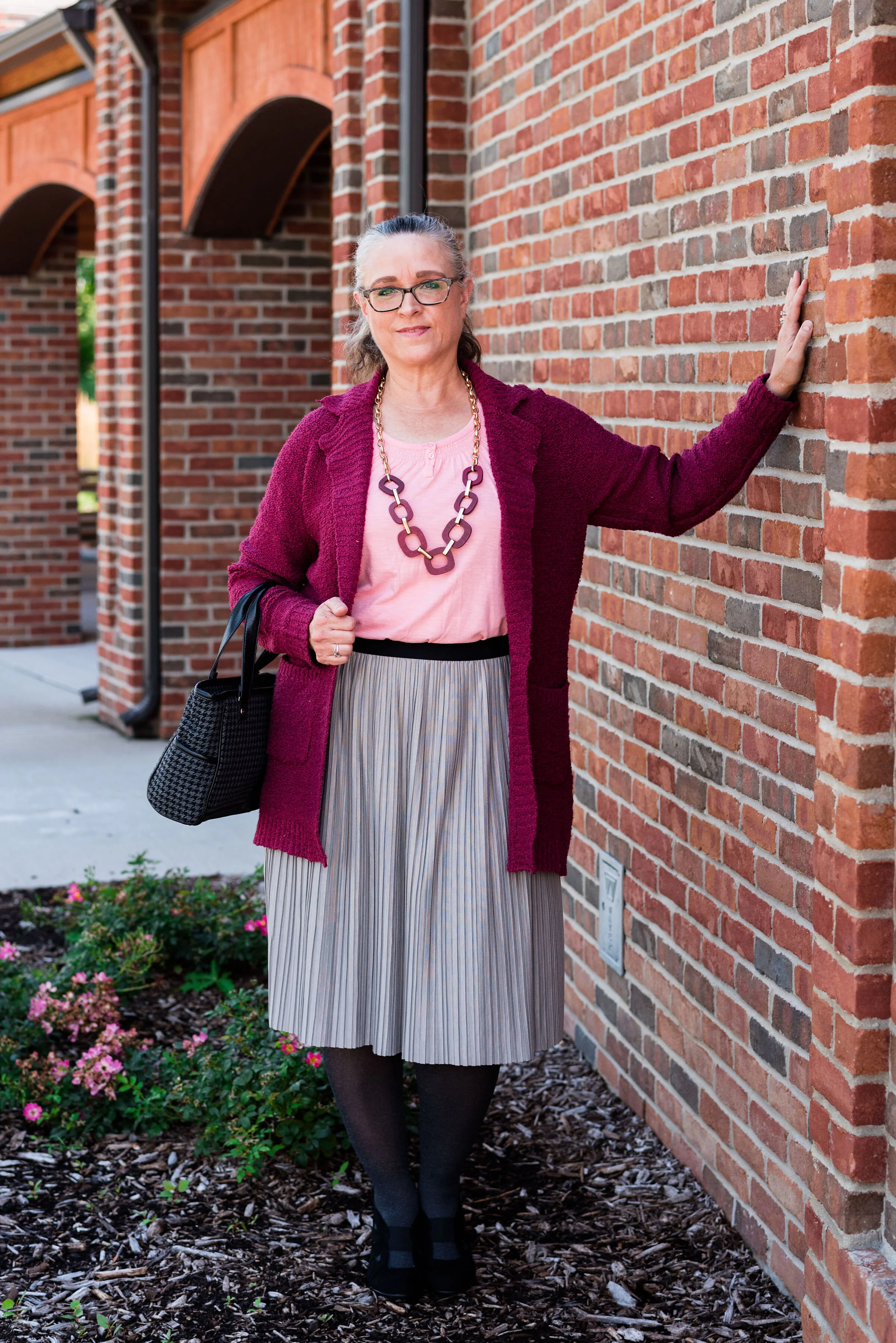
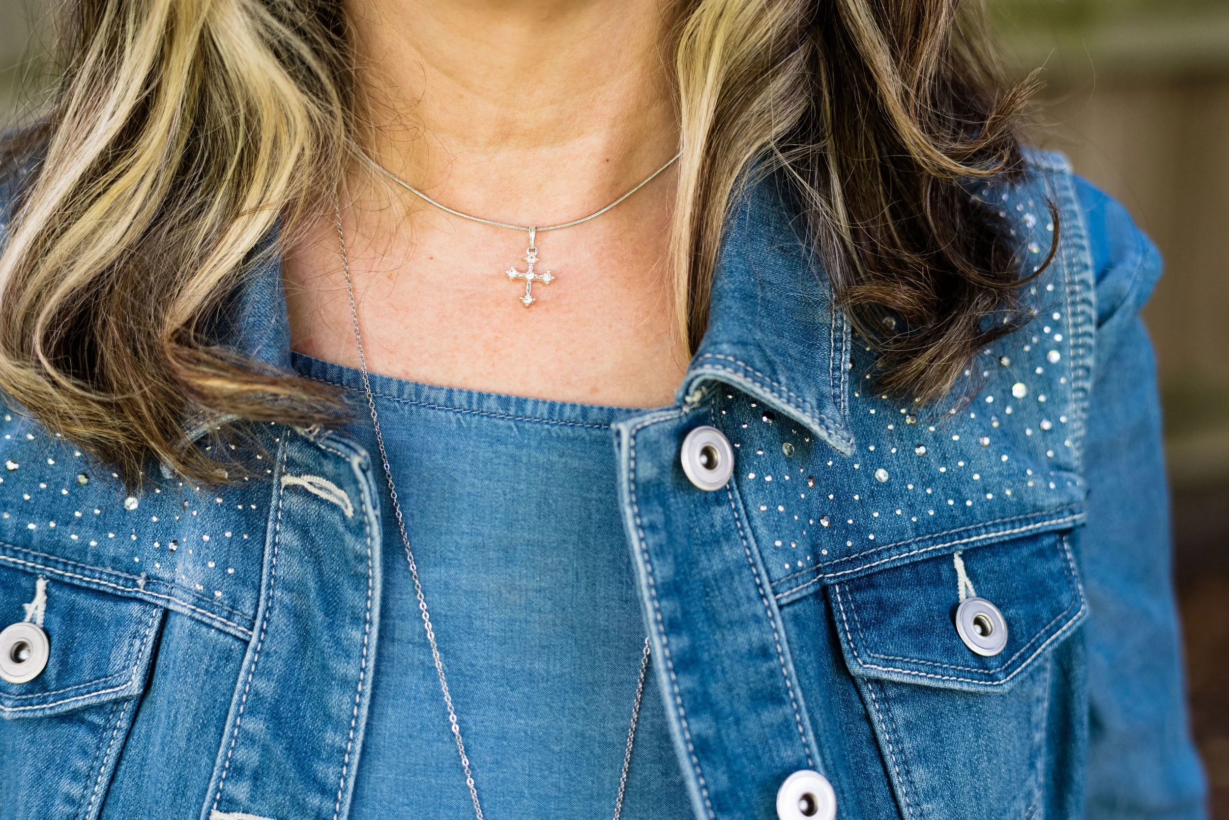
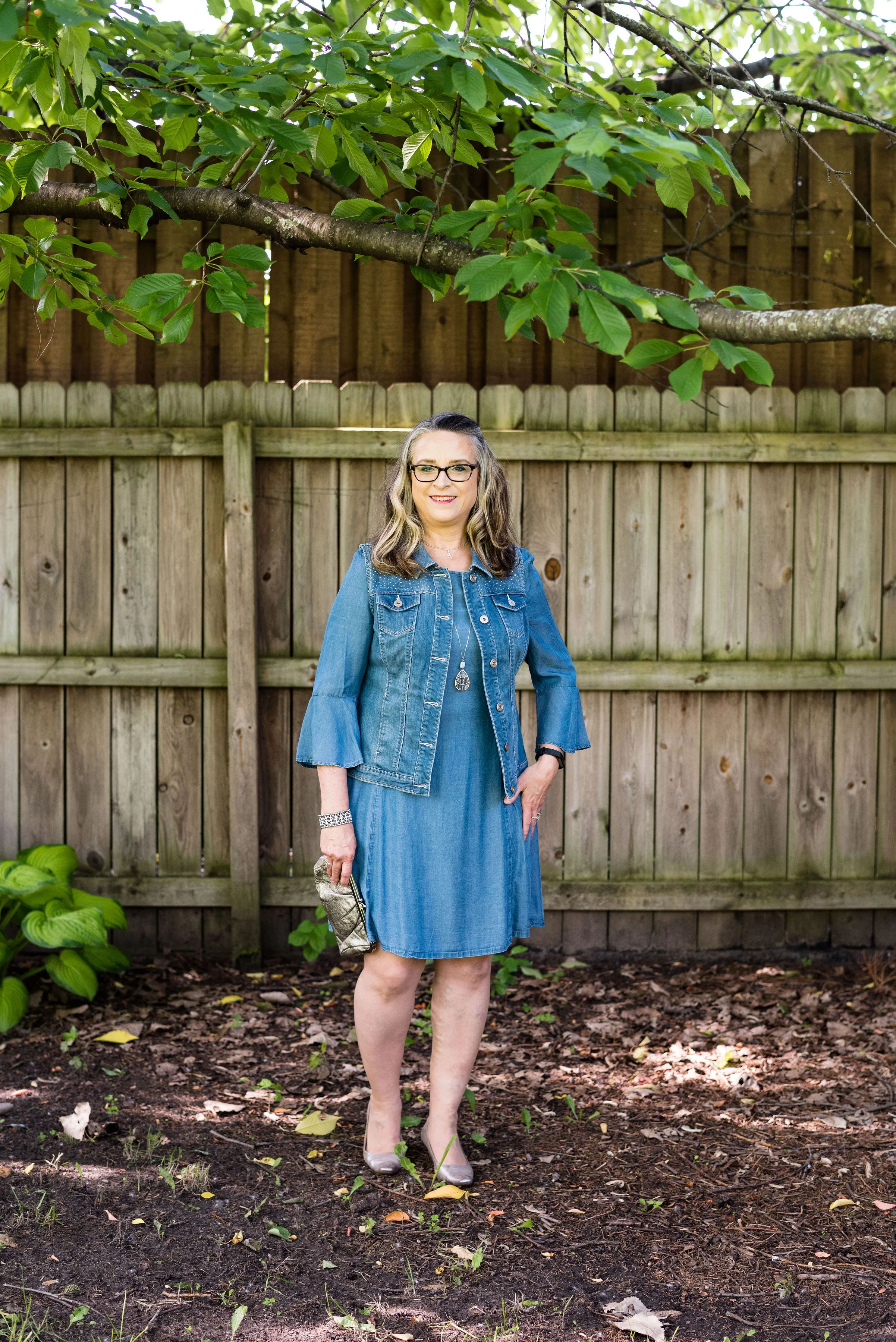
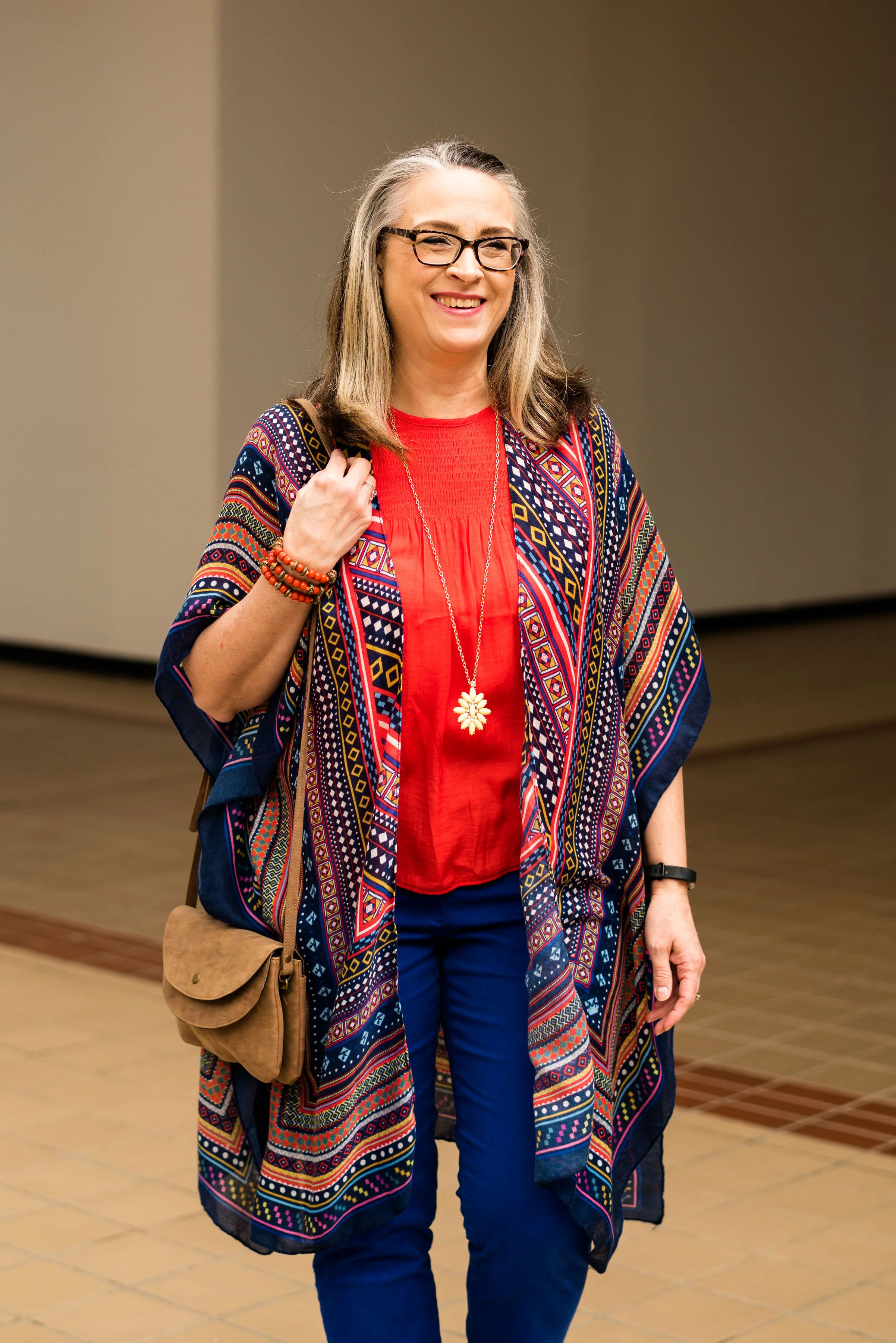
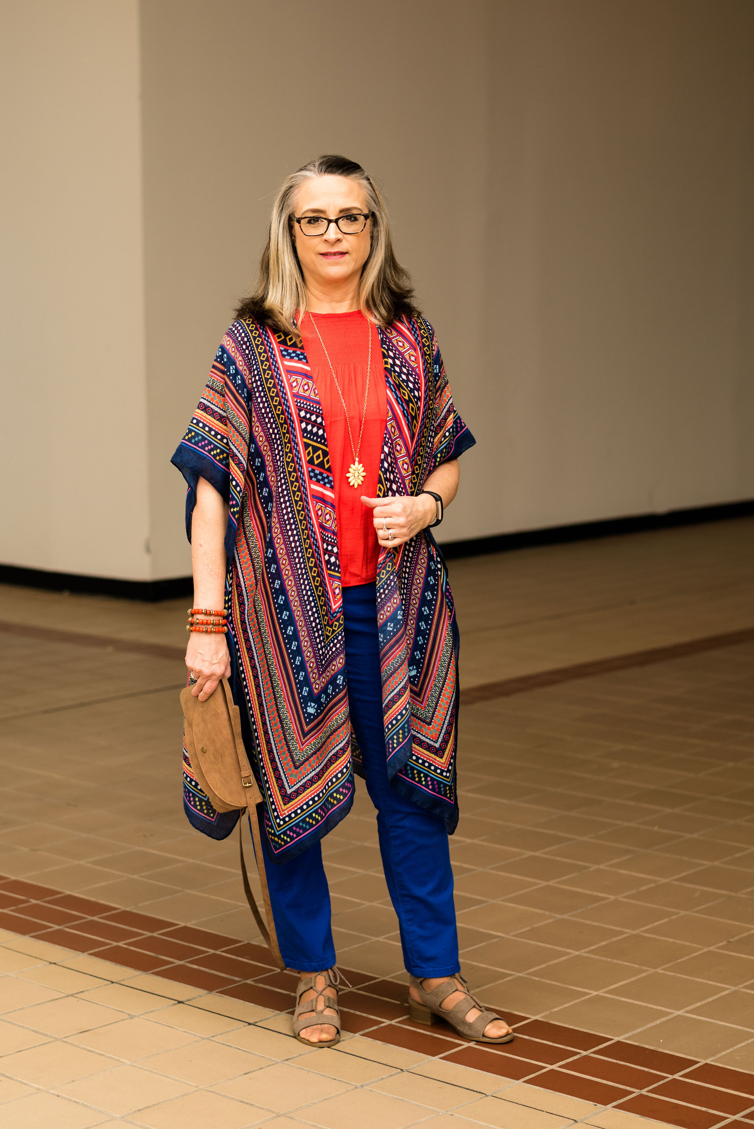
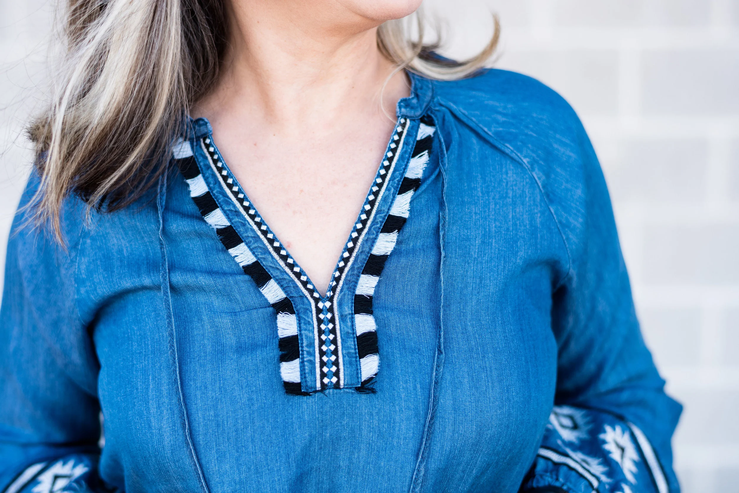
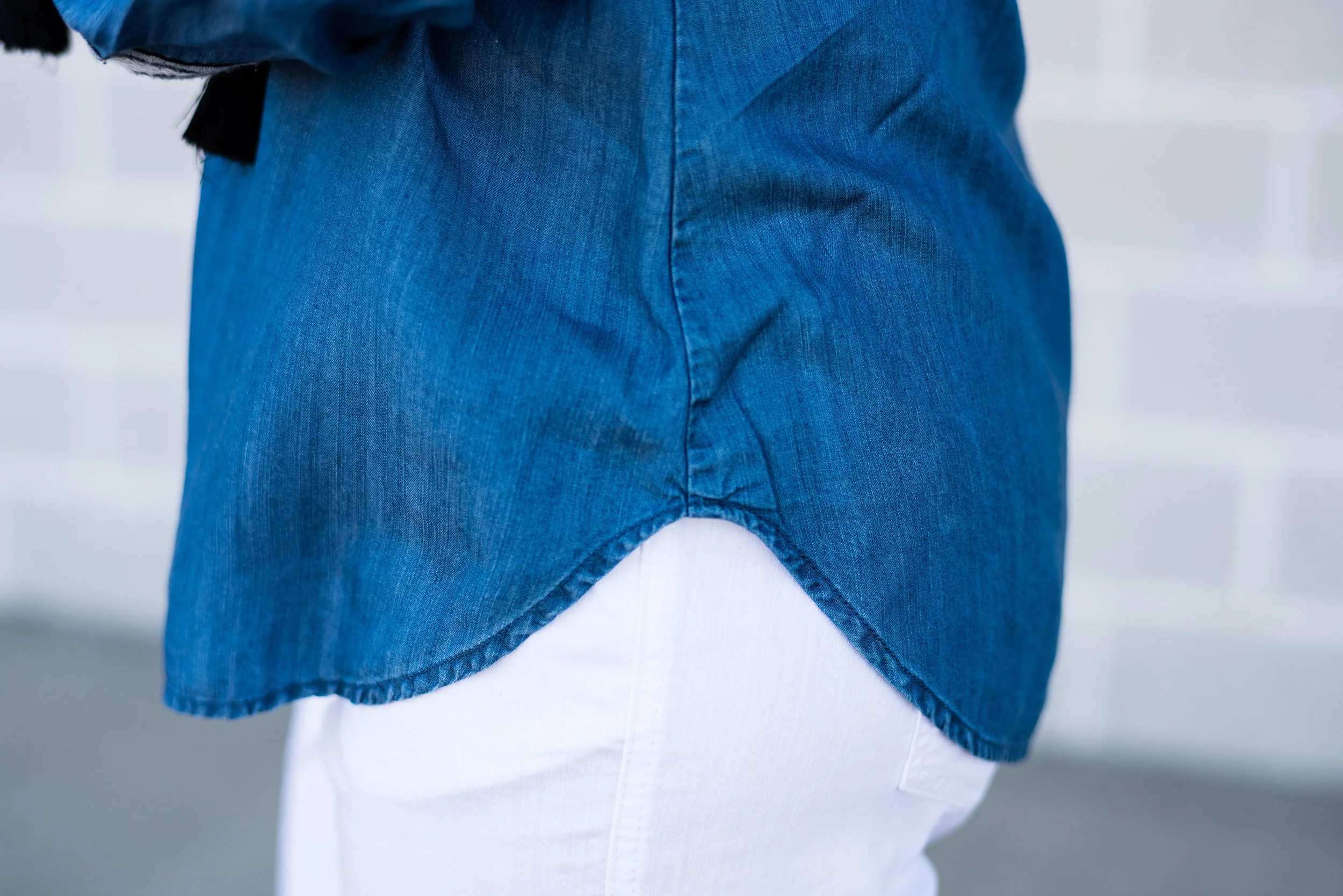
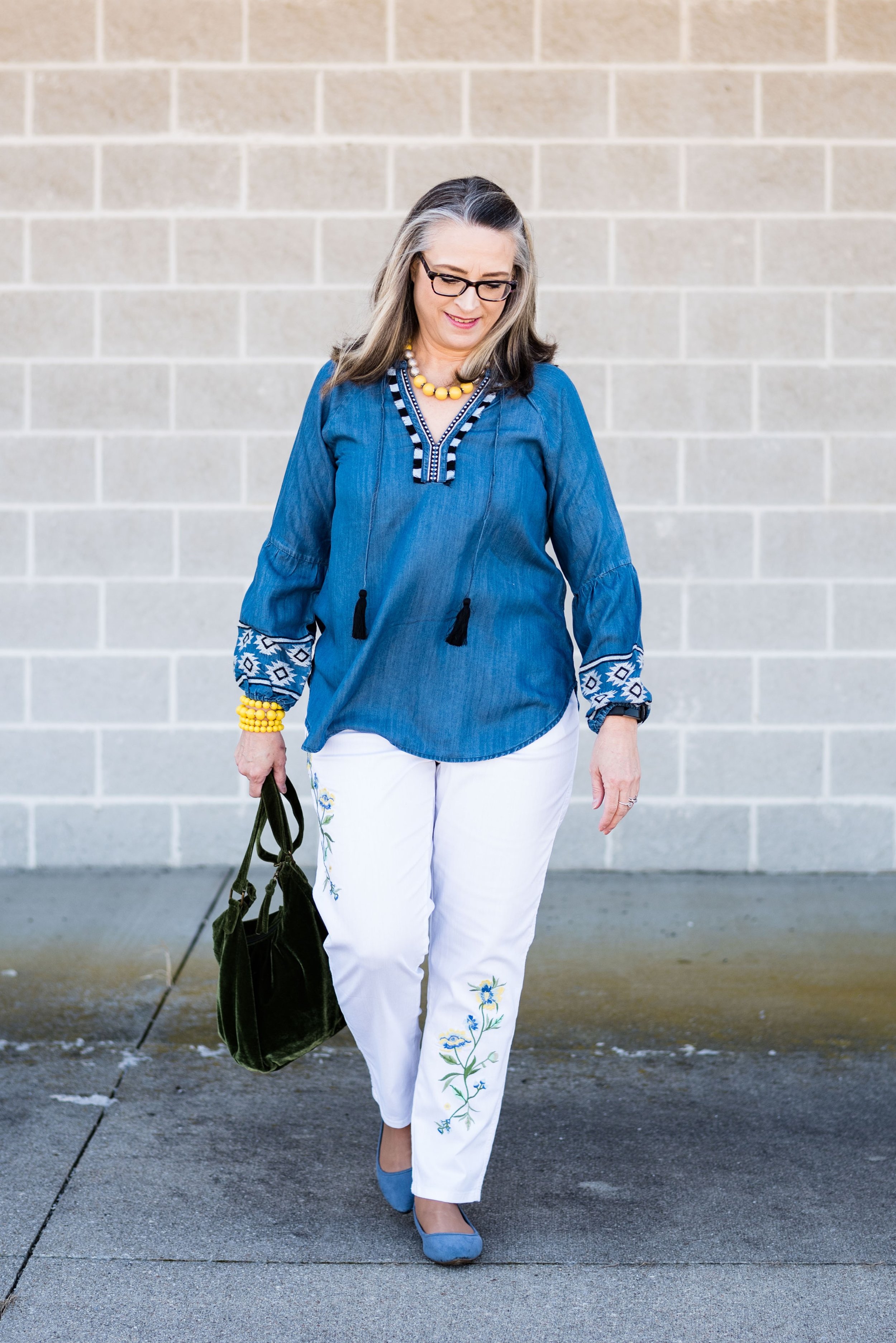
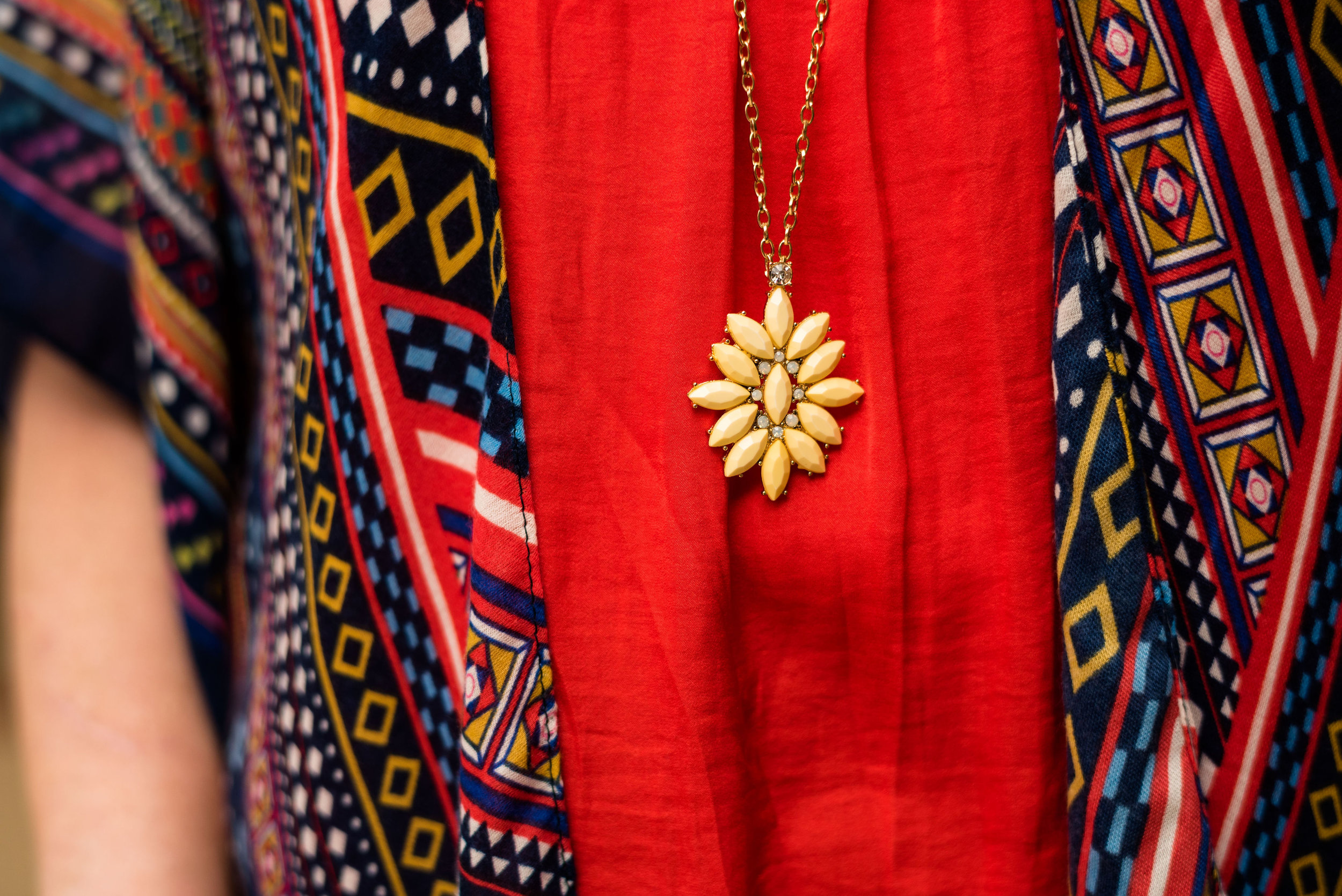
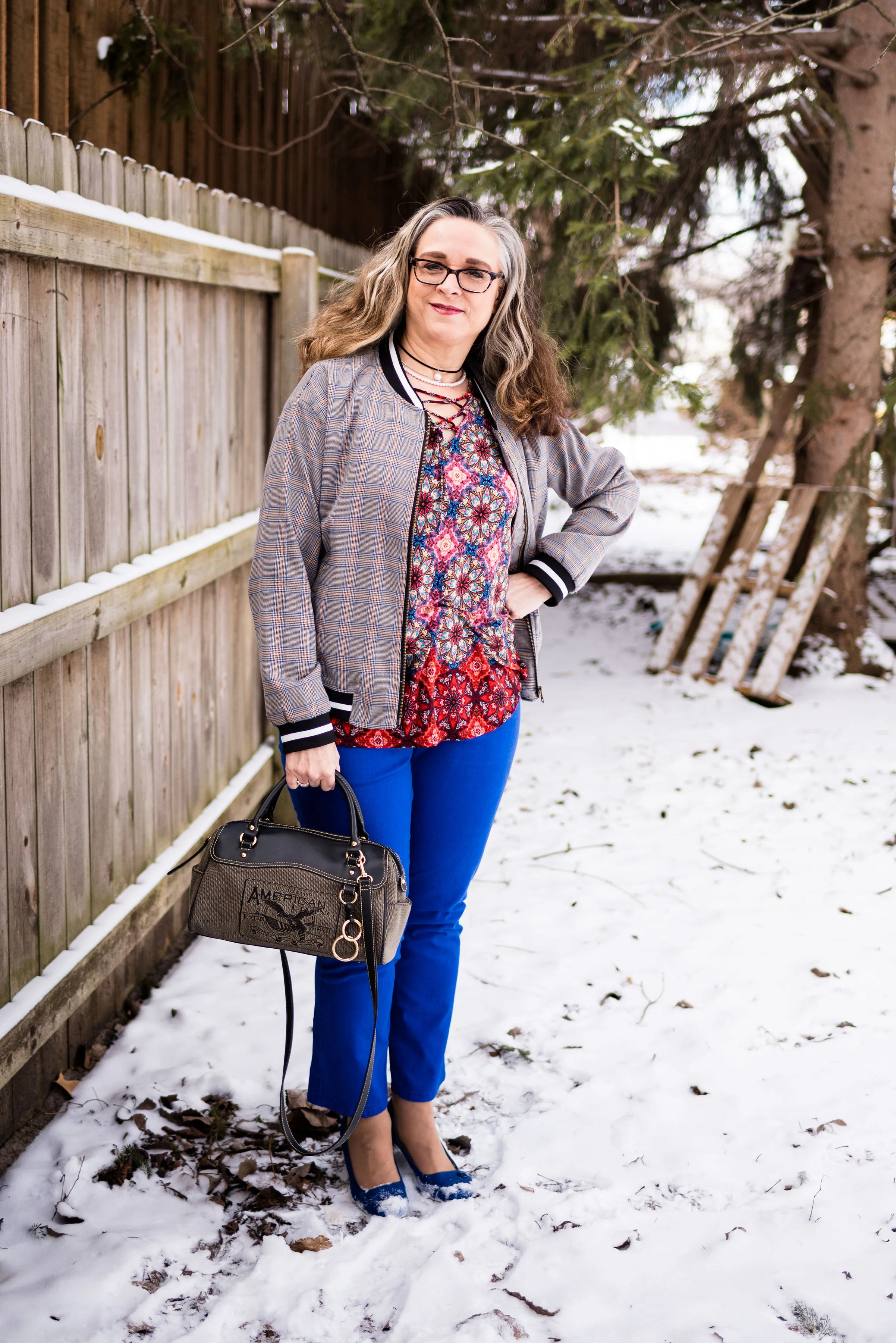
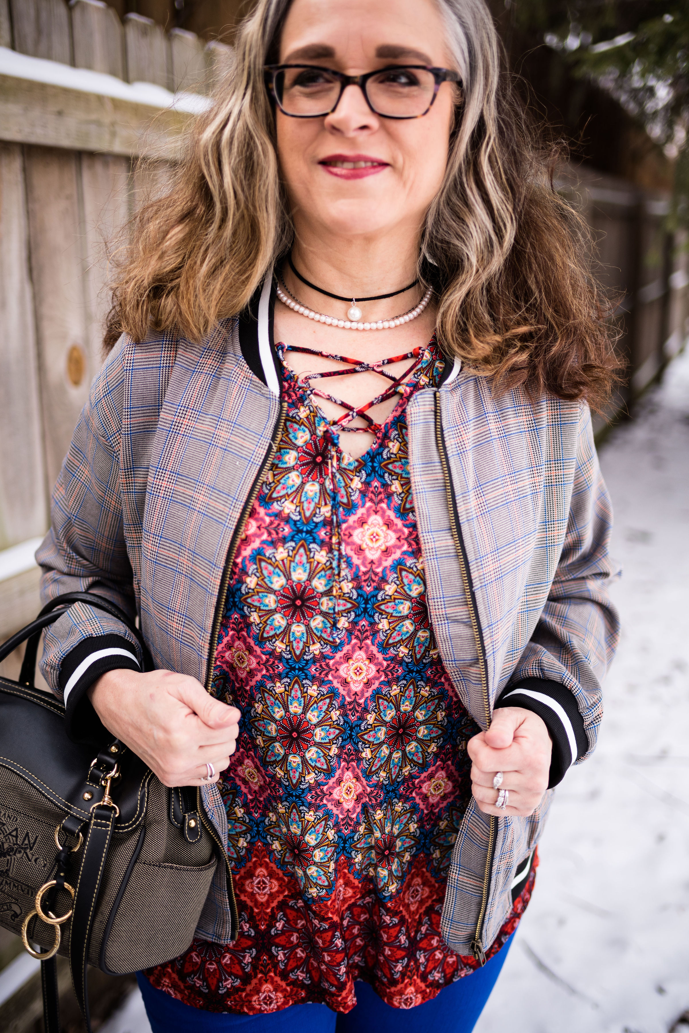
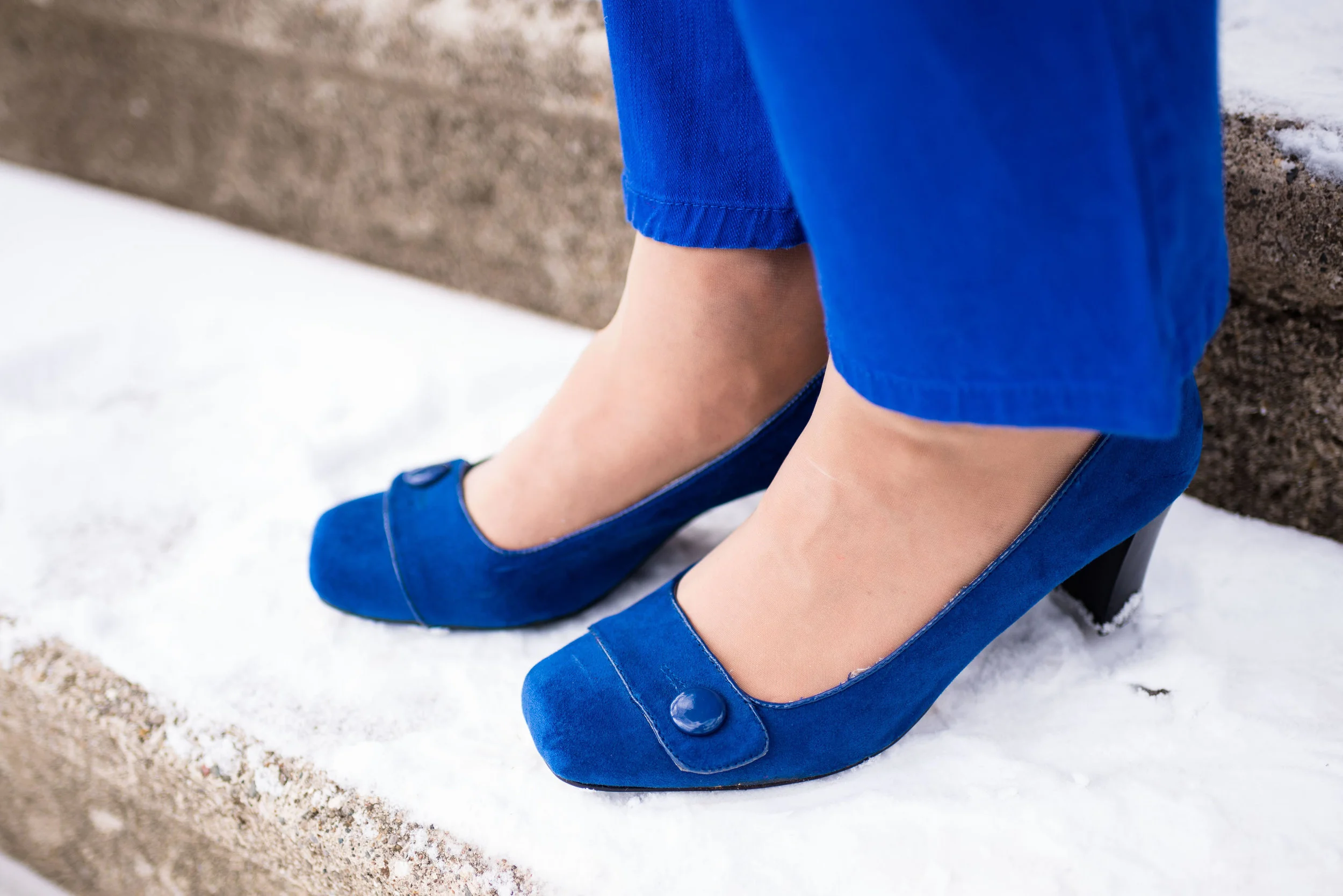
This is the sort of blue that would look good head to toe, or as in my outfit, be the perfect pop of color against other backdrops. I think this blue will look good on almost anyone and is a color that can be worn all year round.

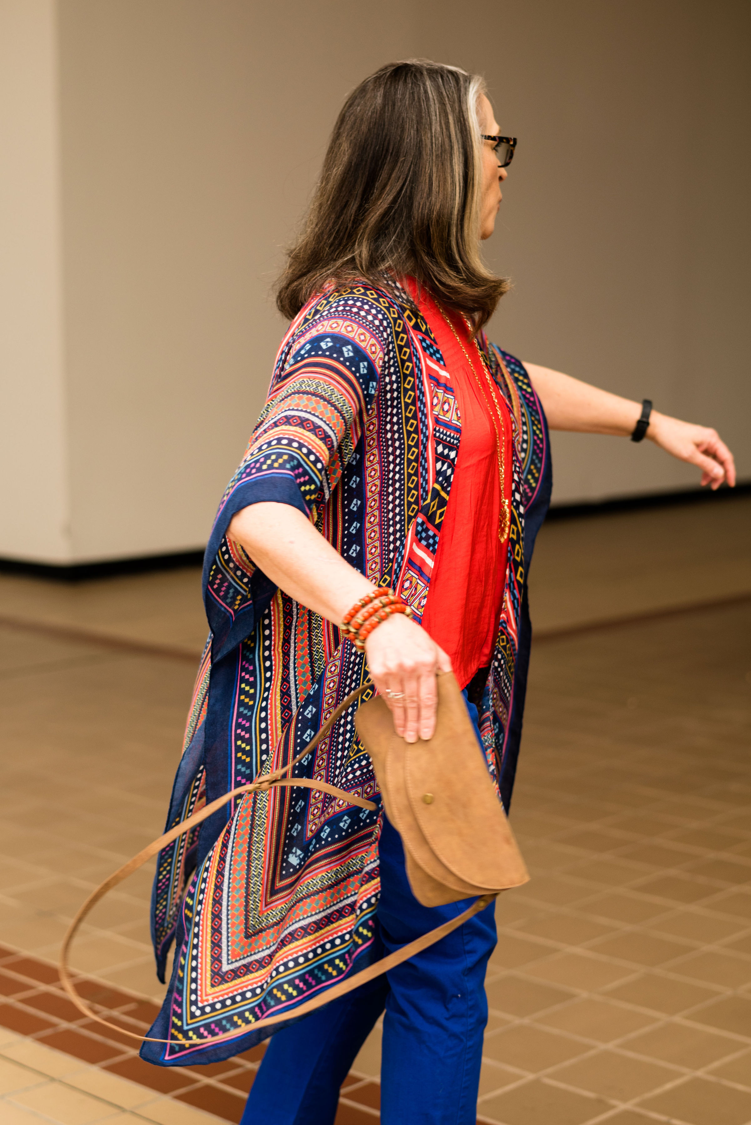
The wind was doing some crazy things to my hair, so my daughter was doing her best to capture good shots regardless. A number of the pieces in this outfit were given to me for Christmas.

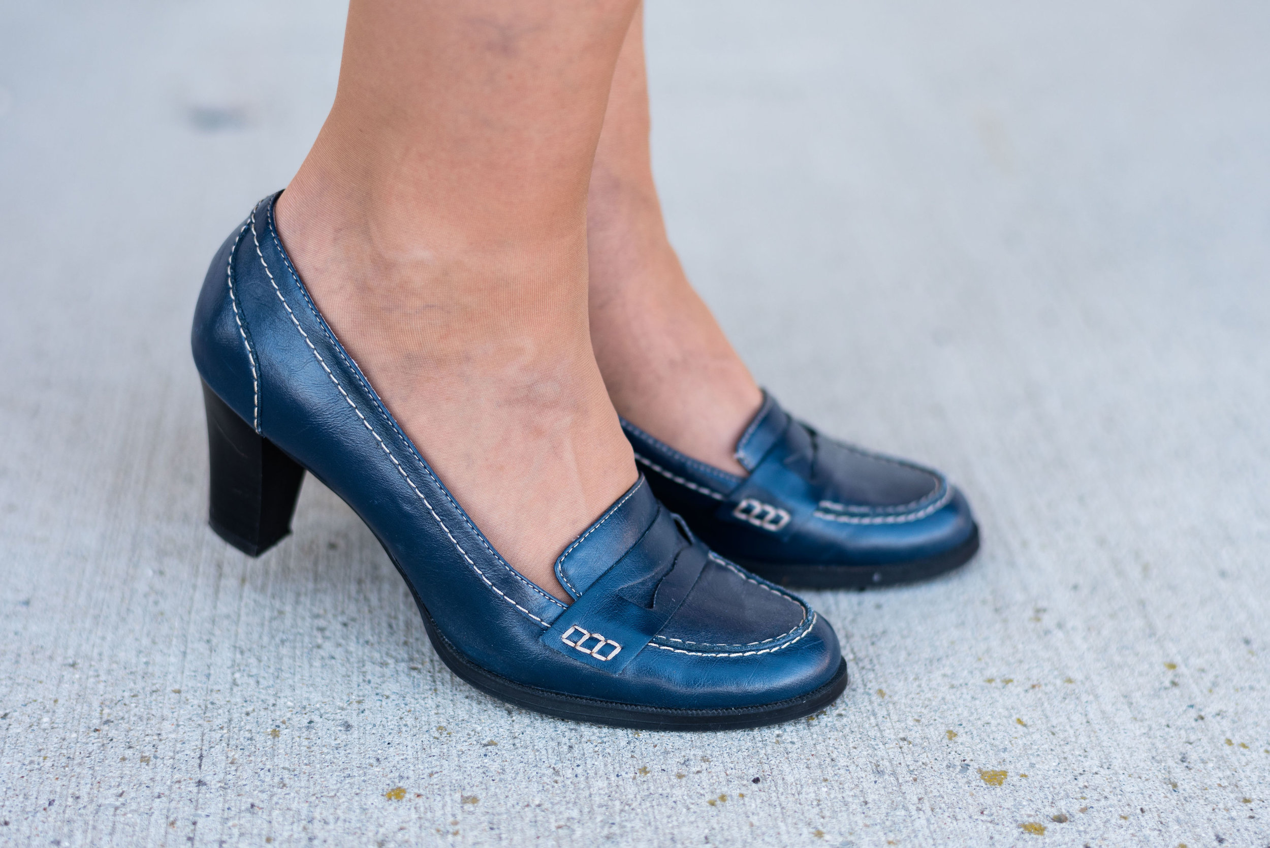
The gray and blue plaid skirt is older and Croft and Barrow brand. There was a time when skirts like these were very trendy. I’ve had my share and have worn them often to church in the winter time. While they may not be the most coveted skirt, these tea length pieces are perfect to wear with boots. I chose to wear my Seven Dials combat boots. I wanted to keep the look a bit more edgy and modern.

This fuzzy faux fur bomber jacket was a Christmas gift from my hubby. It is so soft and I had been coveting all the ones I saw at Kohl’s when I was working. This one he found at Walmart and is No Boundaries brand. Walmart has definitely upped their fashion game.

The gray pullover sweater I have on under the jacket is a brand called Ellen Tracy and was thrifted. A number of retailers carry the Ellen Tracy brand, including Macy’s, Nordstrom, Belk, and others. For this look, I tucked the whole sweater into the skirt. The skirt has a finished waist line, as opposed to elastic. I think a finished waist is just a little more classy than elastic.

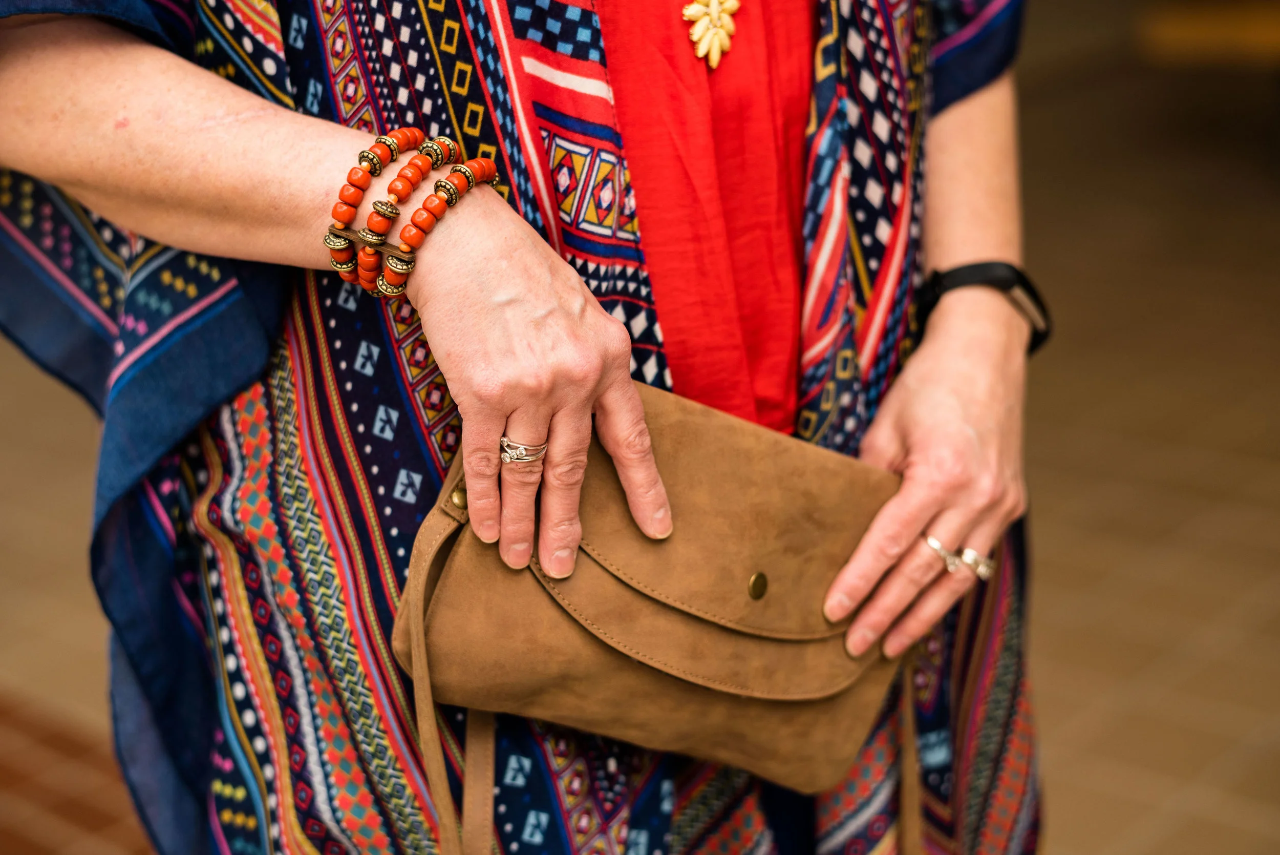
The scarf, necklace and bracelet were all Christmas gifts from my husband and oldest daughter, who went shopping together. She was the one to do the research on the Pantone color of the Year. Indeed, blue was the theme, but what a pretty blue it is.

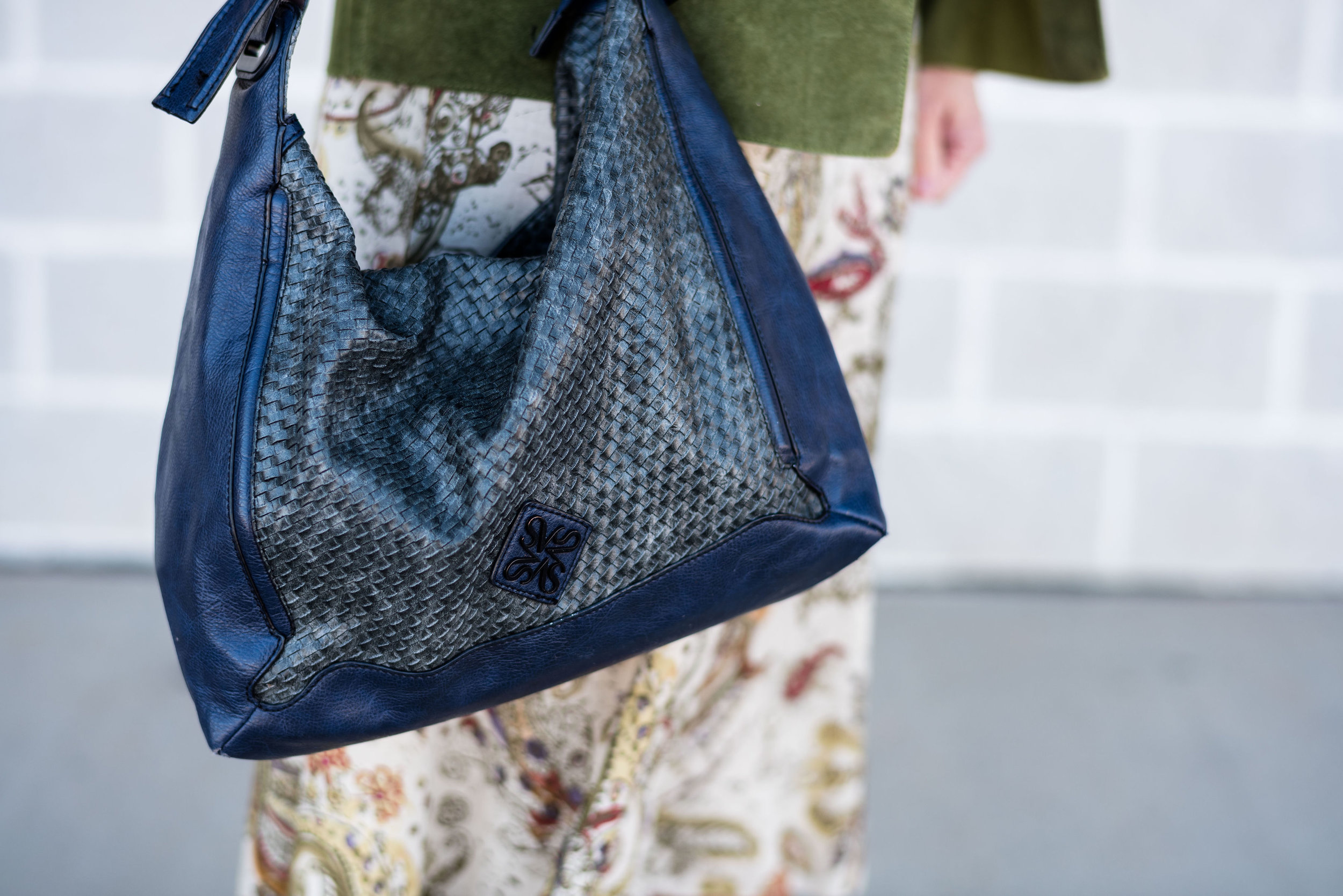
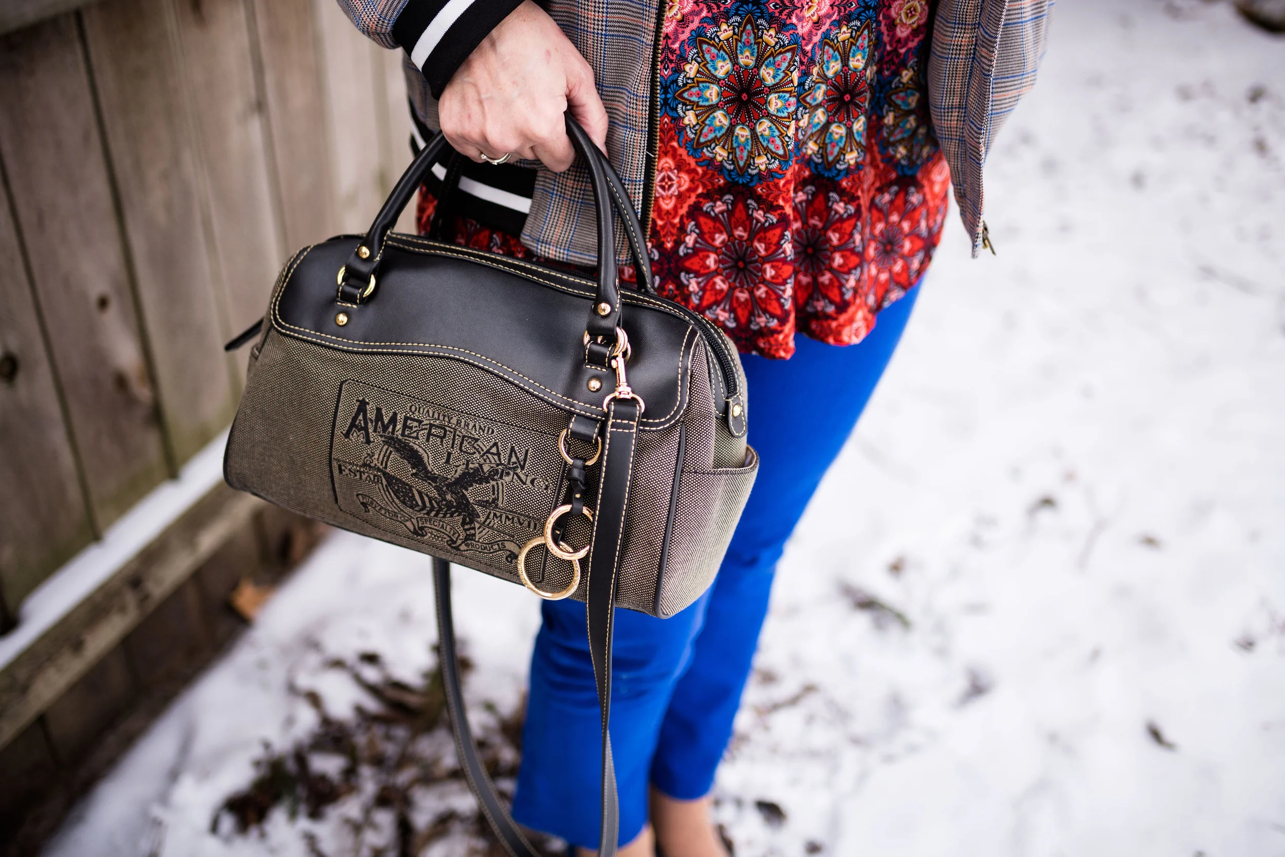
This bag was a thrift find. I often find purses when I thrift shop. They are so much cheaper than their full price counterparts at various retailers and I don’t even by the big name brands. I just don’t like spending a lot of money on clothing or accessories. I also like variety. Sure, I could buy one bag for $500 or I could get a whole year’s worth of thrifting for that much.

What do you think of Pantone’s 2020 Color of the Year? Do you like this blue? Why or why not? Do you have a plaid skirt in your closet like this one? If you do, how do you style it? Be sure to leave me some love in the comments.

I’ve included a few shopping links. These are affiliate links, which means if you click on a link I get a few cents. If you purchase something through a link a get a few cents more. I appreciate every penny!

Have a great day.

Photo credit Rebecca Trumbull.


A Look Back at 2019 - My Favorite Outfits

As we begin another year, I like to look back and see what I have accomplished over the past year. More often than not, it turns out that I didn’t accomplish anything new or life changing, but I did survive all that life threw our way. I wish I could say, I lost the weight I wanted to lose, or cleaned out that bedroom that needed to be freed of clutter, but in fact, what happened was, I gained a few extra pounds and the room got even more cluttered. Real life!

My husband always says, he won’t make any New Year’s resolutions because then he won’t feel disappointed when he doesn’t stick to them. I guess I can see the security in that mentality, but some of us want to have a goal to shoot for, even if we don’t attain it. I like having a second chance, or a third or fourth. There is something encouraging in the idea that I can start over, reboot and try again. I’ll save those thoughts for another post, but today, I want to take a look back at 2019, showing you my favorite outfits and explaining why. If you want to see the original post, just click on the link.

January

Spring Trend - Head to Toe Neutral

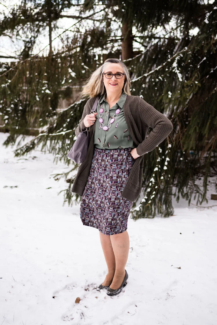
Why I like it: When we are in the midst of the mid-west winter, we are also in the throes of darkness and gloom. For this Seasonal Affective Disorder sufferer that means fatigue, lack of motivation, brain fog, major carb cravings and just a general feeling of anxiety and discouragement. I have found that choosing bright or light colors to wear, gives me a tiny little boost in the middle of the sadness. This creamy neutral outfit is a perfect color to lighten things up. I also love the textural elements in the vest, ribbed knit sweater and patchwork tote bag. In addition I like the way my accessories pop against the neutral back drop.

February

Spring Trend - Scarf Prints

Why I like it: What is not to like about an outfit that is crisp, structured and perfect for a date night or a day at work. I love the mix of prints. The polka dot blazer and the colorful scarf print top are the perfect compliments to each other. Add a bright white pair of trouser/jeans and you have a winning combination. The blue bag and classic patent leather block heels help as well.

March

Print Mixing Mash Up - Printed Skirt - Outfit 2

I loved the way these pieces came together for this print mixing post. All of these pieces were in my closet, which goes to show you don’t have to spend lots of money to have a fun, stylish wardrobe, as well as be a print mixing queen.

April

Pantone Spring/Summer - 2019 - Turmeric and Sweet Lilac

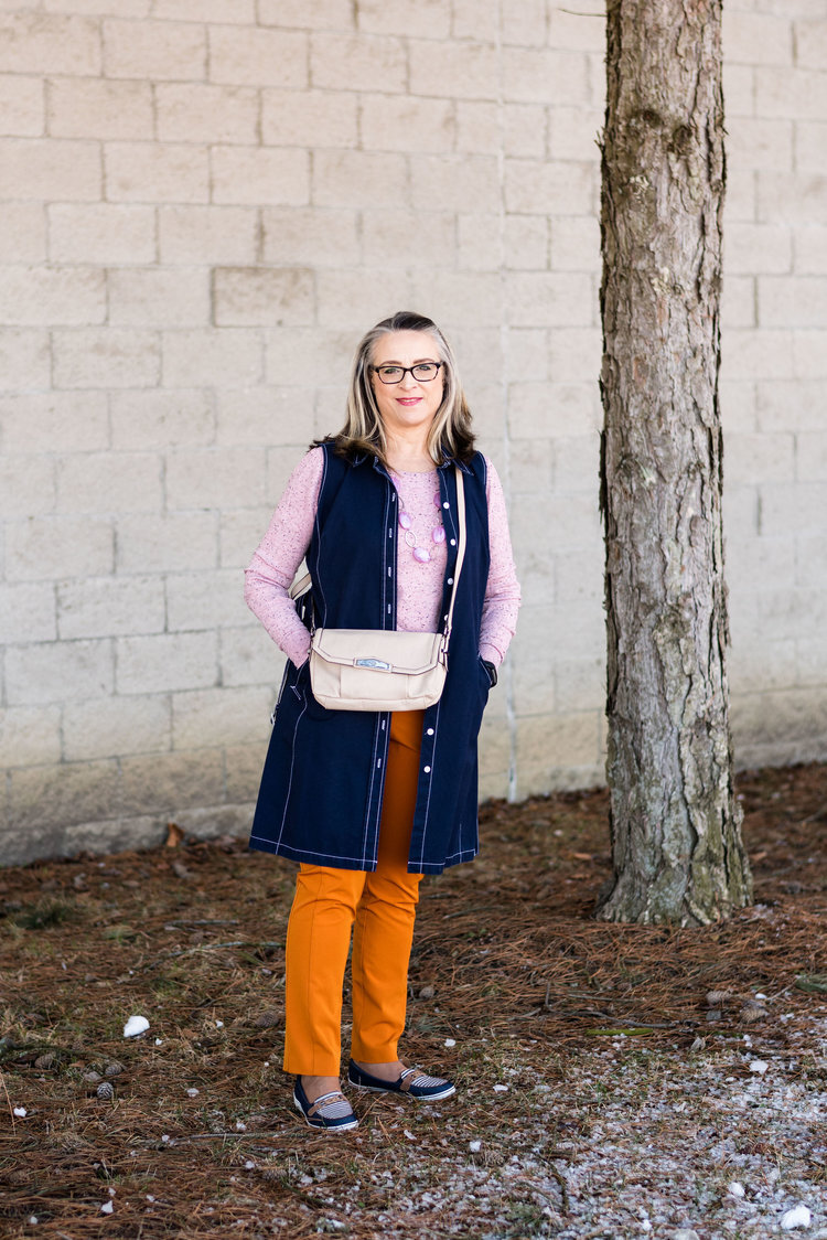
The thing I like about this outfit is how it made me think outside my norm. I would not normally think of pairing this bright orange with this more pastel pinky purple. Those colors always make me think of Easter eggs. Ha, ha. But of course, some of our fashion norms or rules or even preferences are meant to be broken, or at least experimented with. I think adding the dark navy vest and shoes kept the outfit from being to little girlish.

May

Pantone Spring/Summer - 2019 - Toffee and Mango Mojito

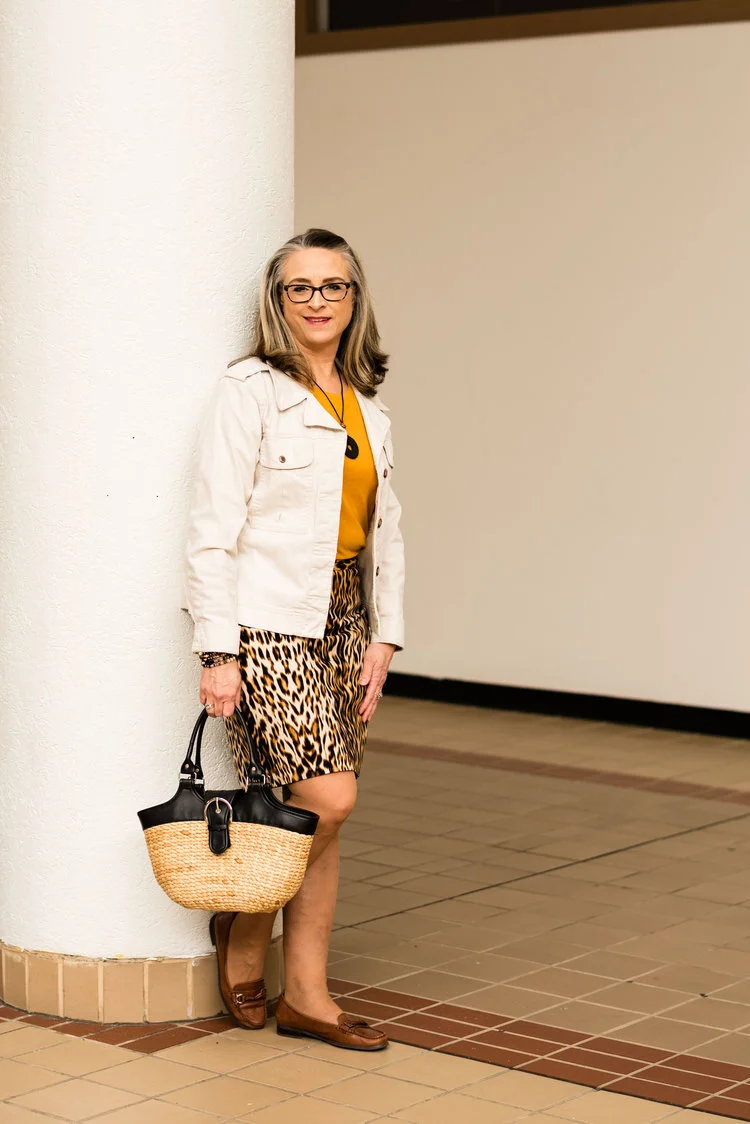
Why do I like this outfit? Leopard print skirt, check! Bright colored tee, check! Creamy denim jacket, check! Fun basket bag, check! It is casual and fun. You could change it up by wearing a black tee or a black jacket. You could wear tennis shoes or heels instead of loafers. Each little change you make, can change the whole persona of the outfit, yet you still keep the classic leopard print skirt.

June

When Summer Doesn’t Feel Like Summer

Photo credit Amy Christensen

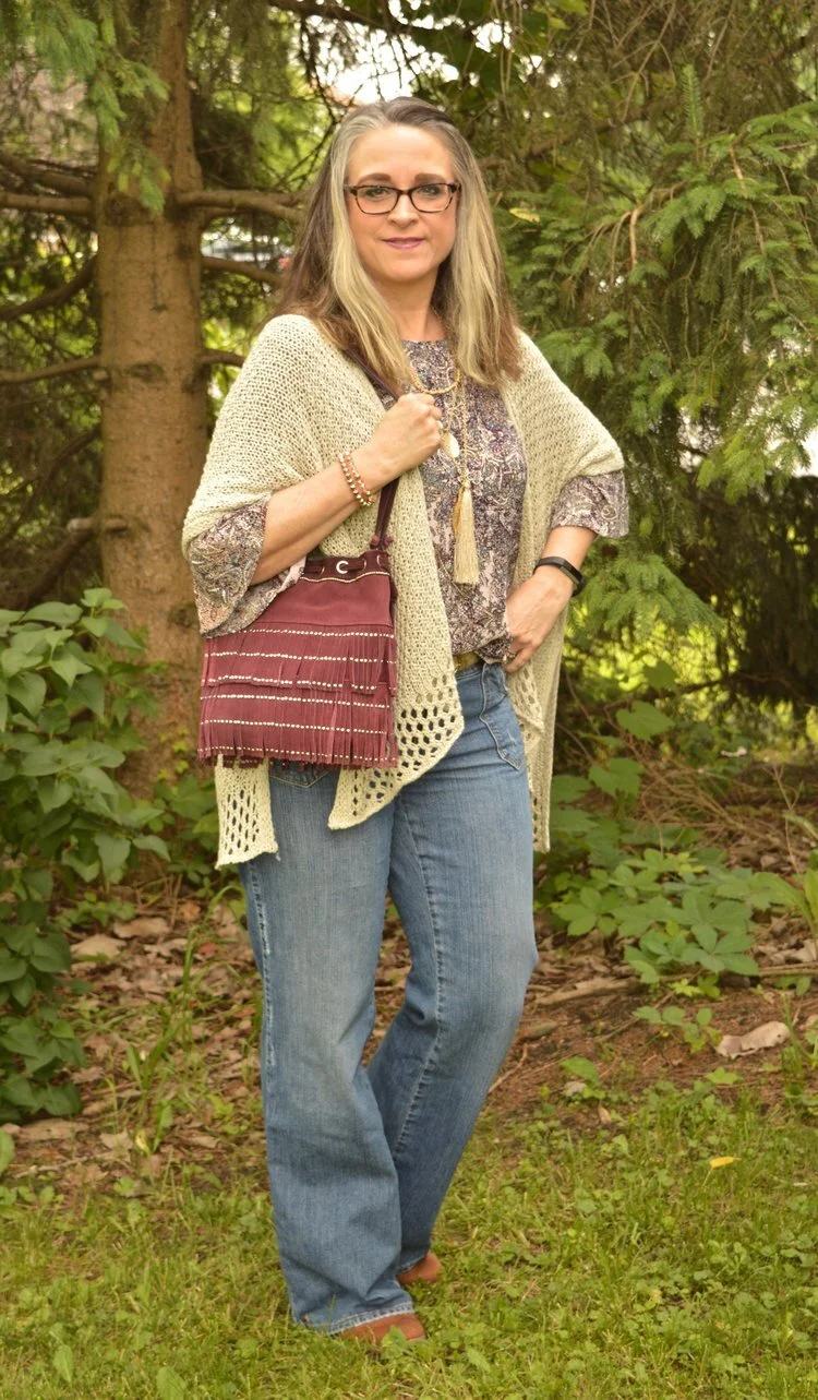
While this outfit picture was taken in June, the weather wasn’t begin very cooperative. It was cool, thus the layers. I really liked this look. The bell sleeve floral top, the crocheted ruana and the light wash denim gave the look a boho feel. Adding the fringe bag and cognac suede booties nailed it. This is definitely an outfit I am comfortable in.

July

Denim Daze 2.0 - Ruffled Chambray Top - Dressy

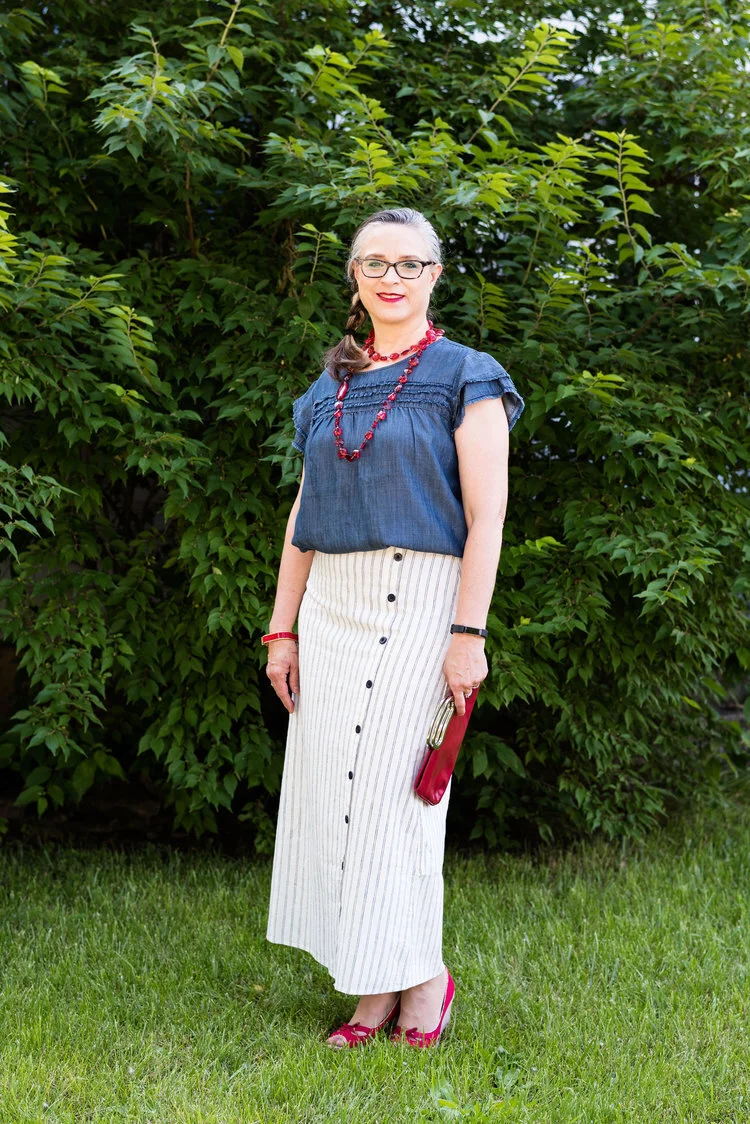
When I found this skirt at Christopher and Banks, I had to have it. I was in the midst of watching Miss Fisher’s Murder Mysteries, and absolutely loved the 20’s vibe and costumes in the show. This skirt made me think of those 20’s styles and I thought it would be a great summer piece. It was perfect for this 4th of July themed outfit.

August

Wearing White - White Sleeveless Sweater

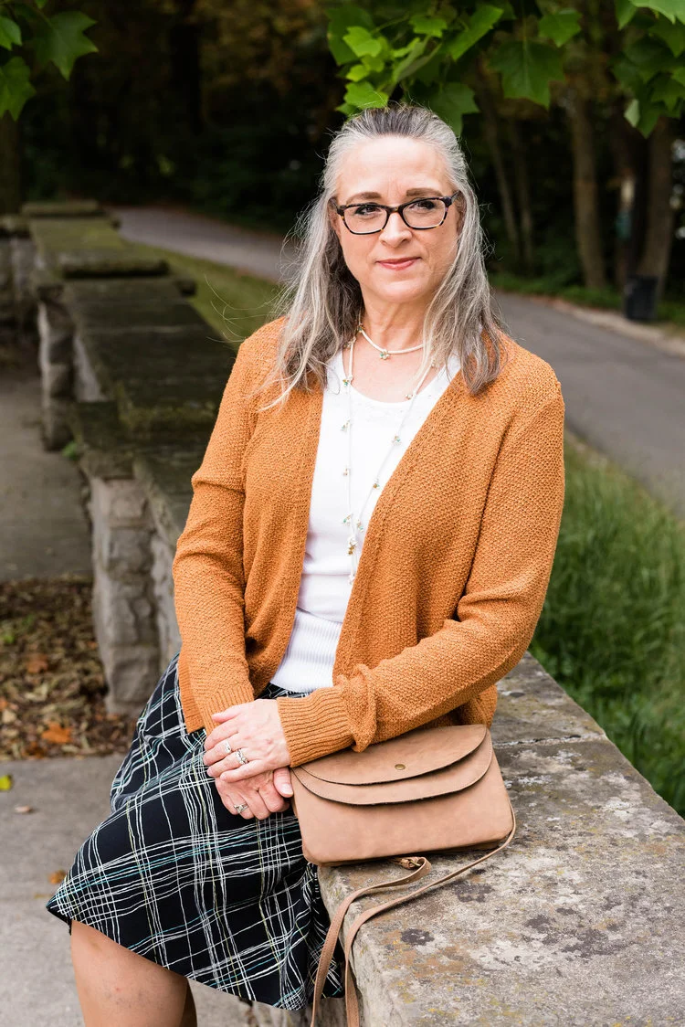
I love this combination. Seeing as this was an outfit for transitioning into fall, I thought it worked very well. The white sleeveless sweater is a perfect topper for the swingy a-line printed skirt, but I really like the way the sweater gives the outfit that fall vibe. The colors go well together, even though the skirt and top didn’t contain any colors remotely similar to the sweater.

September

Pantone - Autumn/Winter - 2019 - Creme de Peche and Rocky Road

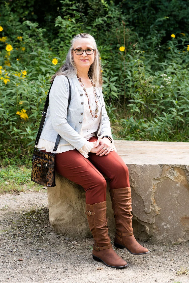
Even though these colors did not exactly match the Pantone colors, I really liked this outfit. The rusty color of the pants and boots were right in tune with fall color trends and the addition of the light peach eyelet top and gray jacket with ruffles gave the outfit a flirty, feminine feel. The leopard print bag and necklace with fall colored beads were lovely compliments.

October

Pantone - Autumn/Winter - 2019 - Cranberry and Chicory Coffee

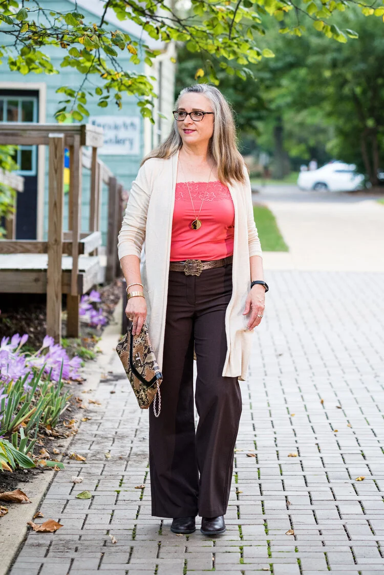
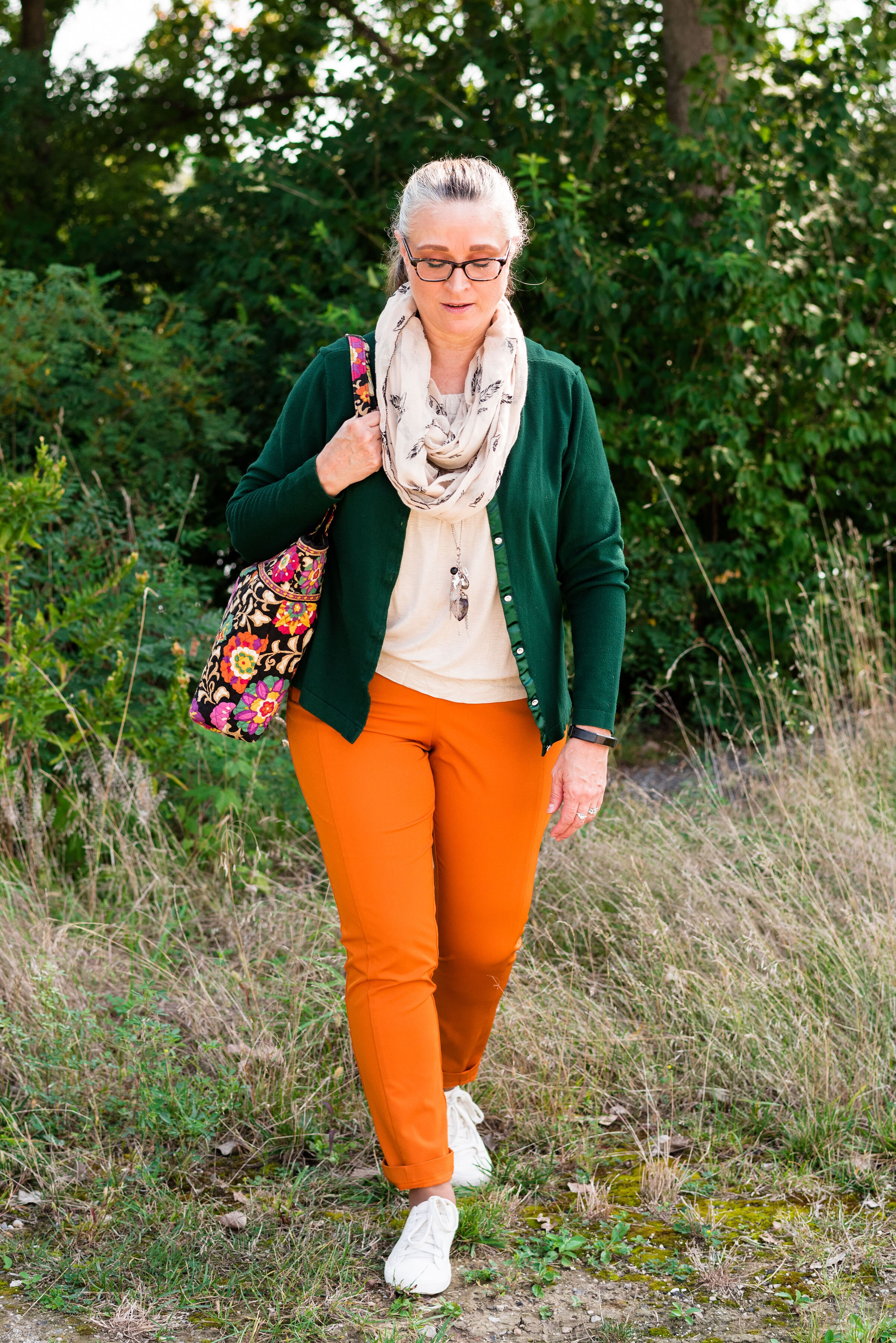
This is a great work wear look, or even a date night combo. I think the outfit elongates my whole body making me look slim and trim. The dark brown trousers and dark brown boots create a long line for my lower half. The dark color is also trimming. In addition to that, I like the longer open front cardi. It is a lighter weight, which doesn’t add bulk. The snakeskin bag, leopard print pendant necklace and the floral lace on the cami added just enough printed interest to keep the outfit from getting boring.

November

Outfit Inspiration - It’s Beginning to Look a lot Like Christmas

I just really like everything about this picture. It really says, “Christmas time is here.” I wanted my outfit to be Christmasy, but not over the top. The creamy thrifted “Joy” sweater is one of my favorites. I also love the pairing of the rusty yellow cognac color with bright red. The finishing touch was the Christmas scarf in my hair. It really gave the look a retro feel.

December

Outfit Inspiration - It’s the Most Wonderful Time of the Year

This is just such a me outfit. I love plaid. I love shearling and I really like how the gray looked with all of it. Turning up the cuffs on the jeans and wearing the tan, shearling lined boots gave the outfit a fun casual flair, while the snowflake tee and Believe pin kept the outfit on the Christmas theme. I’m going to have to wear this plaid blazer a few more times this winter, just for fun!

So there you have it, my favorite outfits from 2019. If you want to read the original posts, just click on the titles of each and it will take you there. Did you have a favorite outfit from my blog, this past year? If you did, I’d love to hear your thoughts.

I hope to have a new series up and running by next week, on layering light for these drab, gloomy days of winter. In addition to that, I am going to revamp my weekly columns, so every Thursday will be a specific area of fashion that I am wanting to post about. I hope you will join me for what’s ahead.

Have a great week.

Photo credit Rebecca Trumbull, unless specified under the picture.

Outfit Inspiration - Santa Baby

There are two Christmas songs I would classify as sexy. The first inspired the outfit in today’s post, Santa Baby sung by Eartha Kitt. The second would be Elvis Presley’s Santa Claus is Back in Town. there is also a good version of that by Kurt Russell in his Christmas movie that came out last year called The Christmas Chronicles. That is a fun family movie, if you are looking for something different to watch.

Back to Santa Baby. This song was written by Joan Javits in 1953. It was meant to be a tongue in cheek look at the Christmas list of a a woman who wants expensive gifts from Santa such as furs, cars and a diamond ring. Eartha Kitt, a multi-talented actress, and singer recorded the song and it was a hit. She had a very distinct voice and that is part of why I love her version of the song. There have been several other artists who recorded the song since then, Madonna being one. Eartha rerecorded the song in 1963 with a more upbeat tempo. I personally, like the original version best. It is sassy and sexy and that is what I was trying to evoke with this outfit. See what you think.

When I thought about doing this song, I pushed the idea from my mind, because I am not a sexy person by nature. As many of you know, who have followed me since the beginning, I grew up with brothers and was a tomboy. I also grew up in a very conservative home, where affection was not regularly expressed and things like sexuality were not discussed. Unfortunately, that did affect how I related to my spouse once I was married. I feel rather silly trying to be sexy. I can pull it off once in a while with my hubby, but that stays in the bedroom. What I have for you is a much more subtle and modest attempt at sexy.

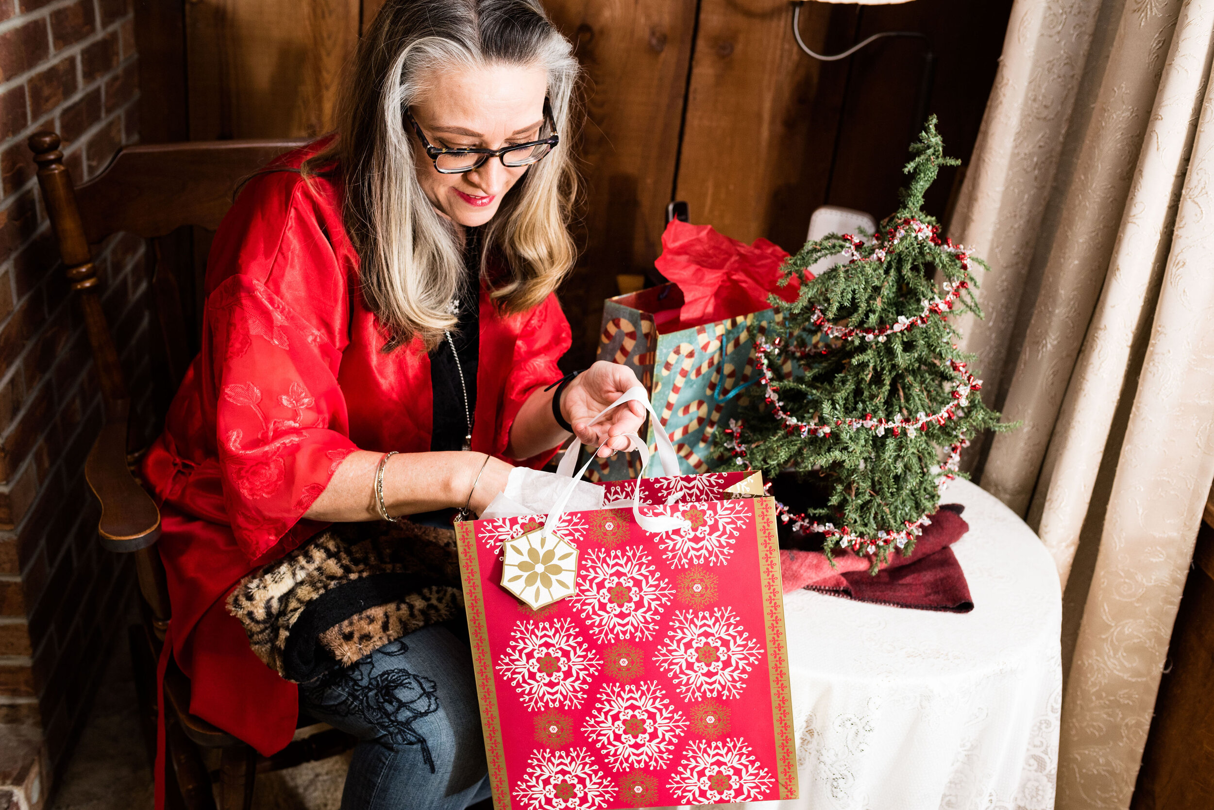
This pretty red kimono was a gift from my hubby in an attempt to make me more sexy, Ha, ha. It is a very pretty piece, so I thought why not use it for this outfit. The red is perfect for Christmas. The kimono is a brand called California Miss. I have no idea where my spouse bought it as that was a few years ago.

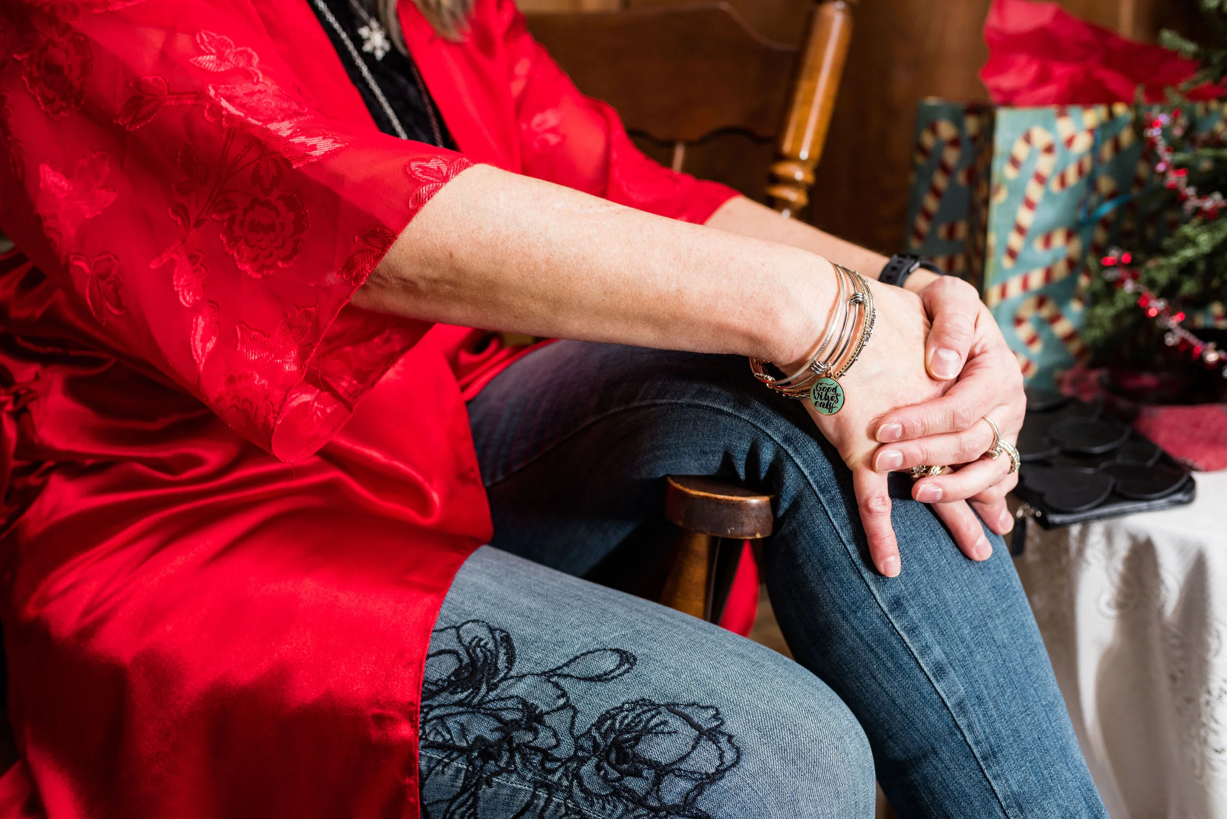
You can see the pretty floral detail on the sleeves of the kimono and how fun that it goes with the floral embroidery on my jeans. I just bought these jeans on clearance at Kohl’s. They are Simply Vera/Vera Wang brand. They fit well and have a good amount of stretch and the skinny legs will work great in boots.

My black velvet tee was a Christmas gift from my spouse last year. The tee is a brand called City Streets. One or both of my daughters usually go shopping at least once with him, to help him choose gifts. He had to do it all by himself when the girls were younger. How did he manage? Ha, ha. He usually does pretty well. My best ever gift was this computer from four years ago. I wouldn’t be blogging if he hadn’t gotten me this wonderful Apple. What is one of your favorite Christmas gifts?

I went for silver and black for my accessories. My silver bangles you can see in the above picture. I also added two silver necklaces. A long fringe pendant and a snowflake pendant.

My little black heart embellished clutch and my Ralph Lauren boots are both thrifted.

Here are a few other pictures that I was inspired to throw in because of the song.

A sable, the keys and a deed. Ha, ha

I hope you enjoyed this post. Do you think this outfit worked for the song? I’d love to hear your thoughts, so leave me a comment or two.

It is hard to believe Christmas is in four days. Yikes! I have so much to do. My brother is coming into town tomorrow on his way to see my mom for a few days. I am glad he will be with her, since with this seasonal job I won’t be off contract until January 4h. I hope you are prepared for the upcoming holiday. I’ll have two more outfits, next week in this series, so keep a look out for those.

Have a great weekend!

Photo credit Rebecca Trumbull.

Enjoy this version of Santa Baby by Eartha Kitt.


Outfit Inspiration - It's the Most Wonderful Time of the Year

Christmas can truly be one of the most wonderful times of the year, but I know it can also be an extremely hard time for people who have gone through loss, are struggling with illness or things like financial strain and relationship stress. Often, the holidays become a mad race to get everything done that we feel we have to do and we end up feeling down and disappointed. Even amidst the struggle and the strains of life, I think we can still see Christmas as a very wonderful time.

Christmas is typically a time we reconnect with loved ones. It can also be a time to do things we find hard to do the rest of the year, like listening to special music, baking, attending holiday parties and other activities like Christmas shopping and gathering with friends. In the church environment there are also special services, kids programs and service activities like caroling and helping at the local food pantries and city missions. Yes, it is a very busy time, but I also believe that the basis for many of these activities is what makes it the most wonderful time of the year.

Serving others and thinking about that special gift we are going to buy for a friend or family member gets us outside our own boxes. It creates in us an others’ centered mentality and it is in that, that we find joy. Not only that, but the basis for Christmas from the very beginning was the unselfish act of an Almighty God, towards His fallen creation.

What I instantly think of when I hear Andy Williams’ It’s the Most Wonderful Time of the Year, are shopping malls and stores all decked out in Christmas garlands and lights while Christmas music plays overhead. It also makes me think of loud family gatherings around the Christmas tree opening presents with laughter and joy.

For this outfit I wanted to look festive, but also like myself. I wasn’t going to see the King, I was going to the mall to shop for my family. Ha, ha.

This wonderful red plaid Requirements blazer was a thrift store find. I just love the treasures I find at thrift stores. I could never have the large wardrobe I do if it weren’t for thrifting. I still shop quite regularly at full price retailers, but I have found some of my most special, unique pieces at thrift stores. Many of them, like this blazer are by brands that no longer exist; the added benefit of thrifting.

The fit and structure of this beautiful jacket is perfect and will definitely get used long past the holiday season. I am excited to try it with various colors and pieces. It is a wool blend, but fully lined so I don’t have to worry about my skin’s aversion to wool.

My black long sleeve embellished snowflake tee was purchased a number of years ago. I believe it is from Kohl’s and is a brand called MCCC Sportswear. You can see holiday sweatshirts from this same brand at Kohl’s by clicking on the link. They also have long sleeve tees here.

You can also see my Believe pin. If you have ever watched Miracle on 34th Street, then you know the significance of the word believe. I have noticed over the last few years, the word believe is popping up everywhere. Whether you believe in Santa, the Spirit of Christmas, the person of Christmas, Jesus Himself, or in yourself, the idea of belief in someone or something is pretty important in our world.

I personally believe in the birth, life, death and resurrection of Jesus Christ and that is what I think of when I see the word believe, but I also love that this idea of belief has become a positive message to all of us, especially young people, who are often told they will never measure up or amount to anything. The beauty and simplicity of the Gospel message is found in this idea of belief. God’s word says,

For the Scripture says, ‘Whoever believes in Him will not be disappointed.’
— Romans 10:11 (NASB)

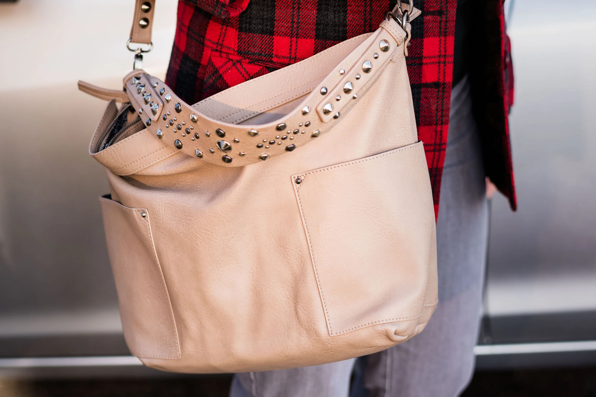
At first I was going to wear knee high boots, but then I thought the pants didn’t really look right with them, so I opted for this pair of Sonoma booties from Kohl’s. I like the contrast of the gray, black and red with the taupe of the boots and bag. I didn’t bother with any other jewelry since I felt the embellishments on the top and bag, along with the pin, gave the outfit enough punch.

What do you like to wear when you shop? Do you dress up or do you prefer to just go out in your sweats? I’d love to hear your thoughts. What do you think about the word, believe? Is belief something that is important to you? Please leave me some love in the comments.

Here is my favorite version of It’s the Most Wonderful Time of the Year by Andy Williams. I’m not so sure about the music video, but it is colorful. Ha, ha

I’m including a few shopping links of all things plaid, for you to look at. Maybe you still have some Christmas shopping to do and one of these links will inspire you. These are affiliate links, which means if you click on a link, I get a few cents. If you purchase something through one of my links, I might get a little more. Every penny helps.

I hope these posts are inspiring you and bringing back memories of your own childhood Christmases. Have a great weekend and stay healthy for the holidays.

Photo credit Rebecca Trumbull.


Flat Lays in the Flesh - Capes

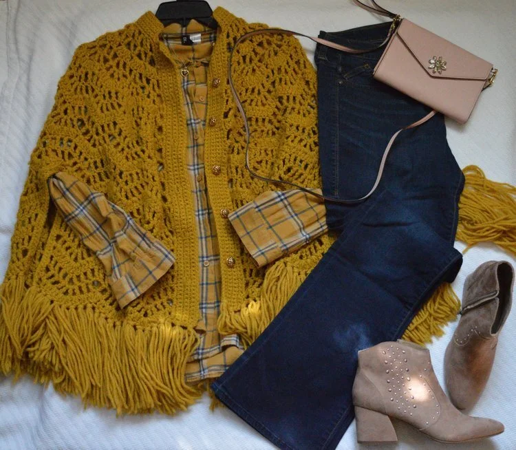
This is the last of my Flat Lays in the Flesh outfits. I picked out the four that really appealed to me, but that doesn’t mean the other Flat Lays weren’t also interesting and possible “in the flesh” outfits. These four were the ones that appealed to me for various reasons and it has been fun to see how they actually looked on a person, namely me. For your information, so that you know how you might measure up, I am 5’5”, 171lbs. I would feel more comfortable in my skin if I was about 150 or 155, so that is a goal I am working towards, albeit very slowly.

Today’s outfit in the flesh features the Fall 2019 trend of capes. I think capes were very popular back in the day, especially in Medieval Europe. They have come and gone over the years and typically when we hear the word cape we think of super heroes donning their spandex suits and adding a cape as a finishing touch; think Superman, Batman and Robin or even Thor. While capes came back this year, I personally haven’t seen very many of them floating around in the stores or donning women walking down the street.

Flay lay and photo by Amy Christensen

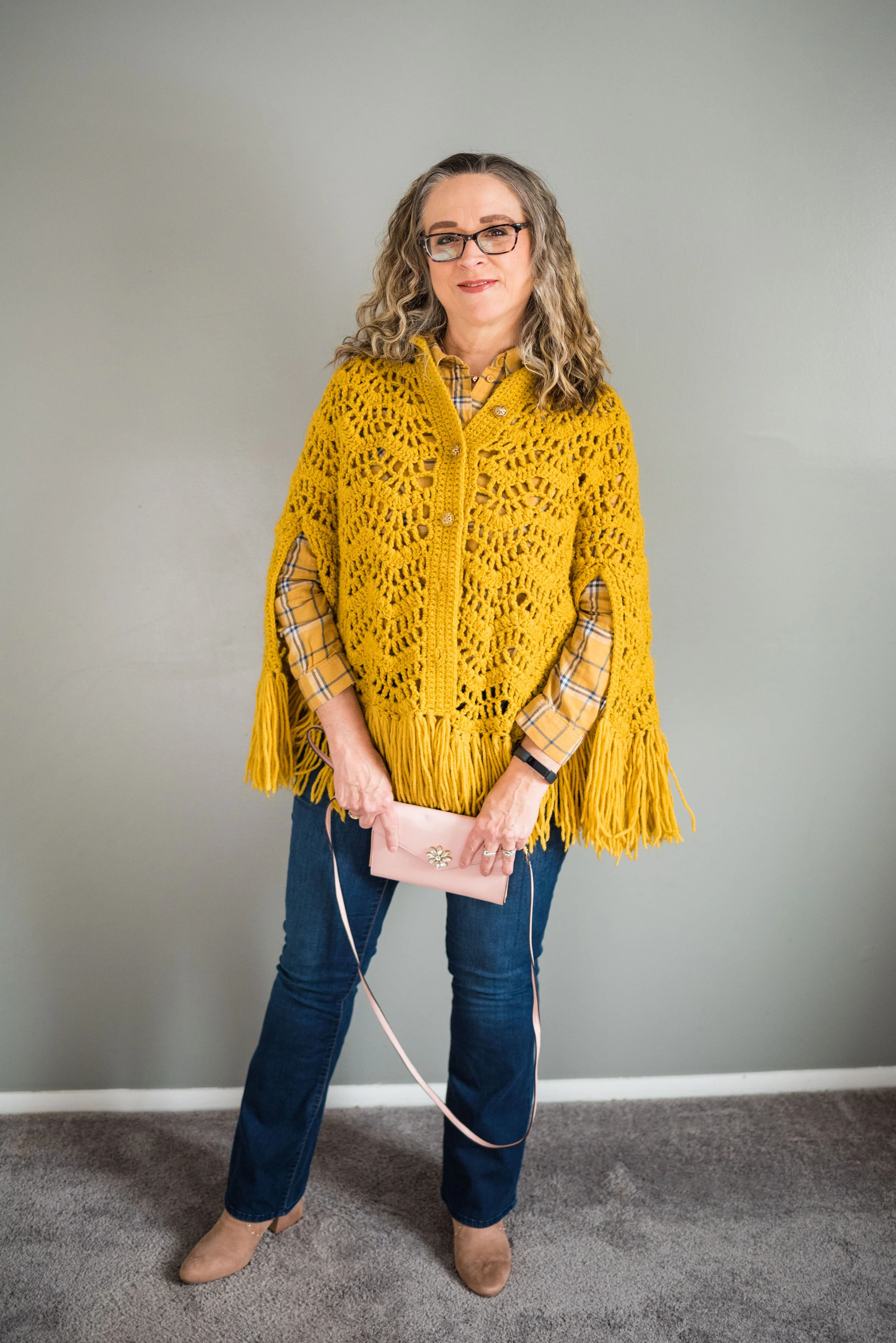
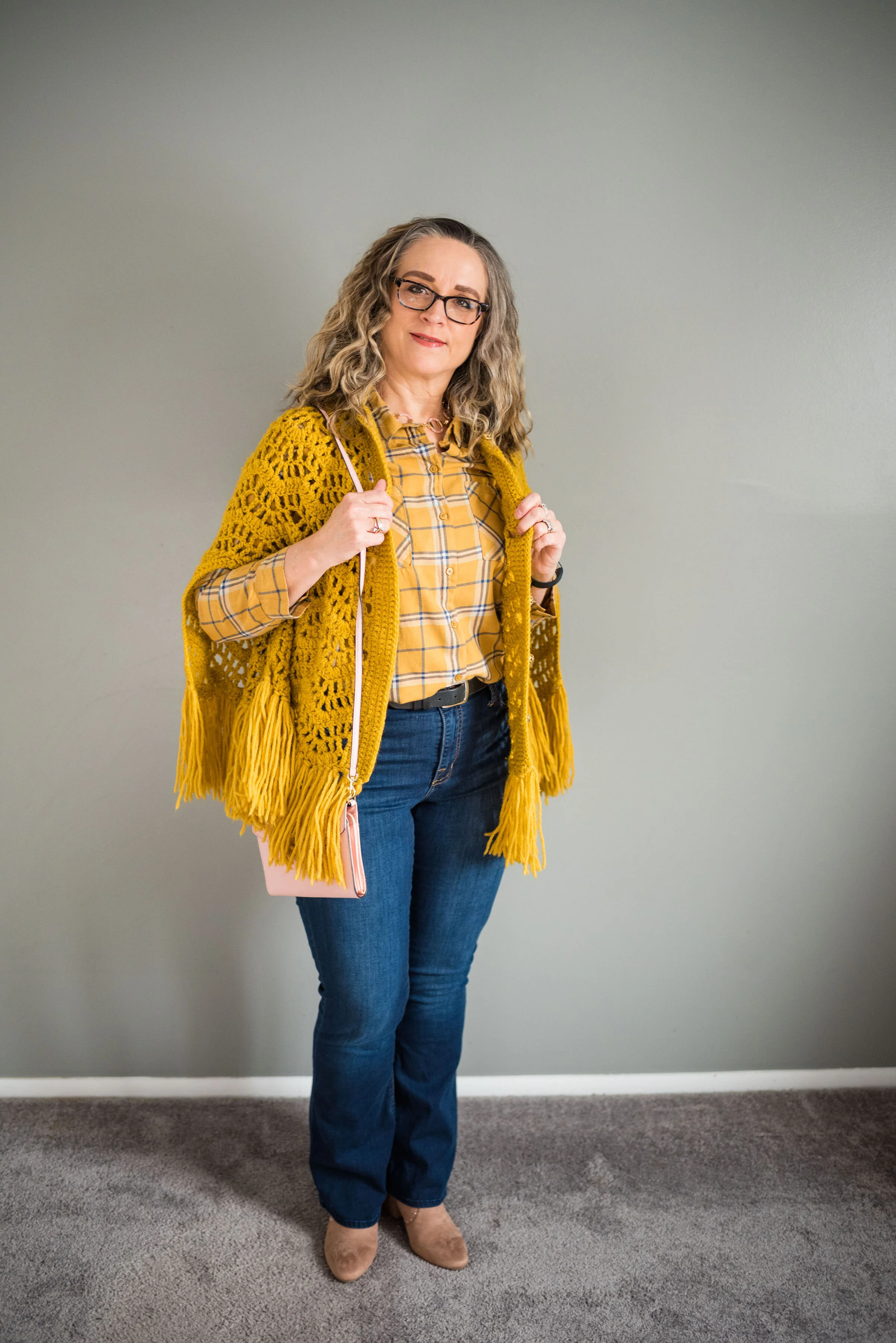
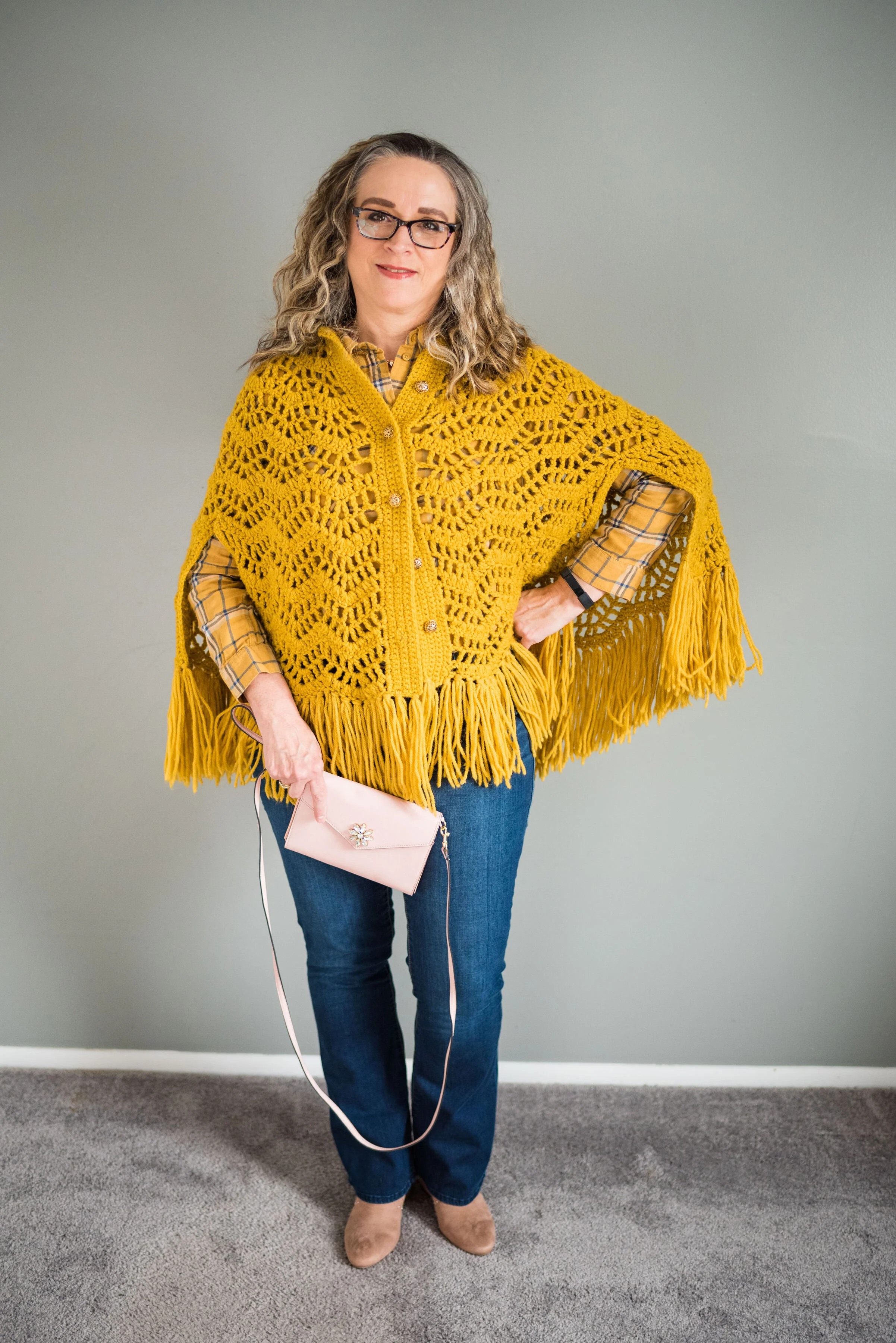
I know not everyone is buying into the mustard trend, but I really do like this rich sunflower yellow cape that I found while thrifting. I like that it is a crafted piece, made by hand and has the fringe, which is so indicative of a bohemian look. Here is the outfit in the flesh.

My yellow thrifted plaid shirt is Divided brand from H&M. I had no idea when I found it how well it would go with this knit cape. I love plaid and since I have been on the yellow train, it makes sense that I would buy a yellow plaid shirt, especially one from a thrift store. The plaid print includes a little blue, white and blush.

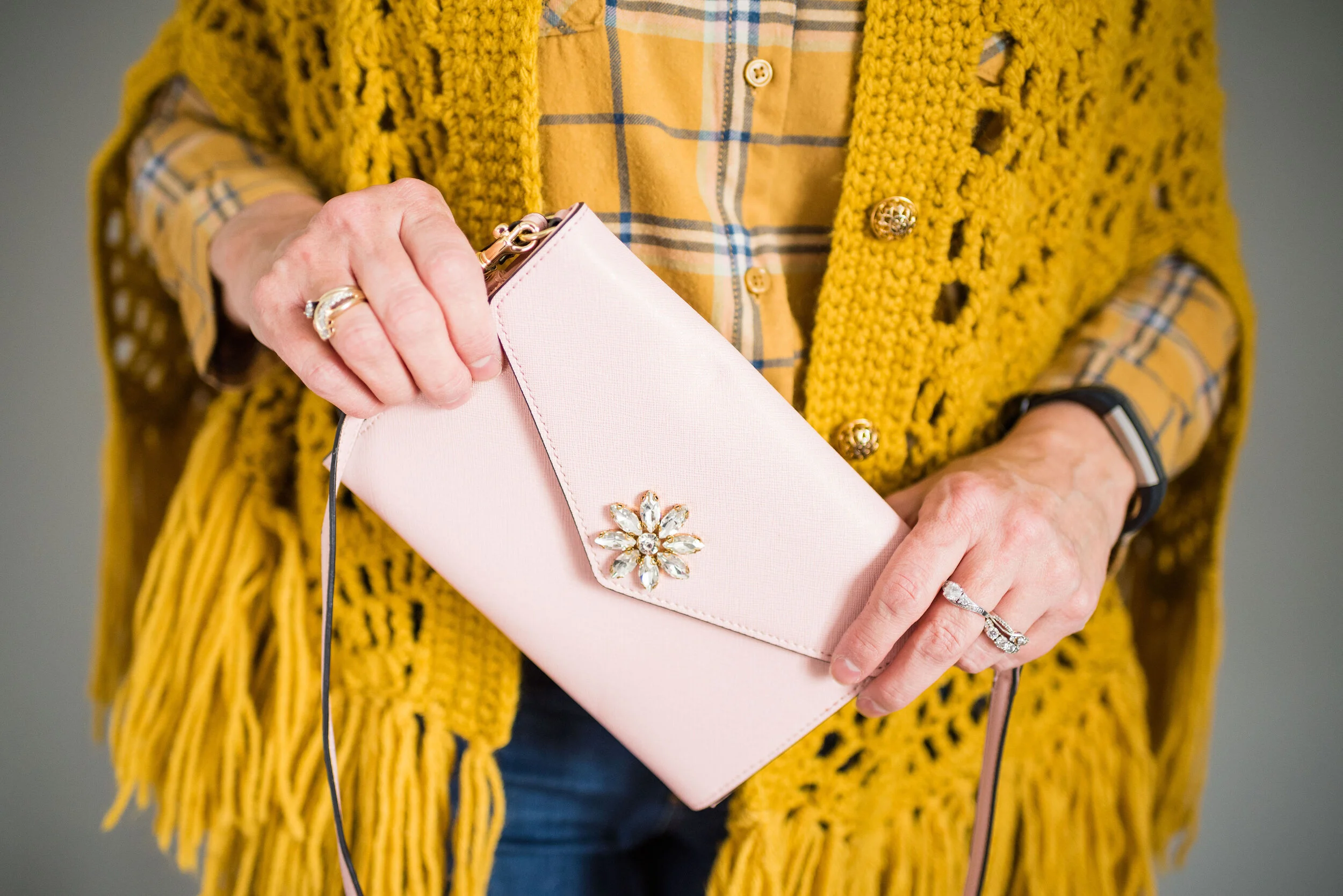
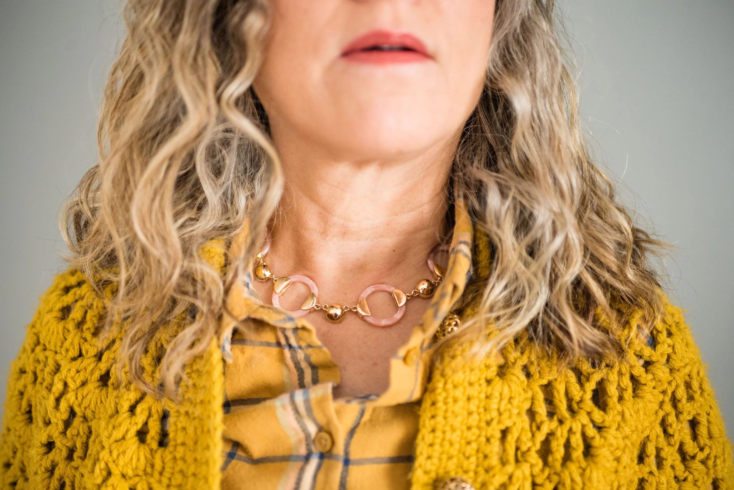
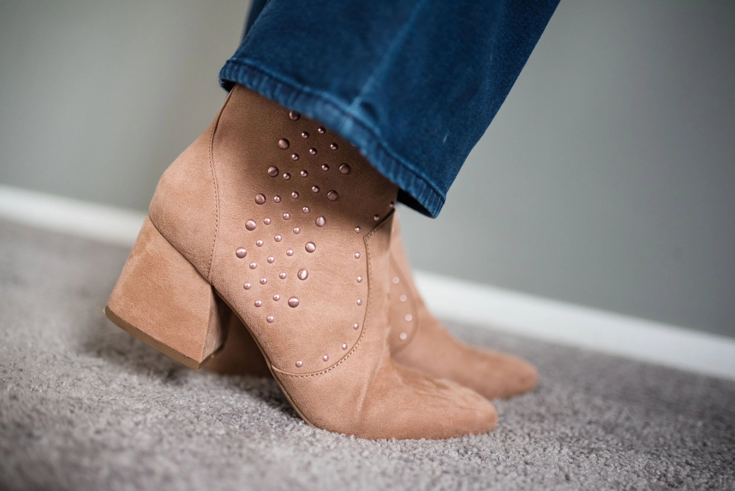
Drawing on the blush in the shirt, I went with blush accessories. My clutch I found on clearance at Meijer. My necklace was a JC Penney clearance find, and my SO ankle boots with the block heel, were a Kohl’s clearance purchase.

My Rock and Republic boot cut jeans are more like jeggings than jeans, but they have a zipper and button front, as well as regular pockets. They are just made from a stretchy fabric and are easy to move in.

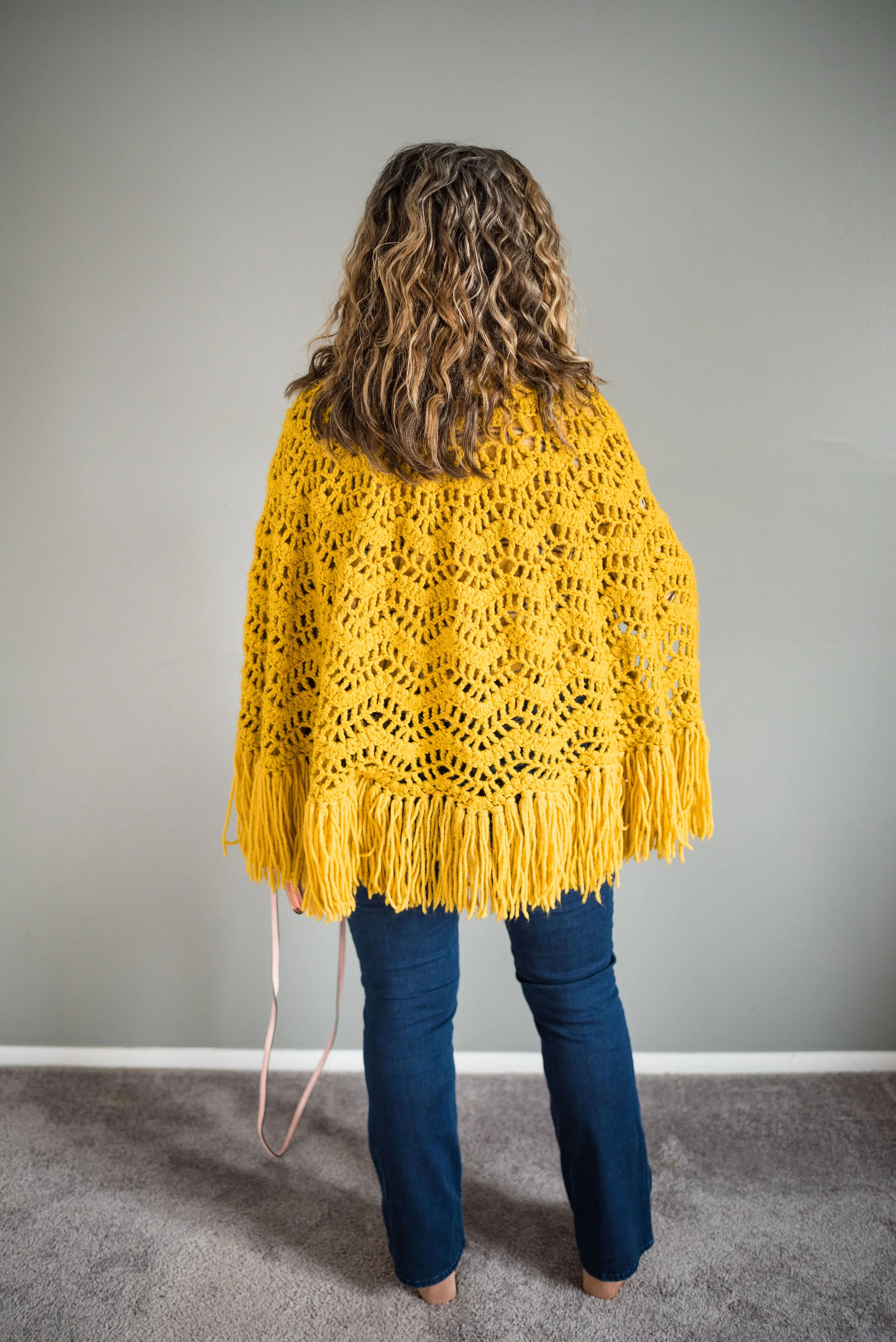
Here is a quick shot of the back of the cape. I just love the fringe around the bottom.

What do you think of this outfit? Would you wear a cape? Just to clarify, capes are usually shorter like this one and cloaks usually come past the knee, with some versions reaching the floor. Do you know how to knit or crochet? That is something I wish I had time to do, but not right now. My mom used to crochet afghans and doilies and I had an aunt that used to crochet stuffed animals like bears.

I’ve included a few shopping links for capes and for yellow pieces that I think are fun. I hope you are having a great Tuesday and thanks so much for stopping by the blog.

Photo credit, except where specified, Rebecca Trumbull.

These shopping links are affiliate links. When you click on a link, I get a few cents. If you purchase something through my site, I get a little bit more. All opinions are my own.


Flat Lays in the Flesh - Animal Print

On Thanksgiving I will be starting a holiday series that I think you might find inspirational and interesting. That is all I am saying about that right now, just to whet your appetites. Until then I thought it might be fun to revisit a few of the Fall Trends 2019 that I talked about through the medium of flat lays. If you don’t know what a flat lay is, it is simply a way to show an outfit by laying out the pieces on a flat surface, rather than showing them on a person. I find so many flat lays look amazing, but I am always left wondering, what does the outfit look like on an actual person. I hope you don’t find this too repetitive, but I decided to take four of the flat lays I did for my Fall Trends 2019 series and show you what they look like, in the flesh. Let’s get started.

This first outfit features a snakeskin jacket that I found thrifting last spring. This was the flat lay from the original post, which focused on the fall trend of animal prints.

Photo by Amy D. Christensen

This is what the outfit looks like in the flesh.

It was only about 10 degrees outside and as much as I like to play the tough chick, I decided, forget that nonsense, so my daughter/photographer turned her spare bedroom into a studio. She is so good at being flexible and working with what we have. She does such a great job with natural light. There was no flash in any of these pictures.

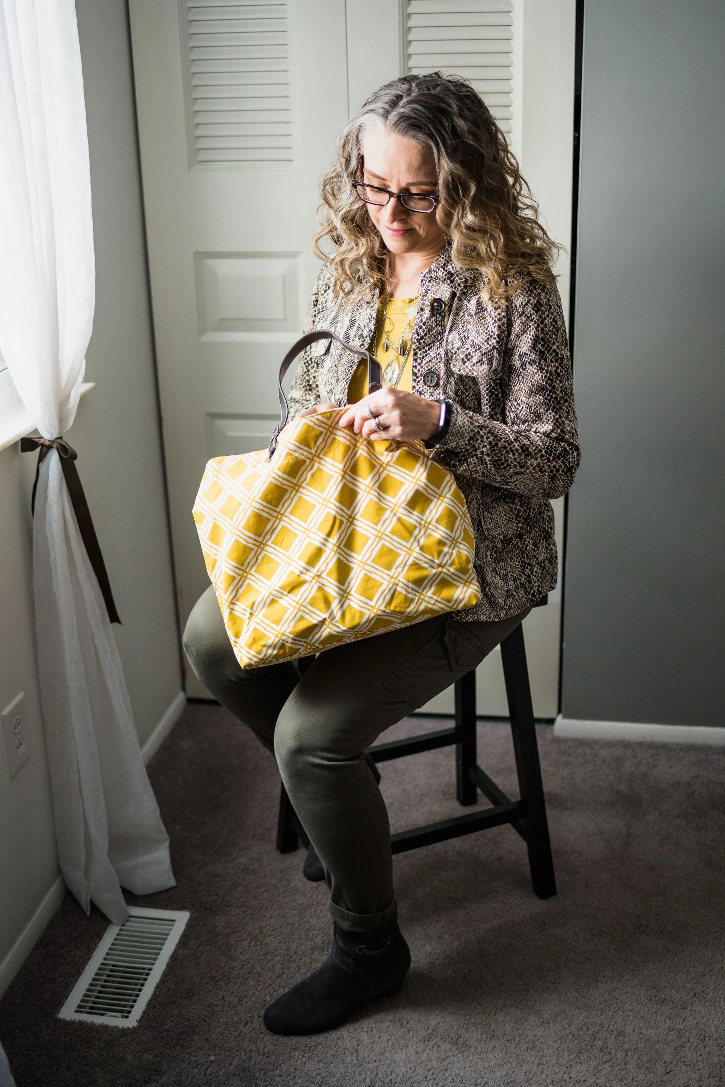
This Liz Claiborne snakeskin jacket has a little bit of stretch to it, making it very easy to move in. I paired it with a thrifted Banana Republic sweater for this outfit, but you could easily swap in other pieces like a button up blouse, a graphic tee or a lighter weight turtleneck for all manner of stylish vibes. A jacket like this is a work horse in your wardrobe and can be dressed up with a skirt or dress and heels; or dressed down with distressed jeans and sneakers.

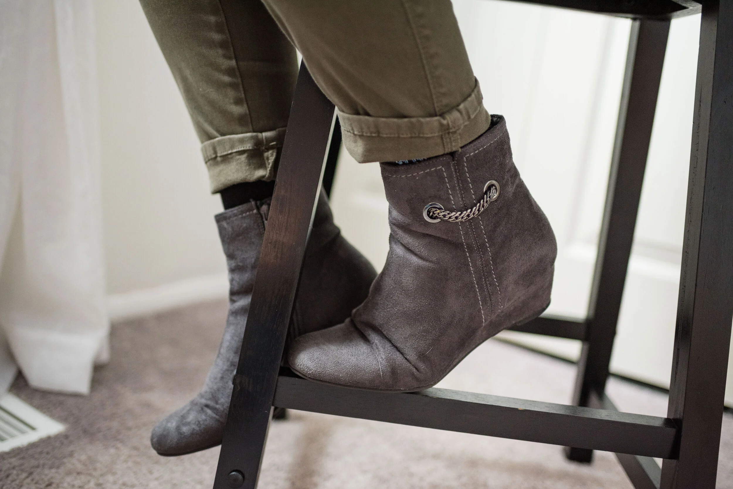
I went for a work wear look, pairing the sweater and jacket with my Gloria Vanderbilt cargo skinnies and my Impo wedge ankle boots.

I chose the yellow tote bag to enhance the sunshiny vibe of the outfit, making this a good combination for a cloudy, fall day. This was another thrifted piece.

I thought layering a few fun necklaces would make for an added statement. In the original flat lay I only had the shorter necklace, but just recently I found the long pendant necklace at JCPenney on the clearance rack. They don’t match, but I think the combination works well against the yellow back drop.

Do you think this flat lay turned out to be a good outfit? Do these pieces work well together? Why or why not? I’d love to hear your thoughts, so leave me a comment or two.

I’m leaving you with a few shopping links for fun animal print pieces. Remember Christmas is coming soon and there might be a person or two on your list, who would love an animal print piece. These are affiliate links, which means if you click on a link, I get a few pennies, and if you purchase something through one of my links I get a few more pennies. Ha, ha. I appreciate every penny I get.

Hope you all have a great weekend and thanks so much for taking the time to stop by the blog.

Photo credit (unless otherwise stated) Rebecca Trumbull.


Pantone - Autumn/Winter - 2019 - New York Palette Recap

I was going to start the Pantone London color palette today, but decided to do a recap of all the New York colors. Some people have told me they like to see all of the outfits and colors together in one post, so here we go.

Outfit 1 - Chili Pepper and Bluestone

Outfit 2 - Fruit Dove and Galaxy Blue

Outfit 3 - Crème de Pêche and Rocky Road

Outfit 4 - Sugar Almond and Dark Cheddar


Outfit 5 - Orange Tiger and Eden

Outfit 6 - Peach Pink and Biking Red

I hope you enjoyed this look at the Pantone - Autumn/Winter - 2019 - New York palette. Which outfit was your favorite? I’d love to hear your thoughts.

Next week I’ll be starting the Pantone - Autumn/Winter - 2019 - London palette. Believe it or not, the only two overlapping colors this year were Galaxy Blue and Bluestone. Be sure to check that out next week.

Thank you all for being a part of my blogging journey. If you ever have something you would like to see me feature on the blog, send me an email. I’m open to new ideas and value your opinions and support.

Have a fabulous weekend!

Photo credit Rebecca Trumbull.

Pantone - Autumn/Winter - 2019 - Crème de Pêche and Rocky Road

I am not sure how the Pantone Color Institute decides the colors they are going to feature for each of their palettes. If you have been following me for a few years now, you can probably tell that many of the colors that appear on the palette are very similar to another season’s palette and are just called a different name. For example Tuesday’s Galaxy Blue was very similar to last spring’s Princess Blue.

Today’s outfit features two colors called Crème de Pêche and Rocky Road. Once again, my versions of the colors, do not look much like the Pantone colors, but it still gives us inspiration to pair to fall type colors together and pull it all together with a light gray.

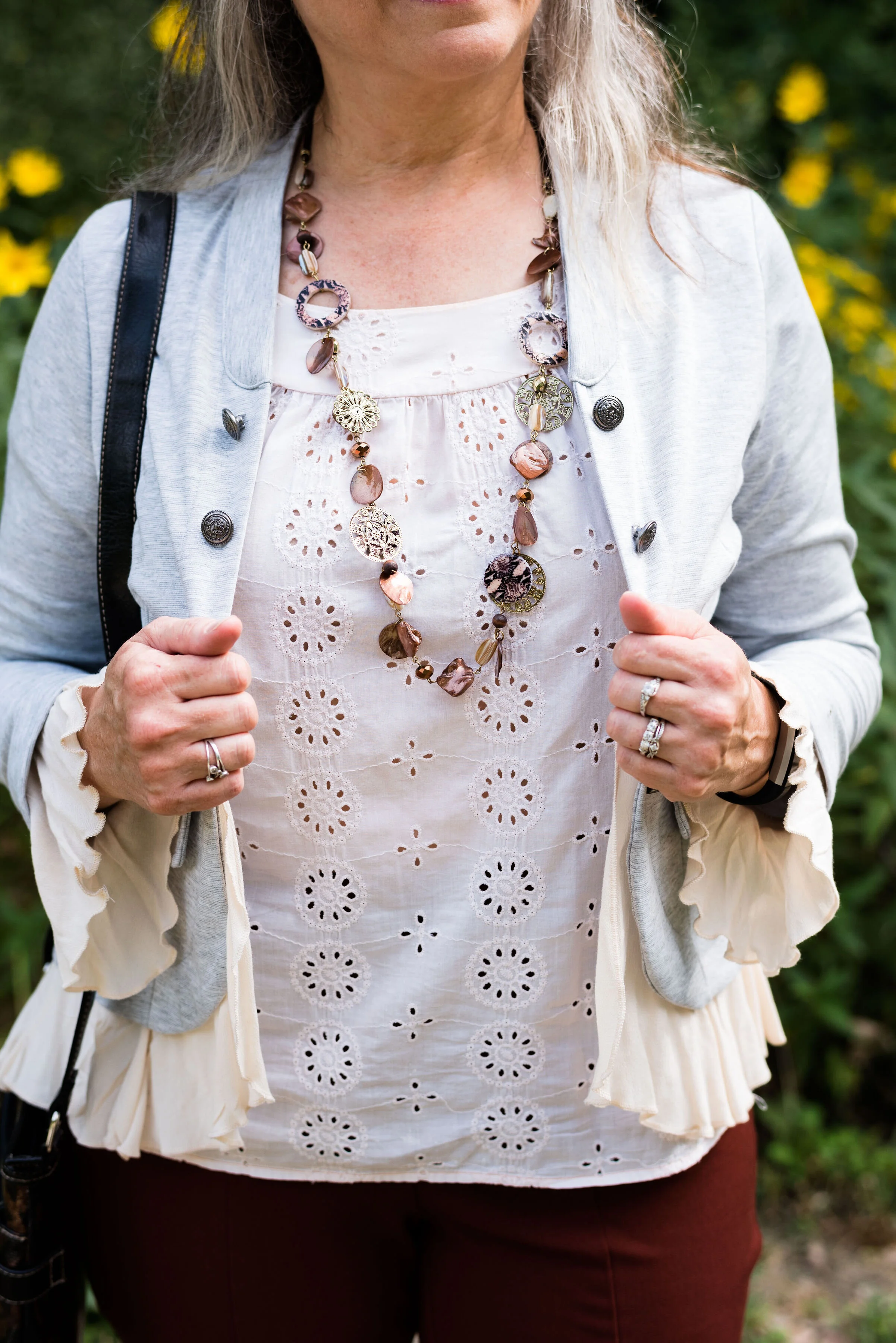
My Chico pants look much more orange in comparison to the Pantone color swatch, but I do like how this pair of pull on Ponte knit pants looks combined with the light peach top.

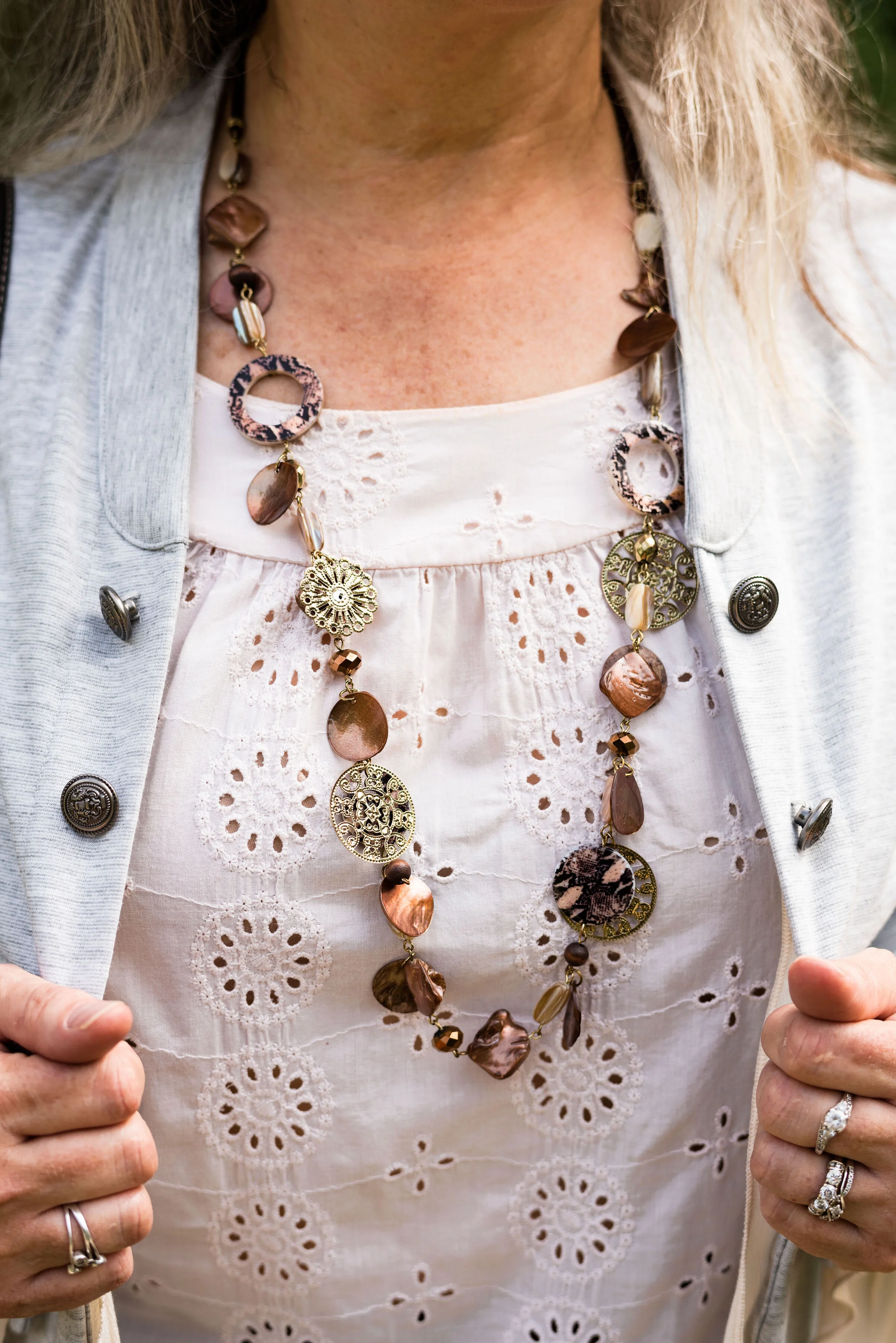
The light peach eyelet top was a thrift find and I wear it a lot in the warmer months. You can see a closer look at that and the necklace I chose in the picture below. I thought the necklace was a good compliment because of its similar colors.

This light gray, About A Girl, jacket was a fun find on the Kohl’s clearance rack. I like the military vibe of the buttons, but the surprising feminine detail of the ruffles on the hem and sleeves.

Another Kohl’s clearance find, I got these Sonoma boots at the end of last winter season. They are a faux suede and a different look that some of my others boots. I love the slouchy and buckle details. Yes, I do have too many pairs of boots, but can a woman who lives in the midwest, have too many? Ha, ha.

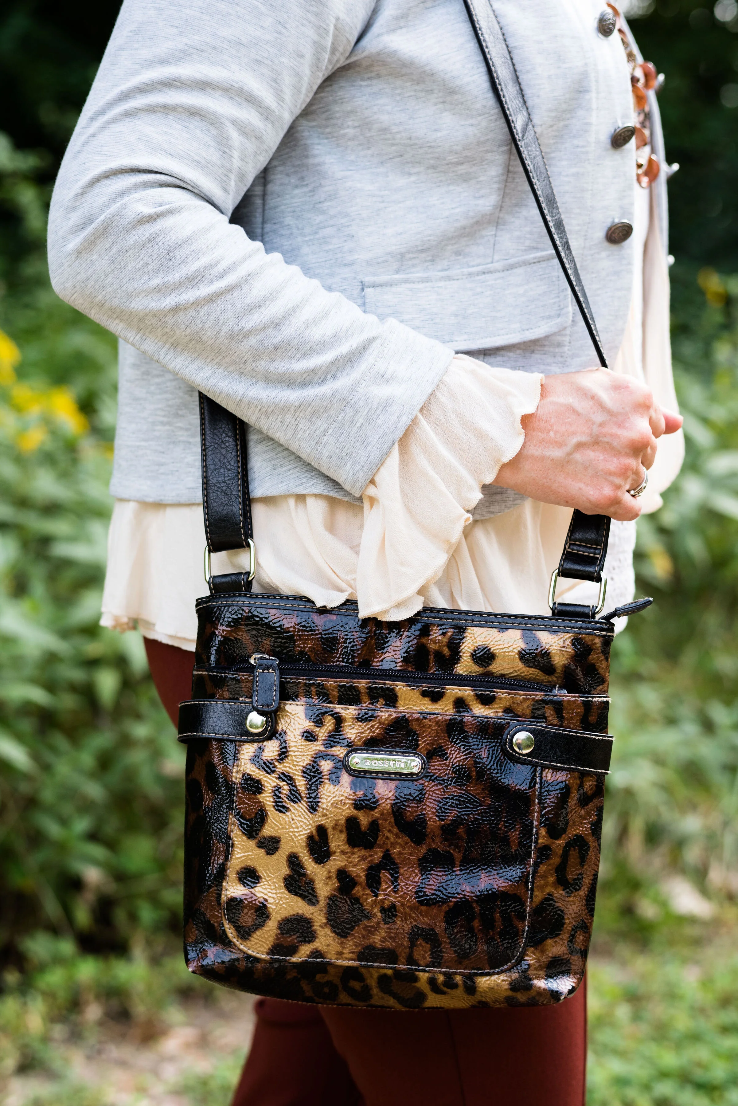
Here is the thrifted Rosetti leopard cross body again. I am planning on making this my “normal” every day bag, as soon as I get around to changing things over. How many of you change your purse on a regular basis? I have many more purses and bags than I actually use. I use them for the blog, so you can see the different styles and shapes, but more often than not, I carry a cross body bag like this. It is just so convenient for hands free shopping.

Here are a few more pictures. I really liked these photos, especially with the large rock and the yellow flowers in the background.

Although my colors were off, I hope you enjoyed this outfit. Do you have a favorite pair of boots you like to wear? What color are they? What do you think of these colors from the Pantone palette? Let me know your thoughts in the comments.

I hope you have a wonderful weekend!

Photo and graphic credit Rebecca Trumbull.

Pantone Autumn/Winter - 2019 - Fruit Dove and Galaxy Blue

These next two colors are described by the Pantone Color Institute as an “extroverted pink” and a “thoughtful blue”. I like that combination of terms, in the same way I like this combination of colors. We often think of extroverted people as popular, charming and talkative, while thoughtful people could be described as people who think more than they talk, or people who are on the look out for ways to help others. I am not an extrovert, but an introvert. I have a hard time in crowds, get tired of too much noise or activity and I need my alone time. Wearing a bright pink like this is my way of standing out in the crowd, without saying very much.

You might think these three colors are more spring like than fall like, but colors transcend all seasons. I do like darker, richer colors for fall and lighter, breezier colors for spring, but that is my personal opinion. What really makes an outfit more season specific are the textures and accessories you incorporate into it.

i’ve worn these bright blue Ruby Rd. pants on the blog before. You can see them with a light blue sweater, a plaid bomber jacket, and a multi-colored kimono. My friend was getting rid of these and I took them, not realizing how much I would actually wear them and used them for the blog. This royal blue color seems to keep coming around again and again.

I have had this thrifted Ralph Lauren pullover sweater for a while. I don’t wear short sleeve sweaters too often, because in the summer it is too hot and in the fall, winter and spring it is too cold. However, for some of these warm fall days, where the temps are still in the 70’s in the day and 50’s at night, a short sleeve sweater is a good option. Can you tell in the picture below I am trying to stand up straight and suck in my rolls? Ha, ha. Well, I am! Just being real!

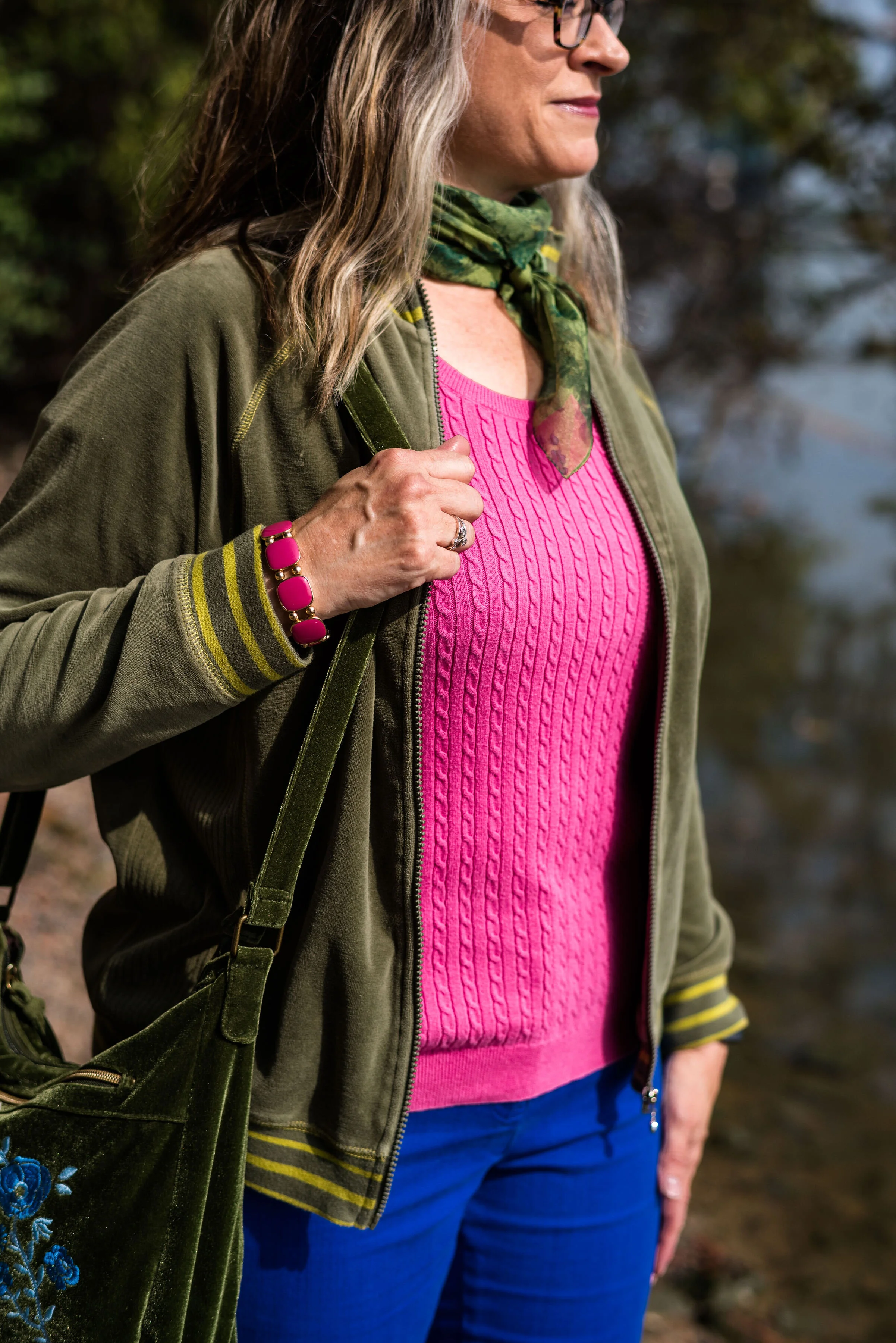
In addition to the two New York palette colors of Fruit Dove and Galaxy Blue, I wanted to incorporate one of the classic colors. I thought it was interesting that they included this olive green, which they call Guacamole. In the past, the classic color palettes usually contained a dark blue, a gray, some sort of cream or ivory and either a camel or a shade of brown. This was the first year they included a green. At first, I thought that was a rather odd choice, but once I got used to the idea, I realized this green would work with a number of color combinations. I pulled out my velour jacket, knowing it would be a great accompanying piece for this outfit.

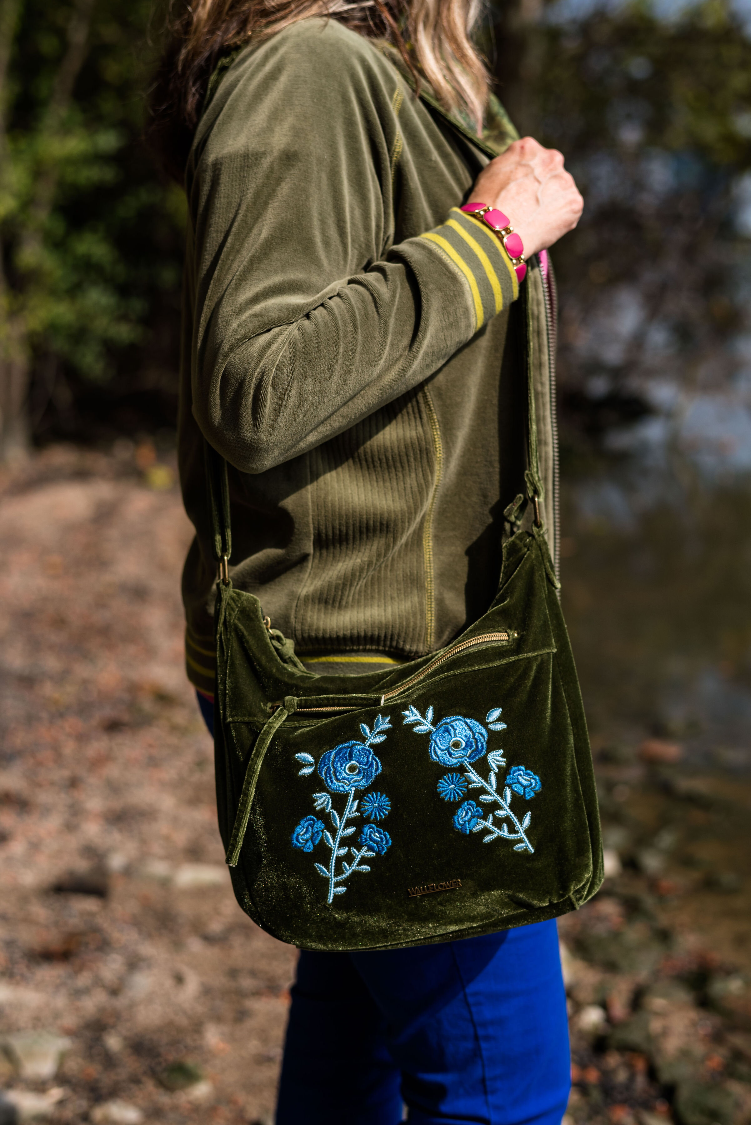
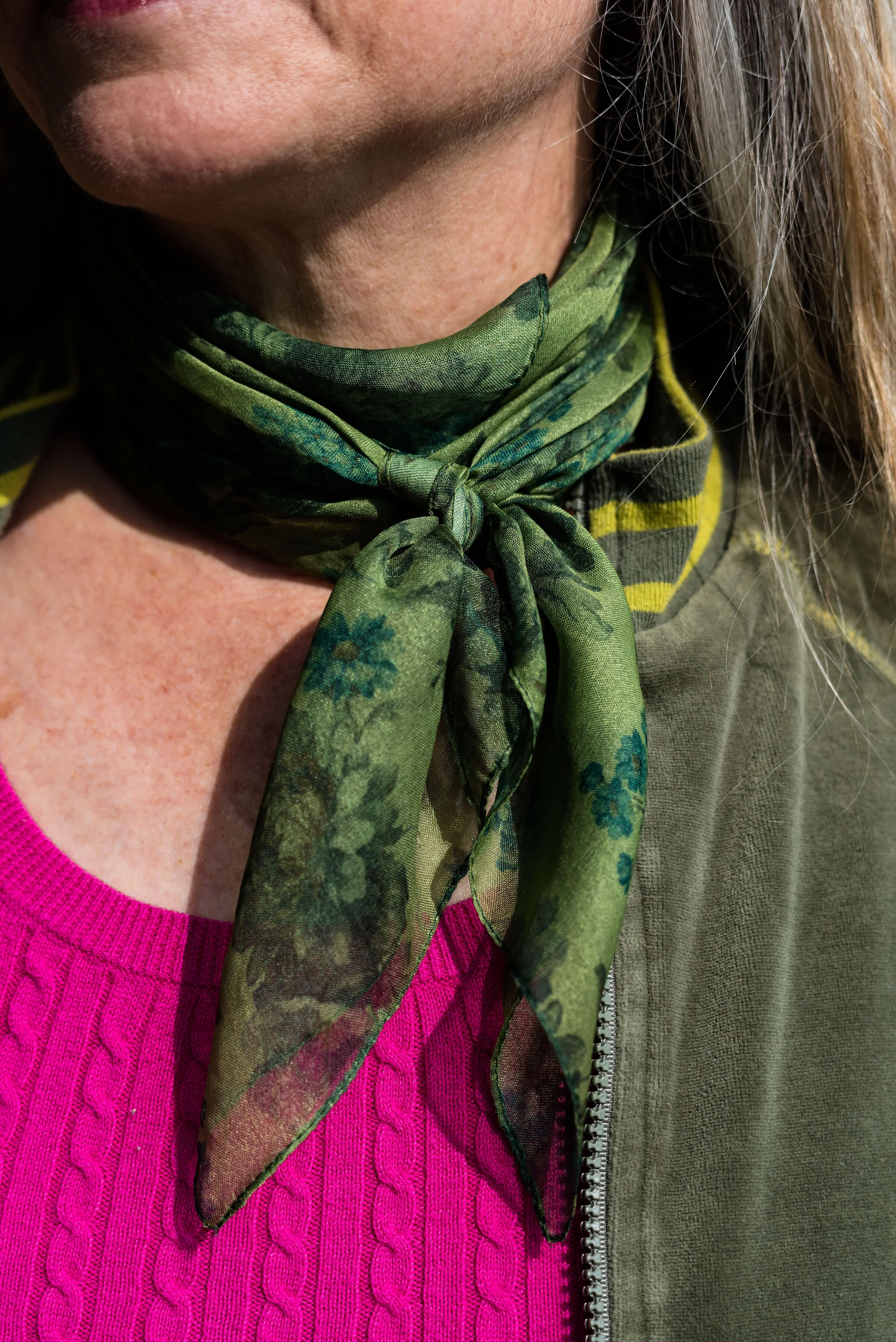
Since I pulled in the Guacamole, I decided to go for green accessories. My SO olive booties, the velvet floral bag and the green neck scarf bring a continuity to the outfit and tone down the bright blue and pink.

Believe me when I say, it was too hot to be wearing all of these layers. As soon as we finished at outfit, I was undressing as we walked back to the car. Ha, ha.

What do you think of this outfit? Would you wear these colors? Would you wear these colors together? Are you an introvert or an extrovert? Do you like to wear clothes that attract attention, or do you like to wear pieces that make you disappear? I’d love to hear your opinions and thoughts. Your support keeps my blog going, so leave a comment or two.

I’m leaving you with a few shopping links for pieces in these colors. These are affiliate links. All opinions are my own.

Photos and graphic credit Rebecca Trumbull.


Fall Trends - 2019 - Part 2

If you missed last Thursday’s post, I’ve started a short series on Fall 2019 Trends. Every season the runways are filled with with new colors and trends. This fall the trends include things we are familiar with like animal prints and metallic sheens to rebooted trends like patchwork, tiny bags and shoulder pads. I encourage you to pick and choose the ones that you feel most comfortable with and maybe go for one that pushes you a little outside your comfort zone.

The next trend I am featuring would, perhaps, be the one that would be a little outside my comfort zone, but one that I felt I could easily adapt to with pieces I already had in my closet.

Trend 3 - Romance Gone Goth

If you want to see the original looks from the runway click on this article by Who What Where titled These are the 9 Biggest Fall 2019 Trends, Period. Of course that is a matter of opinion. Ha, ha. I changed the name to Goth rather than Grunge, because if you do your research, Goth is head to toe black with lace, leather and more form fitting wear. Grunge is more about torn jeans, flannel shirts, Doc Martens, and while black is a common grunge color, other dark colors like maroon, forest green and indigo are also common.

My version is a lot less revealing and personifies me. My outfit is, also, not true Goth, because it has color. It is also not really Grunge either. Don’t believe everything you read on the internet. Do your research.

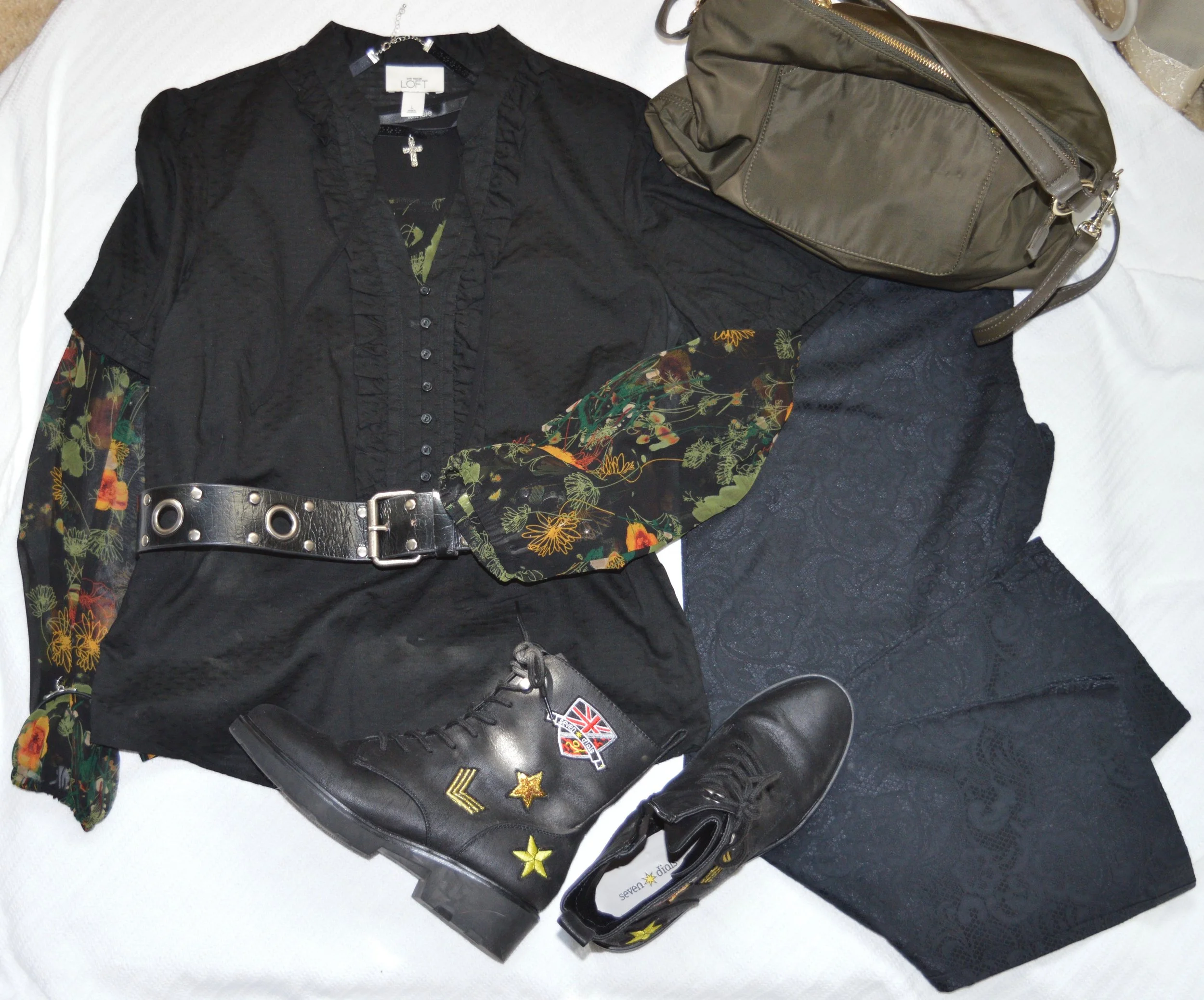
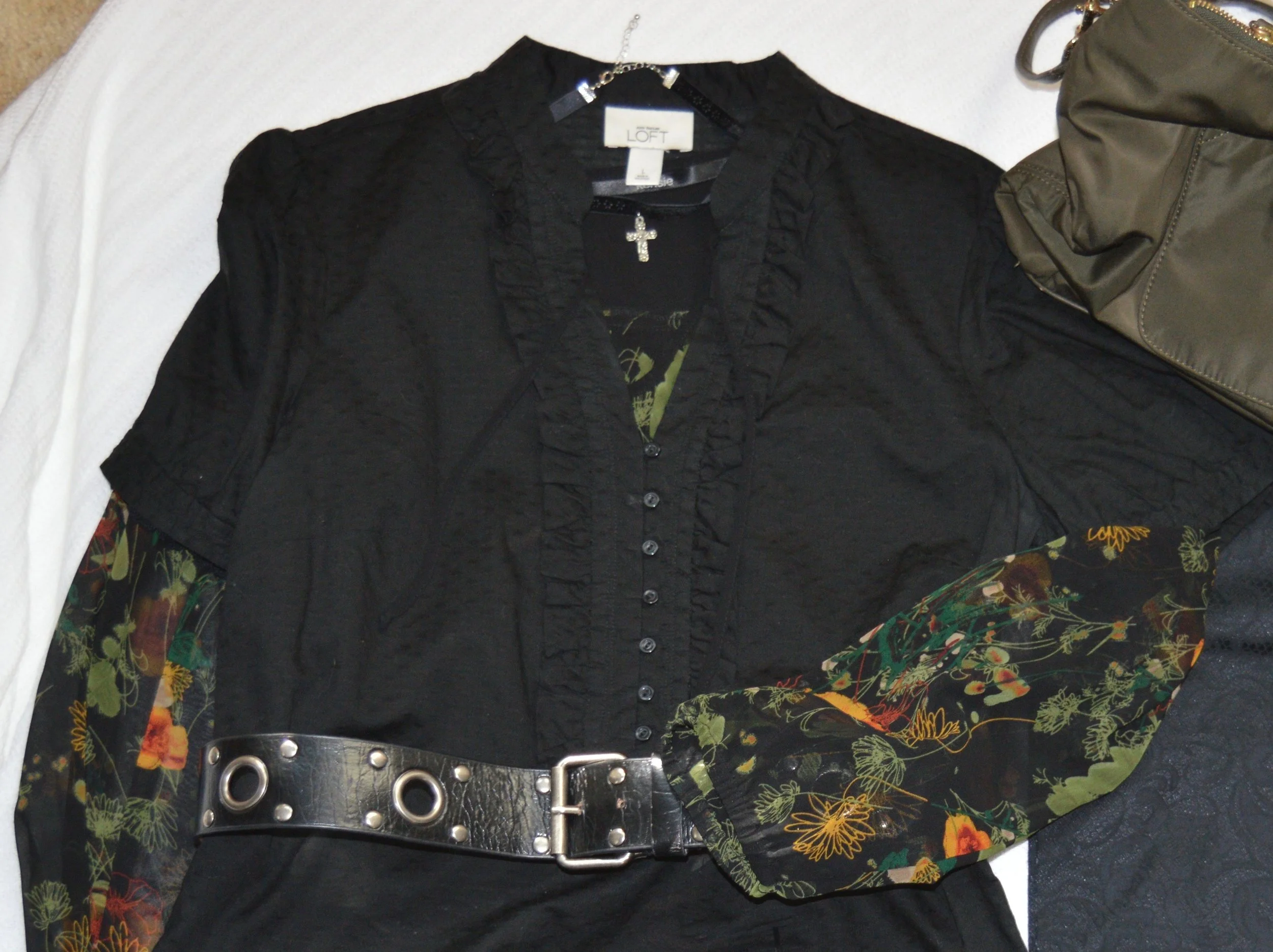
For this look I chose three pieces that I would term romantic. This short sleeve ruffled top was thrifted and is Loft brand. The sheer blouse that I put underneath was my way to add another fall trend, that of dark florals, as well as add, just a touch of color. This is a brand called Kensie. I also thought the wide belt and the cross choker added a touch of metal that is often associate with Goth outfits.

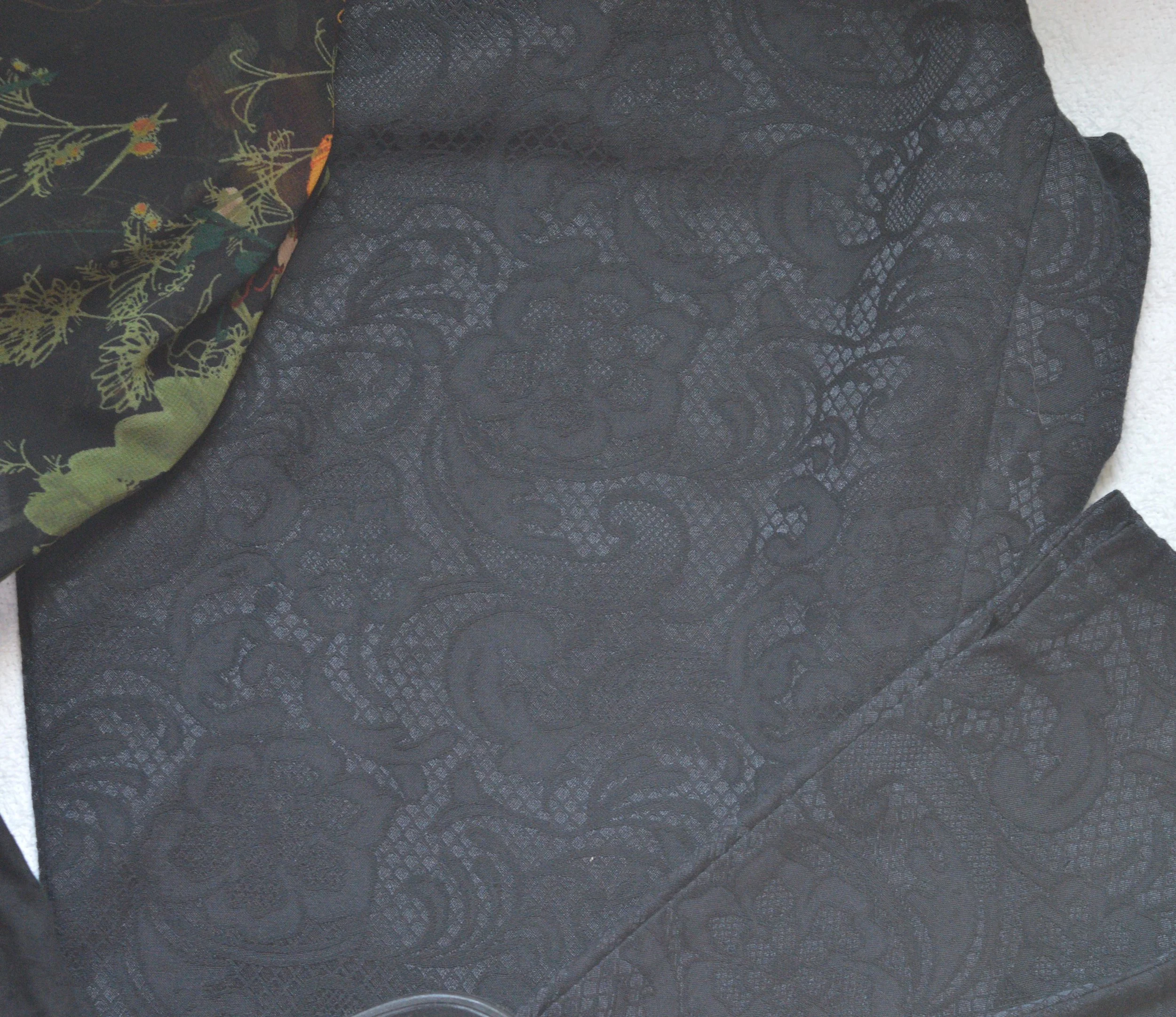
These Apt. 9, faux lace pants I’ve worn before on the blog, You can see them styled with a multi-print tunic, and with a shimmery taupe top. Lace is another fabric or pattern that we often associate with romance, so it seemed appropriate to use them for this Romance Gone Goth outfit.

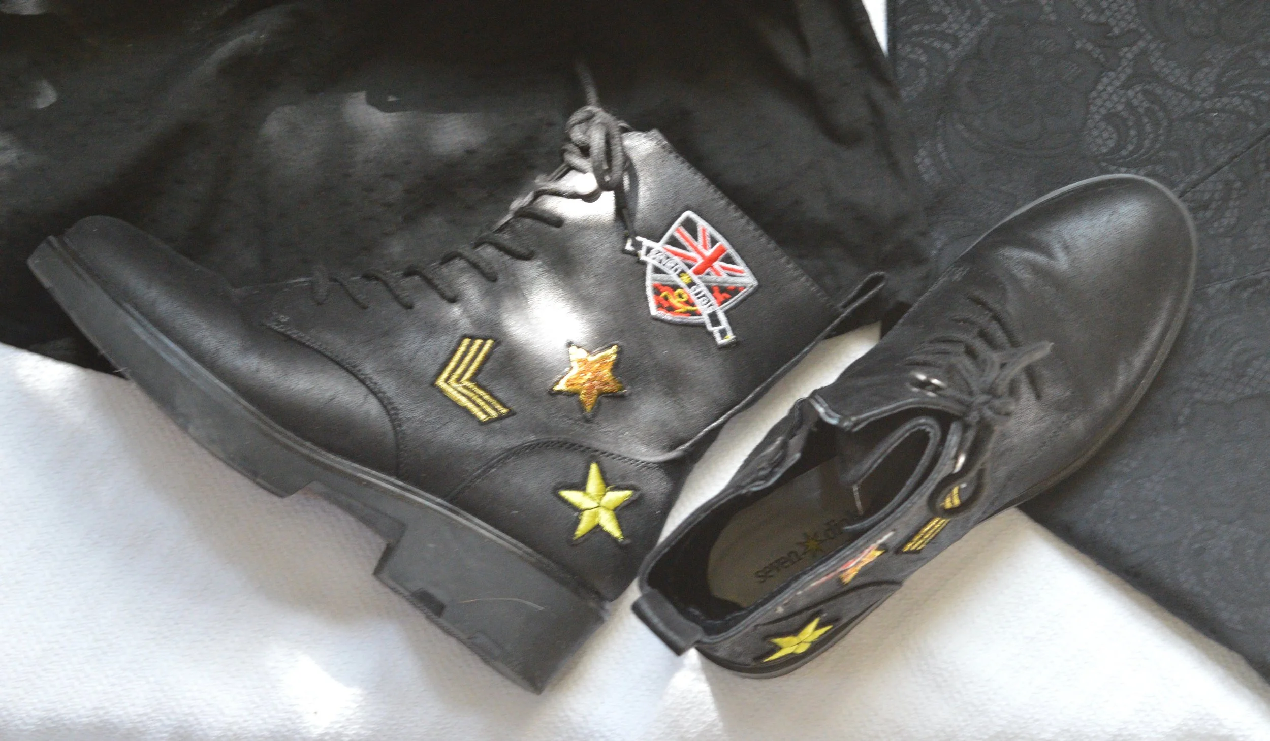
My black, Seven Dials, combat boots seemed the perfect choice for this faux Goth look. True Goth would not have any brightly colored patches.

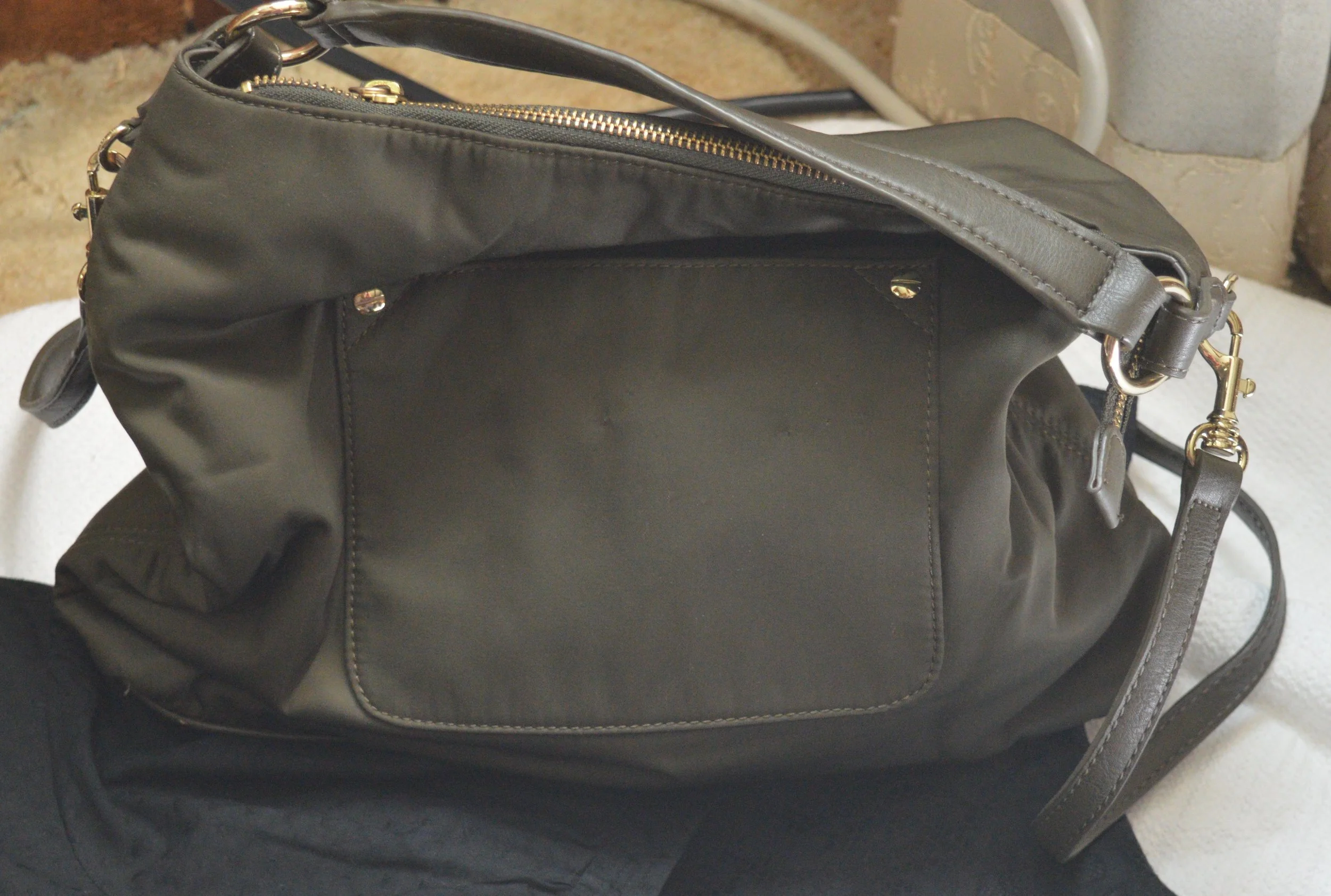
The bag is totally not Goth, but I thought it went nicely with the green in the floral under-top.

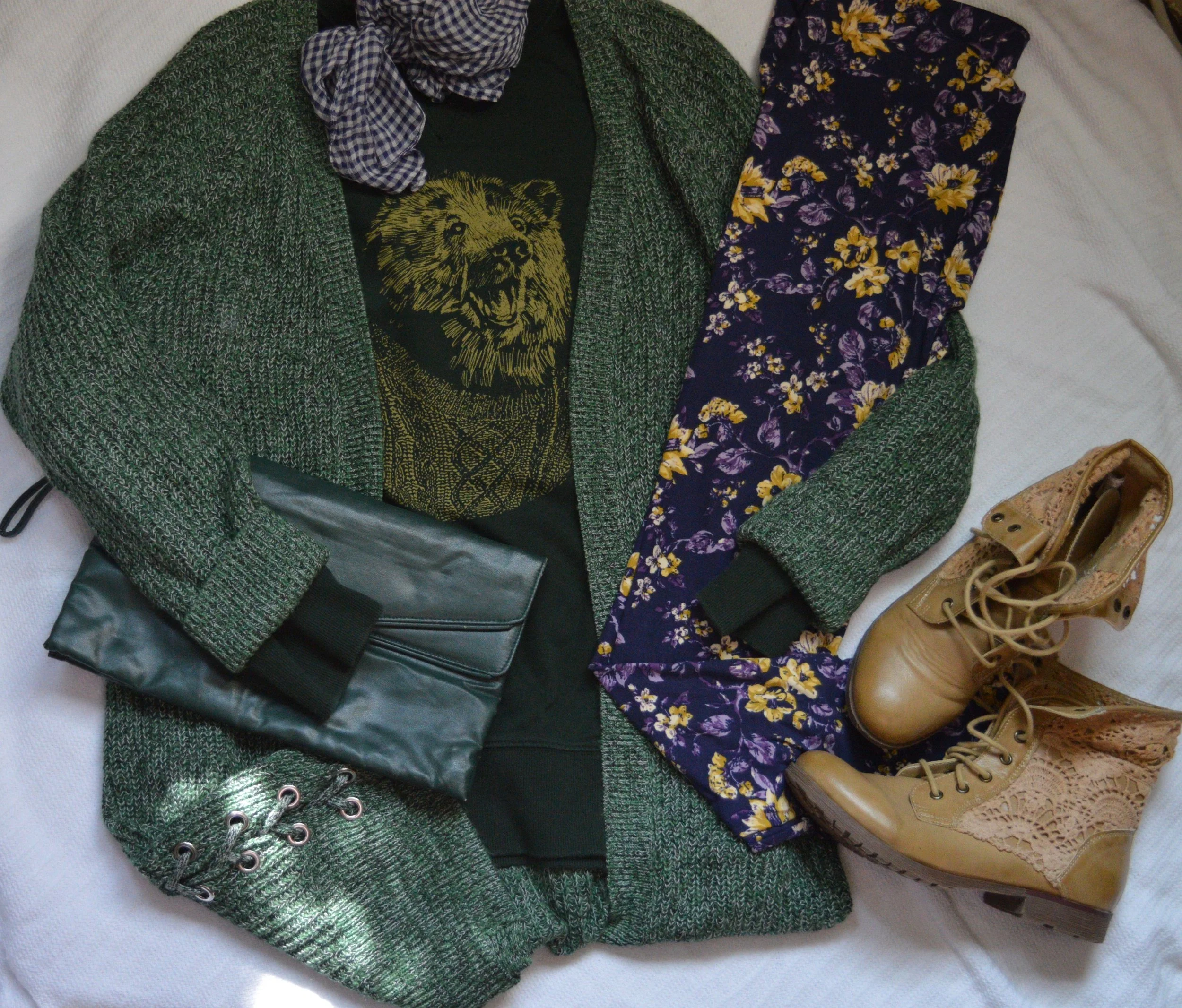
Trend 4 - Layering Knits

I think this is a fun one, although not for everyone. Most women our age are in the throes of menopause and the last thing you want to do is start wearing layers of heavy knits, but for those of you who are typically cold most of the time in the winter months, this trend is for you.

I love the way this outfit turned out in the flat lay and I may actually put this on when it gets colder and see how it looks. I am not a big leggings fan, but this just looks so fun, I may have to do it…yes, getting outside my comfort zone again.

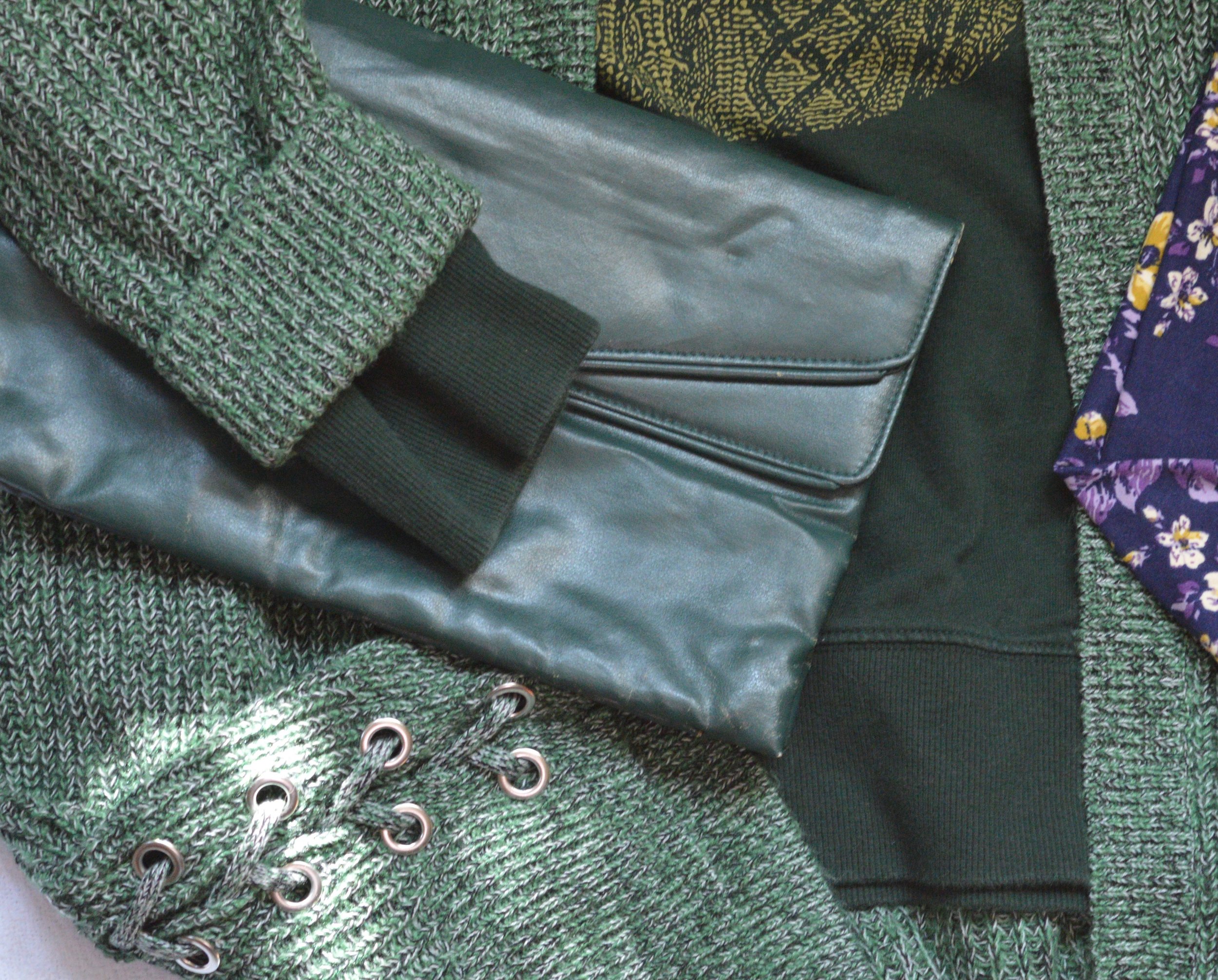
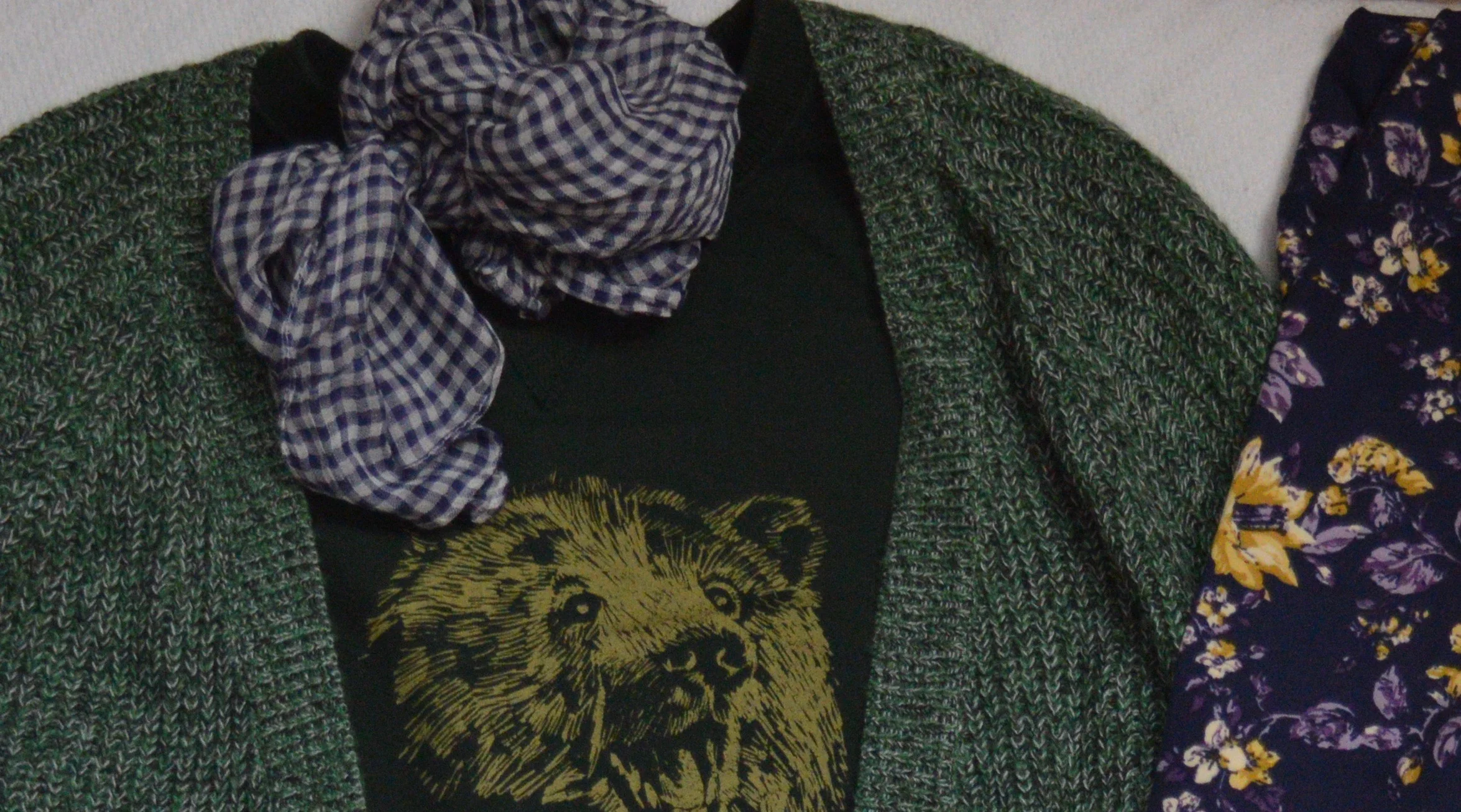
The sweater was a clearance find at Christopher and Banks. I love the lace up detail on the lower sides. This sweater has an open front with no closures and falls right about mid to lower thigh. It is a medium weight, so good for pairing over this thrifted over-sized Merona sweat shirt.

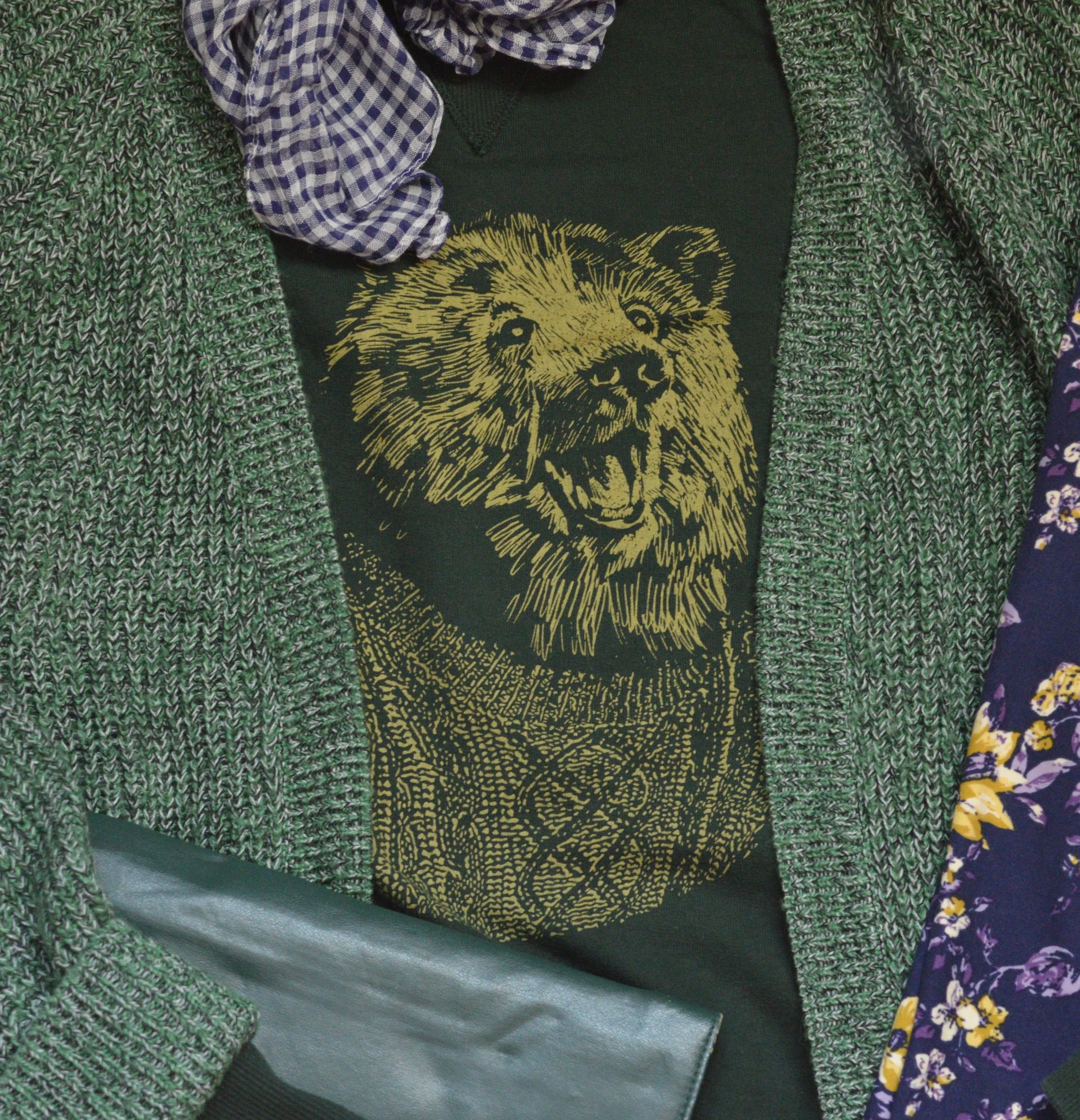
Isn’t Mr. Bear, just the cutest guy ever? He’s styling that cable knit sweater and I’m sure he’s heading right into his cozy hole to sleep for a good long while. He looks so happy. Believe me, I’d be happy too, if I knew when winter was on its way, I could go into a cozy hole and just sleep until spring arrived. Ha, ha.

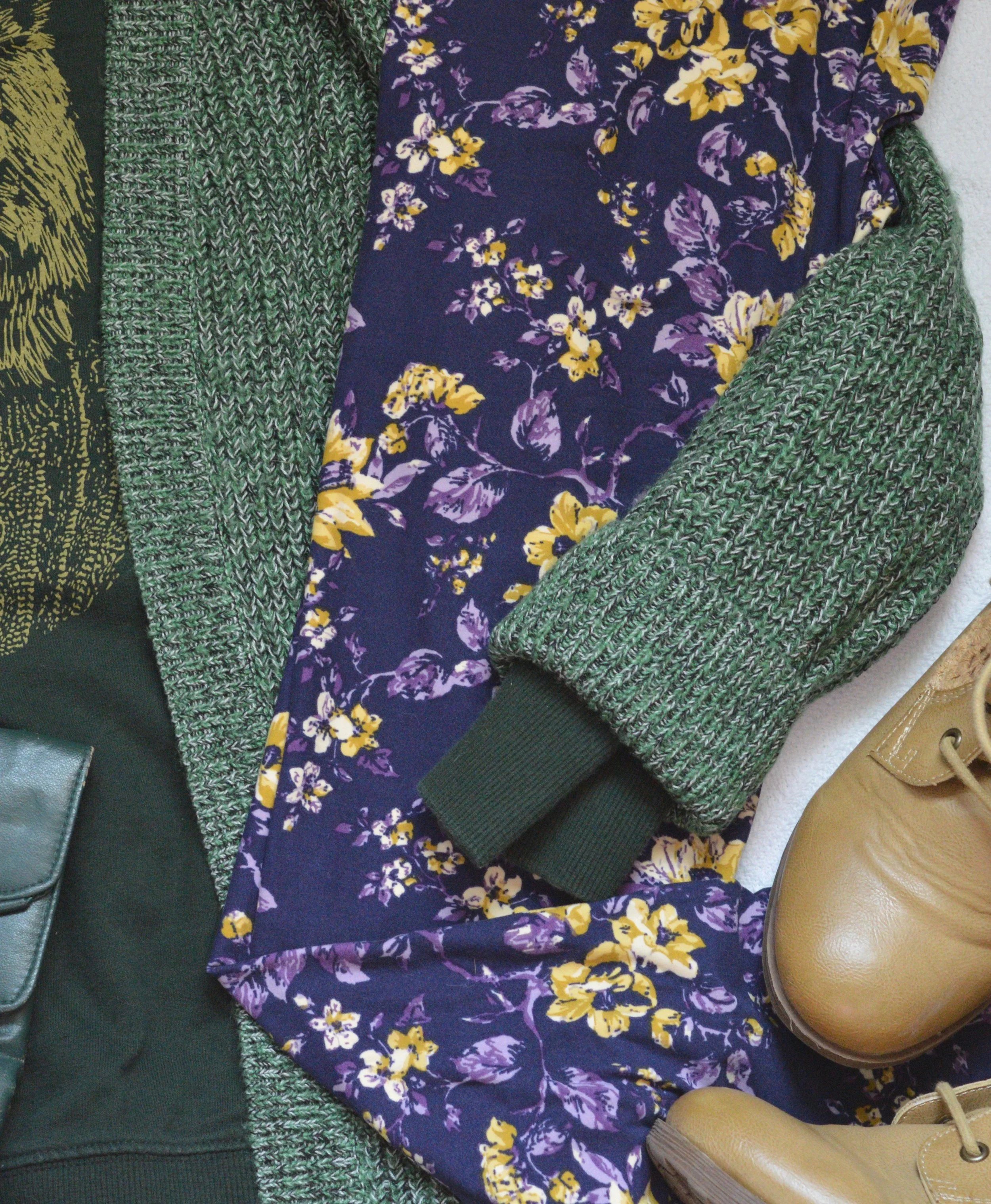
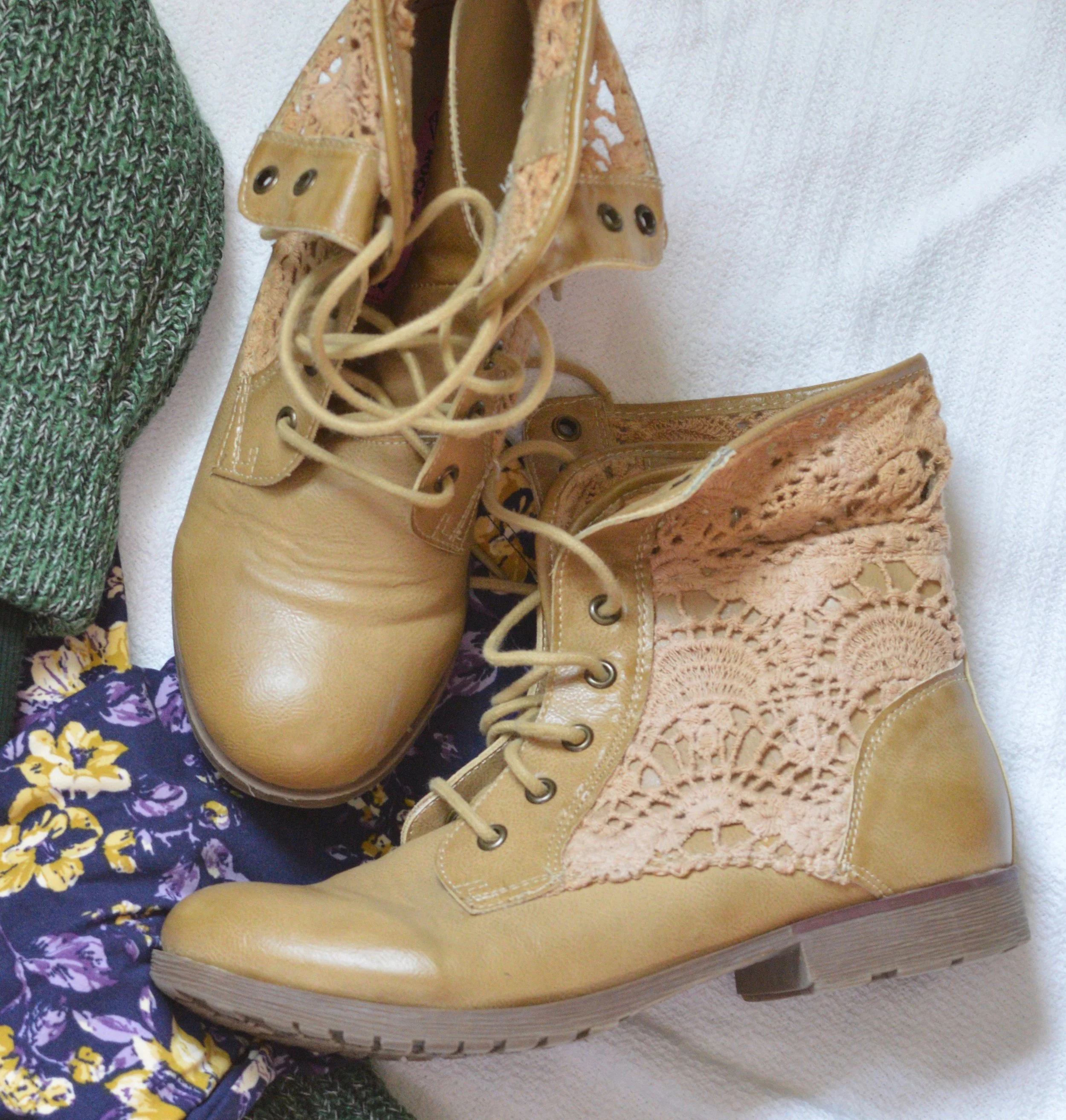
These leggings are Lu La Roe and my daughter gave them to me. I have been waiting on the perfect outfit to pair these with and I think this just may be it. Because I opted for these leggings I decided to wear a recently thrifted pair of boots, high lighting the lighter yellows and tans in the leggings and sweatshirt. These boots are a brand called Rock & Candy by Zigi. While this is a brand I had never heard of before, it appears that they are available at places like Nordstrom Rack, Famous Footwear and Shoe Carnival.

Since the outfit already has a lot going on I went for a simple green clutch.

I added the scarf as an after thought as a way to tie the whole outfit together.

What do you think of these two fall trends? Would you do Romance Gone Goth, or Layering Knits? I’d love to hear your thoughts, so leave me some love in the comments.

I hope your week is off to a great start. Thursday, I’ll give you another peek at two more Fall 2019 trends.

If you know anyone you think might like my blog, pass along the word. If you are not already a subscriber it’s easy to sign up by clicking on the subscribe button. Once a week you’ll receive an email from me letting you know there is new content on the blog. If you are a regular subscriber, hugs all around. You are why I write this blog. I’d also love for you to give me any feedback regarding other things you would like to see on the blog. Right now, I limit it to fashion, faith and occasional travel and lifestyle content, but I am open to other things as well.

Have a great day.


Wearing White - Basic Tee

White has long been a staple for the summer months, and now it is worn all year round, even in the dead of winter. I don’t reach for white on a regular basis, so I thought I would do a short series on white with a few transitional outfits that could easily take me into fall.

This first look features a white tee. A simple white tee is an easy and inexpensive piece to add to your wardrobe and can be dressed up or down. I wore this outfit to my younger daughter’s poster presentation for the final project of her summer research position with the University of Toledo.

In all honesty, I am not happy with my weight right now. After being down last year I have gained everything back plus extra. My pants are too tight. I don’t like the way I look or the way I feel. I have gotten back on the Fitbit bandwagon and am trying to keep track and walk, but it is a long process and I really suck at being disciplined. They say confession is good for the soul, so y’all get to hear mine. Ha, ha.

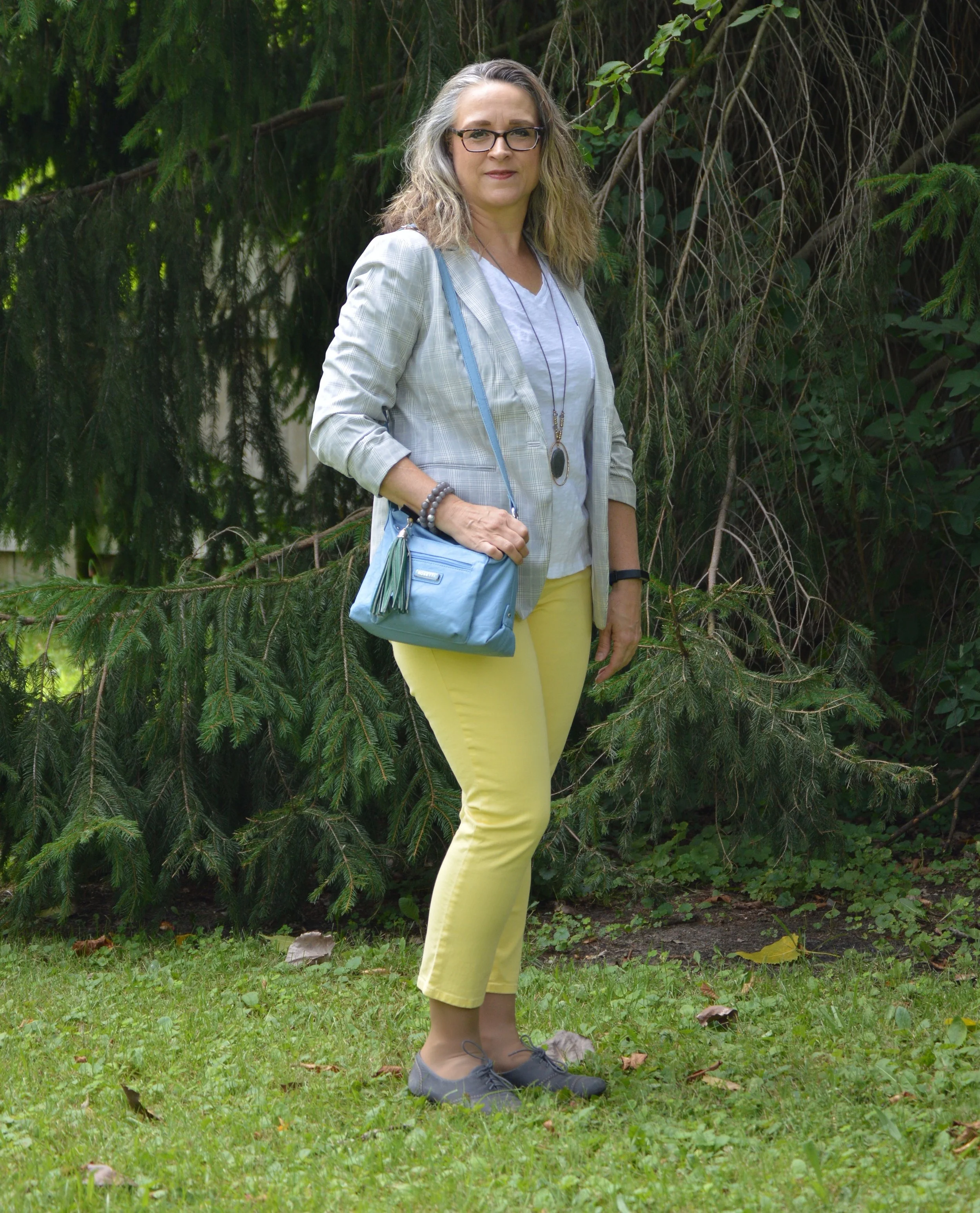
This jacket was a clearance find at H&M last season. You can see how I styled this before on the blog in my print mixing series, here. A light weight, lined jacket like this is a great way to start transitioning toward fall and cooler temps. Here in the midwest we might have days still in the 80’s well into October, but evenings will be cooler. Usually, we start doing the yo-yo thing with one day being 85 and the next day being 55, but thankfully, there should still be some summer type weather for at least another month or so.

My white tee is from Walmart. If you want simple basics that have a great price point, Walmart is a good place to look. This brand is called Tried and Tru. The weight of this tee is medium and it has a relaxed silhouette, so isn’t too clingy in all the wrong places. I also don’t have to worry about it being see through. Obviously, if you were wearing a red or black bra, you could still see it, but for the most part, I won’t have to wear a cami under this tee.

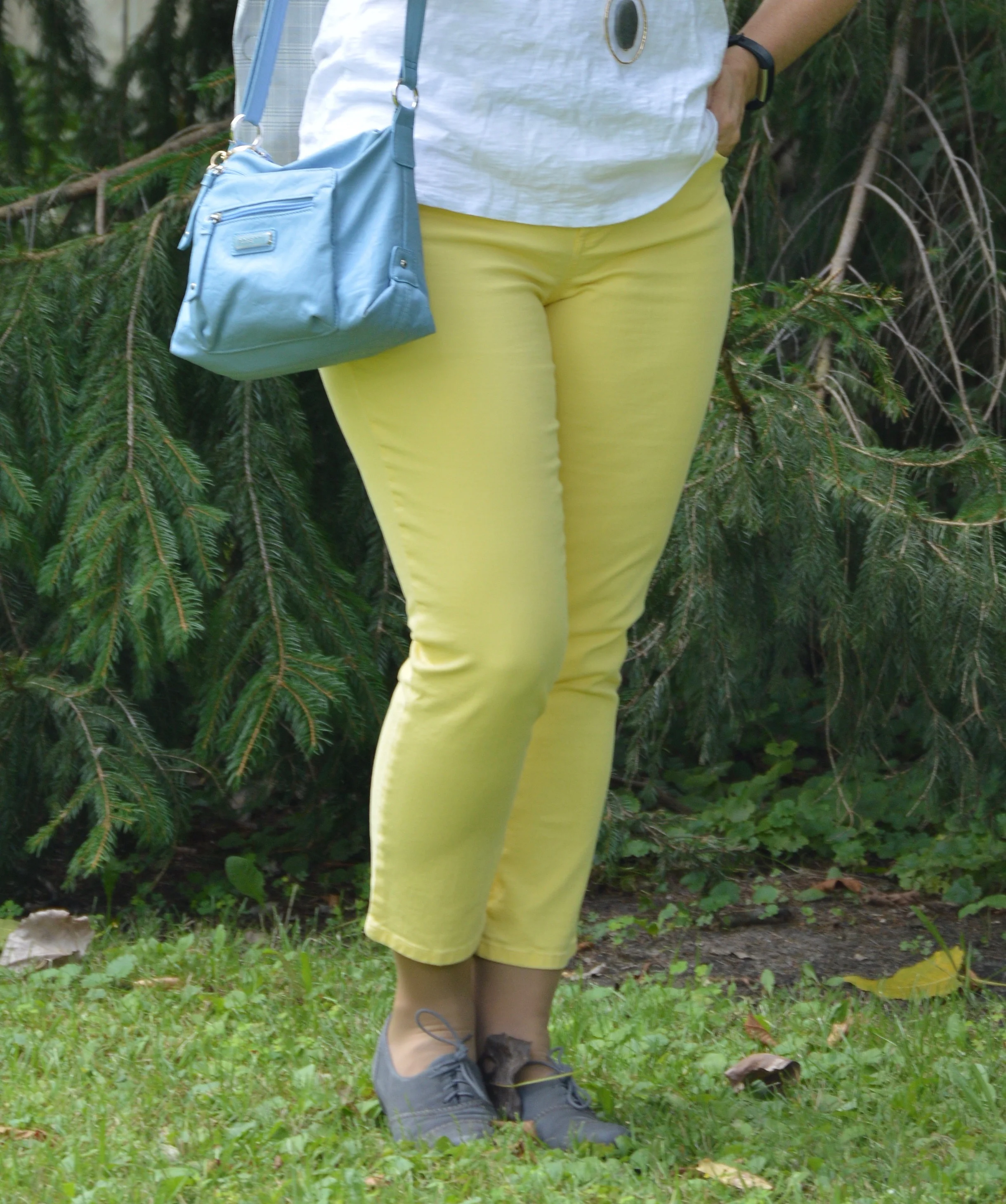
These yellow crop pants were thrifted and are Talbots brand. They are a medium weight denim and I do like that they are a totally different color than I usually wear. This bright yellow is great for spring, summer and fall. You can see how I styled these for a more fall look here.

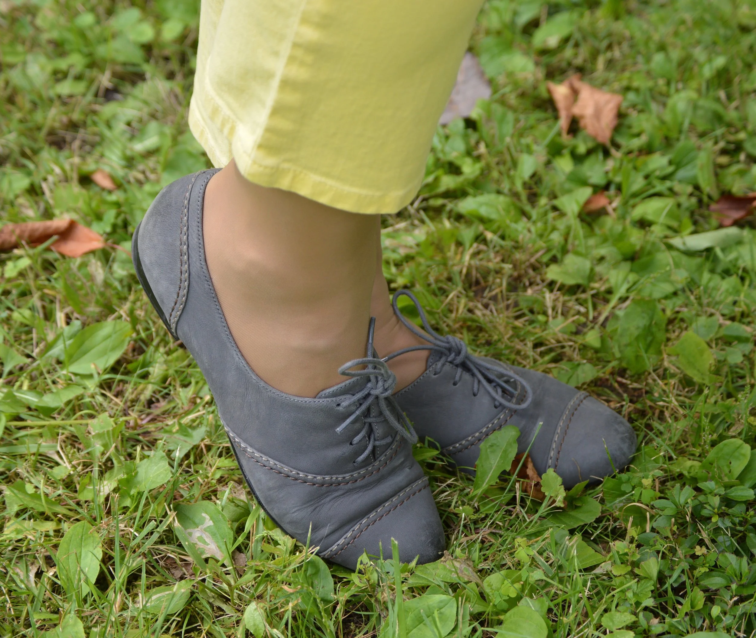
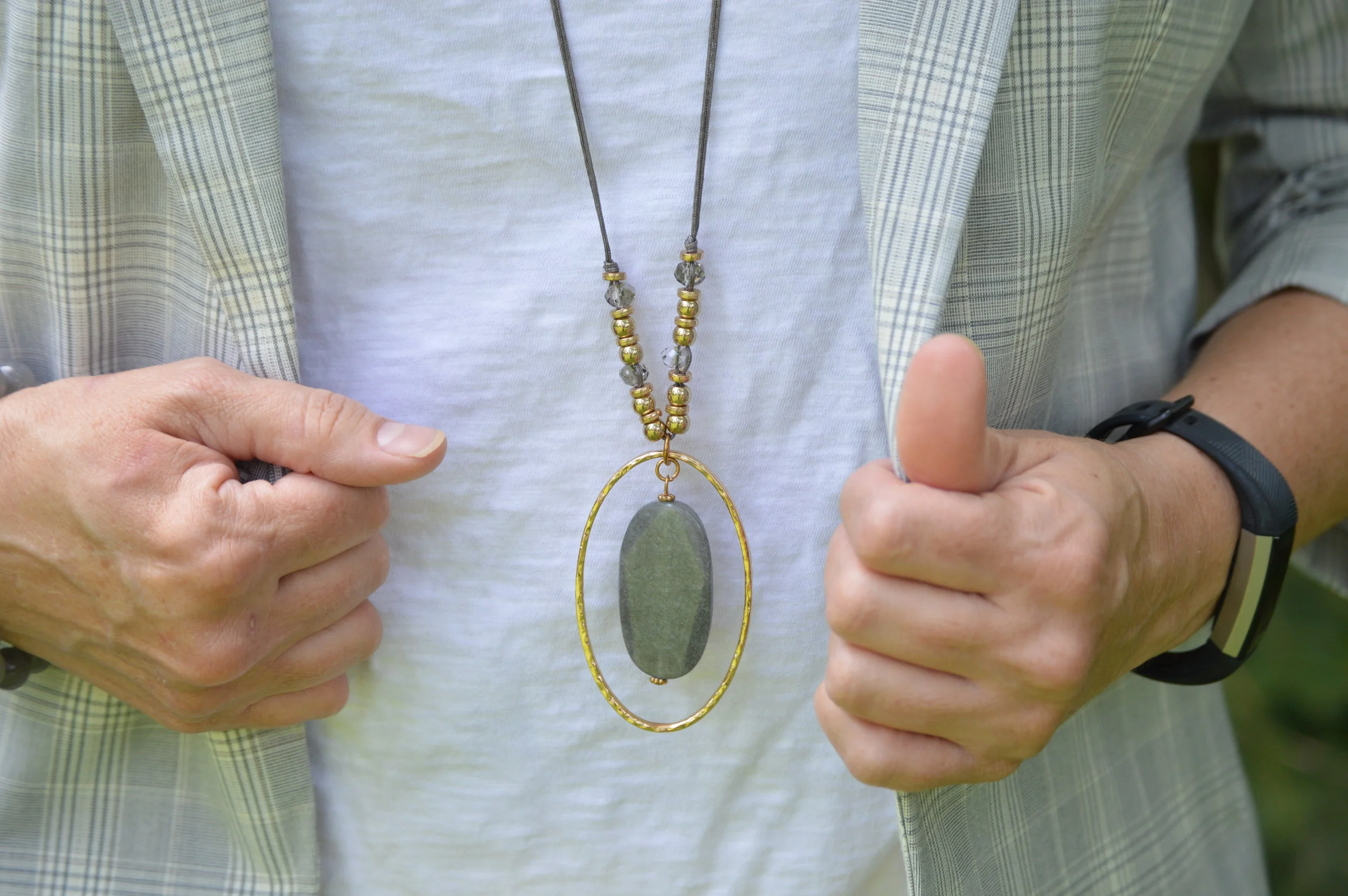
I decided to go with gray for jewelry and shoes to compliment the light gray jacket. These shoes are Naturalizer brand. I think oxfords are a nice alternative flat for general use and I have several pairs.

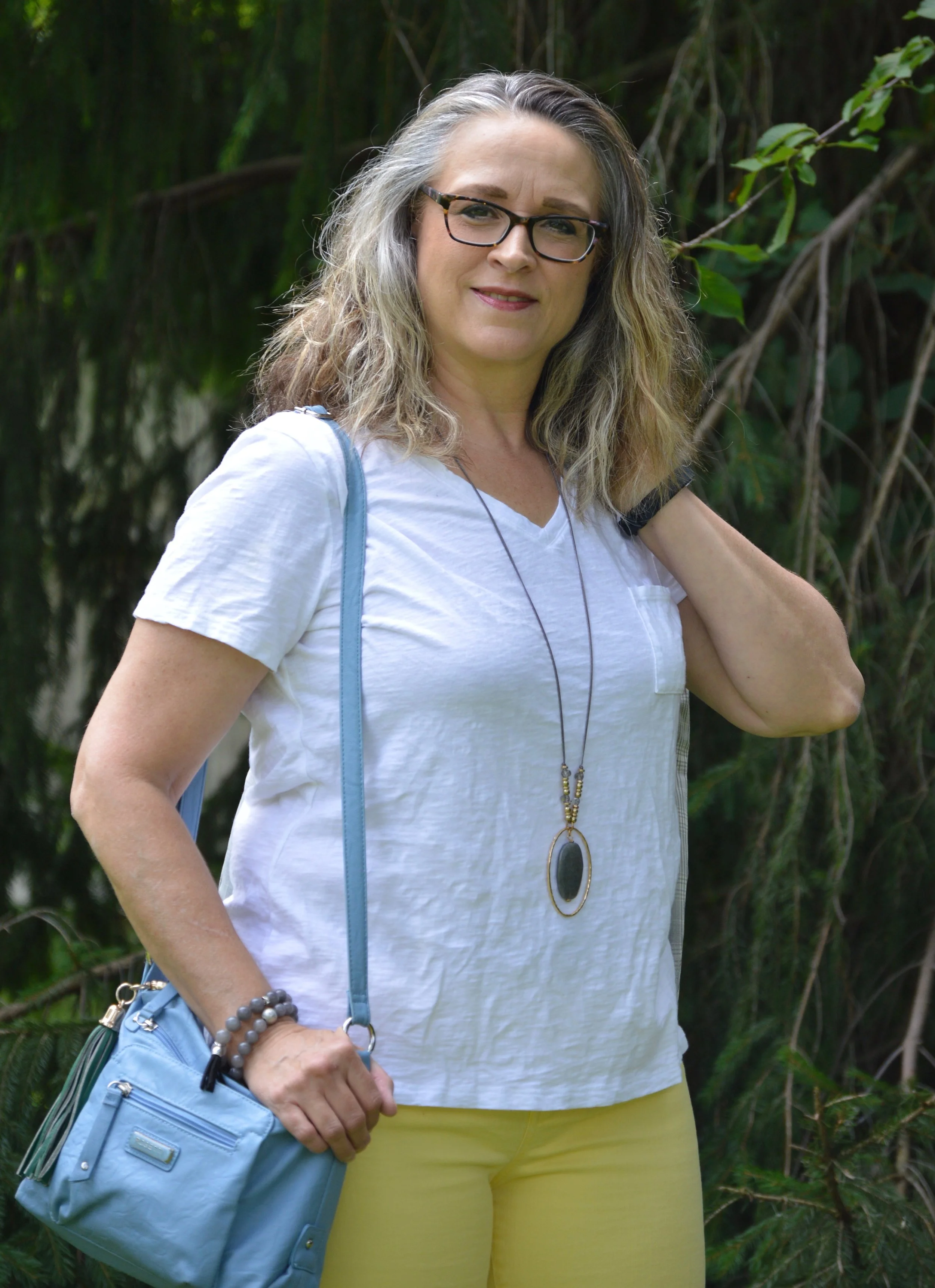
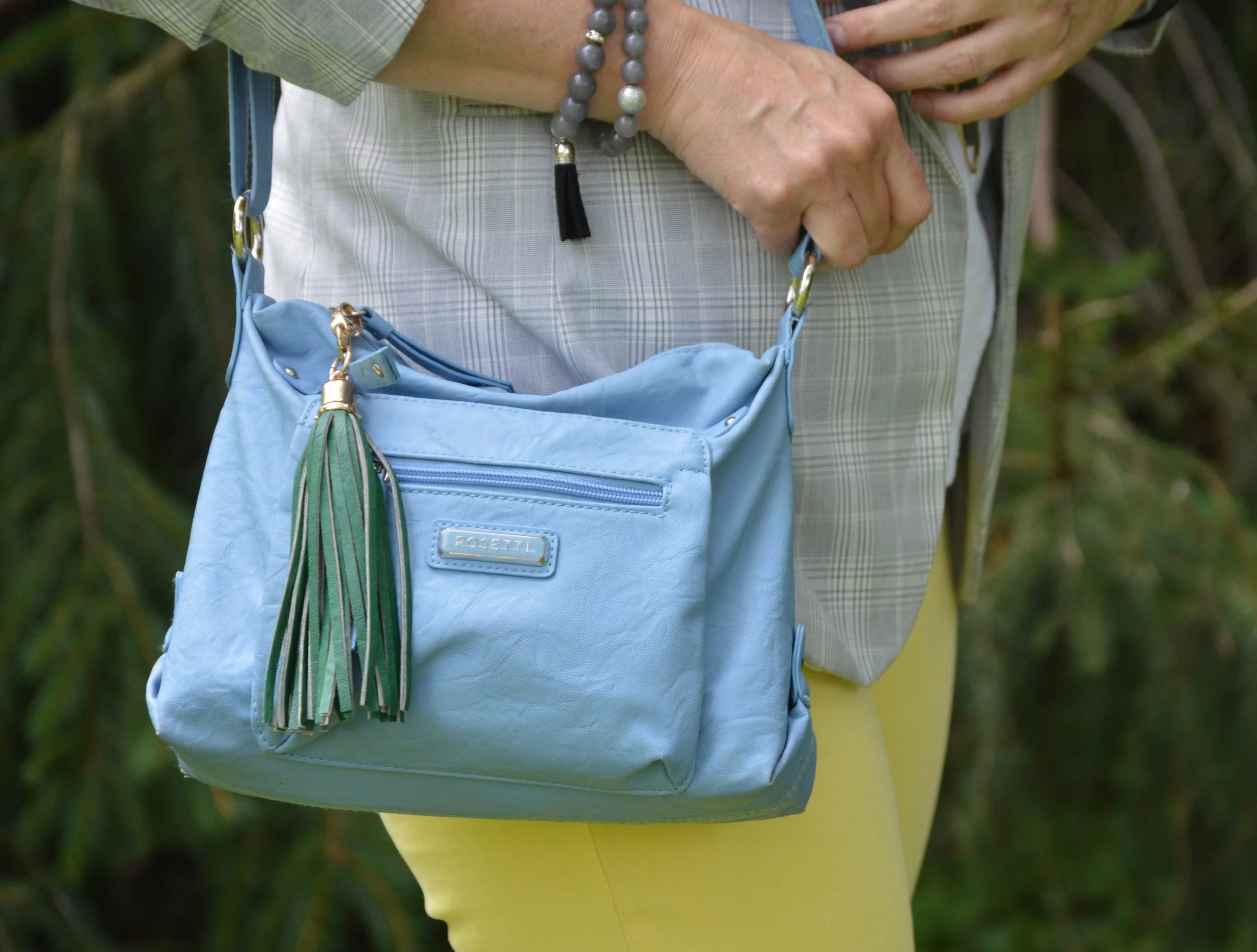
To bring it a little more color, I grabbed the current bag that I am carrying, a blue, cross body. I like the adjustable strap, the extra zippered compartments and I added the green tassel. This is Rosetti brand. Have you ever noticed how expensive purses are? I’m not even talking Coach, Dior or Kate Spade. I mean standard Kohl’s brands like Rosetti, Fossil, Dana Buchman and so on. I have found that I can find my best deals on the clearance racks at the end of the season. I know trends are important to people, and even staying on trend, which means they wear the trend before, or as it is happening, but I’m not all that worried about timing. I also like what I like and if it is a trend, great, and if it isn’t, so what. Wear what you like and carry the bag you like. This little number is pretty, practical and carries everything I need.

What do you think of this outfit? Do you have a white tee that you like to wear? How do you style yours? I’d love to hear you ideas and thoughts in the comments. I appreciate when you have the time to leave me some feedback. That means a lot.

Rebecca Trumbull took these pictures on my camera at our house, but I did the editing. We were heading out the door and just had time for a few quick shots.

Have a great weekend.


Denim Daze 2.0 - Pencil Skirt - Casual

What could be more versatile than a denim skirt? You can wear it spring, summer, winter and fall. You can dress it up or dress it down. You can wear it with heels, flip flops, ballerina flats, and boots of every configuration. A good, pencil skirt in any fabric with stretch can be a great addition to your wardrobe. It can take you from work to date night and has unlimited potential for other outfits. When I found this stretchy denim pencil skirt at a thrift store. I knew I had found a piece that would get repetitive use.

This skirt is a brand called No Faze Jeans. This brand is no longer available, except for on Poshmark and other 2nd hand retailers. This is a case, where the brand is not as important as the type of skirt. As I said before, a pencil type skirt should have a little stretch in it for bending and sitting. While I like a medium wash in a jacket or vest, a dark wash is a good choice for bottoms. Darker usually gives a slimmer profile.

For this casual look I grabbed a thrifted No Boundaries tee with the word, happy, embellishing the front in different colors. This is a light weight semi-sheer tee, so great for summer, but opaque enough that you don’t need a cami, unless you are wearing a very bright or dark bra.

This next picture shows you the front tuck. The shirt is quite long. Doing a front tuck defines your waist and provides an interesting line from front to back. Some people call this the French tuck, as well. I have mentioned this before in an earlier post, but I like the front tuck because it allows me to show off a belt, yet doesn’t take as much effort as tucking the whole piece in.

Even though the belt doesn’t match any other colors in the shirt, I like how it makes the outfit look bright and cheery, after all, the shirt does say happy.

This choker was a clearance find either at Kohl’s or Penney’s. I like that it looks dressed up, but can also be worn with something casual like this. The faux pearls add just the right class. In addition I threw on a few faux pearl bracelets to match.

Besides a cross body bag, I like a small hobo bag like this, when I don’t want to carry my full load around. This small shoulder bag is just big enough for my wallet and a few other items.

Keeping the vibe casual called for my well worn pair of sparkly gray Keds. These sneakers see a lot of wear in the warmer months and have been through the washer numerous times. I’m not sure how much longer they will hold up. Ha, ha. Who doesn’t have a pair of well worn shoes that they pull on all the time?

This is a simple outfit formula: denim skirt, graphic tee, jewelry, bag and sneakers. If you wanted to, you could swap the graphic tee out for a plain colored one and wear layers of chains, pearls or even a scarf for a whole different vibe.

Thursday, I’ll show you how I chose to dress this skirt up.

Do you own a denim skirt? Do you like to wear it? How do you like to style it? As always, I love to have your feedback. Just leave a comment below. I always read and respond to your comments, so you can check back the next time you are on the blog to see how your comment helped me out.

I’ve included a few shopping links for denim skirts. I hope you see something you like. I usually try to stick to retailers I am familiar with and I also try to include at least one plus size option. These are affiliate links. I get a few pennies when you click on a link. All opinions are my own.

Have a great Tuesday!


Denim Daze 2.0 - Vest - Dressy

A monochrome look, to me, always seems more dressed up than other looks using similar pieces. Style a black pair of pants with a multi print blouse and you have a great work outfit. Style the same pair of pants with a matching black blouse, heels and pearls and you have made yourself ready for a night out on the town.

Denim, by nature, is casual. Originally created as work wear for farmers, miners, lumberjacks and other physical labor jobs, denim was not meant to be worn to the opera or the theater. However, denim has come a long way since its original inception back in 1873. We now have various washes, weights and colors of denim, making it a much more versatile fabric for real life events, both casual and dressy.

In order to make this Christopher and Banks, denim vest seem more dressed up, I chose to pair it with a chambray, bell sleeve dress for a glitzed up monochrome look that I would wear with confidence to any number of more dressy events.

I found this cute, Massini, chambray, dress on the Meijer clearance rack a while back and it was one of those things I felt I couldn’t pass up. You know the feeling. It is not only cute and fits, but it is the right price and you have nothing like it in your closet. I love dresses, but do not wear them very often, but still, that doesn’t stop me from occasionally purchasing one that I absolutely love.

This dress has a full zipper in the back, a fit and flare silhouette, and is light weight. It works well on its own or when styled with a vest over the top. Wearing a vest still lets the fun sleeve bells strut their stuff, but gives you extra coverage and layers if the weather is cooler. I’ve worn this piece with a knit vest, suede boots and tights in the chillier months.

The only other things I had to add to this simple, but stylish outfit were the accessories. Since the vest has silver bling on it, I decided to have silver for my jewelry, shoes and bag. Simple pie, right?

This outfit came together quite easily because I had two pieces that were the same color. I don’t think this would have been quite as dressy if I had a vest that was a darker or lighter wash. Remember, when you have an event and you don’t know what to wear, a monochrome look will always be chic and stylish.

What do you think of this outfit? Do you think I accomplished the casual and the dressy with this vest? Are these outfits you would wear? Specifically could you see yourself wearing a monochrome denim outfit for a fancy occasion? It is always refreshing to think outside the box.

Photo credit Rebecca Trumbull. Make up Rachel Christensen.

Have a great weekend, everyone.

I’ve included a few shopping links for chambray dresses. There seem to be a ton of these around right now, so it might be a good time to invest in one. They can be very versatile, especially if you get a button up, shirt dress type, which you could wear as a jacket, vest or dress in so many different ways. Have fun shopping.

These are affiliate links. All opinions are my own.


Summer Pieces - Water Color Maxi Skirt

With my photographer on vacation I have to resort to taking pictures myself for a week or two, meaning relearning how to use my camera. Ha, ha. I thought I would talk about a few of the fun summer pieces I have recently acquired. Every seasonal change, I have to go through my wardrobe to purge what I do not wear, what no longer fits or what I realize was one of those, why did I buy this, moments. As I have said before, I love clothes and I love shopping, so you can imagine that I am inundated with clothing. I also, (true confession time), often shop in spurts, somewhat like an addict trying to get my fix. It is sad, really, but for many of us, shopping is a hobby. To keep myself from ending up on the show, Hoarders, I decided that when I buy, I also need to purge. I am in the middle of this process right now and the fun part of it is, I get reminded of all the fun pieces I do have, and it inspires me to put together a few new outfits.

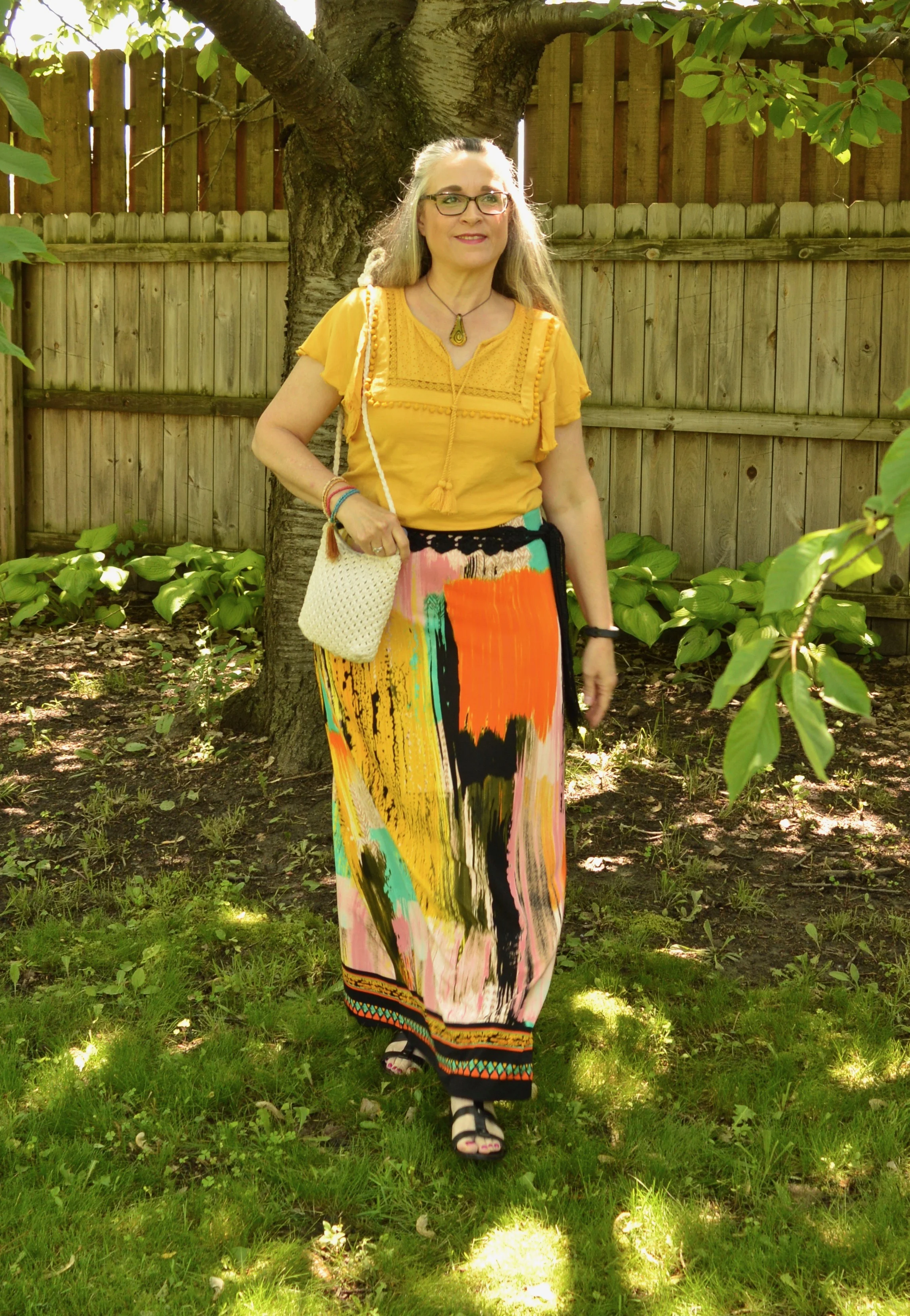
This water color maxi skirt, I found at a Goodwill store along the way, when my hubby and I were on vacation. It is a brand called eci New York. Macy’s does carry a few eci pieces that revolve around bright, bold florals and patterns. I love all the colors, because it provides a myriad of options for putting outfits together. Made of a medium weight polyester, this piece is easy wash and wear with no ironing needed. It has a wider elastic waist which provides comfort, as well as ease of wear.

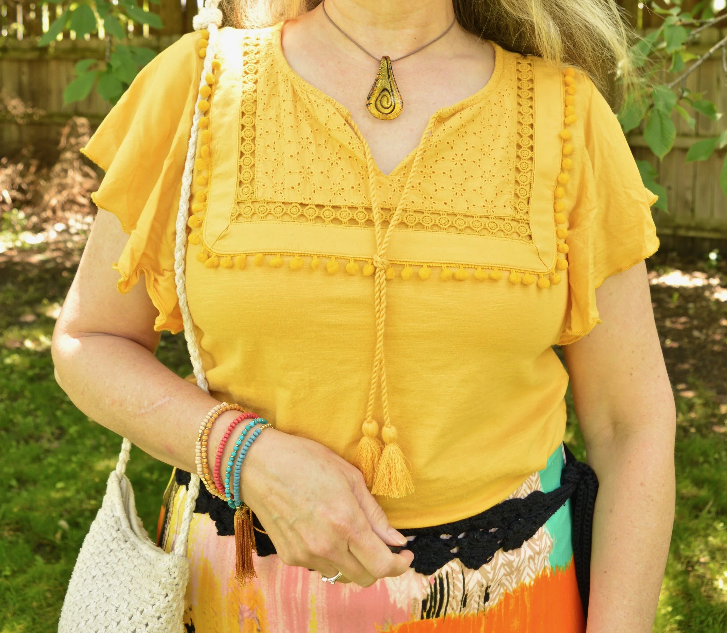
I first thought of pairing the skirt with a light pink top, but then when I pulled this top from last year out of hibernation, I knew that was it. The yellow, St. John’s Bay top, from JC Penney, has a bit of a boho vibe already so I thought it was the perfect companion for this unique skirt. I love the textured aspect of this top, from the eyelet on the bodice, to the poms along the bodice edge, to the tasseled cords. I also like the flowy sleeves.

When I started veering towards the Bohemian feel, I chose a woven belt that ties, leaving long fringe hanging along the skirt. You could position this belt wherever you wanted, with the fringe in the front, back or off to either side. I chose the left side, since I typically carry my bag on my right side.

I also chose jewelry that I felt epitomized that characteristically gypsy feel, like a multi-layered beaded bracelet with a dollop of fringe and a unique amber pendant choker with an aesthetically pleasing swirl.

My bag, bought many years ago, is the only true macrame piece I own and what says boho more than macrame? Ha, ha. It is small, but I have used this piece over and over as a cross body bad when we travel. It is big enough to hold the essentials, but not so big that it hurts your neck. This probably could use another washing. Bags like this are easy to wash. Be sure to put it in a laundry bag, then throw it in with your lights or towels. It isn’t meant to be a true white, but more of a cream.

For shoes I chose my No Boundaries black, gladiator sandals. These are ankle high gladiators, unlike the ones that go all the way up the calf. I’ve had these for a long time. They are comfy for a flat sandal and easy to pair with so many outfits for summer. I finally painted my toes, so summer must be pretty well here to stay. It is not that warm, but perfect in my opinion. If I owned a pool, I’d be happy with temps in the mid eighties, but as it is, I really like it to be about seventy five with a slight breeze.

Do you like this outfit? Would you wear a skirt like this? What sort of artsy or uniques pieces do you have in your closet? I’d love you hear from you. I don’t mean to be a nag, but I really do like when my followers give me a little feedback. It is good for my blog as well. It helps me to know what you like and what sorts of things you would like to see on the blog. Even if you made a commitment to comment once a month, that would mean a great deal to me. Thank you so much, for all of your support, whether you comment or not! I appreciate you.

I’ve included a few shopping links. These are affiliate links. When You click on a link, I receive a few cents. Every little bit helps. These links are to things I think you might like and that follow along with the outfits I am posting. All opinions are my own.

Have a great Tuesday.


Pantone Spring/Summer - 2019 - Fiesta & Princess Blue

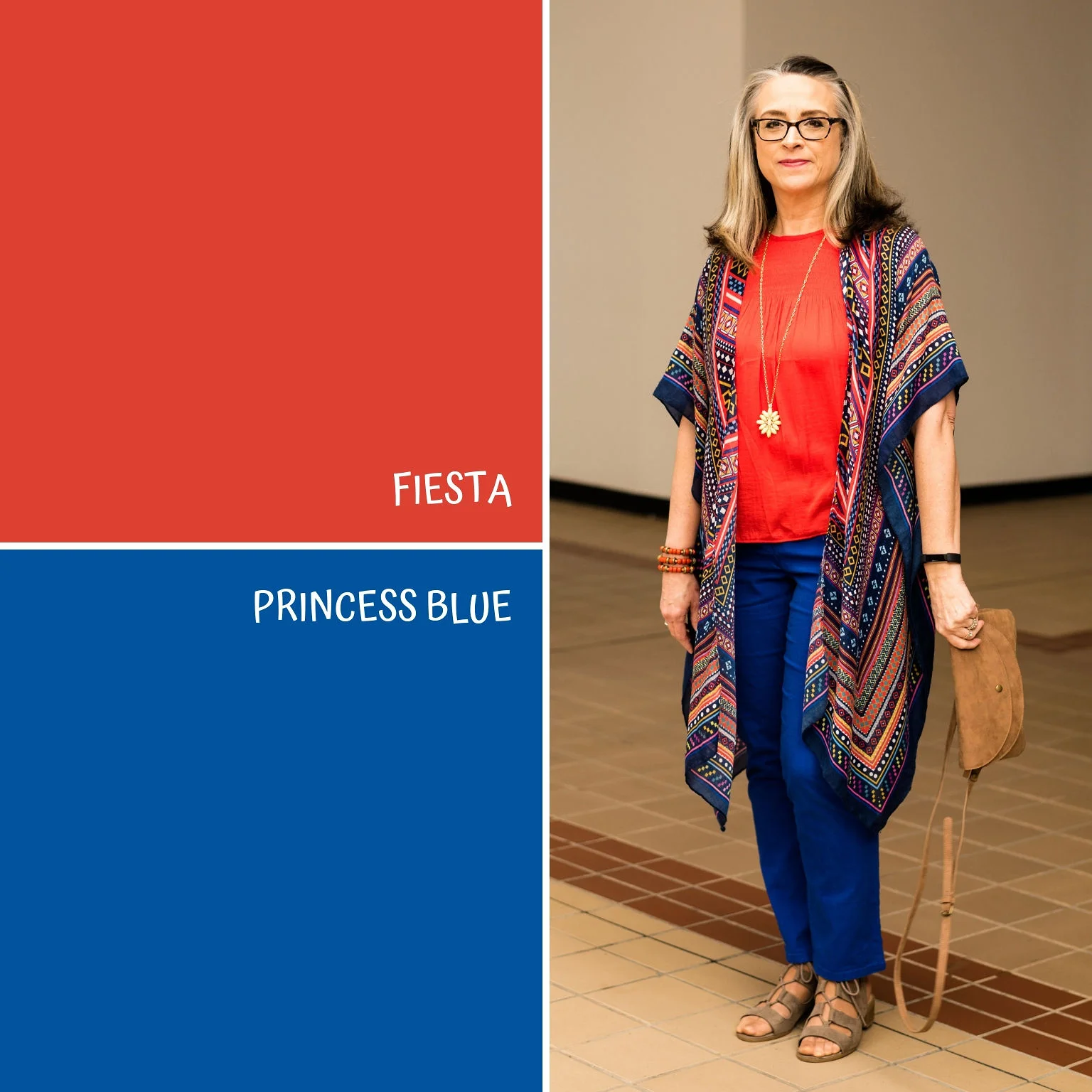
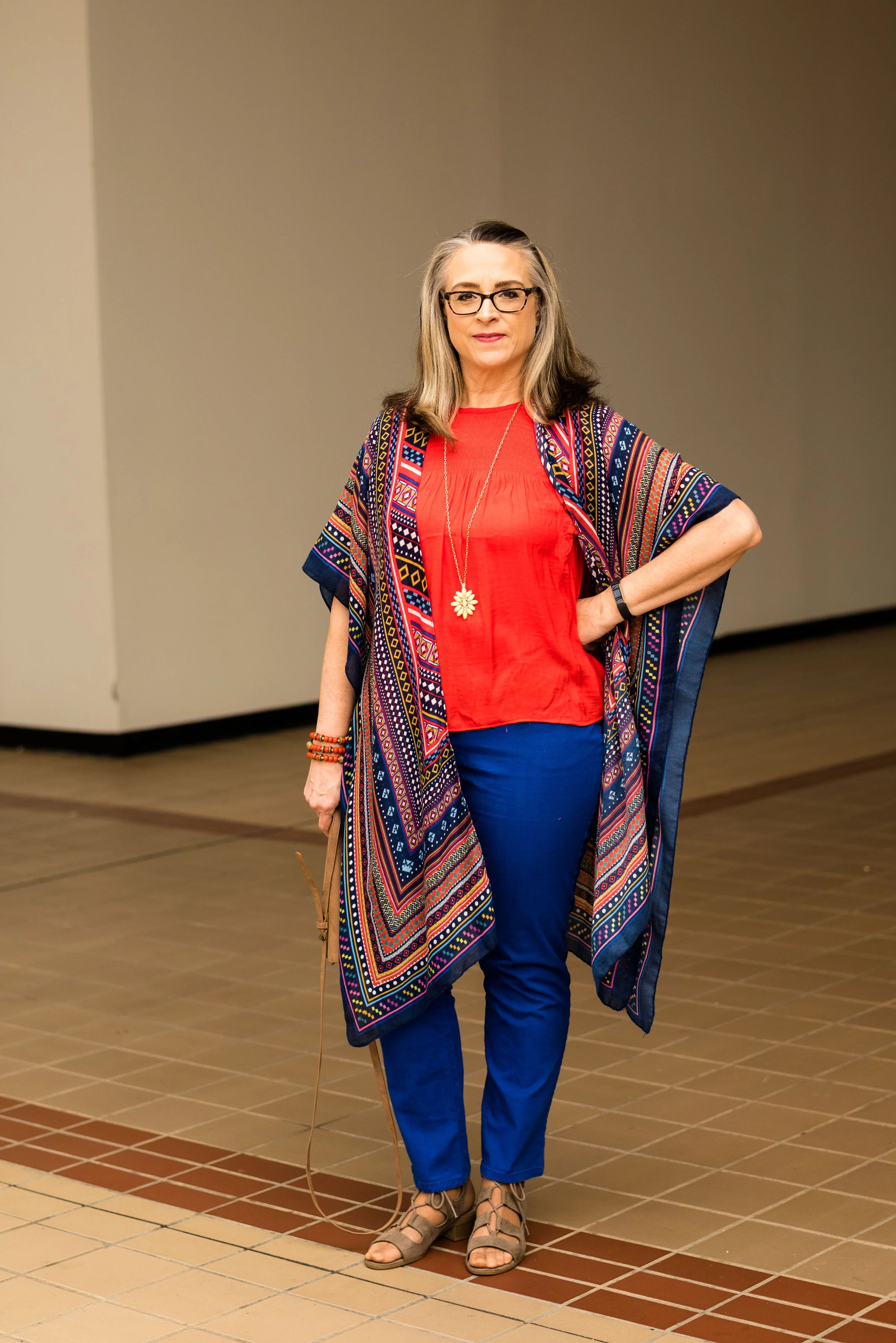
Today’s Pantone outfit revolves around two, rich, party ready colors, called Fiesta and Princess Blue. Fiesta is another red on this spring’s palette, with a leaning towards orange undertones. This bright, cheerful red is perfect for pairing with this royal blue. We’ve had other versions of this royal blue color appear on multiple palettes over the last few years. You can see a few of my renditions and other names for this color by clicking on the links. Riverside Blue, Marina, Lapis Blue, Palace Blue, and Nebulas Blue. While each of these is not exactly the same as the other, you get the point.

I found this Popsugar Fiesta Red top at Kohl’s on the clearance rack. I was very excited, because all the the reds in my closet either lean more towards a purple/brown base - maroon/burgundy or towards a blue base - a truer red. This red definitely has more yellow undertones, which when you see it compares to other reds, makes it look more orange.

You’ve seen these Ruby Rd. pants on the blog many times. When I went through all of my pants, I thought about getting rid of these, but then realized I don’t have anything else in this exact color. They were a thrift find, when shopping a friend’s closet, and they fit pretty well and are made of a denim type fabric, so a perfect for more colorful looks. I just don’t think to grab them that often for everyday wear.

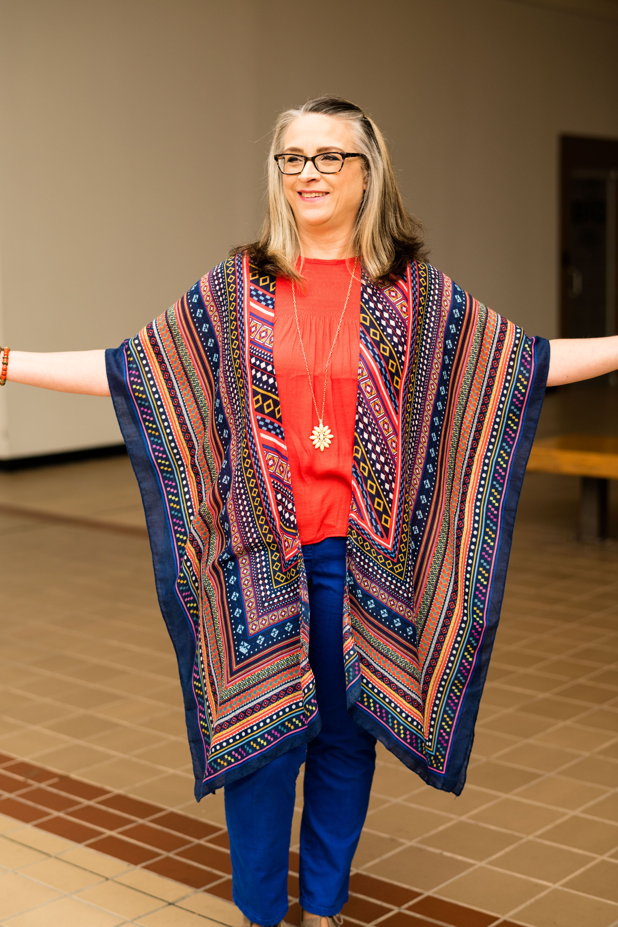
This Do Everything in Love, kimono is from DSW. I absolutely love this piece and when I saw the Fiesta Red top and Princess Blue pants next to it, I knew I was going to get my party on. This has so many amazing colors in it, so it will be useful for many outfits. This would look really cute with a white tee, and jean shorts, or a pair of crop pants with some fun sneakers.

Again, I kept my accessories simple, lest the outfit get too overwhelming. I thought the yellow flower pendant necklace a good choice to bring in the yellow in the kimono. The bag is a clearance find from Meijer and the gladiator sandals are Massini brand.

Do you have your toenails painted yet? I need to do that pretty soon. It’s lovely when you can go to a salon and get a manicure or a pedicure or both, but I don’t do my finger nails very often as they tend to chip and tear easily. I do try to paint my toes when the weather gets warm enough that I can put my flip flops on. It hasn’t warmed up quite to that point here, but my hubby and I are hoping to go on vacation next week and it will be warmer then.

What do you think of this outfit? Do you like these colors and would you wear them? I love to have your feedback. If you have the time, leave a comment below. It helps me to know what you are thinking and as always, if you have any suggestions for the blog, I’d love to hear that as well.

I’m including a few shopping links for you to look over. These are affiliate links. All opinions are my own. Thank you for spending time on the blog. I appreciate all your input.

Have a great day.

Photo credit Rebecca Trumbull. Make up Rachel Christensen.


Spring Outfit with ShopNational

I’m taking a brief break from my Pantone Spring/Summer 2019 series to introduce you to a clothing retailer called National. This is a sponsored post. National gifted me the clothing items in this post and gave me compensation for writing the post. All opinions are my own.

National is a family owned business that was started by Eddie Smith. After the influx of women into the workplace nearing the end of WWII, what started as a small mail order operation selling women’s stockings, has now grown into a prospering clothing platform specifically catering to women who like classic styles and clothes made for real life. National sells everything from cardigans and dresses to hosiery and bras. They have kept up with the times, moving from a strictly catalogue based clientele to the inclusion of a more recent online presence. Knowing the history of National, I am excited to bring this retailer to my readers.

The pieces I chose from National revolve around a spring theme, but will work well through the summer. The first few pictures will show the pieces as is, with the later pictures including my own accessories.

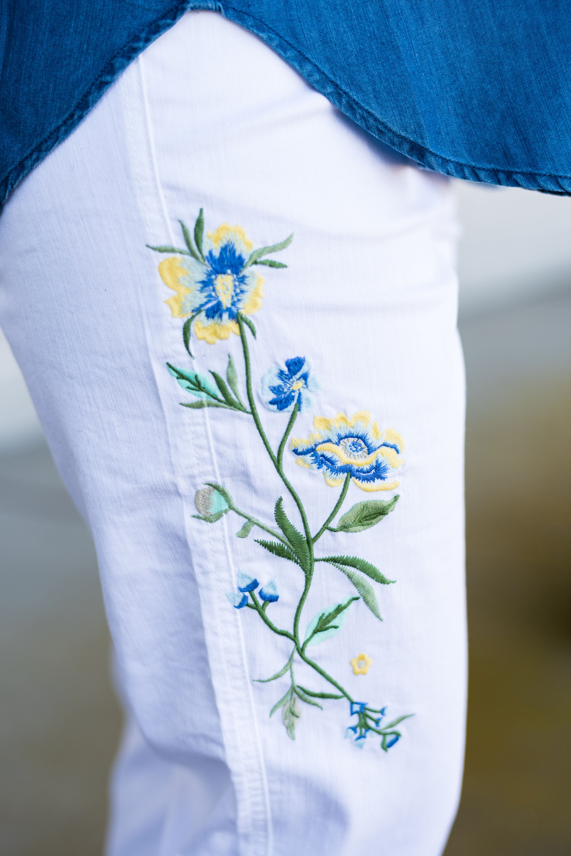
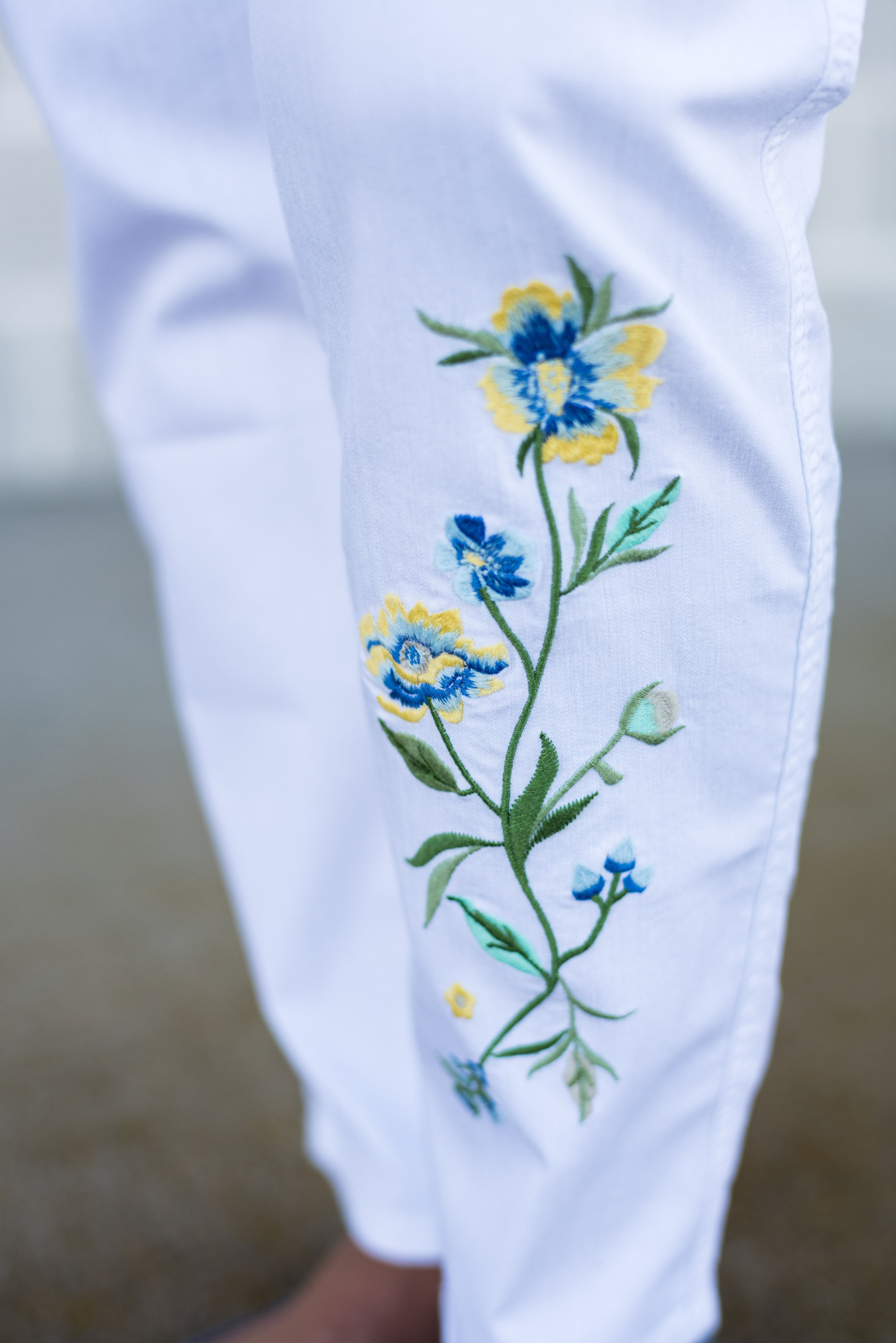
The two pieces I chose are the Southwest Embroidered Top and the Spring Blossoms Embroidered Jeans. i have always been a fan of embroidery. It adds both texture and interest to so many different clothing pieces and these two from National are no exception. I saw the jeans first when I was perusing their website, after they contacted me about a collaboration. I fell in love with the embroidery, especially the splashes of yellow and blue. You can see in the pictures below, the embroidery is both on the thigh of the right leg and the lower shin area of the left leg. I like that the floral images are on both legs, yet in different places.

These pants are light weight and have an elastic waist and slimming front panel. I was surprised at how well they fit and how flattering they were. The straight legs could also be worn rolled up for a more breezy summer look. The only drawback of these light weight pants in the white is they are a bit see through. I chose to wear nude underwear, so it was no problem. Just don’t wear those red, hot pink or black panties, or everyone will know. Ha, ha. I ordered these in a large and the fit was perfect.

I chose the top because I thought the denim blue color went well with the blue in the pants. Once again, the embroidery was the selling point for me. This top has a southwest boho vibe, which I love. Look at all the details on this lovely piece.

The v-neck boasts embroidery detail and fun fringe.

The neck ties end in tassels.

The embroidery on the elastic gathered sleeves adds a black and white color contrast.

The shirt tail hem makes it perfect for wearing untucked.

The fabric this popover blouse is made of is a fabric called lyocell, which is a form of rayon. It is machine wash and dry, so easy to care for. However, the fabric is not stretchy and the bust area is a tad tight. I ordered a medium and think I would have felt a tad more comfortable in a large. Overall, another great clothing piece from National.

Here is the outfit with my own accessories.

I really like these pieces and was pleasantly surprised with National. I have never been a big catalogue shopper, but now that National is available on line, I have a feeling I will be purchasing from them again. It is convenient, easy and quick, and their clothing and accessories are classic pieces easily worn by busy women like us.

I hope you will check out National. Right now they are offering my readers a discount. If you use the code Natl20Amy you will get 20% off your entire order and free shipping. This would be a great time to give this family owned retailer a try.

Have a great day.


Pantone Spring/Summer - 2019 - Jester Red & Pepper Stem

Today’s Pantone colors are the rich saturated relatives of red and green. These two pair perfectly for a tropical vibe mixed with a punch. Jester Red jams with a touch of blue and Pepper Stem is green with lilting yellow tones. I love how these two mix together to create a colorful summer vibe.

This Jones Wear printed midi-skirt is a great piece for spring, summer and fall. It is fully lined, so in the summer you don’t have to worry about wearing a slip. The length is modest, and pairs well with anything from heels to flats to flip flops. I’ve featured this skirt on the blog before in a fall Pantone palette. You can see that post here.

This Field Gear jacket is thrifted. I have also featured this on the blog before too. You can see that post here. If you take a look at that post, you’ll see it was also for the Pantone palette from last spring, where the color of the year was Greenery. This is a softer, light weight suede, which makes it the perfect piece for spring and summer.

This 3/4 length sleeve tee is a bit more red than the Jester Red color, but I thought it was pretty close. What drew me to this Rafaella Studio thrifted piece was the embellished neckline. The cowl neck is covered with beads in a hematite type sheen. I didn’t need any necklaces with this pretty piece in place. Tops with embellished necklines are a nice, easy way to dress up an outfit, without having to think about jewelry. You can see the intricate beading below.

For my accessories, I chose a thrifted Simply Vera/Vera Wang navy bag and thrifted Relativity loafer heels, to go along with the classic color Eclipse. Once again, let me reiterate, this is not a contest to see how close to the Pantone color palette you can get, but a spring board for inspiration and new color combinations that you may not have thought of before. We often think of red and green as a Christmas color combo, but when you make the green a little more tropical it pairs well with any red without looking Christmasy.

I added this belt too, just to make the outfit a little more polished. This is a stretchy belt that just clasps together in the front. A stretch belt is a fun way to add fun to an outfit and cinch in our waists.

I thought this was a fun, festive outfit that could be worn to a party. If the weather is hotter, sub out the 3/4 length sleeve tee for a tank top and use a light weight sweater or hoodie with flip flops or sneakers for a more casual look.

What do you think of Jester Red and Pepper Stem? Do you have any of these colors in your closet? If you do, have you ever worn them together? I love to hear you feedback.

I’ve included a few shopping links for similar colored items. Have fun perusing. These are affiliate links. All opinions are my own.

Photo credit Rebecca Trumbull. Make up Rachel Christensen.


Pantone Spring/Summer - 2019 - Living Coral & Terrarium Moss

I want to take a moment to apologize for my absence this past week. I went to visit my mom and ended up bringing her home with me for a couple of weeks. We came back on Monday, and between unpacking, work and getting ready for Easter weekend, I just didn’t have the time or energy to get my blog posts done. I promise, I did try a few times, in the evening to get them written, but always ended up getting bleary eyed and needing to go to bed. Ha, ha. However, I hope to get back to a normal schedule this week, if I can get my computer to upload my pictures accurately. It’s always something!

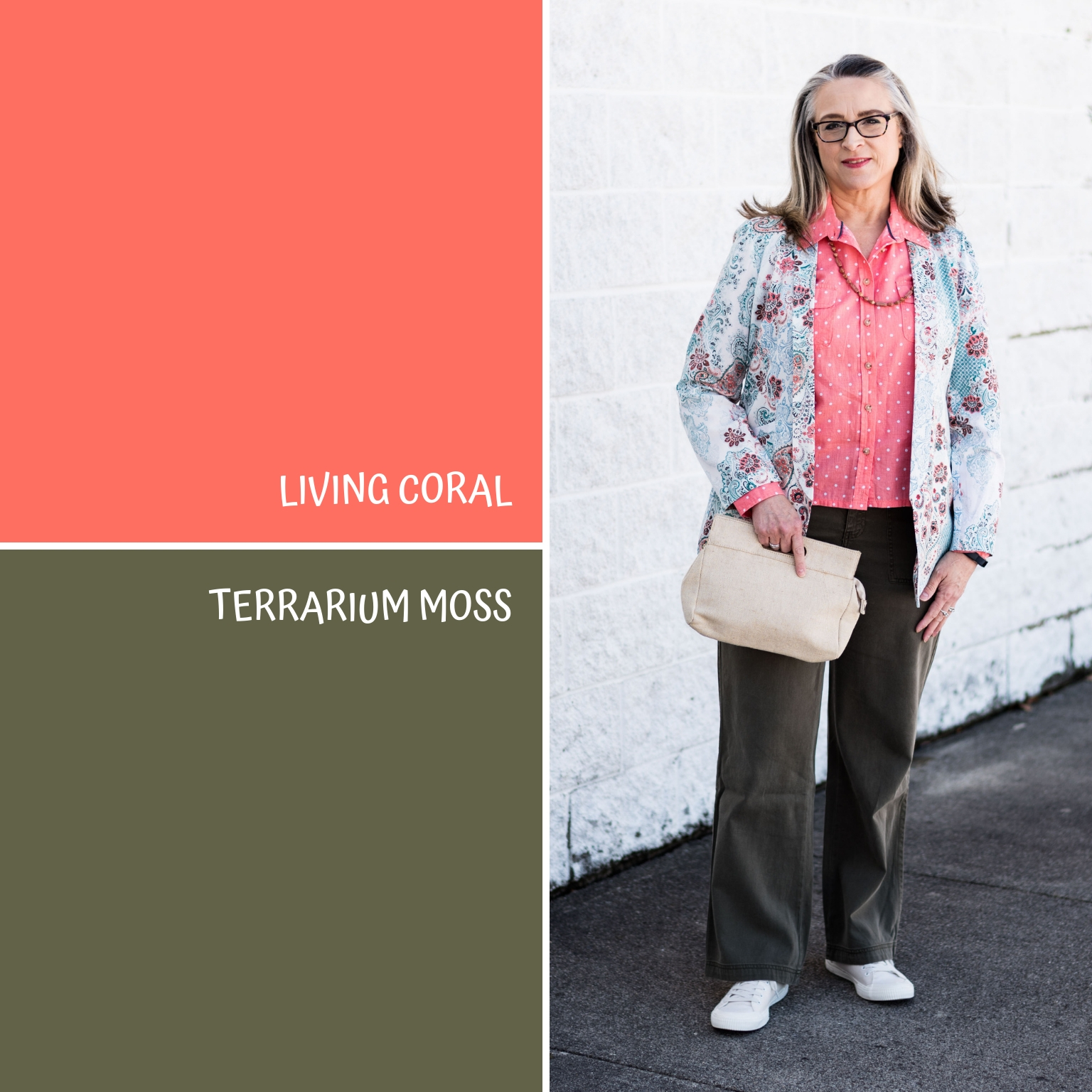
Every year the Pantone Color Institute puts together a palette of colors that are the basis for the fashion and interior design color choices. Since I started blogging three years ago, I decided to draw upon these palettes as a source of inspiration for putting outfits together. I do a series using these colors in both the spring and the fall, as these are the two palettes Pantone puts out each year. Pantone, also, chooses a color of the year. This year that color is Living Coral. I wanted to feature this pretty pinky orange color to kick off this spring’s Pantone series and decided to pair it with the darker green of Terrarium Moss.

For my Living Coral piece I chose a thrifted Liz Claiborne polka dot blouse. I actually have quite a bit of this color, so I was pleased that this was chosen as the color of the year. However, as lovely of a color as it is, it is not my favorite color, so I don’t reach for it with regularity. I’m not sure why, because it is a great color for spring and summer and it goes well with many other colors.

This fun paisley jacket was a recent clearance find at Chico’s. I don’t shop frequently at Chico’s as their prices are a bit higher than what I would normally pay for a single item of clothing. However, if you have a coupon and can use it on clearance, then you can find colorful and fun pieces like this at a significantly reduced rate.

My Sonoma pants were a clearance find from Kohl’s. They are a tad darker than the Terrarium Moss, but basically are an olive green. These are a nice weight for spring, not too heavy and not too light.

As I have done before, I wanted to incorporate one of the neutrals with each outfit. For this one I chose Sweet Corn. This is a light, airy color that reminds us of the lighter kernels of mouthwatering sweet corn. I used this canvas clutch and my thrifted Sonoma sneakers to represent this summery neutral.

What do you think of these two colors? I know many people who have Living Coral already in their closets. It is a good color for the warmer weather, as the sun begins to shine more regularly. It always makes me think of the seaside. Where as, Terrarium Moss makes me think of hiking under a canopy of trees in full leaf mode, in a place that is quiet and cool.

I’ve included a few shopping links for you to peruse featuring the colors Living Coral and Terrarium Moss. These are affiliate links, which means I get a few cents when you click on a link. I get a tiny bit more, when you make a purchase through my page. All opinions are my own.

Photo credit Rebecca Trumbull. Make up Rachel Christensen.

Pantone Spring/Summer - Introduction

I’m a little late, putting this series together this spring, but the Pantone colors are really for two seasons, spring/summer and fall/winter. Since the colors bleed over into summer, I figured it would be okay if my series started a little later.

Once again, we are introduced to both the New York and London color palettes, but the overlap between the two is substantial, so we’ve combined all the colors, so you can see the whole palette at once.

This spring/summer palette is full of rich, saturated colors, but also has sweet, light pastels that will appeal to the little girls in us. As usual the Pantone Color Institute has named these colors with fun foodie words like Pepper Stem, Turmeric, Toffee, Mango Mojito and Lemon Verbena. Other names convey the beauties of the natural world, such as Living Coral (the Pantone Color of the Year), Aspen Gold, Terrarium Moss, Sweet Lilac and Pressed Rose. Finally, summer wouldn’t be complete without a few colors that remind us of cookouts, parties and fun times: Fiesta, Jester Red, Pink Peacock and Princess Blue.

I liked all of the colors on this palette. I had fun choosing outfits around these colors and when we get to the actual outfit posts, I’ll explain my rationale for each outfit more fully.

I addition to the 14 colors above both the New York and London palettes both share the four neutral palette shown below.

I wish they had included a gray, like they’ve done in the past, but I don’t begrudge them for changing things up a bit. The Brown Granite is a nice choice, but I find, that it is easier to locate a gray piece than a color like this. Gray seems to be more classic, but maybe things will change and this brownish gray will take over.

Here are a few sneak peeks at what is to come over the next few weeks.

If you like color and like to challenge yourself to try new things, be sure to join me for this Spring/Summer Pantone 2019 series, beginning next Tuesday.

What do you think of this spring’s color palette? I’d love to hear your thoughts.

Have a great weekend!

Photos and graphics, Rebecca Trumbull.

Print Mixing Mash Up - Plaid Bomber Jacket - Outfit 2

This second look featuring my plaid bomber jacket from Eden Fashion Boutique, might seem a tad overwhelming if you are new to print mixing. Some might say there is too much going on, but I think it works. In fact, it was this combination that inspired me to use the plaid bomber as a print mixer in the first place. Besides, why not get a little crazy once in a while!

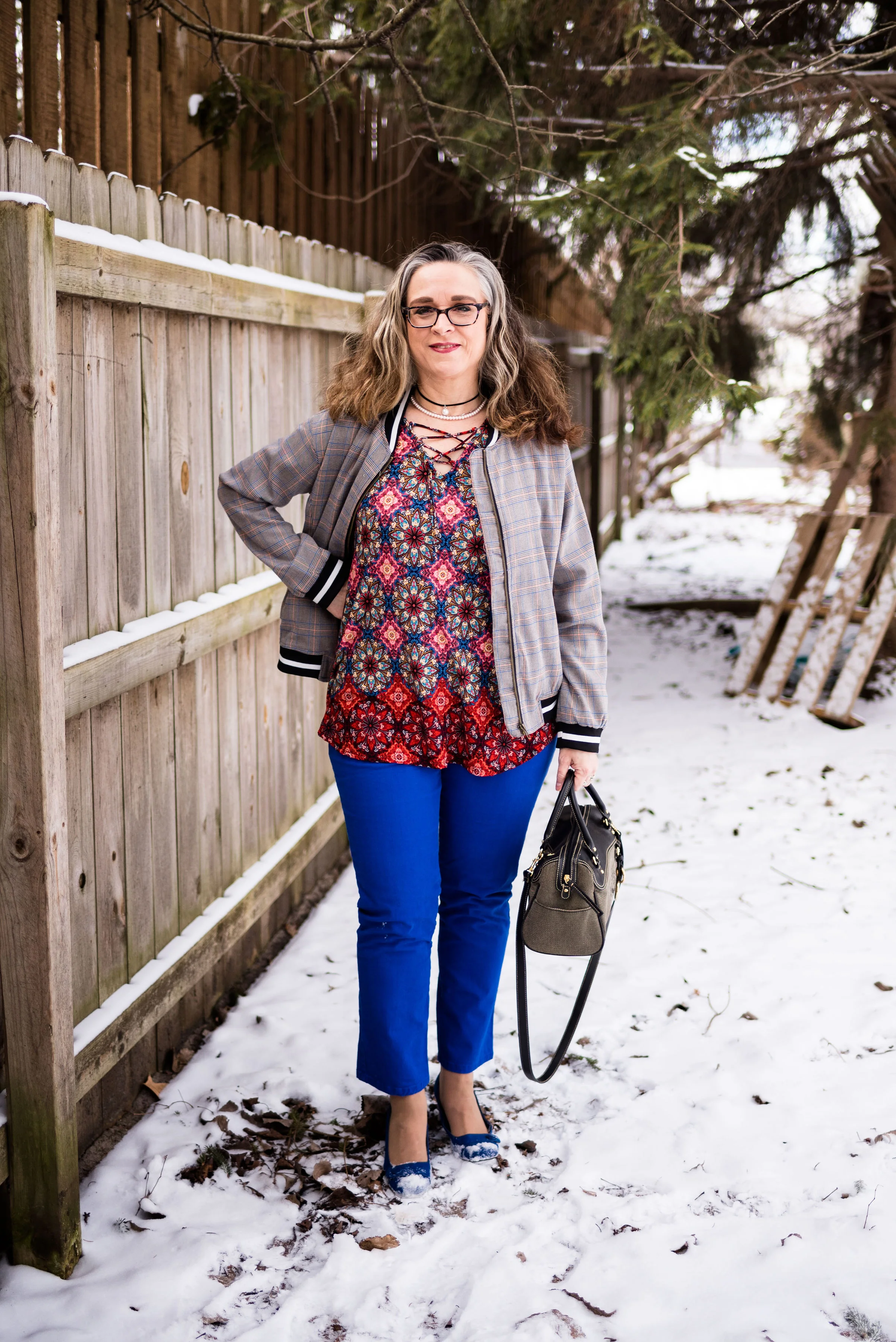
When I saw this multi print tunic hanging in my closet, I thought this might be a good opportunity to get it out. This festive, colorful roz & Ali piece is a past purchase from dressbarn. I think of it as a party shirt. It seems so bright, cheery and happy, that it just wants to dance and party. That’s a little bit of a contrast to my more subdued, introverted nature, but it is good to get out of our comfort zones once in a while.

Pairing it with the plaid jacket, I let it hang around for a while and kept looking at it, wondering how I could make it work for this print mixing series. Then I remembered my thrifted, cobalt blue, Gloria Vanderbilt jeans.

You can see more of the details in this photo. The tunic has a lace up v-neck. Since there is already so much going on with the print, I opted for shorter necklaces in a more classic style. Rev it up and tone it down. I know some might go for bright beads in various lengths, but my objective with this outfit was to party, but party conservatively. That’s me in a nutshell. I don’t drink, but I do like to dance. I also liked the way the pearls and black cord on the choker, compliment the black and white stripes on the jacket.

Funny story about these cobalt shoes. I have had these shoes for a long time. I’ve worn them on the blog before with various outfits and I really like that they are so bright. The last time I remembered wearing them for the blog was summer of last year. My daughter and son-in-law were in the process of moving out of their apartment into a house and we had planned a shoot at the apartment complex so I could help do some packing. That was the last time I ever saw them (the shoes, not my daughter and son-in-law). I thought for sure, they had gotten thrown away in the chaos of helping to pack and purge at the apartment. I gave them up for lost, even though I searched my house all over thinking I may have just misplaced them when I got home to put things away after the shoot.

The other day when I was working on outfits for this series, I was going through shoe boxes looking for some of the pairs I had put away that were more spring/summery. Lo and behold there my shoes were in a box in my closet. Ha, ha, ha. Maybe I am starting to lose the plot, as my hubby likes to say. Dementia is highly likely with my family history, but I just pray I’ll be sweet!


This bag is another thrift store find. I like the style. Now, being a fashion blogger, I do have a few Pinterest boards, that I like to play with. I need to do more with those, but there are only so many hours in a day, as everyone of you know. However, I do have a board that is called Fashion Vocabulary and I put things on there like different types of bag styles, dress styles, skirt lengths, heel heights and so on. Anyway, I looked for the proper name for this bag and I would say that it is a hybrid between a doctor bag and a barrel bag. A true doctor bag style would have a metal frame connected to the opening. So now you know.

I personally feel, what makes this outfit work is the bright blue pants and shoes. Obviously, you could have done the same thing with black pants or a skirt, or orange. The solid color ties the two pieces together, and compliments the blues in each pieces.

What do you think? Am I helping you to get over your fear of print mixing? I certainly hope that these posts are inspiring you to think outside your fashion box.

Photo credit Rebecca Trumbull.
I’ve included a few shopping links for you to have fun with. These are affiliate links. If you click on a link I get a few pennies. All opinions are my own.