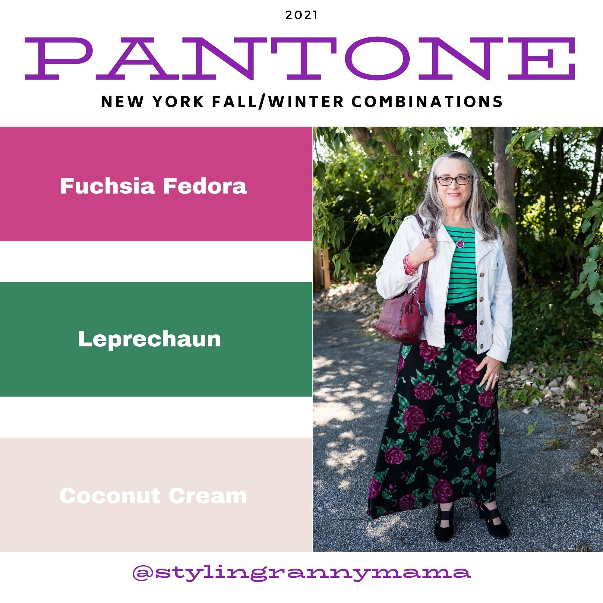
Pantone - Autumn/Winter - 2021 - New York Palette: Fuchsia Fedora, Leprechaun, and Coconut Cream

The colors I am showing you today were ones that surprised me a bit for a fall palette. The bright Fuchsia Fedora is not a color that I have very many pieces in, thus why I used it more as an accessory color. Leprechaun was also a different choice. I was thinking there would be a darker, more forest green color, but this bright, cheeky color is what appeared on the palette. However, that is one of the reasons I like doing this color series. It forces me to think outside the box.

FuschiaFedora.jpg

Even though I wasn’t particularly fond of these colors for fall, I actually liked the way this outfit turned out. Even though the light jacket looks nothing like Coconut Cream, these colors and their combinations are just guidelines for us. Not rules…and just for fun….

I loved The Pirates of the Caribbean movie, and that whole idea of rules versus guidelines was amusing as it kept coming up in the movie and was used according who benefited the most. I guess we could take a lesson from that when we look at our closets. The combinations you put together are for your benefit. You get to decide what you like and what you don’t. You make the choice of what colors or prints to put together, and whether you want to buy into the trends or not. I think we can safely say those fashion “rules”, are really more like “guidelines.” My job as a fashion blogger is to give you ideas of how to make these combinations and hopefully inspire you to think outside your own boxes.

pantonefallcolortrendsfuchsiafedora-10.jpg

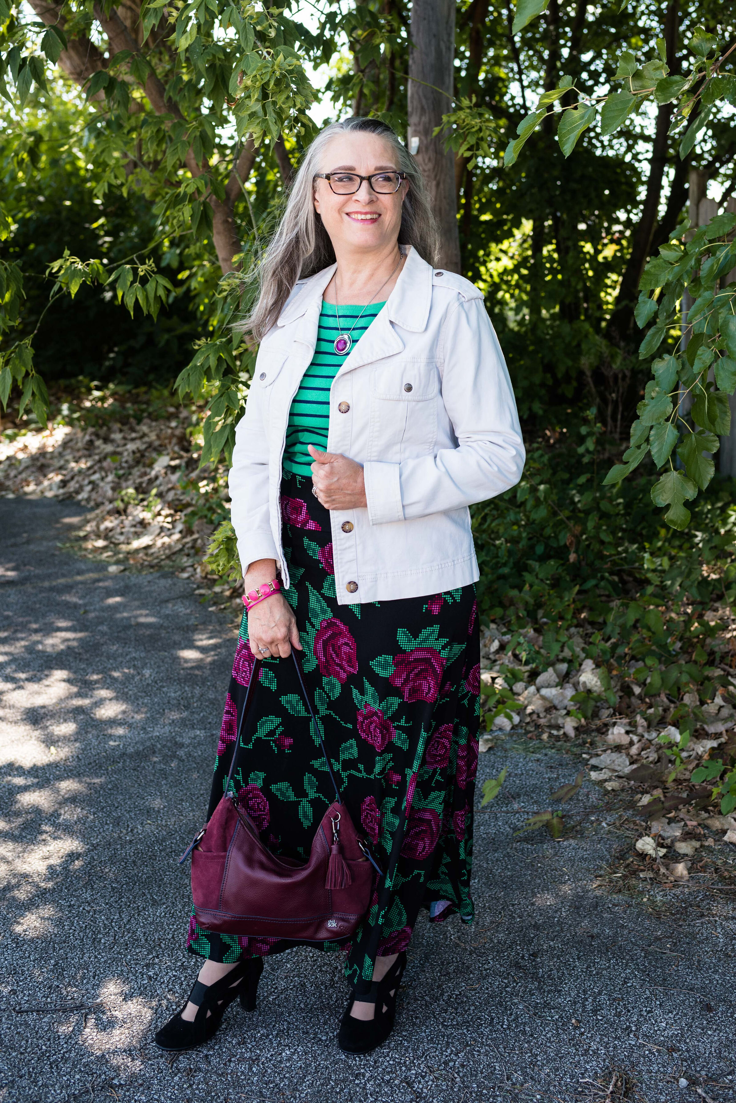
My LuLaRoe skirt was the perfect choice to build this outfit around. I actually had the thrifted striped tee already pulled out as a match for Leprechaun, and as I started figuring out which colors and pieces to put together, I remembered this skirt. I always have a little celebration party when pieces come together. When I try things on I do a little dance in front of the mirror and say, “This is it!” Ha, ha. The stripes in the tee are actually navy, but with the two prints taking center stage, you can’t really tell the colors are different.

pantonefallcolortrendsfuchsiafedora-3.jpg

My cream jacket by Sanctuary is a thrifted piece you have seen before on the blog. You can see it with a leopard print skirt and with my bright blue pants. It is actually more of a canvas than a denim, but it works much the same as a denim jacket providing light weight coverage for cooler weather and adding a casual touch to a dressier outfit.

pantonefallcolortrendsfuchsiafedora-5.jpg

You can see my Fuchsia Fedora necklace and bracelets. I think I have jewelry in just about every color under the sun, but you know, a girl can never have too many fun accessories! Is that a rule, or a guideline? Ha, ha.

pantonefallcolortrendsfuchsiafedora-8.jpg

My bestie, Stacey, gave me this beautiful, leather the Sak bag last time she came to visit. I thought the berry color went perfectly with the darker berry color in the flowers on the skirt.

pantonefallcolortrendsfuchsiafedora-9.jpg

These beautiful black suede heels never get to go anywhere, so I do like to bring them out and show them off on the blog. These are Aerosoles and I bought them a few years ago at a Clarks shoe outlet. I like that they are comfortable, have a reasonable heel, stay perfectly in place and look classy.

pantonefallcolortrendsfuchsiafedora-2.jpg

What do you think of these colors? Do you like them for fall? Now that I am thinking about it, I might need to revisit the idea of fuchsia as a fall color. I could see it with other fall colors like golden yellow, burgundy and rusty orange. Hmmm. I may have to get a little further outside of my color box.

Let me know what you think. I’m including a few shopping links for things of similar color. These are affiliate links and are brought to you at no extra cost. If you click on a link, I get a few pennies. If you purchase something through my site, I get a few more. I appreciate every click.

Have a great day!

Photo credit Jessica Trumbull with Rebecca Trumbull.

Pantone - Autumn/Winter - 2021 - New York Palette: Mykonos Blue, Spring Lake and Coconut Cream

It seems that every Pantone color palette that comes through the Institute has at least one, if not two blues on it. Blue is a color that everyone can wear, whether you wear dark classic navy, casual comfortable chambray or tropical hues that take you to the beaches of the Caribbean. I have a lot of blue in my closet, but then, I have a lot of every color in my closet. Ha, ha. Blue is great for pairing with many other colors. I pair denim with every color and denim definitely falls in the range of blues. Today’s blues are wearable and most likely already in your wardrobe.

SpringLake.jpg

My colors did not really line up with these blues. Oh well, that is part of the challenge of doing this series. I don’t always get the match spot on, but that is okay. The point is to take things you already have and do something similar. It doesn’t matter if your blues are a perfect match or not. All of these pieces were things I already had.

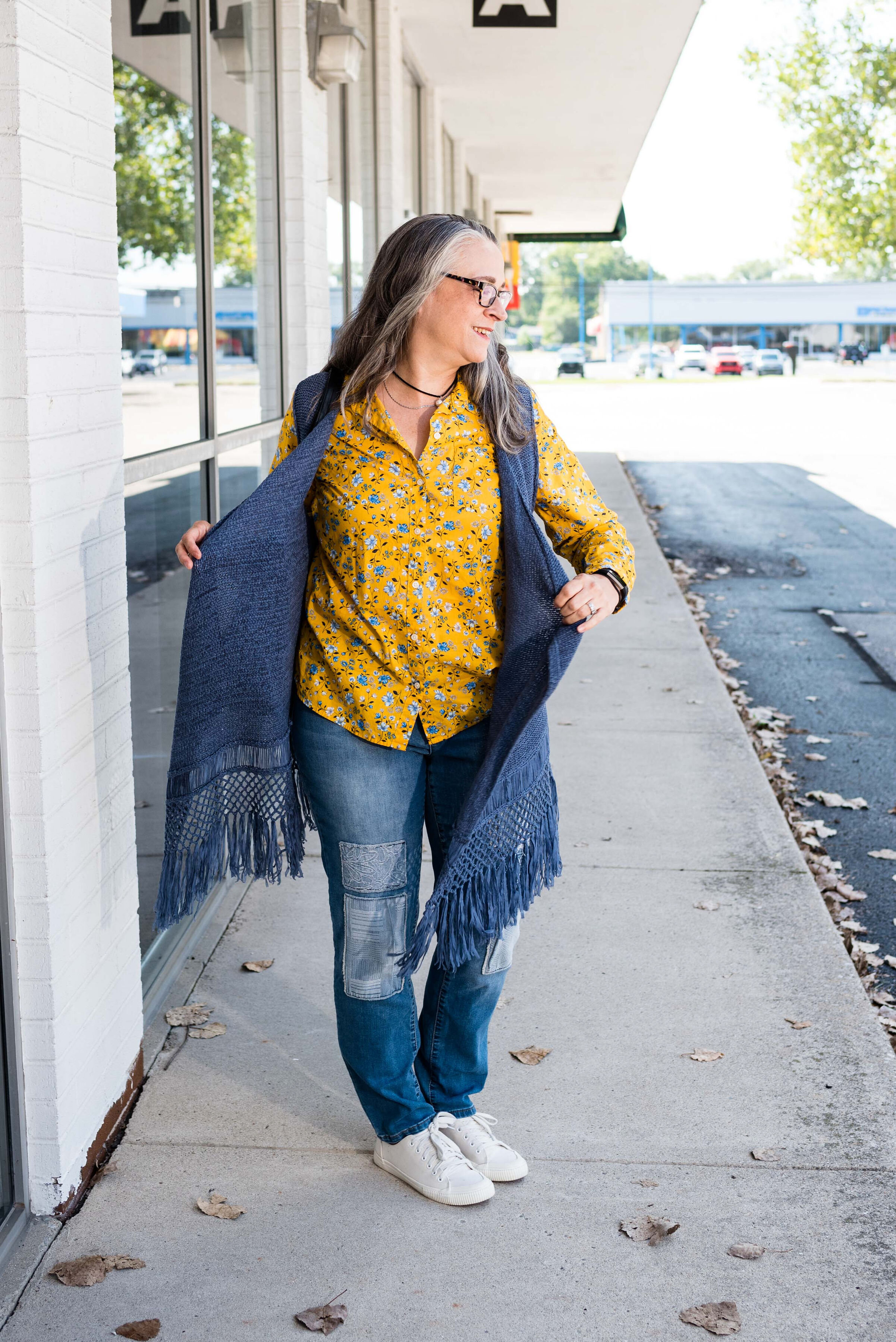
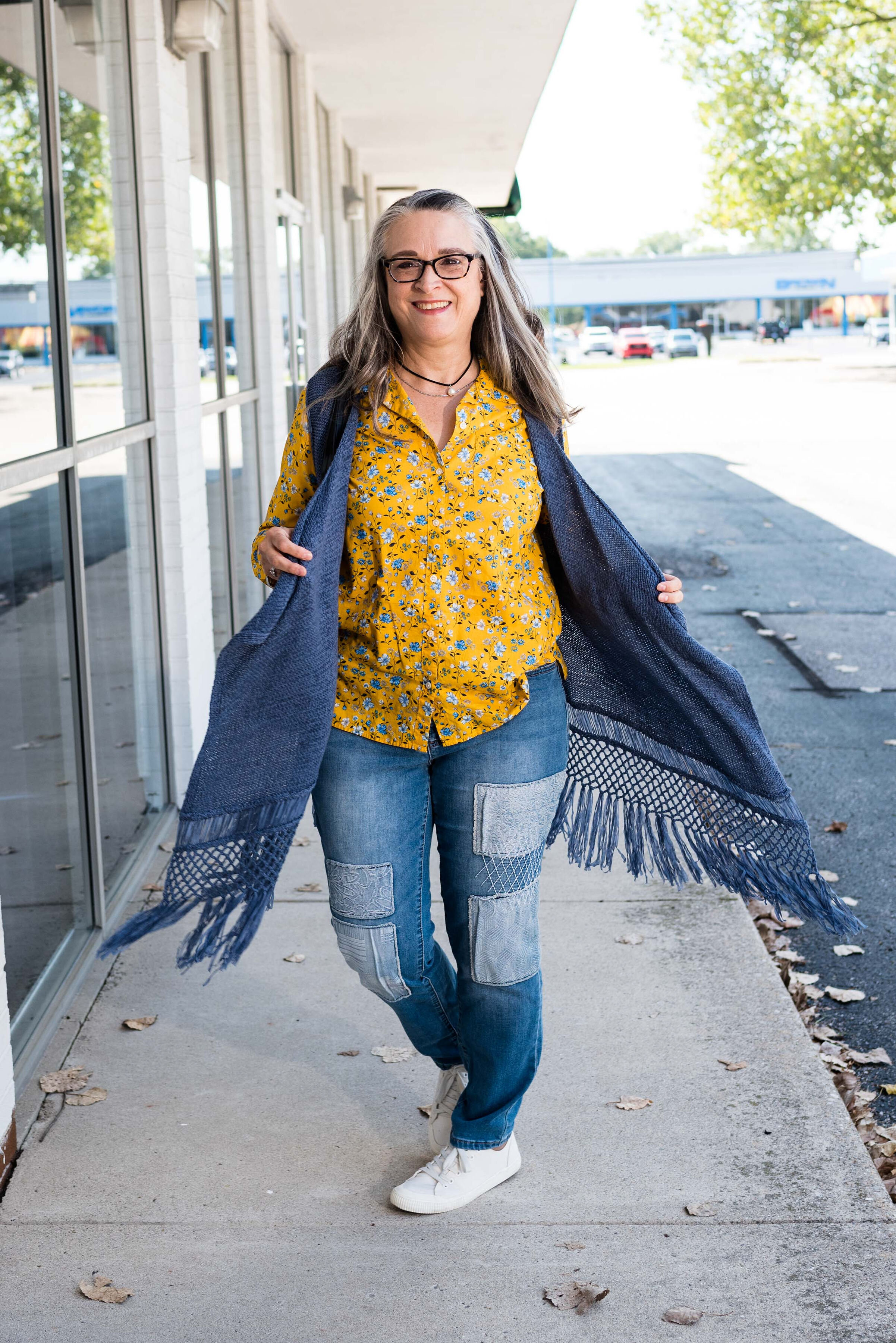
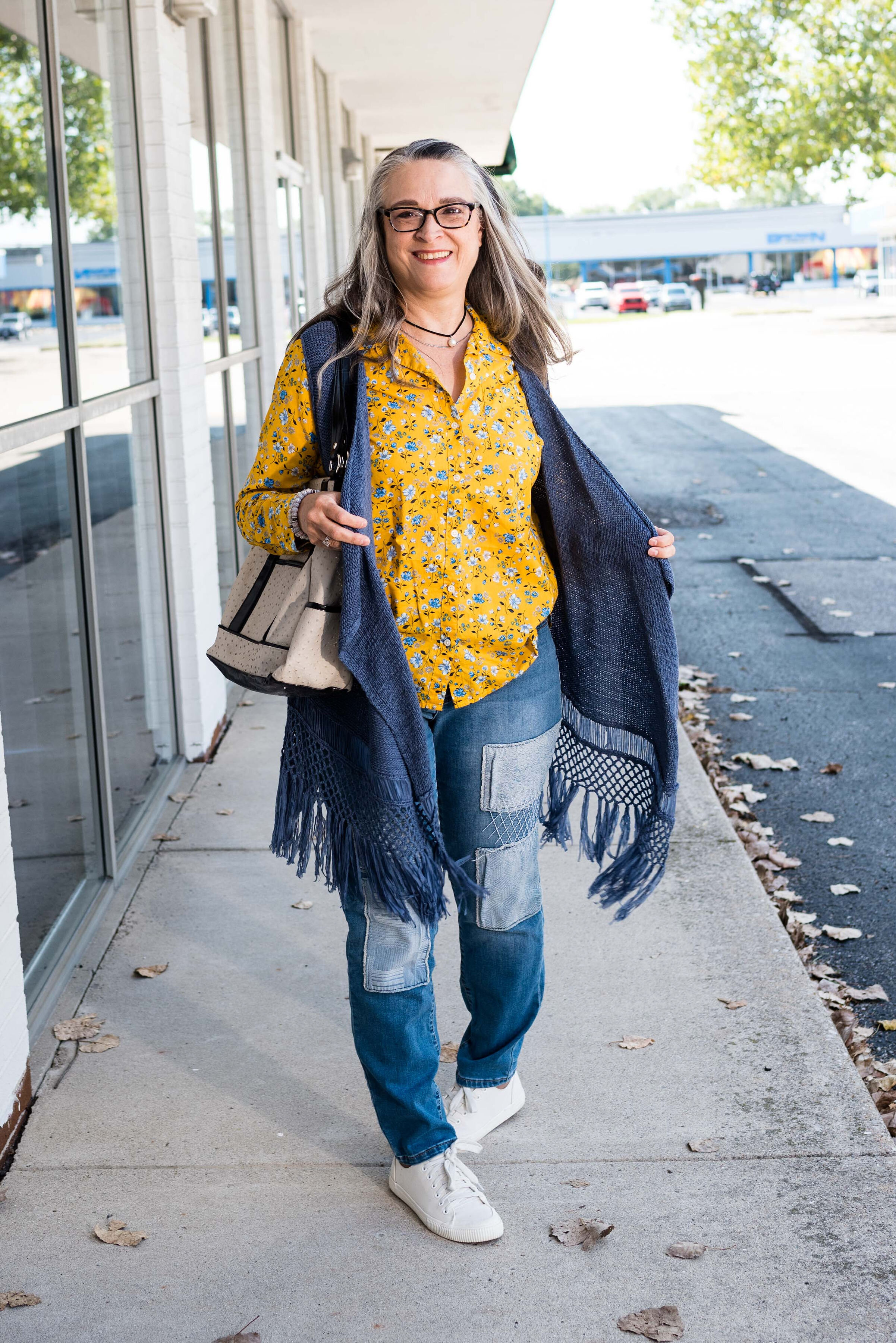
When I picked out these pieces I really thought the pants and the vest would have matched better to Spring Lake, but now looking at the picture the pants seem to match better with the Mykonos Blue. The vest, which does seem to lean a little bit toward a gray undertone, was too dark to match the Spring Lake color. However, the patches on the pants seem to lean a little more in that direction.

pantonefallcolortrendsspringlake-2.jpg
pantonefallcolortrendsspringlake-20.jpg

The vest is a thrifted Relativity piece. I have styled this on the blog before. You can see it worn with a graphic tee. The jeans which I have styled on the blog before are thrifted and a brand called Est. 1946 Denim. You can see how I wore them with a graphic tee and cozy sweater here. Looking at the above picture, I should have rolled up the cuffs on the jeans.

When you have an asymmetrical vest with fringe, you just have to twirl!

My yellow mini floral print button down is a thrifted Old Navy piece. I decided to leave it completely untucked to add to the ultra casual vibe of this outfit.

pantonefallcolortrendsspringlake-5.jpg

I was trying to go for the Coconut Cream idea in my accessories, but again, things didn’t match up exactly. My bag was a hand-me-over from my daughter. This Miche brand bag actually has interchangeable outer shells, so for this look I used the cream colored one.

pantonefallcolortrendsspringlake-14.jpg
pantonefallcolortrendsspringlake-16.jpg

My sneakers are thrifted Mossimo.

pantonefallcolortrendsspringlake-17.jpg

What do you think of these colors? Do you like to wear blue? What color blue is your favorite?

pantonefallcolortrendsspringlake-8.jpg

Thanks for following along with the blog. I appreciate all of your clicks, likes and comments.

I am including a few shopping links for you to look over. These are affiliate links. All opinions are my own.

Have a great day.

Photo credit Jessica Trumbull with Rebecca Trumbull.