Pantone Autumn/Winter 2025 - London Color Palette: Hot Chocolate, Fig and Cumulous Cloud

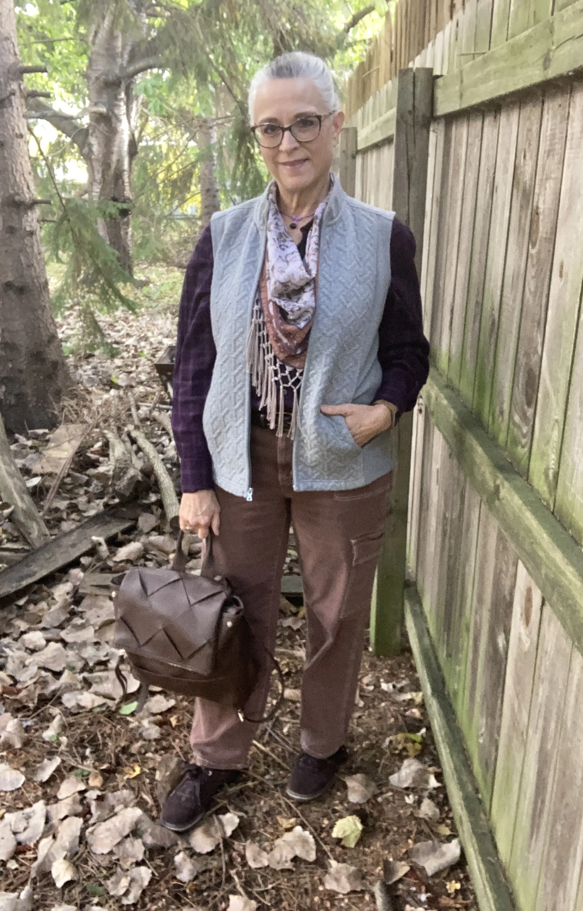
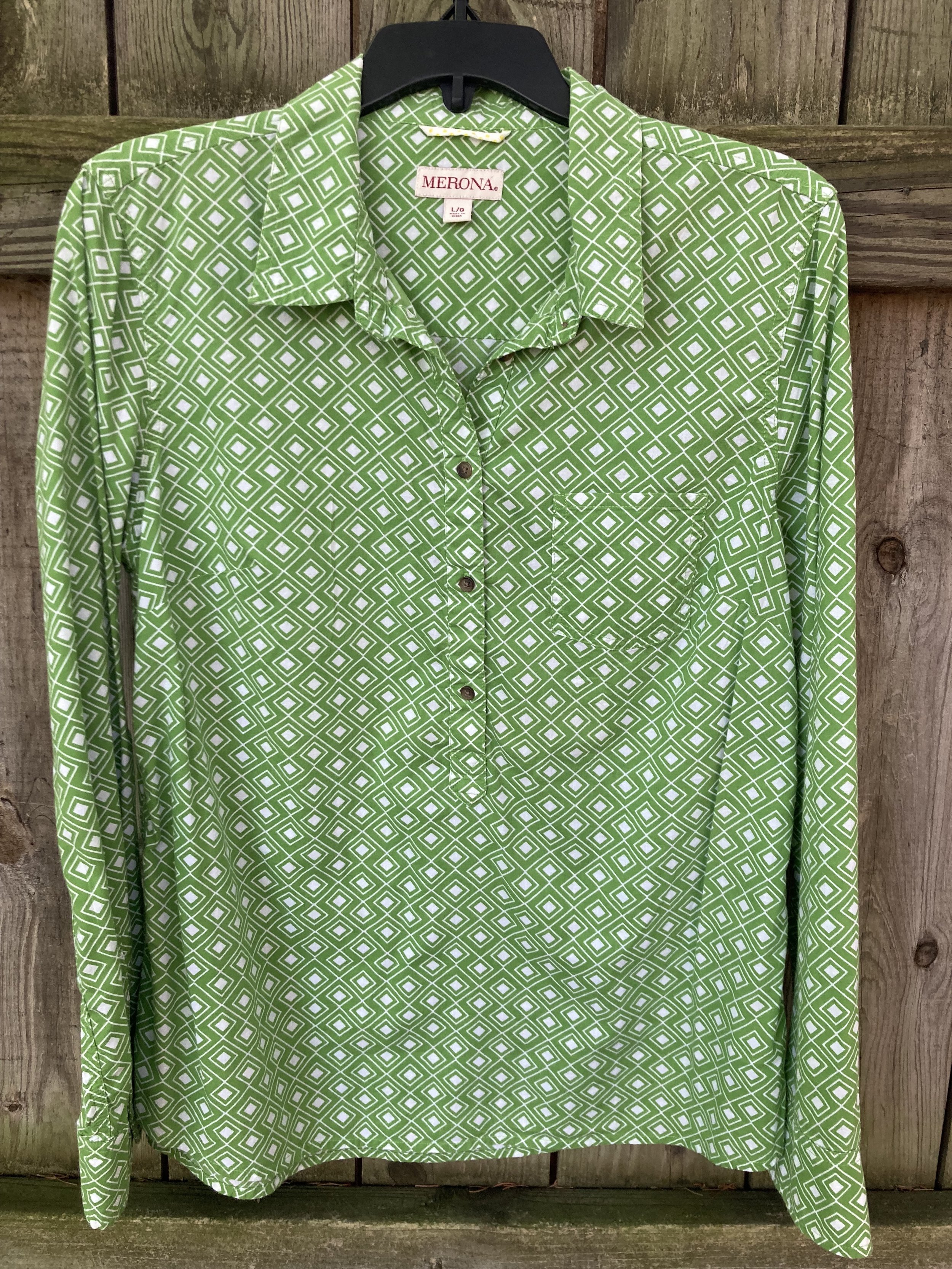
These are the last three colors on the London Color Palette for Autumn/Winter 2025. These are not exact matches, but you can see the actual colors in this pin. I would not have thought to pair these three colors together, but these are what was left after using the other colors on the palette. The reality is, you can pair any colors and create a beautiful outfit by focusing on textures and accessories. Let’s look at the details.

This is a very basic, casual look, but we are all at different stages in life and an outfit like this is perfect for a day of running errands and meeting your girlfriends for lunch. It is comfortable, and warm. Today, I am starting something new. For each piece I am wearing I am going to add a Why I Like It sentence or two, to help you understand my Fashion Philosophy a little better.

Let’s start with my Cumulous Cloud, Christopher & Banks vest. This medium gray is not a color I reach for very often, but I do have a few pieces that are similar to this color. I think it can be a great neutral, but the medium to light grays have a tendency to wash me out, but I don’t let that keep me from wearing the color, I just try to find other ways to bring more color to my face, like a scarf, or even my makeup scheme. I didn’t do as well with that for this outfit, but I still like how this look turned out.

Why I Like It: I have always been a vest girl, and while I am not thrilled with the color, I do love the texture on the front of this piece. It is also a perfect neutral to pair with many other pieces and colors.

My Fig button down is a thrifted Van Heusen men’s shirt. I probably could have found a shirt that was closer to the almost reddish purple, but I ran out of steam. Burgundy might be a better choice.

Why I Like It: It’s purple, what other reason do I need? Ha, ha. There is something about the simplicity of a man’s button down. There’s no lace, no texture, just a basic shirt with a nice pattern. Sometimes simple, masculinity is a nice change from feminine frills.

This color was not popular on my affiliate website, so you are on you own for finding dark purple pieces. If you do a Google search there are a things that pop up.

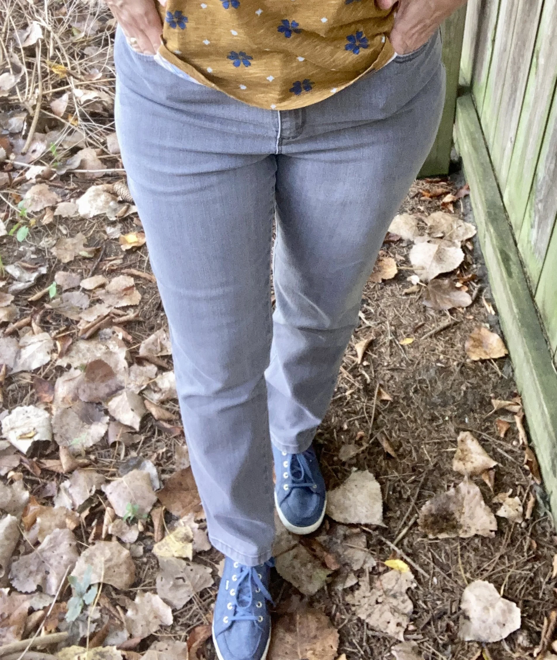
Next up is the color Hot Chocolate. This color was on the New York Palette (you can see that post here), and these thrifted SO jeans are a little light, but again, it is what was closest in my closet.

Why I Like It: I have always liked the casual vibe of a utility pant, coat or vest. The fact that these are also jeans makes it even more fun, plus I was thrilled to find jeans in a different color. Any brown pants I have are dress pants.

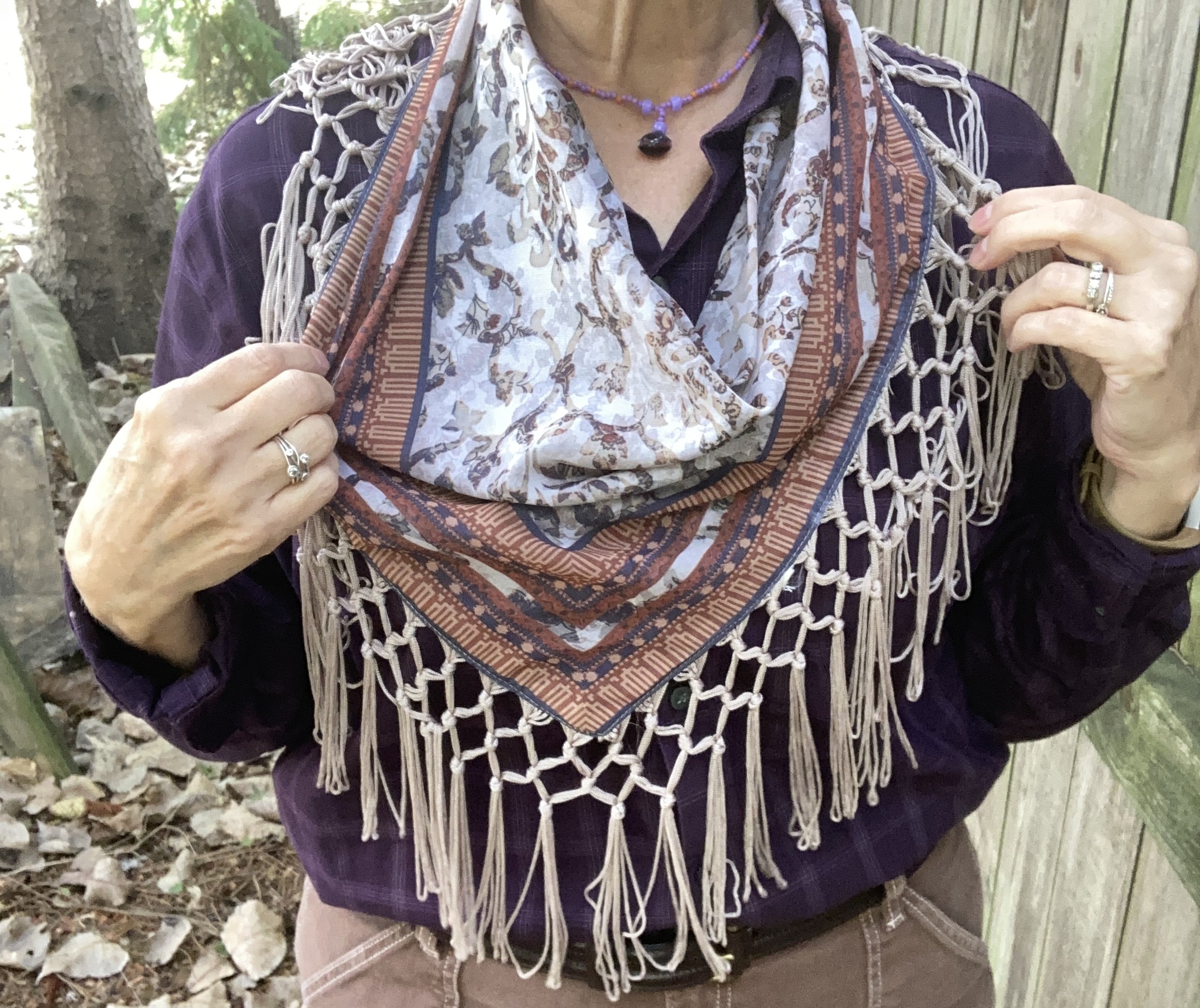
I tried this look with several iterations of layered necklaces, but it just wasn’t working. Finally, I started going through my scarves and immediately knew this thrifted piece was the perfect accompaniment.

Why I Like It: I specifically liked it for this outfit due to the inclusion of every color - Cumulous Cloud, Hot Chocolate and Fig. I think it pulls the whole look together. I bought it because it is different. It is not the traditional square or oblong scarf, and it has that beautiful fringe detail.

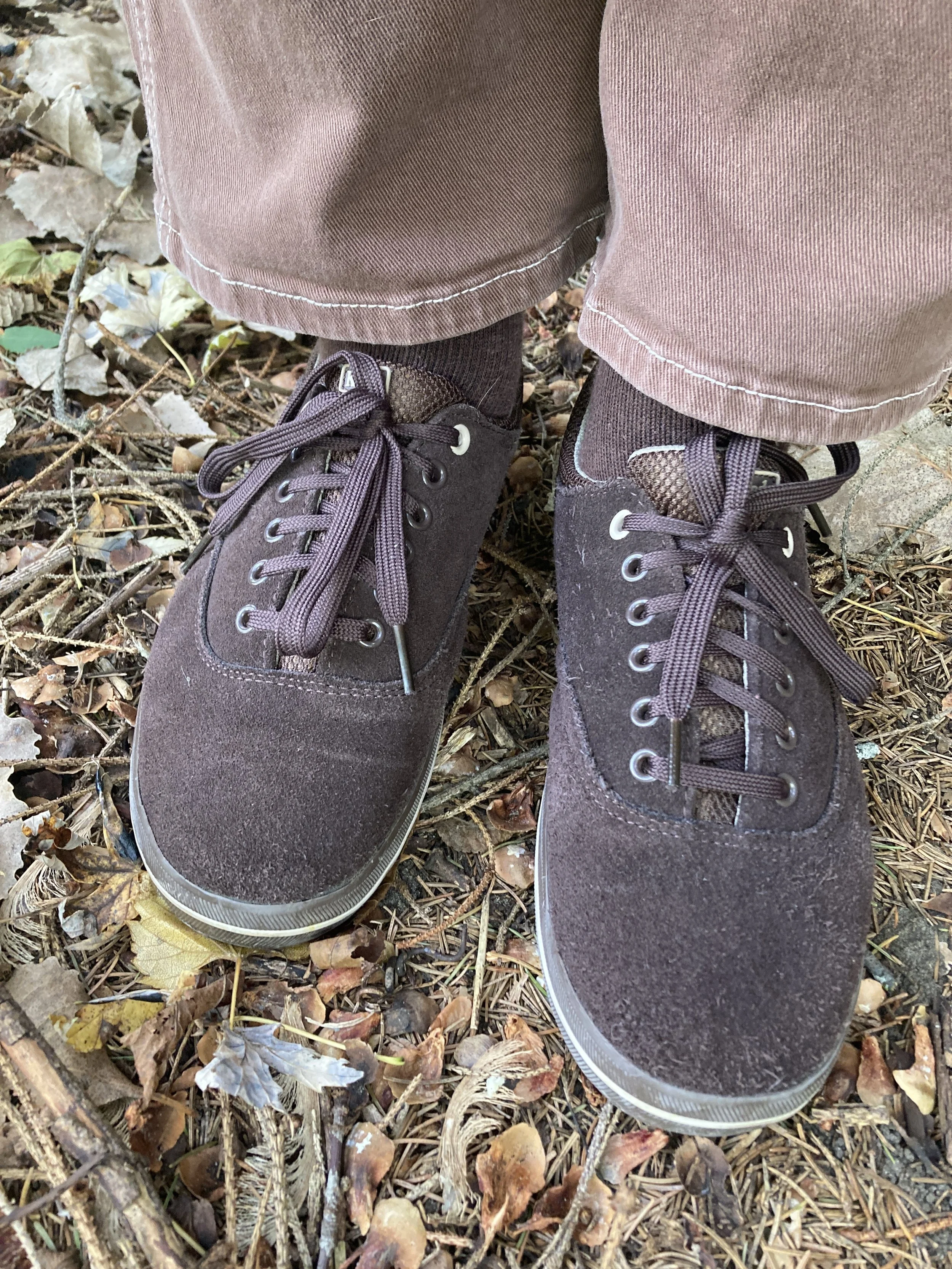
Finally, I chose my thrifted, suede Keds sneakers, a cute backpack for my bag, and a simple bead necklace that was made years ago by my oldest daughter.

Why I Like It: The sneakers are more like shoes than sneakers due to their being dark brown and made of suede. I know these things aren’t even an issue any more, but back in the day, sneakers were white and typically not suede.

The backpack bag was a purchase made in the last couple of years as a travel item. I think I got it at our local Meijer.

While my daughter originally made this necklace when she was into beading and trying to sell jewelry, I obtained it when she was getting rid of a bunch of stuff. I love the color and the cute little dangly bead.

What do you think of these colors? Would you wear a casual outfit like this? What pieces do you have in your closet in these colors? I love to have your feedback so feel free to leave a comment or two.

I’ve included a few shopping links for you to look over. These are affiliate links. What I have found with these Pantone colors is that they are not always available at the retailers used with the affiliate, so that is why you don’t see links for everything. However, this is for your inspiration and to get you to look at your closet with new eyes.

I hope you have a great weekend!

Pantone Autumn/Winter 2025 - Desert Sun, Magical Forest, and Wispy Clouds

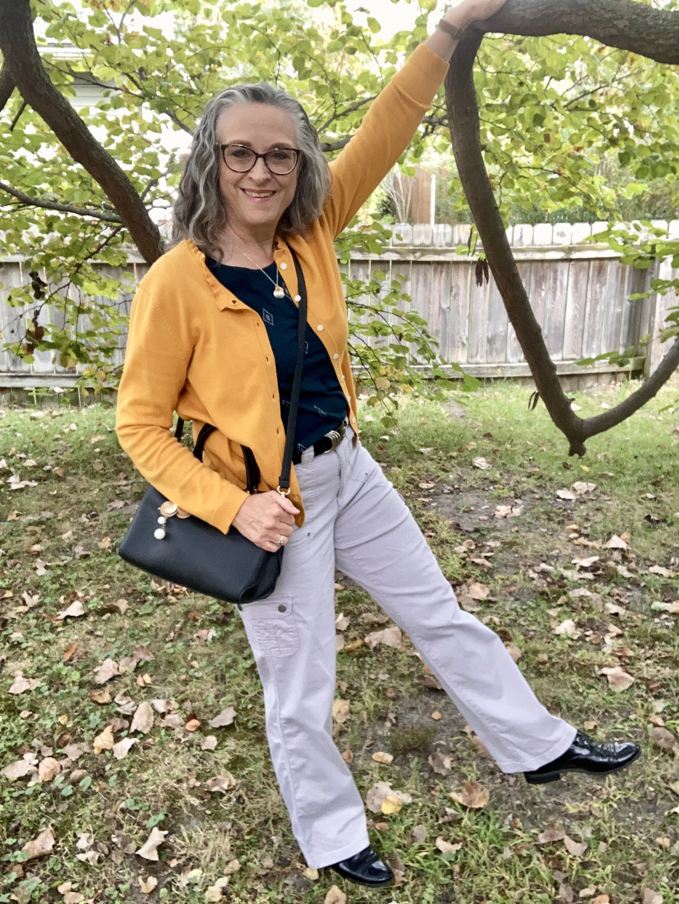
This week we are looking at three more colors from the Pantone London Palette for Autumn/Winter 2025. Today’s colors include, Desert Sun, a rich, golden yellow; Magical Forest, a dark green reminiscent of the deepest woods, and a light, airy grayish white called Wispy Clouds. You can see the actual colors in this pin.

My Desert Sun cardigan is a brand called Callaway V and was a thrift find a few years ago. I love the fun details on this piece including the ruffle around the neck line and the tiny jewels at the center of each button. My phone does not do closeups well, so I didn’t bother trying to get a photo, but trust me those tiny jewels are there. Ha, ha. This golden yellow is a perfect color for fall. You can see how I styled this cardigan with a multi print maxi dress here.

It was hard to find any cardigans in this color so I added a few other Desert Sun items.

My Magical Forest tee is Sonoma brand and was a piece I found at Kohl’s a few seasons ago. Being a not-so-basic sort of girl, most of my basics have to have a few details like interesting prints and even a bit of bling.

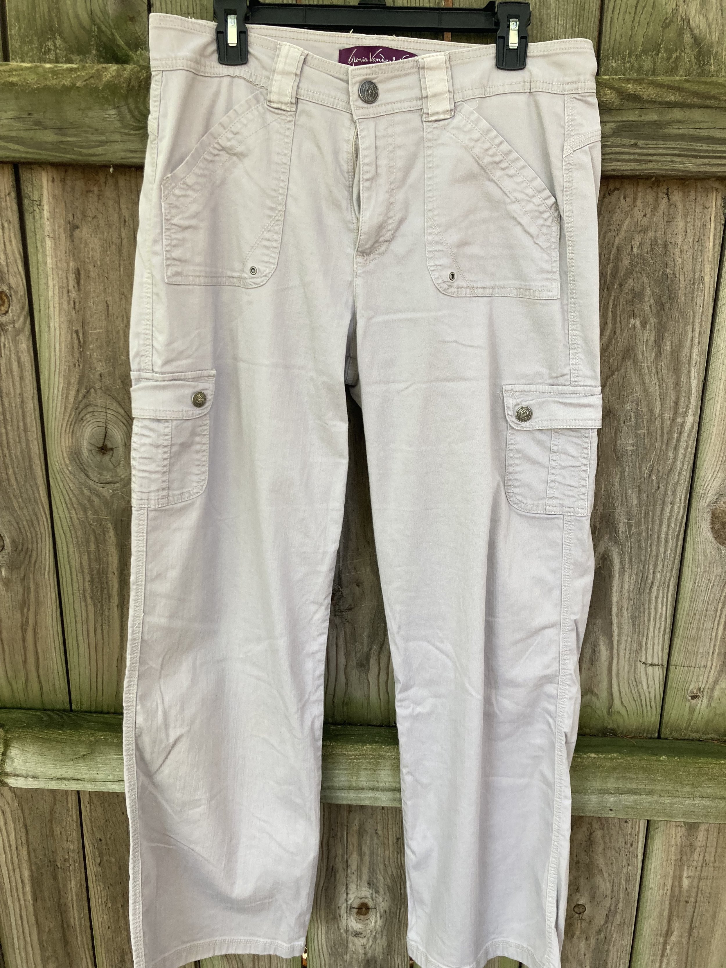
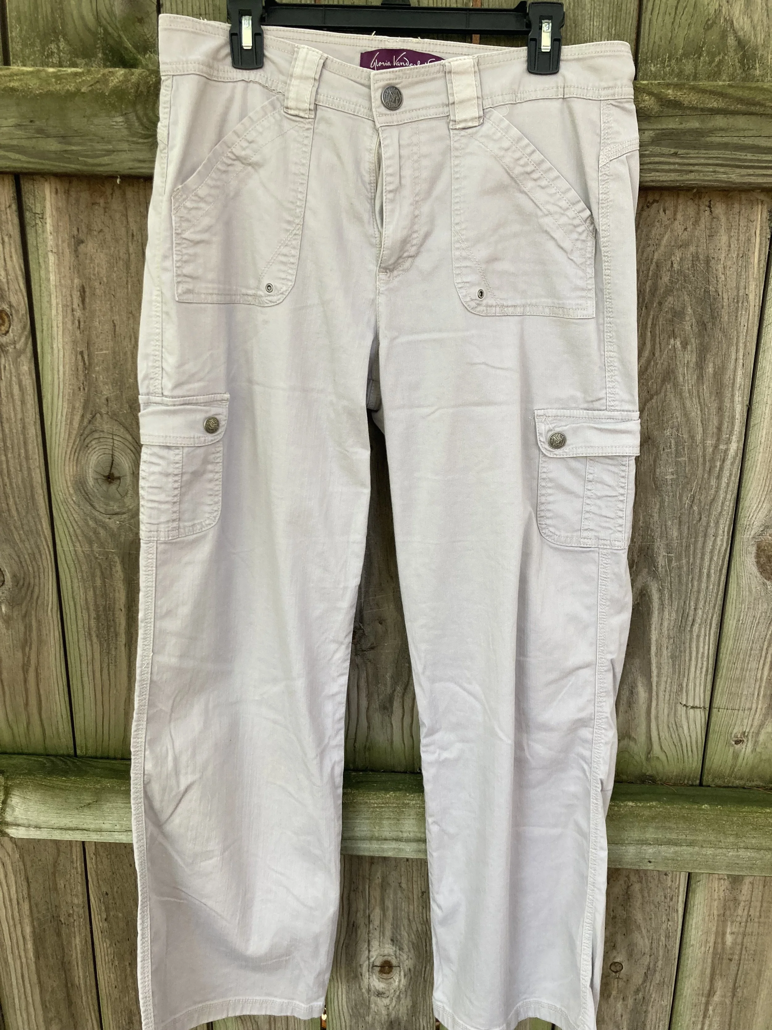
I thought these second hand, Gloria Vanderbilt utility pants were a close match to Wispy Clouds. They are a lighter weight so will be put away for the winter, but they are a great pair of pants for a dressy casual vibe. The utility details of extra pockets and rivets make it more casual, but the wider legs give them a dressier trouser vibe.

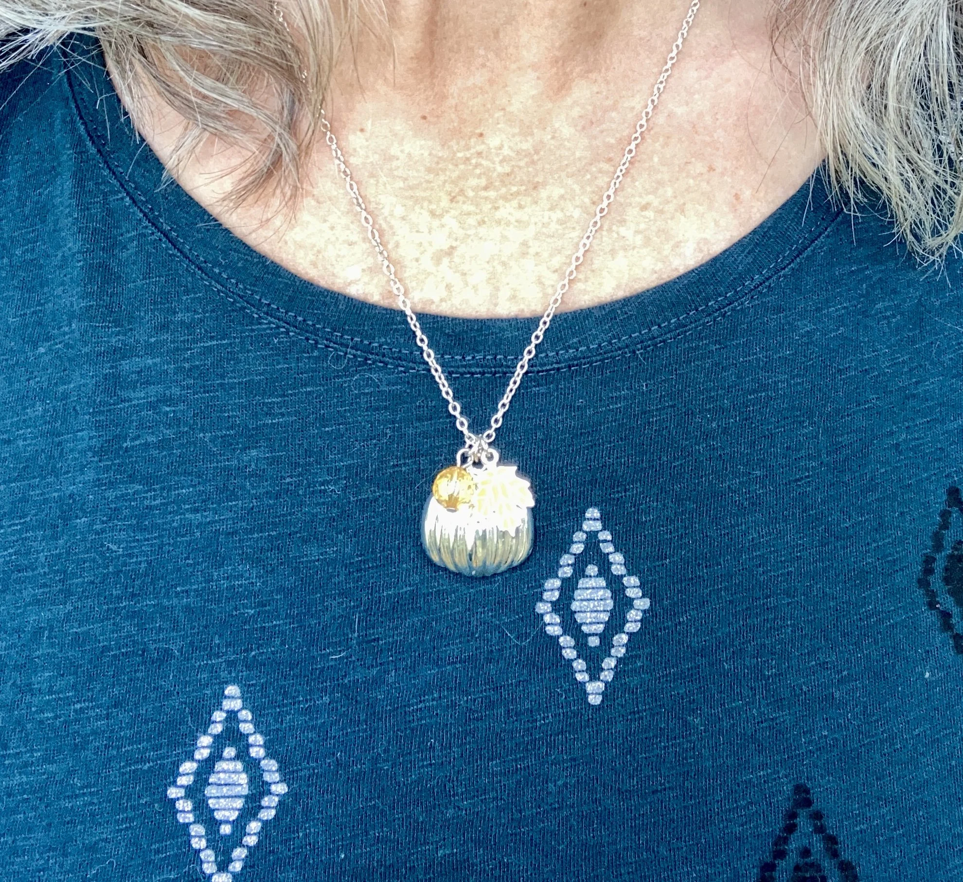
I kept my jewelry minimal with my fall themed, silver pumpkin necklace. This is a fun piece, with an orange leaf and an orange bead, making it perfect to wear all fall long. I honestly can’t remember where I got this. Ha, ha.

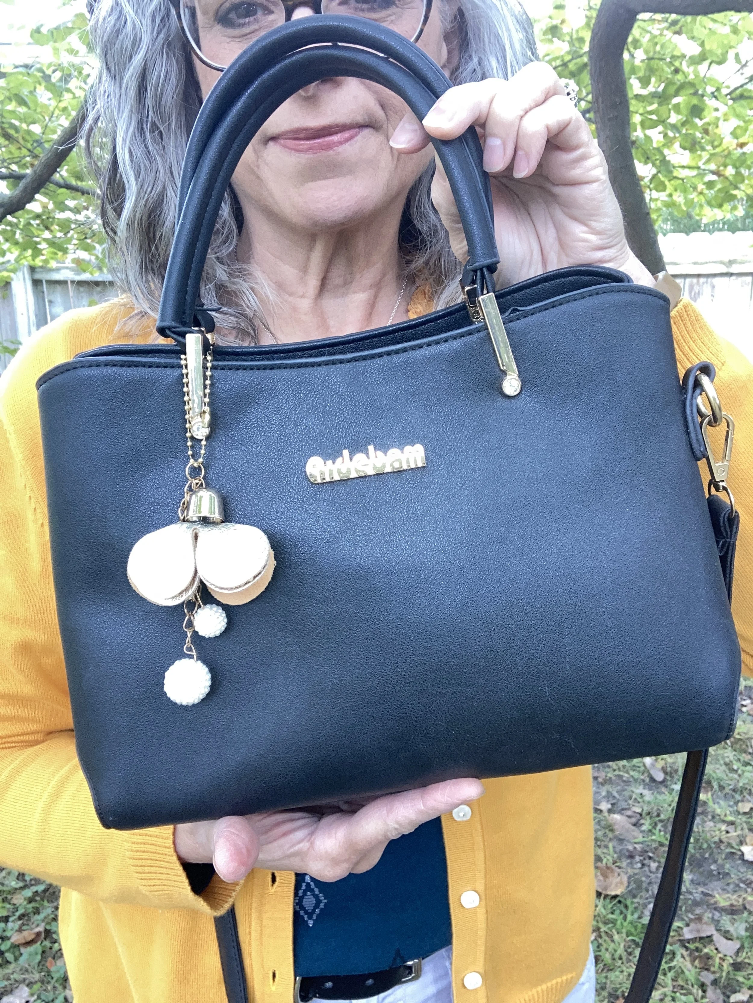
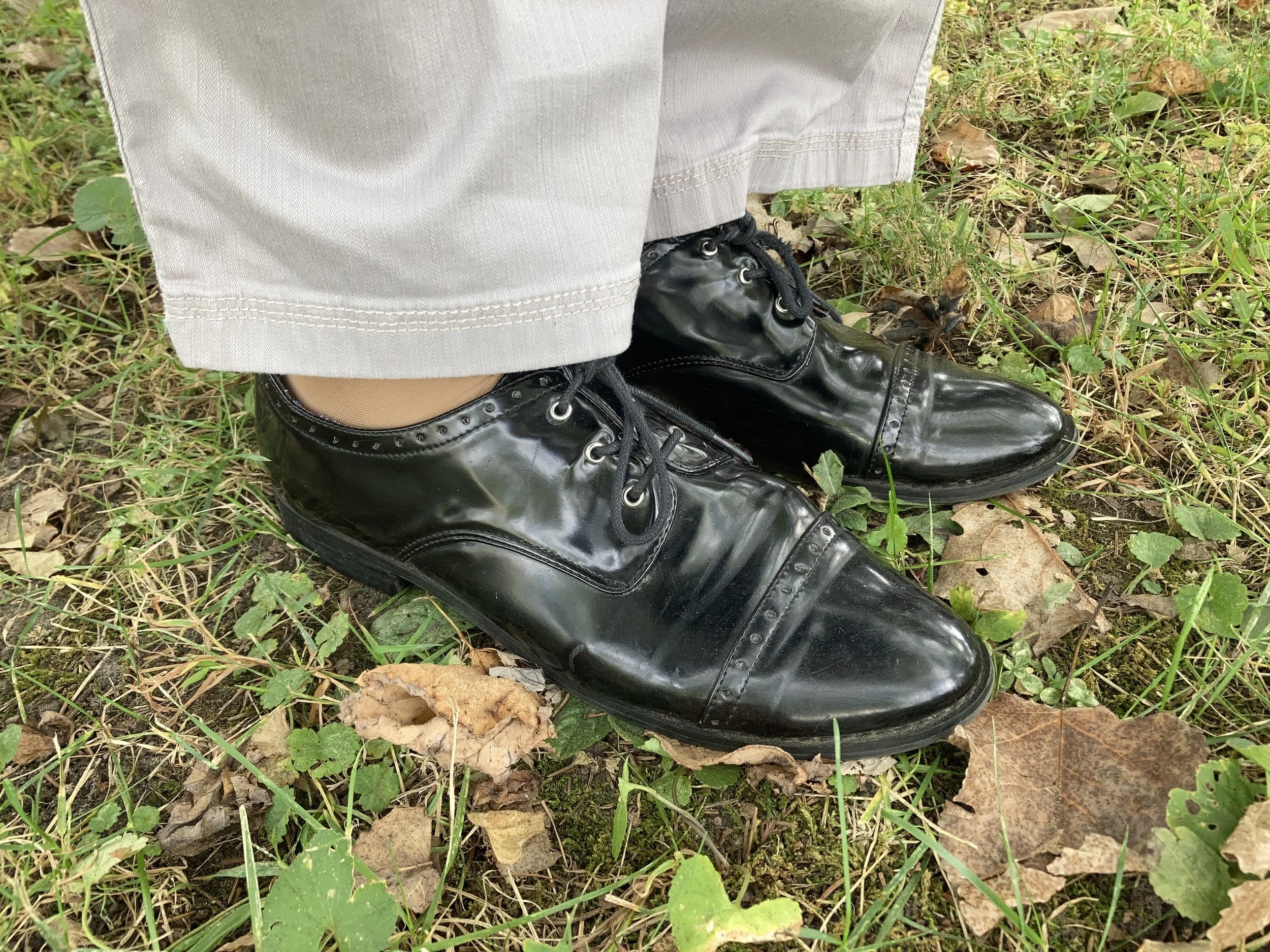
I chose black for my shoes, belt and bag. Honestly, I like how matching a shoe and bag, or a belt with a bag makes an outfit look polished and finished off, but that is just my opinion. Matching is a matter of personal taste these days, so do what works for you.

My belt was thrifted. My bag was a gift from my daughter and is Aidebam brand. My shiny Oxfords are a brand called Sugar. I have had these for a number of years, because I used to wear them to work and I haven’t worked at the bookstore since fall of 2019. Yikes! It’s been six years since I lost my job. Wow! Where does the time go?

What do you think of these colors? Do you like this combination? What colors would you have combined with this golden yellow or this dark green?

I have included a few shopping links. These are affiliate links brought to you at no cost to give you possible shopping options for similar items or colors. Not every color is easy to find, so that is where your closet or a thrift store come in handy. You would be surprised how often I have these colors in my closet, or a close enough match to make it unnecessary to go shopping…although I enjoy that too. Ha, ha.

Thank you for following along on the blog. I appreciate all your support. Have a great day.

Pantone Autumn/Winter 2025 - London Palette: Salted Lime, Fanfare and Chocolate Martini

We are well into October and the last four days have felt like the middle of July rather than fall. We are hopefully heading into a cool down in a day or two. Midwest weather has always been rather chaotic with fluctuating temperatures, times of endless rain, or months of drought. Right now things are very dry, the trees have hardly any color to them, and our cars are regularly covered with dust.

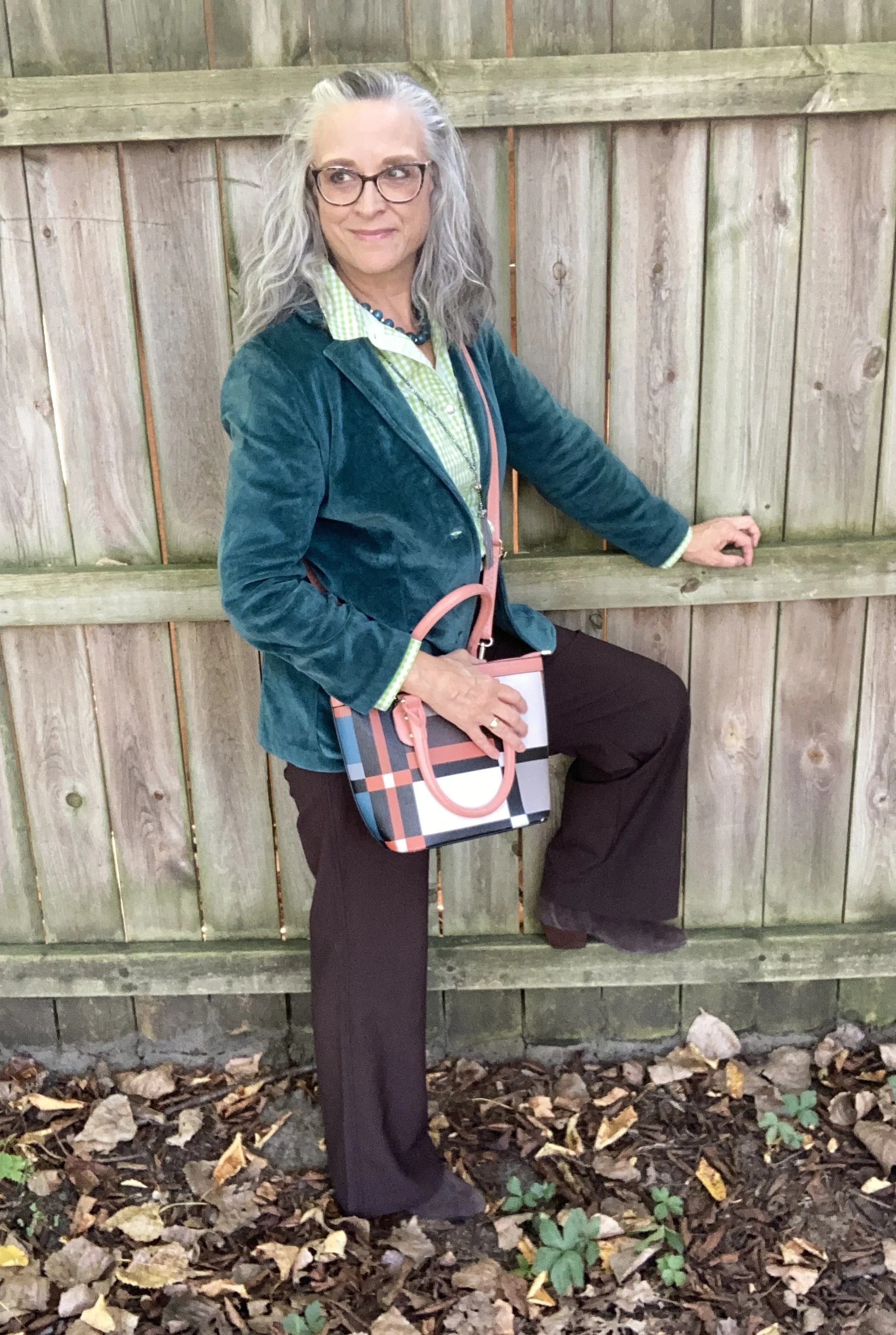
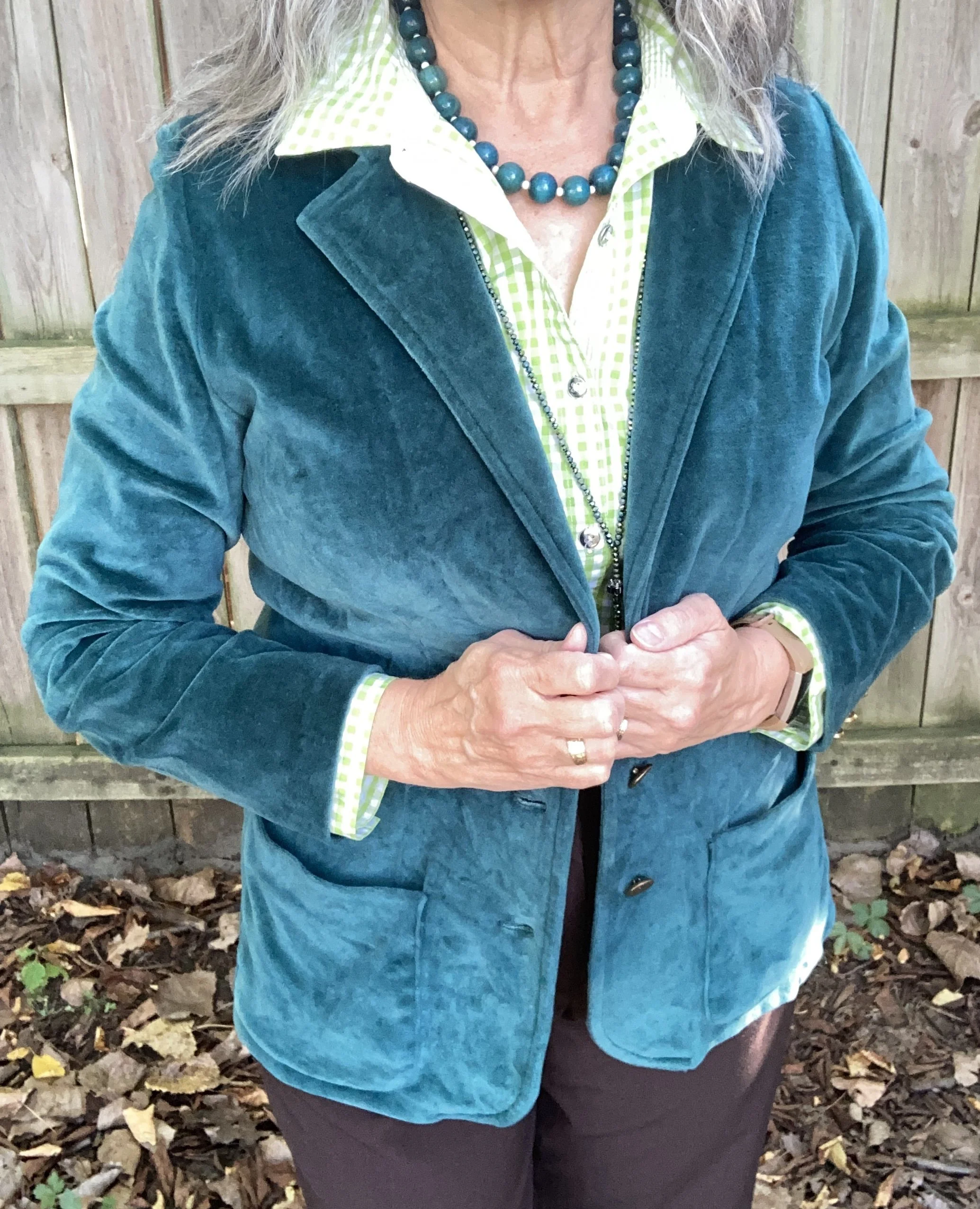
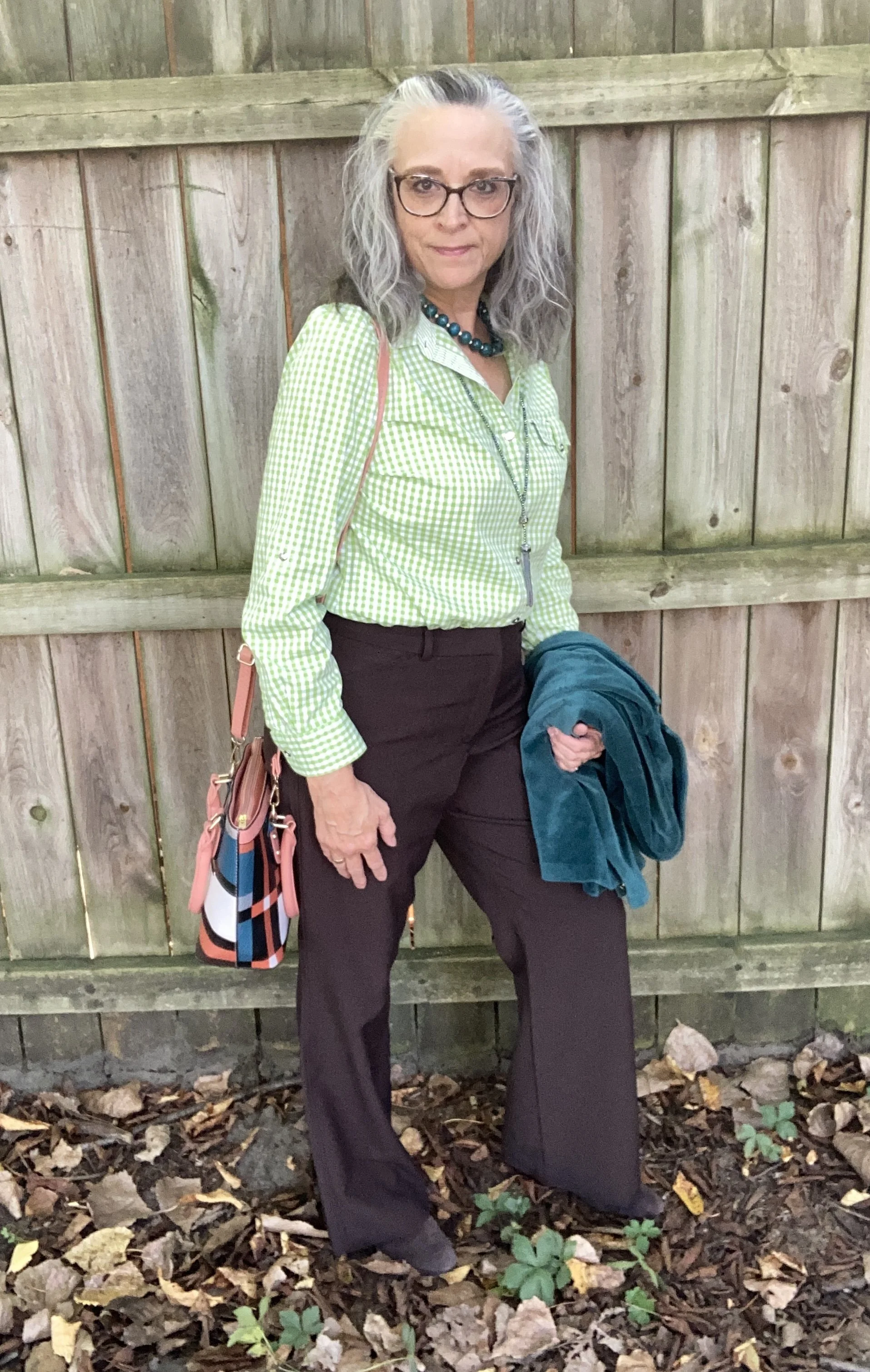
For today’s look I wanted to combine the two greens on the Pantone Autumn/Winter London palette. Just like I combined Lavender Blue and Crown Blue, today I am pairing Salted Lime, a medium, citrus green, and Fanfare, a tealy green. I chose Chocolate Martini for my classic color and I like the earthy vibe of this look. You can see the London palette colors by clicking on this link.

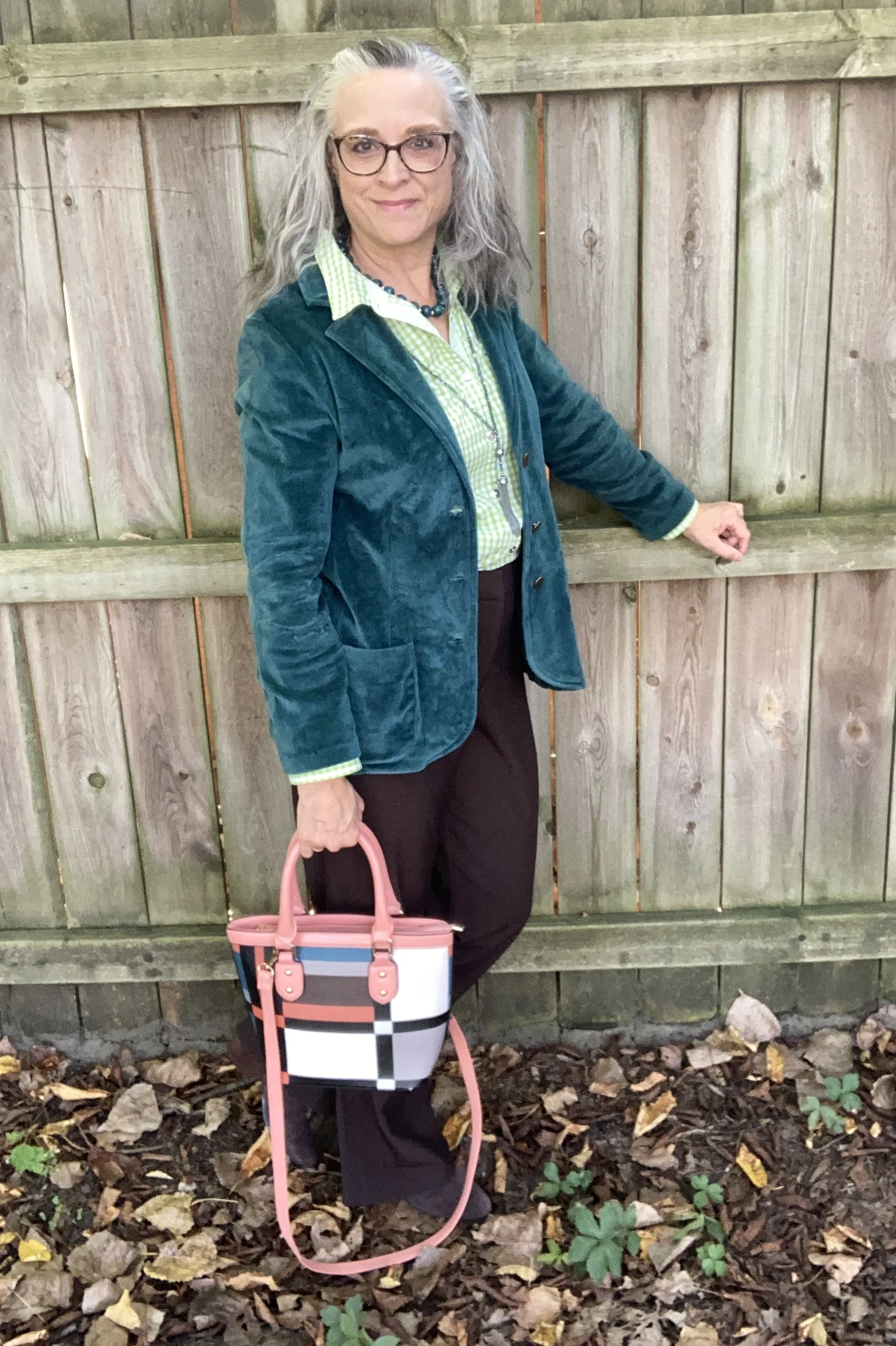
The star of this show is the Fanfare, velvet jacket that I recently thrifted. While not true velvet, it certainly looks the part. I found this piece and immediately threw it into my cart. When I tried it on, I knew it was coming home with me. It was obviously hand made as it still had the rough, inner seams with no finished edges, and no label of any kind.

Salted Lime is not a color I have a lot of. When it comes to greens I like the darker more moody hues of olive and forest green. I also like deep tones like emerald and jungle green. However, I do keep a few pieces that are this lime color. This thrifted, Jaclyn Smith, gingham button down has been around for a number of years. You can see this top as a shacket over a graphic tee, worn under a graphic tee, and worn with a plaid skirt,

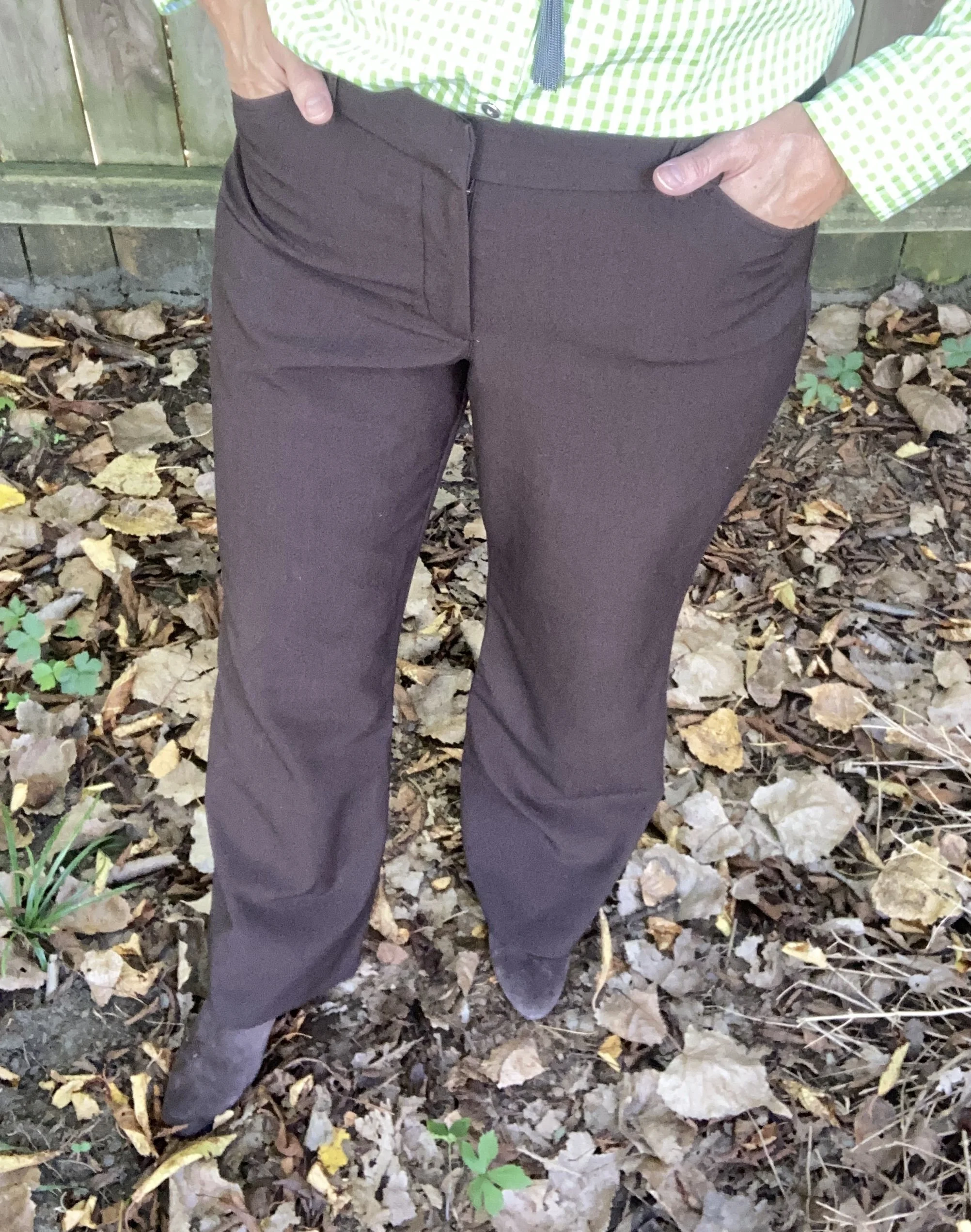
My Chocolate Martini pants were purchased new when I was still working as an assistant manager at a university bookstore. These are Worthington brand and I got them at JCPenney. They have a wider leg and are a bit long so I like to pair them with something that has a small heel.

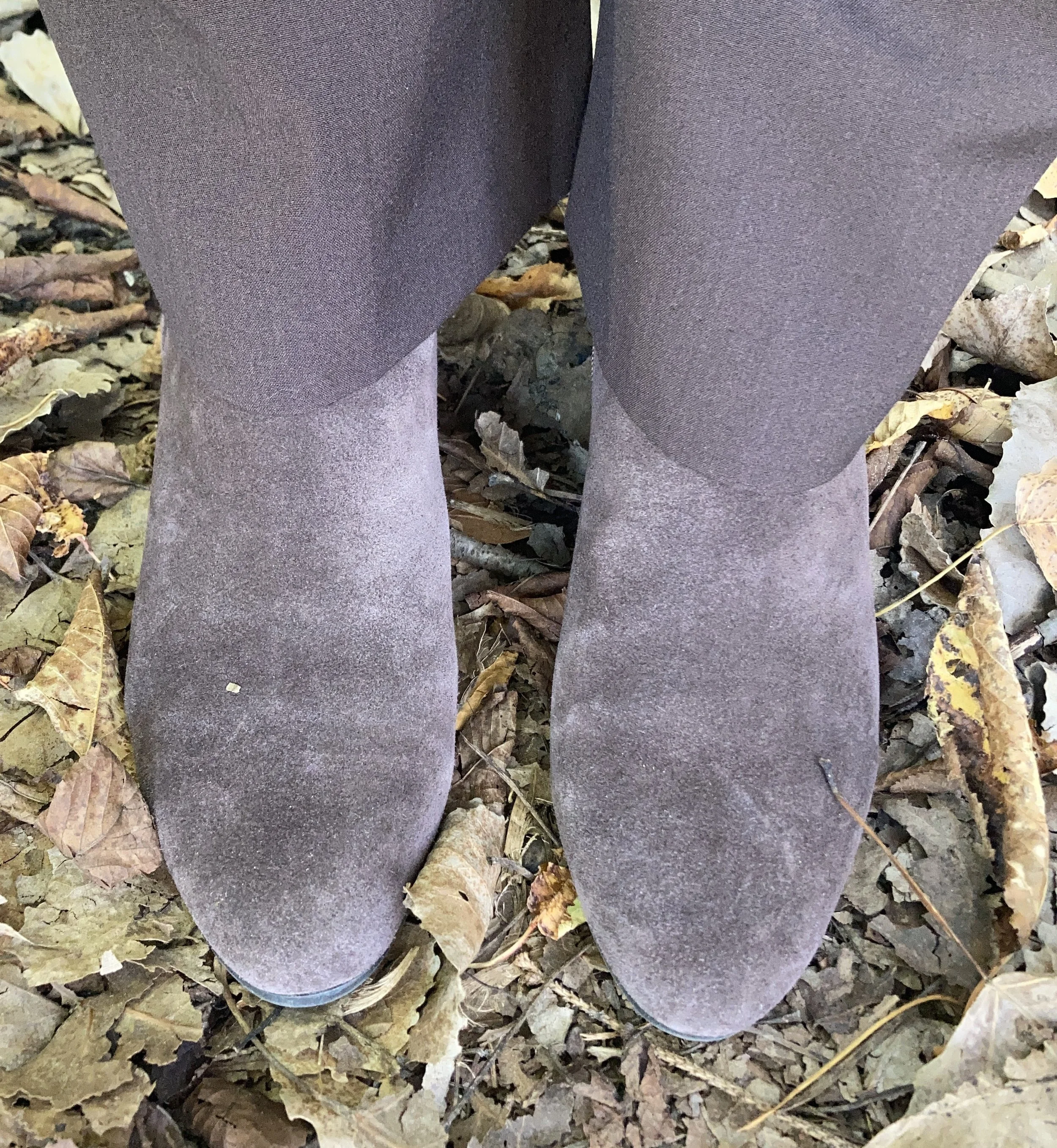
I chose my Nine West heeled ankle boots, which match the pants perfectly. A tip for making your legs look longer and leaner is to match your pants and your shoes. I got these a couple of years ago at Kohl’s.

I went for a layered jewelry look with a short wood bead necklace and a long beaded pendant necklace with fringe.

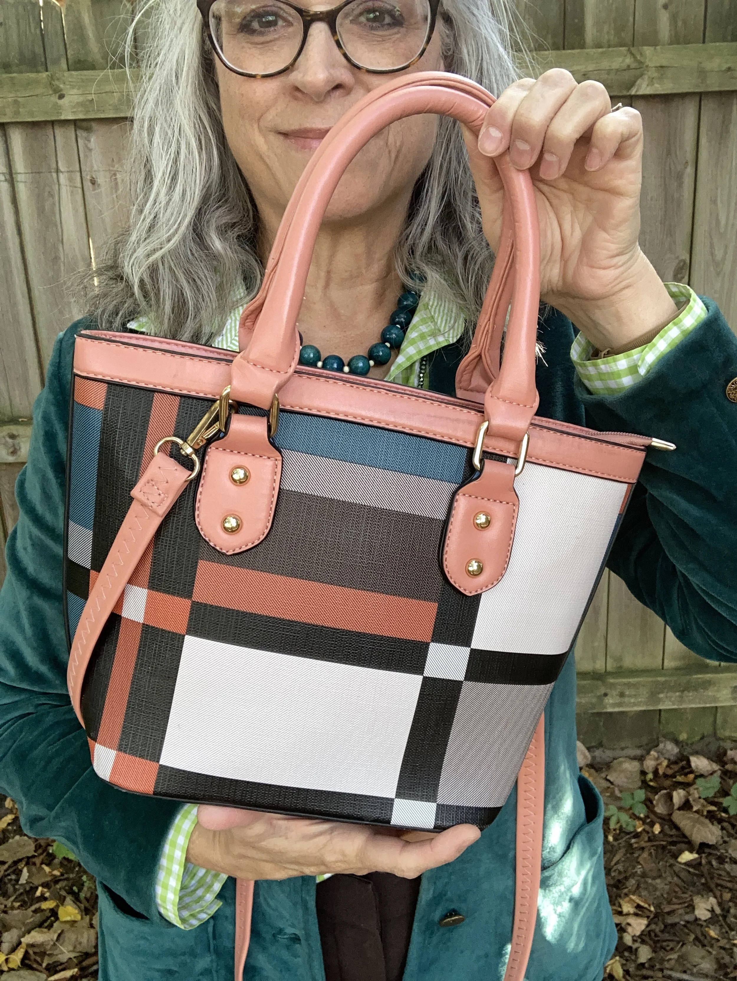
I wanted to add a pop of color and remembered this cute color block bag I had thrifted last year. It is just a cheap bag and has no brand name in it, but I thought it was extremely cute and fun. I think it works beautifully to add an element of extra color to this outfit.

What do you think of these colors? Do you have any of these in your closet? If not, which one would you like to add? Be sure to leave a comment or too. It helps my blog and it always encourages me.

This picture below, definitely needs a caption! What would you put on it?

I have included a few shopping links. These are affiliate links and are brought to you at no extra cost. These are retailers that are available through the affiliate and I cannot speak as to the quality of the pieces offered, so just be sure before you order something that you know the retailer’s return policy. If you purchase an item through my blog using one of my links, I get a little commission. I appreciate all your purchases as they help me keep the blog going. All opinions are my own.

Have a great week!

Pantone Autumn/Winter 2025 - London Palette: Poppy Red, Bronze Mist and Dark Gull Gray

Can you believe September is almost over? Here in the midwest it doesn’t exactly feel like fall. The leaves are changing, the sun’s angle is different and the days are growing shorter and shorter, but our temps have been summery. I really don’t mind the blue skies and high 70’s or low 80’s, but I am ready for the cool down, and the return to all that is cozy, including hot tea and cocoa, baking things in the oven and the sweet layers of sweaters and scarves.

We are looking at another trio of colors from the Pantone London Autumn/Winter 2025 color palette. You can see the colors in this Pinterest pin.

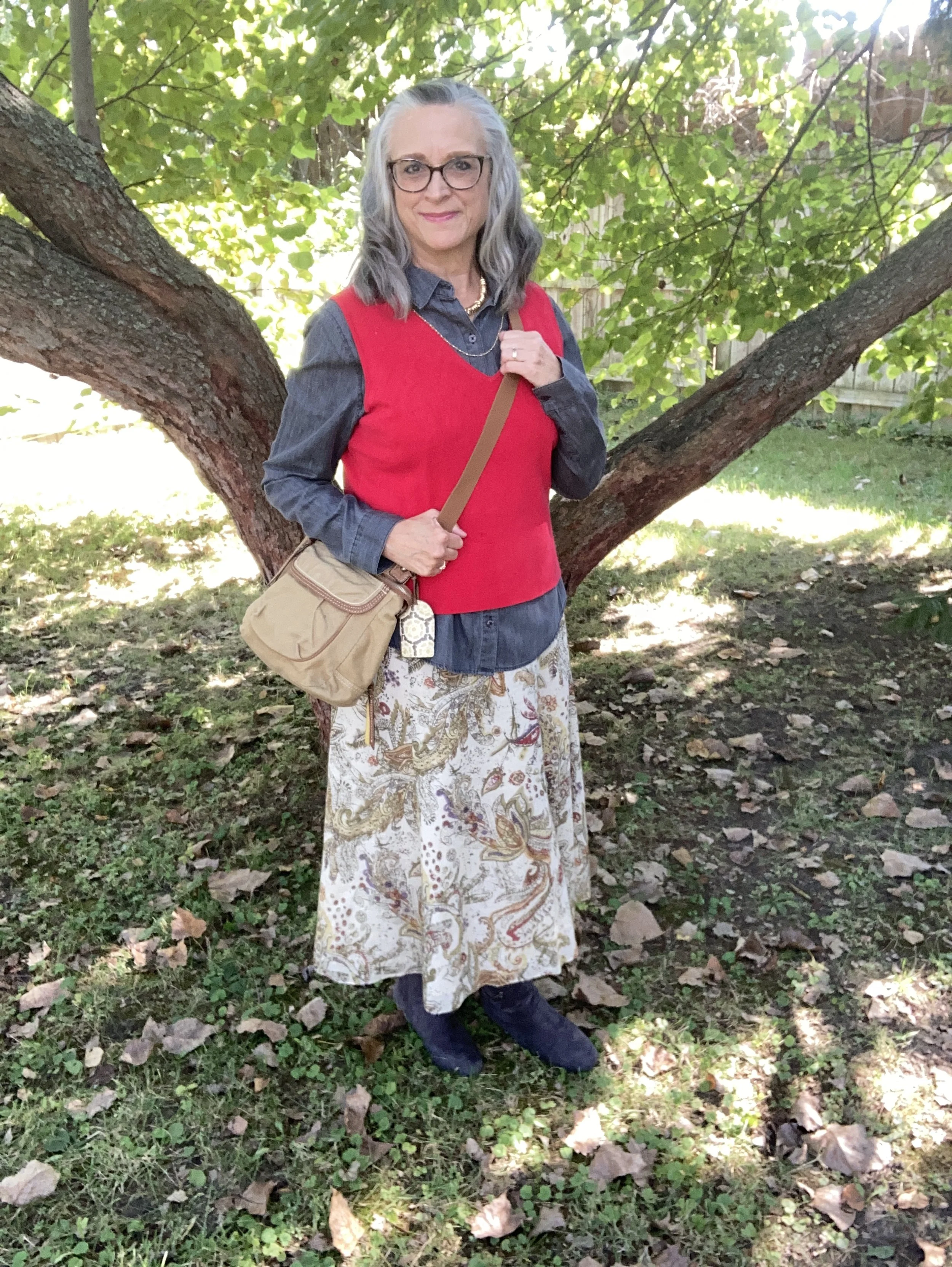
Today’s look gets a power punch from Poppy Red. You might remember this color from the New York palette. It is definitely a mood lifter. You can see the New York post here. Today I decided to pair this bright red with Bronze Mist, which is a similar color to the NY Bronze Brown, just a bit more yellowy green. I also chose the color Dark Gull Gray from the classic palette. I styled the shirt two ways, left out and tucked in, so I will include pictures for both.

I found this bright Poppy Red, Sandra knit shell at a thrift store and thought it would work perfectly for a knit vest. I paired it with a second hand Dark Gull Gray, Falls Creek button down. I believe this may be a man’s shirt as it is quite big on me for a large, but who knows. Sizes are so different these days.

This Jones Wear skirt I have styled multiple times on the blog and even though I don’t wear skirts very often, this is still one I reach for. I chose this for the snippets of Bronze Mist color in the pattern. It is fully lined, but light enough to wear in the warmer weather, and warm enough to wear in the winter with tights and a pair of boots. You can see it with a maroon cardigan, a green suede jacket, a yellow top, and a green pullover sweater.

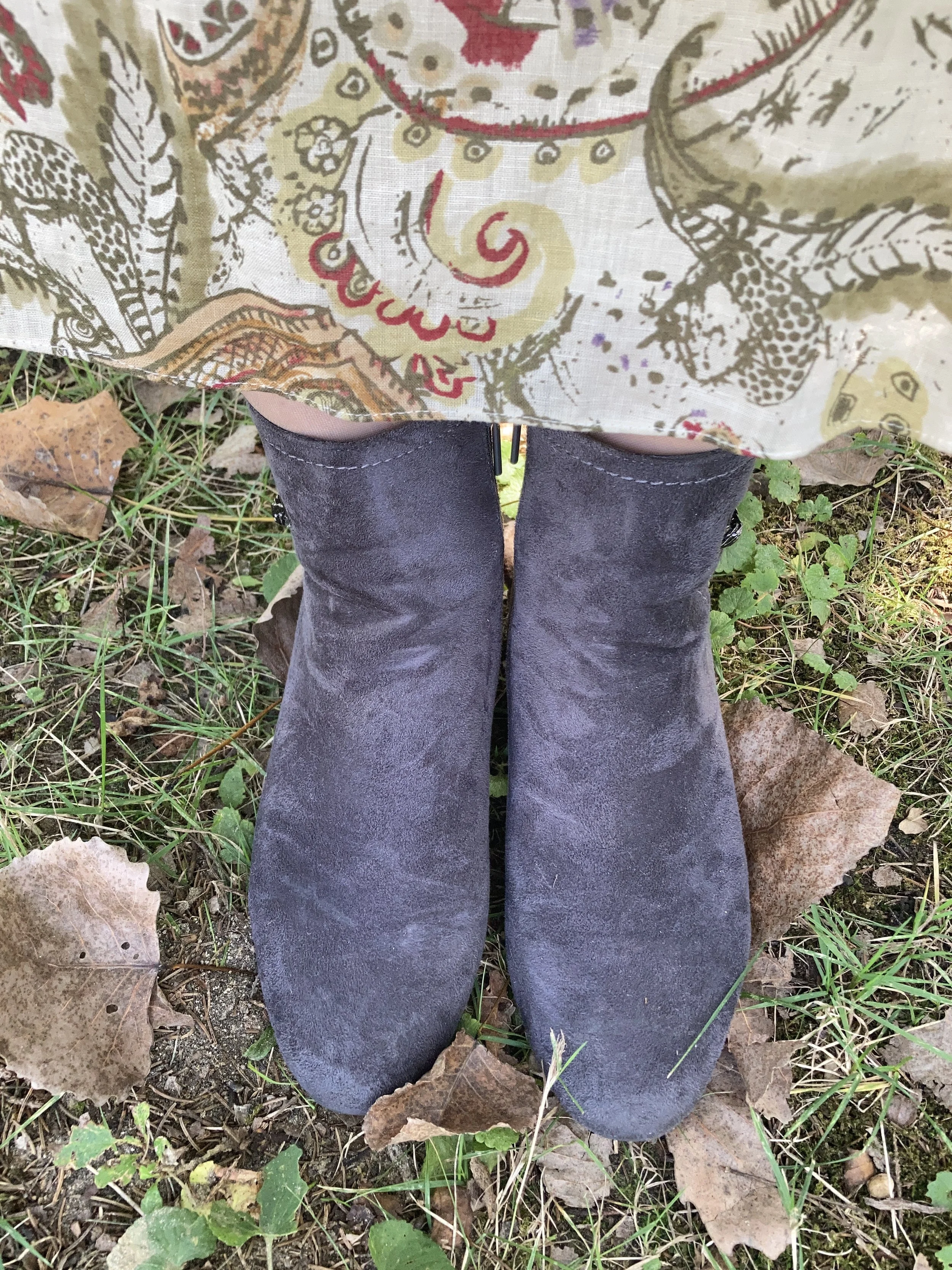
Since I was using the Dark Gull Gray color I chose my Impo ankle boots that I bought on clearance at DSW a few years ago, to balance the look out. Even though fall is the time we put our flip flops away and get out our boots, it is still too warm here to keep boots on for very long…at least for me. I love ankle boots in the cooler weather, and when it gets really cold, then I pull out the taller boots.

I chose this thrifted Fossil bag, as I thought it gave a nod to the Bronze Mist color, even though it isn’t a perfect match.

Do you like these colors together, or do you think they are odd? Do you have this bright Poppy Red in your wardrobe? Which version of this outfit do you like better, tucked in or left out? I love to hear your thoughts so leave me some love.

I’ve included a few shopping links for a few of the pieces to give you some similar color choices, but it was hard to find any sort of skirt in a similar color. These are brought to you at no extra cost. These are affiliate links. All opinions are my own.

I hope you are having a great week!

Pantone Autumn/Winter 2025 - New York Palette: Brandied Melon, Hot Chocolate and Bright White

Today I am showing you outfit #5 from my Pantone Autumn/Winter New York Palette series. This is the last trio of colors from this fall palette, and hopefully next week I’ll start the London color palette. You can see the original colors in this Pinterest pin.

Today’s outfit revolves around a mellow orange named Brandied Melon, a soothing brown reminiscent of Hot Chocolate, and Bright White, mimicking the gorgeous clouds we see meandering through the late summer sky.

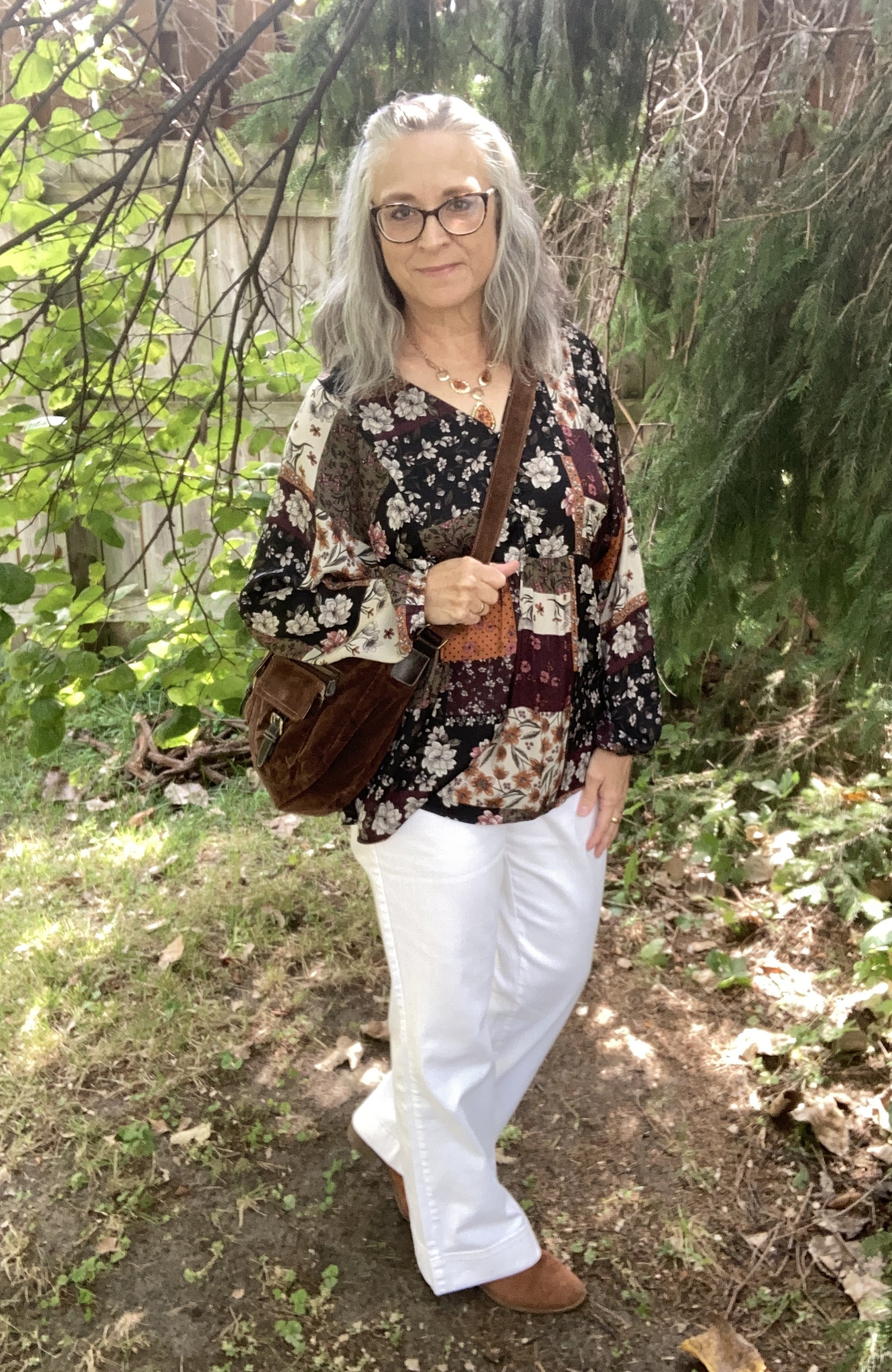
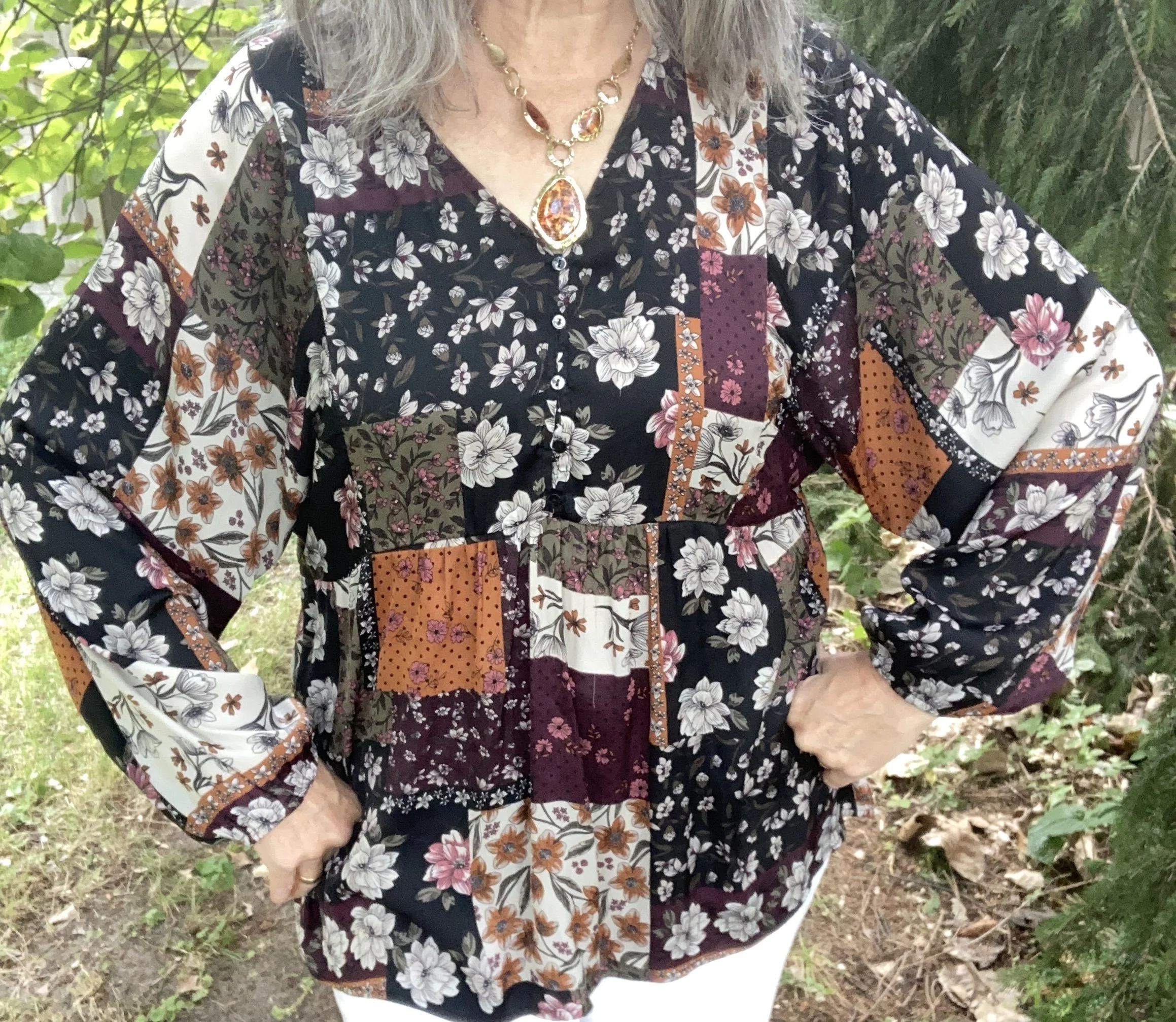
I chose this unique, thrifted patchwork top for the pops of Brandied Melon. I love the boho vibe and the variety of colors and print. I looked up this brand, Style & Co, and found that Macy’s was the original retailer. I always find it interesting that I will find a certain brand and then find more pieces of that brand as I thrift. I must be drawn to them for a reason.

My Bright White Gloria Vanderbilt jeans have been around for years. I purchased them new at JC Penney, and use them whenever I need a pair of crisp, white pants that are both casual and dressy. I have a hard time photographing white, or any lighter colors outside. Oh well, not worries. You get the idea. You can see these jeans styled with a yellow sweater, a floral kimono, a velvet jacket, a fall jacket, with a white top and sweater, a black vest, and a multi print top. There are more, but you get the idea. White pants are not restricted by any season and go with every color.

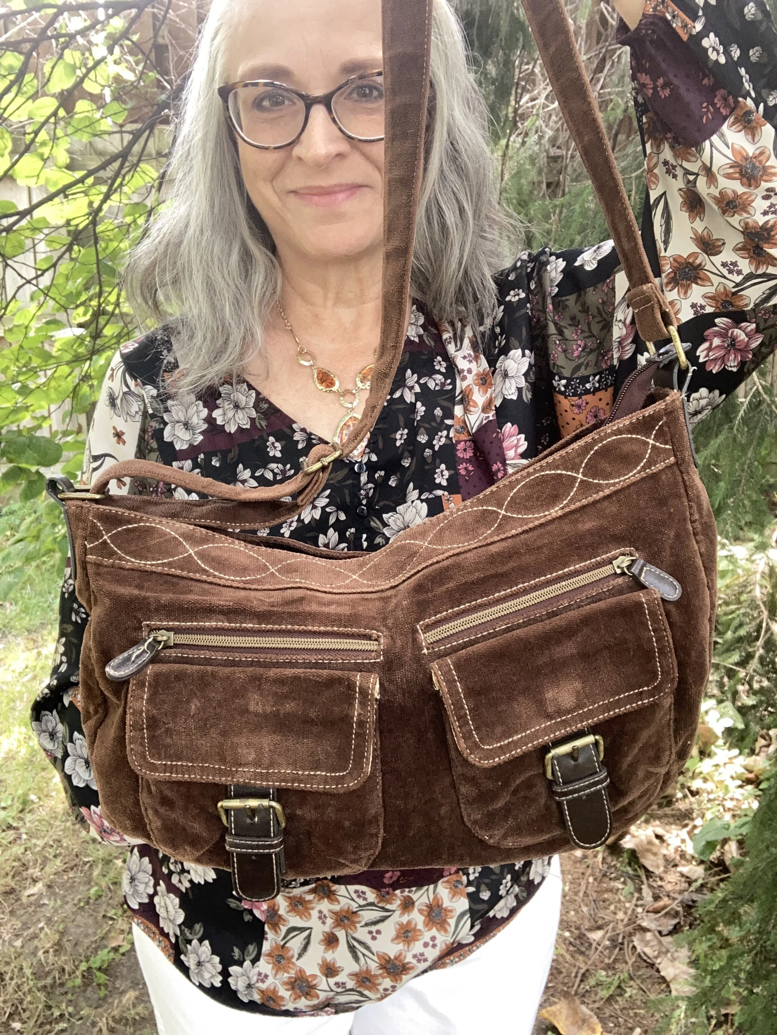
Since the top didn’t contain any browns, I added my thrifted Hot Chocolate corduroy bag. I love this roomy, casual bag, and the strap is long enough I can use it like a cross body bag.

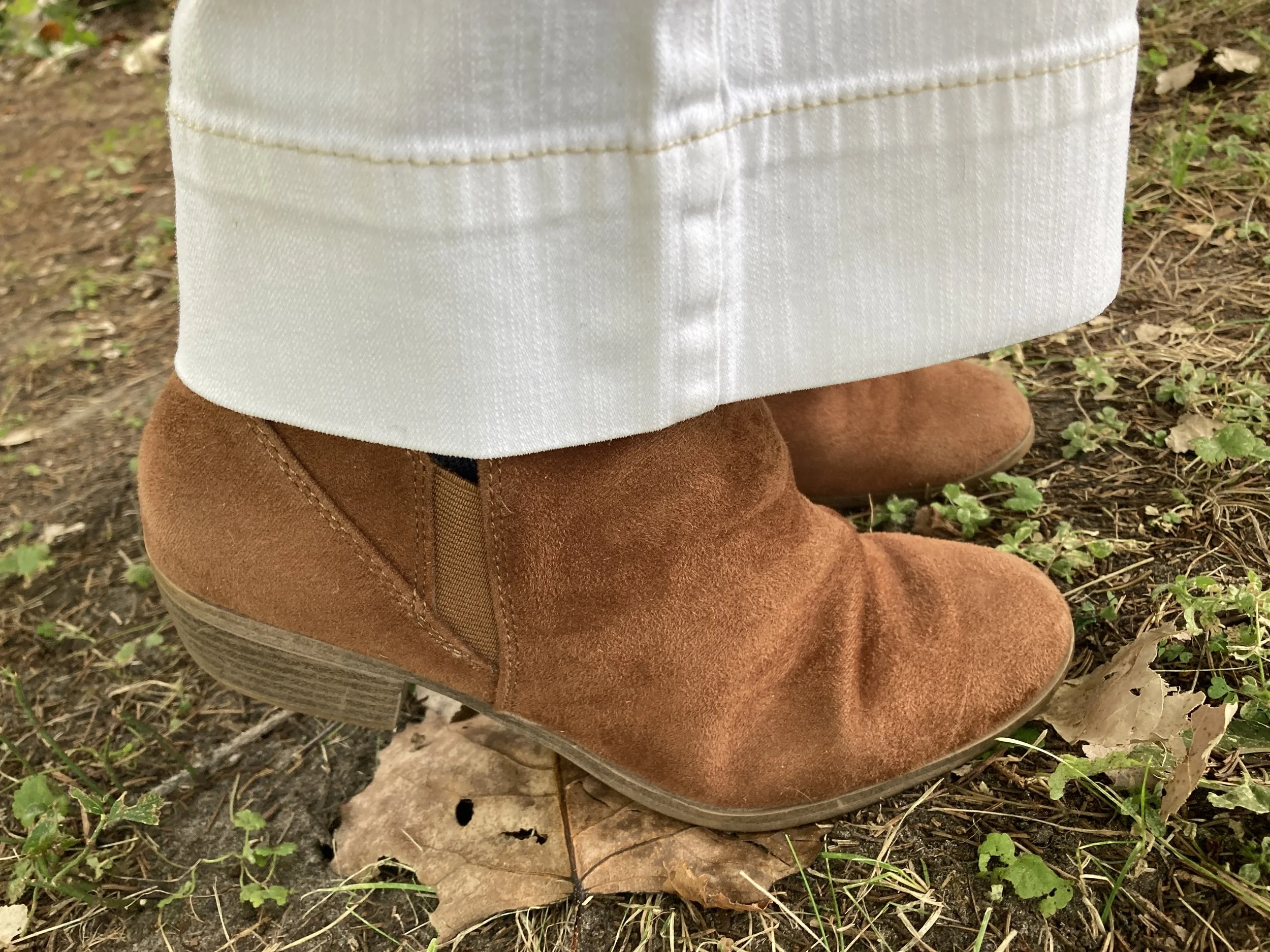
I kept my accessories simple. My faux suede, SO ankle boots were from Kohl’s a number of years ago. My necklace was from a few years ago.

If the weather was cooler, I could easily add a longer cardigan for another layer by picking another color in the top. It would look great with olive, black, white, and even the Mauve Wine (see my first outfit in this series, here.)

What do you think of these colors? Do you wear white all year round, or just in the warmer months? Please leave me your thoughts in the comments or leave a comment on FB. I love to hear your ideas.

I included a few shopping links under each item. These are affiliate links. All opinions are my own. I hope yo are having a great middle of September!

Color Play: Pantone Autumn/Winter NY Palette - Tomato Cream, Moonstruck and Buckthorn Brown

Today I am combining the last three colors from the Pantone Autumn/Winter 2024 New York Palette. Tomato Cream will definitely remind you of the familiar soup. I still have cans of Campbell’s Tomato Soup in my pantry and use them regularly. My mom always used water to make the soup when I was growing up, but when I got married to a Wisconsin man who loved dairy I learned to use half a can of milk and half a can of water, or if I have skim milk, I use a full can. It makes the soup creamier and it takes on this orangey red color.

Moonstruck is a medium gray and reminds me of the gray skies of fall and winter that just hang around, but don’t produce any rain or snow. For this sufferer of Seasonal Affective Disorder those gray clouds are the worst! Just rain or snow, already. Ha, ha.

Buckthorn Brown is an earthy sunshine color. It tends towards yellowish gold, but is not truly yellow. I think their idea was buckskin, but without the bad press that animal skins or prints have for many people. I do not have an issue with leather, but I do prefer it is sustainably and responsibly sourced. Fast fashion is not good for our environment and certainly not for animals who are used just to make a buck…pardon the pun! That being said, I do like this color. It is a nice change from our darker browns, and gives our wardrobes a peppy vibe.

My outfit for these last three colors is very casual. This is more in line with my every day looks, so for those of you who are not working, or are working from home, this might be for you.

To see the actual Pantone Autumn/Winter 2024 New York Palette colors just click on the link. I do the best I can to match the colors with what I have in my closet, so they differ slightly.

My Tomato Cream Tahari open front cardigan was a clearance find from TJMaxx a few years ago. You can see how I styled that with a white sleeveless sweater, a fall graphic tee, and in a monochrome fall look from last year.

My Gloria Vanderbilt Moonstruck jeans have been around for a while. It seems every time there is a Pantone series, I bring these out as there is always some sort of gray. You can see them styled with a red and white striped tee, and with a red plaid blazer.

Buckthorn Brown is really more of a brownish gold or yellow, but I thought this Sonoma tee from Kohl’s was a pretty good match. Kohl’s has always been a great place to find basics like short and long sleeve tees, pullover sweaters for the cooler weather and fun tees with holiday motifs. I don’t shop there much any more due to my lack of need for clothing, and due to my love of thrifting. Ha, ha.

I kept my accessories pretty minimal. My necklace was a more recent thrift find, and might seem a little to fancy for this casual look, but I like the contrast of dressy and casual, and the color goes well with the Tomato Cream cardi.

I chose blue for my bag and my sneakers, just to play off the blue flowers in the tee. My bag is an old thrift find, a brand called Nine & Co. My sneakers are Keds.

What do you think of these colors? What did you think of this fall’s New York palette? What colors were your favorites? I’d love to get your feedback, so leave me a comment or two.

I’m including a few shopping links. These are affiliate links. All opinions are my own.

Have a great weekend, everyone!

Pantone Autumn/Winter 2023 - New York Palette: Rose Violet, High Visibility, and Doe

Today I am bringing you another outfit in my Pantone Autumn/Winter color series. I find these colors on the Pantone website. My renditions of their color palette may not always be an exact match, but I shop my closet and try to find the pieces that come as close as possible to their color choices. I want you to be able to shop your wardrobe as well. You may not have all of these colors in your closet like I do, but you will certainly have two or three. The idea is to take those colors and use them in new ways to make outfits you never thought of before.

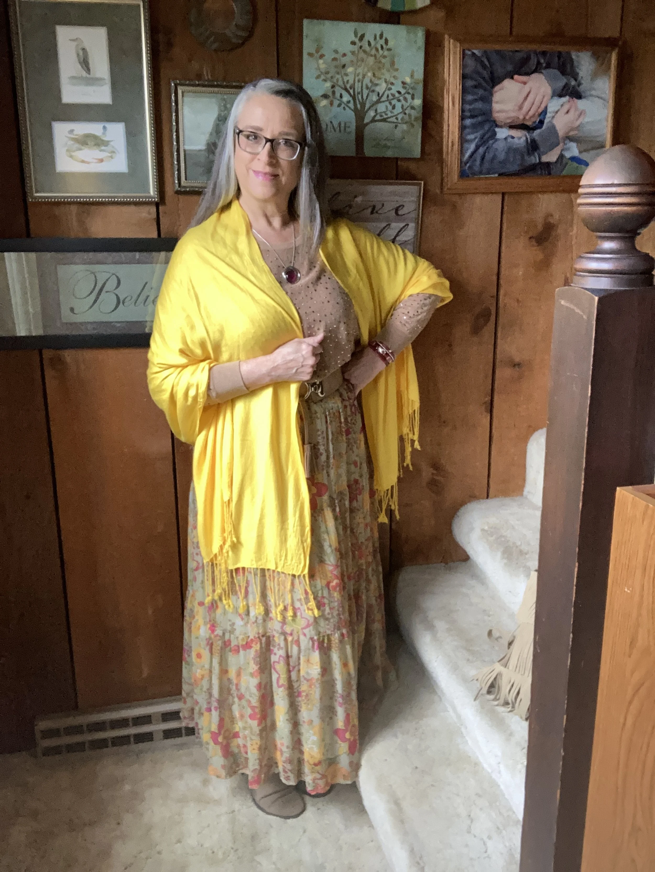
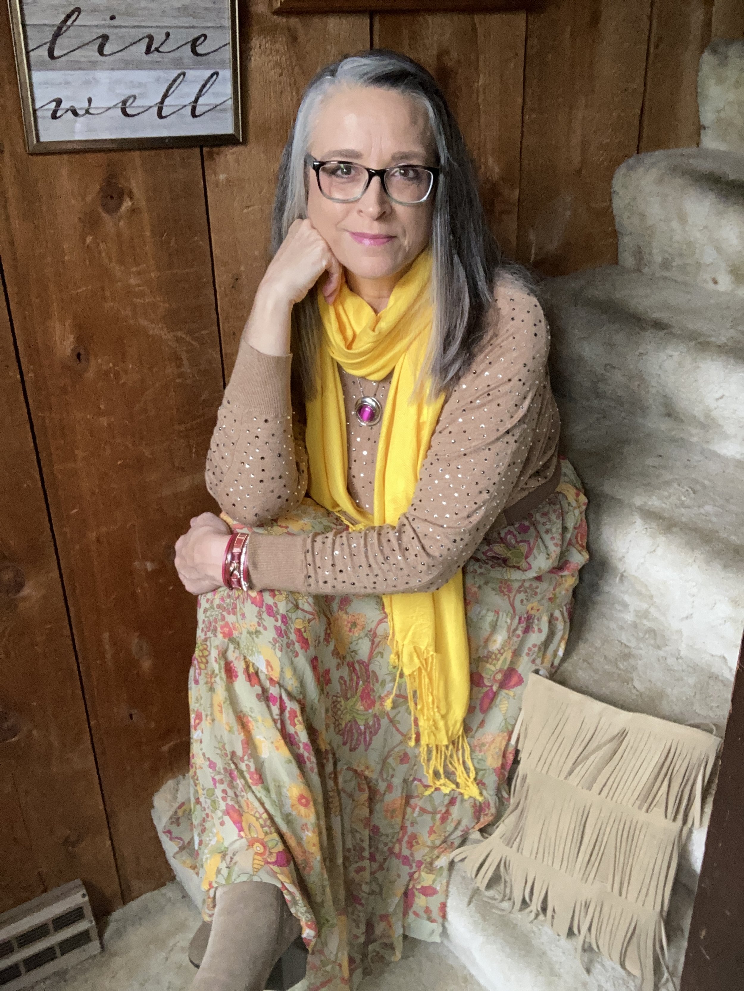
I love the boho vibe of this outfit. The bright colors, tiered skirt and fringe bag are all indicative of many Bohemian outfits.

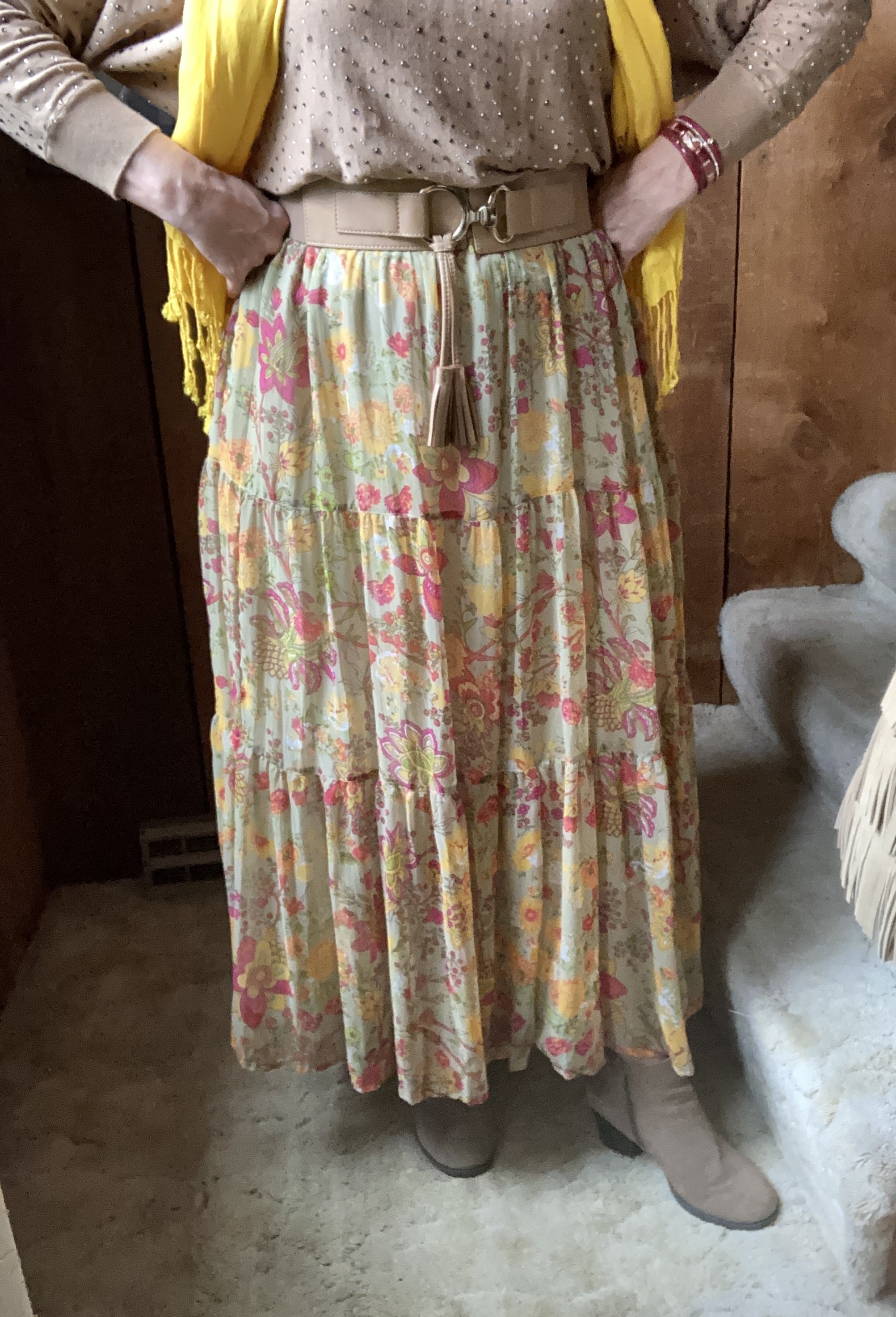
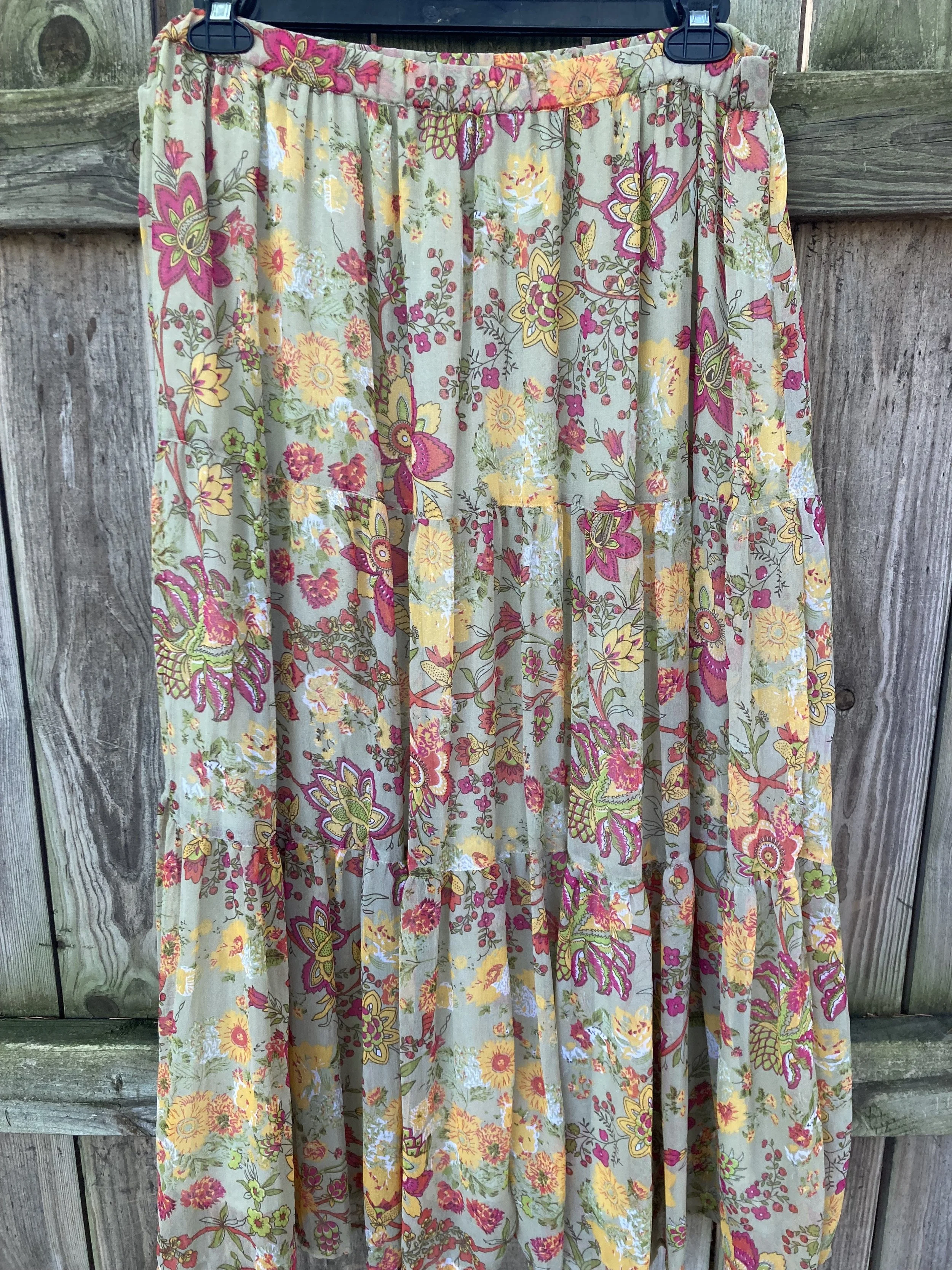
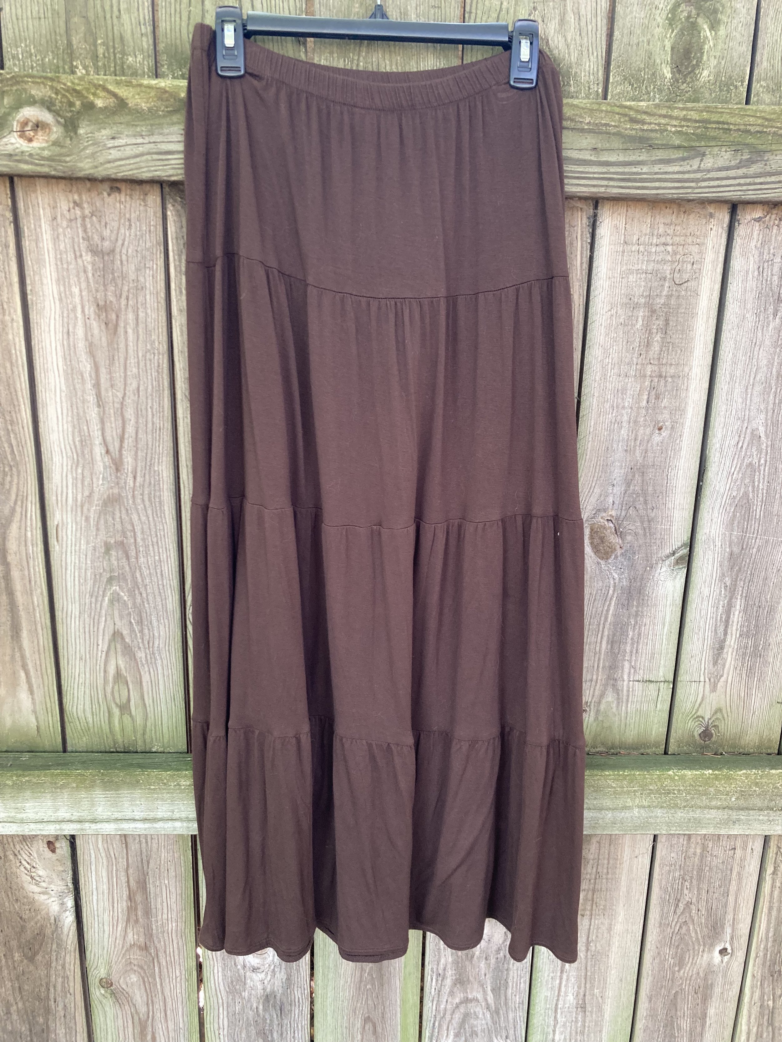
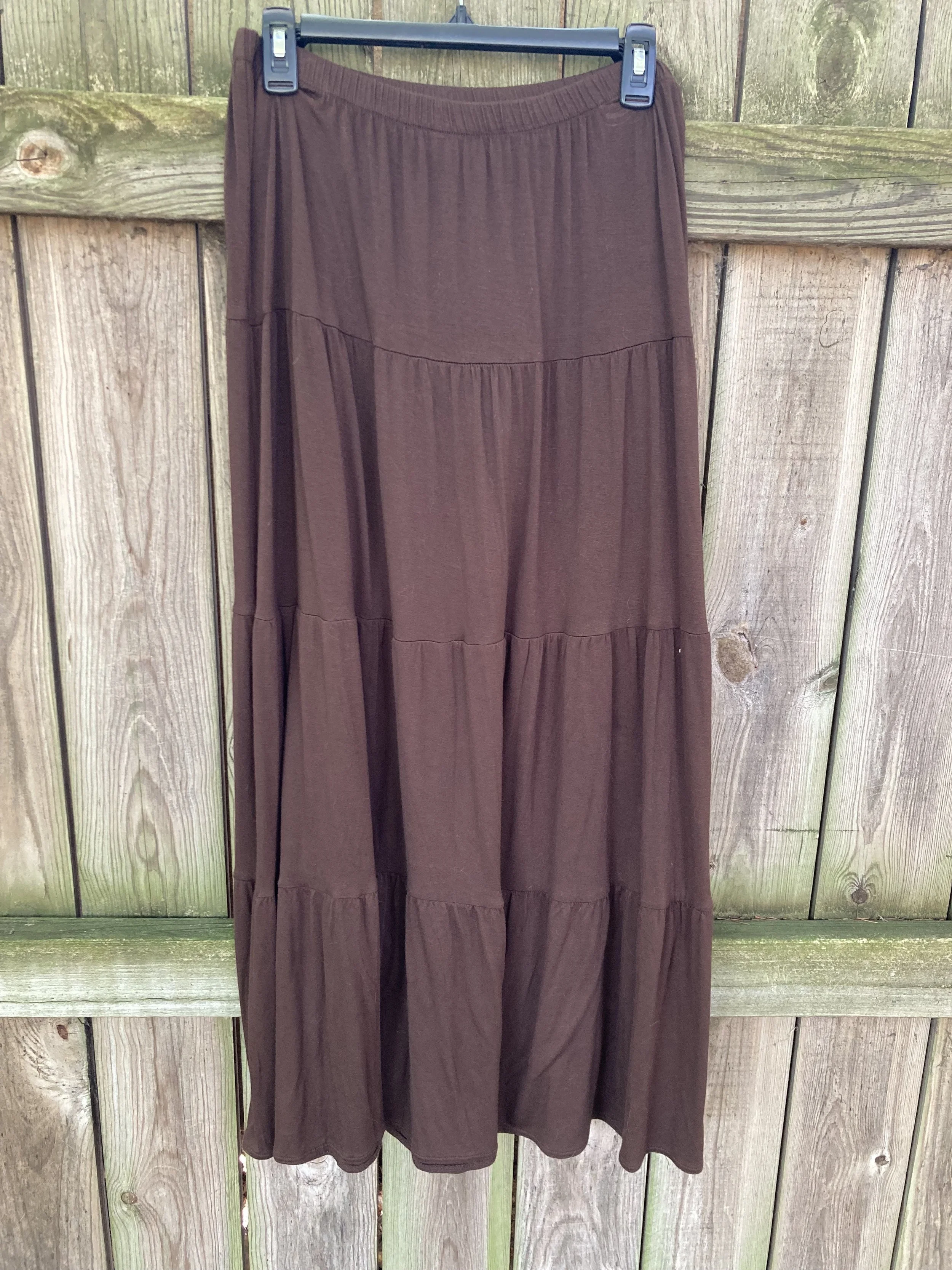
I was having a hard time decided which piece to use for the Rose Violet color. It is a bright, fuchsia pink and though I had my Button Front Maxi Dress from Closet52 (no longer in business), it was too overwhelming. I felt the bright pink and the bright yellow were needed in small doses, thus this fun, thrifted, tiered maxi skirt.

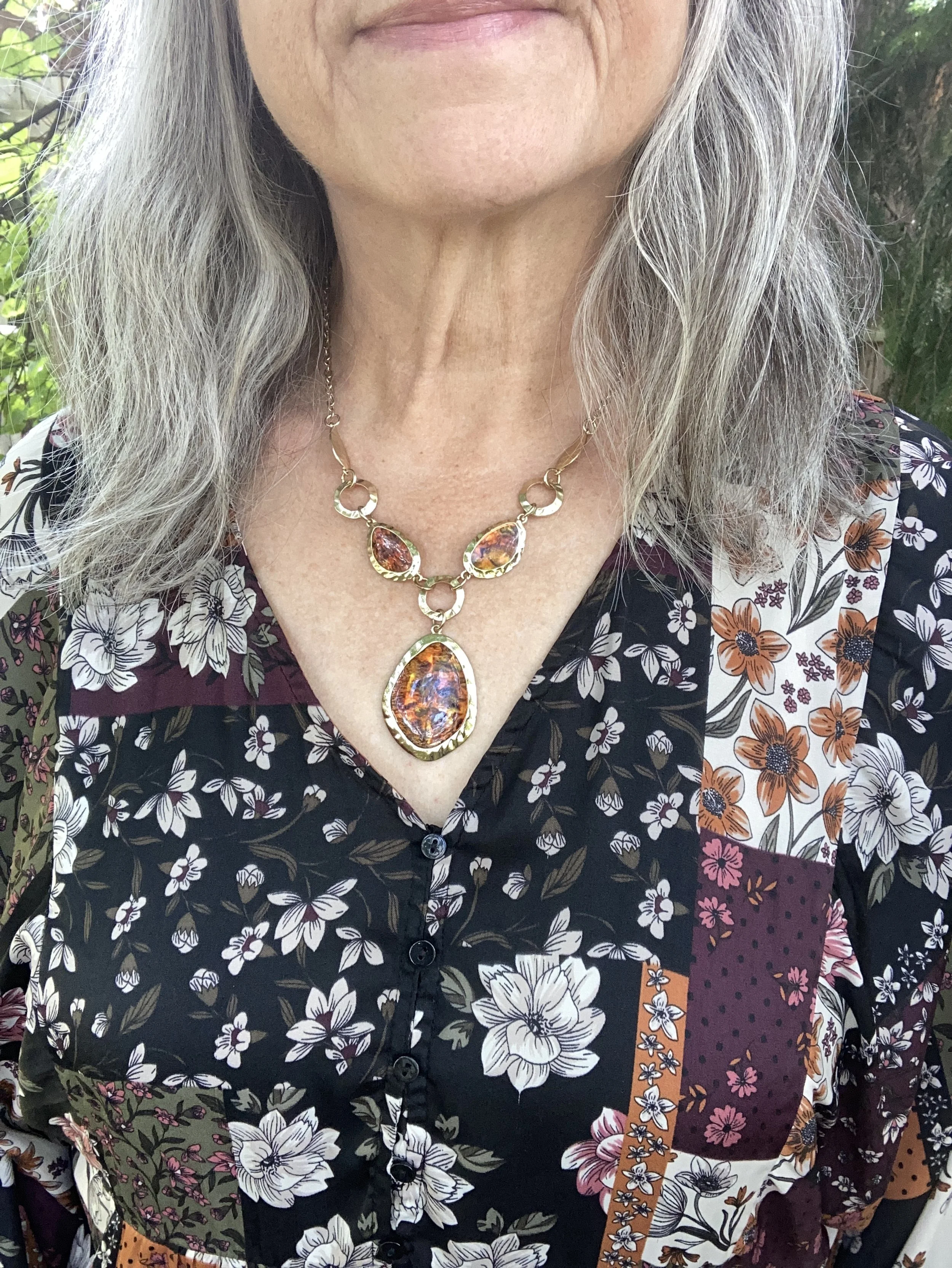
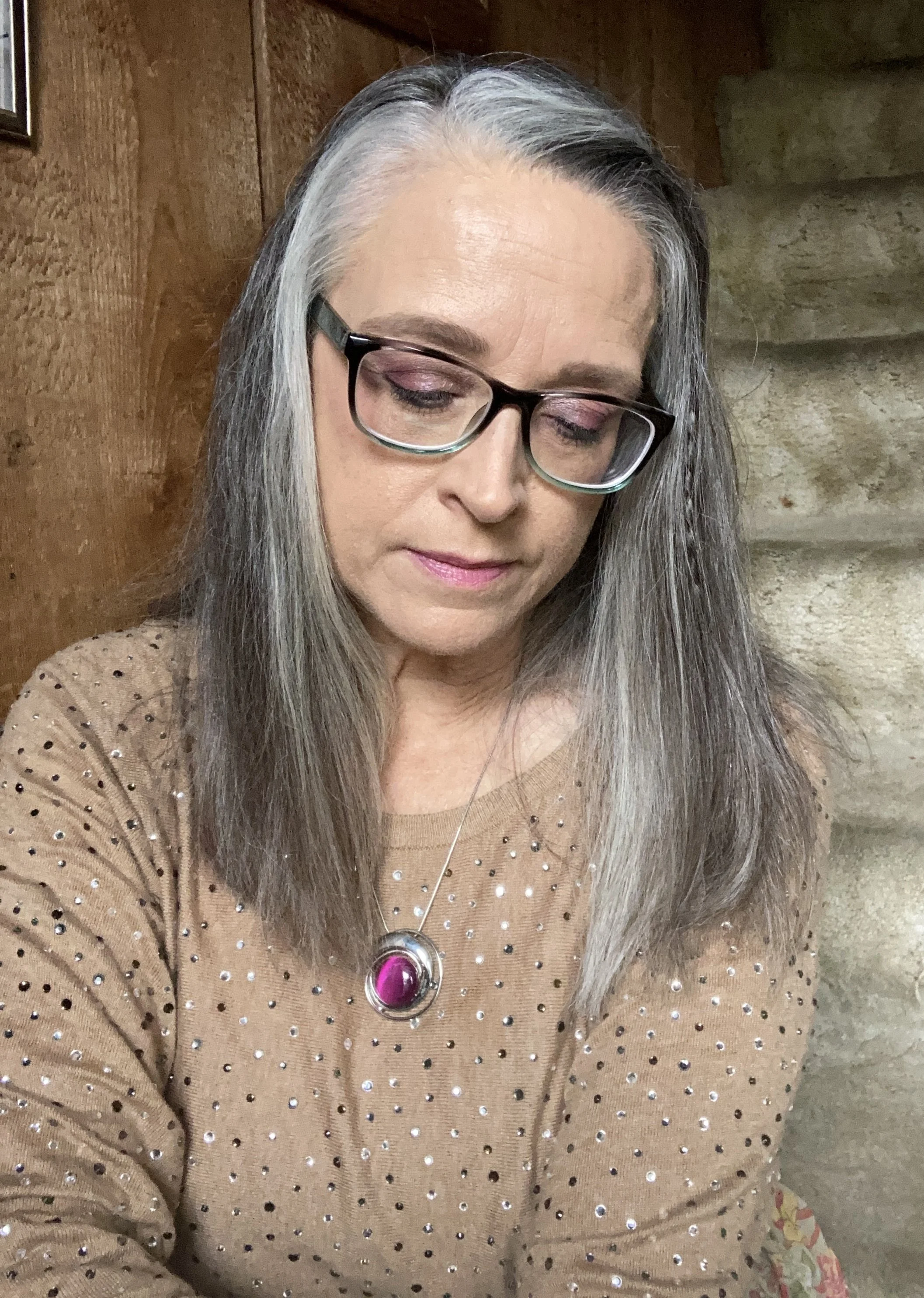
I added the old Christopher and Banks cat eye necklace to pull the Rose Violet color upwards, and I also wore make up allowing for a softer version of the bright pink on my face.

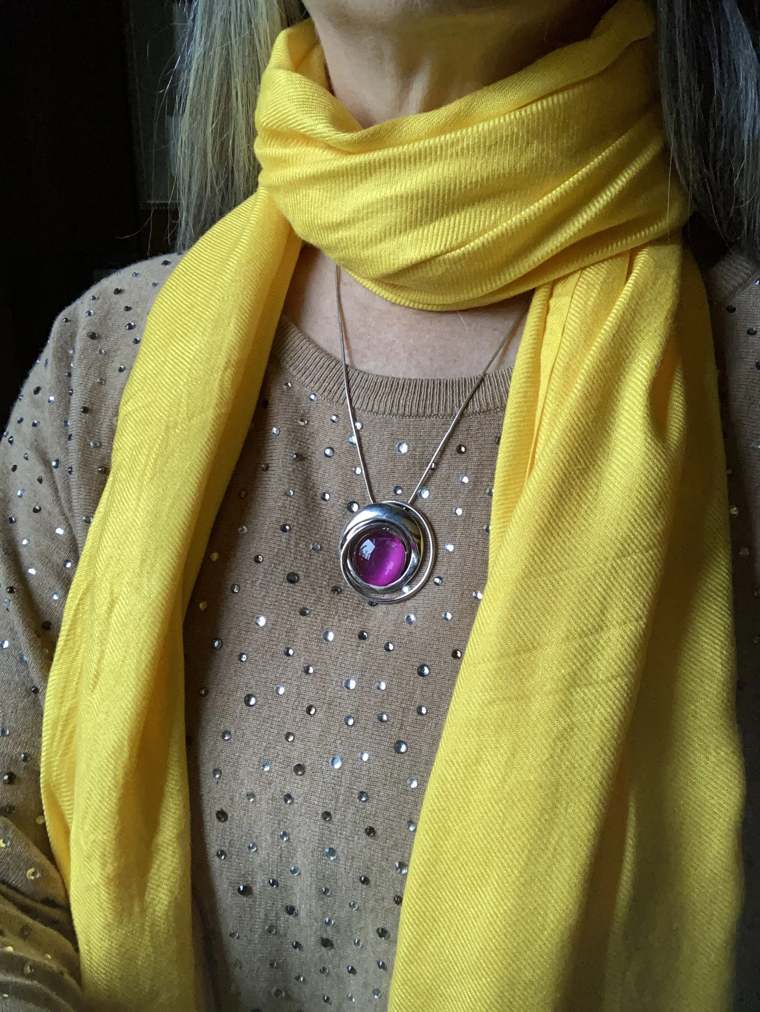
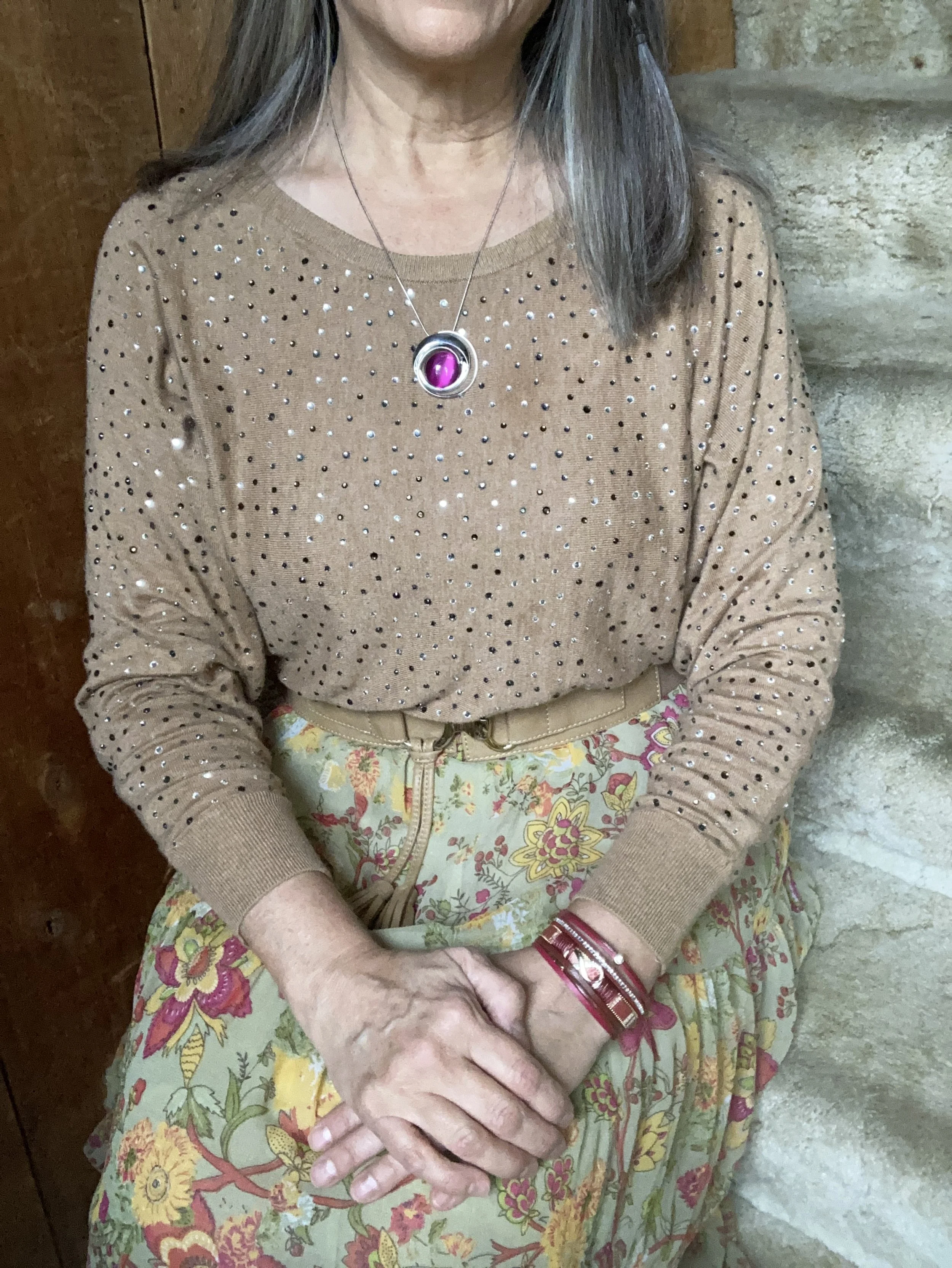
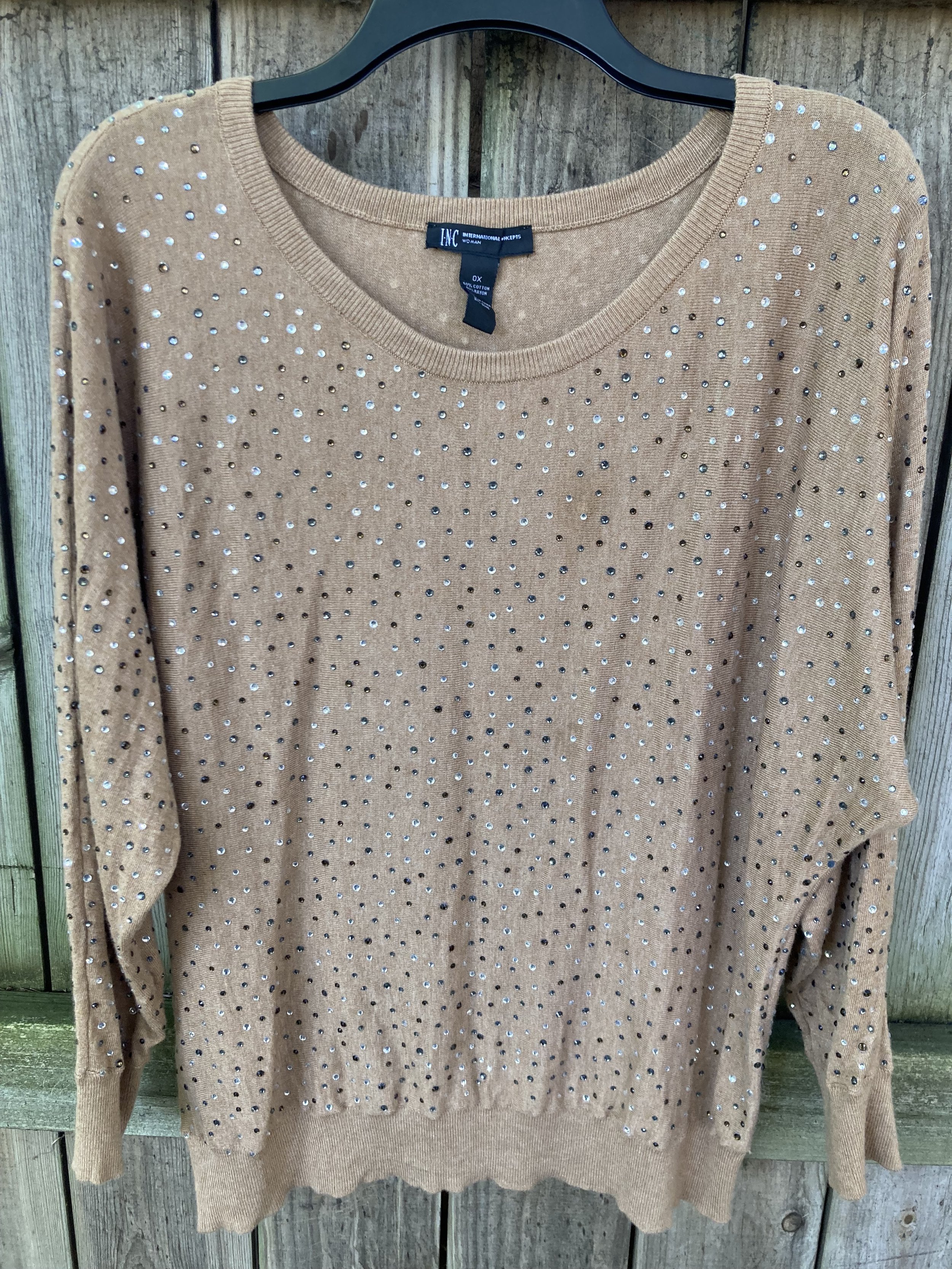
My Doe colored sweater was a fabulous thrift find. I thought the neutral color with the glistening, metallic dots would be great for the up coming holidays with a versatility that allows for dressing up or down.

High Visibility is certainly so. This bright yellow is so cheerful and definitely a pick-me-up on a cloudy, rainy day. Again, the skirt uses a paler version of the yellow to keep the outfit completely compatible through out.

Here is another way to wear the pashmina.

My accessories remained in the neutral shade to allow the bright pink and yellow to be the focal points for the outfit. The sweater is quite long, hanging below my bottom so I tucked it in and added the belt. It brings additional interest, texture and gives me a more refined hour glass silhouette.

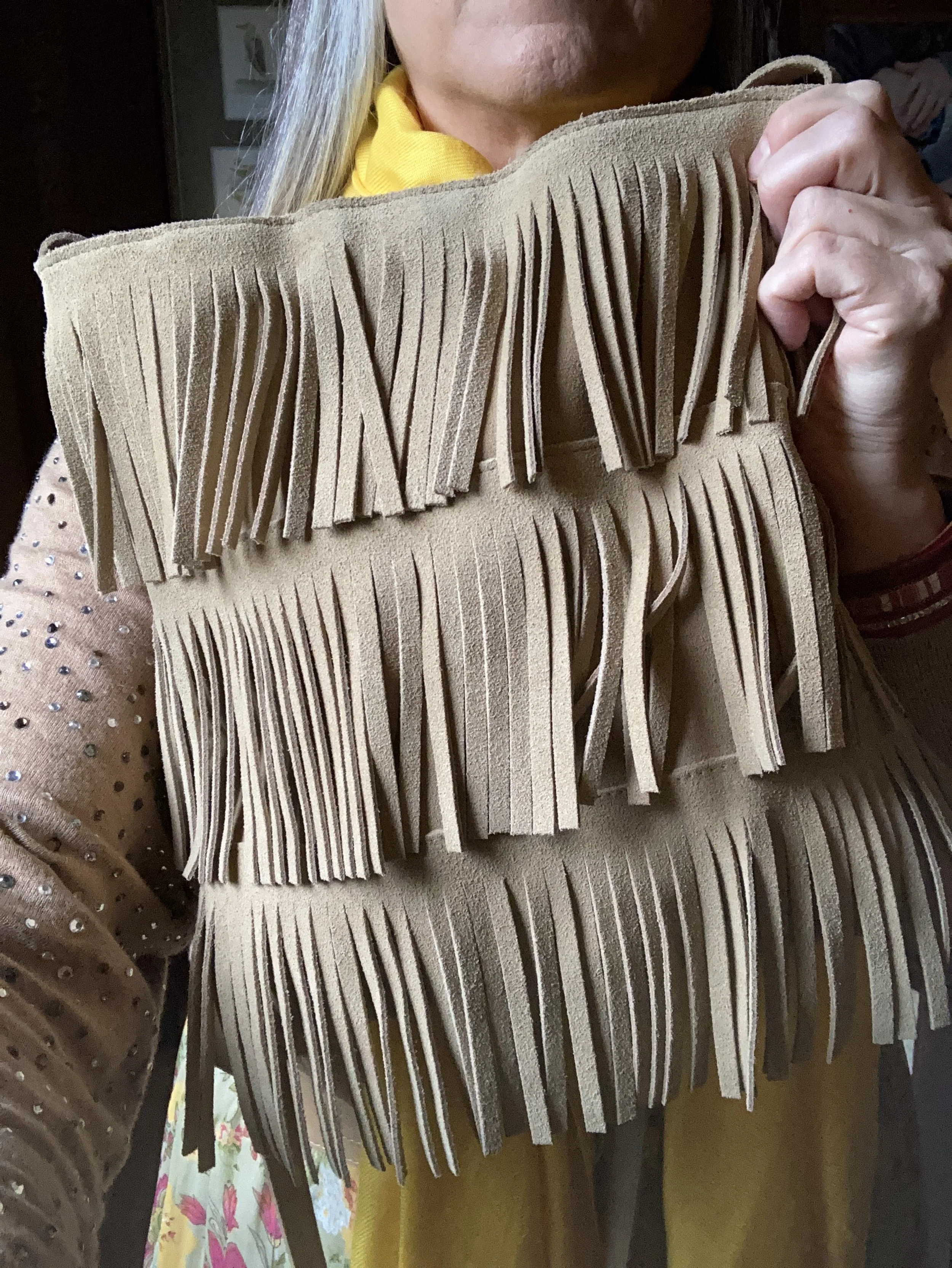
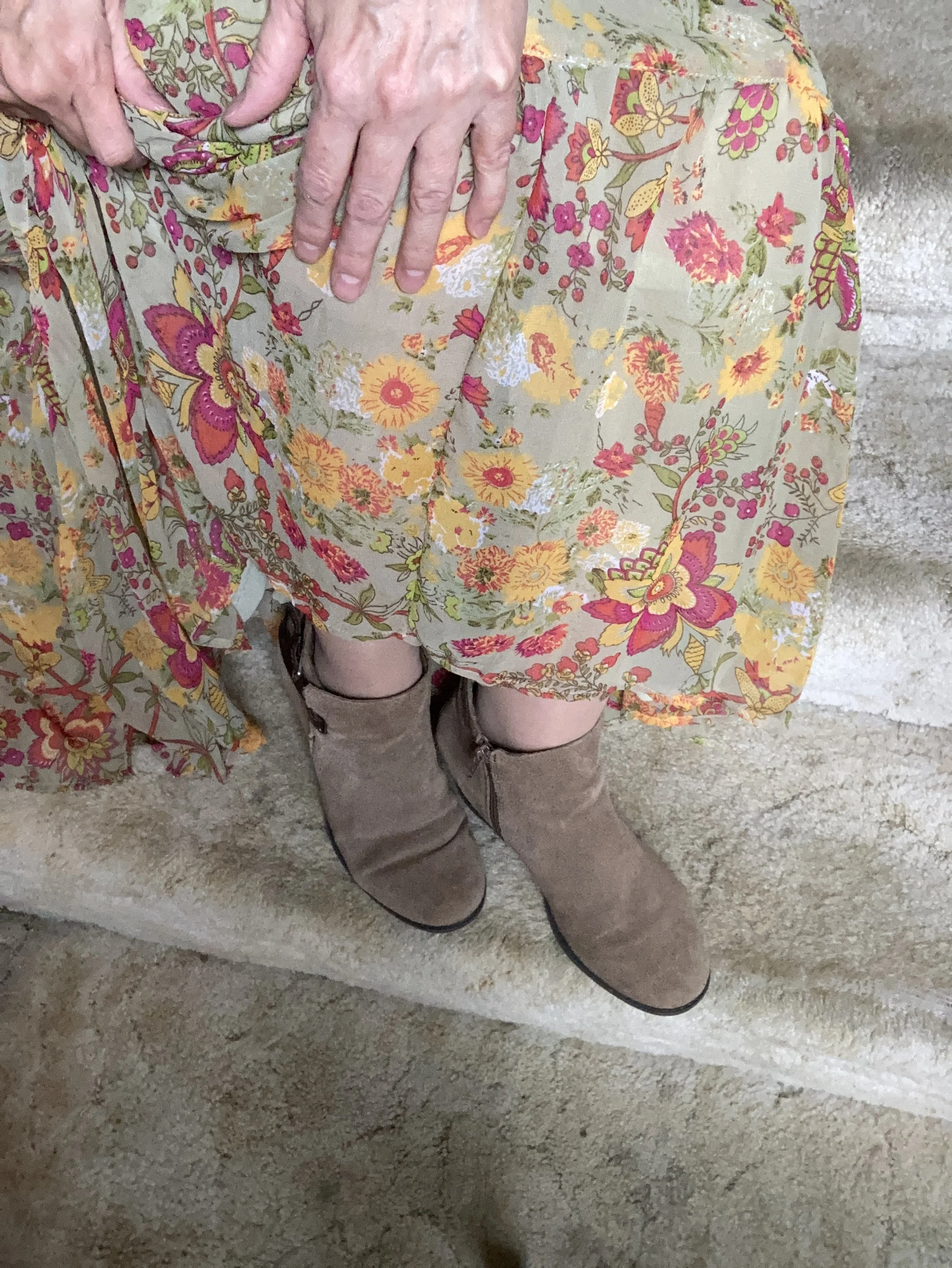
I added the thrifted fringe bag, and my older suede ankle boots which have a low heel helping to keep the skirt off the floor.

What do you think of this outfit? Do you like the combination of bright colors with more neutral colors? What would you do differently? I love to hear your ideas and thoughts, so leave me some love in the comments.

I hope you enjoyed this outfit featuring the Pantone New York Palette colors: Rose Violet, High Visibility, and Doe.

No shopping links this week, but I hope you are having a great day and a good week. Check back next Tuesday for another outfit post.

Pantone Autumn/Winter 2023 - New York Palette

The following are my renderings of the Pantone Color Institute’s Fall 2023 New York Palette. These are not going to be exact representations, but close to what the palette consists of. For actual color comparisons go to Pantone.

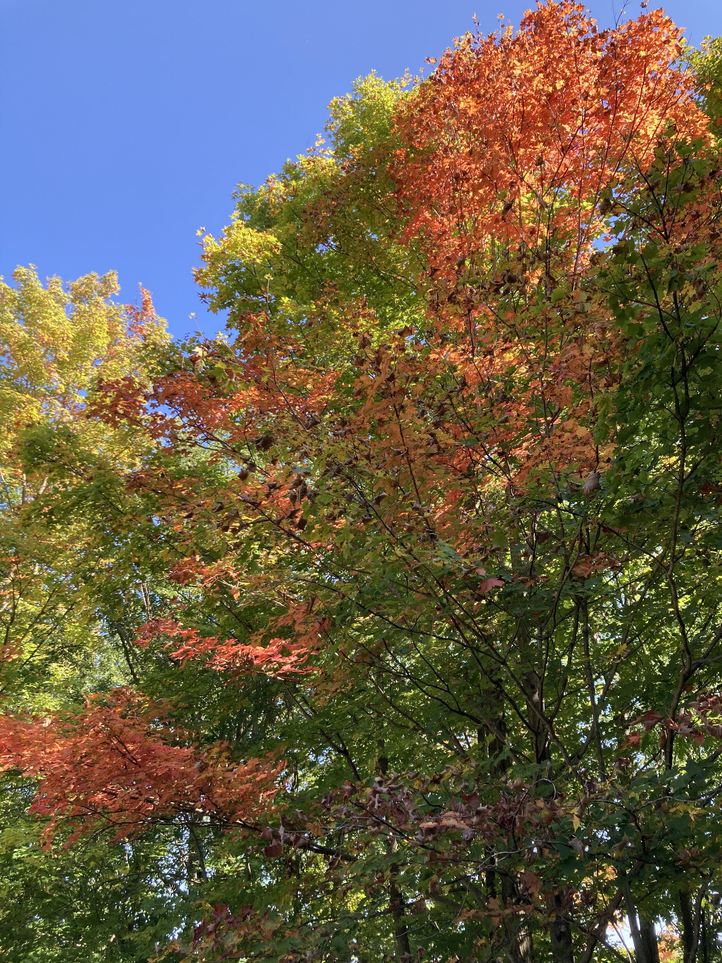
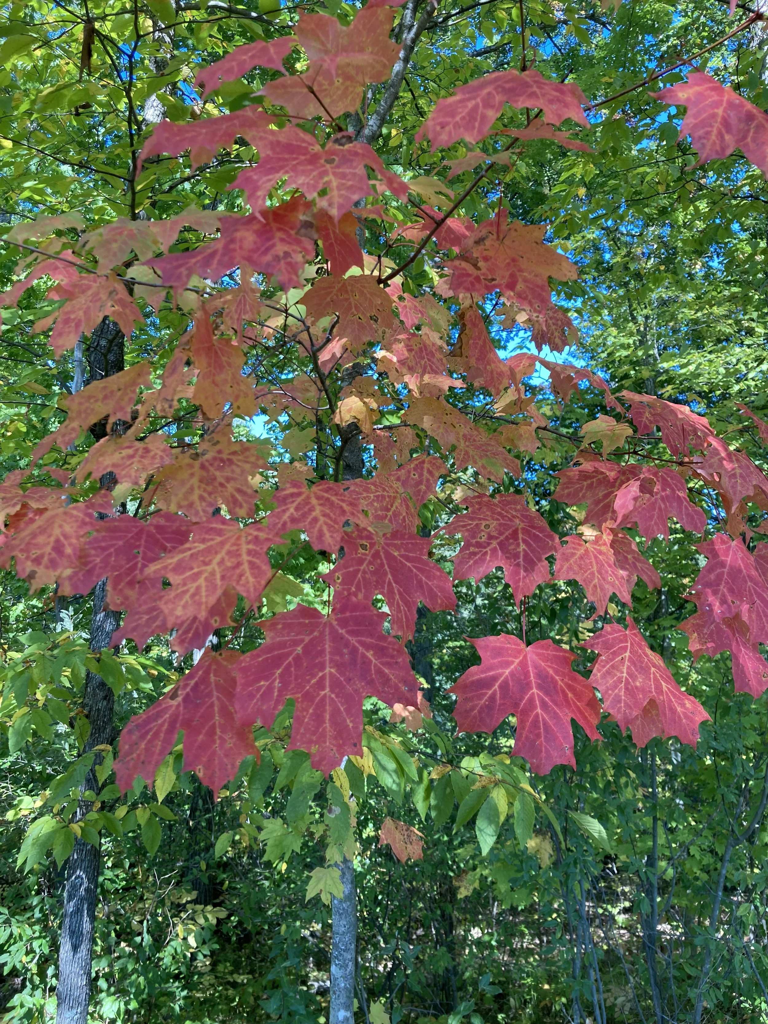
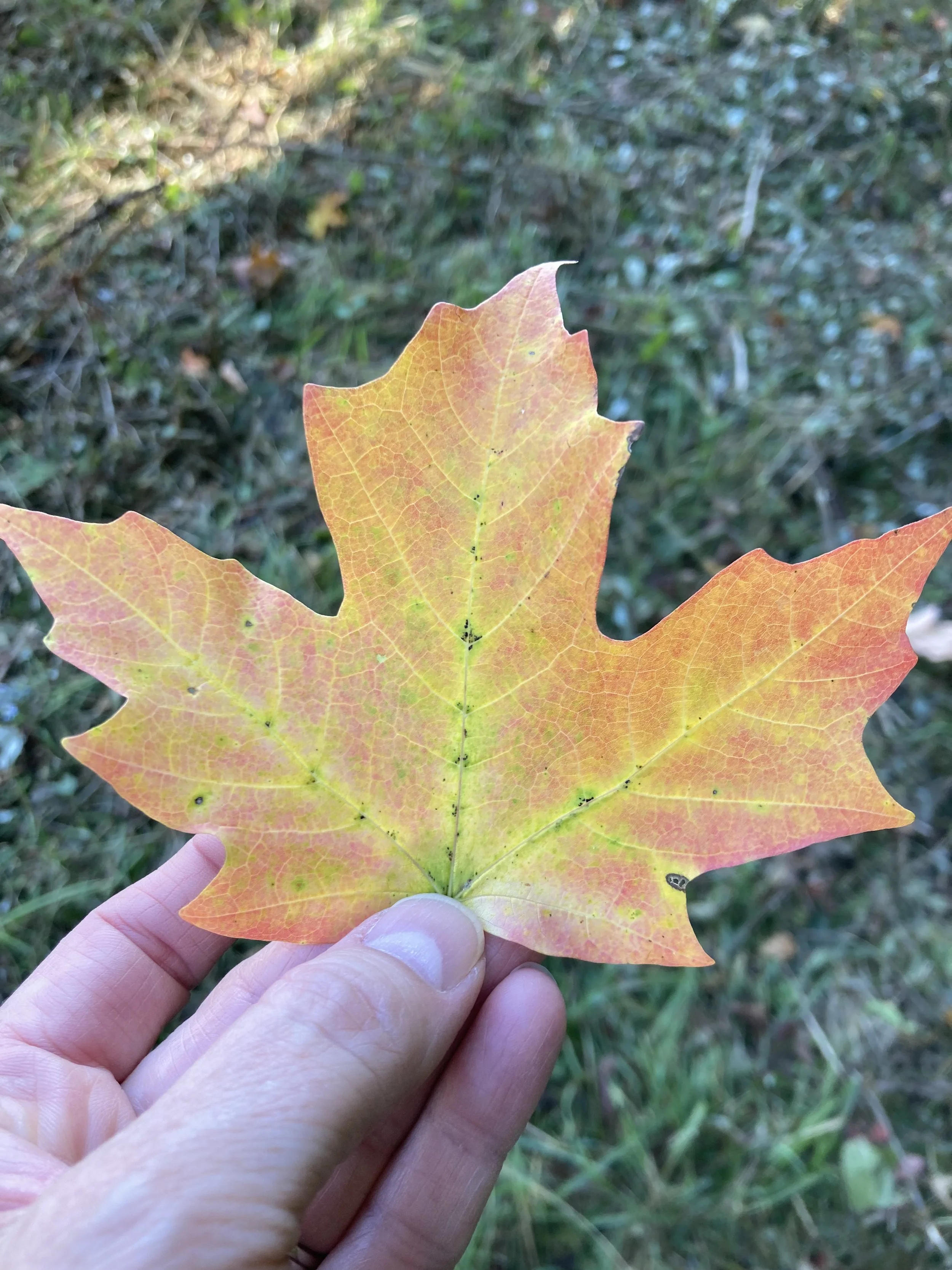
Happy fall everyone! The season is official and the leaves are beginning their seasonal change here in the midwest. My husband and I got out for a hike on Sunday afternoon and it was beautiful. It was actually a little warm for my preferences, but a lovely day to take a walk. The leaves around here are just showing touches, but many of those swatches are vibrant. I’m sorry Pantone, but no one creates a color palette like the God of Creation! These are few shots I took with my phone.

I am going to introduce the New York fall palette to you today. I decided to take pictures of the corresponding color pieces from my wardrobe to give you an idea of what the colors look like. Next week I will actually start showing you the outfits. In the mean time you can try to guess how I might put these pieces together, or you can come up with your own combinations, just for fun. Let me know in the comments which colors you would put together.

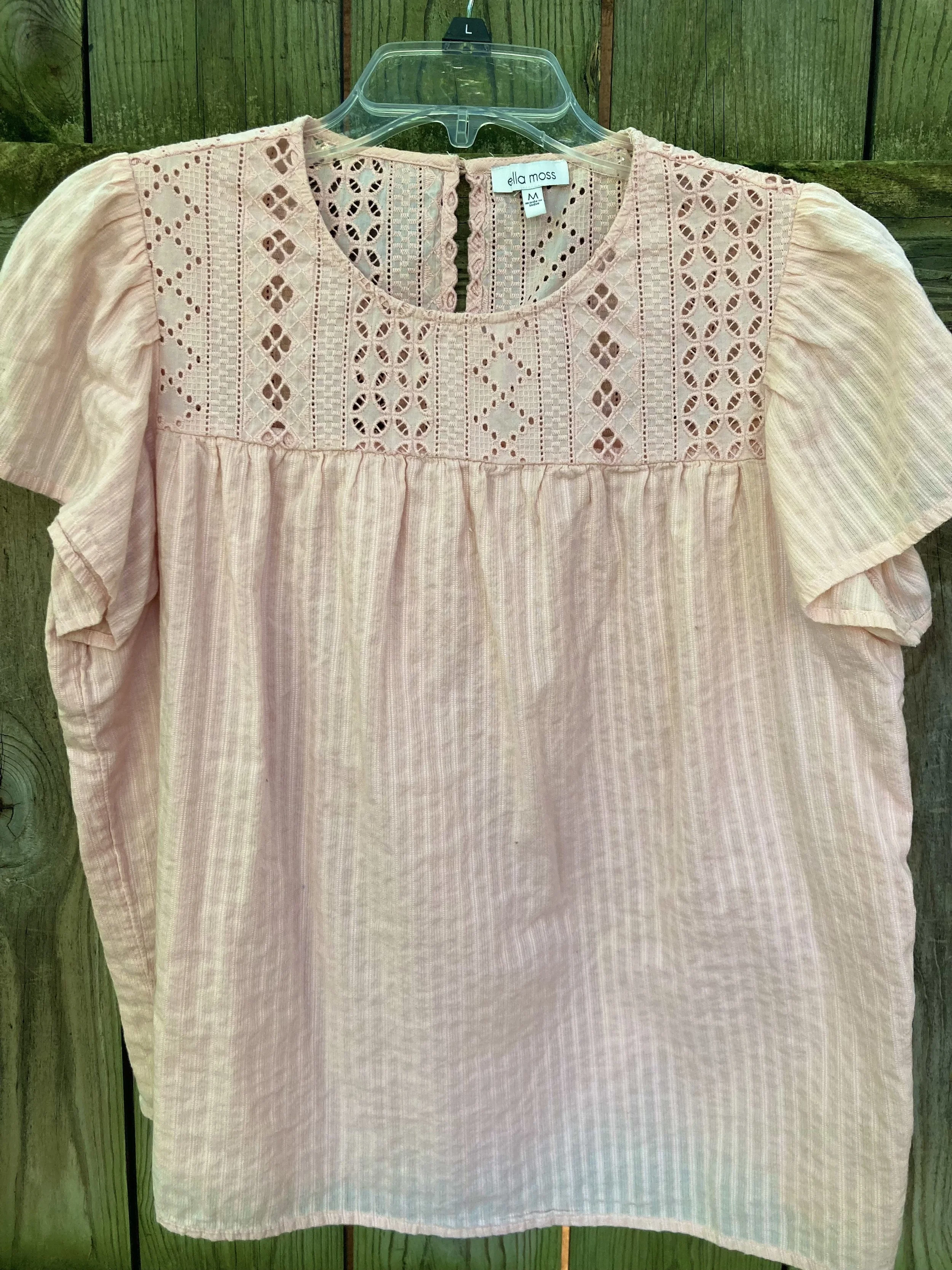
Tender Peach

As Pantone often does they include a few pastels. I am not as much a pastel girl, but I know many of you are, so it is fun to think about how I would include a pastel in a fall outfit.

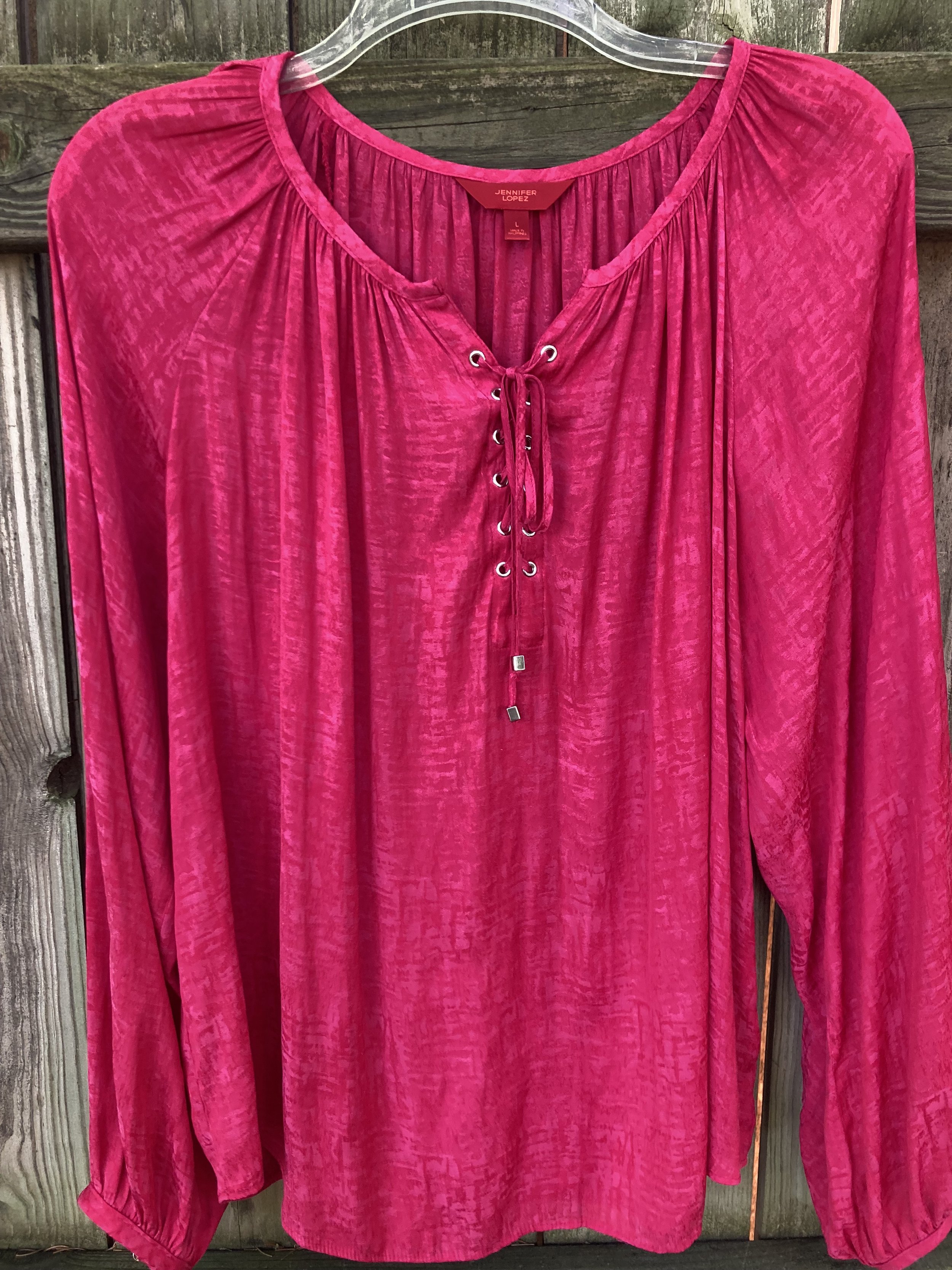
Rose Violet

This hot pink fuchsia color is bright and sassy. Originally, I was going to use my fuchsia dress from Closet52, but it just wasn’t coming together, so I opted for this thrifted skirt with the Rose Violet flowers. I am not even sure what happened to Closet52. I can no longer find their website. So crazy, the way things come and go so fast.

Viva Magenta

This is the Pantone Color of the Year. You can see the post I did on that earlier this year. This is a lovely, bright color that really works in all seasons, and just about everyone can wear it, but it is hard to find.

Red Orange

This is a color we often equate with fall, especially when we think of changing leaves. The red orange can be easier to wear for some than a true orange. Either way it is a great fall color.

Red Dahlia

Fall wouldn’t be complete without some sort of maroon, burgundy or berry color. Red Dahlia is more towards the maroon side. This picture doesn’t really do it justice. The sweater is a dark maroon, but for some reason it kept looking lighter and more red. Silly phone photos!

High Visibility

Pantone almost always has some sort of bright yellow on its fall palettes. This is another color reminiscent of the changing leaves and sunflowers that are in full bloom at the end of summer.

Persian Jewel and Carnival Glass

These two colors you know will go together for my future outfits. They both were hard colors to find in my closet. I actually had a few pieces that met the Carnival Glass qualifications, but the Persian Jewel is a particular blue akin to Periwinkle, which is a purply blue. I do not have much of that particular blue in my wardrobe.

Burnt Sienna

This earthy orange is another fall staple in my opinion. It goes so well with many other colors and exudes that autumn feel.

Kohlrabi

This bright green works well with the fall palette, once again mimicking the changing tones of the leaves as they grown pale in comparison to their spring attire.

Classic Colors

As always the Pantone color palettes include a few classic colors that work well as foundational or accessory colors.

Coconut Milk

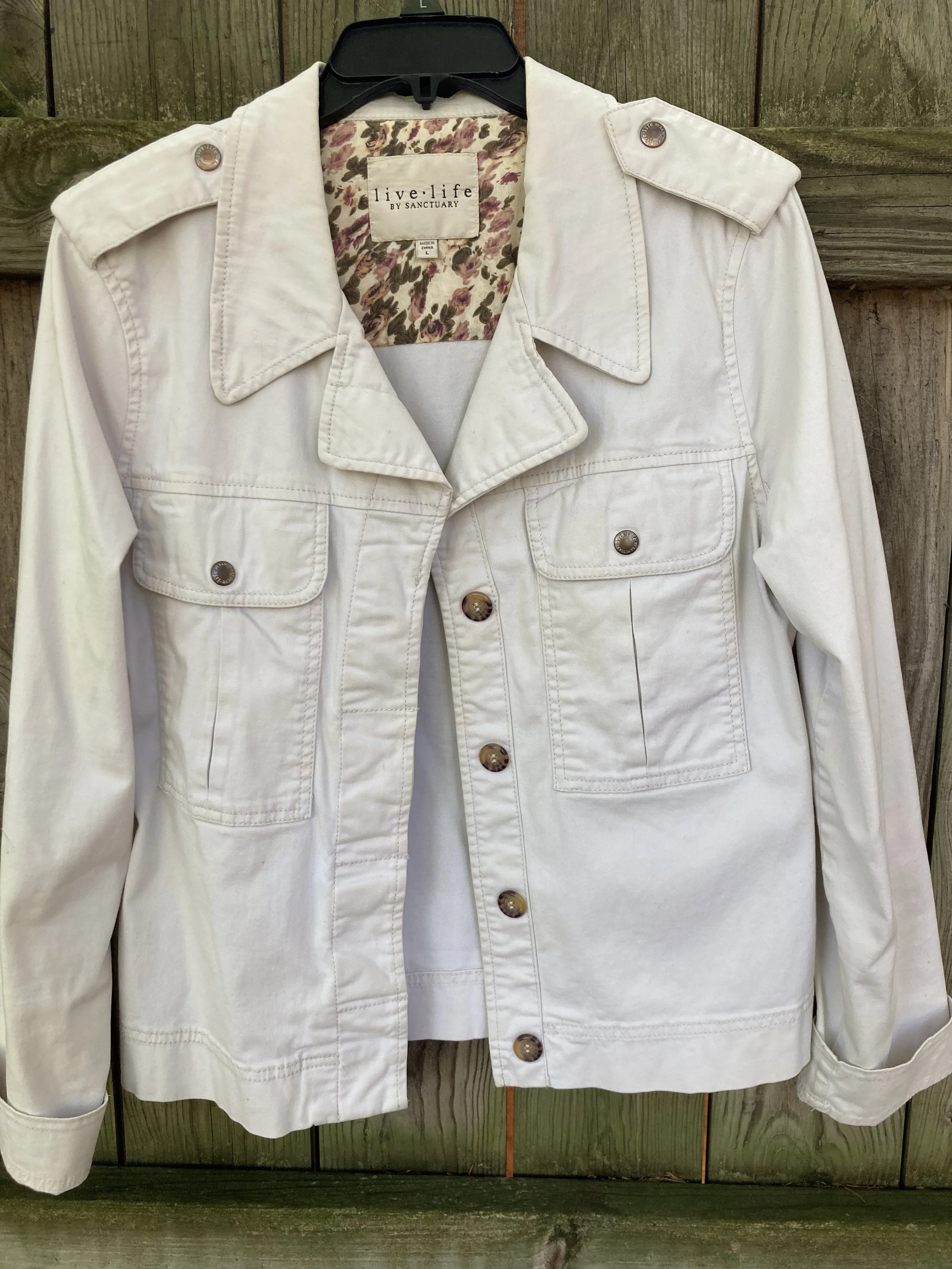
Not a pure, snow white, but not a true cream or ivory, this white does well for casual pieces like this jacket.

Eclipse

This dark, midnight blue is reminiscent of a fall, night sky as after the sun has completely set. A close cousin to navy, this blue is versatile enough to wear with any color.

Doe

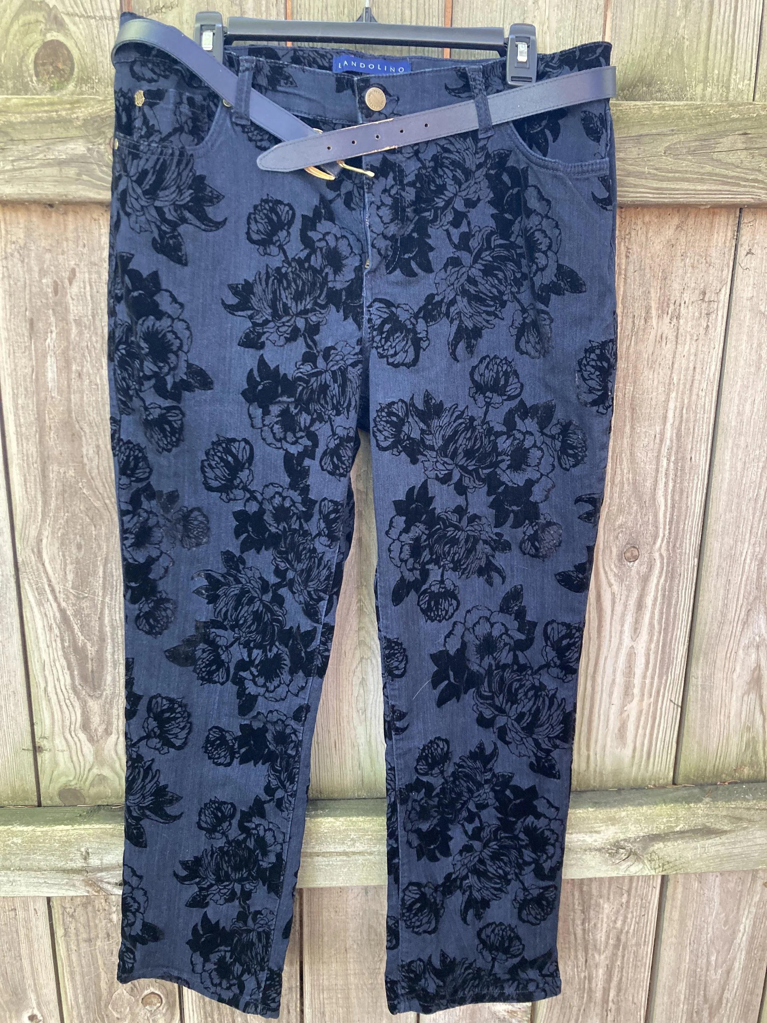
This soft, light brown exudes warmth and can replace other common neutral colors like beige, tan, or camel.

Hot Fudge

A dark brown that can be the perfect color to ground an outfit, weather as a skirt or pair of pants or as a pair of boots or leather bag.

Silver Birch

This light gray is the perfect transition color for fall, when you are not ready for the dark grays like oxford or charcoal. This is another color that will combine with just about anything.

So there you have all the fall colors. The next few weeks I will show you which colors I combined to make five fall worthy looks.

What are your favorite colors? Which colors would you combine to make an outfit? Which of these colors do you have in your closet. I look forward to hearing your thoughts.

Have a great Tuesday!

Pantone - Autumn/Winter - 2021 - London Palette: First Blush, Ibiza Blue and Ultimate Gray

Due to my longer than usual absence from the blog because of my illness, I am going to bypass the wrap up of the New York Palette and the Intro to the London Palette for the Pantone 2021 color series and jump right into the London Palette, so that I can get this series concluded and get on with new content. I have been trying to give a more daily content on Instagram, which now also shows up on my regular Facebook account, but unfortunately, I have not been posting over on my Granny page. I guess I should start doing that as well. You would think all of these things would just be linked together. A few of the meds I am on are making my brain a bit dopey, so bear with me as I try to get things back into some sort of regular routine.

Here we are again, looking at a pastel pink on the fall color palette. I know pastels in fall are no longer taboo, but my brain still looks at this and thinks, “What a great spring outfit!” Maybe I should have paired First Blush with one of colors that seem more Autumnal to me, like Tomato Cream or Downtown Brown, but I liked the combination of blue and pink, so this is what you get.

My Ibeza Blue plaid shirt is a thrifted Faded Glory piece. I used this same plaid shirt in the spring for the French Blue color that was on the New York Palette. You can see that post here. You’ve seen these thrifted, distressed Lane Bryant jeans numerous times on the blog as they are one of my faves.

My First Blush jacket is also a repeat from my closet. Originally a Christopher and Banks purchase, this faux leather piece has some knit panels on the sides and under the arms to allow ease of movement and stretch. I added the scarf to bring in a little bit of added interest and additional color, plus with this being a fall outfit, the need for a scarf seemed more likely.

Ultimate Gray, once again makes its appearance on the London Palette, so I used this for my accessories in the metal chain belt, thrifted fold over bag and my silver sneakers. The only thing I did differently was the rose gold pendant. I just liked the way the color popped against the blue plaid.

While this look is certainly not what we would typically think of for the holidays, if you are more into pastel colors, this is a great casual look for that Thanksgiving celebration, especially if it involves a bit of shopping afterwards.

I’m including a few shopping links for you to look over. Remember to order soon for Christmas. We have all heard how things are taking longer and some things are back logged so be sure to get your orders in, or even better, don’t deal with that added stress and try to buy local. That is what I am thinking about doing at least for part of my shopping this year.

These are affiliate links. All opinions are my own.

Photo credit Jessica Trumbull with Rebecca Trumbull.

Pantone - Autumn/Winter - 2021 - New York Palette: Adobe, Rhodonite and Olive Branch

Due to my illness, I have neglected this little blog for a few weeks. While we are still trying to get all symptoms under control and actually find diagnoses for said symptoms, I hope to be able to get back to some semblance of regular posting, so please bear with me. To all of you who have been so supportive and loving on Facebook and Instagram, thank you. Your kind words, thoughts and prayers have been so appreciated.

The last two colors on the New York Palette for the Pantone Autumn/Winter series are my favorites. Adobe is certainly what I expect on a fall color palette and Rhodonite is a completely different blue, that I think works fabulously for the fall season. Once again, I am using Olive Branch as my classic color. As I have mentioned before, olive works well with so many other colors, and makes the transition from one season to another, smooth and seamless.

Adobe.jpg

These thrifted Michael Kors jeans might be just a smidge lighter than Adobe, but I think they work quite well. I know the world is saying skinny jeans are not in right now, but I like my skinnies and I will continue to wear them. Sure I will wear other silhouettes as well, but I especially favor skinnies in the cool weather to wear with boots.

pantonefallcolortrendsadobe-1.jpg

The dark blue tunic top, is an older Christopher and Banks piece. After I put the outfit together, I realized the tunic is less like the Rhodonite color, while the bluish purple in the print of the jacket is a closer fit.

pantonefallcolortrendsadobe-10.jpg

My jacket is a thrifted Christopher and Banks piece. It fits similarly to a jean jacket and the print is perfect for bringing on all the fall feels.

pantonefallcolortrendsadobe-11.jpg

My thrifted olive bag is Fossil brand. This is a great piece if you want something you can throw all sorts of things into. Ha, ha. A hobo bag is a good choice for travel, as it easily fits into many different spaces and yet has plenty of room for all the goodies.

You can see in the previous two pictures, I kept my jewelry simple by adding a few olive bracelets and a string of olive beads.

pantonefallcolortrendsadobe-13.jpg

You’ve seen numerous pairs of SO ankle boots on the blog, because I have them in SO many different colors. Ha, ha. See what I did there? These are great little ankle boots for fall and work with jeans, trousers, skirts and even dresses. Apparently, the affiliate program I work with is no longer using Kohl’s as one of their retailers, so here are links to the Kohl’s website for a few different styles of ankle boots. Here is the Averyy, the Chantilly, and the Barb 2. These are not an expensive boot, and that is one of the reasons I like them. They also still look pretty good after a number of seasons, but then, I don’t wear the same pair every day. I am not getting any sort of compensation to recommend these boots, I just really like them.

pantonefallcolortrendsadobe-7.jpg

What do you think of these colors? Do you like this outfit? Let me know your thoughts by leaving me some love in the comments.

I’m including a few shopping links, although it was very hard to find this color in the pants. Anyway, these are affiliate links, brought to you at no extra cost. If you purchase something through one of my links, I get a few cents. You are not charged any extra to make a purchase through my blog.

Photo credit Jessica Trumbull with Rebecca Trumbull.

Pantone - Autumn/Winter - 2021 - New York Palette: Mykonos Blue, Spring Lake and Coconut Cream

It seems that every Pantone color palette that comes through the Institute has at least one, if not two blues on it. Blue is a color that everyone can wear, whether you wear dark classic navy, casual comfortable chambray or tropical hues that take you to the beaches of the Caribbean. I have a lot of blue in my closet, but then, I have a lot of every color in my closet. Ha, ha. Blue is great for pairing with many other colors. I pair denim with every color and denim definitely falls in the range of blues. Today’s blues are wearable and most likely already in your wardrobe.

SpringLake.jpg

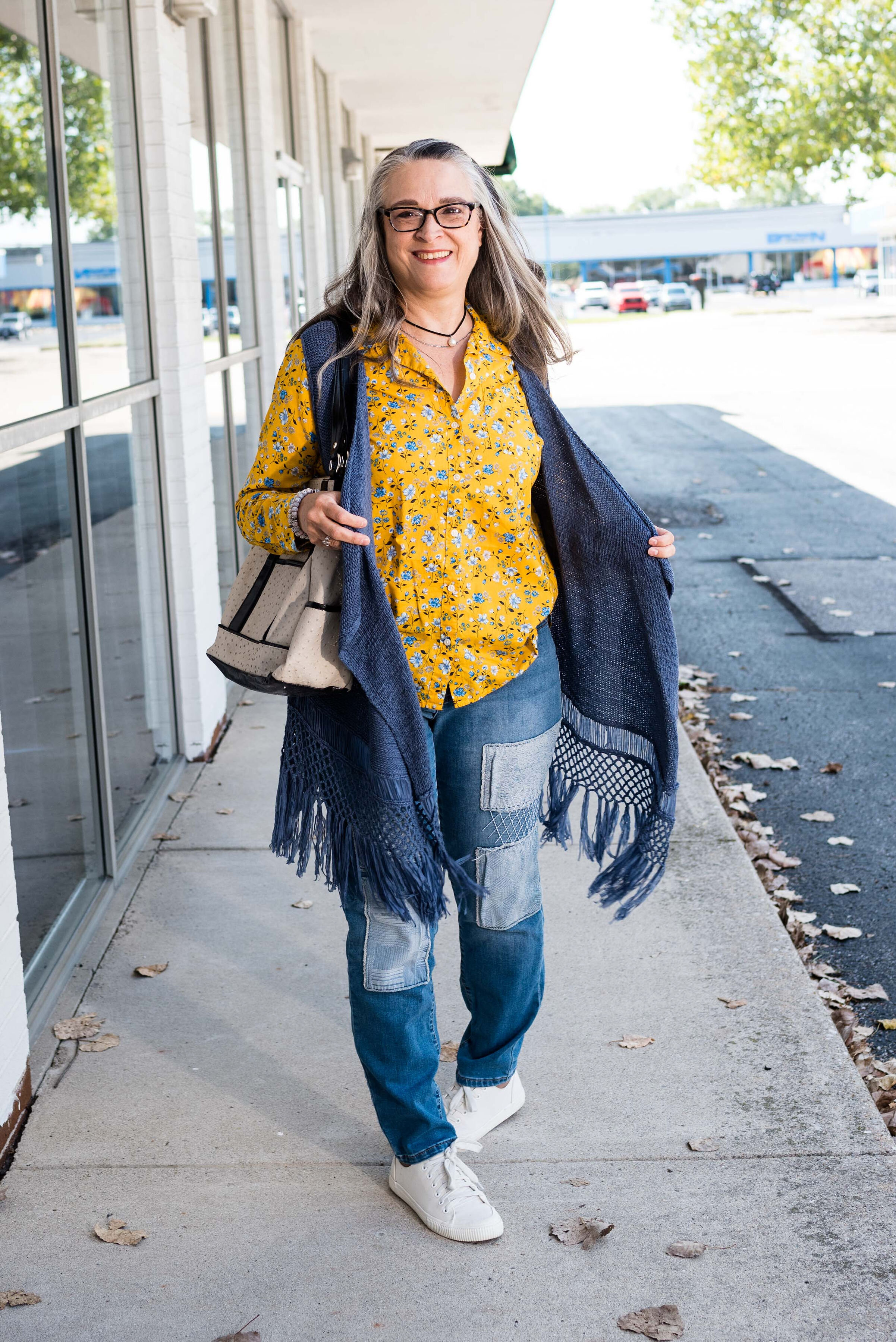
My colors did not really line up with these blues. Oh well, that is part of the challenge of doing this series. I don’t always get the match spot on, but that is okay. The point is to take things you already have and do something similar. It doesn’t matter if your blues are a perfect match or not. All of these pieces were things I already had.

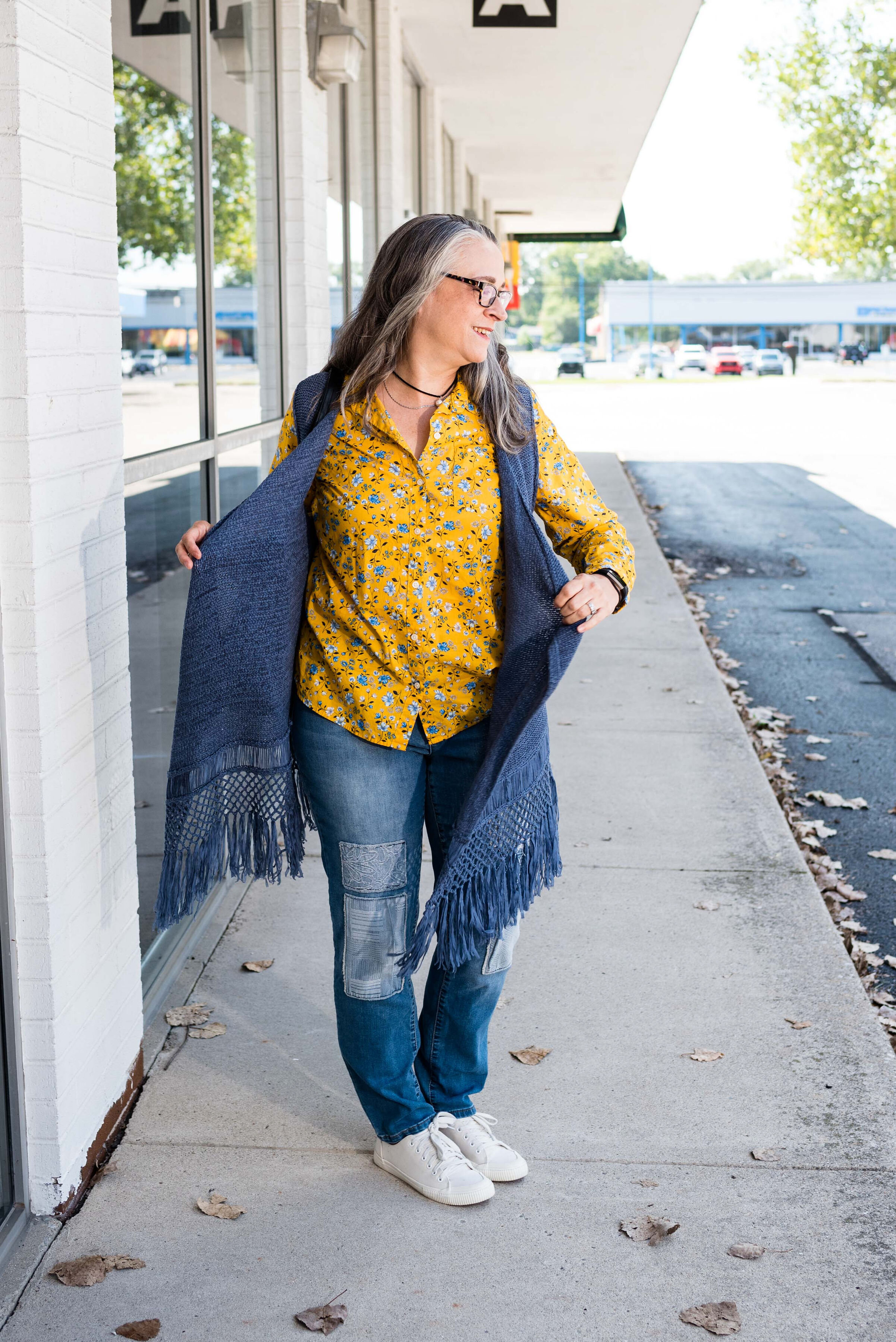
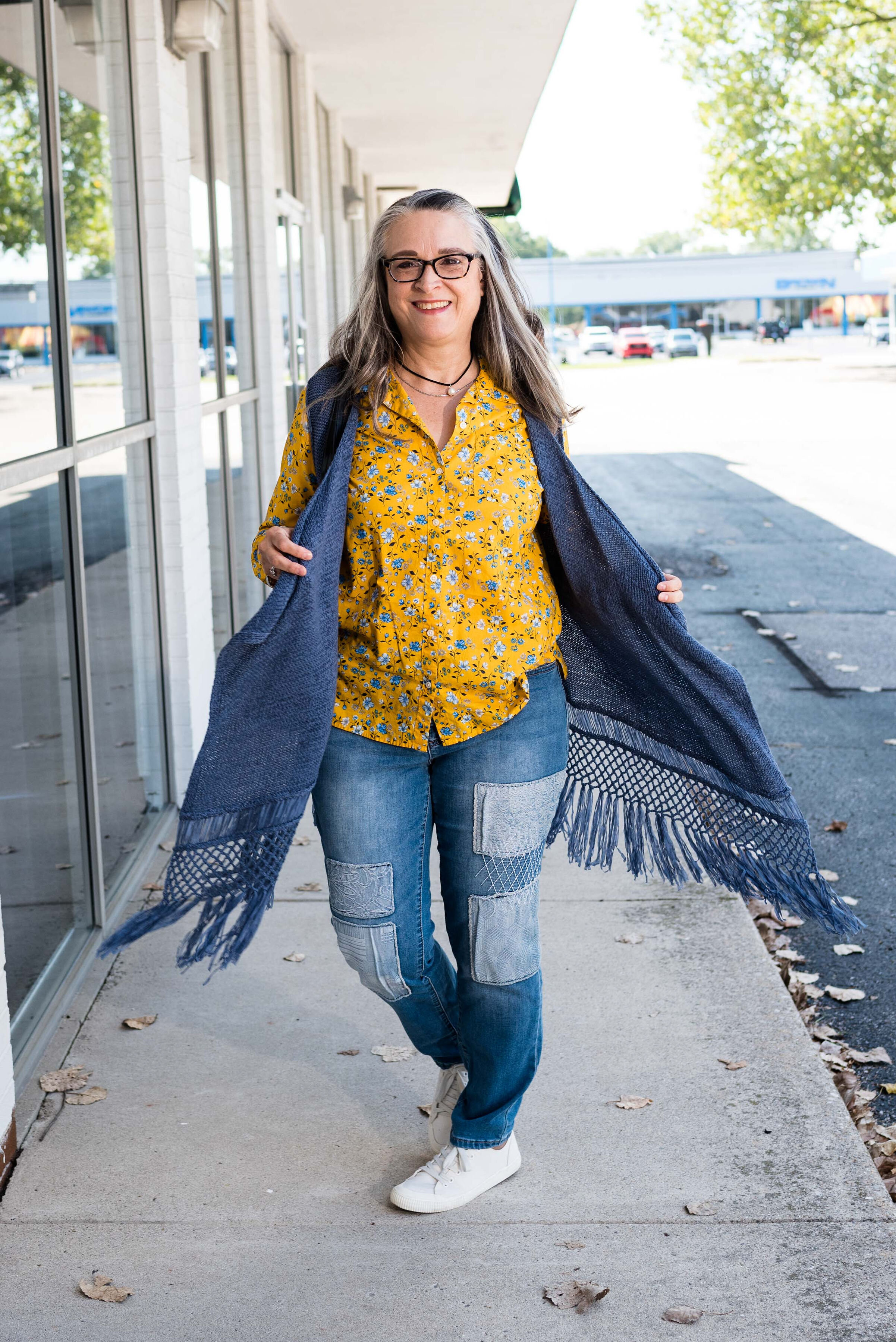
When I picked out these pieces I really thought the pants and the vest would have matched better to Spring Lake, but now looking at the picture the pants seem to match better with the Mykonos Blue. The vest, which does seem to lean a little bit toward a gray undertone, was too dark to match the Spring Lake color. However, the patches on the pants seem to lean a little more in that direction.

pantonefallcolortrendsspringlake-2.jpg
pantonefallcolortrendsspringlake-20.jpg

The vest is a thrifted Relativity piece. I have styled this on the blog before. You can see it worn with a graphic tee. The jeans which I have styled on the blog before are thrifted and a brand called Est. 1946 Denim. You can see how I wore them with a graphic tee and cozy sweater here. Looking at the above picture, I should have rolled up the cuffs on the jeans.

When you have an asymmetrical vest with fringe, you just have to twirl!

My yellow mini floral print button down is a thrifted Old Navy piece. I decided to leave it completely untucked to add to the ultra casual vibe of this outfit.

pantonefallcolortrendsspringlake-5.jpg

I was trying to go for the Coconut Cream idea in my accessories, but again, things didn’t match up exactly. My bag was a hand-me-over from my daughter. This Miche brand bag actually has interchangeable outer shells, so for this look I used the cream colored one.

pantonefallcolortrendsspringlake-14.jpg
pantonefallcolortrendsspringlake-16.jpg

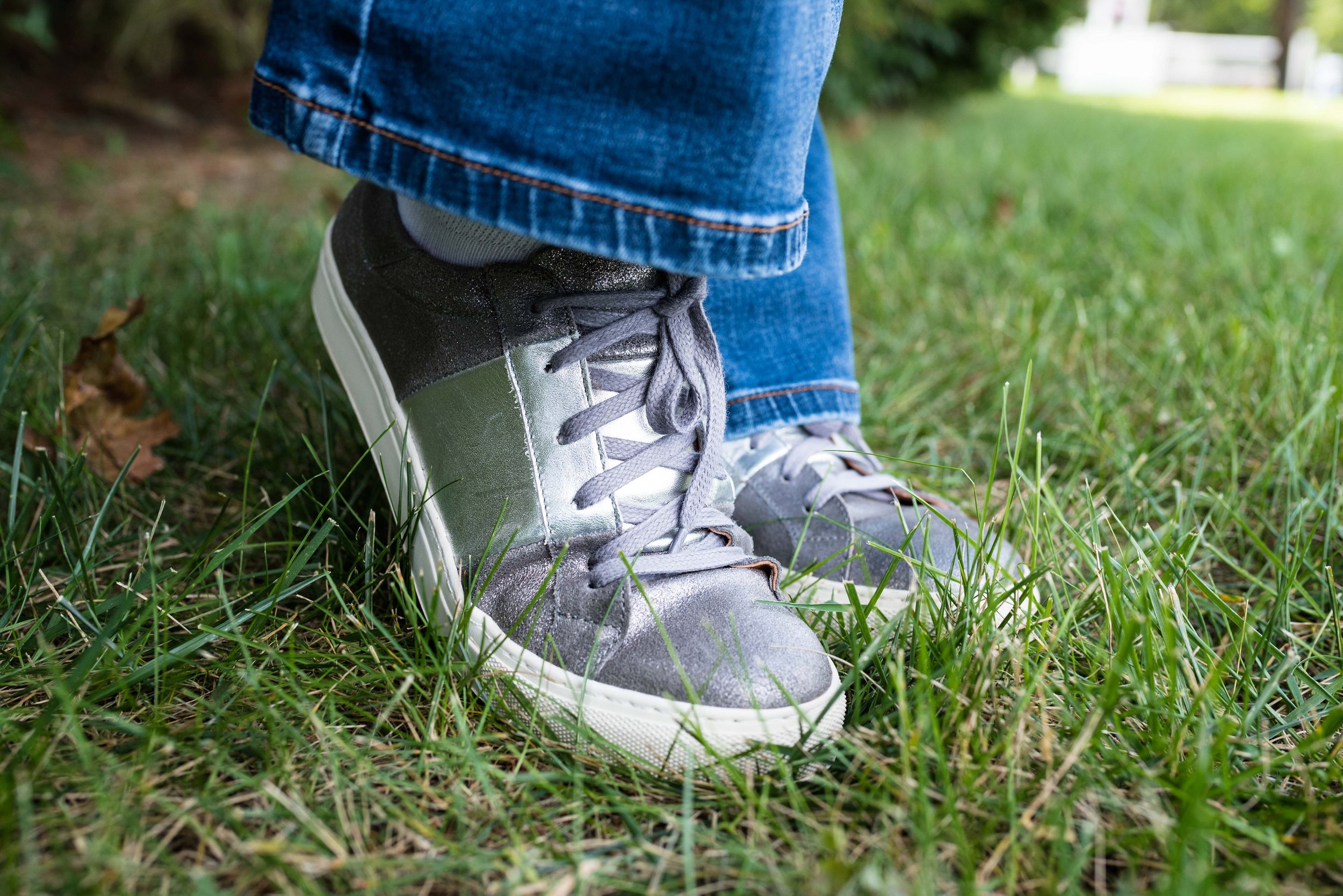
My sneakers are thrifted Mossimo.

pantonefallcolortrendsspringlake-17.jpg

What do you think of these colors? Do you like to wear blue? What color blue is your favorite?

pantonefallcolortrendsspringlake-8.jpg

Thanks for following along with the blog. I appreciate all of your clicks, likes and comments.

I am including a few shopping links for you to look over. These are affiliate links. All opinions are my own.

Have a great day.

Photo credit Jessica Trumbull with Rebecca Trumbull.