Color Play - Building Outfits Around an Abstract Print Skirt

I have been wanting to build an outfit around this pretty abstract print maxi skirt ever since I thrifted it a few seasons ago. In order to get a bit outside my normal jeans and tees kind of casual outfits, I have been purposefully meandering through my maxi skirts in an effort to build a few fun, summer outfits that would work for backyard bbq’s, dressy casual dates with a friend or significant other, work or a more casual summer wedding. Today, I am showing you two different outfits using the same skirt.

Outfit 1 - Dressed Up

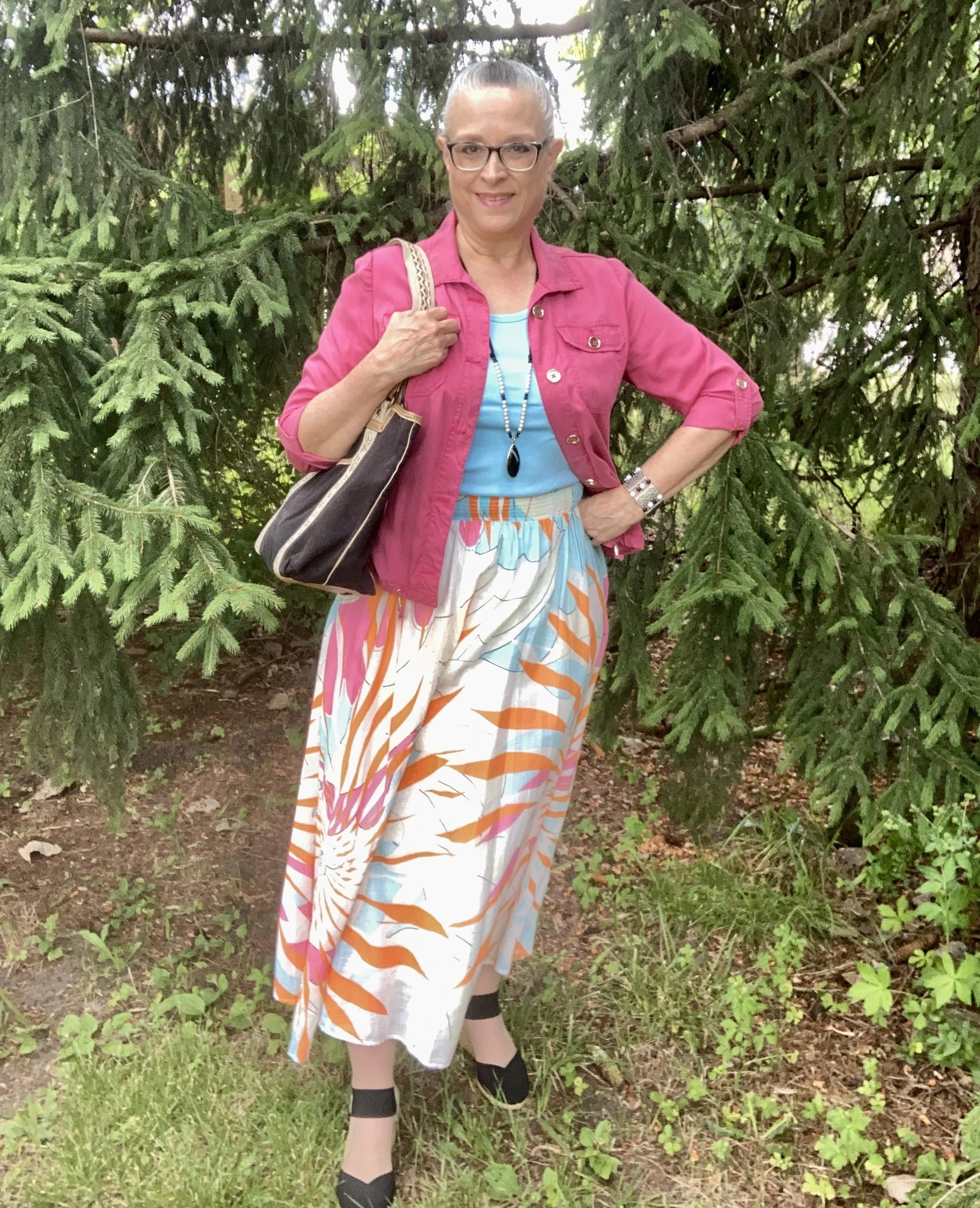
This skirt is a brand called Maeve by Anthropololgie. The outer layer is cotton, and it has an attached slip, making it easy to wear with no show through. The wide elastic band is comfortable, and easily covered with a wide belt, as you’ll see in the next outfit.

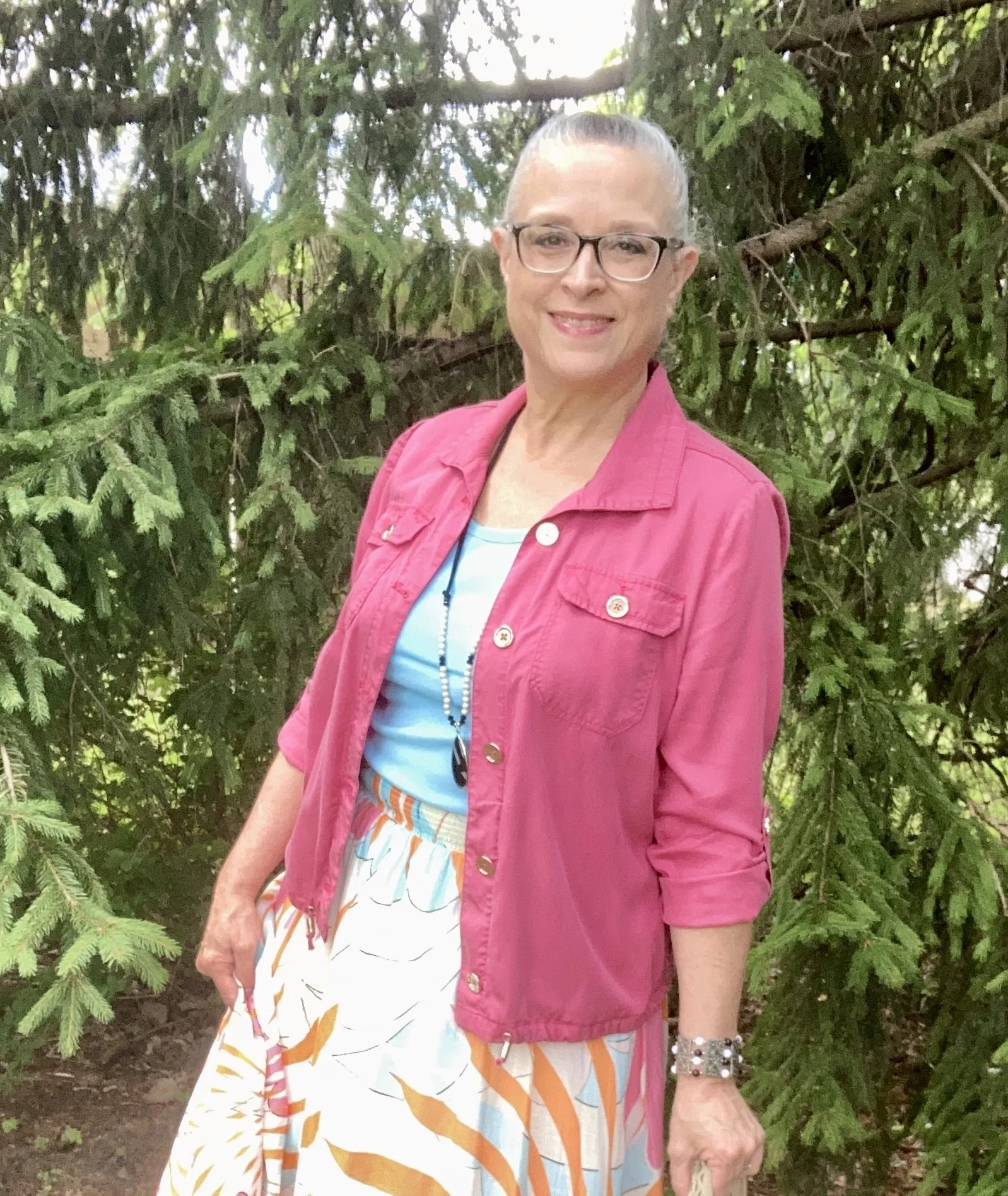
My bright pink jacket is a Chico’s thrift find. It is actually a petite, but I don’t have a super long torso, so I occasionally can get away with a petite size. You don’t really notice, especially if the sleeves are rolled up.

My tank top was a St. John’s Bay basic that I got at JC Penney a few seasons ago. I was excited to see it matched the blue in the skirt spot on. Of course with this skirt you could use pink, orange, white or black, or even mix it up with a totally different color like mint green, or sunflower yellow. That is exactly why I like to call this monthly column, Color Play, to stretch our minds as to what sorts of colors go together.

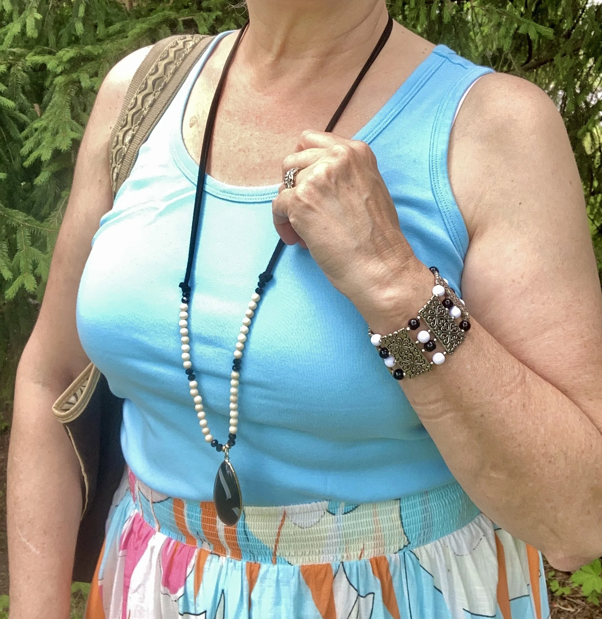
The jewelry wasn’t made to go together, but they certainly work well together. The necklace I got a few months ago at my favorite thrift store around the corner. The bracelet was a clearance purchase probably from Kohl’s or Penneys.

I have had this Relic canvas tote for a number of years, and it is a great work horse for summer. While I regularly carry a cross body bag, I occasionally reach for a tote bag to run to the coffee shop or library, or when packing for a trip. Sorry about the bits of cat hair. You can’t have a pet without there being a bit of fall out, especially in these warm temps. Ha, ha.

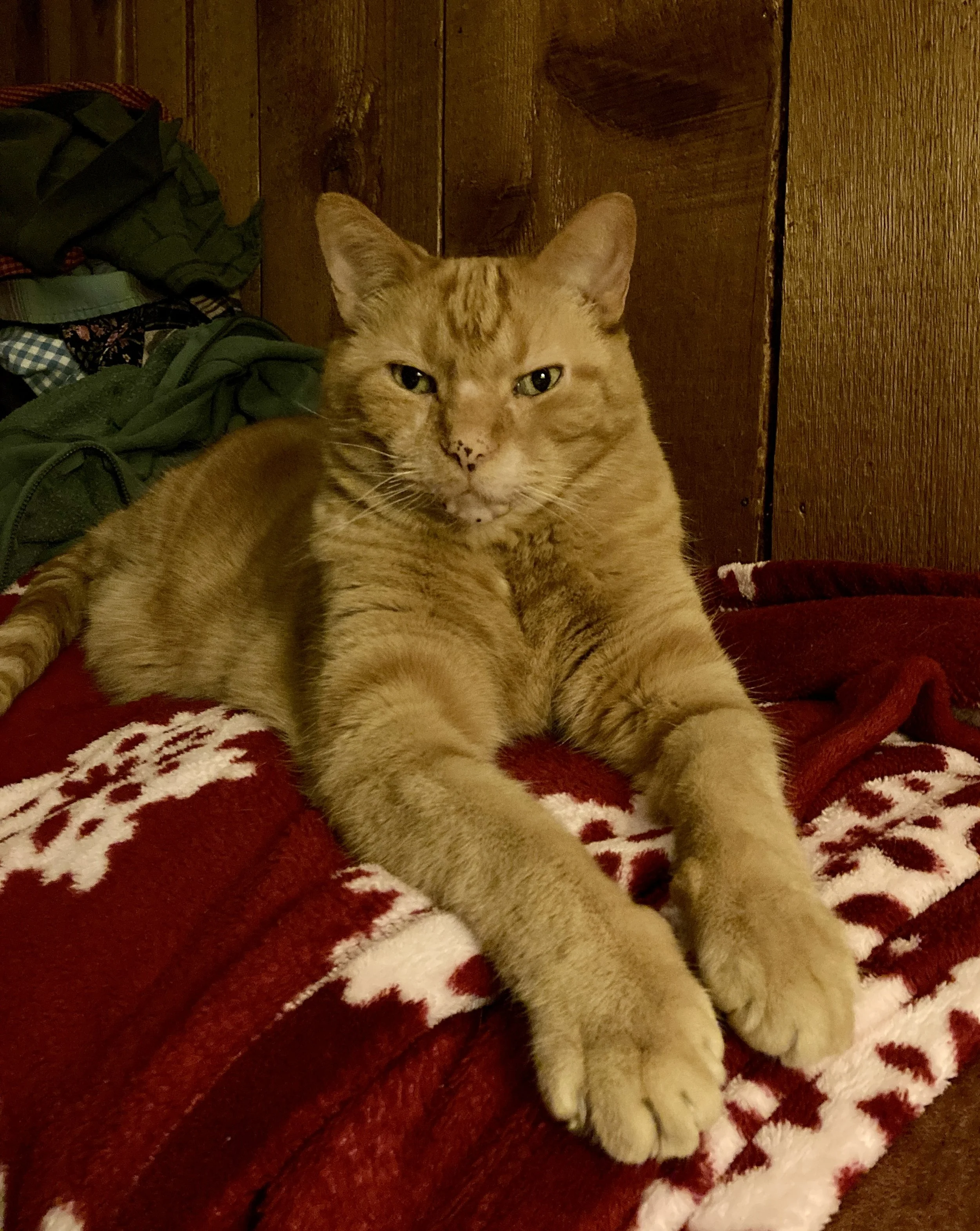
Our silly curmudgeon, Plato Aristotle Radcliffe Christensen. A large cat had to have a large name!

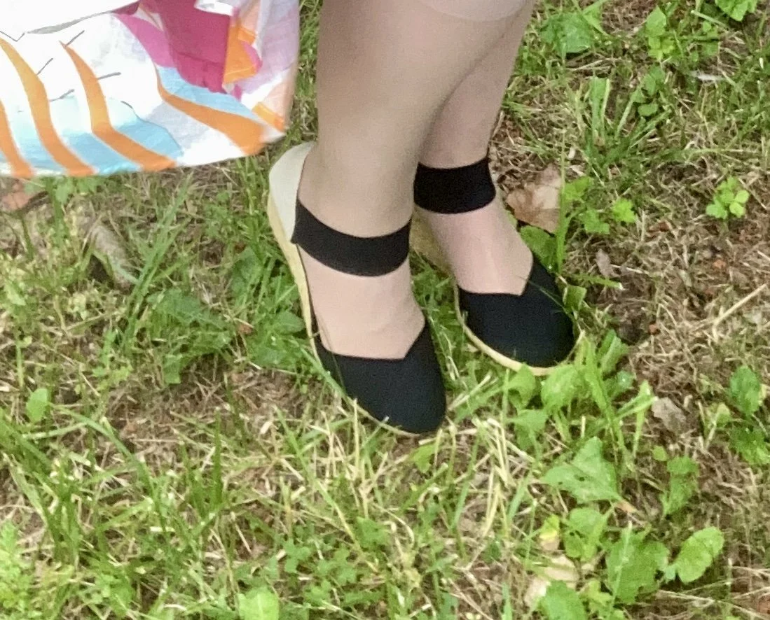
I had to rummage through my shoe boxes to find these cute espadrilles. These are Chaps brand and were a Kohl’s purchase a few years ago.

Outfit 2 - More Casual

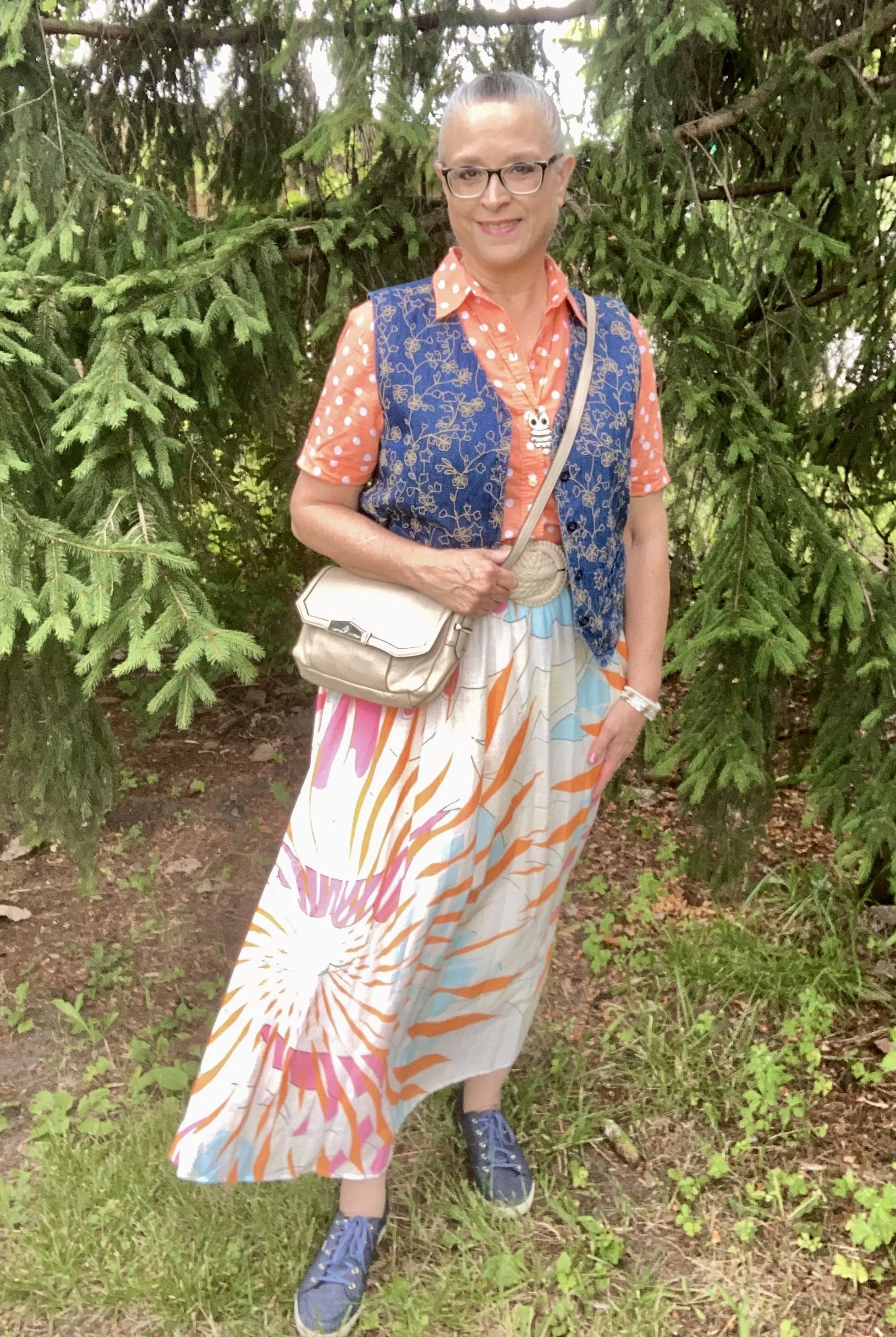
I couldn’t resist doing a bit of print mixing with this fun skirt, and polka dots and embroidery seemed a great companion for the abstract print.

Both of these pieces were second hand finds. Like so many pieces that I thrift, I don’t always have an idea in mind of what they are going to go with, but find I am pleasantly surprise when things line up. My button down is Jones New York Sport, and the embroidered vest is Van Heusen. I’ve heard of Van Heusen in men’s shirts, but this is clearly a women’s vest, although a man might like it as well, but it is cut more for a feminine body. Walmart and a few other stores carry this brand.

I decided to add a wide belt for this look. Another thrift find, this wide braided belt is a soft material that adds interest and texture. I thought the belt and my Vera Wang bag were a good match. You can also see I swapped out the black pendant necklace for my lovable owl, and replaced the metal and bead bracelet for some fun white and gold stretchies.

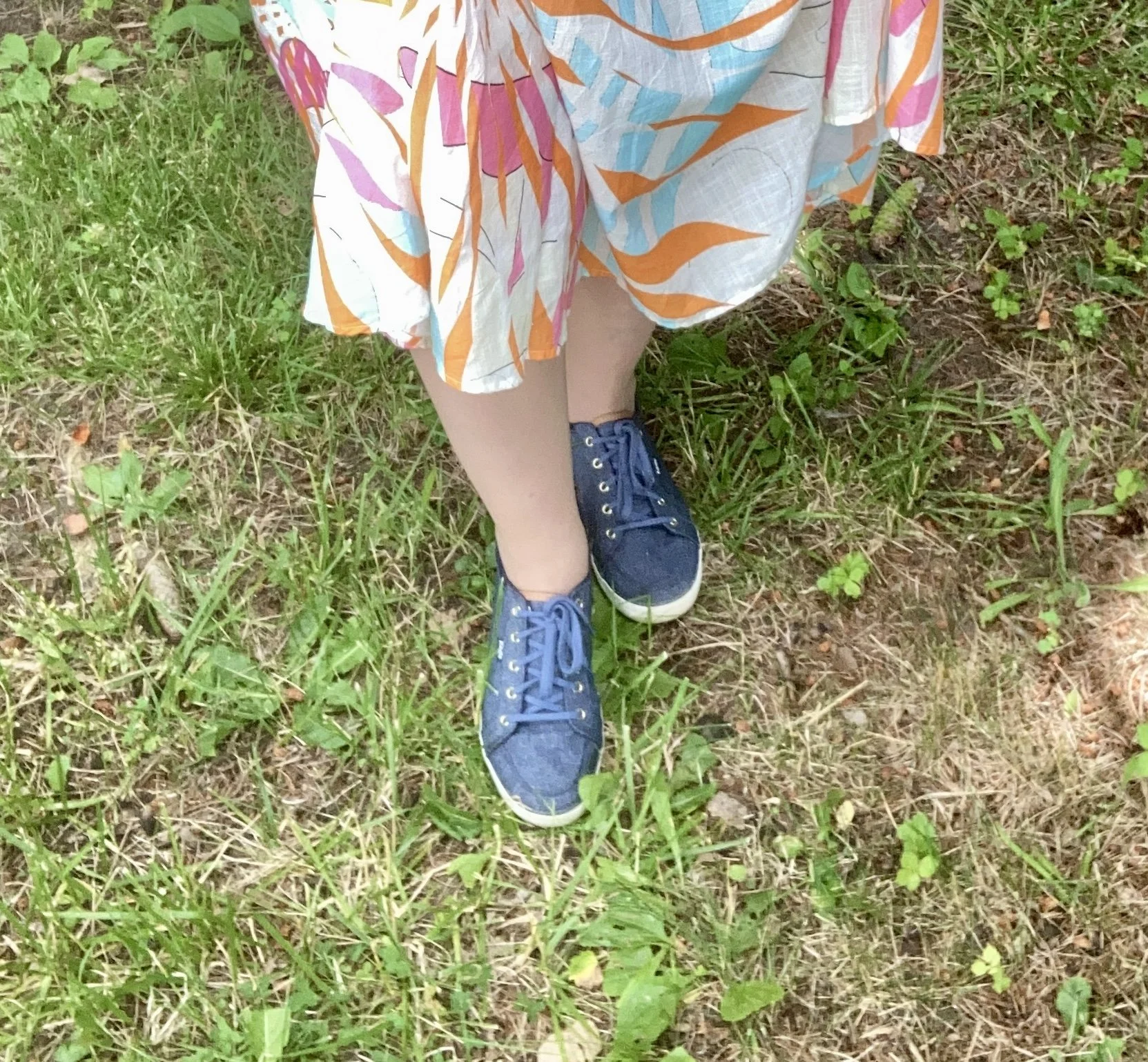
I chose my denim Keds as a way to compliment the vest and create more continuity to a busy printed outfit.

So which look do you like better? Would you have purchased a skirt like this? Do you have any skirts in your closet that you are just not sure how to style? I hope this post gave you a little inspiration for shopping your closet and thinking outside your color box.

I’m including a few shopping links for you to look over. These are affiliate links. If you purchase something through one of my links I get a tiny percent. I appreciate every click and purchase. All opinions are my own and you are not charged anything extra for purchasing through my site.

Thank yo for all you do. I hope you are having a great week.

Pantone Autumn/Winter 2023 - New York Palette: Rose Violet, High Visibility, and Doe

Today I am bringing you another outfit in my Pantone Autumn/Winter color series. I find these colors on the Pantone website. My renditions of their color palette may not always be an exact match, but I shop my closet and try to find the pieces that come as close as possible to their color choices. I want you to be able to shop your wardrobe as well. You may not have all of these colors in your closet like I do, but you will certainly have two or three. The idea is to take those colors and use them in new ways to make outfits you never thought of before.

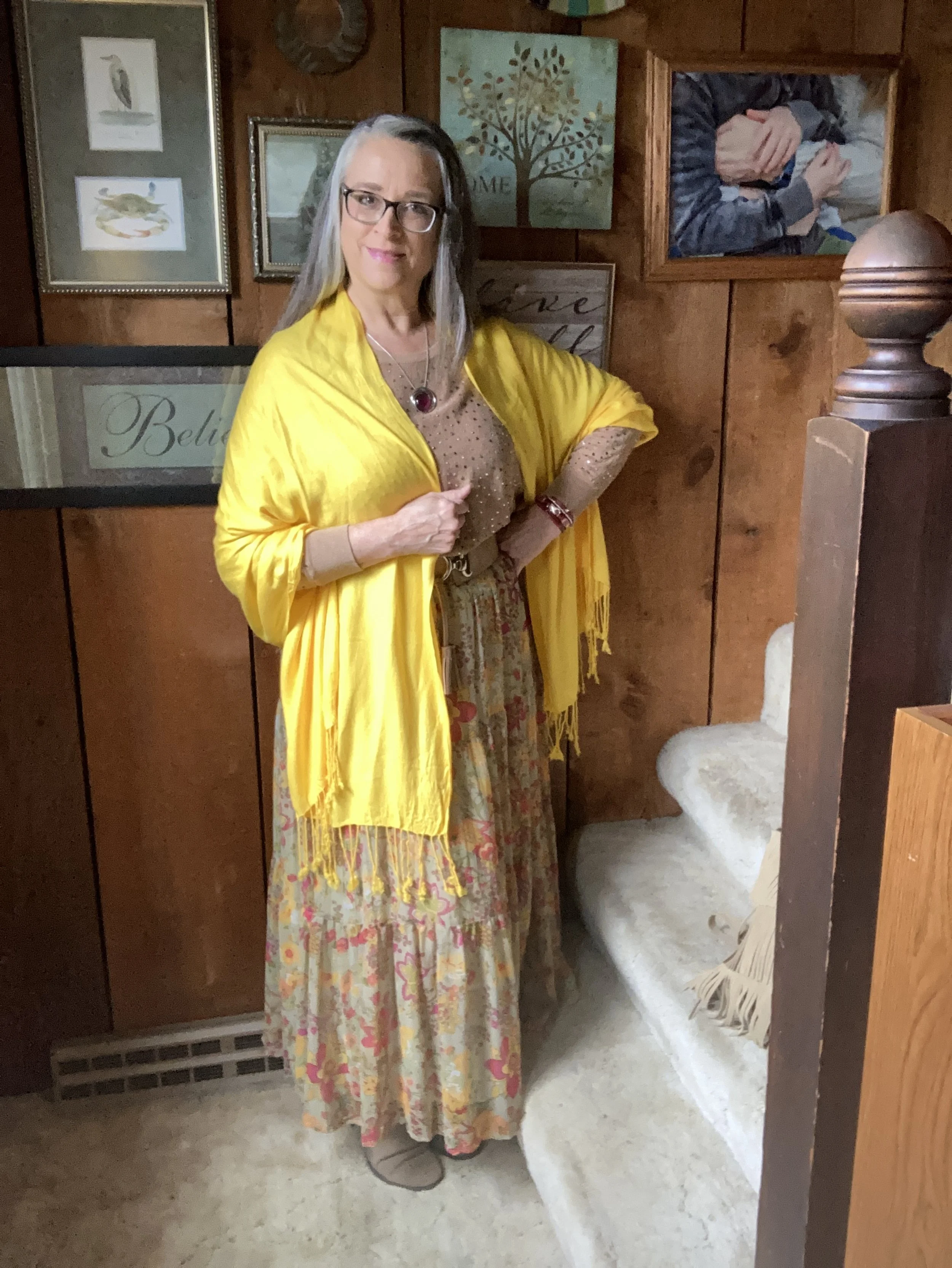
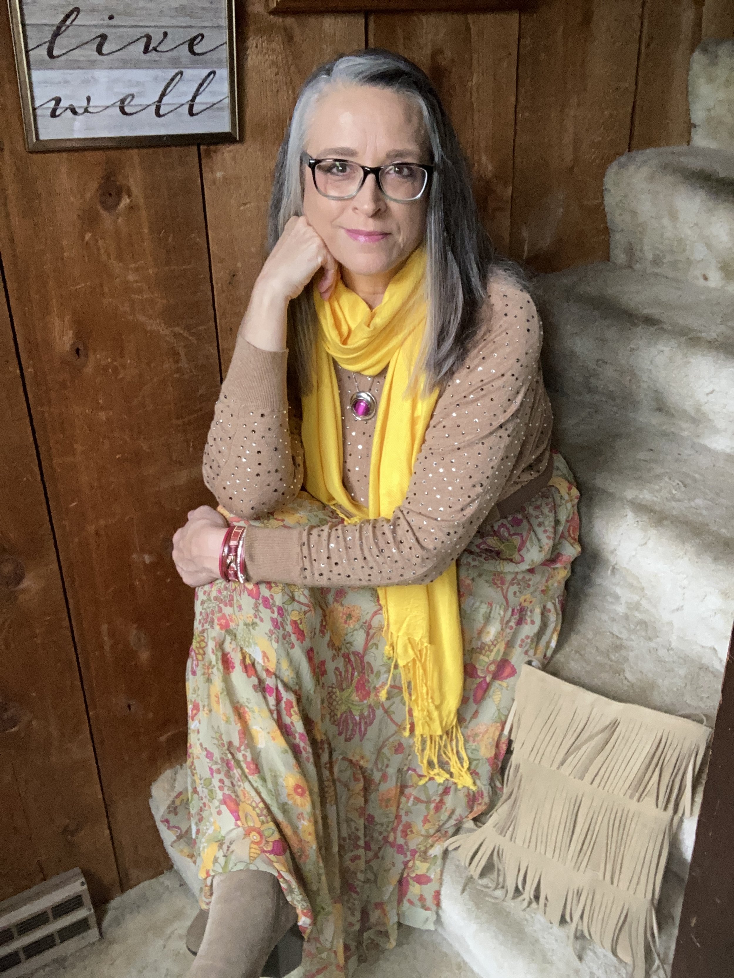
I love the boho vibe of this outfit. The bright colors, tiered skirt and fringe bag are all indicative of many Bohemian outfits.

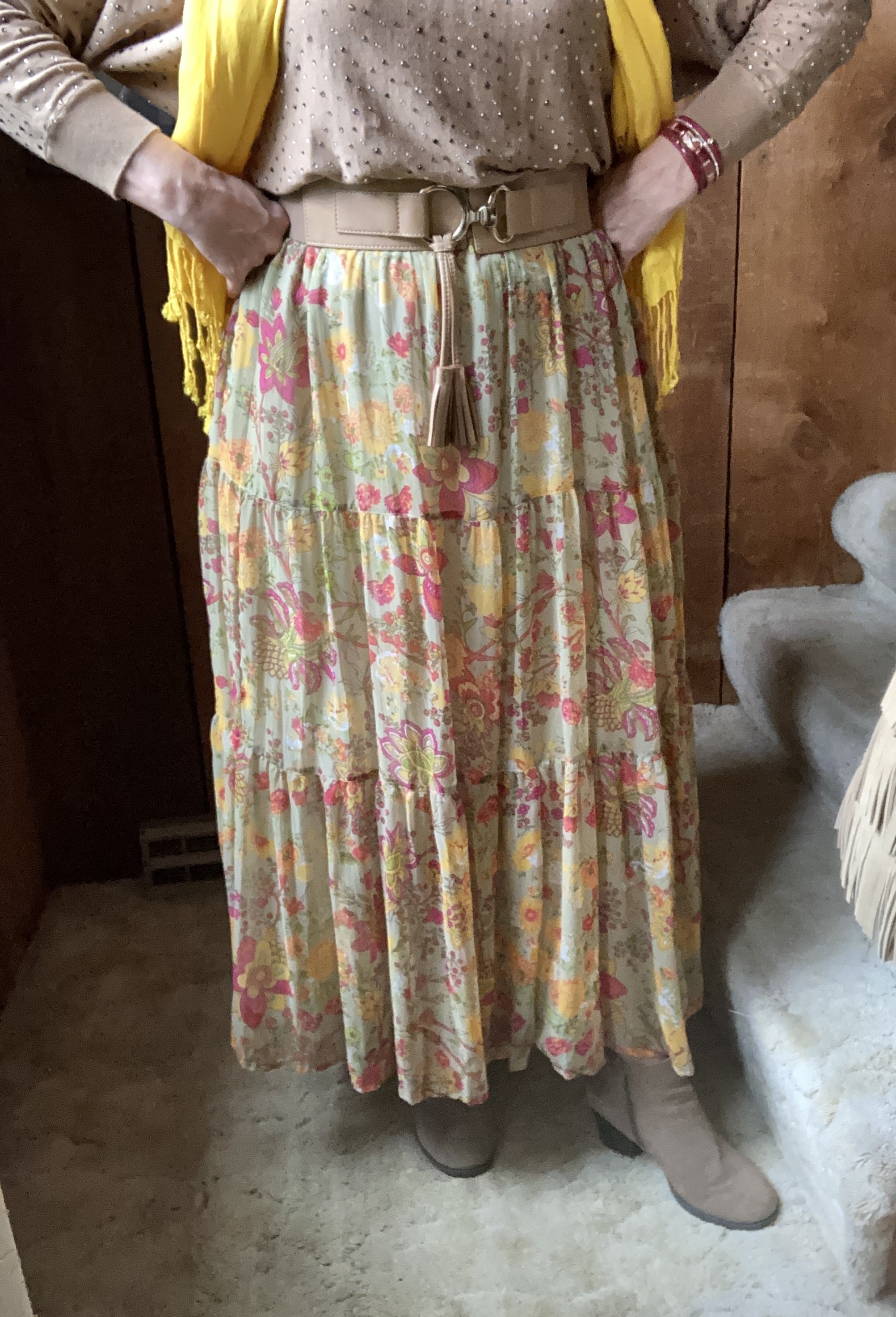
I was having a hard time decided which piece to use for the Rose Violet color. It is a bright, fuchsia pink and though I had my Button Front Maxi Dress from Closet52 (no longer in business), it was too overwhelming. I felt the bright pink and the bright yellow were needed in small doses, thus this fun, thrifted, tiered maxi skirt.

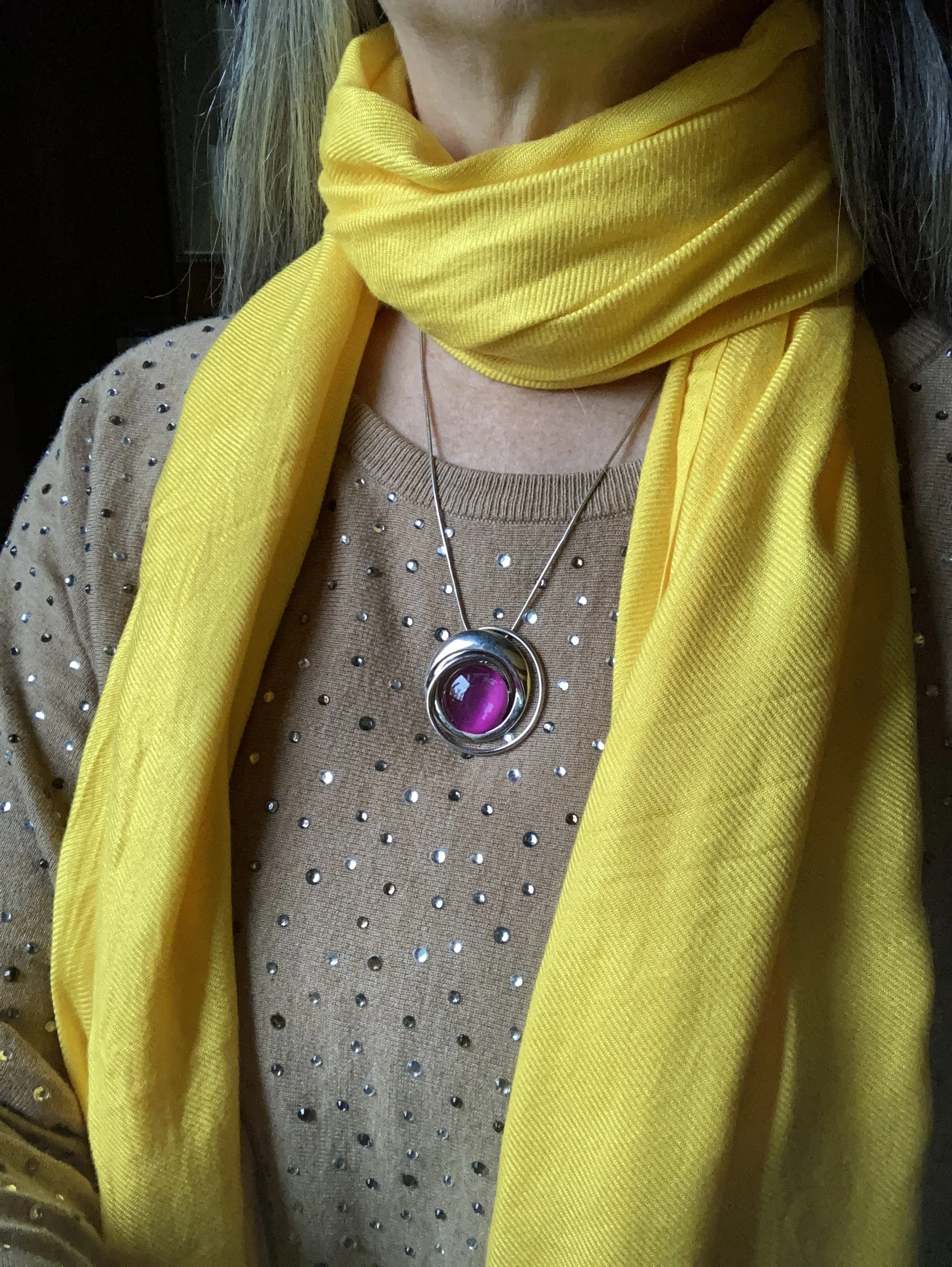
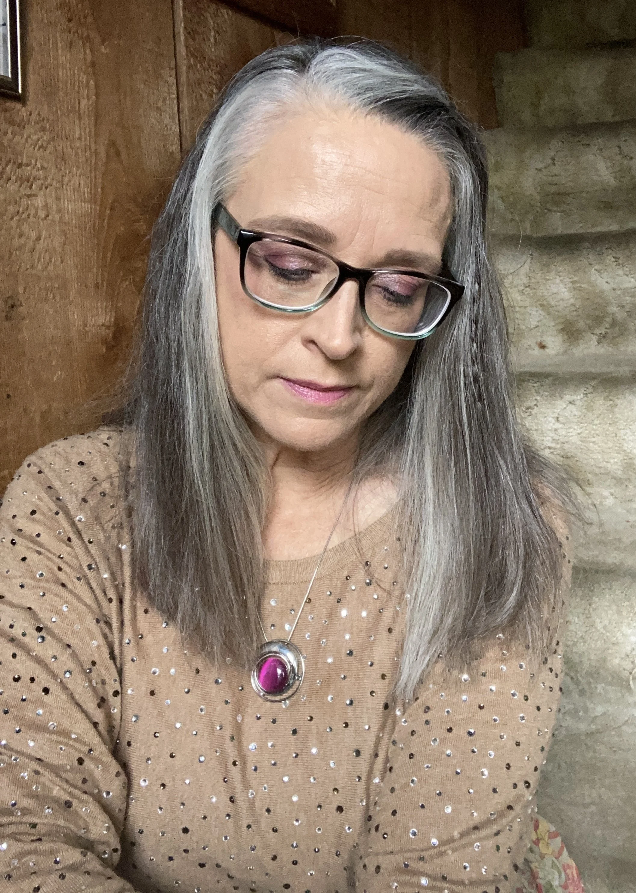
I added the old Christopher and Banks cat eye necklace to pull the Rose Violet color upwards, and I also wore make up allowing for a softer version of the bright pink on my face.

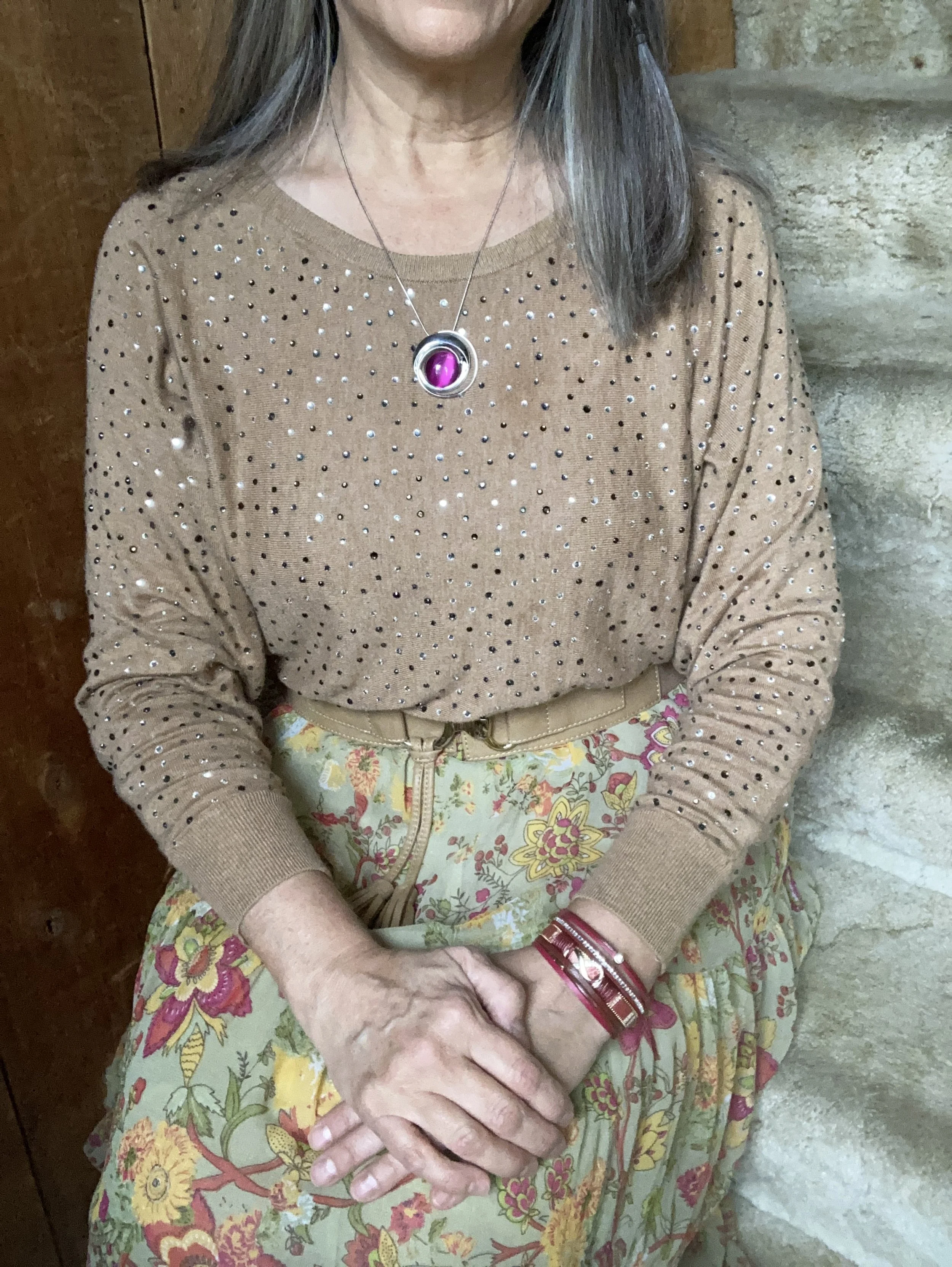
My Doe colored sweater was a fabulous thrift find. I thought the neutral color with the glistening, metallic dots would be great for the up coming holidays with a versatility that allows for dressing up or down.

High Visibility is certainly so. This bright yellow is so cheerful and definitely a pick-me-up on a cloudy, rainy day. Again, the skirt uses a paler version of the yellow to keep the outfit completely compatible through out.

Here is another way to wear the pashmina.

My accessories remained in the neutral shade to allow the bright pink and yellow to be the focal points for the outfit. The sweater is quite long, hanging below my bottom so I tucked it in and added the belt. It brings additional interest, texture and gives me a more refined hour glass silhouette.

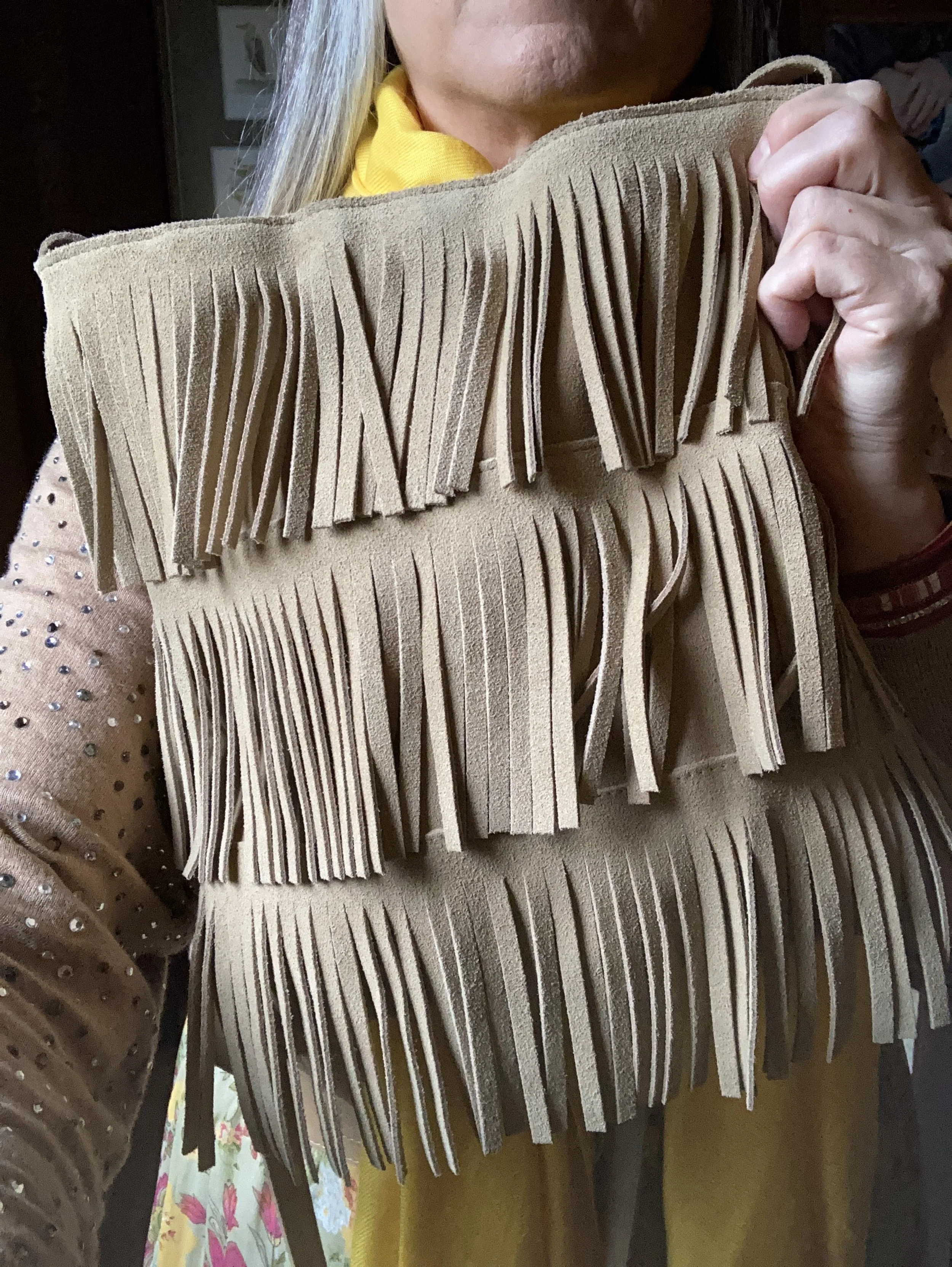
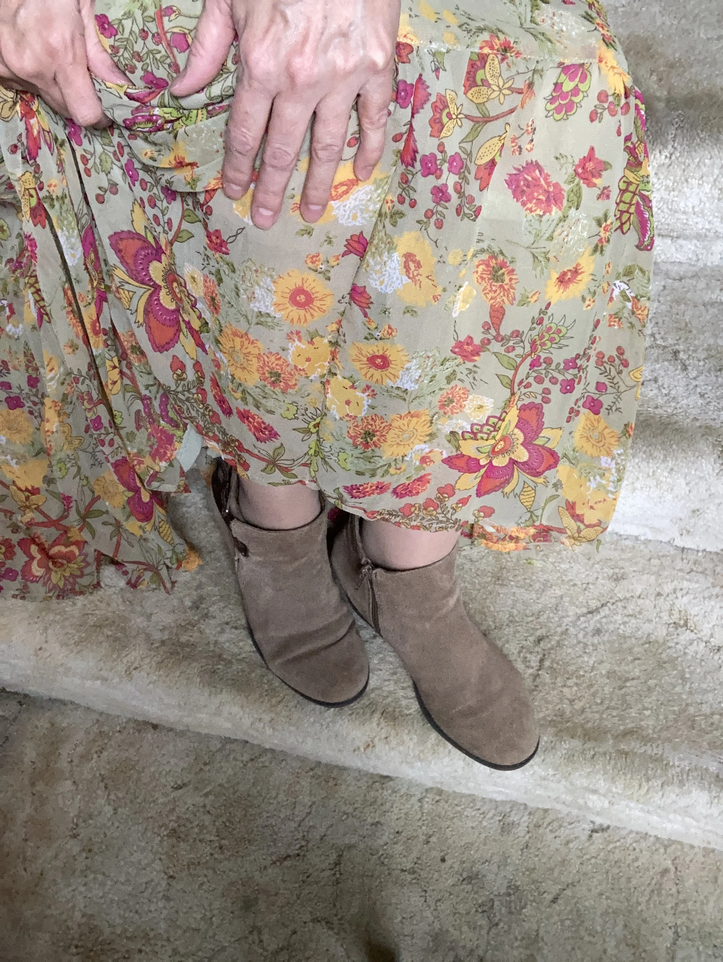
I added the thrifted fringe bag, and my older suede ankle boots which have a low heel helping to keep the skirt off the floor.

What do you think of this outfit? Do you like the combination of bright colors with more neutral colors? What would you do differently? I love to hear your ideas and thoughts, so leave me some love in the comments.

I hope you enjoyed this outfit featuring the Pantone New York Palette colors: Rose Violet, High Visibility, and Doe.

No shopping links this week, but I hope you are having a great day and a good week. Check back next Tuesday for another outfit post.

Pantone Spring/Summer 2022 - NY Palette - Innuendo, Poinciana and Basil

Week two in my Pantone Spring/Summer 2022 series and we are looking at the New York Palette. Last week we saw a medium blue, a bright yellow and a crisp white that, put together, made a perfect spring Easter look. This week is another perfect combo for the upcoming Sunday holiday, especially if you are going to church or visiting family.

Innuendo is a bright, hot pink, while Poinciana is a simmering red. Combined with the classic light green color Basil, the look I put together says chic and classy with a splash of watermelon cooler! Let me know what you think.

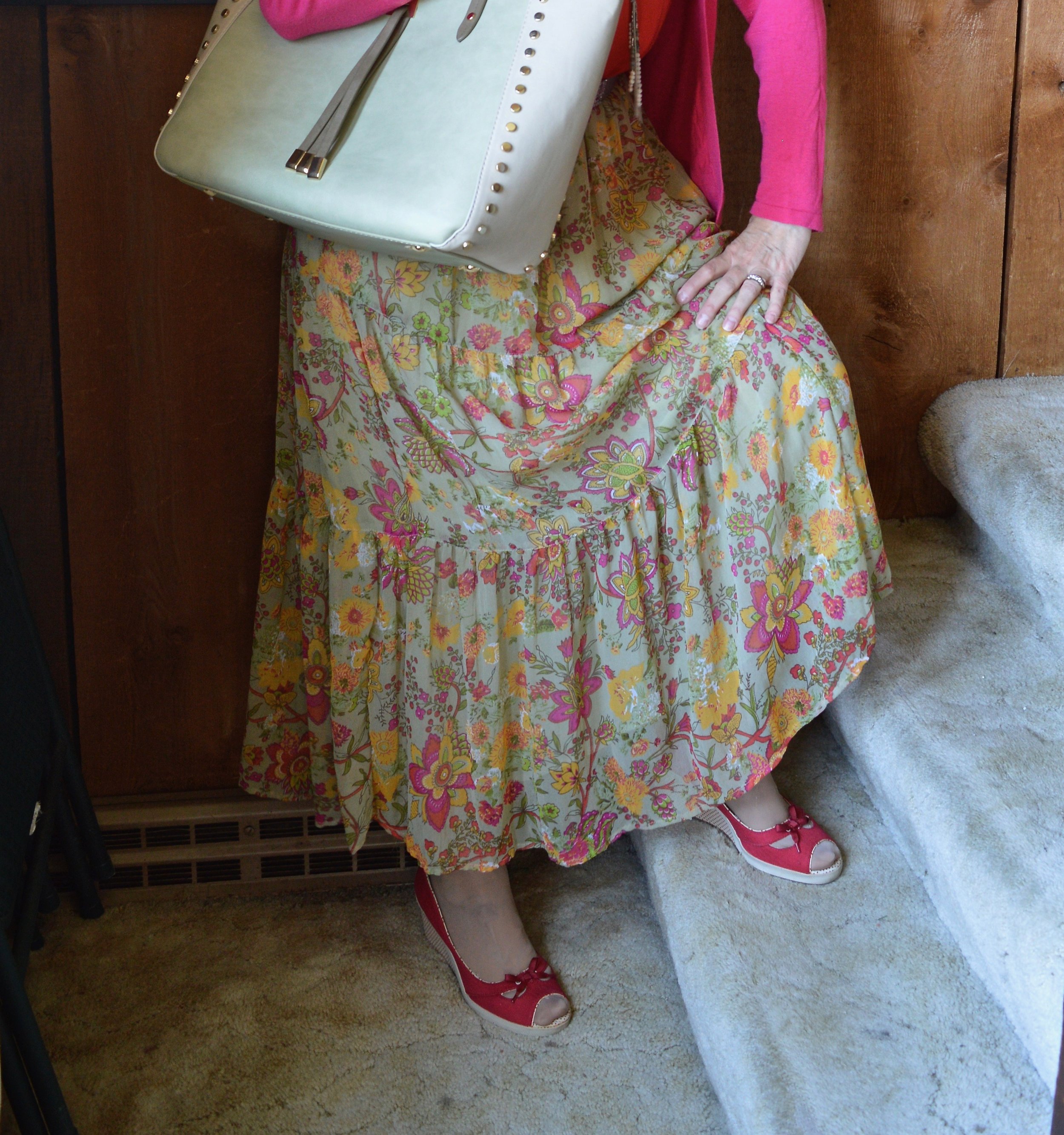
I don’t often think of pairing pink and red, but for some reason I love how this turned out. The bright pink with the bright red just seems to work. Pairing them with the printed floral skirt led to a bright, colorful spring outfit perfect for Easter Sunday, or even a spring wedding or other event where you need to get more dressed up.

My bright pink open front cardigan was a thrift find and is Old Navy brand. I like to give you the brand names on things because it gives you an idea of the cut and quality of a piece. I don’t shop at Old Navy, but I certainly will grab their brand at a thrift store. This is a lighter weight piece so perfect for the warmer temps…at whatever point those arrive. Ha, ha. Here is one from Kohl’s, Shein, and Chico’s.

My Pop Sugar red smocked blouse was from Kohl’s a few seasons ago. It has ruffle details along the sleeve openings, but is otherwise sleeveless. I love the smocking detail and the shiny fabric. Check out these tops from Shein, Dia & Co, and JC Penney. You can also see in the photo below my long pendant necklace and belt. I have a beaded bracelet on as well that mimics the Basil green color, but it is mostly hidden by my sleeve. Ha, ha.

Style Tip: To get more use out of your clothes, try pairing unexpected colors together. You will not only have new ways to wear different pieces, but you’ll become a trend maker.

My skirt is a thrifted piece and the tag was torn or cut out, so I have no idea who made it, but it is a typical prairie maxi skirt. It is lined, but the lining is very sheer like the skirt, so I still felt a slip was necessary. See these from Kohl’s, Shein, and Dia & Co.

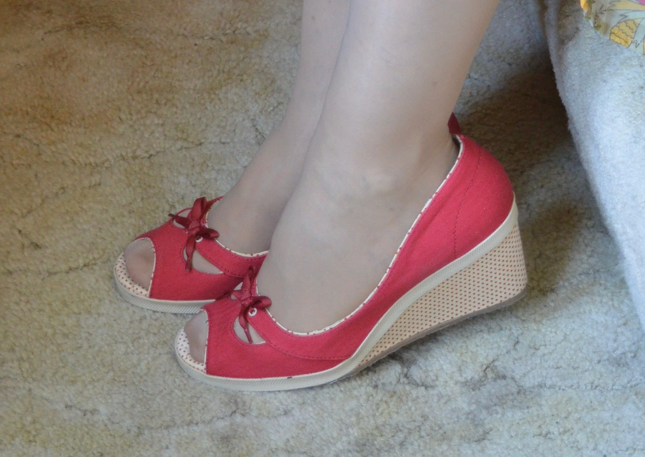
My shoes are a number of years old. I don’t wear heels or wedges much any more, so these have stayed in nice shape. These are Keds brand. I most likely got them at Kohl’s on clearance. The brand doesn’t seem to make this sort of espadrille with the wedge heel anymore, but I’ll give you some other options in my shopping links below.

My bag is also a few years old and was from Charming Charlie. We used to have a store at our mall. Now it is called something else, but still has a similar vibe to it with bags, jewelry and scarves being their main products along with a few clothes. Here are a few green tote bags from Amazon, Banana Republic, ModCloth, and Kohl’s.

What do you think of these colors? Do you think they go well together? Do you have any of these colors in your closet? I love hearing your thoughts, so leave me a comment or two.

I provided direct link shopping links above, due to changes at the affiliate site I was using. I’ve included a few shoe links through the affiliate website. I only receive a few cents when you shop through the affiliate sites. The other direct link sites I bring to you at no cost, but I also don’t make money through them. I just want you to have some shopping options.

Have a great week!

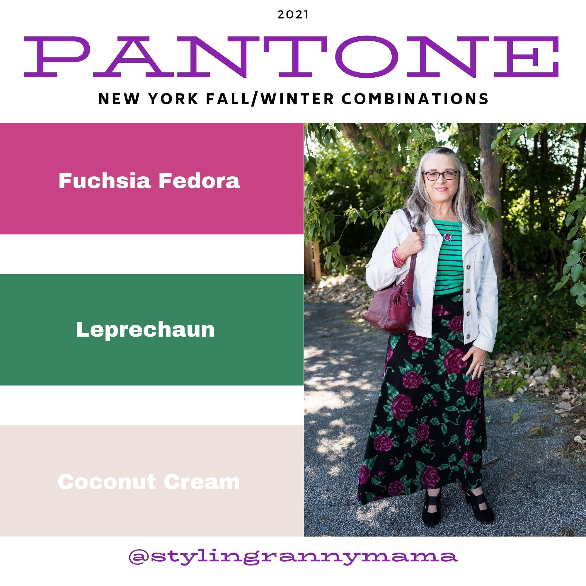
Pantone - Autumn/Winter - 2021 - New York Palette: Fuchsia Fedora, Leprechaun, and Coconut Cream

The colors I am showing you today were ones that surprised me a bit for a fall palette. The bright Fuchsia Fedora is not a color that I have very many pieces in, thus why I used it more as an accessory color. Leprechaun was also a different choice. I was thinking there would be a darker, more forest green color, but this bright, cheeky color is what appeared on the palette. However, that is one of the reasons I like doing this color series. It forces me to think outside the box.

FuschiaFedora.jpg

Even though I wasn’t particularly fond of these colors for fall, I actually liked the way this outfit turned out. Even though the light jacket looks nothing like Coconut Cream, these colors and their combinations are just guidelines for us. Not rules…and just for fun….

I loved The Pirates of the Caribbean movie, and that whole idea of rules versus guidelines was amusing as it kept coming up in the movie and was used according who benefited the most. I guess we could take a lesson from that when we look at our closets. The combinations you put together are for your benefit. You get to decide what you like and what you don’t. You make the choice of what colors or prints to put together, and whether you want to buy into the trends or not. I think we can safely say those fashion “rules”, are really more like “guidelines.” My job as a fashion blogger is to give you ideas of how to make these combinations and hopefully inspire you to think outside your own boxes.

pantonefallcolortrendsfuchsiafedora-10.jpg

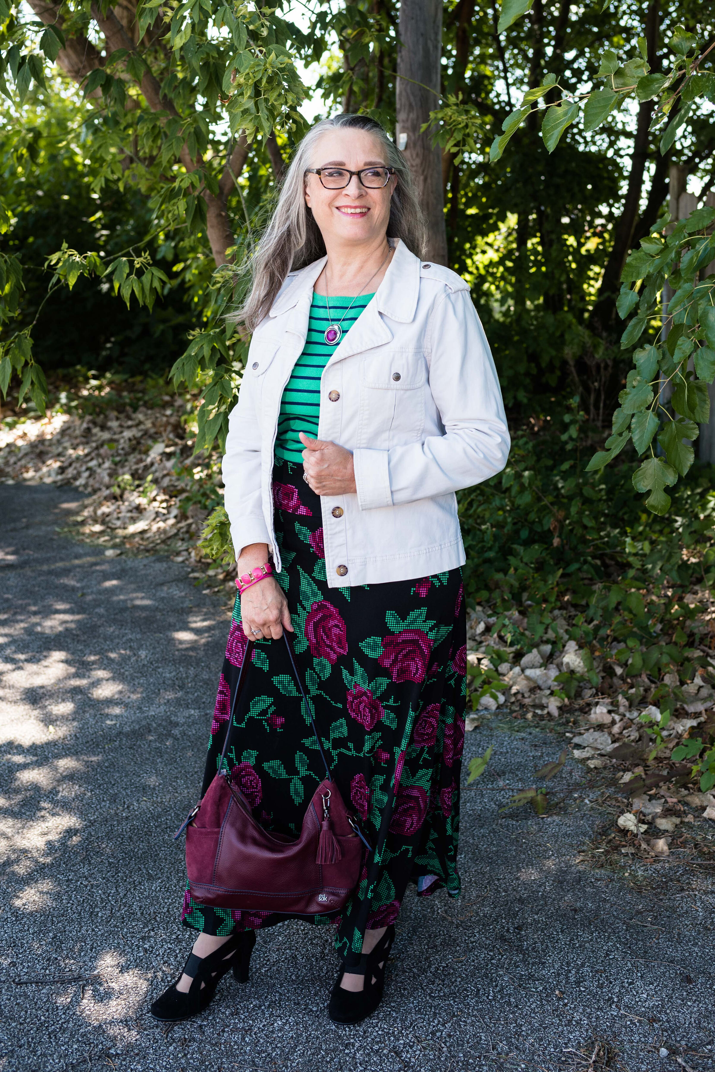
My LuLaRoe skirt was the perfect choice to build this outfit around. I actually had the thrifted striped tee already pulled out as a match for Leprechaun, and as I started figuring out which colors and pieces to put together, I remembered this skirt. I always have a little celebration party when pieces come together. When I try things on I do a little dance in front of the mirror and say, “This is it!” Ha, ha. The stripes in the tee are actually navy, but with the two prints taking center stage, you can’t really tell the colors are different.

pantonefallcolortrendsfuchsiafedora-3.jpg

My cream jacket by Sanctuary is a thrifted piece you have seen before on the blog. You can see it with a leopard print skirt and with my bright blue pants. It is actually more of a canvas than a denim, but it works much the same as a denim jacket providing light weight coverage for cooler weather and adding a casual touch to a dressier outfit.

pantonefallcolortrendsfuchsiafedora-5.jpg

You can see my Fuchsia Fedora necklace and bracelets. I think I have jewelry in just about every color under the sun, but you know, a girl can never have too many fun accessories! Is that a rule, or a guideline? Ha, ha.

pantonefallcolortrendsfuchsiafedora-8.jpg

My bestie, Stacey, gave me this beautiful, leather the Sak bag last time she came to visit. I thought the berry color went perfectly with the darker berry color in the flowers on the skirt.

pantonefallcolortrendsfuchsiafedora-9.jpg

These beautiful black suede heels never get to go anywhere, so I do like to bring them out and show them off on the blog. These are Aerosoles and I bought them a few years ago at a Clarks shoe outlet. I like that they are comfortable, have a reasonable heel, stay perfectly in place and look classy.

pantonefallcolortrendsfuchsiafedora-2.jpg

What do you think of these colors? Do you like them for fall? Now that I am thinking about it, I might need to revisit the idea of fuchsia as a fall color. I could see it with other fall colors like golden yellow, burgundy and rusty orange. Hmmm. I may have to get a little further outside of my color box.

Let me know what you think. I’m including a few shopping links for things of similar color. These are affiliate links and are brought to you at no extra cost. If you click on a link, I get a few pennies. If you purchase something through my site, I get a few more. I appreciate every click.

Have a great day!

Photo credit Jessica Trumbull with Rebecca Trumbull.