Pantone Autumn/Winter 2026: Green Envy, Foxglove, and Candied Ginger

Happy first day of fall! It looks and feels like an autumn day with clouds, wind and a chill in the air. If you hop on over to my Instagram account you’ll see I pulled out one of my favorite flannel button downs and am wearing it as a shacket, which is perfect for today’s temps.

Today on the blog I am featuring another trio of Pantone colors from the Autumn/ Winter New York Palette. Today’s colors are Green Envy, a darker yellow green than our early feature of Acacia; Foxglove, a pretty pinky purple that falls in the mauve category; and Candied Ginger, a soft neutral medium tan. You can see the original Pantone colors here.
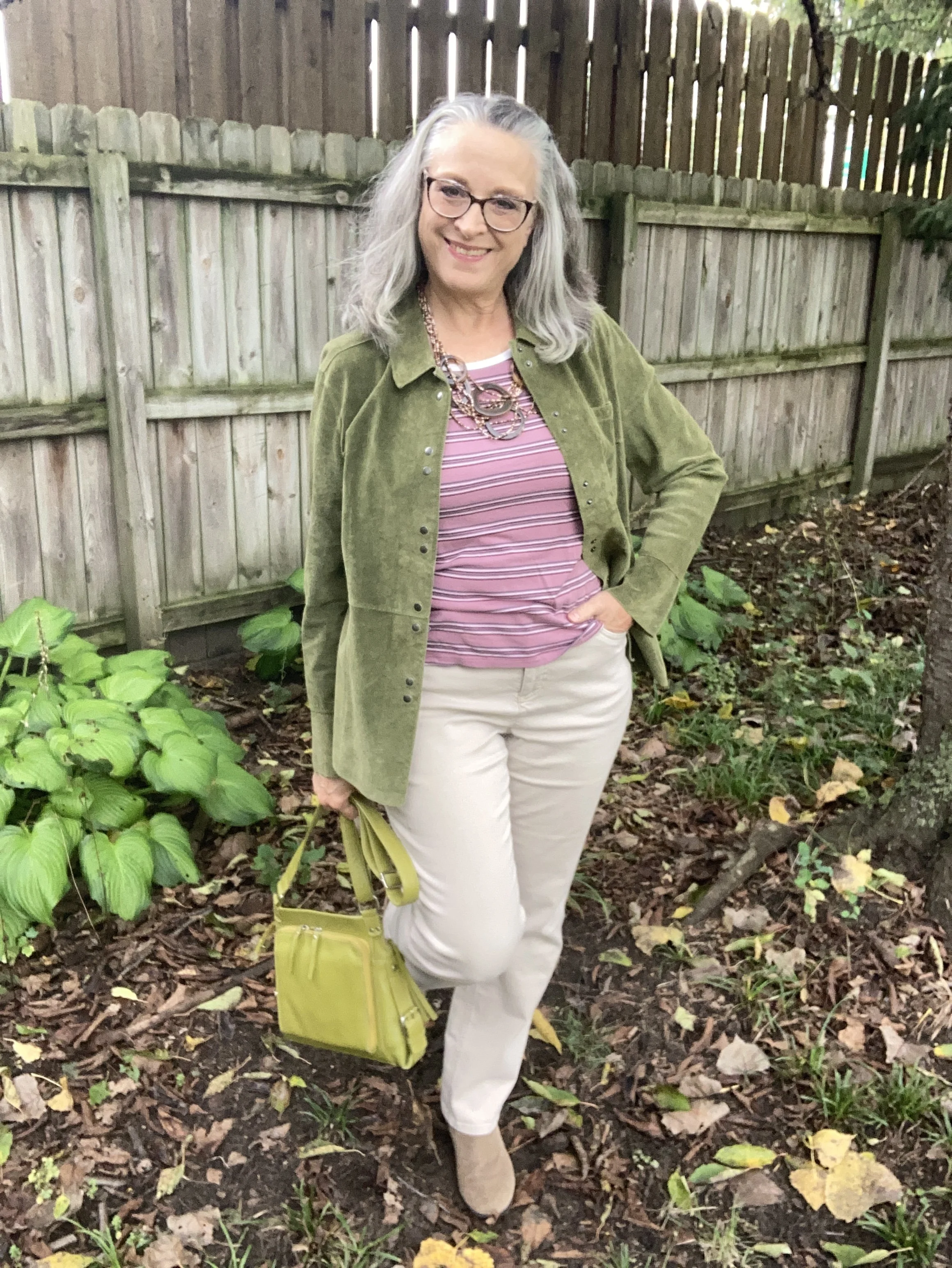
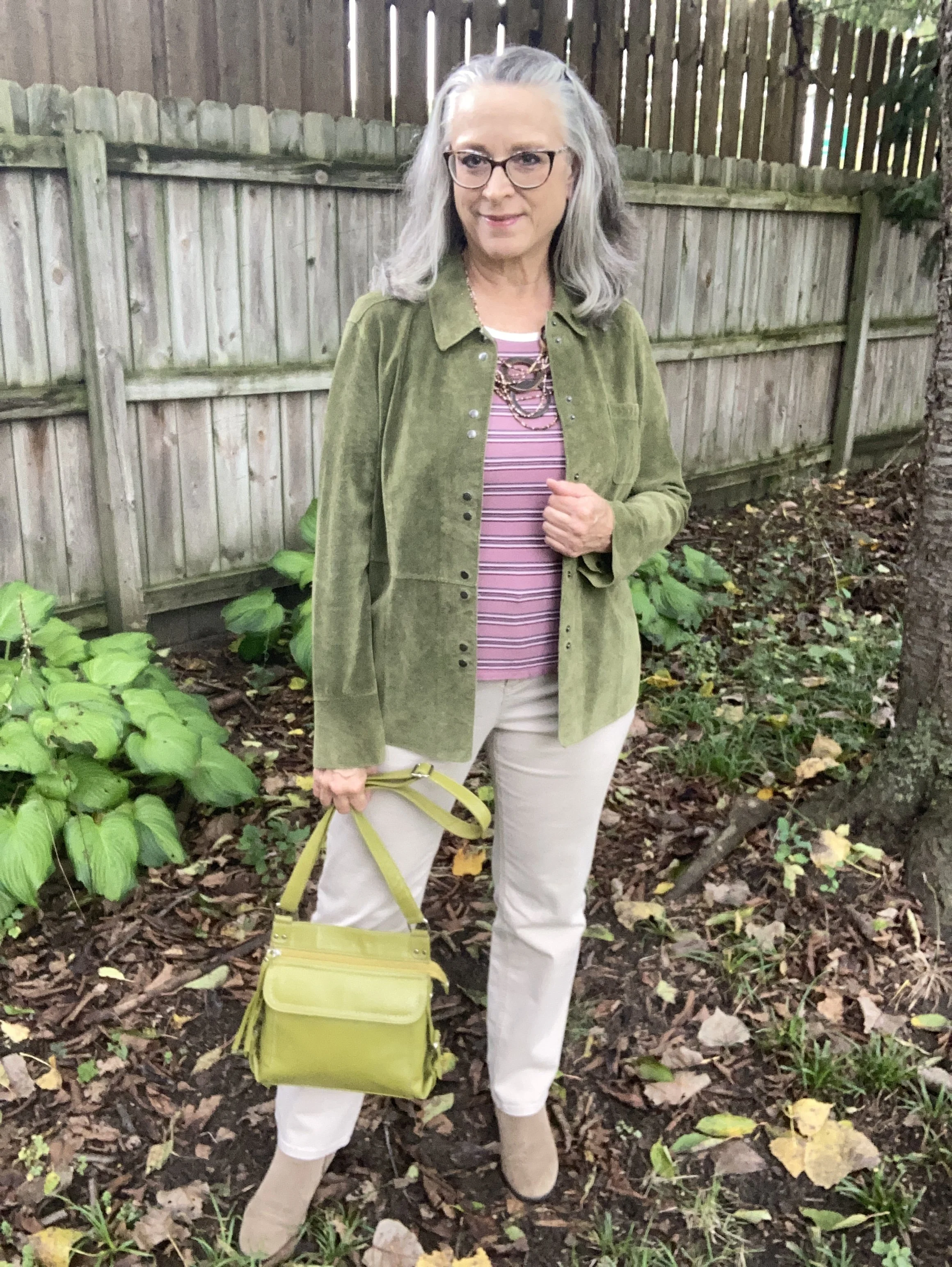
Once again let me say my pieces do not match the colors exactly. My jacket is a darker green, and my pants are definitely lighter. My bag and boots are probably a little closer to the actual colors. Again, this is just for fun, to try different color combinations by shopping the clothes we already have in our closets.

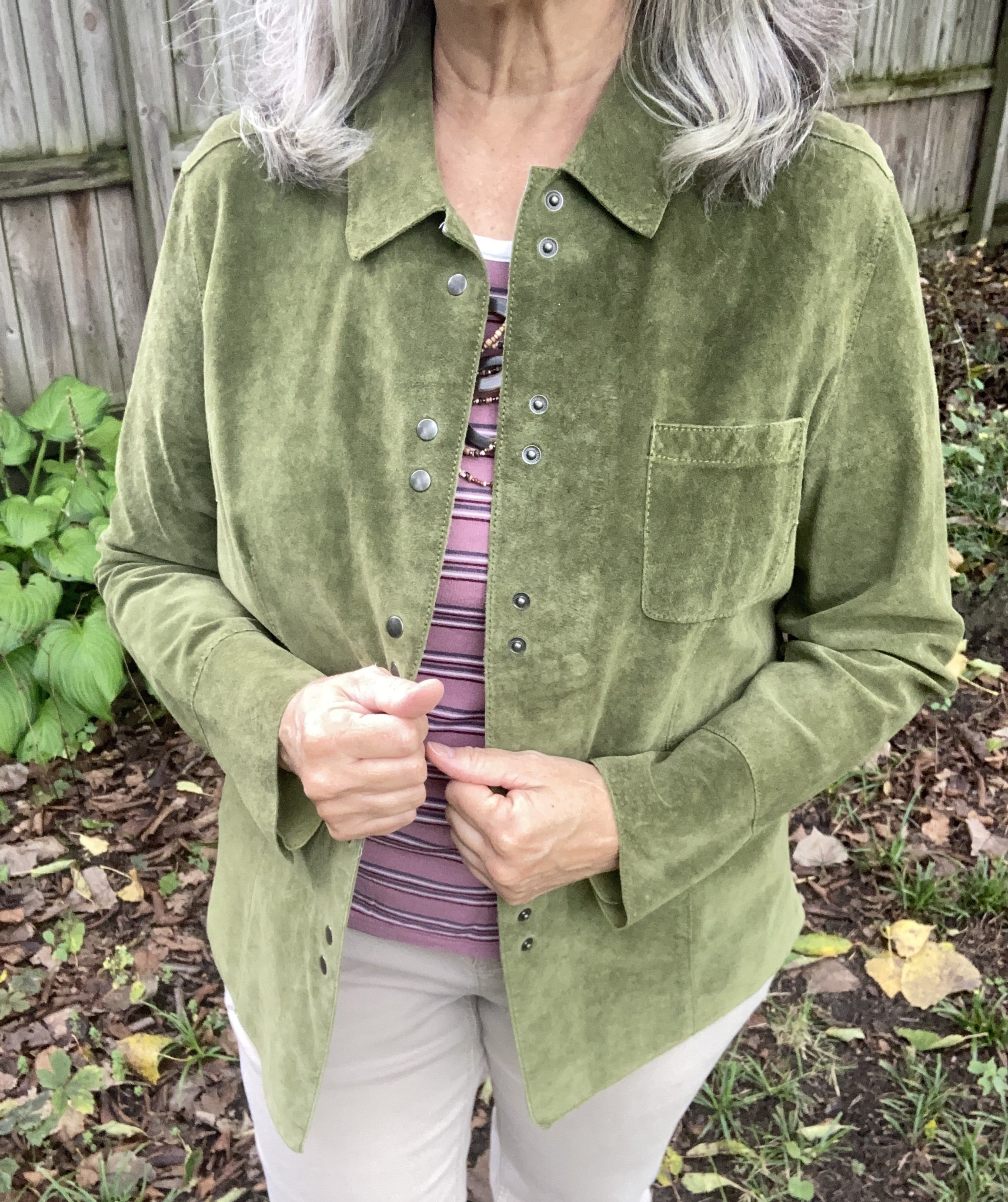
I thrifted this Fieldgear suede jacket years ago. I have thought about getting rid of it, but it is really a well made piece and a pretty color so I keep it around and wear it once in a while. I use it more like a blazer than an actual jacket, although for this in between wear it is a nice weight. Here’s a cute wrap jacket from Old Navy; here’s a pretty option from Shein; and Walmart has this short blazer option.
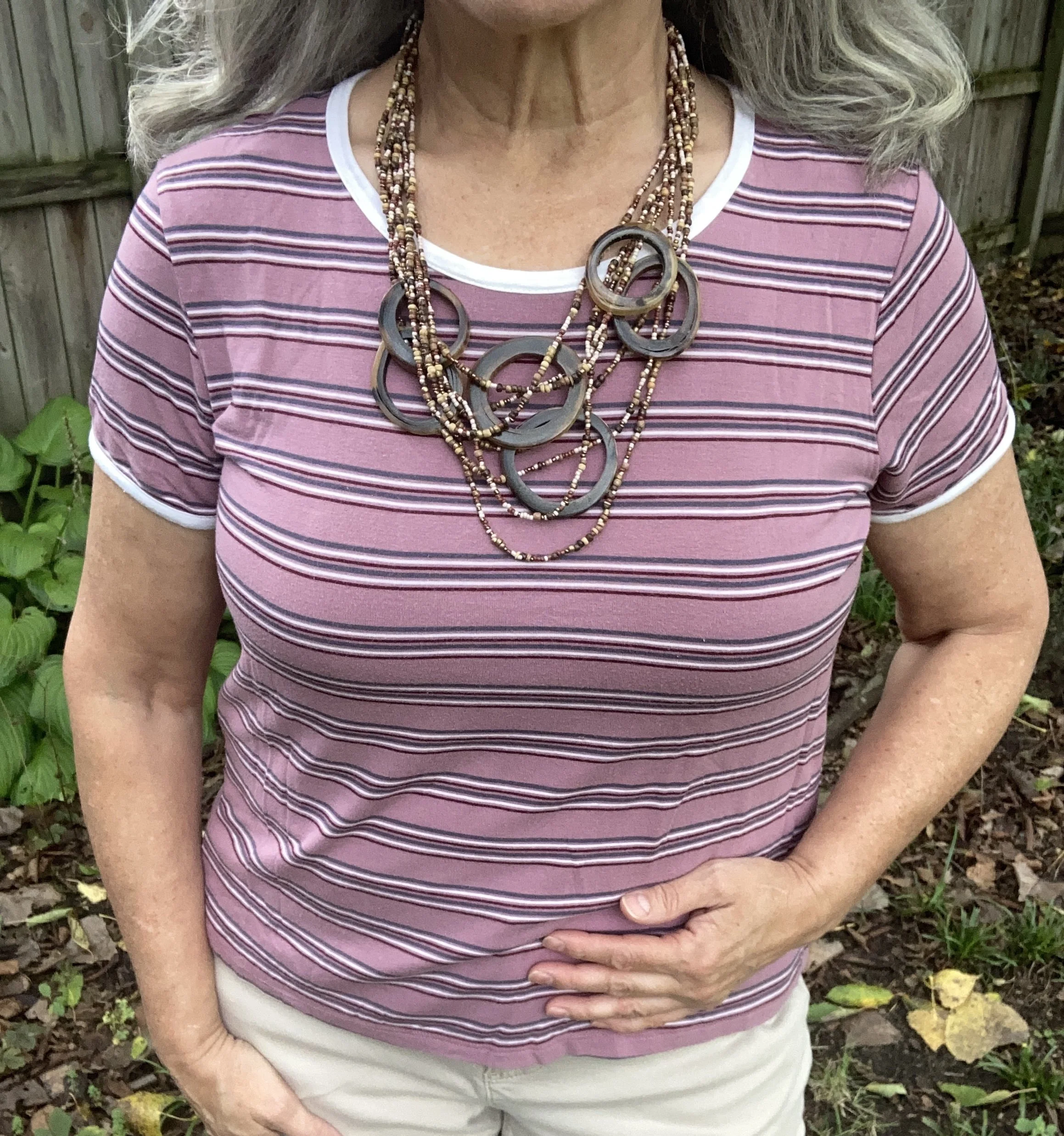
I really struggled with finding a piece in my closet that was close to the Foxglove color. Everything was either too pink or too purple. However, I finally came upon this tee in my tee pile and had to change the whole look to work around it, but I really wanted this color to stand out. This is Pink Republic brand and I got it a few years ago at Kohl’s. Here are a few solid versions from Life is Good, LLBean, and Gap.
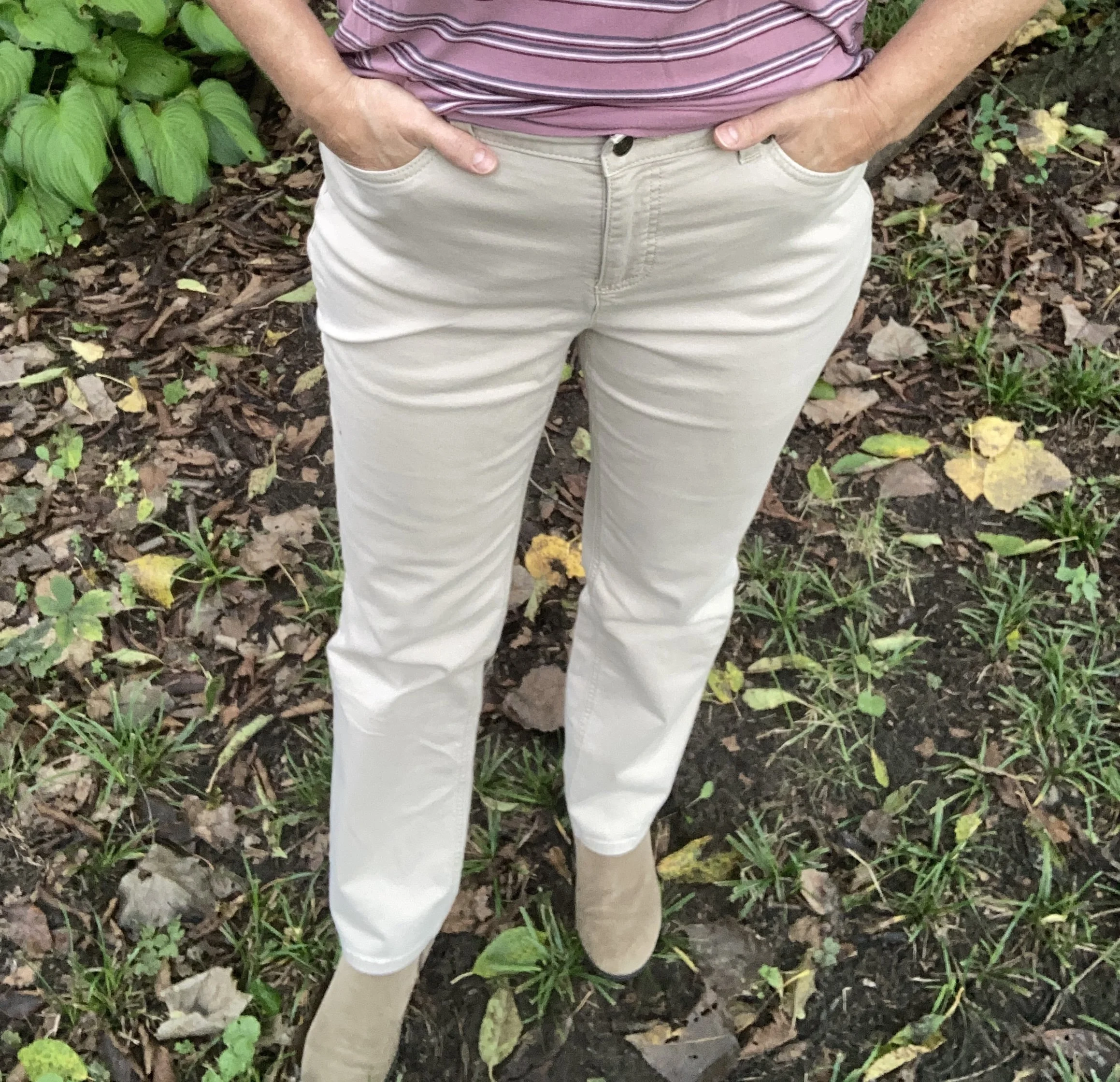
Originally I had a leopard print pleated skirt picked out for this post whose spots matched the Candied Ginger color perfectly, but as I mentioned above, I had to switch things out when I picked the tee. I chose this pair of Croft & Barrow pants that I bought from Kohl’s a few years ago. They definitely have a tan or beige vibe, but they look almost cream or white in these pictures. Oh well! Here is a pair from Land’s End; Old Navy; Maurice’s; and JCPenney.
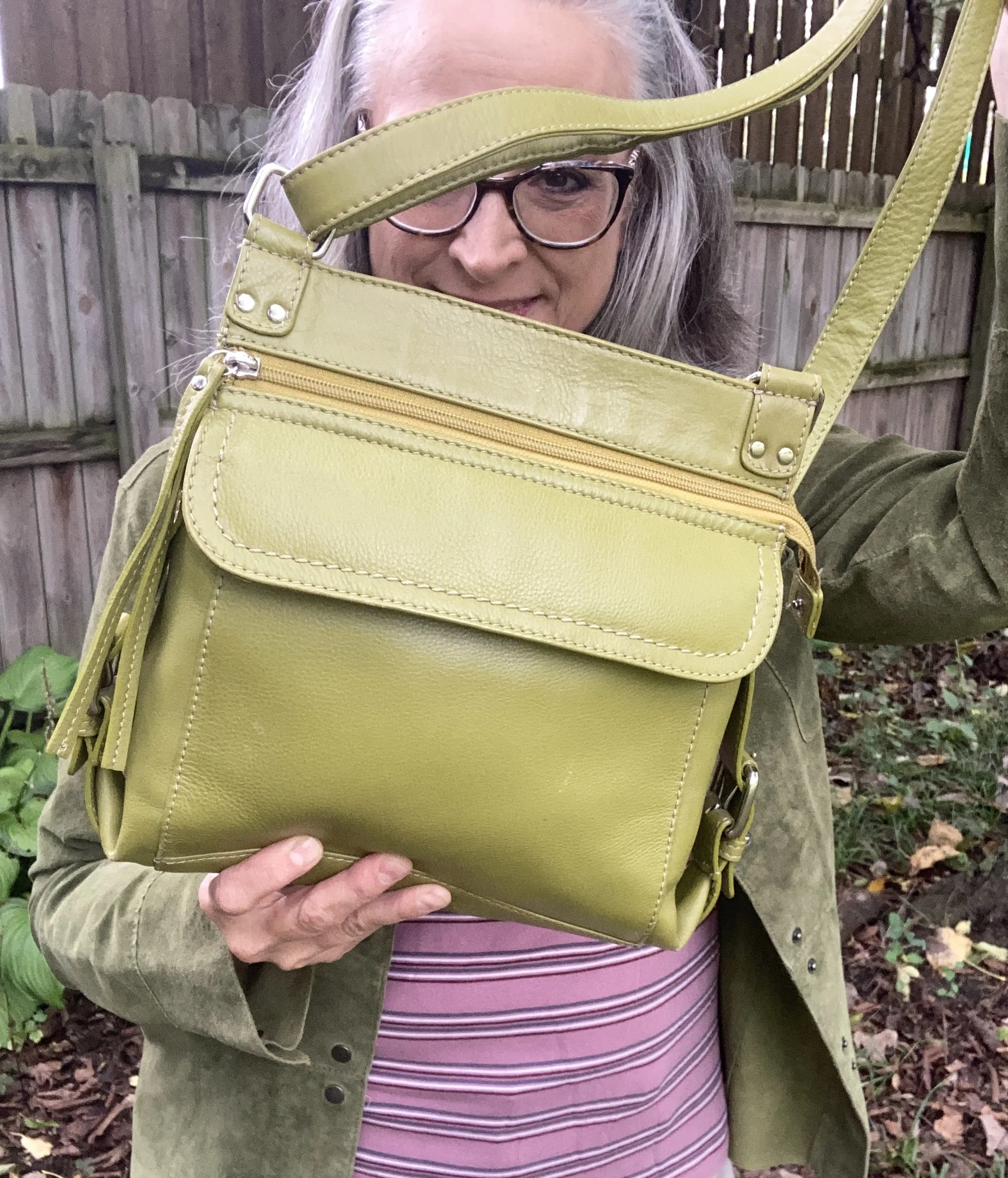
I chose this leather ILI NY bag because it was a similar color. This is a great bag. I prefer a cross body shoulder bag so when I am out I can be hands free. To me it just seems more secure. This one also has a number of extra pockets. I would give you a few shopping links for bags this color, but they all top out at around $100. If you are interested in an odd colored bag like this be sure to check out the thrift stores.
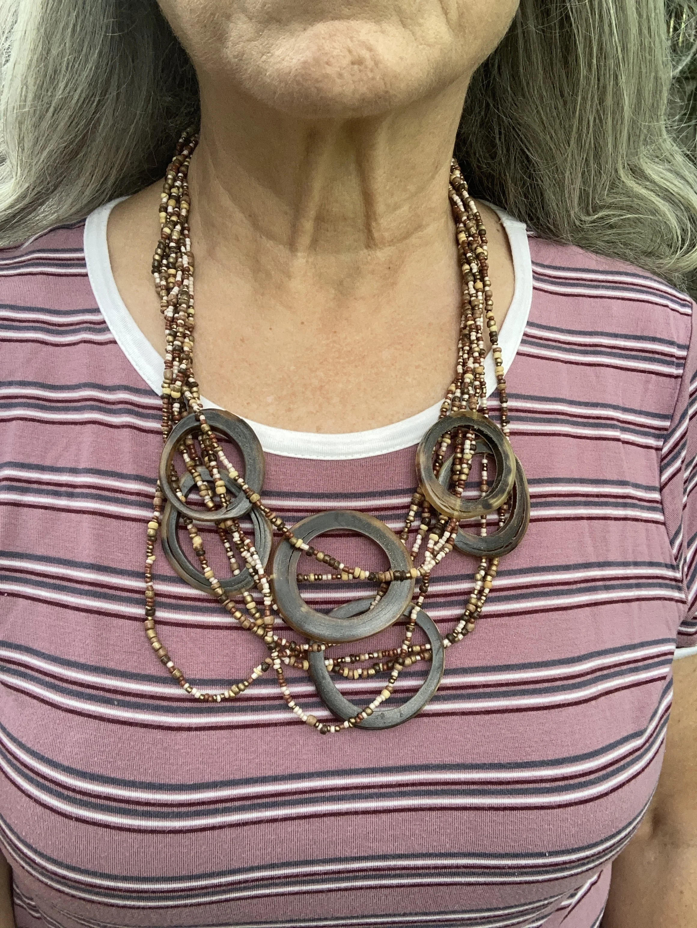
I decided to wear this layered bead and antler necklace. I thought it was a good way to bring in the tan of the pants and the boots. Plus I thought it did a good job of grabbing attention against the stripes of the tee. I can’t remember where I got this, but it is a fun piece.
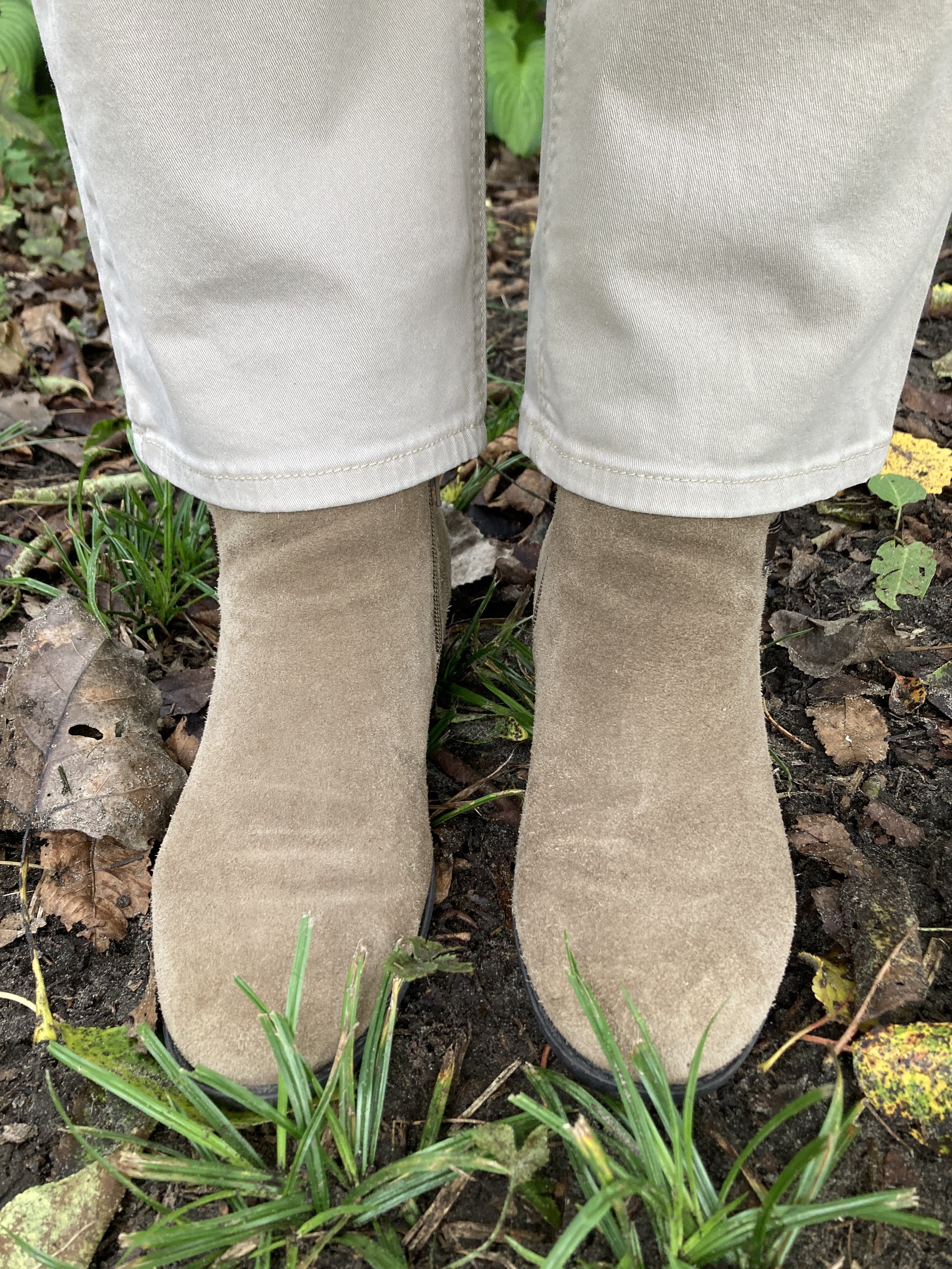
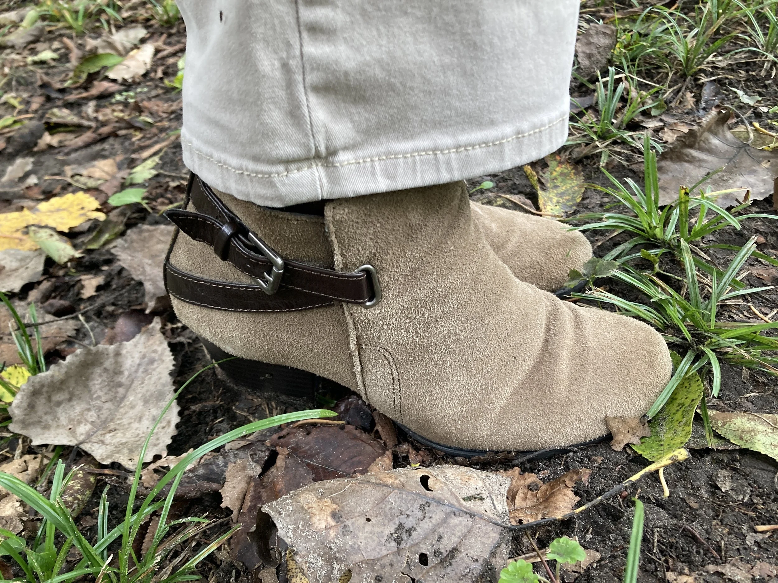
I have had these Sonoma boots for a long time. Made of real suede and leather with a block heel I keep them around as a way to dress up a pair of jeans in the cool weather. I don’t wear heels at all any more, but an occasional date with these stacked heels works well. Here is a page of options from DSW.
What do you think of these colors? Do you have any of these in your closet? What other colors do you think would look good with Foxglove or Green Envy? I always love to get your feed back so be sure to leave a comment or two. I appreciate it.
Shopping links are included for you. I do not make any money off of these links and they are offered to you at no cost unless, of course, your purchase something. Ha, ha.

I hope you are having a fabulous week!
Pantone Autumn/Winter 2026: Neptune Green, Festival Fuchsia, and Toffee

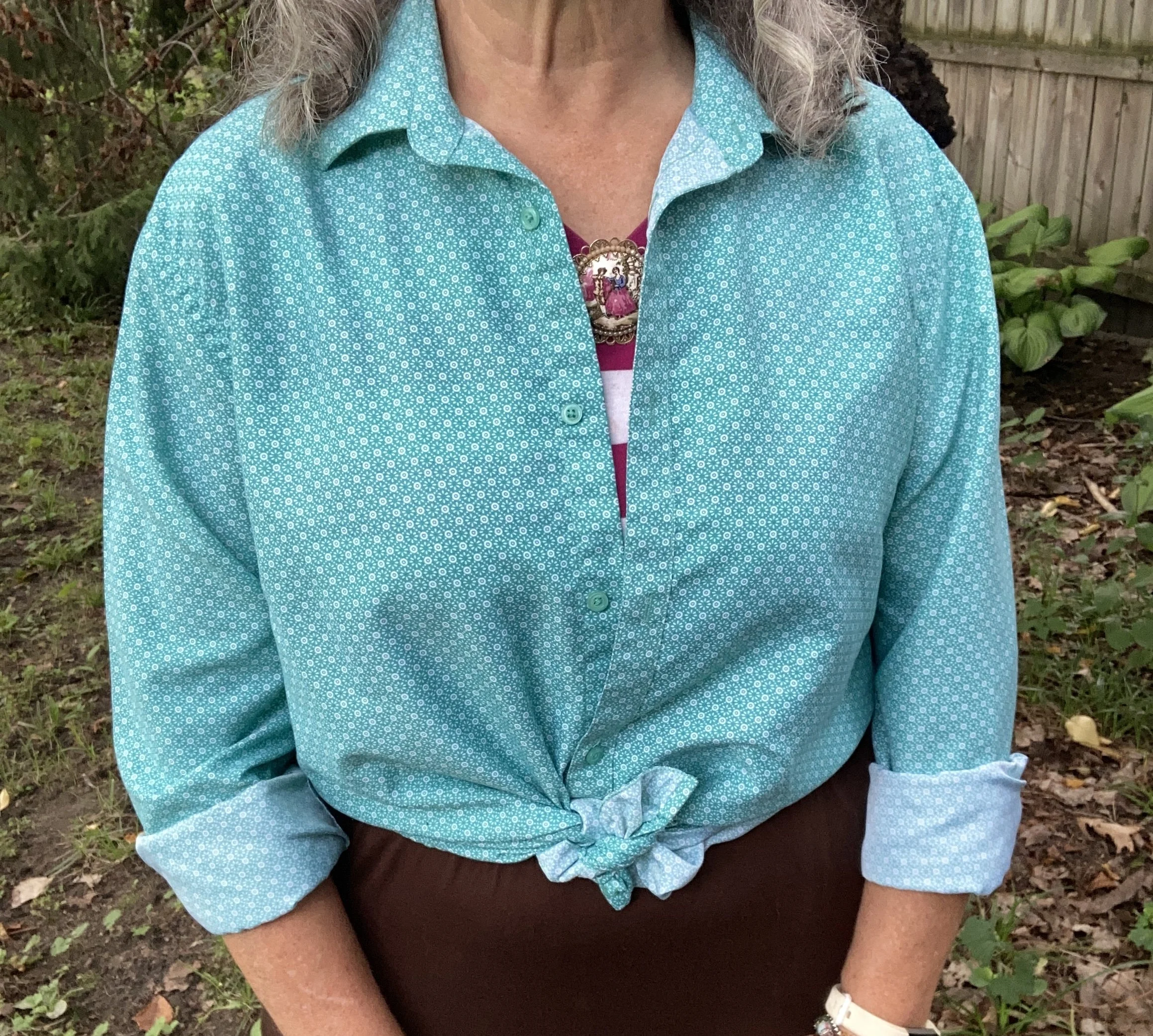
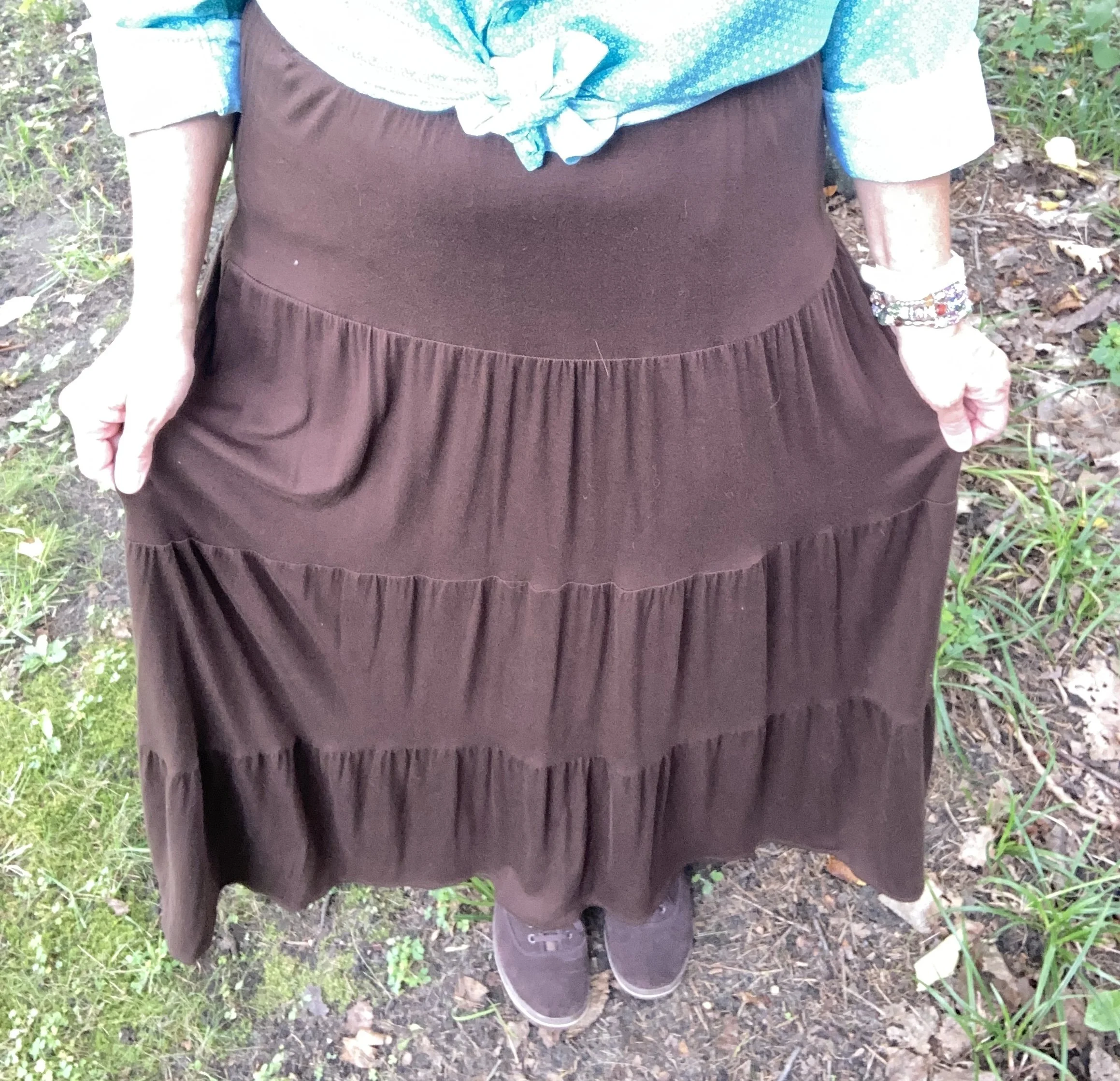
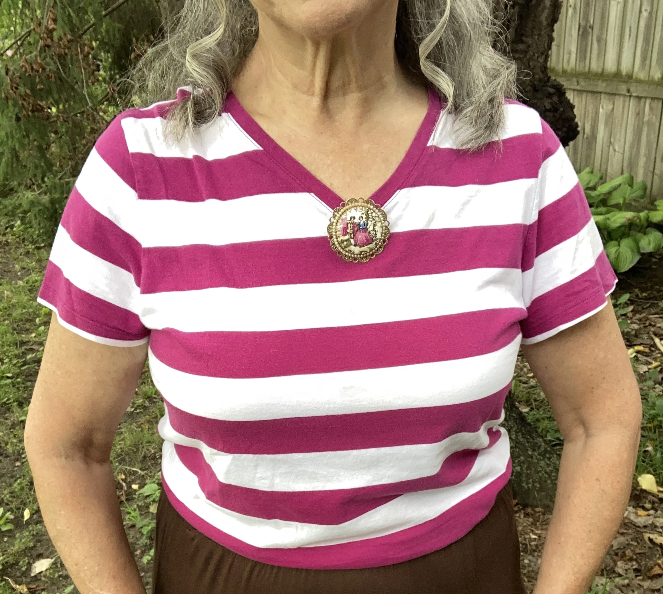
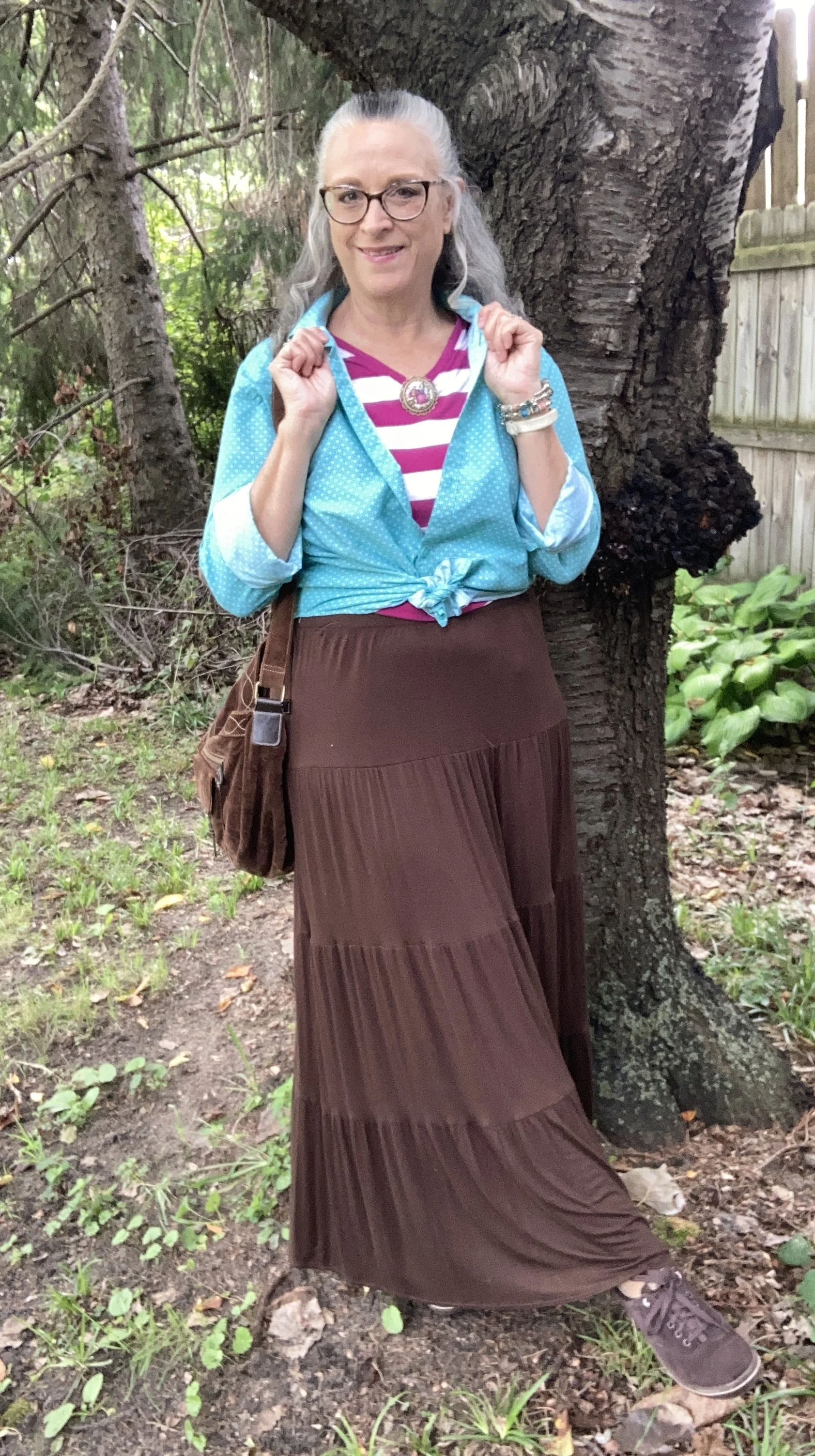
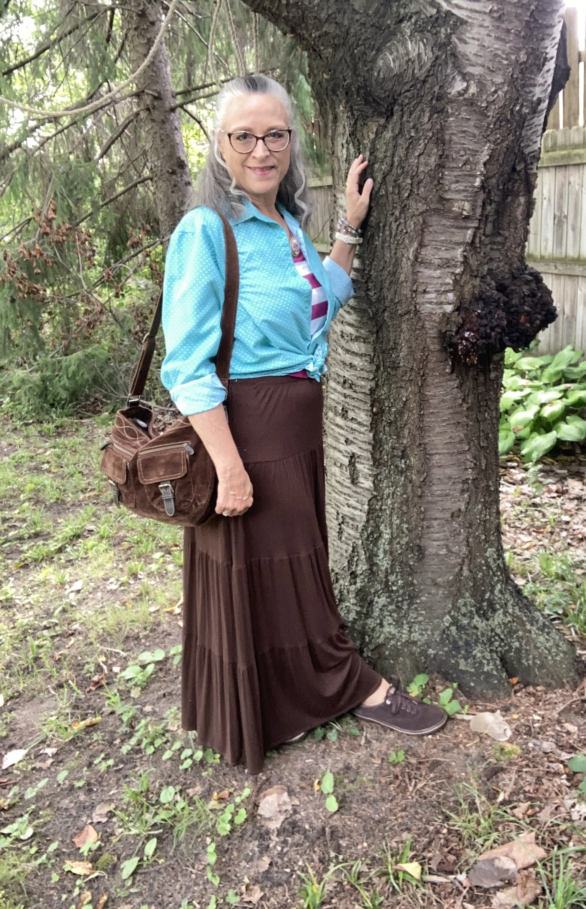
Today I am showing you another outfit with three more colors from the New York, Autumn/Winter palette. Today’s outfit includes Neptune Green, a bright green similar to a sea foam; Festival Fuchsia, a party ready purple, and Toffee, a classic medium brown. I wouldn’t naturally think to put these colors together, though I could easily see the green with the brown, or even the purple with the brown. Combining bright colors like Neptune Green and Festival Fuchsia has never been easy for me, but I love when other people are not afraid to wear the bold, bright colors. This is one way, I have been trying to get outside my own outfit “rut”. You can see the actual Pantone colors here.

For Neptune Green I chose my thrifted Zylos men’s button down. I do like this color. It is not your typical grass, olive, or forest green. My personal “color brain” - yes, I just made that up - thinks this is a better color for spring and summer.

Personal Fashion Philosophy: Let me just sit here for a moment. I guess it is true that for most of our lives, those of us who grew up in the mid twentieth century, were trained to accept certain seasonal color choices: white for summer, rust and burgundy for fall, black and orange for Halloween, red and green for Christmas, icy blues for winter, and pastels for spring and Easter. How many of you know what I am talking about?

Now, let me take that a little further. We all know that certain smells, sights and sounds remind us of certain holidays, childhood experiences and so on. What if part of my “color brain” is my own way of finding peace, coziness and hope during seasonal change? To me there is just something about digging into those dark, rich colors for the fall season as life begins a transition from long, sunny days spent outside to the shorter, cooler months of spiced cider, snuggly layers and blankets, and gatherings in doors. Just something to think about. Let me hear your ideas about seasonal color change.

This is a darker long sleeve choice from Cabela’s; a short sleeve tee, closer to the actual Pantone color from Old Navy (and not a bad price currently); and I really like this print tee from Life is Good. There is also this 3/4 length sleeve tee from LLBean.

The next piece I chose was the skirt. It seems whenever brown is once again on the Classic palette I reach for this skirt. I have many times thought of getting rid of it since I rarely wear skirts, but it always gets pulled out for something or other. My skirt is a bit darker than the actual Pantone Toffee color, but you get the idea. I do this series to inspire you to shop your closet, not match the color palette’s exactly. This skirt is St. John’s Bay brand from JC Penney and is old. Here is a few versions from Target, a patterned print from Natural Life, a midi length from JC Penney, and a pull on faux suede version from a place called The Vermont Country Store.

I chose this thrifted Faded Glory striped tee for Festival Fuchsia. The combination of Neptune Green and this pretty purple is a fun vibe, though I certainly wouldn’t think of it for fall. Here is a striped boat neck version from JCPenney; an embellished top from Kohl’s; and a peasant style from JC Penney.

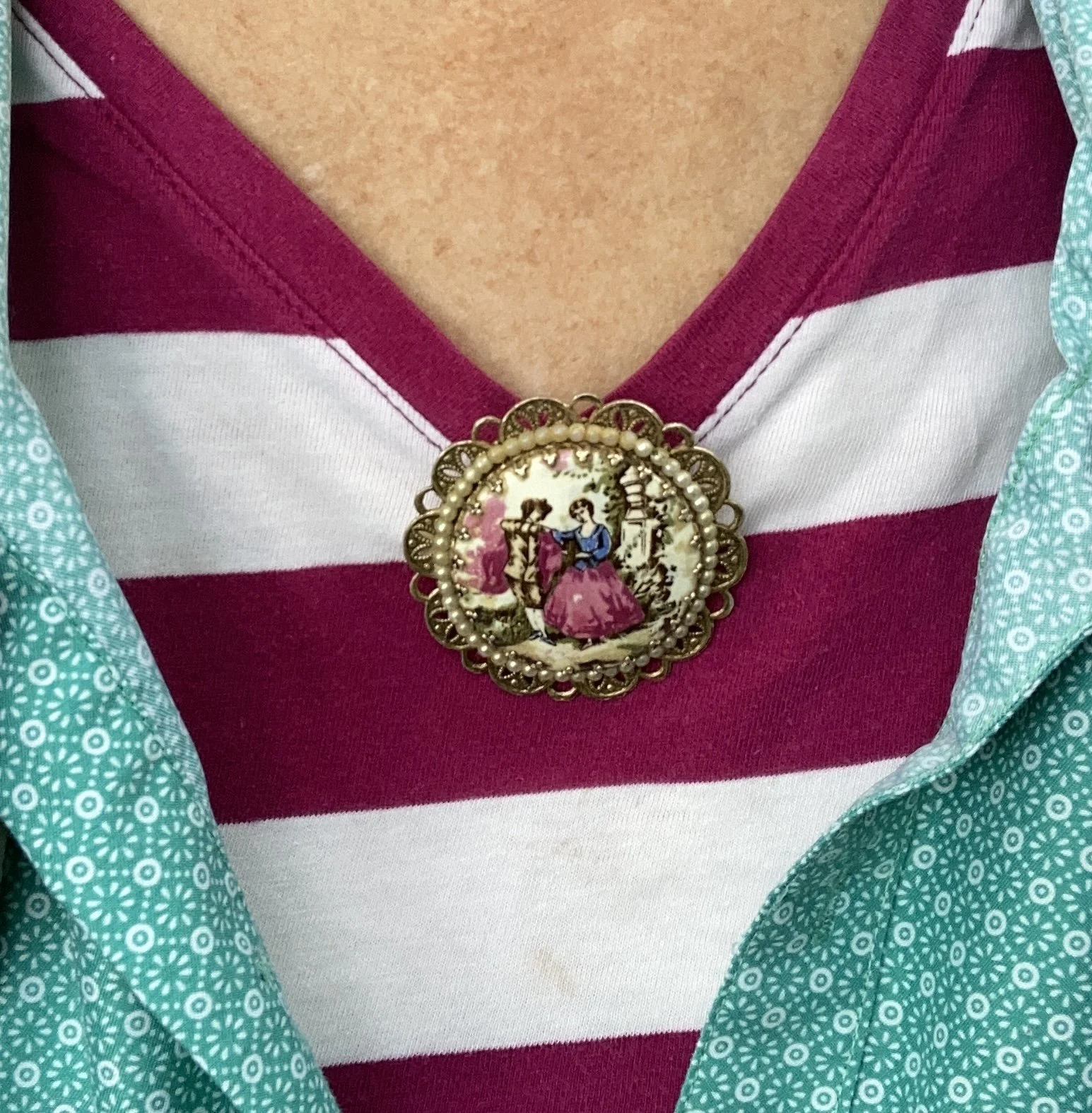
Instead of a necklace I chose a large brooch and pinned it right at the point of the v. I like how it looks. What do you think. I want to incorporate my pins and brooches more often, as they are such fun pieces to use, but often get overlooked.

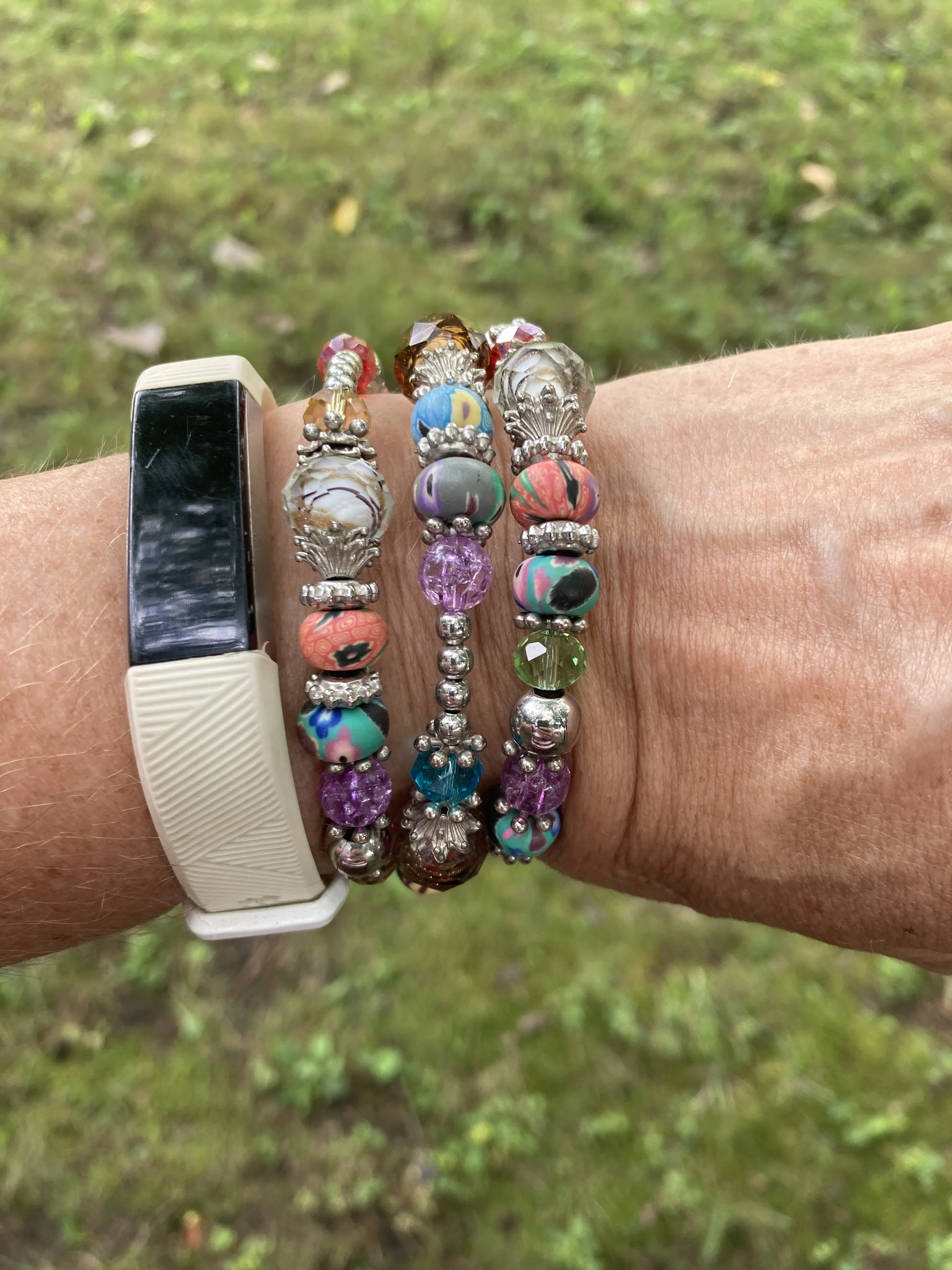
My wrap bracelet was a fun thrift find from a few years ago. I like all the different colors of the beads, so it can be worn with many different things.

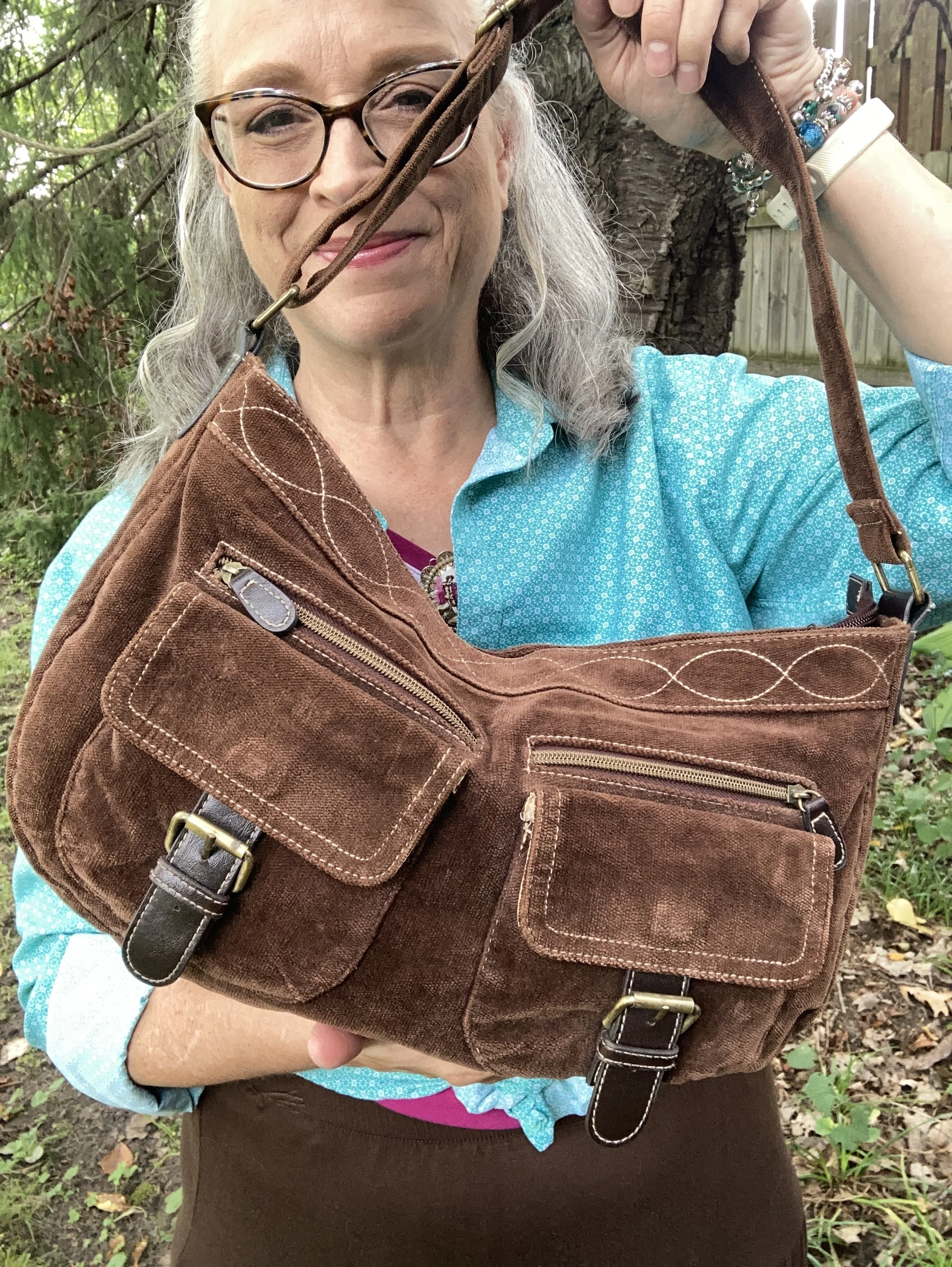
If you have been following me for a while then you know I have had this thrifted corduroy hobo bag for a number of years. Here are a few different ones: Kohl’s, JCPenney, and DSW.

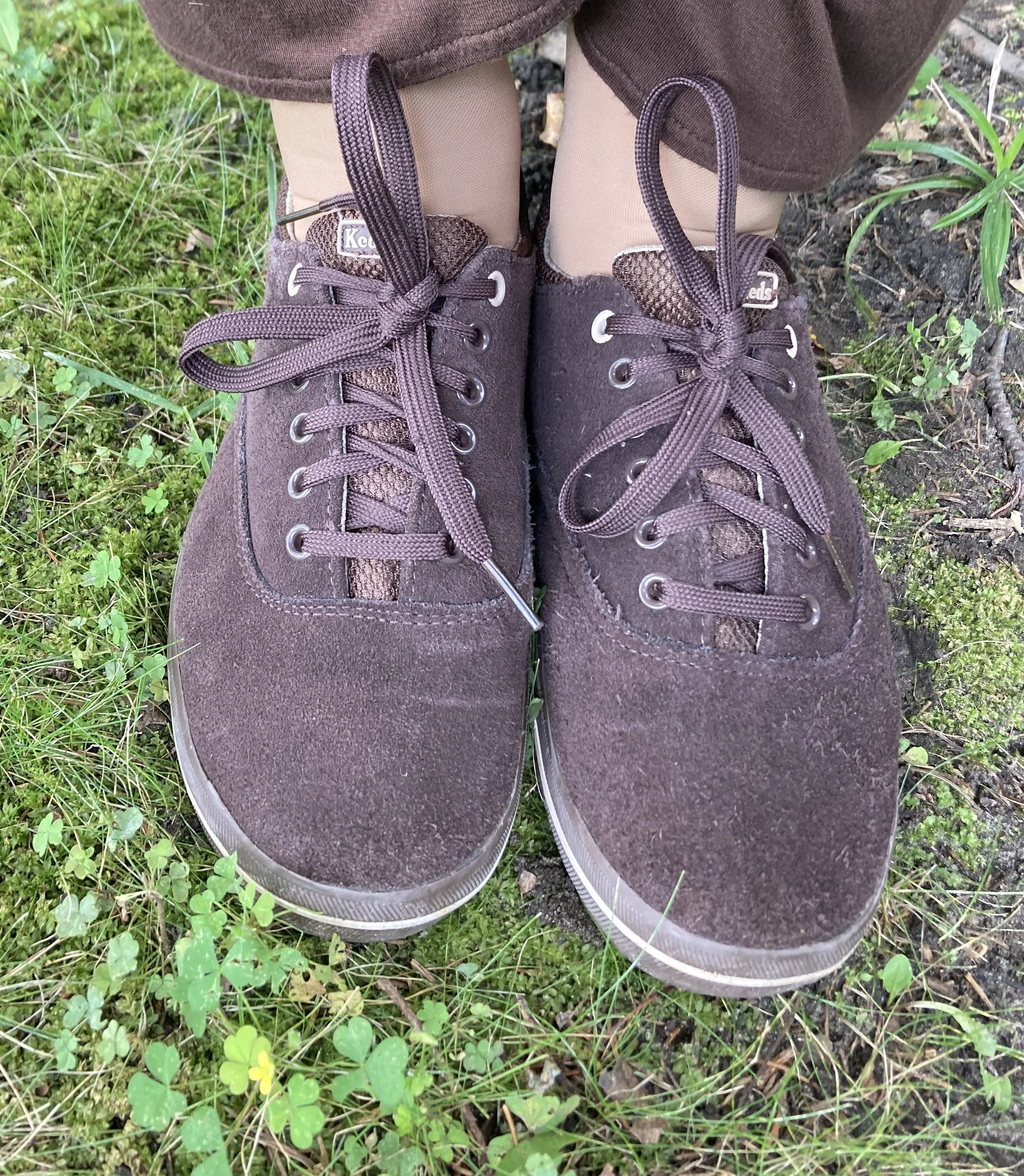
My second hand, brown, suede Keds are getting old, but I still use them regularly. I should probably try to spiff them up with a brush and some suede spray. Here are numerous brown sneaker/shoes from DSW.

What do you think of these colors? Do you suffer from “color brain” like I do? What are some things that are part of your fashion philosophy? If you are interested here is an article I wrote a few years ago on what is behind my Fashion Philosophy. I would love it if you stopped by and read that article too, and leave a comment or two!

I have included a few shopping links for you to look over. These are just suggestions and I do not make any money through them. I do, however, appreciate so much when you leave a comment on the blog. Your thoughts and friendship really do warm my soul and remind me I am not doing this just for myself. Thank you.

Have a wonderful day!

Outfit Inspiration: Pantone Autumn/Winter 2024 NY Palette: Italian Plum, Winter Sky, and White Swan

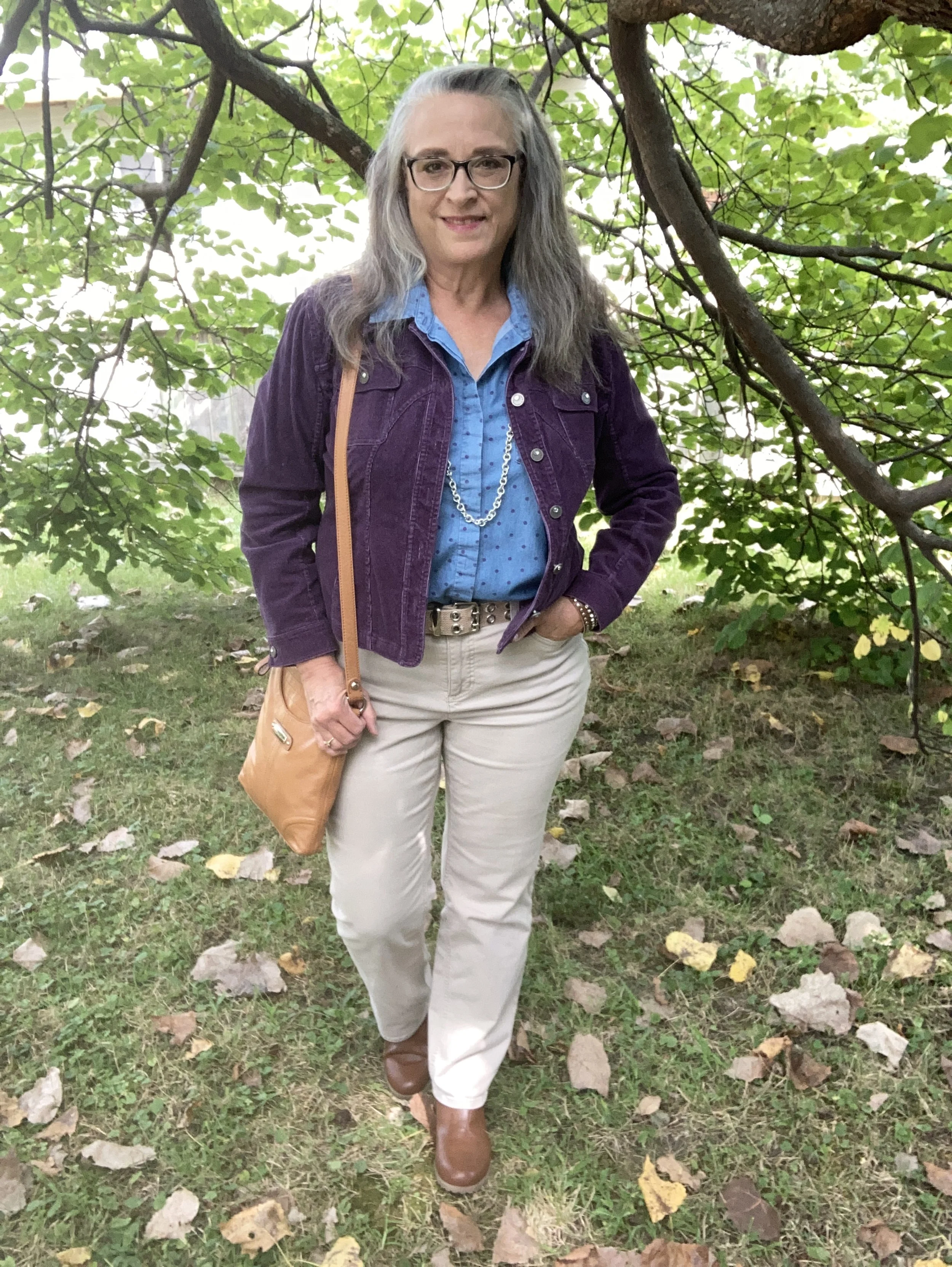
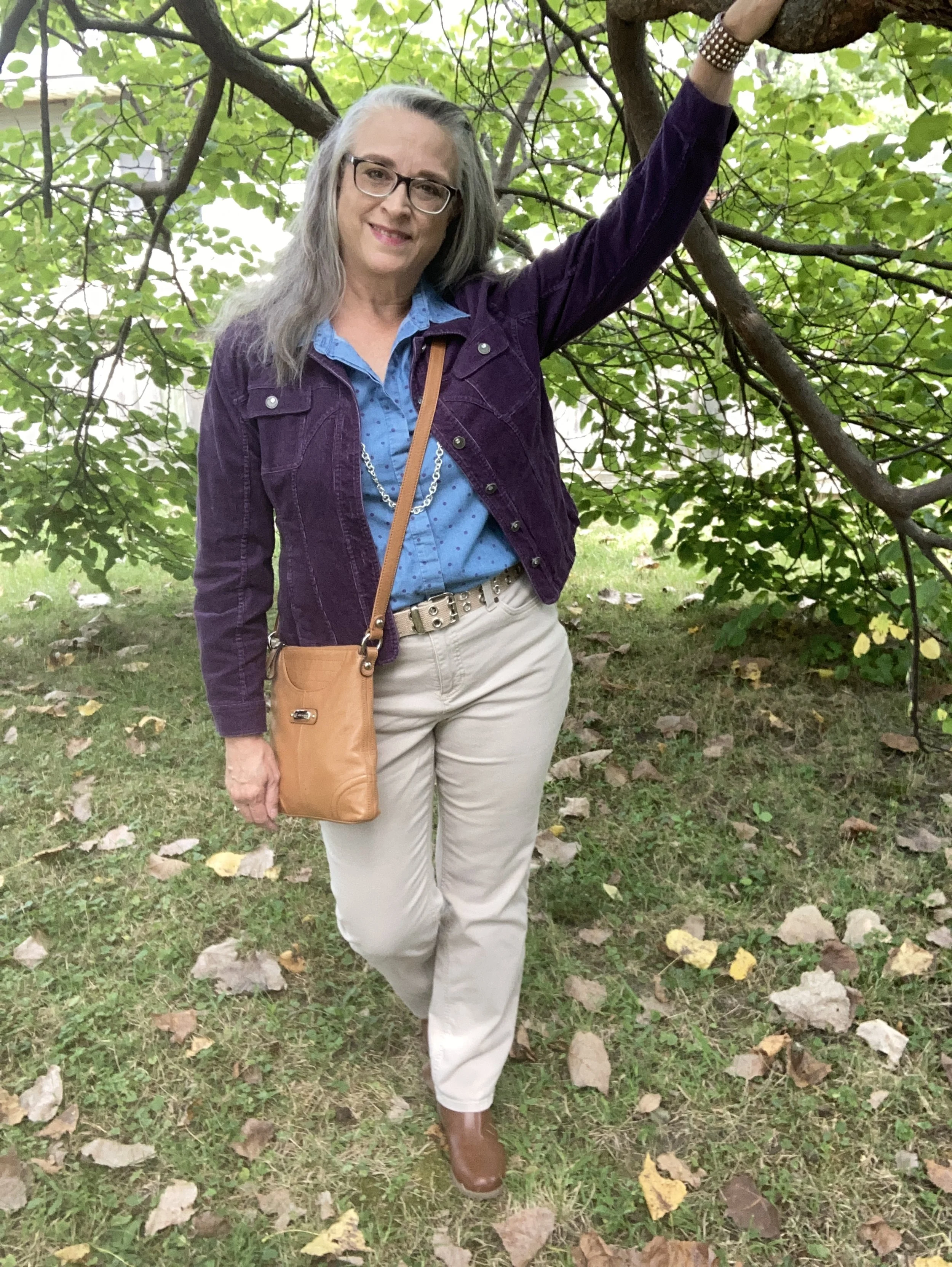
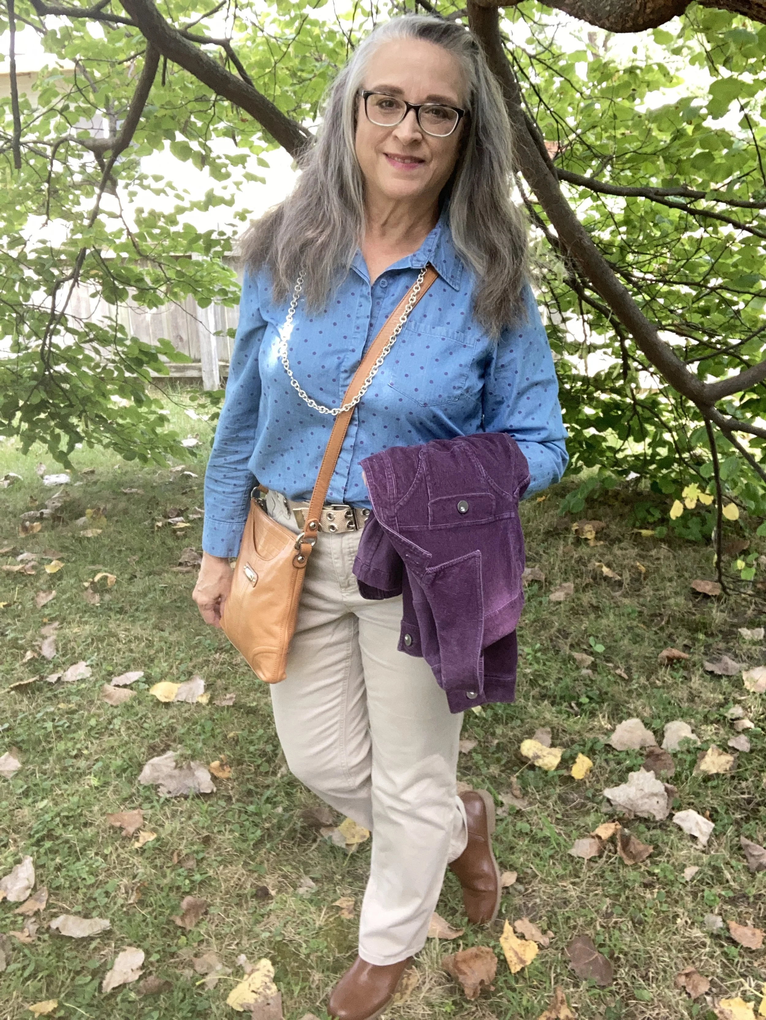
This week’s inspiration came from the Pantone Color Institute’s Autumn/Winter 2024 New York Palette. The three colors I am featuring were fairly easy to find in my wardrobe. My colors may not match spot on, but they are close enough. Feel free to look at the exact colors as given by the Pantone company by clicking on the above link. This week the two main palette colors are the dark purple called Italian Plum, and the blue called Winter Sky. The creamy color is from the classics palette and is called White Swan.

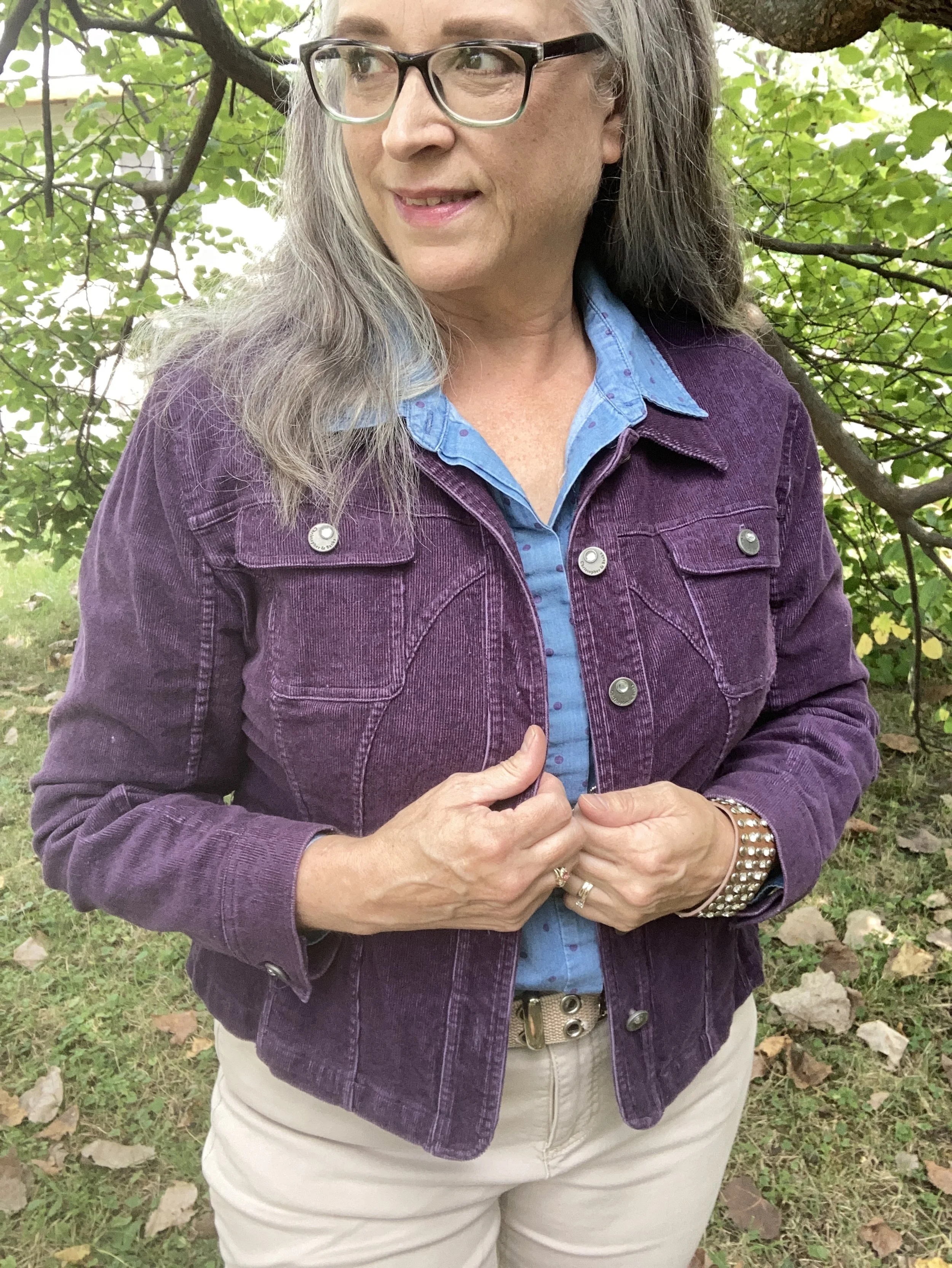
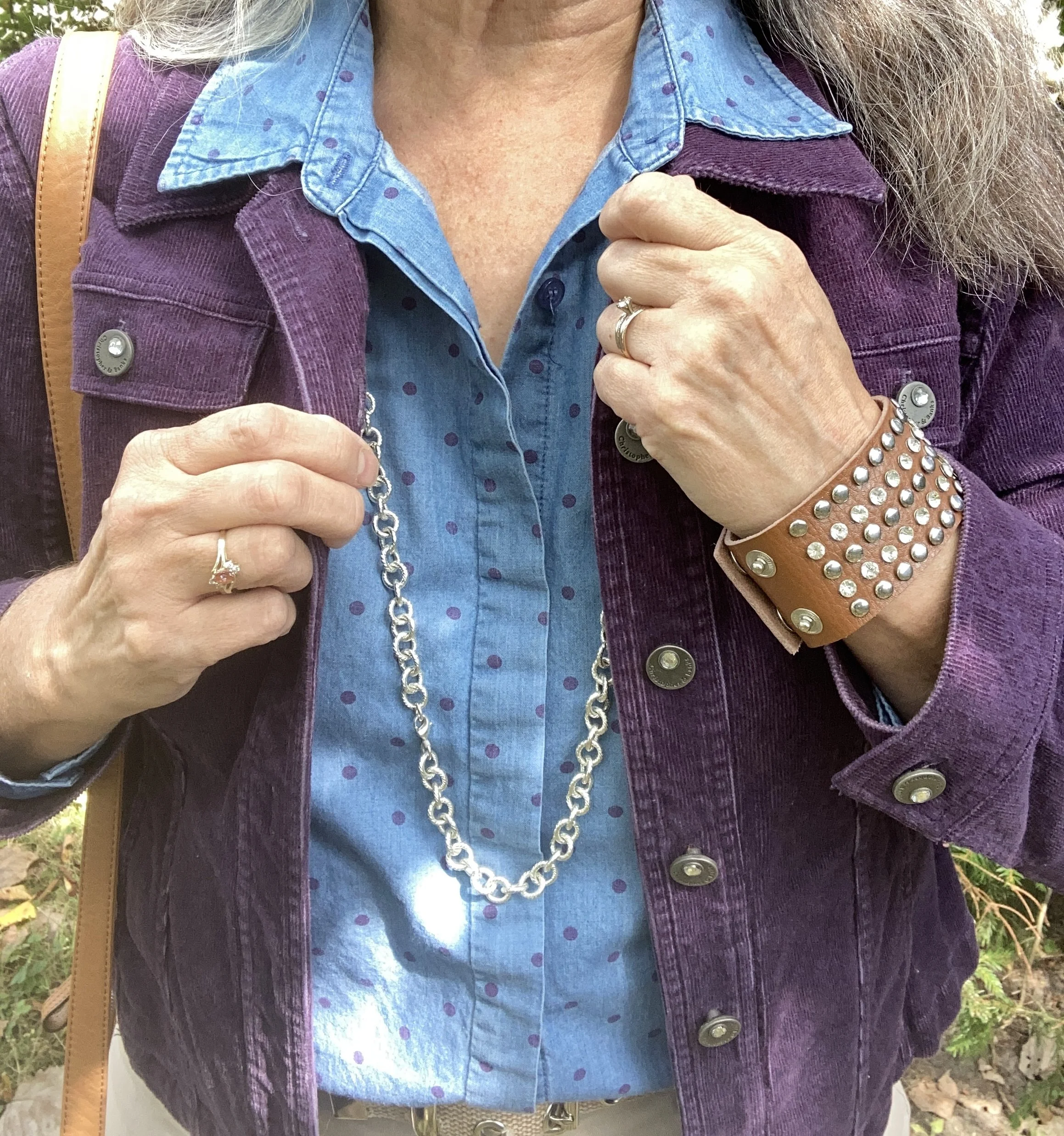
My Italian Plum corduroy jacket is a thrifted Christopher & Banks piece. It is actually a petite large, but I like that it has more of a cropped look. I like the different seams on this piece, and corduroy is perfect for cooler weather.

Style Tip: Shop sizes outside your normal because sizing is different across many manufacturers, and you might like how the piece looks if it is a bit shorter, longer or oversized.

Here are a few possibilities, but there isn’t much out there in this color.

My polka dot Winter Sky top is another Christopher & Banks piece that I bought on a sale back when we had a store in our area. A chambray piece the purple dots were a fun addition to the normal denim style shirt.

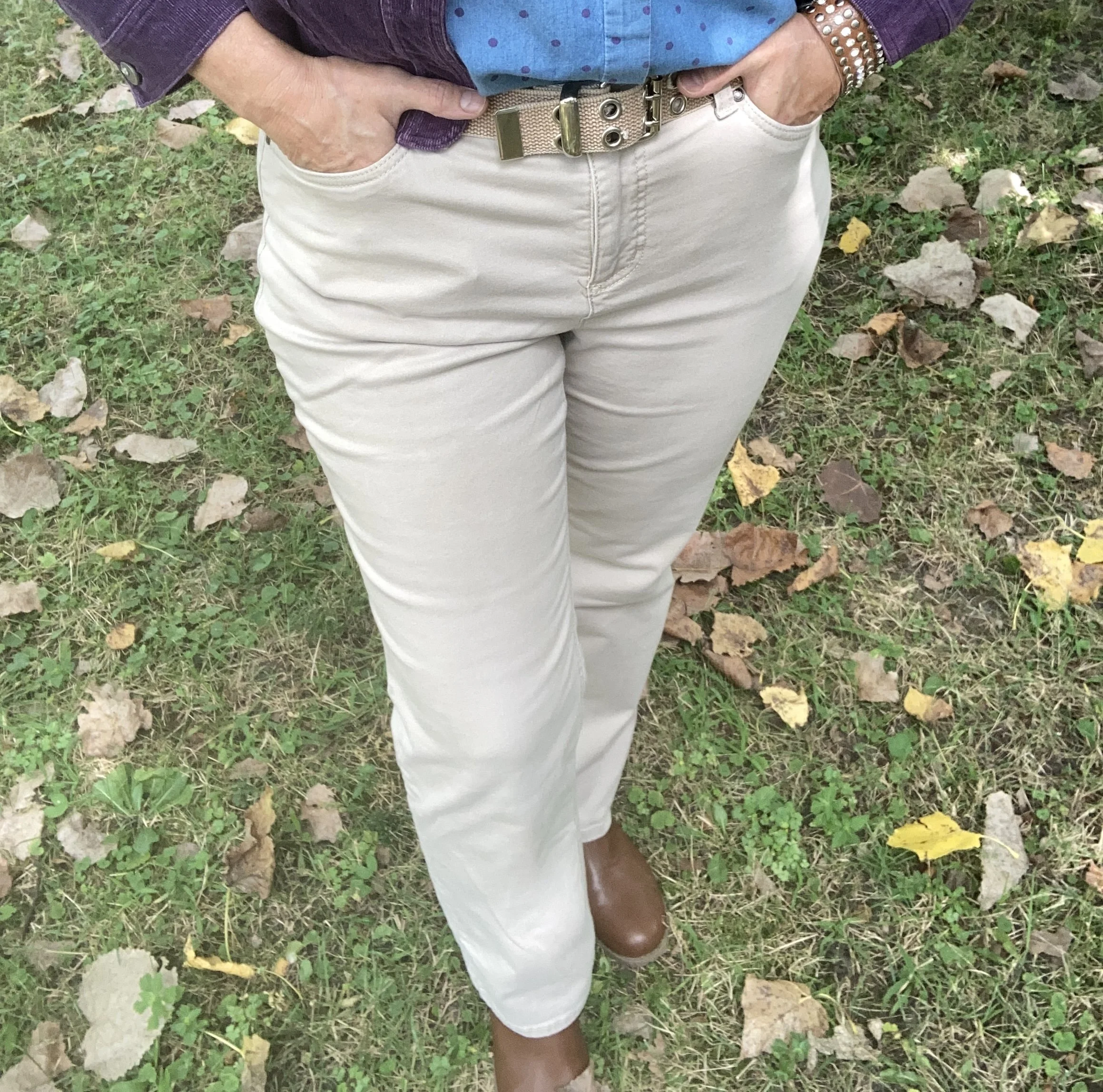
My light colored White Swan pants are Croft & Barrow brand from Kohl’s clearance a few years ago. They are plain and simple and sometimes that is just what an outfit calls for.

Style Tip: Not every outfit needs pants or skirts that are texturized or embellished. Sometimes, the simpler the better. Plain pants are typically better for work if you don’t have a uniform provided by the company.

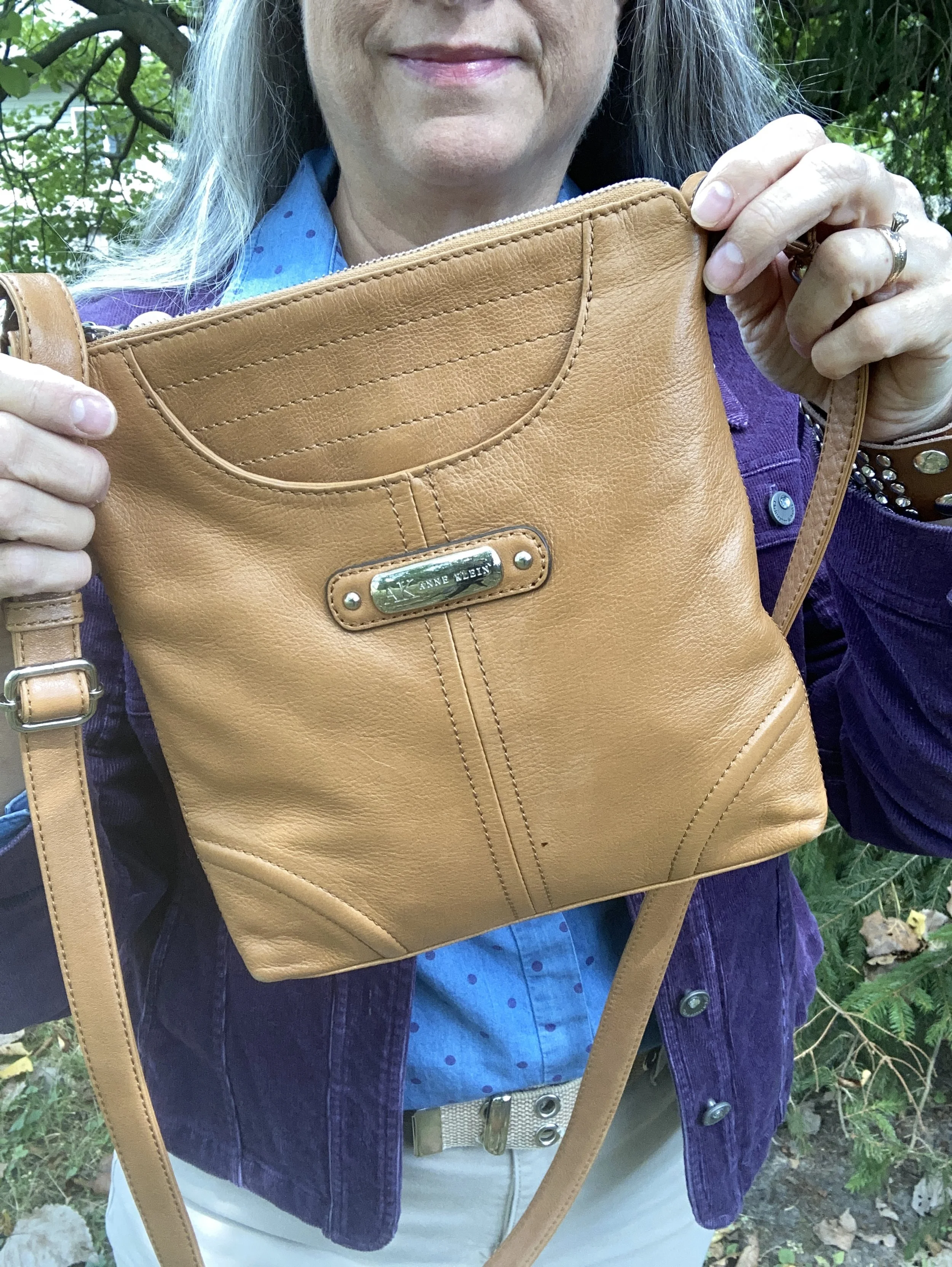
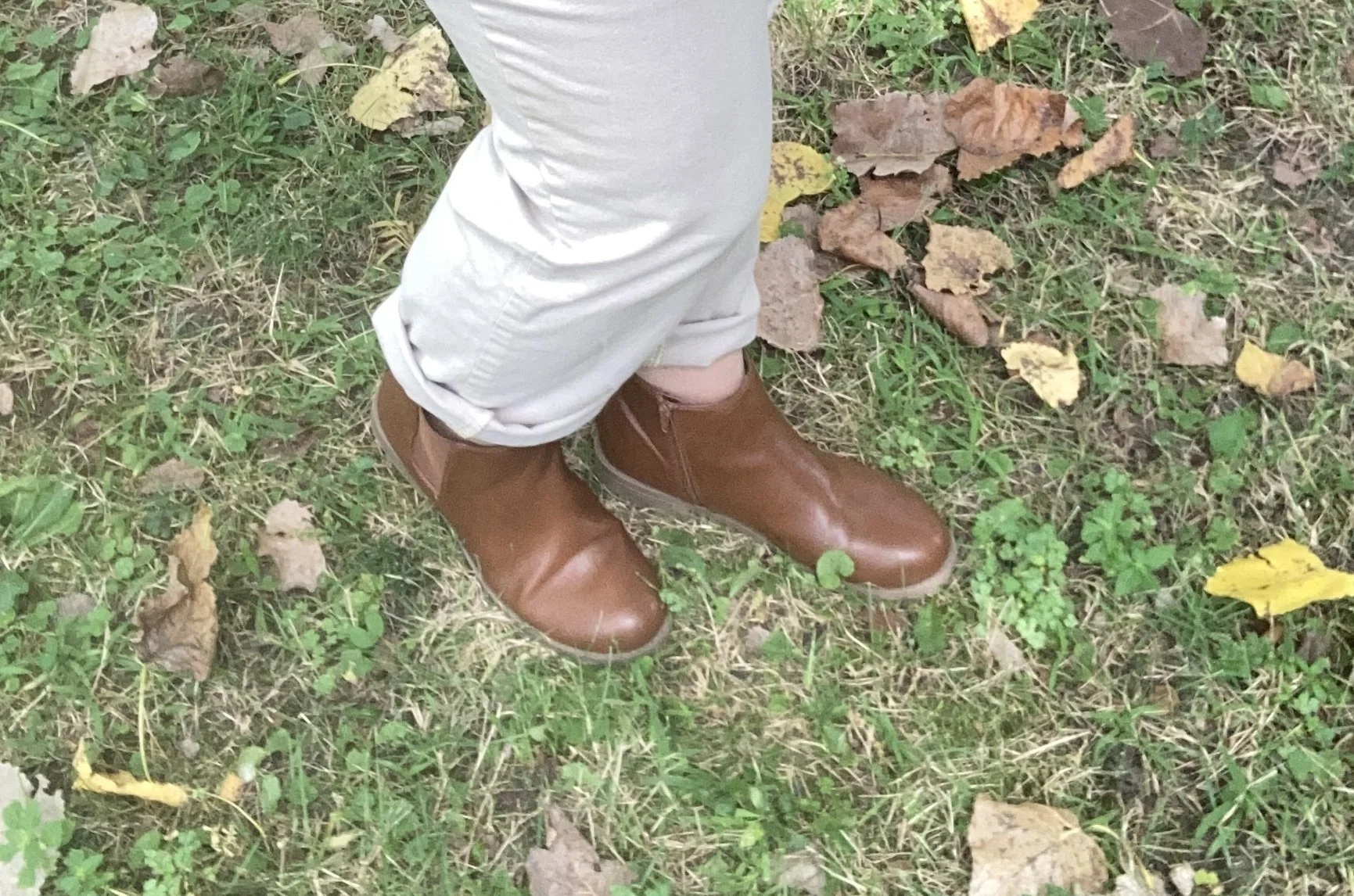
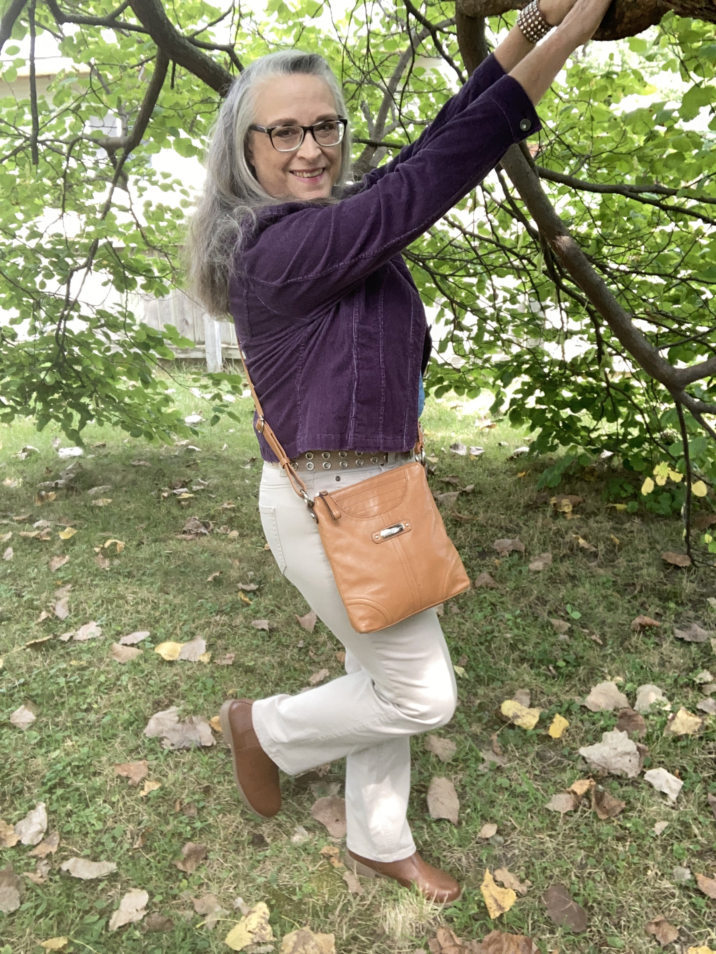
I kept my accessories fairly simple as well. I opted for tan as my color of choice for both my bag and boots since that seems to be trending this fall. I also chose silver as my jewelry color.

What do you think of these Pantone colors? I love purple anyway, so this darker color is a fave, especially for fall. Do you think the a chambray shirt would have worked with this purple jacket and lighter colored pants even if it didn’t have the purple dots on it?

I hope you enjoyed this post. Let me know your thoughts on these colors. Have a great week!

Shopping links are affiliate links, but all opinions are my own.

My Style: Business Casual

I have been doing a series in this monthly column of different style types that I borrow from. As I have said in the past, I do not have one particular style, although often I choose Casual as my current go to. This said, I do like to borrow from other style types when I am feeling particularly adventurous, or if I have a particular event or style challenge that I am participating in on Instagram. So far I have looked at Classic, Boho, and Grunge. Click on those links to see how I interpret each of those styles. Today I am going to look at the Business Casual style.

Business Casual revolves around pieces you can wear to the work place that are both comfortable and classic in style. Think of blazers, tees, trousers or wide leg denim, structured bags, simple cardigans and shoes from loafers to sneakers. For this outfit I chose items from my closet that were bought new and thrifted.

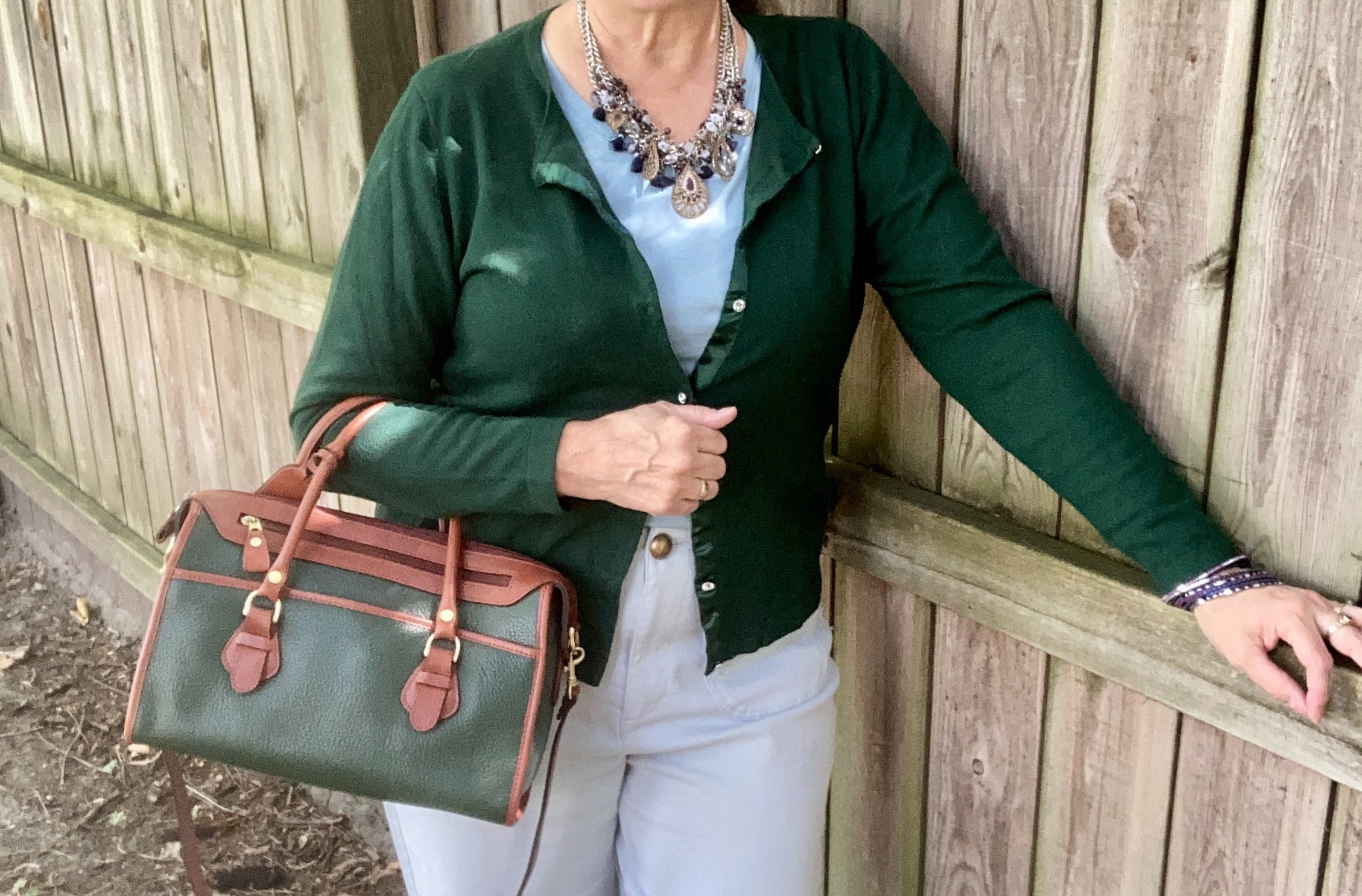
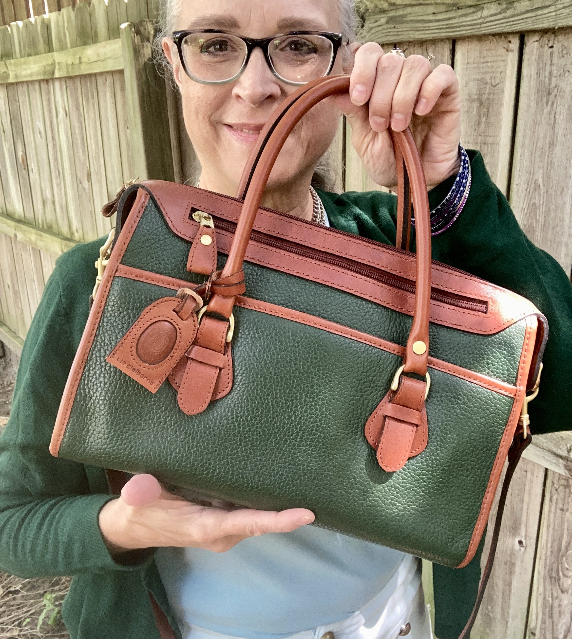
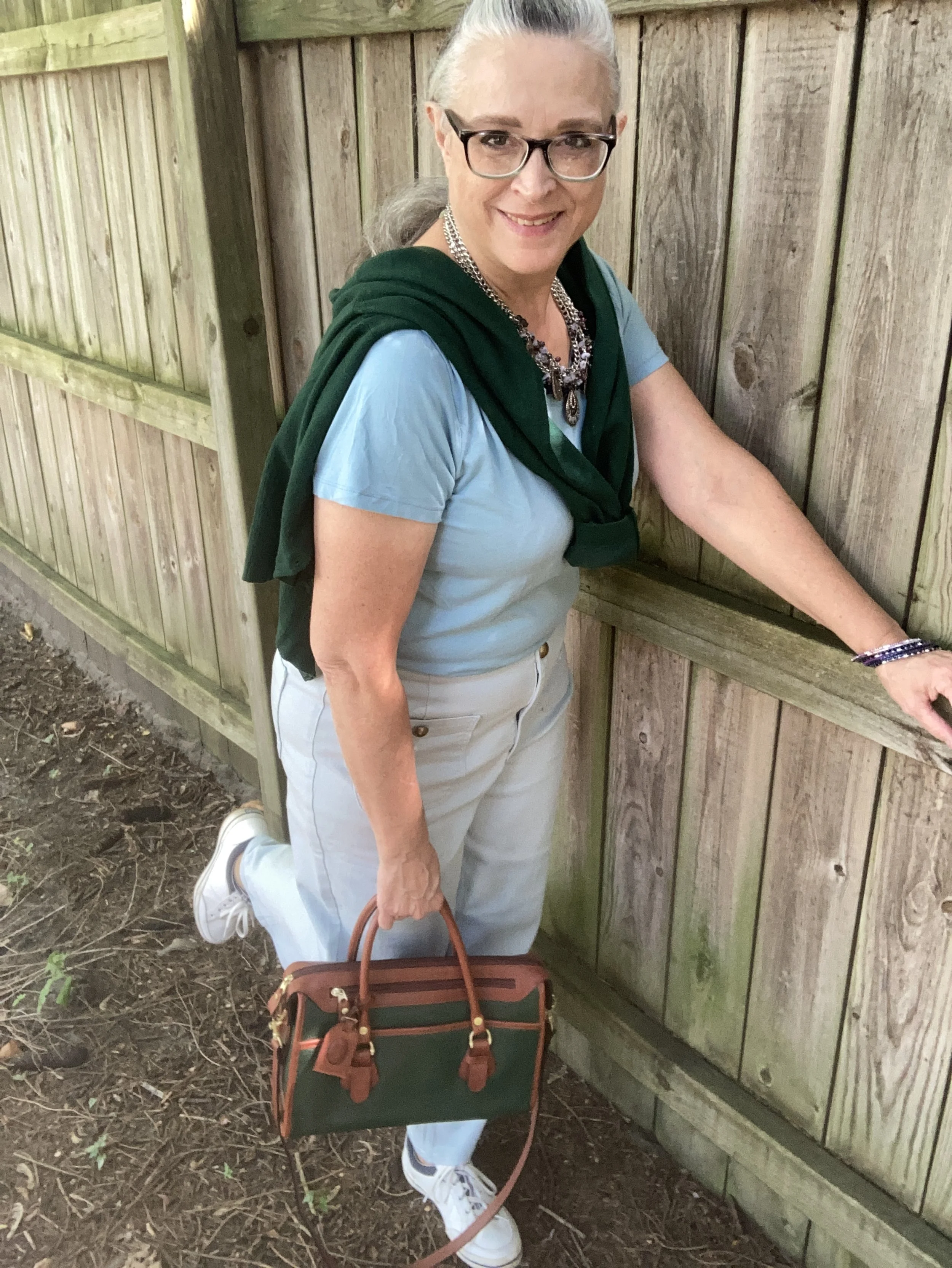
I actually started this outfit with this Jaclyn Smith sweater and Liz Claiborne bag. Both are thrifted pieces. The green color is trending for fall, and the Pantone color palettes for both London and NY contain a few greens. I believe the London palette color called Rain Forest comes closest to this dark, rich green.

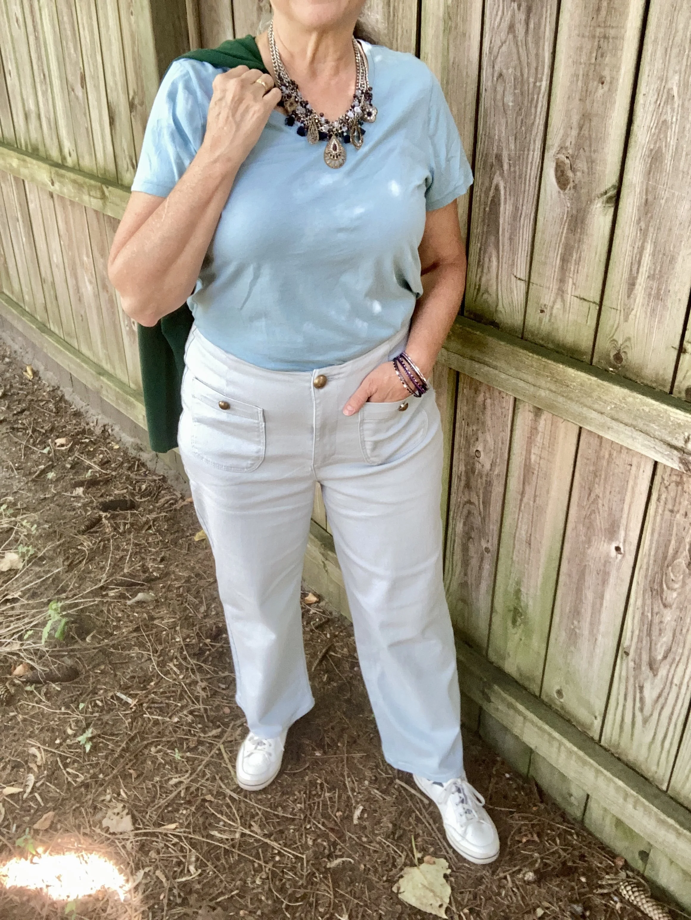
The next piece I chose were these wide leg, Ophelia Roe jeans that I found on clearance at our local Meijer a few seasons ago. That was when wider leg pants were coming back in style and I knew I didn’t have any. I liked the lighter color and the no belt loops waistline. I also like the gold buttons and front patch pockets.

My simple, blue, thrifted, Time and Tru v-neck tee seemed the perfect pairing for this outfit that became, basically, a two color combo of light blue and dark green. To me it symbolizes the beautiful blue skies of late summer and early fall, and the dark greens of the last summer days against those blue skies.

With the addition of a gorgeous statement necklace that I acquired a number of years ago from Christopher and Banks this outfit really stands out. I also added a few metal bangle bracelets in similar colors of silver, blue and purple.

Here is a closer look at this great, green and brown, Liz Claiborne satchel bag that I found thrifting about a year or so ago.

Finally, I went with my older white and navy Keds for my shoes. I also have a pair of brown loafers, a similar brown to that of the bag, that would have went well with this look as well.

Sorry for the poor pictures. I have gotten lazy and use my phone for pictures, that and my computer no longer has room to hold pictures from my camera. The poor Apple is getting old. I will be looking at replacing it in the, hopefully, not too distant future once I have a bit of money saved up. However, the phone, as great as it does, doesn’t allow for adjusting the lighting, and if the light isn’y perfect then neither are the pictures.

So what did you think of this outfit? Do you have Business Casual pieces in your closet? Is this a go to style for you? I love to hear your thoughts so leave me a comment or two.

I’m including a few shopping links for you to look over. These are affiliate links. All opinions are my own.

Have a great day everyone!