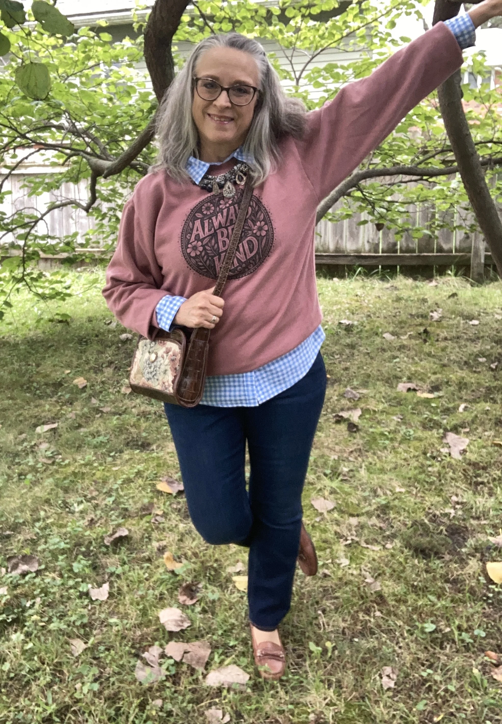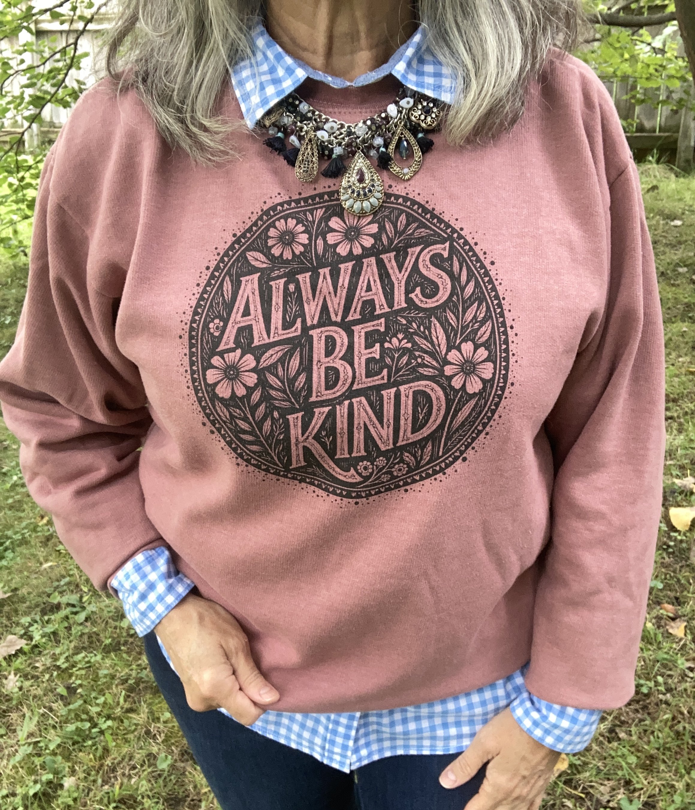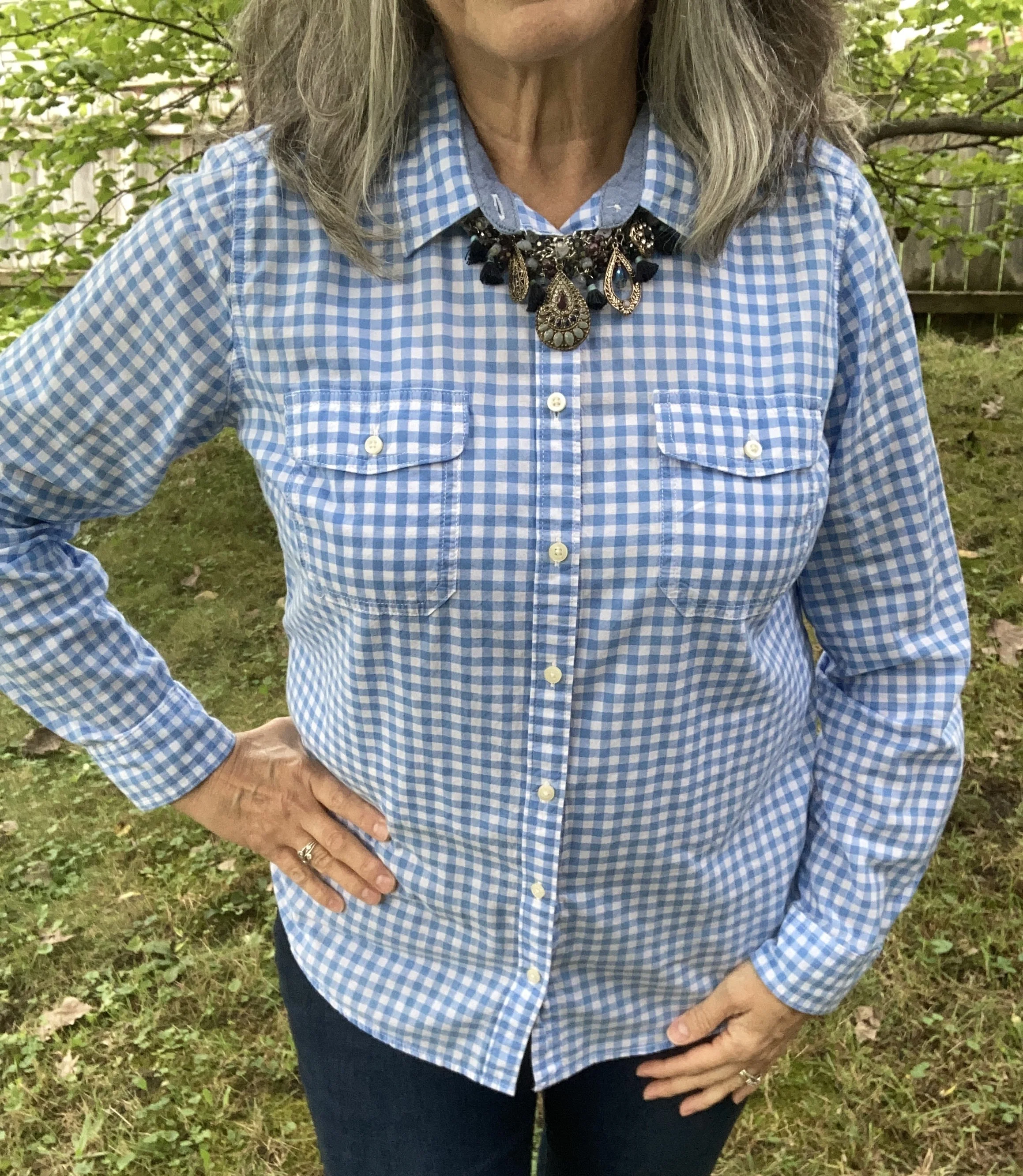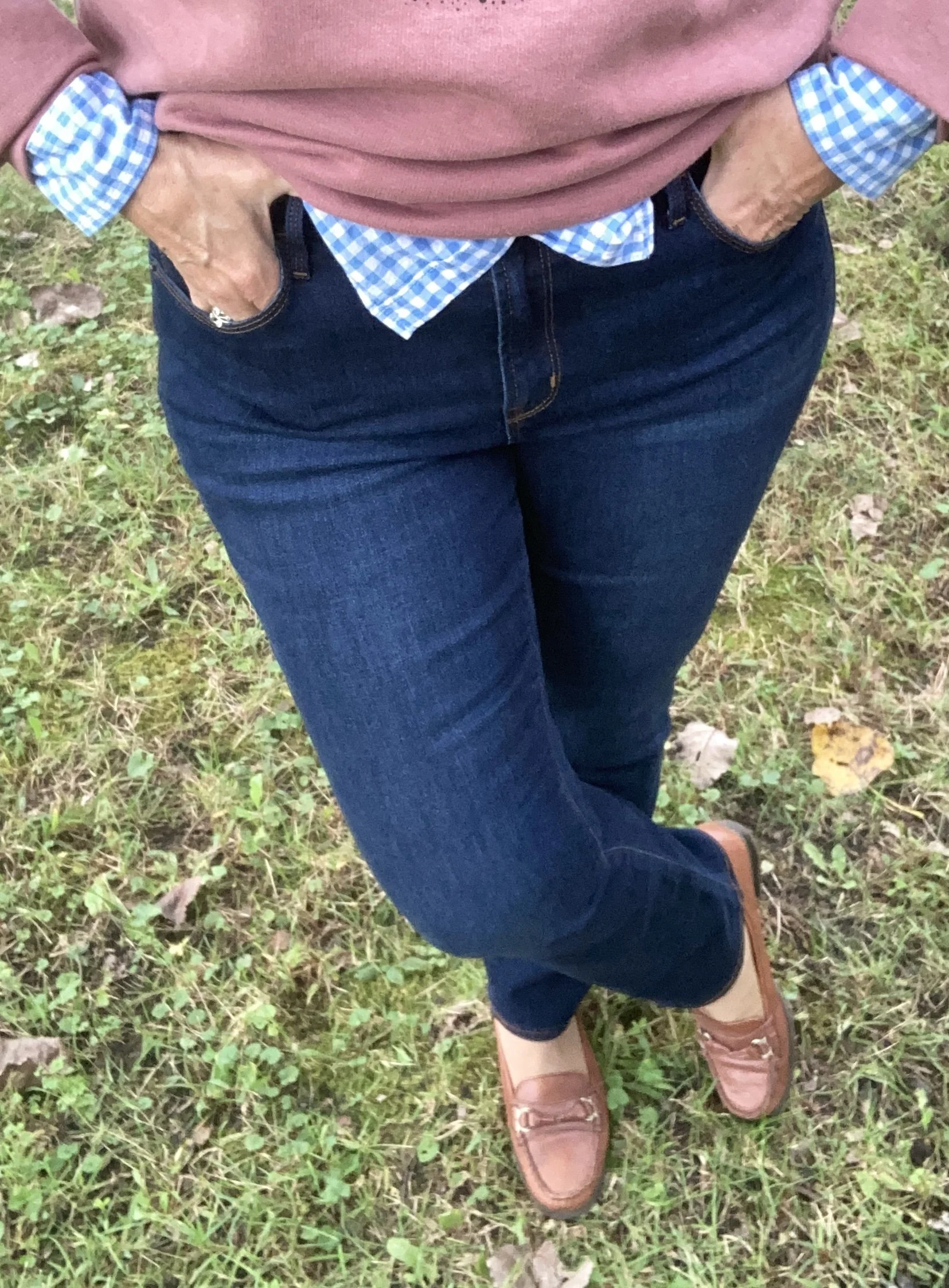
Pantone Autumn/Winter 2026: Neptune Green, Festival Fuchsia, and Toffee

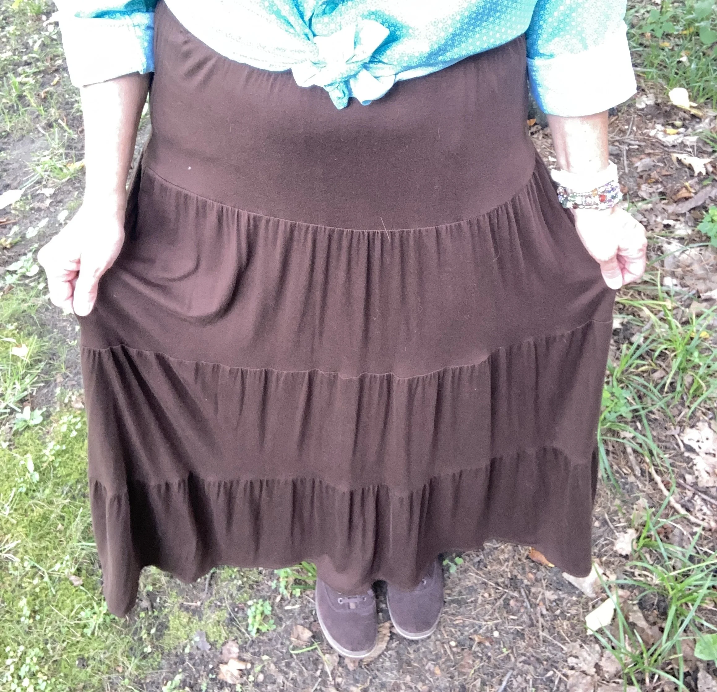
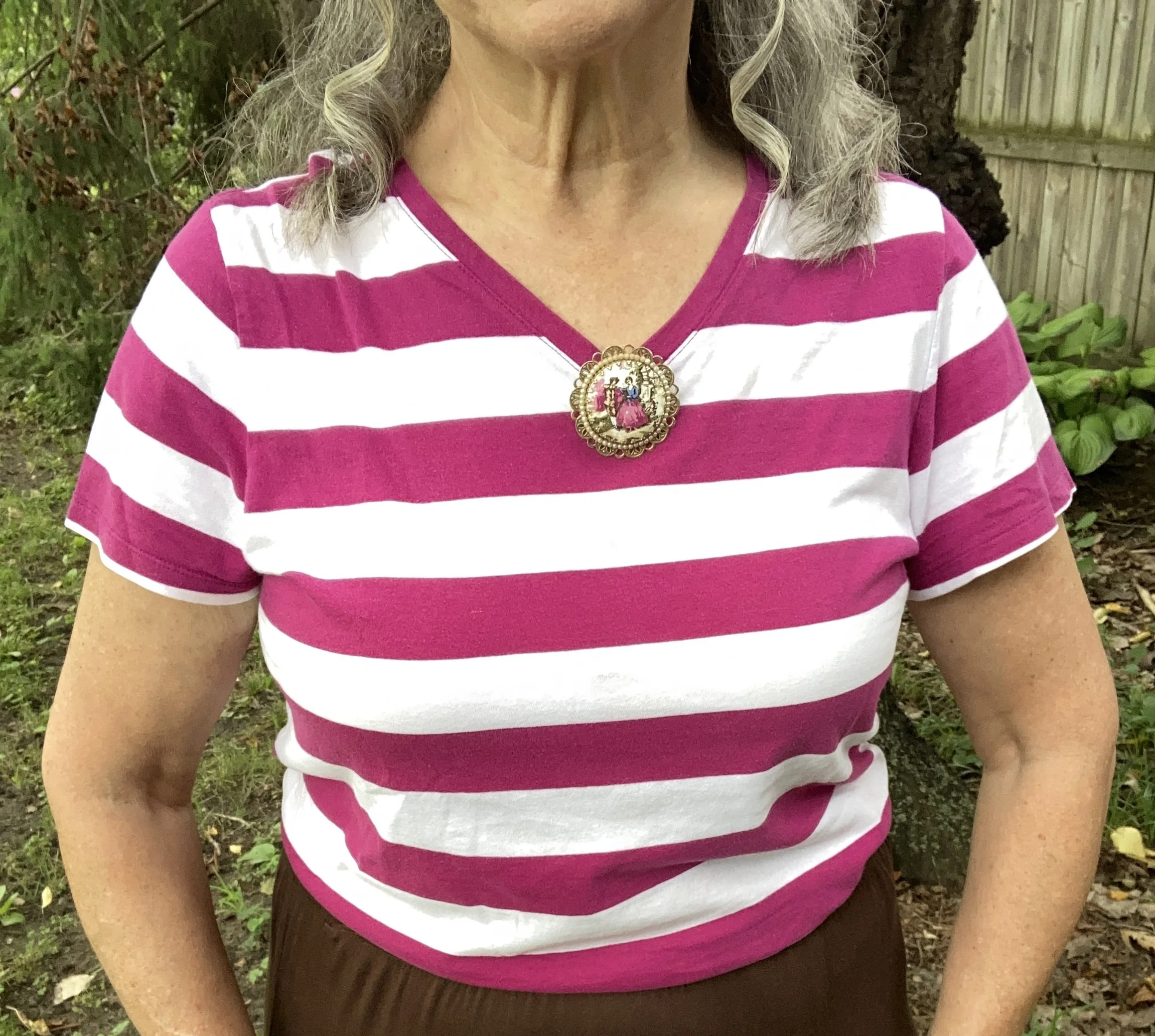
Today I am showing you another outfit with three more colors from the New York, Autumn/Winter palette. Today’s outfit includes Neptune Green, a bright green similar to a sea foam; Festival Fuchsia, a party ready purple, and Toffee, a classic medium brown. I wouldn’t naturally think to put these colors together, though I could easily see the green with the brown, or even the purple with the brown. Combining bright colors like Neptune Green and Festival Fuchsia has never been easy for me, but I love when other people are not afraid to wear the bold, bright colors. This is one way, I have been trying to get outside my own outfit “rut”. You can see the actual Pantone colors here.

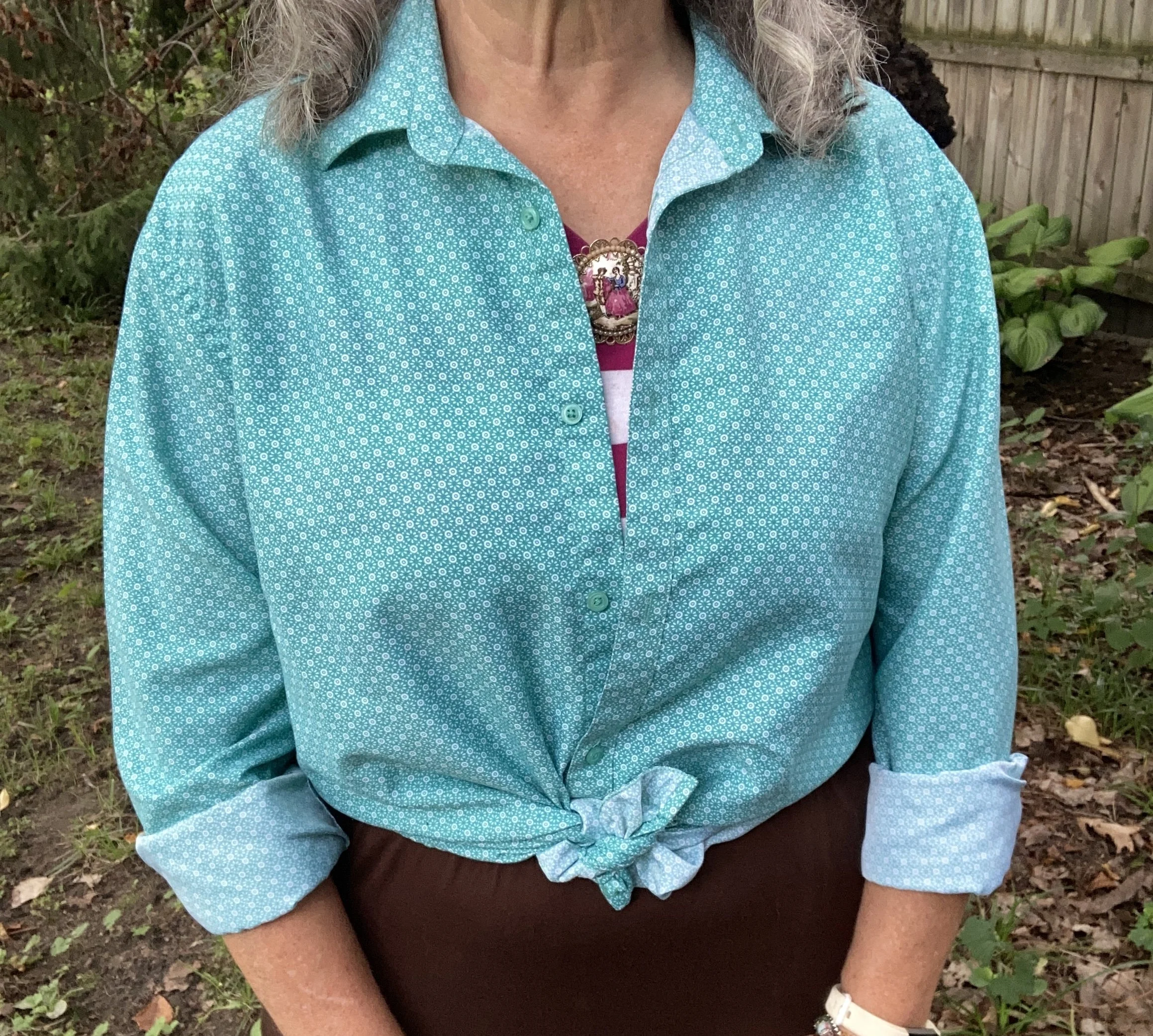
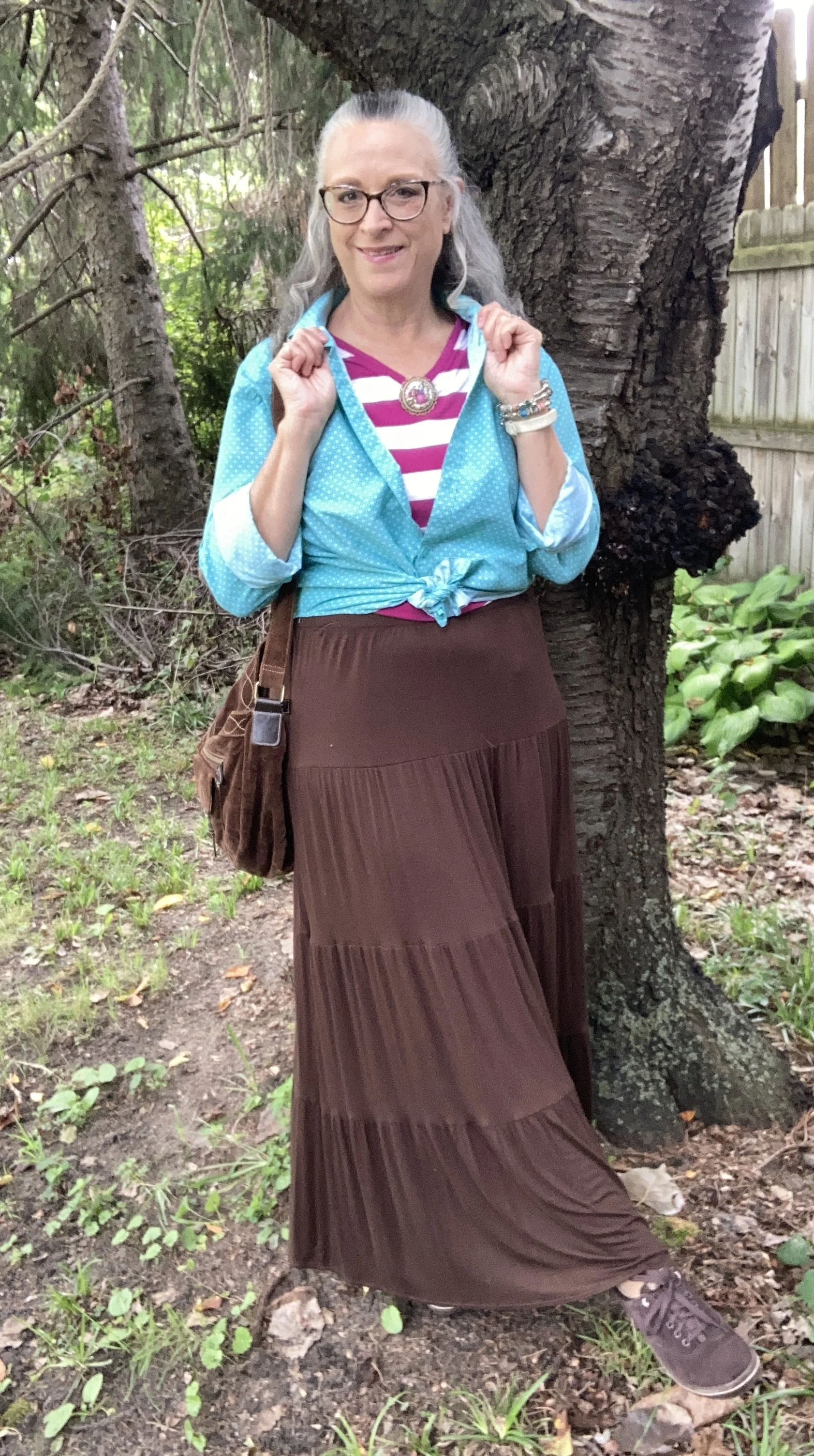
For Neptune Green I chose my thrifted Zylos men’s button down. I do like this color. It is not your typical grass, olive, or forest green. My personal “color brain” - yes, I just made that up - thinks this is a better color for spring and summer.

Personal Fashion Philosophy: Let me just sit here for a moment. I guess it is true that for most of our lives, those of us who grew up in the mid twentieth century, were trained to accept certain seasonal color choices: white for summer, rust and burgundy for fall, black and orange for Halloween, red and green for Christmas, icy blues for winter, and pastels for spring and Easter. How many of you know what I am talking about?

Now, let me take that a little further. We all know that certain smells, sights and sounds remind us of certain holidays, childhood experiences and so on. What if part of my “color brain” is my own way of finding peace, coziness and hope during seasonal change? To me there is just something about digging into those dark, rich colors for the fall season as life begins a transition from long, sunny days spent outside to the shorter, cooler months of spiced cider, snuggly layers and blankets, and gatherings in doors. Just something to think about. Let me hear your ideas about seasonal color change.

This is a darker long sleeve choice from Cabela’s; a short sleeve tee, closer to the actual Pantone color from Old Navy (and not a bad price currently); and I really like this print tee from Life is Good. There is also this 3/4 length sleeve tee from LLBean.

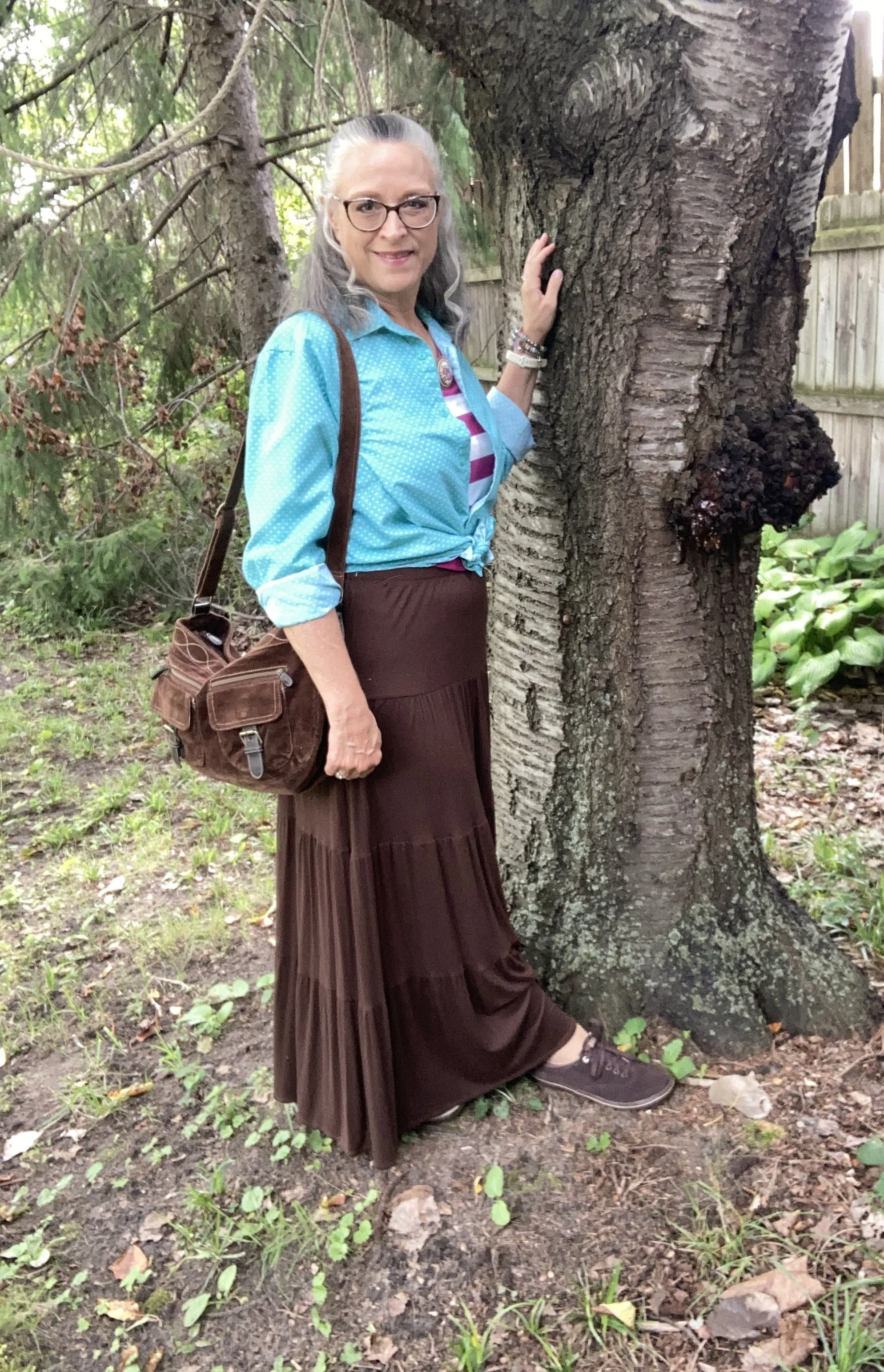
The next piece I chose was the skirt. It seems whenever brown is once again on the Classic palette I reach for this skirt. I have many times thought of getting rid of it since I rarely wear skirts, but it always gets pulled out for something or other. My skirt is a bit darker than the actual Pantone Toffee color, but you get the idea. I do this series to inspire you to shop your closet, not match the color palette’s exactly. This skirt is St. John’s Bay brand from JC Penney and is old. Here is a few versions from Target, a patterned print from Natural Life, a midi length from JC Penney, and a pull on faux suede version from a place called The Vermont Country Store.

I chose this thrifted Faded Glory striped tee for Festival Fuchsia. The combination of Neptune Green and this pretty purple is a fun vibe, though I certainly wouldn’t think of it for fall. Here is a striped boat neck version from JCPenney; an embellished top from Kohl’s; and a peasant style from JC Penney.

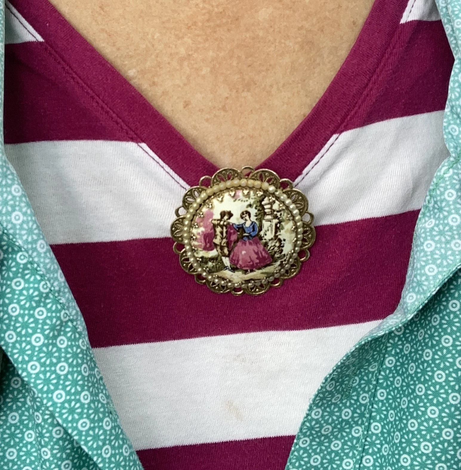
Instead of a necklace I chose a large brooch and pinned it right at the point of the v. I like how it looks. What do you think. I want to incorporate my pins and brooches more often, as they are such fun pieces to use, but often get overlooked.

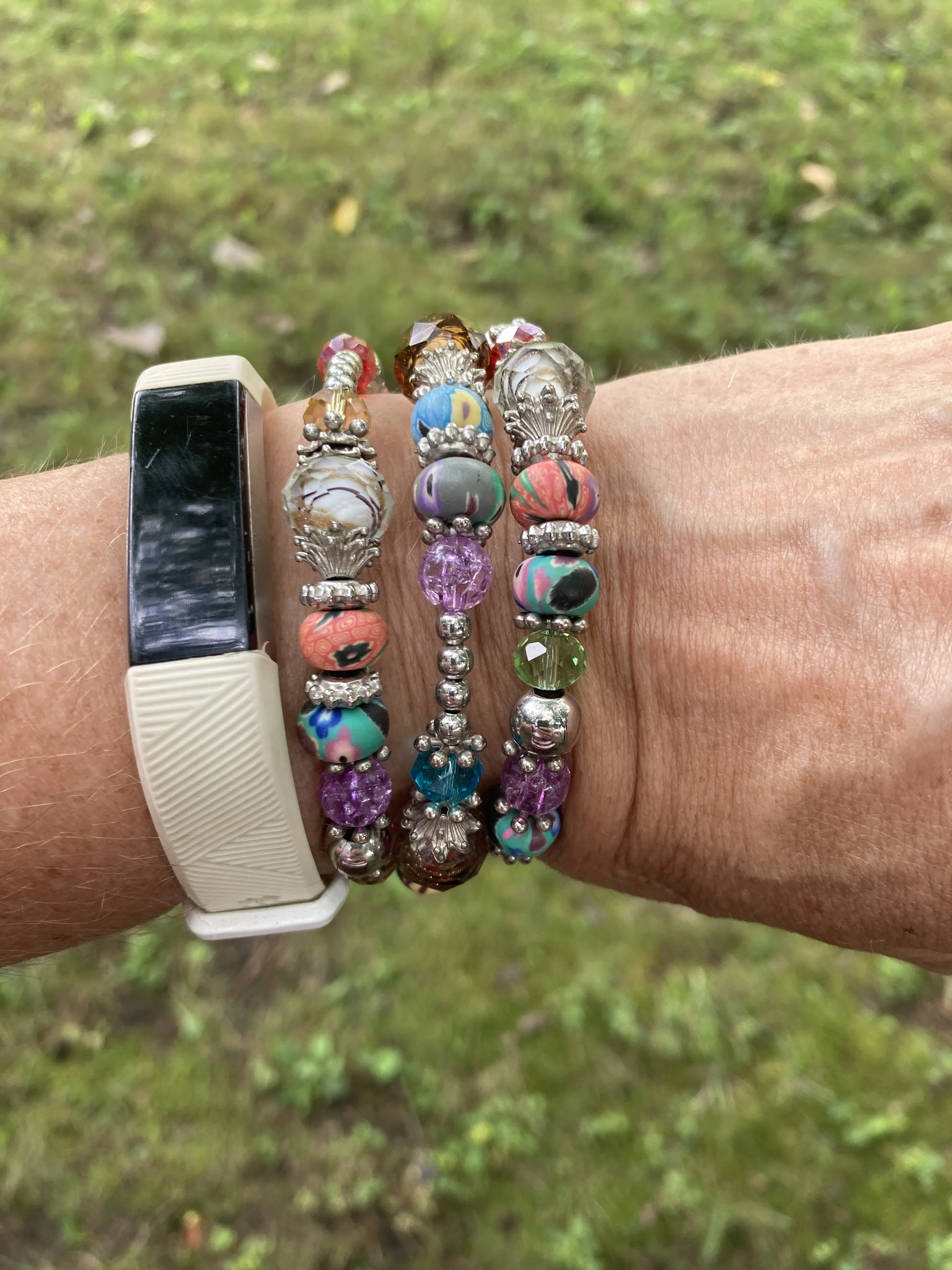
My wrap bracelet was a fun thrift find from a few years ago. I like all the different colors of the beads, so it can be worn with many different things.

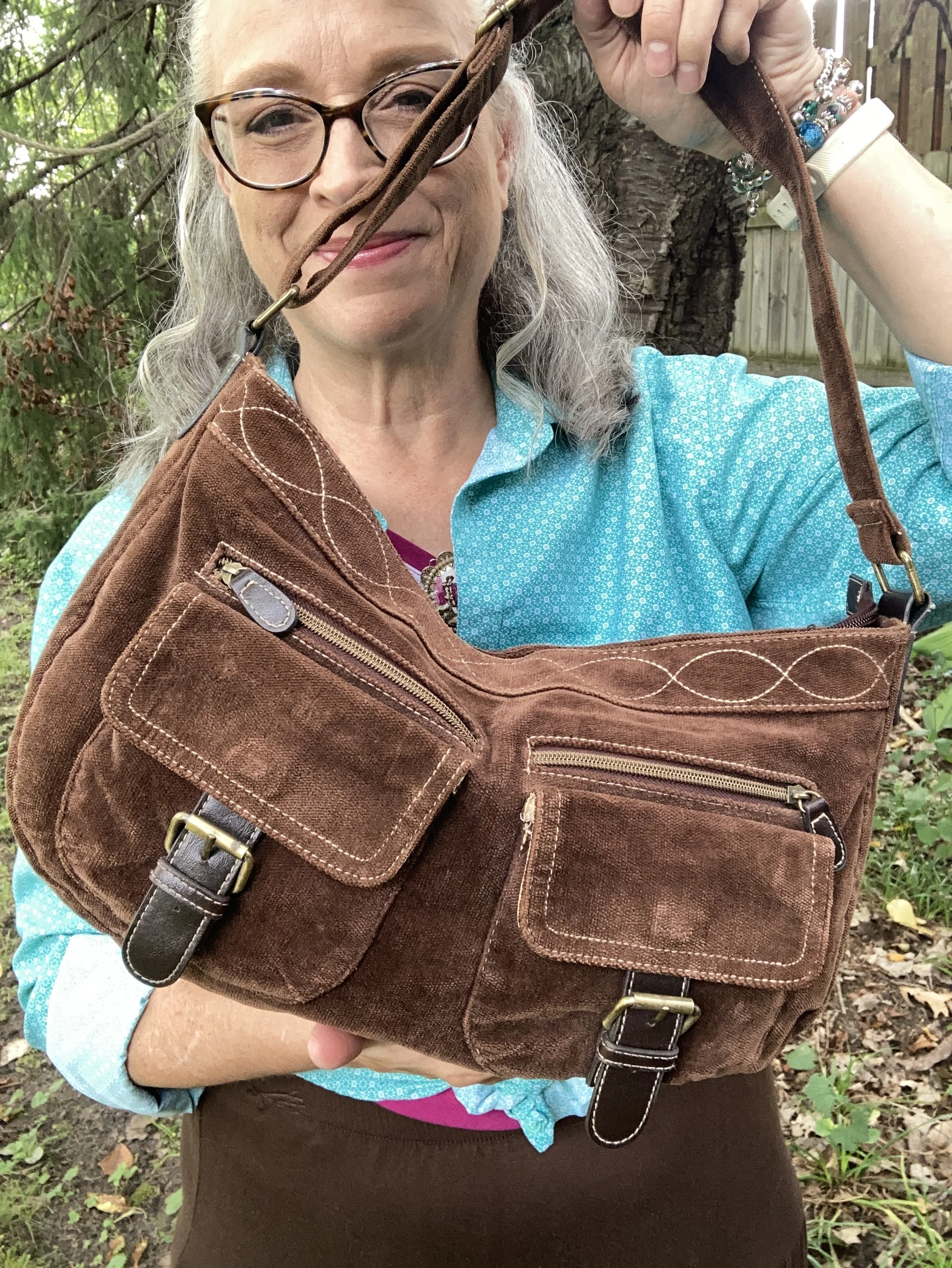
If you have been following me for a while then you know I have had this thrifted corduroy hobo bag for a number of years. Here are a few different ones: Kohl’s, JCPenney, and DSW.

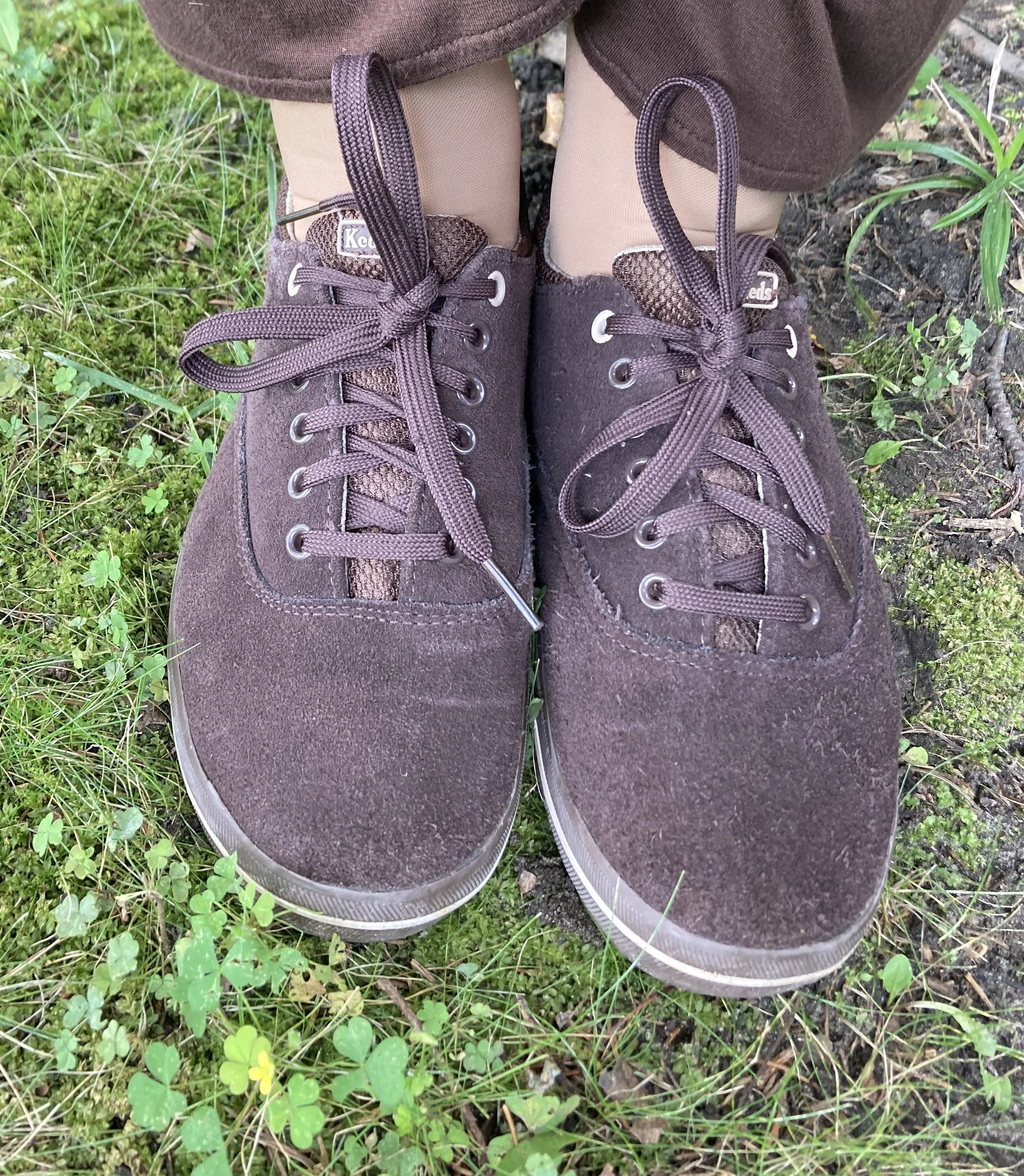
My second hand, brown, suede Keds are getting old, but I still use them regularly. I should probably try to spiff them up with a brush and some suede spray. Here are numerous brown sneaker/shoes from DSW.

What do you think of these colors? Do you suffer from “color brain” like I do? What are some things that are part of your fashion philosophy? If you are interested here is an article I wrote a few years ago on what is behind my Fashion Philosophy. I would love it if you stopped by and read that article too, and leave a comment or two!

I have included a few shopping links for you to look over. These are just suggestions and I do not make any money through them. I do, however, appreciate so much when you leave a comment on the blog. Your thoughts and friendship really do warm my soul and remind me I am not doing this just for myself. Thank you.

Have a wonderful day!

Pantone Autumn/Winter 2026: Arabian Spice, Acacia, and Underworld

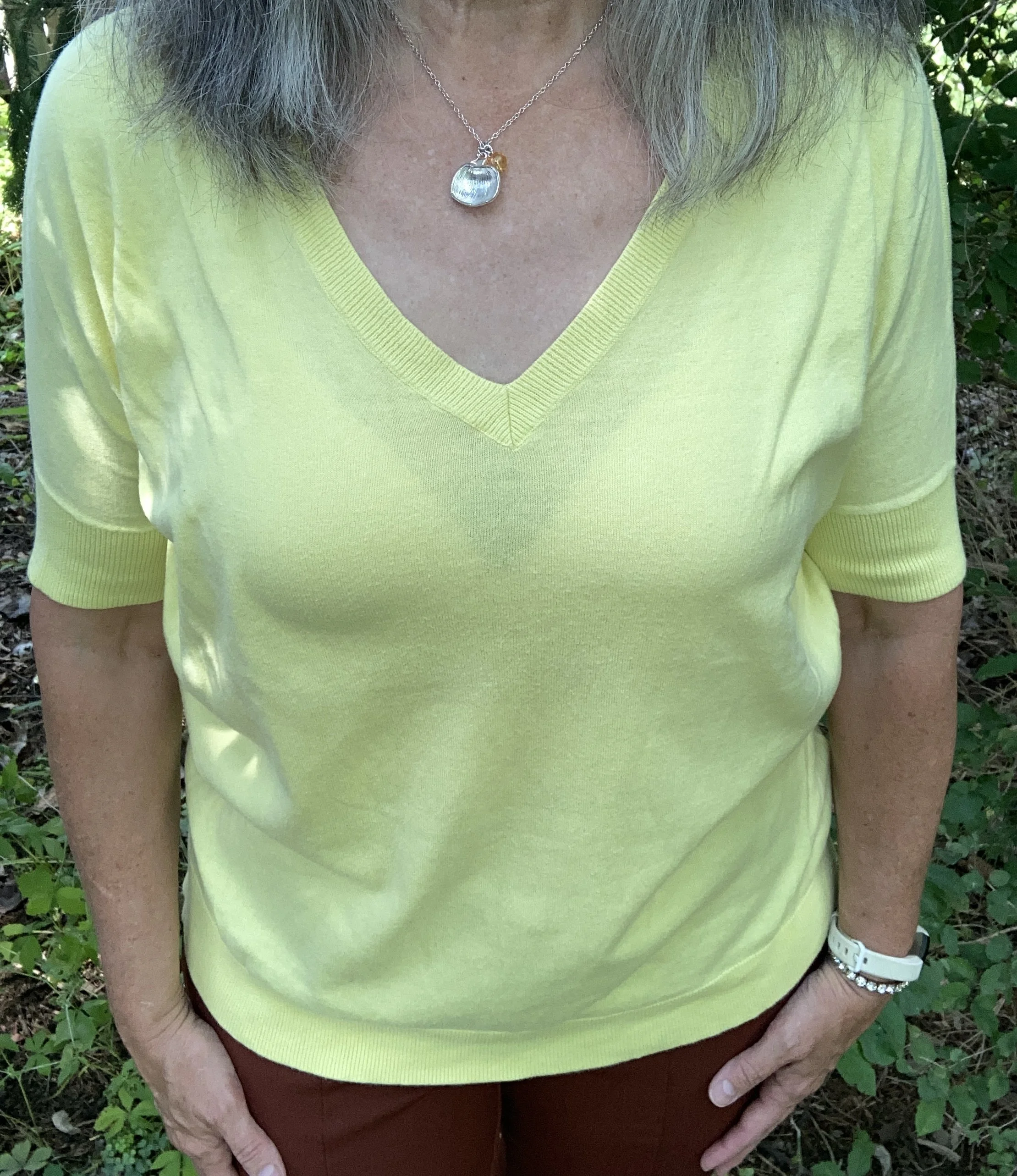
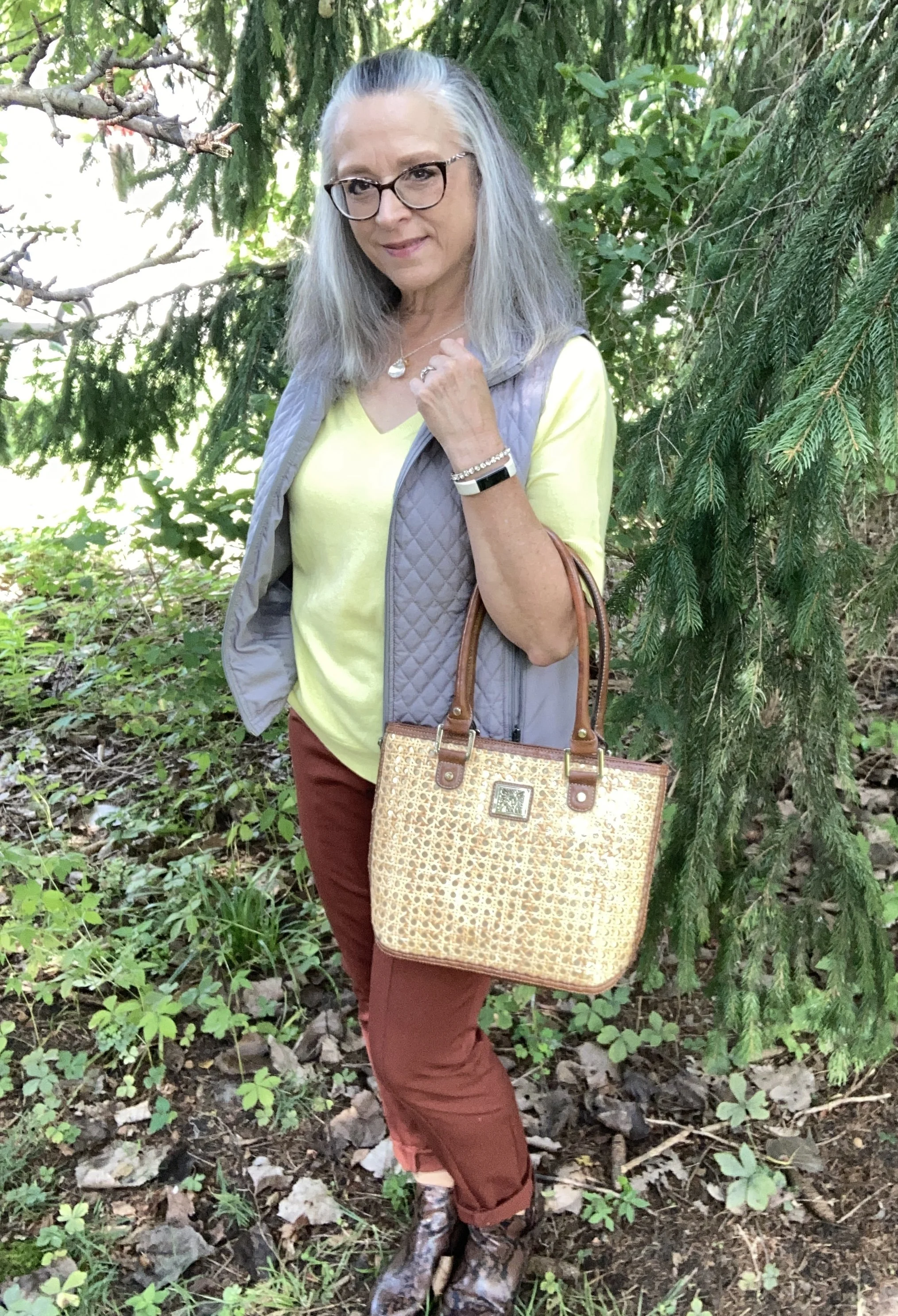
This week we are looking at three more of the New York Autumn/Winter Pantone colors. You can see the actual colors by clicking here. Today’s outfit is a color block style of sorts and uses the colors Arabian Spice, a warm, earthy brown with a little heat; Acacia, a green infused yellow, and Underworld, a medium gray. Let’s take a look.

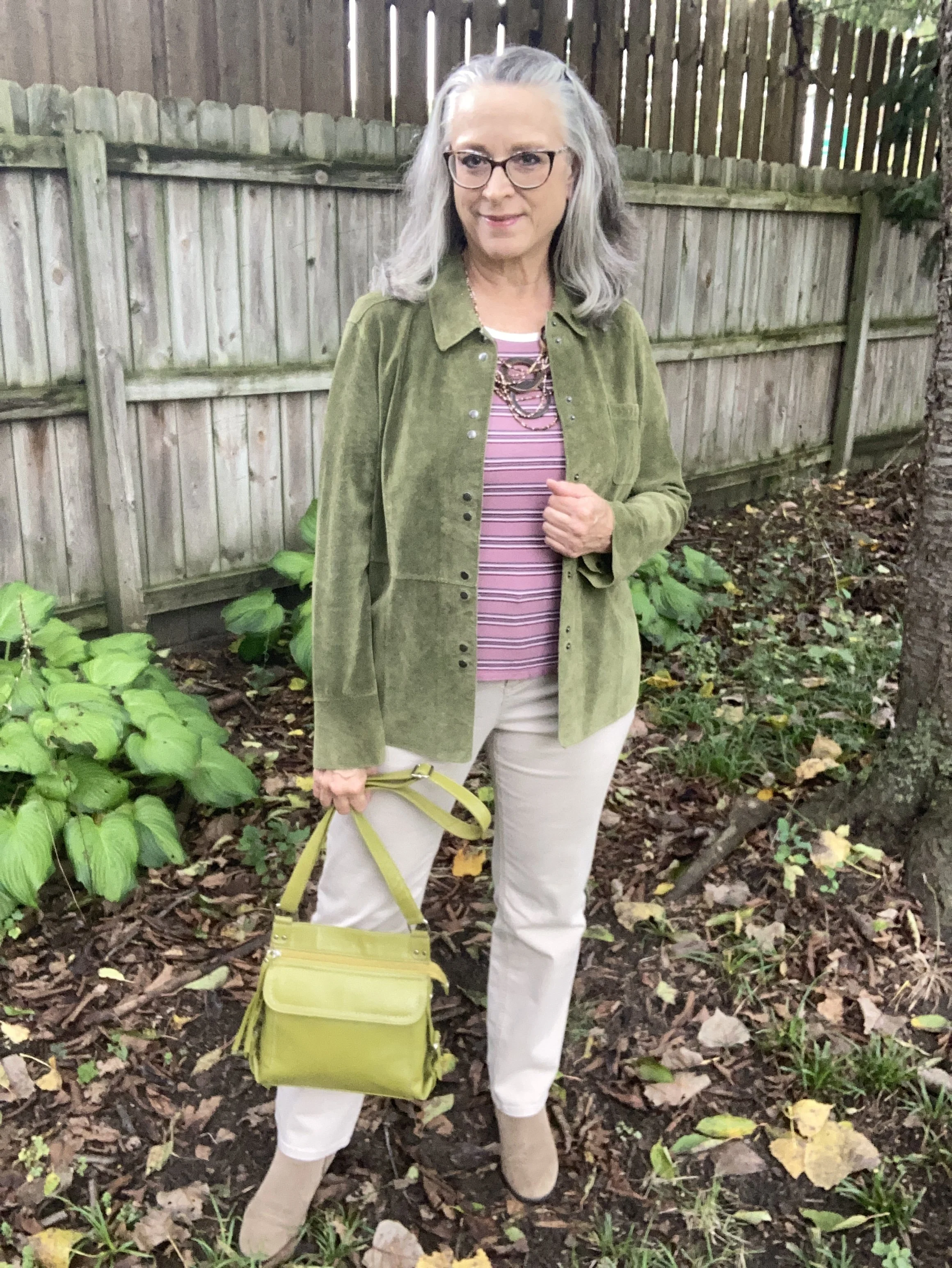
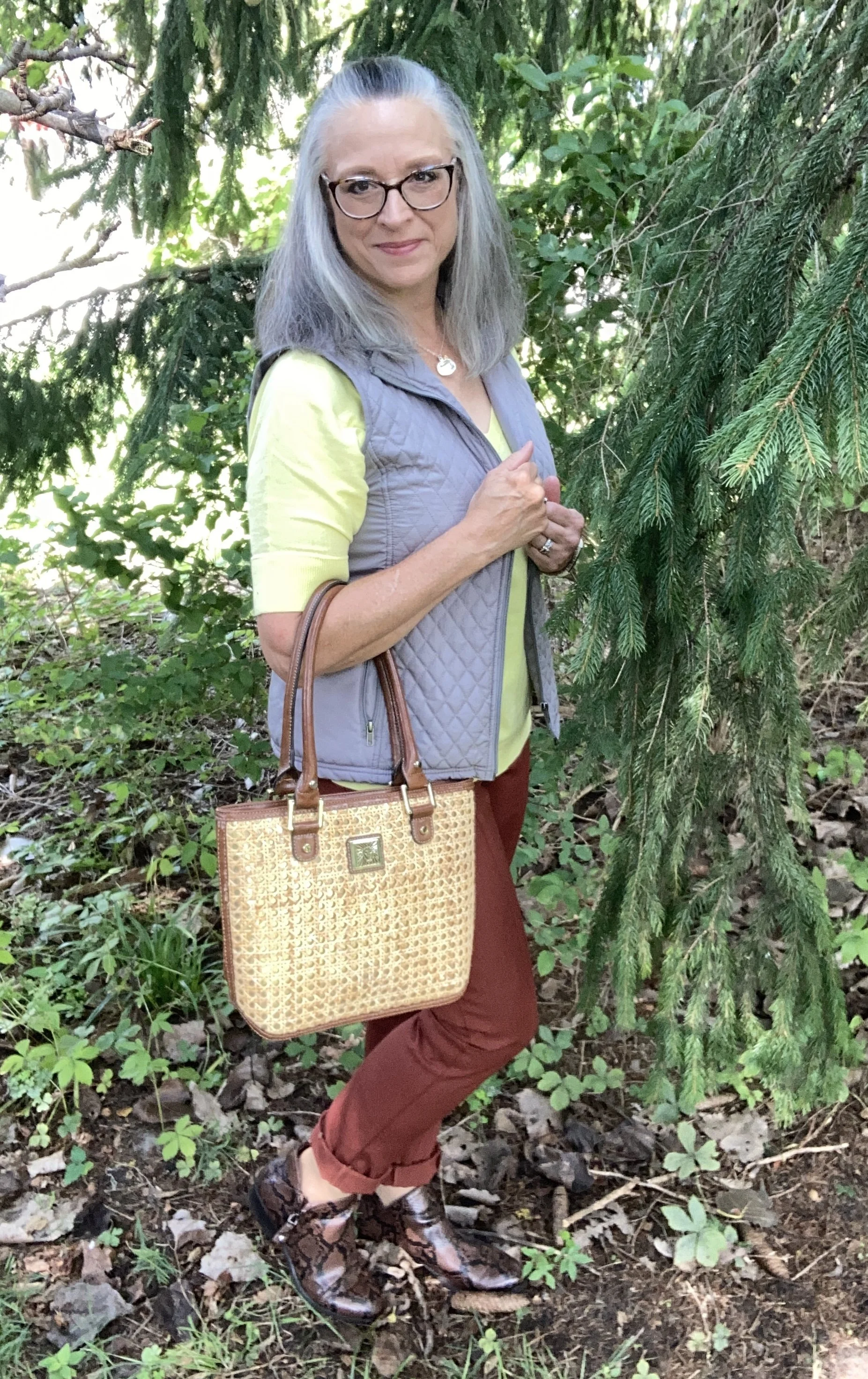
I really had a hard time finding a piece in my closet that closely resembled Acacia. Greenish yellow is not a color that I lean towards. I don’t have a lot of light or bright yellow. With my coloring I typically lean more towards dark or sunny yellows. The first piece I picked out was too green, so after several more attempts I remembered I still had this thrifted, v-neck, short sleeve sweater by Gap. It still seems a bit lighter than the Pantone color, but you get the idea. Here is a possible long sleeve piece from Kohl’s, and a cardigan from Banana Republic,

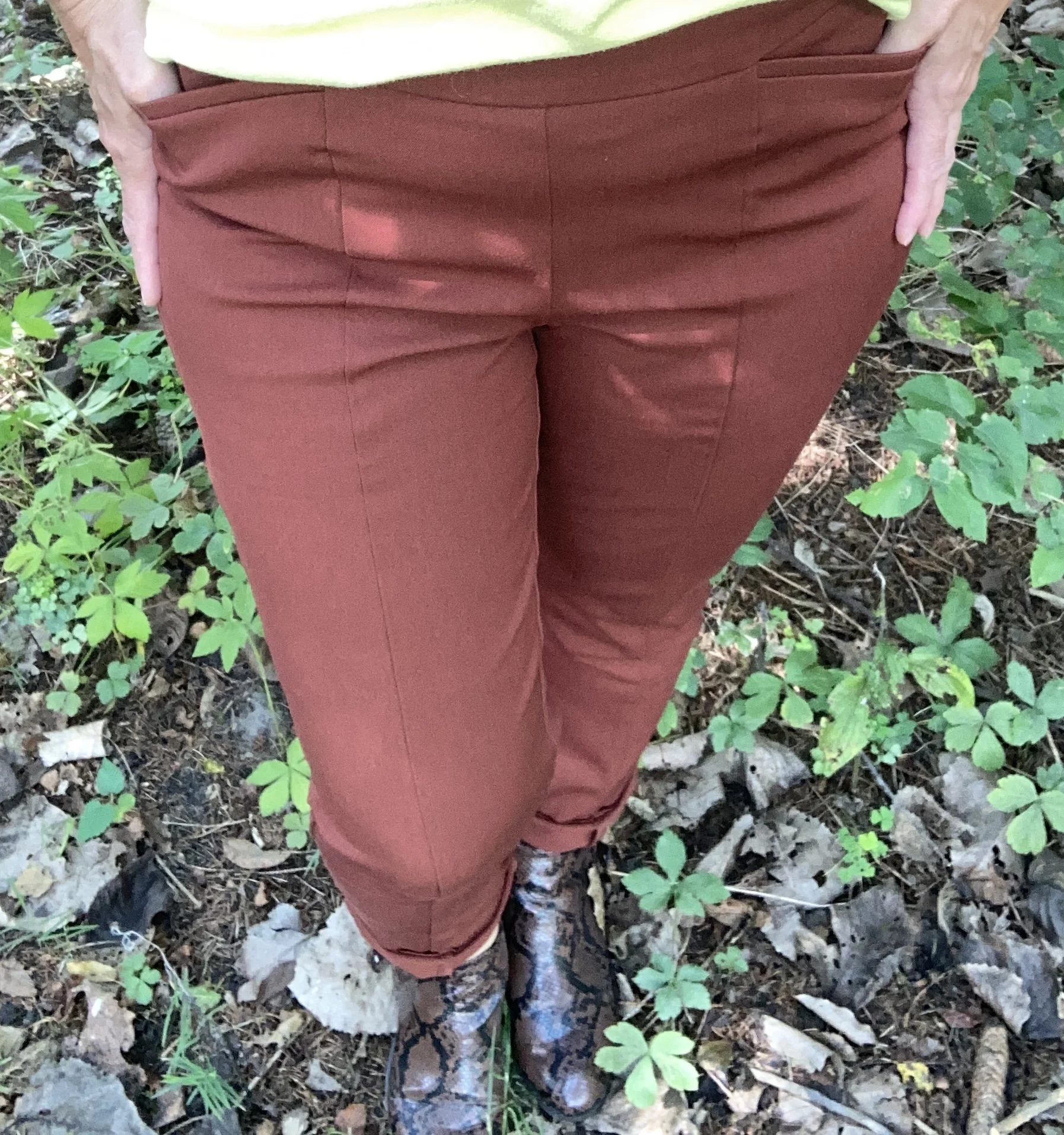
I pulled out these Chico’s So Slimming Ponte knit pants that I bought on sale a number of years ago. Since I no longer have an office job I rarely wear dress pants, but this is a pair I hang onto because they are dressy, but easy to pull on and there are no belt loops or zippers. Those are sun spots on my pants, not bleach stains. Ha, ha. I had the worst time on this day trying to find a spot in the shade that didn’t have dappled sunlight. Here is a straight leg jean from Cabela’s, a pull on pair from JC Penney’s, and a corduroy pair from Kohl’s.

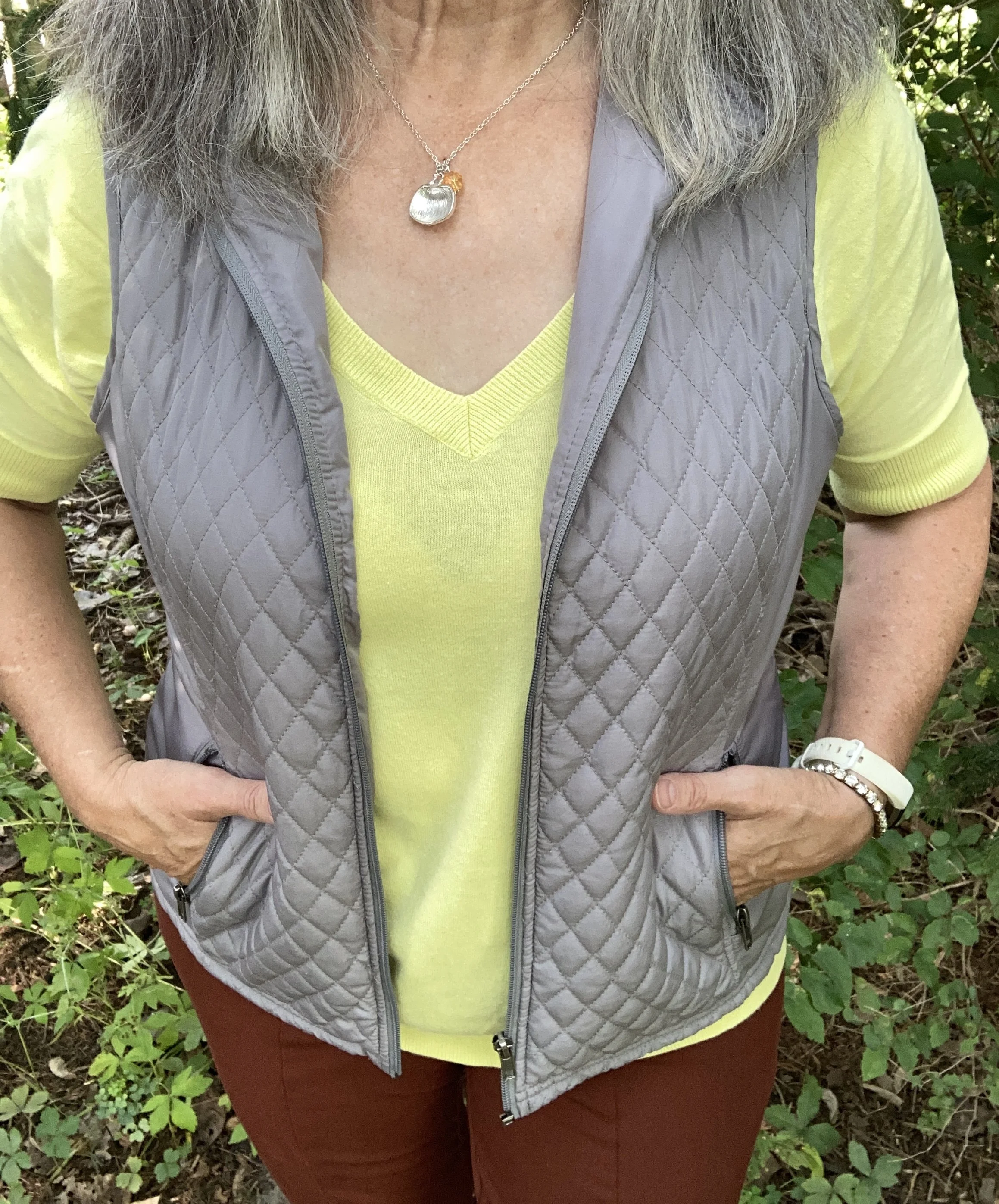
My Underworld vest was a recent thrift purchase. Again, I had to look through a number of pieces in my closet to find the gray that was closest to this color. Gray’s like olives have various undertones and shades. This is Relativity brand. I love vests, especially as the weather cools. The day I took these pictures was not cool!! If you don’t mind a higher price point this is a pretty one with a unique hemline from Coldwater Creek, a fleece one from L.L. Bean, a vintage waistcoat from Kohl’s, and this quilted one from a retailer called 32 Degrees.

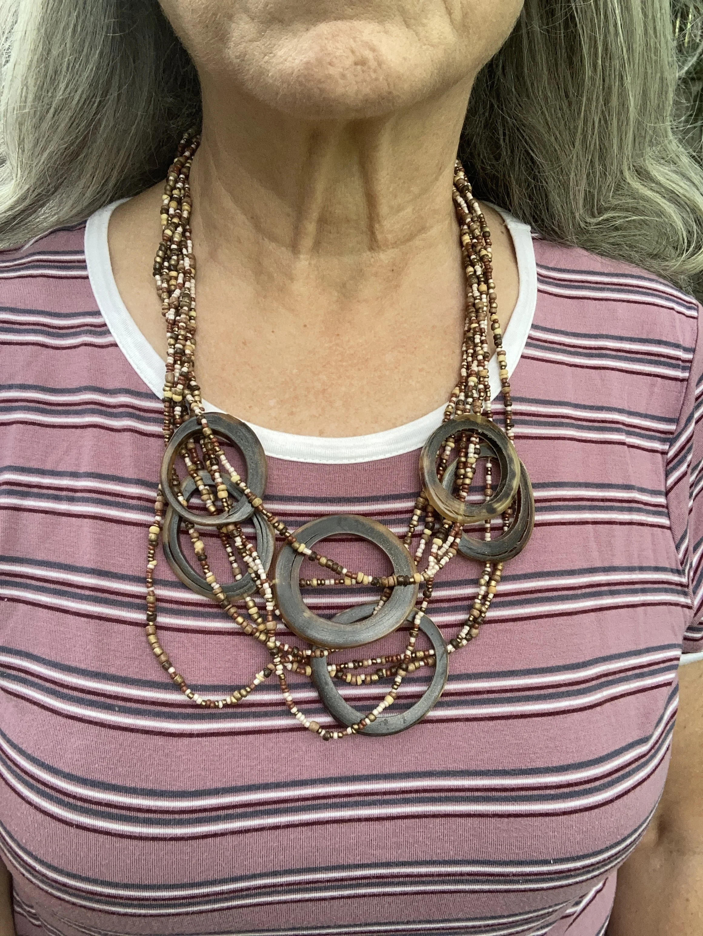
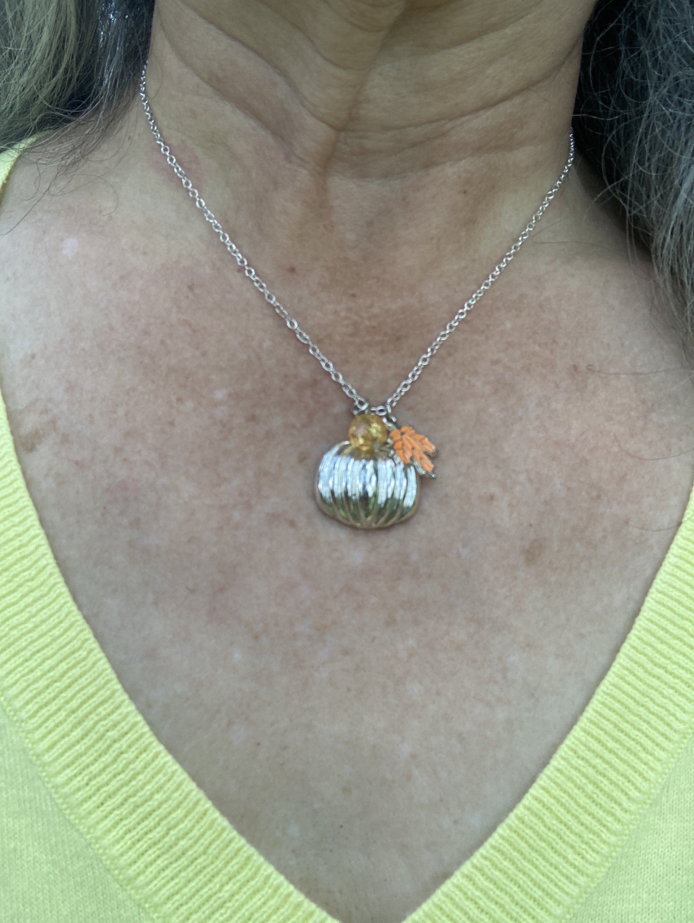
I chose a simple silver, seasonal necklace that has a pumpkin, an orange bead, and leaf. I think I got this a couple years ago at Maurice’s.

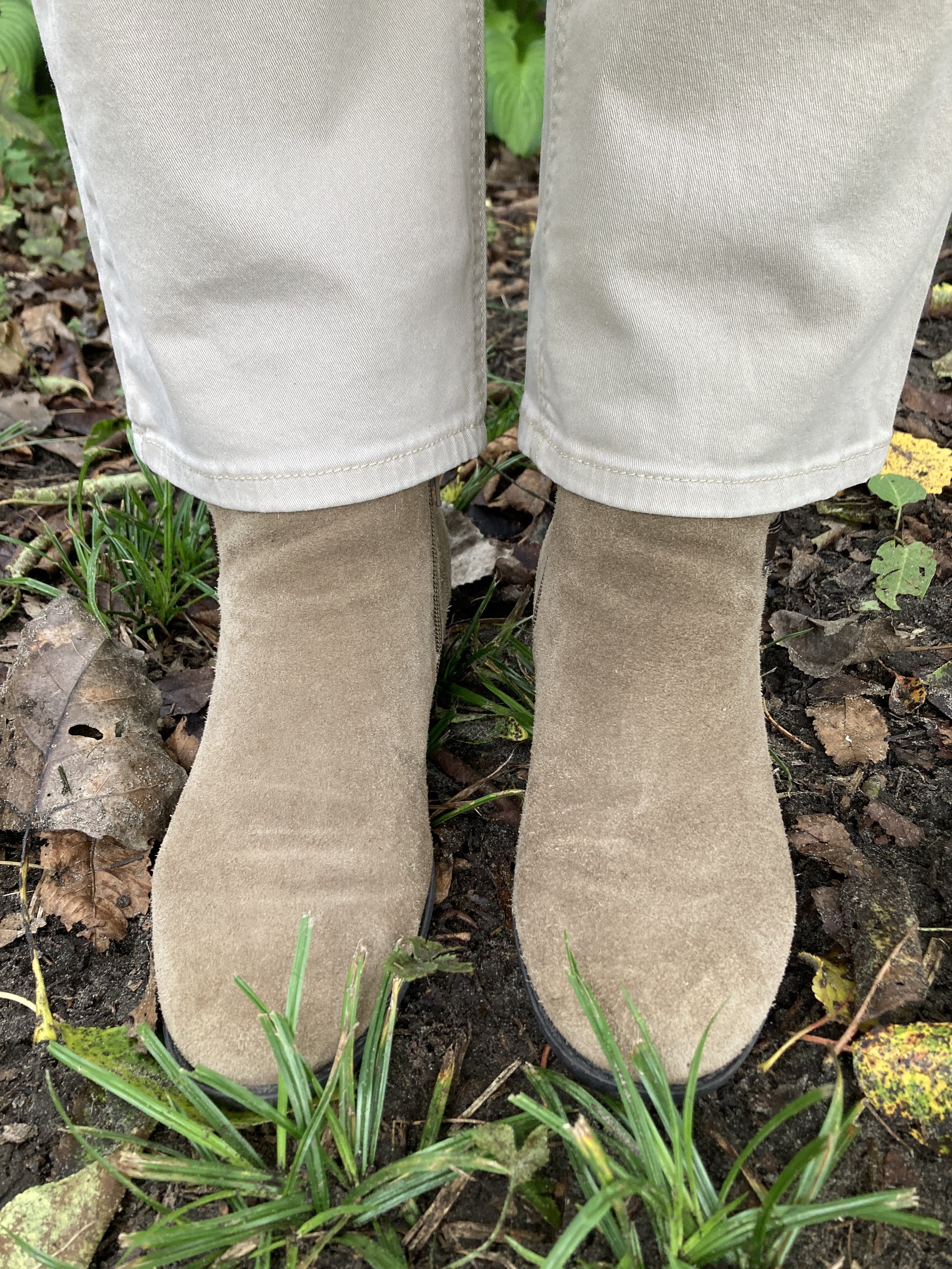
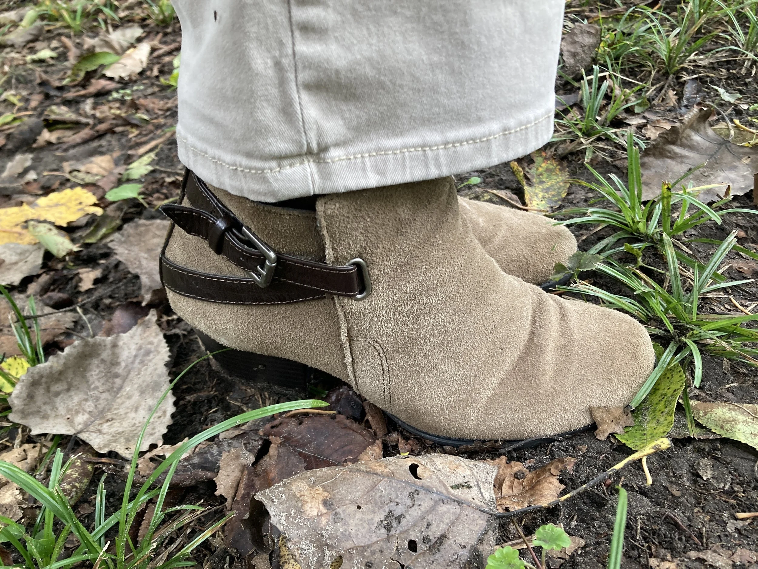
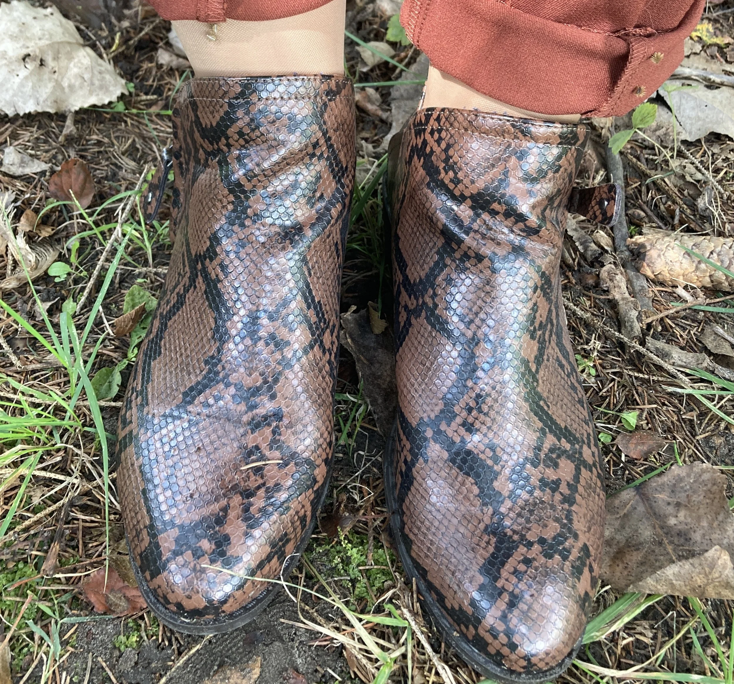
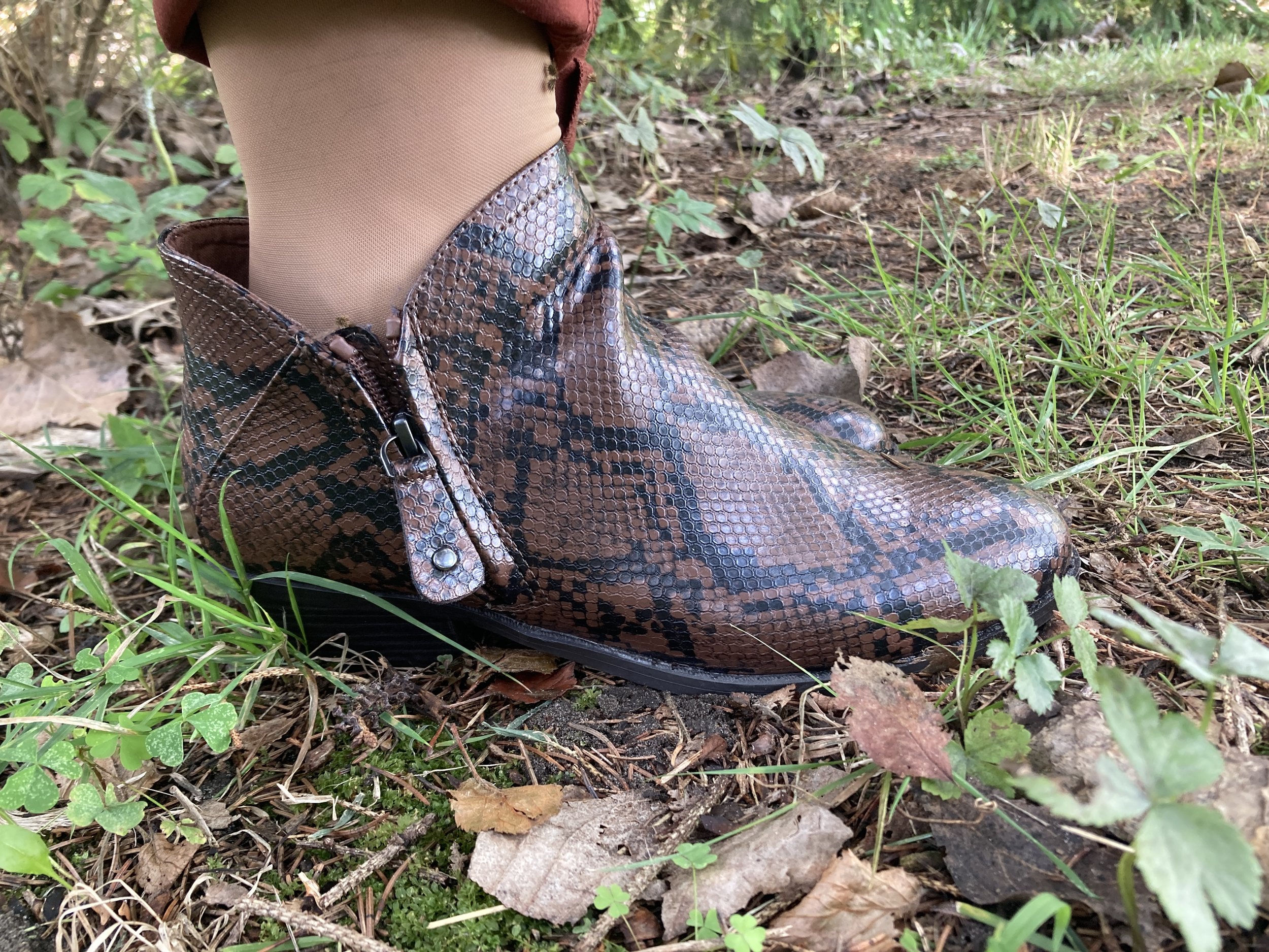
For my shoes I chose one of my many pairs of SO ankle boots from Kohl’s. This pair has a black snake print pattern with a brownish background. Here is a page from DSW with a number of snake print patterned boots.

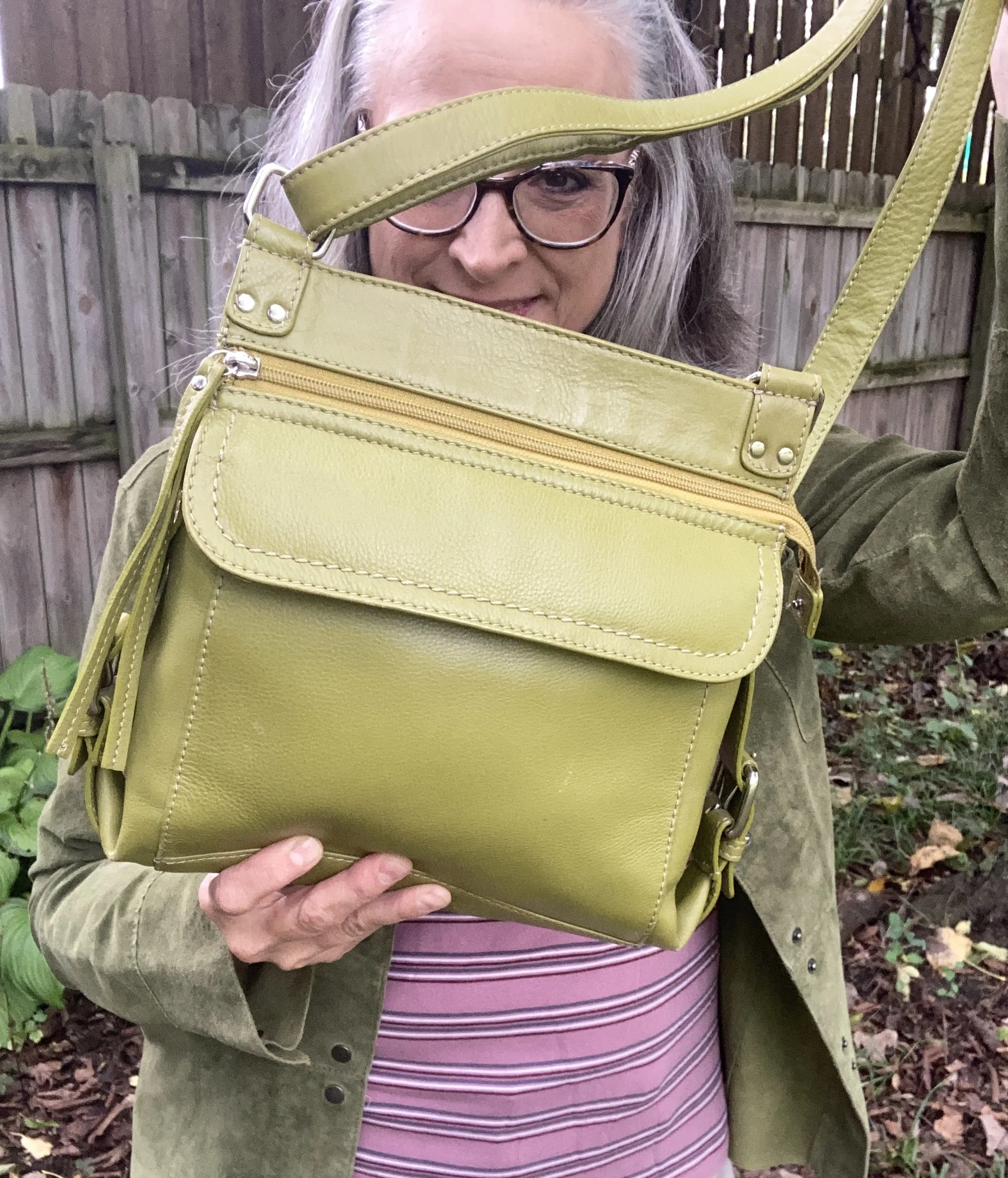
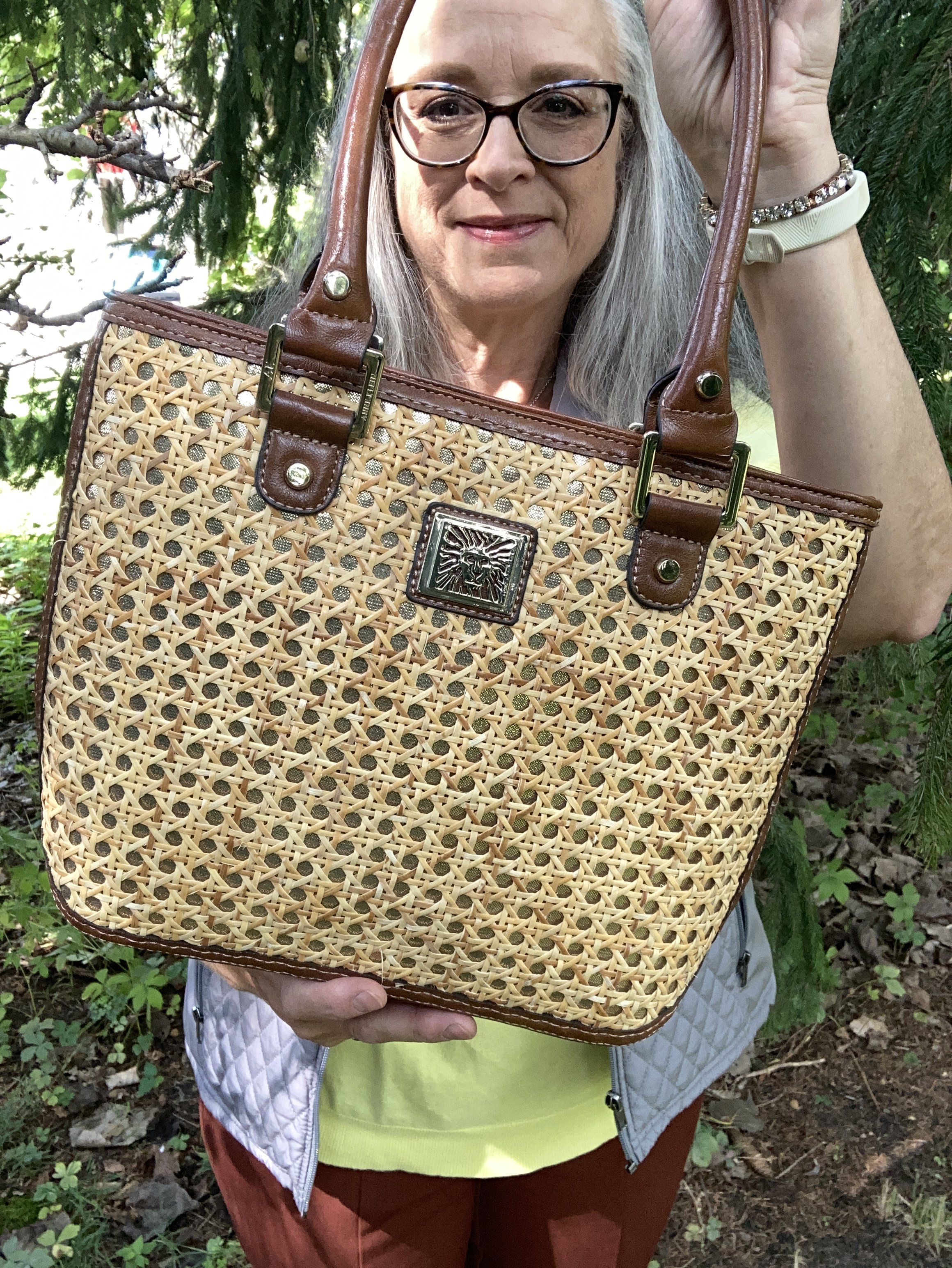
My Anne Klein bag was a thrift find this past spring. I love to look at purses and if you talk to my spouse he will tell you I have too many purses. What nonsense! Ha, ha. Unfortunately, it’s true, so these days I do try to steer clear of the purses so I am not tempted. However, I did grab this cute bag.

I would have never thought to put these colors together, but that is part of what makes this color series so fun. I hope you enjoyed learning more about Arabian Spice, Acacia and Underworld!

Leave me some love in the comments. I always like to hear your thoughts on these colors and on my outfits. I hope you have a wonderful week.

Pantone Autumn/Winter 2026: Red Mahogany, Burnt Olive and Egret

Happy September, everyone! It has been a very long time since I have been regularly posting on the blog, and I hope starting this Pantone series for fall will be the catalyst to bringing this little blog back to life and bringing me back to the things I am most passionate about: fashion, faith and writing. I will be sharing more on my Faith page on the difficulty we have had over the last six months, so if you are interested you can visit there later this week. I hope to get back to my regular posting schedule of Fashion on Tuesdays, Faith on Thursdays and perhaps an occasional post on a different day of the week when time and energy allows.

While access to the Pantone Fashion Week colors seems to be getting harder and harder to find, I was able to find a link to the original article so you can see those colors by clicking on the link here. These fall colors are interesting, and I will be the first to admit that I rather like these bright colorful hues and noticed a few that remind me of colors I like to wear in the fall and winter like Arabian Spice, Red Mahogany, Toffee, and Poseidon.

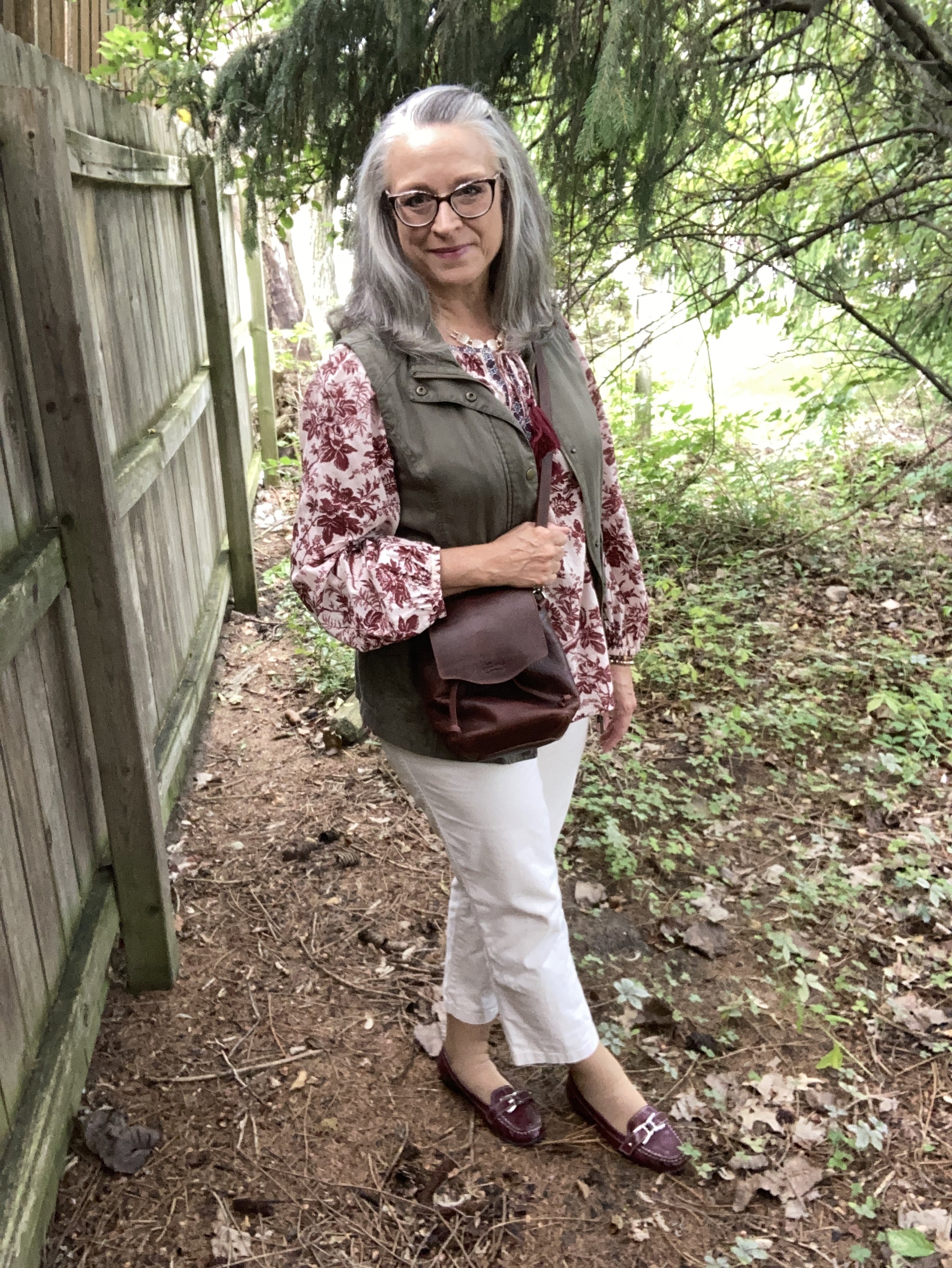
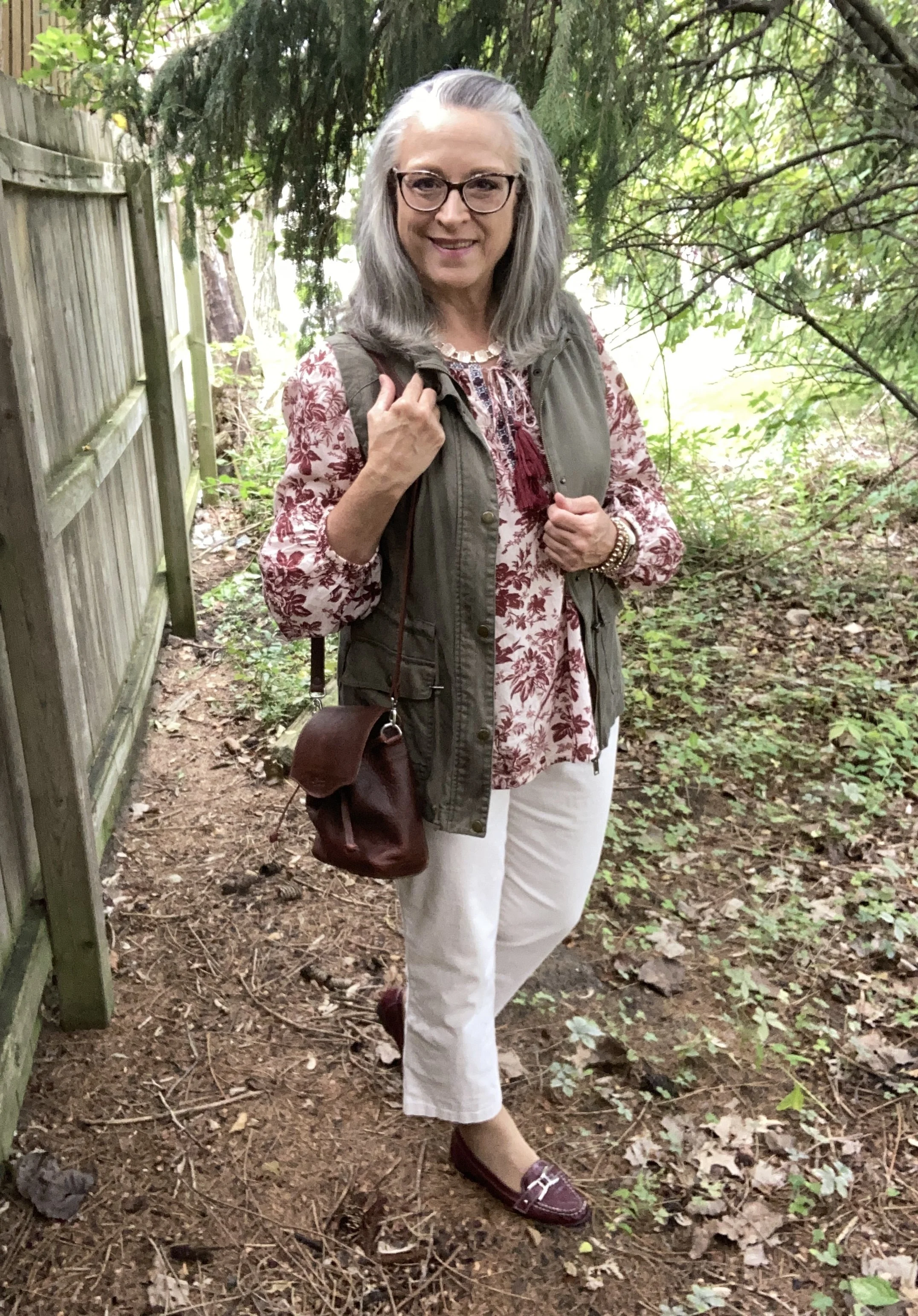
You will see that most of the looks in this series try to incorporate transitional pieces. For those of us who live in the midwest, the transition from summer to fall often means cool mornings and evenings with the heat returning in the late morning and throughout the afternoon. We have to be able to layer light weight fabrics in a way that accounts for the midday heat and the still working air conditioners. In this first look I layer a light weight utility vest over a light weight peasant top, along with lighter weight crop pants.

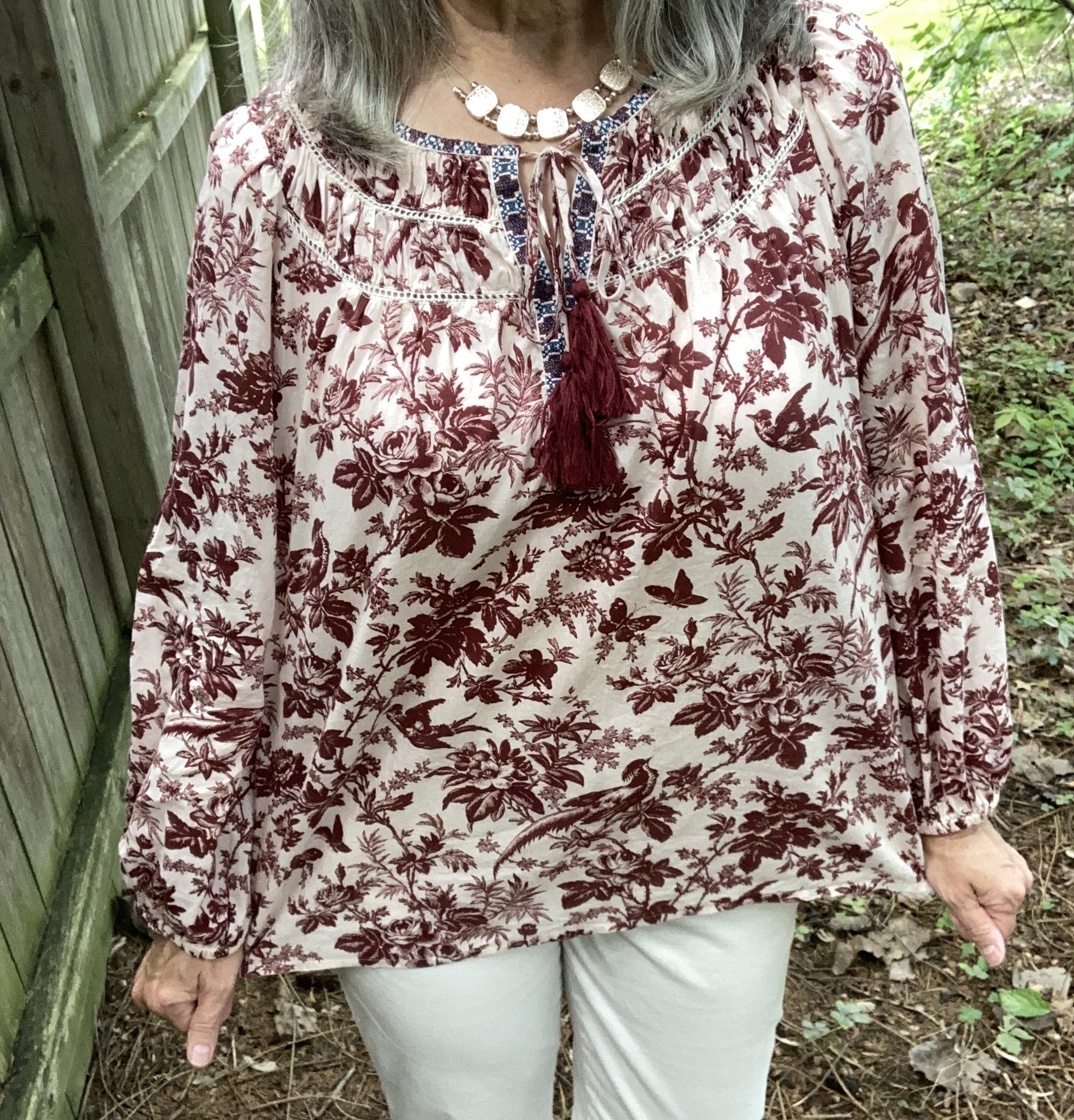
Red Mahogany is dark, rich burgundy color and we often see this color come back in the fall and winter seasons. I chose a peasant top that I discovered last spring at a thrift store. I love the pretty floral and bird pattern, the embroidery around the neckline and the shirring along the neck and shoulders. It definitely has a feminine and Boho vibe which is a fun alternative to my practical tees, sweatshirts and flannels for cooler weather. This is a brand called Sundance. Here is a pretty solid colored piece from Lucky Brand; a floral version from Natural Life; and a Croft & Barrow version from Kohl’s.

Interesting Tidbit: Robert Redford founded the original Sundance clothing company in 1969 in Utah with a paper catalogue coming out in 1989. Pieces were originally crafted with interesting prints and Bohemian vibes. In 2004, Redford sold the company in 2004, and in 2025 the company closed. There is a current Sundance Boutique based in Cape Cod that features skirts and dresses with a coastal influence.

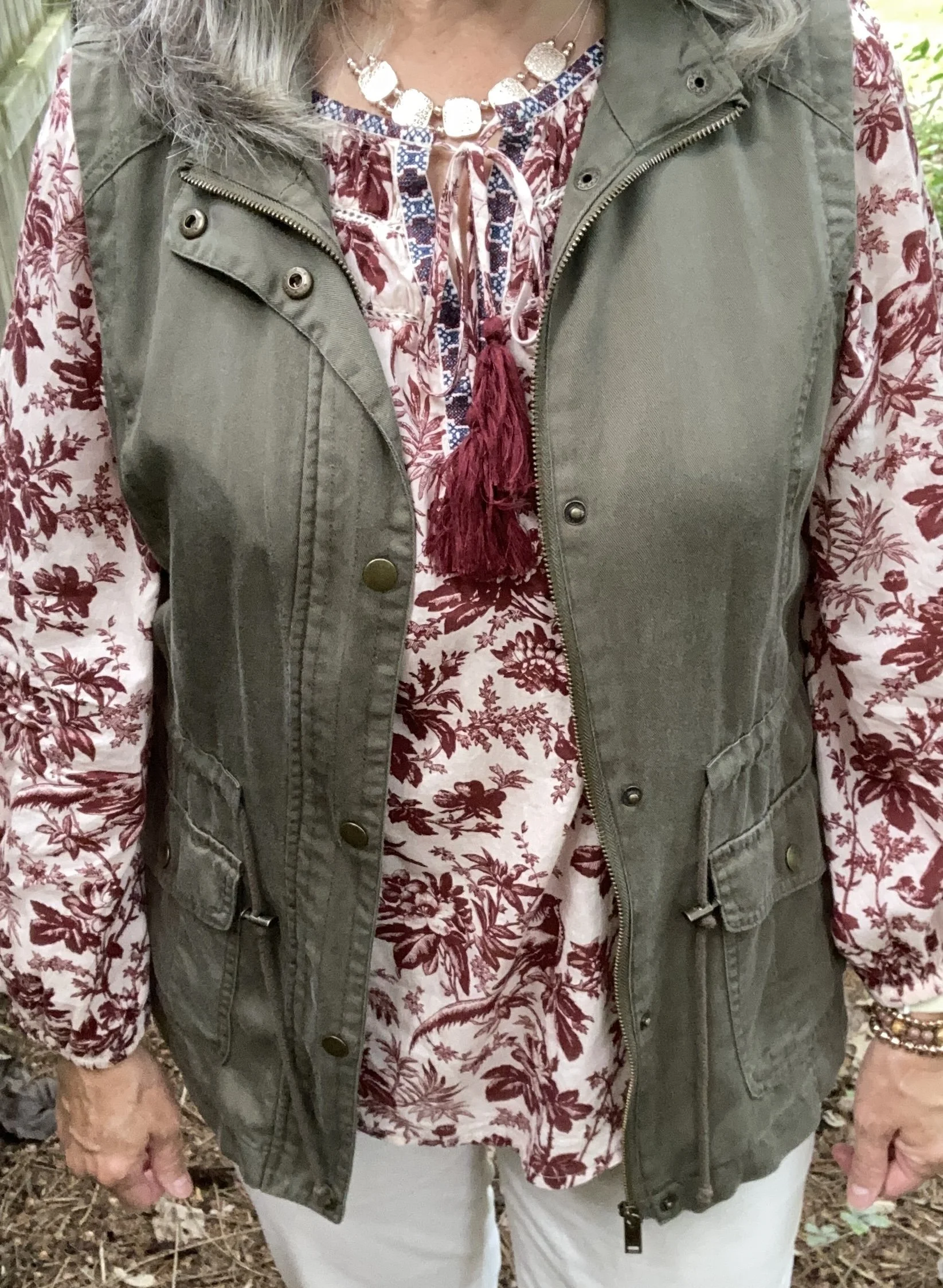
Since the top is rather voluminous, I opted for a vest rather than a belt or tuck. I have had this Mudd piece for a number of years. I used to shop more frequently at Kohl’s in the past, but not as much these days. The changes they have made, the increase in prices and more recently their involvement in political issues has me less likely to shop there. I have no problem with others shopping there and I will still occasionally check out their sales for Christmas or birthdays, but I personally would rather shop at a second hand store.

This piece falls easily into the Burnt Olive color. In my opinion olive can have a yellow undertone or a gray undertone. Burnt Olive seems to lean more towards the gray, and many of my olive pieces fall into this category. Here is one from Walmart, a shorter, insulated version from Duluth Trading, and a actual utility jacket from LL Bean.

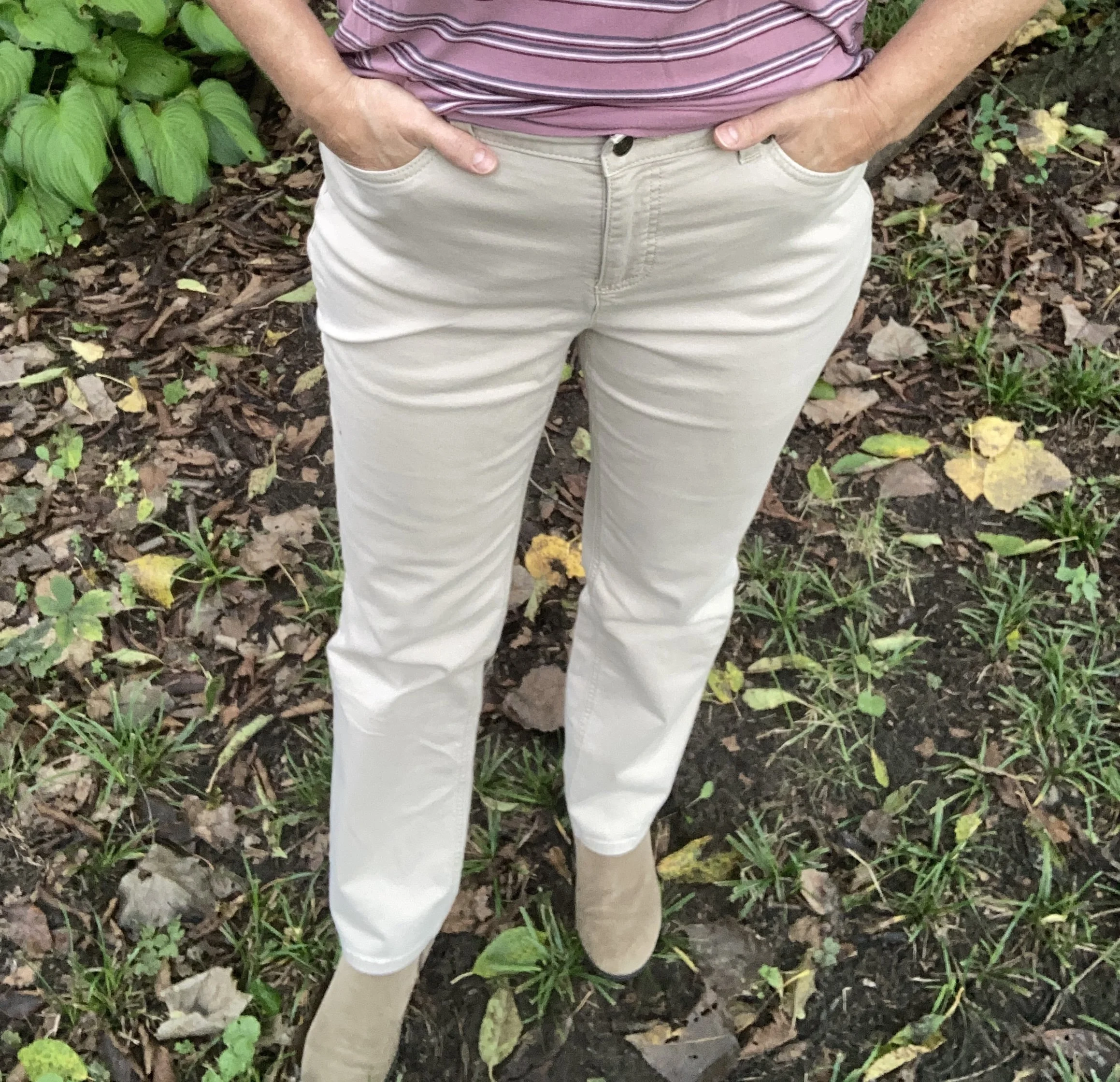
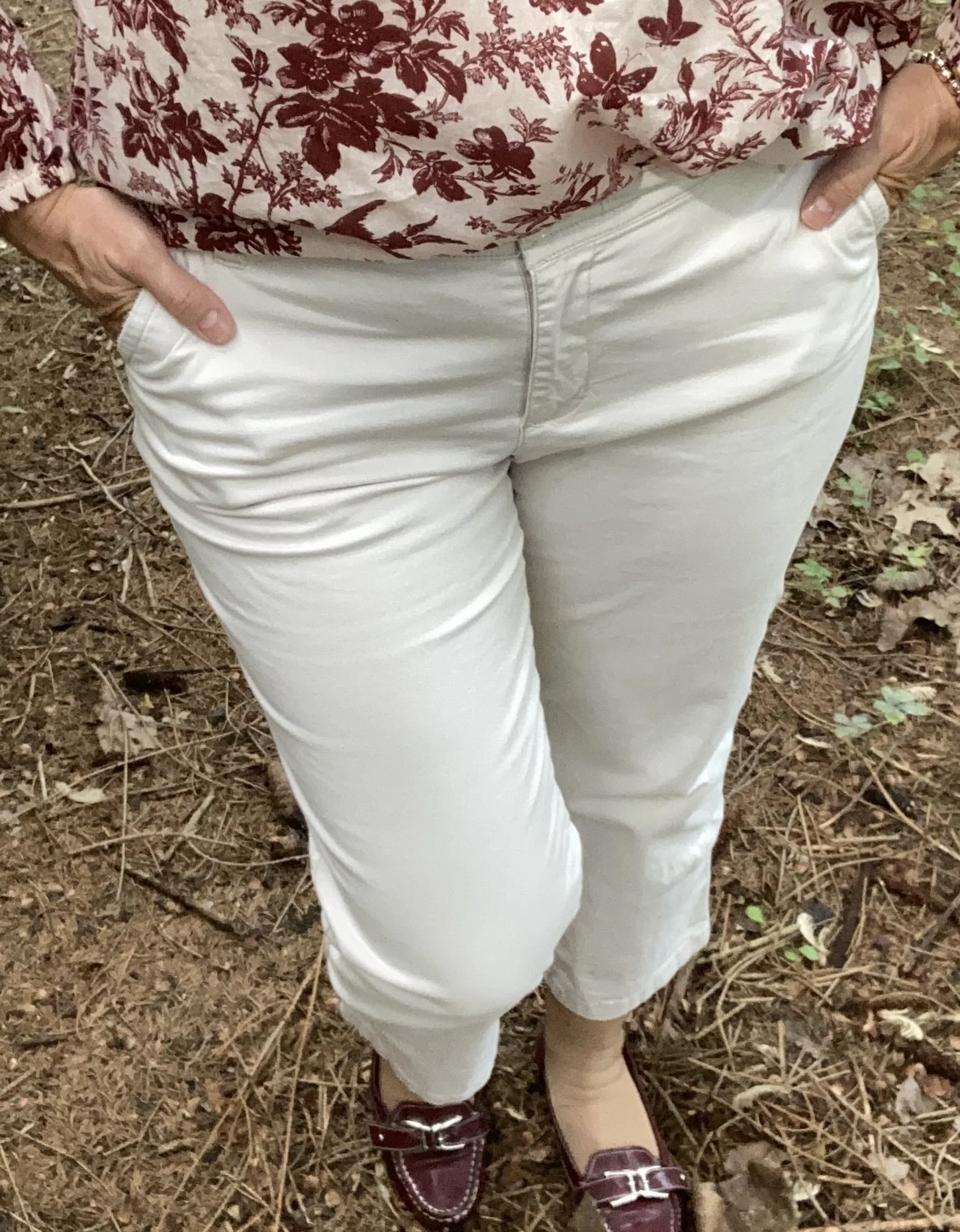
I decided to use my copped pants for the Pantone classic color called Egret. I have had these thrifted St. John’s Bay pants for a number of years. They get pulled out every summer, and will continue to be worn with frequency as long as I can still fit into them. Ha, ha. This looks like a nice pair from Coldwater Creek; a barrel shaped pair from Land’s End, and a capri length pair from Kohl’s.

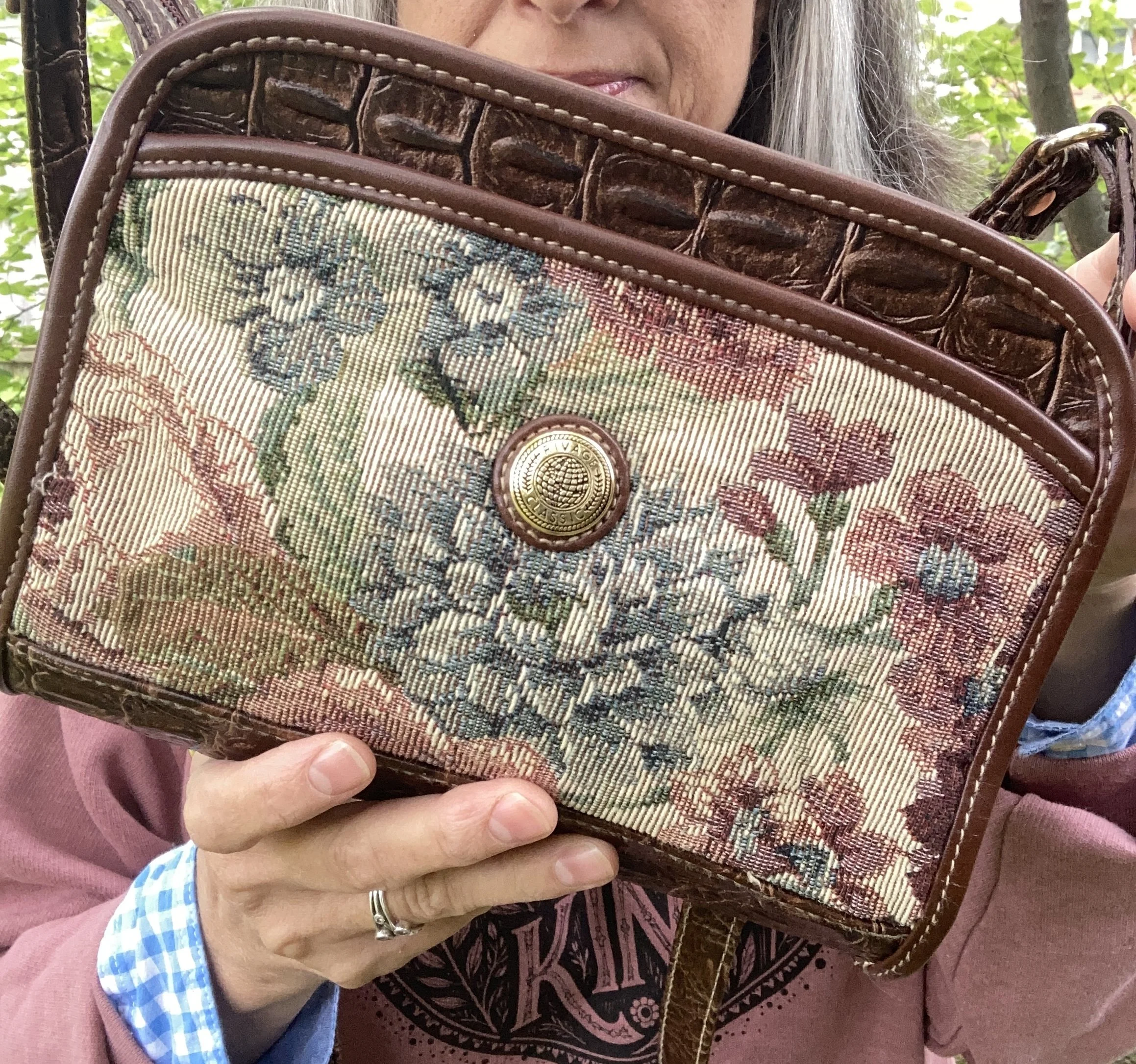
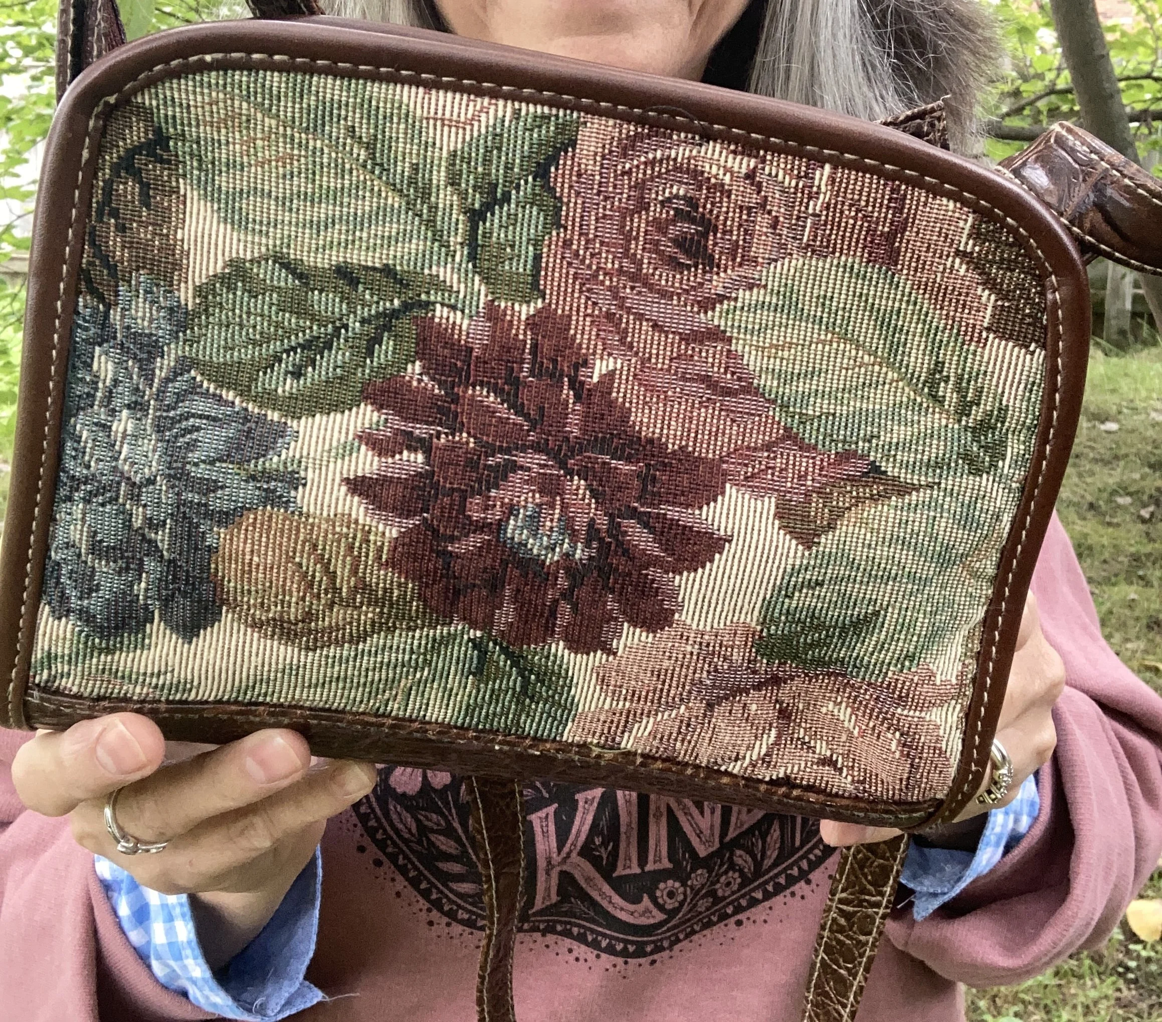
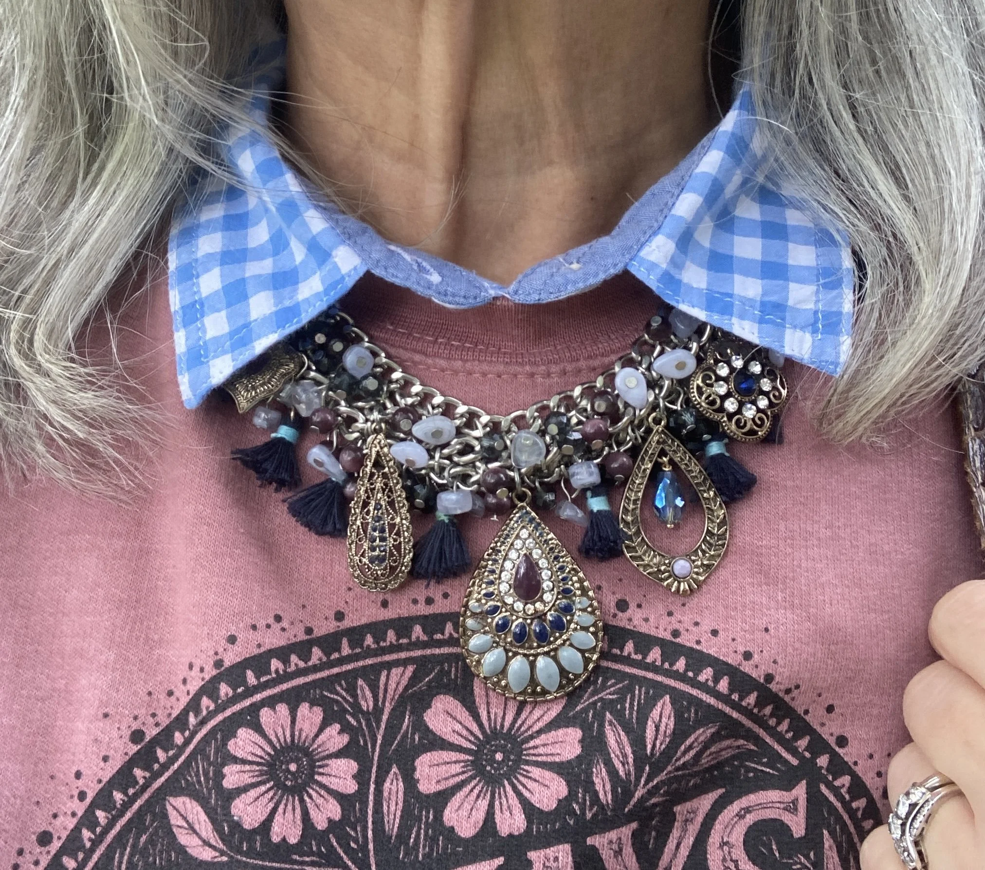
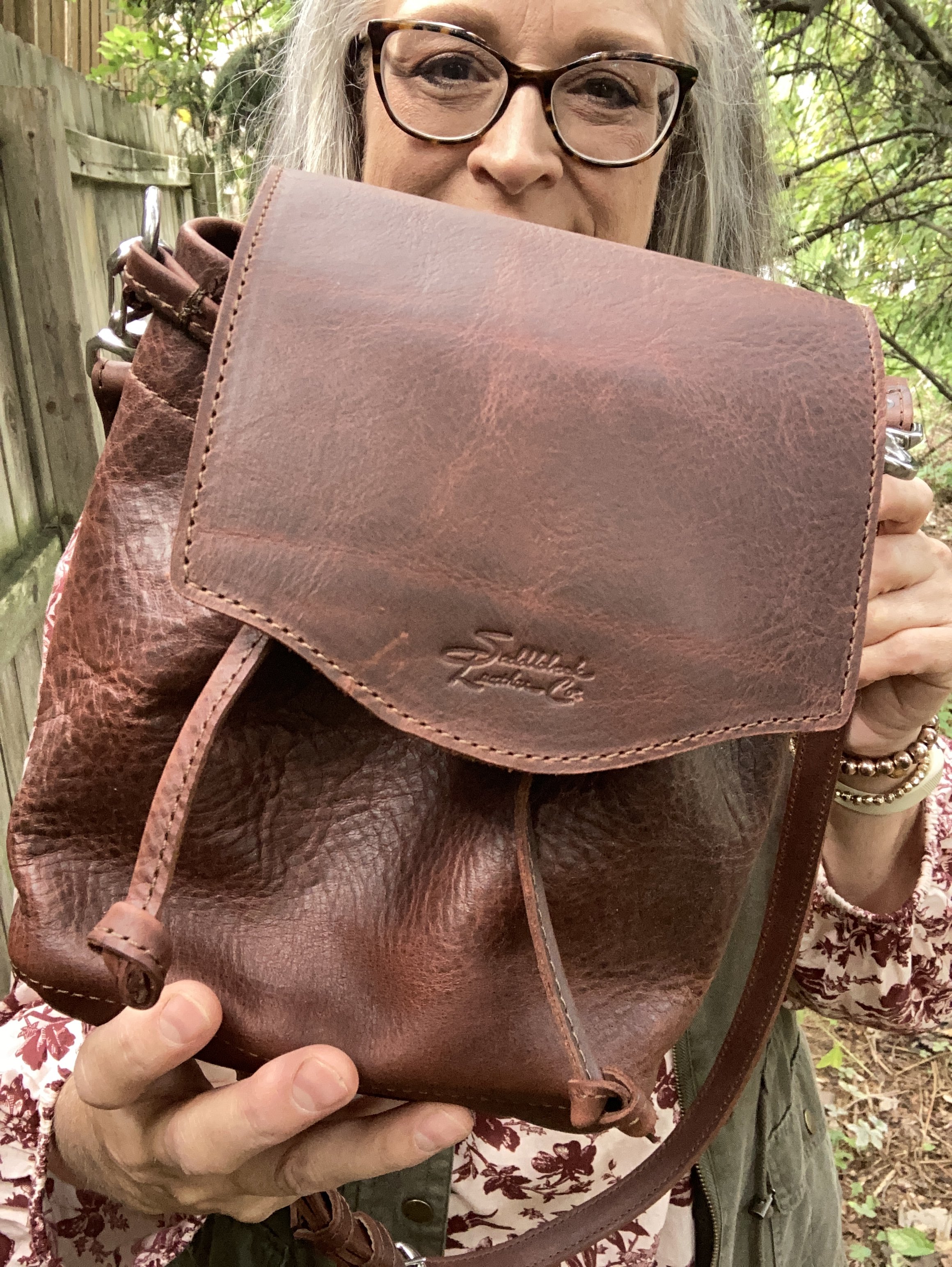
For my accessories I chose gold for my necklace and a sparkly bracelet, both of which I forgot to take pictures of. My bag was a gifted piece from a company called Saddleback Leather, and you can see my review for that here. It is a fun little piece if you want something easy to carry that doesn’t take up much space; perfect for a wallet and few odds and ends.

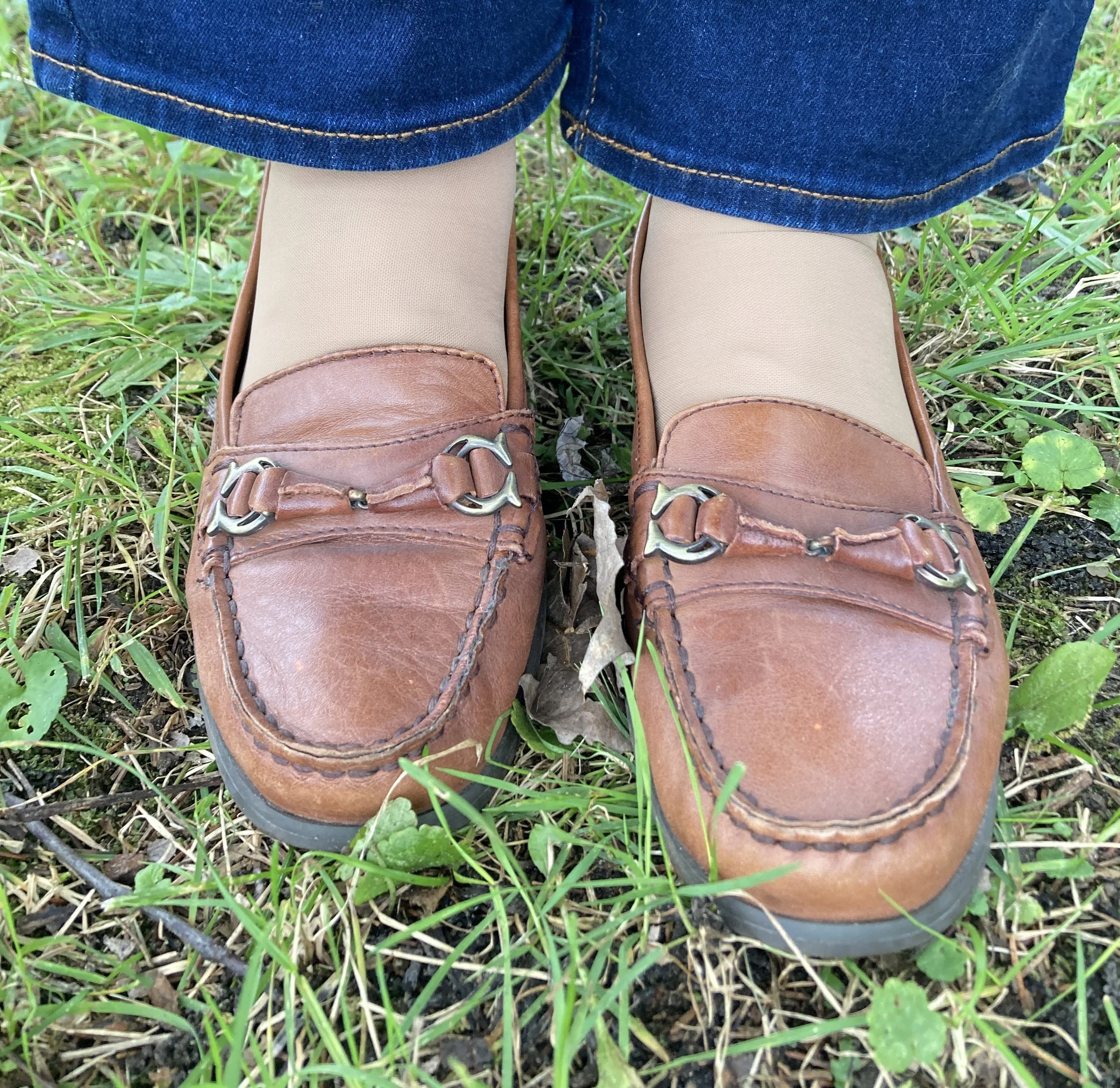
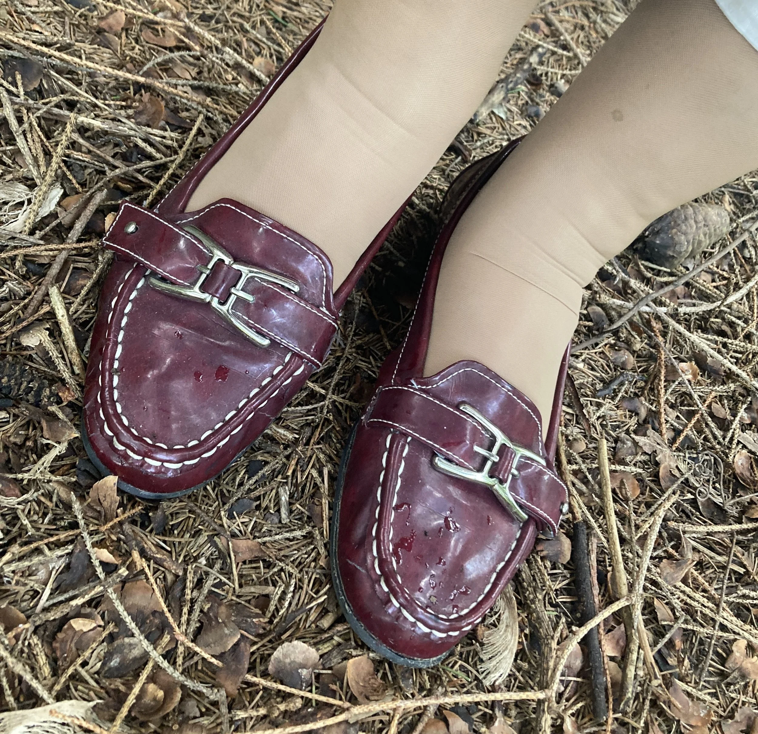
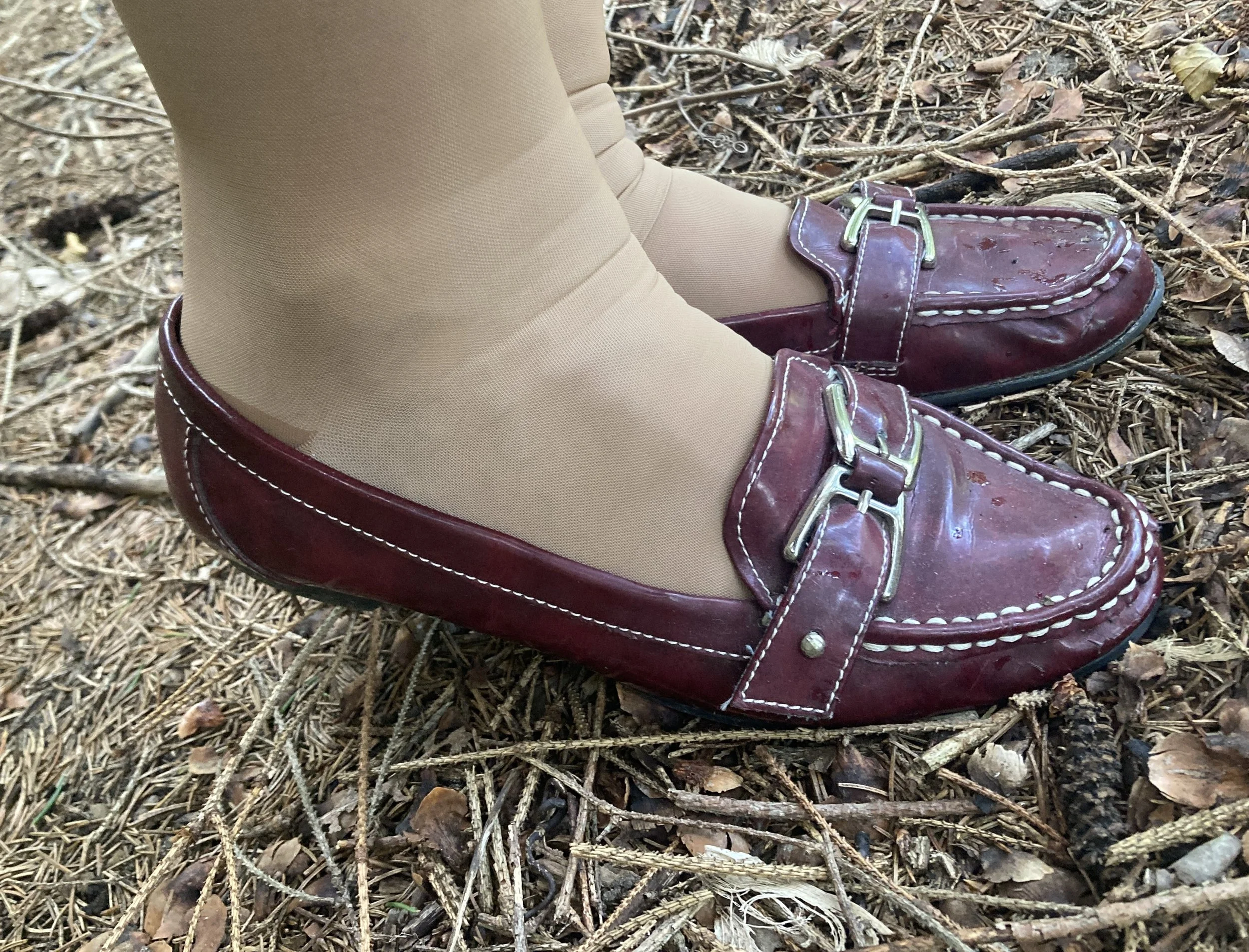
My Natural Soul loafers are also a second hand find from quite a few years ago. Sorry for my wrinkly elephant ankles! Wearing compression hose in the summer is not any fun, but it is better than seeing my pasty, purple and blue, bulgy veins. Ha, ha. Here are a page of options from DSW.

What do you think of these colors? Do you have any of these in your closet? It’s that time of year again to start wearing your fall colors. Isn’t it crazy how fast time flies by. Leave me a comment or two. I love to hear from you.

I hope you are having a great week. Be sure to stop by on Thursday for a new series on my Faith page. Hugs!