Spring Trends: A Look Back at What's Current
You might be reading my title and thinking, how does that work? How can we look back and see what is currently trending? The simple truth is, fashion, like so many things, runs in cycles. The fashion gurus would like you to believe that what is currently trending is new, and has never been done before. While it may look different and the models may no longer be normal women who wear a size 10, 12 or 14, or may not even be women at all, the reality is, as Solomon said, “There is nothing new under the sun.” (Ecclesiastes 1:9) Drawing on that idea, I thought it would be fun to show you a few of the “current” Spring 2025 trends by using outfits that I have worn on the blog or on my Instagram account.
1 - Pistachio and Petal Pink - I already showed you pistachio green and petal pink last week. You can see that outfit here.
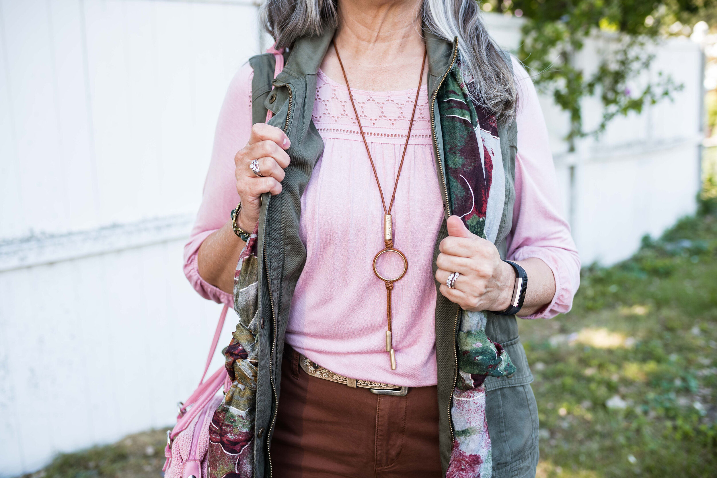
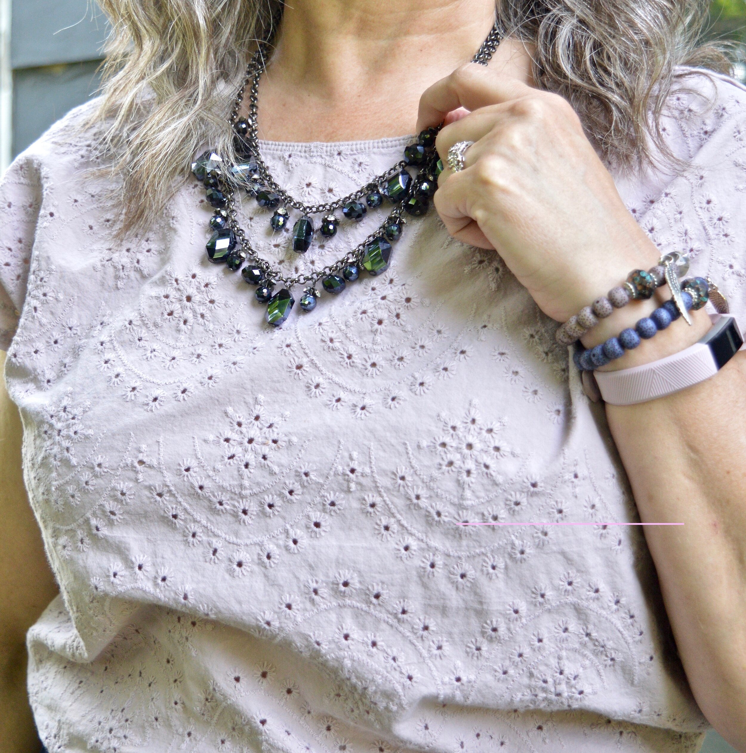
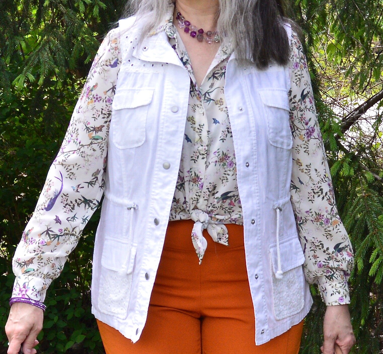
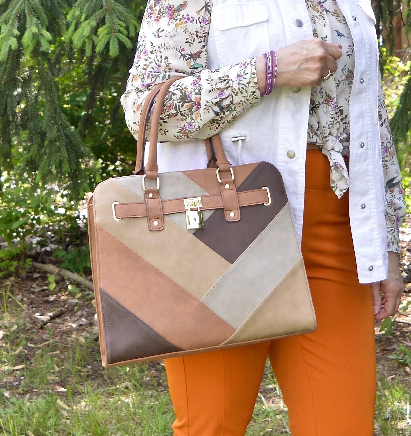
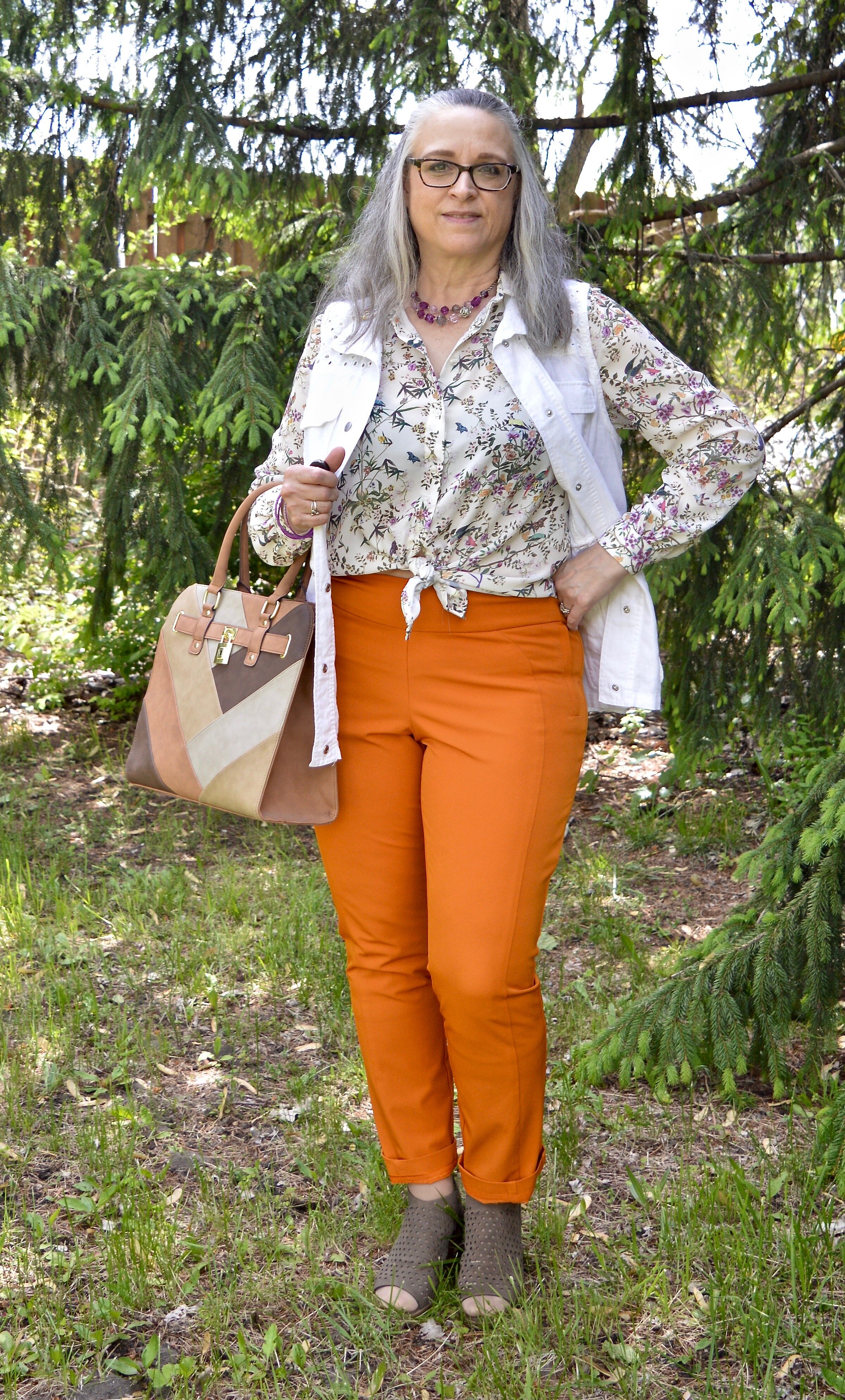
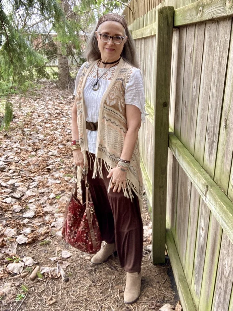
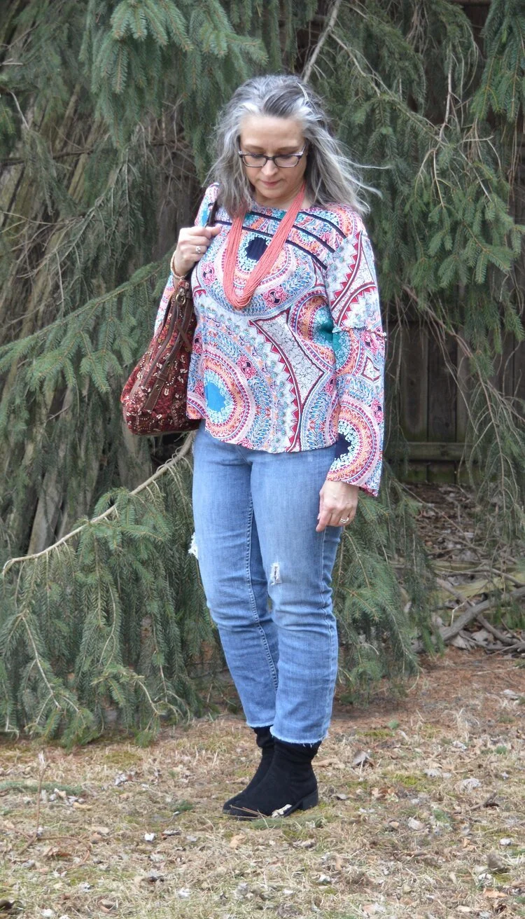
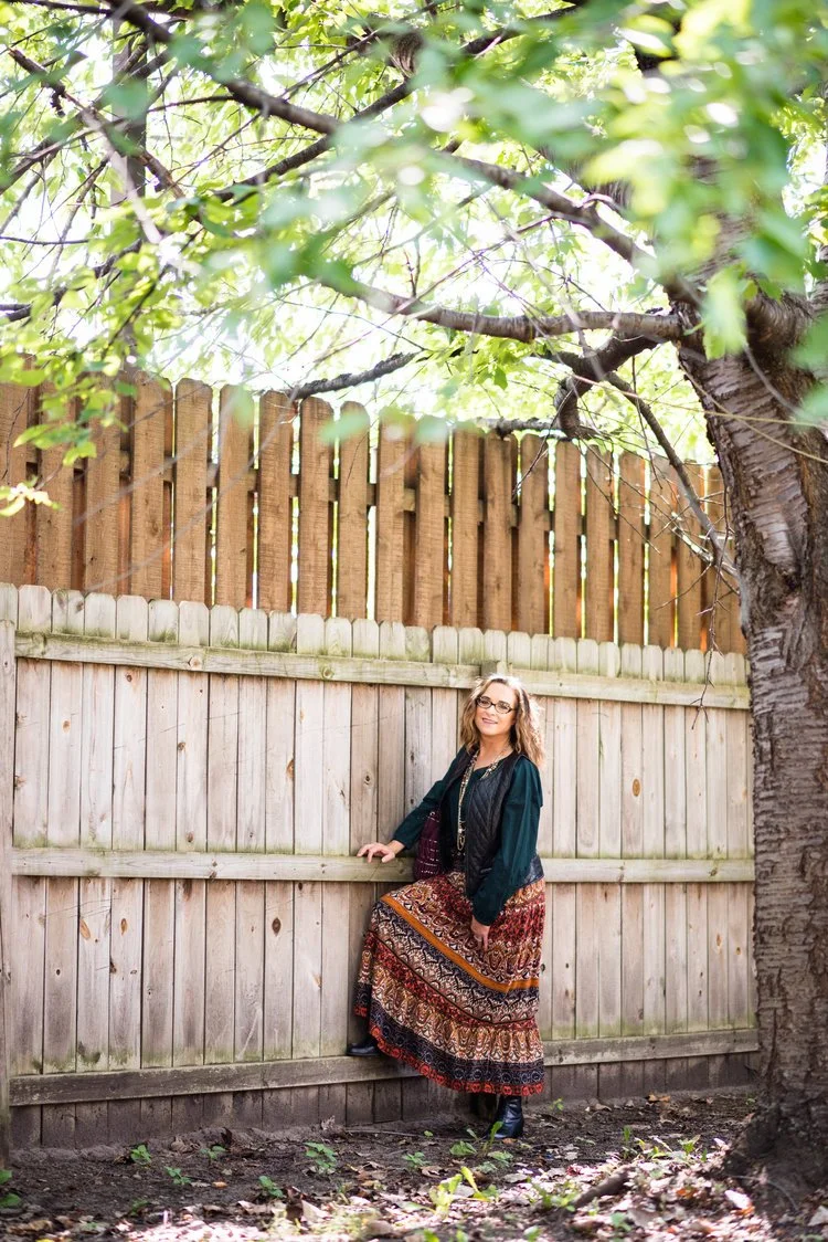
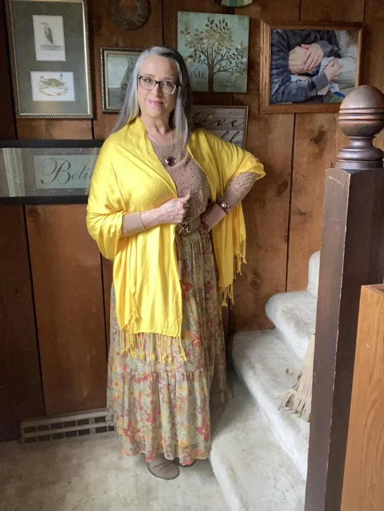
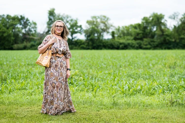
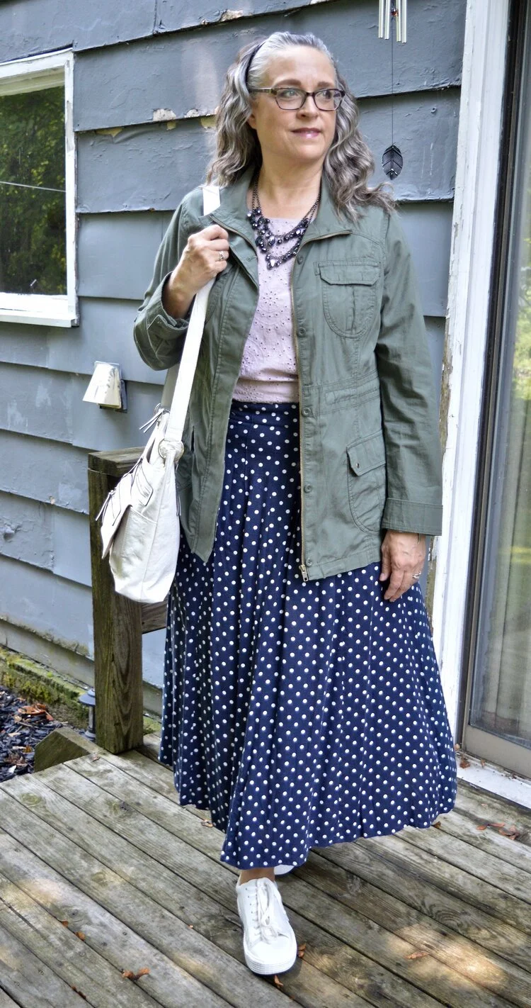
2 - Bohemian vibes - Once again we see things like tiered skirts and dresses, delicate florals, lace, fringe, and flowy fabrics, which not only embrace the 70’s boho vibe, but romance as well.
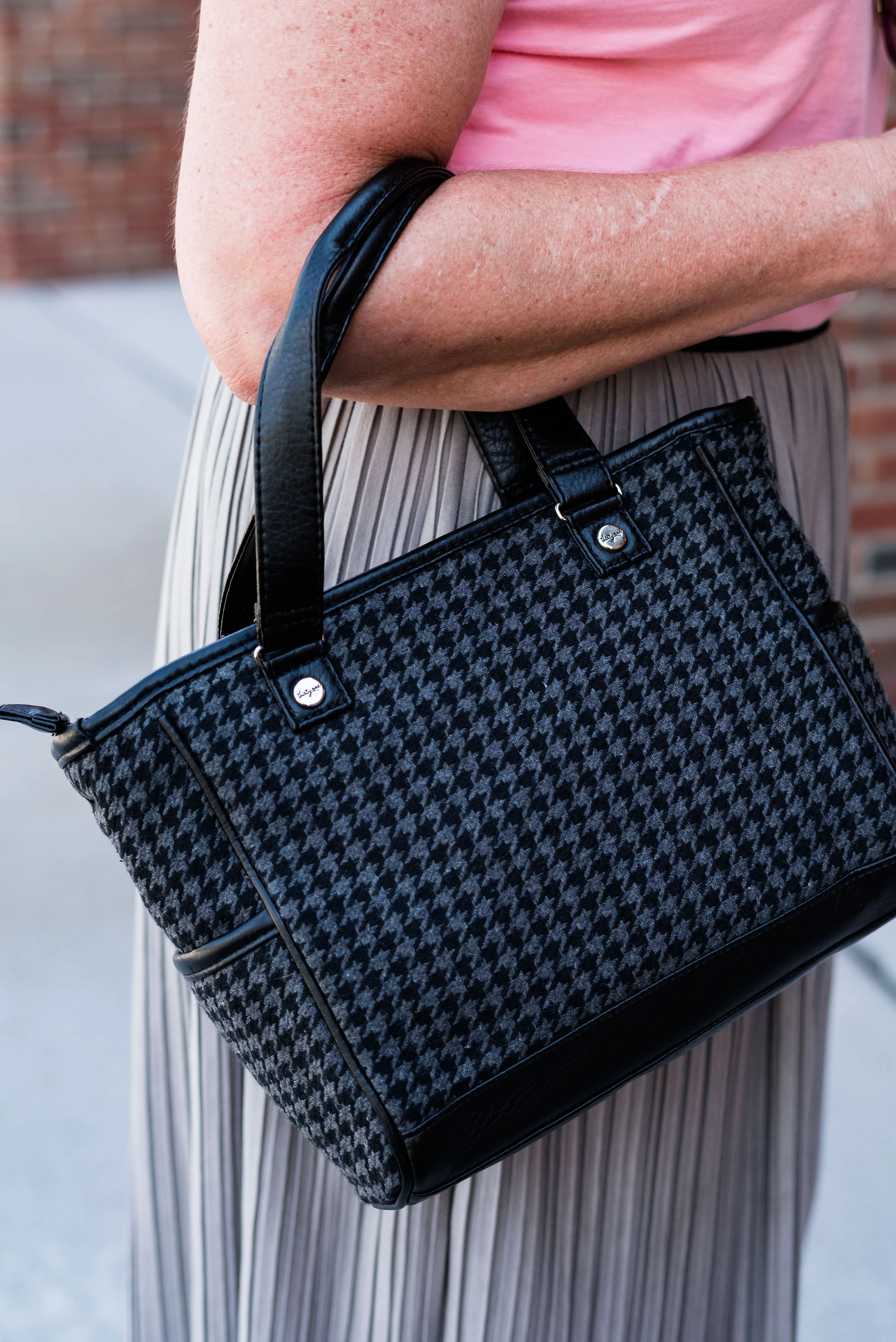
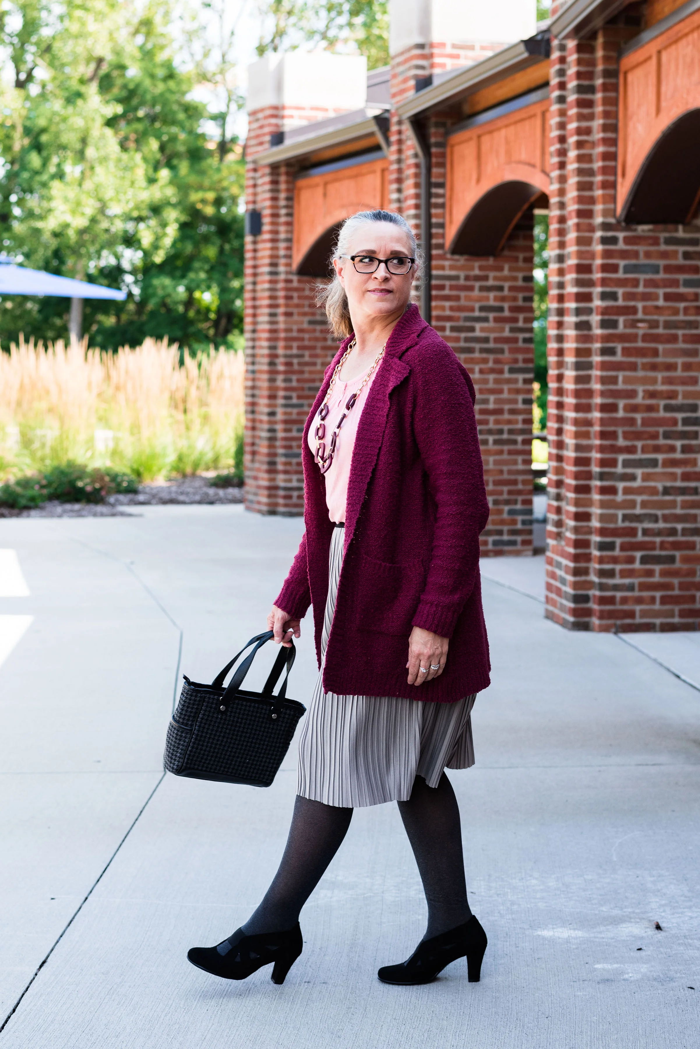
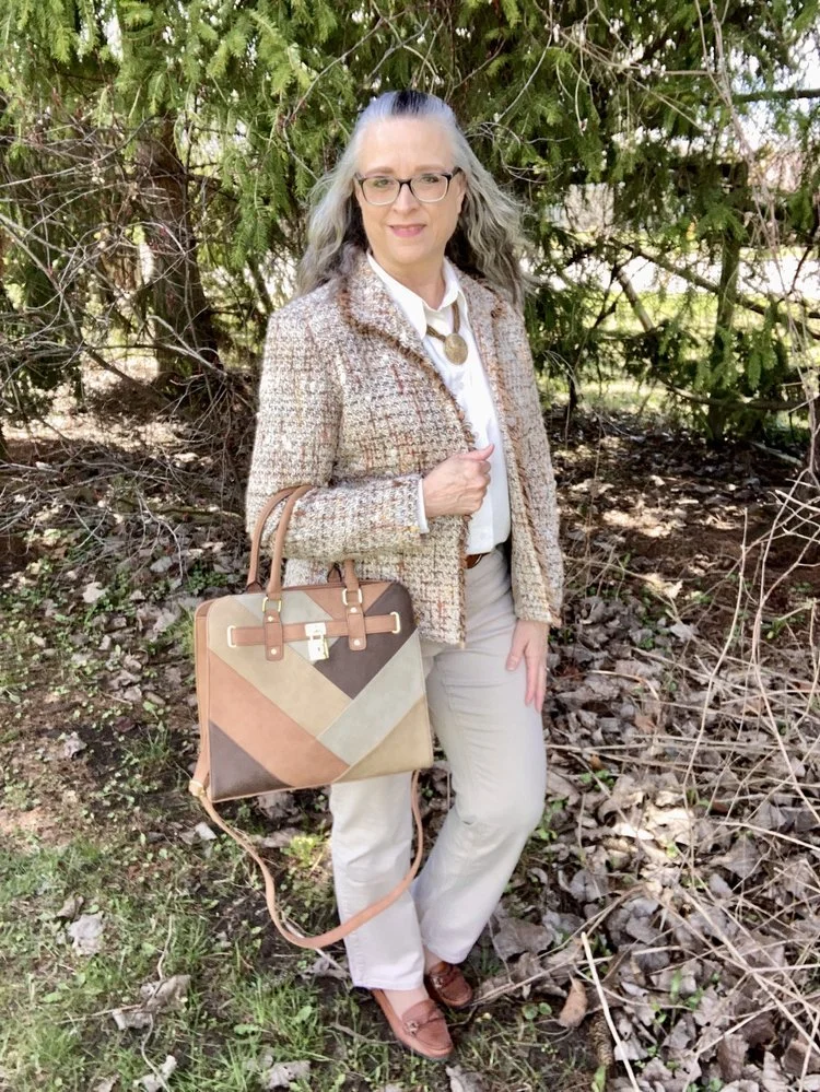
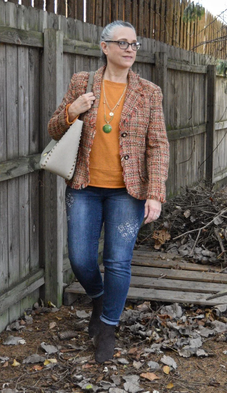
3 - Old School Elegance - This trend encompasses fabrics like tweed, traditional button down knit cardigans, pearl stud earrings, and pleated, tapered, high waisted trousers. However, it allows including your slim leg jeans or even a denim pencil skirt for a slightly edgier vibe.

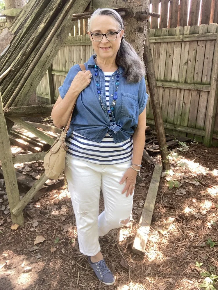
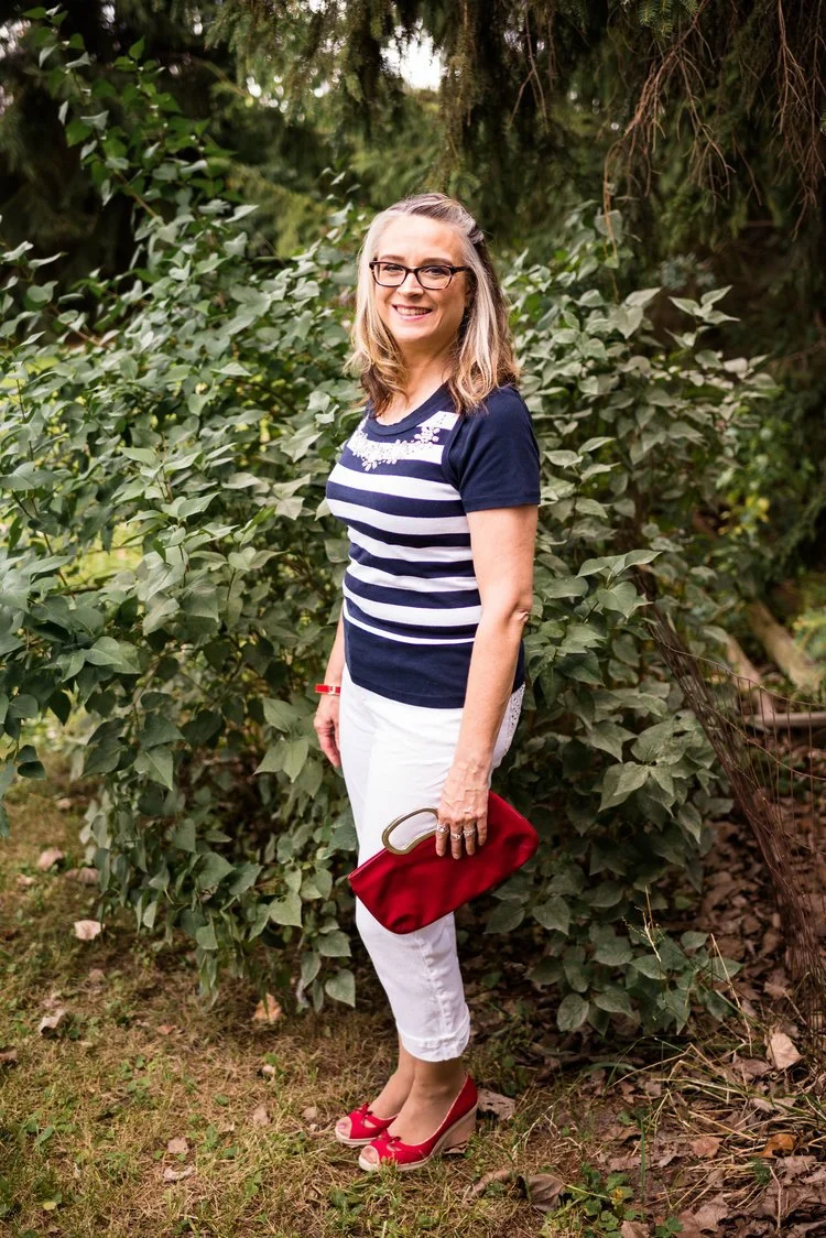
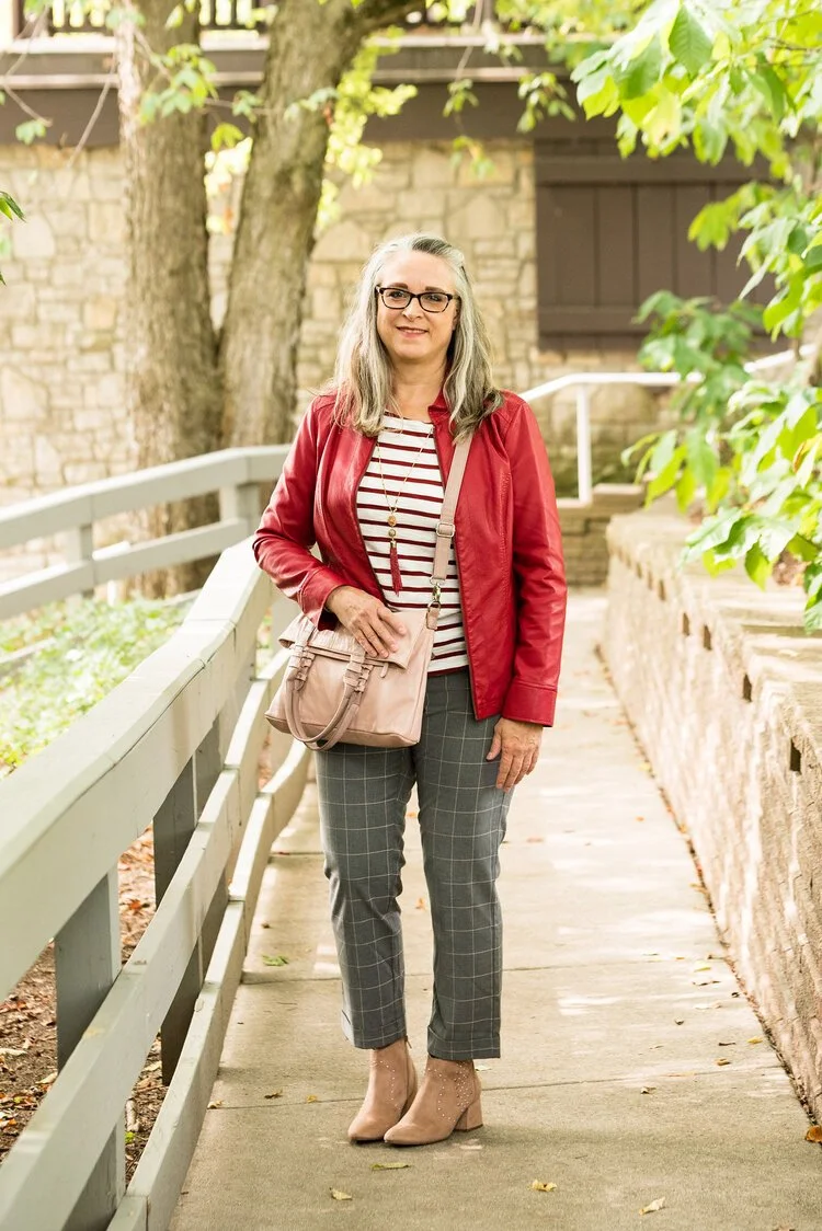
4 - Nautical Vibes - There is nothing that says warmer weather than the look of sailor stripes and the color pairings of navy, red and white. I think adding a navy and white or red and white striped top to an outfit instantly gives it the feel of sandy beaches caressed by white foam waves.
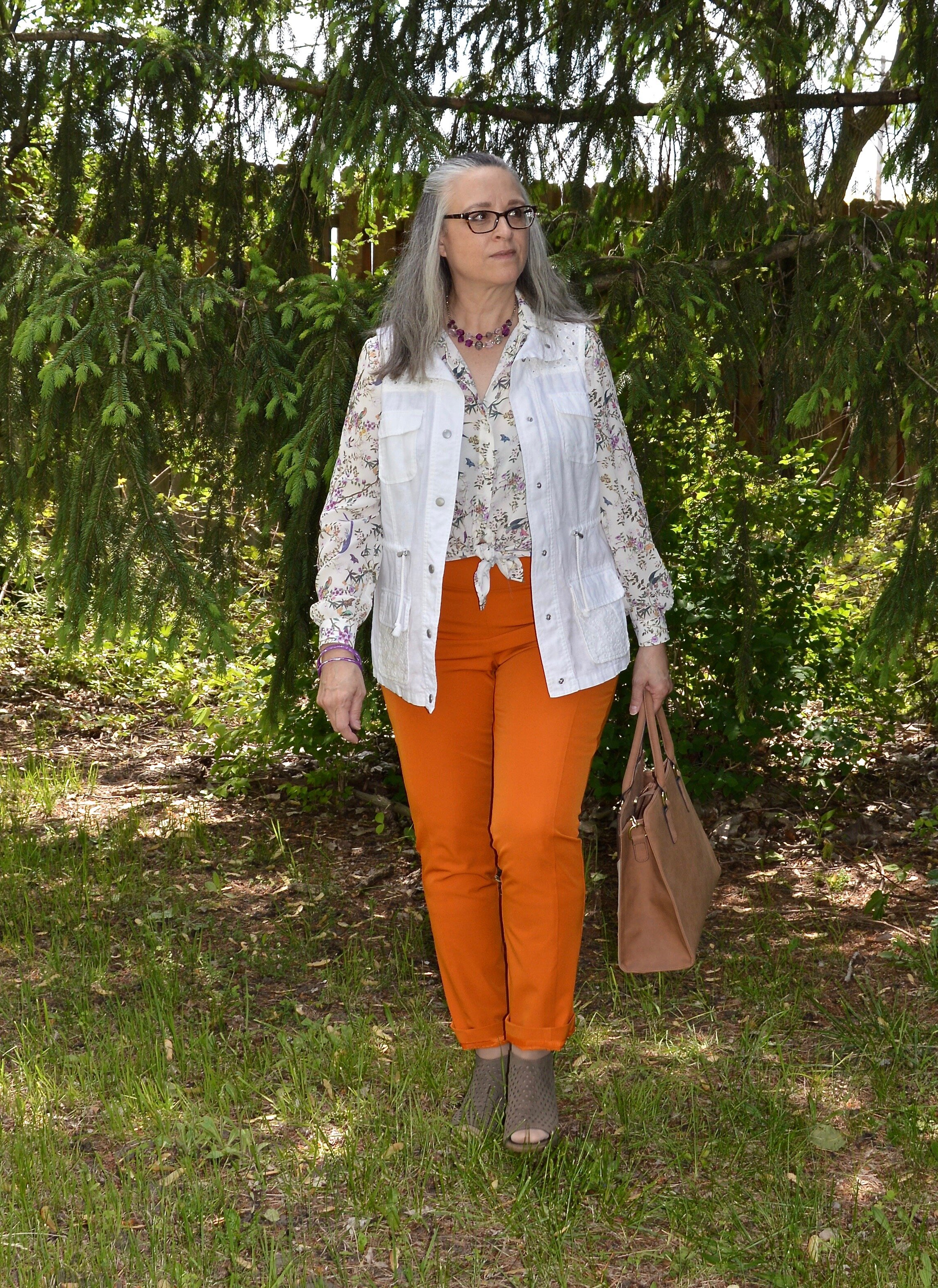
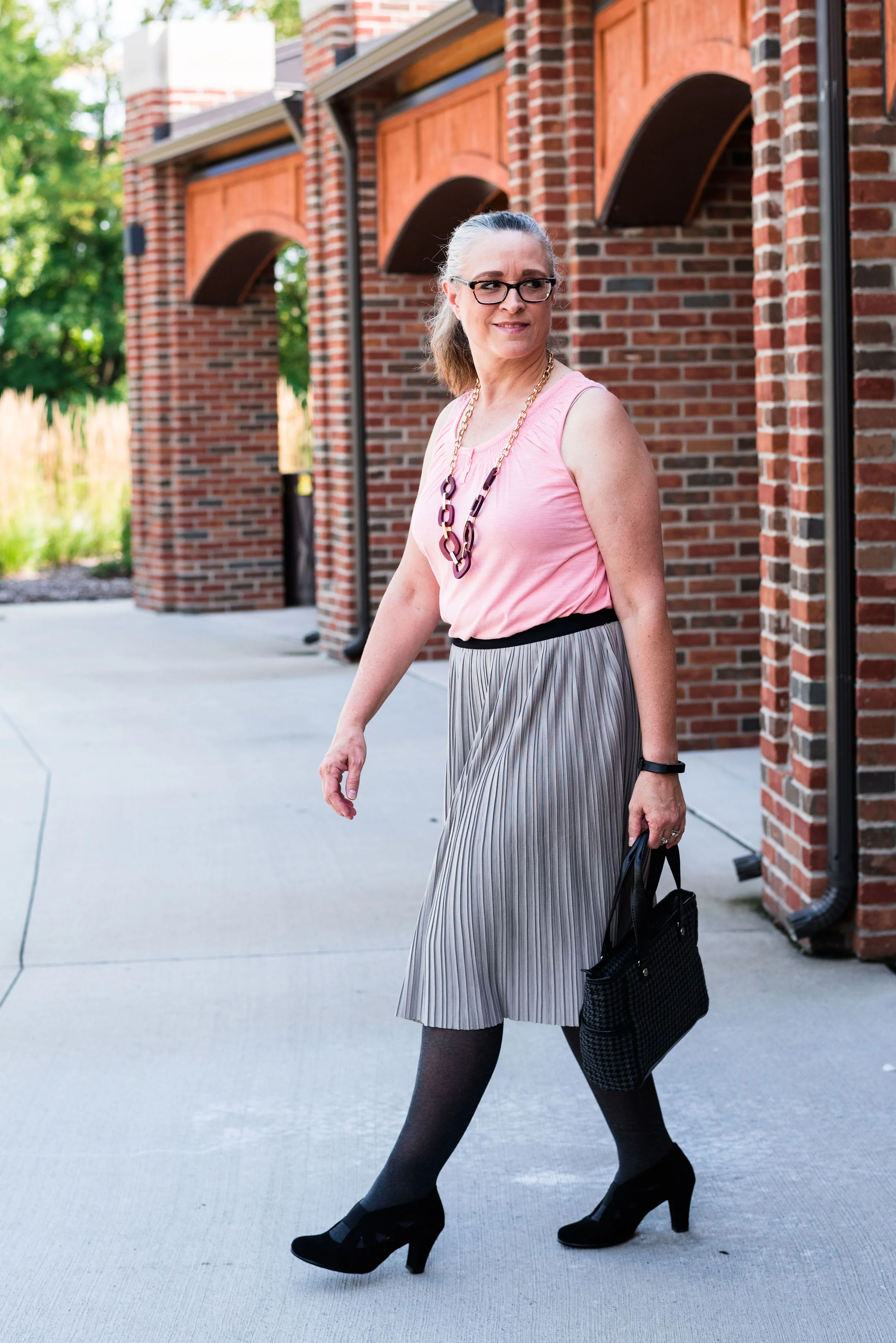
5 - Work Wear Redo - Work wear has become increasingly relaxed, especially since the pandemic and so many working from home. Even with the migration back to the office work wear has taken on a more casual vibe, making it easy to transition from the office to dinner out, to the grandkids’ ball games. These are a few outfits I thought might fit into this category. Pieces included in this trend include oversized, roomy jackets and blazers belted at the waist; pleated skirts instead of pencil shape, trench coats, and straight leg trousers.

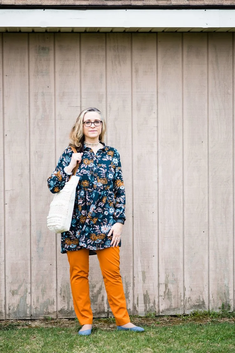
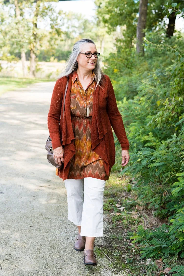
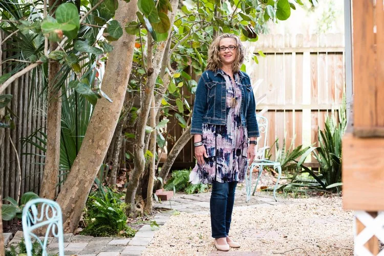
I will also include in this category wearing pants with a dress. This seems to be right on trend and I am hoping to try this out myself again soon. Here are some previous looks where I did the trendy thing, except it wasn’t trendy at the time. Ha, ha.
I have included a few shopping links throughout to give you ideas to create your own trendy wardrobe for spring. These are affiliate links. I provide them to give you inspiration and options if you want to purchase something. If you purchase an item through my links, I get a few pennies. I appreciate all your support.
I hope you enjoyed this look back at what is currently trending for Spring 2025. :)