Color Play - Building an Outfit Around Jewelry

Since my Color Play column can encompass all aspects of color, I thought it would be fun to show you how I build an outfit around a colorful piece of jewelry. Let’s face it, not all of us are into fine jewelry. Yes, I do have a few silver and gold items that my spouse gave me over the years, but those are mainly rings and a few chain necklaces. Most of my jewelry is costume jewelry that I have either found on clearance at regular retail stores like Kohl’s, JC Penney, or Maurice’s, or it is from a thrift store. The piece I will be using today was actually gifted to me by a friend.

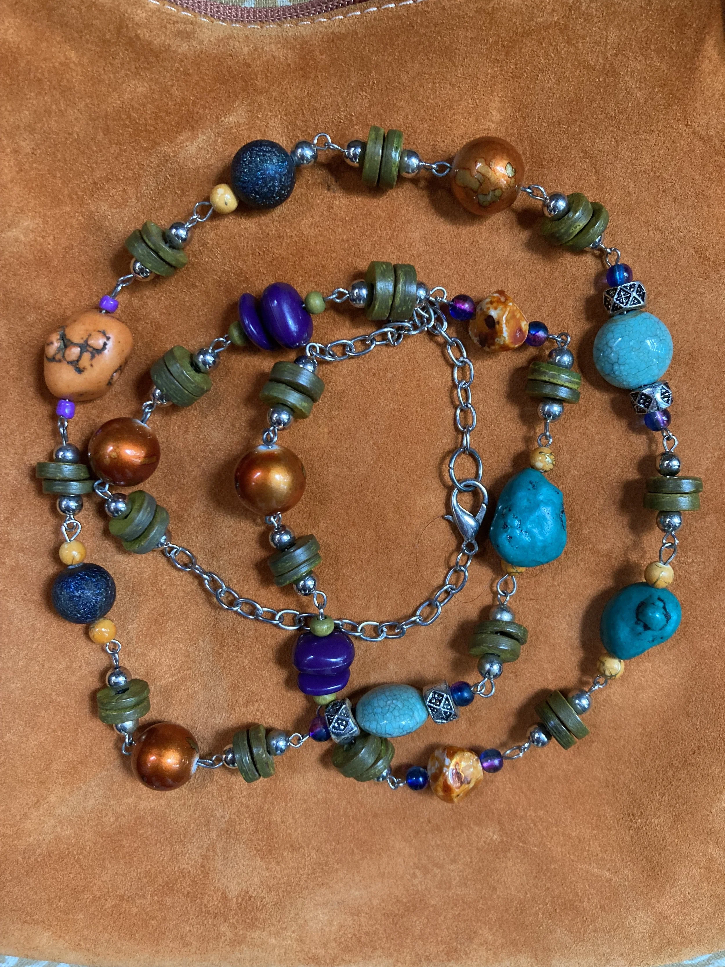
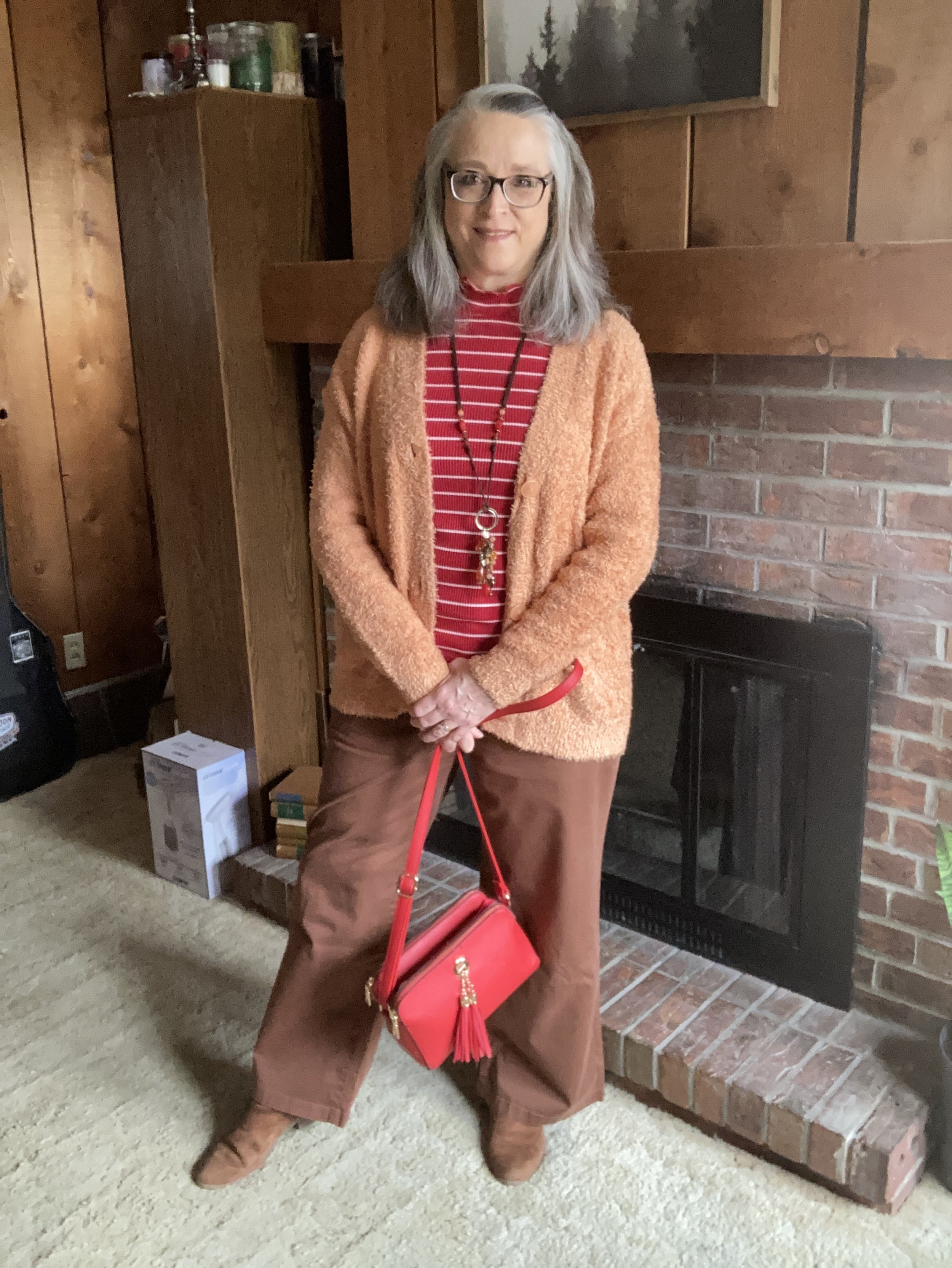
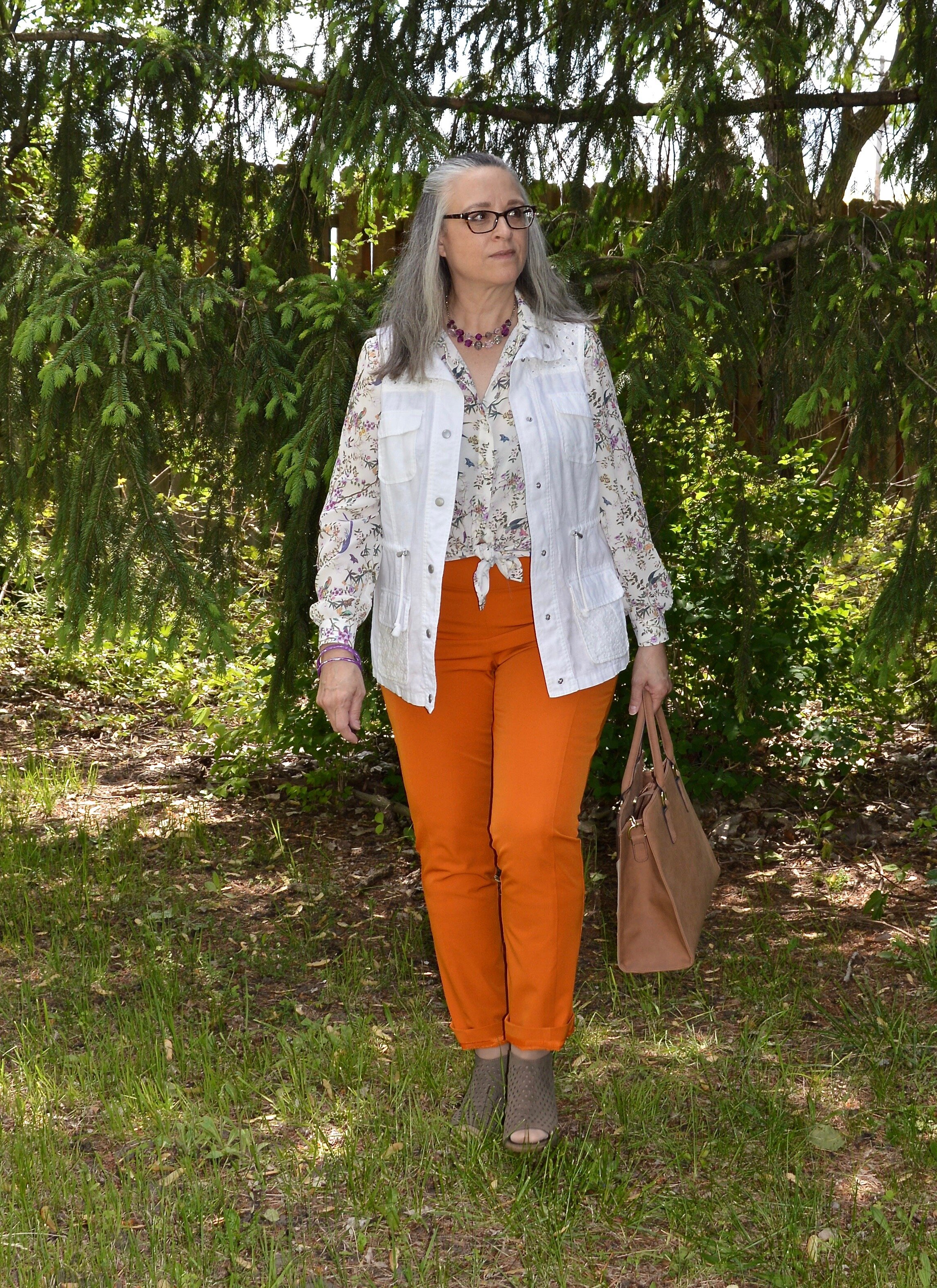
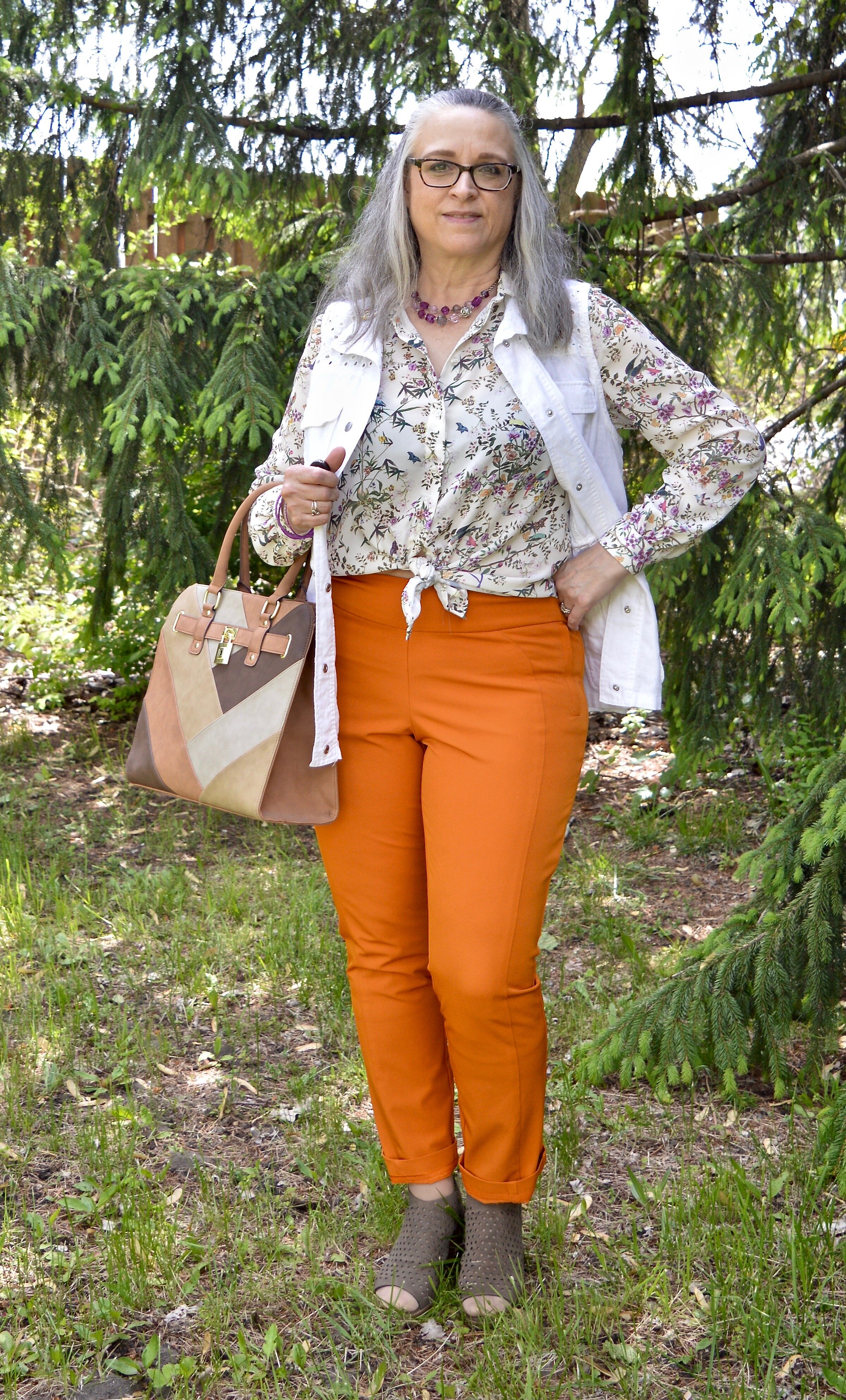
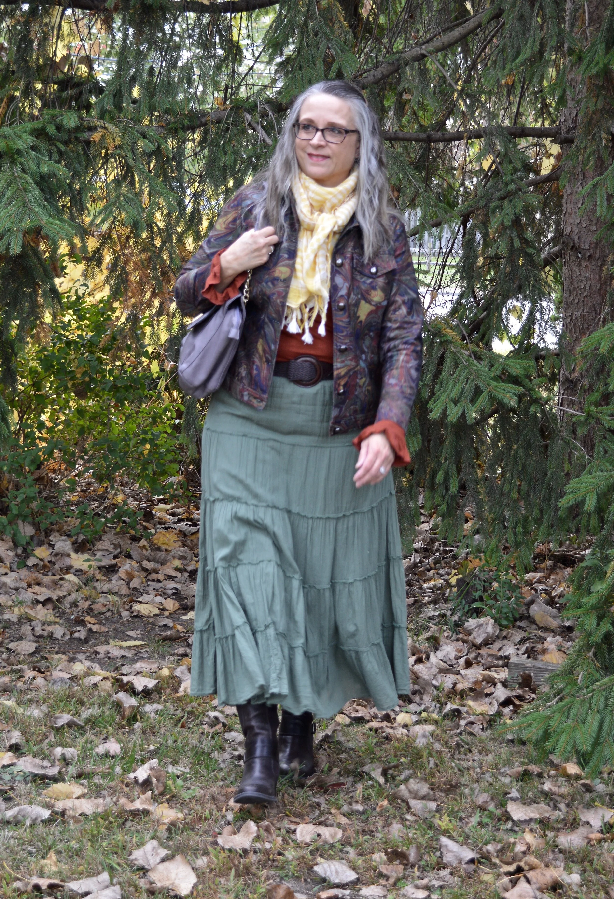
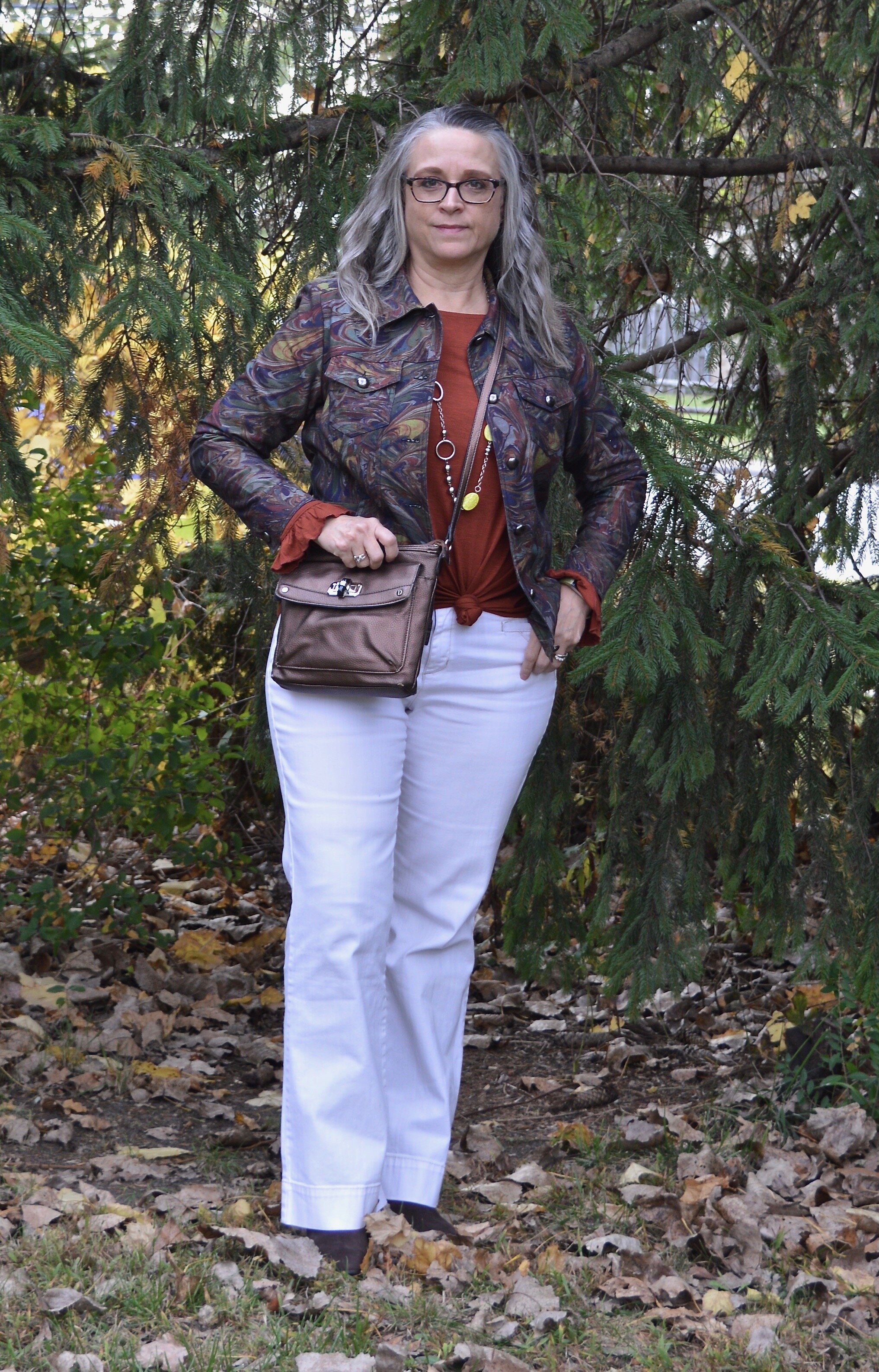
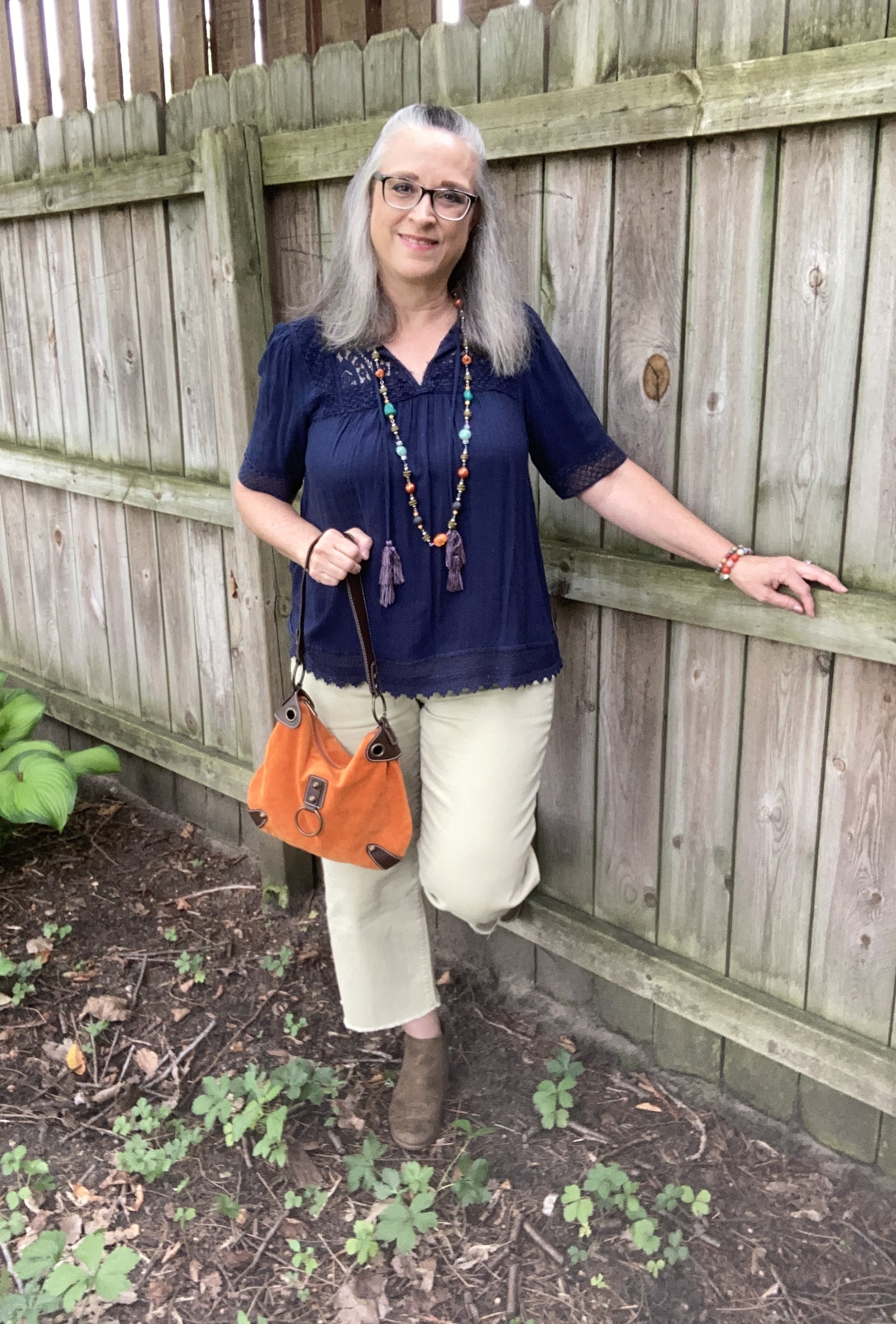
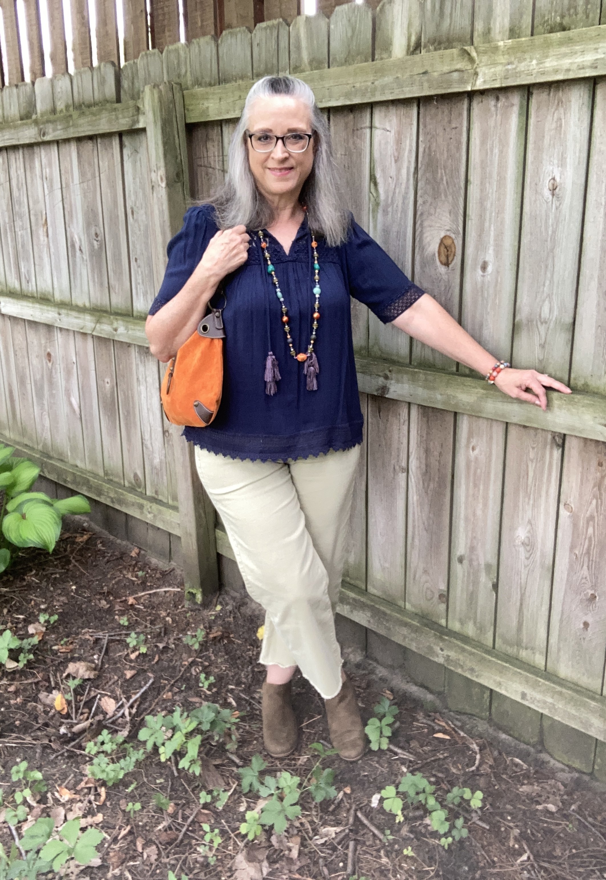
I love all the colors in this piece, but it does make it more difficult to combine with printed pieces, of which I have many. However, that makes it more challenging, which I love. Today, I decided to go for more of a color block style, and used solid colors for each of the pieces in my outfit. Take a look.

I am grooving on my wide leg cropped pants right now, so if they are not your cup of tea, then just swap them out for your own version of pants. You could also just as easily choose a skirt. Remember my job is to inspire you to look at your own clothes in a new and innovative way, to make them work for you and your style preferences.

Today’s style tips are going to cater to styling an outfit around a piece of jewelry.

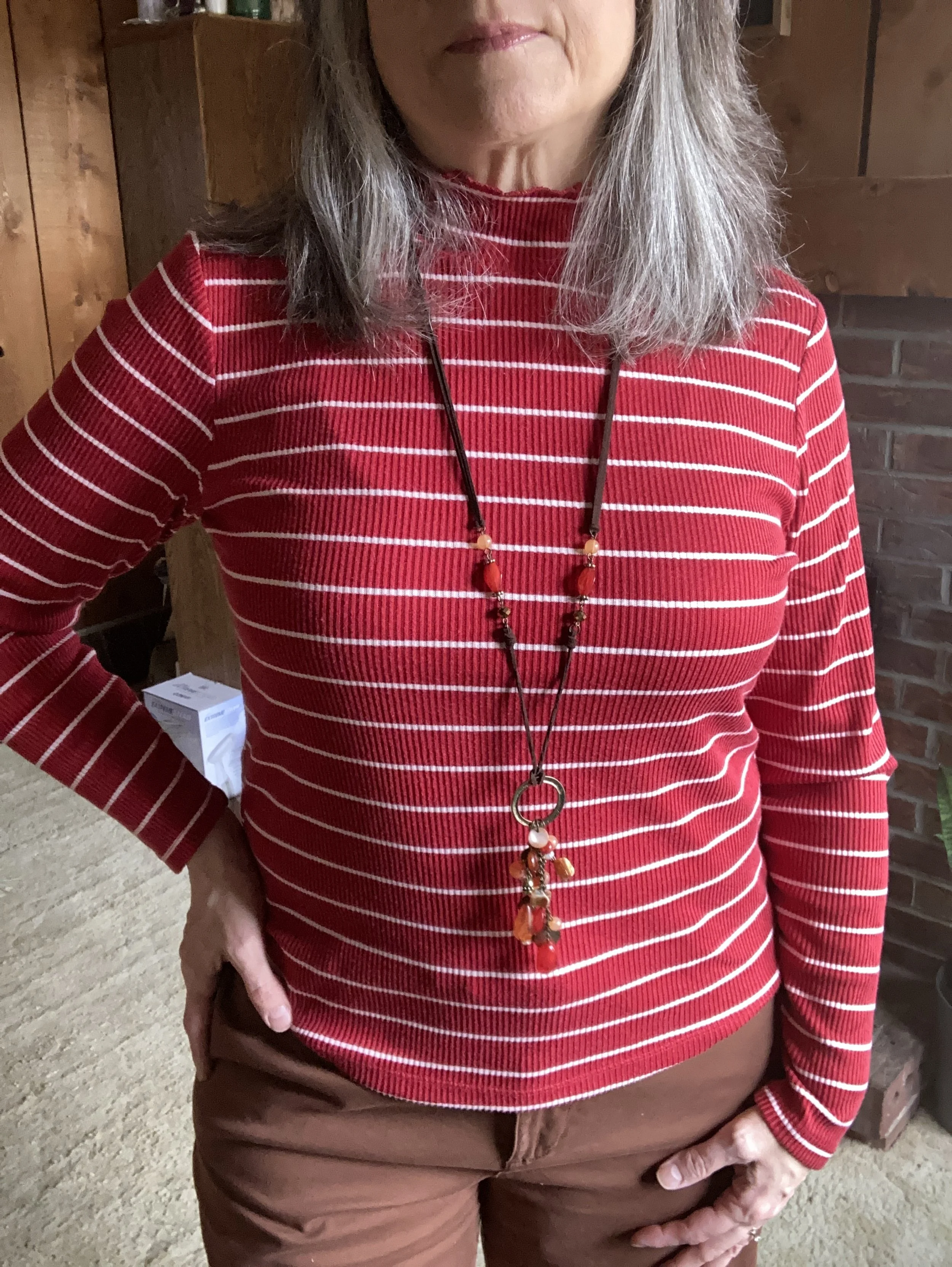
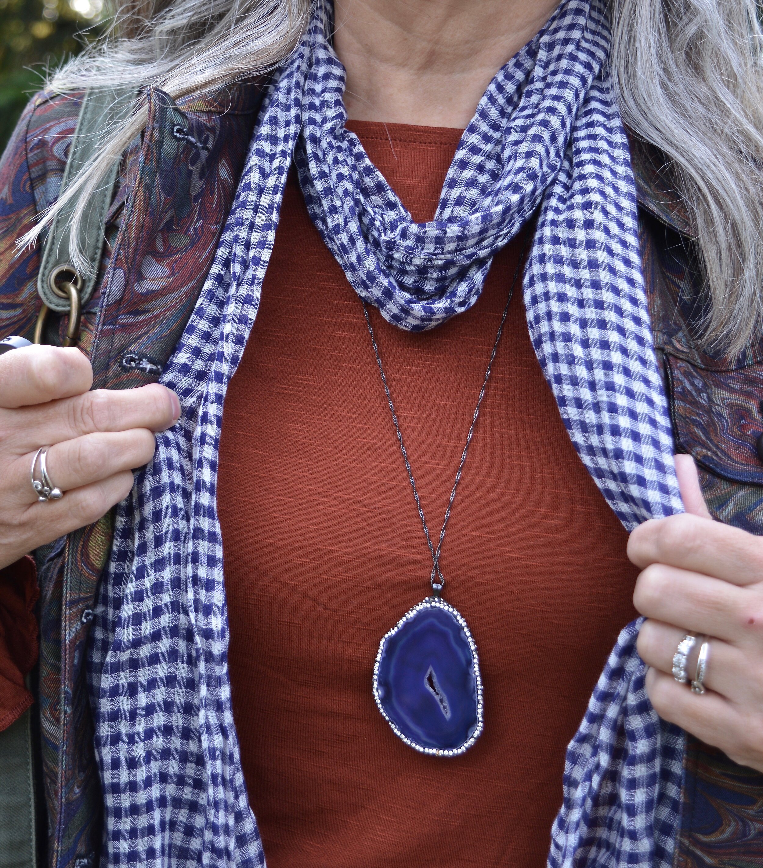
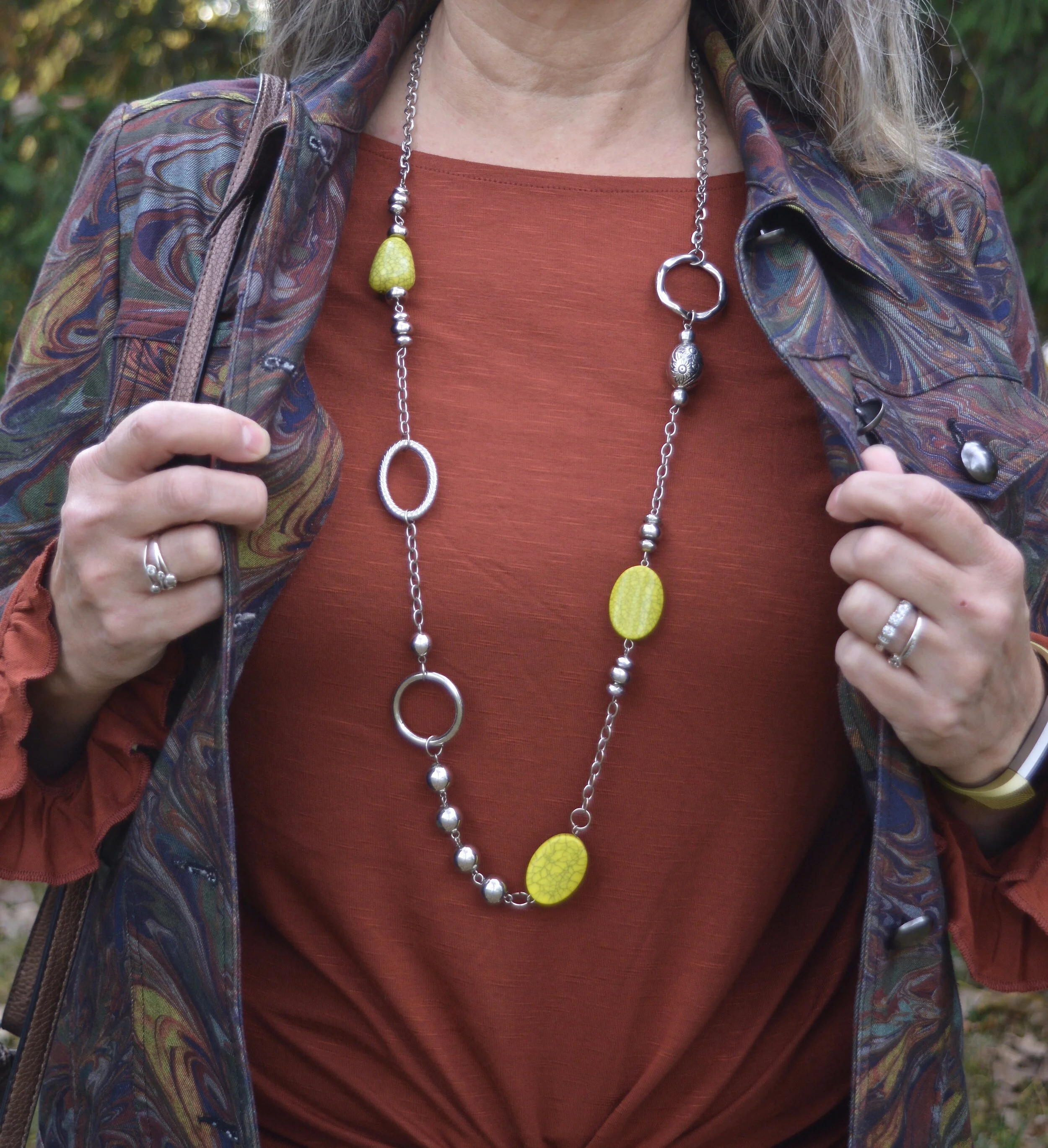
Style Tip 1 - Choose a piece of jewelry that makes a statement, then figure out how to monopolize on that statement effect.

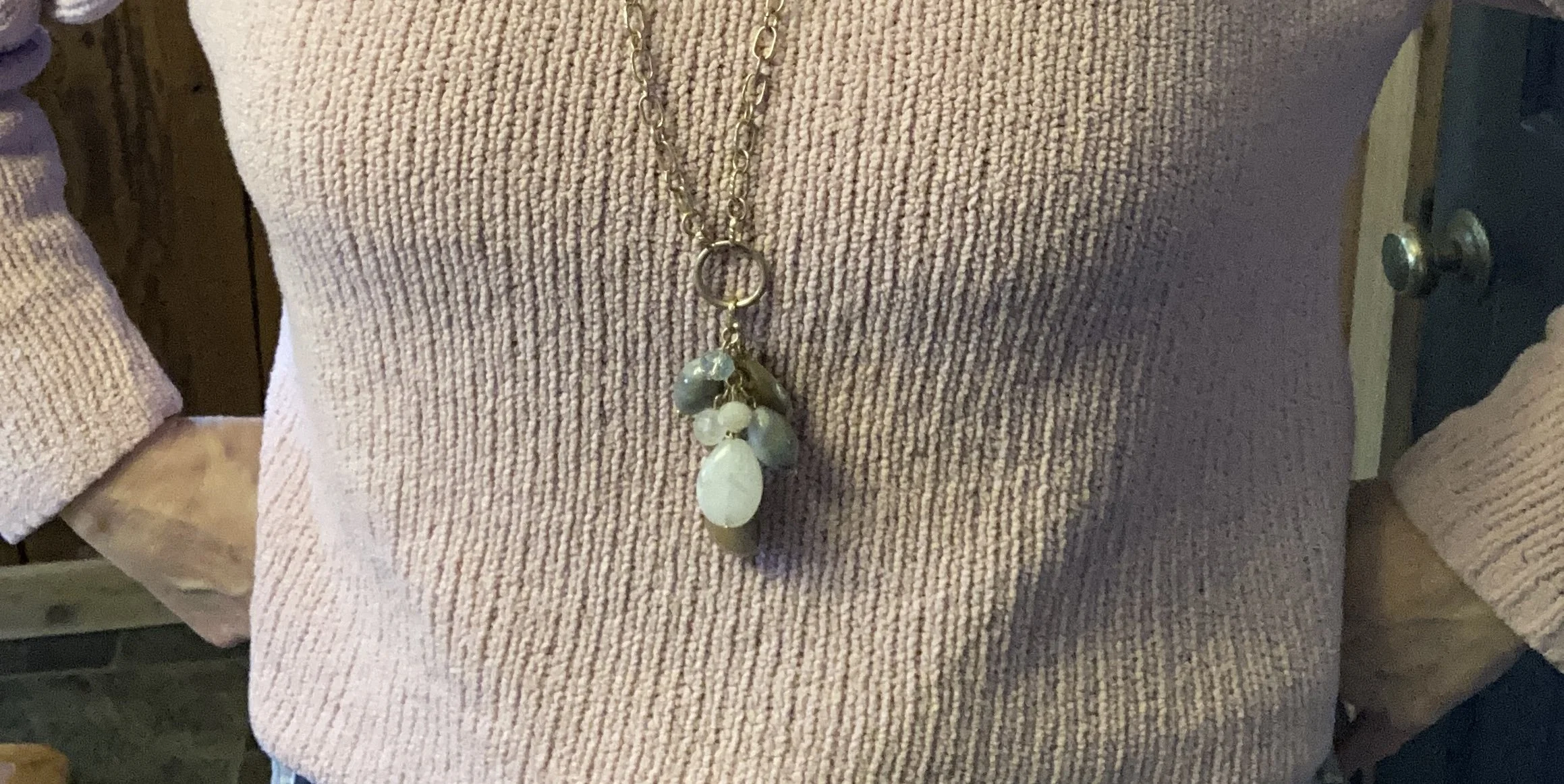
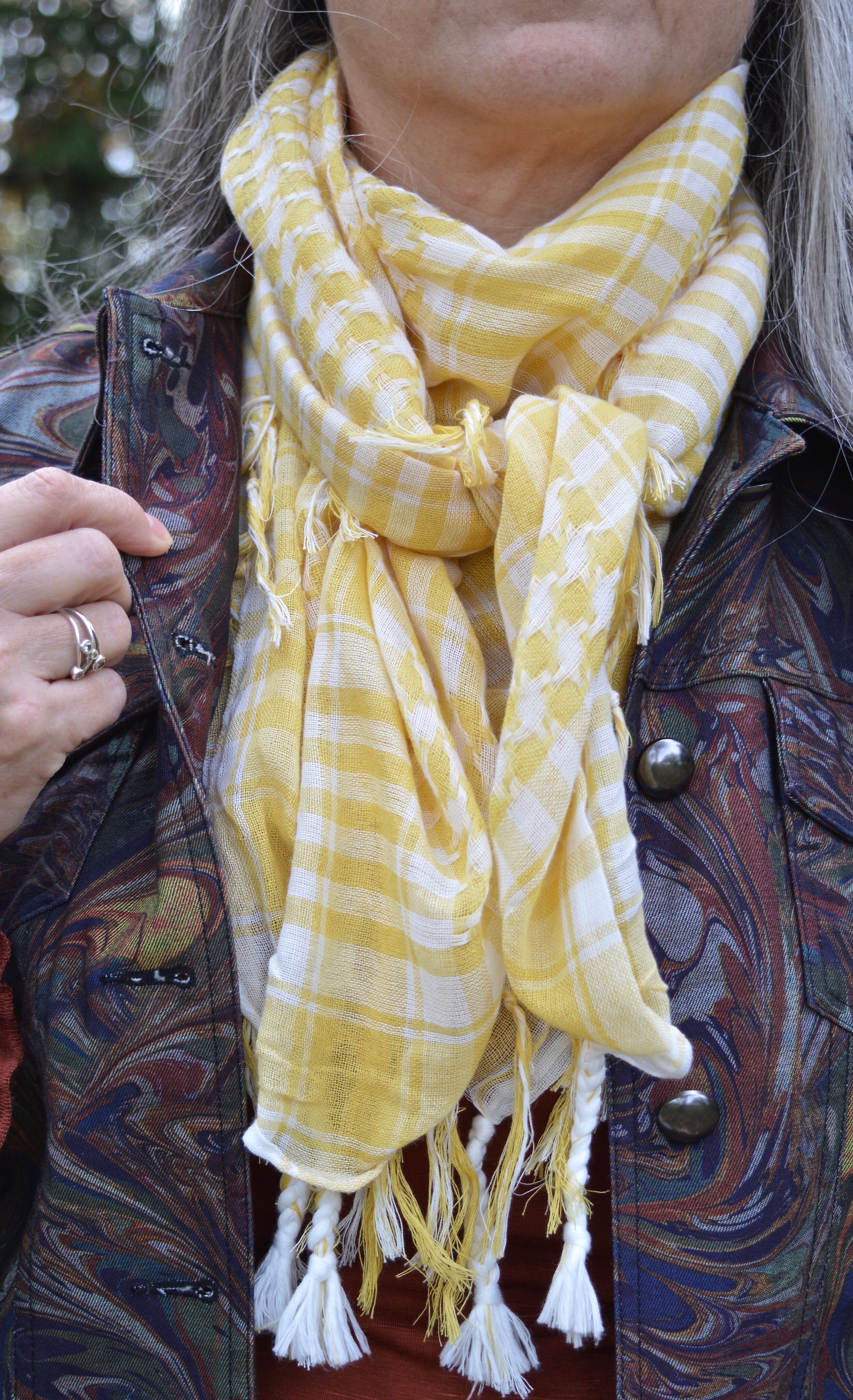
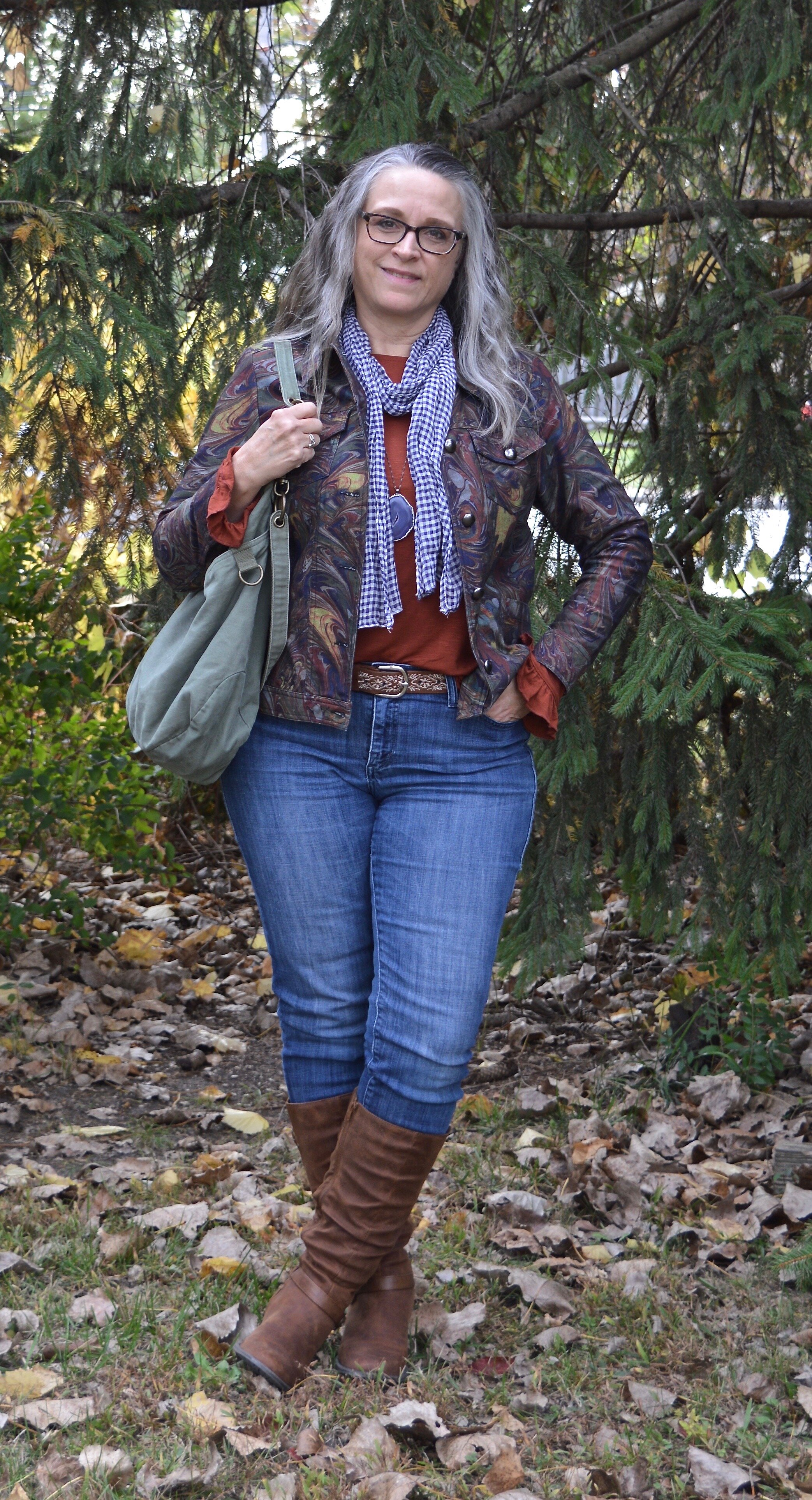
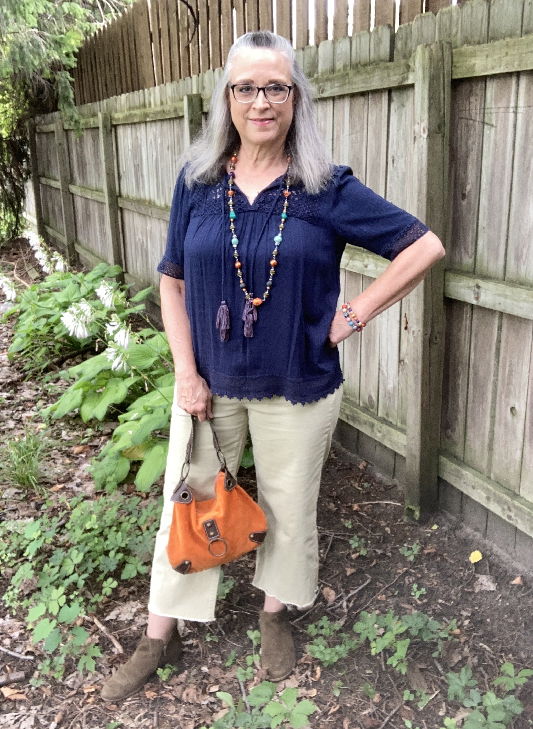
As you can see in the first picture my necklace contains so many colors: orange, dark blue, turquoise, or aqua, purple, olive, light green, orange and a light yellowy orange. If I wore this piece with a printed top it might easily get lost, but pairing it with this navy popover blouse was the perfect way to make the colors of the necklace pop. You could have used any of the colors in the necklace, but I love the way it looks against the navy.

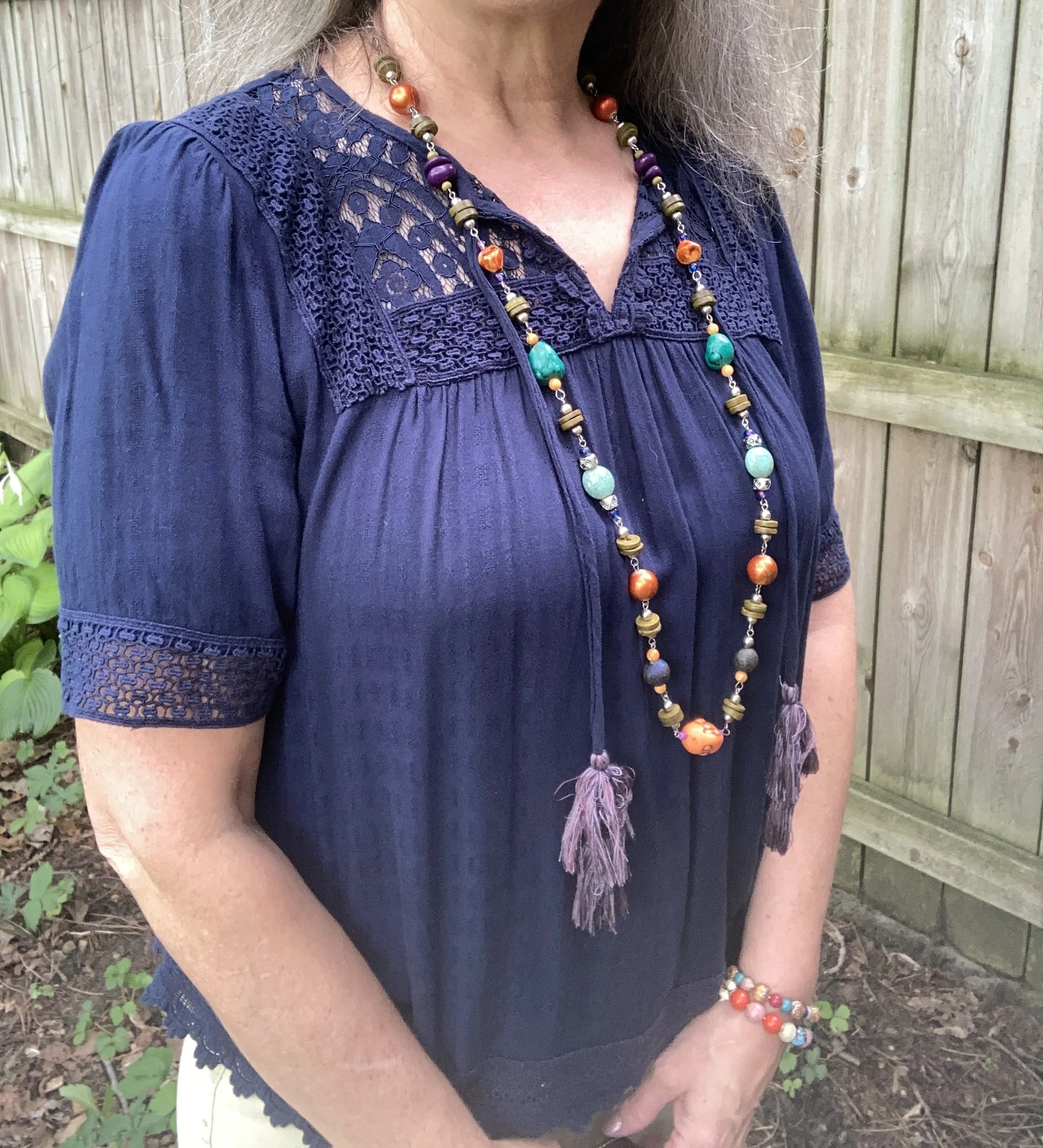
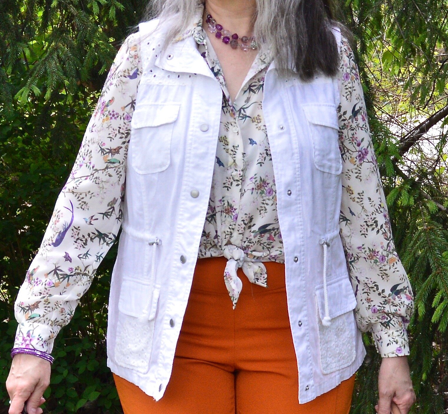
I have two of these Knox Rose tops. The other is a pale purple color. I love the lace, the longer length short sleeves and the flowy silhouette. The trim on the bottom is pretty as well. I honestly can’t remember if I found these on the clearance rack at Target, or at a Goodwill store where I often find like new Knox Rose items.

Style Tip 2 - Choose pieces that go with the colors in the jewelry or at least compliment it.

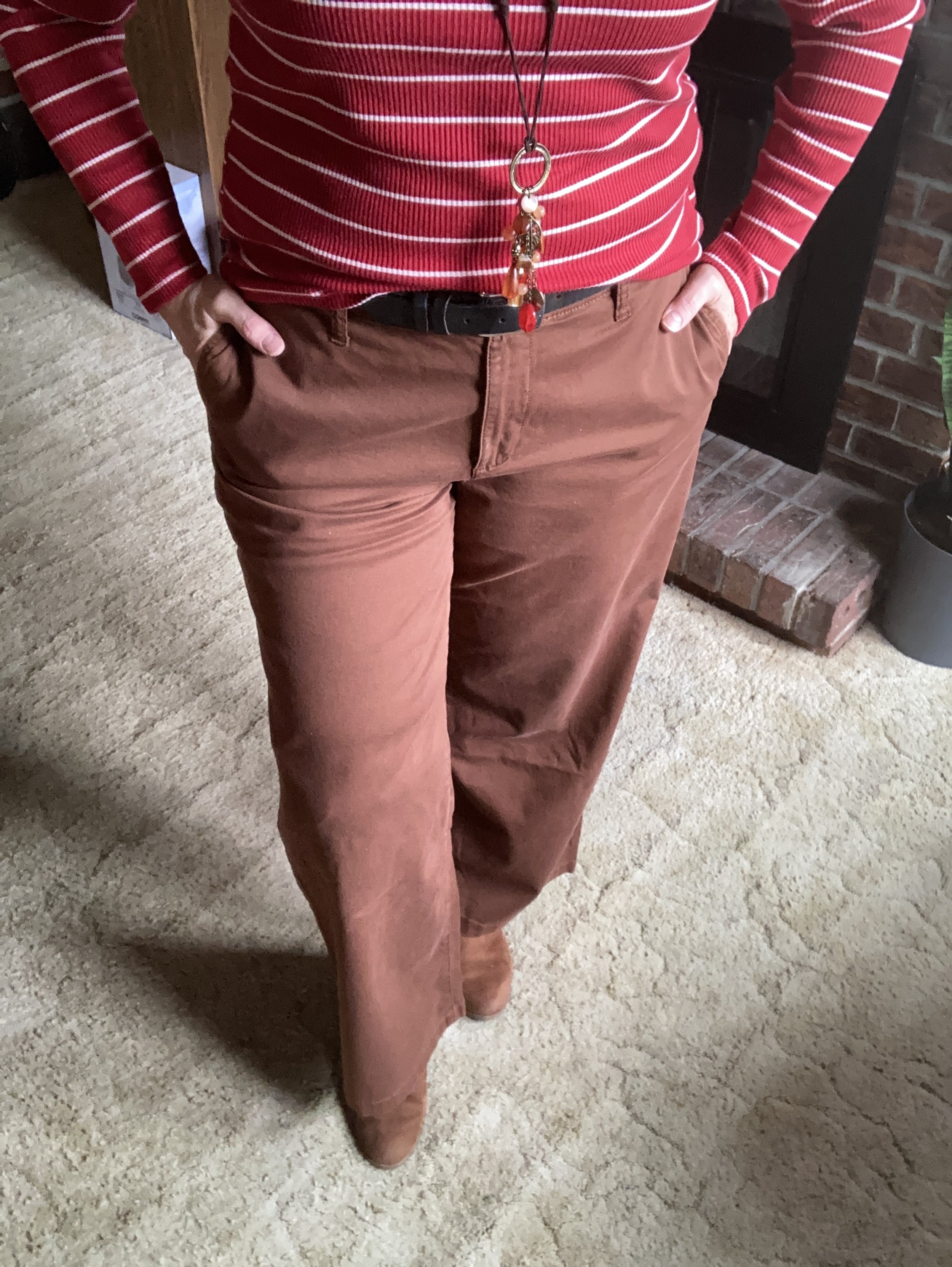
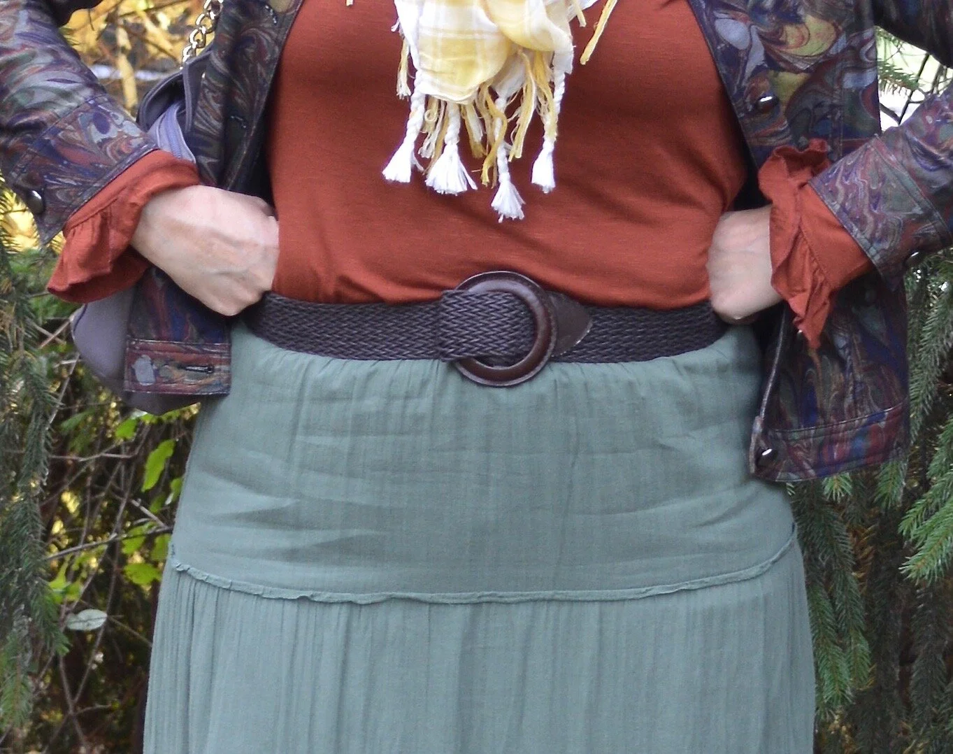
The navy top almost matched exactly the navy beads on the necklace. However, I chose to wear a pair of pants that was less matchy and more complimentary. The light green borders on olive, but not exactly. It’s almost a very pale chartreuse. I know in the picture they look more gray or beige than green, but believe me they have a green cast to them.

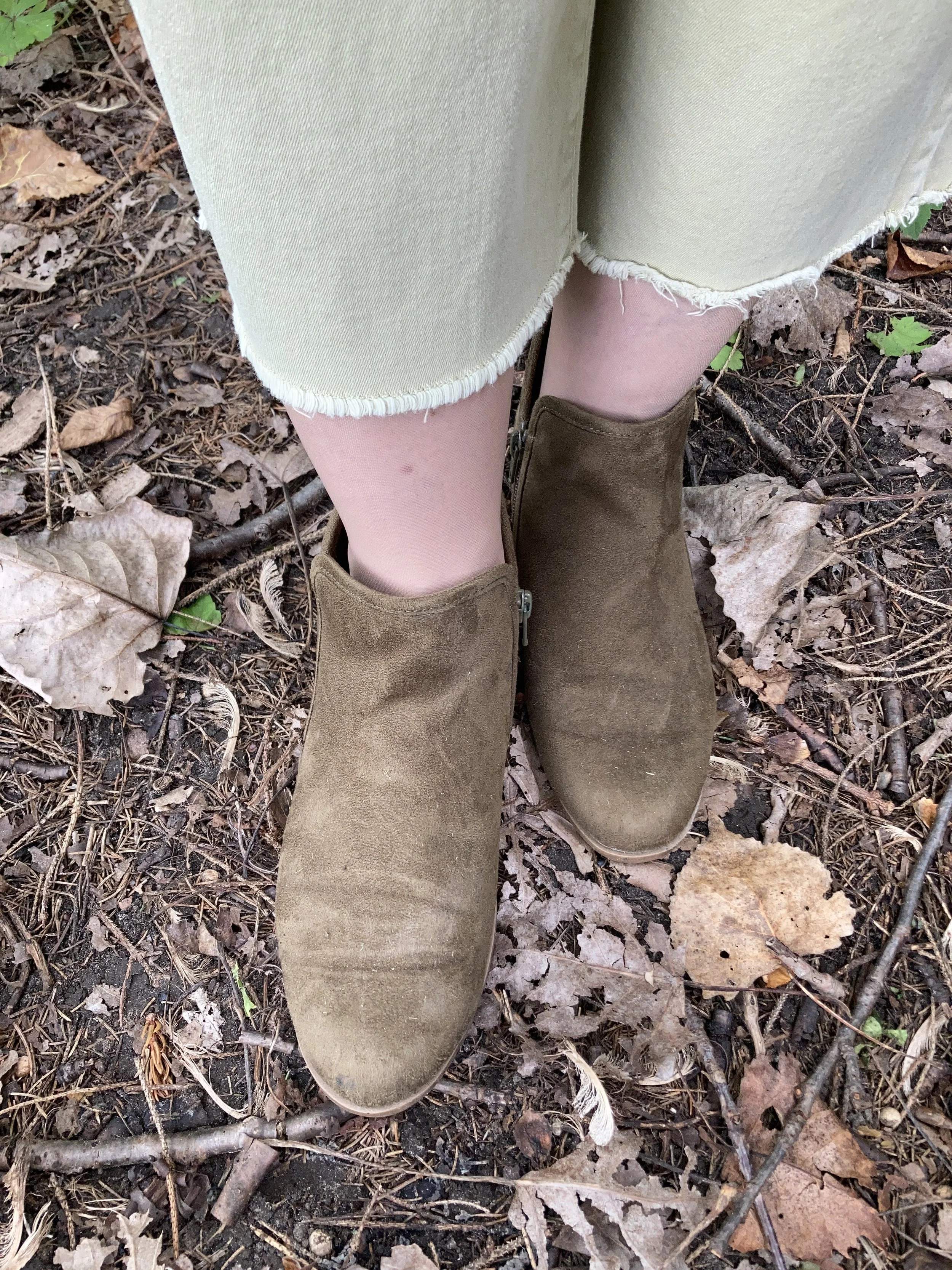
These raw hem jeans are Sonoma brand and they were a clearance find at Kohl’s a summer season ago.

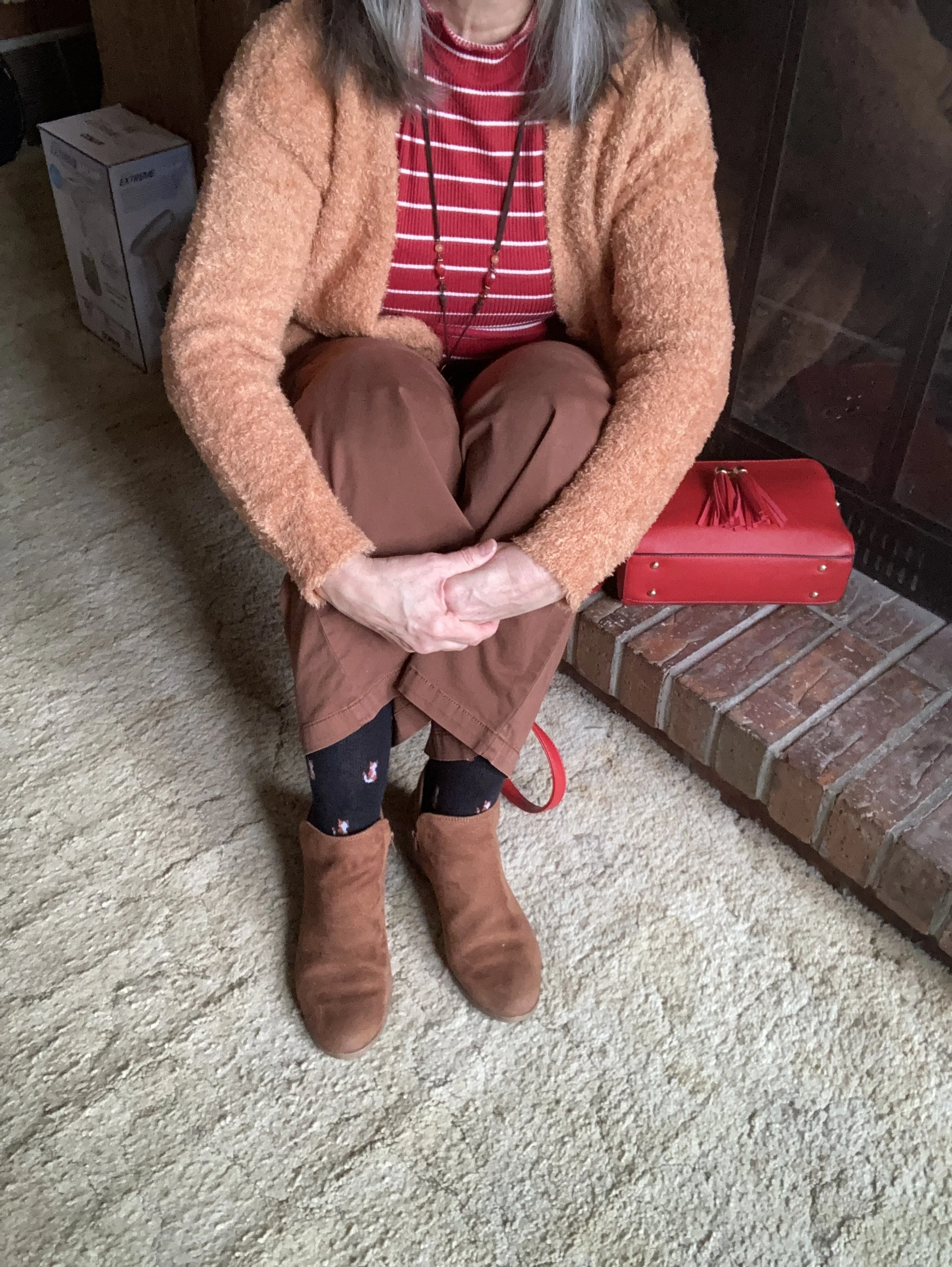
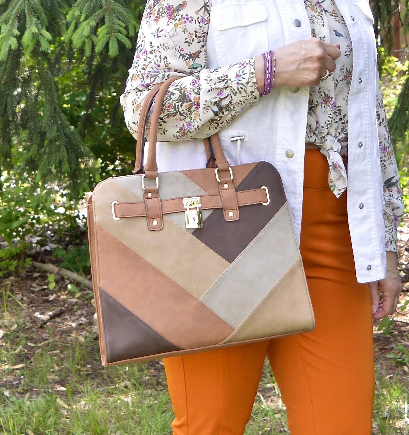
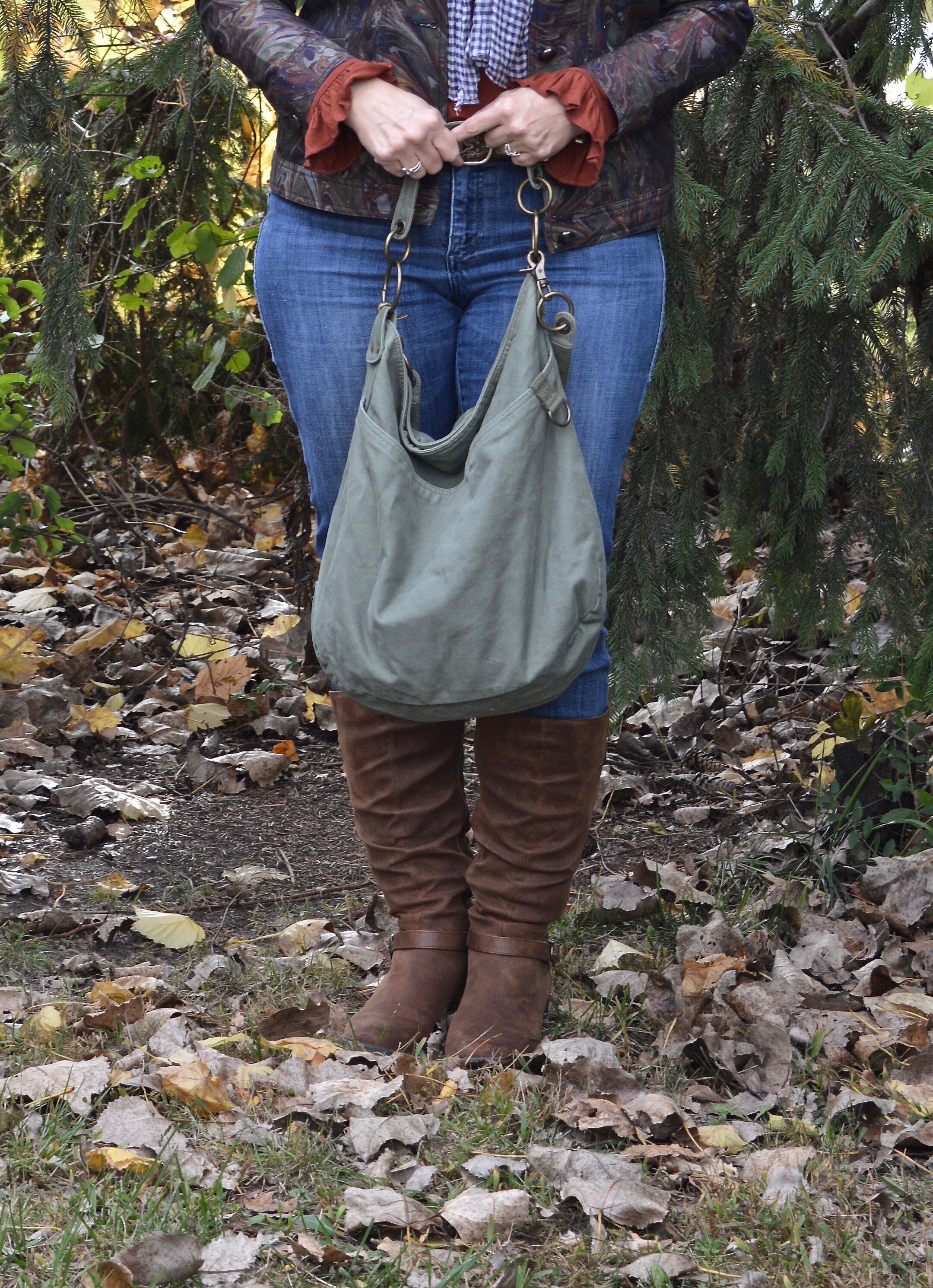
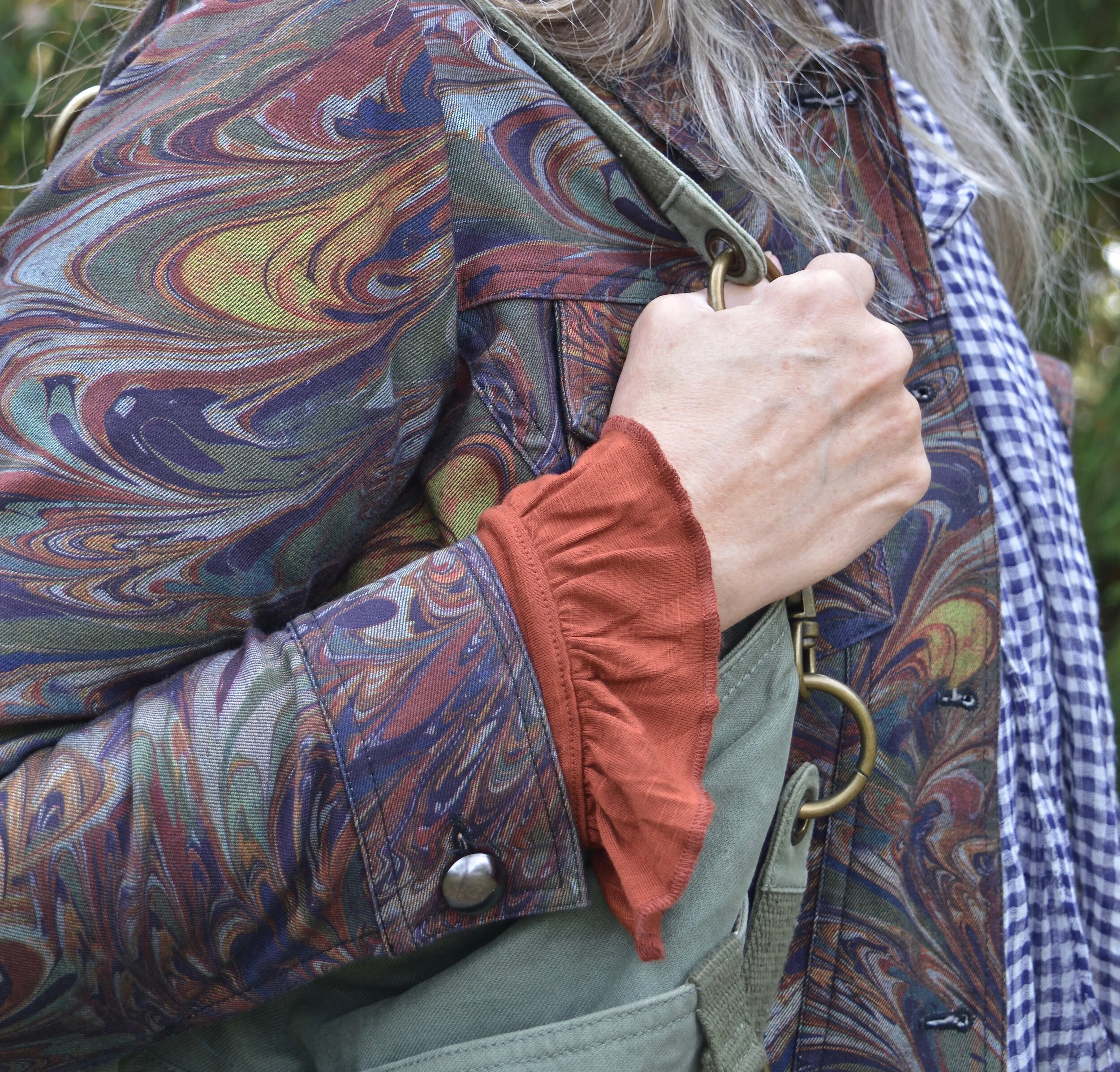
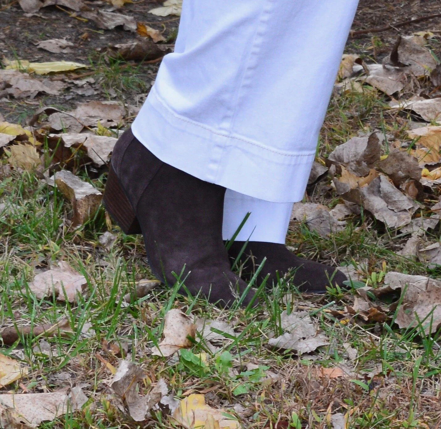
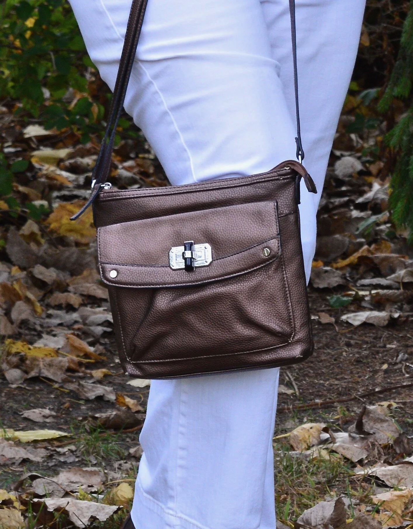
After choosing my main two pieces I decided on shoes and a bag. I also added a few other bright beaded bracelets for fun. My SO ankle boots have been around for a while. I thought it appropriate to start throwing in a few fall like pieces since we all know it is coming at some point. My thrifted orange suede bag is not one I use very often, but I simply love the bright color, and it works so well as an accent piece.

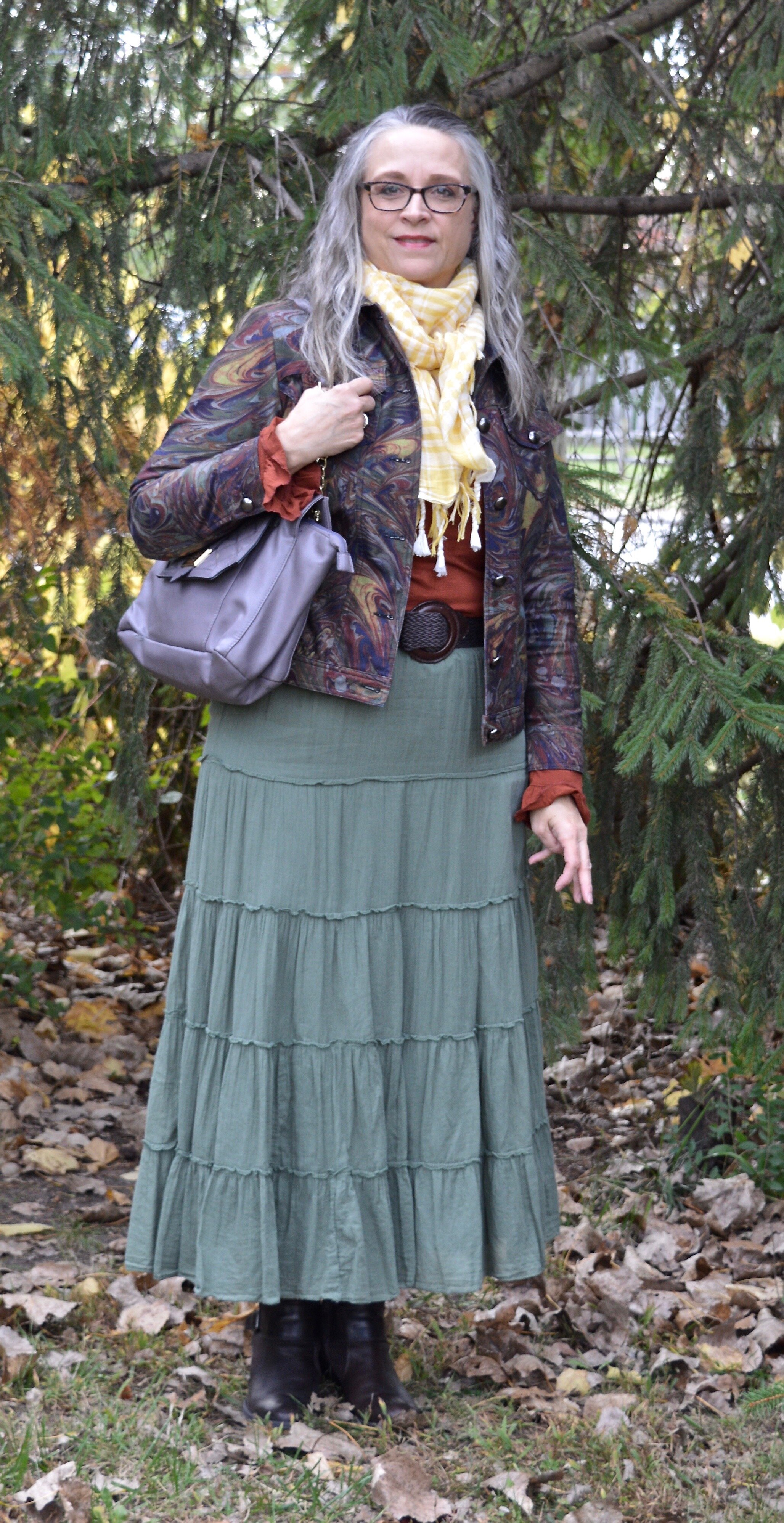
Style Tip 3 - Pull in one or two other colors from you chosen piece of jewelry (if it has more than two colors) by adding them in as accessories: shoes or boots, bags, scarves or a sweater or jacket.

I thought about adding a sweater to this, but I wanted to still look summery, and it was nearing 90F when I took these pictures. I was already beginning to sweat. Ha, ha.

What do you think of this outfit? Have you ever styled an outfit around a piece of jewelry? If so, what was it? I’d love to hear your thoughts. You feedback is always welcome, good or bad.

I’m including a few shopping links for fun necklaces. These are affiliate links. All opinions are my own. Have a great day!

Shopping our Closets - Colorful Skirt and Pantone Spring 2023 NY: Beetroot, Crystal Rose, Gray Lilac

(The colors used in these Pantone posts are approximations and not exact matches. The reference to the Pantone Color Institute is meant as a guide and only for your consideration. I do not receive any money from Pantone for these posts. I do it because I love color.)

This week we are shopping our closets looking for a colorful printed skirt to build an outfit around. I chose this floral maxi skirt that I have styled on the blog before as the place to start. Once again, I am incorporating three of the colors from the New York color palette just to give you a sampling of what the Color Institute came up with for this spring and summer.

These colors definitely fall into our radar for spring and summer. For some people pastels are a year round affair. For me, I tend to reach for these lighter, pale colors in the summer months as a way to stay and look cool. In my opinion Beetroot is very similar to Viva Magenta, although a bit more pink. Unlike years past, this year, the Color of the Year is not on the New York or London palettes. I guess they decided they could add one more color on each if they left the Color of the Year as its own entity.

My pleated maxi skirt was a clearance find from Kohl’s a few years ago. Chaps brand, it has a full lining and is very fun to style with its swishy, pleated loveliness. You can see this skirt styled with a gray tee and pink cardigan another Pantone season a few years ago.

Style Tip: As with our unique cardigan from last month’s Shopping our Closets post, start with your printed skirt and build your outfit around it, either focusing on one color in the skirt or a few different colors.

My Crystal Rose pullover sweater is a brand called Colorado Clothing and was thrifted. One of the reasons I give you the brand names on my thrifted pieces is so that if you like the brand you can take the name and plug it in on second hand clothing apps like Ebay or Poshmark and maybe find something you like.

My utility jacket from Maurices is the closest thing I have to the color called Gray Lilac. I had a bag, but in my messiness of clutter, I couldn’t find, it and might have gotten rid of it, but don’t remember. Oh dear, my brain! Ha, ha. It is a darker shade, but if you look it up on the Pantone Spring/Summer 2023 New York Palette page on their website you can see that it is similar.

I kept the accessories fairly simple as I wanted the skirt to be the focal point. I also made it my own by adding combat boots with a blingy clutch.

Style Tip: Make outfits about you and your personality. Just because a particular outfit typically is worn with a certain type of shoe or blazer, doesn’t mean you can’t mix it up a bit and choose pieces that are more to your liking and make your personality shine. The necklace and clutch were both clearance finds; the clutch at Kohl’s and the necklace at Meijer. My boots are a brand called ID Required and are thrifted.

What do you think of these Pantone colors? Do you have these in your closet? Do you have a love/hate relationship with pastels? Share your thoughts in the comments below or on Facebook. I’d love to hear from you.

How would you change up a style like this to make it your own? What do you like about this outfit? What do you not like? Let me know what you think!

I’m including a few shopping links for you to look over. These are affiliate links. All opinions are my own. Have a great day!

You can now also buy me a cup of coffee by clicking on this link. I appreciate all of your support.

Color Play - Red and Orange Cream

As you know, the reason I like to play with color is to force myself to get out of my own preconceived box regarding color combinations. Most of us are familiar and comfortable with combinations like navy with white in the summer, or rust with yellow in the fall. We tend to stay away from those combinations that look like restaurant decor - think yellow and red (McDonalds), or team colors - yellow and green (Green Bay Packers), unless we are putting on our work uniform or going to a football game. However, I like the challenge of finding different or unusual color combinations allowing me to make better use of the clothing I already have in my closet.

Today’s outfit revolves around two new pieces I got in the last month: a red and white striped top and a creamy light orange eyelash cardigan.

I pulled out my thrifted St. John’s Bay wide leg pants. The only reason I chose these was so I could wear my knee brace without it being seen. Ha, ha. But I actually like the way the outfit turned out. Wide legs seemed to have jumped off the trend-go-round until next time, but that is no reason to get rid of them, if you have a pair. Every once in a while it is nice to wear something outside the trend box, just because it is comfortable and the right color.

My bright red striped mock turtleneck tee is from Maurices and was another great deal. I love stripes anyway. I have a few tops that are white with red stripes, but when I saw this red with skinny white stripes, I grabbed it. It is very soft and comfortable.

I also added a long pendant necklace with reds for a bit of fun.

This wonderfully fuzzy chenille eyelash sweater is the bomb. I love the fun texture and the luxurious softness of the knit. It is also extra cozy, so I have a feeling it will be popping up here and there throughout the chaotic weather of spring. I found this on the clearance rack at our local Meijer.

I used my red top handle bag again for the Valentine’s red color and added my SO ankle boots which matched my pants fairly well. However, silly me, didn’t think to put on my brown socks…ha, ha. Oh well, the little foxes match quite well.

Style Tip: To make your legs look longer and leaner match your shoe to your pants (and your socks :)). You can get the same effect with tights and boots of the same color.

What do you think of this color combination? I think it is fun and different, but not so different that it doesn’t work. Let me know what you think by leaving me some love in the comments.

I am including a few shopping links for you to look over. These are affiliate links, but all opinions are my own. These are provided for your benefit and do not cost you anything to click on.

Have a wonderful Tuesday!

Spring Outfit with Orange Pants

Just like I did for the blue pants, I wanted to show you a new outfit with my Worthington orange pants. For this one I focused on a work appropriate look. With many people finally returning to their jobs I thought it would be a good time to feature an outfit that would be perfect for the office, especially as air conditioners come back on.

DSC_0047.jpg

I wish I would have thought to get close up of the details on this thrifted Maurices vest. I snatched it up, because I don’t have any summer weight white vests and I thought the eyelet detail and the texturing on the pockets made this such a unique piece. It has the utility vibe with the patch pockets and drawstring, but is dressier.

You can also see my H&M button down top. I found this one on the clearance rack a few years ago and just loved the botanical print with its flowers, butterflies and birds. I thought tying the front shirt tails made for a more summery look, but one that remains work appropriate. I also like the soft contrast between the stark white of the vest and the more off white of the blouse.

DSC_0020.jpg

I added a double layered purple necklace and a few purple metal bangles to pull out the purple in the top.

DSC_0046.jpg

I opted for more neutral shoes and bag. I thought the outfit had enough color with the bright orange pants and the flora print in the top. The neutral accessories give it not only a summer feel, but a polished and professional look. If I ever go back to an office job, I would definitely wear this. My bag you have seen on the blog before and is from Walmart and George brand. My perforated peep toe sandals are Sonoma brand from Kohl’s.

DSC_0037.jpg
DSC_0040.jpg

I was pleased with how this outfit turned out. What do you think? Would you wear something like this to work? I’d love to hear your thoughts.

DSC_0038.jpg

I’m including a few shopping links for you to enjoy. These are affiliate links. All opinions are my own.

Have a great day, everyone and thanks for following along on the blog.

Pantone - Spring/Summer - 2021 - New York Palette: Burnt Coral, Marigold and Desert Mist

Today’s outfit blends three colors that seem to epitomize summer with all of its beauty. The deep orange yellow of Marigold, combined with the rustic feel of Burnt Coral and the soft pastel of Desert Mist makes me think of picnics, outdoor parties and long walks on the beach. While my outfit today is probably too warm for summer temperatures, I works well for that in between time when the weather is still unsure of what it is going to do.

burntcoral.jpg

I ordered this waffle weave dolman sleeve top from Maurices earlier this year. It has elastic on the bottom, so has more of a cropped feel to it, which isn’t always my favorite, but I think this works well with pieces where the top can be worn without the need for tucking or wearing a belt.

burntcoralpantonespringcoloroutfitideas-10.jpg

I wasn’t going to use this Roz & Ali medallion print skirt again, but I was having a hard time finding things in my closet that were going to work with these colors. Besides this is a pretty skirt, so I don’t mind using it again. You can see how I styled this piece for several other Pantone color series. Last fall I styled it with a neon yellow short sleeve sweater, and the fall before that with a purple short sleeve sweater. I like that this skirt works perfectly for spring, summer and fall. The skirt contains all the colors from the graphic, even though you can’t see Marigold as well, you can definitely see the Burnt Coral and Desert Mist.

burntcoralpantonespringcoloroutfitideas-6.jpg

My Desert Mist sweater is a little light compared to the Pantone color, but again, this isn’t about having an exact match, but about giving you options that you can find in your closet. This is a thrifted St. John’s Bay piece. It is always good to have a neutral cardigan or jacket that will work well with many different outfits and colors.

burntcoralpantonespringcoloroutfitideas-8.jpg

For the Marigold color, I just added a few accessories, similar to what I did in last Thursday’s post with Raspberry Sorbet. The necklace and Sophia Caperelli bag are both thrift finds.

burntcoralpantonespringcoloroutfitideas-11.jpg

You were recently introduced to these Clark’s flats. They are perfect for wearing with a skirt, whether long or short.

burntcoralpantonespringcoloroutfitideas-13.jpg

What do you think of these colors? Do you have all of these in your closet? Would you wear them together? I’d love to hear your thoughts, so leave me some love.

burntcoralpantonespringcoloroutfitideas-4.jpg

I’m including a few shopping links. These are affiliate links. All opinions are my own. Here’s a picture, just for your enjoyment. Ha, ha.

burntcoralpantonespringcoloroutfitideas-7.jpg

Have a great evening!

Photo and graphic credit Rebecca Trumbull.

Having Fun with Layers - Dressy Valentine's Day Look - 5 Year Bloggiversary with a Giveaway

Today I am showing you a more dressed up Valentine’s Day look. Although, so many of us are choosing to not go out very often, or at all, there still is the opportunity to dress up for a date night right in your own home. Obviously, this is harder for those of you who have kids, but those of us who are empty nesters can do this a little more easily. If you are a young couple, there is no reason you can’t have a fun Valentine’s party with your littles and reserve some of your own special time once they are in bed.

Today’s outfit revolves around a beautiful blouse I recently acquired from Maurice’s clearance rack. I love everything about this blouse from the high collar, to the pattern and the flowy, sheer fabric. Just like I did for my casual outfit on Tuesday, I am wearing the same under layers consisting of the black tights and black tank top.

Dressy Valentine's Day look

My long, black maxi skirt was a Meijer clearance find. It is a summer weight skirt of lighter material, but it is not sheer, so doesn’t need a slip underneath. The brand is Ava James. I like the textured pleats which gives it the look of crepe. It also has a comfortable elastic waistband and pockets.

Dressy Valentine's day outfit

You can see from the above picture that I drew on the gold, metallic splashes that are on the blouse for my jewelry inspiration. There is plenty going on, on the blouse, but I thought a few simple gold pieces would compliment the look just right.

Dressy Valentine's Day look

I added the metallic, blush moto jacket as my over layer piece. This jacket, I’ve styled before on the blog. I got it a few years ago at Nordstrom Rack and it is a brand called Coffee Shop New York. You can see how I styled it with a camo shirt and with a Mickey Mouse tee.

dRessy Valentine's outfit

In keeping with the gold jewelry and the gold flecks on the blouse, I decided to carry my small gold, clutch. This is a thrifted piece and perfect for those special occasions that require you to dress up. I don’t have very many of those any more. How about you? Do you still find occasions to dress up?

My shoes you have seen multiple times on the blog. They are Aerosoles and I got them on clearance at DSW. Again, I apologize for the dirty shoes. I didn’t realize how much cat hair is just laying around, and I have vacuumed several times since Christmas. Those darn fur balls. Ha, ha.

dressy valentine's day outfit

What did you think of this outfit? Do you like floral blouses? Do you prefer maxi skirts, midi skirts or a knee length or shorter? Are you doing anything special for Valentine’s Day? I don’t know if we are doing anything or not. As we get older, it has become less about the particular days and more about making every day special. Don’t forget about the giveaway. I’m including the rules again, below. If you haven’t entered yet, be sure you comment and subscribe.

Dressy Valentine's Day look

If you want to be entered into the drawing to win either a $25 Target card, or a $25 Amazon gift card, please be sure to read the rules and enter. Entries will be taken until 12 midnight on Friday, February 12th. If you are not sure how to subscribe, just click the link at the top of home page that says, Subscribe and fill in the information. Being a subscriber does not cost you a thing. It just allows me to sent you a once a week email, to remind you there are new posts on the blog. You can either comment on today’s post, or on this past Tuesday’s post. You can also earn more entries by commenting on Facebook and Instagram. Have a fabulous Thursday!

Anniversary (1).png

Color Play - More Fall Mixing

My daughter has come into her very busy season and has numerous editing projects on her plate from all sorts of clients, so my Pantone - Autumn/Winter - London Palette series is going to be delayed for a little bit. In the mean time I am falling back to my Thursday columns, so today’s is based on, of all things, fall colors. You just aren’t going to get away from my obsession with color. Ha, ha.

Today’s outfits are centered around a thrifted Christopher and Banks jacket. I absolutely love the muted frenzy of colors and I knew it would be something I could wear repeatedly throughout fall, winter and spring. This is the back of the jacket. It is shaped and feels somewhat like a denim jacket, though the material seems a little less stiff. I paired the jacket with a rusty colored long sleeve tee that I got last year at Maurices. I am going to show you three ways these two pieces can be styled for different looks.

DSC_0034.jpg

Look 1 - With Jeans

This first look was what I wore on the day I took these pictures. This is a simple look with my Rock & Republic jeans that I have had for years. I added my Sonoma faux suede boots to keep the fall color scheme intact, then I added my purple agate pendant necklace and a purply blue gingham scarf. The last piece to add was the thrifted olive hobo bag. I love the little ruffle on the sleeve hem on the tee. The sleeves on this jacket were the perfect length to let the sleeves stick out.

DSC_0004.jpg
Color play - fall mix
Color Play - fall mix

Look 2 - With White Jeans

For this look I swapped out the regular jeans fro my white Gloria Vanderbilt pair. I also removed the scarf, put on a different necklace and changed the bag and boots. White all year round is simple the rage, and that is one trend I am willing to put up with. These jeans are especially suited to the cooler weather, because they are a heavier weight. They also have a wider leg, so it is easier to get taller boots under them.

Color play - fall mix
Color Play - fall mix

These brown ankle boots are a new pair I ordered from Kohl’s. I just love my suede and faux suede ankle boots and wear them all the time. I decided to add this dark brown Nine West pair to my collection because they were on sale and I had a coupon. To go with the boots I chose my thrifted bronzy colored shoulder bag.

Color Pay - fall mix
Color Play - fall mix

Look 3 - Green Skirt

In the final look I chose my thrifted Old Navy tiered skirt, which I have styled numerous other times on the blog. I also added a pale yellow gingham scarf that I bought from the Jacket Society three years ago. Nora always has such unique and beautiful pieces. Be sure to check out the scarves and wraps here. I swapped out my bronze bag for this purple Nicole bag with gold chain handle accents, and my ankle boots for these thrifted mid-calf leather heeled boots. You can see I also added a woven belt that goes with the boots, just for some fun added texture and contrast.

Color play - fall mix
DSC_0031.jpg
Color play - fall mix
Color Play - fall mix

Here are all three outfits side by side. Which one do you like best? Do you have a colorful jacket that you were thinking of getting rid of because you never wear it? How about trying some of these ideas and making your wardrobe work for you?


I hope you enjoyed this post. Let me know your thoughts on these outfits. Tomorrow I will have a new Faith post on the blog, so be sure to stop by and check that out.

Have a great day!

I’ve included a few shopping links for printed jackets. These are affiliate links. It does not cost you anything to click on a link to shop, but it might pay me a few cents. Enjoy!