Pantone - Autumn/Winter - 2019 - Crabapple and Forest Biome

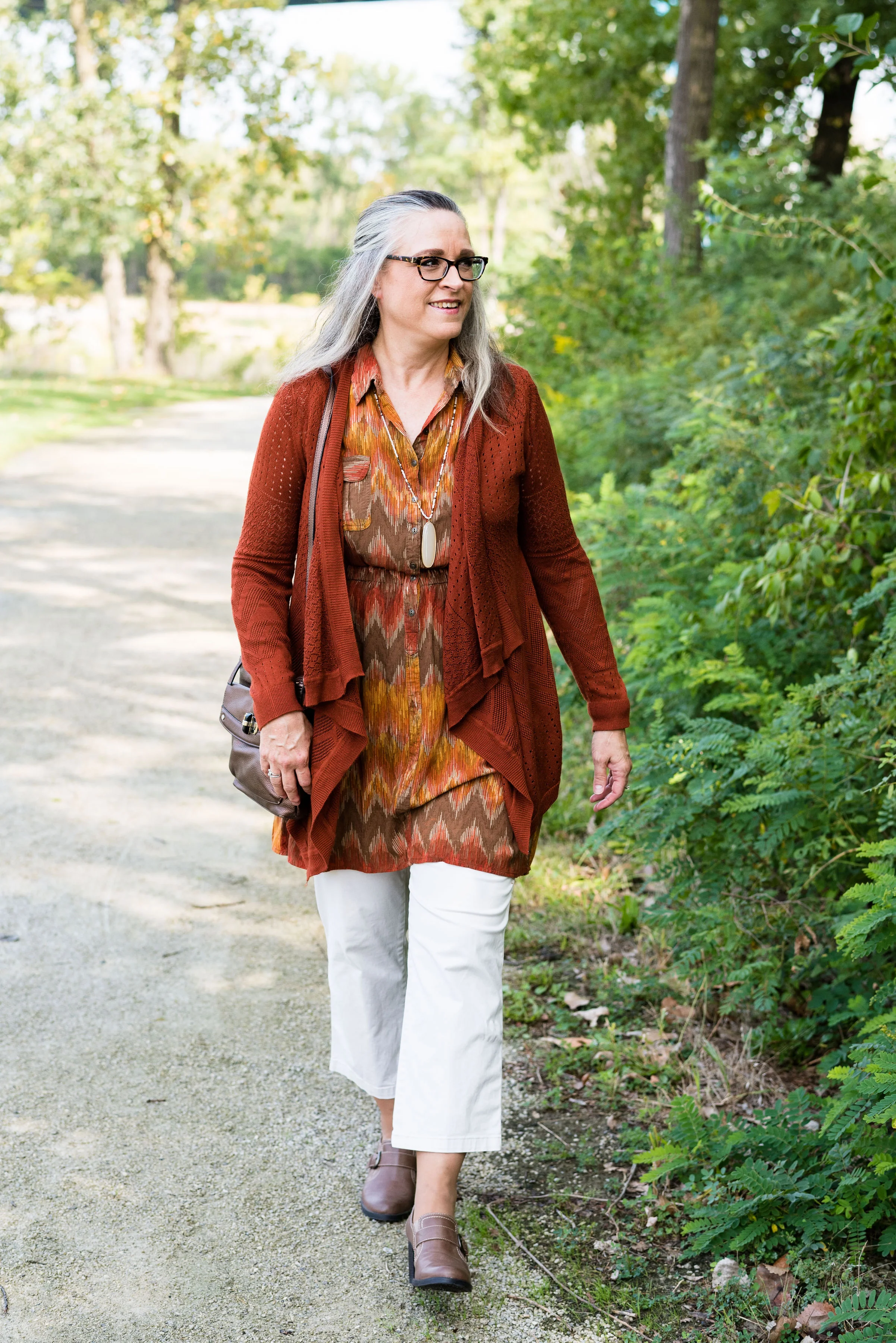
The next two colors in the Pantone - Autumn/Winter - 2019 - London Palette are Crabapple and Forest Biome. I grew up with crabapple trees in our back yard and I thought they were one of the prettiest of spring’s trees. We had a pink and a white, and they had a glorious scent that just floated on the air. Obviously this Crabapple color is meant to mimic, not only the pinky flowers, but the tiny little fruits that hang from the branches. As for Forest Biome, we know that it is a dark green, but I had to look up the word biome, to fully understand it. A biome is an ecological community system, such as a rain forest or dessert. Forest Biome, then would refer to an area of forested land probably brimming with pines and cedars and perhaps a few deciduous trees. Wherever they come up with the names for the colors and just what meaning they had in choosing the name, we don’t really need to know, but it is fun to think about.

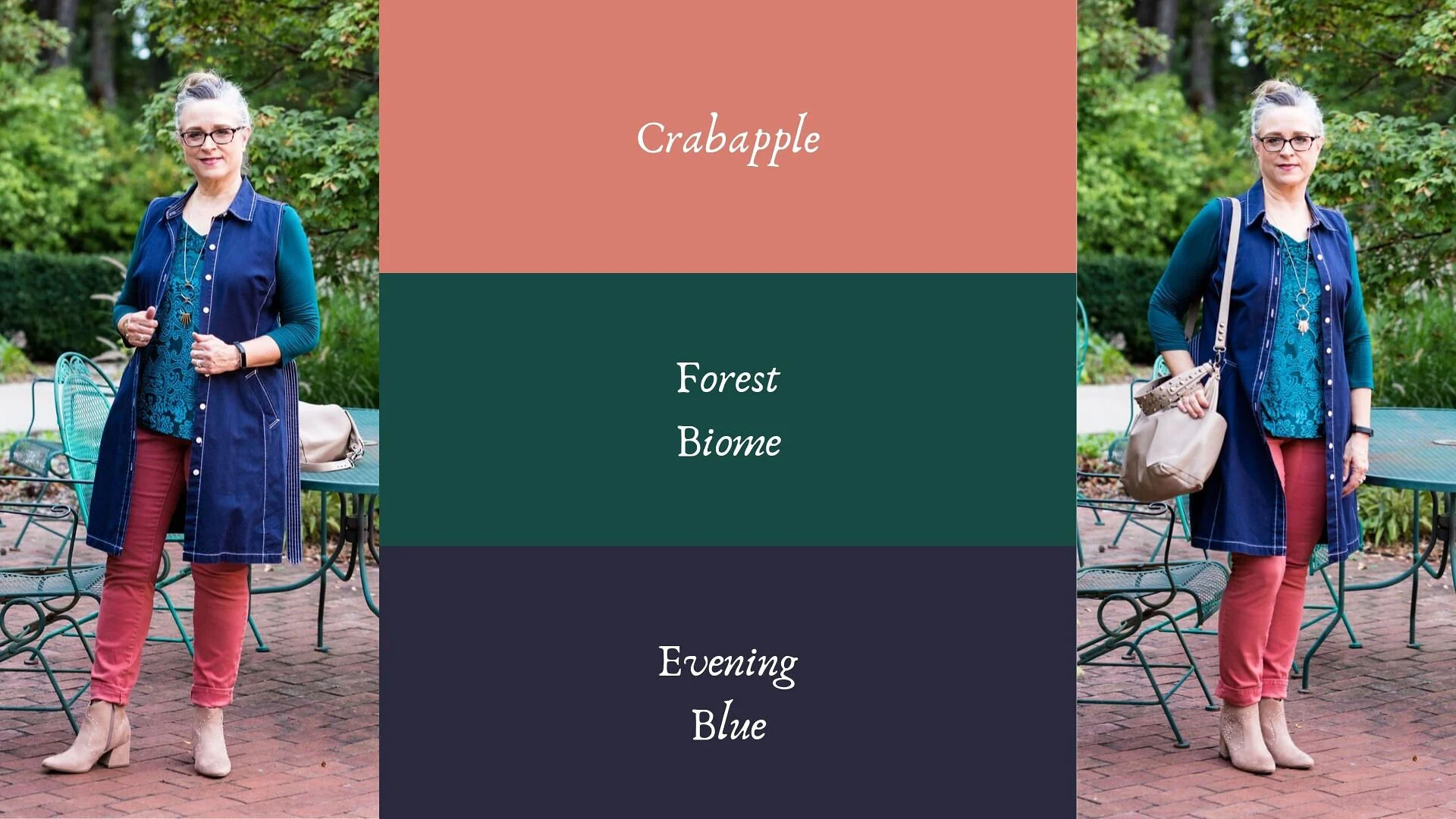
My Forest Biome is a little more blue and my Crabapple is a bit more pink than their colors, but again, you get the idea. I thought Evening Blue would be a good classic color to pair the other two colors with.

This was a neat little sitting area at the Toledo Botanical Gardens where we took the pictures for this series. I’d love to have a patio like this with an English type garden all around, and fun outdoor furniture, but I have neither the resources, the time or the energy. They always say you will find time for the things you really want to do, but I think it would be more accurate to say, we can always find time for the things we know we should do. Ha, ha. My Grandson is a priority. Picking him up after school and hanging out with him when he has a day off are priorities. Do those things cause other things to be put off or put on the back burner? You bet, but that is what I choose to do because I love him and my daughter. What we really need to do, is stop beating ourselves up for all the other things we are not able to get to.

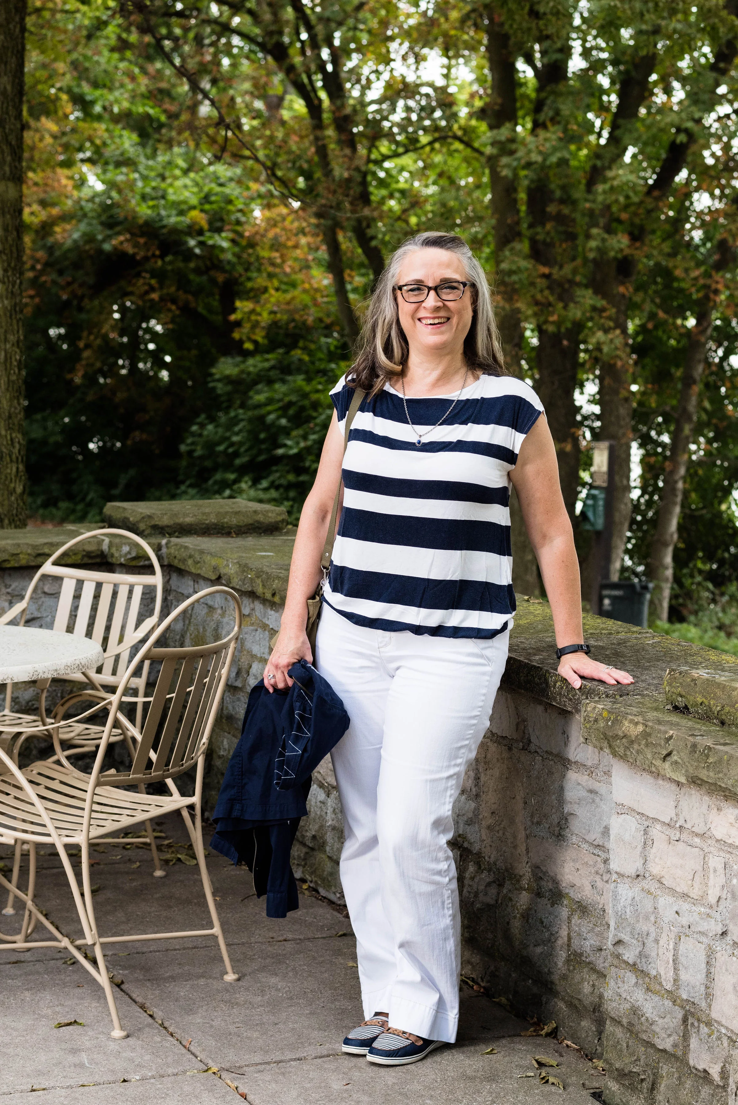
My jeans are W62 brand from dressbarn. They are very comfy and contain a good amount of stretch. I wear these again and again for work or when I just want a different color skinny jean.

This thrifted, embellished, 3/4 length sleeve top is Dana Buchman brand. I do love the swirling pattern and glistening sheen of the front portion of the top. The sleeves and the back are more like a plain jersey knit.

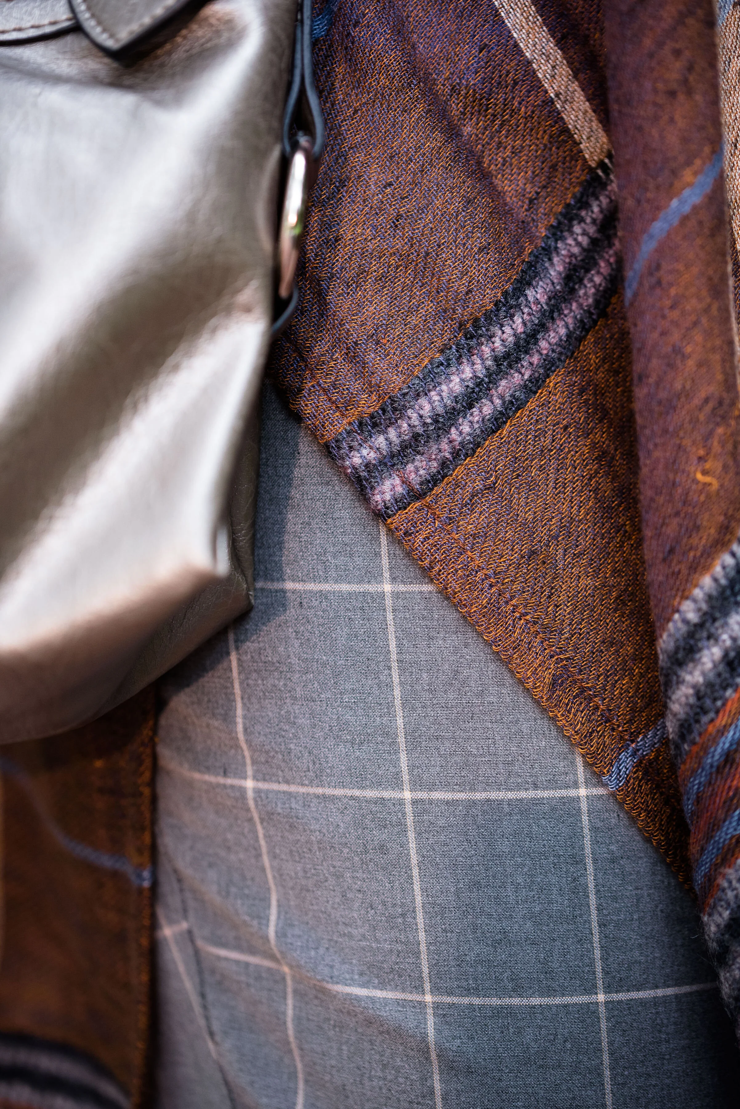
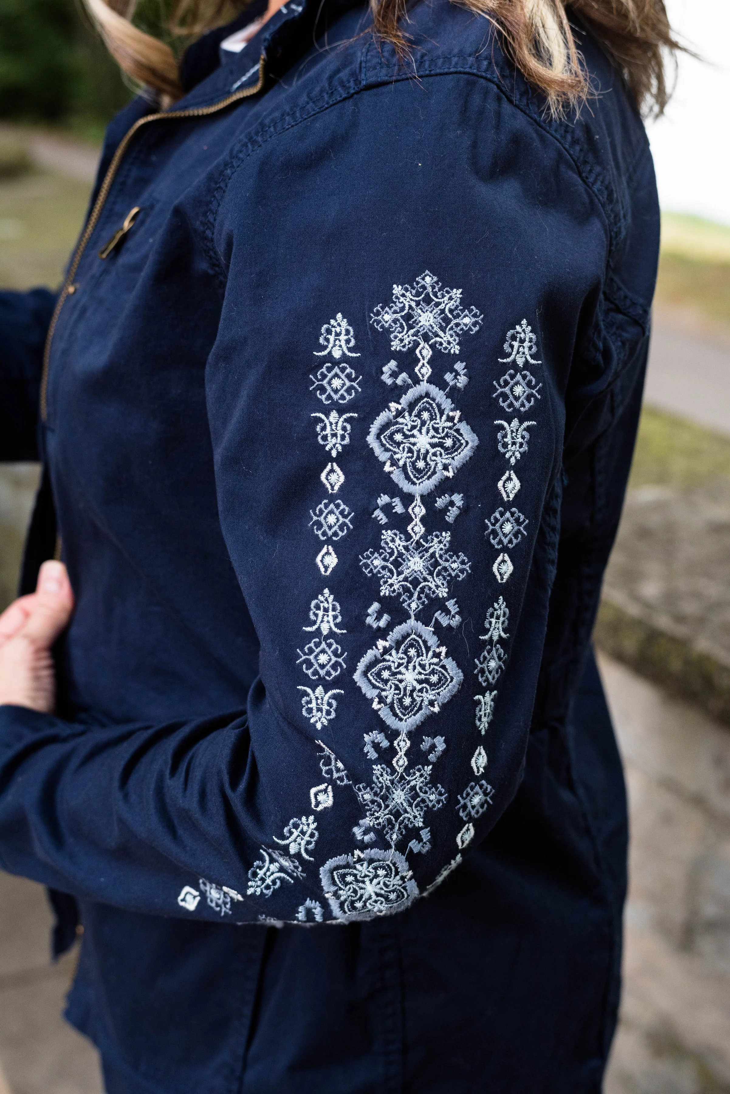
The dark navy vest is really a belted dress that I found at a thrift store a while ago. It is Issac Mizrahi brand and if I was thin enough, I might consider wearing it as a dress, but it works beautifully as a vest. What do you think?

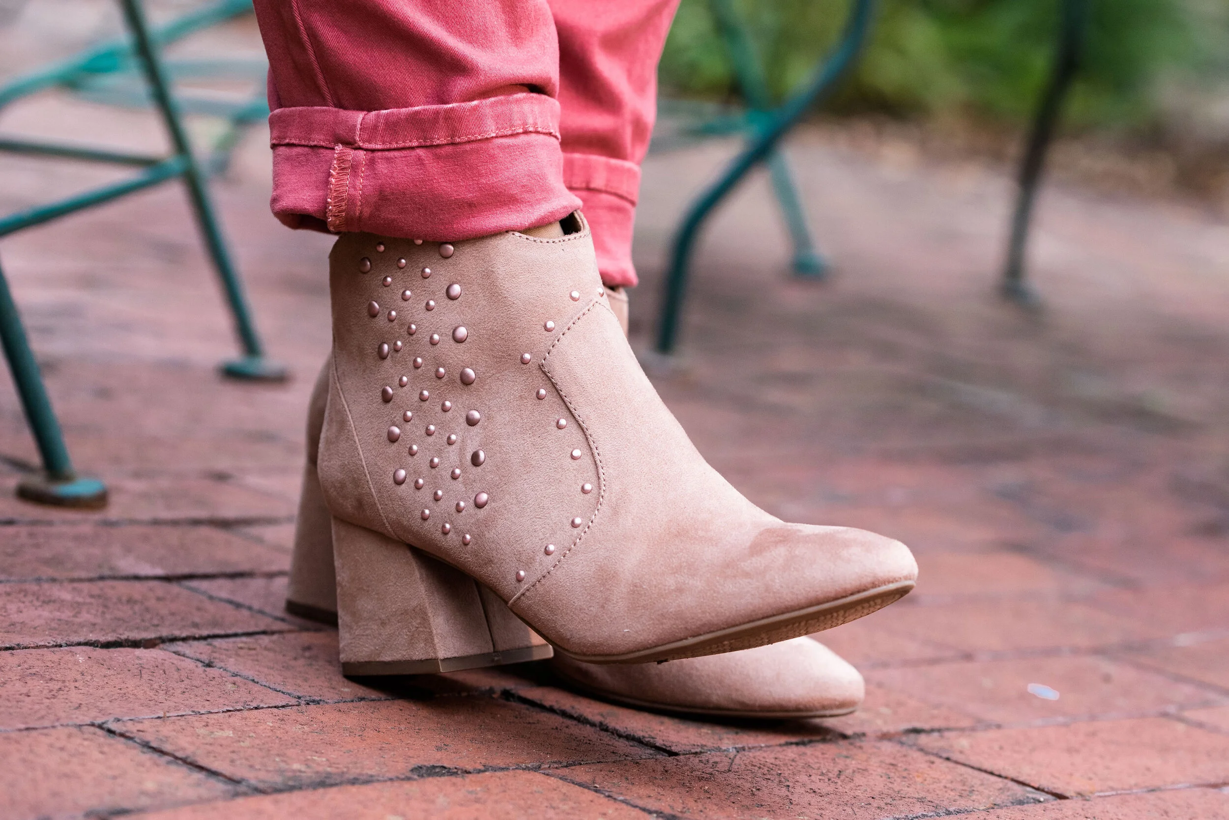
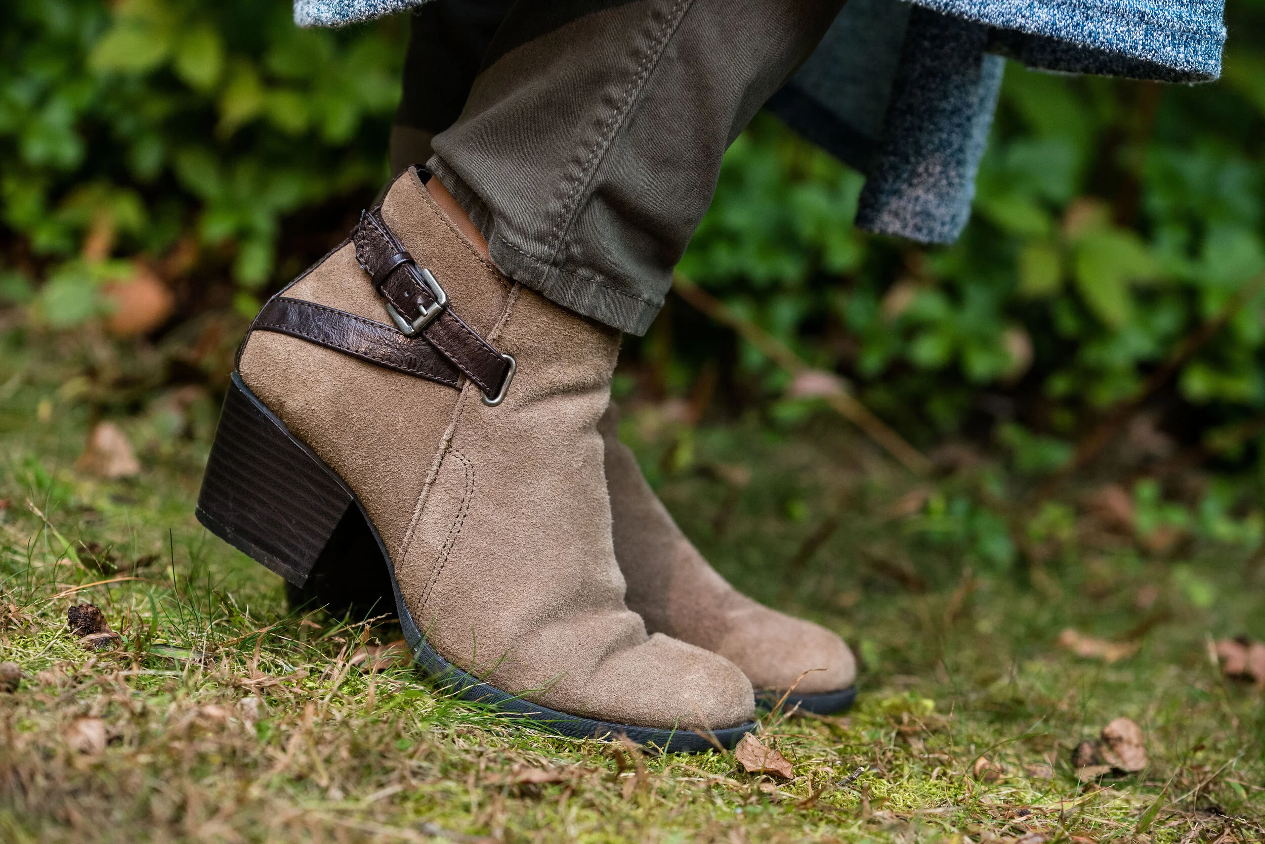
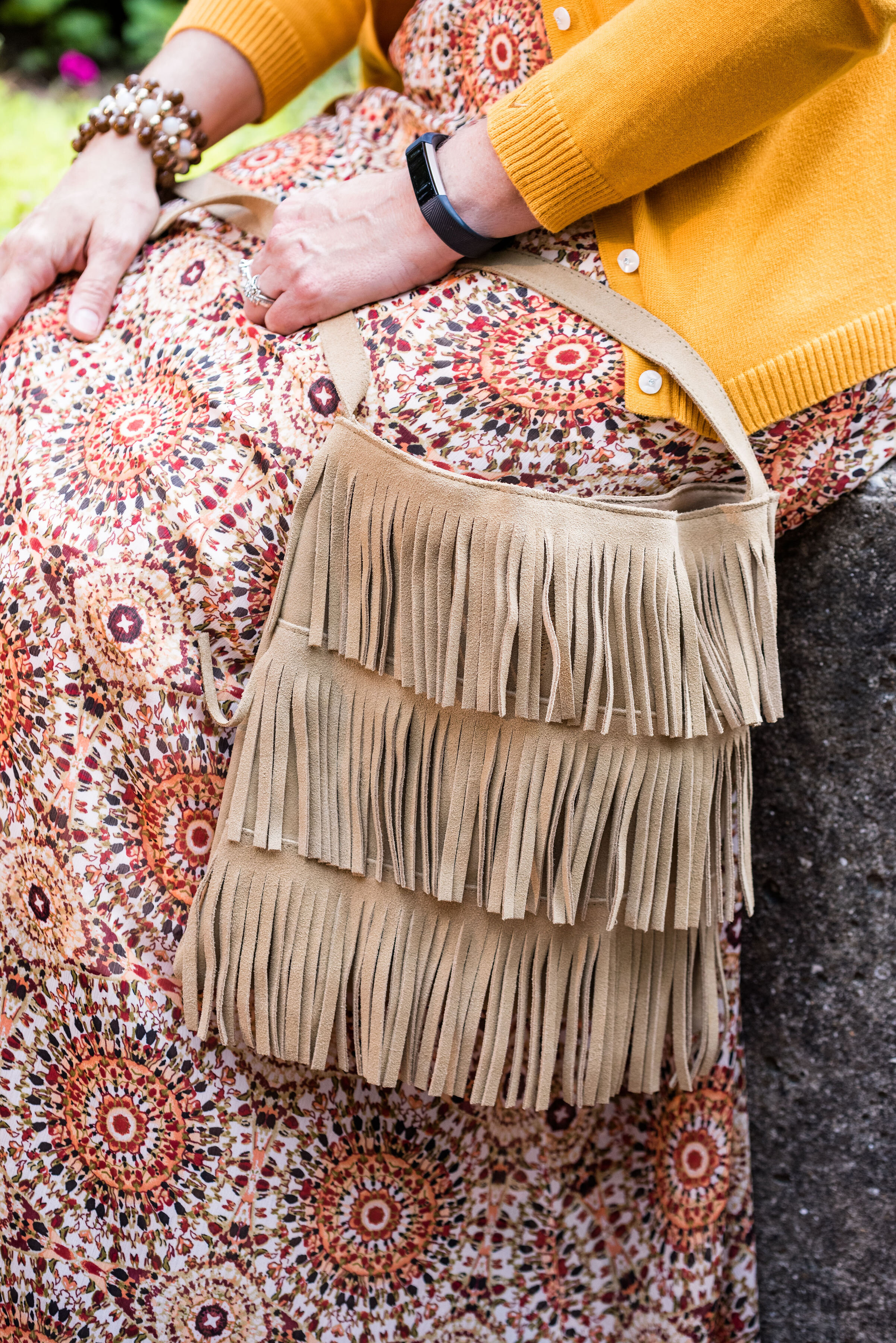
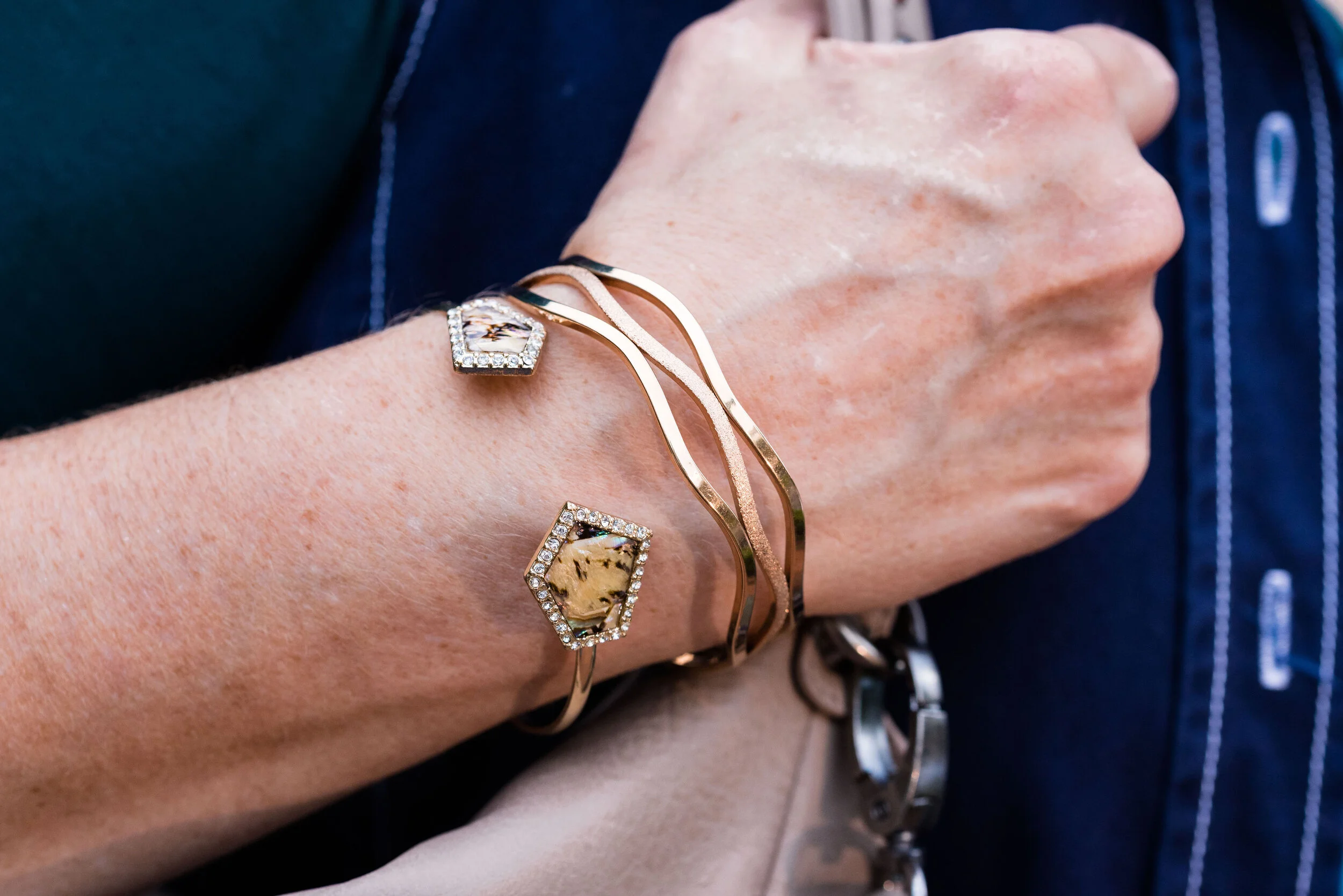
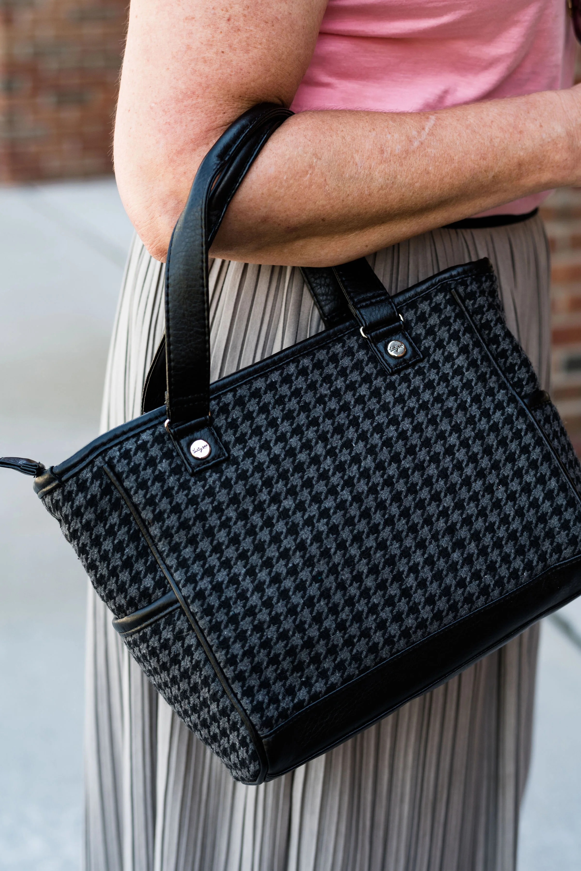
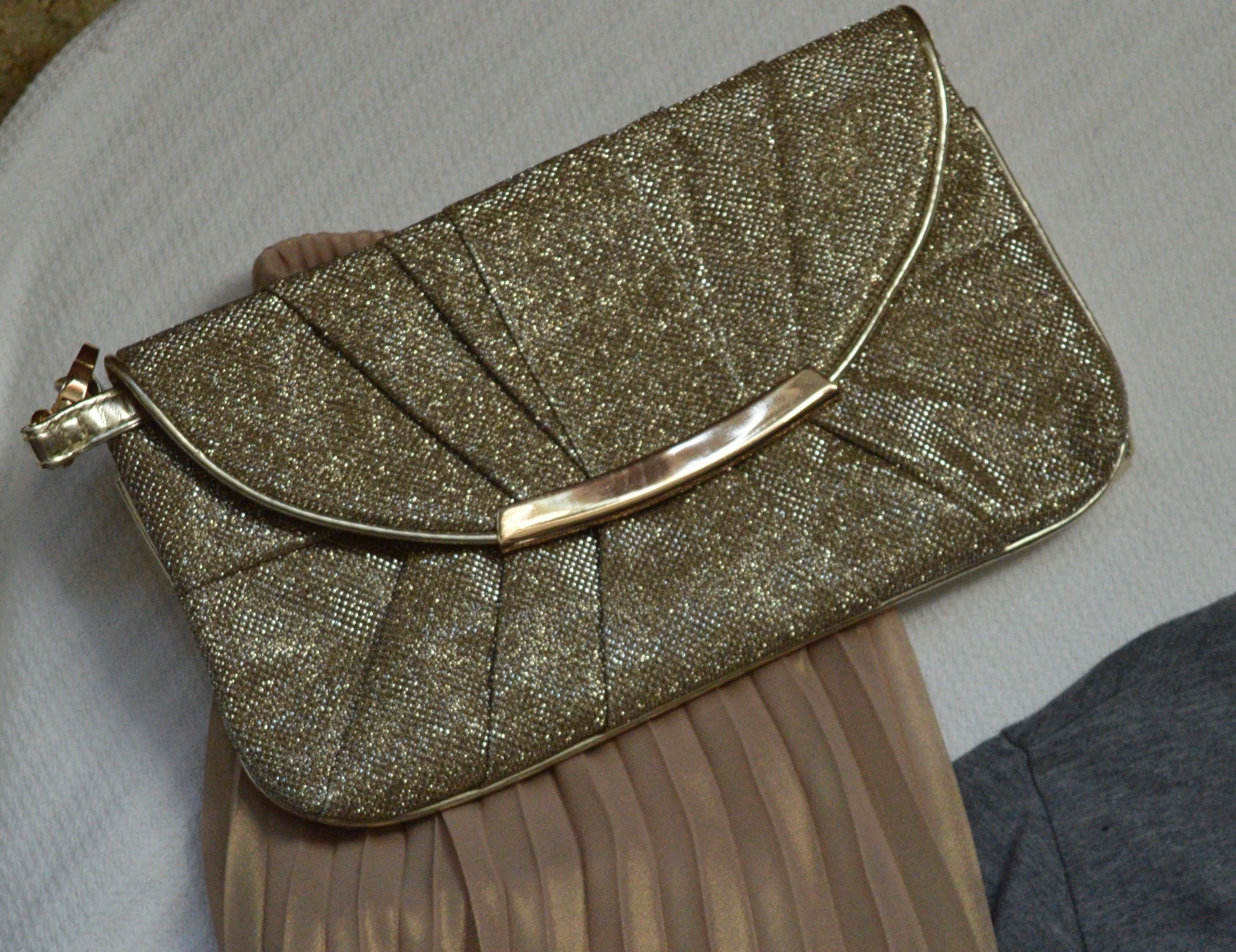
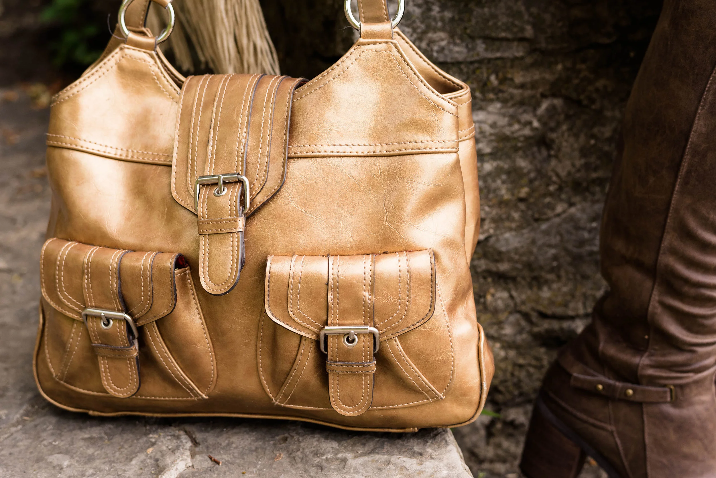
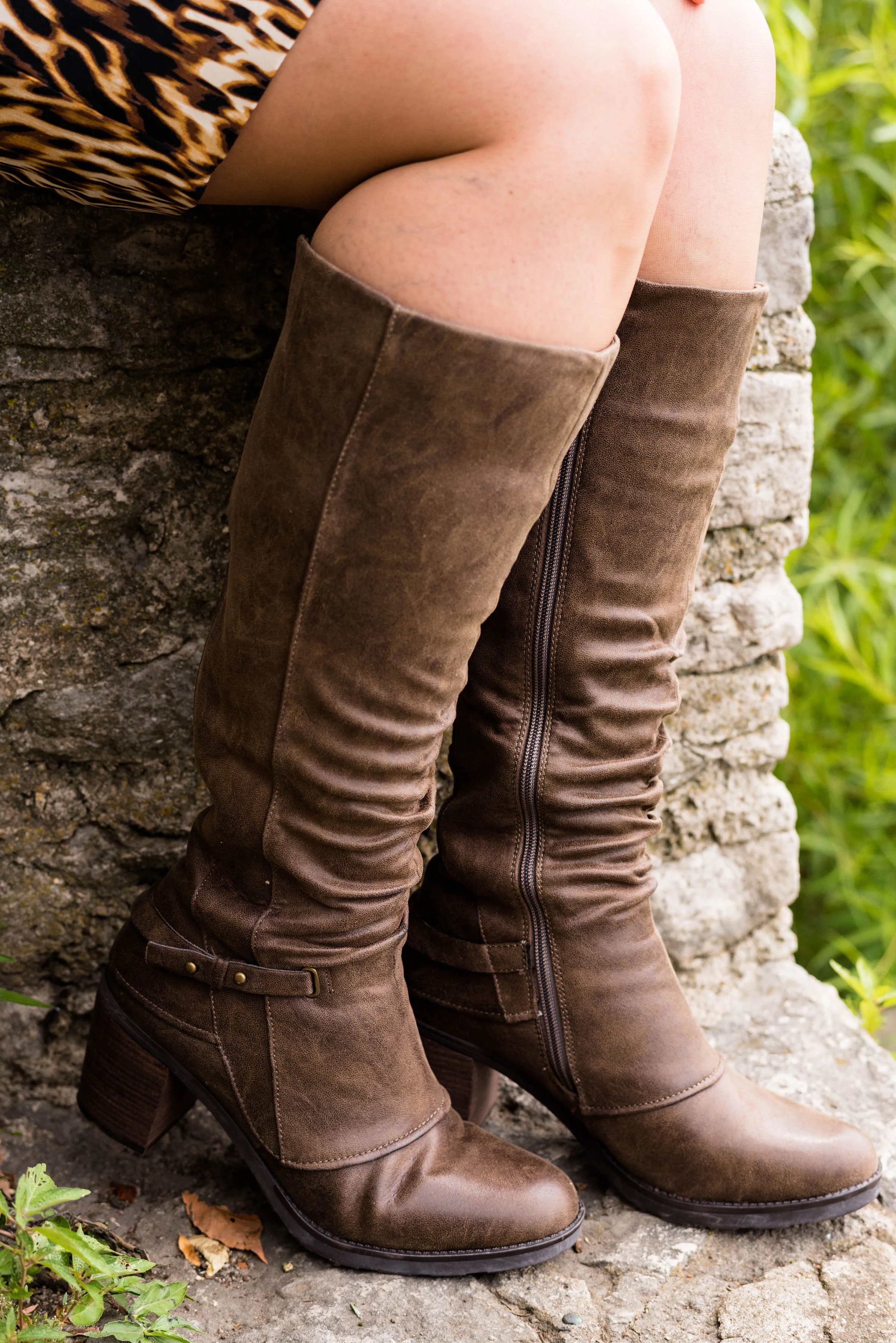
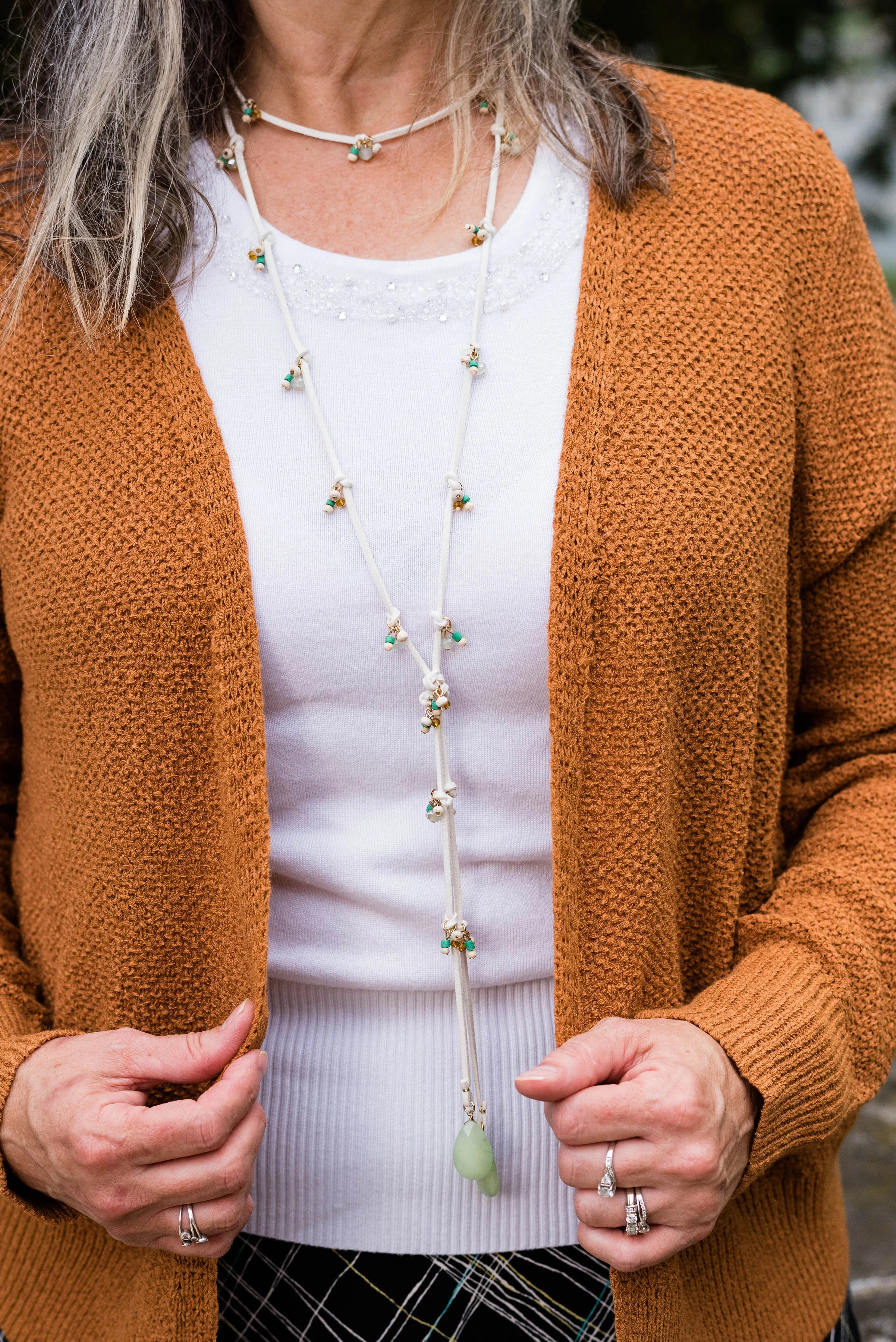
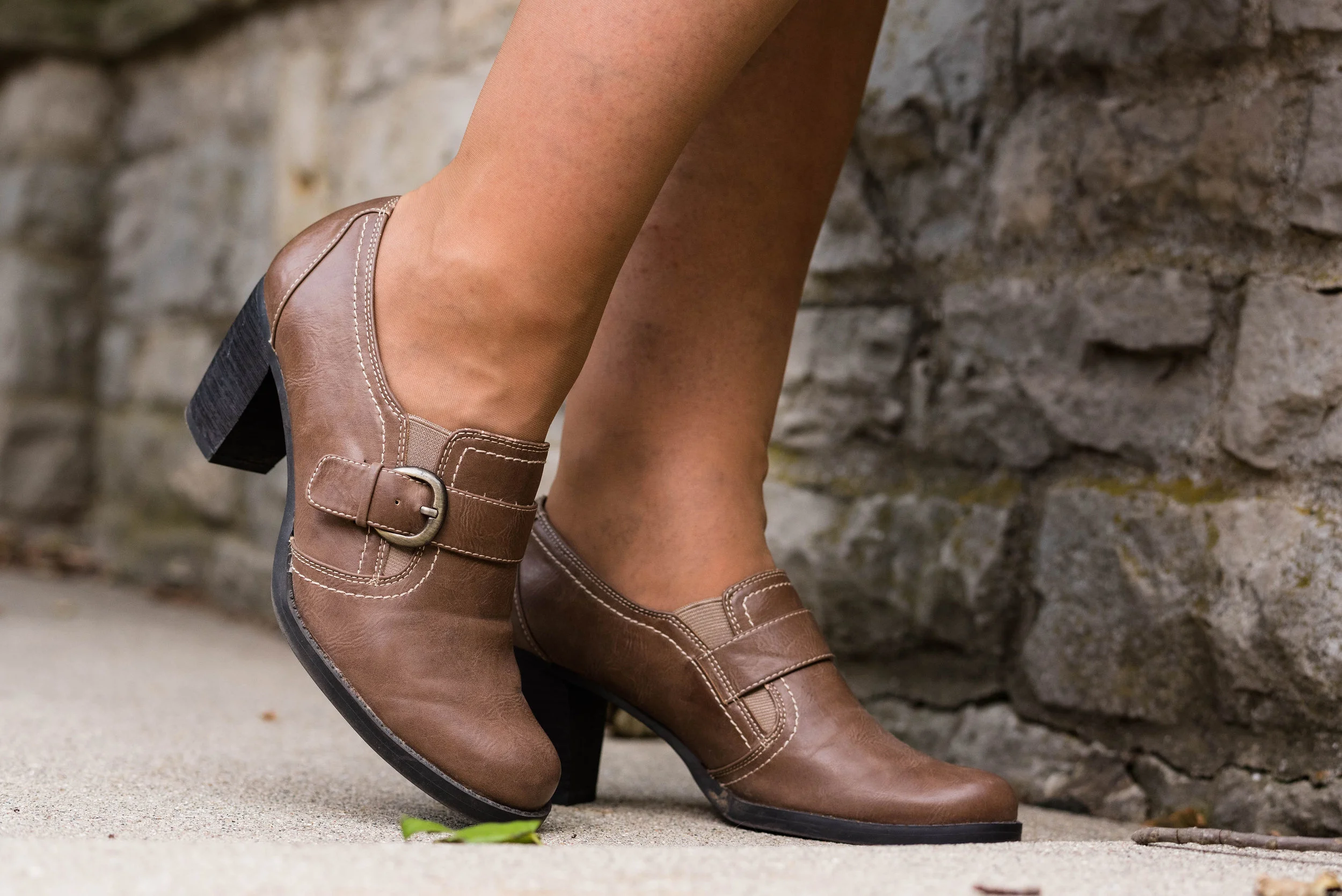
I went with a little metallic bling with my accessories including a rose gold pendent and bracelets, a Madden bag that I got on clearance at Kohl’s and my SO heeled boots, which were also a clearance purchase at Kohl’s.

What do you think of these colors? Would you wear an outfit like this? I’d love to hear from you.

I’m leaving you with a few shopping links. These are affiliate links. All opinions are my own.

Have a great weekend.

Photo and graphic credit Rebecca Trumbull.


Pantone - Autumn/Winter - 2019 - Butterscotch and Grapeade

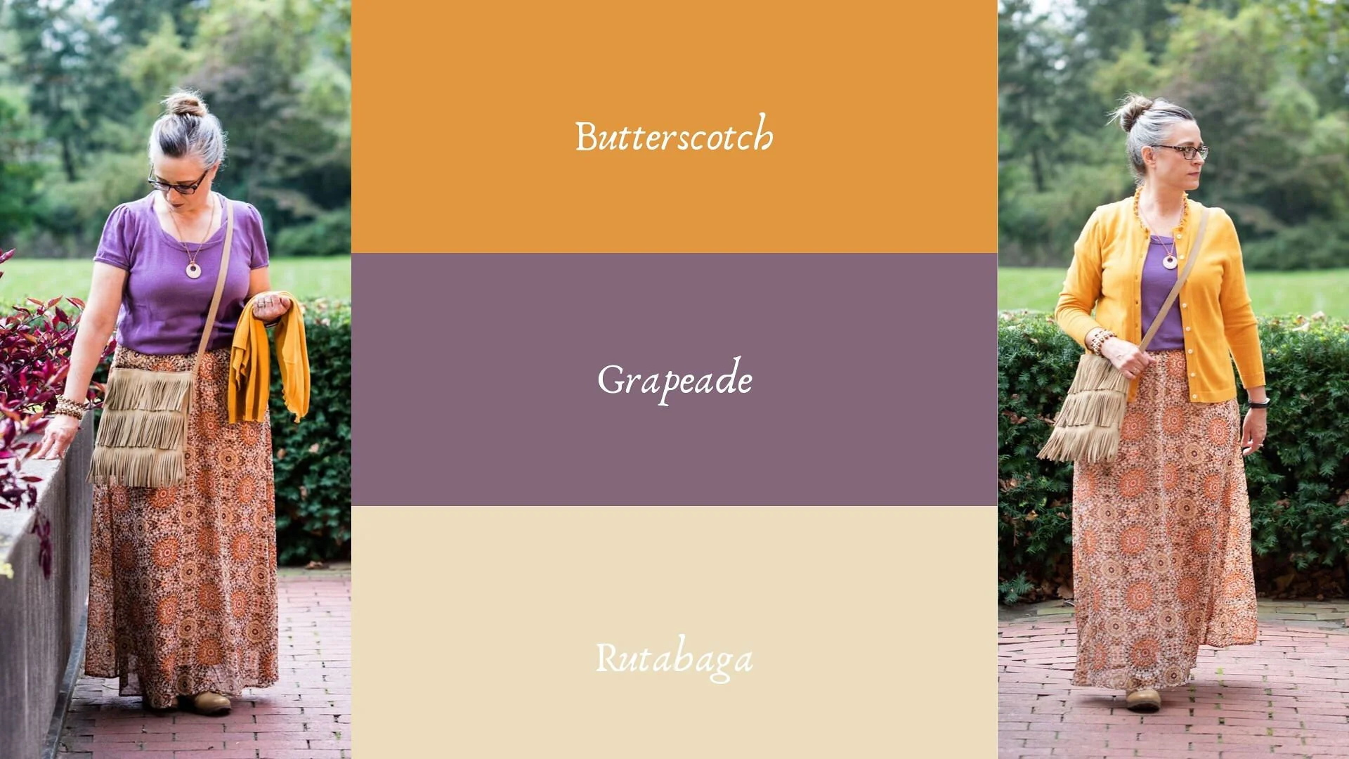
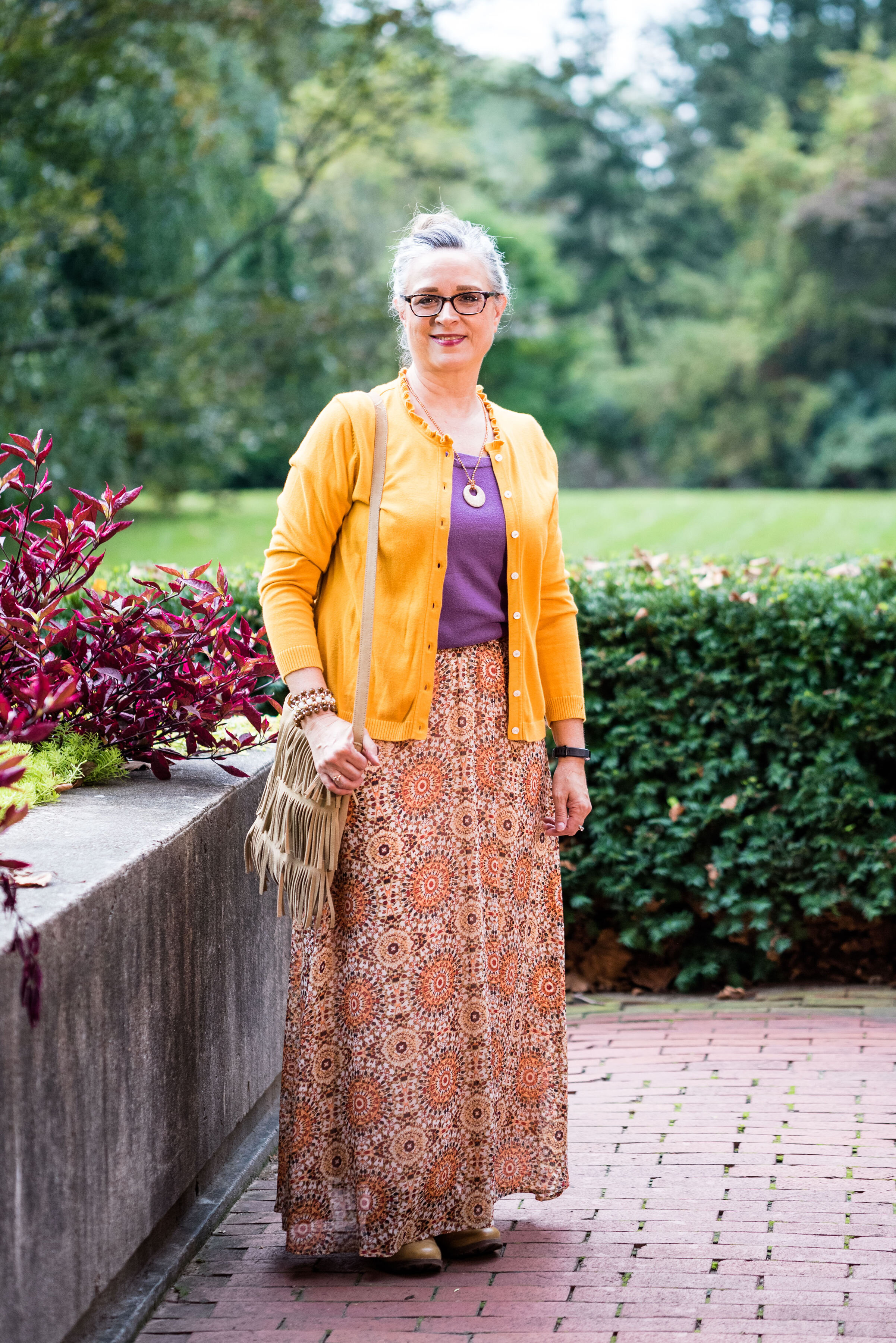
Today’s outfit features two colors from the London Autumn/Winter palette that Pantone describes as a “deliciously appealing golden yellow” and a “notable muted mauve tone.” You might wonder why I would pair purple with yellow. There was just something about this combination that I loved and when I paired them with the printed maxi skirt, I felt I had a winning outfit. Take a look.

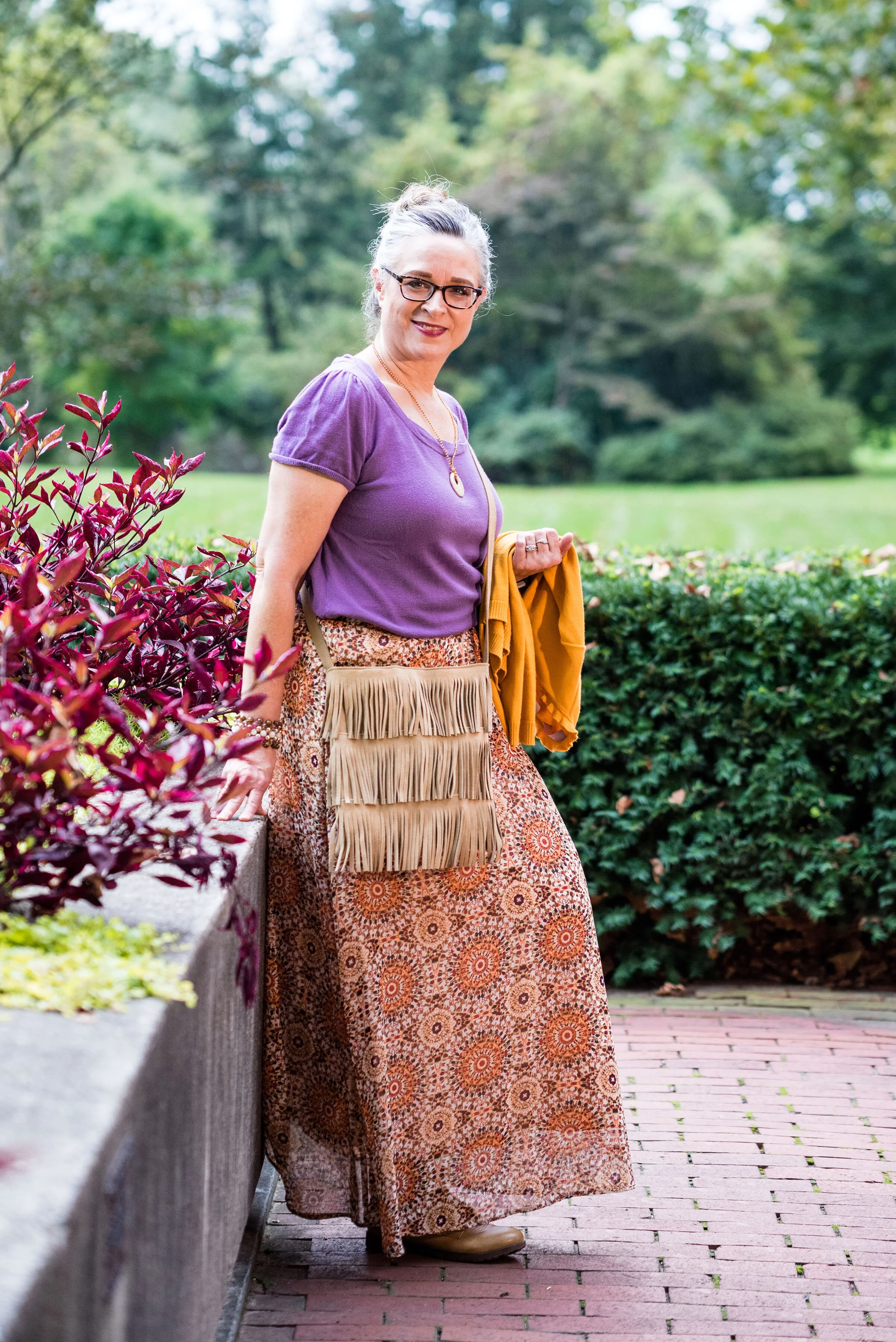
This outfit says several things. First, it says I’m not afraid to try unusual color combinations. Second, it says you can make up your own style. The short sleeve sweater with a cardigan topper is a more classic combination, but the medallion print skirt, beaded jewelry and fringe bag scream boho. Let’s talk details.

The purple short sleeve sweater is a thrifted Loft piece. I like the scoop neck and it has plenty of stretch, but still holds its shape. I also love purple, which is trending this fall.

The Butterscotch thrifted cardigan is a brand called Callaway. When I looked it up, it appears to be a clothing brand for golfing, selling things like polo shirts, pants, jackets and other golf related pieces. The brand also has their own website which features golfing equipment like drivers, putters and bags. Neither my hubby, nor I play golf. He calls it “cow pasture pool.” He’s always got a name for everything. You can see Callaway clothing on Amazon, and on their own website, Callaway Apparel.

I may not be a golfer, but I know a quality sweater when I see one. I love the women’s fit of this cardi and the ruffle treatment around the neckline. It makes the sweater very feminine and fun.

I’ve styled this medallion print Roz & Ali brand skirt on the blog before. I got this at Dressbarn a few years ago. While it is a summer weight skirt, it is fully lined, so good for cooler temps and if you pair it with leggings or heavy tights you could wear it all winter. You can see how I paired the skirt with both an orange tank and a gold top here, and with another lighter purple color here.

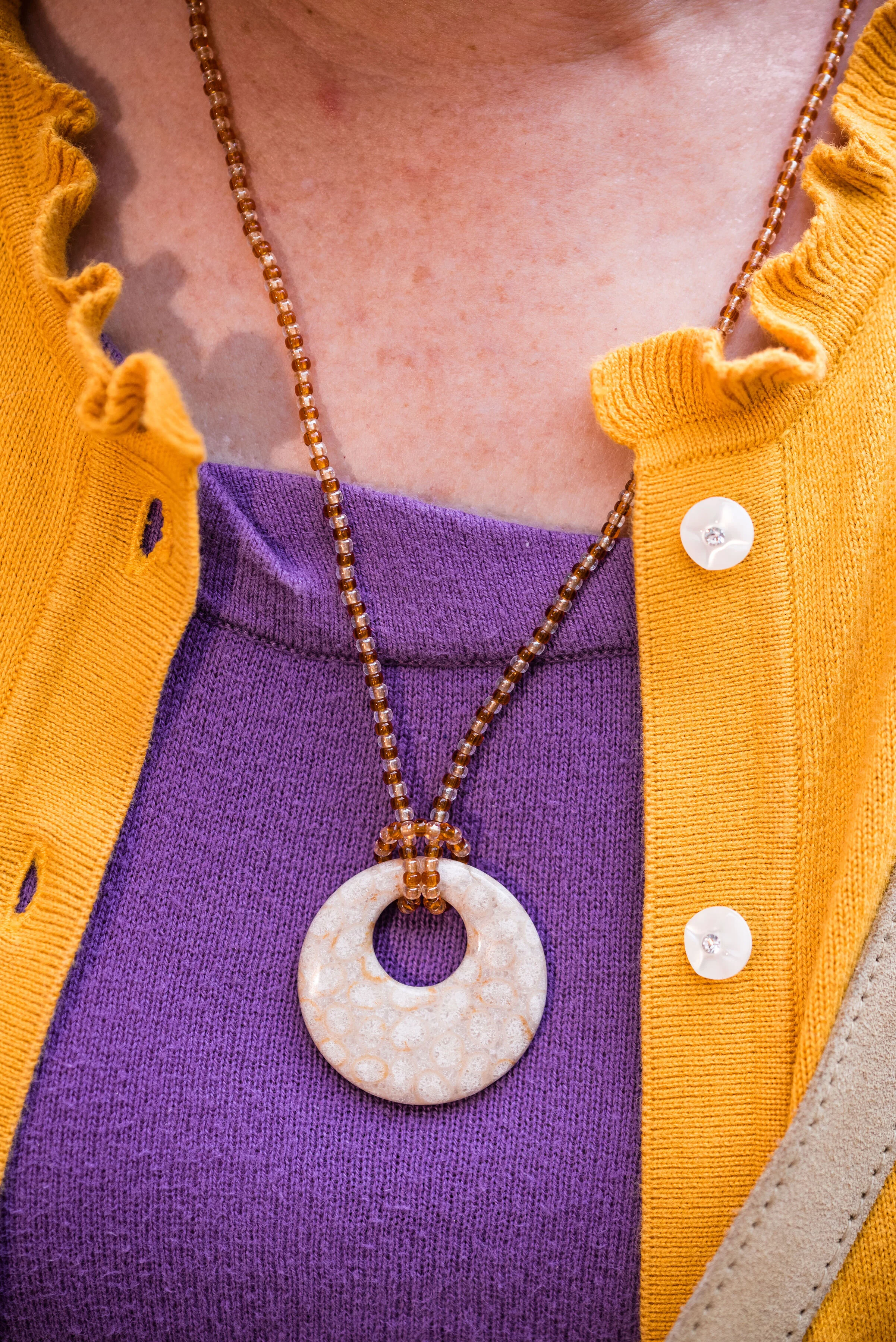
In keeping with the boho feel of the outfit, I went for a hand crafted look with my jewelry and bag. The necklace was actually made by my oldest. She was into beading as a teen and made some fun pieces, of which I still have a few.

This beaded bracelet was probably a Kohl’s or JCPenney piece from the clearance rack. I’ve had it for a while, so I don’t remember.

I found this fringe bag at a thrift store and knew I had to have it. It looks like it was hand made and there is no label inside. I like that it is a neutral color and long enough to be a cross body bag.

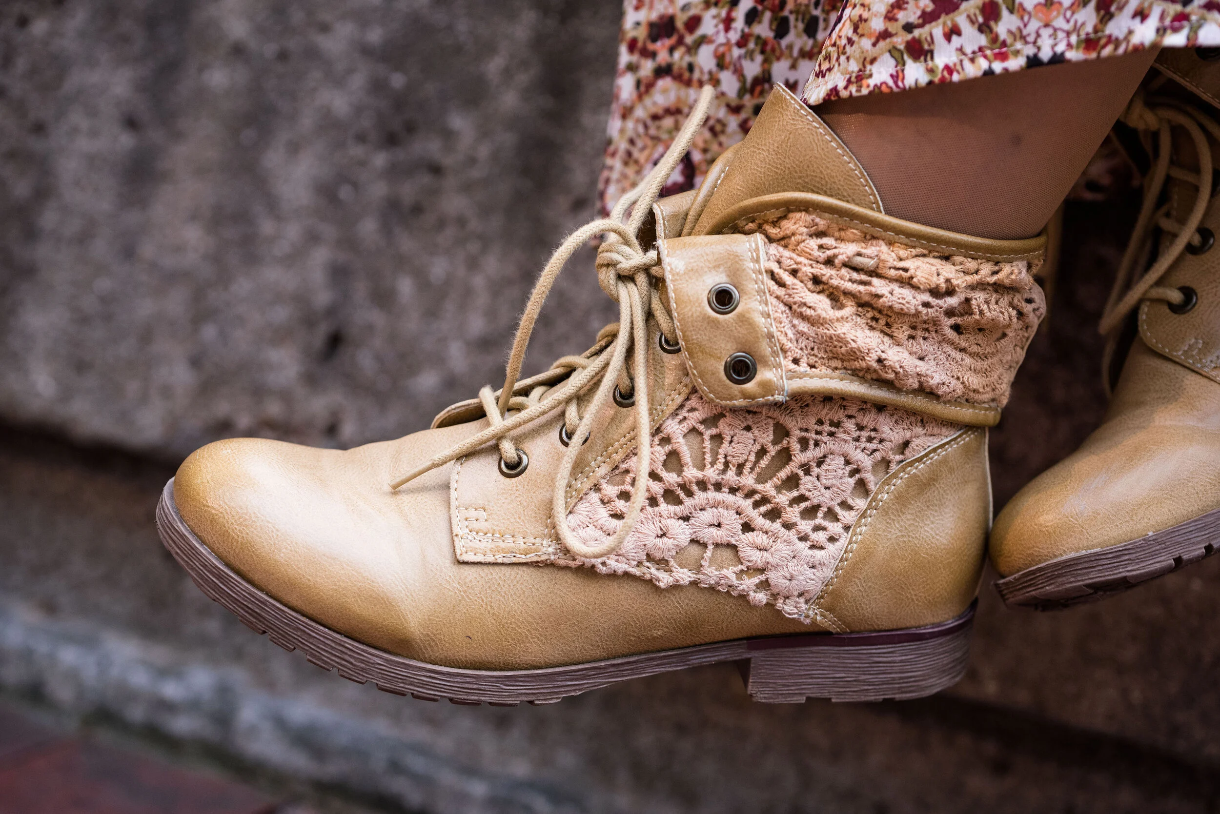
My ankle boots are another thrift store find and I thought paired well with the boho theme of the outfit. These are a brand called Rock Candy by Zigi.

What do you think of these colors? Do you have these in your closet? Would you wear yellow and purple together? I’d love to hear your thoughts. Leave me some love in the comments.

i’m including a few shopping links for things purple and yellow. The holidays are coming up. How many of you have started your Christmas shopping? I’m guilty! Life is so busy, I can’t afford to wait until the last minute. These are affiliate links. All opinions are my own.

Photo and graphic credit Rebecca Trumbull.


Pantone - Autumn/Winter - 2019 - Cranberry and Chicory Coffee

Hi everyone. The days are flying by and we are almost to Halloween. I haven’t even gotten out my decorations yet! That is how far behind I am. Maybe I should just skip Halloween and start decorating for Christmas. All the stores are doing it. Ha, ha . Well, I don’t think I’ll get that crazy, but this time of year does seem to go awfully fast. Do you get that feeling?

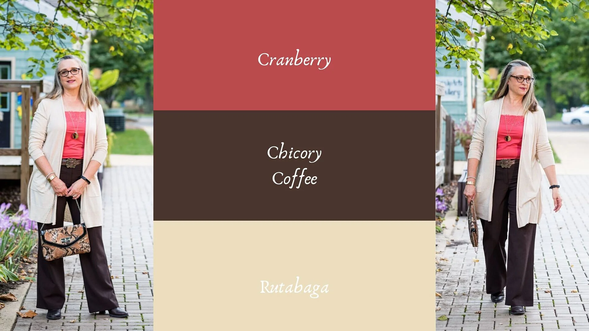
Today’s colors are what the Pantone Color Institute label a “vital red that adds a pungent punch to the palette,” and a “robust and tasteful” brown that, “introduces an element of heartiness.”

I was able to pull these pieces from my closet and decided to add the off white cardi that mimics Rutabaga from the London classic color palette.

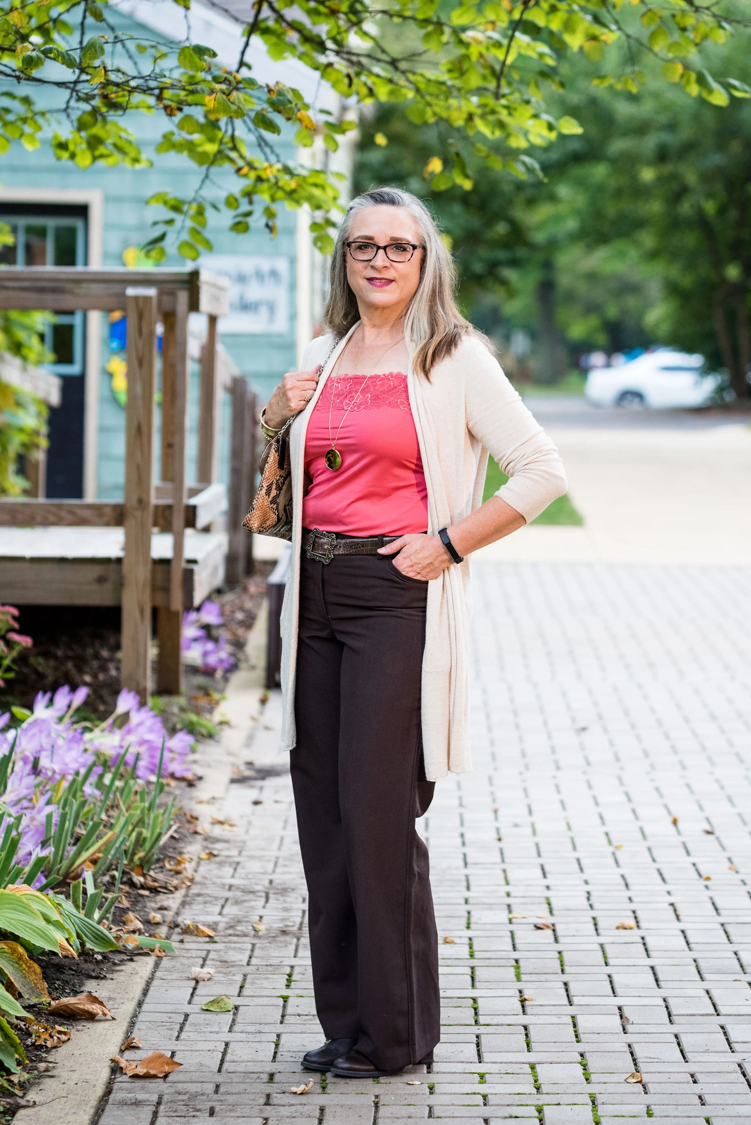
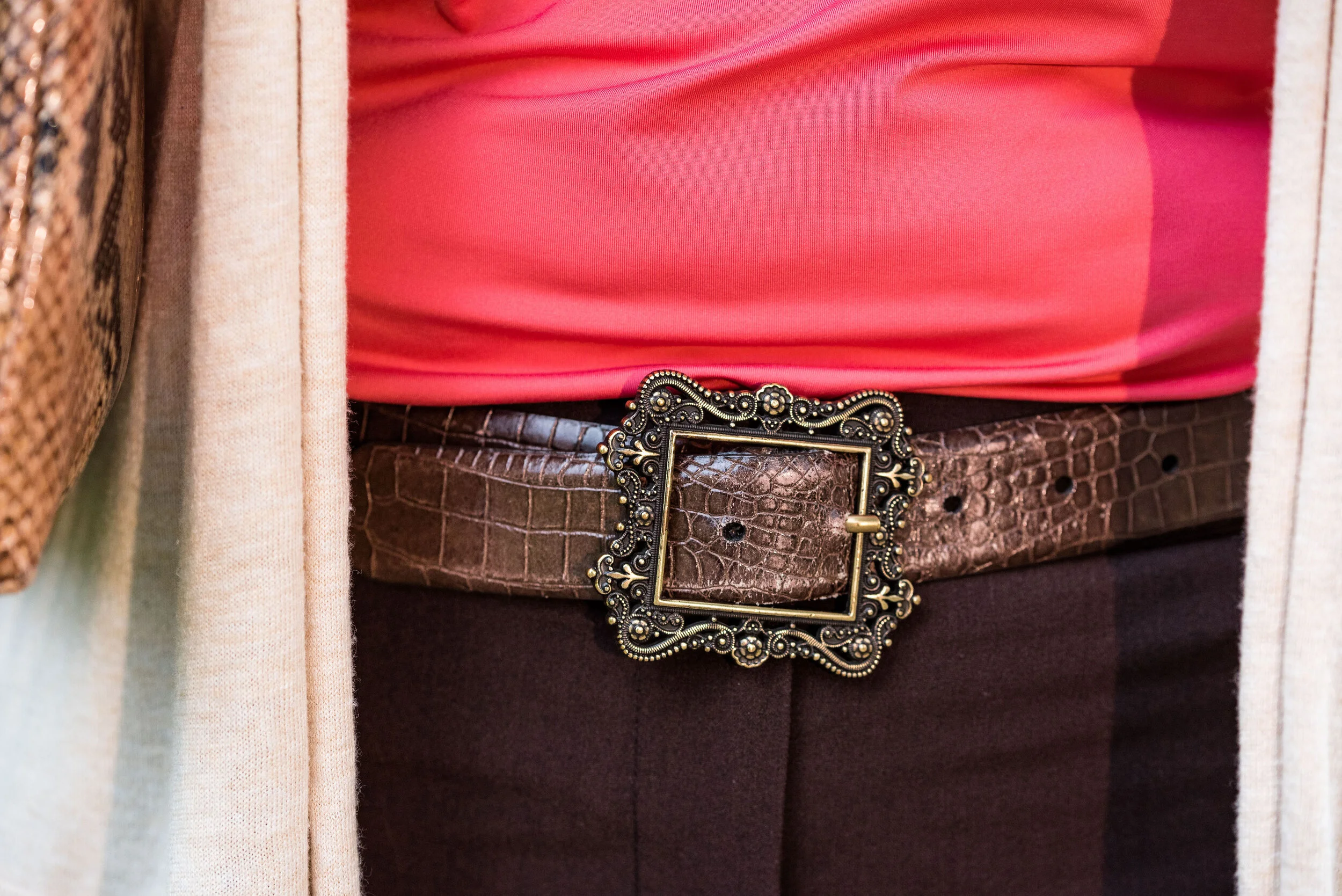
This Cranberry cami was a recent thrift purchase. Most of my camis are pretty tight and I wear them as layering pieces under long sleeve tops and sweaters. I do not wear them to be seen, but it occurred to me that it would be nice to have something I could have more visible under an open sweater. It is Maurice’s brand. I am becoming a fan of Maurice’s. I see pieces every so often at thrift stores and recently I bought what has become one of my favorite pairs of jeans on the clearance rack. What really drew me to this cami was the pretty lace detailing.

These trousers are Worthington brand from JCPenney. Do you know how hard it is to find brown slacks? Now maybe that has changed. I have seen rust, and that more yellowy brown called cognac, but real brown is hard to find, especially a dark brown like this one.

The off white open front cardigan is Chaps brand and another clearance rack find from Kohl’s. Chaps has some nice pieces, but they do have a higher price point than I would normally pay, thus my reasoning for waiting for them to go on clearance. If I thought a particular piece is really worth paying full price for, I would buy it, but for the most part there isn’t anything that I absolutely have to have. I could shop my closet for months and come up with all sorts of new combinations, because I have so many clothes. Truth!

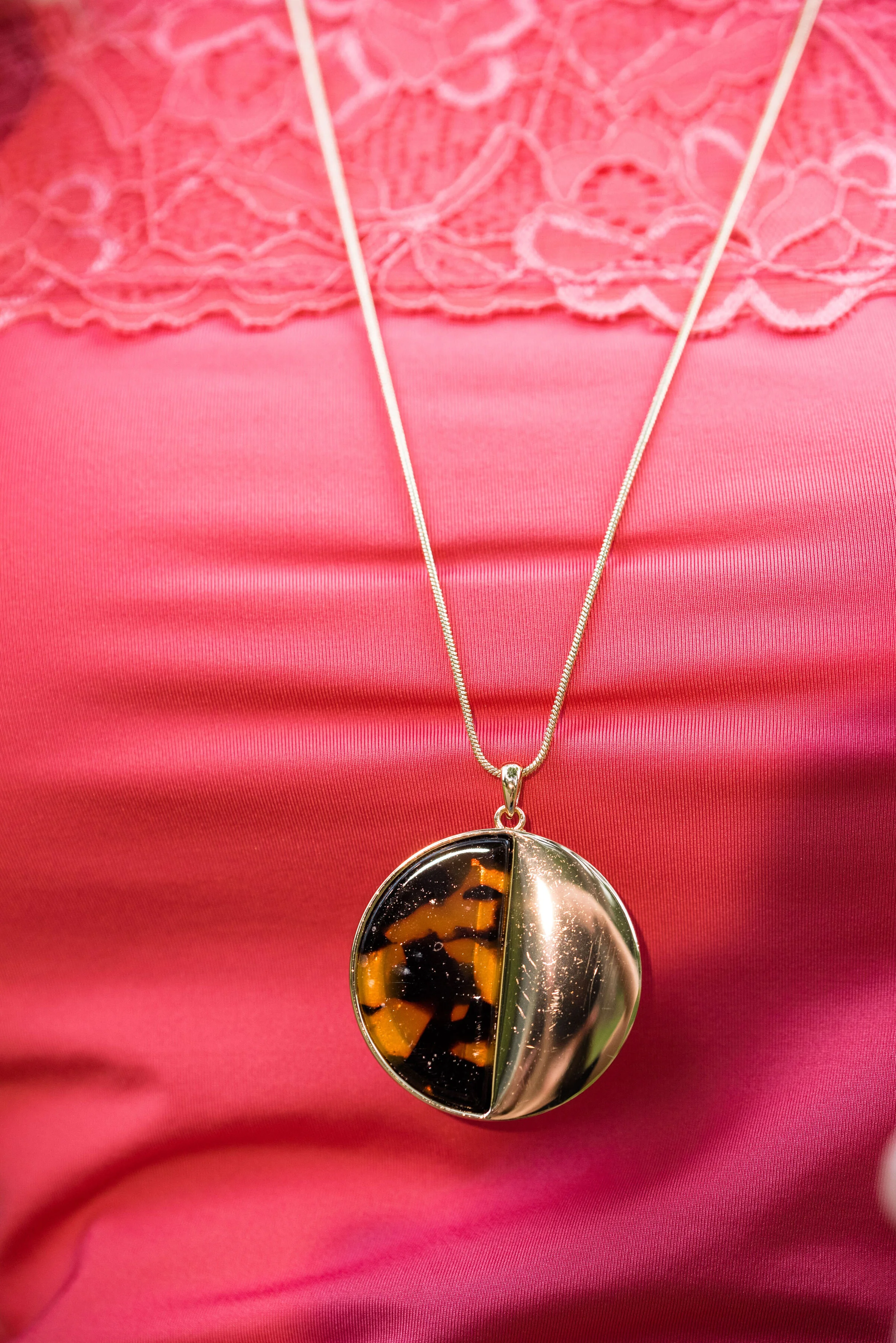
I kept the accessories minimal with my gold leopard print medallion necklace, a few gold bracelets, my snakeskin clutch, a brown belt, and brown boots. I thought this was a good outfit for complimenting with animal prints.

These are two colors that I can get behind. I love the combination and think these two work well together. What do you think? Do you have any of these colors in your closet? Do you wear camis a lot? Do you wear them more for layering or to be seen? I’d love to hear you thoughts, so leave me a comment or two in the comments section. I appreciate hearing from you and all your support.

I’m including a few shopping links for you to peruse. I hope that you find these helpful. Every click you do, gives me a few cents and I appreciate every one. These are affiliate links. All opinions are my own.

Photo and graphic credit Rebecca Trumbull.

Have a great day.


Pantone - Autumn/Winter - 2019 - Merlot and Antique Moss

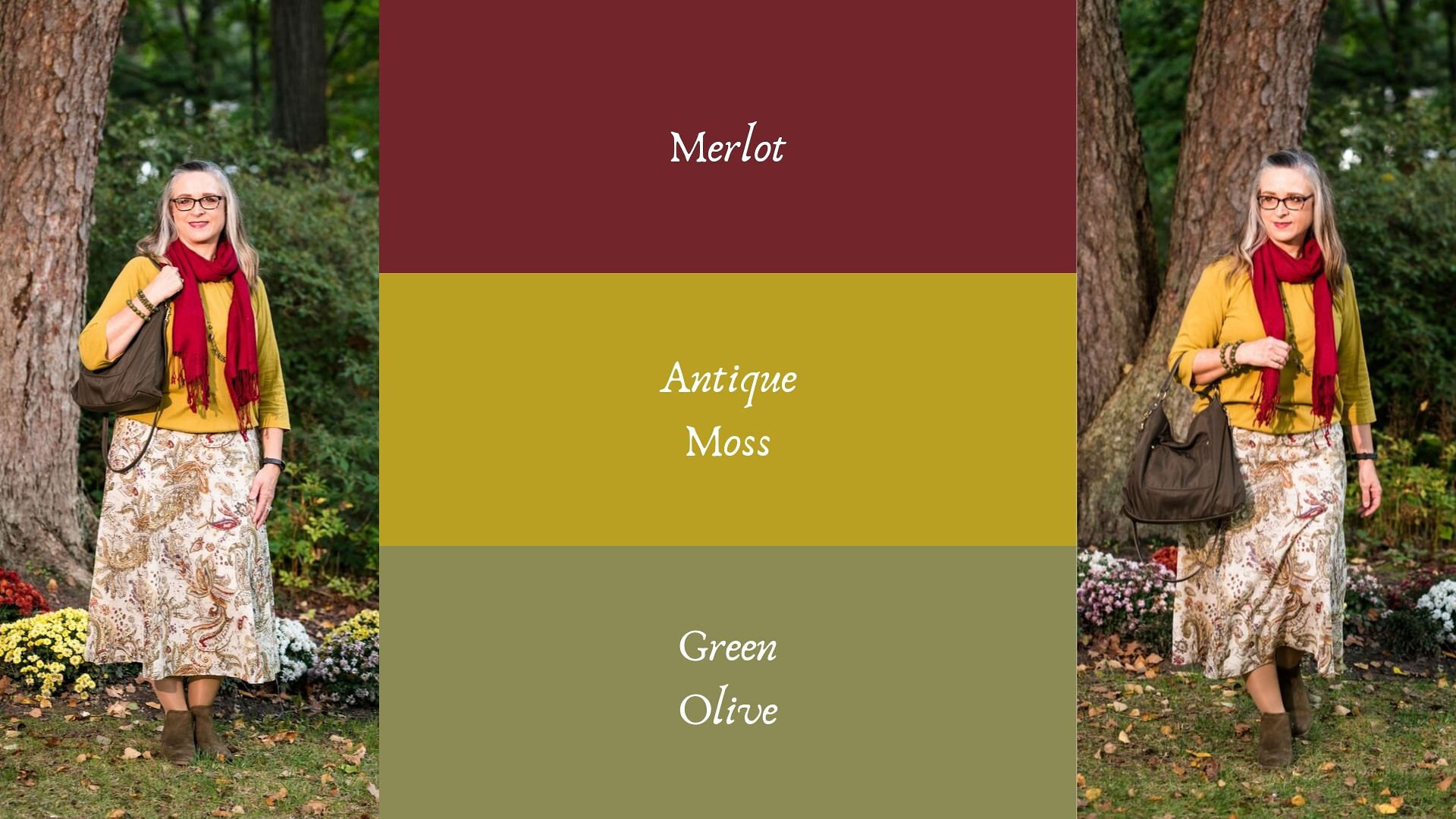
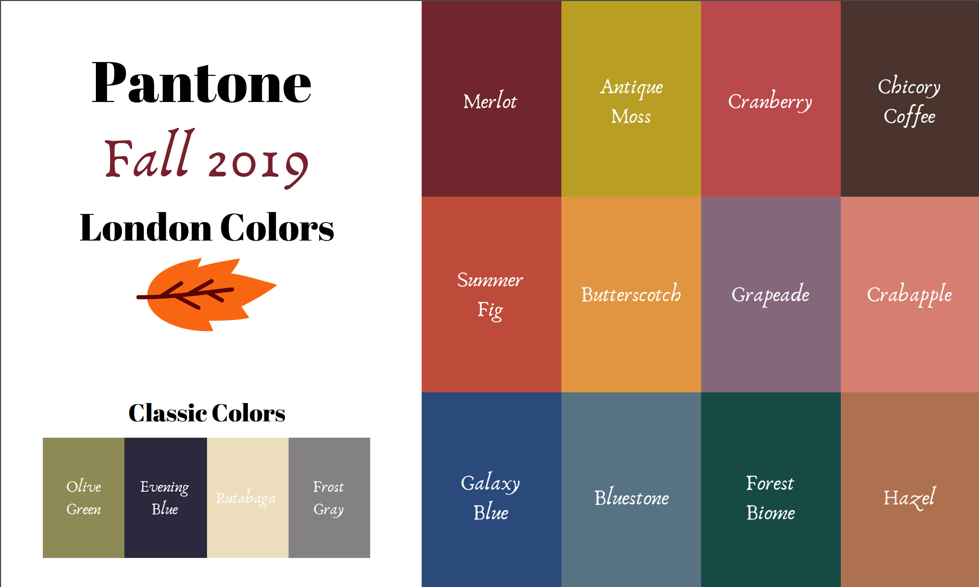
The first two colors from the Pantone - Autumn/Winter - London palette that I am featuring are Merlot and Antique Moss. As you can imagine, Merlot, like the wine is a rich burgundy red, while Antique Moss is a yellowy green. Often when we think of pairing red and yellow, we are concerned we will come out looking like an advertisement for McDonald’s, but let me reassure you these two colors pair in a perfectly un-Ronald like way and I love the combination.

The London color palette classic colors were just a bit different. Green Olive is comparable to Guacamole from the New York palette, with a little more of a gray tinge. My version of olive in my accessories is much darker, but you get the idea.

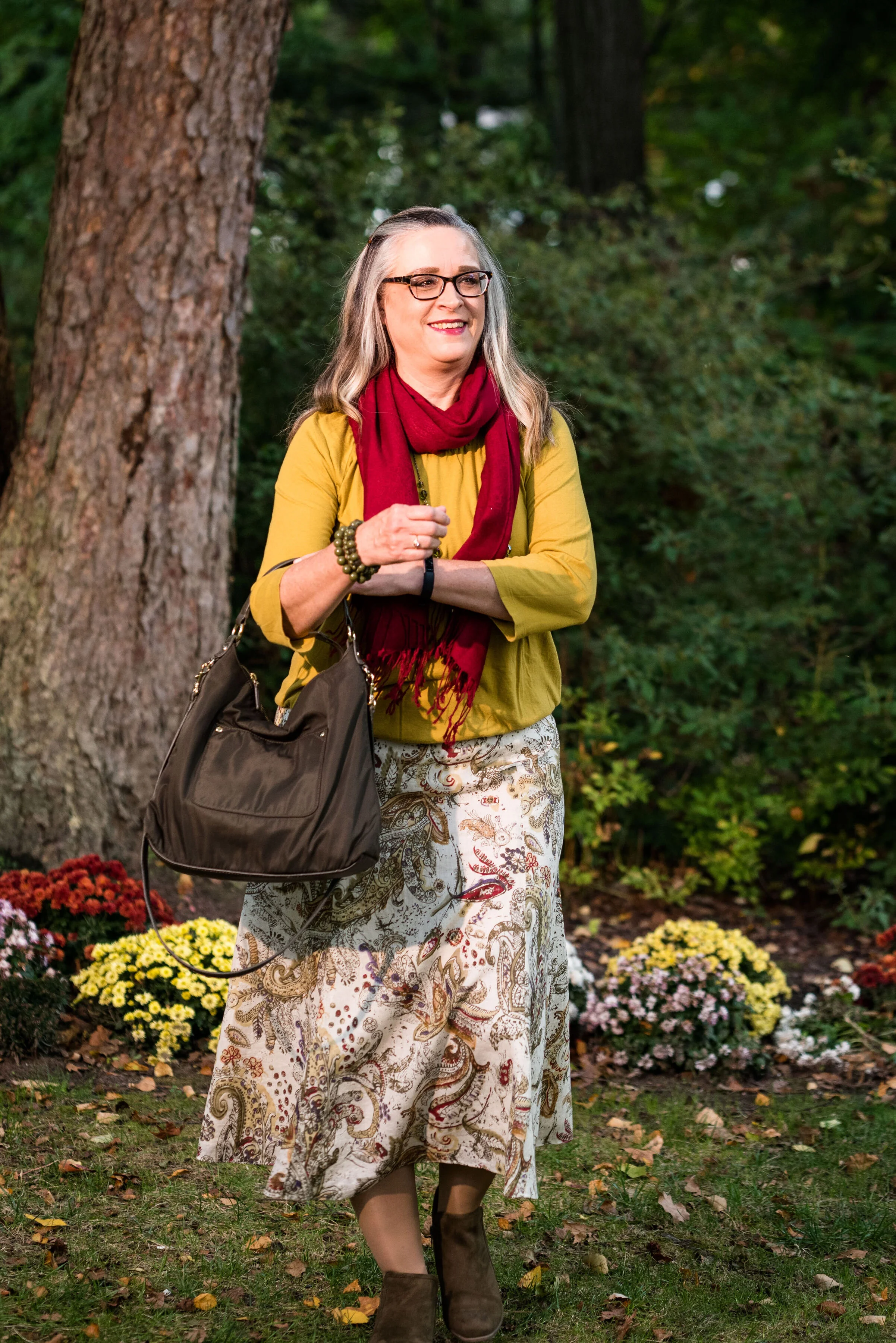
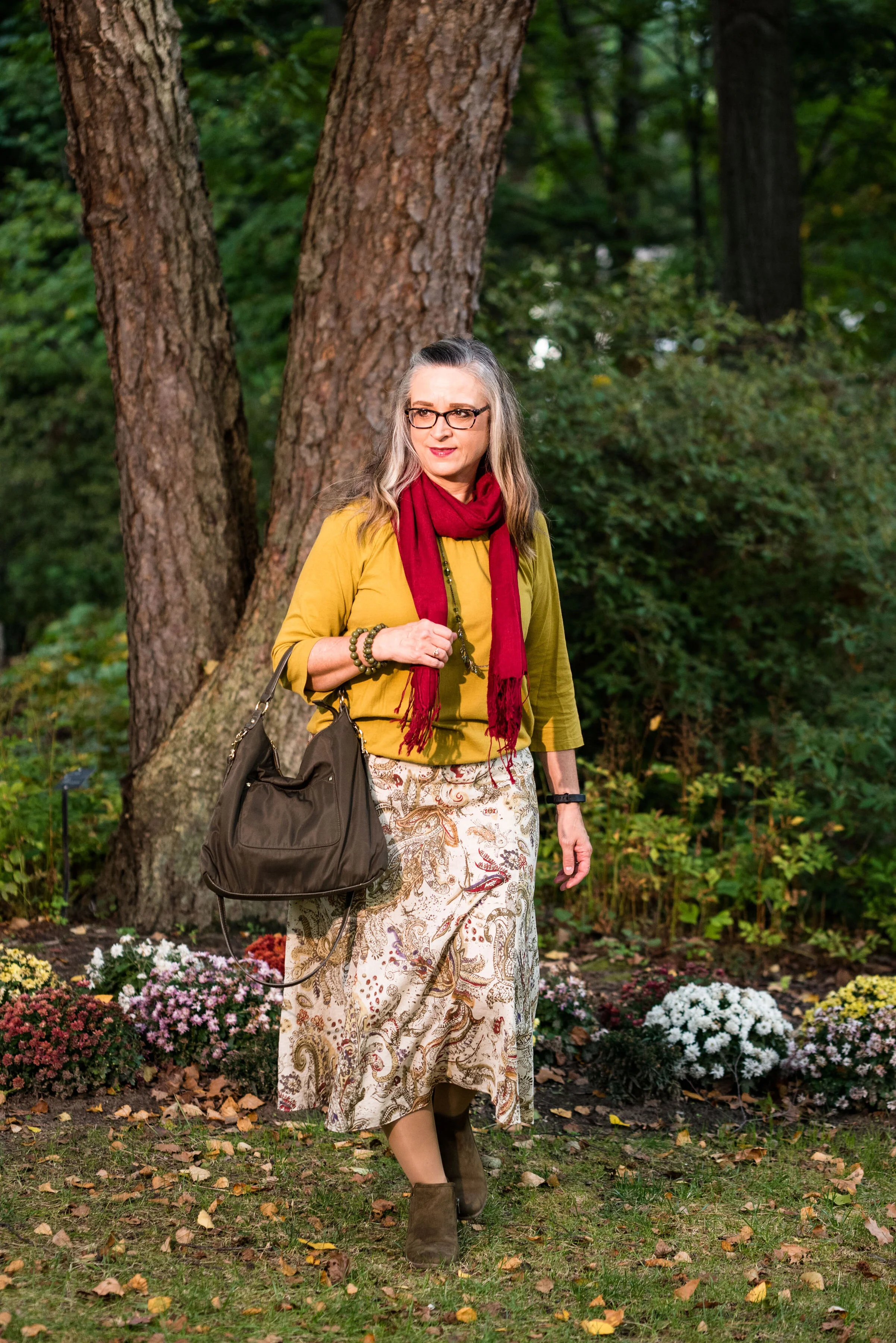
This Jones Wear skirt you’ve seen on the blog before. I styled it for the Pantone Fall 2017 New York Palette in a very similar fashion. I even used the same dark olive bag. Ha, ha. You can see that post here. I also used it this past spring for the Pantone Spring/Summer 2019 colors. You can see that post here. In addition you can see it with a green cardigan, here. I keep coming back to this skirt, because it works so well for these color schemes due to the reds and greens in the print of the skirt. I could easily used this printed skirt for a Christmas outfit as well, so you might see it come up again later this year. I love a versatile piece and when I purchased this skirt, I never knew how often I would use it for the blog.

We took the pictures for this series at the Toledo Botanical Gardens, which are just down the street from where my daughter lives. The gardens are beautiful in all seasons and with walking paths through the grounds, it is a lovely place to visit and I don’t do it nearly enough. In the picture below, I am watching several bus loads of kids scramble on to the grounds and thinking, “Oh boy!” Ha, ha.

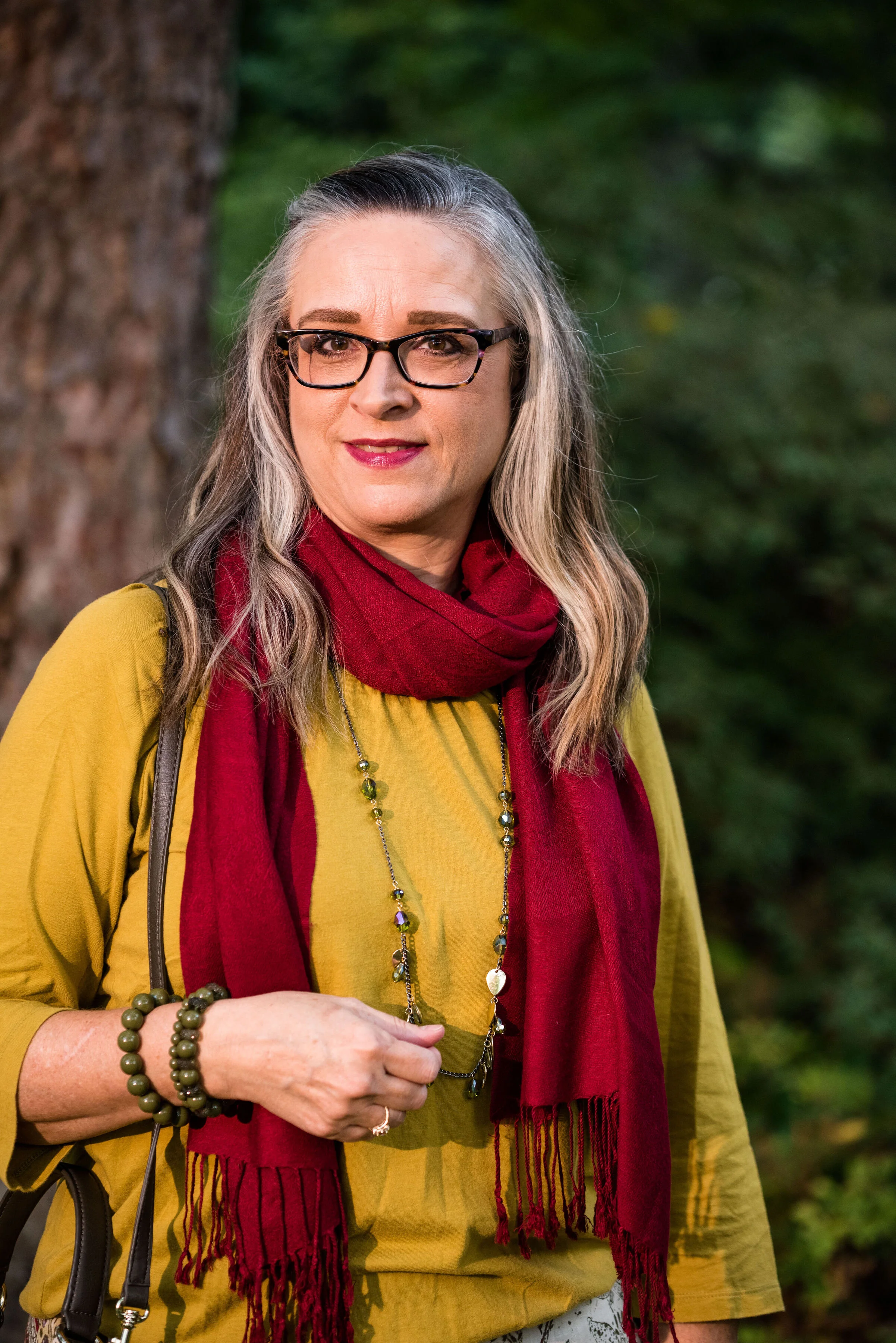
I obtained this red scarf from a friend’s closet. It looked a little more like Merlot, when it was in the low light of my closet, but here it looks much brighter. However, It is not a true red, but more of a burgundy. My 3/4 sleeve tee, I’ve worn on the blog before too. It is a thrifted Sonoma piece and has elastic on the bottom, which allows for freedom of movement and bulge camouflage. Ha, ha. You can see the tee styled with boyfriend jeans and a leopard print skirt here, and with a snakeskin print skirt here.

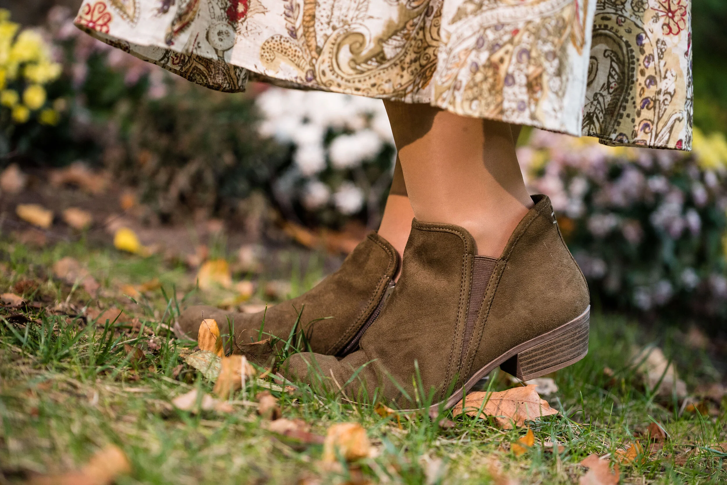
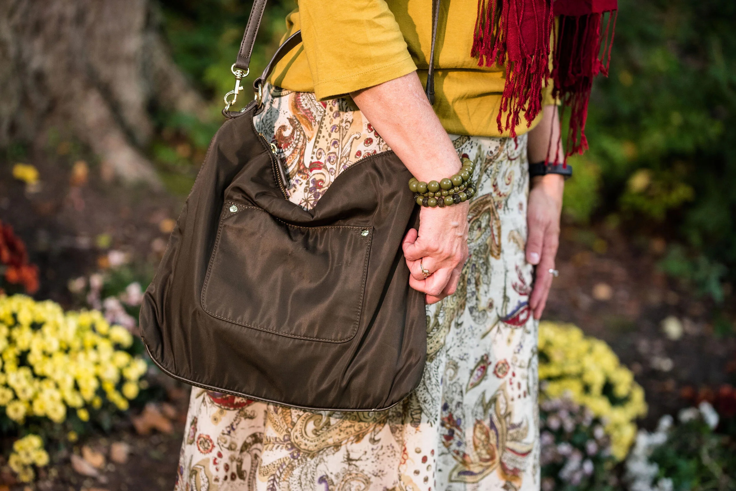
As I said earlier, I opted for olive green accessories which included my necklace, bracelets, thrifted bag and SO booties.

What do you think of these colors? Would you wear either of these? Would you wear them together? I’d love to have your feedback. Your support means a lot to me. I always respond to your comments. Just check back in a few days if you are interested in my reply.

I’m including a few shopping links for Merlot and Antique Moss if those colors got you excited. These are affiliate links, which means I get a few cents when you click on a link. All opinions are my own.

Photo and graphic credit Rebecca Trumbull.


Pantone - Autumn/Winter - 2019 - London Palette - Intro

Past Pantone seasons, I have tried to combine both the New York and the London color palettes into one series. Most of the time there were plenty of overlapping colors, so I was able to take colors from both palettes to make my outfits. This fall there were only two overlapping colors, Galaxy Blue and Bluestone. It was for this reason, that I decided to break the series into two parts. We just finished the New York palette last week. You can see a recap of those outfits here.

Today’s post will introduce you to the London palette and give you a few sneak peeks at the upcoming outfits.

Both the New York and the London palettes included numerous fall yellows, reds and browns. They both included a green, some blues and hues with pink undertones, but the London palette is the only one to include purple, which I thought was interesting since purple is trending right now. Purple has always been one of my favorite colors, so I was excited to see it included on this palette.

In all honesty, I like this palette better than the New York one. I always veer towards richer more saturated colors, rather than pastels and I felt that I had an easier time finding pieces in my wardrobe that better personified the color palette. In this palette we find words like vital, fortifying, robust, delicious, rich, baked, arresting, mellow and distinctive to describe the colors.

I hope you will join me on Thursday as I take a closer look at the London color palette for this fall. Here are a few peeks at what is coming up.

I hope you will join me on Thursday for the start of this series and a look at the first two colors.

Have a great day.

Photo and graphic credit Rebecca Trumbull.


Pantone - Autumn/Winter - 2019 - New York Palette Recap

I was going to start the Pantone London color palette today, but decided to do a recap of all the New York colors. Some people have told me they like to see all of the outfits and colors together in one post, so here we go.

Outfit 1 - Chili Pepper and Bluestone

Outfit 2 - Fruit Dove and Galaxy Blue

Outfit 3 - Crème de Pêche and Rocky Road

Outfit 4 - Sugar Almond and Dark Cheddar


Outfit 5 - Orange Tiger and Eden

Outfit 6 - Peach Pink and Biking Red

I hope you enjoyed this look at the Pantone - Autumn/Winter - 2019 - New York palette. Which outfit was your favorite? I’d love to hear your thoughts.

Next week I’ll be starting the Pantone - Autumn/Winter - 2019 - London palette. Believe it or not, the only two overlapping colors this year were Galaxy Blue and Bluestone. Be sure to check that out next week.

Thank you all for being a part of my blogging journey. If you ever have something you would like to see me feature on the blog, send me an email. I’m open to new ideas and value your opinions and support.

Have a fabulous weekend!

Photo credit Rebecca Trumbull.

Pantone - Autumn/Winter - 2019 - Orange Tiger and Eden

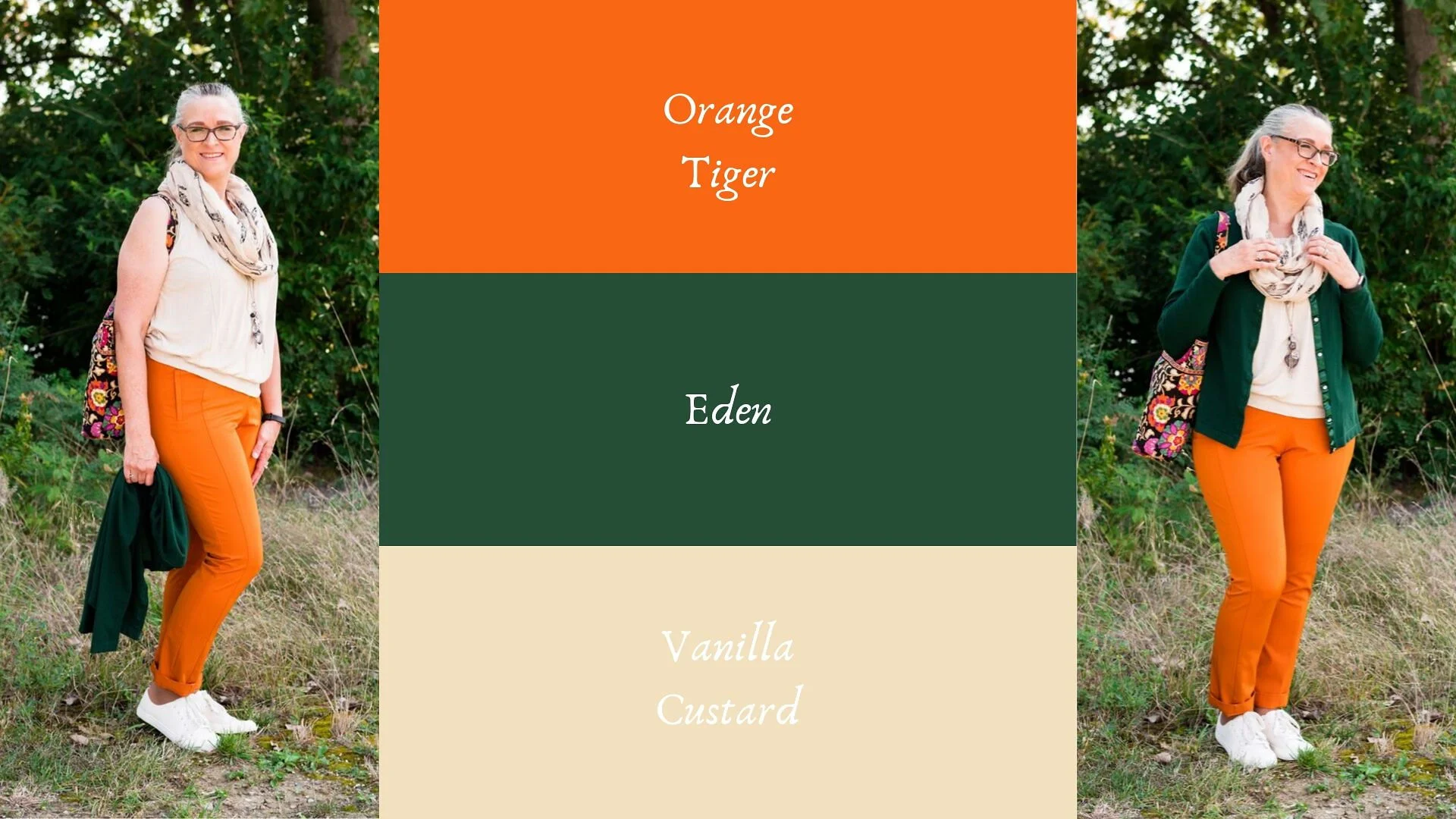
I mentioned in Tuesday’s post on Sugar Almond and Dark Cheddar, that not everyone can or wants to wear orange. I love orange, but it has to be the right shade for me to wear it near my face. Some oranges make me look sallow or washed out. Today’s colors are bold and what caused me to put these two colors together, was the contrast of dark with light, deep with bright. Today’s colors are a “fearless” Tiger Orange, and a rich “stately forest green” called Eden. I think Pantone’s description of these colors is perfect.

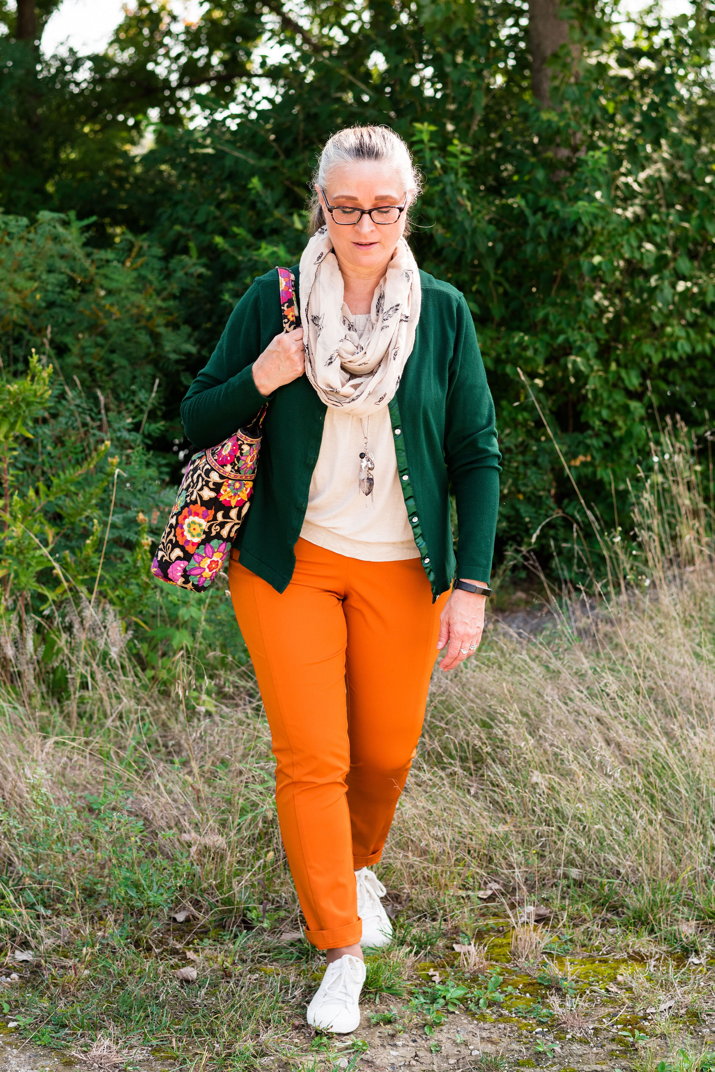
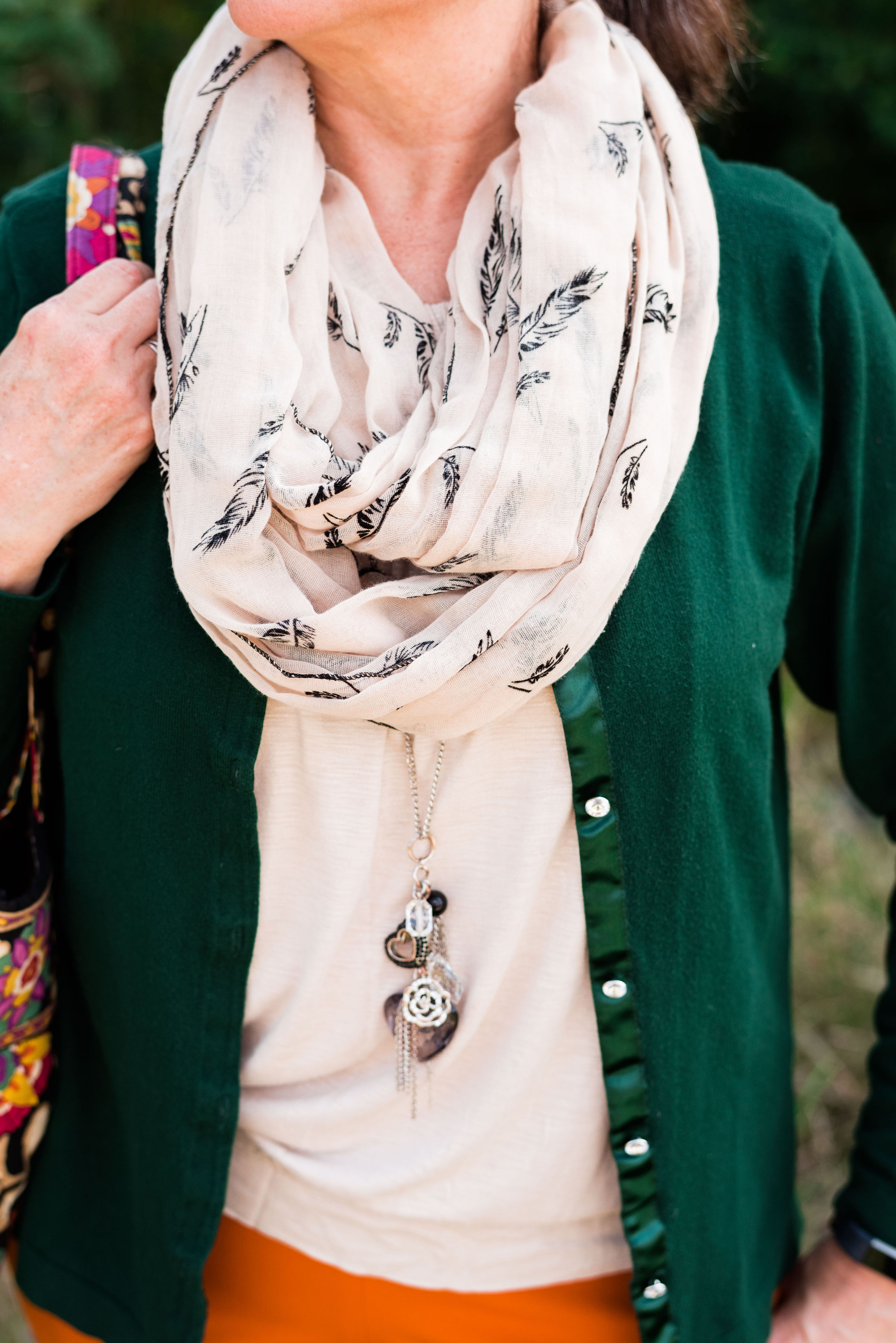
These two colors are the first in this series that I felt truly matched with the Pantone colors. I looked for a while in thrift stores for the perfect green and I really think this dark cardi nailed it. the sweater is Jaclyn Smith brand.

These bright orange pants are Worthington brand and I got them at JC Penney a number of years ago. These are more of a skinny leg trouser than a wide leg trouser. I got them for the bright color and do find occasions in the spring, summer and fall to wear them. You can see how I styled these with a floral tunic here.

This cream colored tank top is a thrifted Loft piece. I actually have two of them, found on different occasions, but the exact same style. This one is a large and has a sheen to it, that you can’t really see in the picture. The other one I have is a medium and is more of a true white. Why do I need two of these? Comfort and ease of wear. They work perfectly for something like this, but I will also be able to use them as a light weight under layer when the temps grow cold. The piece is banded on the bottom, making for a great fit without showing off the bulges. Here are a few to look at.

The scarf I added was another thrifted piece. I don’t have many pieces that are cream or ivory, like this. I am also looking for a cream fisherman sweater and/or turtleneck. I don’t need anything, because I am a clothes horse, but every now and then, I do realize I am lacking something I would love to incorporate into my closet. What about you? What pieces have you been hoping to add to your closet?

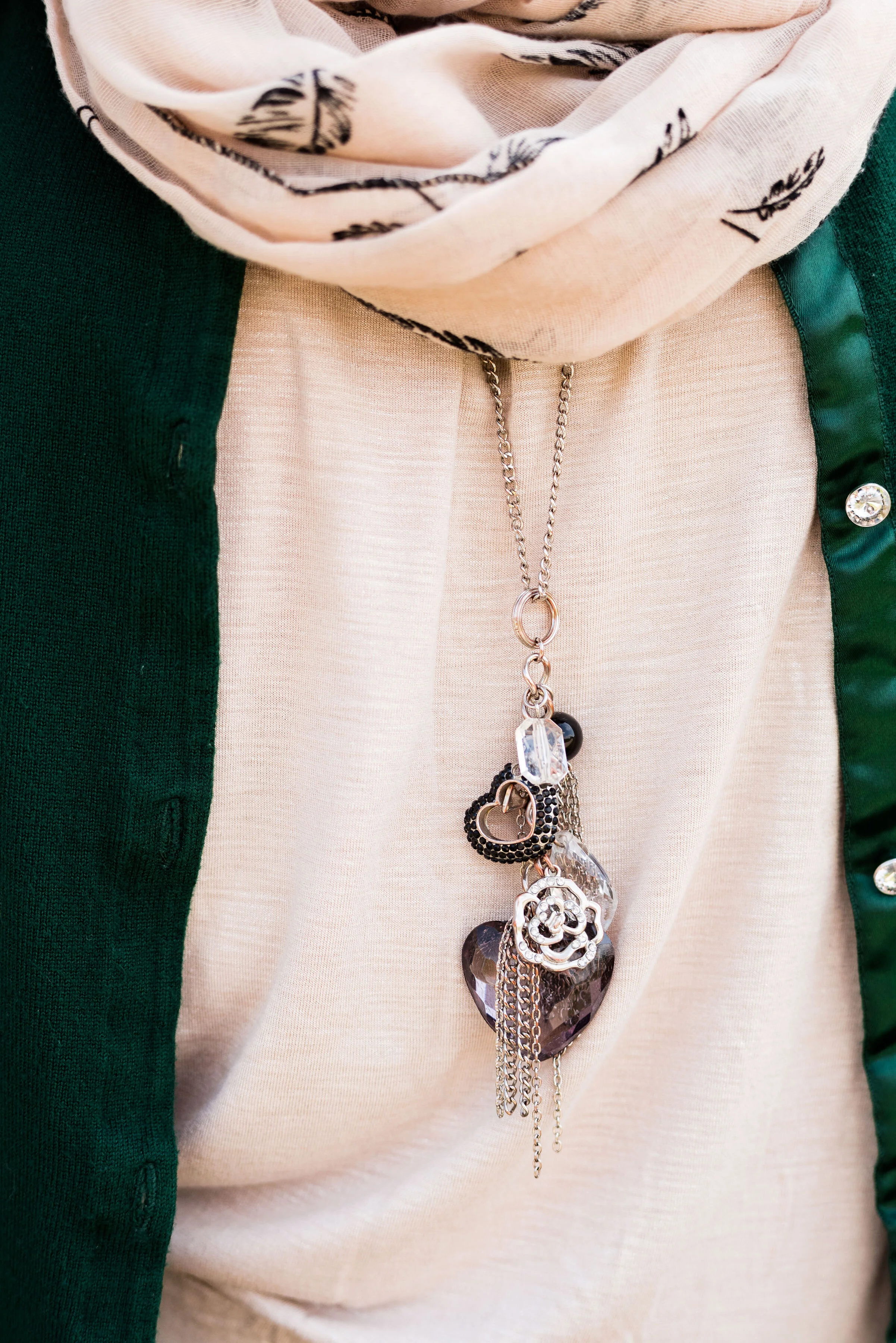
In addition to the scarf I wanted to add a long charm pendant necklace to break up the plain back drop of the tank. I think this outfit would have been equally good with a printed tank under the sweater.

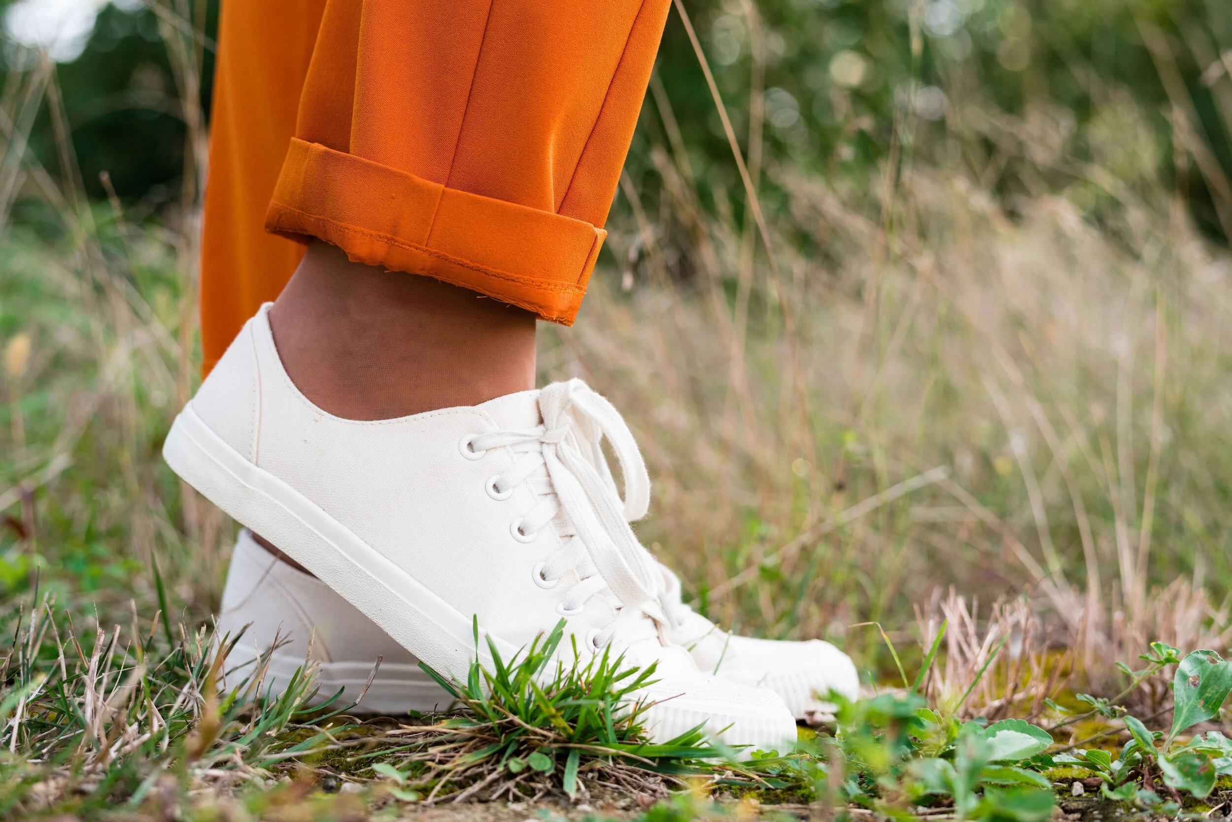
My other accessories included my Vera Bradley tote bag and my thrifted Mossimo sneakers.

What did you think of this outfit? Would you wear a pair of bright orange pants like this? What is the brightest color you have ever worn in pants or a skirt? I’d love to hear you thoughts, so leave me some love in the comments.

I’ve included a few shopping links. These are affiliate links. All opinions are my own.

Photo and graphic credit Rebecca Trumbull.

Have a great weekend, everyone!


Pantone - Autumn/Winter - 2019 - Sugar Almond and Dark Cheddar

Today’s colors, in my opinion are the epitome of fall. The browns and oranges remind me of pumpkins and firewood stacked as it waits to be used. Red’s and yellows are other bright colors associated with this season and we will be seeing more of those in the London color palette, which will be coming up shortly. Let’s take a closer look at Sugar Almond and Dark Cheddar.

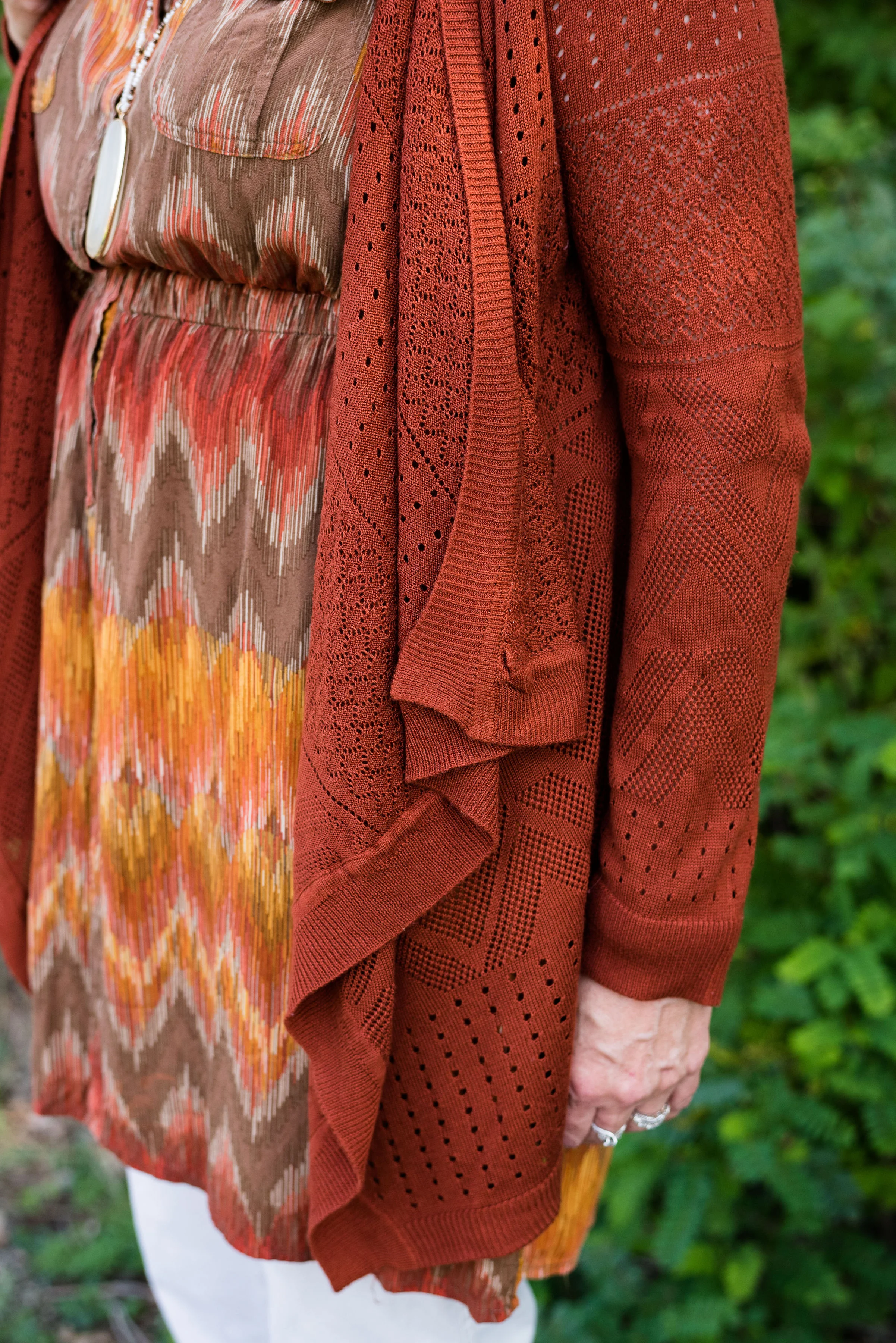
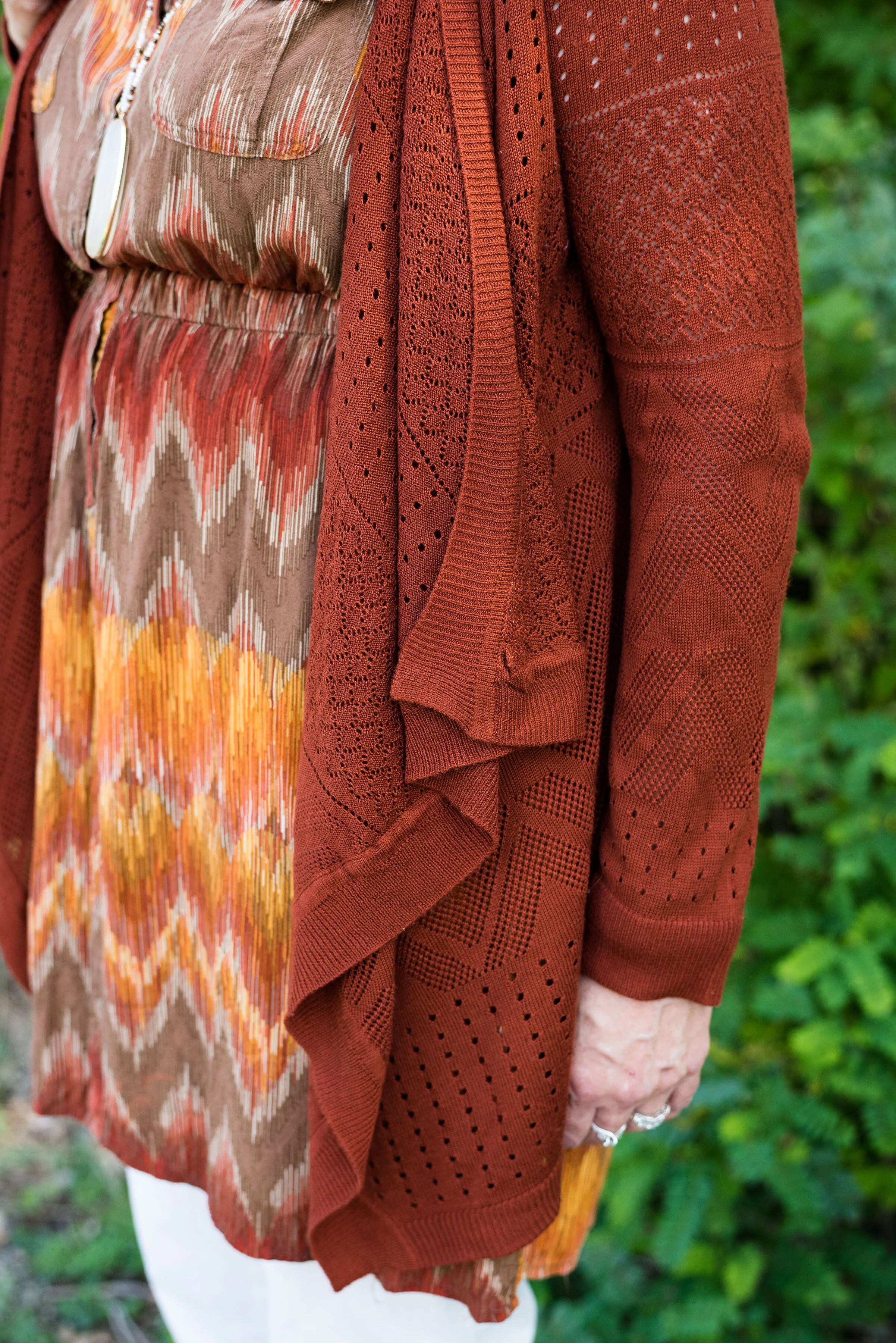
This thrifted, Sonoma, chevron print, dress caught my eye a few months ago and I knew it would be perfect for fall. Originally, I was going to used the waterfall cardi for the Sugar Almond color, but I actually think the colors in the dress are more suited to both of these Pantone colors.

Since I don’t normally wear dresses this short, I thought it would be fun to pair it with cropped pants. This pair of St. John’s Bay, creamy colored pants were another thrift store find. I almost didn’t get them, because I thought they were a little tight, but then, what isn’t on me right now. Ha, ha. However, I ‘m glad I put them in my cart. I think they make a cute addition to this dress. I want to try them with boots, when the weather gets colder. I might even try this dress with a chunky sweater, tights or leggings and boots. If I have success with that, I’ll post pictures either on Instagram, or I’ll do a post about it.

You can see in the above picture, the dress has a partial button front and an elastic waist. Wearing a belt with this would be another fashion forward idea, but I wanted an uninterrupted look from collar to hem, especially since I chose to wear this with cropped pants.

Let’s take just a moment to talk about the rule of thirds. The rule of thirds is a photography guideline that suggests mentally dividing your picture into thirds, horizontally and vertically. You then place the image you wish to photograph at the intersection of two lines. This can make for a more interesting picture, that draws the eye to the image.

Fashion also has a rule of thirds. The body is divided into thirds: head to waist, waist to knees and knees to feet. This is an approximation and as we all know, some people have longer necks, shorter torsos and longer legs, so each individual will be a little different. This rule is good to be aware of when putting together an outfit.

If you look at the above picture, the dress would be considered in the first two thirds of my body and the crop pants and shoes in the last third. Take a look at this article to learn more about the rule of thirds in fashion, and why it helps to keep it in mind when you dress. Dressing Your Best: Rule of Thirds.

This Pink Rose, waterfall cardi is another thrift find. I love the open weave, and as you can see, it also has the chevron pattern on it. I did not plan that. Ha, ha. I just thought the color went perfectly with the colors in the dress. This is a great piece for these fall days that are still warm.

For accessories, I went with a coppery bag and my thrifted Naturalizer shooties. I also added the pendant bead necklace as a way to bring out the cream in the dress and tie in the pants. Accessories are the best way to pull an entire outfit together and make it look finished.

What do you think of these colors? Do you wear orange? Orange is often an intimidating color to wear, but there are so many different shades and tones that there is probably one out there you could wear. Would you wear crop pants with a dress like this? Let me know your thoughts. I love to hear from you.

Be sure to check back Thursday for two more Pantone colors.

Photo and graphic credit Rebecca Trumbull.

I’ve included a few shopping links for you to look at. These are affiliate links. Any time you click on a link, I get a few pennies. If you purchase something through my links, I get a a small commission. I appreciate all your support and all opinions are my own.

Have a great week.

Pantone - Autumn/Winter - 2019 - Crème de Pêche and Rocky Road

I am not sure how the Pantone Color Institute decides the colors they are going to feature for each of their palettes. If you have been following me for a few years now, you can probably tell that many of the colors that appear on the palette are very similar to another season’s palette and are just called a different name. For example Tuesday’s Galaxy Blue was very similar to last spring’s Princess Blue.

Today’s outfit features two colors called Crème de Pêche and Rocky Road. Once again, my versions of the colors, do not look much like the Pantone colors, but it still gives us inspiration to pair to fall type colors together and pull it all together with a light gray.

My Chico pants look much more orange in comparison to the Pantone color swatch, but I do like how this pair of pull on Ponte knit pants looks combined with the light peach top.

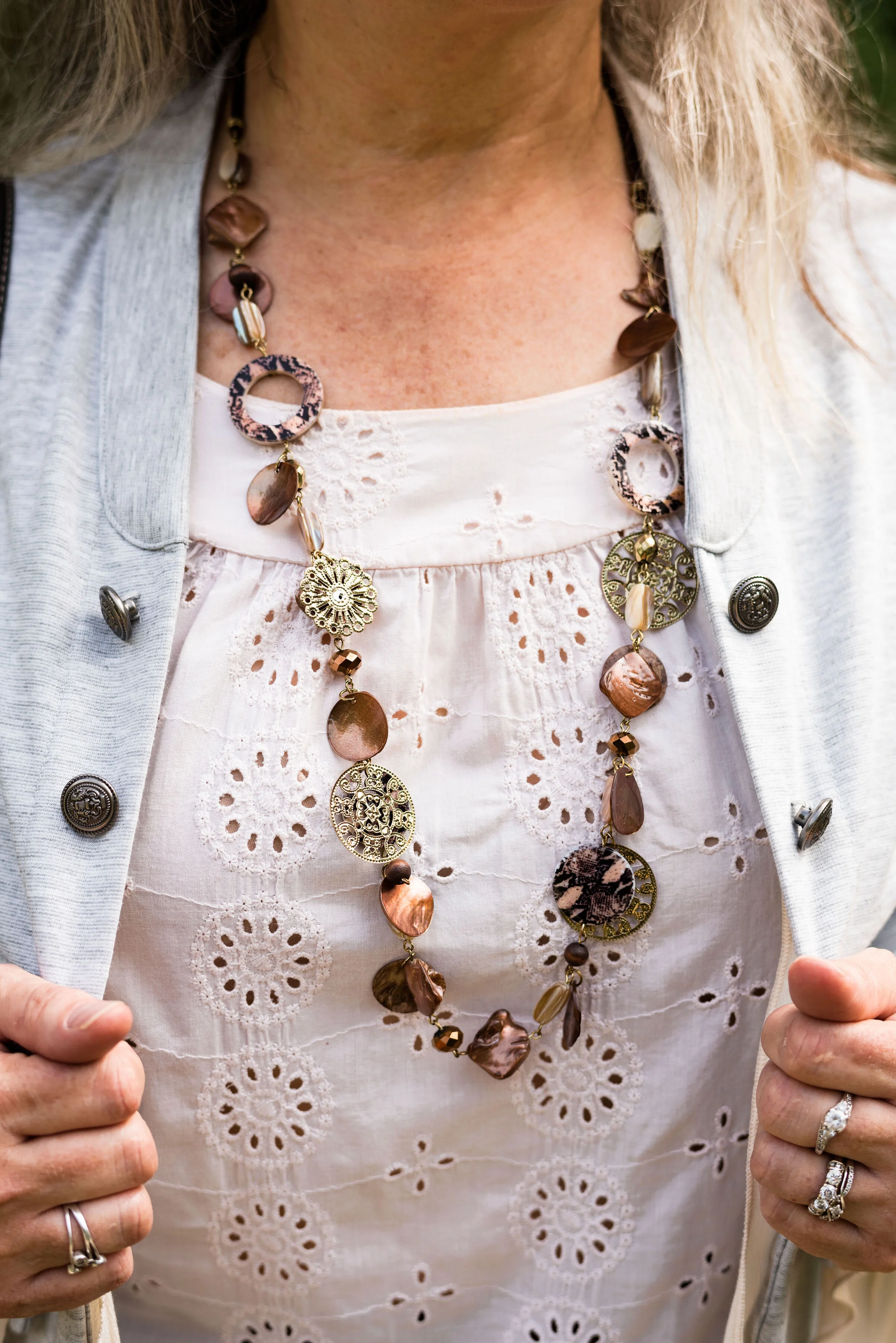
The light peach eyelet top was a thrift find and I wear it a lot in the warmer months. You can see a closer look at that and the necklace I chose in the picture below. I thought the necklace was a good compliment because of its similar colors.

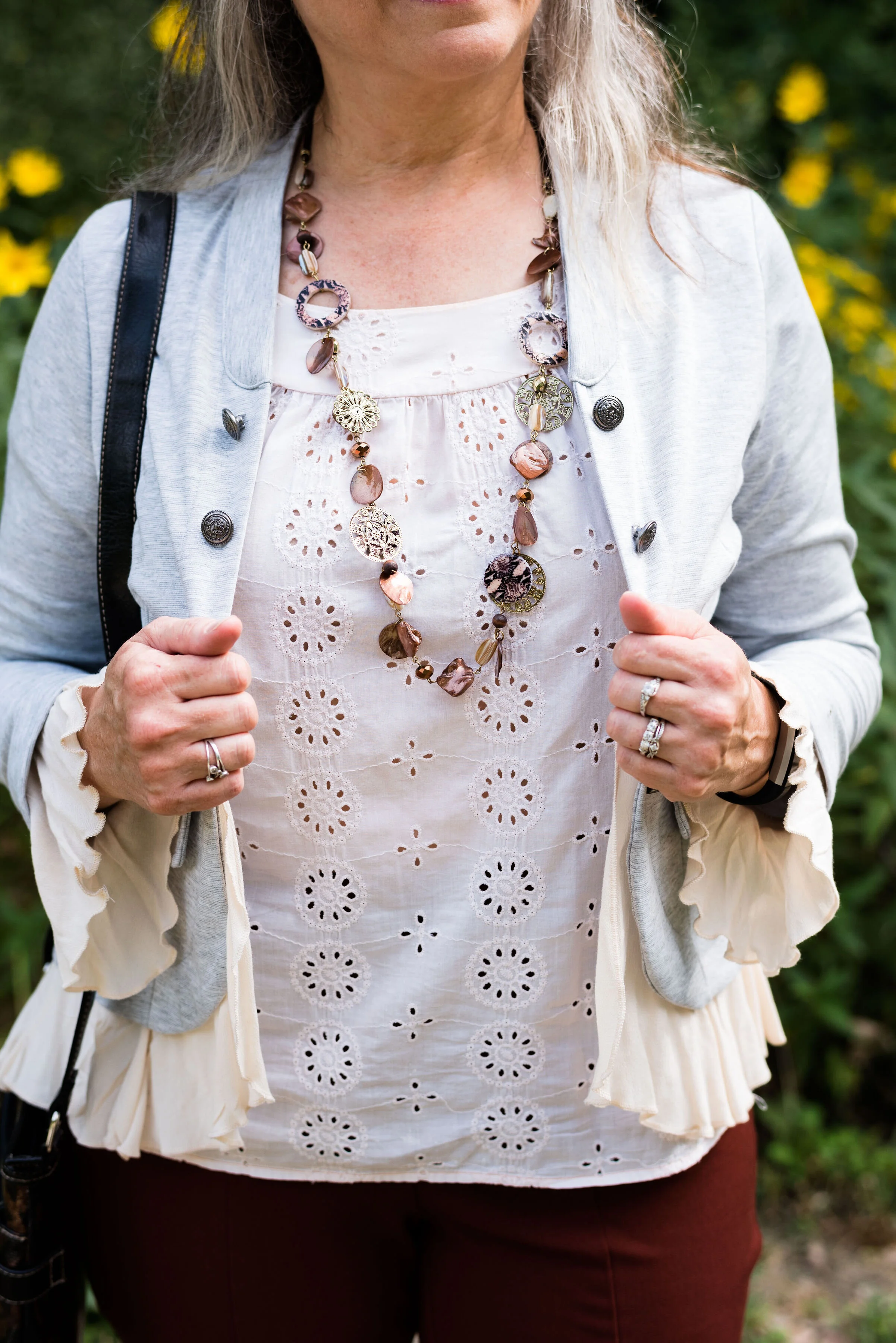
This light gray, About A Girl, jacket was a fun find on the Kohl’s clearance rack. I like the military vibe of the buttons, but the surprising feminine detail of the ruffles on the hem and sleeves.

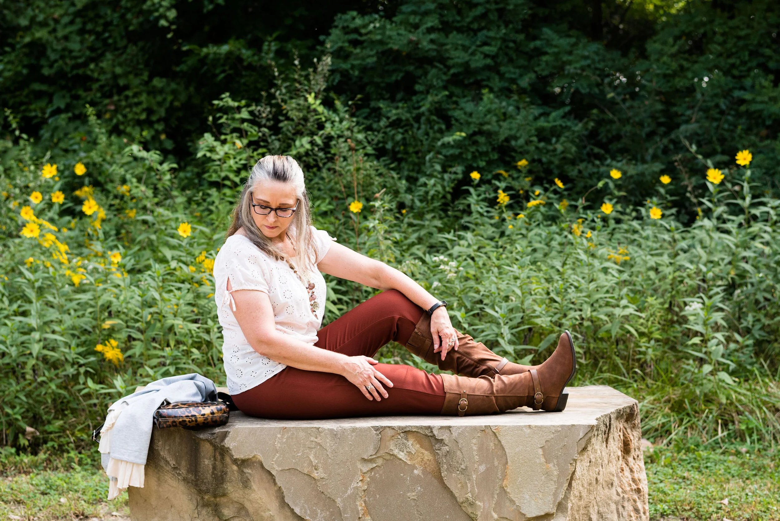
Another Kohl’s clearance find, I got these Sonoma boots at the end of last winter season. They are a faux suede and a different look that some of my others boots. I love the slouchy and buckle details. Yes, I do have too many pairs of boots, but can a woman who lives in the midwest, have too many? Ha, ha.

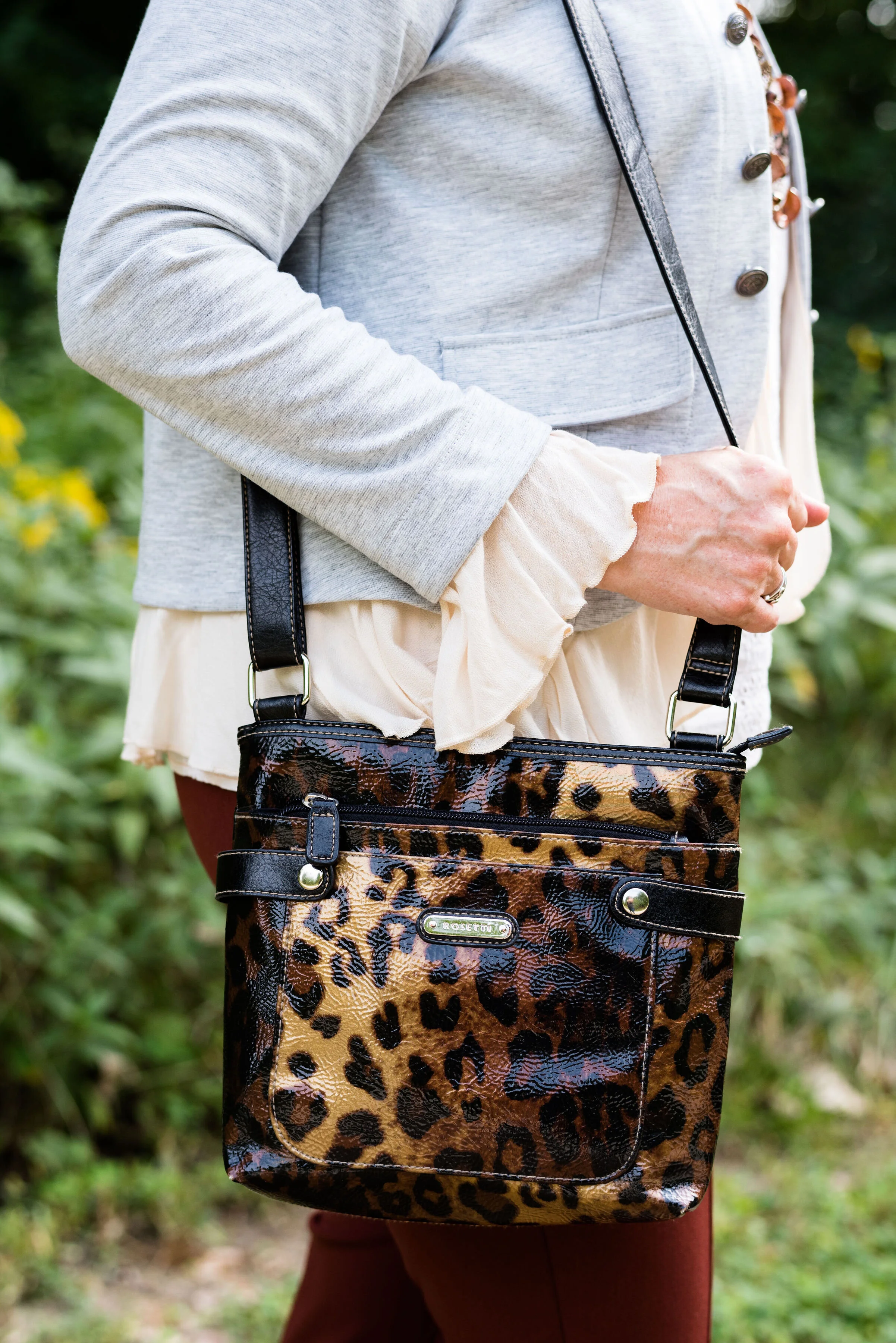
Here is the thrifted Rosetti leopard cross body again. I am planning on making this my “normal” every day bag, as soon as I get around to changing things over. How many of you change your purse on a regular basis? I have many more purses and bags than I actually use. I use them for the blog, so you can see the different styles and shapes, but more often than not, I carry a cross body bag like this. It is just so convenient for hands free shopping.

Here are a few more pictures. I really liked these photos, especially with the large rock and the yellow flowers in the background.

Although my colors were off, I hope you enjoyed this outfit. Do you have a favorite pair of boots you like to wear? What color are they? What do you think of these colors from the Pantone palette? Let me know your thoughts in the comments.

I hope you have a wonderful weekend!

Photo and graphic credit Rebecca Trumbull.

Pantone Autumn/Winter - 2019 - Fruit Dove and Galaxy Blue

These next two colors are described by the Pantone Color Institute as an “extroverted pink” and a “thoughtful blue”. I like that combination of terms, in the same way I like this combination of colors. We often think of extroverted people as popular, charming and talkative, while thoughtful people could be described as people who think more than they talk, or people who are on the look out for ways to help others. I am not an extrovert, but an introvert. I have a hard time in crowds, get tired of too much noise or activity and I need my alone time. Wearing a bright pink like this is my way of standing out in the crowd, without saying very much.

You might think these three colors are more spring like than fall like, but colors transcend all seasons. I do like darker, richer colors for fall and lighter, breezier colors for spring, but that is my personal opinion. What really makes an outfit more season specific are the textures and accessories you incorporate into it.

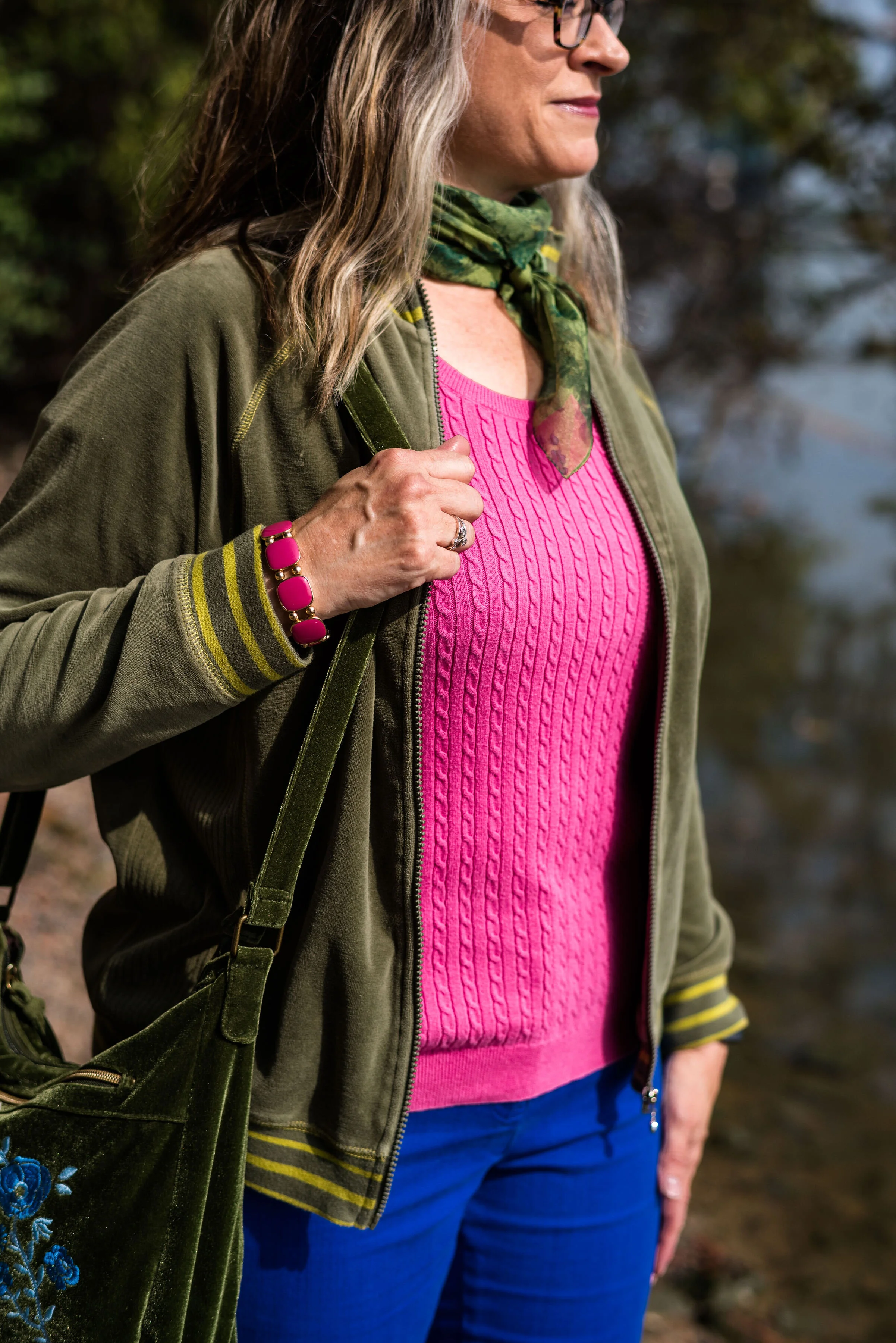
i’ve worn these bright blue Ruby Rd. pants on the blog before. You can see them with a light blue sweater, a plaid bomber jacket, and a multi-colored kimono. My friend was getting rid of these and I took them, not realizing how much I would actually wear them and used them for the blog. This royal blue color seems to keep coming around again and again.

I have had this thrifted Ralph Lauren pullover sweater for a while. I don’t wear short sleeve sweaters too often, because in the summer it is too hot and in the fall, winter and spring it is too cold. However, for some of these warm fall days, where the temps are still in the 70’s in the day and 50’s at night, a short sleeve sweater is a good option. Can you tell in the picture below I am trying to stand up straight and suck in my rolls? Ha, ha. Well, I am! Just being real!

In addition to the two New York palette colors of Fruit Dove and Galaxy Blue, I wanted to incorporate one of the classic colors. I thought it was interesting that they included this olive green, which they call Guacamole. In the past, the classic color palettes usually contained a dark blue, a gray, some sort of cream or ivory and either a camel or a shade of brown. This was the first year they included a green. At first, I thought that was a rather odd choice, but once I got used to the idea, I realized this green would work with a number of color combinations. I pulled out my velour jacket, knowing it would be a great accompanying piece for this outfit.

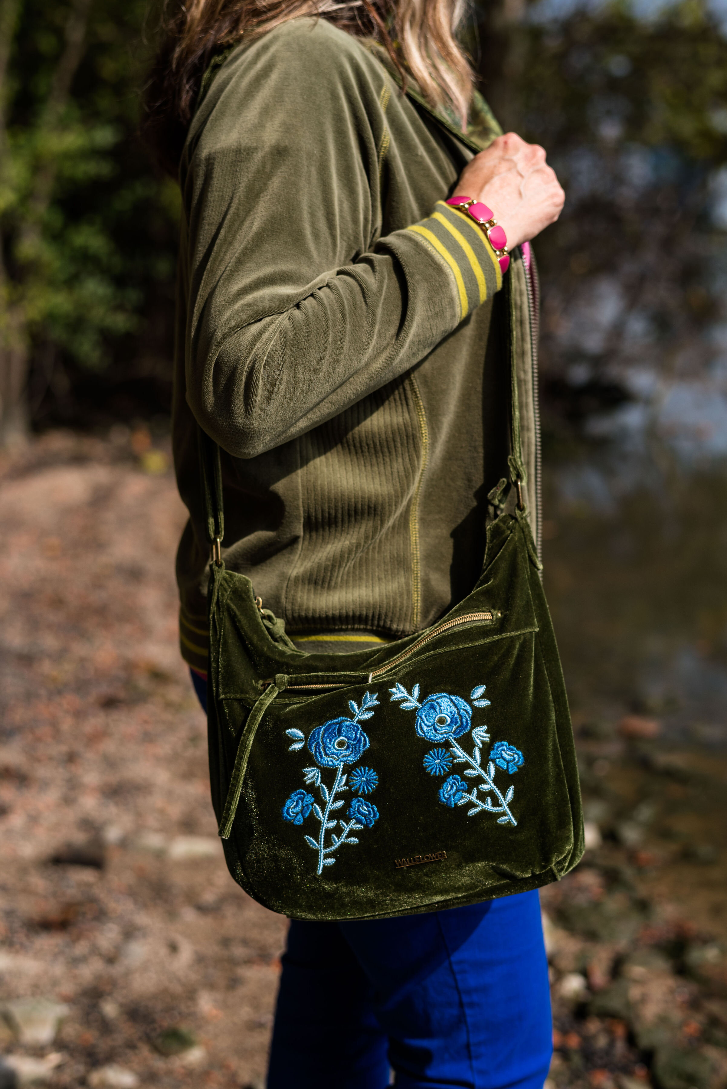
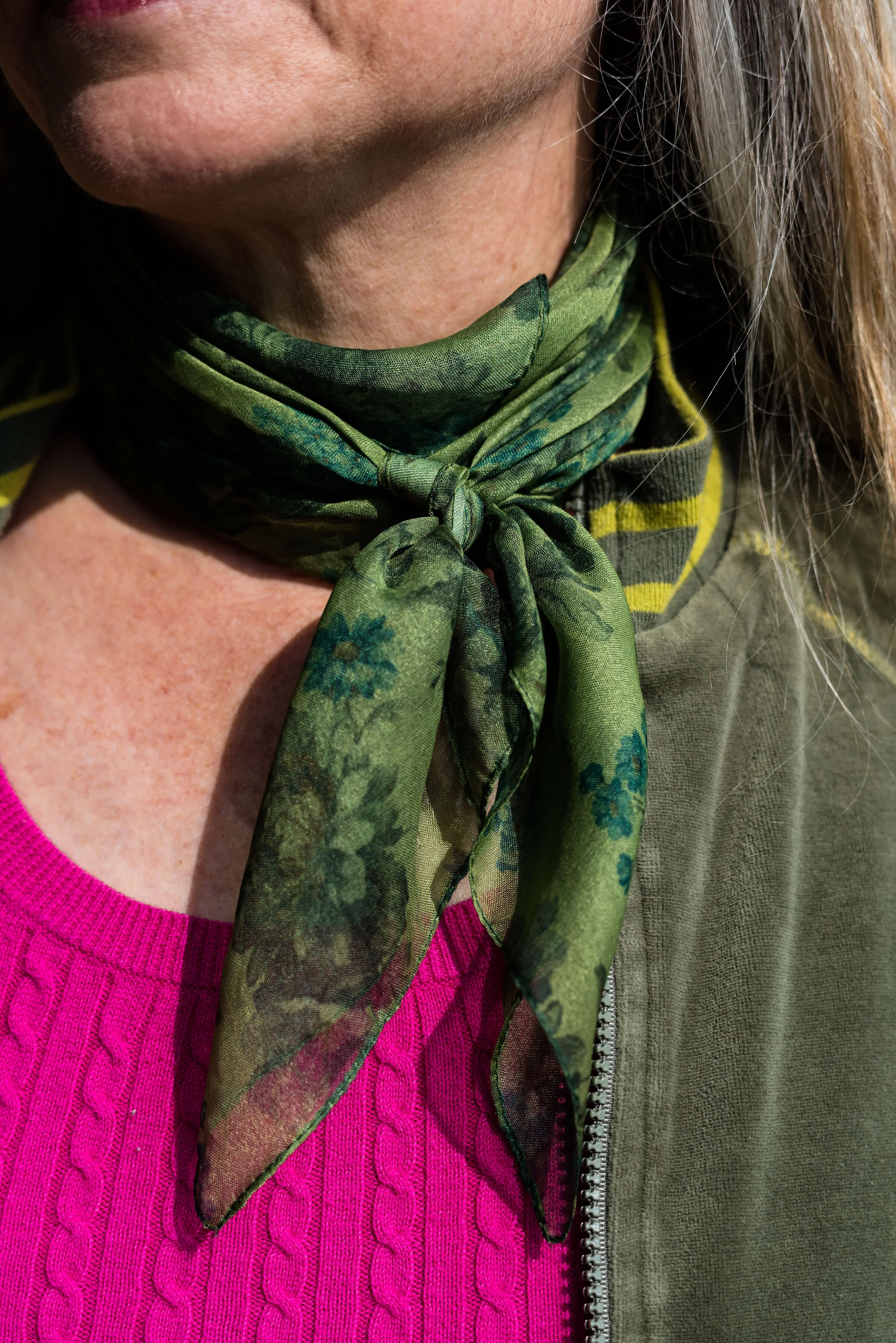
Since I pulled in the Guacamole, I decided to go for green accessories. My SO olive booties, the velvet floral bag and the green neck scarf bring a continuity to the outfit and tone down the bright blue and pink.

Believe me when I say, it was too hot to be wearing all of these layers. As soon as we finished at outfit, I was undressing as we walked back to the car. Ha, ha.

What do you think of this outfit? Would you wear these colors? Would you wear these colors together? Are you an introvert or an extrovert? Do you like to wear clothes that attract attention, or do you like to wear pieces that make you disappear? I’d love to hear your opinions and thoughts. Your support keeps my blog going, so leave a comment or two.

I’m leaving you with a few shopping links for pieces in these colors. These are affiliate links. All opinions are my own.

Photos and graphic credit Rebecca Trumbull.


Pantone Autumn/Winter - 2019 - Chili Pepper and Bluestone

Before I get started showing the outfits I put together for this color series, let me refresh what the Pantone colors are. The Pantone Color Institute is an entity that provides color related solutions across the industry for designers of graphics, products and fashion. It is their color choices for seasons and color of the year that influence the fashion and interior design fields. You can read more on their About Page.

When I began blogging over three years ago, I decided to include the Pantone seasonal color series as a regular feature of my blog. Many bloggers share their favorites with you, but I like to really explore how each of these colors can be combined to make creative outfits that are both fashionable and reasonable financially as almost all of these colors are already in my wardrobe.

This season’s outfits turned out a bit differently than some of the specific colors due to shade variances on different computers, phones and so on. However, the point is not to get perfect matches, but to broaden our thinking about color over all. I ask myself questions like, “How can I combine these colors into one outfit? How can I take this color I am not fond of and use it? How can colors in an outfit make us feel happier, more put together and more confident?”

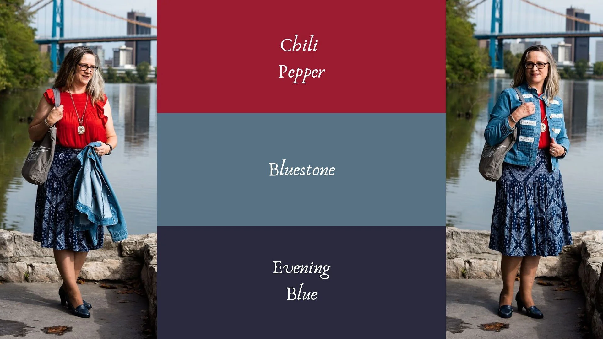
Today’s outfit combines a cool grayish blue with a spicy red. Meet Bluestone and Chili Pepper. The third color is from Panone’s Classics palette, which I have tried to incorporate into each outfit.

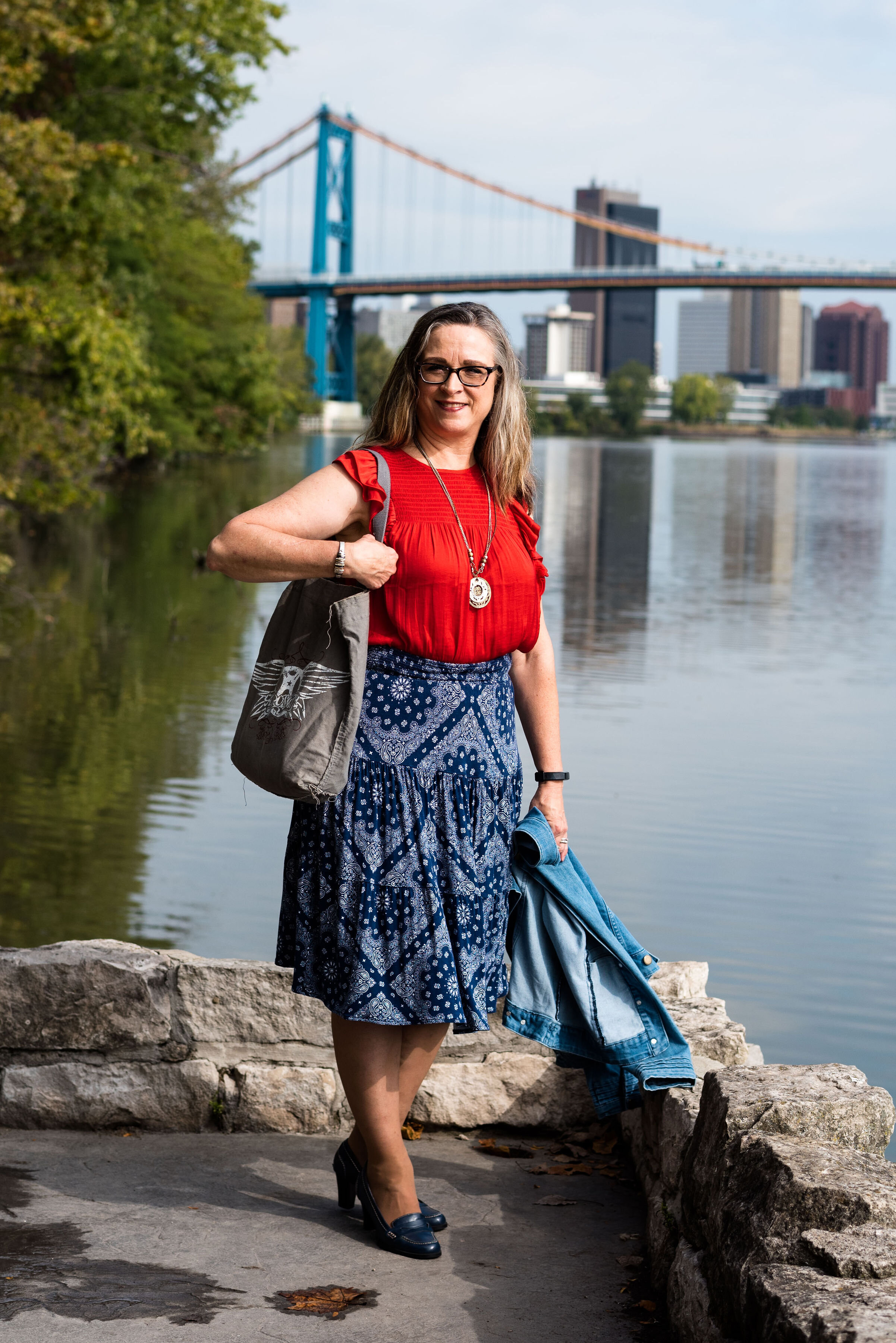
This bright red top is most definitely not the exact same red at Chili Pepper. It was rather strange. I have used my phone before to look at the colors when trying to pick things out of my closet and for some reason I really thought this red was good. However, I think I just wanted to wear this Popsugar top from Kohl’s again because it’s so cute. Ha, ha. I styled this same blouse last spring in another Pantone series. You can see that post here.

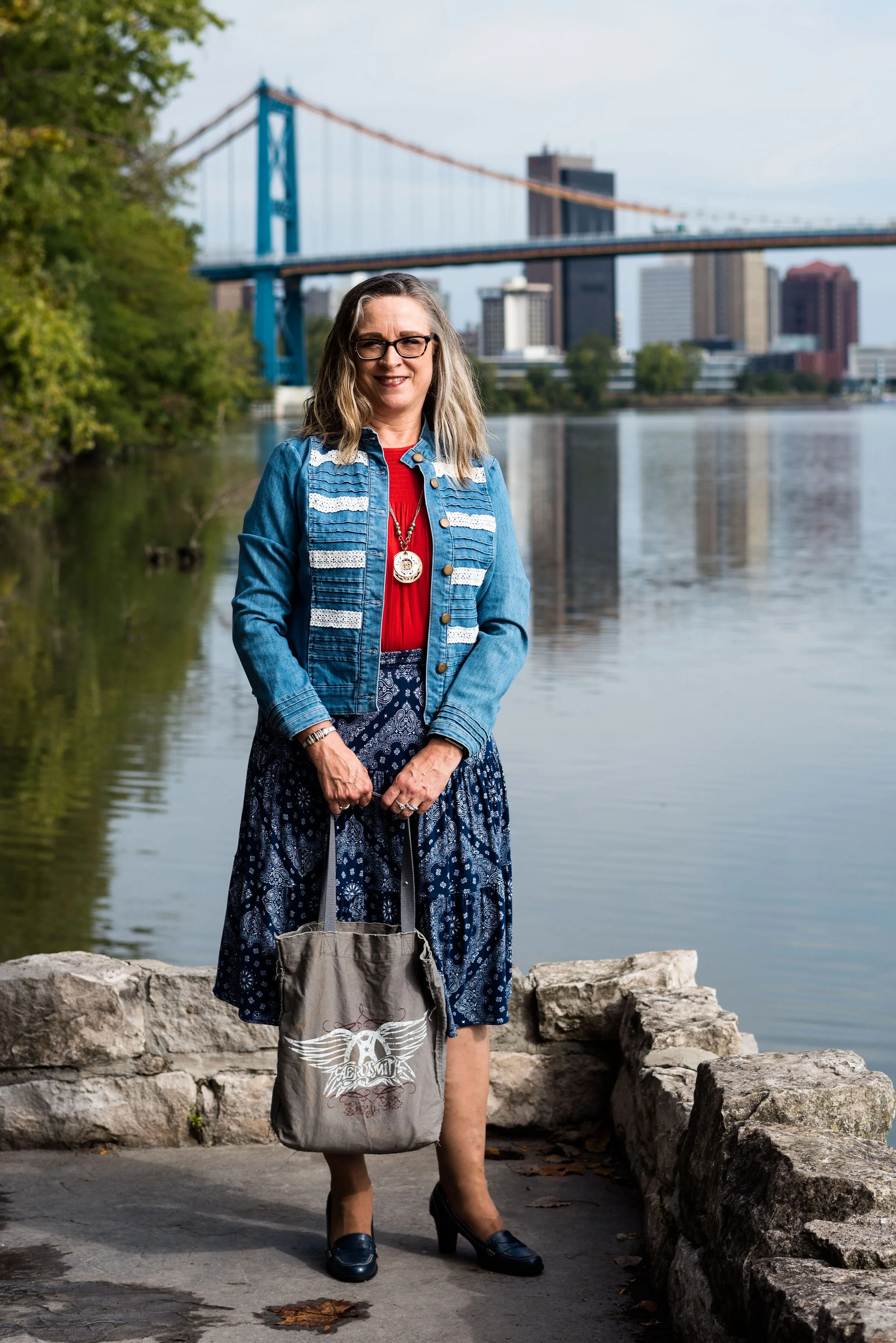
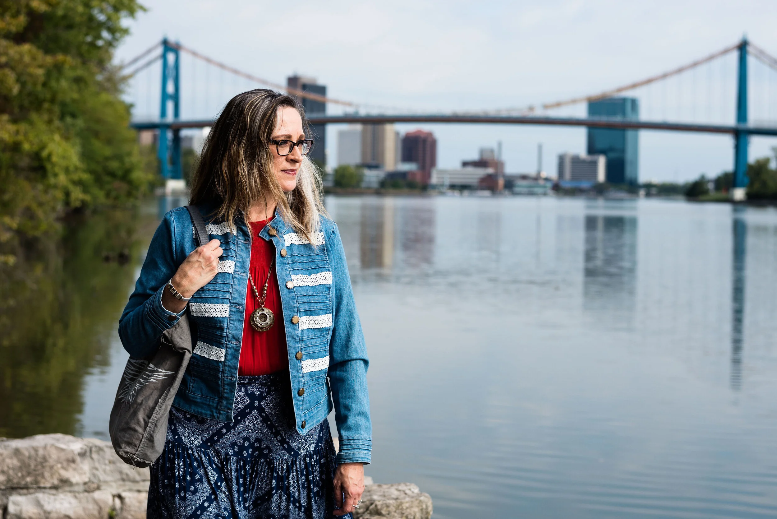
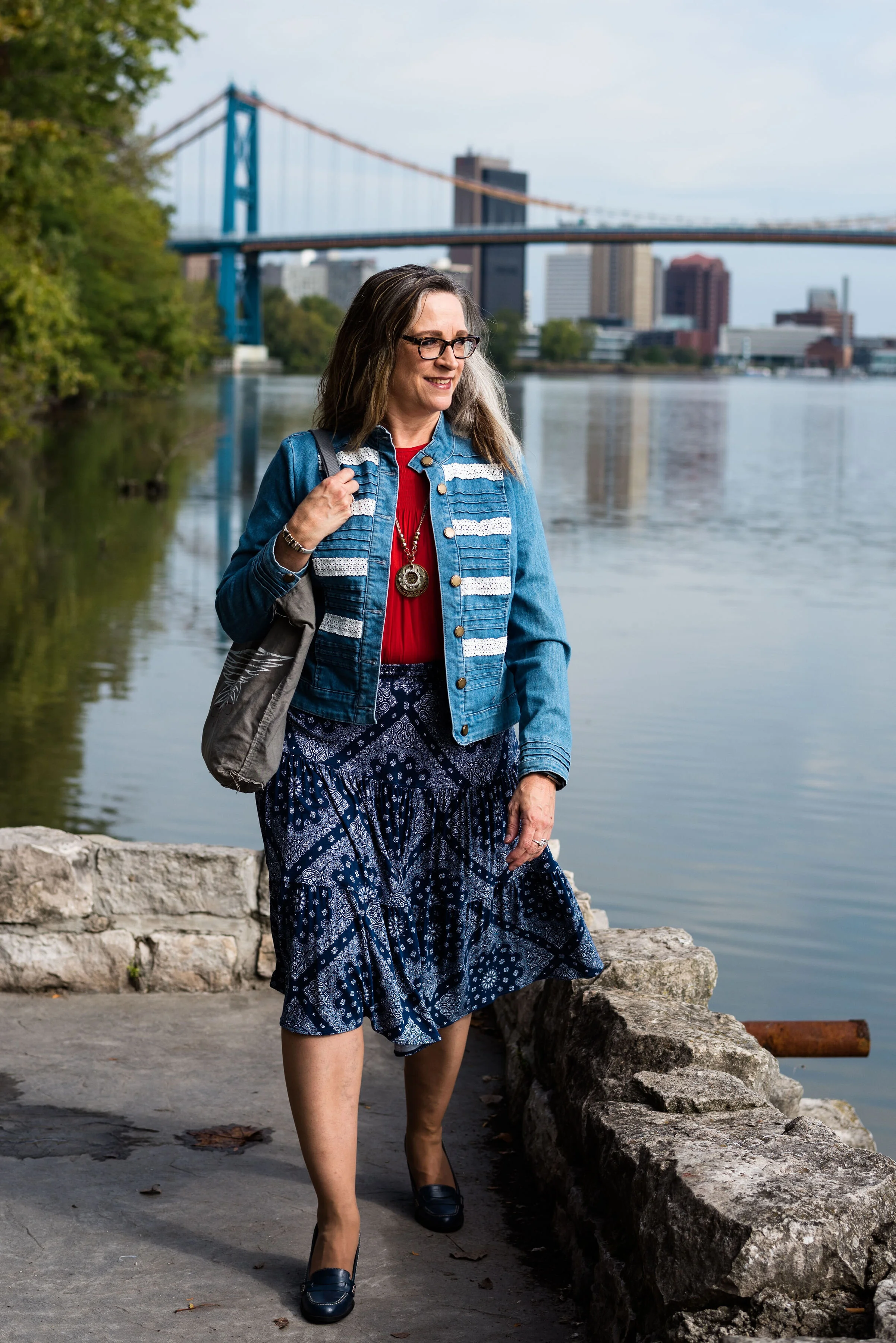
My denim jacket is from Christopher & Banks and isn’t exactly Bluestone either, but I was having trouble finding that exact color.

For these pictures we went to Middlegrounds Metropark in downtown Toledo. What a beautiful park right close to the downtown area of our city. I just love the urban chic vibe that these pictures have. I don’t do a lot in the city, but there is a lot more there than I realized. Unfortunately, I may get more familiar with it, as I got summoned for jury duty in October and the Common Pleas court is downtown. Ha, ha.

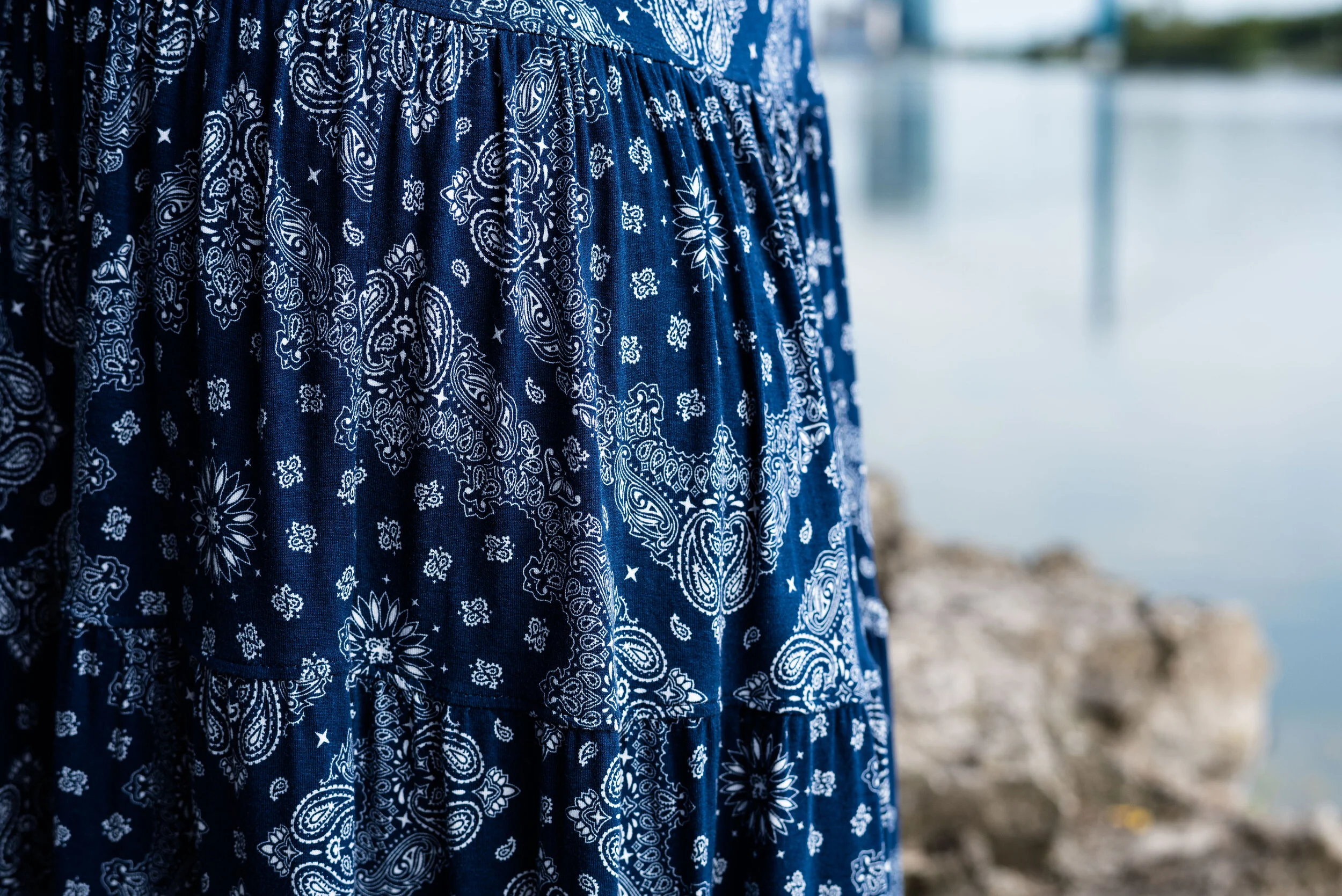
I decided to pair my top and jacket with my dark blue printed St. John’s Bay, skirt from JC Penney. I thought it matched well with the Pantone classics color Evening Blue. This is a fun, easy to wear skirt with a wide elastic waist, and tiered layers which gives it swing.

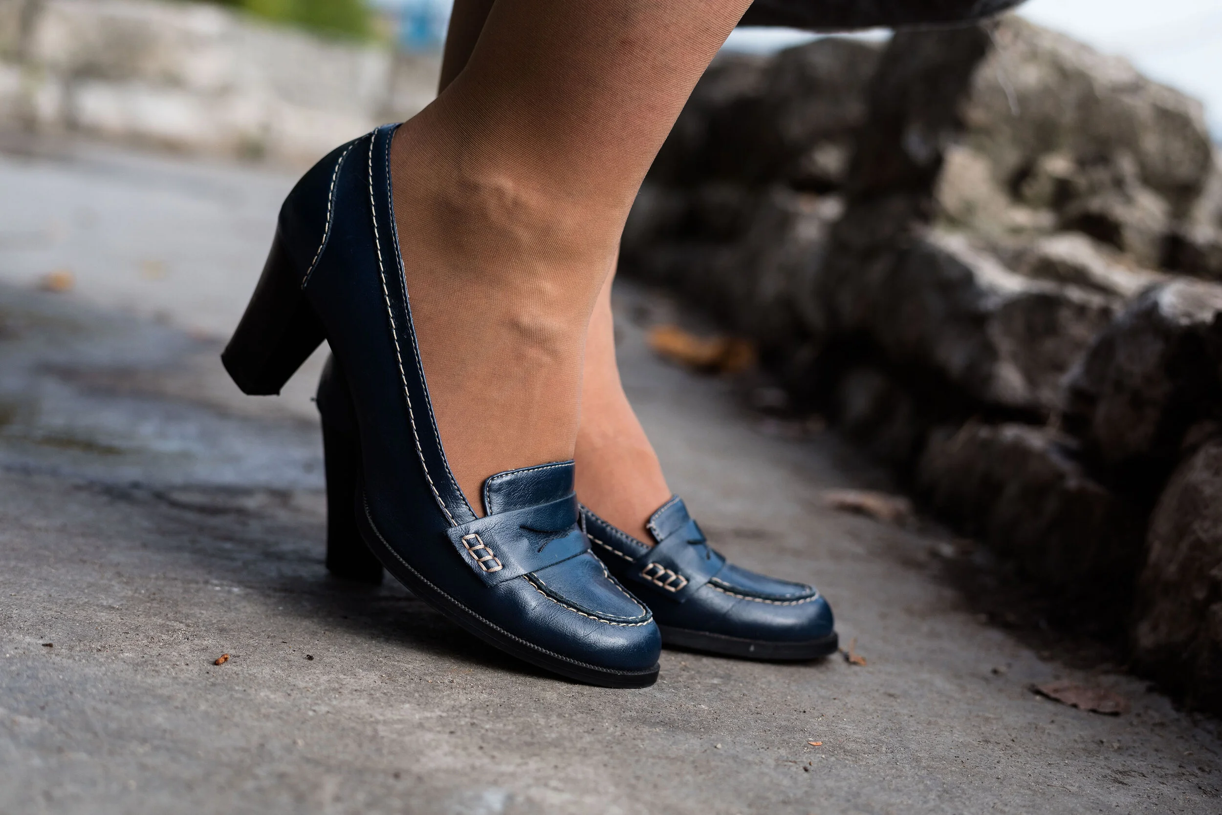
Since I had a lot going on in this outfit with prints and textures I wanted to keep my accessories fairly simple. My thrifted Relativity loafer heels are a go to for a look that is classy and work ready.

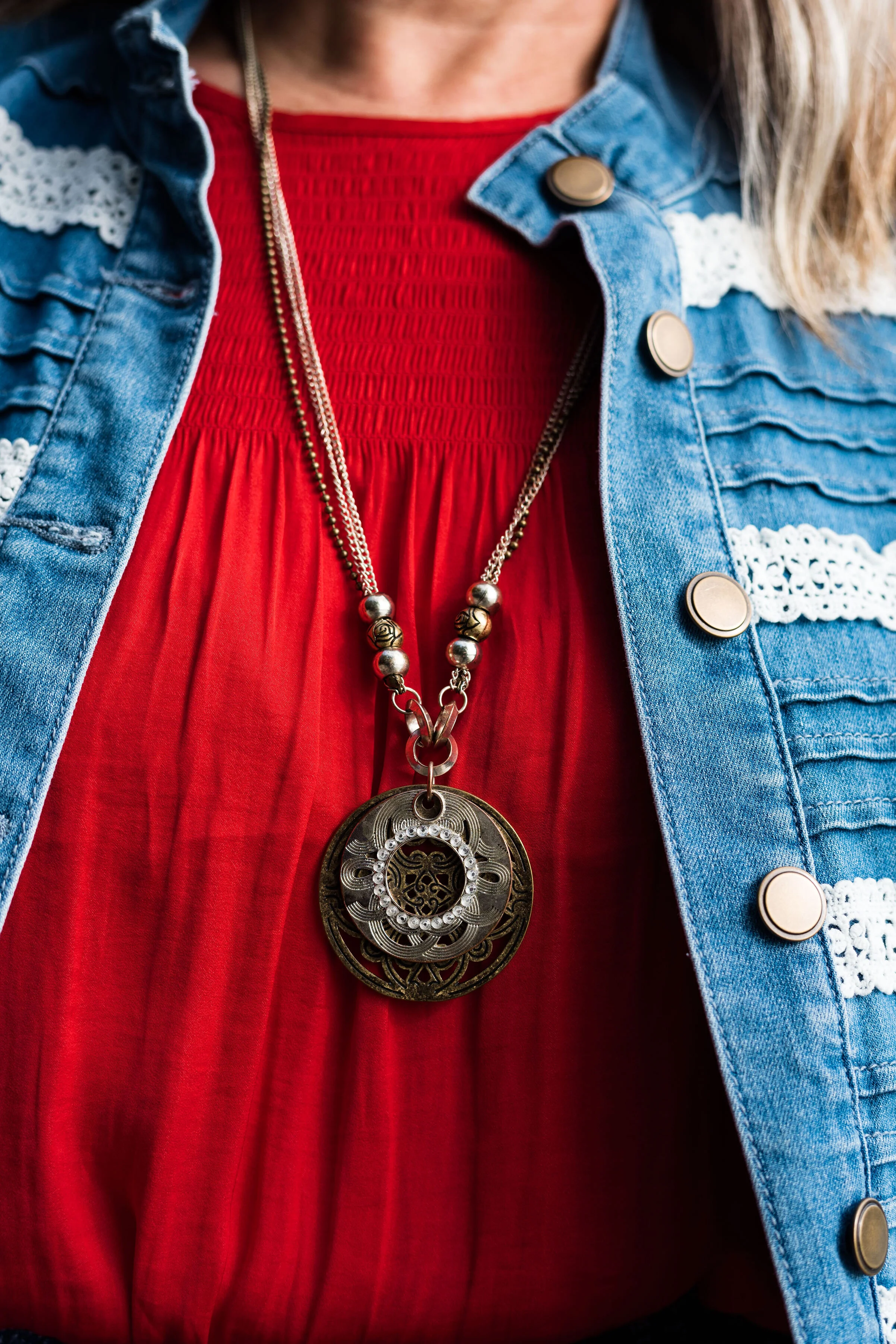
I thought this pendant necklace a good piece that makes its own statement with this outfit.

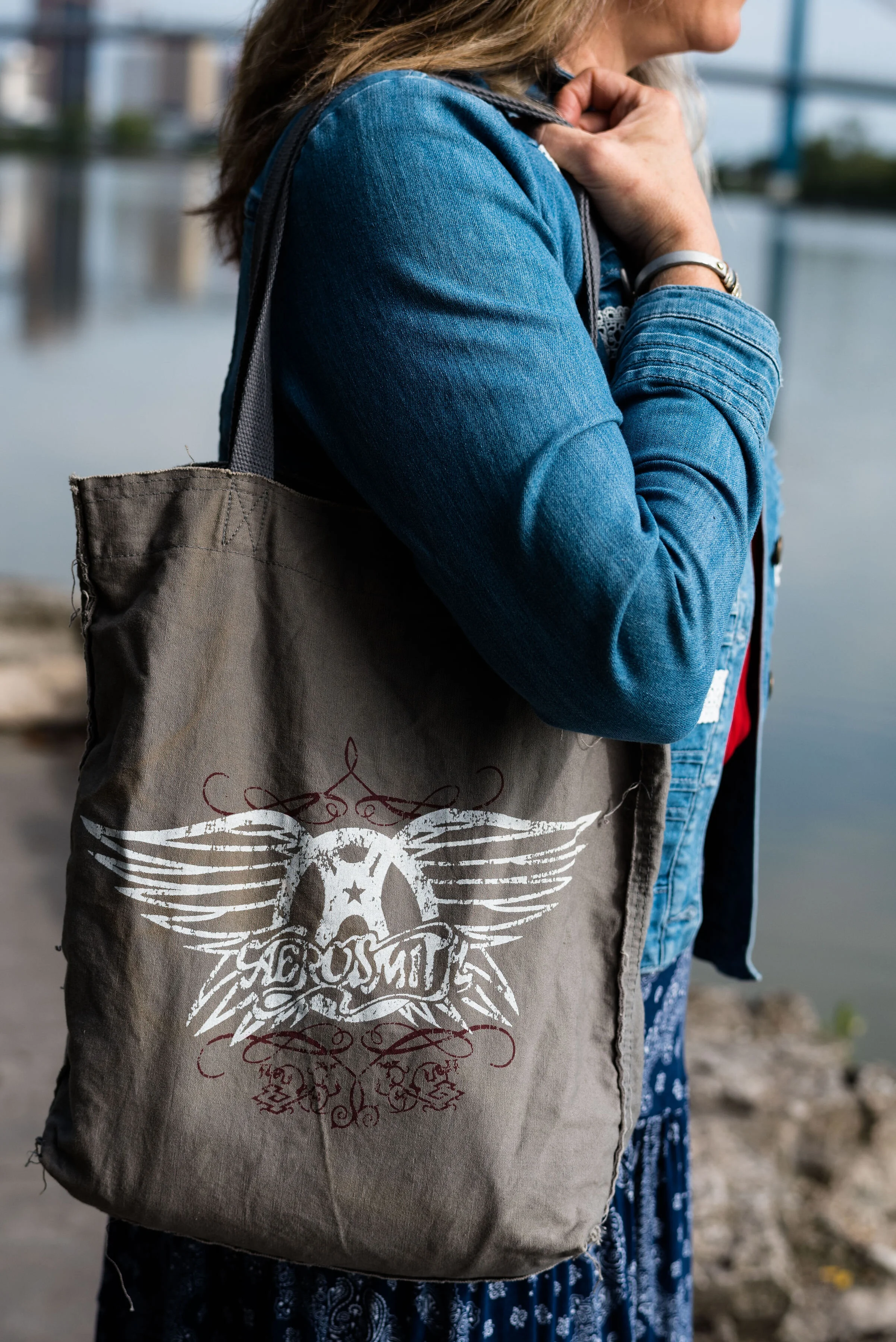
Adding this Aerosmith tote bag was my way to show off my inner rocker. Ha, ha.

What do you think of Chili Pepper and Bluestone? Do you have these colors in your closet? How would you wear these?

I’d love to hear your thoughts, so leave me some love in the comments.

I’m including a few shopping links to look at. These are affiliate links. All opinions are my own.

Photo and graphic credit, Rebecca Trumbull.


Pantone Autumn/Winter - New York Palette - Intro

For those of you who like my Pantone color series, you’ll will be glad to know, it is finally here. Due to scheduling issues my photographer and I finally got together to take the pictures and let me tell you, it was another scorcher! Ha, ha. I don’t know why, but it seems whenever we are scheduled to do pictures the weather is unreasonable. When we did the Pantone 2019 Spring/Summer shoot it was snowing. Now for the Pantone 2019 Autumn/Winter shoot it was sunny and hot. Oh well, there is no planning for the weather around here.

This year the color palettes between New York and London are quite varied, so I decided to do this in two separate series, rather than combining the palettes. Starting on Thursday i’ll be covering just the New York palette. When that palette is finished then I will cover the London palette.

This year’s New York palette is made up of colors described with terms like spicy, adventurous, extroverted and appetizing. Hopefully these descriptors will whet your appetites to follow along with this fall’s color series.

I really like this season’s colors. I feel like there is a good mix of tones that will give all skin colors lots of choices. The palette has a wide array of colors from classic blues, reds and green, to earthy browns and oranges to lighter pastels. Some of my favorites are Bluestone, Eden and Sugar Almond.

In addition, Pantone also includes a palette of classic colors which work well to use as the foundation of your outfit or as add on colors to tone down the brighter more jazzy color combinations. I can’t wait for you to see the outfits I came up with right out of my very own closet.

Here are a few sneak peeks. Join me Thursday for the start of the series.

Photo and graphic credit, Rebecca Trumbull.

Fall Trends 2019 - Part 4

I’ve been looking at various Fall Trends the last few weeks. There are so many fun fashion ideas out there and I wanted to let you know what a few of my favorites are. So far we have looked at Head to Toe Green and Metallics, Romance Gone Goth and Layering Knits, Head to Toe Prints and Dark Florals. You can see the original posts by clicking on the links.

Today we are going to look at two more trends that I like. The first is relatively easy for most women to tap into, because most of us have at least one animal print in our closet. Whether you have a leopard print skirt, a snakeskin bag, a zebra top or a giraffe sweater, all animal prints are in. If you don’t have any type of animal print, be sure to check out thrift stores before you head to the mall. I have seen plenty of animal print items in various places like Goodwill and Salvation Army stores and they are so much cheaper.

Trend 7 - Animal Prints

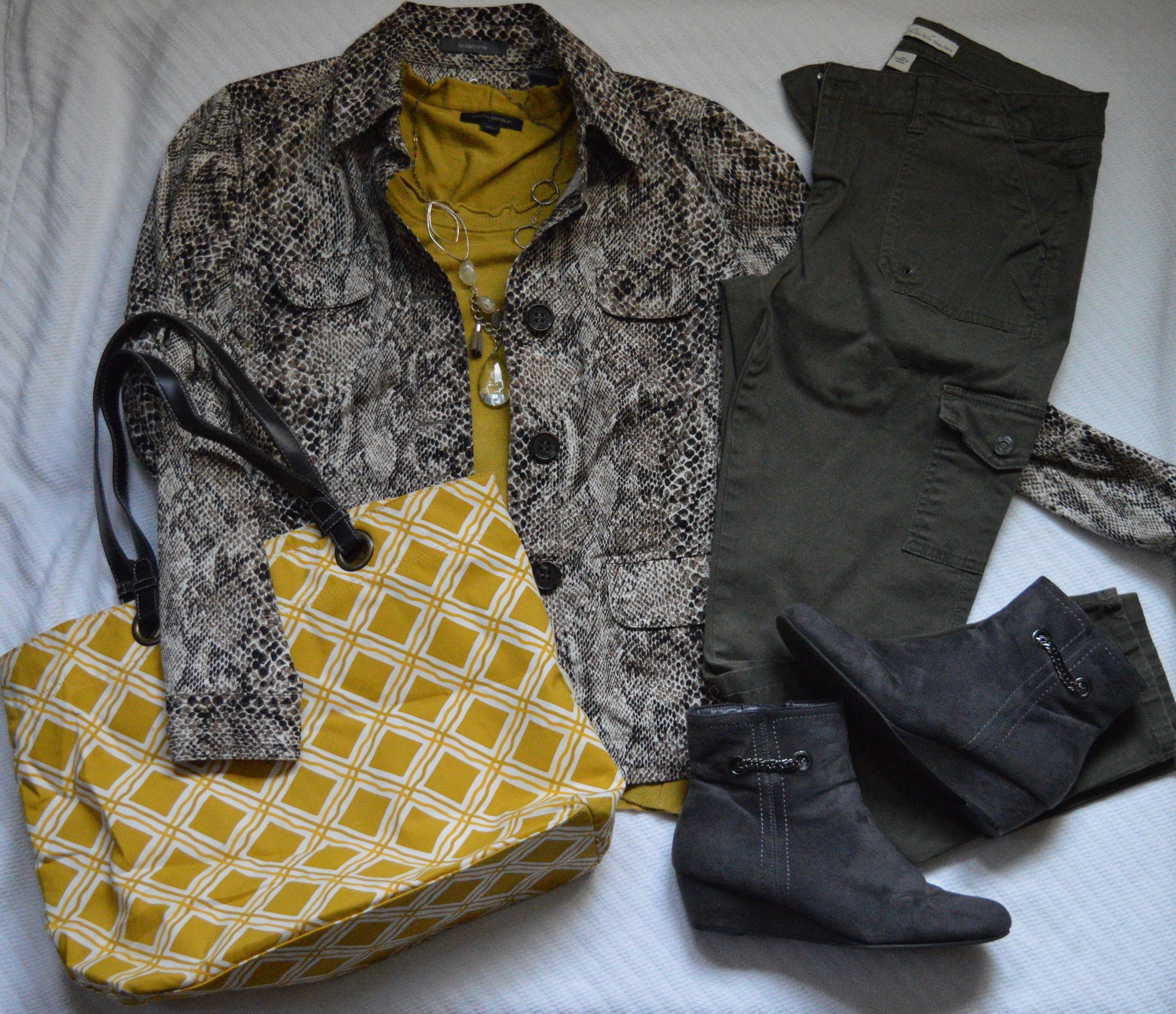
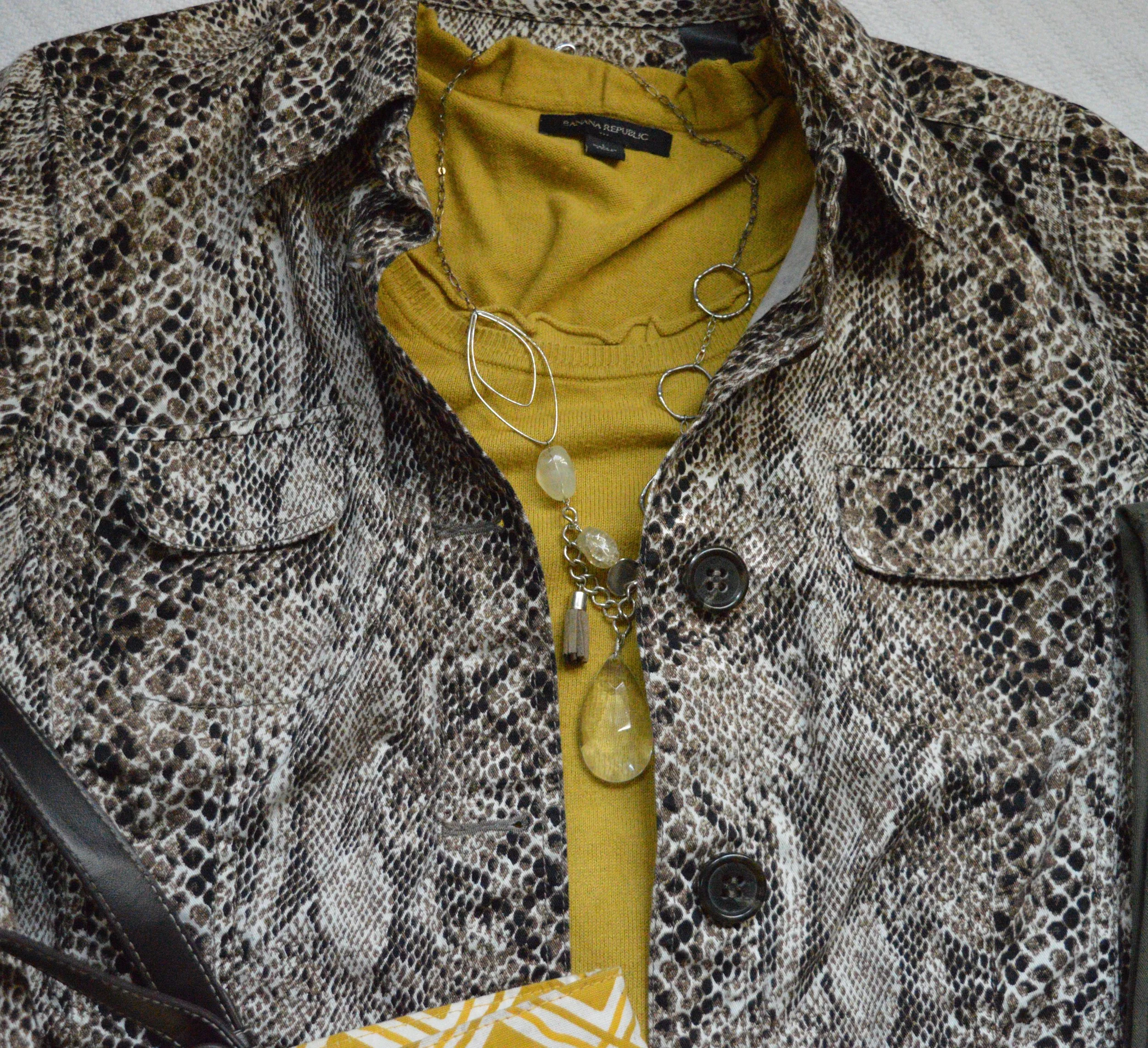
Since you have seen me wear leopard print in the the form of a skirt and a sweater, I thought I would show off my recently acquired snakeskin jacket. I found this brown and white Liz Claiborne print while I was thrifting.

This is a great piece for right now, as it is unlined. As the weather gets cooler, I will reach more for my lined jackets, but this will work well for work or just if I am running errands and need a light weight piece. I decided to pair the jacket with a thrifted, yellow, Banana Republic sweater.

I think yellow looks really good with this earthy brown. Since I was going for a more earth toned looked, I decided to pair the jacket and sweater with my olive, cargo, Gloria Vanderbilt, skinny pants. Cargo and utility looks are still on the radar for this fall, so pull out your utility jackets and cargo pants.

Gray seemed to be a good choice for boots with this outfit I love this dark Impo brand with the low wedge heel. The chains on the side make for a fun detail.

To go along with the yellow sweater, I added a yellow tote. I think the print mixing works well and the yellow pulls the whole look together.

I am going to try this outfit on and see how it looks. If I like it, I’ll probably wear it to work and I’ll post a picture on Instagram.

This next trend, is not something I typically would wear, but finding the right piece at a thrift store suddenly made this feel feasible.

Trend 8 - Capes

Probably most of you when you hear the word cape think ,either of a super hero donning blue spanx, or a dark figure drawing you in with his devilish eyes to have your blood for a night cap. While those individuals certainly did wear capes, and might even be said to be stylish, wearing a cape this fall is trendy.

Capes on the run way are leather trimmed, worn with trench coat flair and made of cashmere. Of course capes are not limited to what the big wigs in New York think. Capes can be made of many different fabrics and like the one I found at a thrift store, can be beautifully crafted pieces knitted or crocheted.

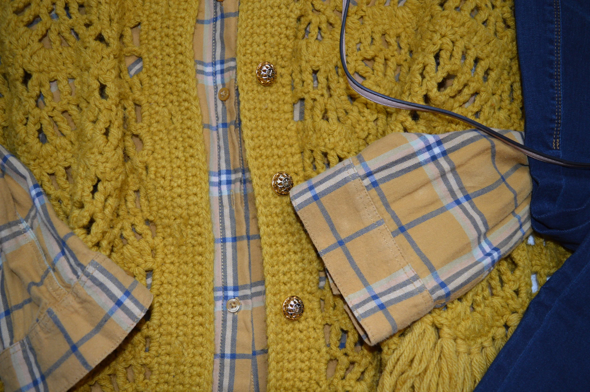
When I saw this sunny yellow cape, I knew I had to try it on. The American Cancer Society thrift store I frequent is just up the road and they always have something that I have to have. This was one of those pieces. Lucky me, they were having a sale that day, so I got this for an even better price. This looks like it was hand made as there are no brand tags or washing instructions inside.

You can see the symmetrical pattern of the knit and the pretty gold buttons. Sometimes a cape will only have one closure at the top, but I like the fact that this one buttons all the way to the bottom. I also love the fringe. I really speaks to my inner hippy and reminds me of the ponchos I used to wear as a girl.

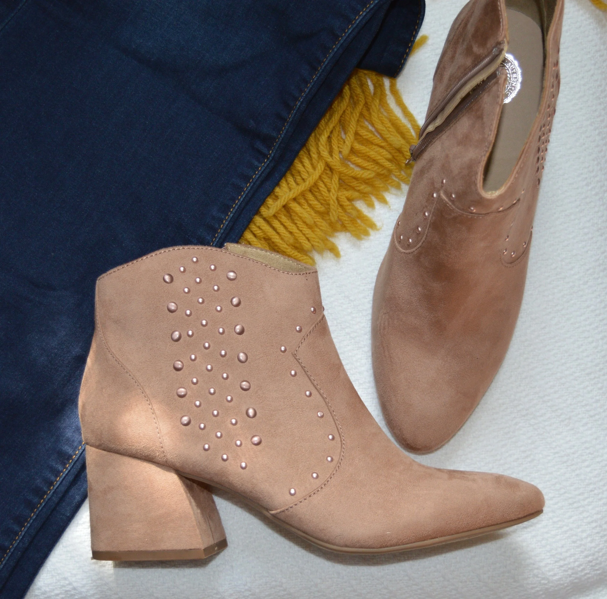
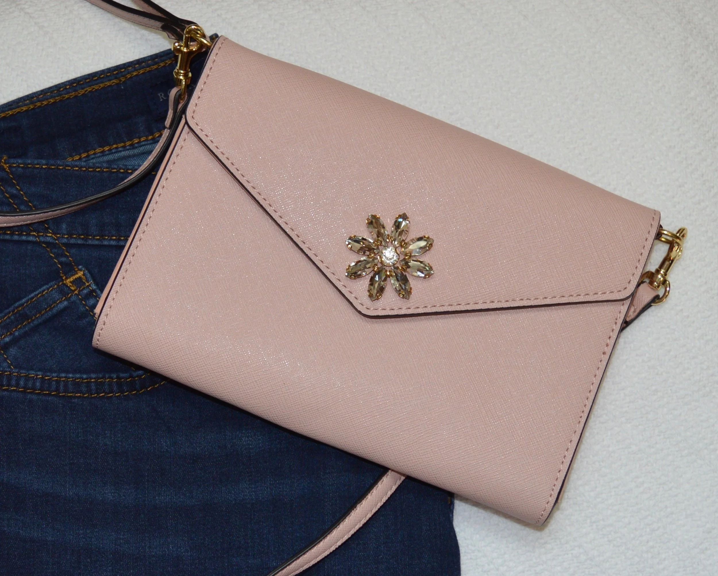
I paired this with a recently thrifted Divided H & M yellow plaid top. Yellow is definitely a new muse for me and I have accumulated quite a collection, more of which you will see in the coming weeks, both here and on IG. The top has just a hint of pink in it, so that is why I went for the blush boots and pink cross body clutch. The boots are SO brand on clearance at Kohl’s and the cross body bag was a clearance find at Meijer.

I thought jeans would be the perfect bottoms for this outfit. These dark wash, boot cut jeans are Rock & Republic brand and are from Kohl’s.

What did you think of these two fall trends? Do you like to wear animal prints? What kind do you have in your closet? Do you own a cape? I don’t know that a lot of people have one, and it may not be a trend that catches on, but it is fun to see what options are out there and how things are being worn.

For more info on these and other fall trends for 2019 check out these websites.

Marie Claire - 10 Fall Trends Everyone Will Be Talking About

Popsugar - The 9 Most Wearable Trends for Fall

Elite Daily - These Fall 2019 Fashion Trends….

There are plenty more. Just type in Fall 2019 Trends and numerous sites will pop up. I hope you enjoyed this look at some of the fun trends for this fall. Enjoy creating your outfits!


Fall Trends - 2019 - Part 3

Here we are looking at two more fall trends for 2019. Depending on who you look to for the latest info on the trends, there is some overlap. However, not all trends are the same according to all the fashion gurus. Who What Wear has a different list from Marie Claire who has a different list from Vogue and so on. When I put together my list of trends, I am taking from a few different sources and presenting you the ones I like and find interesting and plausible for us real women. Remember most trends that you see on the runways are geared toward younger women who have the stature of a fashion model, so very tall and thin. That does not mean that we cannot wear a particular trend, but pick the ones that are right for you.

Trend 5 - Head to Toe Prints

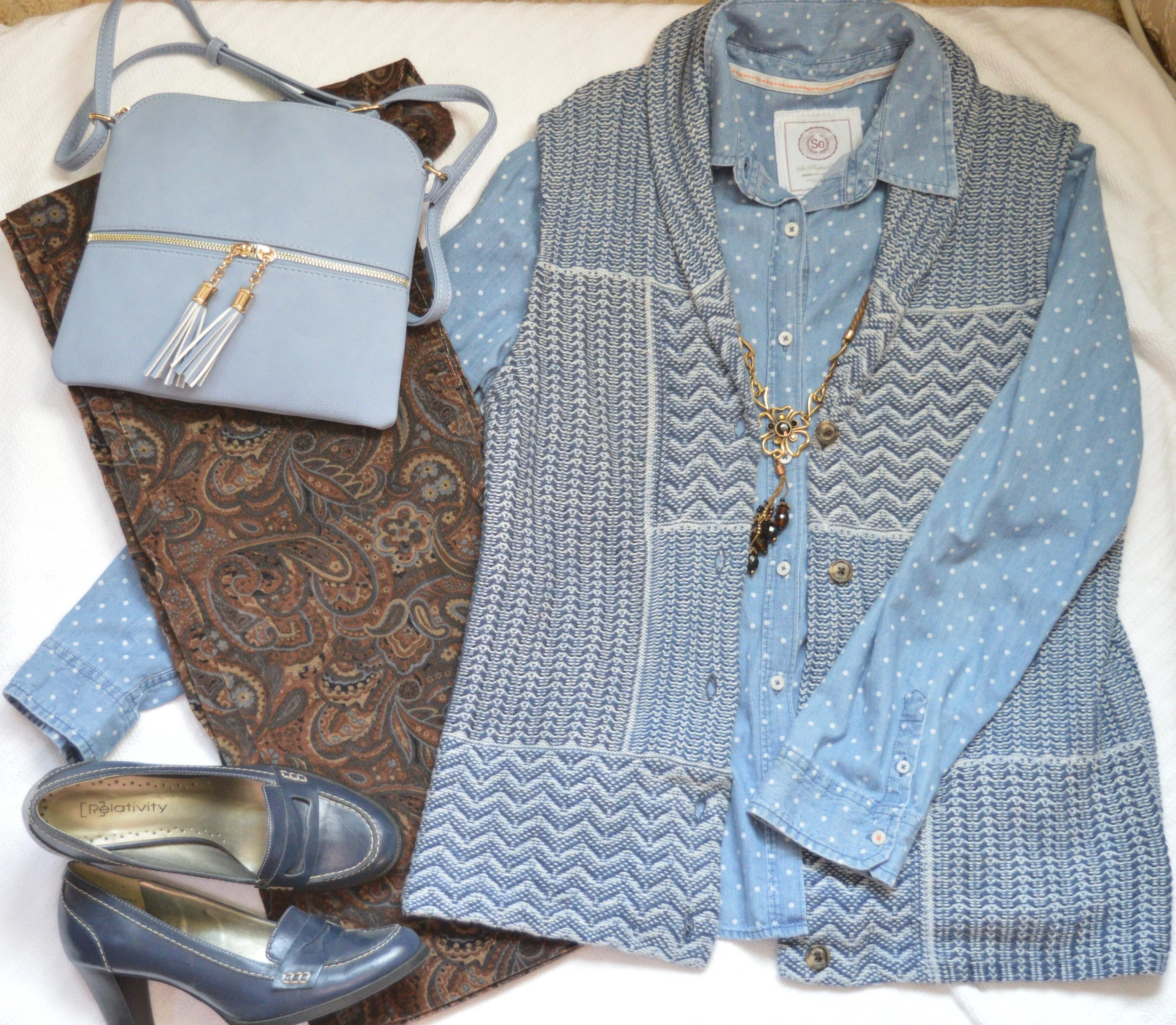
This is not a particularly new trend, but it presents itself in a bolder more, out there way. Pattern mixing has become quite common, but now the patterns are brighter and bigger. Here are some examples from a Pinterest page I discovered. I decided to go more conservative, because I was grooving on the earth tones of browns and blues. This is what I came up with.

Obviously the old time suiting that women, and men, used to wear would fall easily into this trend category. A matching plaid blazer and pants along with a bold print top and you would be stylin’ with the best of them. The thing I like about this trend is the challenge of creating a printed outfit that I would actually wear and that looks palatable to the eye, not obnoxious. Some of the outfits on that Pinterest page I would classify as obnoxious, but that is only my opinion.

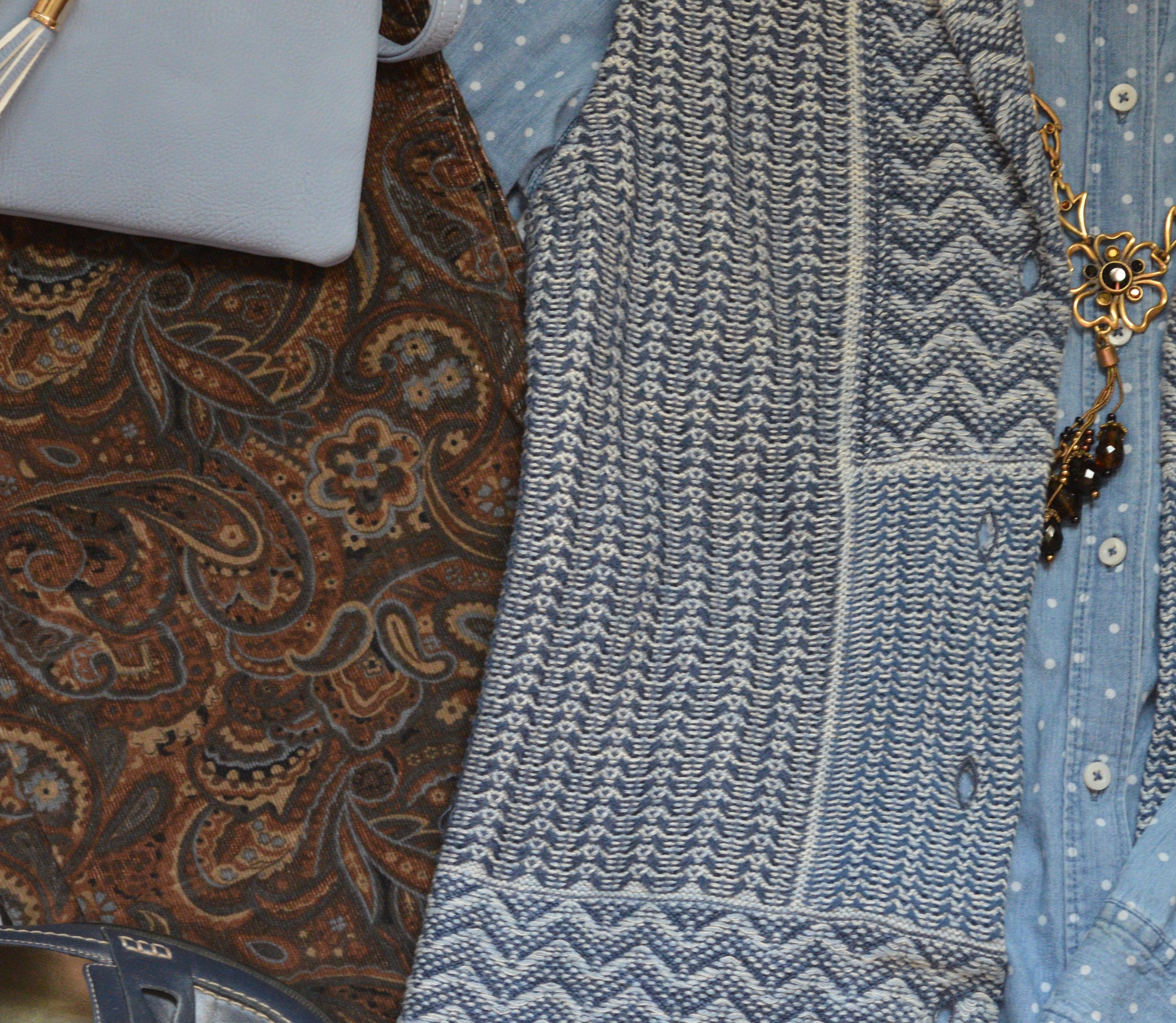
I found these paisley corduroys while thrifting last spring and unfortunately won’t be able to wear them, until I get back to my lighter spring weight. Ugg. However, I loved the pattern and the heavier weight for fall and winter. They are a brand called Havana Jack’s Cafe. Do you ever wonder where they come up with the names for things?

The blue in the pants made me reach for my Chaps knit vest and my thrifted polka dot SO button up. I found the fun necklace at a second hand store and thought it would be a good addition to the outfit.

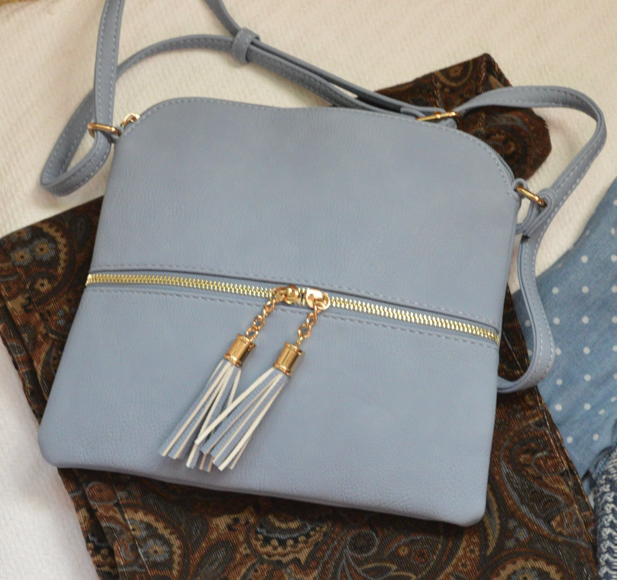
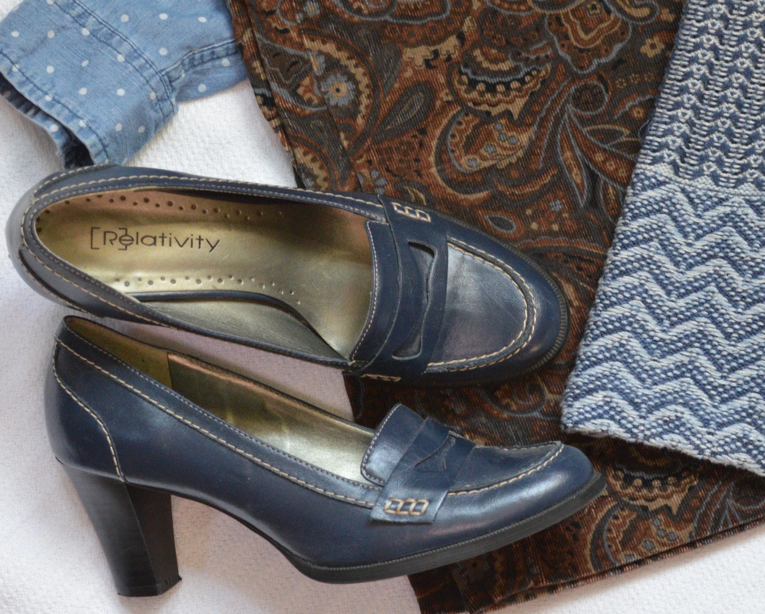
Blue seemed to be my color of choice for bag and shoes. Everything in this outfit came from my closet and has been used on the blog before. You can see the vest here and here. The pants have not. but I already explained that problem. Ha, ha.

Trend 6 - Dark Florals

I have really taken a liking to floral prints. I like the bright bold colors of spring, the soft pastel prints of summer and especially the dark floras of fall and winter. It would seem that florals are here to stay and I am glad.

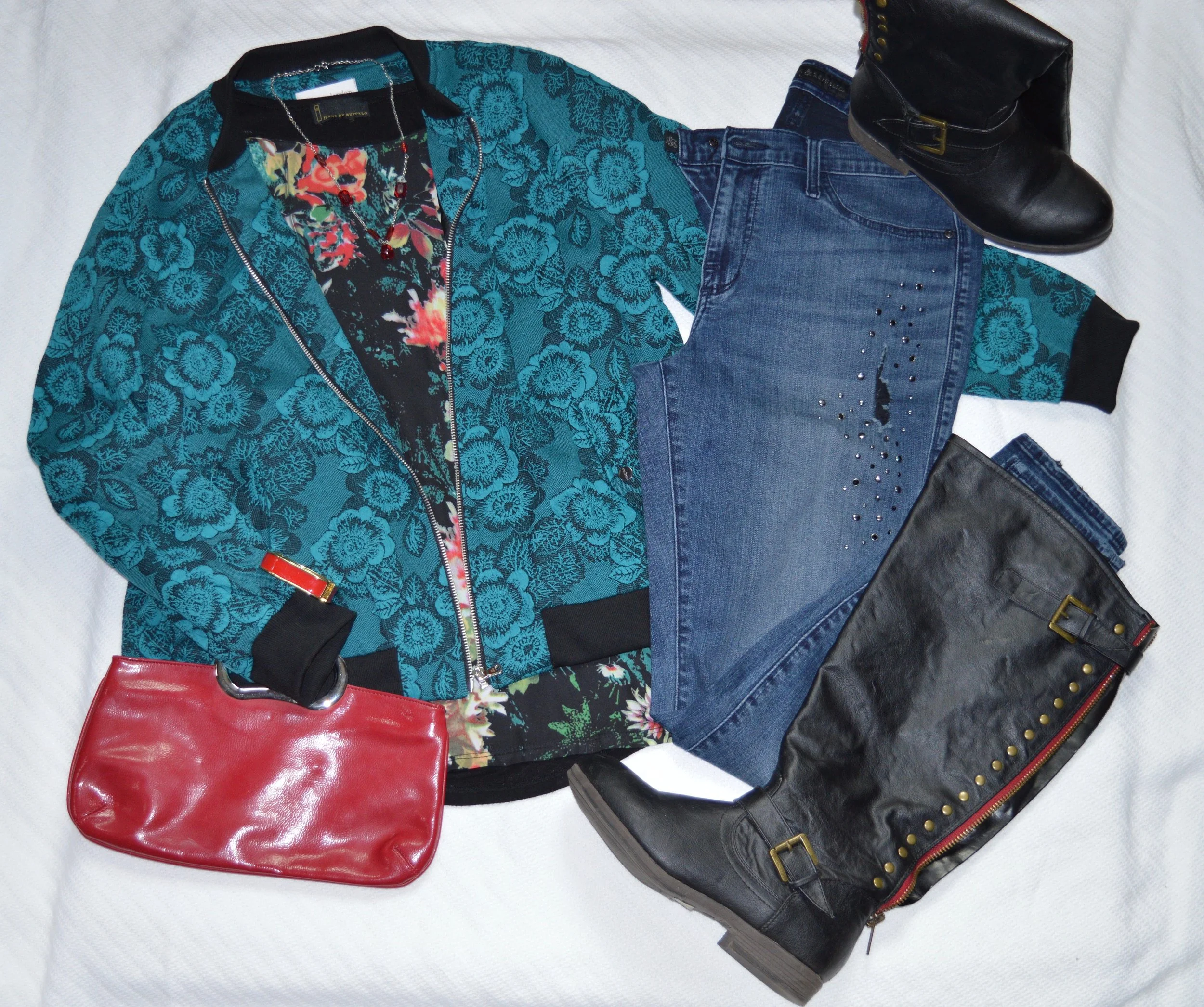
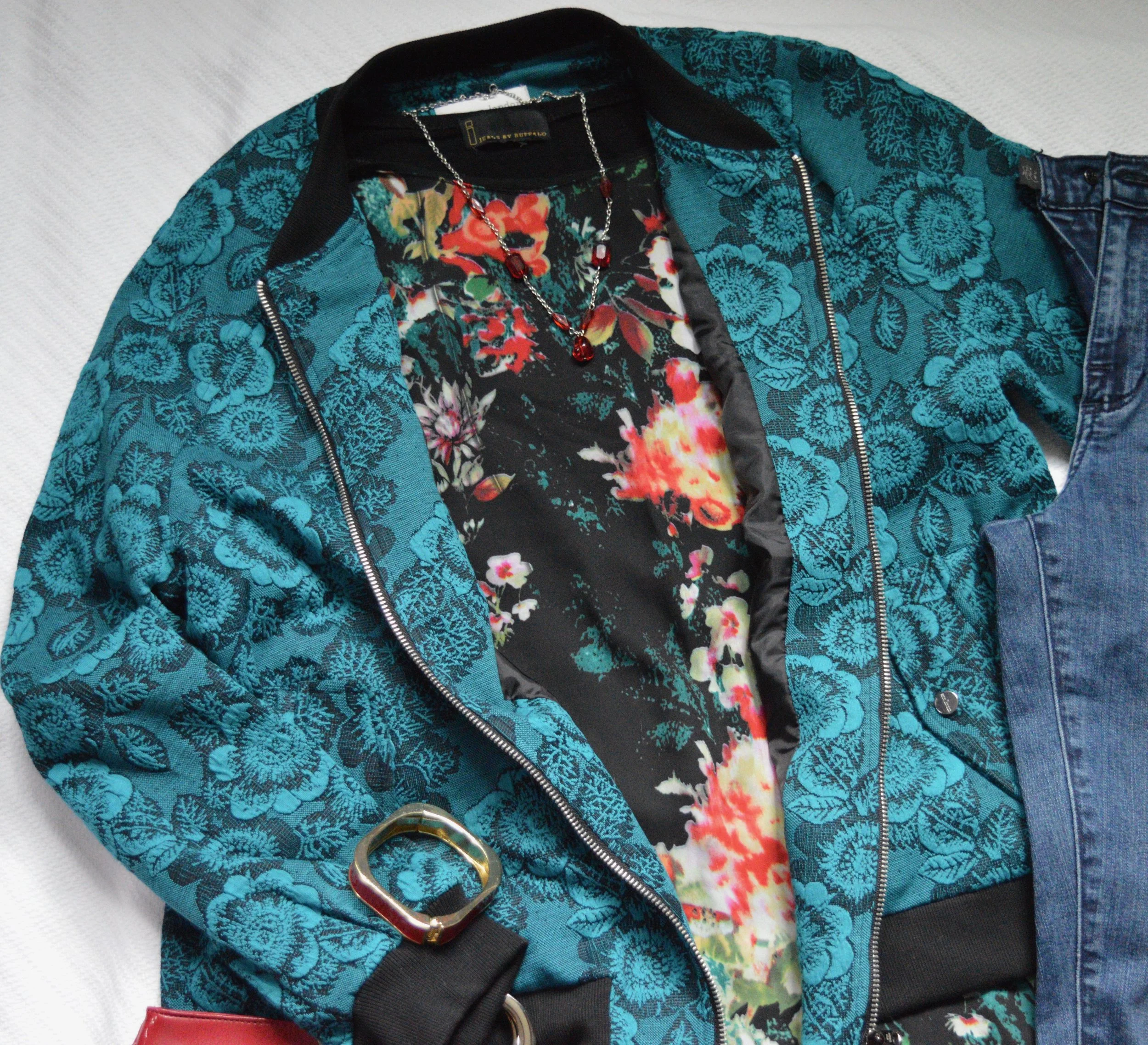
I found this dark floral Jeans by Buffalo top while thrifting. I love the colors and when I went to put this flat lay together, I realized this erin london bomber jacket from Shop National would be the perfect over piece. It goes well with the green in the top and has its own floral print.

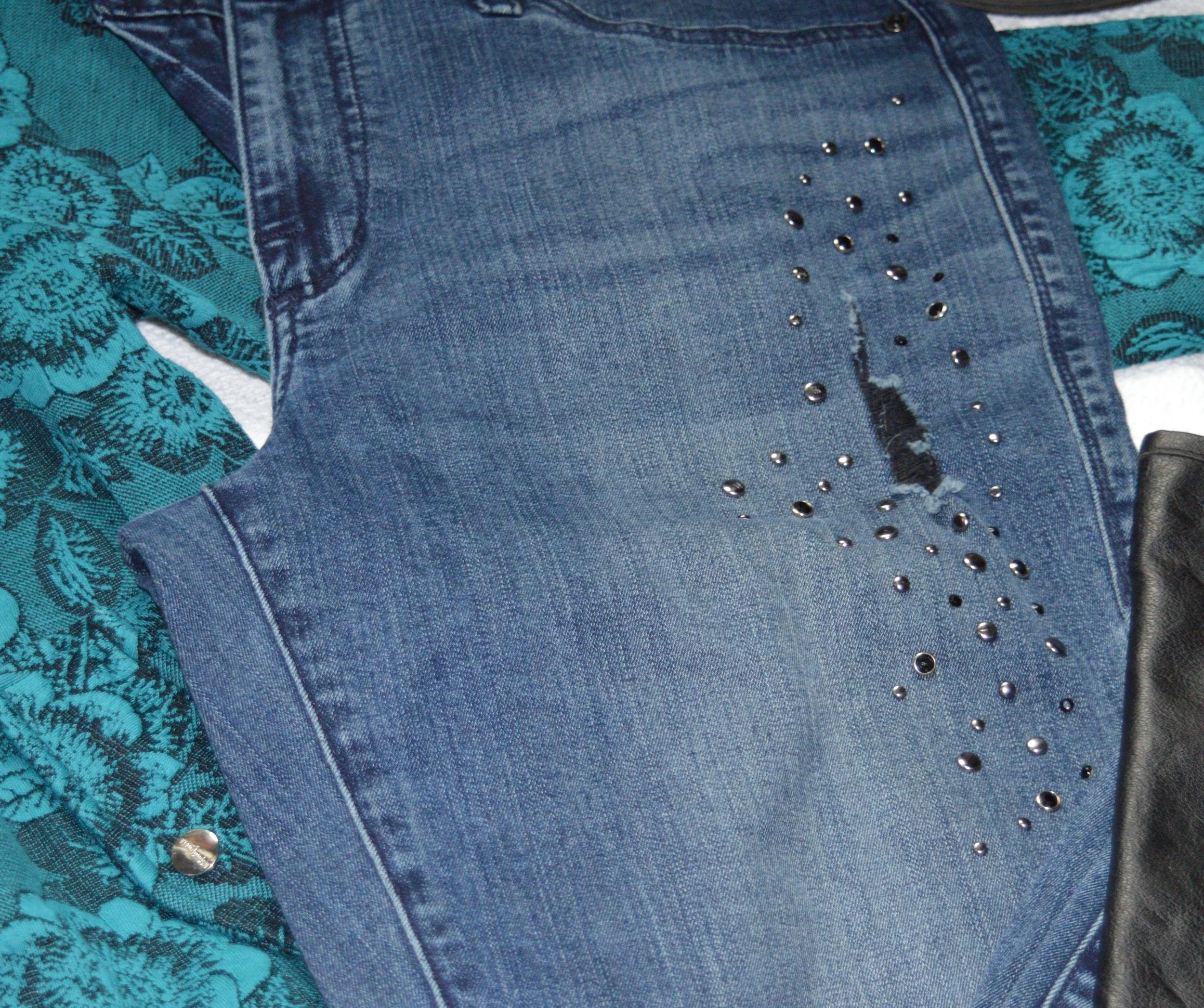
These distressed, embellished skinny jeans are Rock & Republic from Kohl’s, and I’ve had them for a while. Once again, I have grown out of them, but I refuse to get rid of them. Ha, ha.

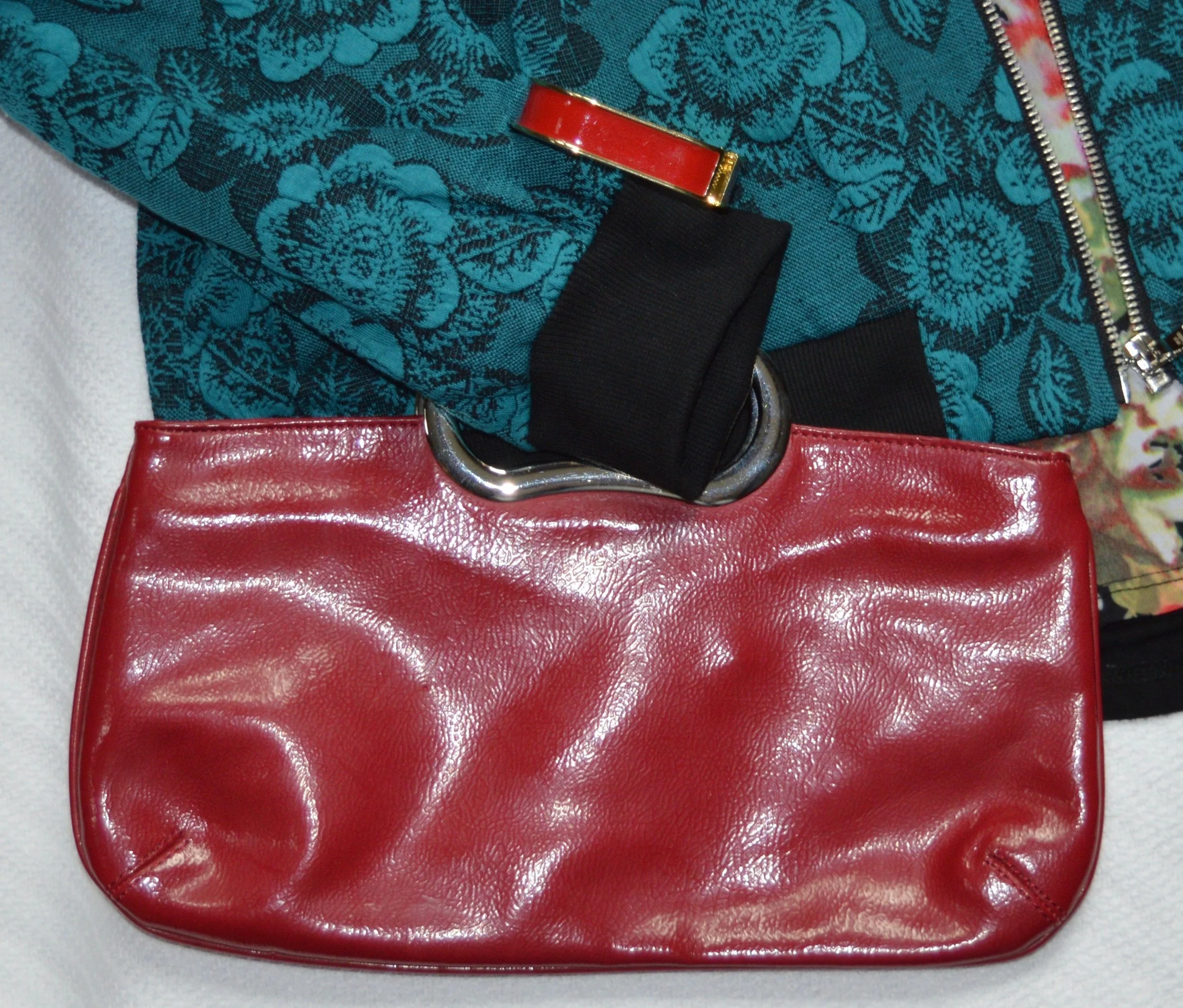
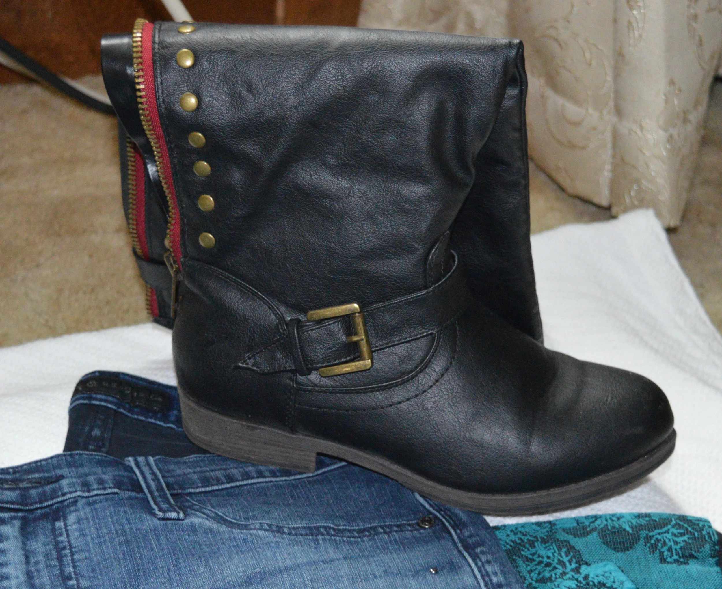
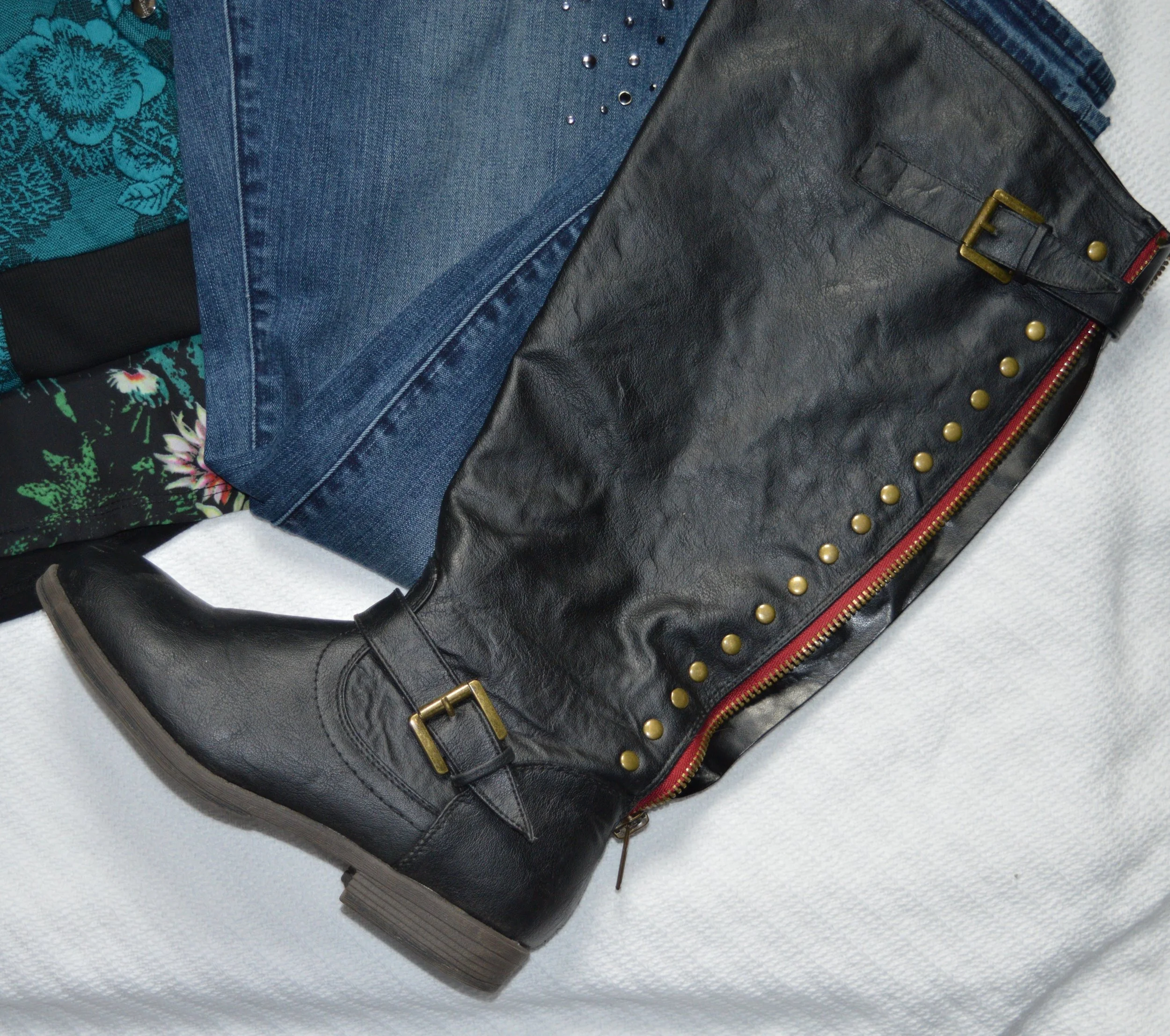
Since the top contains some red, I chose red for my accessories, including my tall, black, studded boots that have red detailing along the zipper on the back.

This is definitely an outfit I would wear on a regular basis. The pretty florals, the layers and the skinny jeans with boots will be a regular rotation as the weather cools.

I hope you enjoyed this post. Next Tuesday I will bring you one more post on fall trends and then I hope to start my Pantone Fall 2019 - New York series.

Thanks for following and please join me next time.

Fall Trends - 2019 - Part 2

If you missed last Thursday’s post, I’ve started a short series on Fall 2019 Trends. Every season the runways are filled with with new colors and trends. This fall the trends include things we are familiar with like animal prints and metallic sheens to rebooted trends like patchwork, tiny bags and shoulder pads. I encourage you to pick and choose the ones that you feel most comfortable with and maybe go for one that pushes you a little outside your comfort zone.

The next trend I am featuring would, perhaps, be the one that would be a little outside my comfort zone, but one that I felt I could easily adapt to with pieces I already had in my closet.

Trend 3 - Romance Gone Goth

If you want to see the original looks from the runway click on this article by Who What Where titled These are the 9 Biggest Fall 2019 Trends, Period. Of course that is a matter of opinion. Ha, ha. I changed the name to Goth rather than Grunge, because if you do your research, Goth is head to toe black with lace, leather and more form fitting wear. Grunge is more about torn jeans, flannel shirts, Doc Martens, and while black is a common grunge color, other dark colors like maroon, forest green and indigo are also common.

My version is a lot less revealing and personifies me. My outfit is, also, not true Goth, because it has color. It is also not really Grunge either. Don’t believe everything you read on the internet. Do your research.

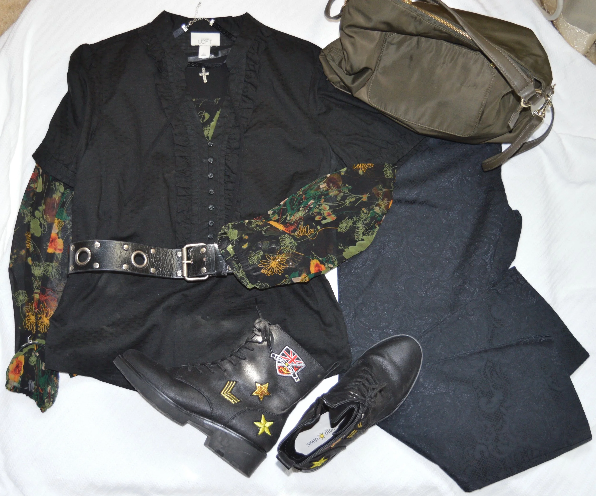
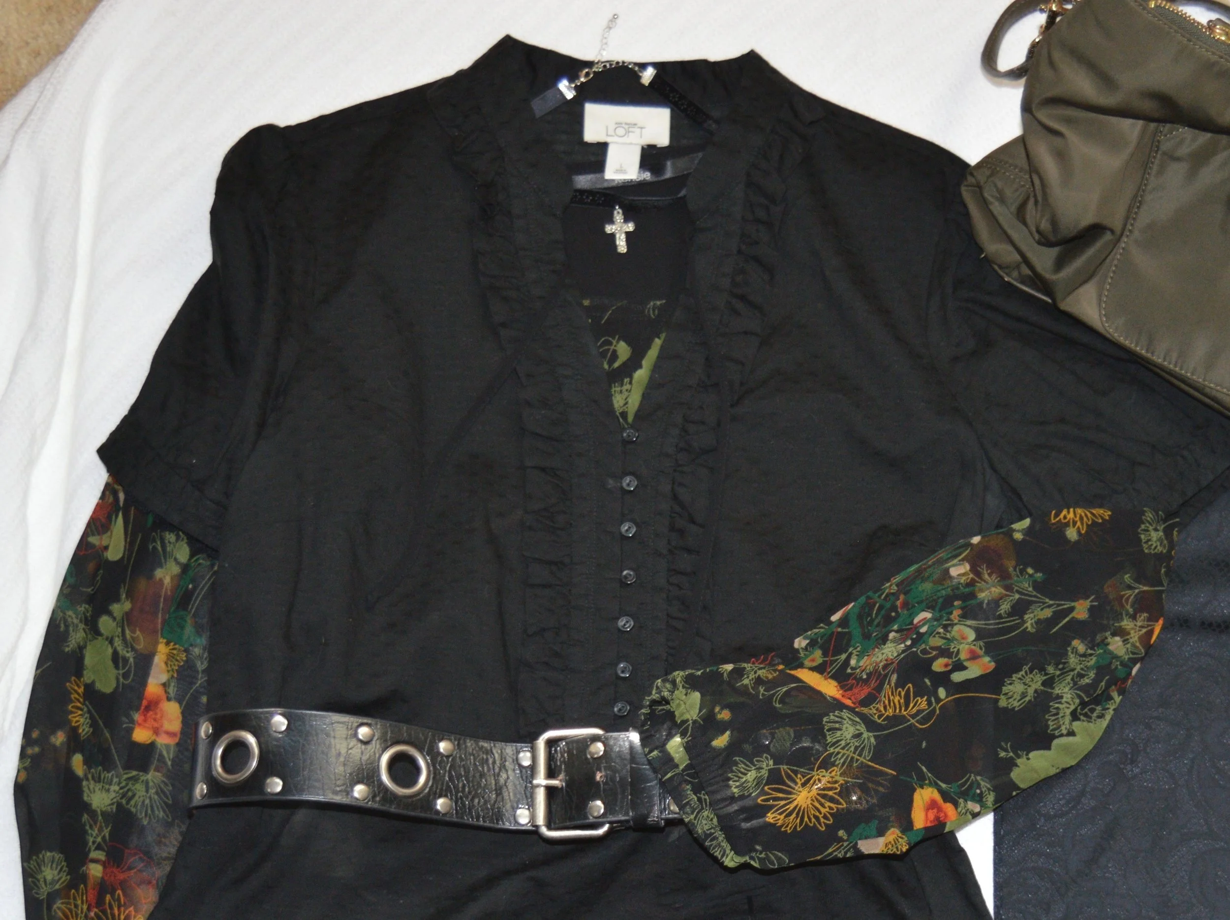
For this look I chose three pieces that I would term romantic. This short sleeve ruffled top was thrifted and is Loft brand. The sheer blouse that I put underneath was my way to add another fall trend, that of dark florals, as well as add, just a touch of color. This is a brand called Kensie. I also thought the wide belt and the cross choker added a touch of metal that is often associate with Goth outfits.

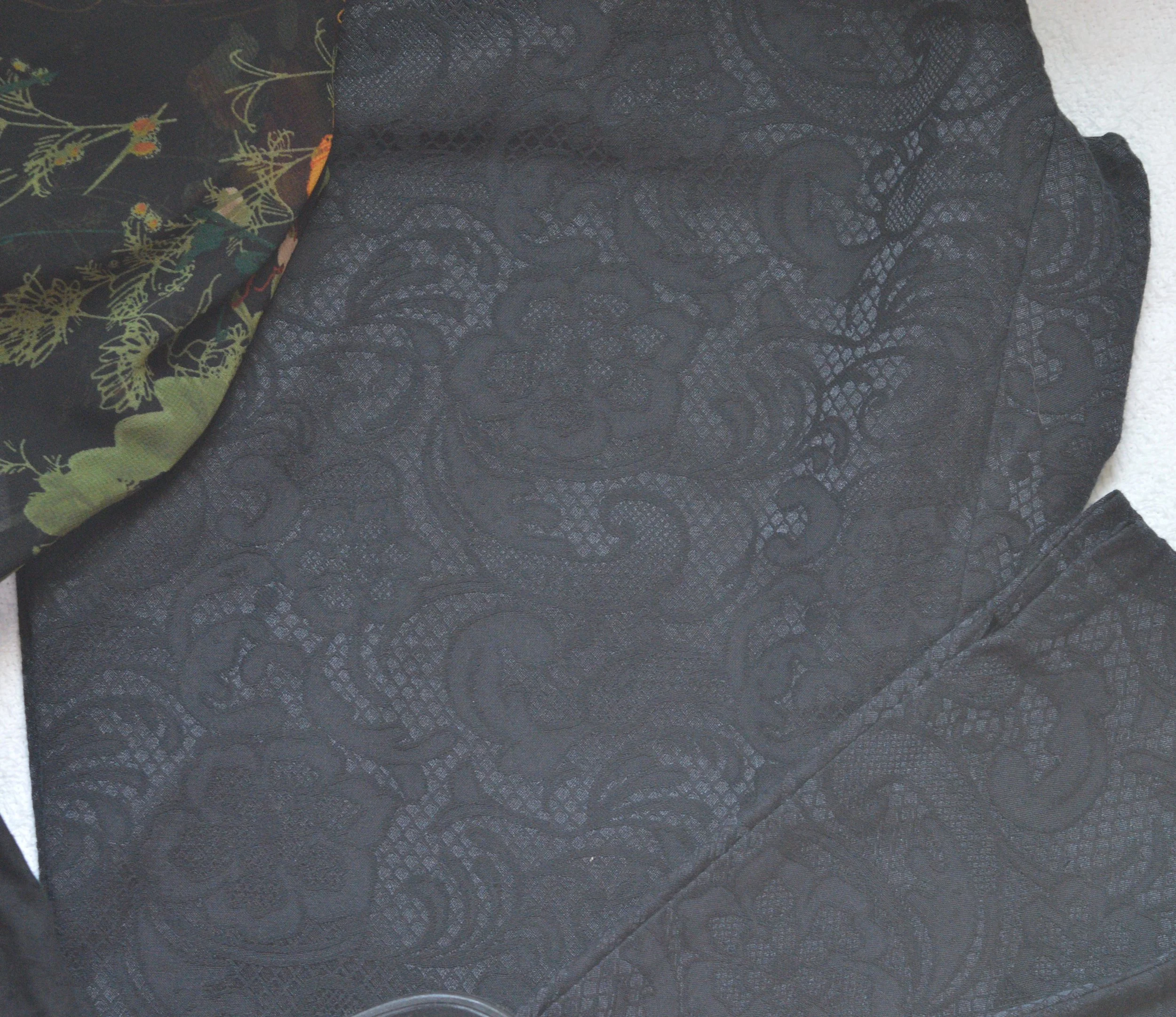
These Apt. 9, faux lace pants I’ve worn before on the blog, You can see them styled with a multi-print tunic, and with a shimmery taupe top. Lace is another fabric or pattern that we often associate with romance, so it seemed appropriate to use them for this Romance Gone Goth outfit.

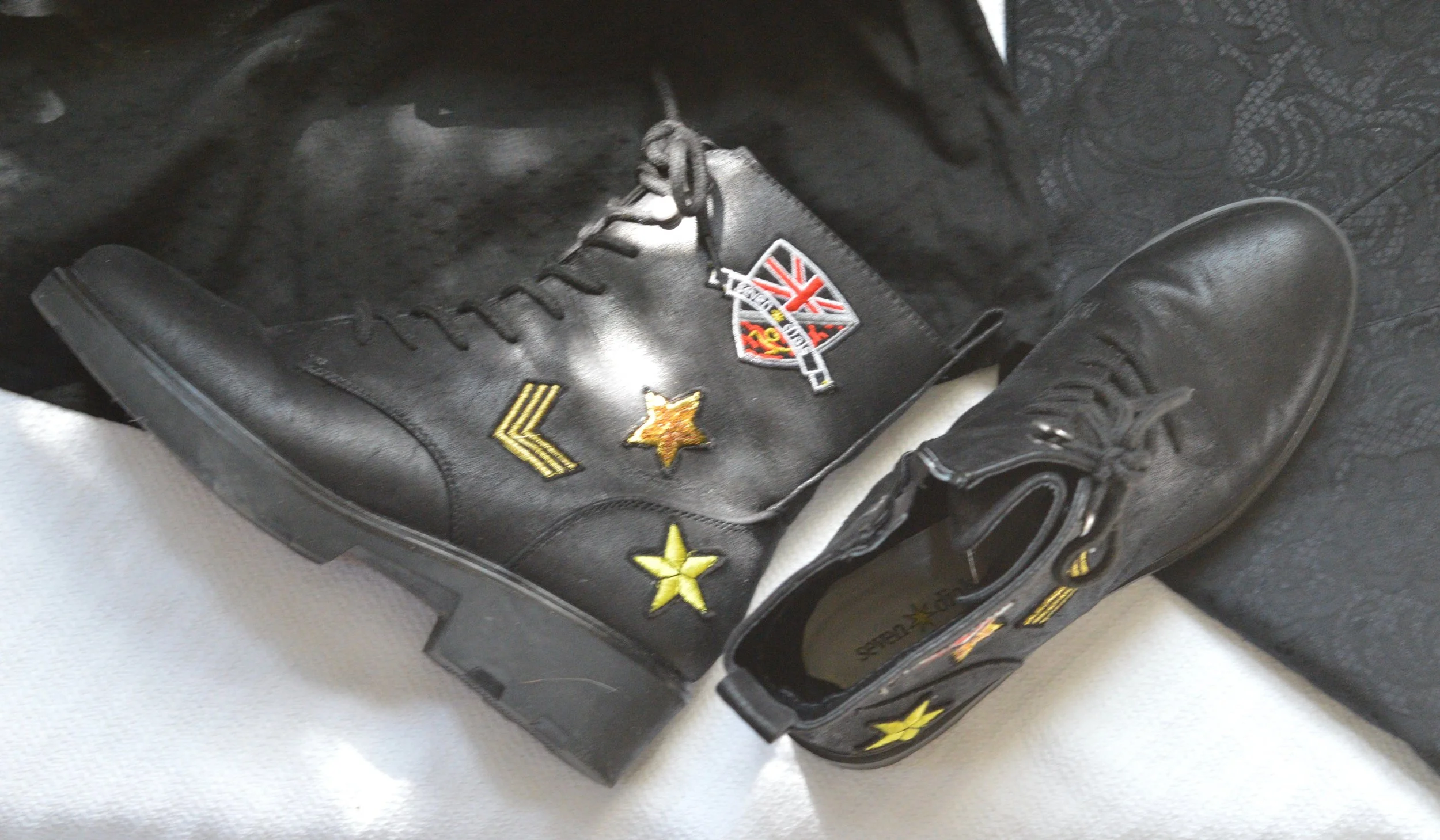
My black, Seven Dials, combat boots seemed the perfect choice for this faux Goth look. True Goth would not have any brightly colored patches.

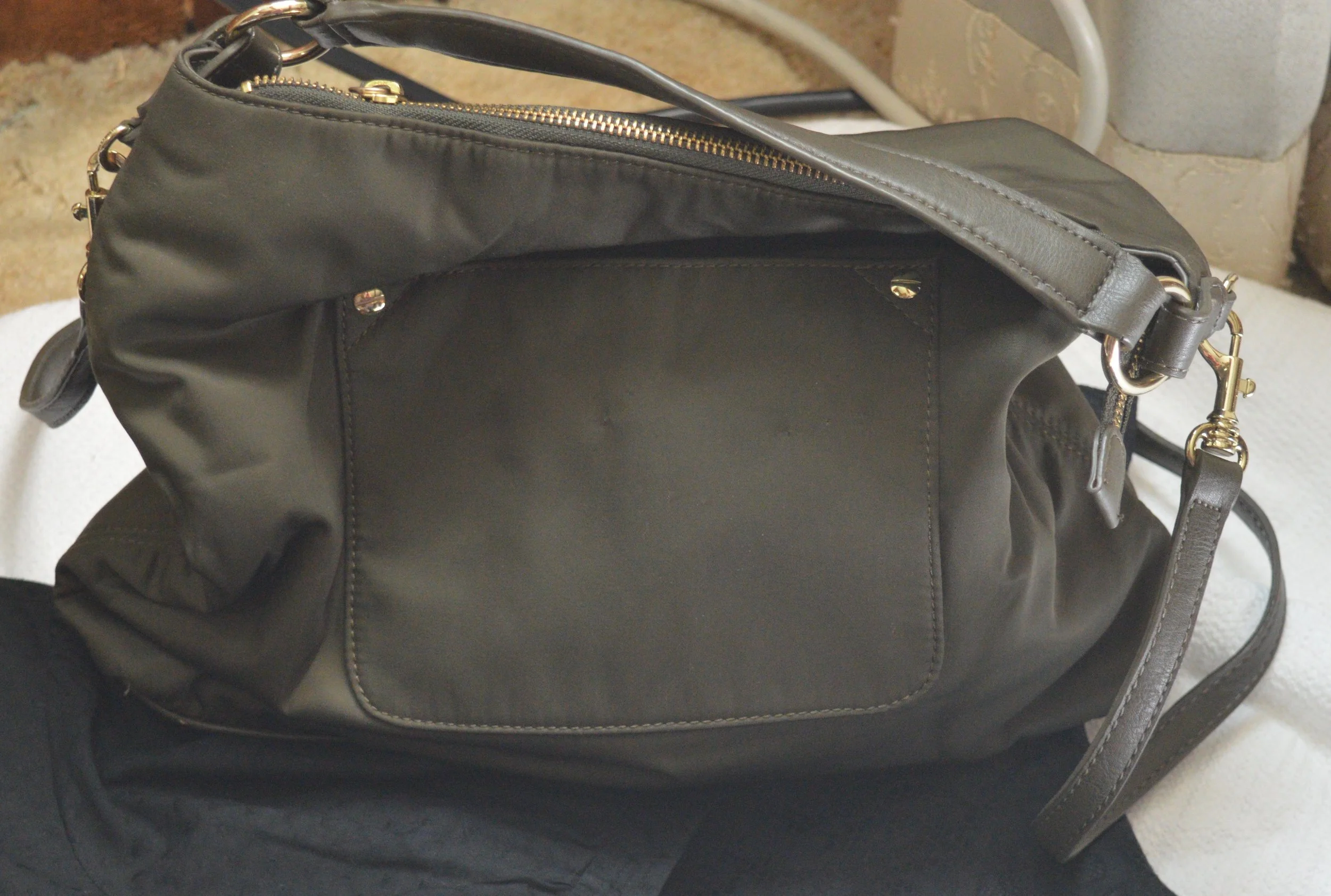
The bag is totally not Goth, but I thought it went nicely with the green in the floral under-top.

Trend 4 - Layering Knits

I think this is a fun one, although not for everyone. Most women our age are in the throes of menopause and the last thing you want to do is start wearing layers of heavy knits, but for those of you who are typically cold most of the time in the winter months, this trend is for you.

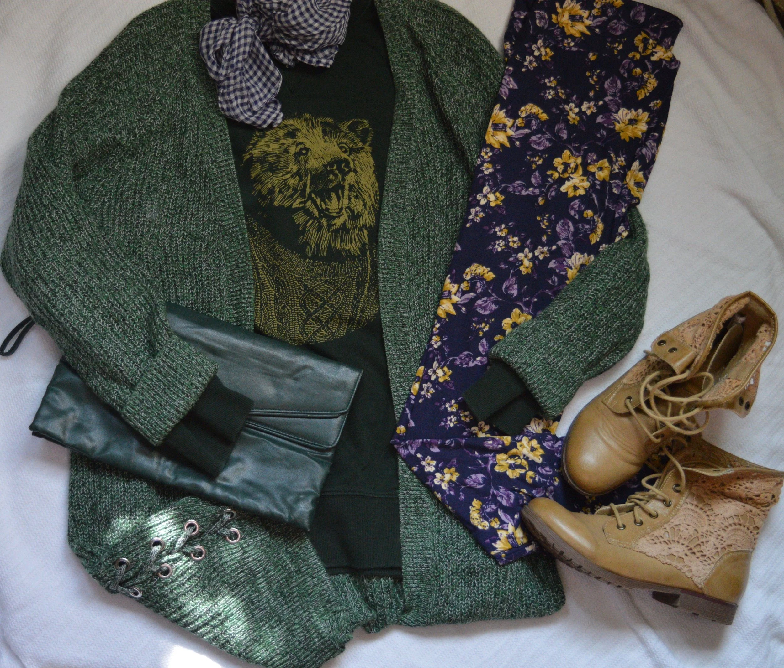
I love the way this outfit turned out in the flat lay and I may actually put this on when it gets colder and see how it looks. I am not a big leggings fan, but this just looks so fun, I may have to do it…yes, getting outside my comfort zone again.

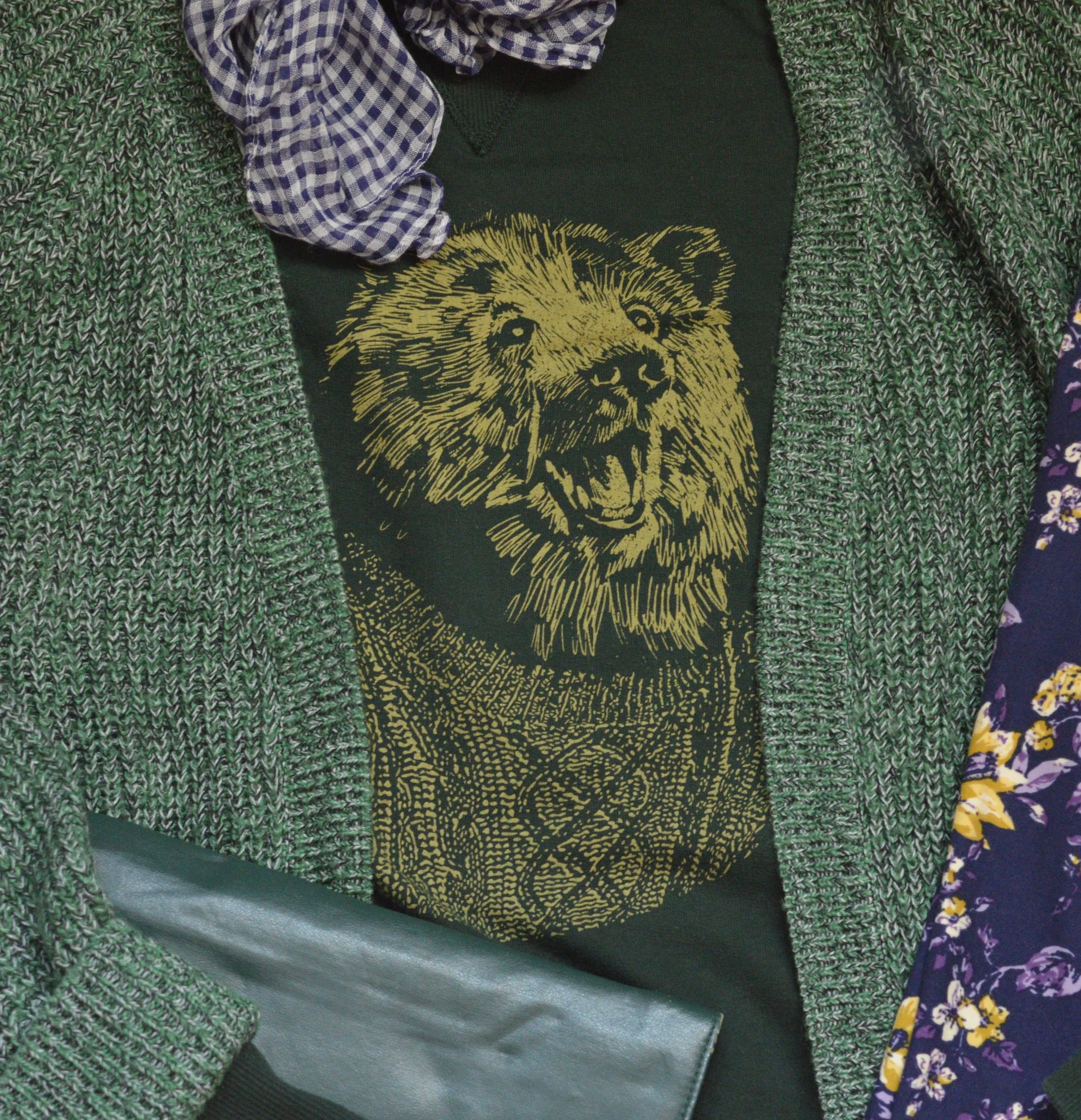
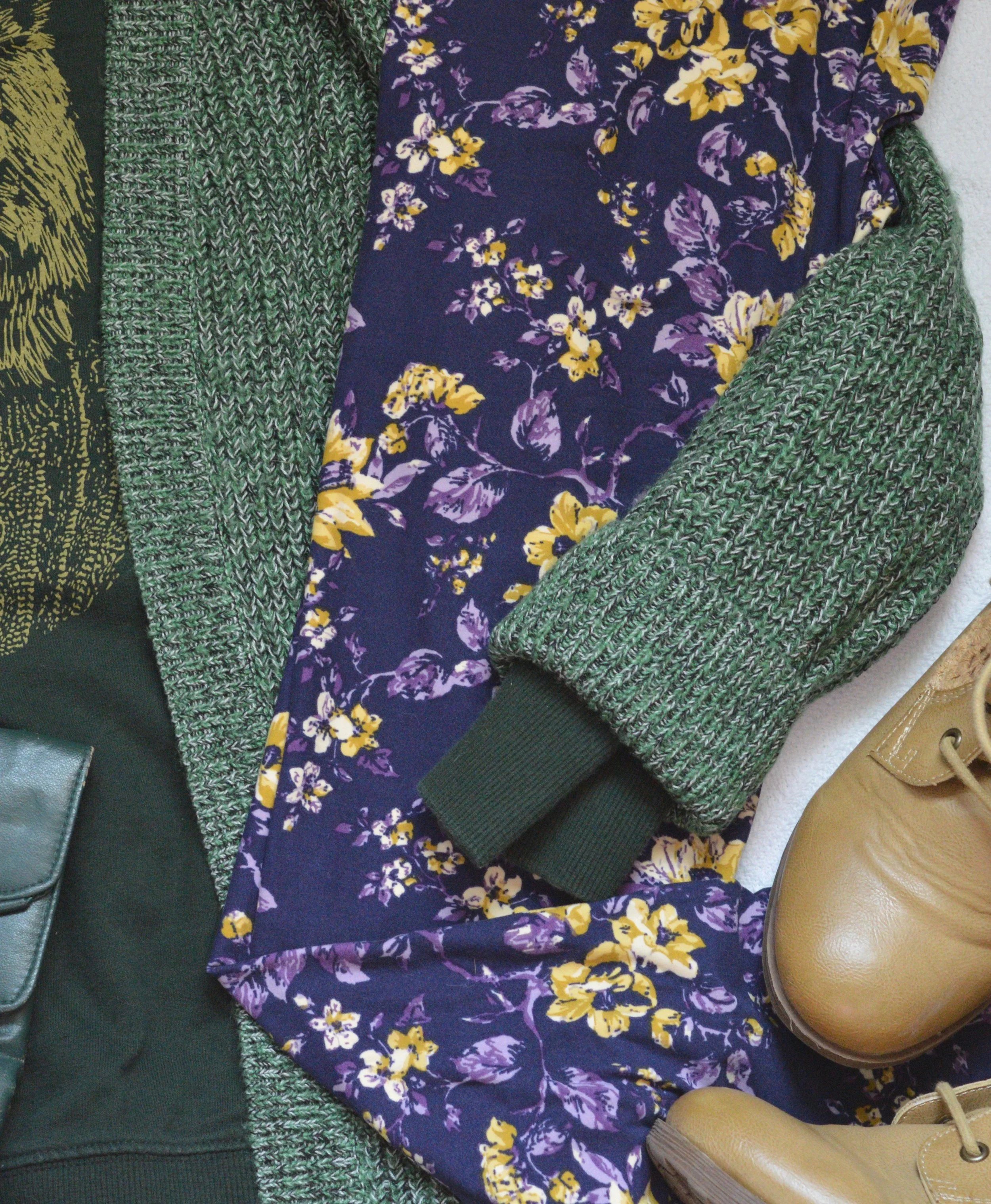
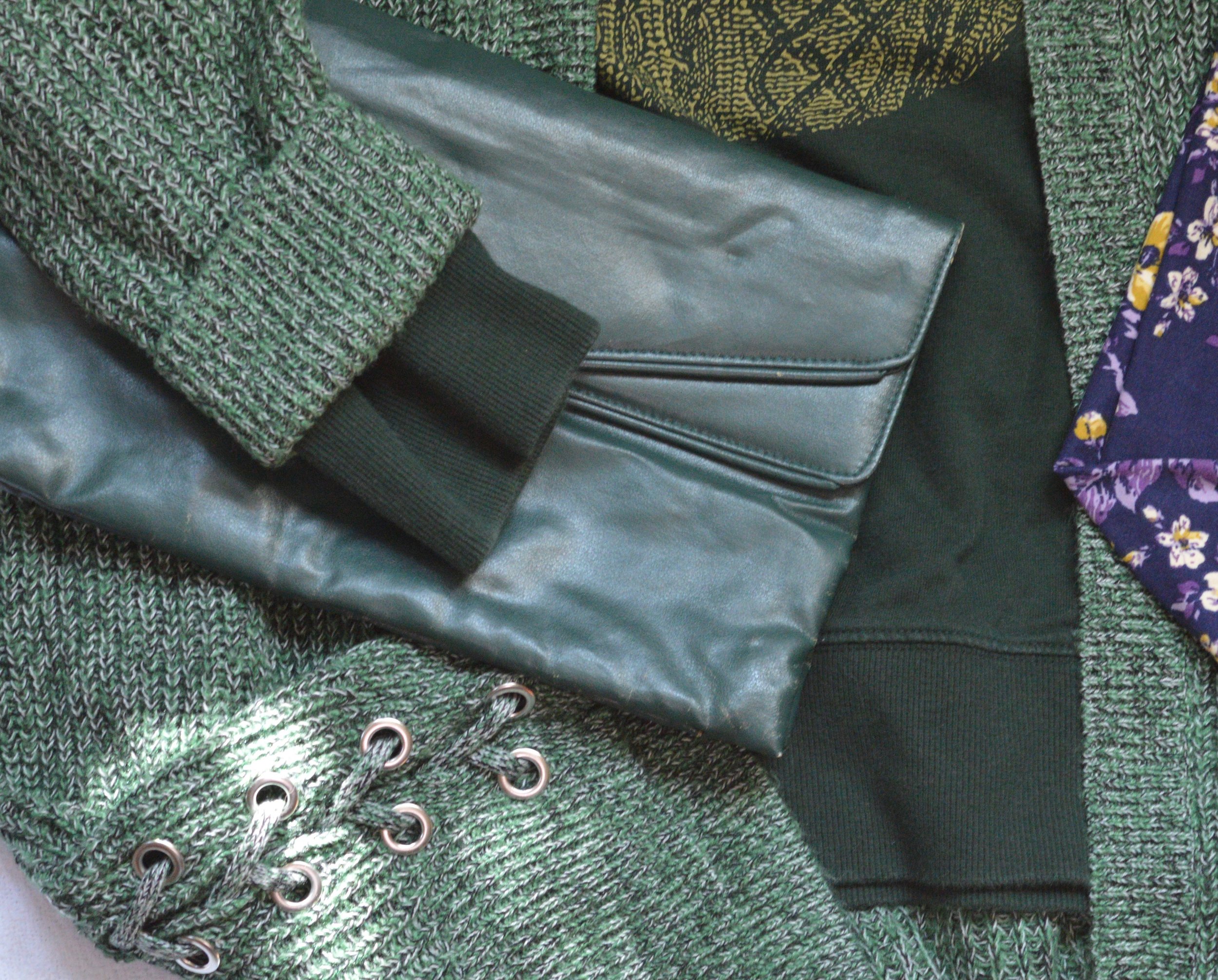
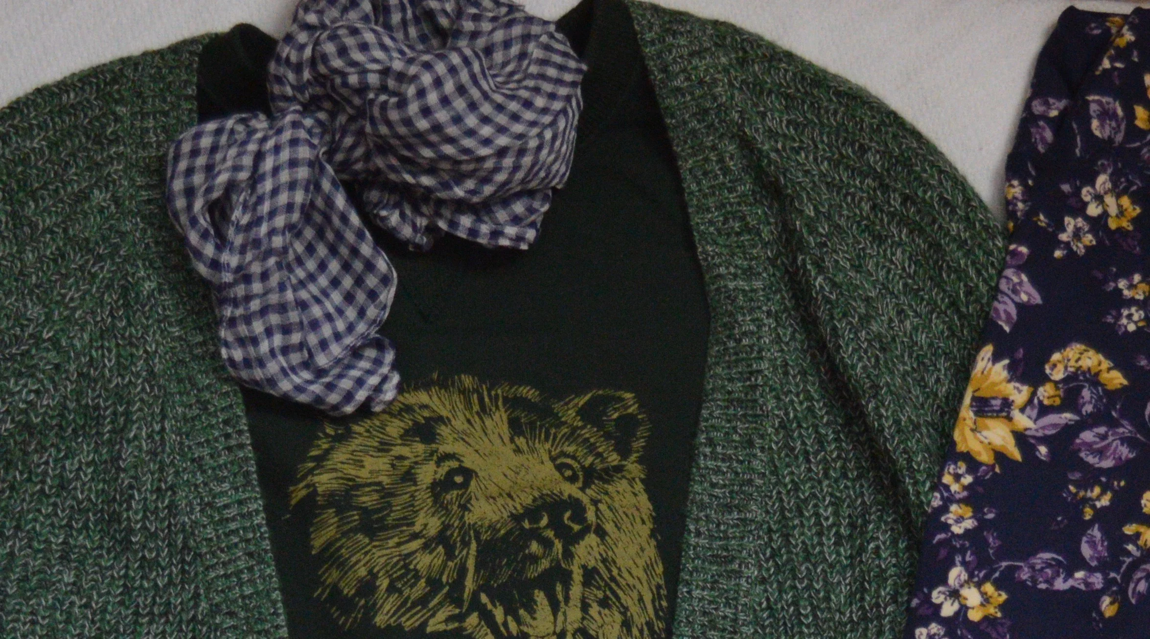
The sweater was a clearance find at Christopher and Banks. I love the lace up detail on the lower sides. This sweater has an open front with no closures and falls right about mid to lower thigh. It is a medium weight, so good for pairing over this thrifted over-sized Merona sweat shirt.

Isn’t Mr. Bear, just the cutest guy ever? He’s styling that cable knit sweater and I’m sure he’s heading right into his cozy hole to sleep for a good long while. He looks so happy. Believe me, I’d be happy too, if I knew when winter was on its way, I could go into a cozy hole and just sleep until spring arrived. Ha, ha.

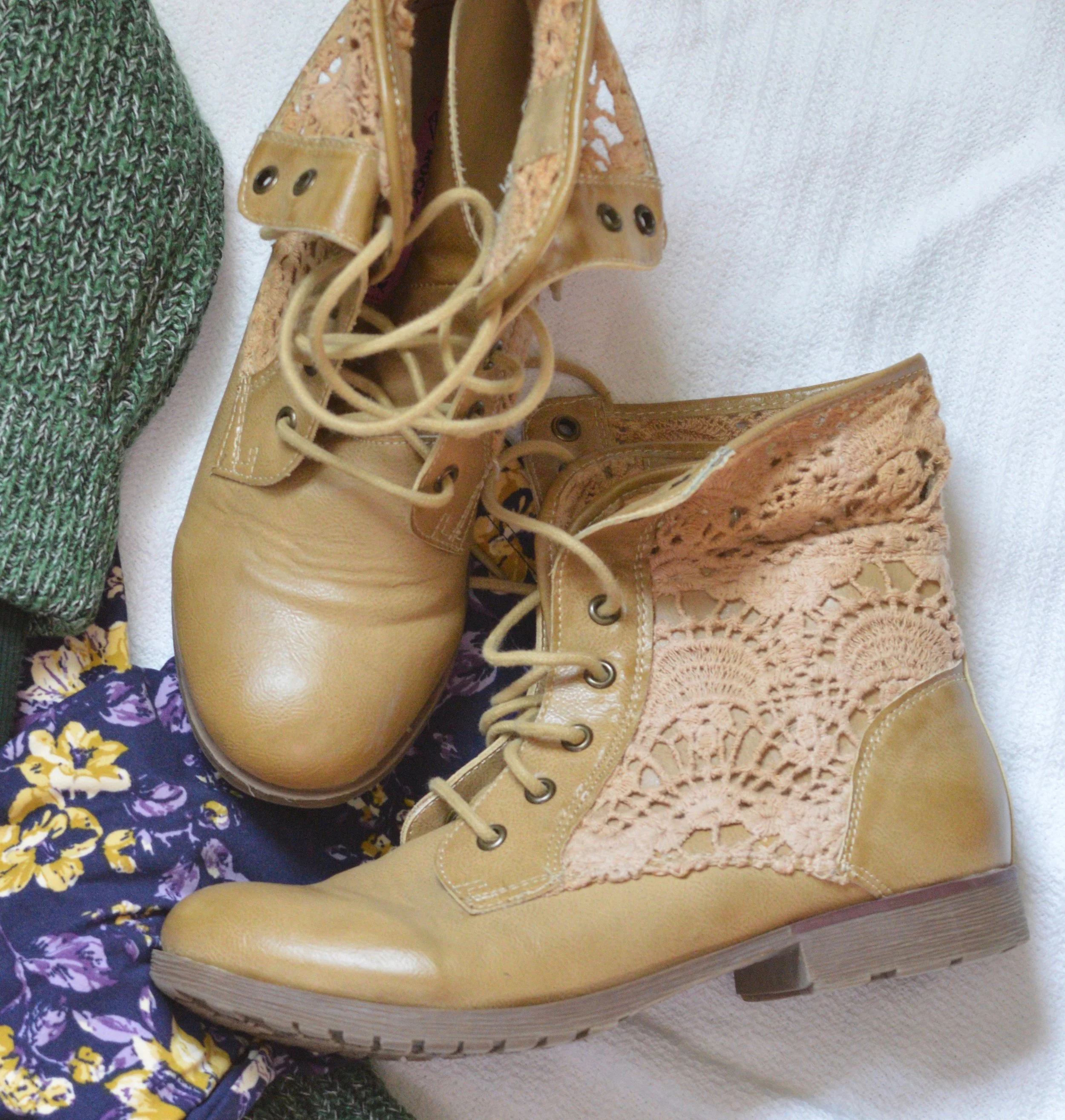
These leggings are Lu La Roe and my daughter gave them to me. I have been waiting on the perfect outfit to pair these with and I think this just may be it. Because I opted for these leggings I decided to wear a recently thrifted pair of boots, high lighting the lighter yellows and tans in the leggings and sweatshirt. These boots are a brand called Rock & Candy by Zigi. While this is a brand I had never heard of before, it appears that they are available at places like Nordstrom Rack, Famous Footwear and Shoe Carnival.

Since the outfit already has a lot going on I went for a simple green clutch.

I added the scarf as an after thought as a way to tie the whole outfit together.

What do you think of these two fall trends? Would you do Romance Gone Goth, or Layering Knits? I’d love to hear your thoughts, so leave me some love in the comments.

I hope your week is off to a great start. Thursday, I’ll give you another peek at two more Fall 2019 trends.

If you know anyone you think might like my blog, pass along the word. If you are not already a subscriber it’s easy to sign up by clicking on the subscribe button. Once a week you’ll receive an email from me letting you know there is new content on the blog. If you are a regular subscriber, hugs all around. You are why I write this blog. I’d also love for you to give me any feedback regarding other things you would like to see on the blog. Right now, I limit it to fashion, faith and occasional travel and lifestyle content, but I am open to other things as well.

Have a great day.


Fall Trends - 2019 - Part 1

Time has gotten away from us and life threw us a few curve balls, so my daughter and I have not been able to connect to take pictures for my Fall Pantone series. It is still on the docket, but will be put off for a week or two. In the mean time, I thought this would be a good opportunity to talk about a few of the fall trends. I touched on a few of them in my last Wearing White post, but now I will address them more in depth.

When it comes to fashion, I am not a big trend follower, but I do like to see what is current and pick and choose what trends I find most fitting for my personality and my style . This week I am going to cover two. These are flat lays I put together and these are clothes from my own closet. Once again, I encourage you to shop your own closet before going out to purchase new items to follow the trends. Often times we have things in our closets that we forget about, that fit perfectly with the trends that are current. I think this is especially important when it is a trend that isn’t going to be lasting - things like tie-dye, see through rain coats, bags and shoes and other very specialized trends.

Trend 1 - Head to Toe Green

I am simply calling this head to toe green, but it is most specific to a light green in the manner of pistachio, sea foam or colors of that nature.

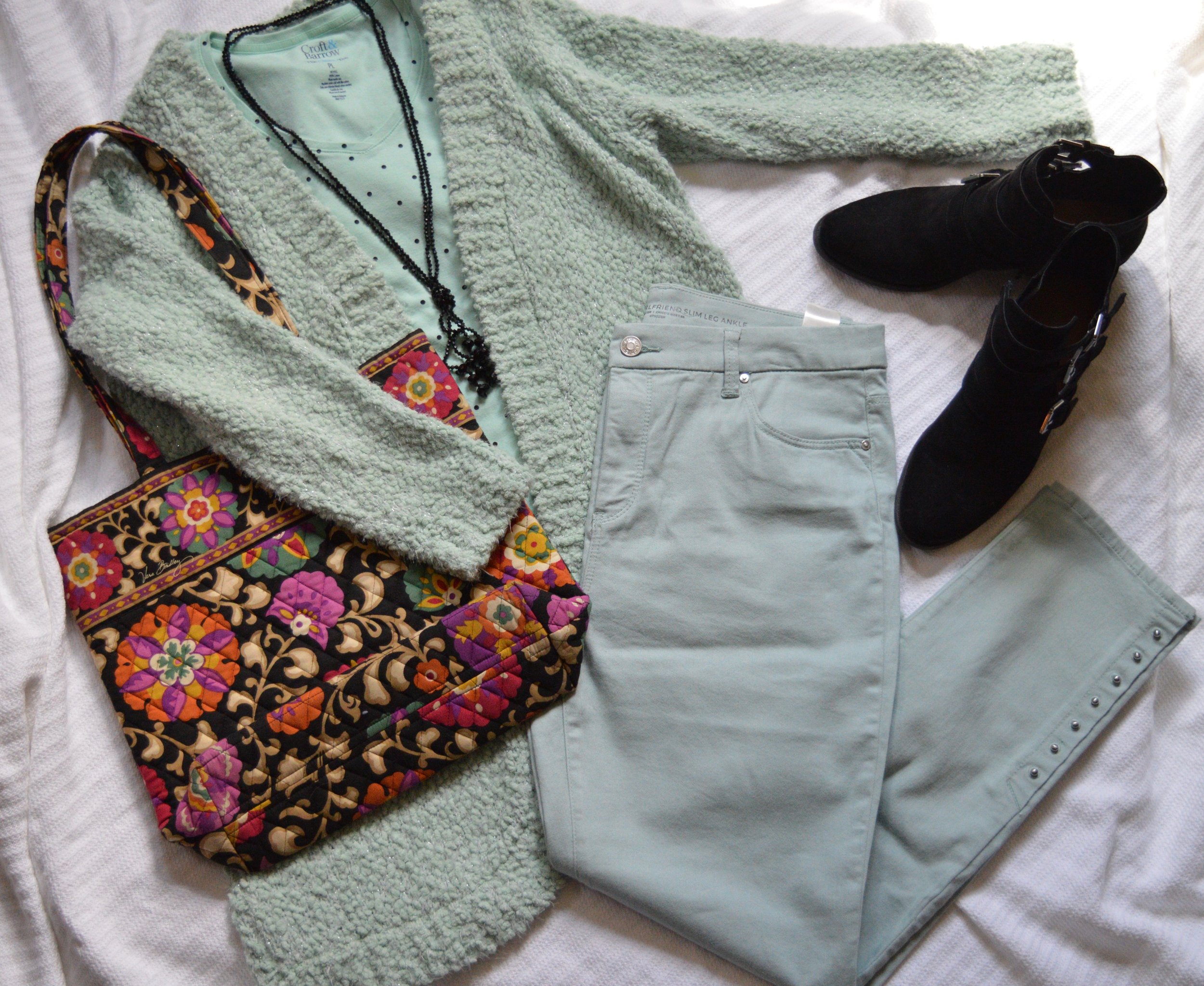
This warm, fuzzy, knee length, open front cardi was a Christopher and Banks purchase at the end of the spring season. I fell in love with the color and its soft coziness. After making that purchase I found myself drawn to other pieces with that same light green color. I would probably say these are closer to a mint. In fact, take the pants away from the sweater and they actually look more like a very light blue. I love when colors have an almost chameleonic effect when they are near other colors.

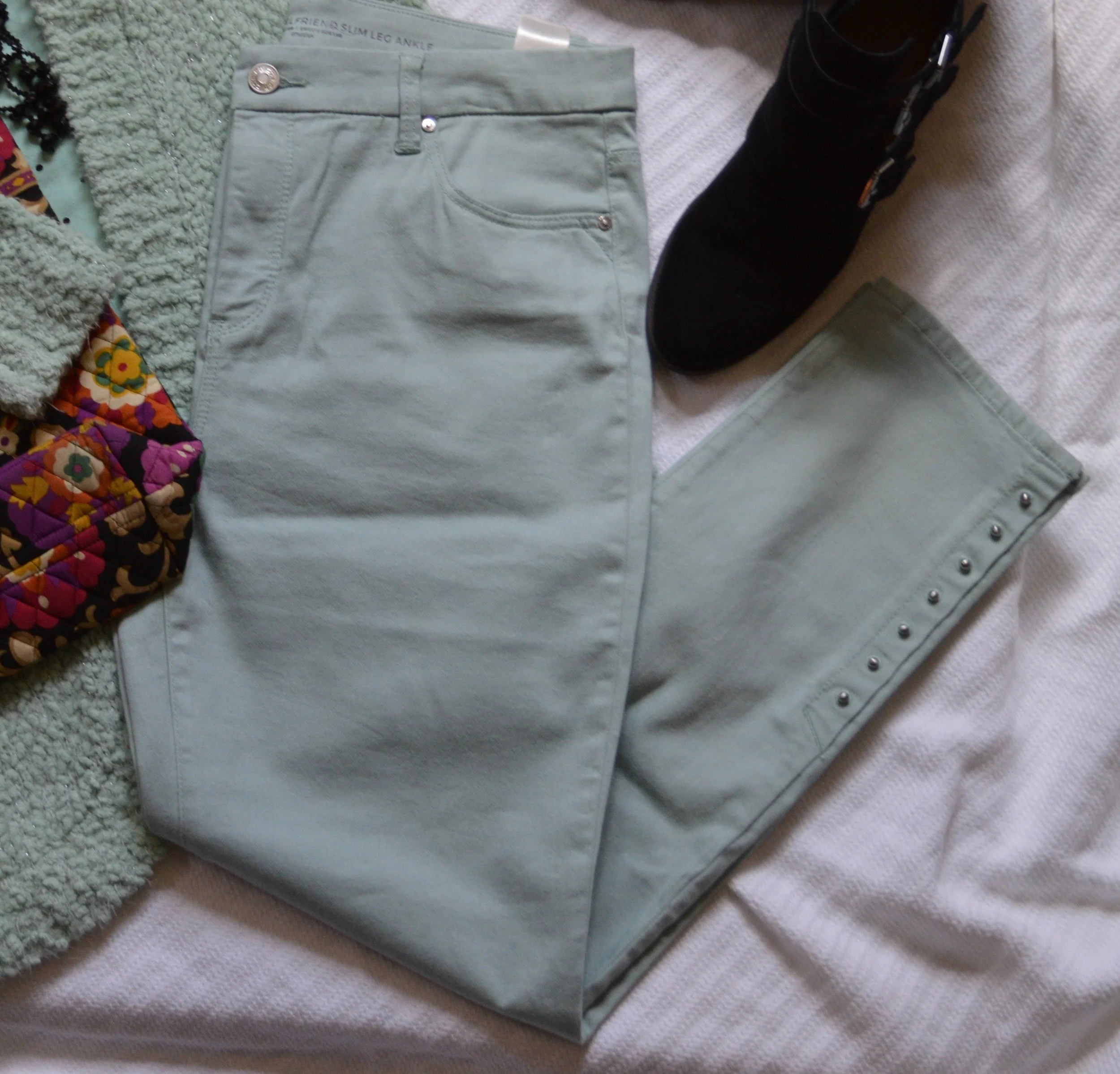
These straight leg jeans are from Chico’s and I found them on the clearance rack. The silver studs on the bottom portion of the pant leg are part of what drew me to them. That, and they have a soft, stretchy feel. These are So Slimming Girlfriend Ankle Jeans.

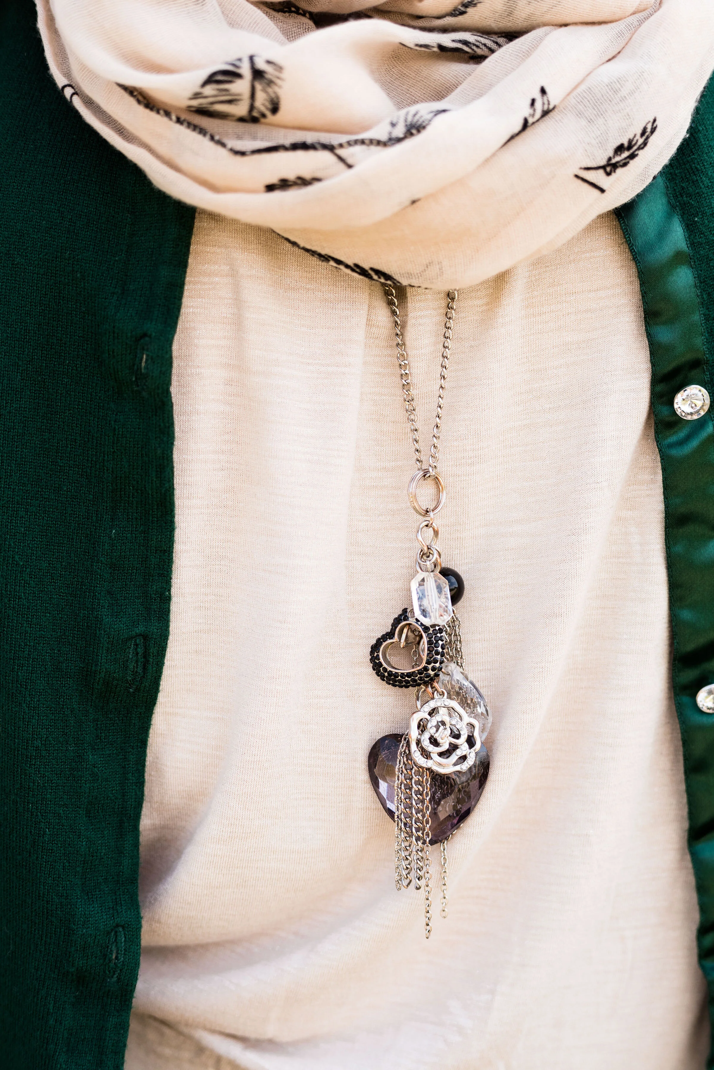
This v-neck, thrifted, Croft and Barrow tee has black polka dots, so I decided to make my accessories black. this black beaded tassel necklace, I have had for a while.

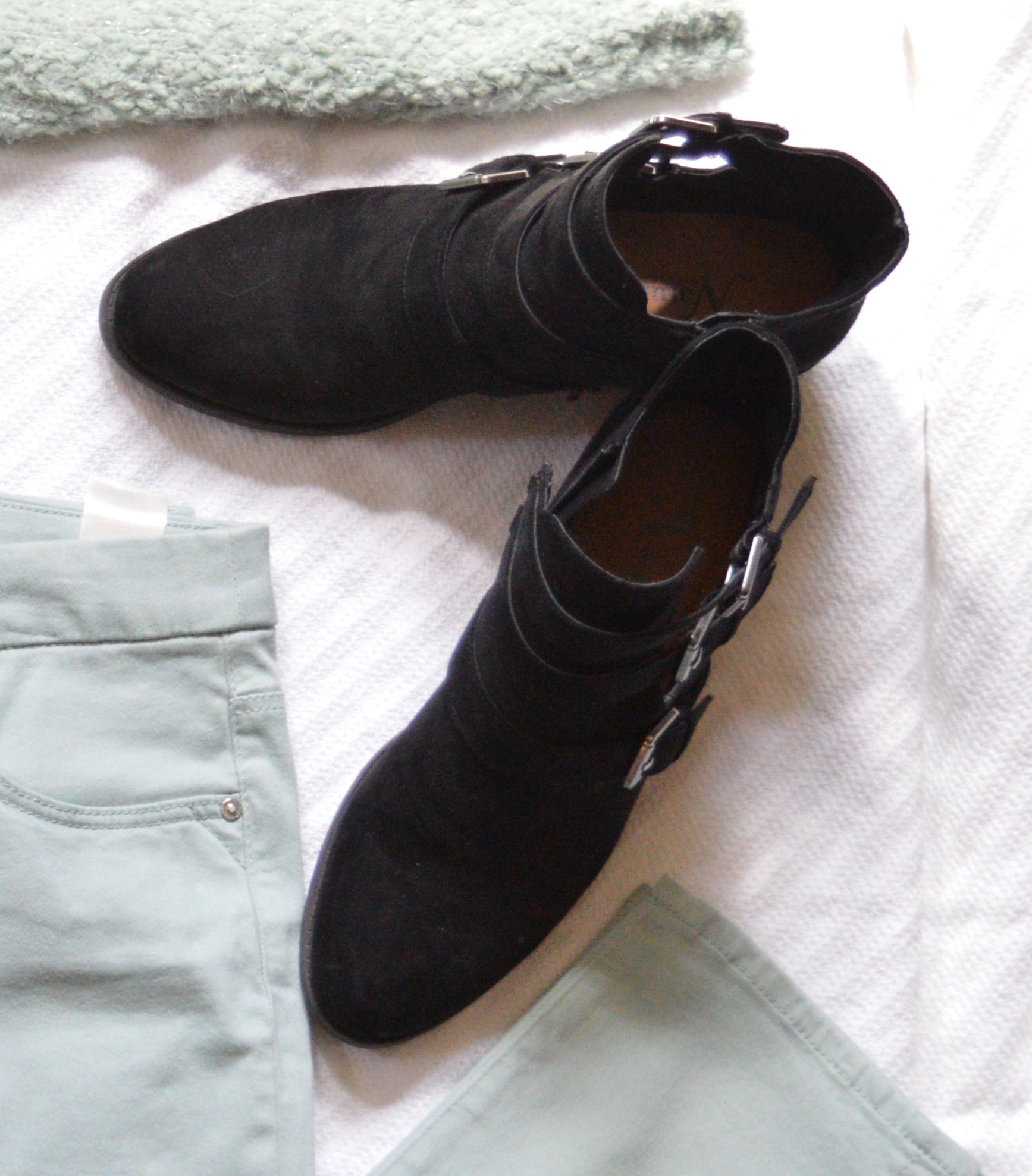
I wish I would have thought to lay one of these booties on the side. They have a neat cut-out along the outside where the buckles attach. They are easy on and off with an inside zipper. I got these at Bass Pro Shop when my hubby was looking for a pair of hiking boots. These were marked down and yes my husband did get a pair of shoes too. Ha, ha. These are Natural Reflection brand.

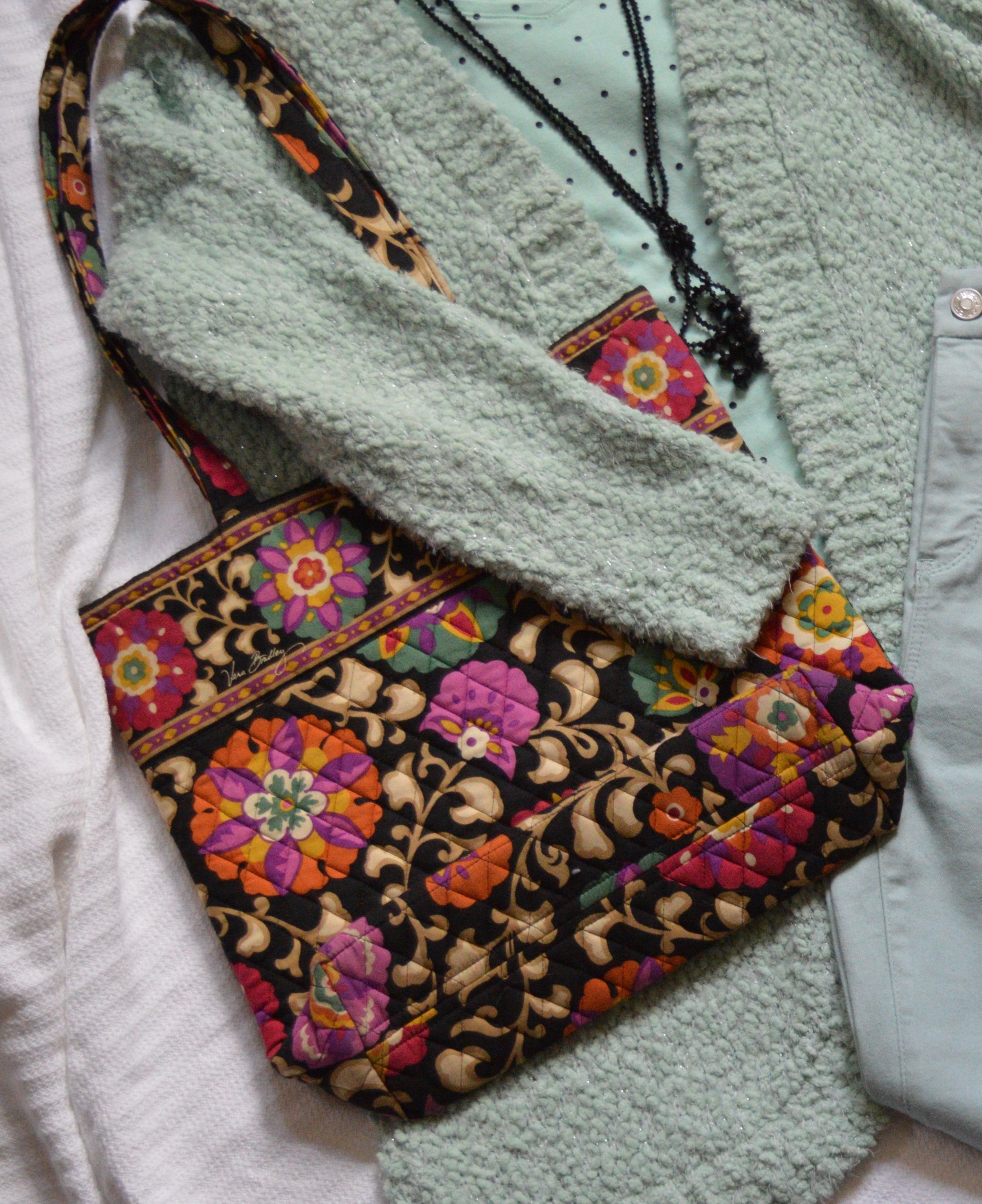
Of course I had to include a bag in my flat lay, so I decided to add another Fall Trend, dark florals. The bookstore where I work used to sell various Vera Bradley products, but not any more. I get a few of these bags at extremely good discounts.

Trend 2 - Metallics

Why do I feel that metallics come around every fall, just in time for the holidays? I like metallics, but they are a trend that I personally feel you have to limit. For fall the push is for head to toe everything, so head to toe green, head to toe metallics and on it goes. I say do what works for you. I like subtlety with metallics, so the following flat lay, would probably be a bit more than I would normally go for, but I think it works well.

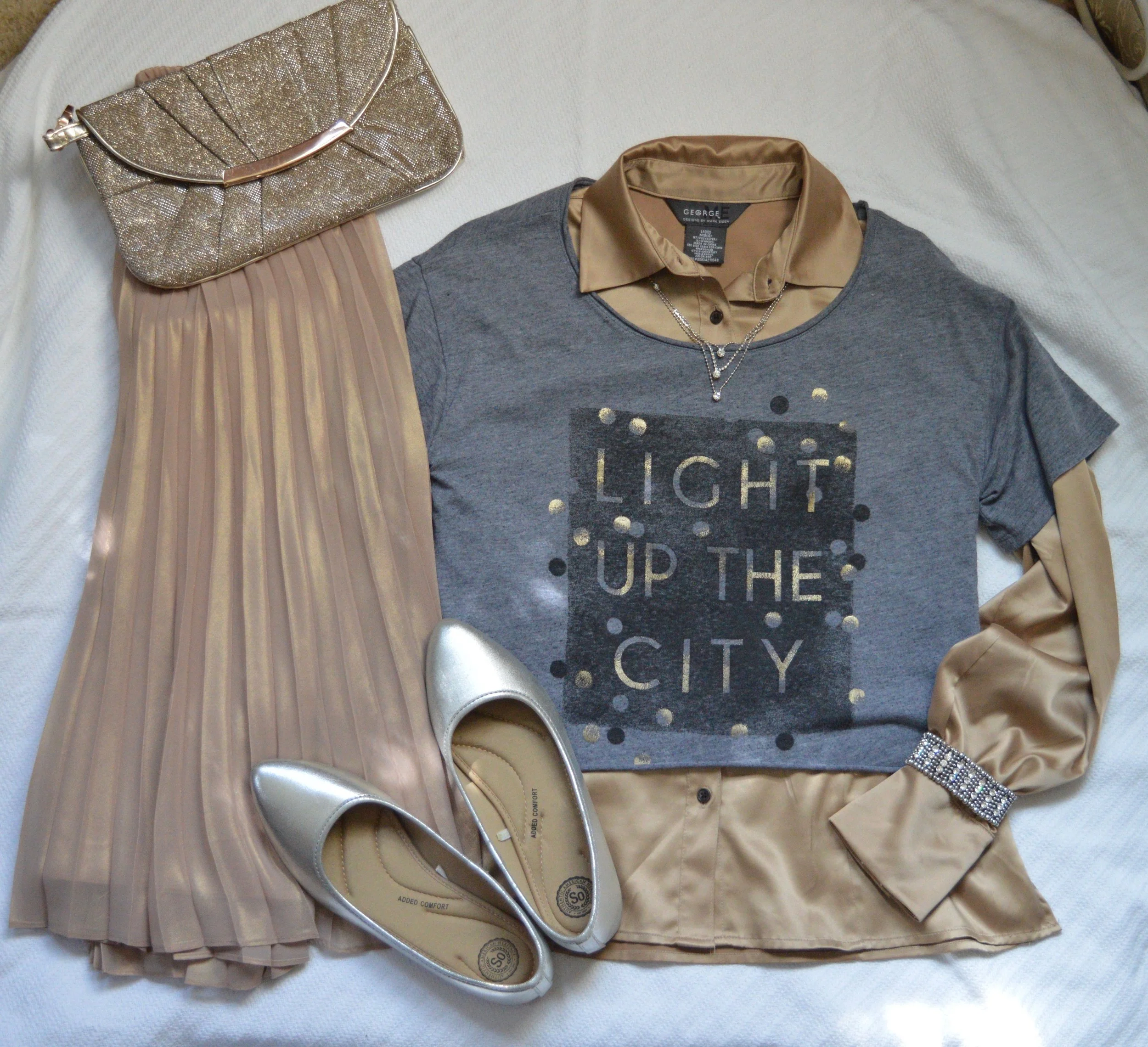
Lauren Conrad is famous for a line of clothes that is rich with pastels and feminine details. This skirt is no exception. The metallic sheen makes it party and holiday ready, but it exudes femininity. I need to figure out how to take it in a bit, because it is a little big.

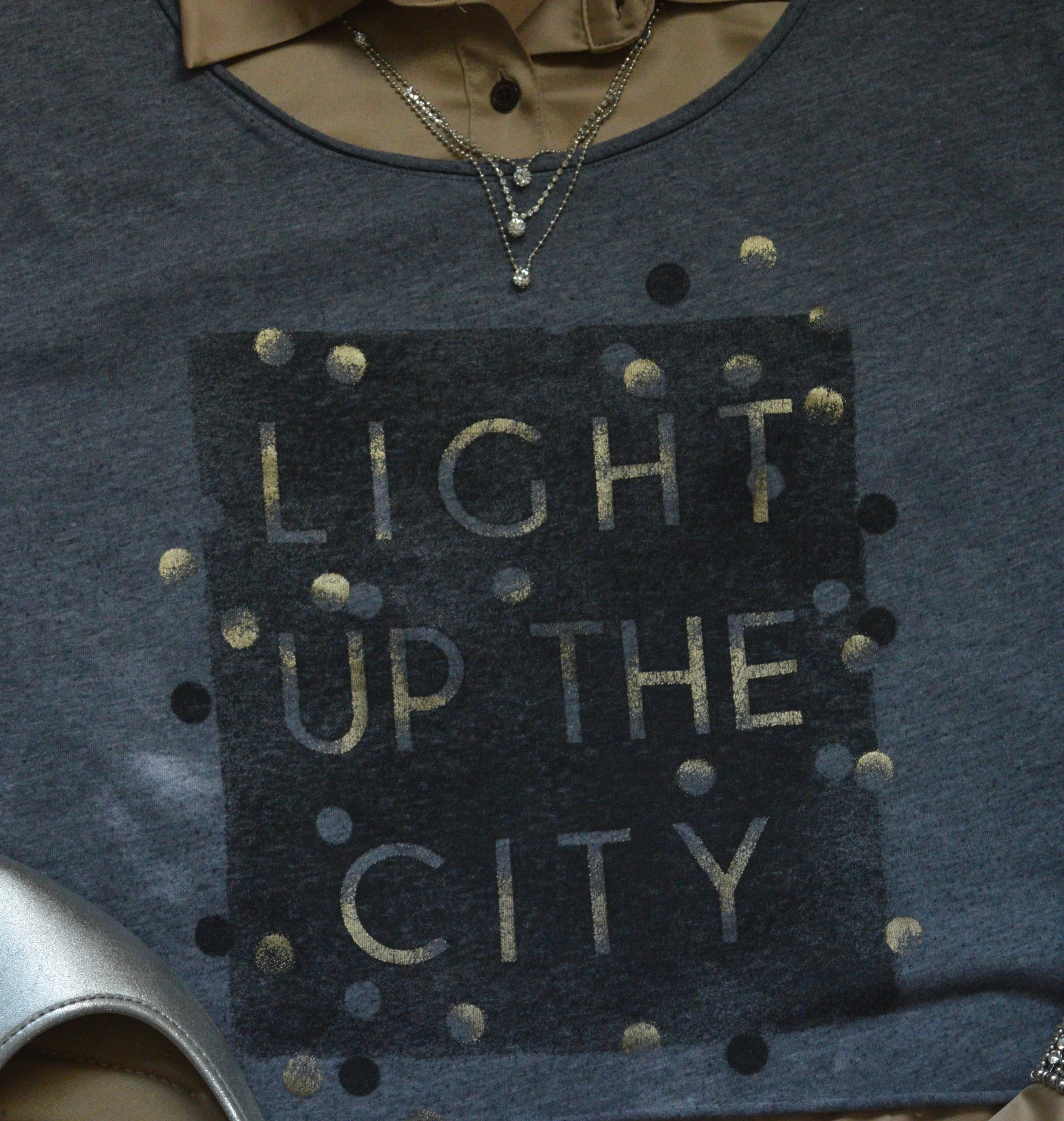
The gold button up was thrifted and I have had it for a long time. George brand clothing is carried by Walmart. When I found this blue cropped tee with the metallic words and dots, I knew I could wear it over this gold blouse. This thrifted piece is Hollister brand. Hollister is not a brand I would normally buy, as they seem to be geared to younger people, but I will say, I don’t care who makes it when I am thrifting. If it fits and I like it, I buy it.

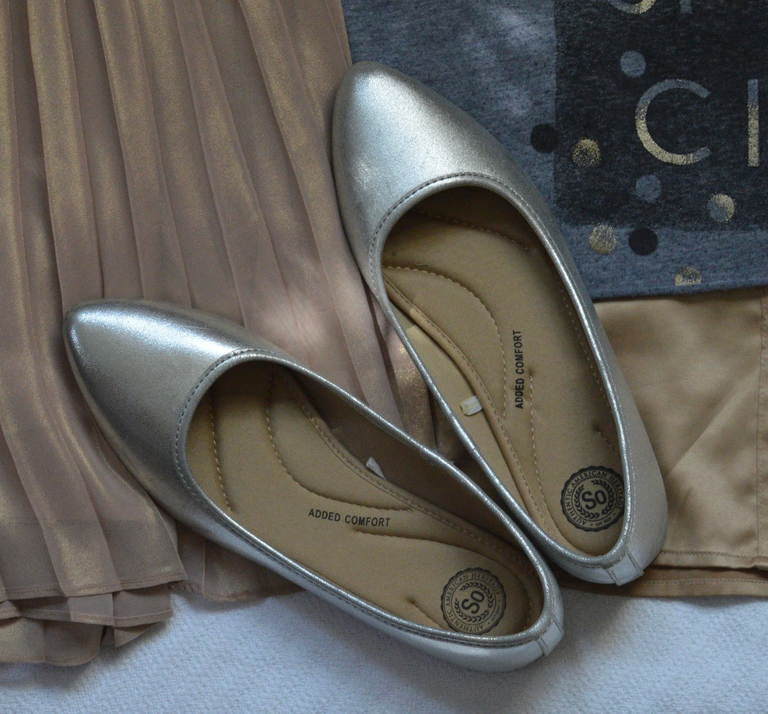
Keeping in the metallics theme I chose my SO silver flats, and my sparkly pewter clutch. The final piece was a metal beaded bracelet.

What do you think of these trends? Will these be trends you will try this fall? I’d love to hear your thoughts.

Have a great weekend.

Wearing White - 3/4 Length Sleeve Tiered Blouse

This is my final post in this wearing white series. I feel this outfit really epitomizes the fall feel and it also showcases some of the fall trends that are floating around out there on the internet and in the fashion world. There are so many trends, and depending on who you get your information from, you’ll see some overlap and some very different ideas as to what is currently trending for fall. I’ll be talking more about that for a few posts starting on Thursday.

Today’s outfit features a white 3/4 length sleeve tiered blouse that I found at a thrift store. Just disregard the snarky look on my face. Ha, ha.

Here is a picture without the vest, so you can get a better look at the top. This top is a brand called Spense. You can find this brand at JC Penney, Nordstrom Rack and a few other retailers.

I didn’t notice until looking at this picture that you can see through the blouse a little bit, so it might be good to wear a cami underneath. It don’t think it is a big deal with the sweater vest over the top. I love the detailing on this piece. Each tier and the flounce on the sleeves are edged with a crocheted embellishment, giving the blouse an extra boho vibe.

I paired the blouse with my Worthington leopard print skirt, which I have styled on the blog before. You can see this skirt paired with a pink blouse, a cropped denim jacket, a teal green sweater, and a white denim jacket. You know a piece was worth investing in when it is worn over and over. Leopard print is still showcasing its fierceness this fall along with other animal prints like snakeskin, zebra and more.

To pull the whole outfit together, I chose this crafted fringe vest. I honestly cannot remember where I got this. Ha, ha. No matter, I like it and reach for it often. Fringe is another trend that seems to be making its own cross seasonal stand in the fashion world.

Accessories for an outfit like this can varied and colorful. You could go classic black or brighten up the look with variations of burgundy, red, blue or green. I wanted the focus to be my white blouse so I kept the accessories more sedate going for gold and brown.

Why not wear a leopard pendant with a leopard skirt?

I’ve had this gold bag for a very long time. It was thrifted and is a brand called emilie. Metallics are another trend that are big this fall. Be on the look out for pieces that shimmer and shine. If you are like me, you already have something in your closet that has a fun metallic sheen. I’ll be talking more about that on Thursday.

I just got these boots from DSW. They are Baretraps and I think they will be getting plenty of use this fall and winter.

What do you think of this outfit? Did you like this series on wearing white? I hope that you found some inspiration here on the blog.

I’ve included a few shopping links, just for fun. Every time you click on a link, I get a few cents. If you purchase something through one of my links, I might get a little commission. All opinions are my own.

I hope you are having a good week so far.

Photo credit Rebecca Trumbull.


Wearing White - White Sleeveless Sweater

As I shopped my closet for white pieces to use in this series, I realized I have some pieces that get worn more frequently and this sweater tank is one of them. I will pull this out time and time again, when I want something that looks more classy to wear with nice pants or a skirt. With that in mind I paired this top with a multi print skirt that I have had for a long time.

This sweater tank is a thrifted piece and I have had it for a long time. What drew me to it was the beaded embellishment around the neckline, which you will be able to see better in a later picture.

I just love the motion in this picture. My daughter and I have been working to get a little more variety in our shoots. It isn’t anyone’s fault, other than life being very busy and just trying to fit photos in around both of our schedules. For this shoot we went to one of the metro parks in our area that is along the Maumee River, called Farnsworth Metropark. All of the parks along this stretch of river are just gorgeous and make a great back drop for pictures.

This skirt was thrifted from many years ago and I hang onto it, because I love the swing of this a-line piece. I also like the pattern. You can’t see the colors too well, but there are greenish blue stripes mixed in with the white ones. Seeing as it is a light weight skirt, I don’t wear it much in the winter, but it is the perfect weight for a transitional outfit from summer to fall.

Once again, when I think about transitioning to fall, I think about layers. For this outfit, I wanted to bring in a more muted fall tone, so chose this sweater I found on the clearance rack at TJ Maxx. A simple open front cardigan, I think it adds depth and warmth to this more crisp and cool look.

Trend Alert: One of the trends for fall is layering knits. I found this rather amusing, because I’ve been layering knits for years. Ha, ha. I was trendy and didn’t even know it. Layering knits just means wearing knit type fabrics with other knit type fabrics, so go ahead and layer your knit shells with your knit cardigans, or your knit turtlenecks with your knit v-neck pullover sweaters. Obviously, if you are in the throes of menopause you do not want to be layering anything, let alone, heavy knits, otherwise layer away.

I found this white lariat type necklace on clearance at JC Penney. I like that it is both a choker and a longer necklace all in one, and that it is not the typical metal or beaded chain. The white piece is cording and every little way along it are a cluster of beads with the whole piece ending in two large green beads at the bottom.

I thought a retro vibe would be appropriate with this skirt so chose my chunky heel shooties which are thrifted Naturalizers. These are easy on and off due to the elastic inset on each side. I have found that shoes with these elastic type insets are very comfortable. You can also tell a good quality shoe, as I have had these for a while and they shoe very little wear.

I chose this very simple cross body bag to match the shoes and keep things sleek, rather than going for a bulkier bag. I got this on clearance at Meijer.

Of course things wouldn’t be complete without a goofy photo. In this one, my daughter was trying to direct me to hold my arms closer to my sides and look cozy. I ended up looking a little bit more like deranged. Honestly, I don’t listen to directions very well. Bah, ha, ha.

Other, than showing my silly side, what do you think of this outfit? Is this something you would wear? How would you change it up to make it more your own? I’d love to hear your ideas. I learn from you, just like you learn from me. It’s all good.

I’m including a few shopping links. These are affiliate links. All opinions are my own. Have fun shopping.

Photo credit Rebecca Trumbull.
Wearing White - Long Pants

Today’s featured piece is a pair of white Gloria Vanderbilt jeans that I have had for a long time. They were a little big when I originally got them, so fortunately, they still fit. These are a heavy weight jean, so there is no fear of see through, but because they are white I still choose to wear neutral underwear. I find that a neutral color like beige or a light peach or blush are an even better choice under white garments, because they mimic the natural color of our skin. If you are a darker skinned individual a deeper neutral would still be the way to go when wearing white.

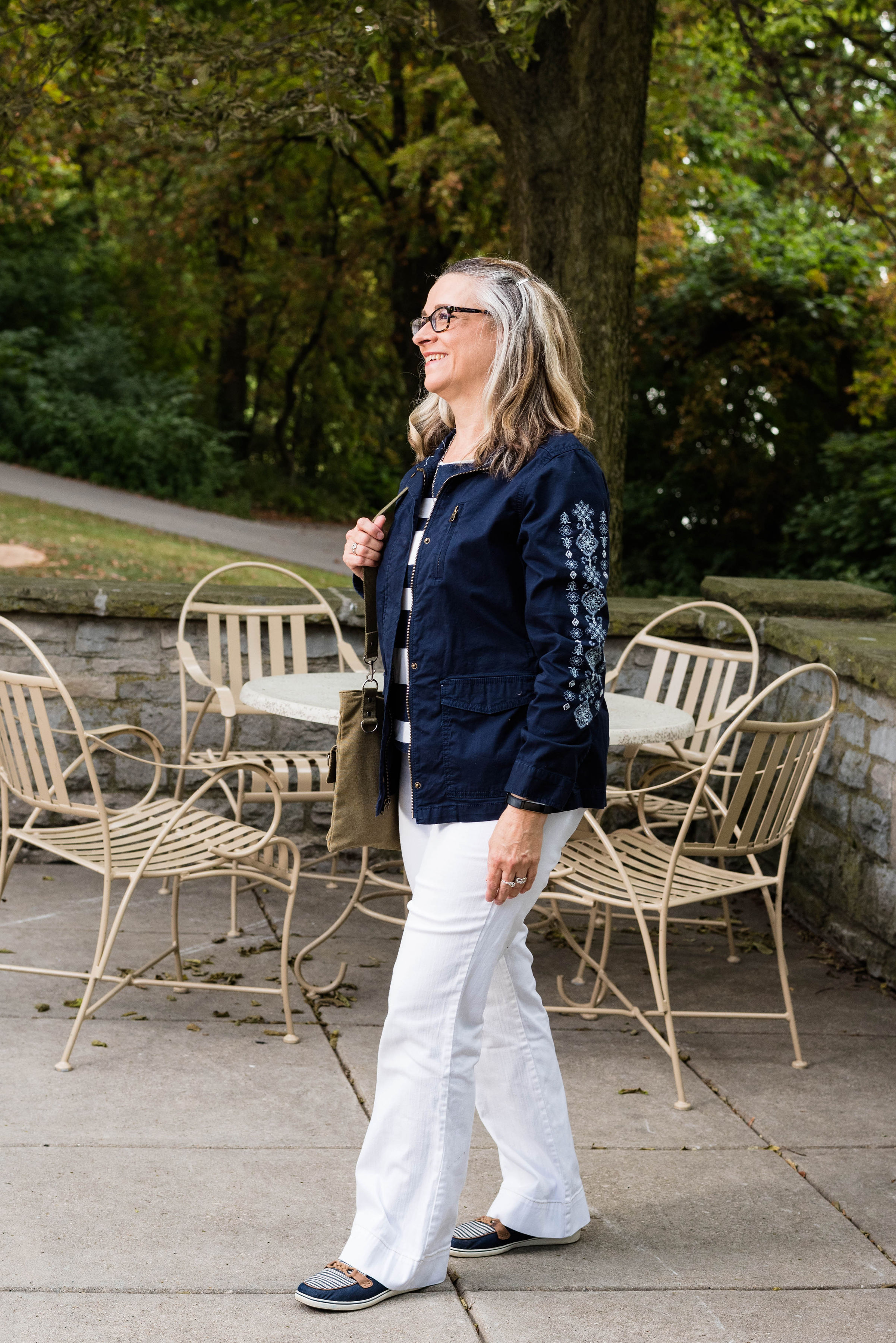
This is another classic look like Tuesday’s pairing with black and white, but this time I paired the white with navy. Navy and white always make me think summer, nautical and beach, for some reason. Isn’t it funny how we have preconceived ideas about color and color combinations? There is nothing wrong with that and sometimes it is good to embrace that which is classic, timeless and well known.

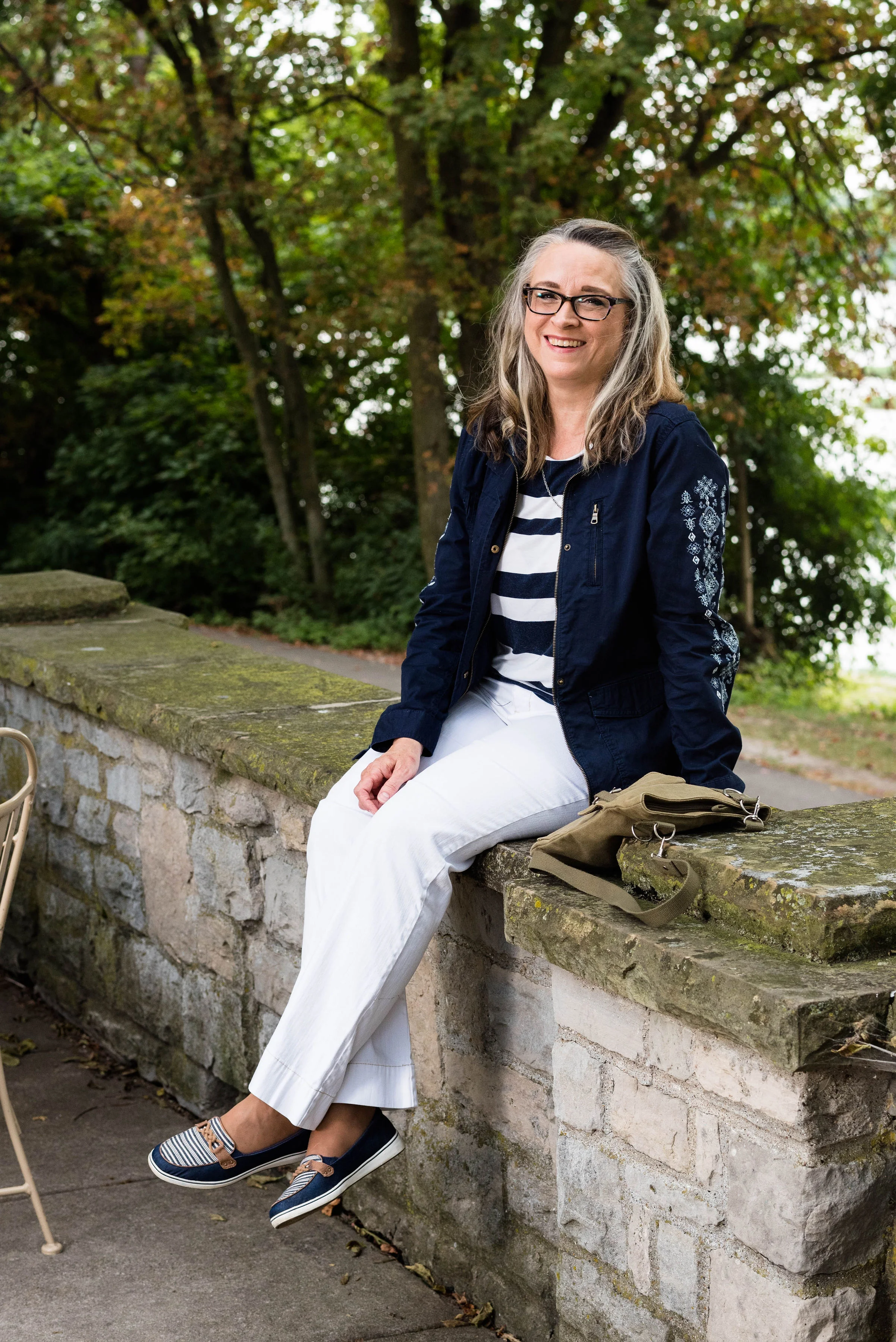
Another classic summer look is the striped tee with white pants. This Loft tee was a thrift store find. I like that it has wider stripes, just for a change of pace from my typical skinny striped tees. I also love the elastic bottom. Sometimes an elastic band can ride up, especially if you get a top that is too small. This is a large and in Loft wear, I probably could use a medium .5, ha, ha, if there was such a thing. However, for this top the large works well. The elastic keeps it in place and the extra room allows for less of my bulges to show.

To make this a fall worthy, transitional outfit, I added the jacket. This Sonoma navy utility jacket has its own unique appeal. I have five utility jackets. You might wonder why I need so many. Truth be told, I don’t need any of them, but each one had something special about it that helped me decide to buy it. This green one was the classic olive style. This orange one is a color I love. Of course the wardrobe wouldn’t be complete without a camo one and an embroidered one. As if that was not enough, (you can see the others by clicking on the links), when I found this navy one with the embroidered sleeves, I knew it was coming home with me.

I kept my accessories simple once again, but you could have jazzed this outfit up with a bright, colorful scarf or bag. I went for a simple olive, crossbody, bag that seemed in keeping with the utility idea. This was a bag my daughter was getting rid of, so I snatched it up.

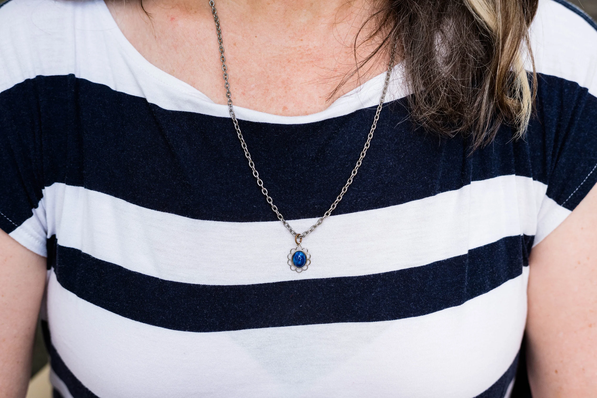
I tried on several necklaces and while I could have got completely without, I chose this simple blue flower on a silver chain. Do you think this small charm works with this outfit? Why or why not?

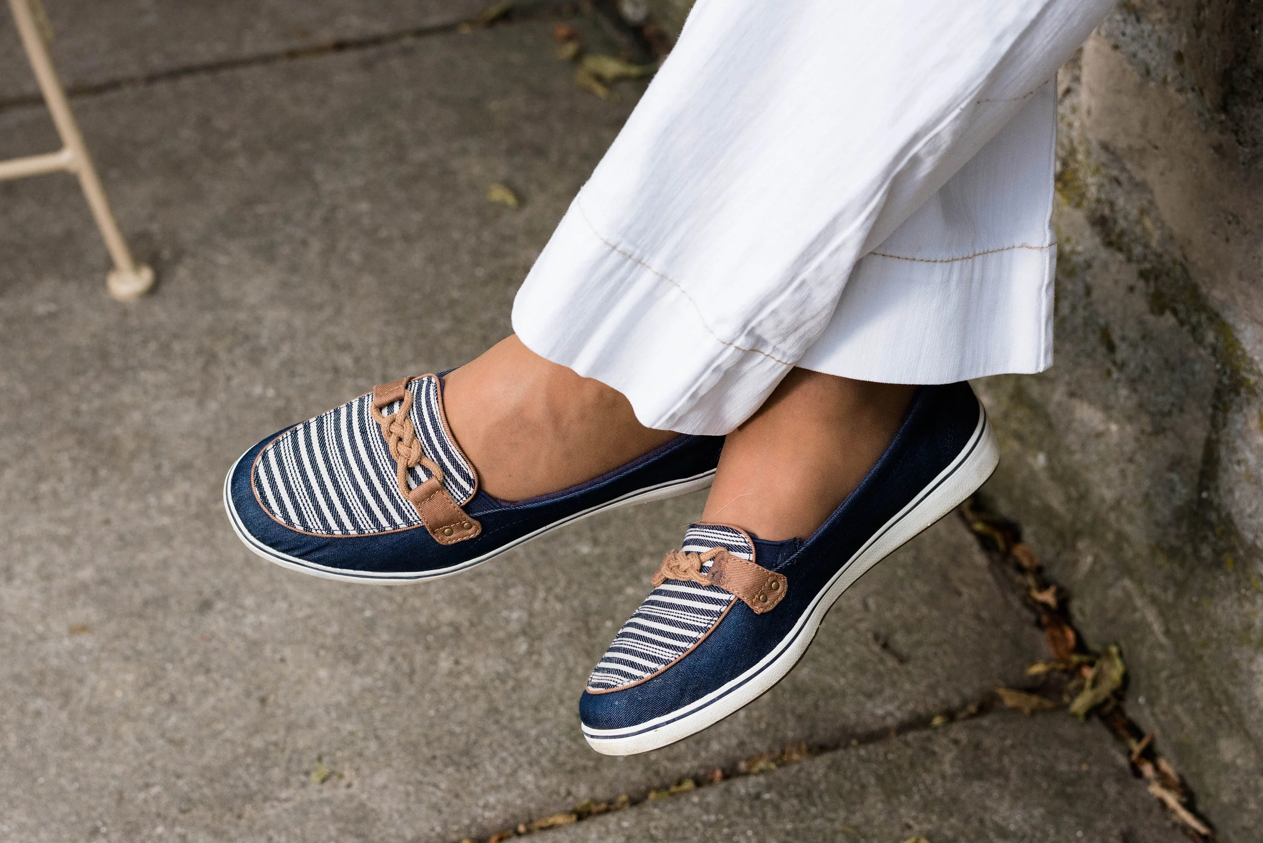
Once again, here are my navy Grasshoppers. These are such a classy and stylish shoe, perfect for warm weather and can be worn with skirts, cropped pants, shorts or jeans and they are amazingly comfy.

Finally, a post from me wouldn’t be complete without a blooper picture when I have one. The wind had picked up a bit on this very warm day, when we were taking pictures. When I tried to put my jacket on it kept blowing back into me. When I finally got it on, I was trying to flip my hair outside the collar and everything was sticking to me. The combination of sticky, windy and silly resulted in the this picture.

Overall, I like this outfit. What did you think? Do you wear white pants? Do you wear them all year round, or just in the summer. I love to hear your thoughts, so leave me some love.

I’ve included a few shopping links for utility jackets. If you don’t own one, now might be a good time to buy for fall. These are affiliate links. All opinions are my own.

Photo credit Rebecca Trumbull.

Friday linking up with Jennie of A Pocketful of Polka Dots.


Wearing White - Ankle Pants

Hi everyone. Can you believe it is the middle of August already? It is still summer here in the mid west. I had a nice reprieve from the heat when I went to my mom’s which is near Buffalo. Sometimes being at the other end of Lake Erie can make a 10 to 15 degree difference. We had a few beautiful days to celebrate my mom’s birthday.

Growing up, my mom and I had a pretty good relationship. I think she was glad to have a girl after two boys. She used to sew us matching dresses and all through my growing up years she always made an effort to take an interest in what I was interested in, whether it was watching late night Sci-Fi Theater or prerecorded Alice Cooper concerts. We both love to read, watch birds and go for walks. My mom and I have seen plenty of sun sets and walked through blizzards just for the fun of it. At 93, she can’t walk as steadily anymore and has a harder time seeing print on a page, but we still watch the birds and television together.

My mom grew up in an era where wearing white was something you only did after Memorial Day at the onset of summer and only until Labor Day at the onset of fall. Usually that meant white shoes, white hand bags and an occasional white skirt or sweater. Obviously, fashion has come a long way since then and white is whenever and whatever you want it to be. Personally, I still like the lighter colors for spring and summer and the darker colors for fall and winter, but as I said, I am trying to get out of my own box.

Today’s white piece is a pair of ankle pants from Christopher and Banks that I have styled on the blog before. You can see these styled with a geometric print top, a gray studded tee, a neutral open front cardi, a bright floral top, and a chambray popover blouse.

Currently, I have two problems with these pants. First of all, I have gained weight and they have gotten tighter than they were. Second, when I stood up you could see all the wrinkles. I was a very warm day and everything was sticking to me, so I am sure that didn’t help either. Ha, ha.

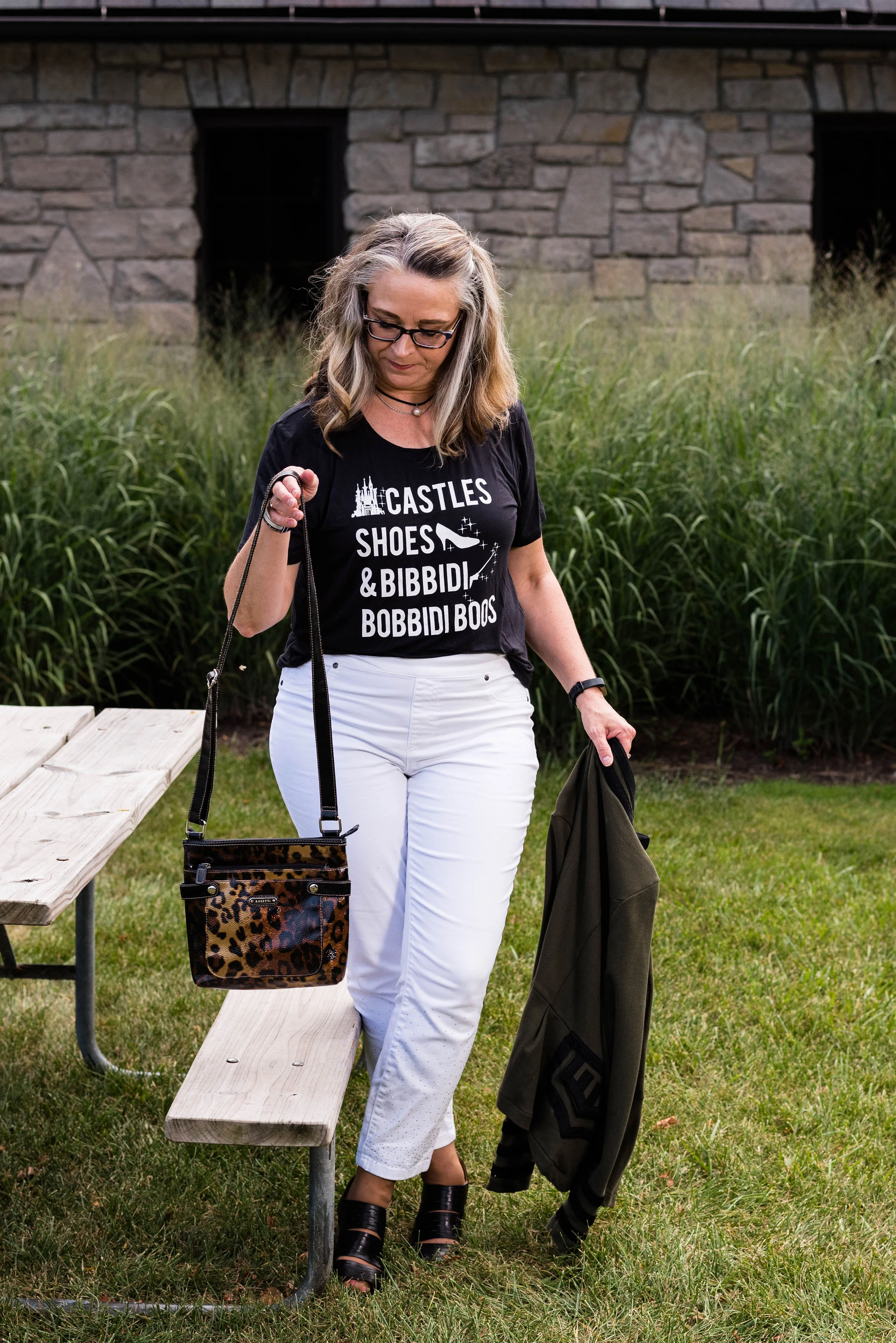
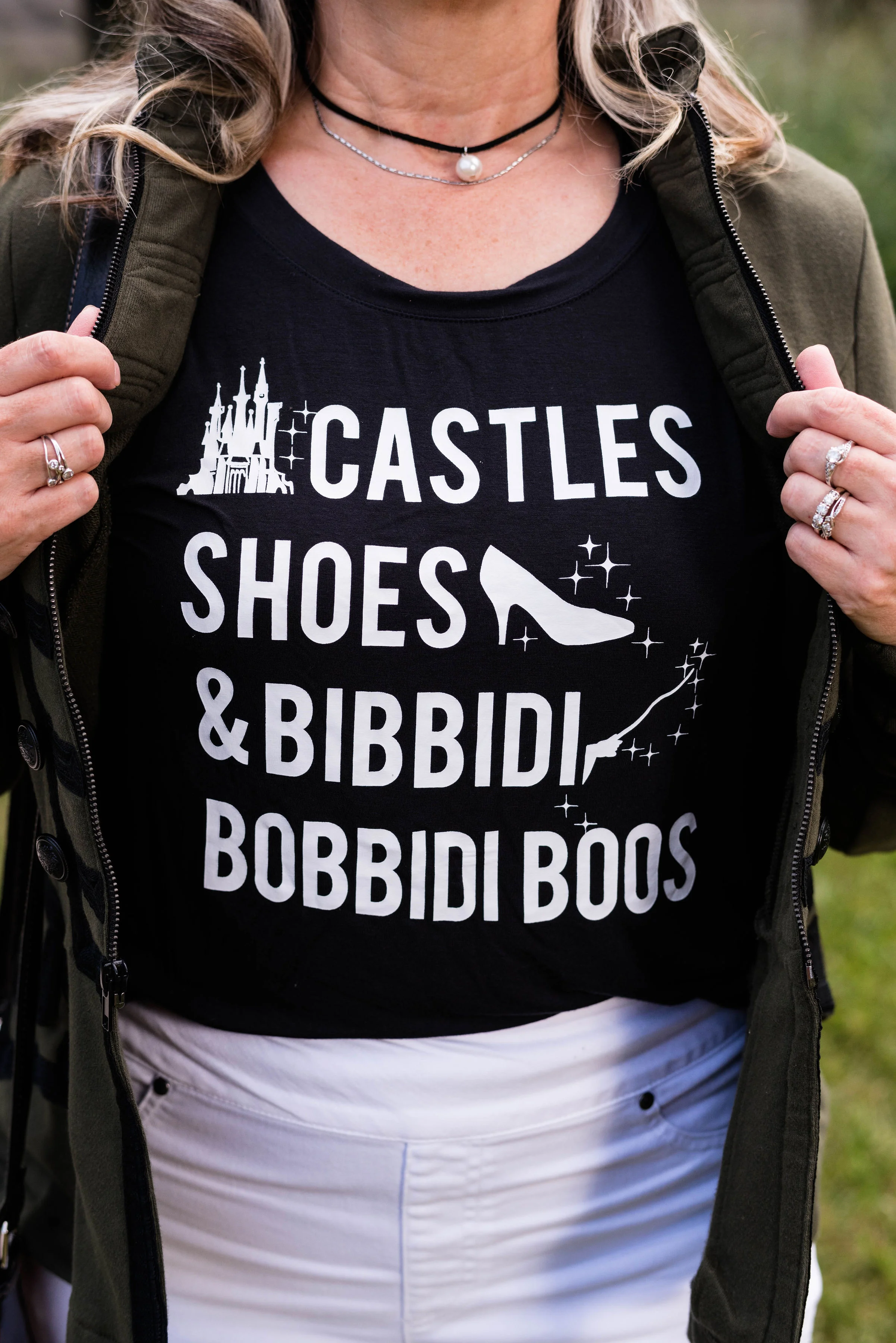
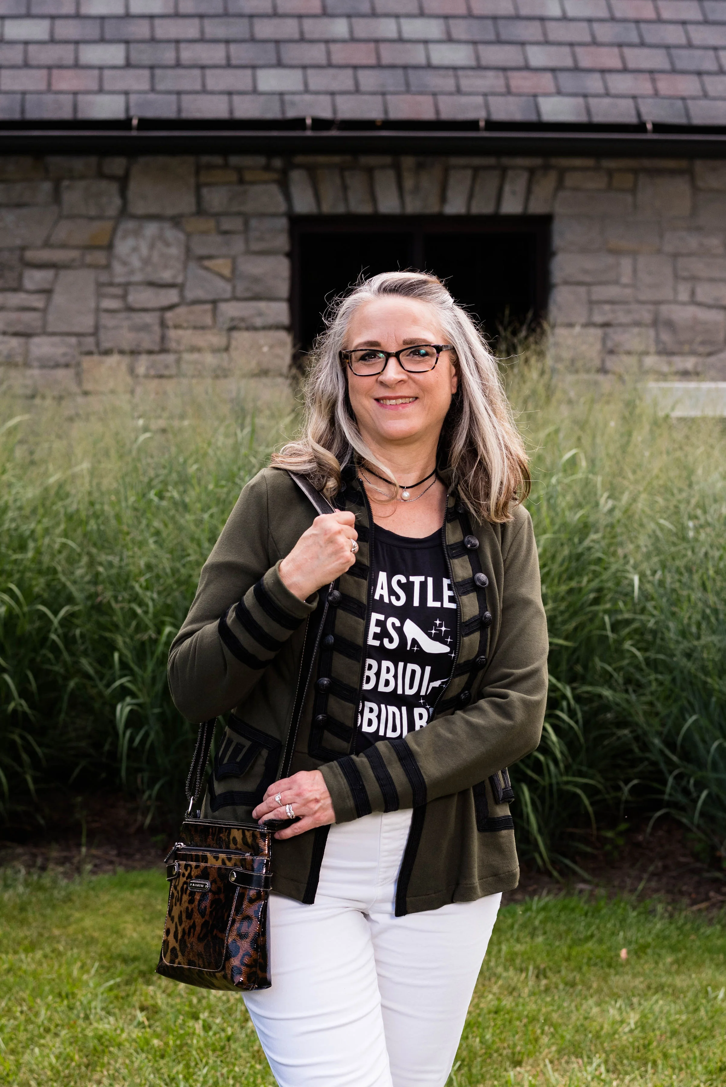
My tee was a recent thrift store find. It is Disney brand and very silky and soft. I love the words and if you don’t remember, or have never seen Disney’s Cinderella, here is a refresher. There are times I wish I was a princess, or at least had the castle. I already have a lot of shoes.

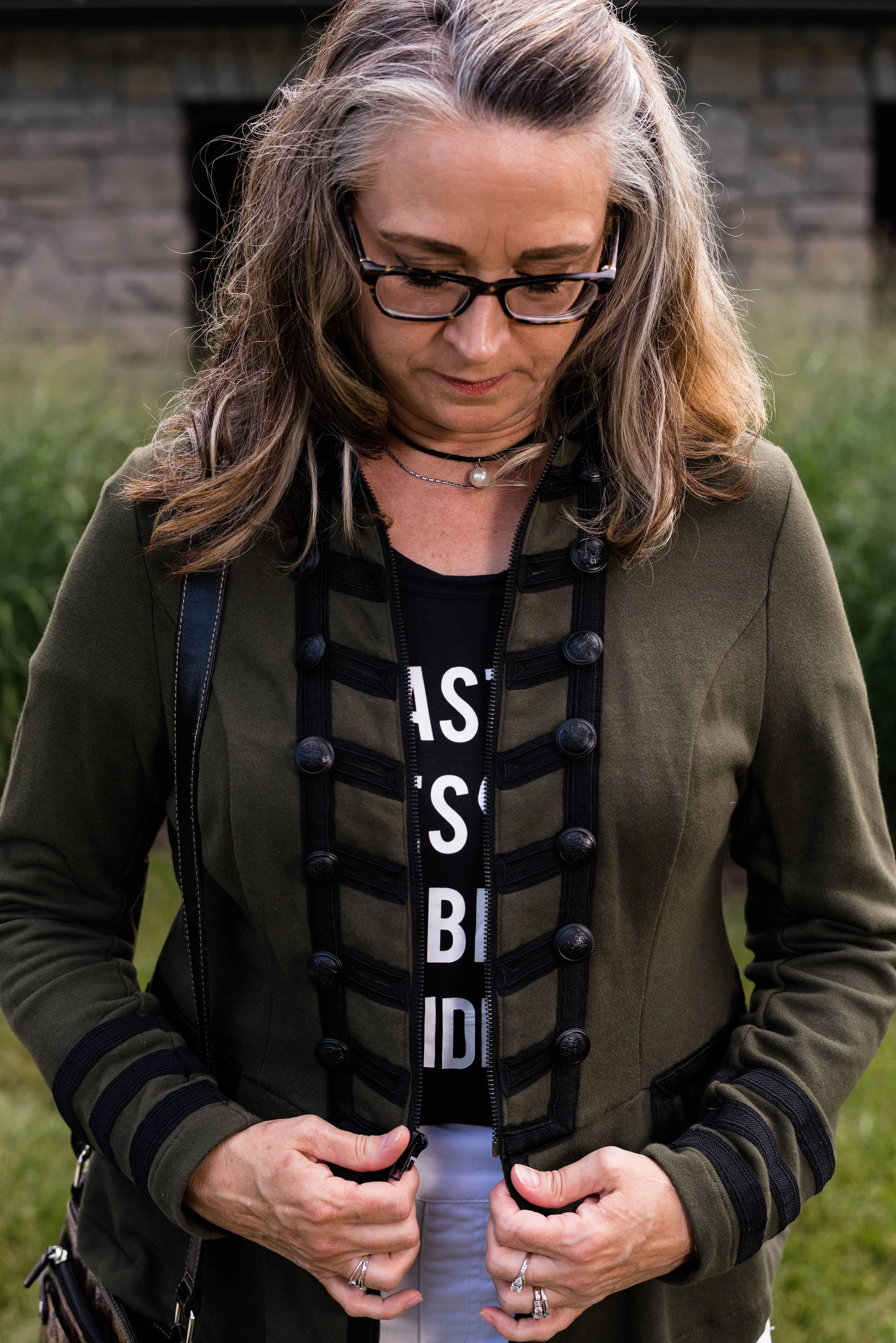
To make the outfit transitional to fall, I added my Torrid olive military jacket. This was a Christmas gift a few years ago, from my younger daughter. I love the detailing on this piece from the cuff stripes to the double rows of buttons, to the pockets.

I opted to keep my accessories dark to go with the jacket and tee. These Clark peep toes shoes are a great transitional shoe with plenty of coverage for cooler weather, but still a peek of skin and toes.

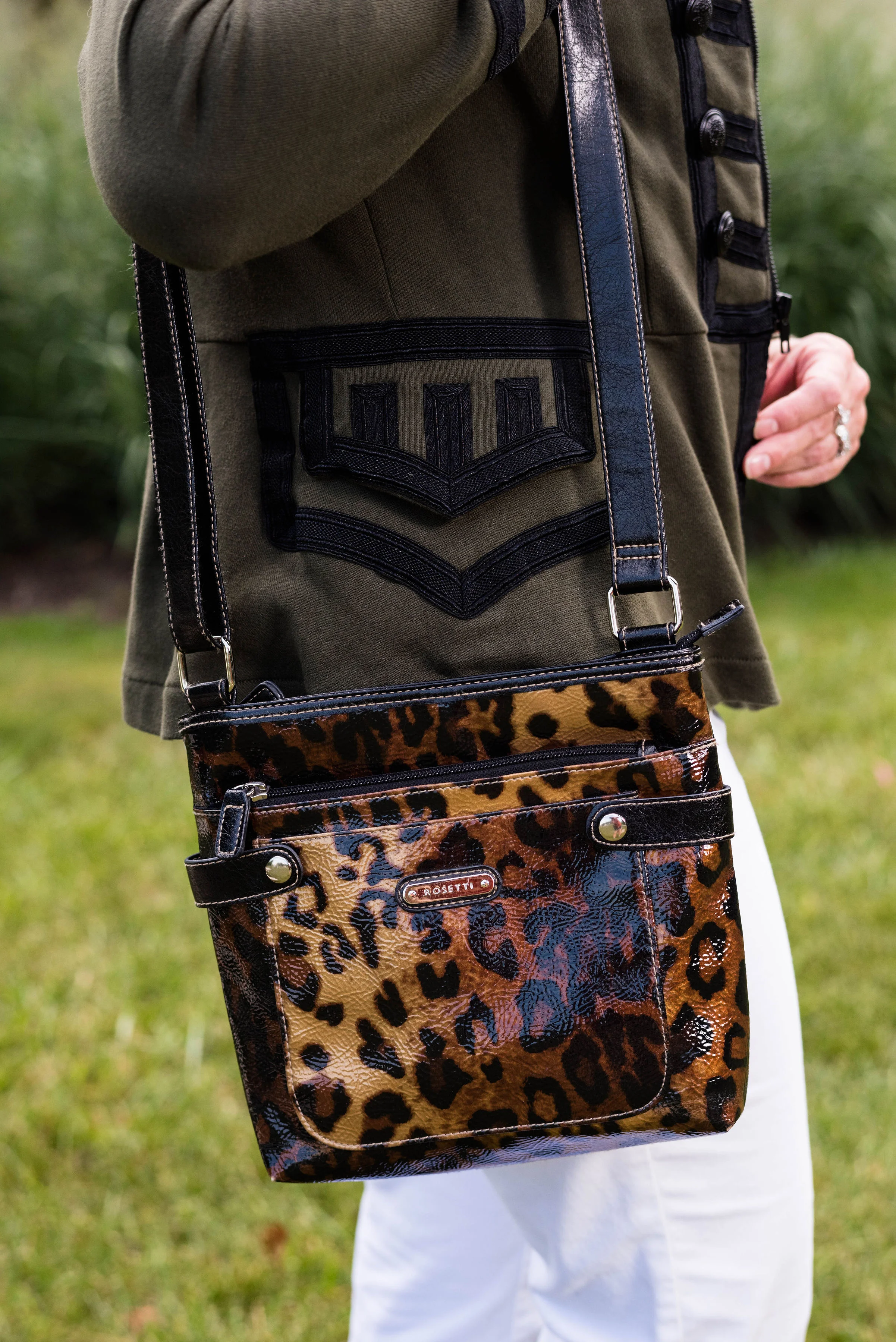
My Rosetti leopard print bag is a new thrifted piece. Leopard print is always a winner and I didn’t have a bag with that print, so why not? I have a feeling I will be using it regularly in the cooler weather.

Since there was more going on in this outfit with the graphic tee, the added textures on the jacket and the print on the bag, I opted for a simple choker.

I hope you enjoyed seeing this outfit. Do you own a military jacket? I’m including a few shopping links for you to see. Every time you click on a shopping link, I get a few cents. Every little bit helps. Thanks for all your support.

Have a great Tuesday.

Photo credit Rebecca Trumbull. 

Tuesday linking up with Catherine of Not Dressed as Lamb, and Shelbee of Shelbee on the Edge.