Pantone Fall 2018 - Quetzal Green, Crocus Petal and Meerkat

I am on my last Pantone Fall 2018 post. I hope you have enjoyed seeing these colors and the way I have managed to put outfits together using the inspiration from the 2018 Fall palette. As in anything where fashion is concerned we can take it our leave it. Fashion is for you. It is about putting together outfits and colors that you like, make you feel confident and that you will enjoy wearing. In some ways what we wear is like our second skin. It provides a covering for a bodies and how we put that cover together can boost our self-image and help us better manage our wardrobes and our pocket books.

I have found, in the fashion realm, just like in cooking, having a source of inspiration really helps. Whether you follow a recipe or cook from memories of you and your mom or grandmother working together to make wonderful creations in the kitchen, you use that inspiration to put food on your table. In the same way inspiration for fashion can come from magazines, bloggers, color palettes or even things out in nature. That is the reason I always like to use the Pantone color palettes as a spring board for creating fun and interesting outfits.

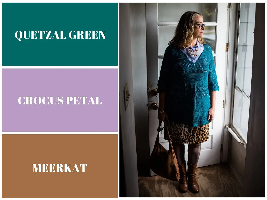
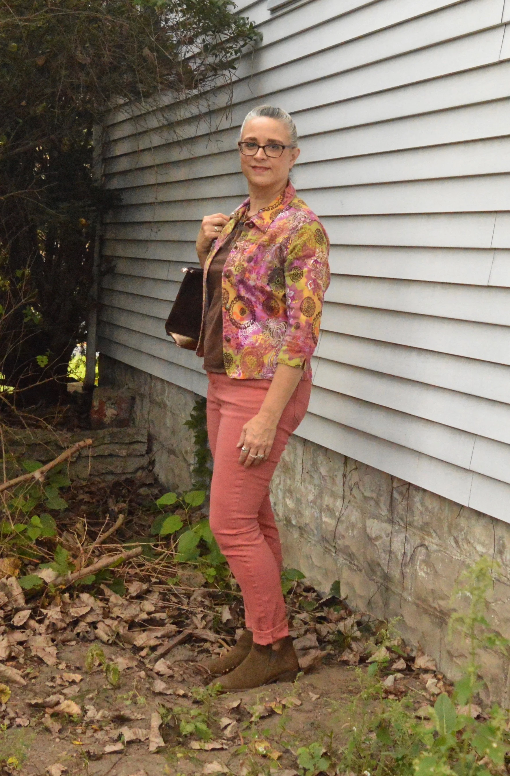
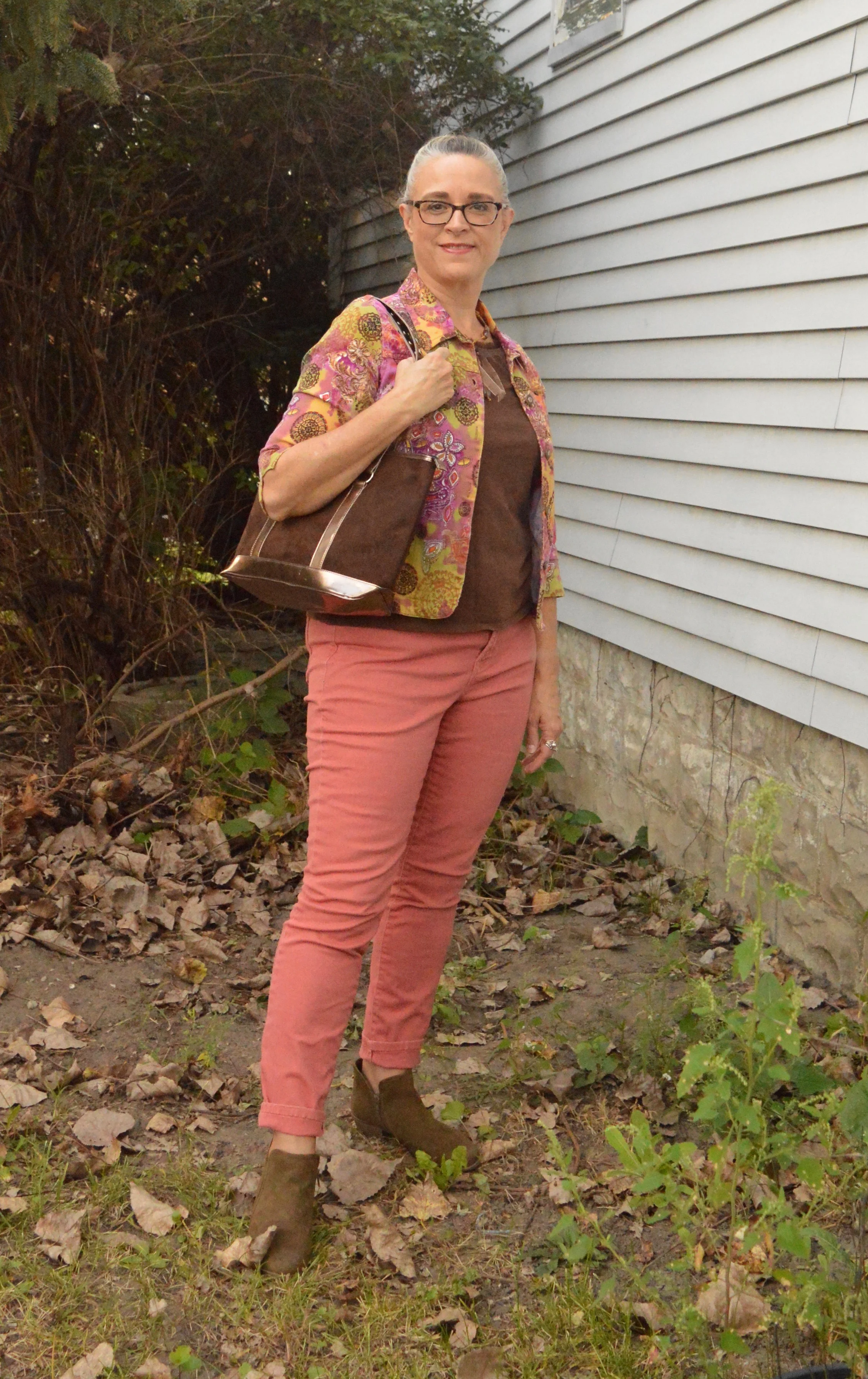
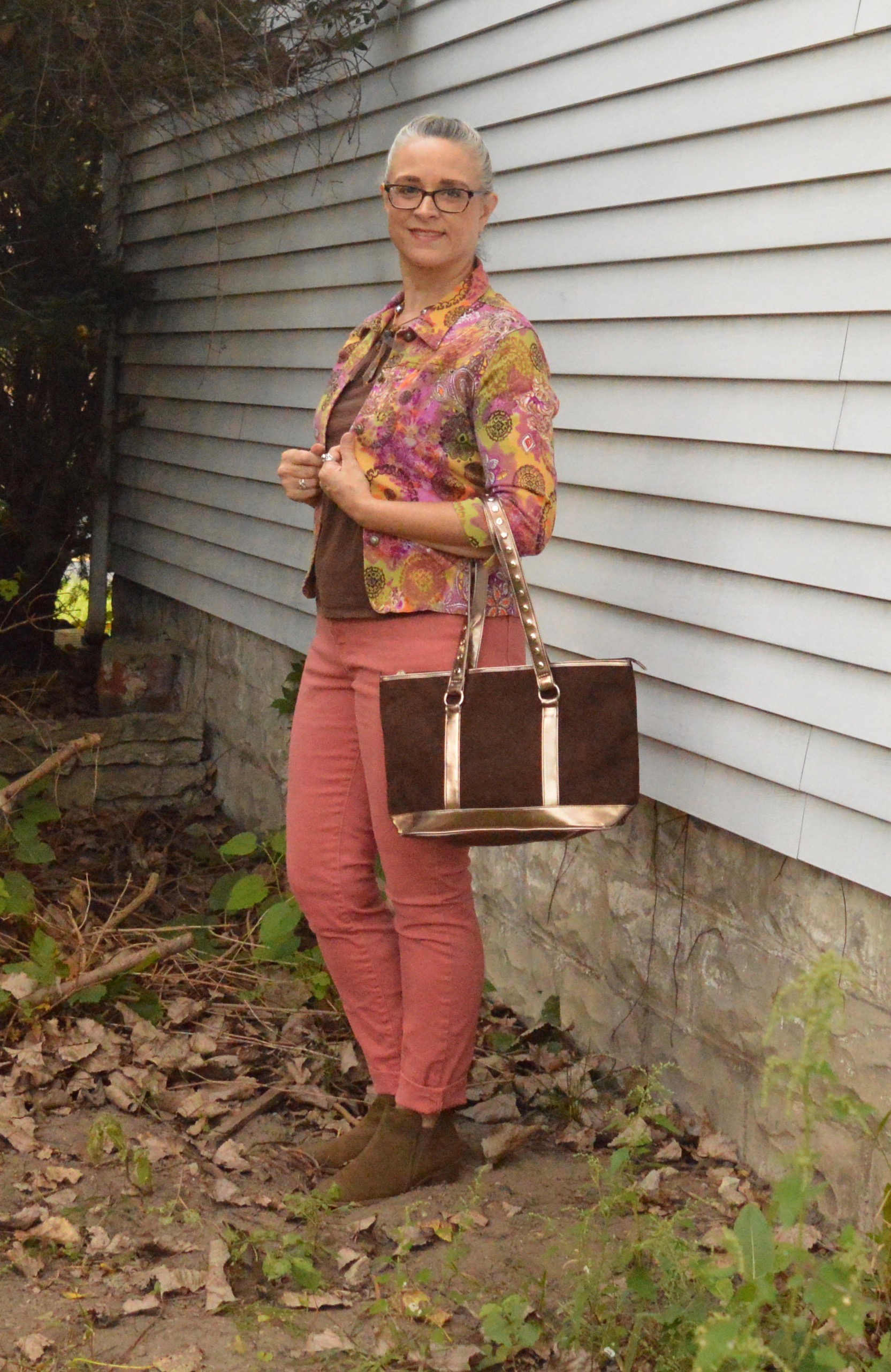
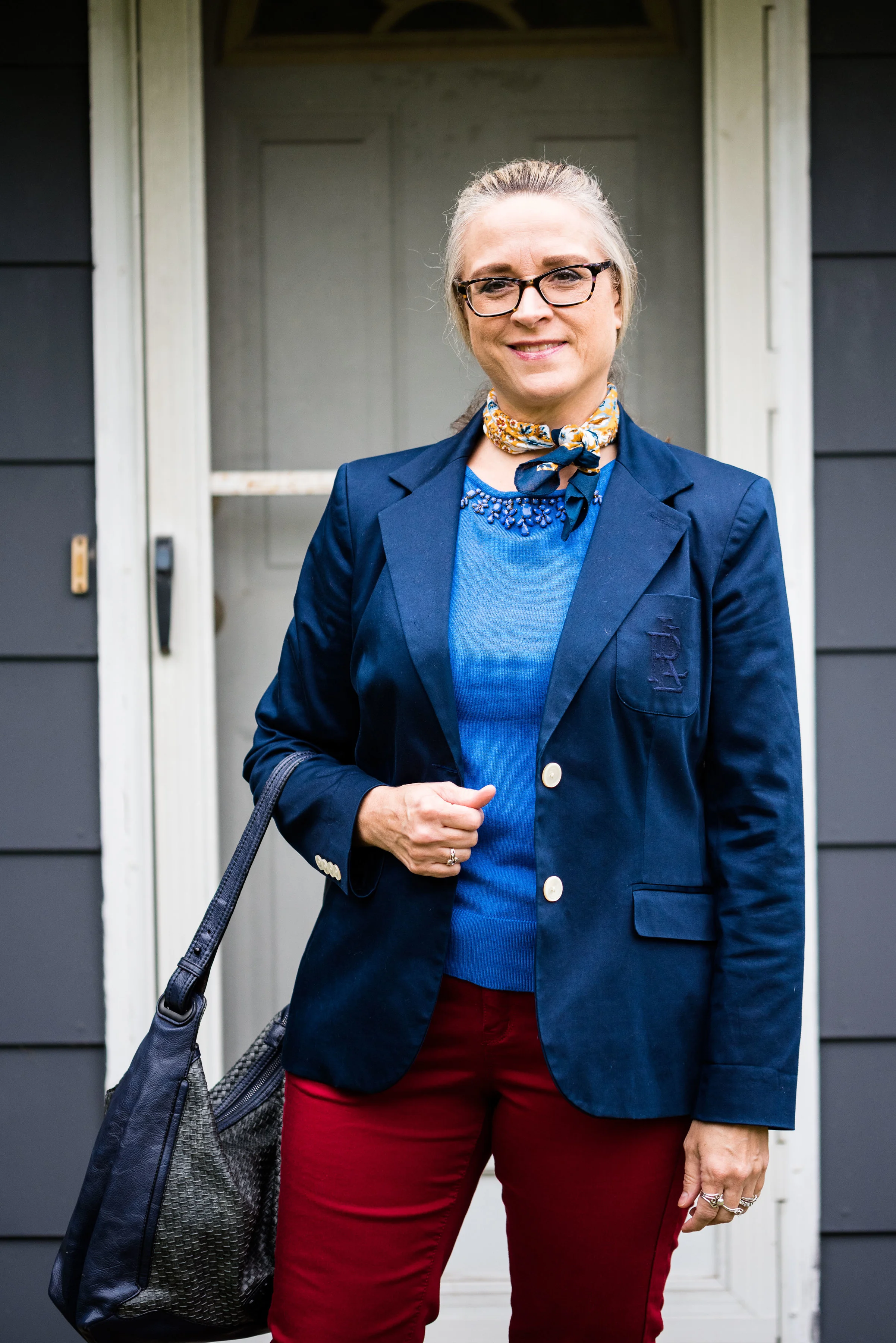
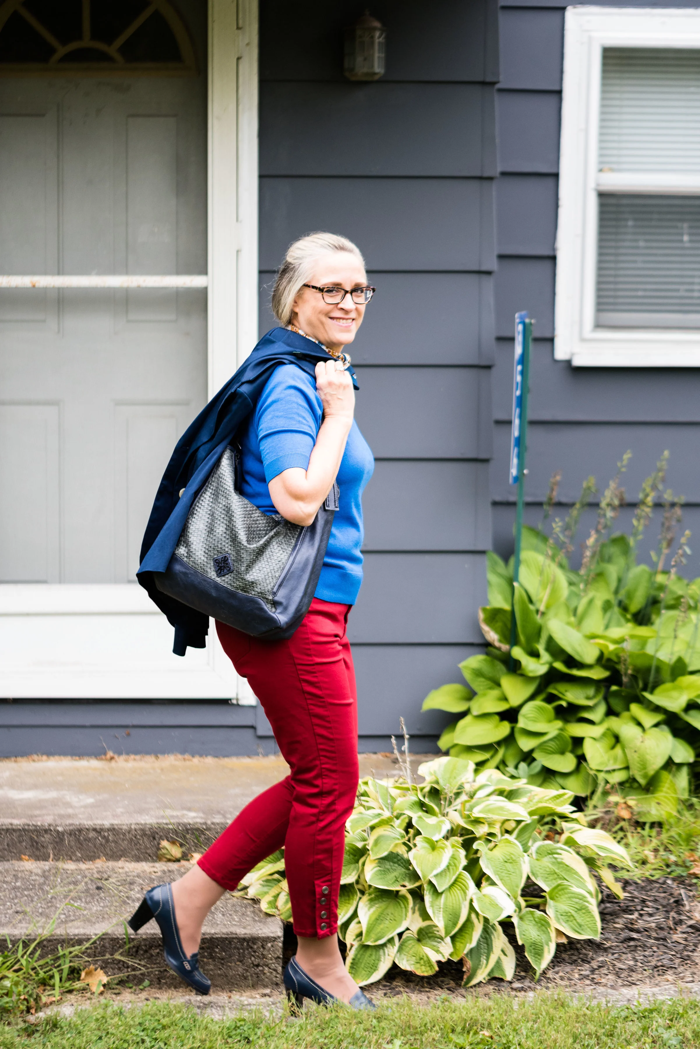
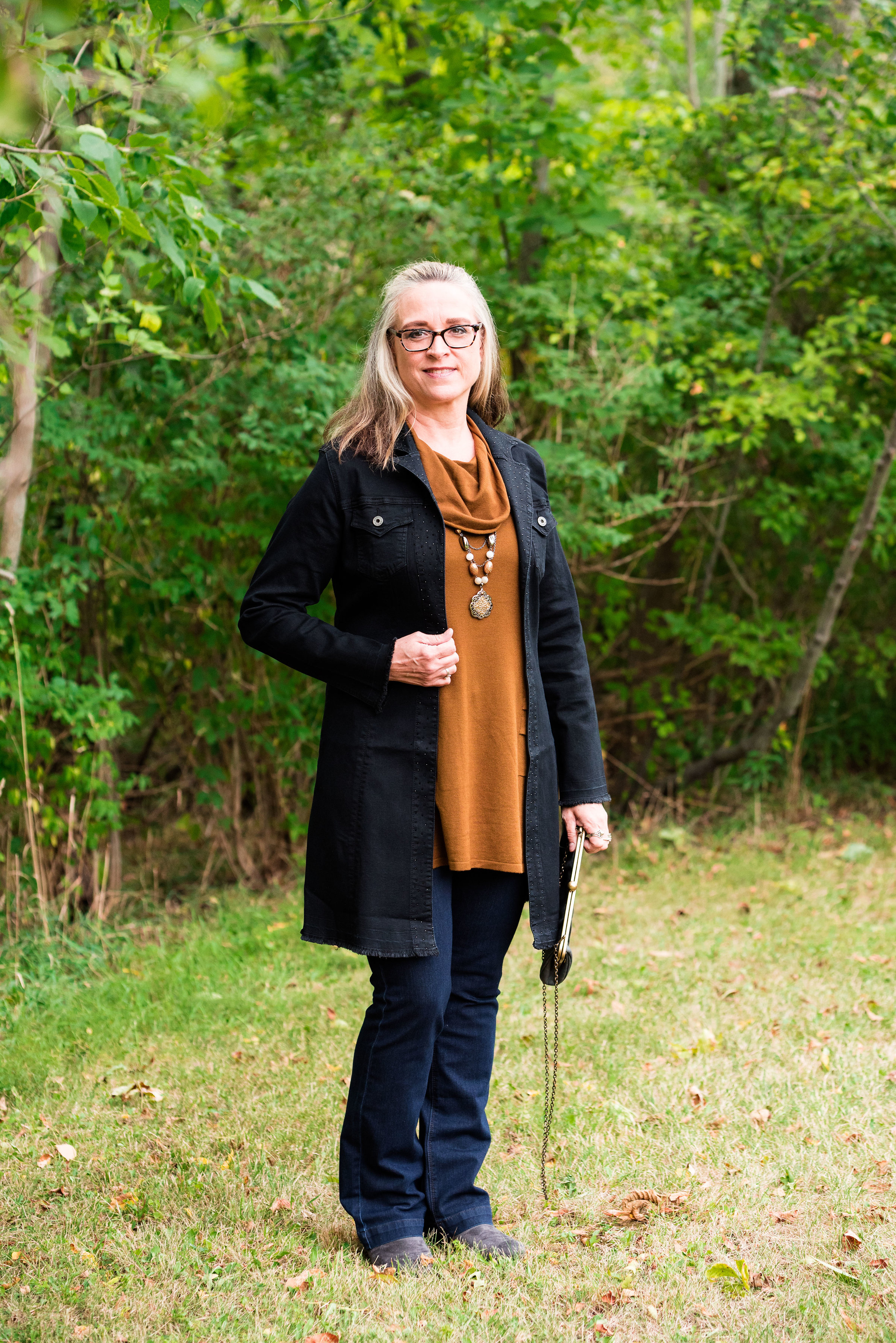
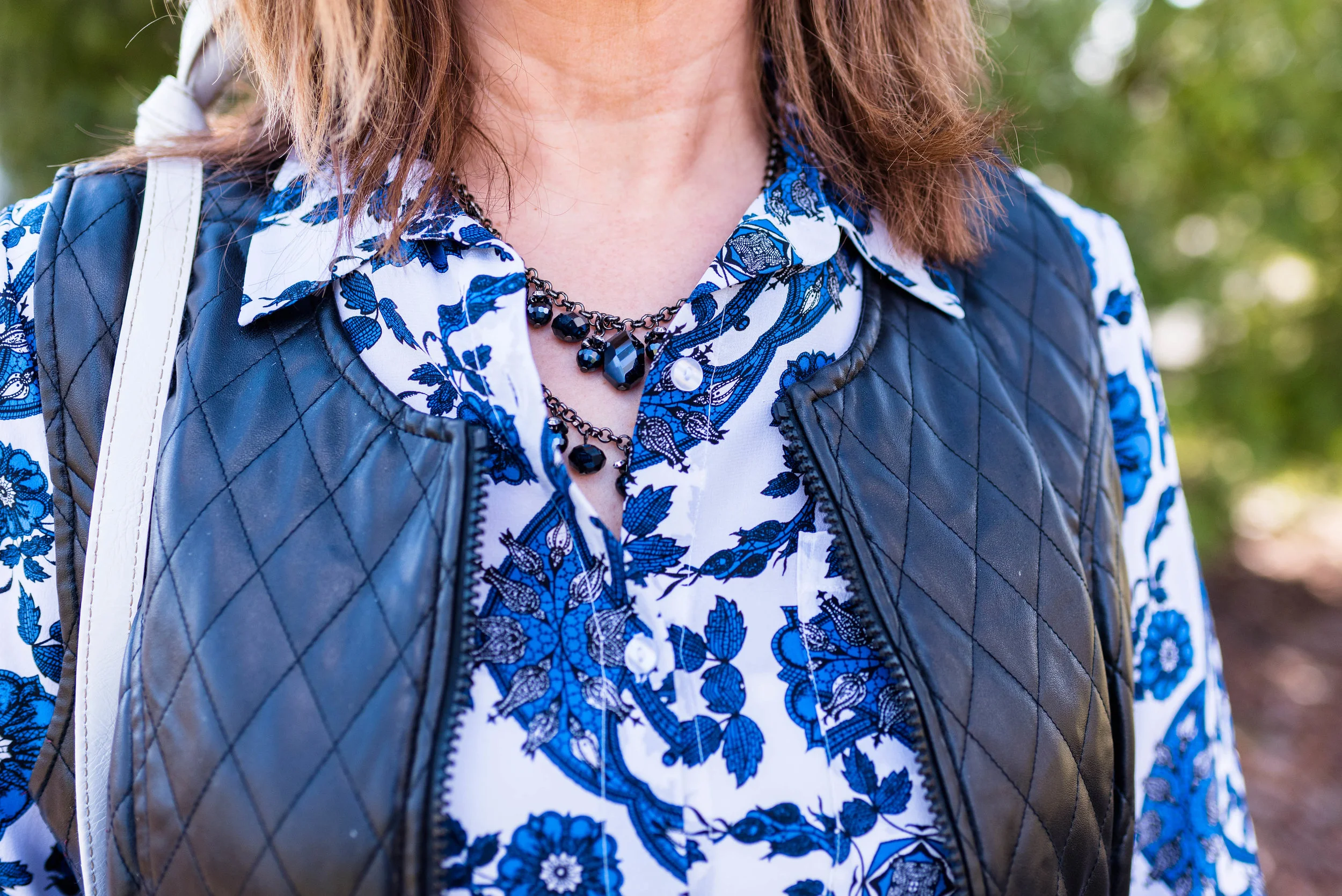
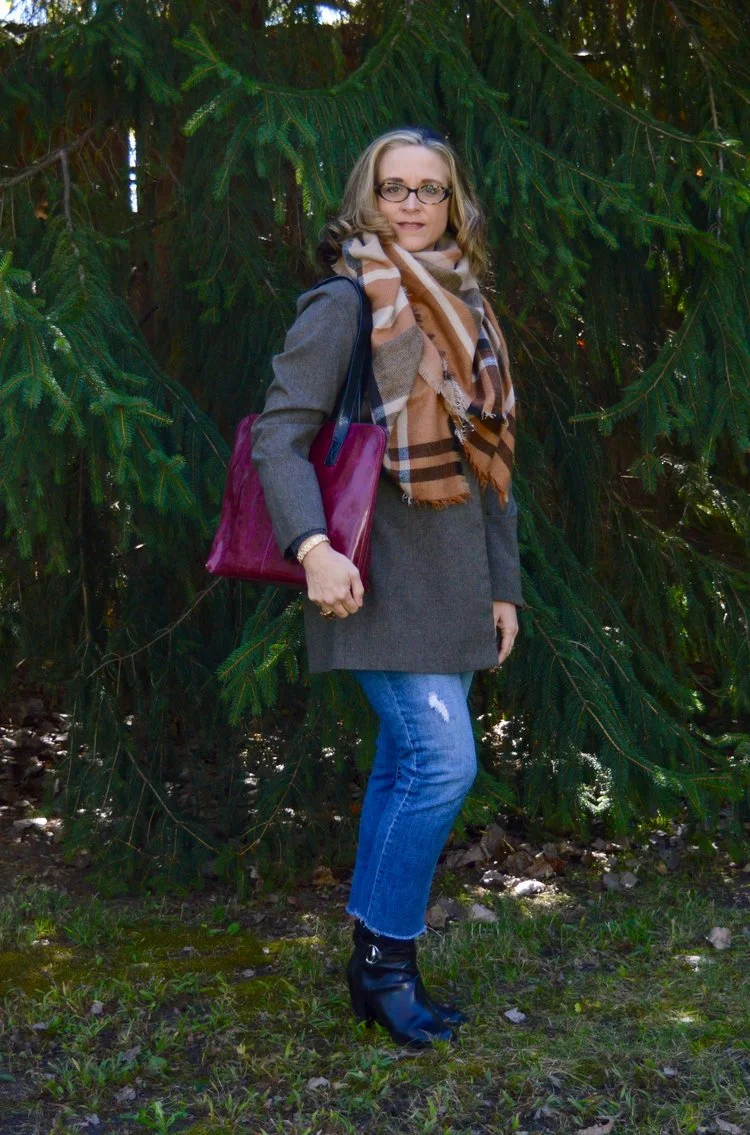
These last two colors, Quetzal Green and Crocus Petal, I decided to pair, once again, with Meerkat. Crocus Petal is a lighter, more spring like color found on the London palette. I feel that pairing it with Quetzal Green and Meerkat was the perfect way to keep the light color grounded and more fall like.

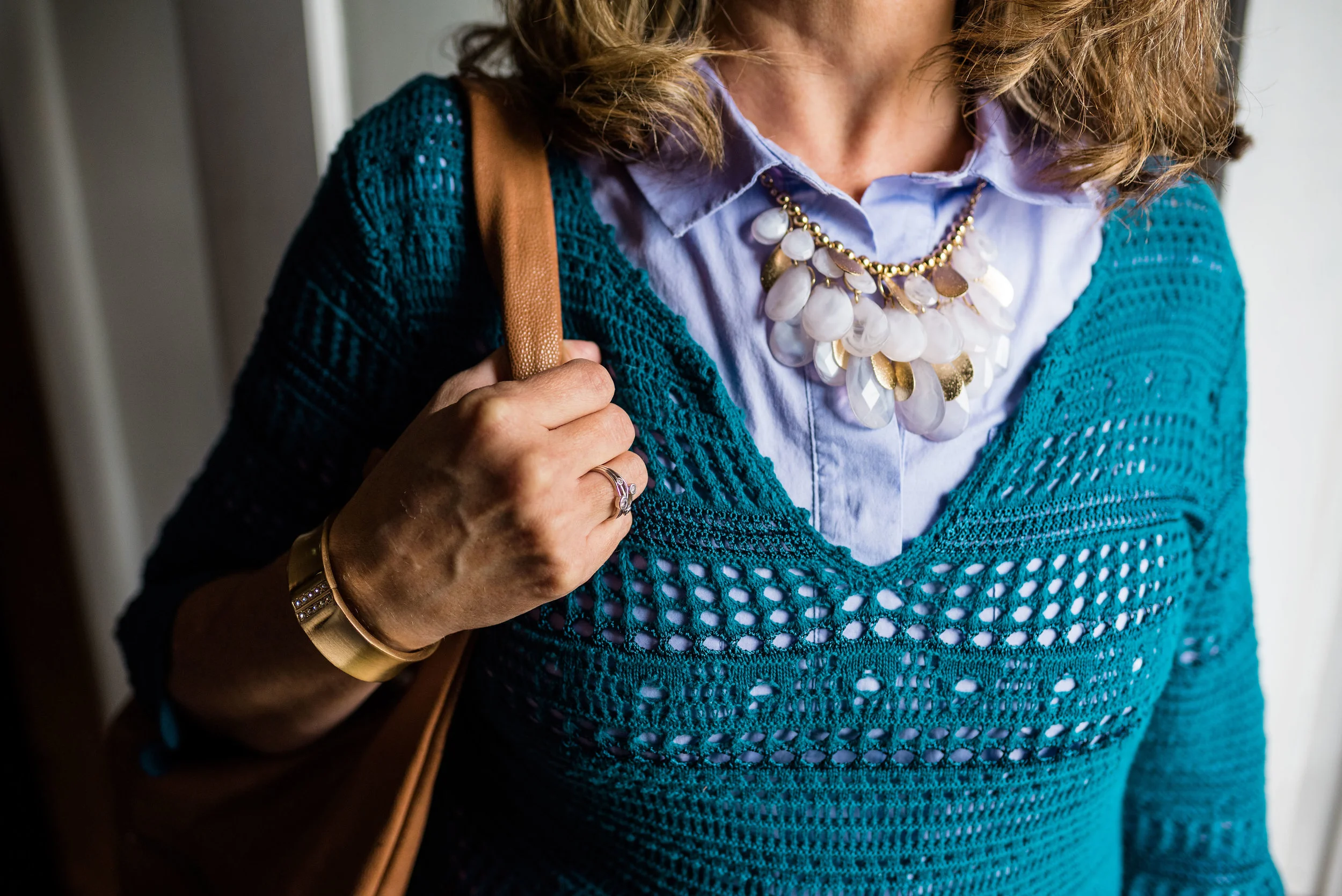
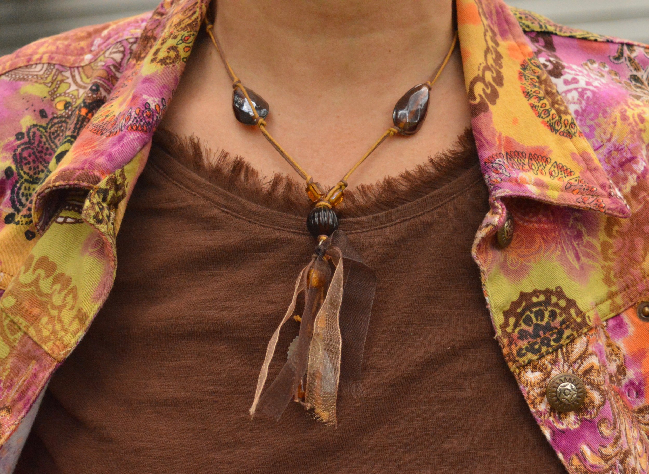
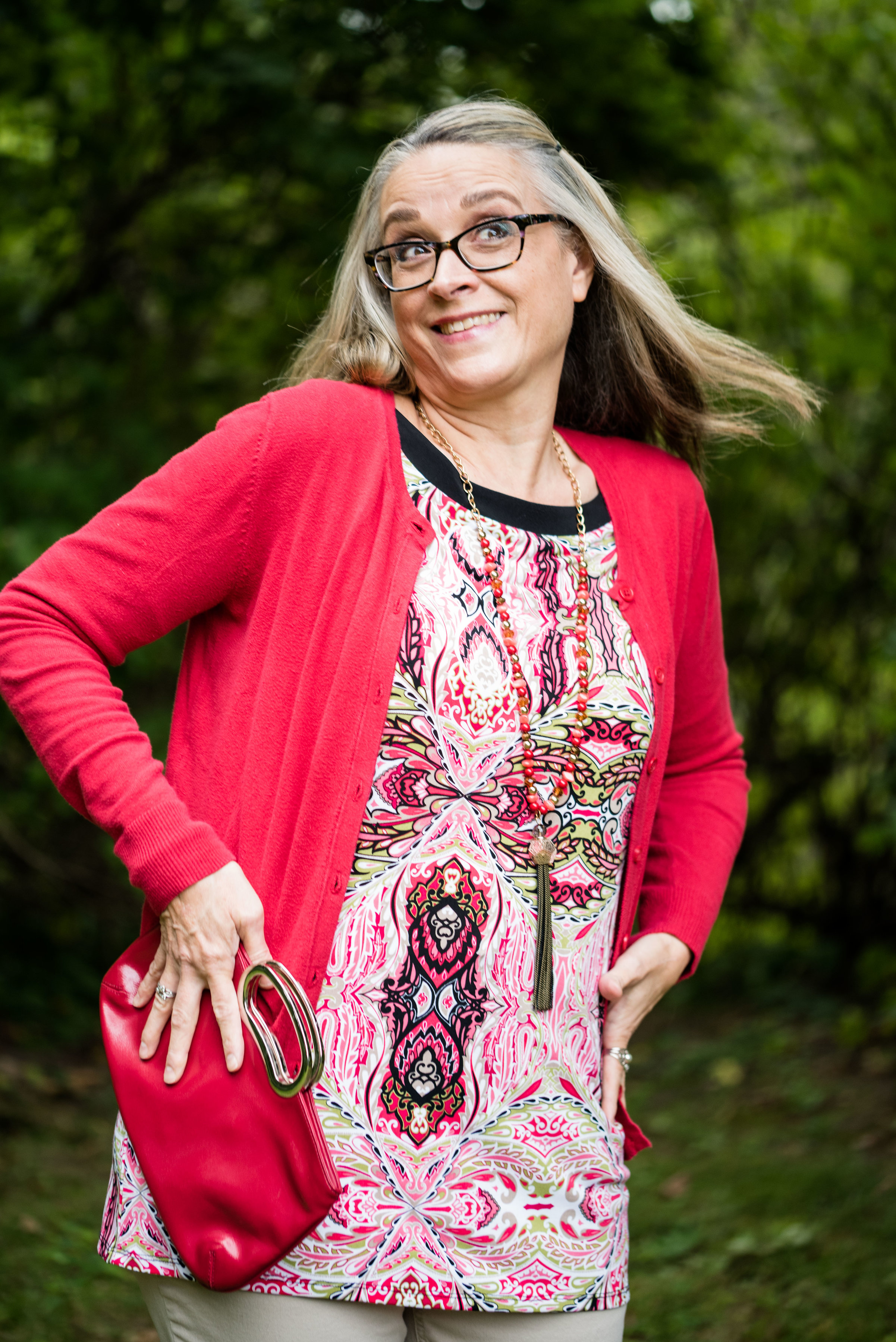
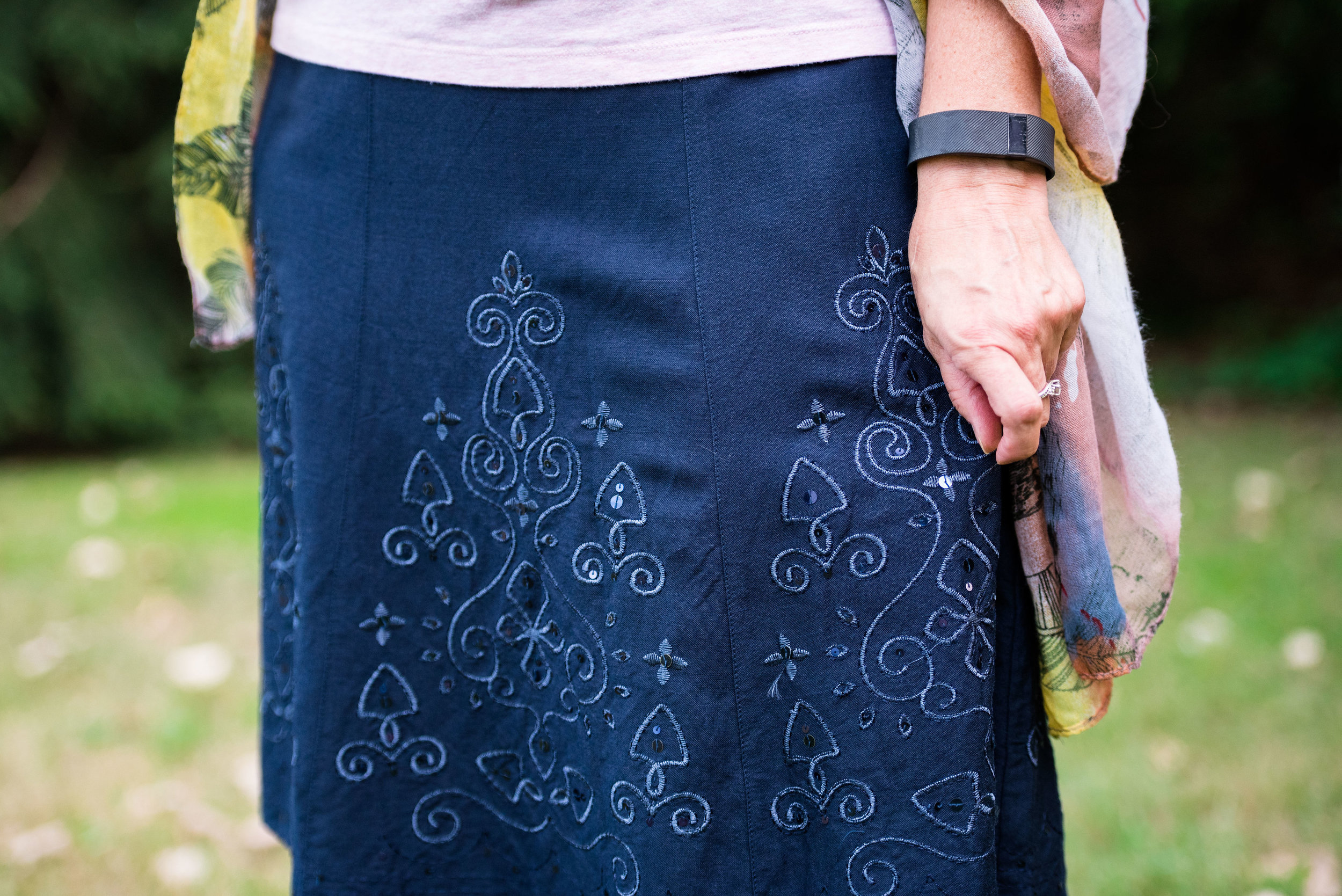
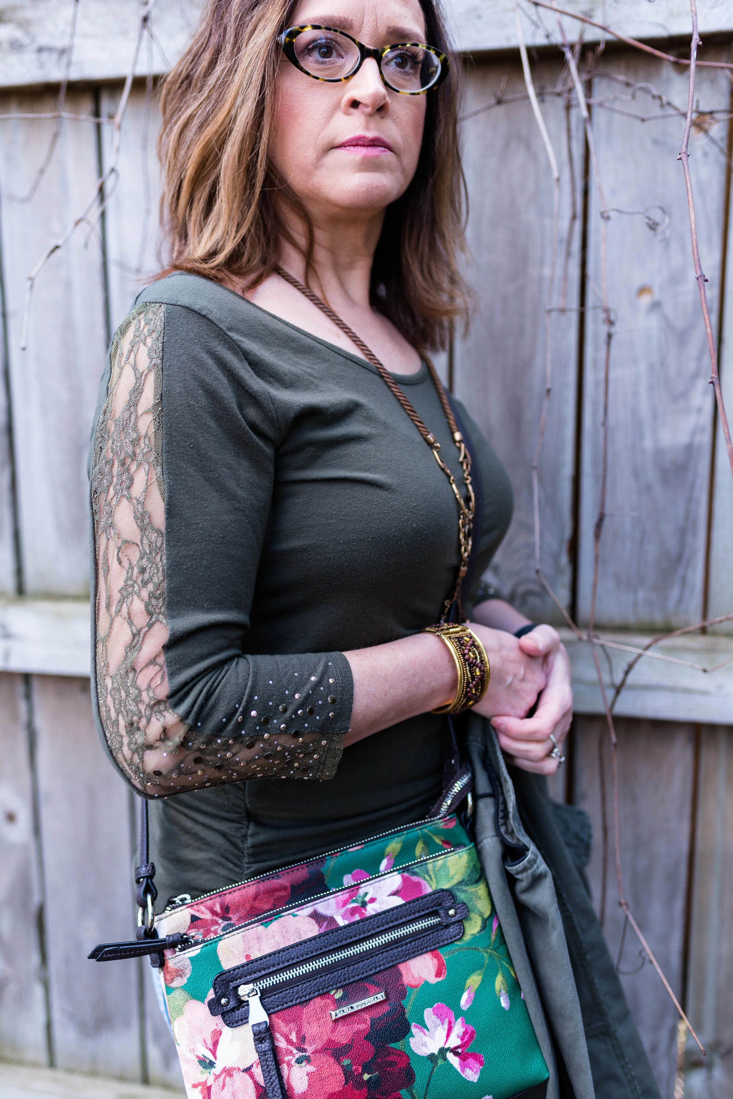
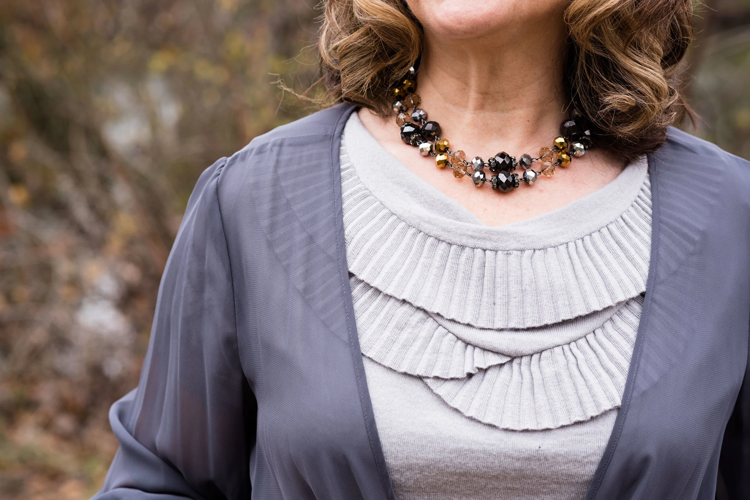
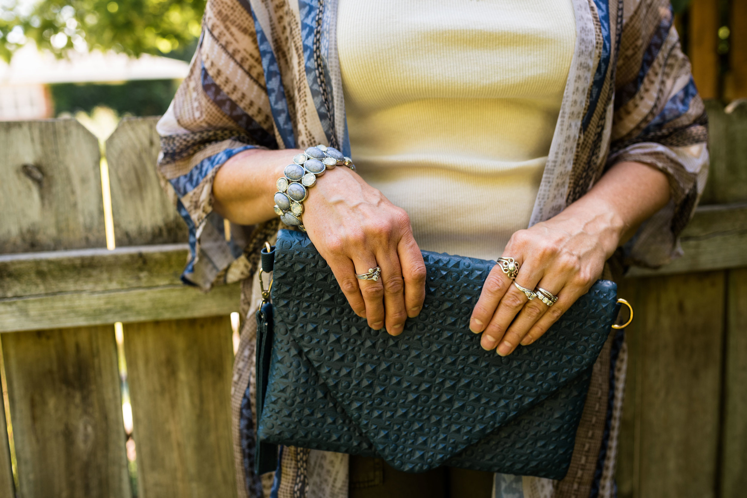
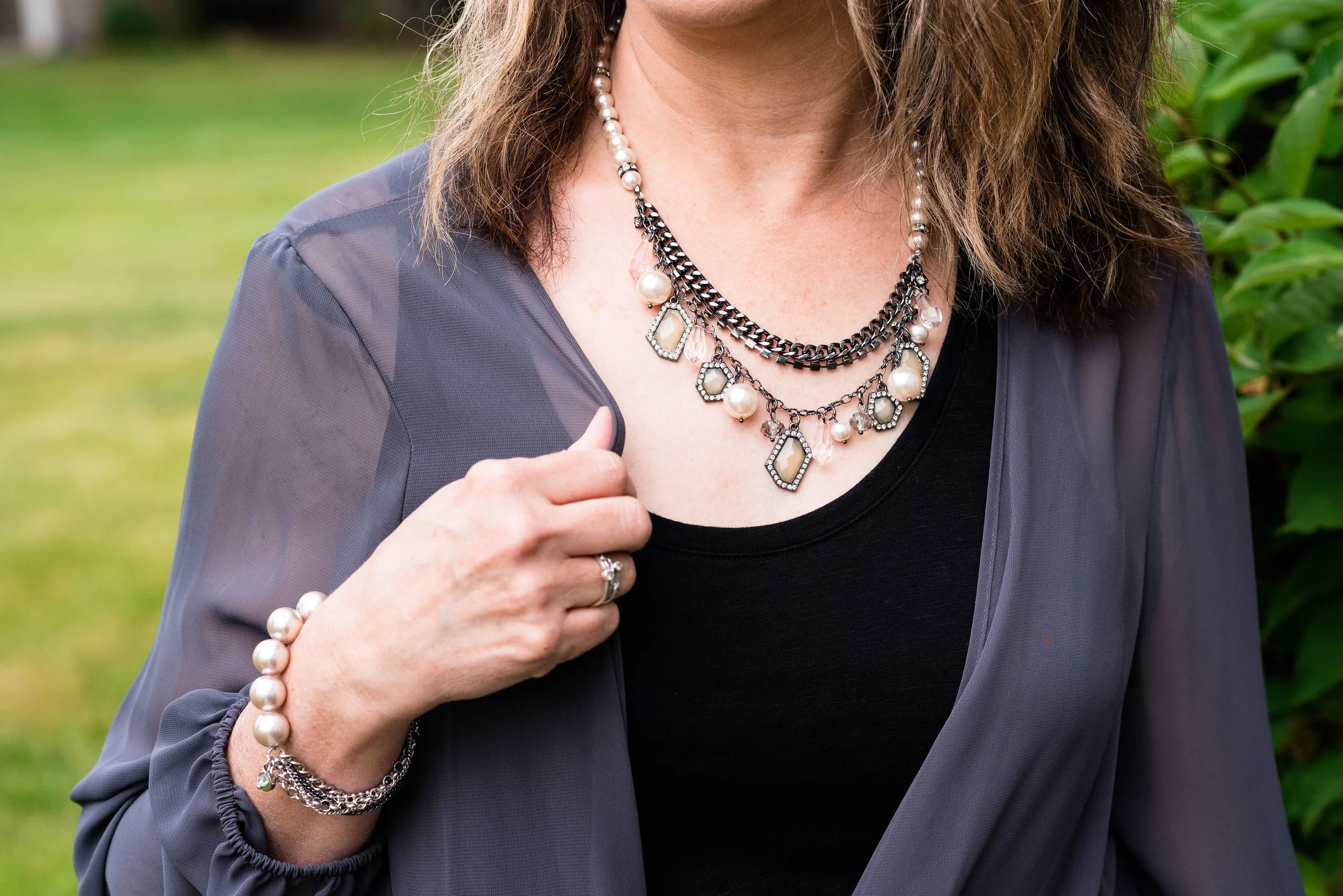
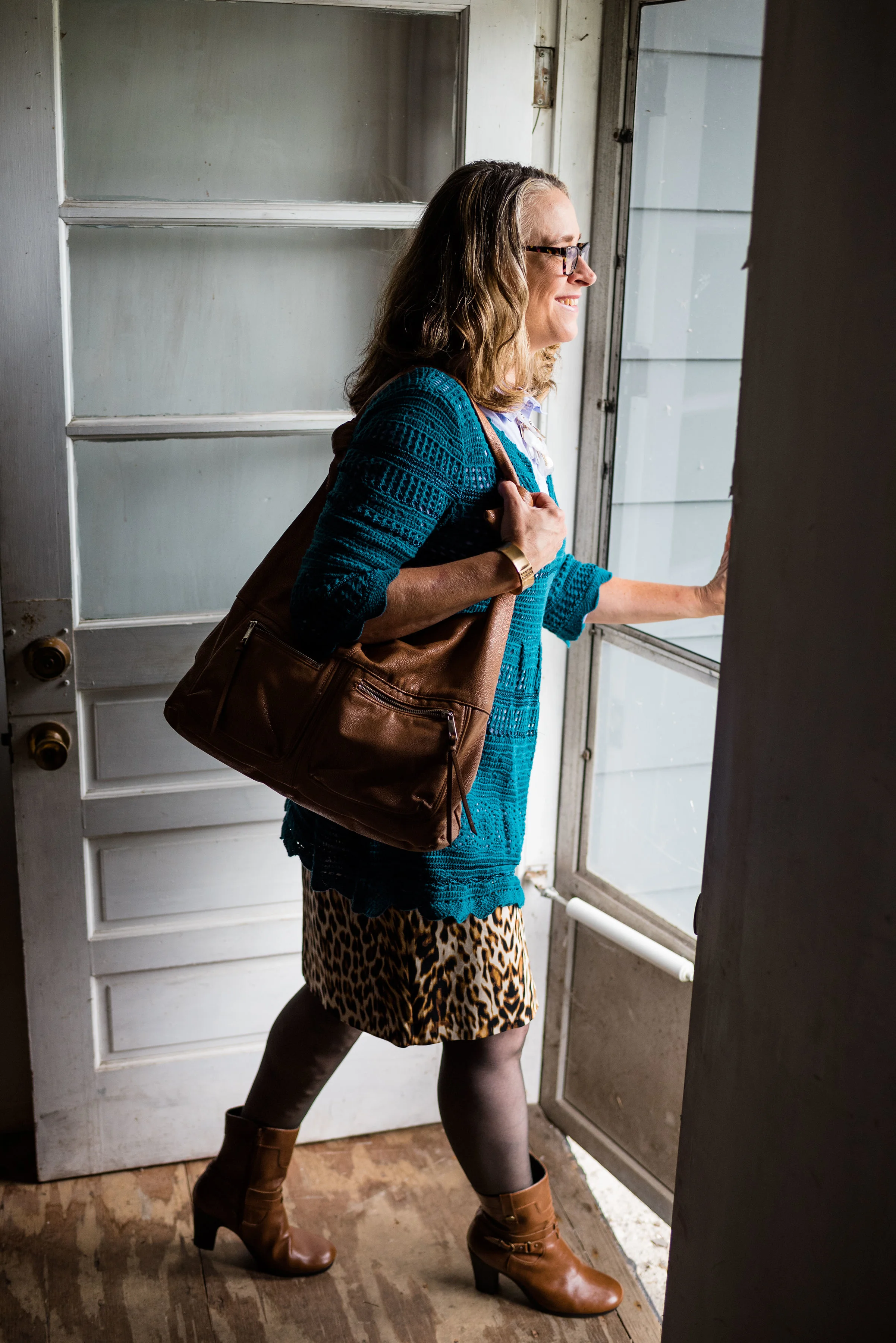
This top is a Kohl’s clearance find and is Dana Buchman brand. It is a button up with 3/4 length sleeves and a longer silhouette. It has some stretch and is more fitted. I opted to wear this bead and metal statement necklace, which incorporates the Crocus Petal color as well. I wore a simple gold cuff on my arm.

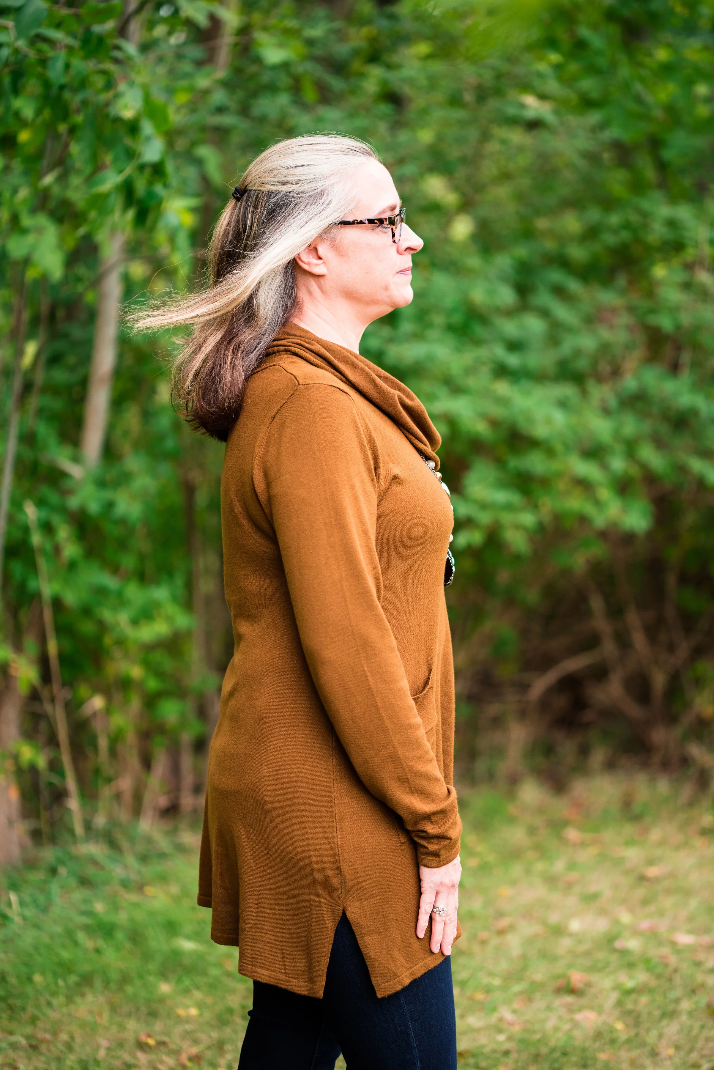
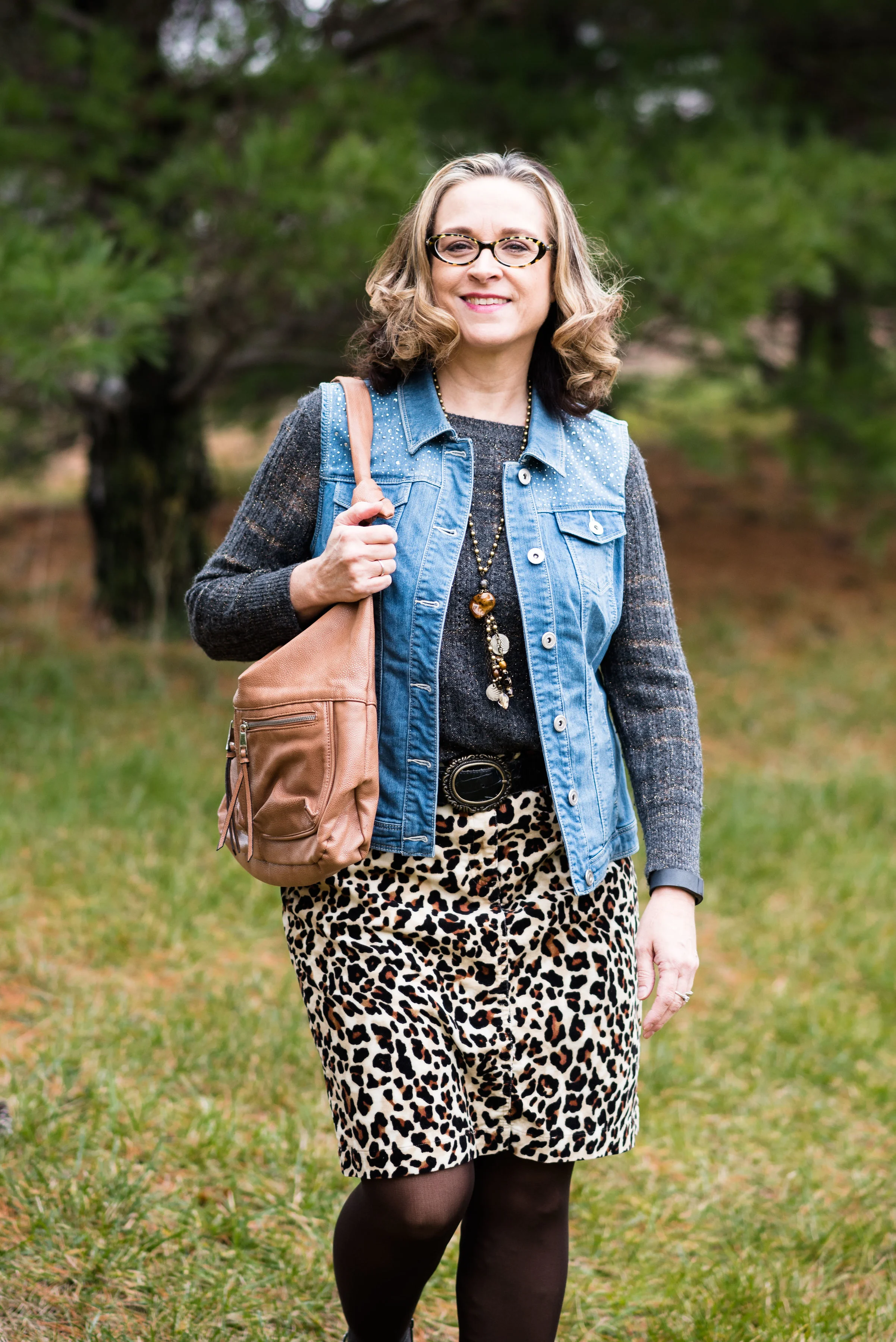
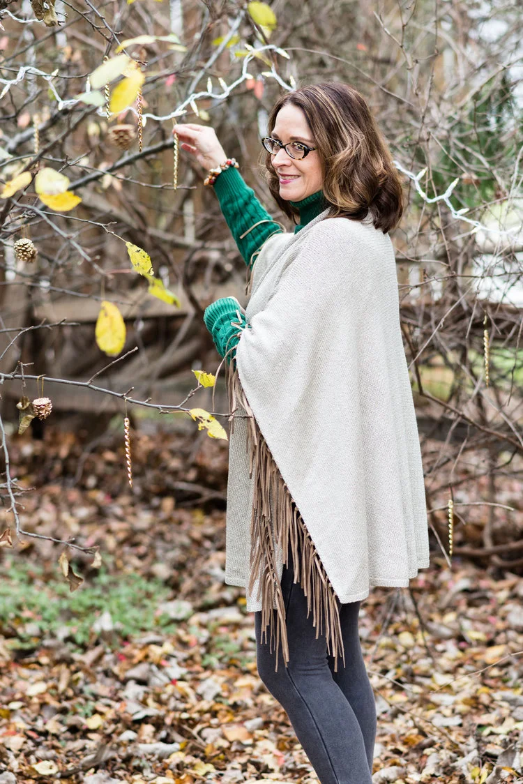
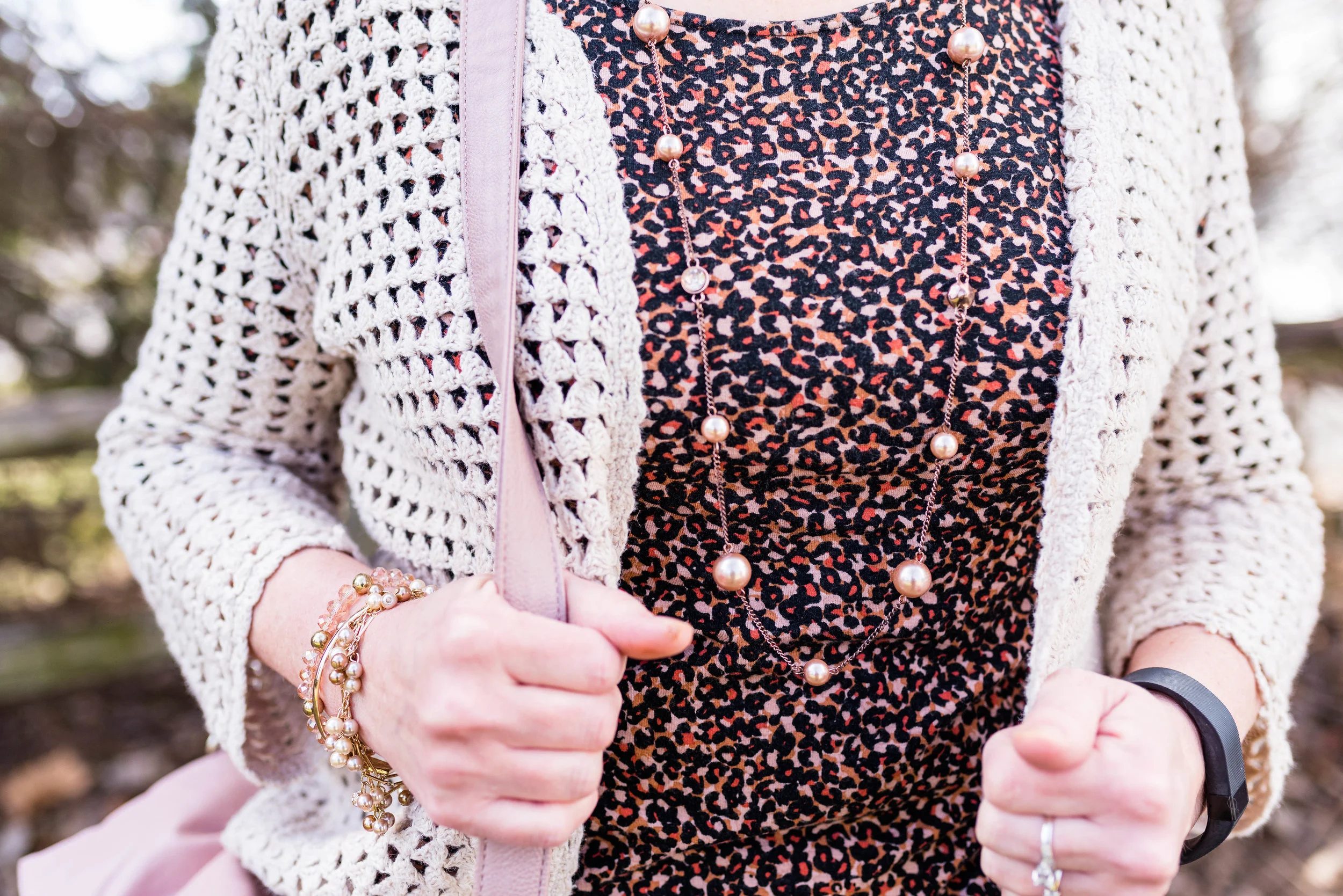
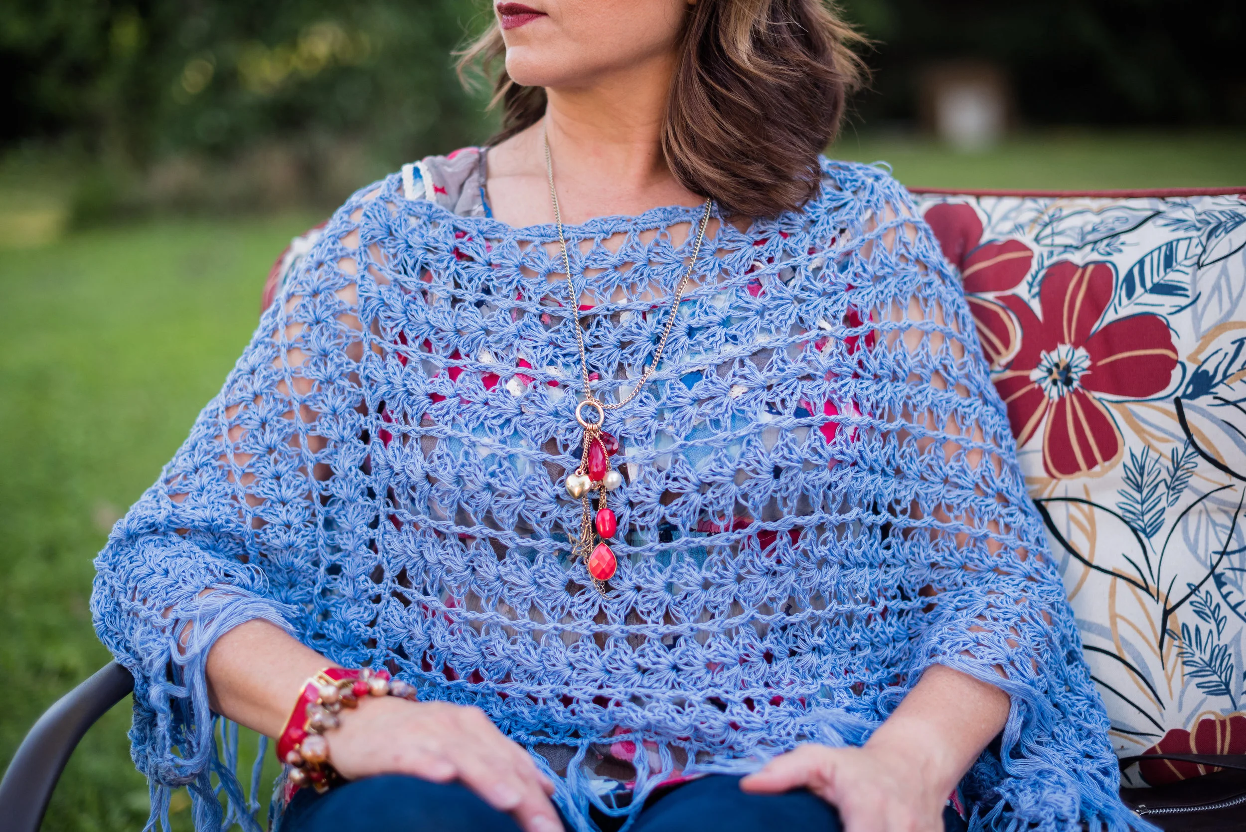
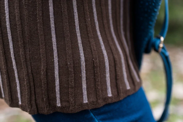
I found the open weave sweater thrifting, I love the variations in the knit. I am not a yarn girl, though I would love to be. I think this is crocheted, but it might be knit. Can any of you readers tell? Whatever it is I love the different stitch sizes and open versus more closed aspect to the piece. Here we are talking about texture again and how essential is is to making an outfit more interesting.

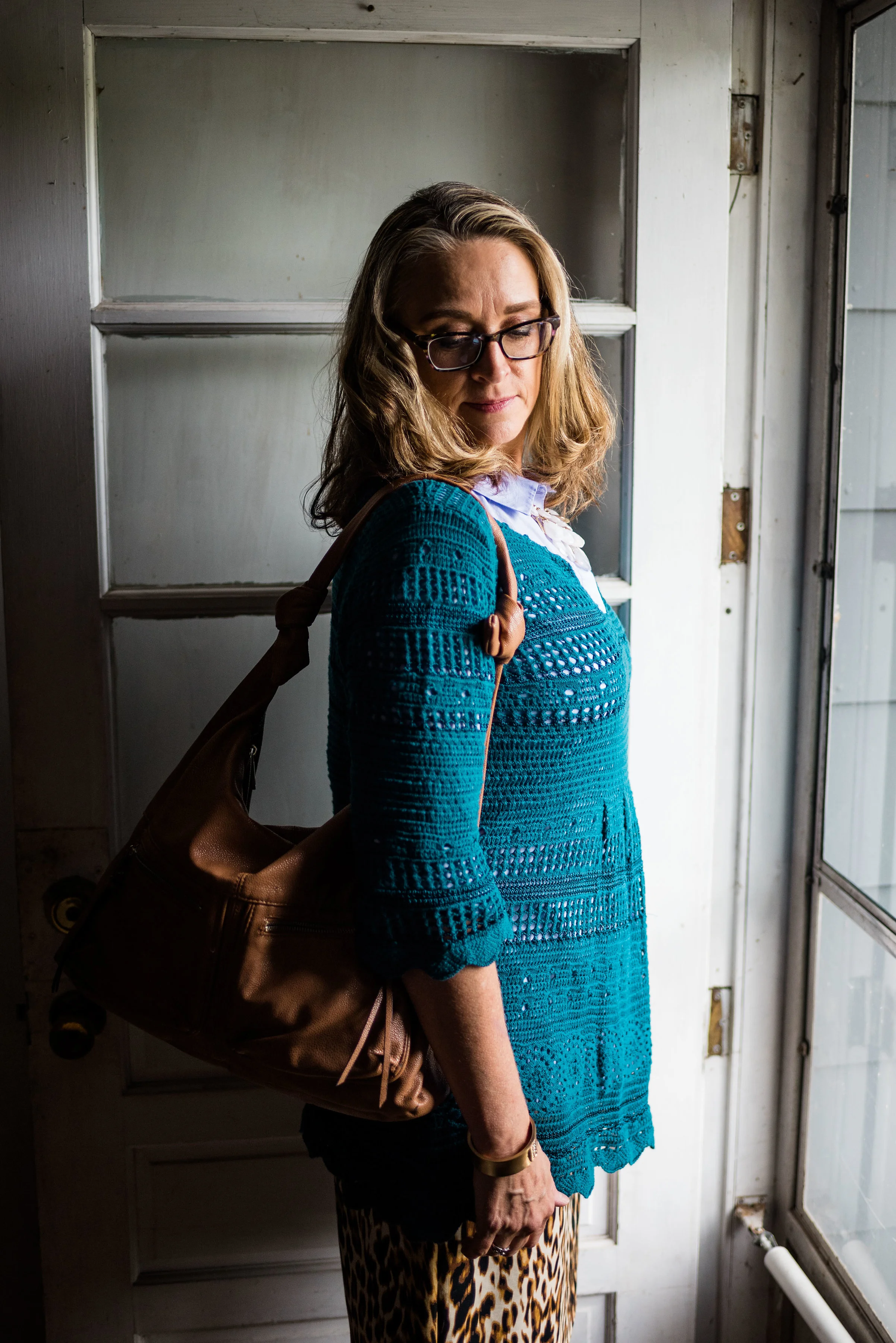
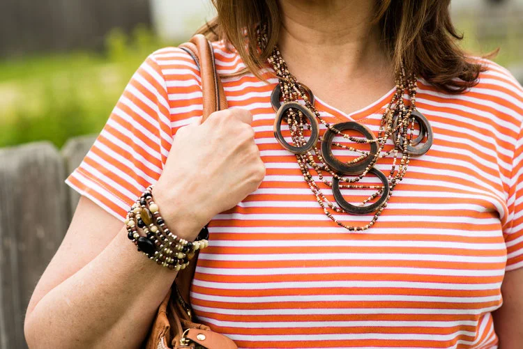
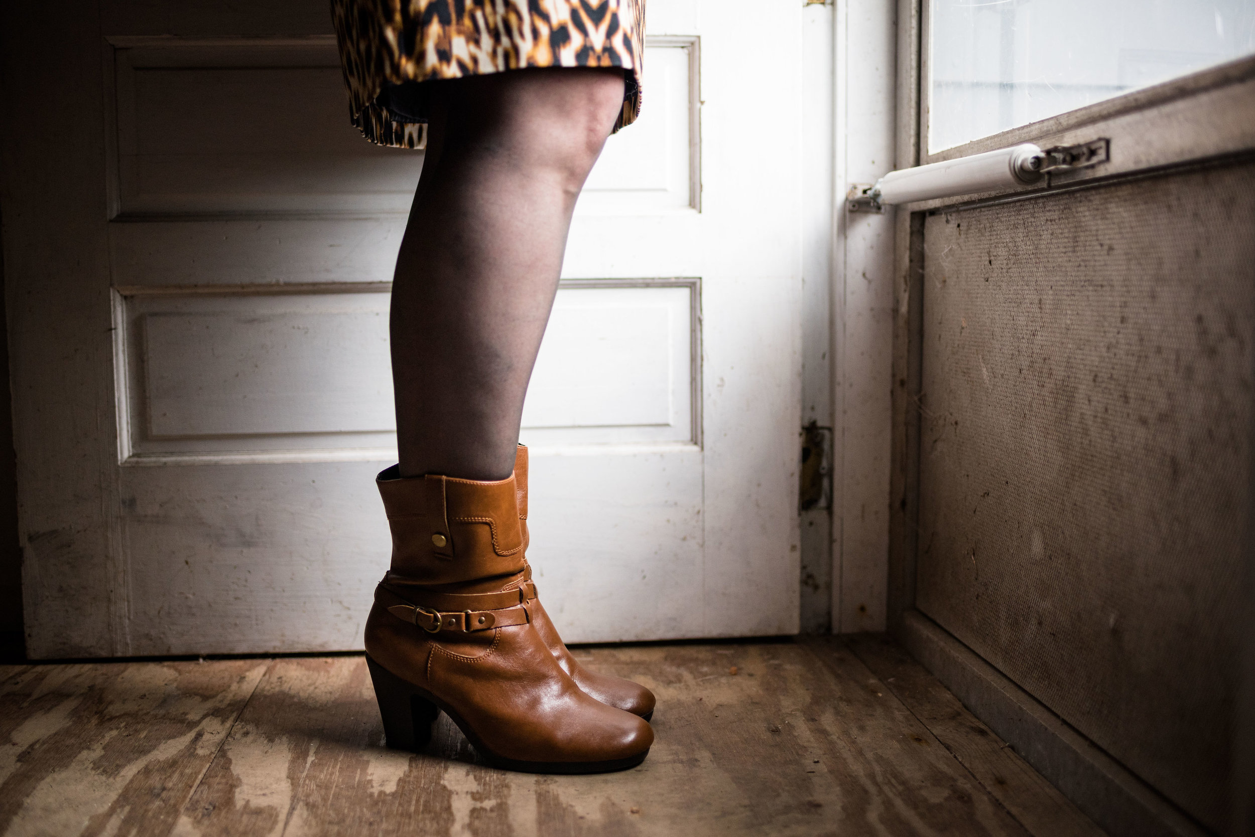
I thought these two colors when great with the browns, black and cream of my leopard print pencil skirt. This skirt is another JC Penney find and is Worthington brand.

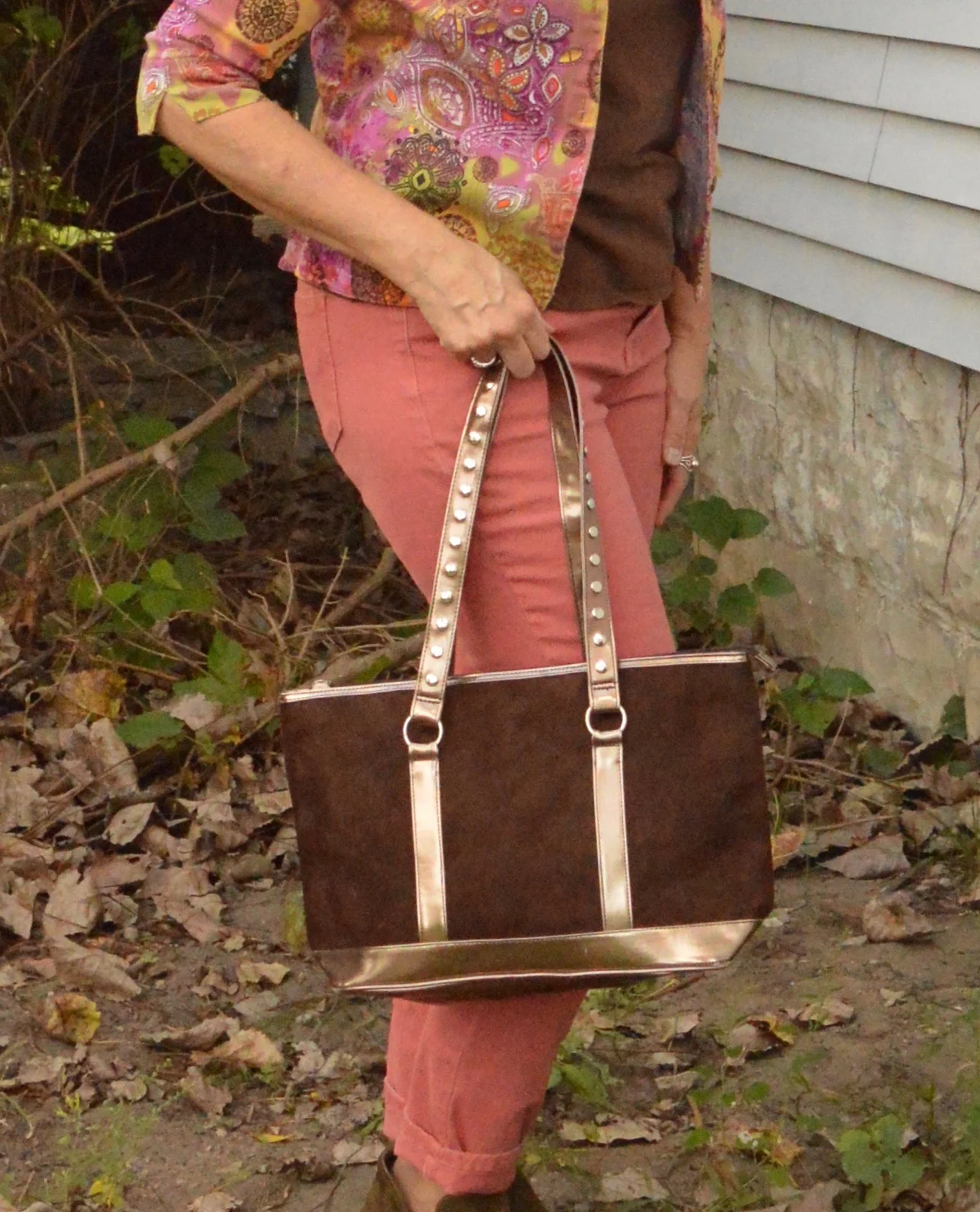
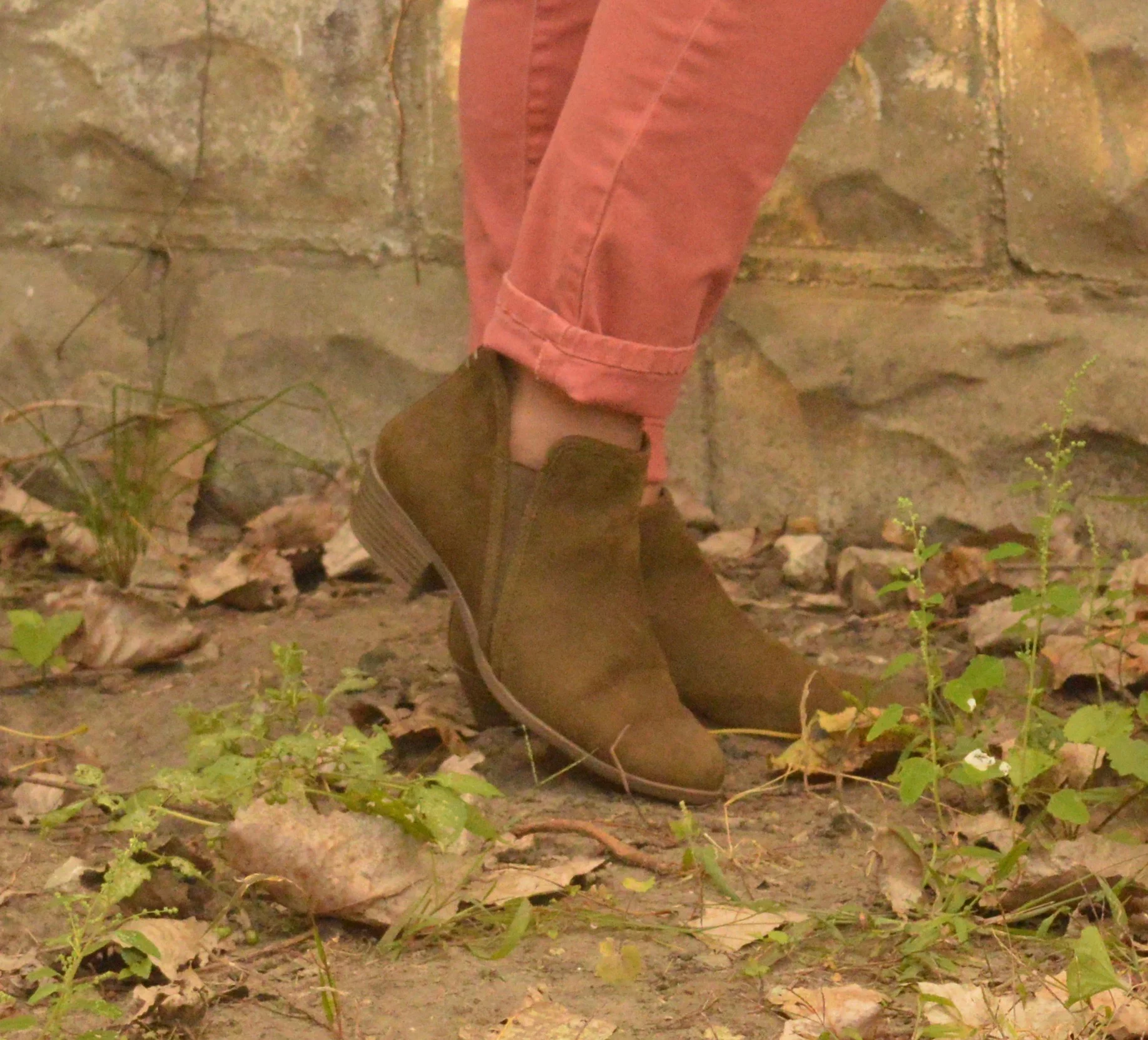
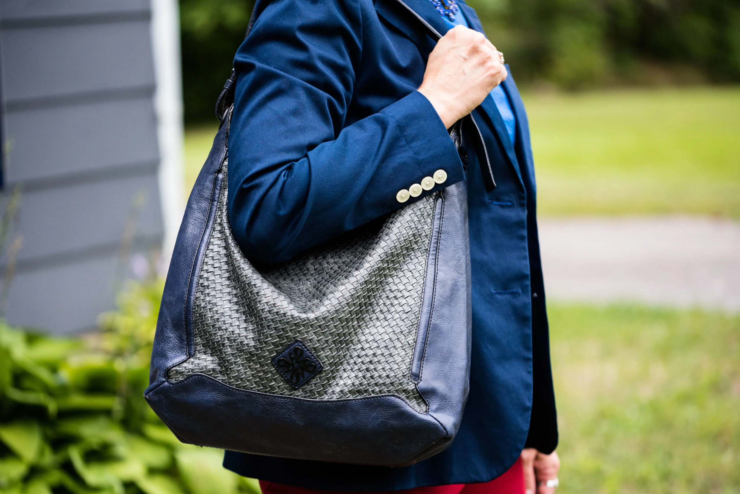
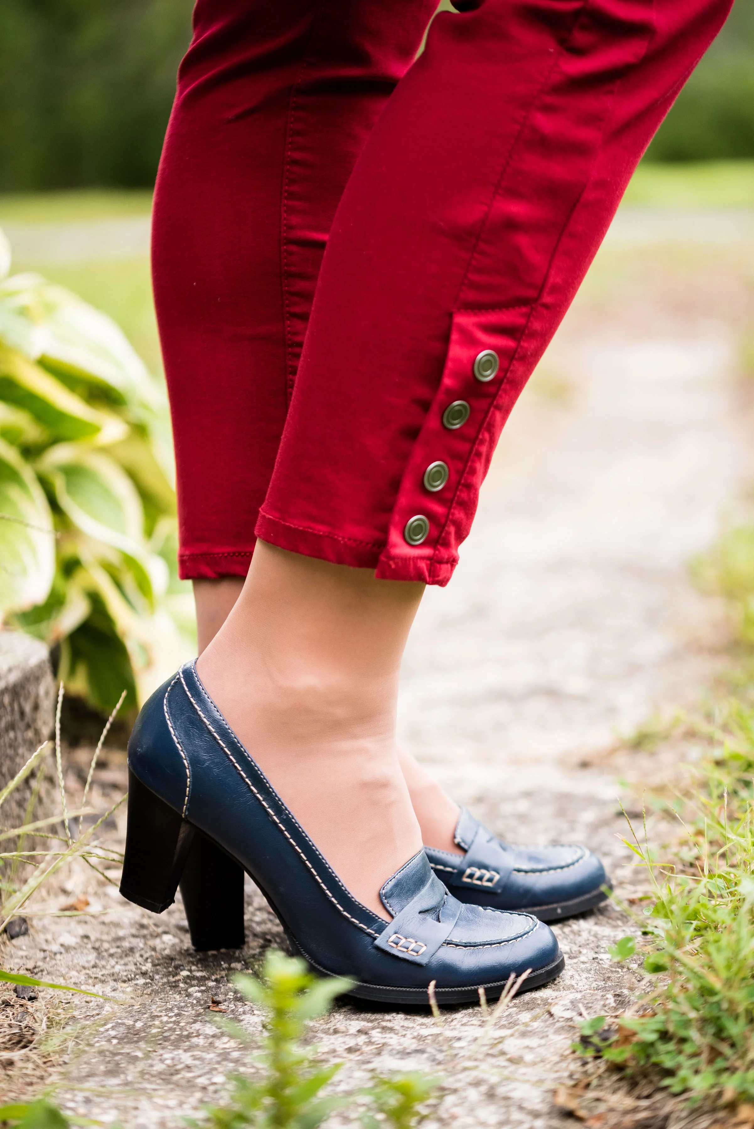
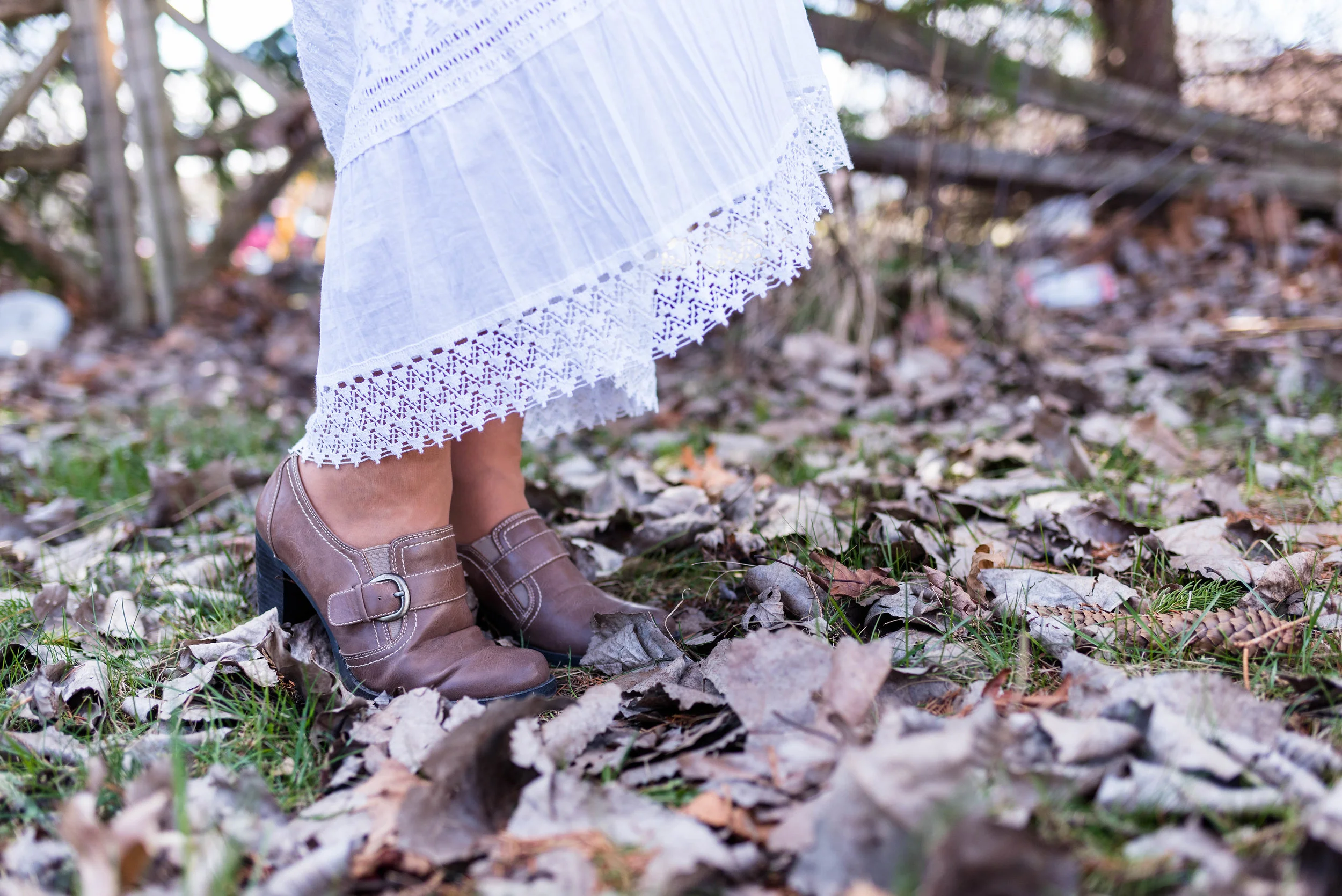
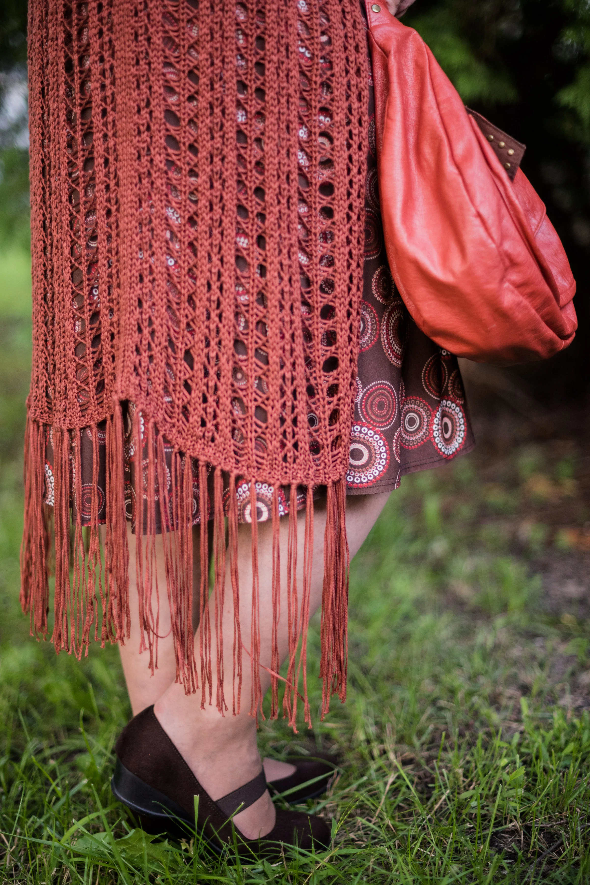
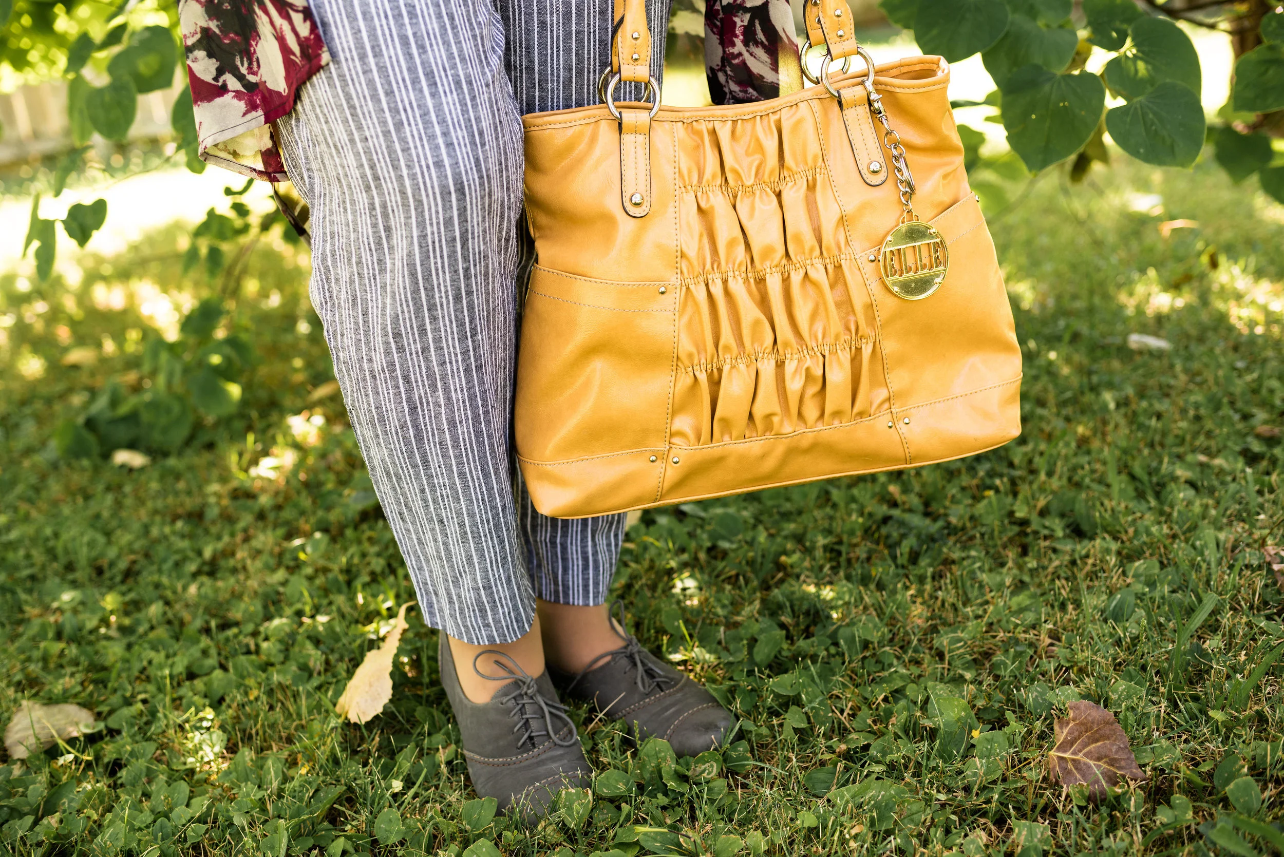
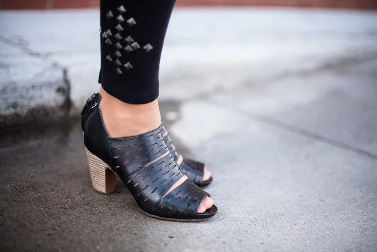
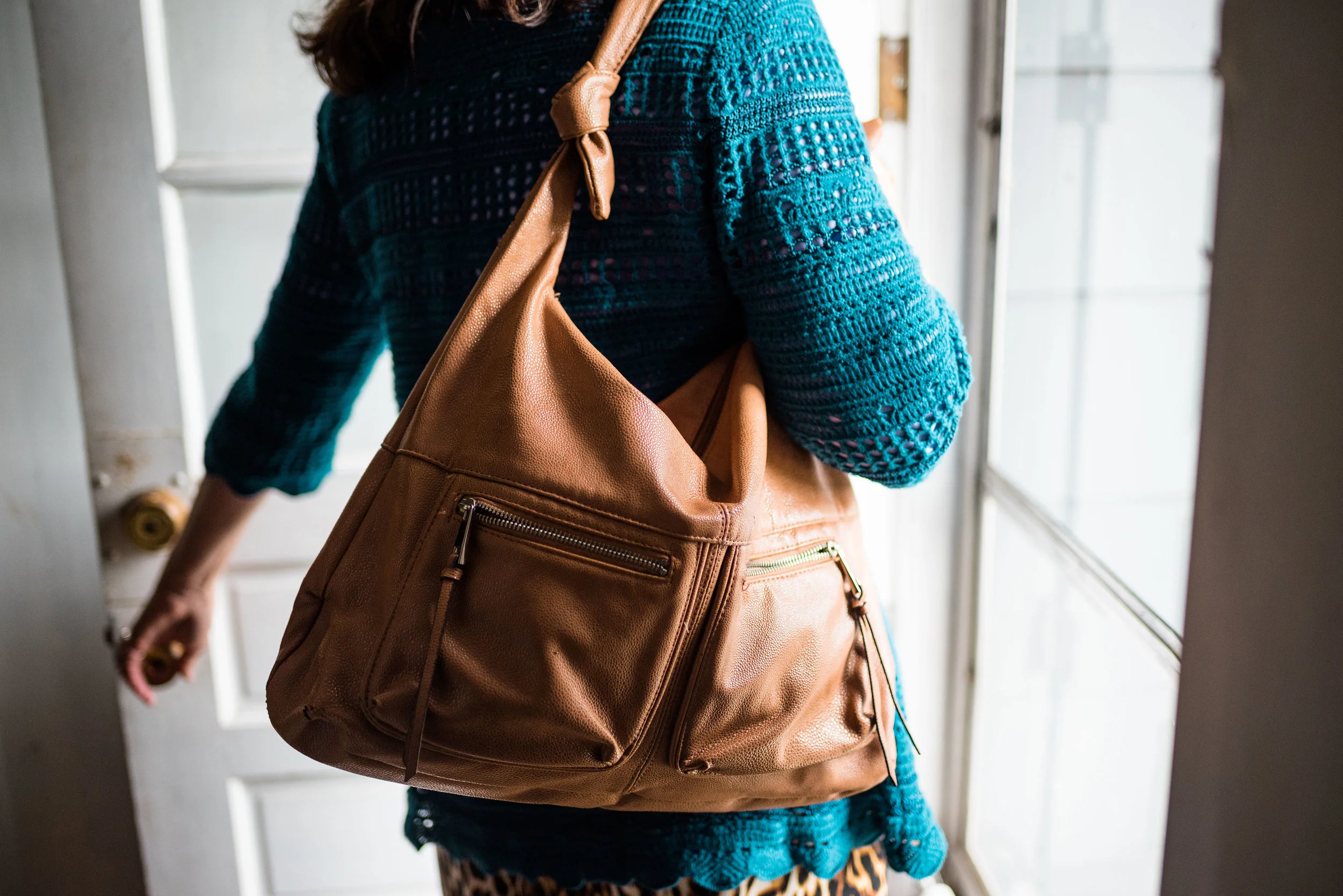
The boots, Aerosoles and bag, both thrifted were the perfect accessories to pair with this outfit. I think black would have worked well or even a cream colored boot, which are trending right now, but I love the luxe feel of the Meerkat color.

Next week I’ll have a recap of all the Pantone Fall 2018 colors. I hope you’ve enjoyed this series and that it provided you with some inspiration for trying new color combinations. Always shop your closet before going out to purchase what is currently trending. You might already have a leopard print top or the perfect color piece that matches with one of the Pantone seasonal colors.

I’ve included a few shopping links. These are affiliate links. All opinions are my own.

Have a great day.

Photo credit Rebecca Trumbull.

Old Becomes New - Multi-print Blazer

For this month’s Old Becomes New column, I am featuring a short, 3/4 sleeve blazer that I found at a thrift store a few years back. What drew me to it was the amazing, eclectic color palette. My first thought was that I could wear it with so many things. After I tried it on and loved its’ stretchy feel, I had to take it home. Unfortunately, I’ve only worn it less than a handful of times. I decided to revisit it and make the tough choice as to whether I should keep it our not.

I honestly believe this jacket is meant for a smaller person than me. I am 5’ 5” and hover around 163 pounds. While it tends, on me, as more of a crop jacket, I’m just not sure. I am asking for your help friends. What do you all think? Does my outfit look disproportionate?

I chose my dressbarn W62 jeans. I bought this pair last year and they no longer carry this color. I love that they are so comfortable and stretchy, however, I feel like they are almost too big. I lost a few pounds this past spring, so I don’t know if that is what made the difference, but they seem to have a lot more wrinkles. Do you ever buy something, put it on and think, “It just doesn’t have the magic, I thought it had?”

I went with this thrifted brown tee and a necklace that was in some of my daughter’s stuff to be gotten rid of. Hey, I’m not afraid to find treasure in the strangest of places. I like the brown and yellow cord, the beads, ribbon and the charms, which you can’t see much of in this picture. It seemed a prefect fall accessory.

My bag is another thrift find. I felt the brown tee and the brown bag pulled in more of a fall feel with this blazer that could be worn in any season.

Once again, I chose my SO olive ankle boots. These are perfect for the cool temps of fall when you are not quite ready for mid-calf or knee high boots. You can see more fun colors here. The price point on these is not bad at all and they are very comfortable. I typically wear an 8.5 or a 9 and went with a 9 in these so I have more room for heavier socks as the days get cooler.

What is your verdict? Is this a jacket I should keep or should I let it go free? Ha, ha. I’d love to hear your thoughts.

I hope you all have a wonderful weekend. I have to work Friday and Saturday and try to play catch up with all the other stuff that I don’t get done during the week. Ha, ha. Take care and always choose to be kind.

Pantone Fall 2018 - Pink Peacock, Valiant Poppy and Almond Buff

Welcome back to outfit number three in this fall’s Pantone color series. Today I am featuring two colors which the Pantone site describes as a “bright and bold dramatic pink” and a “brave and outgoing red.” I didn’t go into this series thinking I would pair these two colors, but when I started looking for the pink and decided on this multi-print tunic, it was only natural to choose another color in the tunic to pair with it, which obviously turned out to be red. I have always thought of pairing red and pink as a Valentine’s Day idea, but when I began putting this outfit together, I saw a subtle shift from cupids and hearts to fall apples and fuzzy pink slippers.

This tunic is a brand called East Fifth and while I can’t remember, I think I got it at JC Penney. Although, when I checked on their website, it looks like they currently only carry East Fifth shoes. and a few bags. I have styled this tunic on the blog before. You can see that post here.

When I realized I had this thrifted Merona cardigan, I knew that would add the perfect pop of red, in addition to my red clutch.

To keep the outfit grounded I picked the Pantone color Almond Buff from the classic palette. These pants are a little on the light side to truly mimic the color, but my swede ankle boots are a closer match. Yes, I am doing the Robot.

The pants are Croft and Barrow brand. The boots are Sonoma. Both items were from Kohl’s.

I chose my bright red clutch to add to the Valiant Poppy vibe. Because the tunic is so busy the only jewelry I added was a gold bangle bracelet and the pink and red tassel necklace, which as you can see, blends in with the top, but still adds a little textural detail.

Isn’t it funny that I bought this necklace a while back, never realizing that Pink Peacock and Valiant Poppy would be a thing, or that I would end up pairing these two colors on the blog? This next picture is just me at my silliest! Ha, ha.

Would you combine these two colors? Do you think they are what we would classify as fall colors? I’d love to hear you thoughts. It means a great deal to me when you take the time to stop by, read my posts and comment (when technology is cooperating). I have learned a lot from your comments, especially when you share, how you would have done it differently or what you like about a particular post, so keep it up.

Be sure to check back Thursday for a new Old Becomes New post, where I’ll be sharing a colorful blazer styled in a fall outfit. I need your help to decide whether I should keep it or not. Until then, have a great day.

I’ve included a few shopping links for pink tops and red bags, just for fun. These are affiliate links which means I get a penny or two when you click on a link. If you purchase something through my site, I get a little commission.

Photo credit Rebecca Trumbull.


Pantone Fall 2018 - Red Pear, Nebulas Blue and Sargasso Sea

Last week, I introduced you to this fall’s Pantone color palette. Now that I am just getting started with my series, I noticed their website already has the color palettes up for Spring 2019. I understand that in the fashion and interior design industries they always need to be one step ahead, or all of a sudden things have gone out of trend and disappeared. That reminds me of a verse from the book of Ecclesiastes which was written by King Solomon.

That which has been is that which will be,
And that which has been done is that which will be done.
So there is nothing new under the sun.
— Ecclesiastes 1:9 (NASB)

Even a man as wise as Solomon, knew there was nothing new under the sun. Look at the movies and books that are currently out. It is pretty much the same story, just written with different characters and a different setting. Heck, how many times have they revisited Spider Man and Predator? Ha, ha. That being said, the color palettes that come out are really nothing new. They call them by different names, make one a little more blue based or yellow based and say they are fresh and new.

However, I do enjoy color and I like to create outfits using color in combinations that may be new or different, at least for me. Following the color palettes that Pantone puts out each season allows me to do just that.

Here are the first of this fall’s palette.

Red Pear and Nebulas Blue are on both the London and New York palettes. Sargasso Sea is one of the classic colors or what I like to refer to as a grounding color. Red Pear borders on a maroon and my pants are really too red, while my version of Nebulas Blue appears spot on. Sargasso Sea is navy by any other name, but even there you can see all the different shades of navy. My Ralph Lauren thrifted blazer is almost too blue, while Sargasso Sea seems to have more gray in it. I think my loafer heels and bag are a little bit closer to the Pantone color.

I added this colorful bandana for a scarf as a way to bring together the red and blue and add a pop of yellow.

The blazer, shoes and bag were all thrifted. The bag is Simply Vera Wang; the blazer is Ralph Lauren and the loafer heels are Relativity. Everything you see in this outfit with the exception of the scarf I have styled on the blog before. It just goes to show that our closets are a great place to look for new color combinations and outfits.

What do you think of these colors? Do you think these colors represent the fall season? Why or why not? I’d love to hear your thoughts.

I have received a few messages that people are having problems commenting on my blog posts. If you an issue, please let me know. I contacted the help team for the platform that I use when I had a problem in the past and they said they couldn’t see any problem on their end. If you have an issue, please shoot me an email, so I can see how widespread the problem is.


I’ve included a few shopping links. These are affiliate links, which means I get a few cents if you click on it. All opinions are my own.

Fall Collaboration with Ethyl Clothing

I was recently contacted by a clothing retailer named Ethyl Clothing. Ethyl Clothing has been around for over 30 years. Based out of Seattle, Washington, founders and designers, Alan and Kathy Schulz, continue to be actively involved in bringing their quality products to over 3000 boutiques across the country. They now have an online store, which makes shopping their classic clothing pieces even easier.

When I went to their website, I was pleased to see models that look like average sized women. In other words, these women look like me. That alone, intrigued me. While I was informed that Ethyl clothing originally was geared to the younger woman, their clothing line has developed over the years to encompass and cater to the “baby-boomer” generation. These are women like me, who are busy and enjoy clothing that looks nice, but feels soft and comfortable with some amount of stretch and give.

When I received my pieces, I was not disappointed. Because these are vanity sized, I was told to size down from what I would normally wear. Sizes run from XS to XXXL on most. For both the tunic sweater and the jacket I chose a medium. For the jeans I went with a size 10, where I normally wear a size 12. Everything fit exactly as it should.

Each of the following pieces was gifted to me. No money was exchanged and all opinions are my own. After a short description of each piece, I will give it a review by listing positive and/or negative points, along with suggestions for wearing.

Like many smaller clothing retailers today, Ethyl Clothing names each of their pieces. Let me introduce you.

1. The Anne 2 - Kenzi

The Kenzi boasts a long, gracious tunic silhouette, a comfortable cowl neckline and roomy, pleated front pockets that add interest and texture.

Positive Points - flattering silhouette, silky material drapes well and holds its shape, roomy - doesn’t bind or pinch.

Negative Points - sleeves are a bit long. For me this is not an issue, but if you have short arms you may need to have them altered or roll them up.

Style suggestions: Wear with skinny jeans or leggings; pair with various jackets either long or short; wear with a skirt, either tucked, belted or just left long; slip on over a dress that will show a little at the bottom.

2. The Jaqueline Flair Jean - Abigail

These boot cut, dark wash jeans are made of a medium weight denim woven from a poly-cotton blend with a dash of rayon and spandex for stretch, comfort and ease of wear.

Positive points - good stretch, not too heavy, hold their shape, dark wash, figure flattering.

Negative points - very long, narrow through the thighs. If you have heavier legs or short legs I would suggest trying their pants with the shorter inseam. The Abigail only comes in the longer (31”to 34”) inseam.

Style Suggestions: Boot cut jeans always look good with heeled boots, but these would also dress up well with a pair of heels. They fall just below the natural waist so could be easily paired with shorter tops and sweaters.

3. The Margot - Blake

The Blake is meant to be a style piece not an actual jacket. A medium weight cotton-poly blend with spandex this black denim jacket is the perfect add on piece to take any outfit up a notch. The bling detail on the lapels and the frayed hems, give it a vibe that says both edgy and party ready. The non-closure, open front allows you to show off, not only the jacket, but a statement piece underneath.

Positive points - easy on and off, no buttons or zippers to snag sweaters or scarves, plenty of stretch, longer length for better back side coverage.

Negative points - this is less a negative than it is a personal opinion. When I first received this jacket I did not like the way it fit and after working with the rep from the company was sent a large to try on. The piece is designed to not come together in the front, which to me seemed odd, but this is the way the designers intended the jacket to be. It was created this way to allow exposure of the top you are wearing underneath. After having the two sizes to try on I ended up sending the large back. It really was too big. Now that I’ve seen the two sizes and have a better understanding of what the piece is intended to do, I like it. I am looking forward to wearing it with other outfits to see its full potential as a fun add on piece, almost more like an accessory.

Style suggestions: This would look great with a shift dress, pencil skirt or skinny pants. It will also allow for many different top choices including tunics and vests. The Blake will also allow your fun scarves and statement necklaces to still take center stage while providing a backdrop of bling, warmth and fun.

My overall opinion of Ethyl Clothing is that it is a woman friendly retailer with a strong classic, casual line structured for comfort and ease of wear. While they are not offering a discount through my site, if you spend over $100 you get free shipping. The pieces you order also come with free return labels, so that if you are not completely satisfied you can return your purchases for a full refund.

I hope you enjoyed this look at Ethyl Clothing. Head on over to their site and take a few minutes to shop. Just click on the link, Ethyl Clothing.

Photo credit Rebecca Trumbull.

Texture Talk - Part 3

You might be thinking I covered everything I could when it came to texture and fashion in the last two posts I did on this quick texture series, however, there are two other areas I wanted to address. They both have to do with adding texture to outfits, but in completely different ways. The first deals with adding texture by using patterns. The second will look at taking a monochrome outfit and making it visually interesting by adding texture. 

Adding Texture by Using Patterns

We talk a lot about patterns on our clothing. Everything from stripes and flowers, to plaid and polka dots are part of the clothing we choose to wear. I personally love prints and since I have been blogging, I love to mix prints. When I started thinking about this series on texture, I suddenly realized that prints and patterns do add dimension and depth to our outfits, so therefore, must be a component of a series on texture.

The following pictures all are examples of patterns that add an interesting dimension to each outfit.

These first two are in black and white, because I thought that it makes the point even more dramatically. Not only does the pattern of my clothing add texture to the outfit, but you can see all the texture in the back ground from the trees and landscape. 

These next two are jackets. The first is a sleek bomber jacket, but it gives the illusion of texture by placing bold colored flowers on a black back ground. 

In my opinion patterns like houndstooth. herringbone, sharkskin and others are the perfect textural patterns. We see these a lot in suits for men and women. I found this houndstooth jacket at a nearby thrift store 

An all over pattern gives the illusion of texture while hiding some of my more prominent bulges. 

The sweater by itself provides texture, but the pattern across the top and shoulder area, as well as the buffalo plaid bag add interest and depth. 

This outfit has many textural components, but they all play so well together, what's not to love? The sweater has ribbing, the vest is embellished at the top, the belt, jewelry and bag provide other interesting elements and the patterned skirt is also made of corduroy, thus more texture. This type of outfit, with all of it's textures still looks chic and classy, but is warm and comfortable. 

The same goes for this outfit as well. The striped dress is knit, the jacket has polka dots and the bag is not only made of suede, but has fringe. Texture upon texture, upon texture. Going back to my initial post about texture, I showed some photos of textural elements in nature. If you go for a walk in a park or even in the city, you will see layer, upon layer, upon layer of texture. It is perfectly okay to wear lots of texture in your outfits, as long as you think about how you are putting things together. You can see my original post here

Adding Texture to a Monochrome Outfit

This first outfit from my Spring 2017 Pantone series featuring a color called Pale Dogwood. This pale pink is a great backdrop for adding pattern and texture. Other than the laces on my shoes, the knit fabric of the sweater and the necklace it is the addition of the bold pattern on the scarf that gives the outfit a texturized look. If you wanted to go for a complete monochrome look you could have added a fuzzy pink boa or a wide pink belt with some sort of texture. 

Even though this outfit has a patterned dress the look is still monochromatic because the entire look is basically a conglomeration of earthy browns. The pattern and the open weave knit are the texture winners in this look.

Just to give you an idea of what an actual monochrome outfit looks like, I threw these next two in from last years holiday outfit series. The black top adds texture with its draping neckline. The over piece adds texture with shear sleeves. Isn't it funny that something sheer can actually add texture, but think about things like neglige and wedding dresses.

This gray outfit is, perhaps, one of my favorites for a monochromatic look with loads of texture. The sheer drape, the pleated neckline of the sweater, the pleats on the skirt as well as my heels which have almost an alligator pattern on them are all textural components in this outfit.

Now that you have seen a few examples I hope you will give more thought as to how to add more texture to your outfits. With the onset of fall it will be much easier to add texture through fun pieces like scarves, hats and boots. 

Let me know if you liked this series on texture. If there are other fashion ideas you are interested in having me do a series on, let me know and I'll give it some thought. 

Have a great weekend, everyone!

Photo credit Rebecca Trumbull. Make up Rachel Christensen.

Texture Talk - Part 2 - Embellishments and Fabrics

Last week I took a look at how adding texture to our outfits can change and elevate our same old, same old looks, to a new level. Texture is all around us in nature and in the homes we live in. Take a look at your living room or bedroom. There is texture on the couch in the form of upholstery, pillows, and throw blankets. Your bed probably has a thick cushy comforter or mattress pad that adds comfort for a better night's sleep. We fill our homes with pictures, decorations and nick nacks to add depth and interest to the environment we live in. Why would we not do the same thing to our outfits?

Last week I looked specifically at adding texture in the form of our accessories, such as bags, shoes, jewelry and scarves. You can see that post here. This week I want to look at fabrics and embellishments and what choices there are to add texture in this regard. 

Embellishments:

This would include anything added to a clothing piece that gives it texture that is not specifically fabric related. Fabrics like lace could be an embellishment, but I am going to leave that for the fabrics section. 

Things like beads, jewels, sequins, fringe and special buttons, are all embellishments. Certain types of stitching, like the embroidery above, as well as things like gathering or ruching also add texture to an outfit. 

Fabrics:

Lace

I love lace and I think it can add an element of elegance to any outfit. It obviously adds beautiful texture when it is worn. Combining lace with leather or lace with some other embellishment makes for an even more interesting outfit. 

Knits

My pictures all revolve around open weave knits. Things like crochet or knitted pieces are great for boosting the texture factor. However, even regular knits made in a factory add dimension to a look, especially if they are ribbed or manufactured in a way that builds texture. You'll see an example of ribbed knits a little further below. 

Fabrics made with special textures:

Pleats

Quilting

Ribbing

Texture is a wonderful thing to add to our outfits. As you begin thinking about fall in particular you will be naturally reaching for things like cozy knit sweaters and fun boots. Coats and jackets will also add an element of texture to your outfit. 

I am going to stretch this into one more post, because I think there is one more area of texture we need to discuss. Look for another post next Thursday. Until then, have a great weekend!

Photo credit Rebecca Trumbull. Make up Rachel Christensen.


Texture Talk - Part 1 - Accessories

I am going to veer away from my usual monthly column for a few weeks to talk about texture. We all know that our clothes are made of various fabrics. These fabrics are woven together from many different materials including plant based items like cotton and linen, to man made items like rayon and nylon. Every fabric has its own feel, swing (or lack thereof) and texture. Many materials might appear to have no texture at all, but even something smooth has texture. Silk for example is smooth to the touch, but a silk blouse feels beautiful because of its smooth, silky texture. Why, then, even worry about whether an outfit has textural elements, when all fabric has texture of some sort? The reason is quite simple. Texture adds interest.

Let's look at a few examples of texture in nature. 

Try to imagine our world without texture? Texture has the ability to tell us something about the thing we are looking at. The bark looks rough. The feather looks soft. The trees have depth. The grass looks wispy. Leaves and flowers speak of life and provide a texture all their own. In the same way, our clothes speak volumes about who we are and what is important to us. 

As I mentioned before all fabric has texture, whether it be smooth, rough, bumpy, itchy, or anything in between, but what sorts of elements can add texture to our outfits to make them more interesting? Think of elements such as ruching, ruffles, buckles, zippers, weaving, fringe and lacing. All of these elements create interest in the palette of an outfit. 

This week I want to give you a few examples of how accessories can easily add texture to your outfits. These are all items you've seen on the blog before and came from my closet. Many of them came from thrift stores or end of season clearance racks. You certainly don't have to spend tons of money to add interesting elements to your every day outfits. Take a look.

Bags

A bag is the perfect way to add texture to an outfit without adding a bulky extra layer. We often think of adding texture by putting on a chunky sweater or a fury scarf, but a bag with ruching, weaving or other textural components is a great way to take your texture IQ up a notch. 

Shoes

You might wonder how a pair of shoes can add texture to an outfit, but think about perforations, laces, shearling or fur, buckles, straps, and bling.

Photo by me

Jewelry

Jewelry is another way to add texture to your outfits without adding a lot of bulk. There are so many choices when it comes to jewelry with just about every material imaginable. Here are some of my pieces.

Scarves

I love scarves and have way too many of them, but scarves are another way to add texture to an outfit. With summer coming to an end and fall on its way, now is a great time to pull out those scarves and think about how you can add them to your outfits. 

Photo by me

Photo by me


Accessories are an easy way to add texture to all of your outfits without having to buy new items. You already have purses and bags and jewelry. Think about how you can combine these for more interesting and undated looks. 

Next week I'll continue this little side series by taking a look fabrics and embellisments that also add texture to our outfits. I hope you enjoyed this post. Leave me some love in the comments section and have a great weekend!

Photo credit Rebecca Trumbull, unless otherwise specified. 

Is It a Kimono or a Ruana? Week 4

Here I am, once again, taking a look at kimonos versus ruanas. Both of these over pieces are excellent additions to your wardrobe. They help spruce up a more plain outfit and add a lovely, interesting, layer to a work outfit or a date night look. The lighter layers not only add interest, but a little extra warmth for those overly air conditioned offices and restaurants. If you didn't see my previous three posts you can look at those by clicking on the link. Week 1, Week 2 and Week 3. Week 2 gives a good overview of the difference between the kimono and the ruana, if you were wondering.

This week's post centers around a hybrid piece that I am going to call a "kiana", as I feel it has both the cut and fit of a ruana, but the essence of the kimono. This is another online purchase from Christopher and Banks that I got for a good deal. 

For this outfit, I wore a pair of Sonoma olive trousers, a cream colored St. John's Bay tank, and my blue SO flats. 

I am calling this a "kiana" because it is shaped like a ruana, but is sewn on the sides, creating the illusion of sleeves, thus the kimono. Once again, you can see that the outfit by itself is rather plain, but adding this sheer over piece makes the outfit really pop.

I received this fun textured clutch for Christmas from my younger daughter a few years ago. I love the color and the texture. Texture is another way to add interest to an outfit. Think about adding texture in the form of a jacket, a scarf or a bag like this one. Jewelry can also be a way to add more texture. Think pendant necklaces with fringe or even a beaded bracelet like this one I am wearing that I found in a clearance basket at Chicos

Here is another look at the entire outfit. 

What do you think of this piece? Do you think calling it a "kiana" is a good name? What are some ways you style your kimonos or ruanas? What are some ways you add texture to your outfits? I'd love to hear your feedback in the comments section below. 

I've included a few shopping links below for you to peruse. These are affiliate links. All opinions are my own. 

Have a wonderful day. 

Photo credit Rebecca Trumbull. Make up Rachel Christensen

Old Becomes New - High Waisted Skirt

This week I am styling a pretty skirt that I have had in my closet for ages. I refuse to get rid of it, because I love the flowy feel of it. I'm sure it has more versatility than I think, so I pulled it out. Since I was already on the crop top band wagon, I thought I would try pairing the same blue and white crop from last Thursday's post (see here) for some fun print mixing with this high waisted skirt. 

This skirt is George brand and I got it at JC Penney, many moons ago. It has a full lining and the fabric is very light weight and flowy. It also has a high, stretchy waistline, which is very comfortable and worked perfectly with the crop top.

I loved the pop of red in last week's outfit with the crop top, so I kept them exactly the same: red patent leather clutch, red bangle and red canvas peep toe Keds. 

I added the cropped denim jacket as a solid piece to tie together the two patterns. When print mixing it is usually best to pick a smaller pattern with a larger pattern and then use a complimentary piece to pull the two patterns together. Here is a photo of  the outfit without the jacket and beside it one with the jacket. Do you think it looks better with or without the jacket?

I hope you liked this outfit. Do you have something in your closet that you are not sure how to wear? Depending on the piece think in terms of balance. Try pairing a fuller, bulkier skirt with a stream lined tee or a belted blouse. Pair skinny jeans with longer tunic tops or even dresses with the jeans rolled up. When the weather cools pair those same skinnies with bulky sweaters or sweat shirts. Wider leg pants look perfect when paired with a tighter fitting top to show off your curves. 

I always love to hear from you, so be sure to leave me a comment or two. I have learned so much from fellow bloggers and others, who leave ideas in my comments box, so please feel free. 

Have a great weekend everyone.