Fun Fall Look - Shearling

For this Fun Fall Look today, I am wearing a pair of boots I recently thrifted, that combine the earthy tone of brown suede with the fun texture of creamy shearling. Shearling is basically the wool from a sheep after it is shorn. Most of the shearling you see in the stores this season is fake, but it is a fun texture that is widely popular right now and appears on coats, vests, hats, scarves and yes, boots. Most often the fuzzy texture is left a creamy white color and can be made of various man made fibers.

Because I wanted to show off the boots, I kept the rest of my outfit rather casual and simple. 

This berry colored tunic I bought a few years ago at Christopher and Banks. Here is a cute cowl neck version at Nordstrom

The  Apt. 9 vest I found on the clearance rack at Kohls. This is a light weight faux suede. I like the waterfall open front and this brown will go with many other colors. Do you like it paired with the berry? I think it works to keep the outfit more earthy. Here is a back view of the vest and the boots.

I chose these dark wash Rock and Republic skinny jeans for a look that slimming and in keeping with the darker colors of fall. I got these on clearance at Kohl's. I lost about 7 pounds over the summer, so they fit a little better now than when I first got them. It's amazing how just a few pounds can make a difference. 

I decided to mix jewelry just to keep the look more interesting. To go with the suede look of the vest and boots I chose the lariat choker. To go with the berry tunic I also added this fun fringe gold and bead pendant necklace.

I also added a number of bracelets that I recently brought home. They are just simple stretchy beaded ones, but even these can make an outfit look more fun and interesting. I love these layers of burgundy, berry and gold.

These Unisa brand boots were a great find. I love that they have a higher wedge heel and the gold zipper and buckle detailing on the outer leg gives them a cool vibe that can be dressed up or down. They seem pretty comfortable, so I expect these will get some wear this winter. Just remember if you are going to wear suede boots they should be treated for waterproofing and I would avoid wearing them when the salt trucks are out. Salt does nasty things to suede and leather. To keep your boots looking great wear your snow boots, rain boots or a boot that can be easily cleaned when the weather gets really messy. 

Do you have any shearling pieces in your closet? How do you wear your shearling? I hope you enjoyed this post. Below are a few affiliate shopping links that can give you other ideas for how to wear shearling. All opinions are my own.

I hope you have a great weekend. 

Pantone Fall 2017 - The New York Palette - Autumn Maple and Shaded Spruce

Believe it or not, this is the final installment in my Pantone Fall 2017 Series. Next week I'll do a recap of all the colors on both the London and New York palettes. After that I'll be starting a new series on camouflaging those problem areas, so keep coming back!

Originally I was going to pair the rusty orange called Autumn Maple with one of the blues, but after mulling it over,  thought what could be a better fall combination. mimicking nature, than orange and green; the very colors we see combined on the trees as they go through their metamorphosis. One of my favorite fall scenes is to see the dark green of pine surrounded by the bright oranges and reds of the changing leaf landscape. It is for that reason I combined Autumn Maple and Shaded Spruce in this rather bohemian outfit for today's post. 

You've seen several of the pieces in this outfit before. I wore the tiered skirt here and the black vest here and here. I also used the bag in this post here. i like to show you that you don't always have to go out and buy new clothes, even though that is way more fun! You can shop you closet and find new ways to reinvent a piece you already have. 

Though this skirt is not a solid color, orange is really what you see when you look at it. I thought it was the perfect companion piece for my Shaded Spruce Sonoma popover top. 

Here you can see some of the pretty perforated detailing on the top. I added a brown belt and lots of necklaces. The belt is velvet. I like a belt with this type of outfit as I feel it adds a touch of class to a more casual look. I tried my hand at the multiple necklace look. Did I pull it off, or do you think it looks to chaotic? I have mixed feelings. I also grabbed my berry fringe drawstring bag. I like this additional pop of color. What do you think?

I topped the whole outfit with the quilted black vest, and my black ankle boots. I think this pulled the outfit together and broke up the differing color scheme. 

I hope you enjoyed this series on the Pantone Fall 2017 colors. Next week, I'll have a recap of all the outfits from this series. 

Check back Thursday for another Fun Fall Look.

Below are a few shopping links in case you are looking for Shaded Spruce or Autumn Maple. This post contains affiliate links. All opinions are my own. 

Fun Fall Look - Plaid Poncho

Plaid is all the rage this fall, so when I found this plaid poncho at Charming Charlie, I thought it would be a great addition to my wardrobe. Poncho's are a fun piece that add a layer of warm and an interesting look to many outfits. I have a crocheted poncho which I have styled on the blog before. You can see that post here. While that poncho is more for summer and warm wether, this piece I am styling for you today is perfect for fall and winter. 

Purple, being one of my favorite colors, I was thrilled to find this poncho. Not long after when I was thrifting with my older daughter, i found this purple pair of jeans. The jeans are really long and will look great with heels, but for this outfit, I rolled the pant legs up and wore my purple velvet kitten heels.

A poncho like this can be worn like a light weight jacket or when the weather gets colder it can be used like a blazer or sweater as an over piece for warmth and interest. I am wearing the poncho the traditional way with the point going down the front and back, but the poncho could be turned so that the points go toward the wrists for more of a rectangular appearance. I forgot to take a picture of it that way. 

For my outfit I am wearing the poncho as a layering piece over a light lavender cowl neck sweater.

Wearing the poncho as a layering piece means I have the extra warmth if I want it. I simply pull the necklace outside the poncho to make it look like a finished outfit. 

You can also see I added a few bracelets and a simple gray clutch.

Do you have a poncho? How do you like to wear yours? I've added a few shopping links if you are interested in getting one for yourself. There are a number of styles and colors. 

This post contains affiliate links. All opinions are my own. 

Thank you for stopping by the blog. Have a great weekend!

Pantone Fall 2017 - The New York Palette - Tawny Port and Golden Lime

This week's color combination is a blend of a dark maroon and a more subtle green. Tawny Port is described on the Pantone site as "Taking the red family to new depths..." I think of it as more of purple than a red, but then purple is made up of red and blue. Golden Lime takes on a more tropical hue, so I though pairing these two colors would make for an interesting outfit. 

These pictures were taken at Wildwood Metropark here in Toledo. This is an amazing park and so close to home. It used to be the estate of Champion Spark Plug magnate Robert Stranahan. The park boasts the original Manor house and outbuildings, as well as acres of trails, a covered bridge and boardwalk. It is used for everything from family picnics to all manner of photo opportunities. In December the Manor house will be decorated for Christmas and thousands of people will come to take a tour. 

For today's pics we just found a piece of trail to take pictures on.

I've had this skirt, which is Jones Wear Brand, for a while. Honestly, I don't even remember where I got it. Ha, ha. However, it is a fun skirt with it's whimsical pattern and colors. It is fully lined and would be considered either midi or tea length, depending on what chart you look at. 

This open waterfall cardi is ANA brand. It probably leans more towards purple than what Tawny Port actually is, but I think It works well. The Tawny Port splotches in the skirt actually are more red. It is amazing how you can pair something with a color that has both red and blue in it's undertones and it will lean toward the color of the piece you have on.

This faux lace top from Croft and Barrow appears more green in person, but you get the idea. I like these types of tops as they give the appearance of lace, but you don't have to wear a cami underneath. This one is a silky, stretchy material, so very easy to wear and wash. 

You can also see I added a gold belt to bring out that color in the skirt as well, plus it adds a point of interest and texture as well as defining my shape. I chose this bluish purple agate necklace as the skirt has just a little bit of this color in it too. 

My bag is thrifted and you can see I've used it before in this post. This dark olive bag from Talbots has two handles. One allows you to use it as a top handle hobo bag and the other as a cross body bag. It is nice to have options. 

I was really stumped when it came to what shoes to wear. My casual side won out in the end and I went for the combat boots. These are thrifted and are Falls Creek brand. Falls Creek is a brand sold at Meijer

I thought this was a fun outfit for fall. It is comfy, cozy and for cooler weather could be made wearable by swapping out the short sleeve stretchy tee for a long sleeve top and adding heavier tights under the skirt. 

I hope you enjoyed this post. I've included a few shopping links for Tawny Port and Golden Lime. This post contains affiliate links. All opinions are my own. 

Have a great week and don't forget to stop back on Thursday for another Fun Fall Look.

Photo credit Rebecca Trumbull. Make up Rachel Christensen.

Monday linking up with Catherine of Not Dressed as Lamb. Tuesday linking up with Shelbee of Shelbee on the Edge and Jess of Elegantly Dressed and Stylish

Fun Fall Look - Blanket Scarf

Until this last spring I had never owned a blanket scarf. Last fall and winter when I saw all sorts of my favorite bloggers showing off their warm, fuzzy scarves I kept thinking I need to get one of these. It wasn't until my hubby and I visited The British Tea Garden in Tecumseh, Michigan that I found the exact one I wanted. Our fun lunch date included delicious food and our choice of tea. They also had a cute little gift shop which I had to peruse while we were waiting to be seated. This is the blanket scarf I bought on clearance. 

What makes a blanket scarf different from other scarves. There are two main characteristics. The first is that the scarf is a large square. I believe this one is five feet by five feet. The second is that the material is heavier, but soft enough to wrap around our necks or shoulders. 

For this post I styled my blanket scarf for a casual look that could be worn on a date with my hubby or shopping with a friend. 

I've been seeing cropped pants everywhere, especially distressed denim with frayed hems. I guess I'm right on trend in that department. These Vera Wang pants are thrifted. I wasn't too keen on the whole distressed pants trend, but I have come over to the dark side. Ha, ha. Personally, this is as much distressing as I need. No holes revealing pasty flesh for this girl. Although small holes and a cute pair of tights would be okay. That's just me!

I thought it would be fun to pair the jeans with a dressier jacket/blazer that is also thrifted. I had been wondering how exactly to style this jacket, but when I saw the scarf next to it, I knew it would be the perfect pairing.

This jacket is not meant to be worn as outerwear as it is very light and unlined. It may have been part of a pant suit or went with a skirt. I like wearing jackets like this. They provide an added layer of warmth, especially when I work. Our office is chilly all year round. 

Under the jacket I wore one of my winter sweaters tunics. It has more of an open weave, so isn't too heavy. If I wore it alone, I would have added a cami or tank underneath. 

The following pictures show another way to style this scarf. 

For shoes I chose my black heeled ankle boots. 

I didn't go wild with my accessories as I wanted the scarf to be the focal point. A fun ring with fall colors and a gold bracelet were my only jewelry. 

I thought adding this red/berry colored bag would be a great pop of color against this otherwise subdued outfit. Another thrift store find, I love the color of this purse. It has the roominess of a tote, but also has organizational compartments for all the extras. Thrift stores are great places to find purses, even pricer name brands like Coach. Just be sure you know your brand before you buy. 

So that is a look at my blanket scarf outfit. I can't wait until it gets a little chillier so I can wear this cozy piece more often. Do you have a blanket scarf? How do you like to wear yours?

Here are a few shopping links for blanket scarves. If you purchase an item through my site I get a little bit of a kick back. While my blog is just a hobby right now, it would be awesome if it made a little bit of money too. Ha, ha. 

This post contains affiliate links. All opinion are my own. 

Thanks for stopping by and have a great weekend! 

Pantone Fall 2017 - The New York Palette - Marina and Navy Peony

I wan't sure about pairing the two blues together that appear on the New York palette, but after mulling it over, I decided to give it a try. Navy Peony is the only color that appeared on both the Pantone London palette and the New York palette this fall. While many of the other colors came close to being similar such as Grenadine and Scarlet Flame or Butterum, Toast and Copper Tan, Navy Peony seemed to be embraced all over. I have heard it said that navy is the new black and is a go to for styling an outfit that is classic and slimming. 

Marina is a lighter blue and reminded me of the beautiful fall sky on a sunny day. Going along with that idea, I decided to add white pants, keeping the outfit light and bright, but still filled with warm layers for a perfect fall transitional outfit. 

For my Navy Peony piece I chose an Isaac Mizrahi denim dress that I found at a thrift store. This dress was made for Target, but Mizrahi no longer has an affiliation with Target. I thought the dress, which comes with an attached belt would make a great jumper or, as in this case, the perfect cool weather longer length vest. It has a row of white buttons up the front and two roomy pockets at the sides. For this outfit I left it unbelted and open. Here is a navy longer length utility vest that would work. 

The Marina button up top is a thrifted Dana Buchman brand from Kohl's. I was looking for a few blouses that I could wear out or tucked in, but that didn't have a lot of bulk to them. This is a silky poly blend and layers well under the heavier vest. 

The pants I have styled before on the blog and are Gloria Vanderbilt boot cut jeans. I'll list a few other shopping links at the end for similar options.

We took these pictures at a local Toledo Metropark named Wildwood. We are very fortunate to have numerous beautiful parks throughout the Toledo area boasting great walking trails and historicbuildings such as this old school house which is still used for various events. 

To keep my outfit still connected to the changing colors of fall, I decided to add a few cognac or Butterum accessories. 

The boots are thrifted Aerosoles and the bag is thrifted New Directions. Here are a cute pair of similar colored boots from DSW. Here is a cute bag from Nordstrom Rack. This color is perfect for fall, not to too dark and not too light. It gives any outfit a warm, toasty feel. 

i also went for the browns in my simple bead necklace and hinged bead bracelet. 

What do you think of this color combination? Do you have many navy pieces in your closet? Be sure to take them out and start wearing them and you'll be right in style. I'd love to hear from you either in the comments section below or leave me a message on Facebook. You can also follow me on Instagram and Pinterest. I appreciate all your support.

This post contains affiliate links. All opinions are my own.

Join me Thursday where I will be feature another Fun Fall Look. See you then.

Photo credit Rebecca Trumbull. Make up Rachel Christensen.

Pantone Fall 2017 - The New York Palette - Ballet Slipper and Neutral Gray

This week's color combo is a blend of soft shades of pink and gray. When I first saw the Pantone Fall 2017 color line up for both London and New York, I was surprised to see light pink featured on both palettes. Looking back I now realize that blush, which is all the rage right now, really is a very light version of pink. Light pink seems to be another neutral that can be paired with just about any color. For this look I chose to pair Ballet Slipper with Neutral Gray.

I really am in love with this neutral combination. There are so many shades of gray out there, think names like oxford, charcoal, heather and steel. The beauty of this gray is in its ability to go with any other color. It really is a neutral. I personally don't wear oxford gray very often. I feel it is too light. Steel gray is sometimes too blue and charcoal can be too dark for some people. Neutral gray seems like a perfect go-to choice when looking for a gray to pair with any color.

I put this outfit together thinking it would be a prefect choice for a work day. The Neutral Gray crop pants from New York & Co. are fairly light weight and work well for these still warm days that we are having here in the mid-west. I've styled these before here and here

To capture the Ballet Slipper pink I found this Neiman Marcus silk sweater set at a thrift store a few months ago. This is one reason I shop thrift stores so often. I would have never shopped Neiman Marcus as they are way above my pay grade, however I was able to find this beautiful set in a trending color for only a few dollars and it is in great shape. I have never had a sweater set before, For some reason they never appealed to me, or maybe I thought they weren't my style. However, when I saw this and then felt its smooth softness, I knew it would be the perfect addition to my wardrobe. 

To give the outfit more of a fall feel, I decided to add a bag and necklaces that herald a coppery orange color. 

Once again, I chose my SO ballet flats. For work I almost always wear a flat shoe. Heels just aren't as practical for moving heavy textbooks. Here is the same style and it comes in a variety of colors at Kohl's.

What do you think of these colors? Do you think they are too summery or do you feel they work well for a transitional outfit?

While we tend to move toward darker colors for fall, I think it is important to remain open to new ways of looking at our wardrobes and the colors we are used to wearing for each season. Either one of these colors would pair well with the rusty oranges, deep wines or dark pines that we are used to seeing in the fall. Be creative and try pairing your pink top with those burgundy skinny jeans. Or pull out that chunky neutral gray sweater and wear it over a dark green pair of leggings. You'll suddenly find you have even more outfits than you thought. 

I always appreciate your comments. Be sure to leave me some love below. Also check out my Instagram and Pinterest pages too. 

Photo credit Rebecca Trumbull. Make up Rachel Christensen.

This post contains affiliate links. All opinions are my own.

Fall 2017 Trends - Textures

A few weeks ago, I was reading a post from Liz of With Wonder and Whimsy. You might recall that Liz and I did a collaboration back in the spring on the Pantone 2017 Spring colors. You can see our posts here and here. Earlier in September Liz posted an article entitled, Texture is Trending this Fall at dressbarnClick on the title and it will take you to her post. Texture is, indeed, trending this fall, not only at dressbarn, but all over. Liz inspired me, like she often does, to do my own post using a few textured pieces that I already had in my closet.

Texture 1 - Lace

Lace seems to be around to stay. I've been seeing it in stores for a few seasons now, so I decided to show you one of my favorite lace pieces. 

For these pics today, I decided to wear the same pair of Daisy Fuentes pants from Kohls for each outfit. It appears that Kohls no longer carries the Fuentes line. Here is a similar look. 

This lace top I bought a number of years ago. It is Apt. 9 brand (Kohls) and is made of a stretch lace that is easy to get on and off. I just threw a tank top of a similar color underneath, but it would look pretty with colored camis or tanks as well. The Victorian neckline is not at all binding. These types of necklines are also in this fall. 

In this picture you can see the detail on the top. It really can be an elegant piece to wear, whether you dress it up or down. 

I decided on the gold, woven clutch as a little bit of extra texture. 

Here are some shopping options for lace tops. I love that middle one from Anthropologie.

Texture 2 - Knits

Cozy knits are once again the rage this fall. I am looking forward to cooler weather so I can start wearing more layers and snuggle into the warmth of all manner of sweaters, scarves and boots. 

For this look I pulled an oversized pullover out of my closet that I got a few years ago from Charlotte Russe. I love the color of this sweater. It is also heavy, but not overwhelmingly so. The perfect choice for this time of year when temps are just starting to fall. After our week long heat wave here in the mid west, the weather looks to be heading in the fall direction soon. 

For this look, I also added a faux fur infinity scarf, recently thrifted. Fur is another texture that is trending right now. When I spotted this little leopard number (pun intended), I knew it was going home with me. Leopard is still in. Let's see, leopard and fur in a scarf - sold!

You can't see them, but I am also wearing my leopard flats from Christopher and Banks. It looks like is is time to do some raking.

Here are some shopping options for cozy knits and fur.

Texture 3 - Velvet

Velvet is another trend that seems to be making a big come back. We saw it last fall/winter and here it is again. Almost every clothing store add that I see has several styles made in velvet or what we would call faux velvet. You can find, dresses, tops, jackets and more made in this soft, shimmery material.

For this shoot, I chose a Christopher and Banks top that I got at the end of the season last year, so this was my first opportunity to wear it. 

Velvet is always a classic look and just like lace you can dress it up or dress it down. This particular top has an embellished neckline, so I chose to not wear any necklaces. I did, however, throw on a couple of bracelets. You can also see the sleeves are slit, which adds interest. 

Since I was going for a more monochrome look, I added my silvery clutch and pewter heels, to keep the look simple.

Here area few shopping links for velvet tops and shoes. Aren't they fun?

i hope you enjoyed this look at some of the texture trends for this fall. Which is your favorite and why? I'd love to hear from you. Leave me a comment in the comments box here on the blog, or you can leave me a comment on Facebook.

Don't forget to check out my Pinterest and Instagram pages as well. I try to add new things at least once or twice a week. 

This post contains affiliate links. All opinions are my own.

Thanks for stopping by the blog and have a great fall weekend!

First Dates After 50

This is a sponsored post. All opinions are my own.

Now before you start worrying that my hubby and I are going to get a divorce let me reassure you there is nothing further from our minds. I was contacted by 2Seniors, a free dating website for people over 50, to write a post featuring tips for dressing for a first date as a senior. There is no guarantee that the one you marry when you are 24 will be the one you enter your later years with. Divorce and death happen, unfortunately at an alarming rate. While many of us could think, I will never date again, when we are suddenly faced with being single, our perspectives might change. This is a sponsored post. All opinions are my own.

Dating again after having a partner for many years can be a little intimidating. I want to offer a few tips and outfit ideas that might help you decide how to dress in a way that makes you feel, not only comfortable, but confident as you enter back into the dating arena. This post is specifically for women, but the tips themselves could apply to men as well. 

1. Accept your age. Let's face reality. We are not in our 20's any more. Most of us are middle aged or older. I stopped wearing short shorts and tube tops a long, long time ago. You are not going to do yourself any favors trying to look like the younger generation if that is not how you currently dress. Let me make a point. As fashion bloggers we are about encouraging others to wear what they want to wear and feel good about it. However, that being said, there are ways to look chic, fashionable and attractive without trying to squeeze our 50 year old bodies back into the jeans we wore in high school. In fact, that picture just makes me shudder. Ha, ha.

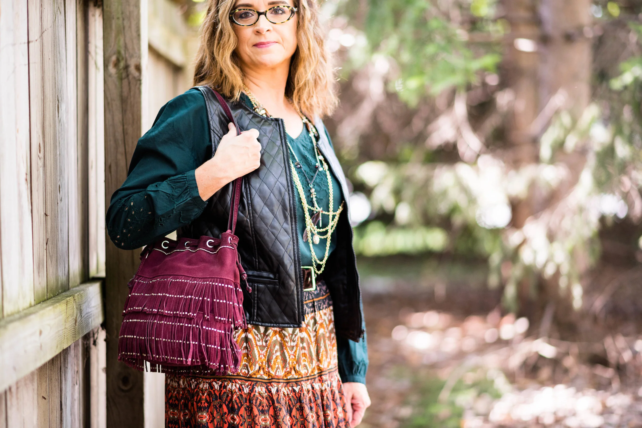
2. Know your style. Everyone has some sense of style. You might disagree with me, but even the people who don't look like they have any style are, in fact, promoting a certain style. Here is a great blog post from StyleWe - Ten Types of Fashion Styles. This article gives good descriptions of what each style is and also provides pictures. I personally draw from several different styles, including, Chic, Casual, Tomboy, and Preppy while pulling a little bit from Bohemian, and Rocker. Knowing your style can help you to dress for that date, whether you are single and looking for new love, or in a relationship and wanting to make an impression on your significant other. 

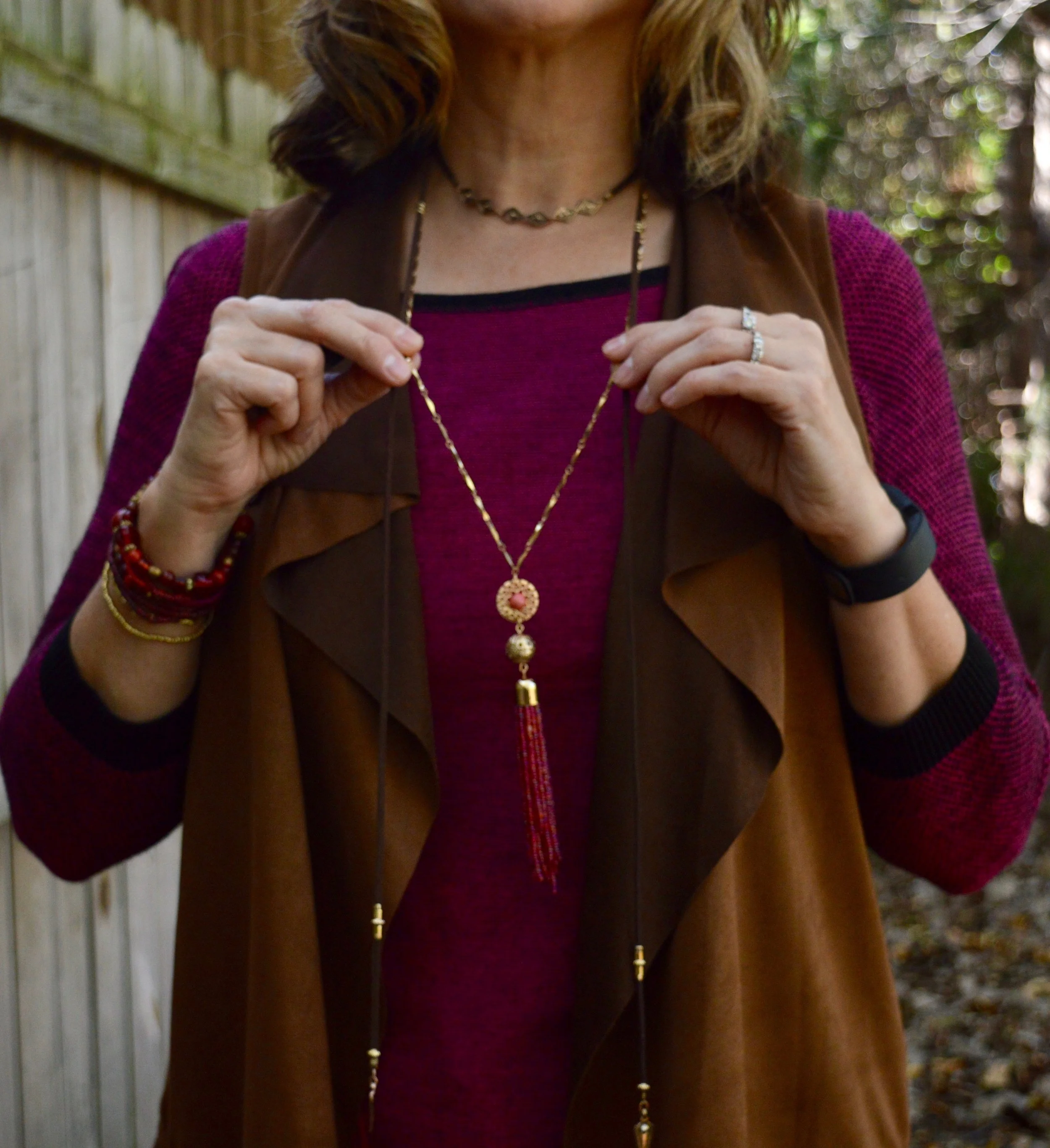
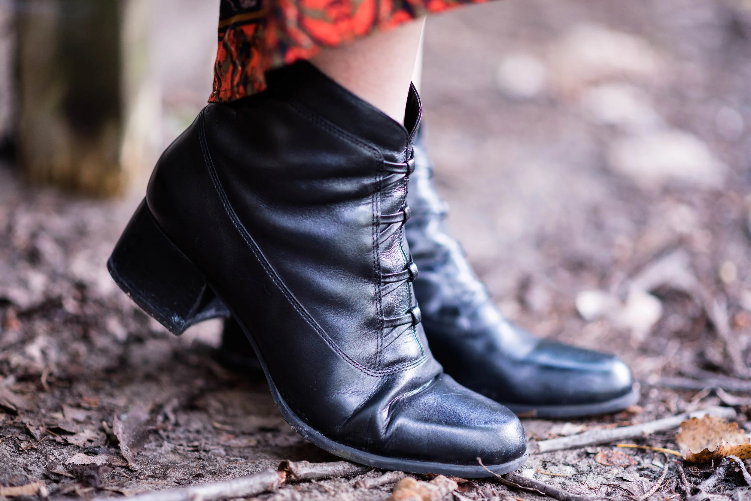
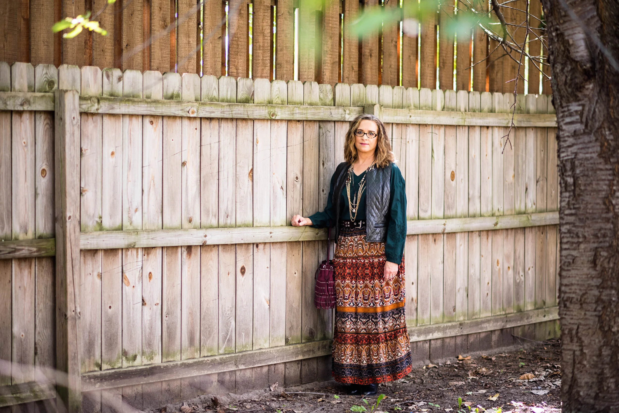
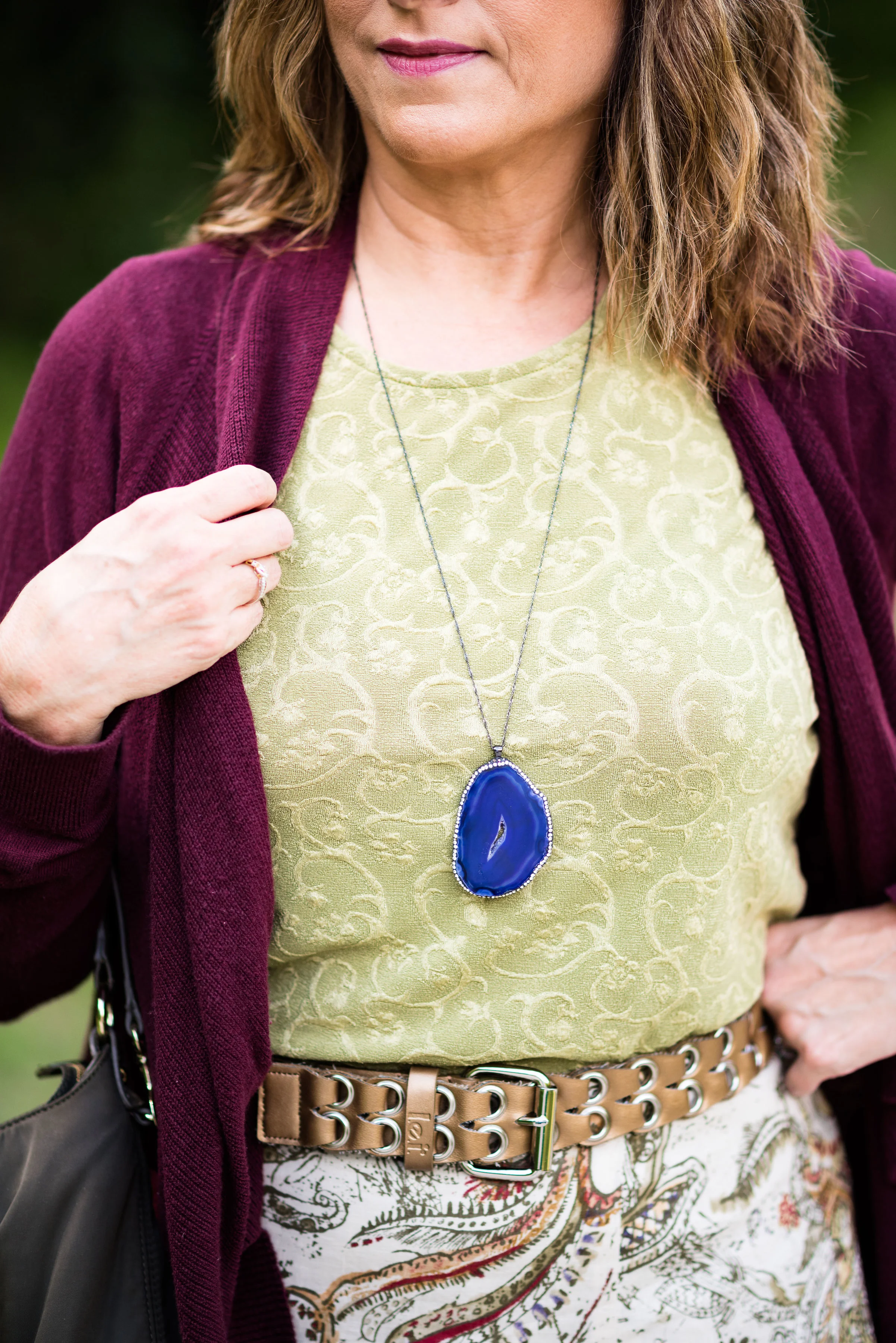
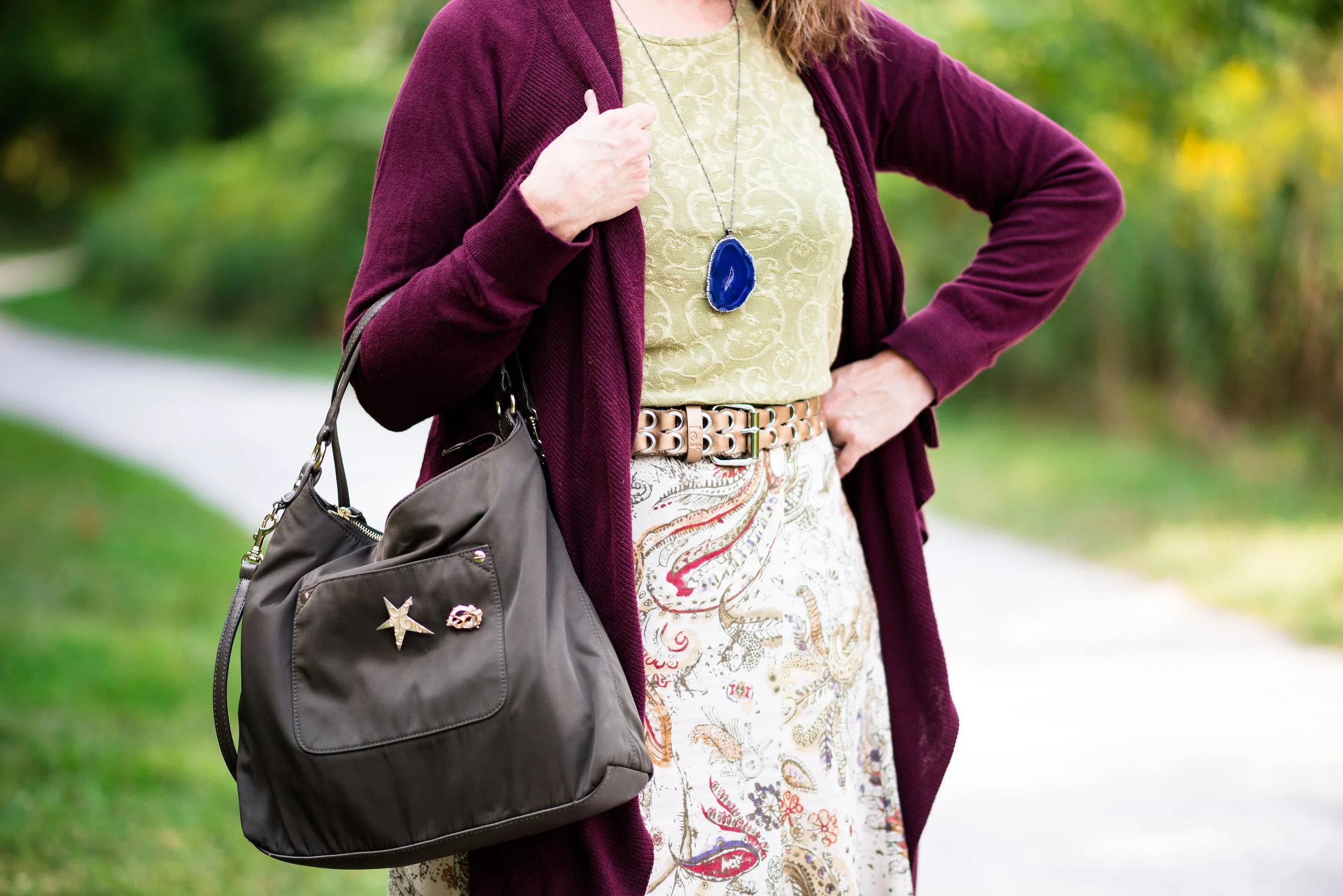
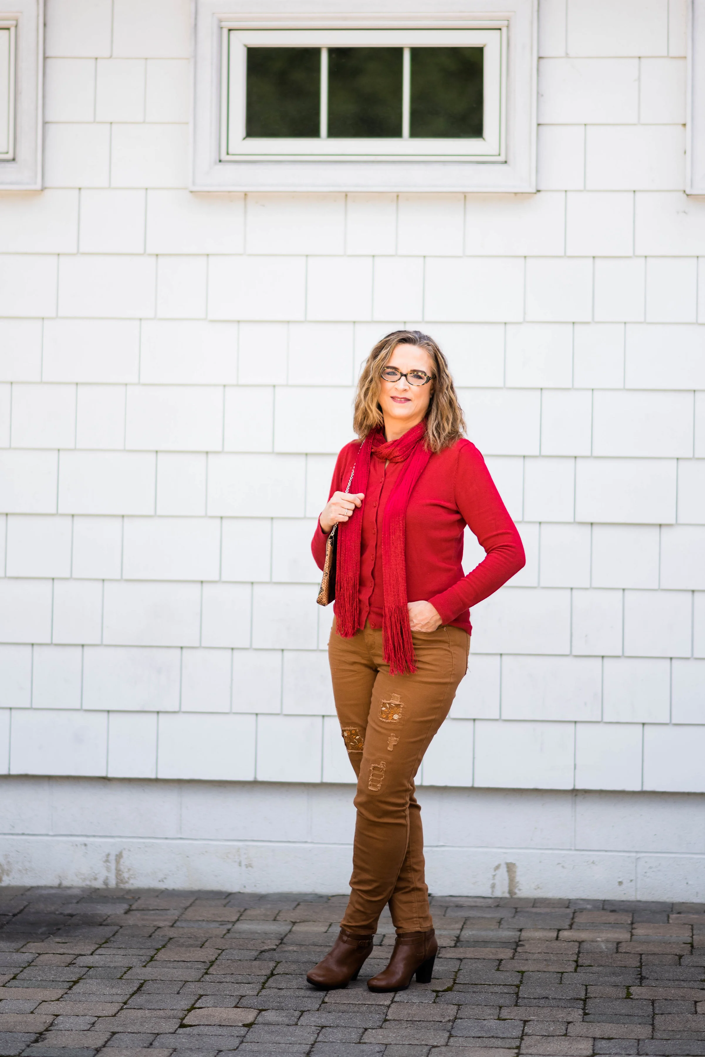
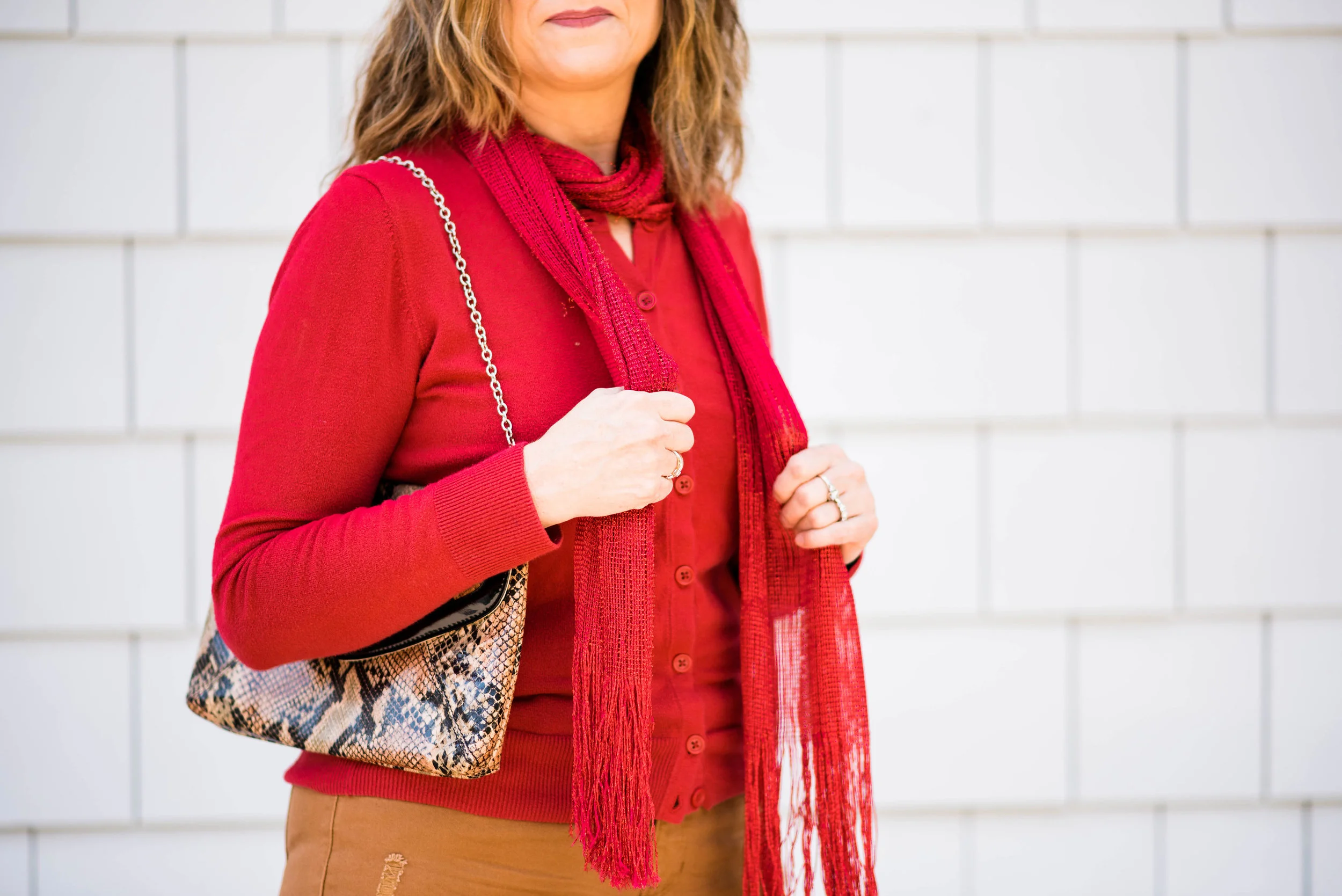
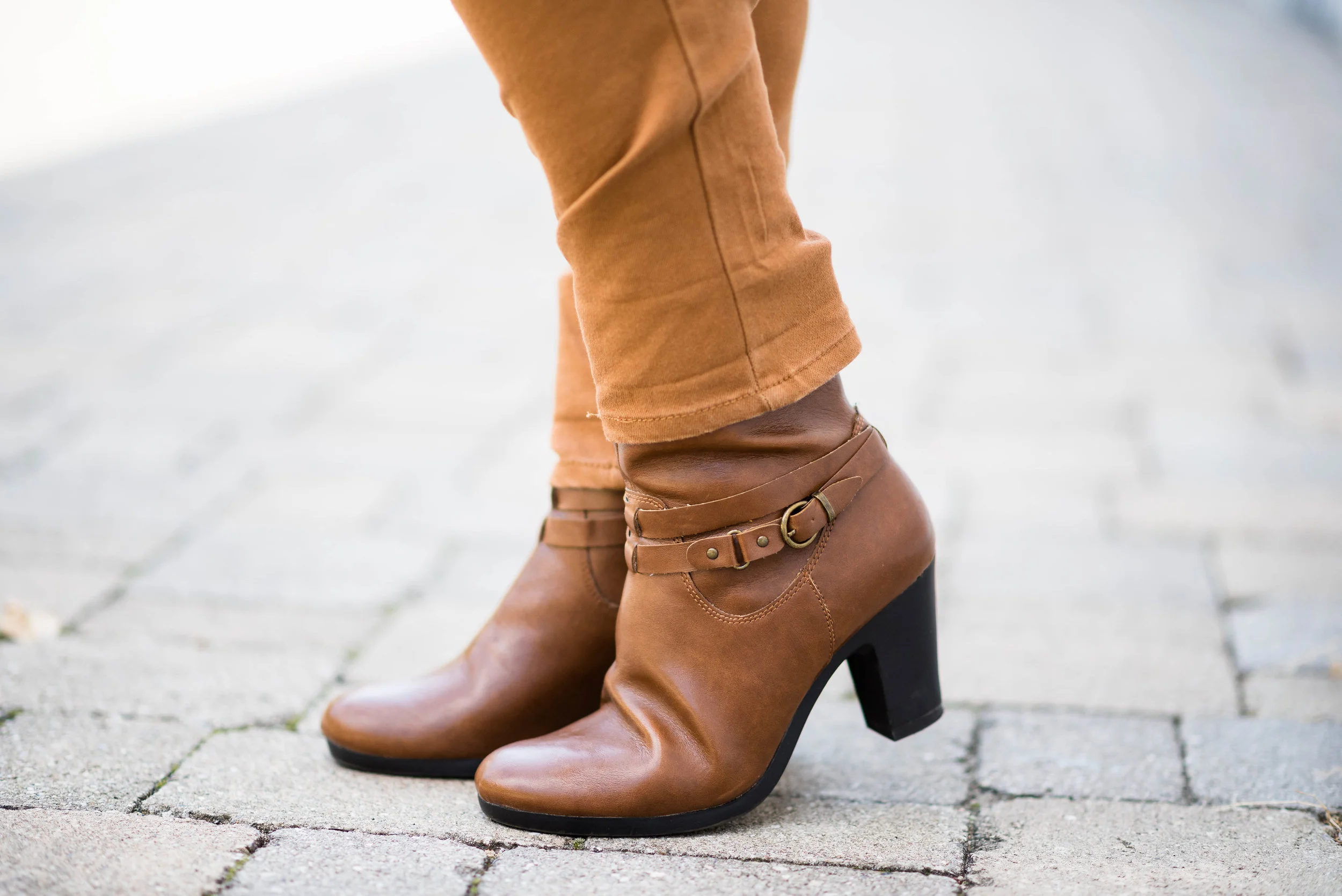
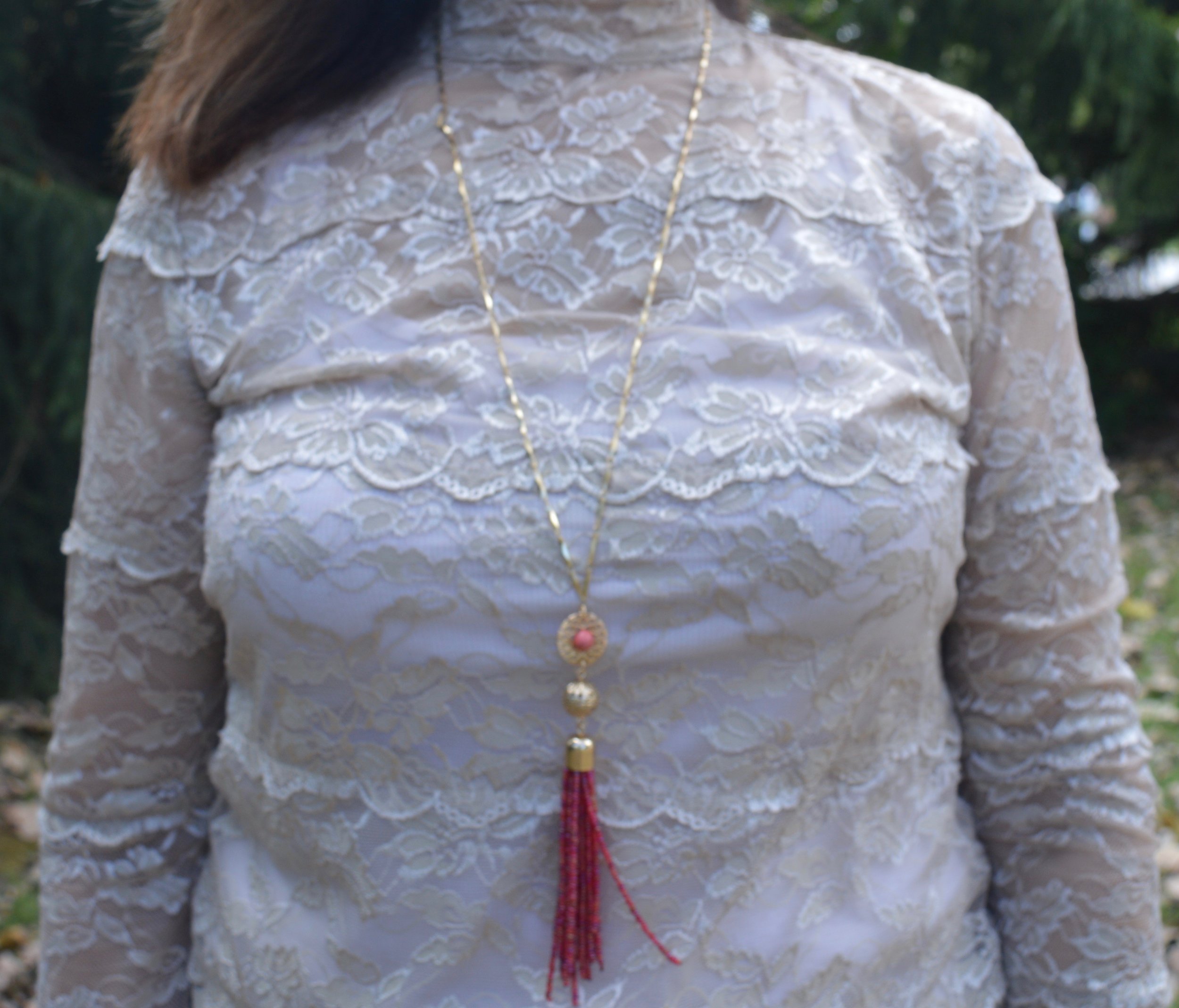
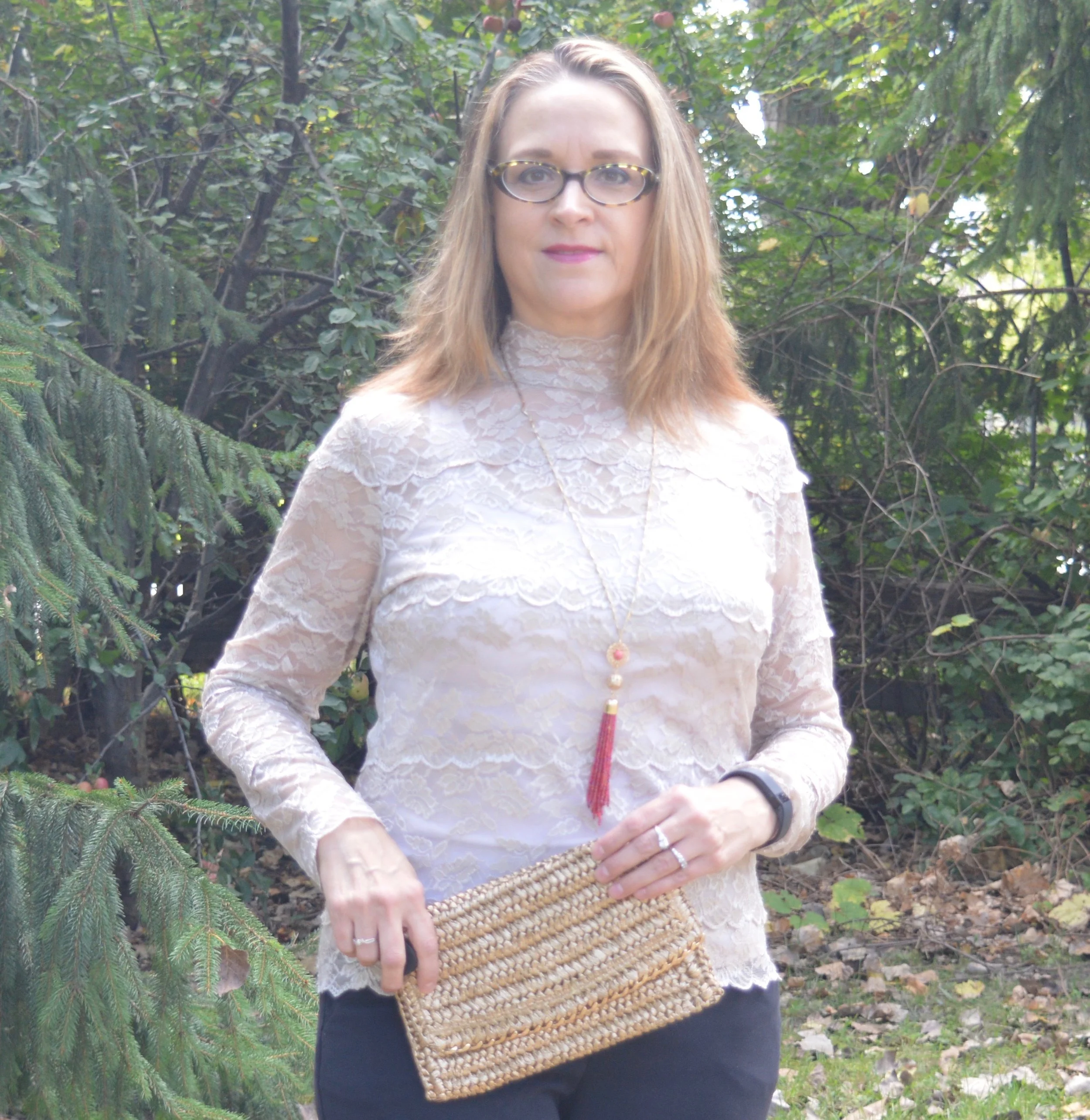
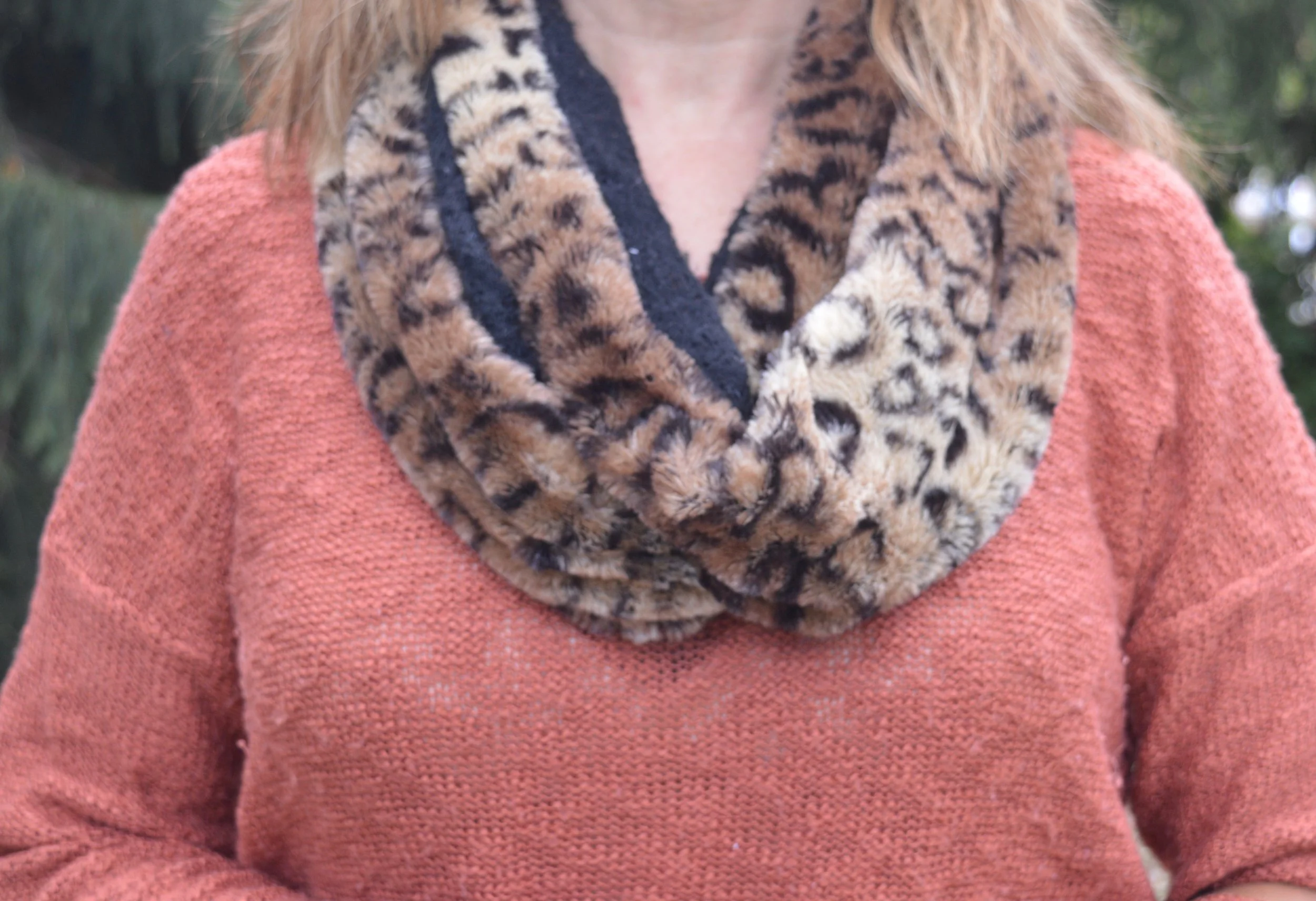
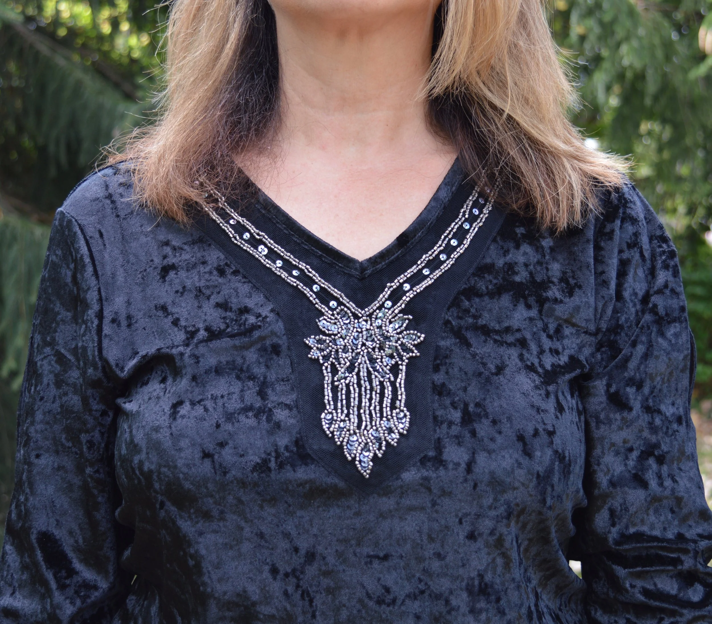
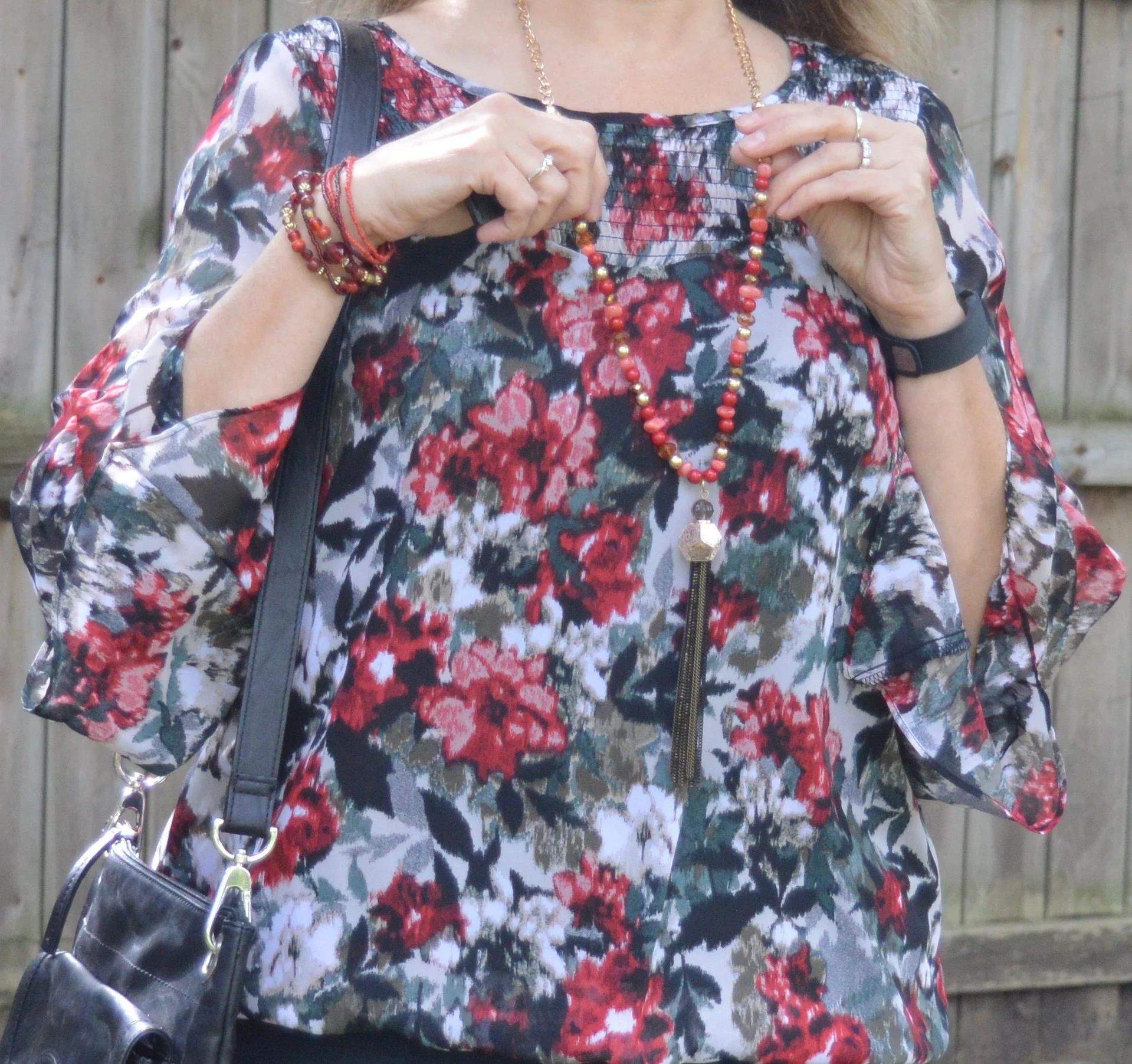
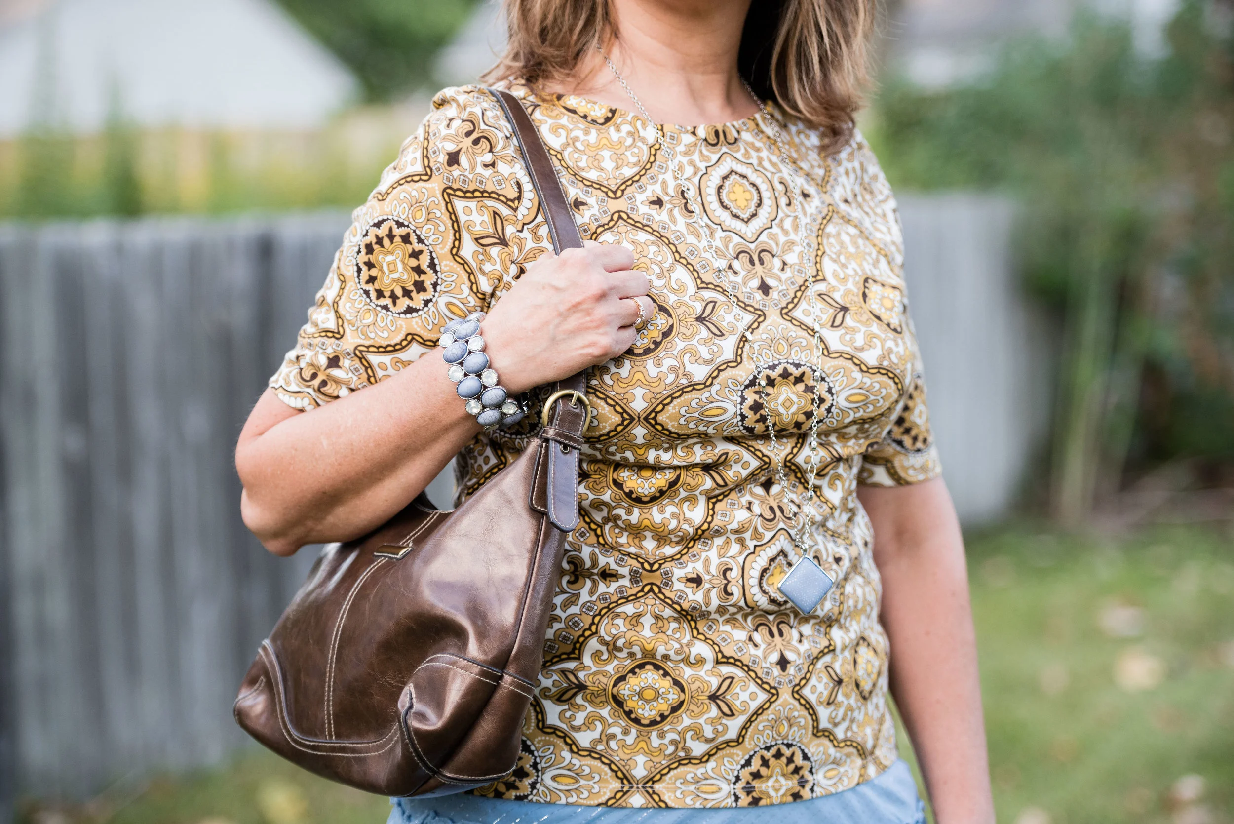
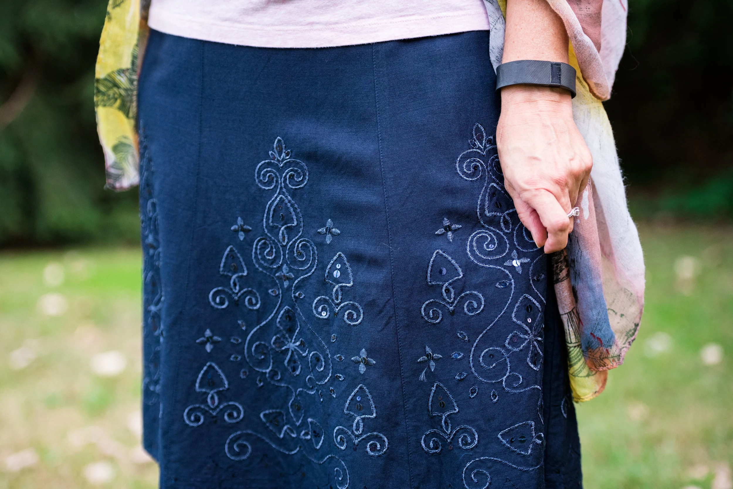
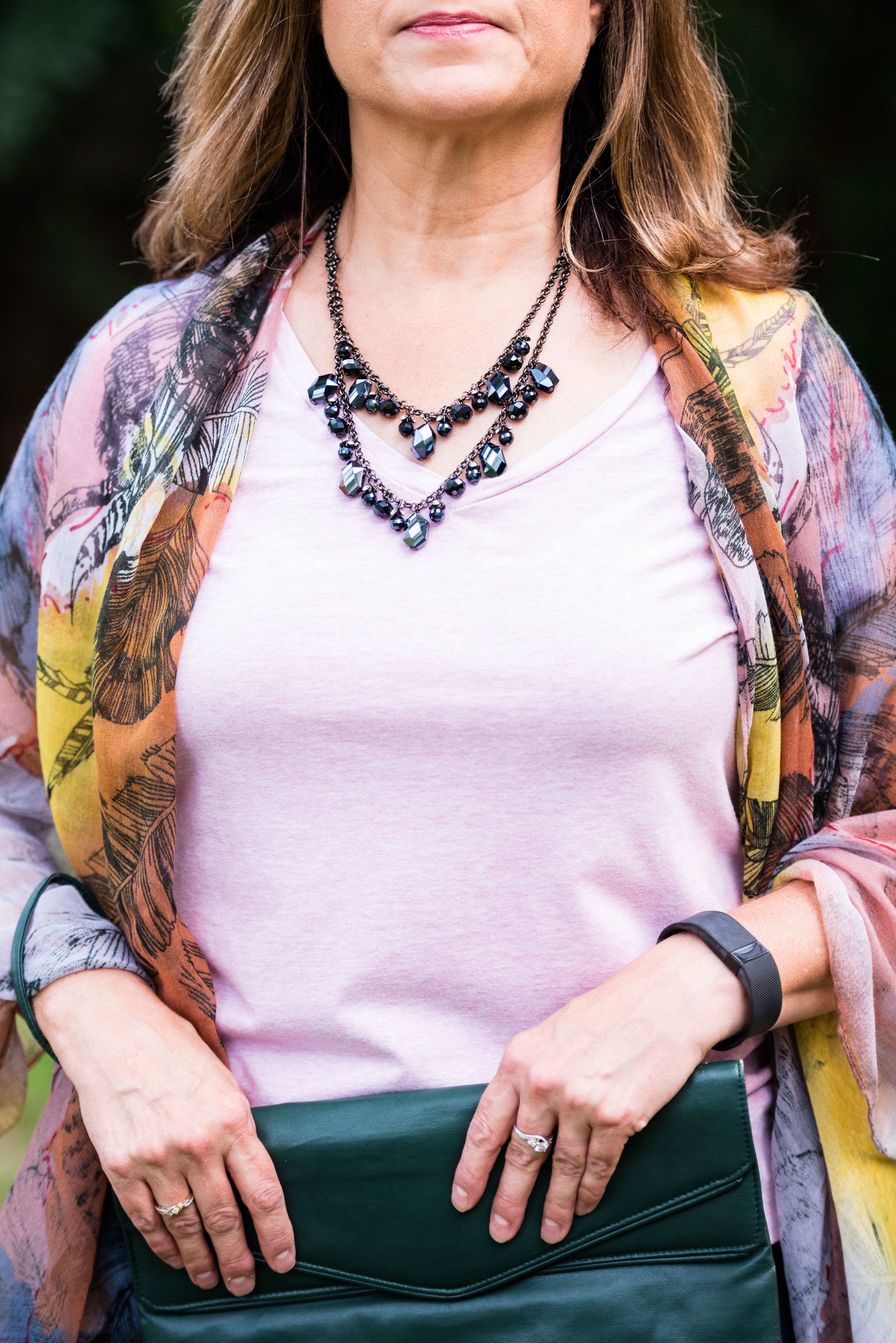
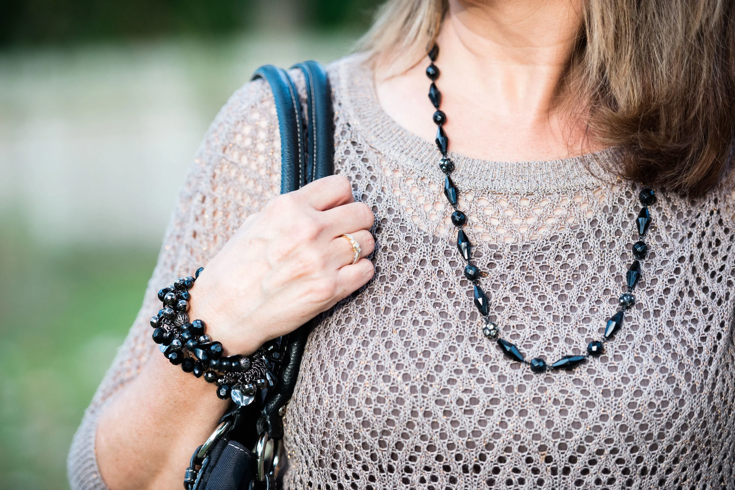
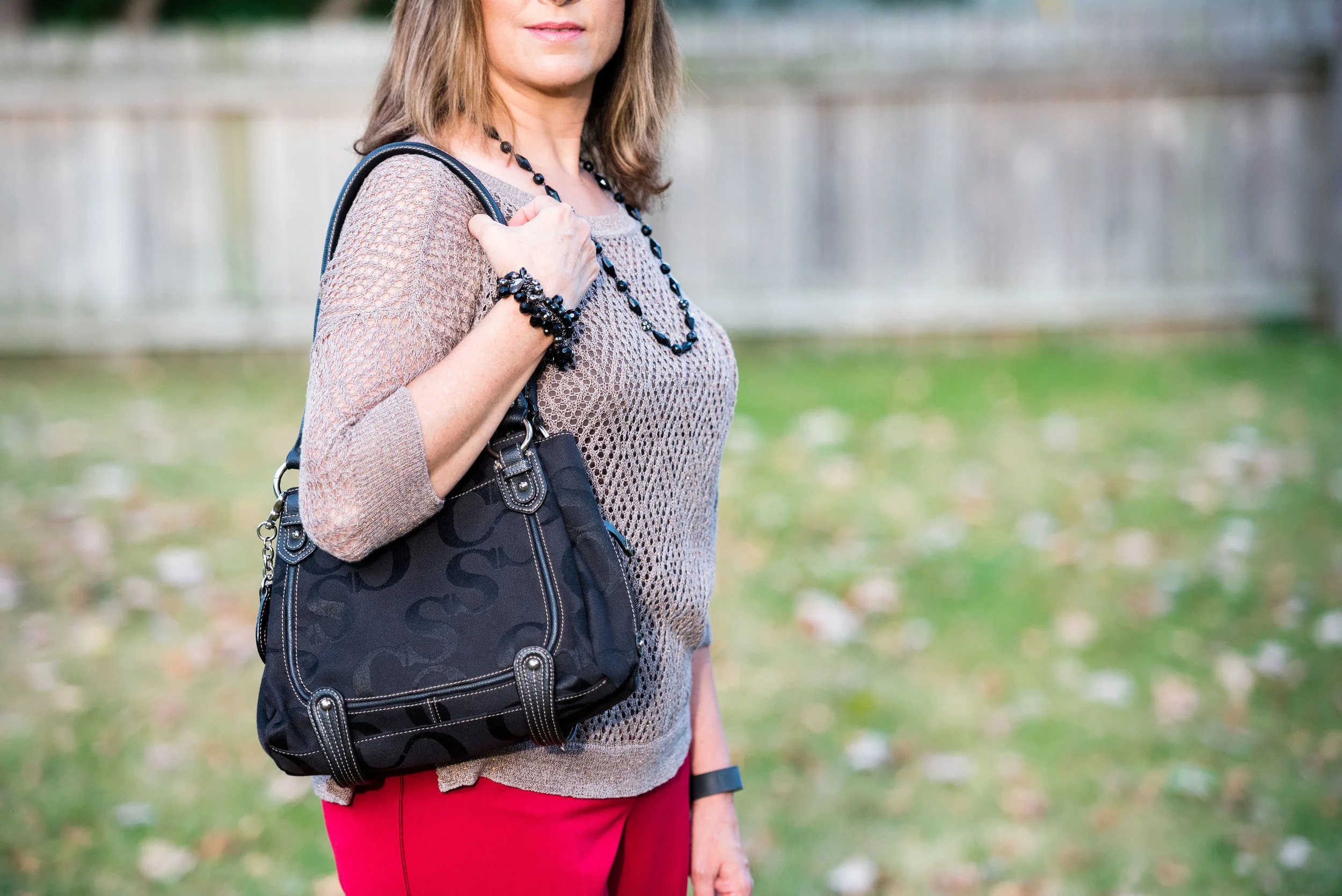
3. Be yourself, but add some change. As an older person who might be thinking about dating again you might think you need to reinvent yourself, but that can be an overwhelming task. It is better to remain true to who you are and your original style, but try adding something new or different to your look. Maybe you don't accessorize much. Try adding a statement necklace or a scarf to the outfit you are planning to wear. Go out and buy a great pair of heeled booties or a new bag. Not only will it bring your outfit up a notch it will give you a much needed boost. You may be recovering from a messy divorce or the death of your spouse. Treat yourself to something new that will flatter you and make you feel beautiful. Charming Charlie is a great retail place to look for a statement piece and not break your bank account.

4. Know where you are going on your date. Knowing where you will be going and what you will be doing is very important on a first date. Keeping your first date public is a good idea. Unless you are meeting someone that you have already gotten to know through work, church or other social gatherings, I think it is just wise to be out and about where other people are when you first meet someone, both for safety reasons and for your own well being. 

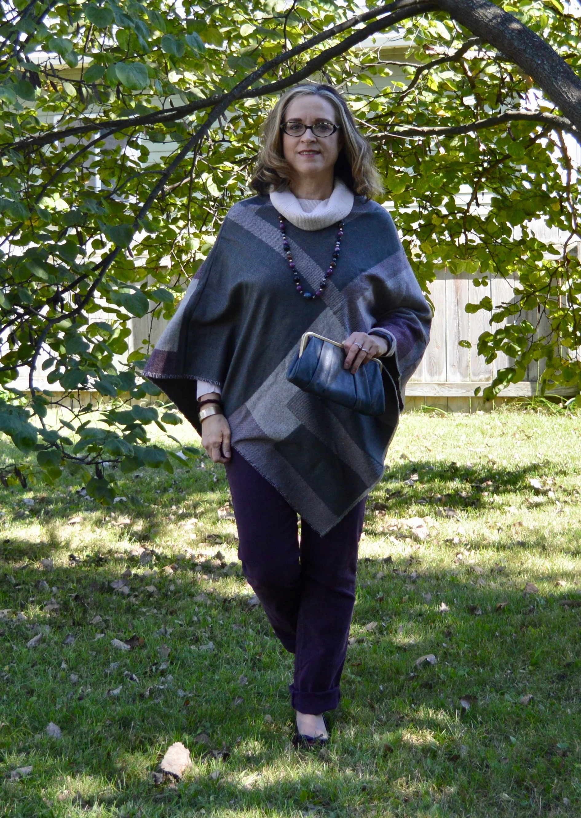
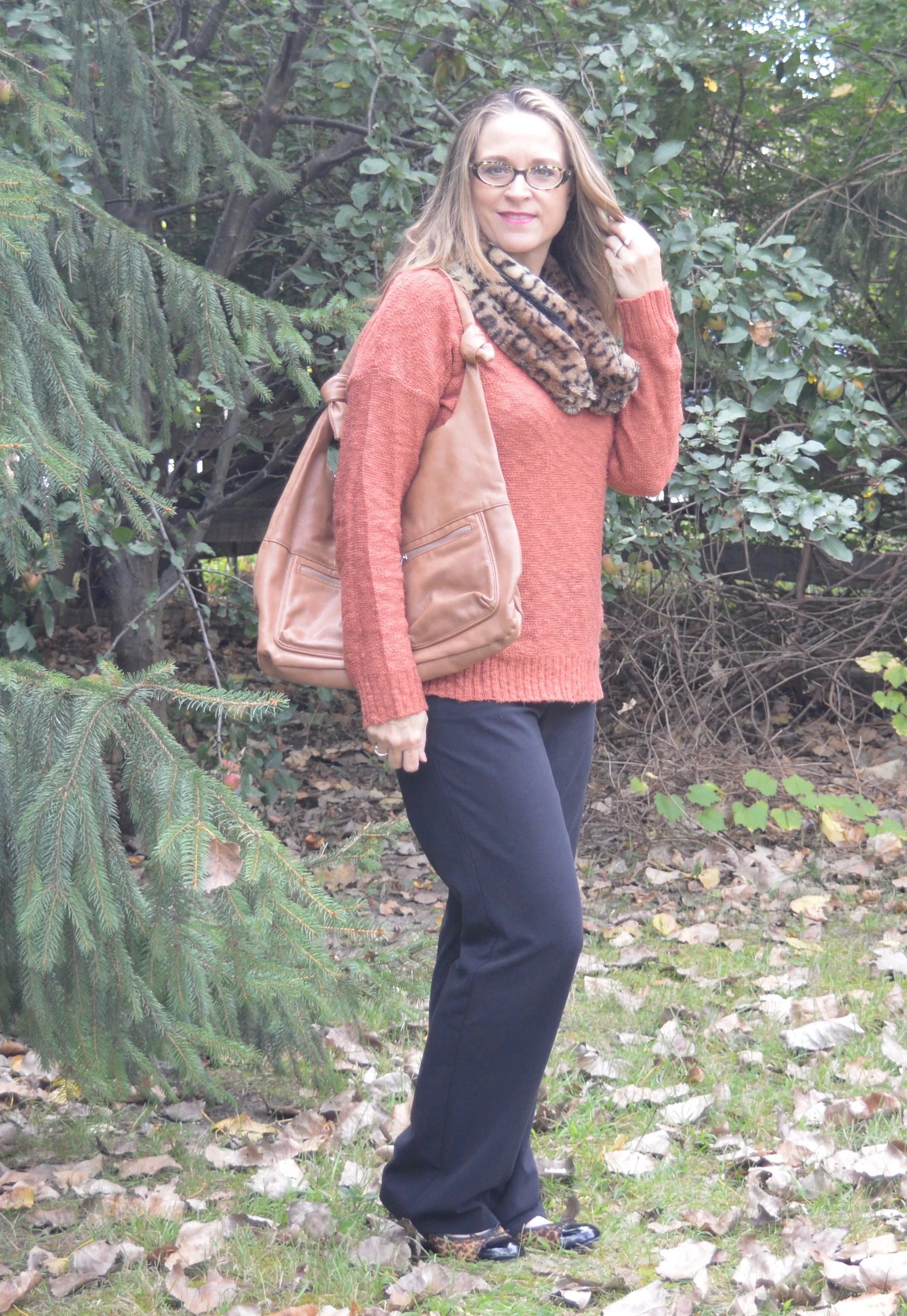
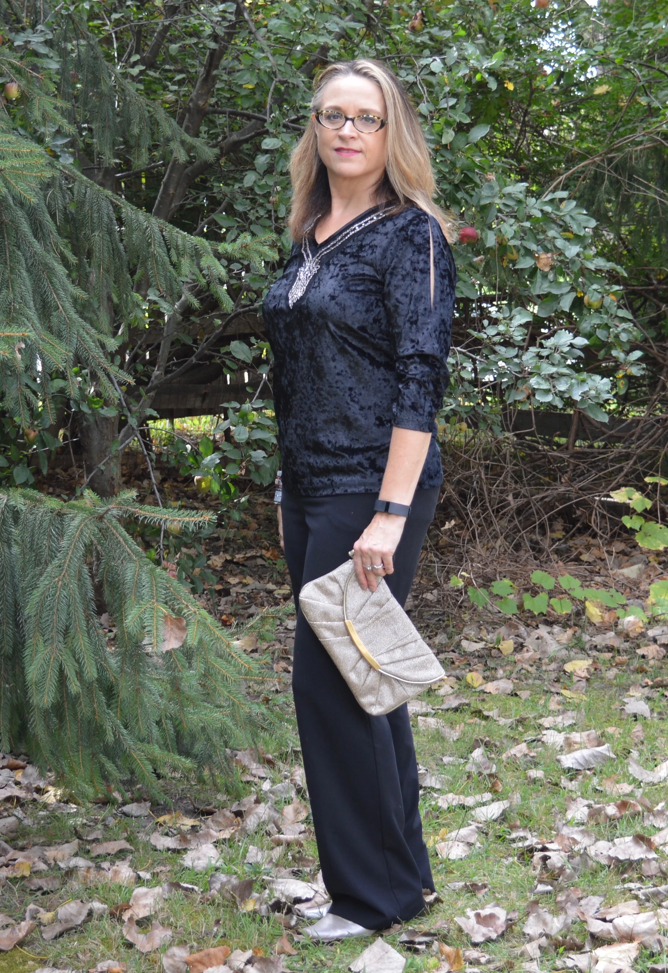
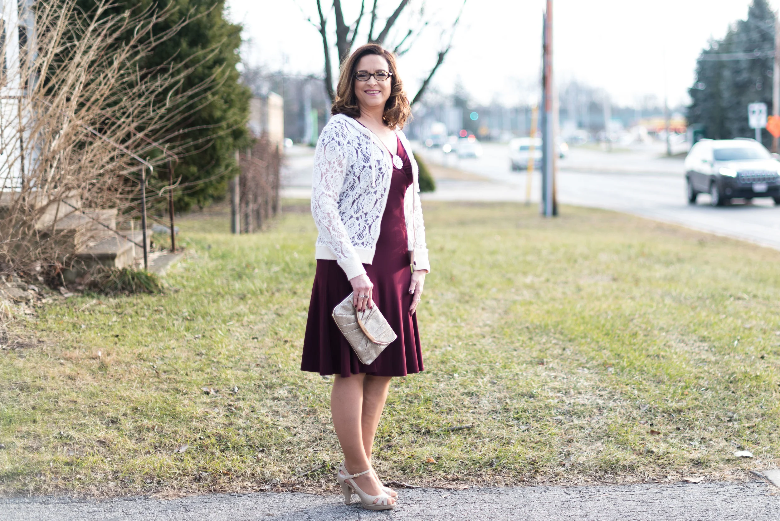
Knowing where you are going will give you the confidence to better choose the right outfit for that first date. If you are going out for dinner and to the theater, make sure you know what that means. Are you going to McDonalds and catching a movie? Then you probably don't need to reach for that black dress and heels. Are you going to a park to do some hiking? Better think about jeans and hiking shoes. All of these choices will be affected by what time of year it is as well. Winter will mean more layers and summer will warrant light, flowy fabrics so you are not embarrassed by sweat and body odor. 

5. Dress comfortably. When I say the word comfort I am looking at it from two different angles. First of all, you want what you wear to not be too small, too large, too hot, too cold, etc. The worst feeling is that you are going to melt because you are having another hot flash, or that you can hardly sit down after dinner because your Spanx are too tight. For the men out there, a button up shirt that is ready to pop is not attractive, and neither is your open fly. Have the courtesy to check yourself over, so you don't embarrass yourself or your date. 

The second meaning for the word comfort has to do with how you feel about yourself, the person you are meeting and the whole dating situation. If you normally don't wear low cut tops, then don't start now. If you hardly ever don a dress, then reach for those stunning black trousers that make your behind look fabulous. The point is you want to be confident in yourself and comfortable in your own skin. If you are not there yet, then maybe you are not ready for this jump back into the dating arena. 

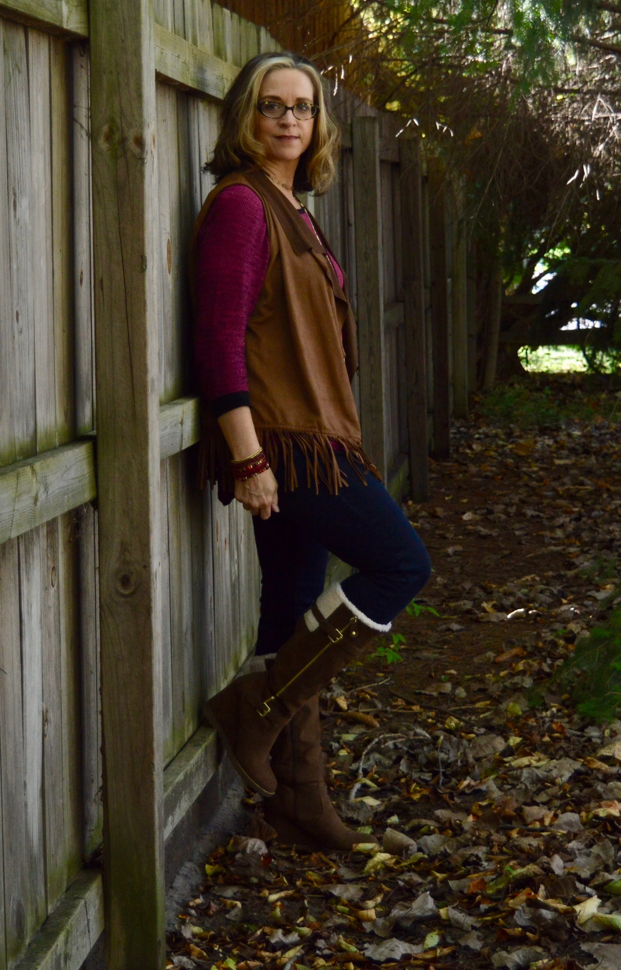
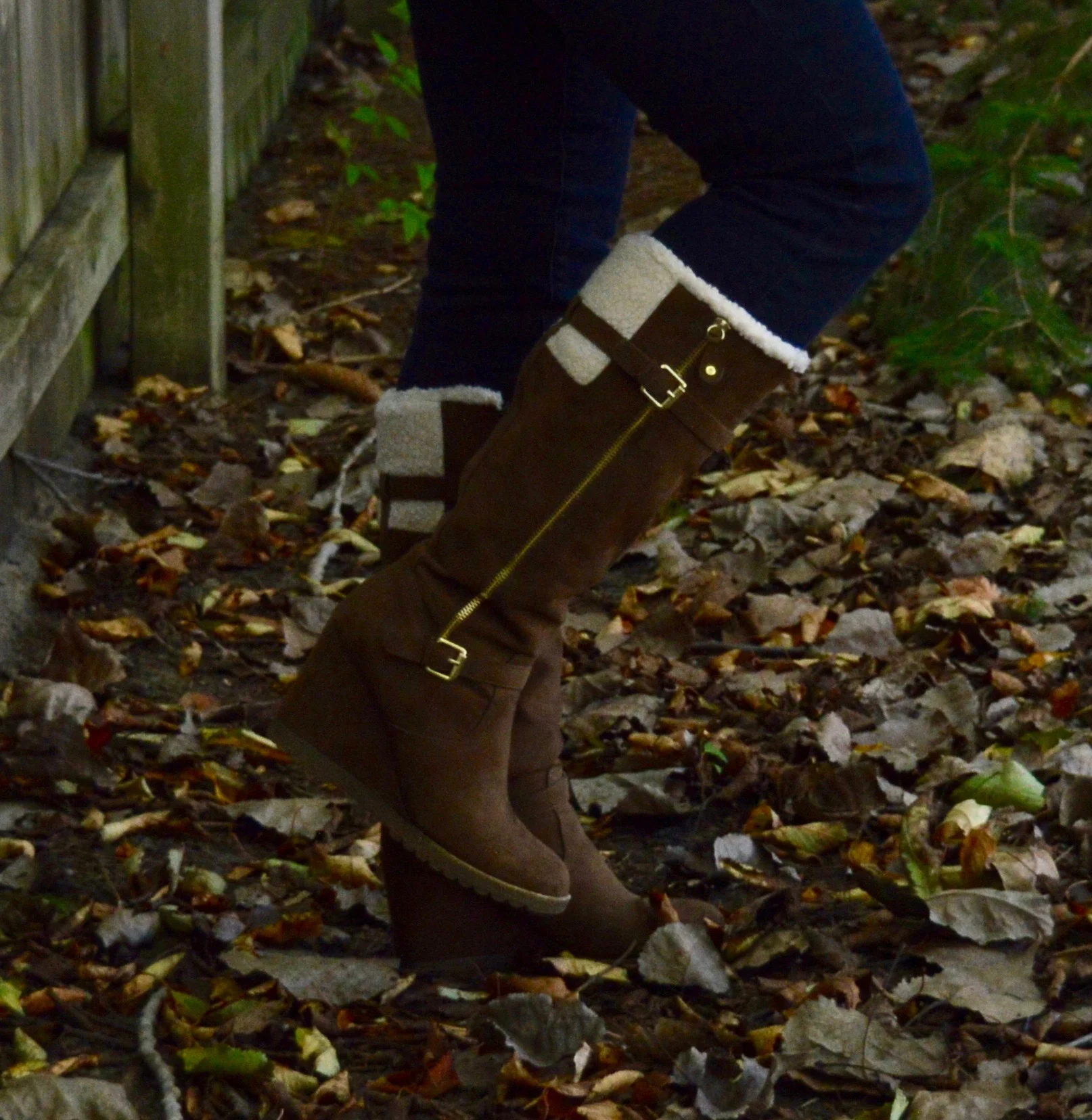
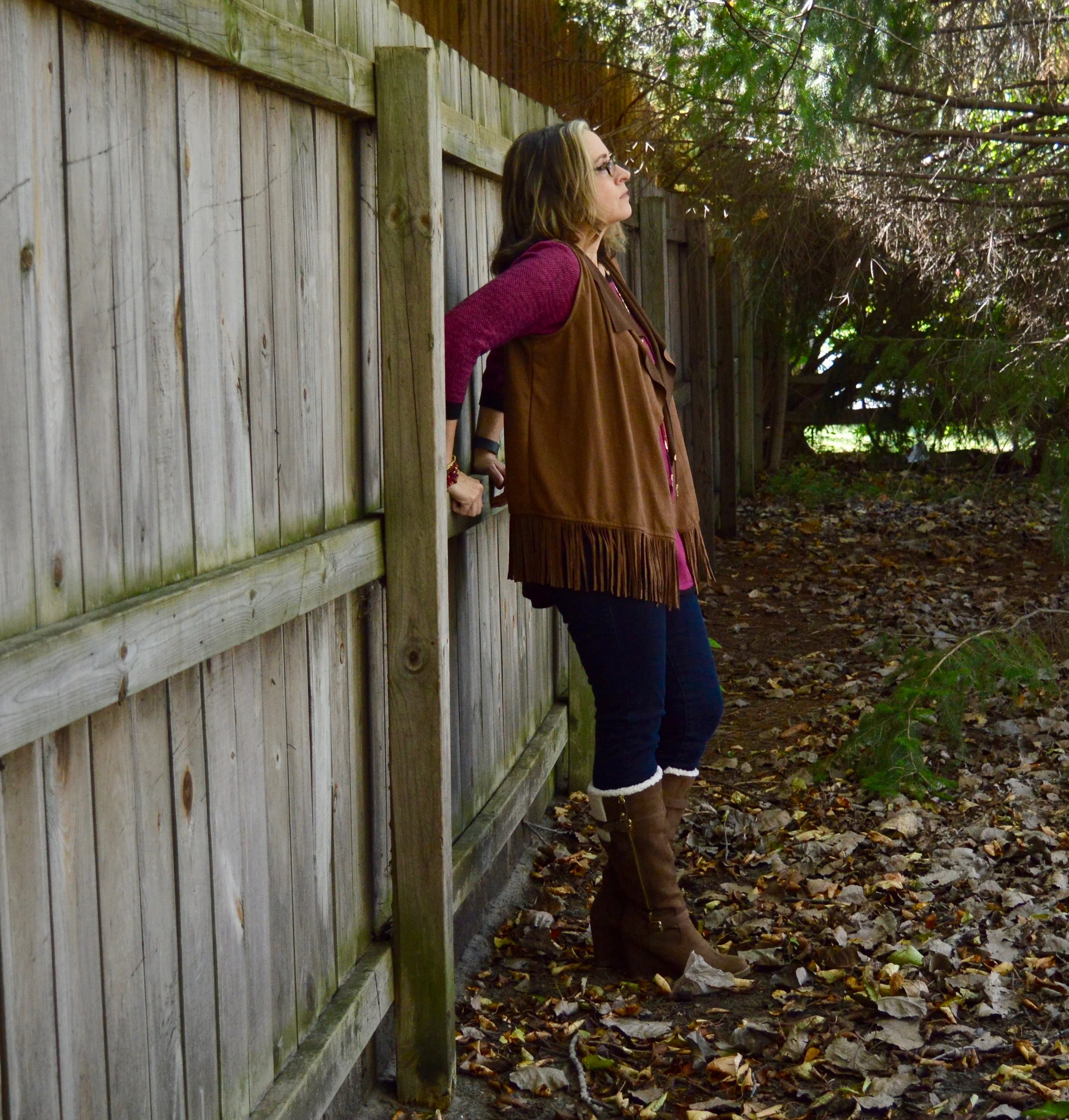
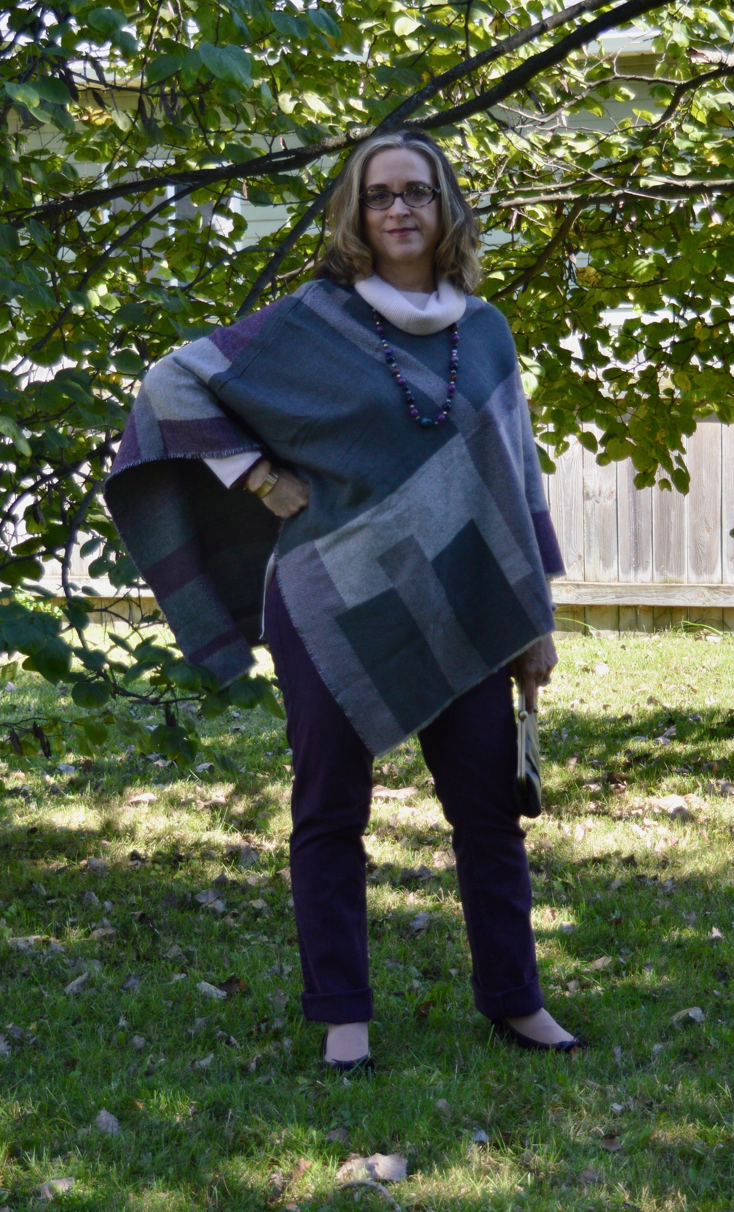
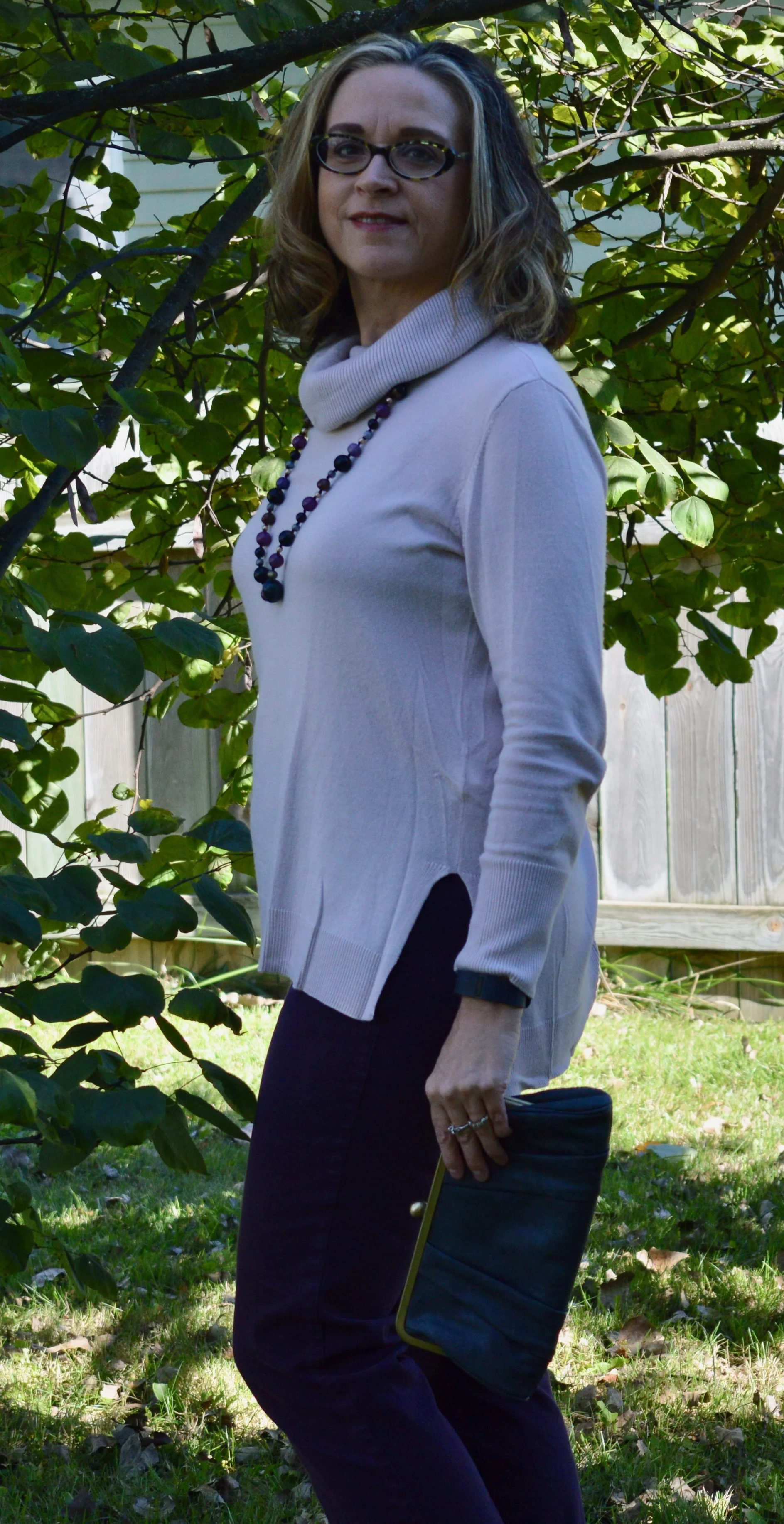
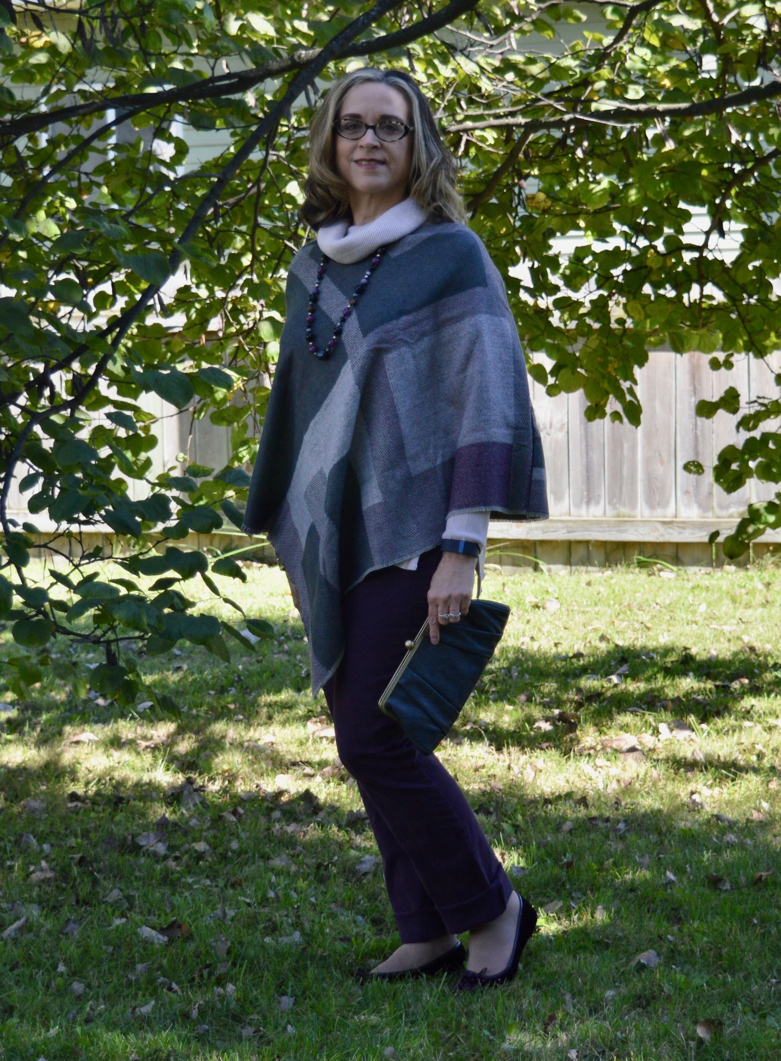
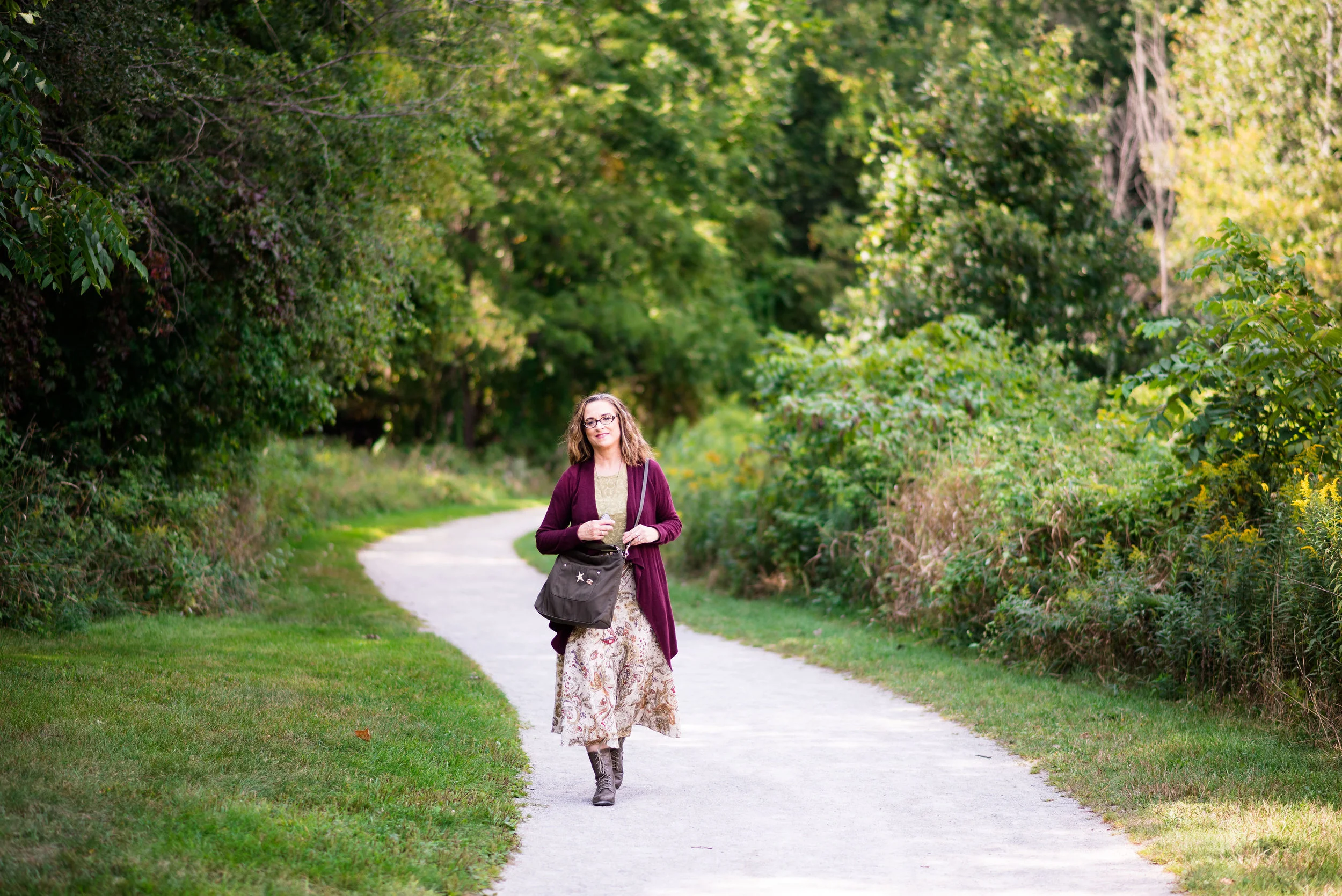
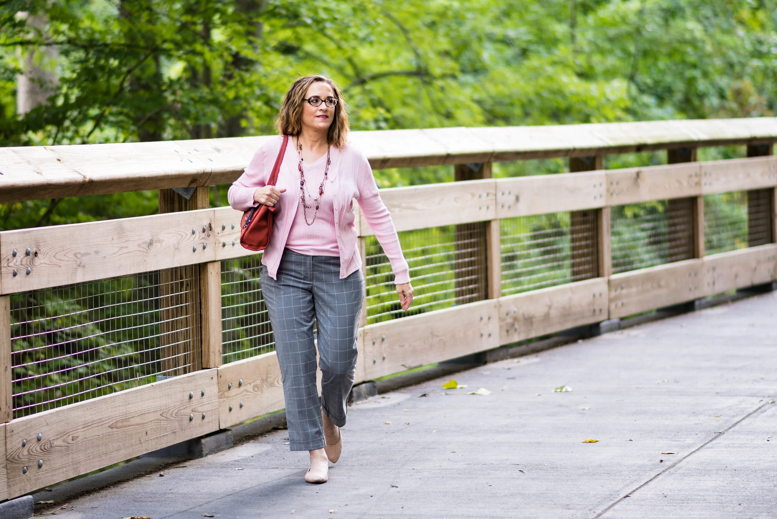
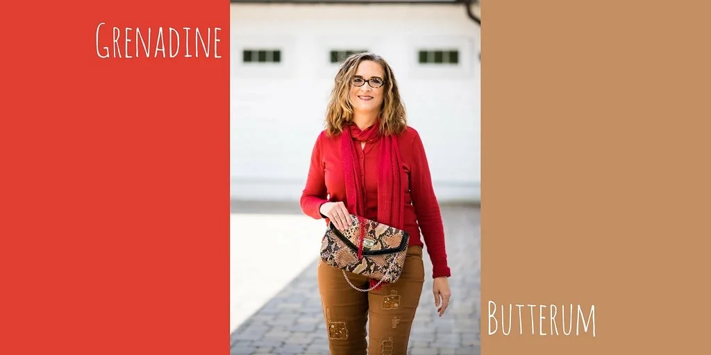
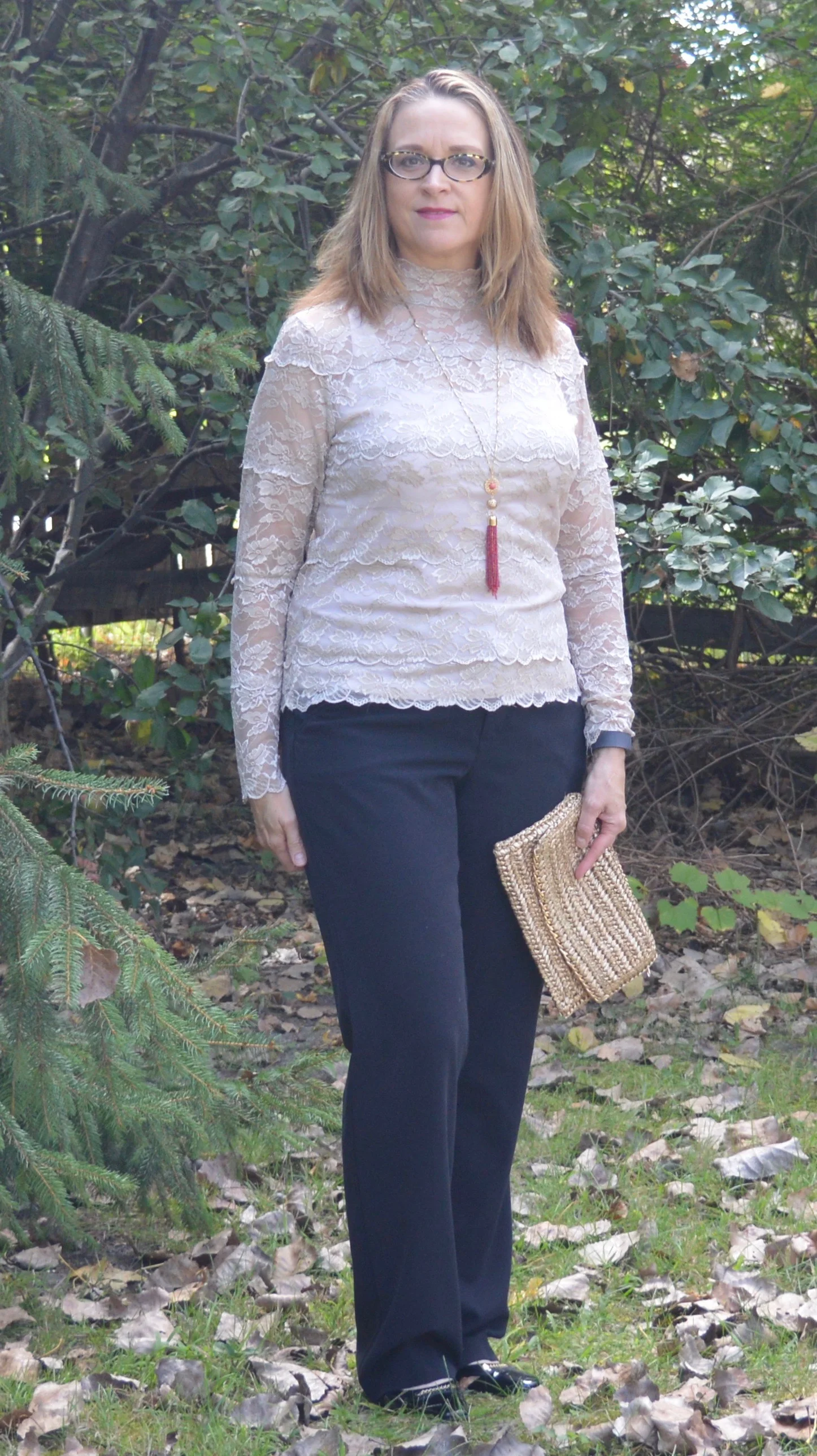
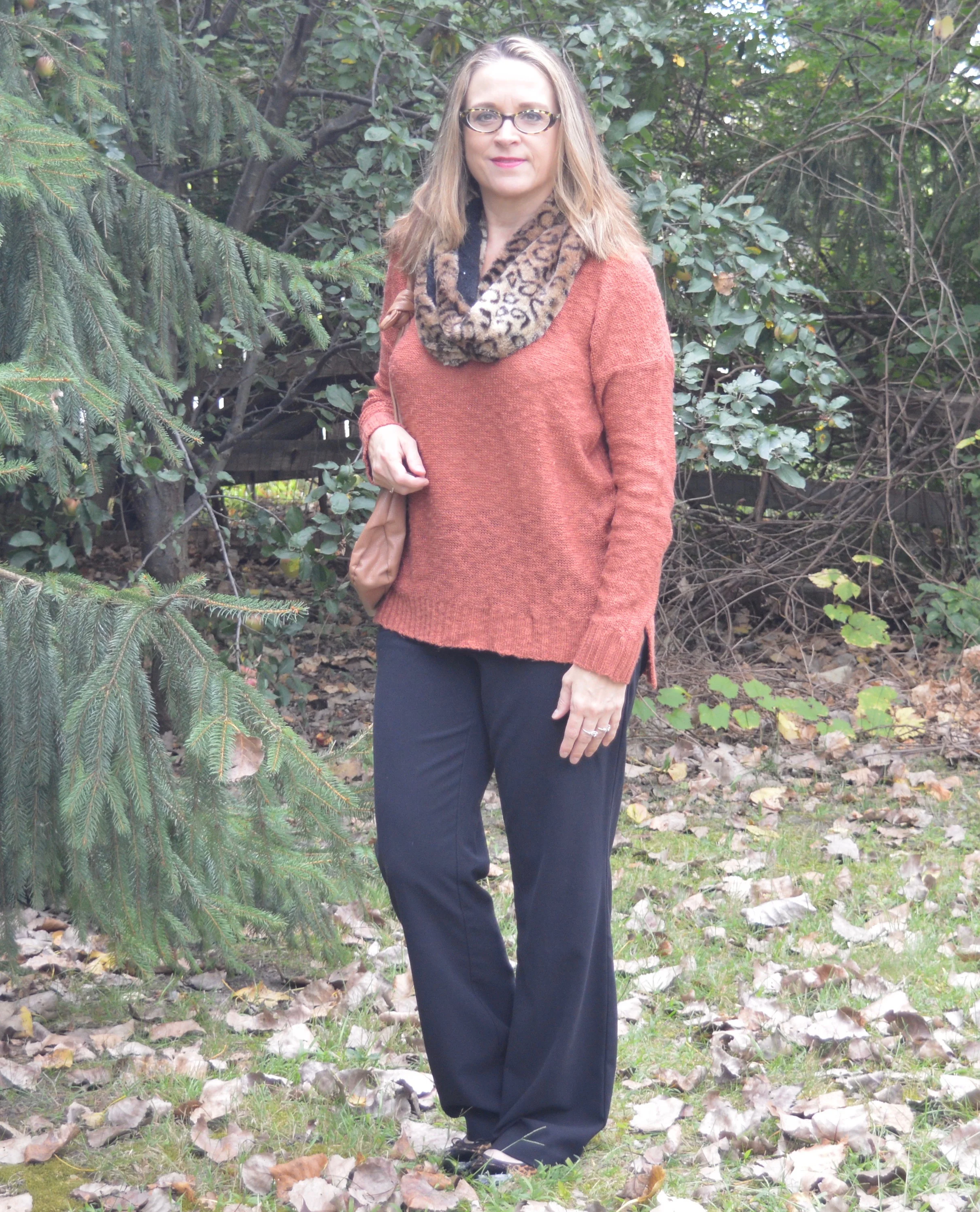
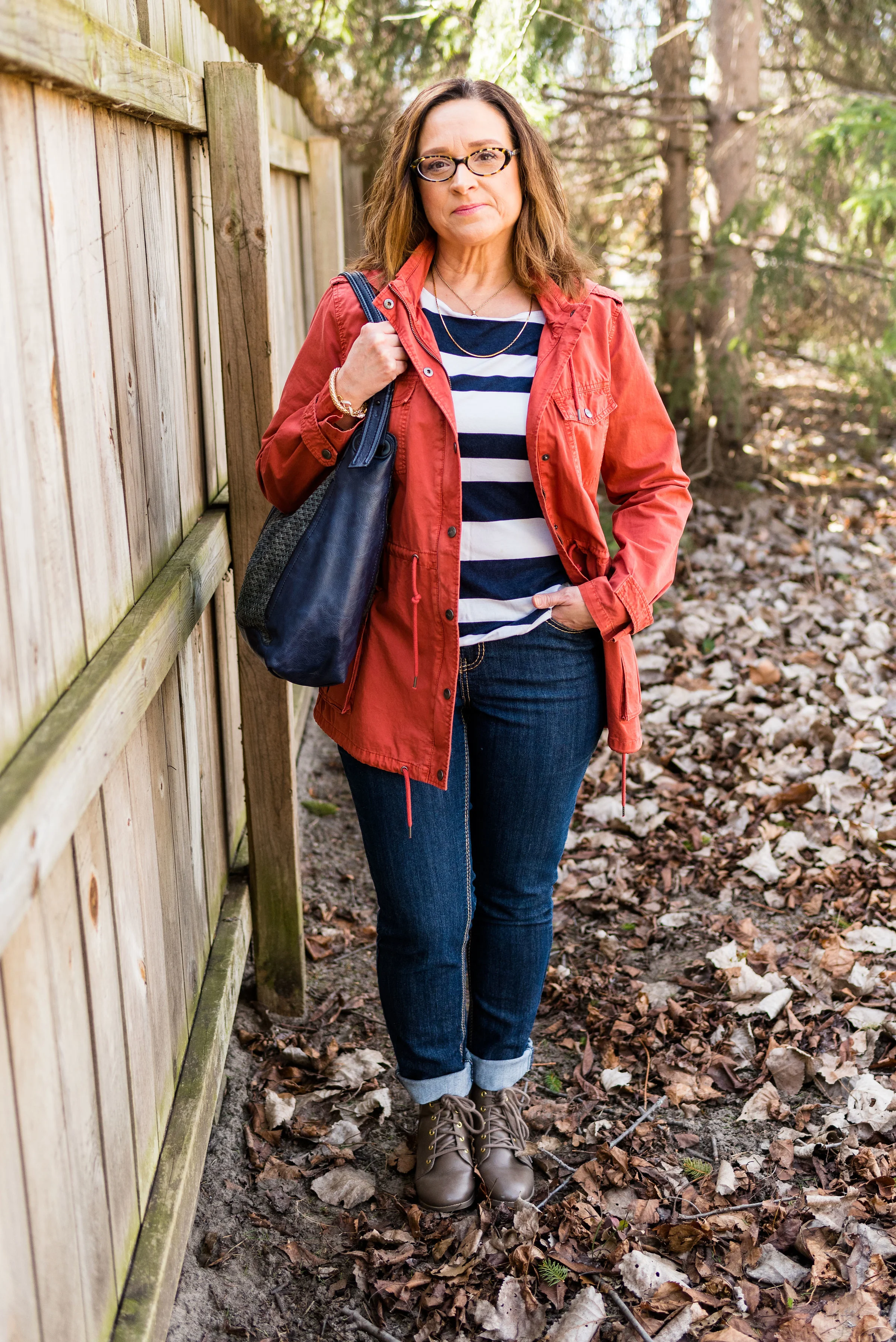
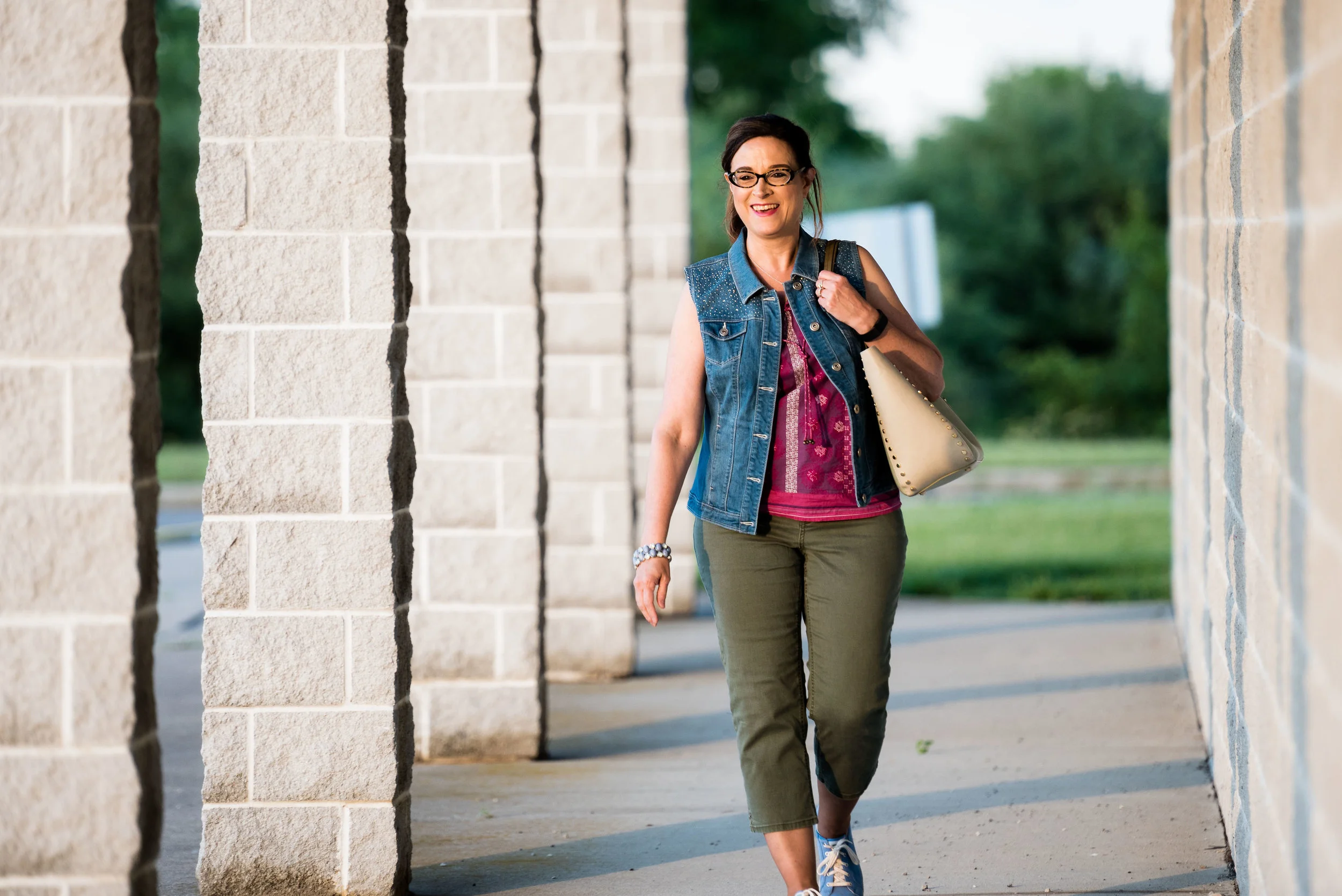
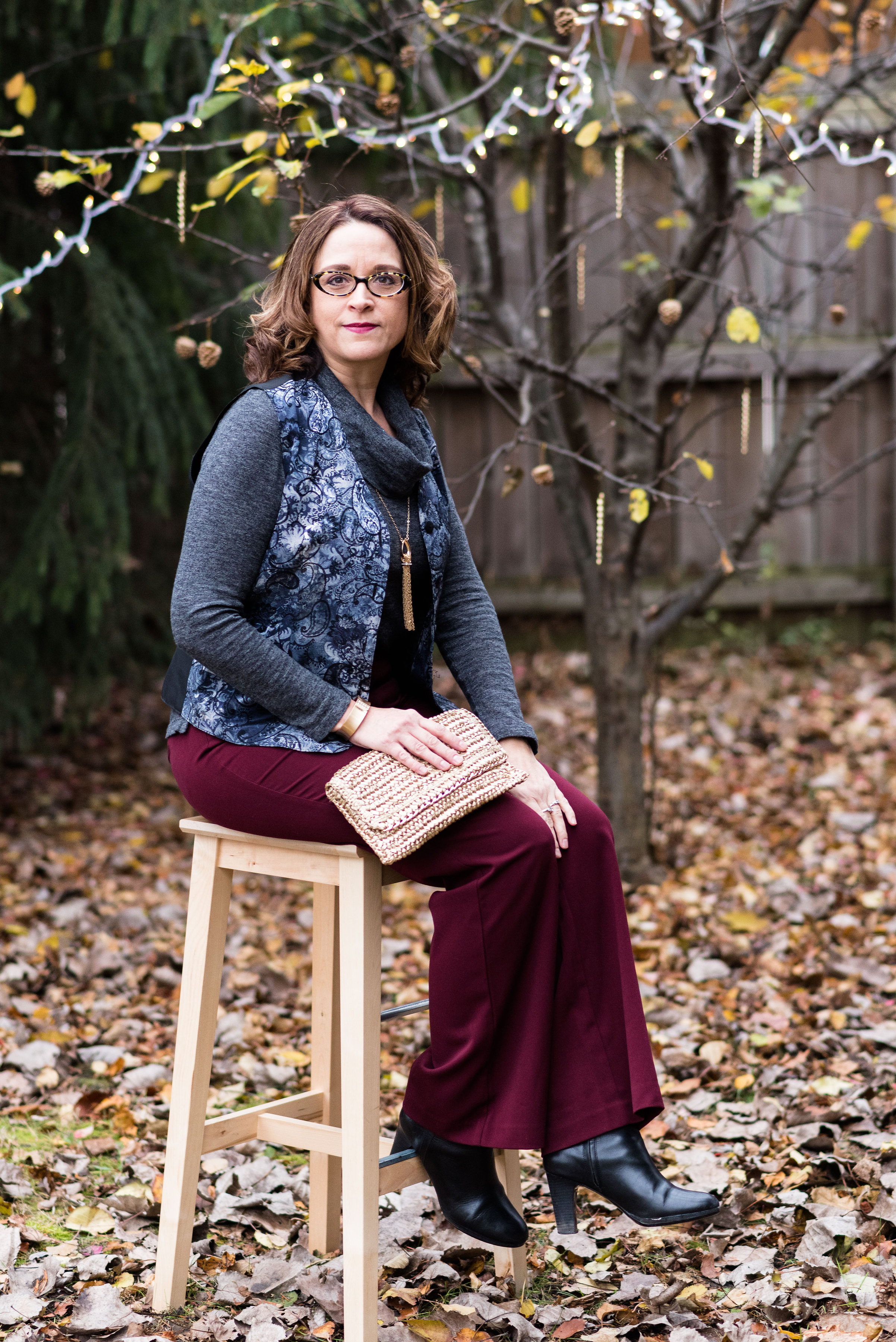
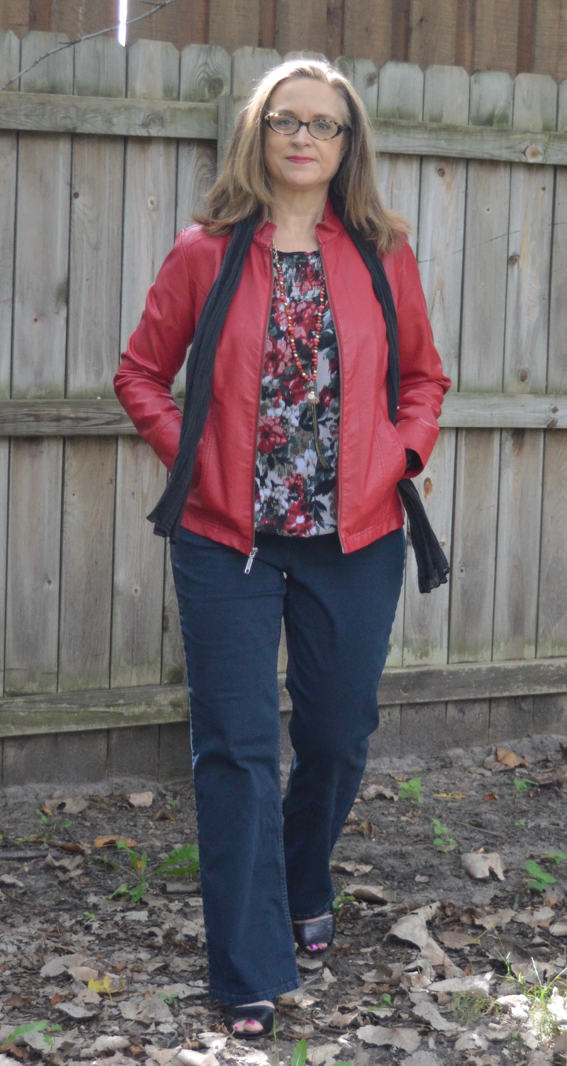
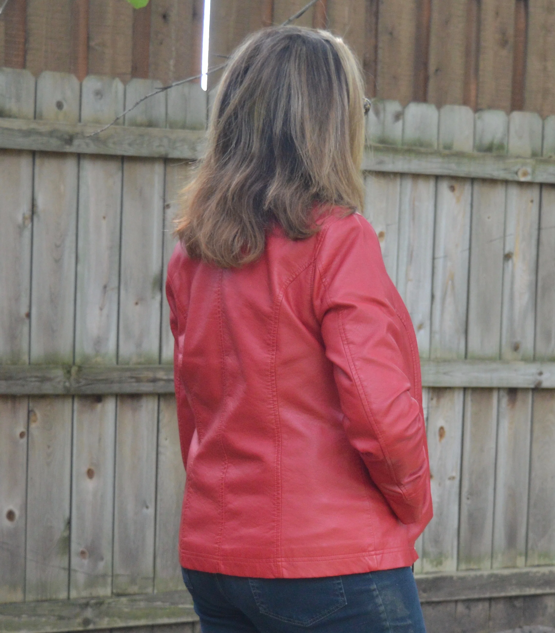
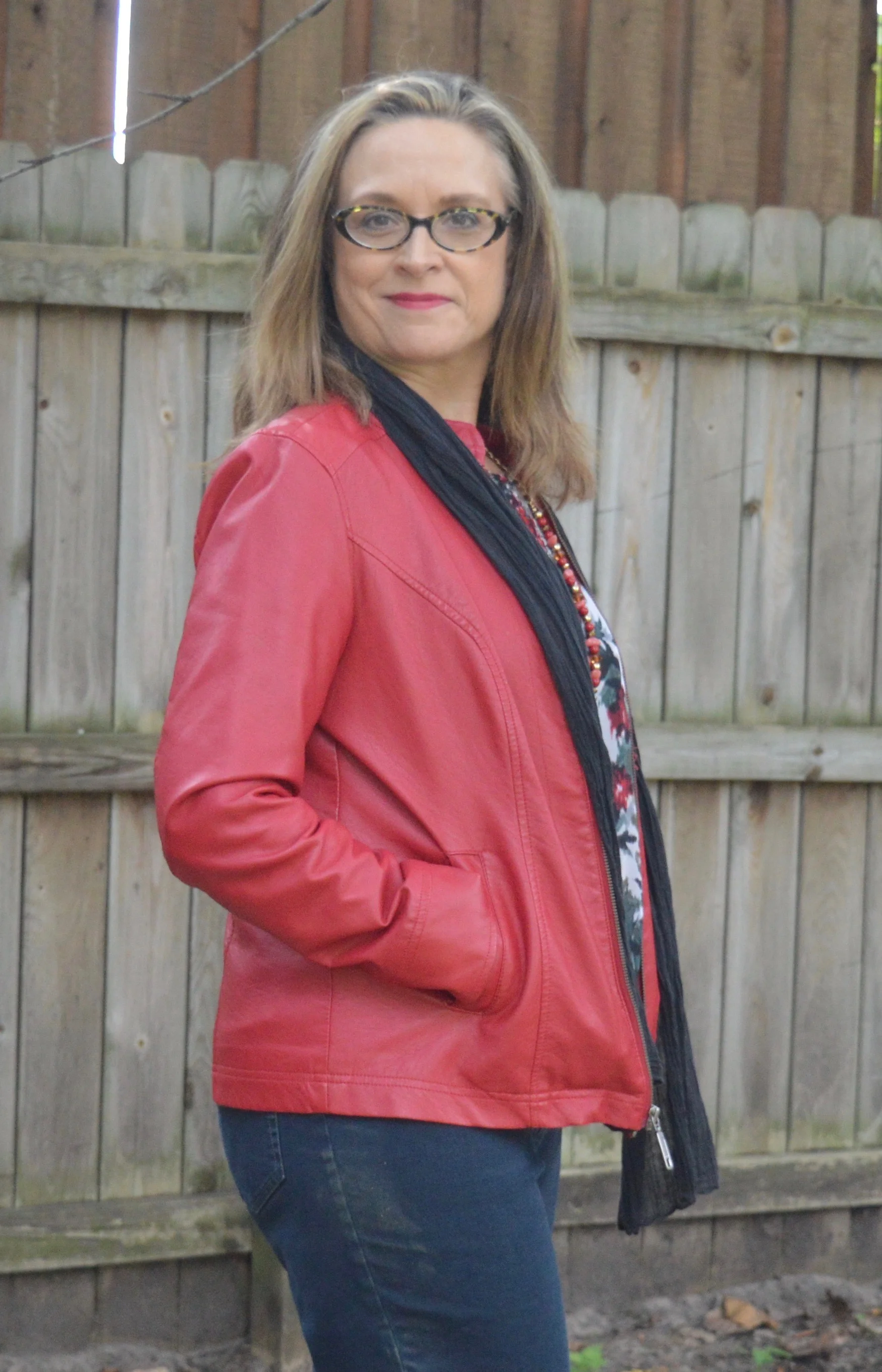
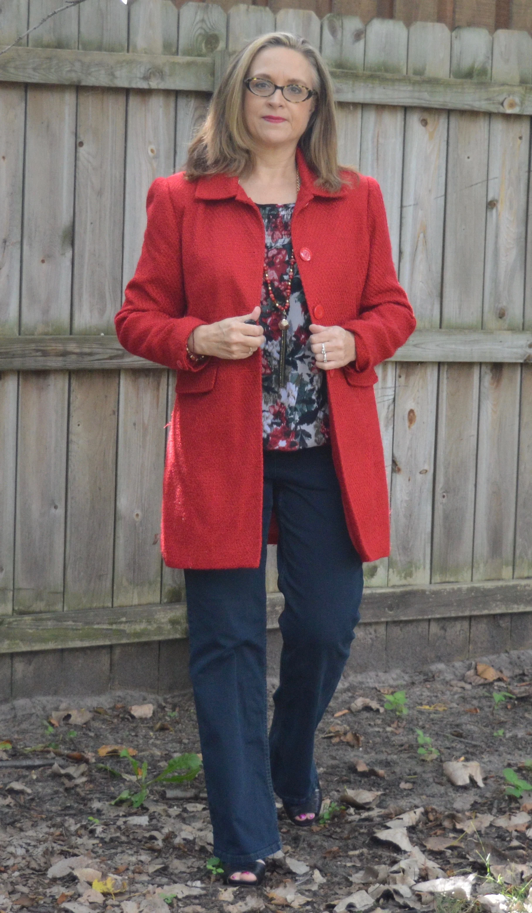
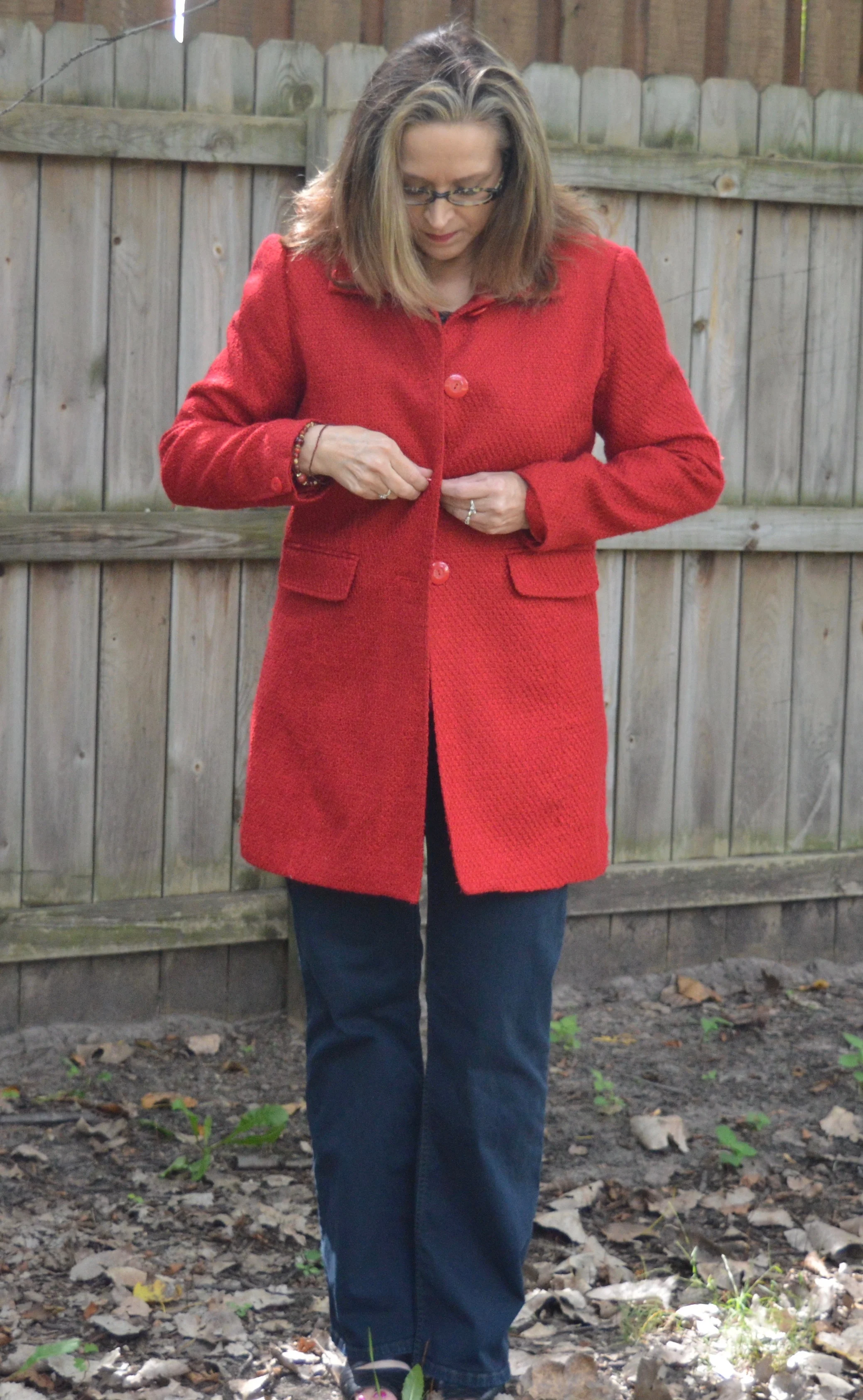
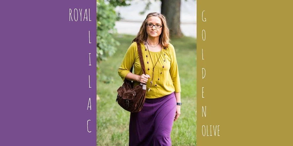
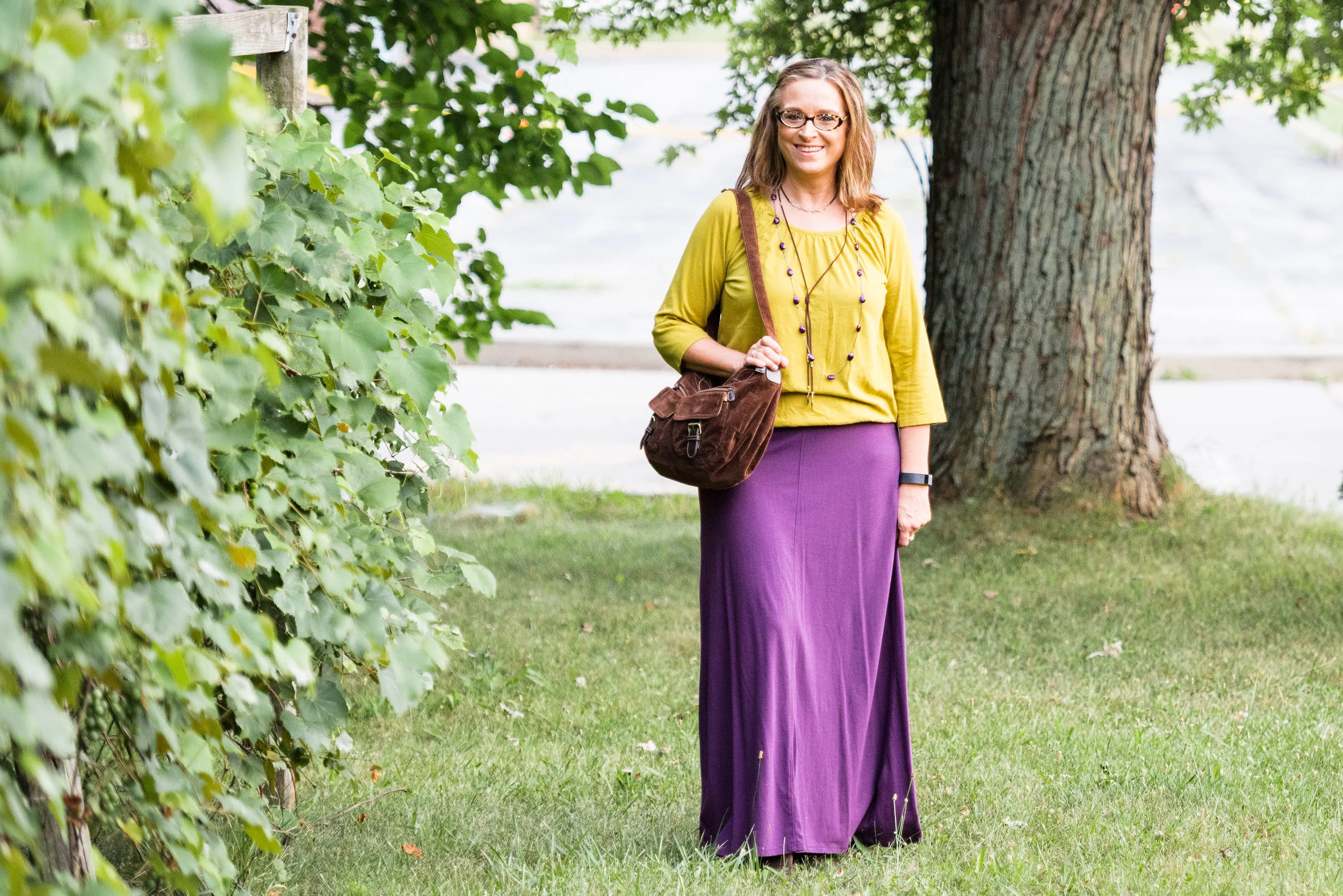
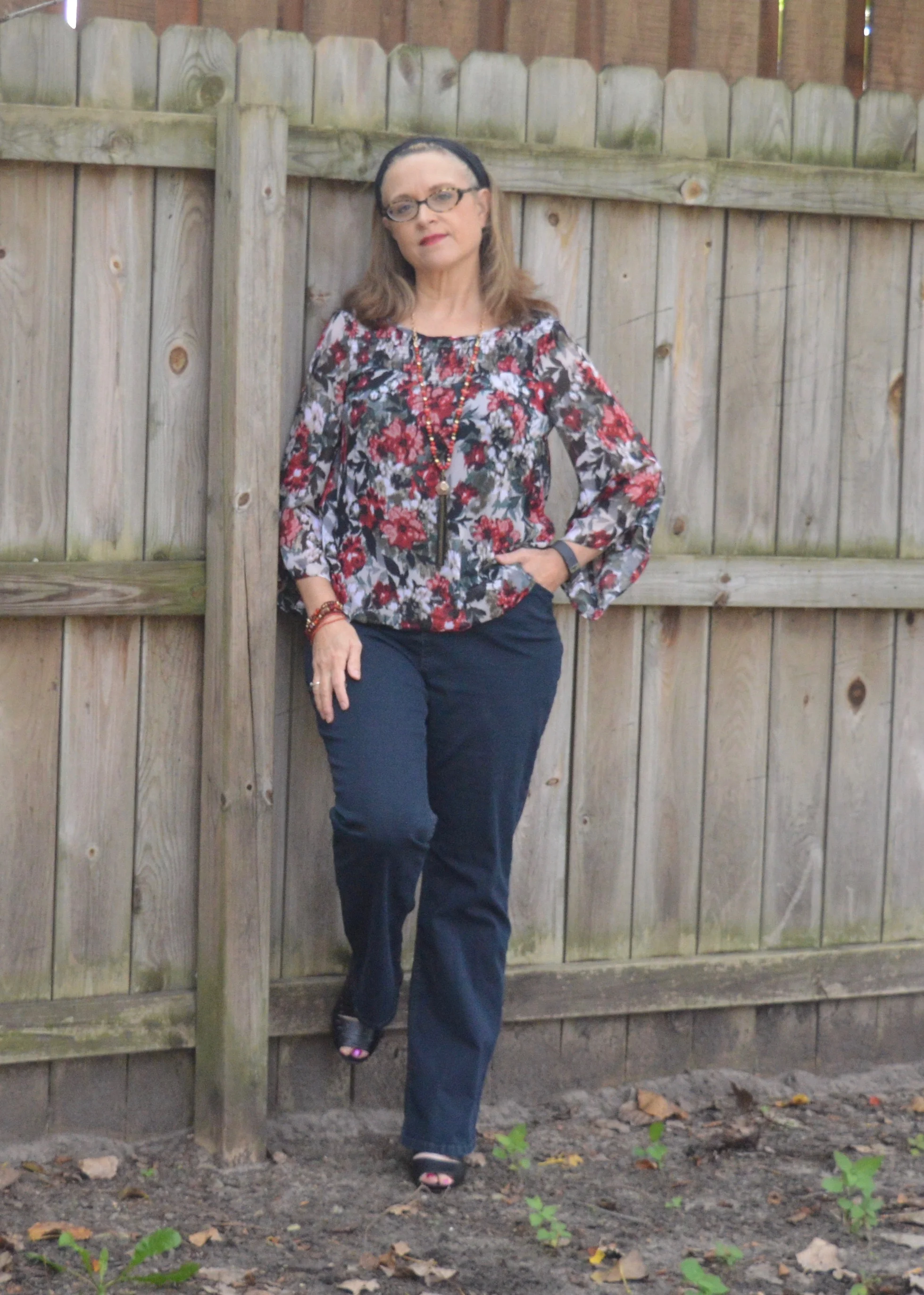
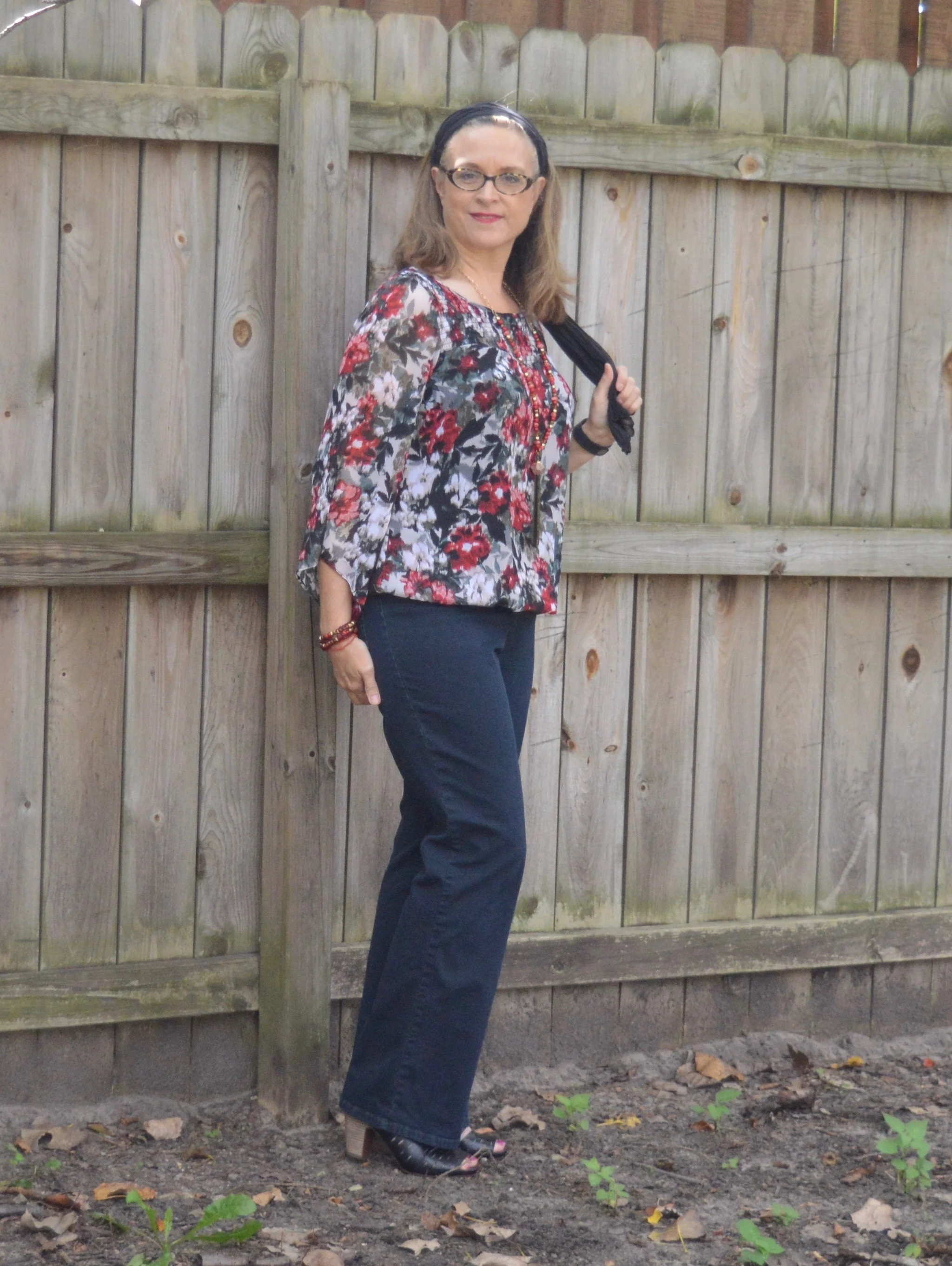
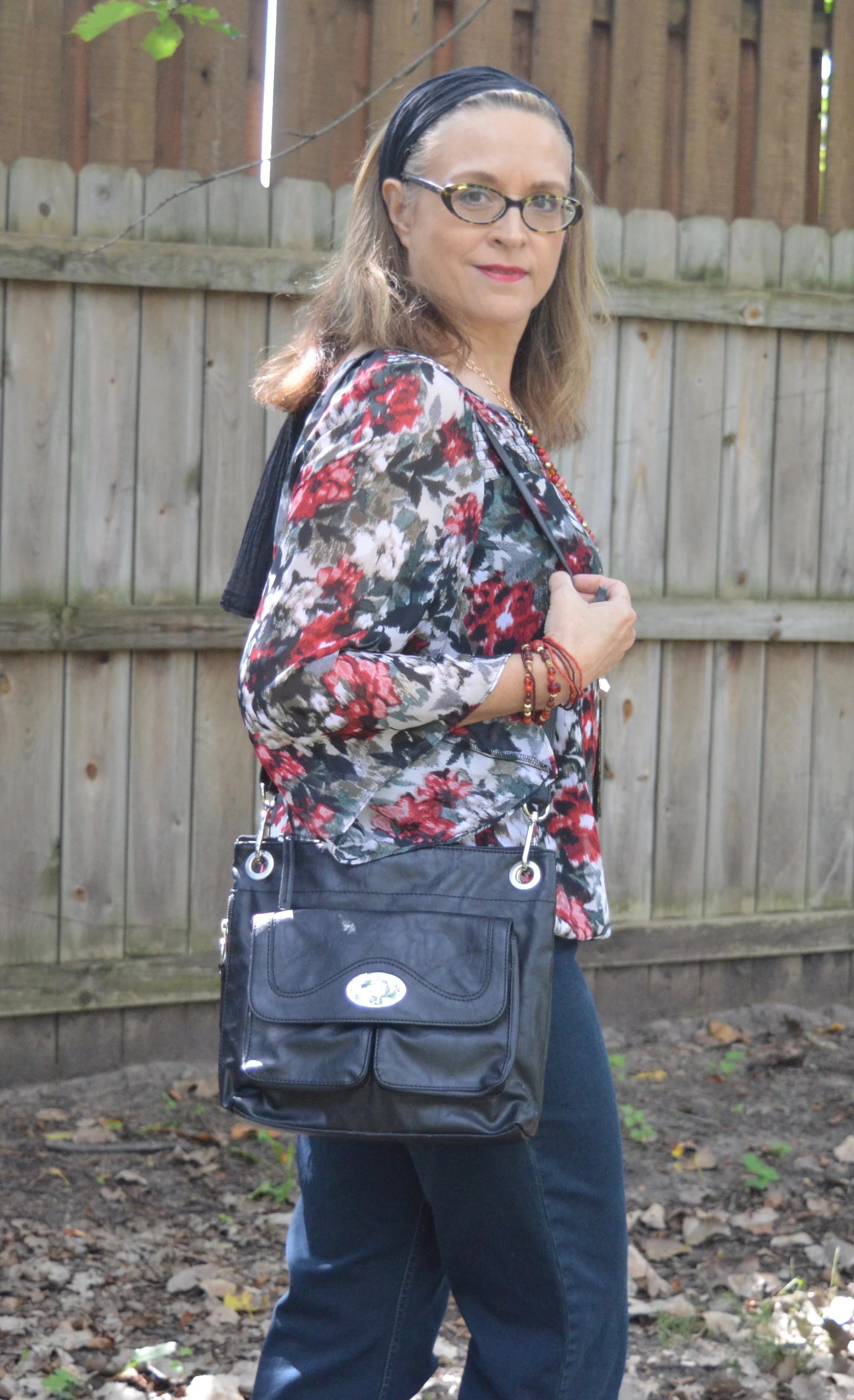
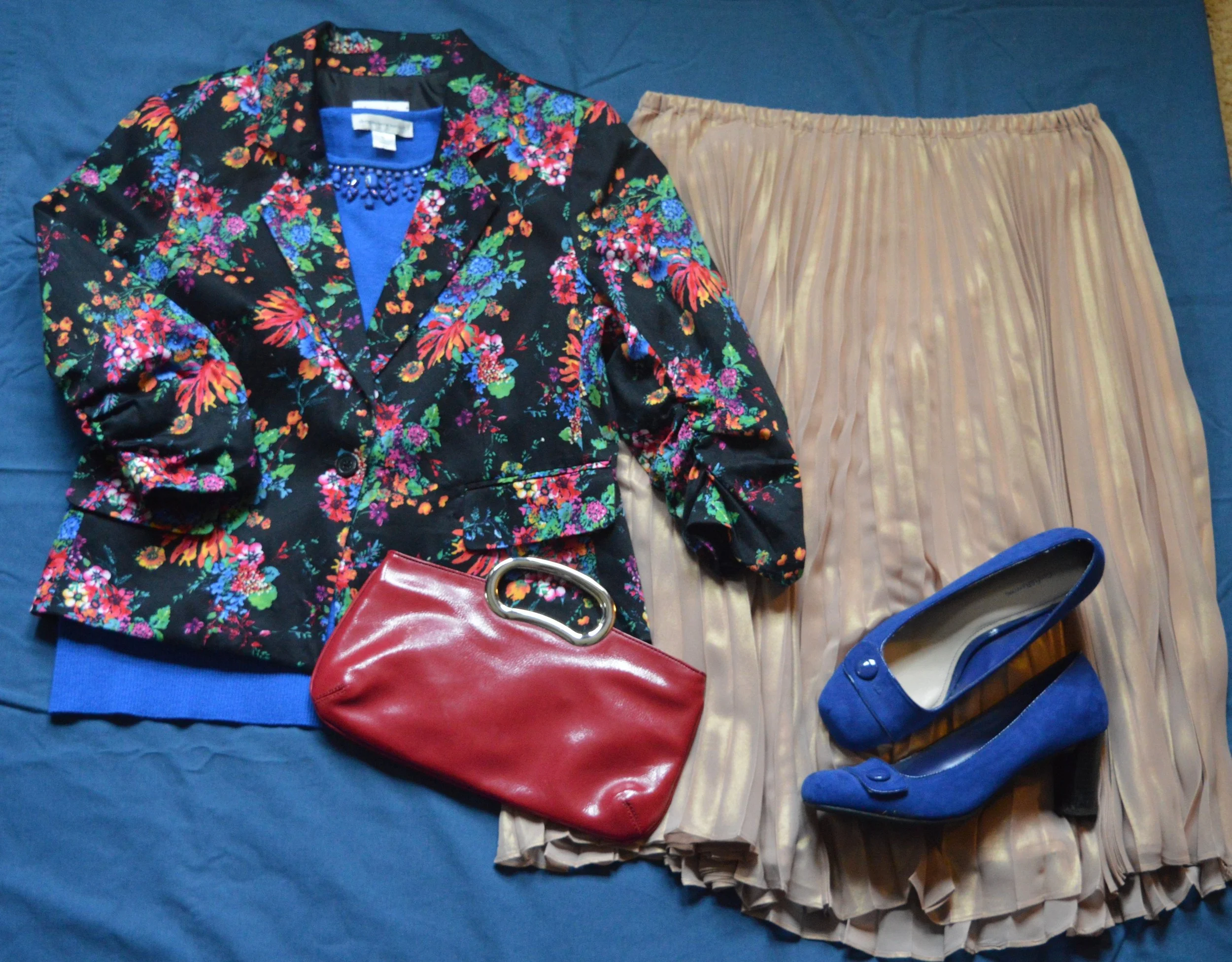
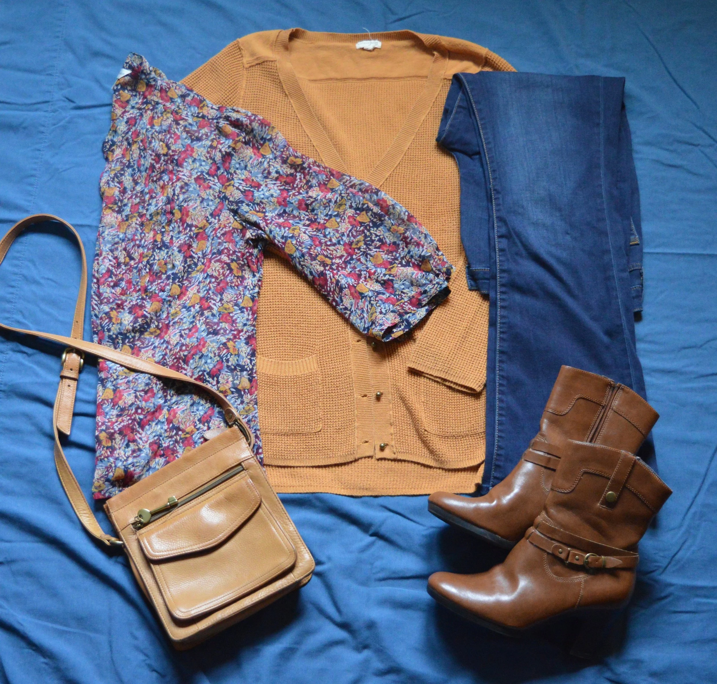
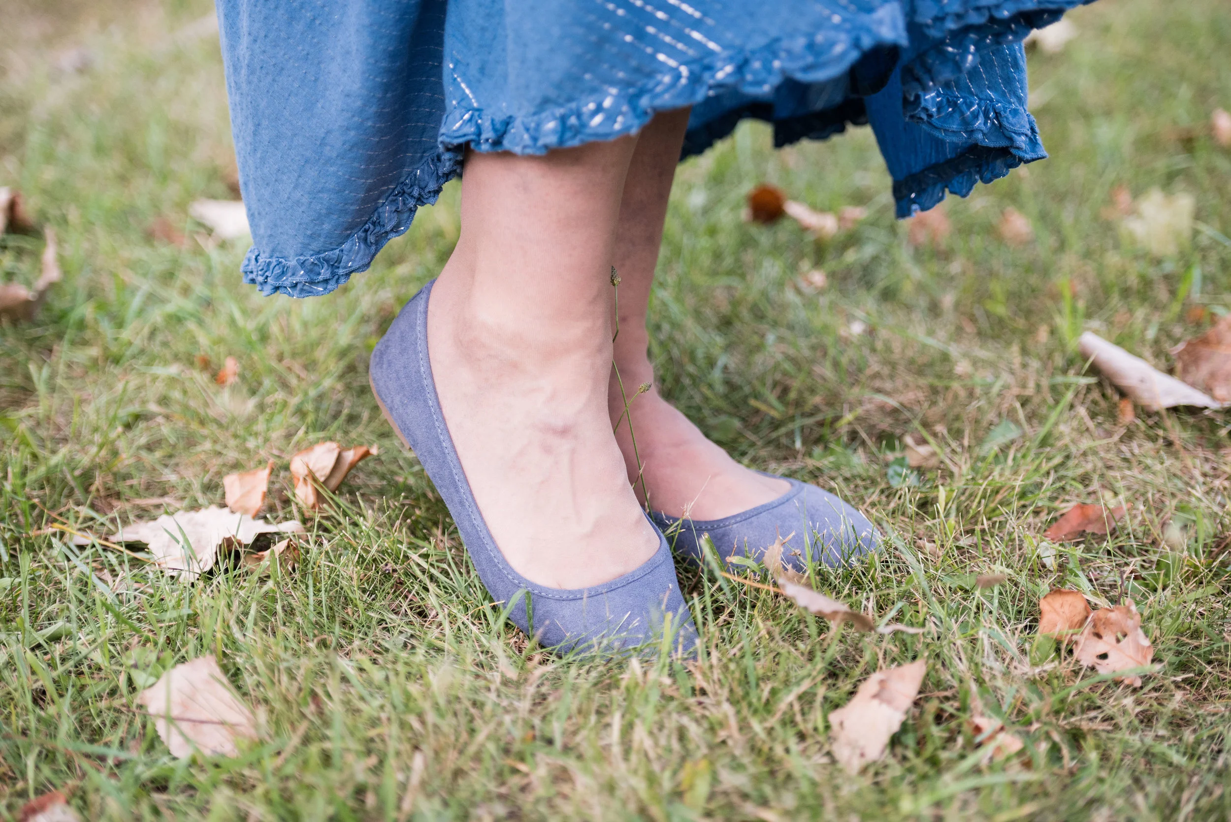
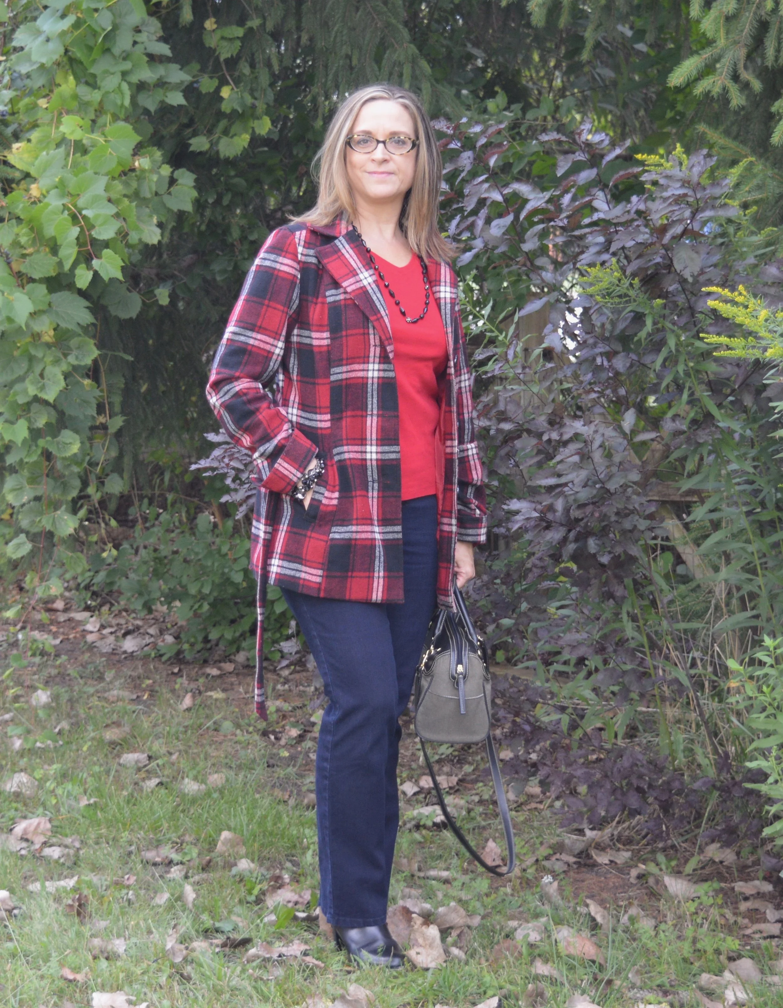
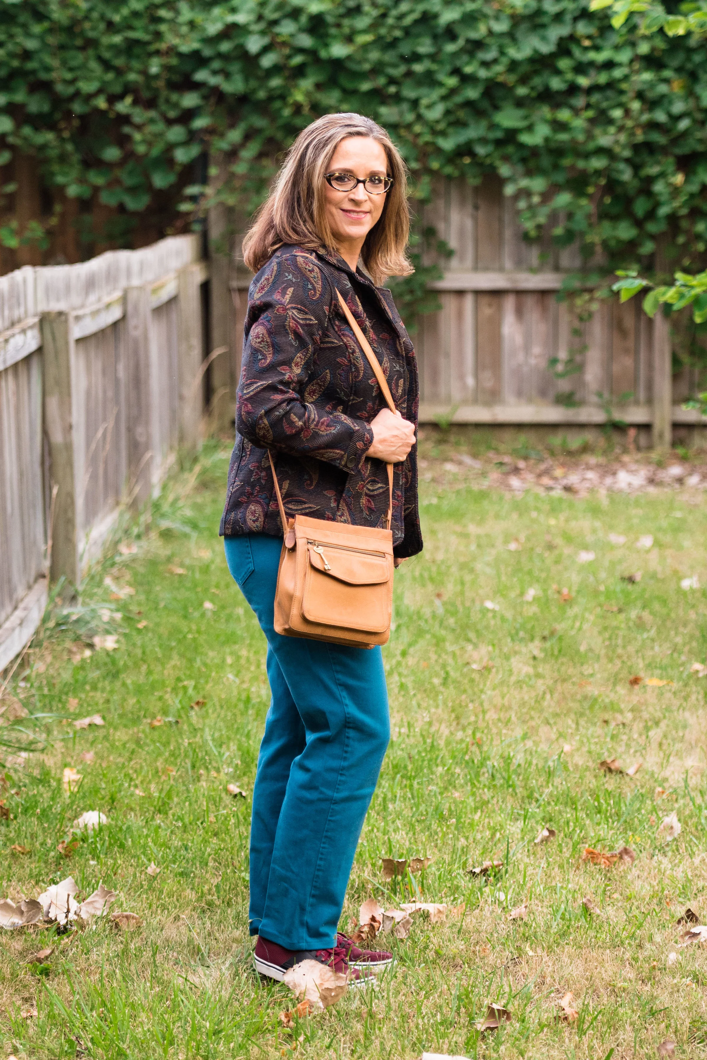
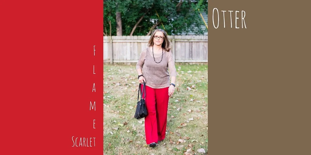
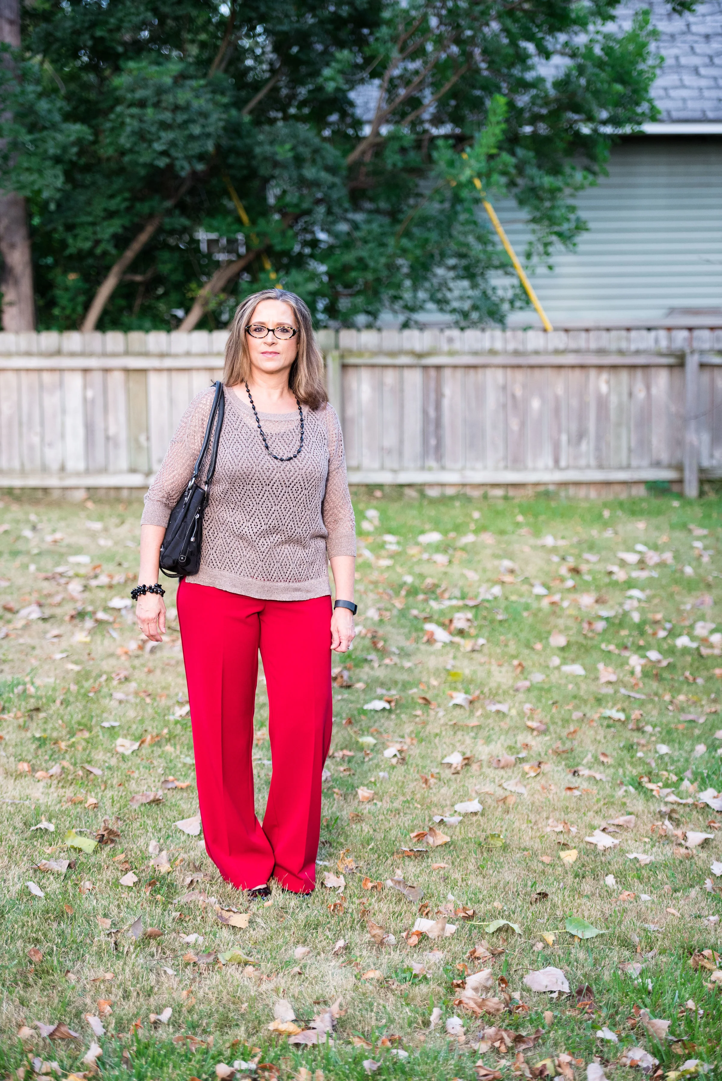
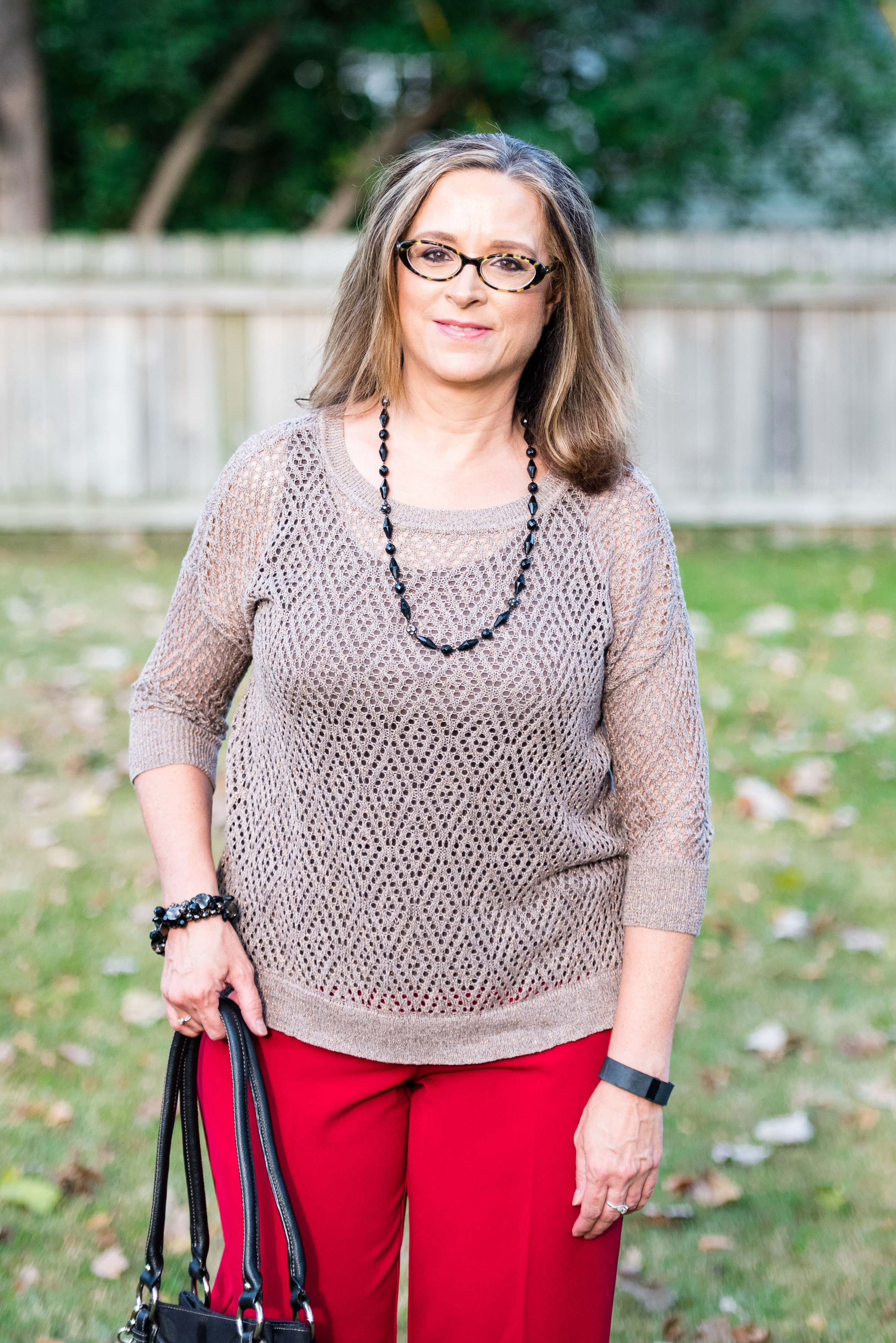
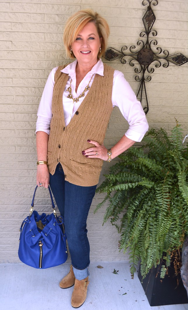
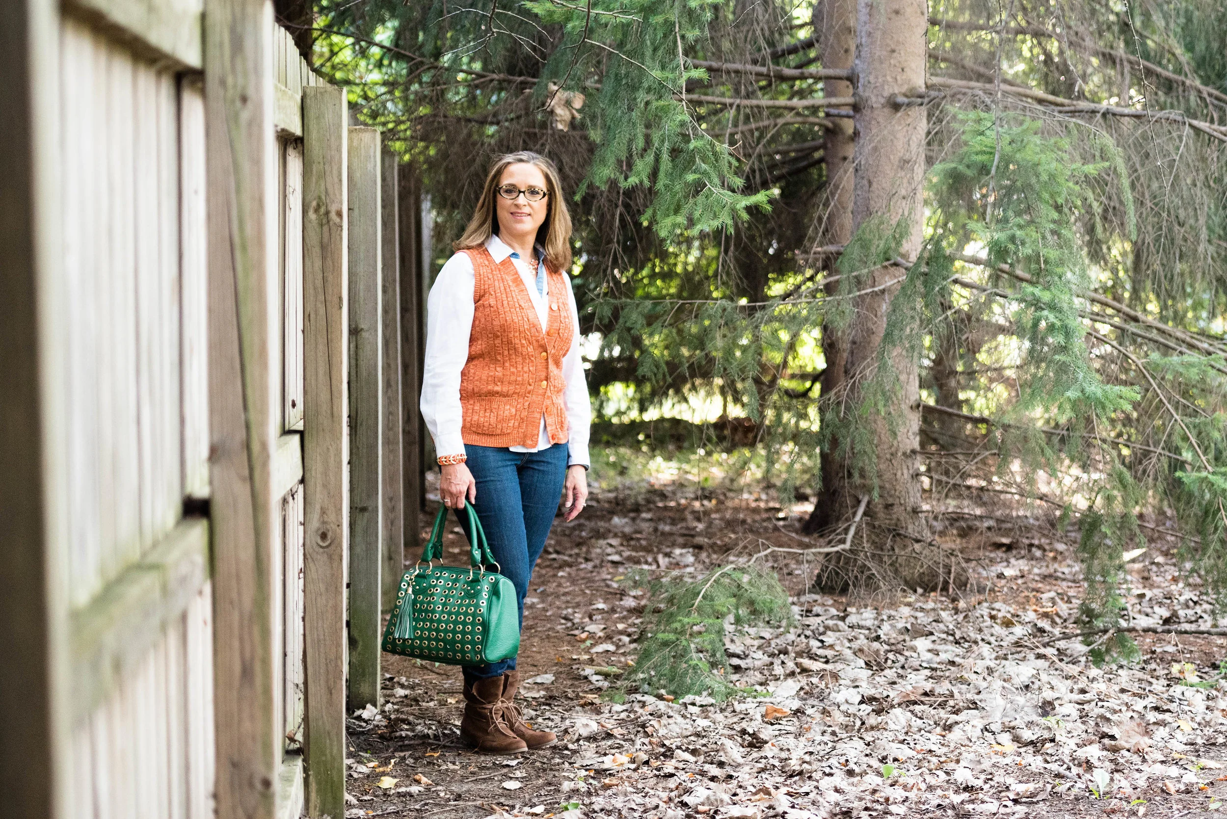
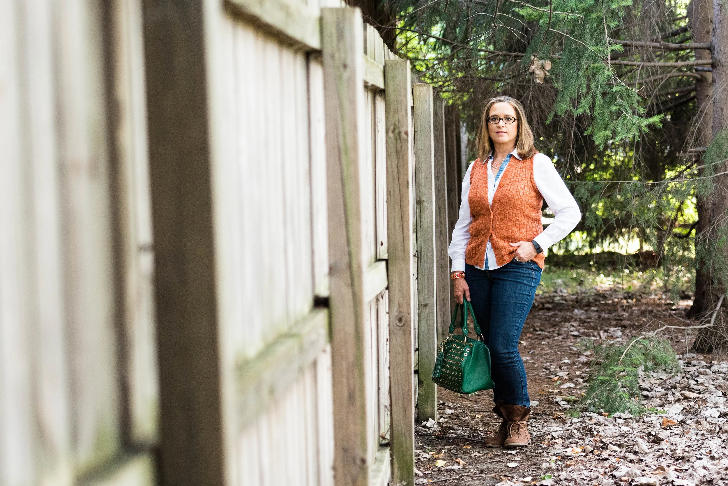
The following pictures are from my blog and are just a few suggestions for outfits to wear on a first date. I've included a few shopping options for you to peruse as well. Just click on the picture and it will take you to the store site. These are affiliate links so I get a few cents if you click and a few cents more if you purchase an item through my site. Hopefully these will give you ideas of what might be in your closet and help you pull an outfit together that will not only make you look and feel fabulous, but make your date want to take you out again.

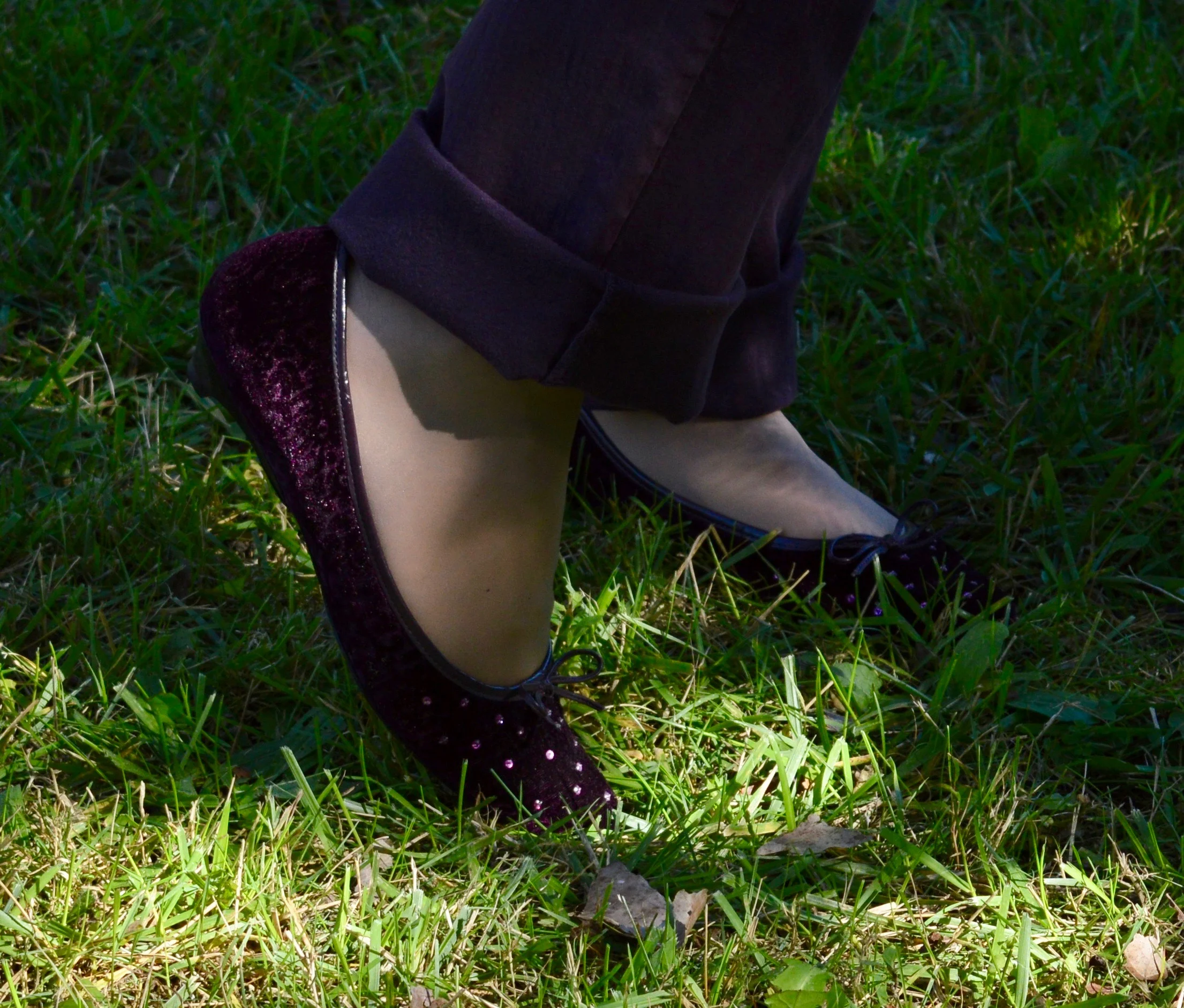
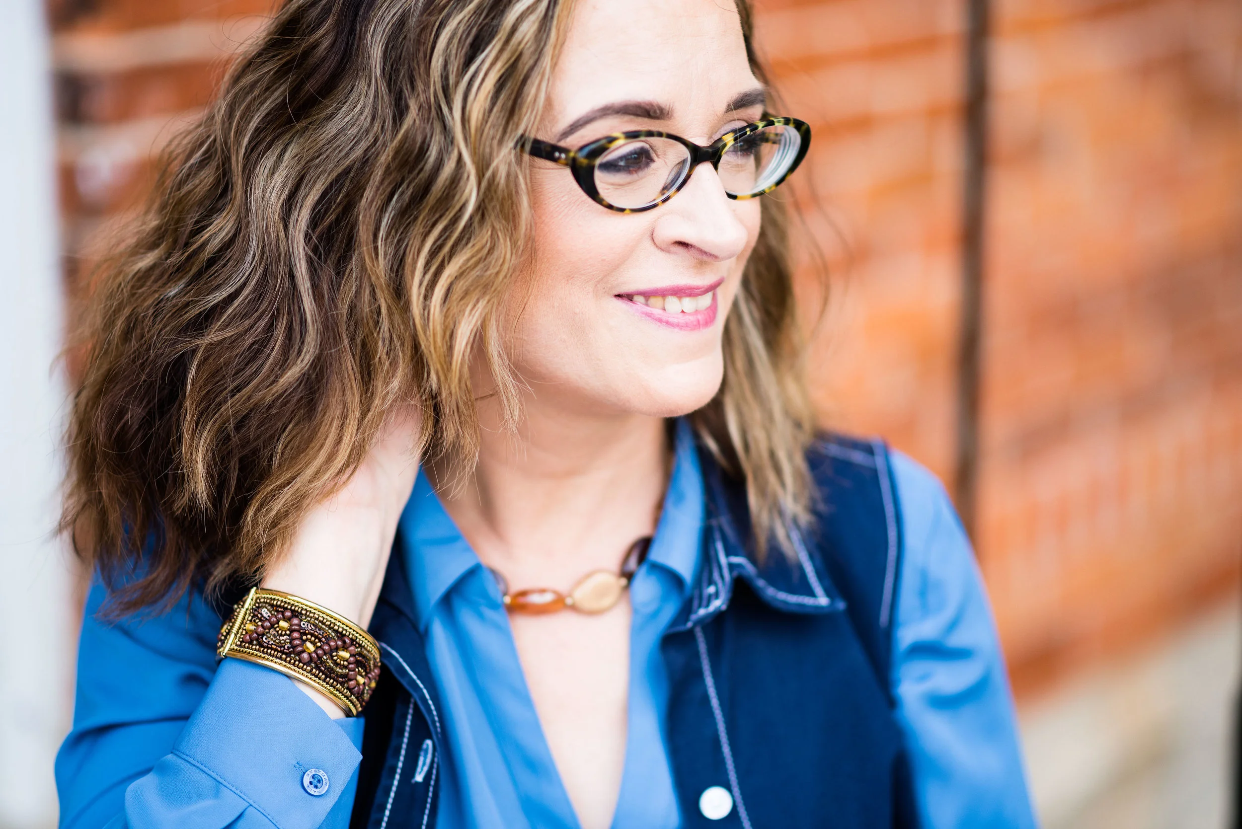
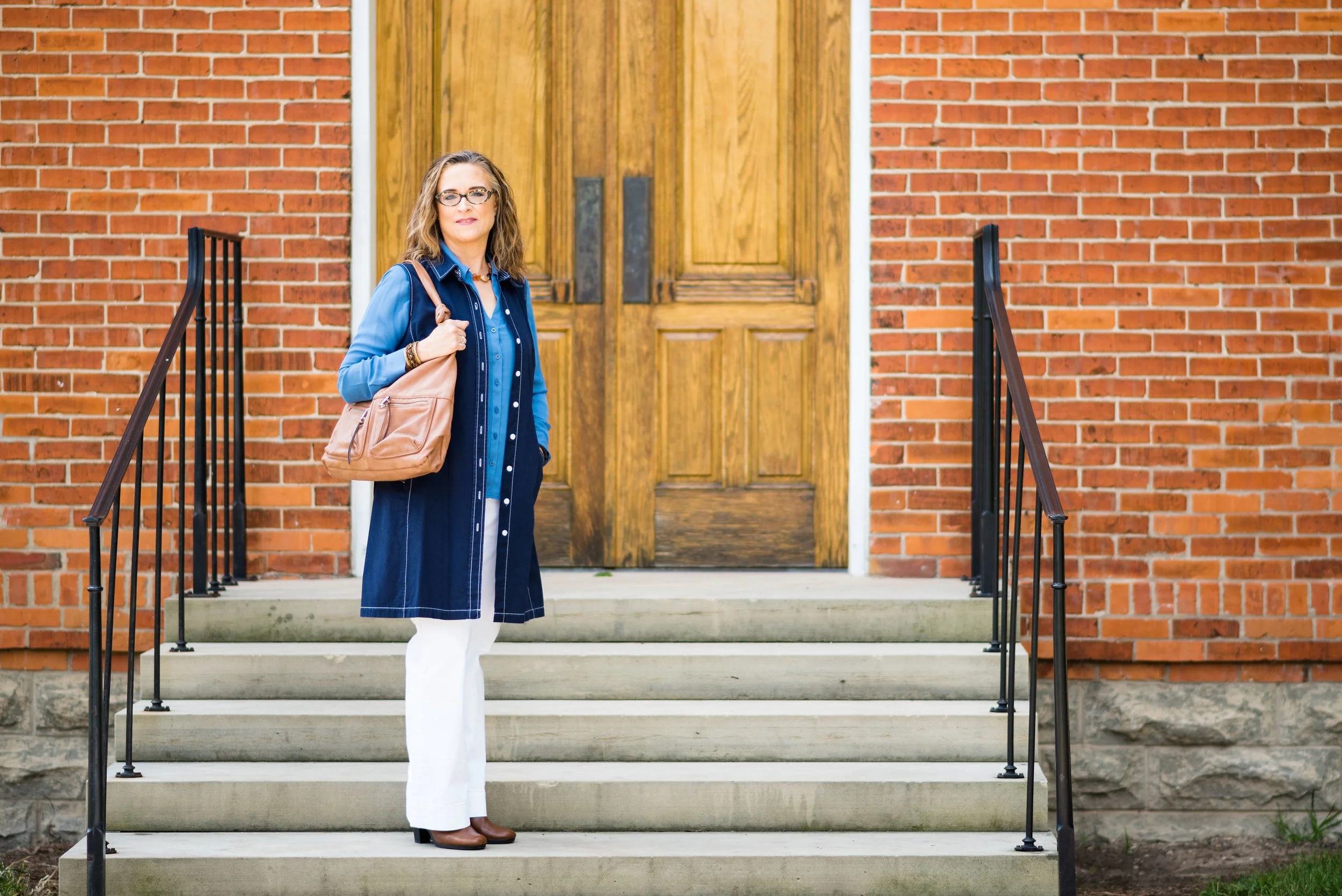
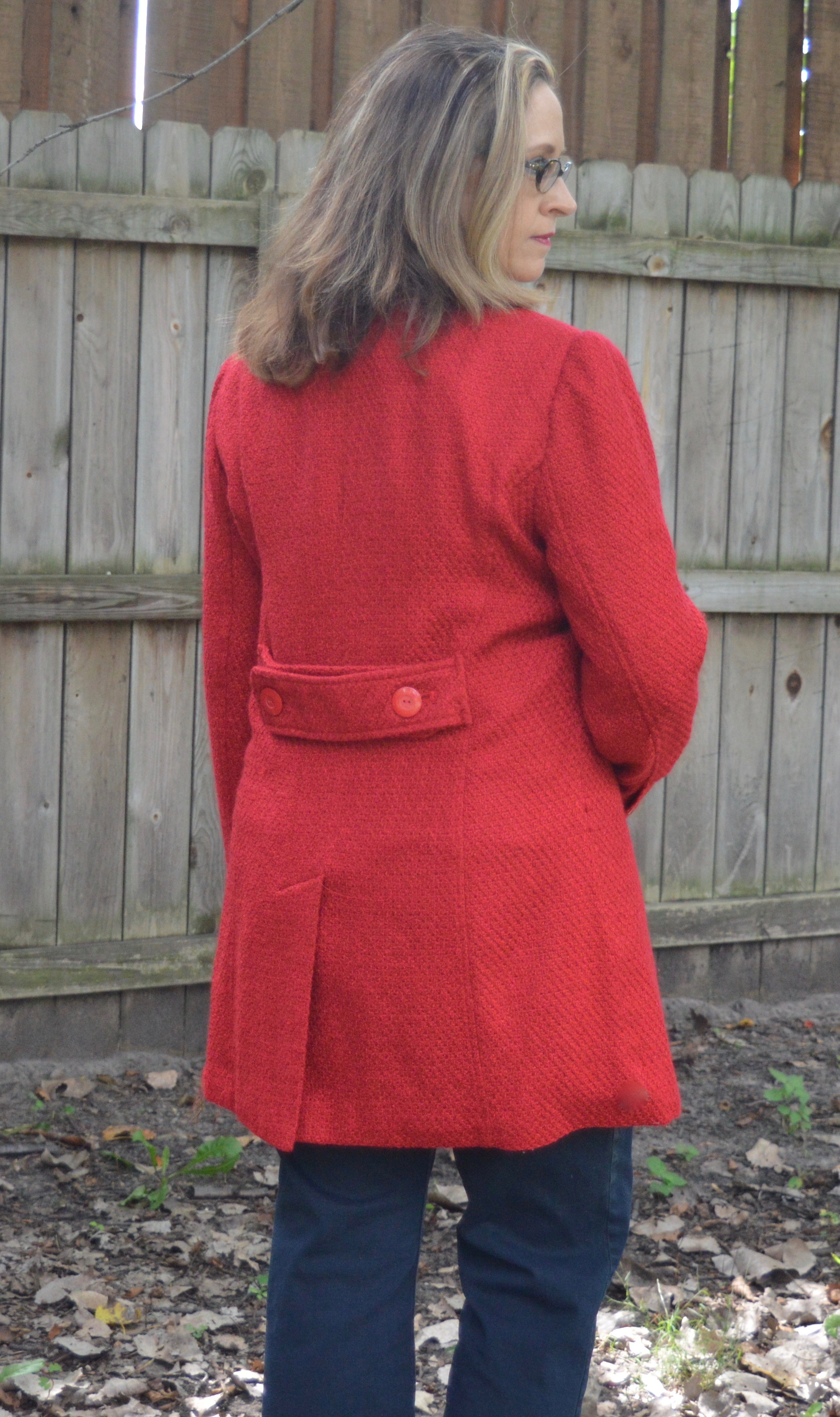
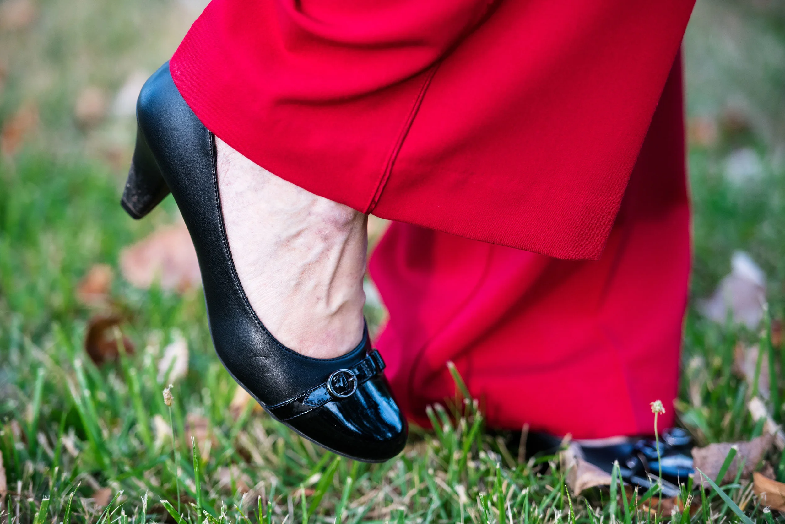
Dinner and the Theater (not McD's and a movie):

Meeting for Lunch and Small Town Shopping:

Meeting for Coffee then a Walk

Going to a Ball Game

Outdoor Summer Concert

Christmas Concert

These are just a few ideas. The key is to wear something that fits well, compliments your figure, skin tone and hair, and to wear a confident smile on your face. Be real. Be yourself. Plan and primp and you will be fabulous!

Photo credit Rebecca Trumbull. Make up Rachel Christensen.


Fall Trends - Reds and Browns

Besides the Pantone Fall 2017 color palette, there are other colors that appear on the fashion scene each season. This fall there has been an outpouring of red and brown. Reds are popping up everywhere and in every piece and style of clothing. Whether it be a coat, a dress, a plaid shirt or a bright red clutch, red has become a go to color for the fall fashion season. In addition there is also an influx of chocolate brown. This rich, warm color can be worn by almost anyone and goes well with so many other colors, including red. 

Last week when I took pictures for the floral trend, I figured I might as well take a few pictures for the red trend as well. This week I was going to take a few pics for the chocolate brown, but Monday I got a cold and so today was a day of rest. I really didn't feel like doing much of anything. I did a faith post on the blog, looked at a few emails, ate lunch and watched a movie. I still had to pick my grandson up from school, but that is really all I did today. So I will include a few shopping links that show you the browns that are trending right now. 

I have a number of red pieces, but since it isn't sweater weather yet, I thought I would share my two red jacket finds. I have grown to love red, a color my mother has always loved. I never realized how pretty red can be in clothing. Red is stunning in a rose, or sweet in a valentine, but I've always associated red with fast cars and fast women. Ha, ha. Isn't that the way we are? We jump to conclusions without really researching things out for ourselves. Last year I wore a red sweater in a blog post showing you my OTK boots. The picture below is from that post. You can see the full post here. 

What started as having one red sweater has turned into a red obsession. 

This is my Christopher and Banks around town red jacket. It is a very simple piece with a full zipper and two roomy pockets. It is fully lined, but I tend to use it more as a work piece rather than a keep me warm outside piece. Fall is the perfect time to wear a jacket like this. They don't have this color at C & B right now, but they do have a pretty red quilted jacket here

The jacket is somewhat fitted, as you can see by this picture of the back. 

This next jacket I found at my favorite thrift store, Savers. It is a Worthington brand from J.C.Penney. A little longer, I expect that I will get some outside wear out of this coat. It is not real heavy, and doesn't contain any wool in it, so like the above jacket will be used for fall, but not long into winter. Here is a oxblood red moto jacket and a red pea coat, both from Penneys.

Once again, there is not a lot of fancy detailing on the coat, but sometimes simplicity is better. Both of these jackets will pair well with any number of scarves. 

This coat has large buttons and again is more fitted through the waist with the addition of button detailing on the back. 

Here are some other red items out in stores now. 

Here are a few options for the chocolate brown color. I love the boots and the bags. You don't have to wear the color, you can always accessorize with it. That's why I say no matter what the color you can use it somehow to make an awesome outfit. Accessories are just as important as the clothes themselves. 

I hope you enjoyed this post on the trending fall colors. This post contains affiliate links. All opinions expressed are my own. 

Do you have any red items in your closet? Do you like to wear red? What about brown? How do you wear your reds and browns? I'd love to have your feedback. 

Have a great weekend!

Pantone Fall 2107 - The London Palette - Royal Lilac and Golden Olive

This is the final installment in the London series of colors from the Pantone Fall 2017 palette. I love the brightness of these two colors, especially together. For some reason they make me think of fall and of a Bohemian gypsy vibe. Maybe it is a flash back from the bright psychedelic colors of the late 60's and early 70's. Royal Lilac is a purple worthy of a king. Purple is one of my favorite colors and we rarely see it on the runways and magazines of the fashion world. Purples in those realms seem to tend more towards wines, burgundies or maroons.

Once again, let me say that when I look for these colors I try to get as close as possible to the color that is being portrayed in the Pantone palette. My colors do not always match exactly, but the point is to introduce you to the colors on the palette and show you ways to style those colors. Just like Toast and Copper Tan, Golden Olive was a difficult color to find. I had this top in my closet and the actual color seems a bit more green than what appears in the pictures, but not quite like the Golden Olive.

Out of all the color pairings that I did from the London palette, I like this one the best. There is something about the contrast between the purple and the mustardy yellow, that appeals to my inner gypsy. In keeping with that idea, I thought I would accessorize with a brown hobo bag and brown slouchy boots. 

For my jewelry I added a brown lariat choker and a long metal and bead necklace that tied into the purple skirt

One of the other things I like about this outfit is the comfort. The material of the top and the skirt is basically heavy weight tee shirt material, so it moves with me and there is no binding or pinching. This is also a great transitional outfit as the weather cools. The 3/4 length sleeves on the shirt, the maxi length skirt and the boots all provide full coverage for those chilly days ahead. 

What do you think of these two colors? Do you like them? Would you wear them? I hope you will leave me a comment in the comments section below. I appreciate when you do and it helps my blog grow.

This post contains affiliate links. If you click on a shopping link below, I get a few cents. Every lttle bit helps, so thank you for the clicks. Part of why I include the links is to show you real items that are currently available in the colors I post, or at least close. All opinions expressed are my own.

Photo credit Rebecca Trumbull. Make up Rachel Christensen.

Thanks for hanging out on the blog today. Check back on Thursday for another Fall 2017 trend.

Fall 2017 Trends - Fabulous Florals

I feel like we have talked about florals before, probably because we have. Floral patterns were trending in spring and they are still trending in fall. However, where spring florals were light and bright, fall florals are dark and bold. There are some fabulous fall florals out there right now and I will include a few shopping links in this post, to give you a few other ideas of what is available. As for my own collection of florals, I have nothing quite like what is trending, but I found a few pieces that I thought would transition well into the fall season. As I did last week, I will show you one outfit, a few flat lays and a few possible shopping options.

i have a few floral tops in my closet and chose this one for my outfit, because it seems a bit more fall like. The body is lined while the sleeves are sheer. the sleeves also have an asymmetrical hem line, and there is smocking on the upper part by the neck, making it an interesting piece. 

I paired the top with these recently thrifted J.Jill black jeans and my Clarks peep toe shooties.

I also had this black Franco Sarto bag in my closet. Here is a cross body bag from their site. 

I added a few fun pieces of jewelry to compliment the colors in the top.

Here are a few other looks that I put together as flat lays.

For this one the focal floral piece is the jacket, I opted to pull the blue out of the jacket by pairing it with a blue Christopher and Banks short sleeve sweater and blue heels. Because the jacket has so many colors it could be paired with lots of other pieces. 

This more casual look revolves around a mini floral print. I've had this yellow sweater for a while and it perfectly pulls out the yellow in the top. Styled with a pair of Rock & Republic boot cut jeans, a leather cross body bag and boots makes for a great casual fall outfit.

Here are a few other options of floral items. This post contains affliate links. All opinions expressed are my own.

I hope you enjoyed this look at another fall trend. Have a great weekend!

Pantone Fall 2017 - The London Palette - Blue Bell and Lemon Curry

Last week I looked at two colors with more of an orange hue from the Pantone Fall 2017 London palette. This week I am going to introduce you to one of the two yellow hues on the palette. Lemon Curry is a spicy yellow that can add a bit of zing to your fall color combinations. I decided to combine this yellow with Blue Bell, a light soothing color. The combination results in an outfit that has both pizzazz and peacefulness. 

My daughter had to teach me a few things about photography when she first sent me this grouping of pictures. The reality is that a camera does not see things the way the human eye does. Our human eye, unless they are unable to translate properly, see colors as they really are. A camera and the image it imprints onto a digital card is affected by lighting, exposure and other factors. 

When I saw these pictures, I texted my daughter and said, "This skirt does not look like it looks in real life." We went back and forth on it for a while and I finally told her to leave it alone. When we got together for my grandson's birthday party yesterday, she took the time to explain to me that a camera, no matter how fancy picks up what it thinks it sees, not necessarily what is really the fact. Who da thunk? Obviously the hombre skirt contains an underlying tone that the camera translates to more of an aqua blue, when in reality it is more of a navy or gray blue. Rebecca was able to adjust the pictures to make the skirt look more like the original color and I learned a few things about digital images. 

For this post, it doesn't really matter, because the blue I am trying to match with the Blue Bell color is the top tier of the skirt, rather than the bottom tier. 

Once again, for this color combination I shopped my closet. I've had this tiered skirt for a while and usually wear it a few times over the summer months, as it is light weight, but also lined. The tee I've had for a long time. I love the pattern, the fit and the longer short sleeves, but I hardly ever wear it. When I came across it looking for something yellow, I realized this would be the perfect piece to represent Lemon Curry.

Even though the top contains some black and white you can clearly tell is has the spicy Lemon Curry vibe. 

To pull the look together I wore Blue Bell colored jewelry including my pendant necklace from Kohls and my bracelet from Chico's. I decided to used a brown bag to keep the look more grounded and earthy.

For shoes, I chose my simple SO flats. Yes, I know I keep wearing these for various outfits, but they are just so cute and comfy!

What do you think of the pairing of these two colors? Which color do you like better?

I think these two colors are perfect for fall and transition easily from summer. 

Photo credit Rebecca Trumbull. Make up Rachel Christensen

The following are few shopping links for possible items in Blue Bell and Lemon Curry. This post contains affiliate links. All opinions are my own. 


Thanks for stopping by the blog. Hope to see you back again soon.


Fall 2017 Trends - Mad about Plaid

When I begin my research on the new season trends, I do a goole search. Often I end up looking at sites like Elle and Cosmopolitan to name a few. One has to weed through numerous articles hi-lighting movies stars, and runway styles to find things that are really useful. I try to approach these sites with an open minded attitude, because there are many trends I do no agree with, nor would you ever catch me supporting them on my blog. However, there are plenty of ideas to glean from these fashion authorities.

For the month of September I am going to forgo my Thursday monthly columns to focus on styles that are trending for fall this year. I thought it would be fun to pick a trend then do a post with an outfit centered around each, as well as a few flat lays and possible shopping options. I hope you enjoy this series. Be sure to let me know your thoughts in the comments section at the bottom of each post. 

Today I am looking at plaid. Plaid is back and for a girl who grew up loving flannel shirts, I am glad. Plaid has been around since as far back the 16th century. The word plaid comes from the Scottish Gaelic word plaide which means blanket. My husband is Scottish on his mother's side. It is fun to look at the numerous plaid colors that represent each of the family/clan names from that time period. My hubby's great grandmother was a Robertson. The Robertson plaid is a bright red with navy and just a hint of forest green. This is a tie Mark's Uncle David got for him. It even has a tag that says Robertson.

I found this light weight plaid jacket at one of my favorite thrift stores, Savers. I make regular stops at this store as they have a great selection that is always changing. You can read more on thrifting in my two part series: Thoughts on Thrifting - Part 1 and Thoughts on Thrifting - Part 2

I love the vibrant red of this jacket. Red is trending for fall also, so look at me, I am being doubly trendy. Ha, ha. We'll look at the fall trending colors in a later post. 

To keep it simple and let the jacket do the talking I slipped on a red tee, my Christopher and Banks slimming slip on jeans, then added black beads, black heeled ankle boots and a black and gray bag. You could also draw on the white in the jacket or the red to bring out those colors as well. 

Here are a few other jacket possibilities:

In addition to jackets you can style an outfit with a plaid top. Here is a flat lay I put together to show you a possible outfit starting with a plaid top. This top screams fall for its lovely fall colors, but to keep it from getting to colorful, I went for olive pants, and a black bomber jacket. 

As a last thought I grabbed the Tawny Port clutch. See the Pantone site for a look at this New York fall color. 

Here are a few plaid button ups that are currently available.

The next look revolves around a plaid accessory. In this case it is a pretty scarf. Plaid scarves have always been a viable option for the cooler weather and this year is no exception.

I think this is a fun look for a date night with the hubby or a lunch date with the girls. Keeping the colors of the pants and top similar allows the scarf to be the center of attention.

Here are a few fun options for scarves:

What do you think of plaid? Is is a pattern you like to wear? Even if you don't like it in big quantities, even a little plaid can brighten up an outfit. 

Here are a few other plaid options:

As you can see there are plenty of options for adding plaid to your wardrobe. If you click on the pictures that show you other options it will take you to the site where you can see more details and tell you the prices.

This post contains affiliate links. If you click on a link I'll get a few cents. If you buy something through the link, I get a small commission. All opinions are my own.

i hope you enjoyed this look at plaid. Be sure to check back next week, where I'll look at another fall trend.

Have a great weekend!

Pantone Fall 2107 - The London Palette - Toast and Copper Tan

Out of all of the London Palette colors, I felt these two were the hardest to find. They are also hard colors for many people to wear. Toast and Copper Tan are not truly tan, but also not truly orange or brown. As this is not a color I saw in the stores, I did some thrifting and found that even there these are not popular colors. In the end, I shopped my closet and this is what I came up with. You have seen all of these pieces before.

With this pairing, I am going for a more monochrome look.

This asymmetrical hem top I have styled before here. I love the detailing on this tee. The bottom is trimmed with lace and there are two side triangular insets that add texture and interest to the top. 

While the pants I am wearing are not truly the Copper Tan color, I felt, due to the yellowy orange stripes in the pants that it makes them seem more of a coppery hue. I styled these Sonoma ankle pants before in my summer InVestments series. 

In keeping with the neutral monochrome vibe, I decided to go with faux pearl jewelry that stood out due to its iridescent quality.

i felt the addition of the chocolate brown moto jacket kept the outfit from being too soft. The jacket adds an edgy vibe and epitomizes my style personality. Of course if I am going for that look, I had to add my favorite taupe SO brand ankle boots as well. 

Due to the fact that I love color, I felt it necessary to add at least one piece that made the outfit pop. The bright blue bag reminds me of the blue skies so prevalent on many midwest fall days. This bag that was thrifted is Nine & Co. brand. 

What do you think of these two colors? Do they seem like fall colors to you, or do you feel they are more reminiscent of a pale sunset on a summer evening? I hope you enjoy following along as I look at the Pantone color palettes for each season. 

Below are a few tops I found that are a similar color. This post contains affiliate links. If you click on a link I get a few cents. All opinions expressed are my own. Thank you for all your support. 

Thursday I am planning a series on this year's fall trends. For the month of September we'll take a closer look at what some of this year's fun fall trends look like from my closet! Stay tuned!

Pantone Fall 2017 - The London Palette - Navy Peony and Primrose Pink

For this week's post I am looking at the Pantone London color palette combination of Navy Peony and Primrose Pink. The Pantone site describes Primrose Pink as a gentle shade and Navy Peony as a strong and dependable color that takes some of the burden off black for a fashion mainstay. 

Navy has long been touted as a neutral, pairing well will just about any other color, even black. Navy worn on the bottom can make us look long and lean, while navy worn on the top can hide a world of flaws. One of my favorite clothing pieces is my Ralph Lauren navy blazer. You can read my post on that here

For today's outfit I shopped my closet and came up with this navy skirt that seems to show off the Navy Peony color perfectly. This embellished skirt I got a while back from dressbarn. It is an a-line shape and falls just at the knee. 

For the top I am wearing a Liz Claiborne tee that I got at a thrift store. Primrose pink is a light pastel pink. It is a little unusual to see a color this light on the fall Pantone palette, but I think this soft pink can be a great color to help us transition from summer to fall. 

I thought the outfit looked a little bland with just the navy and pink, so I added a scarf with a variety of colors including blue and pink, to pull the outfit together and add interest. I styled this wide oblong scarf as a shawl. 

Here is a photo of what the scarf looks like open.

Because the scarf had just a touch of green in it I decided to carry my green clutch. Green is another color that will show up later when I do the New York colors. Be sure to check back for that. 

I chose navy for my shoes, and jewelry and I also wore navy hose. 

What do you think of these two colors? Do you have some of these larger scarves that you like to wear as a shawl?

I hope you enjoyed this look at two more of the Pantone Fall 2017 London color palette. Check back next week for two more colors. 

Be sure to check back Thursday for a look at a new retailer that I'll be featuring.

This post contains affiliate links. All opinions are my own. 

Color Crash Course - Mint Green and Teal

For today's Color Crash Course I thought I would style a transitional outfit. As we near the end of summer and the beginning of fall we see the changes all around us. The leaves begin to turn and drop or if you have a cottonwood, they just drop! Ha, ha. The temperatures begin to cool off and the sun's time in the sky shortens. 

While I love all of these changes, what I think I love even more is that I get to move away from my warm weather clothes and start wearing my cooler weather clothes. However, we all know that cooler weather does not happen over night. Usually, we still have plenty of days in the mid to upper seventies and even a few edging into the eighties. For that reason, I like to think layers. 

As I have told you when I started this blog, I am a woman of layers and that includes my outfit style. For a transitional season like fall, I still want to wear shorter sleeves, but I will add a sweater or jacket to combat the early morning chill on my way to work, or the later evening coolness when the hubby and I are coming home from a night out.

Today's outfit combines the warmth of mint with the coolness of teal. These two colors both come from the green family, but teal edges towards blue and mint edges towards yellow.

This mint, ruffle sleeve popover top is a Lauren Conrad brand from Kohl's. The jeans are Gloria Vanderbilt. Looking at these pics, I began to notice the pants seem a bit big and baggy. Though I love the way baggier pants feel, I really do not like the way they look. I will save that thought for another post! 

This jacket I got on clearance from Christopher and Banks. I like the fall colors and the fit. It is also fully lined, so I will be able to use it as a jacket while the weather is just starting to turn cool. 

The colors in the jacket allowed me to add my maroon necklace and maroon Pumas. I finished off the look with my Fossil cognac cross body bag. 

You can turn just about any of your summer styles (except maybe a swimsuit - ha, ha) into transitional outfits if you think layers. Do you still want to wear those capris? Try adding a pair of ankle boots and top it with a bulky sweater. Want to still wear that light weight tee? Add a denim or camo jacket with a pretty colored scarf. Be creative. You'll be amazed at how many more outfits you can come up with if you just take the time to play with your clothes. 

I hope you enjoyed today's post. Leave me a comment in the comments section. I'd love to hear from you.

I am hoping next week to get back to a more regular schedule. If you follow my faith page, be sure to check back tomorrow for a post on change!

Have a great weekend!

Pantone Fall 2017 - The London Palette - Flame Scarlet and Otter

This year the Pantone Color Institute decided to share two color palettes for fall. Both the London and the New York palettes have similarities, such as Navy Peony and differences. However, I feel that both palettes feature rich colors that easily transition us into fall. You might feel that these colors are not for you and when I first looked them over, I was not excited, but as I began to ruminate on them and look for pieces in my closet and at the store that would best represent each of these colors, I grew excited to see how each of these palettes would translate to real outfits that an actual woman would wear. 

To keep this series to a minimum I decided to challenge myself to come up with outfits that use two of the colors at a time. This week I am featuring a bold, rich red labeled Flame Scarlet, paired with a warm hue called Otter.

I've styled these Worthington brand trousers before on the blog. You can see that post here. This light weight open weave sweater is a great piece for transitioning to fall. Days can still be warm, but mornings and evenings can be cool. I just put a similar colored tank underneath.

I opted for black accessories and kept them to a minimum. I felt the black was a suitable contrast for this two toned outfit. A single strand beaded necklace and a beaded bracelet were my only jewelry. 

I dug this black top handle bag out of my closet, all the while wondering why I have so many purses and bags that I don't use! It is like clothes and shoes. I keep intending to come up with other ways to style all these different pieces, but life!

As you can tell by the fact that this post is a day later than I normally post, that my life is crazy busy. I have been back at work putting in about 30 hours a week, picking up my grandson from school and then trying to spend time with my spouse in the evenings, after which I simply have no energy left to work on the blog! Oh well, that's me...Hi! My name is Amy and I am an actual woman!

My shoes are a simple black pump that I've worn on the blog before. 

I like Flame Scarlett paired with Otter. What do you think? A bold color with a more subdued neutral? Or do you like to pair two bold colors? Maybe you like a more neutral palette all over. I'd love to hear your thoughts in the comments section below. You feedback is very important to me. 

Below you will find some shopping suggestions. These are just options so you know what is available in these colors. This post contains affiliate links. If you click on a shopping link I get a few cents. If you purchase something through my blog, I get a little commission. I appreciate all your clicks. 

I hope you enjoyed this look at the first two colors of the Pantone Fall 2017 London color palette. Thank you for stopping by the blog. 

Beautiful Blogger Bests - Thinking Fall with a Cable Knit Sweater Vest

This week I am featuring a beautiful blogger from down south. Tania Stephens was born in Tennessee and currently lives with her hubby in Southwest Virginia. Tania is a fireball. She is a wife, mother, and grandmother. She works at a lumber yard, is an active member in her women's club, has deep faith, and has an enormous following for her blog, 50 is Not Old, which she started in 2015. It is easy to see why Tania is so popular. She is a real, actual woman and she tells the best stories. She has a classic style and loves jewelry and handbags! Who doesn't? Ha, ha. You can read more about Tania on her About page. 

The look I was inspired by just shouted fall to me. As the weather starts to get chilly we can break out our cozy sweaters and reach for our jackets. This post was from September 26, 2016 and is titled, Cable Knit Sweater VestYou can see Tania's original post by clicking on the link or by clicking on the picture. 

I love simplicity and that is what this outfit says to me. What is more comfortable and simplistic than a pair of jeans, long sleeve button up and a cozy vest? Add a great pair of boots, a colorful bag and some fun jewelry and you are ready to go. I love how Tania's vest, boots and jewelry all tended toward a more neutral color against the dark wash of her jeans. Her white blouse and bright blue bag make the outfit shine. 

Here is my version.

You can see here my sweater vest is orange, so I have a bit more color. I also tucked my jeans into my boots, where as Tania rolled hers up. A different style of boot calls for a little different handling of the individual pieces. 

Since I wore orange, I decided to accessorize with orange jewelry too. This is the only white button up I own and while I like the casual style of the blue chambray stripe, I think I need a plain white one. I probably should have tucked it in as well. I was feeling rather sloppy! Ha, ha.

Here you can get a better look at my boots and my green thrifted bag. I thought green would be the perfect pop of color against the dark wash jeans and the orange sweater and accessories. 

As always, I am thankful for the many other bloggers that continue to inspire and motivate me dress in a style that is all my own, but that can learn from others. Be sure to stop by Tania's blog and give her some love.

Have a great weekend. If you follow my faith blog, be sure to check back tomorrow for my Mulling it Over post on Ephesians 6:16. 

I appreciate each one of you and all the support you give me. If you have a chance leave me a comment. I'd love to hear from you. 

Photo credit (mine) Rebecca Trumbull. Make up Rachel Christensen.

 Thursday linking up with Nicole of High Latitude Style. Friday linking up with Nancy of Nancy's Fashion Style