Pantone Spring/Summer - Introduction

I’m a little late, putting this series together this spring, but the Pantone colors are really for two seasons, spring/summer and fall/winter. Since the colors bleed over into summer, I figured it would be okay if my series started a little later.

Once again, we are introduced to both the New York and London color palettes, but the overlap between the two is substantial, so we’ve combined all the colors, so you can see the whole palette at once.

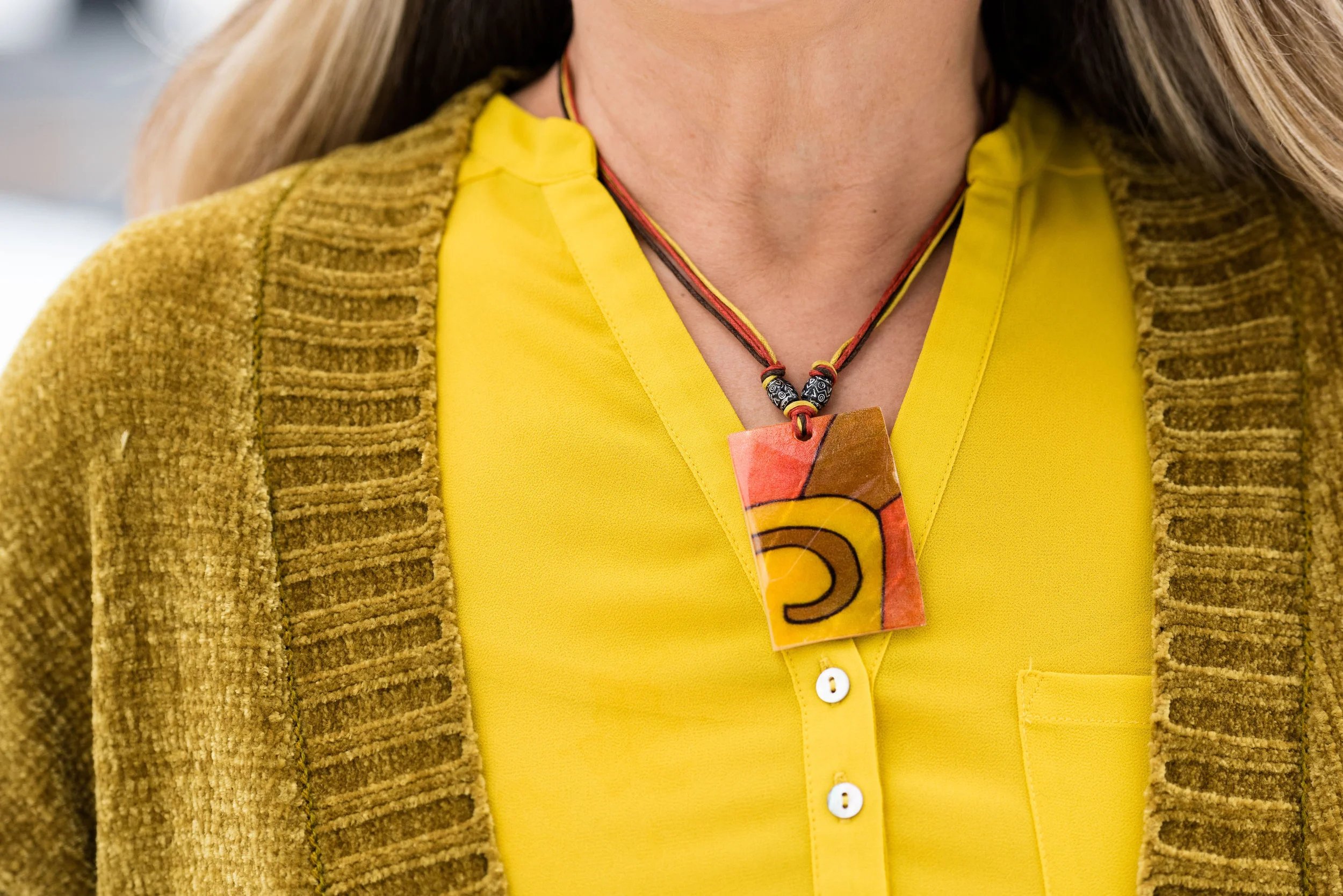
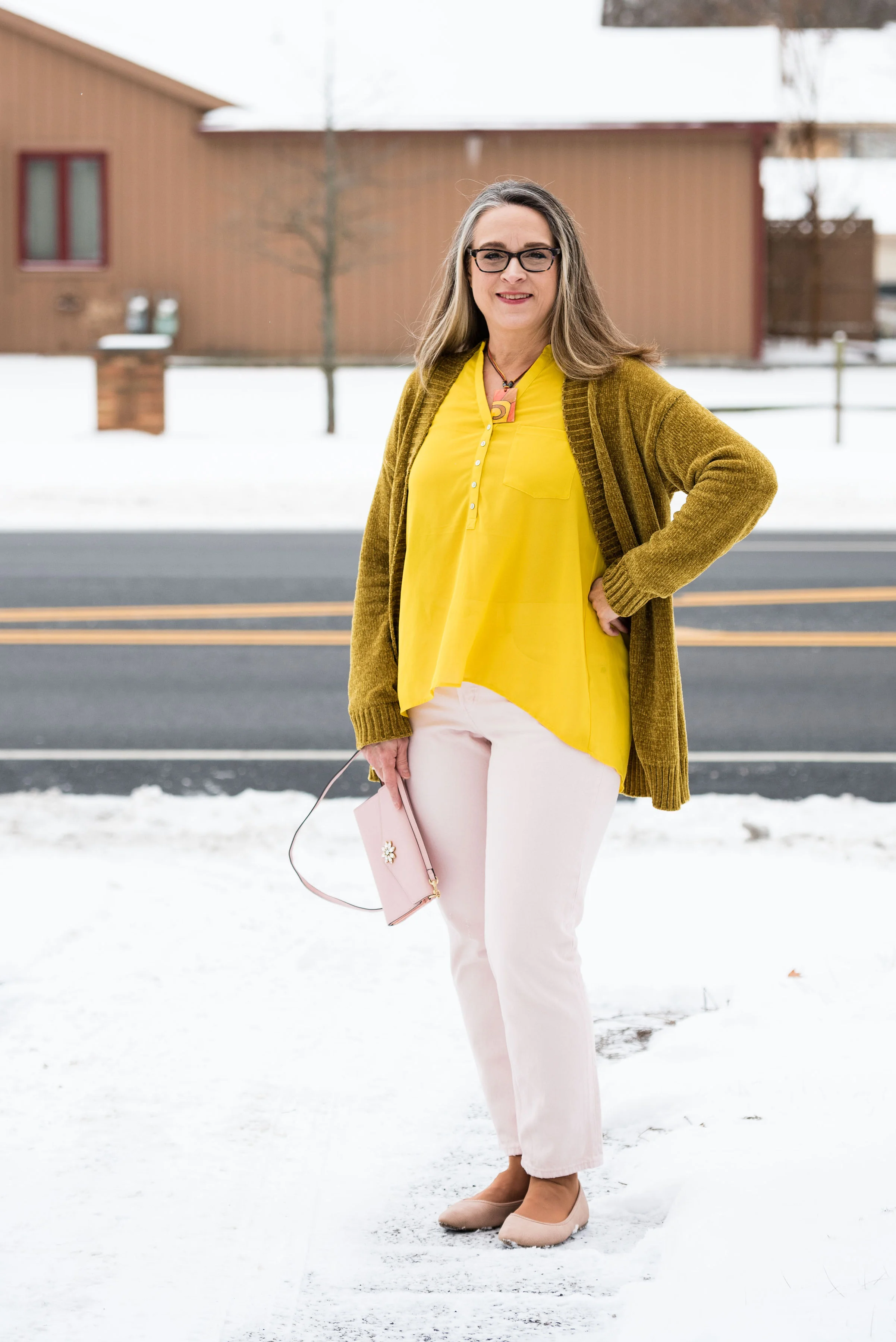
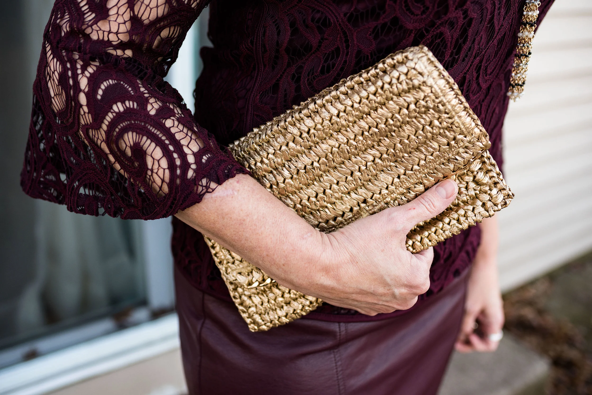
This spring/summer palette is full of rich, saturated colors, but also has sweet, light pastels that will appeal to the little girls in us. As usual the Pantone Color Institute has named these colors with fun foodie words like Pepper Stem, Turmeric, Toffee, Mango Mojito and Lemon Verbena. Other names convey the beauties of the natural world, such as Living Coral (the Pantone Color of the Year), Aspen Gold, Terrarium Moss, Sweet Lilac and Pressed Rose. Finally, summer wouldn’t be complete without a few colors that remind us of cookouts, parties and fun times: Fiesta, Jester Red, Pink Peacock and Princess Blue.

I liked all of the colors on this palette. I had fun choosing outfits around these colors and when we get to the actual outfit posts, I’ll explain my rationale for each outfit more fully.

I addition to the 14 colors above both the New York and London palettes both share the four neutral palette shown below.

I wish they had included a gray, like they’ve done in the past, but I don’t begrudge them for changing things up a bit. The Brown Granite is a nice choice, but I find, that it is easier to locate a gray piece than a color like this. Gray seems to be more classic, but maybe things will change and this brownish gray will take over.

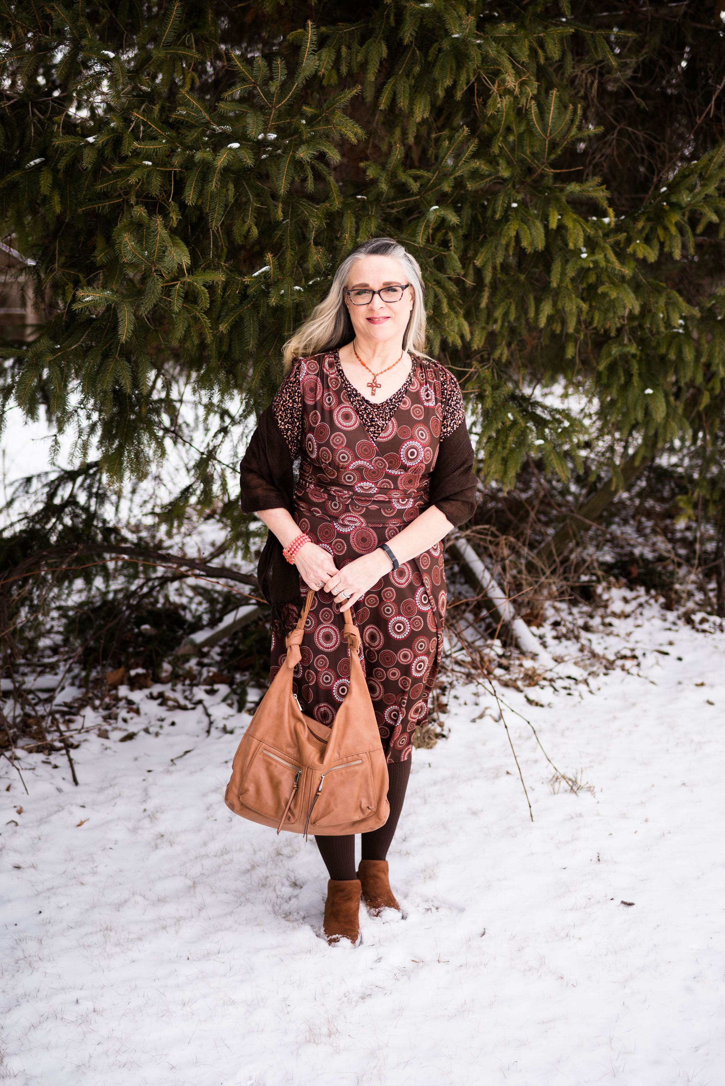
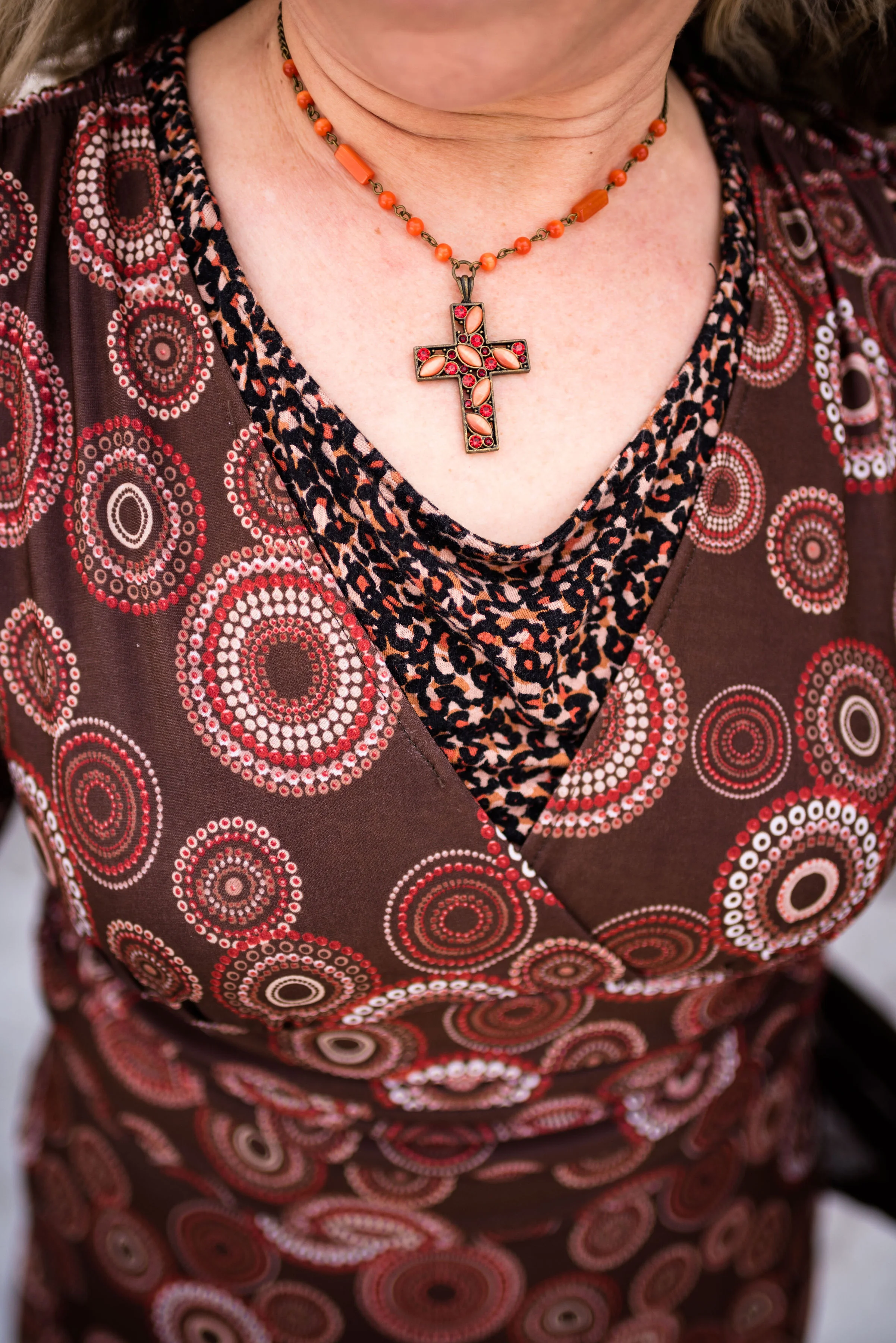
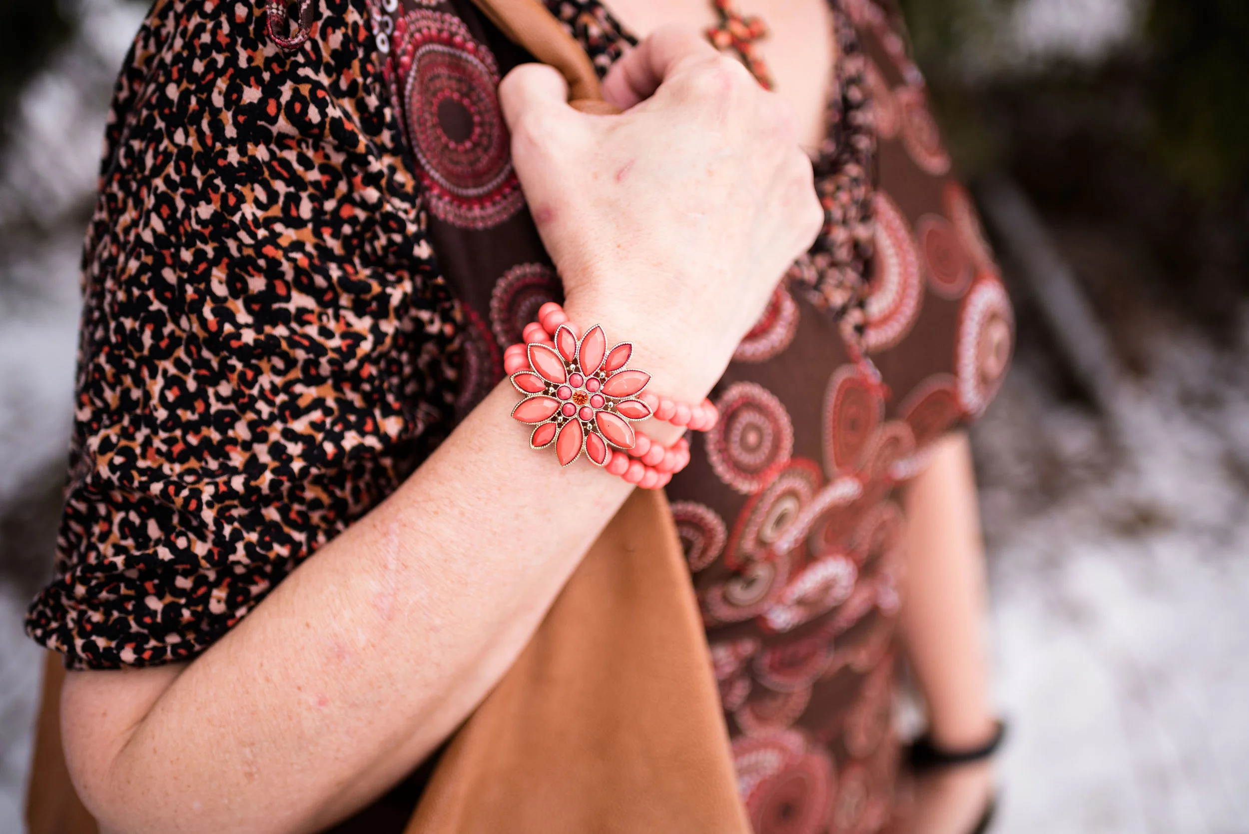
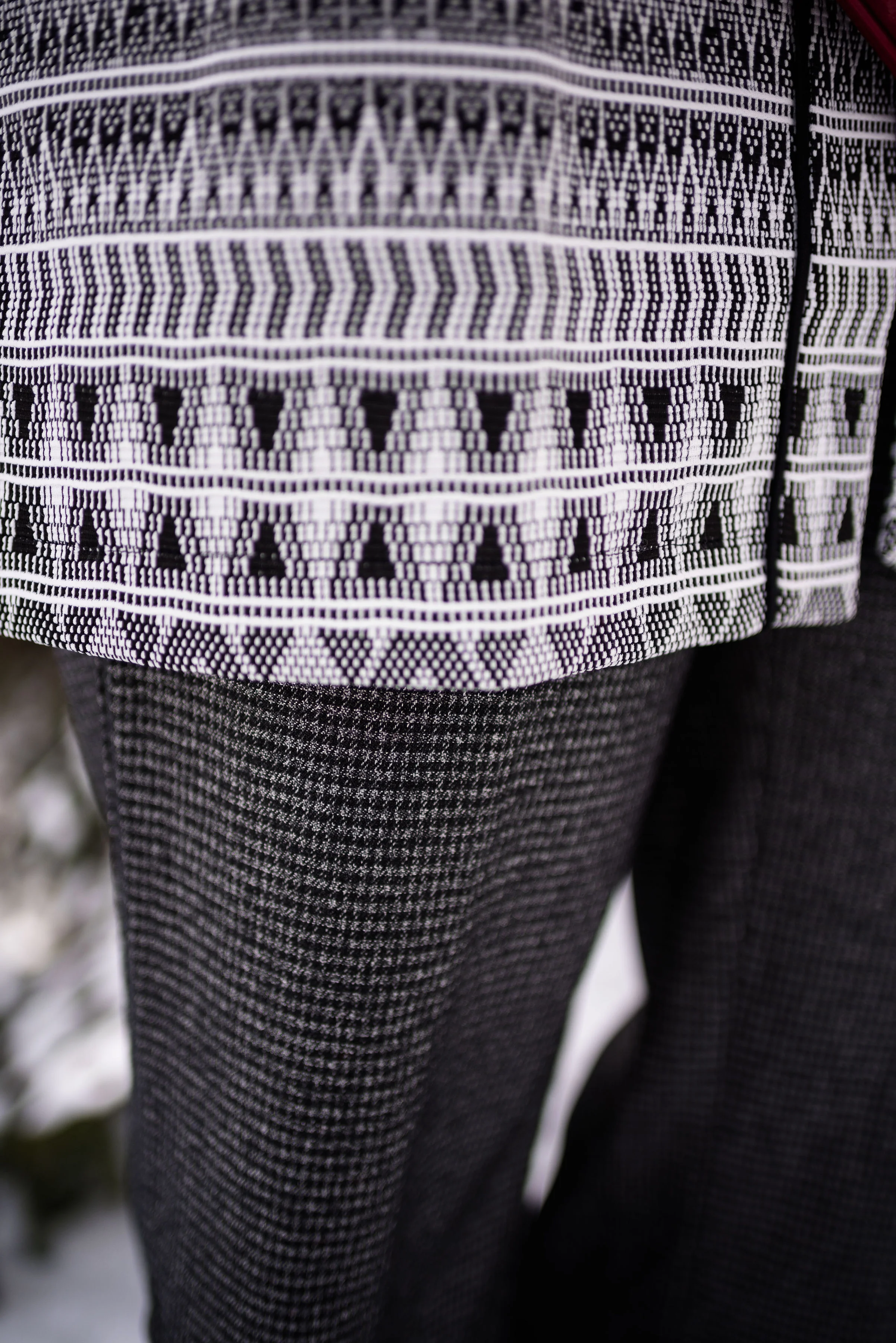
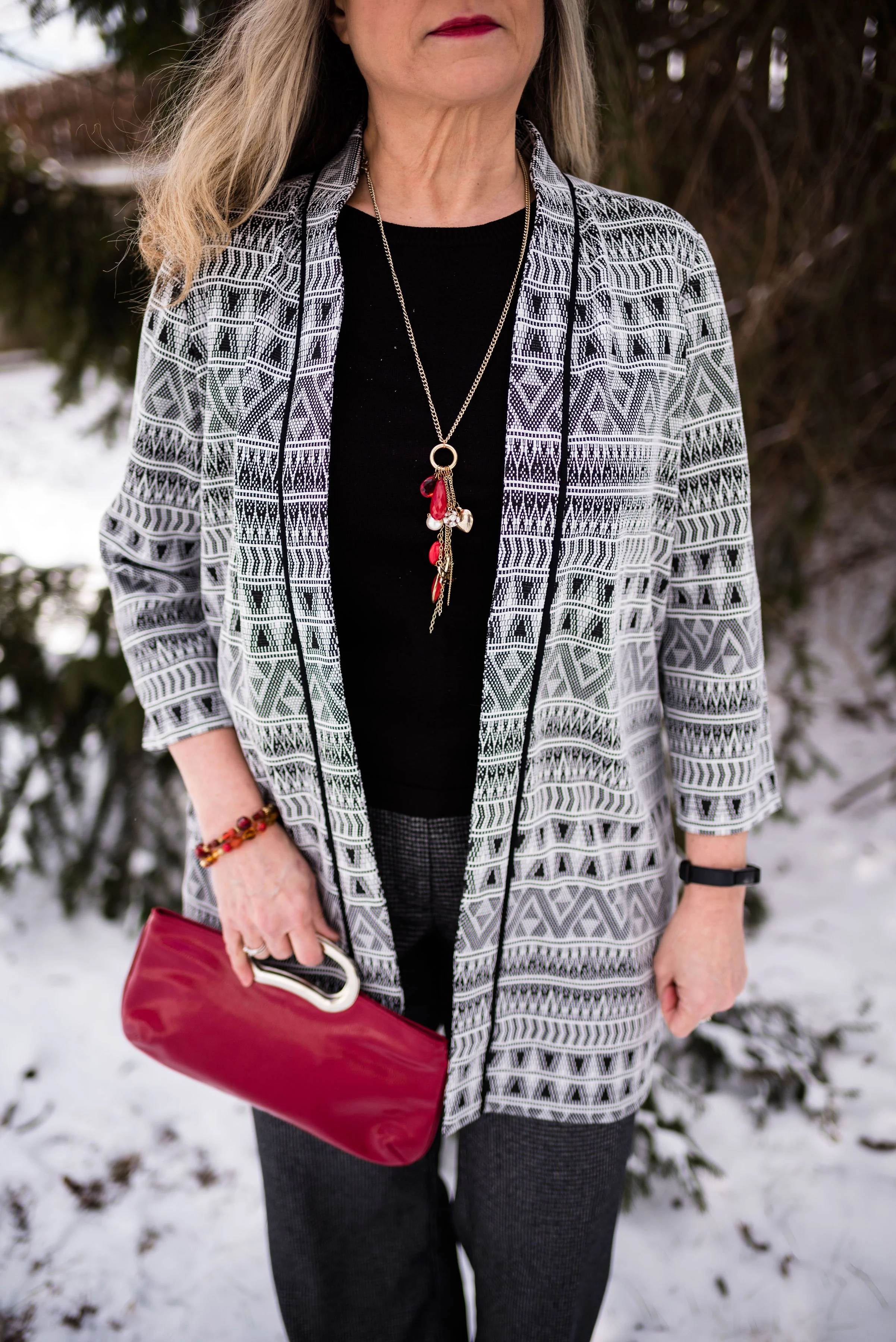
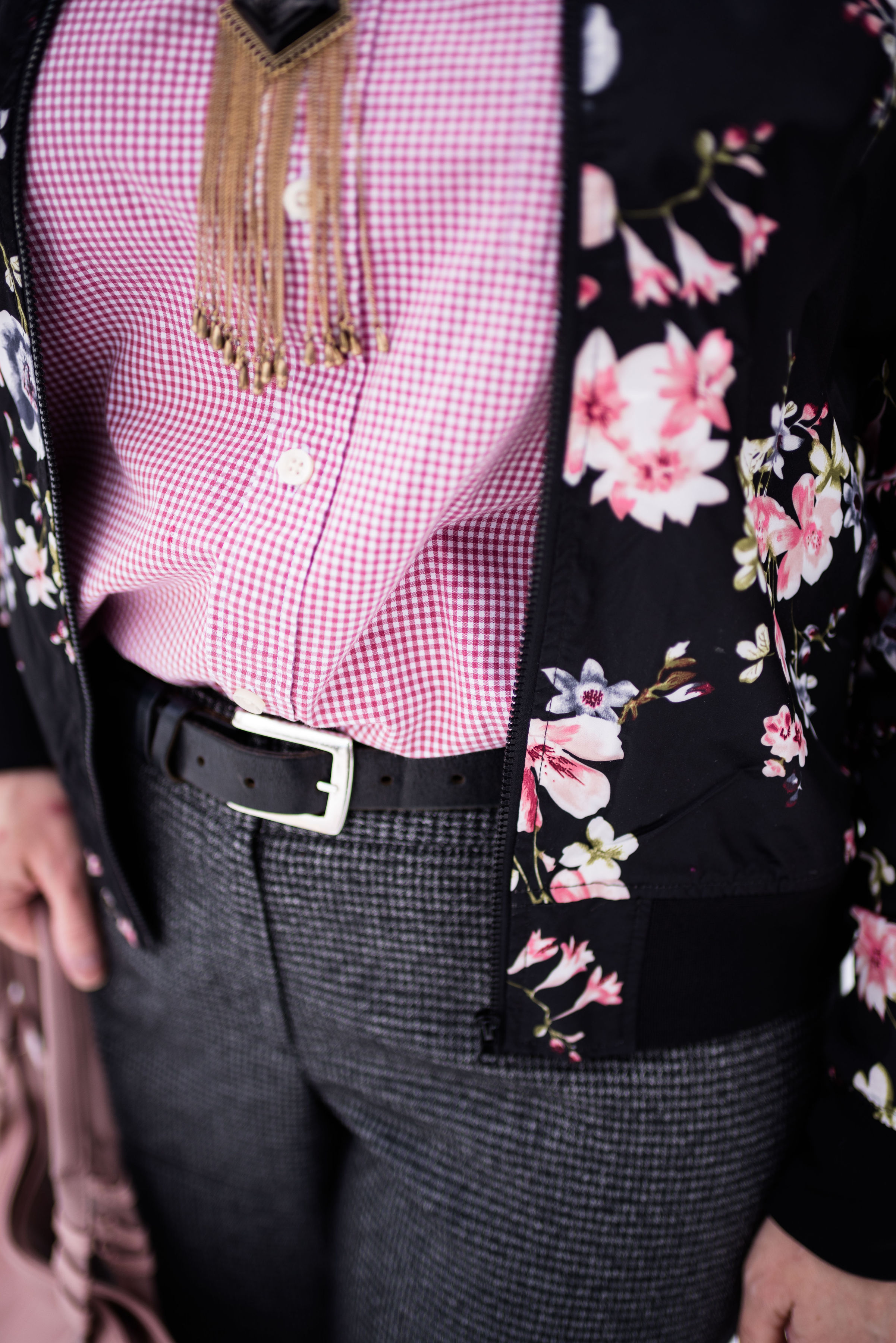
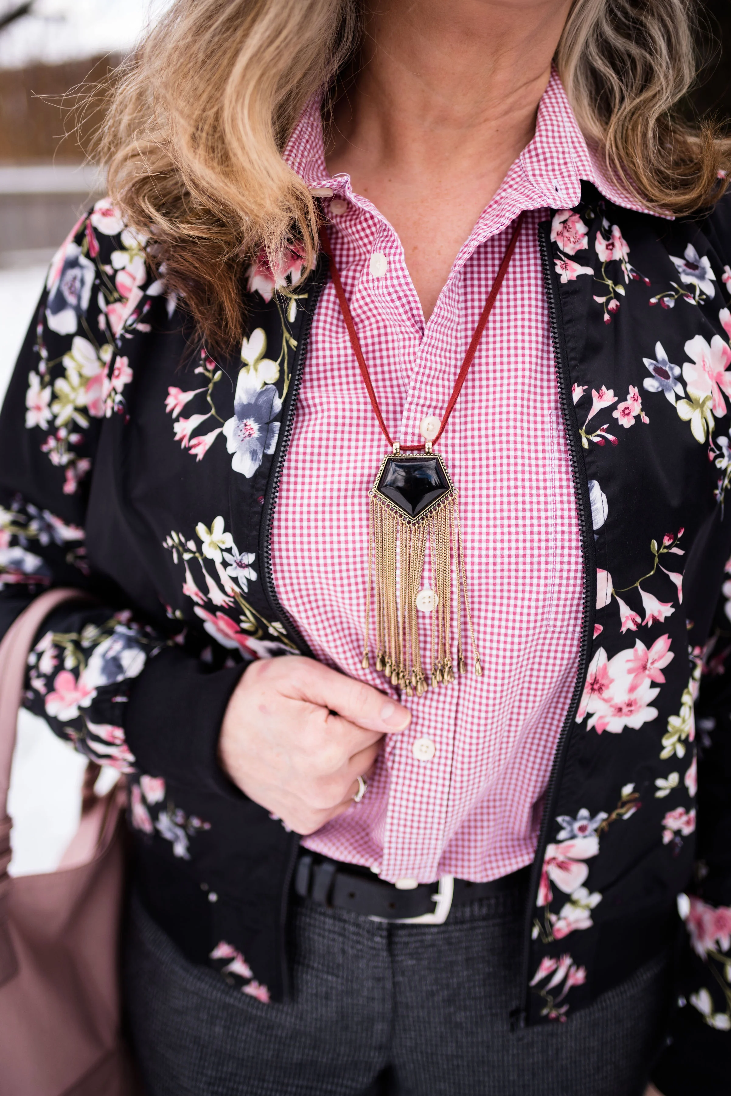
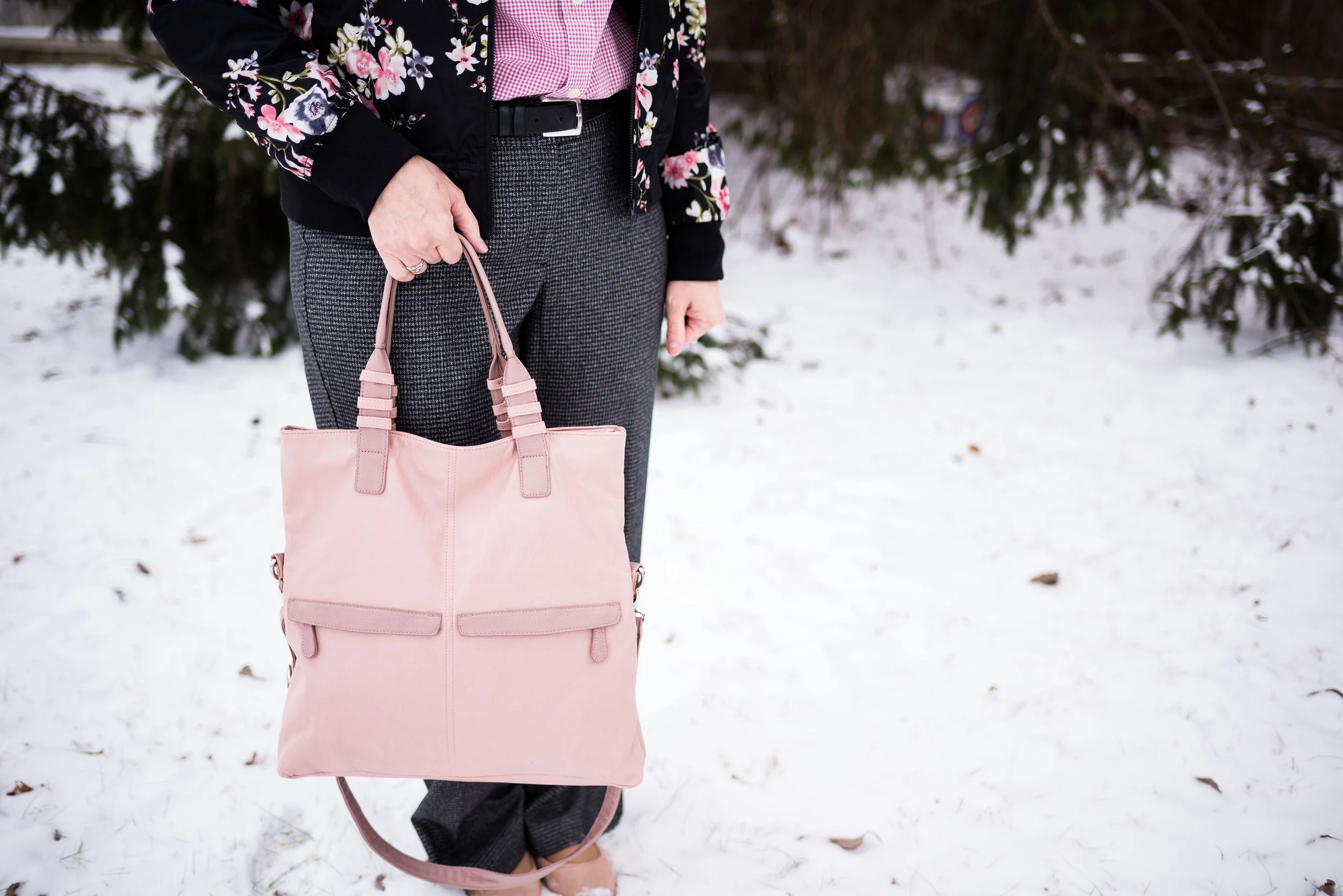
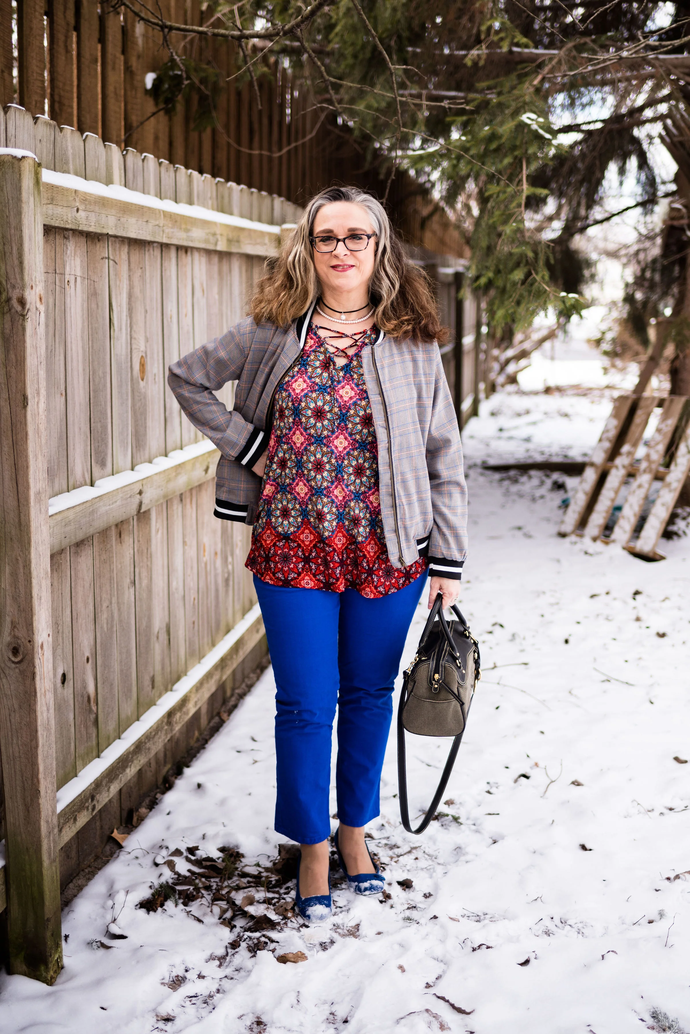
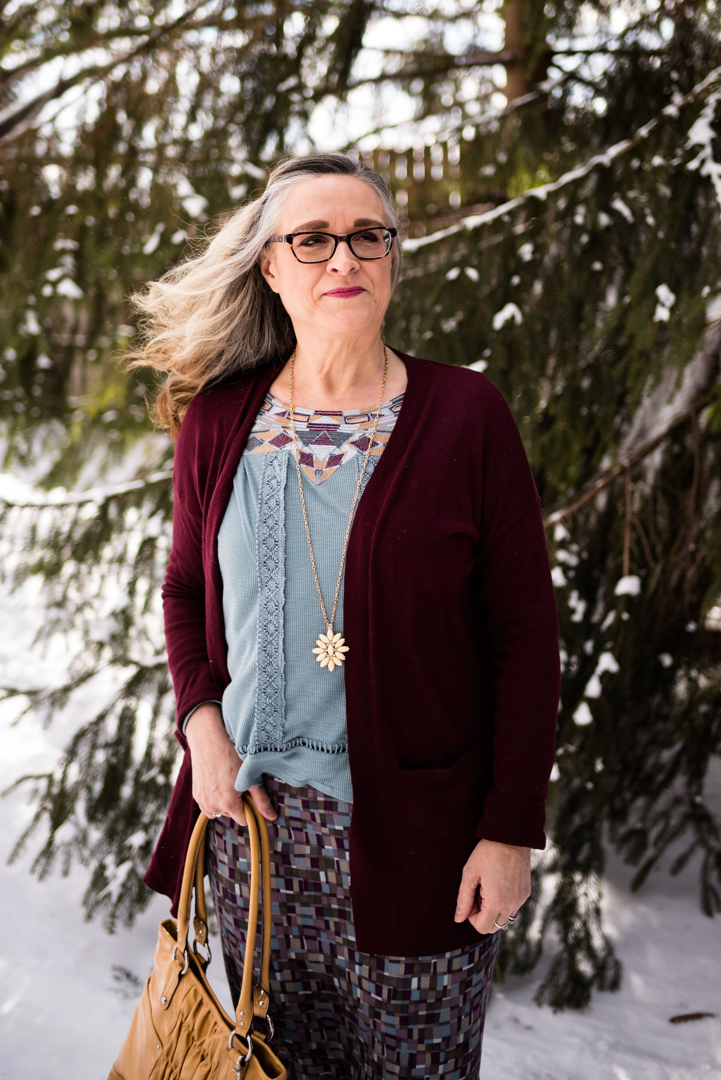
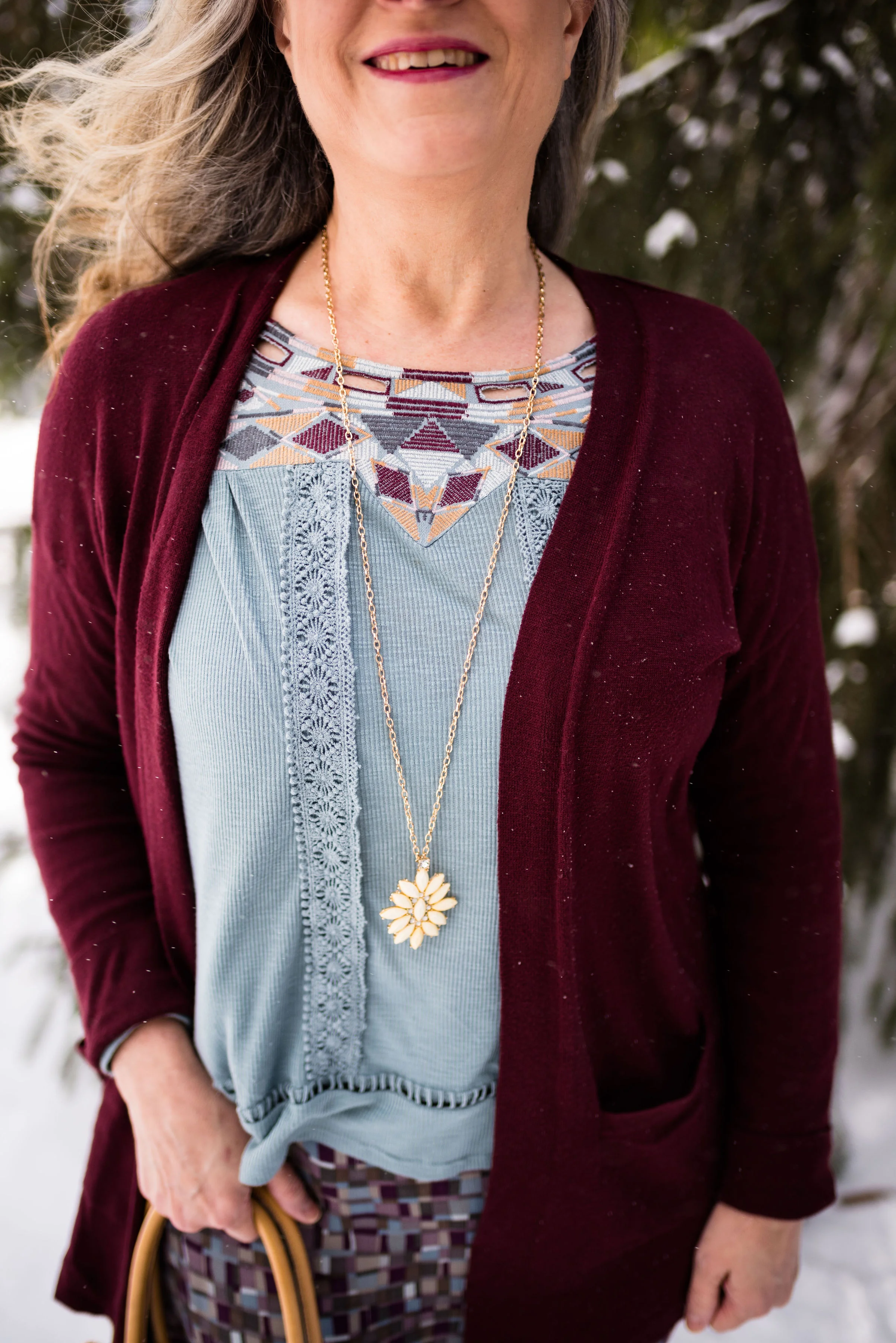
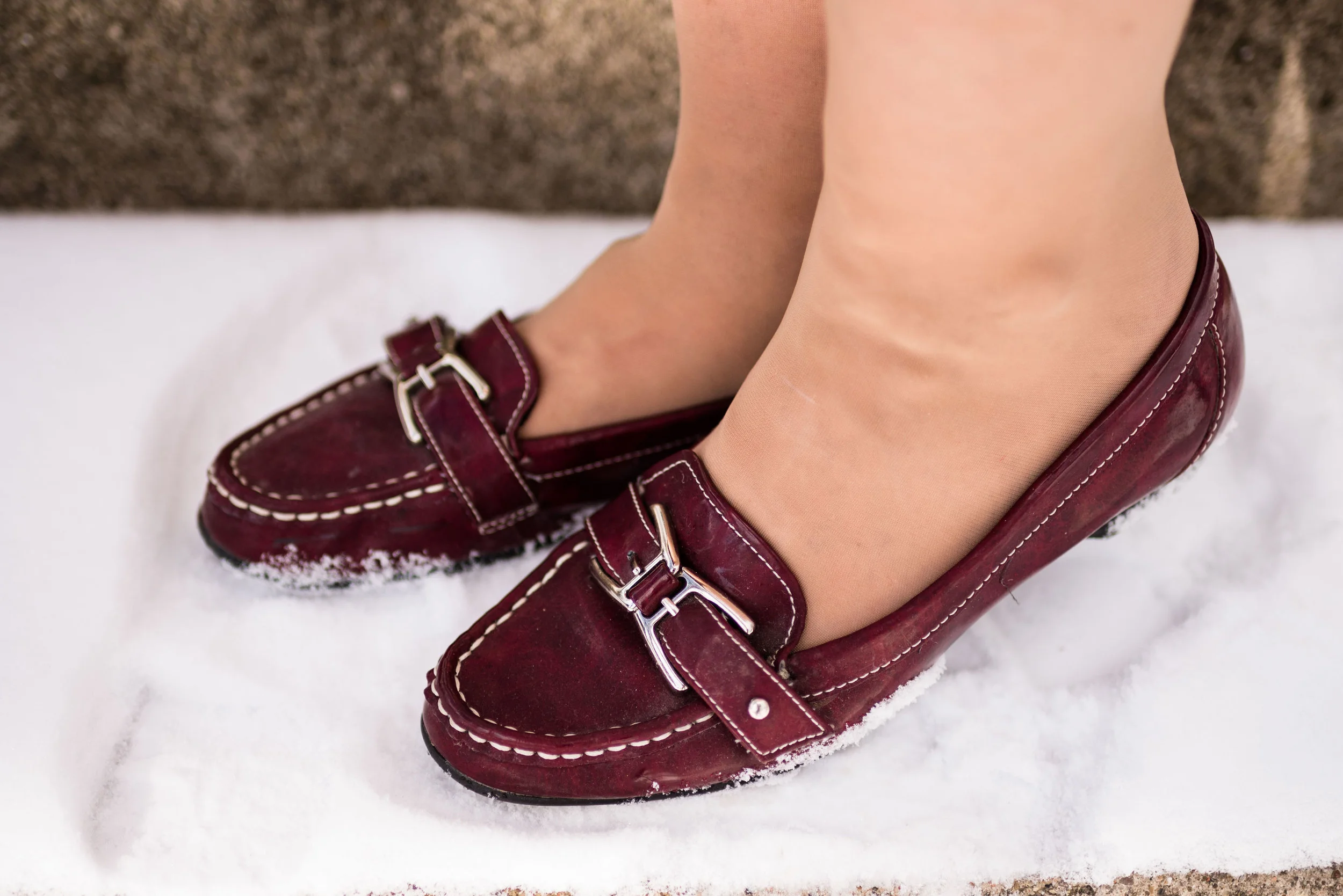
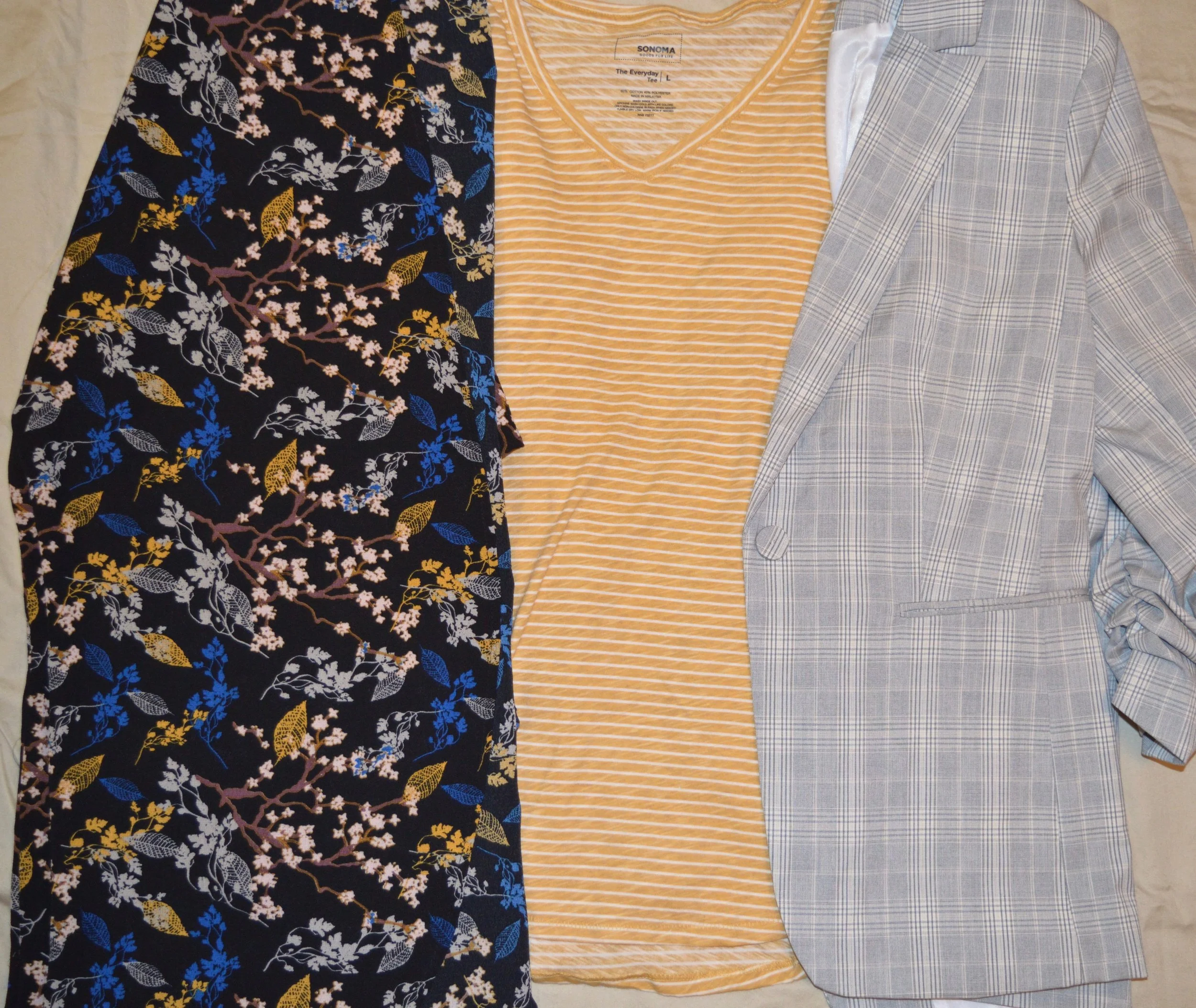
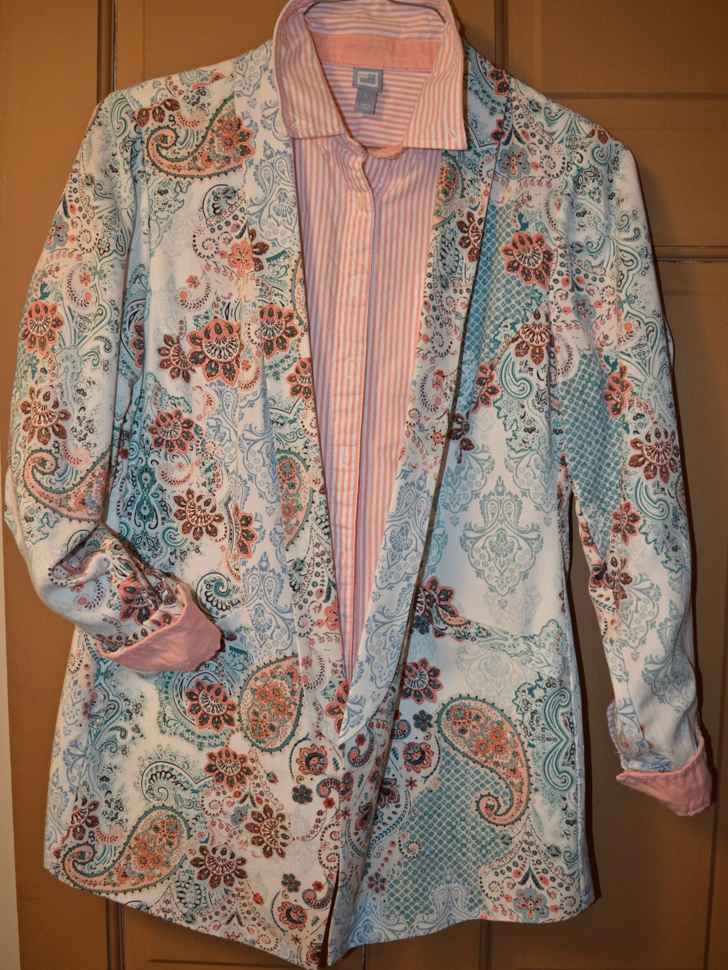
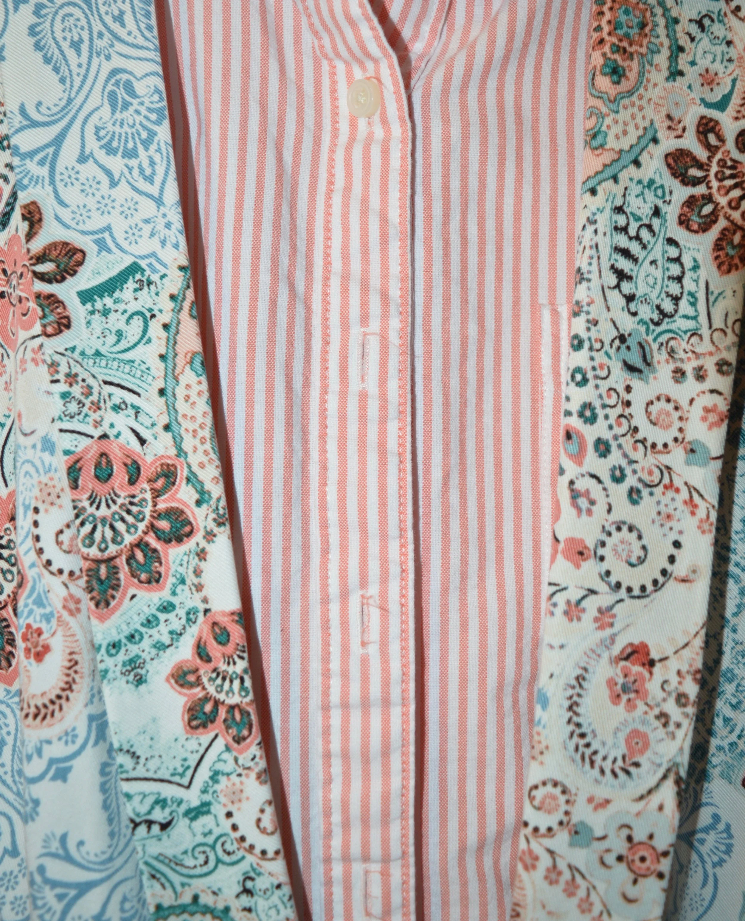
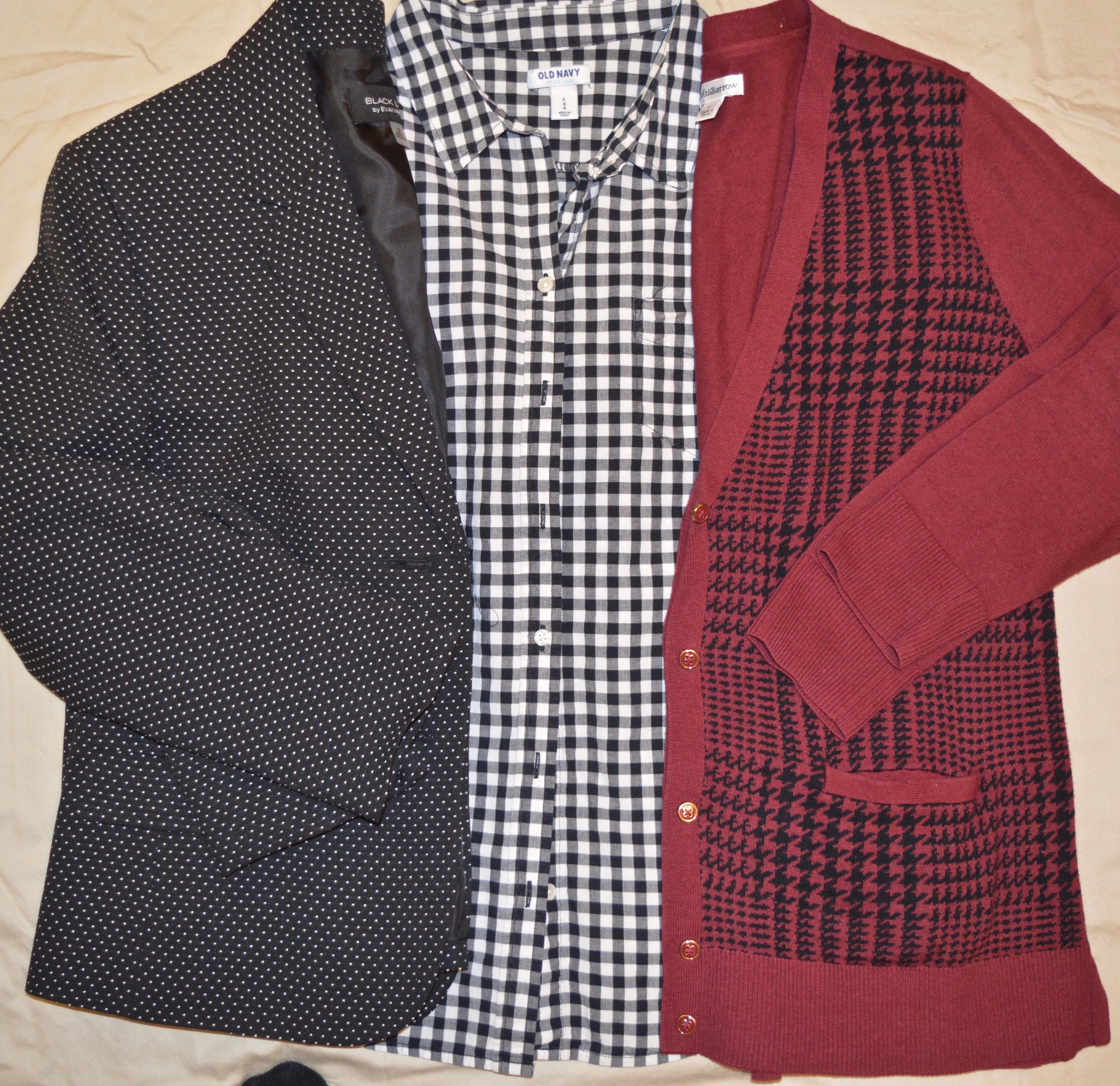
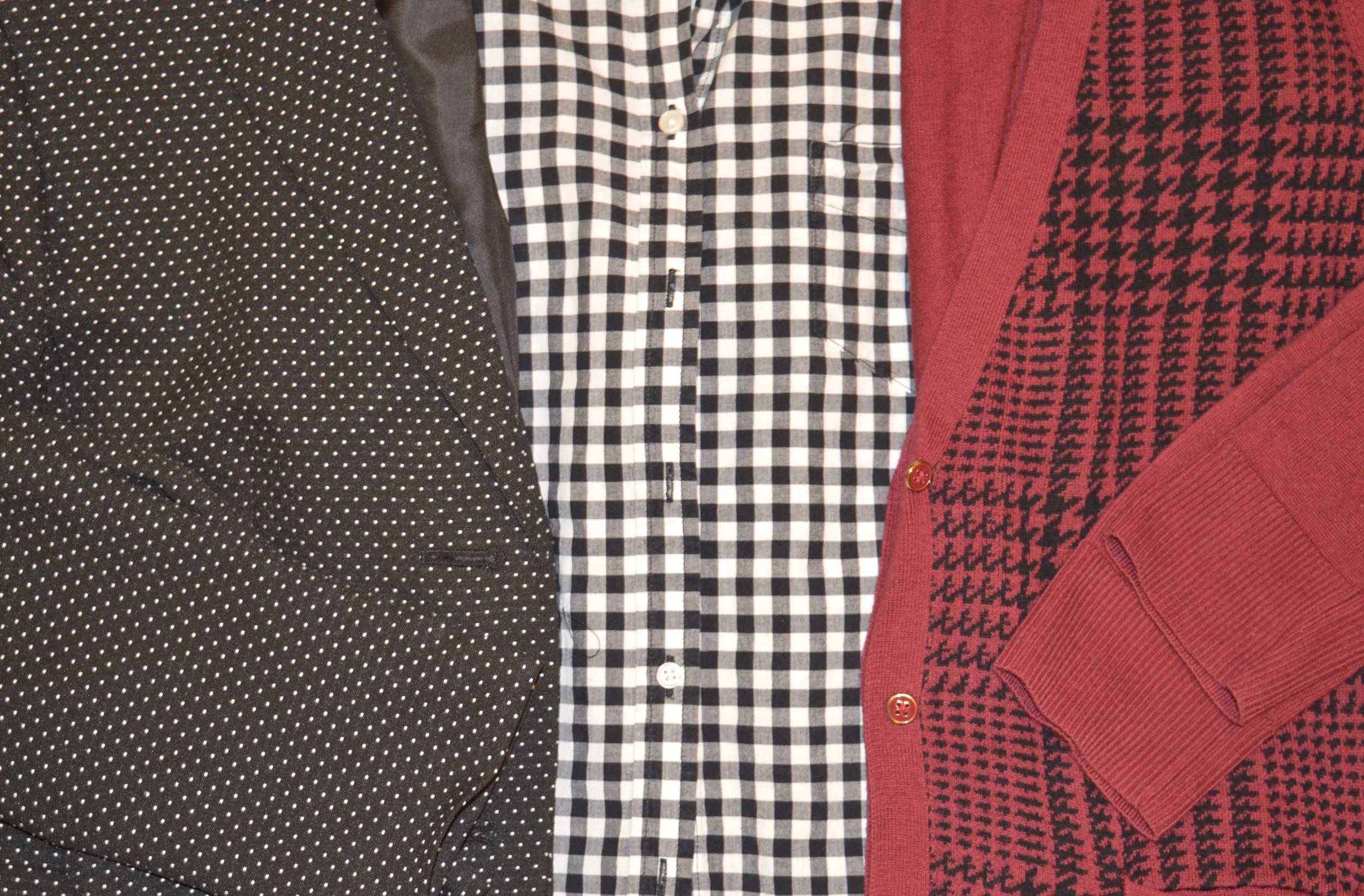
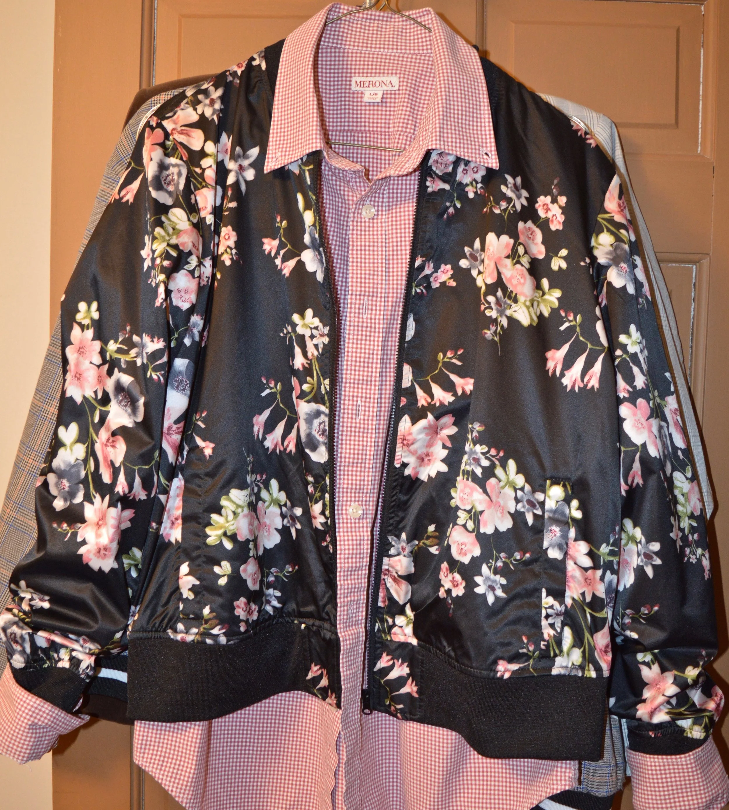
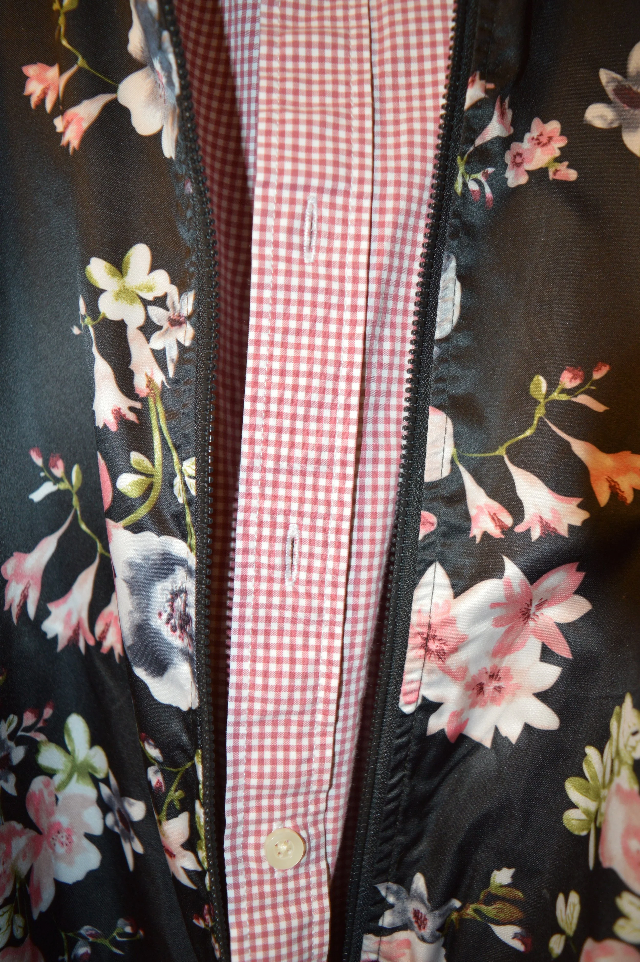
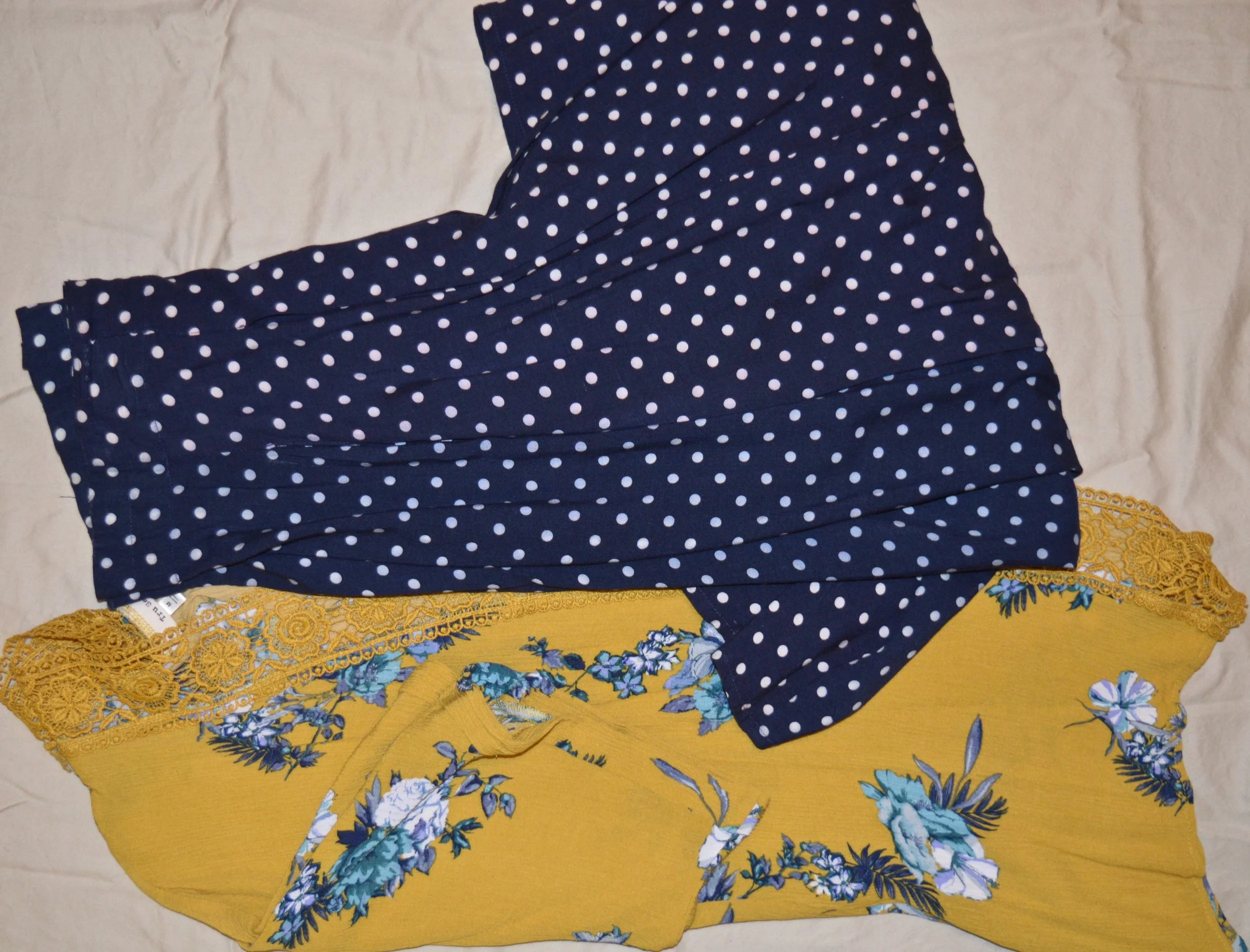
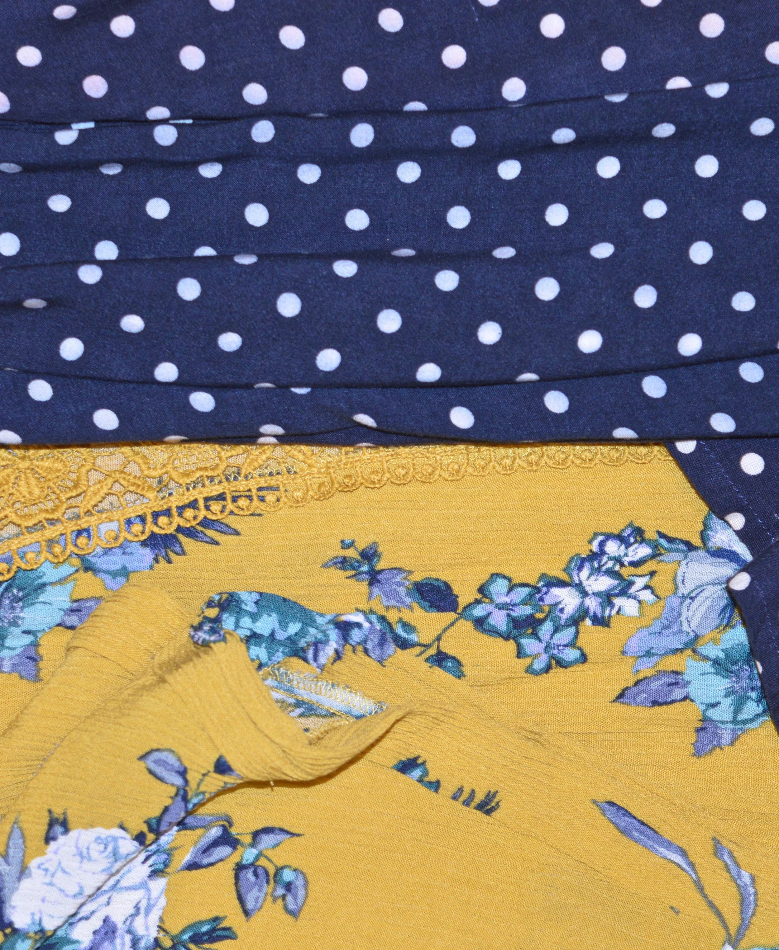
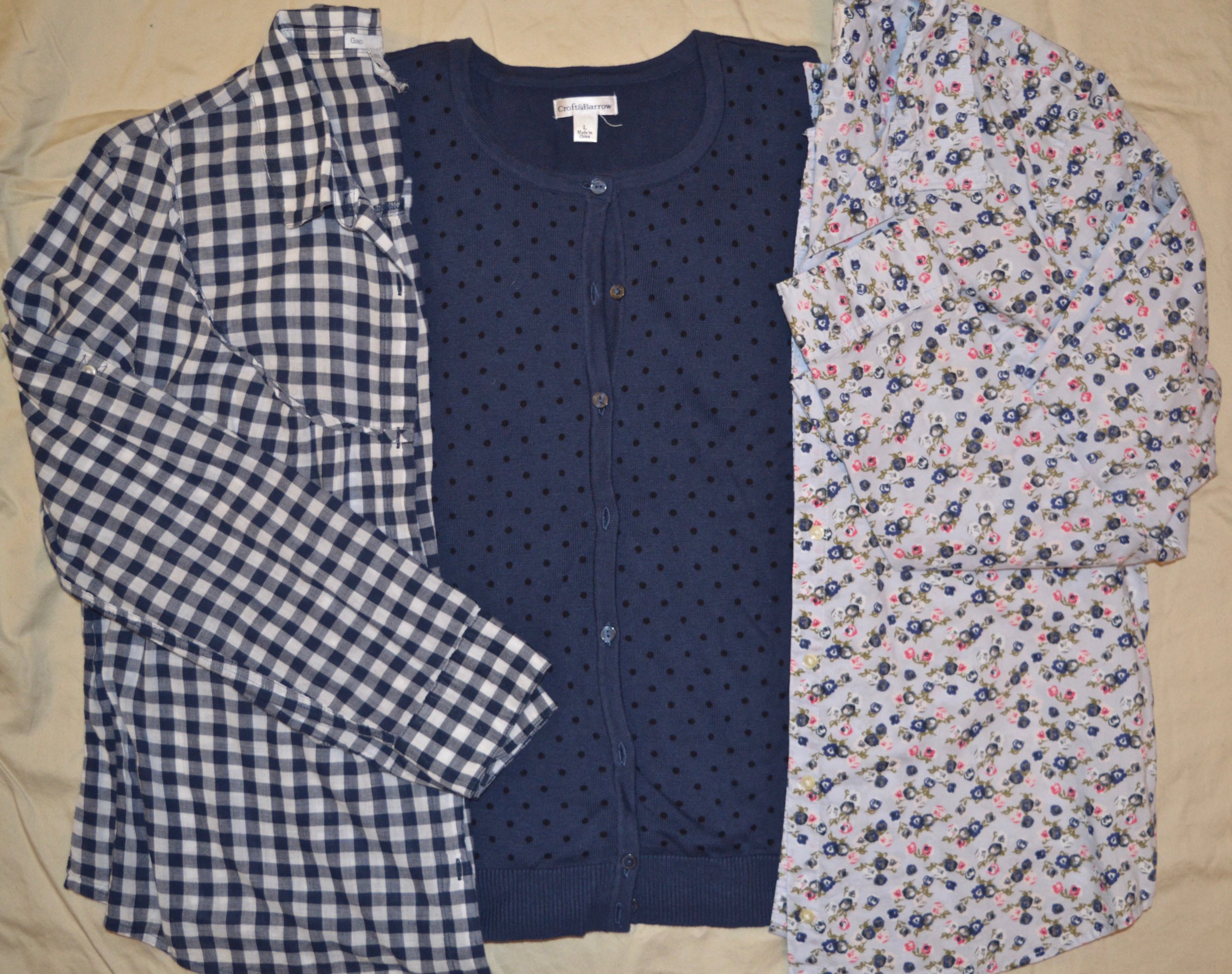
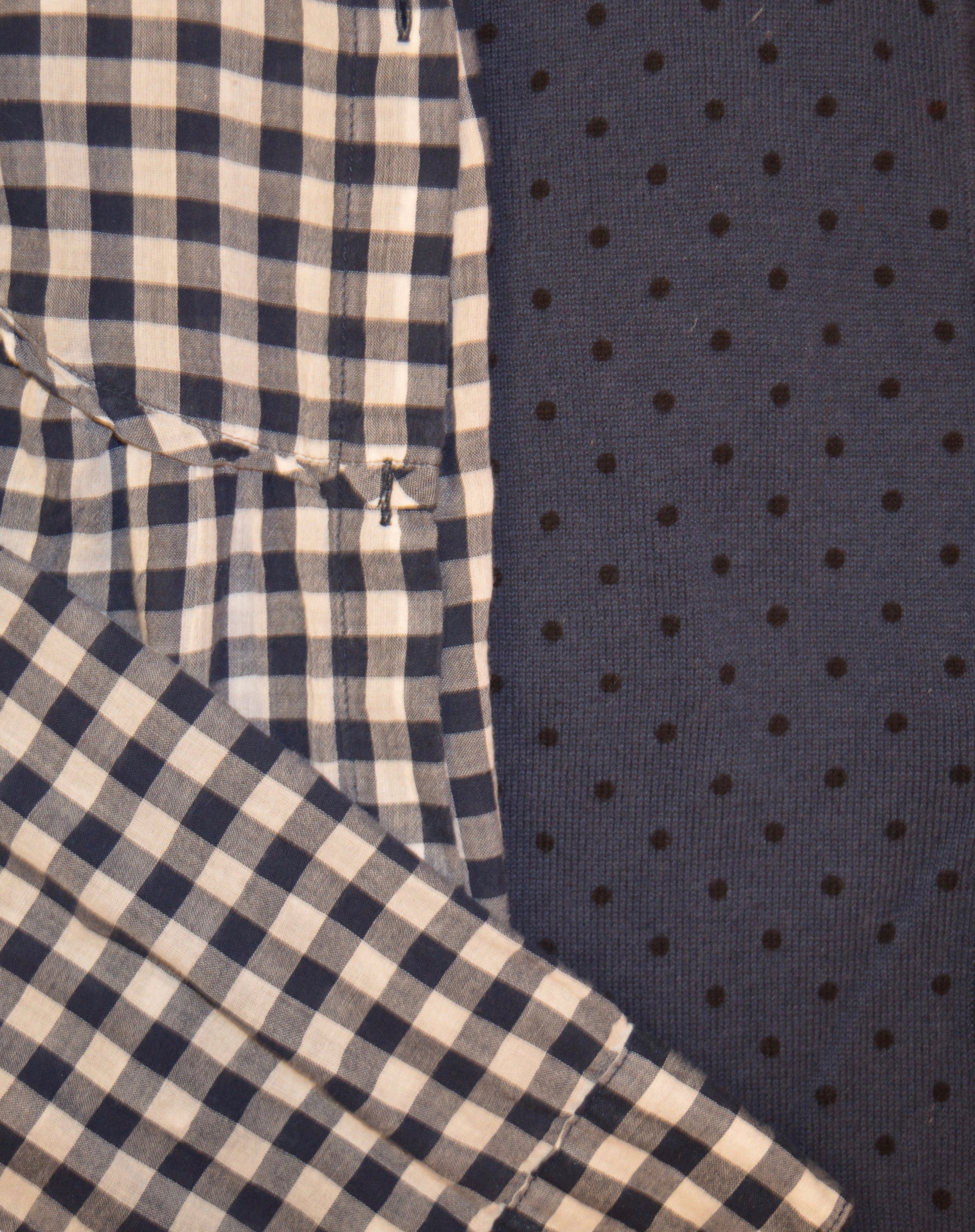
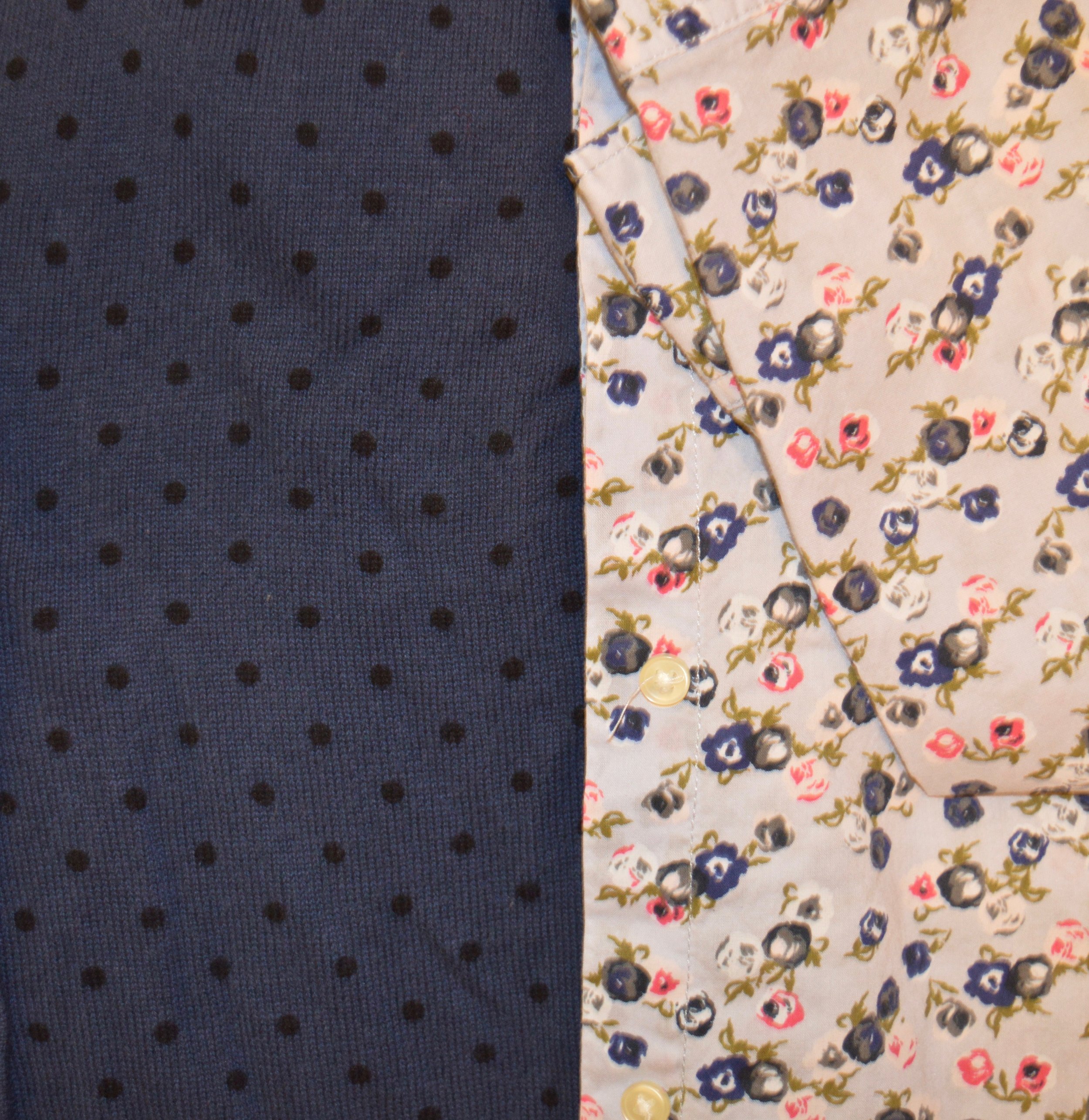
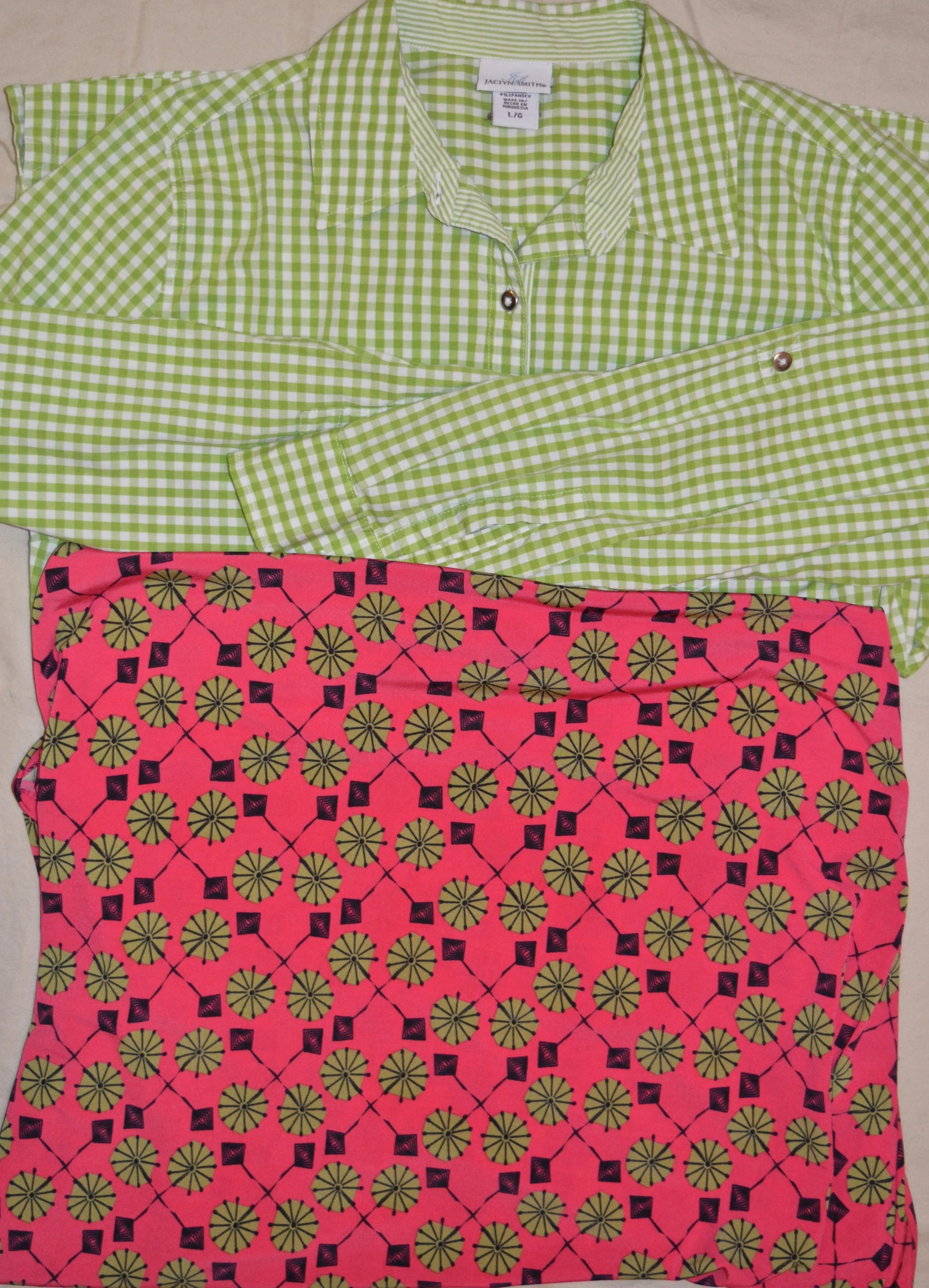
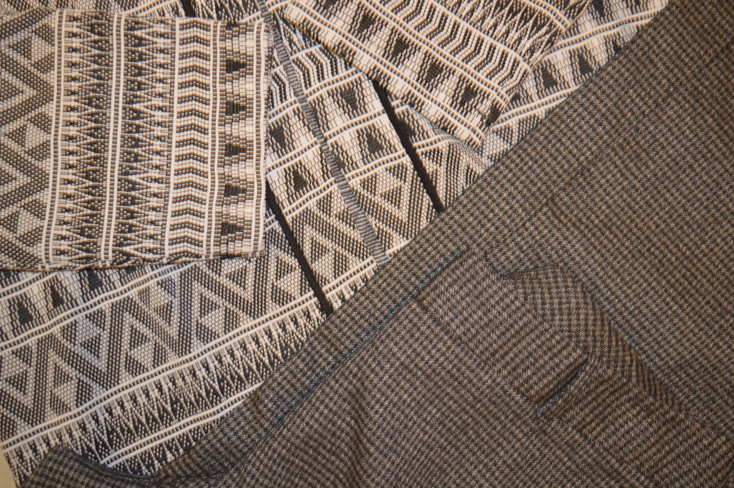
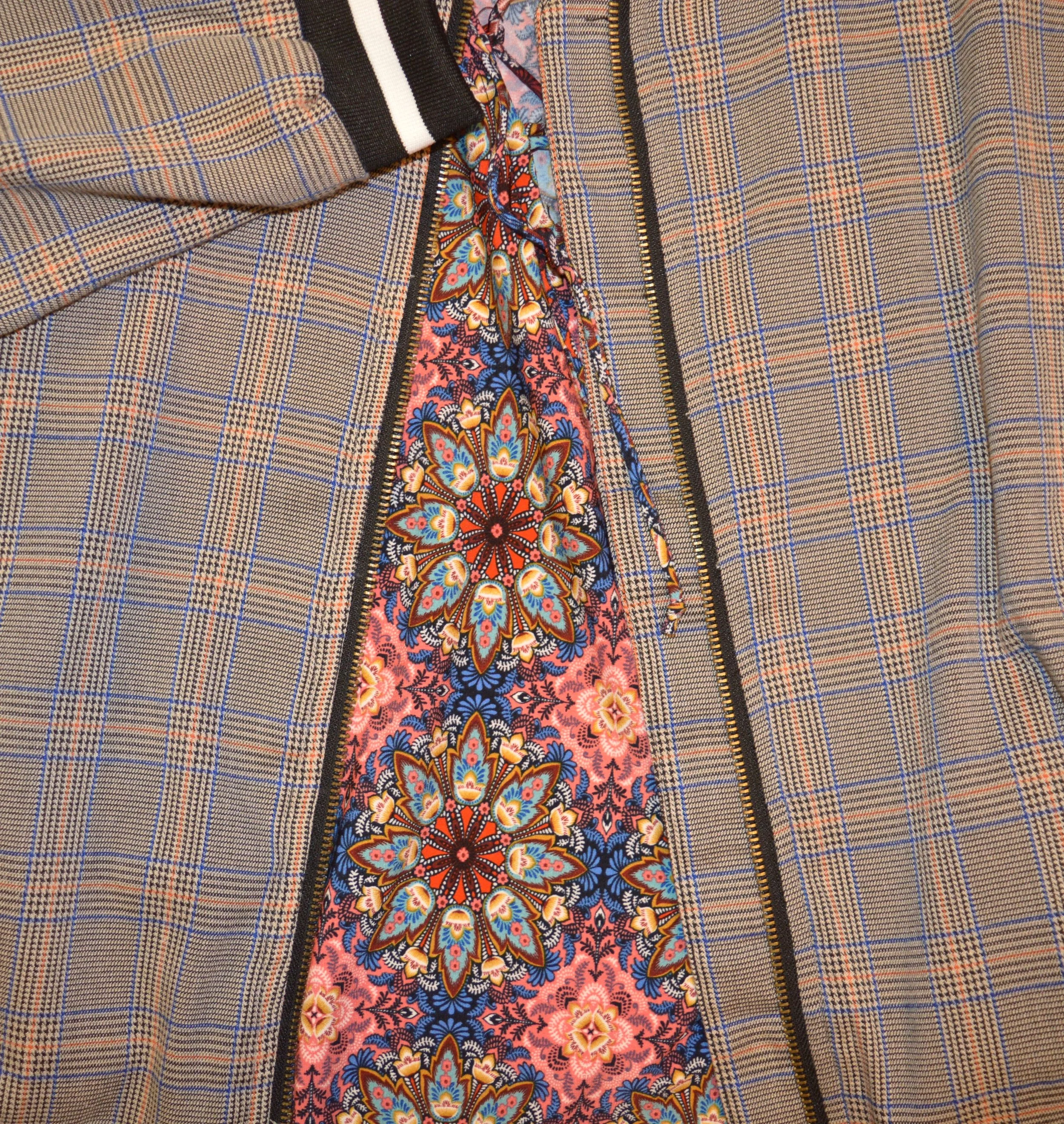
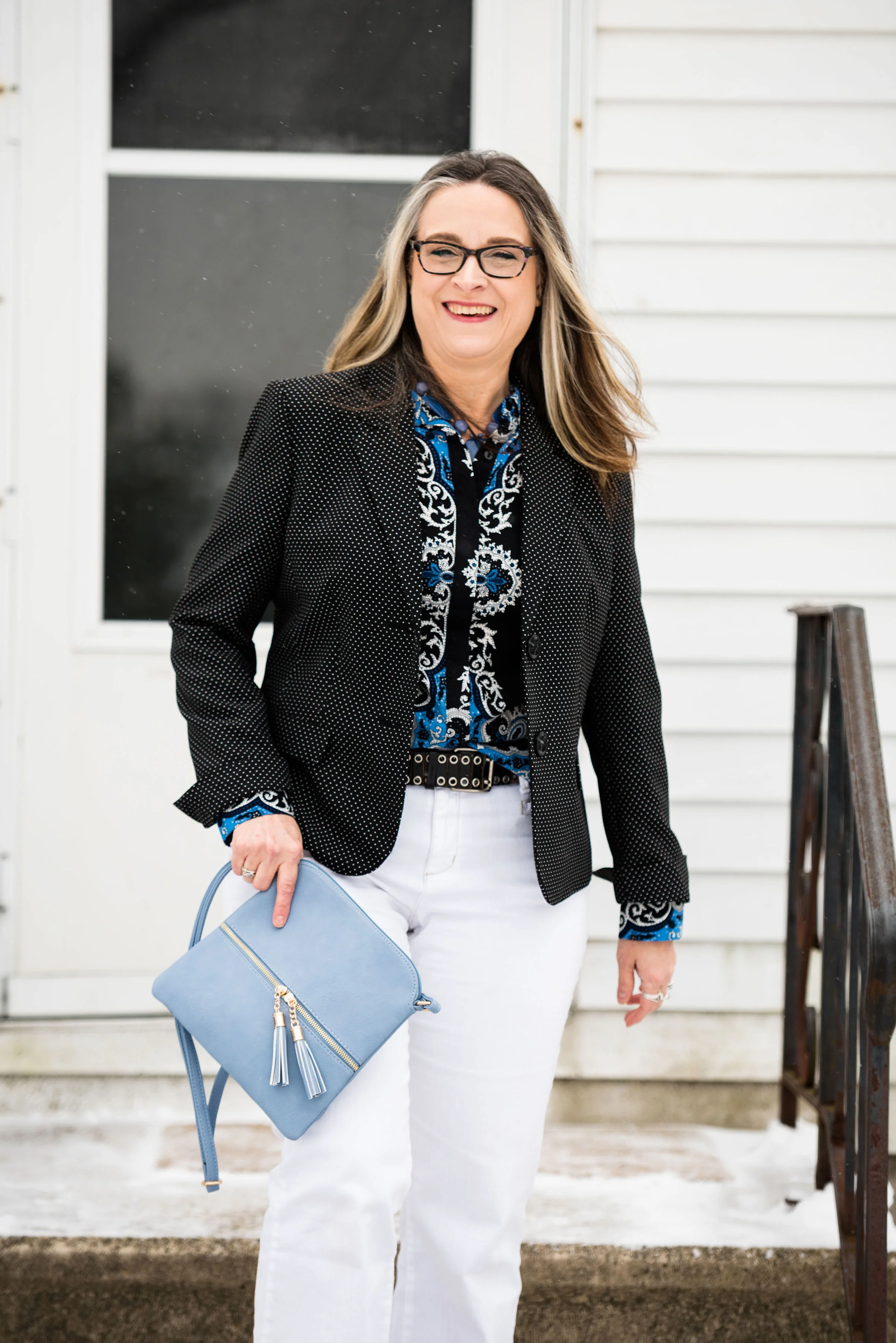
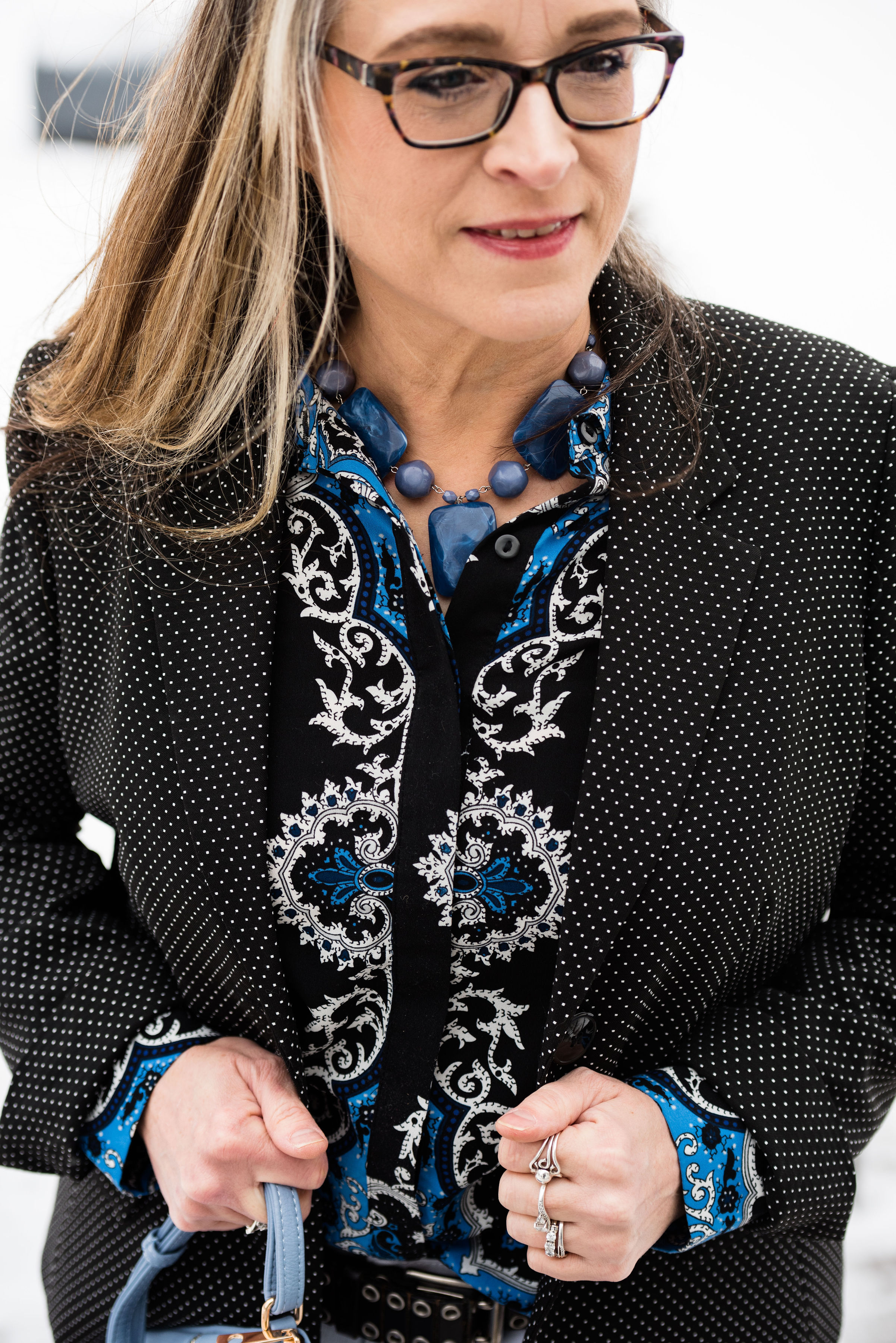
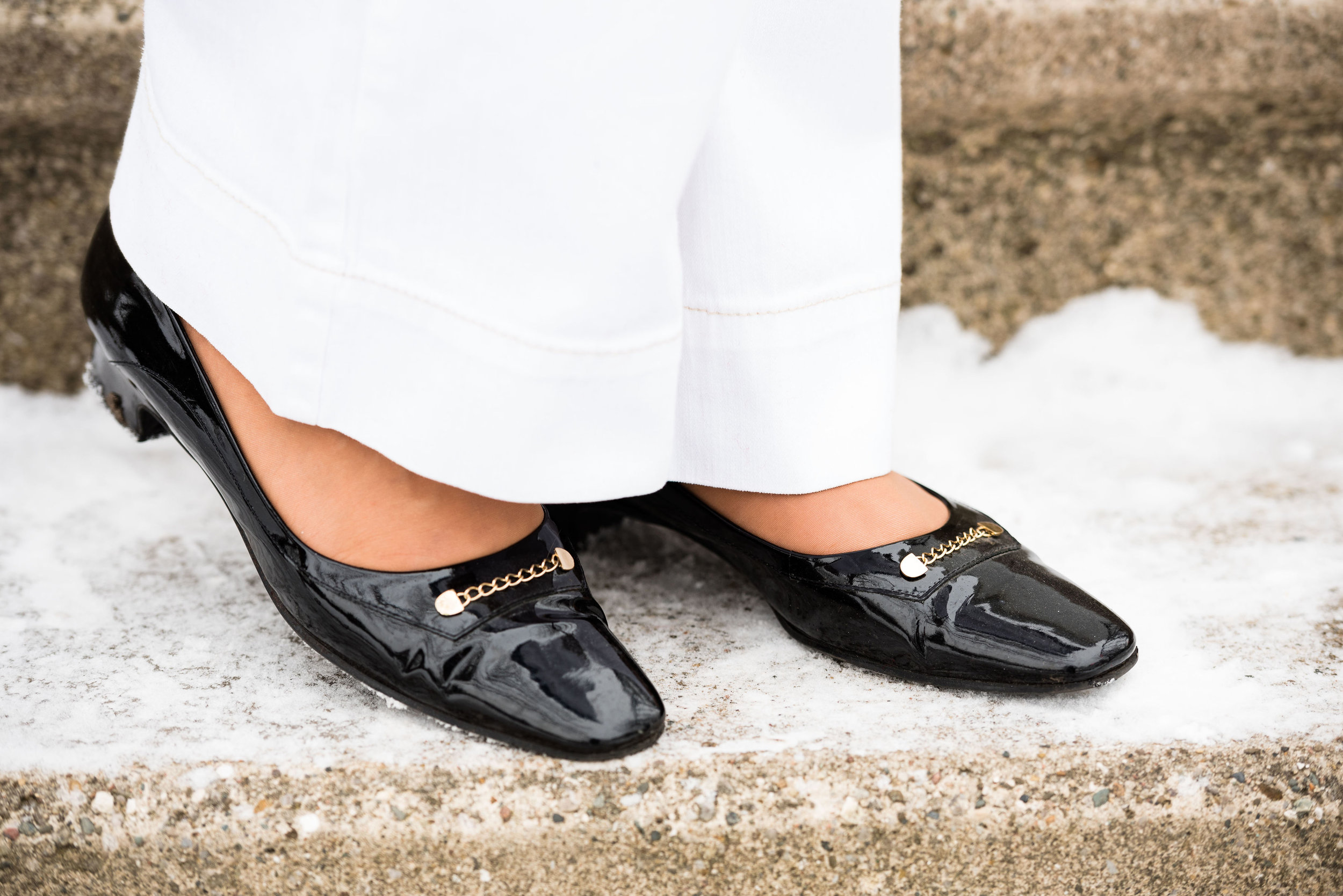
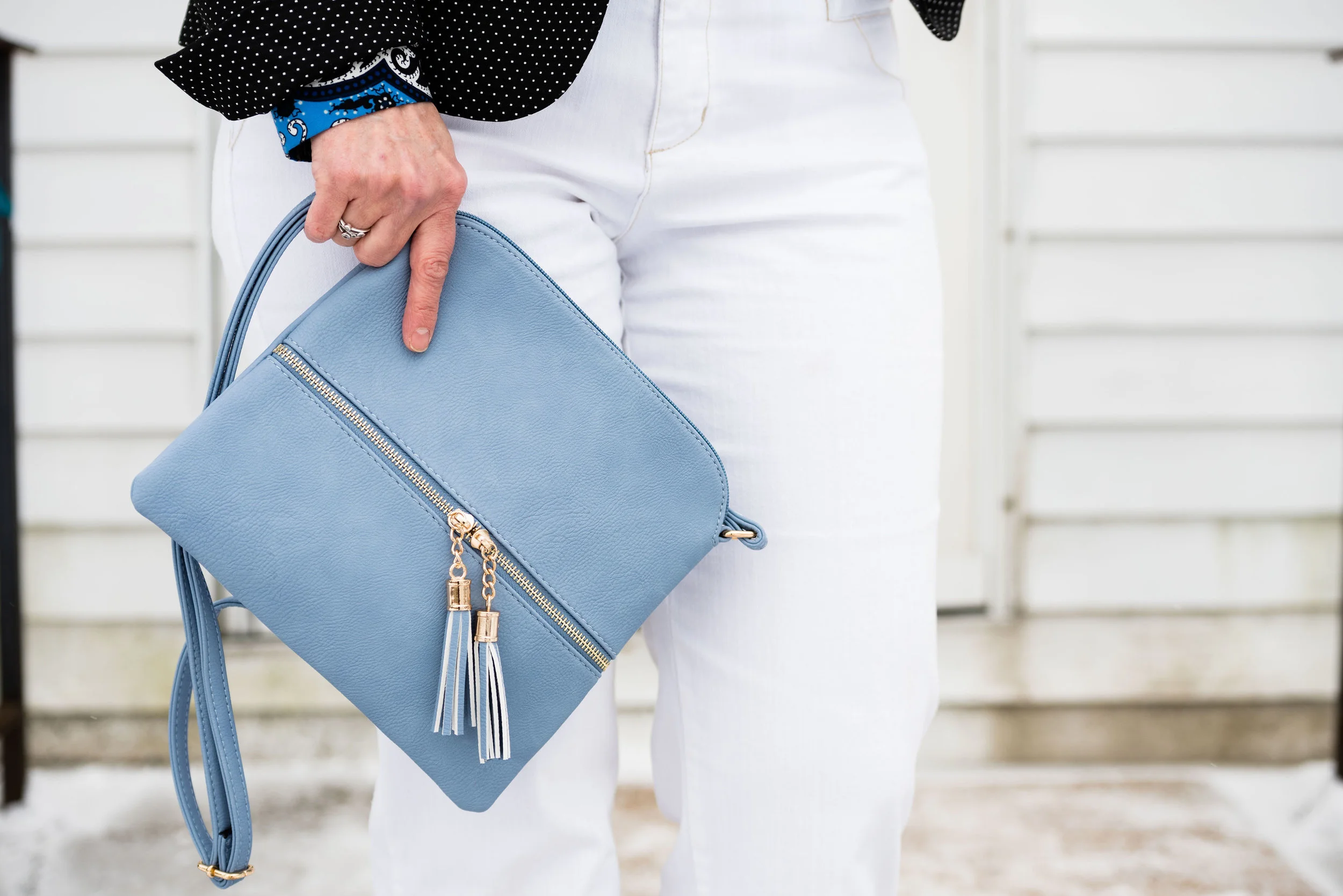
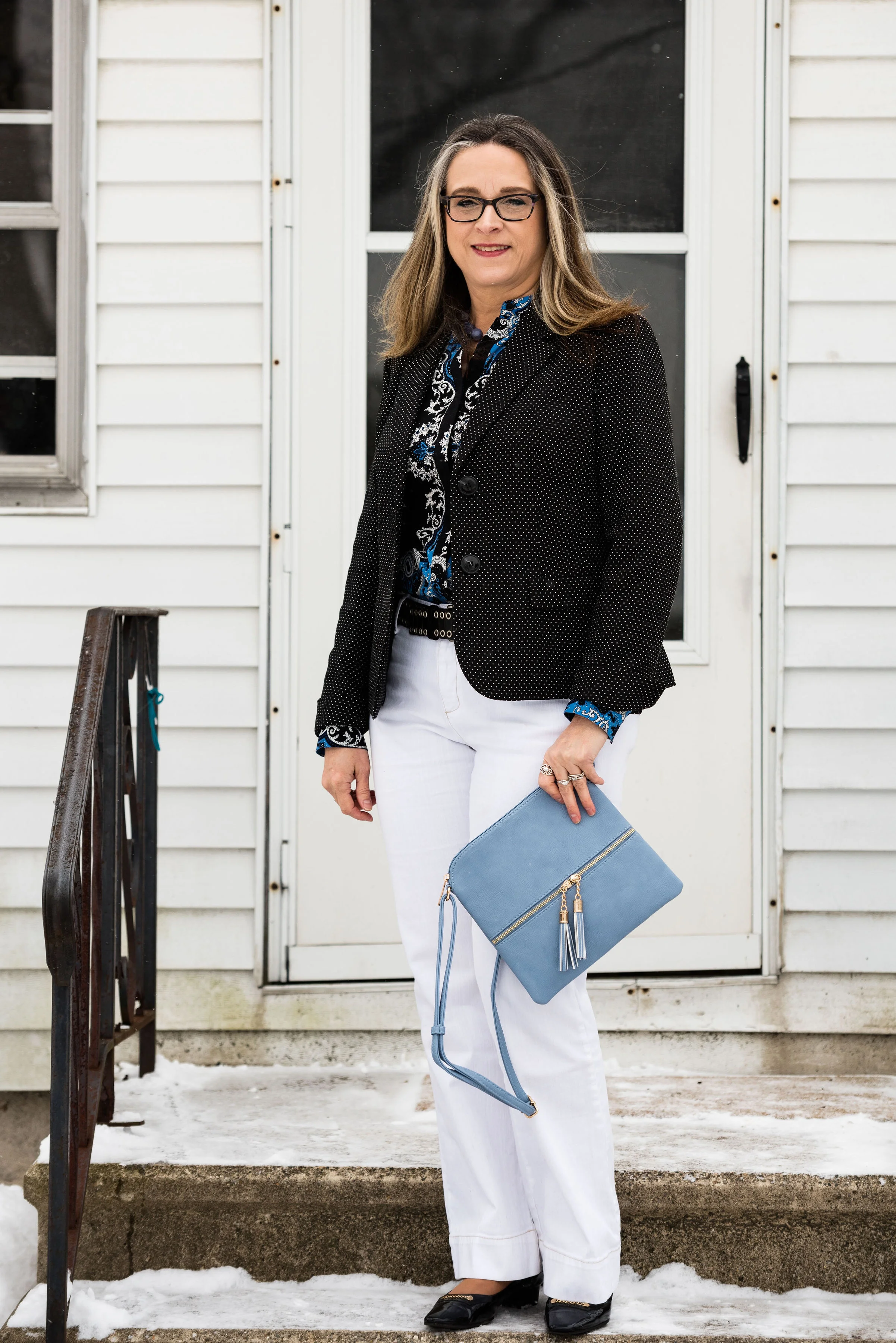
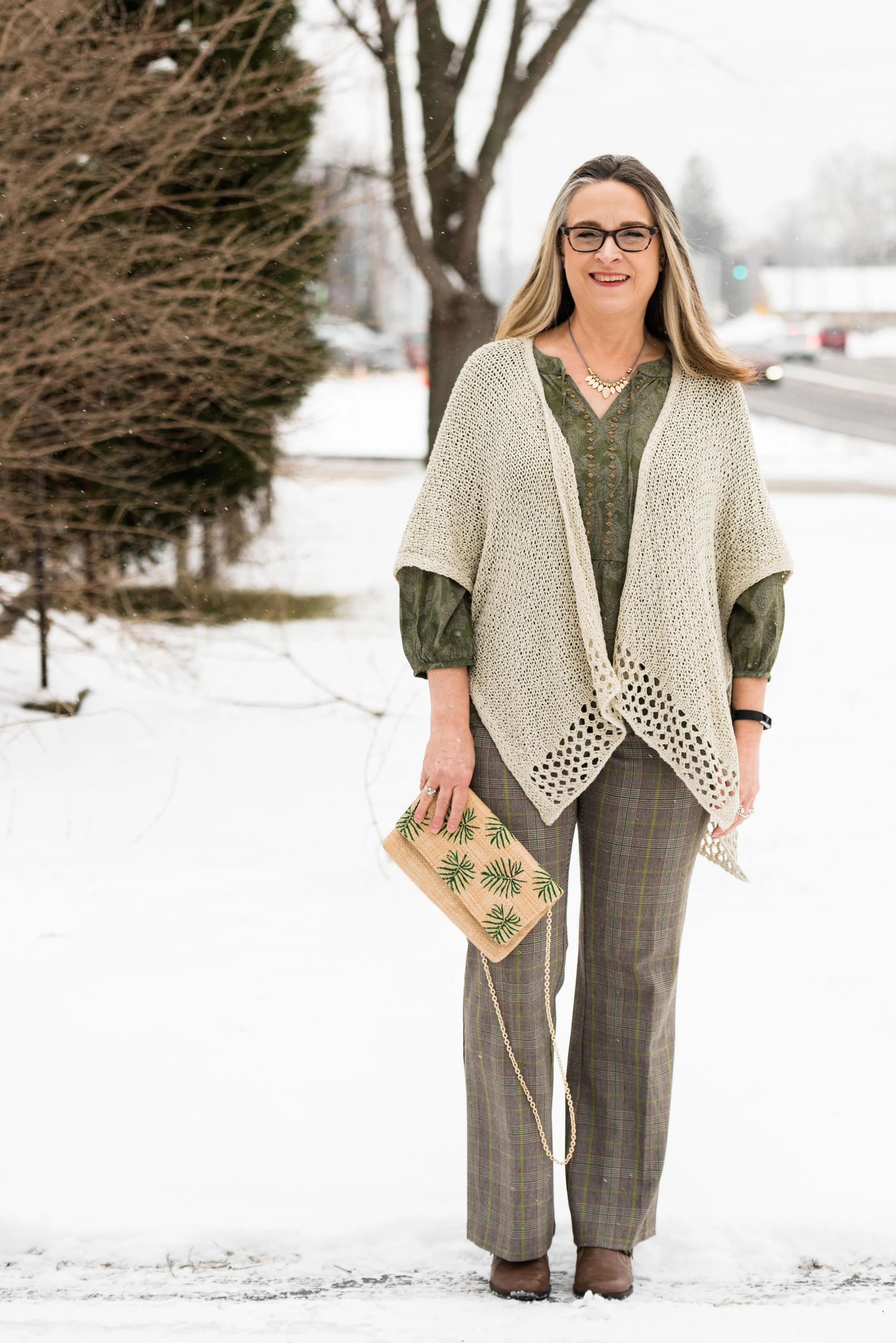
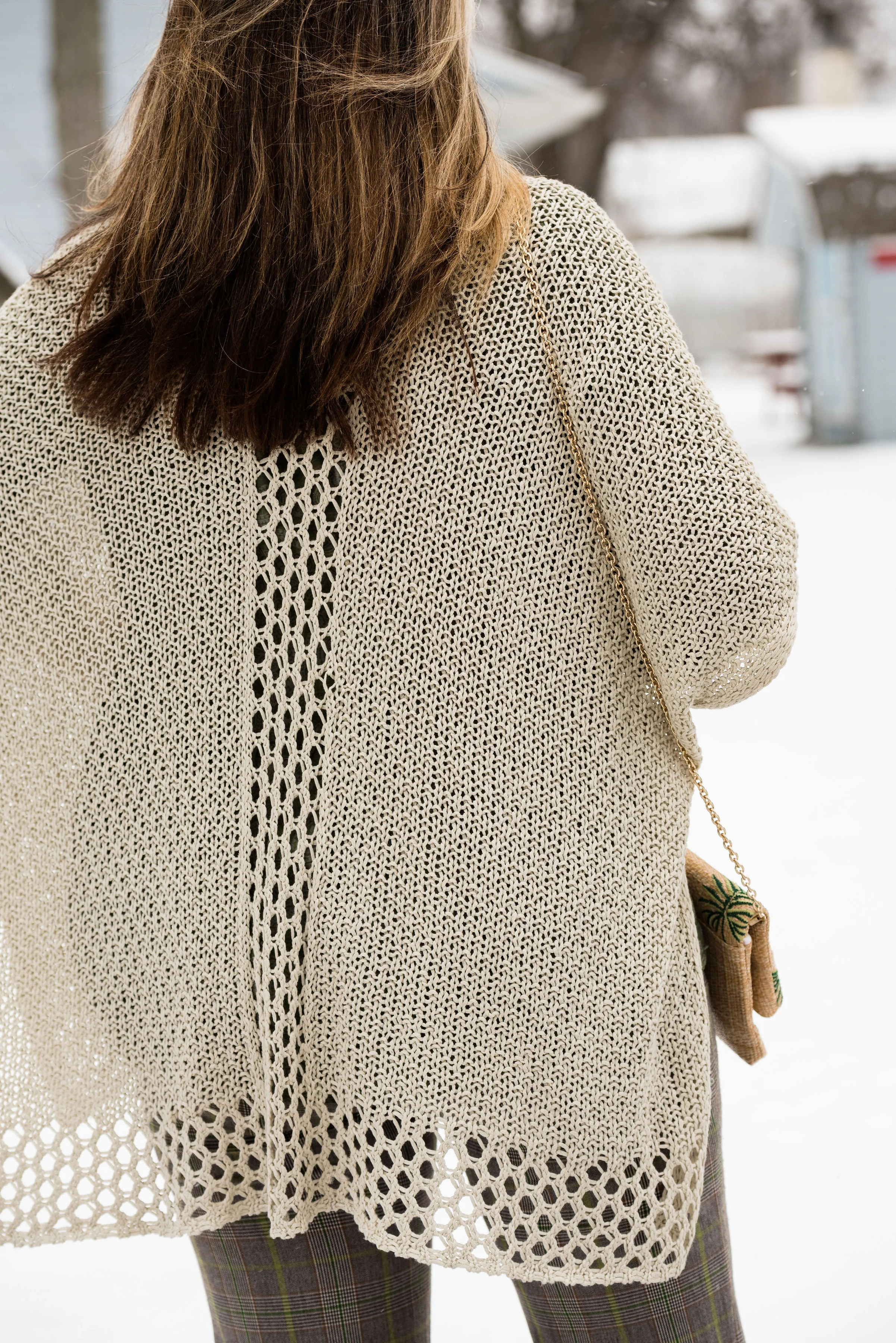
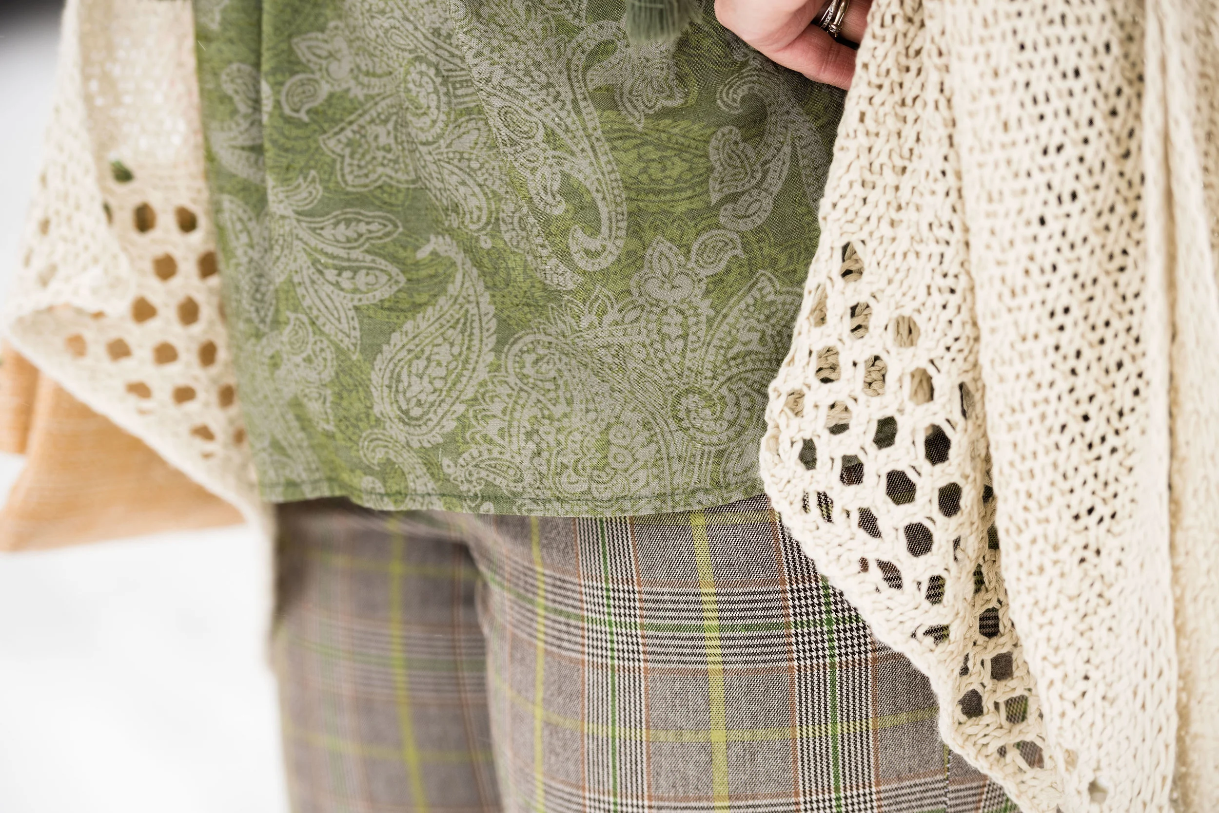
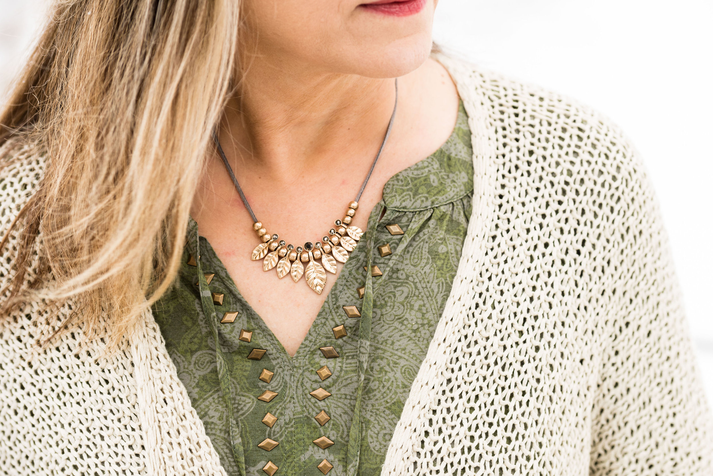
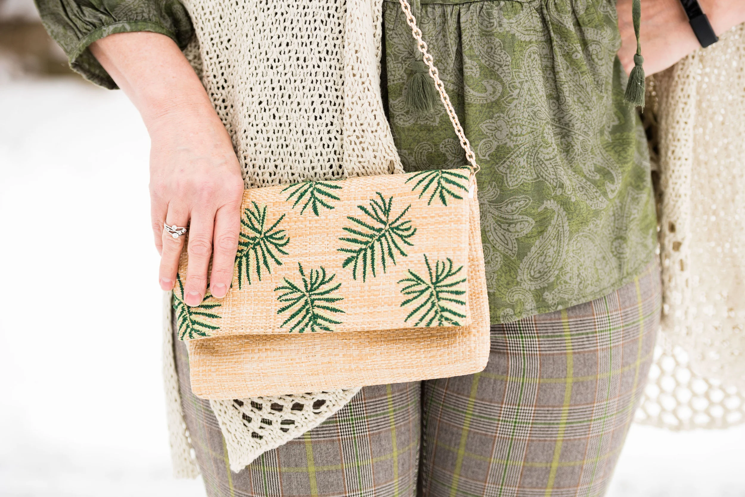
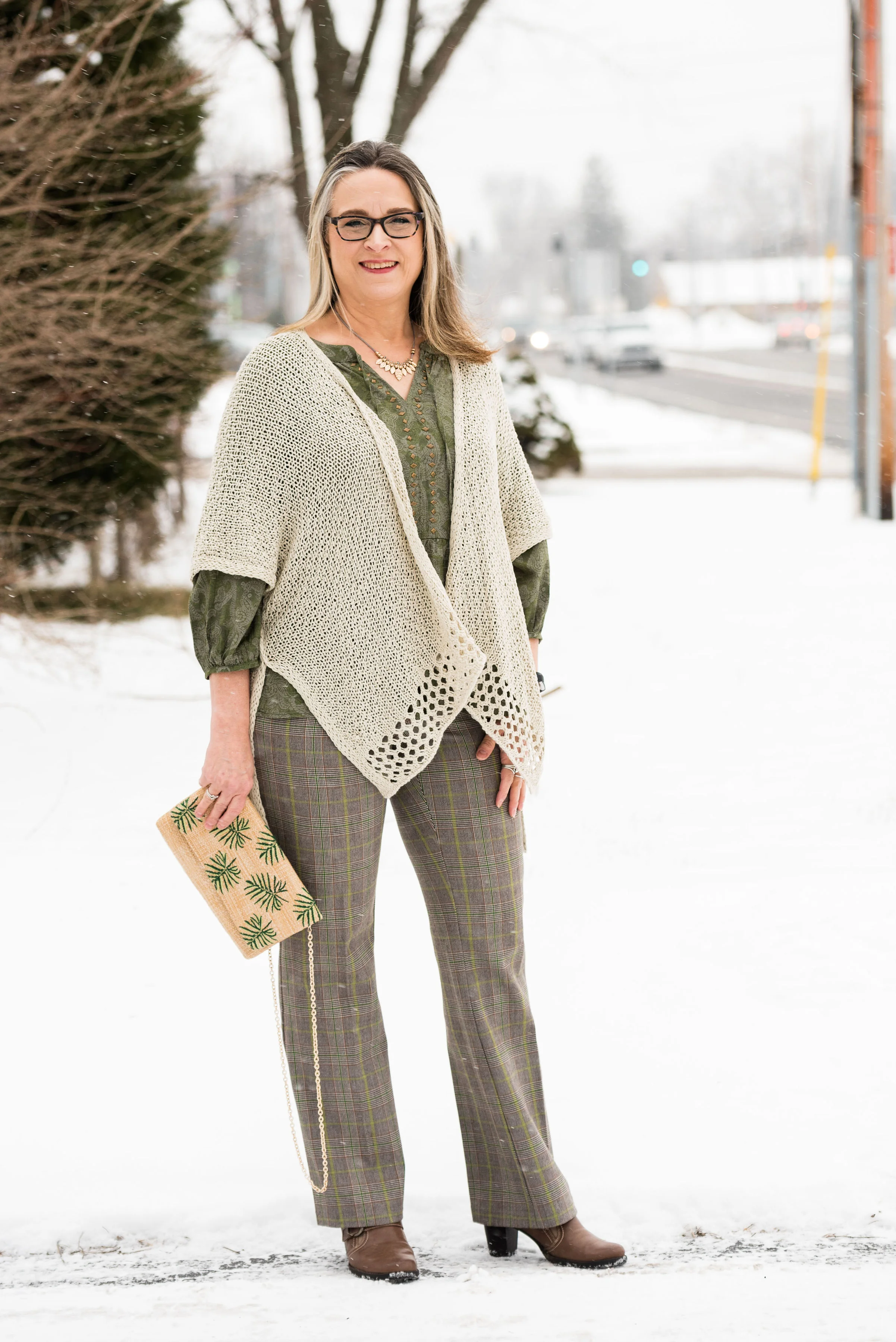
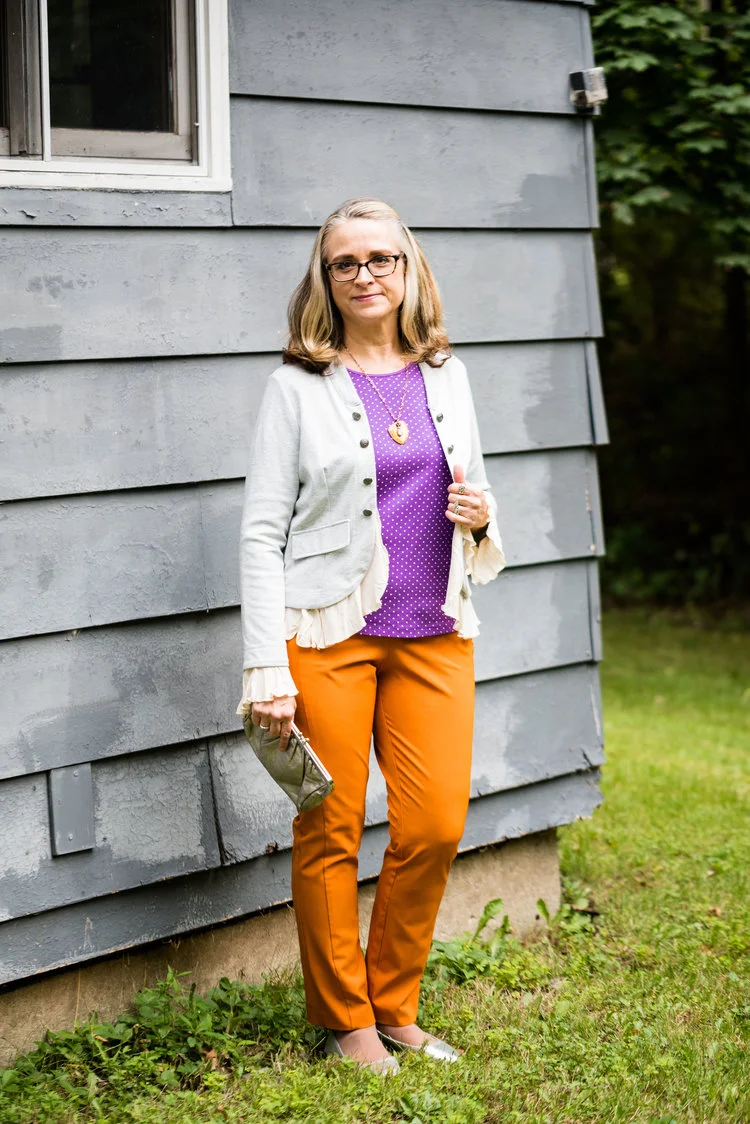
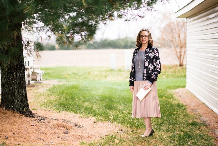
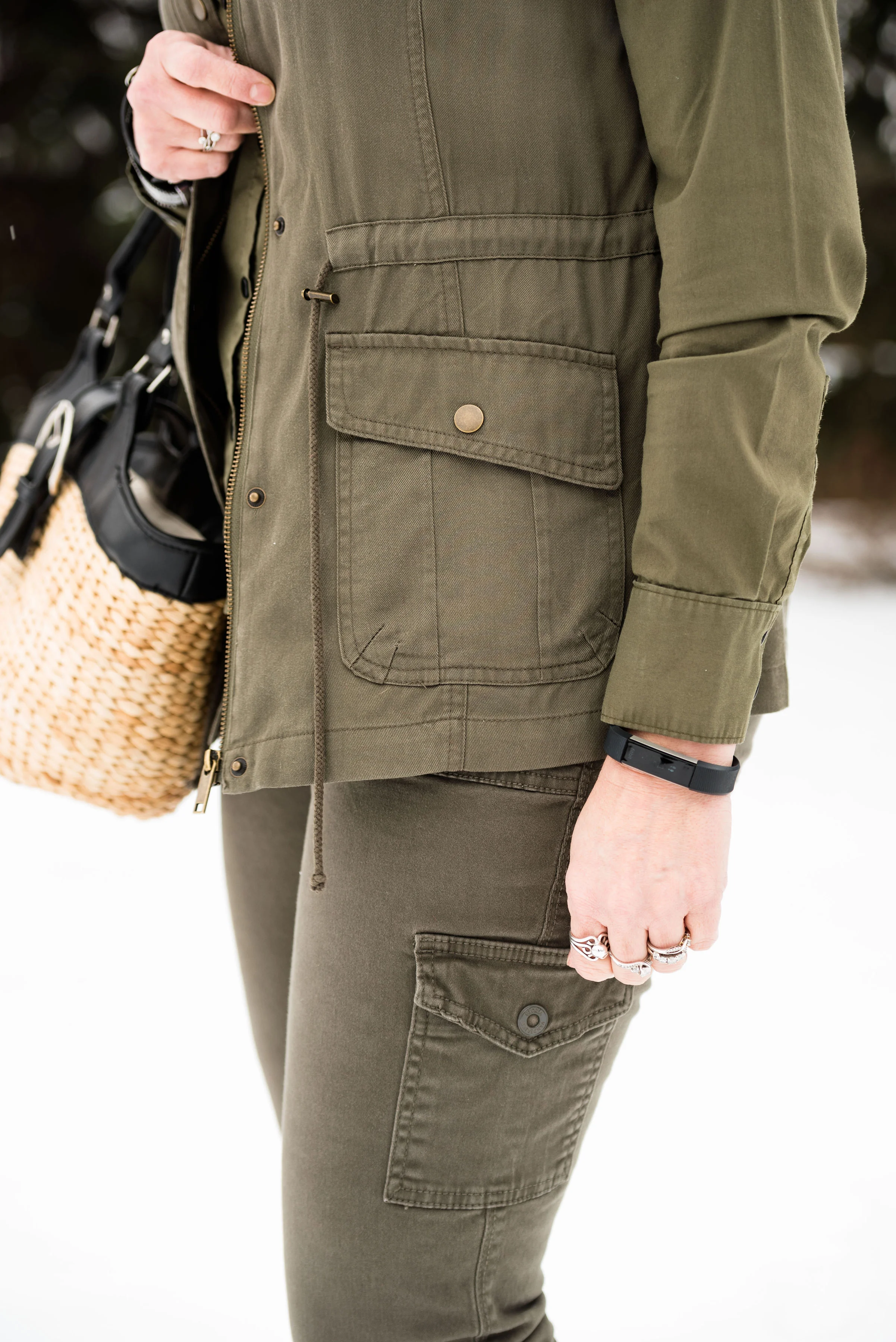
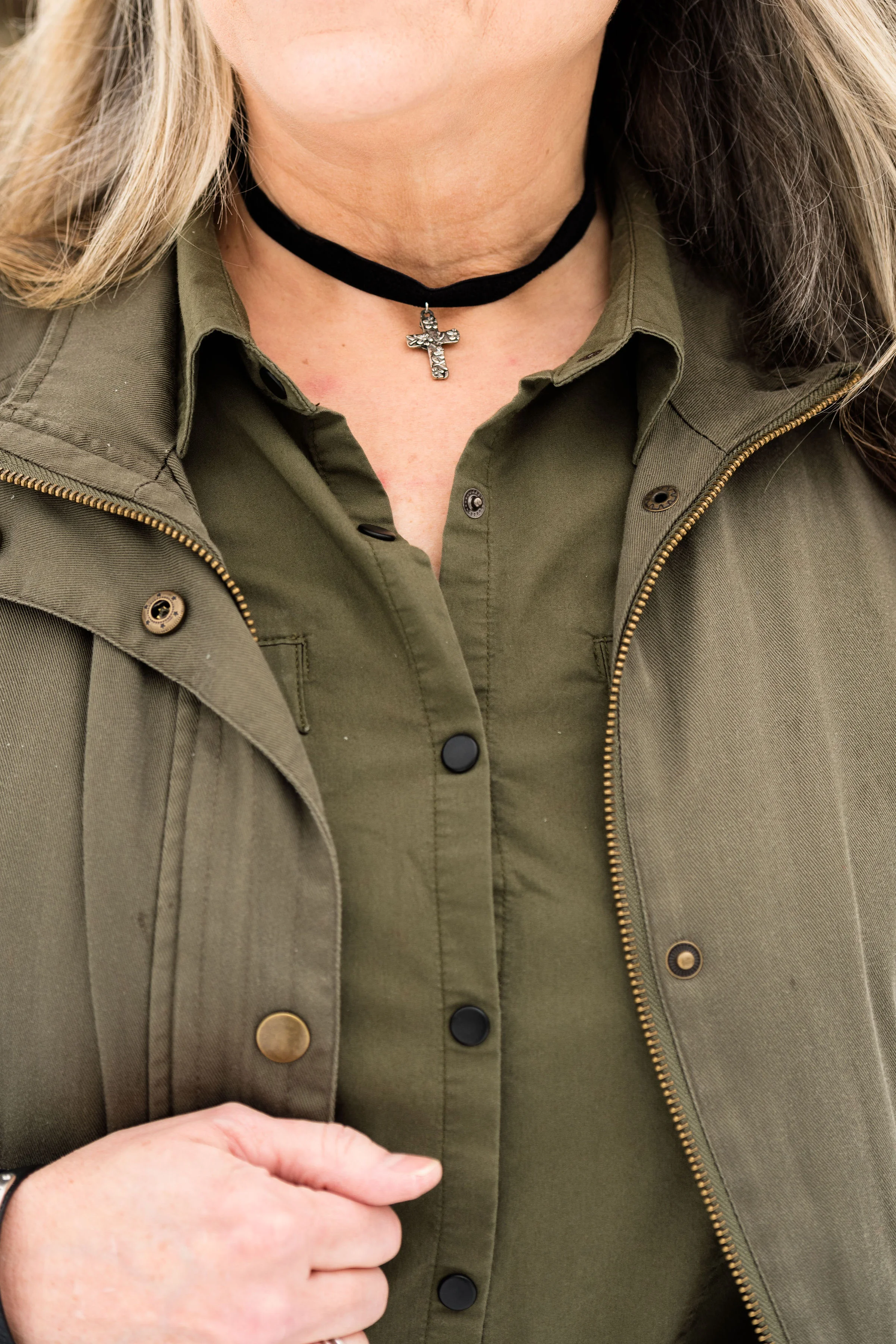
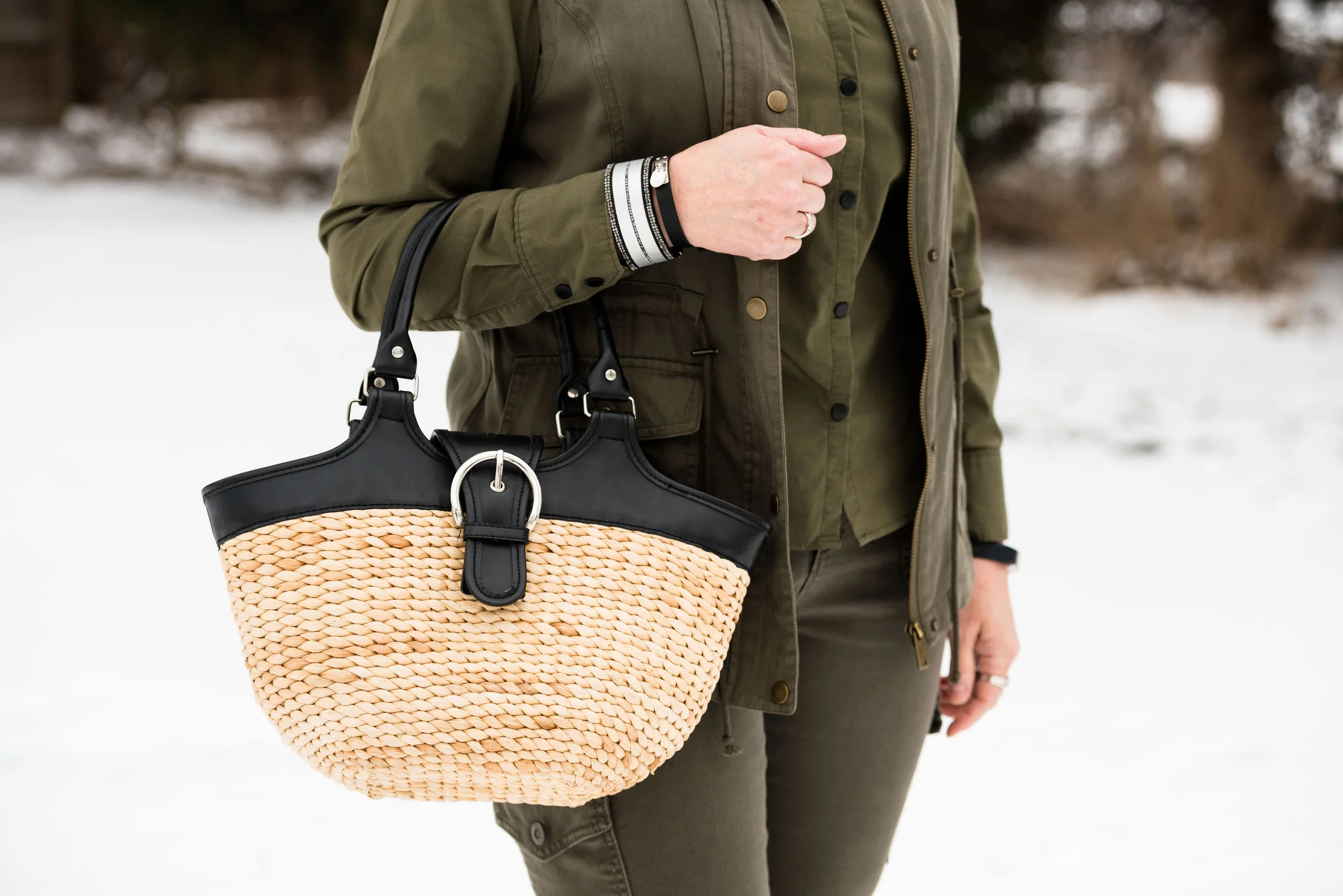
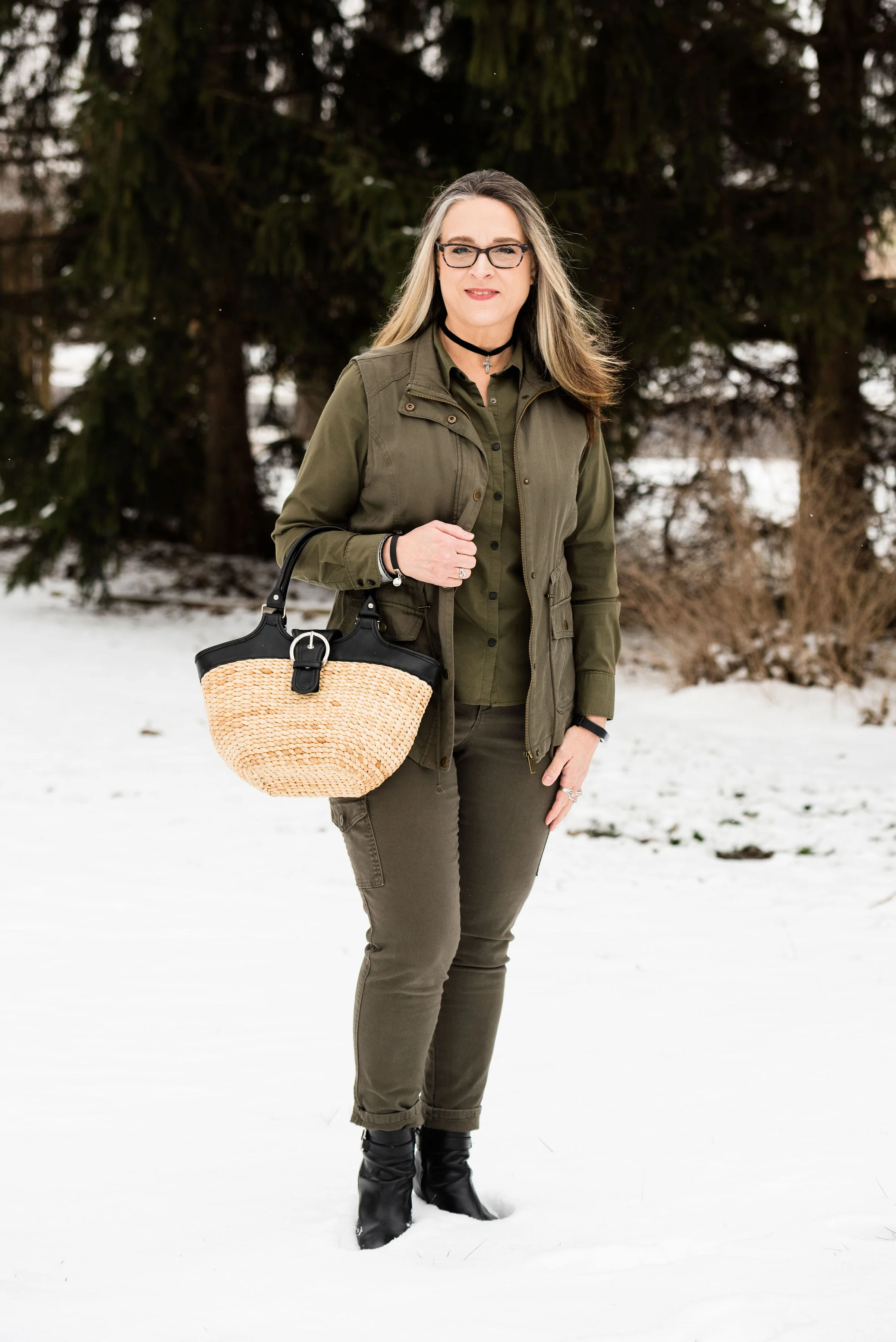
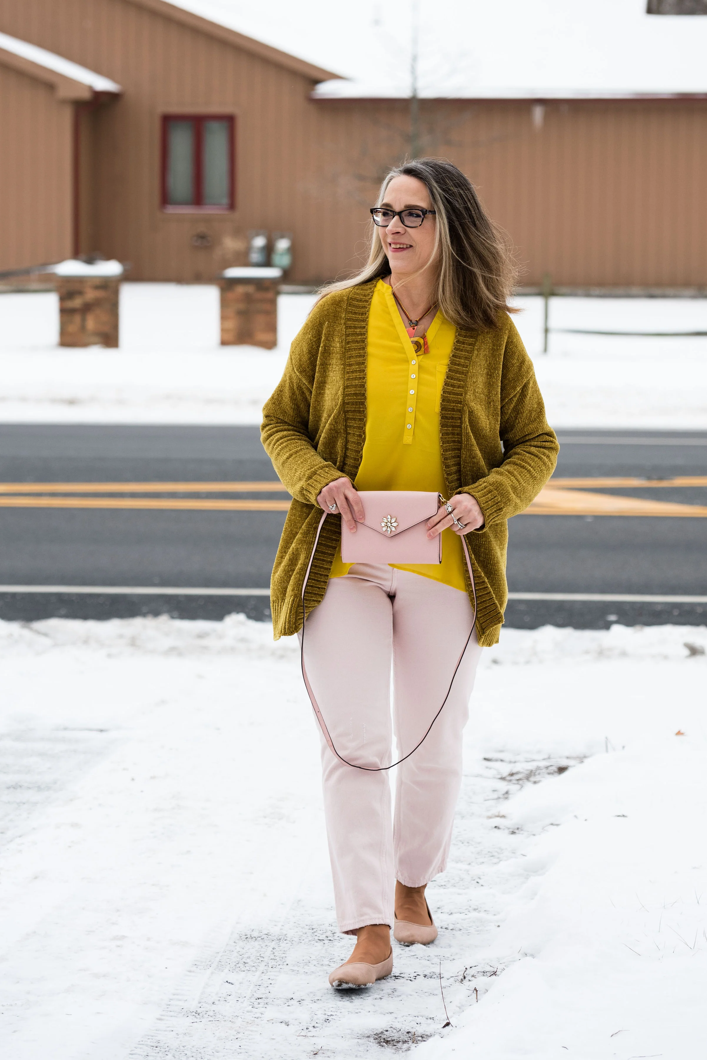
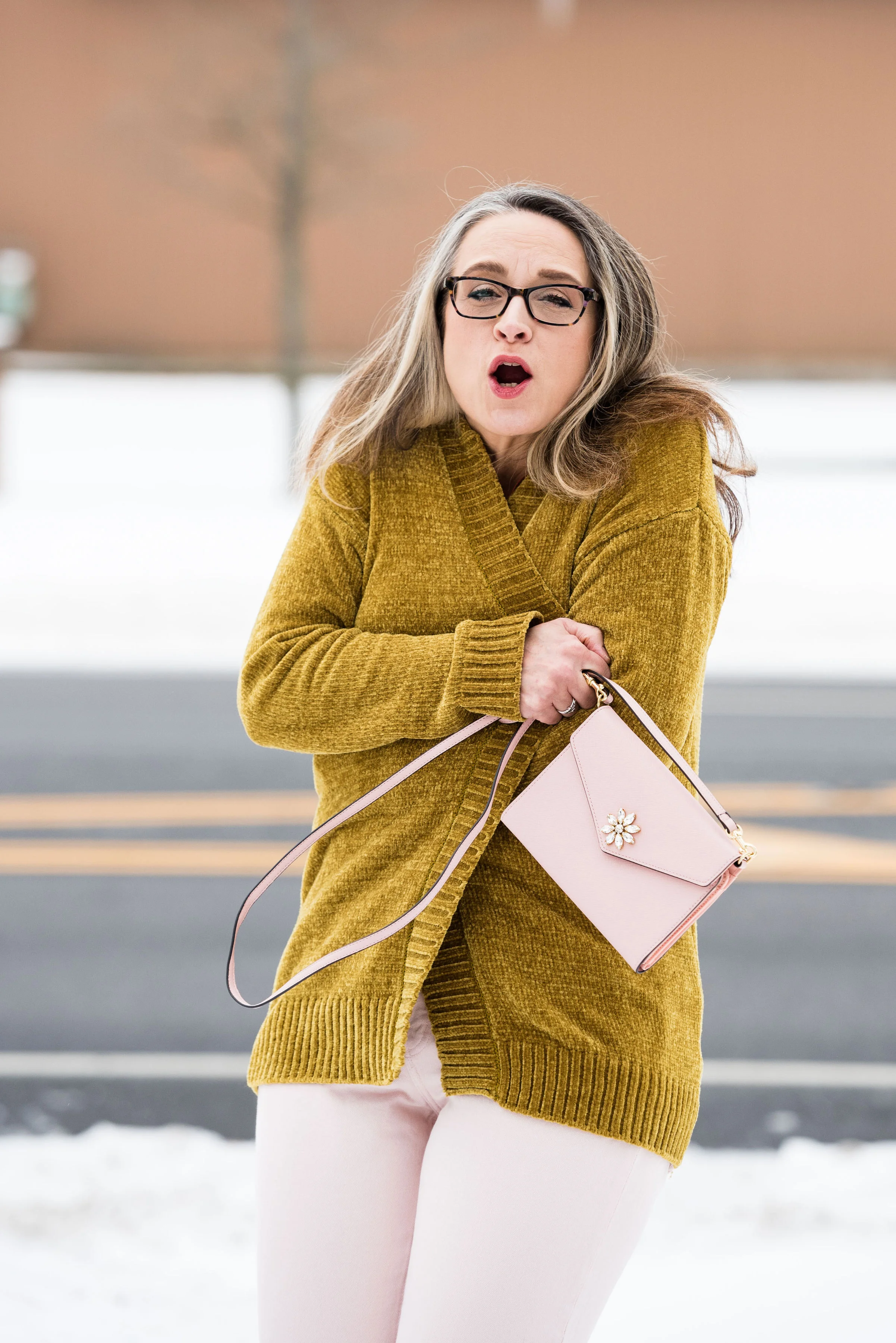
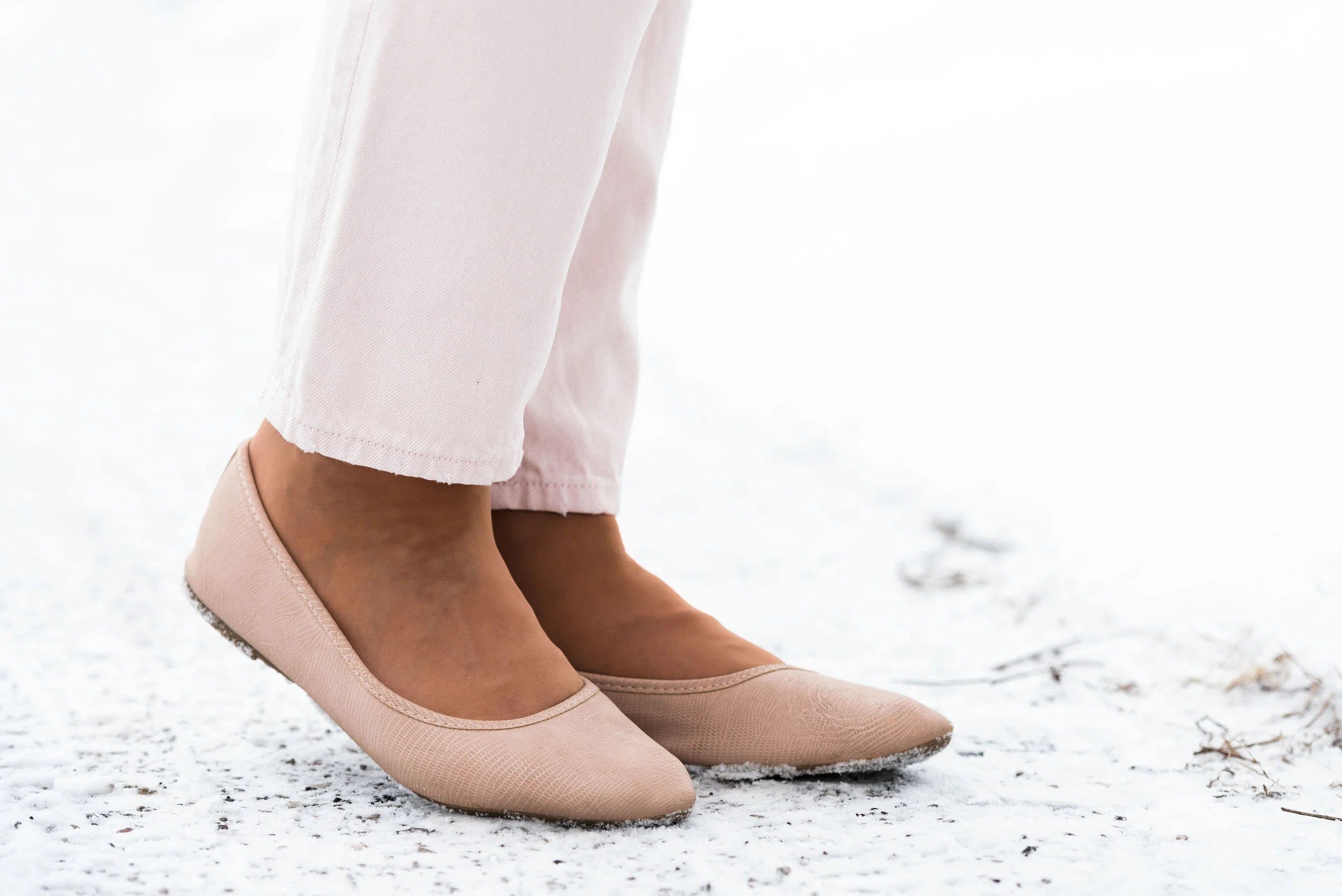
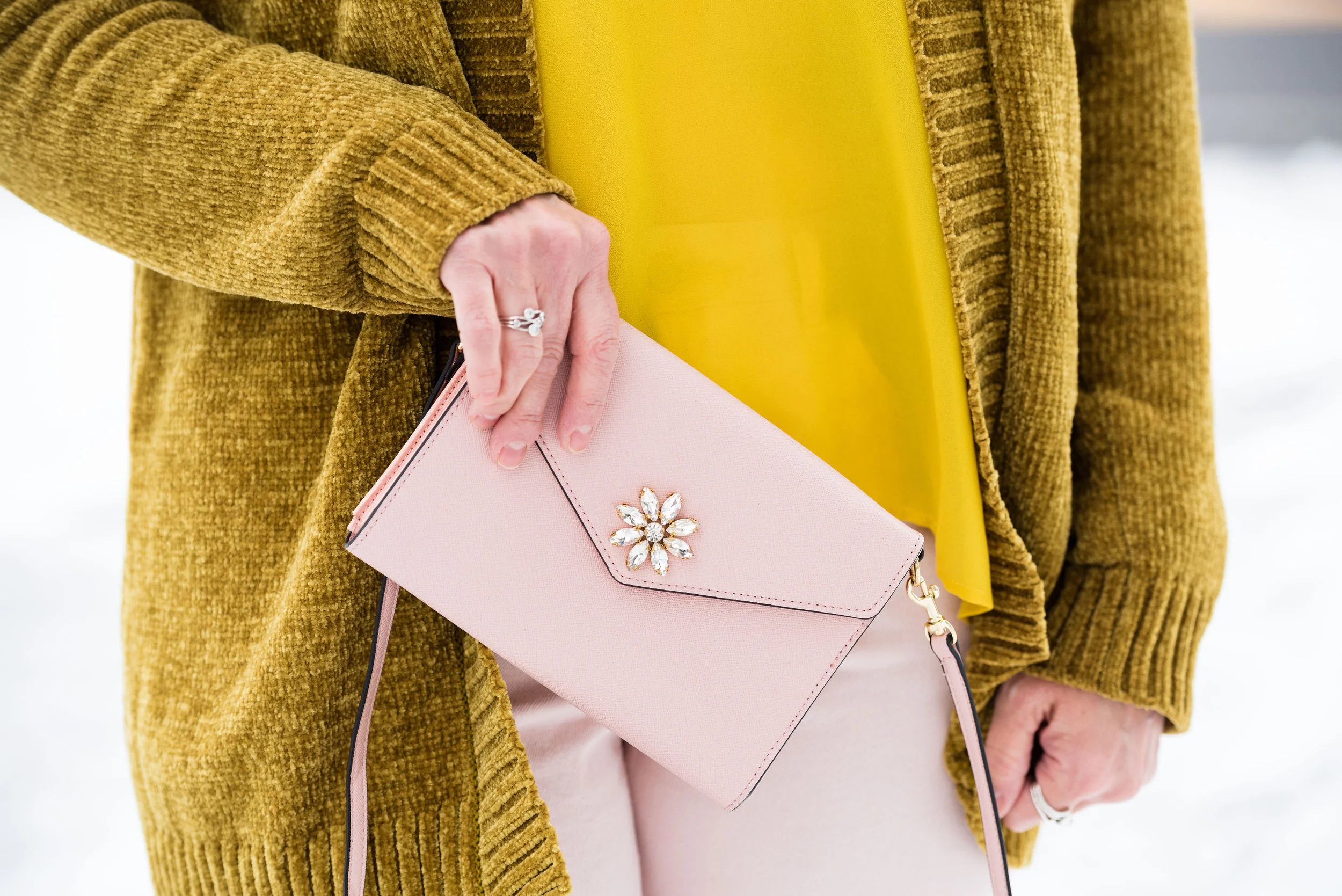
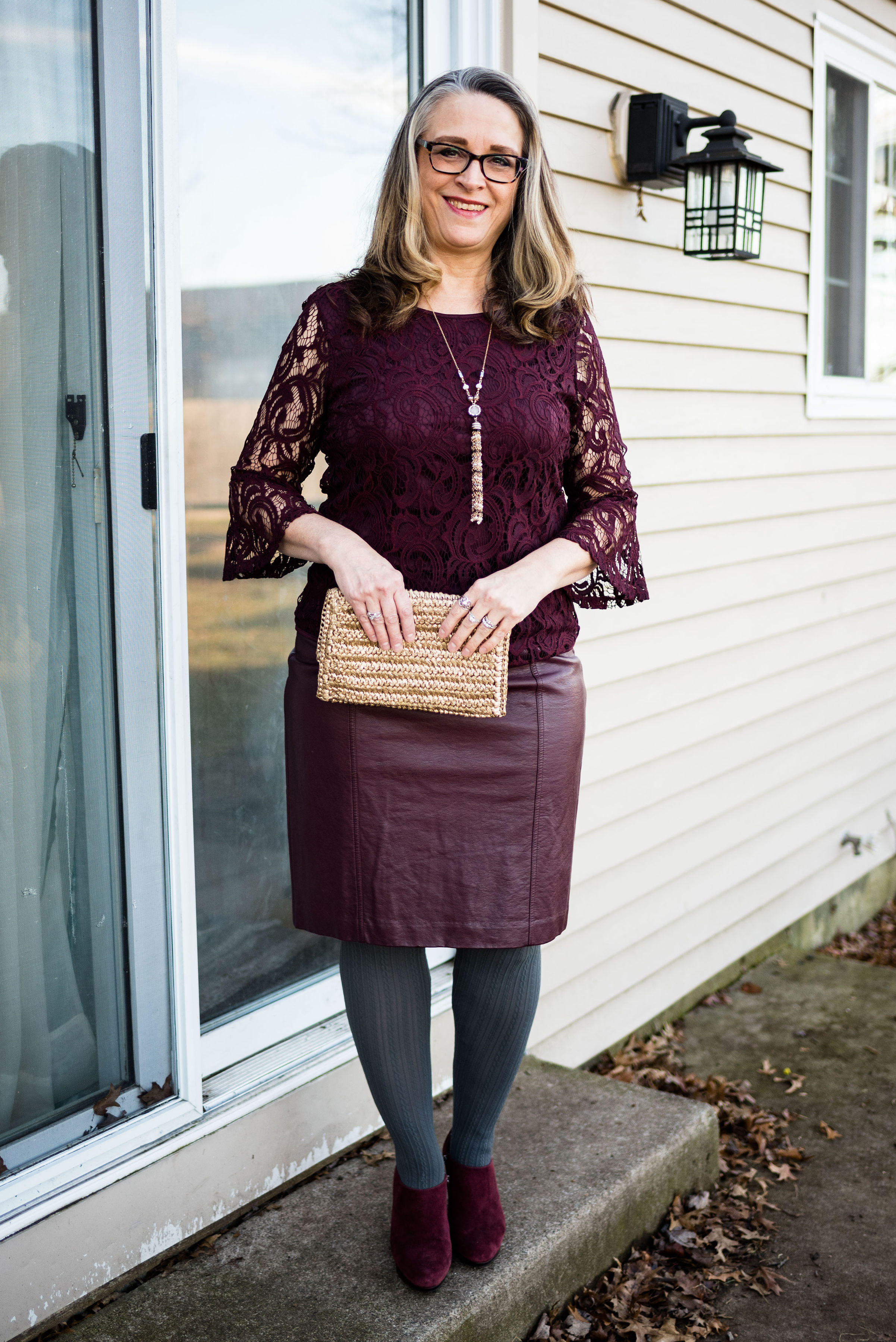
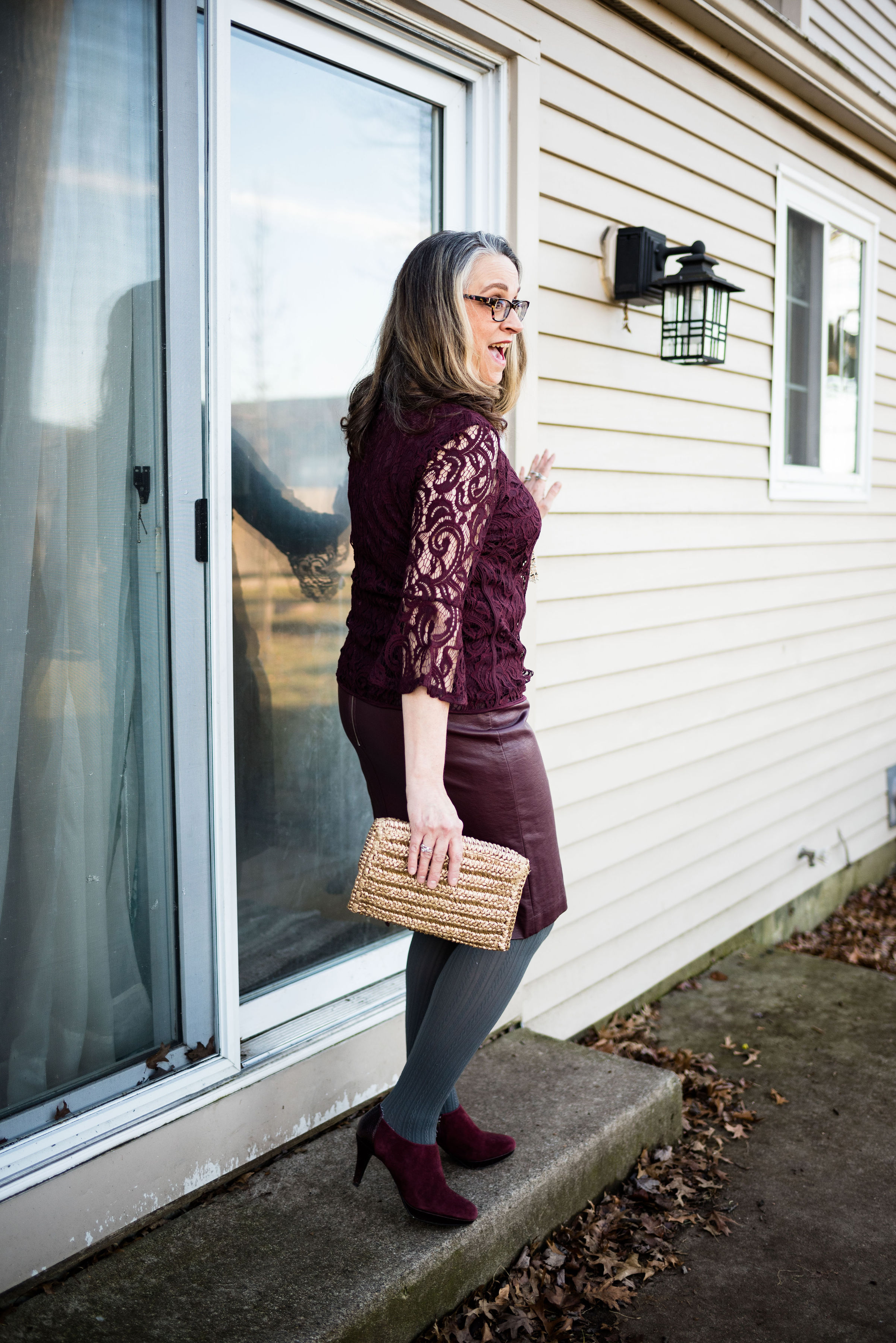
Here are a few sneak peeks at what is to come over the next few weeks.

If you like color and like to challenge yourself to try new things, be sure to join me for this Spring/Summer Pantone 2019 series, beginning next Tuesday.

What do you think of this spring’s color palette? I’d love to hear your thoughts.

Have a great weekend!

Photos and graphics, Rebecca Trumbull.

Print Mixing Mash Up - All the Outfits

After doing a longer series, like the one I just finished, I like to do a post that shows you all the outfits in one place, side by side. When I started this series, I let all of you know that I was a newcomer to print mixing when I started fashion blogging. The question could be asked, why even bother? Many people enjoy more solid colors, monochrome looks and outfits that incorporate prints in a more conservative manner, so why the push to print mix?

There are several rationales I have for learning how to mix prints and I’d like to take a moment to share these with you, before I do the recap of the past few weeks’ outfits.

1 - Print mixing challenges our brains.

I have a history of dementia in my family and understand that there is a very real possibility that I or one of my brothers, or all three of us, could end up with dementia later in life. The reality is I am much closer to that now, than I was 20 years ago. All the research has shown that there are factors that can help delay this unfortunate inevitability for many of us. Diet, exercise and using our brains by learning new things like taking a class, learning an instrument or a language can all prolong our brain health. Even the practice of putting outfits together helps our brains. Every time you challenge yourself to think outside the normal box you are helping your brain health. Print mixing is a great way to challenge your neural net to grow and expand.

2 - Print mixing is good for the environment.

There is a lot of focus these days on waste management. With the need for plastics and metals decreasing in other countries, we are now looking at a garbage and recycling dilemma in our own neighborhoods. Buying used clothing and being a consumer who makes better choices is a way to help our growing garbage problem. I’ve heard many people say, “Well, my not using a straw isn’t really going to make that big of a difference.” That may be true, but each individual who makes that choice, adds up to a great number. The same is true for clothing. Thrift stores are popping up all over, and with online retailers, like Poshmark, Thread Up and more, you can buy and sell used clothing with ease (something that is on my list to learn how to do).

What does that have to do with print mixing? Think about your closet. What percent of your clothing are solids and what percent are prints? If you are like me, I have a plethora of prints. To only wear these fun pieces with solids, really does the piece a disservice. Think about how many more outfits you could have if you started mixing in prints with prints. And the best part is, you didn’t have to go out and buy anything. Your new outfit came entirely from your own closet.

3 - Print mixing is fun.

There is something about putting prints together that really appeals to my inner artist. Just like a interior decorator, a painter or a photographer like to create spaces and pictures that have a message or are aesthetically pleasing to the eye, putting outfits together can be a very satisfying activity. I’m sure you are all familiar with those adult coloring books that flooded the market a few years back. Probably a few of you got one or two for Christmas, or a birthday. I did. What is it that makes coloring so much fun? We might think of it as a rather mindless activity, but in reality, coloring is another way to exercise our brains. I love to put different colors together to see how they are going to look. I especially love putting colors side by side that I normally would not have thought to put together. like pink and orange, purple and red or black and navy.

I do hope that this series has prodded, inspired and encouraged you to look at your wardrobe in a whole new way. Here are all the outfits side by side.

Yellow striped tee.

Multiprint skirt.

Plaid bomber jacket.

Checked trousers.

Printed dress.

I hope you enjoyed this look back at all of the outfits. Have a great Tuesday and be sure to check back on Thursday for the intro to this years Spring/Summer Pantone color series.

Photo credit Rebecca Trumbull.


Print Mixing Mash Up - Print Dress - Outfit 2

For today’s print mixing outfit, I used the same dress from Tuesday, but instead of layering a printed tee underneath, I chose to layer a tee, and also add a printed jacket on the top.

This Apt. 9, tweed jacket, was a thrift store find. I like the light pink trim and polka dots. The brown, faux lace tee that I have on under the dress is also a thrift store purchase and is Croft and Barrow.

For this outfit, I decided to emphasize pink for my accessories. I found this necklace at JC Penney on the clearance rack. I thought it would be a fun statement piece for spring and summer, as it has flowers on it. I also grabbed my little pink clutch.

I’ve had these thrifted A2 Aerosole heels for a while and they are starting to show their age, but I hang onto them, because I really like their retro look.

What do you think of this outfit? Do you feel that it has a rather retro vibe? What have you been challenged to put together since starting this print mixing series? I’d love to have your feedback.

I’ve included a few shopping links for tweed jackets. Everyone should have at least one of these in their closet. They can be dressed up or down and no matter what your style, a tweed jacket will work. These are affiliate links, but all opinions are my own.

Have a great weekend!

Photo credit Rebecca Trumbull.


Print Mixing Mash Up - Print Dress - Outfit 1

This is my last week for the print mixing series. I hope you have enjoyed this, and that it has made a difference in your ability and desire to print mix. You’ll see more print mixing on in future posts, because I really like doing it and I feel that it is so much easier, now that I have had to come up with outfits to share with you all.

This last piece is a thrifted print dress. The brand was an unfamiliar brand called Kari NY. I have featured this dress on the blog before. You can see that post here. I love the print and the colors. It is meant to be a sleeveless summer dress, but I usually wear it with a tee underneath.

I chose this thrifted elbow length sleeve Loft tee because of the color similarities to the dress. Once again, we can see the ratio factor that makes for a great print mix - large with small. This ratio, along with color similarities makes it much easier to mix prints with ease.

I love the ruching around the waist on this dress. It hides so many bulges. Ha, ha.

On this particular day it was freezing, so I thought I’d add a dark brown scarf as a shawl. I also chose dark brown tights and my cognac colored SO ankle boots. Since this is a time of year that we think more about transitional outfits, we have to be conscious of reaching for lighter weight spring pieces, while still needing to keep warm with layers. Layering is a great way to do this and this outfit is the perfect example.

I chose a summery dress, then I added a layer underneath, by choosing a tee shirt. I also opted for heavier tights rather than nude hose, with a pair of ankle boots for added warmth. Believe me, on this day, I needed it!

I chose jewelry with orange tones, to pull out the orangey pinks in the tee and the dress.

I decided, once again to match my bag to my shoes. Once in a while I choose to do this, because there is enough going on in the outfit, especially with print mixing. Adding a completely different colored bag or another print, might have been toon much. I think a black or brown bag would work well with this as well, but I opted for the cognac color of this thrifted hobo bag.

It seems there is a big push towards recycling in our country, especially with clothing. With retailers like Savers, Good Will, Salvation Army, American Cancer Society and others, used clothing can be found for a fraction of the price of what things cost brand new. The added benefit, we aren’t putting those things into a land fill. Everything in this outfit, except my underclothes, my tights, the shoes and the jewelry was thrifted. I have devoted my shopping lust to mainly second hand purchases, although even I am a sucker for a good sale at a store, like Kohl’s, Penney’s, Christopher and Banks and so on. I’ve devoted two full blog posts to my thoughts on thrifting. You can read those by clicking on the links - Thoughts on Thrifting - Part 1 - The Stores, and Thoughts on Thrifting - Part 2 - How To.

Just a funny picture of me getting attacked by snowflakes.

Would you ever mix prints like this? Why or why not? I’d love to have your feedback. Leave me some love in the comments section below.

i’ve included a few shopping links below. These are affiliate links which means if you click on a link I get a few cents. If you purchase something through my site, I get a little commission. All opinions are my own.

I hope you are having a great week.

Photo credit Rebecca Trumbull.


Print Mixing Mash Up - Checked Trousers - Outfit 2

I wanted this second outfit with the checked trousers to be a little more dressy. This could be something worn to work, or out on a special date. This is a more monochrome look, using mainly the black, gray and white, except for the accessories.

I got this 3/4 length sleeve jacket from a clearance rack last fall at dressbarn. It is roz & Ali brand. The southwest pattern was part of what drew me to this piece. When I decided on these trousers i knew this jacket would be a perfect print mixing piece.

There are two things that make this work. One is the print size on each piece. The pants have a smaller print and the jacket has a larger print. The other is the color similarities.

I decided to go with a black short sleeve sweater top. I could have chosen a colored top or even white or gray. Just about any solid would work with this outfit. I opted to have my color pop be with my bag and my jewelry.

A charm necklace with red beads, beaded bracelets and a red clutch, really stand out with this black and white outfit.

I added my thrifted Ralph Lauren heeled ankle boots. You could probably tell from Tuesday’s post, these pants are pretty long and rub on the ground when I have flats on. This heel gave them just the right amount of lift.

I have one more week on this print mixing series. I hope that this has been beneficial, especially for those of you who have been timid about print mixing. Not every fashion trend is for everyone. You can be fashionable and look put together without having to spend money on new pieces for your closet. It is likely, that you already have many fashionable pieces in your closet. A well structured blazer, a cardigan or two, a couple of pairs of jeans and a pair of dress pants, a dress or a skirt, are all pieces that can be used to make great outfits, print mixing or not.

Think of it this way. If you are just getting started, by being more conscious of your clothing and how you look, you have already taken the first step. Print mixing is more like frosting on the cake. What you want to do first is make the best cake you can, whether it be chocolate, vanilla, or lemon. Once you have that done, then you can think about frosting, sprinkles or whatever other embellishments you want to add.

I hope that my blog and all the other wonderful bloggers that are out there, will provide the inspiration you need to look better and feel more confident. Have a great weekend!

Photo credit Rebecca Trumbull.


Print Mixing Mash Up - Checked Trousers - Outfit 1

This week the Print Mixing Mash up features a pair of Worthington black and gray checked trousers. The checkered pattern on these is very subtle, but it is definitely a print, rather than a solid. Worthington has been making reliable dress pants and women’s work clothes for JCPenney since 1985. I have several pairs of their pants, and they are long lasting, wrinkle resistant and fit pretty well.

I have had these pants for many years and have worn them to work and for special outings where I need to be more dressed up. I wanted this first look to be a bit more casual, so chose a thrifted, pinkish red, Merona, gingham blouse, along with my City Streets floral bomber jacket, also from JCPenney. So, yes, I am mixing three prints here. Ha, ha. See how easy it becomes after a little practice.

The prints on the blouse and the trousers are almost an exact match for size, which gives the outfit a more uniform look, even though they are a different color. With the floral bomber on top it pulls the two colored prints together.

This black and gold fringe necklace on a berry colored cord was the perfect accompaniment.

Hello, again, my favorite ballerina flats. These SO flats have a memory foam footbed that make them very comfy. Right now Kohl’s is having a sale on these for only $19.99. They also added a few new colors, so if you are looking for a fun, comfy flat check those out here.

It used to be the trend to match our bags with our shoes. Now the trend has gotten away from that, but every once in a while, I like to match. It just makes an outfit looks polished and balanced. This NY & Co tote was a thrift find. Do you like to match your shoes with your bag? Do you carry the same purse all the time, or do you like to change them frequently? My hubby put me on a purse fast, because I have so many. I keep telling myself I need to use more of them, so they aren’t just laying around, but I get lazy and don’t want to take the time to change everything to a different bag. Ha, ha. How about you? Are you a purse hog like me?

What do you think of this outfit? Do you have a pair of printed trousers, jeans or ankle pants in your closet? How about grabbing a few of your printed tops or jackets and see what new combinations you can come up with.

I’ve included a few shopping links for Worthington pants and floral bombers. Have fun shopping. These are affiliate links. All opinions are my own.

Photo credit Rebecca Trumbull.

Print Mixing Mash Up - Plaid Bomber Jacket - Outfit 2

This second look featuring my plaid bomber jacket from Eden Fashion Boutique, might seem a tad overwhelming if you are new to print mixing. Some might say there is too much going on, but I think it works. In fact, it was this combination that inspired me to use the plaid bomber as a print mixer in the first place. Besides, why not get a little crazy once in a while!

When I saw this multi print tunic hanging in my closet, I thought this might be a good opportunity to get it out. This festive, colorful roz & Ali piece is a past purchase from dressbarn. I think of it as a party shirt. It seems so bright, cheery and happy, that it just wants to dance and party. That’s a little bit of a contrast to my more subdued, introverted nature, but it is good to get out of our comfort zones once in a while.

Pairing it with the plaid jacket, I let it hang around for a while and kept looking at it, wondering how I could make it work for this print mixing series. Then I remembered my thrifted, cobalt blue, Gloria Vanderbilt jeans.

You can see more of the details in this photo. The tunic has a lace up v-neck. Since there is already so much going on with the print, I opted for shorter necklaces in a more classic style. Rev it up and tone it down. I know some might go for bright beads in various lengths, but my objective with this outfit was to party, but party conservatively. That’s me in a nutshell. I don’t drink, but I do like to dance. I also liked the way the pearls and black cord on the choker, compliment the black and white stripes on the jacket.

Funny story about these cobalt shoes. I have had these shoes for a long time. I’ve worn them on the blog before with various outfits and I really like that they are so bright. The last time I remembered wearing them for the blog was summer of last year. My daughter and son-in-law were in the process of moving out of their apartment into a house and we had planned a shoot at the apartment complex so I could help do some packing. That was the last time I ever saw them (the shoes, not my daughter and son-in-law). I thought for sure, they had gotten thrown away in the chaos of helping to pack and purge at the apartment. I gave them up for lost, even though I searched my house all over thinking I may have just misplaced them when I got home to put things away after the shoot.

The other day when I was working on outfits for this series, I was going through shoe boxes looking for some of the pairs I had put away that were more spring/summery. Lo and behold there my shoes were in a box in my closet. Ha, ha, ha. Maybe I am starting to lose the plot, as my hubby likes to say. Dementia is highly likely with my family history, but I just pray I’ll be sweet!


This bag is another thrift store find. I like the style. Now, being a fashion blogger, I do have a few Pinterest boards, that I like to play with. I need to do more with those, but there are only so many hours in a day, as everyone of you know. However, I do have a board that is called Fashion Vocabulary and I put things on there like different types of bag styles, dress styles, skirt lengths, heel heights and so on. Anyway, I looked for the proper name for this bag and I would say that it is a hybrid between a doctor bag and a barrel bag. A true doctor bag style would have a metal frame connected to the opening. So now you know.

I personally feel, what makes this outfit work is the bright blue pants and shoes. Obviously, you could have done the same thing with black pants or a skirt, or orange. The solid color ties the two pieces together, and compliments the blues in each pieces.

What do you think? Am I helping you to get over your fear of print mixing? I certainly hope that these posts are inspiring you to think outside your fashion box.

Photo credit Rebecca Trumbull.

I’ve included a few shopping links for you to have fun with. These are affiliate links. If you click on a link I get a few pennies. All opinions are my own.

Print Mixing Mash Up - Plaid Bomber Jacket - Outfit 1

If you are just joining me here on my blog, I am doing a series on print mixing. Week one focused on a yellow and white long sleeved tee ( Outfit 1, Outfit 2). Week two focused on a printed skirt (Outfit 1, Outfit 2). You can see the original posts for each outfit, by clicking on the links. My goal for each of these outfits is to show you three things: 1) You don’t have to spend buckets of money to look fashionable and be trendy, 2) Print mixing is not that hard, and 3) Your ability to print mix starts in your own closet. The only way I learned to print mix was practice, just like so many things in life that we aren’t born with an innate knowledge of.

This week’s outfits revolve around a plaid bomber jacket. I found this fun piece at Eden Fashion Boutique. It was marked down and I also had a coupon, so it was one of those win, win combos. Eden is a local boutique with stores in Sylvania, Ohio and Bowling Green, Ohio. I did a post on the Sylvania location and if you are interested, you can read about that here.

My daughter and I were doing some thrifting and shopping in Bowling Green and stopped in at their location. We both tried on numerous fun pieces and I bought this bomber jacket and a long sleeve tee that I posted on Instagram last Thursday.

The plaid jacket is a mix of orange and blue stripes on a gray background. I thought it would be fun to pair it with a print containing those same colors. When I came across this longer denim skirt, I thought to give it a try. While, I think the print mix works, I really don’t like the silhouette of the outfit. Just a little too baggy for my taste.

Here you can see the mix of prints closer up.

The fact that the outfit was going to be ultra casual made me reach for this olive hobo bag that I have used on the blog before. It is always fun to add a pretty brooch or two, to an otherwise more plain piece, whether it be a blouse, a jacket, a scarf or a bag like this one.

I also decided to wear my Seven Dials black combat boots. The reason I chose these was to bring together the black and white cuffs and collar on the jacket with the shoes.

To keep the edgy look I went for a necklace that I have had for many years. A combination of metal and beads, I like that it has a utility look to it.

The dark orange tee is a thrifted Chico’s tee. It really brings out the orange in the plaid jacket, as well as the rusty orange floral print of the skirt. This is another way to bring printed pieces together in a harmonious blend. (Yes, I am listening to Celtic music right now and I love the harmonies in their music, whether instrumental or vocal.) Pick a solid piece that is a common color in both pieces. You’ll see this idea again in Thursday’s post with this same jacket.

As always, I love to hear your thoughts on these outfits. Is this something your would wear? Do you like denim skirts? Do you like skirts that are this length or shorter? Do you have a bomber jacket that you like to wear? I value your input, so leave a comment or two below.

My hubby and I had a nice weekend away, but now I am fighting the crud. I was hoping to get through the whole winter without getting sick, but my grandson and daughter both got it, so I had to join the fun. Hope this post finds you all well.

Have a great Tuesday.

Print Mixing Mash Up - Printed Skirt - Outfit 1

This week, I’ll be styling a printed skirt two different ways. Remember, the goal of this series is to show you how you can take a printed piece in your closet and combine it with another printed piece for a print mixing mash up that will make all your girlfriends and colleagues envious of your print mixing panache.

Today’s outfit centers around a thrifted Gianni skirt I have had in my closet for a while. I love purple, so when I found this purple, blue mix, I thought it would be fun to work with. I like the a-line style. It is light weight, but fully lined, so easily wearable for at least three of our four seasons. You could probably extend its season into winter if you wore leggings or a heavy pair of tights. Since we are talking about and looking forward to spring, I wanted to make both of these outfits more transitional looks.

What I love about this skirt, is its ability to change hues. When you look at the skirt by itself, the purples look more purple and the blues look more like a denim blue. When I started looking for a piece to pair this with, I saw this Knox Rose top that I found at Bass Pro Shop a while back on the clearance rack. I thought, even though the colors weren’t exact, at least they were similar enough that it might work. Once I put the SO sweater, from Kohl’s, with it, I knew I had a winner.

Technically this print mixing, isn’t so much mixed, because the print on the top is not next to the print on the skirt. However, the whole point of trying to print mix is to think outside the box. I would have never put these two pieces together, had I not been thinking about mixing prints and colors. The top, which is more of a greenish blue, looks as though it pairs perfectly with the blue of the skirt, just as the more reddish burgundy color on the top and the sweater, look as though they combine perfectly with the purple. Isn’t color wonderful? Ha, ha.

It was so cold when we were taking these pictures. My daughter was running back into the house after each outfit was finished, and she had on a hat, coat, gloves and boots. Ha, ha. My face is set in defiance of the blustery cold! That is definitely not my most flattering face.

I decided to draw on the little bits of yellow in the top for my necklace and purse. Once again, I would have never thought to pair yellow with this color combination, but once I put it together, I loved it.

By the way, those are little fleck of snow on my sweater, not dandruff or lint. Ha, ha . Just thought I had better clarify.

I think this thrifted yellow Elle tote is a great number for spring. I love the shirring on the front, the sunflower yellow color and the metal rivets, rings and Elle charm. This just goes to show, you don’t have to spend lots of money to have a nice bag.

I have a tendency to get into a rut with my bags. Right now I am using my yellow thrifted cross body. It is so convenient for shopping. Often, if I am carrying a large tote like this one, which already has some weight to it, I overfill it and then wonder why my shoulder and back is bothering me. What kind of purse do you like to use?

These burgundy Naturalizer loafers were another thrift find. When I put the outfit together, I knew these would be the perfect casual finishing touch.

One of the things I like about thrift shopping is the ability to try different brands without spending a ton of money. I normally don’t buy high end. My hubby and I just don’t have the income, to support a shopping habit of that nature. Ever since I was a young girl, I have always been somewhat conscious of getting more for my money. My mom used coupons, made our clothes and made the most of what we had. Things were not always easy for our family, but I grew to appreciate the ability to save money by looking for cheaper options. Now when I thrift I am drawn to higher end name brands, because often they are a better fit and are well made. I still like my Kohl’s, Penney’s and Target clearance finds, but thrifting is always my first muse.

I hope you are enjoying this print mixing series. Let me know your thoughts. Have you done any print mixing in the last few weeks? Tell me about what you mixed. I love hearing from you and you are what keeps this blog going, so thank you.

I’ve included a few printed skirts to look over. These are affiliate links. All opinions are my own.


Print Mixing Mash Up - Striped Tee - Outfit 2

On Tuesday you saw the yellow striped tee mixed with a floral kimono. If you didn’t see that you can check it out here. Today I am going to mix that same tee with a light plaid blazer for a great work wear or date night look. The reason I chose this Sonoma striped tee is simple. Stripes are easy to print mix with. As I said in my introductory post, Revisiting Print Mixing, stripes go with just about everything, even other stripes. It is relatively easy to pair stripes with florals, polka dots and plaid as I am about to show you with this outfit.

This plaid blazer I found on the clearance rack at H & M. I didn’t really need another jacket, but then I realized, I didn’t really have anything that was specifically this color and this weight. The price was too good to pass up and this cute little number is going to be a workhorse this spring and summer. I like that it has 3/4 length sleeves with shirring, making it look like they were pushed up.

Although the jacket does not contain any yellow, to match the striped tee, it does contain a lighter stripe through out. The stripe is actually more of a light tan or beige, but will have that chameleonic ability to look like whatever lighter color it is paired with. In this case, it is yellow. But I can also see this light stripe taking on a blush appearance when paired with pink.

I decided to make this more of a work look so chose my dark gray, Liz Claiborne, pencil skirt. Originally, I was going to wear my gray heels, but seeing as we are still in the throes of winter I opted for my gray, wedge heel ankle boots. I think I would have liked it a tad better if I had worn dark gray tights. What do you think? Gray hose or tights would have given a sleeker more elongated look. As it is now, I feel that my legs are cut off, both by the skirt and the boots. Live and learn

These are my favorite wedge heeled booties. I like the chain detail, the color and the fit. These are a brand called Impo.

In keeping with the gray mode I was in, I decided to keep my accessories gray as well.

This Cosmopolitan sparkly, envelope clutch is making another appearance here on the blog. I use this one whenever I am going to something worth getting dressed up for. I like that it is glitzy for those special occasions, but also chic enough to carry to work. It is a good size as well. Some clutches are so small, you can barely get your cell phone and driver’s license into them, let alone keys or other necessities. Believe me, us girls got plenty of necessities. Ha, ha.

What do you all think? Did I do okay with this first print mix mash up? Do you ever mix prints like this? I’d love to have your feedback. Leave me some love in the comments.

I’ve included a few shopping links, just for fun. These are affiliate links, which means I get a few pennies for every click you give me. If you purchase something through my site, I get a small commission. All opinions are my own.

Have a great weekend, everyone and thanks for taking time to hang out on the blog.

Photo credit Rebecca Trumbull.

Friday linking up with Nancy’s Fashion Style.


Print Mixing Mash Up - Striped Tee - Outfit 1

As i started pulling pieces out of my closet to do this print mixing series, I had no idea how much fun it would be and how many outfits I would come up with. It is amazing how many pieces I have that actually go together in a way that creates real life, wear it to work, outfits. The way I decided to put this together, was to feature one printed piece a week that will be the foundational piece that I build the rest of each outfit around. For this week it is a yellow striped Sonoma tee. The outfit you see today and the outfit on Thursday’s post will both be built around this same piece.

Let me preface this by saying, it was 18 degrees with a wind chill factor that made it feel like 4, when we were taking these photos. It was cold and that wind bit, but we got it done. My daughter is pretty quick at taking pictures, although in those temps, even the camera wasn’t always willing to work properly.

Today’s outfit was a casual look, that I might wear to a get together with friends, or a fun date night with my hubby.

It’s a little hard to see the print mix in these photos, but I showed the top and this kimono in last Thursday’s introduction to print mixing. You can see that post here, if you missed it.

This yellow striped long sleeved Sonoma tee is a recent purchase from Kohl’s. It is light weight and a great layering piece for spring.

This floral kimono was a clearance find at DSW. If you are a clearance shopper like me, it is always a good idea to check out the clearance rack at all stores you go into. DSW is a great place to find shoes on clearance, and I would have never thought to go in there to look for a pretty kimono like this, but there it was. In fact I got two other ones that will no doubt make it on to the blog at some point.

These white Gloria Vanderbilt jeans you just saw on the blog, last week when I was wearing them with my scarf print blouse. You can see that post here. These are my favorite white jeans. They are thick enough that my underwear don’t show through and I like the wider leg.

I wanted to keep this look more casual so I opted for my navy blue Keds. After we took these photos are were on the way back into the house, I realized we needed to take a picture of my shoes, thus the snow.

I grabbed this bright blue tote to go with the bright blue in the kimono. This bag is thrifted and Nine & Co. brand. I do like a good sized tote bag like this for traveling. I can fit a lot more in it, like a book and a pad of paper, in case i get the urge to read or write. I know there are electronic versions available, but I still like the feel of a book in my hand or moving a pen on a piece of paper.

You could easily replicate this look by using a color of your choosing for the striped tee and then picking a piece with a complimentary color for the kimono or even a floral cardigan or bomber jacket. It’s not that you create an outfit that looks just like mine, but that you find things in your own closet that will give you a similar look. You wouldn’t have to wear white jeans. Any wash of denim would look cute with a print mix like this or pick out another color that goes with one of the other colors in your print pieces. For instance, my kimono also contains brown and is on a black background. Either color could have worked for my bottom piece.

Why this works:

The main reason this works is the color. The yellow of the striped tee goes perfectly with the yellow in the kimono. The other reason it works is that the stripes are small and narrow, which works well with the busier, bolder pattern of the kimono.

What do you think? Do you like this outfit? Do you have pieces like this in your closet that you like to pair together for a fun print mixing look? I’d love to hear your thoughts. Leave me some love in the comments section.

I’ve included a few shopping links for you. These are affiliate links. All opinions are my own.

Revisiting Print Mixing - An Introduction

While print mixing may come naturally to many of us, I think I can safely say for me it wasn’t always the case. I didn’t know the first thing about print mixing before I became a fashion blogger, and even now, I wouldn’t say it comes naturally. For me, as with cooking, I really have to have a recipe, or at least have my brain working on 3 of its 4 cylinders to be able to figure out a good print mix. Back in March of 2017, I did my first how to print mixing post. You can read that post, by clicking on the link here.

I have decided to do a short series on print mixing. I have had numerous people tell me, that while they are trying the print mixing trend themselves, they do not always feel confident with how to put pieces together that mix prints. After all, most of us don’t want to look like a walking garage sale. I am far from an expert on this, but I thought I would put together a series of posts, that will lay out what to look for when mixing prints and how to mix prints without having to put a lot of time, thought or effort into it.

This week I want to do an introduction of sorts and give you a few basic how to’s, then the next few post will show you outfits of my own and give explanations for what I chose and how I put the prints together.

There is a method to this madness. There are all sorts of prints including stripes, florals, polka dots, paisley and a plethora of others. How, then, do you decide which patterns to put together? Here are a few pointers.

Start with a foundational print.

1 - Stripes, whether vertical or horizontal, are one of the easiest patterns to pair other patterns with. Here are a few examples.

This striped yellow tee goes quite well with the floral kimono and the plaid blazer. The floral kimono contains yellow leaves which really draws the two pieces together. The plaid blazer doesn’t contain yellow, but has a light neutral colored stripe, which almost looks yellow when paired with the tee. I also think it goes splendidly with the leopard blazer and the Aztec print jacket, even though neither of them contains the same yellow color.

Here is another example with a vertical striped blouse.

As you can see from these examples, all of these prints are different, but the stripes work with all of them.

2 - Gingham is another pattern that is easy to pair with almost any other print.

3 - The one other pattern that is easily mixed , besides stripes or gingham is polka dots. Polka dots show up here and there in fashion trends, but I find, like stripes and gingham, polka dots are classic and timeless.

Stripes, gingham and polka dots can be easily mixed with other prints, partly because they are spatially consistent. Usually the stripes are the same distance apart, the squares are the same size and the dots are equally sized as well. If you are just starting to mix prints, look for pieces in your wardrobe or at the store that have those characteristics.

Next find pieces with coordinating colors.

You probably noticed that in the photos above, not all the print mixes have similar color schemes, but for an easier time of print mixing once you choose your foundational print find other pieces in your closet that have similar colors. For instance, the striped yellow tee that I chose above pulls in the yellow leaves on the floral kimono. The coral striped blouse coordinates with the coral colors in the jacket and the navy polka dot cardigan is a natural compliment for the navy gingham or floral blouses.

Here is another example.

I got these two pieces at completely different times. The Jaclyn Smith gingham top was thrifted and the skirt is from LuLaRoe. Matching the green in each piece make it a perfect print mixing combination. You could have also used the black gingham top that was shown above. I hope to include this in my series of outfits over the next few weeks.

This might seem overwhelming at first, but read on for another tip.

Try choosing pieces that have the small/large print ratio.

One of the other techniques for making a perfect print mix outfit is to pair a small pattern with a large pattern. This is especially helpful if you are choosing pieces that include a skirt or pants with a top or jacket. In the previous picture I used the smaller gingham pattern with the larger pattern of the skirt. This is also a good way to mix outfits that are monochrome in appearance. Here is another example.

This combination would be great with a black pullover tee or sweater, silver jewelry, and then a brighter color for shoes and a bag, like yellow, or red.

Using the small/large print ratio as well as choosing pieces that have at least one coordinating color will take you a long way to creating outfits that are not only spot on in the print mixing realm, but outfits that you can be proud of because you created them yourself.

Walk on the wild side.

Once you get the hang of print mixing you might want to venture out into combinations that are a little more bold. This is the one I came up with.

I recently acquired this plaid bomber jacket at Eden, a local boutique. I featured their Sylvania location on the blog a few months ago. You can see that post here. I love the colors that make up the plaid and the bright black and white stripes on the collar and cuffs. When I was going through my closet and came across this tunic, I thought I would see how the two pieces worked together. This is a perfect example of using the print mixing tips to create a unique looking outfit.

The plaid represents the foundational piece. Plaid, in this case is the more subtle print. After choosing the jacket, I looked for a piece that had at least one of the colors in the jacket. When I saw that this tunic contained all the colors, I thought, why not. The more subtle plaid, tones down the busy pattern of the tunic and all of it is pulled together by pairing it with the bright blue pants. I hope to feature this outfit in my series as well.

I hope this post will help you find your own love of print mixing. It takes practice, but over time you can be a print mixing whiz, just by following these tips and by not being afraid to give it a try.

What print combinations do you like to see put together? Are you a print mixing diva, or is it a trend you have shied away from? Did you find this post helpful? I’d love to hear your thoughts.

I hope you have a great weekend.


Spring Trend - Scarf Prints

As I mentioned in last Tuesday’s Spring Trend post on crafted pieces, print mixing is bigger and better than ever. One of the patterns that you will see gracing the stores is scarf print. Scarf prints started a come back back in the fall of last year, but seem to be showing up more and more. Scarf prints are an easy way to mix prints effortlessly. The prints are already picked out for you and all you have to do is take it off the hanger and decide what you want to wear it with. Whether you choose jeans, skirts, leggings, shorts or some other combination, scarf prints will leave you feeling like a print mixing pro.

I’ve had this Apt. 9, scarf print blouse for eons. Every time I think about getting rid of it, I end up hanging on to it. Now I am glad I did. I wish I would have thought to have taken a picture of the blouse without the jacket on, but it was freezing outside and we were just trying to get the pictures finished.

I did the front tuck with the blouse and added a black studded leather belt, just to add a little more interest and texture.

I thought my white Gloria Vanderbilt jeans the perfect bottom piece for this look, to make it more spring-like. While white can be worn all year round, I am a bit of a traditionalist, in that, I like to keep my whites more for spring, summer and a bit into fall. I do agree that white is a great color even in the winter and can really brighten up an otherwise mundane time period. I guess that is one of the reasons I would rather have snow in the winter time, than just brown grass and gray trees.

Since the emphasis was meant to be on print mixing, I decided to add my Black Label, Evan Piccone polka dot blazer. A JC Penney clearance find, this cute little number goes with so many things and is the perfect way to add a print to any outfit without going over the top. You can also see in this picture the blue bead necklace that I chose to wear. This was another hand-me-over from my daughter. It is fun to have girls to be able to swap stuff with.

These Easy Spirit black patent leather block heels I’ve styled on the blog before. I like the lower heel and that the toe is not pointy, but also not rounded. The bit of gold is the perfect amount of bling.

This cute cross body bag was a Christmas gift from my younger daughter. Both my girls do a good job picking out gifts for me. The light blue color is perfect for spring and compliments the blue in the blouse.

What do you think of scarf prints? Do you own any scarf print items? How do you like to wear your scarf prints? How do you like to wear your scarves? Leave me some thoughts in the comments.

I’ve included a few shopping links for scarf print items. Please enjoy looking these over. These are affiliate links. If you click on a link, I get a few cents. If you purchase something through my site, I get a little commission. All opinions are my own.

Thanks for stopping by the blog today. Have a great Tuesday.

Photo credit Rebecca Trumbull. Make up Rachel Christensen.

Spring Trend - Crafted Pieces

If you have followed my last few posts you know I am doing a short series on some of the Spring 2019 trends. The crazy thing about this whole trend idea is that there are many differing opinions on what exactly those trends are. I tried to narrow it down to some of the more prominent ones, but I may have missed some and picked up on others that I thought were more interesting. Today’s trend is definitely one I like, crafted pieces.

What is a crafted piece, you may wonder. Basically, crafting means that it is or is like home made. Think of pieces that are crocheted, knitted, tie dye or various forms of weaving, beading and so on. These pieces are going to make a statement all on their own, but will easily add pop and pizazz to any outfit. Think sixties hippy meets stylin’ granny. If that sounds a little too funky for you, hang in there and you might change your mind.

I grew up with a mom who crocheted and she had numerous sisters, my aunts, that also worked their wonders with yarn and needle(s). Mostly, my mom made afghans and doilies. One of my aunts made bears and clowns and sold them at craft shows. Occasionally something would come across our doorstep from cousins’ and others’ hand-me-downs, that would include a crocheted piece of clothing. I remember a vest, in particular that I really liked made of separate crocheted squares pieced together. I guess it was my exposure to these crafted pieces that has given me the love I have for them still.

This knit ruana is Sonoma brand and I found it at Kohl’s on the clearance rack at the end of last summer season. I like that it is a neutral color and that it has actual sleeves sown into it. Many ruanas merely drape over the arms and down the back, which always makes me feel a little less at ease, for fear it will shift and I will have to keep arranging it to keep it in place. Having a bit of a sleeve solves this problem. You can see another post on a ruana without sewn in sleeves by clicking on the link to this post from last summer.

I love the mix of open and more closed weaving on this piece.

Another trend that I didn’t do a specific post for is pattern mixing. This spring pattern mixing is bigger than ever. For those of you who still haven’t come on board the pattern mixing trend, the fashion gurus are making it easier by manufacturing pieces that have patterns already mixed on them. We saw some of the last few seasons with baseball type tees donning both stripes and flowers. You’ll see more of it this year and the patterns are going to be bolder than ever. I’ll give you more examples on Thursday’s post where I talk about the scarf pattern trend.

I decided to do some of my own print mixing on this outfit by pairing this subtle paisley print top with my thrifted plaid Mossimo trousers.

Once again, the key to print mixing is in both color and pattern. Although, I have a feeling this spring we’ll be seeing more pieces with a more Anything Goes feel.

I kept my jewelry minimal since this Liz Claiborne top from JC Penney already has some of its own embellishment. This leaf necklace was a recent find, also from Penney’s.

My shoes are thrifted and are Natural Soul brand. My cute little clutch was a recent clearance purchase from DSW. Make sure you check out the clearance sections at these types of stores. I found this clutch and three kimono/ruana’s that are going to be perfect for spring and summer. The prices were too good to pass up.

Even though palm print was last spring’s trend I feel that it is one of those that could become timeless, sort of like leopard print. Especially when in a complimentary piece like this that will easily become a go to for summer.

I guess technically you could say I am mixing four prints in this outfit. Plaid, paisley, palms and the weaving on the crafted piece. What do you know, I styled an outfit that is filled with prints and alliteration. Ha, ha. There is texture also happening in the woven bag, the chain, the crochet, the tassels and metal embellishments on the top and the gathering on the empire waist and sleeves. There is, indeed, much going on in this outfit. Do you think it works or is it too much?

I love to hear you thoughts, so leave a comment or two in the comments section.

Now, to announce the winner of the $30 Target gift card. First of all, I want to thank all of you who are my regular followers, who regularly leave some love on the blog. Your input means so much to me. Secondly, I want to thank all the new subscribers who signed up as part of the giveaway and I hope that my blog will not disappoint you and that you will find inspiration and encouragement on a regular basis here.

And the winner is: Shirley Hulbert

I will be contacting you via email, to get your info, so I can get the card out to you as soon as possible. Congratulations!

I’ve included a few shopping links for crafted pieces. These are affiliate links. All opinions are my own. I’ve included a number of pieces I thought looked fun. Enjoy perusing!

Valentine's Day - Romantic Clothing

Valentine’s Day seems to have snuck up on me this year. While many of my blogger friends are showing off their great Valentine inspired outfits, I have been busy watching my Grandson due to extra days off and working a few extra hours as well. My hubby and I also agreed to watch our grand puppy, Beatrice, while her parents are gone for a few days, so she arrived just this morning. We decided to do a stay-at-home Valentine’s Day date with the dog, so she doesn’t have to spend too much time alone. In leu of that, we went out for dinner last night.

Instead of showing you an outfit I thought it would be fun to show you a few clothing pieces that I feel inspire a Valentine’s look all year round. Valentine’s Day is a holiday we associate with romance. Whether you are married, a couple, partners or just friends who want a reason to celebrate, here are a few timeless pieces that inspire romance all the time.

Silk Tops

Besides cashmere, silk is probably the second fabric that people are willing to spend a fair amount of money on. Silk not only looks pretty, but feels pretty as well. Donning a silk top or a silk dress is the perfect way to make yourself look and feel, not just romantic, but sexy as well.

Ruffles

This is just my opinion, but there is something sensual and romantic about pieces with ruffles. Being the tomboy that I am, I rarely wear ruffles, but I do think ruffles exude femininity better than most other textures.

Lace

What is more romantic than lace. Think of the dresses and gowns that ladies used to wear back in the day. Lace wasn’t and isn’t just for negligee or wedding gowns. Lace can be worn any time. It not only adds interest and texture to an outfit, but a splash of romance.

Floral

Once again, I think of floral patterns as subtly romantic. Since we associate the giving of flowers with love or friendship, it seems to make sense that floral pieces would evoke a sense of romance, whimsy and love.

I thought I would include a few pictures of my own from the past three years of blogging that show you each of these romantic pieces “in the flesh”.

Silk

This silk light pink sweater set was a thrift store find. I have always wanted a sweater set for some reason and when I saw this one and felt how soft and literally silky it was, I knew I had to bring it home. If you are interested in the original post, just click on the picture.

Ruffles

As I said, I am not a huge ruffle fan, but occasionally I will find a piece that calls to me. With this fleece jacket I found on the clearance rack at Kohl’s I saw The Three Musketeers in all their swashbuckling glory and knew I had to take it home with me. After all what is more romantic than those handsome, swordsmen on their speedy steeds, trying to save the fair maidens in distress and get rid of the bad guys at the same time?

Photo credit Rebecca Trumbull.

Lace

This top is not real lace, but it gives the appearance of lace, which is even better, because you don’t have to worry about wearing a cami underneath and it is soft and stretchy. I have other pieces that are actual lace, but I thought it would be fun to show you something different.

Photo credit Rebecca Trumbull. Make up Rachel Christensen.

Floral

Finally florals. I have a number of floral pieces from jackets to tops to tunics to dresses. What can I say? I like flowers and since I don’t always succeed at having a greed thumb, the next best thing is being able to wear them, and I don’t even have to worry about killing them! Ha, ha.

This floral bomber jacket was a cheap JC Penney find and I love it’s versatility. I love how it gives this New Years Eve outfit an edgy, yet feminine vibe.

Photo credit Rebecca Trumbull. Make up Rachel Christensen.

As I said before, if you want to see any of these outfit posts in full, just click on the pictures. Also, if any of the clothing links I included interested you, just click on the picture and it will take you to the retailer where you can find all the details on size availability and price. These are affiliate links. All opinions are my own.

I hope this Valentine’s Day finds you feeling loved and warm with happiness, joy and peace.

Have a good day.


Celebrating My 3 Year Bloggiversary with a Giveaway

It is hard for me to believe that I am celebrating three years as a Faith and Fashion blogger. It has been an interesting hobby and I have definitely created new pathways in my brain. There was so much I had to learn about downloading pictures, pasting in links, collaborations and more. There were times that I was ready to throw in the towel, and others, where I was very excited about continuing this journey as a blogger. I have connected with friends, people I may never personally meet, but friends still the same and I have stretched myself by learning new things both technologically and in the realm of fashion blogging.

I wanted to make this a celebration by giving something away. You, my faithful subscribers, are the ones who really keep me motivated to keep doing this. Let’s face it, there are thousands of fashion bloggers out there and thousands of faith bloggers. You could easily find a blog that is more up on the trends, and geared towards featuring great clothes from retailers for you to see and buy. You could also find a blog that is more geared towards the younger set, moms who are raising kids, who need just the right advice or encouragement about how to keep their sanity in these busy years of their lives. These are all good and so many of them are extremely well done. So why do I keep doing this?

Every time, I get discouraged, and start asking myself, why am I doing this, God seems to send just the right person along, to comment on my blog. When someone tells me I inspired them with a certain outfit, to try to do a similar thing from their own closet, or when a subscriber tells me, the faith post I wrote, was just what they needed to hear, that is why I keep doing this.

You see, when I started blogging, it wasn’t about making money, getting free stuff, or becoming famous, it revolved around my desire to write and my desire to encourage. I know in my heart of hearts that there are hundreds of women out there who are having bad days. It might be hard to get out of bed, let alone, figure out what to wear. I also know there are women, like me, who can’t always talk about what is going on inside, because there are other factors and people involved. However, we can still be encouraging by just being there for one another. Think of me, as that friend that shows up at your door at just the right time, to give you a hug and remind you that you are beautiful and you are valuable. We all need that.

I thought it would be fun to show you a few pictures from when I first started blogging and compare them to more recent photos. Let me know if you see any changes, for good or bad. Ha, ha.

This is from my very first fashion post in 2016. If you want to see the original post, just click on the picture.

The next image is from a year later, in February of 2017.

Here is an outfit from February 2018.

And of course I had to add one from this year.

I think it is fun to watch the progression, not only in my daughter Rebecca’s photography, my other daughter Rachel’s make up, but also in the changes in my hair. Ha, ha. Having a blog is a great way to document changes in your life.

I thought a Target gift card would be a good choice for this giveaway. Everyone can find something or other at Target, even if you don’t like their clothes, bags or shoes, you can always use $30 to stock up on toilet paper or cards for upcoming birthdays.

Just follow the directions below to participate in the giveaway.

Thanks again for all of your support. Entries for the giveaway will close on Friday, February 15th at midnight. I’ll announce the winner Tuesday, February 19th.

Photo credit Rebecca Trumbull. Make up Rachel Christensen.

Spring Trend - Utility Dressing

Today I am looking at another spring trend, utility dressing. Typically we think of utility dressing as something a mechanic, painter or other utility worker might wear. Often the uniform will have large pockets, snaps and zippers for ease of wear and storage. These same details have translated into women’s fashion with utility jackets, pants, vests and tops. This spring the trend is bigger than ever and includes jumpsuits in sleek, fun styles.

I am not a fan of jumpsuits. I spend way to much time in the bathroom, so i need things to be as quick as possible, especially when I am at work. However, since I decided to do this little series, I thought I would try to come up with an outfit that mimics a jumpsuit, but still has the ease of a two piece outfit.

This outfit is actually made up of three pieces, but you get the idea. The way to mimic the jumpsuit look is to go back to a monochrome color scheme. I chose olive for my outfit, because that is the color I had utility type pieces in. Large pockets, snaps and zippers all make this outfit fit into the utility vibe.

My button up top is Worthington brand and I’ve had it for a while. I love to shop JC Penney’s clearance racks and I’m sure that is where I found this. I am fond of Worthington pieces as they are usually made for average women like me, who need a little stretch, but still want some structure in a blouse or a pair of pants. I’ve gotten a number of dress pants in this brand too. The other thing I like about this blouse is that is doesn’t gape in the front. The buttons are in the right spots. There is nothing worse than gapage (yes, I did use that as a word) if you are trying to look put together for work or other activities.

My cargo skinnies are another JC Penney purchase from a few years ago. These are Gloria Vanderbilt. I like her brand for the same reason I like Worthington, ease of wear and fit. I used to get Gloria Vanderbilt jeans, but my taste in jeans has grown to include brands that have an edgier and perhaps more youthful vibe to them. I think Gloria Vanderbilt is great for dress pants or, like these, something different than jeans.

The utility vest is a more recent purchase from last season at Kohl’s. This olive utility vest is Mudd brand and was another clearance find. There are very few things that I buy, that aren’t from clearance racks or thrift stores. I could have used my olive utility jacket, because yes, I have one of those as well, but it was a completely different shade of olive. Isn’t it funny how colors that are supposed to be the same, can be so different, but that’s a topic for a different post.

Here is a more detailed look at the pockets on both the pants and the vest. As you can see the vest also has toggles so you can adjust the fit to make it tighter or looser. It has both a full zipper and snaps, giving it added metallic details. I like the brassy look of the metals as well.

My accessories are fairly simple. A black velvet choker with a cross, a few faux leather bracelets, a straw bag with black trim and my black heeled Ralph Lauren boots. The bag and boots were thrifted.

I cuffed the pants for another fun element. If you didn’t want to cuff them, you could also tuck them in. Doing that allows the buckles on the boots to shine, adding that metallic utility detail to the entire outfit.

I’m adding this picture, just because I really liked my modelesque hair and smile. And I didn’t even need to have a fan! Ha, ha.

What do you think of utility dressing? Do you own any utility pieces? Do you own a jumpsuit. Remember, you don’t have to jump on the jumpsuit wagon to get the same effect. Following trends is not so much to mimic a look as it is to make it completely our own. I think that is exactly what I did with this outfit.

I hope you enjoyed this post. Let me know your thoughts. I am so thankful for some of my subscribers who regularly offer their encouragement. I’d love to hear from even more of you. If you have a thought you’d like to share, just put it in the comments. You can also enjoy more outfits and ideas by following my Instagram posts and my Pinterest boards. If there is anything different you would like to see me feature on the blog, shoot me your ideas either in the comments below, on my Facebook page or if you subscribe you can shoot me an email. This isn’t just about fashion, but about making friends and traveling life together.

Photo credit Rebecca Trumbull. Make up Rachel Christensen.

I’ve included a few shopping links for you to peruse. I hope they give you ideas. These are affiliate links. If you click on a link, I get a few pennies. If you purchase something through my blog, I get a small commission. All opinions are my own.


Spring Trend - Neons and Pastels

In contrast to last week’s post, Spring Trend - Head to Toe Neutral, this week I am focusing on the Spring Trend of neons and pastels. Rather than divide this into two posts, I decided to combine the trends and the colors into one outfit. If we can wear neutral on the top and bottom, why not create an outfit with neon and pastel together?

This bright neon yellow top is sleeveless and there was no way I was going out in the snow in a sleeveless top, so I added a recent purchase from Forever 21’s clearance racks, this citron yellow chenille sweater. The top is H&M and is a hand-me-over from my daughter. The sweater is as cozy and soft as it looks, so I was glad to add it to my outfit on this very cold day.

These blush jeans are H&M and you’ve seen them before on the blog in my 20 Days of Christmas series. They have a little bit of distressing on them, but because they are so light you can hardly notice. Since I was going with light pink for my pastel, I added my blush SO flats and my blush clutch.

My necklace was a thrift store find. I thought it added another splash of neon in a different color. If you don’t like neon, this is a simple way to add just a splash of color without being overwhelmed by it. Accessories are always a good way to add color that you wouldn’t necessarily wear near you face.

What do you think of the neon trend? would you wear these bright colors or do you prefer neutrals like the ones in my post last week? Are you a pastel lover? I’d love to hear you thoughts.


I’ve included a few shopping links for all things neon. If you don’t like wearing bright colors like this try adding a little splash by wearing neon earrings or by carrying a neon purse. You’ll be right on trend.

These are affiliate links. All opinions are my own.

Have a terrific Tuesday!

Photo credit Rebecca Trumbull. Make up Rachel Christensen.


Spring Trends (Already?)

I know, I know, why am I already talking about spring trends, when we are about to be blasted by arctic air and winter doesn’t officially end for another two months? Some of it has to do with the fashion industry and the fact that they are simply very pushy. Ha, ha. They want us to already be thinking about, blogging about and buying for the next season. I don’t really buy into that so much, but I do think it is nice to think about warmer weather and being able to go outside without freezing our patooties off.

Pixabay

When I begin to research the upcoming trends for each season, I simply Google Spring 2019 and all sorts of links pop up. The fashion news industry is on top of its game and you can find dozens of articles on this year’s trends. As always, I pick and choose which trends I want to participate in and I try not to “buy” into a trend, unless it is one I know I will be wearing for a very long time. I will invest in a piece or pieces for something I feel comfortable in and that I feel will work well for many seasons to come. For example, leopard print. This animal print has been around for a long time and even though animal print in general made a come back last fall and into this spring, leopard is just one of those that I feel every woman can wear and pairs well with just about any color.

The following is a partial list of the 2019 spring trends, with a few examples. This list is not exhaustive, rather are the ones that I liked from the websites I looked at.

1- Beige or Neutral Head to Toe

Since I am a woman who really likes color, I am not thinking this trend will be my favorite, but I wanted to have an open mind. Shopping my closet, I found a few pieces that might work, so you will see an outfit, designed by me, that mimics this trend, coming soon.

2 - Neons and Pastels

Almost to the opposite extreme of head to toe beige we have neons and pastels abundant on the color scene. You’ll see more on color when I do my Pantone Spring 2019 series in a few weeks, but for now, neon yellow, green, pink and more will add a pop of color to any outfit. In addition, if neon is not in your comfort zone, then pastels are back in full force. Look for soft greens, light purples and calming blues. Tie Dye is also back, so if you still have that tie dye shirt from the sixties or seventies pull it out. It’s back in style! If you don’t have anything tie dye, it’s a great project to do with your kids or grandkids.

3 - Utility Dressing

Jumpsuits are coming back in force and especially those that look like worker outfits. Zippers, pockets and similar embellishments have turned the ordinary into the extraordinary. If you don’t like the inconvenience of a jumpsuit, try pairing a utility jacket with a similarly colored pair of jeans or cargo pants. It’s like wearing a jumpsuit without the struggle when you have to use the restroom.

4 - Crafted Pieces

Crafted pieces are coming back around. Think about the sweaters and shawls many of our mothers and grandmothers used to knit and crochet. These are becoming popular again and include things like macrame, weaving, and fish net. If you go out in your garage, you might be able to find something that could serve as trendy attire. Ha, ha. Honestly, though, I like crafted pieces, especially light weight knits that can serve as over pieces in the spring, summer, and fall.

5 - Black & White Polka Dots

Polka dots are back and in the classic color combination of black and white. I like polka dots in any color, but pairing black and white makes for a print that can be work friendly and easily transitioned to a casual or dressy date night look. I compare polka dots to animal print or camouflage. It is a print that can be worn in many ways and with many other colors. Adding one piece like this to your wardrobe will give you new options for creating fun classy outfits.

7 - Scarf Prints

Print mixing is bigger and bolder than ever. An easy way to do this is buy a piece that already has the print mixing done for you. Scarf print pieces are the perfect way to mix prints and take the guess work out of it. Scarf prints are also a classy way to jazz up an outfit, whether pairing with a pair of jeans for a casual date night look, or a skirt for the office.

These are just a few of the Spring 2019 Trends that you will see online and in stores. You don’t have to buy into the trends at all. You can do exactly what I did and shop your closet. I found a number of pieces that are similar and I will be showing you my spring trend outfits over the next few weeks.

What trend is your favorite? I’d love to hear you thoughts.

All of these photos are affiliate links. If you click on a picture it will take you to the retailer that has that item. If you purchase through my site I get a few cents. I appreciate all your support. All opinions are my own.

Have a great day.


Burgundy Lace Top

As most of you who follow me regularly know, I love color. One of my faves during the colder months is burgundy and maroon. In writing this article I, again, looked up what the difference between these two colors is. Maroon is said to have more of a reddish brown tinge, whereas burgundy leans more towards purple. That being the case, I would say that today’s outfit is burgundy.

I received this pretty lace top from my hubby for Christmas. This is another top from Marshall.s. The lace body is fully lined and the sleeves end in a bell.

This faux leather skirt actually seems to be able to be both burgundy and maroon. Some clothing pieces are like that. The color takes on the hue of whatever it is being paired with.

The rest of the outfit was pretty easy. I went for gold in my accessories. The necklace was also a Christmas gift from my daughter. The woven clutch was thrifted.

I don’t know if the gray tights work. what do you think? I like the combination of gray with burgundy, but I don't know if it takes the outfit level down a notch. I’d love to hear your opinion on that. Along with the gray hose, I went with my heeled suede burgundy shooties.

What do you think of this outfit? Would you wear something like this? What sort of occasion would you wear it for. I love to hear your thoughts in the comments.

I have included a few shopping links for a few burgundy accessories to look over. These are affiliate links. All opinions are my own.

Have a great Thursday. I’ll be adding my faith post tomorrow on the blog, so be sure to look for that.

Have a wonderful weekend.