Seeing Red - Color Play - Patterned Scarf

Color inspiration can come from so many different places. In this monthly column, I am trying to force myself to look in different places for color. The typical places we look to are our clothes. For instance a pattern on a top or sweater, might be the basis for the rest of your clothing piece choices. Last month I chose a watercolor painting and table center piece as the inspiration for my outfit. I am hoping to inspire you to look in places you never thought of looking for color inspiration.

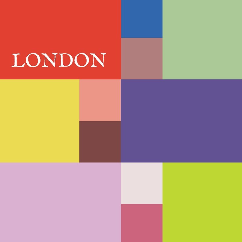
This month, I decided to inspire you with something probably every one of us has in our closets; a scarf. This particular scarf is full of color and not typically colors we would want to put together into an outfit, but why not? Think outside the box. Most of us use our scarves at accessories, without ever really letting them inspire our whole look. I decided to give it a try, so be sure to let me know what you think.

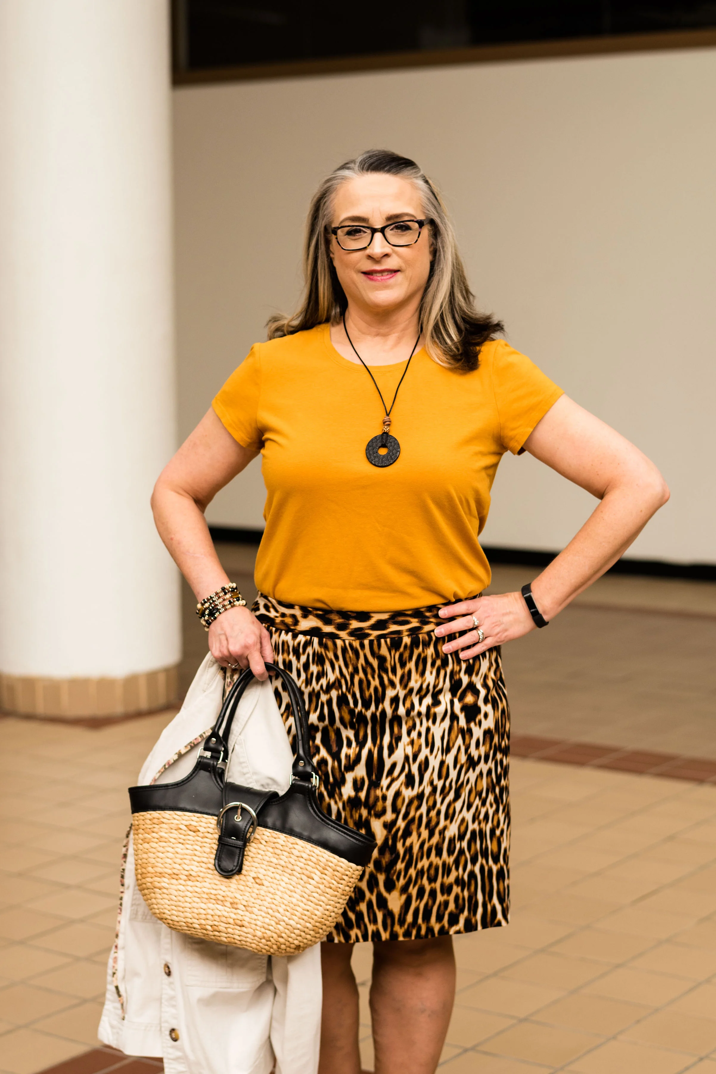
This scarf is perfect for this month’s Seeing Red theme. It is full of burgundy, red, shades of purple and a yellowy green. Using this as my spring board, I dove into my closet to see what I could find. This is what I came up with.

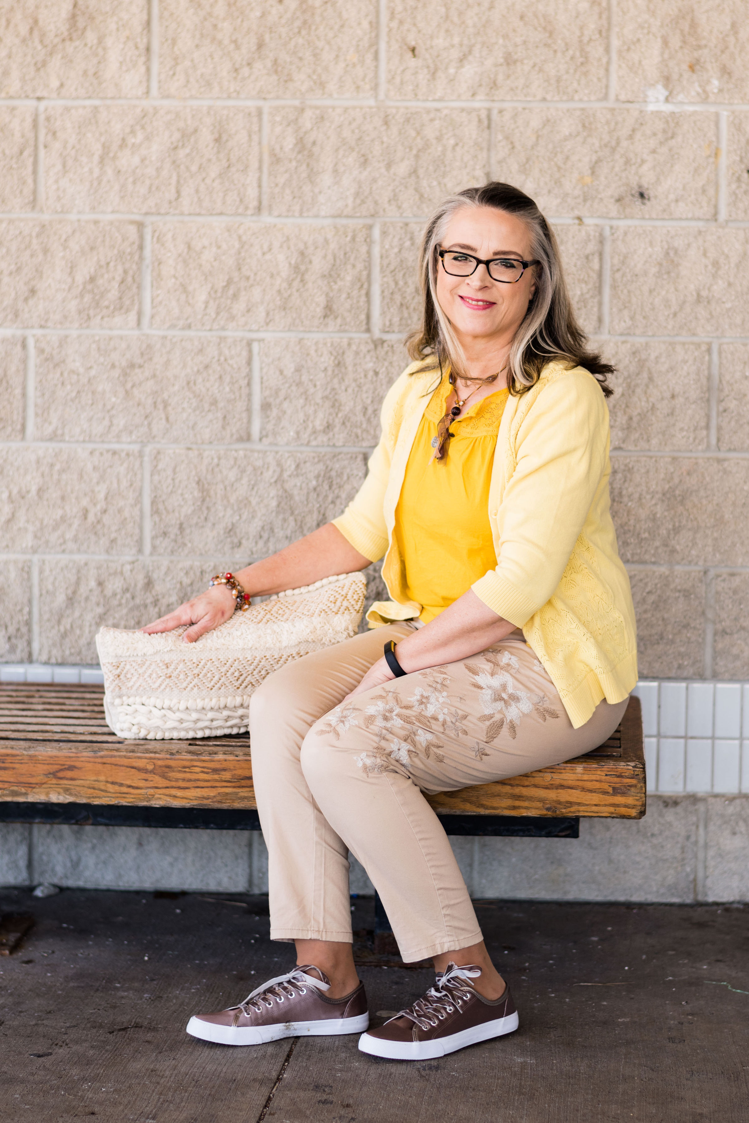
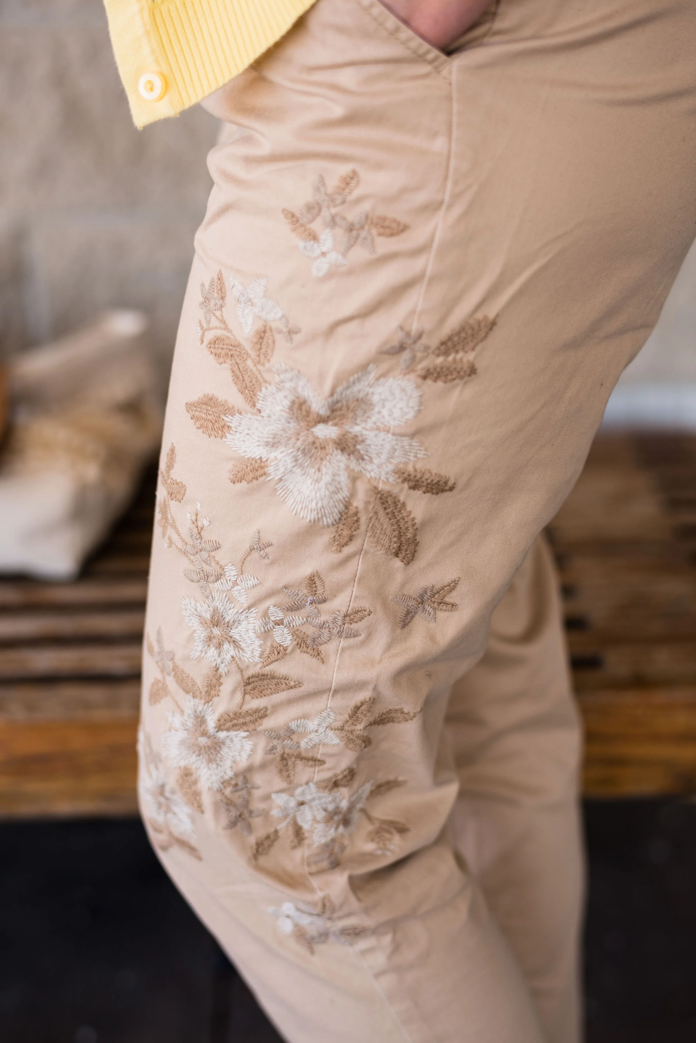
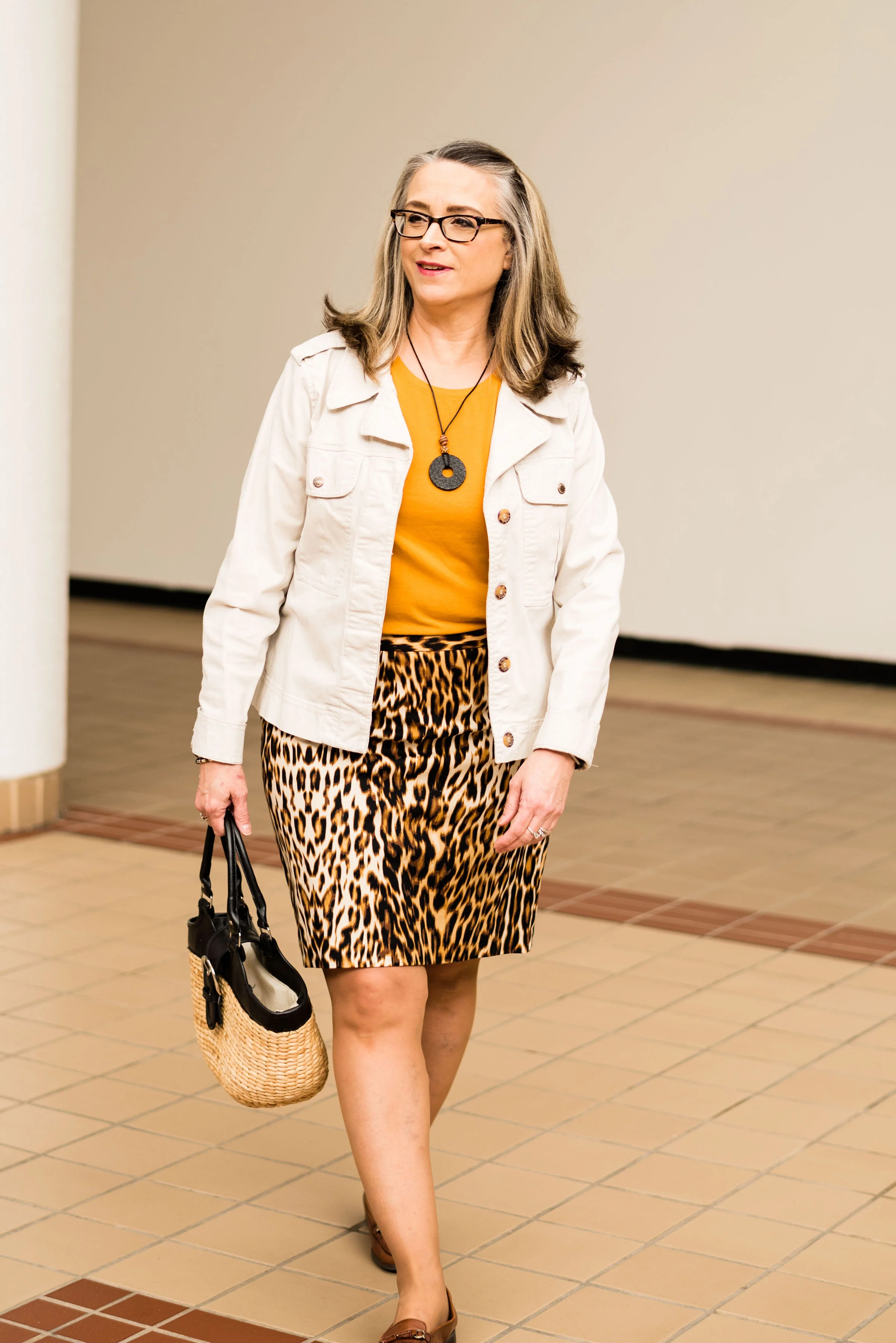
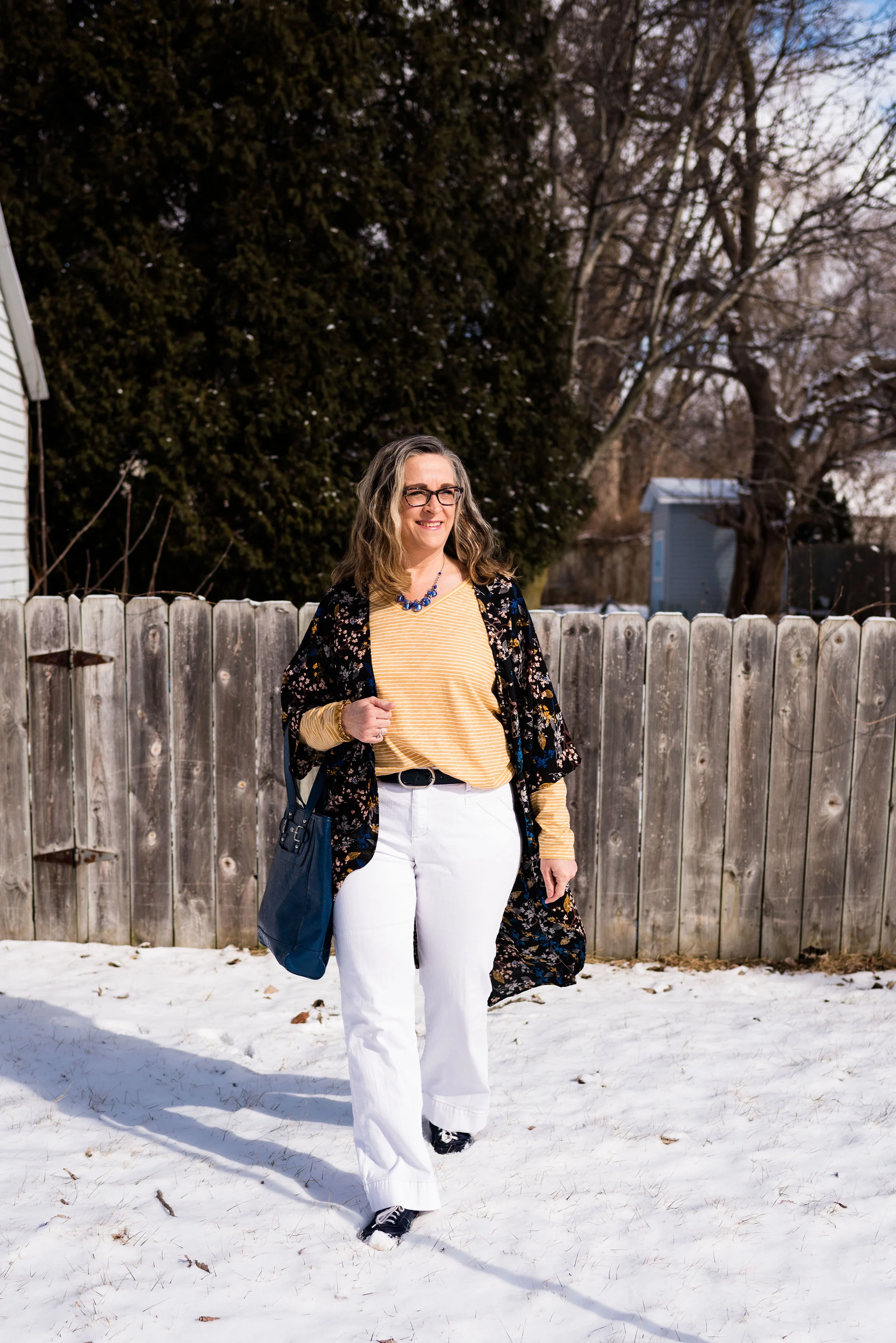
These bright red Faded Glory pants are a recent thrift find. I like ankle pants as the weather gets warmer and I thought this color would be fun for spring and summer. I used to never wear bright colored pants like this, but I have decided that life is too short to not wear the fun pants. I still reach for my simple blue denim jeans the most, but a bright color once in a while is a good way to stretch ourselves, whether it be on the bottom or the top.

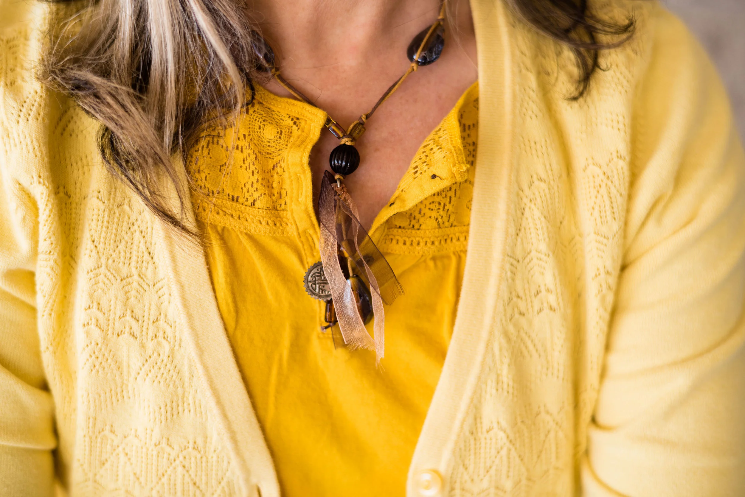
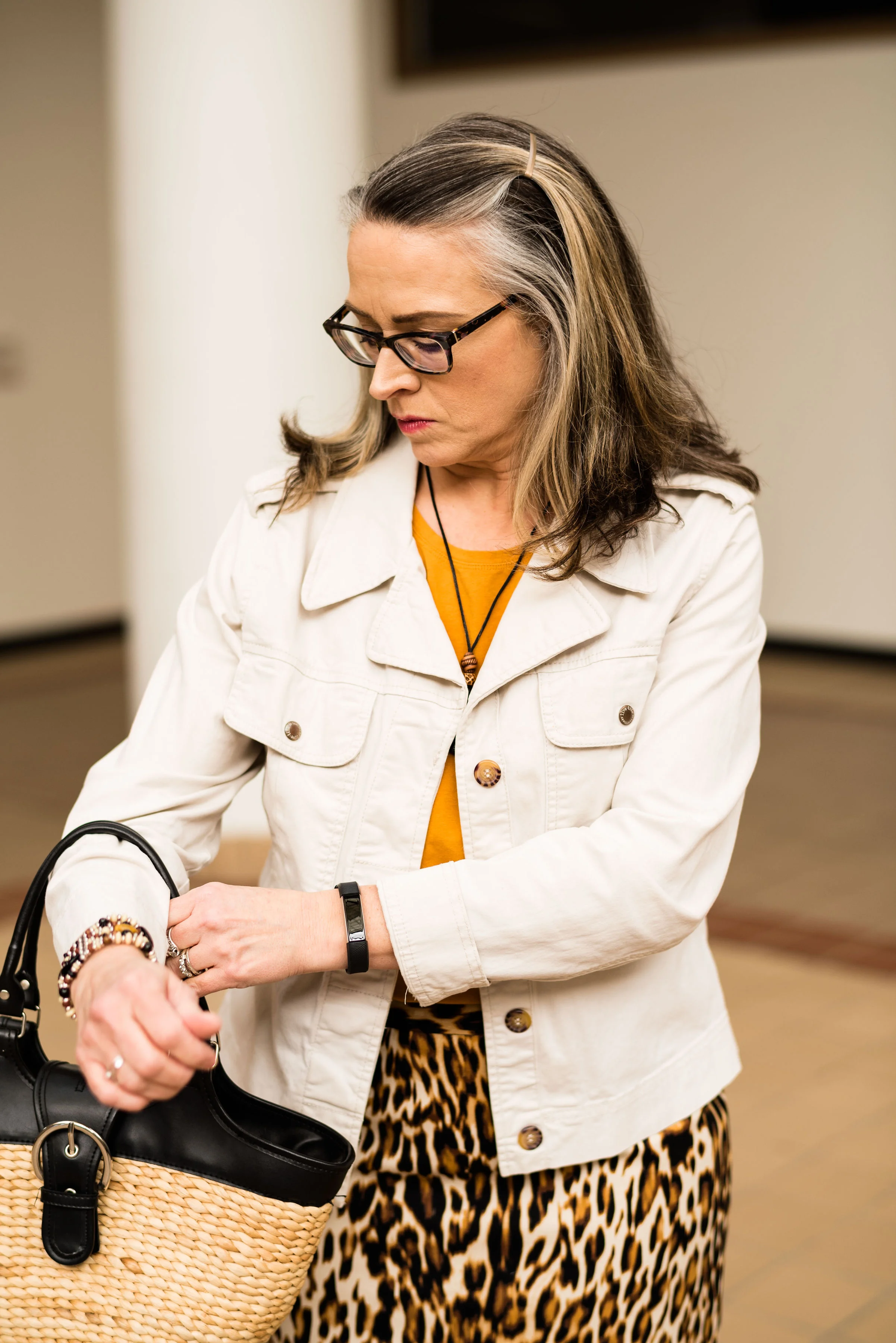
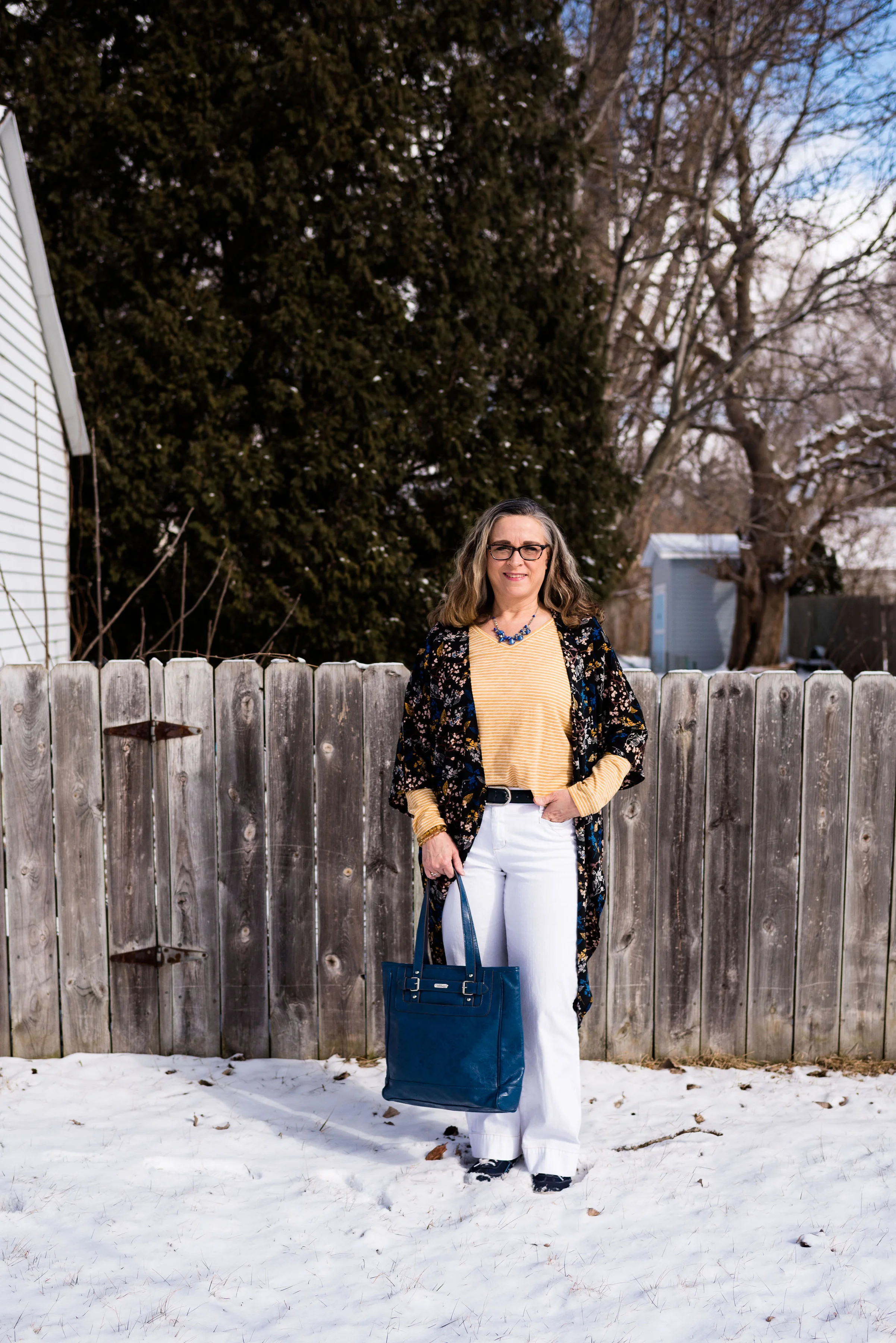
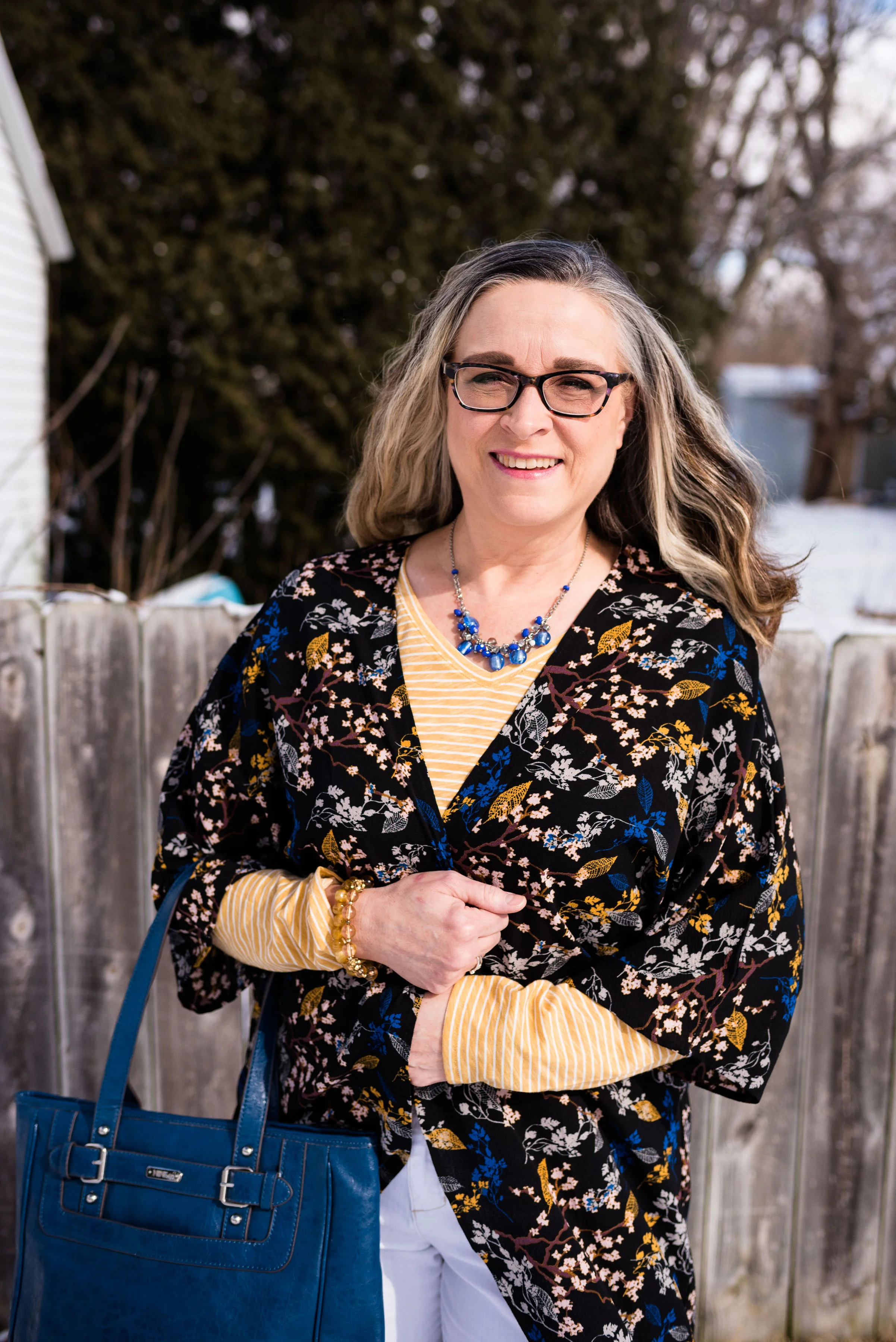
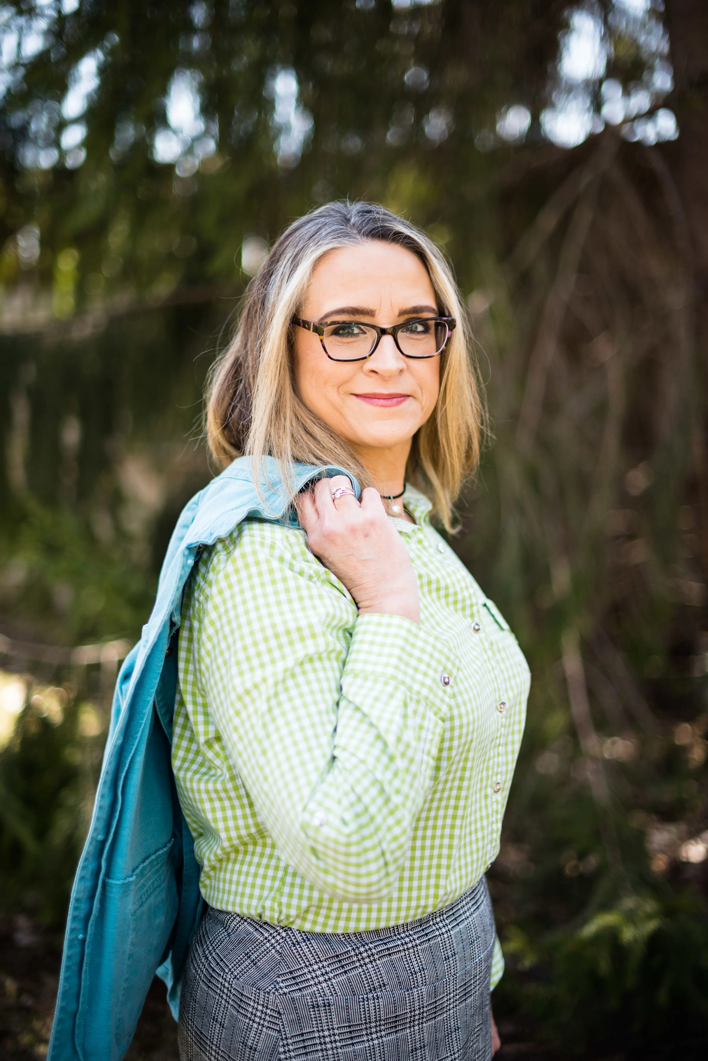
My lavender colored button up shirt is a thrifted Merona piece. The longer yellow sweater was a clearance find at the end of last winter season from Forever 21. I don’t shop there too often, because most juniors sized clothing, does not fit me very well, but with the advent of bigger, roomier fashion, I can find things once in a while that don’t make me look like I’m trying to dress like I am still 21; 39 maybe, but not 21. Ha, ha. The sweater is soft and cozy, the perfect topper for these very chilly winter days.

I know the fashion industry and many bloggers are already talking about spring and the upcoming fashion trends. I understand the need for being ahead of the game and often at this time of year we are yearning for the change of seasons and the warmer days of spring. However, the reality is, it is still, very cold! This morning when I checked the temperature, it registered at 18, but the “feels like” temp was only 9. Um, I’m still going to wear my warm, cozy sweaters, thank you very much. To even think about baring my ankles or talking about shorts and less layers makes me feel cold.

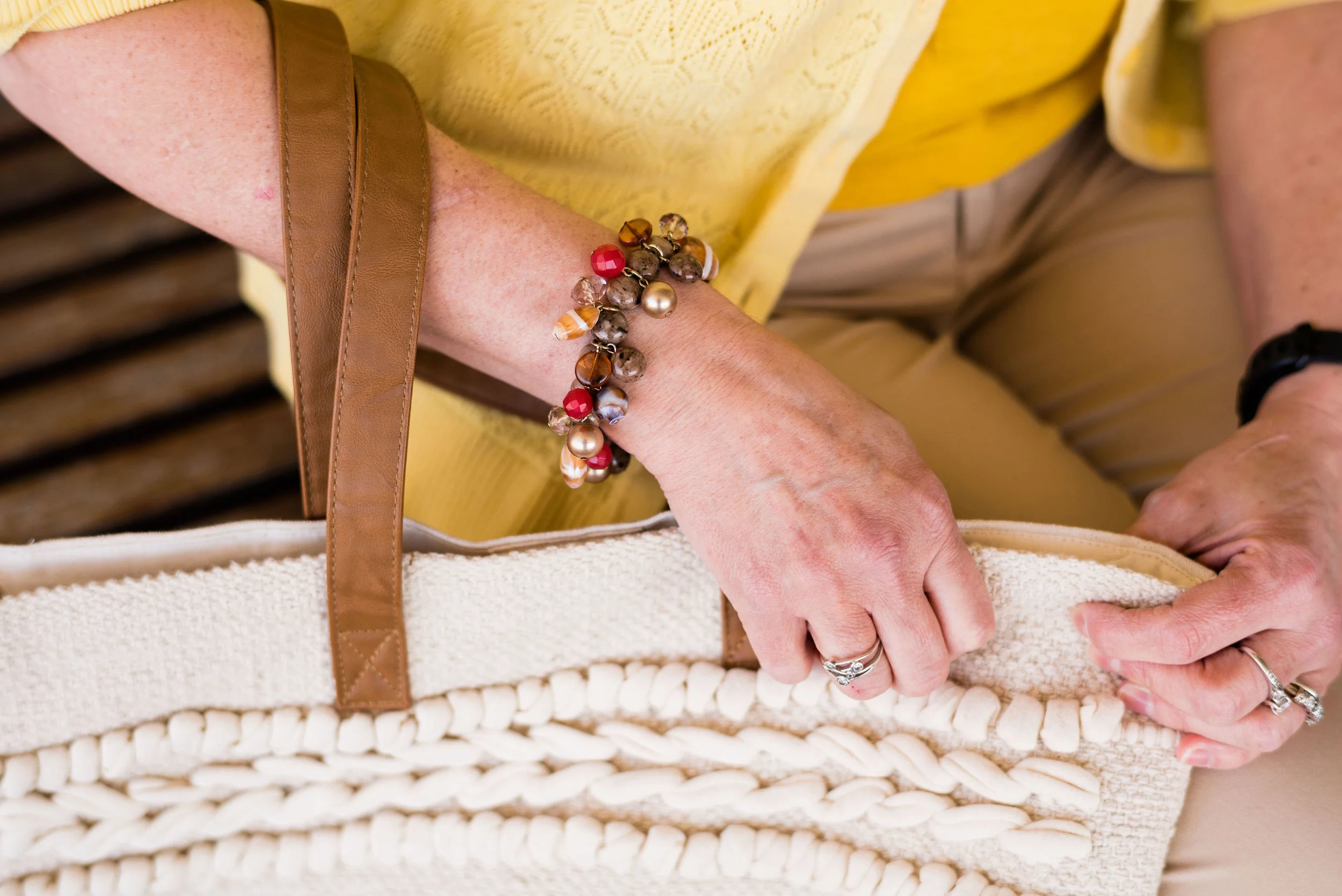
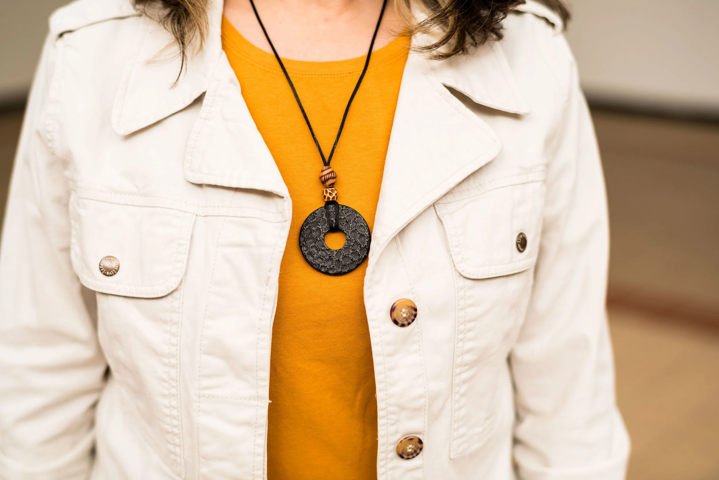
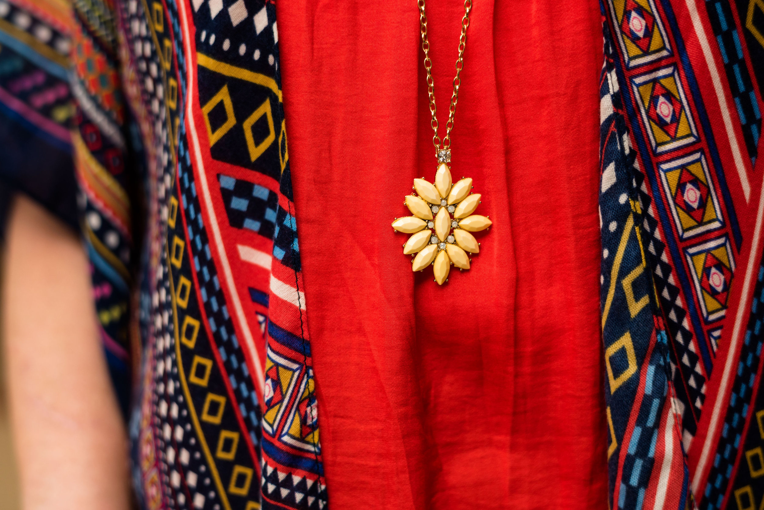
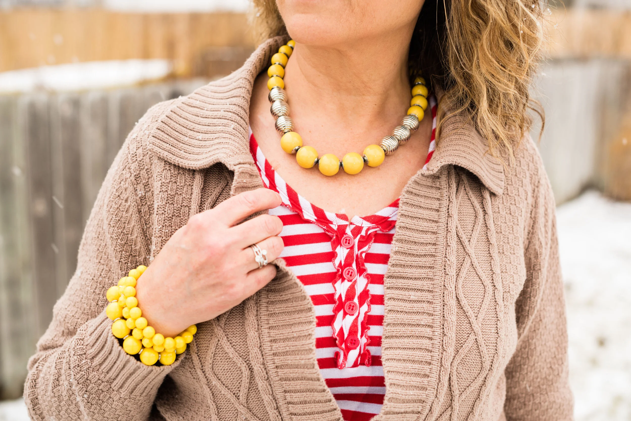
I’ve had this red and gold charm necklace for a long time. It is the perfect piece to add a pop of red color against any top. I love pendant necklaces and I am fortunate enough to have a long enough torso to wear them. I especially like these charm type necklaces with all their different fun charms, beads and dangles.

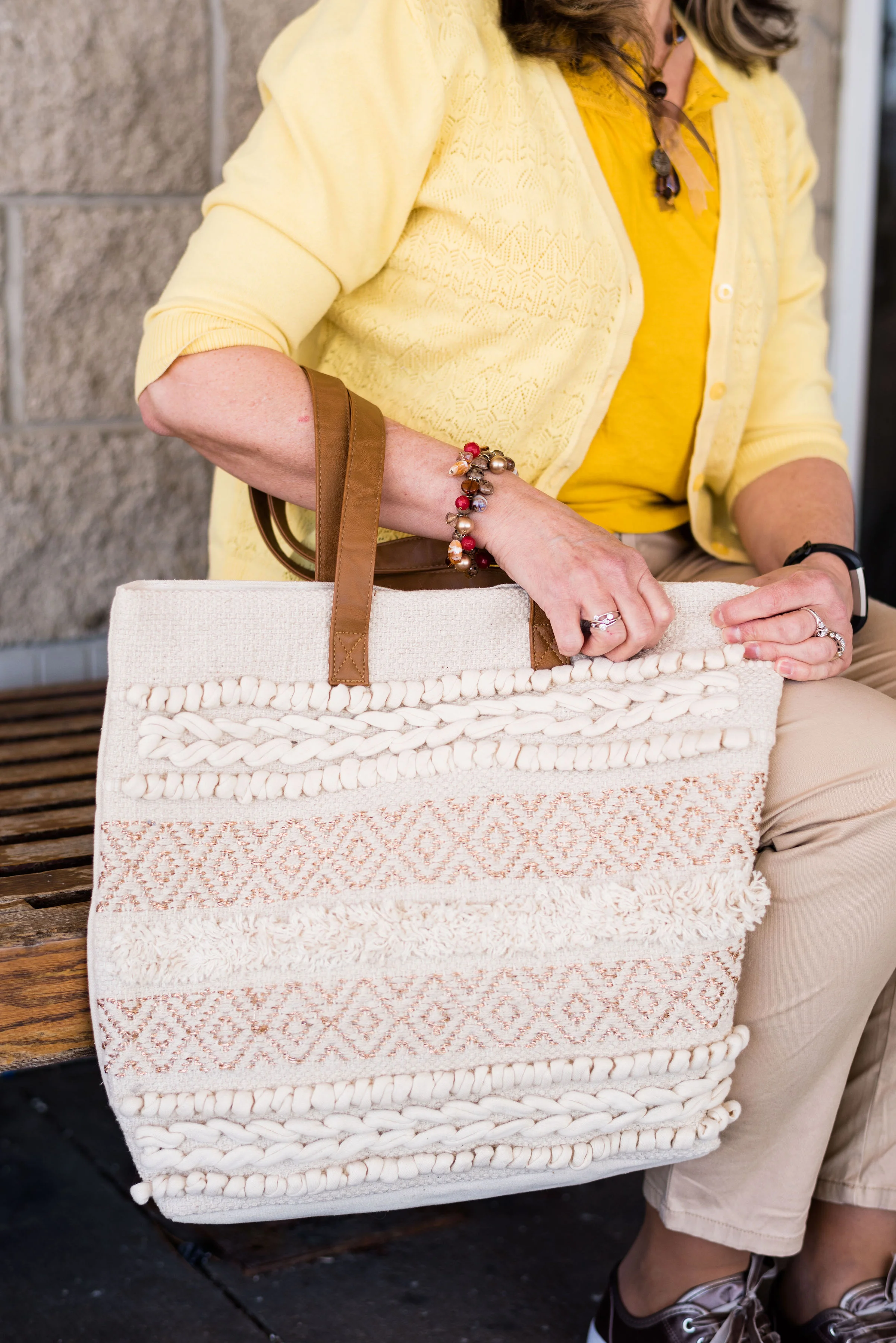
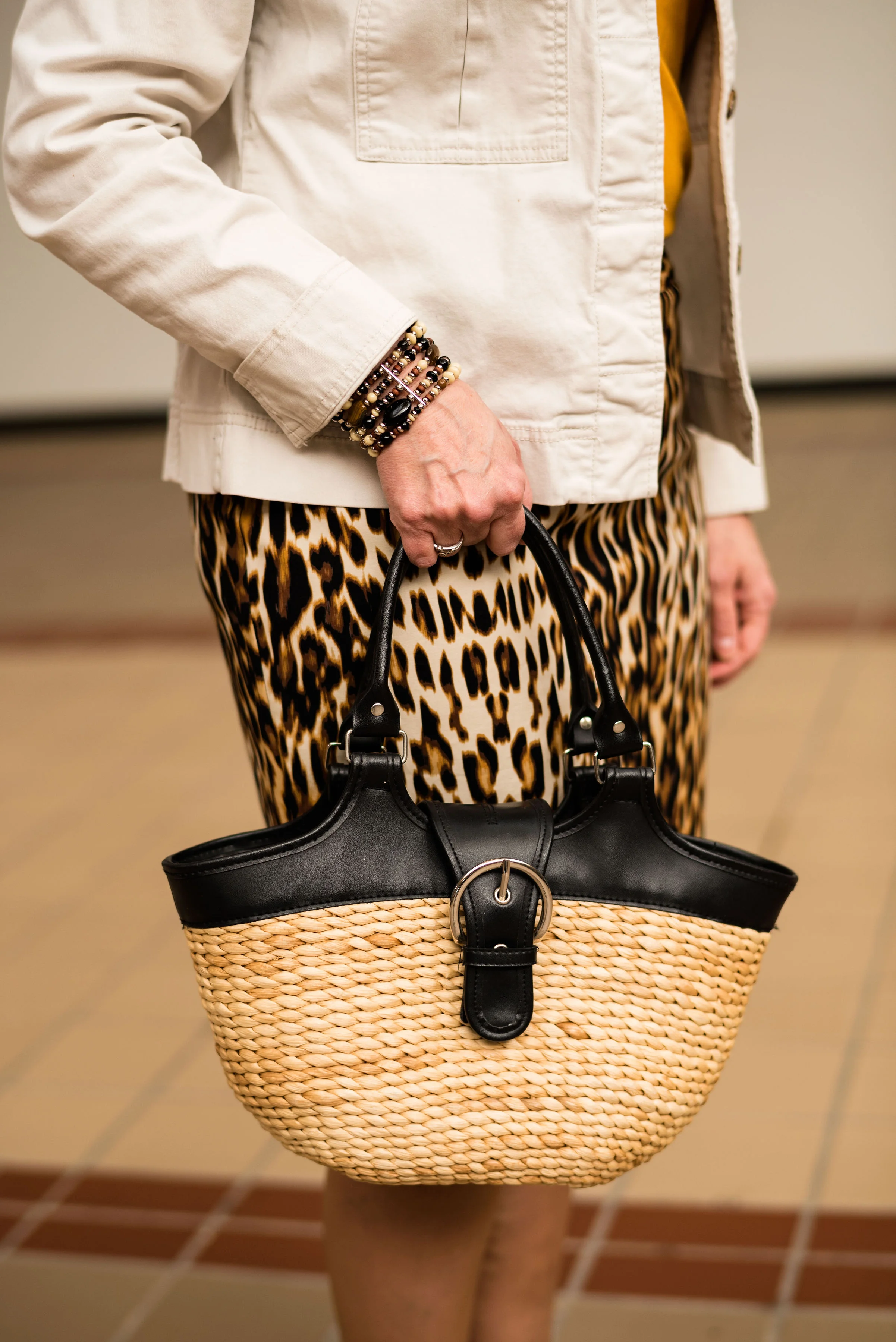
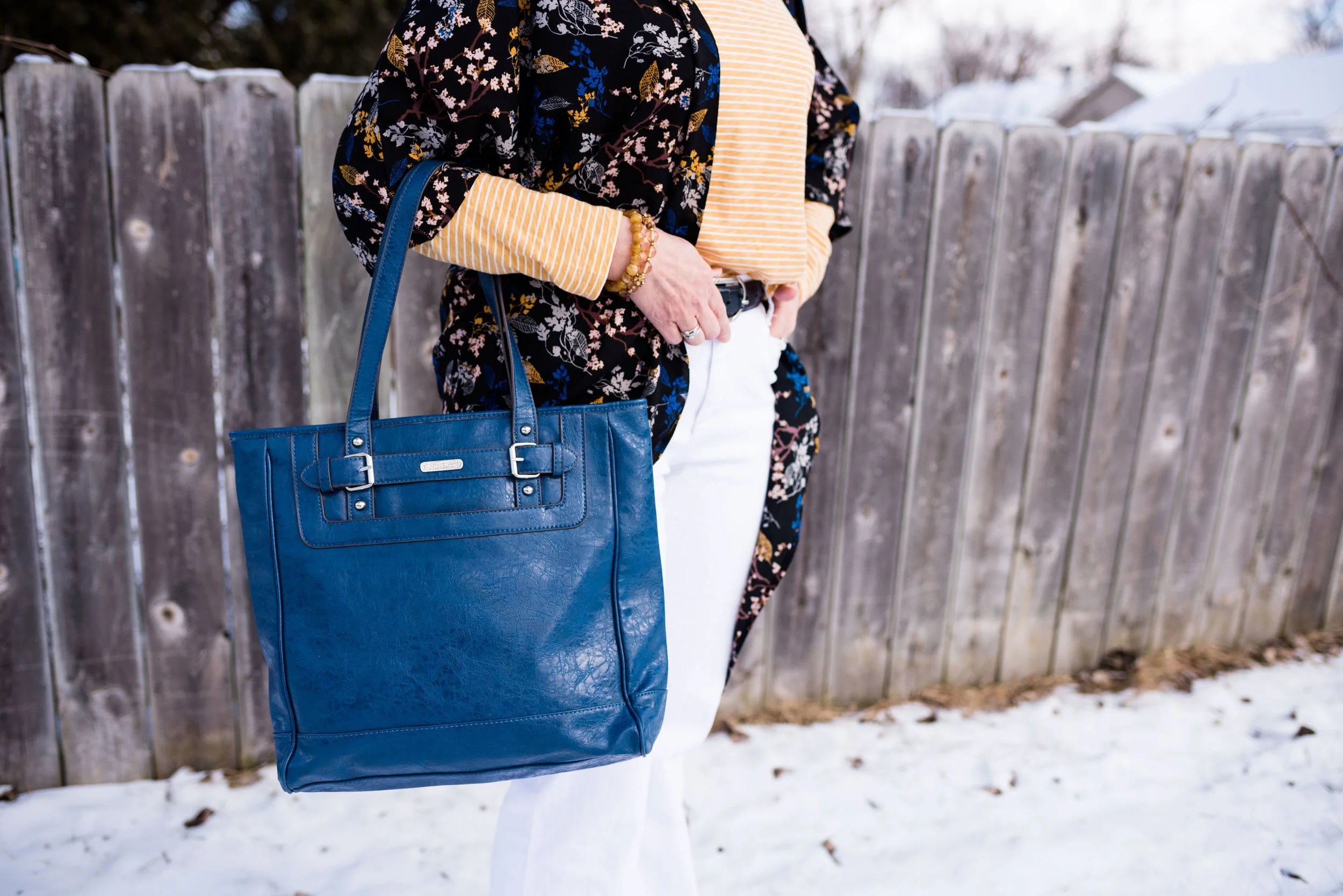
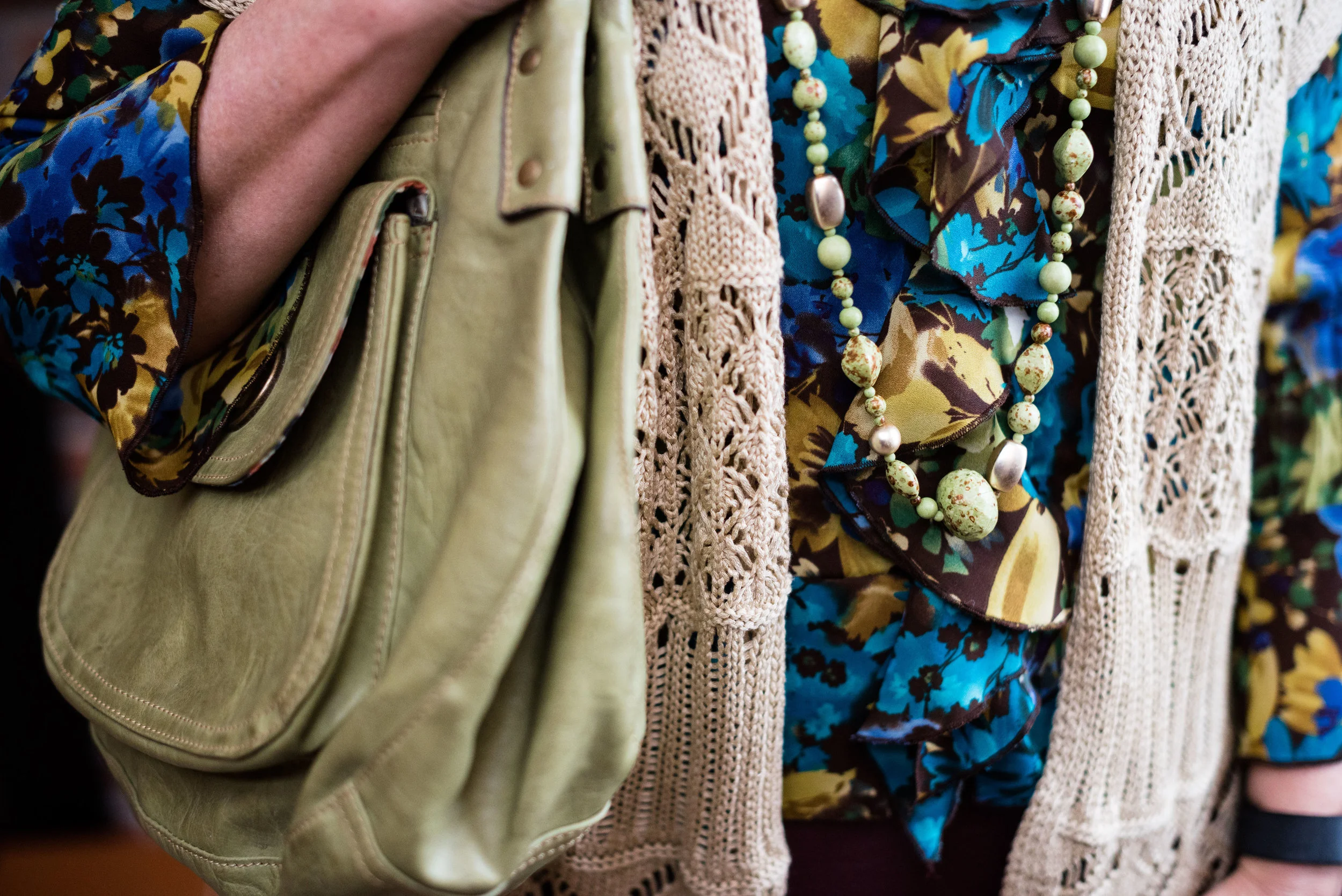
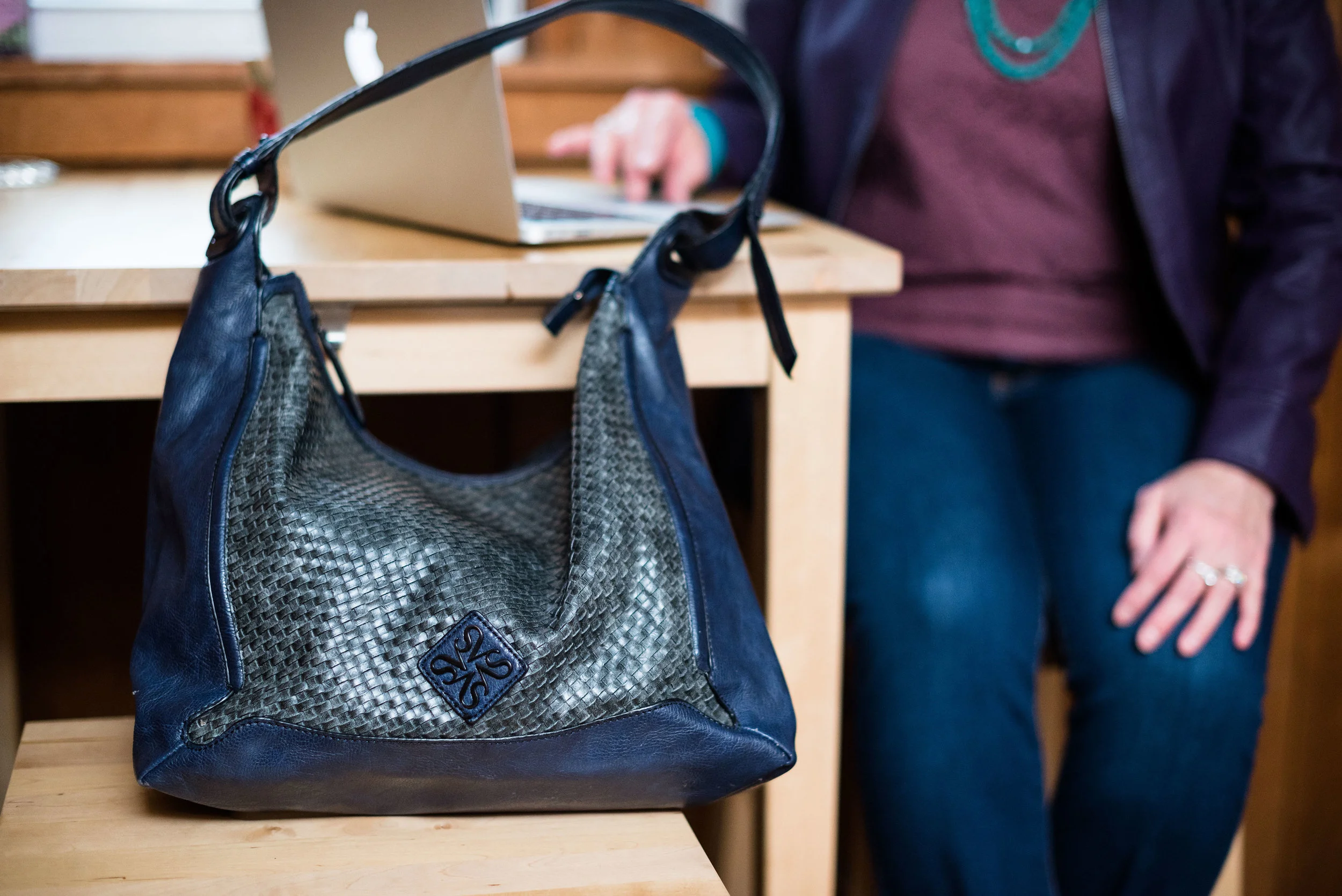
You’ve seen this cranberry colored bag just recently on the blog (you can see that post here), and I realized it would be a great color match for the berry color in the scarf. This thrifted Libby Edelman bag was brought to my attention by my thrifting bestie back in Buffalo, NY one time when I was back visiting my mom. As much as my hubby prefers that I never bring a purse into the house again, once in a while a girl has to bring it home.

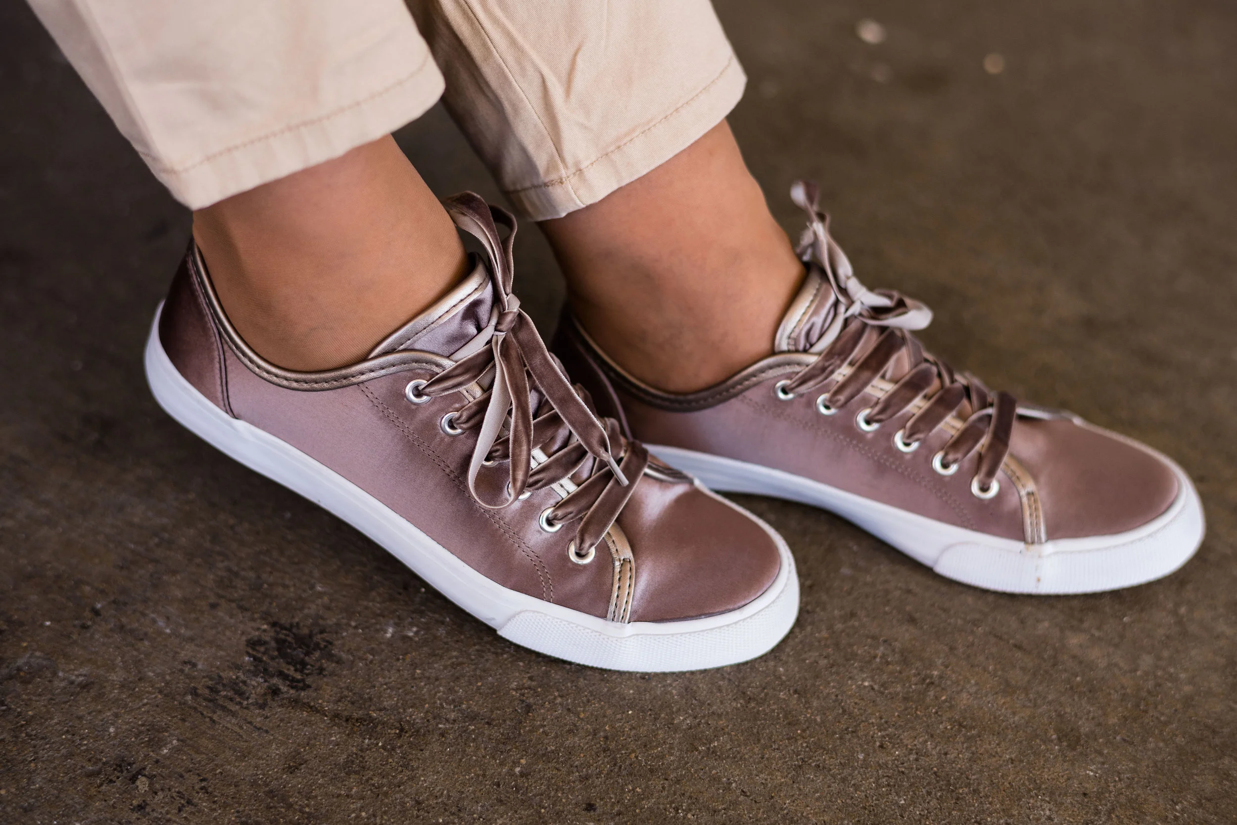
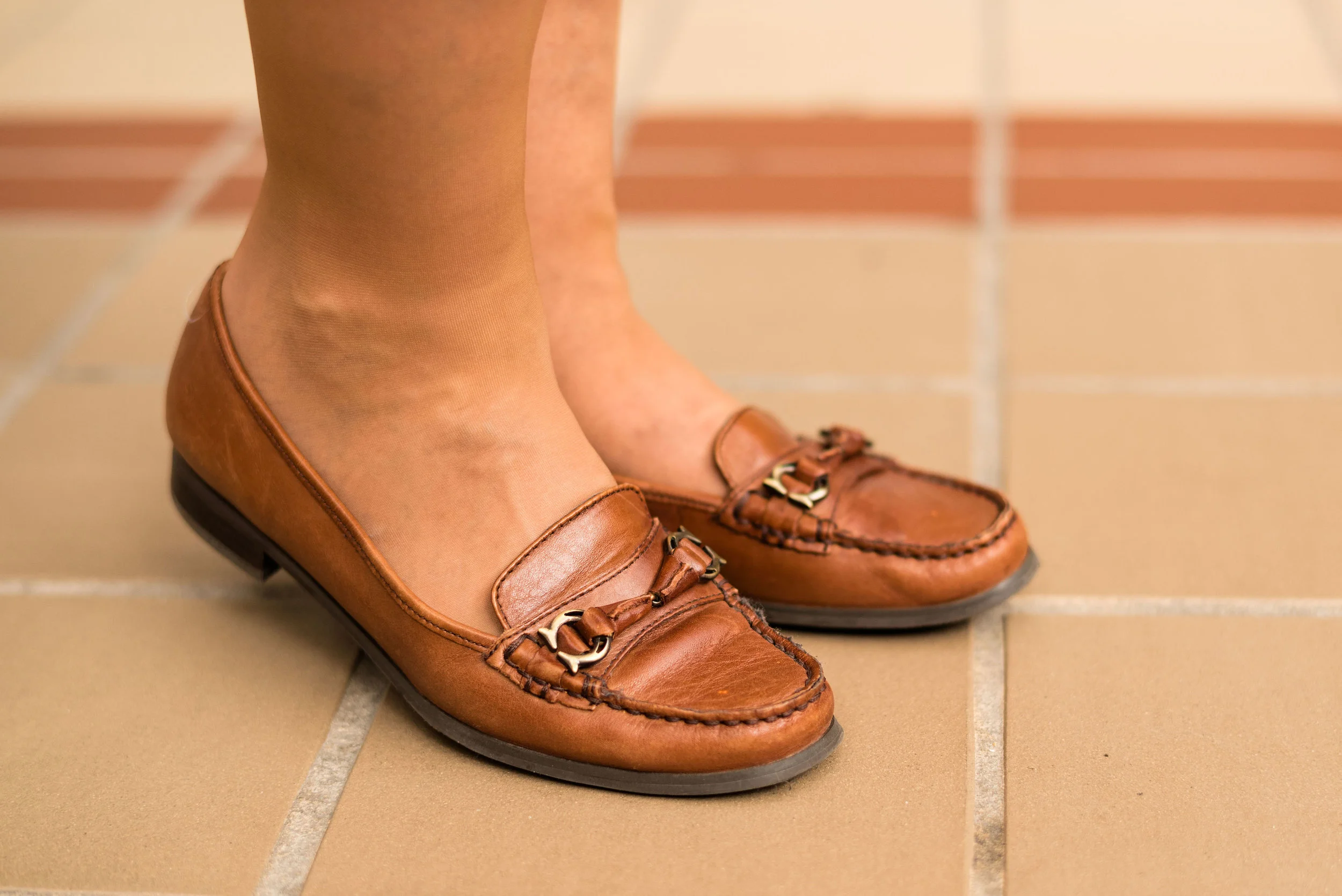
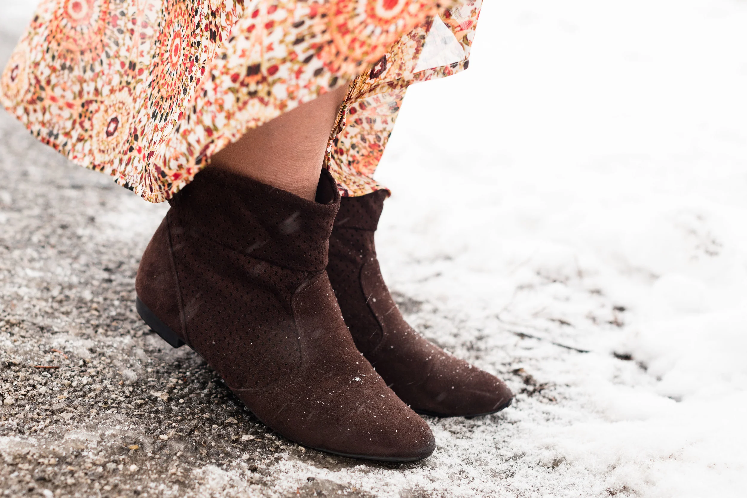
My olive SO ankle boots are making another appearance. These ankle boots are the most comfortable, versatile pieces and are the one purchase I would strongly recommend. It doesn’t have to be the SO brand, but I have found Kohl’s carries SO and Sonoma boots and I have really liked both. They are comfortable, fairly durable and have a great price point, especially if you can get them on sale or on clearance. I’m including shopping links at the bottom of the post, so be sure to check those out. Now is a great time to get boots for next season as many of them are on clearance. The great thing about ankle boots is you can wear them well into the spring with cropped pants, rolled pant hems and even skirts.

Do you have a scarf in your closet that you would love to build an outfit around? Give it a try. It is always fun to challenge your fashion brain to think beyond your norm. Many people might say they don’t want to change the way they do things, but there is something fun and satisfying about doing things differently and having it turn out well. Give it a try and let me know how you did.

For some beautiful scarves check out Nora Minassian at The Jacket Society. She has some beautiful printed pieces like this blue and white multi, ivory, pink and orange, tan and orange, multi-leaf print, and many others. Nora’s scarves are large and can be used as a shawl too, which would also be perfect for an outfit like this.

I love to hear your thoughts and I really wish there was a way to get more people to interact on the blog. The reason I say this, is not just for my benefit, but you all can be an encouragement to each other. After all, isn’t that what this is all about? For those of you who do comment, thanks again. For those who don’t, I would never want you to feel pressured. I know life is crazy busy. I often delete posts from other bloggers, because I just don’t have the time to comment, but I always feel good if I do. I feel like I am reaching out and encouraging a friend I’ve never met.

Thanks again for all your support.

Photo credit Rebecca Trumbull.

The shopping links included are affiliate links. I get a few cents if you click on a link and a little bit more if you purchase something through one of my links. I appreciate every click.

Have a great weekend and I hope the sun is shining where you are.

Pantone Spring/Summer - 2019 - Lemon Verbena & Aspen Gold

Today we are finishing up the Pantone Spring/Summer series with two lovely yellows: London’s Lemon Verbena and New York’s Aspen Gold. It wasn’t my first choice to pair these two colors together, but as I went along, picking out outfits and pairing colors, I decided that pairing the two yellows, was the prefect combination for a bright outfit that epitomizes the changes in the weather as we transition from spring to summer. The sun shines more, (hopefully), the skies are blue and we are looking to spending more time outdoors.

I have become an avid fan of yellows of any shade and have accumulated a number of pieces across seasons. I especially love the deeper shades that are reminiscent of sun flowers and daffodils, but lighter, lemon yellows, or tangier, mustard yellows are fun as well. Perhaps what draws me to it, is its ability to lift my spirits and make me think of sunshine, which I am in dire need of by this time of year. This spring seems especially bad, with all the rain we have been getting.

This Liz Claiborne 3/4 length sleeve cardi was a recent thrift find and so was the Chaps tee. I love the lacy detail on the front panels of the sweater and the yoke on the tee. Details like that just make an outfit look even more special. Once again, I got these two pieces separately, so I didn’t know until I paired them, that they both had that lace detailing. It just shows, once you have developed your fashion likes you will often reach for them. I love lace or things that look lacy. As I have shared with you before, I also love embroidery, which brings me to my neutral ankle pants.

These are also Liz Claiborne, but I got them on the clearance rack at JC Penney. I absolutely love the fit, fabric and details on this neutral pair of ankle pants. They are a light weight, chino type material and because they are a tan color, will go with so many tops. You can’t go wrong, having a neutral pair of pants in your wardrobe, spring, summer, winter or fall, a pair of pants like these can prove very useful.

This fun little necklace, used to belong to one of my daughters, but she didn’t want it any more. I like the hippy vibe and that there is a yellow cord mixed in. You can also see the detailing on the tee and the sweater more closely in this picture.

In keeping with my neutral feel for this outfit, I chose my large woven Sonoma tote bag. Once again, the fun details in the braiding and fringe, as well as the coppery threads, make this a great piece, especially for a day at the beach. This was a clearance find at Kohl’s.

The only other jewelry I added was a beaded bracelet with tones of tan, brown and red.

These Massimo sneakers were another thrift store find. I found these and the cream pair that I wore in the first Pantone outfit from this series at a Goodwill store. They had never been worn and still had the tags on them. I think the chocolate metallic color of these is rather fun! Do you have any metallic shoes. Hmmmm! Sounds like another idea for a blog post, don’t you think?

What do you think of these two colors? Do you like yellow? I never used to wear yellow, but now it has become a favorite of mine.

On Thursday, I hope to do a recap of all the Pantone colors. I’d love to hear which of them were your favorites.

I am including a few shopping links for all things yellow. These are affiliate links. All opinions are my own.

Photo credit Rebecca Trumbull. Make up Rachel Christensen.


Pantone Spring/Summer - 2019 - Toffee & Mango Mojito

I am continuing my Pantone Spring/Summer - 2019 series with two more fun colors called Toffee and Mango Mojito. I was glad to see this lighter brown on the palette this year. Usually brown doesn’t show up until fall and often it is more of an orangey brown, so this brown is a perfect neutral. I absolutely love this pretty yellow and I think the name is perfect. It makes me think of sunflowers and sunshine and what could be more reminiscent of summer.

I didn’t really have anything that was this particular brown. As I have said before, when I talked about Brown Granite in the last Pantone post I did, I like brown, but it is not something I have a lot of in my closet. For this Toffee color, I decided to use my Worthington leopard print skirt. Animal prints are still in, so hang onto your snakeskin, zebra and leopard.

When I saw this Apt. 9 tee at a thrift store, I chose it for the color alone, not realizing how perfectly it would mimic the Mango Mojito color. Then when I chose the skirt, I knew this tee would be the right piece to pair with it.

As with any outfit, accessories can make everything even better. I’ve had this thrifted white jean jacket by Sanctuary, for a few years and pull it out every now and then for the warmer weather. I thought it was the perfect topper for this outfit.

I kept my other accessories simple and earthy in keeping with the leopard print. A black pendant necklace, a beaded bracelet and my woven basket bag with black trim seemed the perfect accompanying pieces for this outfit. Do you own a basket bag? They are fun, and much more versatile than I once thought, especially in the summer.

I decided to wear these thrifted loafers to keep the look more casual. You could easily take this outfit up a notch by adding a sweater instead of the jacket, a sparkly clutch and heels, along with some jewelry with a bit more bling. As is, it is a nice outfit for work.

We had fun taking these pictures inside a local mall that is no longer a “normal” mall.

What sort of photos do you like best? Outdoor or indoor? I’ve always been a fan of natural light, but I think these indoor shots are kind of fun, don’t you?

Do you like these Pantone colors? I think Mango Mojito is one of my favorites. I know not everyone will like it, because not everyone can wear it, but remember, you don’t have to wear a color that’s not really good with your complexion, you can always carry it in the form of a bag, wear it on your feet, or even tie a scarf in the color to your purse.

I hope you enjoyed this post. I’ve included a few shopping links. These are affiliate links, which means, when you click on a link, I get a few pennies. All opinions are my own. Thanks for all of your support. If you know someone you think might enjoy my blog, be sure to tell them about it. If you aren’t already a subscriber, please subscribe. It keeps my blog going.

Have a great week.

Photo credit Rebecca Trumbull. Make up Rachel Christensen.


Pantone Spring/Summer - 2019 - Pink Peacock & Pressed Rose

Today’s Pantone Spring/Summer colors include a hot pink and a pastel pink. Pink Peacock could be a close cousin of fuchsia and reminds me of the bright pink flowers that begin to appear in many people’s gardens at this time of the year. Pressed Rose is a medium pink that appears only on the London color palette as a companion to New York’s Sweet Lilac. To me it is a more adult version of pink, that almost any woman could wear.

For this series, I thought it would be fun to pair colors that had similar roots, so for this pairing it was pink with pink. You will see another post where I pair yellow with yellow. Whereas, in last Thursday’s post with Turmeric and Sweet Lilac, the colors were quite different, almost to the point of being too different to put together. However, as we are beginning to realize with many fashion faux pas, never say never.

This bright pink thrifted, Worthington sweater was a purchase I made, just for this series. I have a number of bright pink things, but nothing seemed quite right, a little too red, or a little too purple, so when I saw this for a dollar I snapped it up without even trying it on. I like the ribbing around the neck line. Little added details like that are part of what make clothes special.

This David & Young kimono was a clearance find from DSW. Who thinks to shop for kimonos at a shoe store? Me, that’s who. Ha, ha. They have all sorts of great accessories there, like bags, wallets, key chains and of course shoes!

It is hard to see in these pictures, but the kimono’s flowers include the Pressed Rose color. I like the fringy details on the sleeves and it is also on the hem line. This will be a great topper for the warmer weather.

For this outfit I decided to try finding a piece that would mimic the Brown Granite color from the classic neutral palette. It is not often we see an actual brown on this palette. More often they choose a gray. I was disappointed there wasn’t a gray, but then I realized it would force me to think outside my box again. I actually like brown and my hubby loves when I wear it as it brings out my brown eyes, however, it is hard to find brown pieces that aren’t just drab and boring.

I got these brown Worthington trousers at JC Penney. You can obviously tell, I have a lot of Worthington pieces. For me it is a brand that fits my figure pretty well and has a lower price point. I think they make great work wear pieces. Here are a few pairs of pants in various colors: gray, various, bright pink, pull on skinny (similar to the orange ones from last Thursday’s post). This pair is more of a wide leg and very comfortable.

These cute ankle boots I found at Kohl’s in the clearance section. Do you shop clearance? It really pays off at Kohl’s as long as you don’t mind getting stuff at the end of the season. I don’t worry about being spot on as far as the trends and timing. I like what I like and I will wear it, whether it is trending or not.

Along with my light pink ankle boots I grabbed my little pink clutch, and added a few simple pieces of jewelry to keep the kimono and sweater center stage.

What do you think of these colors? Do you wear pink? My husband does not like pink, not even on me, but I wear it anyway. I’m such a bad wife. Ha, ha. But he puts up with me and loves me even in my pink moments.

As always, I’ve included a few shopping links for all things pink! Enjoy shopping. These are affiliate link, which means I get a few cents when you click on a link. All opinions are my own.

Photo credit Rebecca Trumbull. Make up Rachel Christensen.


Pantone Spring/Summer - Introduction

I’m a little late, putting this series together this spring, but the Pantone colors are really for two seasons, spring/summer and fall/winter. Since the colors bleed over into summer, I figured it would be okay if my series started a little later.

Once again, we are introduced to both the New York and London color palettes, but the overlap between the two is substantial, so we’ve combined all the colors, so you can see the whole palette at once.

This spring/summer palette is full of rich, saturated colors, but also has sweet, light pastels that will appeal to the little girls in us. As usual the Pantone Color Institute has named these colors with fun foodie words like Pepper Stem, Turmeric, Toffee, Mango Mojito and Lemon Verbena. Other names convey the beauties of the natural world, such as Living Coral (the Pantone Color of the Year), Aspen Gold, Terrarium Moss, Sweet Lilac and Pressed Rose. Finally, summer wouldn’t be complete without a few colors that remind us of cookouts, parties and fun times: Fiesta, Jester Red, Pink Peacock and Princess Blue.

I liked all of the colors on this palette. I had fun choosing outfits around these colors and when we get to the actual outfit posts, I’ll explain my rationale for each outfit more fully.

I addition to the 14 colors above both the New York and London palettes both share the four neutral palette shown below.

I wish they had included a gray, like they’ve done in the past, but I don’t begrudge them for changing things up a bit. The Brown Granite is a nice choice, but I find, that it is easier to locate a gray piece than a color like this. Gray seems to be more classic, but maybe things will change and this brownish gray will take over.

Here are a few sneak peeks at what is to come over the next few weeks.

If you like color and like to challenge yourself to try new things, be sure to join me for this Spring/Summer Pantone 2019 series, beginning next Tuesday.

What do you think of this spring’s color palette? I’d love to hear your thoughts.

Have a great weekend!

Photos and graphics, Rebecca Trumbull.

Print Mixing Mash Up - Striped Tee - Outfit 1

As i started pulling pieces out of my closet to do this print mixing series, I had no idea how much fun it would be and how many outfits I would come up with. It is amazing how many pieces I have that actually go together in a way that creates real life, wear it to work, outfits. The way I decided to put this together, was to feature one printed piece a week that will be the foundational piece that I build the rest of each outfit around. For this week it is a yellow striped Sonoma tee. The outfit you see today and the outfit on Thursday’s post will both be built around this same piece.

Let me preface this by saying, it was 18 degrees with a wind chill factor that made it feel like 4, when we were taking these photos. It was cold and that wind bit, but we got it done. My daughter is pretty quick at taking pictures, although in those temps, even the camera wasn’t always willing to work properly.

Today’s outfit was a casual look, that I might wear to a get together with friends, or a fun date night with my hubby.

It’s a little hard to see the print mix in these photos, but I showed the top and this kimono in last Thursday’s introduction to print mixing. You can see that post here, if you missed it.

This yellow striped long sleeved Sonoma tee is a recent purchase from Kohl’s. It is light weight and a great layering piece for spring.

This floral kimono was a clearance find at DSW. If you are a clearance shopper like me, it is always a good idea to check out the clearance rack at all stores you go into. DSW is a great place to find shoes on clearance, and I would have never thought to go in there to look for a pretty kimono like this, but there it was. In fact I got two other ones that will no doubt make it on to the blog at some point.

These white Gloria Vanderbilt jeans you just saw on the blog, last week when I was wearing them with my scarf print blouse. You can see that post here. These are my favorite white jeans. They are thick enough that my underwear don’t show through and I like the wider leg.

I wanted to keep this look more casual so I opted for my navy blue Keds. After we took these photos are were on the way back into the house, I realized we needed to take a picture of my shoes, thus the snow.

I grabbed this bright blue tote to go with the bright blue in the kimono. This bag is thrifted and Nine & Co. brand. I do like a good sized tote bag like this for traveling. I can fit a lot more in it, like a book and a pad of paper, in case i get the urge to read or write. I know there are electronic versions available, but I still like the feel of a book in my hand or moving a pen on a piece of paper.

You could easily replicate this look by using a color of your choosing for the striped tee and then picking a piece with a complimentary color for the kimono or even a floral cardigan or bomber jacket. It’s not that you create an outfit that looks just like mine, but that you find things in your own closet that will give you a similar look. You wouldn’t have to wear white jeans. Any wash of denim would look cute with a print mix like this or pick out another color that goes with one of the other colors in your print pieces. For instance, my kimono also contains brown and is on a black background. Either color could have worked for my bottom piece.

Why this works:

The main reason this works is the color. The yellow of the striped tee goes perfectly with the yellow in the kimono. The other reason it works is that the stripes are small and narrow, which works well with the busier, bolder pattern of the kimono.

What do you think? Do you like this outfit? Do you have pieces like this in your closet that you like to pair together for a fun print mixing look? I’d love to hear your thoughts. Leave me some love in the comments section.

I’ve included a few shopping links for you. These are affiliate links. All opinions are my own.

Outside the Box - All Over Pattern Mix

Since becoming a blogger I have learned about pattern mixing. I have done a little bit of it here and there, but usually with smaller pieces. I did a post about pattern mixing in March of last year. You can see that post here. Many of those outfits were examples of an all over pattern mix. While I have done it in the past, I thought it would be fun to revisit the all over pattern mix for a fun spring work outfit. 

I came up with the idea for this post when I did my Spring Trends post back in February. You can see that post here. When I lined up the skirt and top to show the plaid/check trend for spring I thought the combination would be perfect for a spring outfit. 

Everything in this outfit is thrifted except the shoes and bag. The skirt is a brand called Michelle. The black and white plaid is broken up in the lower left corner by two pretty embroidered flowers. 

This cute little clutch is actually a pencil pouch that I found at Barnes & Noble. It makes a great clutch and is perfect for spring. You can see how I styled an outfit around this bag in this post here. Since I was going for an all over pattern mix, I thought this bag was perfect for this outfit. 

My jacket is a brand called Madison and Max. I found this in a friend's closet. Shopping your friends' closets can be a great way to recycle and save money for all of you. 

The blouse is Jaclyn Smith brand and is a light green gingham. You can see the mixing better here.

You might feel this mix is over the top, but I really think the jacket pulls it all together and because it is a solid, keeps the mix from becoming too overwhelming. 

I decided on my black Cabela's flats. These are a great shoe for work, when I have to be on my feet. 

How are you at print mixing? Do you think this works or is it too much? I'd love to hear your thoughts in the comments. 

I've included a few shopping links for some fun printed pieces for spring. This post contains affiliate links, which means if you click on a shopping link I get a few pennies. If you purchase something through my site, I get a small commission. All opinions are my own. 

Have fun with your print mixing!

Photo credit Rebecca Trumbull. Make up Rachel Christensen.

Thursday linking up with Nicole of High Latitude Style and Jacqui at Mummabstylish. Friday linking up with Shelbee of Shelbee on the Edge, Nancy of Nancy's Fashion Style, Jennie of A Pocketful of Polka Dots, and Jo-Lynne of Jo-Lynne Shane.

Pantone Spring 2018 - Introduction to the New York and London Palettes

This spring, the Pantone palette is full of pastels. Both the New York and the London palette have a number of overlapping colors that instantly say spring. I am excited about introducing this series to you and even though the colors have been on the Pantone website since last fall, I feel that the end of February and beginning of March are the perfect times to introduce spring colors. 

I'll confess, up until a few days ago, I couldn't even think about spring. As much as I want it to be here, I know there are still cold days ahead. However, with a forecast of temps in the forties and fifties, I think I can finally blog about spring, knowing that it will soon be here in all of its splendor.

The above graphic as well as the photos in this post are done by Rebecca Trumbull. Rebecca, not only takes amazing photos of all varieties from pets, to weddings, to seniors, to models, she also dabbles with managing social media accounts. If you need someone to manage your social media Rebecca might be a good choice. She is organized, has strong business savy and knows her way around the internet. (She didn't ask me, or pay me to advertise, I get something better, she's my daughter!)

As you can see by comparing the two palettes there are seven overlapping colors that appear on both palettes. These are :

Cherry Tomato - an orangey red described as "...impulsive....demanding attention...courageous..."

Blooming Dahlia - a peachy salmon.."subtly alluring...with understated appeal."

Meadowlark - a pretty yellow, described by Pantone as "glistening with joy and illuminating the world around us."

Pink Lavendar - lavender with a little more pink and a little less blue. Described as, "..soft and romantic...that charms with its soothing sense of quiescence."

Ultra Violet - Medium purple with a "complex and magical" hue. This is Pantone's choice for Color of the Year

Almost Mauve - this ultra light blush is perfect for using as a neutral and pairing with any other color. 

Lime Punch - appropriately named, this color makes me think of citrus fruit and warm sunny days. 

In addition to these duplicate colors each palette has five other colors:

New York Palette

Little Boy Blue - the color of sunny skies and a feeling of "expansiveness"

Chili Oil - think spicy for this deep reddish brown. 

Arcadia - a green with blue undertones, reminiscent of tropical waters.

Emperador - a rich chocolate brown.

Spring Crocus - described as a "...witty and flamboyant...fuchsia shade...."

London Palette

Palace Blue - not quite royal, but "...sparkling with energy...."

Ash Rose - a more earthy darker pink.

Nile Green - reminiscent of sage and honeydew melons.

Spiced Apple - similar to Chili Oil, but with a deeper brown.

Rapture Rose - a pinky red "...that brings flirtatious charm to the Spring 2018 palette."

In addition to each palettes' twelve colors, this year they added four Classic Colors which can be used with any palette choice for a foundation from which to build an outfit. These are the same for both New York and London and are:

Sailor Blue - dark navy.

Harbor Mist - light to medium gray.

Warm Sand - tan with more yellow tones.

Coconut Milk - white to off white. 

The following photos are some sneak peaks at my series that will start next week, where I will feature outfits using two or three of the palette colors as well as a classic color. 


I hope you'll join me next week as I begin my Pantone Spring 2018 series. Check back on Thursday for my Old Becomes New column. 

Have a great day. 

Monday linking up with Catherine of Not Dressed as Lamb. Tuesday linking up with Shelbee in The Spread the Kindness link up and Jess of Elegantly Dressed and Stylish. Friday linking up with Nancy of Nancy's Fashion Style