Pantone Autumn/Winter 2025 - London Palette: Poppy Red, Bronze Mist and Dark Gull Gray
Can you believe September is almost over? Here in the midwest it doesn’t exactly feel like fall. The leaves are changing, the sun’s angle is different and the days are growing shorter and shorter, but our temps have been summery. I really don’t mind the blue skies and high 70’s or low 80’s, but I am ready for the cool down, and the return to all that is cozy, including hot tea and cocoa, baking things in the oven and the sweet layers of sweaters and scarves.
We are looking at another trio of colors from the Pantone London Autumn/Winter 2025 color palette. You can see the colors in this Pinterest pin.
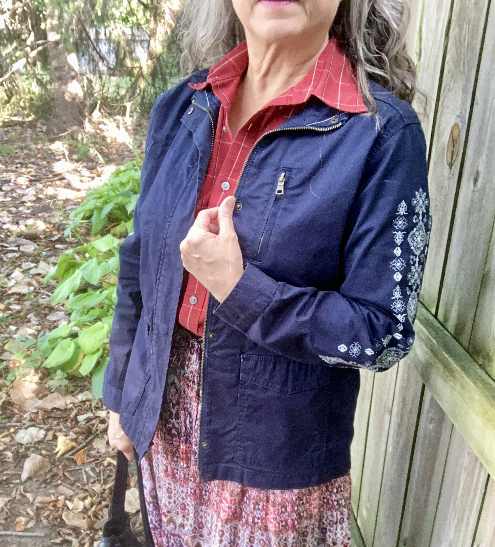
Today’s look gets a power punch from Poppy Red. You might remember this color from the New York palette. It is definitely a mood lifter. You can see the New York post here. Today I decided to pair this bright red with Bronze Mist, which is a similar color to the NY Bronze Brown, just a bit more yellowy green. I also chose the color Dark Gull Gray from the classic palette. I styled the shirt two ways, left out and tucked in, so I will include pictures for both.
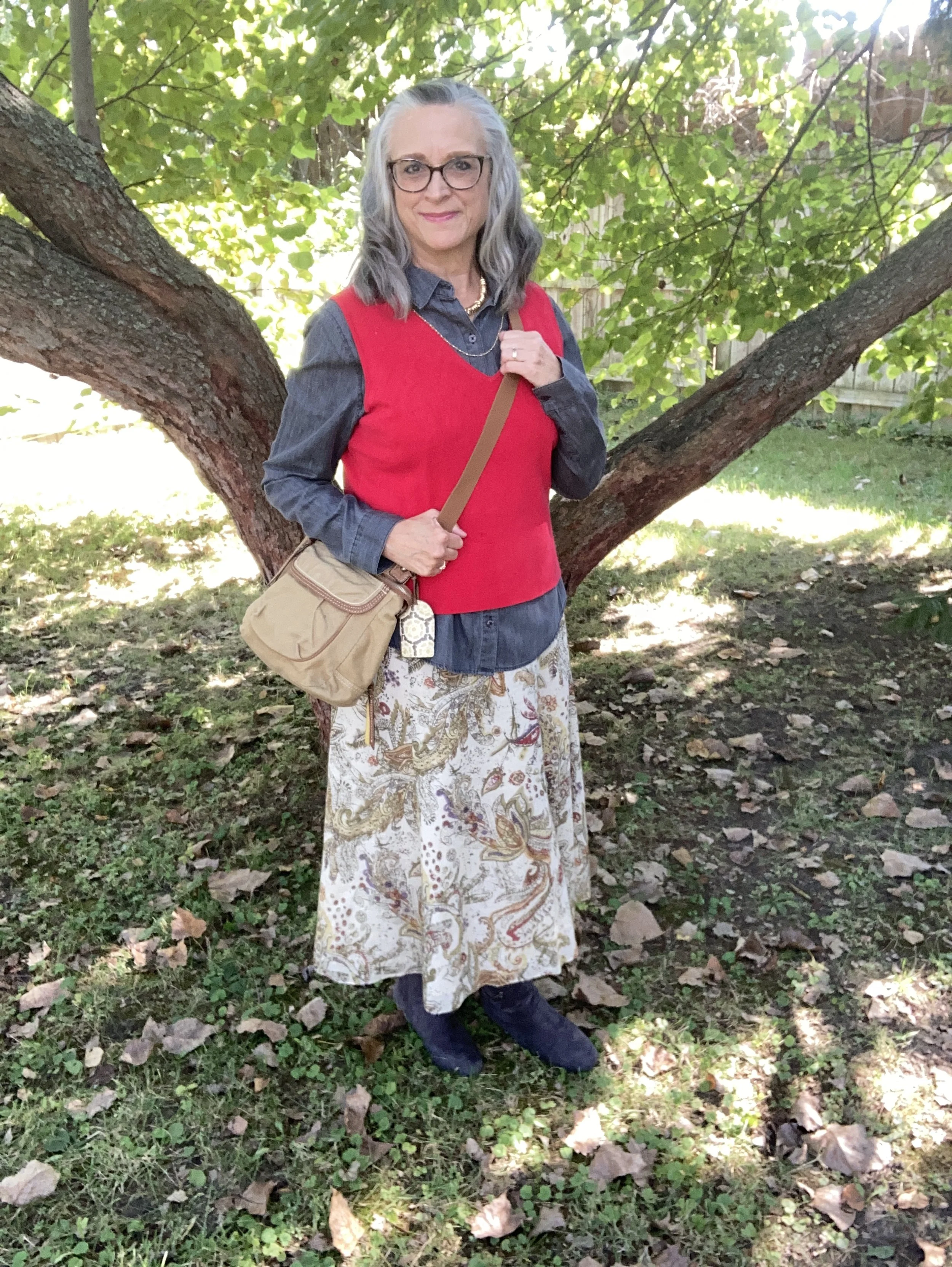

I found this bright Poppy Red, Sandra knit shell at a thrift store and thought it would work perfectly for a knit vest. I paired it with a second hand Dark Gull Gray, Falls Creek button down. I believe this may be a man’s shirt as it is quite big on me for a large, but who knows. Sizes are so different these days.

This Jones Wear skirt I have styled multiple times on the blog and even though I don’t wear skirts very often, this is still one I reach for. I chose this for the snippets of Bronze Mist color in the pattern. It is fully lined, but light enough to wear in the warmer weather, and warm enough to wear in the winter with tights and a pair of boots. You can see it with a maroon cardigan, a green suede jacket, a yellow top, and a green pullover sweater.

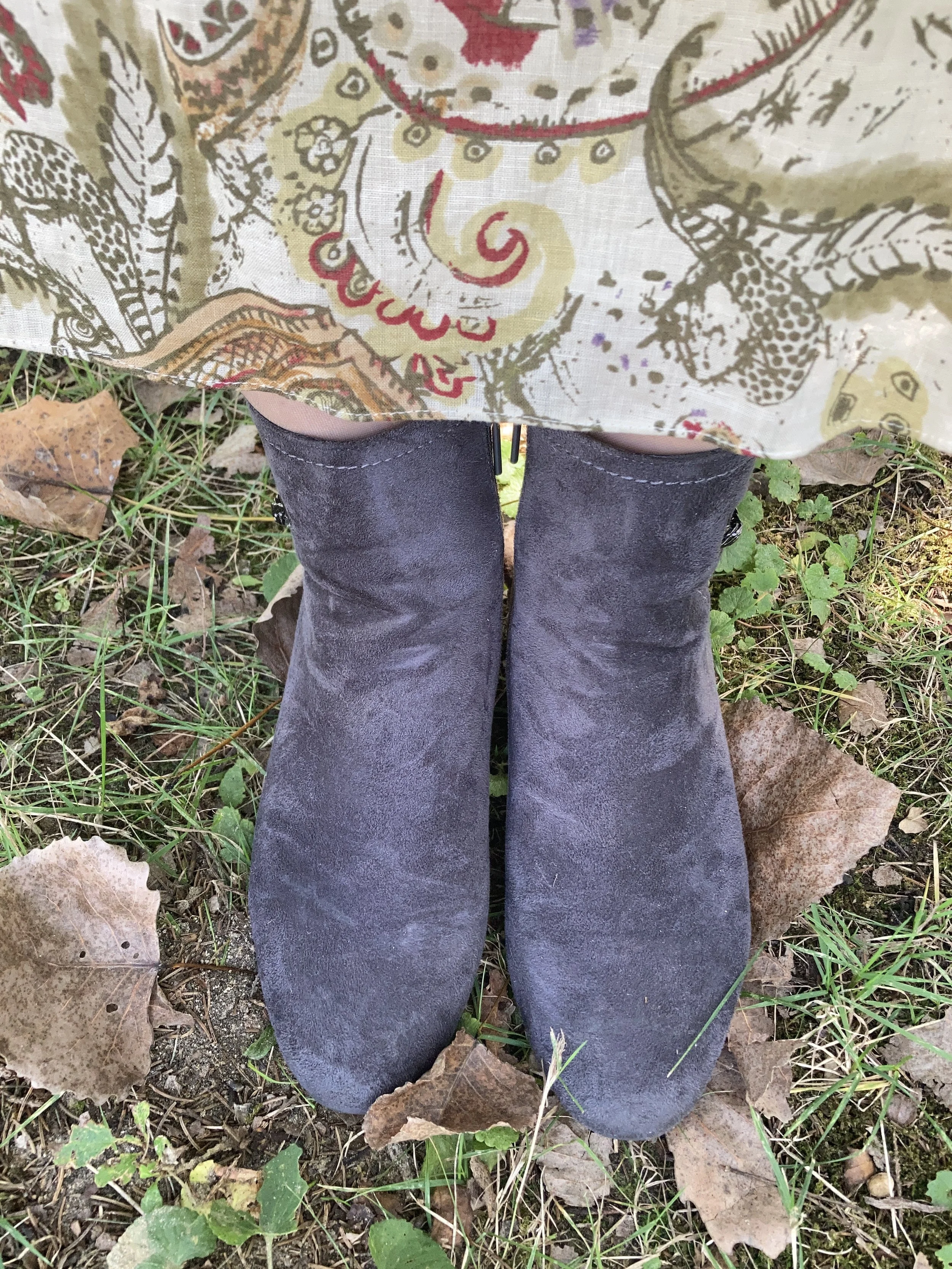
Since I was using the Dark Gull Gray color I chose my Impo ankle boots that I bought on clearance at DSW a few years ago, to balance the look out. Even though fall is the time we put our flip flops away and get out our boots, it is still too warm here to keep boots on for very long…at least for me. I love ankle boots in the cooler weather, and when it gets really cold, then I pull out the taller boots.

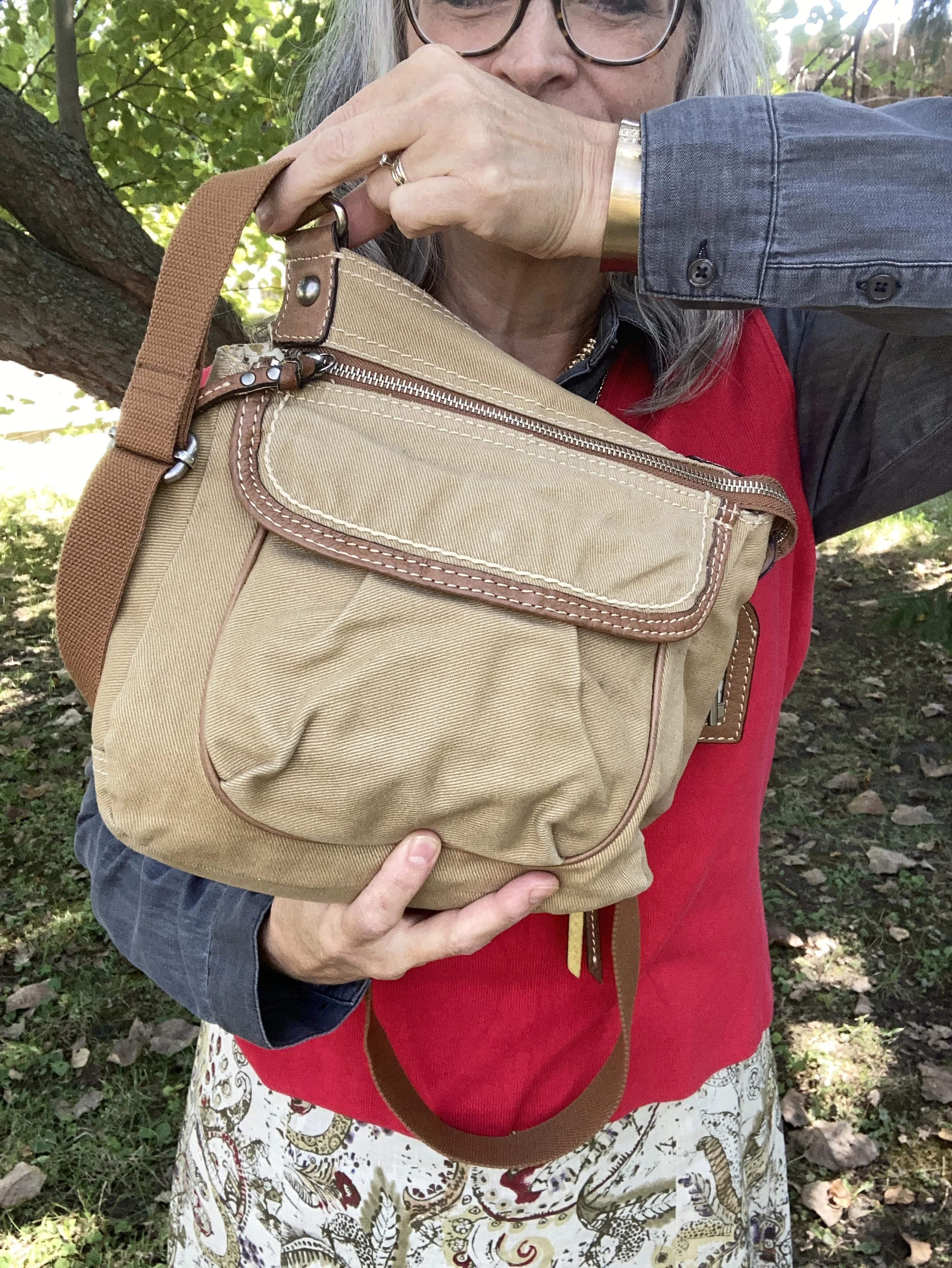
I chose this thrifted Fossil bag, as I thought it gave a nod to the Bronze Mist color, even though it isn’t a perfect match.

Do you like these colors together, or do you think they are odd? Do you have this bright Poppy Red in your wardrobe? Which version of this outfit do you like better, tucked in or left out? I love to hear your thoughts so leave me some love.


I’ve included a few shopping links for a few of the pieces to give you some similar color choices, but it was hard to find any sort of skirt in a similar color. These are brought to you at no extra cost. These are affiliate links. All opinions are my own.
I hope you are having a great week!