Shopping Our Closets: Pantone Autumn/Winter 2024 NY - Red Orange, Scarlet Smile and Baritone Blue

The best part about having a closet full of color is that I can almost always come close to matching the Pantone color palettes, whether for spring or fall. I do try to come as close as possible to the palette colors, but it is not a science. It is meant to be a fun exercise in trying new color combinations that you might not normally try.

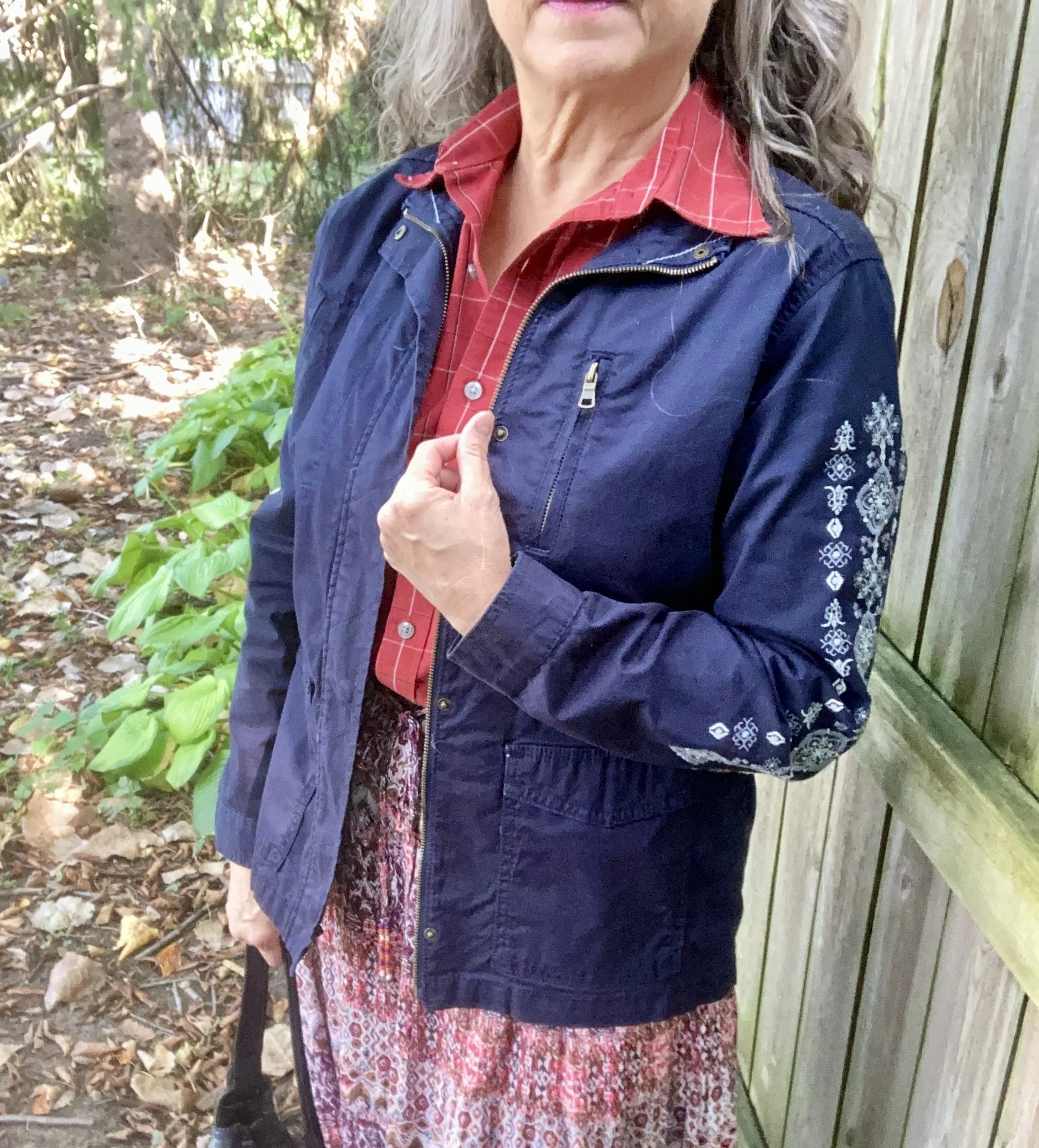
Today’s outfit is a fun combination of Red Orange, Scarlet Smile, and Baritone Blue. I think this look would be great for work, or for a fall festival or party.

For this outfit I started with this recently thrifted Notations prairie skirt. It has the Red Orange color throughout. I am a sucker for tiered maxi skirts and especially like the boho feel of the fall colored print. Seeing as the skirt has a variety of colors I am looking forward to trying out a few other ways to style this. It is light weight, so for this shoot I added a slip, but that’s just my personal preference. In the cooler weather I would also add heavier tights.

I had a different top picked out that leaned more towards a reddish pink, but looking at Scarlet Smile again, I opted for this men’s Van Heusen, plaid, short sleeve number. It gives the look a touch of a masculine feel. You certainly could make it much more feminine by choosing a top with ruffles, lace or puffy sleeves.

To bring in the darker classic Baritone Blue, which is basically navy, I chose my Sonoma utility jacket from Kohl’s with the embroidered sleeves. I thought the embroidery added a nice element and pulled the whole look together.

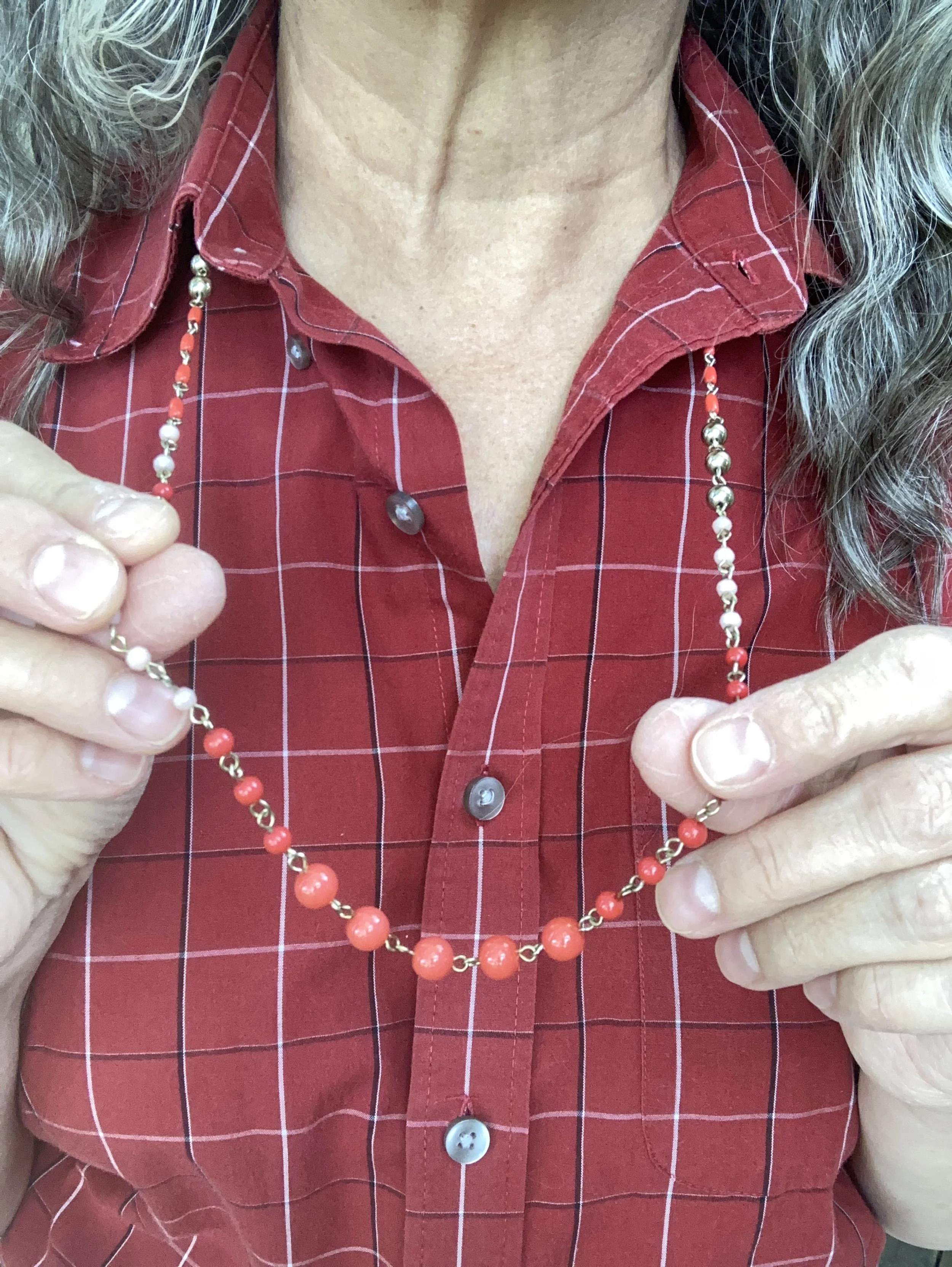
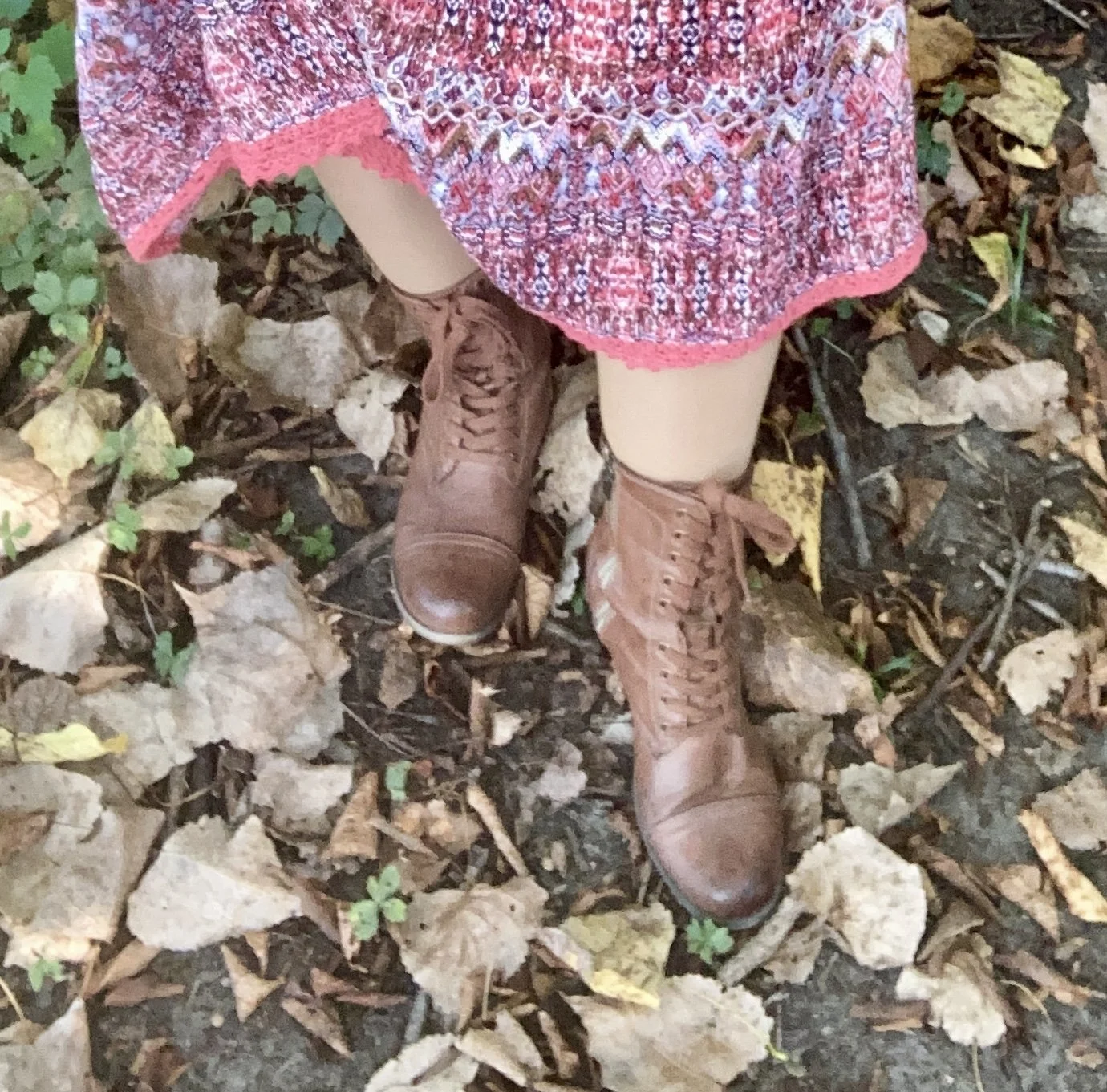
Once I had the outfit figured out, it was an easy choice to add a simple bead and metal necklace in the Red Orange color, my brown, thrifted combat boots, and my thrifted Simple Vera, Vera Wang, bag. Unfortunately, once I was finished with the shoot this bag went in the dumpster. I know of no way to stop the fake leather bags from peeling. If anyone knows a cure, let me know. Ha, ha.

What do you think of these colors? do you have any of these in your closet? Would you wear these colors together? I love to hear your thoughts, so be sure to take the time to comment.

I’m including a few shopping links for you to look at. These are affiliate links. All opinions are my own.

Have a great day!

Fashion Fun: Men's Oversized Button Down

When it comes to thrifting for fashion, I like to think outside the box. I always peruse all the sizes, because so often size is relative. What I mean by that is, it is relative to the brand. A size 12 in one brand might fit you perfectly, but a size 12 in another brand, might be too big or too small. I honestly believe sizing is different than it used to be. If you shop vintage clothing, at all, you will see that most of the pieces are relatively small. Women tended towards being smaller in the waist, hips, and shoulders than we are now. Not sure why, but it does seem to be the case.

I have also started looking in the men’s section of thrift stores for fun pieces like tees and printed button downs. I like the roomier cut of a men’s medium or even large shirt and they often have textures, prints and fabrics that are different than those on the women’s racks. Today, I am going to show you three different outfits using three men’s button downs that I purchased while thrifting.

Outfit 1 - Men’s Button Down as a Tunic

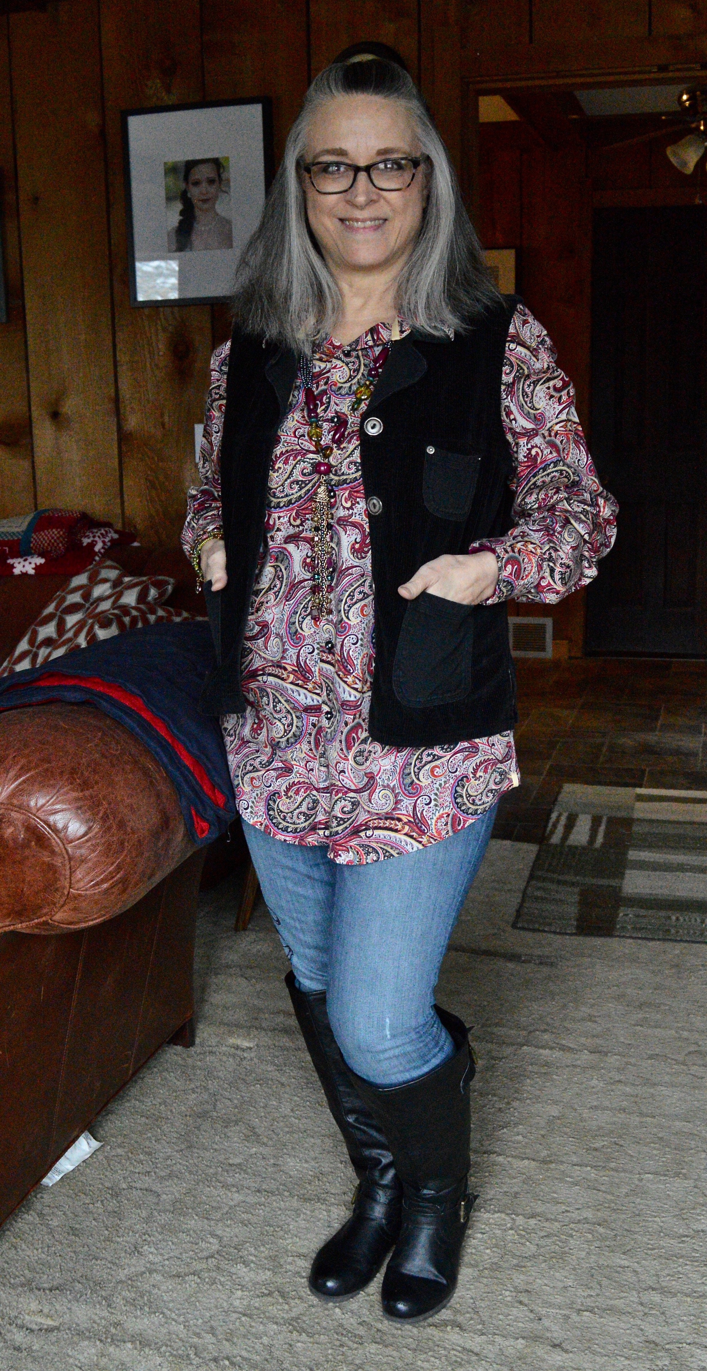
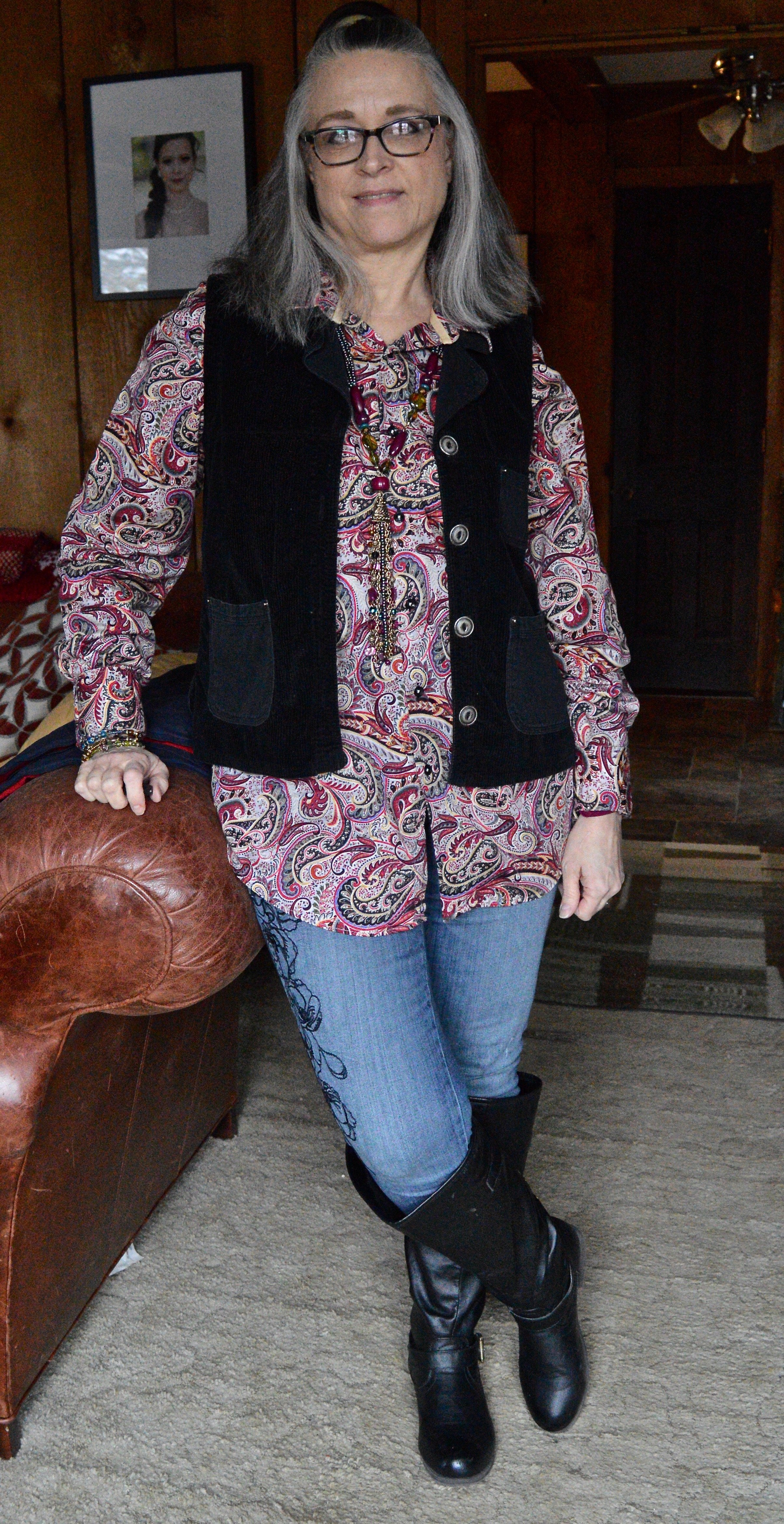
When I saw this paisley madness, I knew I had to have it. This is Visconti brand. If you type the name be sure to type in Visconti clothing. and you’ll see they have them at Dillards. They also have their own website, but I am not here to encourage you to buy a new shirt. This to encourage you to look at the men’s racks if you thrift, or even if you shop clearance. I absolutely love the colors in this piece and it is easily worn all year round as a top or as a “shacket”.

I topped this look with a thrifted, black Nadia brand, corduroy vest. I added my Simply Vera, Vera Wang skinny jeans and my black knee high boots. The black embroidery on these jeans are what sold me. The abstract floral print goes with so many other pieces.

I didn’t really need to add any jewelry since the print is so busy, but I thought it would be fun to add this piece that has a variety of colors and textures. It blends in, yet also stands on its own.

Outfit 2 - Men’s Button Down as a Work Wear Top

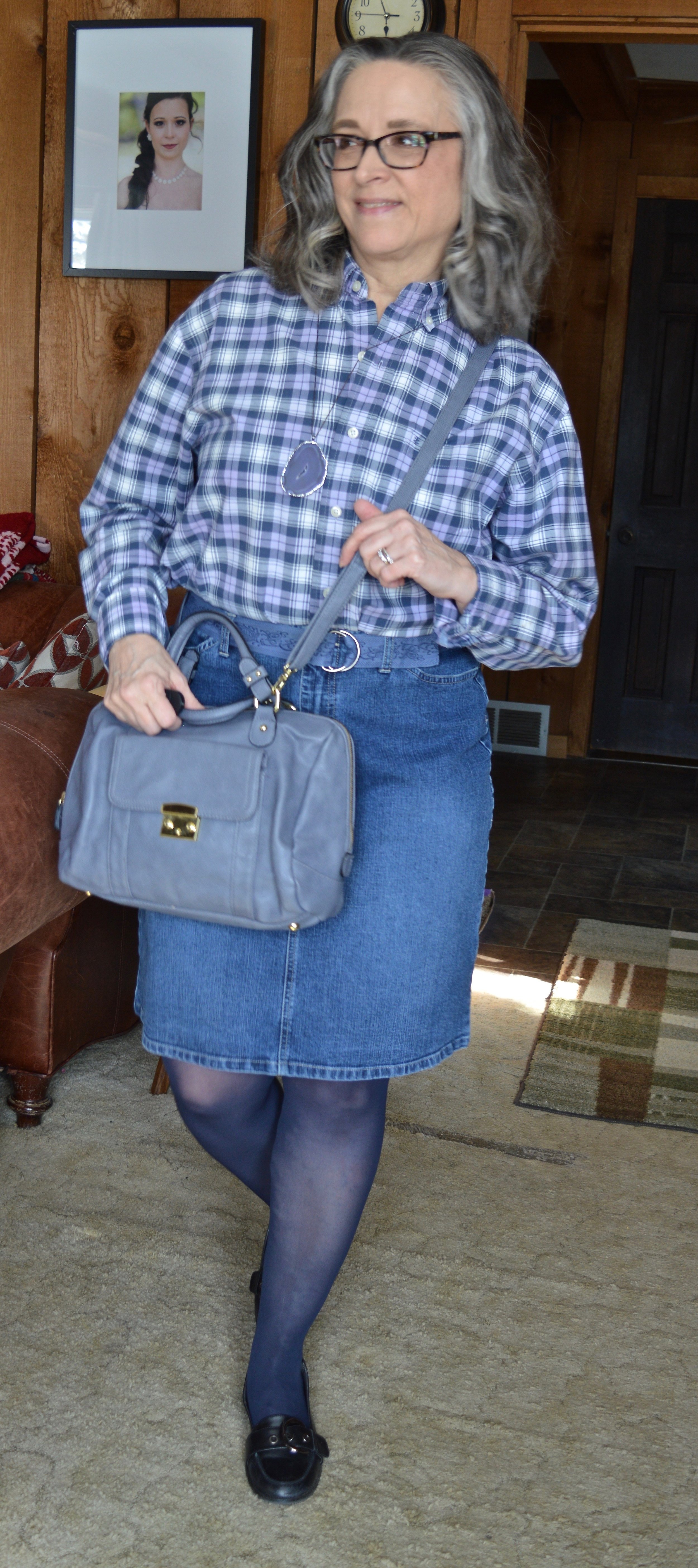
This shirt is Izod brand. This year’s Pantone Color of the Year is called Very Peri. I think it is a very pretty color reminiscent of the Periwinkle flowers, which can come in blue, purple or white. I thought this checked shirt fit the color well. One thing I have to do with most of the men’s shirts I purchase is roll up the sleeves, but rolling up the width of the cuff is just the right amount, so you can hardly tell.

My denim pencil skirt is also thrifted and Gloria Vanderbilt brand. I like the length of this and if I still had a reason to wear a skirt would definitely be wearing this often. I added the navy hose to cover my veiny legs and thought the black, thrifted Nine West loafers gave it a work wear look. I also added the denim blue cloth belt and the dark purple agate pendant necklace. My thrifted, Merona bag, also brings in that Very Peri vibe.

Outfit 3 - Men’s Button Down as a Shacket

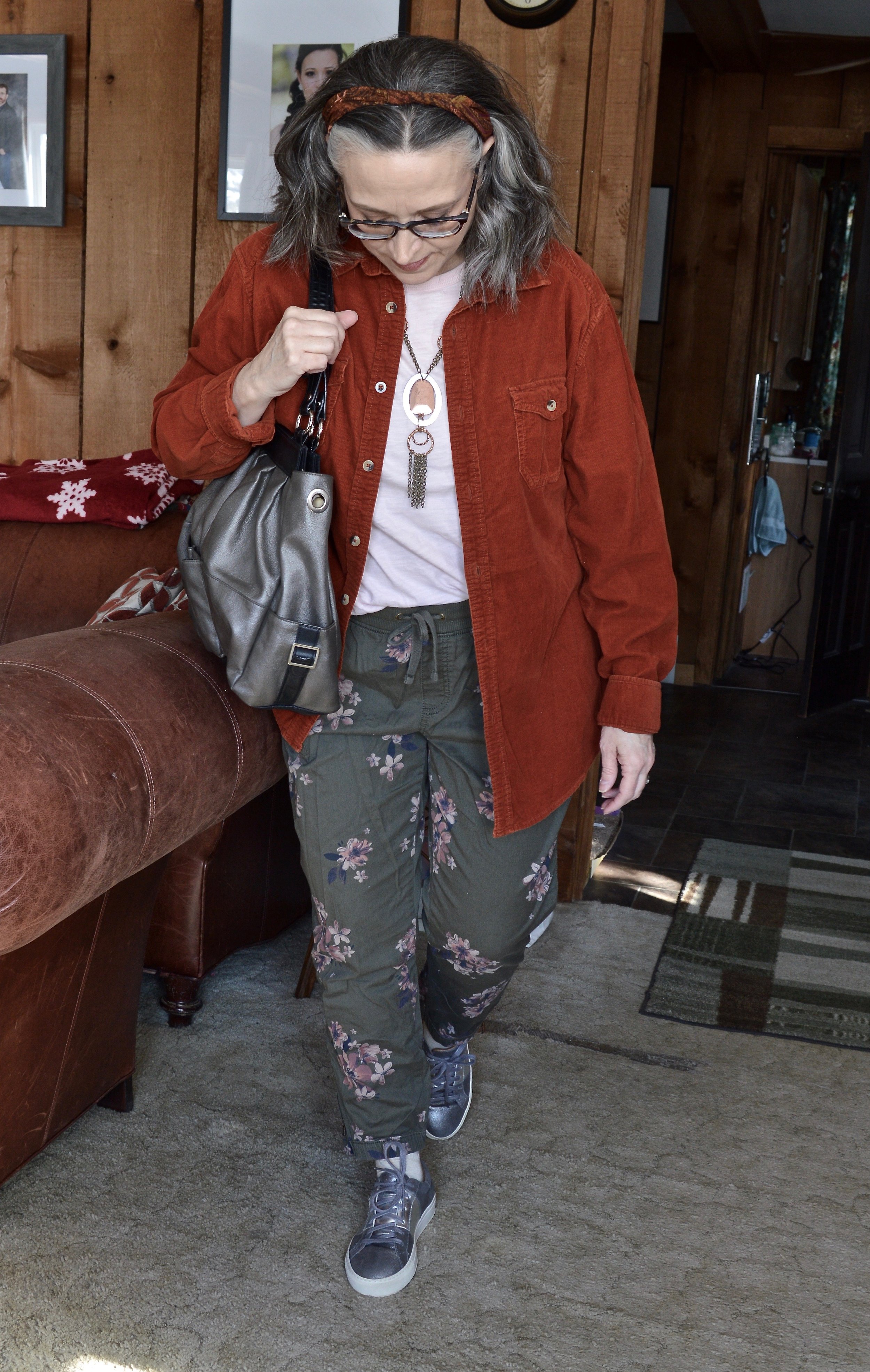
I’ve had this thrifted, Ruff Hewn corduroy button down for a few years now. I love the color and typically think of it as a fall piece. It is soft, warm and roomy, so a perfect piece for wearing over lightweight sweaters, sweatshirts or long sleeve tees.

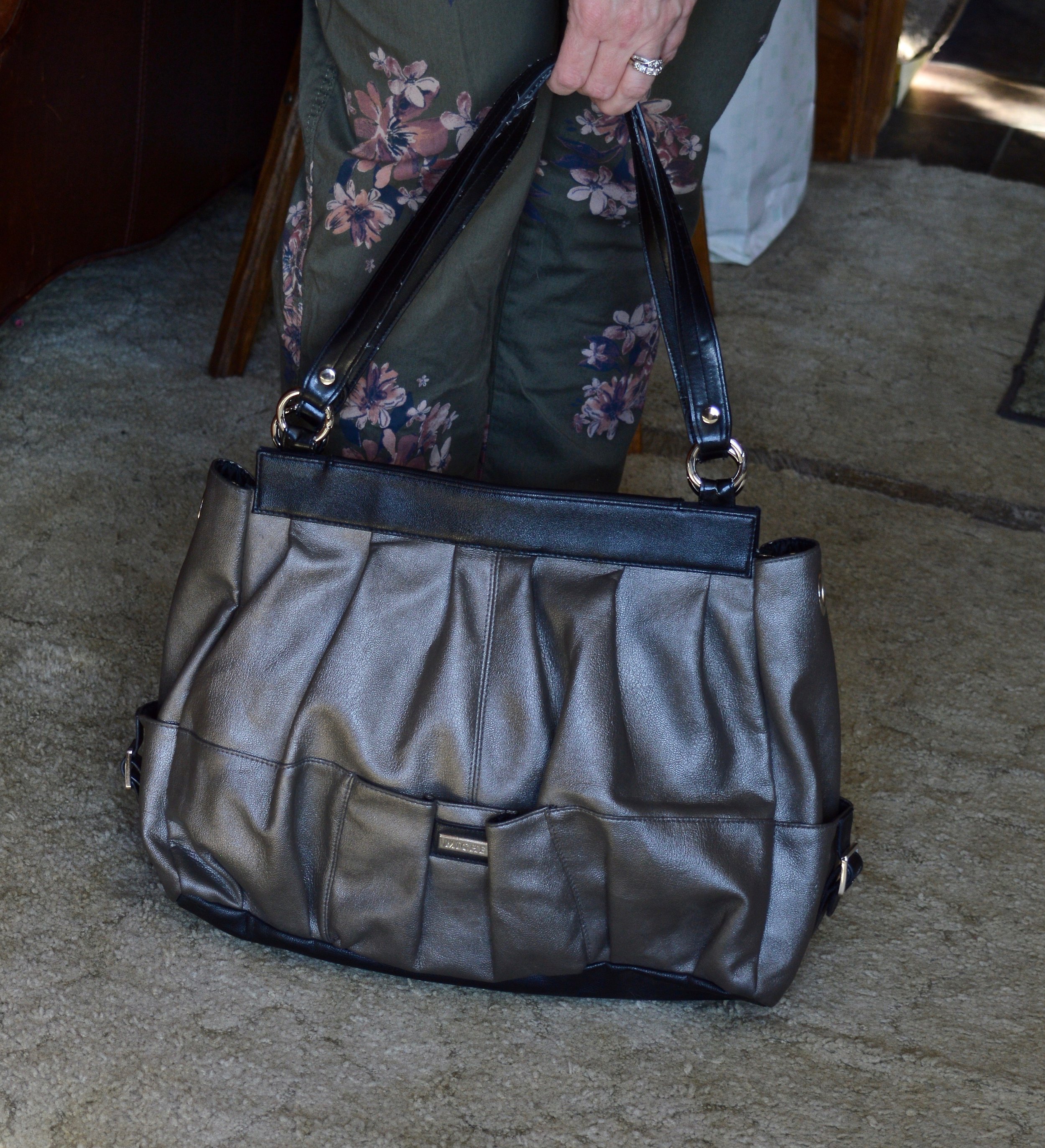
I wanted this outfit to have more of a spring vibe, so I went with my Sonoma floral joggers, and a thrifted light pink Express short sleeve tee. I opted for metallic accessories including my silver Sketcher sneakers, pewter hand-me-over bag, and my silver and copper necklace.

Here are the three outfits side by side.

I hope you enjoyed this look at how to style a men’s oversized button down. It is fun to explore other options in your fashion wardrobe, and you never know when something you try will become your new favorite style. Which outfit was your favorite? Do you wear men’s clothing? How do you like to style a men’s or women’s oversized shirt? I’d love to hear your thoughts, so leave me some love in the comments.

Thanks for stopping by the blog. I have provided a few shopping links for your enjoyment. These are affiliate links. All opinions are my own.

Pantone Spring/Summer - 2020 - Biscay Green, Saffron and Brilliant White

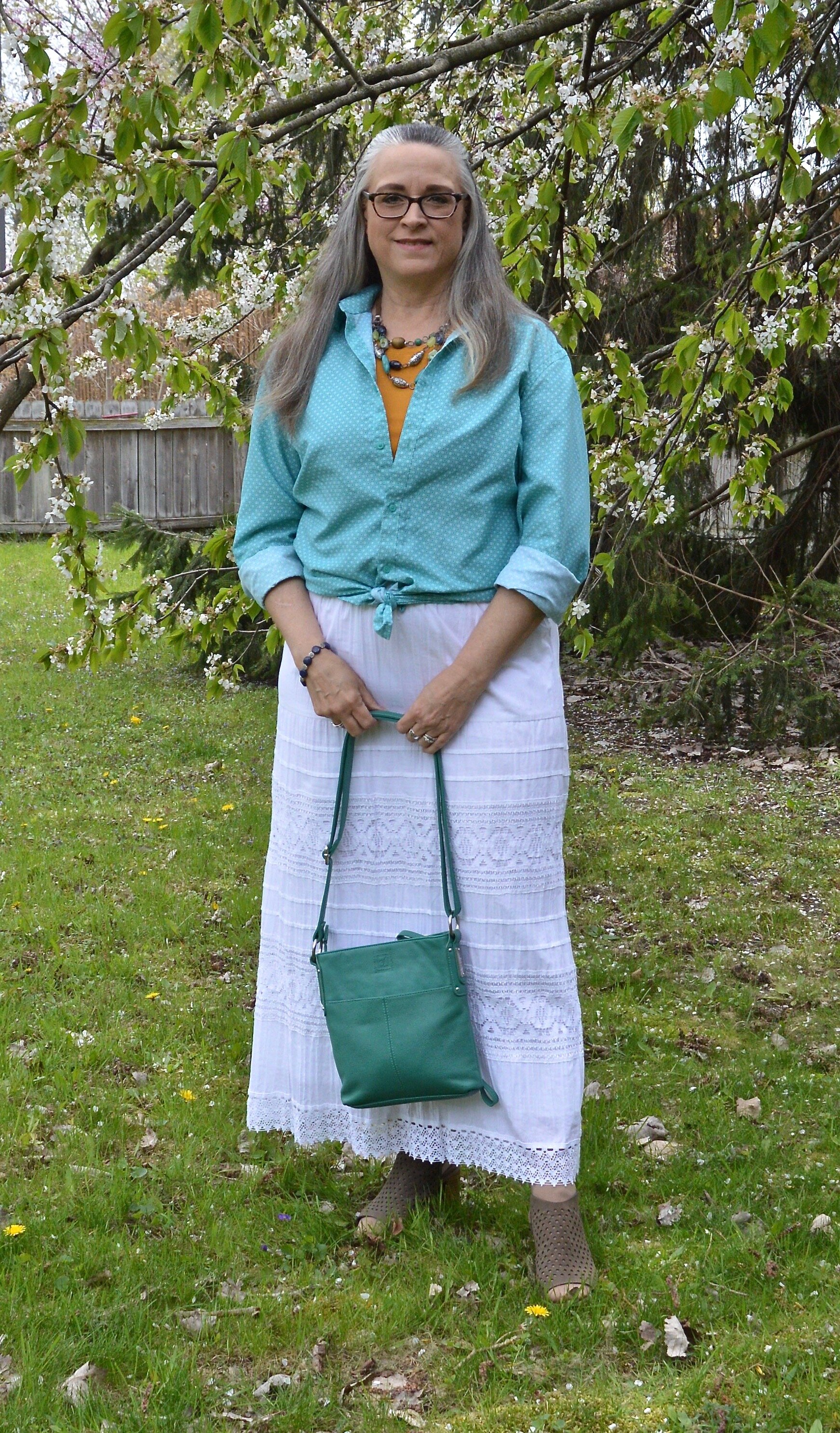
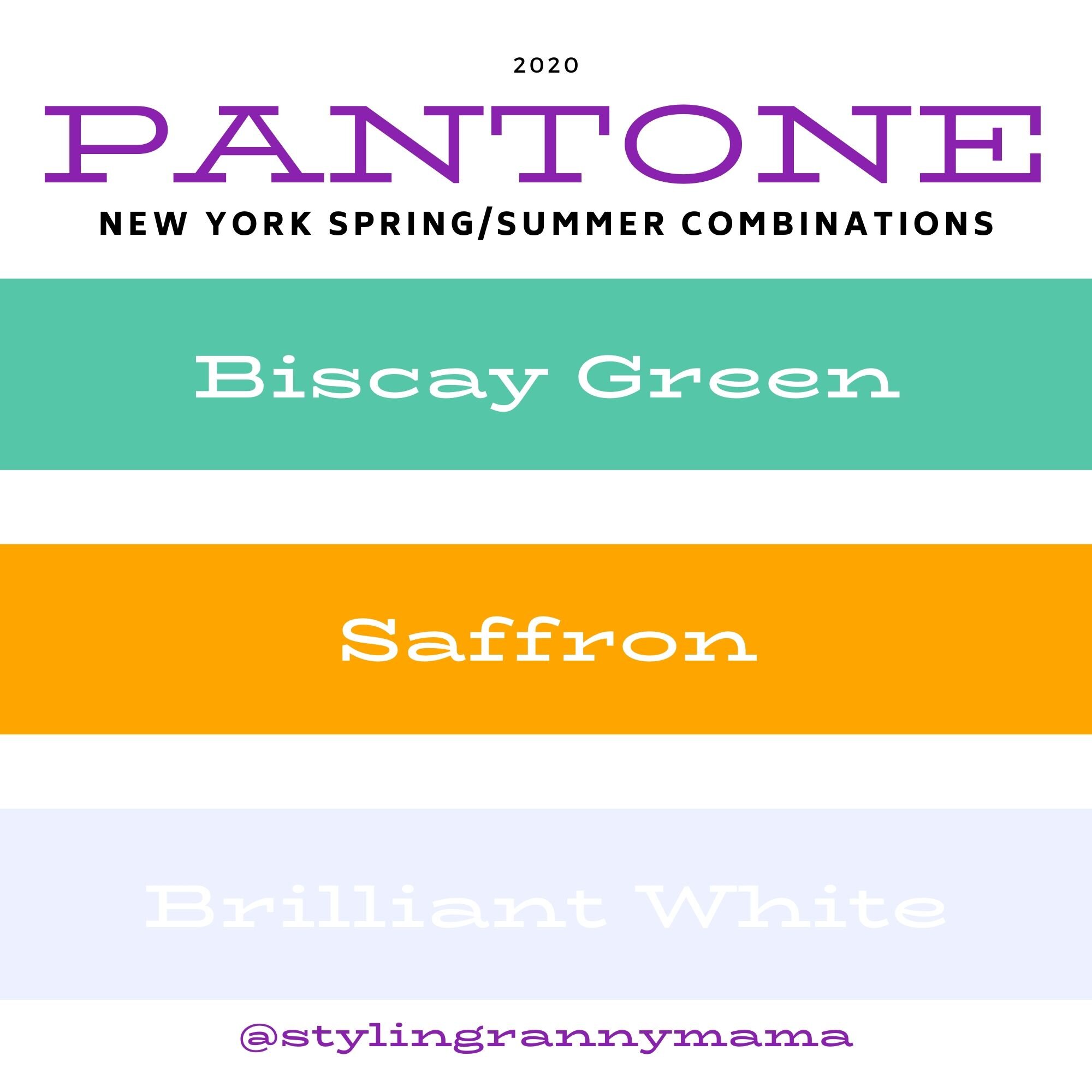
Today’s outfit revolves around three colors from the Pantone Spring 2020 New York Palette that are described as flavorful, cleansing and pristine. Saffron is a rich orangey yellow color, while Biscay Green leans towards a more soothing aqua. Both colors to me are perfect for summer and when paired with a bright white give a warm weather, party ready look.

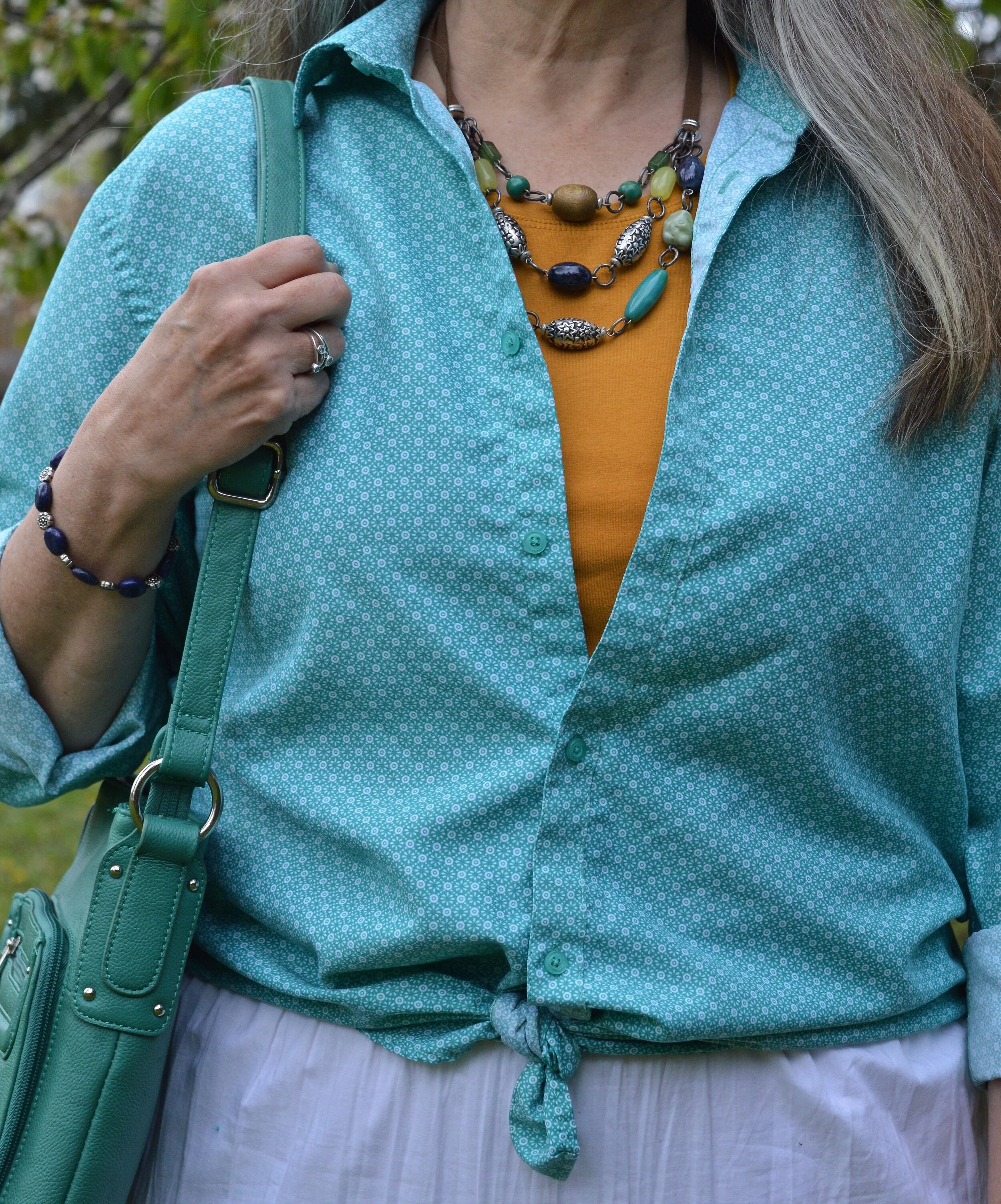
When I saw Biscay Green on the palette, I knew that I had nearly nothing in my closet that was this pretty greenish blue, so I started keeping an eye out at my local thrift stores last fall for an item or two that would add this medium green to my closet. This oversized button-up caught my eye. It is a brand called Zylos, which appears to be a past men’s brand in dress shirts and ties. As I have mentioned before, I am liking the oversized button up shirts for a fun, casual way to dress up a pair of jeans or in this case a skirt. For this outfit, I tied the bottom of the shirt and buttoned two buttons.

Pantone Spring/Summer 2020 - Biscay Green, Saffron and Brilliant White

The Saffron colored Apt. 9 tee, is another thrift find and I have used it on the blog before for another Pantone series. Last year a similar color was called Mango Mojito and I used this same tee to represent that color. You can see that post here. I thought the color was independent enough that I didn’t need the whole tee shirt to show. The bright pop of yellow orange stands out quite nicely with the peaceful green.

Pantone Spring/Summer 2020 - Biscay Green, Saffron and Brilliant White

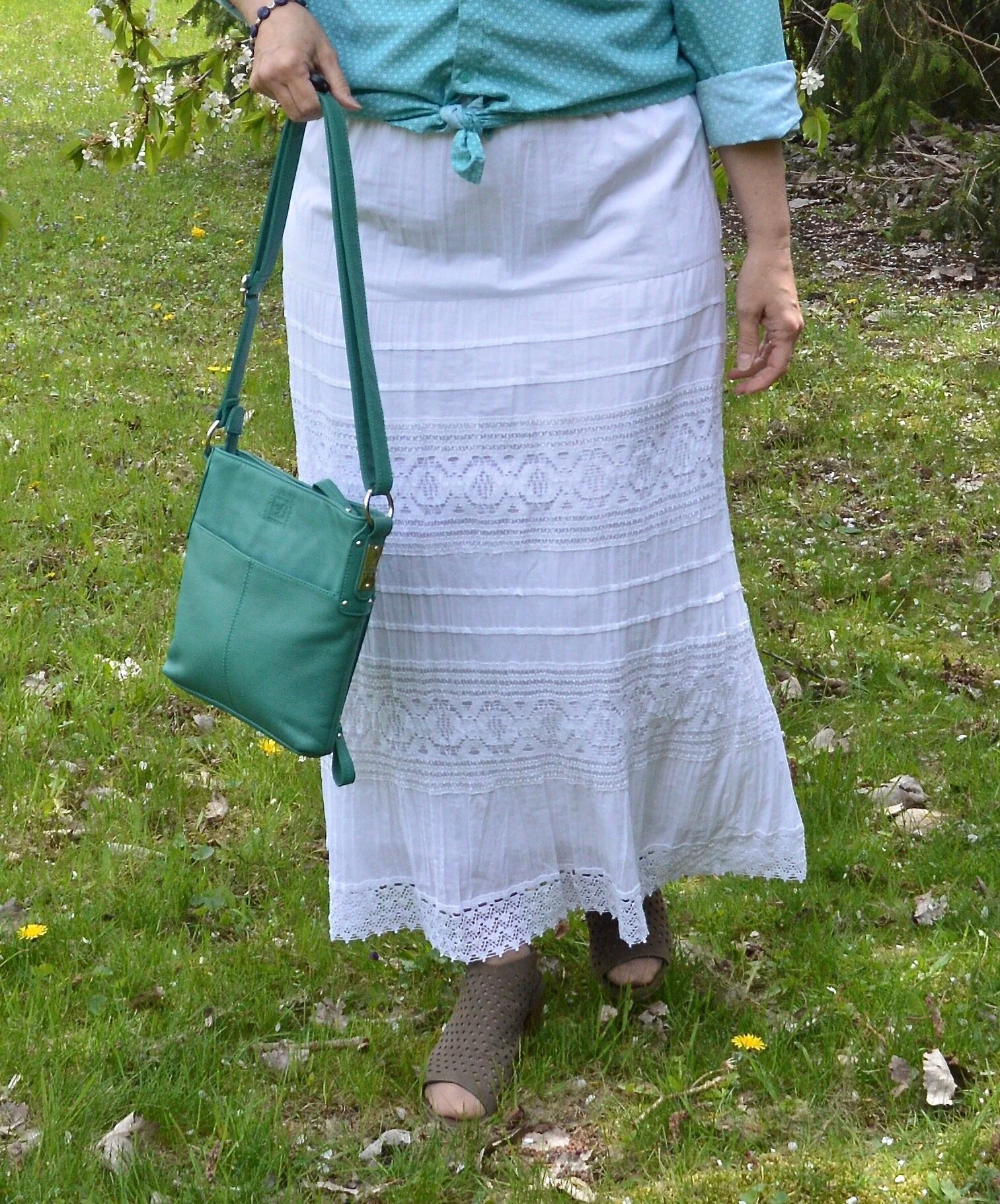
I’ve styled this skirt on the blog before. It is St. John’s Bay brand and I got it at JC Penney a few years ago. I was drawn to it for two reasons. The first was that it was white and it was lined. It is so hard to find white you can wear in the summer that doesn’t require a slip or some other underwear that won’t show. This skirt is completely lined. You can still see through it if you have on a dark pair of panties, like red, black or navy, but for the most part they won’t be noticeable. The other reason was the beautiful lace detailing. It is a very pretty piece and can be dressed up or down, depending if you are feeling classic or boho.

DSC_0012 (2).jpg

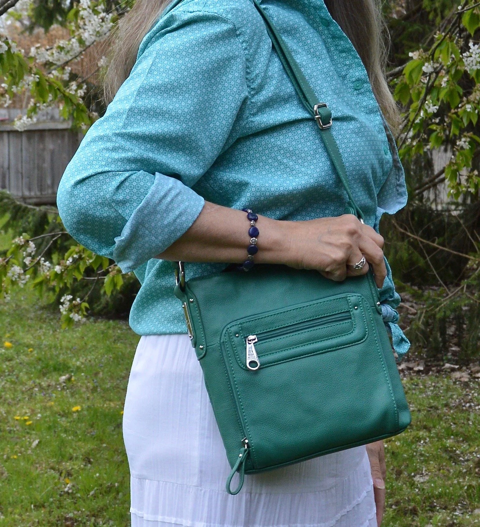
I have had this layered beaded necklace for a while. I really like it, but don’t think to wear it that much. When I saw how well it complimented this outfit I was excited to include it. So much of my jewelry I can’t even remember where or when I got it. Ha, ha. Maybe that’s because I have so much of it. I also included a navy beaded bracelet, which you will see in the next picture, to pair with the navy beads in the necklace.

Pantone Spring/Summer 2020 - Biscay Green, Saffron and Brilliant White

I found this bag at another thrift store when my girls took me thrifting back on my birthday in January. Ahh, those were the days, when we could get together, go shopping and get lunch. Hopefully, those days will come again. I love the color and feel of this bag. It is a brand called Stone Mountain and is very well made. It has a long handle which can be adjusted, so you can either use it for a shoulder bag or a cross body bag.

Pantone Spring/Summer 2020 - Biscay Green, Saffron and Brilliant white

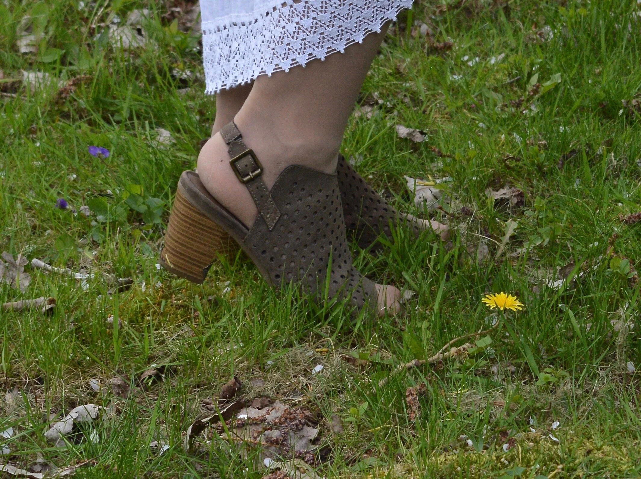
My perforated peep toe shoeties are Sonoma brand and from Kohl’s. I need to paint my toes. I don’t wear sandals a lot because my feet are like my legs and covered with nasty looking varicose veins. Last fall I went to a vascular surgeon who did an ultra sound to see what could be done. Unfortunately, most of the veins in my legs are in the same bad condition, so having them worked on would provide some temporary relief, but over the course of time, they would develop the same issues. I am putting that off for now, but one day may revisit the idea.

Pantone Spring/summer -Biscay Green, Saffron and Brilliant White

Do you like these colors? How would you wear them? Remember you don’t have to put the colors together as I do. I am simply trying to show you what the colors are for the Pantone seasons and ways you might combine them. Do you wear white in the summer? Do you have a white skirt or do you prefer to wear pants, capris or shorts? I’d love to hear from you, so leave a comment or two.

Graphic designed by Rebecca Trumbull.

I’ve included a few shopping links for you. These are affiliate links. All opinions are my own.

Have a great day and be safe as the world begins to open back up!

.