Seeing Red - Red with Black - Taking Care of Our Hearts

We don’t often think of pairing red and black for Valentine’s Day. More often we style red with white or some version of red and pink. There are also many of us who don’t even visit the red or pink idea for Valentine’s because we either don’t celebrate that special day, we don’t like traditional holiday color schemes in our outfits or maybe are more into blues and greens than reds and pinks.

For these February posts, I’ve chosen to focus on red or darker versions of red like burgundy. I also wanted to make each of these outfits, not be so much about Valentine’s Day, although you could use them for a Valentine’s or Galentine’s outing, but more about the color red.

February is Heart Disease awareness month, and the color red certainly represents the age old idea of what a Valentine’s heart looks like, but it also represents that most important muscle in our bodies. This major fireball, which is about the size of your fist, works hard, pumping blood to keep us alive. Try to envision the heart as the UPS hub, where everything comes to and goes out that our bodies need to survive. Heart disease, like cancer, drug addictions and infectious diseases can be life threatening. It can manifest itself with high blood pressure, high cholesterol, hardening of the arteries and many other complications. Take a look at some of these statistics that I got off the CDC (Centers for Disease Control) website:

Heart disease is the leading cause of death for men, women, and people of most racial and ethnic groups in the United States.1
One person dies every 37 seconds in the United States from cardiovascular disease.1
About 647,000 Americans die from heart disease each year—that’s 1 in every 4 deaths.2,3
Heart disease costs the United States about $219 billion each year from 2014 to 2015.3 This includes the cost of health care services, medicines, and lost productivity due to death.
— Centers for Disease Control Website

As you look at the pictures of this outfit I put together, I’m sure you can think of at least one person you know that has been affected by heart disease. This past fall at the college my husband teaches at, a 24 year old student died from a massive heart attack. It was a tragedy.

The Heart Association, formed in 1924, is the major force behind raising awareness about heart disease in the United States. Their website has a bucket load of information. You can see some interesting historical facts on their history page here. I am not getting paid to mention this, but merely want to raise awareness of a disease that affects so many people. You would think in our world where we have so much awareness about health, good eating, exercise and so on, that heart disease would be a thing of the past, but it’s not. We all struggle to make good choices and taking care of our hearts should be no exception.

I have not touched my camera for months, but this is what you get when schedules for taking pictures don’t coincide. Ha, ha. I just did not want to stand outside and try to get my settings figured out, so I tried to stand by the windows to get enough natural light. The skies were gray, as usual, thus the shadows on my face. Oh well, I tired and the pictures are good enough that you get the idea.

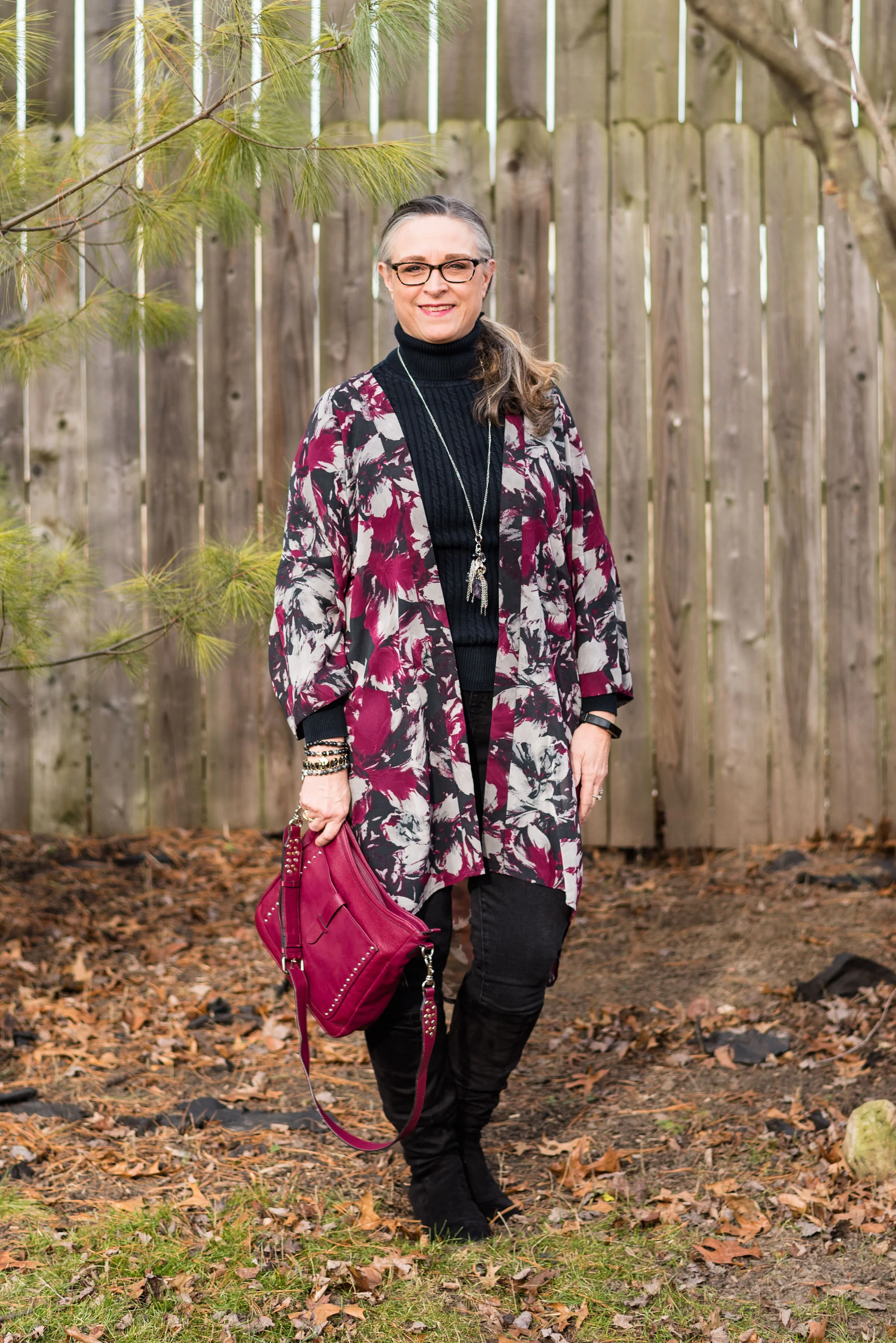
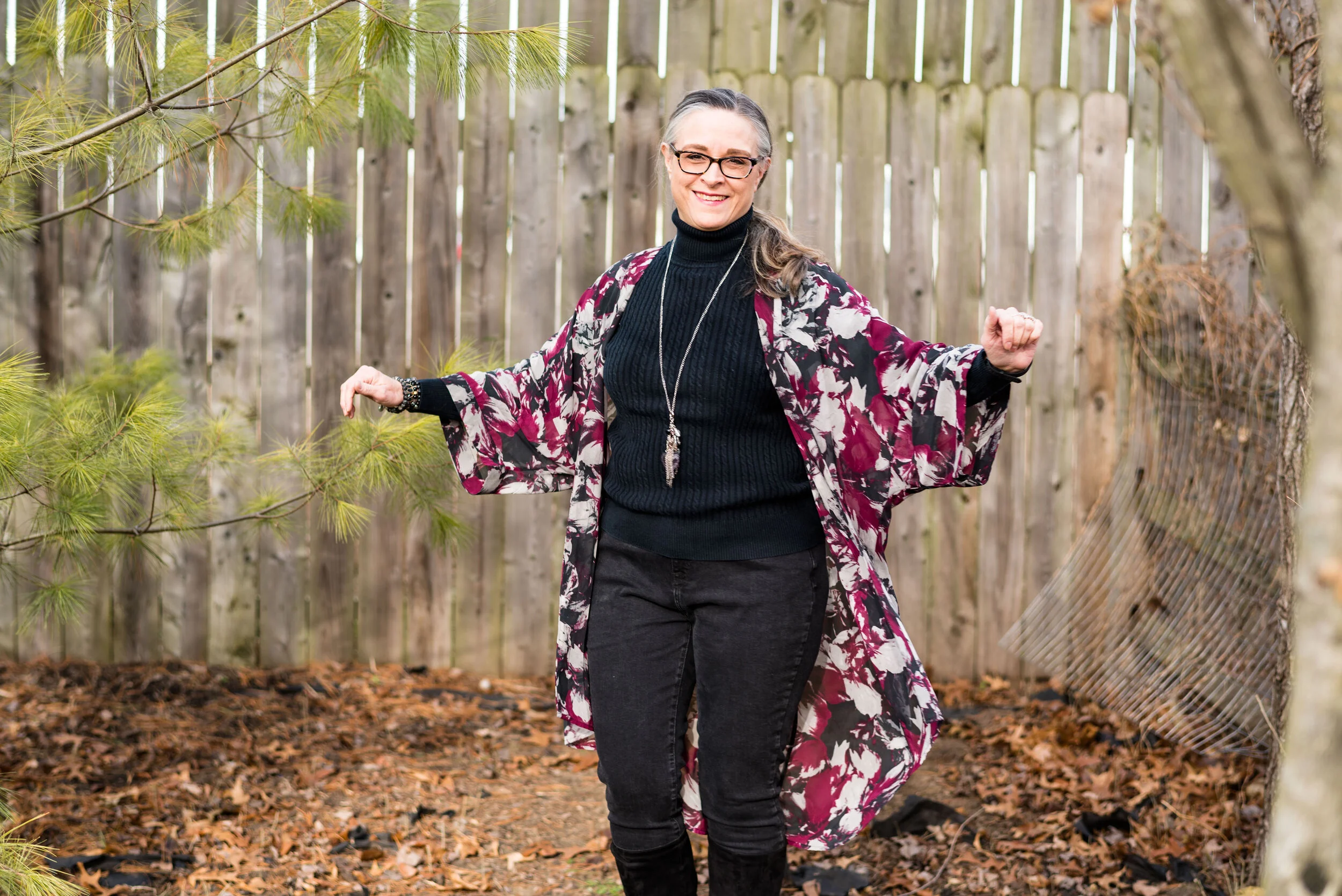
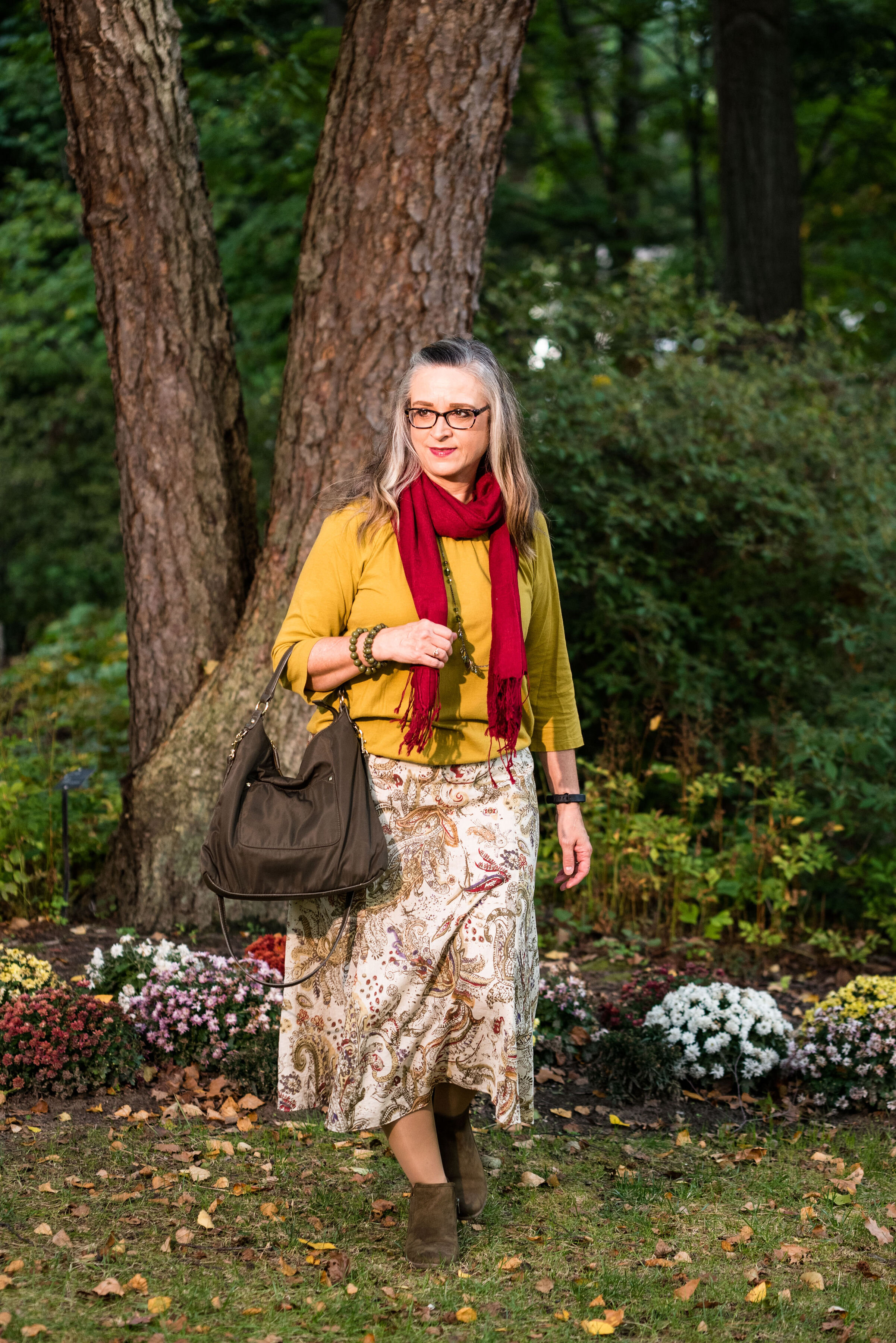
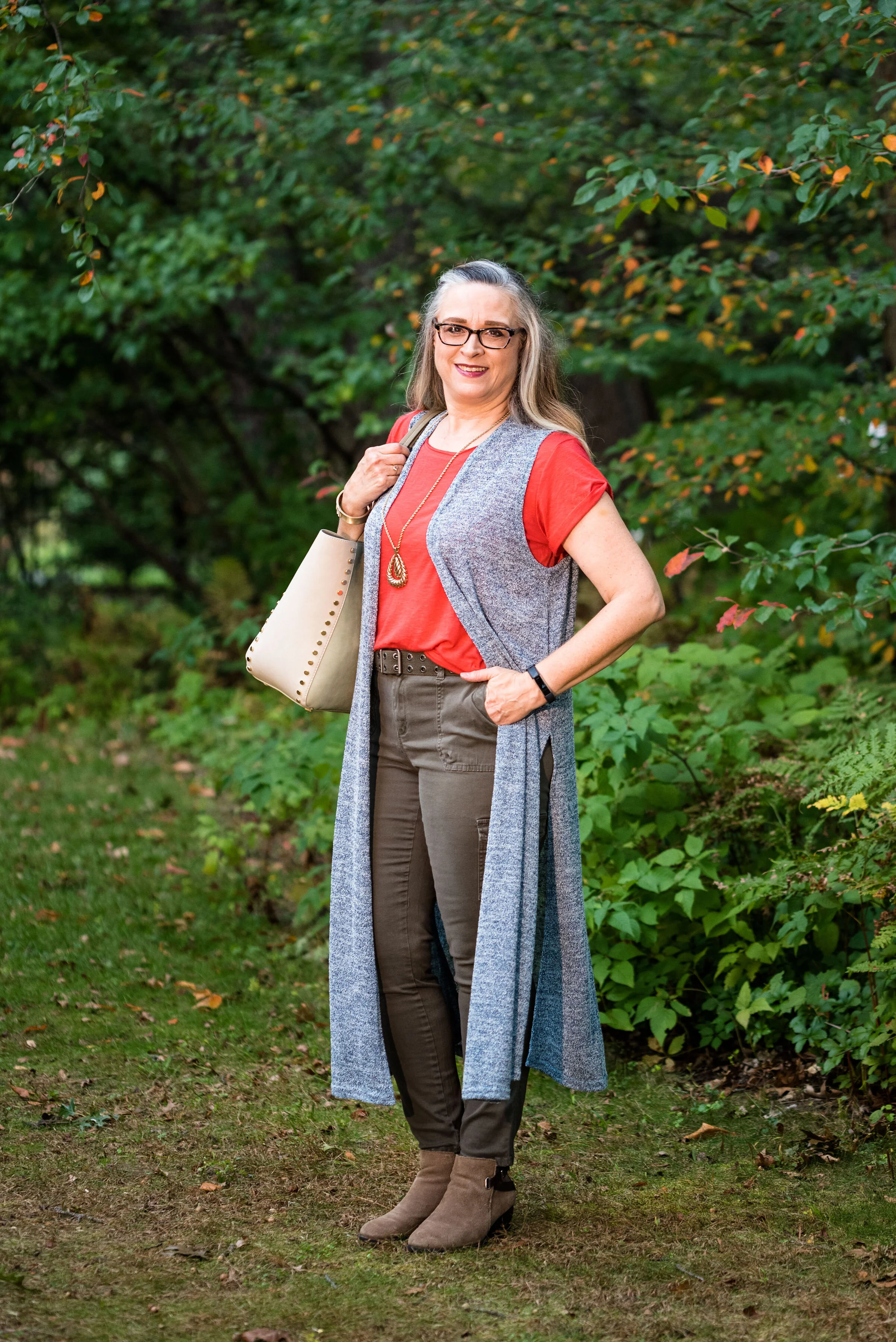
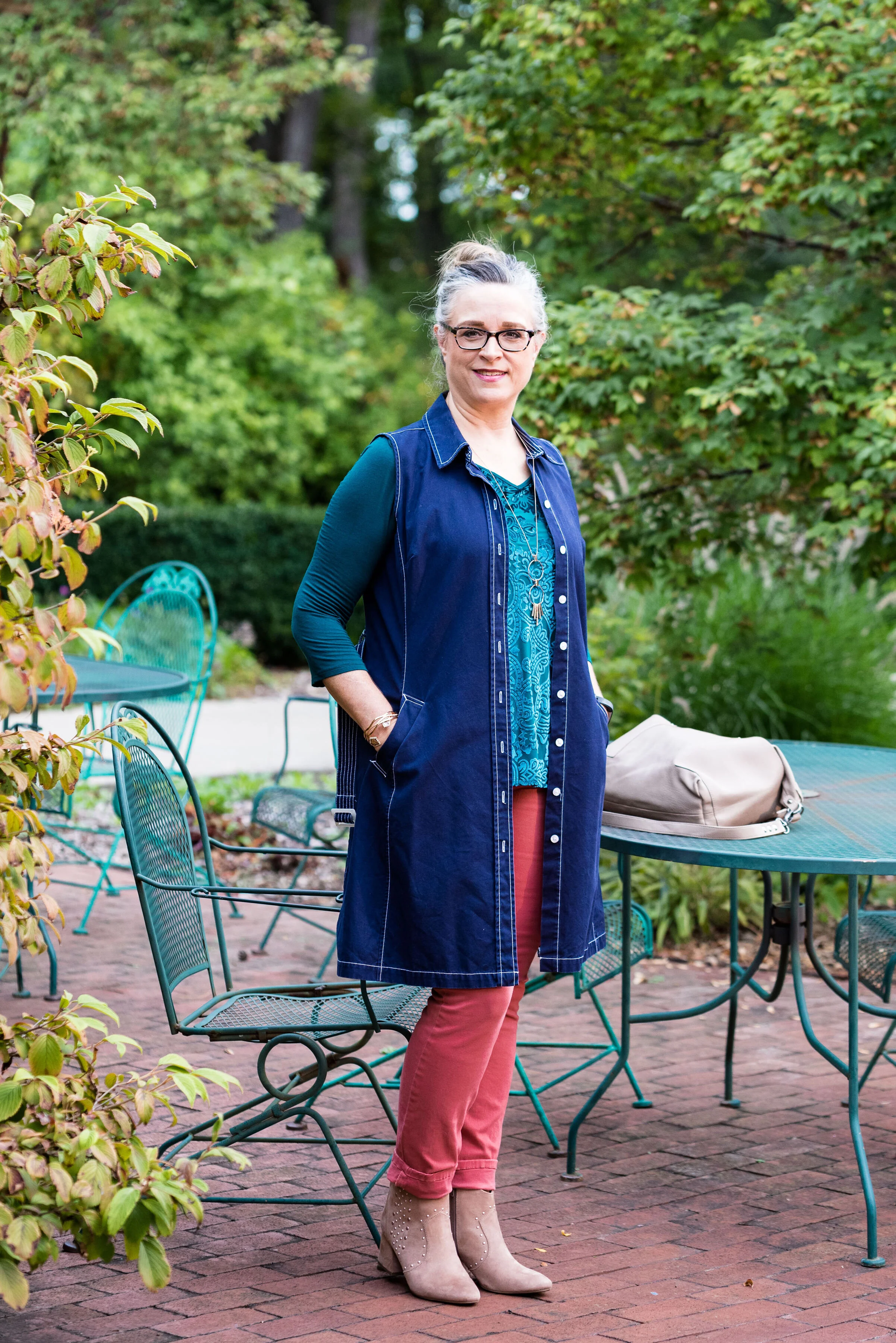
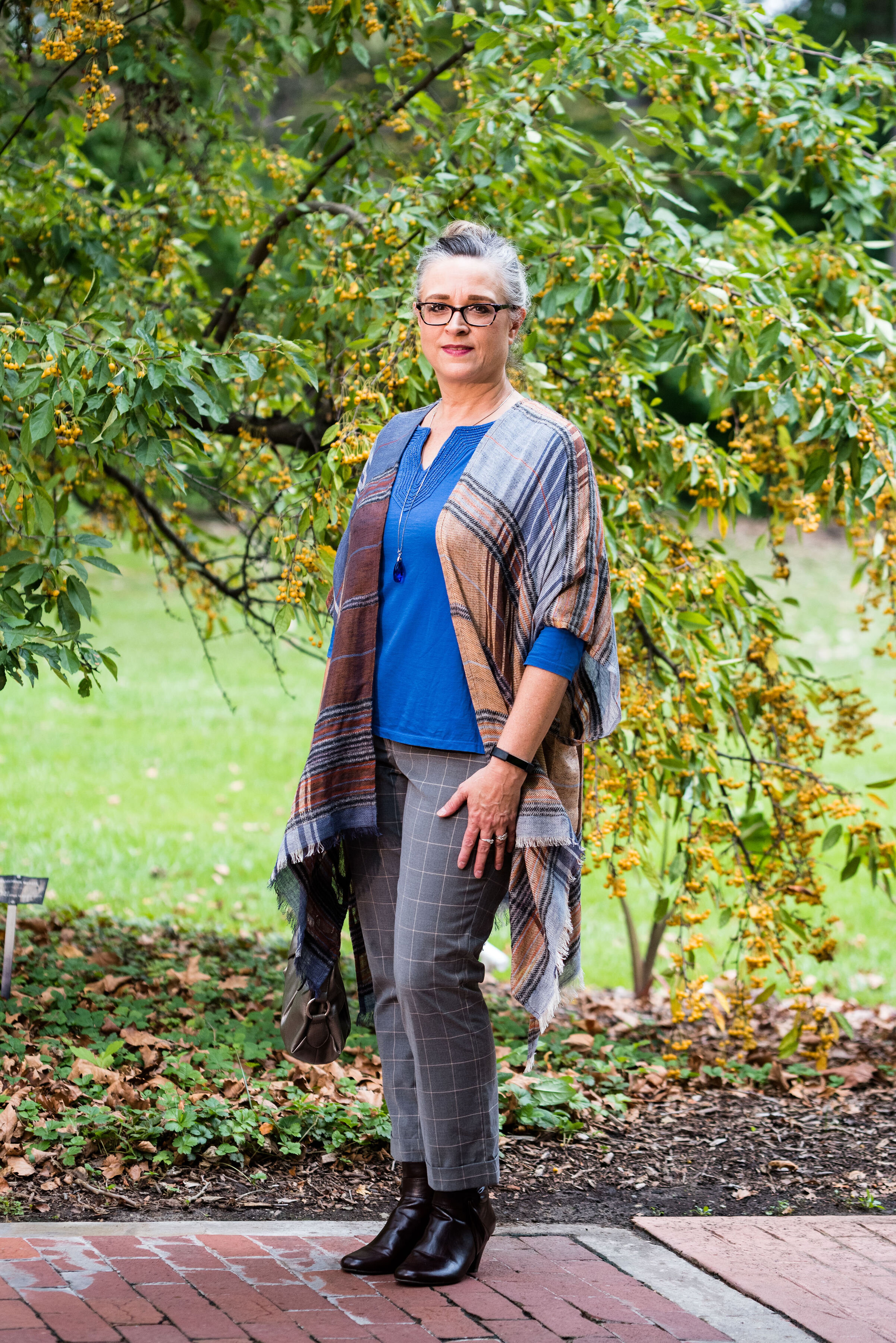
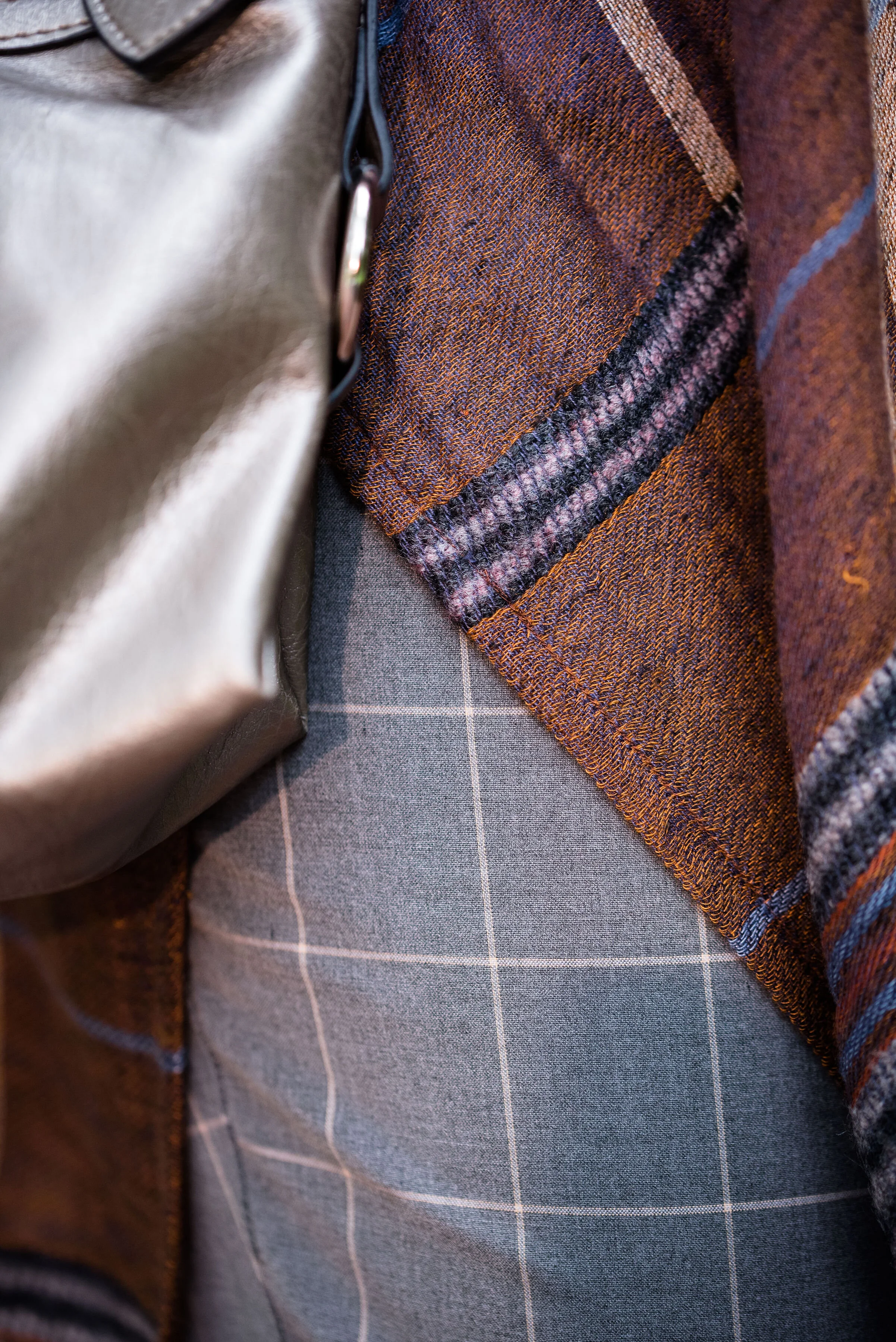
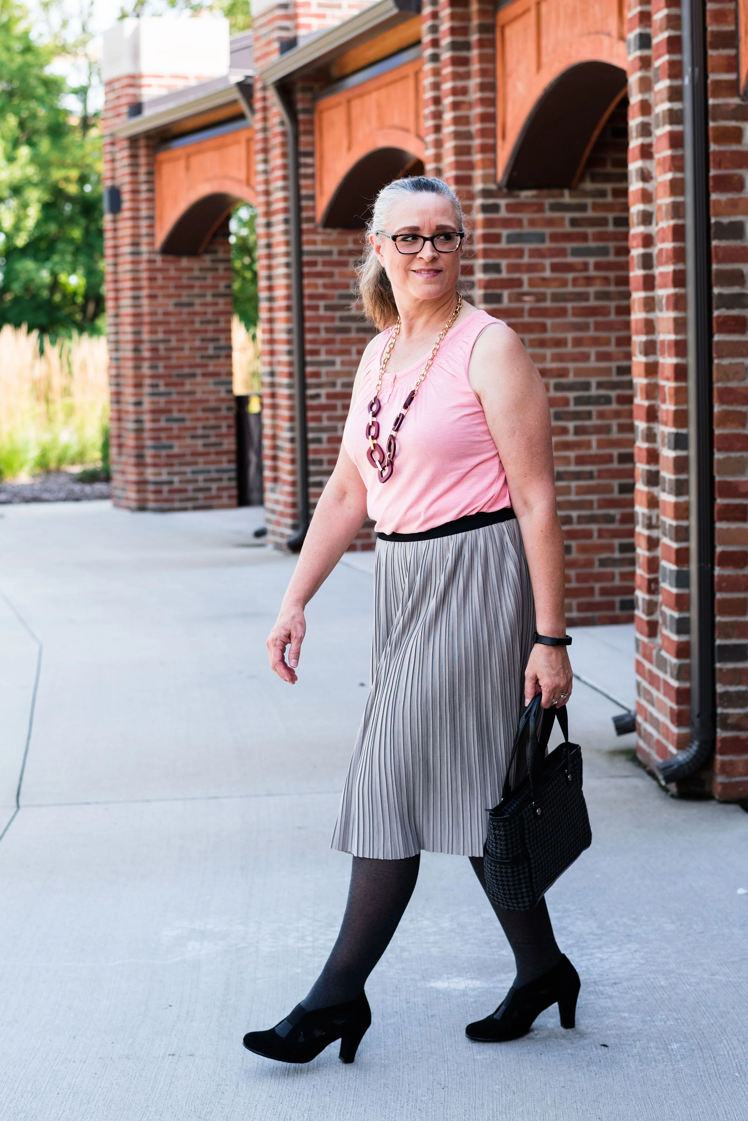
For this outfit I wanted to showcase this cute black Croft and Barrow tunic that I found a few weeks ago thrifting. It is probably meant to be more of a summer piece, and when I saw it, I thought it would look cute with cropped jeans and a tee or tank top in the warmer weather, but I also thought it would be the perfect topper for a winter look, thus this red and black combo.

My red cropped pants, I have styled on the blog before. You can see them with a black kimono and with a navy blazer. I found these a while ago at Meijer on the clearance rack and they are a brand called Stitch Star.

The lace 3/4 sleeve, Lauren Conrad top was a thrift find. Typically I would wear a cami underneath, but because I knew the black tunic was going over the top, I didn’t bother. The idea was to create a monochrome layer underneath and even though the pants and top are not the exact same shade of red, it works fine because they are not right next to each other.

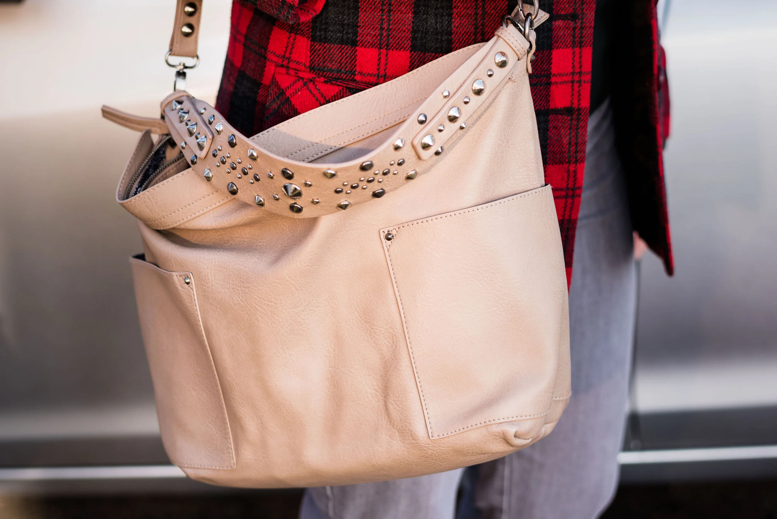
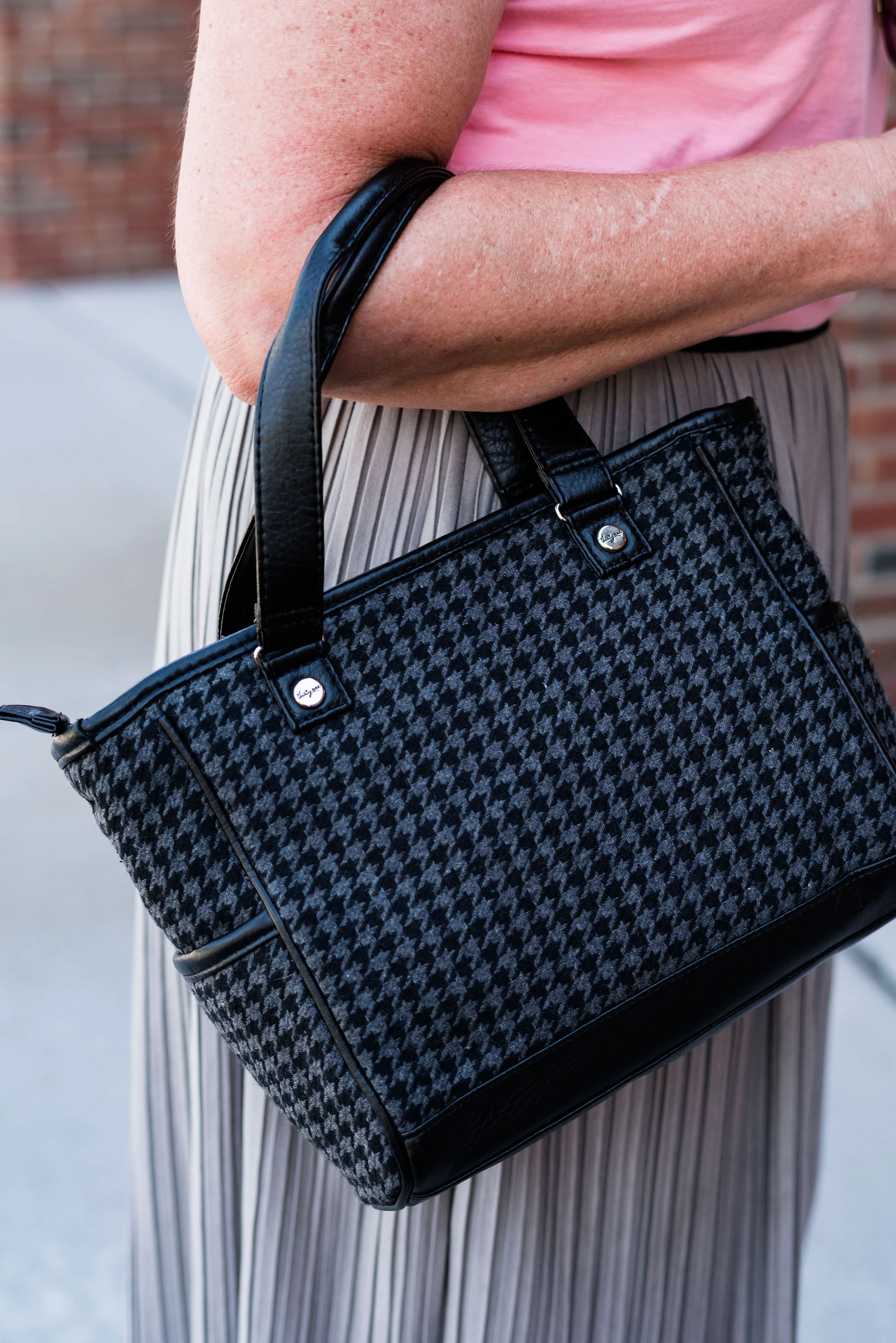
To keep the look fairly stream lined I chose my thrifted black and gray houndstooth, Thirty One purse and my Aerosole black suede heels.

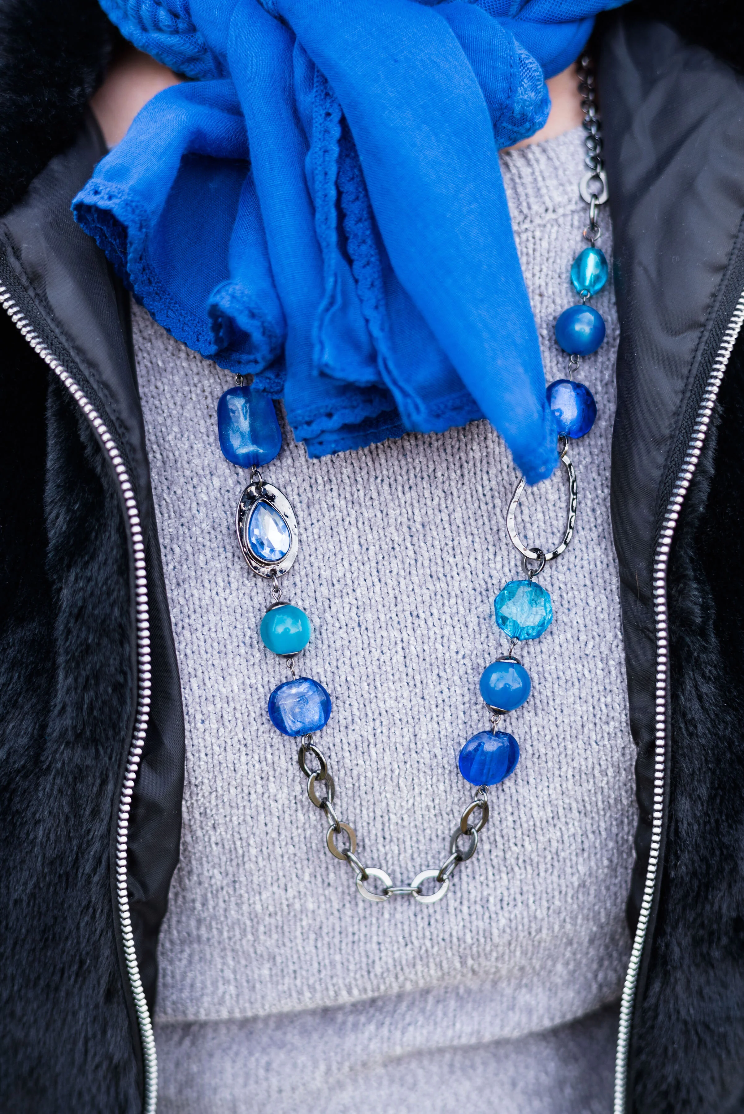
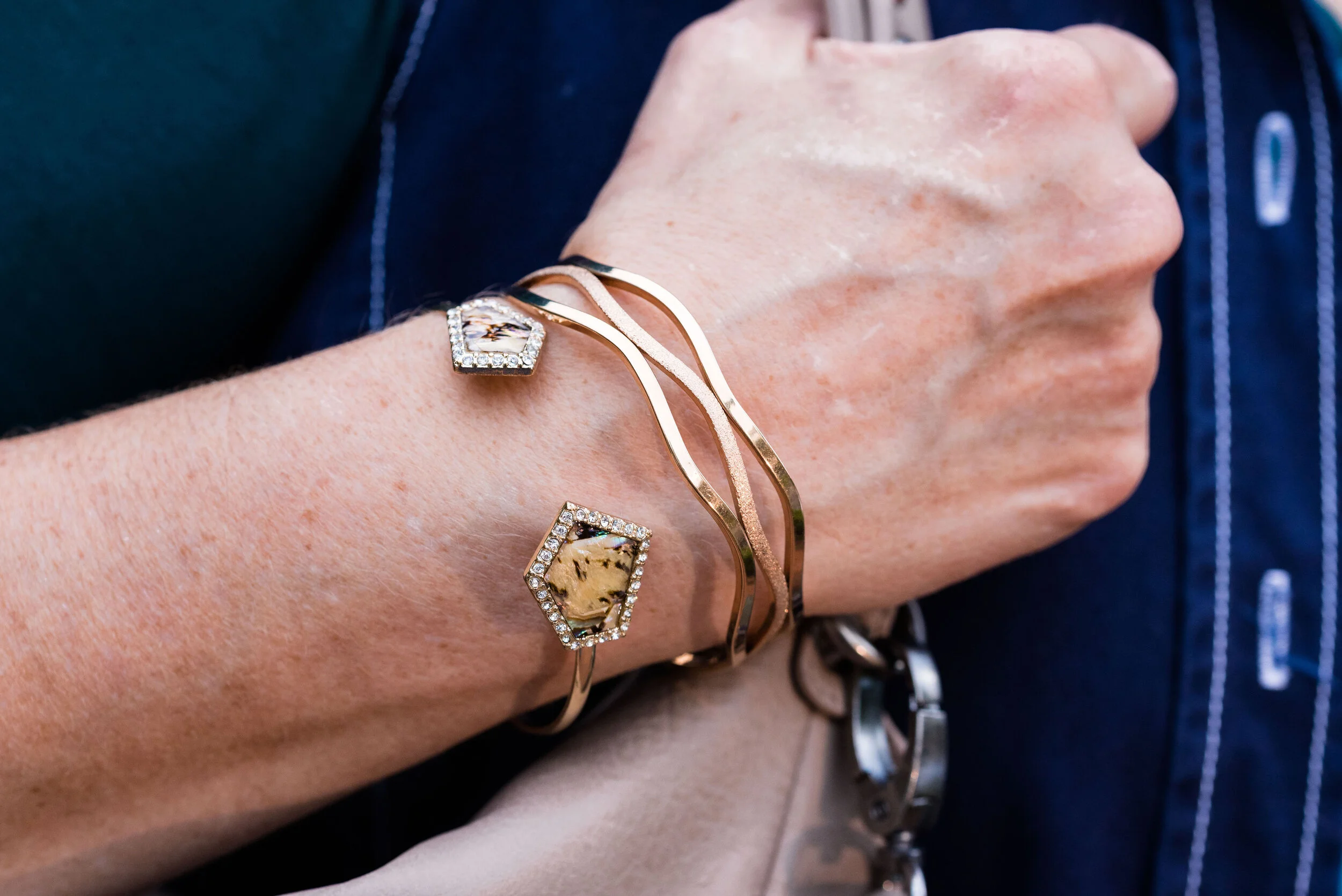
The jewelry I am wearing I bought for my oldest daughter’s wedding, so I am often looking for other reasons to wear the necklace and bracelet. I thought this was the perfect finishing touch. You can also see the fun metal rings on the tunic.

Would you wear red and black? What sort of occasion would you wear it for? I could see wearing this outfit for a date night with my hubs where we go somewhere more fancy than Five Guys. Ha, ha.

Do you take care of your heart? I need too. My cholesterol is borderline high, so I have started eating oatmeal more. Exercise is very important, especially cardiovascular. I try to walk a few days a week, but I know I need to be more purposeful in that area as well. I want to do better and my heart needs me to. I hope you all are taking care of your hearts. What better way to celebrate Valentine’s Day than to give the gift of health to our hearts.

Have a great Tuesday!

I’ve included a few shopping links for black tunics. These would be great to pair with red pants, pencil skirts or shorts. They could go with all sorts of colors. Feel free to peruse at your leisure. These are affiliate links. All opinions are my own.




Seeing Red - Layering Light - Monochrome Pink Outfit

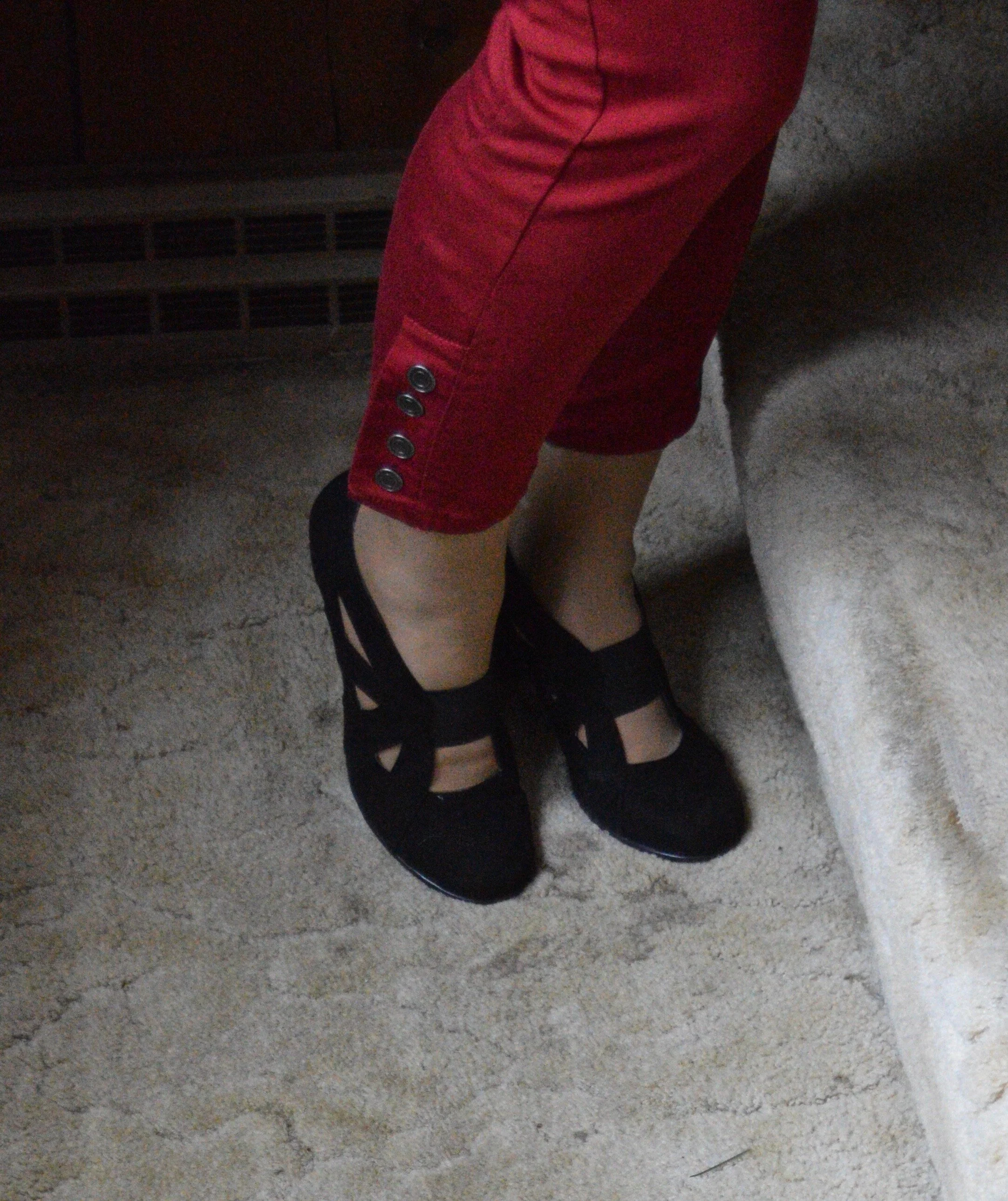
Seeing as it is the beginning of February, I thought it would be fun to make this whole month revolve around the color red, or some derivative thereof in keeping with a Valentines theme. Today’s outfit is the last in my Layering Light series, but I felt it fit into this month’s theme, because pink is just a lighter shade of red. I remember in grade school, learning how to make pink by mixing red paint with white paint. Even though this outfit is mainly pink, just think of it as a shade a red with white mixed in.

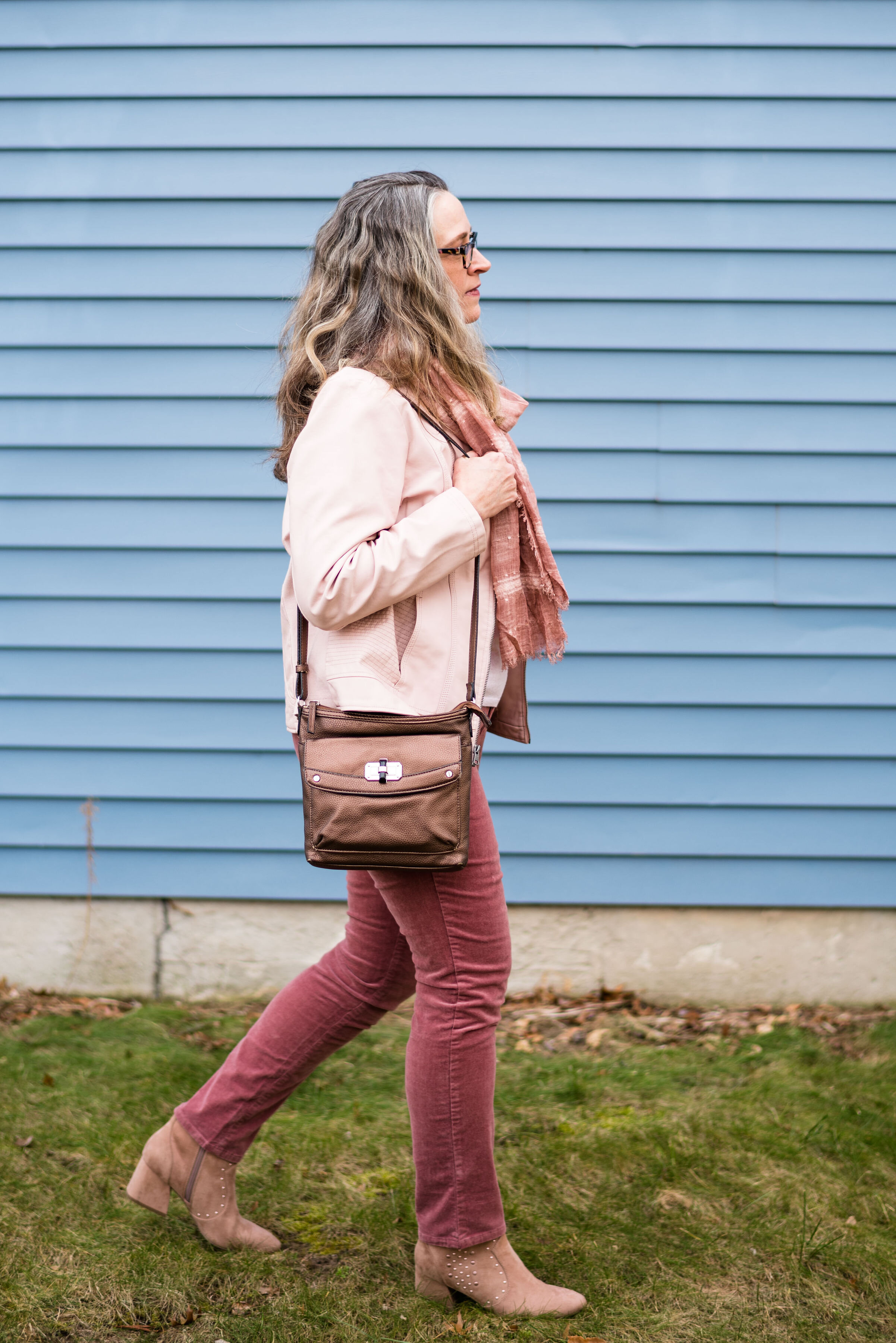
I got these dark pink Sonoma corduroy jeans at Kohl’s this past fall. They are soft and stretchy, and the narrow wale corduroy is extra warm in the chilly winter weather.

This light pink moto jacket is a clearance buy from Christopher and Banks. Can you have too many moto jackets? Of course not! Ha, ha.

This light pink Gap turtleneck was a thrift find. I like that it is lighter weight, because that makes it easy to layer under other pieces. The ribbed neck is also soft and comfortable, with no itchiness or irritation. Different fabrics affect my skin in different ways. I cannot wear wool and usually try to stay away from fabrics that are stiff and scratchy.

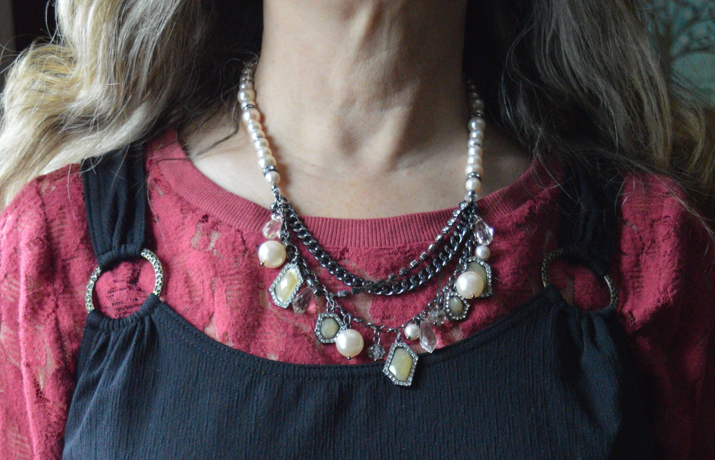
You can also see in the above picture, I added a pink scarf which subtly ties in to the darker color of the pants. The coppery metallic ring necklace and the thrifted copper bag were a way to add a touch of earthy color to the outfit.

These SO block heeled blush boots were the perfect choice to finish off the outfit.

This outfit would be a great date night look to wear with your significant other for Valentine’s Day. My husband is not a huge fan of pink, so I might wear this out with friends and choose something else for the romantic holiday.

Would you wear all pink? Do you own a pair of corduroy’s? Let me know your thoughts in the comments below.

This month I will be having another give away since this is my bloggiversary month, so keep a look out for that.


Actual Amy - Waterfall Cardigan Outfit

I decided to go back to a column once a month on outfits that better represent how I really dress. I think it is important for fashion bloggers to show you things about fashion and beauty that are trending and help women feel more confident and beautiful. I also think there is a lot of false information going around out there. Take for example the idea of ageism and body acceptance. I really believe that even though these things are being addressed, in the fashion realm, there is still a huge gap between what is shown and what is reality. I do think it has been bloggers that have made strides in closing that gap, but I know I still struggle with showing you things that are interesting and helpful and showing you the real me. Thus this monthly column. I was doing a similar column previously and called it Ordinary Amy, but I thought that might not be the best title, so now you get Actual Amy! Ha, ha.

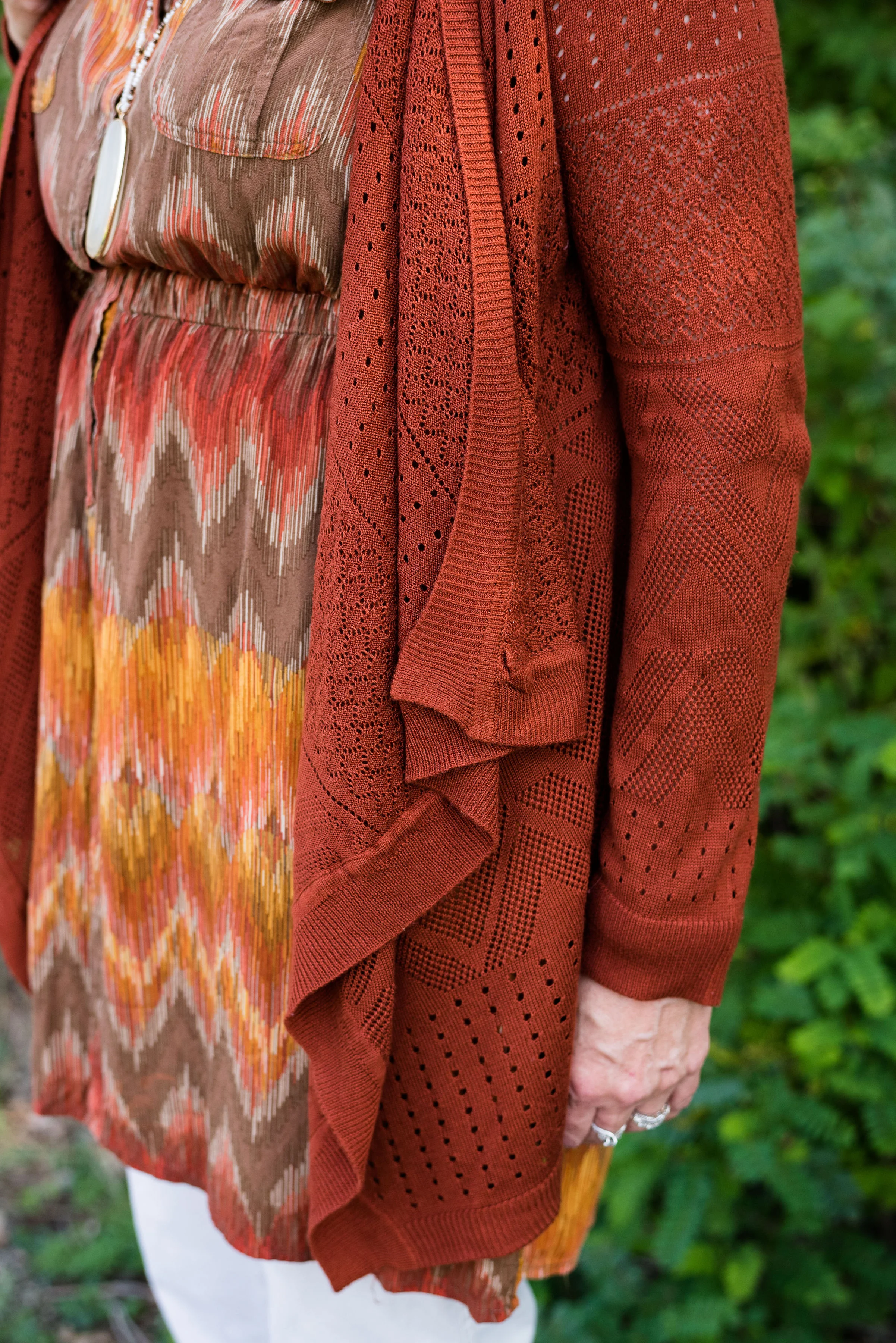
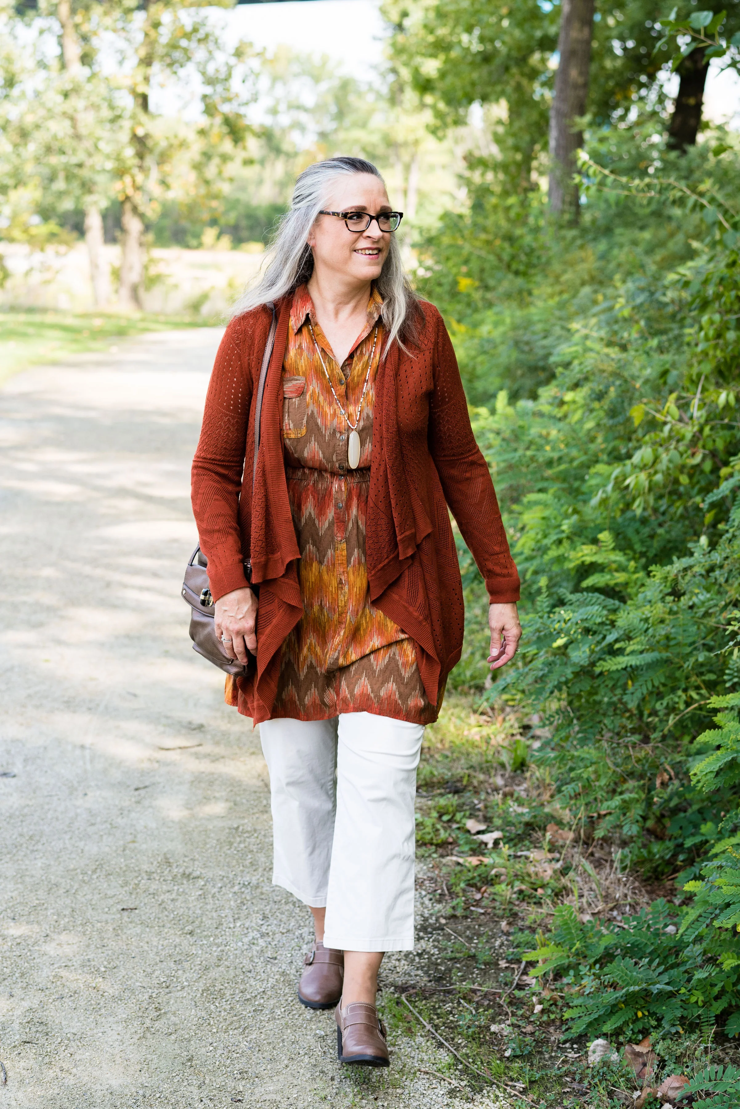
This thrifted Pink Rose brand, waterfall cardigan is one of my favorites. I am not a huge fan of the waterfall or cascading cardigans, unless they are made from a lighter weight knit. I have tried heavier versions and I always feel that they add to much bulk right where I do not need extra bulk; around the thighs and middle. The lighter weight knit and the more open weave seem to do better for me. I also love the rusty color of this one.

I found this rust and navy long sleeve tee at Maurice’s on sale. It’s made of a soft, stretchy fabric and will be a great piece to wear by itself, when the weather warms up a little. The brand is 24/7.

You can also see my pendant necklace. The thing I like about this large, donut style bead is the variety of colors in it. I wear it a lot with blue and navy, but it also looks great with this rust color.

Kohl’s now carries the brand Nine West and this bag was on clearance. I do not have a round bag, so when I saw this brand, at a great price and with a snakeskin print I knew I had to order it. I’m sure it will not be a regular in my rotation, because the shape and size are not large enough for all I carry in a bag, but it will be great for special occasions. I’m thinking this will look great with yellow, brown, blush or navy.

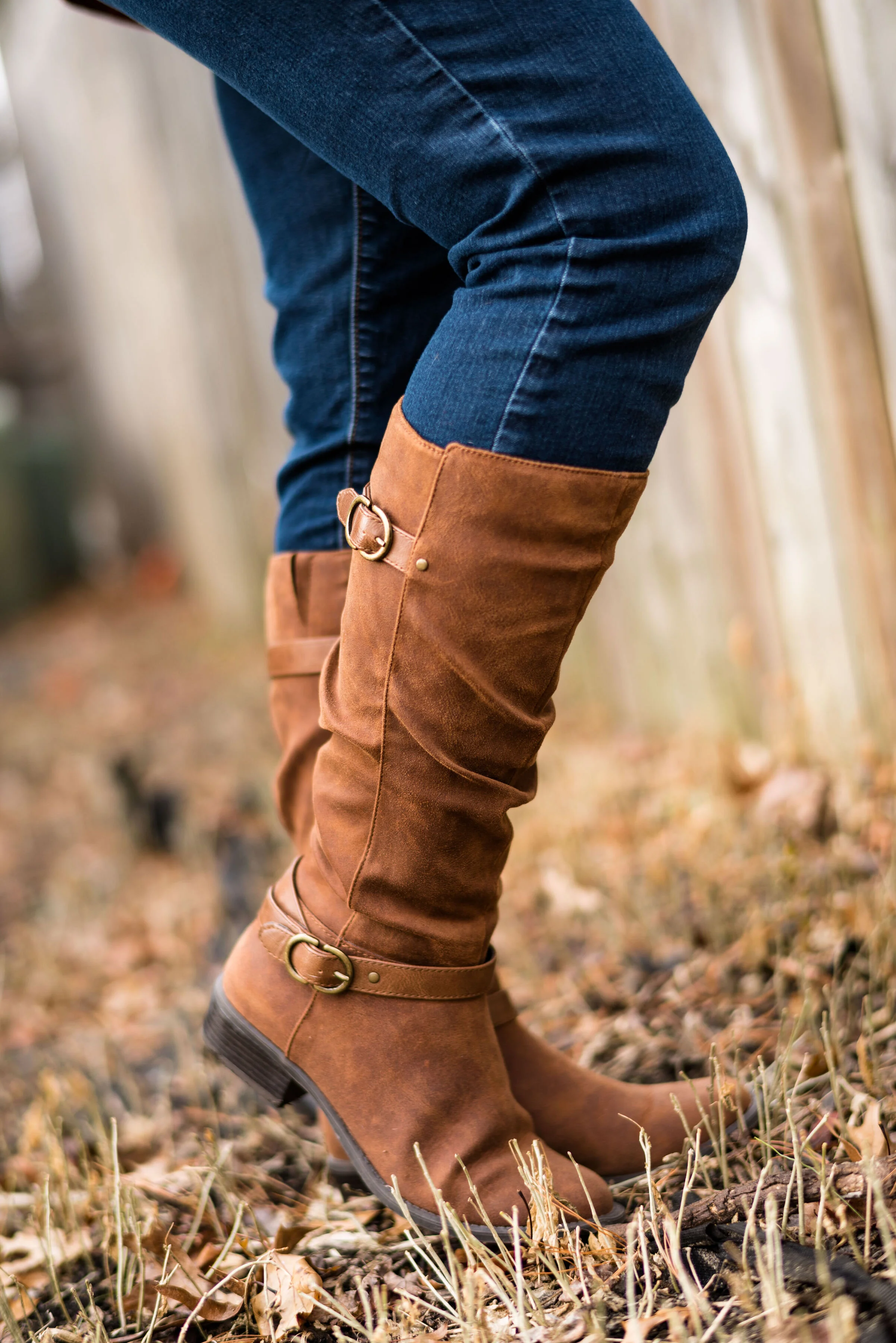
My jeans are Apt. 9 skinny ankle jeans. These work great with my Sonoma faux suede boots. Because they are shorter than other pairs of my skinny jeans, I wear a pair of heavy boot socks which come up about mid calf, and tuck the pants into them. It keeps the jeans from riding up when I sit down.

This an outfit formula that works for me. Pick a great sweater, a top, a pair of jeans, boots and a bag and voila you are ready for a day out with friends shopping and hanging out.

What do you think of this outfit? Do you like waterfall cardigans? If not, what sorts of sweaters do you reach for in your wardrobe?

I’m including a few shopping links. These are affiliate links, which means when you click on a link, I get a small commission. All opinions are my own.

Thank you for all your support. I know not everyone has time to read blog posts or time to make comments, but I appreciate when you do. Have a great weekend and I’ll see you next week.

Photo credit Rebecca Trumbull.


Layering Light - Lifting our Winter Blues with Color

This is the second installment in my Layering Light series. This is not about layering light weight layers, but about layering up with light colors; colors that will help lift your mood in the deep, dark, doldrums of winter. Last week I showed you an outfit with light wash jeans, light neutral layers and a scarf that brought a bright pop of sunshine yellow. This week I reached for a floral dress and a light colored jacket to lighten up the blue mood.

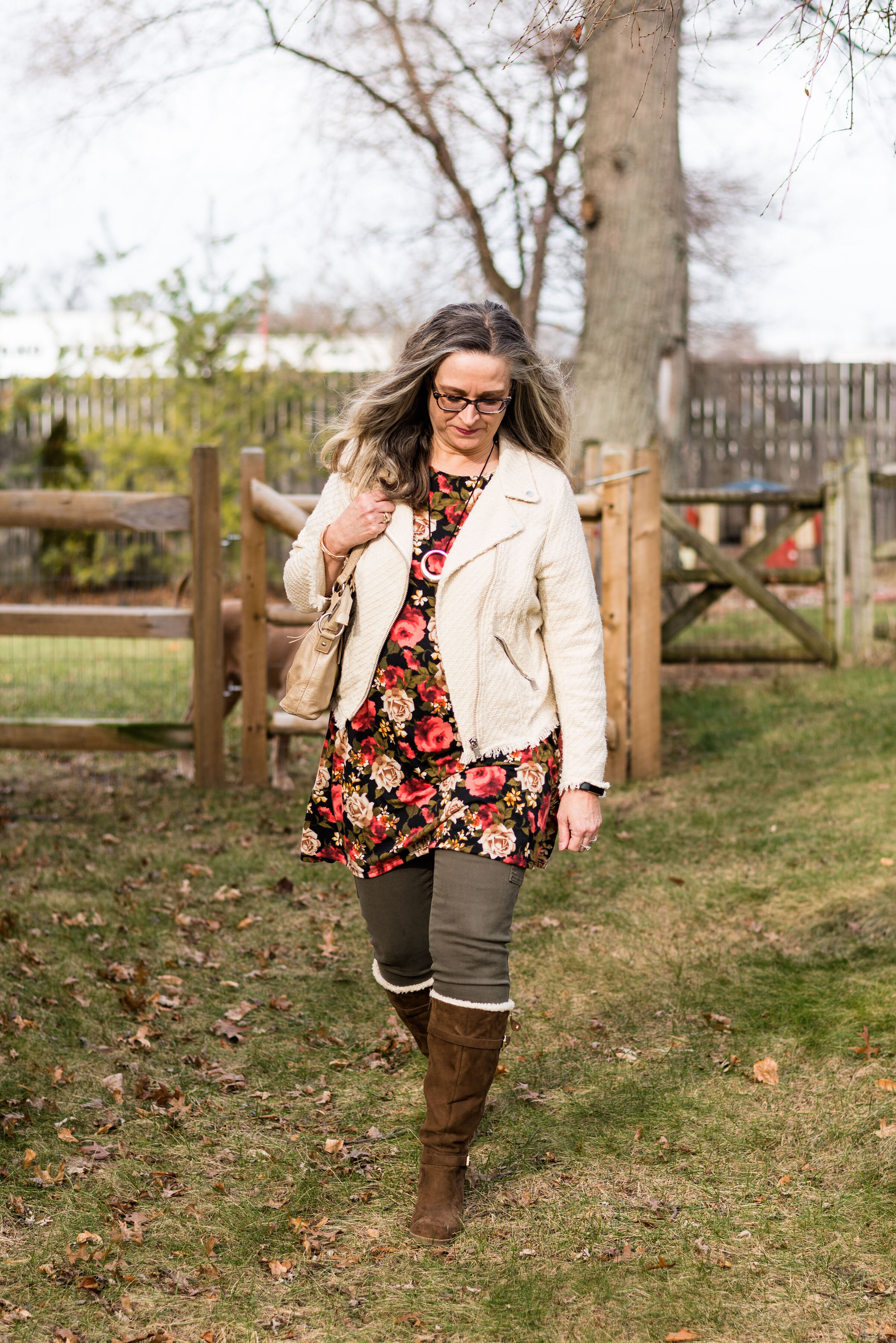
Even though this floral dress might be considered more of a winter floral due to the dark back ground, it still has an uplifting feel, making me think of summer time when the roses are in full bloom. You can see how I styled this Wilde brand bell sleeve top with fishnet stockings and combat boots here.

Versatility in a clothing piece is a prerequisite for purchasing it in my opinion. I have a ton of clothes, but only a certain percent of them get worn repeatedly. Even if it is only to show you on a blog post, you can see the value of a piece in how often and how uniquely it can be styled. Truth be told, I have not yet worn this dress for an actual real day of wear, but seeing it here, I am thinking ahead to summer and wearing it with rolled up jeans and either oxfords or tennies for a fun warm weather look.

I opted for my skinny olive cargo pants, since it is cold and I don’t have any good sweater weight tights right now. Leggings would work as well, but these Gloria Vanderbilt pants are a good medium weight and have lots of stretch for maximum comfort.

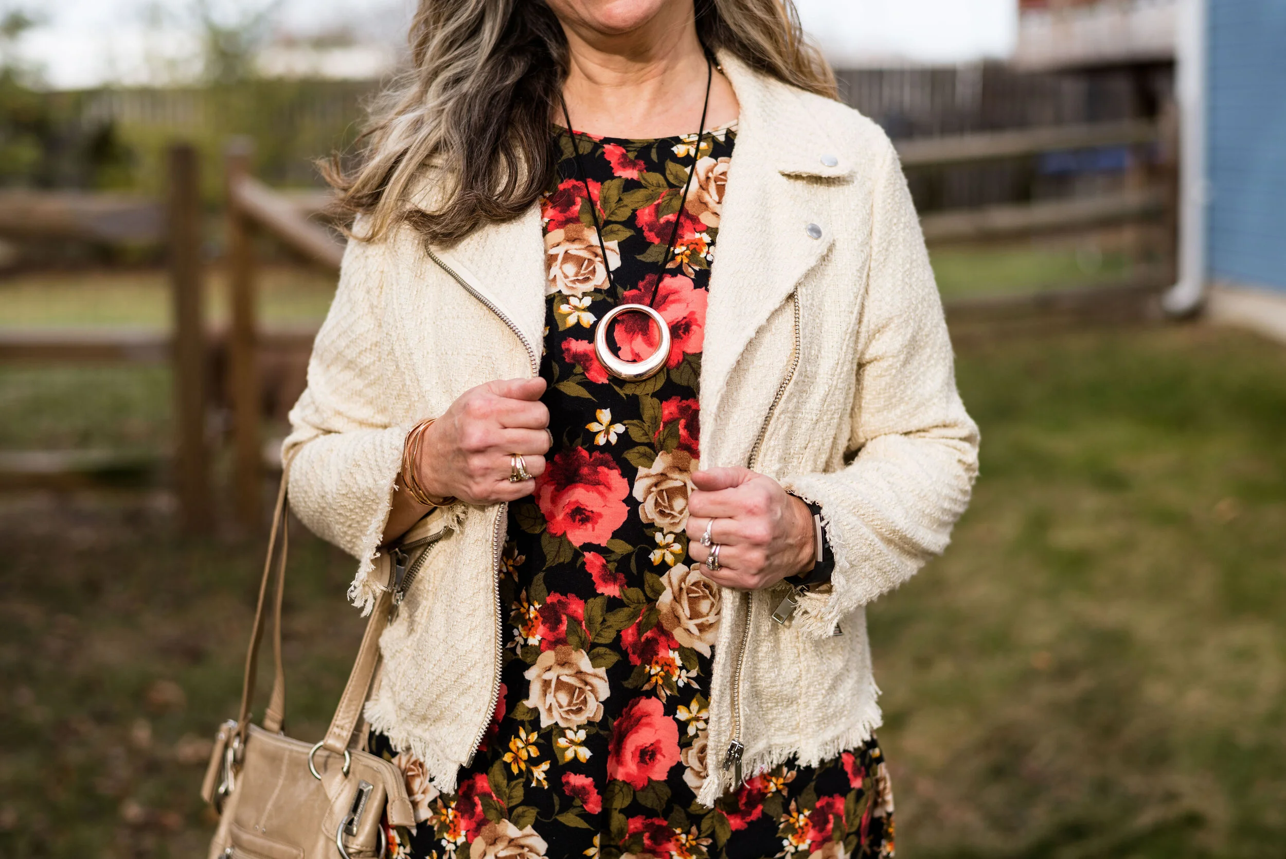
My tweed moto jacket is from H&M clearance last season. It hasn’t gotten a ton of wear, but I really love how it looks with this dress. You can also see how I styled this pieces in my Pantone series from Fall 2018.

There are several things that drew me to this piece. The first was the color. I have numerous moto jackets, but until recently I only had darker colors. With this creamy color, I have different options for putting together an outfit like this. In addition to the color, I was draw to the tweedy texture and the frayed hems on the bottom and sleeves.

For my jewelry I chose two simple rose gold pieces. The bracelet was a gift from The Happiness Boutique and I featured them on this post here.

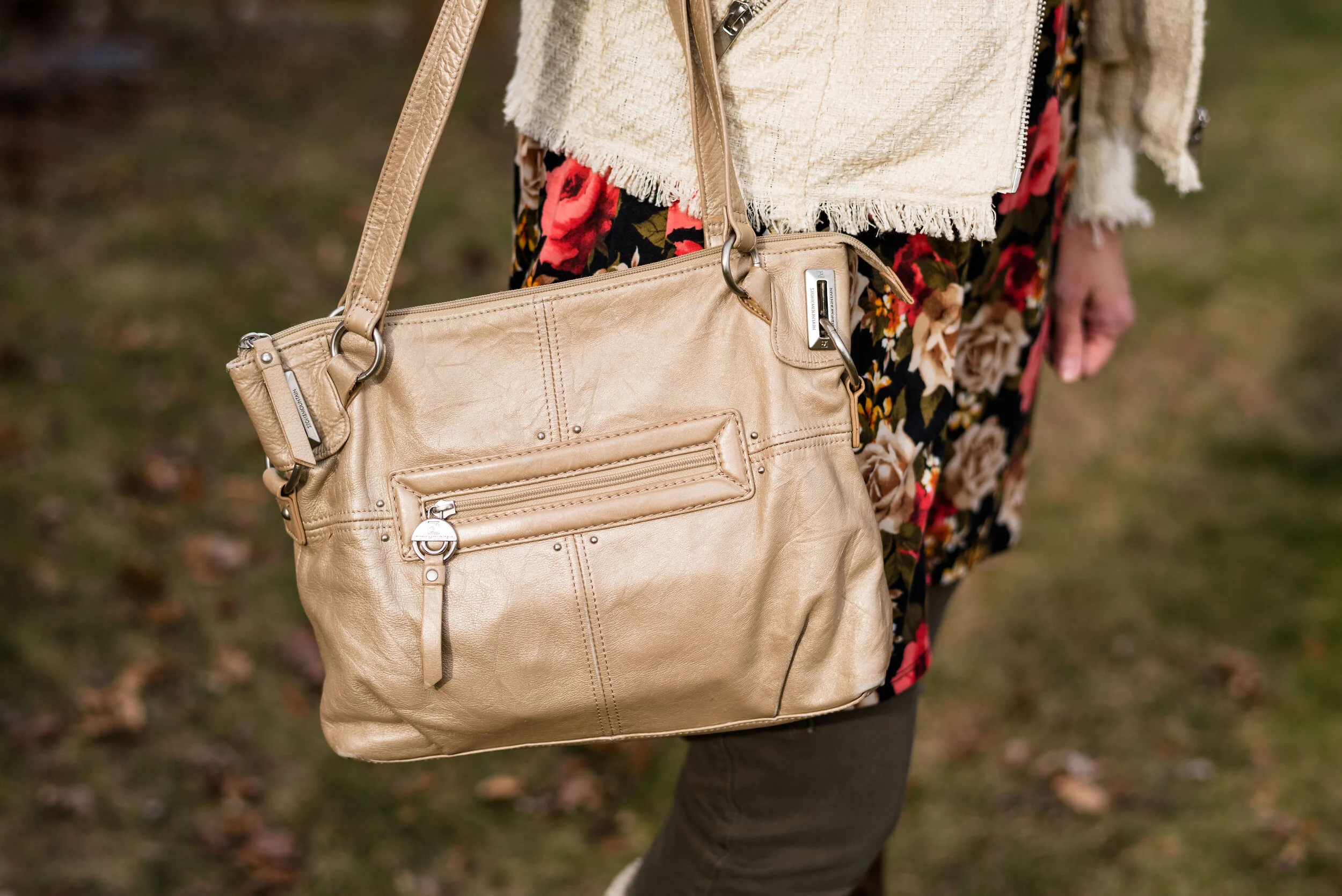
This cream colored bag was another thrift find as were the shearling knee high boots. The bag is Stone Mountain brand. The boots are Unisa brand. DSW and other retailers carry this brand. I love the details on these boots. The three inch wedge heel is a bit of a challenge to walk in for me, but these would be great “sitting” boots, because they look so good. Ha, ha.

I was being photo bombed by my cute grand puppies, so of course I had to include a few of those pics.

They didn’t like that they had to stay in the fence at my daughter’s house, but Titan, the white Pity mix, would have disappeared in a grand squirrel chase adventure if he was let out. Beatrice, brown Mastiff mix probably would have stayed by us, but would have barked at every car that went by.

What do you think of this outfit? What pieces do you have in your closet that will lighten up your dreary winter days? What’s keeping you from getting them out and putting together something new and different that you had never thought to put together?

I’m including a few shopping links. While the pieces I am wearing are thrifted and from clearance racks, that doesn’t mean that there aren’t similar pieces out there. These are affiliate links. All opinions are my own.

Photo credit Rebecca Trumbull.

Photo bombers: White Pity mix - Titan Oliver Trumbull, Brown Mastiff mix - Beatrice Potter Trumbull, Follow their adventures on Instagram - sitstaybea


Color Play - Inspiration from Art

One of my monthly columns is going to be this one called Color Play. You know how much I love color and enjoy finding different combinations that are new and unique. Color is all around us in nature, in our homes and in many places we don’t really think about. For this month’s outfit, I was inspired by a painting and table arrangement in my daughter’s house.

This is a watercolor painting by my son-in-law’s grandfather, John Trumbull (not to be confused with the American Revolutionary painter by the same name). While he is not famous, he has done some teaching and won a few awards and ribbons for his work. I was gifted one of this paintings last year for Christmas and just love it.

The table arrangement was put together by my daughter and I really like how the painting and arrangement compliment each other. This is when I was inspired to come up with an outfit using a similar arrangement of colors. This is what I did.

I just obtained this plaid ANA jacket from the JC Penney clearance rack. It was still a little more than I wanted to pay, but I had a coupon. I almost put it back, but I just have this thing for plaid. I kept looking at it thinking, I love it. I can come up with fun blog outfits with it and I’ll actually wear it. It came home with me and I don’t regret it. I could also justify the purchase because I was using birthday money to buy it. Ha, ha.

The piece is not lined, but has deep, welt pockets a notched lapel and button front. The color is a very light bluish gray and it made me think of the two tall, slender vases in the picture.

The two under layers consisted of a thrifted Chaps, floral button up, and a thrifted Sonoma, v-neck sweater. I felt the green sweater went with the lighter greens in the painting and the floral top picks up the sublte purples. I get into these moods when I am thrifting where I buy similar type items, usually patterns. For a while it was gingham, then it was stripes, now it is florals and plaid. That is part of the reason I have so many clothes. It’s that time of year where I will need to do some thinning out of my wardrobe.

My light colored Croft and Barrow jeans are also thrifted. I was looking for something in a lighter color that wasn’t white and these seemed to fit the bill.

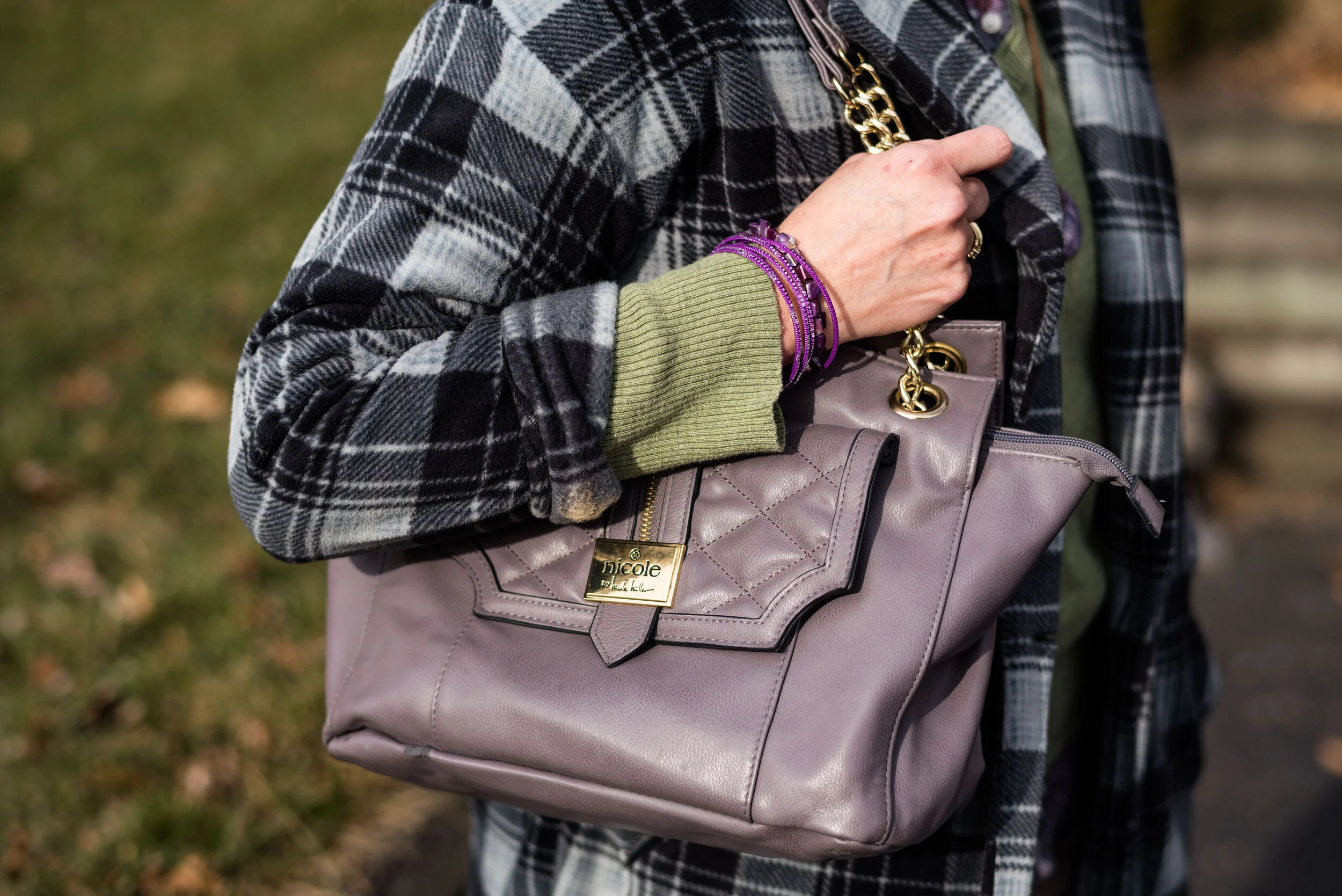
Accessories included a simply handmade bead necklace, purple bangle bracelets. and a Nicole tote bag. I love the purply gray color of this purse. The gold accents make it look high class.

Since we are still in the cold weather season I decided to include my Sonoma shearling ankle boots. These are warm, comfy and stylish for this chilly time of year.

What do you think of this color combination? Do you like to wear plaid? What’s your favorite pattern to wear? Leave me some love in the comments. It always gives me a boost to hear from you.

I’m including a few shopping links. These are affiliate links, which means I get a few cents if you click on a link. I get a little more if you purchase something through my website. All opinions are my own.

Photo credit Rebecca Trumbull.


Layering Light - Lifting Our Winter Blues with Color

If you have been following my blog for a while you know I have talked about Seasonal Affective Disorder before. I don’t mean to belabor a point, but I think it is good to be aware of particular issues, especially those affecting our mental health. I had a terrible day a few days ago. I felt completely flat when I got out of bed and I just couldn’t seem to get myself out of the funk. I felt depressed, crabby and completely anti-social. I started to wonder what in the world was wrong with me. A day prior, I was feeling pretty good. I was working on my writing, and I was getting a few things accomplished with my days since I becoming unemployed. I was actually enjoying the fact that, at least for a time, I didn’t have to answer to someone else. I was thrilled to be able to be creative and also be a housewife without the stress of being an employee.

As the morning wore on, I looked outside and realized what was wrong. Winters in my midwestern area are not pretty. We don’t have vast amounts of fluffy snow, blanketing the roof tops and trees. The world is not a winter wonderland, but rather a dsytopian array of browns and grays. The sky hangs lower and lower, it seems, and that steel colored ceiling weighs on me just like fathoms of water weigh on a wreck at the bottom of the ocean. And that, was exactly how I felt. I was a wreck, laying fathoms below where the sun ever shone, cold, alone and decaying.

Seasonal Affective Disorder is a type of seasonal depression and is often accompanied by anxiety and social awkwardness. It has also been noted that sufferers have food cravings for foods high in carbohydrates and for me that includes chips and sweets, although bread is on the list too. Ha, ha. In the last two weeks I have craved chocolate cake. Maybe it had something to do with my birthday passing by, because when I was growing up, my mom always made me a chocolate cake for my special day.

There are things people can do who suffer from Seasonal Affective Disorder. My own choice would be to move somewhere that the sun shines at least 200 days a year. Toledo only averages 180. Believe me 20 days would help. However, since resources aren’t available to move some place sunny there are relatively inexpensive lights that will help, like this one. Exercise is very helpful, even if it is just a walk out in the dismal gloom. I also give myself grace. I have had chocolate cake. Another thing that helps me is choosing to wear bright or light colors.

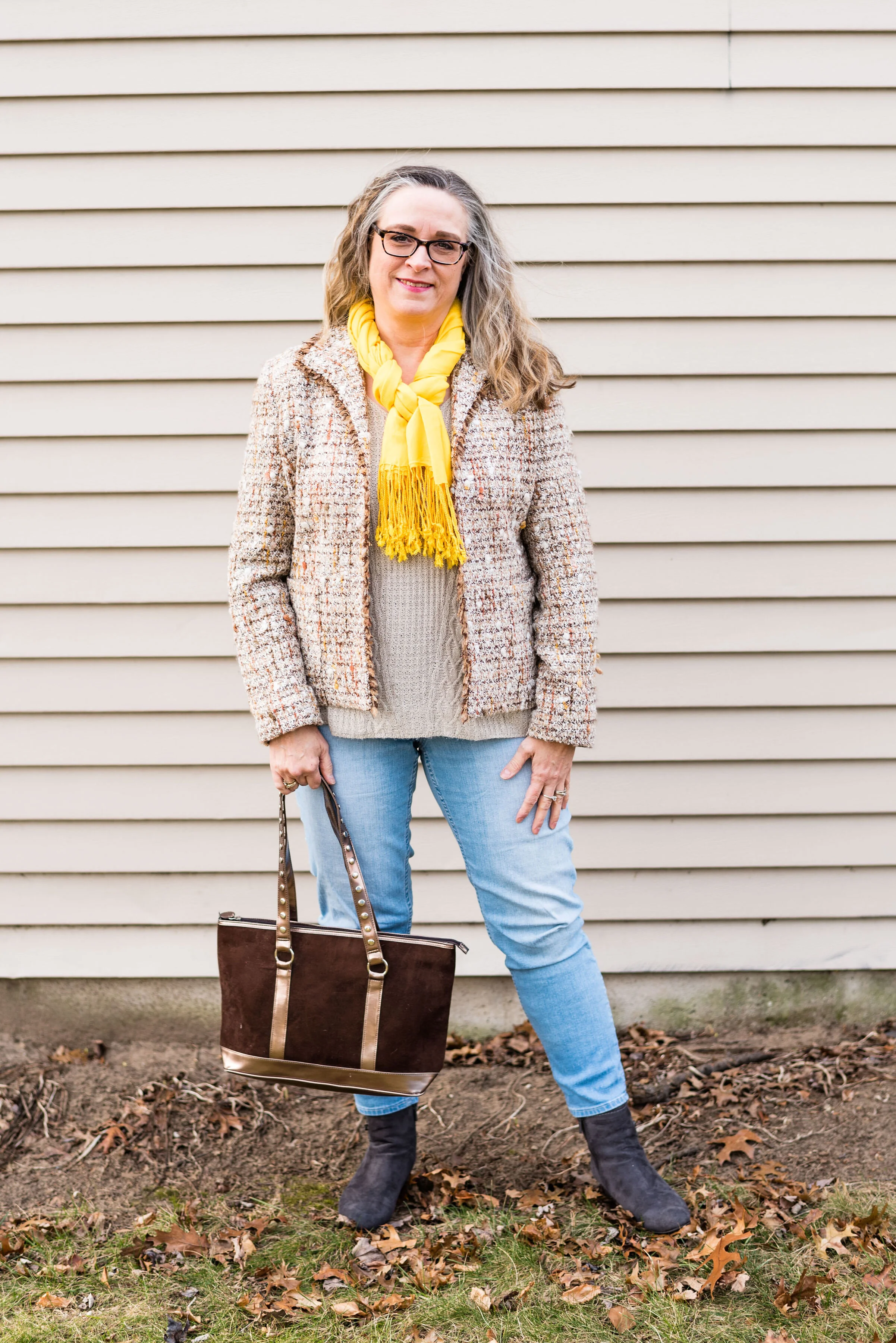
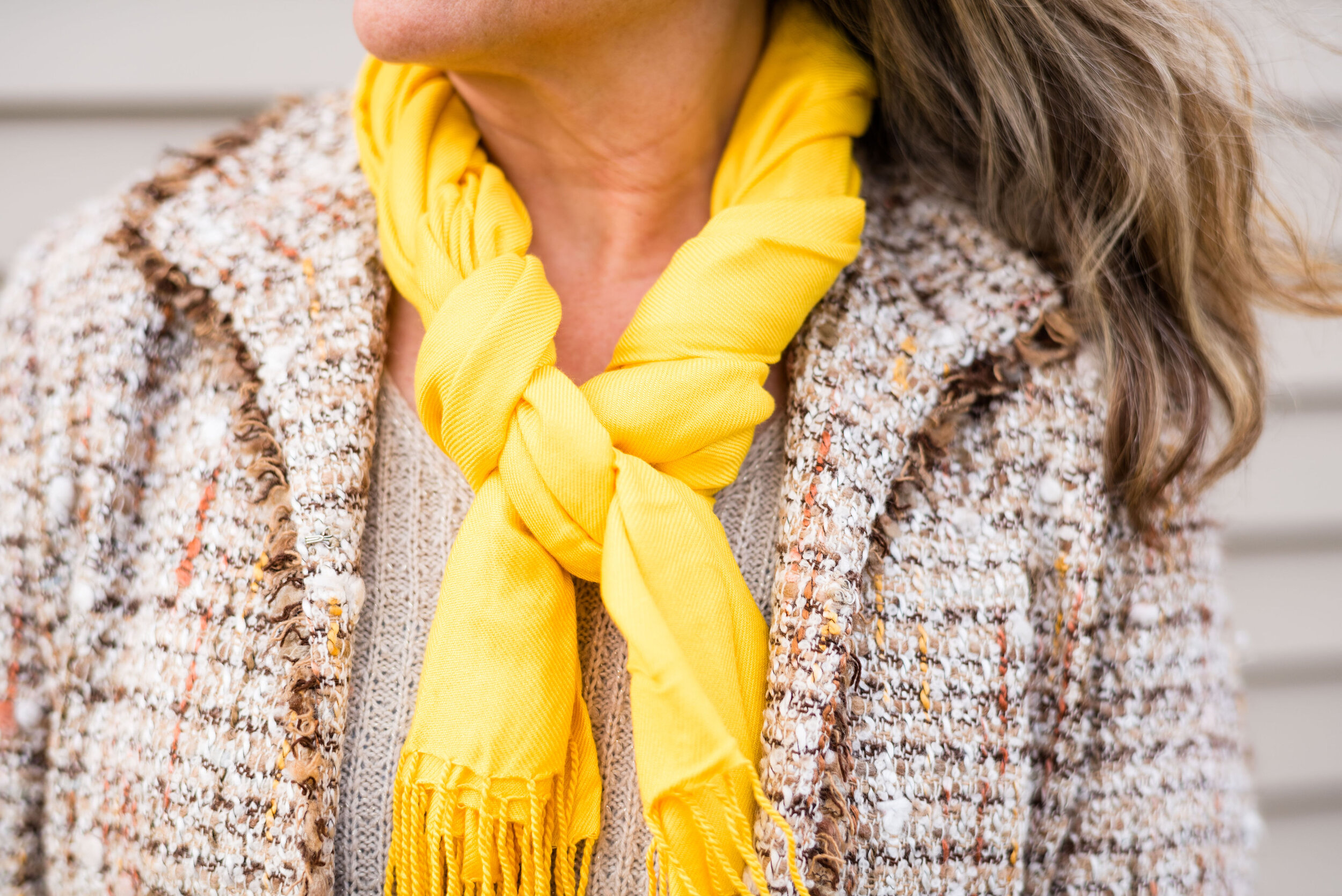
Obviously, what really makes this outfit pop is the bright, sunny yellow pashmina scarf. When I started putting the outfit together I had the light wash Apt. 9 ankle pants and the St. John’s Bay v-neck sweater picked out. I had a different jacket picked out, but then thought I wanted something with a color in it that I could accessorize with that would brighten up the whole look. This thrifted Marshall Fields tweed jacket has little flecks of yellow and rust in it.

The gray, Impo, wedge heeled ankle boots pulls out the dark threads of the jacket and the thrifted brown and copper bag works well with the rusty browns.

I really like the way this outfit turned out, and the way my daughter framed me against the neutral colored siding on the house. It just works so well and really shows off the idea of how texture can make a big difference, not only in our outfits, but in the world around us.

Do you struggle with the winter blues? Do you like to wear bright or light colors to help boost your mood when you are feeling down? I’d love to hear your thoughts, so leave me some love in the comments.

I’m including a few shopping links for you to look at. I’ve tried to pick out items that are light and bright. These are affiliate links. All opinions are my own.

Photo credit Rebecca Trumbull.


Outfit Inspiration - Monochrome Look with a Kimono

As I have mentioned on other occasions, the inspiration for my fashion posts, comes from all different areas. A lot of times it comes from a picture in a magazine, or an add I get in the mail. I have a notebook where I keep the pages from these magazines and catalogues, of outfits I’d like to try to mimic. Today’s outfit was inspired by a JC Penney add from last fall.

In the add, the model featured a rust colored tee, rust colored corduroys and a kimono with a beautiful fall pattern full of those colors like rust, teal and burgundy. I have numerous kimonos, which I am always lamenting I don’t wear enough for how pretty they are. Kimonos, ruanas, ponchos or capes can all be such beautiful statement pieces, so why not make that statement piece the focal point of the outfit.

Since we are well into winter, I decided to use a more wintery colored kimono. This is truly a great piece for all year round, but since I decided to make the monochrome part of the outfit black, it seemed perfect to top the dark under layers with a piece full of bright tropical pink. This kimono was thrifted and is Massini brand. Before I had any kimonos, I never really saw what the draw was, but now I am sold. This beauty was one of the first ones I bought.

I know my black pieces do not match exactly and while that would drive some people nutty, I figure the kimono is getting the main attention in this outfit, so it didn’t matter as much. The thrifted black skinny jeans are Mossimo brand and the back cable knit turtleneck sweater was from Kohl’s a number of years ago and is Croft and Barrow brand.

My black, slouch, Massini, boots are also a Kohl’s purchase, but a clearance find. I had been looking for a pair of these soft, faux suede boots to wear with skirts and dresses. I have a wider calf, so quite often I cannot get these softer types of pieces. They are usually made thinner to stay up, otherwise we’d have panty hose ankles like our grandmas use to have, but with our boots.

With my recent walking activity while employed seasonally by Kohl’s my legs got much more tone and I lost a few pounds. Now I can wear these boots over skinny jeans, as long as the material isn’t too bulky.

I styled these same boots and the black turtleneck in my 20 Days of Christmas series back in 2018. You can see how I used those two pieces with a slip dress here.

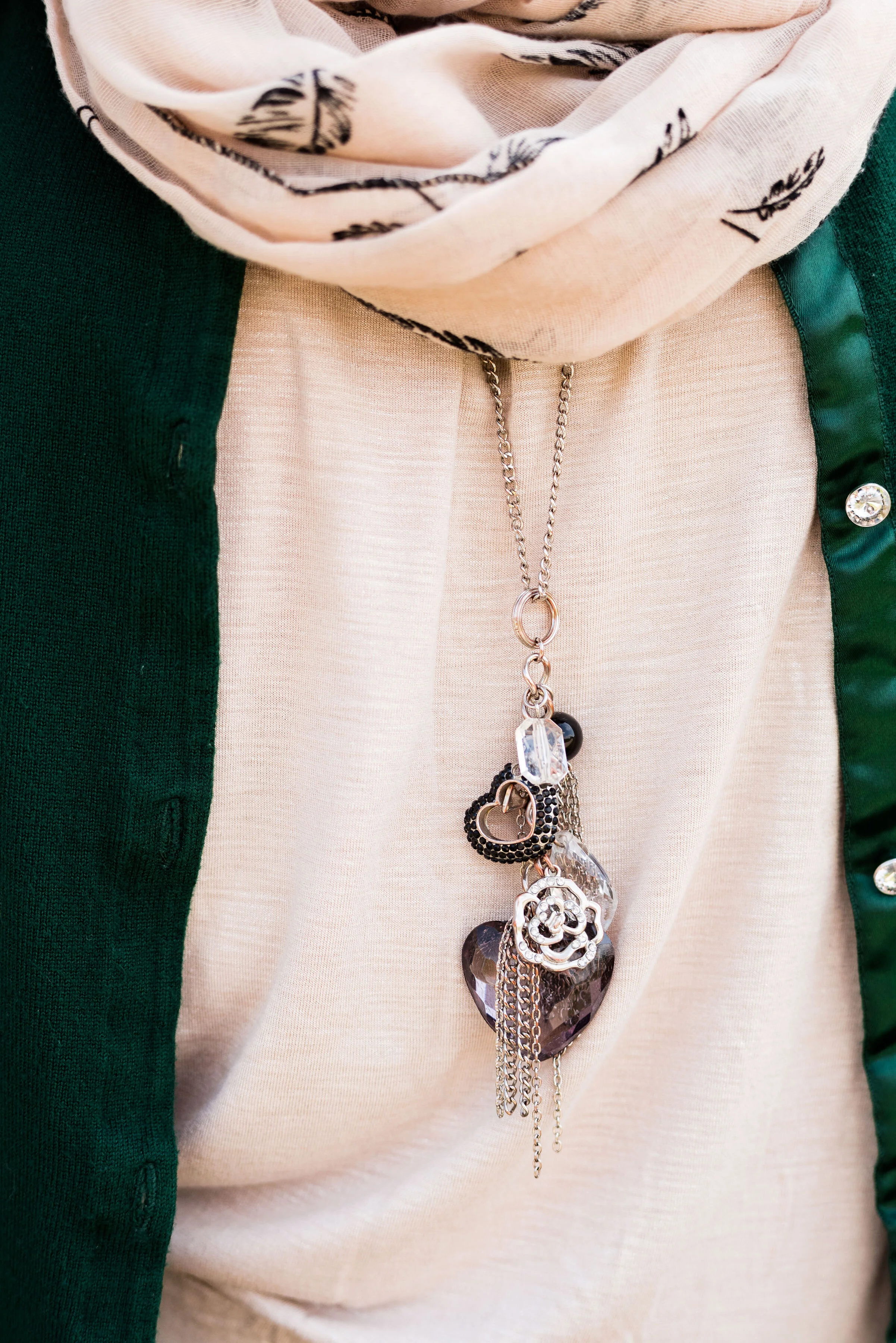
For my accessories I went with silver, black and gold. These days there is no worry over mixing our metals. I enjoy pendant necklaces and reach for these longer pieces more often than my short ones. This one has a number of charms dangling from the end of the chain.

You can also see the layers of bracelets I threw on my arm. Most of these are cheap stretchy beaded types, but I don’t think we have to pay tons of money to have interesting and unique pieces in our jewelry boxes.


This bag was another thrift store find. It is Libby Edelman brand and is genuine leather. The leather is soft and supple and I love the wide guitar like strap and the riveting. My hubby thinks i have two many purses, which is true, but how can you pass up a winner like this one? I also love the bright reddish pink color.

What do you think of this outfit formula? What inspires the outfits you wear? Inspiration can come from all sorts of places, including bloggers you follow, other people’s Pinterest pages and like I found, even pictures in an add or catalog. Let me know your thoughts in the comments below. I appreciate each one of you.

Photo credit Rebecca Trumbull.

I’m including a few shopping links. These are affiliate links. All opinions are my own.
Pantone Color of the Year - Classic Blue

Since I do the Pantone Color Series twice a year, it seemed to make sense that I introduce the Color of the Year. For the year 2020, blue is the chosen color. Classic Blue, as it is called is a medium, dusky blue reminiscent of the the evening sky. Pantone describes it this way:

An expansive presence, Classic Blue is evocative of the vast and infinite evening sky opening a world of possibilities.
— Pantone Website

This is the sort of blue that would look good head to toe, or as in my outfit, be the perfect pop of color against other backdrops. I think this blue will look good on almost anyone and is a color that can be worn all year round.

The wind was doing some crazy things to my hair, so my daughter was doing her best to capture good shots regardless. A number of the pieces in this outfit were given to me for Christmas.

The gray and blue plaid skirt is older and Croft and Barrow brand. There was a time when skirts like these were very trendy. I’ve had my share and have worn them often to church in the winter time. While they may not be the most coveted skirt, these tea length pieces are perfect to wear with boots. I chose to wear my Seven Dials combat boots. I wanted to keep the look a bit more edgy and modern.

This fuzzy faux fur bomber jacket was a Christmas gift from my hubby. It is so soft and I had been coveting all the ones I saw at Kohl’s when I was working. This one he found at Walmart and is No Boundaries brand. Walmart has definitely upped their fashion game.

The gray pullover sweater I have on under the jacket is a brand called Ellen Tracy and was thrifted. A number of retailers carry the Ellen Tracy brand, including Macy’s, Nordstrom, Belk, and others. For this look, I tucked the whole sweater into the skirt. The skirt has a finished waist line, as opposed to elastic. I think a finished waist is just a little more classy than elastic.

The scarf, necklace and bracelet were all Christmas gifts from my husband and oldest daughter, who went shopping together. She was the one to do the research on the Pantone color of the Year. Indeed, blue was the theme, but what a pretty blue it is.

This bag was a thrift find. I often find purses when I thrift shop. They are so much cheaper than their full price counterparts at various retailers and I don’t even by the big name brands. I just don’t like spending a lot of money on clothing or accessories. I also like variety. Sure, I could buy one bag for $500 or I could get a whole year’s worth of thrifting for that much.

What do you think of Pantone’s 2020 Color of the Year? Do you like this blue? Why or why not? Do you have a plaid skirt in your closet like this one? If you do, how do you style it? Be sure to leave me some love in the comments.

I’ve included a few shopping links. These are affiliate links, which means if you click on a link I get a few cents. If you purchase something through a link a get a few cents more. I appreciate every penny!

Have a great day.

Photo credit Rebecca Trumbull.


Outfit Inspiration - Feliz Navidad

This final installment in my Christmas outfit series was supposed to end on Christmas day and what better song to end it with, than Jose Feliciano’s, Feliz Navidad? It simply means, Merry Christmas in Spanish. The song is upbeat and perfect for the joy of Christmas day. Jose Feliciano wrote and recorded the song in 1970, and it regularly remains one of the most downloaded and aired Christmas songs.

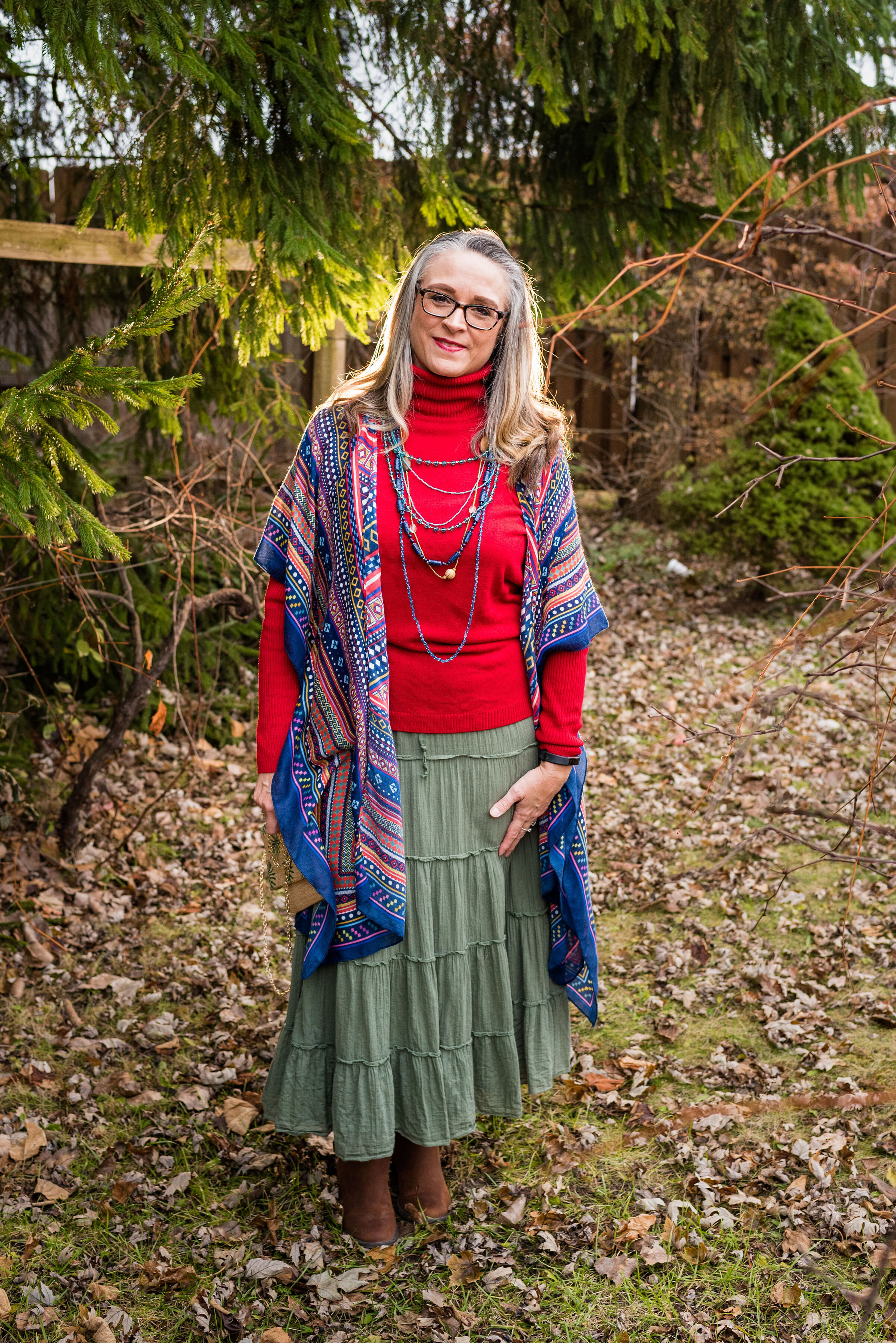
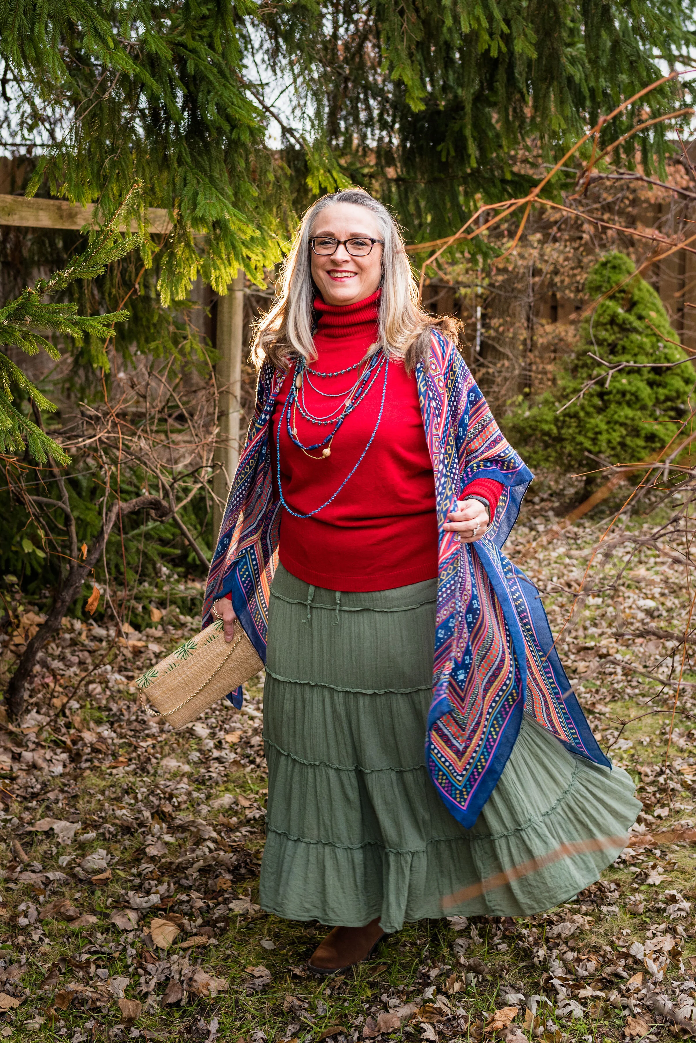
For a song with such an obvious party vibe, I wanted an outfit that was full of color. As you can see, I still kept the more traditional red and green Christmas colors intact, but went for an olive green rather than the true Christmas green. I also added my multi colored kimono and lots of colorful beads.

My kimono was a DSW clearance rack find and is a brand called Do Everything in Love. I styled this piece earlier this year in the Spring 2019 Pantone series. You can see that post here. It is such a fun, colorful piece and I am glad I added it to my wardrobe.

I love a soft turtleneck when the weather is cold, especially if my hair is up in a French braid or a bun. This thrifted one is a brand called Josephine Chaus and is a perfect Christmas red. It really shows off the array of colored beads quite well.

My green tiered skirt is an Old Navy thrift find. For some reason, I have always been drawn to the prairie skirt, or as you saw in my previous post, the prairie dress. The tiered skirt appeals to me as a somewhat casual skirt that offers comfort and ease of wear. I rather like the gypsy vibe of this tiered piece and the green color goes with many other things.

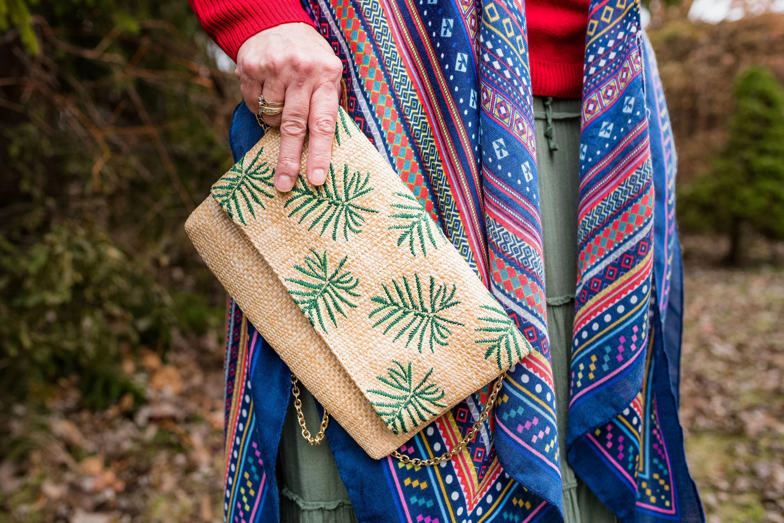
In keeping with the idea of Mexico and warm weather, I added my palm print clutch, which was also a DSW find.

While I wanted the outfit to represent a colorful, Mexican celebration of Christmas, I also wanted to keep it grounded to the reality of a mid-western winter where boots are a must, even if there isn’t snow. Boots are a great way to keep your legs and feet warm and when you are wearing a skirt, that is very important.

I found this pair of simple Sonoma rusty colored boots in the Kohl’s clearance area. Don’t be afraid to rifle through the clearance areas at your favorite stores. Between thrifting and clearance finds I rarely pay full price for any of my clothes. When you are on a budget as tight as ours and you like to shop, that is an absolute must.

I hope you don’t mind that I dragged out my holiday outfit posts. Working more, taking care of my grandson and Christmas gatherings used up most of the energy I had. I hope you all had a wonderful Christmas and will have a lovely New Year. I might try to post a Favorites from 2019 post some time this week, if I can.

I hope you are looking forward to a New Year. Happy celebrations and be safe!

Photo credit Rebecca Trumbull.


Outfit Inspiration - It's the Most Wonderful Time of the Year

Christmas can truly be one of the most wonderful times of the year, but I know it can also be an extremely hard time for people who have gone through loss, are struggling with illness or things like financial strain and relationship stress. Often, the holidays become a mad race to get everything done that we feel we have to do and we end up feeling down and disappointed. Even amidst the struggle and the strains of life, I think we can still see Christmas as a very wonderful time.

Christmas is typically a time we reconnect with loved ones. It can also be a time to do things we find hard to do the rest of the year, like listening to special music, baking, attending holiday parties and other activities like Christmas shopping and gathering with friends. In the church environment there are also special services, kids programs and service activities like caroling and helping at the local food pantries and city missions. Yes, it is a very busy time, but I also believe that the basis for many of these activities is what makes it the most wonderful time of the year.

Serving others and thinking about that special gift we are going to buy for a friend or family member gets us outside our own boxes. It creates in us an others’ centered mentality and it is in that, that we find joy. Not only that, but the basis for Christmas from the very beginning was the unselfish act of an Almighty God, towards His fallen creation.

What I instantly think of when I hear Andy Williams’ It’s the Most Wonderful Time of the Year, are shopping malls and stores all decked out in Christmas garlands and lights while Christmas music plays overhead. It also makes me think of loud family gatherings around the Christmas tree opening presents with laughter and joy.

For this outfit I wanted to look festive, but also like myself. I wasn’t going to see the King, I was going to the mall to shop for my family. Ha, ha.

This wonderful red plaid Requirements blazer was a thrift store find. I just love the treasures I find at thrift stores. I could never have the large wardrobe I do if it weren’t for thrifting. I still shop quite regularly at full price retailers, but I have found some of my most special, unique pieces at thrift stores. Many of them, like this blazer are by brands that no longer exist; the added benefit of thrifting.

The fit and structure of this beautiful jacket is perfect and will definitely get used long past the holiday season. I am excited to try it with various colors and pieces. It is a wool blend, but fully lined so I don’t have to worry about my skin’s aversion to wool.

My black long sleeve embellished snowflake tee was purchased a number of years ago. I believe it is from Kohl’s and is a brand called MCCC Sportswear. You can see holiday sweatshirts from this same brand at Kohl’s by clicking on the link. They also have long sleeve tees here.

You can also see my Believe pin. If you have ever watched Miracle on 34th Street, then you know the significance of the word believe. I have noticed over the last few years, the word believe is popping up everywhere. Whether you believe in Santa, the Spirit of Christmas, the person of Christmas, Jesus Himself, or in yourself, the idea of belief in someone or something is pretty important in our world.

I personally believe in the birth, life, death and resurrection of Jesus Christ and that is what I think of when I see the word believe, but I also love that this idea of belief has become a positive message to all of us, especially young people, who are often told they will never measure up or amount to anything. The beauty and simplicity of the Gospel message is found in this idea of belief. God’s word says,

For the Scripture says, ‘Whoever believes in Him will not be disappointed.’
— Romans 10:11 (NASB)

At first I was going to wear knee high boots, but then I thought the pants didn’t really look right with them, so I opted for this pair of Sonoma booties from Kohl’s. I like the contrast of the gray, black and red with the taupe of the boots and bag. I didn’t bother with any other jewelry since I felt the embellishments on the top and bag, along with the pin, gave the outfit enough punch.

What do you like to wear when you shop? Do you dress up or do you prefer to just go out in your sweats? I’d love to hear your thoughts. What do you think about the word, believe? Is belief something that is important to you? Please leave me some love in the comments.

Here is my favorite version of It’s the Most Wonderful Time of the Year by Andy Williams. I’m not so sure about the music video, but it is colorful. Ha, ha

I’m including a few shopping links of all things plaid, for you to look at. Maybe you still have some Christmas shopping to do and one of these links will inspire you. These are affiliate links, which means if you click on a link, I get a few cents. If you purchase something through one of my links, I might get a little more. Every penny helps.

I hope these posts are inspiring you and bringing back memories of your own childhood Christmases. Have a great weekend and stay healthy for the holidays.

Photo credit Rebecca Trumbull.


Flat Lays in the Flesh - Layering Knits

One of my favorite flat lays from my Fall Trends 2019 series was the one featuring layered knits. I’ve always been a fan of layering, especially in the winter time. I don’t like to feel cold, so laying is the obvious choice here in northwest Ohio. I know it might sound funny, but the other reason I like to layer is so that I can wear more of my clothes at the same time. Ha, ha. When I saw that layering knits was a trend for this fall, I was so excited. Finally, a trend I can really buy into.

Photo by Amy Christensen

Normally, I only layer knits on the top. I don’t typically wear leggings, but would be more likely to do this outfit with a pair of jeans. However, wanting to keep an open mind and use these LuLaRoe leggings my daughter got me, I decided to add them to the mix. Here is the look in the flesh.

This long green sweater is from Christopher and Banks. They are having some good sales on sweaters right now, so check out their website or if you have one near you drop in. This sweater is medium weight and has no closures, so just hang open. I rather like that idea, because then I can wear something underneath and know that it will still be seen.

What you see underneath the sweater this time is my thrifted Merona bear sweatshirt. This is definitely not something you want to wear when you are going to be real active, but if you are sitting around watching a movie at home or want to be comfy when running to the store, this would be a great outfit. Mr. Bear looks a little wrinkly. Ha, ha.

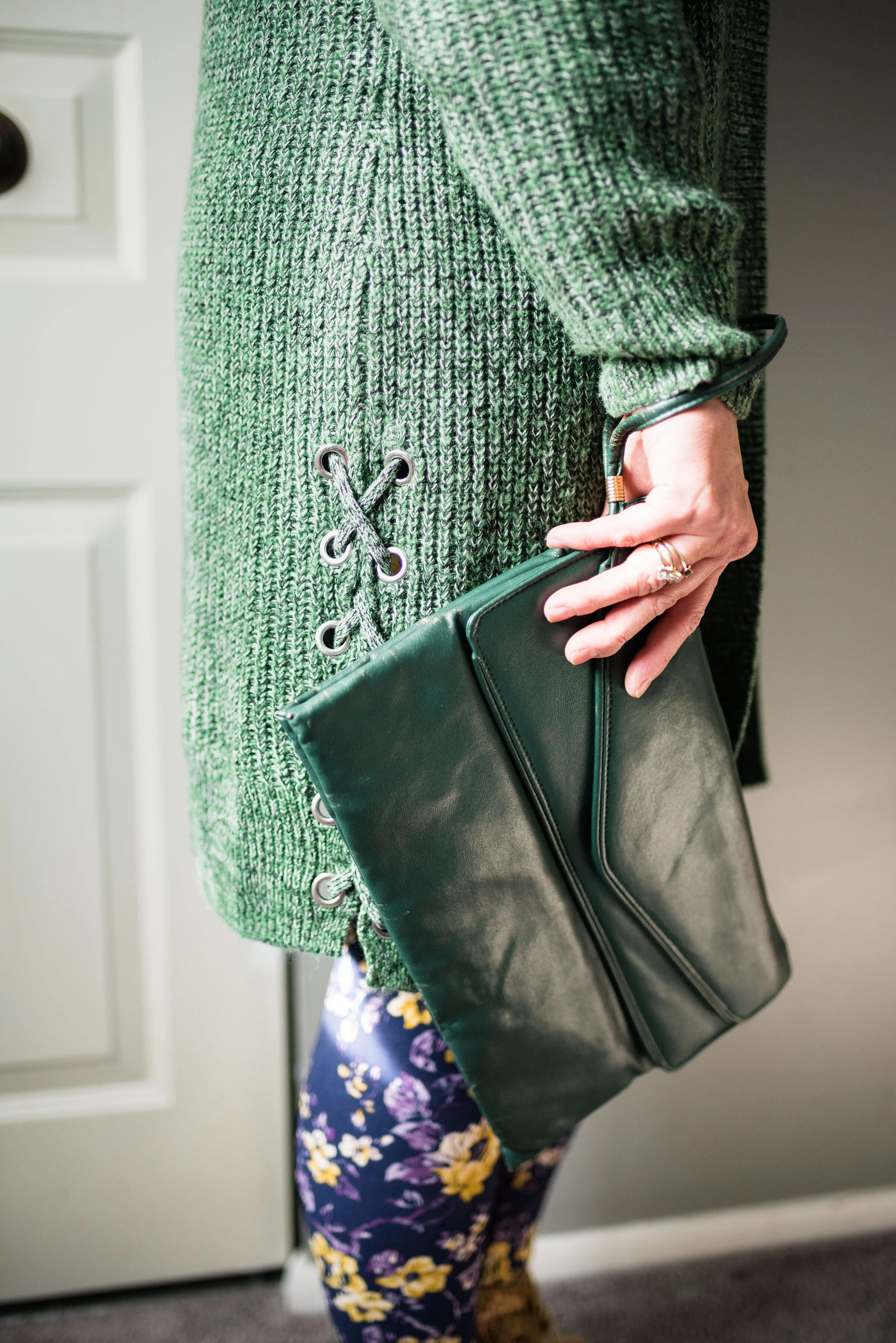
I added the gingham scarf as a way to pull the purples together, making the outfit look a little more cohesive. I added a green envelope clutch and my Rock & Candy by Zigi thrifted boots.

In the picture below, you can see the fun lace detail on the side of the sweater. Little details like those are what draw me to different pieces. It was the same way with the boots. I love the lace overlay giving them a unique texture.

I was a little disappointed with how this outfit looked in the flesh. Part of it might be the leggings. I think I would look better in leggings that were a solid color and preferably a darker color. I feel that these flowers are a little much for my pudgy gams. The other thing I do not like is the volume of the sweatshirt and the sweater together. It makes me look like some sort of pillar. Just being real here and analyzing this. When we think about what we are wearing and what works and what doesn’t we will begin to make better choices about how to put pieces together.

My verdict on this outfit is that it looks better as a flat lay, than in the flesh. What do you think? Please be honest. I love to hear your opinions and ideas.

I hope you all have a great weekend. See you next week.

I’ve included a few shopping links for sweaters. These are affiliate links. All opinions are my own.
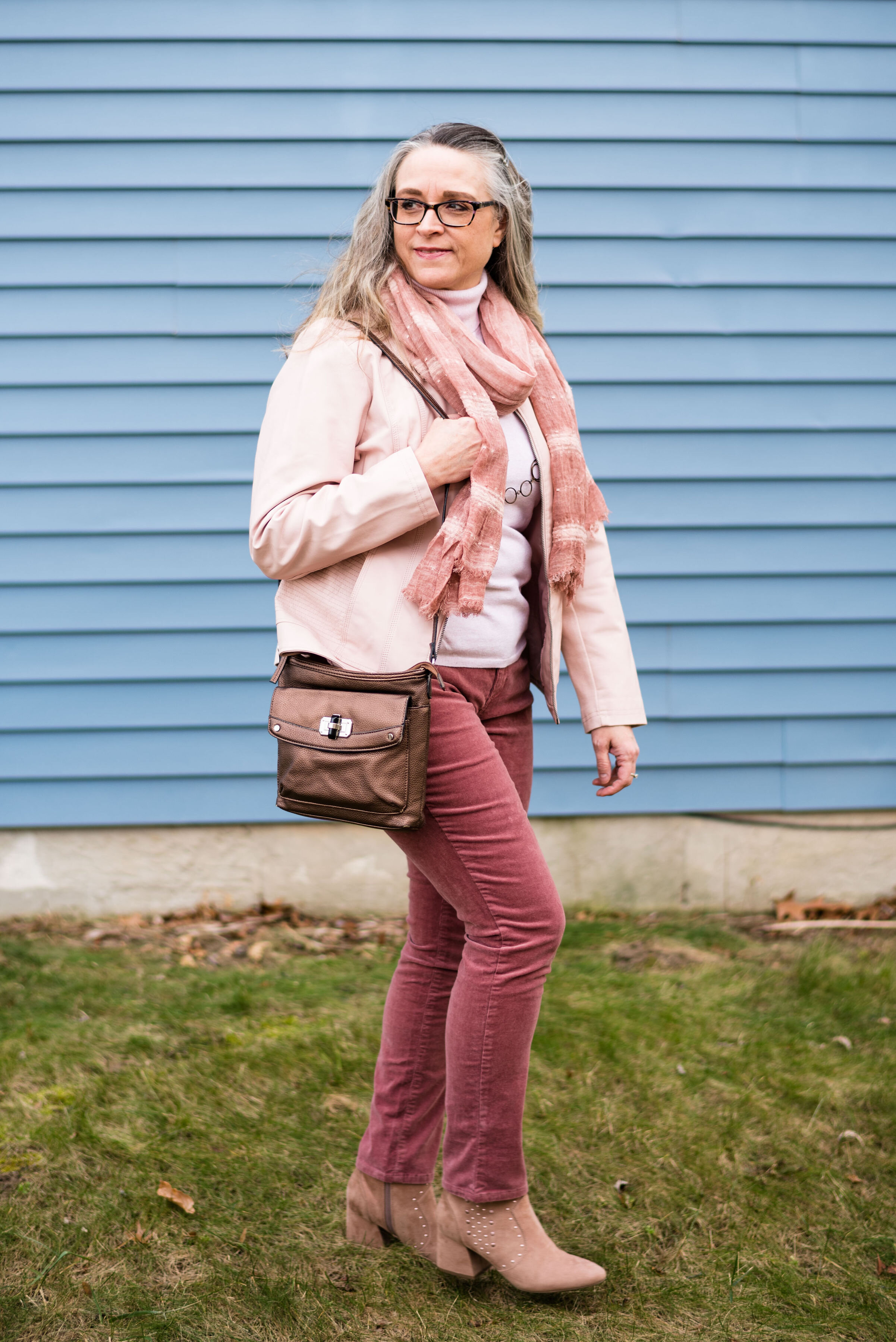
Photo credit (except where noted) Rebecca Trumbull.


Flat Lays in the Flesh - Animal Print

On Thanksgiving I will be starting a holiday series that I think you might find inspirational and interesting. That is all I am saying about that right now, just to whet your appetites. Until then I thought it might be fun to revisit a few of the Fall Trends 2019 that I talked about through the medium of flat lays. If you don’t know what a flat lay is, it is simply a way to show an outfit by laying out the pieces on a flat surface, rather than showing them on a person. I find so many flat lays look amazing, but I am always left wondering, what does the outfit look like on an actual person. I hope you don’t find this too repetitive, but I decided to take four of the flat lays I did for my Fall Trends 2019 series and show you what they look like, in the flesh. Let’s get started.

This first outfit features a snakeskin jacket that I found thrifting last spring. This was the flat lay from the original post, which focused on the fall trend of animal prints.

Photo by Amy D. Christensen

This is what the outfit looks like in the flesh.

It was only about 10 degrees outside and as much as I like to play the tough chick, I decided, forget that nonsense, so my daughter/photographer turned her spare bedroom into a studio. She is so good at being flexible and working with what we have. She does such a great job with natural light. There was no flash in any of these pictures.

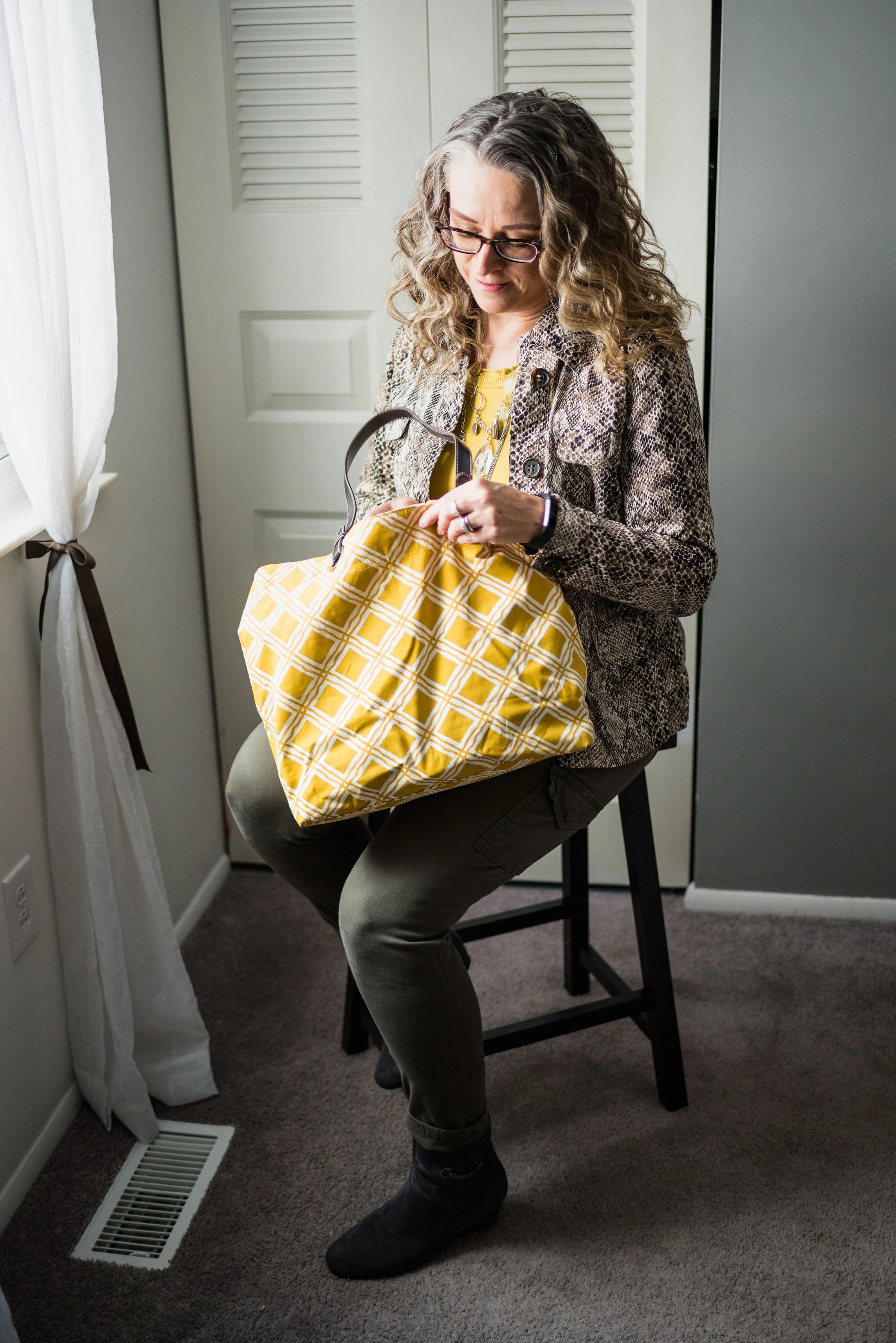
This Liz Claiborne snakeskin jacket has a little bit of stretch to it, making it very easy to move in. I paired it with a thrifted Banana Republic sweater for this outfit, but you could easily swap in other pieces like a button up blouse, a graphic tee or a lighter weight turtleneck for all manner of stylish vibes. A jacket like this is a work horse in your wardrobe and can be dressed up with a skirt or dress and heels; or dressed down with distressed jeans and sneakers.

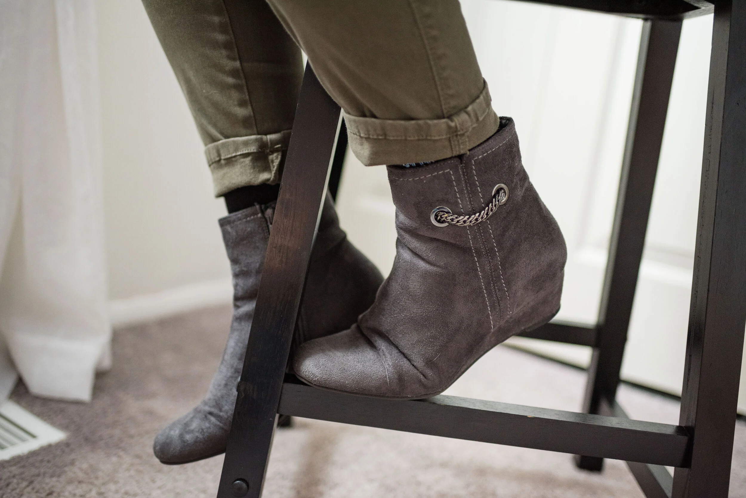
I went for a work wear look, pairing the sweater and jacket with my Gloria Vanderbilt cargo skinnies and my Impo wedge ankle boots.

I chose the yellow tote bag to enhance the sunshiny vibe of the outfit, making this a good combination for a cloudy, fall day. This was another thrifted piece.

I thought layering a few fun necklaces would make for an added statement. In the original flat lay I only had the shorter necklace, but just recently I found the long pendant necklace at JCPenney on the clearance rack. They don’t match, but I think the combination works well against the yellow back drop.

Do you think this flat lay turned out to be a good outfit? Do these pieces work well together? Why or why not? I’d love to hear your thoughts, so leave me a comment or two.

I’m leaving you with a few shopping links for fun animal print pieces. Remember Christmas is coming soon and there might be a person or two on your list, who would love an animal print piece. These are affiliate links, which means if you click on a link, I get a few pennies, and if you purchase something through one of my links I get a few more pennies. Ha, ha. I appreciate every penny I get.

Hope you all have a great weekend and thanks so much for taking the time to stop by the blog.

Photo credit (unless otherwise stated) Rebecca Trumbull.


Pantone - Autumn/Winter - 2019 - London Palette Recap

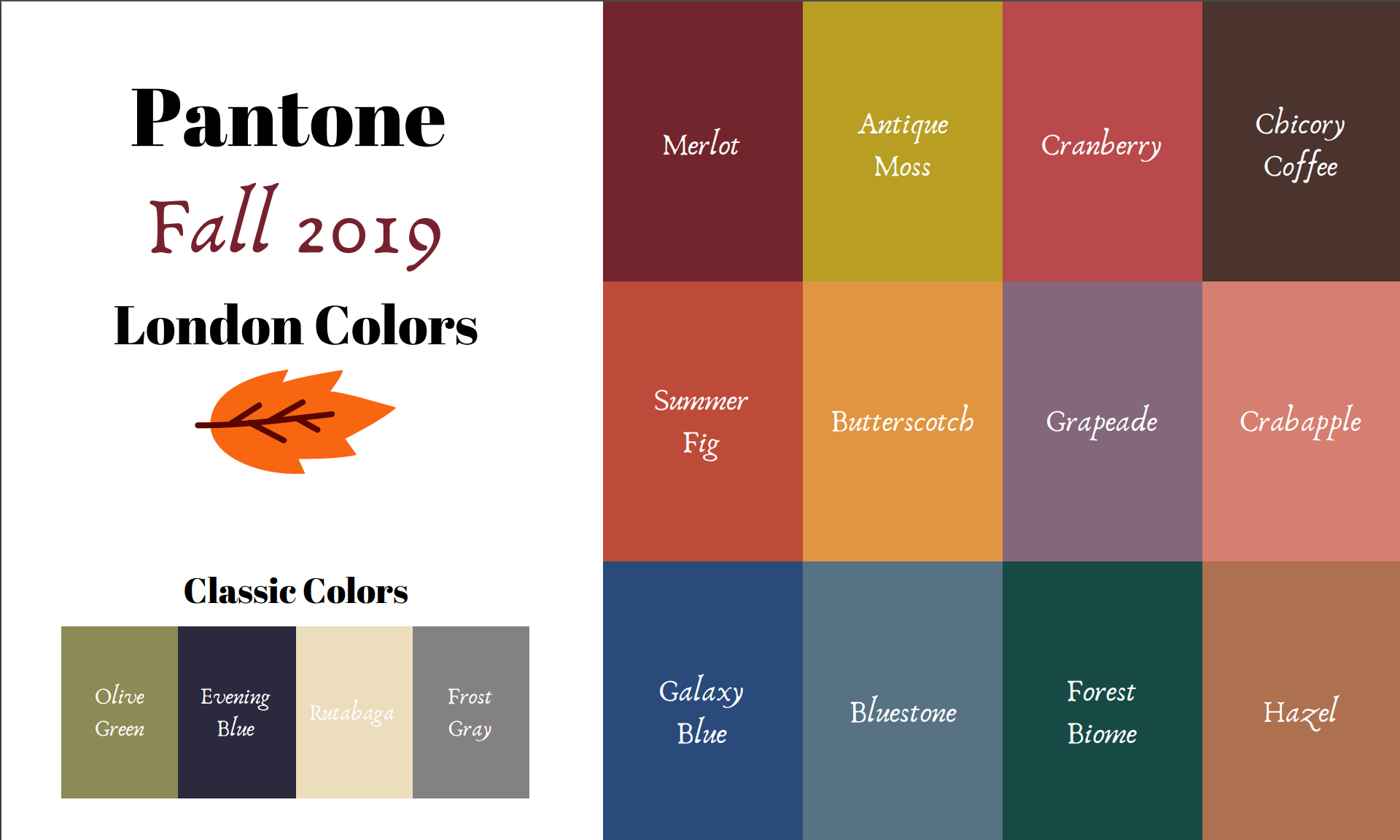
It’s time for a recap of the all the Pantone - Autumn/Winter -2019 - London Palette colors. There were things about these colors that I liked better than the New York Palette, but each of them had colors that I felt comfortable wearing. I’ll explain my favorite from this series after a review of the outfits.

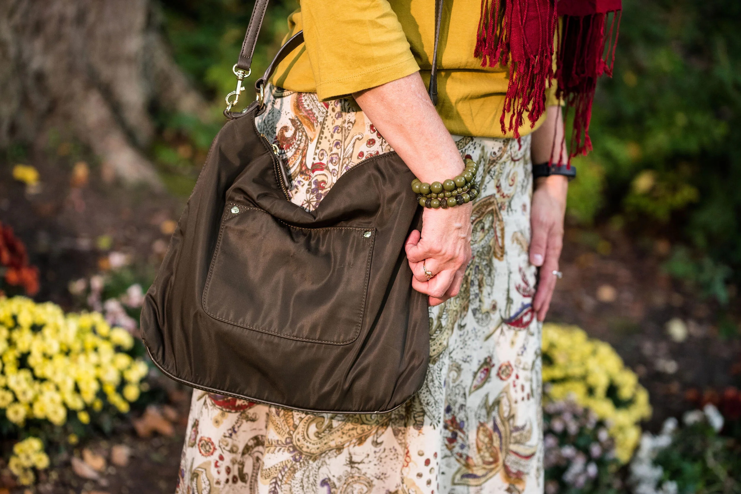
Outfit 1 - Merlot and Antique Moss

Outfit 2 - Cranberry and Chicory Coffee

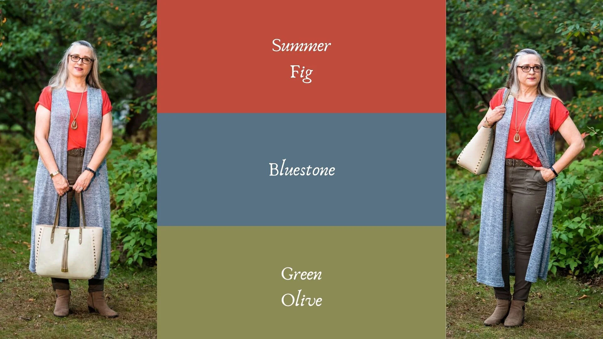
Outfit 3 - Summer Fig and Bluestone

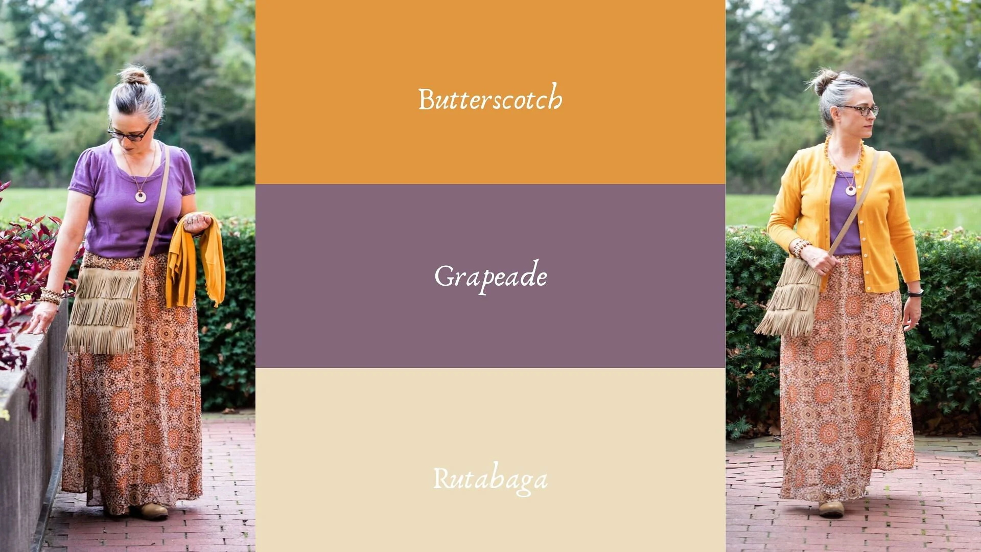
Outfit 4 - Butterscotch and Grapeade

Outfit 5 - Crabapple and Forest Biome

Outfit 6 - Galaxy Blue and Hazel

I am having a hard time picking just one outfit from this series that I liked the best. I really liked Cranberry and Chicory Coffee. I have always been a fan of browns, but I just love the result when it is combined with the medium pinky red of Cranberry. I also like the long line of this outfit and I think the long Rutabaga open front cardi helped with the illusion.

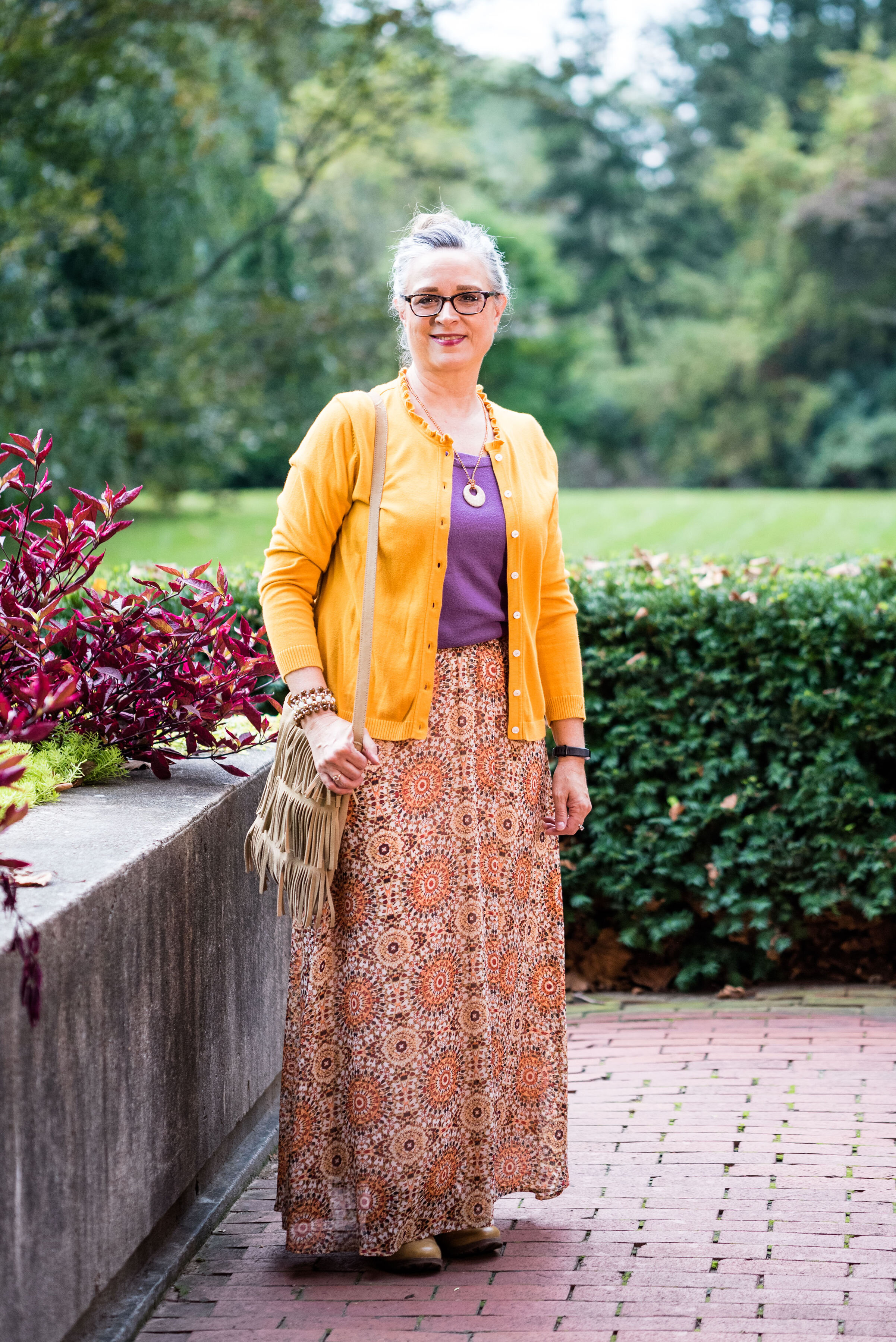
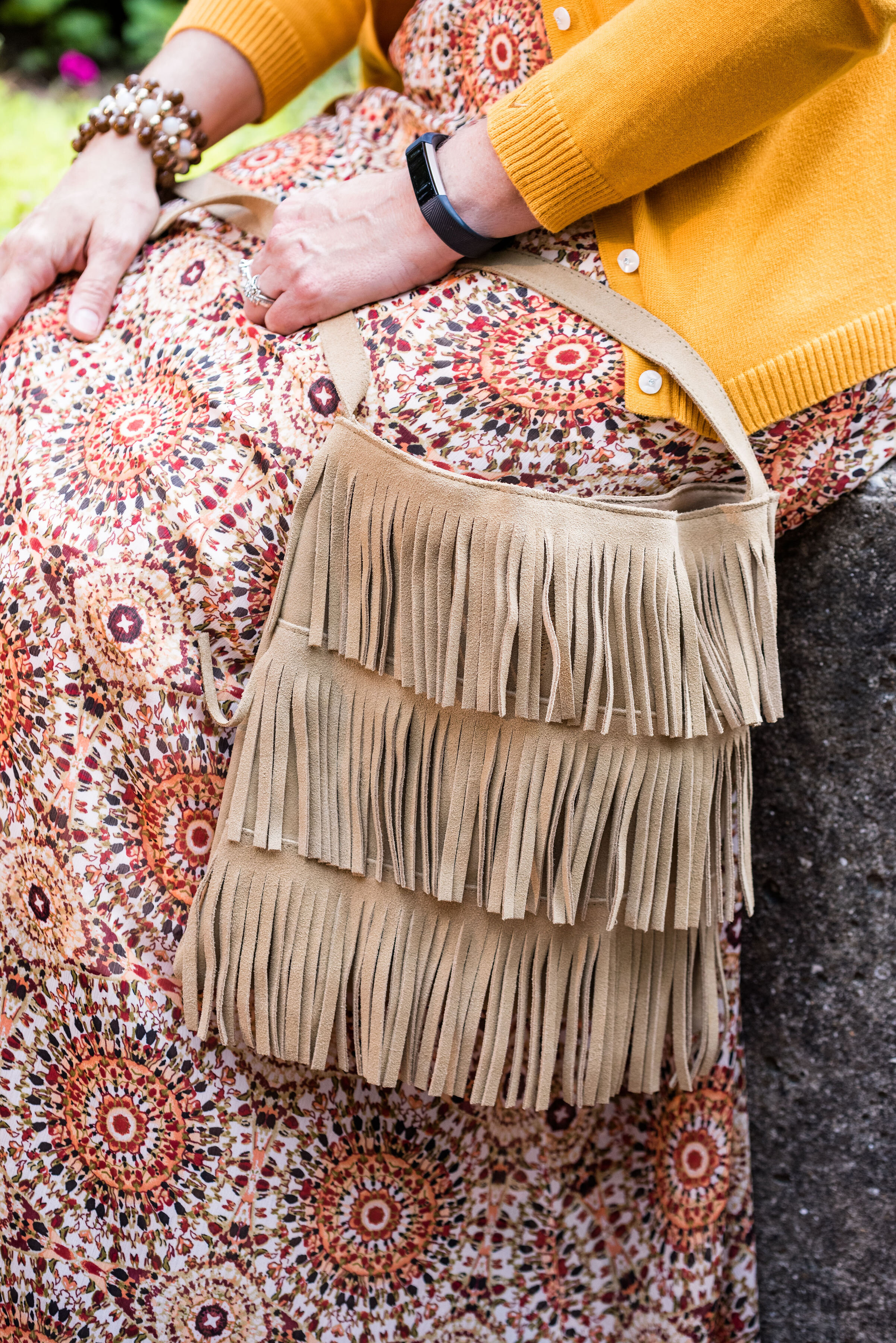
My next fave would be the boho vibe of Butterscotch and Grapeade. If you would have asked me a few years ago if I would wear an outfit with these two colors together, I would have said no way. Yellow and purple? You have to be kidding, but there is something whimsical about this outfit and the color combination is only part of it. The colors are happy and fun, but the print of the skirt, the fringe bag and the fun textured boots really give this outfit its bohemian style.

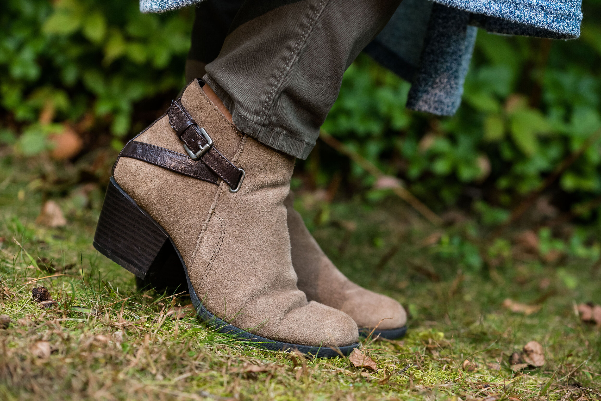
Finally, I really like the last outfit. Even though, I wouldn’t necessarily wear a color like Hazel all on it’s own, I do like the way this color pairs so well with the grays and the blues in outfit. I also like the subtle plaid print mixing. It is obvious, but it doesn’t overwhelm the eye like some print mixing is capable of doing.

Well, I’ve told you my favorites, now tell me yours. I love to hear your feedback.

i hope you enjoyed this Pantone - Autumn/Winter series. If there is anything else you would like to see, with regards to the Pantone Color Institute you can check out their website. Just click on the link.

Have a great Tuesday!

Photo credit Rebecca Trumbull.


Pantone - Autumn/Winter - 2019 - Butterscotch and Grapeade

Today’s outfit features two colors from the London Autumn/Winter palette that Pantone describes as a “deliciously appealing golden yellow” and a “notable muted mauve tone.” You might wonder why I would pair purple with yellow. There was just something about this combination that I loved and when I paired them with the printed maxi skirt, I felt I had a winning outfit. Take a look.

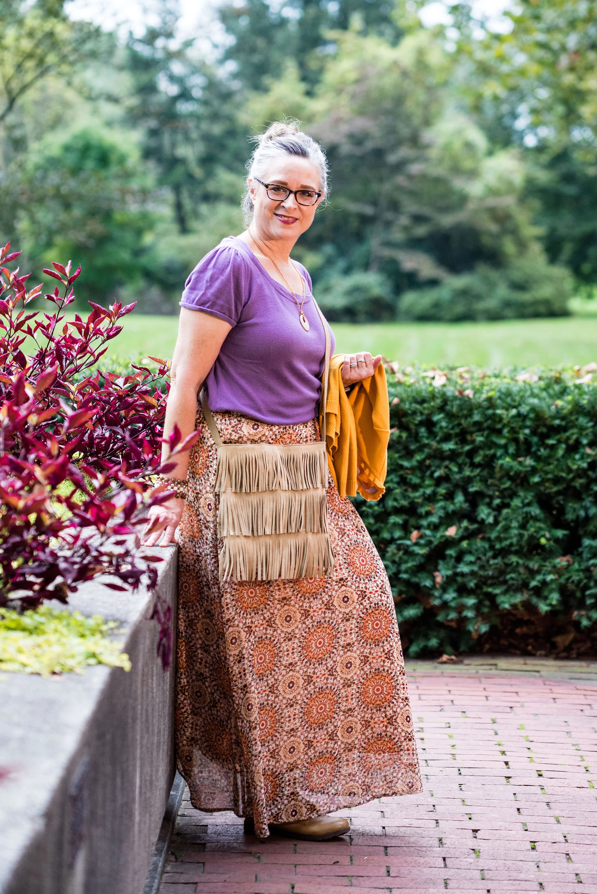
This outfit says several things. First, it says I’m not afraid to try unusual color combinations. Second, it says you can make up your own style. The short sleeve sweater with a cardigan topper is a more classic combination, but the medallion print skirt, beaded jewelry and fringe bag scream boho. Let’s talk details.

The purple short sleeve sweater is a thrifted Loft piece. I like the scoop neck and it has plenty of stretch, but still holds its shape. I also love purple, which is trending this fall.

The Butterscotch thrifted cardigan is a brand called Callaway. When I looked it up, it appears to be a clothing brand for golfing, selling things like polo shirts, pants, jackets and other golf related pieces. The brand also has their own website which features golfing equipment like drivers, putters and bags. Neither my hubby, nor I play golf. He calls it “cow pasture pool.” He’s always got a name for everything. You can see Callaway clothing on Amazon, and on their own website, Callaway Apparel.

I may not be a golfer, but I know a quality sweater when I see one. I love the women’s fit of this cardi and the ruffle treatment around the neckline. It makes the sweater very feminine and fun.

I’ve styled this medallion print Roz & Ali brand skirt on the blog before. I got this at Dressbarn a few years ago. While it is a summer weight skirt, it is fully lined, so good for cooler temps and if you pair it with leggings or heavy tights you could wear it all winter. You can see how I paired the skirt with both an orange tank and a gold top here, and with another lighter purple color here.

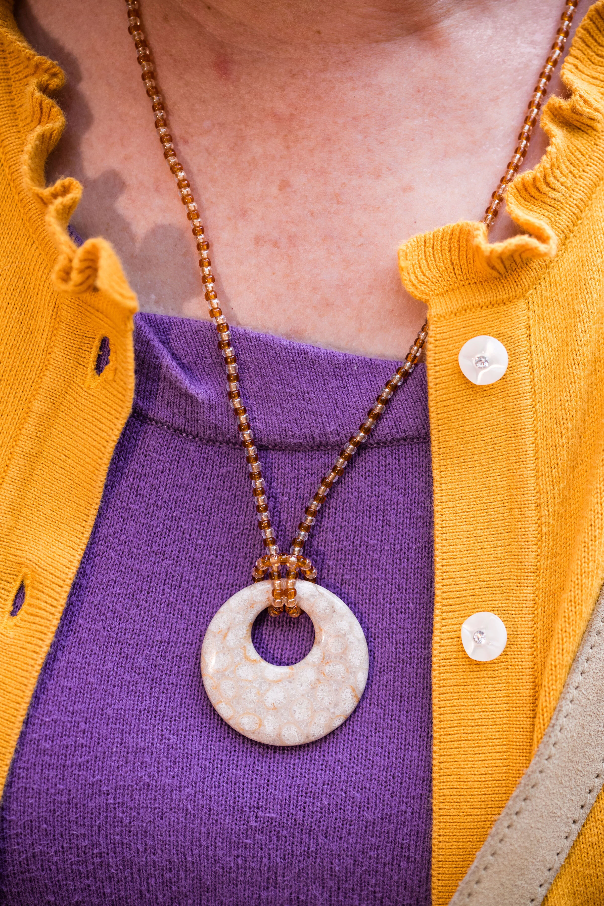
In keeping with the boho feel of the outfit, I went for a hand crafted look with my jewelry and bag. The necklace was actually made by my oldest. She was into beading as a teen and made some fun pieces, of which I still have a few.

This beaded bracelet was probably a Kohl’s or JCPenney piece from the clearance rack. I’ve had it for a while, so I don’t remember.

I found this fringe bag at a thrift store and knew I had to have it. It looks like it was hand made and there is no label inside. I like that it is a neutral color and long enough to be a cross body bag.

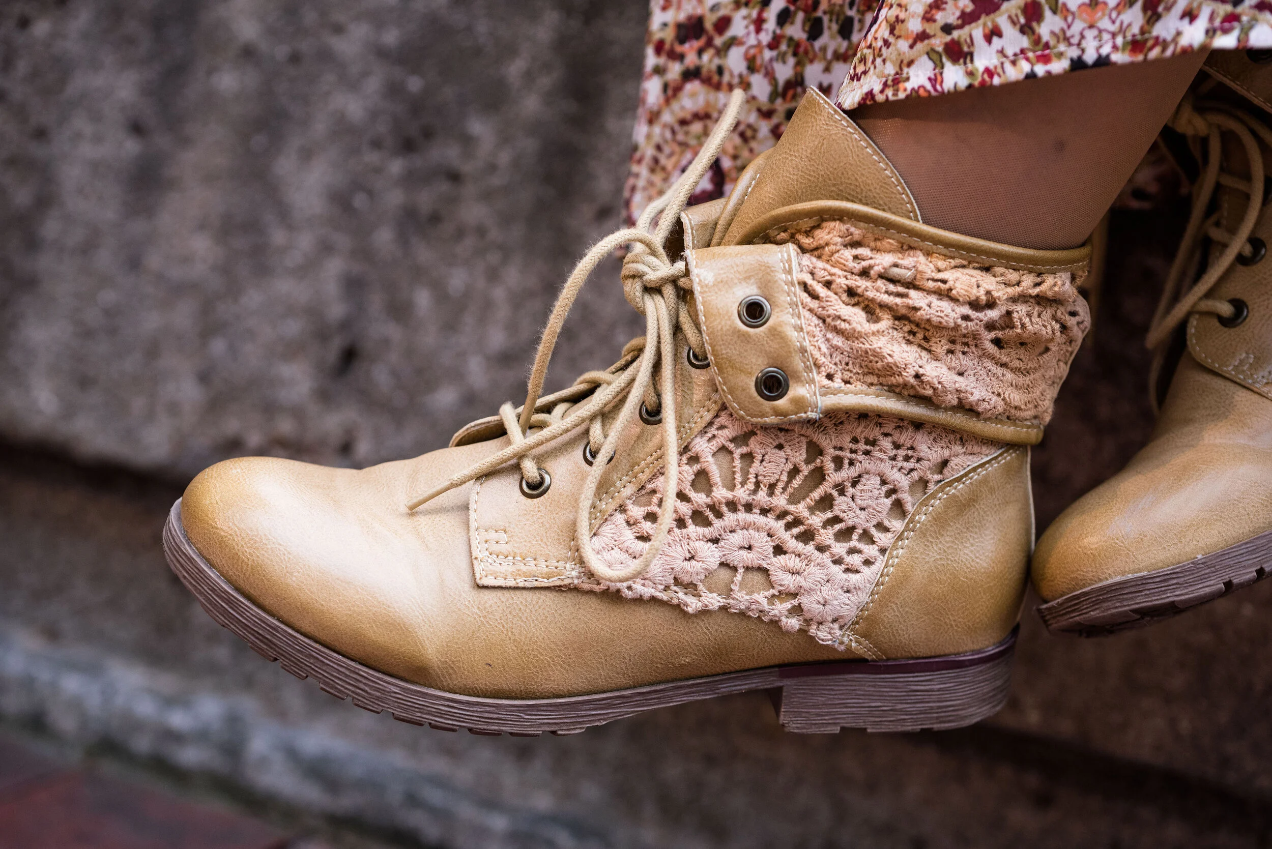
My ankle boots are another thrift store find and I thought paired well with the boho theme of the outfit. These are a brand called Rock Candy by Zigi.

What do you think of these colors? Do you have these in your closet? Would you wear yellow and purple together? I’d love to hear your thoughts. Leave me some love in the comments.

i’m including a few shopping links for things purple and yellow. The holidays are coming up. How many of you have started your Christmas shopping? I’m guilty! Life is so busy, I can’t afford to wait until the last minute. These are affiliate links. All opinions are my own.
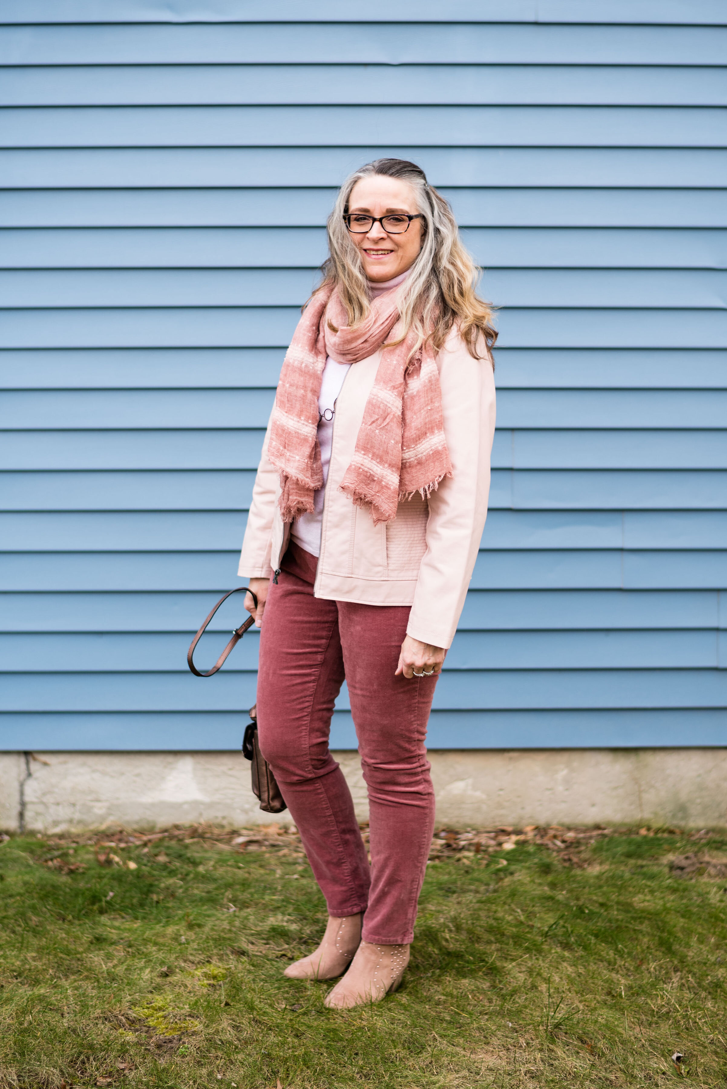
Photo and graphic credit Rebecca Trumbull.


Pantone - Autumn/Winter - 2019 - Summer Fig and Bluestone

You’ll remember from the New York Pantone series the color Bluestone. This is one of only two colors that showed up on both palettes. I’m not sure how the Pantone Color Institute comes up with the colors they choose. Is there a committee? If so who is on the committee? How do they come up with the names for each of the colors? Yes, these are the things a fashion blogger wonders when she is tired and needing a burst of writing motivation. Ha, ha. I am speaking the truth when I say, I had to look up what a fig looked like to understand where they came up with this red color. This red coincides with the bright red interior of the fig fruit. I have never eaten a fig, have you?

This bright red tee is SO brand from Kohl’s. It is a few years old. I find Kohl’s and JCPenney my go to’s for things like short and long sleeve tees.

The Bluestone vest is a LuLaRoe piece. This particular style is called Joy. I like that some clothing companies name each of their styles. Not that I will remember what they are called, but I just think it adds another dimension to a retailer, that they have taken the time and effort to specify a certain line has a name. This is the only vest I have that is this length and I like how it looks in this outfit. The fabric has plenty of stretch, but doesn’t lose its shape.

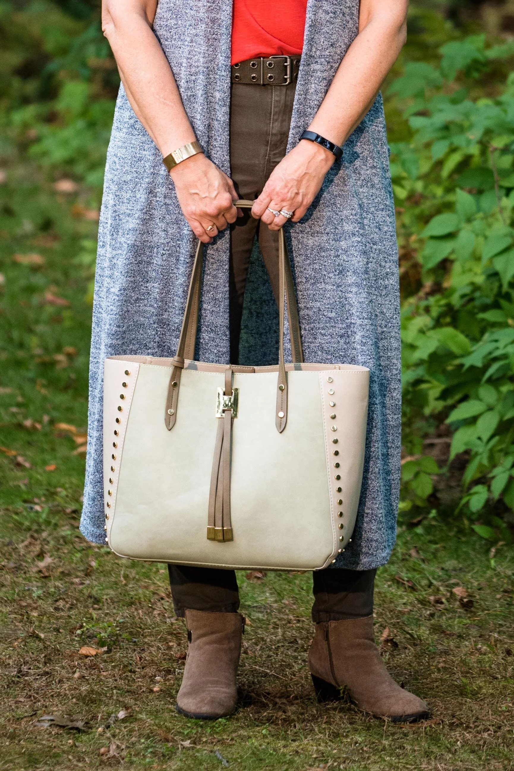
Once again, I turned to the classic color of Olive Green for my pants, bag, and belt. Olive just seems to be an easy color to pair other colors with and it grounds an outfit and keeps it looking chic with a bit of an edge. These utility pants are Gloria Vanderbilt brand and I’ve styled them before on the blog. You can see them styled with an olive utility vest here and in a flat lay with a snakeskin jacket here. I got the tote bag from Charming Charlie a couple years before they went out of business. Belts are so expensive, I usually try to pick them up at thrift stores.

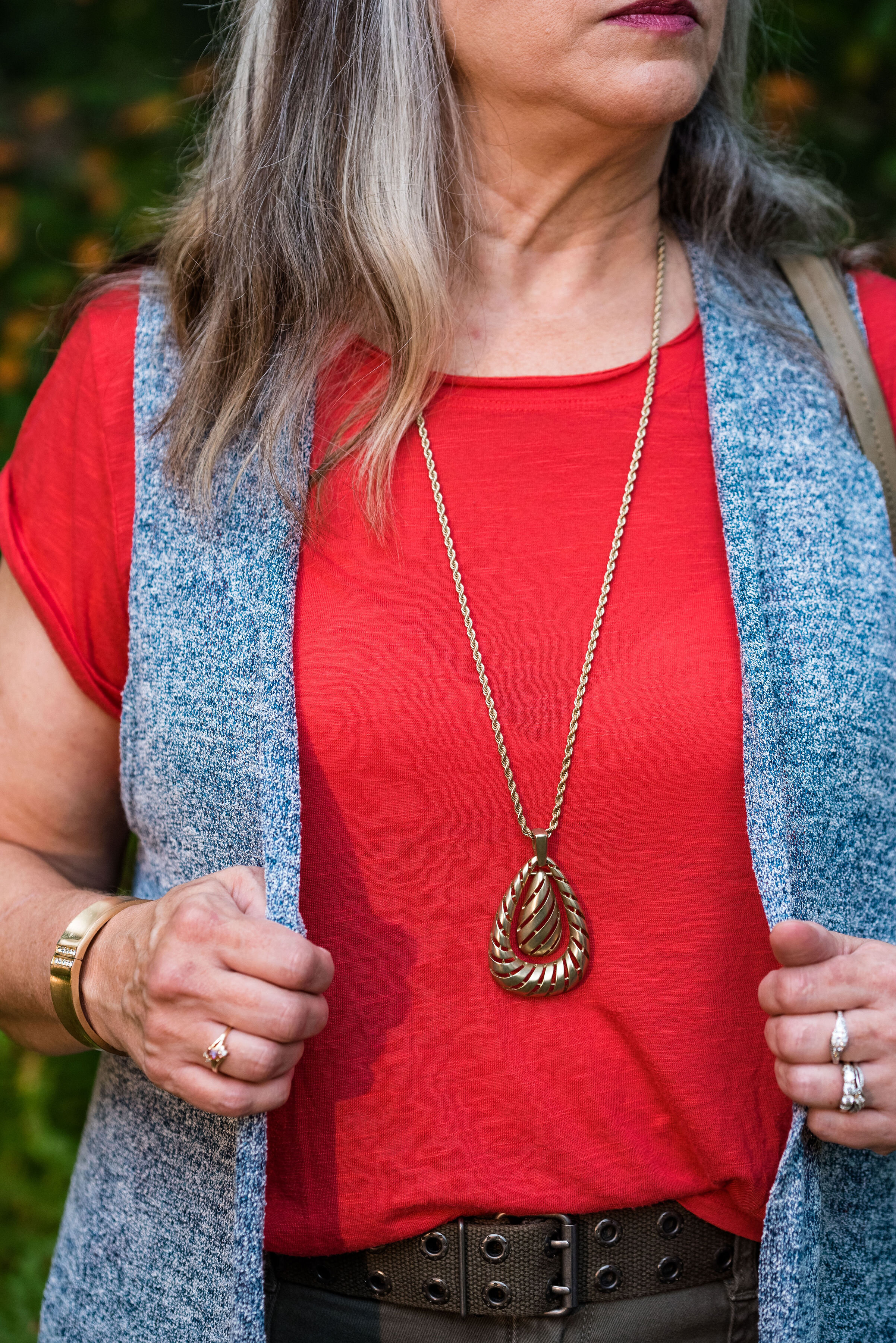
I kept the jewelry simple with a gold pendant necklace and a gold bracelet.

This old pair of Sonoma ankle boots has been with me for a while, but they are the perfect neutral finishing touch and the suede texture is just right for a fall outfit.

What do you think of these colors? They are very similar to the New York palette using Bluestone and Chili Pepper. Do you like to wear vests? Do you have a long one like this? What are some other ways you could style a long vest? I’d love to have your feedback.

I’m including a few shopping links. These are affiliate links. All opinions are my own.

Photo and graphic credit Rebecca Trumbull.


Pantone - Autumn/Winter - 2019 - London Palette - Intro

Past Pantone seasons, I have tried to combine both the New York and the London color palettes into one series. Most of the time there were plenty of overlapping colors, so I was able to take colors from both palettes to make my outfits. This fall there were only two overlapping colors, Galaxy Blue and Bluestone. It was for this reason, that I decided to break the series into two parts. We just finished the New York palette last week. You can see a recap of those outfits here.

Today’s post will introduce you to the London palette and give you a few sneak peeks at the upcoming outfits.

Both the New York and the London palettes included numerous fall yellows, reds and browns. They both included a green, some blues and hues with pink undertones, but the London palette is the only one to include purple, which I thought was interesting since purple is trending right now. Purple has always been one of my favorite colors, so I was excited to see it included on this palette.

In all honesty, I like this palette better than the New York one. I always veer towards richer more saturated colors, rather than pastels and I felt that I had an easier time finding pieces in my wardrobe that better personified the color palette. In this palette we find words like vital, fortifying, robust, delicious, rich, baked, arresting, mellow and distinctive to describe the colors.

I hope you will join me on Thursday as I take a closer look at the London color palette for this fall. Here are a few peeks at what is coming up.

I hope you will join me on Thursday for the start of this series and a look at the first two colors.

Have a great day.

Photo and graphic credit Rebecca Trumbull.


Pantone - Autumn/Winter - 2019 - Peach Pink and Biking Red

These are the last two colors from the Pantone - Autumn/Winter - New York palette. Peach Pink is reminiscent of coral, which never really seemed like a fall color to me, but I must remember that the old rules don’t apply…at least to some things. I know many people buy into the old adage, the rules are meant to be broken, but I don’t always believe that is the best mindset to have, and that mindset trickles down to our children and our grandchildren. As far as rules, I think that many of them are in place for our protection and our benefit. Rules like, look both ways before you cross the street, floss your teeth once a day and eat your fruits and veggies are not bad. Actually, they are for our well being. Rules about color, really no longer apply, so I am okay with wearing white after Labor Day and wearing coral in October. Why not?

The other color in this ensemble is a dark red. It reminds me of the Brick Red from my Crayola Crayon box. How many of you remember those wonderful boxes of crayons? I used to obsess about having all the similar colors arranged by shade in my box. I didn’t want to hunt around for Brick Red, so I put it in the “red” section. Ha, ha.

As you can see, once again, my colors were not perfect matches. You will see I did a little better with the London Palette, which I will be introducing on Thursday.

The heavy gauge sweater is Candies brand from the Koh’s clearance rack at end of last winter’s season. I find this is the best time to shop for those pieces you want for the season, if you don’t want to pay full price. I have found most of my non-thrifted clothing pieces this way.

My Peach Pink tank top was a thrift find from a few years ago. It is Eddie Bauer brand. You’ll be able to see the ruching on the neckline in an upcoming picture.

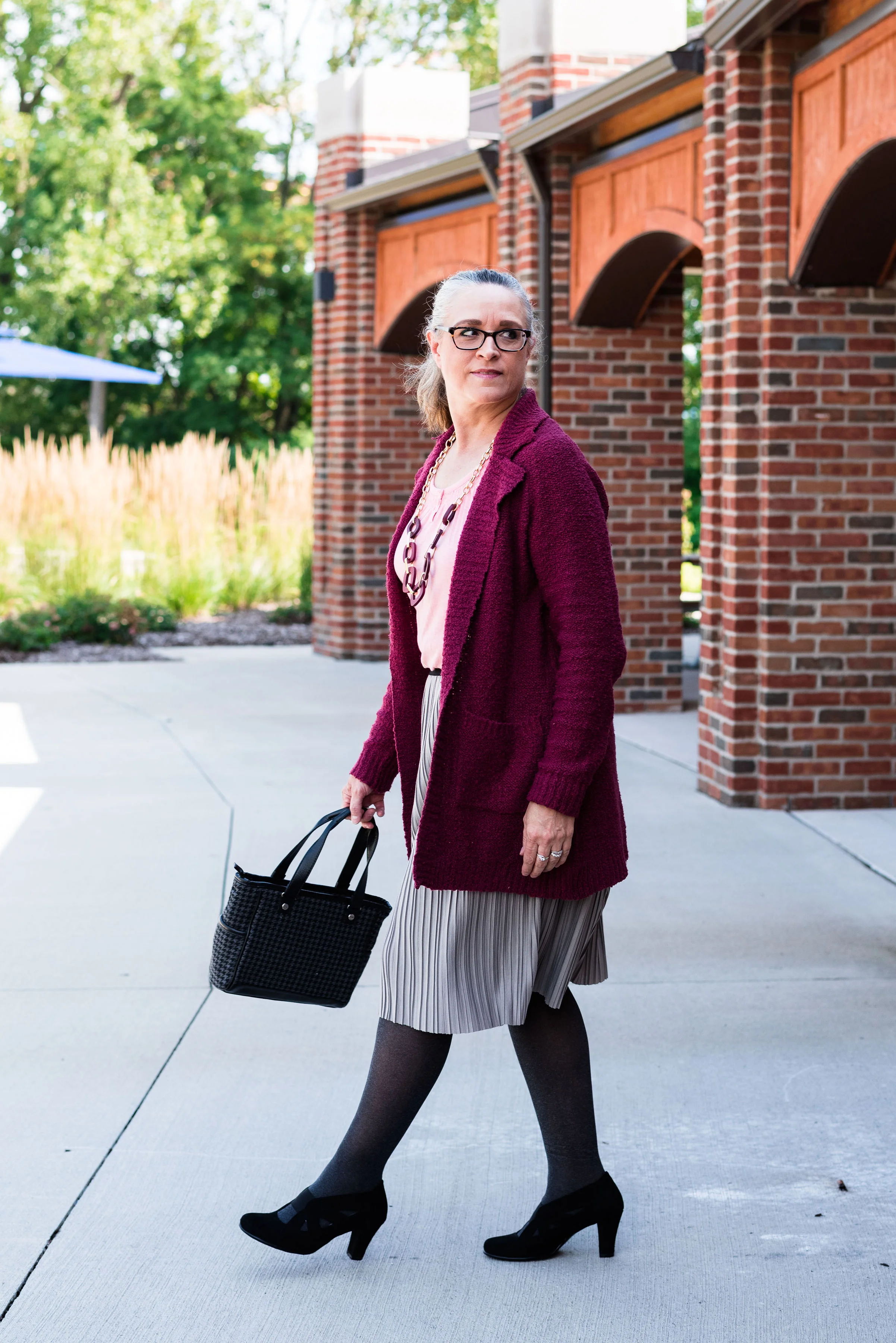
My Paloma gray pleated skirt was also a Kohl’s clearance find a few years ago and is Apt. 9 brand.

My chunky wood ring necklace is making an appearance again. I love this necklace my daughter gave me for Christmas. It is so handy for making a statement and pulling the colors in an outfit together. A necklace like this works much the same way a scarf will, but without the added heat around your neck.

My little thrifted Houndstooth bag works both as a satchel and a cross body. The shoulder strap is inside the bag, but can easily be taken out and attached so I can wear this for hands free activities.

I really like these black Aerosole heels. They are comfortable and stay on my feet with no slipping or sliding. I decided to add the dark tights at the last minute for two reasons. The first was to keep the leg more monochrome and thus make the legs look longer. The other was to make the outfit seem more ready for fall weather. The day we took these pics it was hot!

What do you think of this outfit? Is this something you would wear? Do you like these Pantone colors? Why or why not? I’d love to hear from you, so leave a comment or two.

I’ve included a few shopping links. These are affiliate links. All opinions are my own.
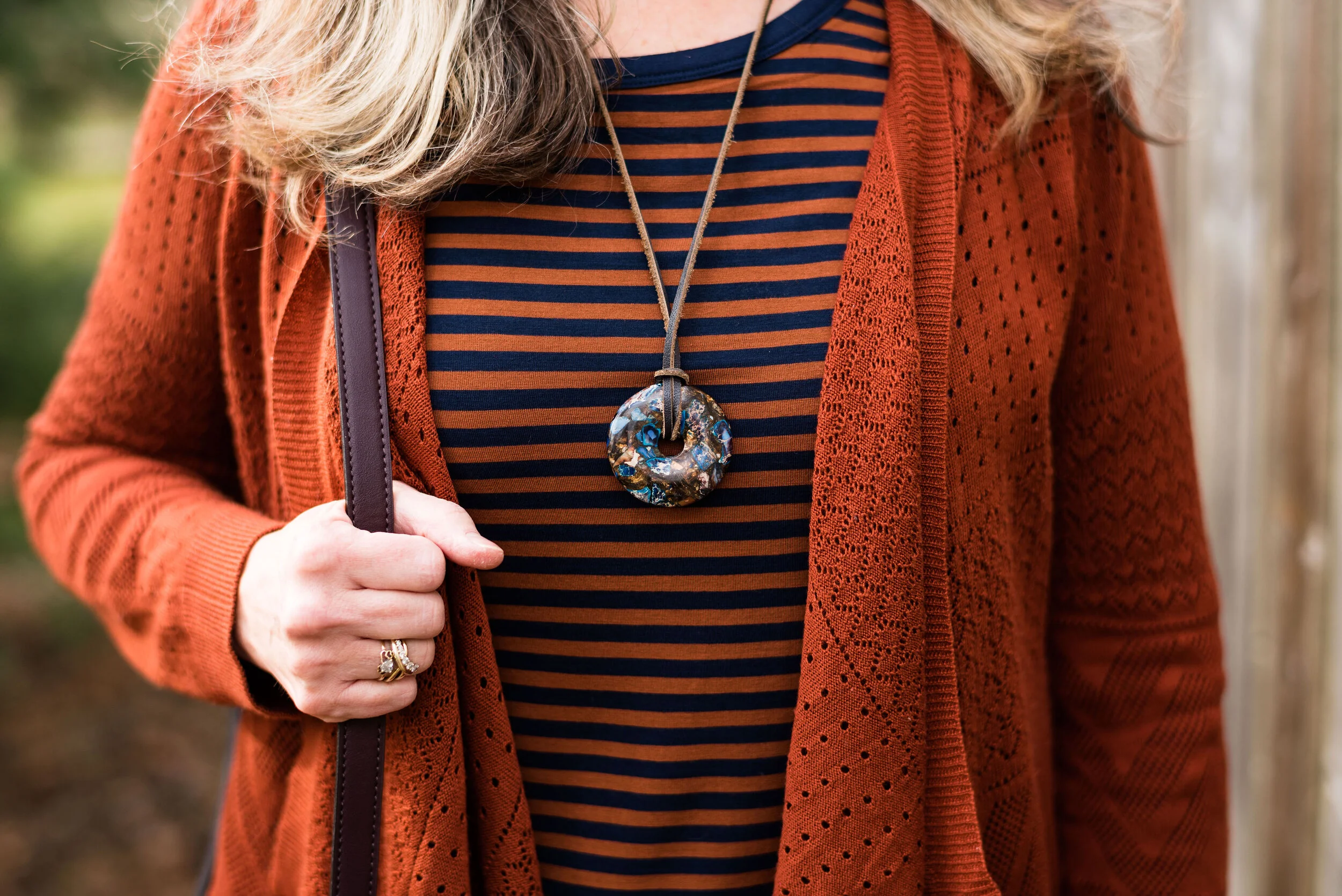
Photo and graphic credit, Rebecca Trumbull.

Have a great day.

Pantone - Autumn/Winter - 2019 - Orange Tiger and Eden

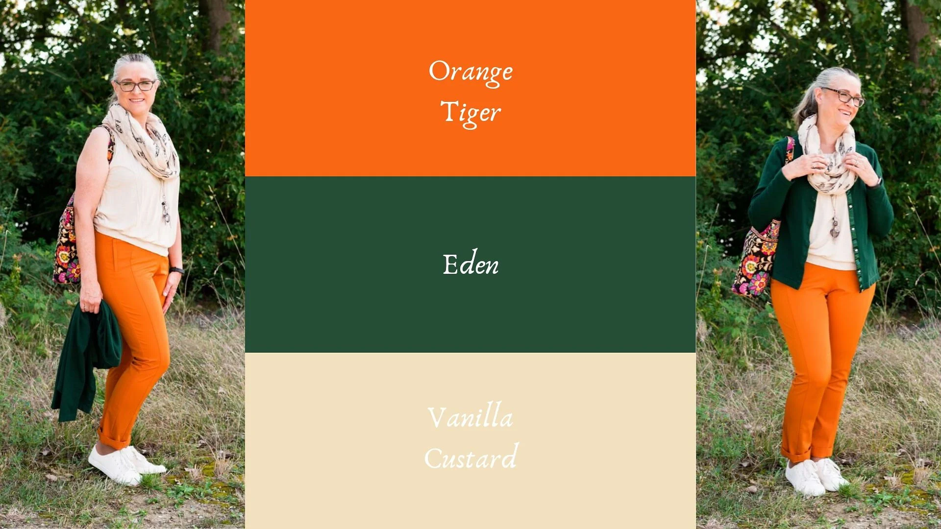
I mentioned in Tuesday’s post on Sugar Almond and Dark Cheddar, that not everyone can or wants to wear orange. I love orange, but it has to be the right shade for me to wear it near my face. Some oranges make me look sallow or washed out. Today’s colors are bold and what caused me to put these two colors together, was the contrast of dark with light, deep with bright. Today’s colors are a “fearless” Tiger Orange, and a rich “stately forest green” called Eden. I think Pantone’s description of these colors is perfect.

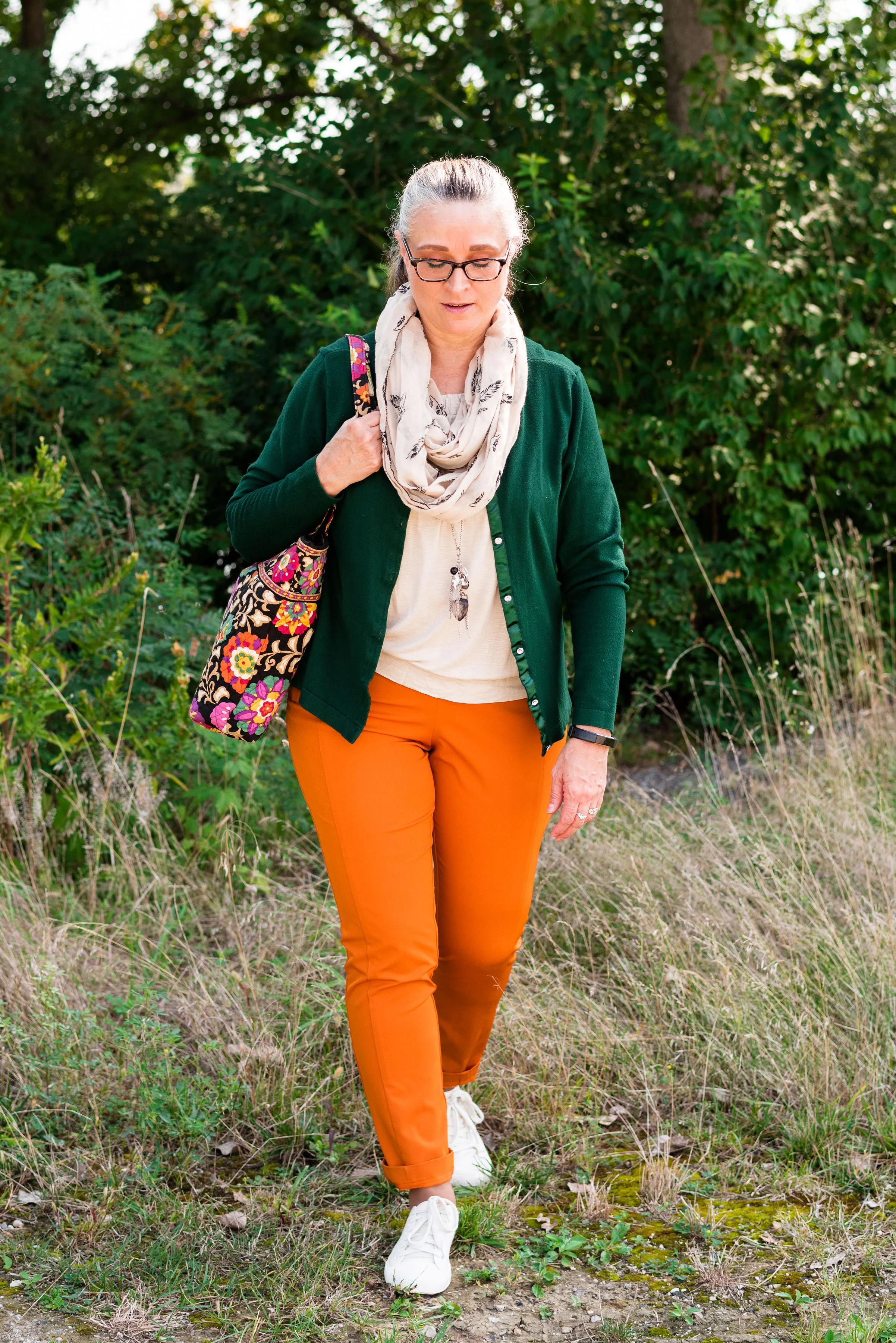
These two colors are the first in this series that I felt truly matched with the Pantone colors. I looked for a while in thrift stores for the perfect green and I really think this dark cardi nailed it. the sweater is Jaclyn Smith brand.

These bright orange pants are Worthington brand and I got them at JC Penney a number of years ago. These are more of a skinny leg trouser than a wide leg trouser. I got them for the bright color and do find occasions in the spring, summer and fall to wear them. You can see how I styled these with a floral tunic here.

This cream colored tank top is a thrifted Loft piece. I actually have two of them, found on different occasions, but the exact same style. This one is a large and has a sheen to it, that you can’t really see in the picture. The other one I have is a medium and is more of a true white. Why do I need two of these? Comfort and ease of wear. They work perfectly for something like this, but I will also be able to use them as a light weight under layer when the temps grow cold. The piece is banded on the bottom, making for a great fit without showing off the bulges. Here are a few to look at.

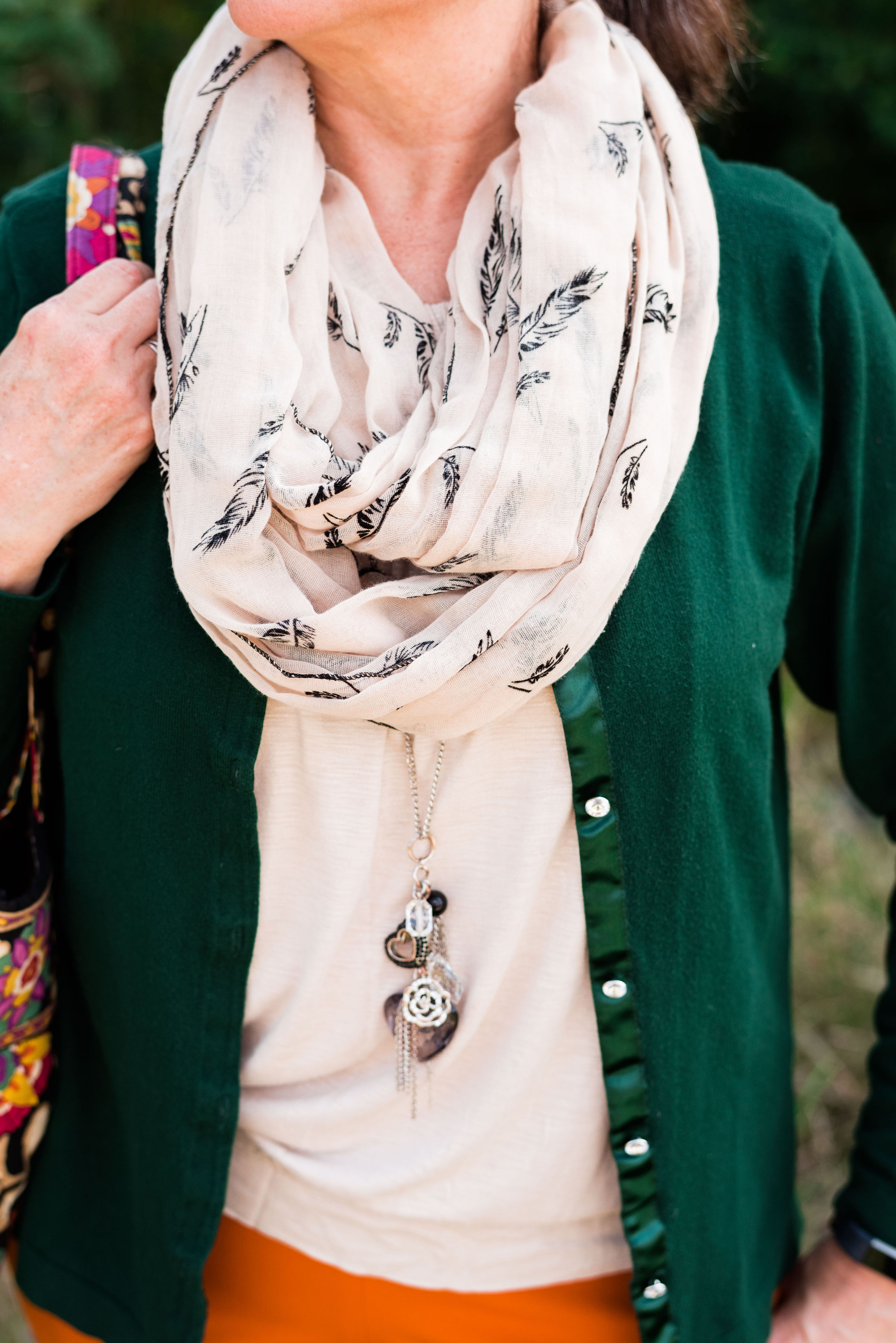
The scarf I added was another thrifted piece. I don’t have many pieces that are cream or ivory, like this. I am also looking for a cream fisherman sweater and/or turtleneck. I don’t need anything, because I am a clothes horse, but every now and then, I do realize I am lacking something I would love to incorporate into my closet. What about you? What pieces have you been hoping to add to your closet?

In addition to the scarf I wanted to add a long charm pendant necklace to break up the plain back drop of the tank. I think this outfit would have been equally good with a printed tank under the sweater.

My other accessories included my Vera Bradley tote bag and my thrifted Mossimo sneakers.

What did you think of this outfit? Would you wear a pair of bright orange pants like this? What is the brightest color you have ever worn in pants or a skirt? I’d love to hear you thoughts, so leave me some love in the comments.

I’ve included a few shopping links. These are affiliate links. All opinions are my own.

Photo and graphic credit Rebecca Trumbull.

Have a great weekend, everyone!


Pantone - Autumn/Winter - 2019 - Sugar Almond and Dark Cheddar

Today’s colors, in my opinion are the epitome of fall. The browns and oranges remind me of pumpkins and firewood stacked as it waits to be used. Red’s and yellows are other bright colors associated with this season and we will be seeing more of those in the London color palette, which will be coming up shortly. Let’s take a closer look at Sugar Almond and Dark Cheddar.

This thrifted, Sonoma, chevron print, dress caught my eye a few months ago and I knew it would be perfect for fall. Originally, I was going to used the waterfall cardi for the Sugar Almond color, but I actually think the colors in the dress are more suited to both of these Pantone colors.

Since I don’t normally wear dresses this short, I thought it would be fun to pair it with cropped pants. This pair of St. John’s Bay, creamy colored pants were another thrift store find. I almost didn’t get them, because I thought they were a little tight, but then, what isn’t on me right now. Ha, ha. However, I ‘m glad I put them in my cart. I think they make a cute addition to this dress. I want to try them with boots, when the weather gets colder. I might even try this dress with a chunky sweater, tights or leggings and boots. If I have success with that, I’ll post pictures either on Instagram, or I’ll do a post about it.

You can see in the above picture, the dress has a partial button front and an elastic waist. Wearing a belt with this would be another fashion forward idea, but I wanted an uninterrupted look from collar to hem, especially since I chose to wear this with cropped pants.

Let’s take just a moment to talk about the rule of thirds. The rule of thirds is a photography guideline that suggests mentally dividing your picture into thirds, horizontally and vertically. You then place the image you wish to photograph at the intersection of two lines. This can make for a more interesting picture, that draws the eye to the image.

Fashion also has a rule of thirds. The body is divided into thirds: head to waist, waist to knees and knees to feet. This is an approximation and as we all know, some people have longer necks, shorter torsos and longer legs, so each individual will be a little different. This rule is good to be aware of when putting together an outfit.

If you look at the above picture, the dress would be considered in the first two thirds of my body and the crop pants and shoes in the last third. Take a look at this article to learn more about the rule of thirds in fashion, and why it helps to keep it in mind when you dress. Dressing Your Best: Rule of Thirds.

This Pink Rose, waterfall cardi is another thrift find. I love the open weave, and as you can see, it also has the chevron pattern on it. I did not plan that. Ha, ha. I just thought the color went perfectly with the colors in the dress. This is a great piece for these fall days that are still warm.

For accessories, I went with a coppery bag and my thrifted Naturalizer shooties. I also added the pendant bead necklace as a way to bring out the cream in the dress and tie in the pants. Accessories are the best way to pull an entire outfit together and make it look finished.

What do you think of these colors? Do you wear orange? Orange is often an intimidating color to wear, but there are so many different shades and tones that there is probably one out there you could wear. Would you wear crop pants with a dress like this? Let me know your thoughts. I love to hear from you.

Be sure to check back Thursday for two more Pantone colors.

Photo and graphic credit Rebecca Trumbull.

I’ve included a few shopping links for you to look at. These are affiliate links. Any time you click on a link, I get a few pennies. If you purchase something through my links, I get a a small commission. I appreciate all your support and all opinions are my own.
Have a great week.

Pantone - Autumn/Winter - 2019 - Crème de Pêche and Rocky Road

I am not sure how the Pantone Color Institute decides the colors they are going to feature for each of their palettes. If you have been following me for a few years now, you can probably tell that many of the colors that appear on the palette are very similar to another season’s palette and are just called a different name. For example Tuesday’s Galaxy Blue was very similar to last spring’s Princess Blue.

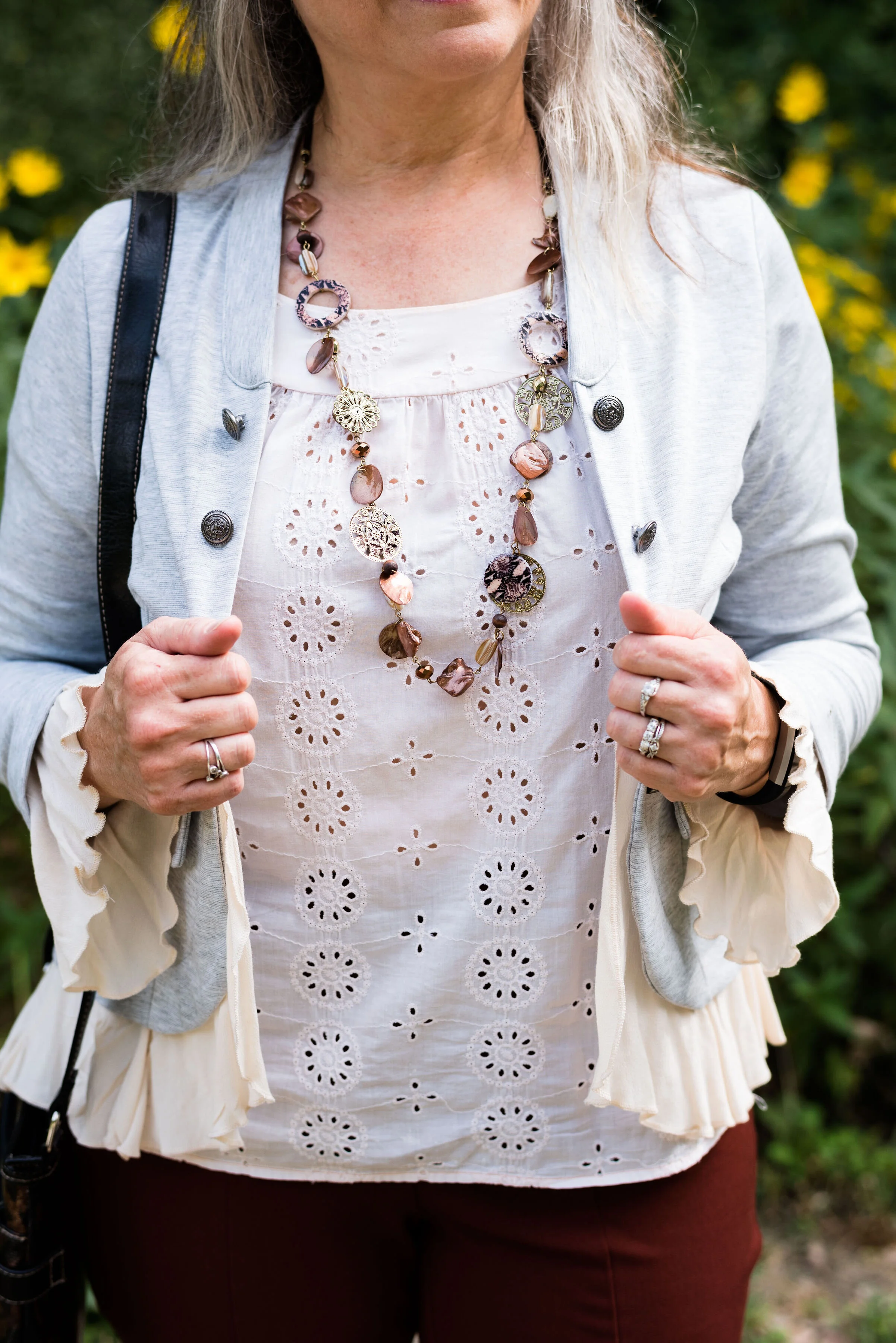
Today’s outfit features two colors called Crème de Pêche and Rocky Road. Once again, my versions of the colors, do not look much like the Pantone colors, but it still gives us inspiration to pair to fall type colors together and pull it all together with a light gray.

My Chico pants look much more orange in comparison to the Pantone color swatch, but I do like how this pair of pull on Ponte knit pants looks combined with the light peach top.

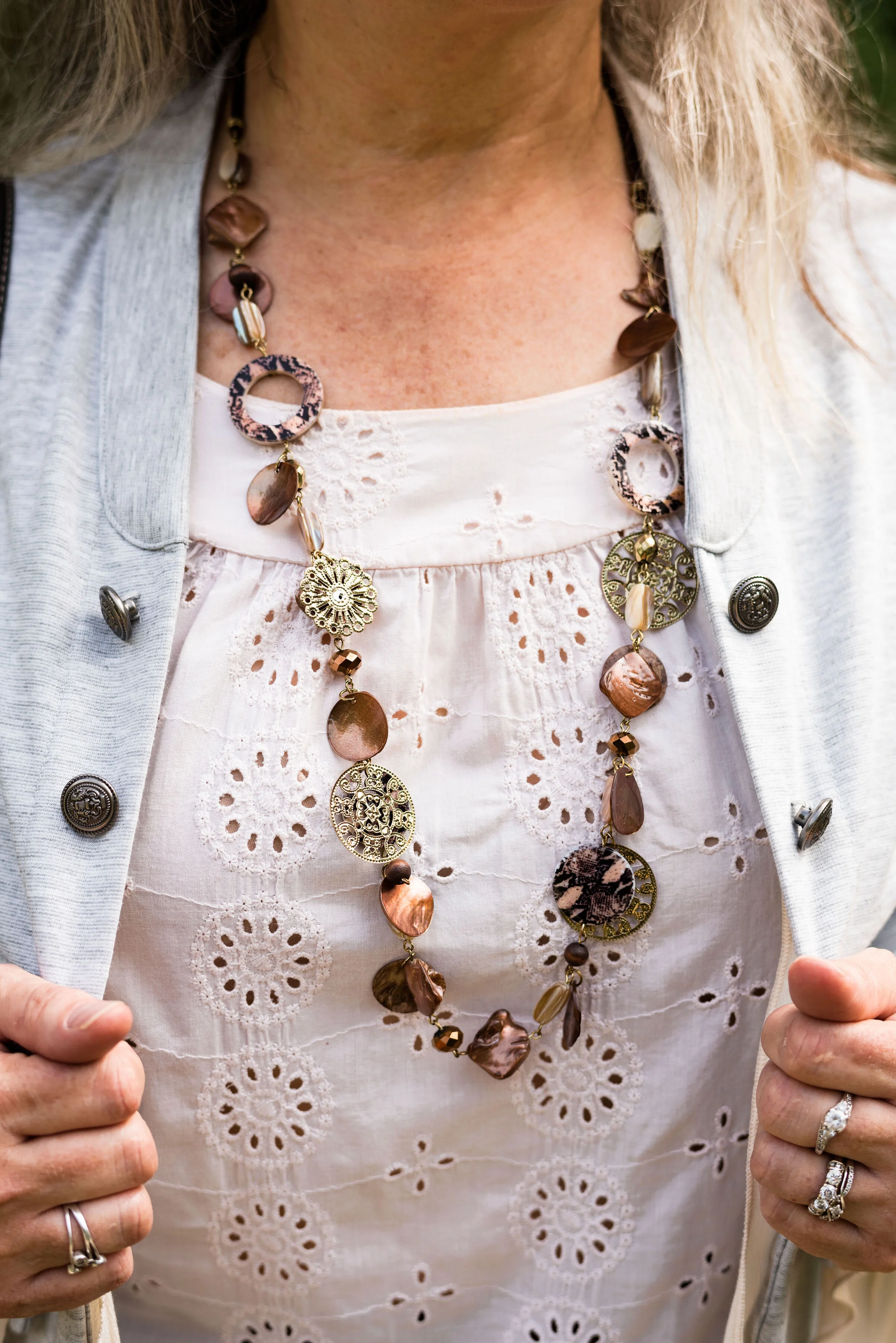
The light peach eyelet top was a thrift find and I wear it a lot in the warmer months. You can see a closer look at that and the necklace I chose in the picture below. I thought the necklace was a good compliment because of its similar colors.

This light gray, About A Girl, jacket was a fun find on the Kohl’s clearance rack. I like the military vibe of the buttons, but the surprising feminine detail of the ruffles on the hem and sleeves.

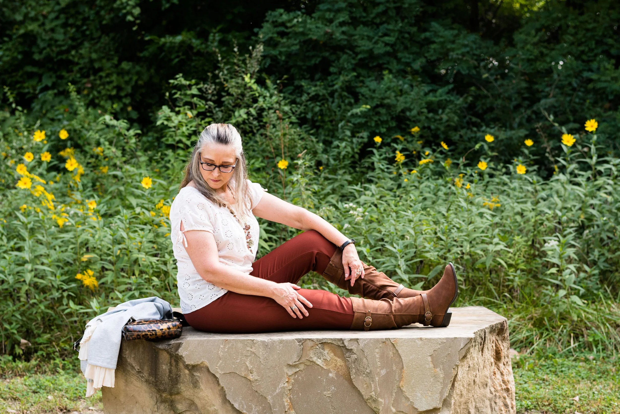
Another Kohl’s clearance find, I got these Sonoma boots at the end of last winter season. They are a faux suede and a different look that some of my others boots. I love the slouchy and buckle details. Yes, I do have too many pairs of boots, but can a woman who lives in the midwest, have too many? Ha, ha.
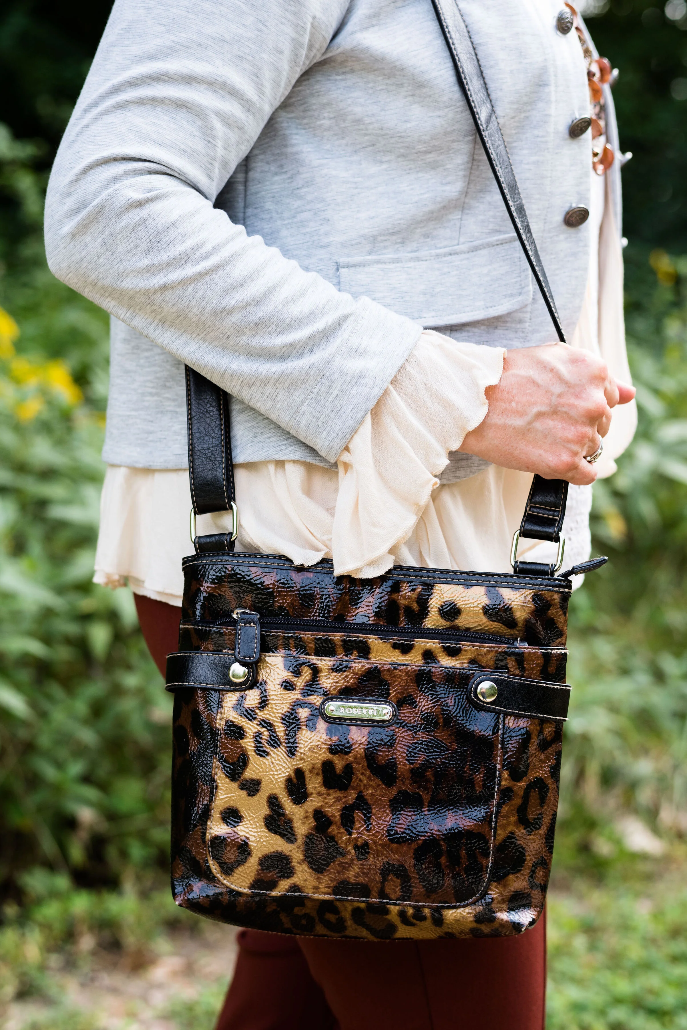
Here is the thrifted Rosetti leopard cross body again. I am planning on making this my “normal” every day bag, as soon as I get around to changing things over. How many of you change your purse on a regular basis? I have many more purses and bags than I actually use. I use them for the blog, so you can see the different styles and shapes, but more often than not, I carry a cross body bag like this. It is just so convenient for hands free shopping.
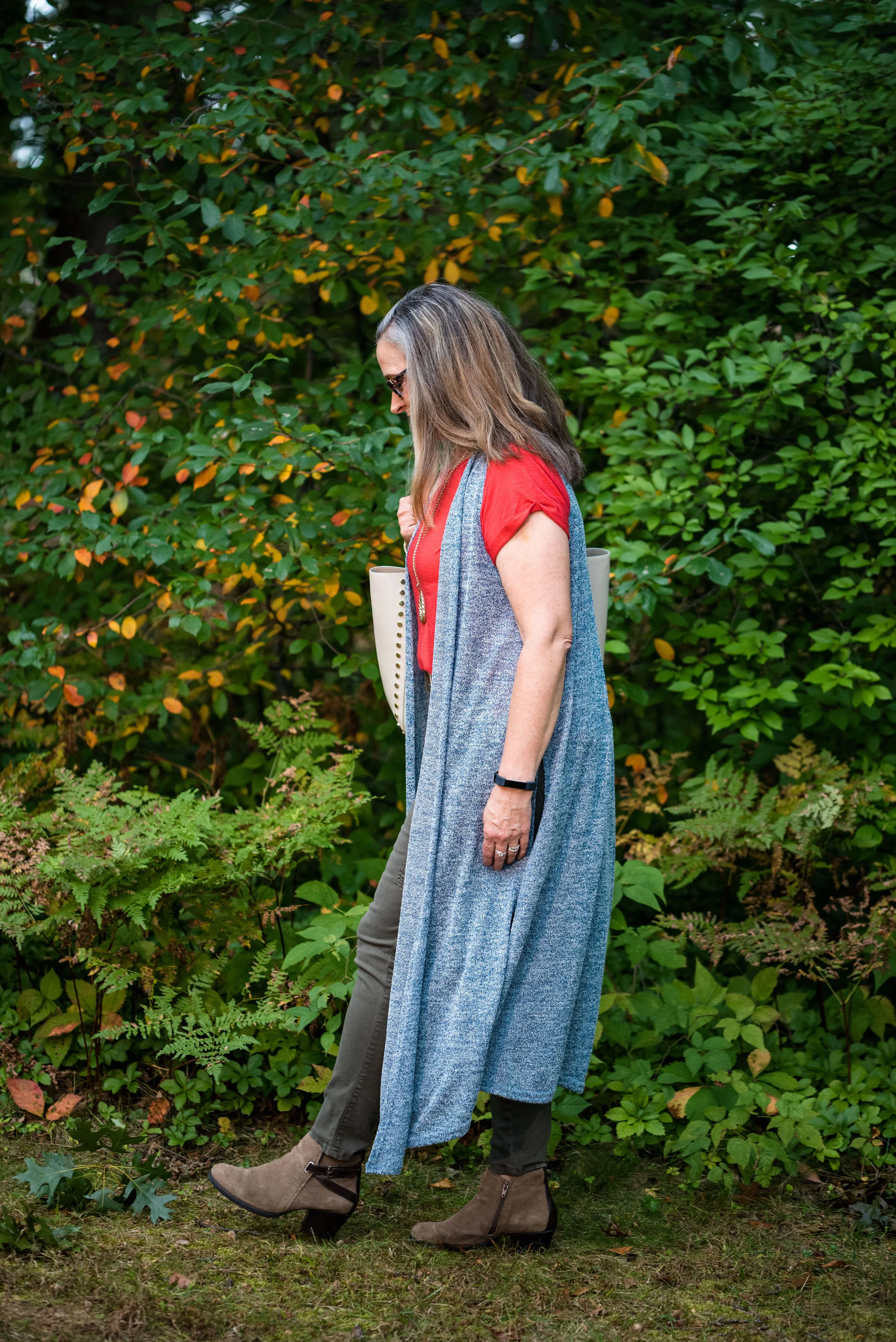
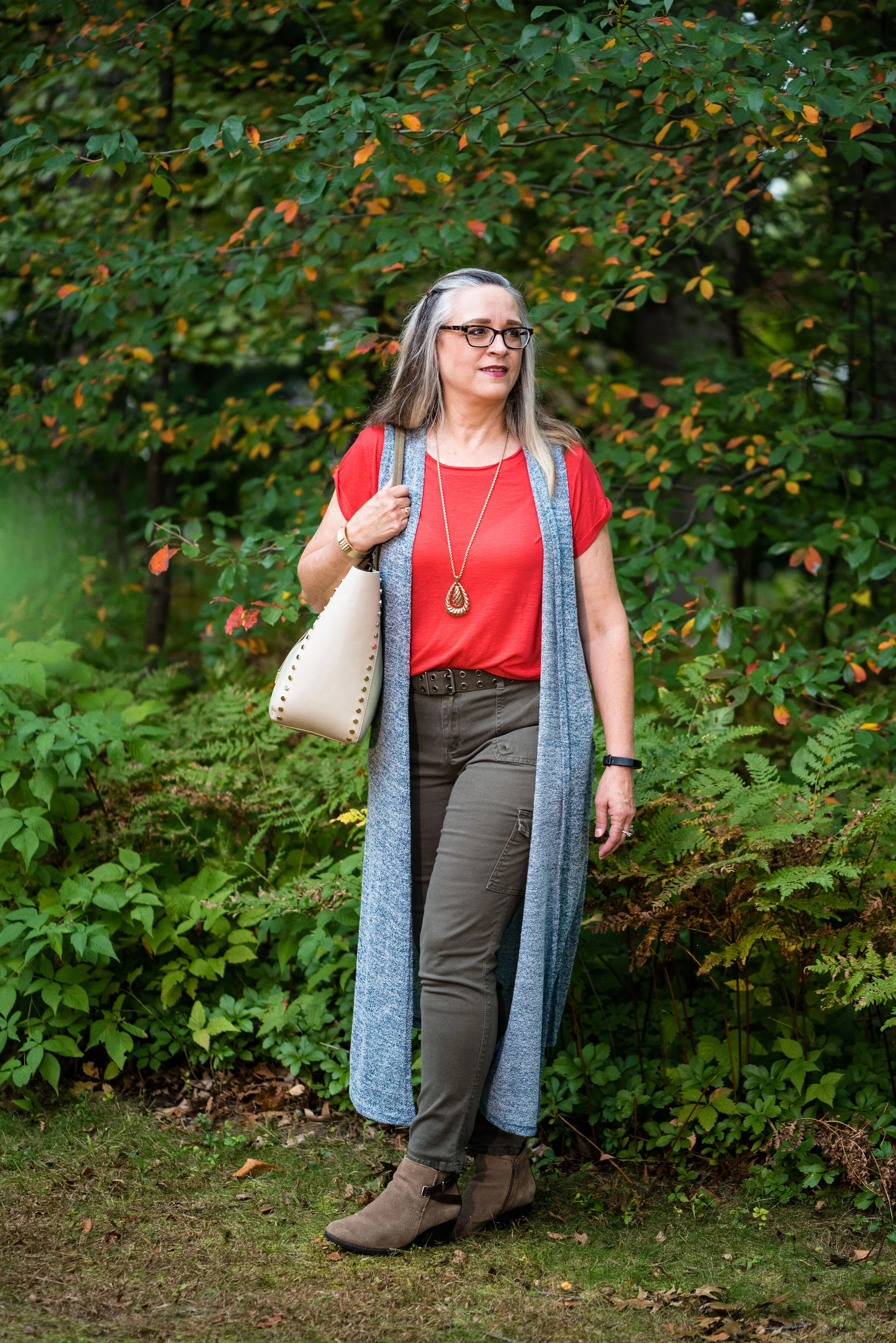
Here are a few more pictures. I really liked these photos, especially with the large rock and the yellow flowers in the background.

Although my colors were off, I hope you enjoyed this outfit. Do you have a favorite pair of boots you like to wear? What color are they? What do you think of these colors from the Pantone palette? Let me know your thoughts in the comments.

I hope you have a wonderful weekend!

Photo and graphic credit Rebecca Trumbull.