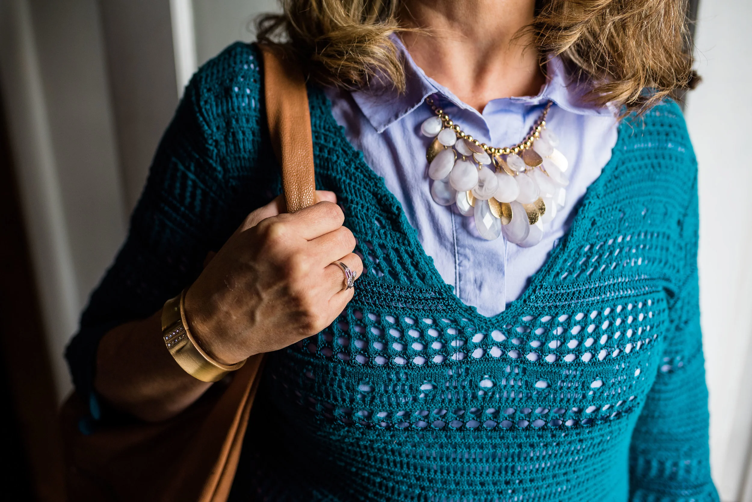
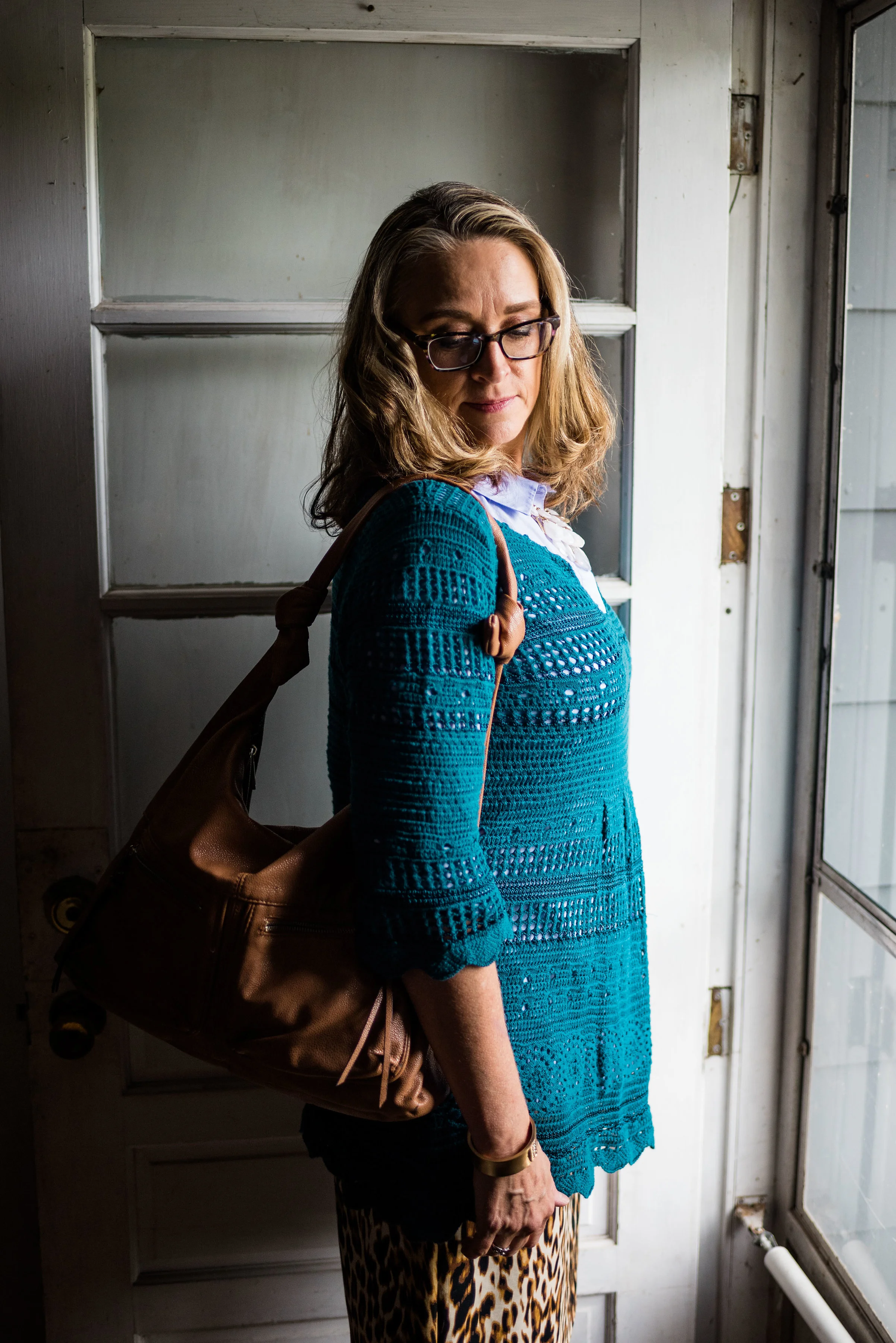
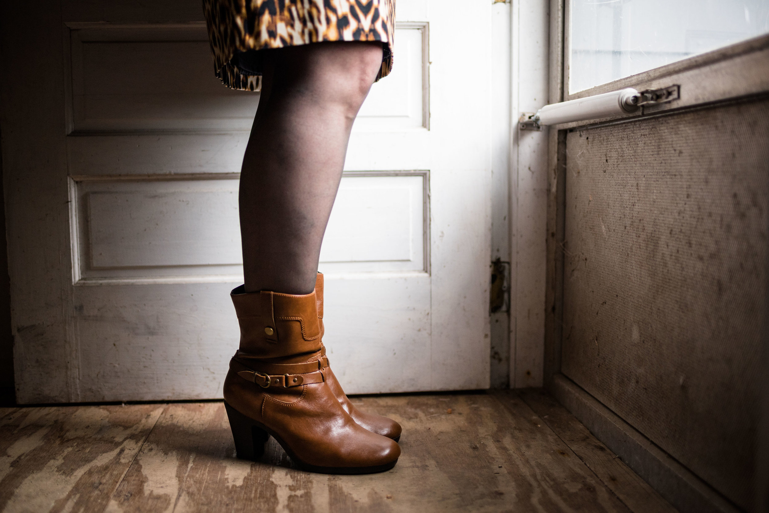
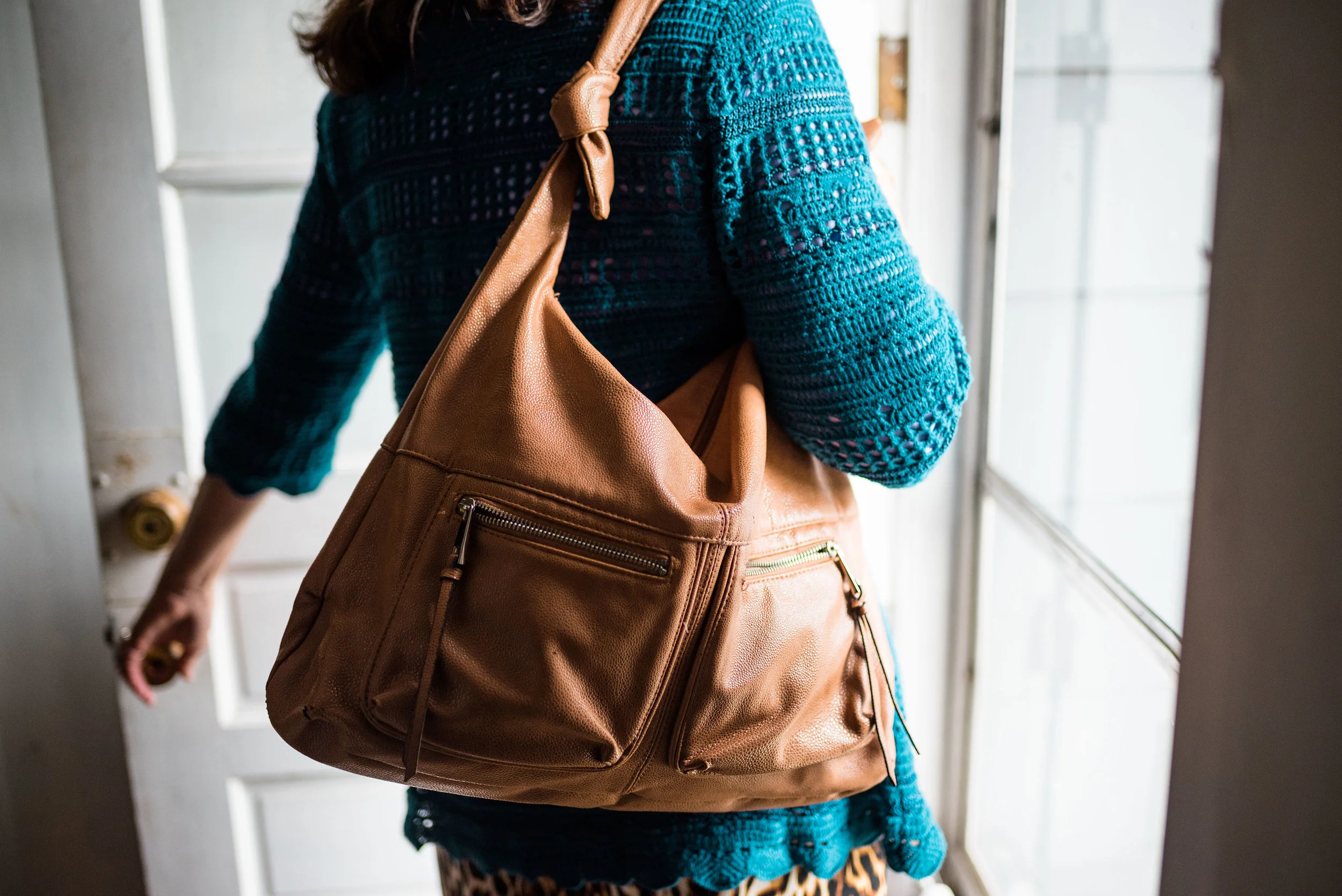
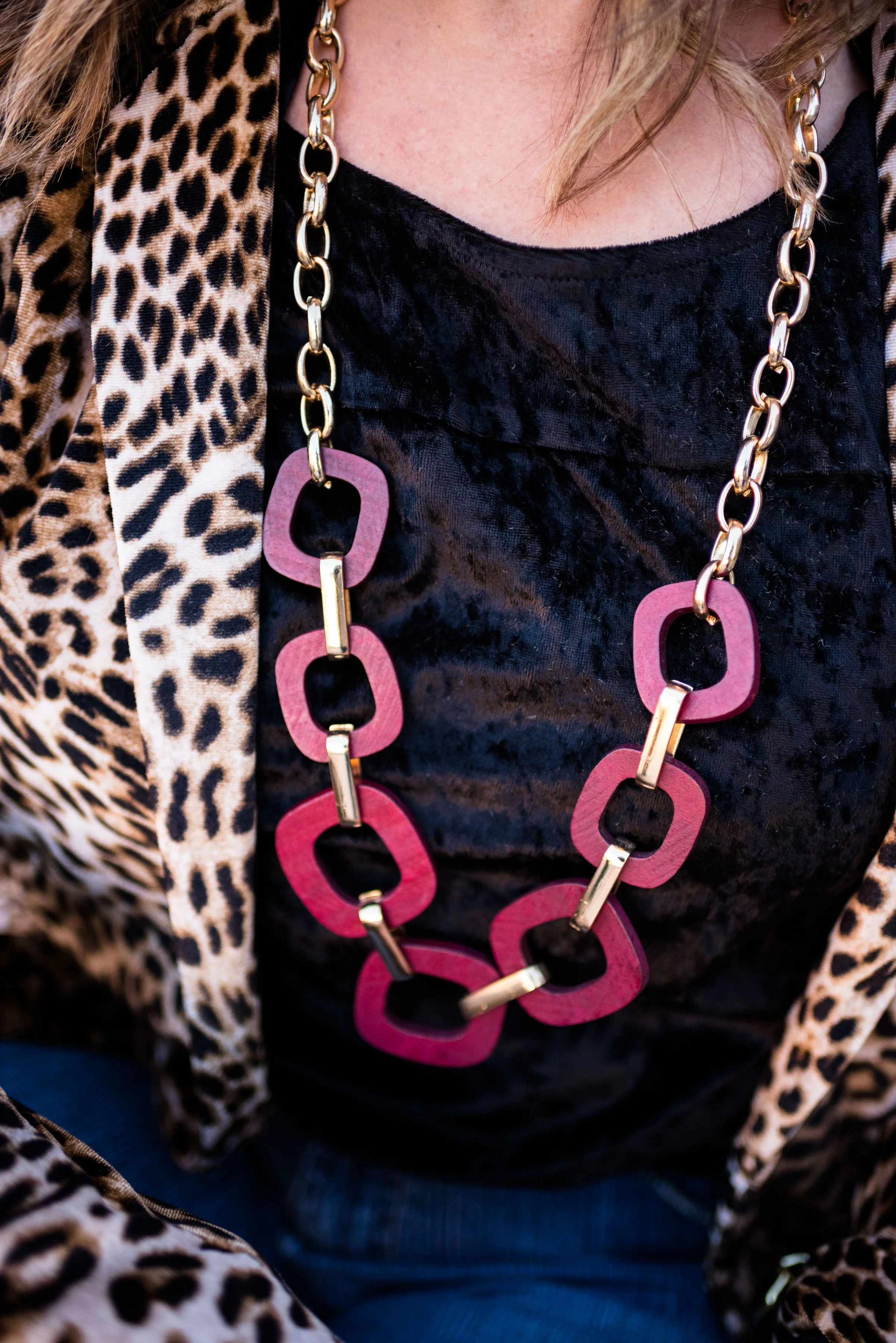
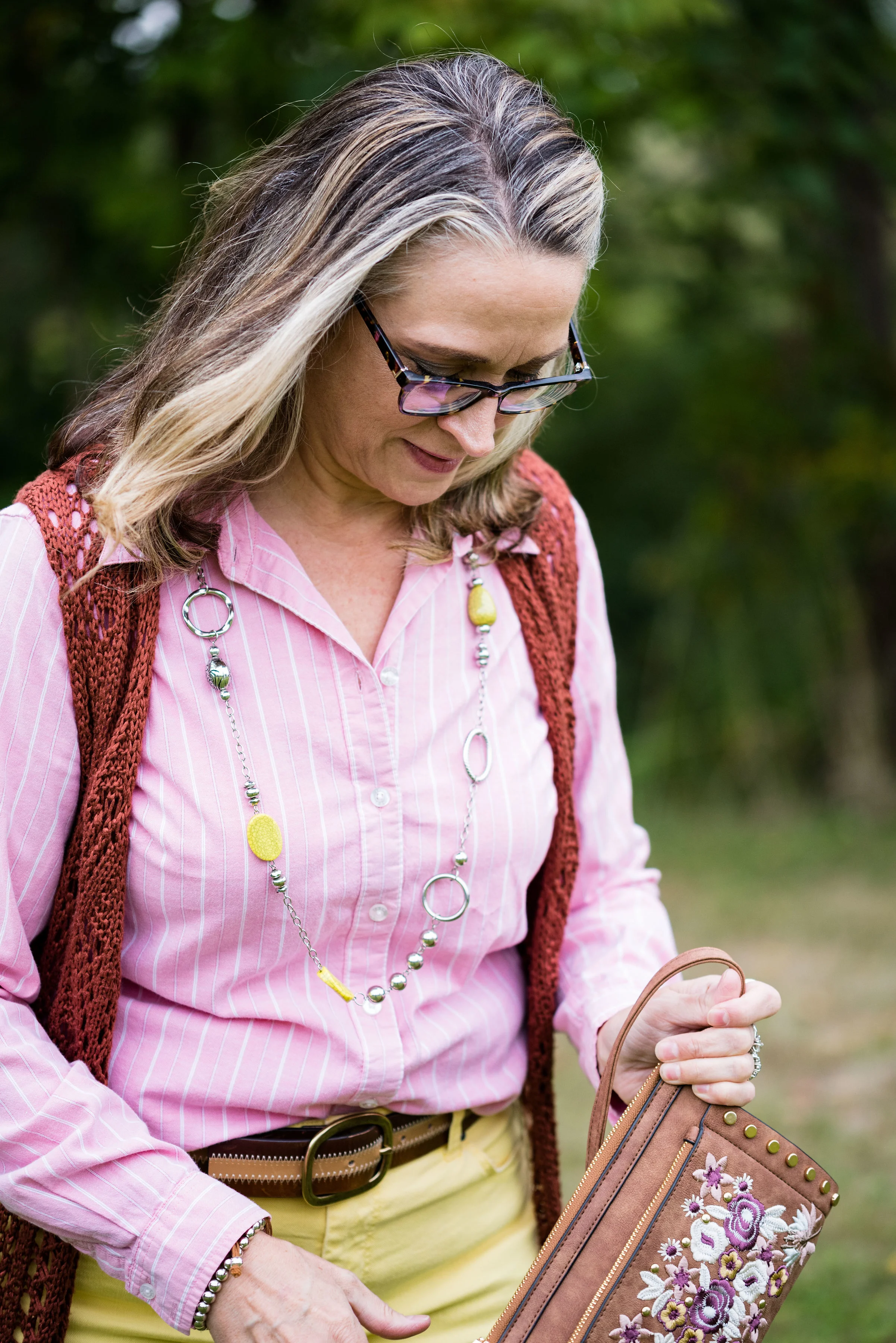
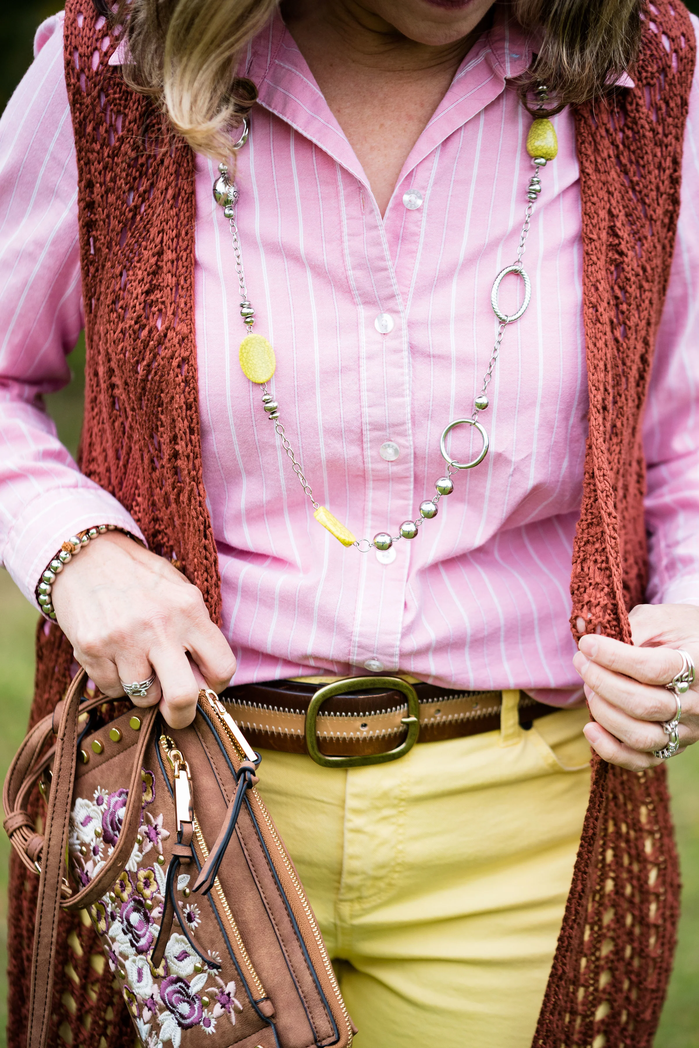
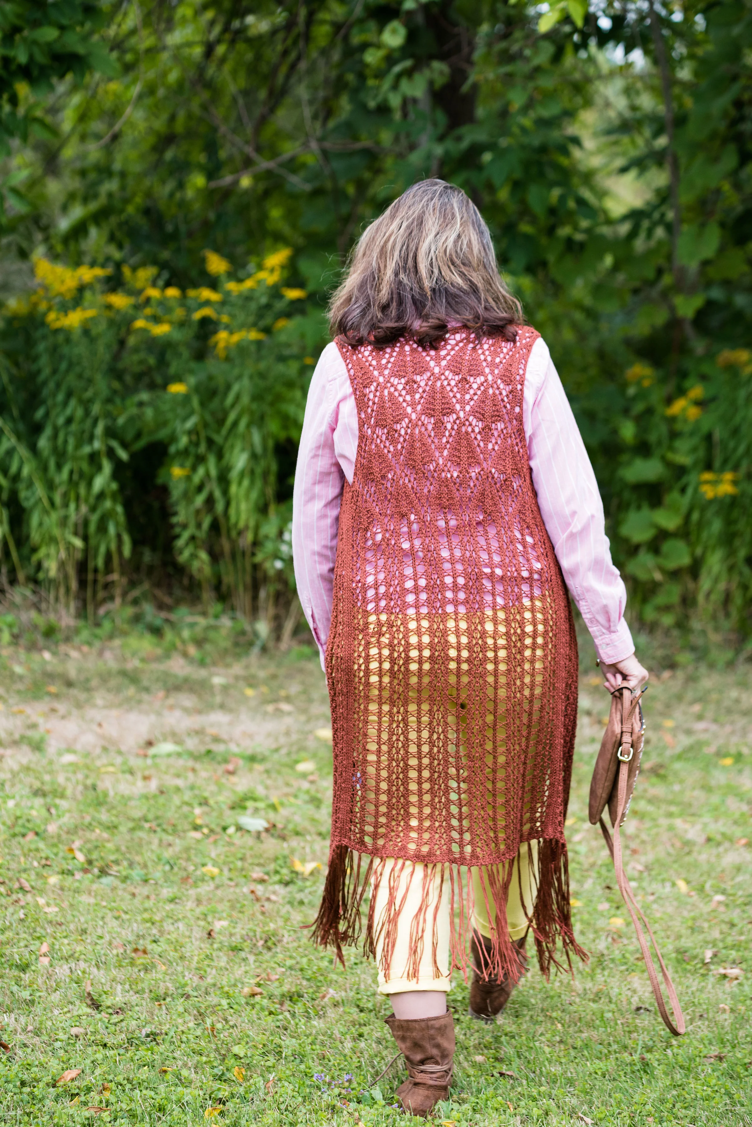
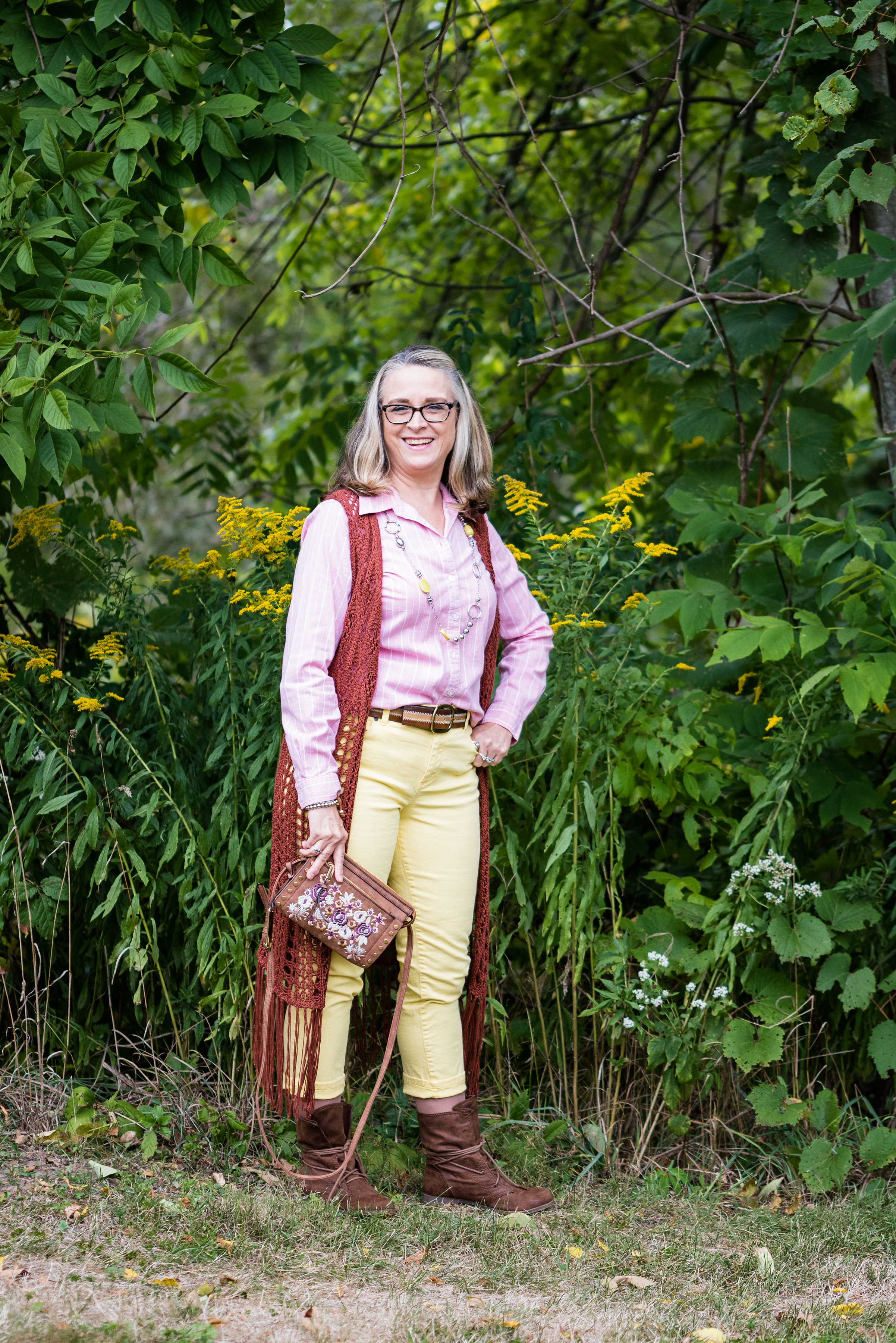
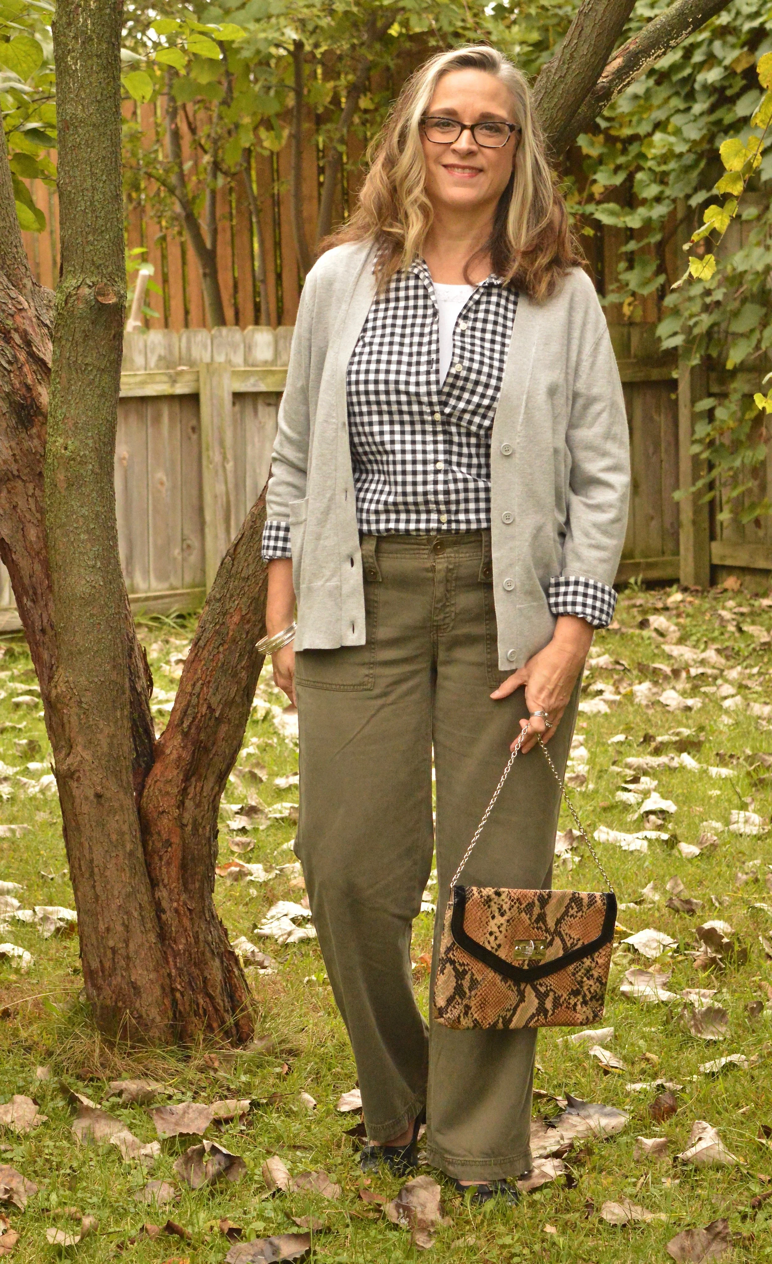
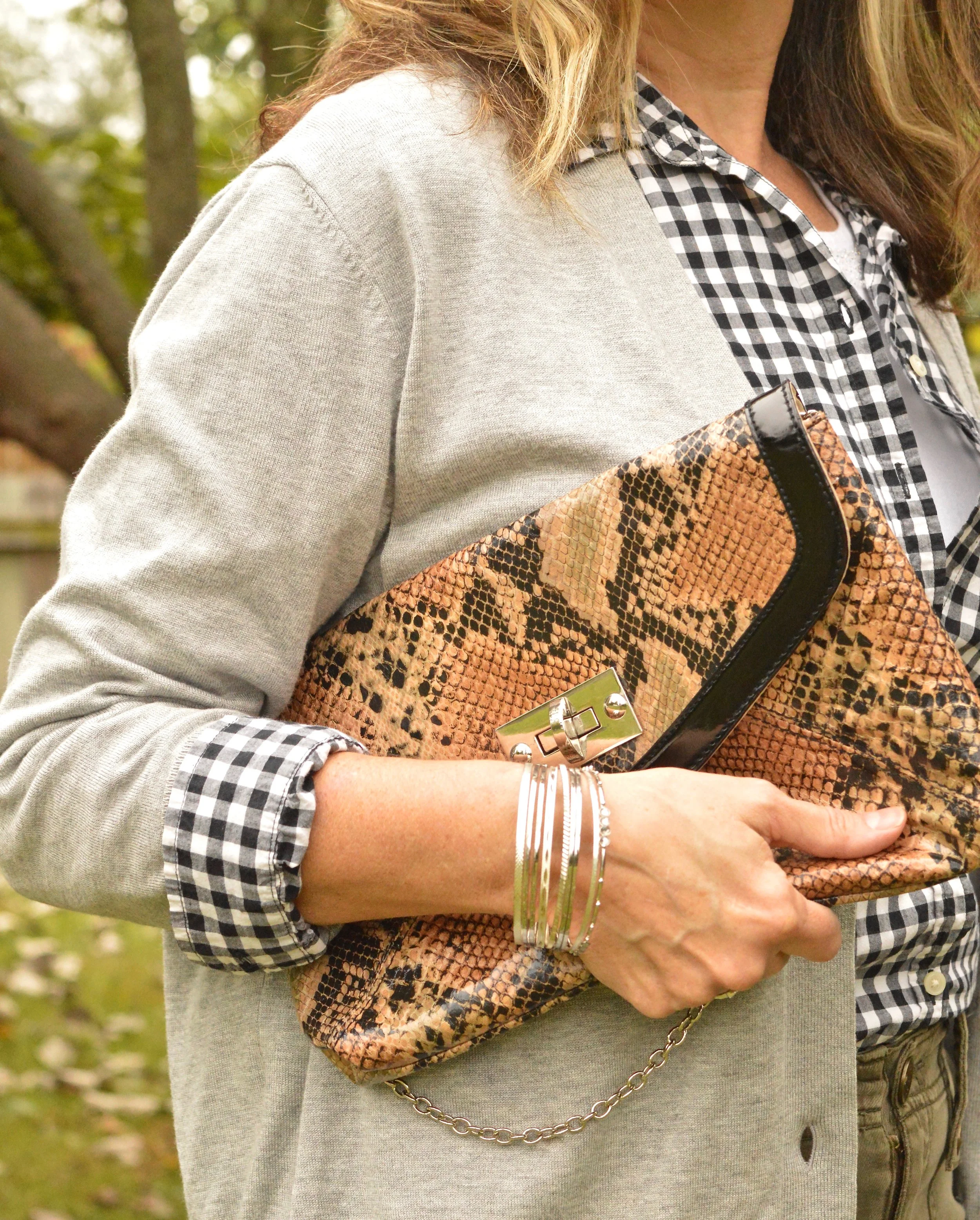
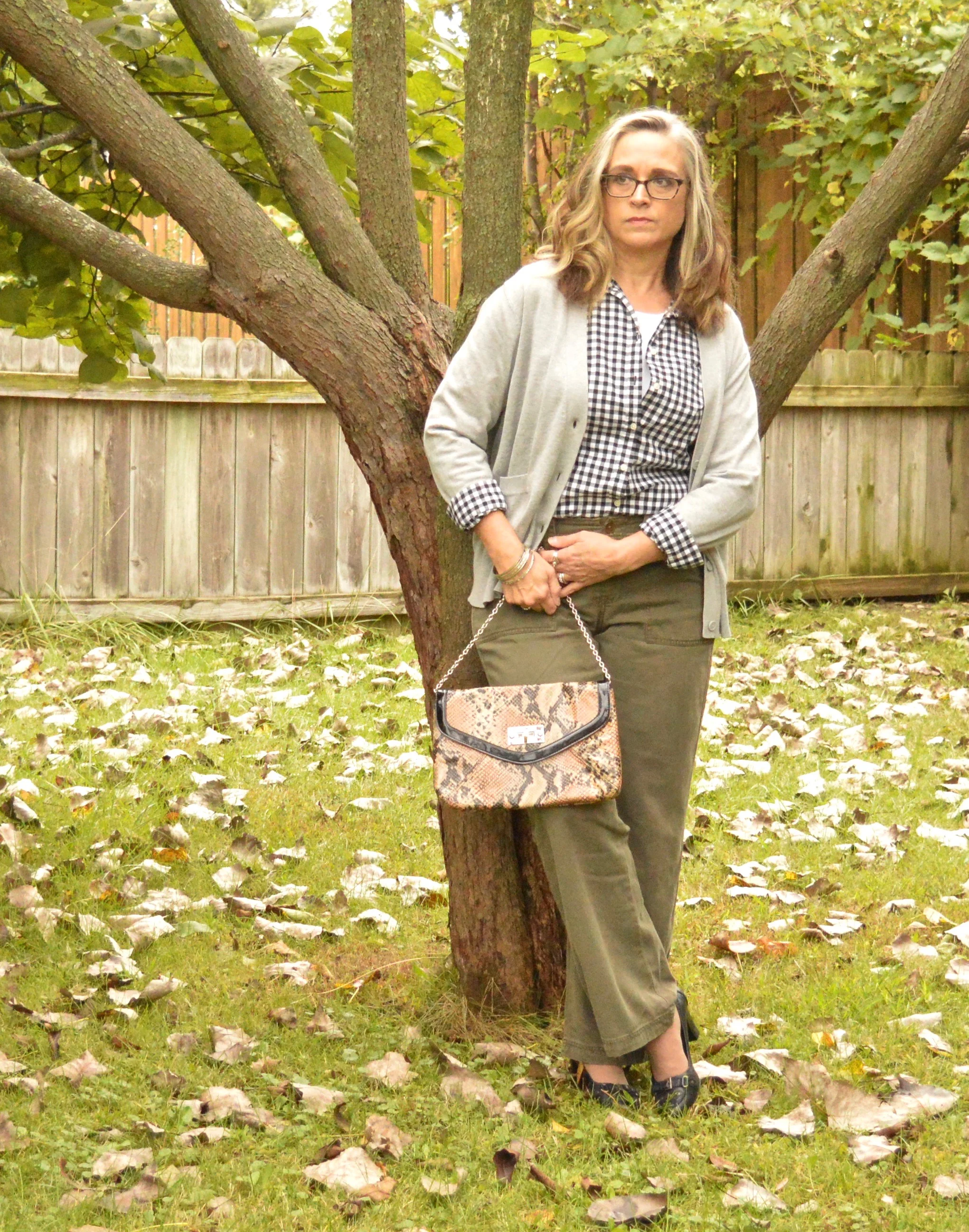
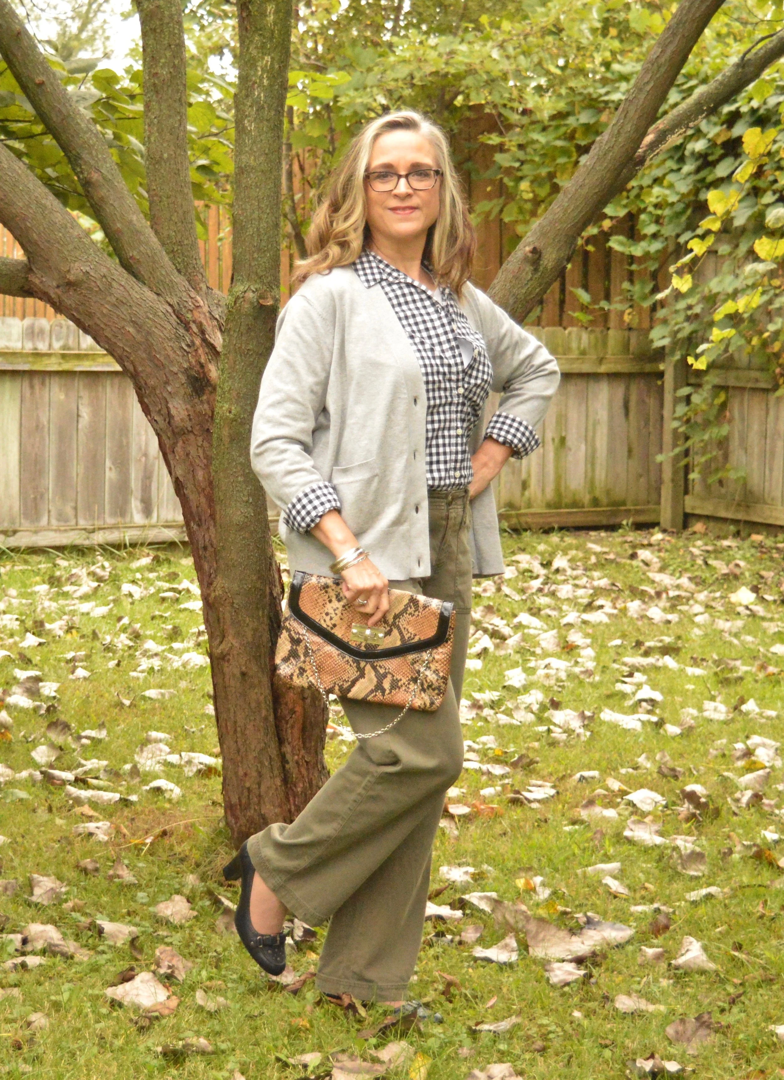
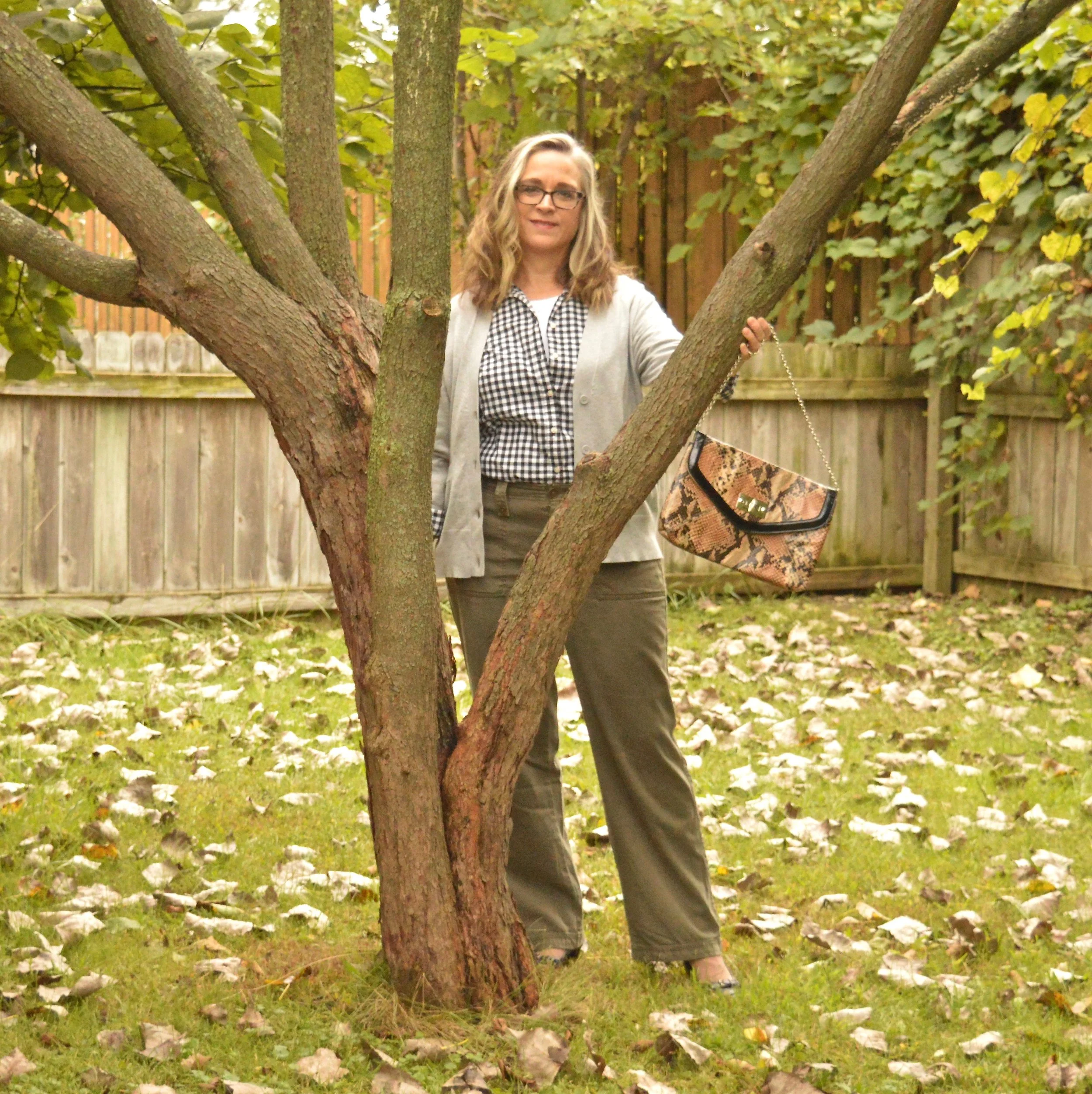
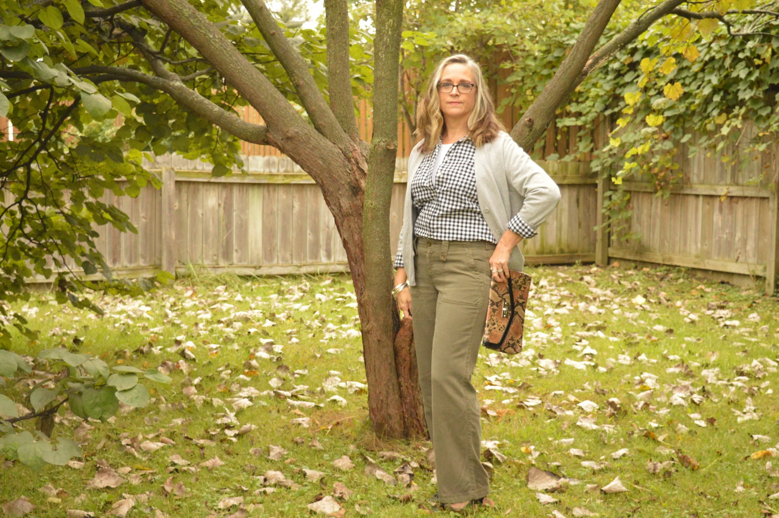
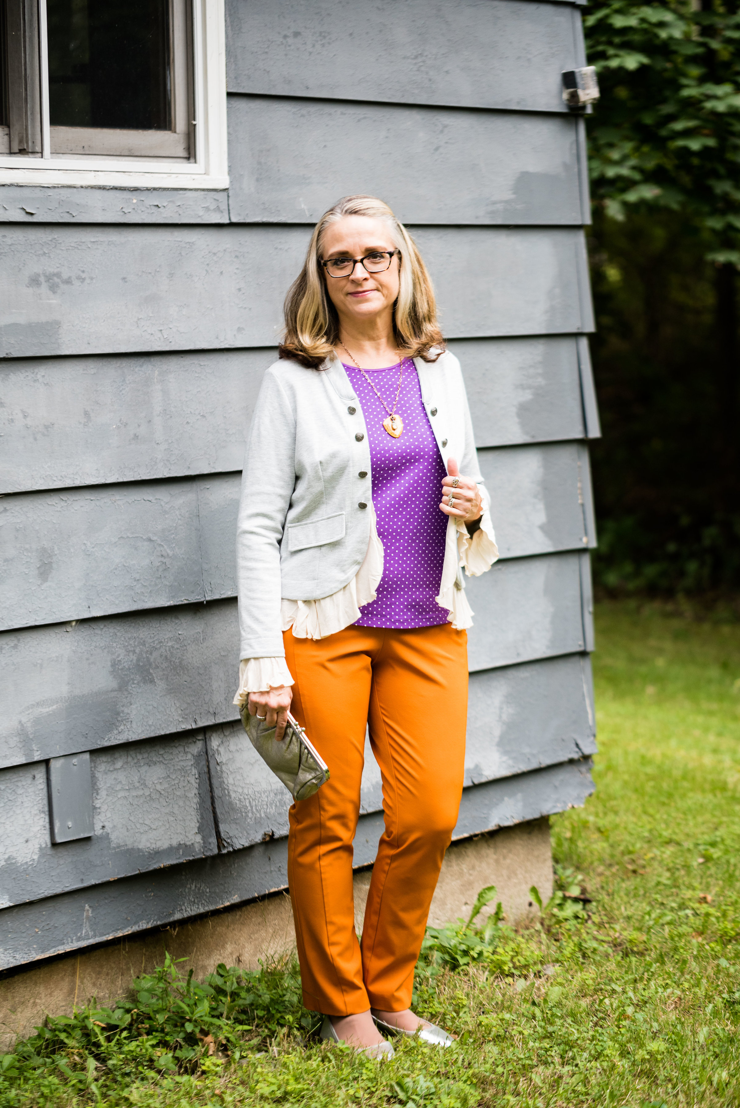
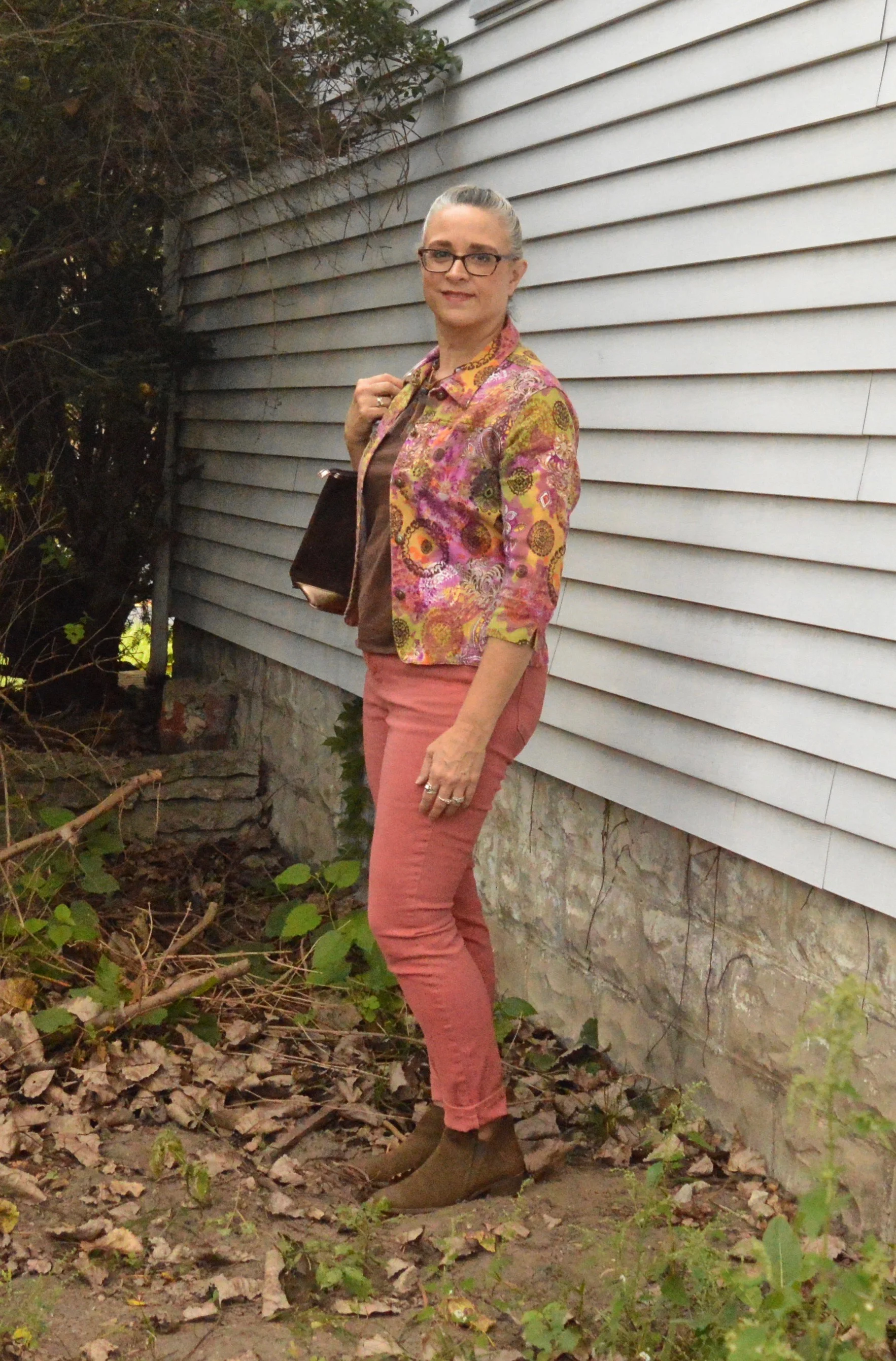
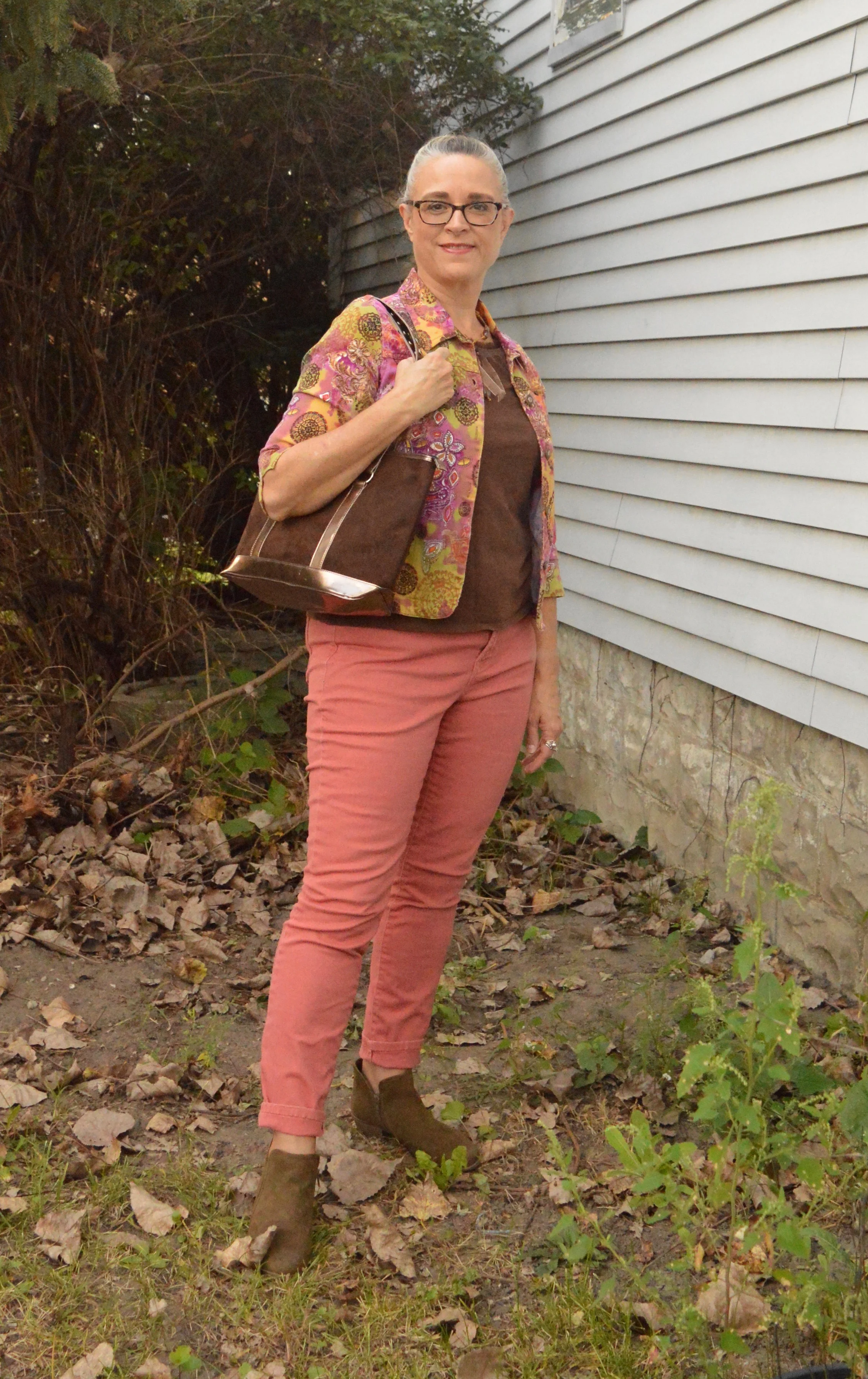
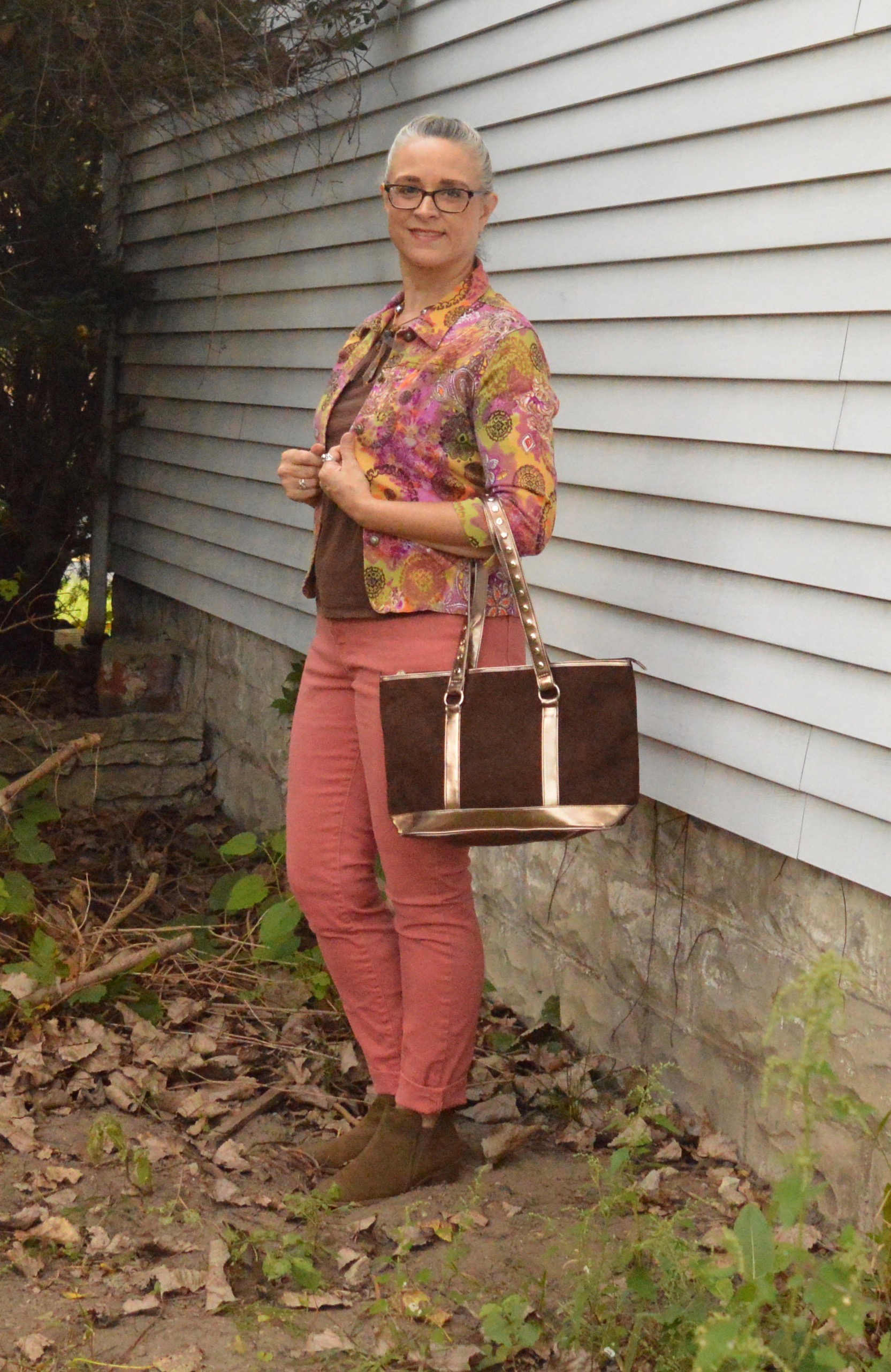
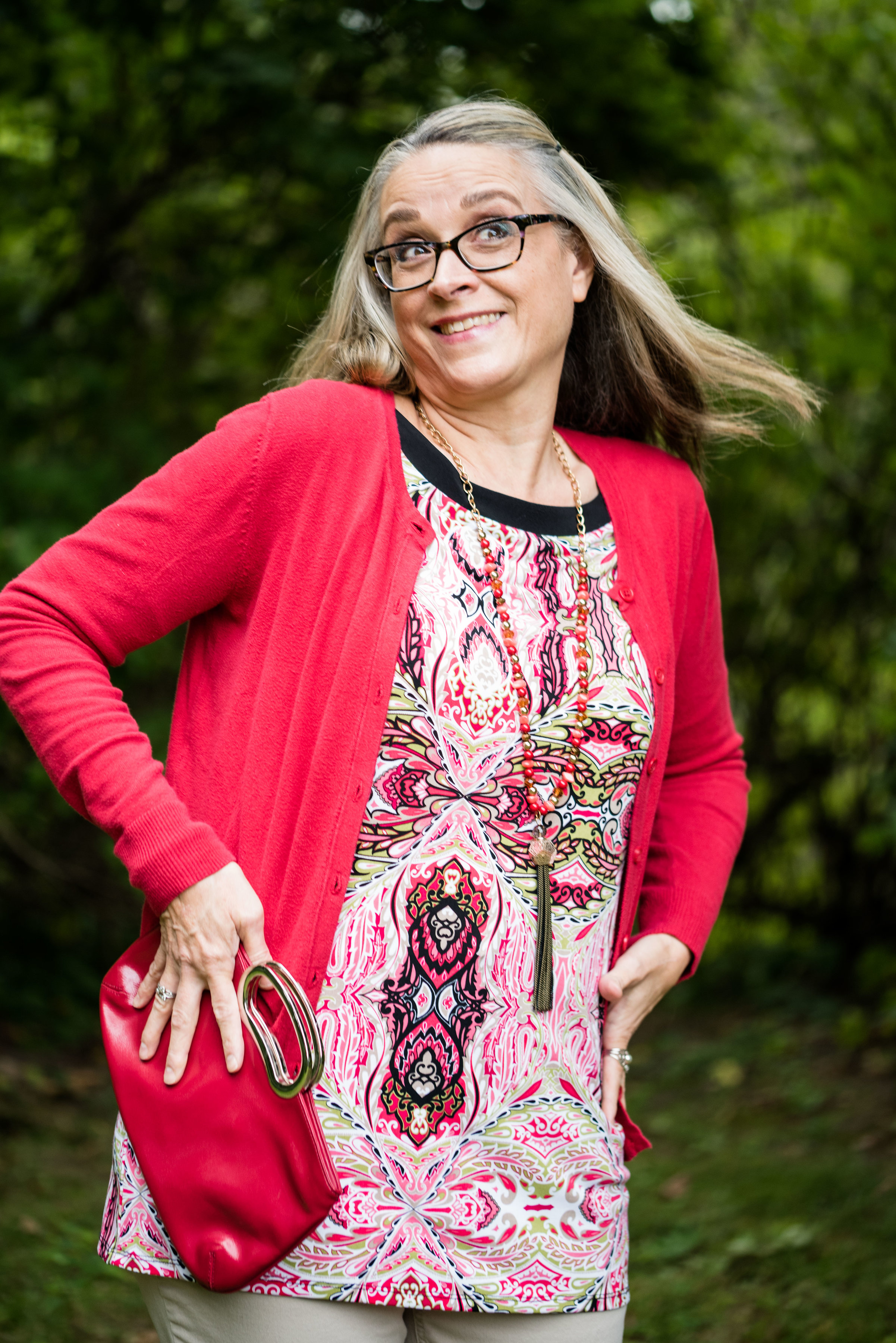
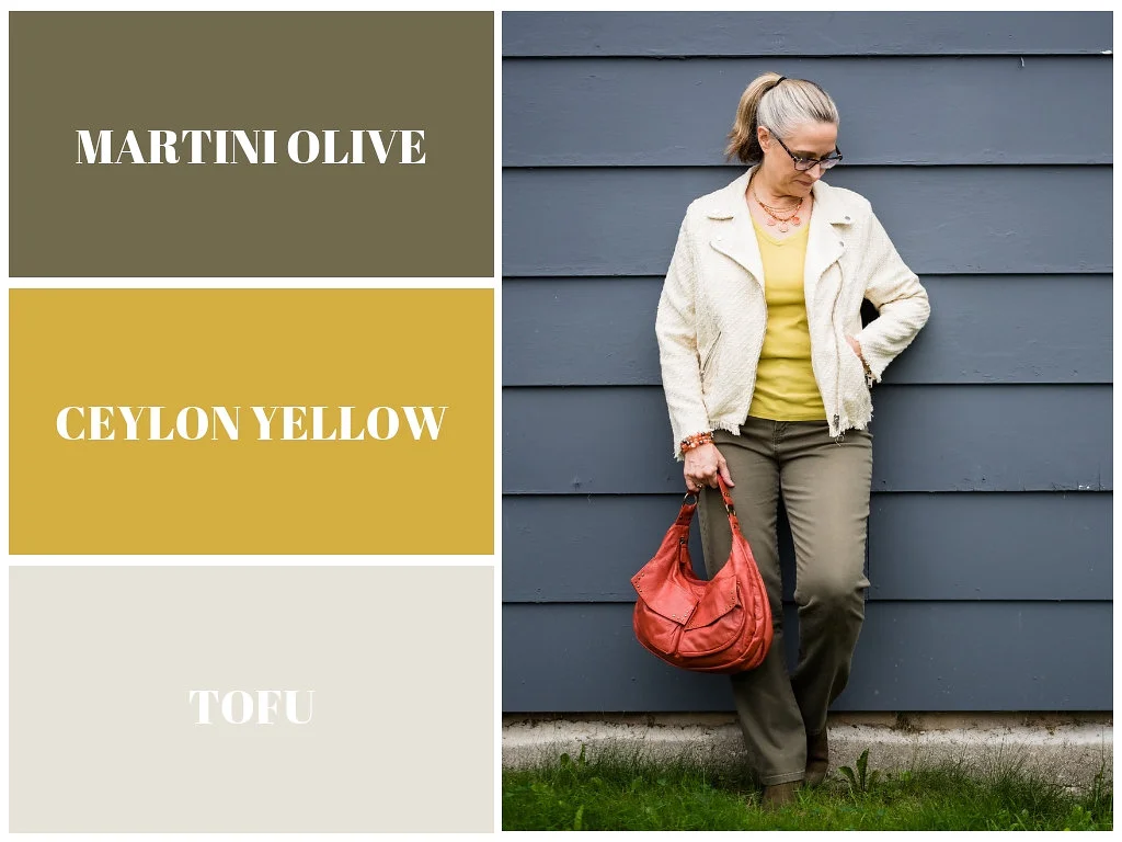
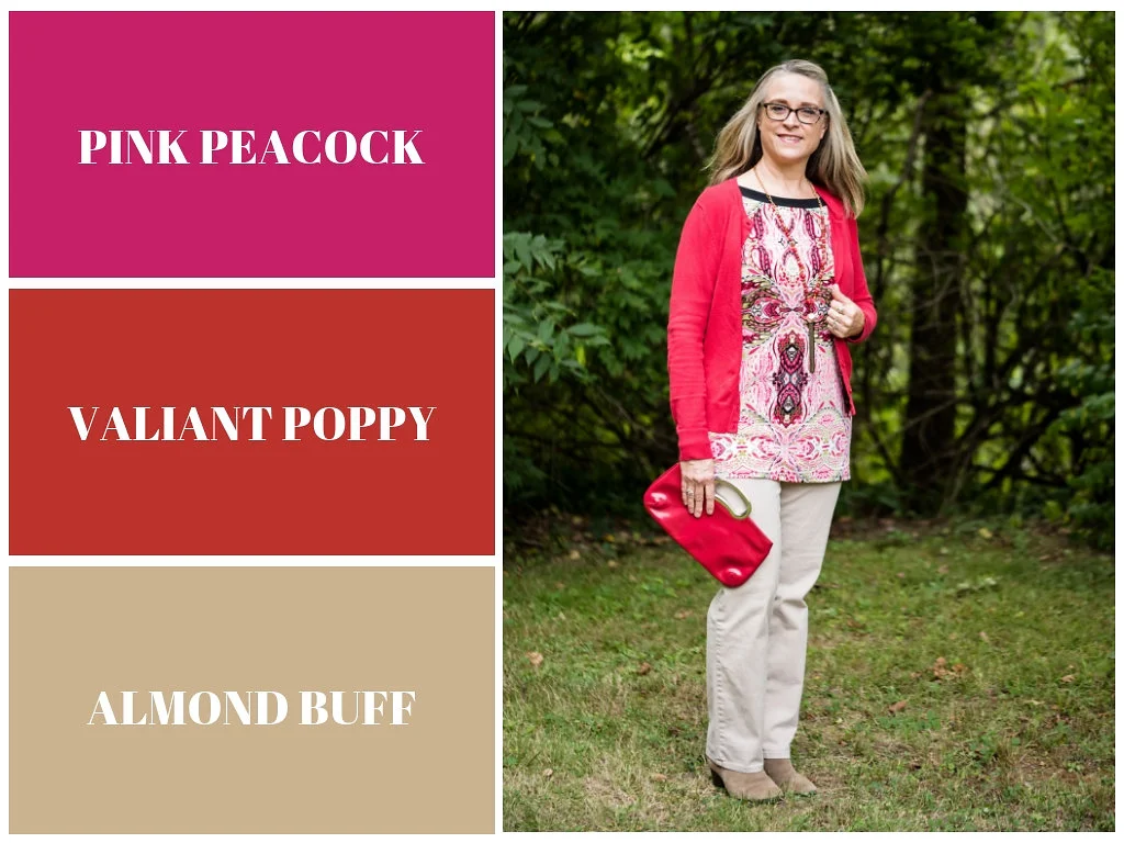
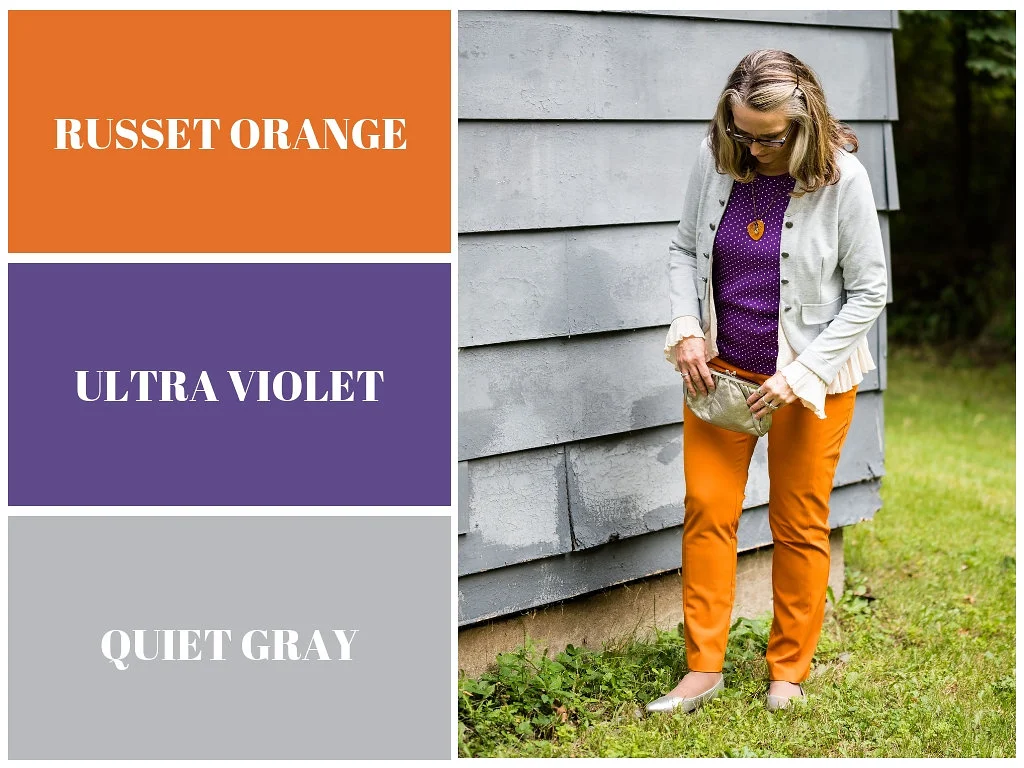
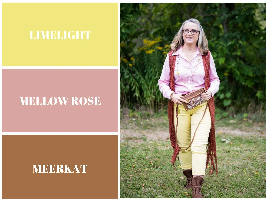
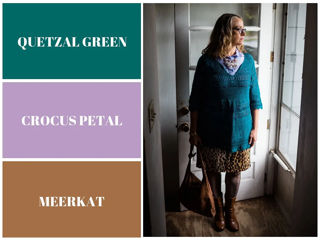
Pantone Fall 2018 Recap

After a series like the Pantone color one, I usually like to do a recap post, to show you all the colors and the outfits I styled using those colors into one post. These colors this season were not what I would call common fall colors. I usually think of fall colors as being richer and darker hues like deep burgundies, earthy browns and garden oranges that make us think of pumpkins and fall leaves. While the Pantone Fall 2018 had a few colors that fit into my typical fall color box they had numerous ones that clearly stepped outside that box. Colors like Limelight, Mellow Rose and Crocus Petal provided a pastel palette choice for those who like to think brighter and lighter when the seasons change.

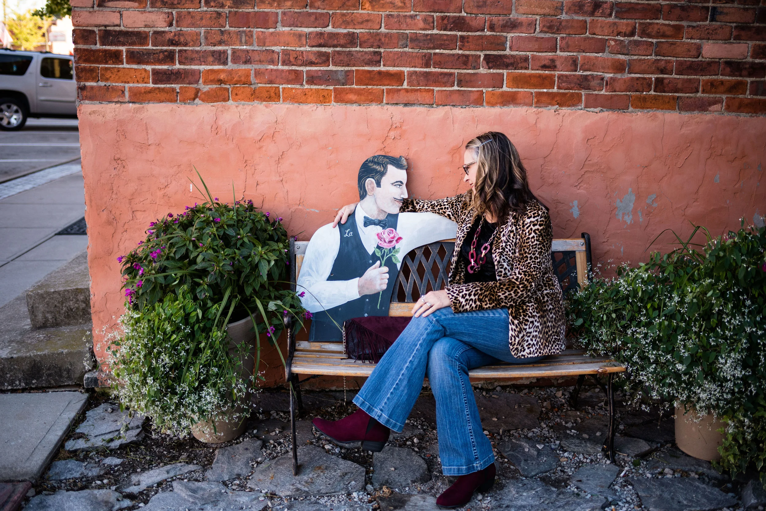
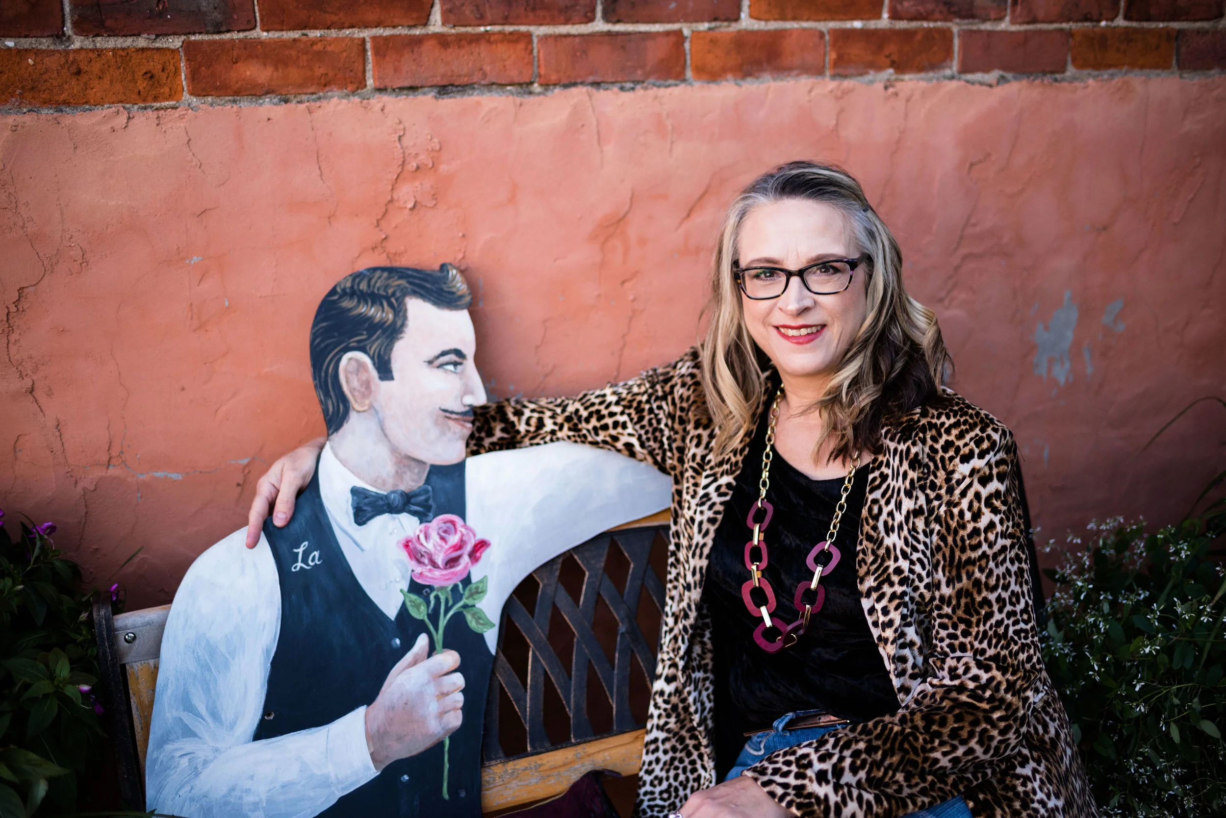
Enjoy this review of my Pantone Fall 2018 outfits.

What did you think of this color palette this year? Do you like lighter, pastel colors or go for richer, darker colors when fall rolls around? Do you like to think outside the seasonal color rules, or are you like me and look forward to the seasons bringing you back to those colors you are familiar with and enjoy at that time of year? It really doesn’t matter any more. The joy of fashion today is that you can decide what you like to wear at any time of year.

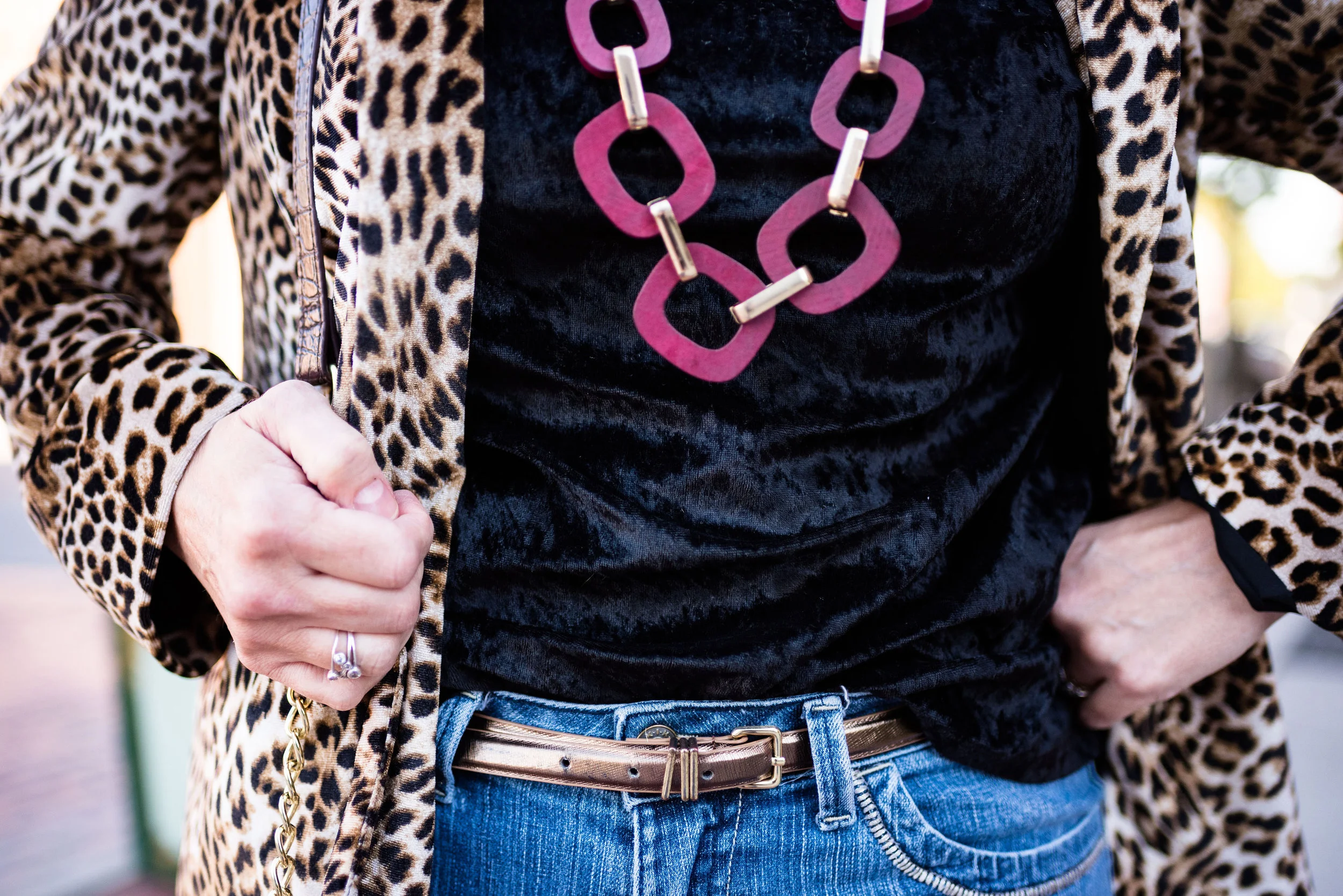
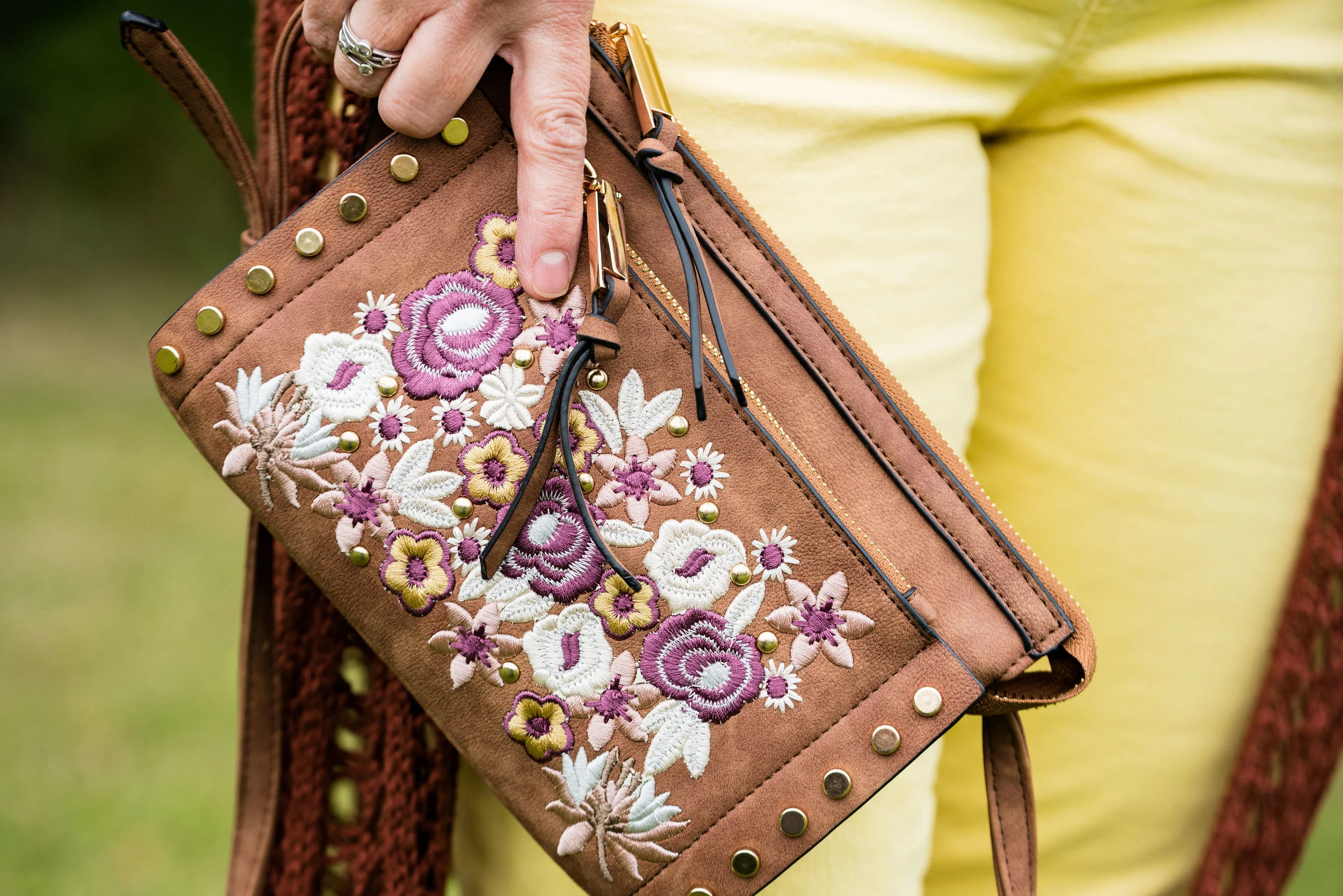
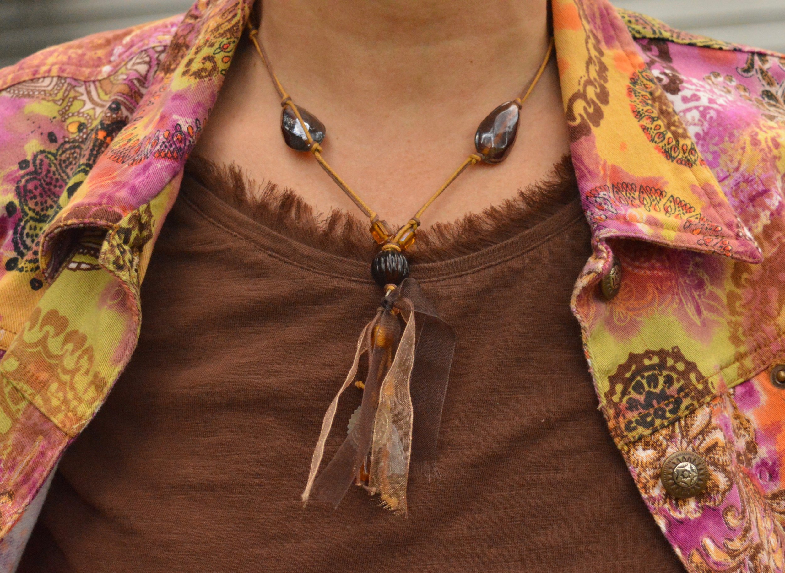
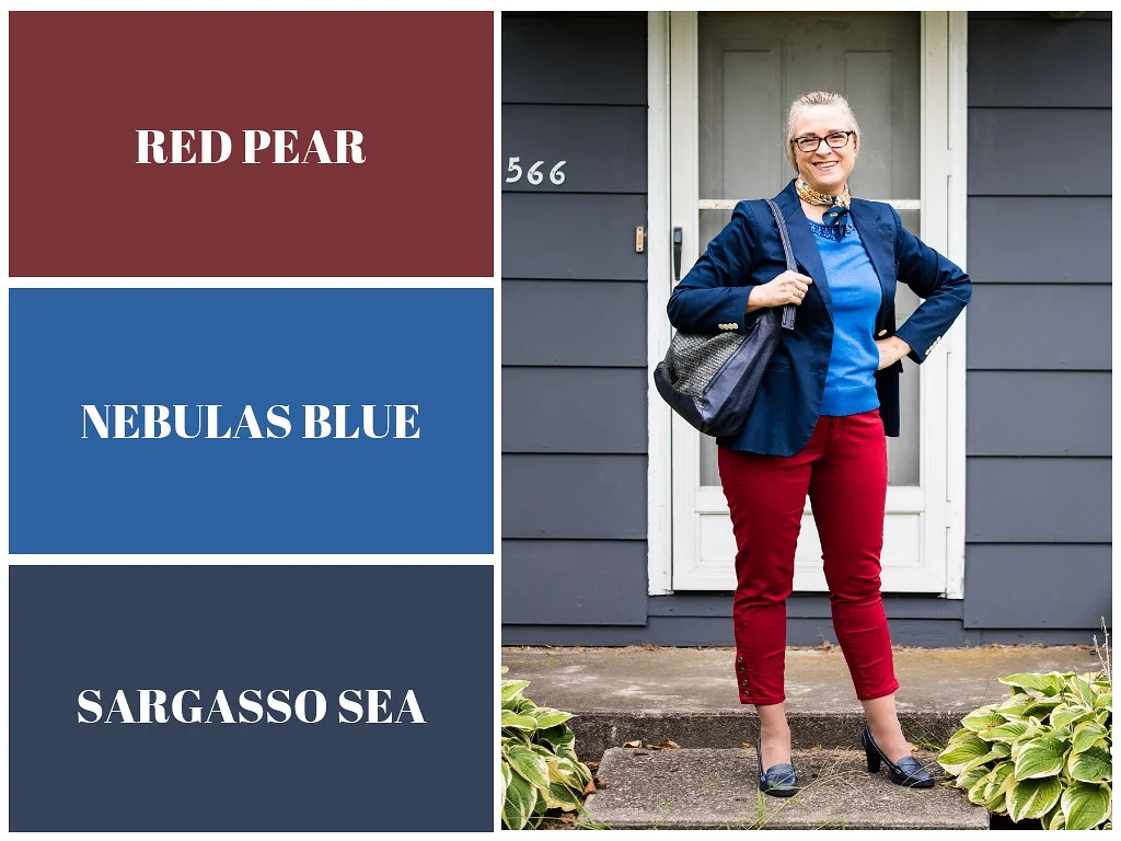
I like that Pantone had added the classic colors to the color palette for each season. It allows me to add a more toned down color to each outfit keeping the outfit colorful, but no overly so. it would be easy to add a touch of any of these colors to a more neutral outfit. For instance, if you wanted to go for a monochrome look using a navy like Sargasso Sea, you could add a little color by throwing on a bright Russet Orange scarf or some Limelight colored beads. If you normally dress in more neutral tones try adding just a touch of color in your accessories to make your outfits more interesting and visible.

I hope you enjoyed this series. Check back on Thursday for more fashion fun.

Photo credit Rebecca Trumbull.

Pantone Fall 2018 - Quetzal Green, Crocus Petal and Meerkat

I am on my last Pantone Fall 2018 post. I hope you have enjoyed seeing these colors and the way I have managed to put outfits together using the inspiration from the 2018 Fall palette. As in anything where fashion is concerned we can take it our leave it. Fashion is for you. It is about putting together outfits and colors that you like, make you feel confident and that you will enjoy wearing. In some ways what we wear is like our second skin. It provides a covering for a bodies and how we put that cover together can boost our self-image and help us better manage our wardrobes and our pocket books.

I have found, in the fashion realm, just like in cooking, having a source of inspiration really helps. Whether you follow a recipe or cook from memories of you and your mom or grandmother working together to make wonderful creations in the kitchen, you use that inspiration to put food on your table. In the same way inspiration for fashion can come from magazines, bloggers, color palettes or even things out in nature. That is the reason I always like to use the Pantone color palettes as a spring board for creating fun and interesting outfits.

These last two colors, Quetzal Green and Crocus Petal, I decided to pair, once again, with Meerkat. Crocus Petal is a lighter, more spring like color found on the London palette. I feel that pairing it with Quetzal Green and Meerkat was the perfect way to keep the light color grounded and more fall like.

This top is a Kohl’s clearance find and is Dana Buchman brand. It is a button up with 3/4 length sleeves and a longer silhouette. It has some stretch and is more fitted. I opted to wear this bead and metal statement necklace, which incorporates the Crocus Petal color as well. I wore a simple gold cuff on my arm.

I found the open weave sweater thrifting, I love the variations in the knit. I am not a yarn girl, though I would love to be. I think this is crocheted, but it might be knit. Can any of you readers tell? Whatever it is I love the different stitch sizes and open versus more closed aspect to the piece. Here we are talking about texture again and how essential is is to making an outfit more interesting.

I thought these two colors when great with the browns, black and cream of my leopard print pencil skirt. This skirt is another JC Penney find and is Worthington brand.

The boots, Aerosoles and bag, both thrifted were the perfect accessories to pair with this outfit. I think black would have worked well or even a cream colored boot, which are trending right now, but I love the luxe feel of the Meerkat color.

Next week I’ll have a recap of all the Pantone Fall 2018 colors. I hope you’ve enjoyed this series and that it provided you with some inspiration for trying new color combinations. Always shop your closet before going out to purchase what is currently trending. You might already have a leopard print top or the perfect color piece that matches with one of the Pantone seasonal colors.

I’ve included a few shopping links. These are affiliate links. All opinions are my own.

Have a great day.

Photo credit Rebecca Trumbull.

Ordinary Amy - Bootcut Jeans and Leopard Print

Those of you who follow me on a regular basis know I am a jeans kind of gal. Jean are what I live in and I love to be able to dress up a pair of jeans for a lunch date, work or a night out with my hubby. I don’t care what wash they are or what cut, jeans are just my favorite, go to pants.

For today’s post I decided to move away from my frequent choice of dark wash skinny jeans and chose my lighter wash, thrifted, bootcut jeans. I like the shape of a good pair of boot cut jeans. These are actually a little bigger, which I like because they are so comfortable. These are a thicker denim, so hopefully, will last for a while. This is an older brand called Kikit, which are only available through Etsy, Poshmark and other thrift retailers.

The choice to wear this leopard print blazer that I found on the JC Penney clearance rack last year was a no brainer! Animal prints are trending now, especially the classic leopard print.

I can remember when I was a young girl thinking of leopard print as something only the rich and famous wore. Pictures of celebrities with their fur stoles and jackets were from before my time, but even in the late 60’s and early 70’s animal print patterns were not something the average woman wore. Maybe that is part of the reason these prints are so popular now and continue to be. Also, I think we are more evolved in the fashion arena as far as fabrics and pieces that can mimic the patterns in nature.

For my top, I chose my black velvet tee. This was a Christmas gift from my hubby last Christmas. I thought it went very nicely under the velvet, leopard jacket.

Along with leopard print comes the look of burgundy or red accessories. Red shoes and boots are big this fall. I opted for the more subdued burgundy color, rather than a bright red, but the combination works to make a much more interesting outfit. Even if you don’t have leopard print you could combine burgundy with brown, tan and black and get a sharp looking outfit.

My cute fringe bag is thrifted and my ankle boots are a recent purchase from Meijer. I will be the first to admit I have a shoe problem, but only in spurts. Meijer was having a Buy One Get One for a Dollar, so I had to take a look. Of course I found these boot and they went right into my cart. Then I tried on some Keds and a pair of those jumped in the cart. Well, there was a clearance area as well and I found the cutest blush sneakers…so yes, I came home with three pairs of shoes. Shhhhh! Don’t tell.

I decided to wear my burgundy wood and metal and a coppery gold belt as my finishing pieces, adding a front tuck to give definition to my waist.

While we were taking pictures, I met this very nice man. He was so understanding and quite a good listener. Ha, ha. We couldn’t pass up a great picture opportunity.

Are you a jeans girl too? What is your favorite brand of jeans? Do you buy your jeans at thrift stores or do you have a particular retailer that you like to buy from? I’d love to hear your thoughts. Leave me some love in the comments section.

I’ve included a few shopping links. These are affiliate links, which means if you click on a link I get a few pennies. If you purchase something through one of my links, I get a little bit more. All opinions are my own.

Have a great weekend.

Photo credit Rebecca Trumbull. Make up Rachel Christensen.

Pantone Fall 2018 - Limelight, Mellow Rose and Meerkat

Of all the colors on the Pantone Fall 2018 palette, I felt Limelight and Mellow Rose were the least fall-like colors. Once again, I had to think outside the box when pairing these two light pastels together, to make the outfit seem more in keeping with a fall theme. In order to do this, I thought it would be best to pair them with Pantone’s classic color, Meerkat. Meerkat is a warm, orange brown and while it could be used in any season, It makes me think of fall leaves, bonfires and warm apple cider.

Mellow Rose is actually one of two colors that is only found on the London Palette. I am not sure why they added this and Crocus Petal, the two extra colors on their palette, but they are light, airy and more spring like. Maybe it was an attempt at bridging the gap between the seasons and reminding people that the old rules are gone and colors are seasonless.

All of the pieces in this outfit were thrifted except the bag and the boots. The Limelight colored jeans are Talbots brand and are really an ankle pant that I rolled up, so they stop at the top of my boots. The Mellow Rose button up is Izod brand and the long fringe knit vest is a brand called Sun and Shadow. I’ve styled this vest several times before. You can see those posts here and here.

I don’t remember where I got the belt, but I thought it tied in with the boots and bag quite well. I just did a front tuck with the shirt.

This bag I got at Meijer and I am not sure of the brand. It is a nice cross body bag and the embroidery on the front adds interesting color and texture. I think this can be used for all seasons.

These boots are a brand called Sugar and I got them at Kohl’s a few years ago. They are made of a suede type material and add a different look to an outfit because of the single, long, wrap tie.

I just added a simple bead and metal necklace and a bracelet for jewelry. This might be fun with a scarf or even some layered necklaces for a more bohemian look.

Here is a full length view of the vest from behind.

This is the second outfit in this series that I am not completely happy with. These colors are great, just not necessarily together, or for the season of fall. I know, I know, we can wear whatever, whenever, but if I’m not happy with it, then I’m not going to wear it. I’ve worn both of these pieces in the spring and summer. My color leanings are more bold and bright, but if you are a pastel kind of girl, then follow my friend Liz at With Wonder and Whimsy. She loves pastels and wears them all year round!

That’s all for today. Hope you are having a great Tuesday!


Outfit Inspiration - Gingham and Olive

This week’s Outfit Inspiration comes from a Christopher & Banks add that I received in the mail. I love to try to copy the outfits that many retailers put in their advertisements and catalogues, because it gives me a source for a well thought out outfit, without me having to come up with the idea. I still have to shop my closet and try to find similar enough pieces to create the look, but the inspiration was provided by someone else.

When I saw the classic combination of a gingham button up with olive pants I knew it was an outfit I could easily replicate from pieces in my closet. This is what I came up with.

Since olive is treated as a neutral these days you can wear it with any other color and it works. Case in point, for this outfit I am pairing these olive trousers with a black and white gingham blouse, a white tank underneath to add interest and a gray casual cardigan.

This is an outfit I would easily wear to work. While the outfit is fairly neutral you can easily jazz it up by adding color in your accessories. I chose to keep my look more neutral all over. I have on black loafer heels, which I have worn on the blog before, and decided to carry my thrifted snakeskin clutch, since animal prints are trending right now. I opted for a few silver bangles and no other jewelry. I felt there was enough going on with the gingham check and the layers, although you could easily add a necklace or a pretty colored scarf to wake the outfit up a bit.

This gingham blouse was thrifted and is Old Navy brand. The white sweater tank that I have on underneath was also thrifted and is George brand. The original photo that I took the inspiration from showed the model with her top tucked in and no belt, even though the pants had belt loops. I wanted to stick to the original outfit as much as possible, but next time I will add a belt. I just think it makes an outfit look more polished. I have an olive colored one that would have worked perfectly with these pants.

My gray sweater is from H&M. I had a gray sweater, very similar to this, but it was showing wear, so I was glad to find this as a replacement.

Here is a picture of the shoes taken on a different occasion. They are a sturdy, practical heel, but still look stylish while being fairly comfortable. These were thrifted and are ANA brand.

Here are a few more photos I thought I’d share just for fun:

I was having fun with this red bud tree. Unfortunately, the poor thing is half dead.

That’s all I have for today. I hope you enjoyed this post. I’d love the hear your feedback. Don’t forget to follow me on Instagram.

Have a wonderful weekend!

Pantone Fall 2018 - Russet Orange, Ultra Violet and Quiet Gray

This week’s Pantone Fall 2018 colors are a bright pumpkin orange and a deep purple we met last spring, that won Color of the Year. Russet Orange is an easy color on the eye and reminds us of those beautiful Maple trees that boast red, yellow and orange leaves. Ultra Violet might be part of your Halloween decorating. Since the combination of orange and purple has become a less dark and more party friendly Halloween pairing, I thought it would be fun to put these two colors together.

These pants I’ve worn on the blog before, here, here and here. They are Worthington brand from JC Penney. These have a side zipper and sit higher on the waist, so help to create a more smooth silhouette.

My top is an older tee from Christopher & Banks. I love the color of this top. To keep the bright colors from being too overwhelming, I chose the Pantone color Quiet Gray as a topper to polish off the look. This fun piece is from the Kohl’s clearance rack and is a brand called About A Girl. I really like the double breasted look and the feminine detailed ruffles.

I kept my accessories fairly simple. This lovely leaf necklace I found at a shop in Grayling, MI called The Main Branch Gallery. Boasting art work and crafts from local artisans it is a great place to visit if you are ever up that way.

I then finished off the look with my silver clutch and silver SO flats that I recently added to my SO shoe collection from Kohl’s. Here is a link if you are interested in other colors. They are on sale right now for only $21.99, which is a good deal for a fairly comfortable shoe that makes any outfit look a little more dressed up. I normally wear an 8.5 or a 9 and I get these in a 9.

What do you think of these two colors? Would you wear Russet Orange and Ultra Violet together? I’ve included a few shopping links below. These are affiliate links, but all opinions are my own.

Old Becomes New - Multi-print Blazer

For this month’s Old Becomes New column, I am featuring a short, 3/4 sleeve blazer that I found at a thrift store a few years back. What drew me to it was the amazing, eclectic color palette. My first thought was that I could wear it with so many things. After I tried it on and loved its’ stretchy feel, I had to take it home. Unfortunately, I’ve only worn it less than a handful of times. I decided to revisit it and make the tough choice as to whether I should keep it our not.

I honestly believe this jacket is meant for a smaller person than me. I am 5’ 5” and hover around 163 pounds. While it tends, on me, as more of a crop jacket, I’m just not sure. I am asking for your help friends. What do you all think? Does my outfit look disproportionate?

I chose my dressbarn W62 jeans. I bought this pair last year and they no longer carry this color. I love that they are so comfortable and stretchy, however, I feel like they are almost too big. I lost a few pounds this past spring, so I don’t know if that is what made the difference, but they seem to have a lot more wrinkles. Do you ever buy something, put it on and think, “It just doesn’t have the magic, I thought it had?”

I went with this thrifted brown tee and a necklace that was in some of my daughter’s stuff to be gotten rid of. Hey, I’m not afraid to find treasure in the strangest of places. I like the brown and yellow cord, the beads, ribbon and the charms, which you can’t see much of in this picture. It seemed a prefect fall accessory.

My bag is another thrift find. I felt the brown tee and the brown bag pulled in more of a fall feel with this blazer that could be worn in any season.

Once again, I chose my SO olive ankle boots. These are perfect for the cool temps of fall when you are not quite ready for mid-calf or knee high boots. You can see more fun colors here. The price point on these is not bad at all and they are very comfortable. I typically wear an 8.5 or a 9 and went with a 9 in these so I have more room for heavier socks as the days get cooler.

What is your verdict? Is this a jacket I should keep or should I let it go free? Ha, ha. I’d love to hear your thoughts.

I hope you all have a wonderful weekend. I have to work Friday and Saturday and try to play catch up with all the other stuff that I don’t get done during the week. Ha, ha. Take care and always choose to be kind.

Pantone Fall 2018 - Pink Peacock, Valiant Poppy and Almond Buff

Welcome back to outfit number three in this fall’s Pantone color series. Today I am featuring two colors which the Pantone site describes as a “bright and bold dramatic pink” and a “brave and outgoing red.” I didn’t go into this series thinking I would pair these two colors, but when I started looking for the pink and decided on this multi-print tunic, it was only natural to choose another color in the tunic to pair with it, which obviously turned out to be red. I have always thought of pairing red and pink as a Valentine’s Day idea, but when I began putting this outfit together, I saw a subtle shift from cupids and hearts to fall apples and fuzzy pink slippers.

This tunic is a brand called East Fifth and while I can’t remember, I think I got it at JC Penney. Although, when I checked on their website, it looks like they currently only carry East Fifth shoes. and a few bags. I have styled this tunic on the blog before. You can see that post here.

When I realized I had this thrifted Merona cardigan, I knew that would add the perfect pop of red, in addition to my red clutch.

To keep the outfit grounded I picked the Pantone color Almond Buff from the classic palette. These pants are a little on the light side to truly mimic the color, but my swede ankle boots are a closer match. Yes, I am doing the Robot.

The pants are Croft and Barrow brand. The boots are Sonoma. Both items were from Kohl’s.

I chose my bright red clutch to add to the Valiant Poppy vibe. Because the tunic is so busy the only jewelry I added was a gold bangle bracelet and the pink and red tassel necklace, which as you can see, blends in with the top, but still adds a little textural detail.

Isn’t it funny that I bought this necklace a while back, never realizing that Pink Peacock and Valiant Poppy would be a thing, or that I would end up pairing these two colors on the blog? This next picture is just me at my silliest! Ha, ha.

Would you combine these two colors? Do you think they are what we would classify as fall colors? I’d love to hear you thoughts. It means a great deal to me when you take the time to stop by, read my posts and comment (when technology is cooperating). I have learned a lot from your comments, especially when you share, how you would have done it differently or what you like about a particular post, so keep it up.

Be sure to check back Thursday for a new Old Becomes New post, where I’ll be sharing a colorful blazer styled in a fall outfit. I need your help to decide whether I should keep it or not. Until then, have a great day.

I’ve included a few shopping links for pink tops and red bags, just for fun. These are affiliate links which means I get a penny or two when you click on a link. If you purchase something through my site, I get a little commission.

Photo credit Rebecca Trumbull.