Pantone Autumn/Winter 2023 - New York Palette: Rose Violet, High Visibility, and Doe

Today I am bringing you another outfit in my Pantone Autumn/Winter color series. I find these colors on the Pantone website. My renditions of their color palette may not always be an exact match, but I shop my closet and try to find the pieces that come as close as possible to their color choices. I want you to be able to shop your wardrobe as well. You may not have all of these colors in your closet like I do, but you will certainly have two or three. The idea is to take those colors and use them in new ways to make outfits you never thought of before.

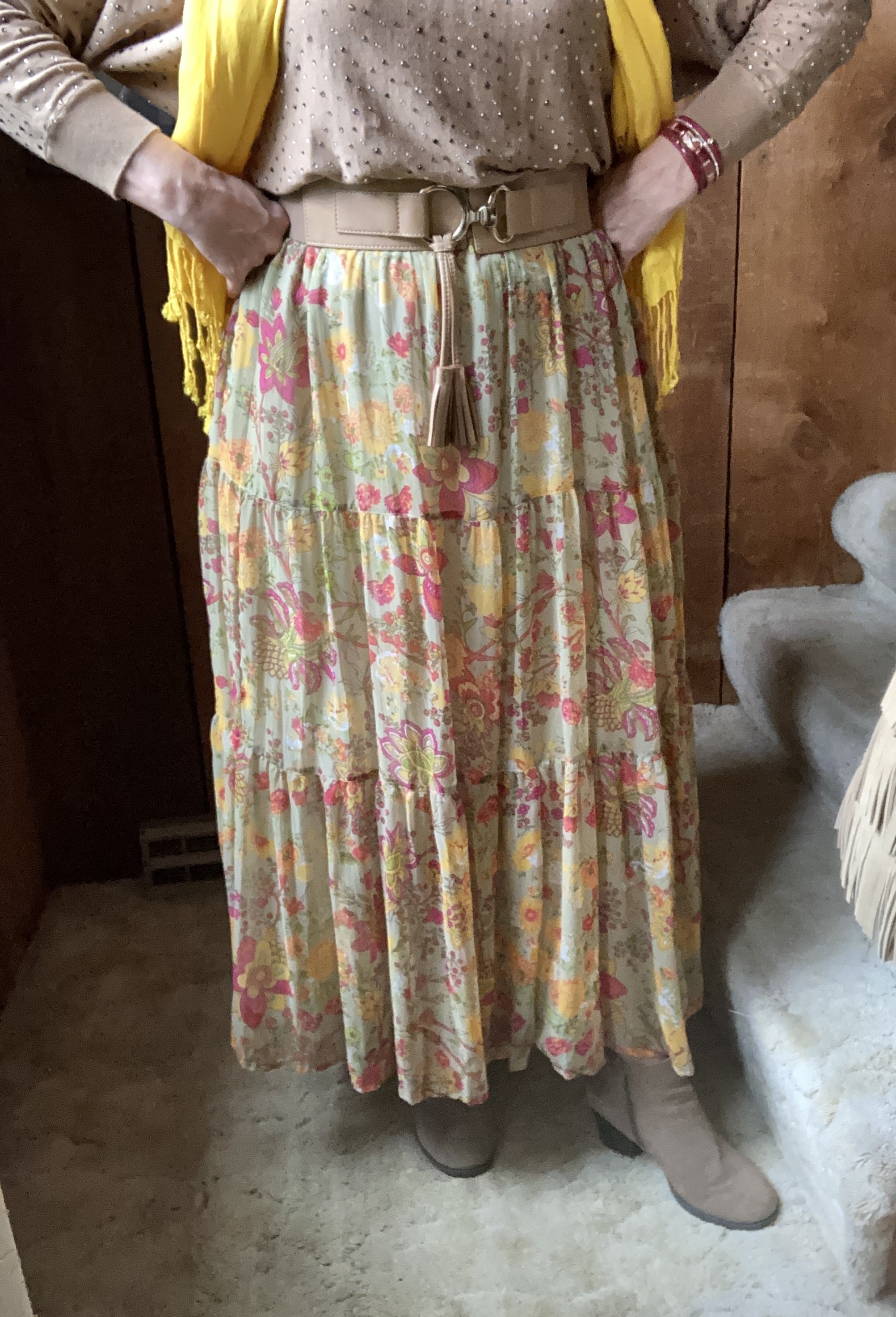
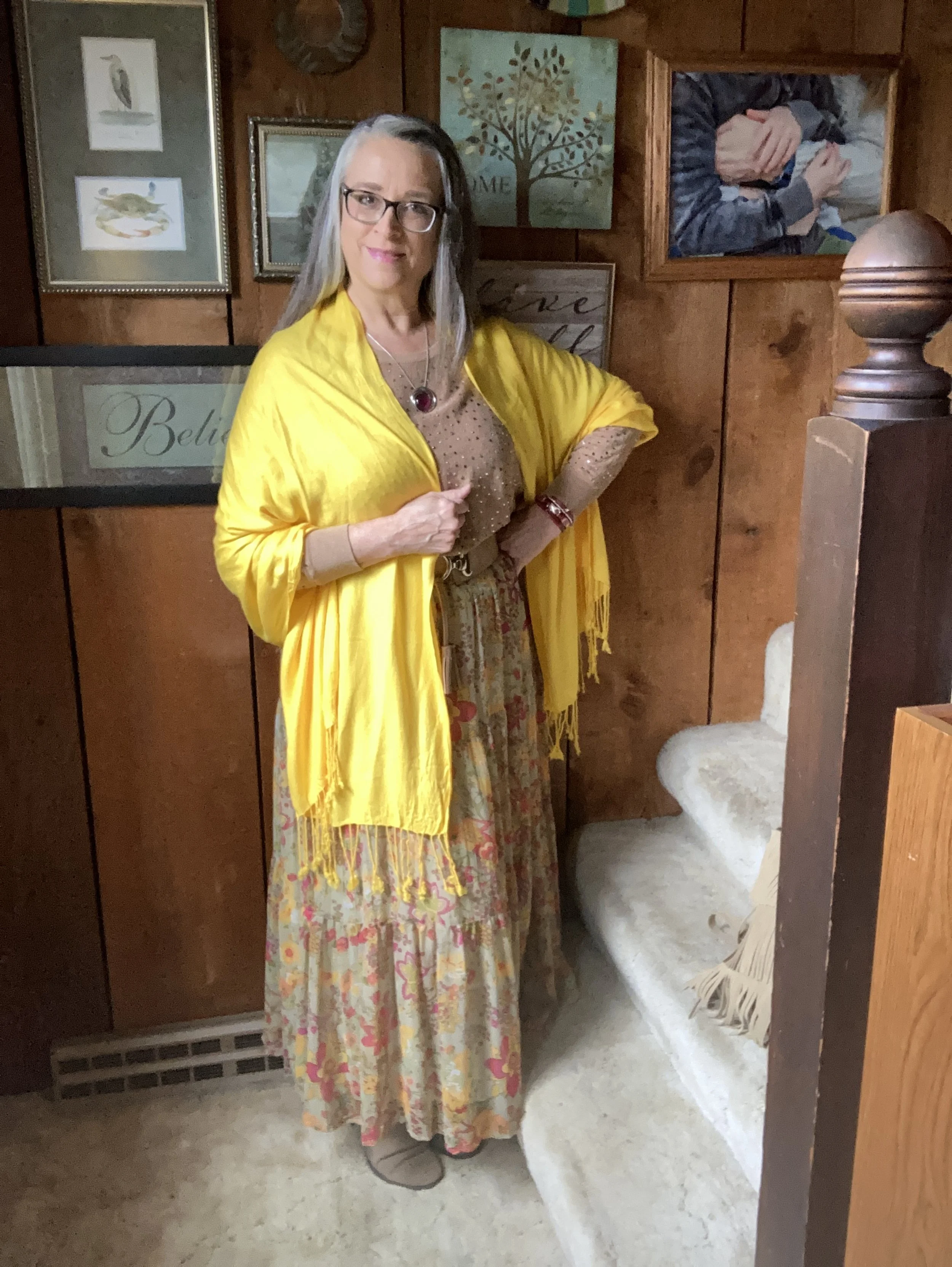
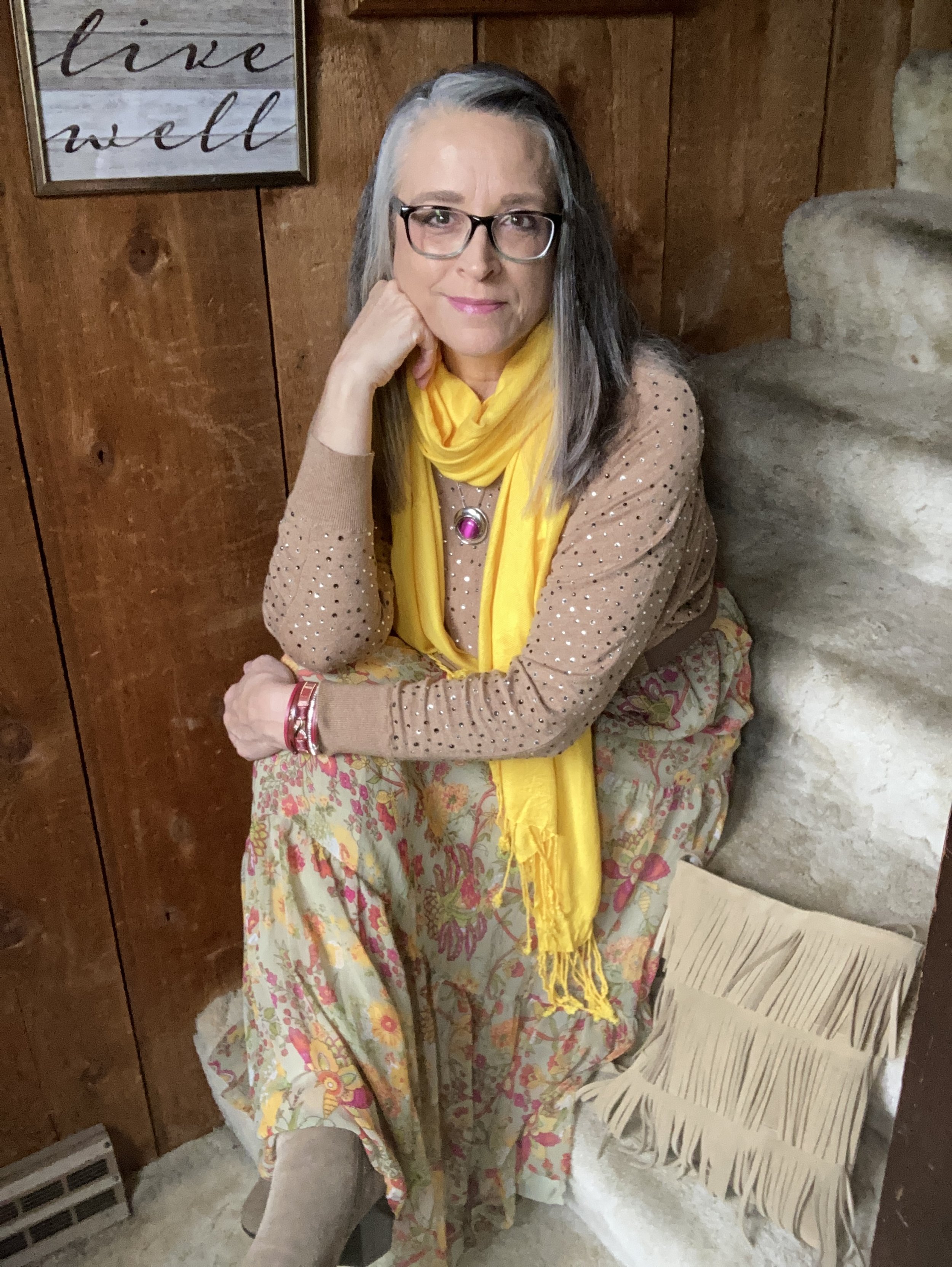
I love the boho vibe of this outfit. The bright colors, tiered skirt and fringe bag are all indicative of many Bohemian outfits.

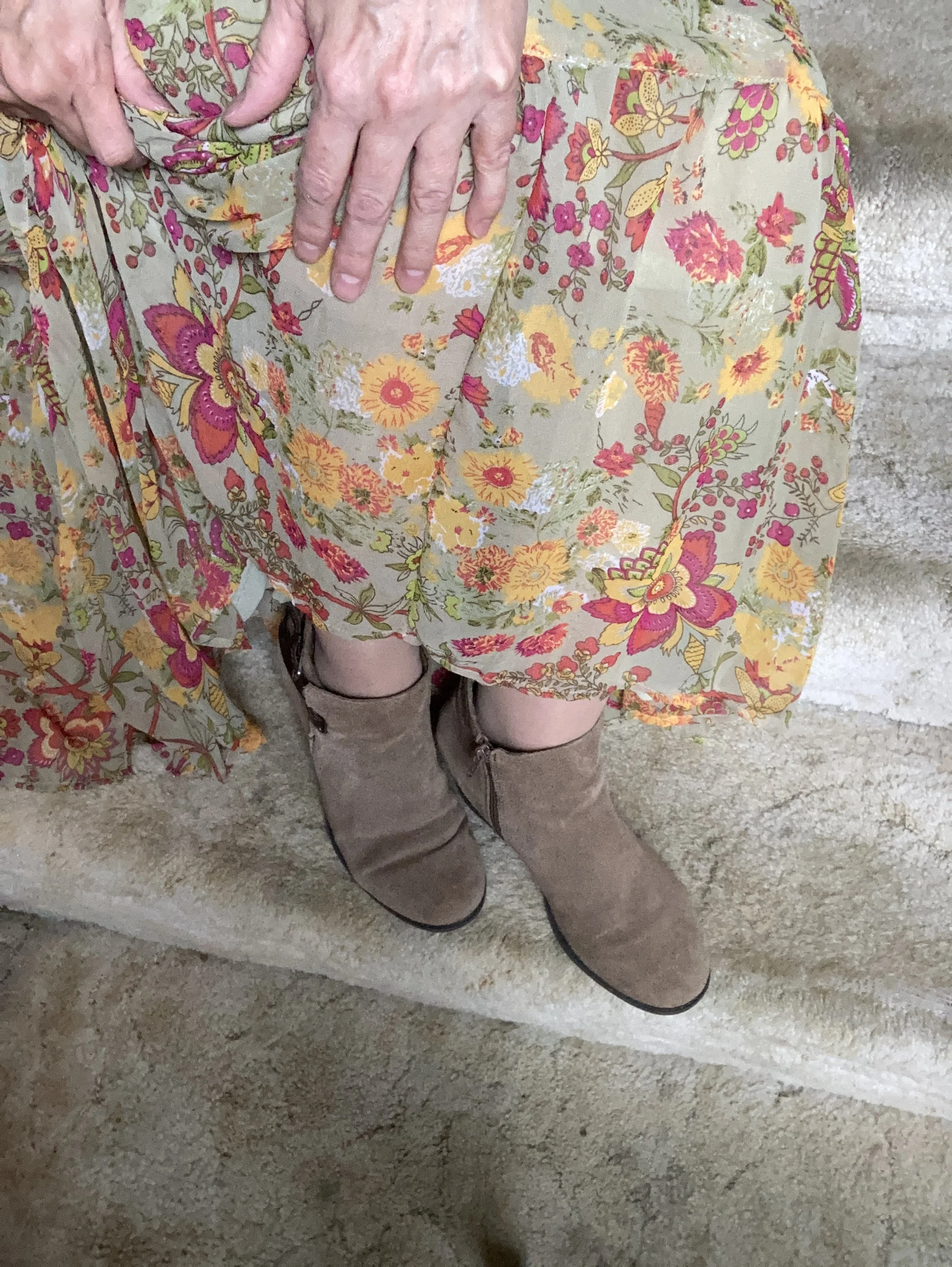
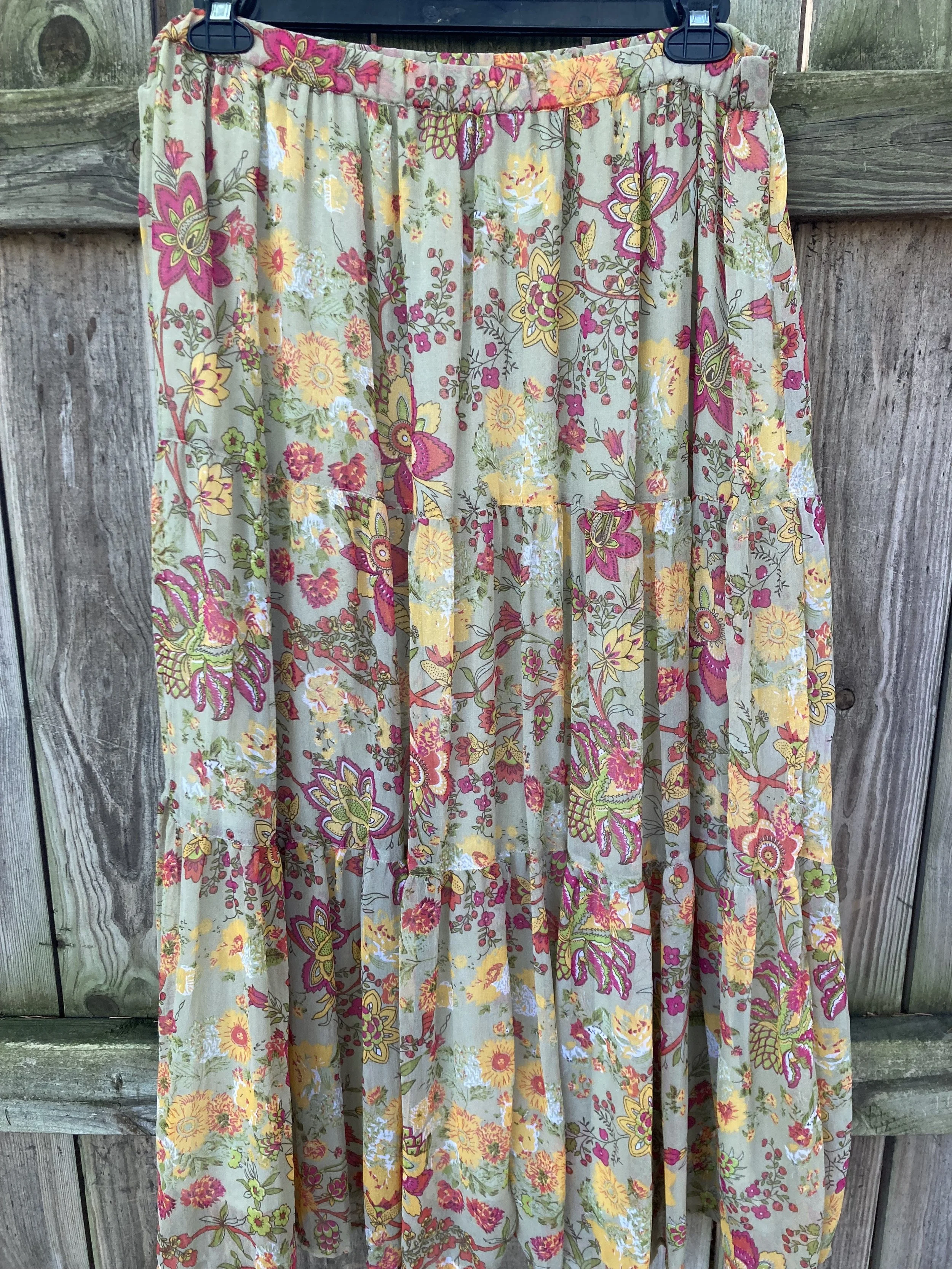
I was having a hard time decided which piece to use for the Rose Violet color. It is a bright, fuchsia pink and though I had my Button Front Maxi Dress from Closet52 (no longer in business), it was too overwhelming. I felt the bright pink and the bright yellow were needed in small doses, thus this fun, thrifted, tiered maxi skirt.

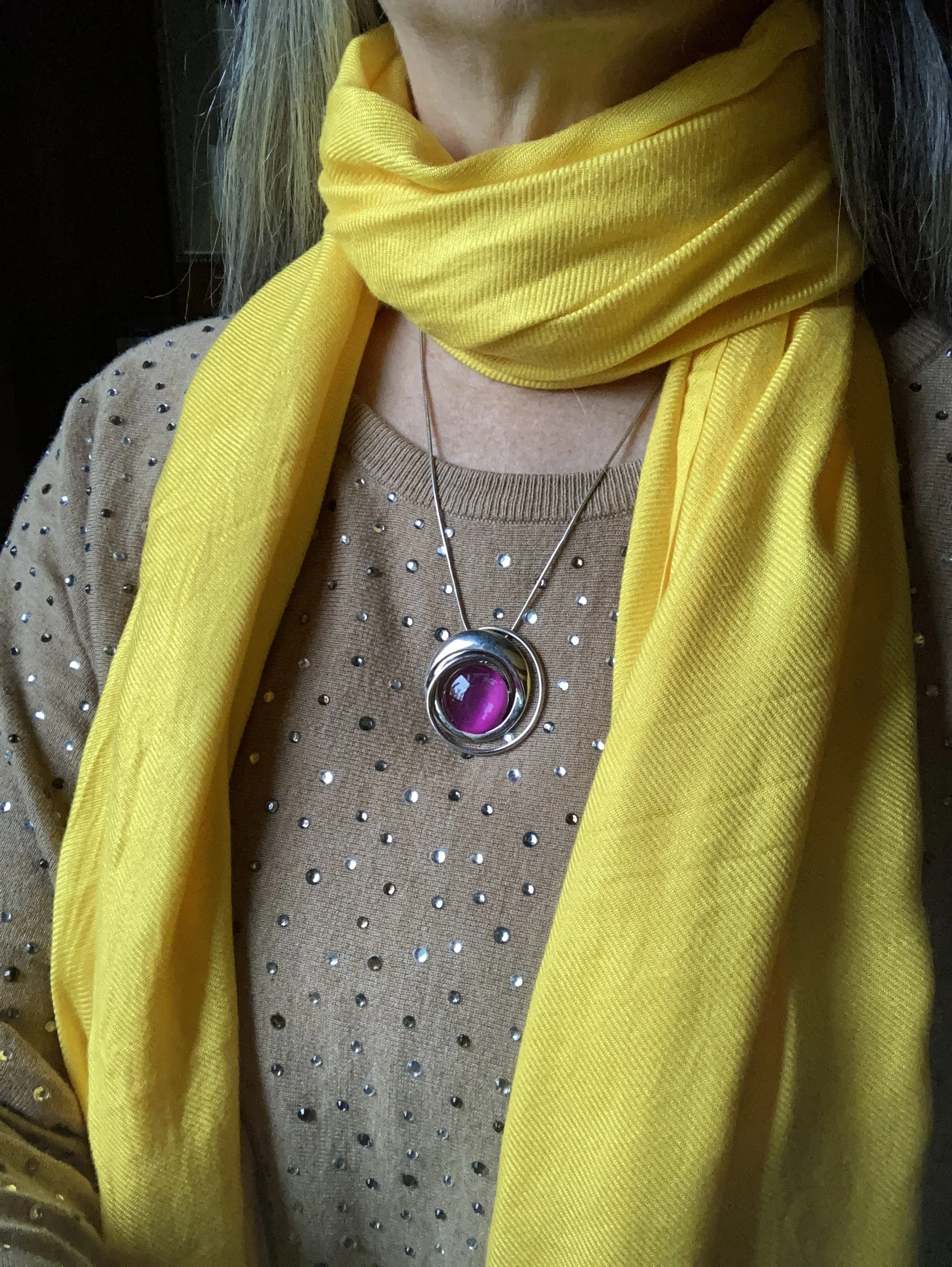
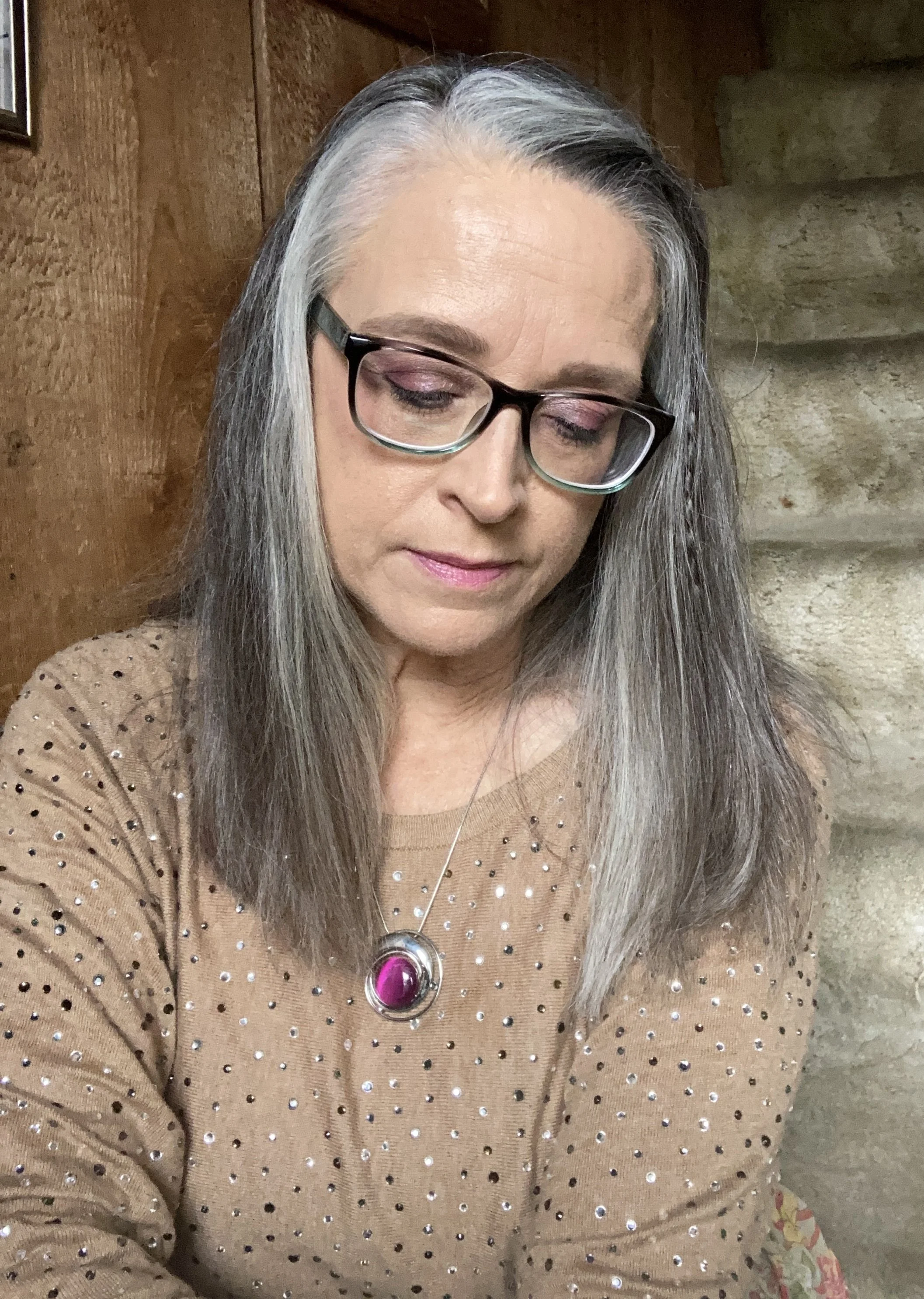
I added the old Christopher and Banks cat eye necklace to pull the Rose Violet color upwards, and I also wore make up allowing for a softer version of the bright pink on my face.

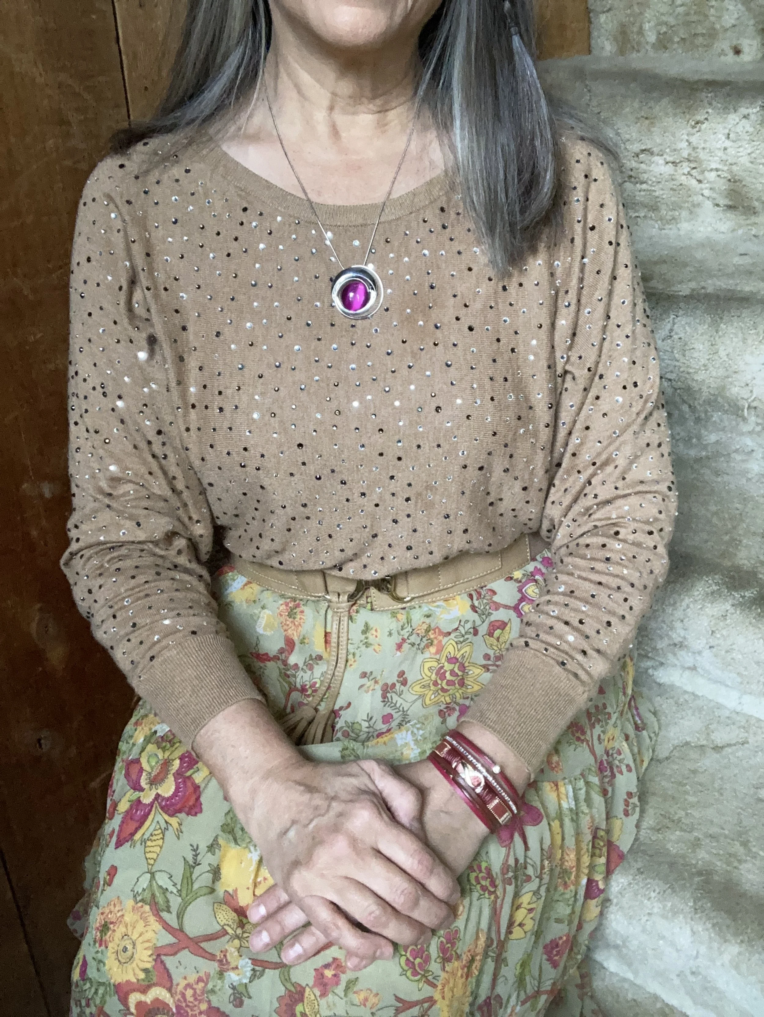
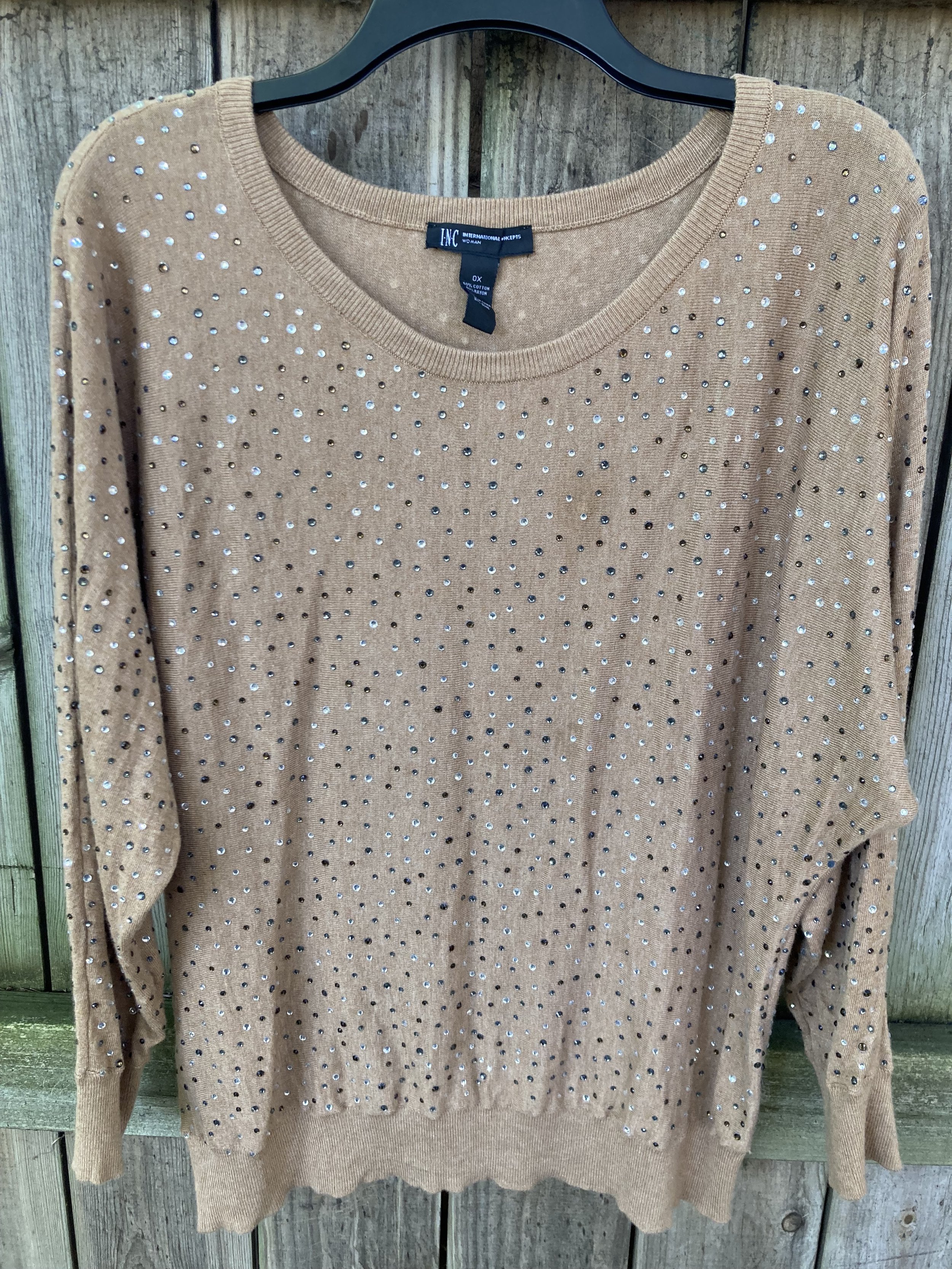
My Doe colored sweater was a fabulous thrift find. I thought the neutral color with the glistening, metallic dots would be great for the up coming holidays with a versatility that allows for dressing up or down.

High Visibility is certainly so. This bright yellow is so cheerful and definitely a pick-me-up on a cloudy, rainy day. Again, the skirt uses a paler version of the yellow to keep the outfit completely compatible through out.

Here is another way to wear the pashmina.

My accessories remained in the neutral shade to allow the bright pink and yellow to be the focal points for the outfit. The sweater is quite long, hanging below my bottom so I tucked it in and added the belt. It brings additional interest, texture and gives me a more refined hour glass silhouette.

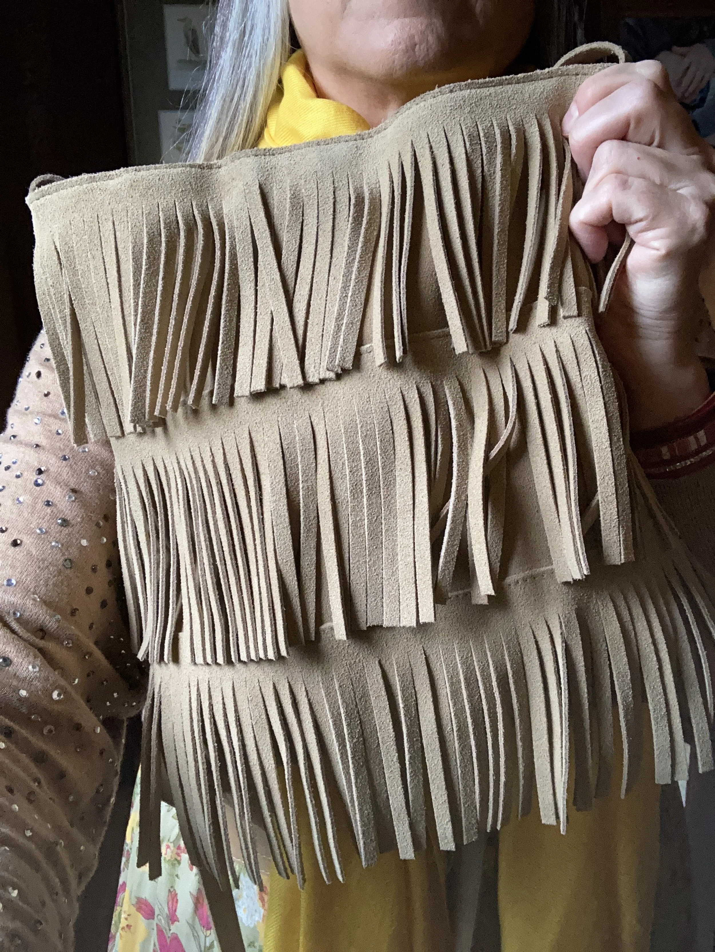
I added the thrifted fringe bag, and my older suede ankle boots which have a low heel helping to keep the skirt off the floor.

What do you think of this outfit? Do you like the combination of bright colors with more neutral colors? What would you do differently? I love to hear your ideas and thoughts, so leave me some love in the comments.

I hope you enjoyed this outfit featuring the Pantone New York Palette colors: Rose Violet, High Visibility, and Doe.

No shopping links this week, but I hope you are having a great day and a good week. Check back next Tuesday for another outfit post.

Pantone Autumn/Winter 2023 - New York Palette

The following are my renderings of the Pantone Color Institute’s Fall 2023 New York Palette. These are not going to be exact representations, but close to what the palette consists of. For actual color comparisons go to Pantone.

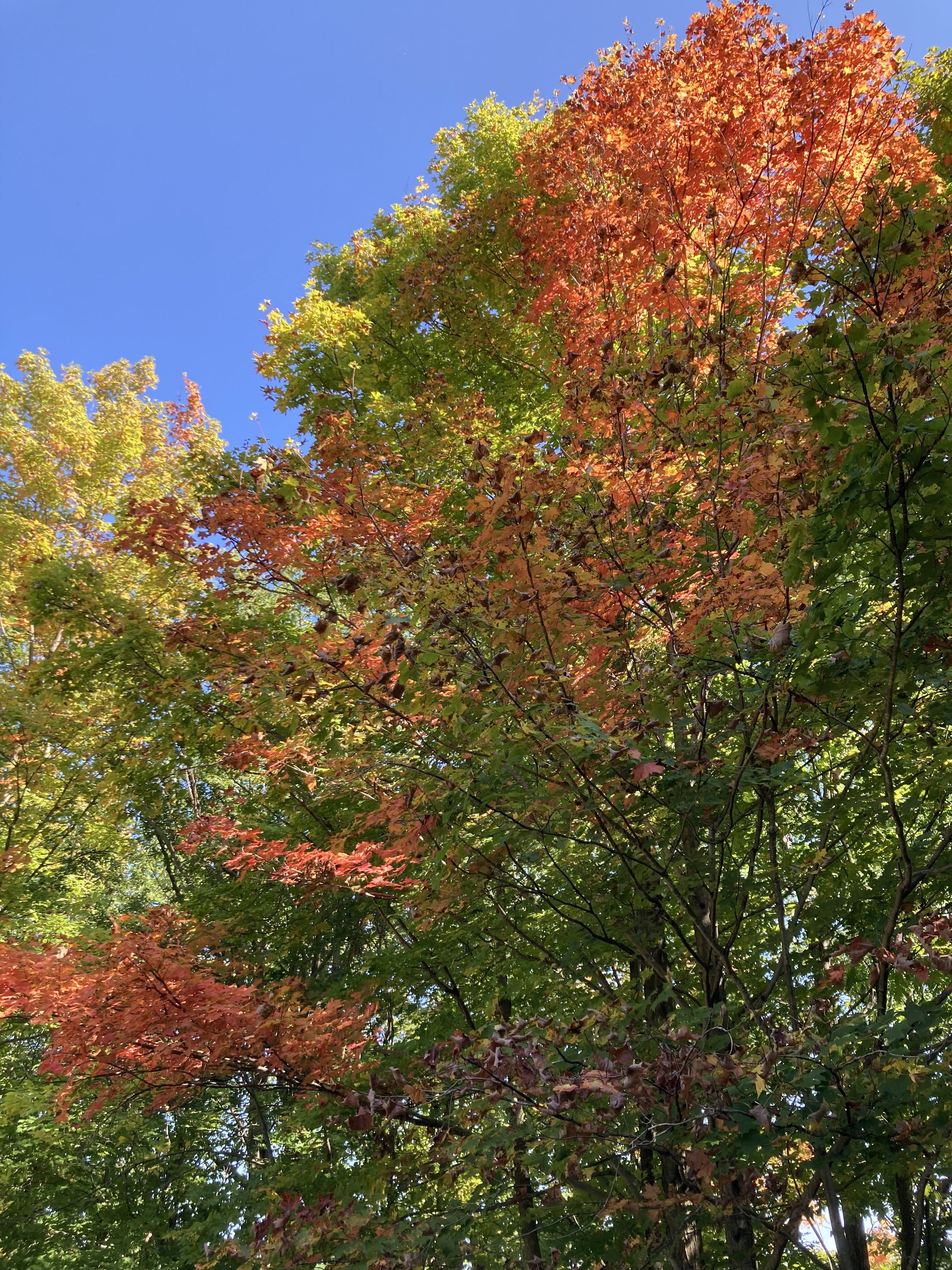
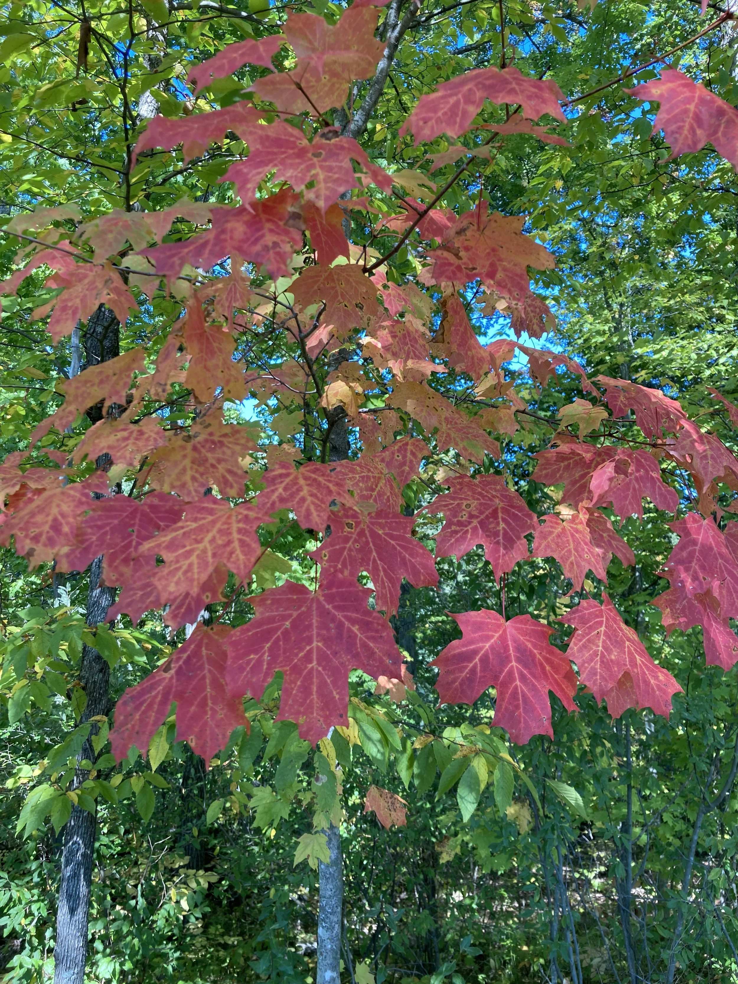
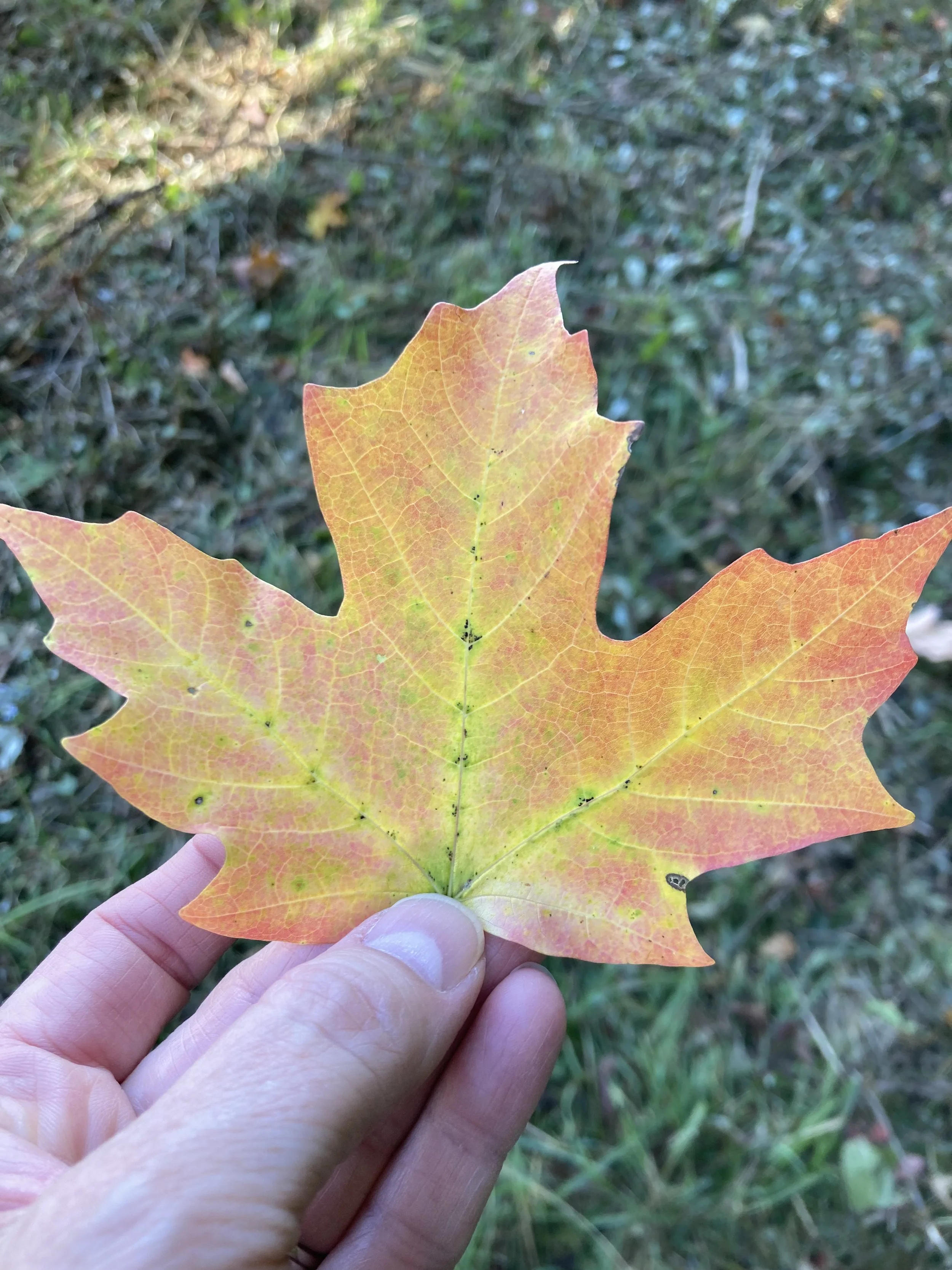
Happy fall everyone! The season is official and the leaves are beginning their seasonal change here in the midwest. My husband and I got out for a hike on Sunday afternoon and it was beautiful. It was actually a little warm for my preferences, but a lovely day to take a walk. The leaves around here are just showing touches, but many of those swatches are vibrant. I’m sorry Pantone, but no one creates a color palette like the God of Creation! These are few shots I took with my phone.
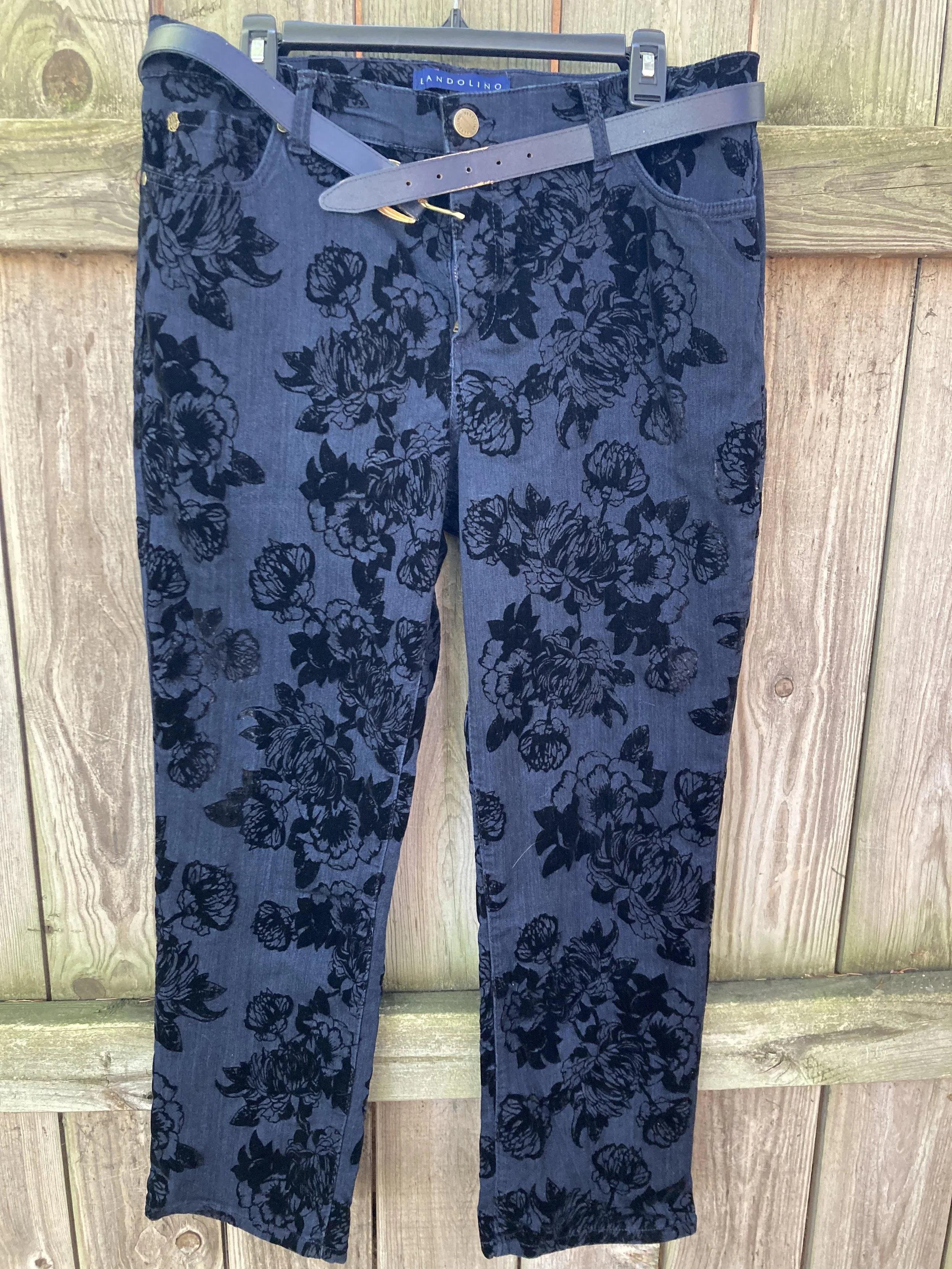
I am going to introduce the New York fall palette to you today. I decided to take pictures of the corresponding color pieces from my wardrobe to give you an idea of what the colors look like. Next week I will actually start showing you the outfits. In the mean time you can try to guess how I might put these pieces together, or you can come up with your own combinations, just for fun. Let me know in the comments which colors you would put together.

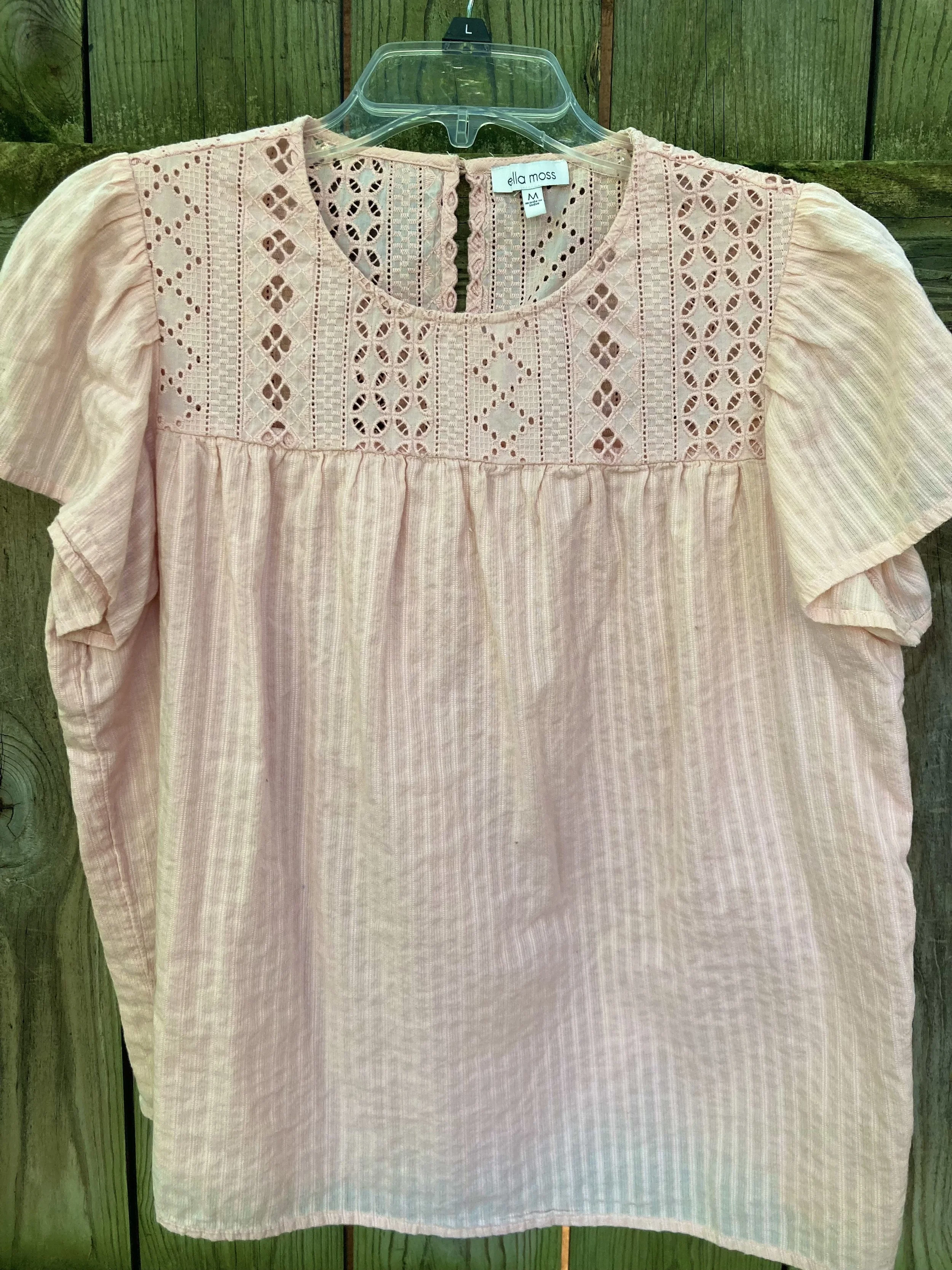
Tender Peach

As Pantone often does they include a few pastels. I am not as much a pastel girl, but I know many of you are, so it is fun to think about how I would include a pastel in a fall outfit.

Rose Violet

This hot pink fuchsia color is bright and sassy. Originally, I was going to use my fuchsia dress from Closet52, but it just wasn’t coming together, so I opted for this thrifted skirt with the Rose Violet flowers. I am not even sure what happened to Closet52. I can no longer find their website. So crazy, the way things come and go so fast.

Viva Magenta

This is the Pantone Color of the Year. You can see the post I did on that earlier this year. This is a lovely, bright color that really works in all seasons, and just about everyone can wear it, but it is hard to find.

Red Orange

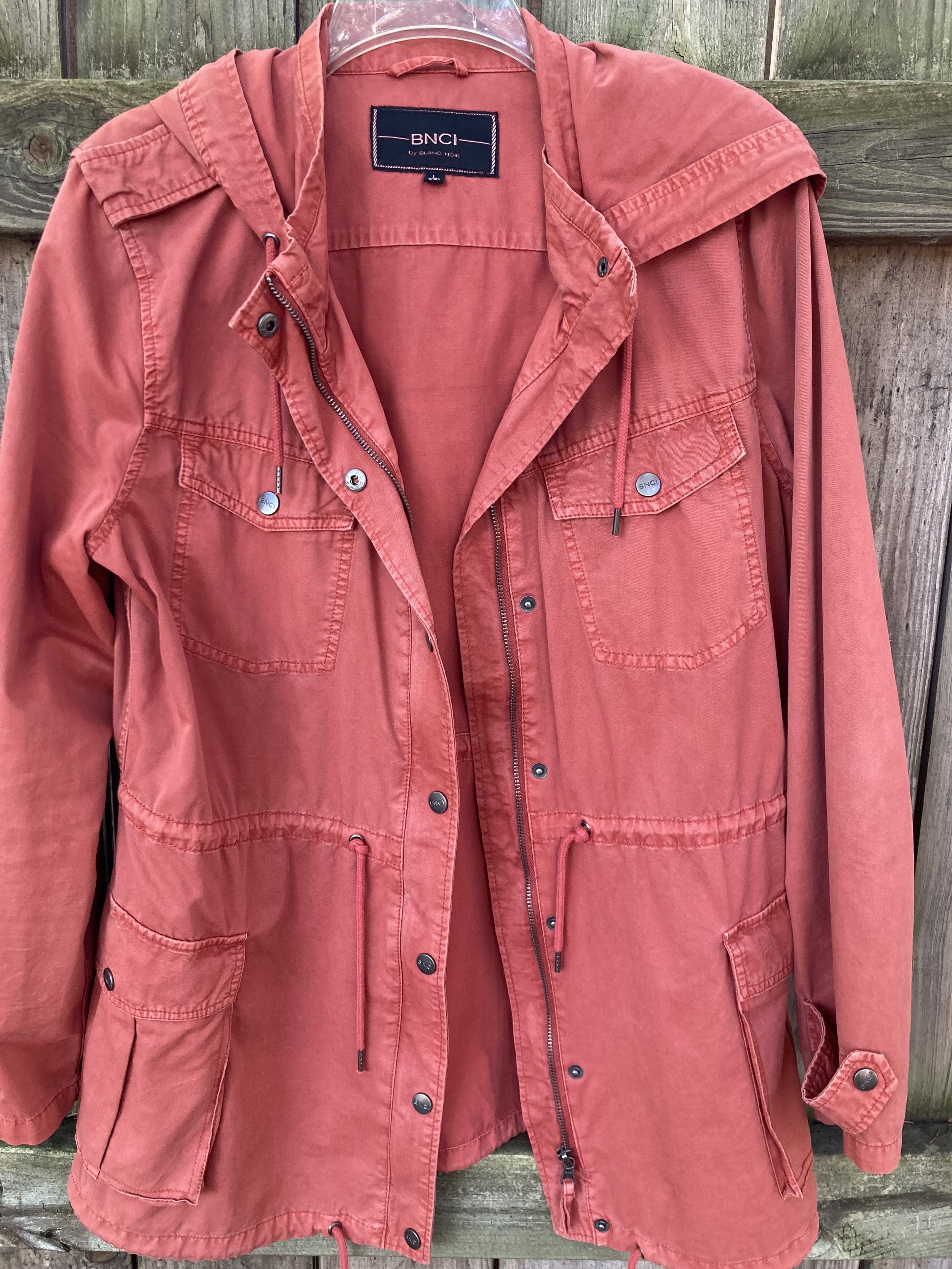
This is a color we often equate with fall, especially when we think of changing leaves. The red orange can be easier to wear for some than a true orange. Either way it is a great fall color.

Red Dahlia

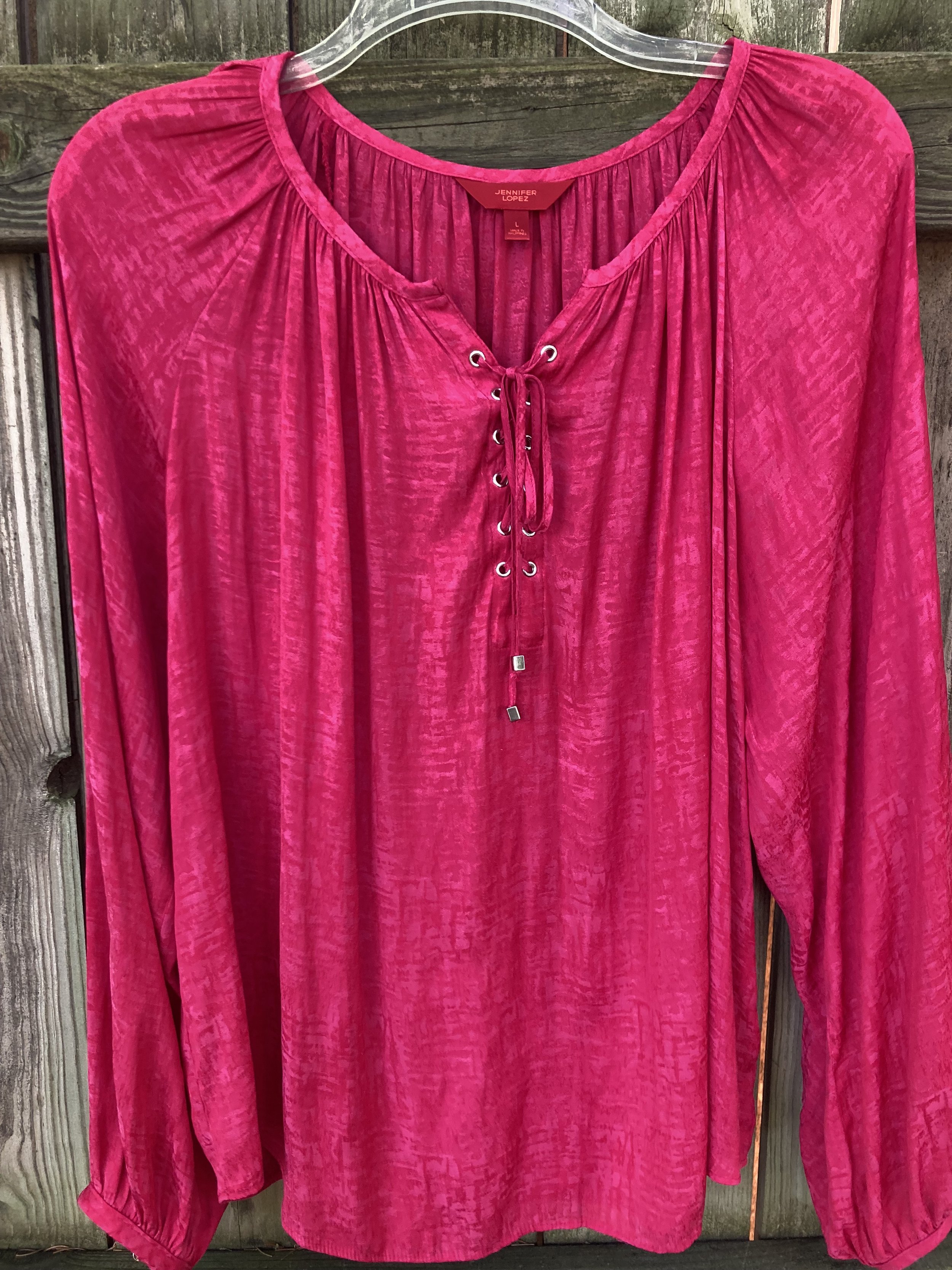
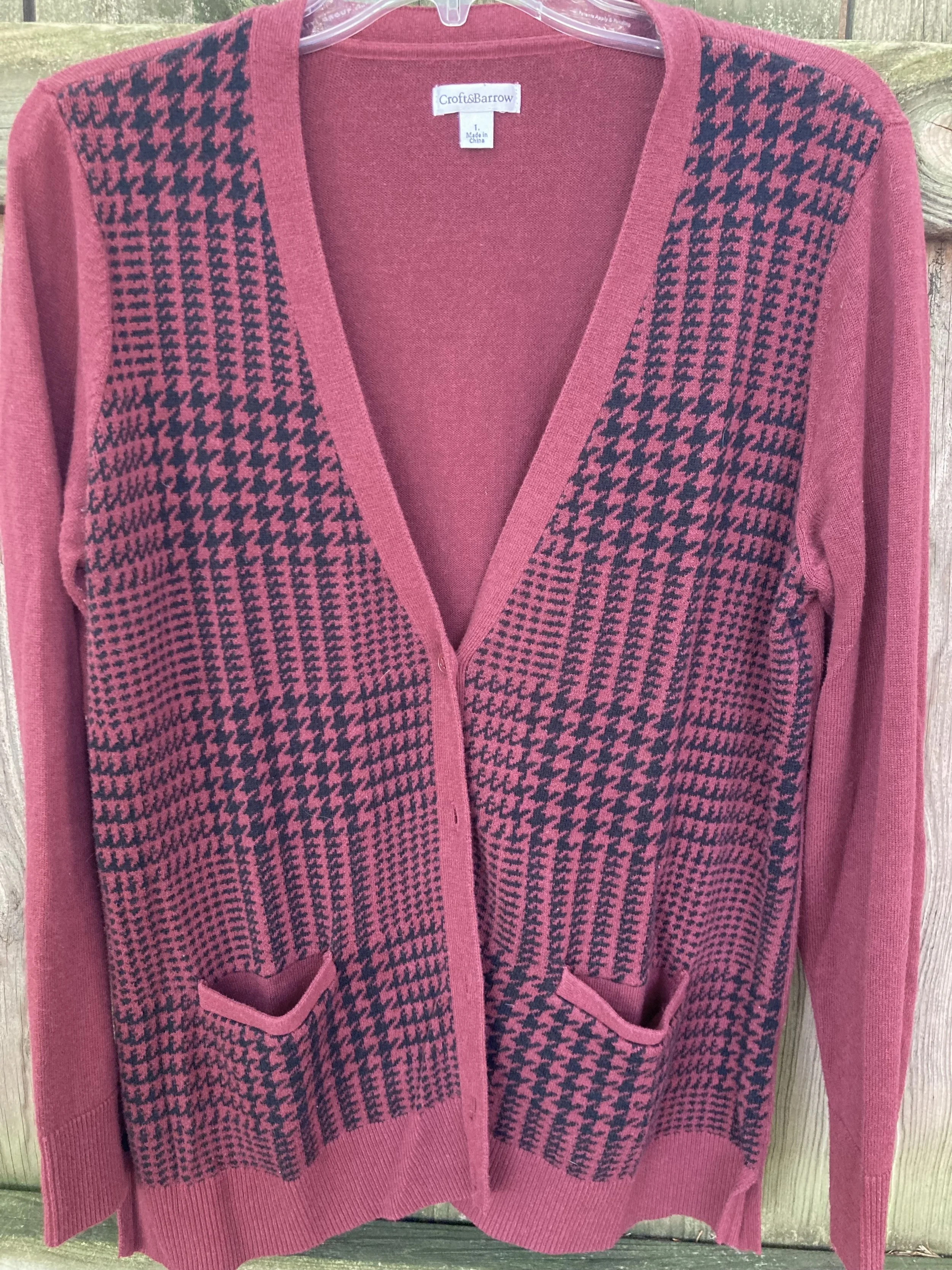
Fall wouldn’t be complete without some sort of maroon, burgundy or berry color. Red Dahlia is more towards the maroon side. This picture doesn’t really do it justice. The sweater is a dark maroon, but for some reason it kept looking lighter and more red. Silly phone photos!

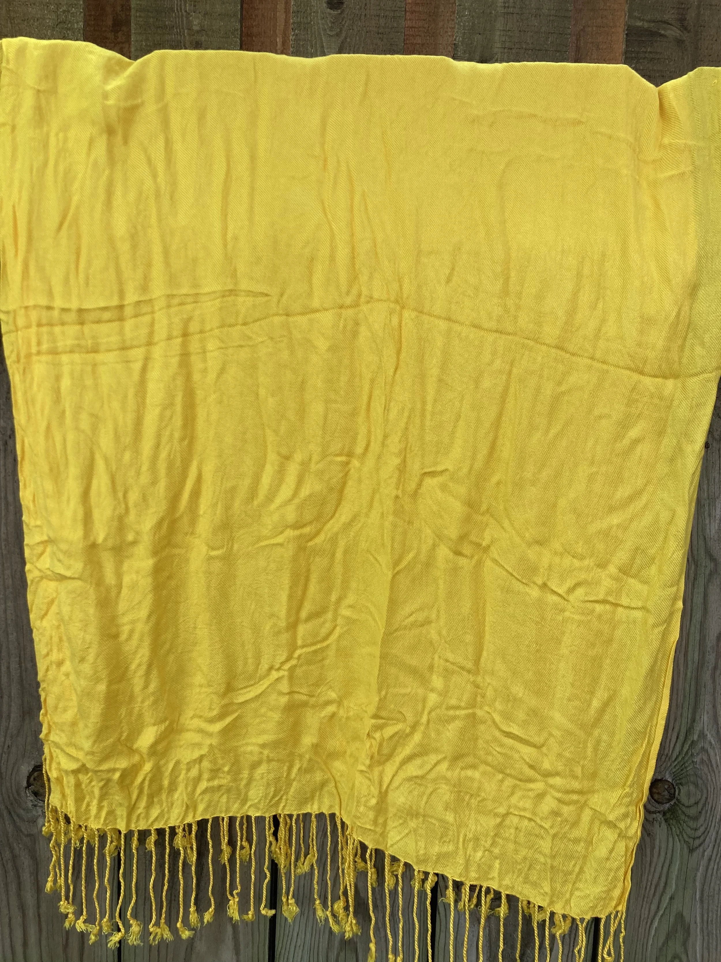
High Visibility

Pantone almost always has some sort of bright yellow on its fall palettes. This is another color reminiscent of the changing leaves and sunflowers that are in full bloom at the end of summer.

Persian Jewel and Carnival Glass

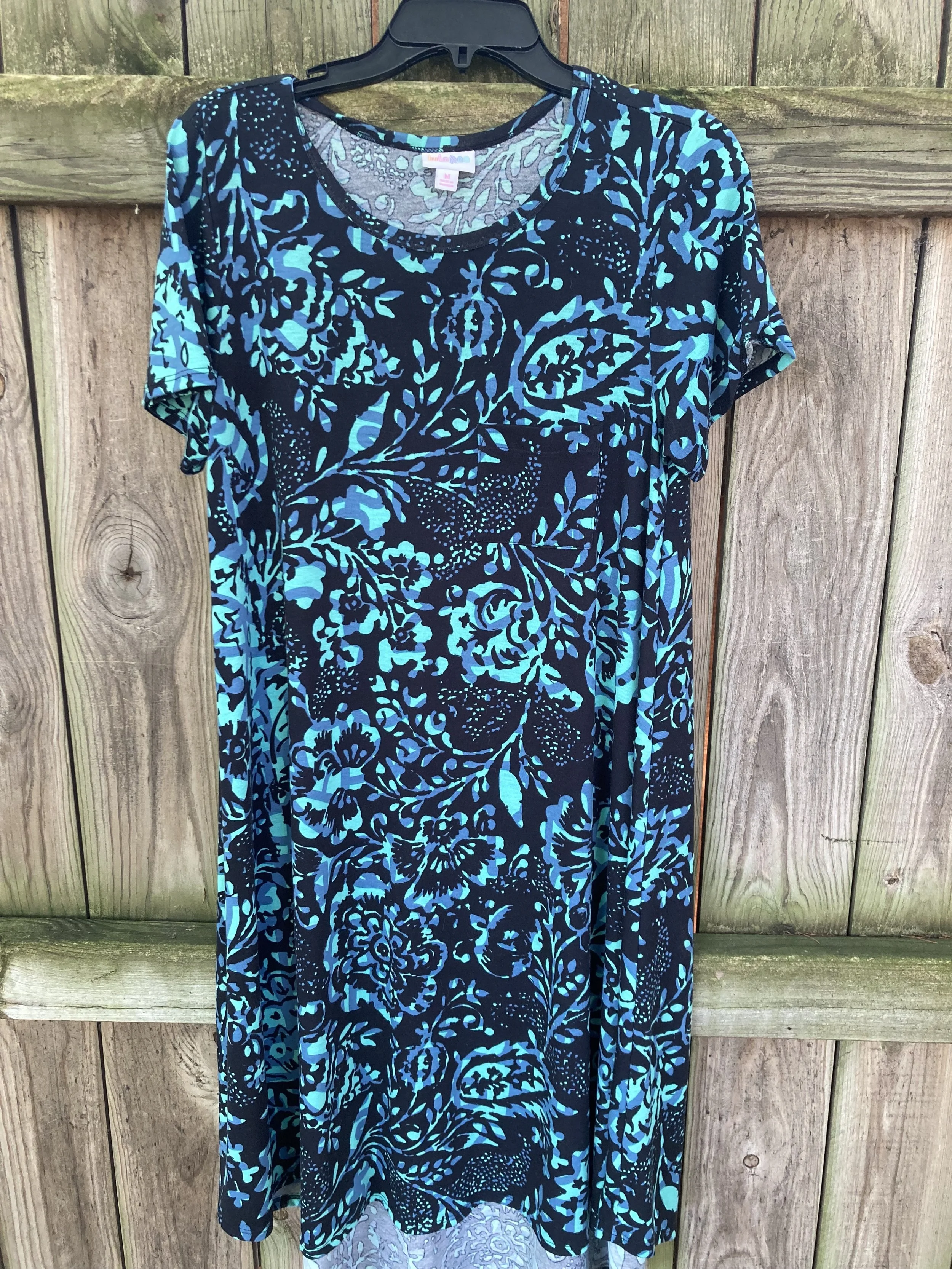
These two colors you know will go together for my future outfits. They both were hard colors to find in my closet. I actually had a few pieces that met the Carnival Glass qualifications, but the Persian Jewel is a particular blue akin to Periwinkle, which is a purply blue. I do not have much of that particular blue in my wardrobe.

Burnt Sienna

This earthy orange is another fall staple in my opinion. It goes so well with many other colors and exudes that autumn feel.

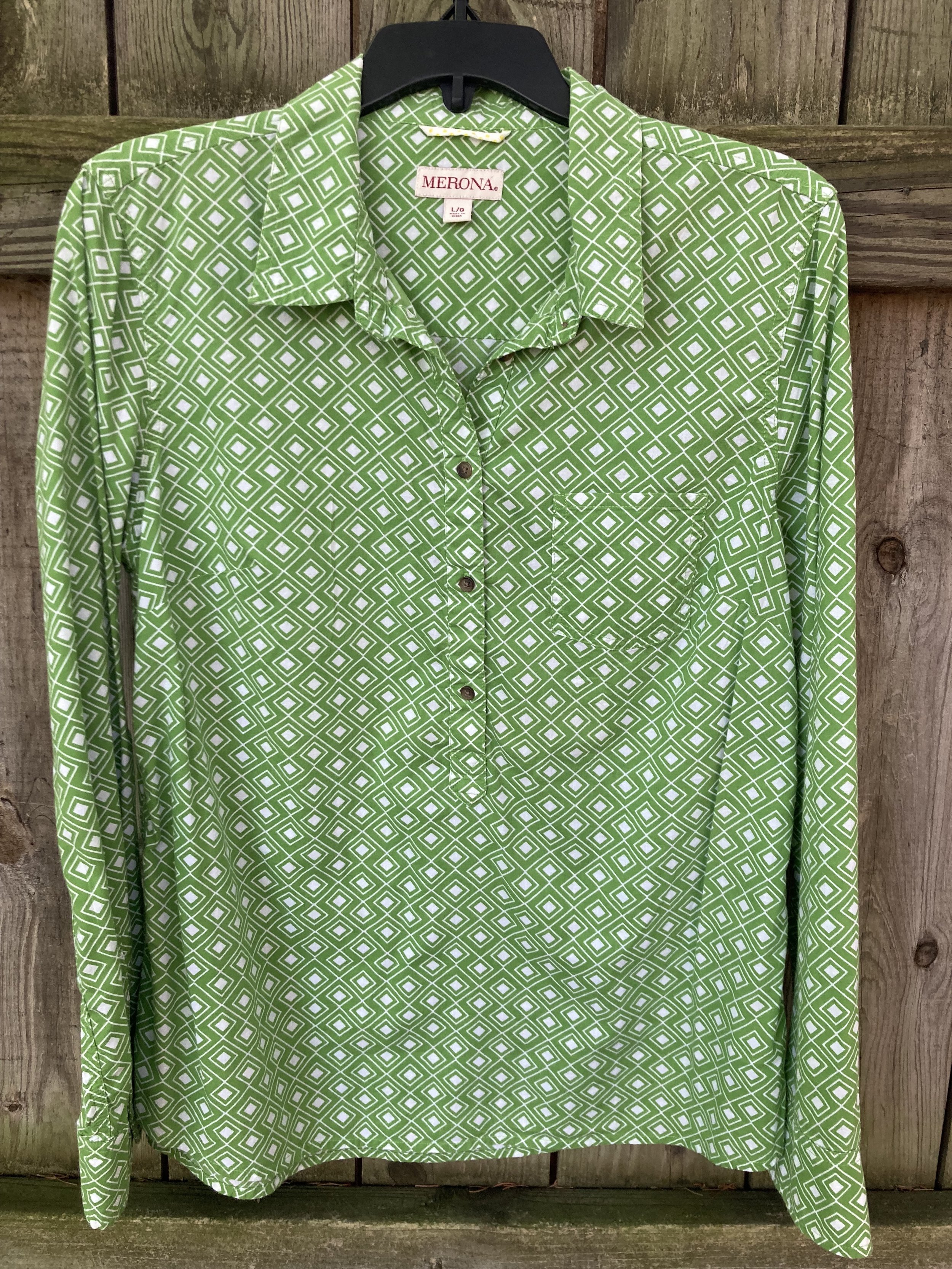
Kohlrabi

This bright green works well with the fall palette, once again mimicking the changing tones of the leaves as they grown pale in comparison to their spring attire.

Classic Colors

As always the Pantone color palettes include a few classic colors that work well as foundational or accessory colors.

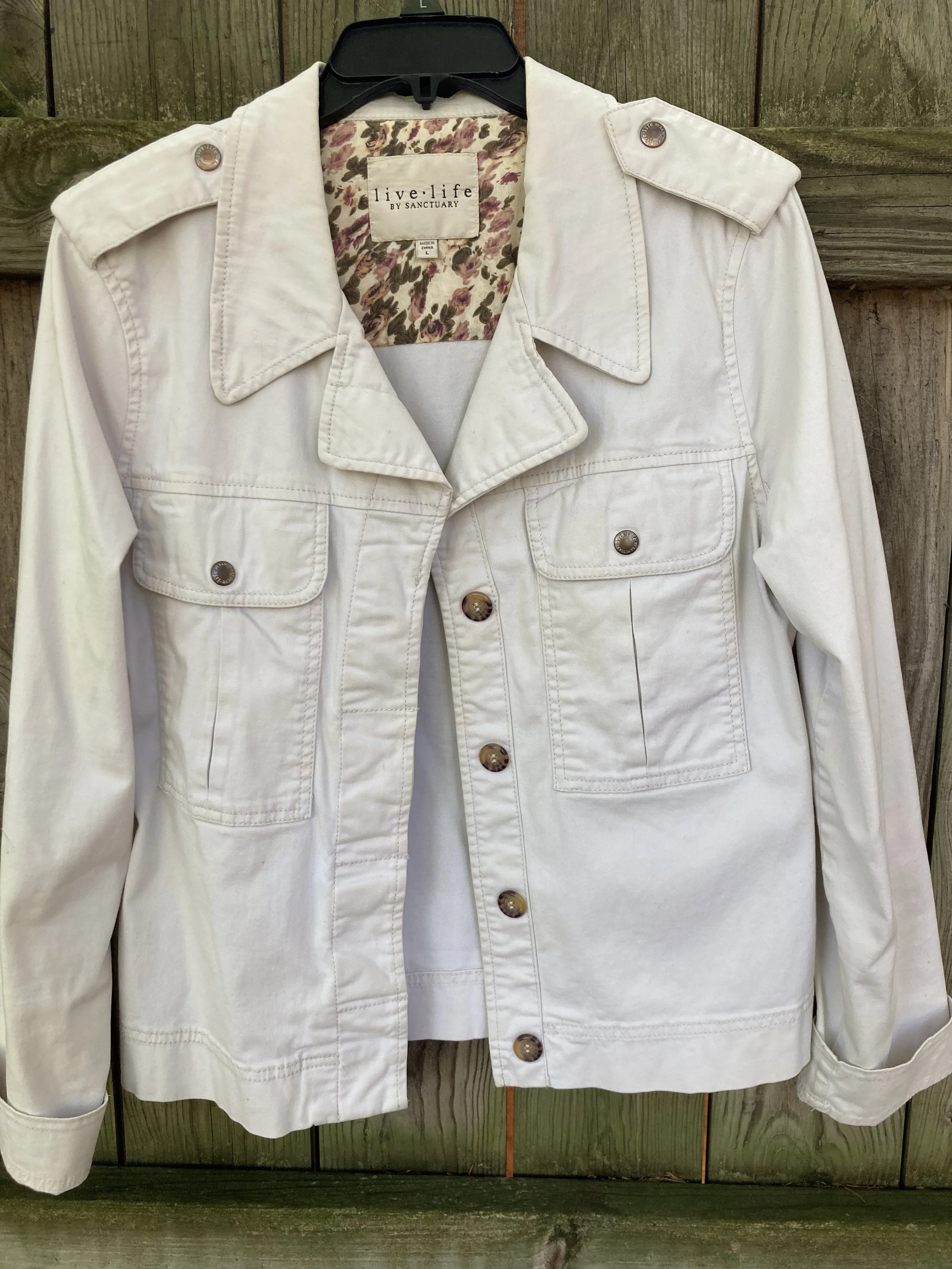
Coconut Milk

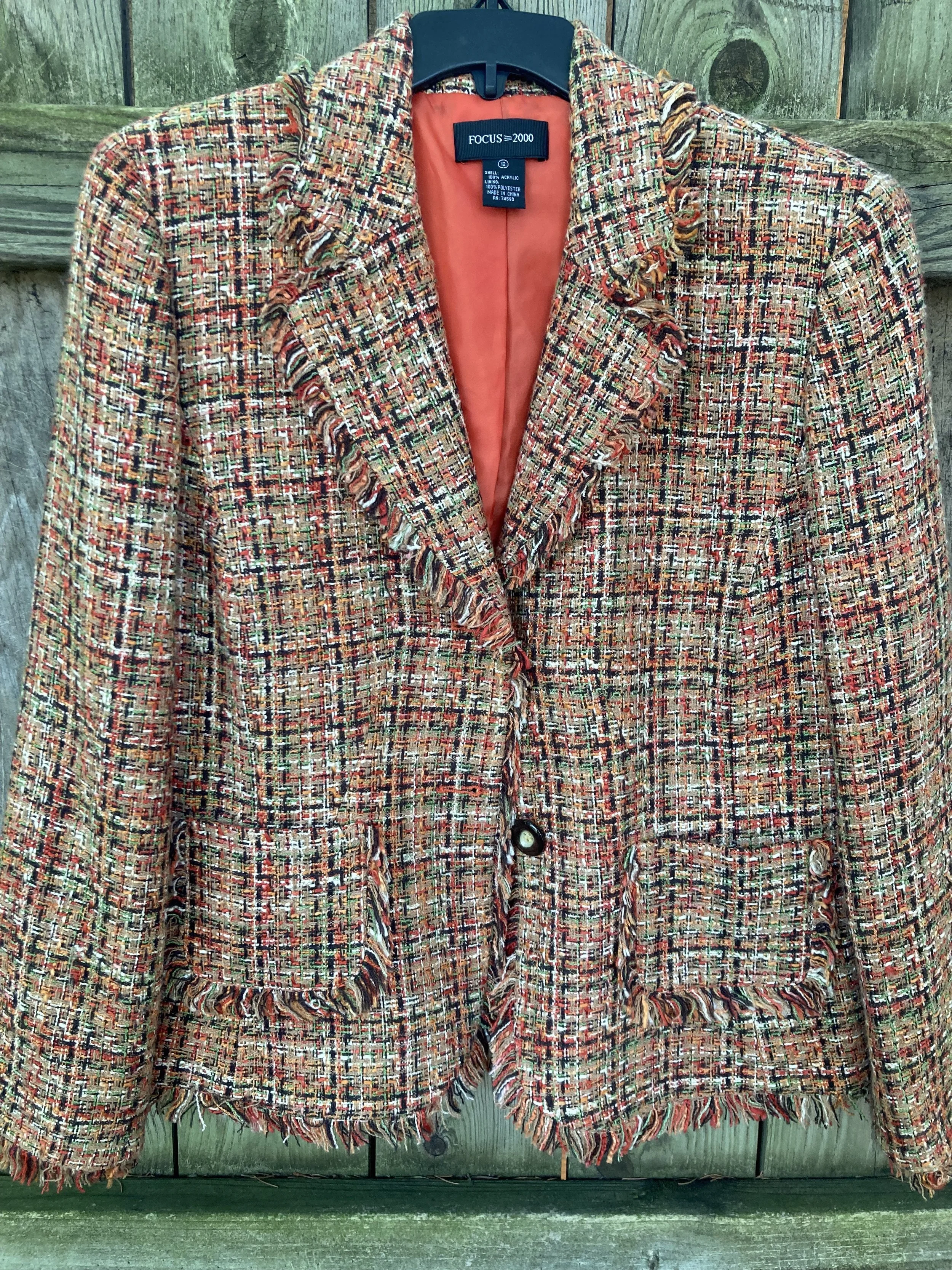
Not a pure, snow white, but not a true cream or ivory, this white does well for casual pieces like this jacket.

Eclipse

This dark, midnight blue is reminiscent of a fall, night sky as after the sun has completely set. A close cousin to navy, this blue is versatile enough to wear with any color.

Doe

This soft, light brown exudes warmth and can replace other common neutral colors like beige, tan, or camel.

Hot Fudge

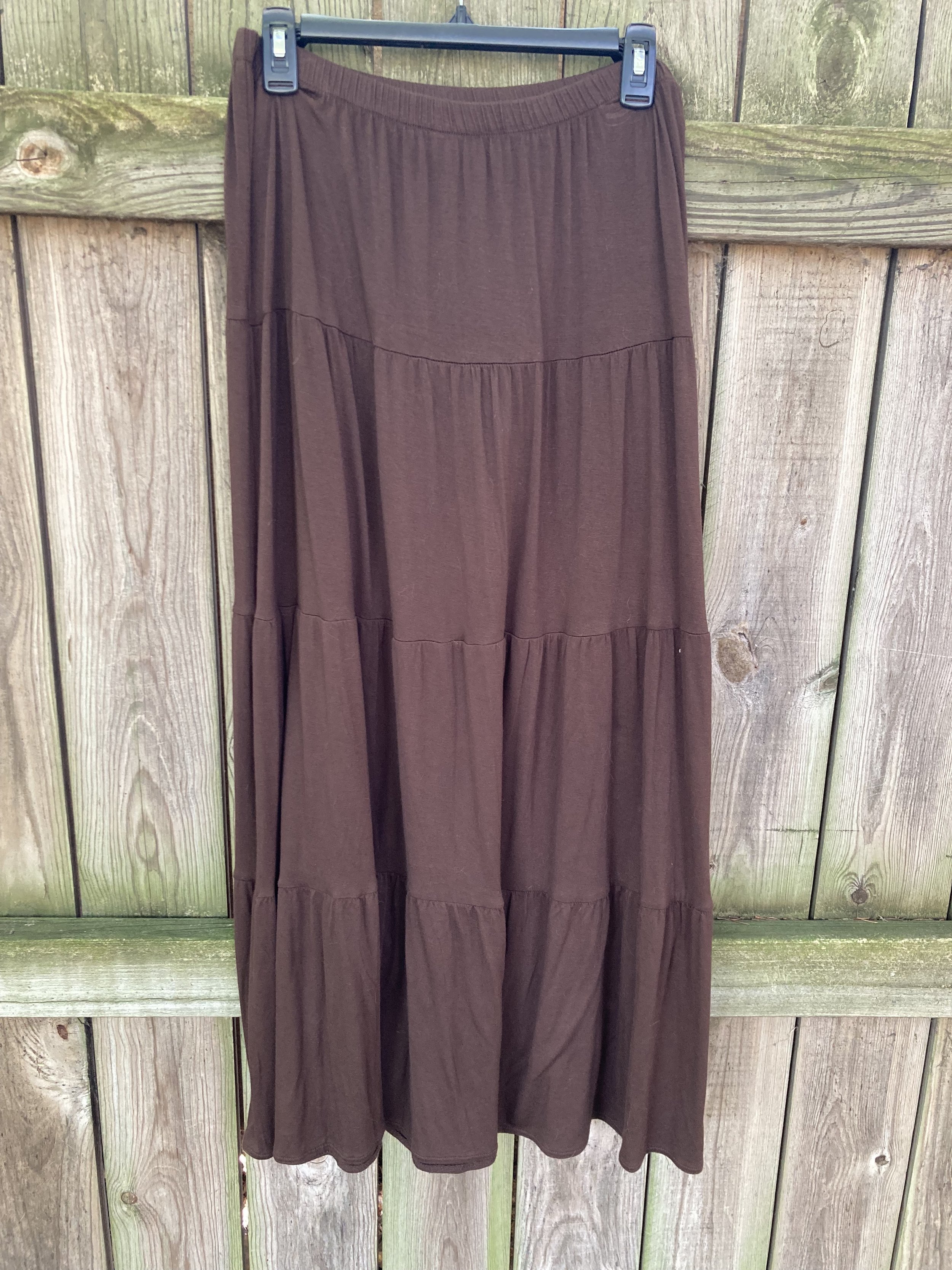
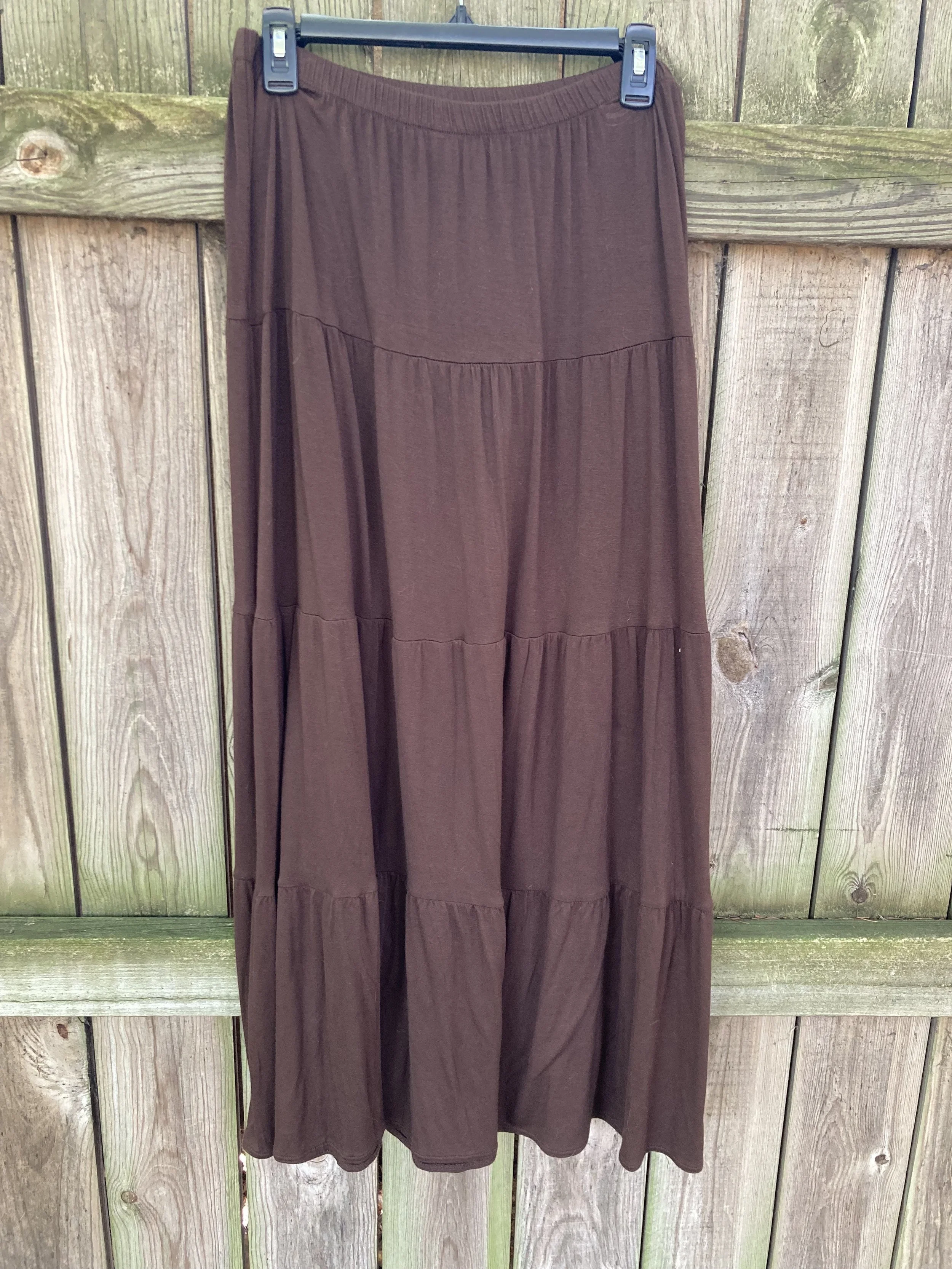
A dark brown that can be the perfect color to ground an outfit, weather as a skirt or pair of pants or as a pair of boots or leather bag.

Silver Birch

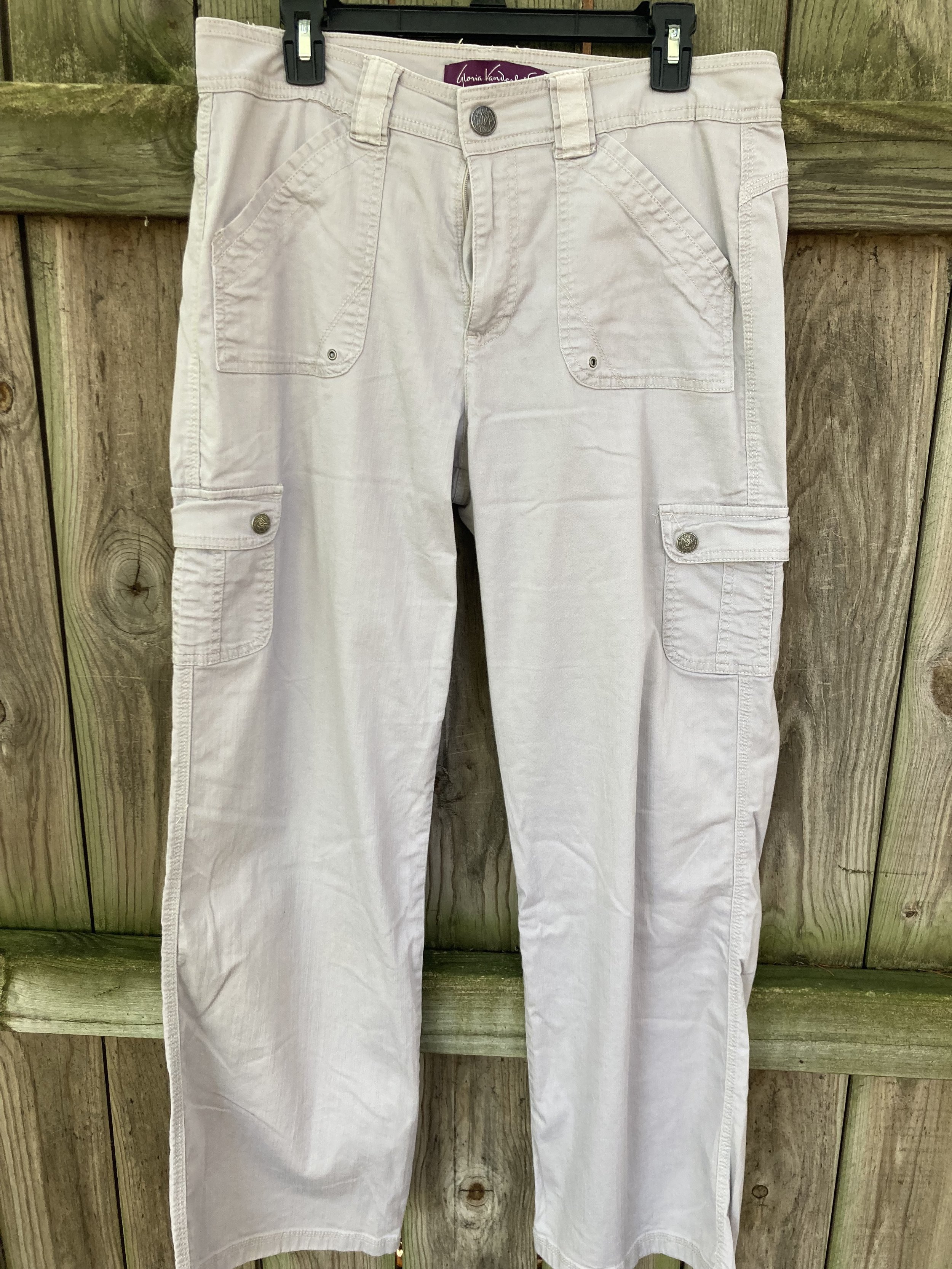
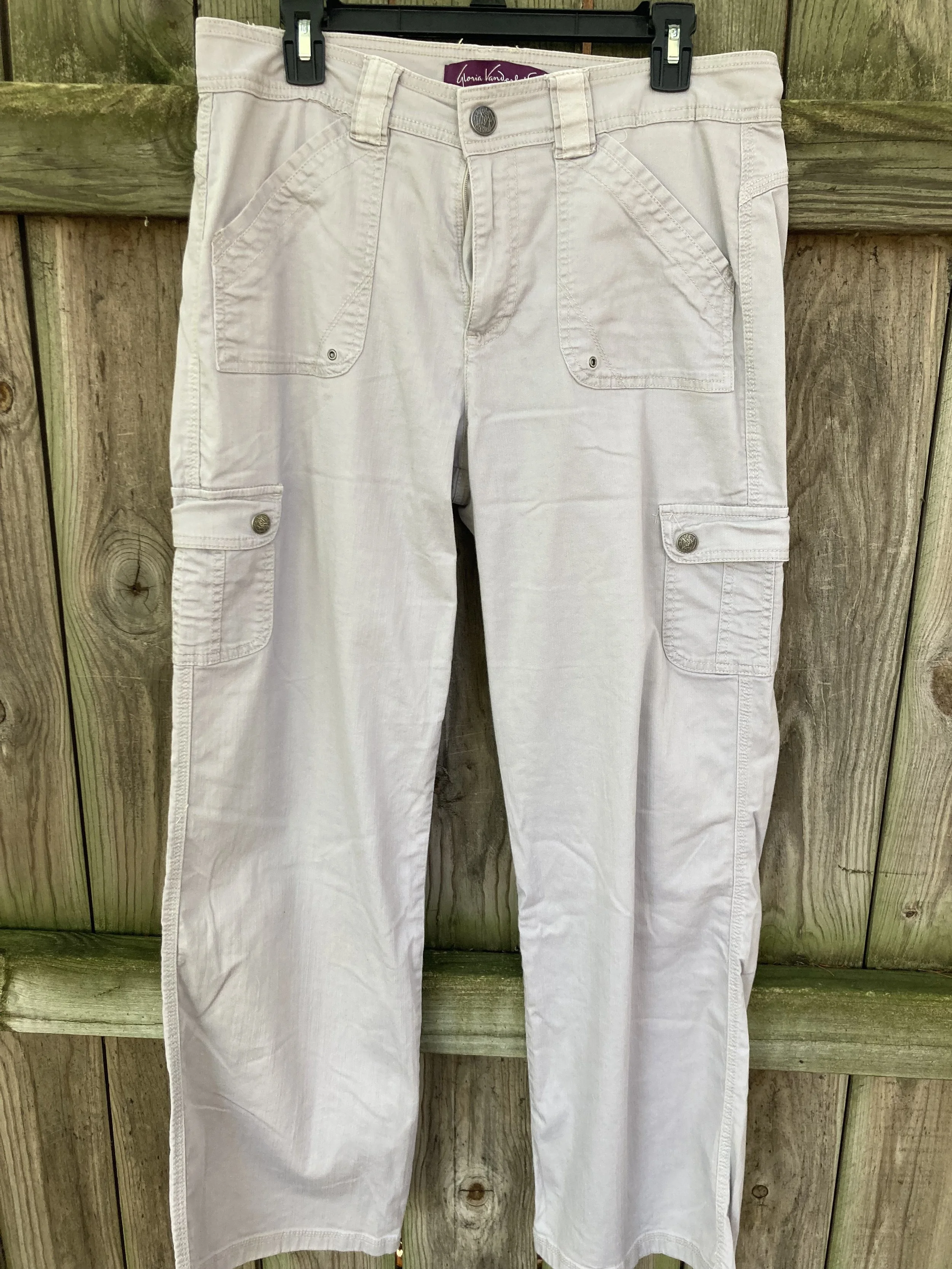
This light gray is the perfect transition color for fall, when you are not ready for the dark grays like oxford or charcoal. This is another color that will combine with just about anything.

So there you have all the fall colors. The next few weeks I will show you which colors I combined to make five fall worthy looks.

What are your favorite colors? Which colors would you combine to make an outfit? Which of these colors do you have in your closet. I look forward to hearing your thoughts.

Have a great Tuesday!