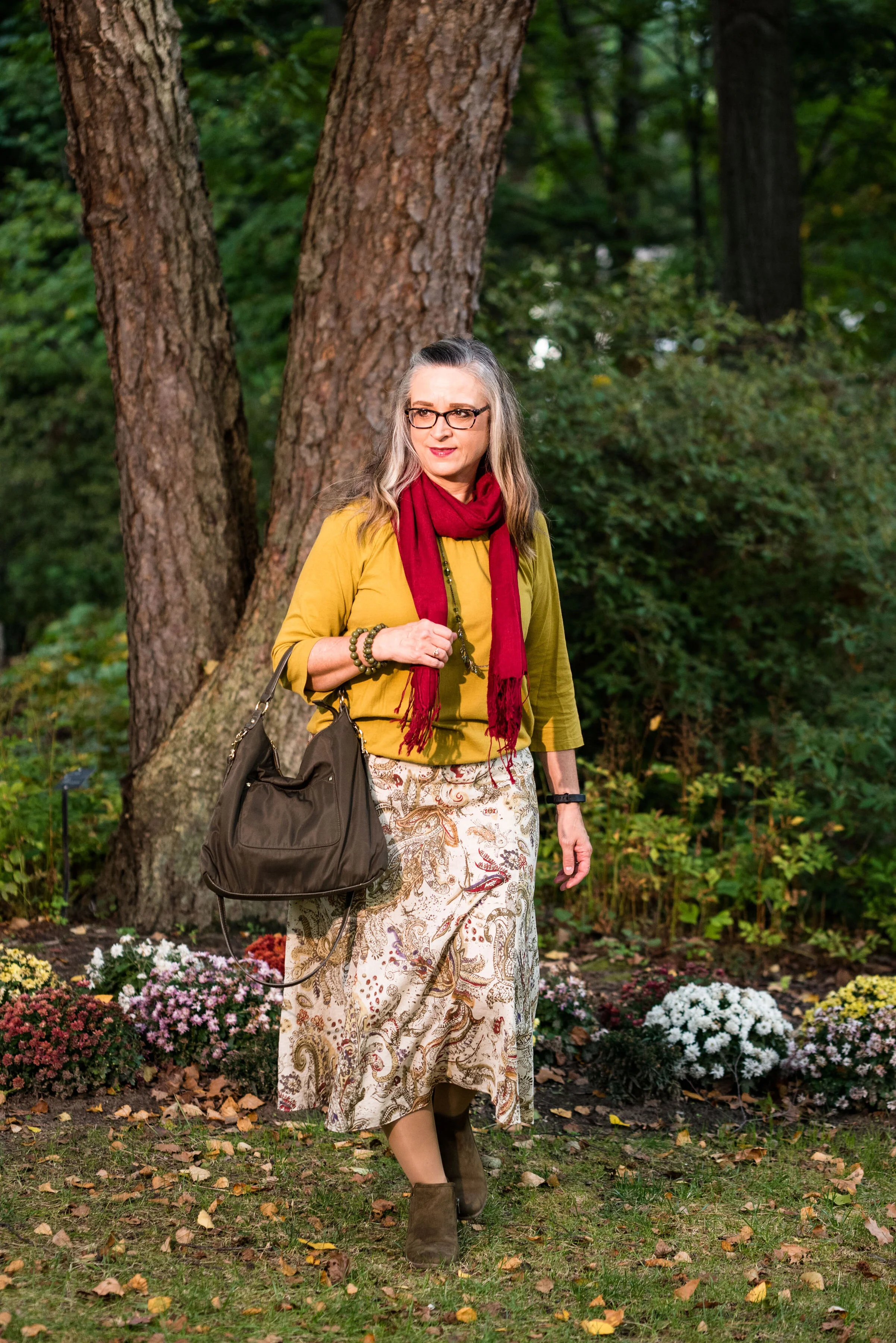
Color Play - Inspiration from Art

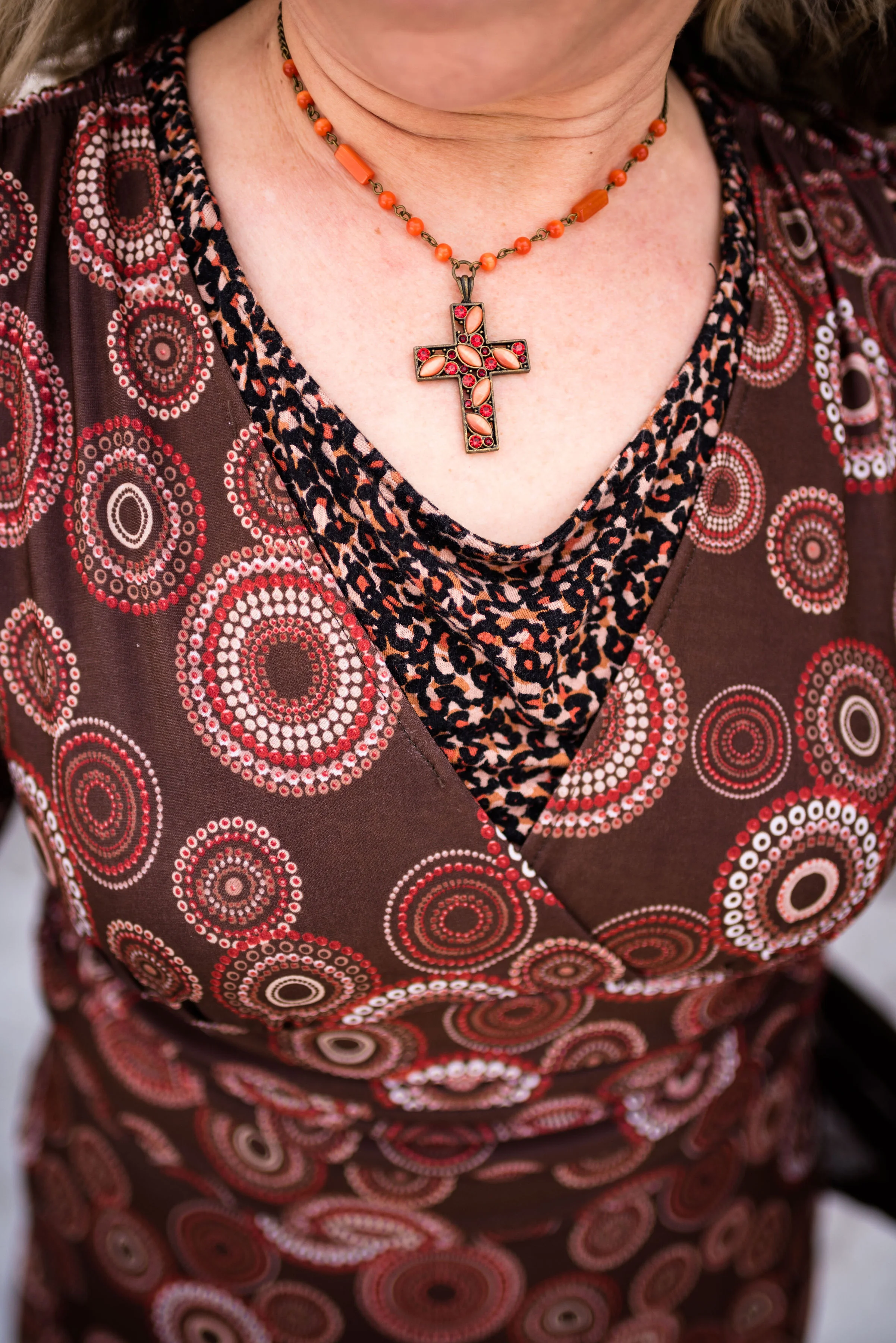
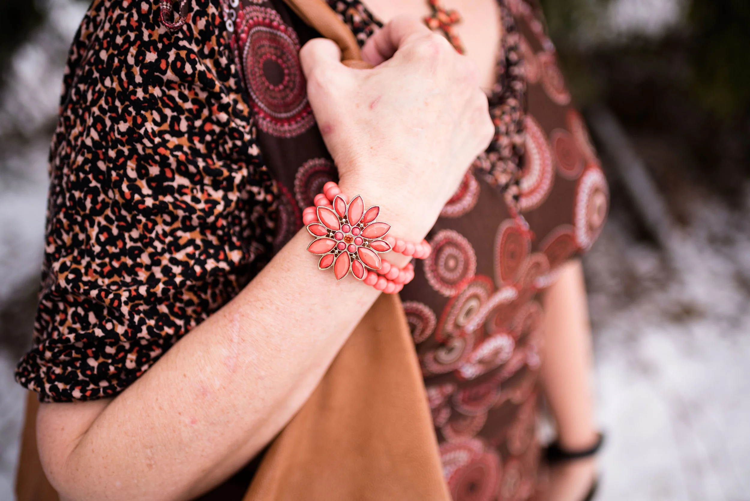
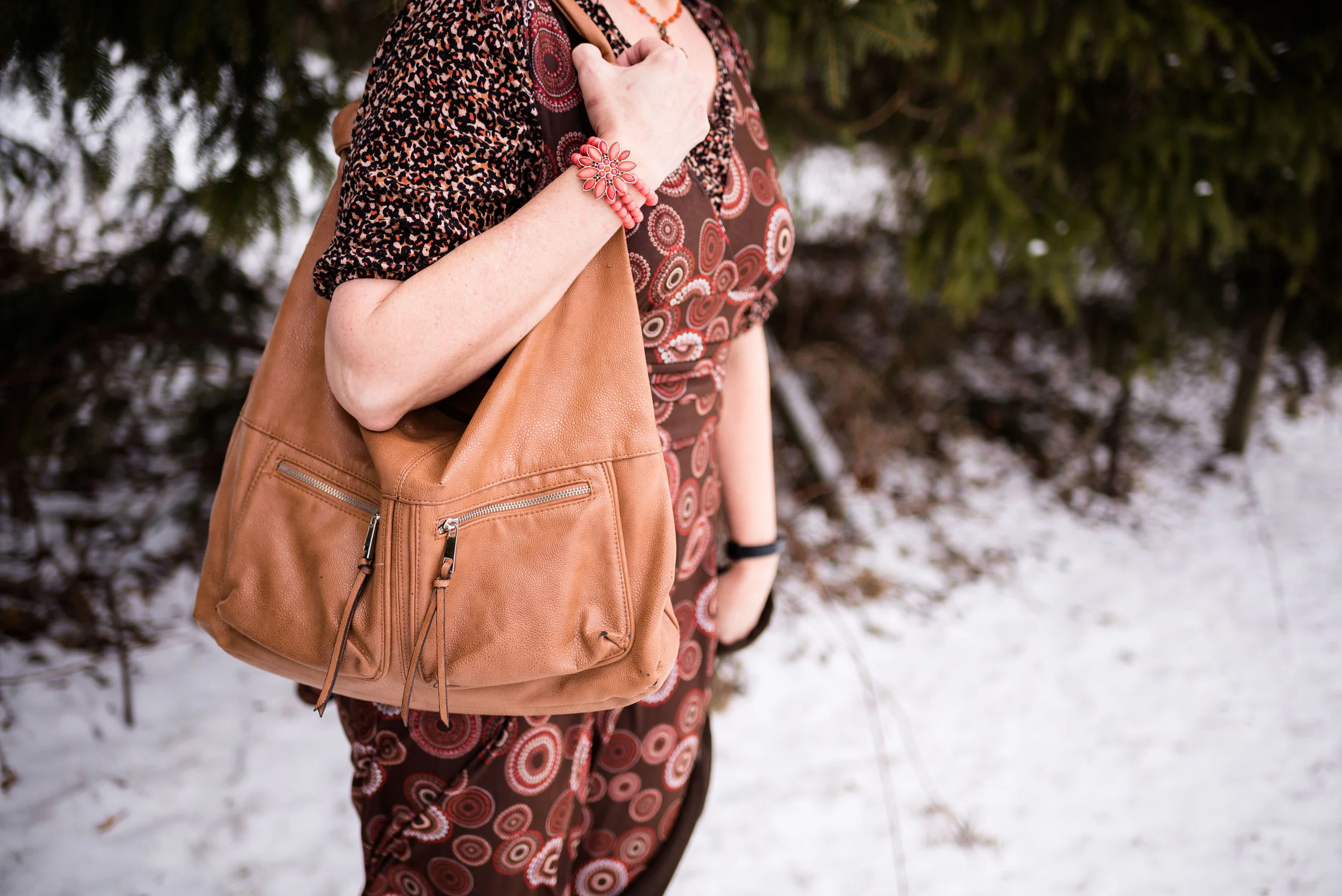
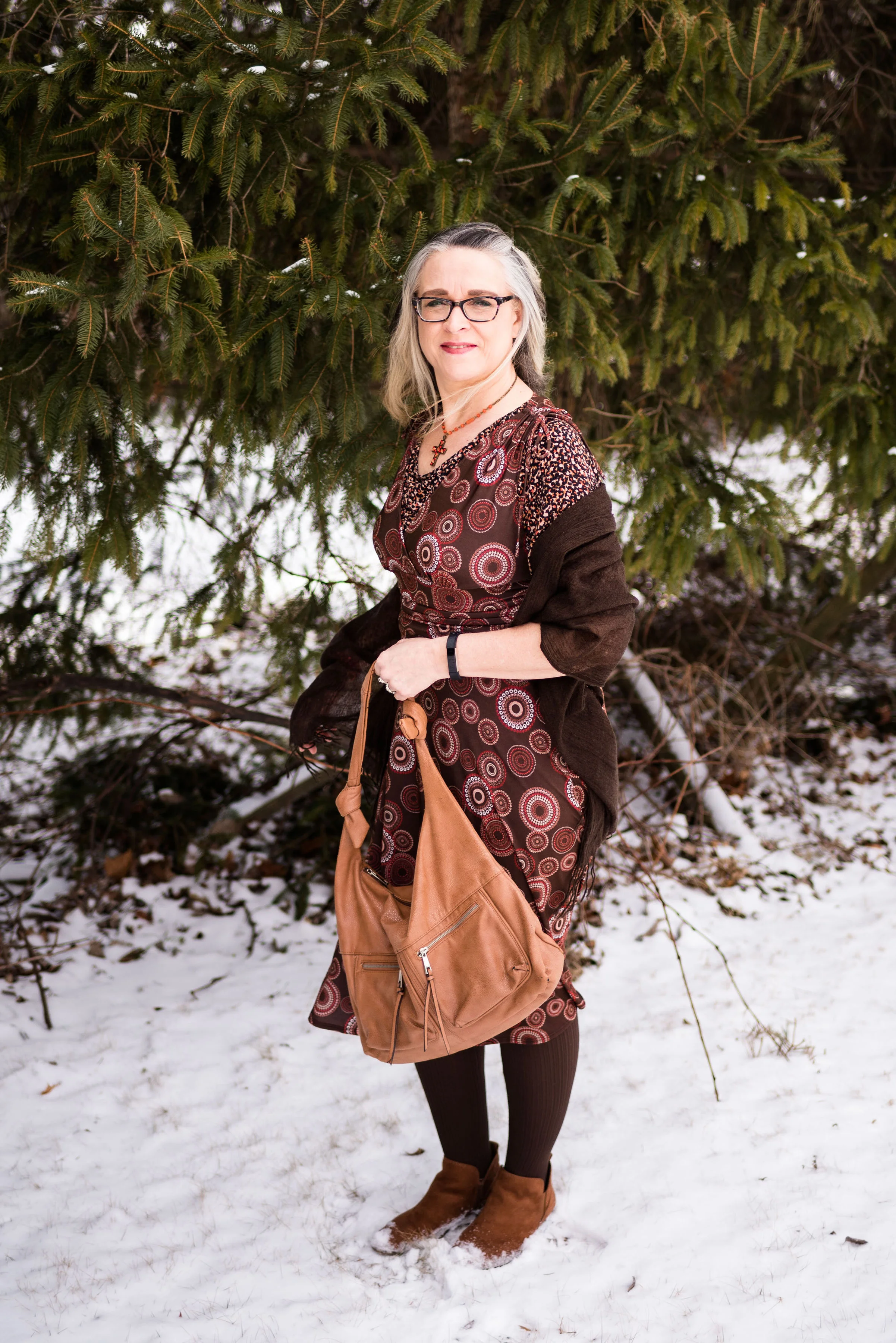
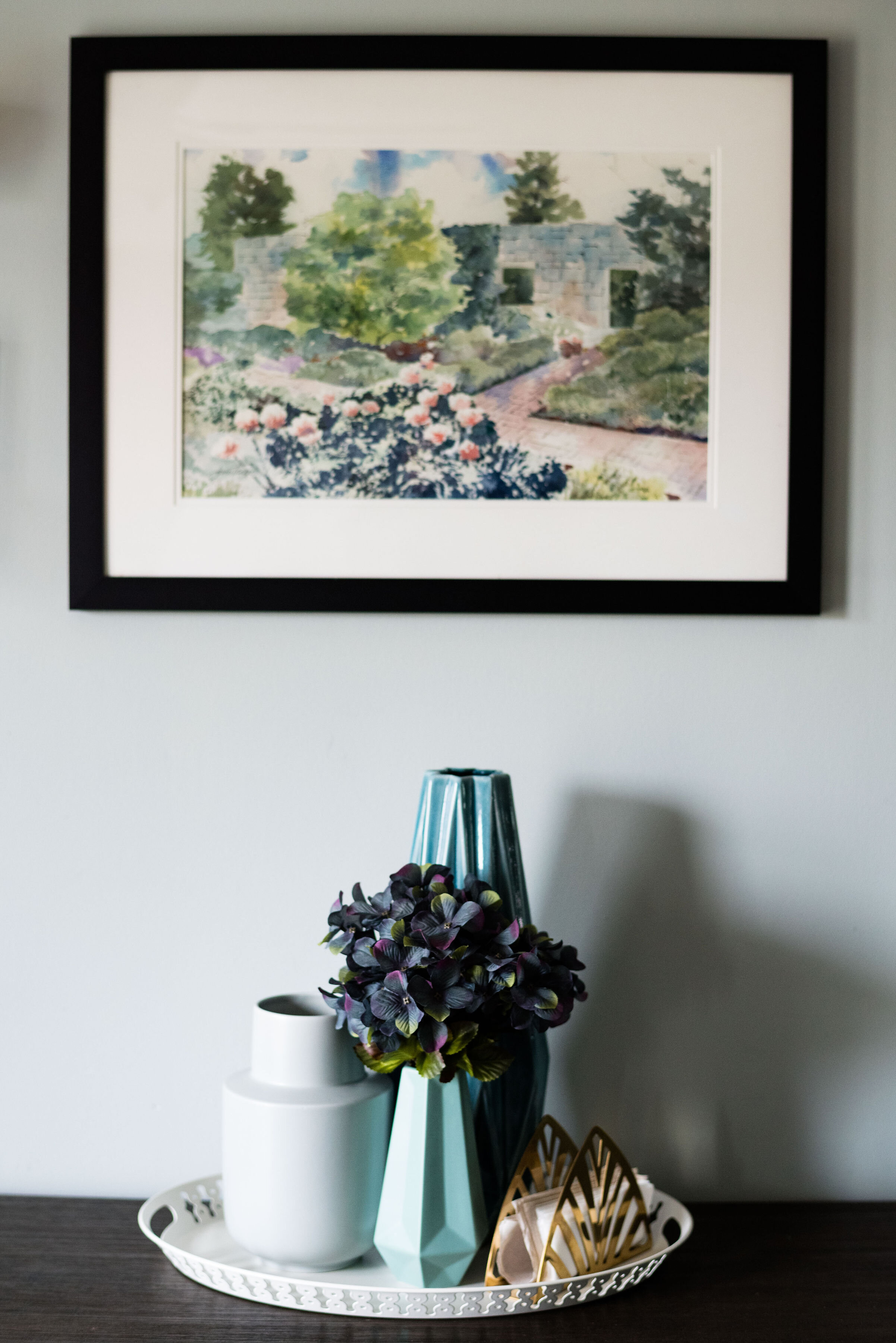
One of my monthly columns is going to be this one called Color Play. You know how much I love color and enjoy finding different combinations that are new and unique. Color is all around us in nature, in our homes and in many places we don’t really think about. For this month’s outfit, I was inspired by a painting and table arrangement in my daughter’s house.

This is a watercolor painting by my son-in-law’s grandfather, John Trumbull (not to be confused with the American Revolutionary painter by the same name). While he is not famous, he has done some teaching and won a few awards and ribbons for his work. I was gifted one of this paintings last year for Christmas and just love it.

The table arrangement was put together by my daughter and I really like how the painting and arrangement compliment each other. This is when I was inspired to come up with an outfit using a similar arrangement of colors. This is what I did.

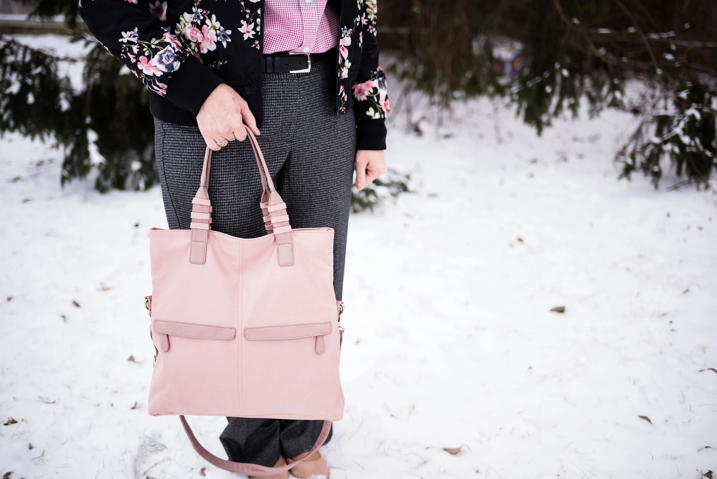
I just obtained this plaid ANA jacket from the JC Penney clearance rack. It was still a little more than I wanted to pay, but I had a coupon. I almost put it back, but I just have this thing for plaid. I kept looking at it thinking, I love it. I can come up with fun blog outfits with it and I’ll actually wear it. It came home with me and I don’t regret it. I could also justify the purchase because I was using birthday money to buy it. Ha, ha.

The piece is not lined, but has deep, welt pockets a notched lapel and button front. The color is a very light bluish gray and it made me think of the two tall, slender vases in the picture.

The two under layers consisted of a thrifted Chaps, floral button up, and a thrifted Sonoma, v-neck sweater. I felt the green sweater went with the lighter greens in the painting and the floral top picks up the sublte purples. I get into these moods when I am thrifting where I buy similar type items, usually patterns. For a while it was gingham, then it was stripes, now it is florals and plaid. That is part of the reason I have so many clothes. It’s that time of year where I will need to do some thinning out of my wardrobe.

My light colored Croft and Barrow jeans are also thrifted. I was looking for something in a lighter color that wasn’t white and these seemed to fit the bill.

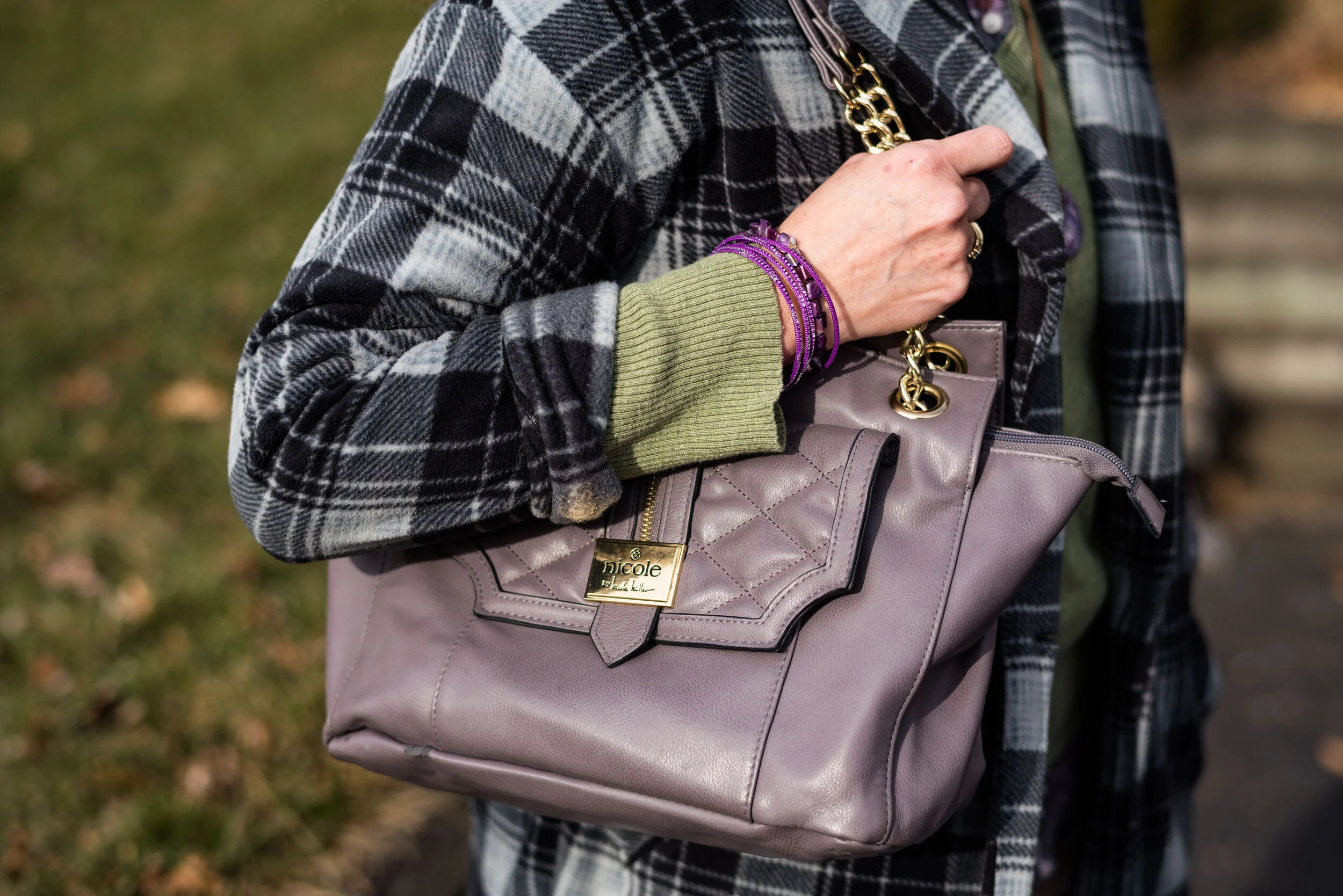
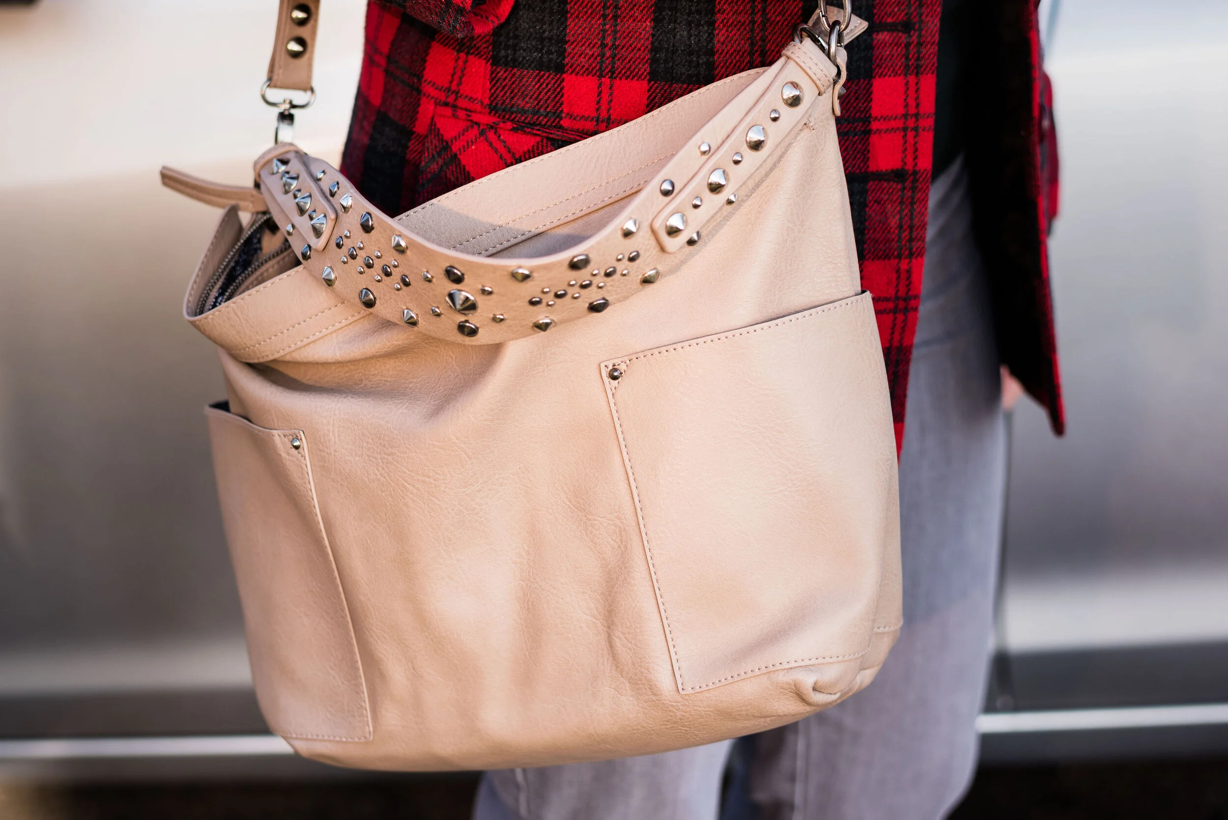
Accessories included a simply handmade bead necklace, purple bangle bracelets. and a Nicole tote bag. I love the purply gray color of this purse. The gold accents make it look high class.

Since we are still in the cold weather season I decided to include my Sonoma shearling ankle boots. These are warm, comfy and stylish for this chilly time of year.

What do you think of this color combination? Do you like to wear plaid? What’s your favorite pattern to wear? Leave me some love in the comments. It always gives me a boost to hear from you.

I’m including a few shopping links. These are affiliate links, which means I get a few cents if you click on a link. I get a little more if you purchase something through my website. All opinions are my own.

Photo credit Rebecca Trumbull.


Layering Light - Lifting Our Winter Blues with Color

If you have been following my blog for a while you know I have talked about Seasonal Affective Disorder before. I don’t mean to belabor a point, but I think it is good to be aware of particular issues, especially those affecting our mental health. I had a terrible day a few days ago. I felt completely flat when I got out of bed and I just couldn’t seem to get myself out of the funk. I felt depressed, crabby and completely anti-social. I started to wonder what in the world was wrong with me. A day prior, I was feeling pretty good. I was working on my writing, and I was getting a few things accomplished with my days since I becoming unemployed. I was actually enjoying the fact that, at least for a time, I didn’t have to answer to someone else. I was thrilled to be able to be creative and also be a housewife without the stress of being an employee.

As the morning wore on, I looked outside and realized what was wrong. Winters in my midwestern area are not pretty. We don’t have vast amounts of fluffy snow, blanketing the roof tops and trees. The world is not a winter wonderland, but rather a dsytopian array of browns and grays. The sky hangs lower and lower, it seems, and that steel colored ceiling weighs on me just like fathoms of water weigh on a wreck at the bottom of the ocean. And that, was exactly how I felt. I was a wreck, laying fathoms below where the sun ever shone, cold, alone and decaying.

Seasonal Affective Disorder is a type of seasonal depression and is often accompanied by anxiety and social awkwardness. It has also been noted that sufferers have food cravings for foods high in carbohydrates and for me that includes chips and sweets, although bread is on the list too. Ha, ha. In the last two weeks I have craved chocolate cake. Maybe it had something to do with my birthday passing by, because when I was growing up, my mom always made me a chocolate cake for my special day.

There are things people can do who suffer from Seasonal Affective Disorder. My own choice would be to move somewhere that the sun shines at least 200 days a year. Toledo only averages 180. Believe me 20 days would help. However, since resources aren’t available to move some place sunny there are relatively inexpensive lights that will help, like this one. Exercise is very helpful, even if it is just a walk out in the dismal gloom. I also give myself grace. I have had chocolate cake. Another thing that helps me is choosing to wear bright or light colors.

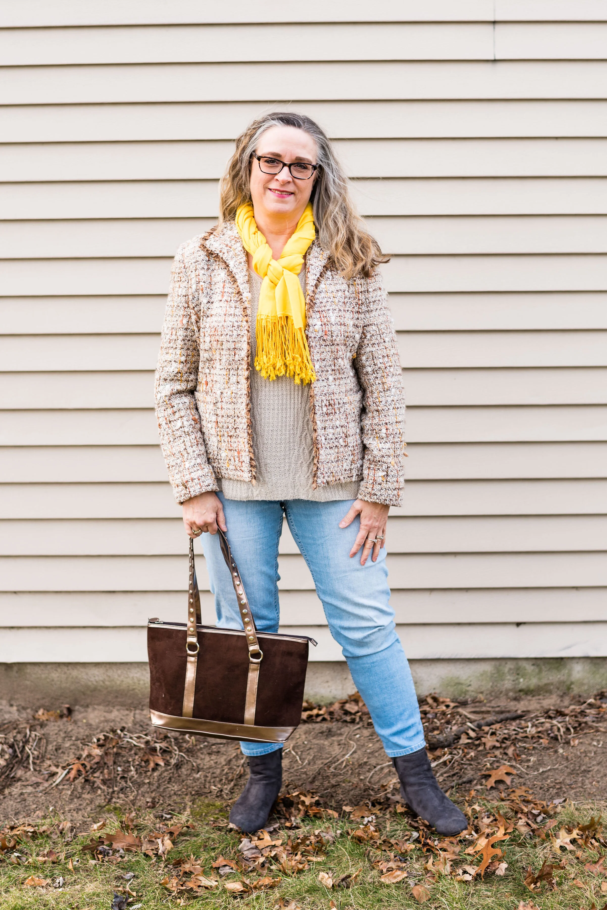
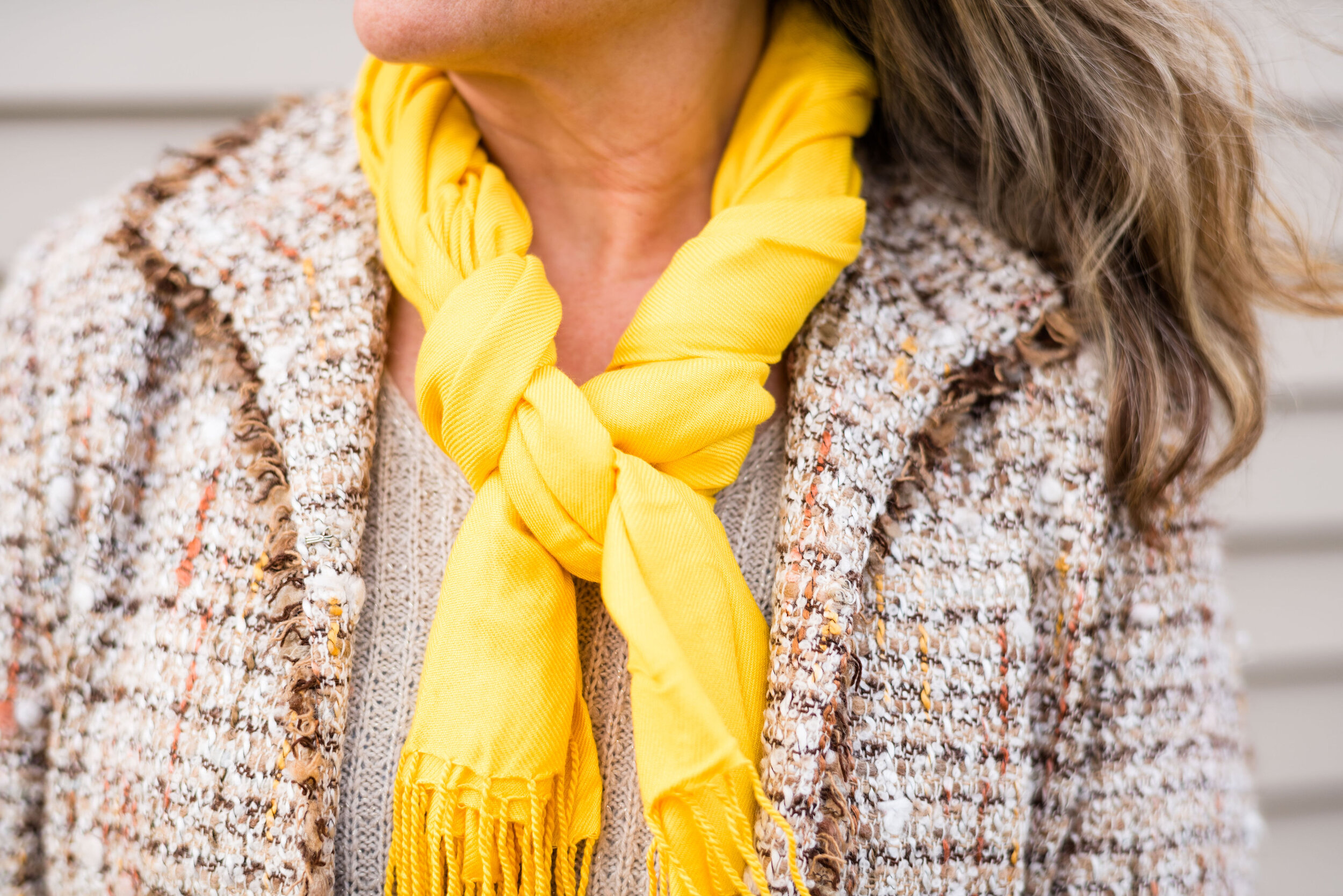
Obviously, what really makes this outfit pop is the bright, sunny yellow pashmina scarf. When I started putting the outfit together I had the light wash Apt. 9 ankle pants and the St. John’s Bay v-neck sweater picked out. I had a different jacket picked out, but then thought I wanted something with a color in it that I could accessorize with that would brighten up the whole look. This thrifted Marshall Fields tweed jacket has little flecks of yellow and rust in it.

The gray, Impo, wedge heeled ankle boots pulls out the dark threads of the jacket and the thrifted brown and copper bag works well with the rusty browns.

I really like the way this outfit turned out, and the way my daughter framed me against the neutral colored siding on the house. It just works so well and really shows off the idea of how texture can make a big difference, not only in our outfits, but in the world around us.

Do you struggle with the winter blues? Do you like to wear bright or light colors to help boost your mood when you are feeling down? I’d love to hear your thoughts, so leave me some love in the comments.

I’m including a few shopping links for you to look at. I’ve tried to pick out items that are light and bright. These are affiliate links. All opinions are my own.

Photo credit Rebecca Trumbull.

Pantone Color of the Year - Classic Blue

Since I do the Pantone Color Series twice a year, it seemed to make sense that I introduce the Color of the Year. For the year 2020, blue is the chosen color. Classic Blue, as it is called is a medium, dusky blue reminiscent of the the evening sky. Pantone describes it this way:

An expansive presence, Classic Blue is evocative of the vast and infinite evening sky opening a world of possibilities.
— Pantone Website

This is the sort of blue that would look good head to toe, or as in my outfit, be the perfect pop of color against other backdrops. I think this blue will look good on almost anyone and is a color that can be worn all year round.

The wind was doing some crazy things to my hair, so my daughter was doing her best to capture good shots regardless. A number of the pieces in this outfit were given to me for Christmas.

The gray and blue plaid skirt is older and Croft and Barrow brand. There was a time when skirts like these were very trendy. I’ve had my share and have worn them often to church in the winter time. While they may not be the most coveted skirt, these tea length pieces are perfect to wear with boots. I chose to wear my Seven Dials combat boots. I wanted to keep the look a bit more edgy and modern.

This fuzzy faux fur bomber jacket was a Christmas gift from my hubby. It is so soft and I had been coveting all the ones I saw at Kohl’s when I was working. This one he found at Walmart and is No Boundaries brand. Walmart has definitely upped their fashion game.

The gray pullover sweater I have on under the jacket is a brand called Ellen Tracy and was thrifted. A number of retailers carry the Ellen Tracy brand, including Macy’s, Nordstrom, Belk, and others. For this look, I tucked the whole sweater into the skirt. The skirt has a finished waist line, as opposed to elastic. I think a finished waist is just a little more classy than elastic.

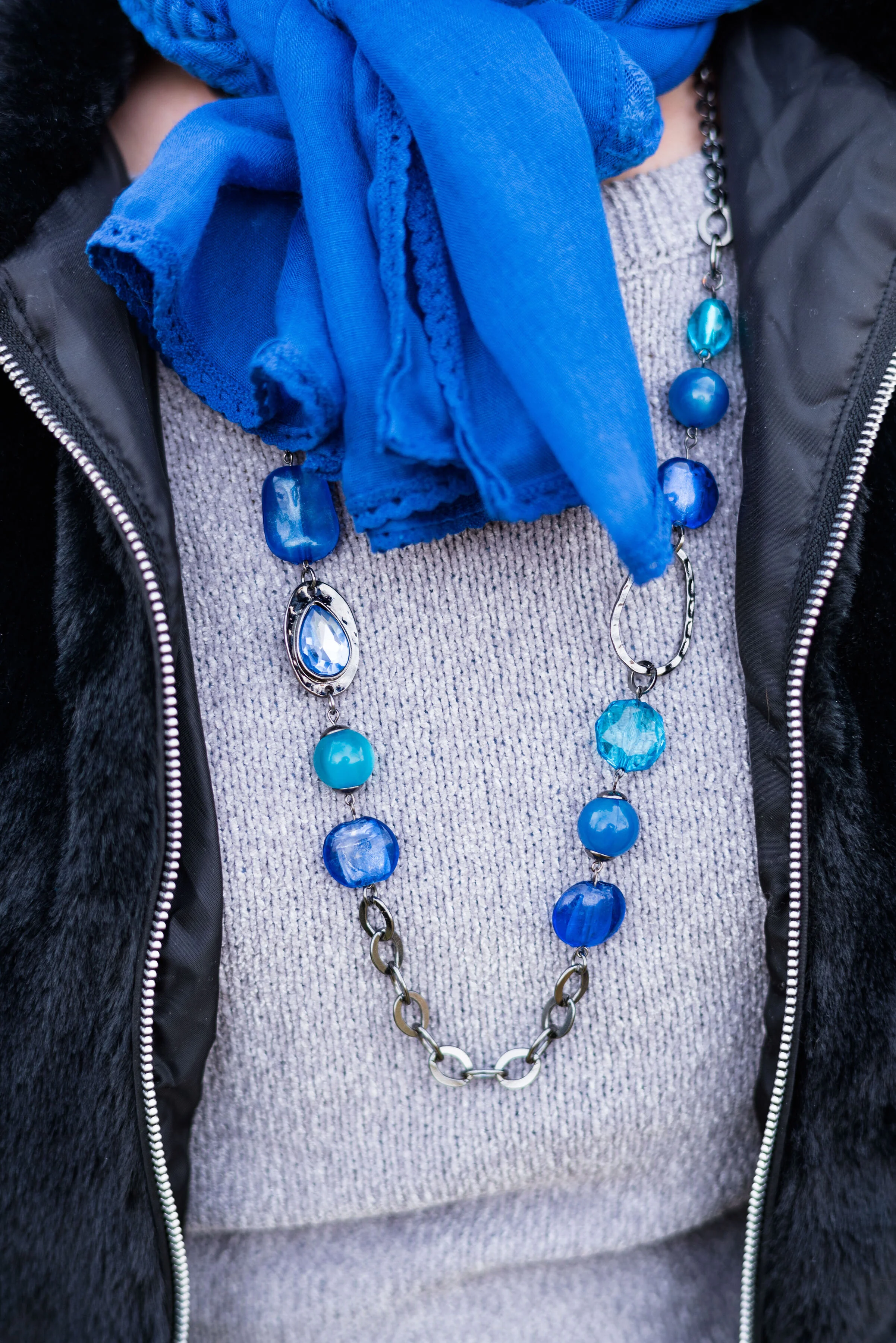
The scarf, necklace and bracelet were all Christmas gifts from my husband and oldest daughter, who went shopping together. She was the one to do the research on the Pantone color of the Year. Indeed, blue was the theme, but what a pretty blue it is.

This bag was a thrift find. I often find purses when I thrift shop. They are so much cheaper than their full price counterparts at various retailers and I don’t even by the big name brands. I just don’t like spending a lot of money on clothing or accessories. I also like variety. Sure, I could buy one bag for $500 or I could get a whole year’s worth of thrifting for that much.

What do you think of Pantone’s 2020 Color of the Year? Do you like this blue? Why or why not? Do you have a plaid skirt in your closet like this one? If you do, how do you style it? Be sure to leave me some love in the comments.

I’ve included a few shopping links. These are affiliate links, which means if you click on a link I get a few cents. If you purchase something through a link a get a few cents more. I appreciate every penny!

Have a great day.

Photo credit Rebecca Trumbull.


Outfit Inspiration - Rockin' Around the Christmas Tree

One of my favorite Christmas tunes is Rockin’ Around the Christmas Tree by Brenda Lee. When I was in high school I hung out with a girl a grade ahead of me named Sherry. We had tons of fun together and had a very special friendship. Though our ways parted after high school, we still keep in touch through Facebook. Sherry and I were in my church’s youth group together and often found ourselves with other church friends at local restaurants. One particular pizza/sub shop had a juke box. Seeing as it was that time of year, Christmas songs had been added to the playlist. Sherry and I chose a few songs, and one of the ones she picked was Rockin’ Around the Christmas Tree. The funny thing was, Sherry decided to be silly and kept going up, inserting more change and playing that same song over and over. We all had a giggle fest as we ate our food. Now, every time I hear that song, I think of my dear friend and all the fun we had together.

The song, Rockin’ Around the Christmas Tree, was written by Johnny Marks and sung by Brenda Lee in 1958. The interesting thing about Brenda Lee was her age when she recorded the song. She was only thirteen. Her mature sounding voice lead her to a career in country music, but it is the blend of rockabilly and country style that makes this song a forever hit. To this day most radio stations from adult contemporary, to top 40, to country play Mark’s and Lee’s version of Rockin’ Around the Christmas Tree more than any other version.

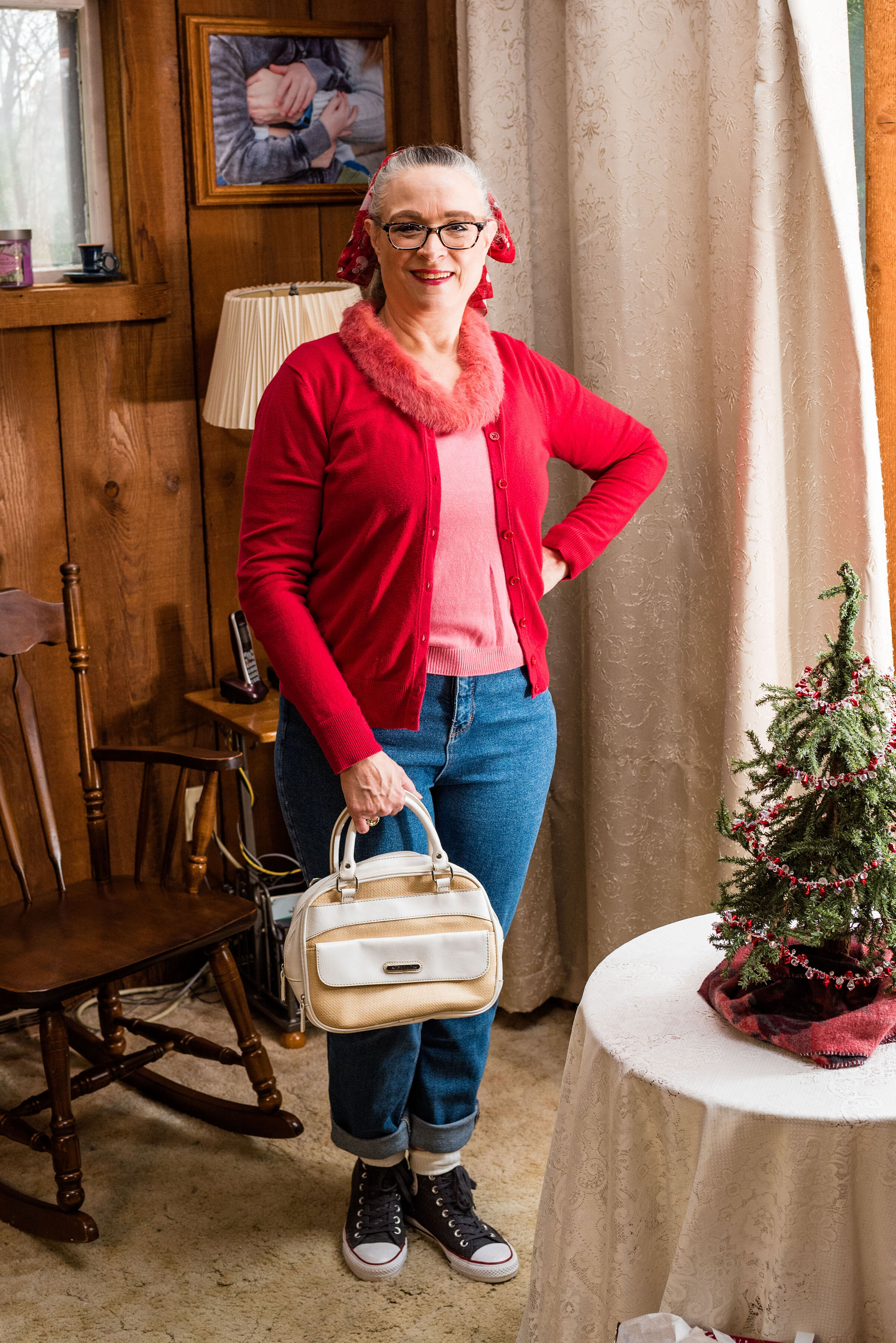
Of course with the 50’s rock and roll feel of the song, I had to dress with a 50’s vibe. Rolled up jeans, a mismatched sweater set and a ponytail with a fun Christmas scarf brought in the 50’s details, most of which I got from watching shows like Happy Days. Ha, ha. Probably not exactly historically accurate, but you get the idea.

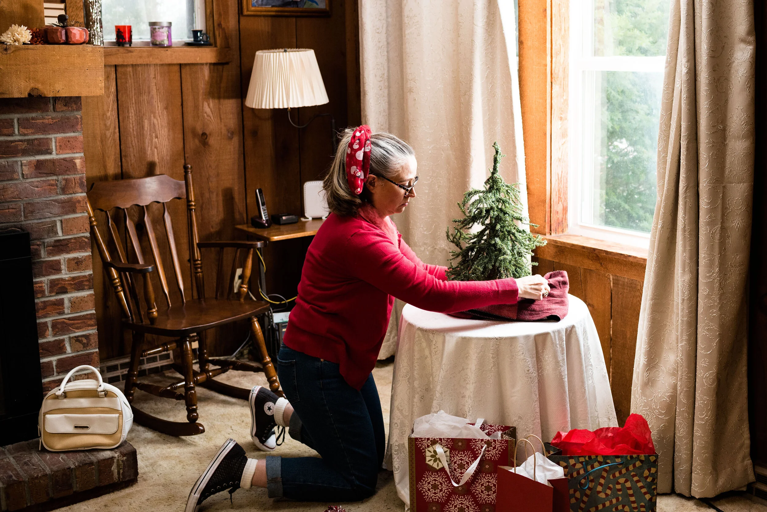
I hadn’t gotten my full sized Christmas tree up yet, but I wanted the pictures to look somewhat festive. When my daughters were both still living at home, we had gotten them each a tiny, Charlie Brown, type tree for their rooms. This one still resides at our house, so I thought it would add a touch of Christmas cheer to the pictures. Plus, how do you rock around the Christmas tree, if there isn’t one?

As you know, high waisted mom jeans are back in style. I had gotten rid of all of mine, not because they went out of stye, but because I gained weight and had to buy new jeans. Personally, I don’t really like the confines of high waisted jeans now that I have muffins to stuff into them. I prefer jeans that fall just below my belly button, but when I found this pair on clearance at Kohl’s, I thought I would add one pair of high waisted jeans back into rotation. These are Wild Fable brand. Target carries this brand and has a number of different washes, as well as various amounts of distressing.

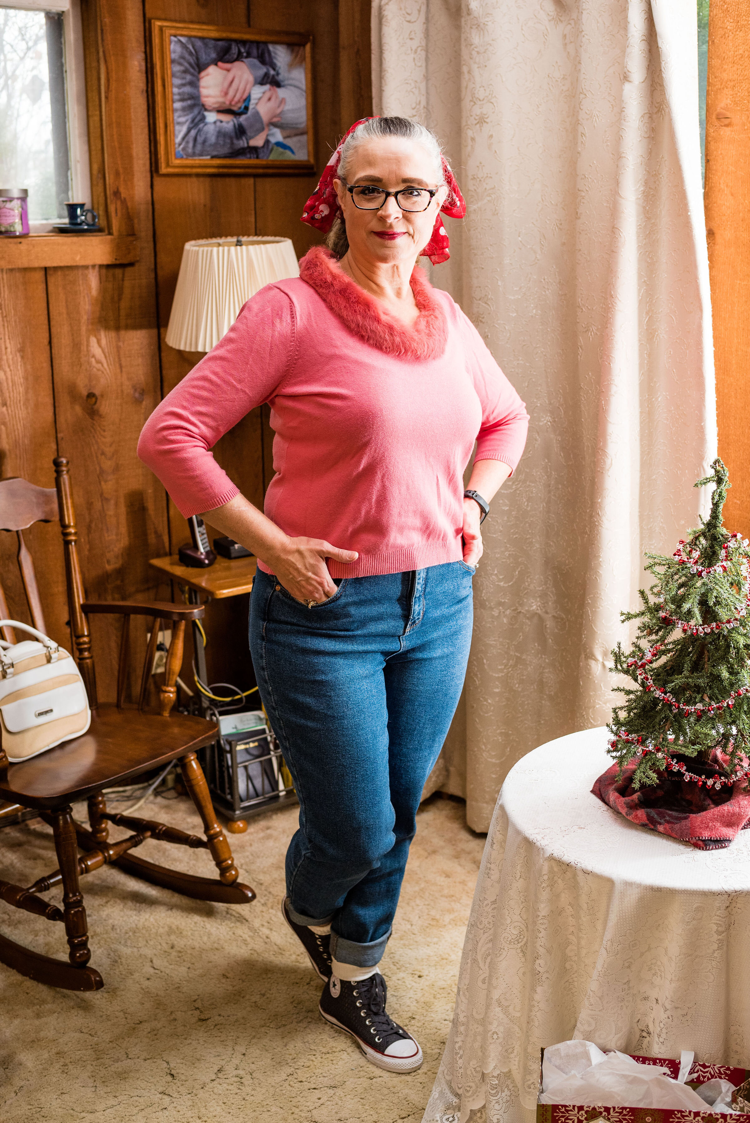
You may think pink and red an odd color combo for Christmas, but it just makes me think of candy canes, Christmas cookies and wrapping paper. Both of these pieces were thrifted. The red cardigan is Merona brand and the pink pullover with rabbit fur embellishment is Emma James (a Liz Claiborne company). I am not a proponent of real fur, but if I have the choice of saving a clothing item from a land fill and part or all of its component are real fur, then I am a fan. Here is a pic without the cardi.

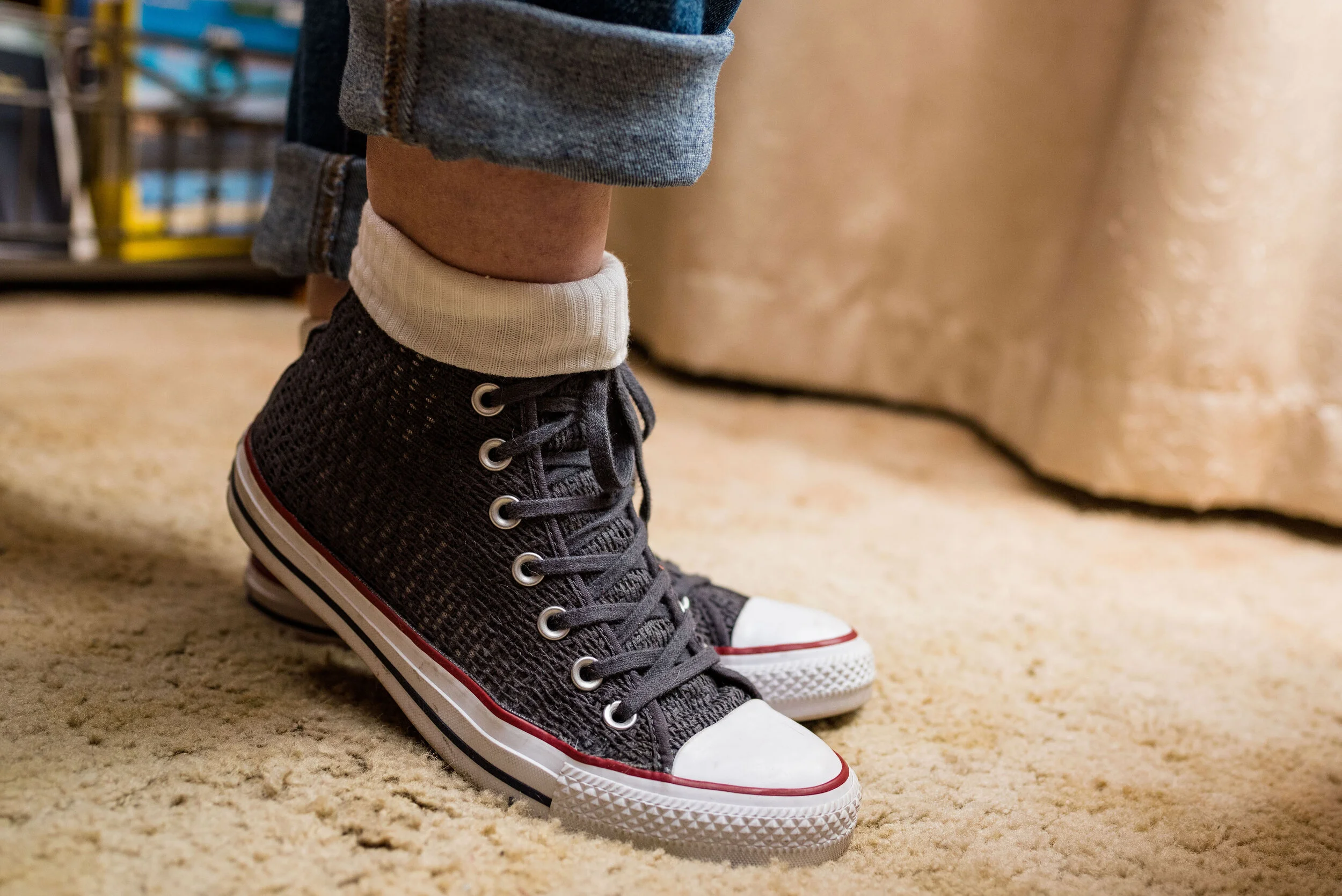
Since I wanted the outfit to be simple and fun I didn’t wear any jewelry. I don’t own a pair of saddle shoes, so the next best thing was a pair of Converse high tops. These are the only Converse I own. They typically do not fit my feet very well, but I found these on clearance at DSW. I popped on the white socks as a topper and it reminded me of how girls would wear their socks back in the 50’s.

Of course, in my opinion, no outfit is complete without a bag. What if you realize as you are rockin’ around the Christmas tree, baking cookies or decorating that you’ve run out of sugar or you’ve discovered another string of lights that won’t light (I swear, it happens every year)? You will need to run to the store. I chose this white, Jaclyn Smith satchel. This thrifted bag can be carried by the top handles and it also comes with a long strap to wear it as a cross body bag. This is also a thrift find.

My final addition was the scarf in my hair. Over the years I have collected a number of Christmas related pieces. I have a number of long sleeve tees, a couple sweaters and a few scarves. If you followed my Instagram feed last year, I featured most of those pieces in my “20 Days of Christmas series”. This cute snowman scarf is a narrow oblong scarf that works perfectly as a hair tie. I wore it to work yesterday around my neck, with a snowman pin.

What do you think of this outfit? Do you like high waisted mom jeans? Is Rockin’ Around the Christmas Tree a favorite song of yours? Do you think I did justice to the song with my outfit? I’d love to hear your thoughts.

Here is Brenda Lee singing Rockin’ Around the Christmas Tree.

I’m including a few shopping links. I hope you are having a good month leading up to Christmas. I especially hope that you do not feel stressed out and that you are staying healthy. Take care of yourself. There is only one beautiful you. Have a great week.

Photo credit Rebecca Trumbull.


Outfit Inspiration - It's the Most Wonderful Time of the Year

Christmas can truly be one of the most wonderful times of the year, but I know it can also be an extremely hard time for people who have gone through loss, are struggling with illness or things like financial strain and relationship stress. Often, the holidays become a mad race to get everything done that we feel we have to do and we end up feeling down and disappointed. Even amidst the struggle and the strains of life, I think we can still see Christmas as a very wonderful time.

Christmas is typically a time we reconnect with loved ones. It can also be a time to do things we find hard to do the rest of the year, like listening to special music, baking, attending holiday parties and other activities like Christmas shopping and gathering with friends. In the church environment there are also special services, kids programs and service activities like caroling and helping at the local food pantries and city missions. Yes, it is a very busy time, but I also believe that the basis for many of these activities is what makes it the most wonderful time of the year.

Serving others and thinking about that special gift we are going to buy for a friend or family member gets us outside our own boxes. It creates in us an others’ centered mentality and it is in that, that we find joy. Not only that, but the basis for Christmas from the very beginning was the unselfish act of an Almighty God, towards His fallen creation.

What I instantly think of when I hear Andy Williams’ It’s the Most Wonderful Time of the Year, are shopping malls and stores all decked out in Christmas garlands and lights while Christmas music plays overhead. It also makes me think of loud family gatherings around the Christmas tree opening presents with laughter and joy.

For this outfit I wanted to look festive, but also like myself. I wasn’t going to see the King, I was going to the mall to shop for my family. Ha, ha.

This wonderful red plaid Requirements blazer was a thrift store find. I just love the treasures I find at thrift stores. I could never have the large wardrobe I do if it weren’t for thrifting. I still shop quite regularly at full price retailers, but I have found some of my most special, unique pieces at thrift stores. Many of them, like this blazer are by brands that no longer exist; the added benefit of thrifting.

The fit and structure of this beautiful jacket is perfect and will definitely get used long past the holiday season. I am excited to try it with various colors and pieces. It is a wool blend, but fully lined so I don’t have to worry about my skin’s aversion to wool.

My black long sleeve embellished snowflake tee was purchased a number of years ago. I believe it is from Kohl’s and is a brand called MCCC Sportswear. You can see holiday sweatshirts from this same brand at Kohl’s by clicking on the link. They also have long sleeve tees here.

You can also see my Believe pin. If you have ever watched Miracle on 34th Street, then you know the significance of the word believe. I have noticed over the last few years, the word believe is popping up everywhere. Whether you believe in Santa, the Spirit of Christmas, the person of Christmas, Jesus Himself, or in yourself, the idea of belief in someone or something is pretty important in our world.

I personally believe in the birth, life, death and resurrection of Jesus Christ and that is what I think of when I see the word believe, but I also love that this idea of belief has become a positive message to all of us, especially young people, who are often told they will never measure up or amount to anything. The beauty and simplicity of the Gospel message is found in this idea of belief. God’s word says,

For the Scripture says, ‘Whoever believes in Him will not be disappointed.’
— Romans 10:11 (NASB)

At first I was going to wear knee high boots, but then I thought the pants didn’t really look right with them, so I opted for this pair of Sonoma booties from Kohl’s. I like the contrast of the gray, black and red with the taupe of the boots and bag. I didn’t bother with any other jewelry since I felt the embellishments on the top and bag, along with the pin, gave the outfit enough punch.

What do you like to wear when you shop? Do you dress up or do you prefer to just go out in your sweats? I’d love to hear your thoughts. What do you think about the word, believe? Is belief something that is important to you? Please leave me some love in the comments.

Here is my favorite version of It’s the Most Wonderful Time of the Year by Andy Williams. I’m not so sure about the music video, but it is colorful. Ha, ha

I’m including a few shopping links of all things plaid, for you to look at. Maybe you still have some Christmas shopping to do and one of these links will inspire you. These are affiliate links, which means if you click on a link, I get a few cents. If you purchase something through one of my links, I might get a little more. Every penny helps.

I hope these posts are inspiring you and bringing back memories of your own childhood Christmases. Have a great weekend and stay healthy for the holidays.

Photo credit Rebecca Trumbull.


Outfit Inspiration - We Three Kings

I have been listening to Christmas music since I was a toddler. Songs like Jingle Bells, I’m Dreaming of a White Christmas and so many others have been permanently embedded in my brain. There are a few songs that I remember, not so much because of their catchy tunes, but because of the pictures they created in my mind as a young person. We Three Kings is a perfect example of this kind of song.

Over the years We Three Kings became an icon of American Christmas carols. It was originally written by John Henry Hopkins, Jr. in 1857 for a Christmas pageant In New York City. He was the rector of Christ Episcopal Church in Williamsport, PA at the time. The song revolves around the three Magi who came to worship Jesus when He was a small child. You can read that Biblical account in Matthew 1:1-12. If I had more time, I would love to spend a little time discussing these interesting men and the gifts they bring the Christ child, but since this is a fashion post I won’t belabor the point.

You might be wondering, why did I choose this song. While it is clearly a traditional Christmas carol, it wouldn’t necessarily be a favorite of everyone out there. I love the story behind it. For years, these extremely wise men, who were obviously people of influence and wealth, but not necessarily kings in their own countries, studied the stars. They studied history and they may have even studied some version of Messianic prophecy. We can’t really say for sure, what caused them to take up their long trek to Bethlehem, but my imagination says it must have been a pulling of the Holy Spirit that led them to Herod and then to the baby Jesus.

I also love the dichotomy of shepherds on the night of His birth and these upper class men, some days later. It reminds me that we are all able to approach God, not because of our goodness and rightness, but because of Jesus.

I wanted this outfit to exude luxury, not that these wise men had all sorts of money, nor even dressed in a way that would attract attention, but the idea of kings, wise men and worshipping the King of Kings, made me want to dress as thought I was going to see the King myself.

This velvet jacket was a thrift store find. I was watching Merlin, a King Arthur series that was on a few years ago. When I saw this, I thought of Arthur Pendragon in all his finery and I knew I had to have it. I guess I should have taken the lint brush to it, before we took pictures. Ha, ha. I think the gold front closures are so fun. The brand is R & M Richards by Karen Kwong. It is obvious the style has an oriental flavor, which makes it perfect for my wisemen from the east.

At first I was going to go for a monochrome look, and pair the jacket with brown trousers, but then I thought of this Lauren Conrad skirt that I ordered from Kohl’s on clearance. It’s actually too big on me, so I had to safety pin the waist band for our photo shoot, but one of these days I will take it in. I thought the gold pleats and flowy feel made for a more luxe look.

In thinking about our three wise men, I chose gold to accent the entire outfit. My gold high-lo hemline tee, I got for Christmas last year from my husband. It is Dantelle brand from Marshalls. I tucked it in for this look and paired it with a wide gold belt that I found thrifting.

My jewelry and bag are gold with just a touch of bling. The little clutch with attached chain is also a thrift find.

I’ve worn these thrifted LifeStride brown ankle boots on the blog before and I thought they matched the jacket perfectly.

What would you wear to see a king? If we could afford it we would probably wear something a bit fancier than what I put together. Ha, ha. But that is part of the point of Christmas. The shepherds were able to see the King the night He was born and I’m sure they weren’t wearing their Sunday best. Jesus is happy to have us come as we are.

Today I am not going to include any shopping links, but here is one of the versions of We Three Kings that I like. For some reason I was not able to upload the video, so just click on the link and it will take you to the YouTube page with the video.

https://www.youtube.com/watch?v=_qmrRhVhKuw

Photo credit Rebecca Trumbull.

Flat Lays in the Flesh - Layering Knits

One of my favorite flat lays from my Fall Trends 2019 series was the one featuring layered knits. I’ve always been a fan of layering, especially in the winter time. I don’t like to feel cold, so laying is the obvious choice here in northwest Ohio. I know it might sound funny, but the other reason I like to layer is so that I can wear more of my clothes at the same time. Ha, ha. When I saw that layering knits was a trend for this fall, I was so excited. Finally, a trend I can really buy into.

Photo by Amy Christensen

Normally, I only layer knits on the top. I don’t typically wear leggings, but would be more likely to do this outfit with a pair of jeans. However, wanting to keep an open mind and use these LuLaRoe leggings my daughter got me, I decided to add them to the mix. Here is the look in the flesh.

This long green sweater is from Christopher and Banks. They are having some good sales on sweaters right now, so check out their website or if you have one near you drop in. This sweater is medium weight and has no closures, so just hang open. I rather like that idea, because then I can wear something underneath and know that it will still be seen.

What you see underneath the sweater this time is my thrifted Merona bear sweatshirt. This is definitely not something you want to wear when you are going to be real active, but if you are sitting around watching a movie at home or want to be comfy when running to the store, this would be a great outfit. Mr. Bear looks a little wrinkly. Ha, ha.

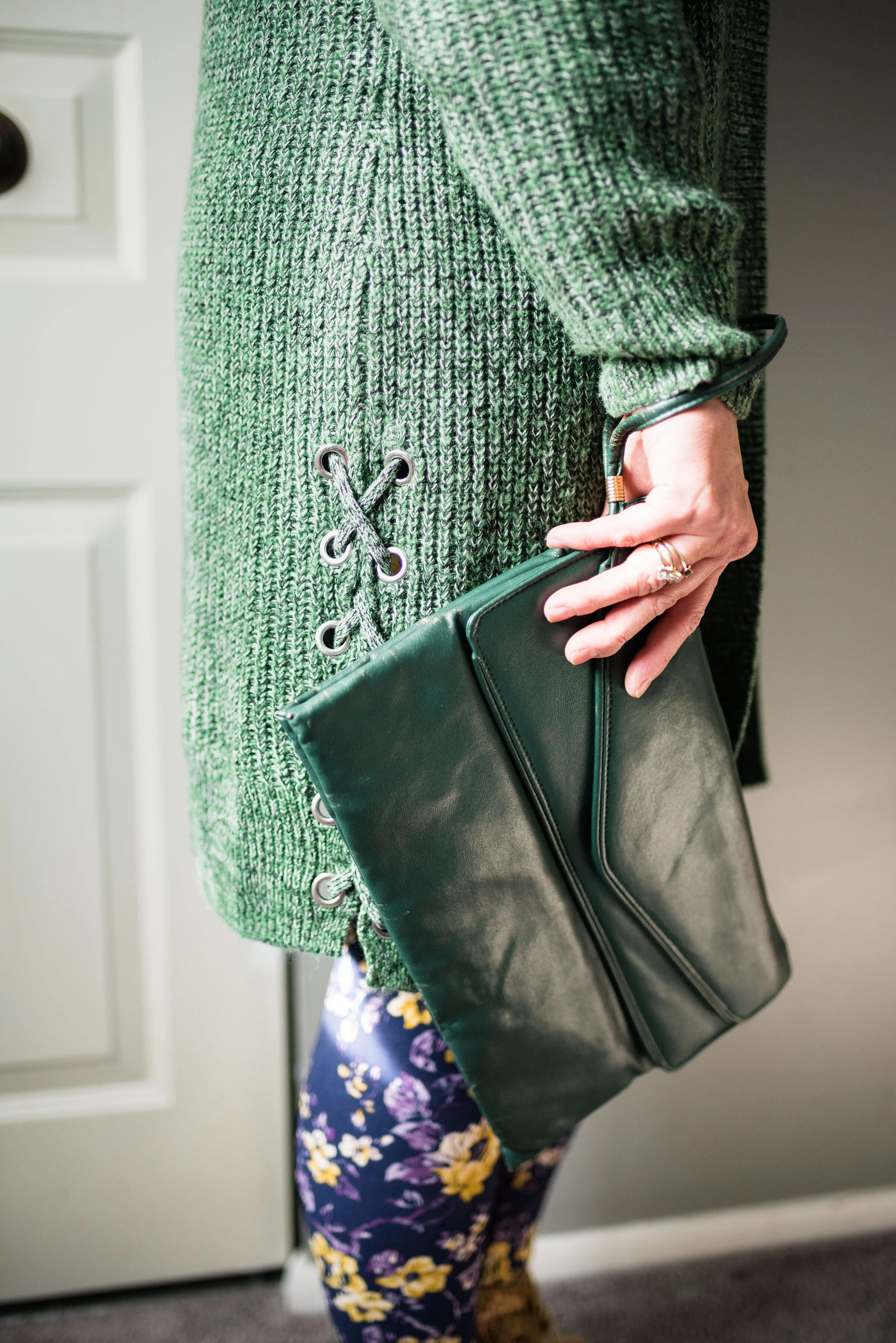
I added the gingham scarf as a way to pull the purples together, making the outfit look a little more cohesive. I added a green envelope clutch and my Rock & Candy by Zigi thrifted boots.

In the picture below, you can see the fun lace detail on the side of the sweater. Little details like those are what draw me to different pieces. It was the same way with the boots. I love the lace overlay giving them a unique texture.

I was a little disappointed with how this outfit looked in the flesh. Part of it might be the leggings. I think I would look better in leggings that were a solid color and preferably a darker color. I feel that these flowers are a little much for my pudgy gams. The other thing I do not like is the volume of the sweatshirt and the sweater together. It makes me look like some sort of pillar. Just being real here and analyzing this. When we think about what we are wearing and what works and what doesn’t we will begin to make better choices about how to put pieces together.

My verdict on this outfit is that it looks better as a flat lay, than in the flesh. What do you think? Please be honest. I love to hear your opinions and ideas.

I hope you all have a great weekend. See you next week.

I’ve included a few shopping links for sweaters. These are affiliate links. All opinions are my own.

Photo credit (except where noted) Rebecca Trumbull.


Flat Lays in the Flesh - Dark Florals

For those of you just joining me on the blog, I am doing a short series based on the Fall Trends 2019 flat lays that I did back in September. You can see those original posts by clicking on the links: Part 1, Part 2, Part 3 and Part 4. I’ve been discussing how a flat lay can present how an outfit might look, but only from a more two dimensional view. Actually putting a person into the outfit is three dimensional and helps you see how the pieces go together and fit on the human body. In this case it is my human body, with all of its lovely flaws. Ha, ha

Photo credit Amy Christensen

This week’s outfit was based on the dark floral trend which was prominent this fall. Dark florals are moody, mysterious and melodramatic and that is why I like them. Dark florals want to be noticed, but are just as happy being partially hidden under a jacket, sweater or blazer. So what does this flat lay look like in the flesh?

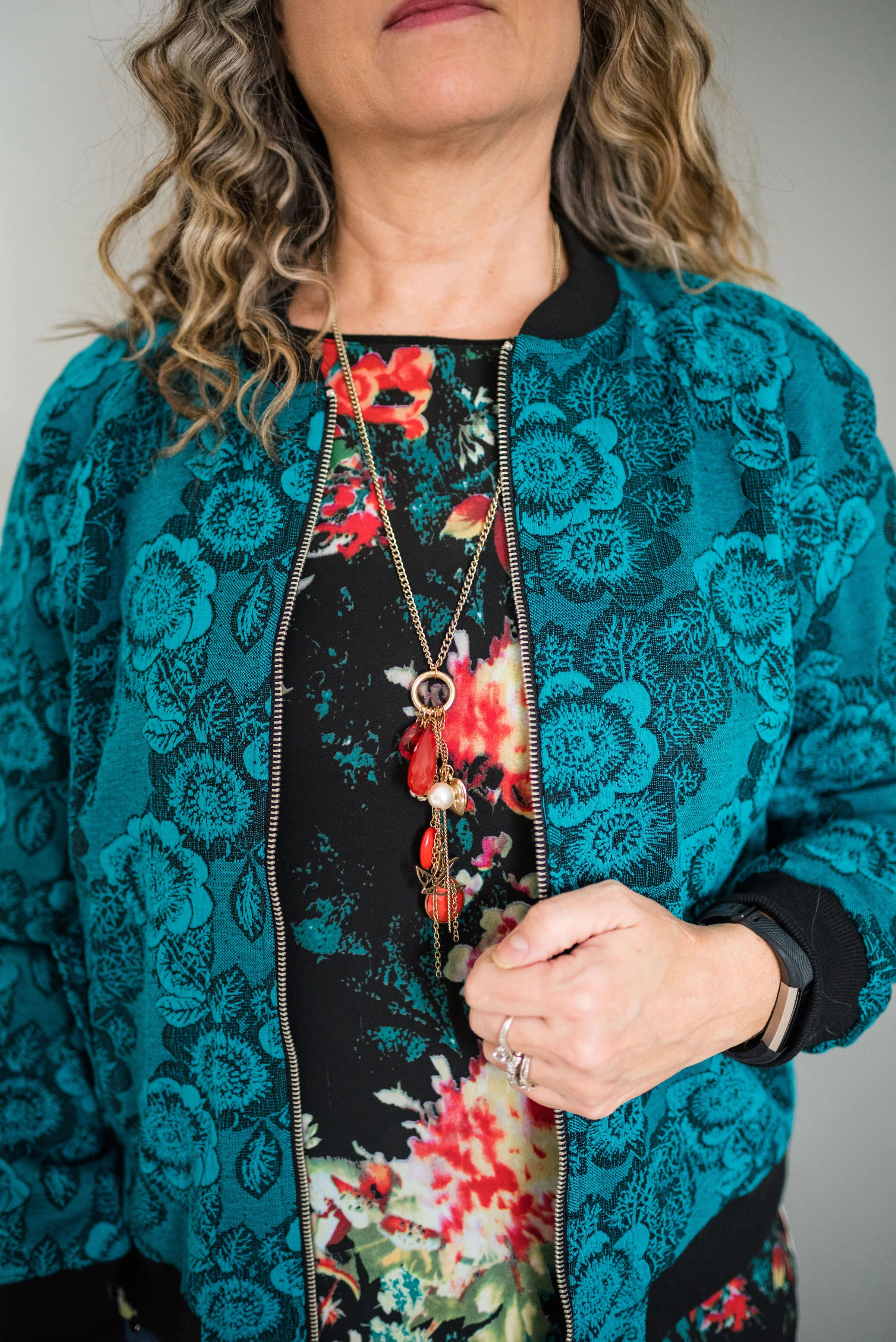
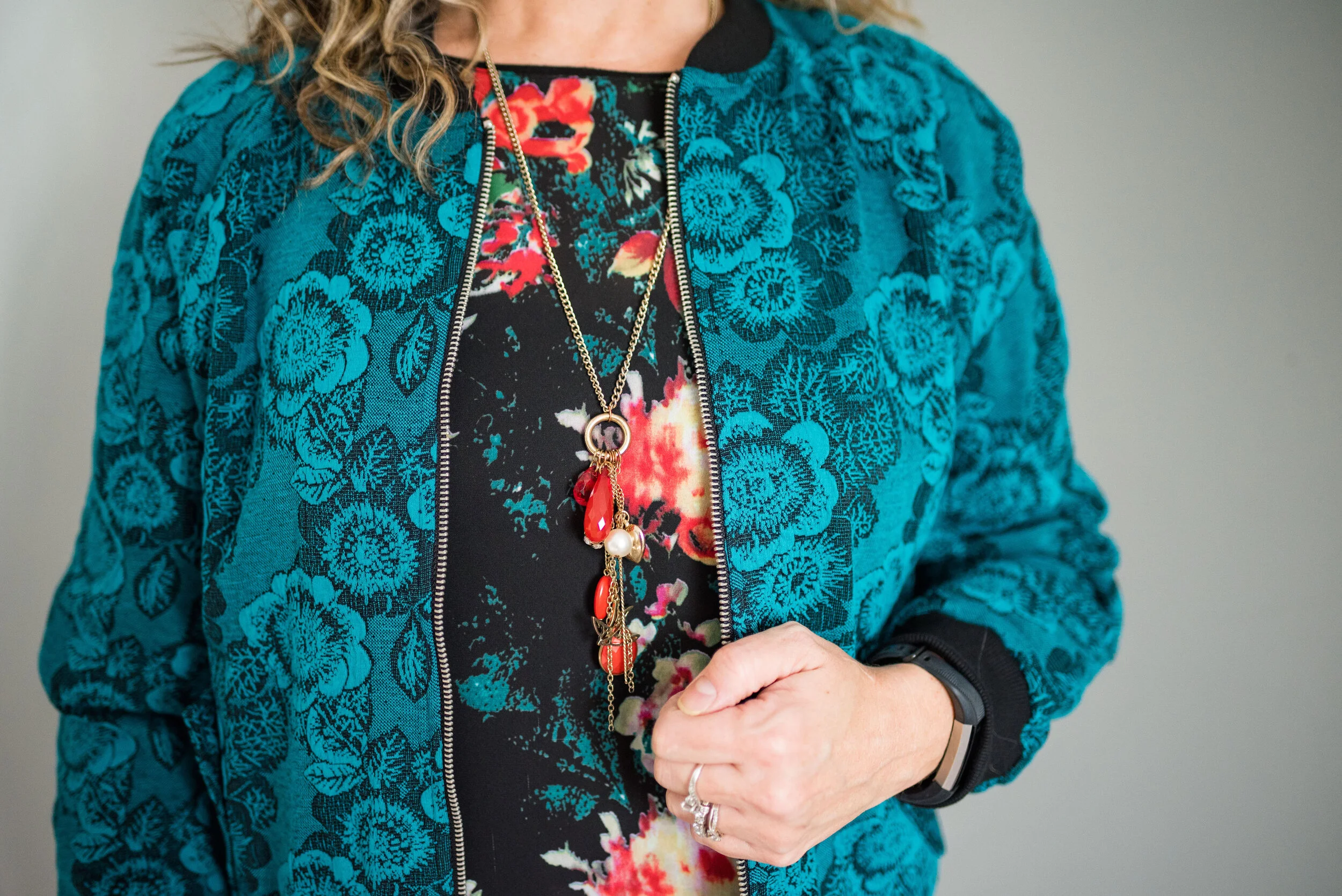
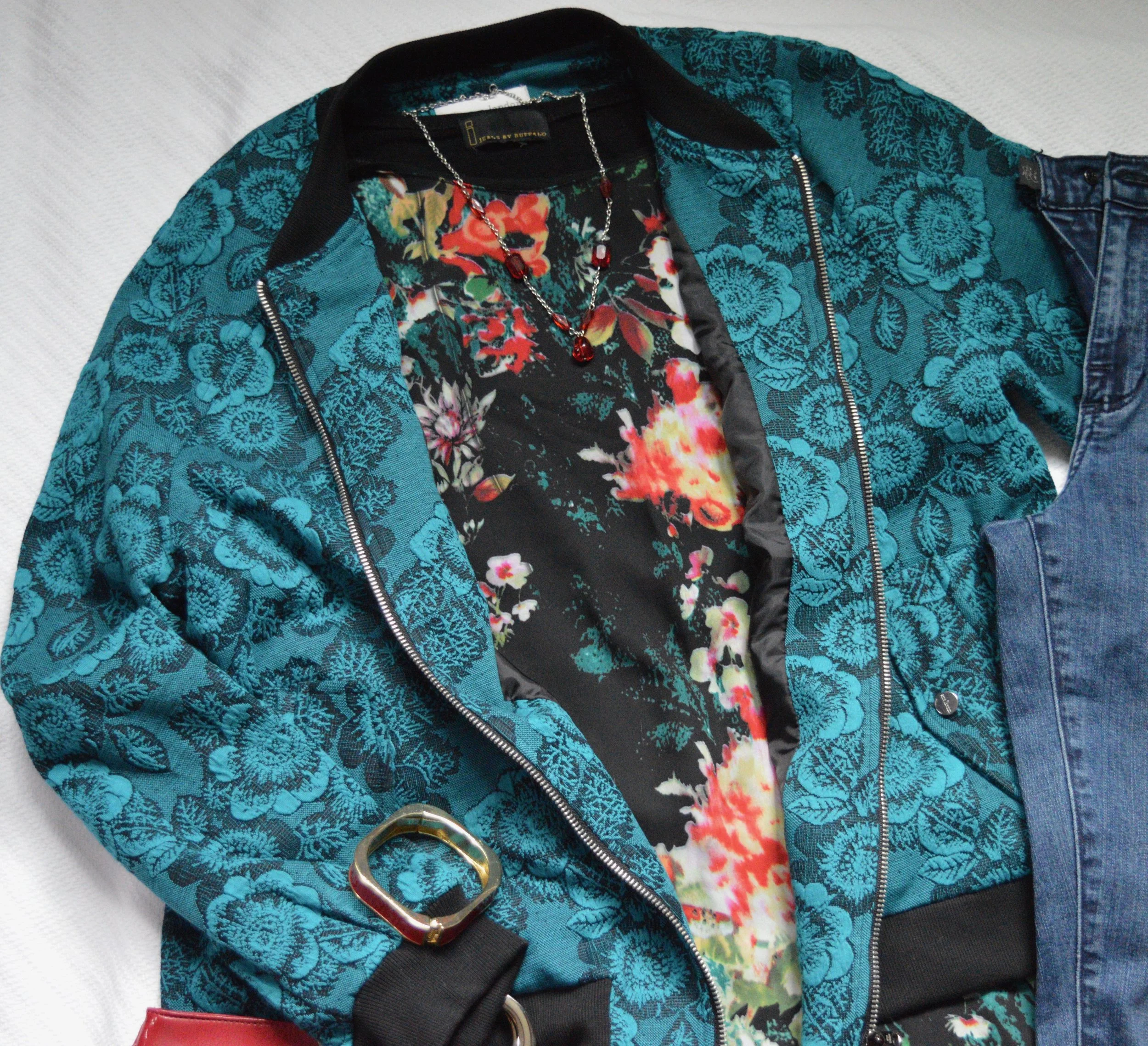
This teal floral bomber jacket was a late summer purchase from National an online women’s clothing retailer, that I did a sponsored post for back in May. You can see that original post here. After working with National, I regularly received their catalogues and had my eye on this fun jacket. I was able to purchase it at a good discount, so ordered it straight away. The jacket is fully lined, has soft banding around the neck, sleeves and bottom and a durable metal zipper that is easy to zip.

This thrifted Jeans by Buffalo floral tee goes perfectly with the color of the bomber jacket. You can see the same teal color in the top and they look like they were meant to be together. Here is a picture of the top without the jacket, just so you get an idea of the shape. I like the longer tunic length hi-low hem and the a-line cut of this top.

The pattern on the top is only on the front. The back and sleeves are a simple, basic black. I’ve been thinking of pairing this with a black button up or a turtleneck so I can have the warmer layers without covering up the pretty print. I think I’d also like to try this with white jeans and a red jacket. What do you think? The colors in the shirt make me think of Christmas, so this might be a good top to wear throughout the holiday season.

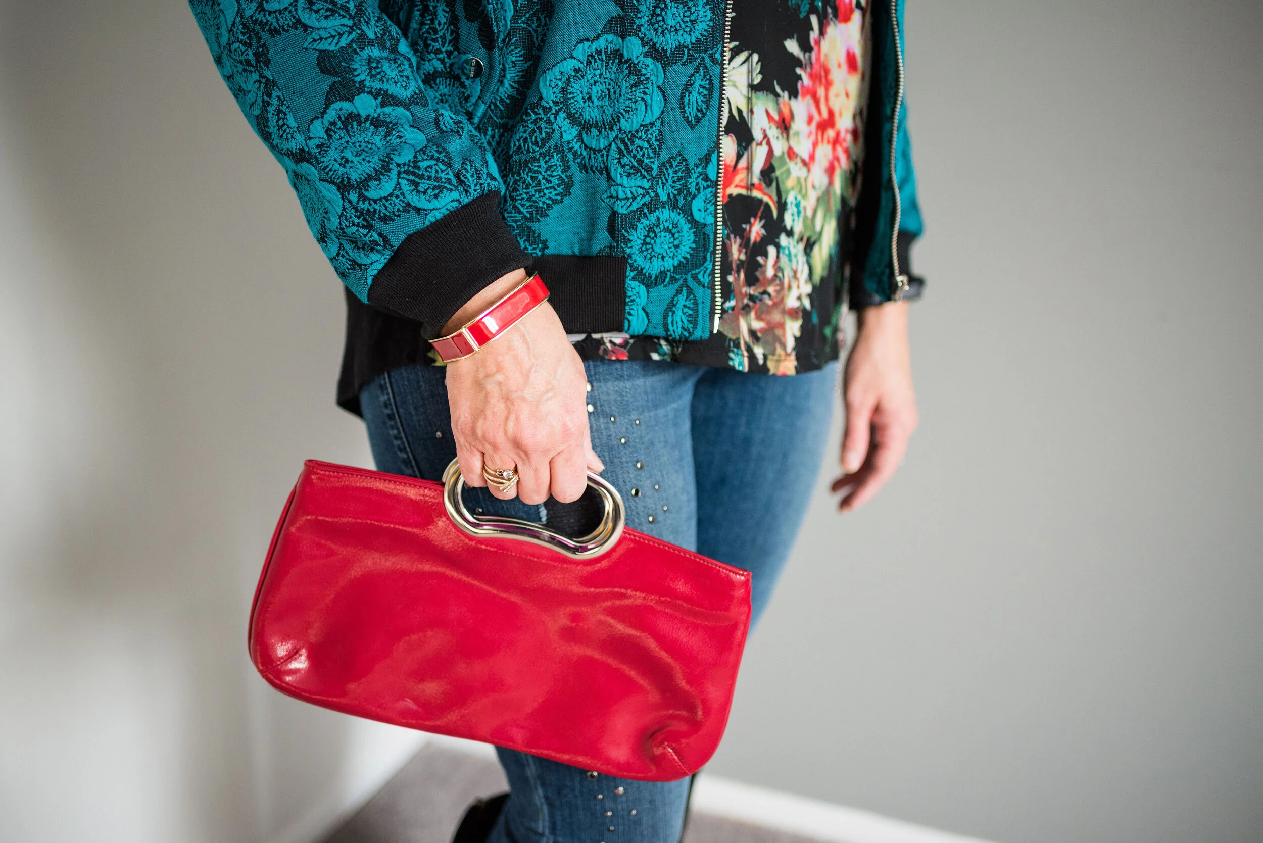
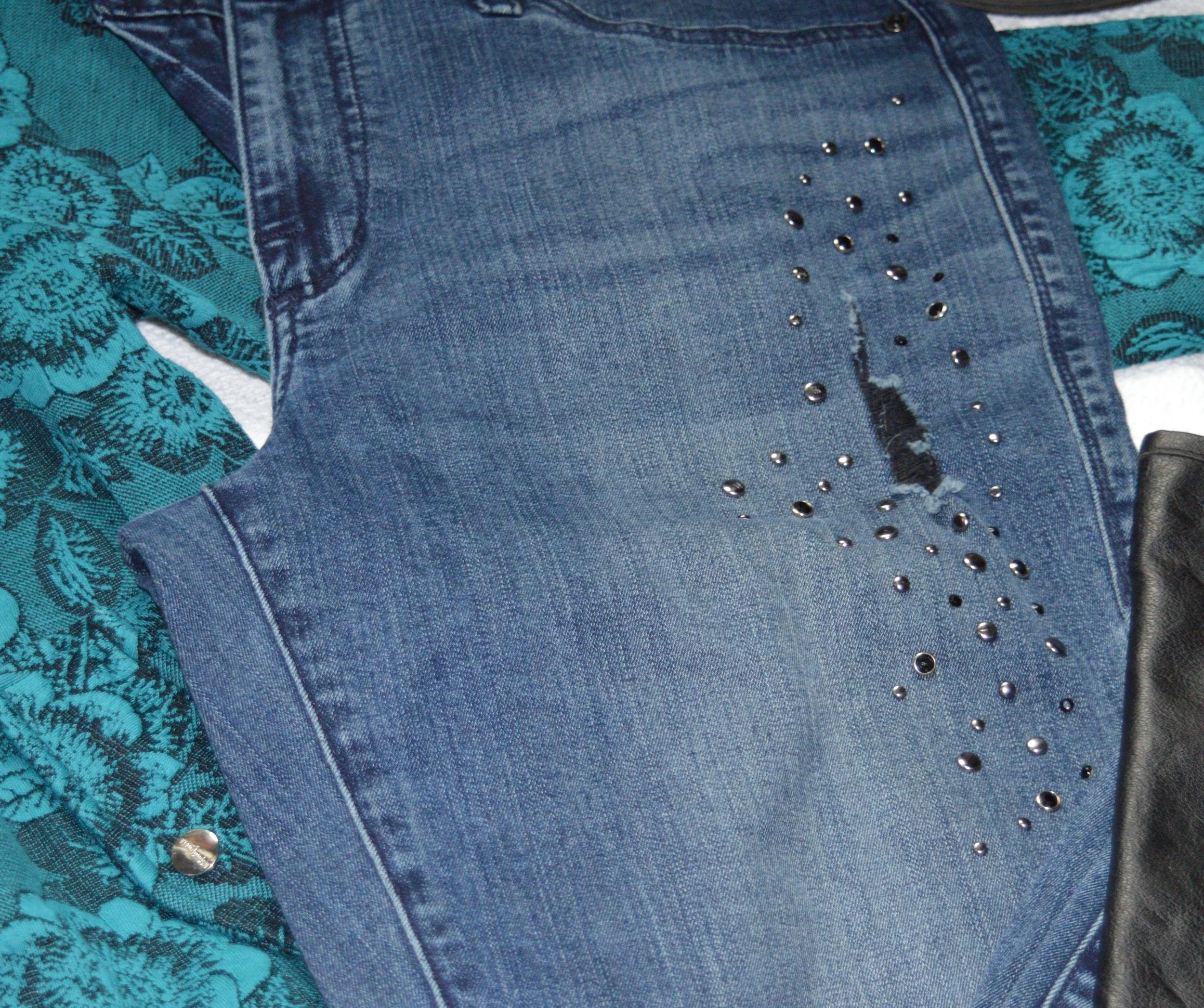
These Rock and Republic jeans from Kohl’s have a good deal of stretch, otherwise I would never fit into them. Ha, ha. I like the bling and the distressing and I figure as long as my bum is covered I can still wear these because they are very comfy, even though they are tight.

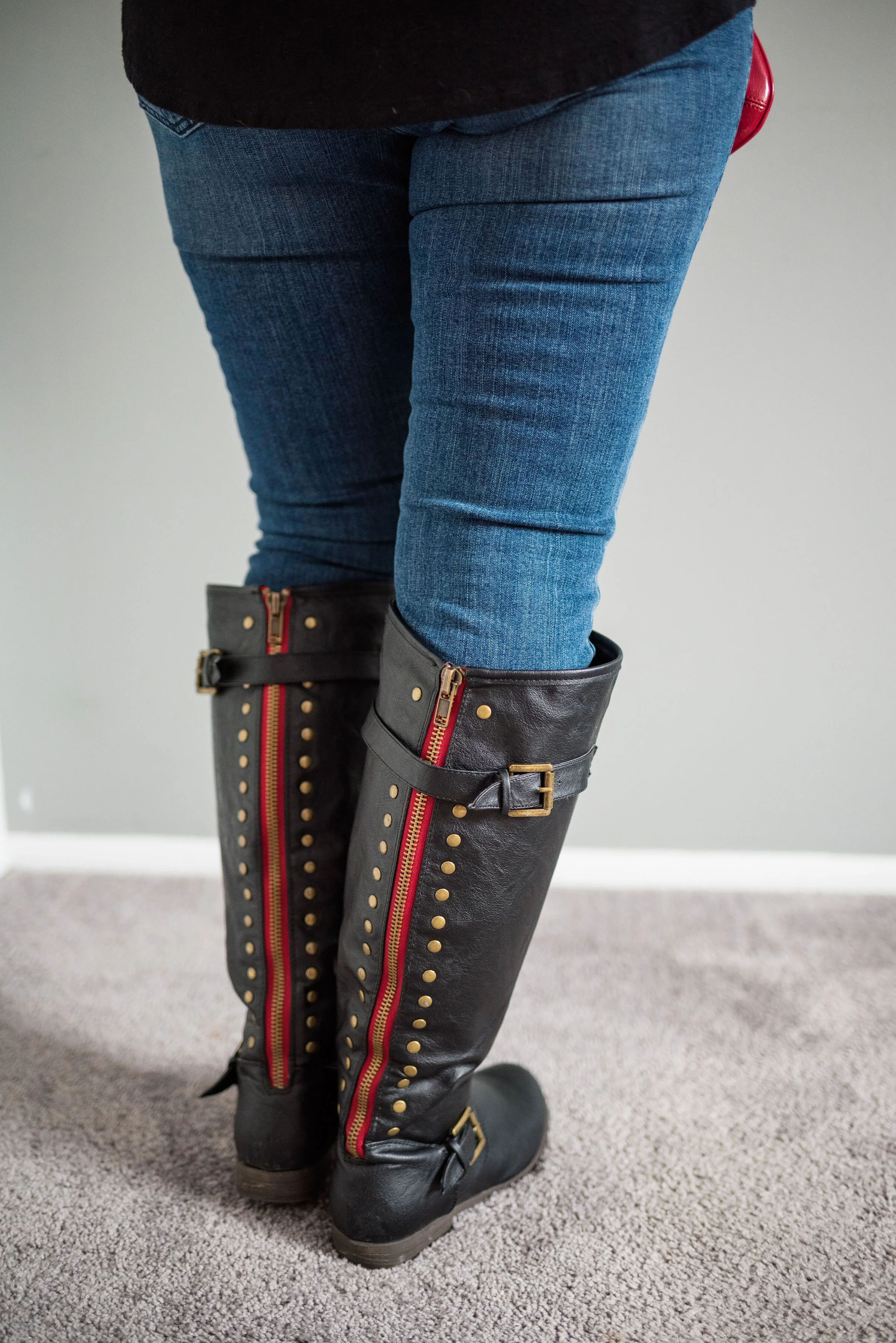
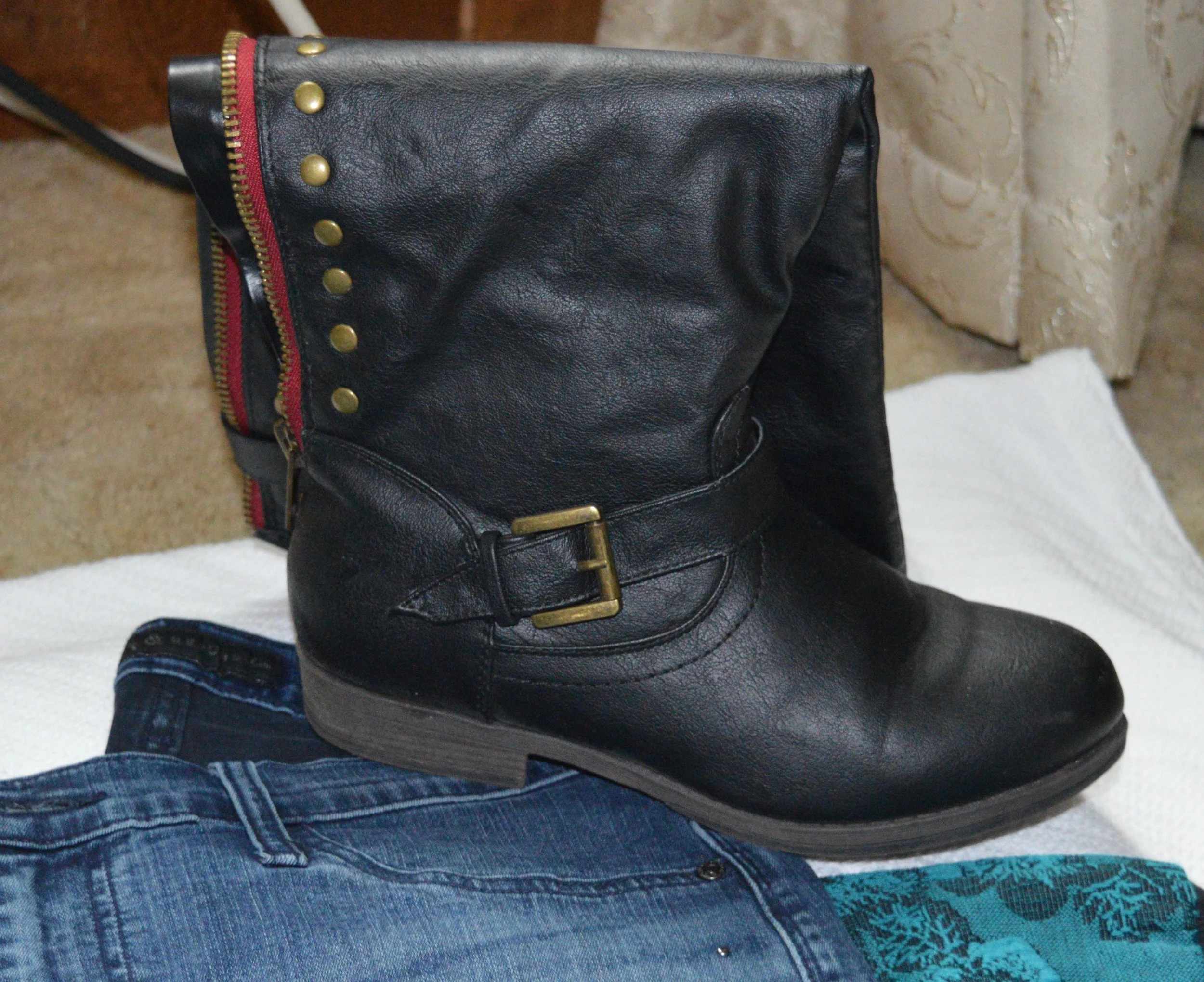
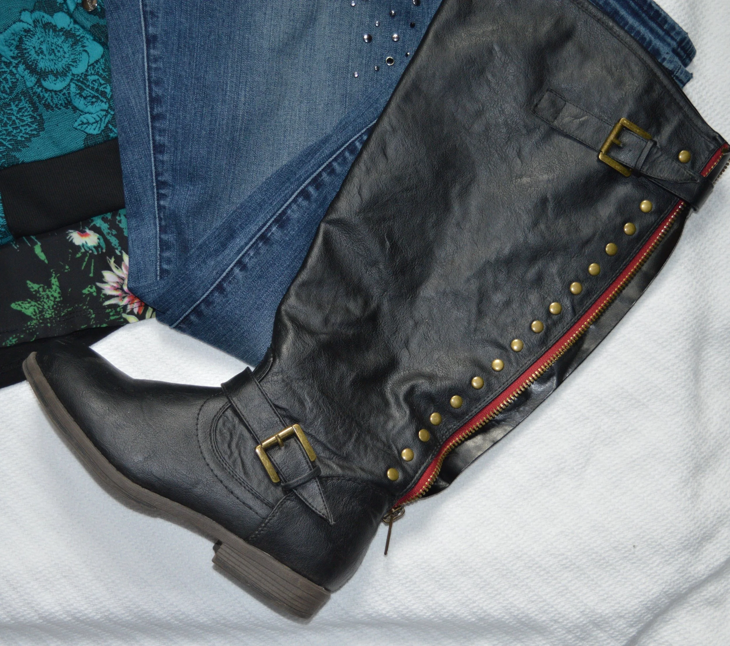
My tall black boots were a clearance find at DSW. Don’t you love the clearance racks? They are definitely worth checking out from time to time at any store you may shop at. i love the detailing on these and the bright red zipper casement along the back. Sorry about the cheeky bum!

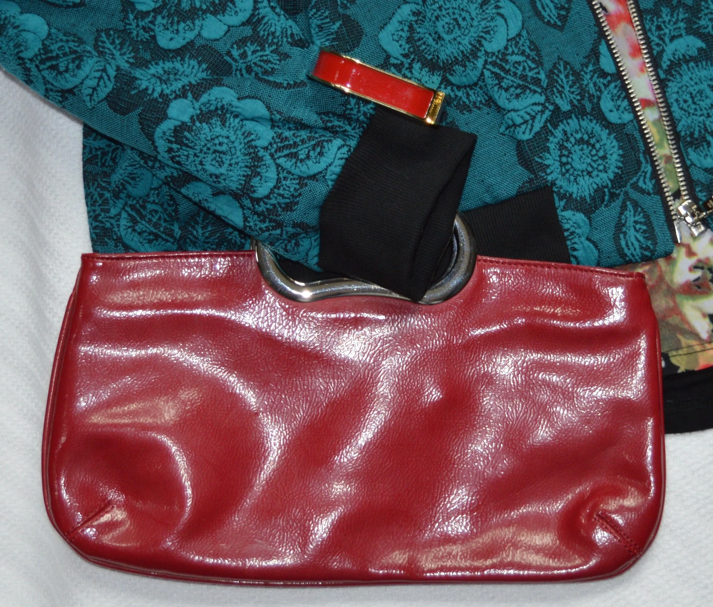
I went with red for my other accessories, and even though the necklace doesn’t make a bold statement, I like the way the gold chain and charms give added texture to the top.

Do you think this flat lay worked in the flesh? What about it do you like? What don’t you like? I appreciate all your input and your support.

I’m including a few shopping links for some dark florals. Remember Christmas is right around the corner and shopping from home is so easy. Ha, ha. These are affiliate links. All opinions are my own.

Photo credit, unless specified, Rebecca Trumbull.


Pantone - Autumn/Winter - 2019 - Summer Fig and Bluestone

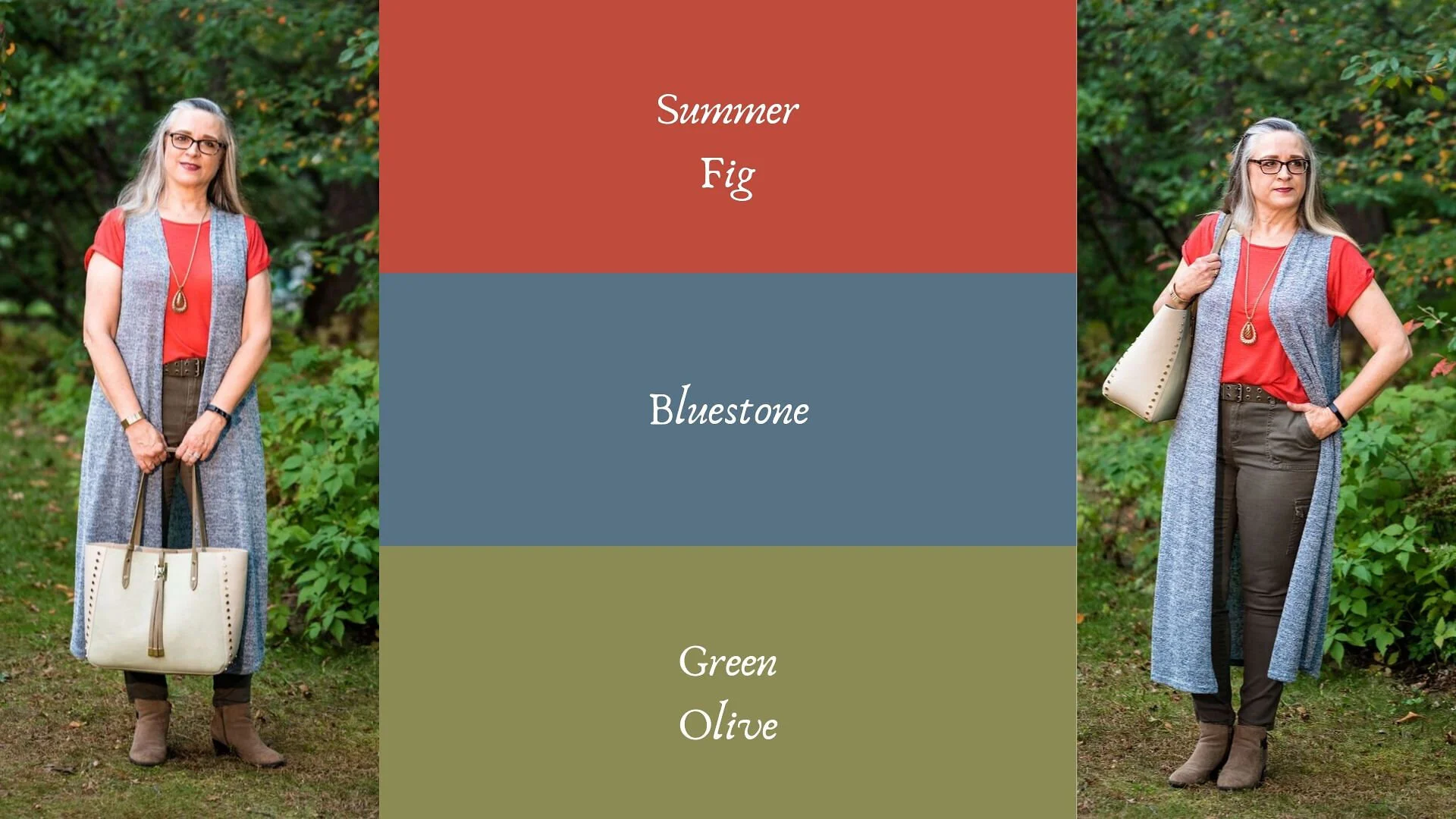
You’ll remember from the New York Pantone series the color Bluestone. This is one of only two colors that showed up on both palettes. I’m not sure how the Pantone Color Institute comes up with the colors they choose. Is there a committee? If so who is on the committee? How do they come up with the names for each of the colors? Yes, these are the things a fashion blogger wonders when she is tired and needing a burst of writing motivation. Ha, ha. I am speaking the truth when I say, I had to look up what a fig looked like to understand where they came up with this red color. This red coincides with the bright red interior of the fig fruit. I have never eaten a fig, have you?

This bright red tee is SO brand from Kohl’s. It is a few years old. I find Kohl’s and JCPenney my go to’s for things like short and long sleeve tees.

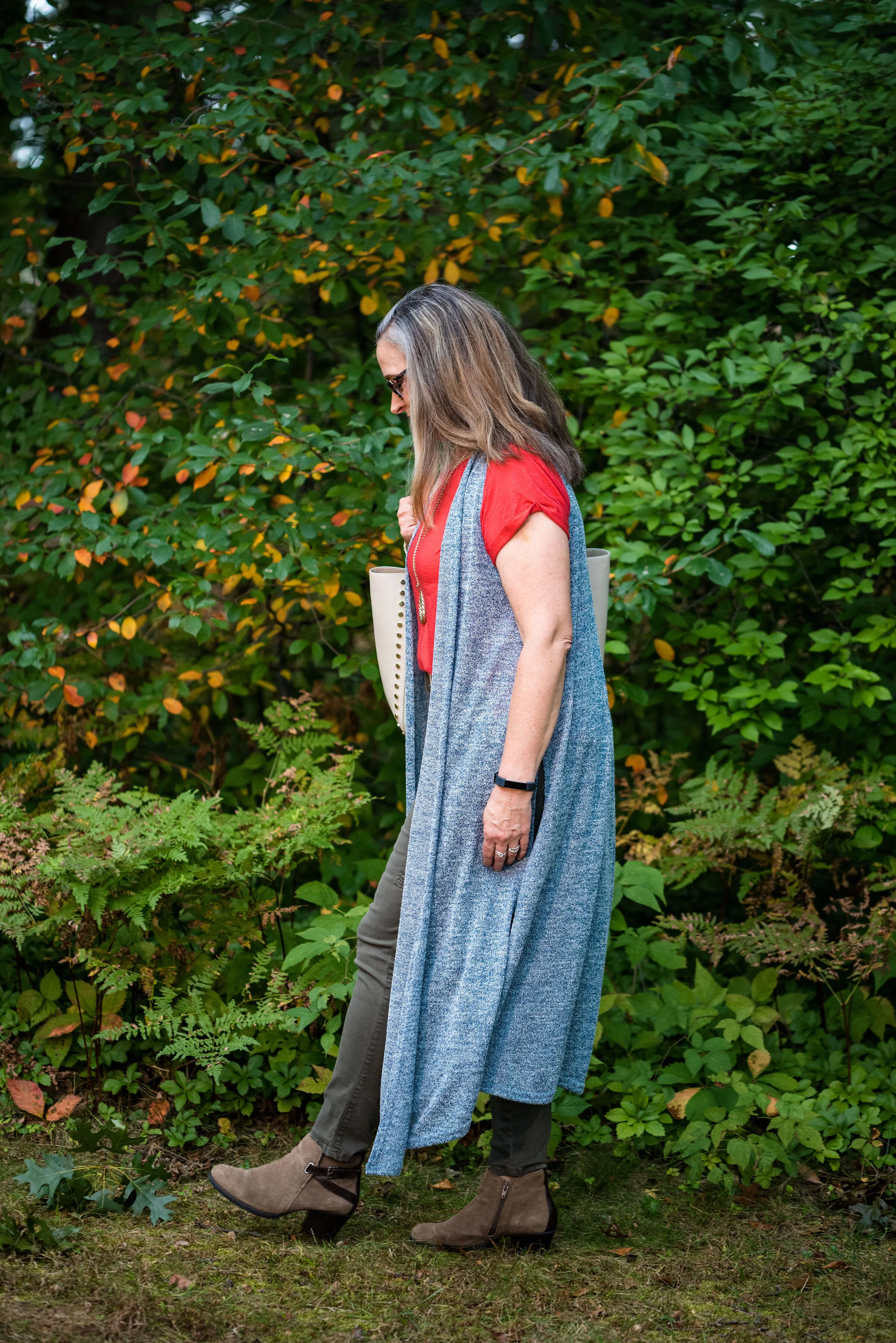
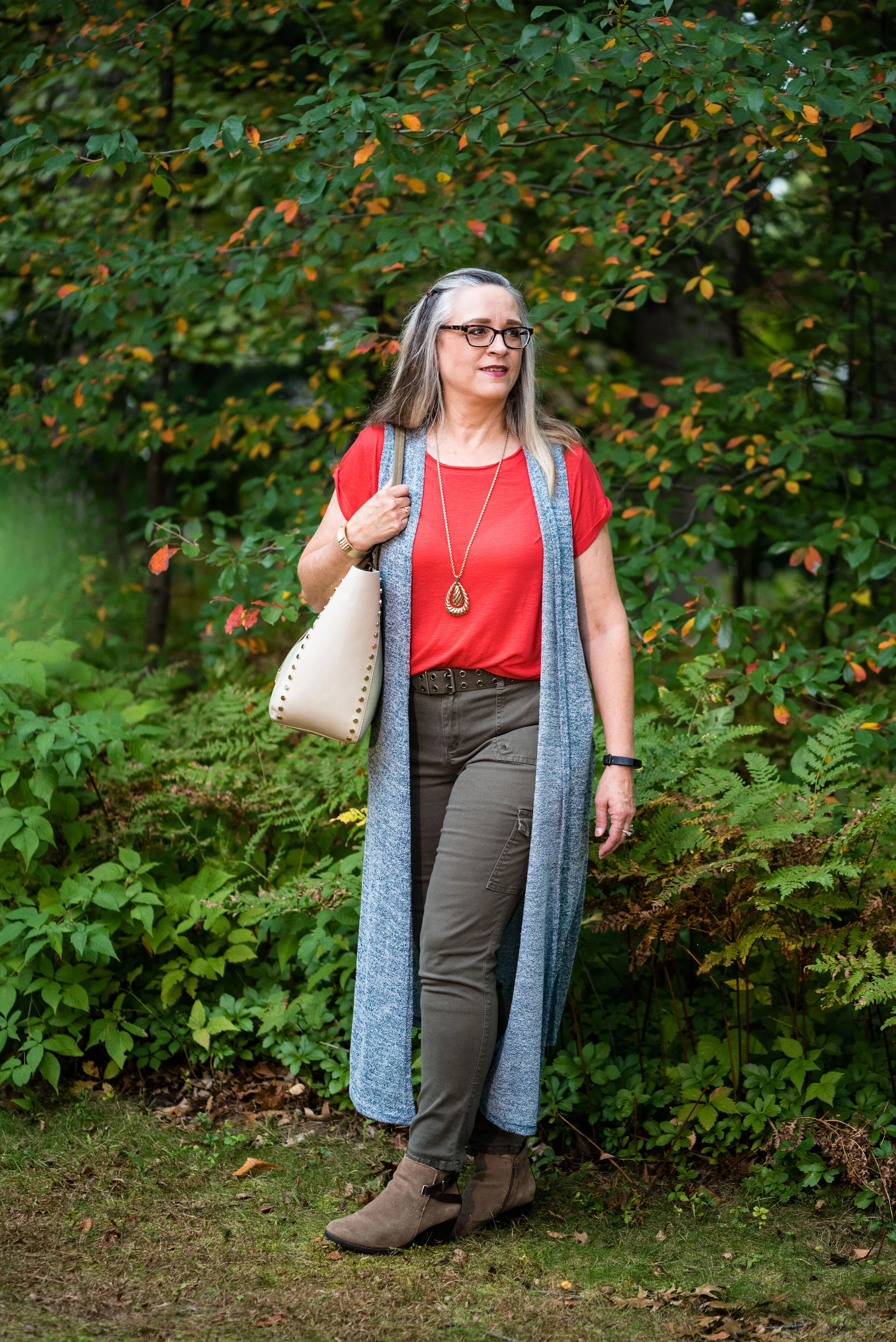
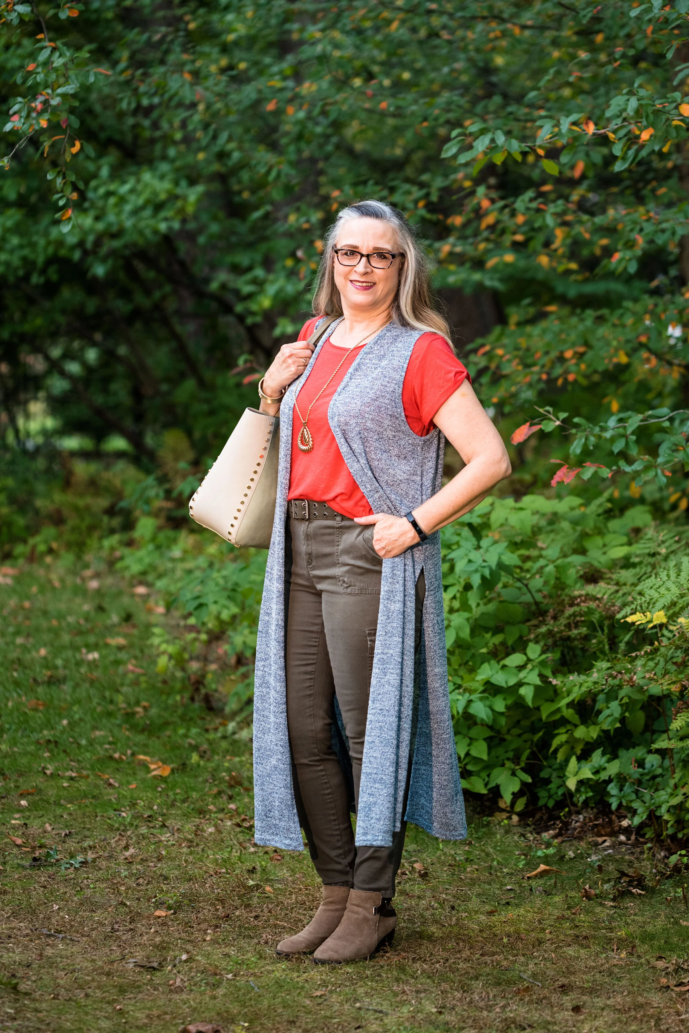
The Bluestone vest is a LuLaRoe piece. This particular style is called Joy. I like that some clothing companies name each of their styles. Not that I will remember what they are called, but I just think it adds another dimension to a retailer, that they have taken the time and effort to specify a certain line has a name. This is the only vest I have that is this length and I like how it looks in this outfit. The fabric has plenty of stretch, but doesn’t lose its shape.

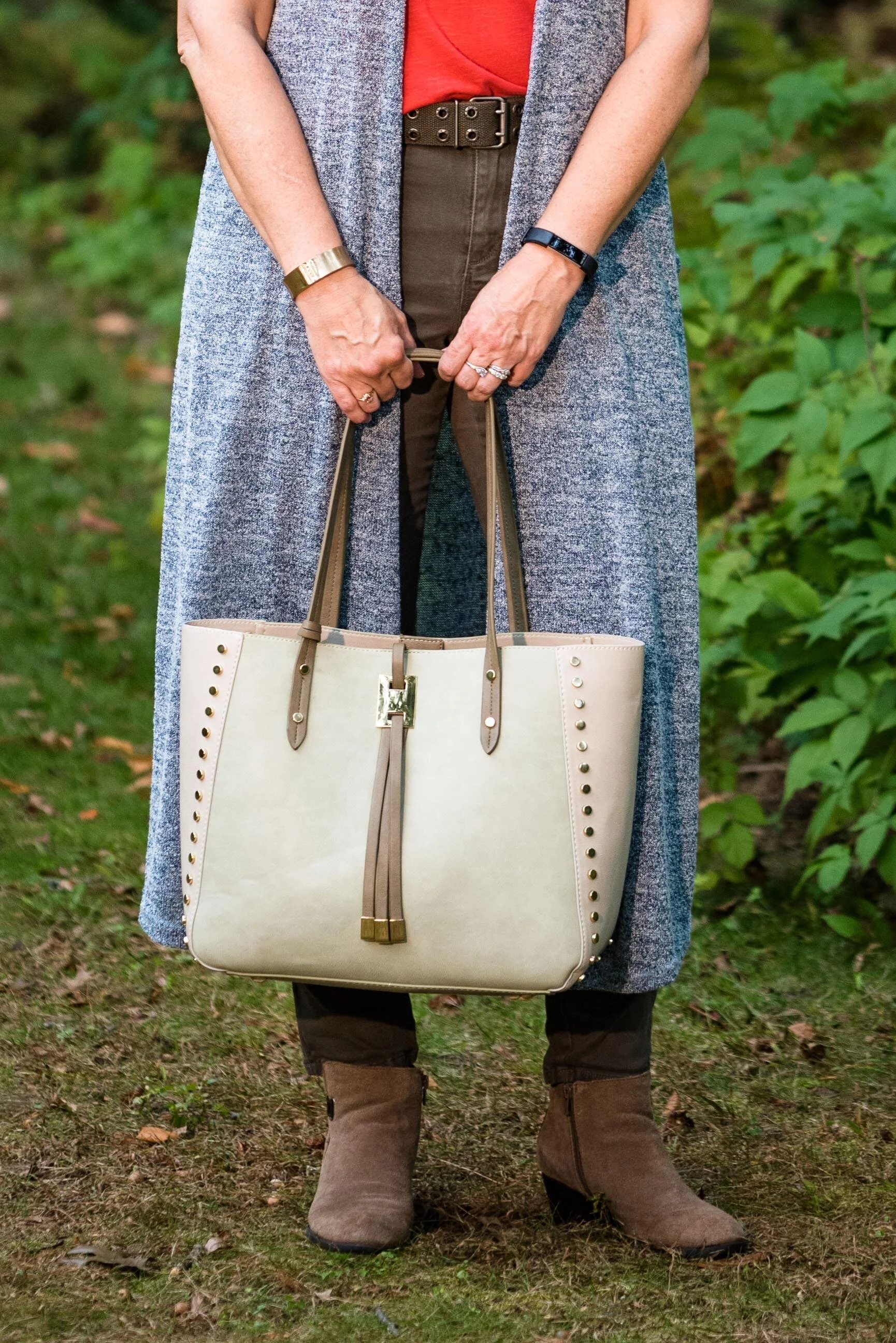
Once again, I turned to the classic color of Olive Green for my pants, bag, and belt. Olive just seems to be an easy color to pair other colors with and it grounds an outfit and keeps it looking chic with a bit of an edge. These utility pants are Gloria Vanderbilt brand and I’ve styled them before on the blog. You can see them styled with an olive utility vest here and in a flat lay with a snakeskin jacket here. I got the tote bag from Charming Charlie a couple years before they went out of business. Belts are so expensive, I usually try to pick them up at thrift stores.

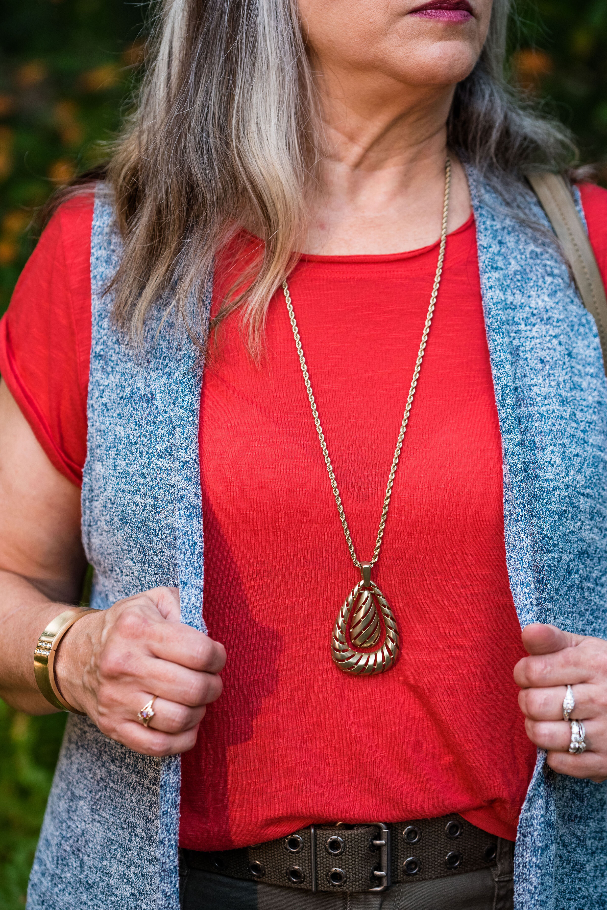
I kept the jewelry simple with a gold pendant necklace and a gold bracelet.

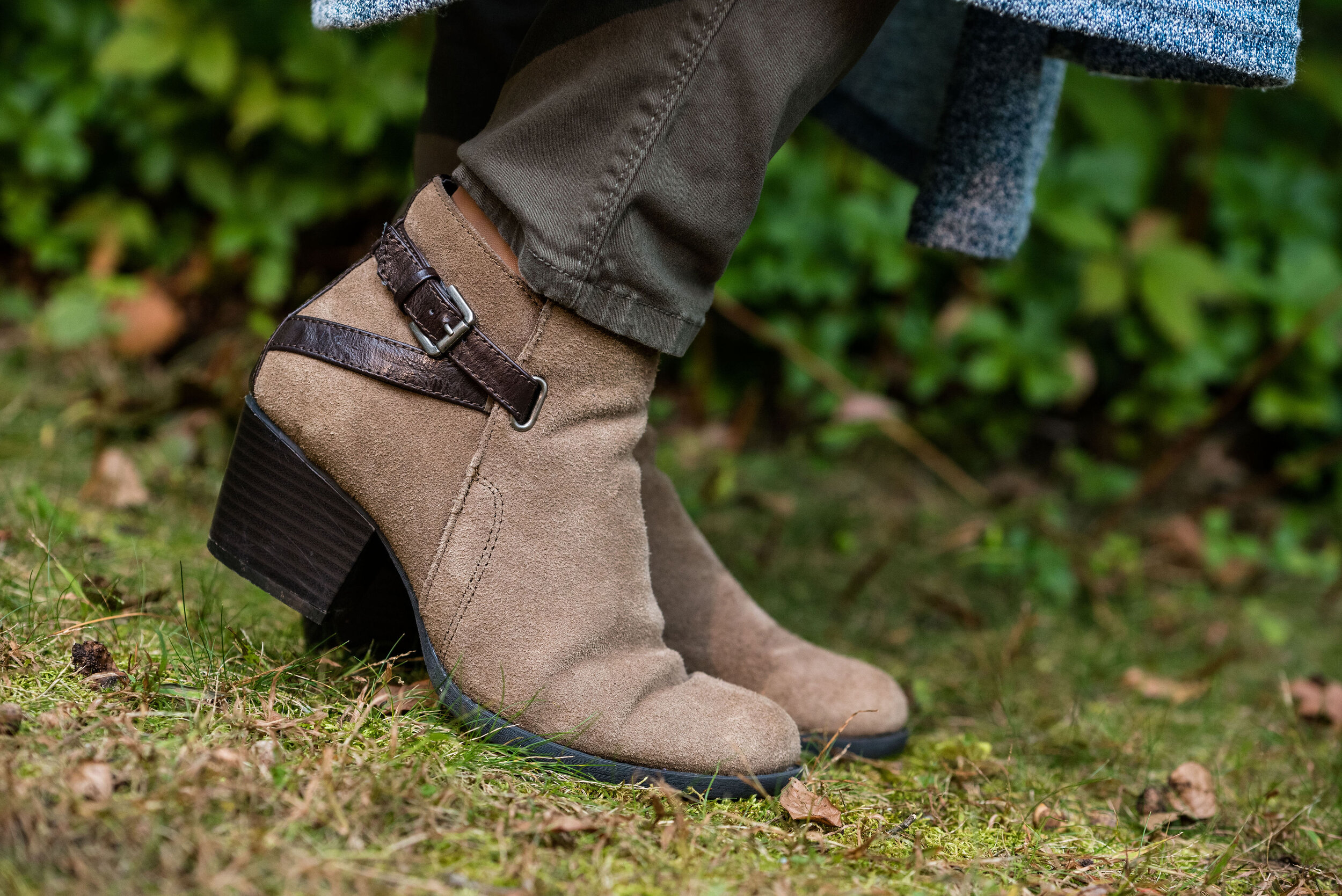
This old pair of Sonoma ankle boots has been with me for a while, but they are the perfect neutral finishing touch and the suede texture is just right for a fall outfit.

What do you think of these colors? They are very similar to the New York palette using Bluestone and Chili Pepper. Do you like to wear vests? Do you have a long one like this? What are some other ways you could style a long vest? I’d love to have your feedback.

I’m including a few shopping links. These are affiliate links. All opinions are my own.

Photo and graphic credit Rebecca Trumbull.


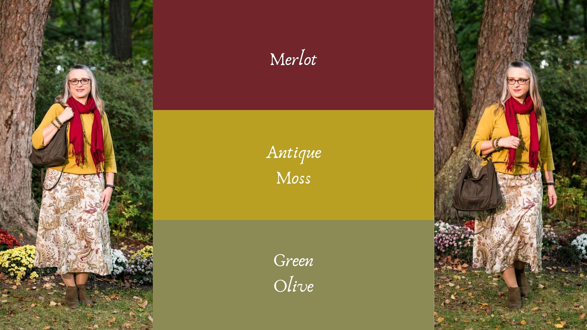
Pantone - Autumn/Winter - 2019 - Merlot and Antique Moss

The first two colors from the Pantone - Autumn/Winter - London palette that I am featuring are Merlot and Antique Moss. As you can imagine, Merlot, like the wine is a rich burgundy red, while Antique Moss is a yellowy green. Often when we think of pairing red and yellow, we are concerned we will come out looking like an advertisement for McDonald’s, but let me reassure you these two colors pair in a perfectly un-Ronald like way and I love the combination.

The London color palette classic colors were just a bit different. Green Olive is comparable to Guacamole from the New York palette, with a little more of a gray tinge. My version of olive in my accessories is much darker, but you get the idea.

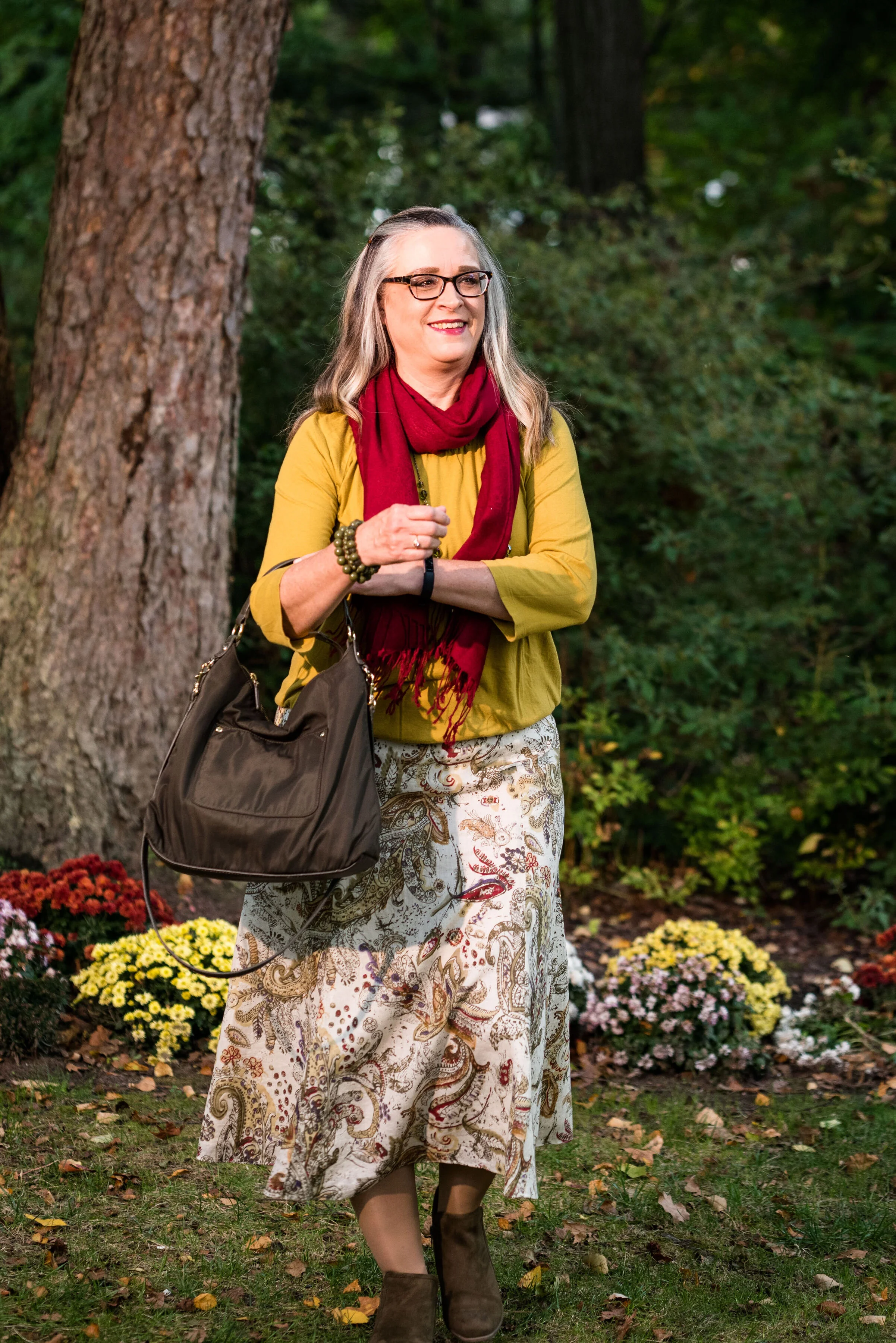
This Jones Wear skirt you’ve seen on the blog before. I styled it for the Pantone Fall 2017 New York Palette in a very similar fashion. I even used the same dark olive bag. Ha, ha. You can see that post here. I also used it this past spring for the Pantone Spring/Summer 2019 colors. You can see that post here. In addition you can see it with a green cardigan, here. I keep coming back to this skirt, because it works so well for these color schemes due to the reds and greens in the print of the skirt. I could easily used this printed skirt for a Christmas outfit as well, so you might see it come up again later this year. I love a versatile piece and when I purchased this skirt, I never knew how often I would use it for the blog.

We took the pictures for this series at the Toledo Botanical Gardens, which are just down the street from where my daughter lives. The gardens are beautiful in all seasons and with walking paths through the grounds, it is a lovely place to visit and I don’t do it nearly enough. In the picture below, I am watching several bus loads of kids scramble on to the grounds and thinking, “Oh boy!” Ha, ha.

I obtained this red scarf from a friend’s closet. It looked a little more like Merlot, when it was in the low light of my closet, but here it looks much brighter. However, It is not a true red, but more of a burgundy. My 3/4 sleeve tee, I’ve worn on the blog before too. It is a thrifted Sonoma piece and has elastic on the bottom, which allows for freedom of movement and bulge camouflage. Ha, ha. You can see the tee styled with boyfriend jeans and a leopard print skirt here, and with a snakeskin print skirt here.

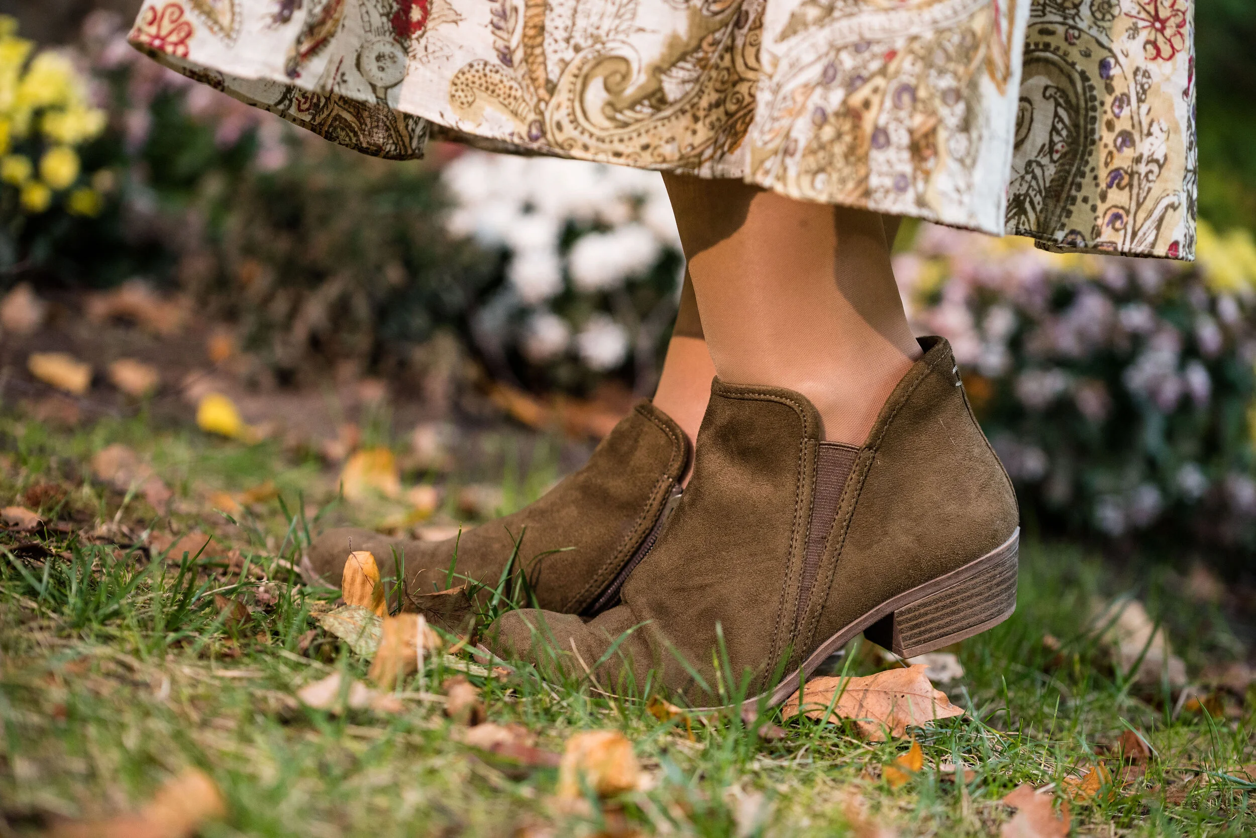
As I said earlier, I opted for olive green accessories which included my necklace, bracelets, thrifted bag and SO booties.

What do you think of these colors? Would you wear either of these? Would you wear them together? I’d love to have your feedback. Your support means a lot to me. I always respond to your comments. Just check back in a few days if you are interested in my reply.

I’m including a few shopping links for Merlot and Antique Moss if those colors got you excited. These are affiliate links, which means I get a few cents when you click on a link. All opinions are my own.

Photo and graphic credit Rebecca Trumbull.


Pantone - Autumn/Winter - 2019 - Peach Pink and Biking Red

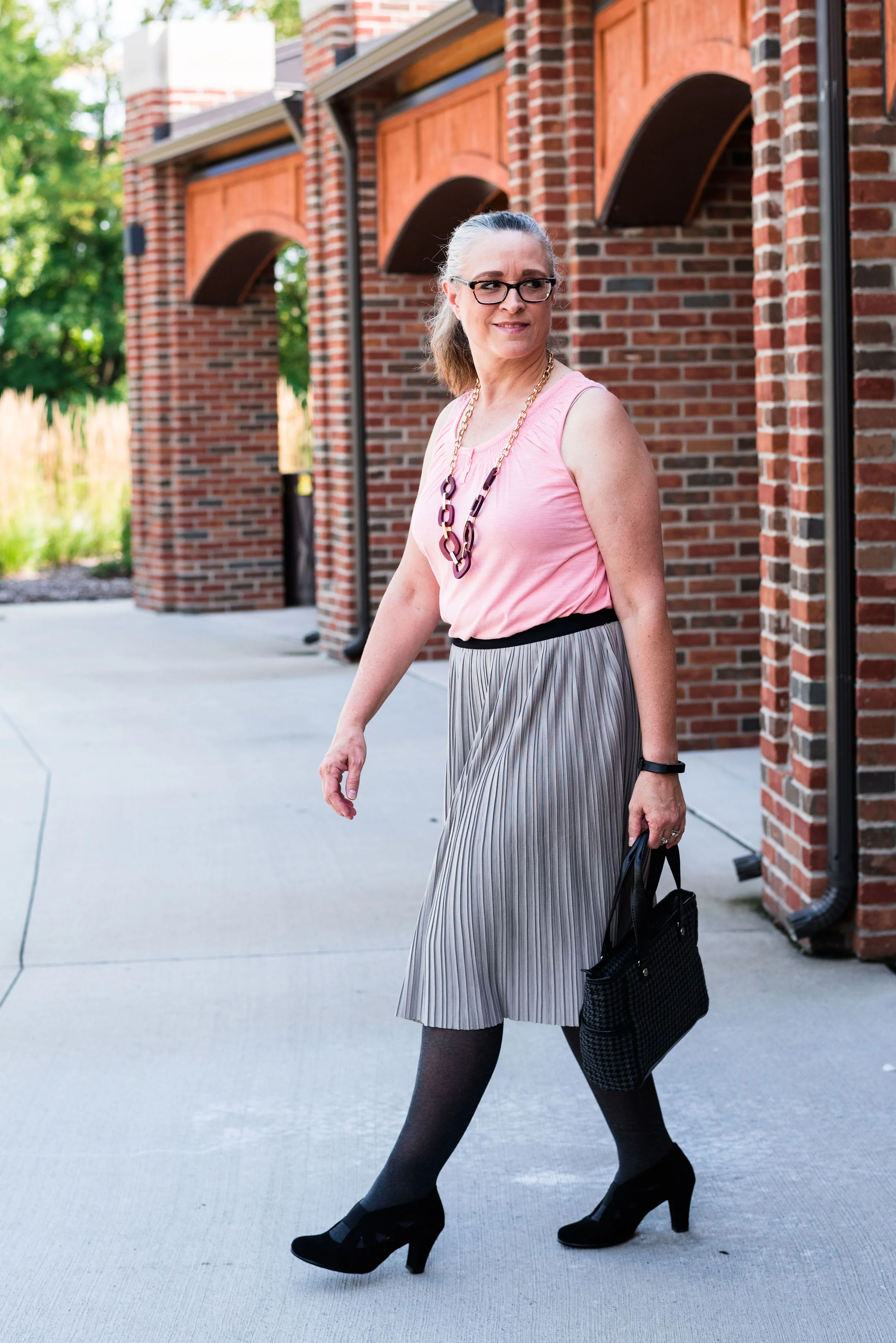
These are the last two colors from the Pantone - Autumn/Winter - New York palette. Peach Pink is reminiscent of coral, which never really seemed like a fall color to me, but I must remember that the old rules don’t apply…at least to some things. I know many people buy into the old adage, the rules are meant to be broken, but I don’t always believe that is the best mindset to have, and that mindset trickles down to our children and our grandchildren. As far as rules, I think that many of them are in place for our protection and our benefit. Rules like, look both ways before you cross the street, floss your teeth once a day and eat your fruits and veggies are not bad. Actually, they are for our well being. Rules about color, really no longer apply, so I am okay with wearing white after Labor Day and wearing coral in October. Why not?

The other color in this ensemble is a dark red. It reminds me of the Brick Red from my Crayola Crayon box. How many of you remember those wonderful boxes of crayons? I used to obsess about having all the similar colors arranged by shade in my box. I didn’t want to hunt around for Brick Red, so I put it in the “red” section. Ha, ha.

As you can see, once again, my colors were not perfect matches. You will see I did a little better with the London Palette, which I will be introducing on Thursday.

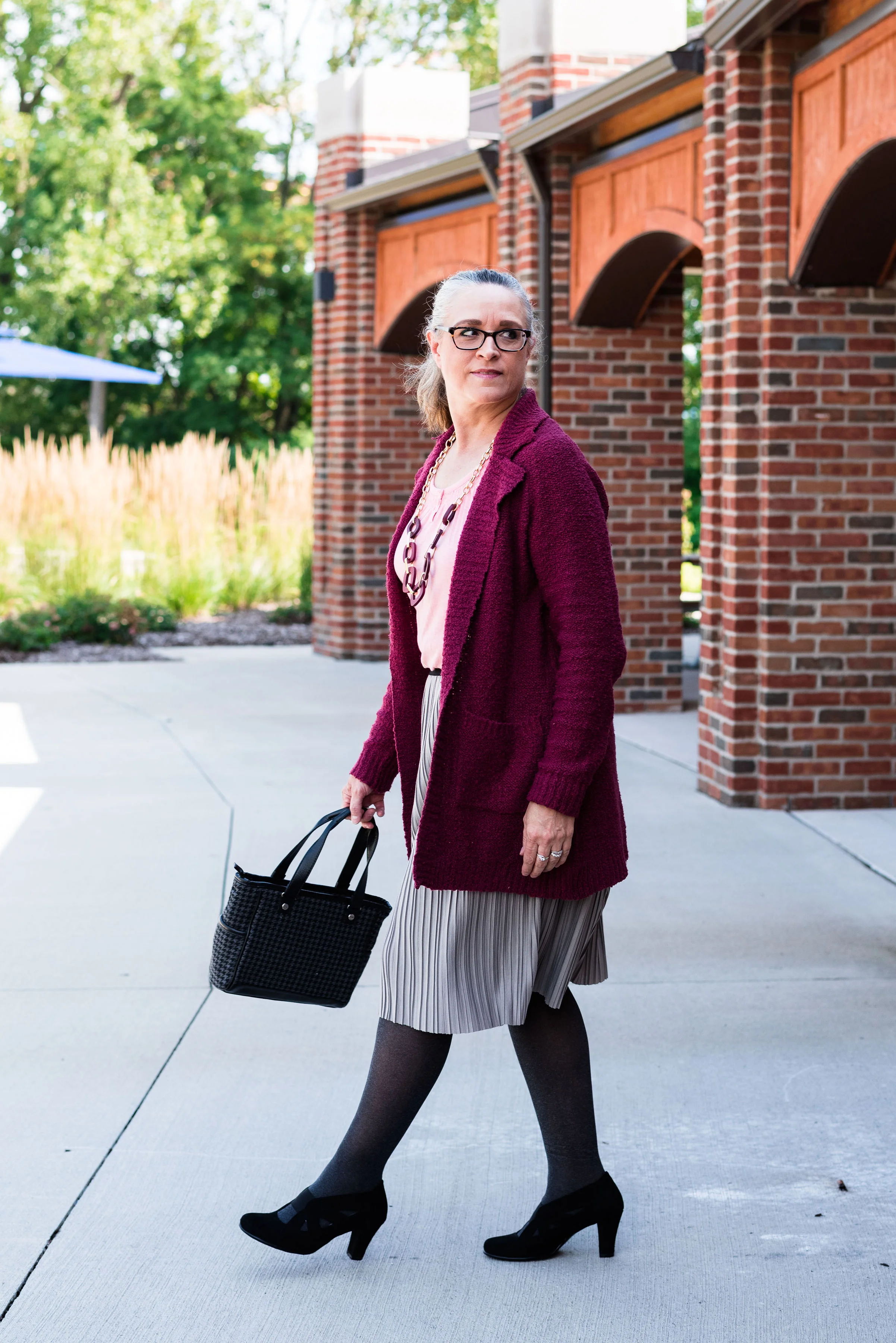
The heavy gauge sweater is Candies brand from the Koh’s clearance rack at end of last winter’s season. I find this is the best time to shop for those pieces you want for the season, if you don’t want to pay full price. I have found most of my non-thrifted clothing pieces this way.

My Peach Pink tank top was a thrift find from a few years ago. It is Eddie Bauer brand. You’ll be able to see the ruching on the neckline in an upcoming picture.

My Paloma gray pleated skirt was also a Kohl’s clearance find a few years ago and is Apt. 9 brand.

My chunky wood ring necklace is making an appearance again. I love this necklace my daughter gave me for Christmas. It is so handy for making a statement and pulling the colors in an outfit together. A necklace like this works much the same way a scarf will, but without the added heat around your neck.

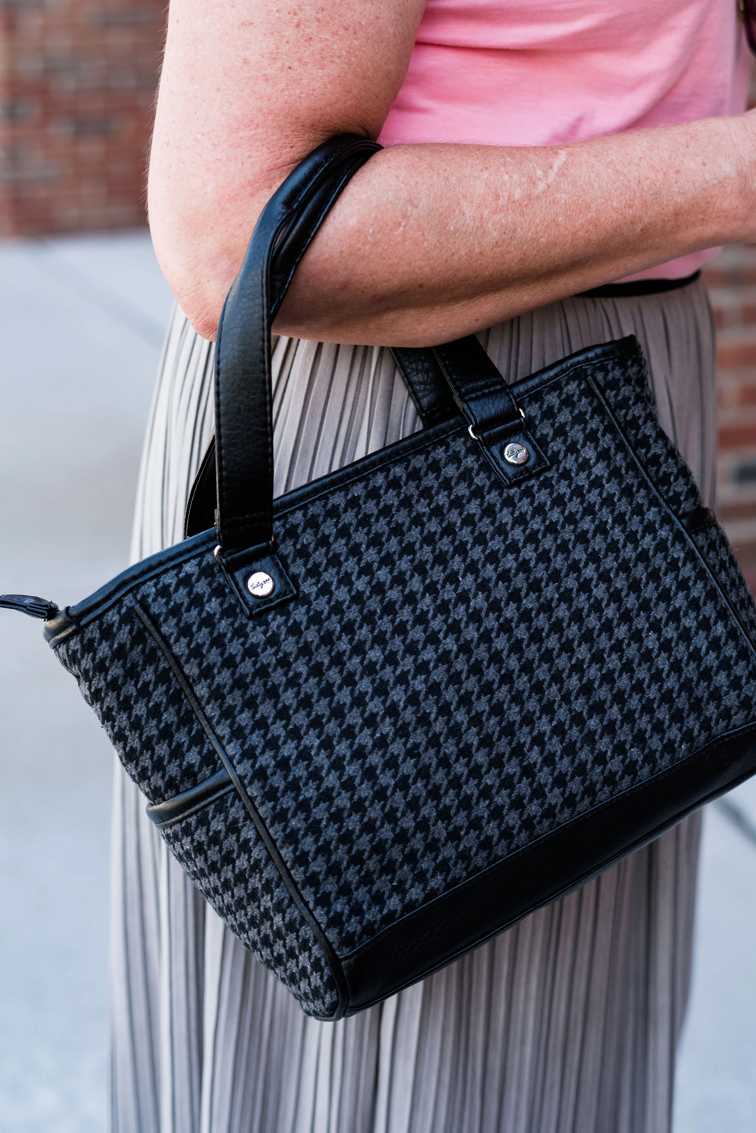
My little thrifted Houndstooth bag works both as a satchel and a cross body. The shoulder strap is inside the bag, but can easily be taken out and attached so I can wear this for hands free activities.

I really like these black Aerosole heels. They are comfortable and stay on my feet with no slipping or sliding. I decided to add the dark tights at the last minute for two reasons. The first was to keep the leg more monochrome and thus make the legs look longer. The other was to make the outfit seem more ready for fall weather. The day we took these pics it was hot!

What do you think of this outfit? Is this something you would wear? Do you like these Pantone colors? Why or why not? I’d love to hear from you, so leave a comment or two.

I’ve included a few shopping links. These are affiliate links. All opinions are my own.

Photo and graphic credit, Rebecca Trumbull.

Have a great day.

Pantone - Autumn/Winter - 2019 - Orange Tiger and Eden

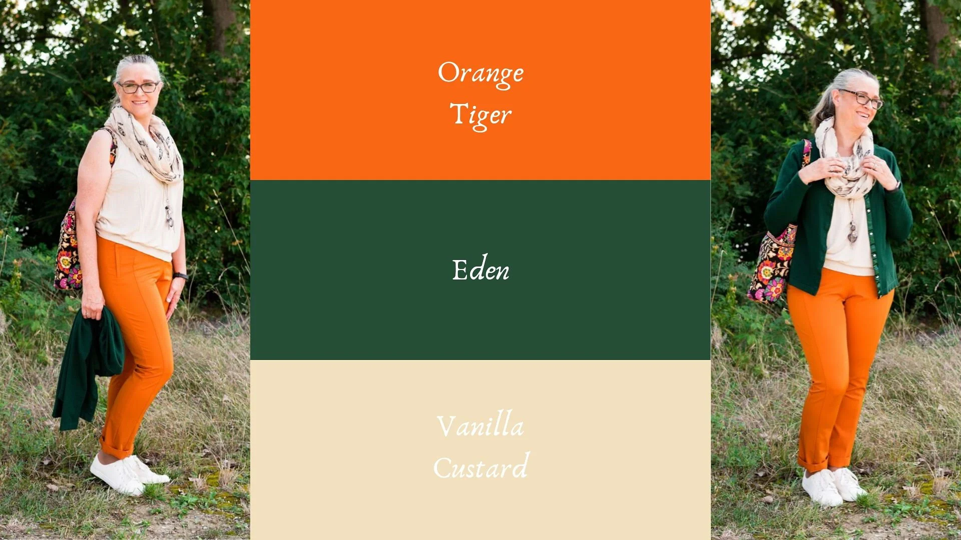
I mentioned in Tuesday’s post on Sugar Almond and Dark Cheddar, that not everyone can or wants to wear orange. I love orange, but it has to be the right shade for me to wear it near my face. Some oranges make me look sallow or washed out. Today’s colors are bold and what caused me to put these two colors together, was the contrast of dark with light, deep with bright. Today’s colors are a “fearless” Tiger Orange, and a rich “stately forest green” called Eden. I think Pantone’s description of these colors is perfect.

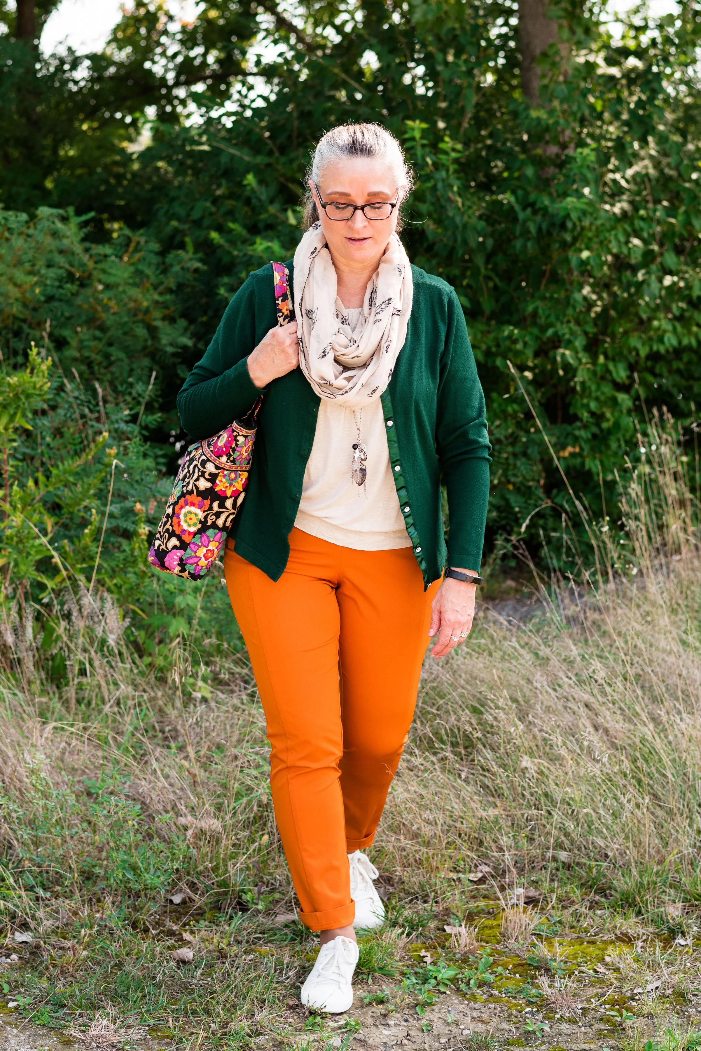
These two colors are the first in this series that I felt truly matched with the Pantone colors. I looked for a while in thrift stores for the perfect green and I really think this dark cardi nailed it. the sweater is Jaclyn Smith brand.

These bright orange pants are Worthington brand and I got them at JC Penney a number of years ago. These are more of a skinny leg trouser than a wide leg trouser. I got them for the bright color and do find occasions in the spring, summer and fall to wear them. You can see how I styled these with a floral tunic here.

This cream colored tank top is a thrifted Loft piece. I actually have two of them, found on different occasions, but the exact same style. This one is a large and has a sheen to it, that you can’t really see in the picture. The other one I have is a medium and is more of a true white. Why do I need two of these? Comfort and ease of wear. They work perfectly for something like this, but I will also be able to use them as a light weight under layer when the temps grow cold. The piece is banded on the bottom, making for a great fit without showing off the bulges. Here are a few to look at.

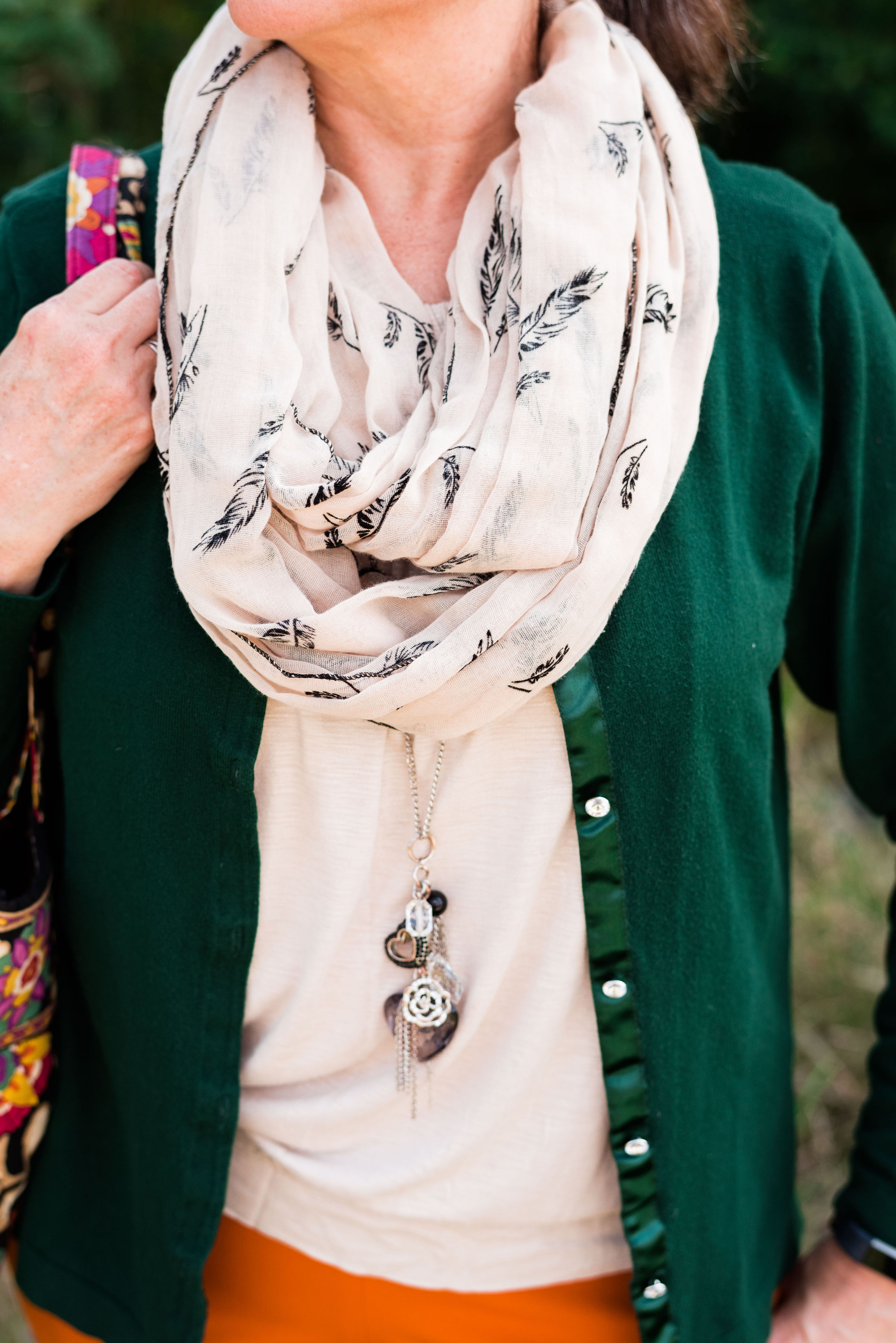
The scarf I added was another thrifted piece. I don’t have many pieces that are cream or ivory, like this. I am also looking for a cream fisherman sweater and/or turtleneck. I don’t need anything, because I am a clothes horse, but every now and then, I do realize I am lacking something I would love to incorporate into my closet. What about you? What pieces have you been hoping to add to your closet?

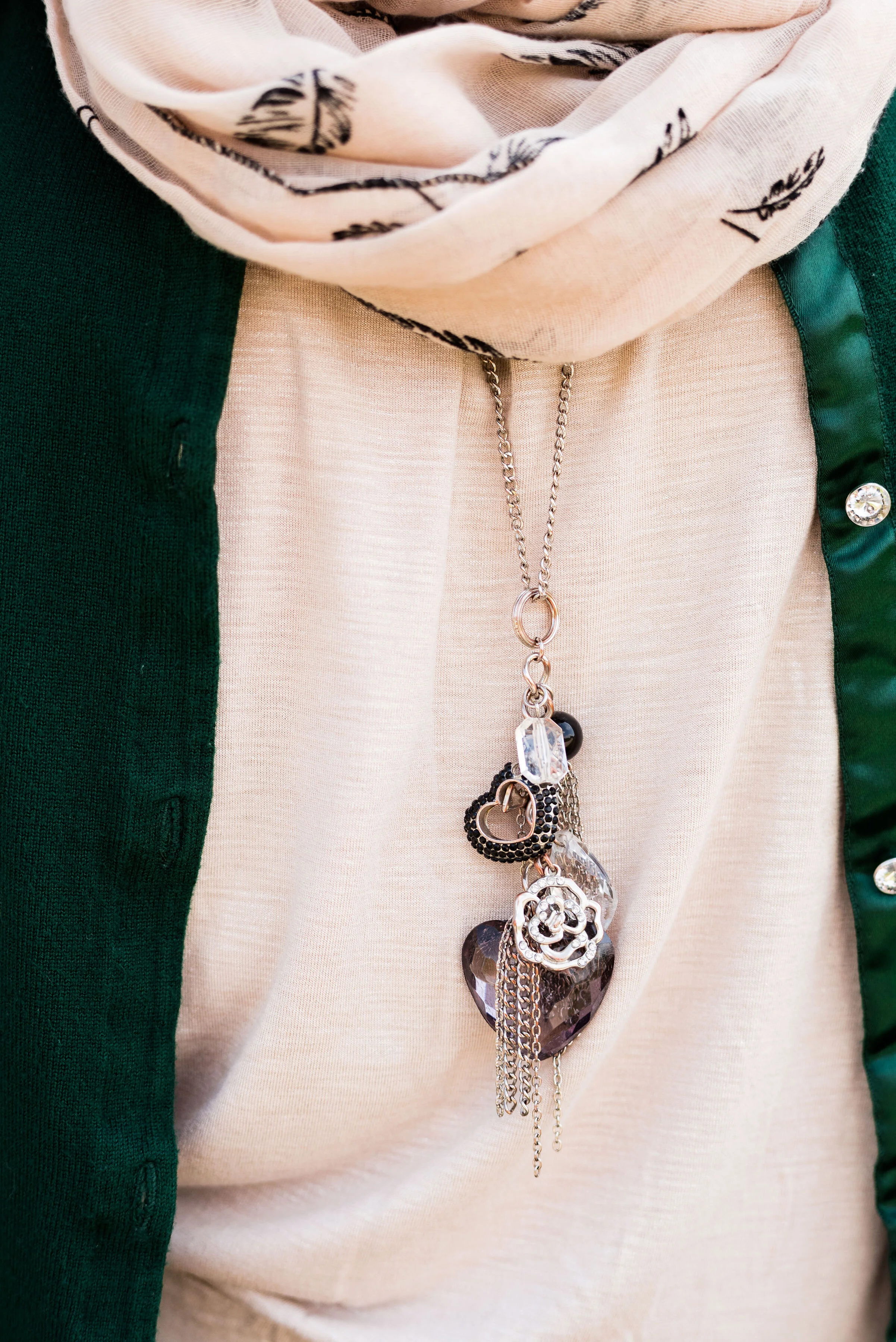
In addition to the scarf I wanted to add a long charm pendant necklace to break up the plain back drop of the tank. I think this outfit would have been equally good with a printed tank under the sweater.

My other accessories included my Vera Bradley tote bag and my thrifted Mossimo sneakers.

What did you think of this outfit? Would you wear a pair of bright orange pants like this? What is the brightest color you have ever worn in pants or a skirt? I’d love to hear you thoughts, so leave me some love in the comments.

I’ve included a few shopping links. These are affiliate links. All opinions are my own.

Photo and graphic credit Rebecca Trumbull.

Have a great weekend, everyone!


Pantone - Autumn/Winter - 2019 - Crème de Pêche and Rocky Road

I am not sure how the Pantone Color Institute decides the colors they are going to feature for each of their palettes. If you have been following me for a few years now, you can probably tell that many of the colors that appear on the palette are very similar to another season’s palette and are just called a different name. For example Tuesday’s Galaxy Blue was very similar to last spring’s Princess Blue.

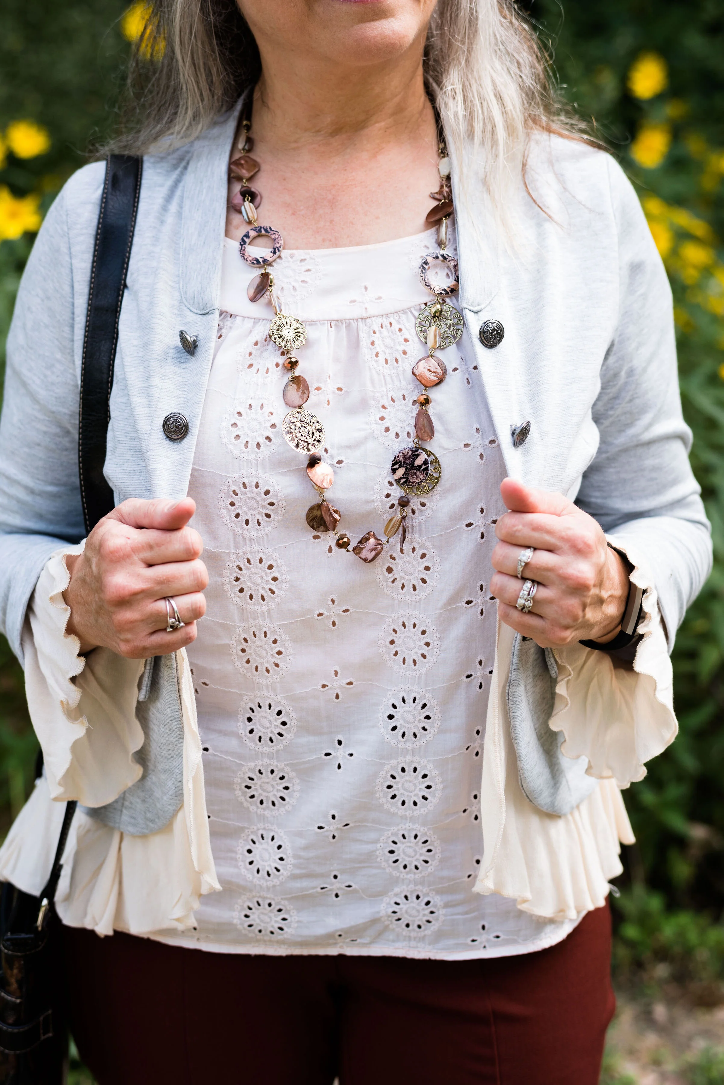
Today’s outfit features two colors called Crème de Pêche and Rocky Road. Once again, my versions of the colors, do not look much like the Pantone colors, but it still gives us inspiration to pair to fall type colors together and pull it all together with a light gray.

My Chico pants look much more orange in comparison to the Pantone color swatch, but I do like how this pair of pull on Ponte knit pants looks combined with the light peach top.

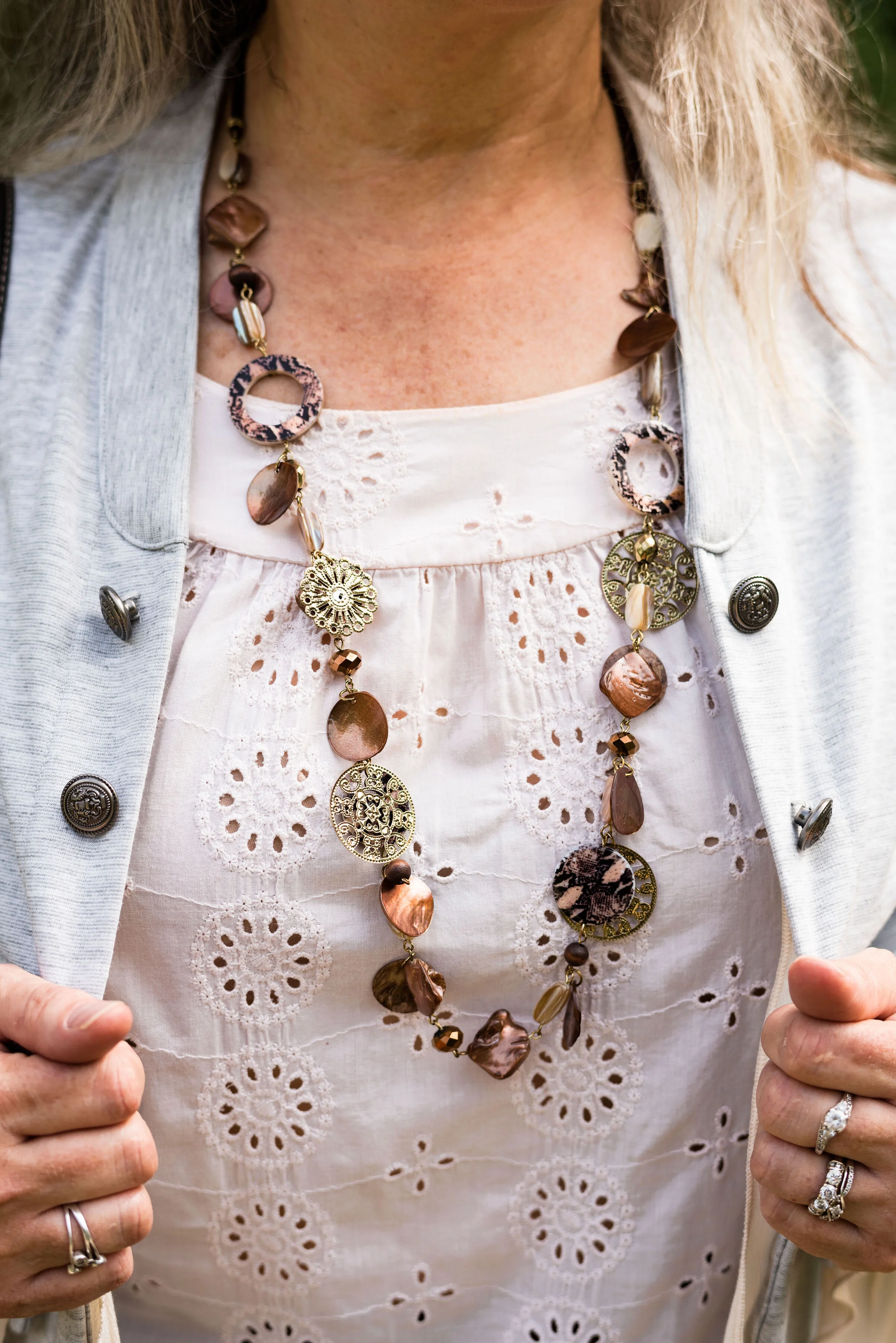
The light peach eyelet top was a thrift find and I wear it a lot in the warmer months. You can see a closer look at that and the necklace I chose in the picture below. I thought the necklace was a good compliment because of its similar colors.

This light gray, About A Girl, jacket was a fun find on the Kohl’s clearance rack. I like the military vibe of the buttons, but the surprising feminine detail of the ruffles on the hem and sleeves.

Another Kohl’s clearance find, I got these Sonoma boots at the end of last winter season. They are a faux suede and a different look that some of my others boots. I love the slouchy and buckle details. Yes, I do have too many pairs of boots, but can a woman who lives in the midwest, have too many? Ha, ha.

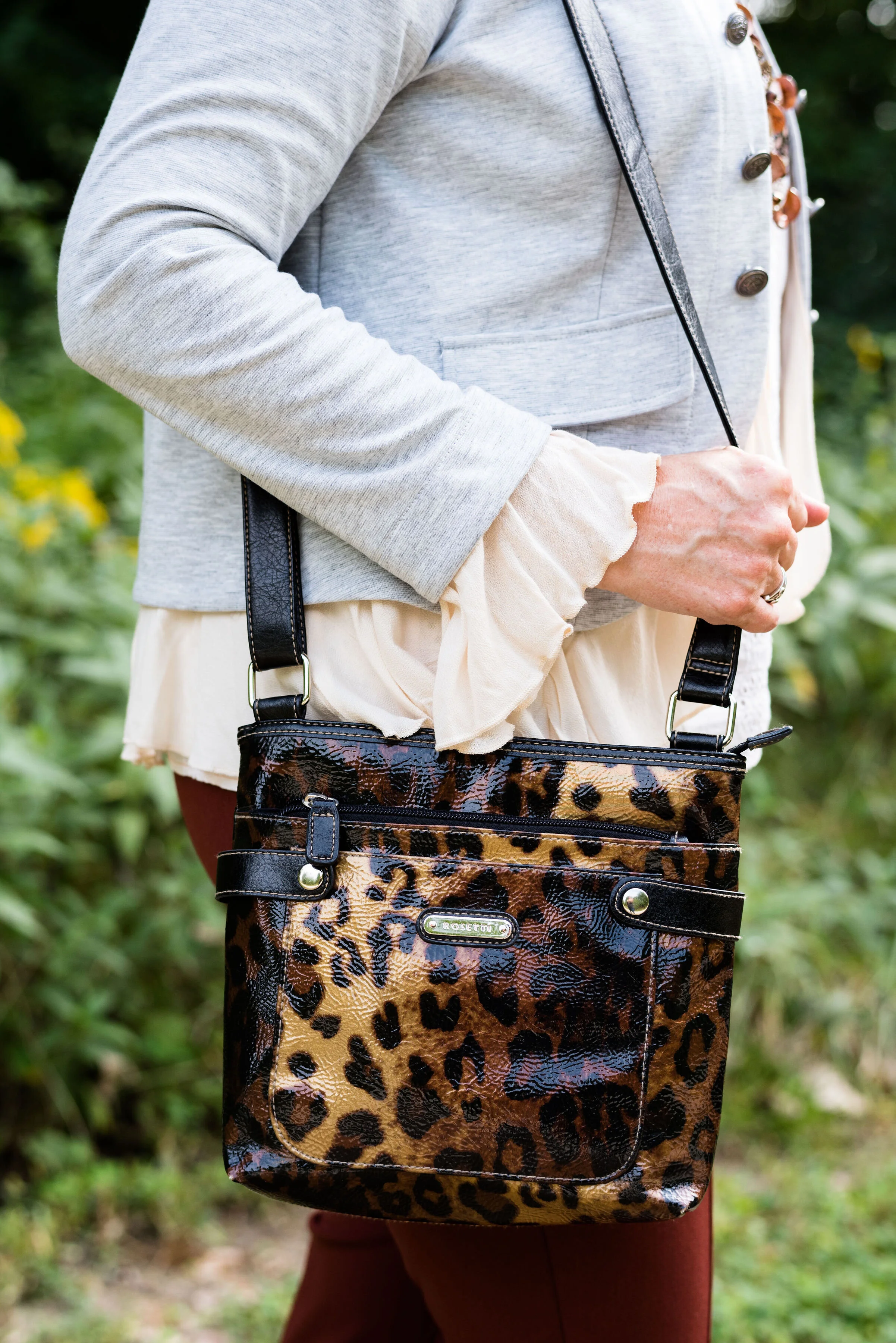
Here is the thrifted Rosetti leopard cross body again. I am planning on making this my “normal” every day bag, as soon as I get around to changing things over. How many of you change your purse on a regular basis? I have many more purses and bags than I actually use. I use them for the blog, so you can see the different styles and shapes, but more often than not, I carry a cross body bag like this. It is just so convenient for hands free shopping.

Here are a few more pictures. I really liked these photos, especially with the large rock and the yellow flowers in the background.

Although my colors were off, I hope you enjoyed this outfit. Do you have a favorite pair of boots you like to wear? What color are they? What do you think of these colors from the Pantone palette? Let me know your thoughts in the comments.

I hope you have a wonderful weekend!

Photo and graphic credit Rebecca Trumbull.

Fall Trends - 2019 - Part 3

Here we are looking at two more fall trends for 2019. Depending on who you look to for the latest info on the trends, there is some overlap. However, not all trends are the same according to all the fashion gurus. Who What Wear has a different list from Marie Claire who has a different list from Vogue and so on. When I put together my list of trends, I am taking from a few different sources and presenting you the ones I like and find interesting and plausible for us real women. Remember most trends that you see on the runways are geared toward younger women who have the stature of a fashion model, so very tall and thin. That does not mean that we cannot wear a particular trend, but pick the ones that are right for you.

Trend 5 - Head to Toe Prints

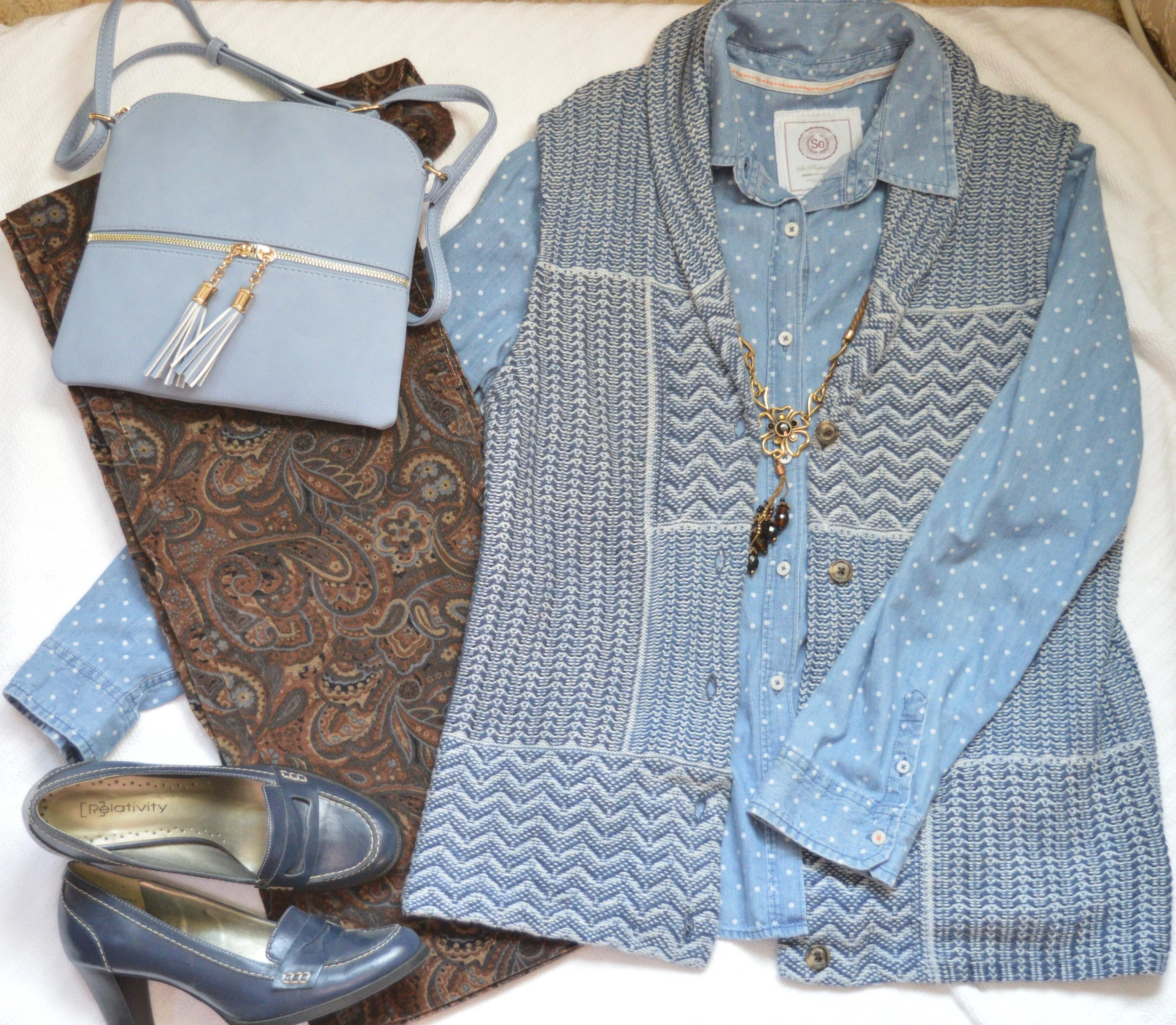
This is not a particularly new trend, but it presents itself in a bolder more, out there way. Pattern mixing has become quite common, but now the patterns are brighter and bigger. Here are some examples from a Pinterest page I discovered. I decided to go more conservative, because I was grooving on the earth tones of browns and blues. This is what I came up with.

Obviously the old time suiting that women, and men, used to wear would fall easily into this trend category. A matching plaid blazer and pants along with a bold print top and you would be stylin’ with the best of them. The thing I like about this trend is the challenge of creating a printed outfit that I would actually wear and that looks palatable to the eye, not obnoxious. Some of the outfits on that Pinterest page I would classify as obnoxious, but that is only my opinion.

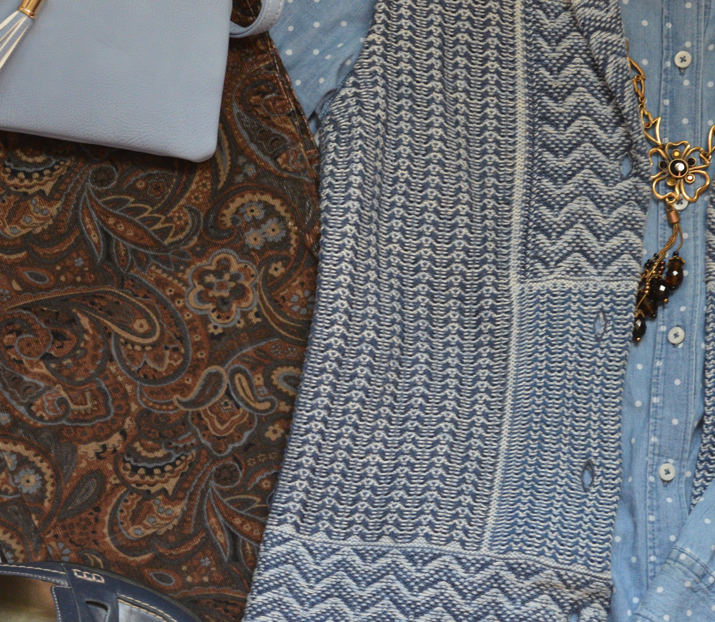
I found these paisley corduroys while thrifting last spring and unfortunately won’t be able to wear them, until I get back to my lighter spring weight. Ugg. However, I loved the pattern and the heavier weight for fall and winter. They are a brand called Havana Jack’s Cafe. Do you ever wonder where they come up with the names for things?

The blue in the pants made me reach for my Chaps knit vest and my thrifted polka dot SO button up. I found the fun necklace at a second hand store and thought it would be a good addition to the outfit.

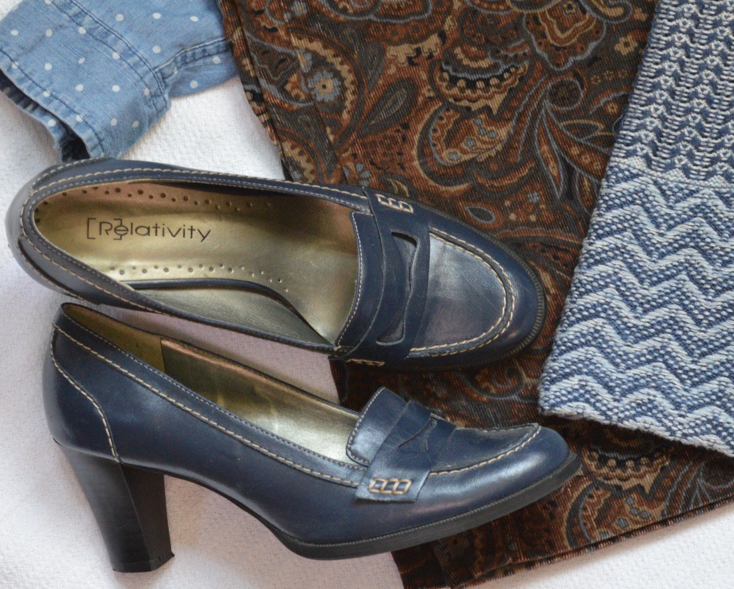
Blue seemed to be my color of choice for bag and shoes. Everything in this outfit came from my closet and has been used on the blog before. You can see the vest here and here. The pants have not. but I already explained that problem. Ha, ha.

Trend 6 - Dark Florals

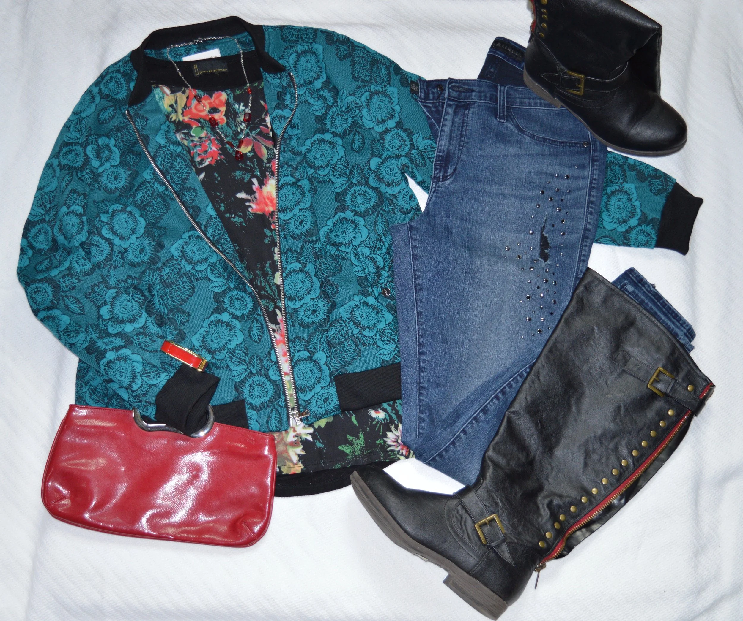
I have really taken a liking to floral prints. I like the bright bold colors of spring, the soft pastel prints of summer and especially the dark floras of fall and winter. It would seem that florals are here to stay and I am glad.

I found this dark floral Jeans by Buffalo top while thrifting. I love the colors and when I went to put this flat lay together, I realized this erin london bomber jacket from Shop National would be the perfect over piece. It goes well with the green in the top and has its own floral print.

These distressed, embellished skinny jeans are Rock & Republic from Kohl’s, and I’ve had them for a while. Once again, I have grown out of them, but I refuse to get rid of them. Ha, ha.

Since the top contains some red, I chose red for my accessories, including my tall, black, studded boots that have red detailing along the zipper on the back.

This is definitely an outfit I would wear on a regular basis. The pretty florals, the layers and the skinny jeans with boots will be a regular rotation as the weather cools.

I hope you enjoyed this post. Next Tuesday I will bring you one more post on fall trends and then I hope to start my Pantone Fall 2019 - New York series.

Thanks for following and please join me next time.

Print Mixing Mash Up - Print Dress - Outfit 1

This is my last week for the print mixing series. I hope you have enjoyed this, and that it has made a difference in your ability and desire to print mix. You’ll see more print mixing on in future posts, because I really like doing it and I feel that it is so much easier, now that I have had to come up with outfits to share with you all.

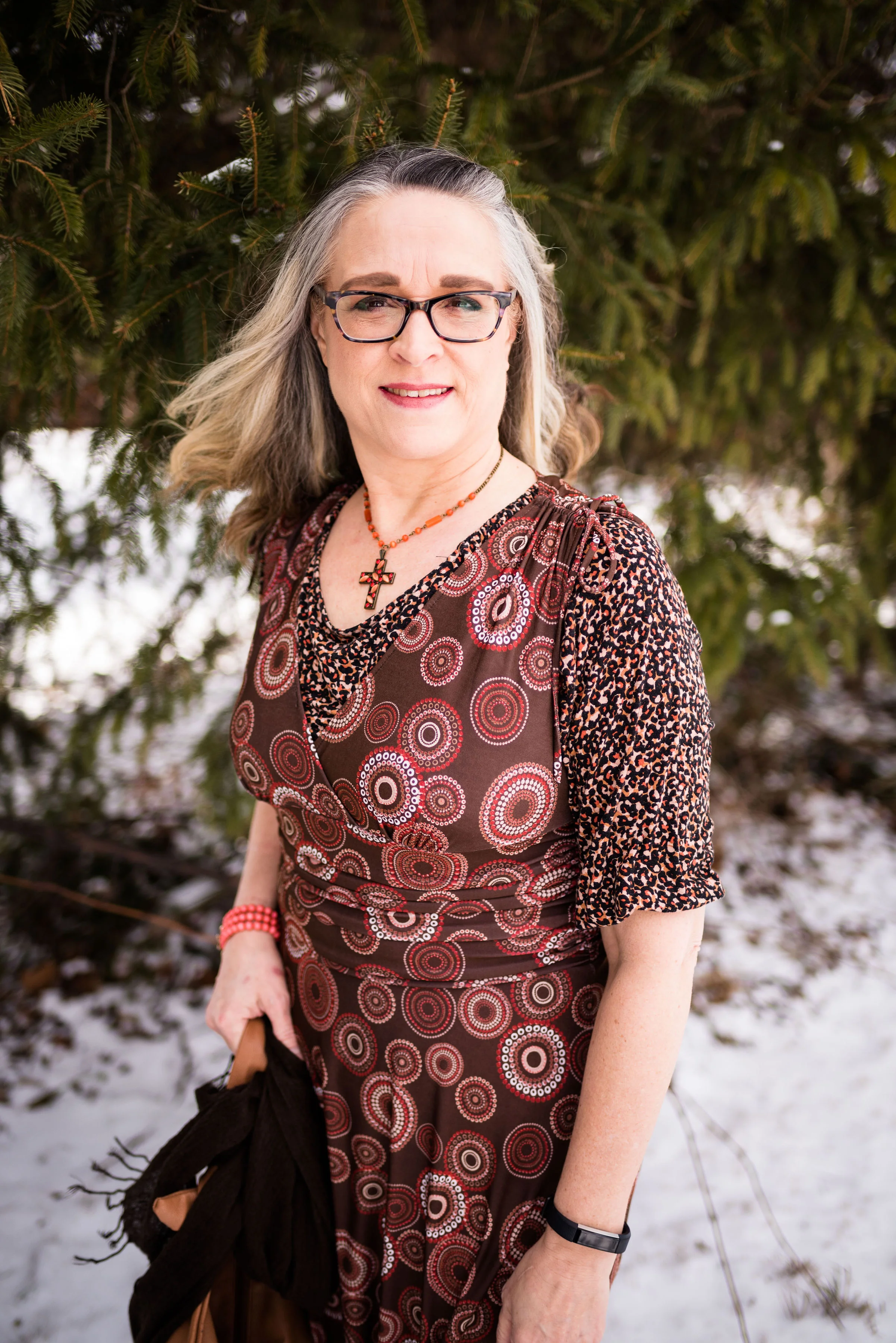
This last piece is a thrifted print dress. The brand was an unfamiliar brand called Kari NY. I have featured this dress on the blog before. You can see that post here. I love the print and the colors. It is meant to be a sleeveless summer dress, but I usually wear it with a tee underneath.

I chose this thrifted elbow length sleeve Loft tee because of the color similarities to the dress. Once again, we can see the ratio factor that makes for a great print mix - large with small. This ratio, along with color similarities makes it much easier to mix prints with ease.

I love the ruching around the waist on this dress. It hides so many bulges. Ha, ha.

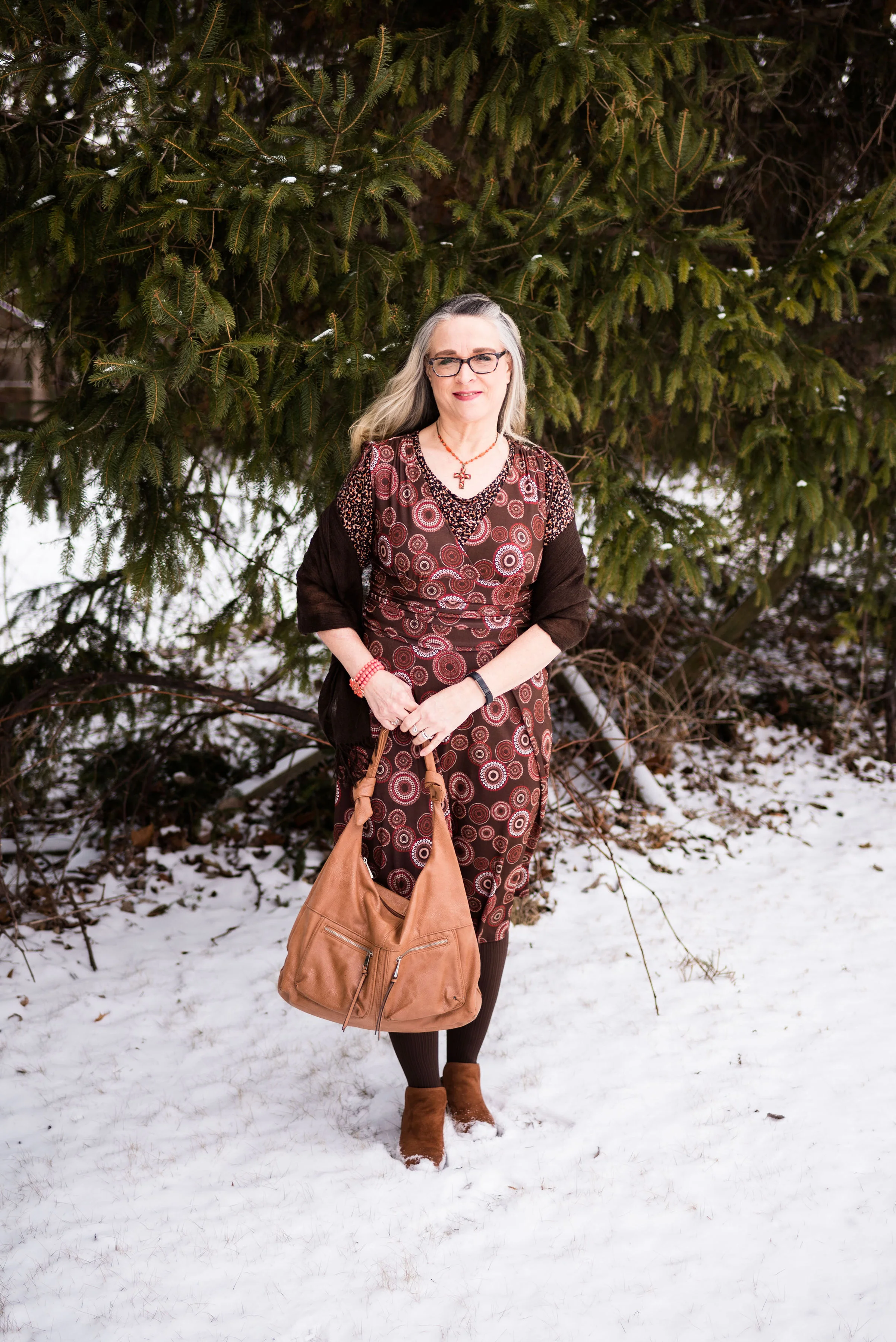
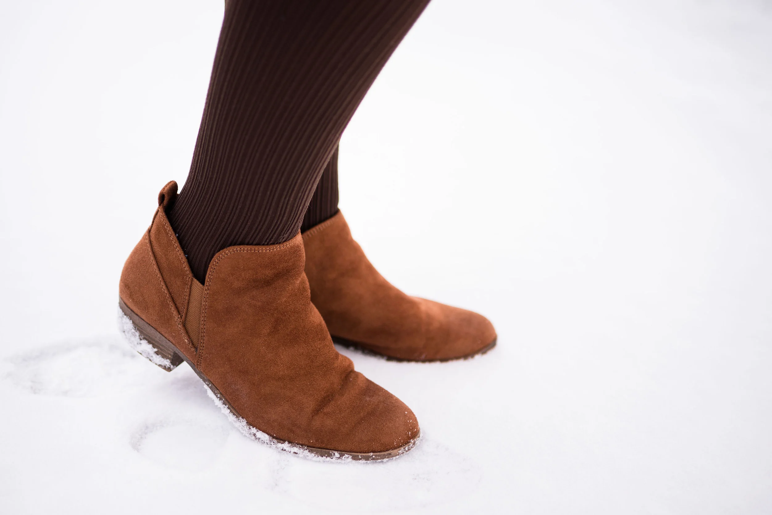
On this particular day it was freezing, so I thought I’d add a dark brown scarf as a shawl. I also chose dark brown tights and my cognac colored SO ankle boots. Since this is a time of year that we think more about transitional outfits, we have to be conscious of reaching for lighter weight spring pieces, while still needing to keep warm with layers. Layering is a great way to do this and this outfit is the perfect example.

I chose a summery dress, then I added a layer underneath, by choosing a tee shirt. I also opted for heavier tights rather than nude hose, with a pair of ankle boots for added warmth. Believe me, on this day, I needed it!

I chose jewelry with orange tones, to pull out the orangey pinks in the tee and the dress.

I decided, once again to match my bag to my shoes. Once in a while I choose to do this, because there is enough going on in the outfit, especially with print mixing. Adding a completely different colored bag or another print, might have been toon much. I think a black or brown bag would work well with this as well, but I opted for the cognac color of this thrifted hobo bag.

It seems there is a big push towards recycling in our country, especially with clothing. With retailers like Savers, Good Will, Salvation Army, American Cancer Society and others, used clothing can be found for a fraction of the price of what things cost brand new. The added benefit, we aren’t putting those things into a land fill. Everything in this outfit, except my underclothes, my tights, the shoes and the jewelry was thrifted. I have devoted my shopping lust to mainly second hand purchases, although even I am a sucker for a good sale at a store, like Kohl’s, Penney’s, Christopher and Banks and so on. I’ve devoted two full blog posts to my thoughts on thrifting. You can read those by clicking on the links - Thoughts on Thrifting - Part 1 - The Stores, and Thoughts on Thrifting - Part 2 - How To.

Just a funny picture of me getting attacked by snowflakes.

Would you ever mix prints like this? Why or why not? I’d love to have your feedback. Leave me some love in the comments section below.

i’ve included a few shopping links below. These are affiliate links which means if you click on a link I get a few cents. If you purchase something through my site, I get a little commission. All opinions are my own.

I hope you are having a great week.

Photo credit Rebecca Trumbull.


Print Mixing Mash Up - Checked Trousers - Outfit 2

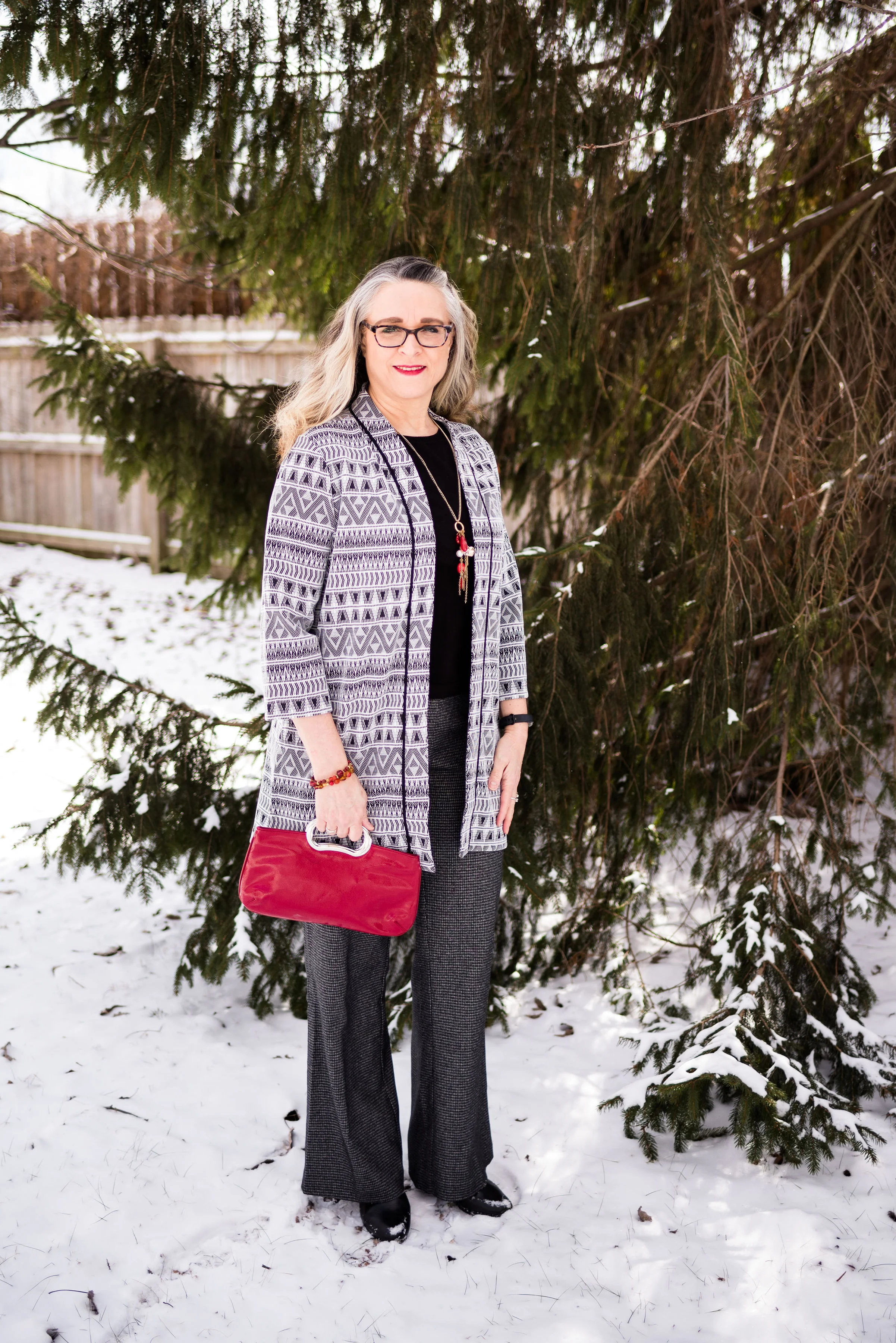
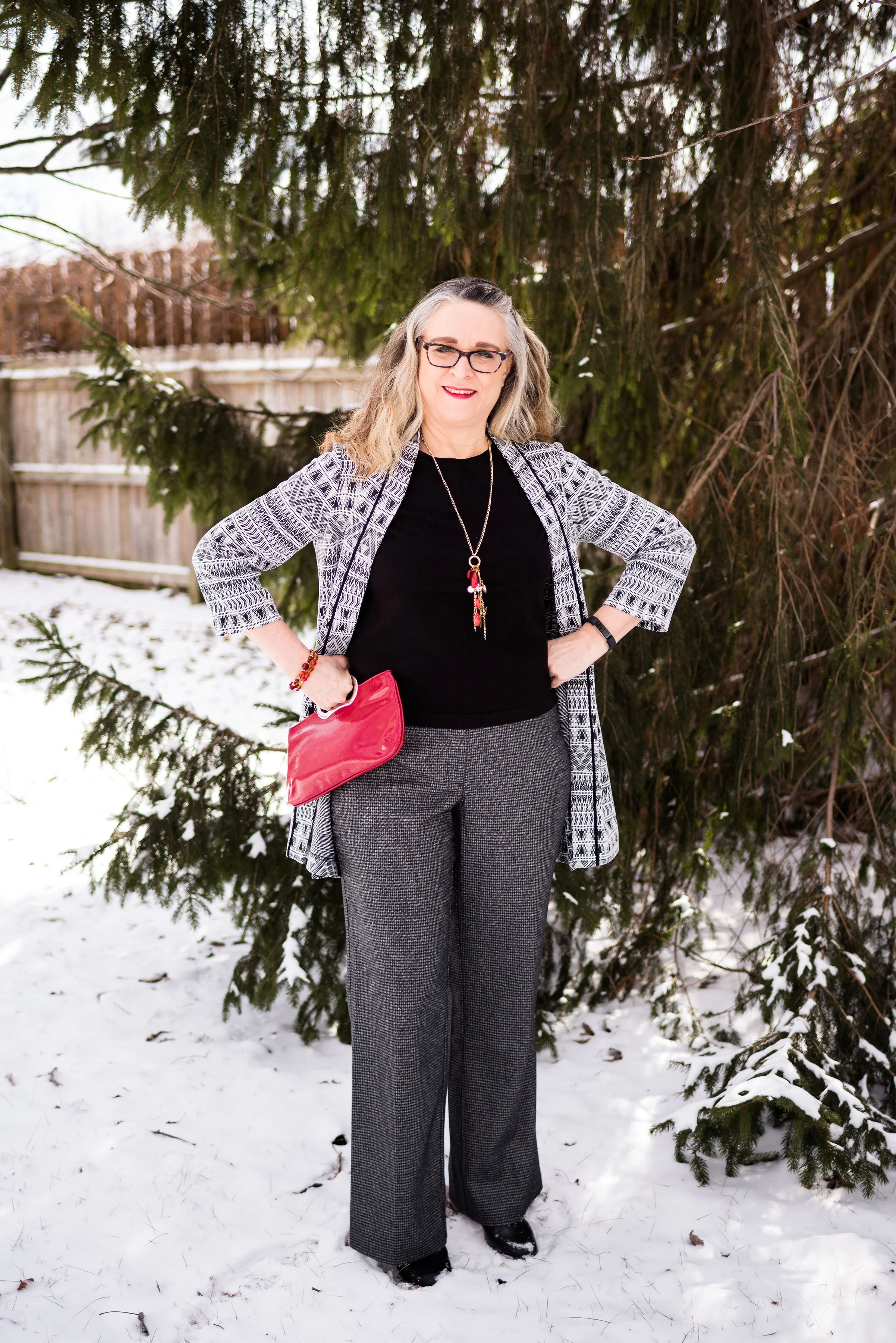
I wanted this second outfit with the checked trousers to be a little more dressy. This could be something worn to work, or out on a special date. This is a more monochrome look, using mainly the black, gray and white, except for the accessories.

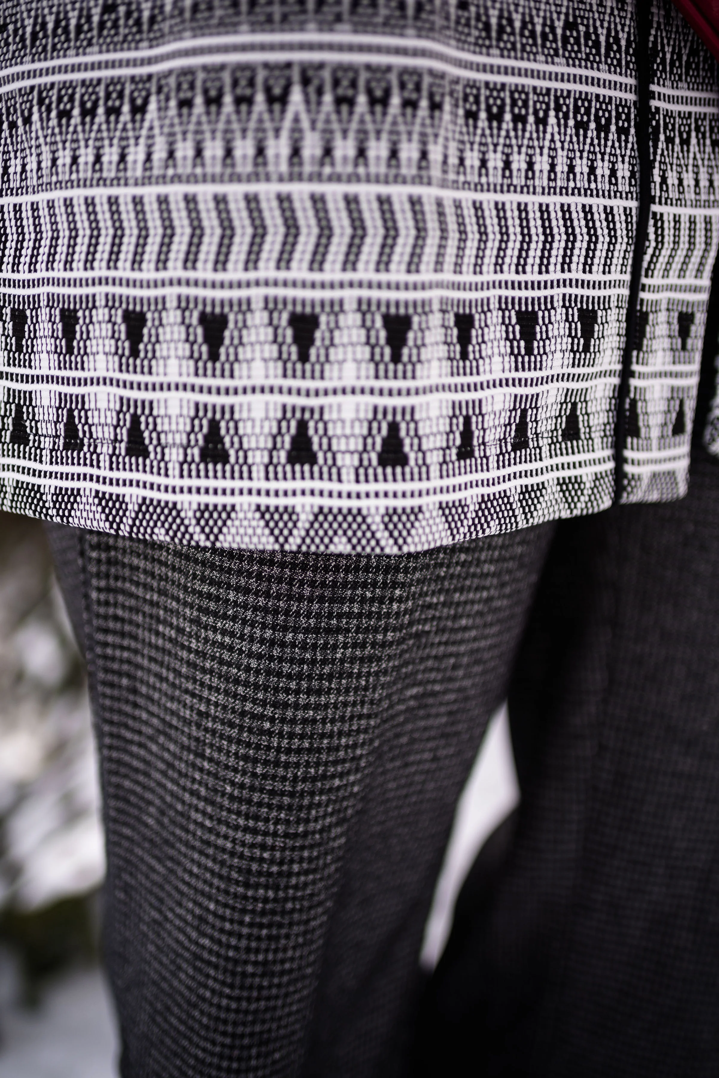
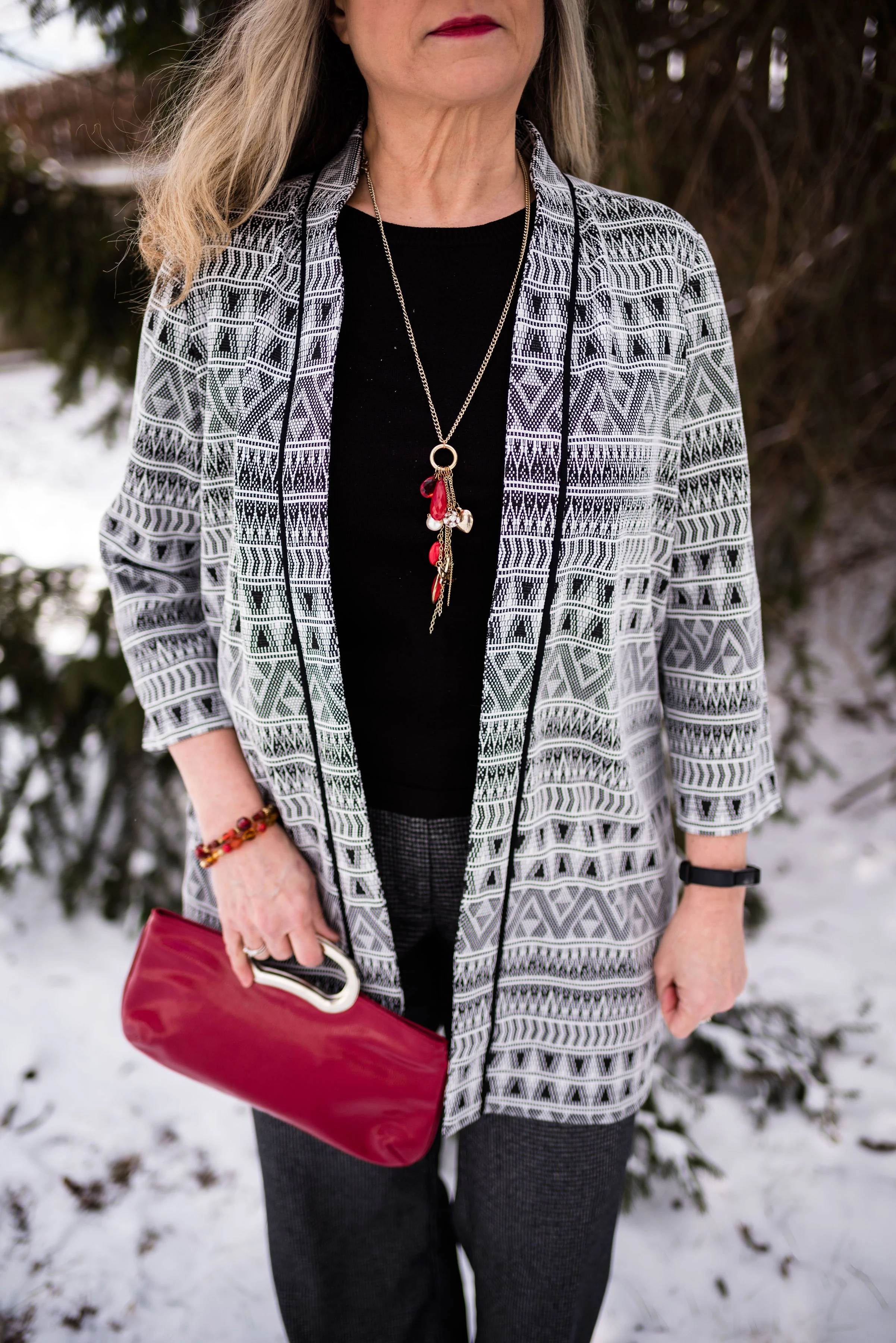
I got this 3/4 length sleeve jacket from a clearance rack last fall at dressbarn. It is roz & Ali brand. The southwest pattern was part of what drew me to this piece. When I decided on these trousers i knew this jacket would be a perfect print mixing piece.

There are two things that make this work. One is the print size on each piece. The pants have a smaller print and the jacket has a larger print. The other is the color similarities.

I decided to go with a black short sleeve sweater top. I could have chosen a colored top or even white or gray. Just about any solid would work with this outfit. I opted to have my color pop be with my bag and my jewelry.

A charm necklace with red beads, beaded bracelets and a red clutch, really stand out with this black and white outfit.

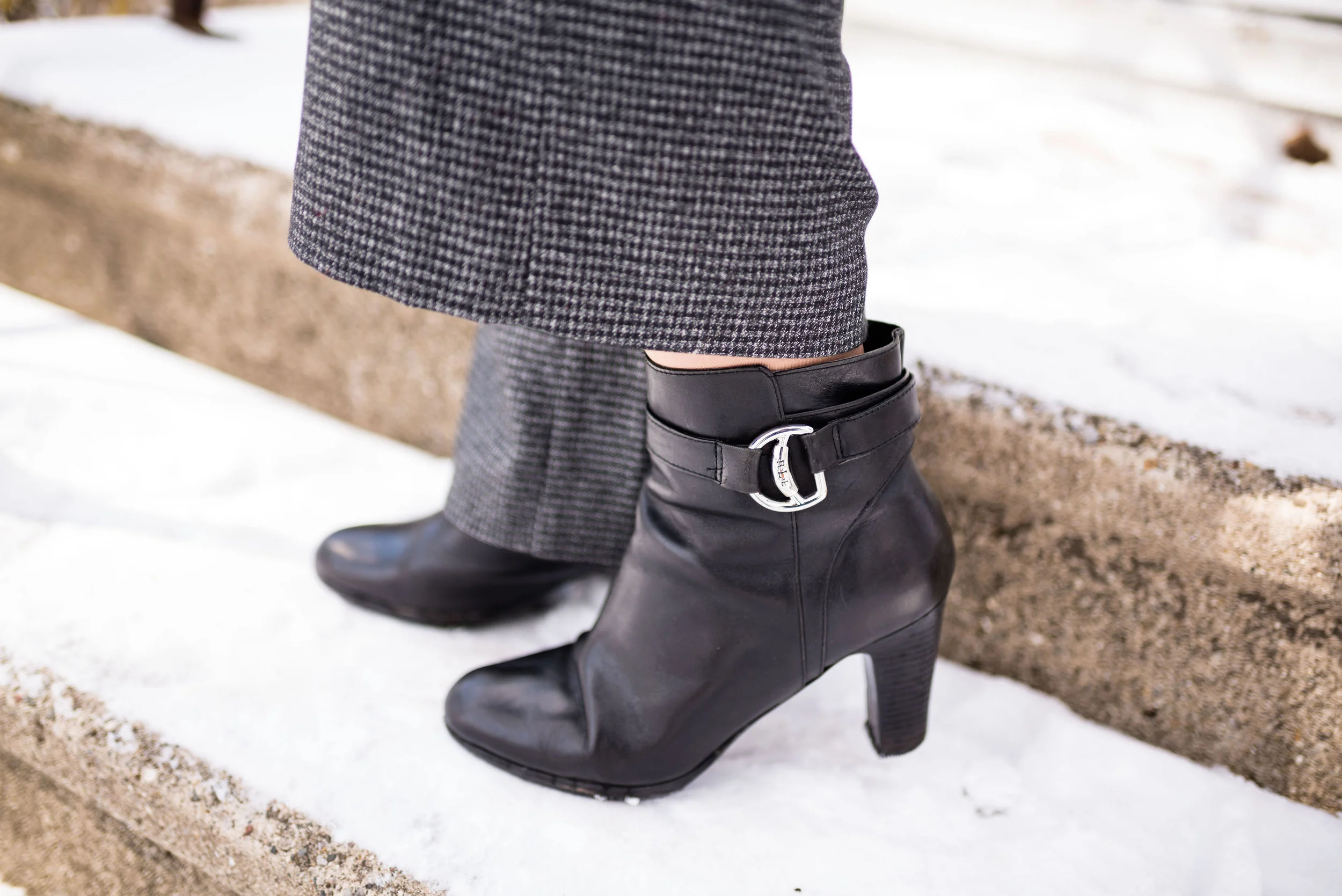
I added my thrifted Ralph Lauren heeled ankle boots. You could probably tell from Tuesday’s post, these pants are pretty long and rub on the ground when I have flats on. This heel gave them just the right amount of lift.

I have one more week on this print mixing series. I hope that this has been beneficial, especially for those of you who have been timid about print mixing. Not every fashion trend is for everyone. You can be fashionable and look put together without having to spend money on new pieces for your closet. It is likely, that you already have many fashionable pieces in your closet. A well structured blazer, a cardigan or two, a couple of pairs of jeans and a pair of dress pants, a dress or a skirt, are all pieces that can be used to make great outfits, print mixing or not.

Think of it this way. If you are just getting started, by being more conscious of your clothing and how you look, you have already taken the first step. Print mixing is more like frosting on the cake. What you want to do first is make the best cake you can, whether it be chocolate, vanilla, or lemon. Once you have that done, then you can think about frosting, sprinkles or whatever other embellishments you want to add.

I hope that my blog and all the other wonderful bloggers that are out there, will provide the inspiration you need to look better and feel more confident. Have a great weekend!

Photo credit Rebecca Trumbull.


Print Mixing Mash Up - Checked Trousers - Outfit 1

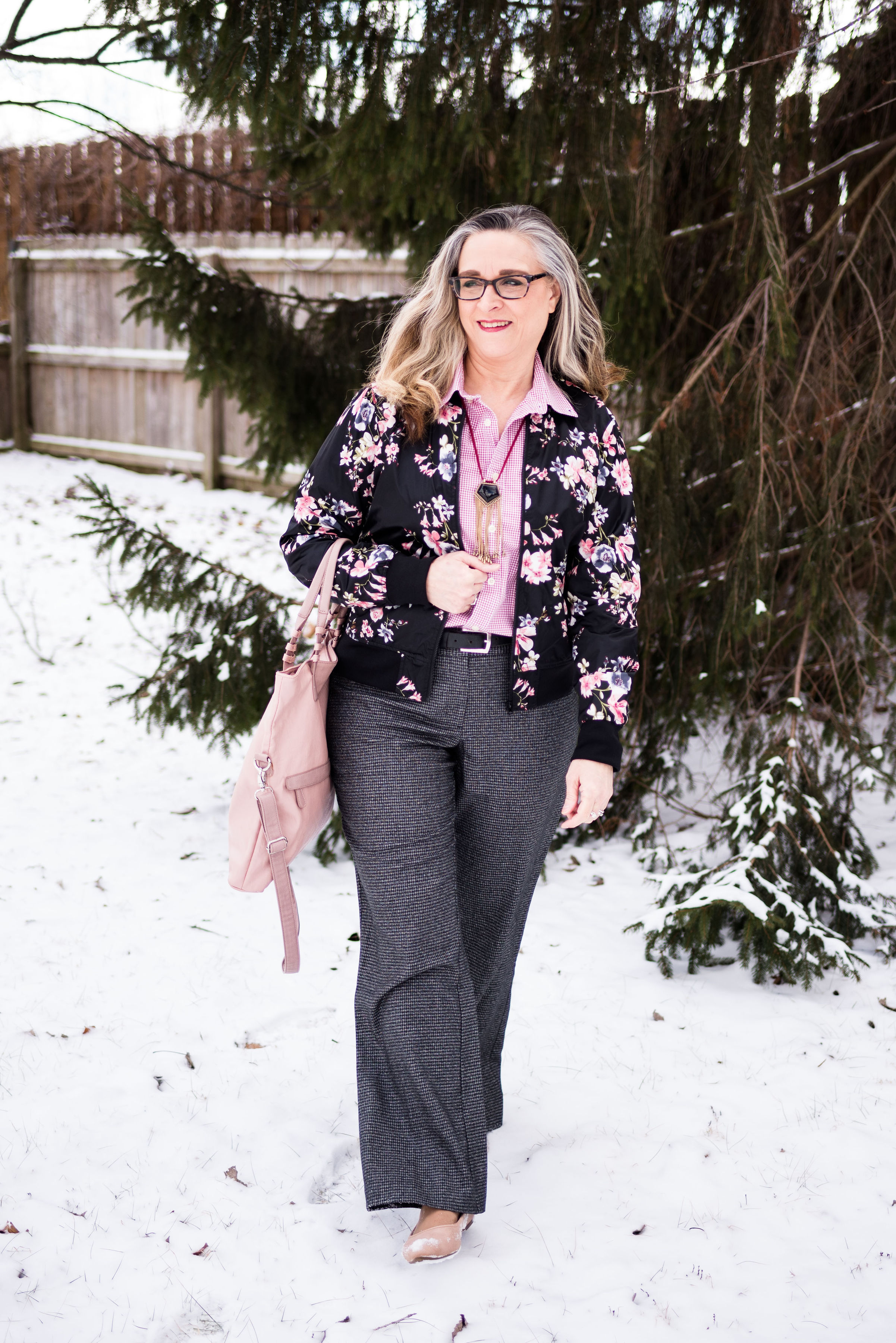
This week the Print Mixing Mash up features a pair of Worthington black and gray checked trousers. The checkered pattern on these is very subtle, but it is definitely a print, rather than a solid. Worthington has been making reliable dress pants and women’s work clothes for JCPenney since 1985. I have several pairs of their pants, and they are long lasting, wrinkle resistant and fit pretty well.

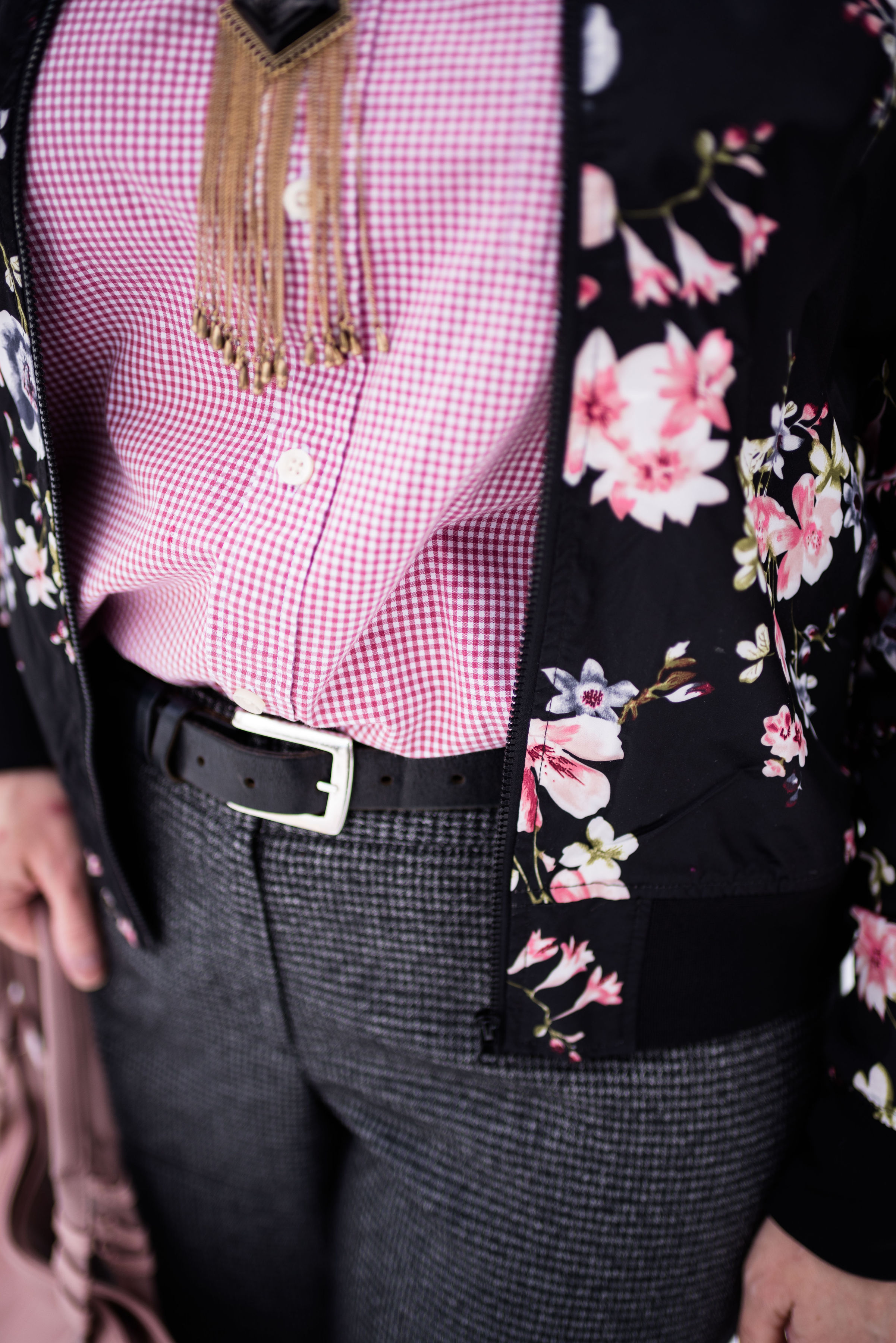
I have had these pants for many years and have worn them to work and for special outings where I need to be more dressed up. I wanted this first look to be a bit more casual, so chose a thrifted, pinkish red, Merona, gingham blouse, along with my City Streets floral bomber jacket, also from JCPenney. So, yes, I am mixing three prints here. Ha, ha. See how easy it becomes after a little practice.

The prints on the blouse and the trousers are almost an exact match for size, which gives the outfit a more uniform look, even though they are a different color. With the floral bomber on top it pulls the two colored prints together.

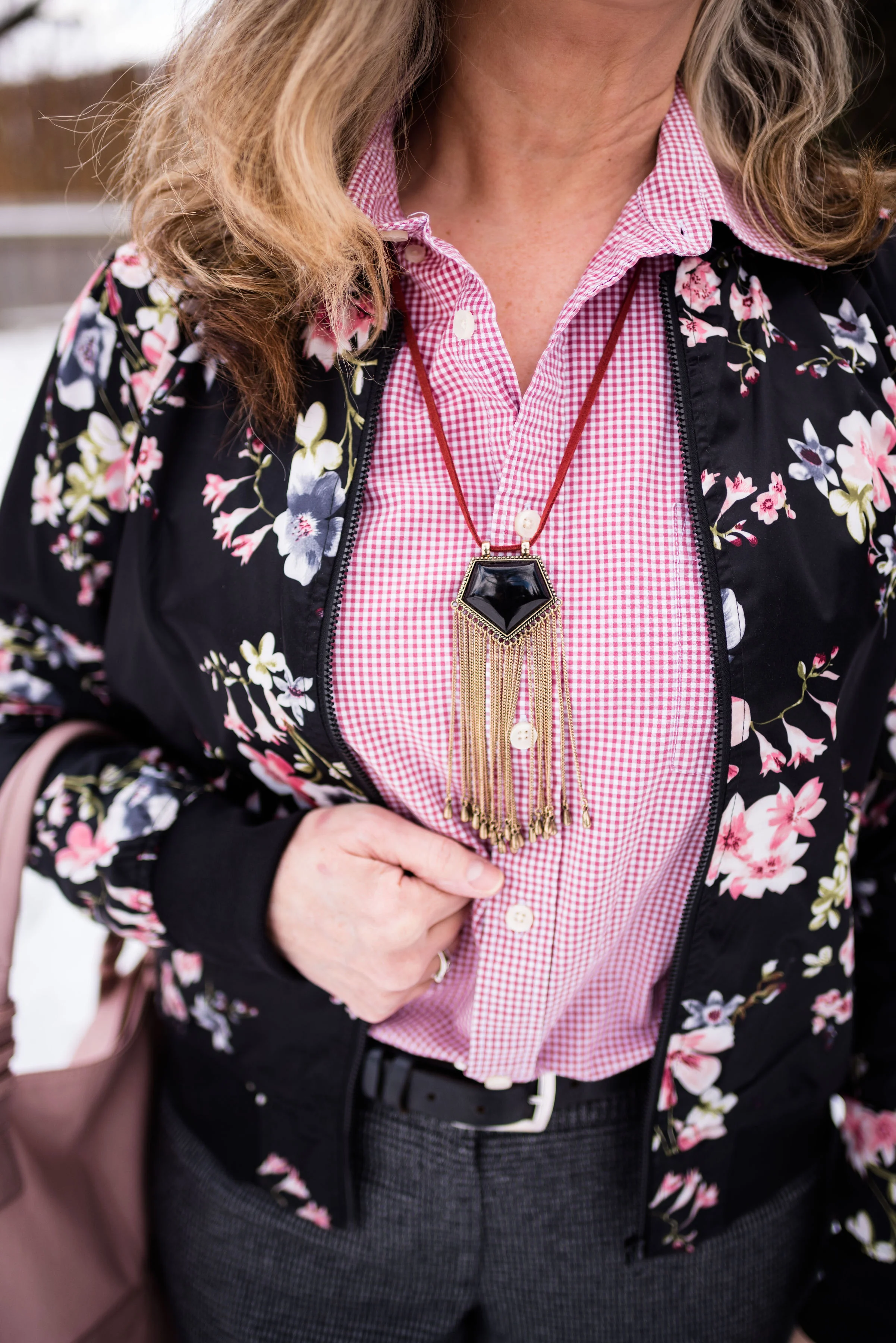
This black and gold fringe necklace on a berry colored cord was the perfect accompaniment.

Hello, again, my favorite ballerina flats. These SO flats have a memory foam footbed that make them very comfy. Right now Kohl’s is having a sale on these for only $19.99. They also added a few new colors, so if you are looking for a fun, comfy flat check those out here.

It used to be the trend to match our bags with our shoes. Now the trend has gotten away from that, but every once in a while, I like to match. It just makes an outfit looks polished and balanced. This NY & Co tote was a thrift find. Do you like to match your shoes with your bag? Do you carry the same purse all the time, or do you like to change them frequently? My hubby put me on a purse fast, because I have so many. I keep telling myself I need to use more of them, so they aren’t just laying around, but I get lazy and don’t want to take the time to change everything to a different bag. Ha, ha. How about you? Are you a purse hog like me?

What do you think of this outfit? Do you have a pair of printed trousers, jeans or ankle pants in your closet? How about grabbing a few of your printed tops or jackets and see what new combinations you can come up with.

I’ve included a few shopping links for Worthington pants and floral bombers. Have fun shopping. These are affiliate links. All opinions are my own.

Photo credit Rebecca Trumbull.

Print Mixing Mash Up - Striped Tee - Outfit 1

As i started pulling pieces out of my closet to do this print mixing series, I had no idea how much fun it would be and how many outfits I would come up with. It is amazing how many pieces I have that actually go together in a way that creates real life, wear it to work, outfits. The way I decided to put this together, was to feature one printed piece a week that will be the foundational piece that I build the rest of each outfit around. For this week it is a yellow striped Sonoma tee. The outfit you see today and the outfit on Thursday’s post will both be built around this same piece.

Let me preface this by saying, it was 18 degrees with a wind chill factor that made it feel like 4, when we were taking these photos. It was cold and that wind bit, but we got it done. My daughter is pretty quick at taking pictures, although in those temps, even the camera wasn’t always willing to work properly.

Today’s outfit was a casual look, that I might wear to a get together with friends, or a fun date night with my hubby.

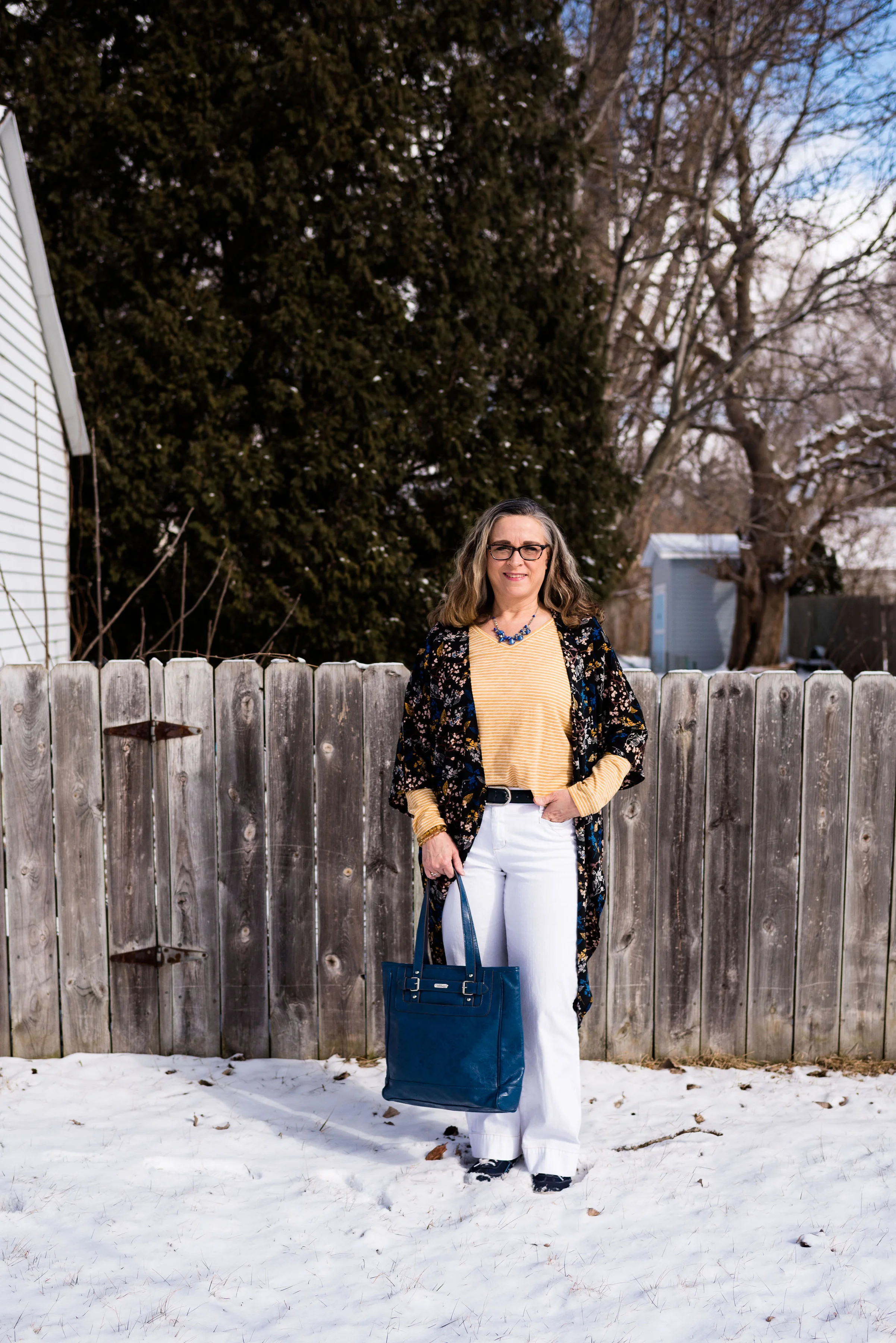
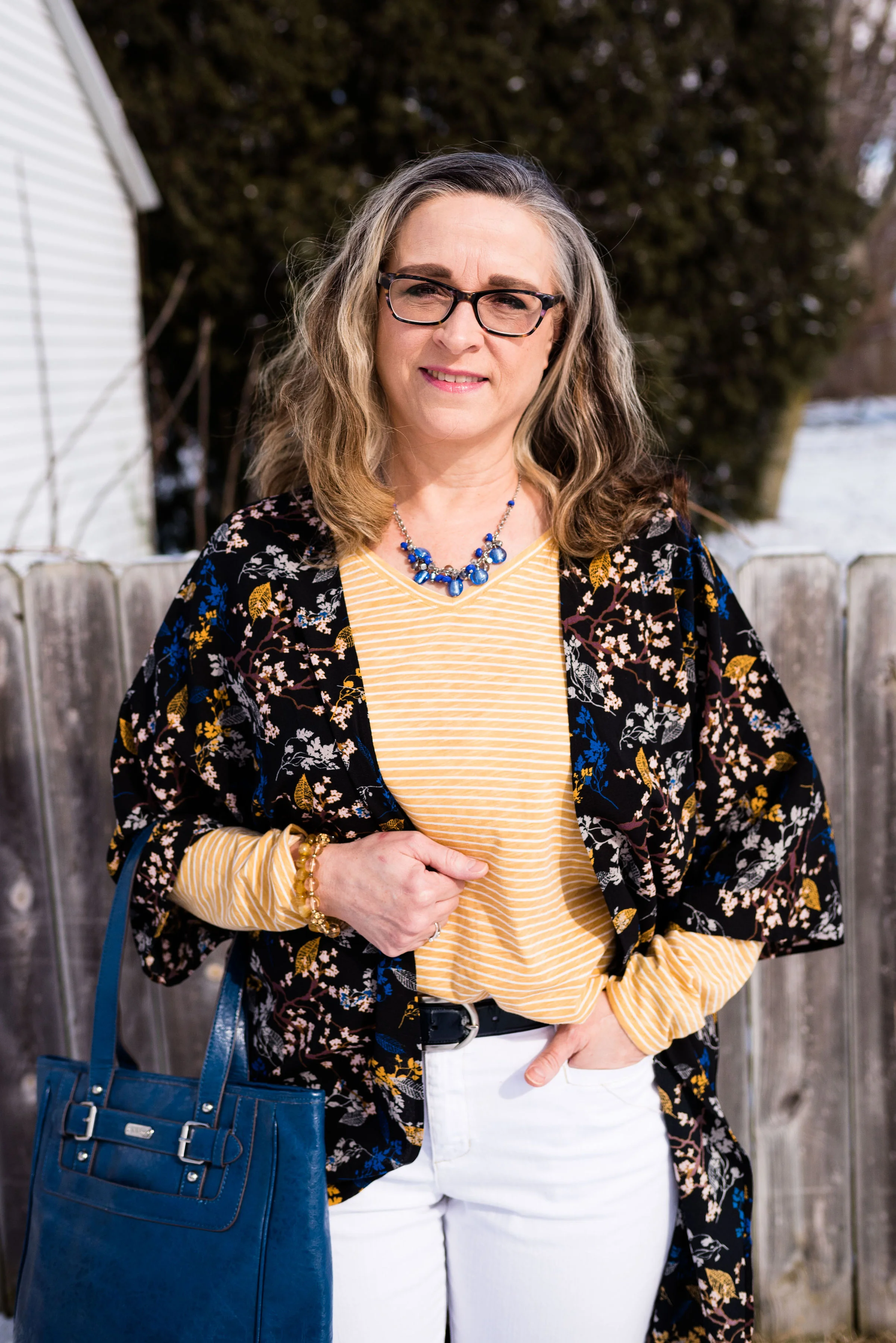
It’s a little hard to see the print mix in these photos, but I showed the top and this kimono in last Thursday’s introduction to print mixing. You can see that post here, if you missed it.

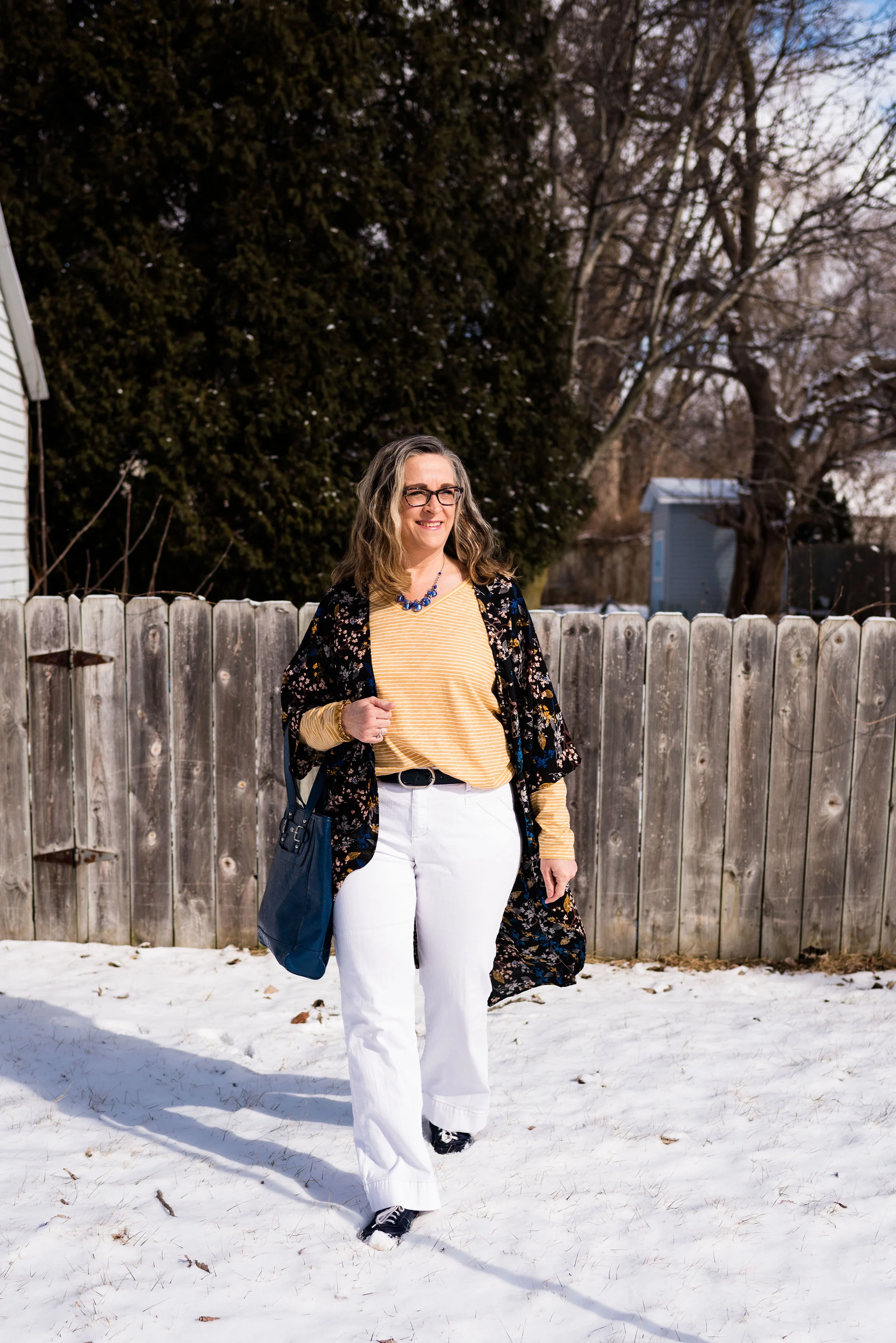
This yellow striped long sleeved Sonoma tee is a recent purchase from Kohl’s. It is light weight and a great layering piece for spring.

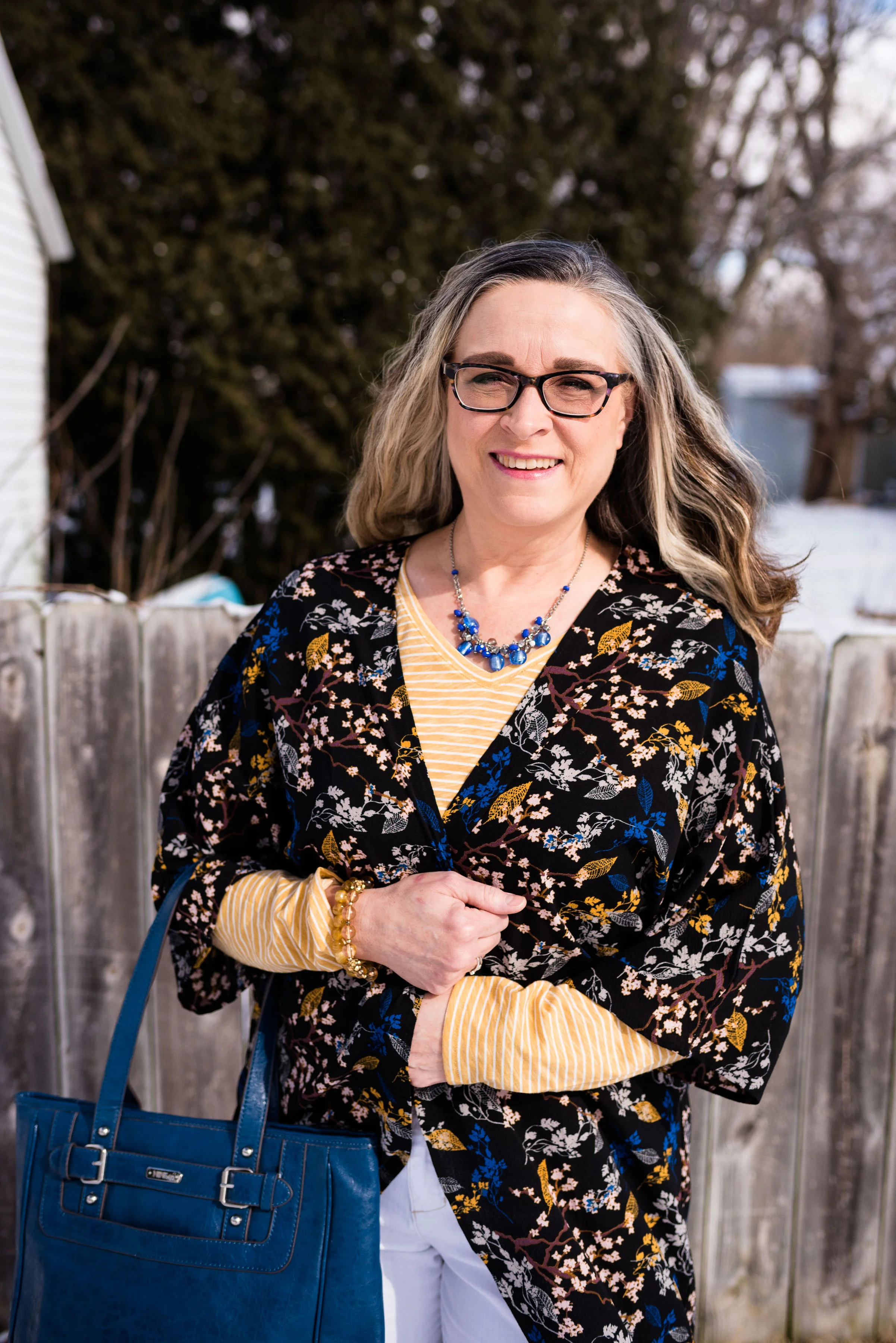
This floral kimono was a clearance find at DSW. If you are a clearance shopper like me, it is always a good idea to check out the clearance rack at all stores you go into. DSW is a great place to find shoes on clearance, and I would have never thought to go in there to look for a pretty kimono like this, but there it was. In fact I got two other ones that will no doubt make it on to the blog at some point.

These white Gloria Vanderbilt jeans you just saw on the blog, last week when I was wearing them with my scarf print blouse. You can see that post here. These are my favorite white jeans. They are thick enough that my underwear don’t show through and I like the wider leg.

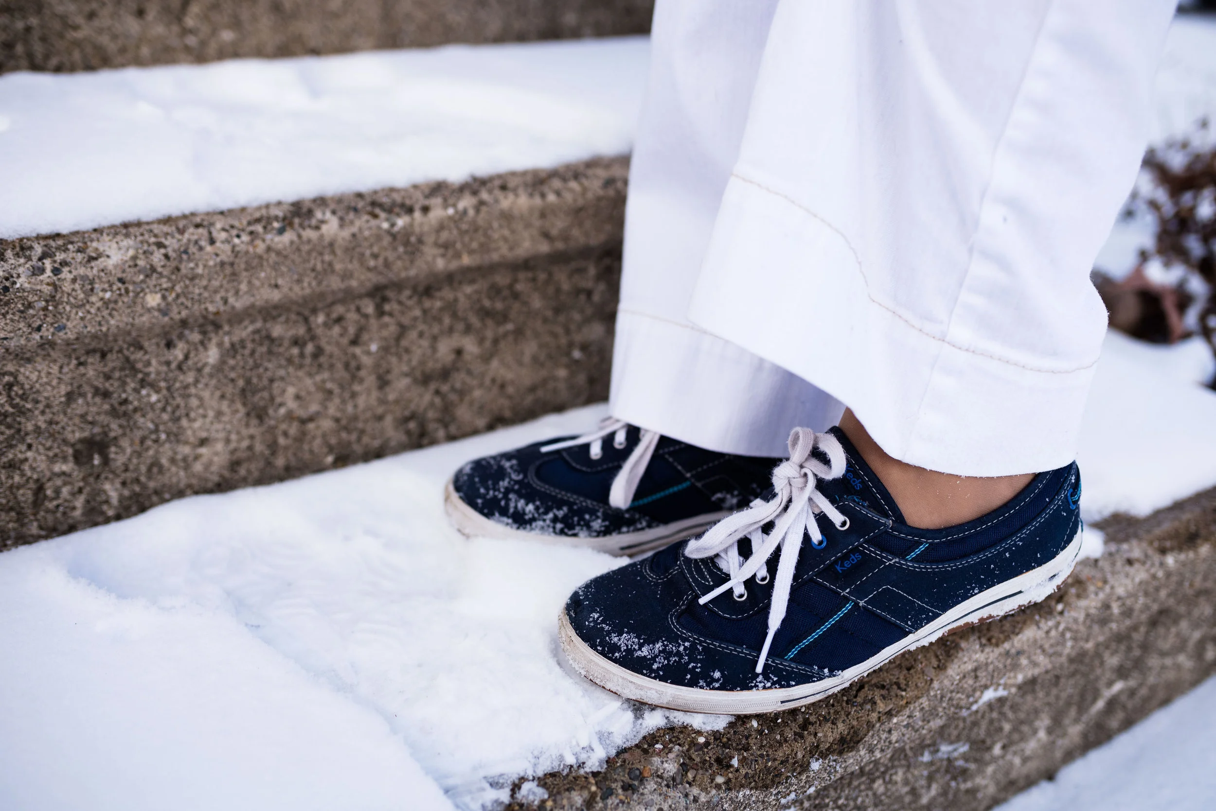
I wanted to keep this look more casual so I opted for my navy blue Keds. After we took these photos are were on the way back into the house, I realized we needed to take a picture of my shoes, thus the snow.

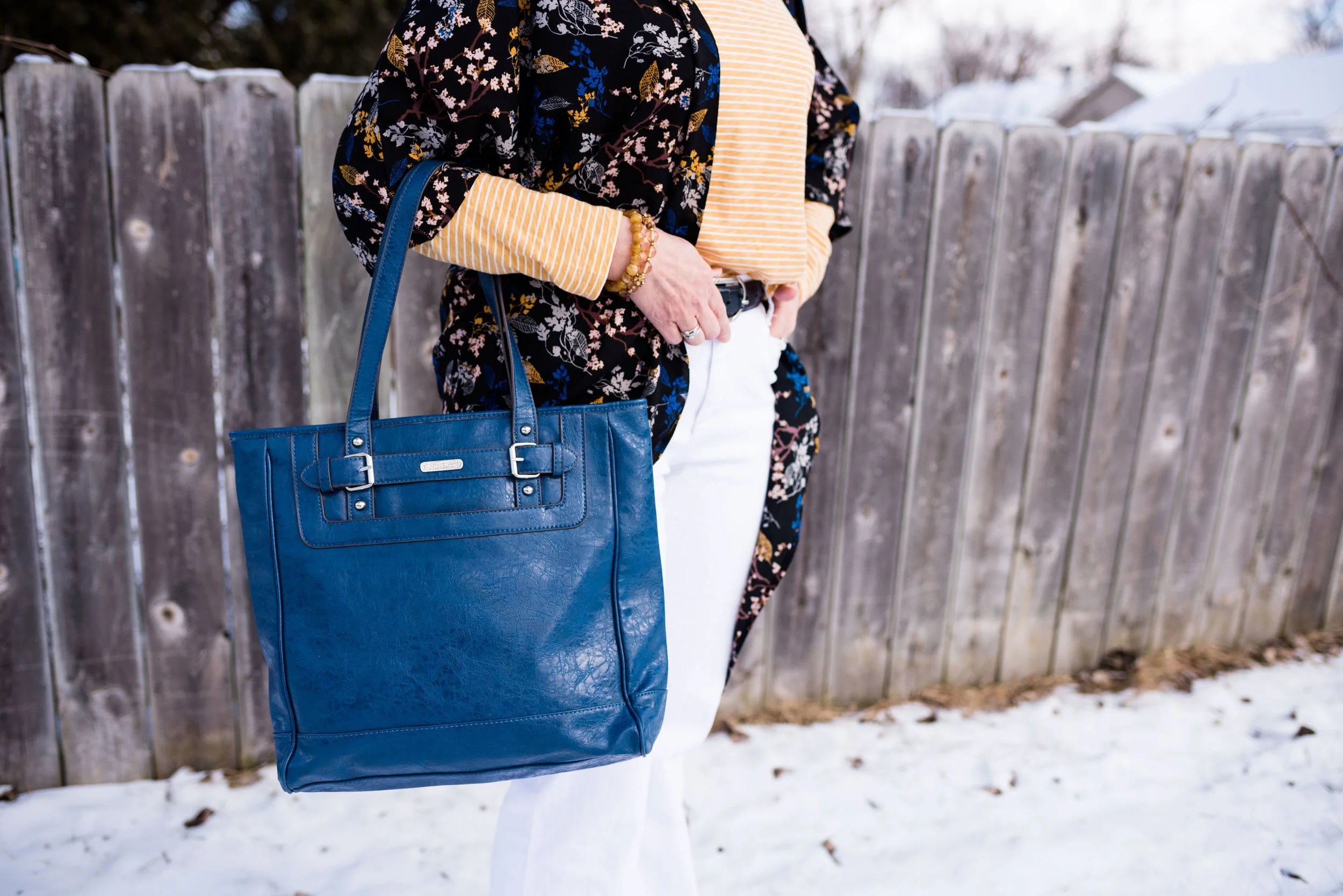
I grabbed this bright blue tote to go with the bright blue in the kimono. This bag is thrifted and Nine & Co. brand. I do like a good sized tote bag like this for traveling. I can fit a lot more in it, like a book and a pad of paper, in case i get the urge to read or write. I know there are electronic versions available, but I still like the feel of a book in my hand or moving a pen on a piece of paper.

You could easily replicate this look by using a color of your choosing for the striped tee and then picking a piece with a complimentary color for the kimono or even a floral cardigan or bomber jacket. It’s not that you create an outfit that looks just like mine, but that you find things in your own closet that will give you a similar look. You wouldn’t have to wear white jeans. Any wash of denim would look cute with a print mix like this or pick out another color that goes with one of the other colors in your print pieces. For instance, my kimono also contains brown and is on a black background. Either color could have worked for my bottom piece.

Why this works:

The main reason this works is the color. The yellow of the striped tee goes perfectly with the yellow in the kimono. The other reason it works is that the stripes are small and narrow, which works well with the busier, bolder pattern of the kimono.

What do you think? Do you like this outfit? Do you have pieces like this in your closet that you like to pair together for a fun print mixing look? I’d love to hear your thoughts. Leave me some love in the comments section.

I’ve included a few shopping links for you. These are affiliate links. All opinions are my own.

Spring Trend - Scarf Prints

As I mentioned in last Tuesday’s Spring Trend post on crafted pieces, print mixing is bigger and better than ever. One of the patterns that you will see gracing the stores is scarf print. Scarf prints started a come back back in the fall of last year, but seem to be showing up more and more. Scarf prints are an easy way to mix prints effortlessly. The prints are already picked out for you and all you have to do is take it off the hanger and decide what you want to wear it with. Whether you choose jeans, skirts, leggings, shorts or some other combination, scarf prints will leave you feeling like a print mixing pro.

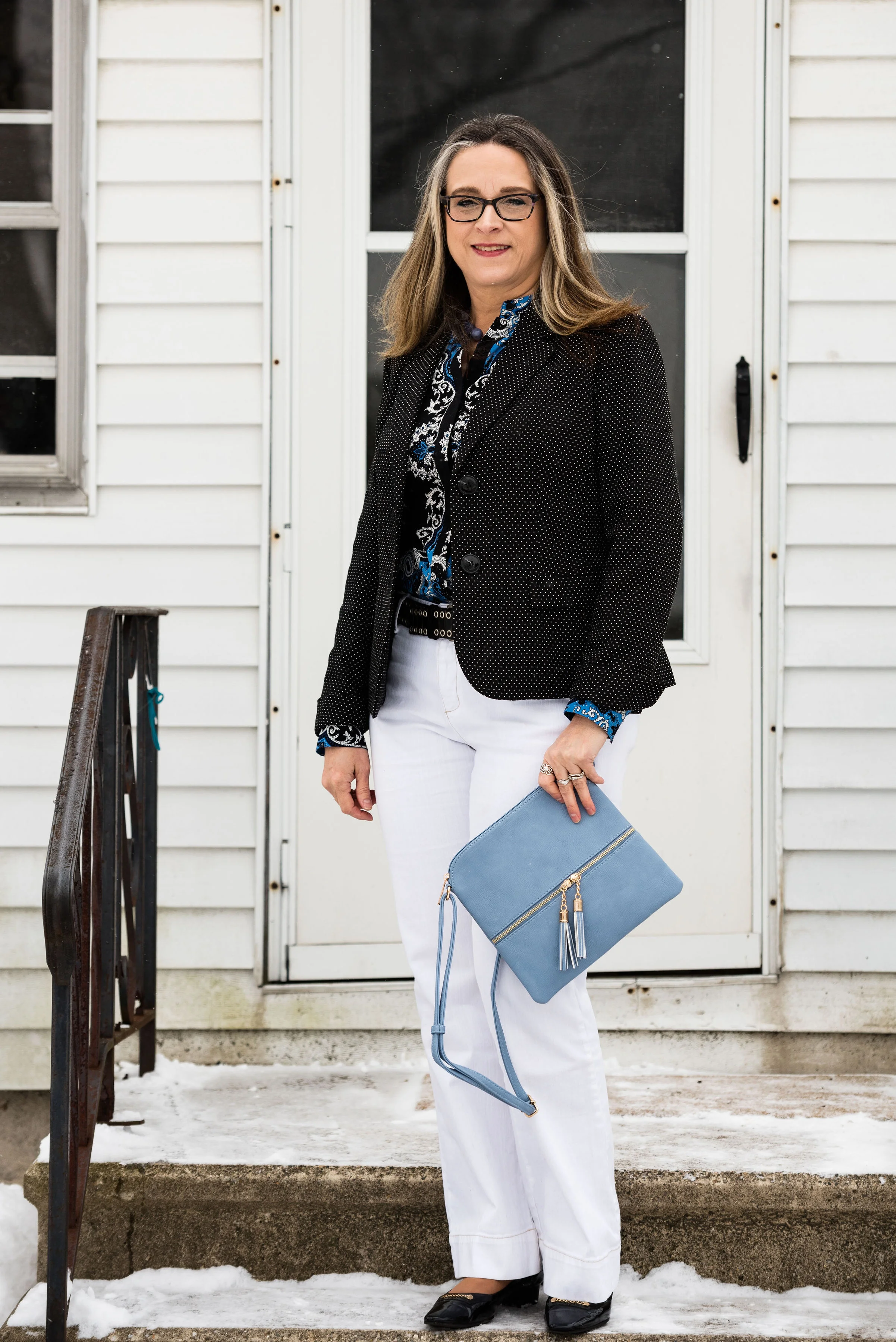
I’ve had this Apt. 9, scarf print blouse for eons. Every time I think about getting rid of it, I end up hanging on to it. Now I am glad I did. I wish I would have thought to have taken a picture of the blouse without the jacket on, but it was freezing outside and we were just trying to get the pictures finished.

I did the front tuck with the blouse and added a black studded leather belt, just to add a little more interest and texture.

I thought my white Gloria Vanderbilt jeans the perfect bottom piece for this look, to make it more spring-like. While white can be worn all year round, I am a bit of a traditionalist, in that, I like to keep my whites more for spring, summer and a bit into fall. I do agree that white is a great color even in the winter and can really brighten up an otherwise mundane time period. I guess that is one of the reasons I would rather have snow in the winter time, than just brown grass and gray trees.

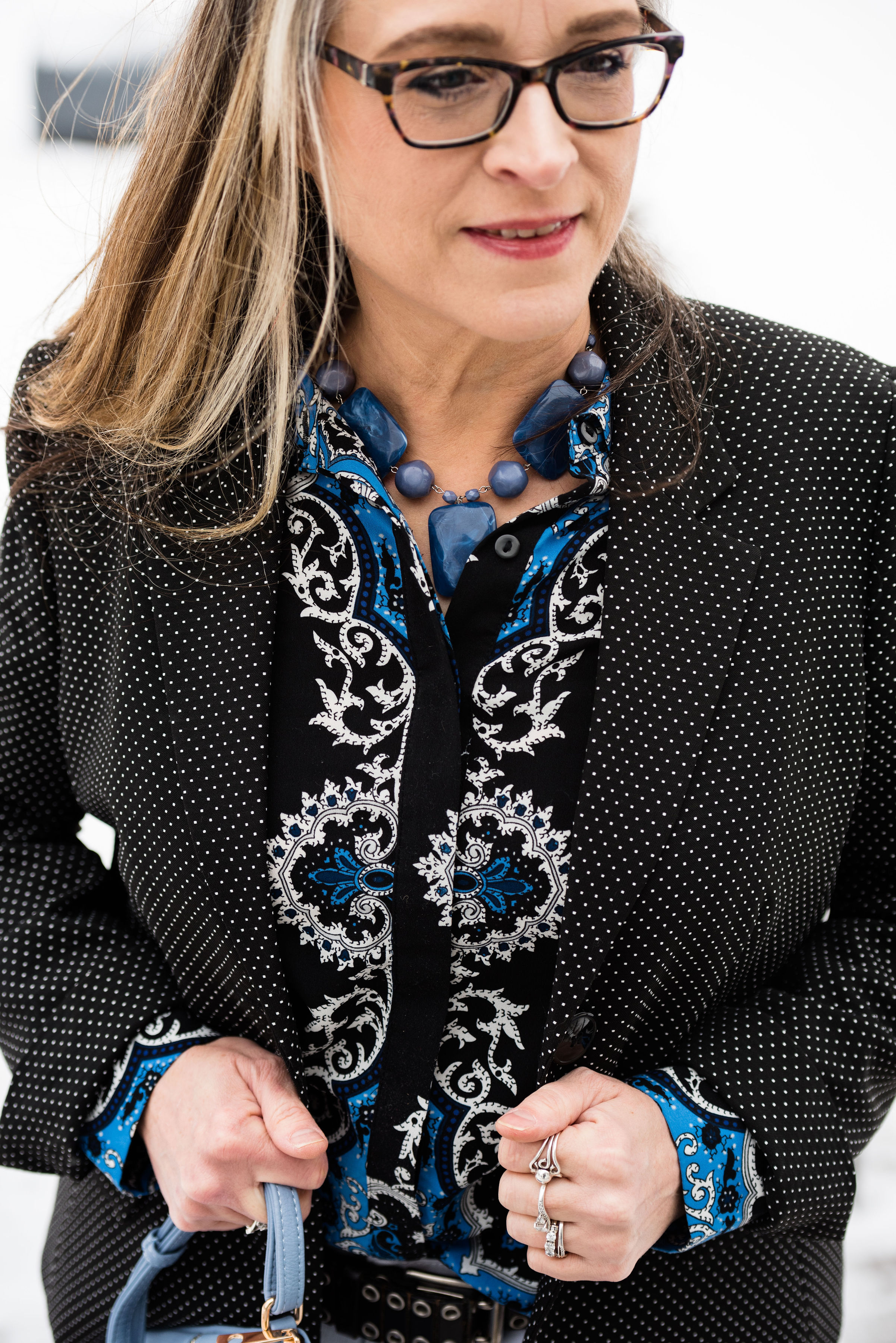
Since the emphasis was meant to be on print mixing, I decided to add my Black Label, Evan Piccone polka dot blazer. A JC Penney clearance find, this cute little number goes with so many things and is the perfect way to add a print to any outfit without going over the top. You can also see in this picture the blue bead necklace that I chose to wear. This was another hand-me-over from my daughter. It is fun to have girls to be able to swap stuff with.

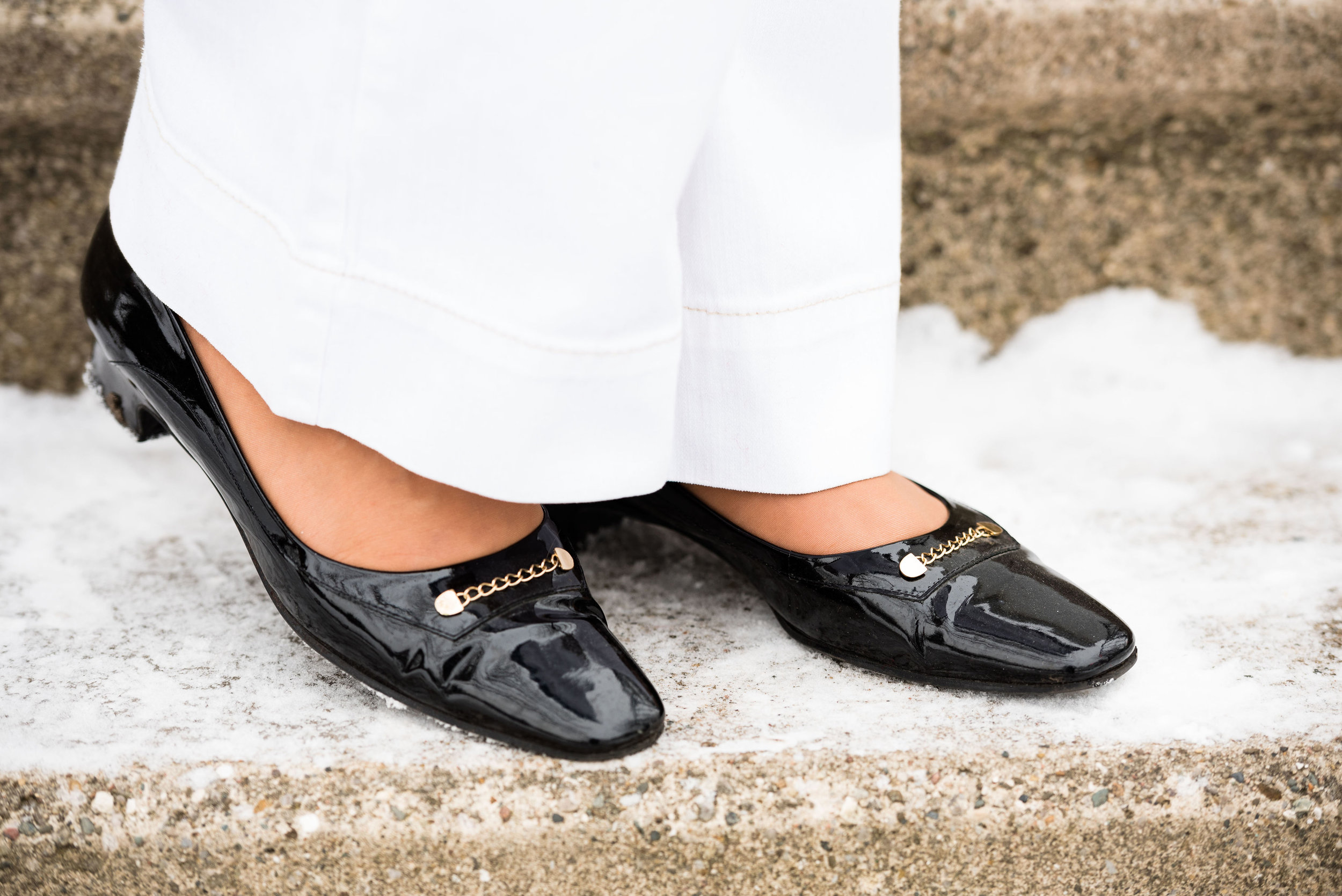
These Easy Spirit black patent leather block heels I’ve styled on the blog before. I like the lower heel and that the toe is not pointy, but also not rounded. The bit of gold is the perfect amount of bling.

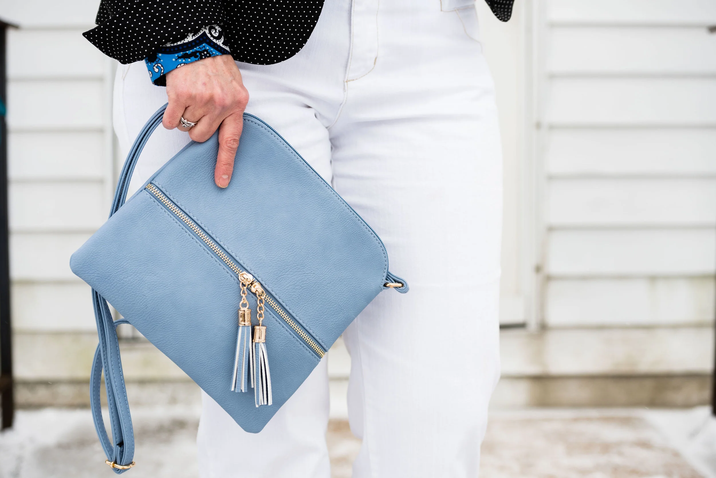
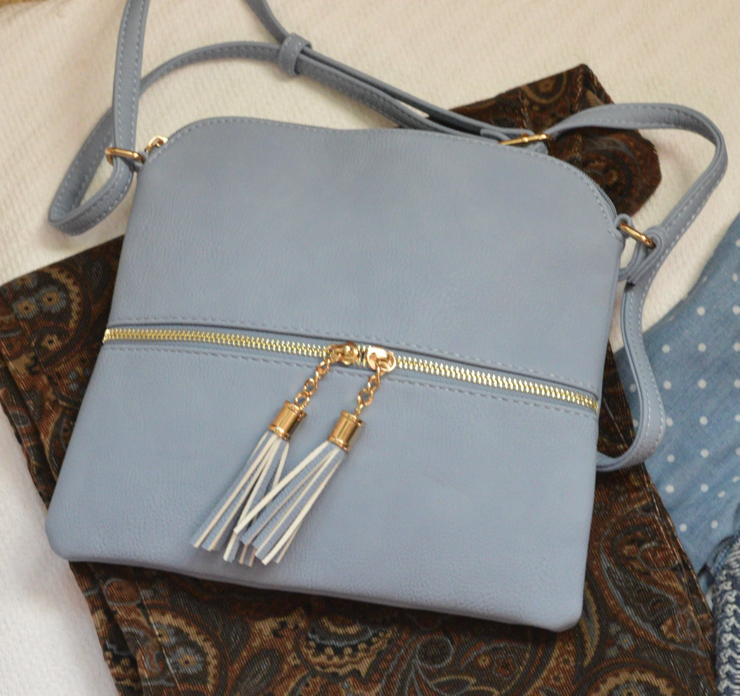
This cute cross body bag was a Christmas gift from my younger daughter. Both my girls do a good job picking out gifts for me. The light blue color is perfect for spring and compliments the blue in the blouse.

What do you think of scarf prints? Do you own any scarf print items? How do you like to wear your scarf prints? How do you like to wear your scarves? Leave me some thoughts in the comments.

I’ve included a few shopping links for scarf print items. Please enjoy looking these over. These are affiliate links. If you click on a link, I get a few cents. If you purchase something through my site, I get a little commission. All opinions are my own.

Thanks for stopping by the blog today. Have a great Tuesday.

Photo credit Rebecca Trumbull. Make up Rachel Christensen.

Eva Trends - Half Collar Sweater Top

When I first was contacted by Eva Trends to do a collaboration, I immediately went to their site to check out their merchandise. What I found was a large collection of pieces from roomy artistic tops, to lovely lace dresses, to baggy grunge type pants. There really is something for everyone at this retailer. With reasonable price points and rapid turn over of styles there is always something new to look at on their website.
This is the second collaboration I have done with Eva Trends and enjoyed selecting the pieces that I have been sharing with you. Today is my final piece and is called the Half Collar Sweater Top with Dough Twist Stripes.

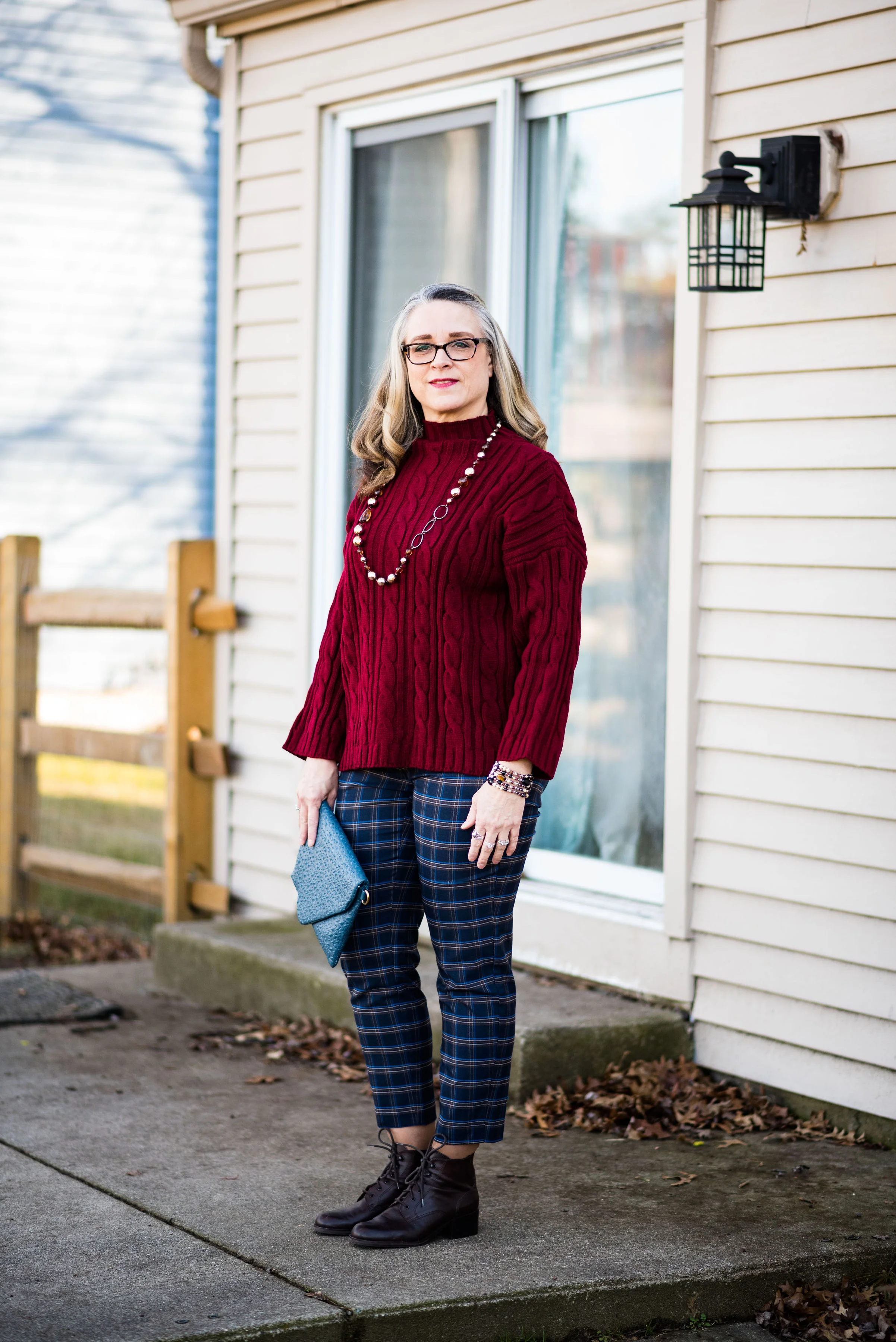
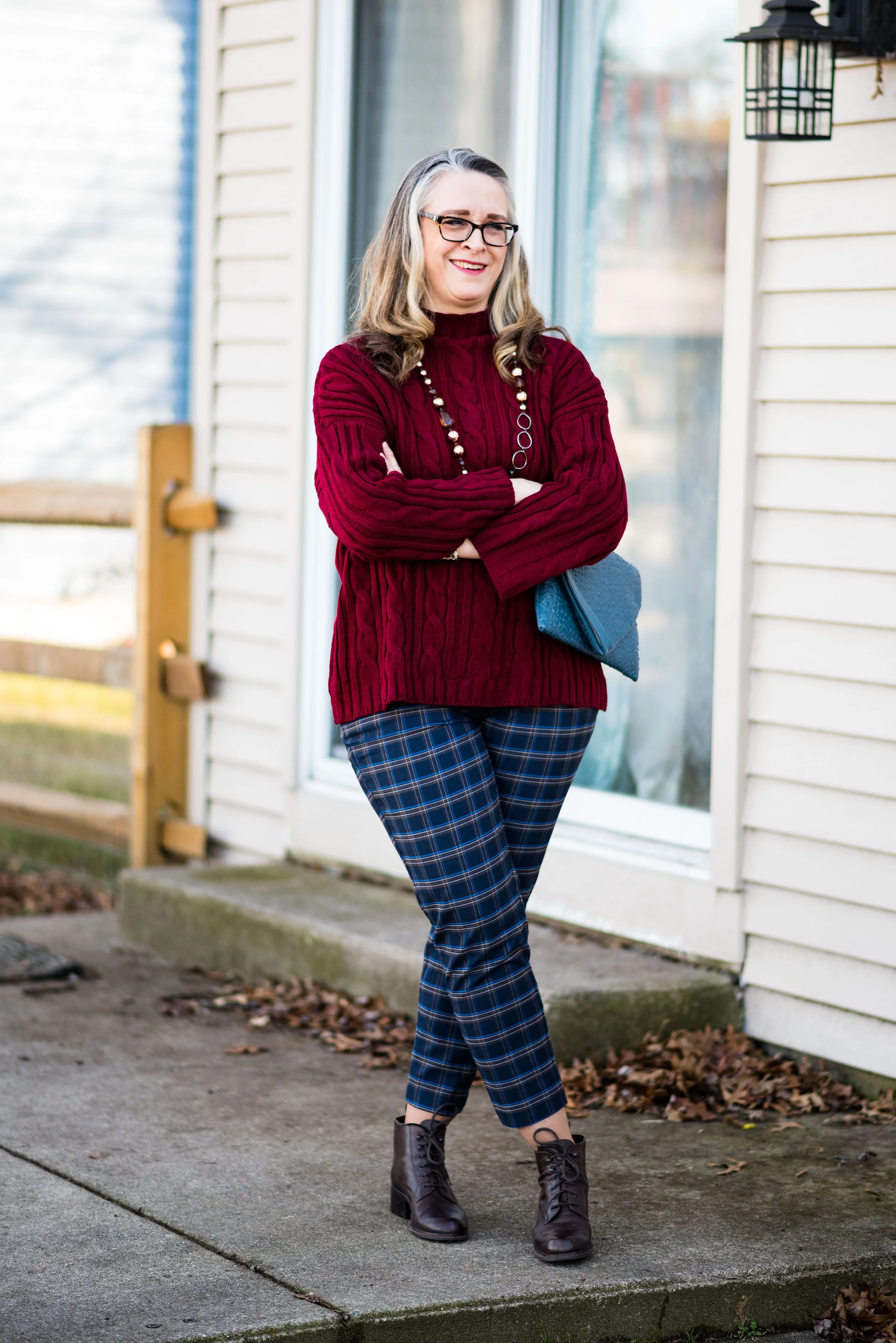
There are so many pieces that I like, but when I saw this sweater, I thought it would be perfect for the winter. Not only is it a rich, dark red, but I like the looser fit and the half collar. It is not truly a turtle neck, but not a crew next either.

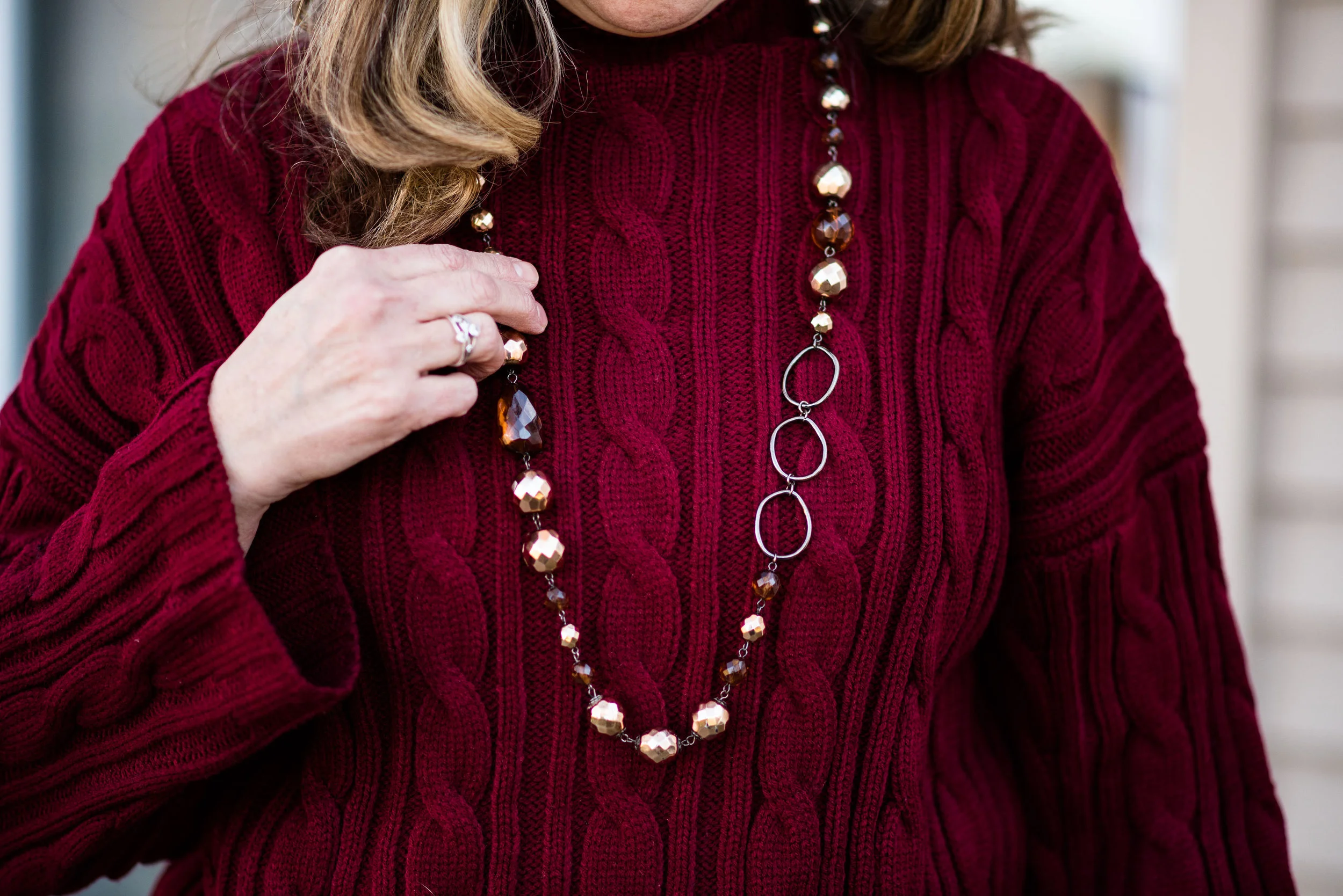
This sweater features drop shoulders, dough stripe or cable knit texturing and flared or bell sleeves. This is a thick sweater and quite warm. This particular sweater is no longer available, but if you click on the link you will see several pages of fun sweaters, many of which would be great for spring.

I decided to style the sweater for this shoot with my plaid ankle pants, however, I wore this to work the other day and wore a pair of boot cut jeans and my dark red, ankle boots. The plaid pants are fun, but with where this sweater ends, adds a great deal of bulk to my widening bottom. Yes, I am one of those people who gained weight over Christmas!

What a face, right?

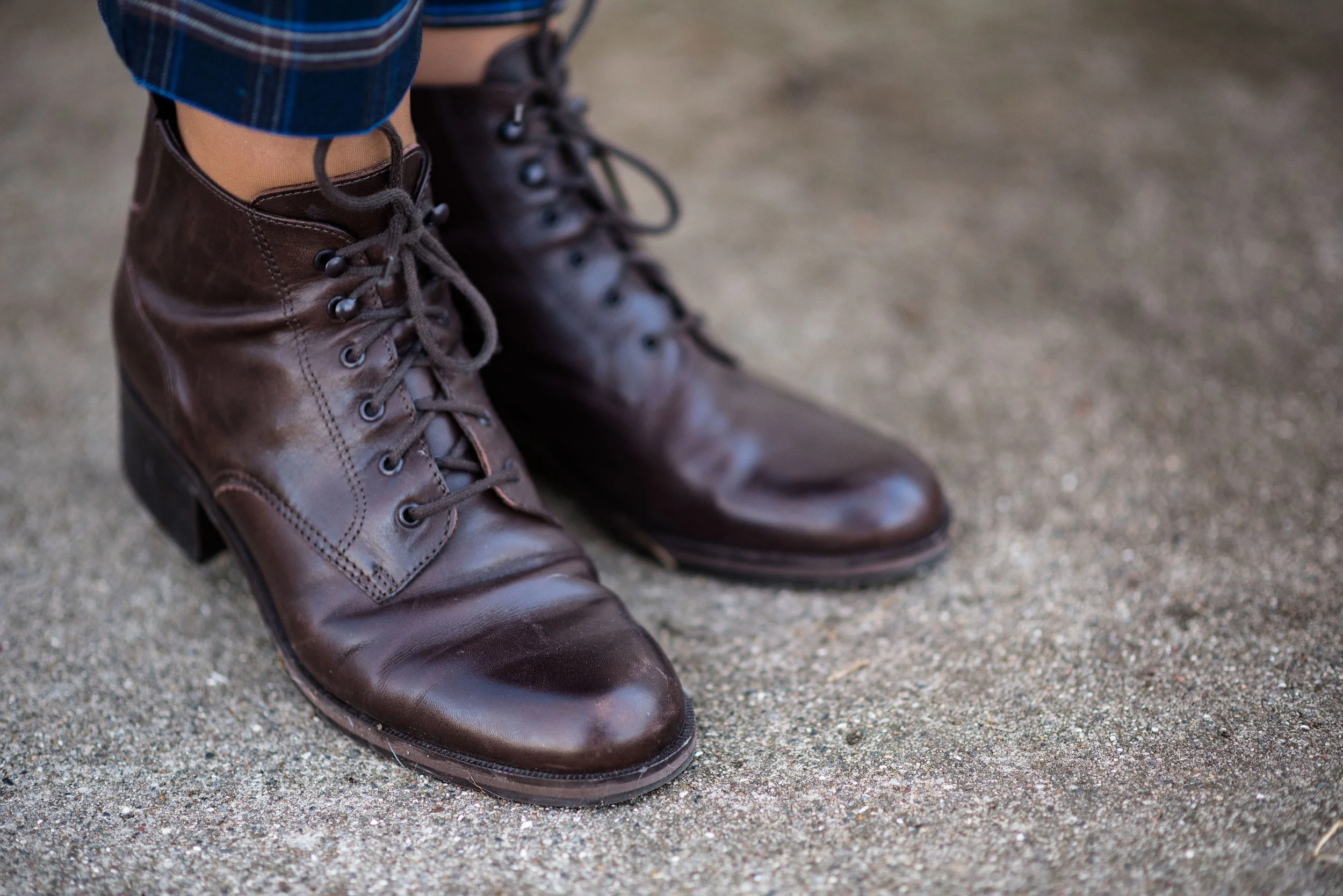
For accessories I chose my brown, lace up ankle boots, some beaded jewelry and my blue, textured clutch.

Cable knit sweaters are a warm cozy way to dress up an outfit. Layer collared blouses underneath or throw one over a dress. Do you own a cable knit sweater or two? I have a number of sweaters like this with the cable knitting in various colors. How would you style a sweater like this? Would you wear it with jeans, a pencil skirt, leggings or a maxi?

I hope you enjoyed these posts about Eva Trends. If you see something you like be sure to use the code AC15 at check out to receive 15% off your entire order.

These items were gifted to me by Eva Trends. I was not paid to do these posts and all opinions are my own.

Photo credit Rebecca Trumbull.