Pantone - Autumn/Winter - 2019 - Cranberry and Chicory Coffee

Hi everyone. The days are flying by and we are almost to Halloween. I haven’t even gotten out my decorations yet! That is how far behind I am. Maybe I should just skip Halloween and start decorating for Christmas. All the stores are doing it. Ha, ha . Well, I don’t think I’ll get that crazy, but this time of year does seem to go awfully fast. Do you get that feeling?

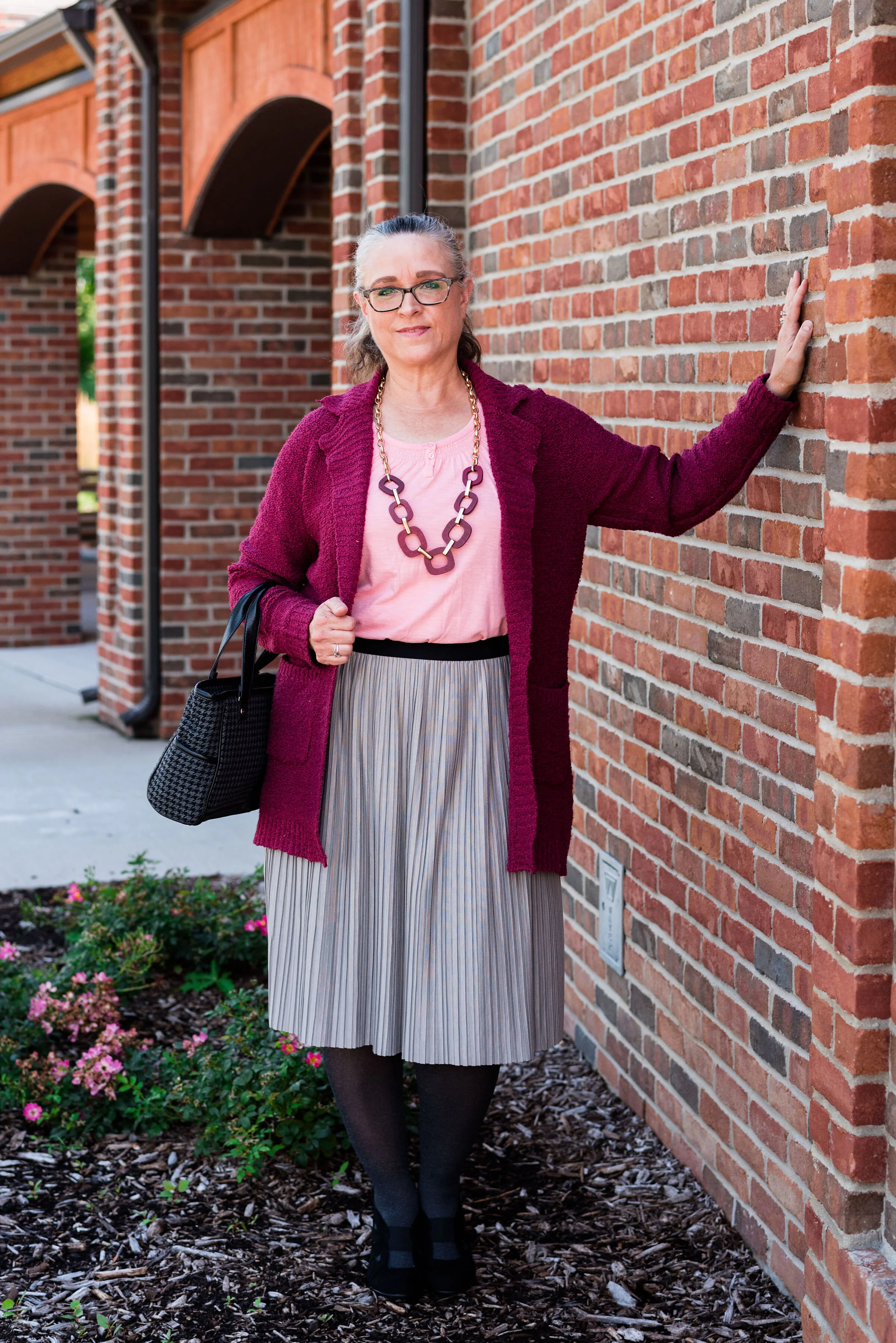
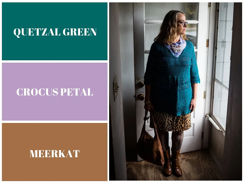
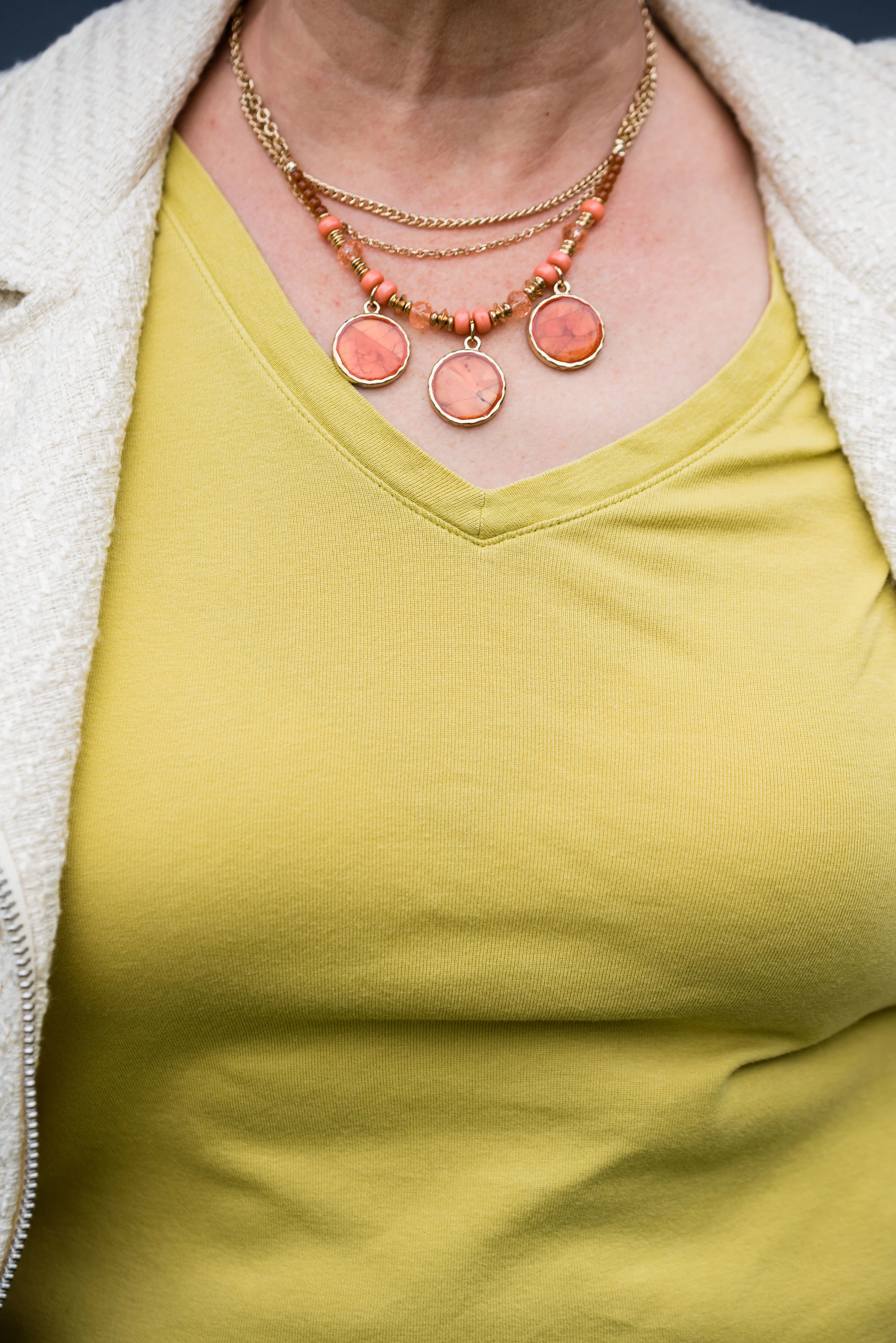
Today’s colors are what the Pantone Color Institute label a “vital red that adds a pungent punch to the palette,” and a “robust and tasteful” brown that, “introduces an element of heartiness.”

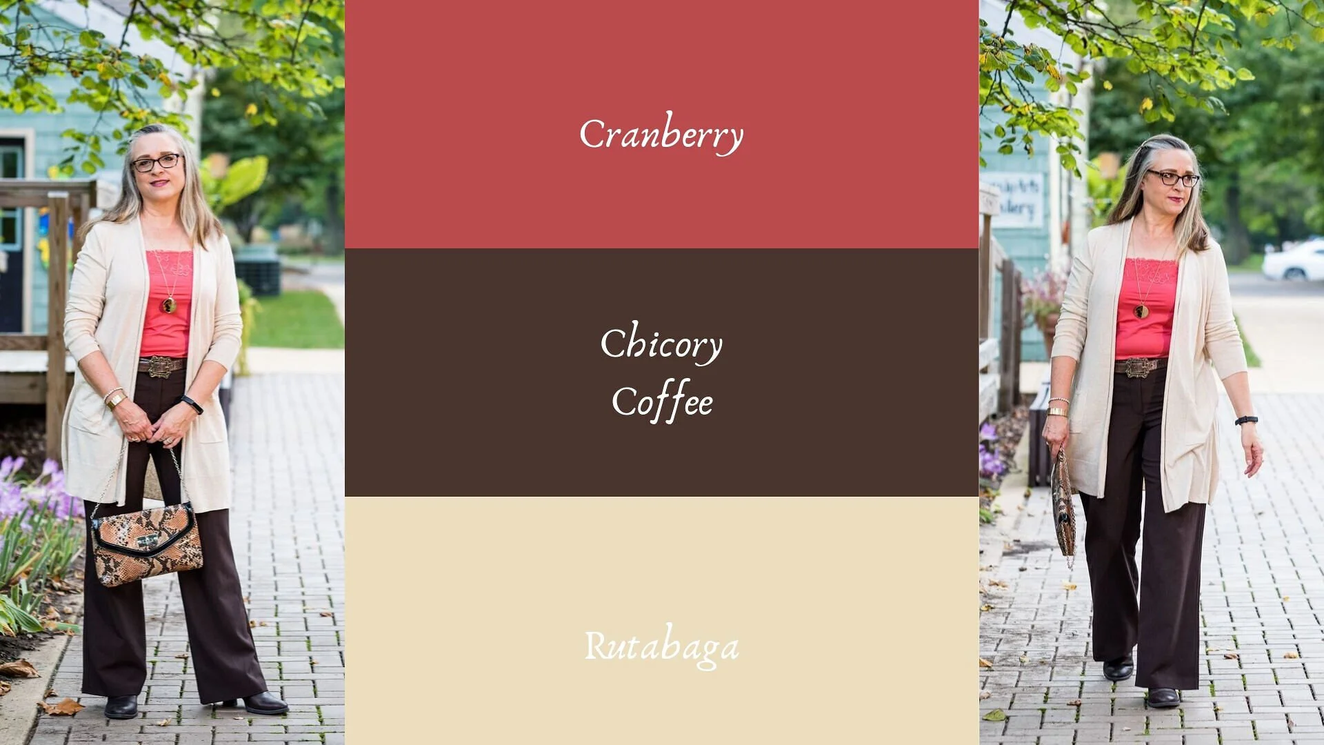
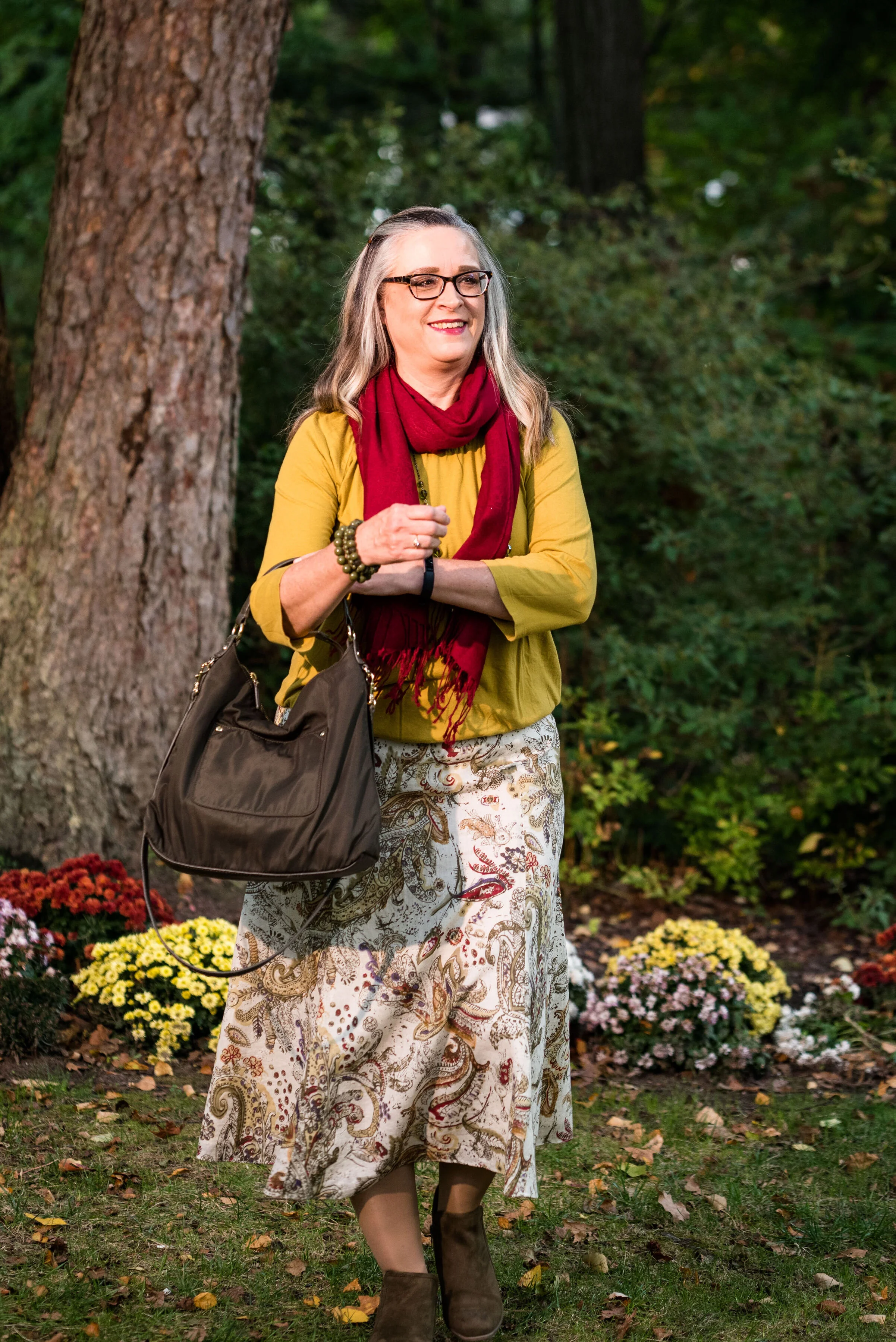
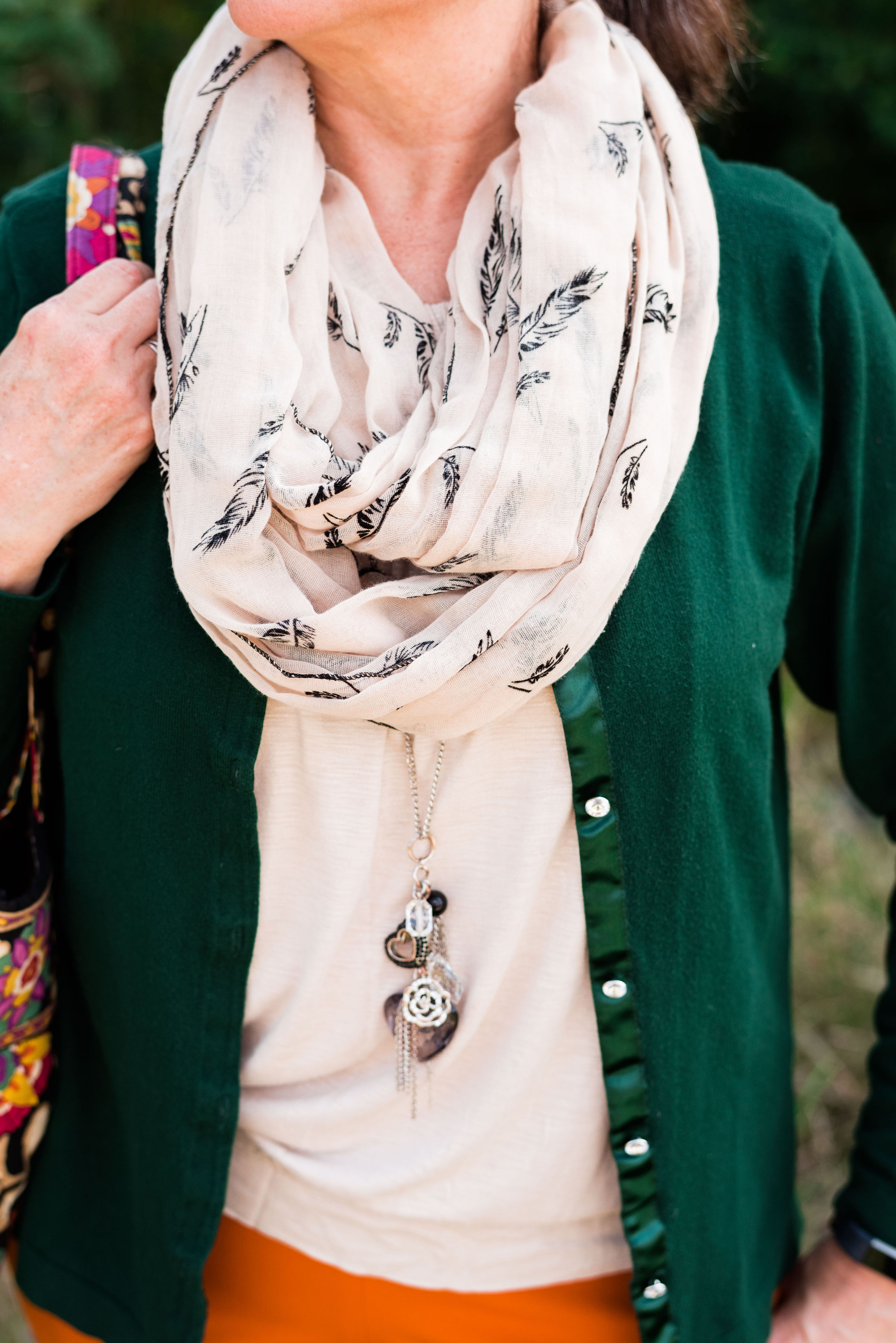
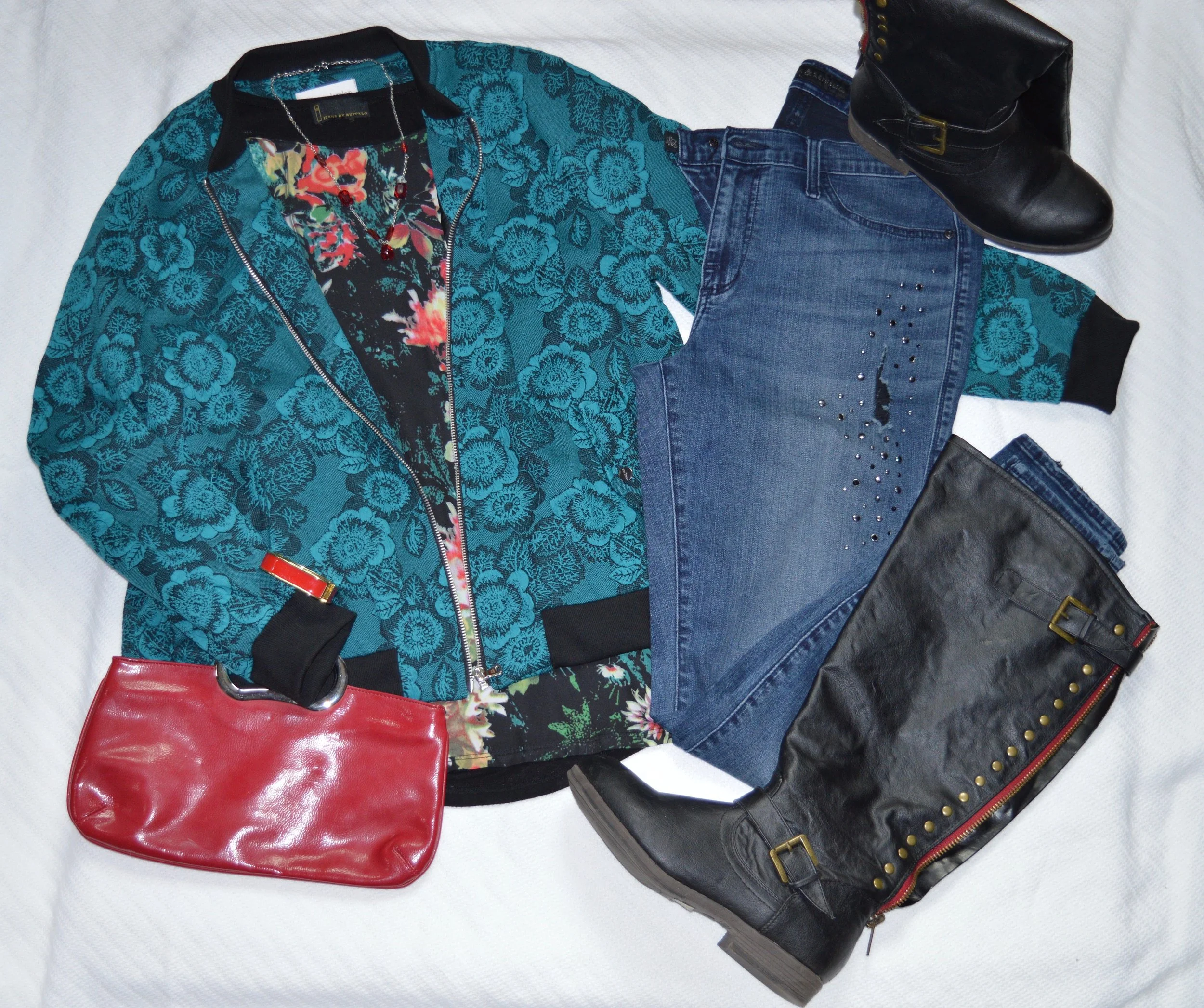
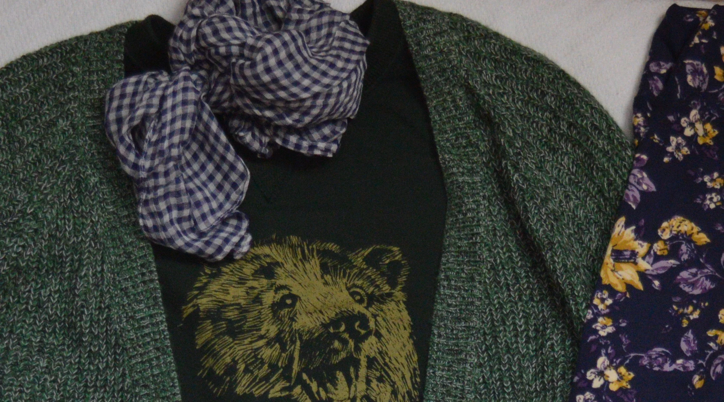
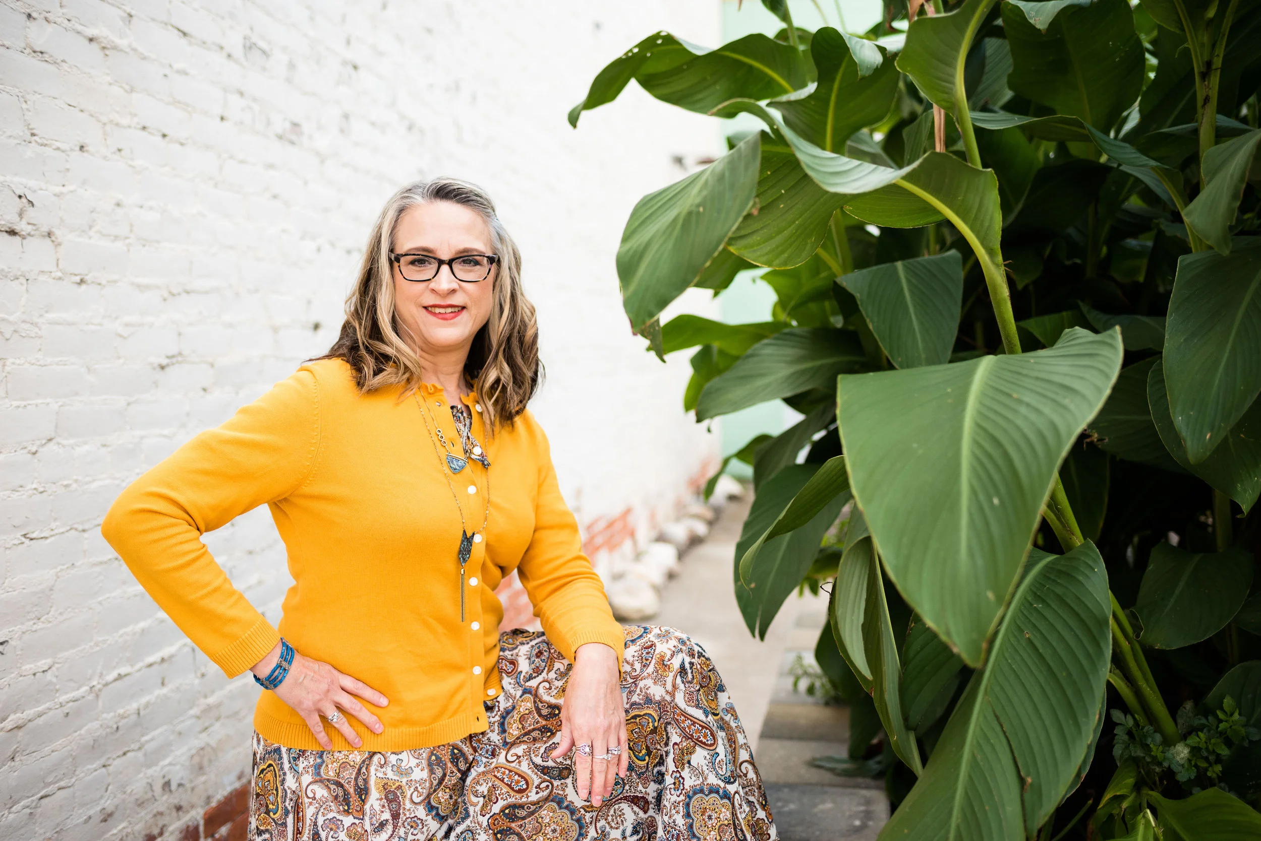
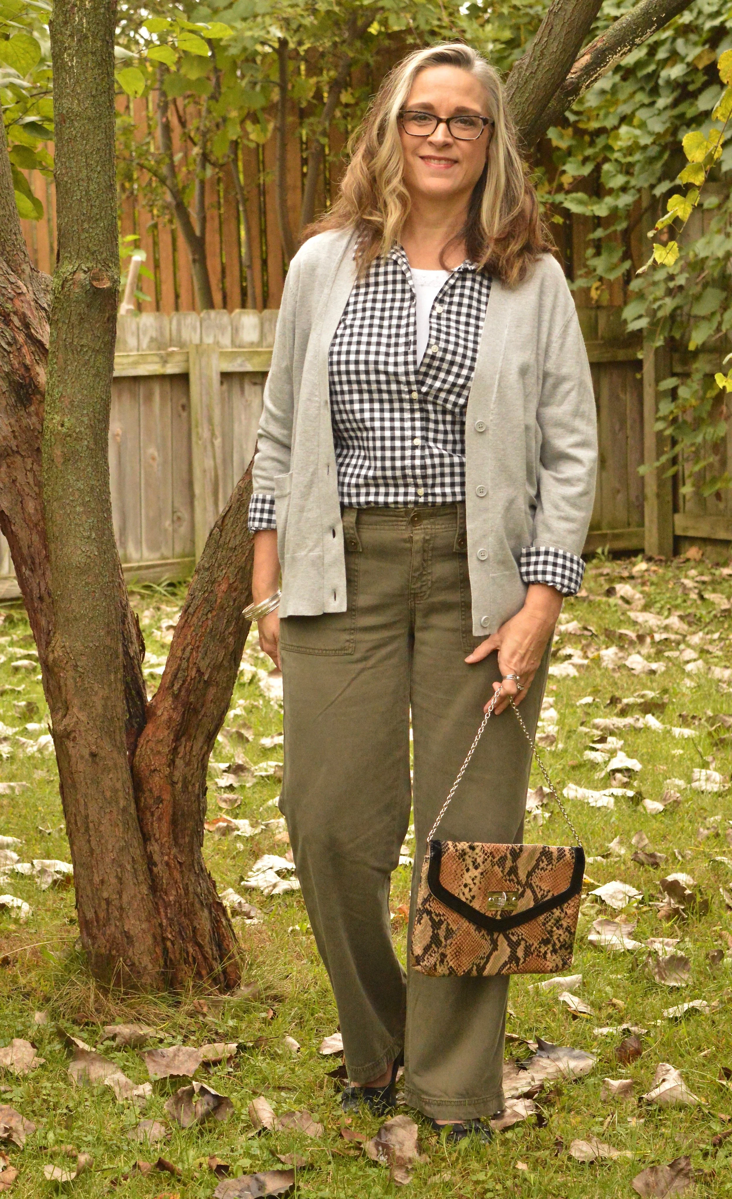
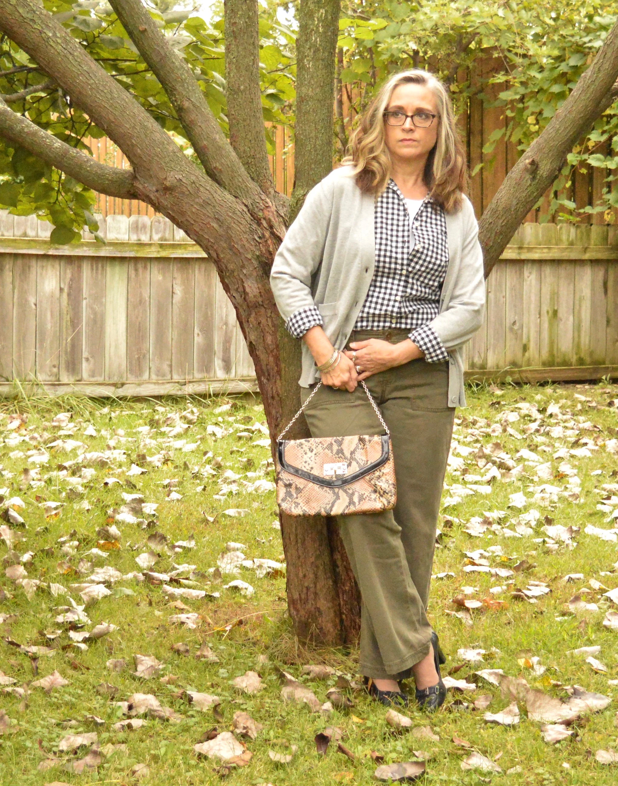
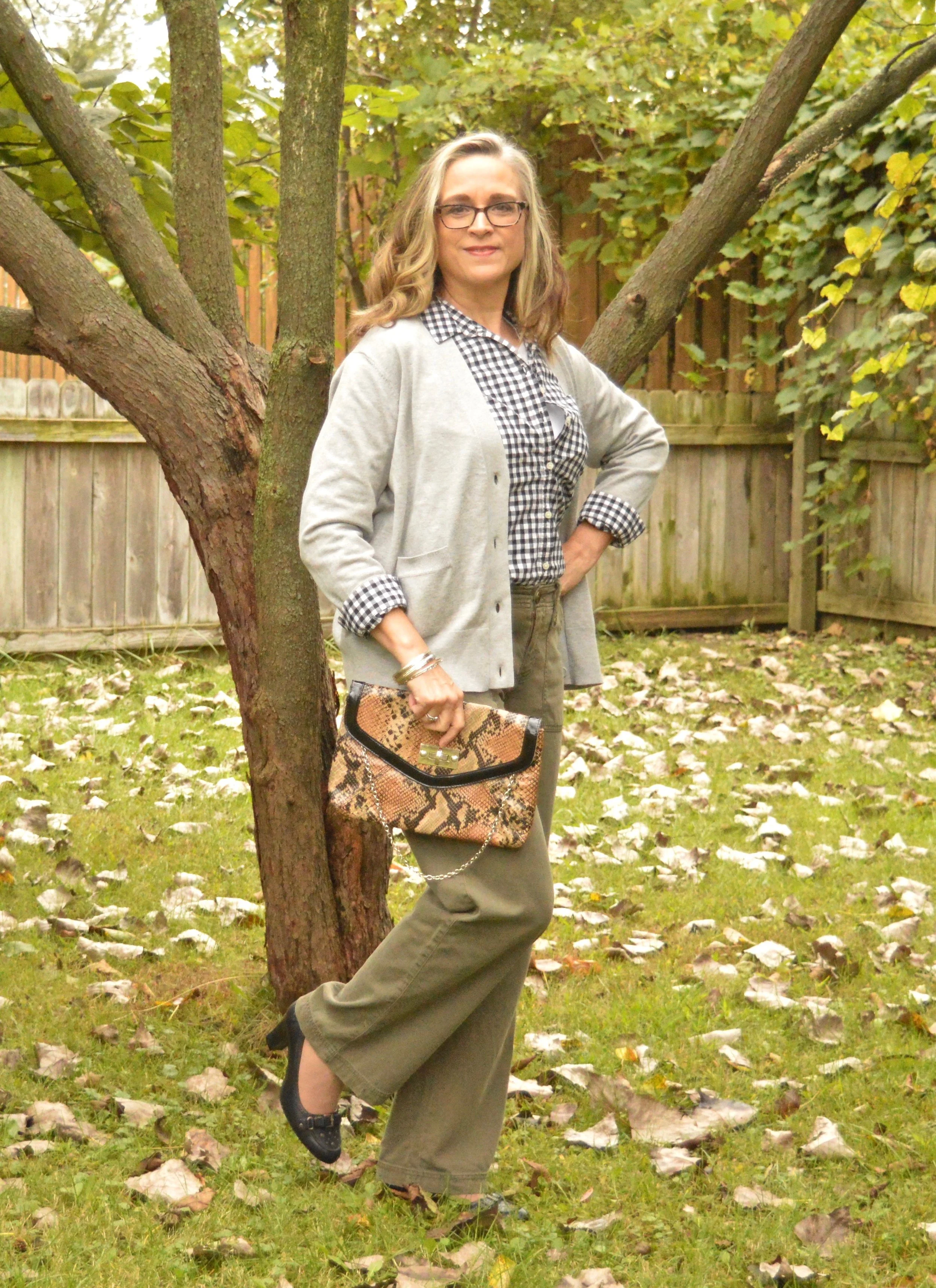
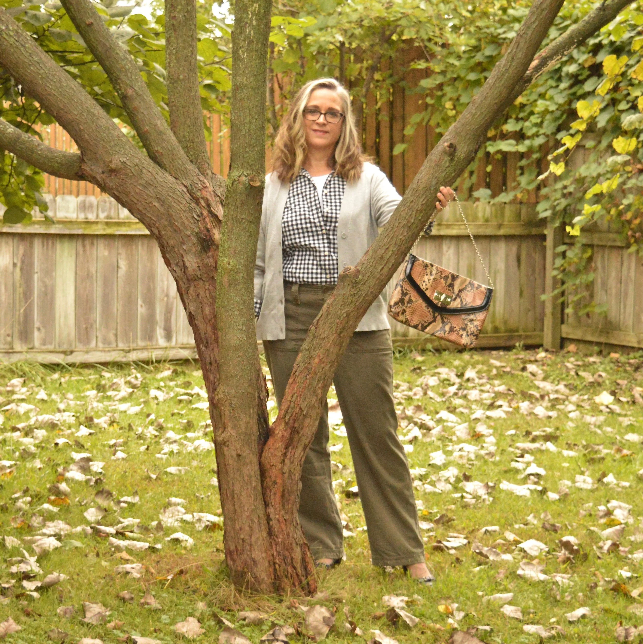
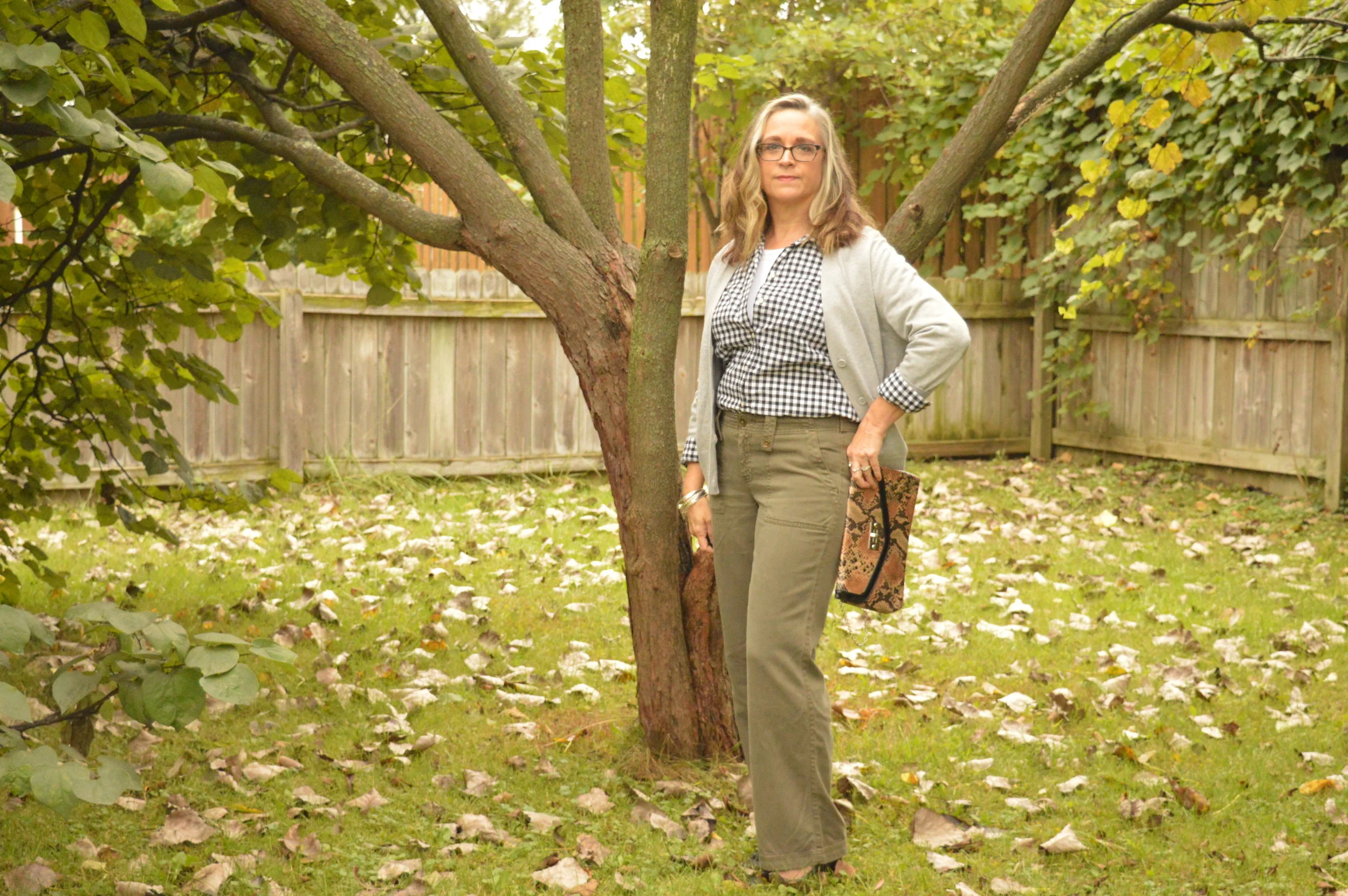
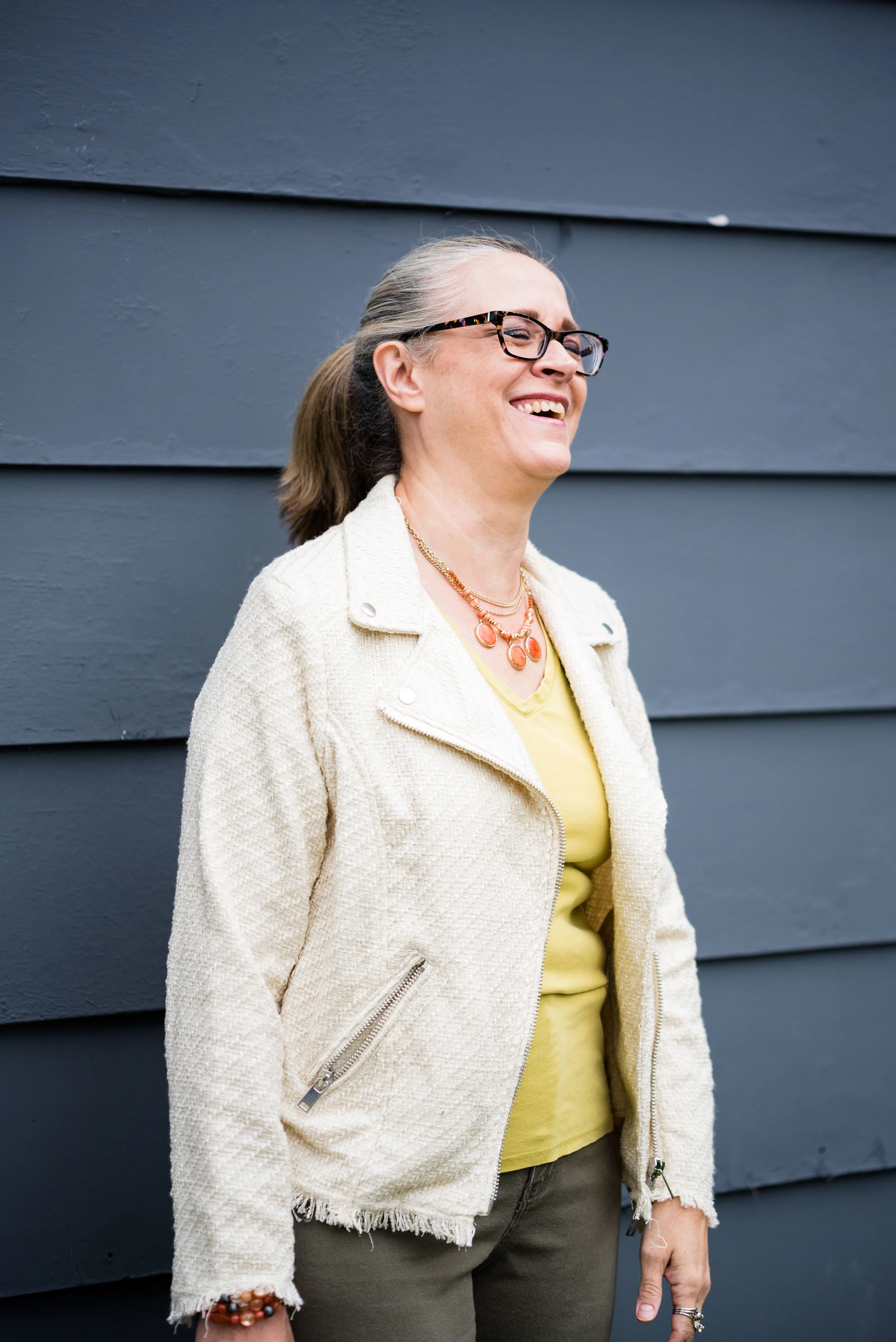
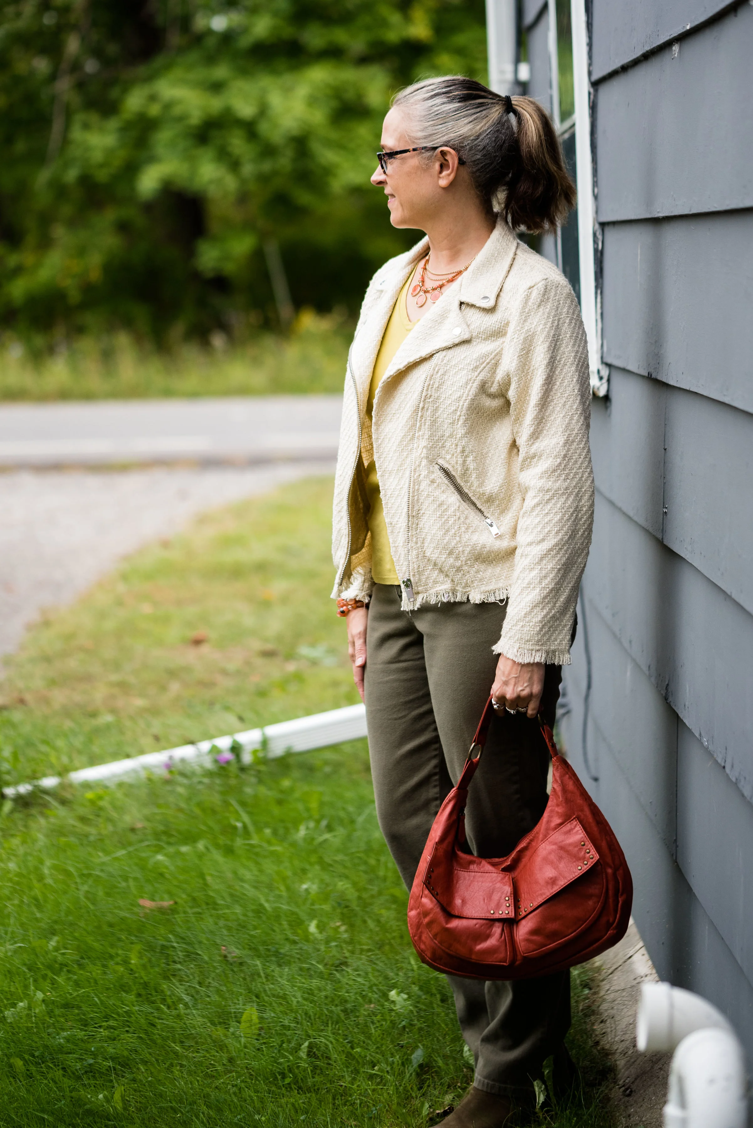
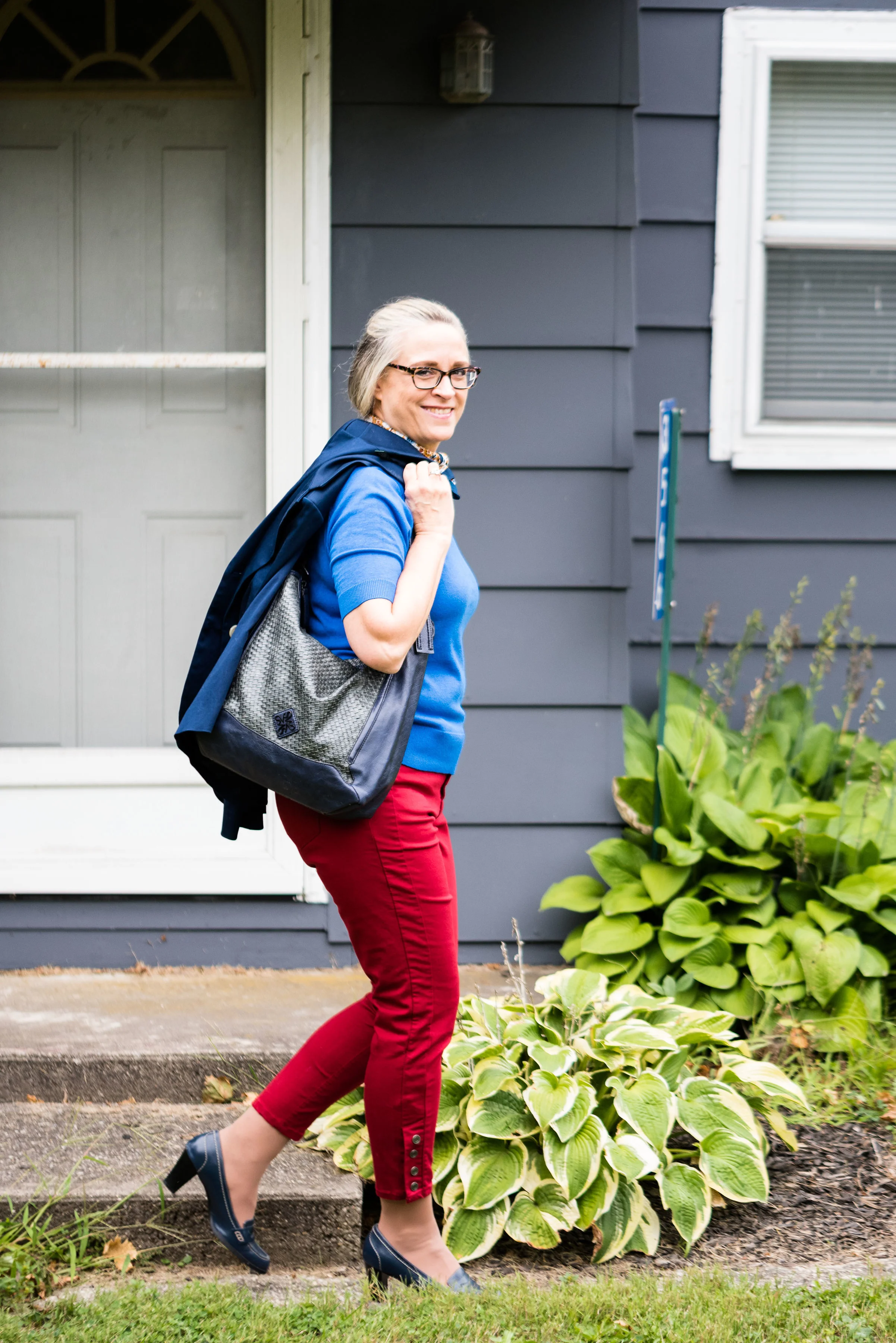
I was able to pull these pieces from my closet and decided to add the off white cardi that mimics Rutabaga from the London classic color palette.

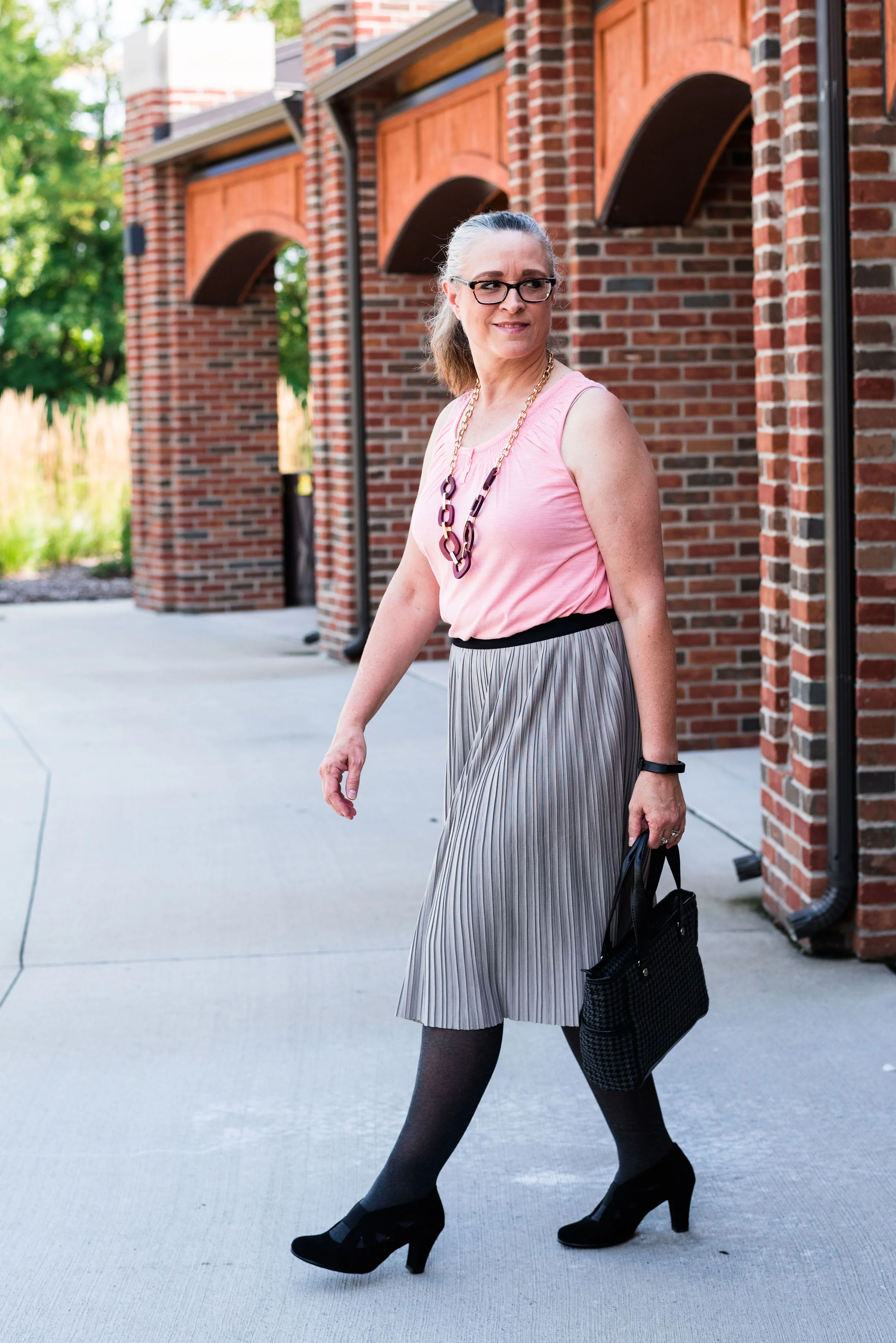
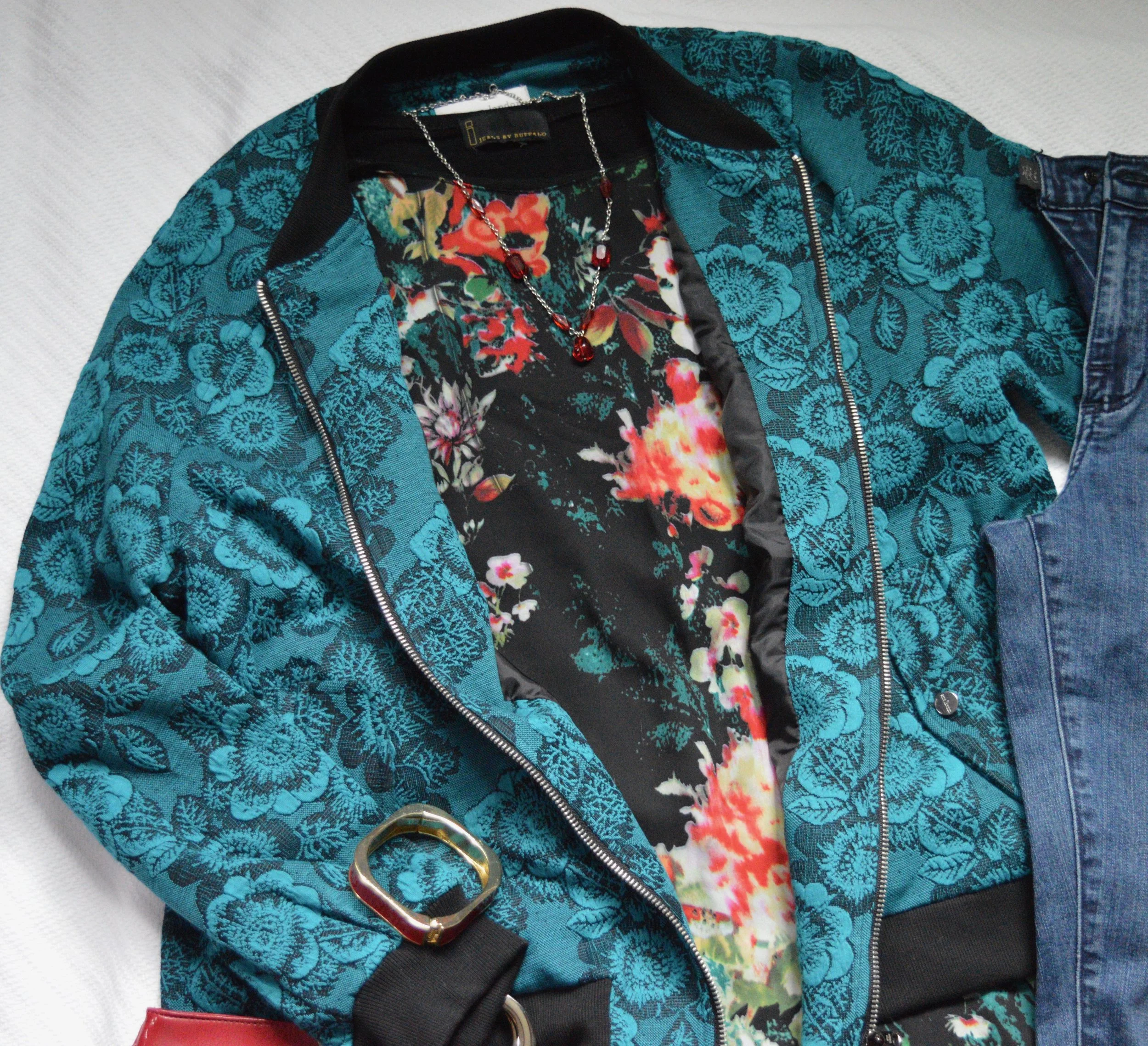
This Cranberry cami was a recent thrift purchase. Most of my camis are pretty tight and I wear them as layering pieces under long sleeve tops and sweaters. I do not wear them to be seen, but it occurred to me that it would be nice to have something I could have more visible under an open sweater. It is Maurice’s brand. I am becoming a fan of Maurice’s. I see pieces every so often at thrift stores and recently I bought what has become one of my favorite pairs of jeans on the clearance rack. What really drew me to this cami was the pretty lace detailing.

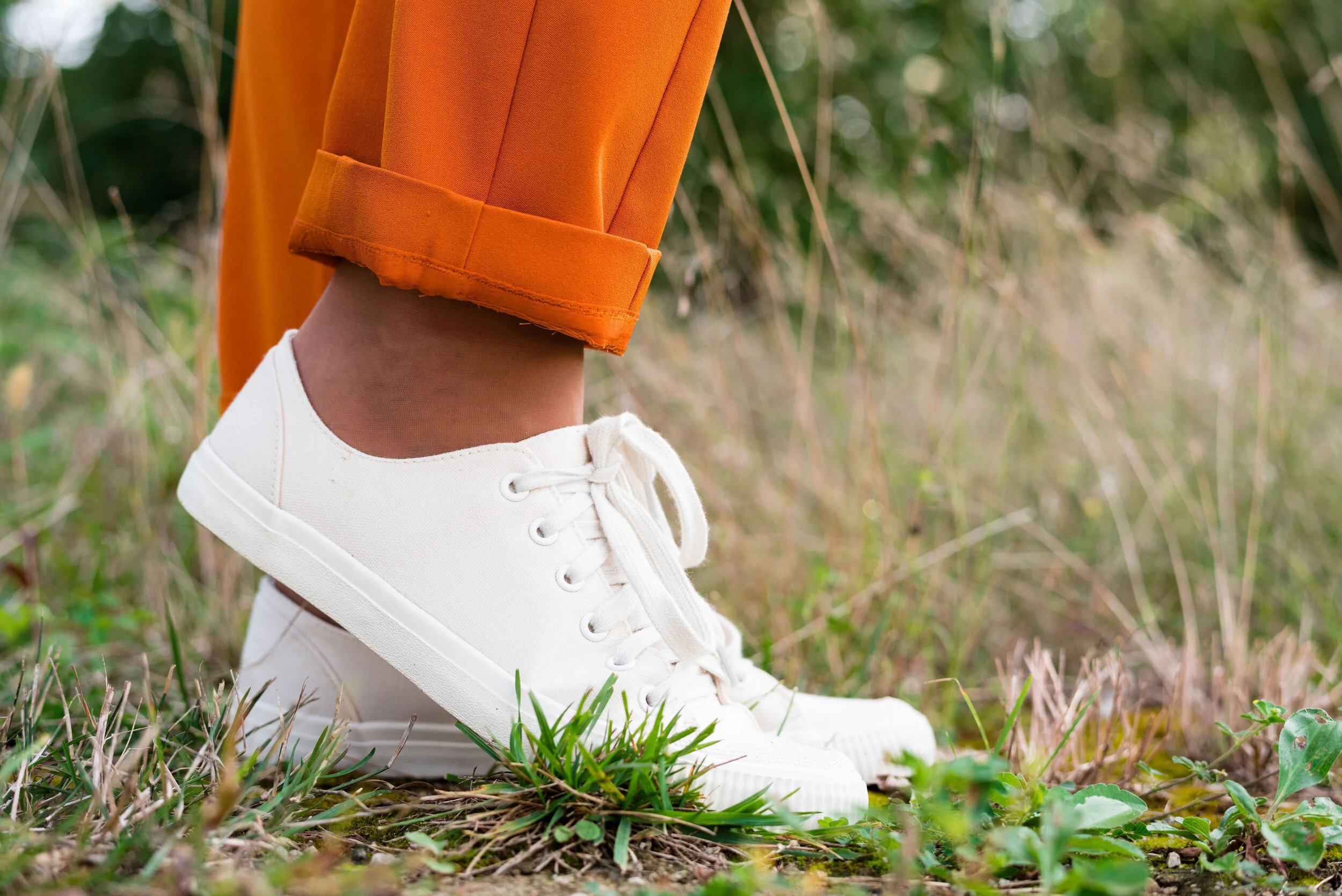
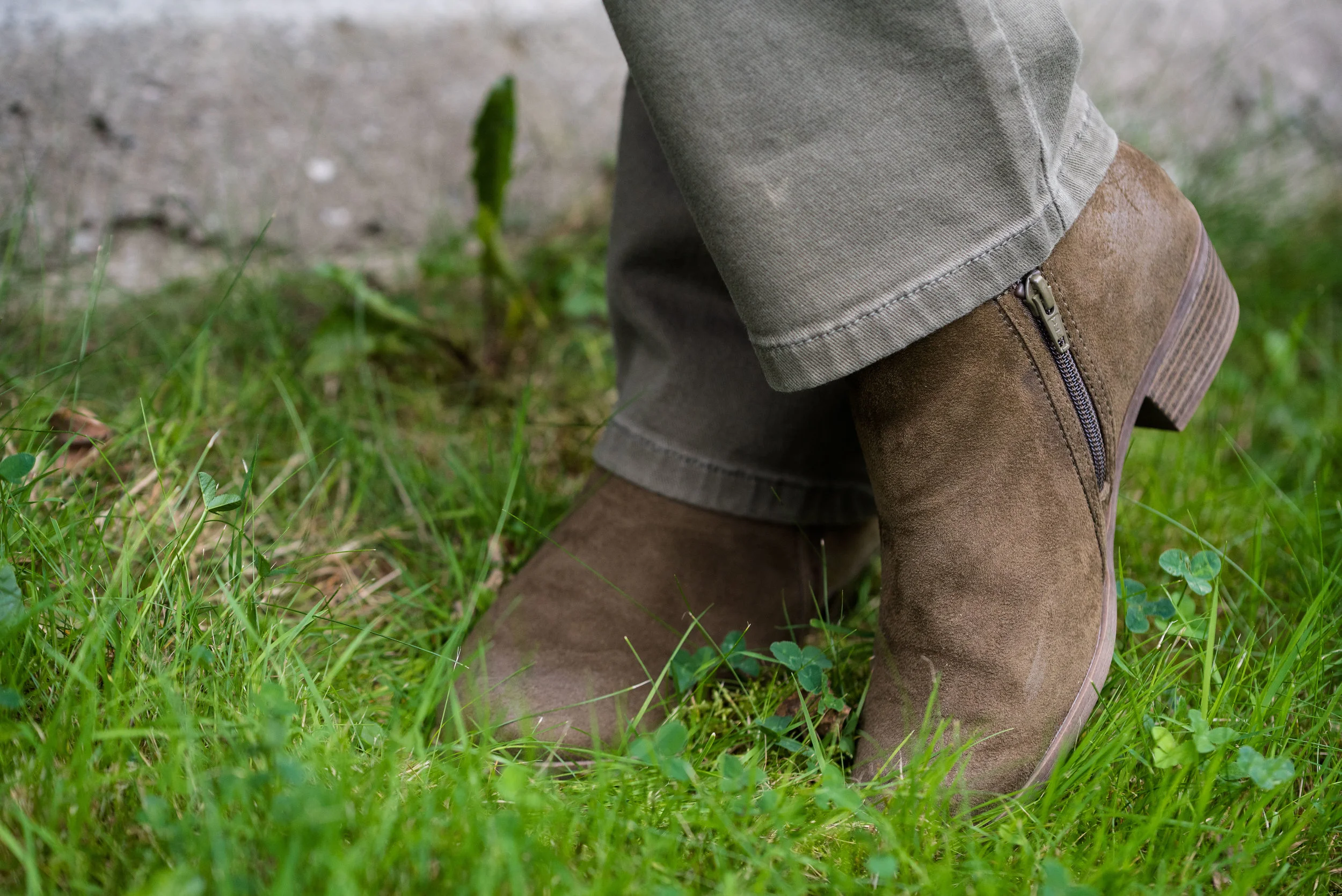
These trousers are Worthington brand from JCPenney. Do you know how hard it is to find brown slacks? Now maybe that has changed. I have seen rust, and that more yellowy brown called cognac, but real brown is hard to find, especially a dark brown like this one.

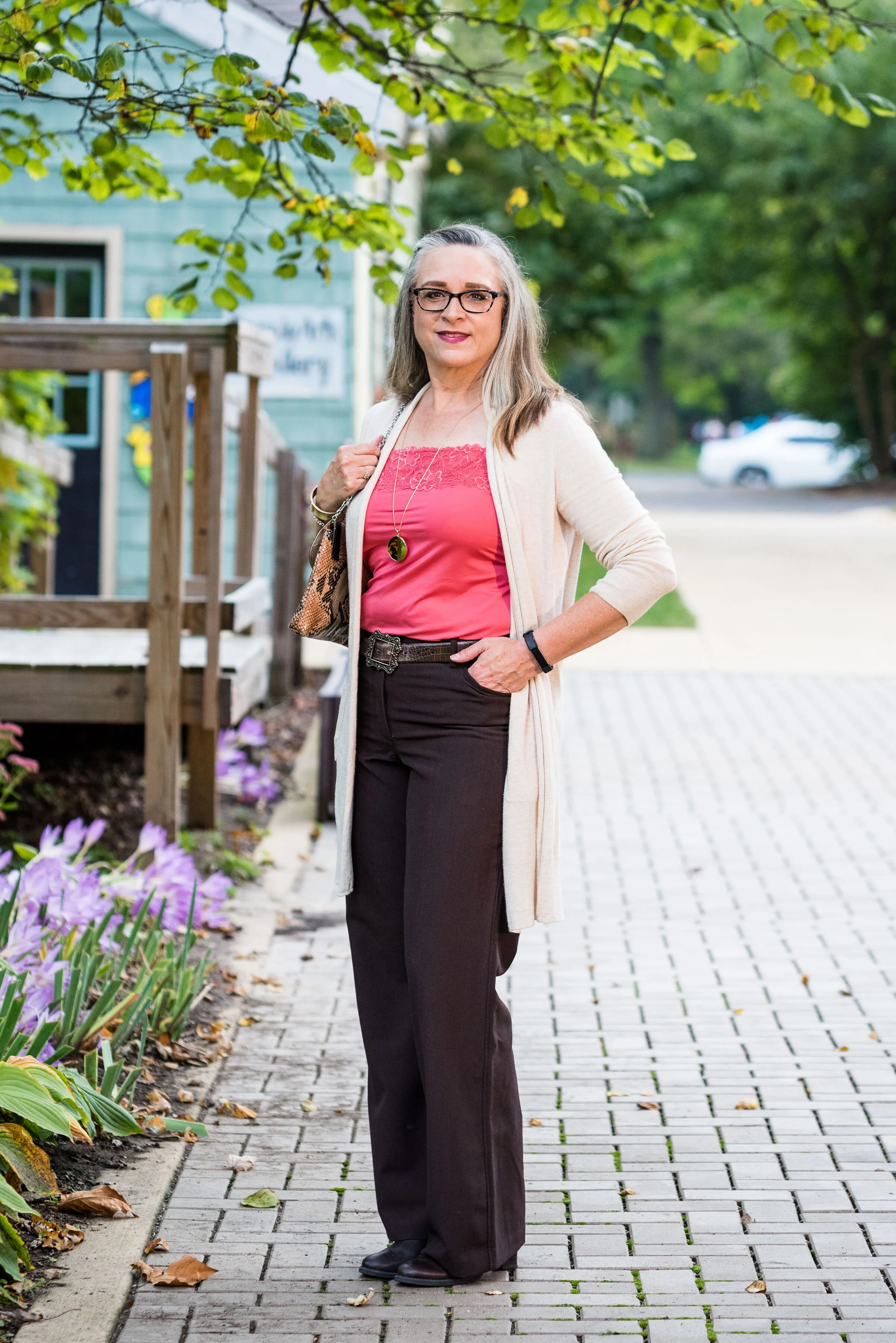
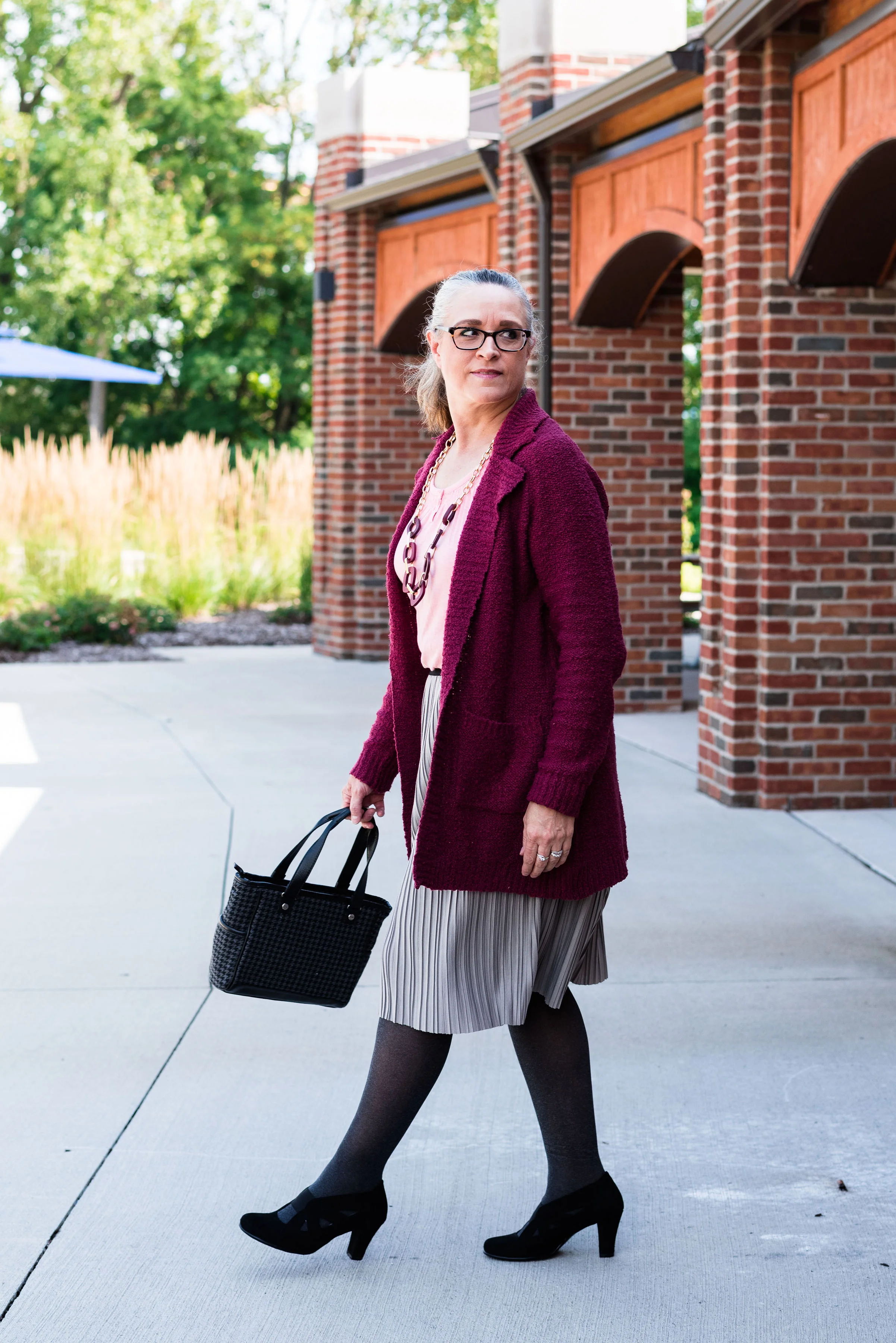
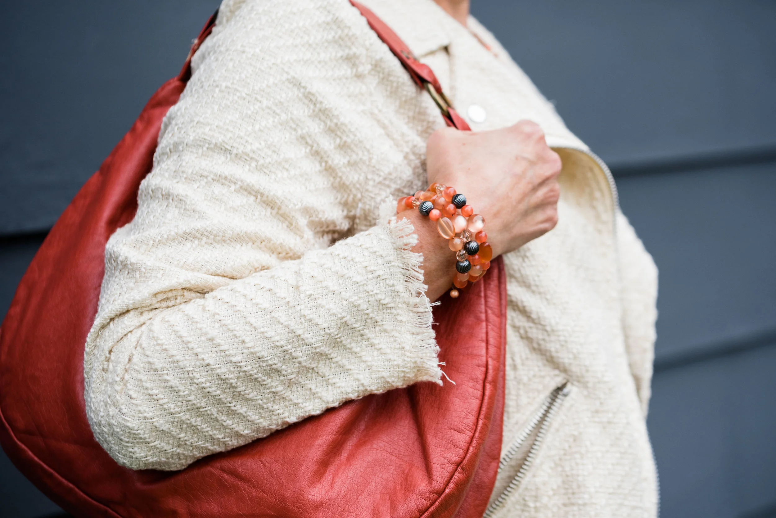
The off white open front cardigan is Chaps brand and another clearance rack find from Kohl’s. Chaps has some nice pieces, but they do have a higher price point than I would normally pay, thus my reasoning for waiting for them to go on clearance. If I thought a particular piece is really worth paying full price for, I would buy it, but for the most part there isn’t anything that I absolutely have to have. I could shop my closet for months and come up with all sorts of new combinations, because I have so many clothes. Truth!

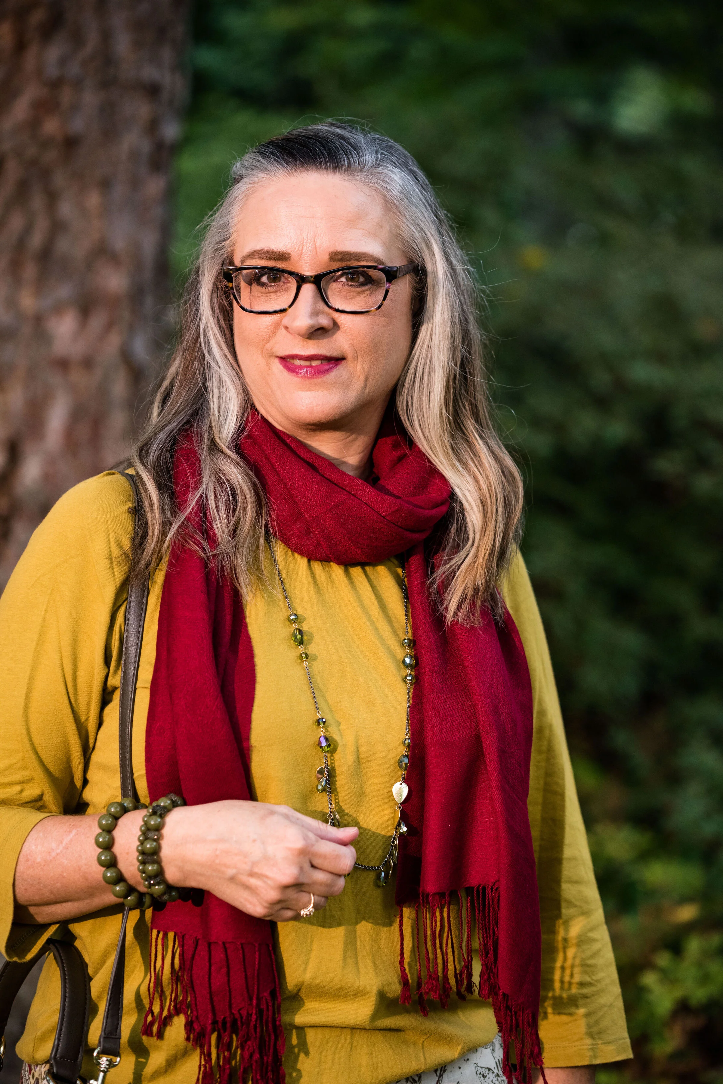
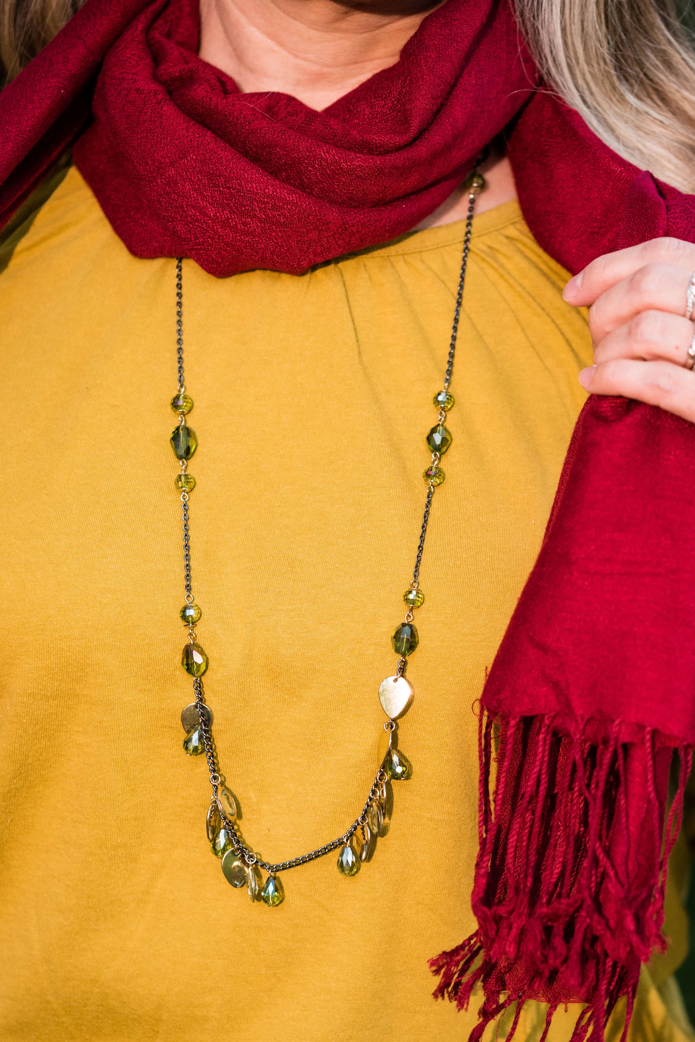
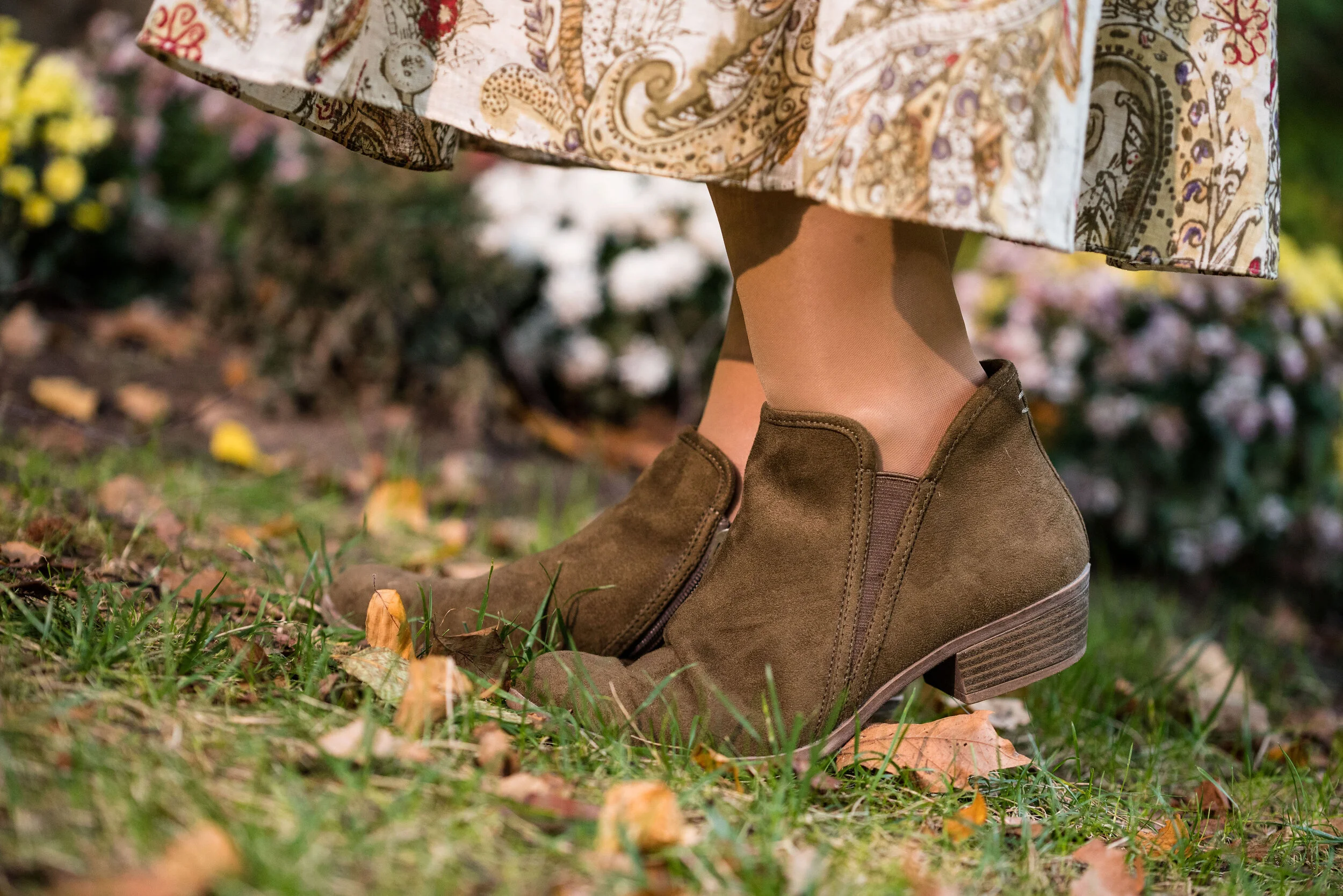
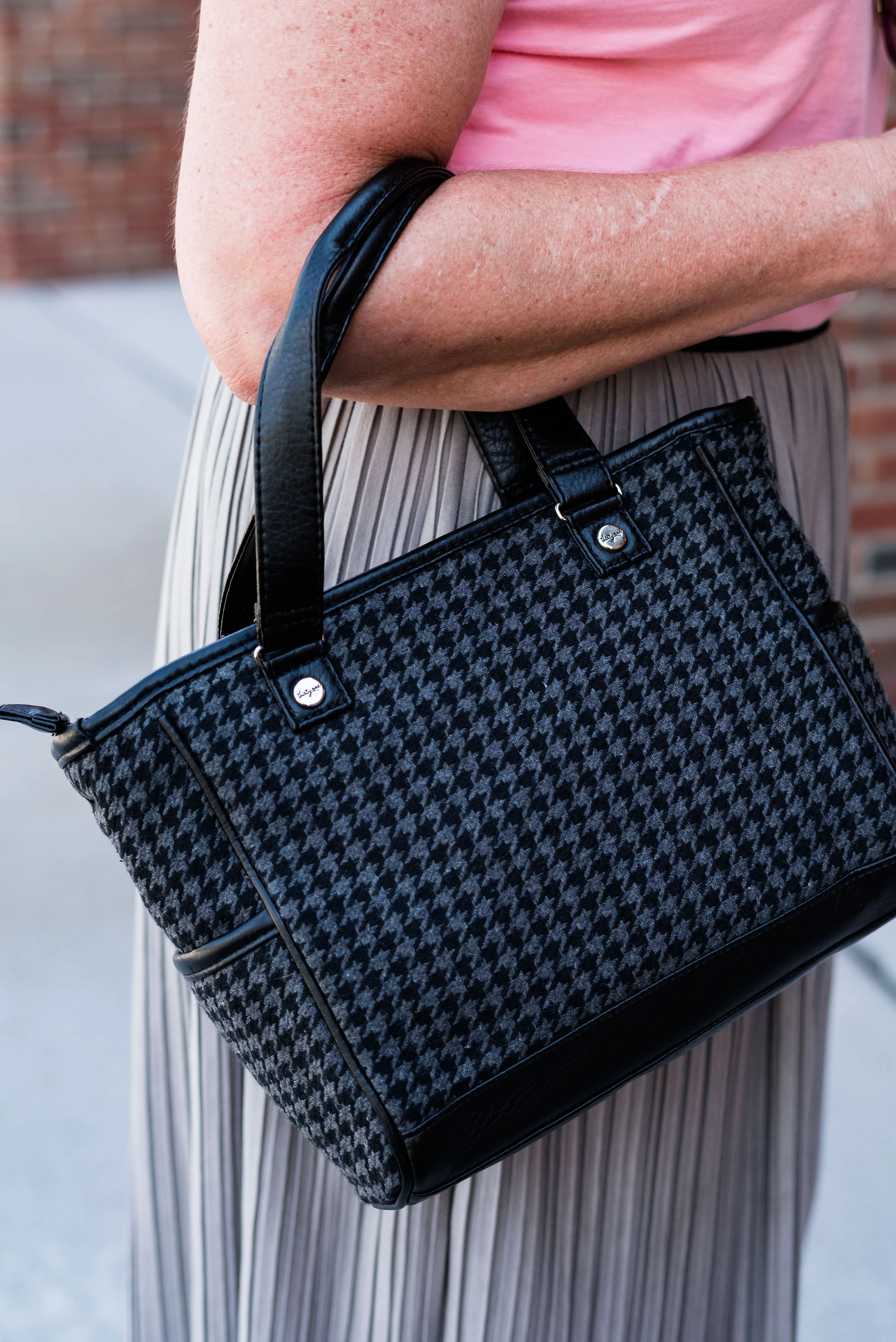
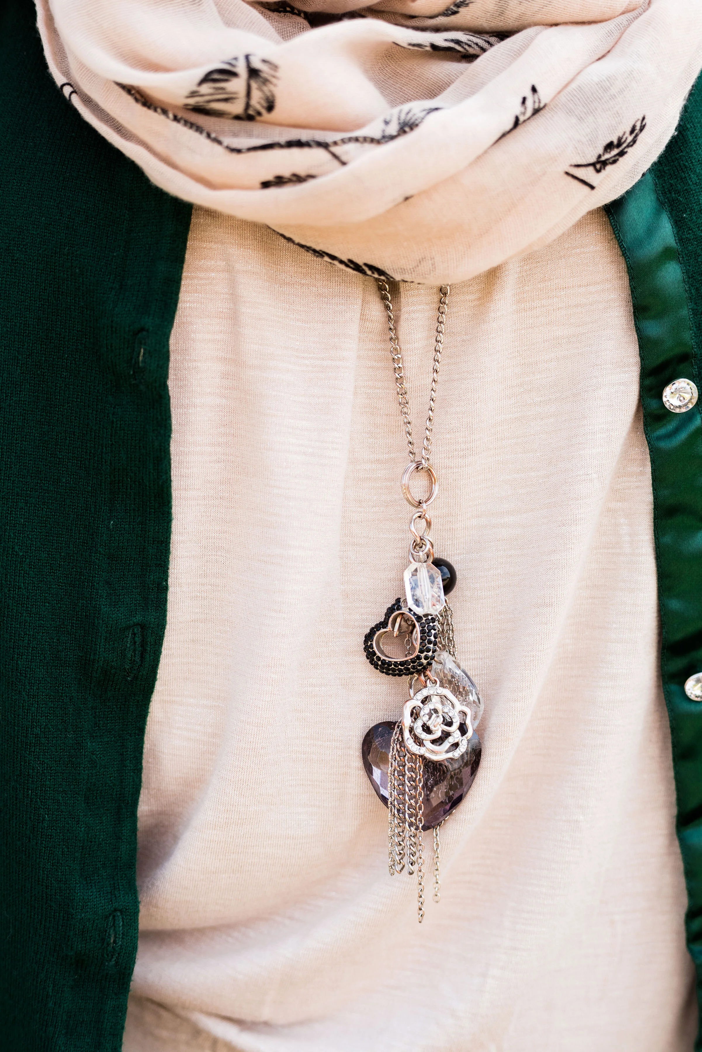
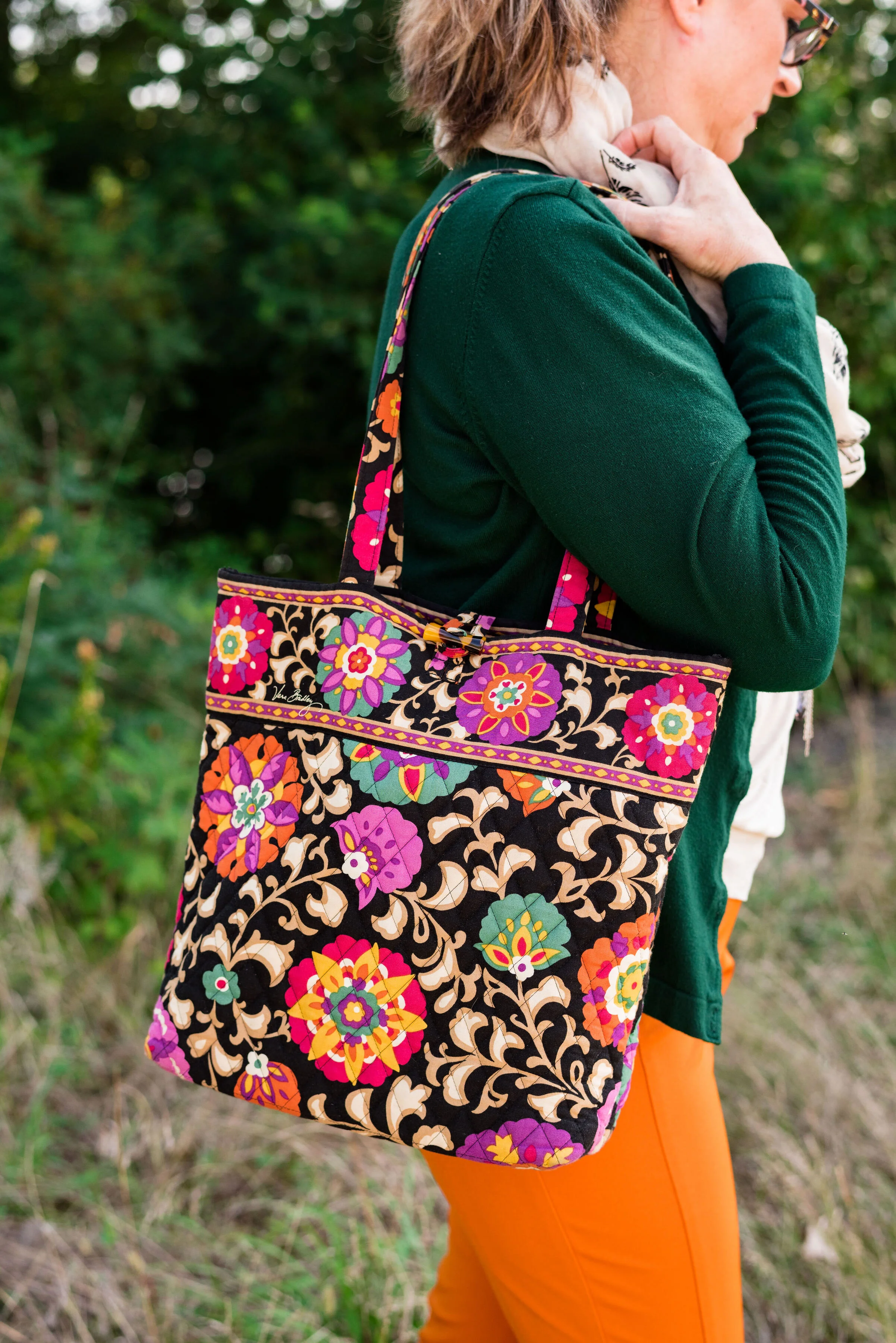
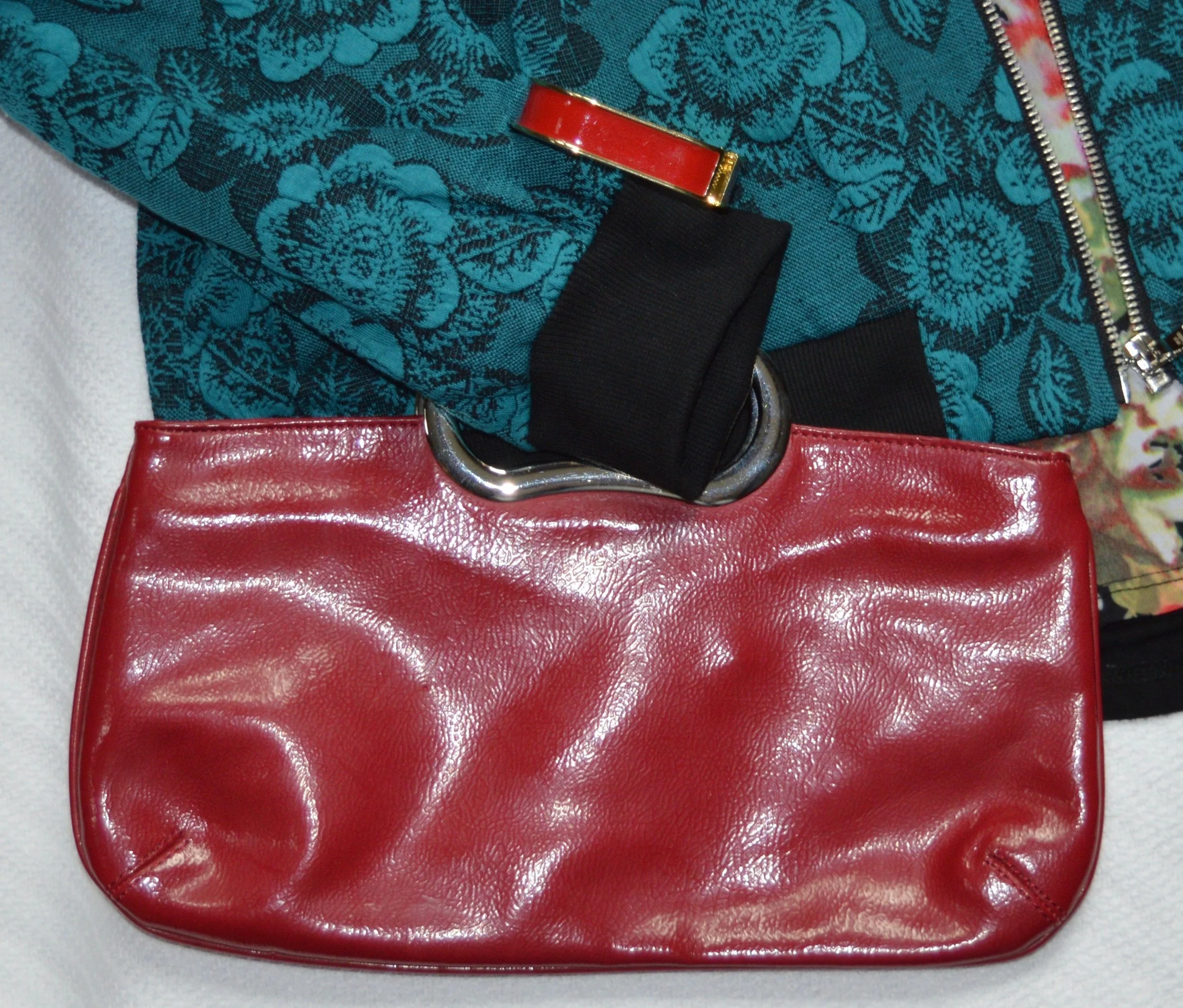
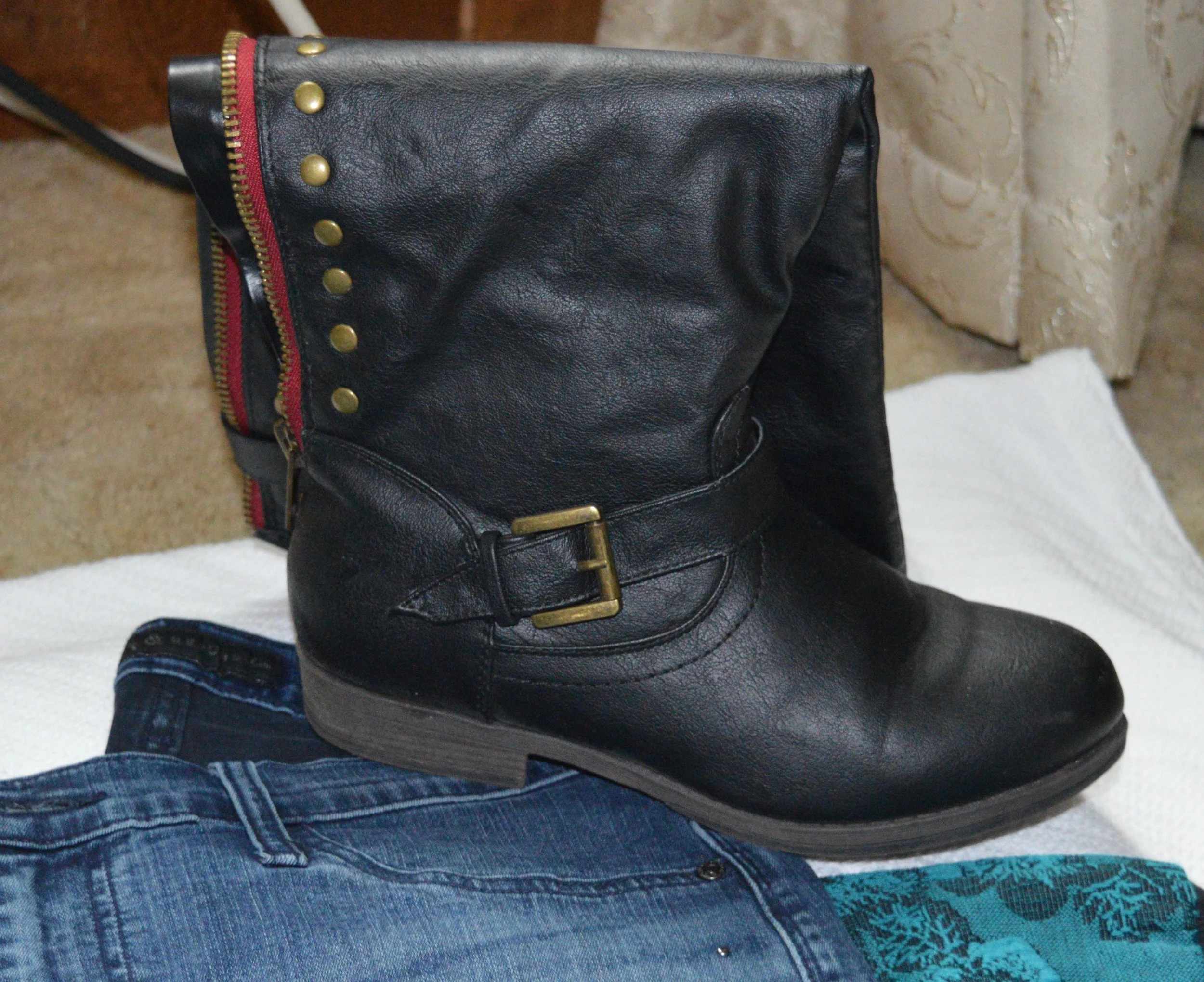
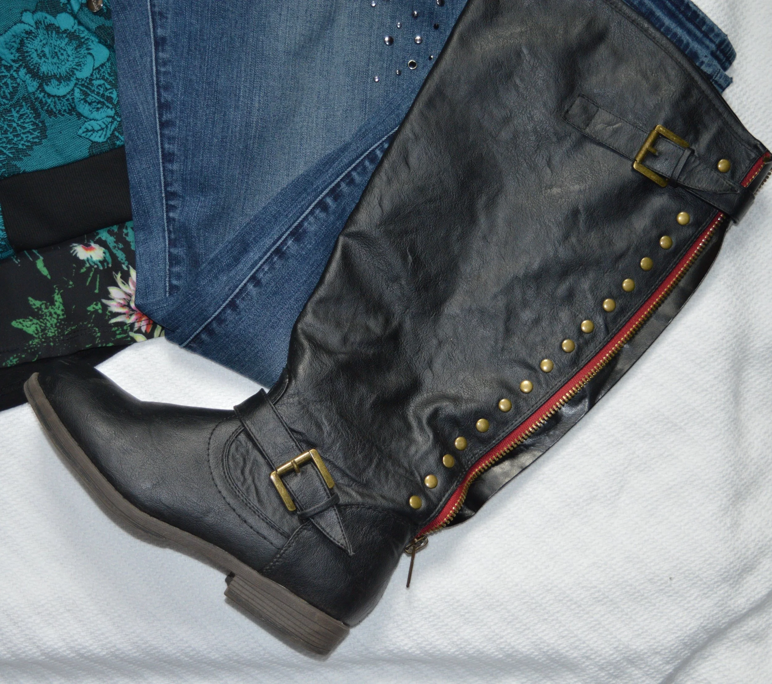
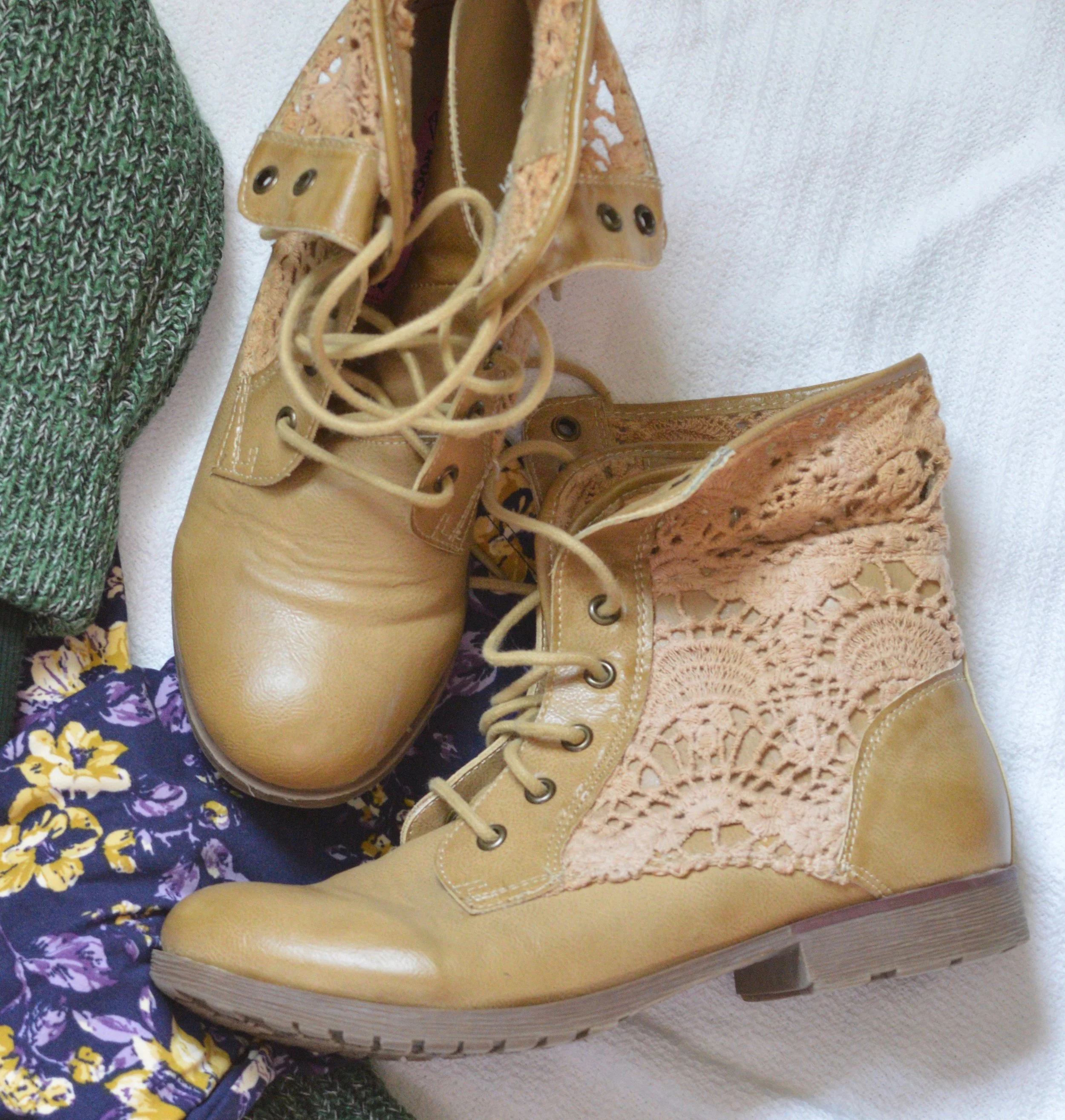
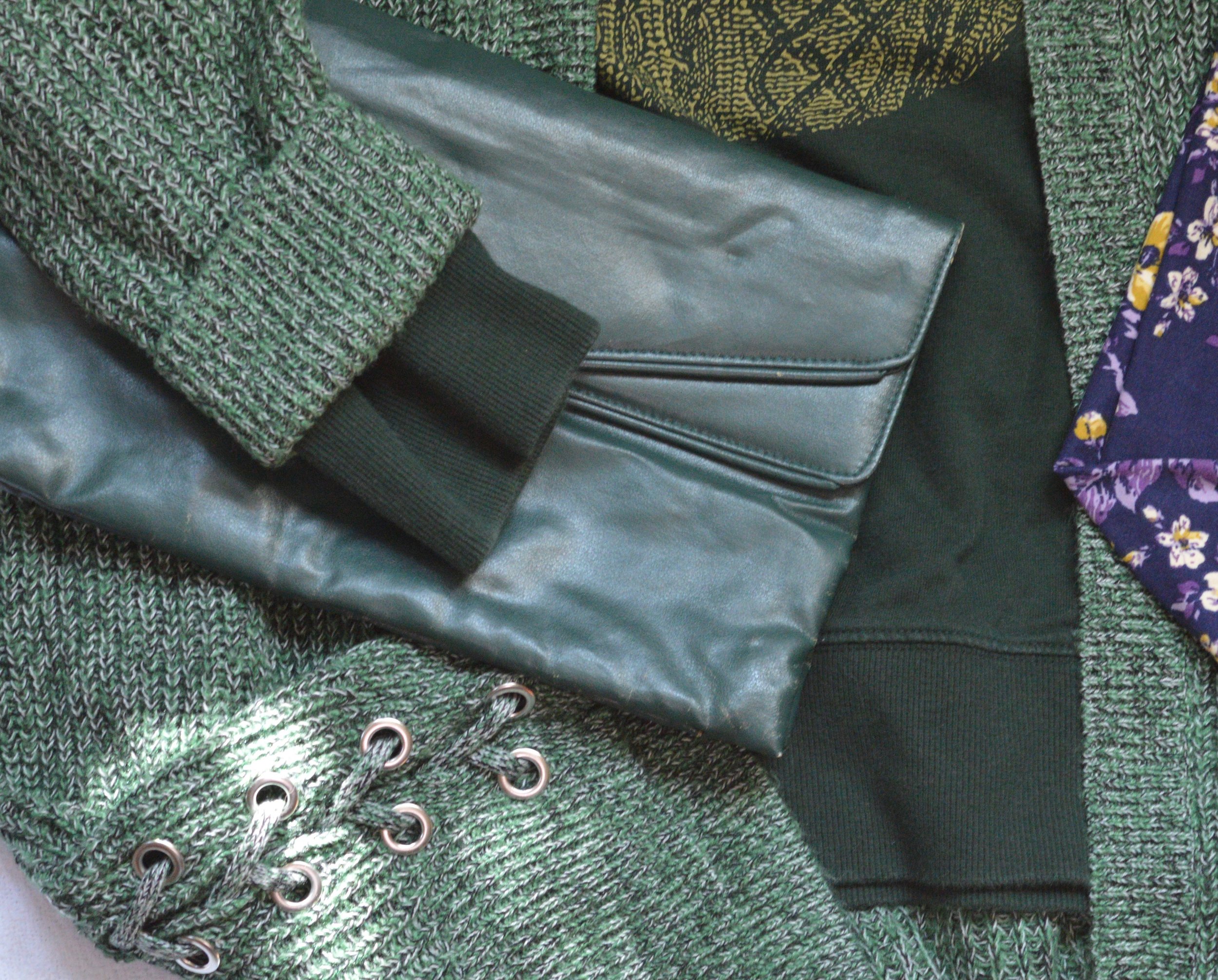
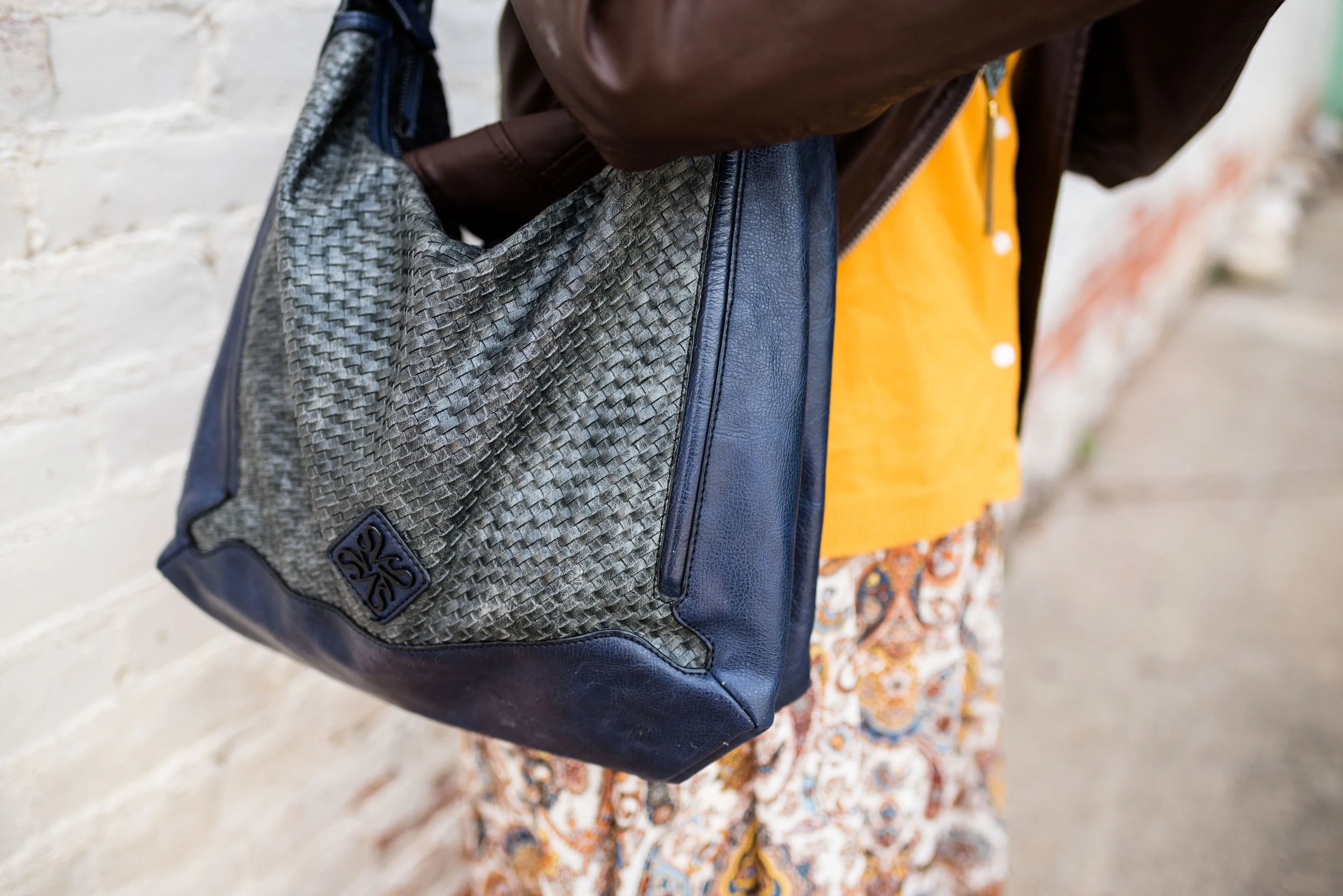
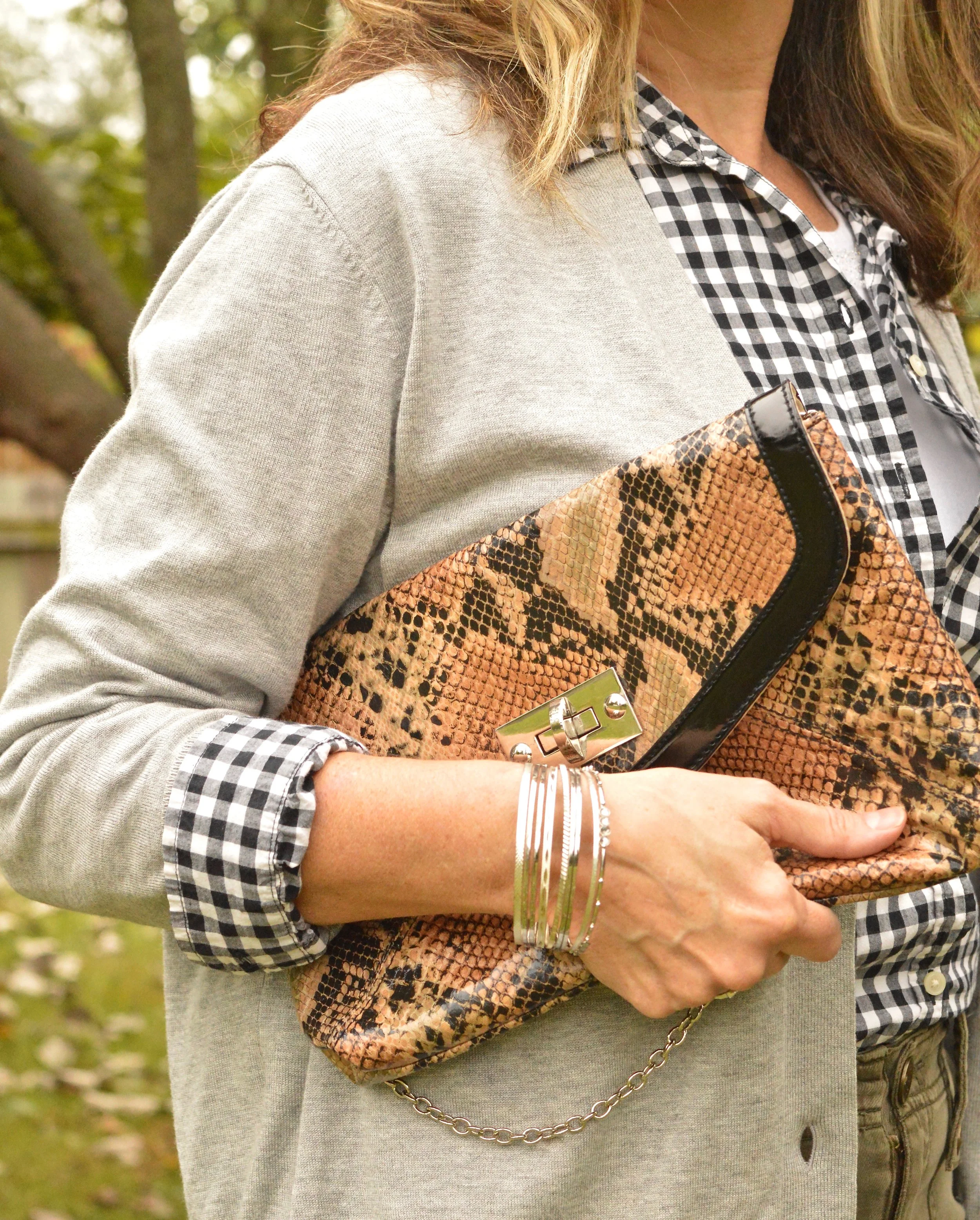
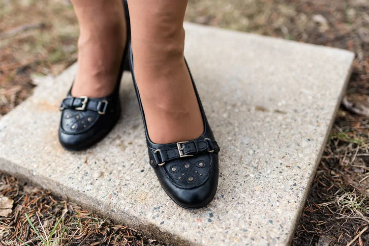
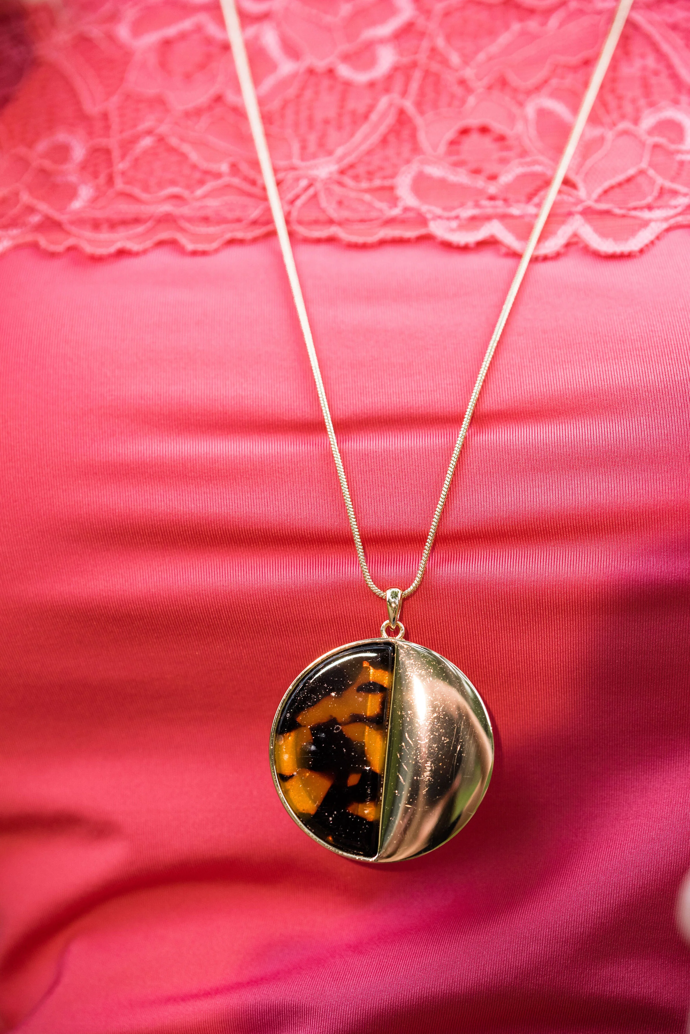
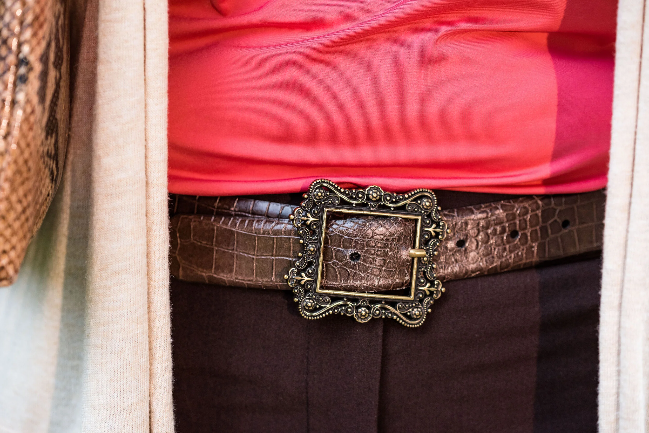
I kept the accessories minimal with my gold leopard print medallion necklace, a few gold bracelets, my snakeskin clutch, a brown belt, and brown boots. I thought this was a good outfit for complimenting with animal prints.

These are two colors that I can get behind. I love the combination and think these two work well together. What do you think? Do you have any of these colors in your closet? Do you wear camis a lot? Do you wear them more for layering or to be seen? I’d love to hear you thoughts, so leave me a comment or two in the comments section. I appreciate hearing from you and all your support.

I’m including a few shopping links for you to peruse. I hope that you find these helpful. Every click you do, gives me a few cents and I appreciate every one. These are affiliate links. All opinions are my own.

Photo and graphic credit Rebecca Trumbull.

Have a great day.


Pantone - Autumn/Winter - 2019 - Merlot and Antique Moss

The first two colors from the Pantone - Autumn/Winter - London palette that I am featuring are Merlot and Antique Moss. As you can imagine, Merlot, like the wine is a rich burgundy red, while Antique Moss is a yellowy green. Often when we think of pairing red and yellow, we are concerned we will come out looking like an advertisement for McDonald’s, but let me reassure you these two colors pair in a perfectly un-Ronald like way and I love the combination.

The London color palette classic colors were just a bit different. Green Olive is comparable to Guacamole from the New York palette, with a little more of a gray tinge. My version of olive in my accessories is much darker, but you get the idea.

This Jones Wear skirt you’ve seen on the blog before. I styled it for the Pantone Fall 2017 New York Palette in a very similar fashion. I even used the same dark olive bag. Ha, ha. You can see that post here. I also used it this past spring for the Pantone Spring/Summer 2019 colors. You can see that post here. In addition you can see it with a green cardigan, here. I keep coming back to this skirt, because it works so well for these color schemes due to the reds and greens in the print of the skirt. I could easily used this printed skirt for a Christmas outfit as well, so you might see it come up again later this year. I love a versatile piece and when I purchased this skirt, I never knew how often I would use it for the blog.

We took the pictures for this series at the Toledo Botanical Gardens, which are just down the street from where my daughter lives. The gardens are beautiful in all seasons and with walking paths through the grounds, it is a lovely place to visit and I don’t do it nearly enough. In the picture below, I am watching several bus loads of kids scramble on to the grounds and thinking, “Oh boy!” Ha, ha.

I obtained this red scarf from a friend’s closet. It looked a little more like Merlot, when it was in the low light of my closet, but here it looks much brighter. However, It is not a true red, but more of a burgundy. My 3/4 sleeve tee, I’ve worn on the blog before too. It is a thrifted Sonoma piece and has elastic on the bottom, which allows for freedom of movement and bulge camouflage. Ha, ha. You can see the tee styled with boyfriend jeans and a leopard print skirt here, and with a snakeskin print skirt here.

As I said earlier, I opted for olive green accessories which included my necklace, bracelets, thrifted bag and SO booties.

What do you think of these colors? Would you wear either of these? Would you wear them together? I’d love to have your feedback. Your support means a lot to me. I always respond to your comments. Just check back in a few days if you are interested in my reply.

I’m including a few shopping links for Merlot and Antique Moss if those colors got you excited. These are affiliate links, which means I get a few cents when you click on a link. All opinions are my own.

Photo and graphic credit Rebecca Trumbull.


Pantone - Autumn/Winter - 2019 - New York Palette Recap

I was going to start the Pantone London color palette today, but decided to do a recap of all the New York colors. Some people have told me they like to see all of the outfits and colors together in one post, so here we go.

Outfit 1 - Chili Pepper and Bluestone

Outfit 2 - Fruit Dove and Galaxy Blue

Outfit 3 - Crème de Pêche and Rocky Road

Outfit 4 - Sugar Almond and Dark Cheddar


Outfit 5 - Orange Tiger and Eden

Outfit 6 - Peach Pink and Biking Red

I hope you enjoyed this look at the Pantone - Autumn/Winter - 2019 - New York palette. Which outfit was your favorite? I’d love to hear your thoughts.

Next week I’ll be starting the Pantone - Autumn/Winter - 2019 - London palette. Believe it or not, the only two overlapping colors this year were Galaxy Blue and Bluestone. Be sure to check that out next week.

Thank you all for being a part of my blogging journey. If you ever have something you would like to see me feature on the blog, send me an email. I’m open to new ideas and value your opinions and support.

Have a fabulous weekend!

Photo credit Rebecca Trumbull.

Pantone - Autumn/Winter - 2019 - Peach Pink and Biking Red

These are the last two colors from the Pantone - Autumn/Winter - New York palette. Peach Pink is reminiscent of coral, which never really seemed like a fall color to me, but I must remember that the old rules don’t apply…at least to some things. I know many people buy into the old adage, the rules are meant to be broken, but I don’t always believe that is the best mindset to have, and that mindset trickles down to our children and our grandchildren. As far as rules, I think that many of them are in place for our protection and our benefit. Rules like, look both ways before you cross the street, floss your teeth once a day and eat your fruits and veggies are not bad. Actually, they are for our well being. Rules about color, really no longer apply, so I am okay with wearing white after Labor Day and wearing coral in October. Why not?

The other color in this ensemble is a dark red. It reminds me of the Brick Red from my Crayola Crayon box. How many of you remember those wonderful boxes of crayons? I used to obsess about having all the similar colors arranged by shade in my box. I didn’t want to hunt around for Brick Red, so I put it in the “red” section. Ha, ha.

As you can see, once again, my colors were not perfect matches. You will see I did a little better with the London Palette, which I will be introducing on Thursday.

The heavy gauge sweater is Candies brand from the Koh’s clearance rack at end of last winter’s season. I find this is the best time to shop for those pieces you want for the season, if you don’t want to pay full price. I have found most of my non-thrifted clothing pieces this way.

My Peach Pink tank top was a thrift find from a few years ago. It is Eddie Bauer brand. You’ll be able to see the ruching on the neckline in an upcoming picture.

My Paloma gray pleated skirt was also a Kohl’s clearance find a few years ago and is Apt. 9 brand.

My chunky wood ring necklace is making an appearance again. I love this necklace my daughter gave me for Christmas. It is so handy for making a statement and pulling the colors in an outfit together. A necklace like this works much the same way a scarf will, but without the added heat around your neck.

My little thrifted Houndstooth bag works both as a satchel and a cross body. The shoulder strap is inside the bag, but can easily be taken out and attached so I can wear this for hands free activities.

I really like these black Aerosole heels. They are comfortable and stay on my feet with no slipping or sliding. I decided to add the dark tights at the last minute for two reasons. The first was to keep the leg more monochrome and thus make the legs look longer. The other was to make the outfit seem more ready for fall weather. The day we took these pics it was hot!

What do you think of this outfit? Is this something you would wear? Do you like these Pantone colors? Why or why not? I’d love to hear from you, so leave a comment or two.

I’ve included a few shopping links. These are affiliate links. All opinions are my own.

Photo and graphic credit, Rebecca Trumbull.

Have a great day.

Pantone - Autumn/Winter - 2019 - Orange Tiger and Eden

I mentioned in Tuesday’s post on Sugar Almond and Dark Cheddar, that not everyone can or wants to wear orange. I love orange, but it has to be the right shade for me to wear it near my face. Some oranges make me look sallow or washed out. Today’s colors are bold and what caused me to put these two colors together, was the contrast of dark with light, deep with bright. Today’s colors are a “fearless” Tiger Orange, and a rich “stately forest green” called Eden. I think Pantone’s description of these colors is perfect.

These two colors are the first in this series that I felt truly matched with the Pantone colors. I looked for a while in thrift stores for the perfect green and I really think this dark cardi nailed it. the sweater is Jaclyn Smith brand.

These bright orange pants are Worthington brand and I got them at JC Penney a number of years ago. These are more of a skinny leg trouser than a wide leg trouser. I got them for the bright color and do find occasions in the spring, summer and fall to wear them. You can see how I styled these with a floral tunic here.

This cream colored tank top is a thrifted Loft piece. I actually have two of them, found on different occasions, but the exact same style. This one is a large and has a sheen to it, that you can’t really see in the picture. The other one I have is a medium and is more of a true white. Why do I need two of these? Comfort and ease of wear. They work perfectly for something like this, but I will also be able to use them as a light weight under layer when the temps grow cold. The piece is banded on the bottom, making for a great fit without showing off the bulges. Here are a few to look at.

The scarf I added was another thrifted piece. I don’t have many pieces that are cream or ivory, like this. I am also looking for a cream fisherman sweater and/or turtleneck. I don’t need anything, because I am a clothes horse, but every now and then, I do realize I am lacking something I would love to incorporate into my closet. What about you? What pieces have you been hoping to add to your closet?

In addition to the scarf I wanted to add a long charm pendant necklace to break up the plain back drop of the tank. I think this outfit would have been equally good with a printed tank under the sweater.

My other accessories included my Vera Bradley tote bag and my thrifted Mossimo sneakers.

What did you think of this outfit? Would you wear a pair of bright orange pants like this? What is the brightest color you have ever worn in pants or a skirt? I’d love to hear you thoughts, so leave me some love in the comments.

I’ve included a few shopping links. These are affiliate links. All opinions are my own.

Photo and graphic credit Rebecca Trumbull.

Have a great weekend, everyone!


Fall Trends - 2019 - Part 3

Here we are looking at two more fall trends for 2019. Depending on who you look to for the latest info on the trends, there is some overlap. However, not all trends are the same according to all the fashion gurus. Who What Wear has a different list from Marie Claire who has a different list from Vogue and so on. When I put together my list of trends, I am taking from a few different sources and presenting you the ones I like and find interesting and plausible for us real women. Remember most trends that you see on the runways are geared toward younger women who have the stature of a fashion model, so very tall and thin. That does not mean that we cannot wear a particular trend, but pick the ones that are right for you.

Trend 5 - Head to Toe Prints

This is not a particularly new trend, but it presents itself in a bolder more, out there way. Pattern mixing has become quite common, but now the patterns are brighter and bigger. Here are some examples from a Pinterest page I discovered. I decided to go more conservative, because I was grooving on the earth tones of browns and blues. This is what I came up with.

Obviously the old time suiting that women, and men, used to wear would fall easily into this trend category. A matching plaid blazer and pants along with a bold print top and you would be stylin’ with the best of them. The thing I like about this trend is the challenge of creating a printed outfit that I would actually wear and that looks palatable to the eye, not obnoxious. Some of the outfits on that Pinterest page I would classify as obnoxious, but that is only my opinion.

I found these paisley corduroys while thrifting last spring and unfortunately won’t be able to wear them, until I get back to my lighter spring weight. Ugg. However, I loved the pattern and the heavier weight for fall and winter. They are a brand called Havana Jack’s Cafe. Do you ever wonder where they come up with the names for things?

The blue in the pants made me reach for my Chaps knit vest and my thrifted polka dot SO button up. I found the fun necklace at a second hand store and thought it would be a good addition to the outfit.

Blue seemed to be my color of choice for bag and shoes. Everything in this outfit came from my closet and has been used on the blog before. You can see the vest here and here. The pants have not. but I already explained that problem. Ha, ha.

Trend 6 - Dark Florals

I have really taken a liking to floral prints. I like the bright bold colors of spring, the soft pastel prints of summer and especially the dark floras of fall and winter. It would seem that florals are here to stay and I am glad.

I found this dark floral Jeans by Buffalo top while thrifting. I love the colors and when I went to put this flat lay together, I realized this erin london bomber jacket from Shop National would be the perfect over piece. It goes well with the green in the top and has its own floral print.

These distressed, embellished skinny jeans are Rock & Republic from Kohl’s, and I’ve had them for a while. Once again, I have grown out of them, but I refuse to get rid of them. Ha, ha.

Since the top contains some red, I chose red for my accessories, including my tall, black, studded boots that have red detailing along the zipper on the back.

This is definitely an outfit I would wear on a regular basis. The pretty florals, the layers and the skinny jeans with boots will be a regular rotation as the weather cools.

I hope you enjoyed this post. Next Tuesday I will bring you one more post on fall trends and then I hope to start my Pantone Fall 2019 - New York series.

Thanks for following and please join me next time.

Fall Trends - 2019 - Part 2

If you missed last Thursday’s post, I’ve started a short series on Fall 2019 Trends. Every season the runways are filled with with new colors and trends. This fall the trends include things we are familiar with like animal prints and metallic sheens to rebooted trends like patchwork, tiny bags and shoulder pads. I encourage you to pick and choose the ones that you feel most comfortable with and maybe go for one that pushes you a little outside your comfort zone.

The next trend I am featuring would, perhaps, be the one that would be a little outside my comfort zone, but one that I felt I could easily adapt to with pieces I already had in my closet.

Trend 3 - Romance Gone Goth

If you want to see the original looks from the runway click on this article by Who What Where titled These are the 9 Biggest Fall 2019 Trends, Period. Of course that is a matter of opinion. Ha, ha. I changed the name to Goth rather than Grunge, because if you do your research, Goth is head to toe black with lace, leather and more form fitting wear. Grunge is more about torn jeans, flannel shirts, Doc Martens, and while black is a common grunge color, other dark colors like maroon, forest green and indigo are also common.

My version is a lot less revealing and personifies me. My outfit is, also, not true Goth, because it has color. It is also not really Grunge either. Don’t believe everything you read on the internet. Do your research.

For this look I chose three pieces that I would term romantic. This short sleeve ruffled top was thrifted and is Loft brand. The sheer blouse that I put underneath was my way to add another fall trend, that of dark florals, as well as add, just a touch of color. This is a brand called Kensie. I also thought the wide belt and the cross choker added a touch of metal that is often associate with Goth outfits.

These Apt. 9, faux lace pants I’ve worn before on the blog, You can see them styled with a multi-print tunic, and with a shimmery taupe top. Lace is another fabric or pattern that we often associate with romance, so it seemed appropriate to use them for this Romance Gone Goth outfit.

My black, Seven Dials, combat boots seemed the perfect choice for this faux Goth look. True Goth would not have any brightly colored patches.

The bag is totally not Goth, but I thought it went nicely with the green in the floral under-top.

Trend 4 - Layering Knits

I think this is a fun one, although not for everyone. Most women our age are in the throes of menopause and the last thing you want to do is start wearing layers of heavy knits, but for those of you who are typically cold most of the time in the winter months, this trend is for you.

I love the way this outfit turned out in the flat lay and I may actually put this on when it gets colder and see how it looks. I am not a big leggings fan, but this just looks so fun, I may have to do it…yes, getting outside my comfort zone again.

The sweater was a clearance find at Christopher and Banks. I love the lace up detail on the lower sides. This sweater has an open front with no closures and falls right about mid to lower thigh. It is a medium weight, so good for pairing over this thrifted over-sized Merona sweat shirt.

Isn’t Mr. Bear, just the cutest guy ever? He’s styling that cable knit sweater and I’m sure he’s heading right into his cozy hole to sleep for a good long while. He looks so happy. Believe me, I’d be happy too, if I knew when winter was on its way, I could go into a cozy hole and just sleep until spring arrived. Ha, ha.

These leggings are Lu La Roe and my daughter gave them to me. I have been waiting on the perfect outfit to pair these with and I think this just may be it. Because I opted for these leggings I decided to wear a recently thrifted pair of boots, high lighting the lighter yellows and tans in the leggings and sweatshirt. These boots are a brand called Rock & Candy by Zigi. While this is a brand I had never heard of before, it appears that they are available at places like Nordstrom Rack, Famous Footwear and Shoe Carnival.

Since the outfit already has a lot going on I went for a simple green clutch.

I added the scarf as an after thought as a way to tie the whole outfit together.

What do you think of these two fall trends? Would you do Romance Gone Goth, or Layering Knits? I’d love to hear your thoughts, so leave me some love in the comments.

I hope your week is off to a great start. Thursday, I’ll give you another peek at two more Fall 2019 trends.

If you know anyone you think might like my blog, pass along the word. If you are not already a subscriber it’s easy to sign up by clicking on the subscribe button. Once a week you’ll receive an email from me letting you know there is new content on the blog. If you are a regular subscriber, hugs all around. You are why I write this blog. I’d also love for you to give me any feedback regarding other things you would like to see on the blog. Right now, I limit it to fashion, faith and occasional travel and lifestyle content, but I am open to other things as well.

Have a great day.


Summer Maxi Dress for Fall

I’m sure many of you have heard about transitional dressing. This has to do with taking a clothing piece from one season and changing it up to make it wearable in the next season. With our seasons here in the mid west being so varied, it is essential to have pieces that can be worn for more than one season. Perhaps that is one of the reasons I love jeans. You can wear them any time of year. Ha, ha. However, this is not going to be a post about jeans. You already know how much I love those! This post focuses on a summer maxi dress that was a new purchase from late last spring.

Some of you who regularly follow me might remember this dress from my summer series on maxi dresses. You can see the whole dress and the original post here. This bohemian style maxi boldly stated it wanted to come home with me when I saw it on the rack at Nordstrom Rack this past May. I knew as soon as I tried it on that it would be a versatile piece and would easily take me from summer into fall.

In order to make the light weight dress fall ready I decided I needed layers. I knew I wanted to style it with knee high boots to add warmth on the lower level. While I didn’t wear tights for this photo shoot, I would add them if I was going to have the dress on for a longer period of time.

I do love wearing boots. They are a great way to change up an outfit and add warmth. With so many styles from ankle booties to over the knee types what is not to love. And now there are so many more colors!

Here are a few brown pairs, that I like at decent price points.

To add layers at the top I chose this thrifted sunflower yellow sweater cardigan. The brand name is Callaway. A simple cardigan adds a warm layer without a lot of bulk and they come in so many pretty prints and colors. Here are a few to look at. With Christmas coming, I am sure you need ideas for all those girls on your list. Ha, ha.

In addition to the sweater I also grabbed my thrifted brown moto jacket. I have styled this many times on the blog. It is one of my favorite thrift finds and most often I wear it as an extra layer in the winter time, rather than as an outerwear jacket. For this particular fall day this and the sweater were just the right amount of layers.

Here are a few shopping options.

My accessories are pretty simple. This layered necklace I found somewhere or other on the clearance rack. The nice thing about these types of necklaces is there is no work involved. Some days that is just exactly what I need.

My bag is a navy Vera Wang bag that is also thrifted.

One of the things that I like about fashion blogging is learning new ways to use my clothes. It used to be that we had our summer clothes and our winter clothes. I still go through the process of putting things away and pulling out different things each season, simply because I am a clothes horse and there is no way I could have all my clothes out at the same time. Also, I tend to reach for what is in my comfort zone. In the winter I like to be warm, so I like my heavy sweaters and added layers. In the summer I like less layers and lighter material. However, since I have started blogging I have learned that there are ways to extend the seasonal pieces and get more wear out of them. This outfit is the perfect example.


I hope you enjoyed this post. Leave me some love in the comments. I always like to hear your point of view.

This post contains affiliate links. If you click on a shopping link I get a few cents. If you make a purchase through a link I get a little commission. I appreciate all your clicks.

Have a great day.

Photo credit Rebecca Trumbull. Make up Rachel Christensen.


Pantone Fall 2018 Recap

After a series like the Pantone color one, I usually like to do a recap post, to show you all the colors and the outfits I styled using those colors into one post. These colors this season were not what I would call common fall colors. I usually think of fall colors as being richer and darker hues like deep burgundies, earthy browns and garden oranges that make us think of pumpkins and fall leaves. While the Pantone Fall 2018 had a few colors that fit into my typical fall color box they had numerous ones that clearly stepped outside that box. Colors like Limelight, Mellow Rose and Crocus Petal provided a pastel palette choice for those who like to think brighter and lighter when the seasons change.

Enjoy this review of my Pantone Fall 2018 outfits.

What did you think of this color palette this year? Do you like lighter, pastel colors or go for richer, darker colors when fall rolls around? Do you like to think outside the seasonal color rules, or are you like me and look forward to the seasons bringing you back to those colors you are familiar with and enjoy at that time of year? It really doesn’t matter any more. The joy of fashion today is that you can decide what you like to wear at any time of year.

I like that Pantone had added the classic colors to the color palette for each season. It allows me to add a more toned down color to each outfit keeping the outfit colorful, but no overly so. it would be easy to add a touch of any of these colors to a more neutral outfit. For instance, if you wanted to go for a monochrome look using a navy like Sargasso Sea, you could add a little color by throwing on a bright Russet Orange scarf or some Limelight colored beads. If you normally dress in more neutral tones try adding just a touch of color in your accessories to make your outfits more interesting and visible.

I hope you enjoyed this series. Check back on Thursday for more fashion fun.

Photo credit Rebecca Trumbull.

Outfit Inspiration - Gingham and Olive

This week’s Outfit Inspiration comes from a Christopher & Banks add that I received in the mail. I love to try to copy the outfits that many retailers put in their advertisements and catalogues, because it gives me a source for a well thought out outfit, without me having to come up with the idea. I still have to shop my closet and try to find similar enough pieces to create the look, but the inspiration was provided by someone else.

When I saw the classic combination of a gingham button up with olive pants I knew it was an outfit I could easily replicate from pieces in my closet. This is what I came up with.

Since olive is treated as a neutral these days you can wear it with any other color and it works. Case in point, for this outfit I am pairing these olive trousers with a black and white gingham blouse, a white tank underneath to add interest and a gray casual cardigan.

This is an outfit I would easily wear to work. While the outfit is fairly neutral you can easily jazz it up by adding color in your accessories. I chose to keep my look more neutral all over. I have on black loafer heels, which I have worn on the blog before, and decided to carry my thrifted snakeskin clutch, since animal prints are trending right now. I opted for a few silver bangles and no other jewelry. I felt there was enough going on with the gingham check and the layers, although you could easily add a necklace or a pretty colored scarf to wake the outfit up a bit.

This gingham blouse was thrifted and is Old Navy brand. The white sweater tank that I have on underneath was also thrifted and is George brand. The original photo that I took the inspiration from showed the model with her top tucked in and no belt, even though the pants had belt loops. I wanted to stick to the original outfit as much as possible, but next time I will add a belt. I just think it makes an outfit look more polished. I have an olive colored one that would have worked perfectly with these pants.

My gray sweater is from H&M. I had a gray sweater, very similar to this, but it was showing wear, so I was glad to find this as a replacement.

Here is a picture of the shoes taken on a different occasion. They are a sturdy, practical heel, but still look stylish while being fairly comfortable. These were thrifted and are ANA brand.

Here are a few more photos I thought I’d share just for fun:

I was having fun with this red bud tree. Unfortunately, the poor thing is half dead.

That’s all I have for today. I hope you enjoyed this post. I’d love the hear your feedback. Don’t forget to follow me on Instagram.

Have a wonderful weekend!

Pantone Fall 2018 - Russet Orange, Ultra Violet and Quiet Gray

This week’s Pantone Fall 2018 colors are a bright pumpkin orange and a deep purple we met last spring, that won Color of the Year. Russet Orange is an easy color on the eye and reminds us of those beautiful Maple trees that boast red, yellow and orange leaves. Ultra Violet might be part of your Halloween decorating. Since the combination of orange and purple has become a less dark and more party friendly Halloween pairing, I thought it would be fun to put these two colors together.

These pants I’ve worn on the blog before, here, here and here. They are Worthington brand from JC Penney. These have a side zipper and sit higher on the waist, so help to create a more smooth silhouette.

My top is an older tee from Christopher & Banks. I love the color of this top. To keep the bright colors from being too overwhelming, I chose the Pantone color Quiet Gray as a topper to polish off the look. This fun piece is from the Kohl’s clearance rack and is a brand called About A Girl. I really like the double breasted look and the feminine detailed ruffles.

I kept my accessories fairly simple. This lovely leaf necklace I found at a shop in Grayling, MI called The Main Branch Gallery. Boasting art work and crafts from local artisans it is a great place to visit if you are ever up that way.

I then finished off the look with my silver clutch and silver SO flats that I recently added to my SO shoe collection from Kohl’s. Here is a link if you are interested in other colors. They are on sale right now for only $21.99, which is a good deal for a fairly comfortable shoe that makes any outfit look a little more dressed up. I normally wear an 8.5 or a 9 and I get these in a 9.

What do you think of these two colors? Would you wear Russet Orange and Ultra Violet together? I’ve included a few shopping links below. These are affiliate links, but all opinions are my own.

Pantone Fall 2018 - Martini Olive, Ceylon Yellow and Tofu

I will confess, these colors are not my favorites. It might be due to the fact that I decided to combine them into one outfit.

Martini Olive is more of a gray or brown based olive. I honestly like an olive that is more green. However, for the sake of being open minded this would be a good neutral that could go with many different colors including navy, black or even a rich deep red. Maybe I should have paired Martini Olive with Red Pear. What do you think? These jeans are thrifted and Gloria Vanderbilt brand.

Ceylon Yellow has a bit of a bite. It is not really a mustard, but has a bit of spice underlying it. I have fallen in love with yellow, but my personal tastes tend more towards the yellows that are sunflower or goldenrod. The top is thrifted and Merona brand.

I opted for orange, as the pop of color I felt this outfit needed. Orange bag, orange necklace and bracelet: I feel like it epitomizes the mix of colors in the fall that we so often see in the trees.

This jacket I found at H&M on the clearance rack. Once again, it is a moto type jacket, but tends more towards a tweedy look, which gives it an entirely different vibe from last week’s metallic blush moto jacket. The color is in line with the Pantone classic color labeled Tofu. Not a true white, but not a true cream, it seems to fall somewhere in between. I love the texture details, including the frayed sleeves and bottom hem.

Once again, I am wearing my olive SO ankle boots. Just like my SO ballet flats these boots are very comfortable and look nice. I love the rich texture of the faux suede.

I am not completely satisfied with this look. I don’t like what I did with my hair, even though that is something I do from time to time and this outfit doesn’t have enough color contrast for me. I like bright, rich colors and this palette just leaves me looking washed out. But hey, not every outfit can be a winner. I’m still learning and growing.

I do think these colors would be better paired with another color. The yellow would look pretty with a blue shade or even a rich chocolate brown and like I said earlier, the Martini Olive would pair well with a navy, burgundy or even a purple.

As always, I’d love to hear your thoughts, both good and bad! I’ve included a few shopping links for you to look over. These are affiliate links. All opinions are my own.

Pantone Fall 2018 - Red Pear, Nebulas Blue and Sargasso Sea

Last week, I introduced you to this fall’s Pantone color palette. Now that I am just getting started with my series, I noticed their website already has the color palettes up for Spring 2019. I understand that in the fashion and interior design industries they always need to be one step ahead, or all of a sudden things have gone out of trend and disappeared. That reminds me of a verse from the book of Ecclesiastes which was written by King Solomon.

That which has been is that which will be,
And that which has been done is that which will be done.
So there is nothing new under the sun.
— Ecclesiastes 1:9 (NASB)

Even a man as wise as Solomon, knew there was nothing new under the sun. Look at the movies and books that are currently out. It is pretty much the same story, just written with different characters and a different setting. Heck, how many times have they revisited Spider Man and Predator? Ha, ha. That being said, the color palettes that come out are really nothing new. They call them by different names, make one a little more blue based or yellow based and say they are fresh and new.

However, I do enjoy color and I like to create outfits using color in combinations that may be new or different, at least for me. Following the color palettes that Pantone puts out each season allows me to do just that.

Here are the first of this fall’s palette.

Red Pear and Nebulas Blue are on both the London and New York palettes. Sargasso Sea is one of the classic colors or what I like to refer to as a grounding color. Red Pear borders on a maroon and my pants are really too red, while my version of Nebulas Blue appears spot on. Sargasso Sea is navy by any other name, but even there you can see all the different shades of navy. My Ralph Lauren thrifted blazer is almost too blue, while Sargasso Sea seems to have more gray in it. I think my loafer heels and bag are a little bit closer to the Pantone color.

I added this colorful bandana for a scarf as a way to bring together the red and blue and add a pop of yellow.

The blazer, shoes and bag were all thrifted. The bag is Simply Vera Wang; the blazer is Ralph Lauren and the loafer heels are Relativity. Everything you see in this outfit with the exception of the scarf I have styled on the blog before. It just goes to show that our closets are a great place to look for new color combinations and outfits.

What do you think of these colors? Do you think these colors represent the fall season? Why or why not? I’d love to hear your thoughts.

I have received a few messages that people are having problems commenting on my blog posts. If you an issue, please let me know. I contacted the help team for the platform that I use when I had a problem in the past and they said they couldn’t see any problem on their end. If you have an issue, please shoot me an email, so I can see how widespread the problem is.


I’ve included a few shopping links. These are affiliate links, which means I get a few cents if you click on it. All opinions are my own.

Fall Collaboration with Ethyl Clothing

I was recently contacted by a clothing retailer named Ethyl Clothing. Ethyl Clothing has been around for over 30 years. Based out of Seattle, Washington, founders and designers, Alan and Kathy Schulz, continue to be actively involved in bringing their quality products to over 3000 boutiques across the country. They now have an online store, which makes shopping their classic clothing pieces even easier.

When I went to their website, I was pleased to see models that look like average sized women. In other words, these women look like me. That alone, intrigued me. While I was informed that Ethyl clothing originally was geared to the younger woman, their clothing line has developed over the years to encompass and cater to the “baby-boomer” generation. These are women like me, who are busy and enjoy clothing that looks nice, but feels soft and comfortable with some amount of stretch and give.

When I received my pieces, I was not disappointed. Because these are vanity sized, I was told to size down from what I would normally wear. Sizes run from XS to XXXL on most. For both the tunic sweater and the jacket I chose a medium. For the jeans I went with a size 10, where I normally wear a size 12. Everything fit exactly as it should.

Each of the following pieces was gifted to me. No money was exchanged and all opinions are my own. After a short description of each piece, I will give it a review by listing positive and/or negative points, along with suggestions for wearing.

Like many smaller clothing retailers today, Ethyl Clothing names each of their pieces. Let me introduce you.

1. The Anne 2 - Kenzi

The Kenzi boasts a long, gracious tunic silhouette, a comfortable cowl neckline and roomy, pleated front pockets that add interest and texture.

Positive Points - flattering silhouette, silky material drapes well and holds its shape, roomy - doesn’t bind or pinch.

Negative Points - sleeves are a bit long. For me this is not an issue, but if you have short arms you may need to have them altered or roll them up.

Style suggestions: Wear with skinny jeans or leggings; pair with various jackets either long or short; wear with a skirt, either tucked, belted or just left long; slip on over a dress that will show a little at the bottom.

2. The Jaqueline Flair Jean - Abigail

These boot cut, dark wash jeans are made of a medium weight denim woven from a poly-cotton blend with a dash of rayon and spandex for stretch, comfort and ease of wear.

Positive points - good stretch, not too heavy, hold their shape, dark wash, figure flattering.

Negative points - very long, narrow through the thighs. If you have heavier legs or short legs I would suggest trying their pants with the shorter inseam. The Abigail only comes in the longer (31”to 34”) inseam.

Style Suggestions: Boot cut jeans always look good with heeled boots, but these would also dress up well with a pair of heels. They fall just below the natural waist so could be easily paired with shorter tops and sweaters.

3. The Margot - Blake

The Blake is meant to be a style piece not an actual jacket. A medium weight cotton-poly blend with spandex this black denim jacket is the perfect add on piece to take any outfit up a notch. The bling detail on the lapels and the frayed hems, give it a vibe that says both edgy and party ready. The non-closure, open front allows you to show off, not only the jacket, but a statement piece underneath.

Positive points - easy on and off, no buttons or zippers to snag sweaters or scarves, plenty of stretch, longer length for better back side coverage.

Negative points - this is less a negative than it is a personal opinion. When I first received this jacket I did not like the way it fit and after working with the rep from the company was sent a large to try on. The piece is designed to not come together in the front, which to me seemed odd, but this is the way the designers intended the jacket to be. It was created this way to allow exposure of the top you are wearing underneath. After having the two sizes to try on I ended up sending the large back. It really was too big. Now that I’ve seen the two sizes and have a better understanding of what the piece is intended to do, I like it. I am looking forward to wearing it with other outfits to see its full potential as a fun add on piece, almost more like an accessory.

Style suggestions: This would look great with a shift dress, pencil skirt or skinny pants. It will also allow for many different top choices including tunics and vests. The Blake will also allow your fun scarves and statement necklaces to still take center stage while providing a backdrop of bling, warmth and fun.

My overall opinion of Ethyl Clothing is that it is a woman friendly retailer with a strong classic, casual line structured for comfort and ease of wear. While they are not offering a discount through my site, if you spend over $100 you get free shipping. The pieces you order also come with free return labels, so that if you are not completely satisfied you can return your purchases for a full refund.

I hope you enjoyed this look at Ethyl Clothing. Head on over to their site and take a few minutes to shop. Just click on the link, Ethyl Clothing.

Photo credit Rebecca Trumbull.