Kickin' It with Kimonos - Orange Floral

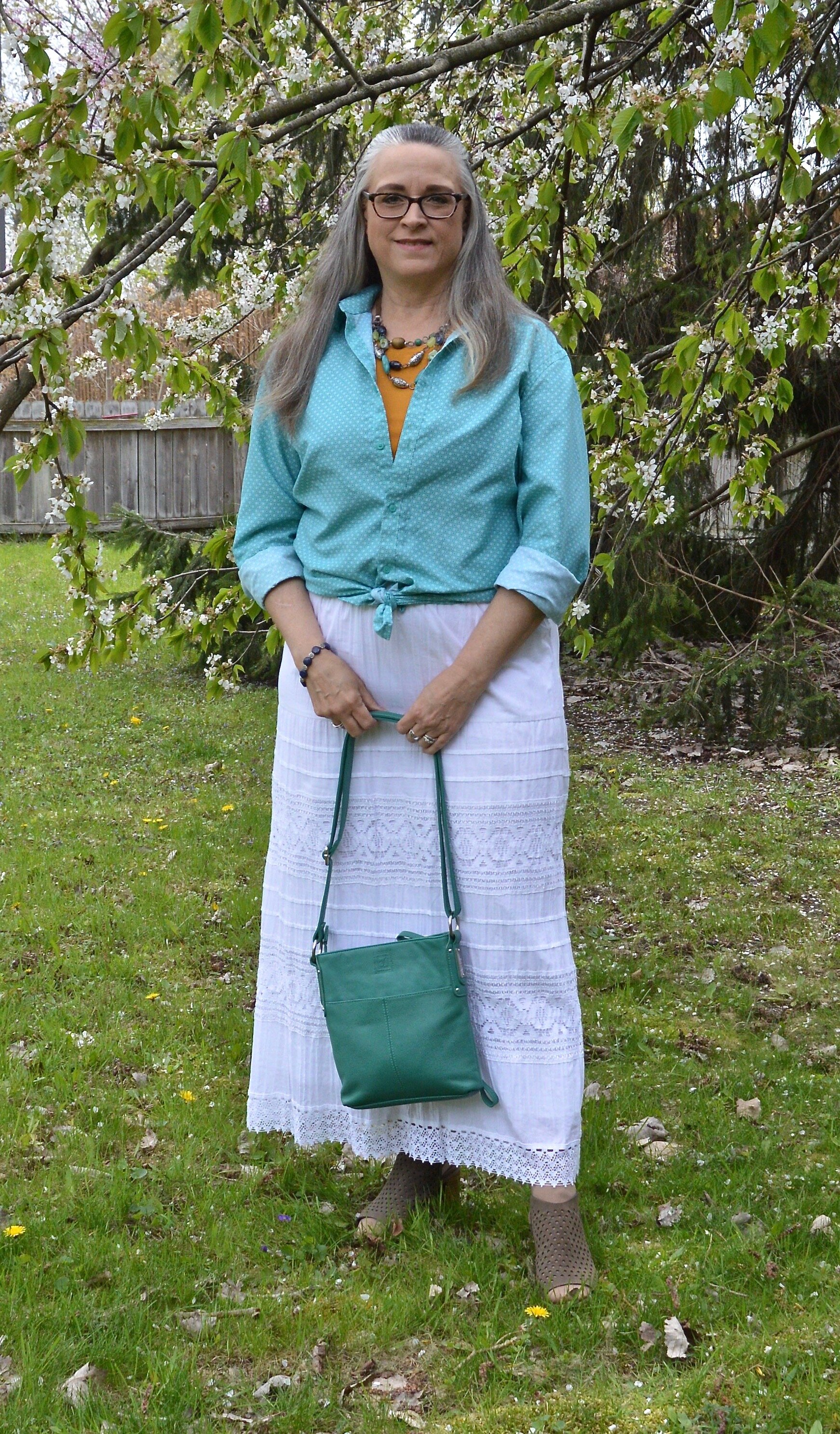
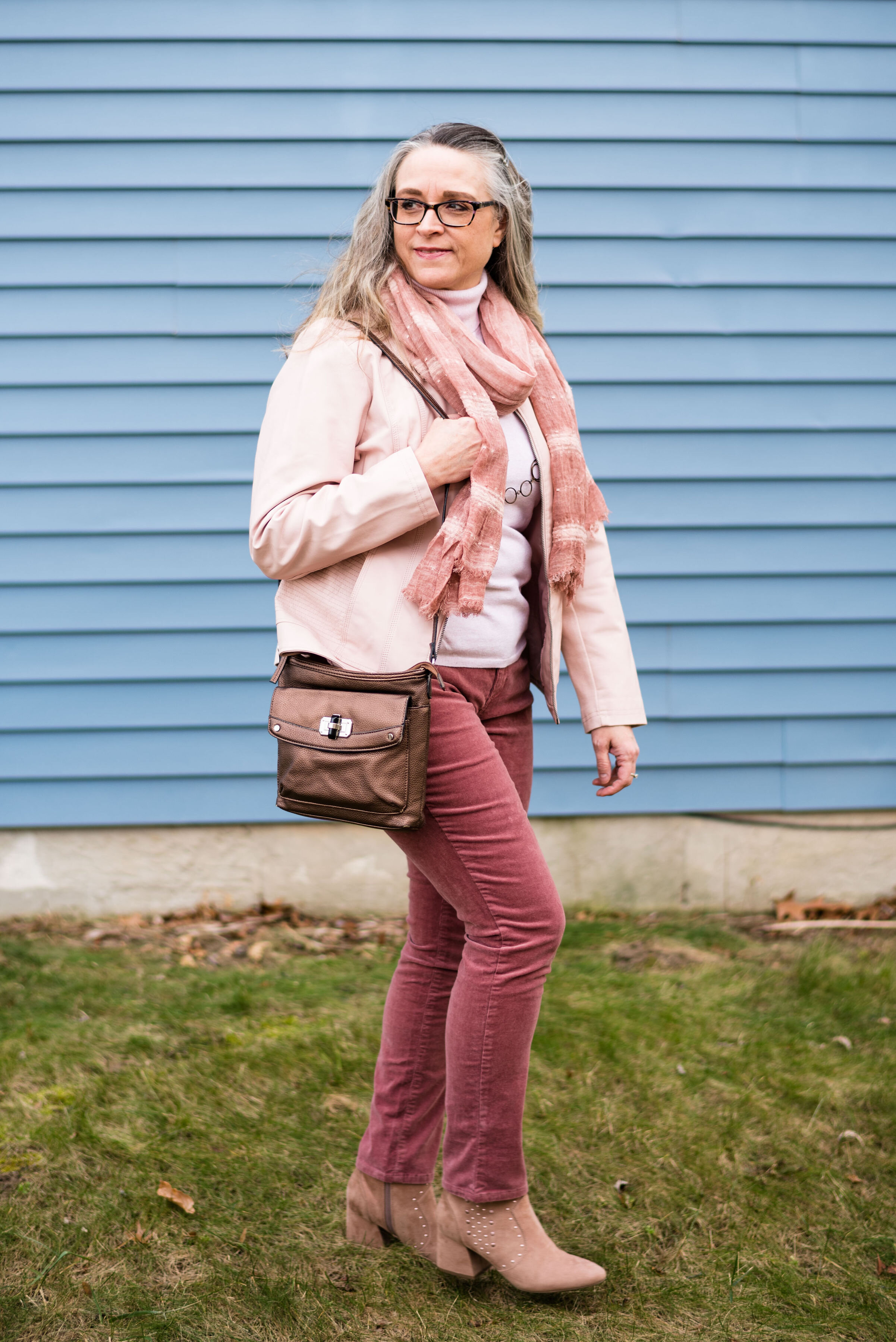
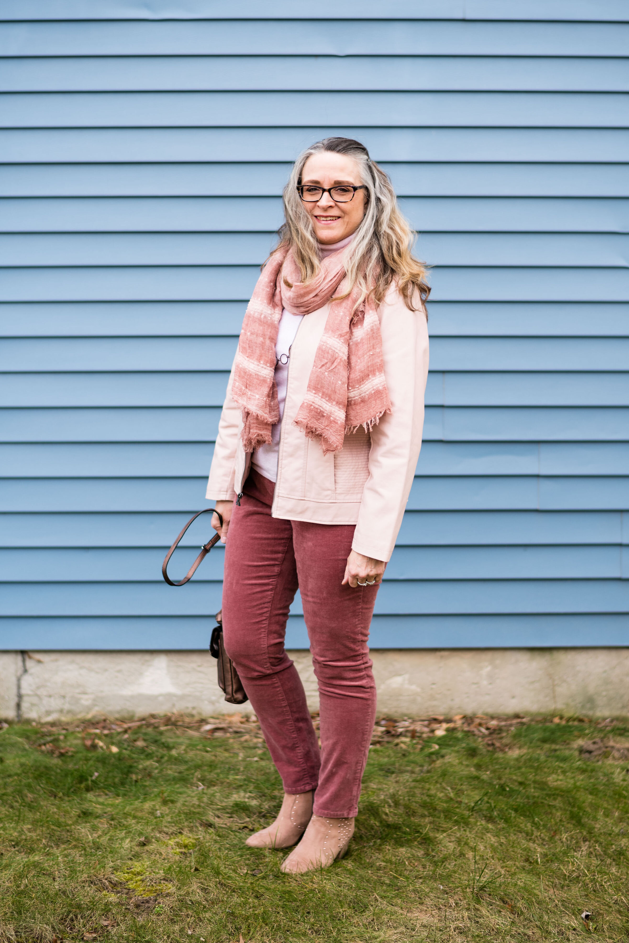
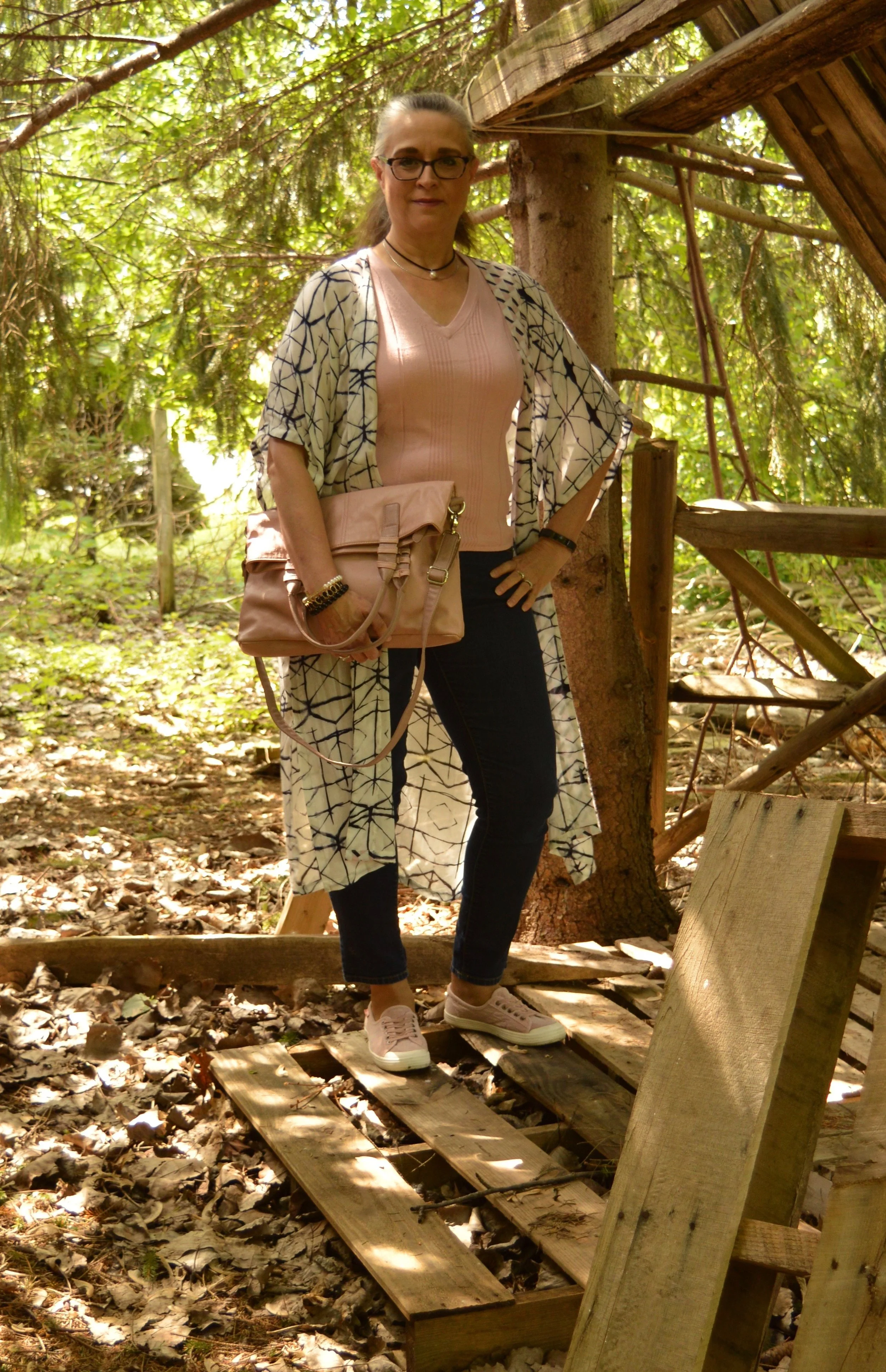
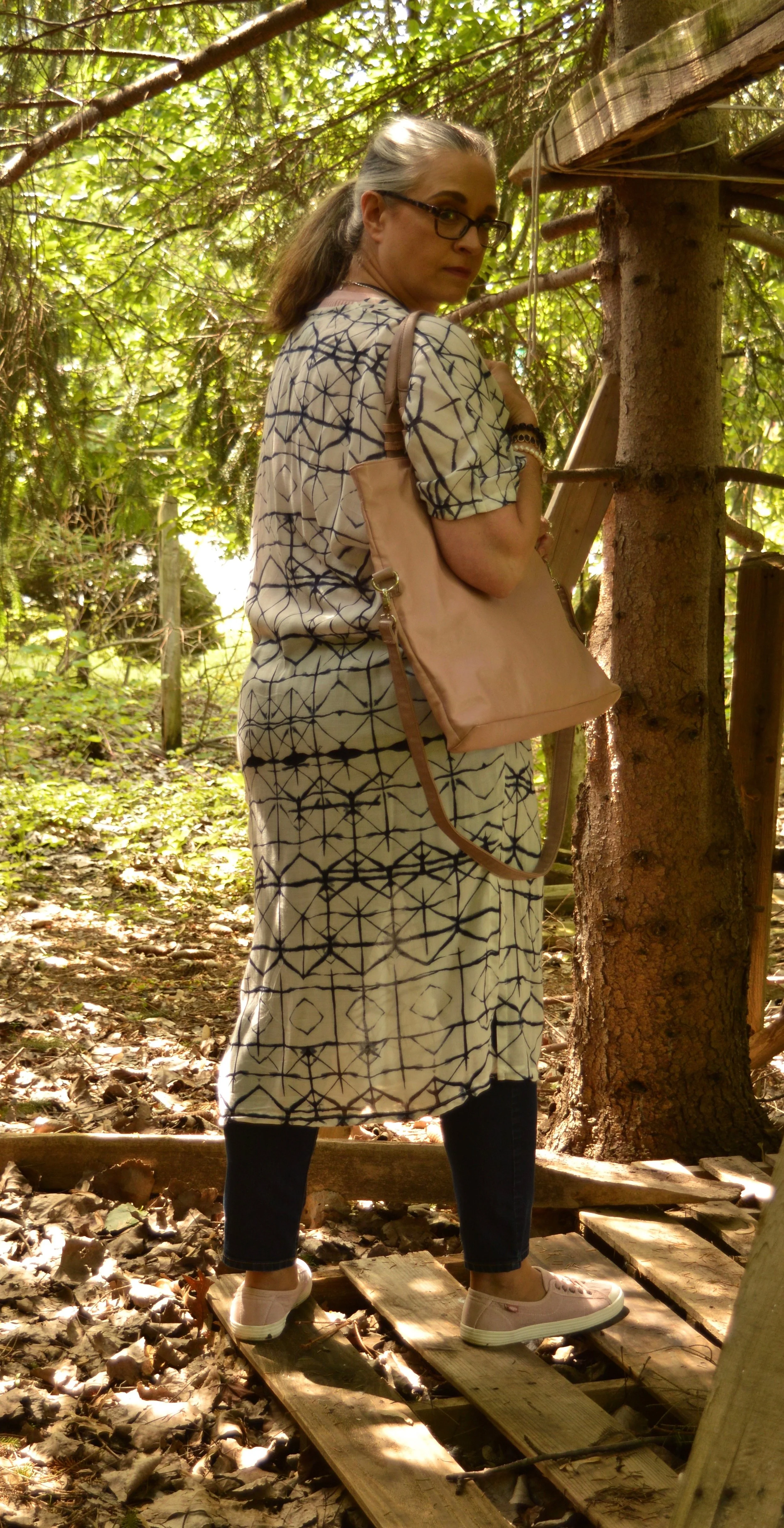
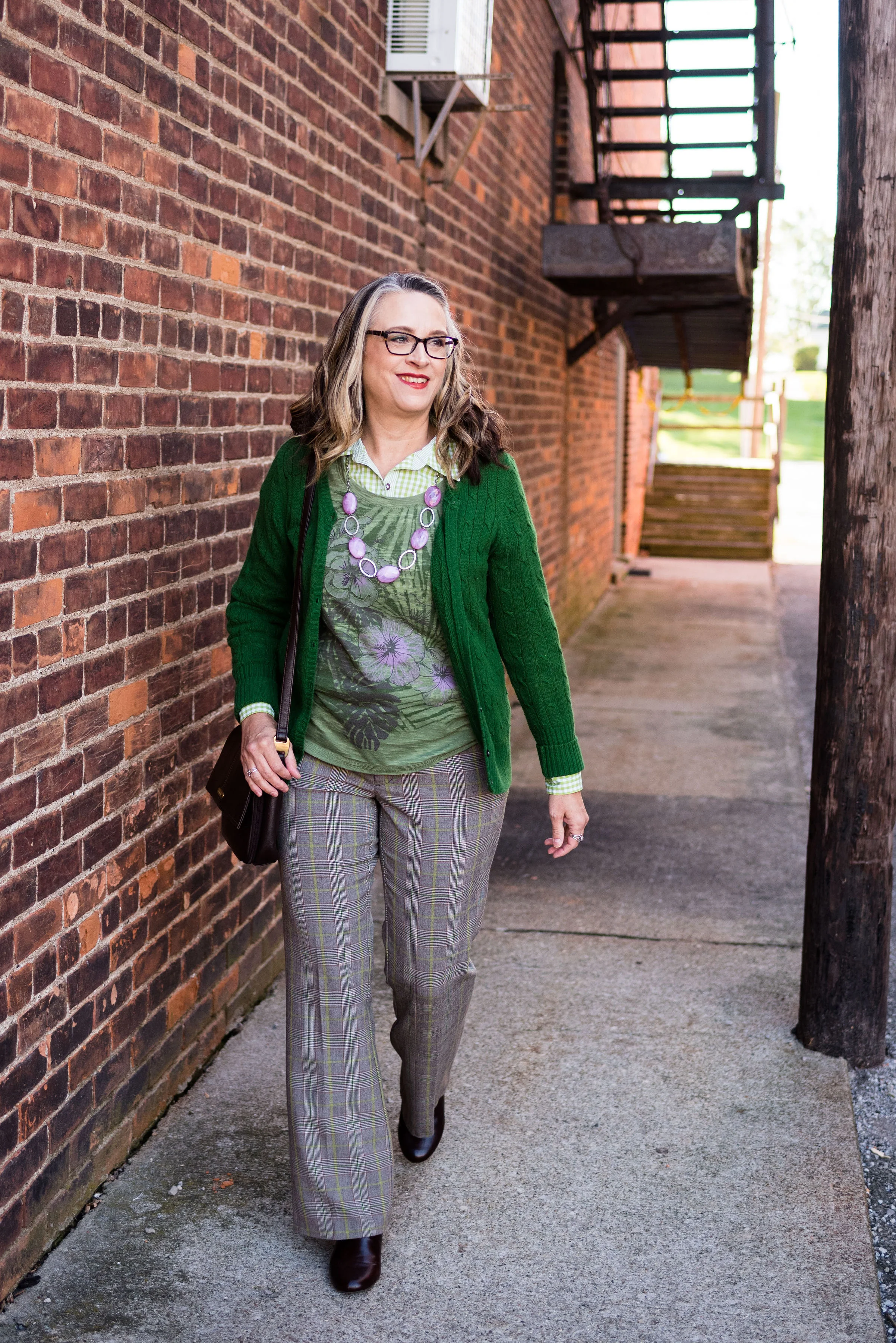
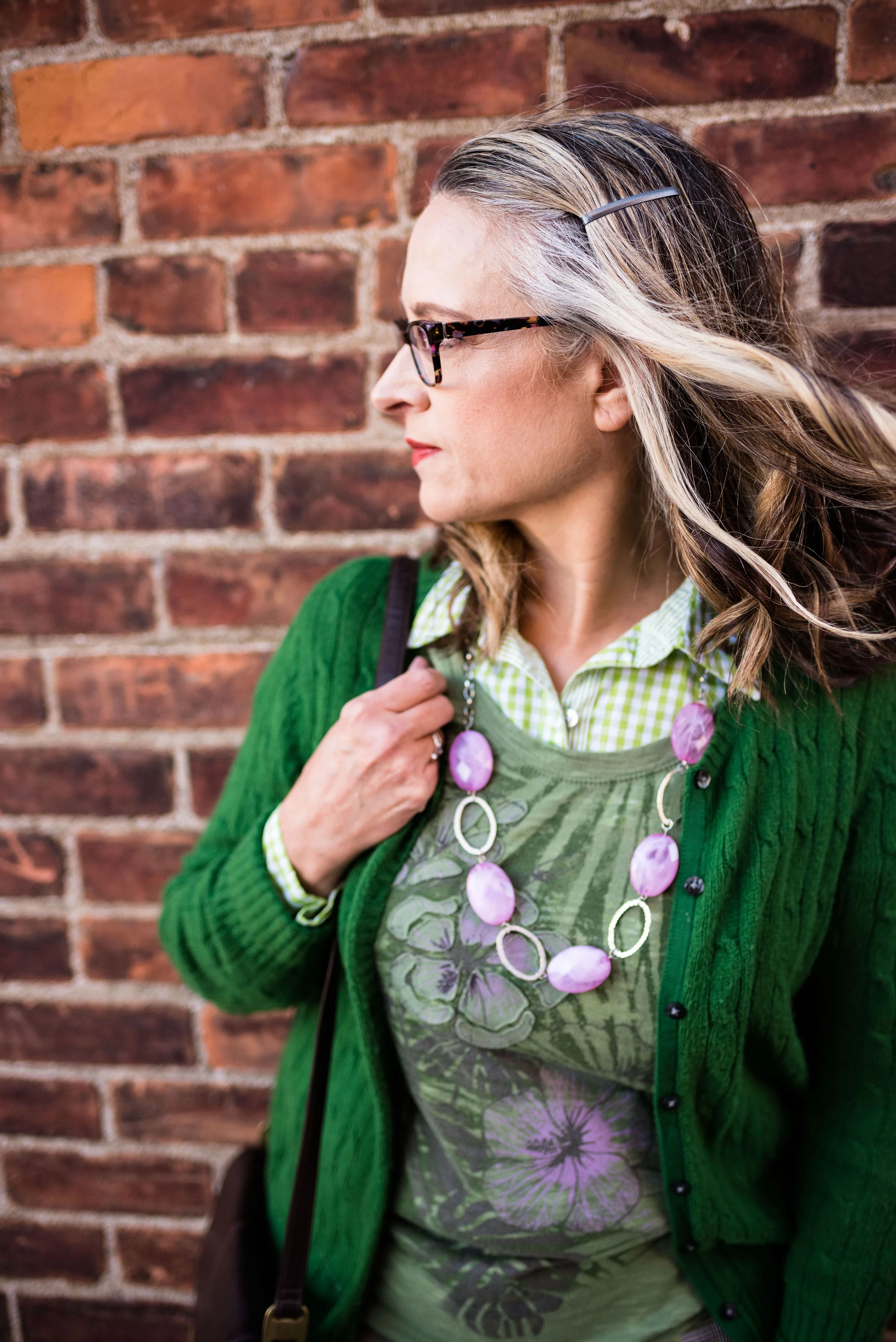
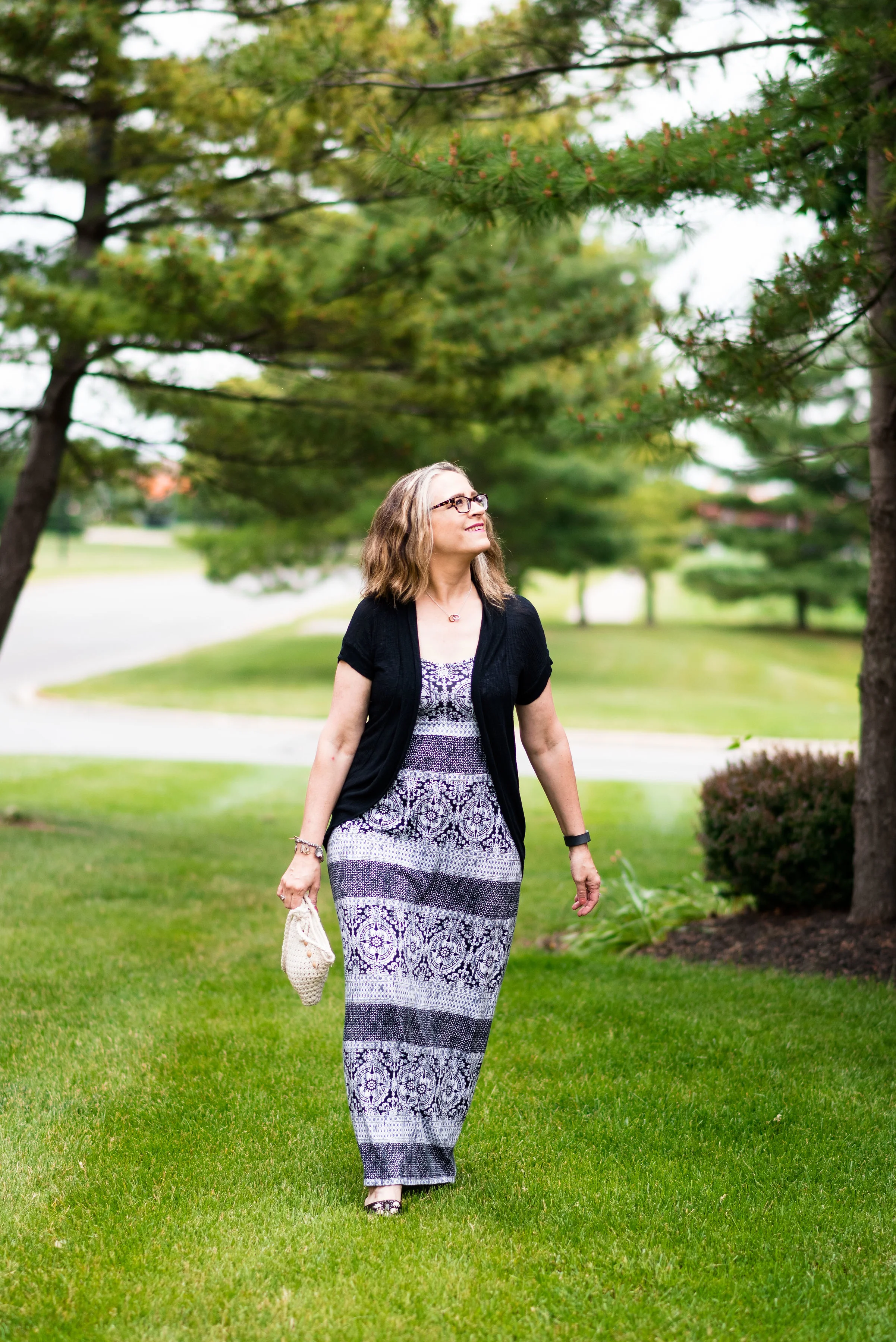
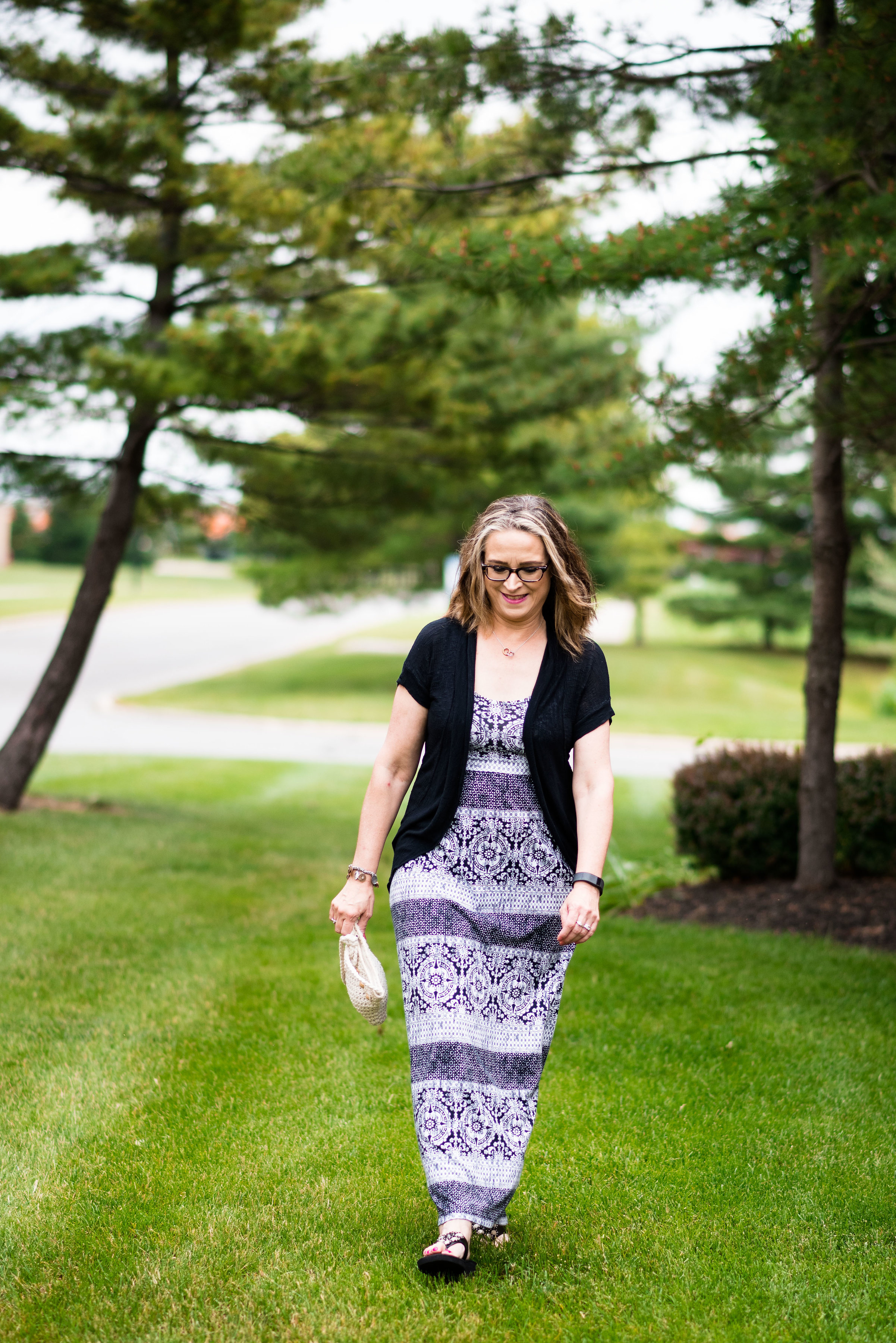
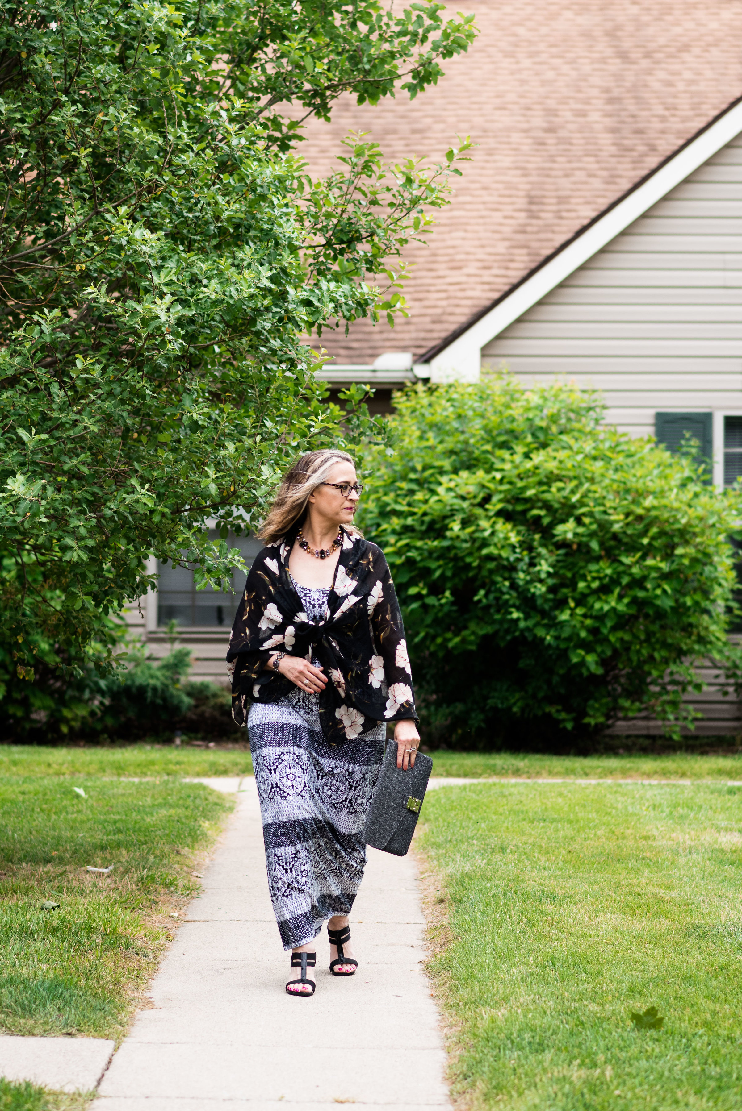
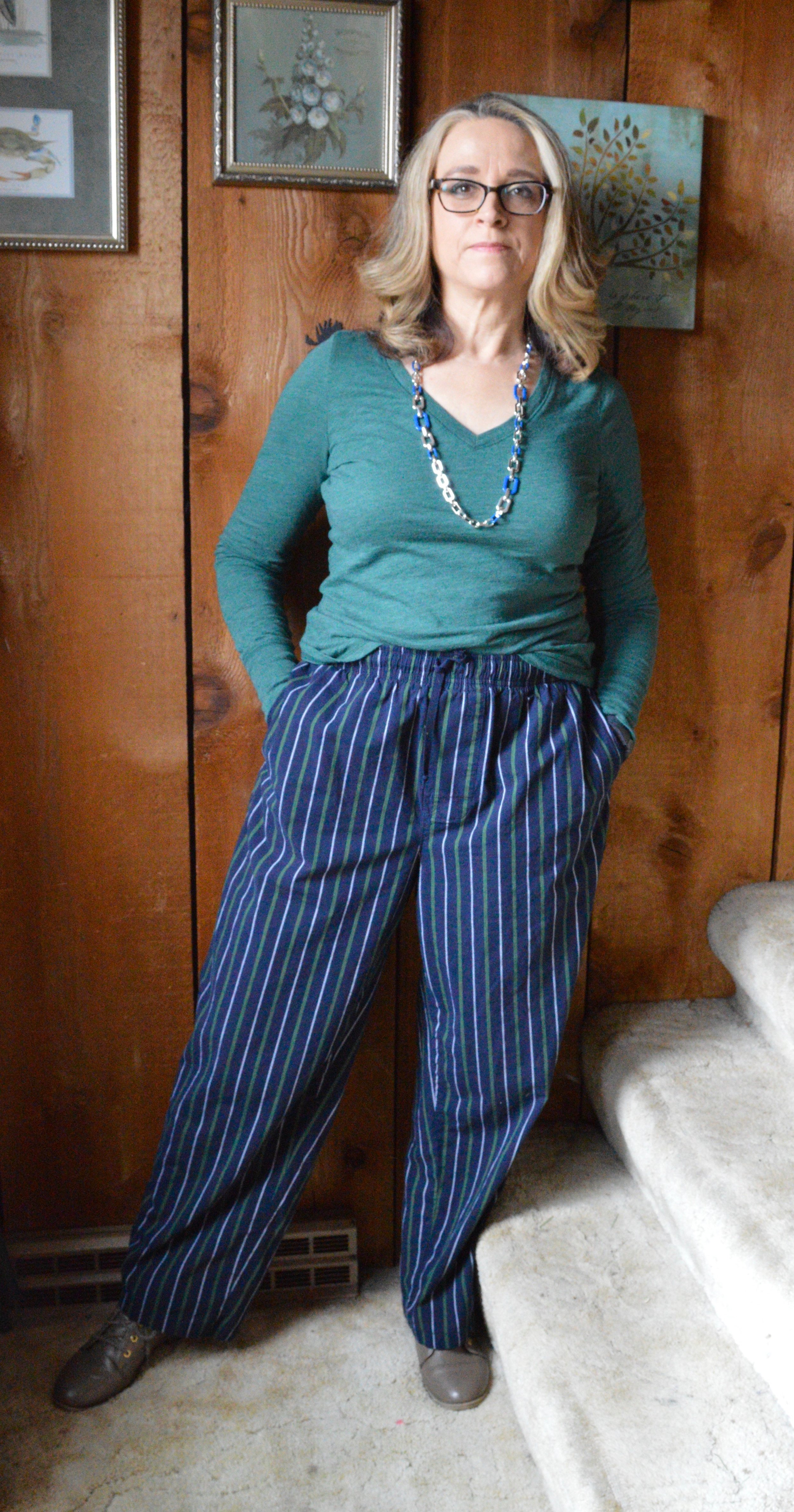
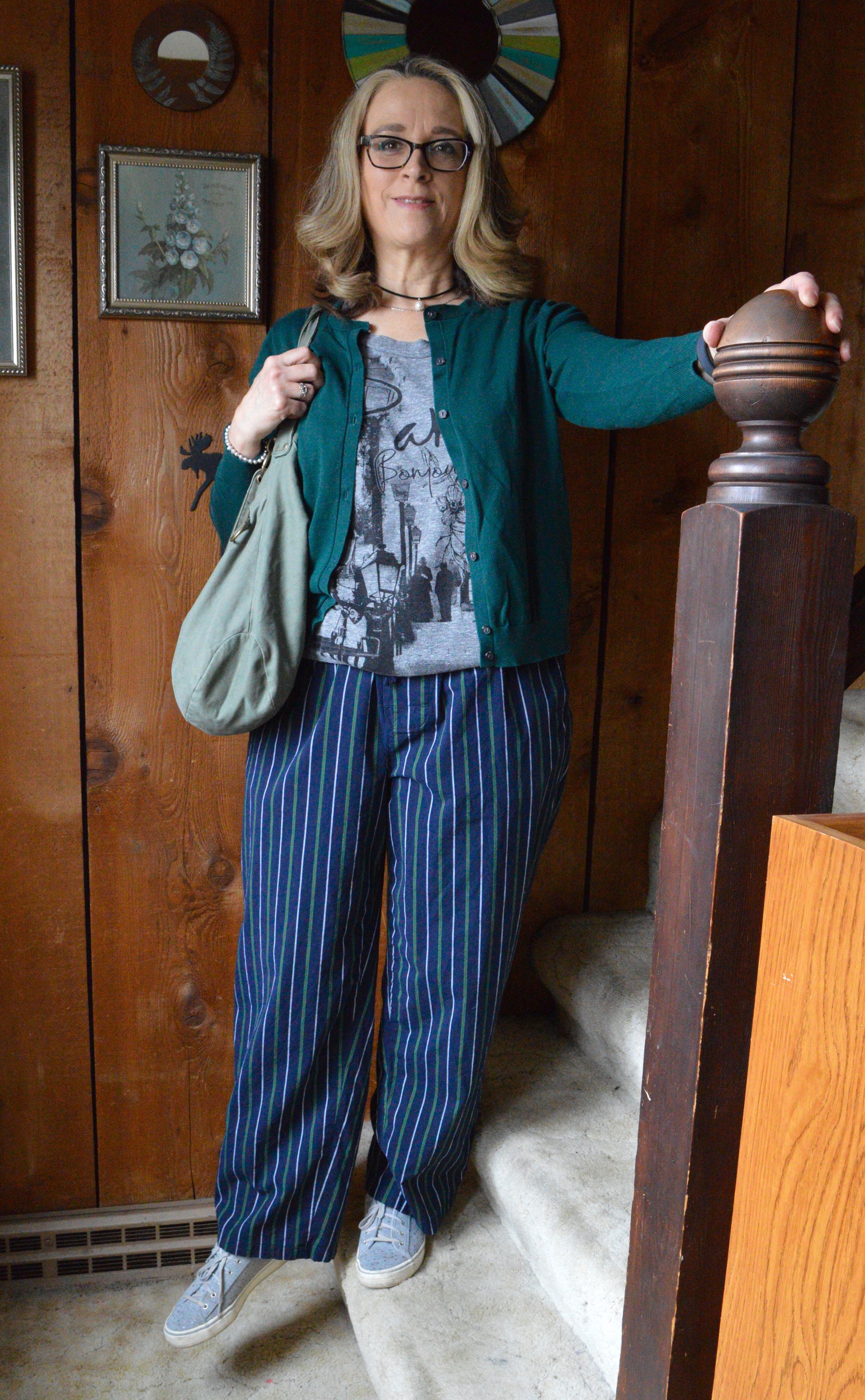
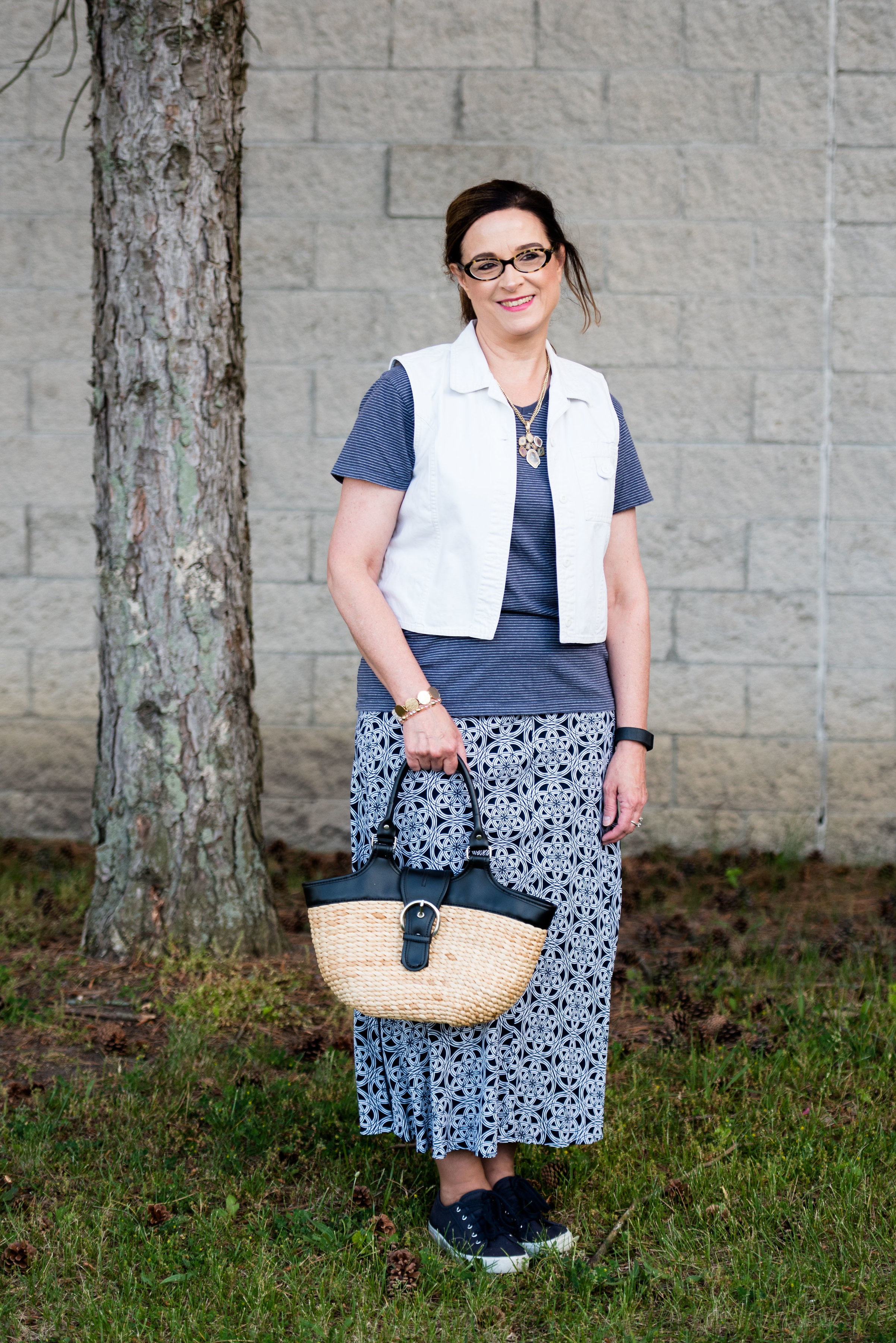
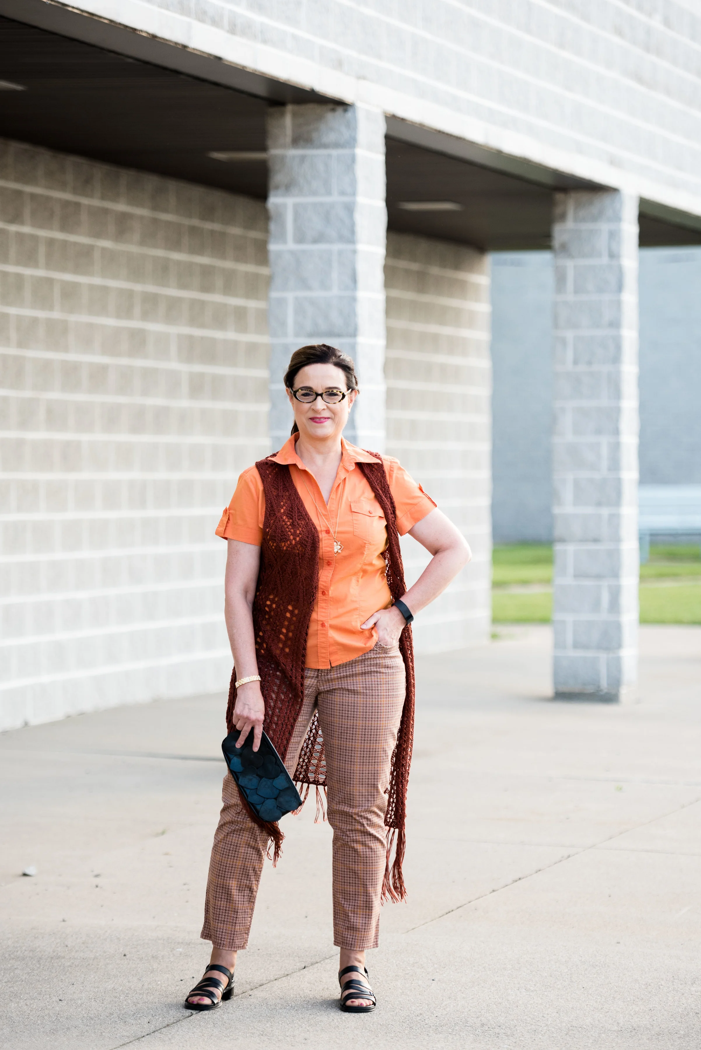
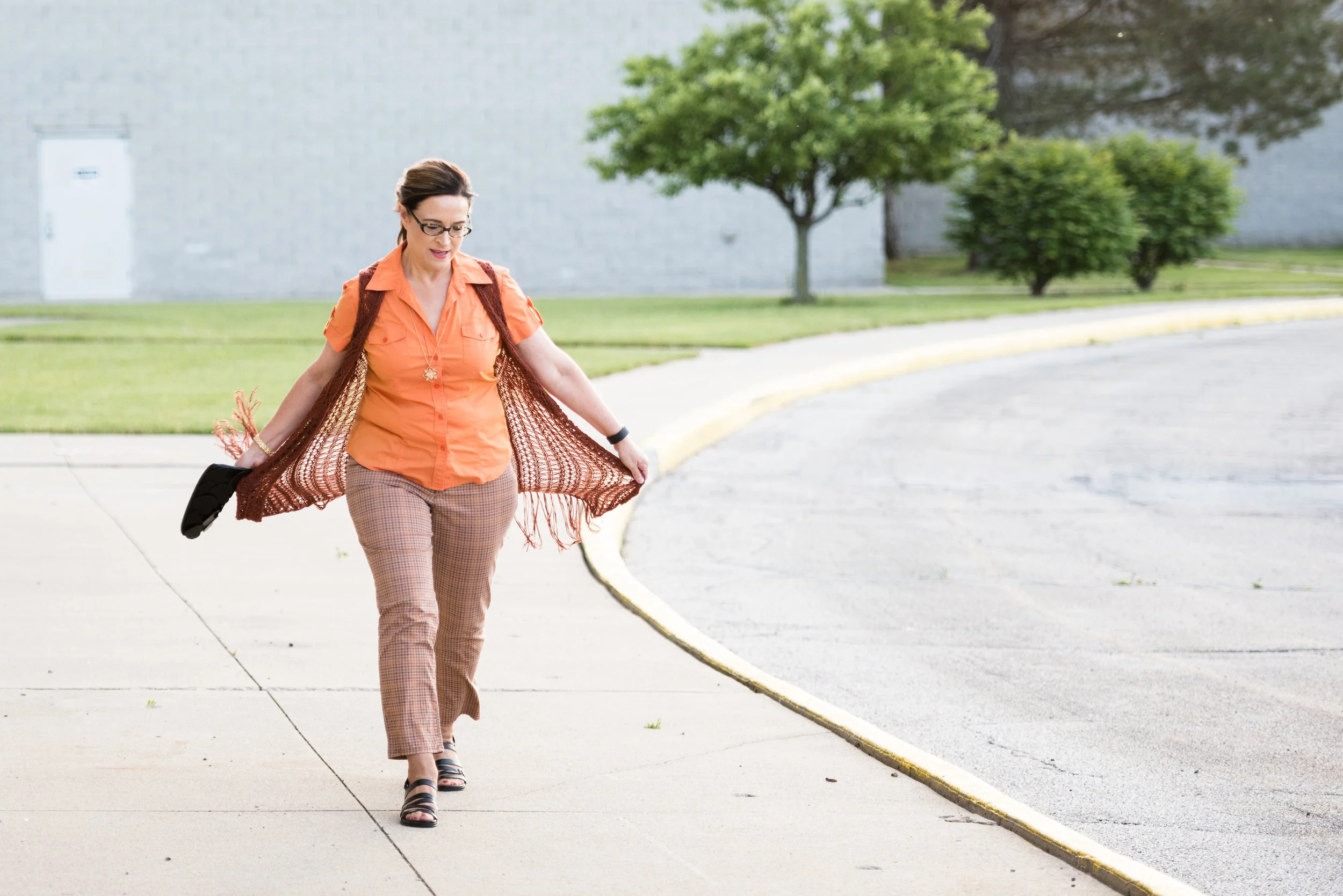
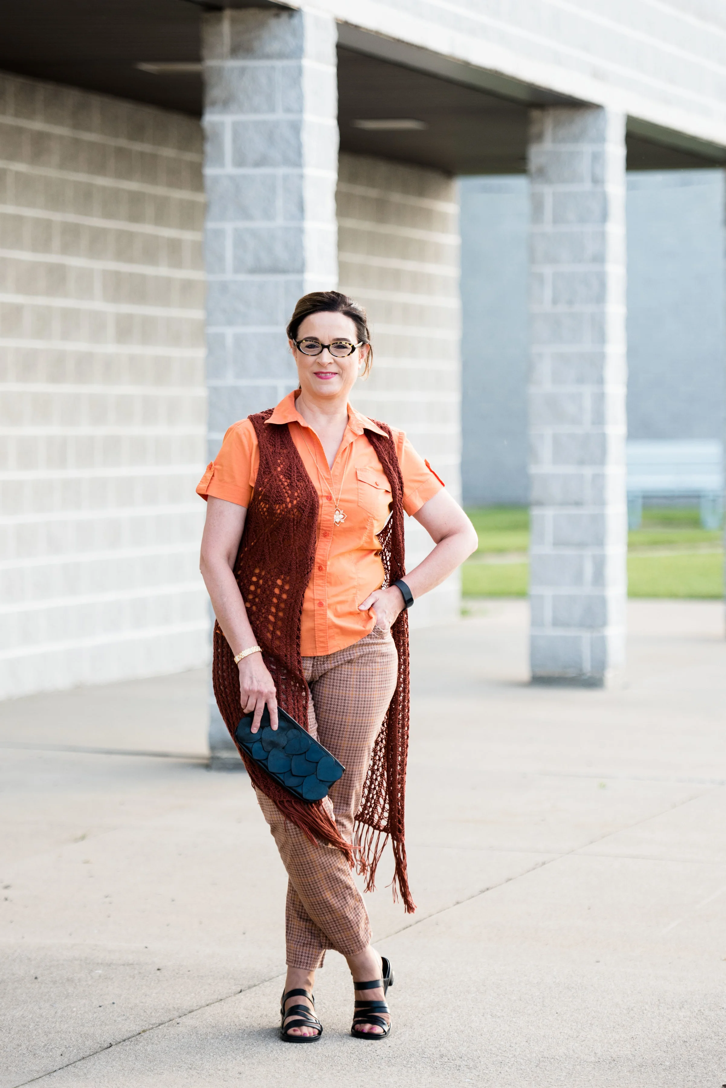
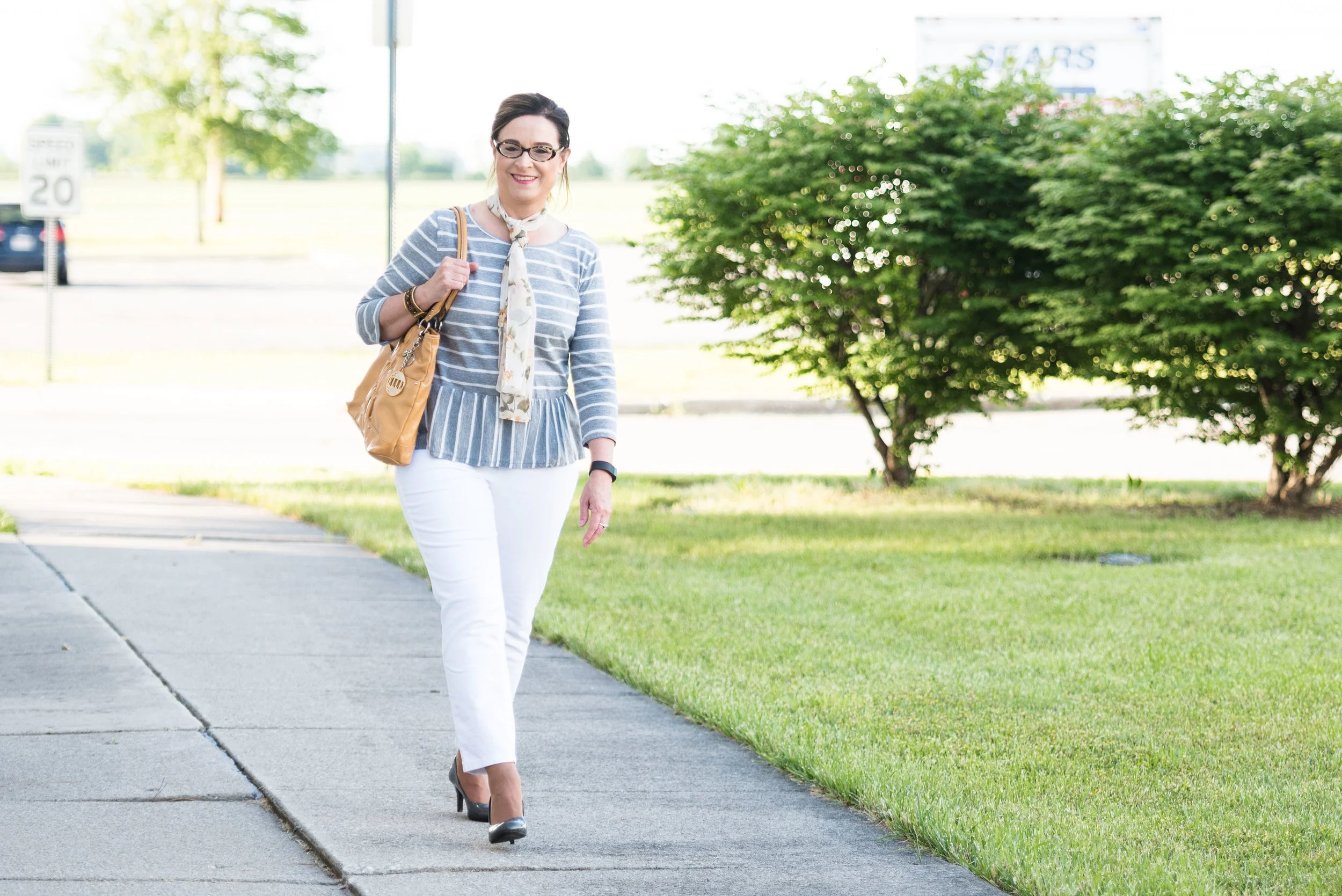
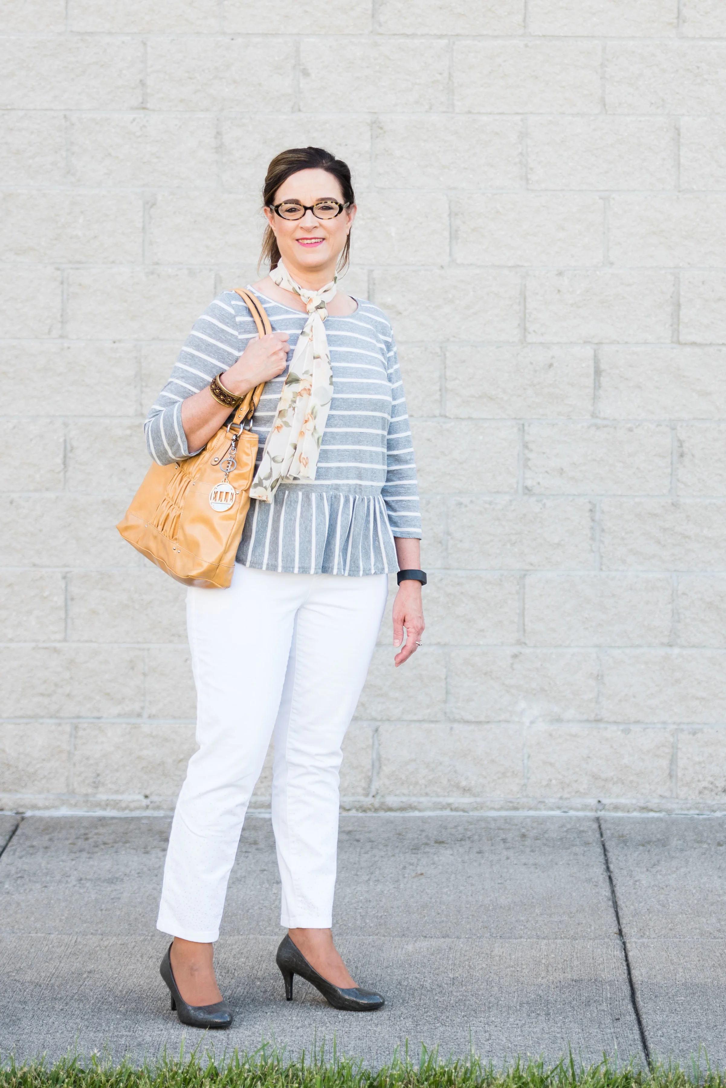
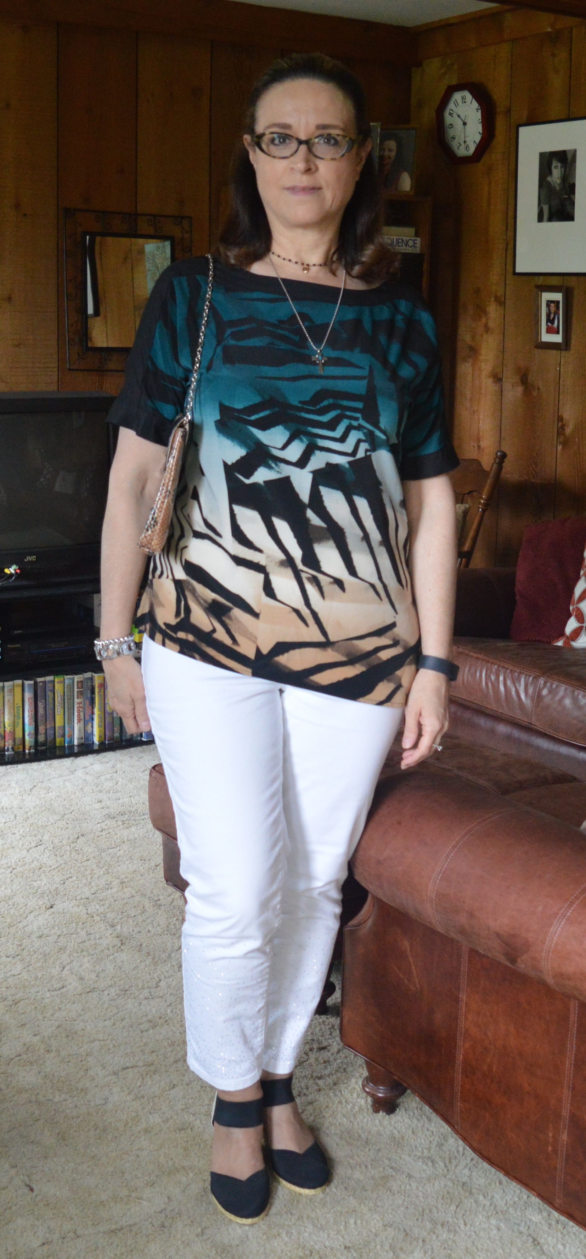
Today’s look involves some bold print mixing, but why not? It is fun to think outside the box when it comes to building an outfit and one way to do that is to mix prints. This might not appeal to you, because it is a little busy, but there is something about this I really like. I think it might be that this outfit has a bit of a bohemian vibe. The colors do lean a little bit more towards fall, but seeing as we are now in the month of August, I think it is a great transitional look.

Kickin' it with kimonos - orange floral

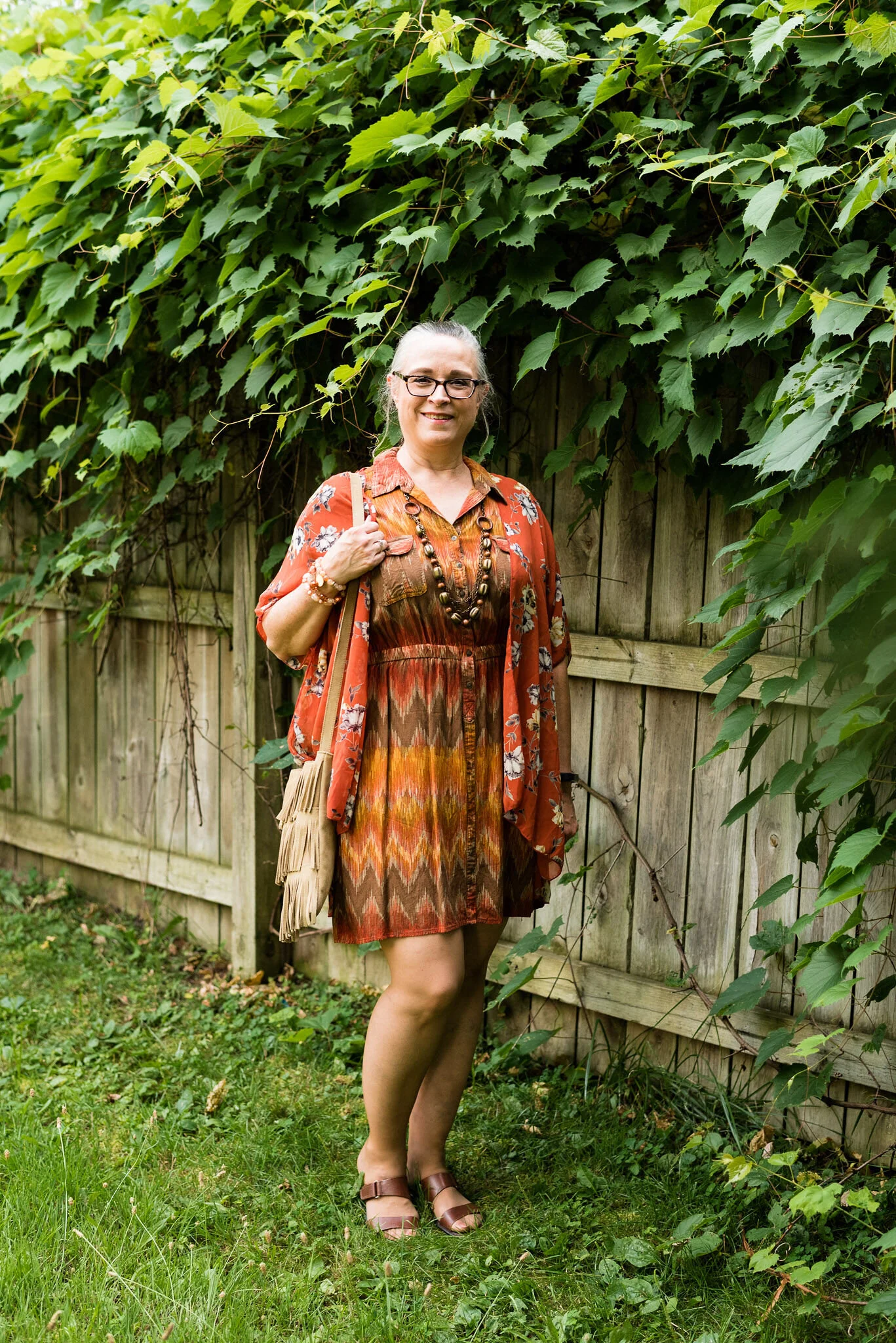
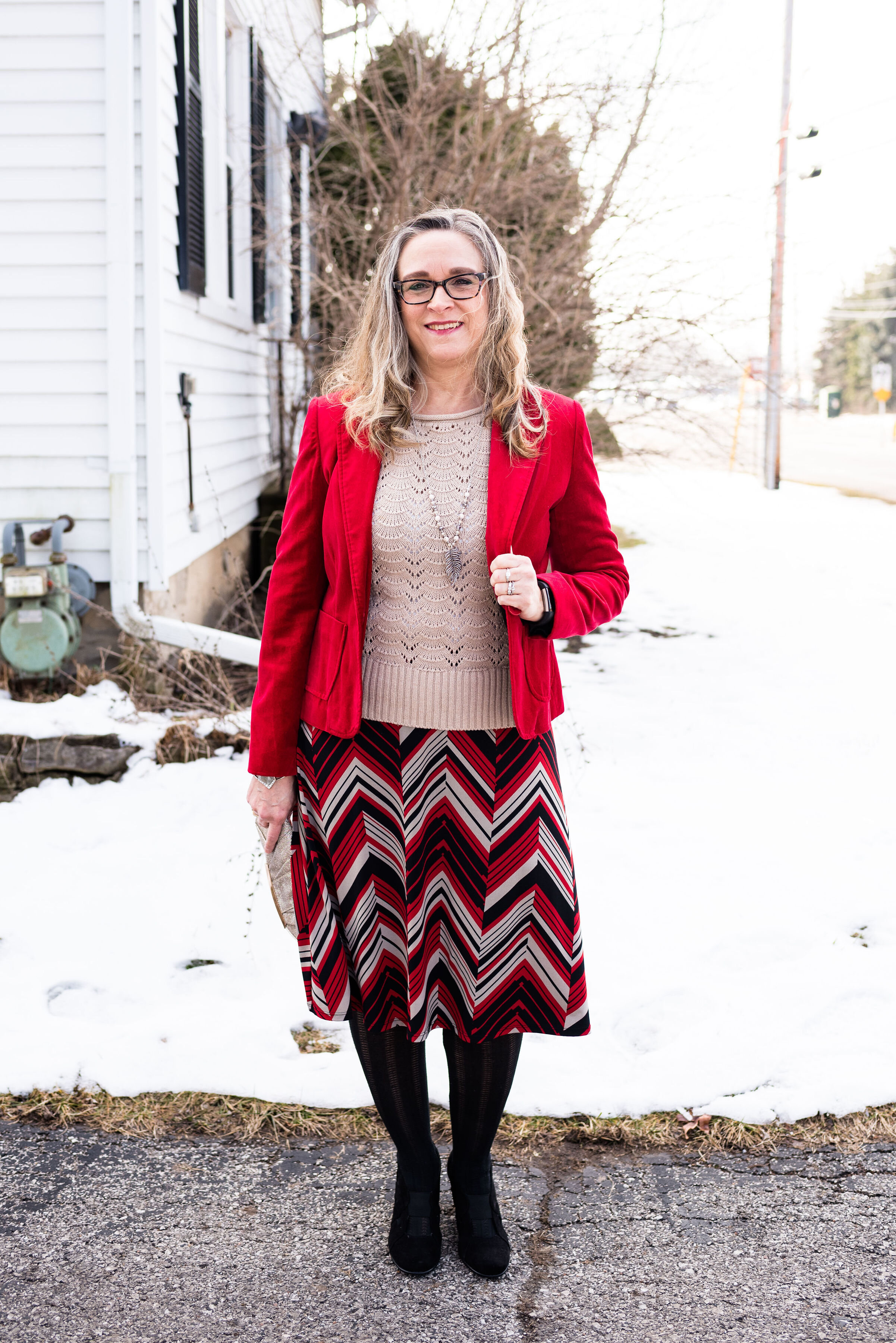
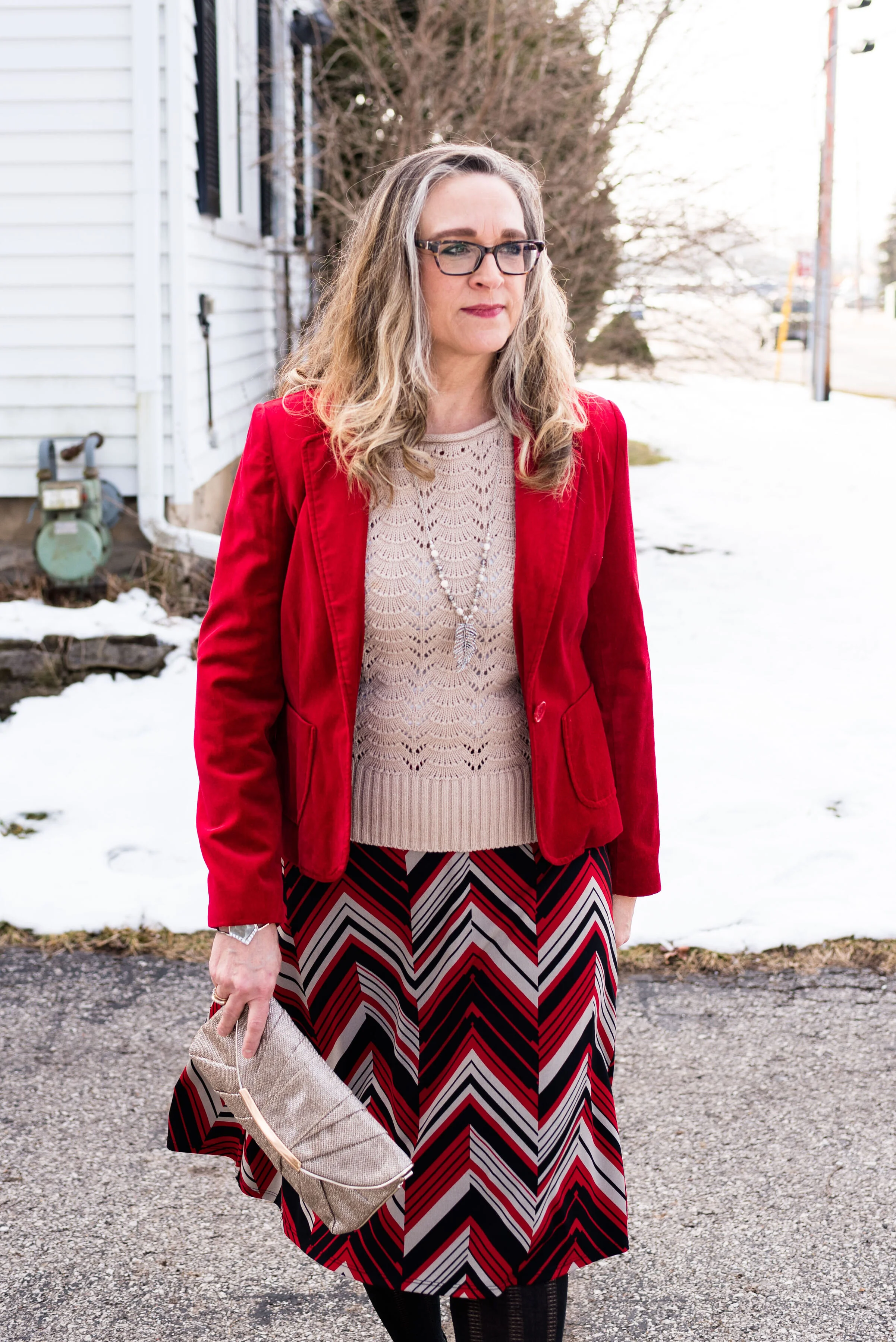
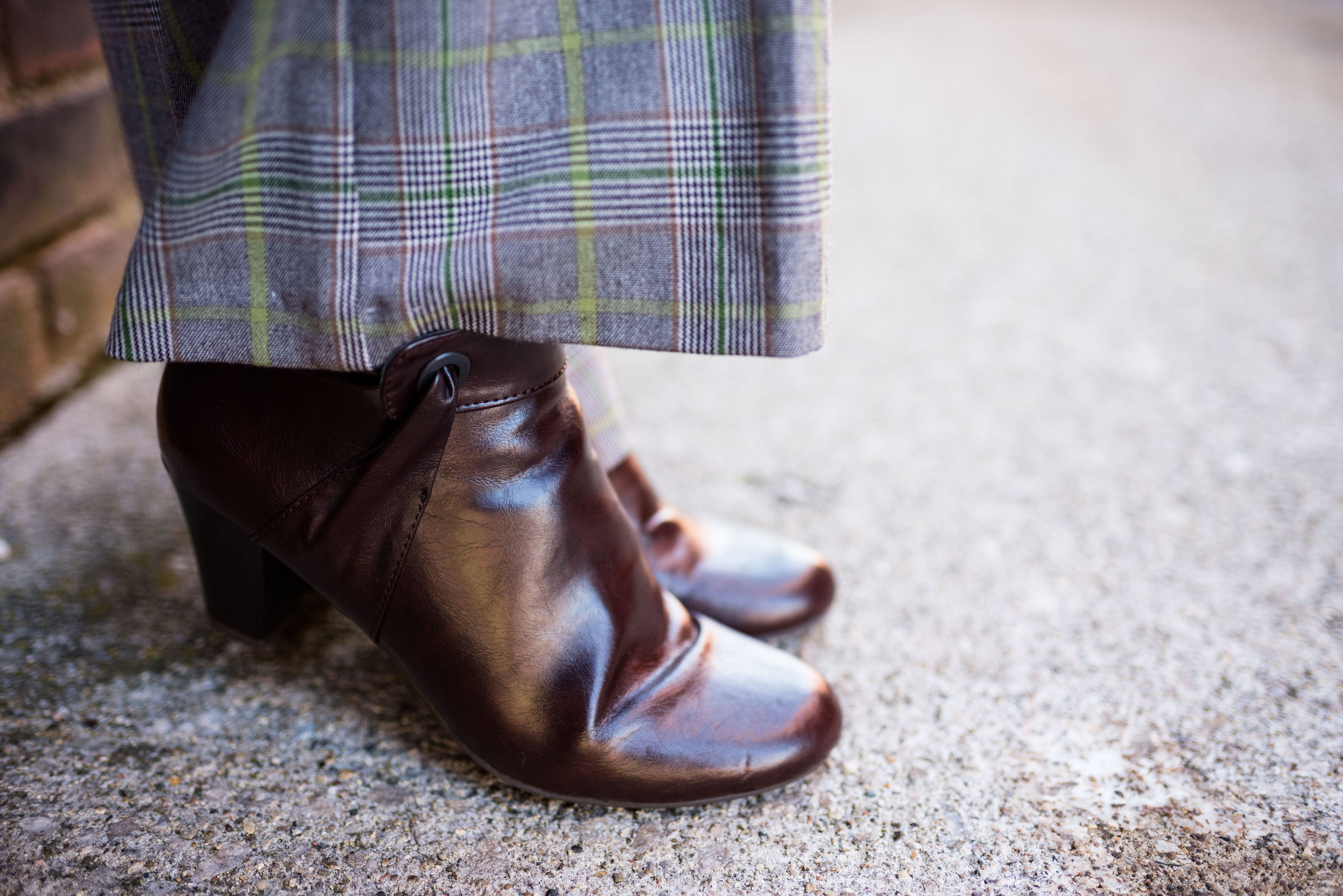
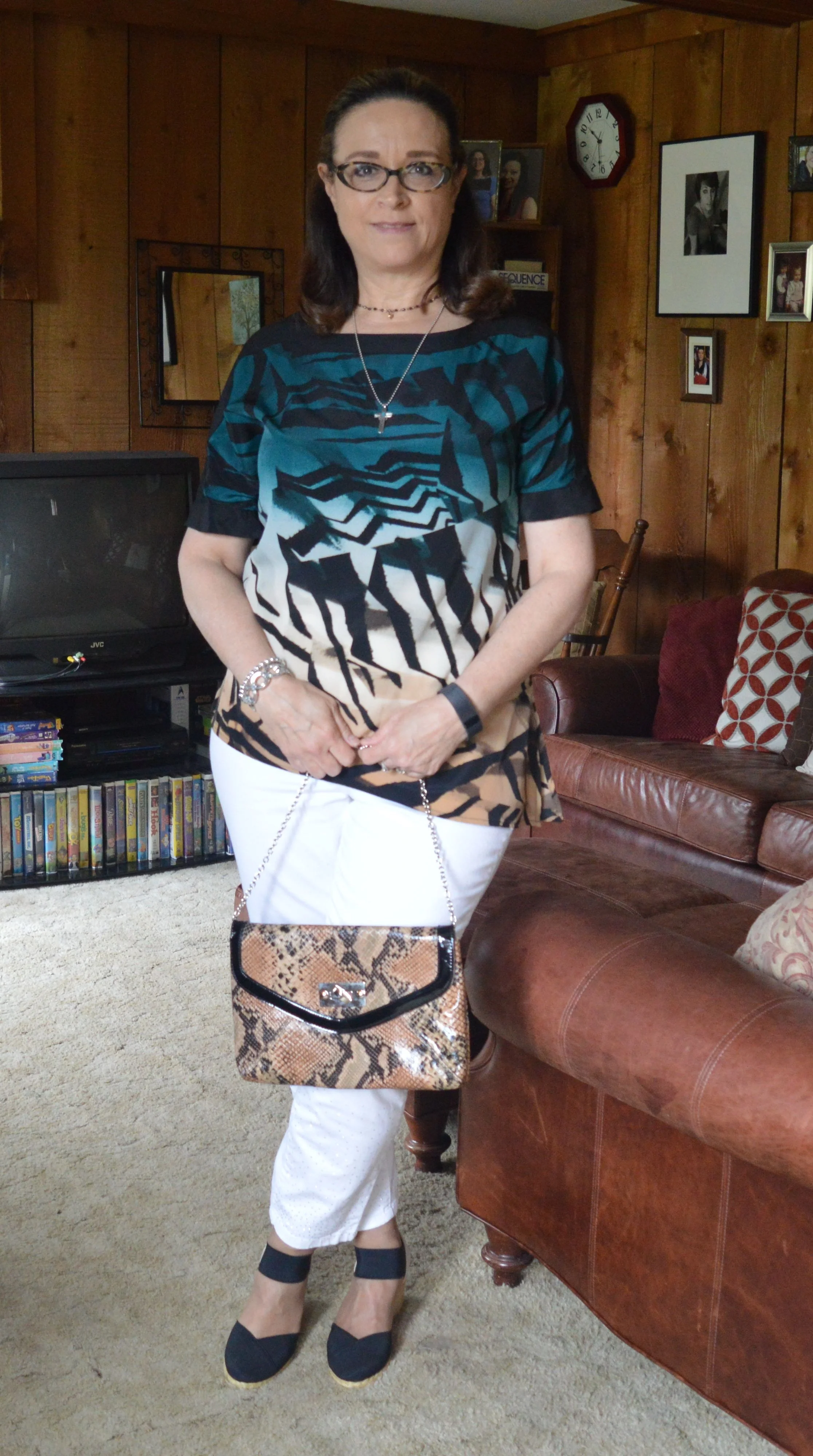
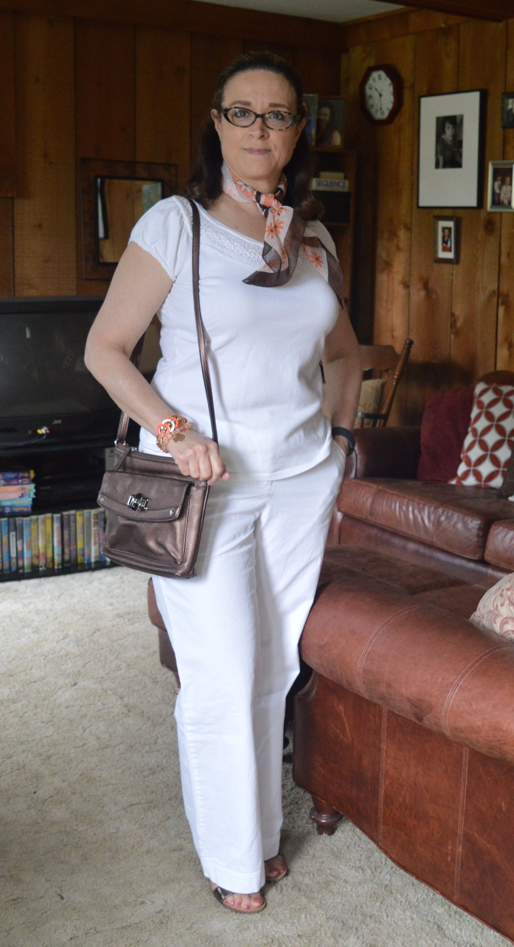
This chevron print dress is Sonoma brand. I just loved the colors of this thrifted piece and knew I had to bring it home with me when I found it. You can see how I styled this same piece with a pair of crop pants in one of my previous Pantone series.

Kickin' it with Kimonos - Orange Floral

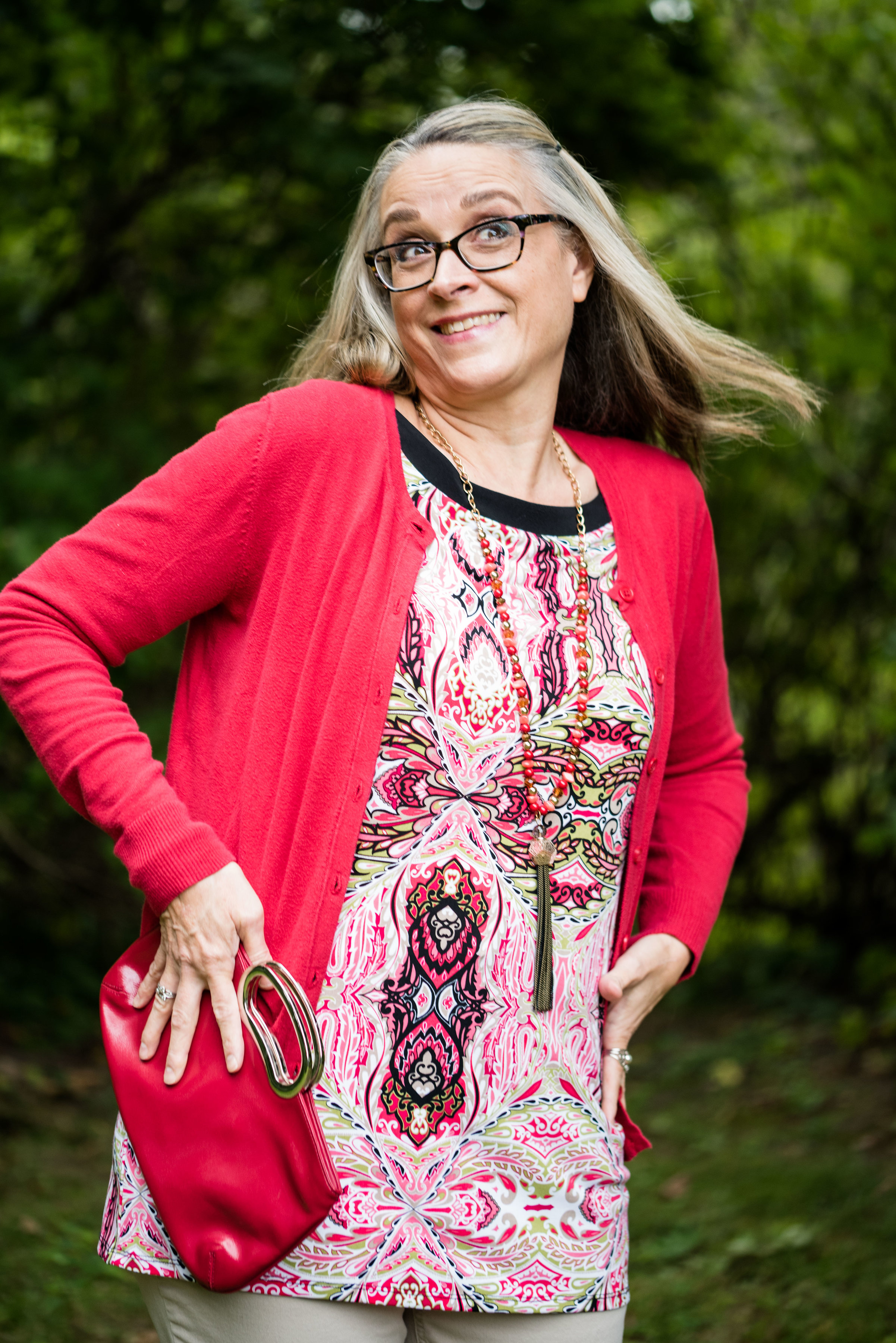
I am not sure what I was doing with my mouth, be these sorts of pictures have been pretty typical throughout my whole photographic career. Ha, ha.

Kickin' It with Kimonos - Orange floral

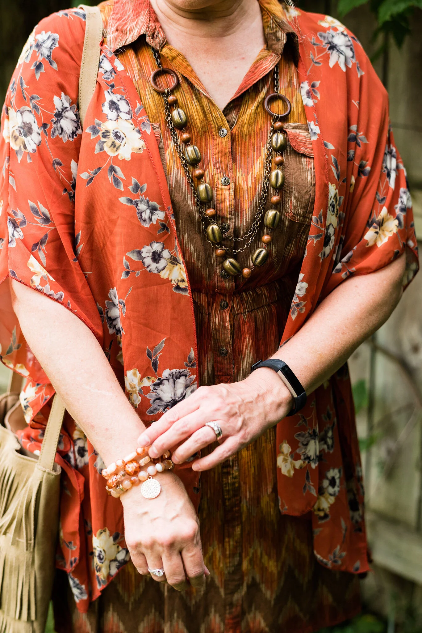
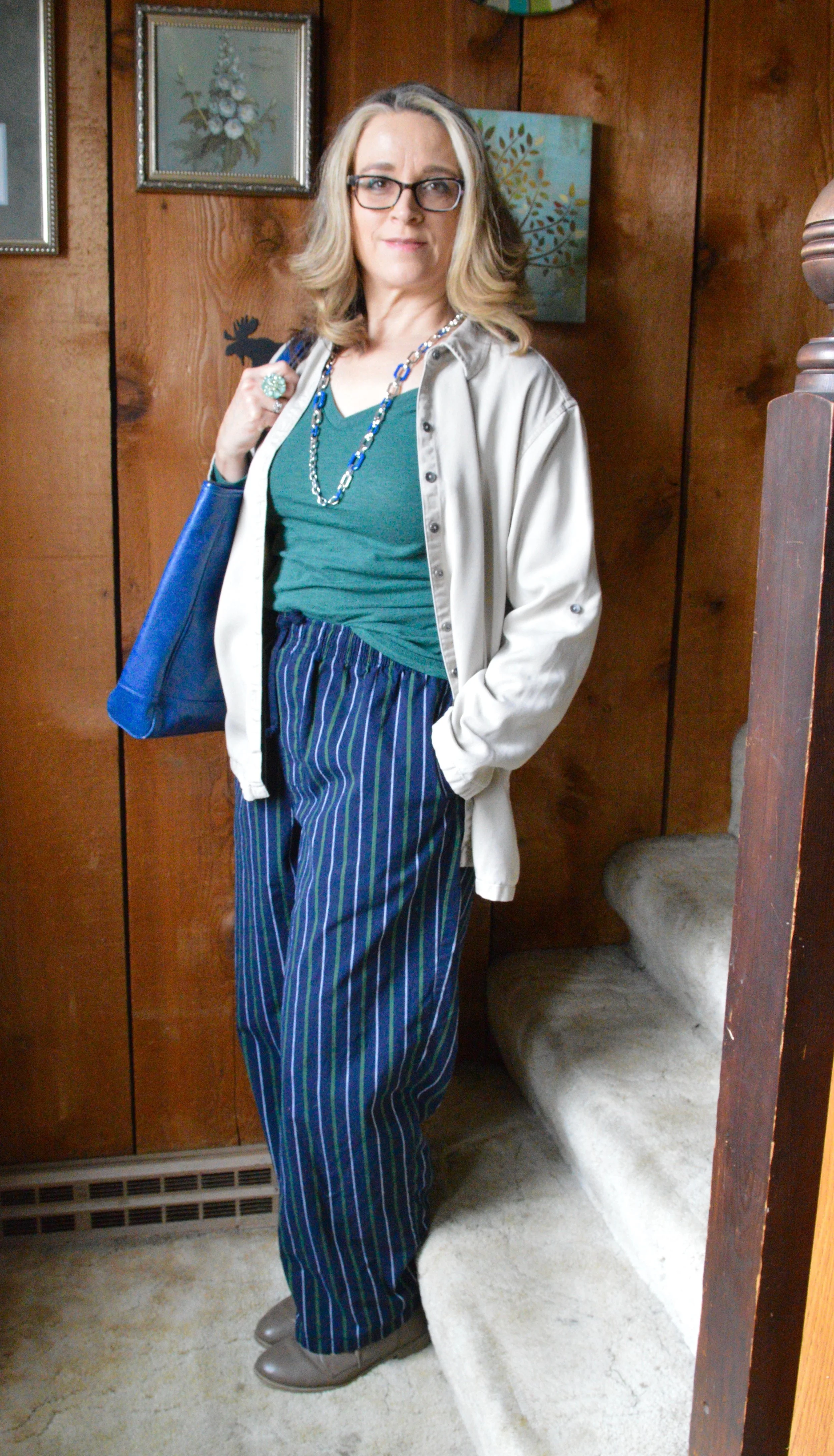
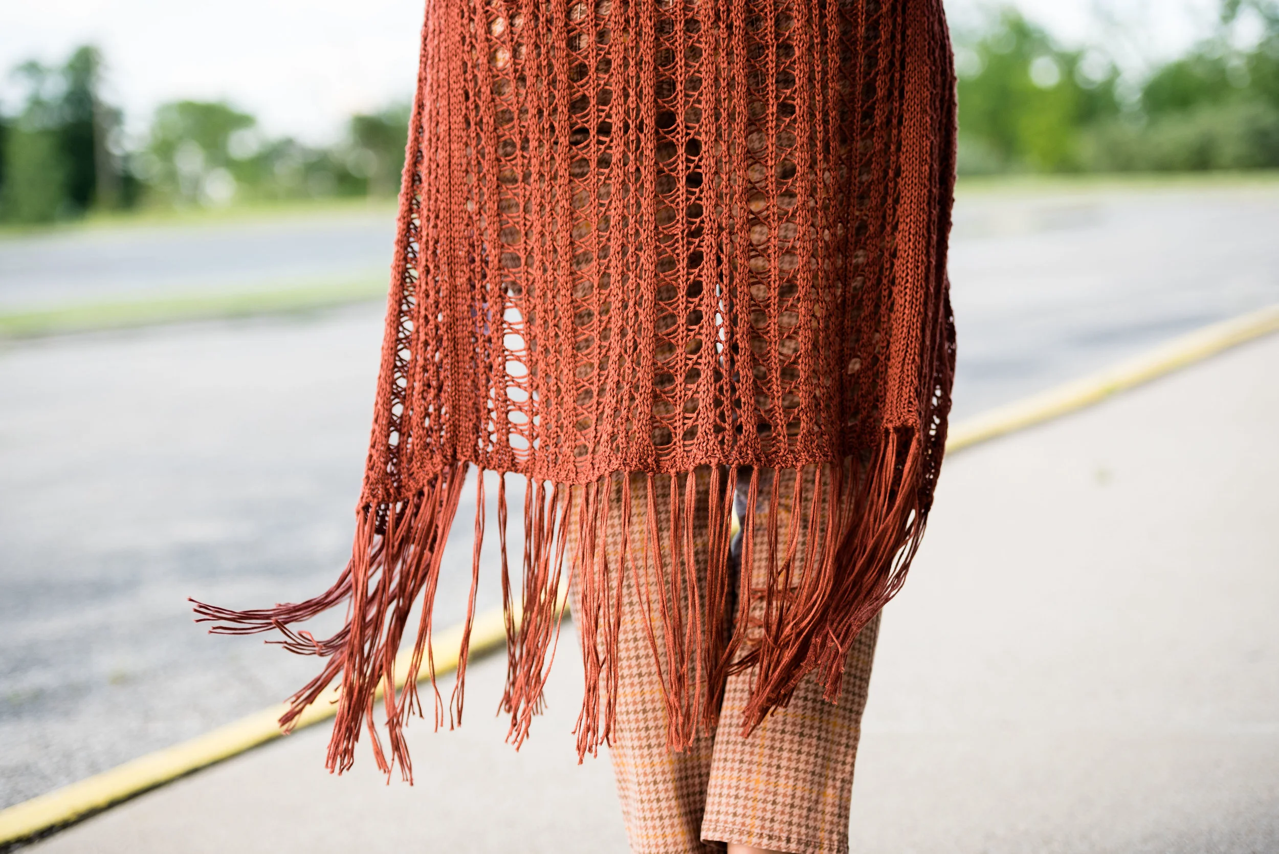
I ordered this orange floral ruana from a boutique retailer called Glamour Farms. I used to follow several bloggers who featured a number of their pieces and I thought they were cute. This ruana was on clearance and I loved the color and the pattern. Unfortunately when I got it, the seams they put at the sides to make it more secure and have sleeves, made the piece too small. I just removed a few inches of stitching and now it is perfect.

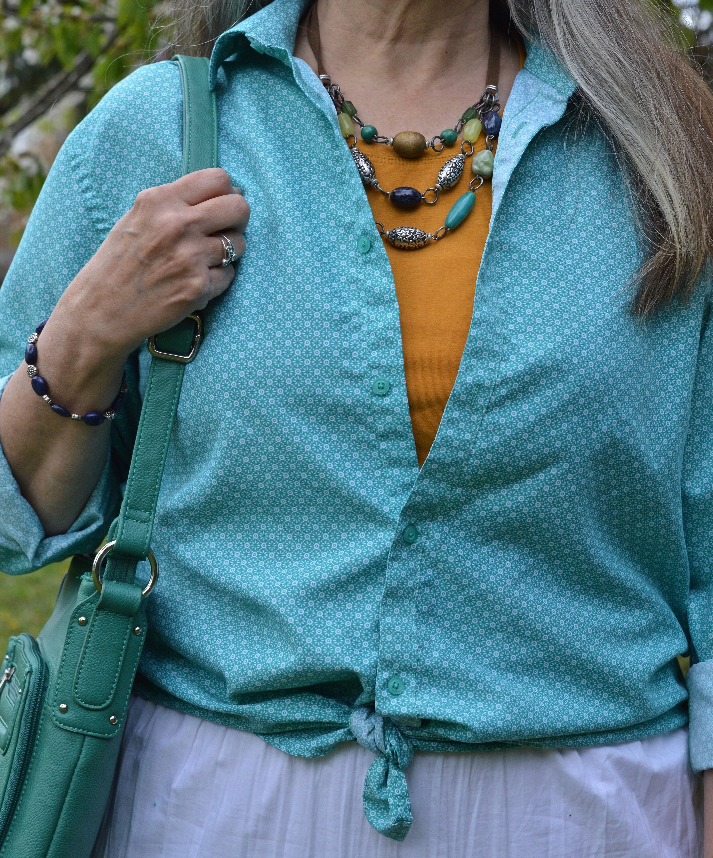
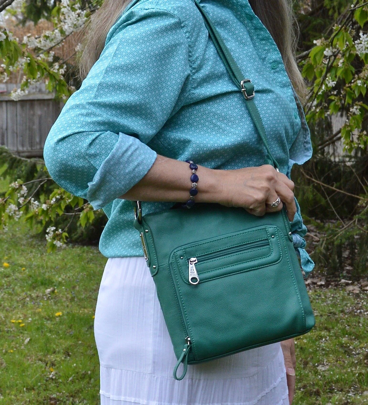
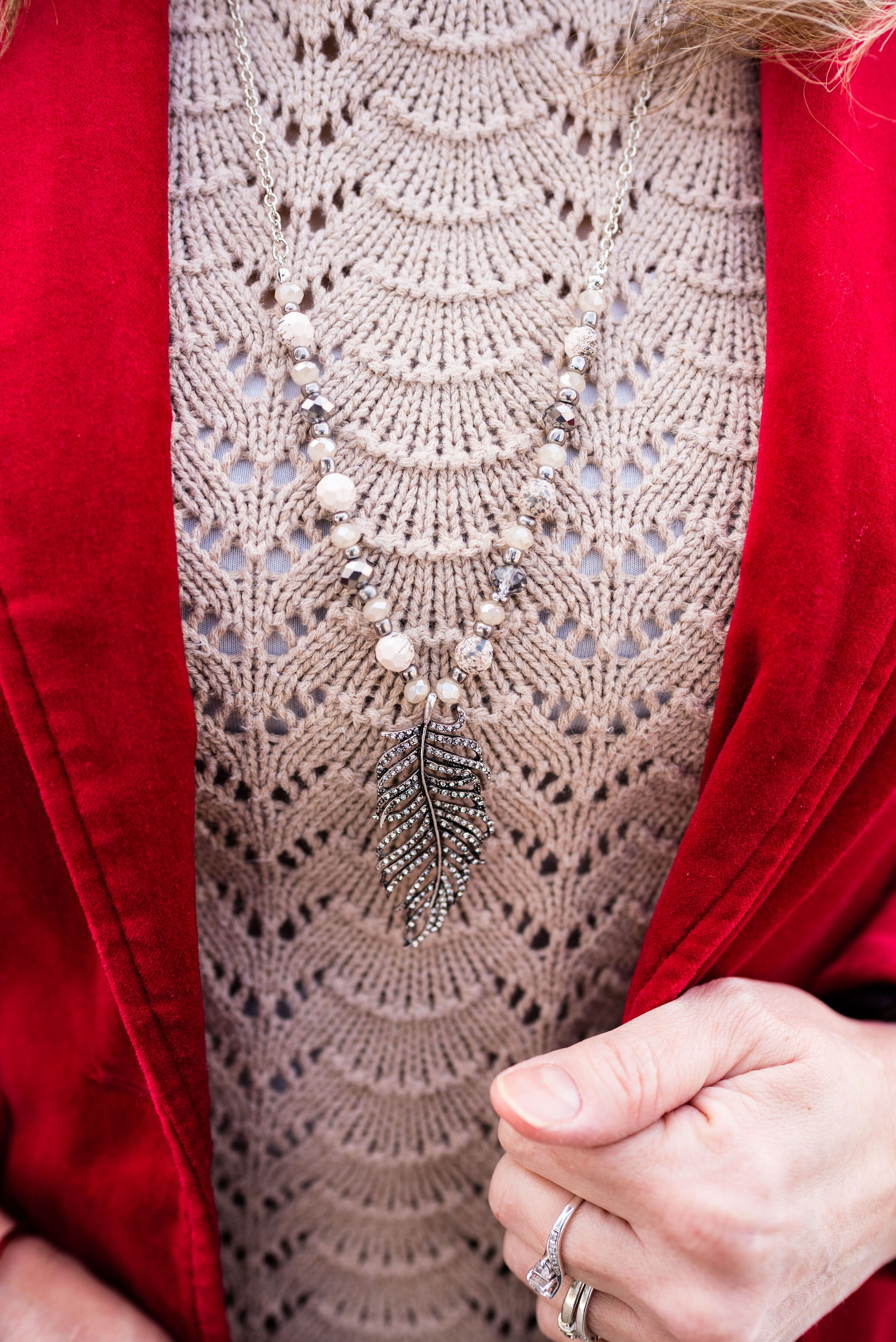
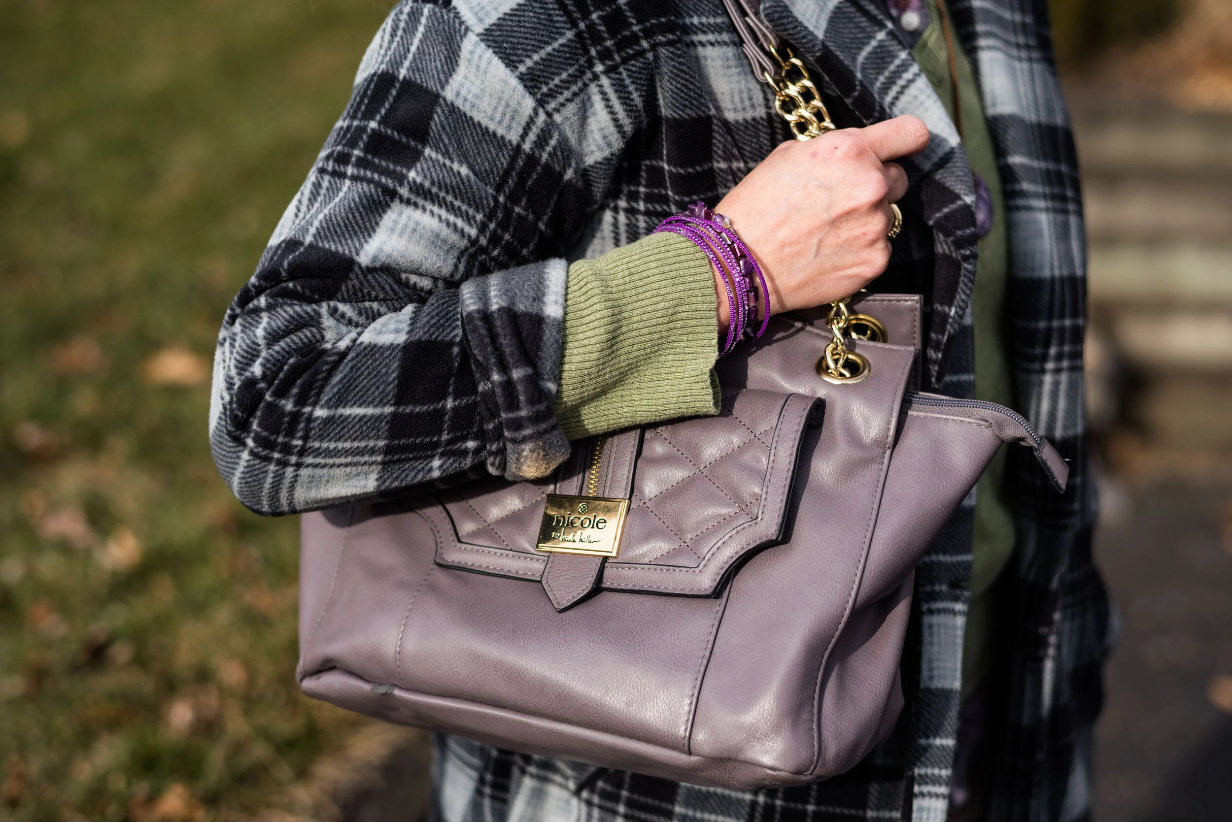
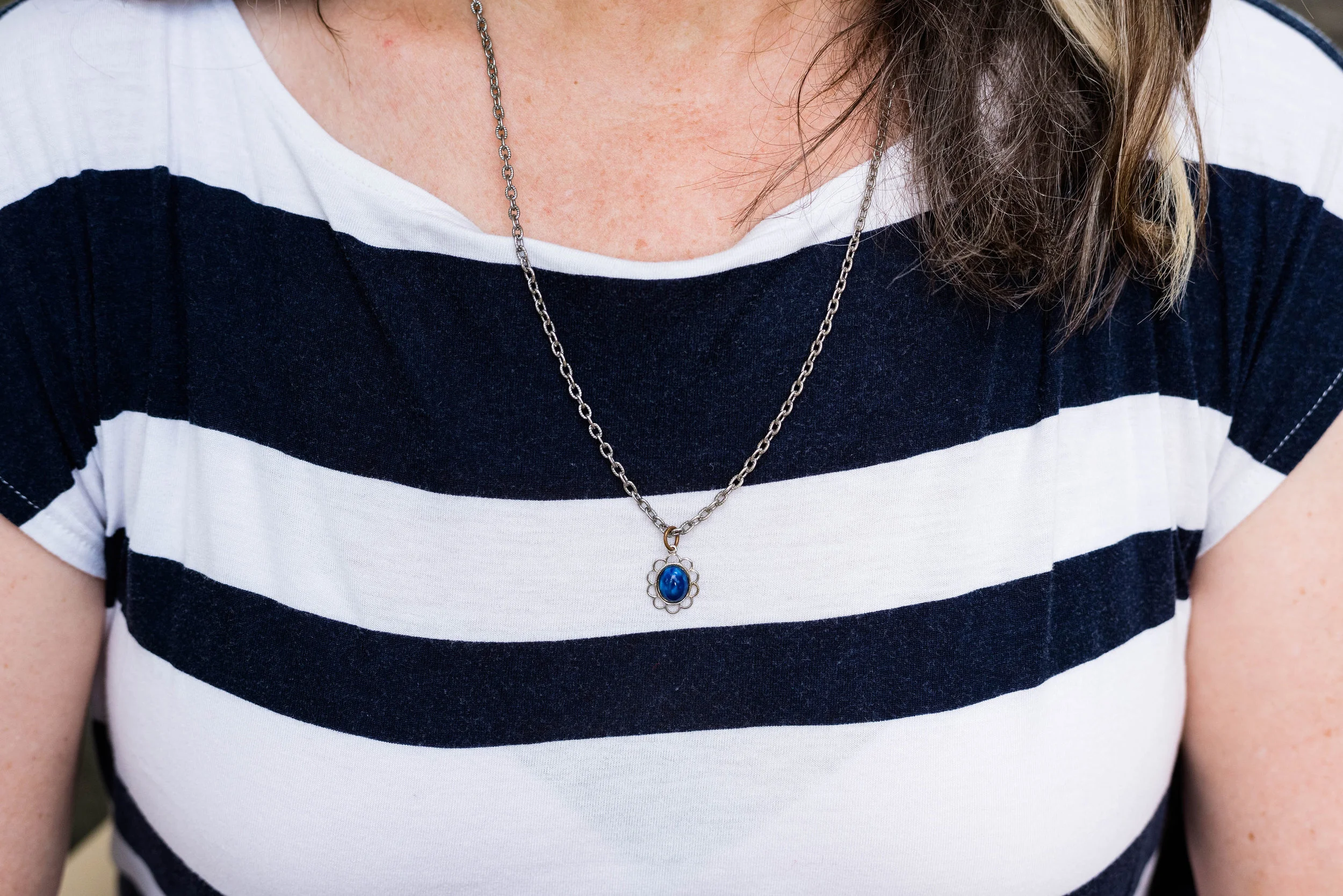
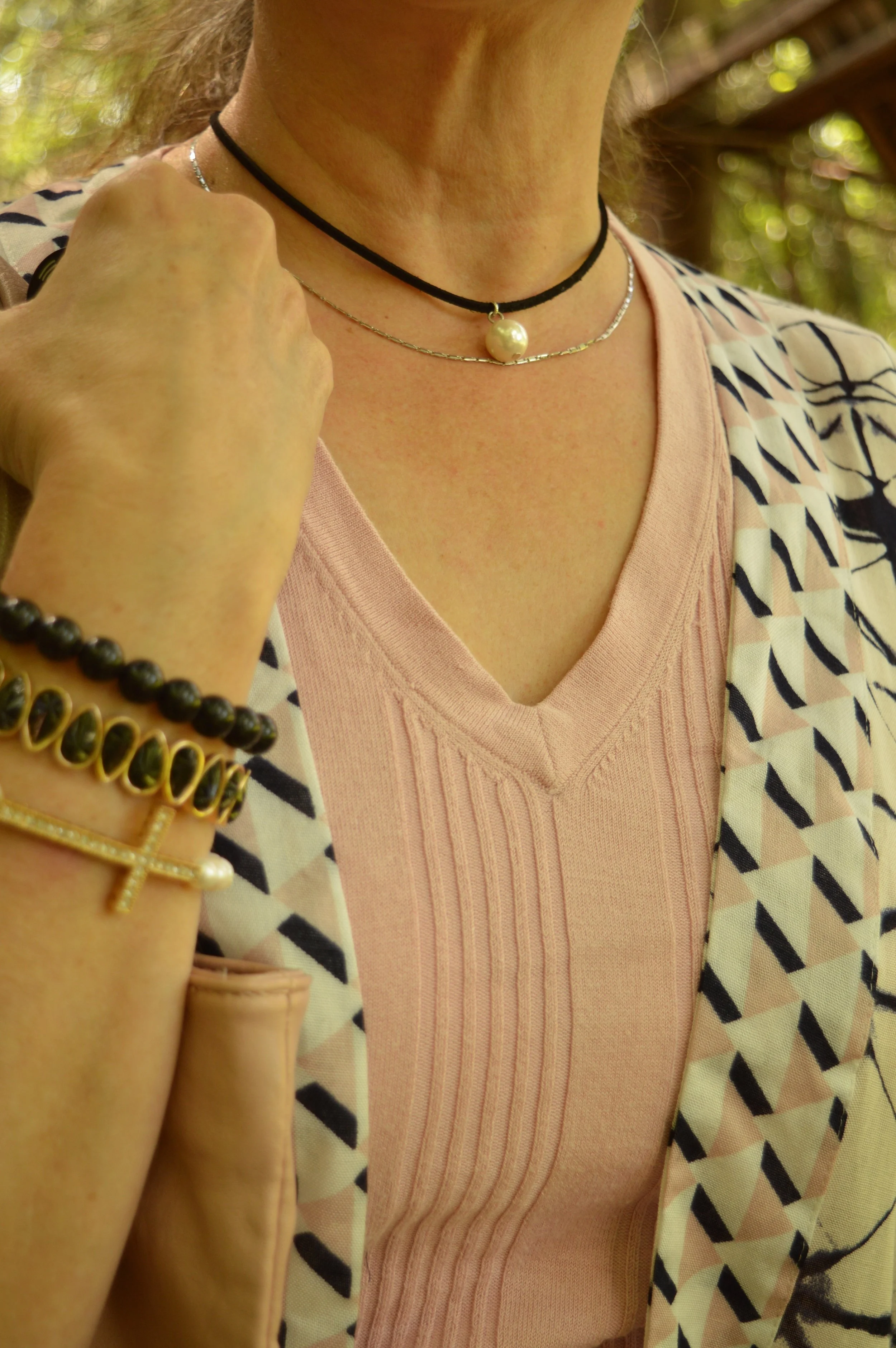
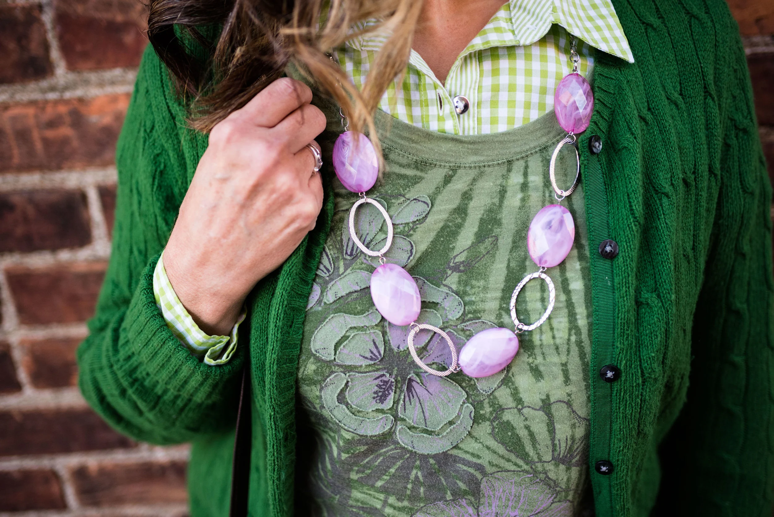
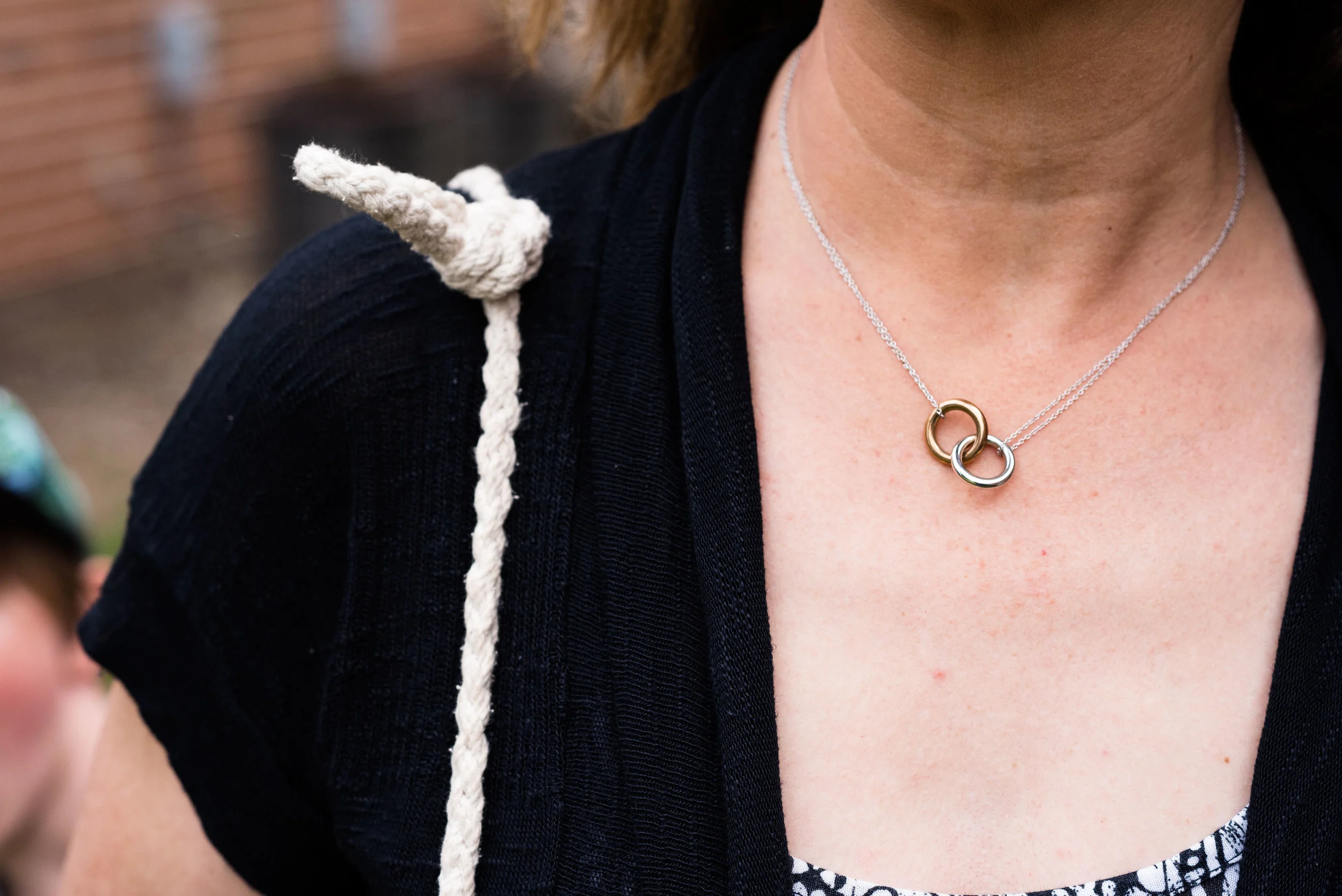
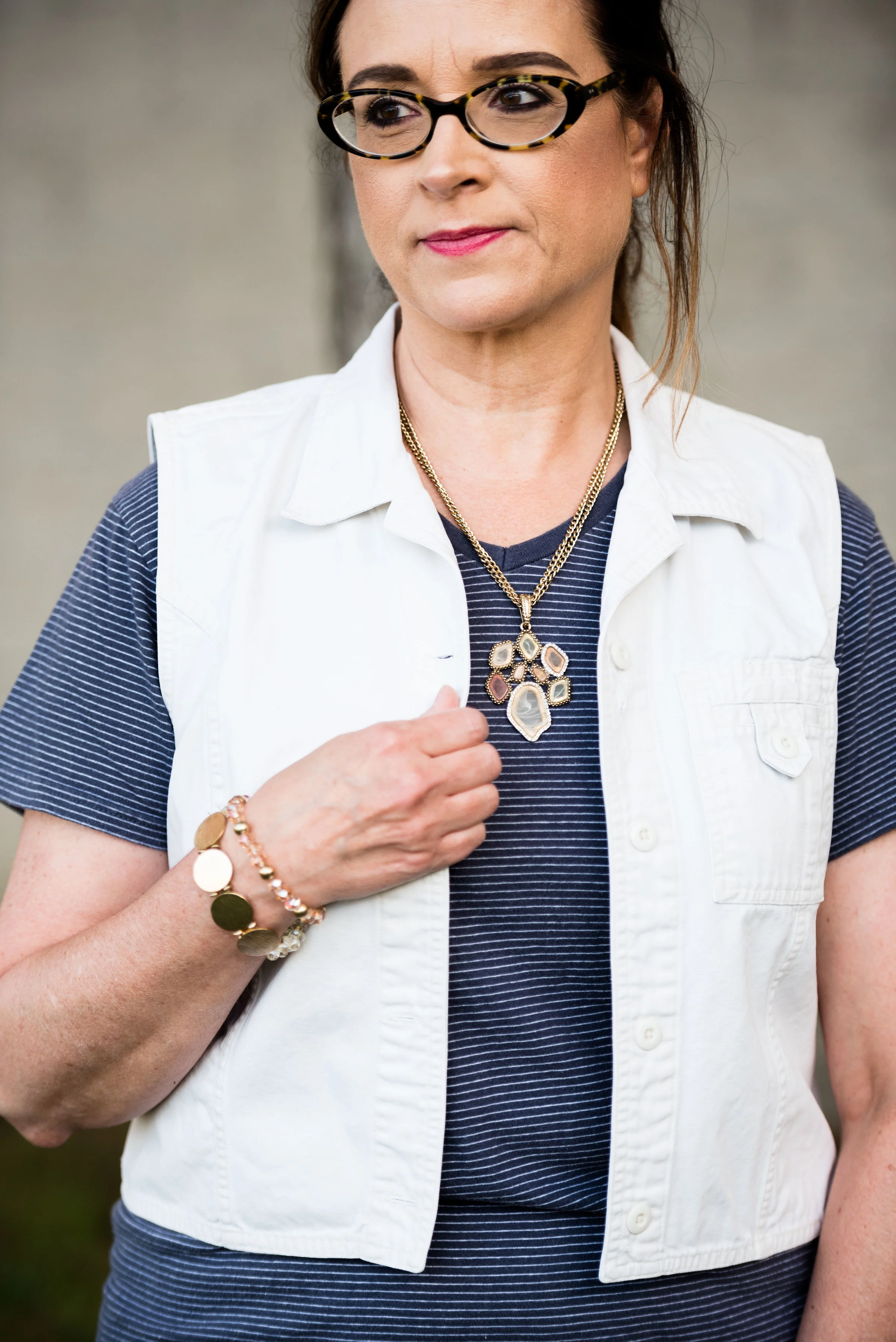
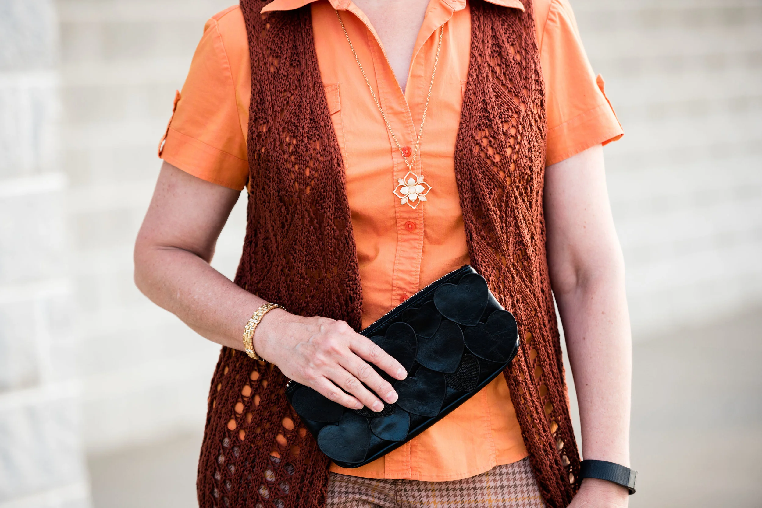
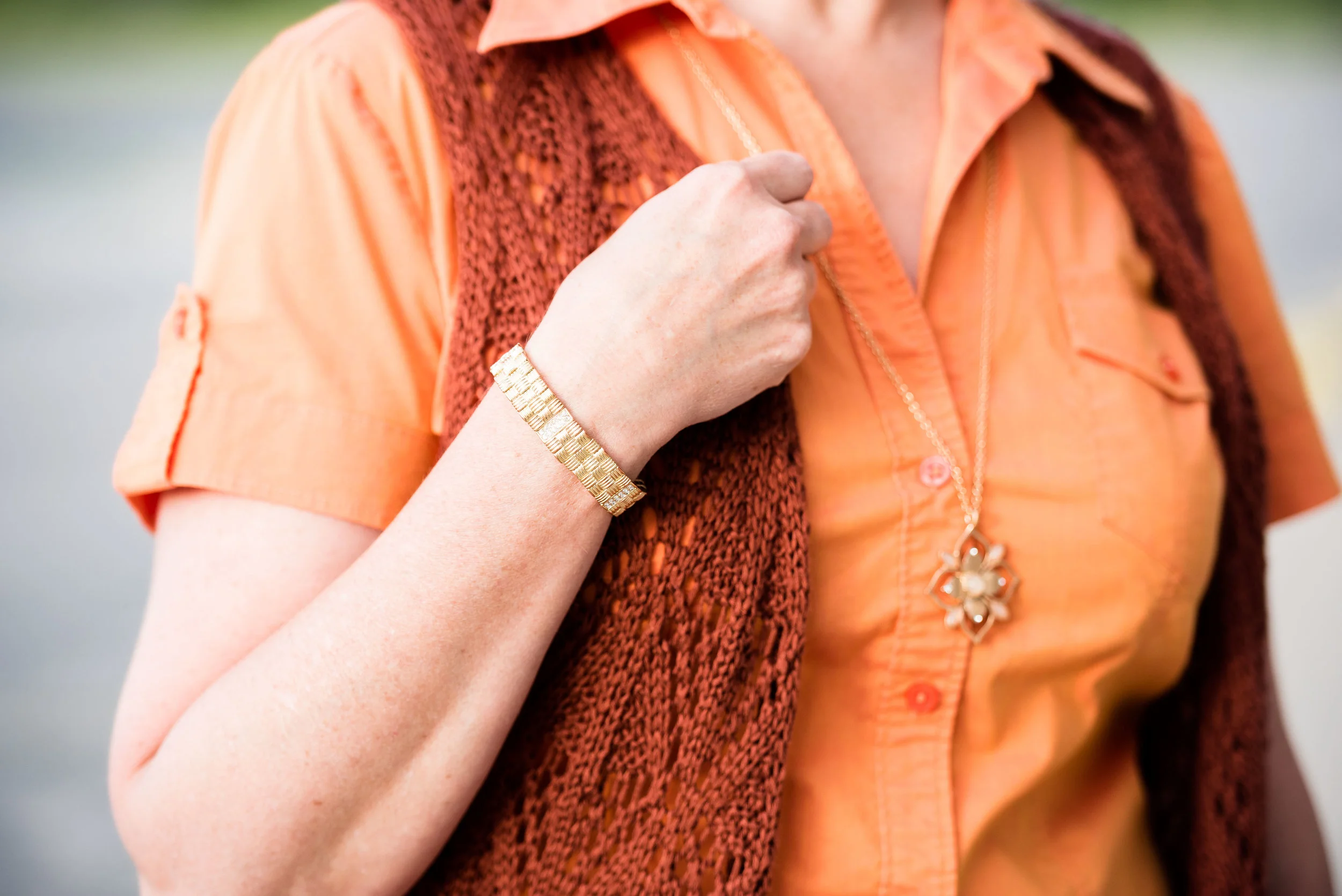
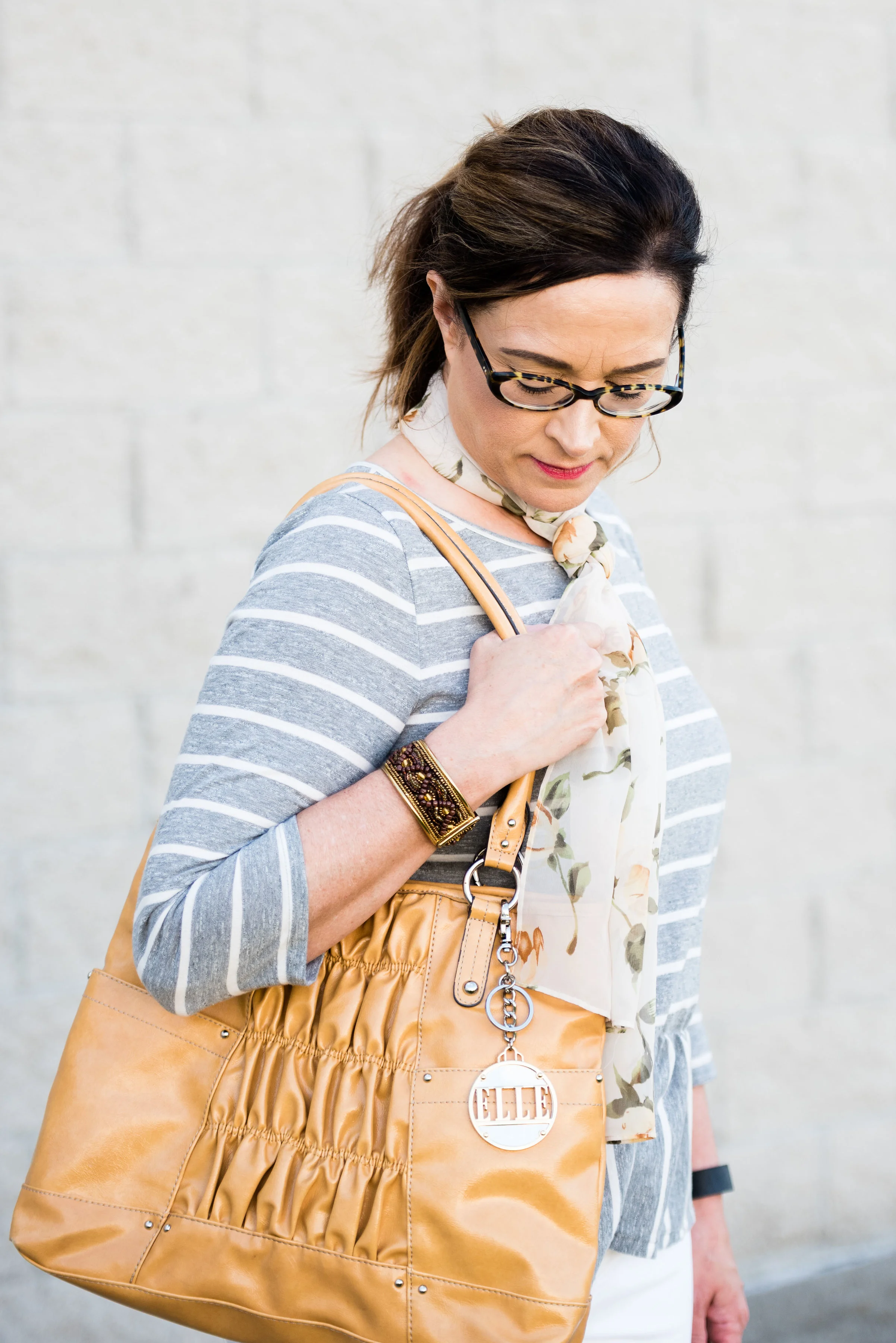
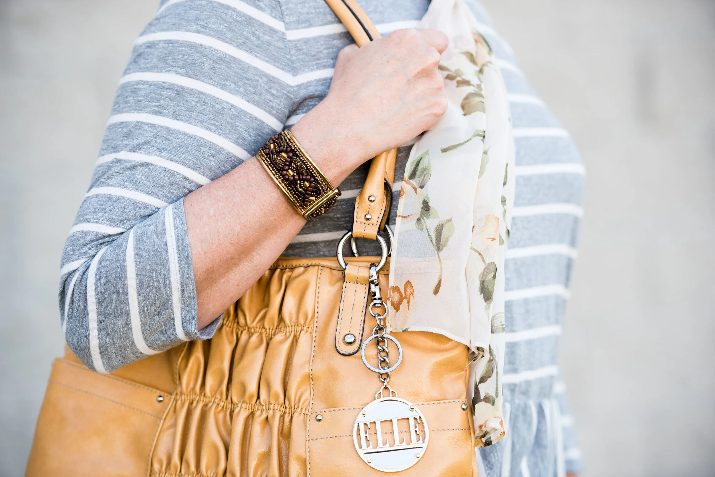
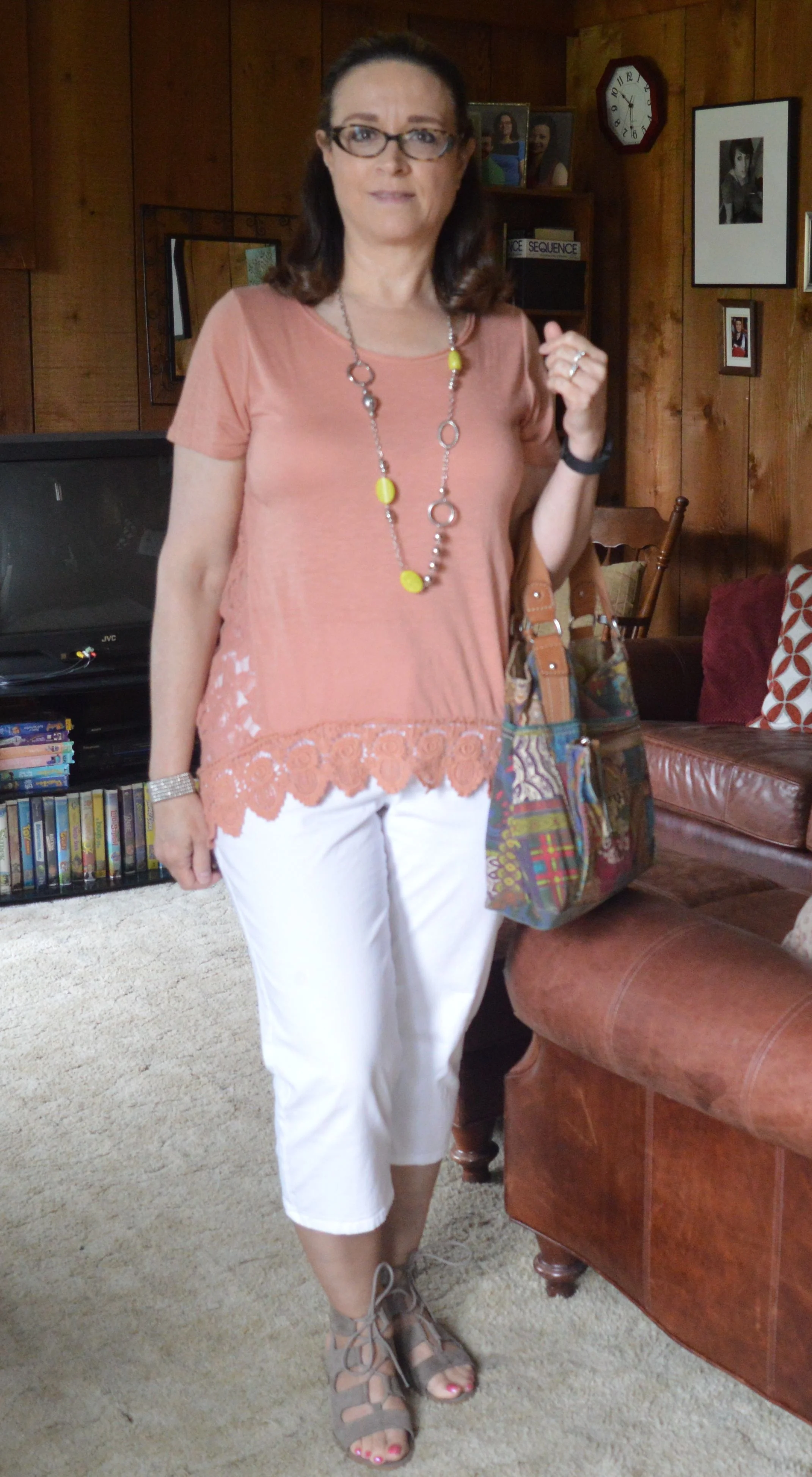
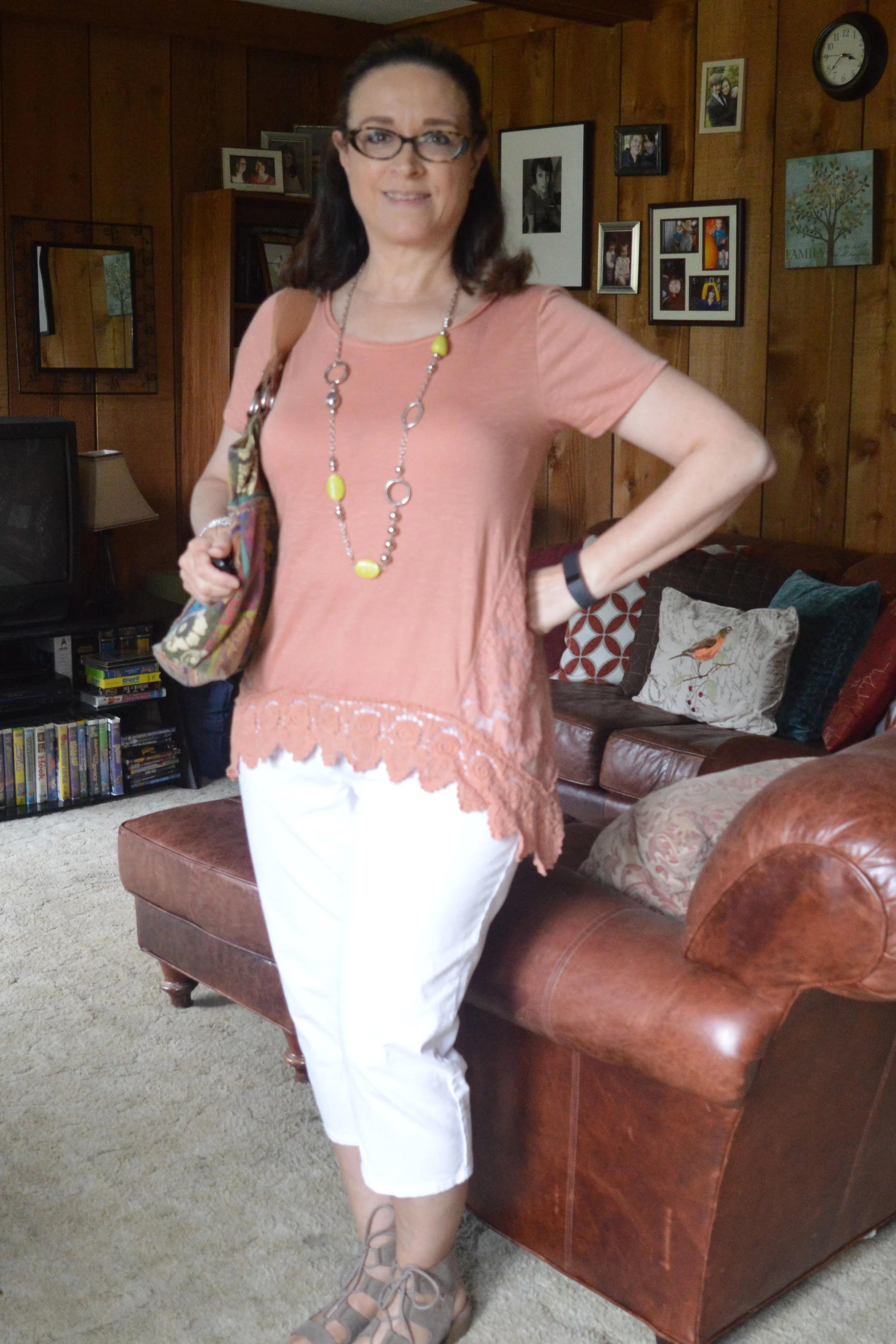
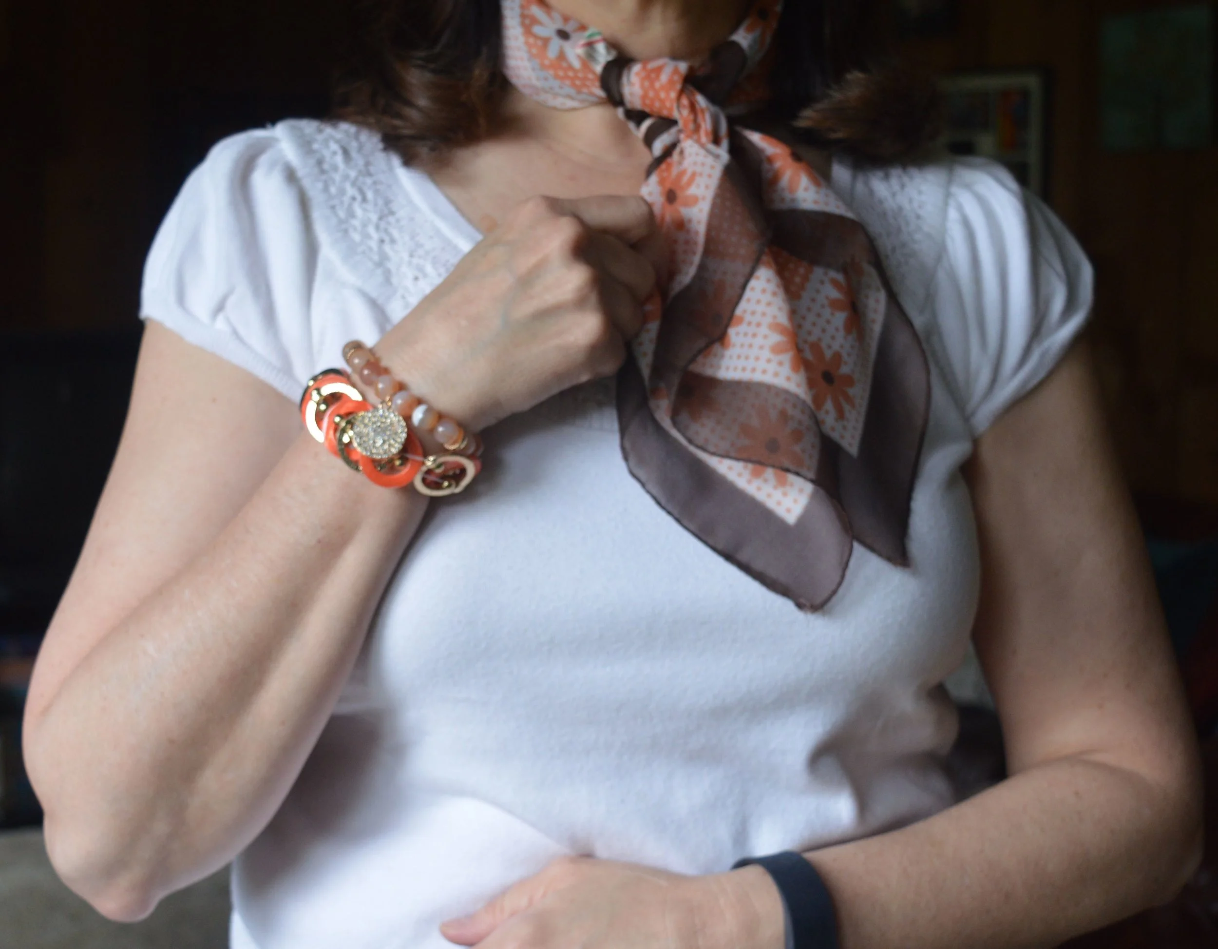
The above picture also gives you a closer look at the thrifted necklace and my beaded bracelets. I thought this necklace was a very unique blend of brassy metallics and wooden beads.

Kickin' it with kimonos - orange floral

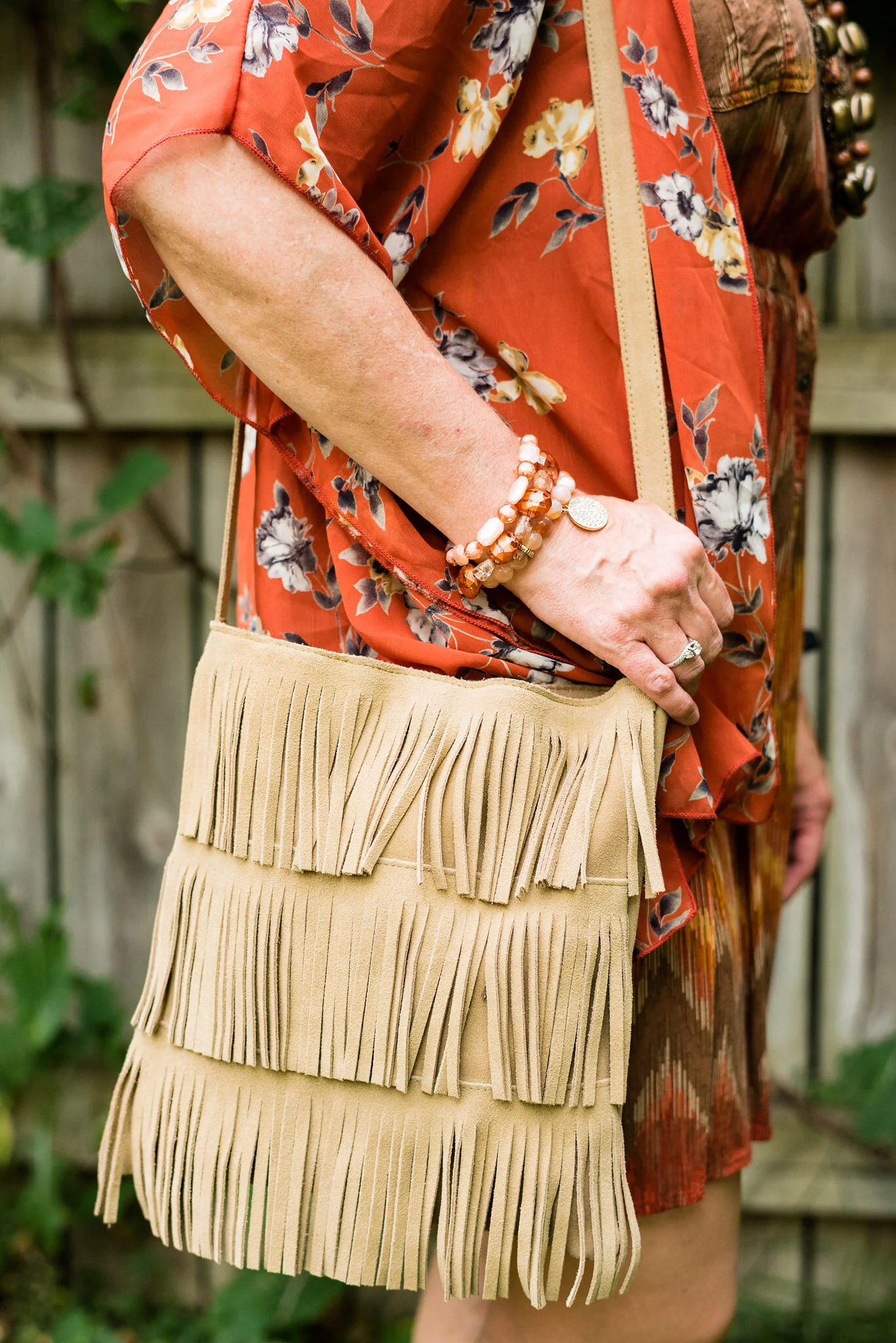
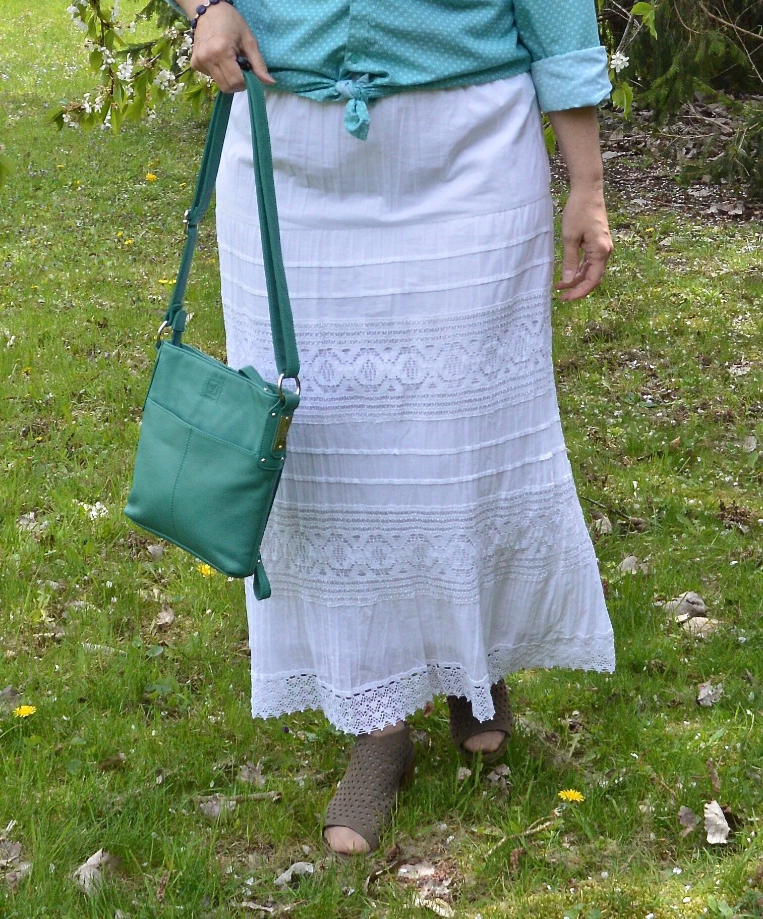
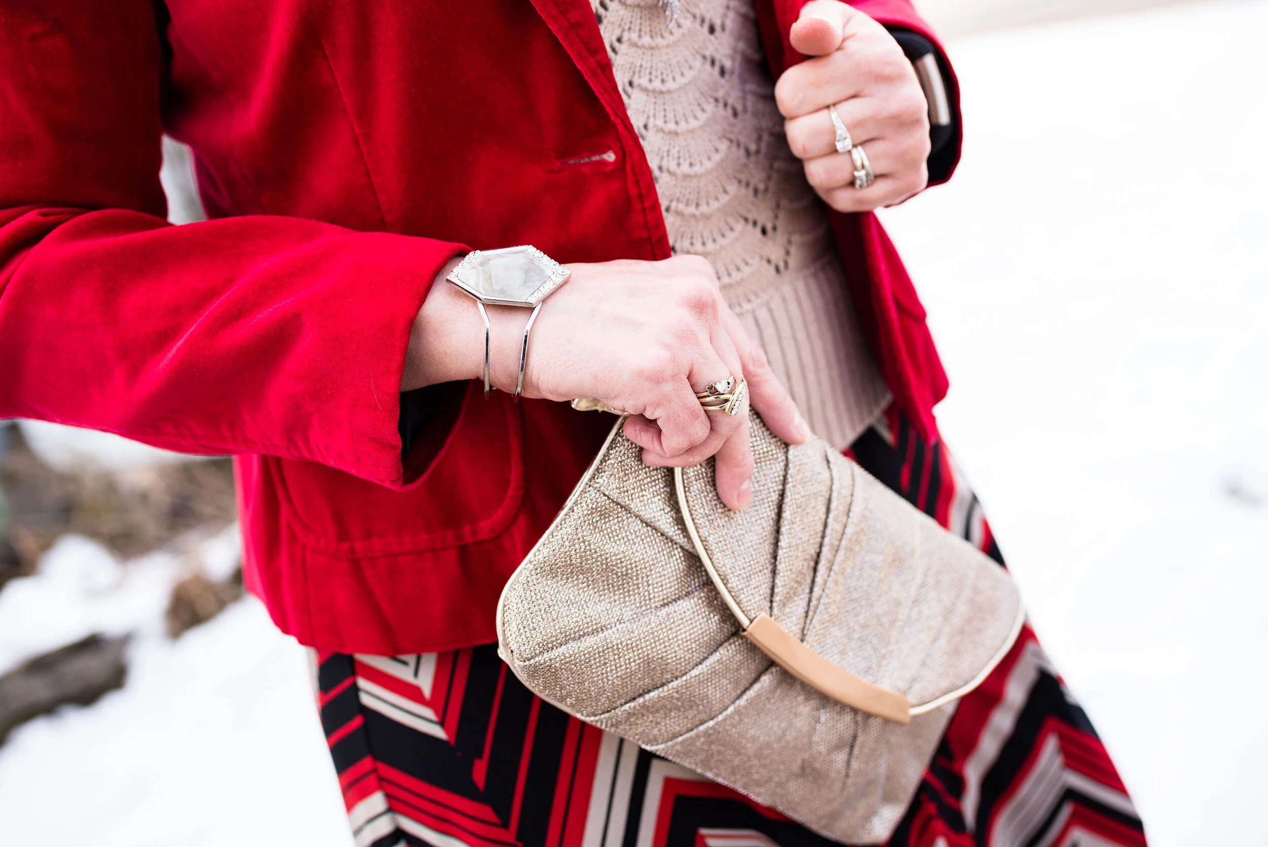
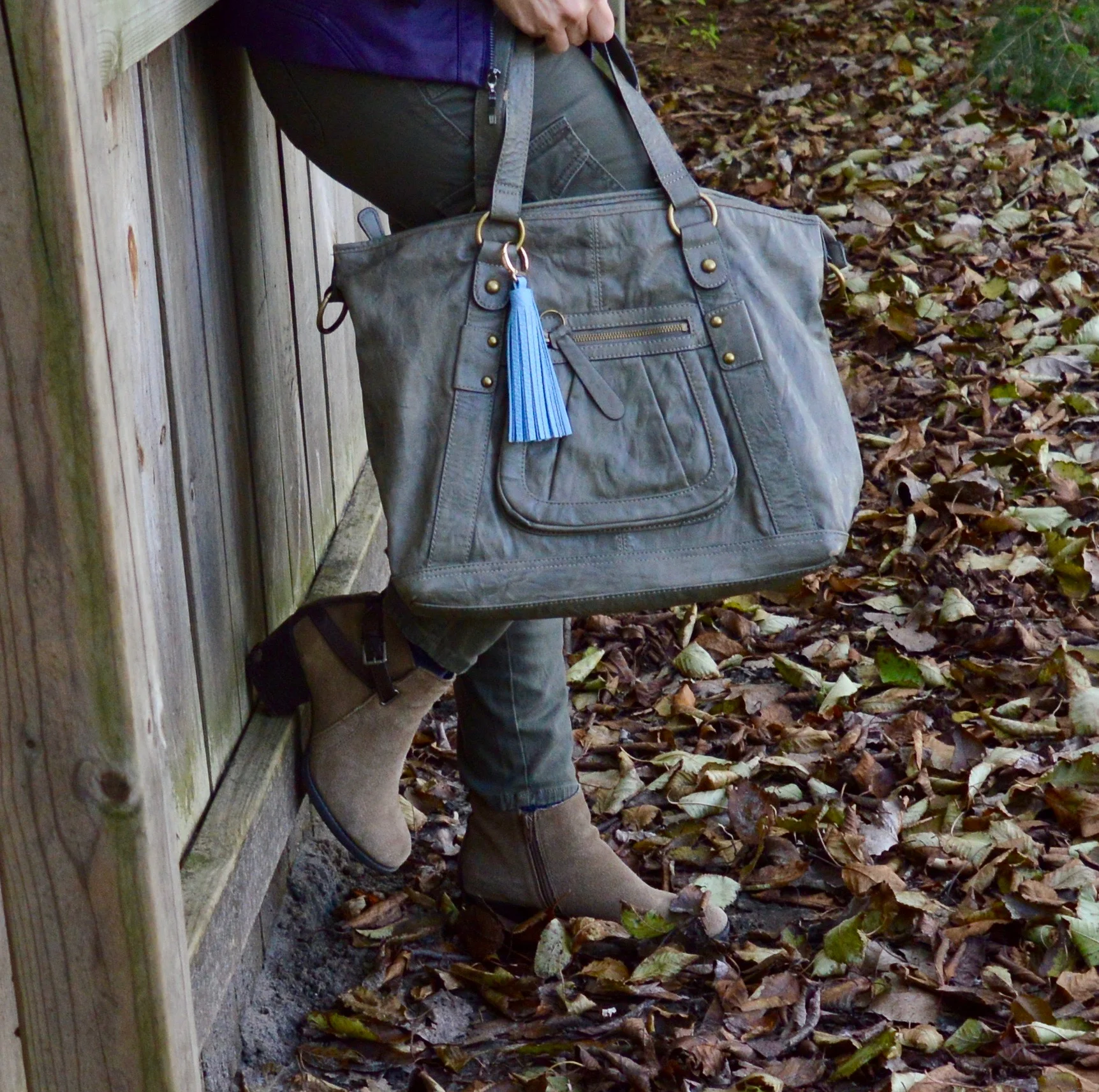
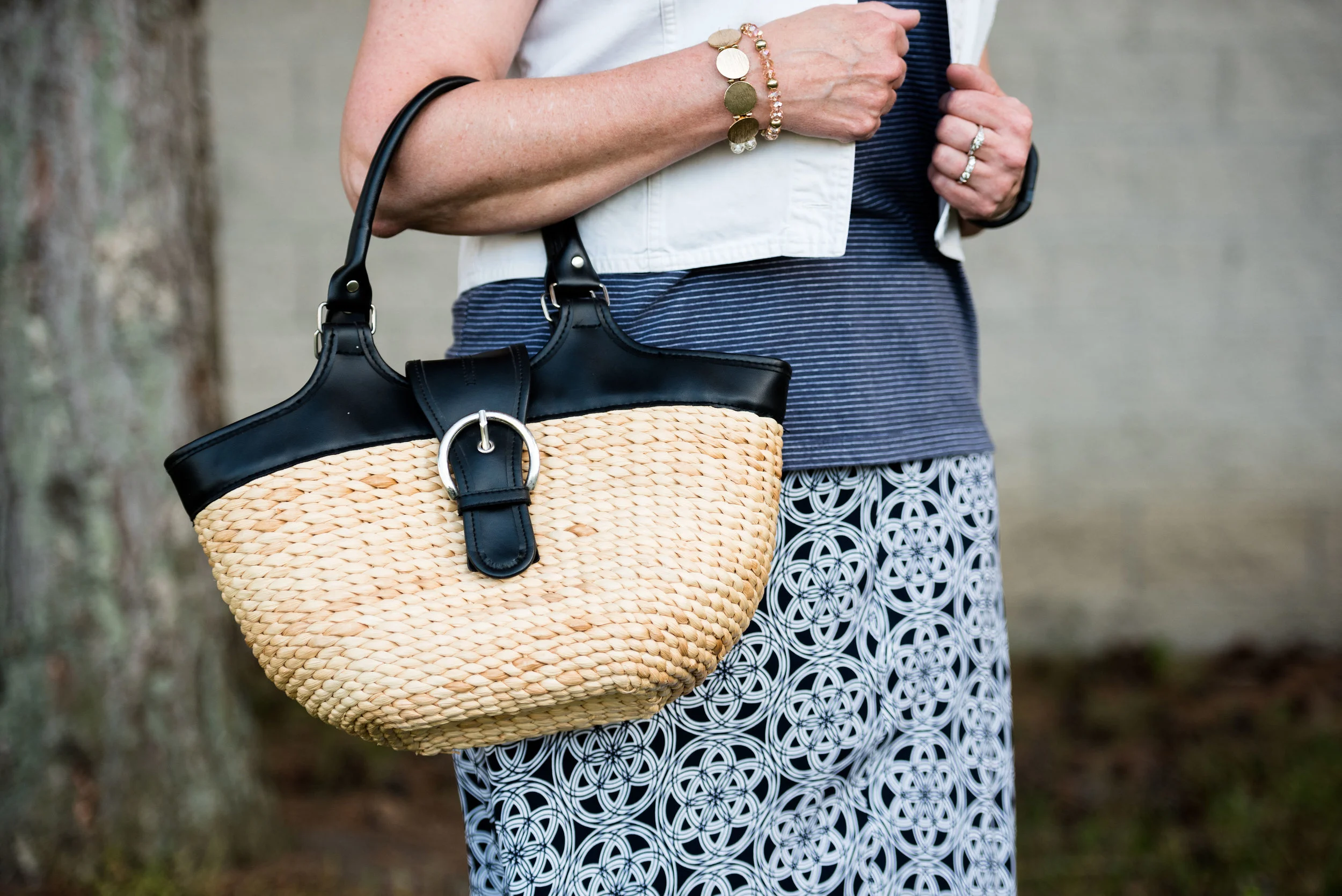
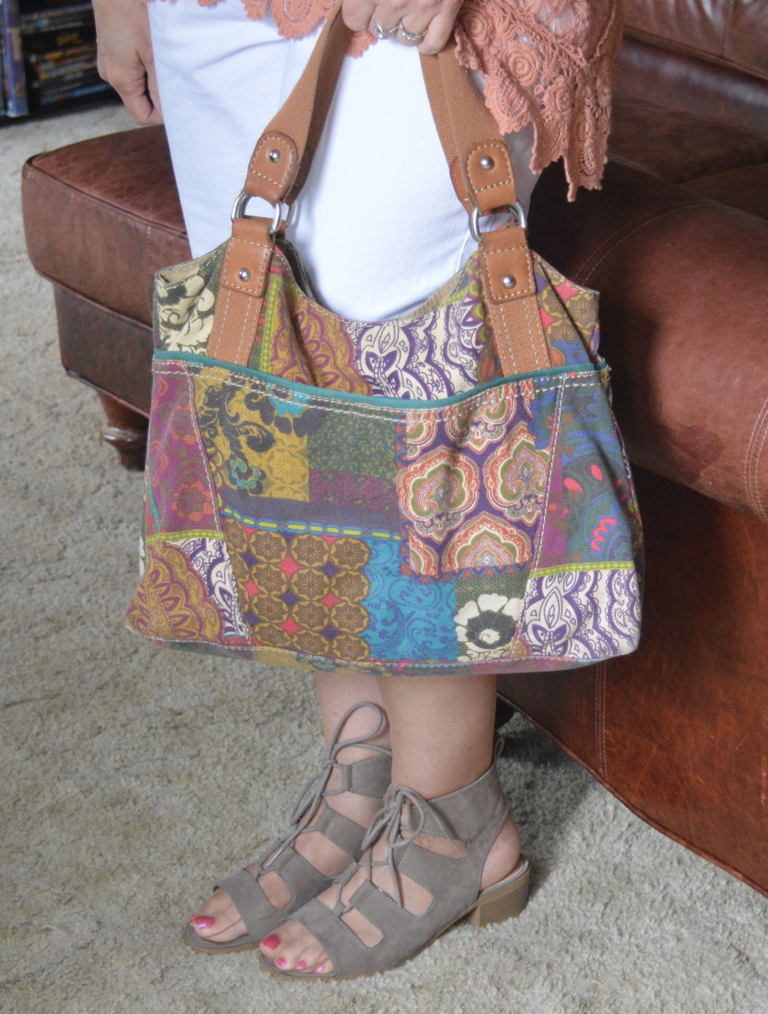
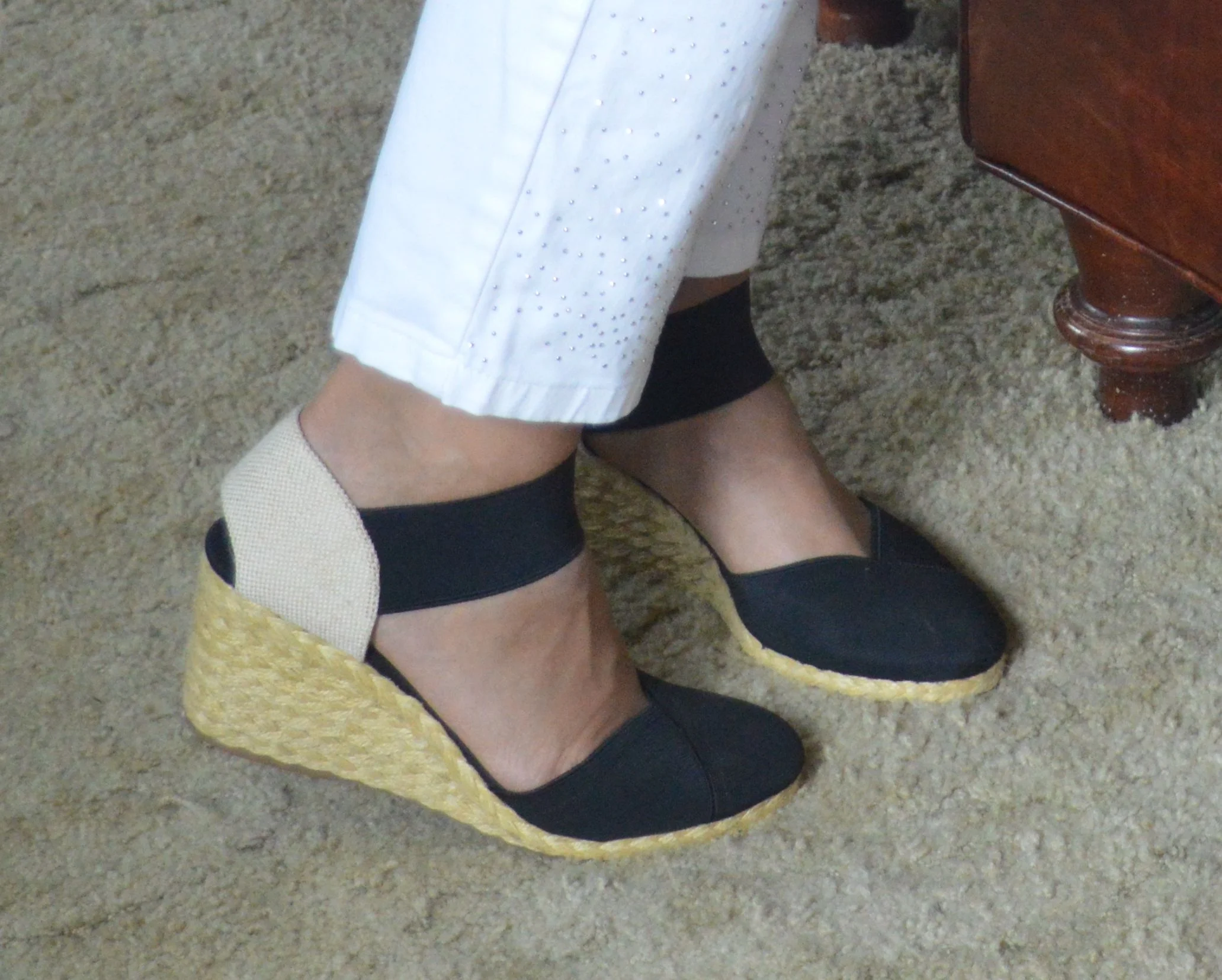
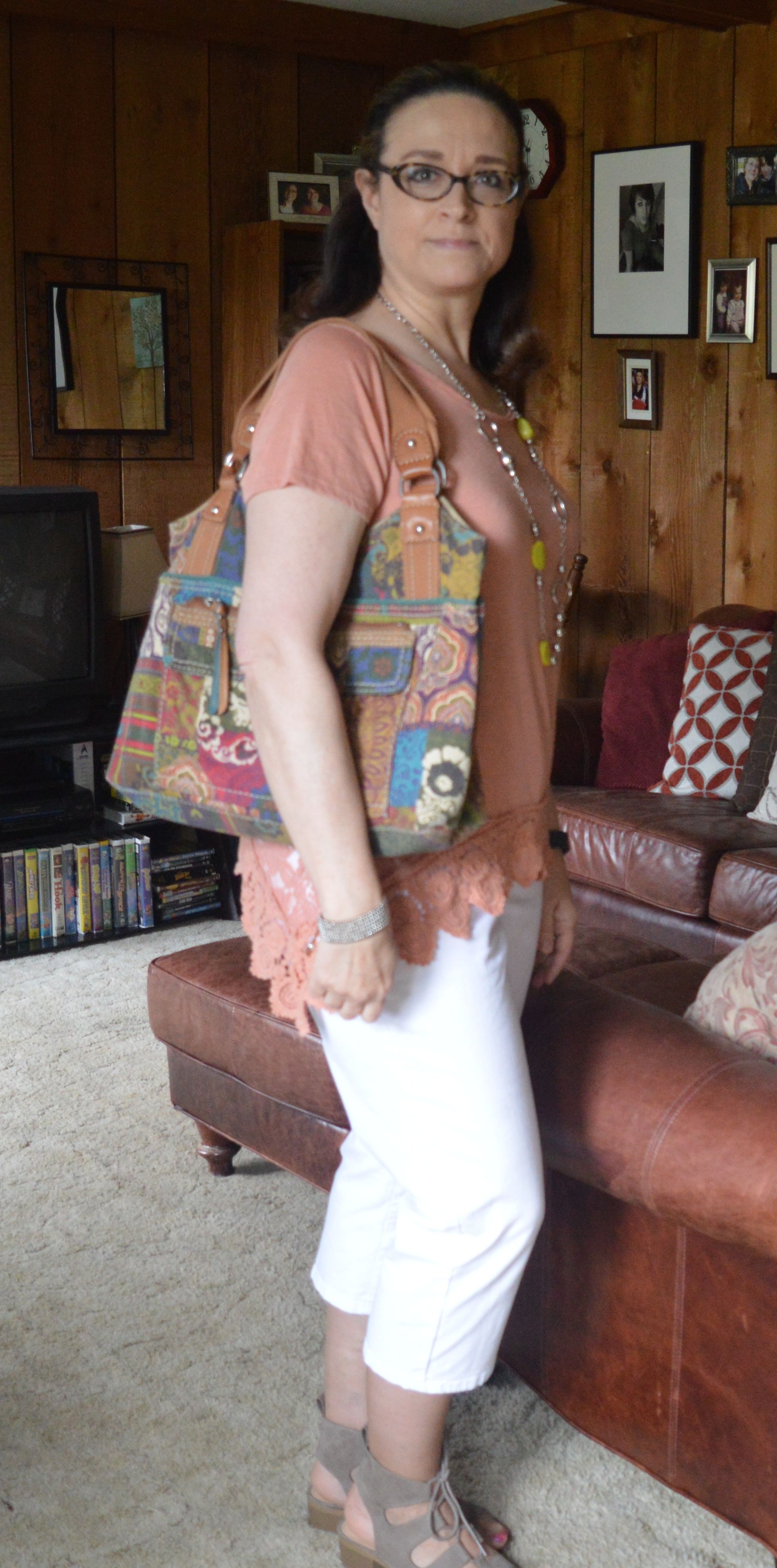
My thinking is, a good boho outfit always should include some fringe, thus this thrifted bag. This is a very simple hand crafted piece, but I just love the fringy layers and it definitely appeals to my inner hippy. You can see this bag with two other boho looks on the blog: medallion print skirt and denim outfit.

Kickin' It with Kimonos - orange flora

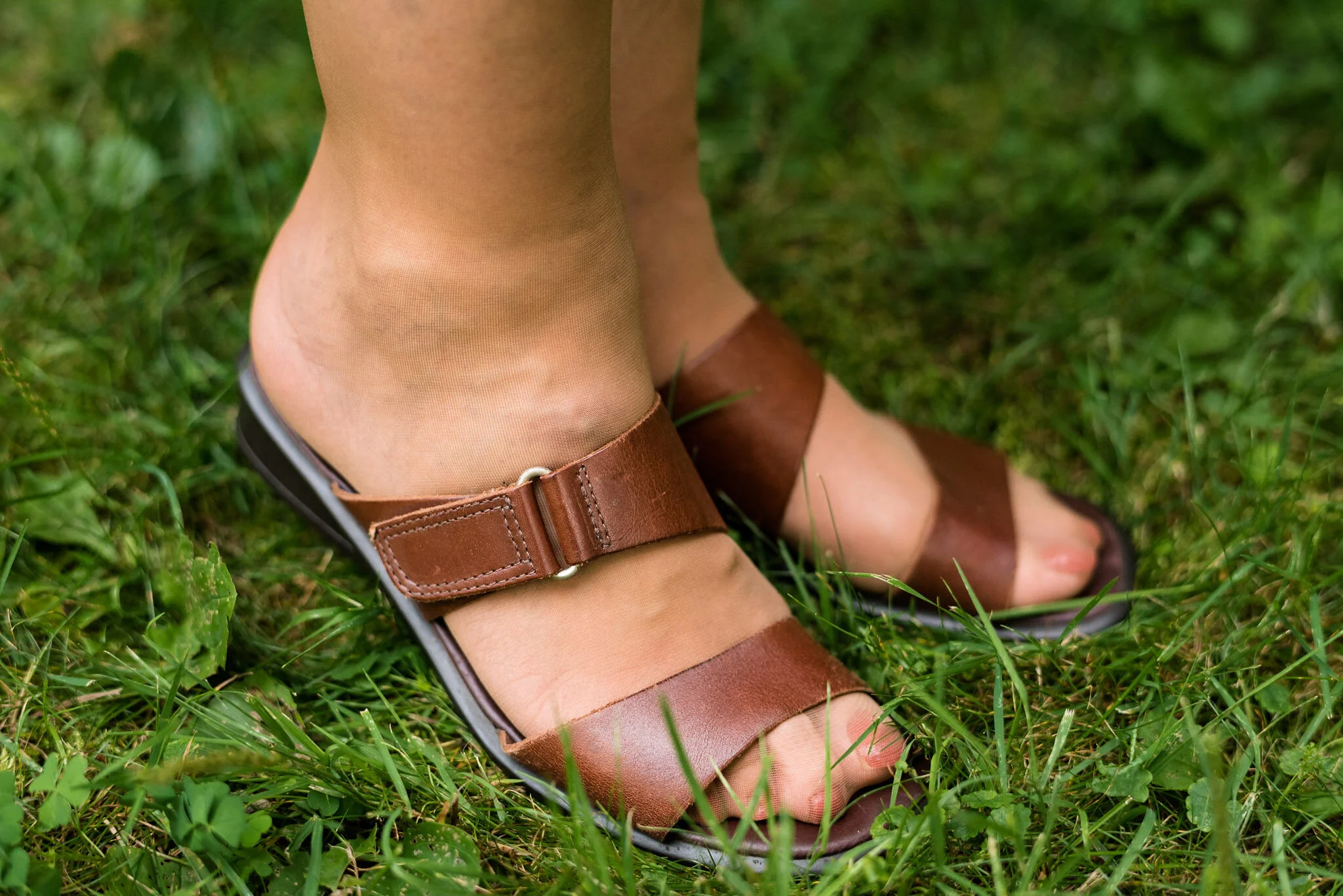
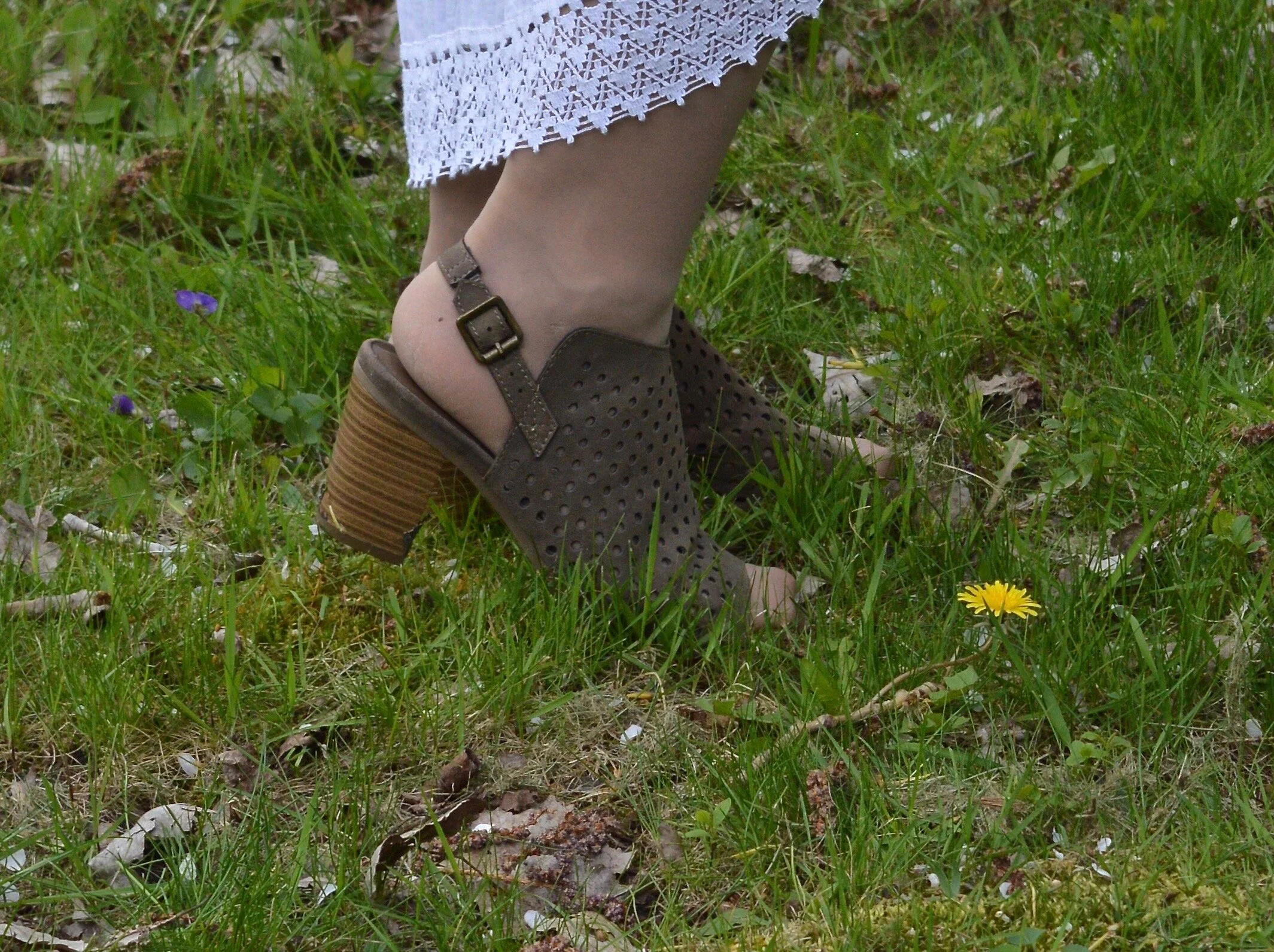
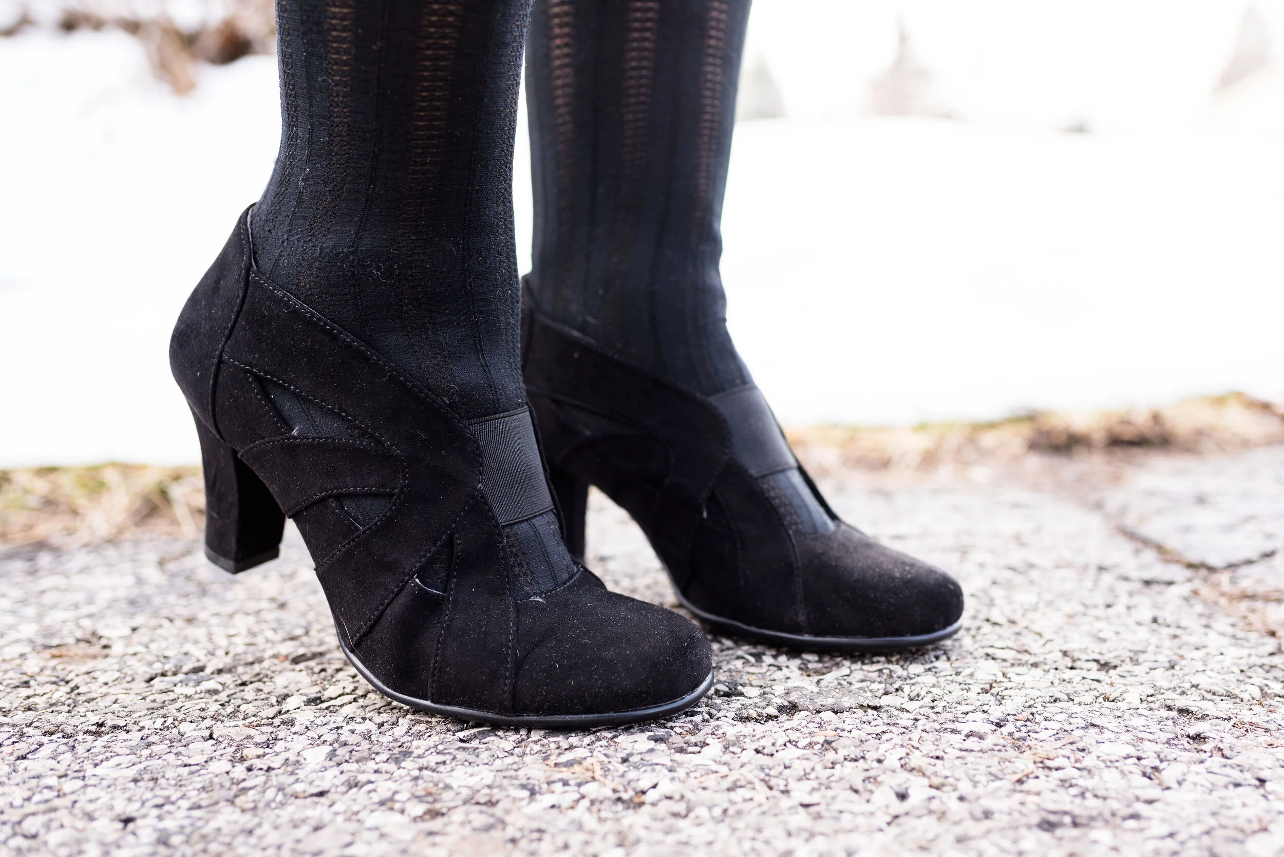
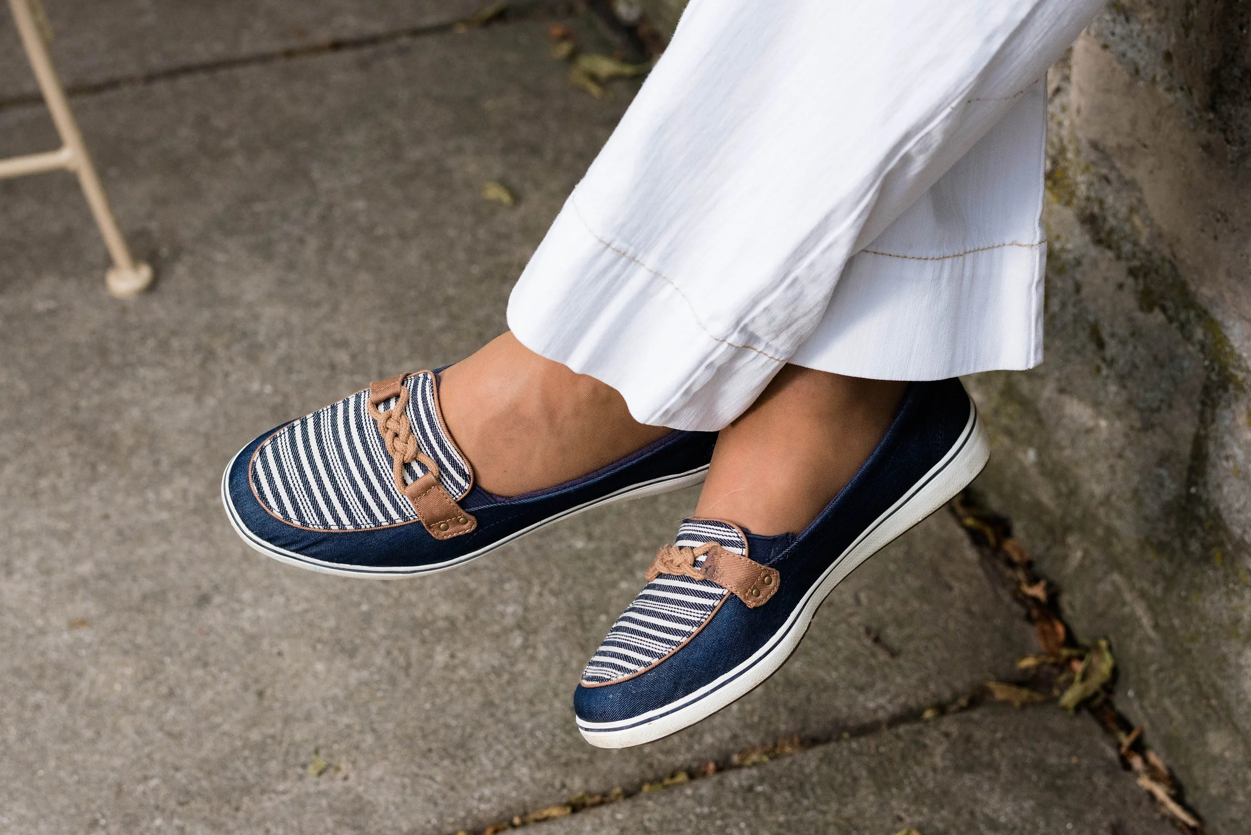
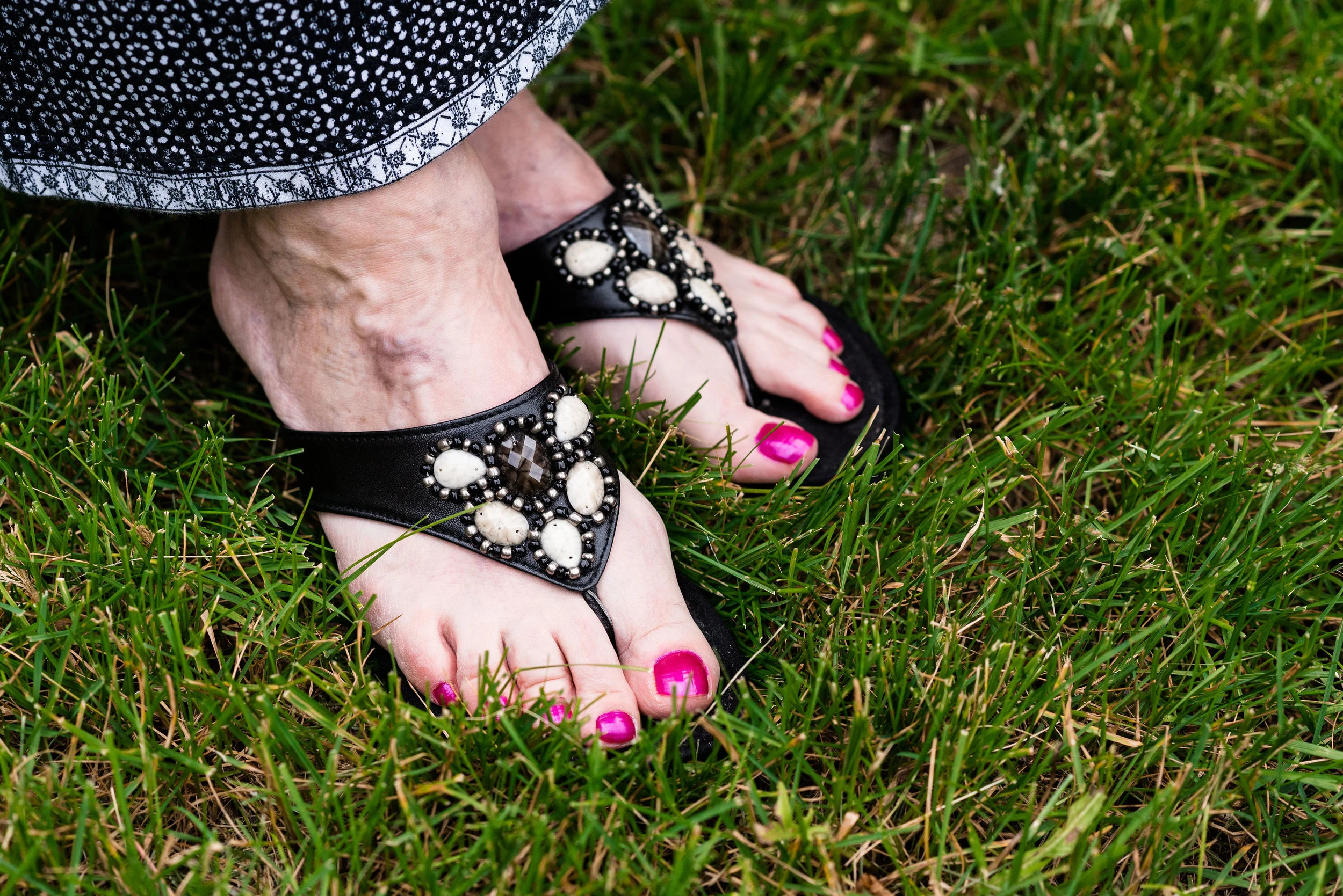
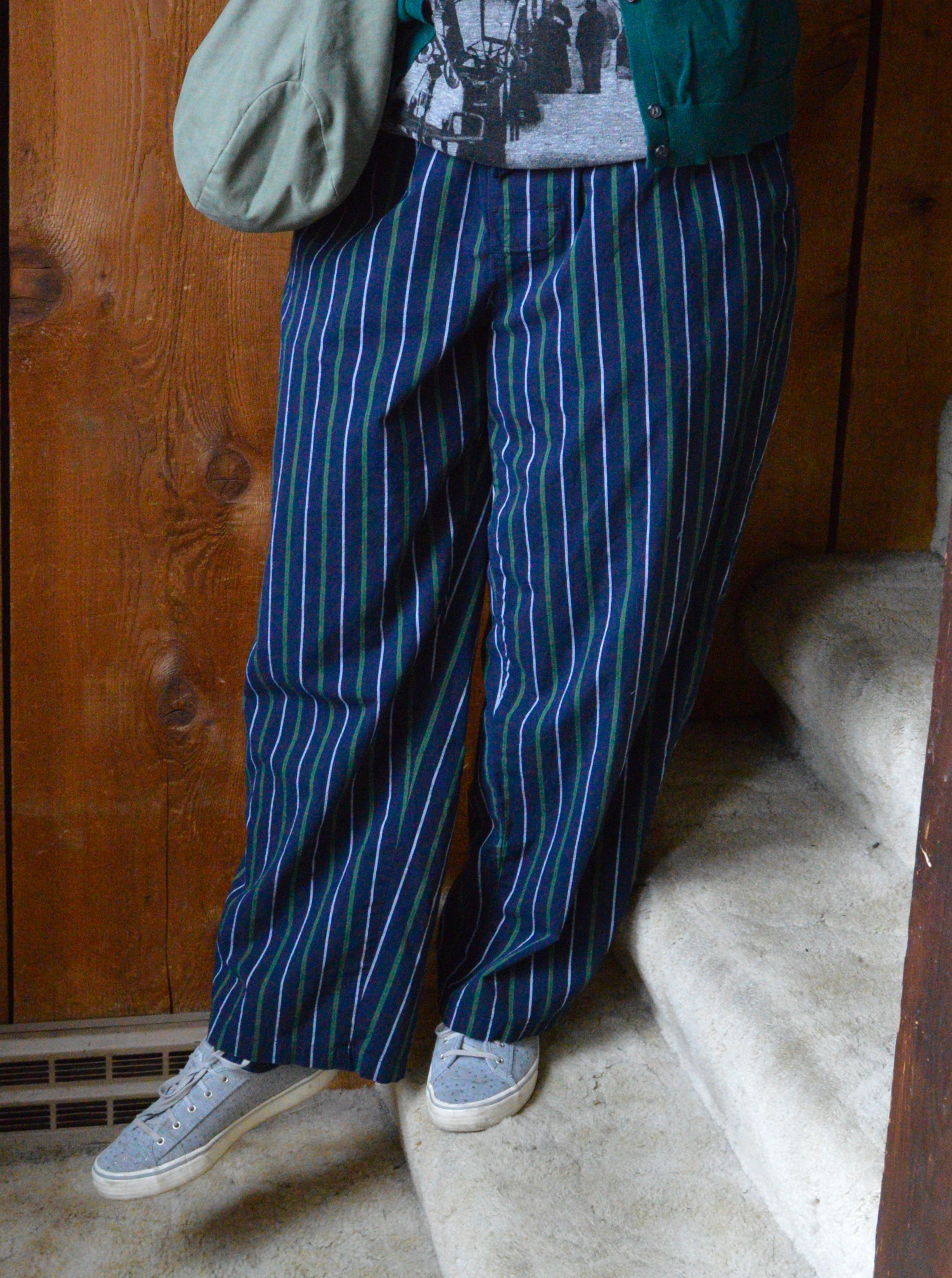
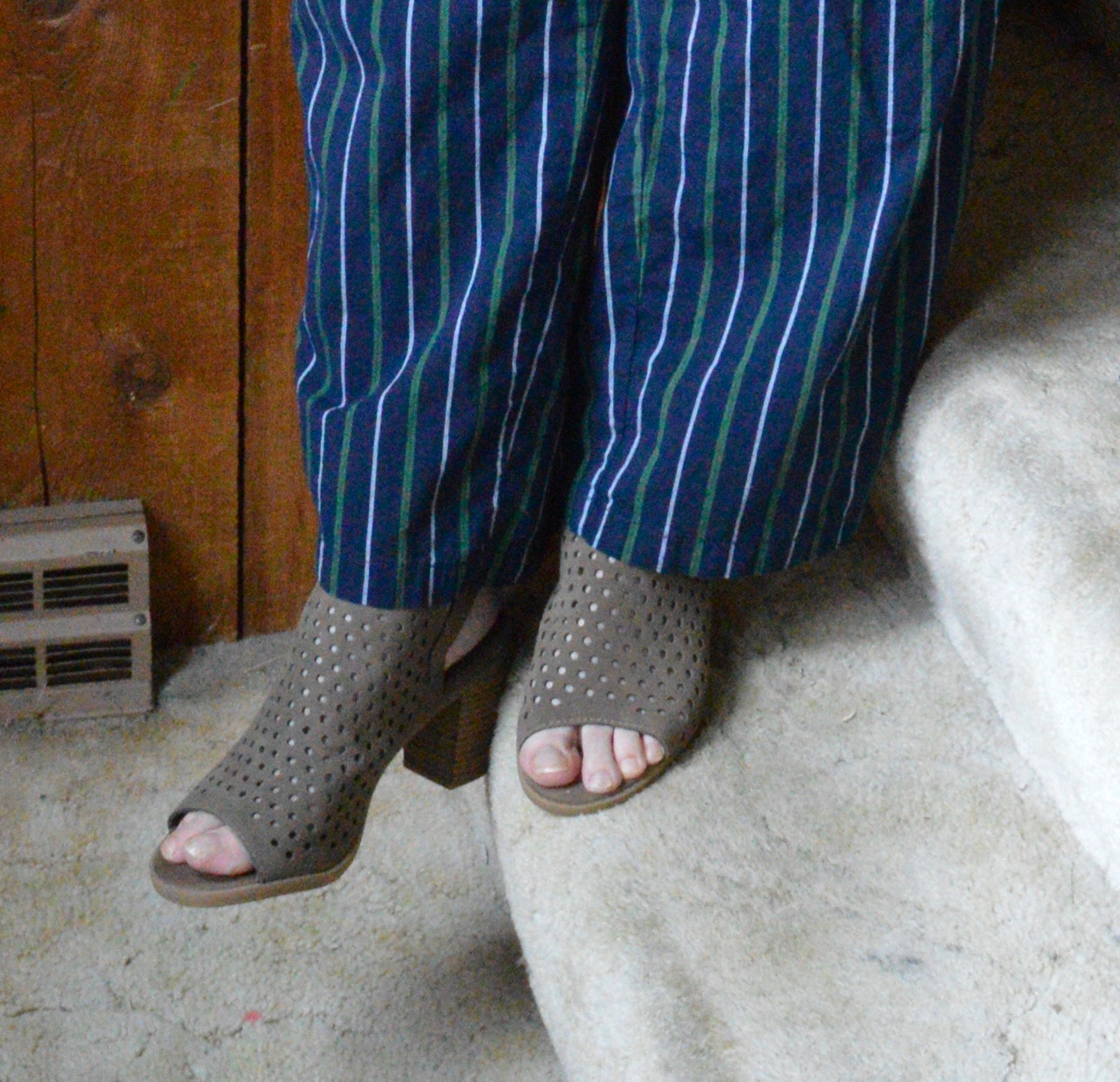
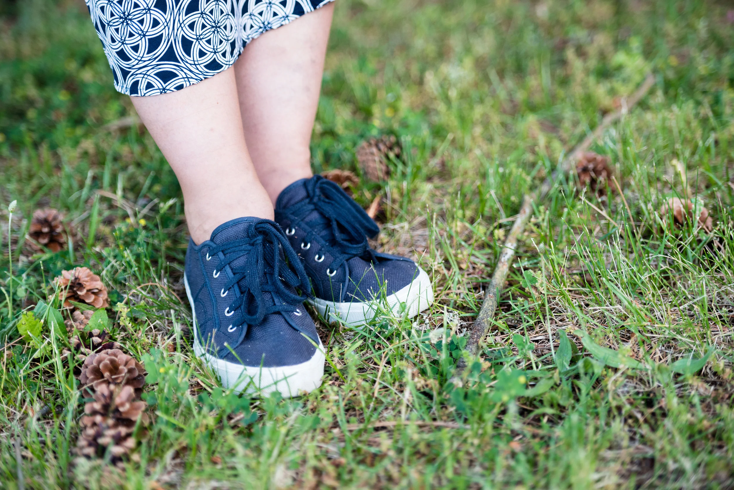
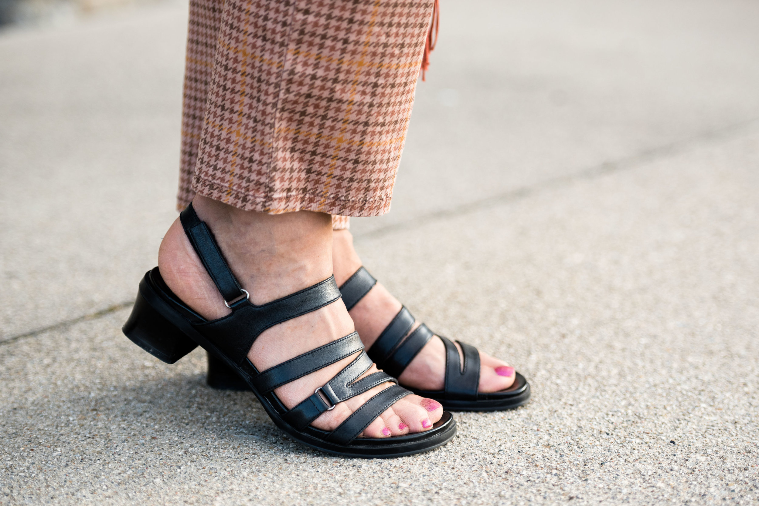
I have had these Montego Bay Club sandals for ages. I used to wear them quite a bit, but more recently I haven’t really been wearing sandals as much. I’m glad I thought of these, however, and I think they work just right for this outfit. What do you think?

Kickin' it with kimonos - orange floral

What did you think of this outfit? Would you do a print mix like this? Why or why not? I’d love to hear your thoughts, so be sure to leave me some love in the comments. I appreciate all your insights and ideas.

I’m including a few shopping links. These are affiliate links. Every time you click on a link, I get a few cents. Every penny counts. All opinions are my own.

Photo credit Rebecca Trumbull.


Pantone Spring/Summer - 2020 - Biscay Green, Saffron and Brilliant White

Today’s outfit revolves around three colors from the Pantone Spring 2020 New York Palette that are described as flavorful, cleansing and pristine. Saffron is a rich orangey yellow color, while Biscay Green leans towards a more soothing aqua. Both colors to me are perfect for summer and when paired with a bright white give a warm weather, party ready look.

When I saw Biscay Green on the palette, I knew that I had nearly nothing in my closet that was this pretty greenish blue, so I started keeping an eye out at my local thrift stores last fall for an item or two that would add this medium green to my closet. This oversized button-up caught my eye. It is a brand called Zylos, which appears to be a past men’s brand in dress shirts and ties. As I have mentioned before, I am liking the oversized button up shirts for a fun, casual way to dress up a pair of jeans or in this case a skirt. For this outfit, I tied the bottom of the shirt and buttoned two buttons.

Pantone Spring/Summer 2020 - Biscay Green, Saffron and Brilliant White

The Saffron colored Apt. 9 tee, is another thrift find and I have used it on the blog before for another Pantone series. Last year a similar color was called Mango Mojito and I used this same tee to represent that color. You can see that post here. I thought the color was independent enough that I didn’t need the whole tee shirt to show. The bright pop of yellow orange stands out quite nicely with the peaceful green.

Pantone Spring/Summer 2020 - Biscay Green, Saffron and Brilliant White

I’ve styled this skirt on the blog before. It is St. John’s Bay brand and I got it at JC Penney a few years ago. I was drawn to it for two reasons. The first was that it was white and it was lined. It is so hard to find white you can wear in the summer that doesn’t require a slip or some other underwear that won’t show. This skirt is completely lined. You can still see through it if you have on a dark pair of panties, like red, black or navy, but for the most part they won’t be noticeable. The other reason was the beautiful lace detailing. It is a very pretty piece and can be dressed up or down, depending if you are feeling classic or boho.

DSC_0012 (2).jpg

I have had this layered beaded necklace for a while. I really like it, but don’t think to wear it that much. When I saw how well it complimented this outfit I was excited to include it. So much of my jewelry I can’t even remember where or when I got it. Ha, ha. Maybe that’s because I have so much of it. I also included a navy beaded bracelet, which you will see in the next picture, to pair with the navy beads in the necklace.

Pantone Spring/Summer 2020 - Biscay Green, Saffron and Brilliant White

I found this bag at another thrift store when my girls took me thrifting back on my birthday in January. Ahh, those were the days, when we could get together, go shopping and get lunch. Hopefully, those days will come again. I love the color and feel of this bag. It is a brand called Stone Mountain and is very well made. It has a long handle which can be adjusted, so you can either use it for a shoulder bag or a cross body bag.

Pantone Spring/Summer 2020 - Biscay Green, Saffron and Brilliant white

My perforated peep toe shoeties are Sonoma brand and from Kohl’s. I need to paint my toes. I don’t wear sandals a lot because my feet are like my legs and covered with nasty looking varicose veins. Last fall I went to a vascular surgeon who did an ultra sound to see what could be done. Unfortunately, most of the veins in my legs are in the same bad condition, so having them worked on would provide some temporary relief, but over the course of time, they would develop the same issues. I am putting that off for now, but one day may revisit the idea.

Pantone Spring/summer -Biscay Green, Saffron and Brilliant White

Do you like these colors? How would you wear them? Remember you don’t have to put the colors together as I do. I am simply trying to show you what the colors are for the Pantone seasons and ways you might combine them. Do you wear white in the summer? Do you have a white skirt or do you prefer to wear pants, capris or shorts? I’d love to hear from you, so leave a comment or two.

Graphic designed by Rebecca Trumbull.

I’ve included a few shopping links for you. These are affiliate links. All opinions are my own.

Have a great day and be safe as the world begins to open back up!

.

Transitional Spring Outfit

Before I get to my Pantone series I decided to do a few more posts featuring transitional spring outfits. If you are unsure what a transitional outfit is, let me explain by first giving you the definition of the word transition. Webster’s online dictionary gives several definitions for this word:

- passage from one state, stage, subject, or place to another

- a movement, development, or evolution from one form, stage, or style to another

- a musical passage leading from one section of a piece to another

There are a few other definitions which are not as pertinent to our fashion content. The second definition seems to be the one that suits our needs the best, but I really like the third definition. Aren’t we a musical score, written by an Almighty Creator? The seasonal changes in our natural world and in the fashion world are akin to a piece of music changing and modulating from one section to another.

When it pertains to fashion we enjoy moving from one season to another just as much as we enjoy the change of the nakedness of winter to the covering bloom of spring. We enjoy moving our heavy, dark winter clothes to the back of the closet, or the bins in the basement and pulling out our bright, light weight tops and fun colorful maxi dresses. What often becomes a problem is that period of time when winter has not yet loosened its grip and the chill in the spring air is too cool for our light weight layers. The transition is this time period we, in the midwest, now find ourselves in. We still need our sweaters and our booties, but we crave our bright colors and layers that allow the sun to caress our skin.

Today’s outfit is another attempt at styling a look around a scarf. I have so many pretty, colorful scarves, so I thought why not use them as focal points for outfits.

The beauty of styling an outfit around a colorful scarf like this is it is so easy to do. This scarf has several colors including a light and dark pink, a light purple, a light blue and the orange. I wanted to stay away from pink for this outfit so I chose the orange, light blue and purple to focus on.

My Worthington orange pants have made many appearances on the blog. You can see them worn with a green sweater, a floral dress, and a print top. Worthington is a JC Penney brand and I find them to be a good brand if you are looking for durable, decent fitting work/dress pants.

My light blue Sonoma tee was a thrift find. I typically wear these crew neck or v-neck types of tees as layering pieces under sweaters or long sleeve button ups during the winter, but for a transitional outfit like this it was perfect to wear on its own, or in this case with a vest.

The above picture gives you a closer view of the scarf. It is a large square, which I folded into a triangle. The point point of the triangle is at the front. The two other long, narrow points fold towards the back and then around to the front. I tied those into a double knot over the bib part of the triangle.

I chose this open weave black marled vest to go with the black lines in the scarf. This vest is Croft and Barrow brand from the Kohl’s clearance racks a number of years ago. (I am not sure what was going on with my pants, but please don’t judge my crotch ailment — ha, ha! Probably because they are a little tight, bleh!)

This Nicole Miller bag was another Kohl’s clearance find a few years ago. It has appeared on the blog numerous times. I chose it for its purplish color. I also opted for a few purple bangle bracelets to add to the purple vibe of the scarf.

I chose my tasseled Dana Buchman loafers as I thought they went with the vest and as you learned earlier this year, loafers are back in.

Do I have you thinking about those pretty scarves in your closet? Do you have a few that you feel qualify as spring scarves due to their color and weight? I think it would be fabulous if you built an outfit around one of those scarves and told me about it in the comments below. I would love to hear your thoughts on how you put a transitional spring outfit together, using one of your scarves.

As usual, I am including a few shopping links for you to look over. These are affiliate links, which means when you click on a link, I get a few cents. If you purchase something through one of my links I get a few more cents. I appreciate every click. All opinions are my own.

I hope you week is off to a good start.

Be sure to check back tomorrow for another post on my Faith page, where we are working our way very slowly through Romans chapter 8. In addition if you follow my Fashion pages, Thursday will feature another transitional spring outfit, this time with a new maxi dress I got from a local retailer before the stay at home order went into effect.

Have a good day!

Seeing Red - Red with Tan - Velvet Jacket

(For those of you who entered the Bloggiversary Givaway, be sure to read to the bottom to see who won.)

As I was preparing for this series, I knew there were certain pieces I wanted to feature. Today’s red velvet jacket is one of those. This thrifted Briggs NY blazer is such a fun and unique piece. I originally got it as a holiday blazer when I was doing my 20 Days of Christmas series back in 2018. You can see the post featuring that Christmas outfit here. I wanted to be able to style this jacket in another way and what better than to wear it for the month of February. Whether you celebrate Valentines Day or are wearing red for Heart Disease awareness month, a red jacket, or blazer is a great way to do it.

Let me share a style secret with you. I typically don’t button or zip my sweaters or blazers. If I am using a piece as outerwear, then I do want to be able to zip or button it. More often though, I add a jacket or sweater as a layering piece for warmth, but leave it open, so the under layer, whether it be a graphic tee, button up or a textured sweater like the one in this outfit, can be seen. That also allows any necklaces or scarves to be an added focal point in the outfit. This blazer is too tight, but it fits well through the shoulders and back so I bought it, knowing this is exactly how I would wear it. The fashion gurus might say I am committing a crime worthy of jail, but I don’t care. After all, part of the reason many of us blog about fashion is to remind people to wear what makes you feel good and is completely you.

Just like the red and black of last week’s post, red and tan also make a wonderful statement. My tan Sonoma sweater is older than the hills. I don’t wear it too often, but it goes with so many things and was the perfect topper for this recently thrifted Worthington skirt. I like that the sweater is an open weave, so I can layer any cardi under it and you’ll be able to see the color. For this outfit I just did white, but it would have worked well with black or red too.

I fell in love with this skirt when I saw it. I have way too many skirts and don’t wear them very often at all, but I like having them, if just for the sake of showing you outfits on the blog. Plus, I like to have choices. My problem is, I have too many choices. Ha, ha. Anyway, the skirt is easy on and easy off with an elastic waist. It is a medium weight swingy knit. I wasn’t sure about the pattern at first, and even when I put it on and looked in the mirror I wasn’t sure if it would make me look too wide on the bottom, but I think the diagonal pattern works well for both narrow and fat bottomed girls. ( Do you hear Freddy Mercury singing, “Fat bottomed girls make the rockin’ world go round”?)

I found this fun necklace on clearance at Meijer. The pretty leaf is what sold me.

I also chose my bracelet with the gray stone and my silver clutch.

The same suede Aerosoles that I wore in last week’s post are making another appearance. I opted for the black hose for two reasons. With the black shoes, they make my legs look longer and thinner. In addition, the fact that it is still winter and they were a heavier weight seemed like a good choice.

What do you think of this outfit? Do wear printed skirts or do you choose to wear only solids on your bottom half? Do you like your sweaters and jackets to be worn closed or open? I’d love to hear your thoughts

For those of you who entered my Bloggiversary giveaway, thank you so much for participating. I didn’t get nearly the response I did last year, so I’m not sure if people are just too busy, or if a Target gift card isn’t that big of a draw. Ha, ha. Anyway, for those who took the time and my one new person who subscribed, thank you, thank you, thank you. You all are truly the reason I keep doing this. I also want to say thanks for your kind remarks. You all made my day and my week.

The winner of the $30 Target gift card is Karen Anderson. Congratulations, Karen!

Thanks again, everyone who supports the blog. Have a great Tuesday.

Photo credit Rebecca Trumbull.

I’m including a few shopping links for red blazers and jackets, just in case you find your closet lacking. Have fun shopping. These are affiliate links, all opinions are my own.


Seeing Red - Layering Light - Monochrome Pink Outfit

Seeing as it is the beginning of February, I thought it would be fun to make this whole month revolve around the color red, or some derivative thereof in keeping with a Valentines theme. Today’s outfit is the last in my Layering Light series, but I felt it fit into this month’s theme, because pink is just a lighter shade of red. I remember in grade school, learning how to make pink by mixing red paint with white paint. Even though this outfit is mainly pink, just think of it as a shade a red with white mixed in.

I got these dark pink Sonoma corduroy jeans at Kohl’s this past fall. They are soft and stretchy, and the narrow wale corduroy is extra warm in the chilly winter weather.

This light pink moto jacket is a clearance buy from Christopher and Banks. Can you have too many moto jackets? Of course not! Ha, ha.

This light pink Gap turtleneck was a thrift find. I like that it is lighter weight, because that makes it easy to layer under other pieces. The ribbed neck is also soft and comfortable, with no itchiness or irritation. Different fabrics affect my skin in different ways. I cannot wear wool and usually try to stay away from fabrics that are stiff and scratchy.

You can also see in the above picture, I added a pink scarf which subtly ties in to the darker color of the pants. The coppery metallic ring necklace and the thrifted copper bag were a way to add a touch of earthy color to the outfit.

These SO block heeled blush boots were the perfect choice to finish off the outfit.

This outfit would be a great date night look to wear with your significant other for Valentine’s Day. My husband is not a huge fan of pink, so I might wear this out with friends and choose something else for the romantic holiday.

Would you wear all pink? Do you own a pair of corduroy’s? Let me know your thoughts in the comments below.

This month I will be having another give away since this is my bloggiversary month, so keep a look out for that.


Color Play - Inspiration from Art

One of my monthly columns is going to be this one called Color Play. You know how much I love color and enjoy finding different combinations that are new and unique. Color is all around us in nature, in our homes and in many places we don’t really think about. For this month’s outfit, I was inspired by a painting and table arrangement in my daughter’s house.

This is a watercolor painting by my son-in-law’s grandfather, John Trumbull (not to be confused with the American Revolutionary painter by the same name). While he is not famous, he has done some teaching and won a few awards and ribbons for his work. I was gifted one of this paintings last year for Christmas and just love it.

The table arrangement was put together by my daughter and I really like how the painting and arrangement compliment each other. This is when I was inspired to come up with an outfit using a similar arrangement of colors. This is what I did.

I just obtained this plaid ANA jacket from the JC Penney clearance rack. It was still a little more than I wanted to pay, but I had a coupon. I almost put it back, but I just have this thing for plaid. I kept looking at it thinking, I love it. I can come up with fun blog outfits with it and I’ll actually wear it. It came home with me and I don’t regret it. I could also justify the purchase because I was using birthday money to buy it. Ha, ha.

The piece is not lined, but has deep, welt pockets a notched lapel and button front. The color is a very light bluish gray and it made me think of the two tall, slender vases in the picture.

The two under layers consisted of a thrifted Chaps, floral button up, and a thrifted Sonoma, v-neck sweater. I felt the green sweater went with the lighter greens in the painting and the floral top picks up the sublte purples. I get into these moods when I am thrifting where I buy similar type items, usually patterns. For a while it was gingham, then it was stripes, now it is florals and plaid. That is part of the reason I have so many clothes. It’s that time of year where I will need to do some thinning out of my wardrobe.

My light colored Croft and Barrow jeans are also thrifted. I was looking for something in a lighter color that wasn’t white and these seemed to fit the bill.

Accessories included a simply handmade bead necklace, purple bangle bracelets. and a Nicole tote bag. I love the purply gray color of this purse. The gold accents make it look high class.

Since we are still in the cold weather season I decided to include my Sonoma shearling ankle boots. These are warm, comfy and stylish for this chilly time of year.

What do you think of this color combination? Do you like to wear plaid? What’s your favorite pattern to wear? Leave me some love in the comments. It always gives me a boost to hear from you.

I’m including a few shopping links. These are affiliate links, which means I get a few cents if you click on a link. I get a little more if you purchase something through my website. All opinions are my own.

Photo credit Rebecca Trumbull.


Wearing White - Long Pants

Today’s featured piece is a pair of white Gloria Vanderbilt jeans that I have had for a long time. They were a little big when I originally got them, so fortunately, they still fit. These are a heavy weight jean, so there is no fear of see through, but because they are white I still choose to wear neutral underwear. I find that a neutral color like beige or a light peach or blush are an even better choice under white garments, because they mimic the natural color of our skin. If you are a darker skinned individual a deeper neutral would still be the way to go when wearing white.

This is another classic look like Tuesday’s pairing with black and white, but this time I paired the white with navy. Navy and white always make me think summer, nautical and beach, for some reason. Isn’t it funny how we have preconceived ideas about color and color combinations? There is nothing wrong with that and sometimes it is good to embrace that which is classic, timeless and well known.

Another classic summer look is the striped tee with white pants. This Loft tee was a thrift store find. I like that it has wider stripes, just for a change of pace from my typical skinny striped tees. I also love the elastic bottom. Sometimes an elastic band can ride up, especially if you get a top that is too small. This is a large and in Loft wear, I probably could use a medium .5, ha, ha, if there was such a thing. However, for this top the large works well. The elastic keeps it in place and the extra room allows for less of my bulges to show.

To make this a fall worthy, transitional outfit, I added the jacket. This Sonoma navy utility jacket has its own unique appeal. I have five utility jackets. You might wonder why I need so many. Truth be told, I don’t need any of them, but each one had something special about it that helped me decide to buy it. This green one was the classic olive style. This orange one is a color I love. Of course the wardrobe wouldn’t be complete without a camo one and an embroidered one. As if that was not enough, (you can see the others by clicking on the links), when I found this navy one with the embroidered sleeves, I knew it was coming home with me.

I kept my accessories simple once again, but you could have jazzed this outfit up with a bright, colorful scarf or bag. I went for a simple olive, crossbody, bag that seemed in keeping with the utility idea. This was a bag my daughter was getting rid of, so I snatched it up.

I tried on several necklaces and while I could have got completely without, I chose this simple blue flower on a silver chain. Do you think this small charm works with this outfit? Why or why not?

Once again, here are my navy Grasshoppers. These are such a classy and stylish shoe, perfect for warm weather and can be worn with skirts, cropped pants, shorts or jeans and they are amazingly comfy.

Finally, a post from me wouldn’t be complete without a blooper picture when I have one. The wind had picked up a bit on this very warm day, when we were taking pictures. When I tried to put my jacket on it kept blowing back into me. When I finally got it on, I was trying to flip my hair outside the collar and everything was sticking to me. The combination of sticky, windy and silly resulted in the this picture.

Overall, I like this outfit. What did you think? Do you wear white pants? Do you wear them all year round, or just in the summer. I love to hear your thoughts, so leave me some love.

I’ve included a few shopping links for utility jackets. If you don’t own one, now might be a good time to buy for fall. These are affiliate links. All opinions are my own.

Photo credit Rebecca Trumbull.

Friday linking up with Jennie of A Pocketful of Polka Dots.


Summer Pieces - Longer Kimono

Part of what makes a clothing piece interesting to me is color and pattern. As most of you already know, who follow me, I love pattern mixing and color combinations. Some of my pieces are busy with patterns and some are simply understated with texture rather than a mix of designs and color. What I like is the ability to choose. I have never been a fan of capsule wardrobes, not because they aren’t incredibly practical and workable, especially for vacations, but because I like to have choices. Not just the choice of what outfit to wear, but how to put that outfit together. As an aside, I really should try to do a capsule wardrobe for a month and see how it goes. That would make for some interesting blog posts

Today’s outfit focuses on a Sonoma kimono that I recently acquired on the clearance rack at Kohl’s. I love when they mark things down and then I get a 30% off coupon, plus a rewards coupon and some Kohl’s cash. That is really the way to stock up on fun pieces like this.

I like the sleeker fit of this kimono compared to a poncho, a ruana or a kimono that is wider. It gives a more fitted silhouette. If you are not sure what the difference is, check out my series on kimonos by clicking on the following links: Week 1, Week 2, Week 3, Week 4, Week 5, and Week 6.

I normally don’t like to take pictures of my bum, but I wanted you to see the whole kimono front and back. This way you can see the length and the continuity of the pattern. The colors include a light blush on the front trim and a dark navy criss cross and diamond pattern.

I went with the silk tee from my Neiman Marcus, thrifted, sweater set. You can see how I styled the whole set in this post. It is a classy piece with plenty of texture and stretch. I also chose a choker set that has both a cord with a pearl and a chain. From there I added the bracelets.

This New York & Co bag actually belonged to a friend who was getting rid of it. You can used it as a large clutch or a tote, depending on how you want to carry it.

These sneakers were a Meijer find. I think one day, I found three pairs of shoes at Meijer on the clearance tables and this was one of them. They are a bit loose, but work well if you don’t want to pay the more expensive price of Converse. The brand is called Rocket Dog. Here are a few fun pairs, prints, stripes and slip ons.

My jeans are an older pair of Apt. 9 ankle pants. Many times I roll these up so they are more of a crop pant, but I like the ankle pant length for this outfit.

Do you wear kimono’s or other layering pieces like this? They are perfect for summer, when you don’t want a heavy sweater to wear outside, but you also need something for a chilly, air conditioned office, theater or restaurant. I have a number of kimonos now and am looking forward to wearing them more this summer.

I’m including a few shopping links for kimonos and fun bags. Be sure to check those out. These are affiliate links. All opinions are my own.


Outfit Inspiration - Plaid Trousers with Green

This outfit is another product of perusing a Christopher & Banks add that I had gotten in the mail. The add contained an outfit consisting of a pair of plaid pants, a cardigan, a short sleeve tee and a button up blouse with a collar. Since I am such a layering fanatic in the winter, due to living in a drafty old house and living in the mid west, I thought this would be a fun and different way to add multiple light layers. This layering not only adds warmth, but creates visual interest and additional texture, for an outfit that is clearly work appropriate, and also date night ready.

Plaid is in again and seems to be a recurring pattern in the fashion realm. Whether it is the light and bright plaids of spring and summer checks or the more expected flannel and buffalo plaids of fall, plaid is a pattern everyone can wear. With plaid shirts, pants, skirts and jackets there are plenty of choices for your closet.

I found this pair of Mossimo brand trousers at a thrift store. I like the wider legs, but it was the plaid pattern and the bright green stripes that had me throwing them in my cart. The picture below was to show off my dark brown Life Stride boots, but it also gives you a close up of the plaid colors.

Seeing as the pants have both a light green and a dark green stripe I was able to draw from several different greens in my closet. The Sonoma tee shirt is fairly old and is often worn during the warmer months as it is relatively light weight. The long sleeve gingham that I am wearing underneath is Jaclyn Smith and was thrifted. The cardigan was also thrifted and is Old Navy.

Because the tee had that touch of purple I added the purple bead and metal necklace for a contrasting splash of color.

I really like these greens with the purple. Even though I typically would associate these colors more with spring or summer I think they work well for fall and brighten things up, which really helps on a dreary day.

This shoulder bag is another thrift store find and is Liz Claiborne brand.

I like when the strap on a bag is long enough that I can use it either as a shoulder bag or a crossbody bag. It’s okay to occasionally have it both ways! Ha, ha.

I hope you enjoyed seeing this outfit. Do you like to wear plaid? What sorts of plaid items do you have in your closet. In addition to my plaid pants I have a few tops that are plaid, including a few flannel ones. How about you? Not all patterns are liked by everyone, but there are other ways to embrace a trend like florals or plaid, just think less is more. Carry a plaid bag, wear a plaid scarf or even a pair of plaid socks and then roll your pant cuffs so the socks are just peeking out.Everyone will think you are so on trend and you didn’t have to make a big investment.

I hope you all have a great weekend! Until next time.

Photo credit Rebecca Trumbull.


Pantone Fall 2018 - Pink Peacock, Valiant Poppy and Almond Buff

Welcome back to outfit number three in this fall’s Pantone color series. Today I am featuring two colors which the Pantone site describes as a “bright and bold dramatic pink” and a “brave and outgoing red.” I didn’t go into this series thinking I would pair these two colors, but when I started looking for the pink and decided on this multi-print tunic, it was only natural to choose another color in the tunic to pair with it, which obviously turned out to be red. I have always thought of pairing red and pink as a Valentine’s Day idea, but when I began putting this outfit together, I saw a subtle shift from cupids and hearts to fall apples and fuzzy pink slippers.

This tunic is a brand called East Fifth and while I can’t remember, I think I got it at JC Penney. Although, when I checked on their website, it looks like they currently only carry East Fifth shoes. and a few bags. I have styled this tunic on the blog before. You can see that post here.

When I realized I had this thrifted Merona cardigan, I knew that would add the perfect pop of red, in addition to my red clutch.

To keep the outfit grounded I picked the Pantone color Almond Buff from the classic palette. These pants are a little on the light side to truly mimic the color, but my swede ankle boots are a closer match. Yes, I am doing the Robot.

The pants are Croft and Barrow brand. The boots are Sonoma. Both items were from Kohl’s.

I chose my bright red clutch to add to the Valiant Poppy vibe. Because the tunic is so busy the only jewelry I added was a gold bangle bracelet and the pink and red tassel necklace, which as you can see, blends in with the top, but still adds a little textural detail.

Isn’t it funny that I bought this necklace a while back, never realizing that Pink Peacock and Valiant Poppy would be a thing, or that I would end up pairing these two colors on the blog? This next picture is just me at my silliest! Ha, ha.

Would you combine these two colors? Do you think they are what we would classify as fall colors? I’d love to hear you thoughts. It means a great deal to me when you take the time to stop by, read my posts and comment (when technology is cooperating). I have learned a lot from your comments, especially when you share, how you would have done it differently or what you like about a particular post, so keep it up.

Be sure to check back Thursday for a new Old Becomes New post, where I’ll be sharing a colorful blazer styled in a fall outfit. I need your help to decide whether I should keep it or not. Until then, have a great day.

I’ve included a few shopping links for pink tops and red bags, just for fun. These are affiliate links which means I get a penny or two when you click on a link. If you purchase something through my site, I get a little commission.

Photo credit Rebecca Trumbull.


Is It a Kimono or a Ruana? Week 4

Here I am, once again, taking a look at kimonos versus ruanas. Both of these over pieces are excellent additions to your wardrobe. They help spruce up a more plain outfit and add a lovely, interesting, layer to a work outfit or a date night look. The lighter layers not only add interest, but a little extra warmth for those overly air conditioned offices and restaurants. If you didn't see my previous three posts you can look at those by clicking on the link. Week 1, Week 2 and Week 3. Week 2 gives a good overview of the difference between the kimono and the ruana, if you were wondering.

This week's post centers around a hybrid piece that I am going to call a "kiana", as I feel it has both the cut and fit of a ruana, but the essence of the kimono. This is another online purchase from Christopher and Banks that I got for a good deal. 

For this outfit, I wore a pair of Sonoma olive trousers, a cream colored St. John's Bay tank, and my blue SO flats. 

I am calling this a "kiana" because it is shaped like a ruana, but is sewn on the sides, creating the illusion of sleeves, thus the kimono. Once again, you can see that the outfit by itself is rather plain, but adding this sheer over piece makes the outfit really pop.

I received this fun textured clutch for Christmas from my younger daughter a few years ago. I love the color and the texture. Texture is another way to add interest to an outfit. Think about adding texture in the form of a jacket, a scarf or a bag like this one. Jewelry can also be a way to add more texture. Think pendant necklaces with fringe or even a beaded bracelet like this one I am wearing that I found in a clearance basket at Chicos

Here is another look at the entire outfit. 

What do you think of this piece? Do you think calling it a "kiana" is a good name? What are some ways you style your kimonos or ruanas? What are some ways you add texture to your outfits? I'd love to hear your feedback in the comments section below. 

I've included a few shopping links below for you to peruse. These are affiliate links. All opinions are my own. 

Have a wonderful day. 

Photo credit Rebecca Trumbull. Make up Rachel Christensen

Is it a Kimono or a Ruana? Week 1

There are numerous over layers that we can wear including sweaters, blazers and jackets, but what about kimonos, and ruanas? I'll admit, I had to look up ruana, because I wasn't sure exactly what that was. I am familiar with kimonos and have been seeing lots of bloggers showing off these stylish pieces over their summer tanks and shorts. I bought a few pieces from Christopher and Banks recently and realized that one was more like a kimono and one was more like a ruana. Needless to say, I now have acquired a number of these and thought it would be fun to do another series, before we have to start thinking about the reality that fall is coming. 

This first pretty piece is a short kimono I recently found at Meijer on the clearance rack. For each of these posts I'm going to show you a picture of the outfit before I added the kimono. For this week I chose my Sonoma (Kohl's) Bermuda shorts, a Sonoma tank (Kohl's) and my light blue Keds (thrifted). 

For some reason, tank tops seem to be the perfect under piece for a kimono. I think what I like about it, is that the kimono really takes center stage and there is no bulk or extra fabric to deal with when wearing a tank top. I won't normally wear just a tank top, unless it is really hot and I am doing yard work. However, a tank top under a kimono, shawl, ruana or other light weight piece is perfect. 

Here are a few other pics of the kimono. I love the color, the pretty blue flowers and the lace edging. I kept my accessories simple with a teal fringe pendant necklace. 

I'm carrying my navy Simply Vera Wang bag (thrifted), as I thought it went well with the colors in the kimono. 

Of course, the footwear had to be ultra casual as well, thus my bright blue Keds (thrifted).

Do you have any kimonos? How do you like to wear them? I have become more fond of them over the last couple of years and seeing how other bloggers style them really helps. They are a great piece to add pizzazz to any outfit whether dressy or casual like this one.

I love to hear your feedback. Did you like this outfit? Do you like this kimono? I usually think of kimonos as being longer, but I think this short one works and I'll be looking at more ways to style this in the future. 

I've included a few shopping links for shorter kimonos, Bermuda denim shorts and Keds, just for fun. These are affiliate links which means I get a few cents if you click on a shopping link. If you make a purchase through one of my links, I get a small commission. All opinions are my own. 

Photo credit Rebecca Trumbull. Make up Rachel Christensen.

Marvelous Maxis - The Dress Edition - Week 5

This is the last week of my marvelous maxi dress series. It has been fun, and good for me to pull these beauties out of my closet, and think about how to wear them. Let's face it, most of us will reach for the same pieces over and over, because we want things to be easy. I am finding that growth as a person does not happen by doing everything the same way. Sometimes you need to do something differently for your brain's sake, even if it is something as simple as starting your washing routine on the opposite side of your body. With these maxi dresses the easy way is to just throw them on, after all most maxi dresses can pretty much stand alone, but taking the time to think about adding a fun belt, fancy jewelry, the right shoes or a statement bag can take the outfit from boring to bold. 

This last dress is one of the very first maxi dresses I bought years ago. It is Sonoma brand. As I have mentioned before, I don't wear dresses very much, as I am more a jeans kind of girl, but I do like to have options and when I saw this particular dress, I thought the pattern and color combo perfect for summer and the empire waist hides many a bulge. I am showing you two ways to style this piece. 

Look 1 - Casual

For the first look, I simply threw on my  black Mossimo shrug, a pair of beaded MIx-It thongs, a gold and silver necklace, charm bracelet, and carried my woven bag. 

I know what they say about horizontal stripes that hit at the hips, but you know what? I don't really care. Ha!

Look 2 - Dressy

For the second look, I decided to do a bit of print mixing by removing the black shrug and adding an elegant, floral, rectangular scarf that serves as a wrap. I swapped out the casual thongs for a pair of Kenneth Cole - Reaction, patent leather wedge heeled sandals and exchanged the jewelry and bag for something a bit fancier. 

Just a few simple changes can take your look from every day to date night. Here are the outfits side by side 

I hope you enjoyed this series on the maxi dress. It might be fun to revisit these in the fall and see how I can style them for colder weather. What do you think? Is that something you would like to see? I love hearing from you.

Be sure to leave some love in the comments box. My comments box disappeared last week for some reason, but the next day it was back, so if you ever have an issue and want to leave a comment, just wait 24 hours and try again. Technology!

I've included a few shopping links just for fun. These are affiliate links, but all opinions are my own. 

Have a great day.

Photo credit Rebecca Trumbull. Make up Rachel Christensen.

Outside the Box - Styling PJ Pants

This new monthly column on my blog is going to deal with fashion ideas and trends that I don't really buy into. Most of the time, it will involve me trying a different trend that I would have never tried before. It will also, occasionally include posts about color, print and texture pairings that we wouldn't usually think about putting together. Once in a while, I might use this monthly column to discuss ideas in the fashion world that I find hard to swallow. I hope you will enjoy this new column and I would love to hear from you. If you have an idea of a trend or fashion style you would like me to feature as something you are not used to wearing or don't have any idea how to style, this will be a good platform for that as well. You can leave me your ideas in a comment here on the blog or send me a Facebook message.

This week, I decided to try a trend that I have seen come and go on the runways: wearing pajama pants as part of an outfit. I'm sure we are all used to the idea of pajama pants as something we put on before we go to bed, or something we put on when we want to lounge around the house, but wearing a pair of pj pants out in public...uh, no! Okay, so I get it. I see more and more people running to Walmart and the grocery store with their fuzzy pajama pants on, but that is hardly stylish, let alone, something a stylish 50 something year old would wear to work or out to dinner. Remember, we are doing a fashion blog to help ourselves and you look and feel better, not end up imitating a walking pile of laundry. 

I found these striped pajama pants at a thrift store. They are Sonoma brand and a size large. If I do this again, I think I will try to go down a size and see if I like that look better. Sizing really depends on what you want to do with them and what look you are going for. If the only thing you are going to do with the pants is watch tv and get cozy, then by all means size up. The roomier the better. But for a sleeker, more stylish look it might be better to have the pants fit a little tighter. Let me know what you think.

Look 1 & 2 - Casual

For this first look, I paired the pants with my Paris graphic tee, a Loft green cardigan, Keds gray sneakers and an olive American Eagle bag. Here is another option on the Loft cardigan.  I also added my pearl, velvet and silver choker as well as a pearl bracelet.

For the next casual look, I swapped out the graphic tee for a long sleeve Mossimo tee from Target. Here is a bell sleeve one.  I did the front tuck to give a little more definition to my waist. Over the top I have on a heavy weight Liz Claiborne button up, that works great as a light weight jacket. I am wearing my SO taupe ankle boots and carrying a Nine & Co. bright blue tote. 

I also added a silver and blue chain necklace as well as a green cocktail ring. 

Look 3 & 4 - Dressy

The next two outfits I dressed up a little bit more. These would be good for work or even for a date night, if your hubby doesn't mind being seen in public with you wearing a pair of pajama pants. Ha, ha. 

In the first look I am wearing a navy crocheted top that I bought a few years ago at Christopher and Banks. It is more of a tunic, but I decided to tuck the top in and add a belt to give me a more defined waistline. I think this is a good idea when your pants are more bulky or billowy. 

The belt is a simple crocheted number that is stretchy. For jewelry I just added a neutral beaded necklace to pull in the colors of the shoes, belt and bag. The bag was a recent find on the Kohl's clearance rack. It is Madden brand. Here is the same one from Nordstrom on sale. I got a better deal at Kohl's, but clearance is what it is. When it is gone, it is gone. 

These SO peep toe heels are another recent find from Kohl's clearance. Here is another pair from Kohl's that is very similar. I am looking forward to warmer temps (and painting my toenails, of course), so I can wear these more. 

Even though my top is navy and matches the navy in my bottoms, I've got some print mixing going on. See how I did that? Print mixing is not always about color. It can also happen with textures and the weave of fabrics. 

This second dressy look is, perhaps my favorite. This outfit uses a button up top from JC Penney and a thrifted suiting piece, that I'll just call a vest. It is more like a blazer vest. You'll get what I mean if you know what a coat vest is. If not, don't worry about it. For the purpose of this post it is a vest. 

I think this is one classy outfit and yes, I am wearing pajama pants. Ha, ha. In addition to the button up, which has fish on it (more print mixing), and the vest, I added a beaded necklace and bracelets with an olive hue. I also grabbed my velvet clearance find from Meijer. This is Wallflower brand. Such a cute bag, and I don't care that it is velvet, I'll be using it in the spring! My loafer heels were the last touch. 

Here are all four of the outfits:

What do you think? Would you wear pajama pants as part of an outfit? I think this is a great idea, especially for summer, when you need something cool and light. I think part of the process in figuring out if a pair of pj bottoms are good for style wear is to see how they fit and what sort of outfit you can make out of them. I personally would not wear my Eeyore pajama pants, but this striped pair or maybe a plaid, why not! 

I hope you enjoyed this post and that it gave you a new perspective on those cozy duds we wear to bed!

Here are a few fun options. How would you style these into an outfit? This post contains affiliate links. All opinions are my own. 

Friday linking up with Nancy of Nancy's Fashion Style, Shelbee of Shelbee on the Edge, Jo-Lynne of Jo-Lynne Shane and Jennie of A Pocketful of Polka Dots. Saturday linking up with Rena of It's All Fine. Whatever Tickles the Fancy. 

Layering Love - What to do with a Light Weight Sweater

When the temperatures begin to fall I start to dress in layers. Much like a bear getting ready to hibernate, I add layers to keep me warm. Unfortunately, through the holidays I often add a layer of fat as well as clothing. To keep from looking like the Michelin Man, or the Stay Puft Marshmallow Man it is important to add layers that don't also add bulk. Bulky is fine if you are staying home, or if you pair skinny jeans with a heavy sweater, but there are days and times that we just don't want the heavier layers. 

Today's outfit is built around a light weight long sleeve sweater from Old Navy that I found thrifting. When I saw the word Joy written in gold threads across the front I knew it was coming home with me and would be a perfect piece for holiday dressing.

For this casual look I wore my Gloria Vanderbilt olive green skinnies. 

My shoes are Sonoma suede ankle boots with a low block heel. This olive colored tote bag is Style and Co brand and is also thrifted. I added the blue fringe dangle for an additional pop of color. 

For my extra layer I added my purple Christopher and Banks moto jacket. I love these kinds of jackets. They are not too heavy, but add the perfect layer of warmth. These work quite well for shopping, where you are just running from the car to the store. I also, occasionally where one to work to keep warm in the cold office. 

To keep the look simple and not detract from the lettering on the sweater, I chose a short statement necklace. It has a little bit of purple in it and goes well with both the sweater and the jacket. 

Do you have a light weight sweater in your closet? This is one way you can wear it while still keeping warm. Lighter layers are the perfect way to add warmth without adding a lot of bulk. 

I hope you enjoyed this post. This post contains affiliate links. All opinions are my own. 

Have a great weekend!

Pantone Fall 2107 - The London Palette - Toast and Copper Tan

Out of all of the London Palette colors, I felt these two were the hardest to find. They are also hard colors for many people to wear. Toast and Copper Tan are not truly tan, but also not truly orange or brown. As this is not a color I saw in the stores, I did some thrifting and found that even there these are not popular colors. In the end, I shopped my closet and this is what I came up with. You have seen all of these pieces before.

With this pairing, I am going for a more monochrome look.

This asymmetrical hem top I have styled before here. I love the detailing on this tee. The bottom is trimmed with lace and there are two side triangular insets that add texture and interest to the top. 

While the pants I am wearing are not truly the Copper Tan color, I felt, due to the yellowy orange stripes in the pants that it makes them seem more of a coppery hue. I styled these Sonoma ankle pants before in my summer InVestments series. 

In keeping with the neutral monochrome vibe, I decided to go with faux pearl jewelry that stood out due to its iridescent quality.

i felt the addition of the chocolate brown moto jacket kept the outfit from being too soft. The jacket adds an edgy vibe and epitomizes my style personality. Of course if I am going for that look, I had to add my favorite taupe SO brand ankle boots as well. 

Due to the fact that I love color, I felt it necessary to add at least one piece that made the outfit pop. The bright blue bag reminds me of the blue skies so prevalent on many midwest fall days. This bag that was thrifted is Nine & Co. brand. 

What do you think of these two colors? Do they seem like fall colors to you, or do you feel they are more reminiscent of a pale sunset on a summer evening? I hope you enjoy following along as I look at the Pantone color palettes for each season. 

Below are a few tops I found that are a similar color. This post contains affiliate links. If you click on a link I get a few cents. All opinions expressed are my own. Thank you for all your support. 

Thursday I am planning a series on this year's fall trends. For the month of September we'll take a closer look at what some of this year's fun fall trends look like from my closet! Stay tuned!

InVESTments: Wearing Vests in the Summer - Denim

I've been taking you on a tour of my vest collection and showing you ways to style these fun pieces for warmer weather. Today I am styling two denim vests to show you how these can be used with various pieces, including capris and a skirt.

Look 1 - Medium Wash

For this first look I wore a medium wash vest from Christopher and Banks. Here is an embroidered option here and a dark wash version here

To keep the look casual I paired the vest with my olive colored capris. I really like the look of blue denim with olive. Olive has become one of my faves for a different color to turn to for a neutral. When you think about it, olive really pairs well with many other colors. These thrifted capris are Sonoma brand with a modern fit, which simply means they sit a little lower on the waist and have a roomier fit through the hips and legs. Here is a utility style from Kohl's.

The top I wore was a sleeveless Izod popover, with a fun tropical floral design in pinks and purples. Here is a possible version from JC Penney. I thought the sleeveless top worked with this sleeveless vest. It gives the outfit an edgier vibe. 

I kept the accessories simple with a stretchy cuff bracelet from Chicos and a silver necklace. Here is another pretty option for the bracelet. 

My tote is from Charming Charlie and is a very light sage green, which I thought went well with the whole outfit. They don't have this version any more, but here is another pretty one. 

I finished off this casual look with my bright blue Keds. Keds are a great sneaker for summer. They are comfortable, cute and reasonably priced. These I found thrifting, but I've brought a few pairs at Kohl's. They don't have anything this bright, but here is a cute striped version. 

Look 2 - White

For the other denim look, I went with a white St. John's Bay vest that I got at a thrift store. This time I paired the vest with a blue striped tee and a navy and white maxi skirt.

You can see I was doing a little print mixing for this outfit. I thought the colors went well together and the narrow stripes on the tee, didn't overwhelm the geometric pattern on the skirt. This skirt was from Christopher and Banks also. 

For my bag I chose this fun little straw number. Straw handbags were on trend this summer and I came upon this little treasure when my husband and I were on a weekend away, while I was perusing a second hand shop.

For my accessories I went with my "stained glass" necklace and two bracelets. I like the contrast of the gold with the blue and white. 

Keeping the look casual I wore my navy Candies canvas sneakers. My husband reminded me the other day that I have numerous pairs of navy or blue sneakers! Ha, ha. I think I counted four pairs, but no two pairs are the same! 

Here are the two looks side by side. 

Do you have a denim vest in your closet that you have neglected to wear? These are versatile pieces that you can wear all year long through all four seasons. 

Have a great week. Be sure to check back Thursday for another post on thrifting. 

Photo credit Rebecca Trumbull. Make up Rachel Christensen.

This post contains affiliate links. All opinions are my own. 

Monday linking up with Catherine of Not Dressed as Lamb. Tuesday linking up with Shelbee of Shelbee on the Edge

InVESTments: Wearing Vests in the Summer - Long Knit

An open weave vest is perfect for summer because it allows air movement. Whether the fabric of your vest is yarn, lace or some other material, having perforations, or open weave will keep you cooler than a vest of the same material without the holes. 

This week's look was based around a long, open weave vest that I featured last fall in my Pantone series. You can see that look here in the post Potter's Clay. For this week's outfit I decided to pair the vest with a pair of crop pants, a button up short sleeve top and accessories. 

Everything in this outfit except the sandals and the jewelry was thrifted. These plaid Sonoma ankle pants are a combination of colors we usually think of for fall: brown, tan, orange and black. However, the light weight of this chino type fabric makes me think summer. To keep the look summery under the clay brown knit of the vest I chose a bright orange New York & Co. top that suggests more peaches and cream than pumpkin. This orange perfectly compliments the orange in the pants.

The above two photos show you more detail of the open weave of the vest. I love the fringe on this vest. It adds length, but also adds a fun bohemian vibe to the outfit. 

I added a gold stretch bracelet and a simple pendant necklace that I picked up at Meijer on clearance. I wanted the focal point of the outfit to be the vest, so I kept the accessories minimal. 

The cute black clutch and St. John's Bay block heel sandals complete the look. 

I know it might seem silly or at least not very practical to layer on a long vest in the summer. However, there are times and places for everything. For example, this would be a great outfit for work. Let's face it, most work places are overly air conditioned and usually you have no control over where the temperature is set. Wearing these layers will give you extra warmth without giving you extra weight. Also, this vest and others like it can easily take an outfit from day to night just by switching out a few things like shoes, your bag and jewelry. Exchange those black block heels for a pair of nude  or blush heels, add a blingy clutch or cross body and layer on a few long gold chains and you are ready for dinner and the dance floor. Ha, ha.

I hope you like this post. Let me know your thoughts in the comments section below. I know you are very busy, but your comments help my blog to grow. Also, check out my Pinterest, Facebook and Instagram. Once in a while there will be different things featured on those. As always thank you for your support.

Photo credit Rebecca Trumbull. Make up Rachel Christensen.

This post contains affiliate links. All opinions are my own.

Friday linking up with Jennie of A Pocketful of Polka Dots, Shelbee of Shelbee on the Edge and Nancy of Nancy's Fashion Style

Beautiful Blogger Bests - Cute Top, White Jeans, Skinny Scarf, Heels!

This month I am featuring a lovely lady who has been blogging for over ten years. Starting with a blog that was geared toward The Musings of a Housewife (her original blog name), Jo-Lynne Shane has narrowed her focus to style and fashion. Her blog, Jo-Lynne Shane: My Life and Style, is widely visited and subscribed to by thousands of women looking to learn about fashion. Jo-Lynne is sweet, intelligent and giving. A woman of faith she shares her life with her husband (also her photographer), three children and a dog.

Jo-Lynne terms her style as "casual chic". I love her casual, comfortable, yet totally put together looks. The post I chose to reinvent was from March 15, 2017 and is titled, Bell Sleeve Top and White Jeans with Floral Skinny Scarf

You can either click on the title of the Jo-Lynne's blog post above, or click on her picture and it will take you to the original post, where you can read it in full and leave her some love! What I love about this look is the comfort aspect. The top is not tight and binding, yet Jo-Lynne did a fabulous job of looking so chic and put together. The pop of pink of her heels and the cute neck scarf are the perfect accessories. The outfit is balanced, not being over or under done.

For my outfit, I didn't have a bell sleeved tee so I opted for a  Sonoma brand peplum tee instead. I found this tee on the clearance rack at Kohl's. Here, here and here (plus size) are some very cute versions.  My white crop pants are an older version from Christopher and Banks. Here is a similar pair, but in an off white. They are having a pretty good sale right now too, so take a look. 

I have a bit more going on in my outfit with the stripes on the tee, but I tried to tone down my accessories, so it didn't seem too busy or out of balance. 

Instead of tying the scarf short around my neck, I let the oblong pieces hang which allows for some print mixing. While the colors do not match, the yellows and browns in the scarf go well with the oxford gray of the top.

Jo-Lynne's blush bag looks so good with her bright pink shoes and the pinks in the scarf. I decided to carry this goldenrod yellow Elle bag which draws out the yellows in the scarf. As far as I can tell, Elle does not make handbags anymore, or at least not for regular retail. You can find a number of Elle bags on Poshmark, an online thrift store. 

Like Jo-Lynne, I kept my jewelry minimal, since the scarf adds visual interest around the neck. I wore a simple beaded cuff bracelet that picks up the browns in the scarf.  

This outfit would have been fun with bright yellow heels, but I don't have a pair in my closet. Ha, ha. These gray ones work just as well. DSW has a great selection of pumps. Here is a cute pair of Clarks, My shoes are a Payless brand called Comfort Plus. You can check those out by clicking on the link.

Be sure to hop on over to Jo-Lynne's great blog. She has her own board on my Pinterest account, because I love so many of her outfits. 

There are two reasons I started this Beautiful Blogger column on my blog. The first is to exposed my readers to some other really awesome fashion bloggers. The second is for purely selfish reasons, their sense of style gives me more inspiration to look great and feel confident. 

Thanks so much for stopping by the blog today. Have a great weekend. 

Photo credit Rebecca Trumbull. Make up Rachel Christensen.

This post contains affiliate links. All opinions are my own.

Thursday linking up with Nicole of High Latitude Style. Friday linking up with Jennie of A Pocketful of Polka Dots, Nancy of Nancy's Fashion Style, Jo-Lynne Shane in the Fashion Friday link up

Piece Perfect - White Pants

White used to be a color only worn during the summer, between Memorial Day and Labor Day, but now white has become a wardrobe staple for all seasons. When I thought about featuring white pants for this post, I didn't know I would be able to come up with three different length white pants. I even surprised myself by realizing, I really did like white as a way to brighten up an outfit. 

When I was growing up I never wore white. I have always loved color and thought of white as a non-color. Truth be told, however, I am quite clumsy, and knew if I wore white I would end up soiling it with, either tomato sauce in some form, or grease of the automotive variety. My father was an airplane mechanic who also loved to work on cars. It seemed there was always a car sitting in our driveway with the tires off or the hood up. Being the only girl in my family did not deter me from following Dad around as he rolled himself under the car fixing a break line or doing a rigged up muffler repair. There was no way, my mother was going to put white on this girl!

While both of my brothers followed my dad in the family business of airplane repair, the best I could do was change a flat tire. In thirty years of marriage I don't think I have ever had to change my own flat. My hubby has always been there to do the job. Still, it is reassuring that if I had to do it, I probably could. I just hope I'm not wearing white when it happens!

For this post, I decided to show you three different outfits using three different length pants. Unfortunately, all these photos were done indoors, as when I had the time to take the photos the wind chill was in the forties and it was raining. Spring in Toledo!

You might be wondering what the difference is between capris, peddle pushers, crop pants or ankle pants. JoLynne Shane did a great job of explaining this conundrum in a post from April of 2015 titled Capri Pants: In or Out?

Outfit 1 - Capri Pants 

My version of capris actually is rather taboo by the standard that JoLynne explains in her post. She says that the pants should not end at the widest point on your calf and these pants I have on pretty much sit right there or maybe a tad below. Tell me what you think.

The only thing in this outfit that is not a thrift store find are the sandals. I consider these capri pants as they end on the calf between the knee and the ankle. I think I got away with these in this outfit because I am wearing sandals that are neutral color which elongates the part of my leg that is showing. If I would have worn my Keds or other tennies, I think it would make my legs look stubby.

The top has a fun shark bite hemline edged with lace. I love the way the lace is inserted into the body of the tee adding more texture to an otherwise plain top. 

Since I kept the outfit simple I thought a printed bag would work well and the sandals which provide a cagey textured look. 

For my jewelry I went with silver tones. I had this necklace and thought it pulled some of the yellow in the bag, giving continuity to the whole outfit.

Outfit 2 - Ankle Pants

In this next outfit I am wearing my ankle pants. I define ankle pants as those that end at or just above the ankle.

For this outfit I paired the pants with a recent purchase from Kohl's. This Dana Buchman top also has an asymmetrical hem line, although this one only drops on one side. The fun ombre pattern is abstract geometric that reminds me of zebra stripes, so in keeping with the wild animal theme I carried my snakeskin bag. 

Here's another view of the top.

I wore my black wedge espadrilles to tie in the black in the blouse and my bag. 

Silver seemed to be my go to for jewelry with these outfits. A couple of silver bracelets and my silver cross necklace with a turquoise center work well with the blueish green of the top. I also added a beaded choker just for a delicate line of black. 

Outfit 3 - Full Length Pants

I own two pairs of full length white pants now, one heavier weight denim and then the pair I style here. This pair was another thrift store find and is J.Jill brand. Lighter weight material can be a problem in pants as it allows your underwear to show through. I don't know quite when women got obsessed with their underwear. Whether it is the question of wearing underwear or not, or the question of thong, hipsters, briefs, boy cuts or bikinis, we certainly have much to think about when it comes to our intimates. My solution is simple, white pants, shorts or skirt, wear white or nude underwear. Yes, I still might have panty lines, but the white will simply become part of your outfit, where as a darker or brighter color will become an accessory....an accessory to others noticing your panties! Ha, ha.

When looking for white pants, look for heavier weight with more structure. There are many good choices on the market right now as the push for white began a month or two ago. I'll list some options at the end of this post. I would suggest actually going to the store to shop for white pants. That way you can try them on and see if you are comfortable with the weight of the material and the amount your underwear can be seen.

For this final outfit I decided to go for a monochrome look. I feel it speaks of a fun summer get away to the French Riviera or some other magical destination.

The outfit formula is very simple: white short sleeve sweater top, white wide leg pants, copper and orange accessories. Done. If you missed my Mad About Monochrome post from last week's Color Crash Course column, be sure to check it out by clicking on the link. Going monochrome can really make getting dressed even simpler.

My wonderfully comfortable Sonoma brand sandals from Kohl's and a cross body bag. I think this outfit would have worked even better with a straw shopping bag and floppy sun hat.

Here's another look at the sandals. They actually zip up the back so are pretty easy to get on and they have a very cushy footbed, making walking a dream! A wedge heel always looks classy.

Cute neck scarves are in right now, so I thought this brown, white and orange version was the perfect accompaniment to the outfit. The orange bracelets add an additional pop of color.

Here are all three outfits next to each other so you can see the varied pant lengths. 

I hope you enjoyed this post and that you now have added inspiration for styling those white pants. Maybe you, like me, are very hesitant to wear white. I say give it a try. Find a pair on sale or at a thrift store, if you really don't like them you can always donate them!

Here are some shopping options. I provide these options as a way to show you what is out there and if you click on a link I get a little bit of a kick back. This post contains affiliate links. All opinions are my own. 

I cannot guarantee these options are see through. As I said before it is best to go and try them on before you purchase, so you can see how they will look.

Thanks for stopping by the blog today! Have a great weekend. 

Thursday linking up with Nicole of High Latitude Style. Friday linking up with Jennie of A Pocketful of Polka Dots.  Friday linking up with JoLynne Shane in the Fashion Friday Link Up