Dreamy Dresses from Closet52 - Button Front Maxi Dress

Today’s outfit is another piece gifted to me by Closet52. Closet52 provides quality dresses for women at reasonable prices. Whether you need a dress for work, a special occasion or every day, Closet52 is a great place to start you search.

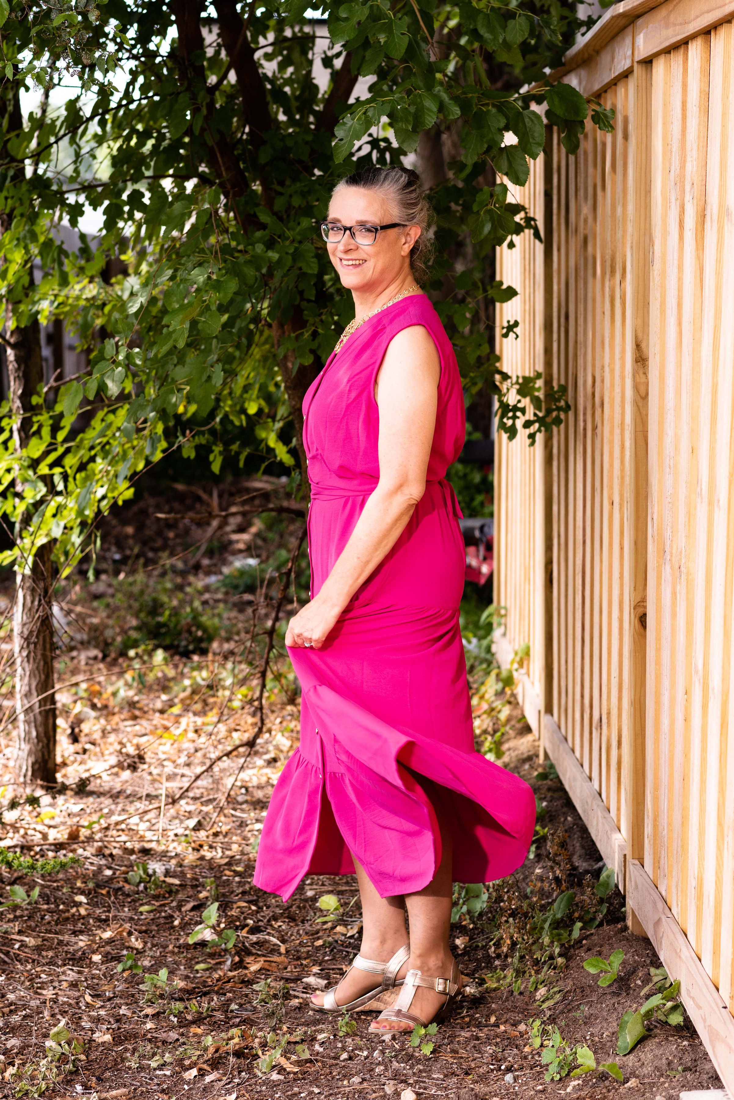
Today’s featured dress is the Button Front Maxi.

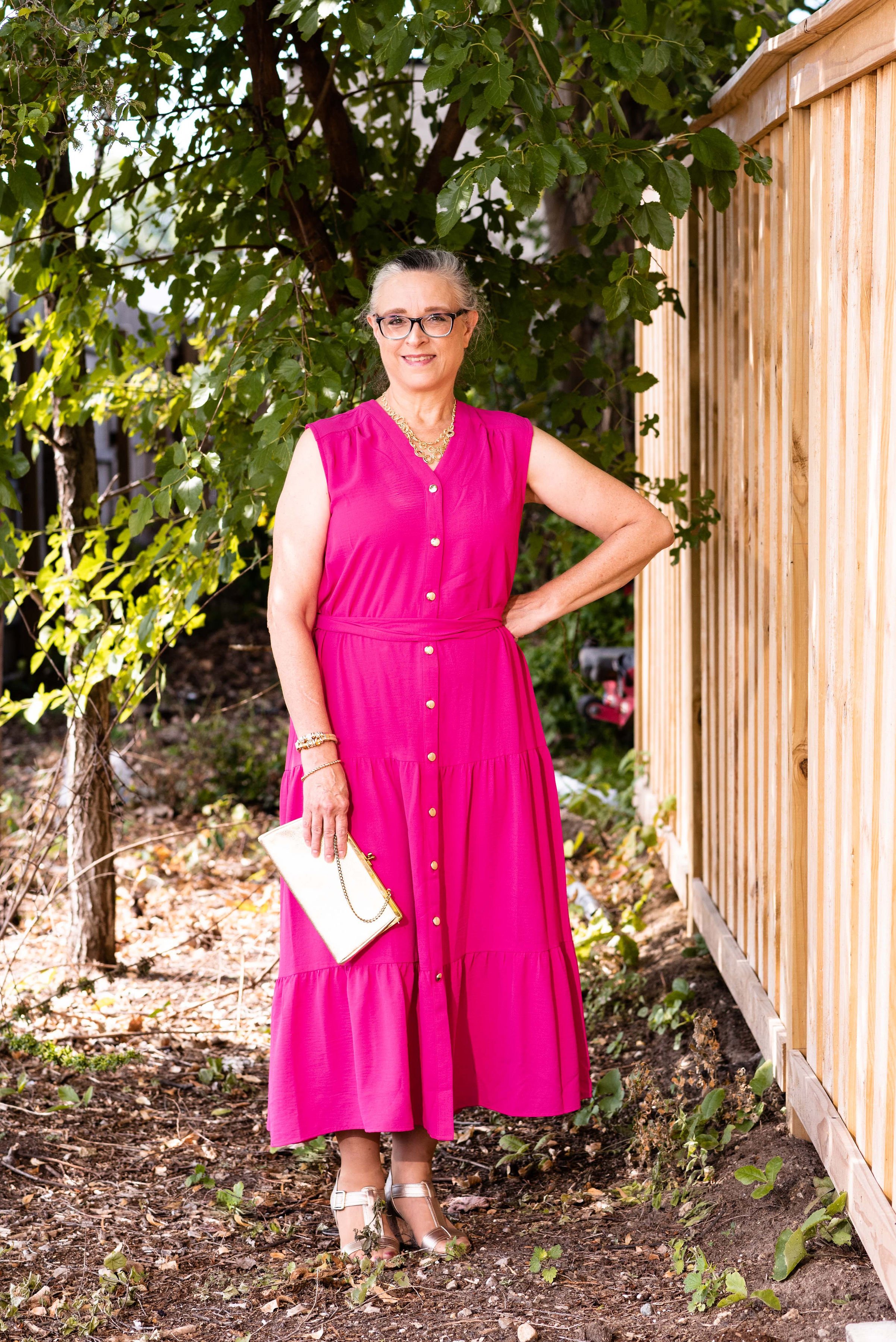
I love the simplicity and elegance of this maxi dress. Once again, the fabric is a medium weight, 100% polyester knit. The description on their websites lists this as a capped sleeve, and on their model it does look that way, but on me, it lays as a wide sleeveless. A capped sleeve usually extends a little bit onto the arm.

I should have taken a picture without the included belt to show you the dress actually doesn’t have a waist. From the bodice to the first tier on the skirt the dress is more of a column. What I like about this idea is I can style it with different belts, or even scarves to create unique looks. I decided to wrap the belt around and tie it at the back for a different look.

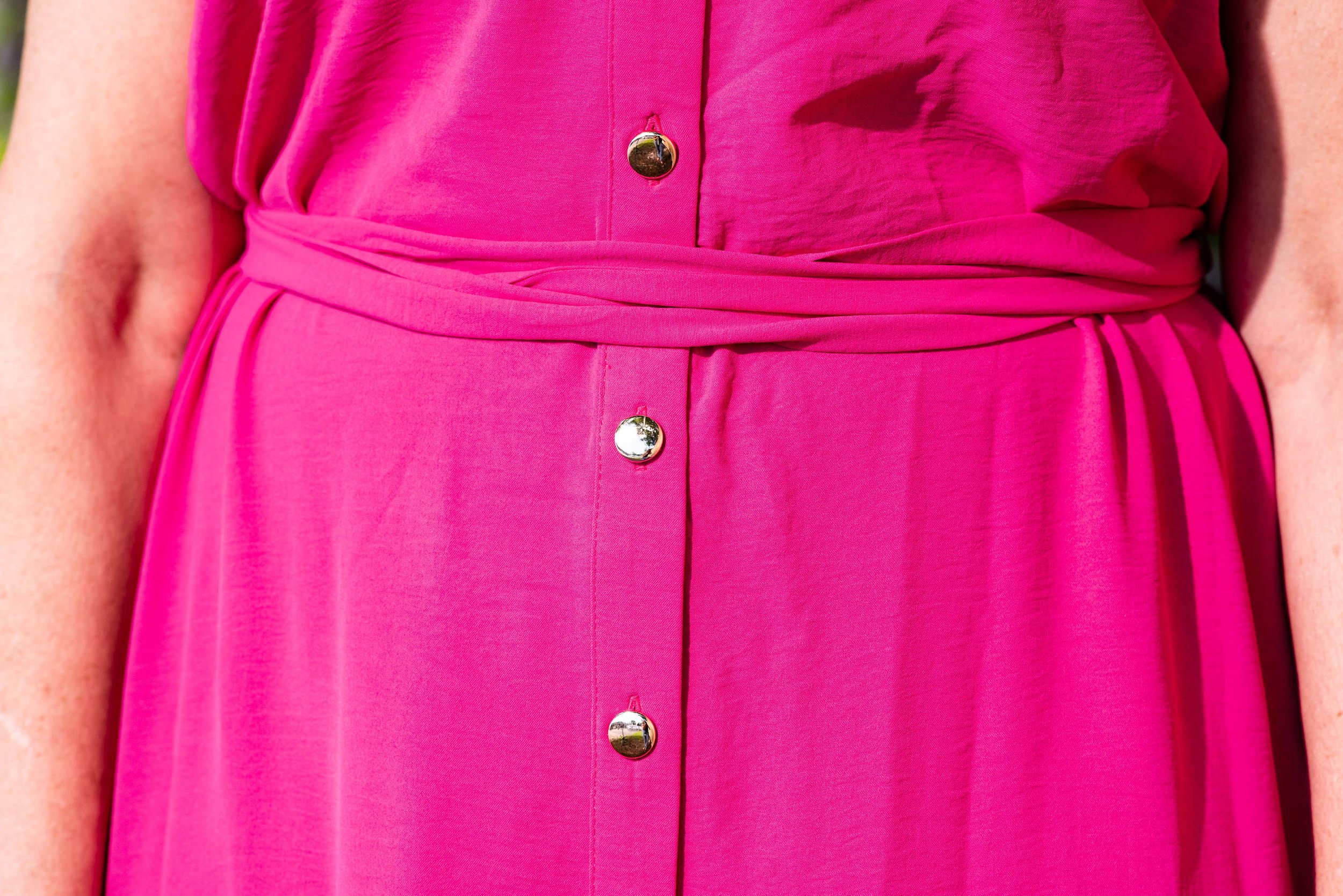
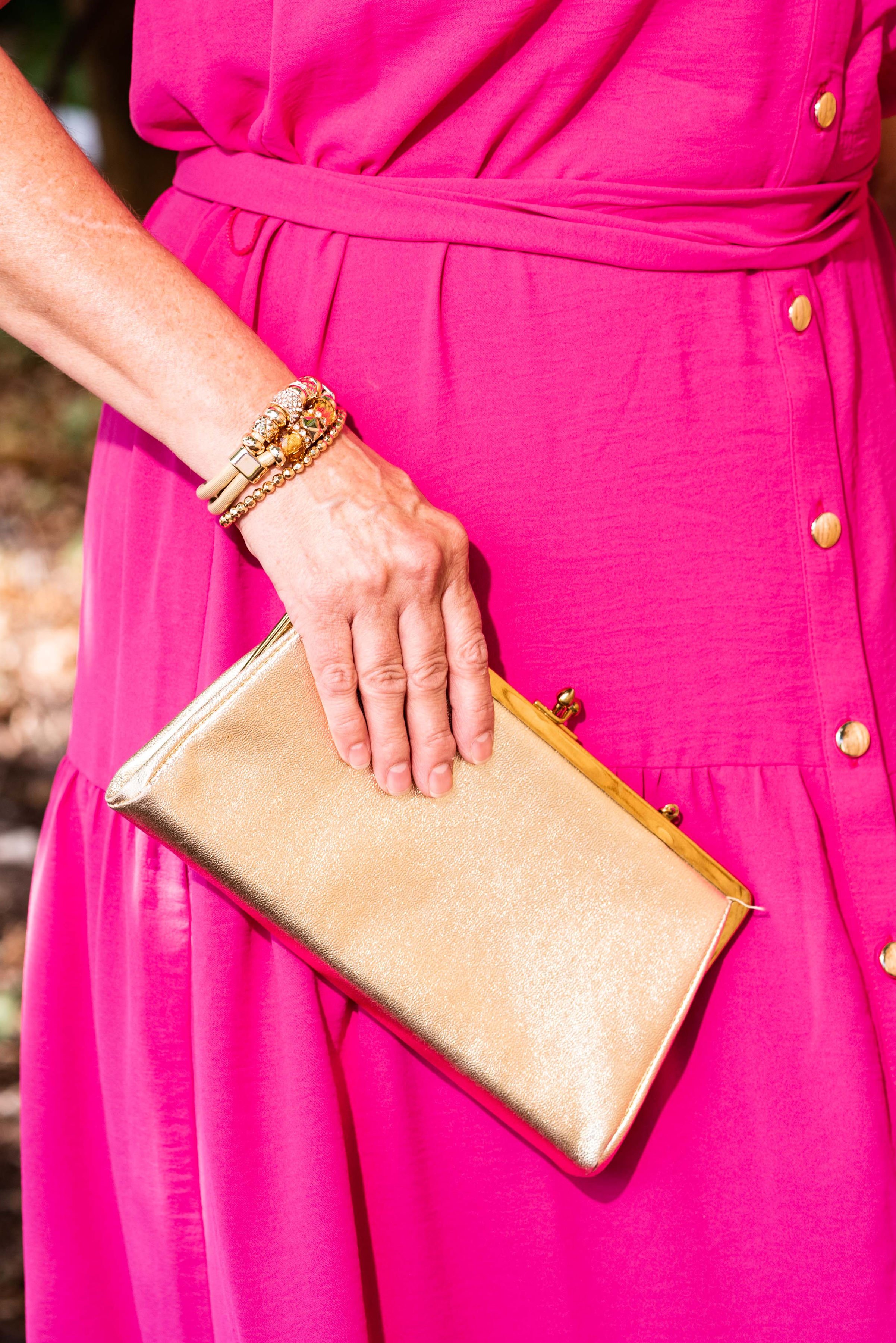
The gold buttons are a beautiful addition to the bright fuchsia color of the dress. I think it is small details like this that make Closet52’s selection a step above other dress retailers. Gold allows this dress to be taken from the work place to a night on the town, with just a quick change of accessories. I wanted to focus on the gold buttons so my accessory choices were all gold.

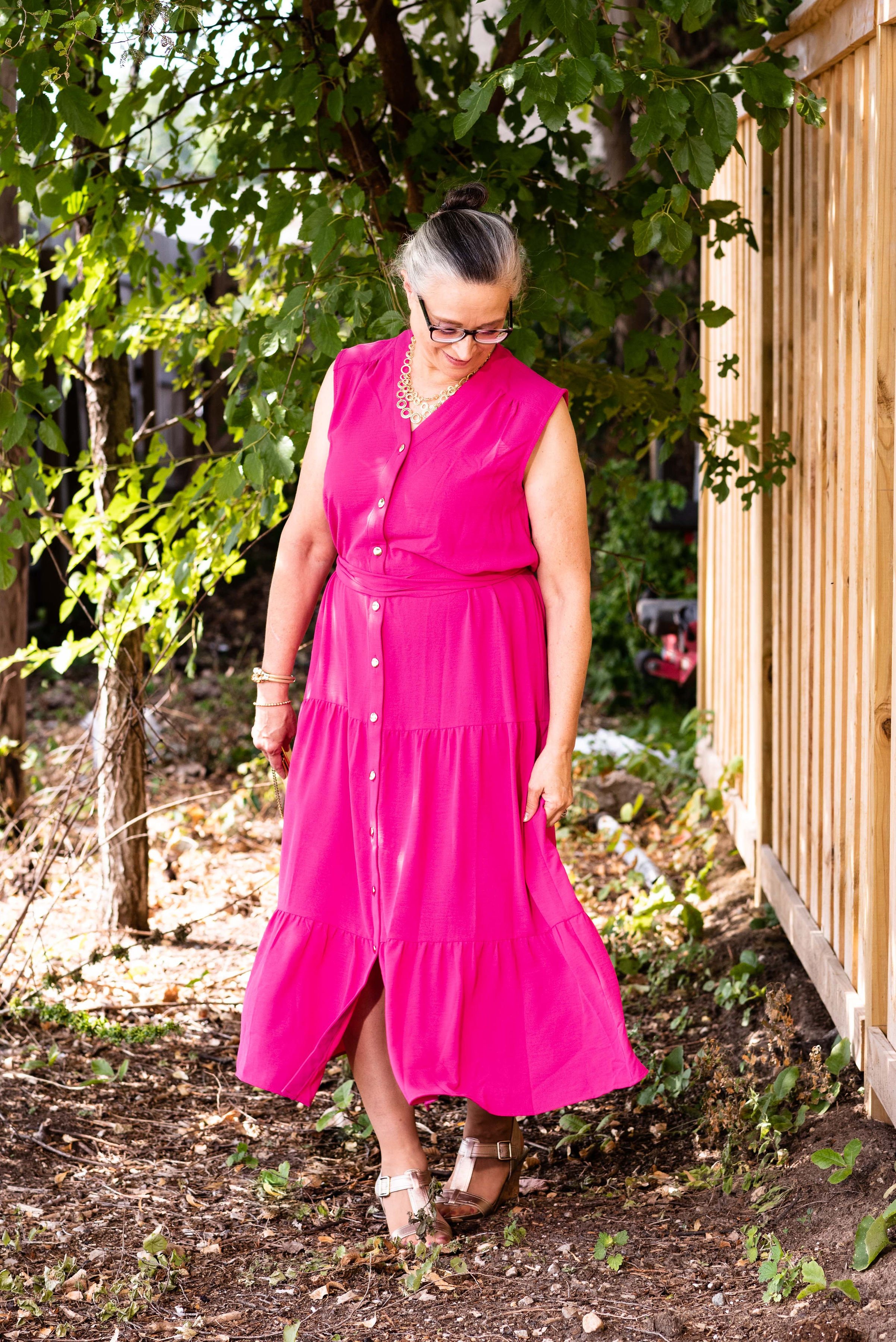
I love a tiered maxi skirt anyway, so the tiering on this piece is perfect. It gives the look a little bit of that prairie girl, boho chic vibe while still looking modern and classic. This is another piece I am excited about trying to style in different ways. I can see this working quite well as a jumper with a flowy button down top and knee high boots. You could even leave a few of the lower buttons unbuttoned to better show off your boots.

With the tiered skirt giving it a bit more volume a girl’s gotta twirl!

Once again, I am very impressed with the quality and detailing on this piece from Closet52. The easy on, easy off ability and the way the dress hangs are just added benefits of this beautiful dress. Check out the great selection at Closet52 by clicking on any of the included links.

This dress was gifted to me by Closet52. All opinions are my own.

Photo credit Jessica Trumbull for Rebecca Trumbull Photography.

Pantone - Autumn/Winter - 2021 - London Palette: Green Bee, Downtown Brown, and Olive Branch

Hi everyone! November is zooming along and I am still trying to get back into some sort of rhythm, not only here on the blog, but in life. Anyone who suffers from a long term illness can relate to what I am talking about. Not being able to sleep for such a long period of time and still dealing with unresolved symptoms make it hard to get back to what I would say is a normal routine. However, I know there are people who are struggling with much worse situations and I am thankful that I am able to do as much as I can. In fact, this past weekend, we were able to travel to celebrate my mother-in-law’s 80th birthday with her, so that was good.

Unfortunately, there has also been other difficult things along the way. My son-in-law lost his grandfather this past week and I know that has been a great loss for the whole family. He was a dear man, a wonderful painter and loved his family, so he will be missed. As many of you can relate, it seems as we get older, we see loss happening around us at a more frequent pace. This too is part of life, and for me knowing God is holding me and my loved ones during these times, makes it a little less painful.

Now on to another outfit. As I said last week, while I am wildly behind, I decided to go ahead and show you these Pantone London Palette outfits as possible sources of inspiration for Thanksgiving Day wear. Many of you will be celebrating with friends or family and it is a good reason, to get out of those sweat pants and dress up a little bit, if just for your own mental well being.

You can’t go wrong with a pair of trousers, a pretty top and a fun scarf and bag. Obviously, you can pick your colors, but I chose to combine these earthy tones for a look that is a mix of military meets, moto chic.

My Downtown Brown moto jacket is a thrifted piece that I have styled on the blog before. It is a brand called Celebrity Works. I do like this medium milk chocolate brown. Browns can be tricky to wear, especially when they contain a little too much gray or a little more red, or well, you get the idea. A true brown is hard to find, but I think this brown hits the mark, so thank you Pantone for that one.

You’ve seen my Olive Branch pants numerous times on the blog as well. As I look at them in these pictures, I am thinking I might need to find a replacement pair. These are starting to look worn and really don’t look very flattering. Of course that may have had something to do with my chubby thighs. Ha, ha. These were Gloria Vanderbilt brand and I probably got them at Kohl’s.

For the Green Bee color I chose a thrifted Studio Works popover top that I did the front tuck on, which gave it the blouson effect. I also added the Green Bee paisley print scarf. The thought to add the Dana Buchman floral bag was a last minute addition, but I like how it pulled everything together. A fun floral bag is a great addition to your wardrobe, especially when it can serve multiple season duty. This one works just as well in spring, summer and fall.

I chose my trusty Olive Branch SO ankle boots for my shoes. My ankle boots definitely get used in these cooler fall temps.

What do you think of these colors? Would you wear an outfit like this to your Thanksgiving celebration? I’d love to hear your thoughts, so leave me some love in the comments below.

I am including a few shopping links. These are affiliate links and are brought to you at no extra cost. If you click on a link, I get a few cents. If you purchase something through one of my links I get a few more pennies. I appreciate every penny! All opinions are my own. Please note, I am not familiar with all of the retailers I list in my links, so be sure to read and understand their return policies in case something doesn’t fit or isn’t to your liking.

I hope you enjoyed today’s post. Until next time, have a great day.

Photo credit Jessica Trumbull with Rebecca Trumbull.

Pantone - Autumn/Winter - 2021 - London Palette: First Blush, Ibiza Blue and Ultimate Gray

Due to my longer than usual absence from the blog because of my illness, I am going to bypass the wrap up of the New York Palette and the Intro to the London Palette for the Pantone 2021 color series and jump right into the London Palette, so that I can get this series concluded and get on with new content. I have been trying to give a more daily content on Instagram, which now also shows up on my regular Facebook account, but unfortunately, I have not been posting over on my Granny page. I guess I should start doing that as well. You would think all of these things would just be linked together. A few of the meds I am on are making my brain a bit dopey, so bear with me as I try to get things back into some sort of regular routine.

Here we are again, looking at a pastel pink on the fall color palette. I know pastels in fall are no longer taboo, but my brain still looks at this and thinks, “What a great spring outfit!” Maybe I should have paired First Blush with one of colors that seem more Autumnal to me, like Tomato Cream or Downtown Brown, but I liked the combination of blue and pink, so this is what you get.

My Ibeza Blue plaid shirt is a thrifted Faded Glory piece. I used this same plaid shirt in the spring for the French Blue color that was on the New York Palette. You can see that post here. You’ve seen these thrifted, distressed Lane Bryant jeans numerous times on the blog as they are one of my faves.

My First Blush jacket is also a repeat from my closet. Originally a Christopher and Banks purchase, this faux leather piece has some knit panels on the sides and under the arms to allow ease of movement and stretch. I added the scarf to bring in a little bit of added interest and additional color, plus with this being a fall outfit, the need for a scarf seemed more likely.

Ultimate Gray, once again makes its appearance on the London Palette, so I used this for my accessories in the metal chain belt, thrifted fold over bag and my silver sneakers. The only thing I did differently was the rose gold pendant. I just liked the way the color popped against the blue plaid.

While this look is certainly not what we would typically think of for the holidays, if you are more into pastel colors, this is a great casual look for that Thanksgiving celebration, especially if it involves a bit of shopping afterwards.

I’m including a few shopping links for you to look over. Remember to order soon for Christmas. We have all heard how things are taking longer and some things are back logged so be sure to get your orders in, or even better, don’t deal with that added stress and try to buy local. That is what I am thinking about doing at least for part of my shopping this year.

These are affiliate links. All opinions are my own.

Photo credit Jessica Trumbull with Rebecca Trumbull.

Pantone - Autumn/Winter - 2021 - New York Palette: Fuchsia Fedora, Leprechaun, and Coconut Cream

The colors I am showing you today were ones that surprised me a bit for a fall palette. The bright Fuchsia Fedora is not a color that I have very many pieces in, thus why I used it more as an accessory color. Leprechaun was also a different choice. I was thinking there would be a darker, more forest green color, but this bright, cheeky color is what appeared on the palette. However, that is one of the reasons I like doing this color series. It forces me to think outside the box.

FuschiaFedora.jpg

Even though I wasn’t particularly fond of these colors for fall, I actually liked the way this outfit turned out. Even though the light jacket looks nothing like Coconut Cream, these colors and their combinations are just guidelines for us. Not rules…and just for fun….

I loved The Pirates of the Caribbean movie, and that whole idea of rules versus guidelines was amusing as it kept coming up in the movie and was used according who benefited the most. I guess we could take a lesson from that when we look at our closets. The combinations you put together are for your benefit. You get to decide what you like and what you don’t. You make the choice of what colors or prints to put together, and whether you want to buy into the trends or not. I think we can safely say those fashion “rules”, are really more like “guidelines.” My job as a fashion blogger is to give you ideas of how to make these combinations and hopefully inspire you to think outside your own boxes.

pantonefallcolortrendsfuchsiafedora-10.jpg

My LuLaRoe skirt was the perfect choice to build this outfit around. I actually had the thrifted striped tee already pulled out as a match for Leprechaun, and as I started figuring out which colors and pieces to put together, I remembered this skirt. I always have a little celebration party when pieces come together. When I try things on I do a little dance in front of the mirror and say, “This is it!” Ha, ha. The stripes in the tee are actually navy, but with the two prints taking center stage, you can’t really tell the colors are different.

pantonefallcolortrendsfuchsiafedora-3.jpg

My cream jacket by Sanctuary is a thrifted piece you have seen before on the blog. You can see it with a leopard print skirt and with my bright blue pants. It is actually more of a canvas than a denim, but it works much the same as a denim jacket providing light weight coverage for cooler weather and adding a casual touch to a dressier outfit.

pantonefallcolortrendsfuchsiafedora-5.jpg

You can see my Fuchsia Fedora necklace and bracelets. I think I have jewelry in just about every color under the sun, but you know, a girl can never have too many fun accessories! Is that a rule, or a guideline? Ha, ha.

pantonefallcolortrendsfuchsiafedora-8.jpg

My bestie, Stacey, gave me this beautiful, leather the Sak bag last time she came to visit. I thought the berry color went perfectly with the darker berry color in the flowers on the skirt.

pantonefallcolortrendsfuchsiafedora-9.jpg

These beautiful black suede heels never get to go anywhere, so I do like to bring them out and show them off on the blog. These are Aerosoles and I bought them a few years ago at a Clarks shoe outlet. I like that they are comfortable, have a reasonable heel, stay perfectly in place and look classy.

pantonefallcolortrendsfuchsiafedora-2.jpg

What do you think of these colors? Do you like them for fall? Now that I am thinking about it, I might need to revisit the idea of fuchsia as a fall color. I could see it with other fall colors like golden yellow, burgundy and rusty orange. Hmmm. I may have to get a little further outside of my color box.

Let me know what you think. I’m including a few shopping links for things of similar color. These are affiliate links and are brought to you at no extra cost. If you click on a link, I get a few pennies. If you purchase something through my site, I get a few more. I appreciate every click.

Have a great day!

Photo credit Jessica Trumbull with Rebecca Trumbull.