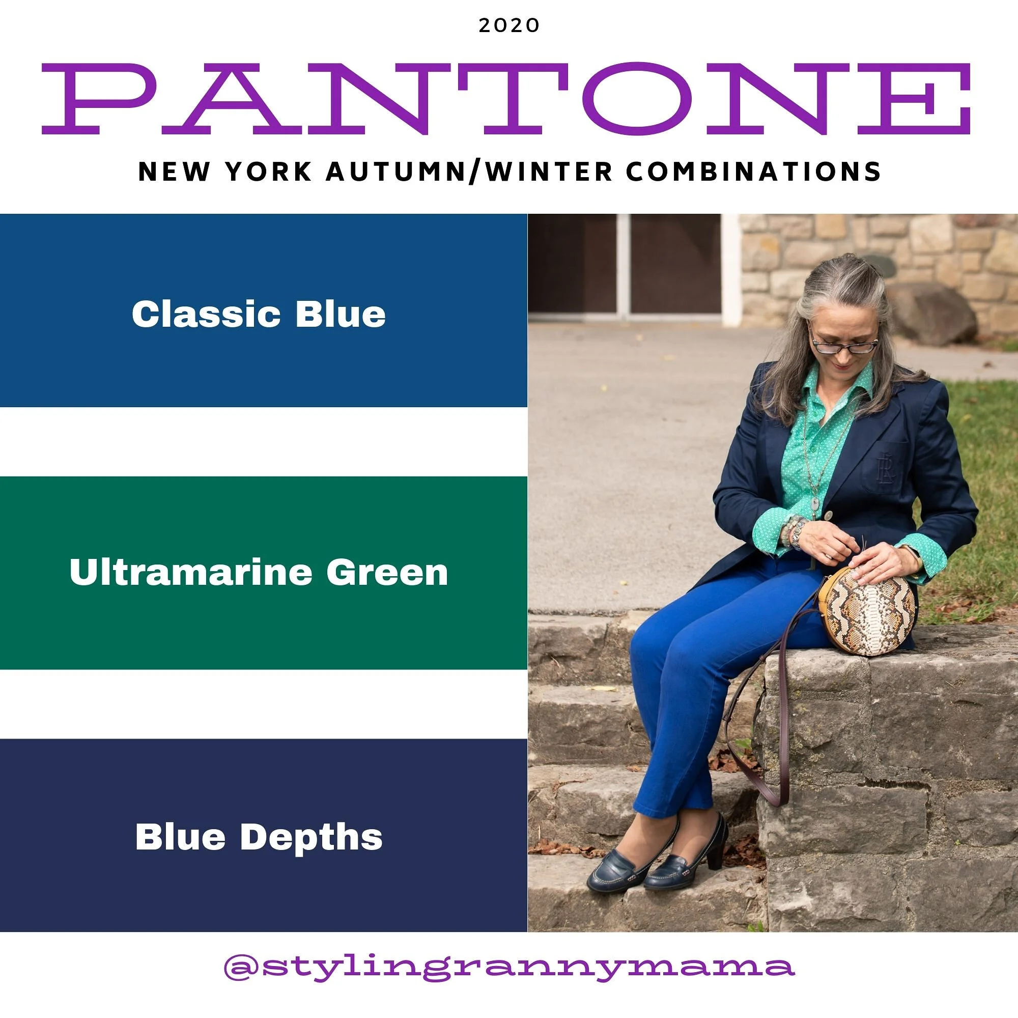
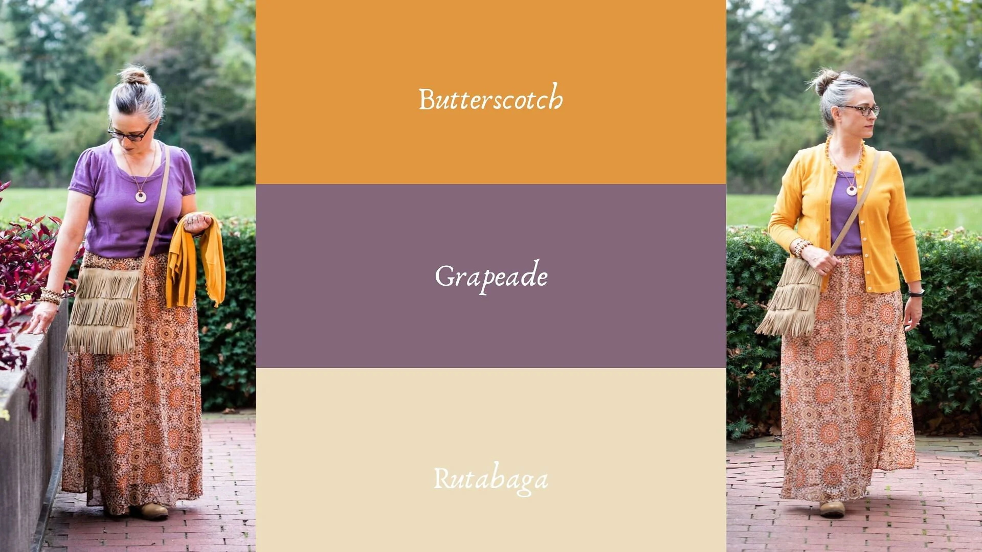
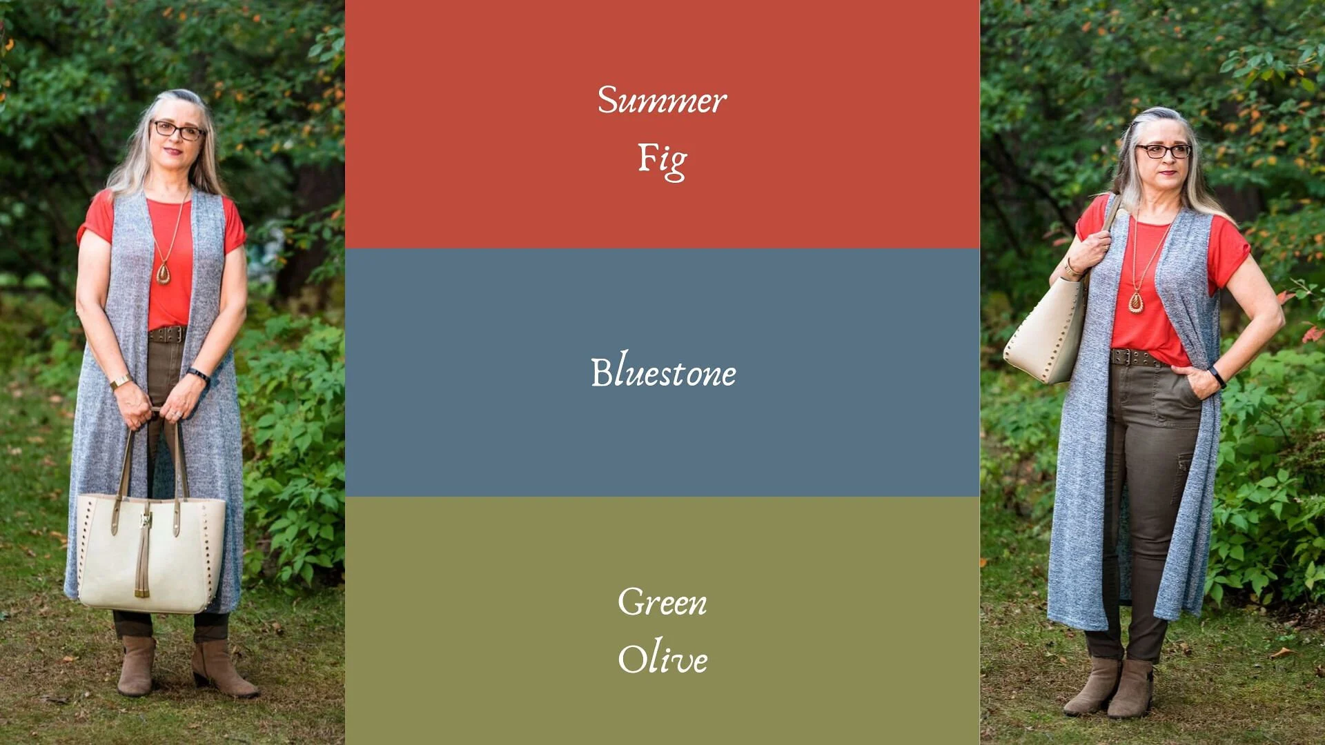
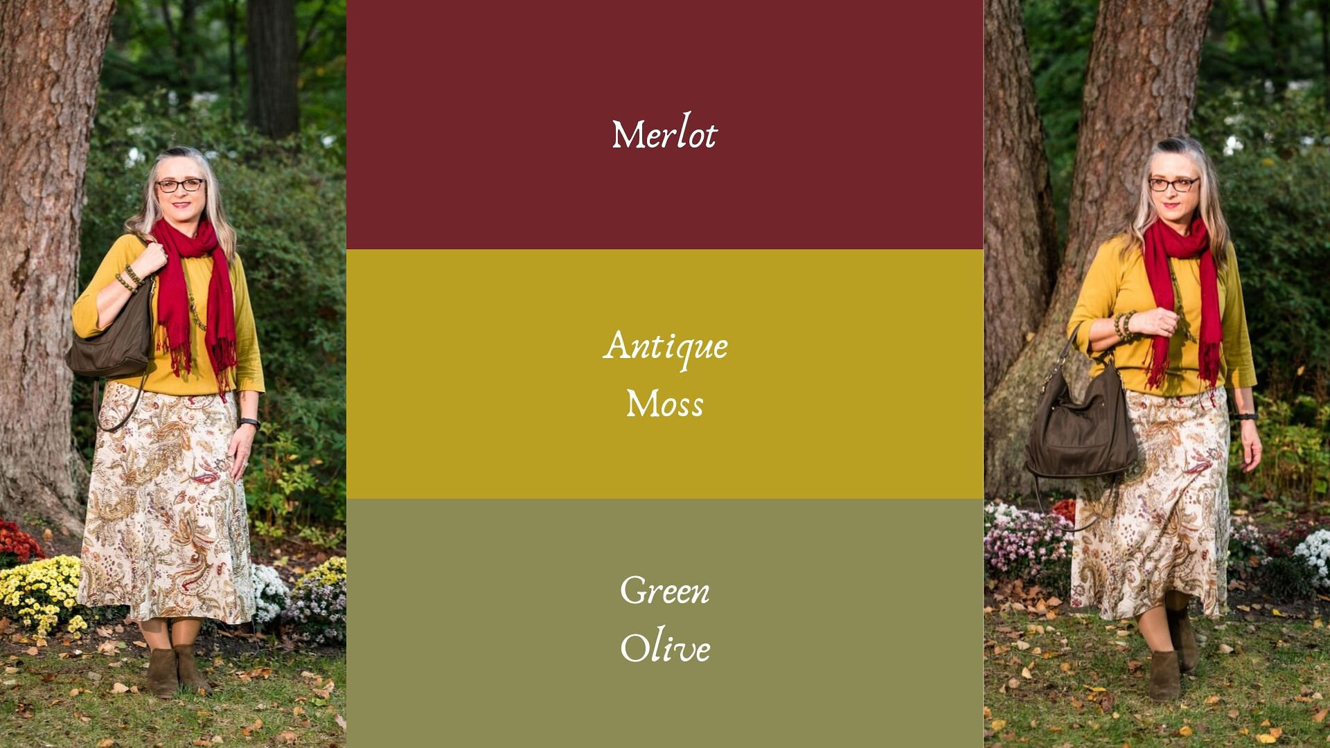
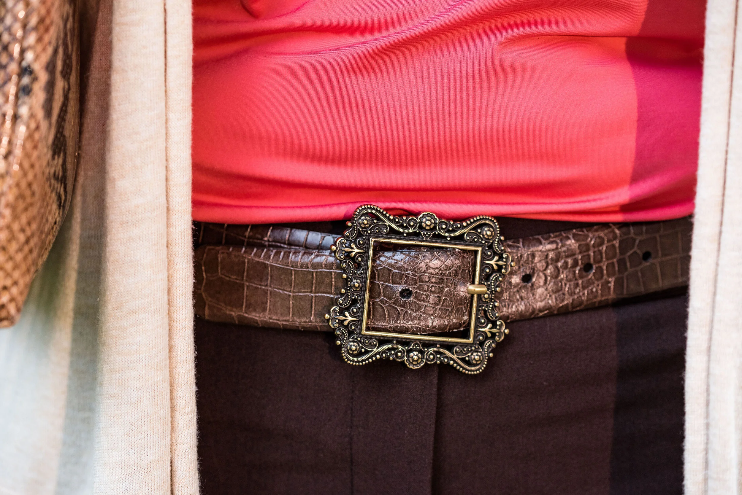
Pantone - Fall/Winter 2020 - New York Palette - Magenta Purple, Rose Tan and Sleet
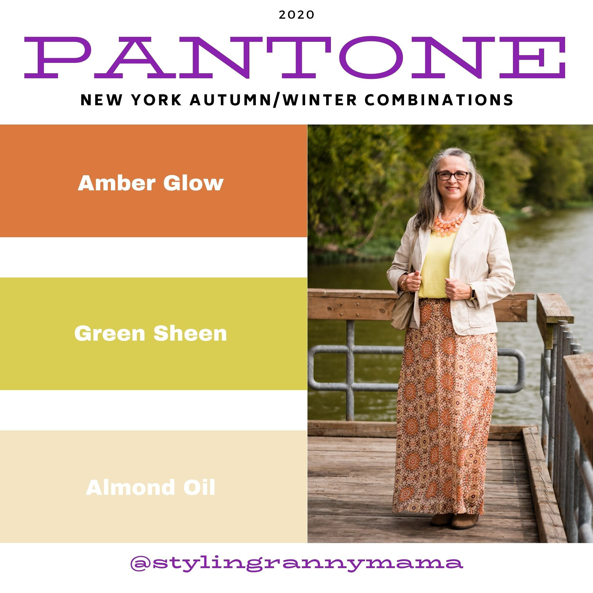
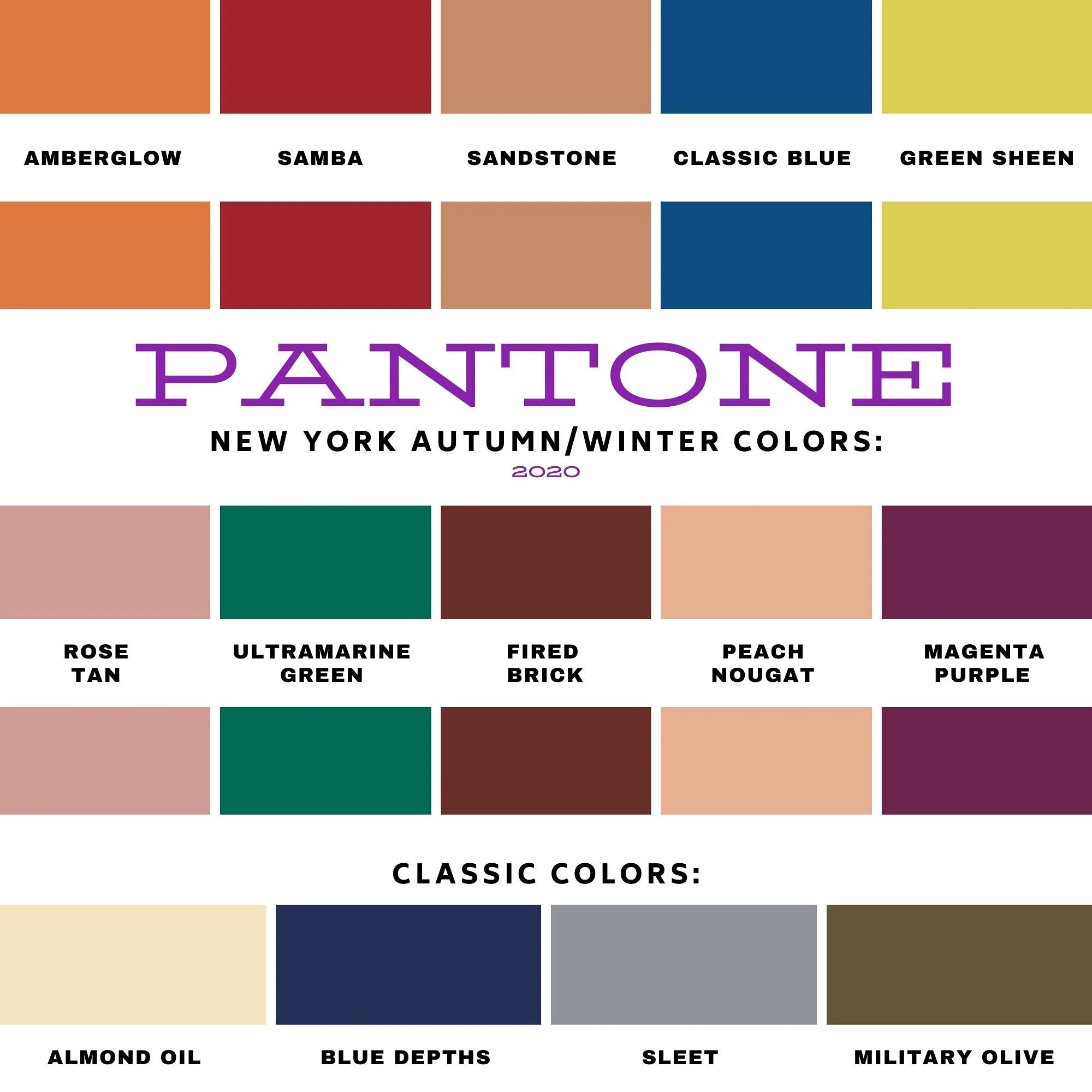
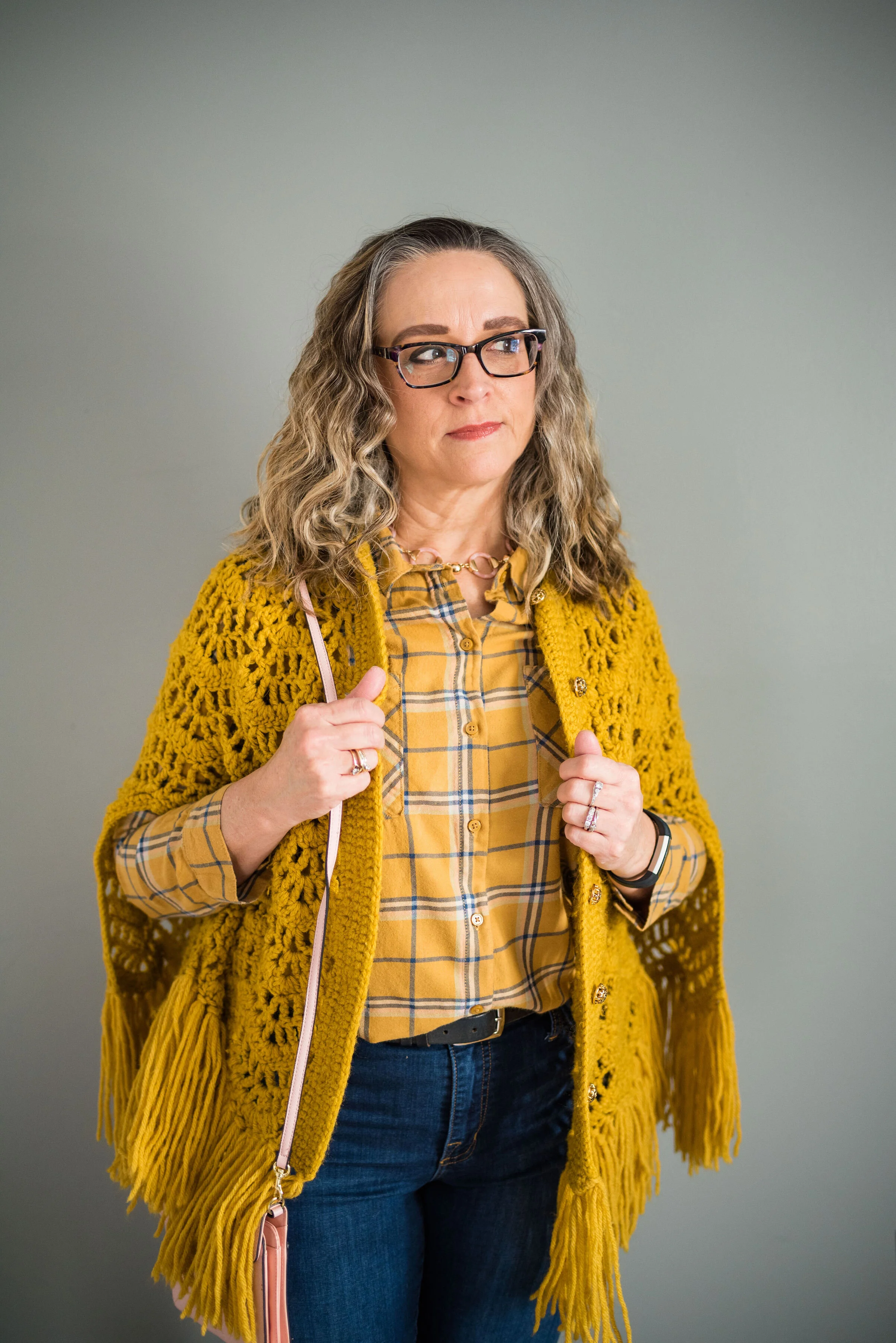
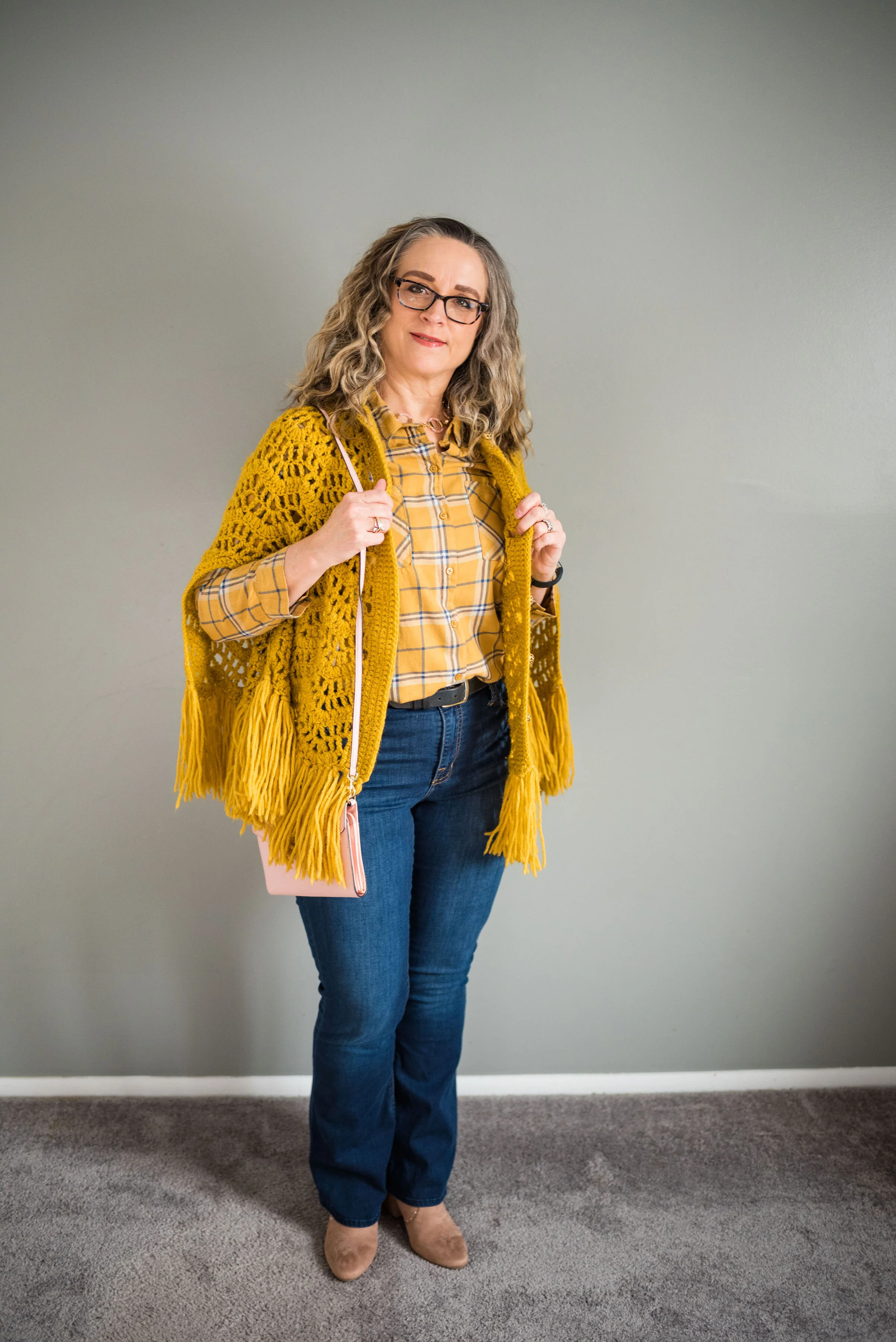
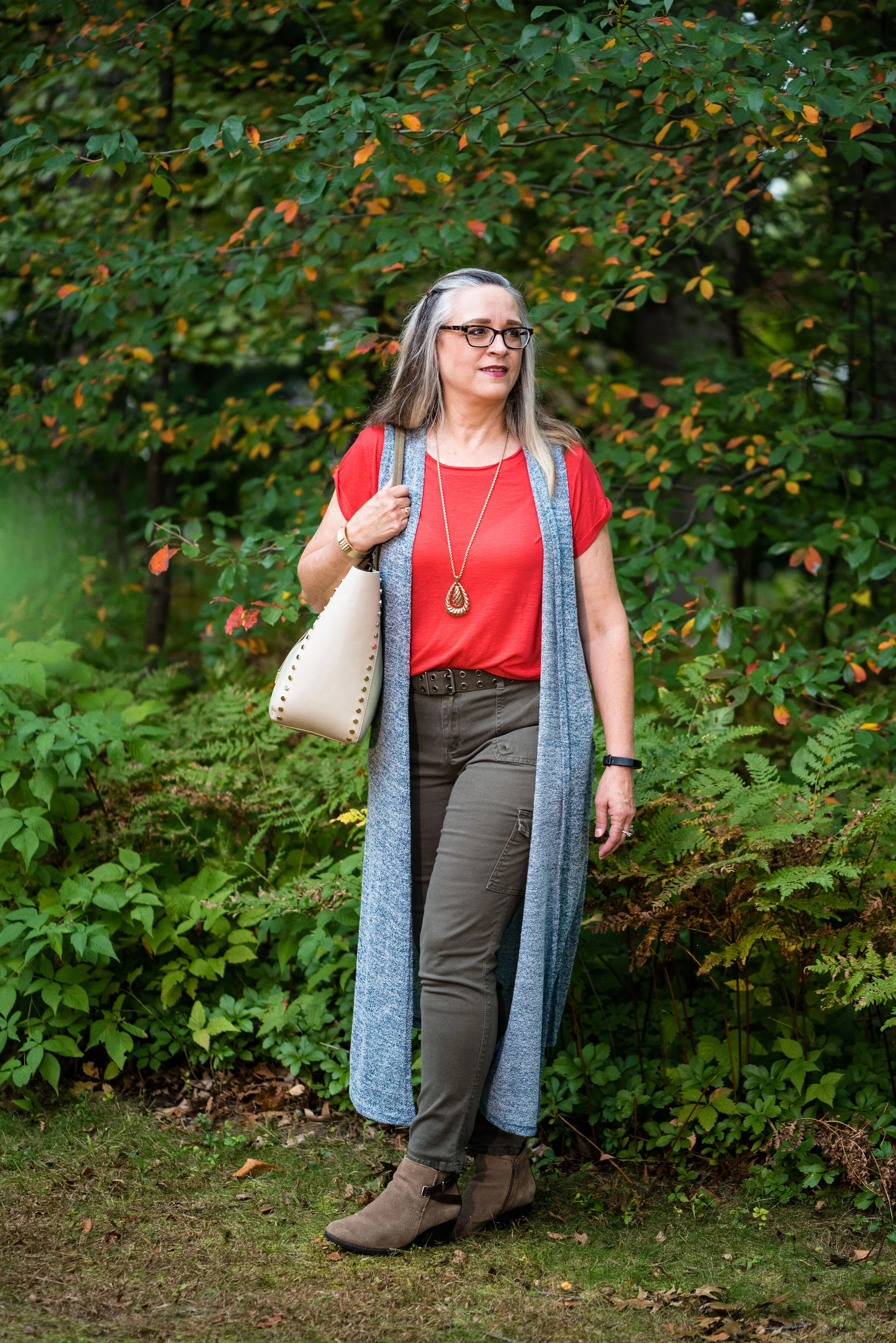
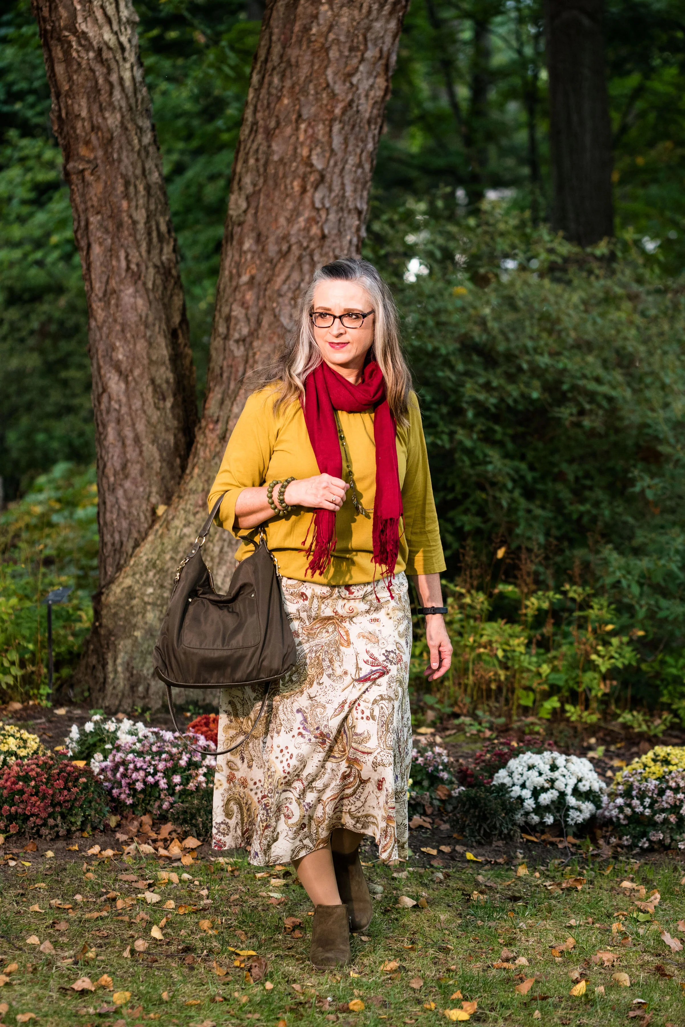
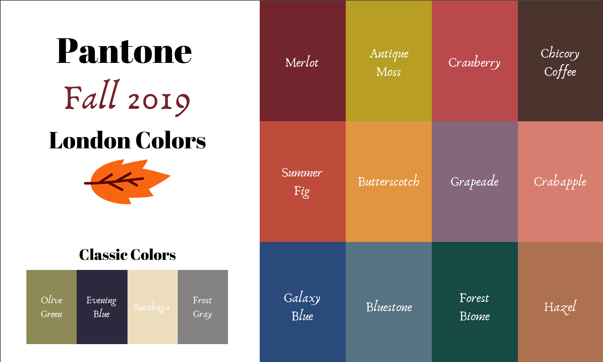
This is the last installment in the Pantone Fall/Winter 2020 New York Palette series. This has been an interesting palette with both rich, bold colors like Classic Blue, Samba and Ultramarine Green and the softer more muted neutrals like Peach Nougat, Sandstone and Almond Oil. Today’s last two colors are a mix of both the bold and muted elements. While Tuesday’s post was full on bold with Classic Blue and Ultramarine paired sided by side, today’s outfit takes the bright Magenta Purple and pairs it with the more subtle Rose Tan. As always, I’ve included a classic color to bring in a more foundational element.
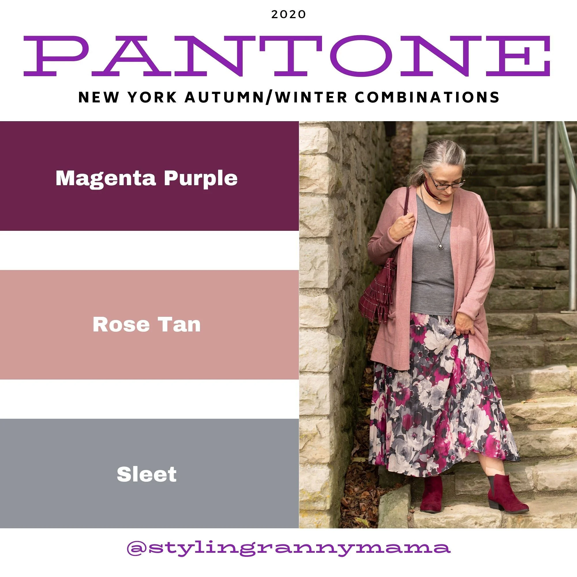
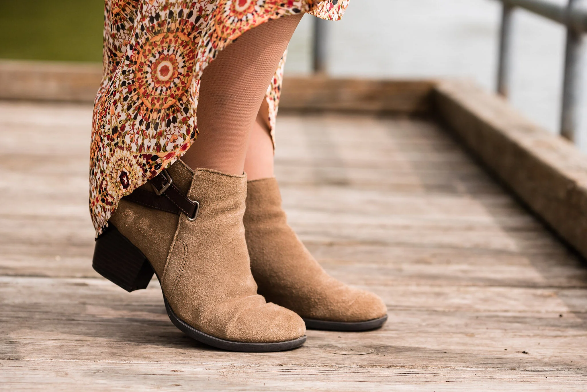
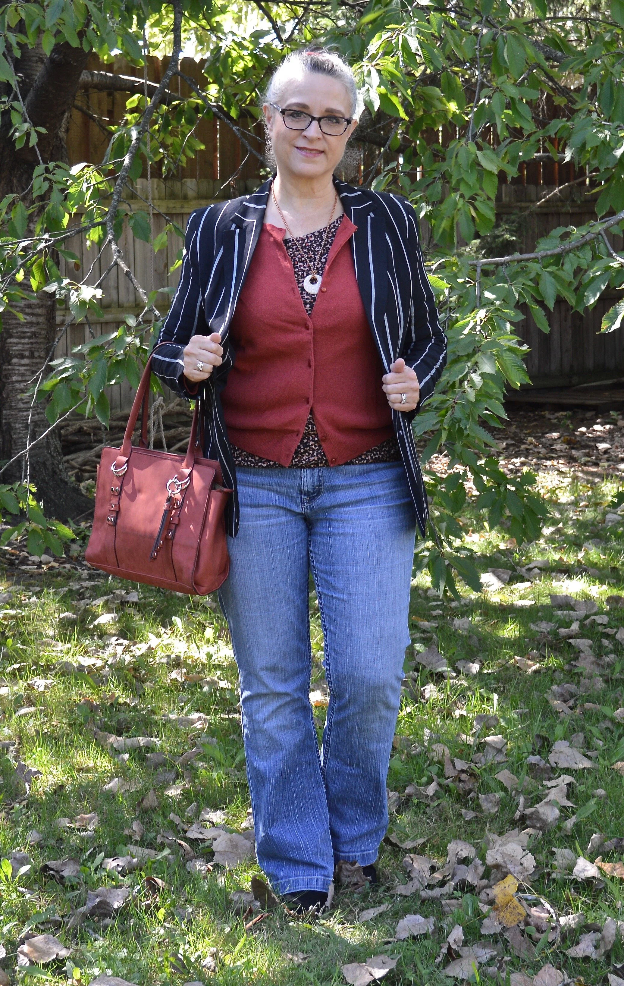
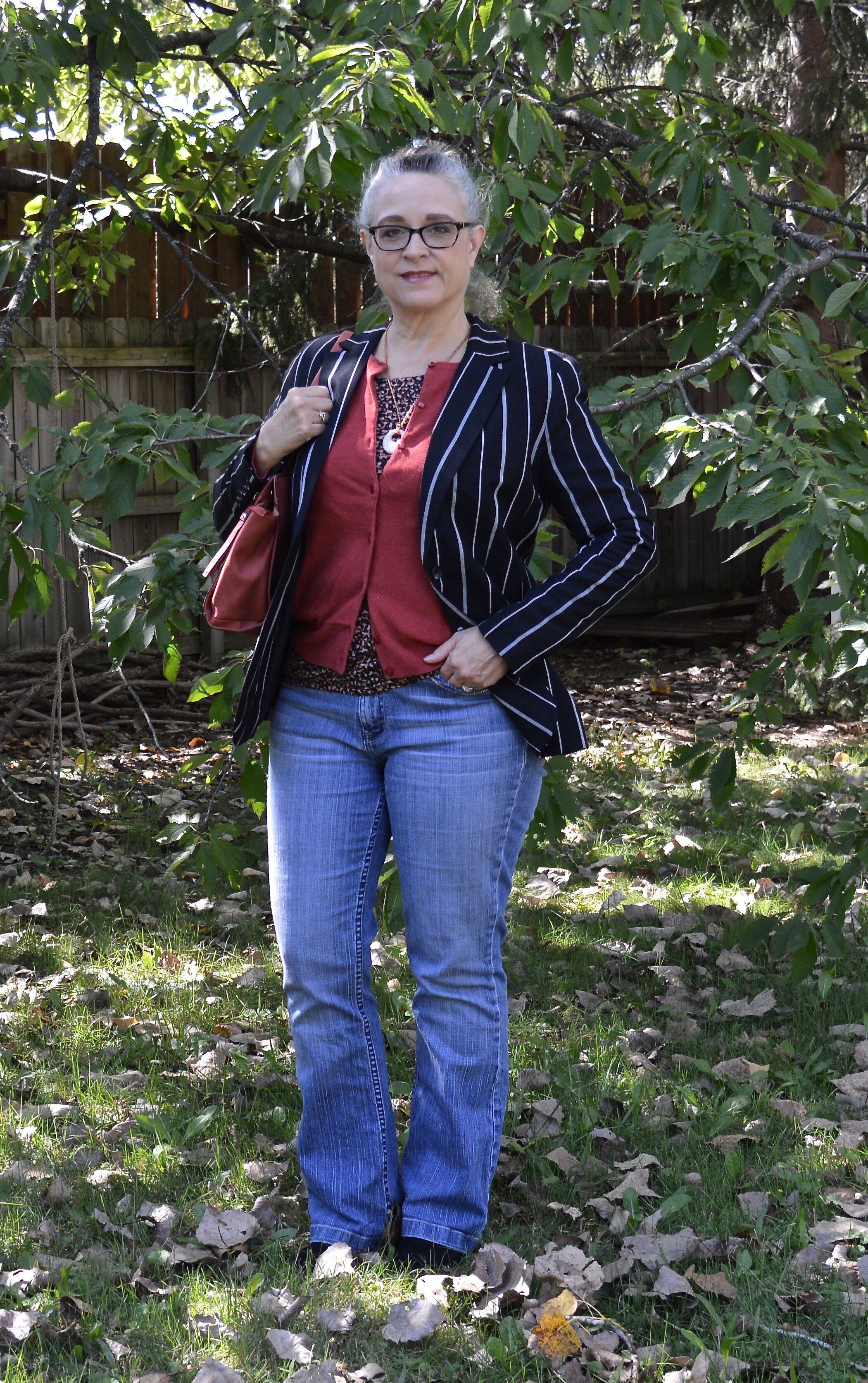
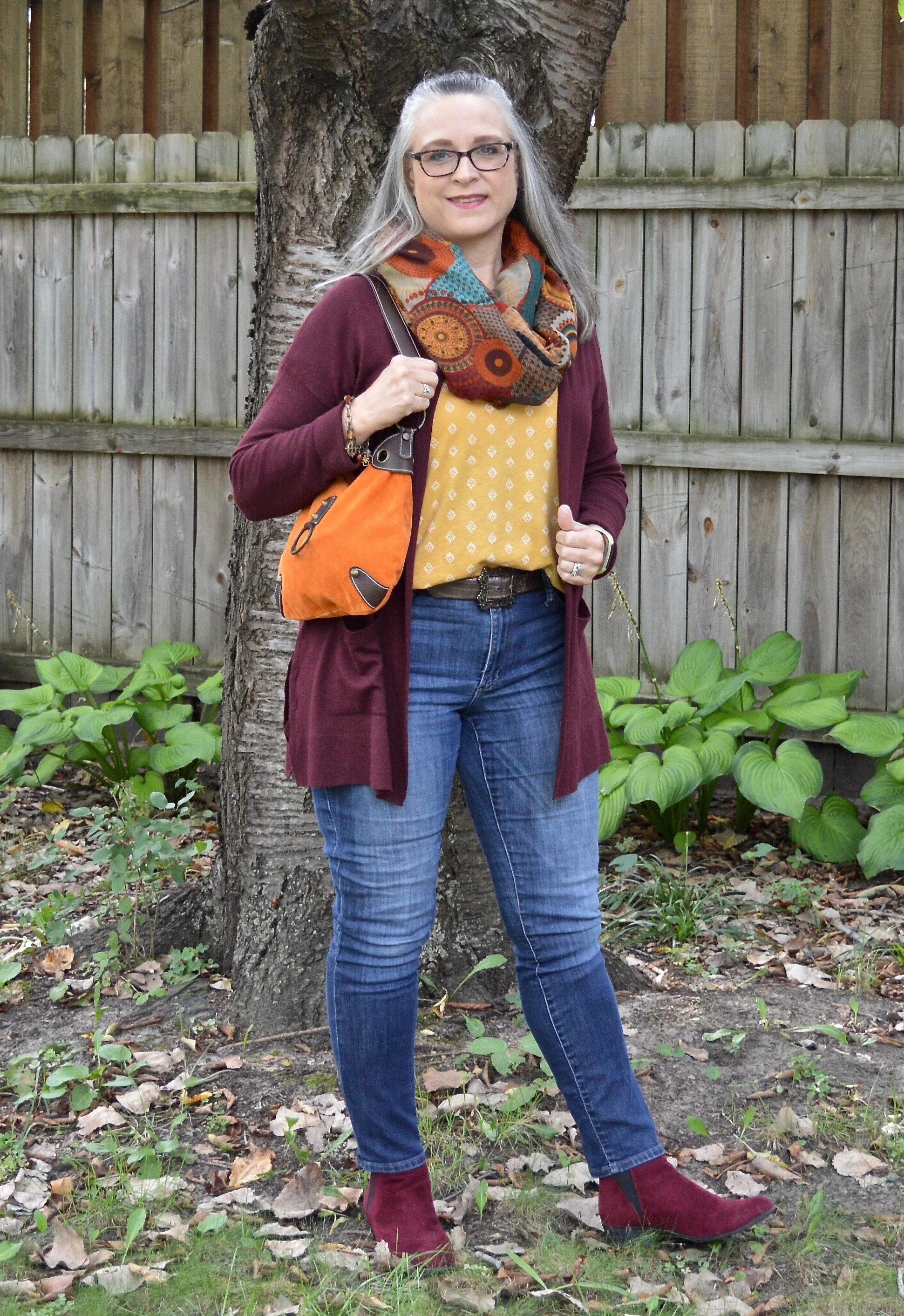
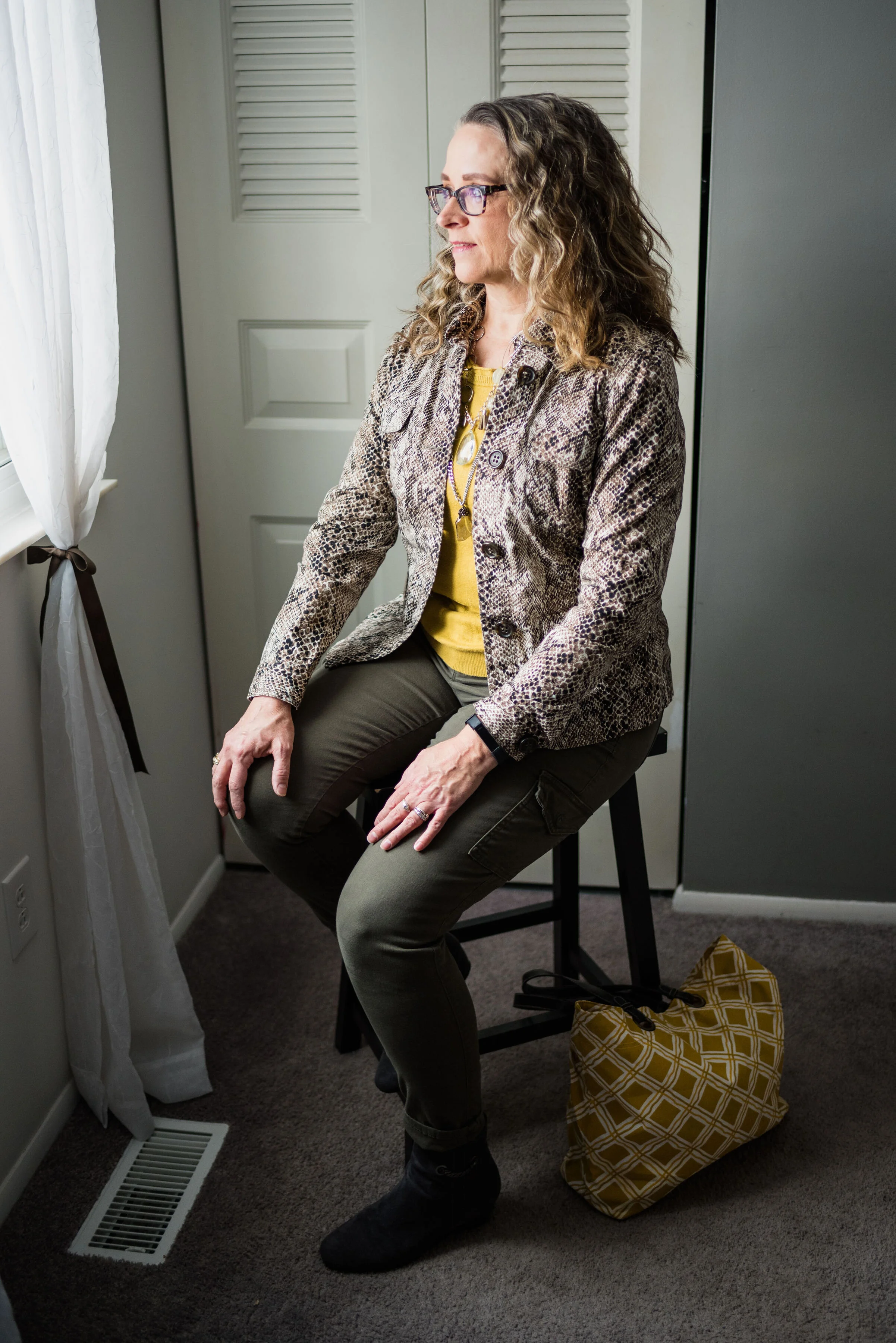
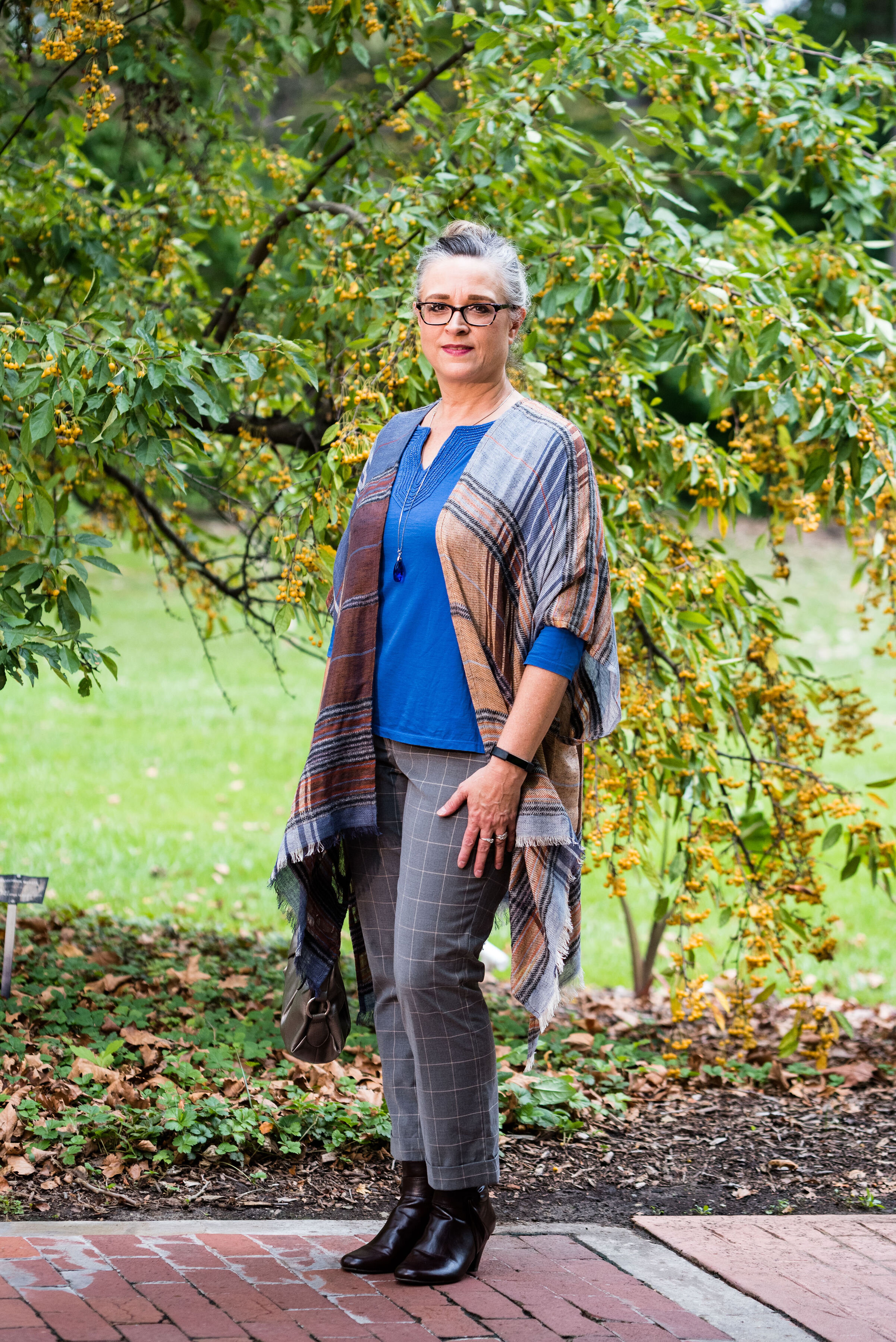
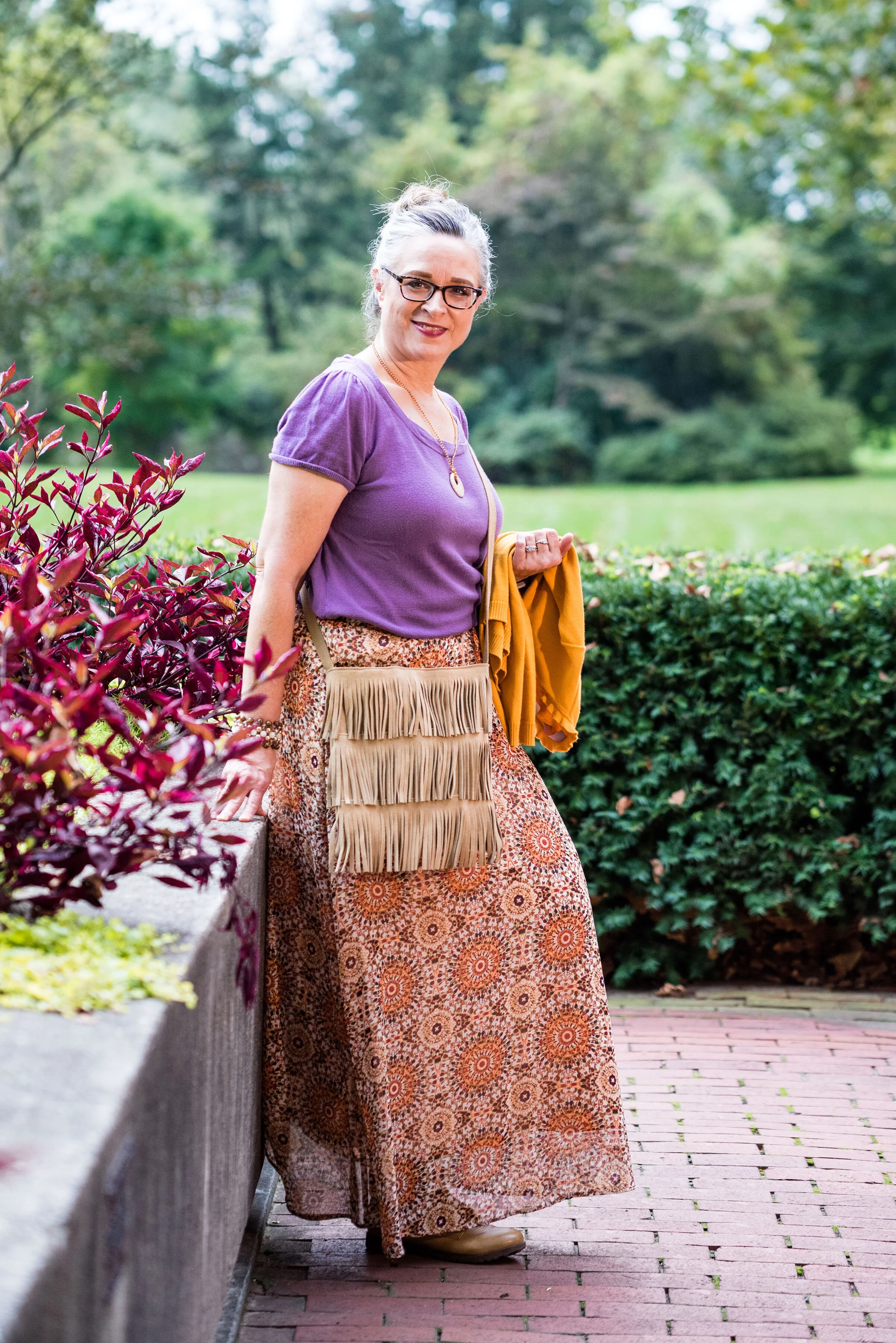
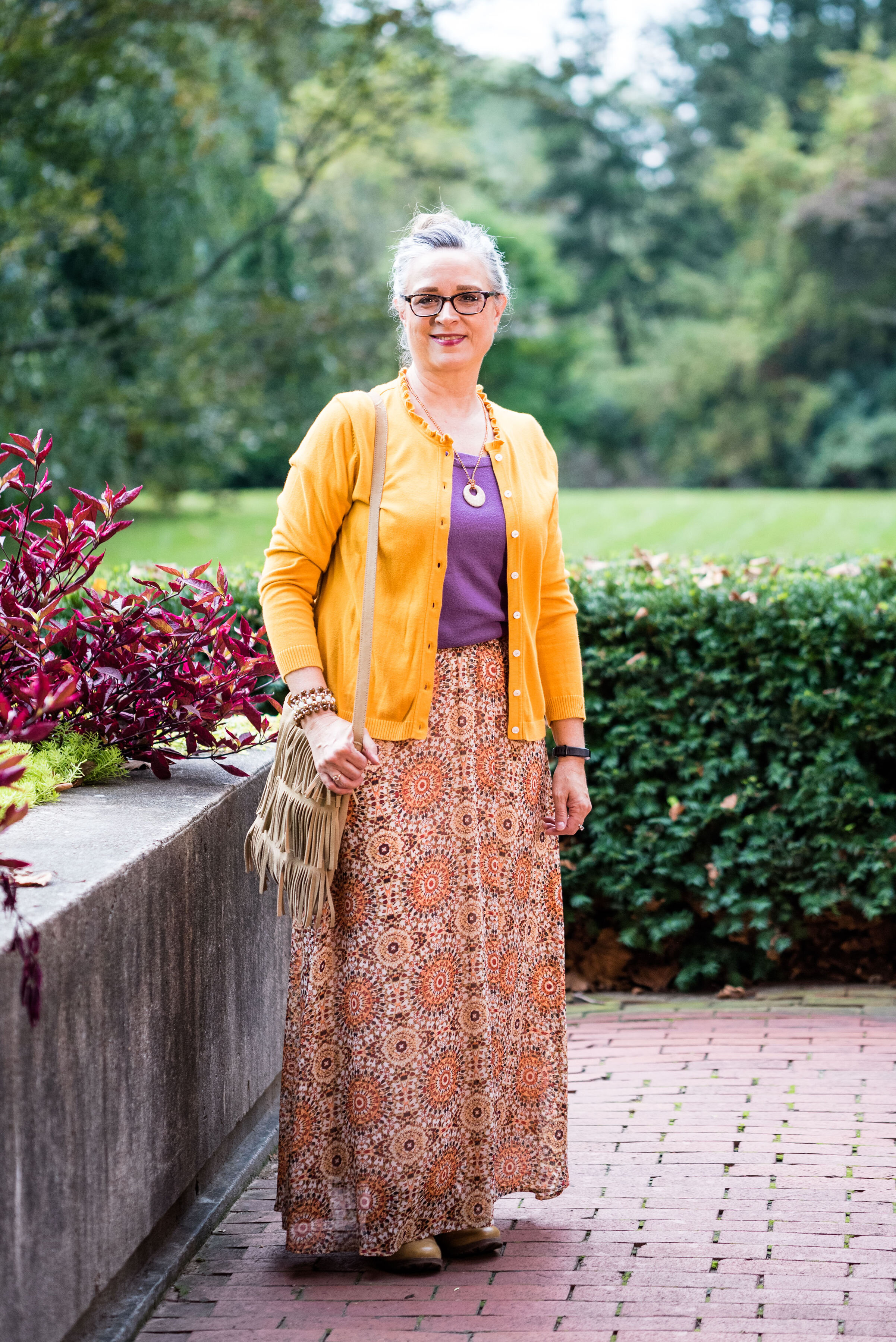
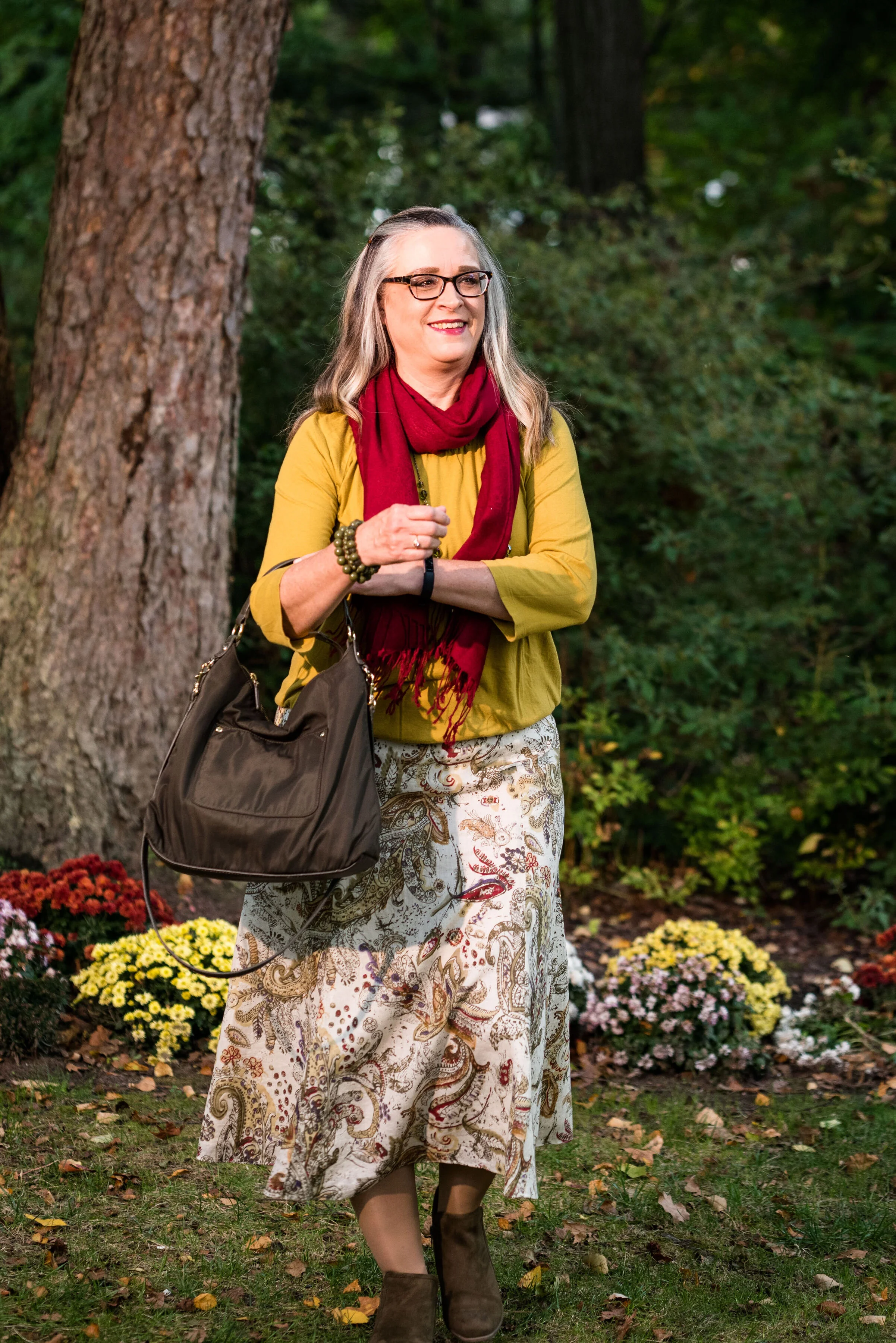
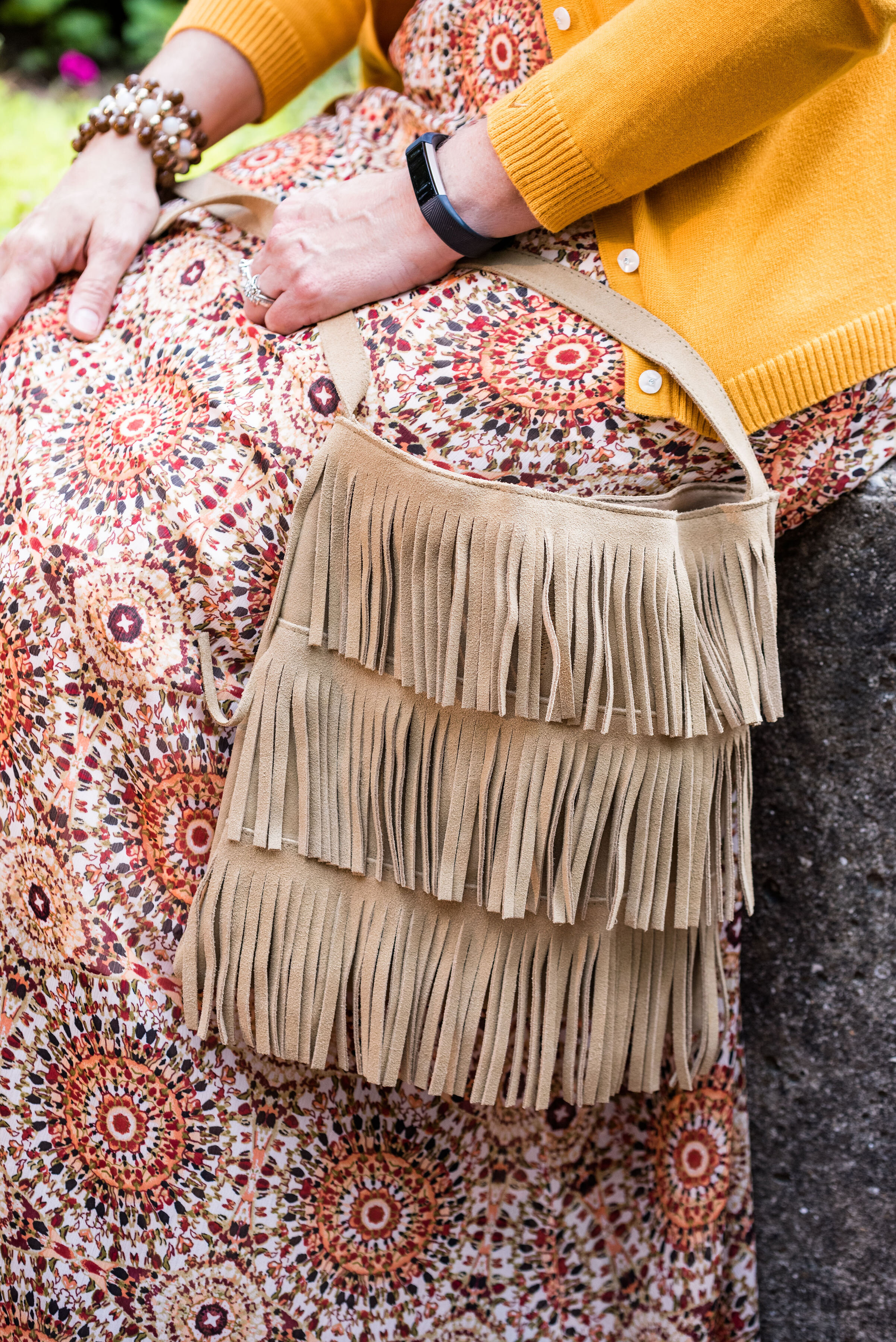
This outfit, once again, has a rather bohemian vibe with the dark florals, fringe bag, and suede booties. I also feel that the more layered, relaxed look is often indicative of the boho style as well.

My long, pleated, floral maxi skirt is Chaps brand from Kohl’s. You can see this skirt styled for an earlier Pantone series back in Spring of 2018. I styled it with a blush top and gray sweater. The beauty of this piece is that it can be worn in any season and it is fully lined. I really like when a skirt is lined and I don’t have to wear a slip with it. This is especially nice in the cooler weather.

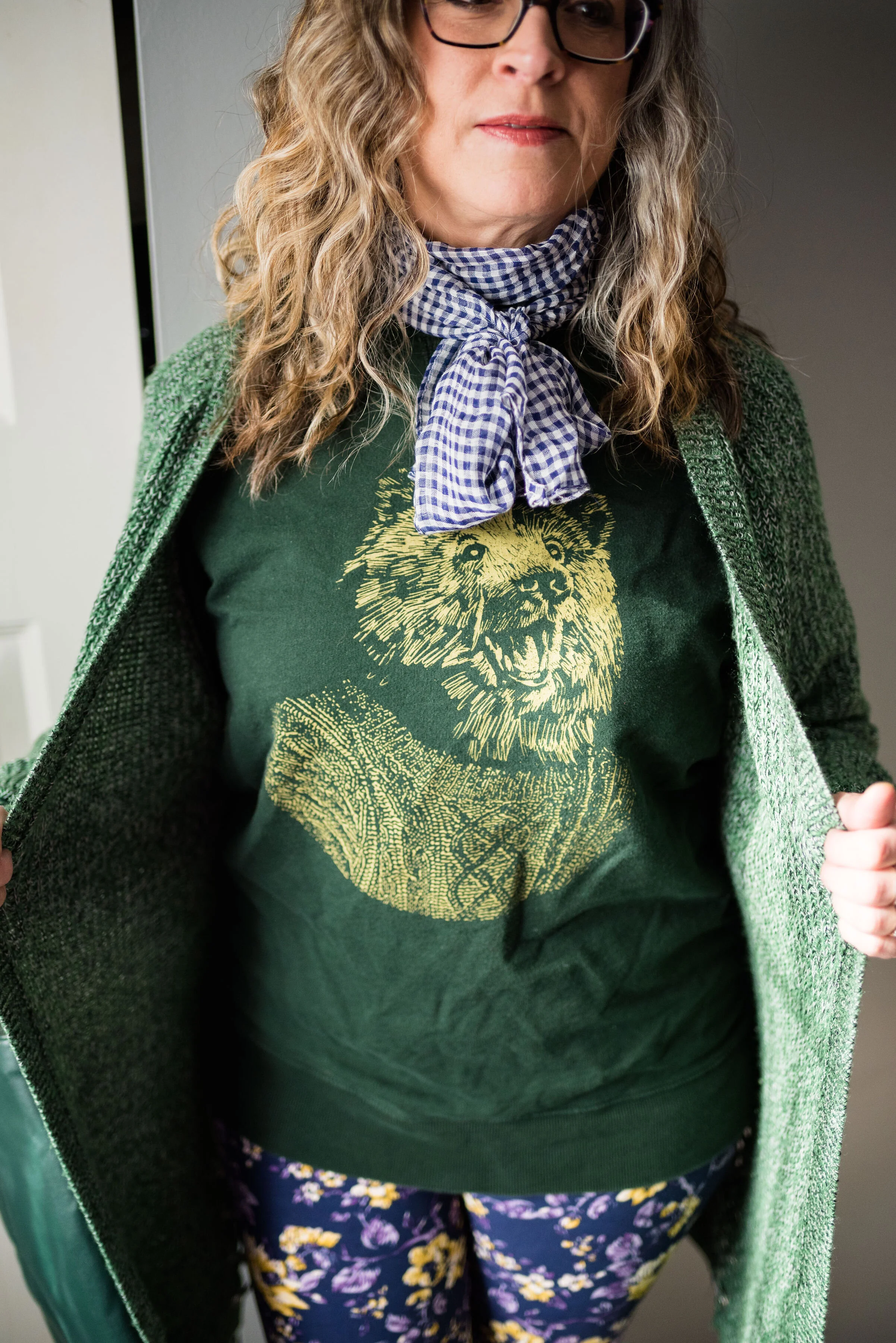
My Sleet colored slouchy tee is SO brand and also from Kohl’s. Do you know I have not been in a Kohl's store in months? Of course I haven’t been in any store, other than grocery stores and a few choice thrift shops since COVID happened. I have ordered a few things online from Kohl’s, so I can’t say I haven’t shopped there. Ha, ha. This tee is very light weight and has been retired to the summer clothing box for now. I have styled this on the blog before too. You can see it with another pleated skirt here.
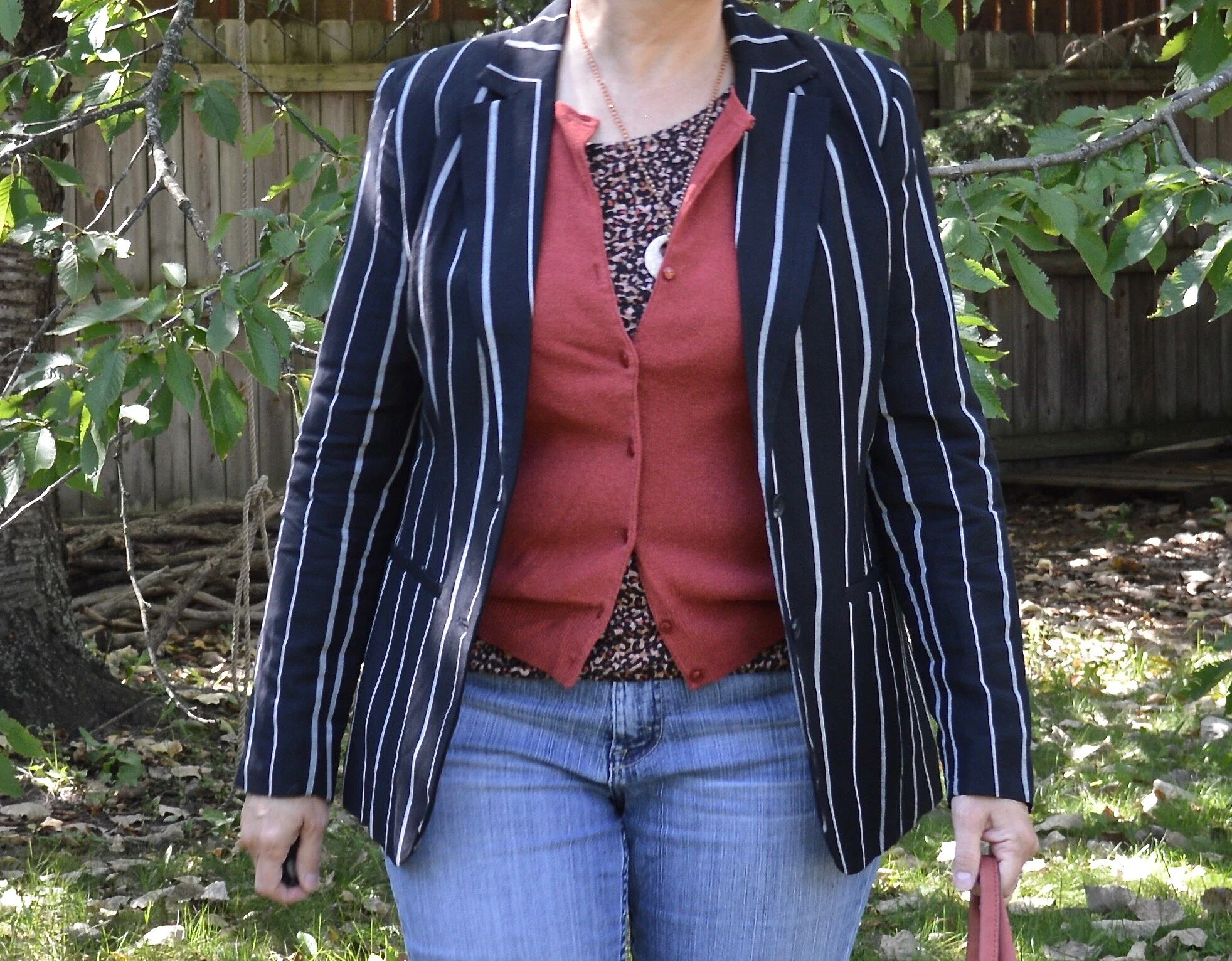
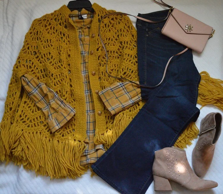
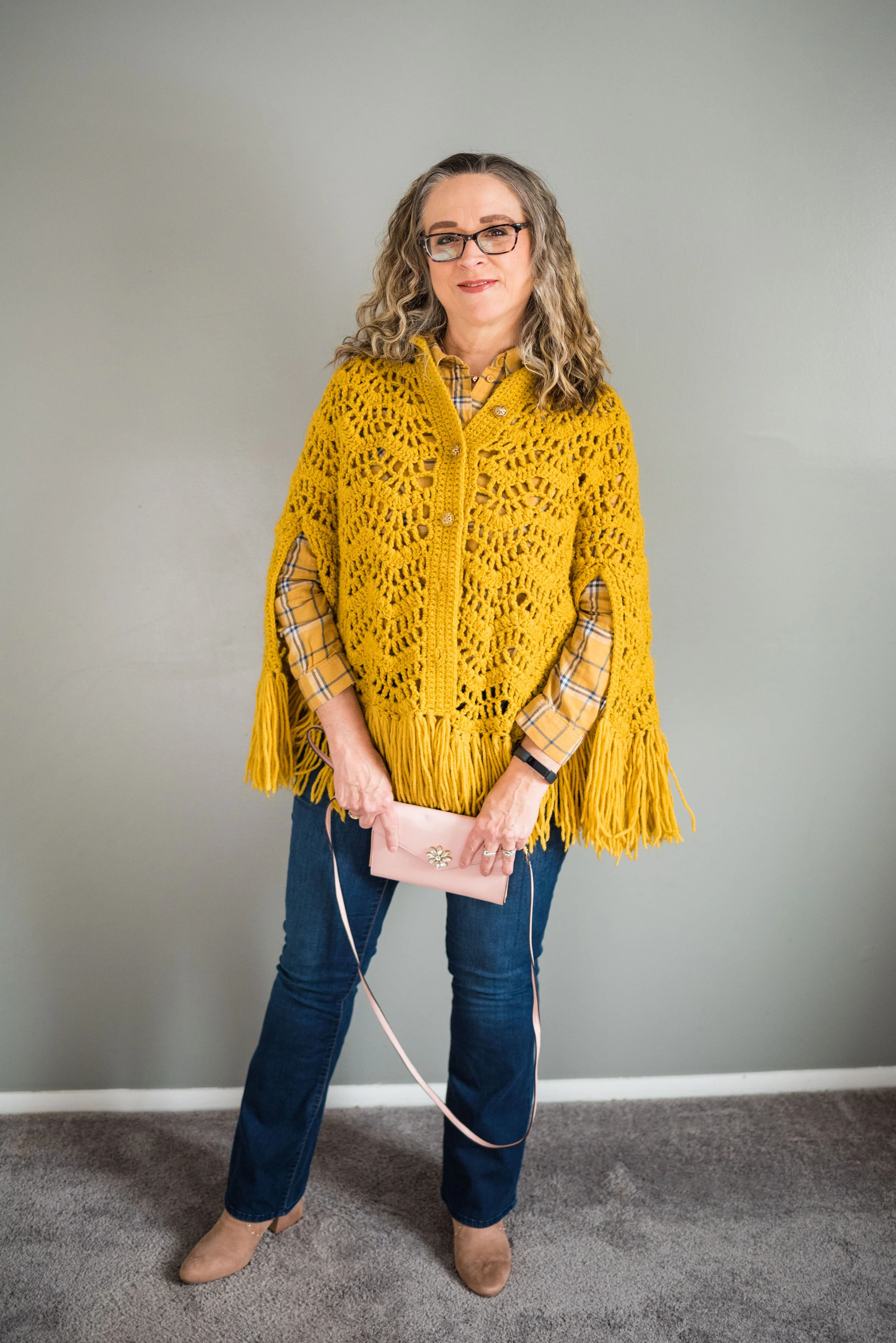
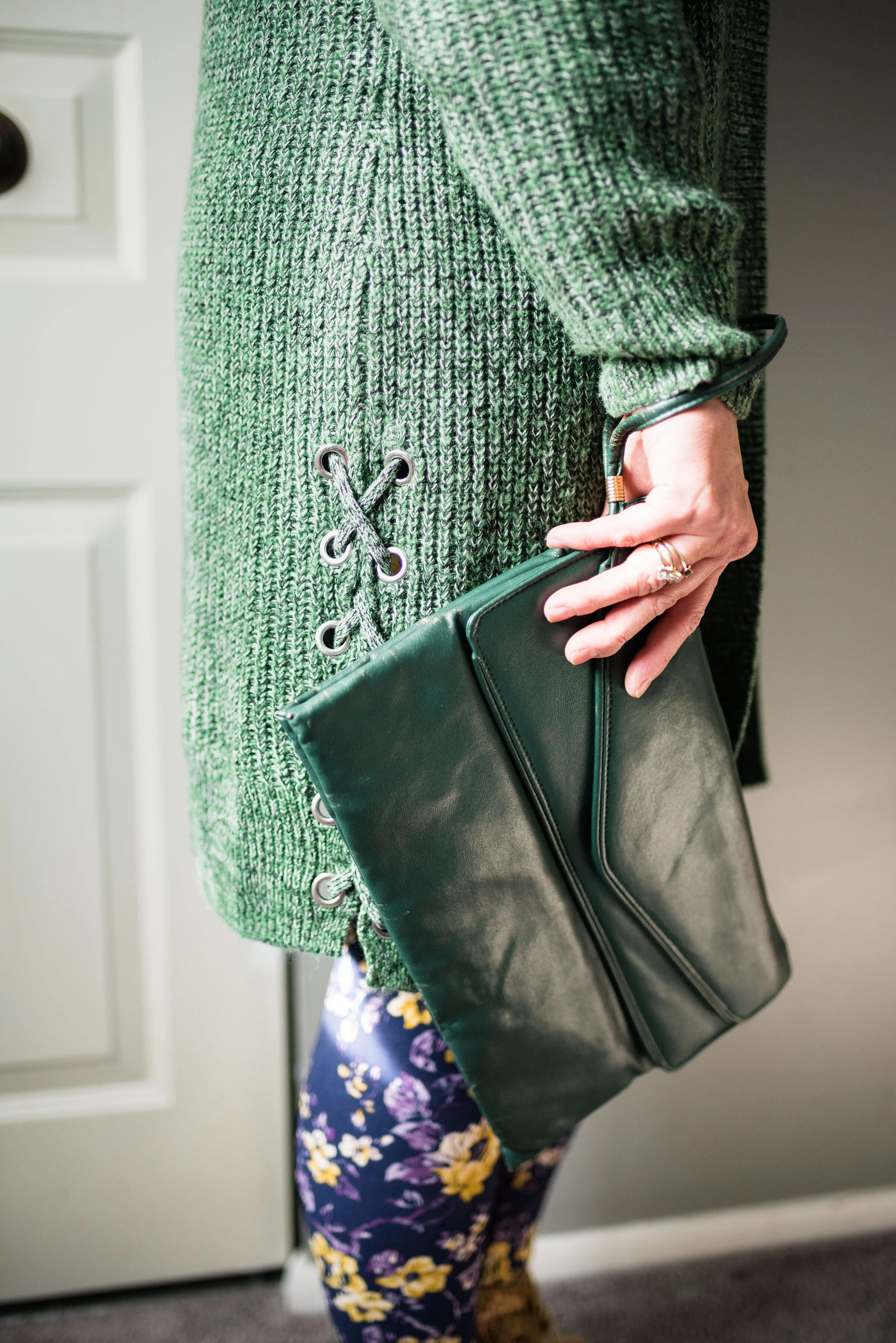
My long pink sweater is also SO brand from Kohl’s. I bought two of these sweaters, as I mentioned a few weeks ago when I styled the maroon colored one. You can see that post here. This one is an XL and the maroon one is a L. This one is definitely bigger, but it is nice for wearing over multiple layers.

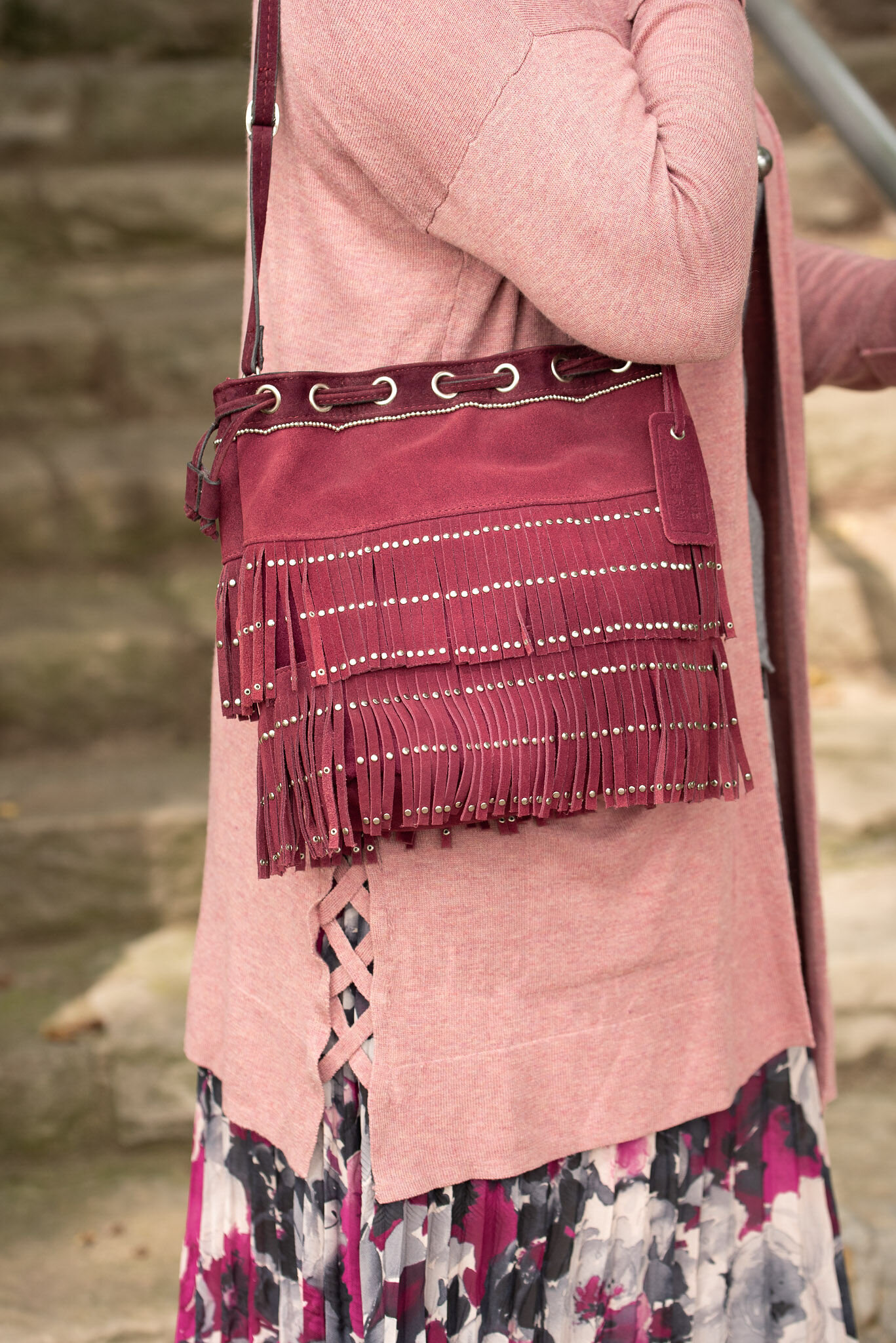
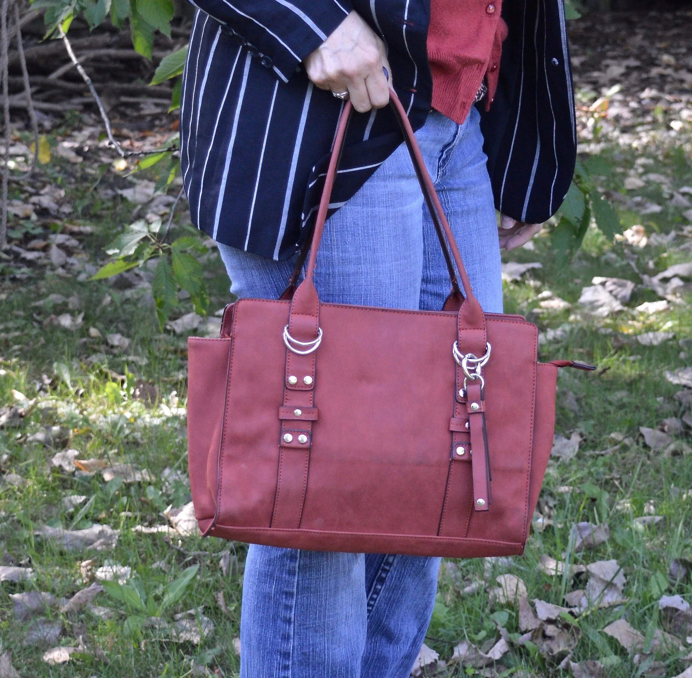
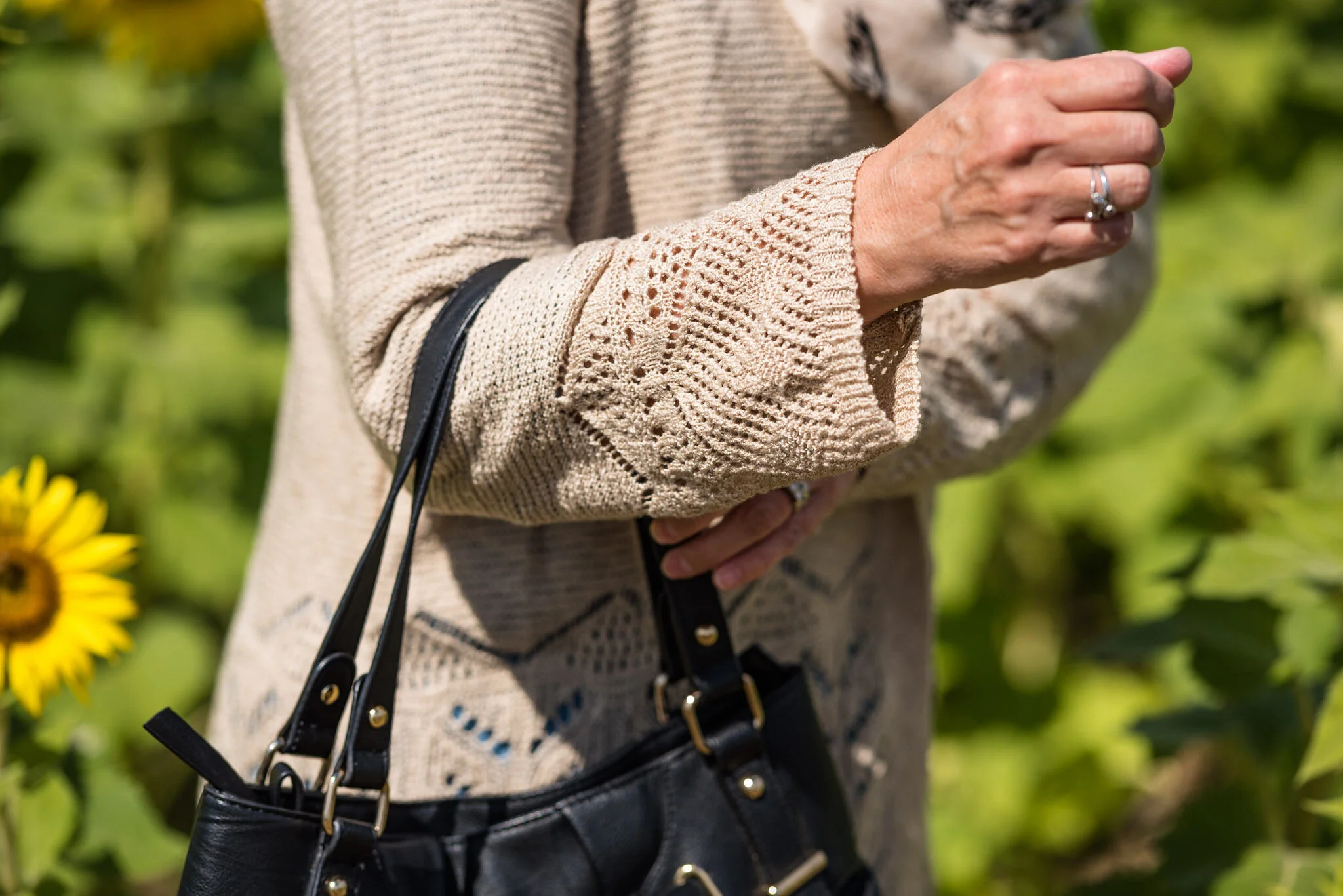
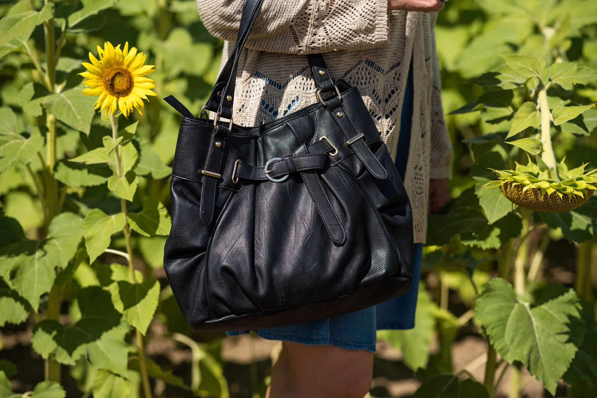
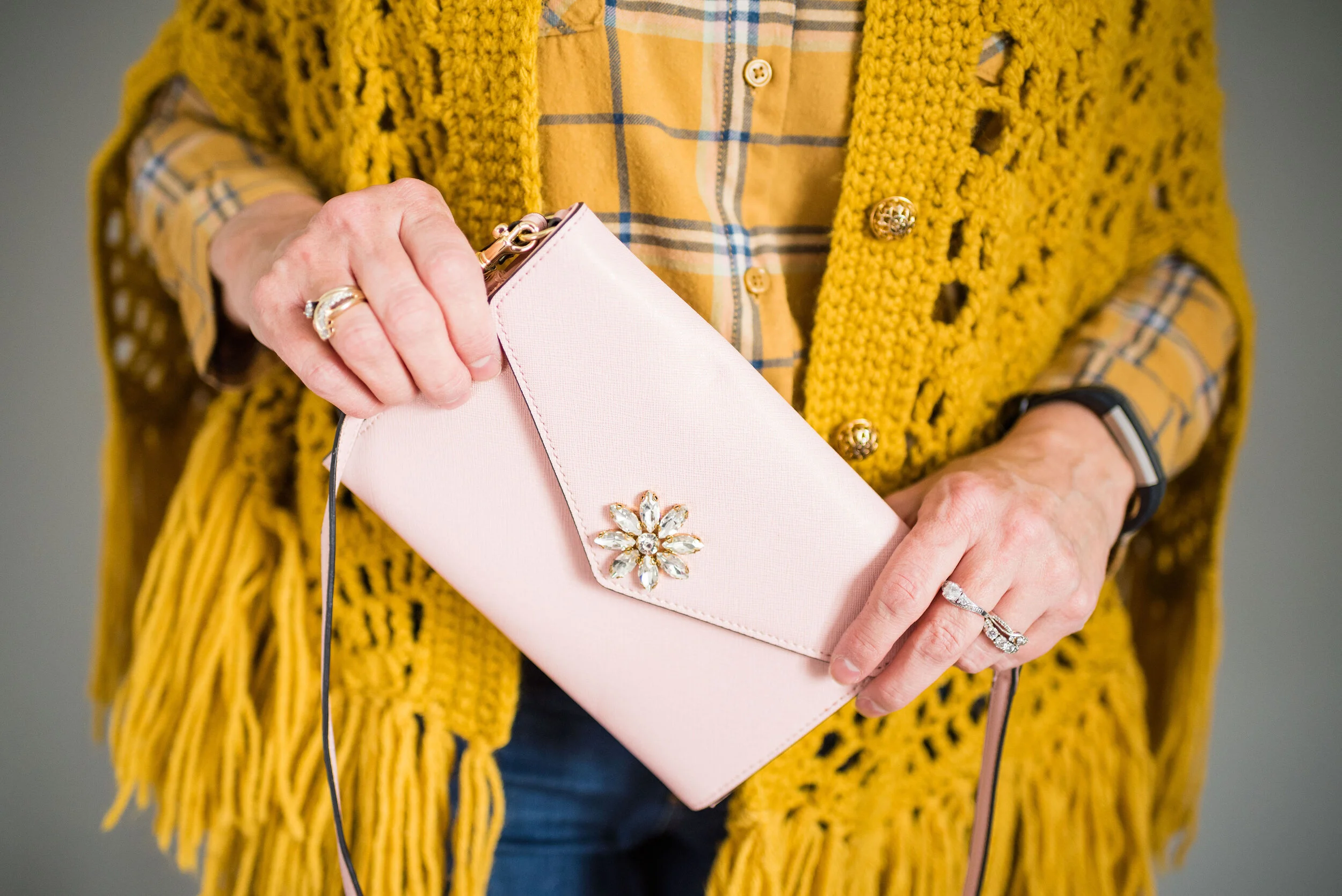
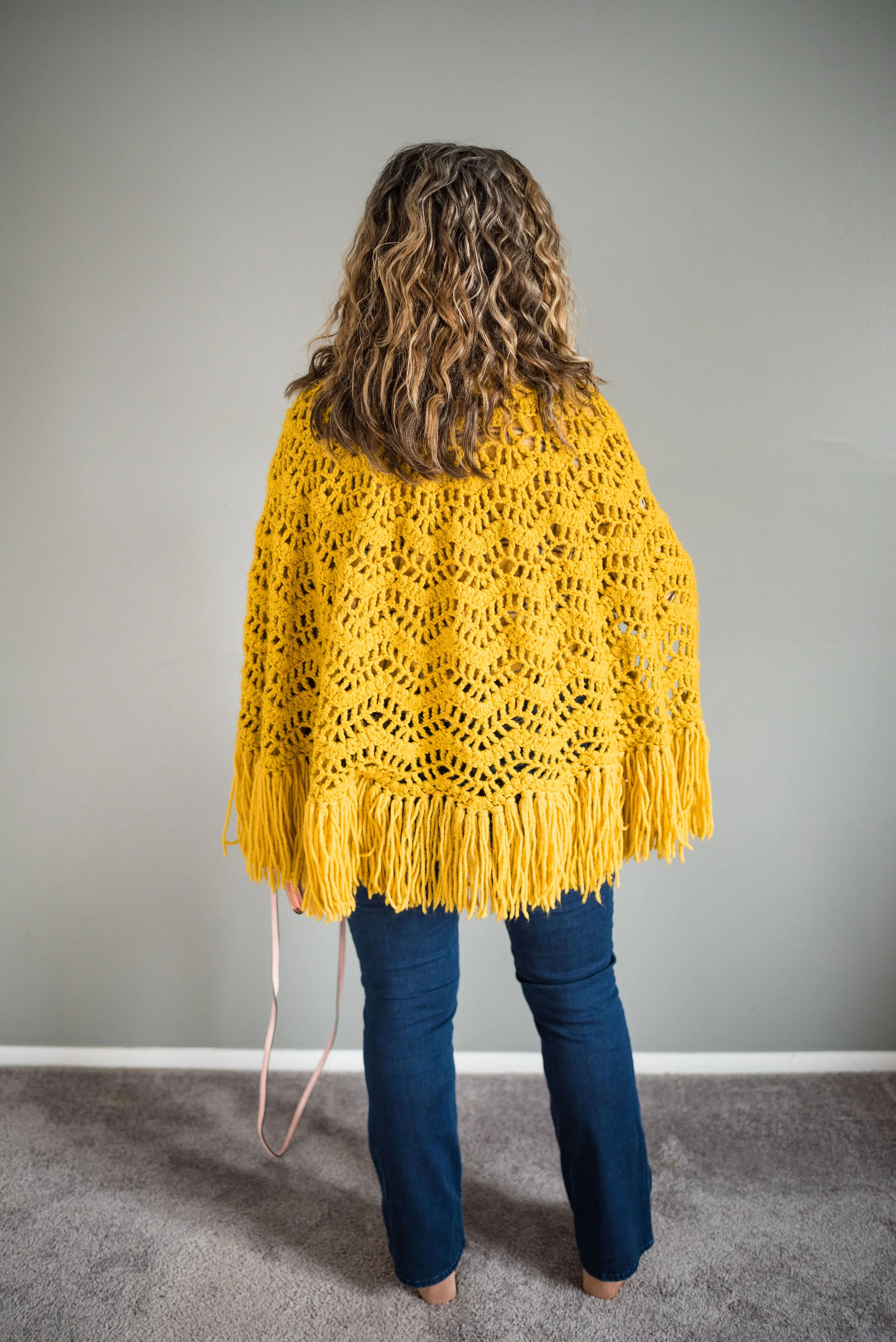
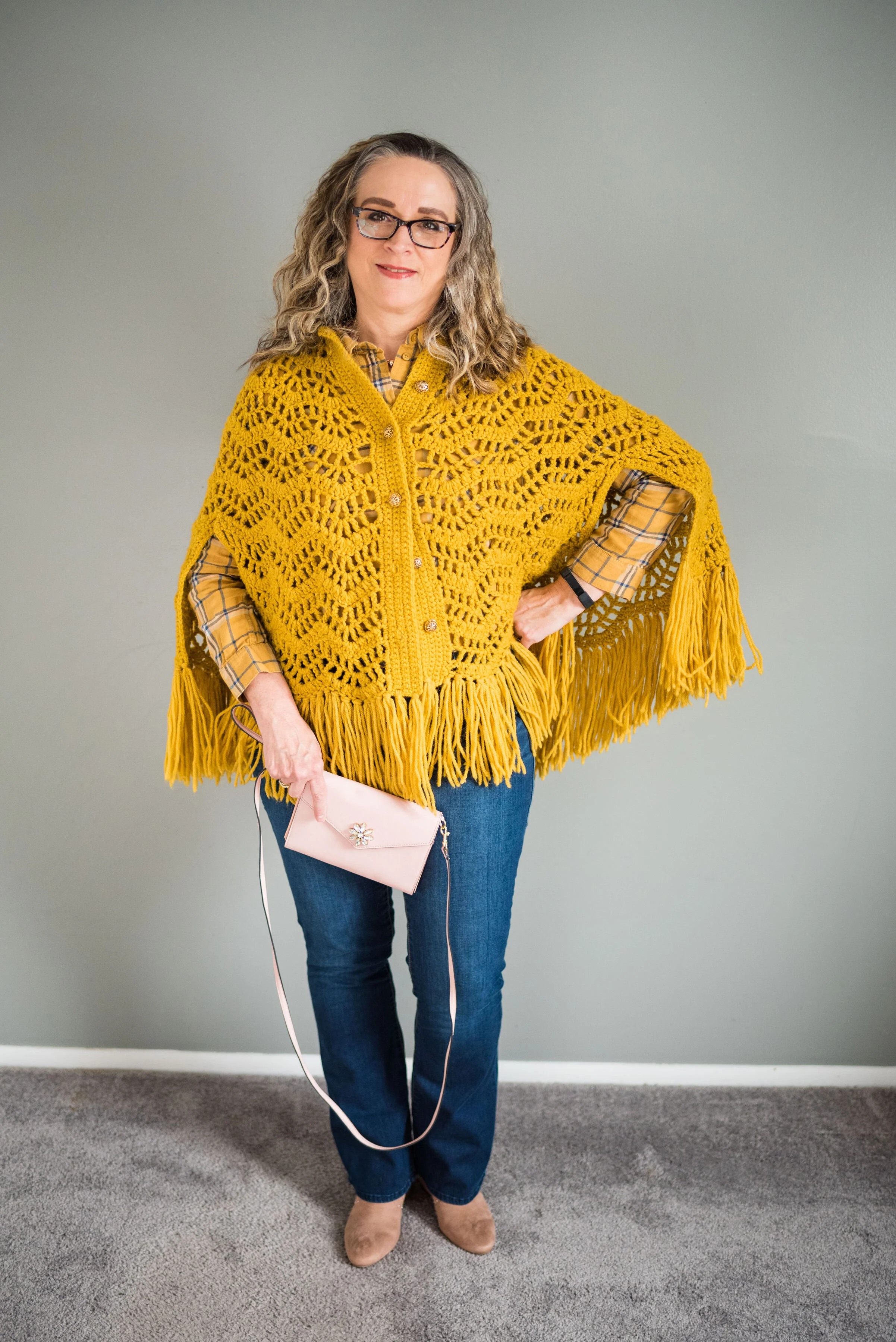
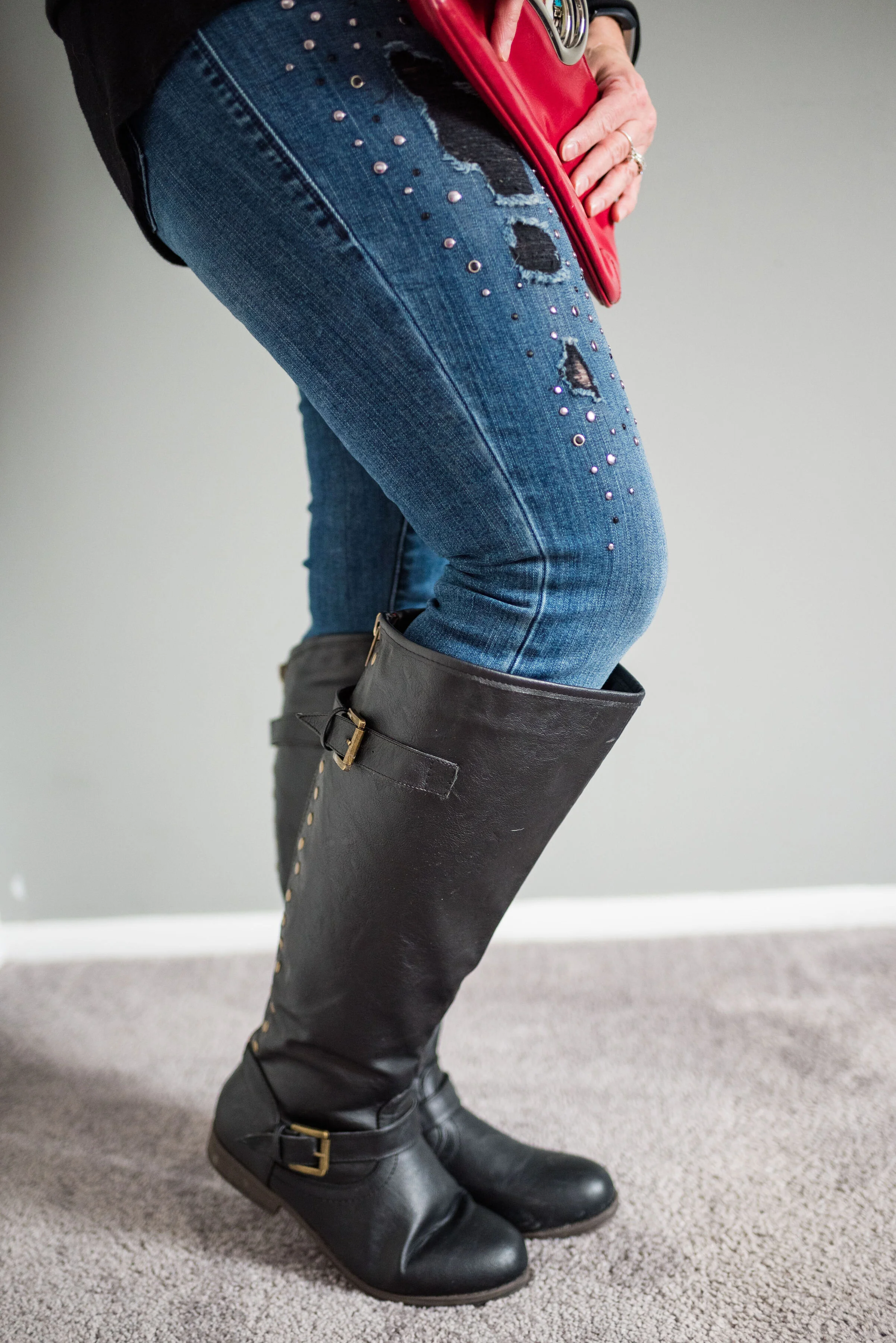
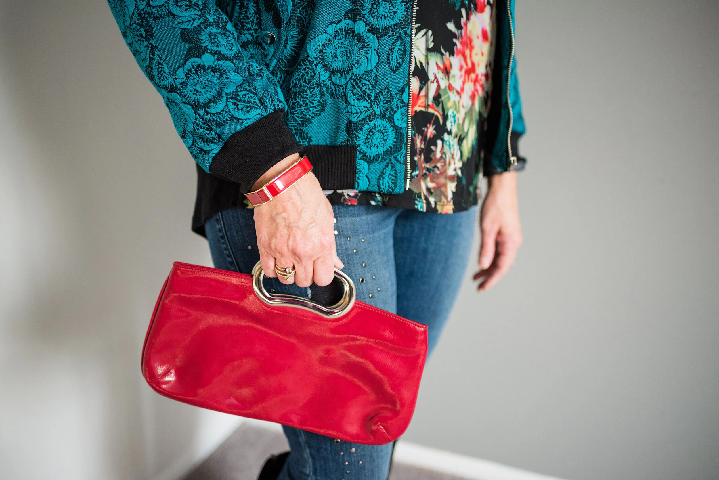
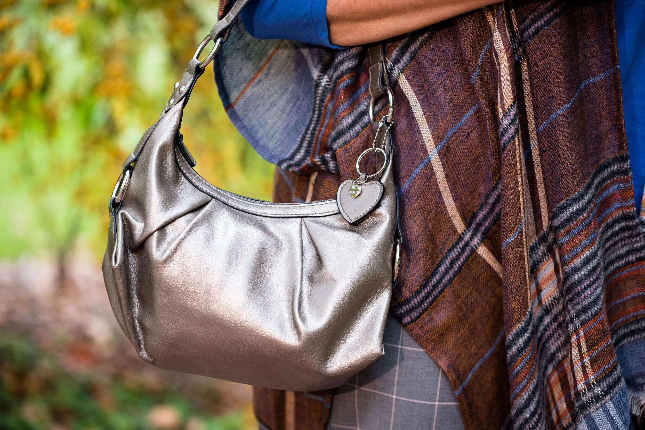
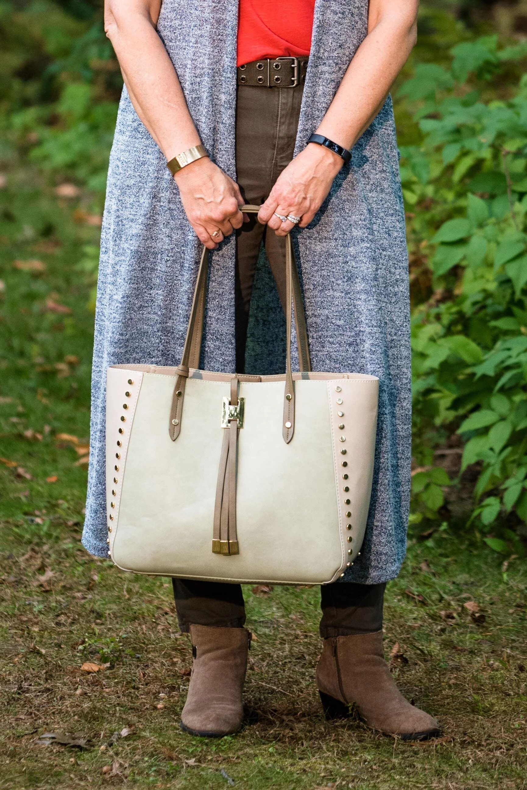
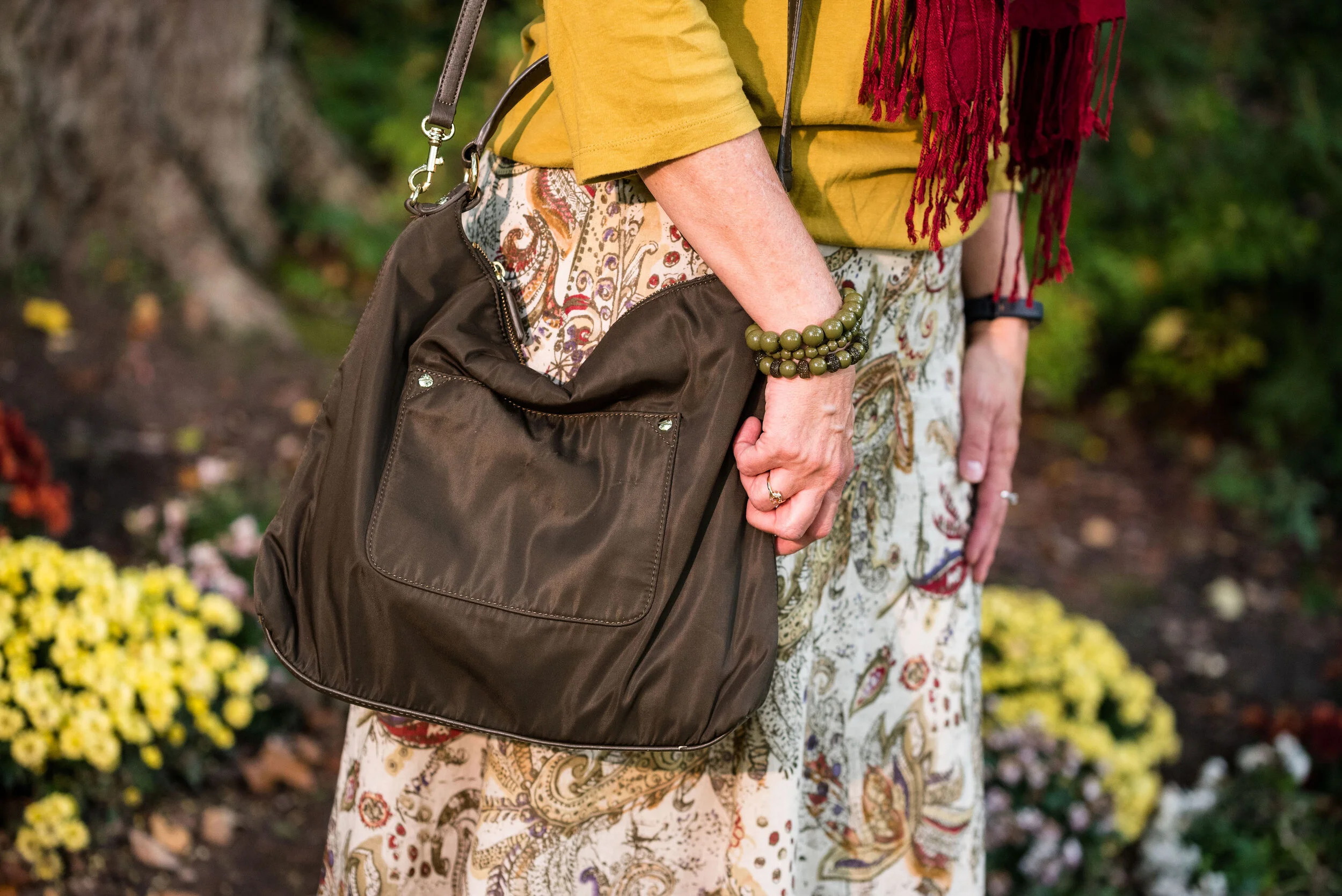
This fringe, suede bucket bag has been around for a few years and makes regular appearances on the blog. I actually haven’t used it as my day to day purse, because the top does not close. I like a little more security when I am out in public, as far as my bag goes. But it is cute and a great color for fall, so I keep it around.

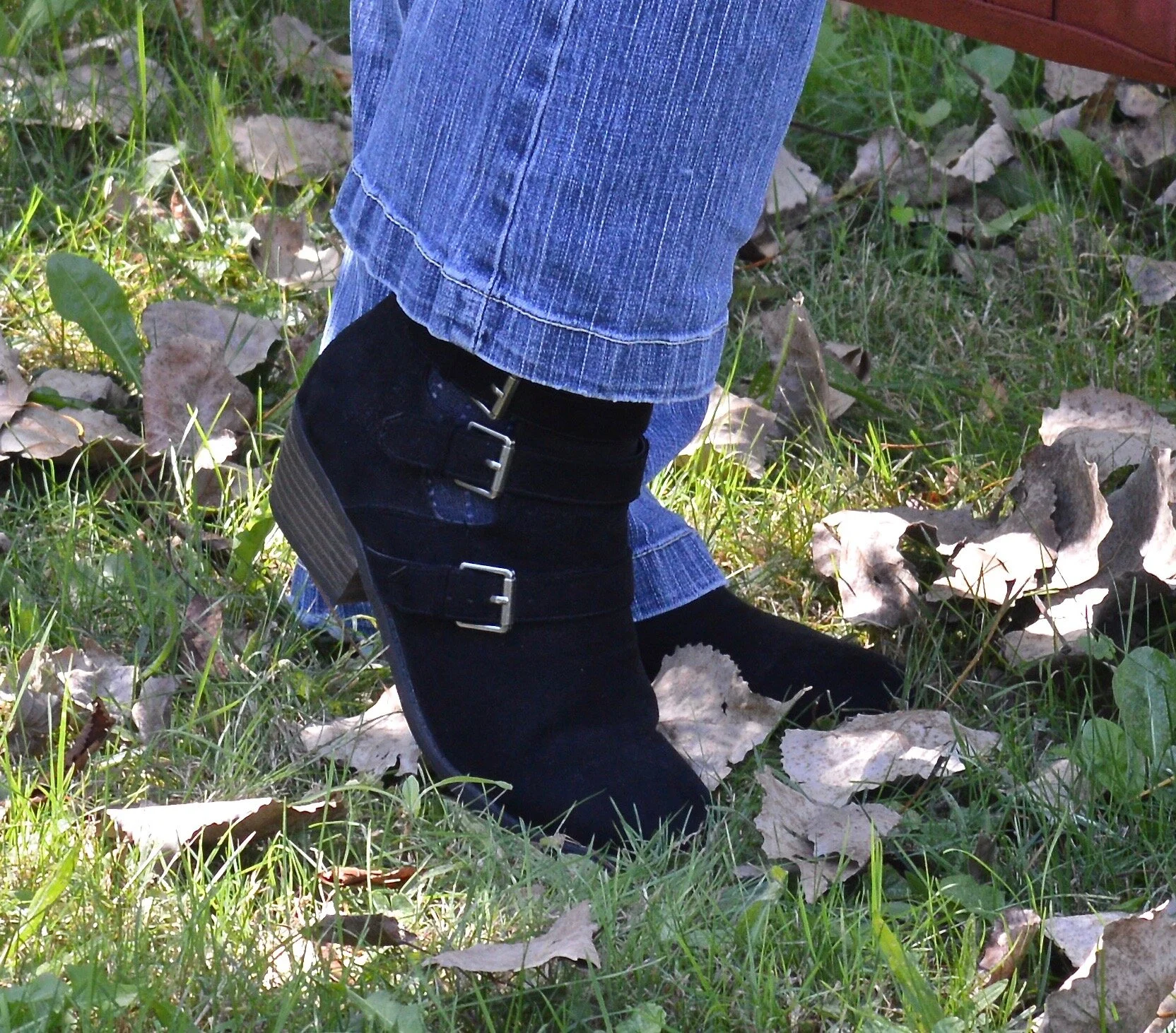
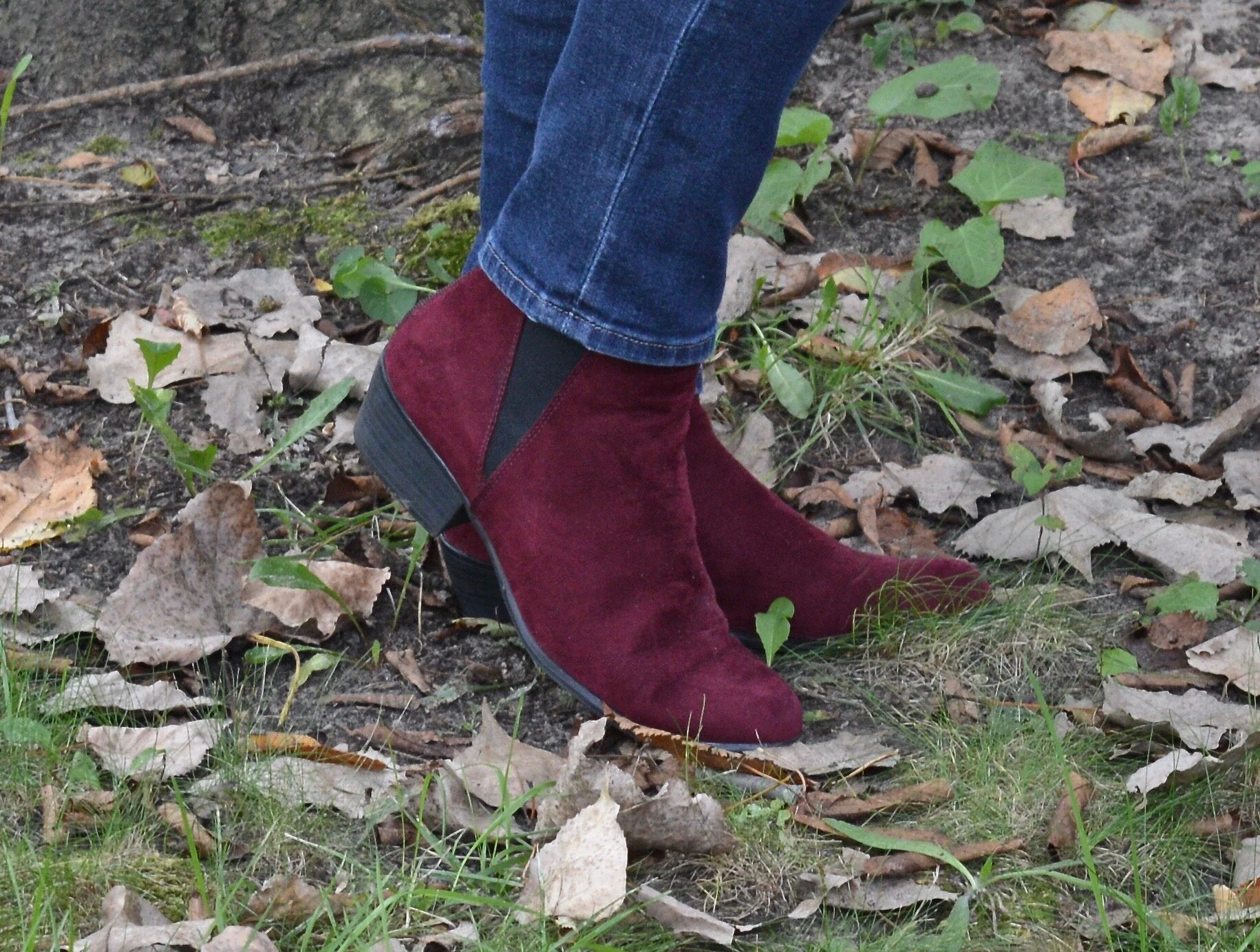
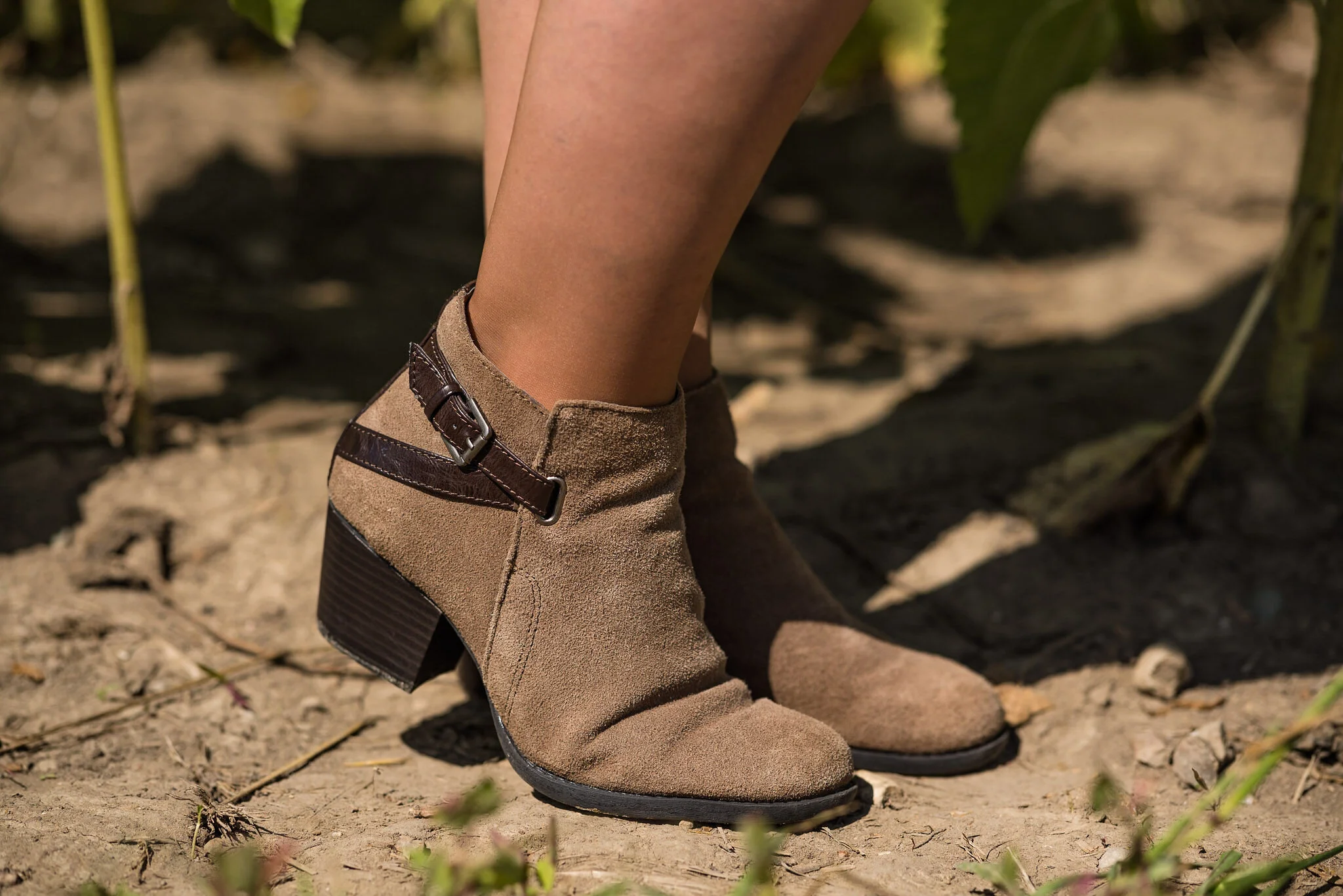
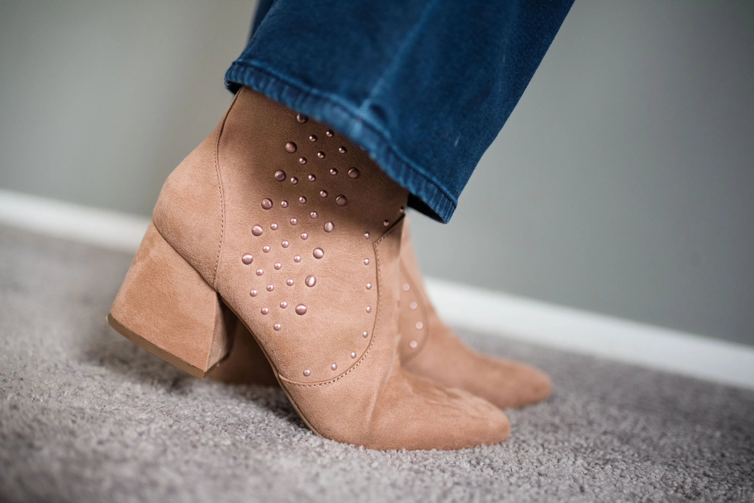
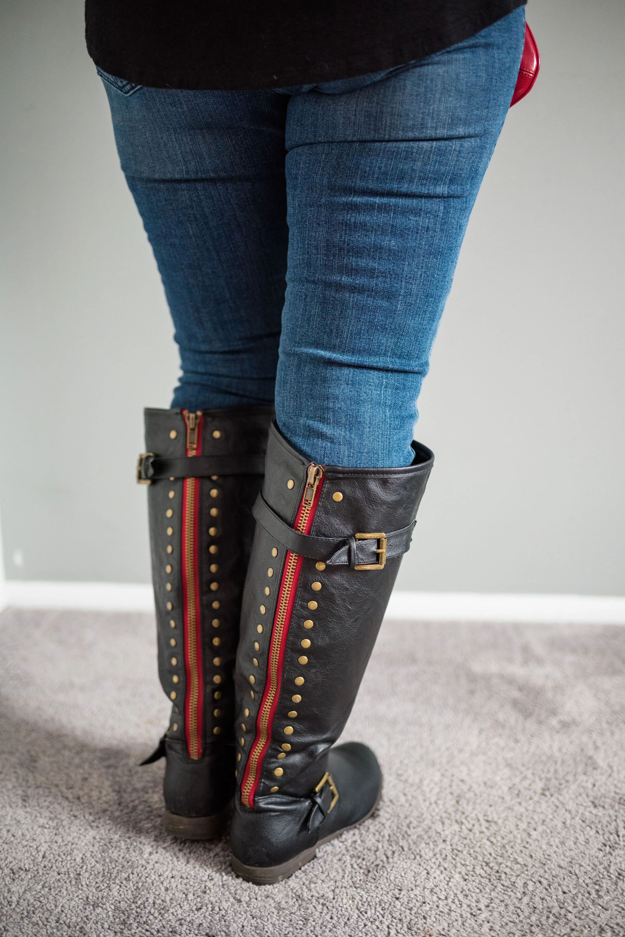
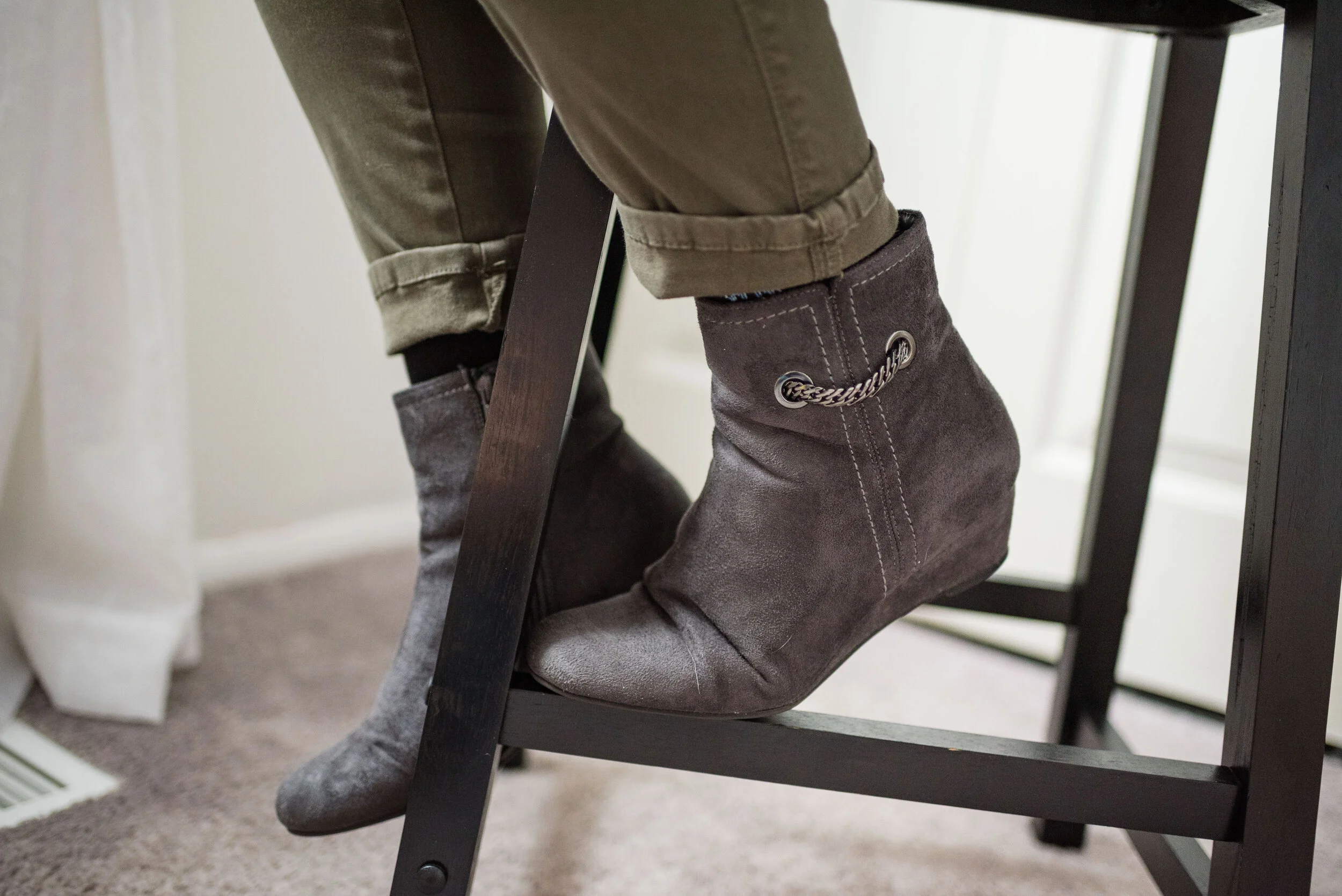
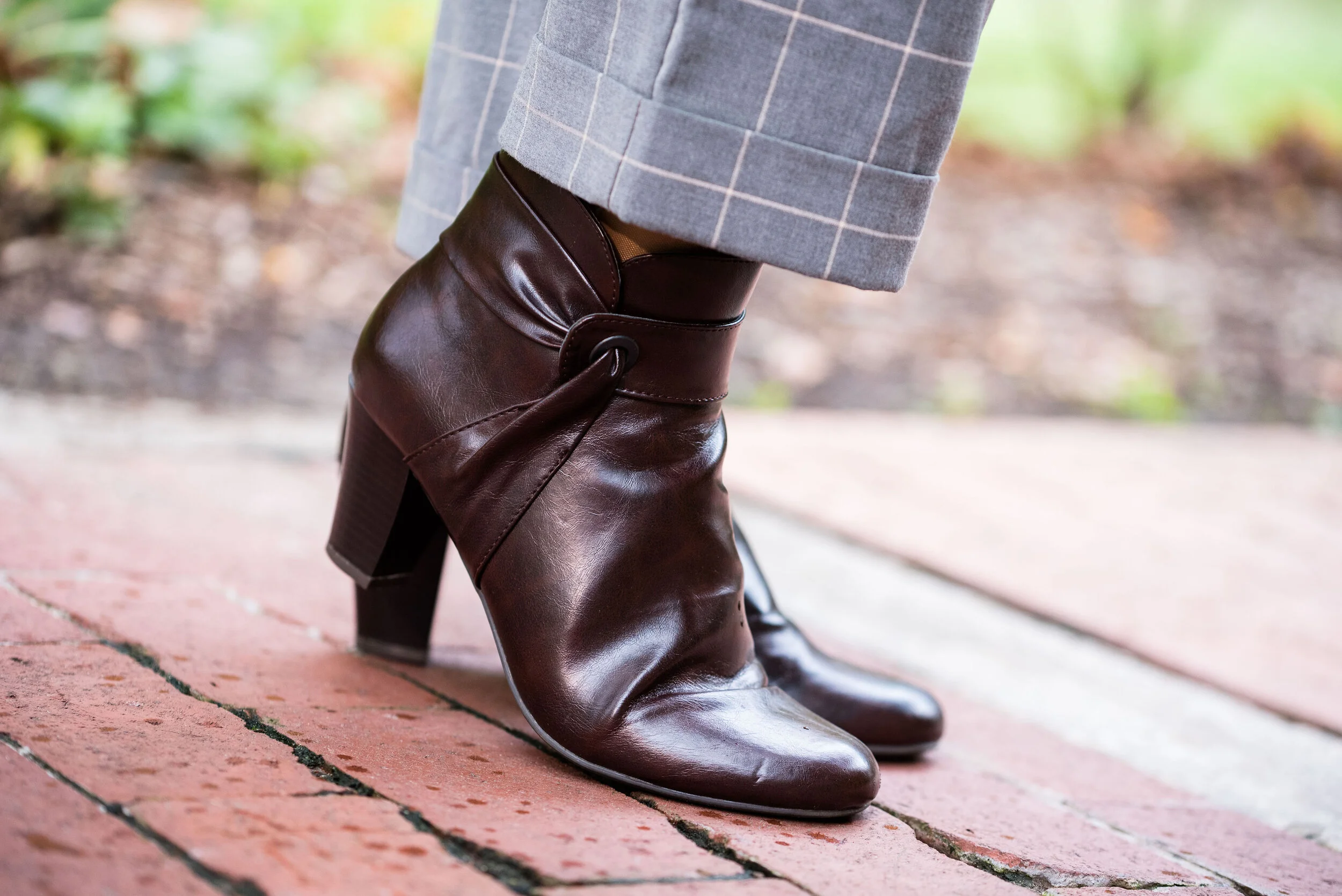
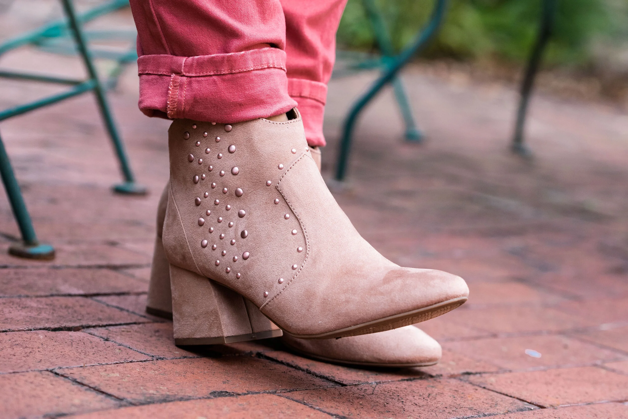
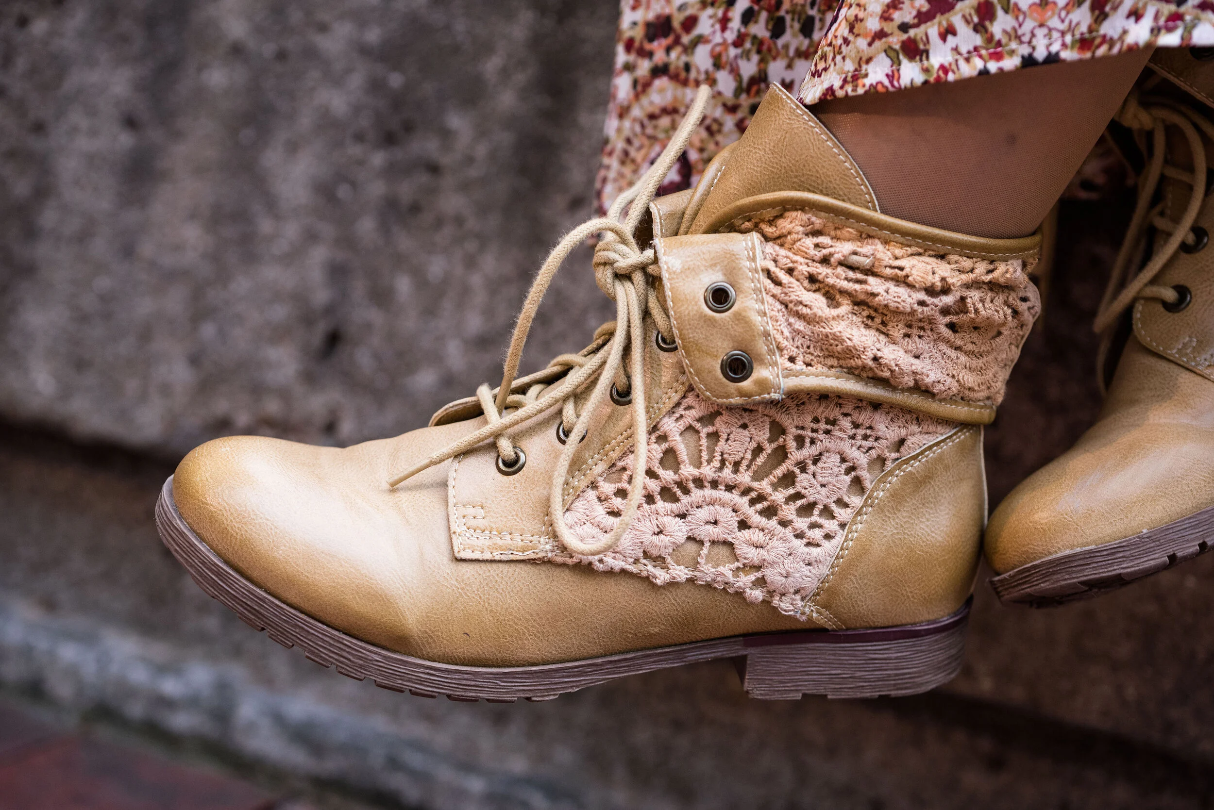
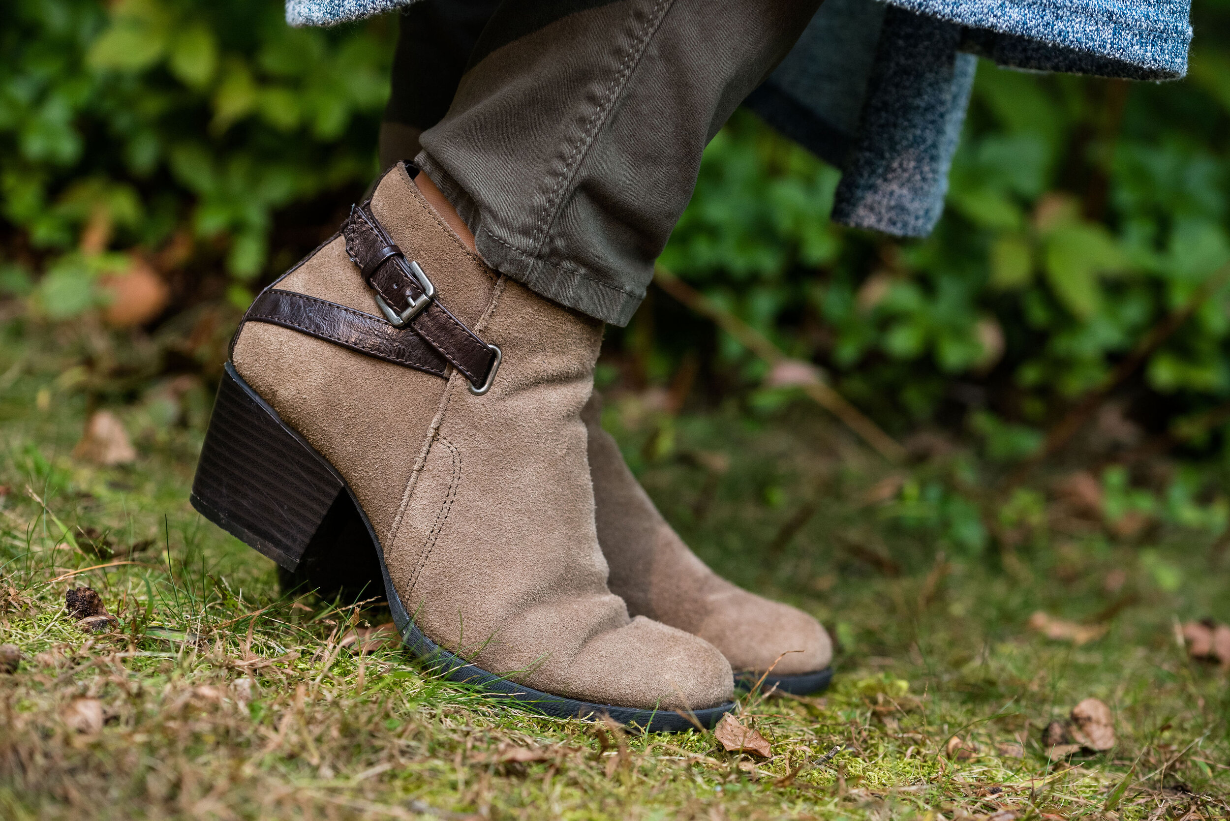
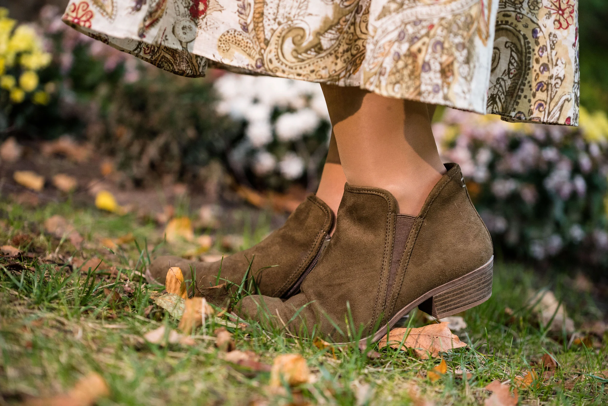
I’ve styled these Easy Spirit ankle boots on the blog before too. I have numerous pairs of faux suede ankle boots. They are so easy to get on and off. They go with all manner of outfits and I can wear them with a variety of types and thicknesses of socks and hose. They are a nice alternative to dress shoes for work or an event where you want to look a little more put together, but still be casual.

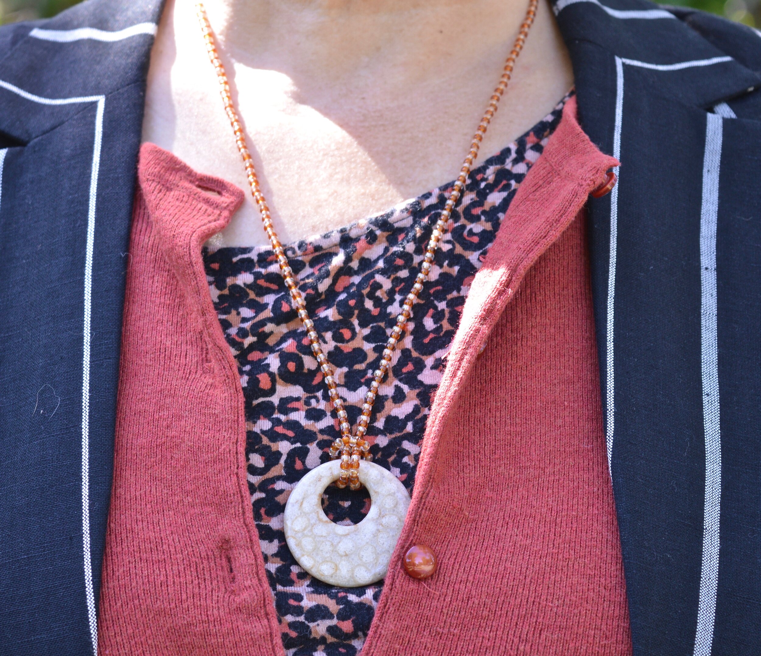
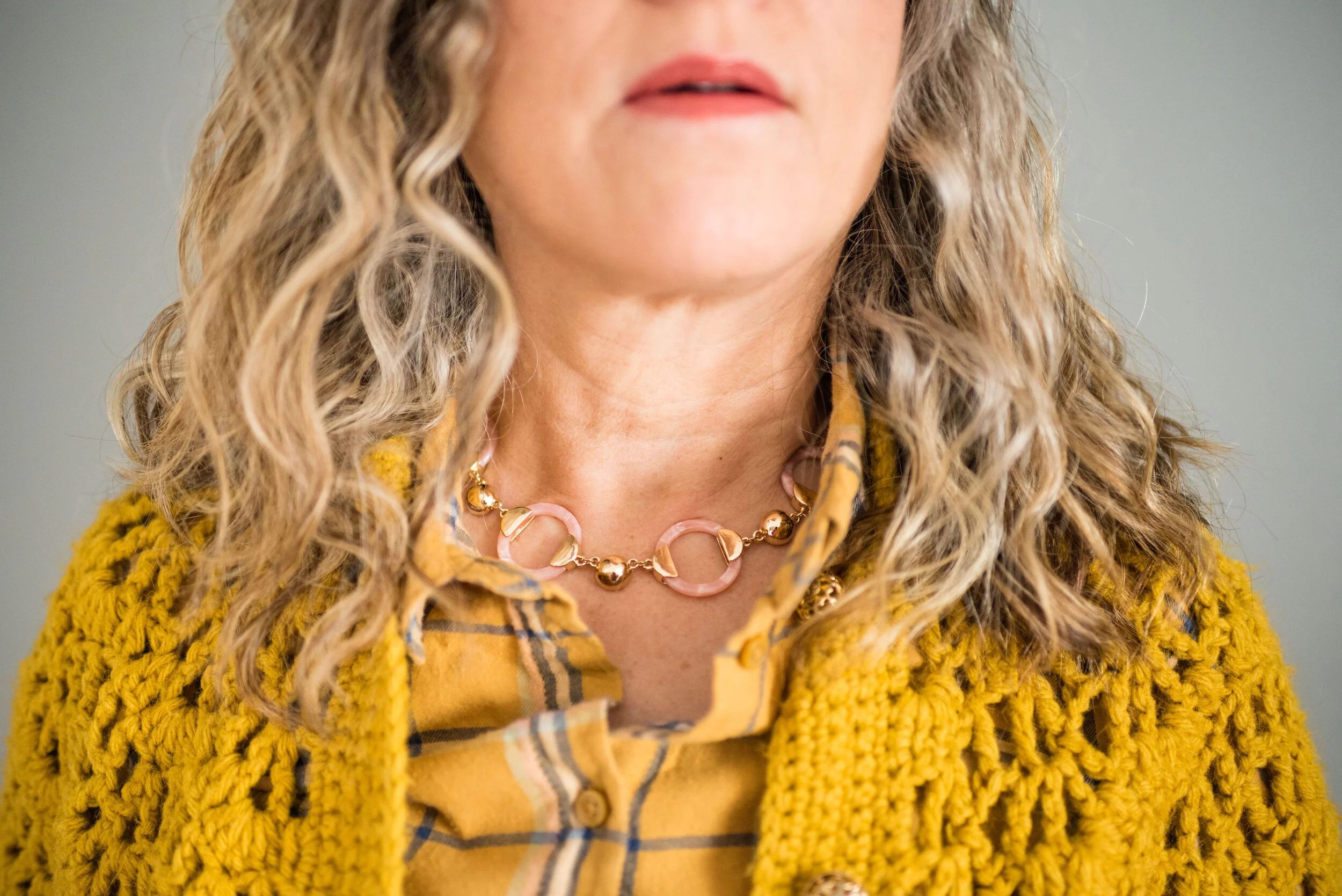
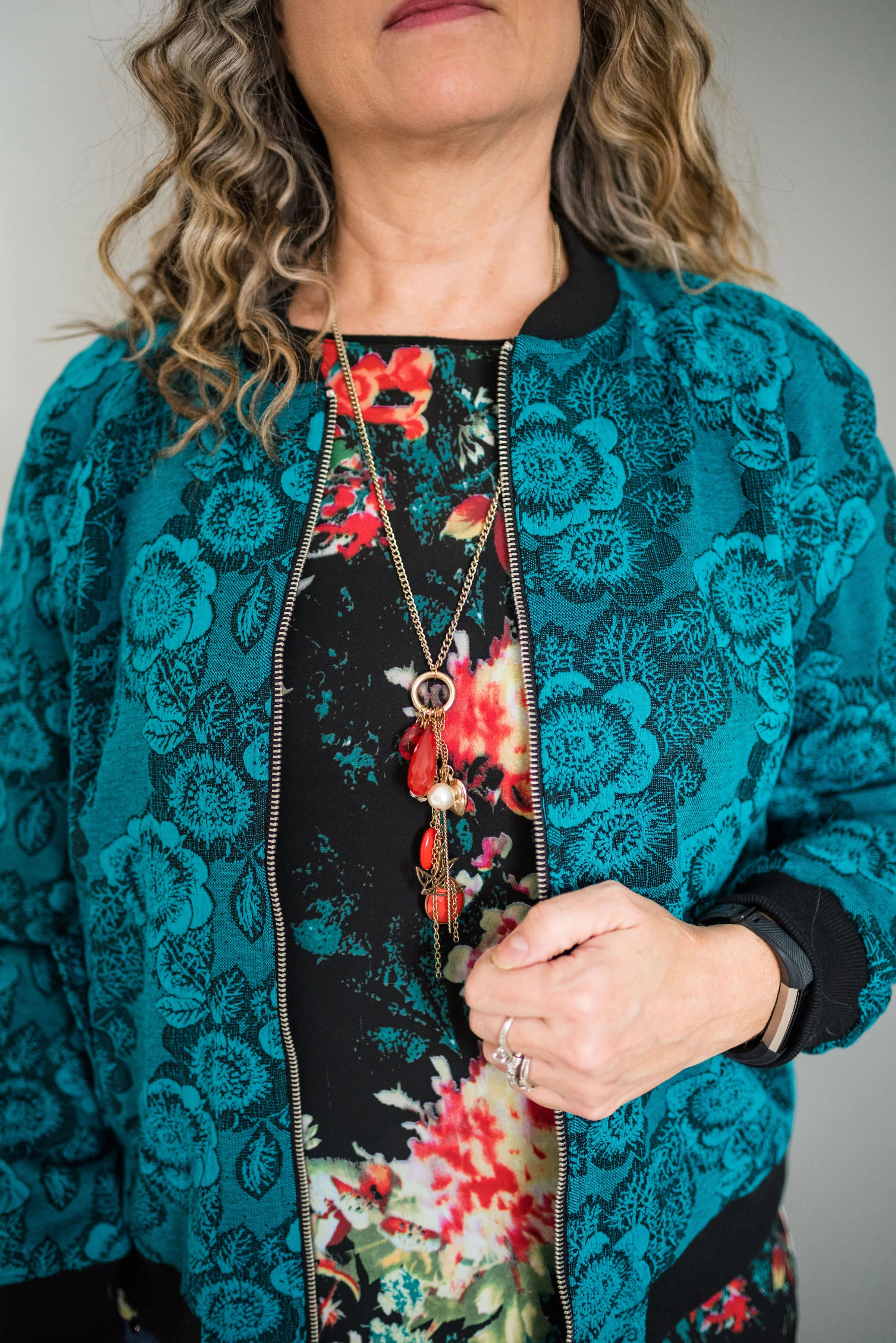
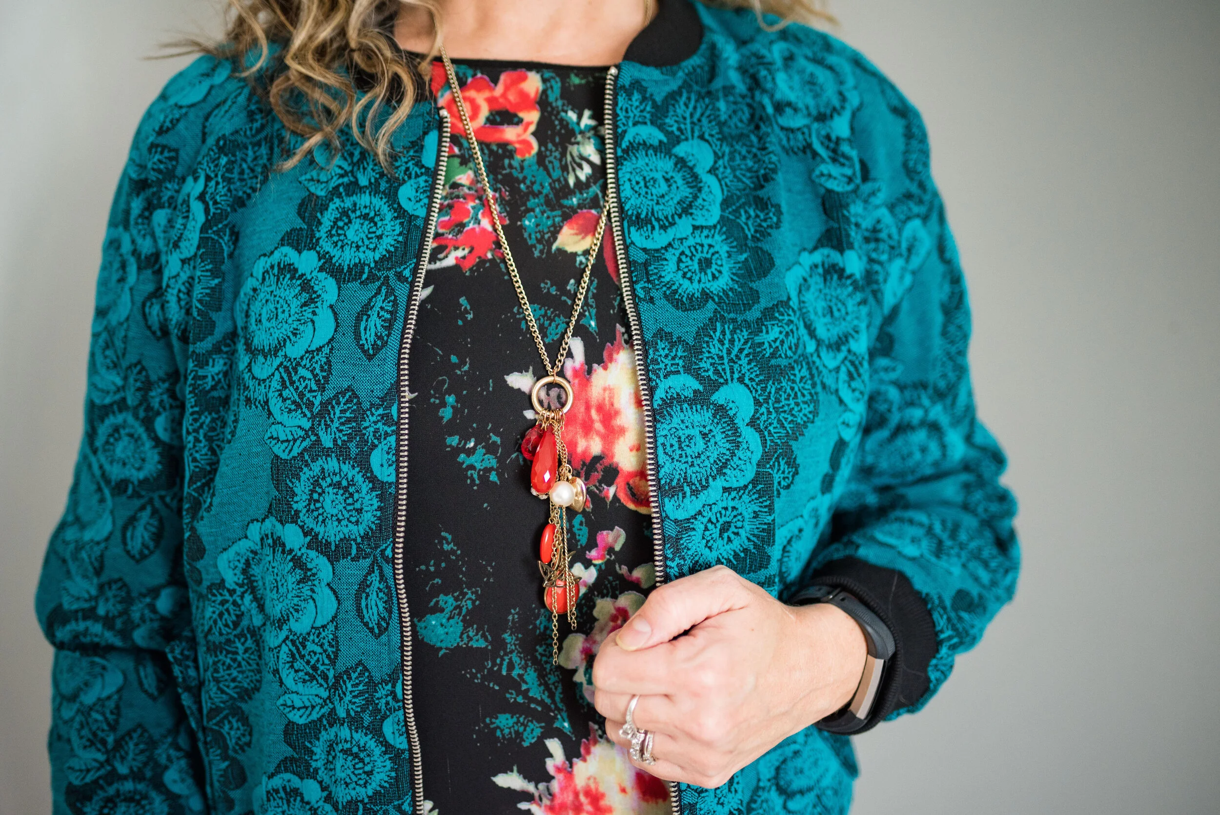
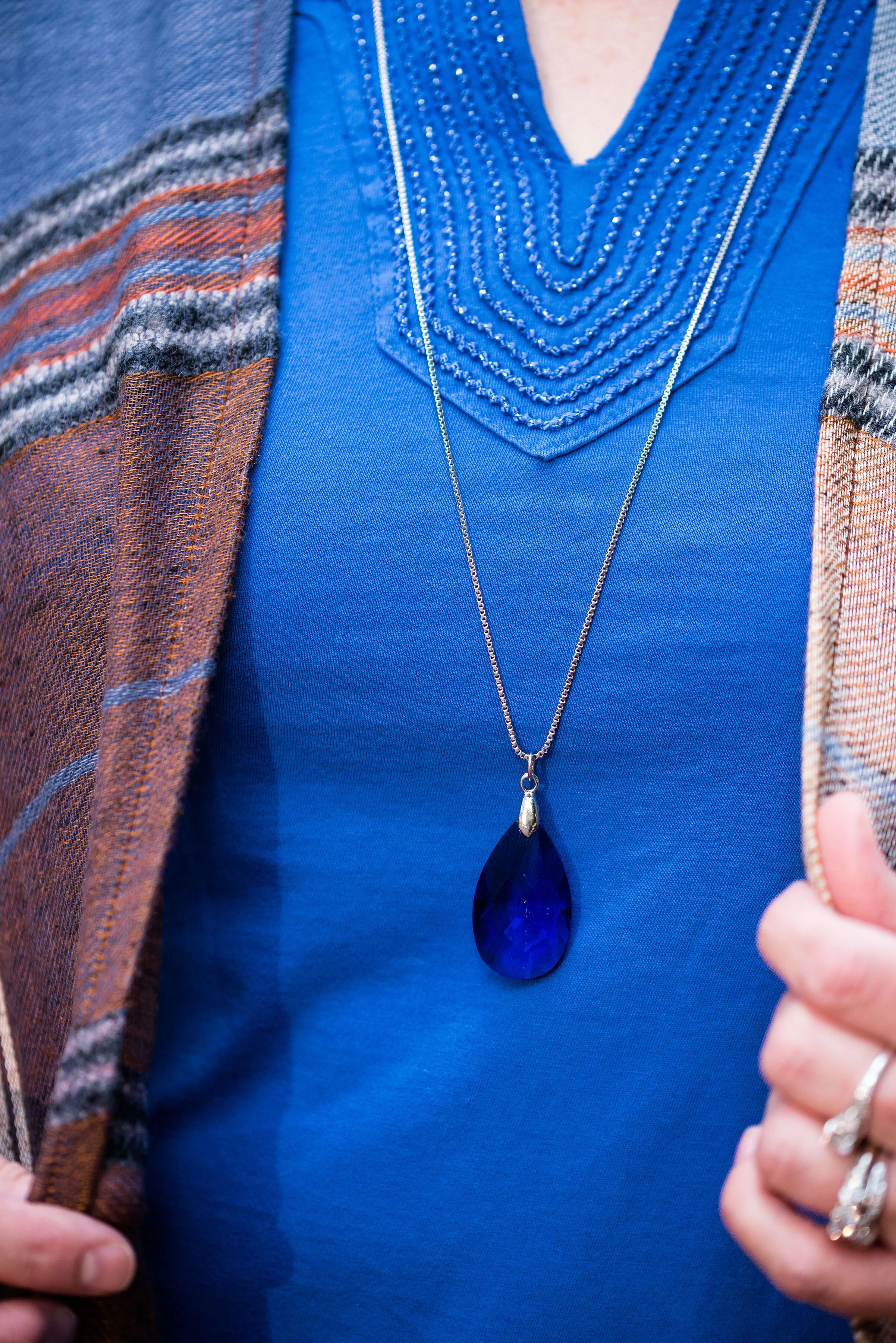
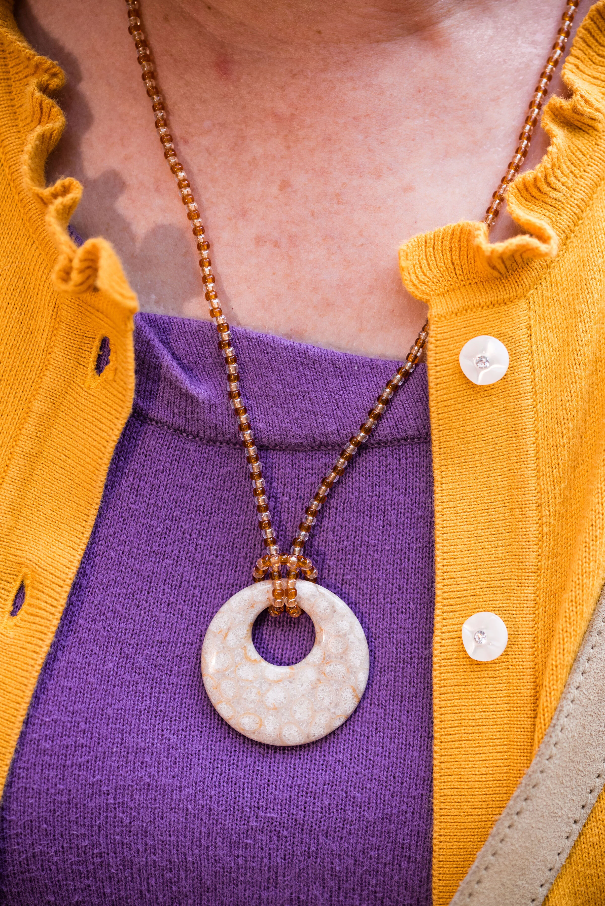
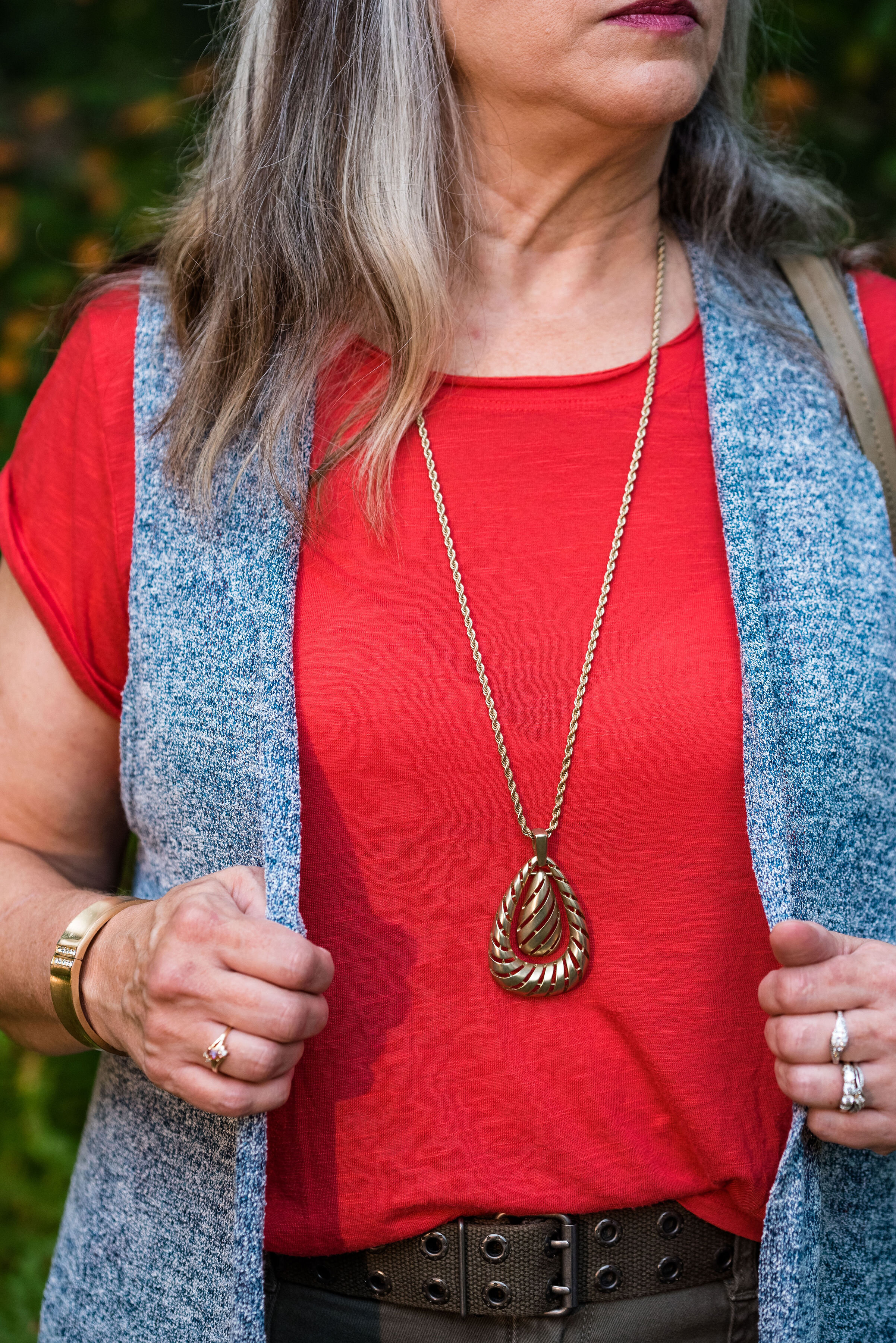
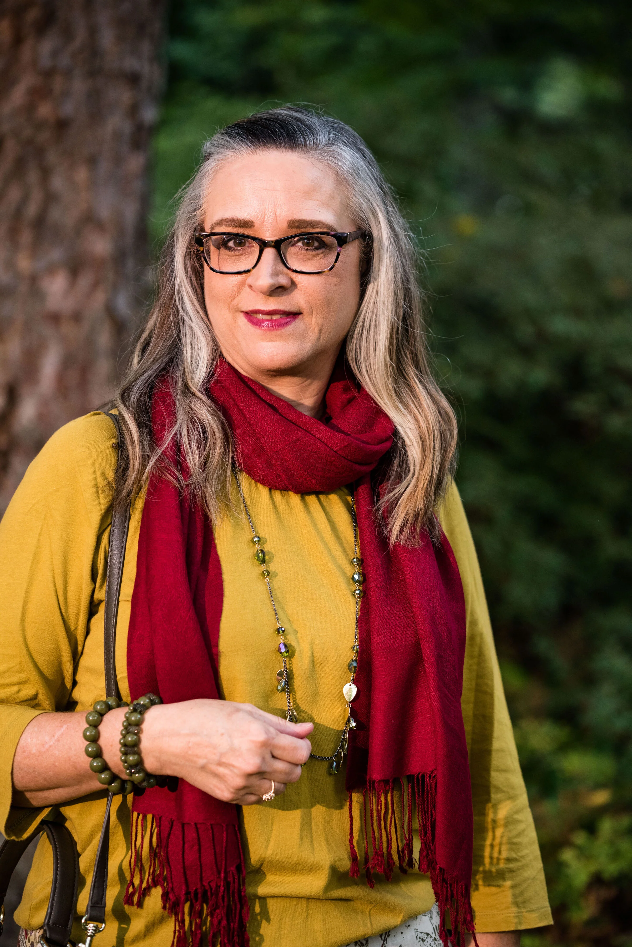
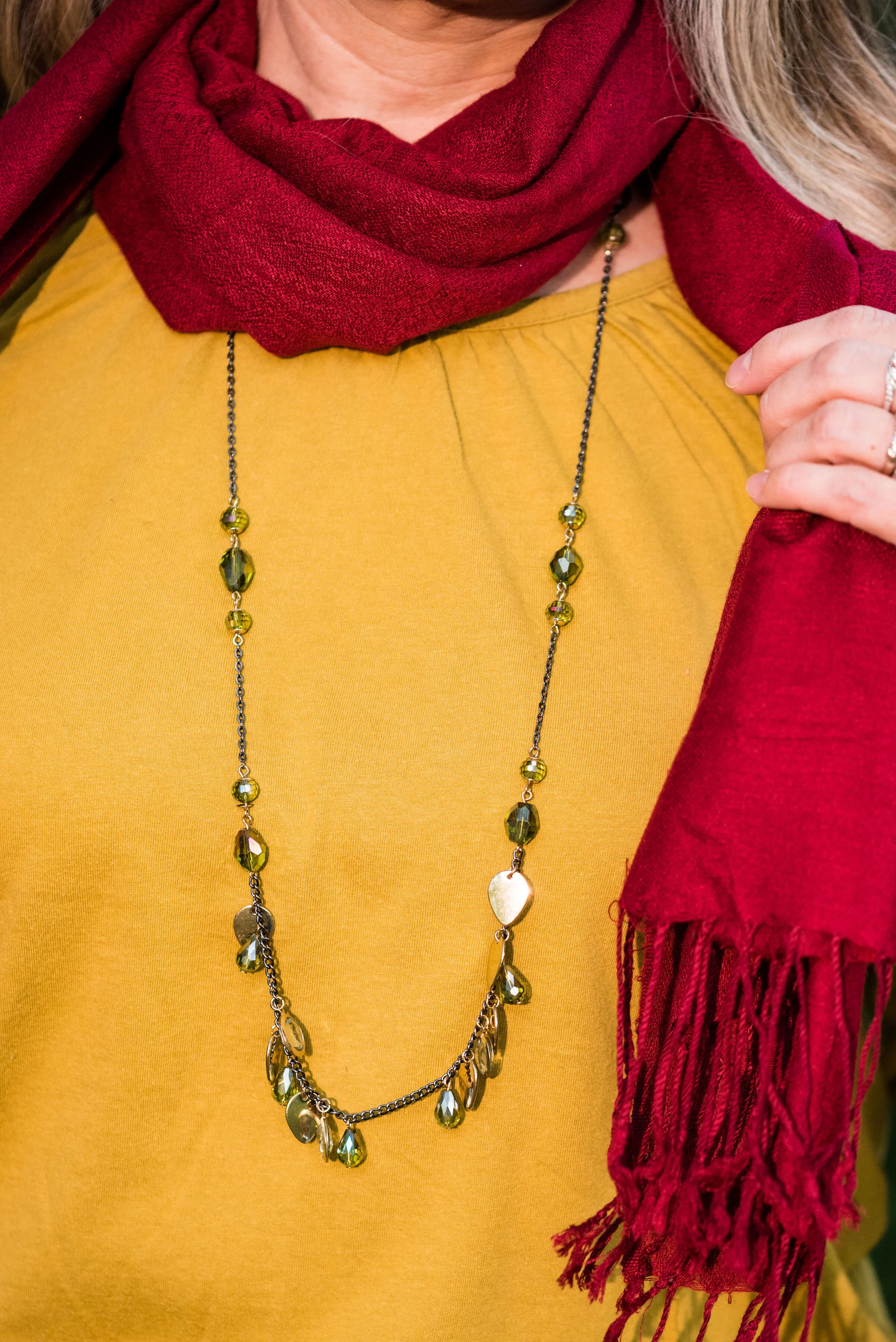
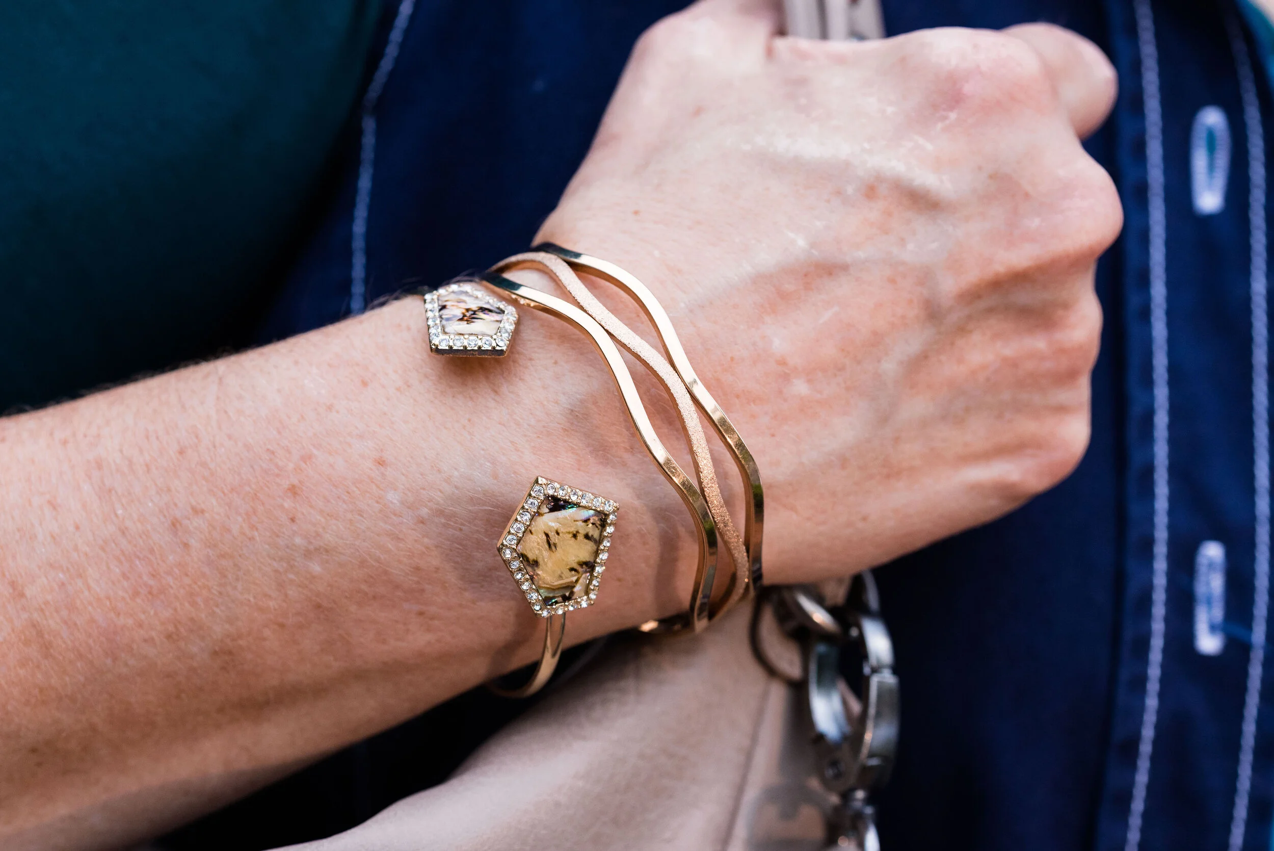
I went for a layered look with my necklaces. I started with the ribbon choker, but gradually added the layered pearl choker and then the silver sphere pendant necklace. I like the look and I think it added a finishing touch to the outfit as a whole and still kept the boho vibe.

What do you think of this outfit? Do you think the long cardigan and the long maxi skirt work together? What might you have done differently? I’d love to hear your thoughts.
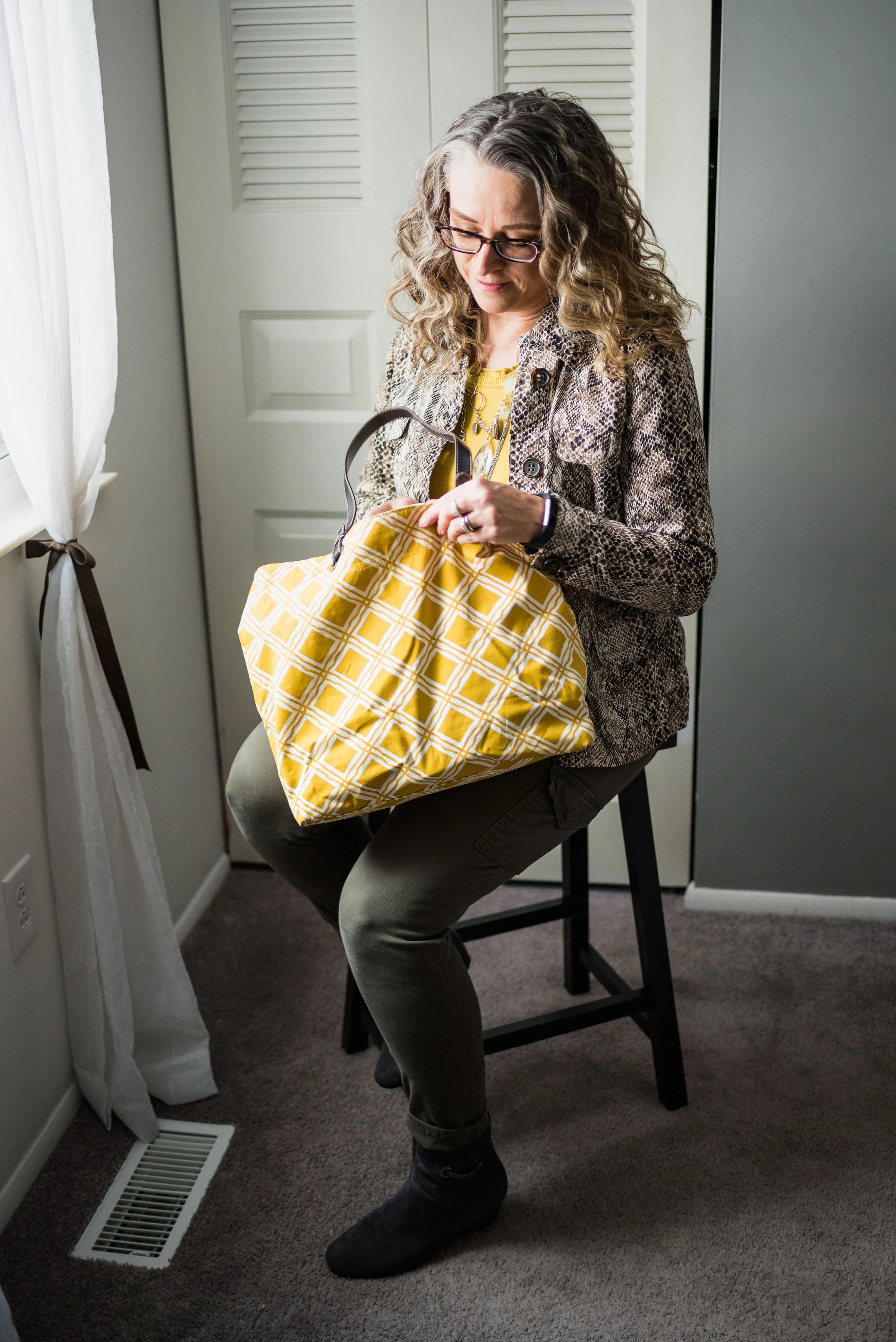
Here a silly picture to make you smile. This is me, wishing COVID was a thing of the past. Ha, ha.

I am including a few shopping links for you. I hope you will check these out. Every click on a link gives me a few cents. It takes a very long time for the clicks to add up, but they do eventually and I appreciate every single one.
Keep laughing. Keep dancing. Keep loving. Keep Safe.
Graphic and photo credit Rebecca Trumbull.