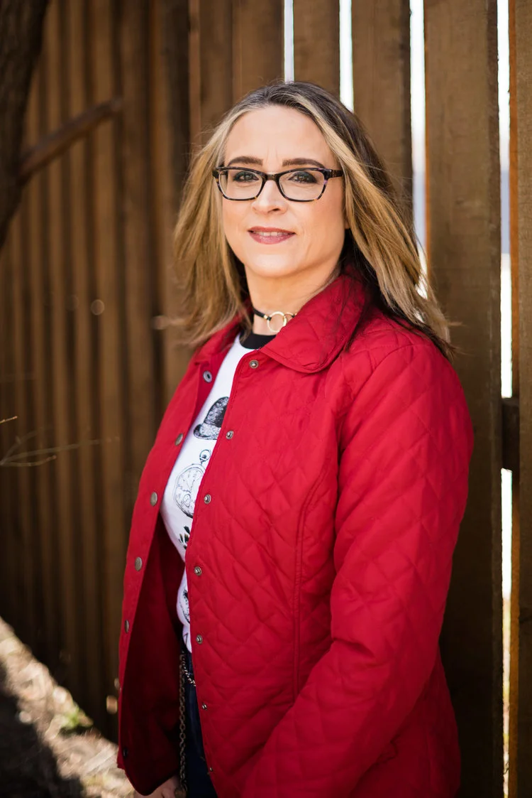
20 Days of Christmas - Slip Dress

I have seen many fashion bloggers do series that cover a period of days. Spring and fall fashion are popular themes for many of these series. I thought it would be fun to do a series revolving around Christmas. Christmas is my favorite holiday. I love the decorations, the music and movies, the food and gatherings, and the gift giving, but even more important is the meaning that this holiday has for those of us who call ourselves Christians. This is the time we celebrate our Savior’s birth.

That being said, I love to dress for the occasion. I don’t own a boat load of ugly Christmas sweaters, but I do have a few kitschy tees that are fun to get out each Christmas. In addition, I love to pair the colors that we typically think of at Christmas time, like red and green, in different ways that look classy, but still festive. This year, for this particular challenge, I also wanted to bring in some color combinations like silver and gold (I hear Burl Ives singing) and white with blue (which makes me think of Frozen), as well as classic black with gold or cream. It is that last color combination that made it to the blog today. If you want to see all twenty of my outfits leading up to Christmas, be sure to also follow my Instagram feed, as that is where I will post my combinations for Monday’s, Wednesdays and Fridays.

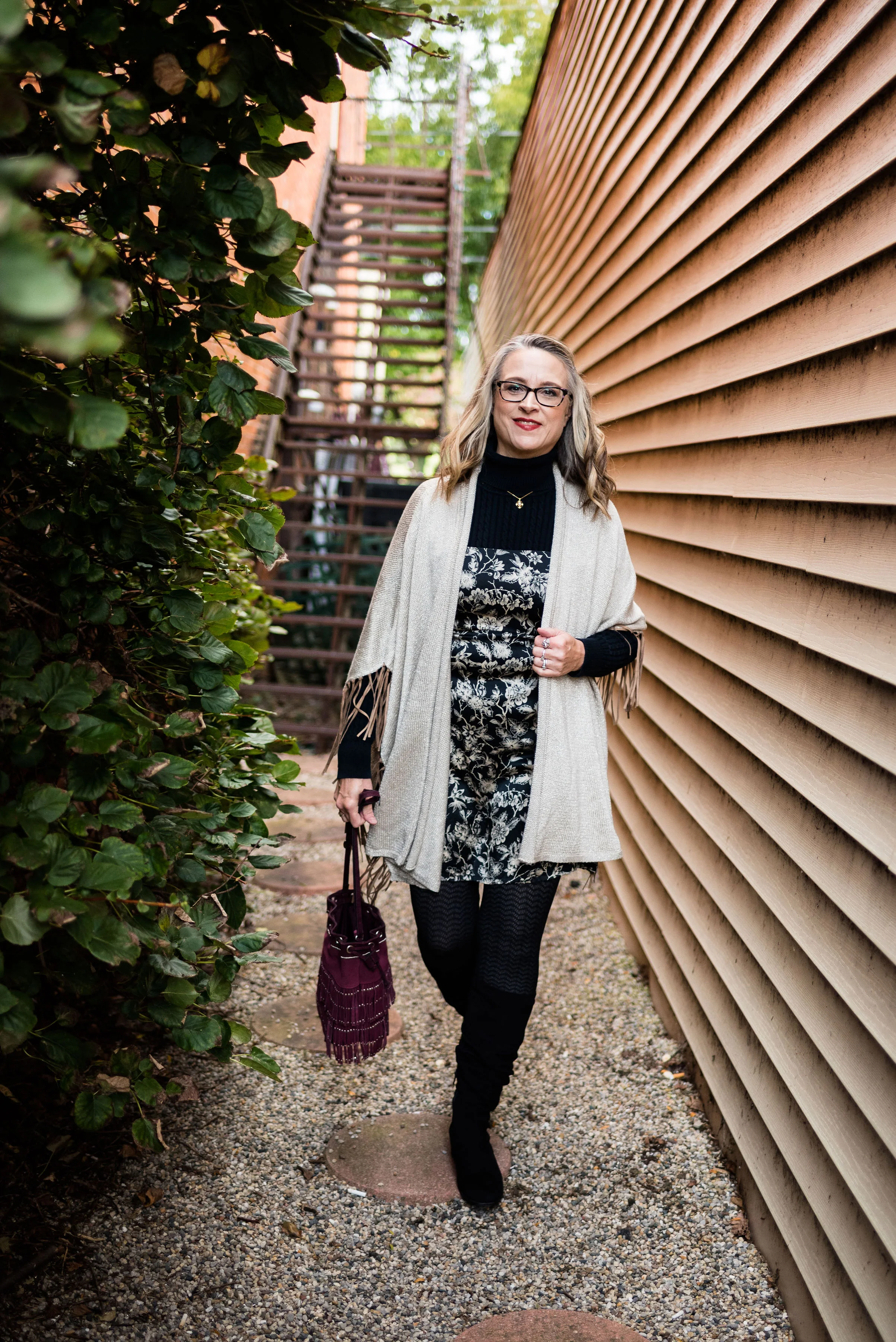
Today’s outfit revolves around a black and cream slip dress. I found this little number while thrifting. I have seen numerous bloggers style slip dresses and have always thought it was not for me. However, it was always simmering at the back of my mind that if I found the right deal, I would get outside my box and give it a try, thus today’s thrifted dress. A slip dress, simply put, is a slip that can be worn as a dress. For the most part slip dresses are made of a heavier weight fabric than a typical slip that you would wear under a dress, so that they can be worn out in public without fear of being see through.

What makes this a slip dress? The spaghetti straps, the light weight, silky fabric and the fit and flair style. A slip dress will typically not be big and flowing. This one was a bit tight on me and I would have felt more comfortable in a larger size, but when you thrift shop, you have to go with what you get. I just have to remind myself to stand up straight so my bulges aren’t as obvious. Ha, ha.

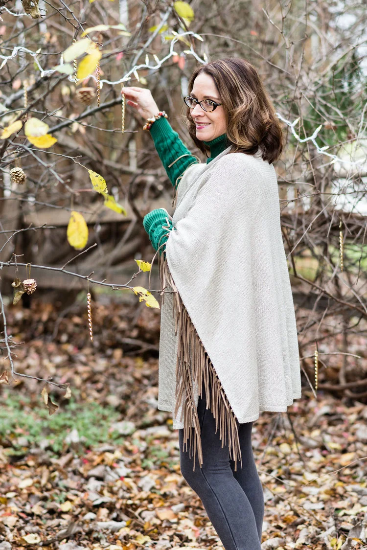
I added a black turtleneck under my slip dress, because, dang it, it is cold out there! I also threw on this fringed cape that I got from Chico’s. A little gold and pearl jewelry helped to up the class factor.

I chose the burgundy suede fringe bag to bring in a pop of color, as well as to tie in with the boho feel of the whole outfit.

Black textured tights over a gray pair of tights adds warmth and interest and I finished off the look with my black suede boots.

Do you have a dress you like to wear at the holidays? Do you own a slip dress? If so, how do you style yours? I’d love to hear your thoughts.

Thanks for following along and be sure to check out my Instagram to see more Christmas outfit ideas. I’ve included a few shopping links. These are affiliate links which means if you click on a link, I get a few cents. If you purchase something through my site, I get a small commission. All opinions are my own.

Photo credit Rebecca Trumbull. Make up Rachel Christensen.

Hanging Out with the Happiness Boutique

I was contacted by a German company called Happiness Boutique wanting to do a collaboration with me. The Happiness Boutique describes its style as being “…modern classic with a charming vintage touch.” They offered I pick out two of their jewelry pieces in exchange for featuring them on a blog post. When you check out their website you will see a collection of youthful, whimsical pieces that will add an element of bling or pizzazz to any outfit.

I pulled this outfit together just before I flew out the door to go to take pictures at my daughter’s house. I wanted to put together a look that was both warm and fun and that could be worn for a Thanksgiving day get together. I also wanted to think outside the box, since I wanted the jewelry to take center stage.

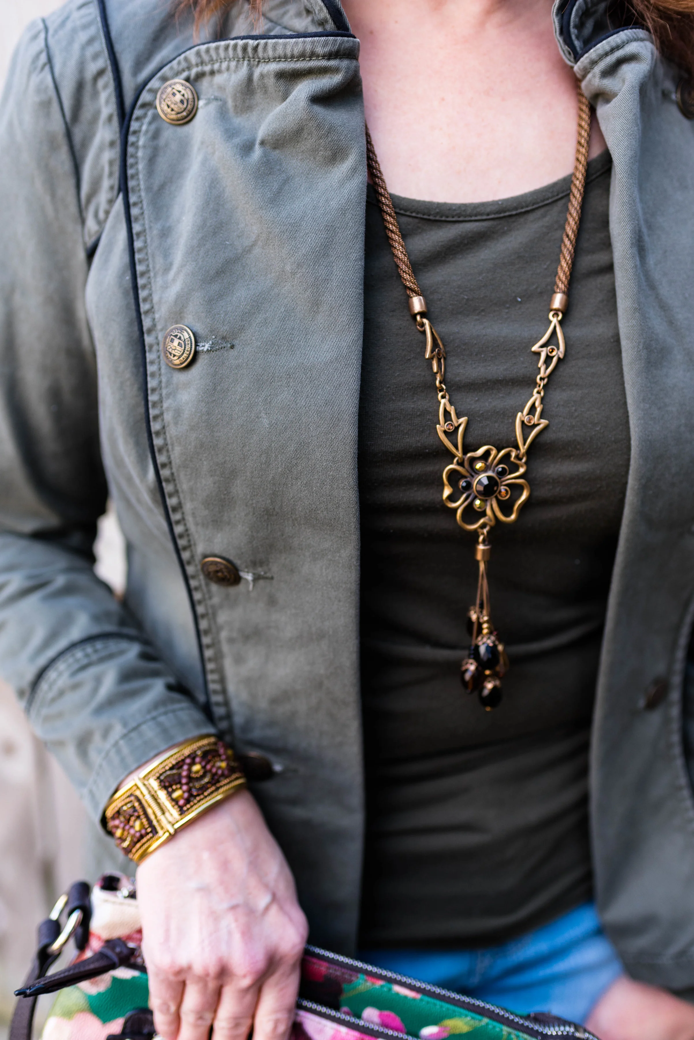
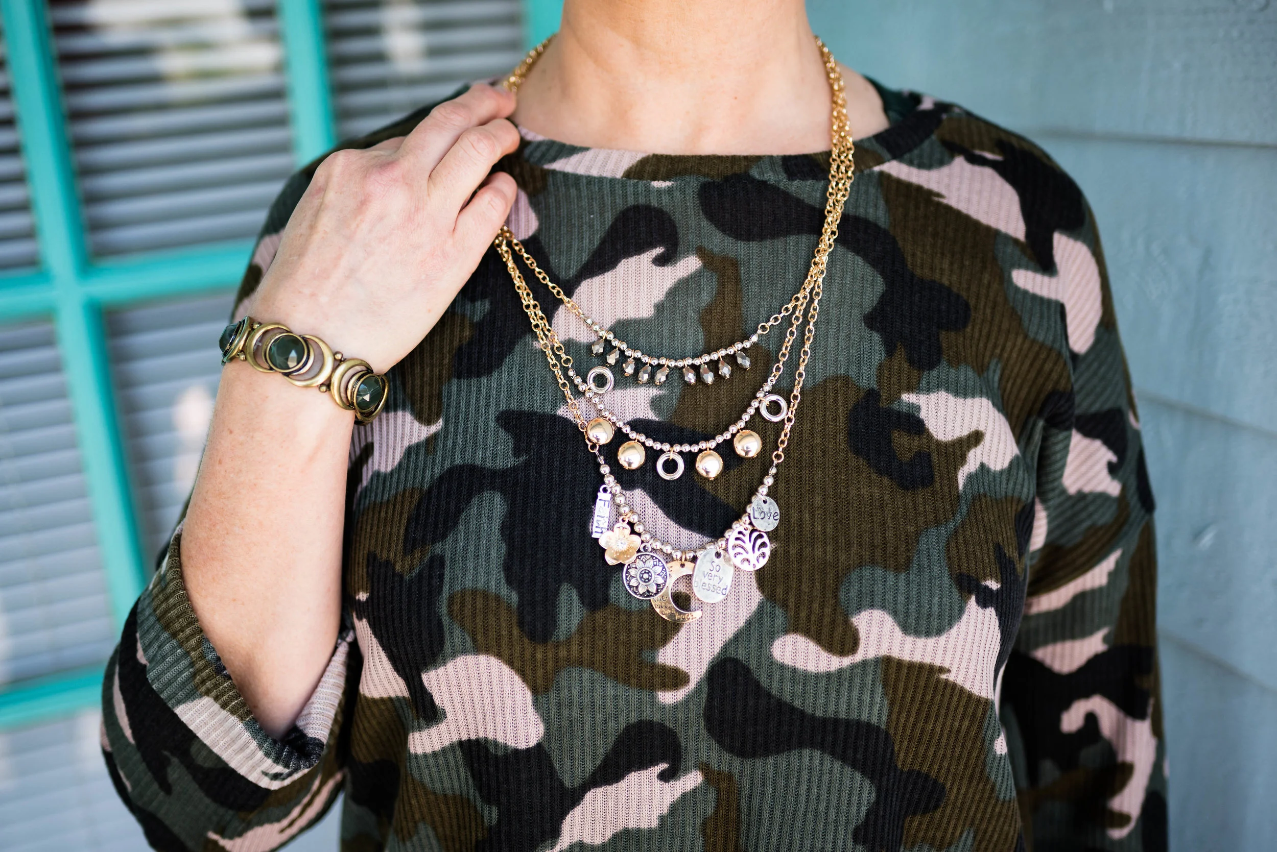
The two pieces I chose were a necklace and a bracelet. The necklace has more of a traditional gold finish and the bracelet is more of a rose gold.

I chose this double leaf pendant because I like that it acts like both a pendant and a fringe necklace. The leaves are very cute and add a unique textural element to the outfit. There is also a small dark colored jewel at the point from which the two leaf chains hang. This vintage feather necklace is a wonderfully delicate piece that makes a statement all on its own.

I chose to wear my new sweater from Eden Fashion Boutique as a solid backdrop for the necklace. Wanting the necklace to make a statement, I was afraid it would get lost in a print blouse, but any solid back ground really makes this pop.

The wavy bracelet in rose gold, is another statement piece. I love the wavy design, but also the added texture on the one loop. This shimmery, shiny piece is going to be making regular appearances throughout the holidays.

Happiness Boutique is currently offering my readers a 10% discount on your total order over $21.00. Just enter stylingrannymama at checkout. Act soon on that, because the extra 10% is a special for the Christmas season from November 20th to December 20th. In addition Happiness Boutique offers free shipping and a customer reward program.

I hope you enjoyed this look at Happiness Boutique. These items were gifted to me. I received no money for this post. All opinions are my own.

Photo credit Rebecca Trumbull.

Here are a few other fun pieces from Happiness Boutique.


My Favorite Animal...Print, I Mean

I thought it would be fun to show you some of my own leopard print pieces. I would say, out of all the different animal prints, leopard is probably my favorite with snakeskin print being the second. I have never been into zebra print. I love the animals and think it is very pretty in home decor, but the jazzy black and white stripes never seemed to appeal to my fashion preferences. But never say never.

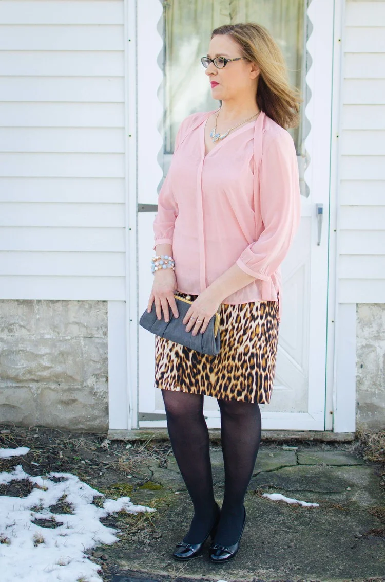
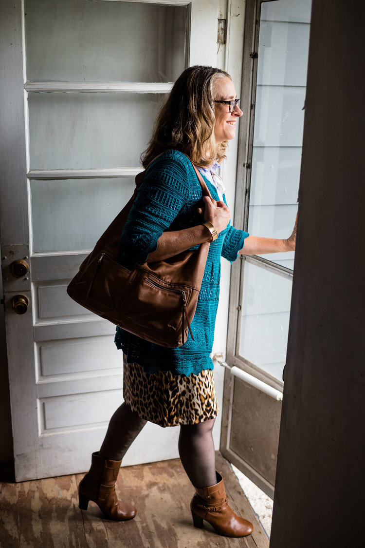
Over the last few years I have been drawn to leopard print and have found a few fun pieces, some of which you have seen already. The first piece I acquired was a leopard print skirt. This was a JC Penney find and is Worthington brand. The first picture was from spring of 2016; the second is just this fall.

See original post here.

See original post here.

I also snatched up another leopard print skirt at a thrift store. Why do I need two leopard print skirts that are almost the same as far as shape and length? I could say the colors are a bit different and the second has a richer texture because it is corduroy, but in all honesty, I just forgot that I had the first one when I saw the second one in the thrift store. Ha, ha. This one is Jones, NY brand.

See original post here.

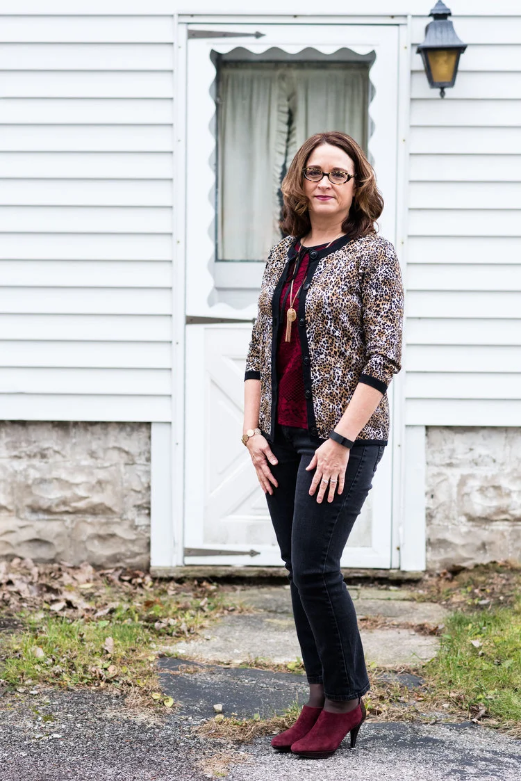
The next piece I acquired was a thrifted 3/4 length sleeve cardigan sweater. I liked the extra classy feel of the black band around the hem, sleeves and buttons. This is a brand called Karen Scott.

See original post here.

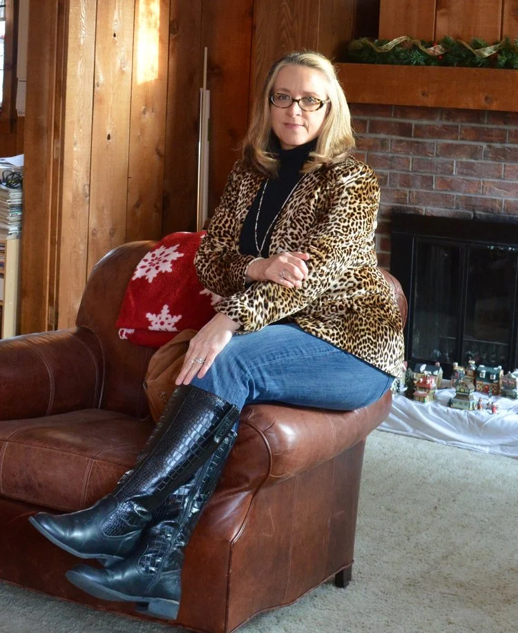
One of my favorite pieces you have seen recently on the blog and that is my leopard print blazer from JC Penney. This is a faux velvet piece and while it is not rigidly structured, it has enough shape to make it look classy. Thus far I have only styled it casually, but I think I will think about a more dressed up look.

See original post here.

See original post here.

If you are interesting in reading those original posts, just click on the links below the pictures. You might have fun seeing how different my hair was before I decided to start growing out my gray. Ha, ha.

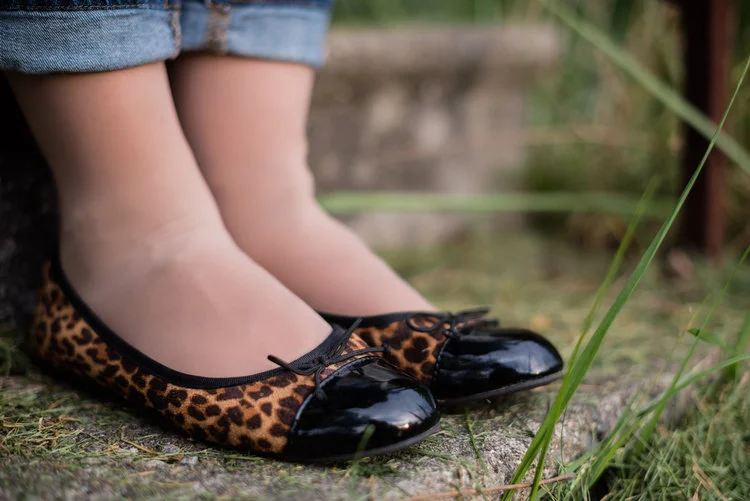
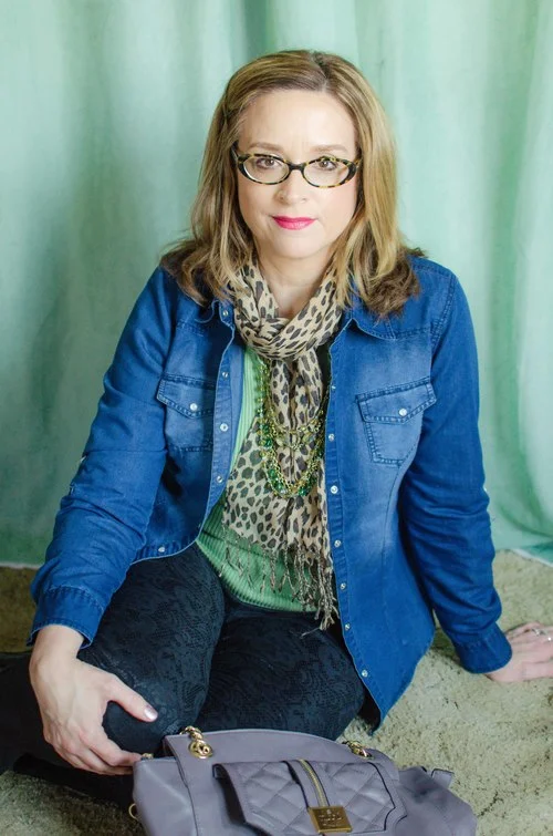
I have a few other leopard print pieces for accessories including a pair of flats from Christopher and Banks and a scarf.

See original post here.

See original post here.

Those are my current leopard print treasures. I’m hoping at some point to acquire a pair of booties and a bag of some sort, but I’m in no hurry. I think leopard print is here to stay.

Do you have a favorite animal print? What ways do you like to wear those types of prints. I’d love to hear from you. Leave me some love or a few sassy remarks about my past pictures in the comments. Ha, ha.

Have a great weekend!

I’ve included a few shopping links for you to peruse. These are affiliate links. All opinions are my own.


Girls' Night Out - Eden Fashion Boutique

This past Thursday a local small business, Eden Fashion Boutique, was hosting a Girls’ Night Out party at their downtown Sylvania, Ohio location. Eden Fashion Boutique was the brain child of Katie Thompson and originally started in Bowling Green, Ohio, but their cute little retail store has expanded to include the Sylvania location. In addition, they have an online shop that features the same pieces they have in store, so if you like to shop from home, be sure to check out their site.

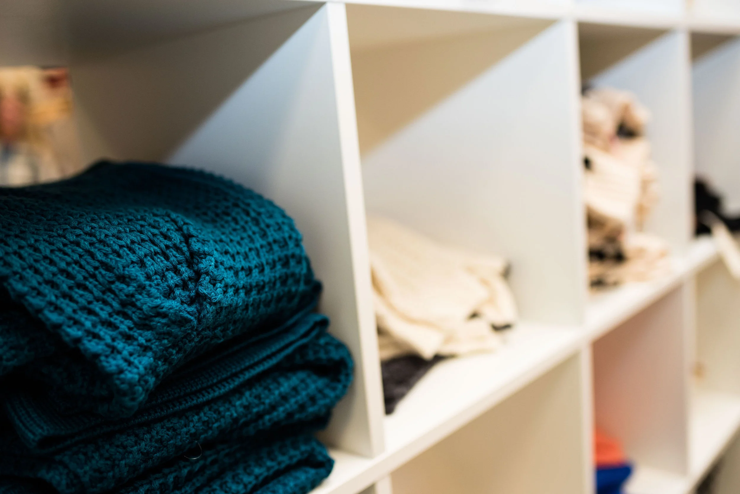
The Eden Fashion Boutique in downtown Sylvania is a small space that packs a big punch. From the stylish mannequins in the windows to the racks filled with items grouped by color, I couldn’t help but feel the need to try on every item in the store. Mustard and sunflower yellows, cedar greens, rich burgundies and classic black and whites filled the racks with the warm and cozy textures of fall and on coming winter.

The obvious idea behind this party was to bring your girl friends and have an intimate shopping experience while enjoying wine and snacks.

The party was timed from 5 to 9 so Rebecca and I got there right about 5:30. When we first walked in there were only a few other people in the store, but before we knew it, Eden was hopping. Rebecca had contacted Katie ahead of time and asked if she would be up for having us take pictures, try things on and so on. Katie was all about it and when I met her in person I was so impressed with her positive and energetic spirit.

Katie’s background is marketing and organizational development. A stay at home mom for nine years she was inspired to fill a need in her community.

“I wanted an uncluttered, curated place to shop with unique pieces that were affordable. And since that didn’t exist, I decided to create it myself!”

This wasn’t something that came about on a whim. Eden has their own branding statements that include their vision and mission. Their mission statement will ring true with many of my fellow bloggers:

“We strive to encourage, empower, and inspire women….” This statement is supported by the space Eden occupies, the clothing sold there, the people who serve the customers and the customers themselves. Shopping at Eden is not like going to the mall. It is an intimate, relaxed and positive experience.

That positivity translates into the boutiques from the friendly and helpful staff, to the signs on the walls, to the cute stickers they use to tape the tissue they wrap each purchased item in when it goes into your bag.

Picture from my cell phone.

They were having a special sale that evening, if you bought three items you got one free. With Rebecca’s birthday coming up this weekend, I told her to pick out two items and I would pick out two items. Let the shopping commence.

Don’t ask me to pose and shop at the same time! This is serious business! Ha, ha.

There were so many delicious pieces that it was hard to not try everything on. I told Katie I was going to have to come back for my own personal style session and do just that.

These were a few of the things I tried on.

This fuzzy cardigan was like wrapping yourself inside a blanket. What could be better in the winter than a stylish fuzzy blanket with arms? I loved the color.

These were a pair of their pull on jeans. The fit was nice and the material soft and flexible. Rebecca ended up with a pair of these. This sweat shirt is just another example of the positivity vibe of this store.

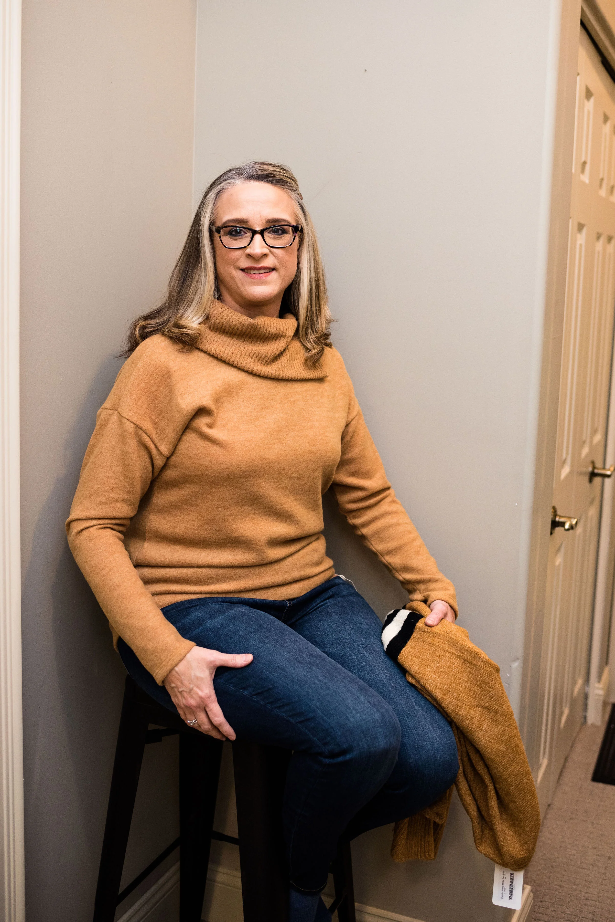
I’m just loving this brown mustard yellow color. The turtleneck is so soft to the touch and the sweater is another fun piece I would love to add to my wardrobe. I ended up with the turtleneck. It has an asymmetrical neck line. That and the soft fabric sold me.

I’ll be styling this on the blog later this week. I also bought a dark green pullover sweater that will be making an appearance on the blog as well.

This was a fun event and I hope to make Eden a more frequent stop. They keep their collections moving, so there are always new items to check out. The clothing seems to be well made, the price points are not bad and the shopping experience is intimate and fun. I will definitely be back.

I hope you enjoyed this look at one of my home town’s local small businesses and if you have the time, check out their online store. If you are ever in the area, this is a retail business worth checking out.

You can also visit Eden on their facebook page or their Instagram account.

Have a great day.

Photo credit Rebecca Trumbull. Make up Rachel Christensen.
Outfit Inspiration - Plaid Trousers with Green

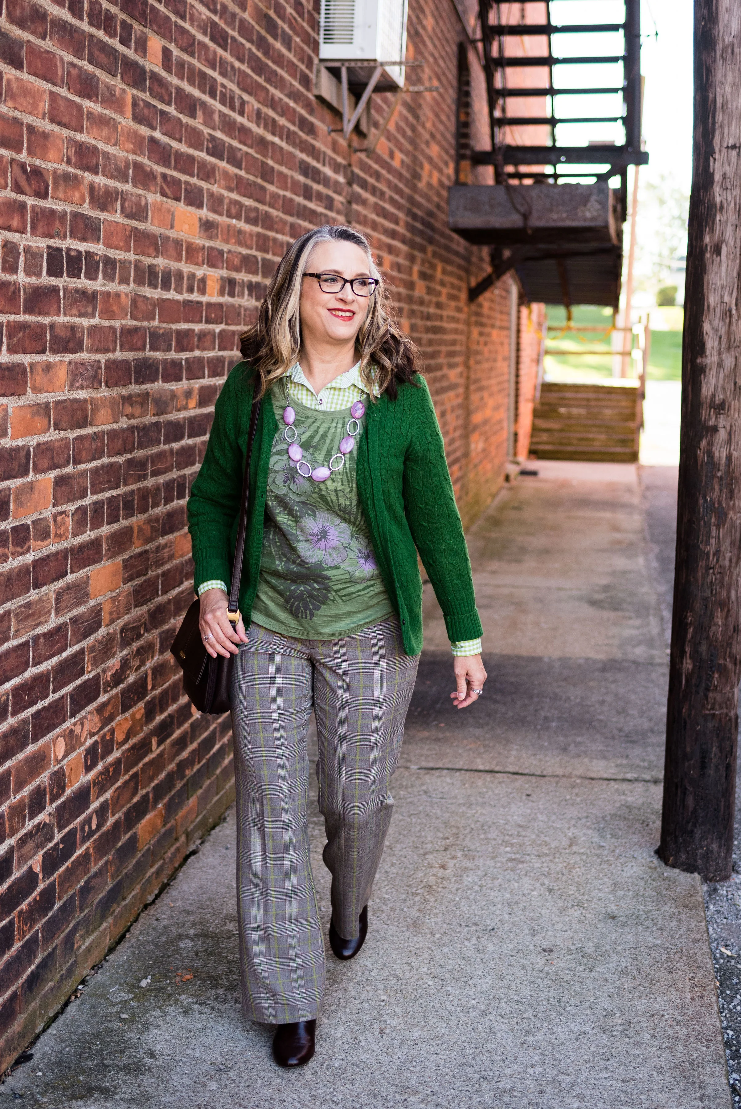
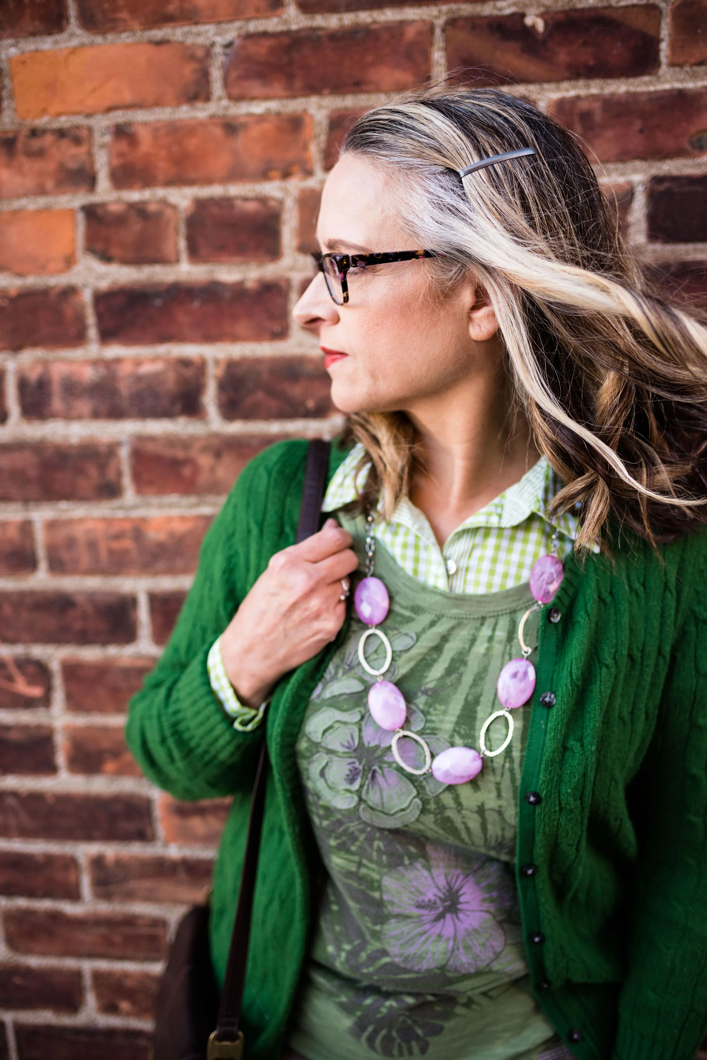
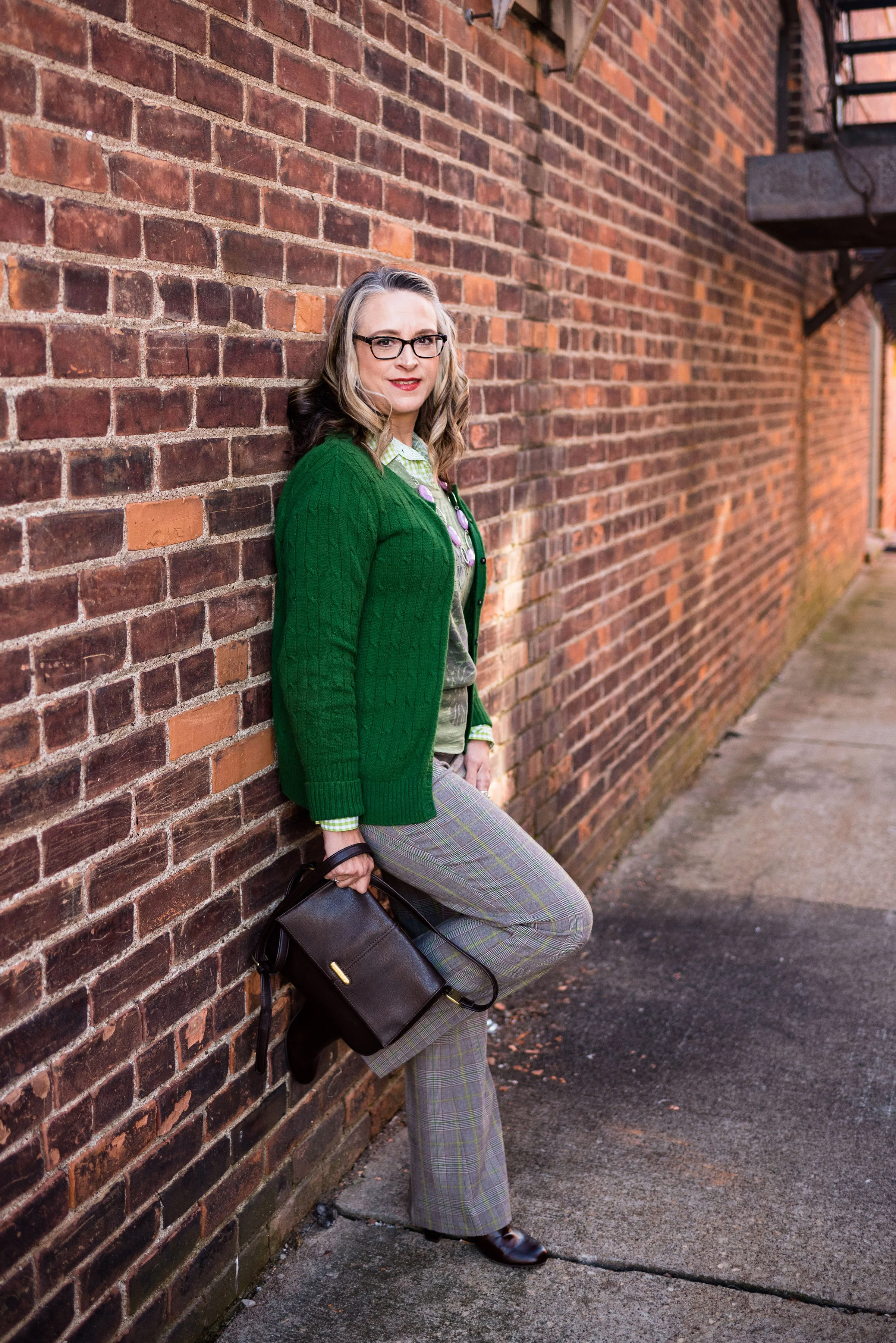
This outfit is another product of perusing a Christopher & Banks add that I had gotten in the mail. The add contained an outfit consisting of a pair of plaid pants, a cardigan, a short sleeve tee and a button up blouse with a collar. Since I am such a layering fanatic in the winter, due to living in a drafty old house and living in the mid west, I thought this would be a fun and different way to add multiple light layers. This layering not only adds warmth, but creates visual interest and additional texture, for an outfit that is clearly work appropriate, and also date night ready.

Plaid is in again and seems to be a recurring pattern in the fashion realm. Whether it is the light and bright plaids of spring and summer checks or the more expected flannel and buffalo plaids of fall, plaid is a pattern everyone can wear. With plaid shirts, pants, skirts and jackets there are plenty of choices for your closet.

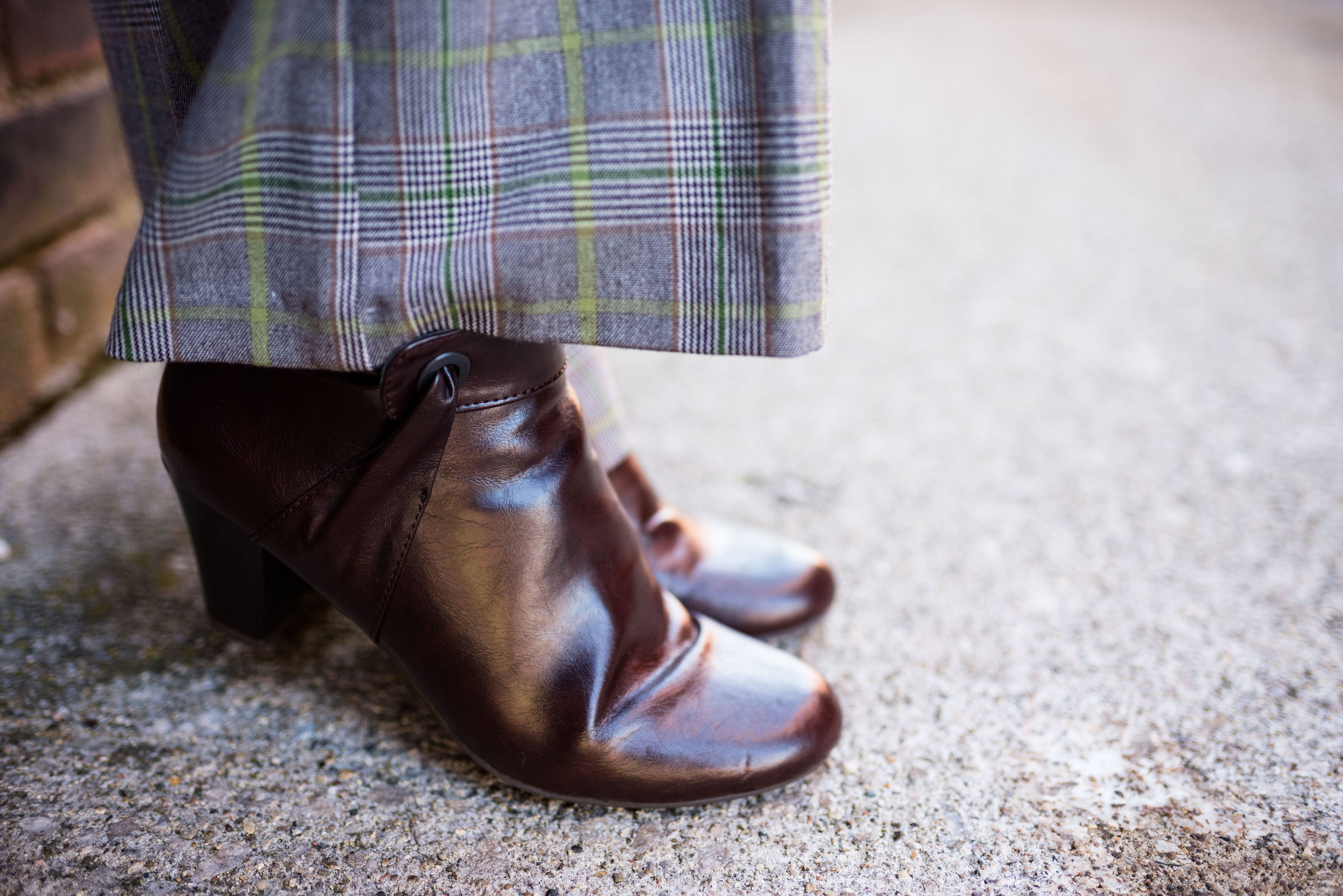
I found this pair of Mossimo brand trousers at a thrift store. I like the wider legs, but it was the plaid pattern and the bright green stripes that had me throwing them in my cart. The picture below was to show off my dark brown Life Stride boots, but it also gives you a close up of the plaid colors.

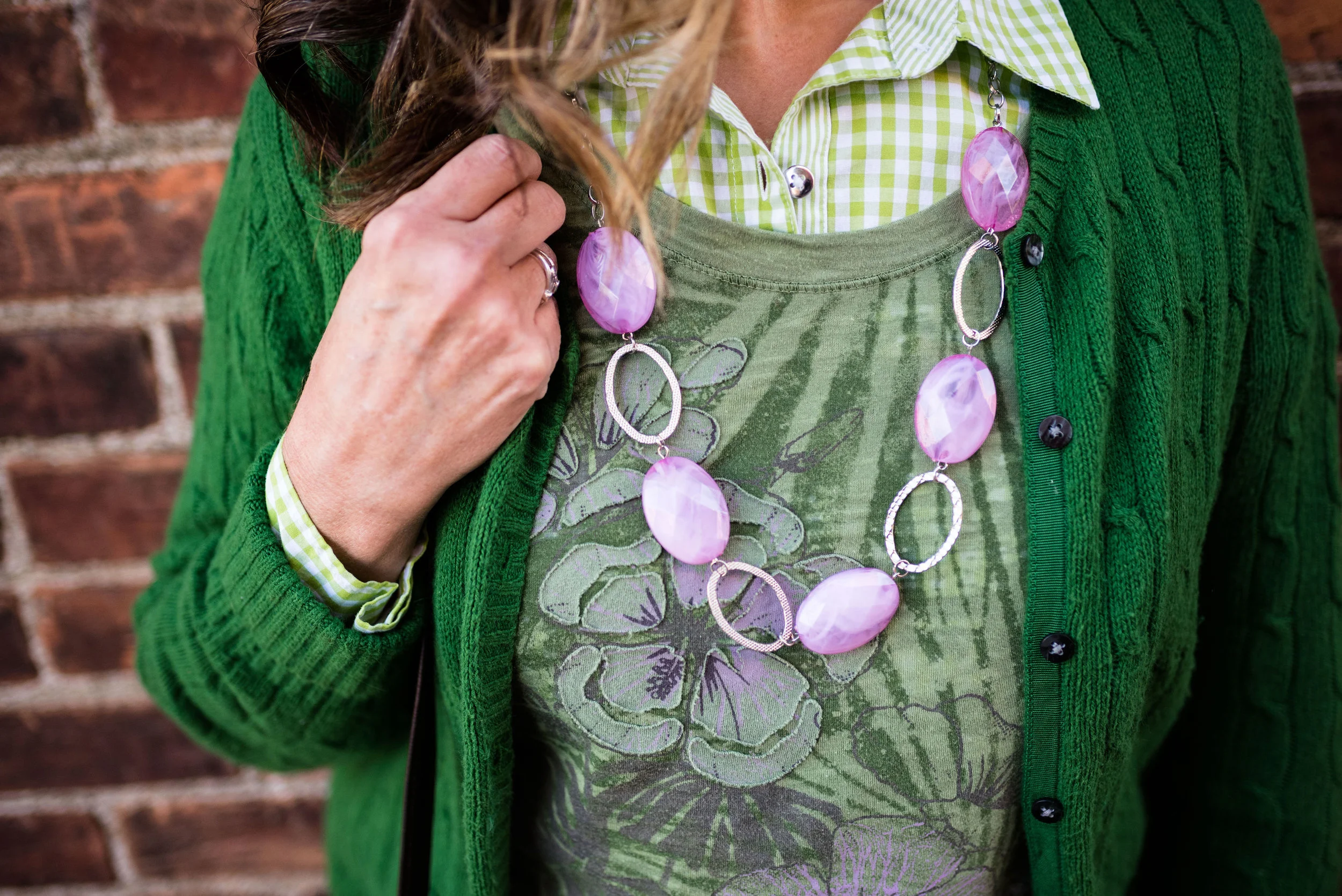
Seeing as the pants have both a light green and a dark green stripe I was able to draw from several different greens in my closet. The Sonoma tee shirt is fairly old and is often worn during the warmer months as it is relatively light weight. The long sleeve gingham that I am wearing underneath is Jaclyn Smith and was thrifted. The cardigan was also thrifted and is Old Navy.

Because the tee had that touch of purple I added the purple bead and metal necklace for a contrasting splash of color.

I really like these greens with the purple. Even though I typically would associate these colors more with spring or summer I think they work well for fall and brighten things up, which really helps on a dreary day.

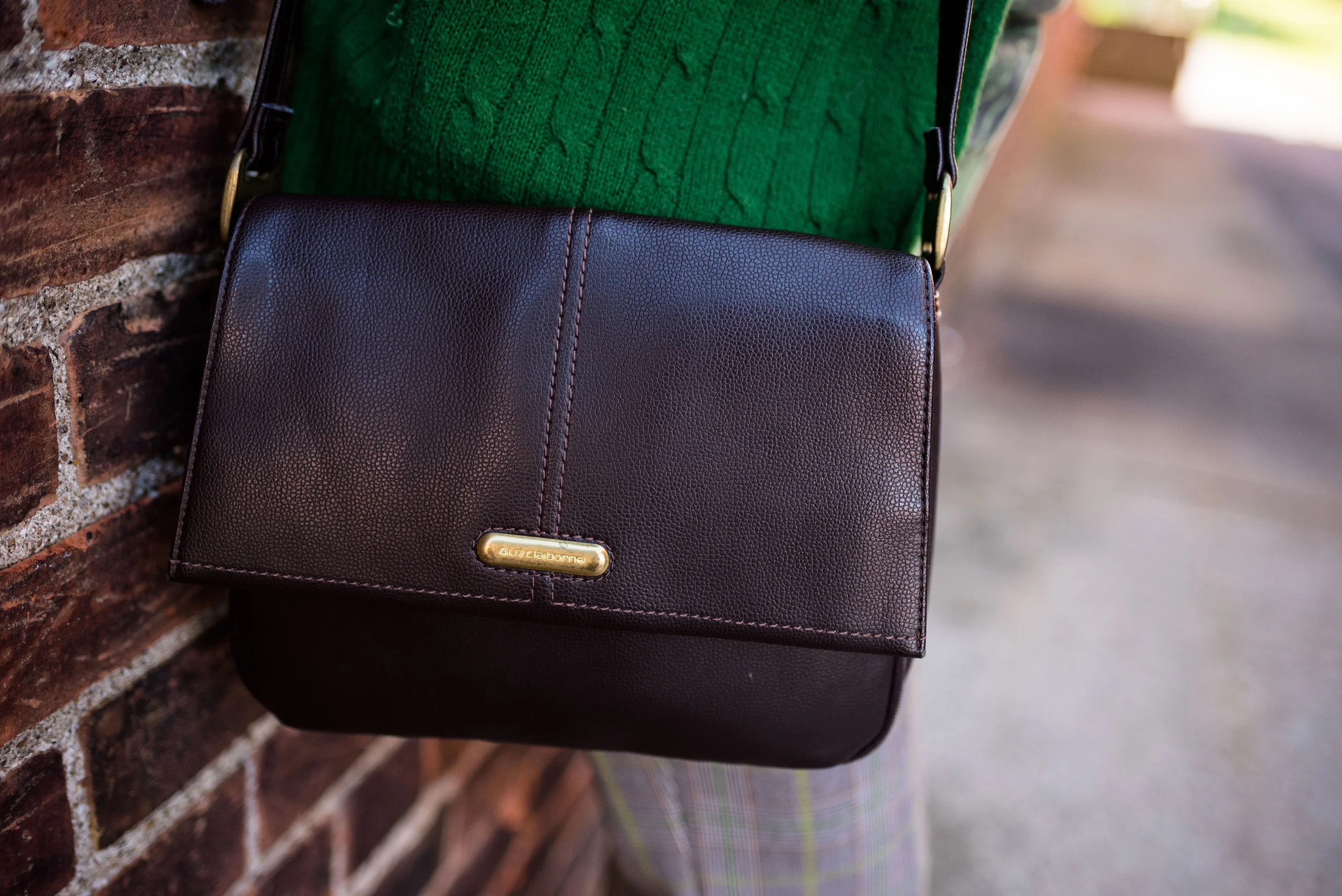
This shoulder bag is another thrift store find and is Liz Claiborne brand.

I like when the strap on a bag is long enough that I can use it either as a shoulder bag or a crossbody bag. It’s okay to occasionally have it both ways! Ha, ha.

I hope you enjoyed seeing this outfit. Do you like to wear plaid? What sorts of plaid items do you have in your closet. In addition to my plaid pants I have a few tops that are plaid, including a few flannel ones. How about you? Not all patterns are liked by everyone, but there are other ways to embrace a trend like florals or plaid, just think less is more. Carry a plaid bag, wear a plaid scarf or even a pair of plaid socks and then roll your pant cuffs so the socks are just peeking out.Everyone will think you are so on trend and you didn’t have to make a big investment.

I hope you all have a great weekend! Until next time.

Photo credit Rebecca Trumbull.


Summer Maxi Dress for Fall

I’m sure many of you have heard about transitional dressing. This has to do with taking a clothing piece from one season and changing it up to make it wearable in the next season. With our seasons here in the mid west being so varied, it is essential to have pieces that can be worn for more than one season. Perhaps that is one of the reasons I love jeans. You can wear them any time of year. Ha, ha. However, this is not going to be a post about jeans. You already know how much I love those! This post focuses on a summer maxi dress that was a new purchase from late last spring.

Some of you who regularly follow me might remember this dress from my summer series on maxi dresses. You can see the whole dress and the original post here. This bohemian style maxi boldly stated it wanted to come home with me when I saw it on the rack at Nordstrom Rack this past May. I knew as soon as I tried it on that it would be a versatile piece and would easily take me from summer into fall.

In order to make the light weight dress fall ready I decided I needed layers. I knew I wanted to style it with knee high boots to add warmth on the lower level. While I didn’t wear tights for this photo shoot, I would add them if I was going to have the dress on for a longer period of time.

I do love wearing boots. They are a great way to change up an outfit and add warmth. With so many styles from ankle booties to over the knee types what is not to love. And now there are so many more colors!

Here are a few brown pairs, that I like at decent price points.

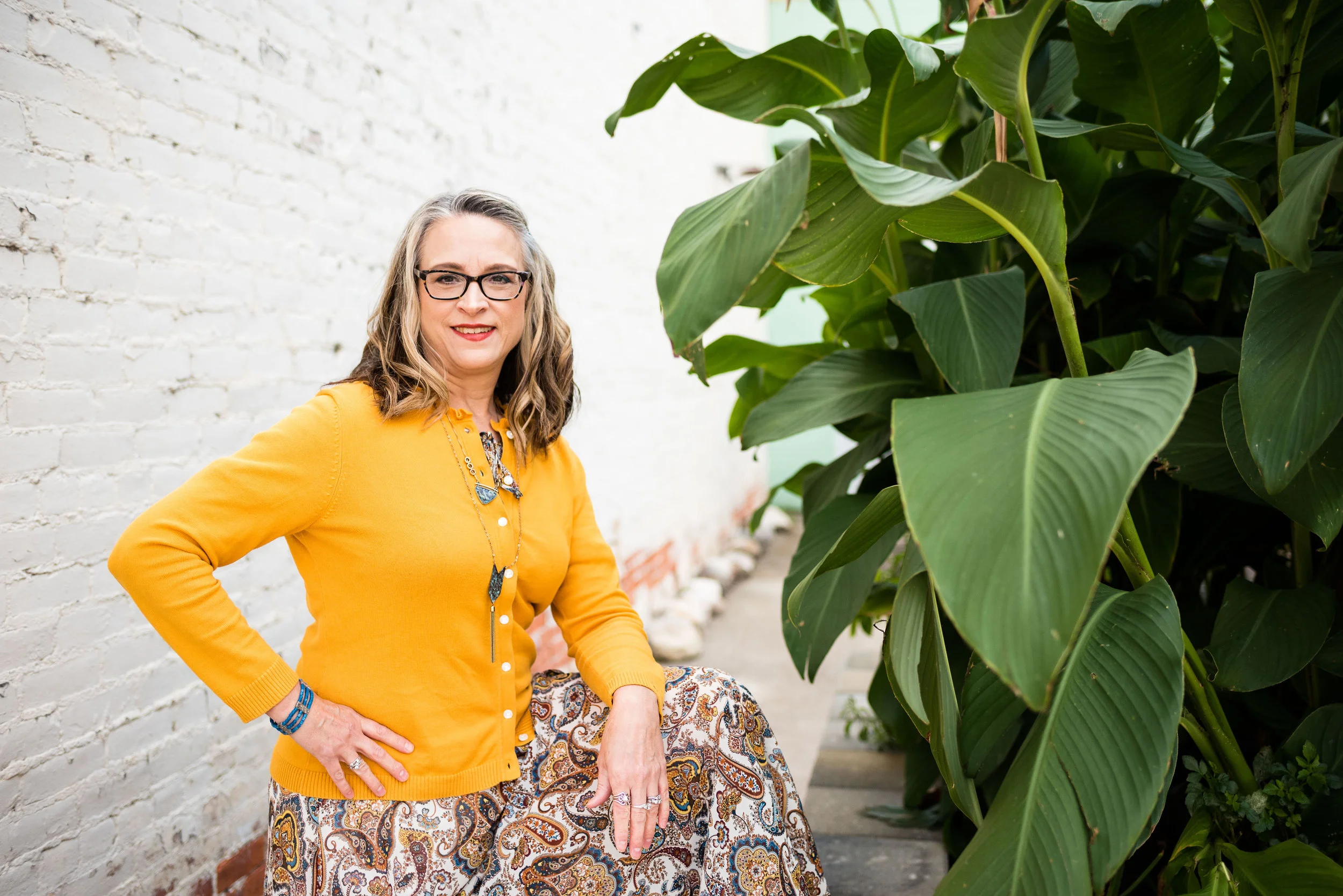
To add layers at the top I chose this thrifted sunflower yellow sweater cardigan. The brand name is Callaway. A simple cardigan adds a warm layer without a lot of bulk and they come in so many pretty prints and colors. Here are a few to look at. With Christmas coming, I am sure you need ideas for all those girls on your list. Ha, ha.

In addition to the sweater I also grabbed my thrifted brown moto jacket. I have styled this many times on the blog. It is one of my favorite thrift finds and most often I wear it as an extra layer in the winter time, rather than as an outerwear jacket. For this particular fall day this and the sweater were just the right amount of layers.

Here are a few shopping options.

My accessories are pretty simple. This layered necklace I found somewhere or other on the clearance rack. The nice thing about these types of necklaces is there is no work involved. Some days that is just exactly what I need.

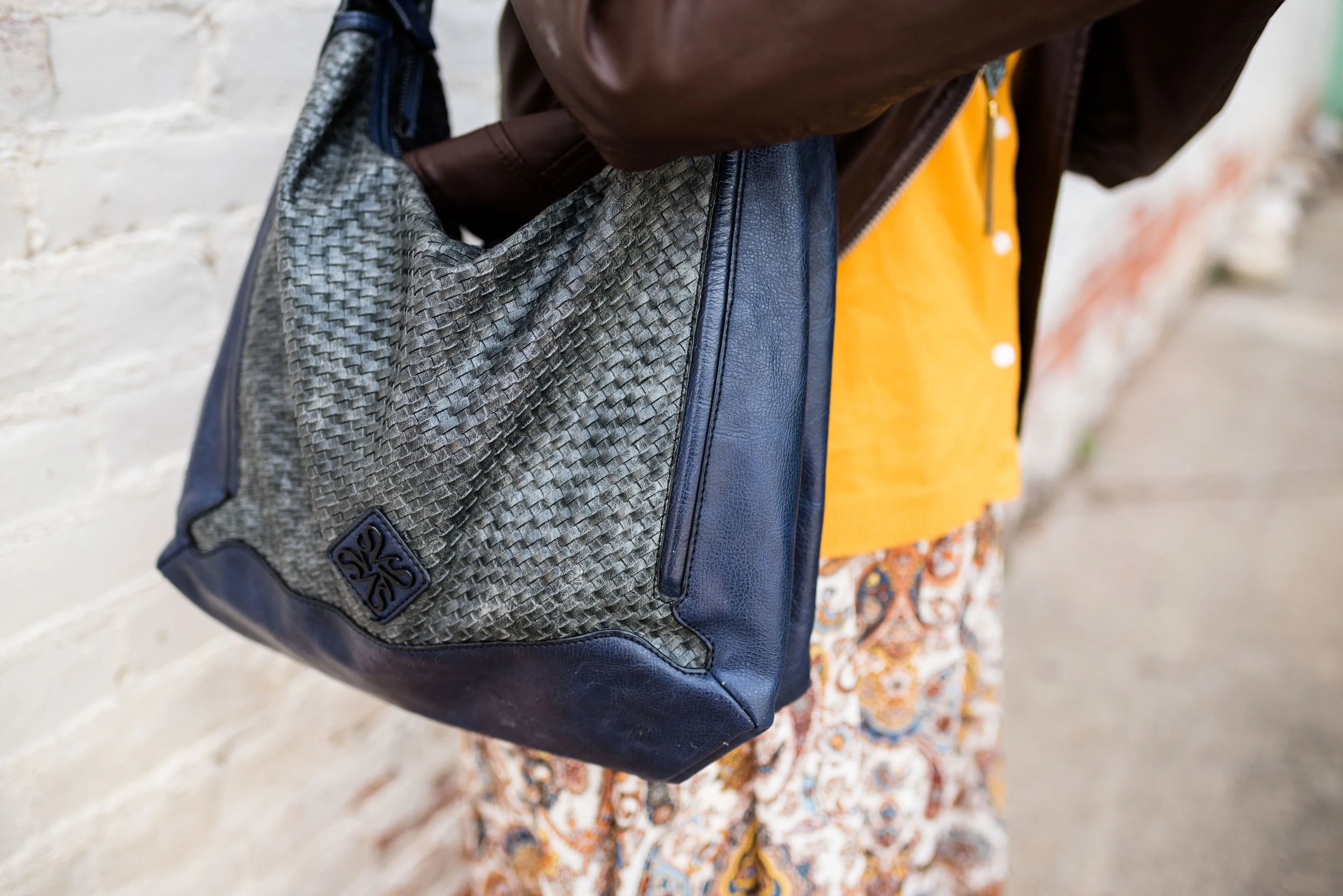
My bag is a navy Vera Wang bag that is also thrifted.

One of the things that I like about fashion blogging is learning new ways to use my clothes. It used to be that we had our summer clothes and our winter clothes. I still go through the process of putting things away and pulling out different things each season, simply because I am a clothes horse and there is no way I could have all my clothes out at the same time. Also, I tend to reach for what is in my comfort zone. In the winter I like to be warm, so I like my heavy sweaters and added layers. In the summer I like less layers and lighter material. However, since I have started blogging I have learned that there are ways to extend the seasonal pieces and get more wear out of them. This outfit is the perfect example.


I hope you enjoyed this post. Leave me some love in the comments. I always like to hear your point of view.

This post contains affiliate links. If you click on a shopping link I get a few cents. If you make a purchase through a link I get a little commission. I appreciate all your clicks.

Have a great day.

Photo credit Rebecca Trumbull. Make up Rachel Christensen.


Pantone Fall 2018 Recap

After a series like the Pantone color one, I usually like to do a recap post, to show you all the colors and the outfits I styled using those colors into one post. These colors this season were not what I would call common fall colors. I usually think of fall colors as being richer and darker hues like deep burgundies, earthy browns and garden oranges that make us think of pumpkins and fall leaves. While the Pantone Fall 2018 had a few colors that fit into my typical fall color box they had numerous ones that clearly stepped outside that box. Colors like Limelight, Mellow Rose and Crocus Petal provided a pastel palette choice for those who like to think brighter and lighter when the seasons change.

Enjoy this review of my Pantone Fall 2018 outfits.

What did you think of this color palette this year? Do you like lighter, pastel colors or go for richer, darker colors when fall rolls around? Do you like to think outside the seasonal color rules, or are you like me and look forward to the seasons bringing you back to those colors you are familiar with and enjoy at that time of year? It really doesn’t matter any more. The joy of fashion today is that you can decide what you like to wear at any time of year.

I like that Pantone had added the classic colors to the color palette for each season. It allows me to add a more toned down color to each outfit keeping the outfit colorful, but no overly so. it would be easy to add a touch of any of these colors to a more neutral outfit. For instance, if you wanted to go for a monochrome look using a navy like Sargasso Sea, you could add a little color by throwing on a bright Russet Orange scarf or some Limelight colored beads. If you normally dress in more neutral tones try adding just a touch of color in your accessories to make your outfits more interesting and visible.

I hope you enjoyed this series. Check back on Thursday for more fashion fun.

Photo credit Rebecca Trumbull.

Pantone Fall 2018 - Quetzal Green, Crocus Petal and Meerkat

I am on my last Pantone Fall 2018 post. I hope you have enjoyed seeing these colors and the way I have managed to put outfits together using the inspiration from the 2018 Fall palette. As in anything where fashion is concerned we can take it our leave it. Fashion is for you. It is about putting together outfits and colors that you like, make you feel confident and that you will enjoy wearing. In some ways what we wear is like our second skin. It provides a covering for a bodies and how we put that cover together can boost our self-image and help us better manage our wardrobes and our pocket books.

I have found, in the fashion realm, just like in cooking, having a source of inspiration really helps. Whether you follow a recipe or cook from memories of you and your mom or grandmother working together to make wonderful creations in the kitchen, you use that inspiration to put food on your table. In the same way inspiration for fashion can come from magazines, bloggers, color palettes or even things out in nature. That is the reason I always like to use the Pantone color palettes as a spring board for creating fun and interesting outfits.

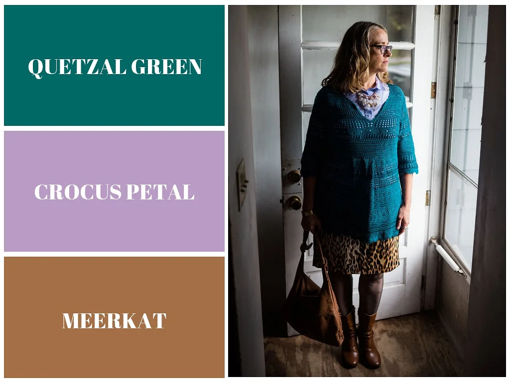
These last two colors, Quetzal Green and Crocus Petal, I decided to pair, once again, with Meerkat. Crocus Petal is a lighter, more spring like color found on the London palette. I feel that pairing it with Quetzal Green and Meerkat was the perfect way to keep the light color grounded and more fall like.

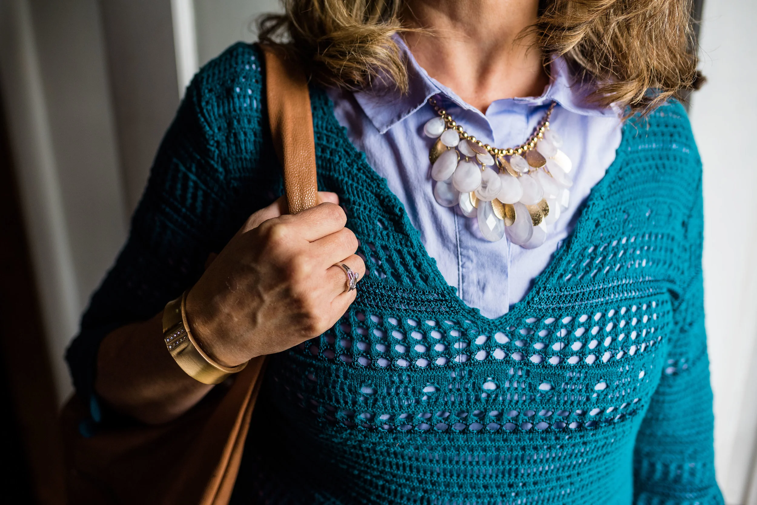
This top is a Kohl’s clearance find and is Dana Buchman brand. It is a button up with 3/4 length sleeves and a longer silhouette. It has some stretch and is more fitted. I opted to wear this bead and metal statement necklace, which incorporates the Crocus Petal color as well. I wore a simple gold cuff on my arm.

I found the open weave sweater thrifting, I love the variations in the knit. I am not a yarn girl, though I would love to be. I think this is crocheted, but it might be knit. Can any of you readers tell? Whatever it is I love the different stitch sizes and open versus more closed aspect to the piece. Here we are talking about texture again and how essential is is to making an outfit more interesting.

I thought these two colors when great with the browns, black and cream of my leopard print pencil skirt. This skirt is another JC Penney find and is Worthington brand.

The boots, Aerosoles and bag, both thrifted were the perfect accessories to pair with this outfit. I think black would have worked well or even a cream colored boot, which are trending right now, but I love the luxe feel of the Meerkat color.

Next week I’ll have a recap of all the Pantone Fall 2018 colors. I hope you’ve enjoyed this series and that it provided you with some inspiration for trying new color combinations. Always shop your closet before going out to purchase what is currently trending. You might already have a leopard print top or the perfect color piece that matches with one of the Pantone seasonal colors.

I’ve included a few shopping links. These are affiliate links. All opinions are my own.

Have a great day.

Photo credit Rebecca Trumbull.

Ordinary Amy - Bootcut Jeans and Leopard Print

Those of you who follow me on a regular basis know I am a jeans kind of gal. Jean are what I live in and I love to be able to dress up a pair of jeans for a lunch date, work or a night out with my hubby. I don’t care what wash they are or what cut, jeans are just my favorite, go to pants.

For today’s post I decided to move away from my frequent choice of dark wash skinny jeans and chose my lighter wash, thrifted, bootcut jeans. I like the shape of a good pair of boot cut jeans. These are actually a little bigger, which I like because they are so comfortable. These are a thicker denim, so hopefully, will last for a while. This is an older brand called Kikit, which are only available through Etsy, Poshmark and other thrift retailers.

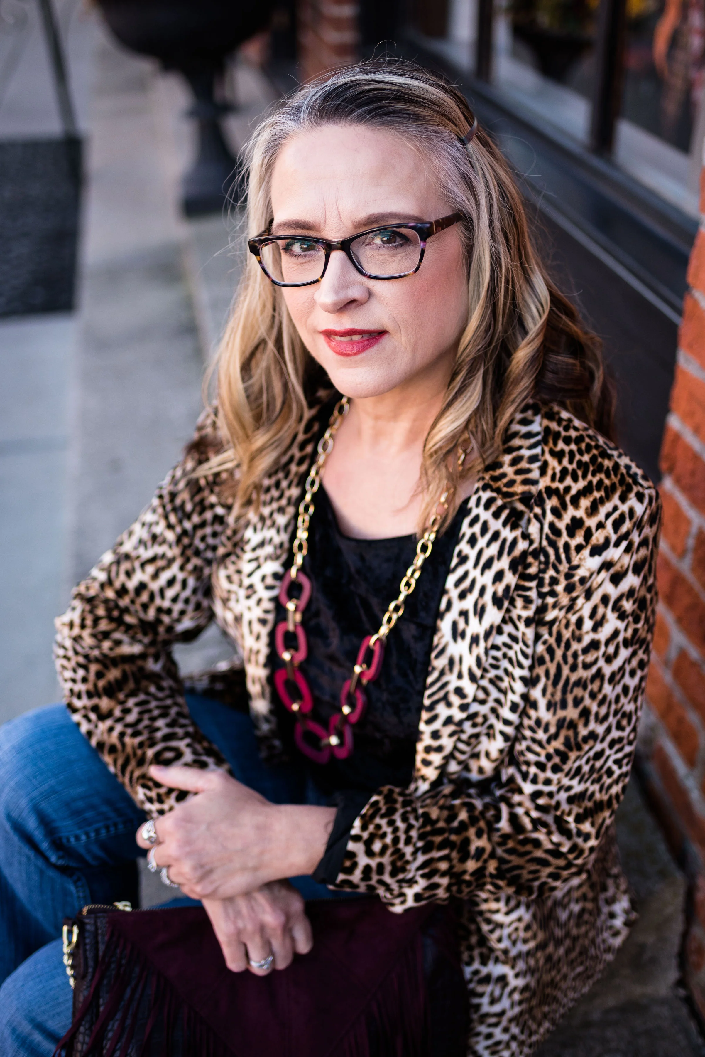
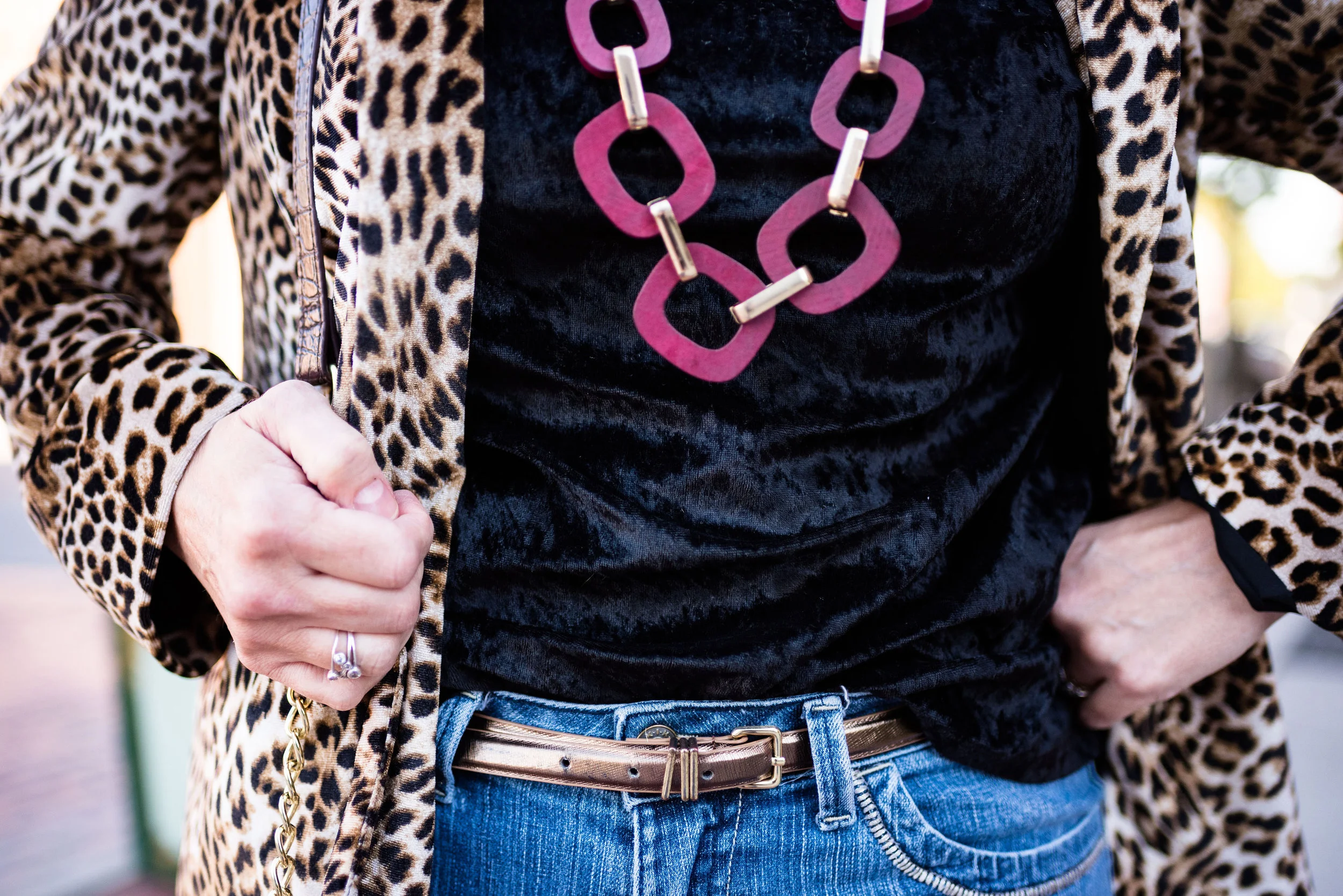
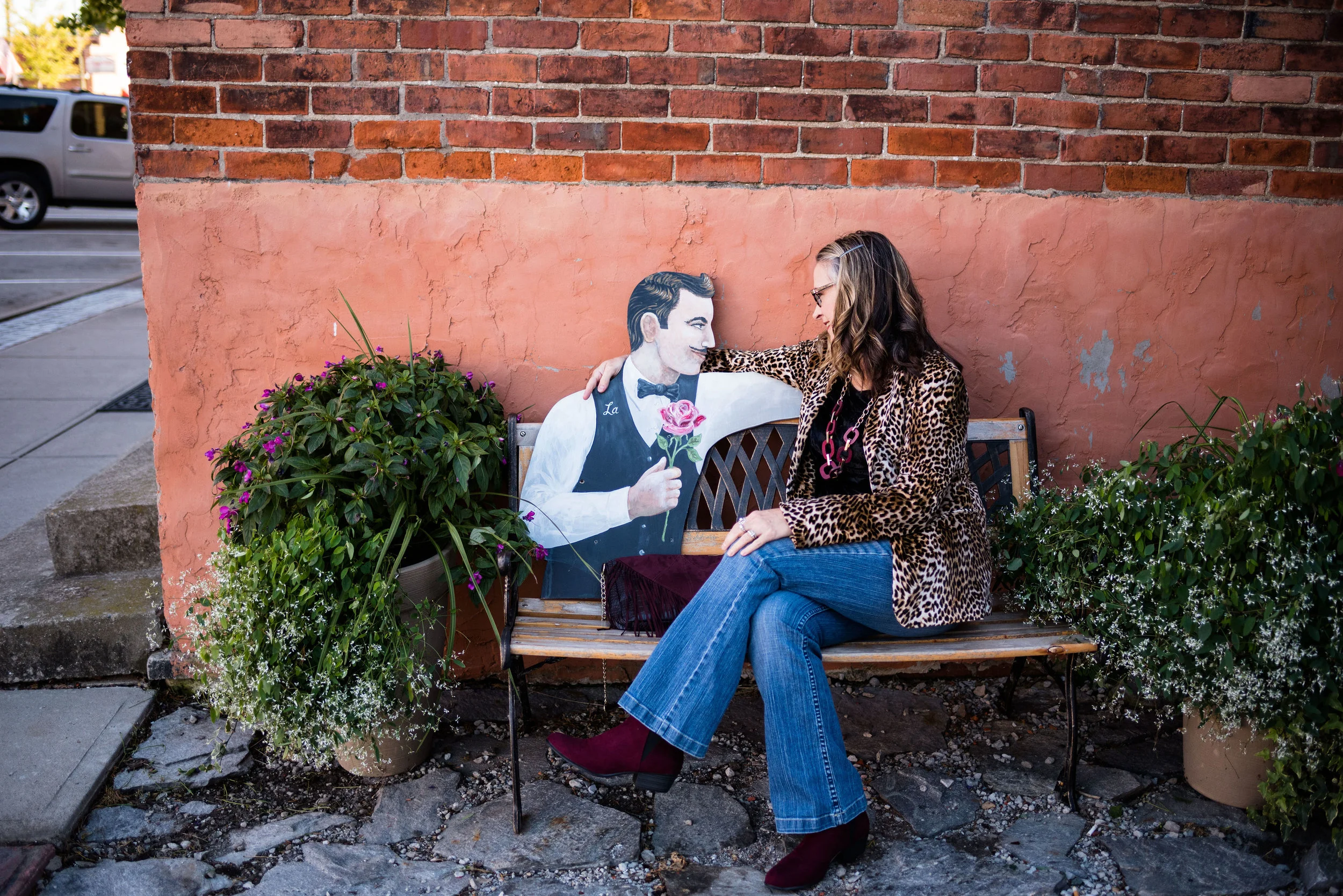
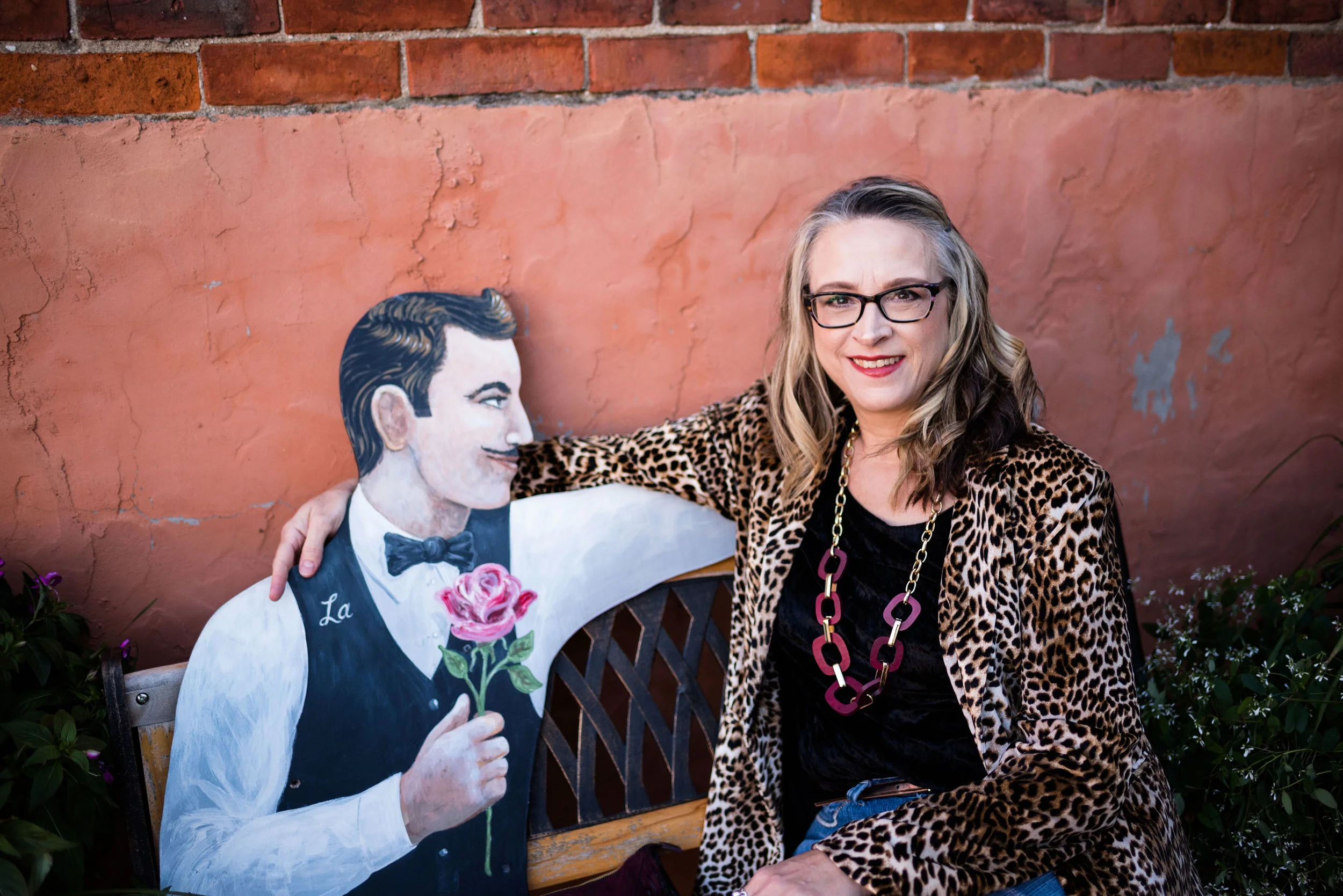
The choice to wear this leopard print blazer that I found on the JC Penney clearance rack last year was a no brainer! Animal prints are trending now, especially the classic leopard print.

I can remember when I was a young girl thinking of leopard print as something only the rich and famous wore. Pictures of celebrities with their fur stoles and jackets were from before my time, but even in the late 60’s and early 70’s animal print patterns were not something the average woman wore. Maybe that is part of the reason these prints are so popular now and continue to be. Also, I think we are more evolved in the fashion arena as far as fabrics and pieces that can mimic the patterns in nature.

For my top, I chose my black velvet tee. This was a Christmas gift from my hubby last Christmas. I thought it went very nicely under the velvet, leopard jacket.

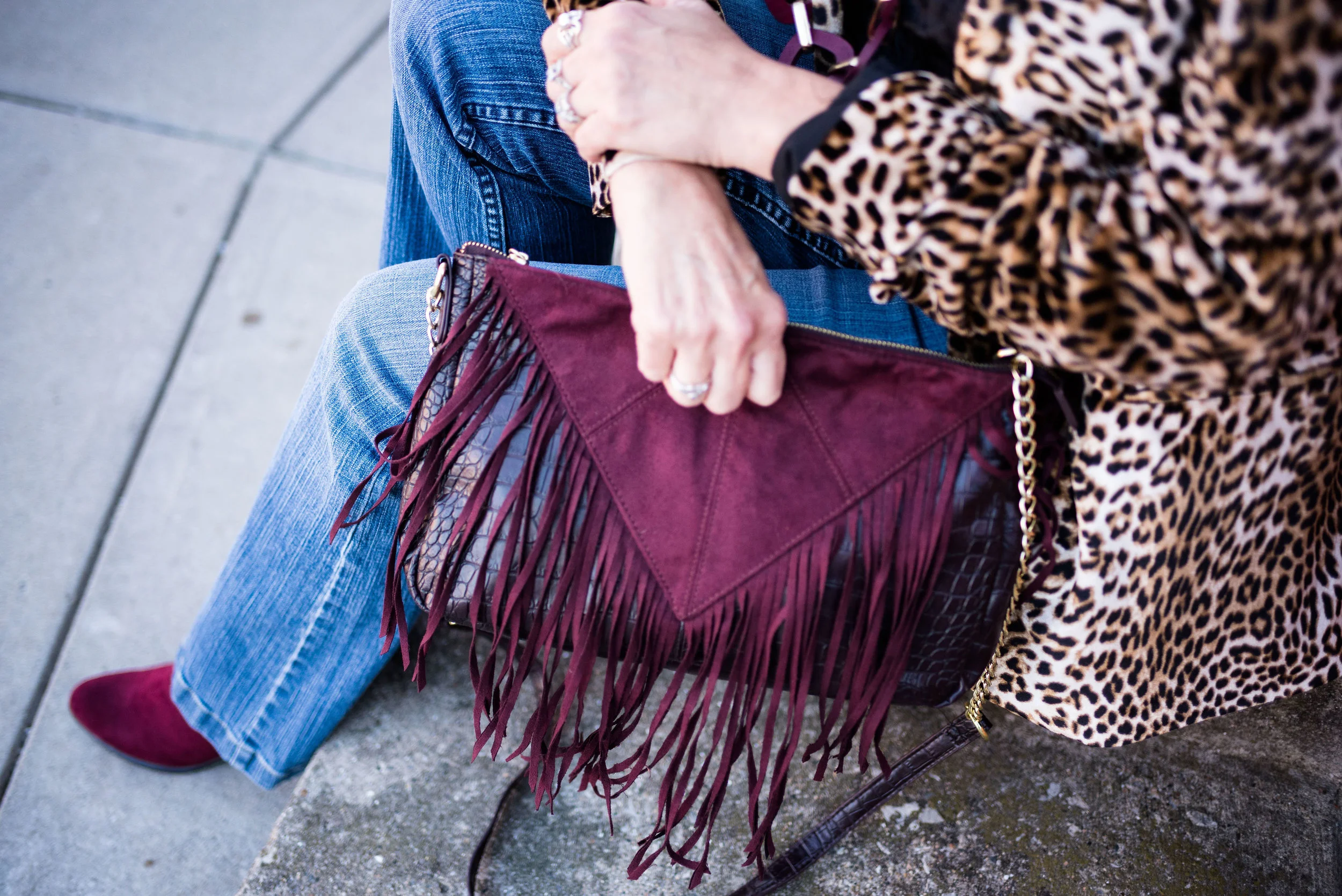
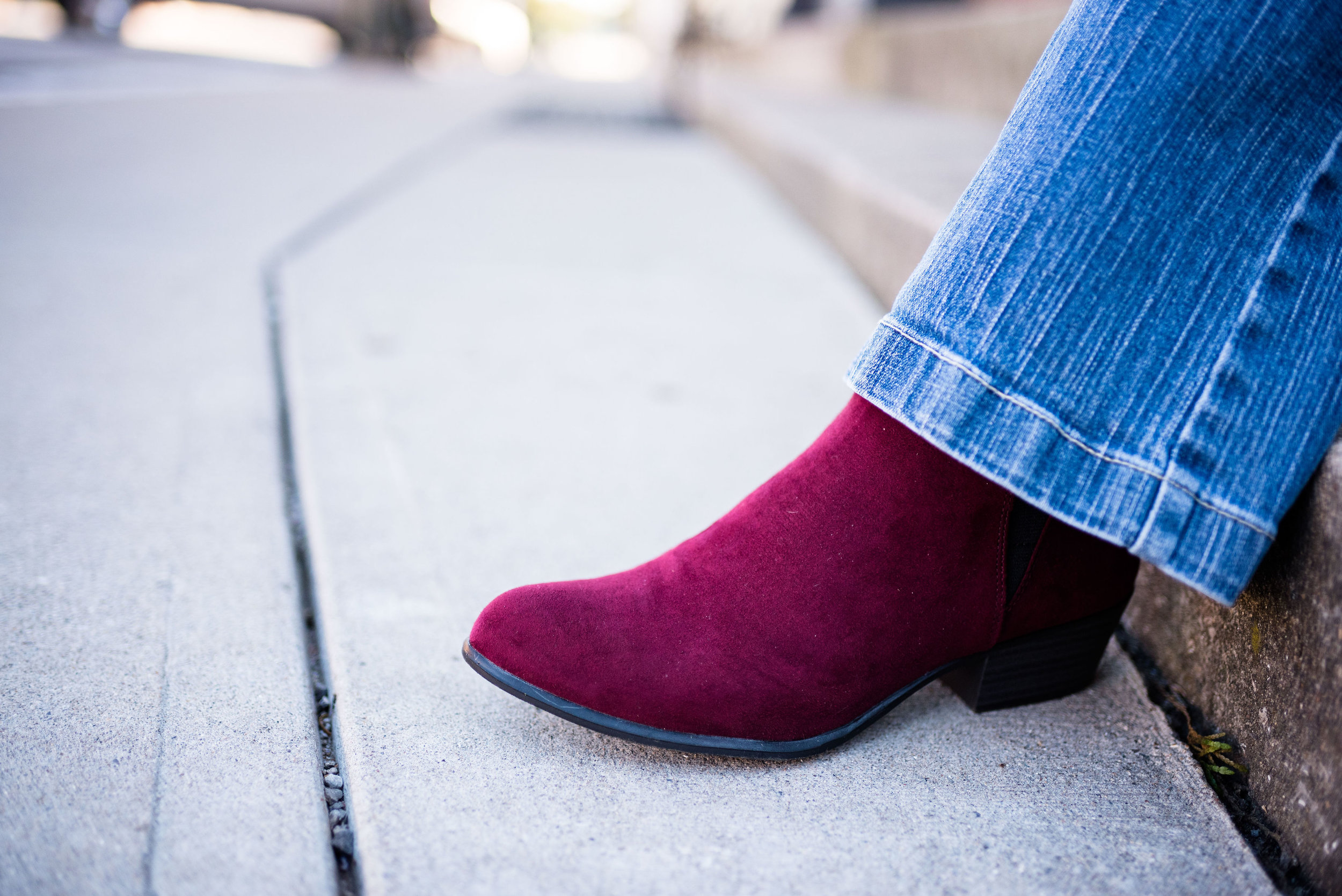
Along with leopard print comes the look of burgundy or red accessories. Red shoes and boots are big this fall. I opted for the more subdued burgundy color, rather than a bright red, but the combination works to make a much more interesting outfit. Even if you don’t have leopard print you could combine burgundy with brown, tan and black and get a sharp looking outfit.

My cute fringe bag is thrifted and my ankle boots are a recent purchase from Meijer. I will be the first to admit I have a shoe problem, but only in spurts. Meijer was having a Buy One Get One for a Dollar, so I had to take a look. Of course I found these boot and they went right into my cart. Then I tried on some Keds and a pair of those jumped in the cart. Well, there was a clearance area as well and I found the cutest blush sneakers…so yes, I came home with three pairs of shoes. Shhhhh! Don’t tell.

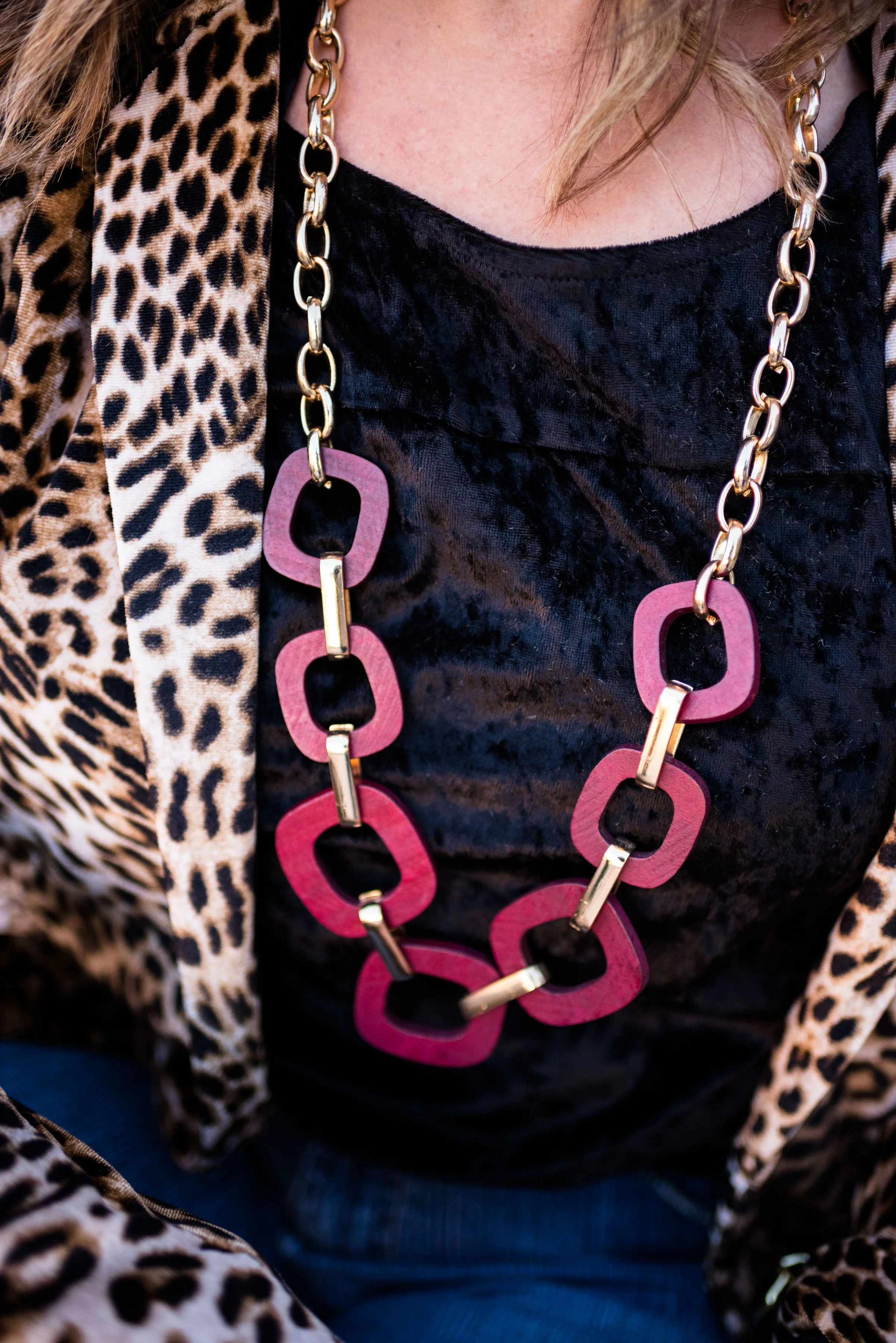
I decided to wear my burgundy wood and metal and a coppery gold belt as my finishing pieces, adding a front tuck to give definition to my waist.

While we were taking pictures, I met this very nice man. He was so understanding and quite a good listener. Ha, ha. We couldn’t pass up a great picture opportunity.

Are you a jeans girl too? What is your favorite brand of jeans? Do you buy your jeans at thrift stores or do you have a particular retailer that you like to buy from? I’d love to hear your thoughts. Leave me some love in the comments section.

I’ve included a few shopping links. These are affiliate links, which means if you click on a link I get a few pennies. If you purchase something through one of my links, I get a little bit more. All opinions are my own.

Have a great weekend.

Photo credit Rebecca Trumbull. Make up Rachel Christensen.

Pantone Fall 2018 - Limelight, Mellow Rose and Meerkat

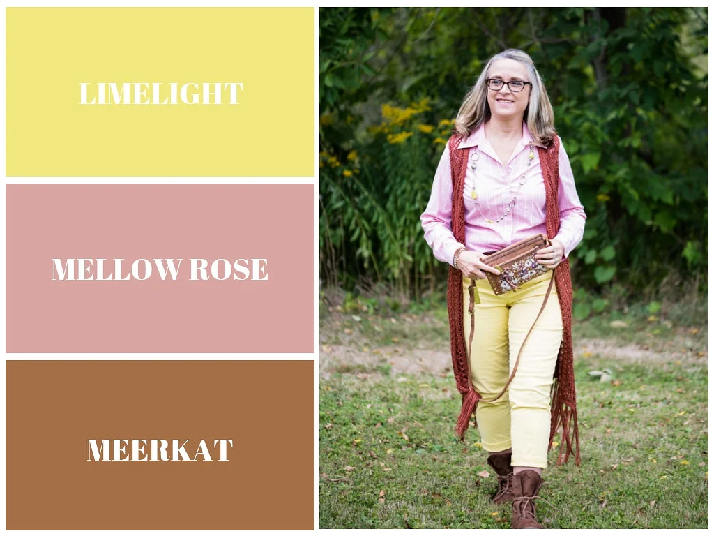
Of all the colors on the Pantone Fall 2018 palette, I felt Limelight and Mellow Rose were the least fall-like colors. Once again, I had to think outside the box when pairing these two light pastels together, to make the outfit seem more in keeping with a fall theme. In order to do this, I thought it would be best to pair them with Pantone’s classic color, Meerkat. Meerkat is a warm, orange brown and while it could be used in any season, It makes me think of fall leaves, bonfires and warm apple cider.

Mellow Rose is actually one of two colors that is only found on the London Palette. I am not sure why they added this and Crocus Petal, the two extra colors on their palette, but they are light, airy and more spring like. Maybe it was an attempt at bridging the gap between the seasons and reminding people that the old rules are gone and colors are seasonless.

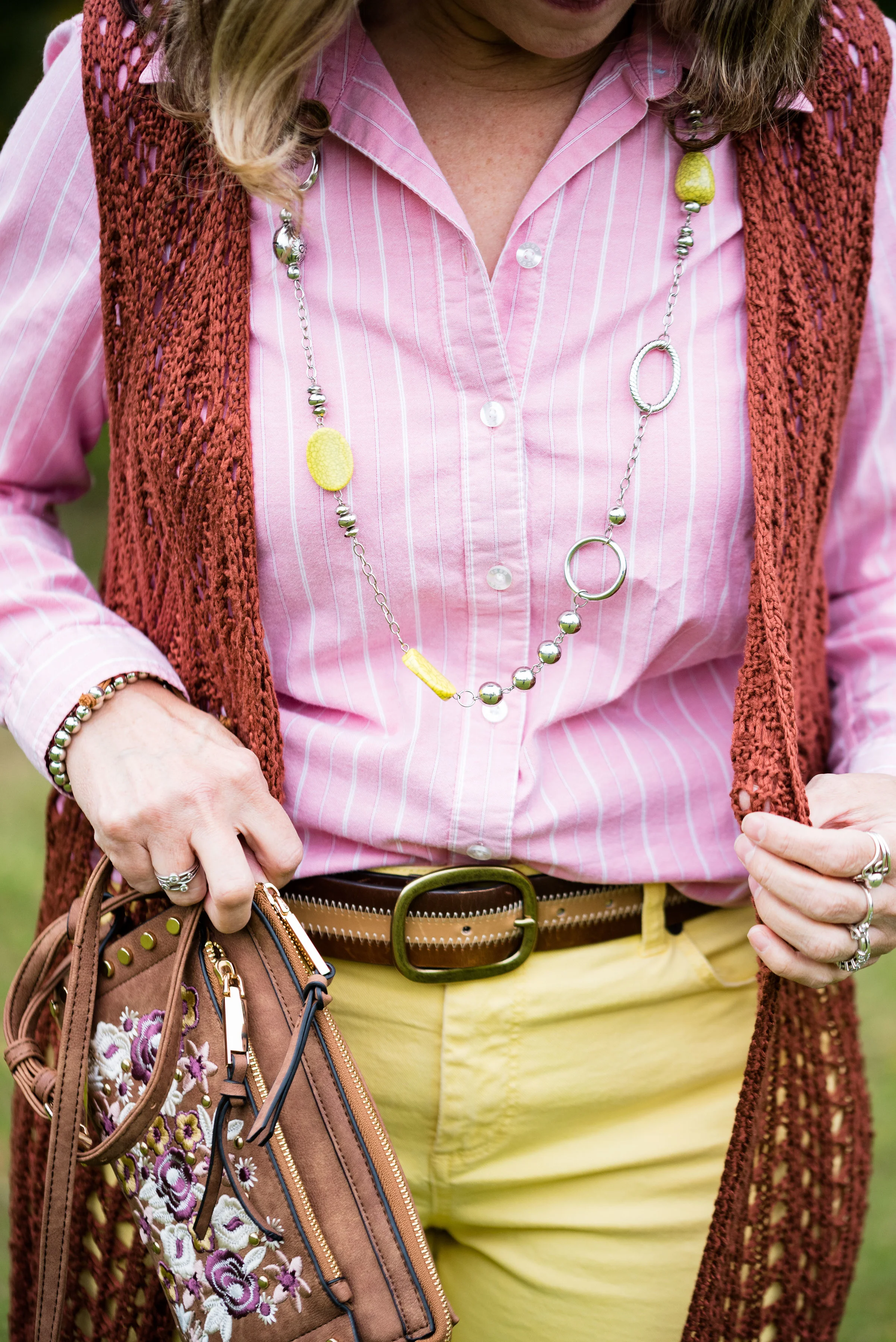
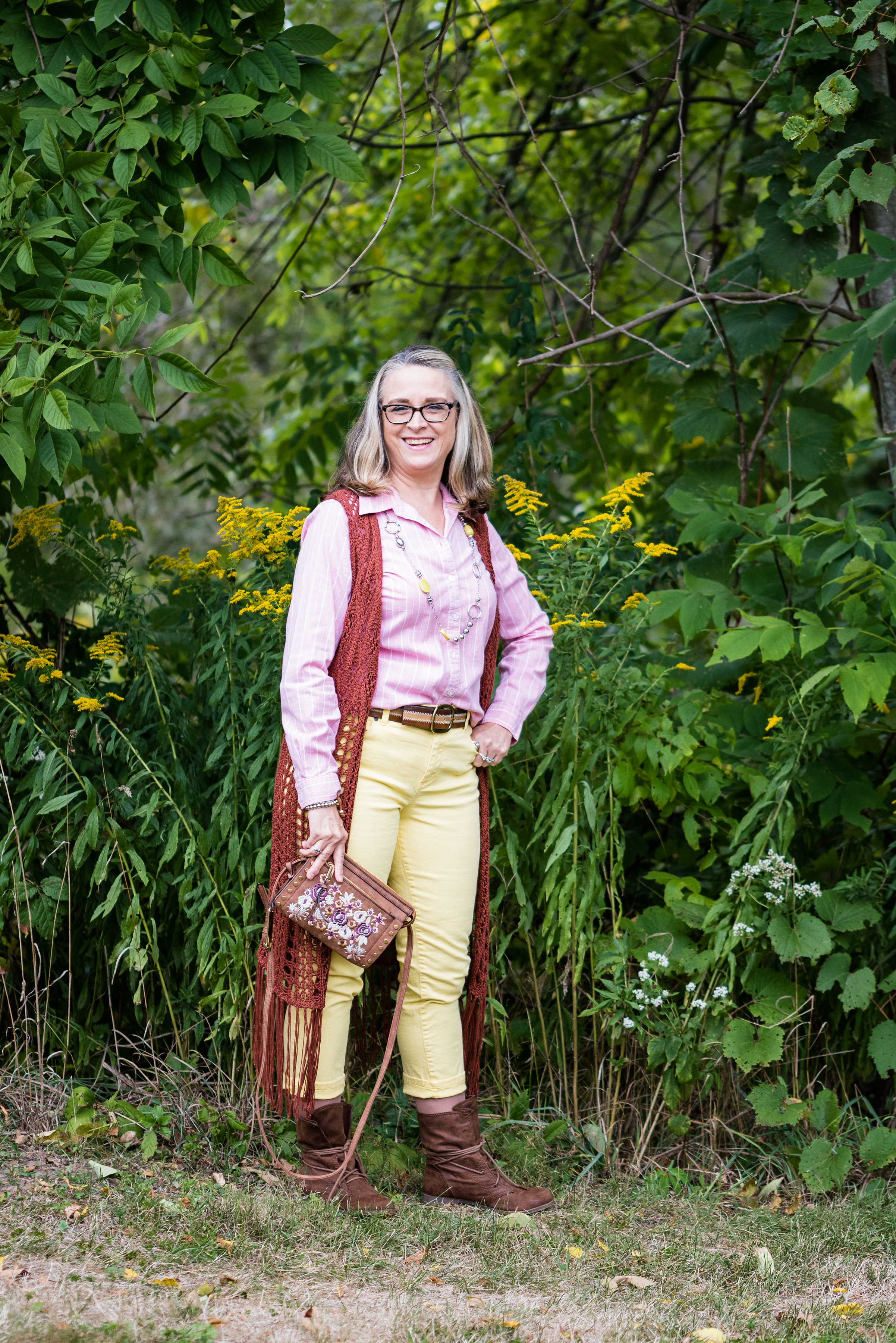
All of the pieces in this outfit were thrifted except the bag and the boots. The Limelight colored jeans are Talbots brand and are really an ankle pant that I rolled up, so they stop at the top of my boots. The Mellow Rose button up is Izod brand and the long fringe knit vest is a brand called Sun and Shadow. I’ve styled this vest several times before. You can see those posts here and here.

I don’t remember where I got the belt, but I thought it tied in with the boots and bag quite well. I just did a front tuck with the shirt.

This bag I got at Meijer and I am not sure of the brand. It is a nice cross body bag and the embroidery on the front adds interesting color and texture. I think this can be used for all seasons.

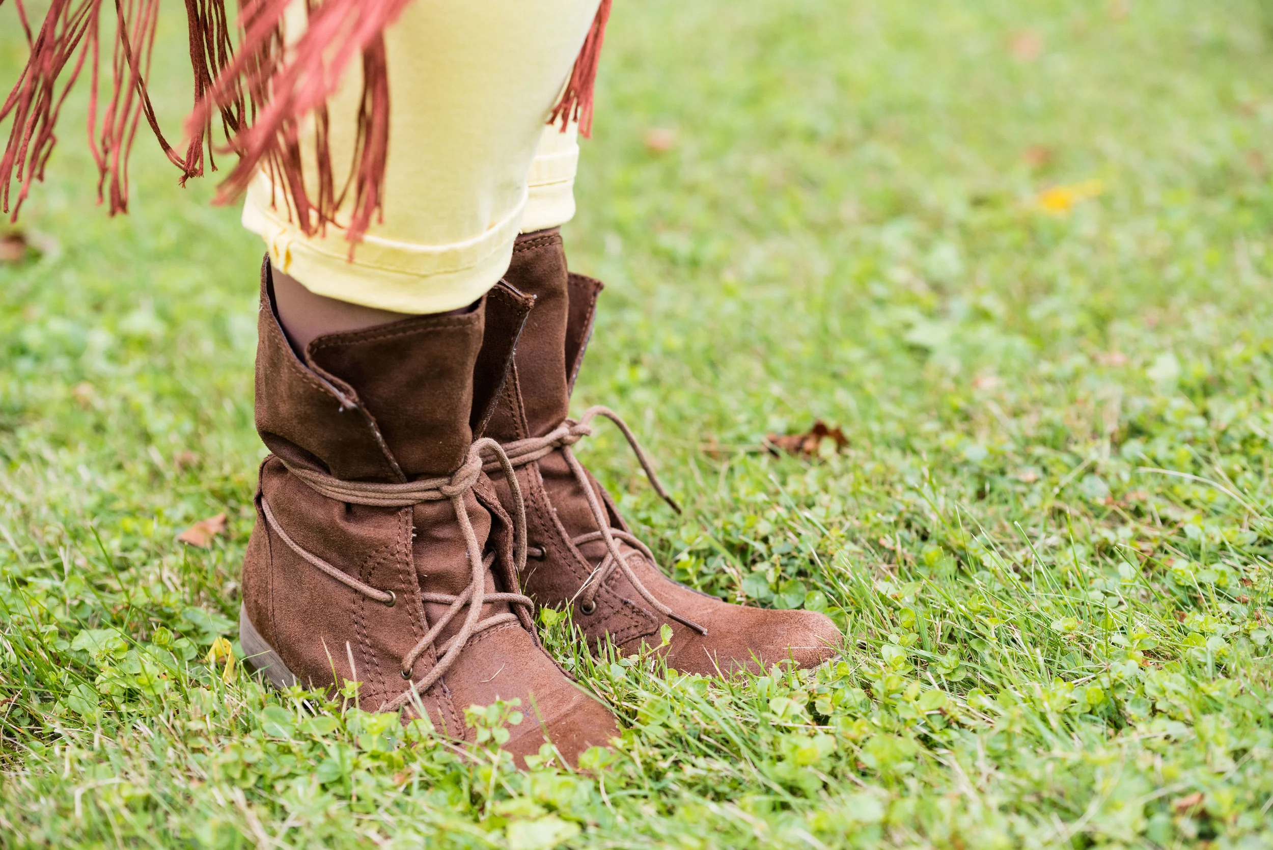
These boots are a brand called Sugar and I got them at Kohl’s a few years ago. They are made of a suede type material and add a different look to an outfit because of the single, long, wrap tie.

I just added a simple bead and metal necklace and a bracelet for jewelry. This might be fun with a scarf or even some layered necklaces for a more bohemian look.

Here is a full length view of the vest from behind.

This is the second outfit in this series that I am not completely happy with. These colors are great, just not necessarily together, or for the season of fall. I know, I know, we can wear whatever, whenever, but if I’m not happy with it, then I’m not going to wear it. I’ve worn both of these pieces in the spring and summer. My color leanings are more bold and bright, but if you are a pastel kind of girl, then follow my friend Liz at With Wonder and Whimsy. She loves pastels and wears them all year round!

That’s all for today. Hope you are having a great Tuesday!


Outfit Inspiration - Gingham and Olive

This week’s Outfit Inspiration comes from a Christopher & Banks add that I received in the mail. I love to try to copy the outfits that many retailers put in their advertisements and catalogues, because it gives me a source for a well thought out outfit, without me having to come up with the idea. I still have to shop my closet and try to find similar enough pieces to create the look, but the inspiration was provided by someone else.

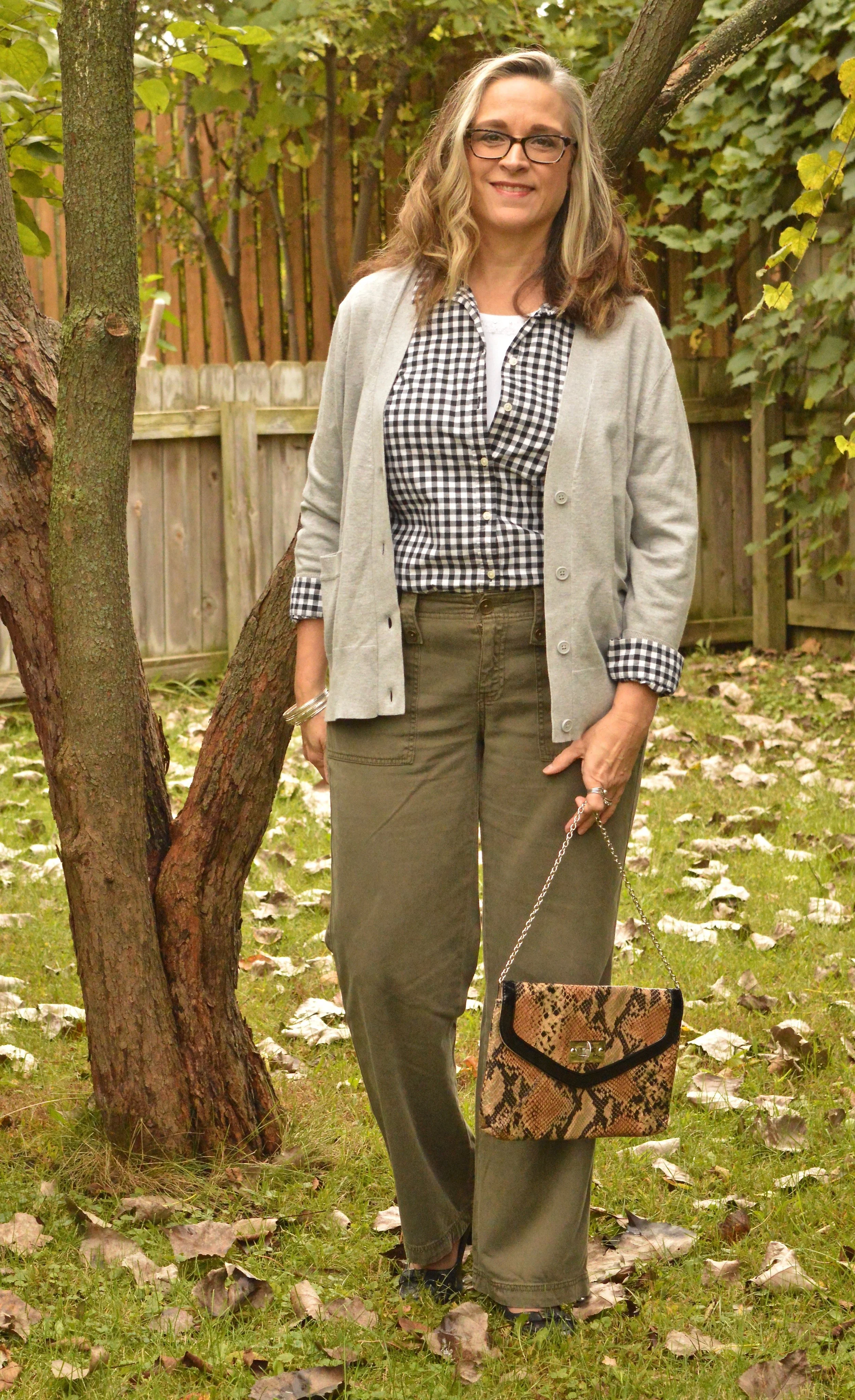
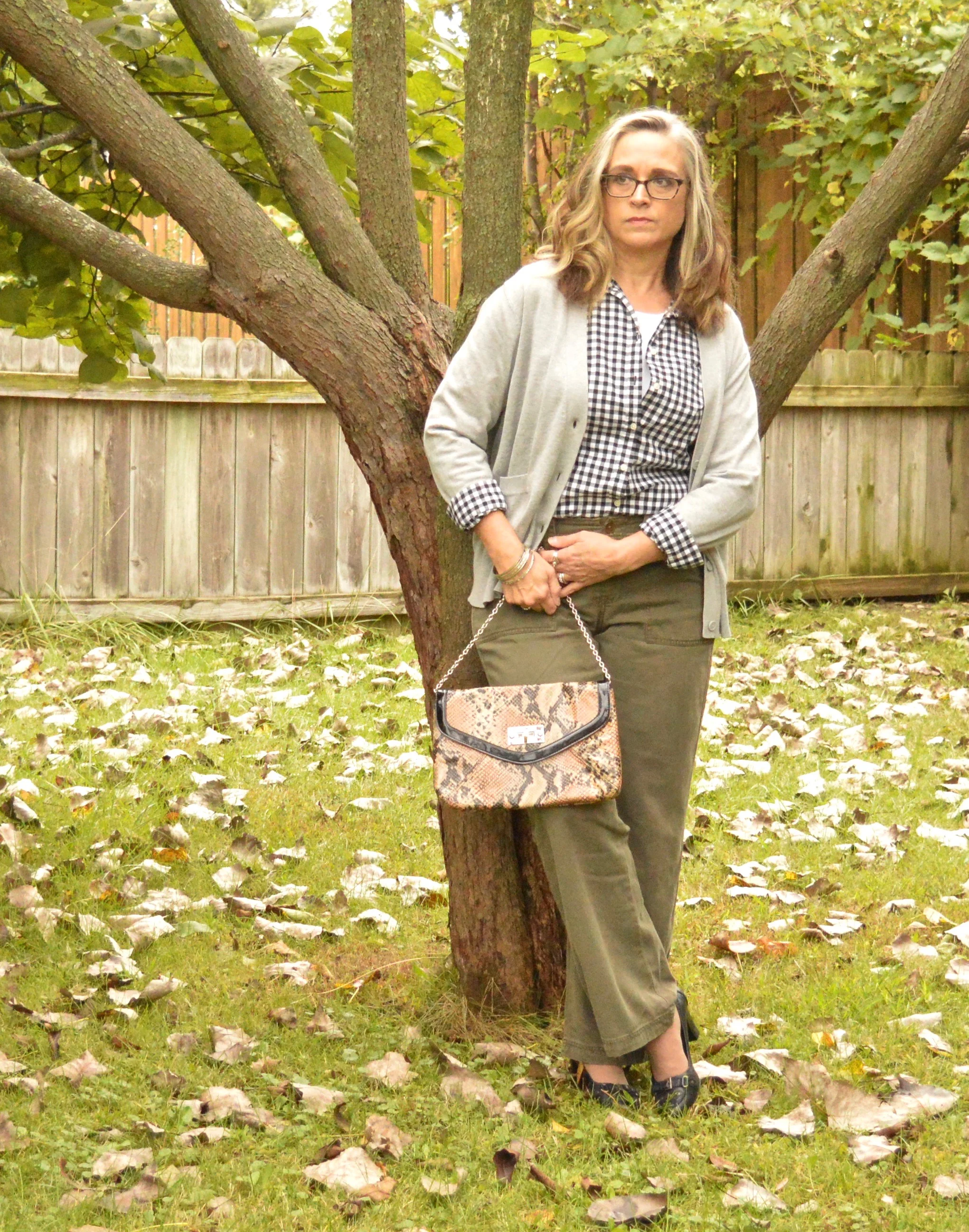
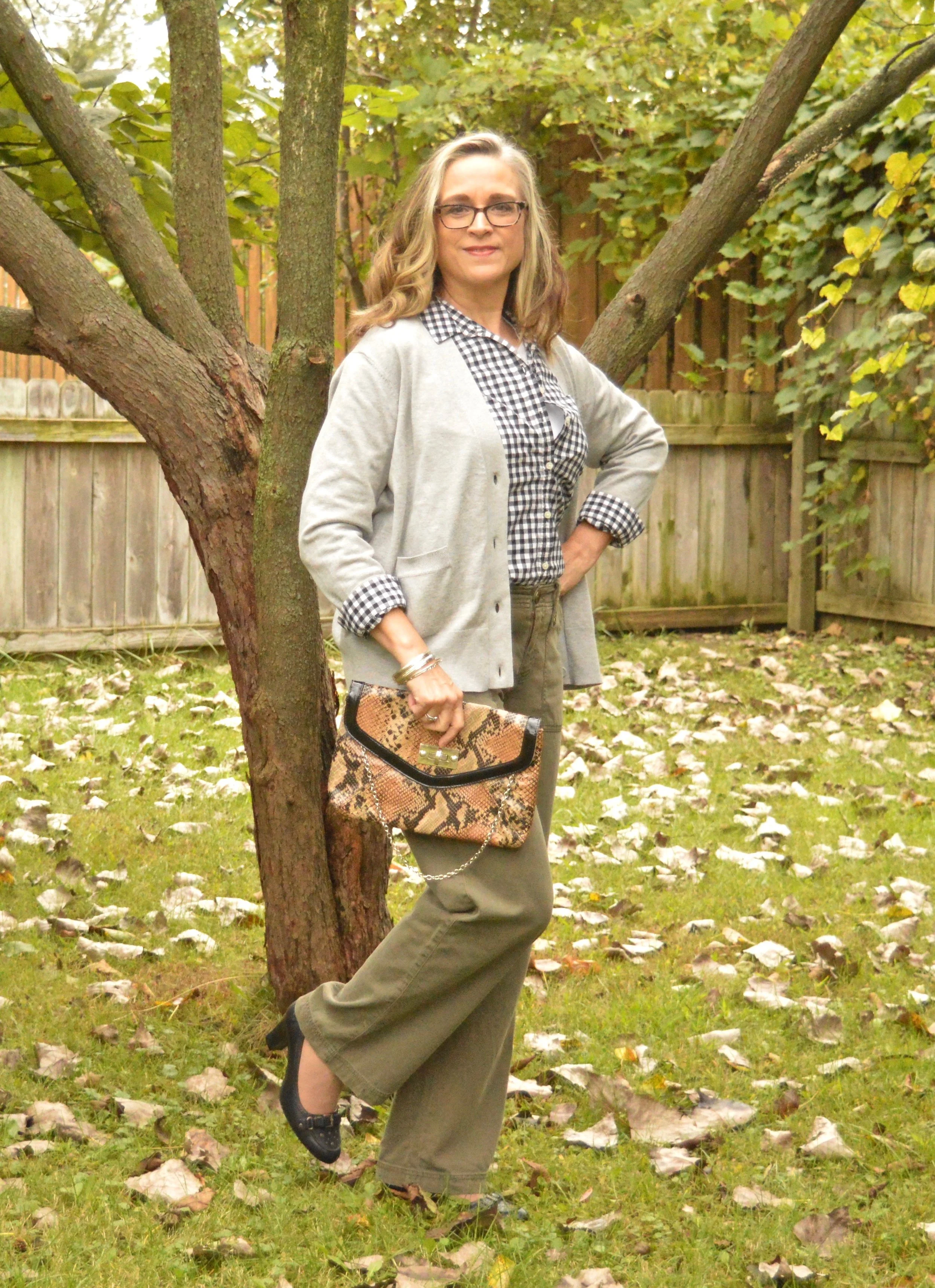
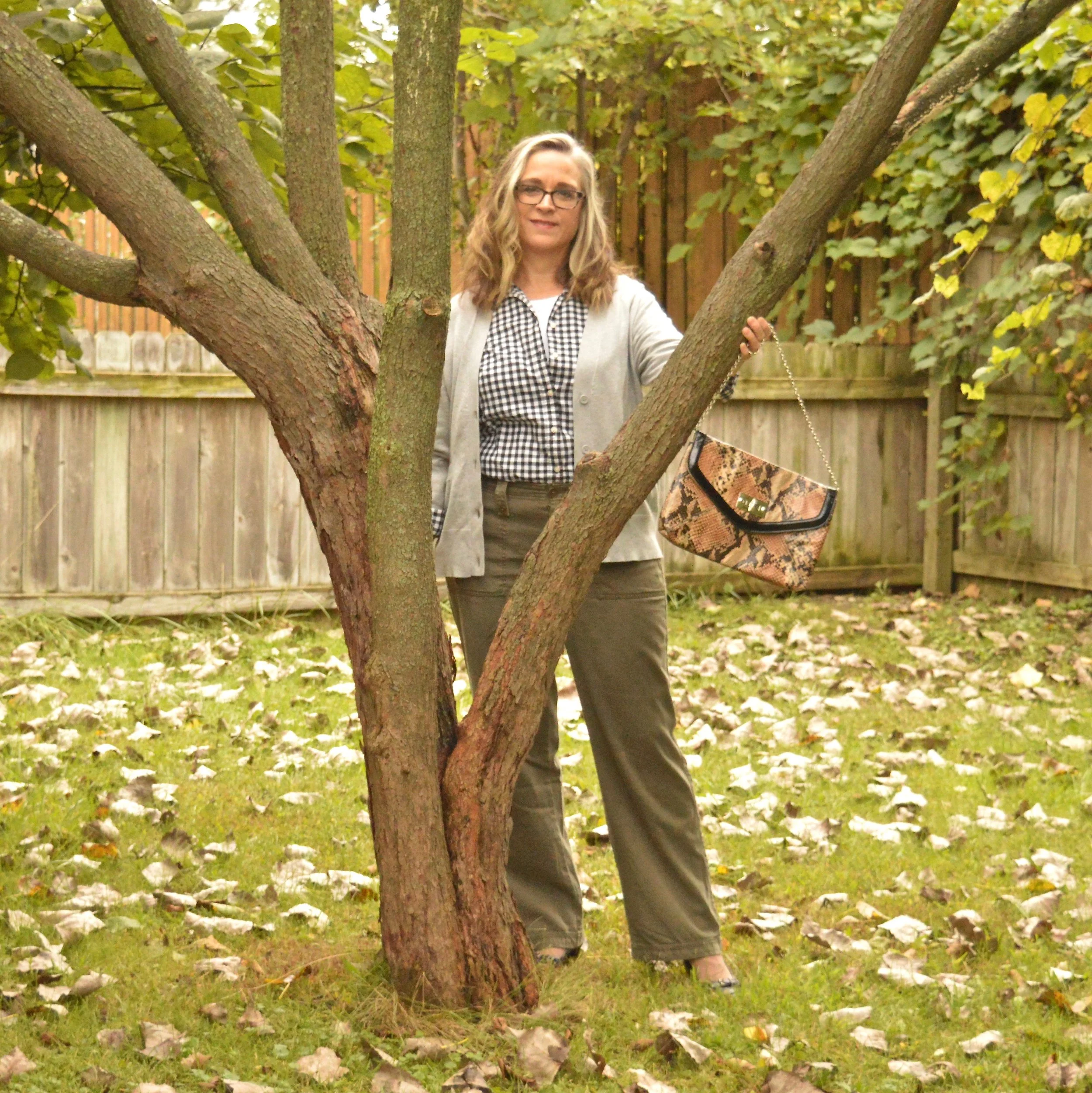
When I saw the classic combination of a gingham button up with olive pants I knew it was an outfit I could easily replicate from pieces in my closet. This is what I came up with.

Since olive is treated as a neutral these days you can wear it with any other color and it works. Case in point, for this outfit I am pairing these olive trousers with a black and white gingham blouse, a white tank underneath to add interest and a gray casual cardigan.

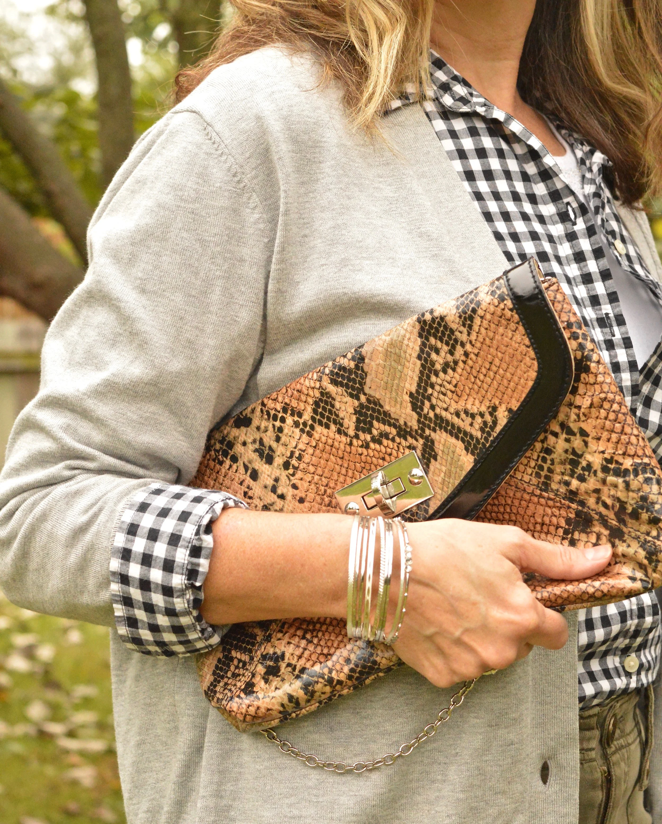
This is an outfit I would easily wear to work. While the outfit is fairly neutral you can easily jazz it up by adding color in your accessories. I chose to keep my look more neutral all over. I have on black loafer heels, which I have worn on the blog before, and decided to carry my thrifted snakeskin clutch, since animal prints are trending right now. I opted for a few silver bangles and no other jewelry. I felt there was enough going on with the gingham check and the layers, although you could easily add a necklace or a pretty colored scarf to wake the outfit up a bit.

This gingham blouse was thrifted and is Old Navy brand. The white sweater tank that I have on underneath was also thrifted and is George brand. The original photo that I took the inspiration from showed the model with her top tucked in and no belt, even though the pants had belt loops. I wanted to stick to the original outfit as much as possible, but next time I will add a belt. I just think it makes an outfit look more polished. I have an olive colored one that would have worked perfectly with these pants.

My gray sweater is from H&M. I had a gray sweater, very similar to this, but it was showing wear, so I was glad to find this as a replacement.

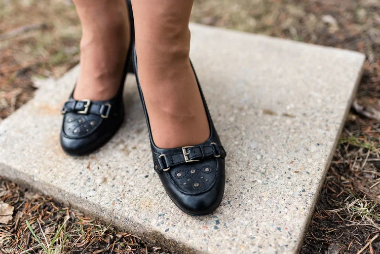
Here is a picture of the shoes taken on a different occasion. They are a sturdy, practical heel, but still look stylish while being fairly comfortable. These were thrifted and are ANA brand.

Here are a few more photos I thought I’d share just for fun:

I was having fun with this red bud tree. Unfortunately, the poor thing is half dead.

That’s all I have for today. I hope you enjoyed this post. I’d love the hear your feedback. Don’t forget to follow me on Instagram.

Have a wonderful weekend!

Pantone Fall 2018 - Russet Orange, Ultra Violet and Quiet Gray

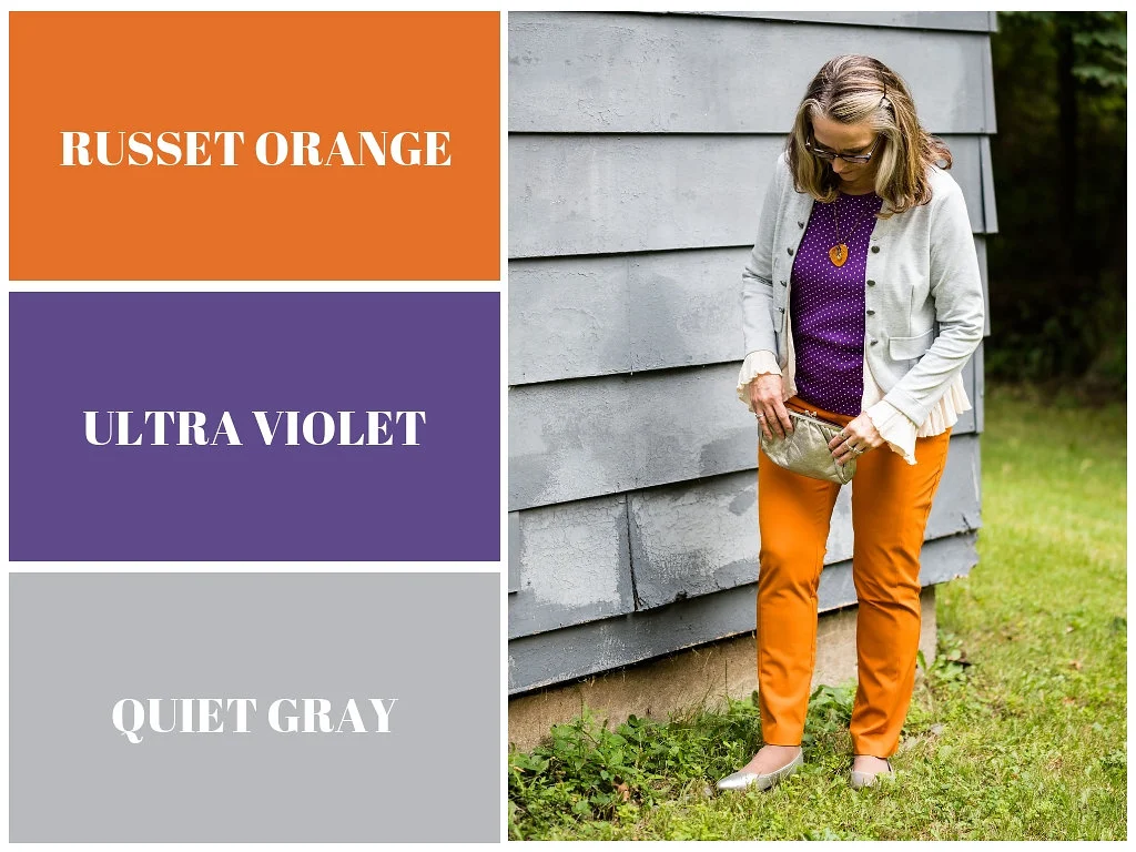
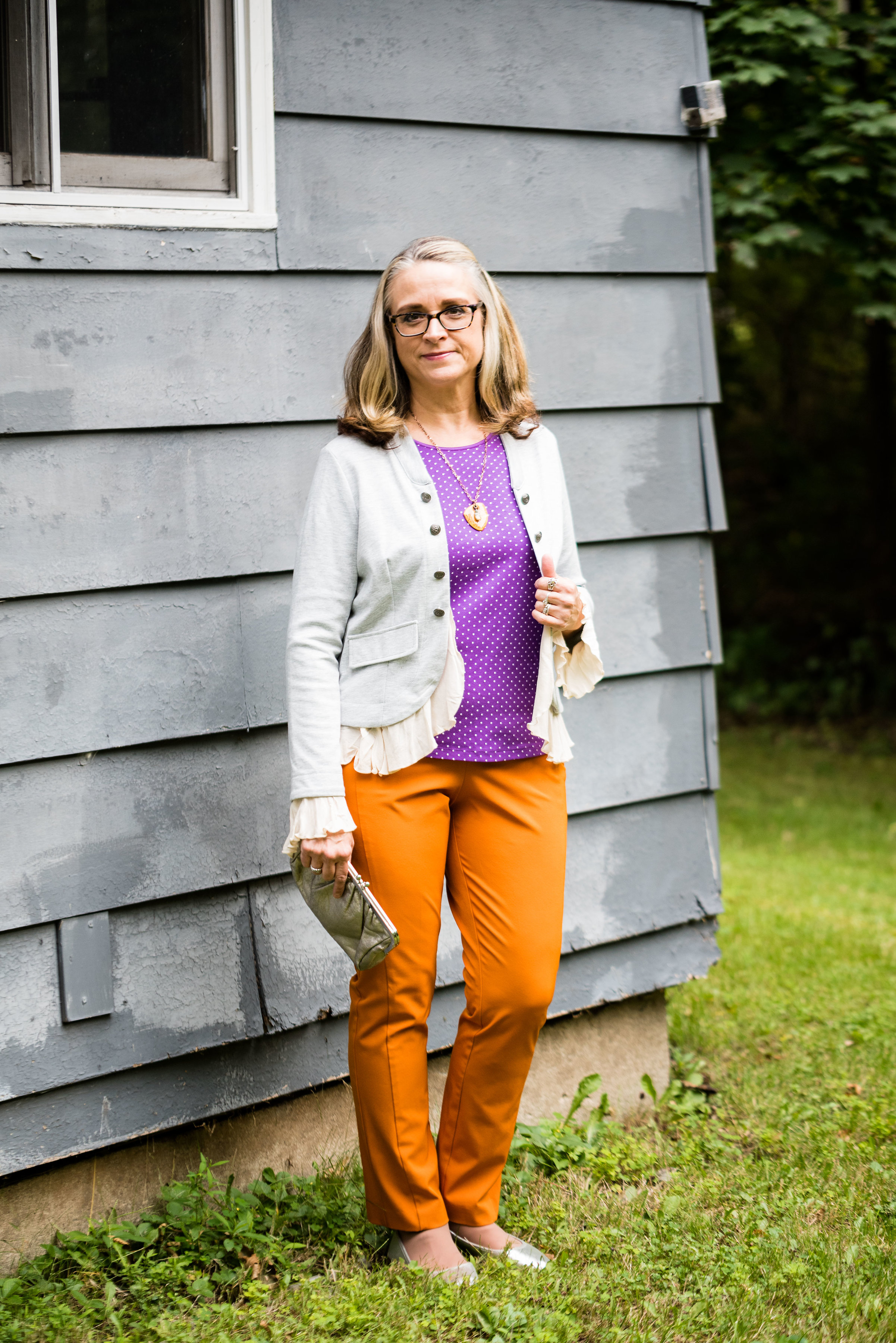
This week’s Pantone Fall 2018 colors are a bright pumpkin orange and a deep purple we met last spring, that won Color of the Year. Russet Orange is an easy color on the eye and reminds us of those beautiful Maple trees that boast red, yellow and orange leaves. Ultra Violet might be part of your Halloween decorating. Since the combination of orange and purple has become a less dark and more party friendly Halloween pairing, I thought it would be fun to put these two colors together.

These pants I’ve worn on the blog before, here, here and here. They are Worthington brand from JC Penney. These have a side zipper and sit higher on the waist, so help to create a more smooth silhouette.

My top is an older tee from Christopher & Banks. I love the color of this top. To keep the bright colors from being too overwhelming, I chose the Pantone color Quiet Gray as a topper to polish off the look. This fun piece is from the Kohl’s clearance rack and is a brand called About A Girl. I really like the double breasted look and the feminine detailed ruffles.

I kept my accessories fairly simple. This lovely leaf necklace I found at a shop in Grayling, MI called The Main Branch Gallery. Boasting art work and crafts from local artisans it is a great place to visit if you are ever up that way.

I then finished off the look with my silver clutch and silver SO flats that I recently added to my SO shoe collection from Kohl’s. Here is a link if you are interested in other colors. They are on sale right now for only $21.99, which is a good deal for a fairly comfortable shoe that makes any outfit look a little more dressed up. I normally wear an 8.5 or a 9 and I get these in a 9.

What do you think of these two colors? Would you wear Russet Orange and Ultra Violet together? I’ve included a few shopping links below. These are affiliate links, but all opinions are my own.

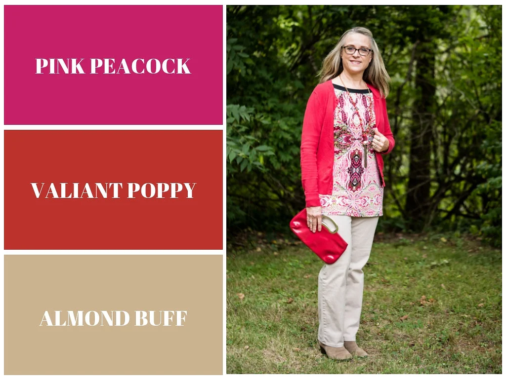
Pantone Fall 2018 - Pink Peacock, Valiant Poppy and Almond Buff

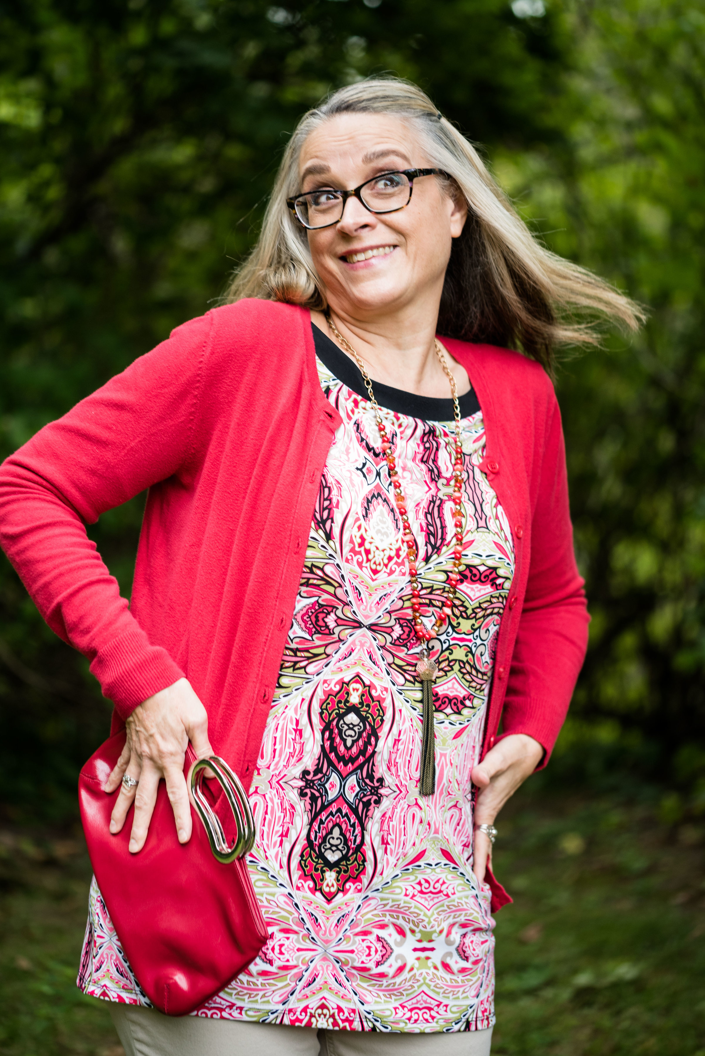
Welcome back to outfit number three in this fall’s Pantone color series. Today I am featuring two colors which the Pantone site describes as a “bright and bold dramatic pink” and a “brave and outgoing red.” I didn’t go into this series thinking I would pair these two colors, but when I started looking for the pink and decided on this multi-print tunic, it was only natural to choose another color in the tunic to pair with it, which obviously turned out to be red. I have always thought of pairing red and pink as a Valentine’s Day idea, but when I began putting this outfit together, I saw a subtle shift from cupids and hearts to fall apples and fuzzy pink slippers.

This tunic is a brand called East Fifth and while I can’t remember, I think I got it at JC Penney. Although, when I checked on their website, it looks like they currently only carry East Fifth shoes. and a few bags. I have styled this tunic on the blog before. You can see that post here.

When I realized I had this thrifted Merona cardigan, I knew that would add the perfect pop of red, in addition to my red clutch.

To keep the outfit grounded I picked the Pantone color Almond Buff from the classic palette. These pants are a little on the light side to truly mimic the color, but my swede ankle boots are a closer match. Yes, I am doing the Robot.

The pants are Croft and Barrow brand. The boots are Sonoma. Both items were from Kohl’s.

I chose my bright red clutch to add to the Valiant Poppy vibe. Because the tunic is so busy the only jewelry I added was a gold bangle bracelet and the pink and red tassel necklace, which as you can see, blends in with the top, but still adds a little textural detail.

Isn’t it funny that I bought this necklace a while back, never realizing that Pink Peacock and Valiant Poppy would be a thing, or that I would end up pairing these two colors on the blog? This next picture is just me at my silliest! Ha, ha.

Would you combine these two colors? Do you think they are what we would classify as fall colors? I’d love to hear you thoughts. It means a great deal to me when you take the time to stop by, read my posts and comment (when technology is cooperating). I have learned a lot from your comments, especially when you share, how you would have done it differently or what you like about a particular post, so keep it up.

Be sure to check back Thursday for a new Old Becomes New post, where I’ll be sharing a colorful blazer styled in a fall outfit. I need your help to decide whether I should keep it or not. Until then, have a great day.

I’ve included a few shopping links for pink tops and red bags, just for fun. These are affiliate links which means I get a penny or two when you click on a link. If you purchase something through my site, I get a little commission.

Photo credit Rebecca Trumbull.


Outside the Box - Floral Dress with Combat Boots

I have never been especially adventurous with fashion. My style is somewhat classic with a tomboy edge and a dash of boho meets warrior princess, or at least that is what I would like to think. I am not overtly feminine, though I do like pink and especially love lace. As I revealed in last week’s Ordinary Amy post, I like motorcycle jackets, blue jeans and boots or tennis shoes. The premise for having a column called Outside the Box, is exactly that, to get me thinking outside my own fashion box.

This week’s outfit is what I would call motorcycle mayhem meets feminine flirt. Let me know if you agree.

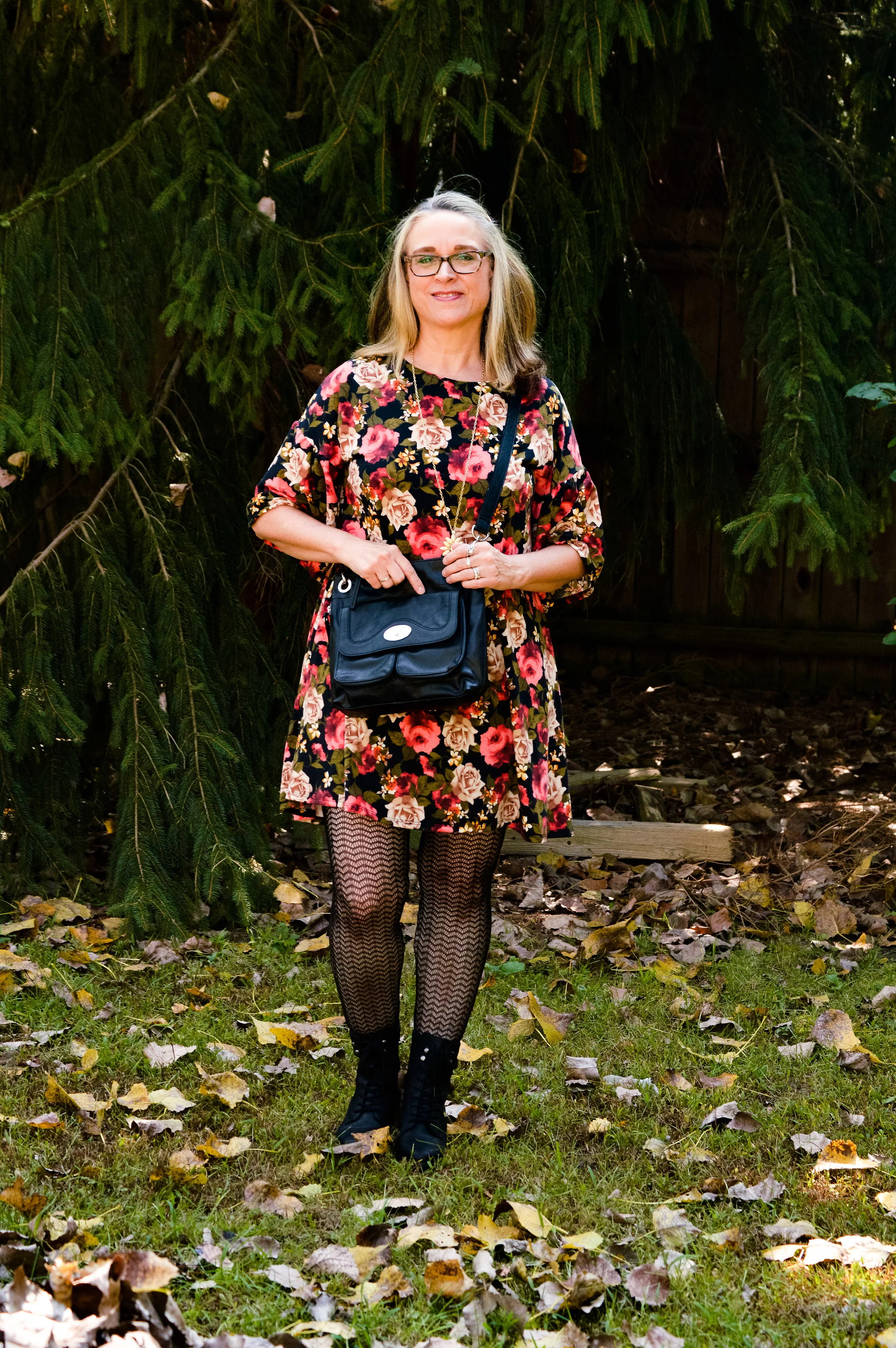
I often see bloggers who put together outfits that I would have never dreamed of doing. Not because they are so bold or daring, but because my mind would just never think to combine combat boots, fishnet stockings and a floral dress.

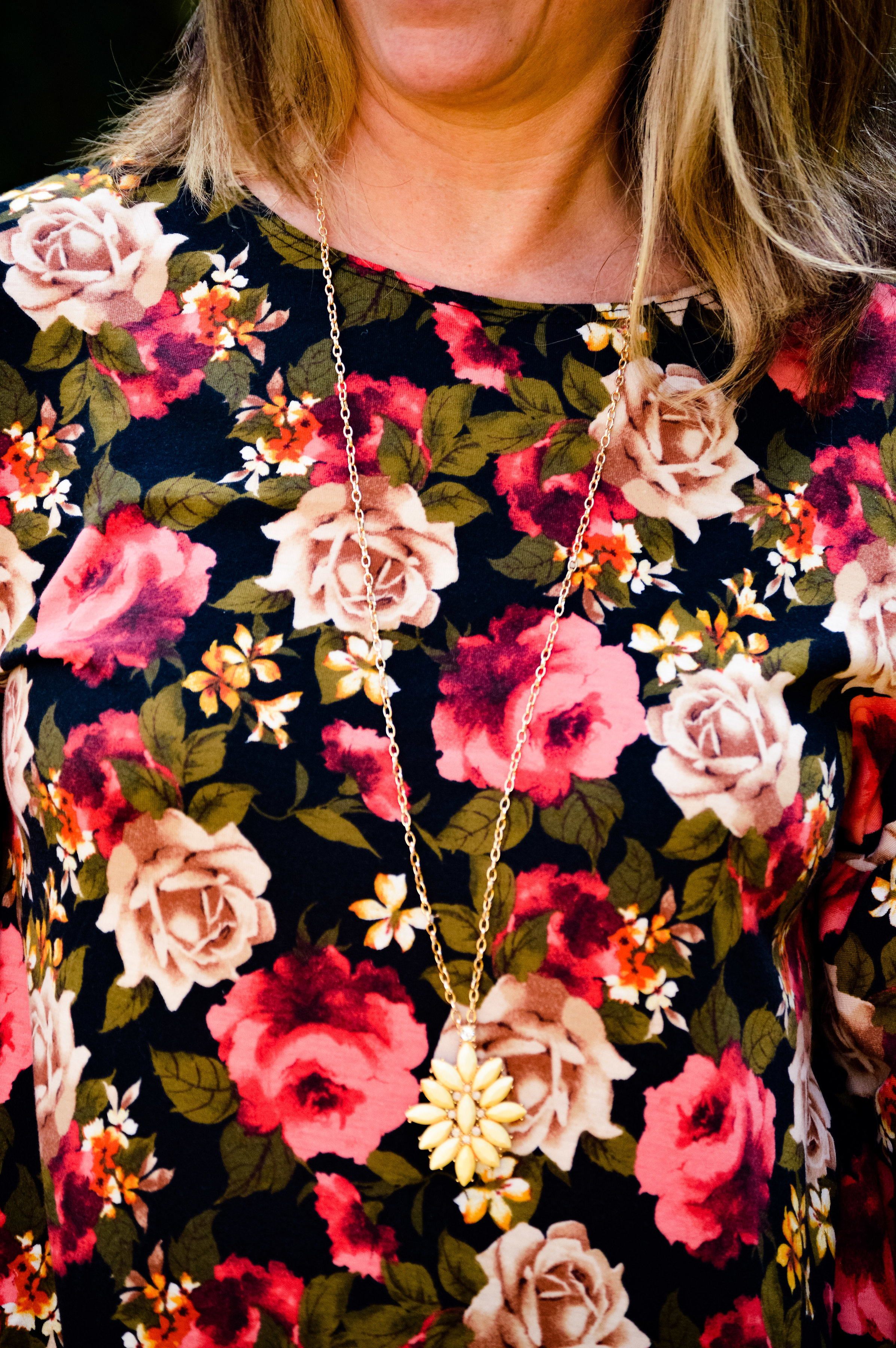
I began this outfit journey with the floral dress. I picked this up at Gabes this past spring with the thought in mind that it would be a great fall piece. Bright florals on a dark background make me think more of cooler weather and sipping hot cocoa. It’s not that you couldn’t wear these colors in the spring and summer, but there is something seasonal about certain color combinations.

I know fashion is not contained neatly in one box and many in the fashion world are strongly pushing against the stereotypes of weight and age, which is awesome, and I fully support. However, there is also a push against traditional fashion ideas, such as not wearing white before or after the summer months, or allowing seasonal color changes to affect what we wear. I’m fine with many of these ideas, but fashion is also about wearing what we want to wear. I like darker colors in the fall and winter and brighter colors in the spring and summer. That is just me!

What really drew me to this little floral number besides the print were the bell sleeves. You can’t see them really well in these photos, but they add a fun element to the piece.

During the summer, when my hubby and I were on vacation in Wisconsin, I went with my mother-in-law to a department store that was going out of business. They were just getting started with their sales and we spent our time looking at shoes. It was then, I came across these boots.

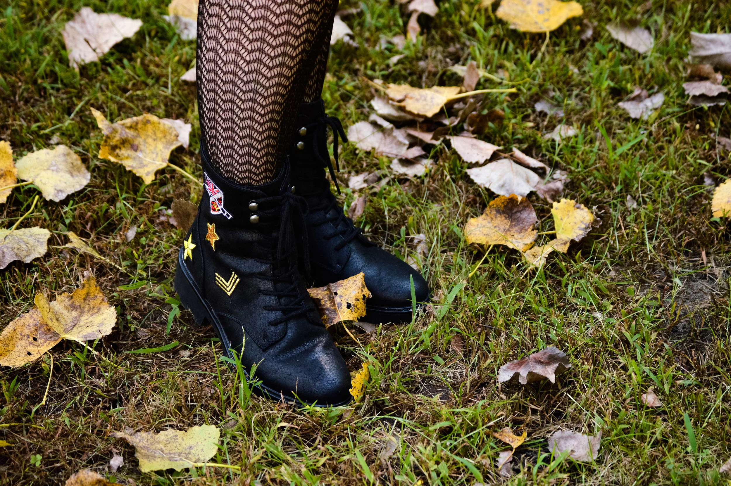
Just like motorcycle jackets, I love combat boots. This is now my third pair and I love the embellishments on these. I’ve included a few shopping links at the end of similar pairs. These zip on the inner ankle so are easy to get on and off. I thought the contrast of the floral dress with the combat boots was a look that was outside my norm.

To give the outfit another more feminine edge I added the fishnet tights. These are a heavier weight than true fishnet stockings. I didn’t even remember I had these until I started looking through my hose bin! I saw these and said, “Yes, this is it!” The outfit would be just as fun with a pair of sweater tights in a dark or a bright color like red or cream. I do like darker on the bottom for the thinning factor.

Because the dress is so busy, I kept my accessories minimal. I put on my yellow pendant necklace and added a faux leather cross body bag for a last touch of tough girl.


This bag makes me think of a motorcycle saddle bag. I’m a little preoccupied! My hubby had a Harley before we ever met, and I keep trying to convince him we need to get one in our old age. Ha, ha.

What do you think? Would you wear combat boots with fishnet stockings and a dress? It even sounds odd, but I actually think it works. I’d love to hear your thoughts.

I have been having some issues with people commenting on my blog. For some reason it lets some people comment and not others. I have contacted my platform support team to see if the issues are on my end. Sometimes it can be the browser you are using. Squarespace tries to keep current with changes and updates in multiple browsers so it can take time. If you can’t comment right away, please try again later. I do apologize for the problems. You can also give me feedback on Facebook as well. I appreciate your thoughts and support.

Have a great weekend!


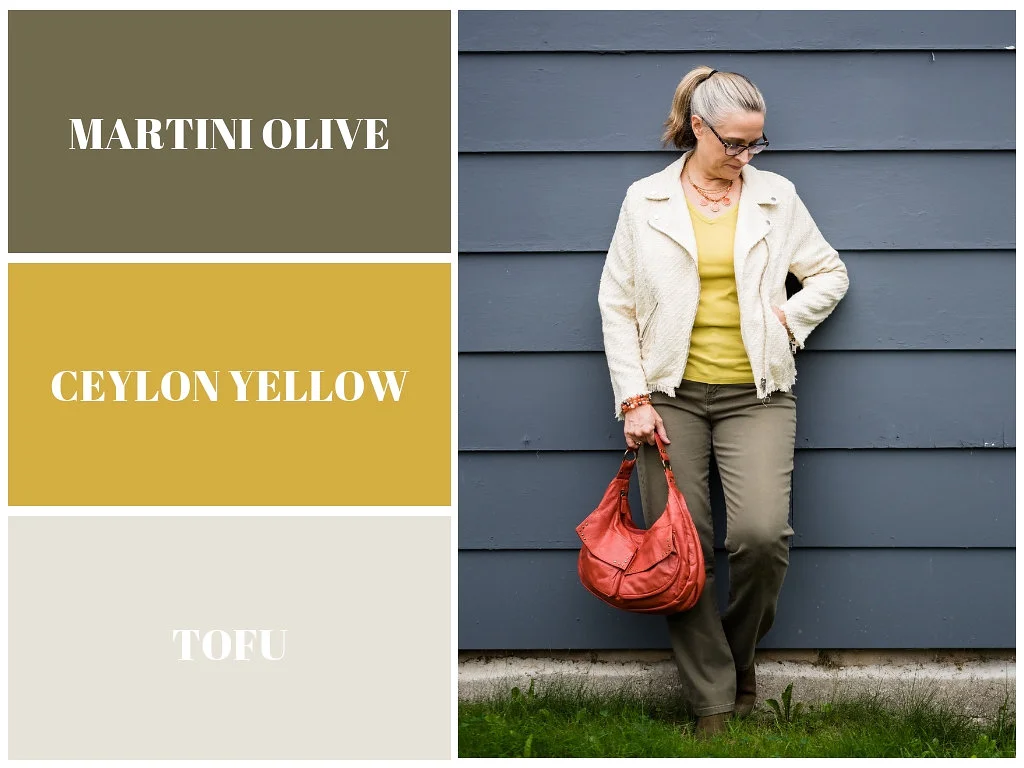
Pantone Fall 2018 - Martini Olive, Ceylon Yellow and Tofu

I will confess, these colors are not my favorites. It might be due to the fact that I decided to combine them into one outfit.

Martini Olive is more of a gray or brown based olive. I honestly like an olive that is more green. However, for the sake of being open minded this would be a good neutral that could go with many different colors including navy, black or even a rich deep red. Maybe I should have paired Martini Olive with Red Pear. What do you think? These jeans are thrifted and Gloria Vanderbilt brand.

Ceylon Yellow has a bit of a bite. It is not really a mustard, but has a bit of spice underlying it. I have fallen in love with yellow, but my personal tastes tend more towards the yellows that are sunflower or goldenrod. The top is thrifted and Merona brand.

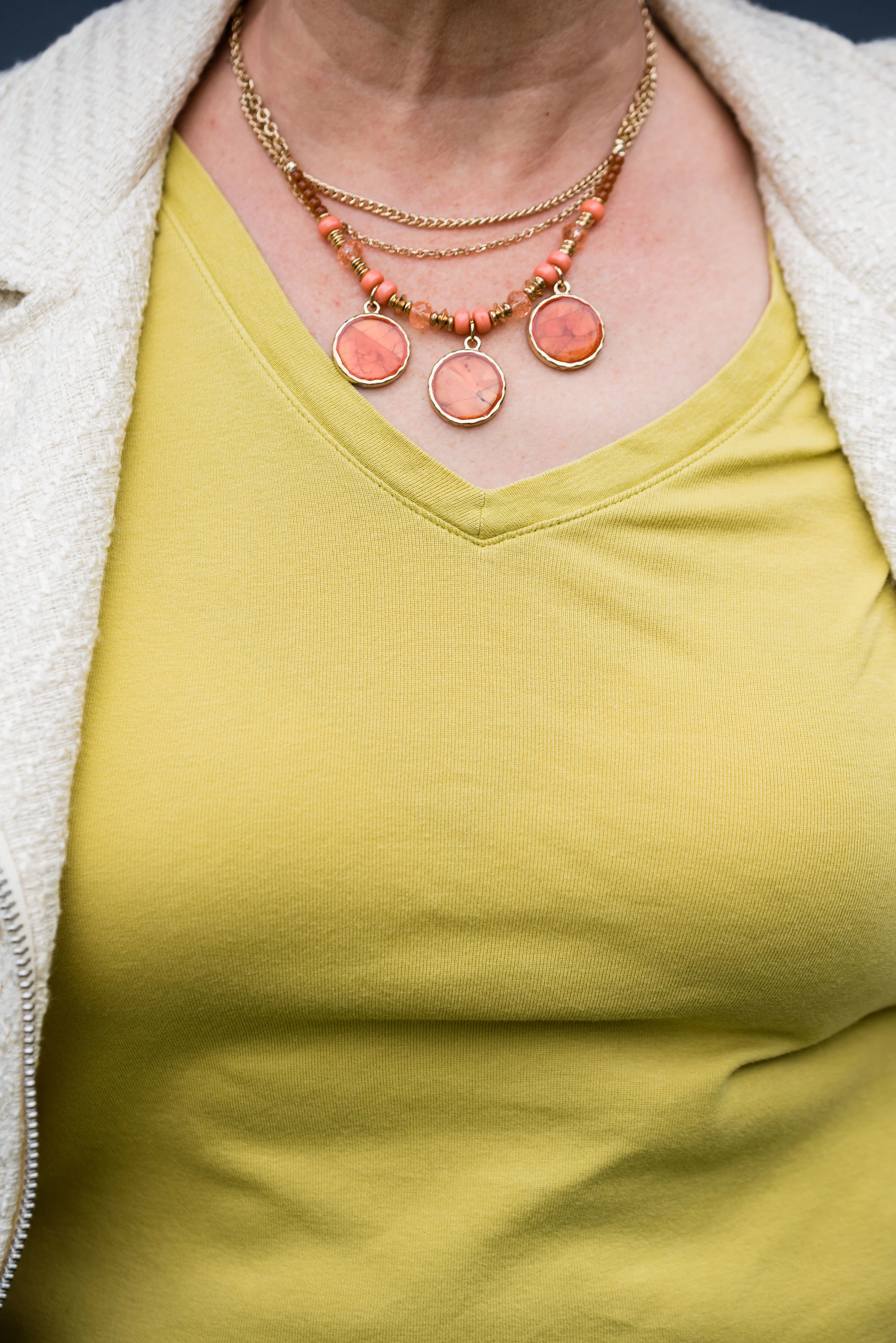
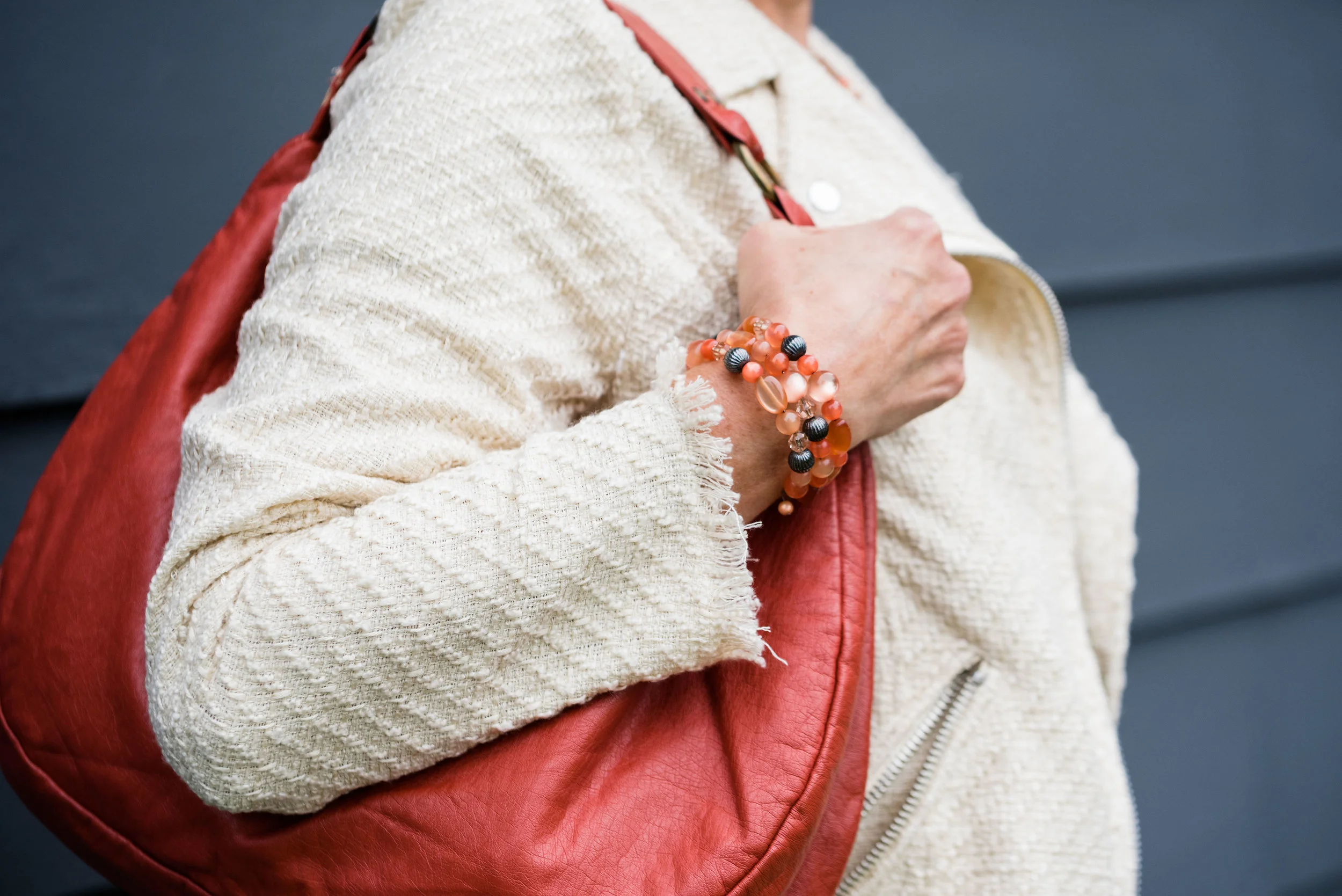
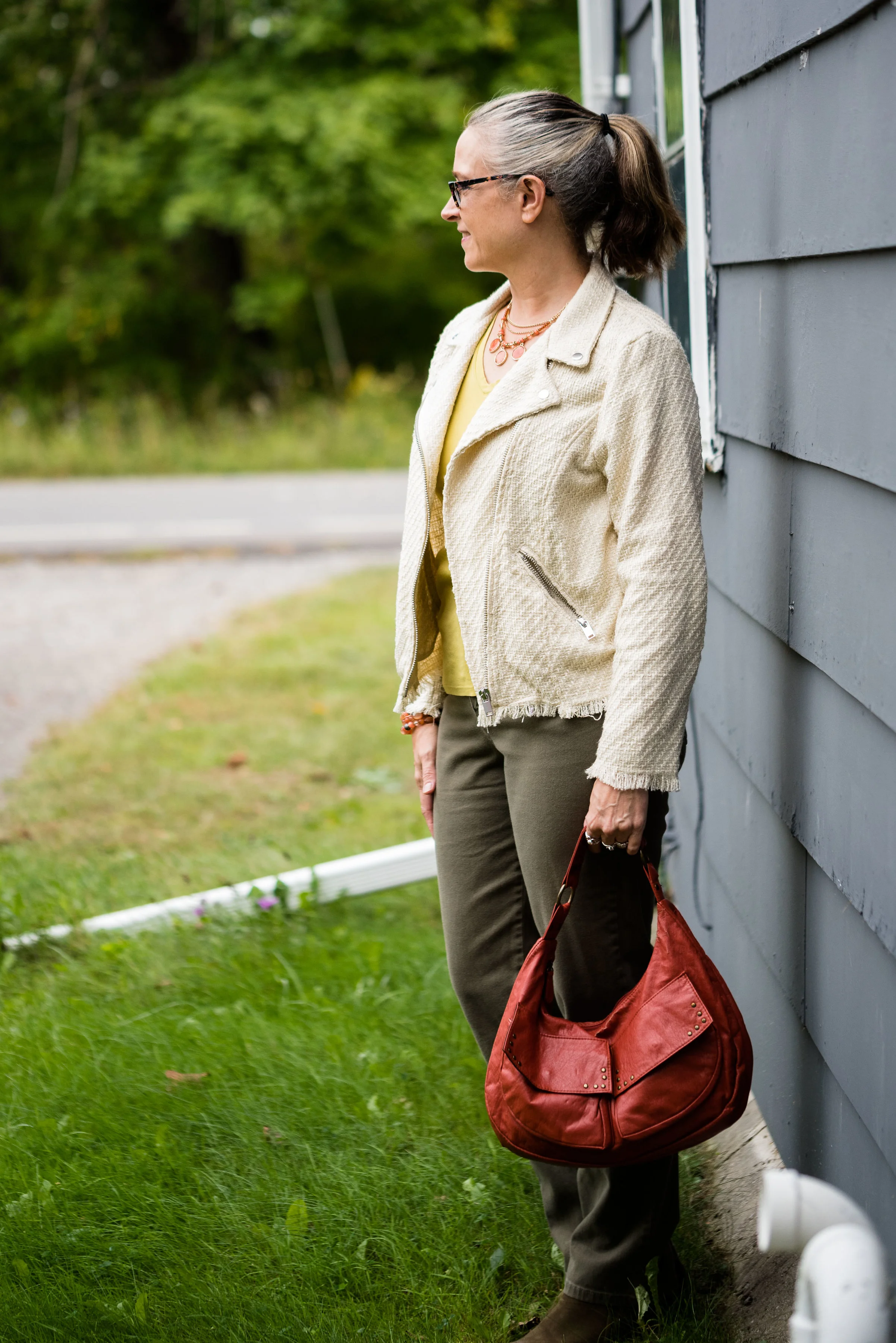
I opted for orange, as the pop of color I felt this outfit needed. Orange bag, orange necklace and bracelet: I feel like it epitomizes the mix of colors in the fall that we so often see in the trees.

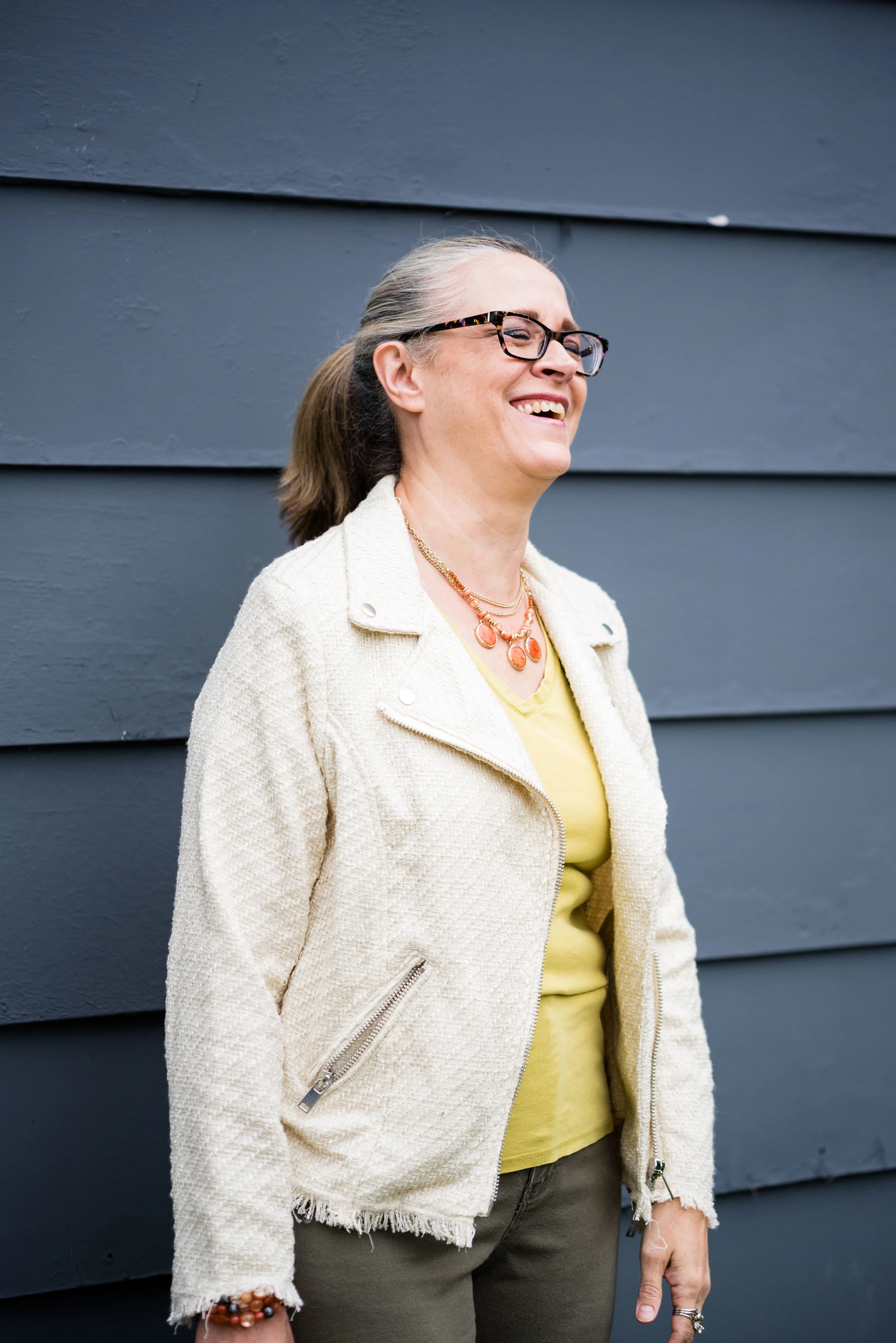
This jacket I found at H&M on the clearance rack. Once again, it is a moto type jacket, but tends more towards a tweedy look, which gives it an entirely different vibe from last week’s metallic blush moto jacket. The color is in line with the Pantone classic color labeled Tofu. Not a true white, but not a true cream, it seems to fall somewhere in between. I love the texture details, including the frayed sleeves and bottom hem.

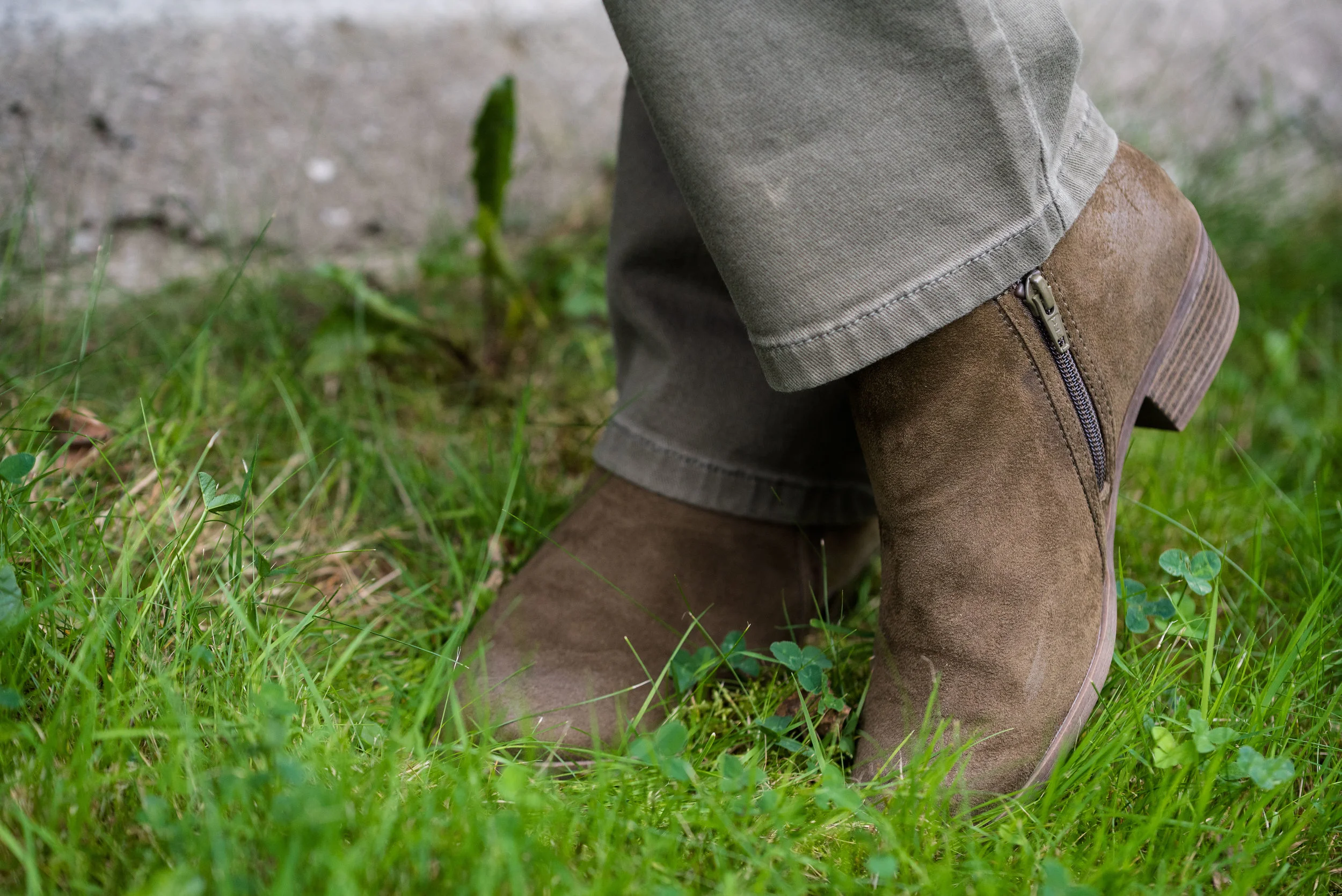
Once again, I am wearing my olive SO ankle boots. Just like my SO ballet flats these boots are very comfortable and look nice. I love the rich texture of the faux suede.

I am not completely satisfied with this look. I don’t like what I did with my hair, even though that is something I do from time to time and this outfit doesn’t have enough color contrast for me. I like bright, rich colors and this palette just leaves me looking washed out. But hey, not every outfit can be a winner. I’m still learning and growing.

I do think these colors would be better paired with another color. The yellow would look pretty with a blue shade or even a rich chocolate brown and like I said earlier, the Martini Olive would pair well with a navy, burgundy or even a purple.

As always, I’d love to hear your thoughts, both good and bad! I’ve included a few shopping links for you to look over. These are affiliate links. All opinions are my own.

Ordinary Amy: Blush Moto Jacket

I have gotten away from my monthly columns for a while, but now feel like I can get back at it. For today’s Ordinary Amy post, I chose to build my outfit around a blush moto jacket that I found at Nordstrom Rack back in May. I had been looking for a lighter colored moto jacket and this one fit the bill perfectly.

I know I am not the only gal that has a love affair with motorcycle jackets. They have always been a favorite of mine, for as long as I can remember. When I was young, my brothers used to race dirt bikes (motocross) and I loved the thrill, the noise and the dirt of going to watch them ride. I always thought that would have been so much fun. Needless to say, growing up with the two wheeled noise makers around gave me an earthy, edgy perspective on life.

Another factor that solidified my love for moto jackets, motorcycles and writing, was a book that I had to read in my 8th grade English class. The Outsiders, by S.E. Hinton was a coming of age story about a group of boys from the poor side of town and how they dealt with the difficulties of broken homes, strained relationships and maneuvering adolescence in the midst of night time rumbles with the rich kids and running away from home. Some of the first stories I wrote followed a very similar thread to S.E. Hinton, as I struggled with my own acceptance of adolescence, my place in the socioeconomic strata and who I was becoming as a young woman.

Just as my fashion sense has grown and changed, so has my writing ability and interest. I still love to revisit those early stories and remember the feelings associated with them. I’m now trying to learn new genres of writing, in the hopes that one day, I might actually make publishing a reality. In the mean time, here is an outfit for you to peruse.

My daughter quickly took these pictures on my camera while she was over with her pups to help me rake my yard. Cottonwood trees are big and give plenty of shade, but they shed terribly and the leaves they drop in the fall are exactly as you see here, brown and crunchy. This was after my spouse and I had already raked a good portion of the yard into huge piles.

This jacket is a crop length and has a beautiful metallic sheen. I am excited to see how many different ways this can be styled, both casual and dressy. Since this is about my regular way of dressing I paired it with a blush and camo knit top, a pair of Rock & Republic jeans and my SO olive booties.

Do you like moto jackets? Do you have any in your closet? I think everyone, should have at least one. They can be a very versatile piece and are perfect for the cooler weather of fall.

I hope you enjoyed this post and reading more about extraordinary me. Ha, ha.

I’ve included a few shopping links for you to look over. These are affiliate links. All opinions are my own.

Saturday linking up with Rena of It’s All Fine. Whatever…

Pantone Fall 2018 - Red Pear, Nebulas Blue and Sargasso Sea

Last week, I introduced you to this fall’s Pantone color palette. Now that I am just getting started with my series, I noticed their website already has the color palettes up for Spring 2019. I understand that in the fashion and interior design industries they always need to be one step ahead, or all of a sudden things have gone out of trend and disappeared. That reminds me of a verse from the book of Ecclesiastes which was written by King Solomon.

That which has been is that which will be,
And that which has been done is that which will be done.
So there is nothing new under the sun.
— Ecclesiastes 1:9 (NASB)

Even a man as wise as Solomon, knew there was nothing new under the sun. Look at the movies and books that are currently out. It is pretty much the same story, just written with different characters and a different setting. Heck, how many times have they revisited Spider Man and Predator? Ha, ha. That being said, the color palettes that come out are really nothing new. They call them by different names, make one a little more blue based or yellow based and say they are fresh and new.

However, I do enjoy color and I like to create outfits using color in combinations that may be new or different, at least for me. Following the color palettes that Pantone puts out each season allows me to do just that.

Here are the first of this fall’s palette.

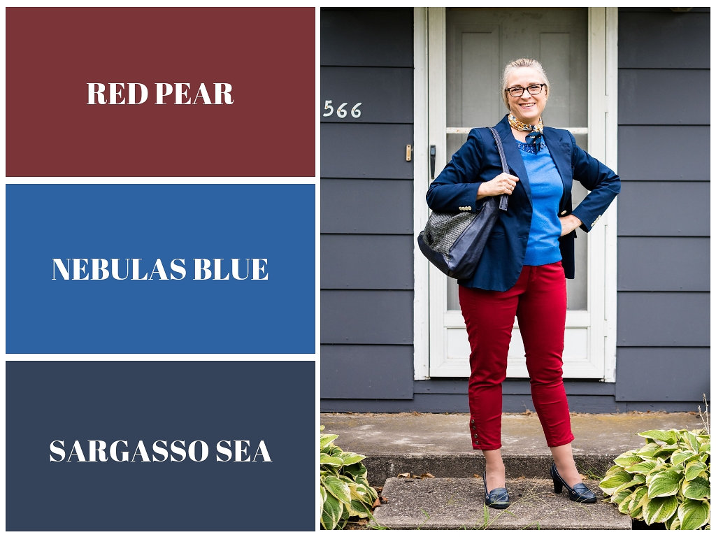
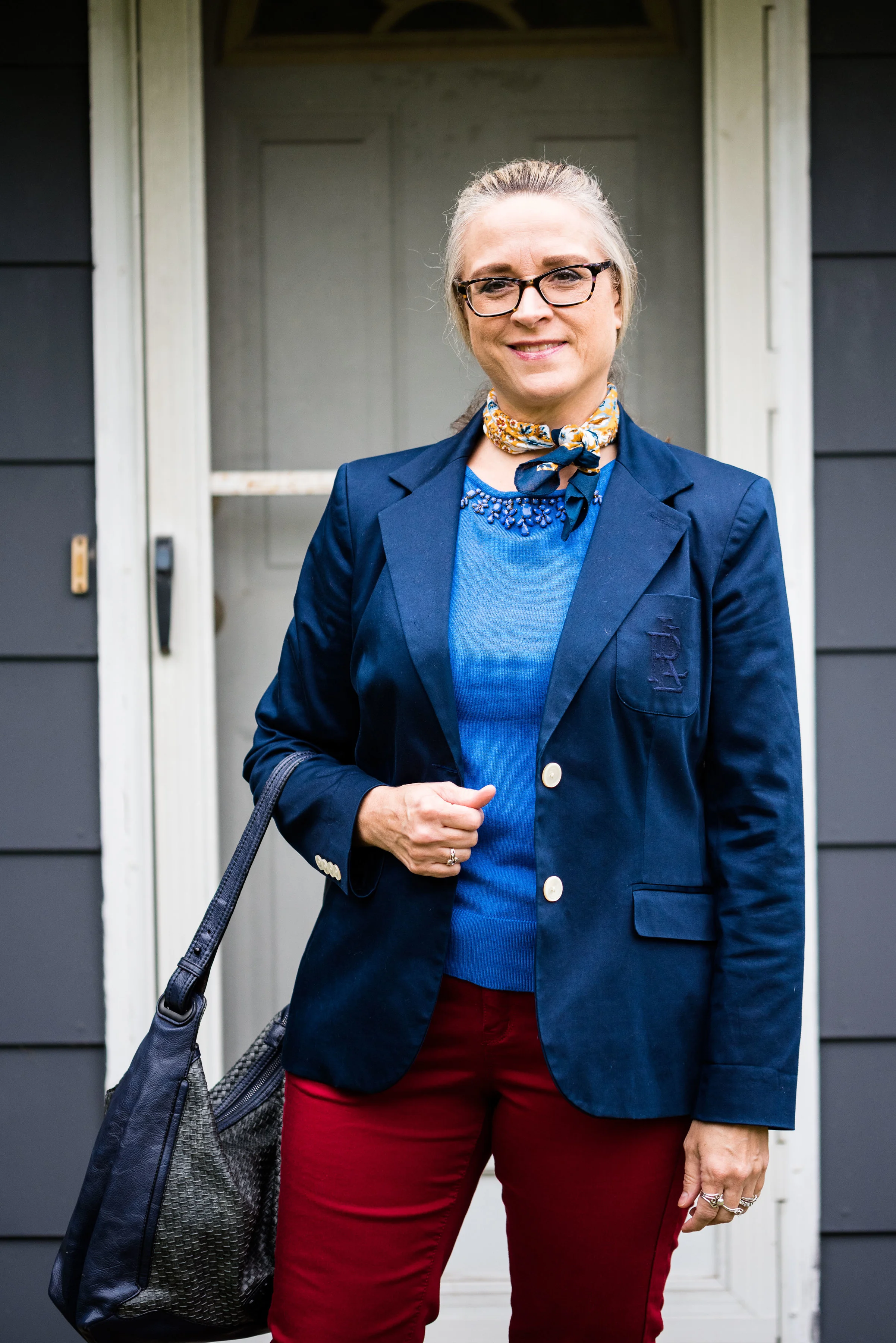
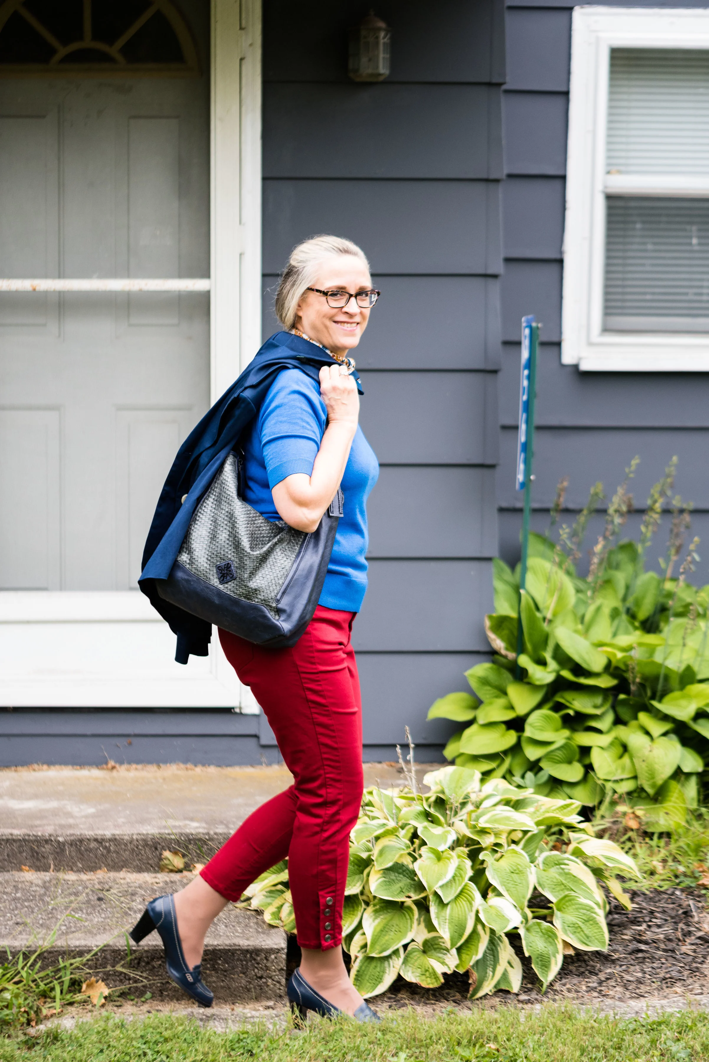
Red Pear and Nebulas Blue are on both the London and New York palettes. Sargasso Sea is one of the classic colors or what I like to refer to as a grounding color. Red Pear borders on a maroon and my pants are really too red, while my version of Nebulas Blue appears spot on. Sargasso Sea is navy by any other name, but even there you can see all the different shades of navy. My Ralph Lauren thrifted blazer is almost too blue, while Sargasso Sea seems to have more gray in it. I think my loafer heels and bag are a little bit closer to the Pantone color.

I added this colorful bandana for a scarf as a way to bring together the red and blue and add a pop of yellow.

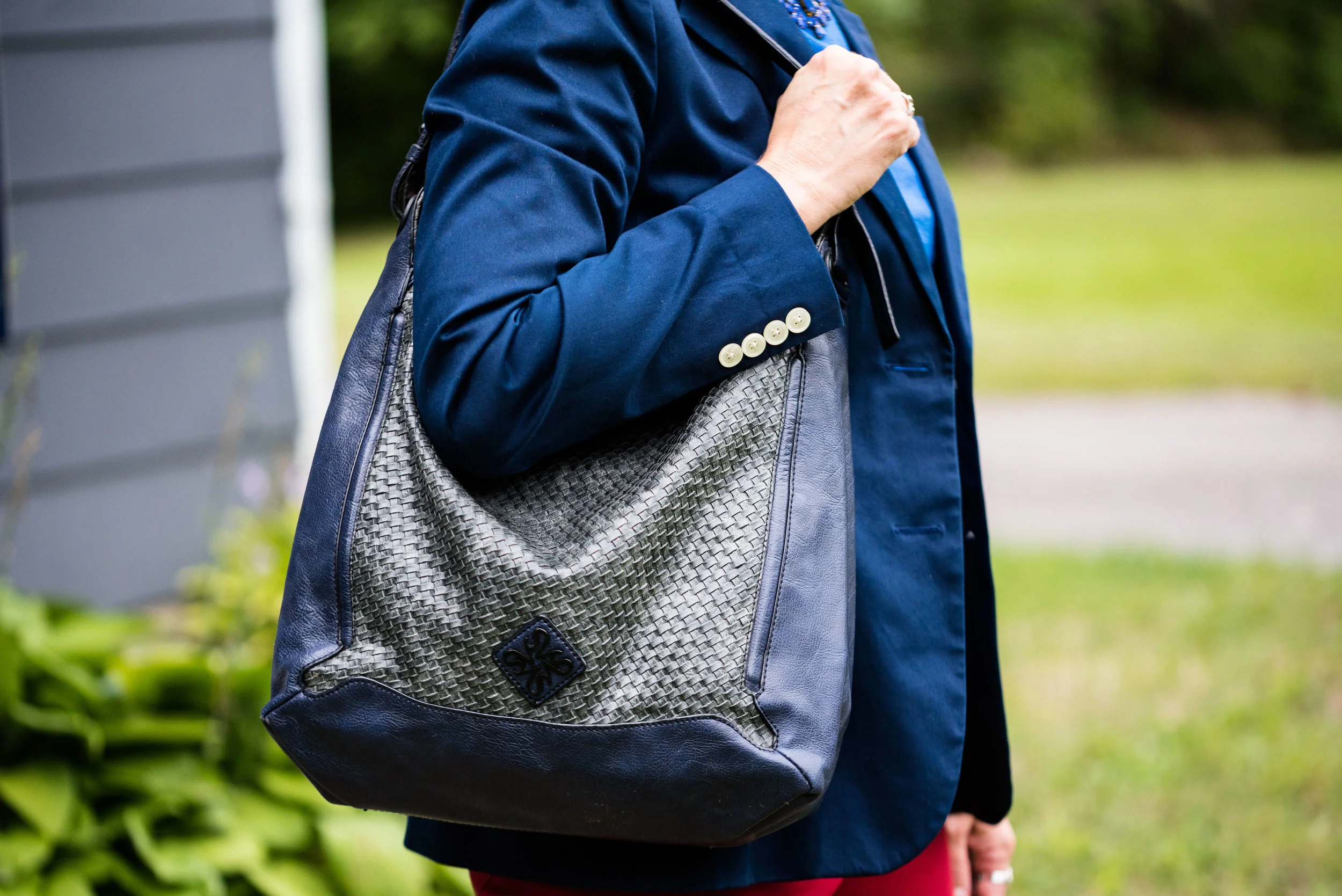
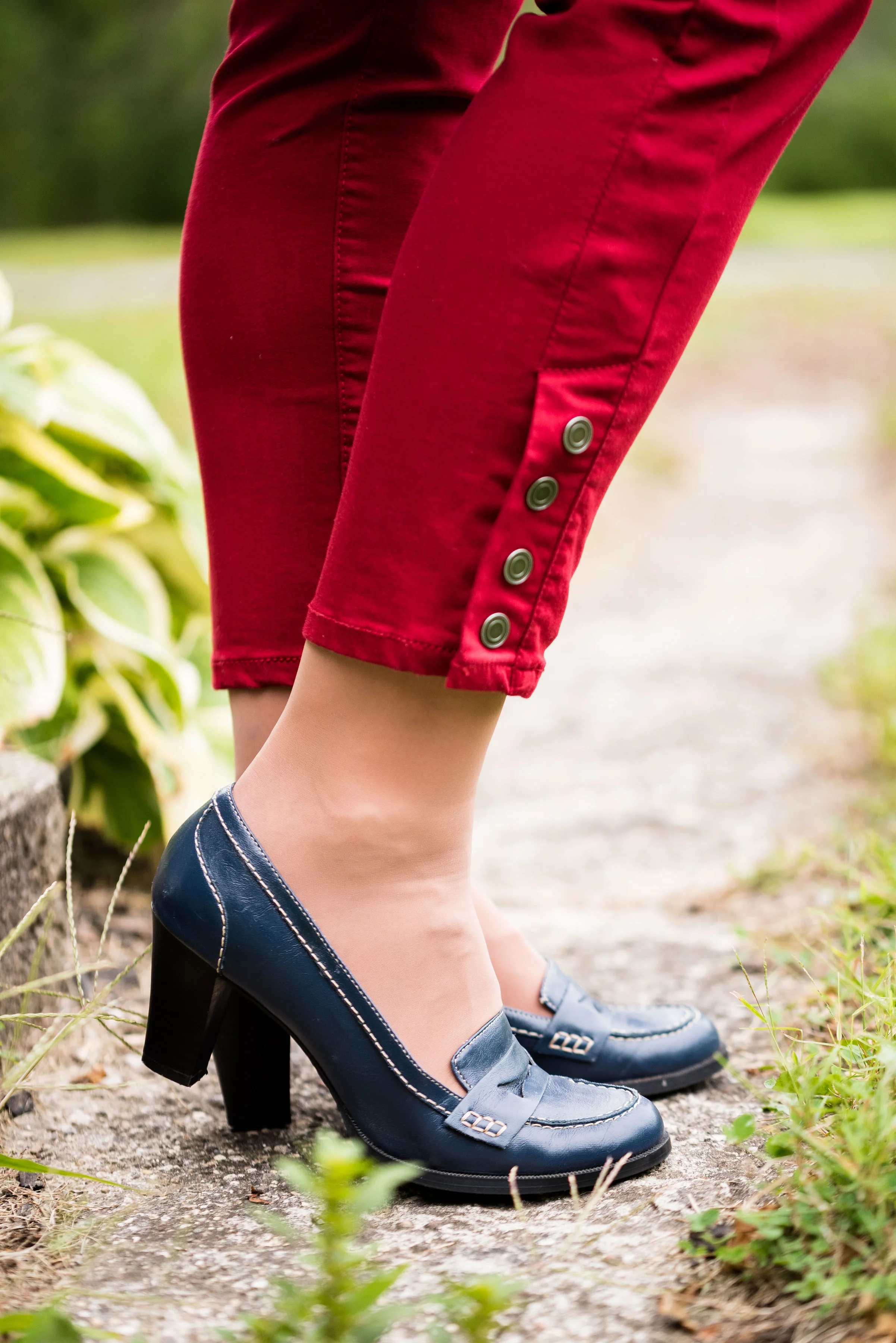
The blazer, shoes and bag were all thrifted. The bag is Simply Vera Wang; the blazer is Ralph Lauren and the loafer heels are Relativity. Everything you see in this outfit with the exception of the scarf I have styled on the blog before. It just goes to show that our closets are a great place to look for new color combinations and outfits.

What do you think of these colors? Do you think these colors represent the fall season? Why or why not? I’d love to hear your thoughts.

I have received a few messages that people are having problems commenting on my blog posts. If you an issue, please let me know. I contacted the help team for the platform that I use when I had a problem in the past and they said they couldn’t see any problem on their end. If you have an issue, please shoot me an email, so I can see how widespread the problem is.


I’ve included a few shopping links. These are affiliate links, which means I get a few cents if you click on it. All opinions are my own.

Texture Talk - Part 3

You might be thinking I covered everything I could when it came to texture and fashion in the last two posts I did on this quick texture series, however, there are two other areas I wanted to address. They both have to do with adding texture to outfits, but in completely different ways. The first deals with adding texture by using patterns. The second will look at taking a monochrome outfit and making it visually interesting by adding texture. 

Adding Texture by Using Patterns

We talk a lot about patterns on our clothing. Everything from stripes and flowers, to plaid and polka dots are part of the clothing we choose to wear. I personally love prints and since I have been blogging, I love to mix prints. When I started thinking about this series on texture, I suddenly realized that prints and patterns do add dimension and depth to our outfits, so therefore, must be a component of a series on texture.

The following pictures all are examples of patterns that add an interesting dimension to each outfit.

These first two are in black and white, because I thought that it makes the point even more dramatically. Not only does the pattern of my clothing add texture to the outfit, but you can see all the texture in the back ground from the trees and landscape. 

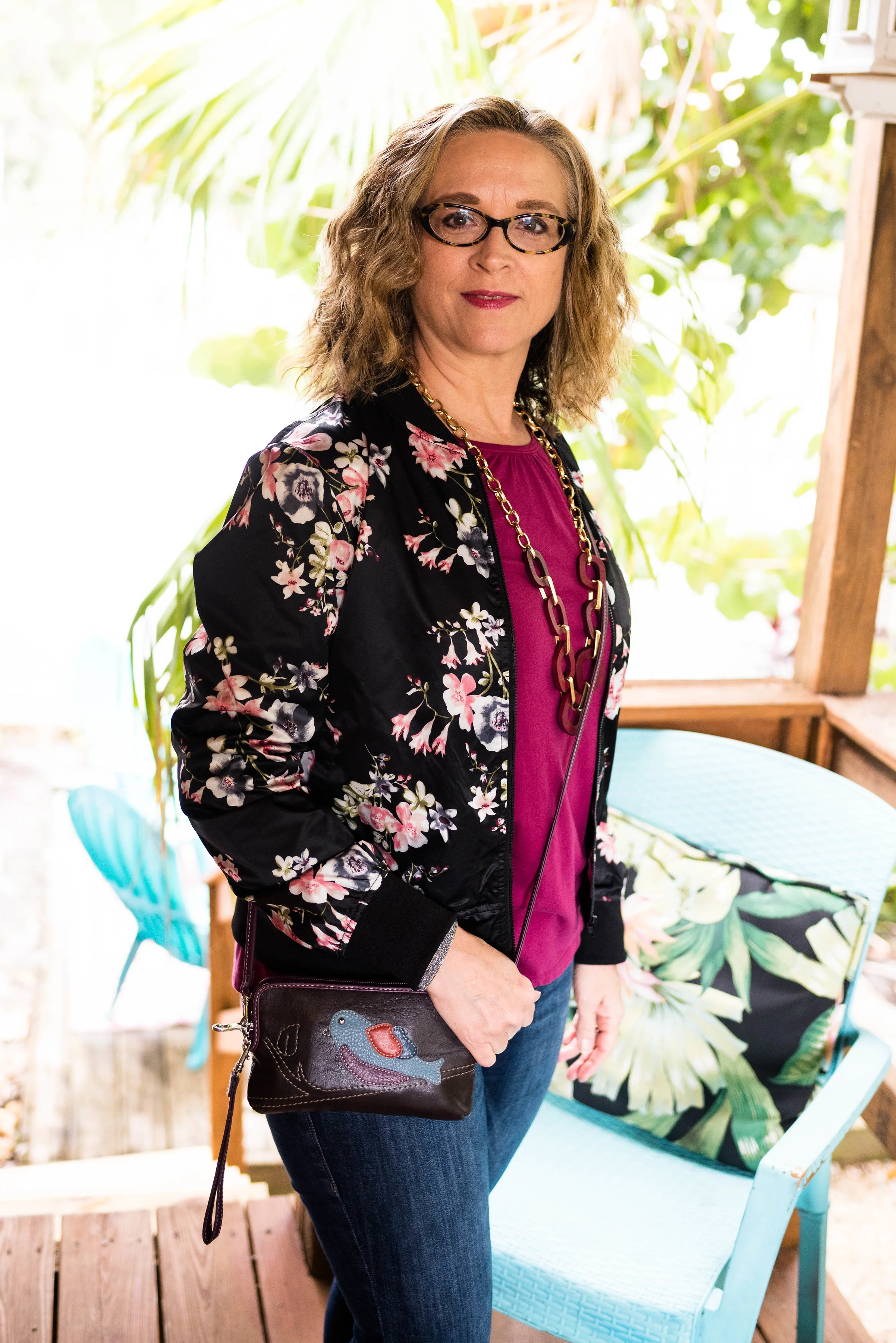
These next two are jackets. The first is a sleek bomber jacket, but it gives the illusion of texture by placing bold colored flowers on a black back ground. 

In my opinion patterns like houndstooth. herringbone, sharkskin and others are the perfect textural patterns. We see these a lot in suits for men and women. I found this houndstooth jacket at a nearby thrift store 

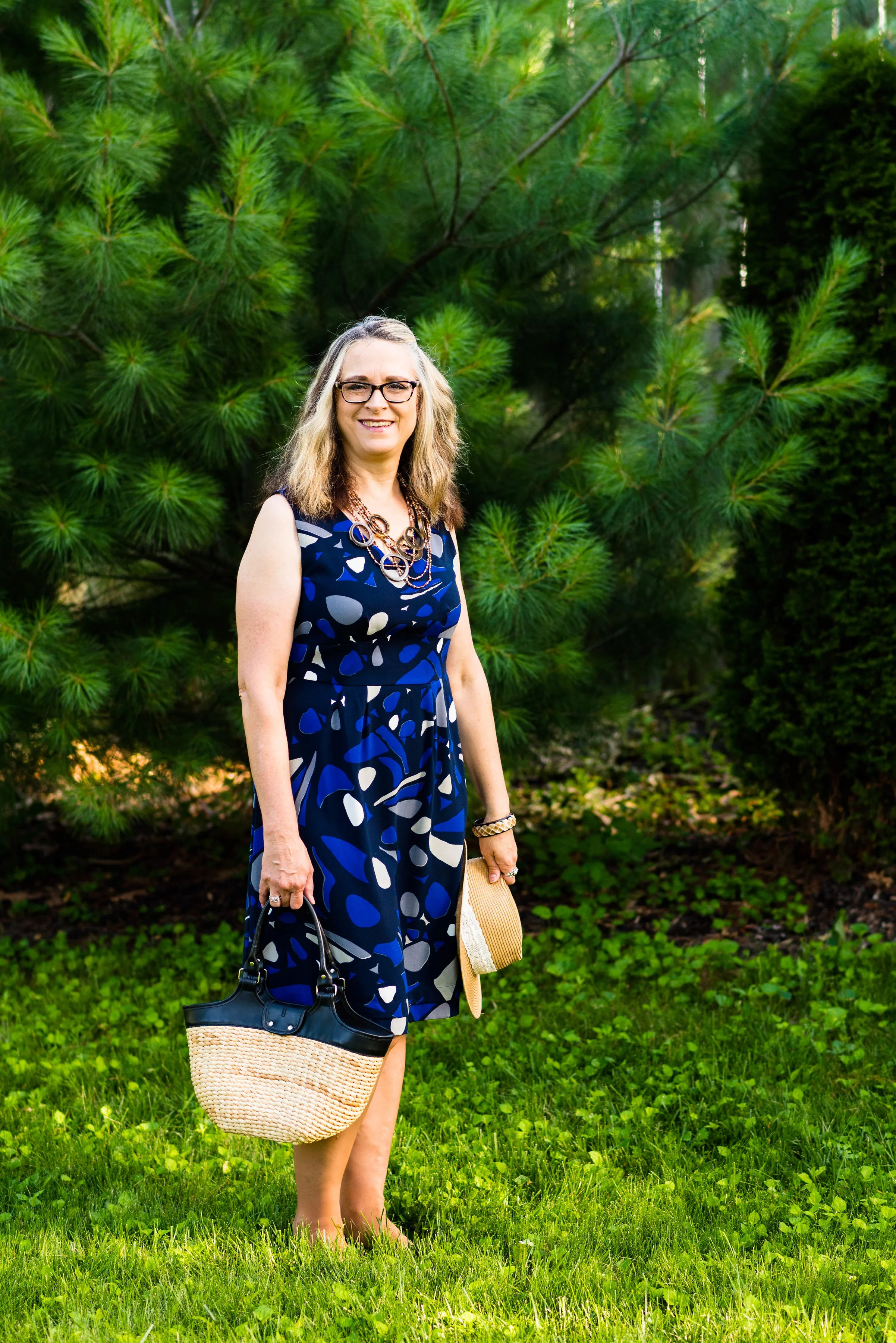
An all over pattern gives the illusion of texture while hiding some of my more prominent bulges. 

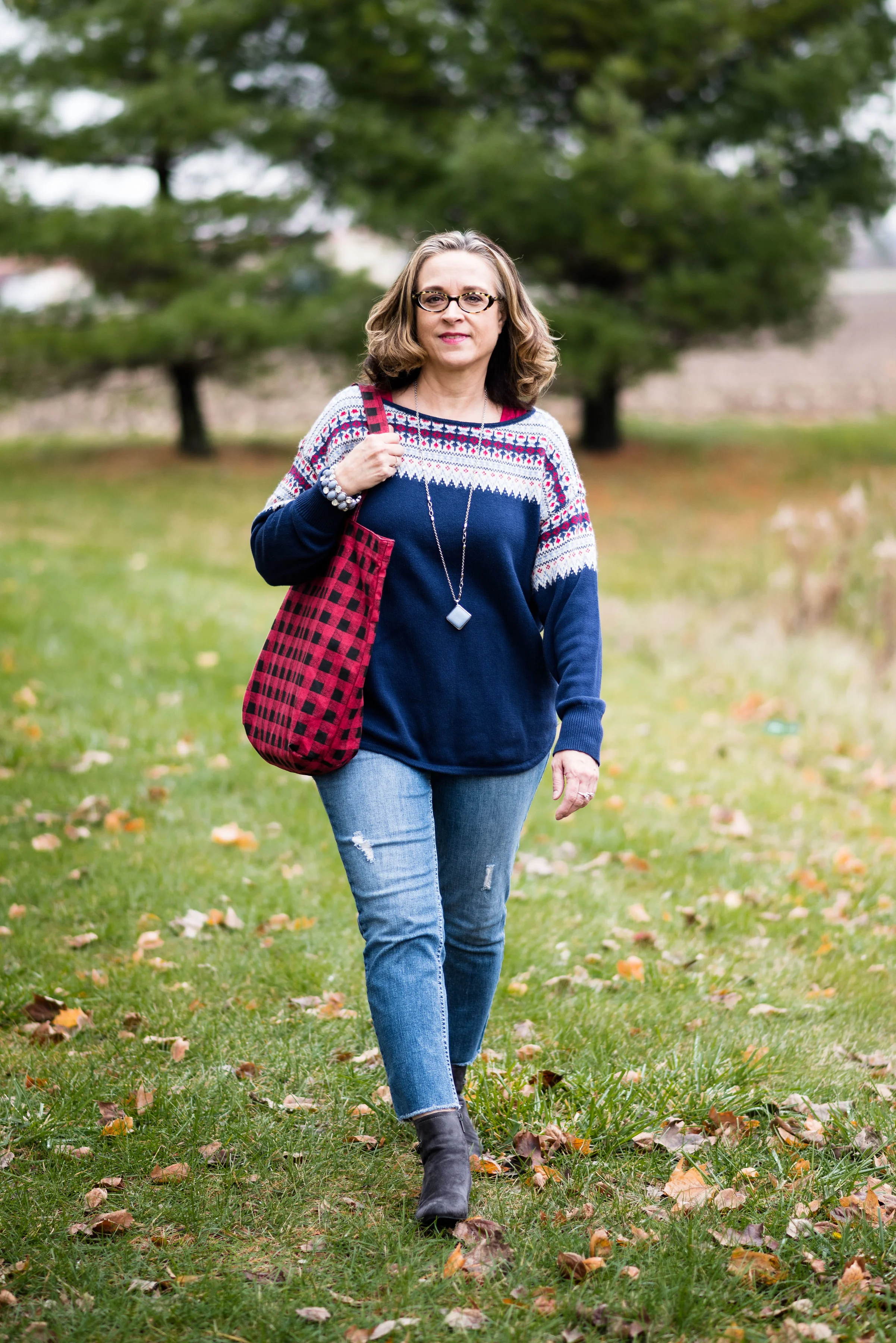
The sweater by itself provides texture, but the pattern across the top and shoulder area, as well as the buffalo plaid bag add interest and depth. 

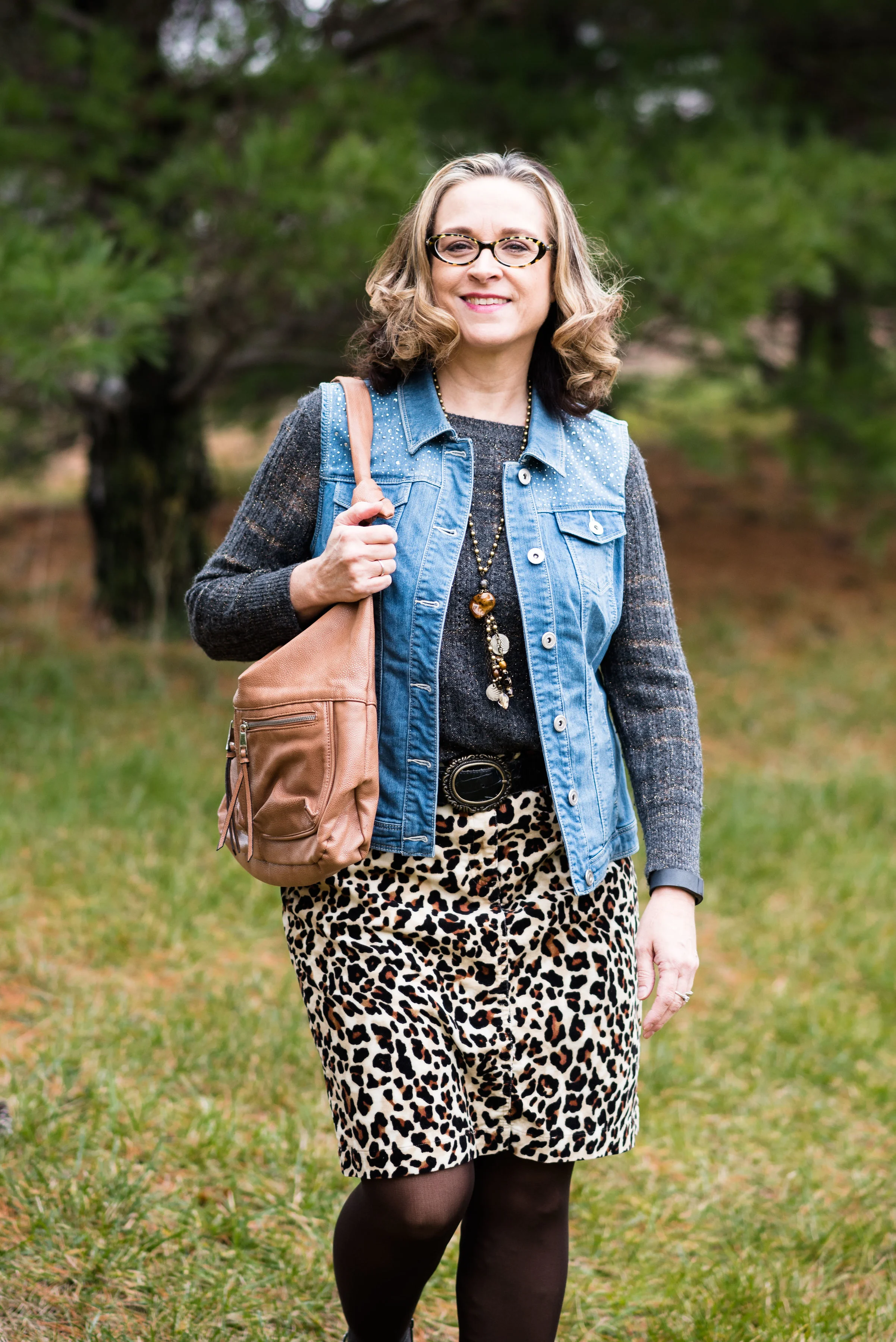
This outfit has many textural components, but they all play so well together, what's not to love? The sweater has ribbing, the vest is embellished at the top, the belt, jewelry and bag provide other interesting elements and the patterned skirt is also made of corduroy, thus more texture. This type of outfit, with all of it's textures still looks chic and classy, but is warm and comfortable. 

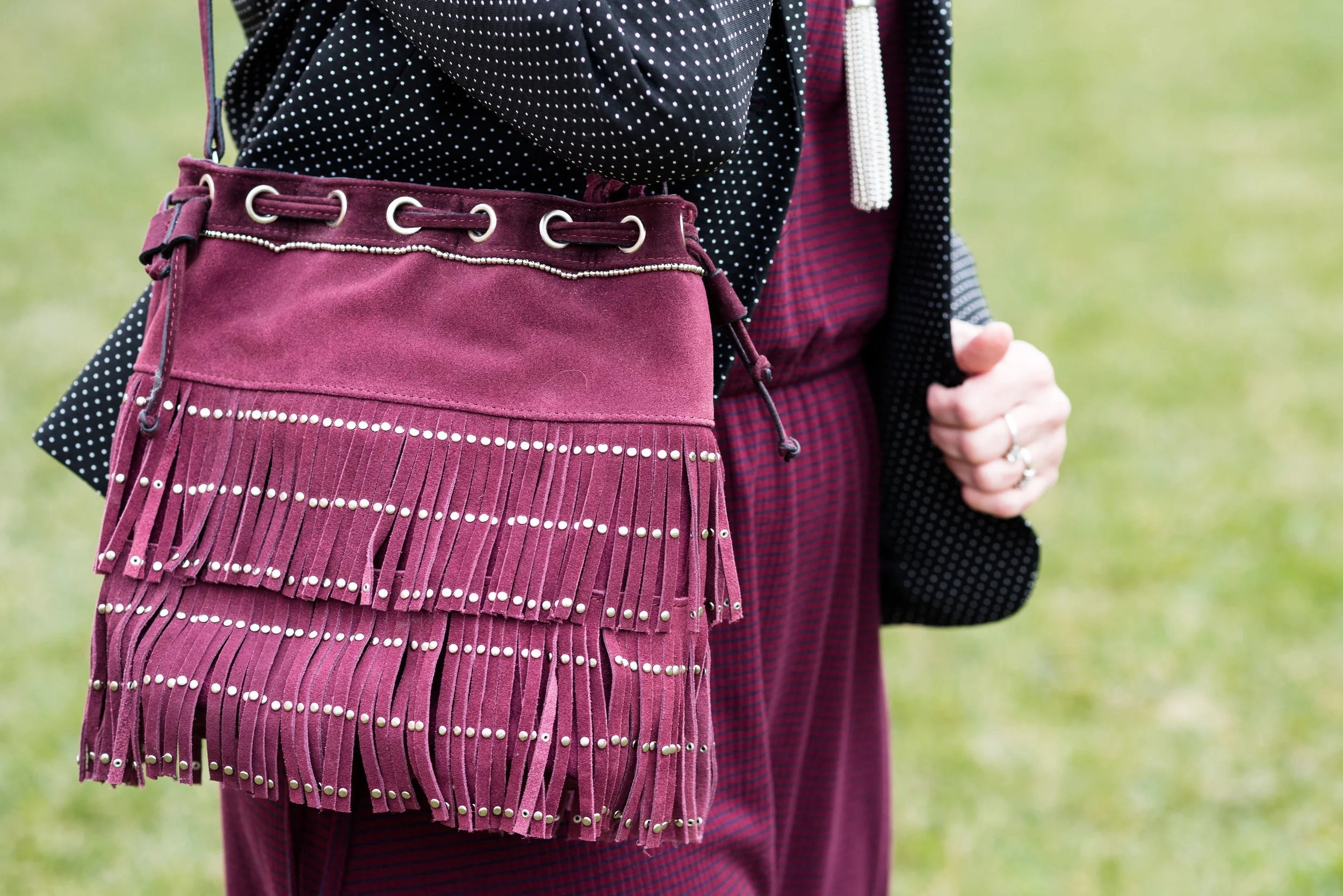
The same goes for this outfit as well. The striped dress is knit, the jacket has polka dots and the bag is not only made of suede, but has fringe. Texture upon texture, upon texture. Going back to my initial post about texture, I showed some photos of textural elements in nature. If you go for a walk in a park or even in the city, you will see layer, upon layer, upon layer of texture. It is perfectly okay to wear lots of texture in your outfits, as long as you think about how you are putting things together. You can see my original post here

Adding Texture to a Monochrome Outfit

This first outfit from my Spring 2017 Pantone series featuring a color called Pale Dogwood. This pale pink is a great backdrop for adding pattern and texture. Other than the laces on my shoes, the knit fabric of the sweater and the necklace it is the addition of the bold pattern on the scarf that gives the outfit a texturized look. If you wanted to go for a complete monochrome look you could have added a fuzzy pink boa or a wide pink belt with some sort of texture. 

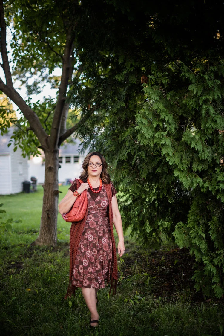
Even though this outfit has a patterned dress the look is still monochromatic because the entire look is basically a conglomeration of earthy browns. The pattern and the open weave knit are the texture winners in this look.

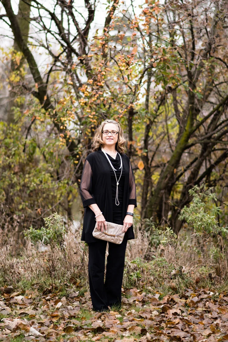
Just to give you an idea of what an actual monochrome outfit looks like, I threw these next two in from last years holiday outfit series. The black top adds texture with its draping neckline. The over piece adds texture with shear sleeves. Isn't it funny that something sheer can actually add texture, but think about things like neglige and wedding dresses.

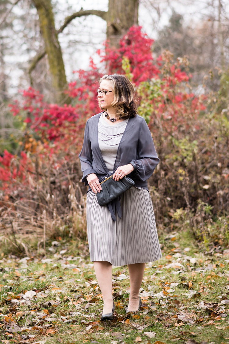
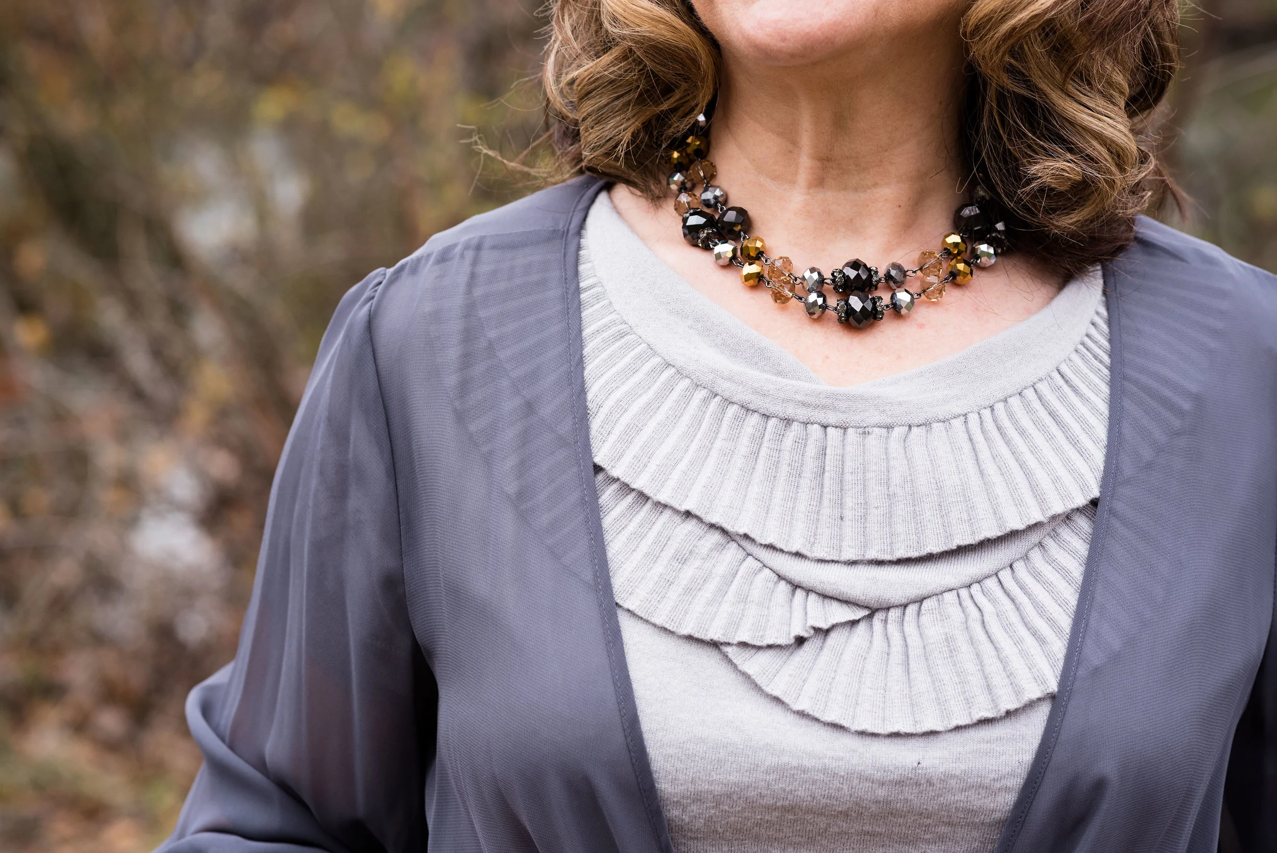
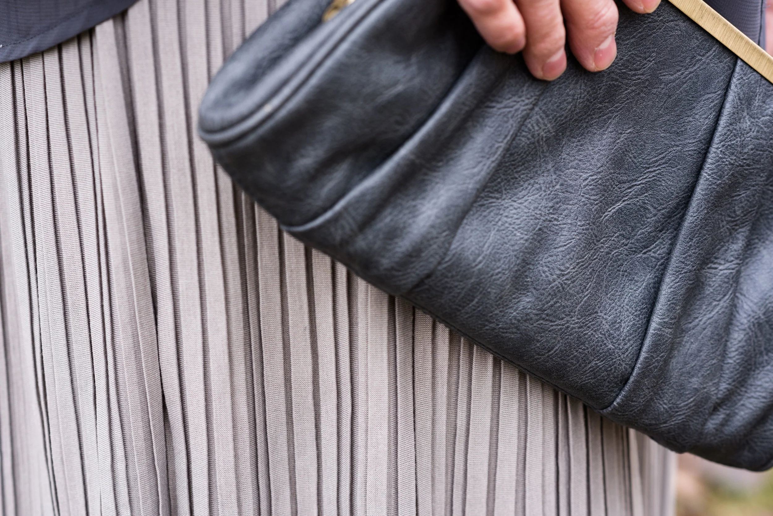
This gray outfit is, perhaps, one of my favorites for a monochromatic look with loads of texture. The sheer drape, the pleated neckline of the sweater, the pleats on the skirt as well as my heels which have almost an alligator pattern on them are all textural components in this outfit.

Now that you have seen a few examples I hope you will give more thought as to how to add more texture to your outfits. With the onset of fall it will be much easier to add texture through fun pieces like scarves, hats and boots. 

Let me know if you liked this series on texture. If there are other fashion ideas you are interested in having me do a series on, let me know and I'll give it some thought. 

Have a great weekend, everyone!

Photo credit Rebecca Trumbull. Make up Rachel Christensen.

What to Wear to a Family Photo Shoot

Today I am a guest writer for Rebecca Trumbull Photography. If you are thinking about having family photos done, you will want to read my blog post on Rebecca's website. Family photos are a wonderful investment and a way to capture a moment in time. 

I can remember at every family gathering, my Dad getting out the camera and often the movie camera as well. It has been twelve years since he passed away, but we still have loads of pictures to remind us of the fun gatherings we had with immediate and extended family. The pictures were often under exposed, over exposed, blurry and full of people with missing heads, arms and feet. That's why I would encourage you to get family photos done by a professional photographer. 

As I point out in the post on Rebecca's blog, getting ready for family photos can often be a challenge, especially if you've never done it before. Figuring out what to wear when you have a family with age ranges from teens to toddlers provides an added challenge. That is exactly why we collaborated on this post. Rebecca and I want you make it easier for you to have family portraits that will provide beauty, and cohesiveness, but also provide images that are uniquely your family. 

Be sure to click on the image below and read the article. Leave some love on Rebecca's blog and let us know your thoughts. 

Rebecca Trumbull is a professional photographer based out of Northwest Ohio. Rebecca is easy to work with and for those of you uncomfortable in front of the camera like I am, she is great at giving directions and making your portrait session fun and painless. In addition to being the main photographer for Stylin' Granny Mama, and taking fabulous family portraits, Rebecca also shoots high school seniors, pets, maternity, weddings and commercial photos. To see more of her work or contact her about scheduling photos just click the link. 

Texture Talk - Part 2 - Embellishments and Fabrics

Last week I took a look at how adding texture to our outfits can change and elevate our same old, same old looks, to a new level. Texture is all around us in nature and in the homes we live in. Take a look at your living room or bedroom. There is texture on the couch in the form of upholstery, pillows, and throw blankets. Your bed probably has a thick cushy comforter or mattress pad that adds comfort for a better night's sleep. We fill our homes with pictures, decorations and nick nacks to add depth and interest to the environment we live in. Why would we not do the same thing to our outfits?

Last week I looked specifically at adding texture in the form of our accessories, such as bags, shoes, jewelry and scarves. You can see that post here. This week I want to look at fabrics and embellishments and what choices there are to add texture in this regard. 

Embellishments:

This would include anything added to a clothing piece that gives it texture that is not specifically fabric related. Fabrics like lace could be an embellishment, but I am going to leave that for the fabrics section. 

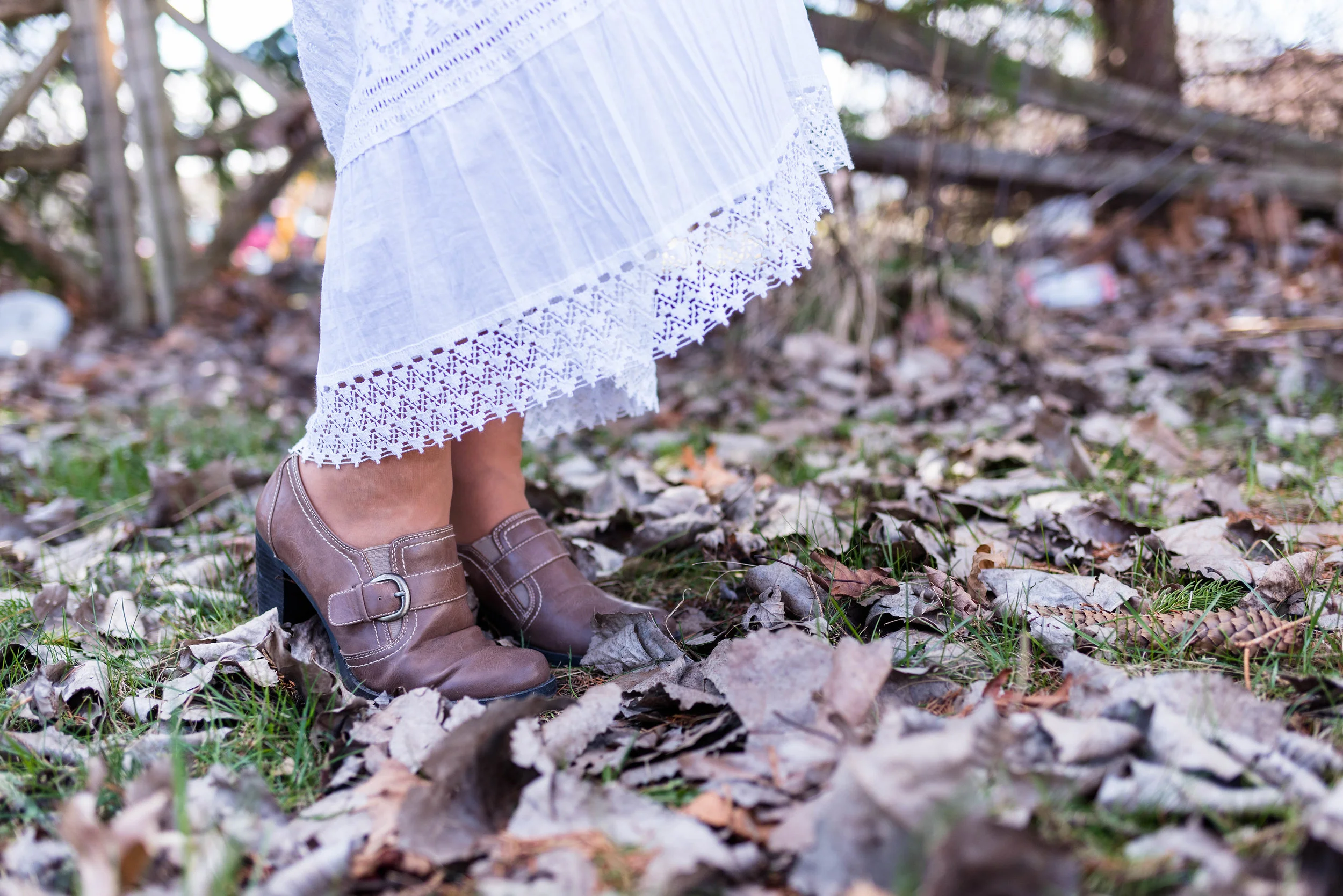
Things like beads, jewels, sequins, fringe and special buttons, are all embellishments. Certain types of stitching, like the embroidery above, as well as things like gathering or ruching also add texture to an outfit. 

Fabrics:

Lace

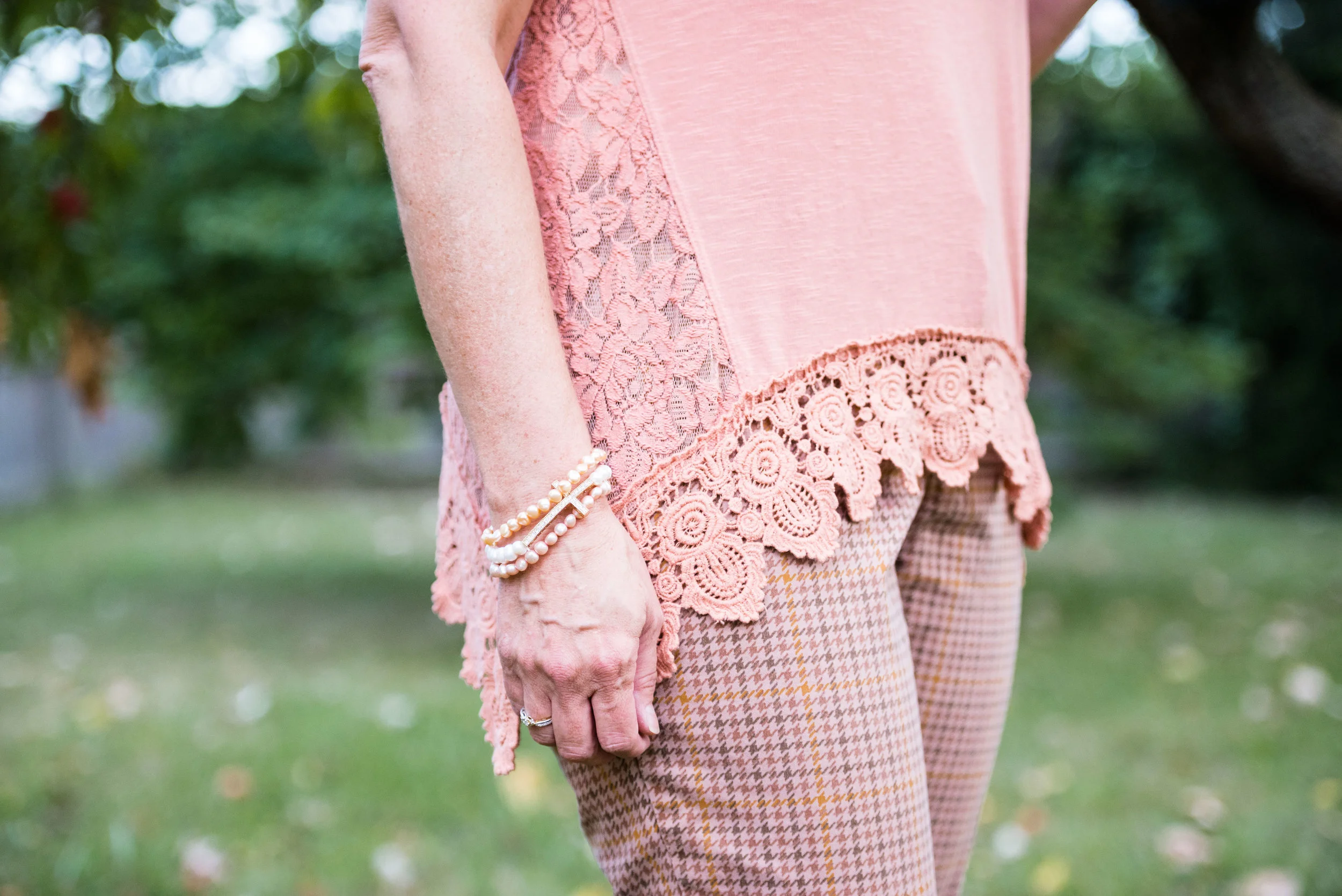
I love lace and I think it can add an element of elegance to any outfit. It obviously adds beautiful texture when it is worn. Combining lace with leather or lace with some other embellishment makes for an even more interesting outfit. 

Knits

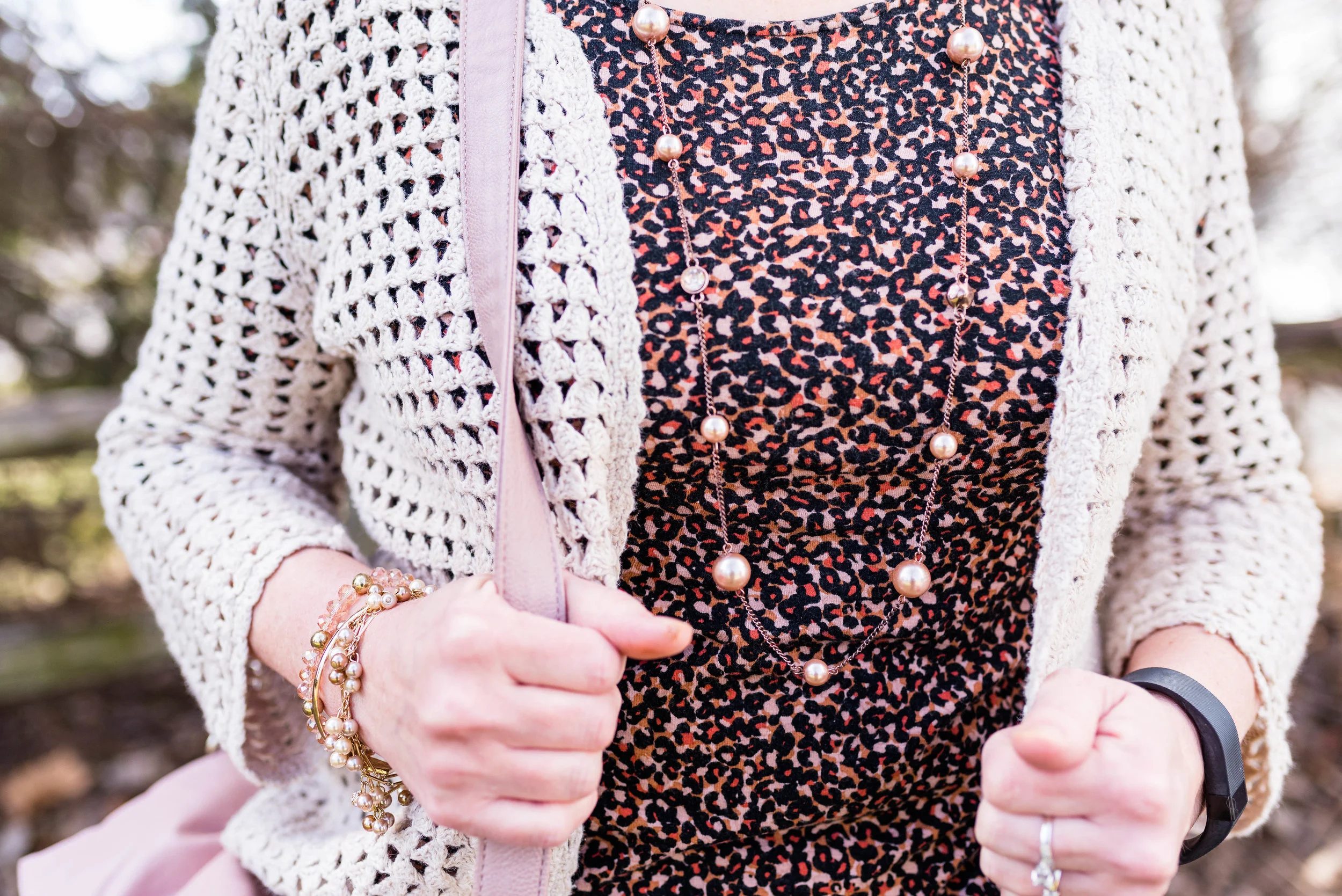
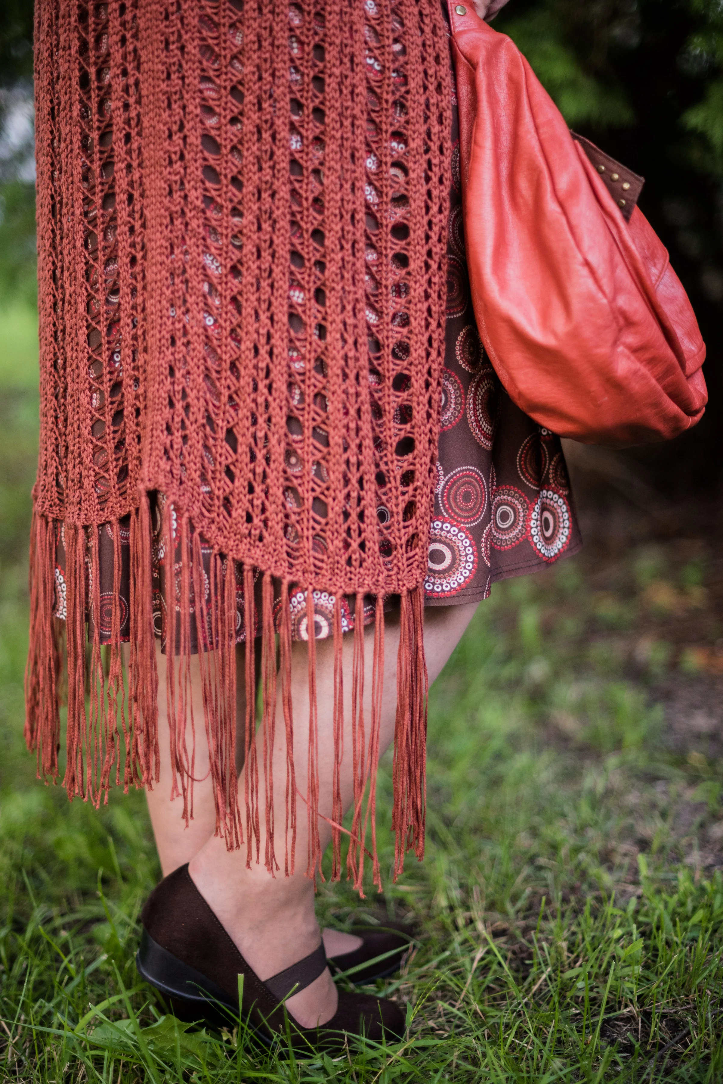
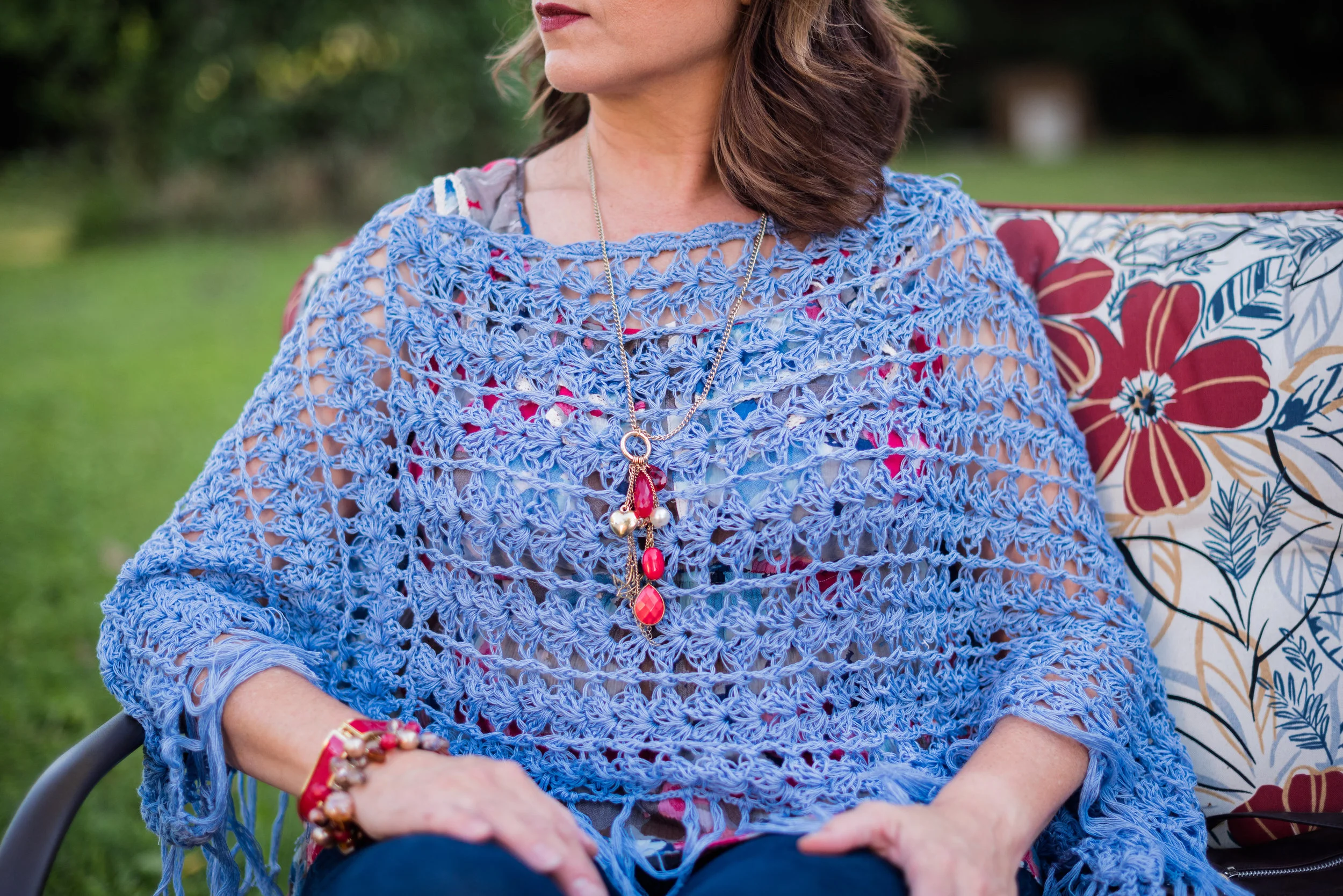
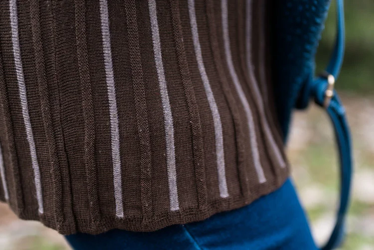
My pictures all revolve around open weave knits. Things like crochet or knitted pieces are great for boosting the texture factor. However, even regular knits made in a factory add dimension to a look, especially if they are ribbed or manufactured in a way that builds texture. You'll see an example of ribbed knits a little further below. 

Fabrics made with special textures:

Pleats

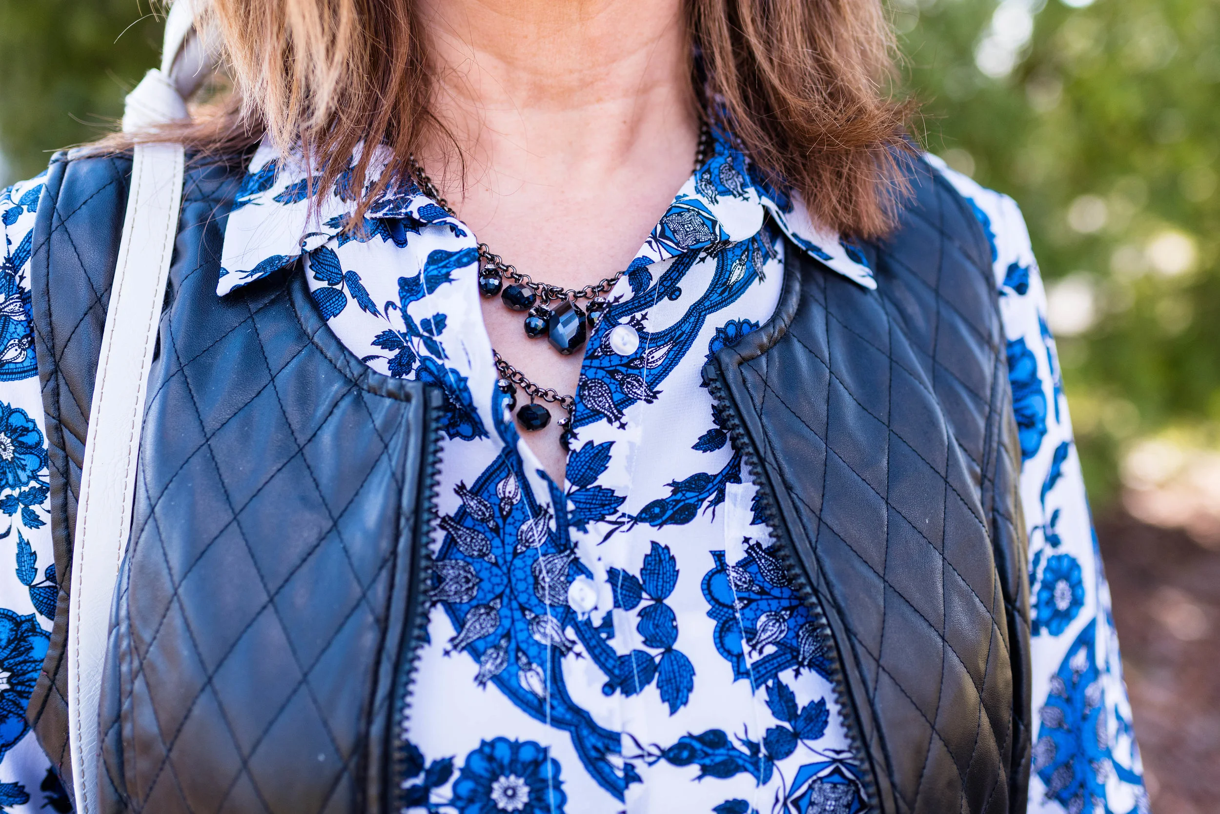
Quilting

Ribbing

Texture is a wonderful thing to add to our outfits. As you begin thinking about fall in particular you will be naturally reaching for things like cozy knit sweaters and fun boots. Coats and jackets will also add an element of texture to your outfit. 

I am going to stretch this into one more post, because I think there is one more area of texture we need to discuss. Look for another post next Thursday. Until then, have a great weekend!

Photo credit Rebecca Trumbull. Make up Rachel Christensen.