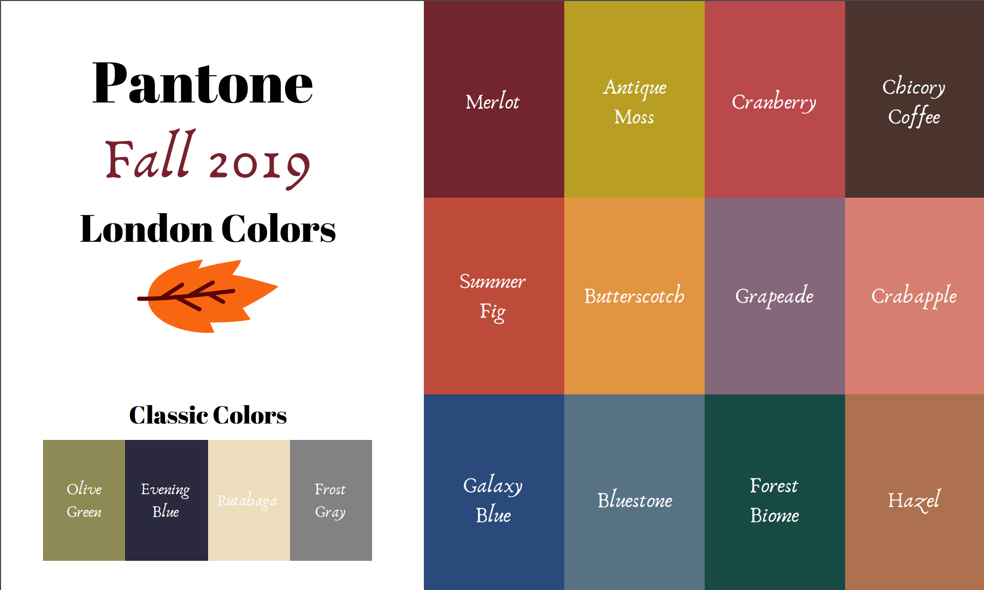
Pantone - Autumn/Winter - 2019 - London Palette Recap
It’s time for a recap of the all the Pantone - Autumn/Winter -2019 - London Palette colors. There were things about these colors that I liked better than the New York Palette, but each of them had colors that I felt comfortable wearing. I’ll explain my favorite from this series after a review of the outfits.
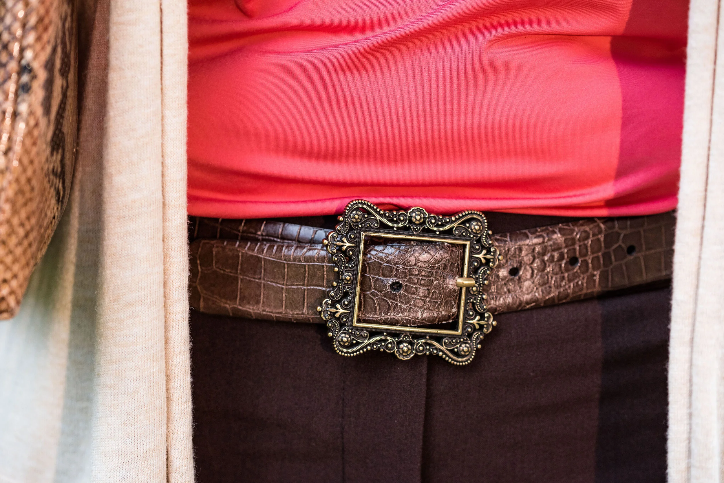
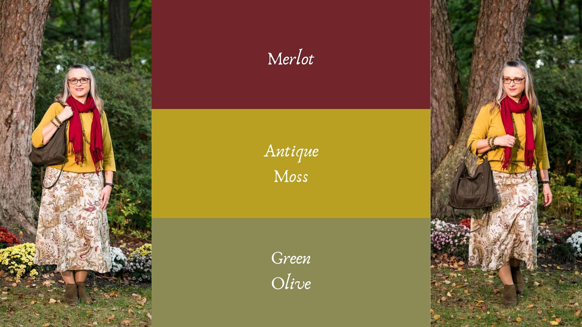
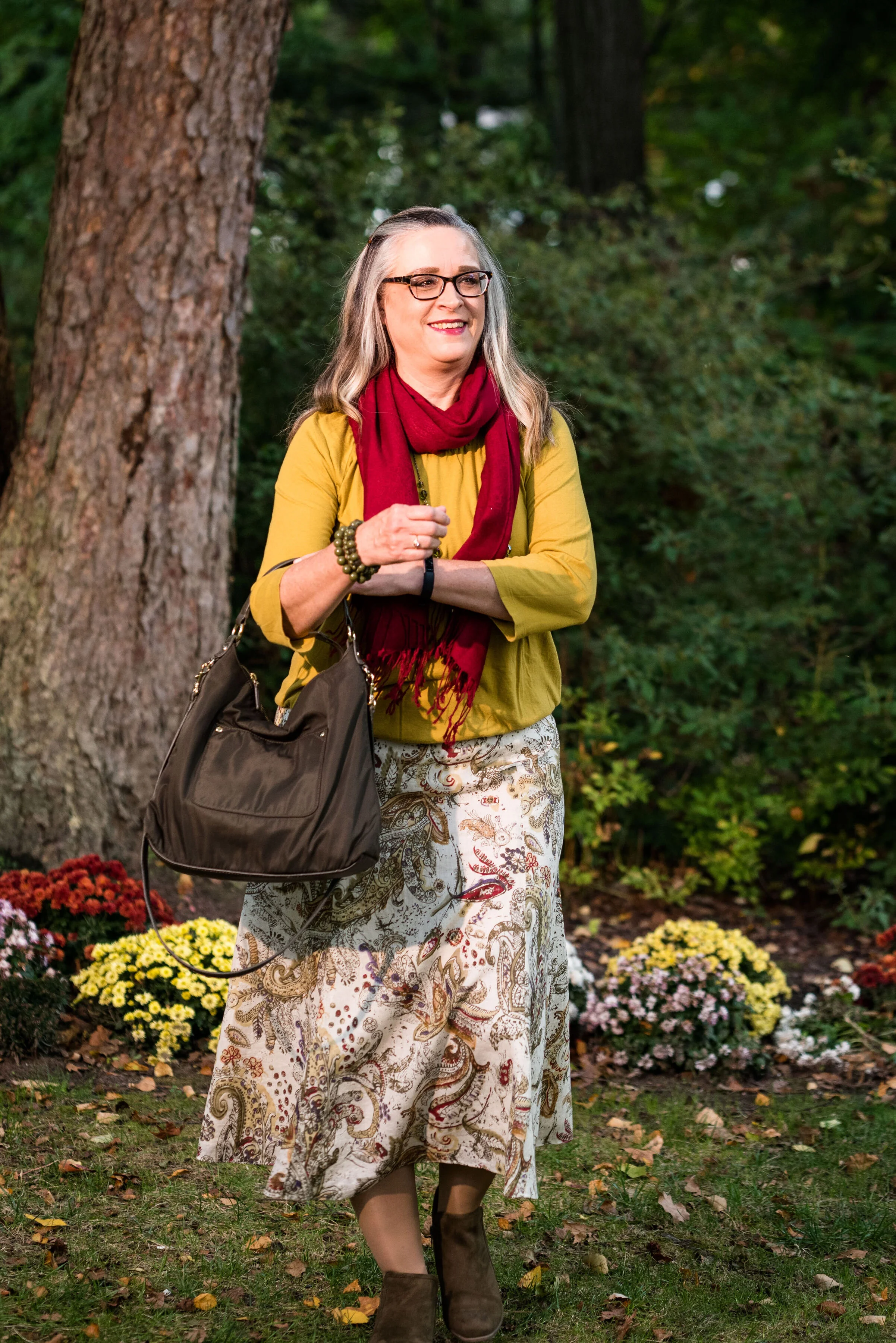
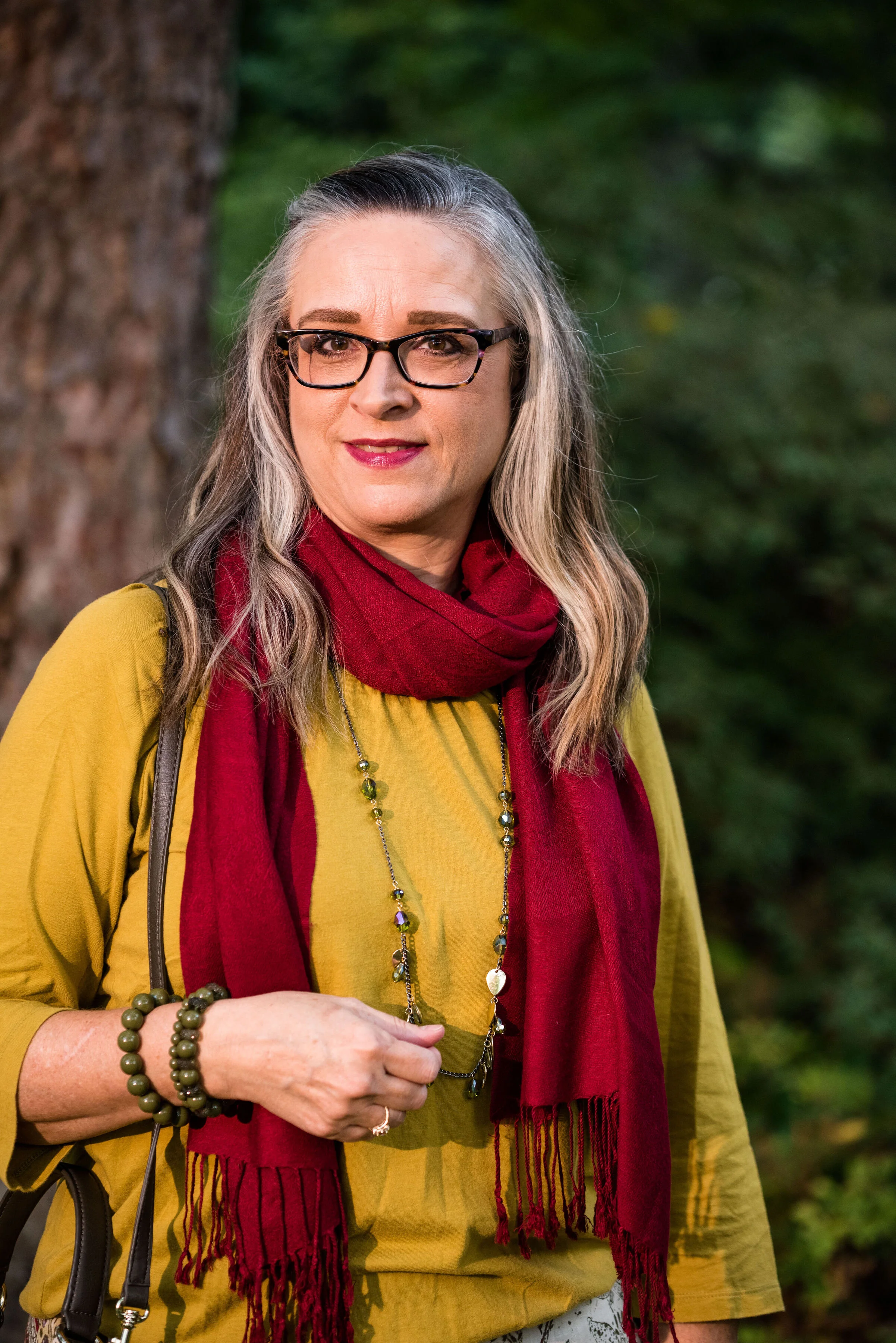
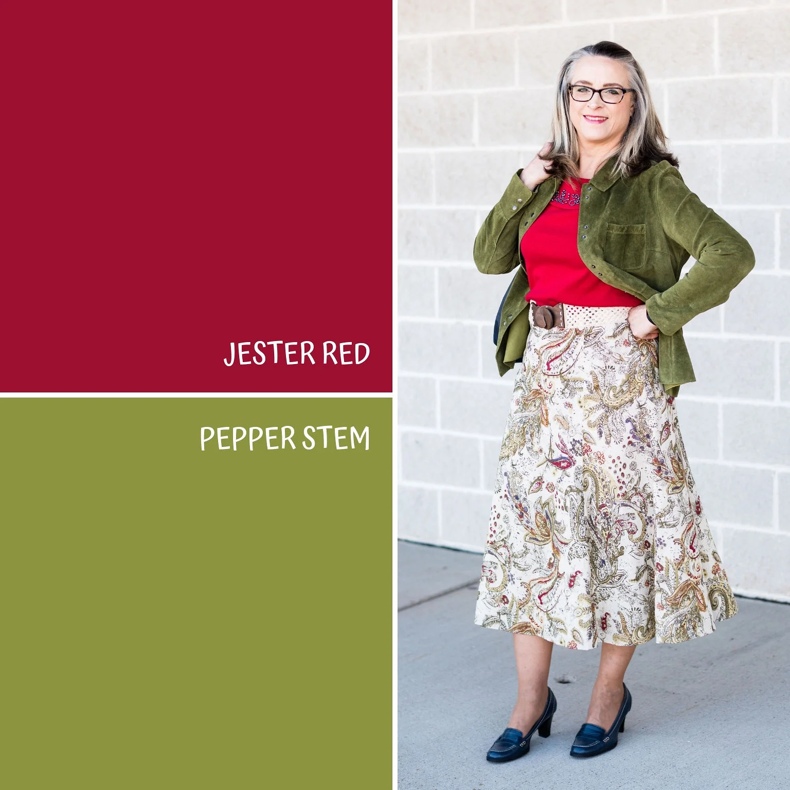
Outfit 1 - Merlot and Antique Moss

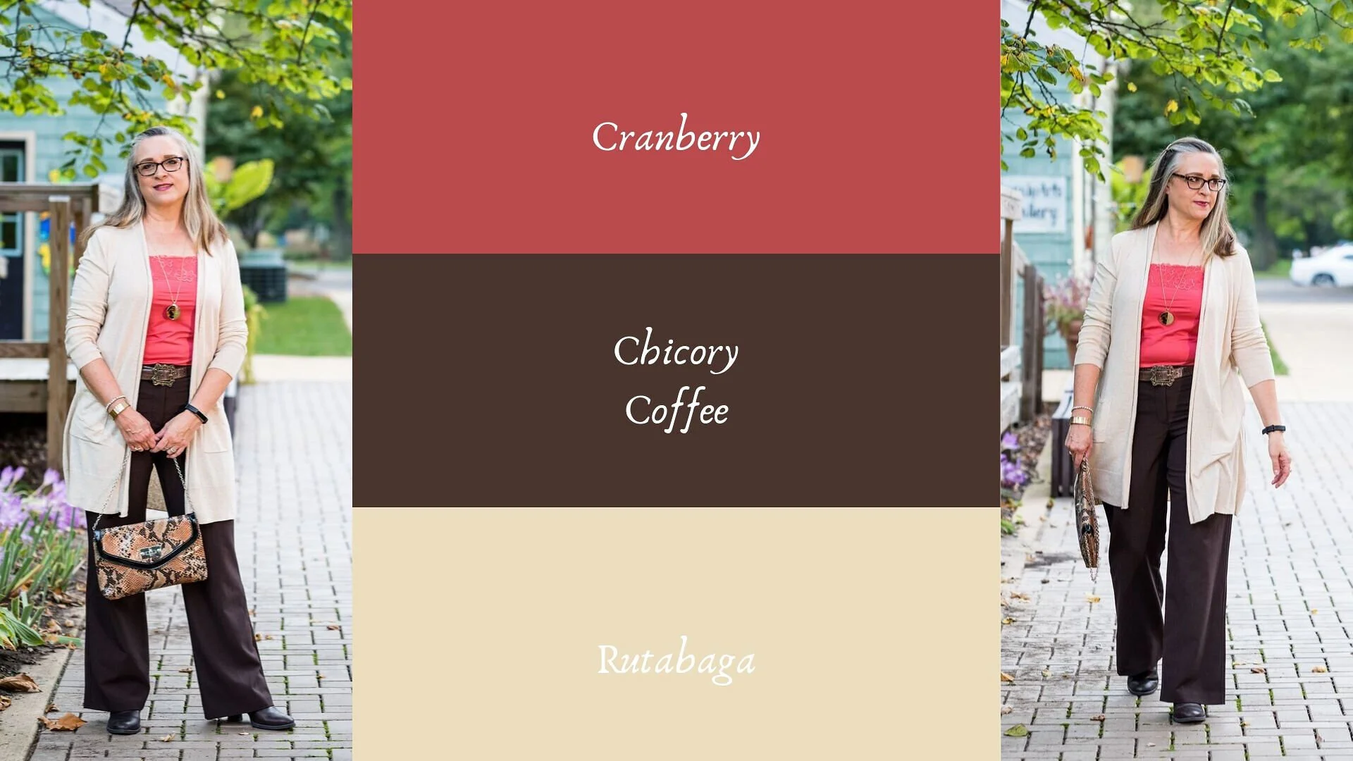
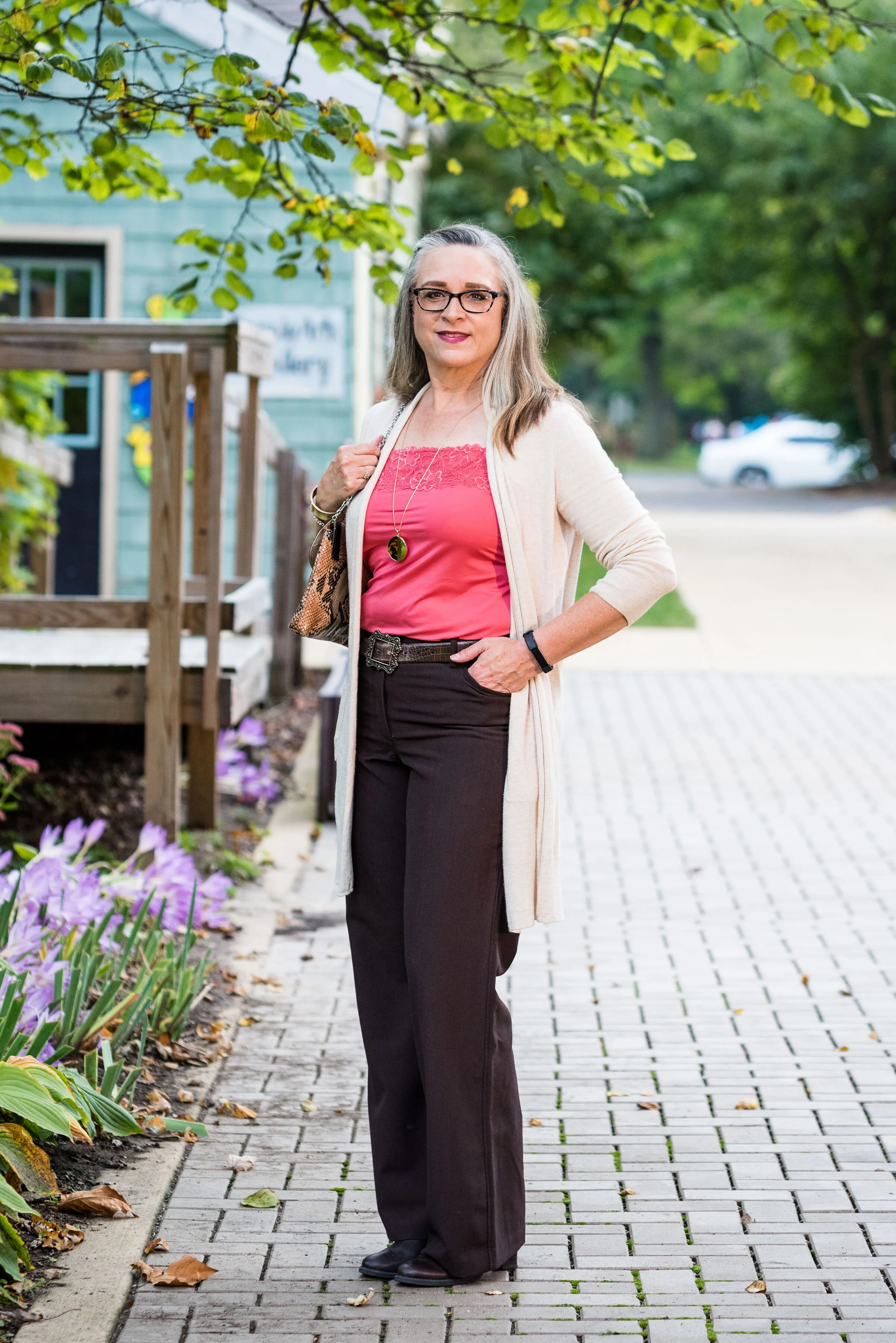
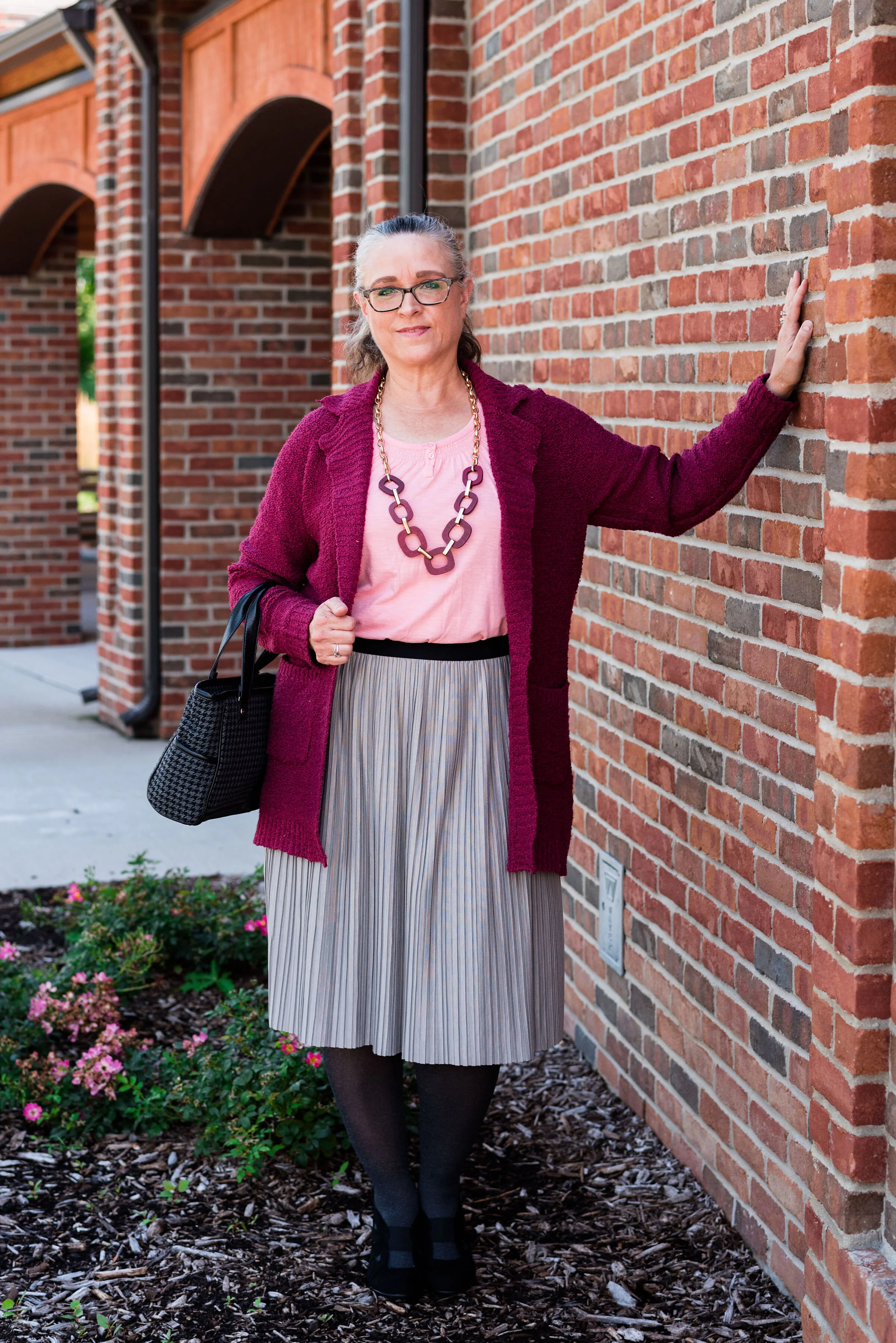
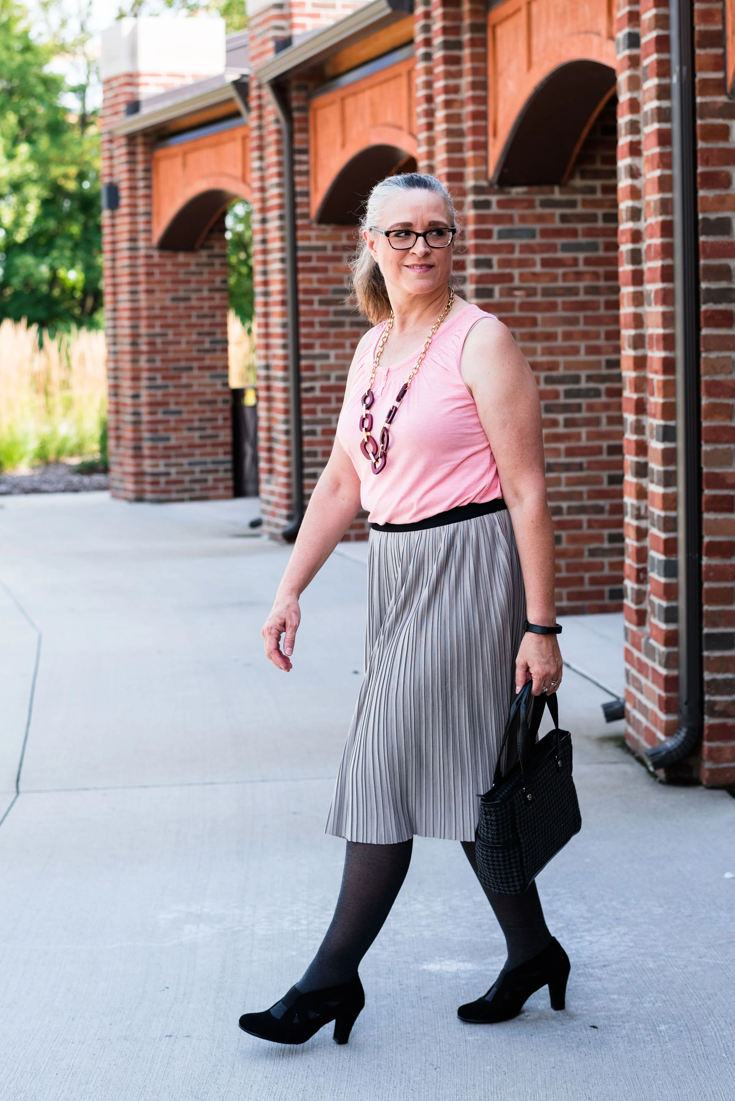
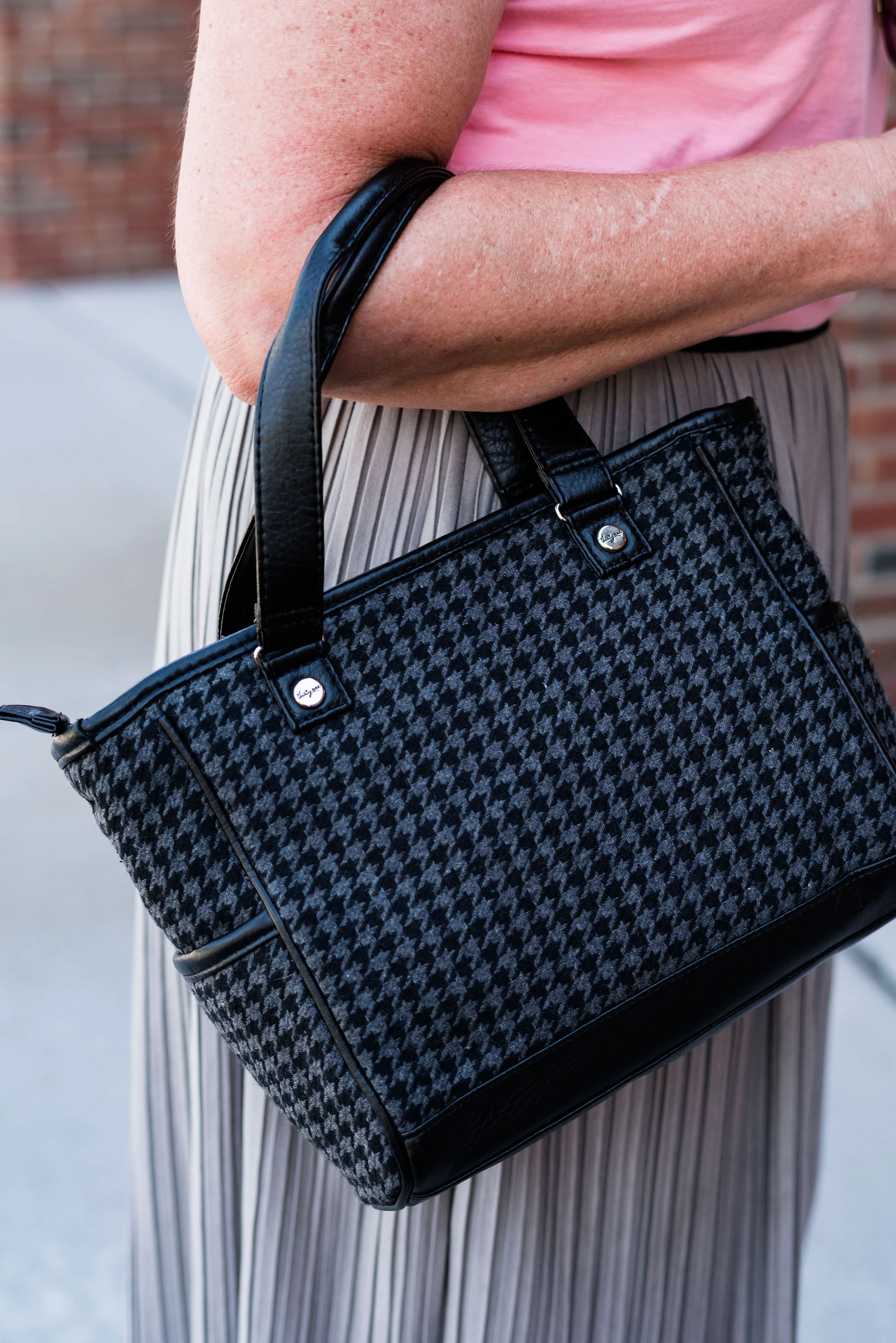
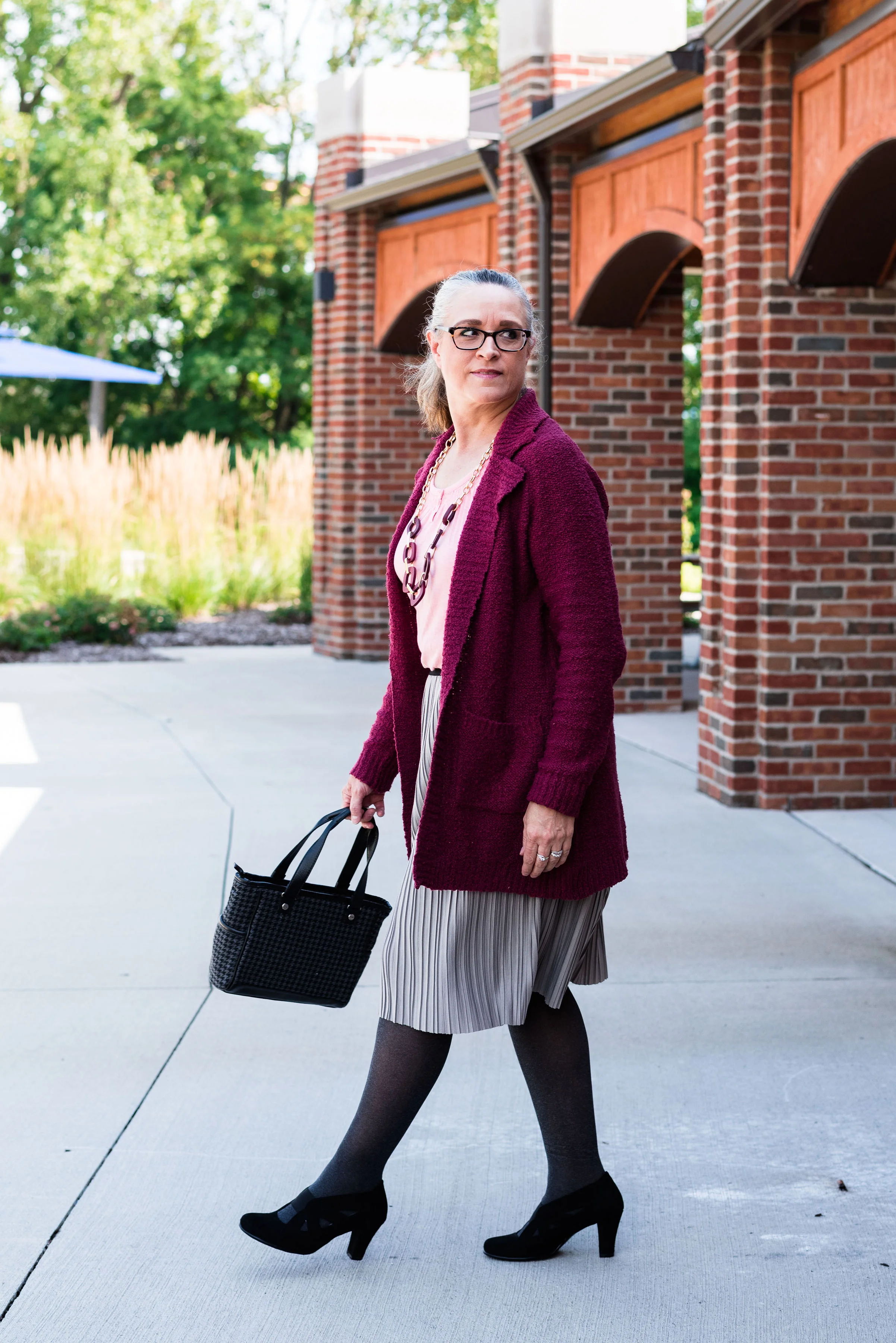
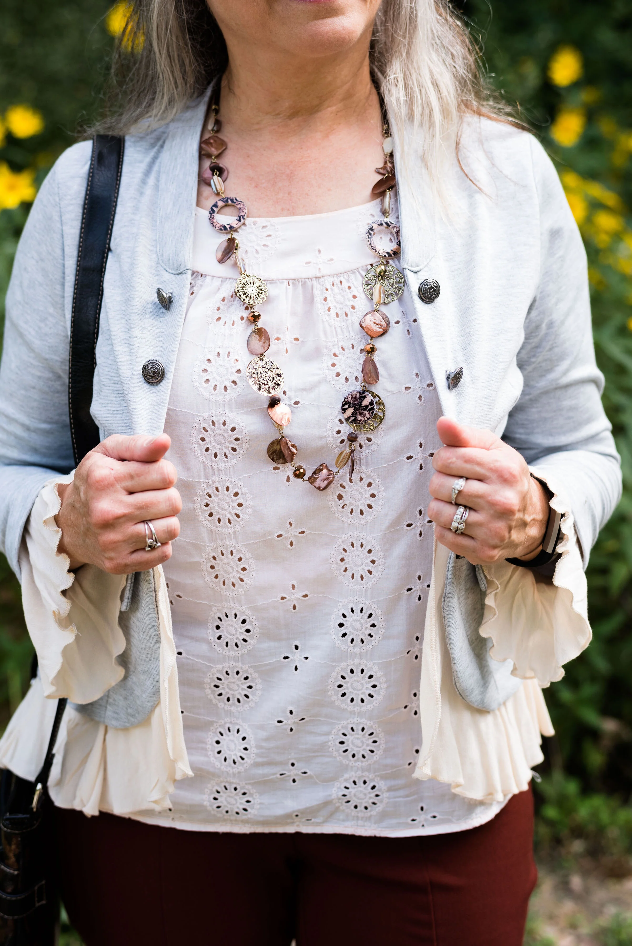
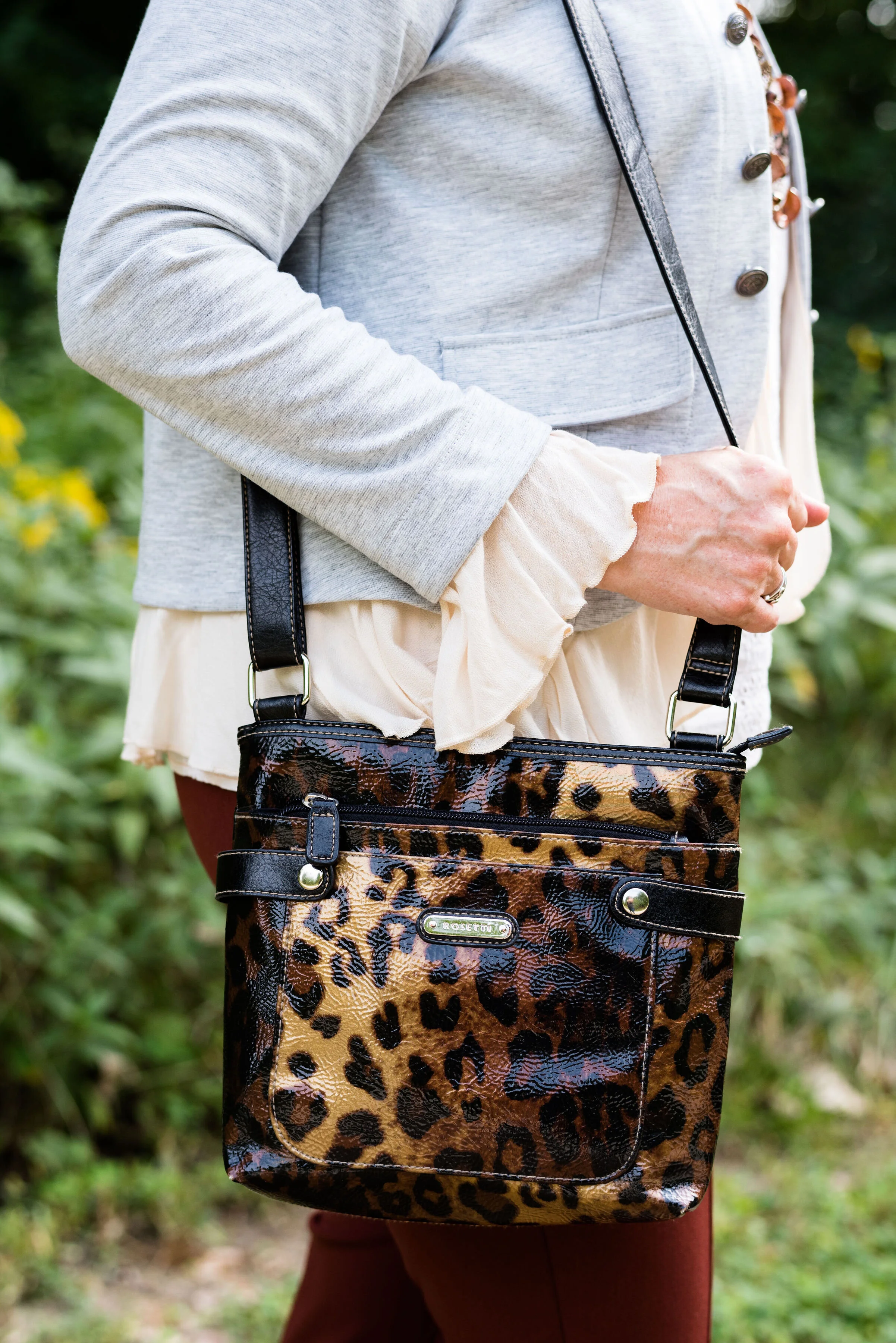
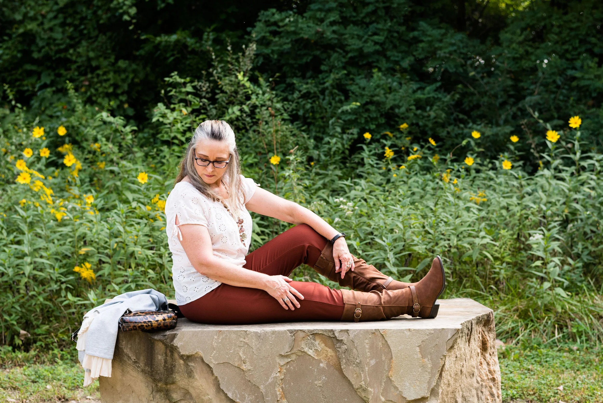
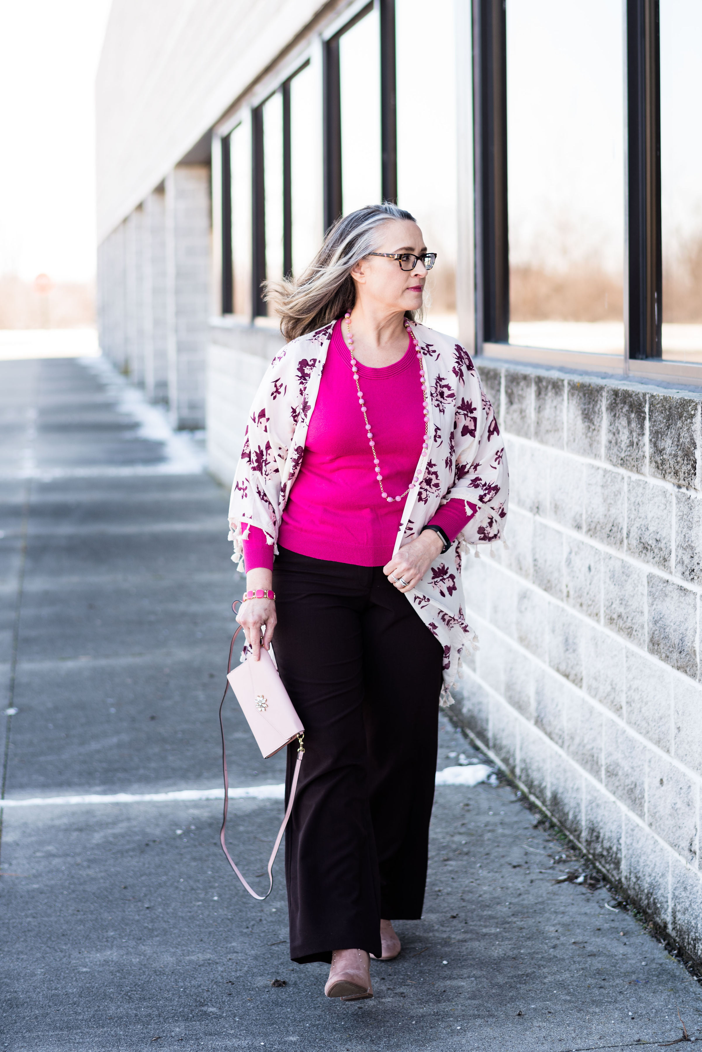
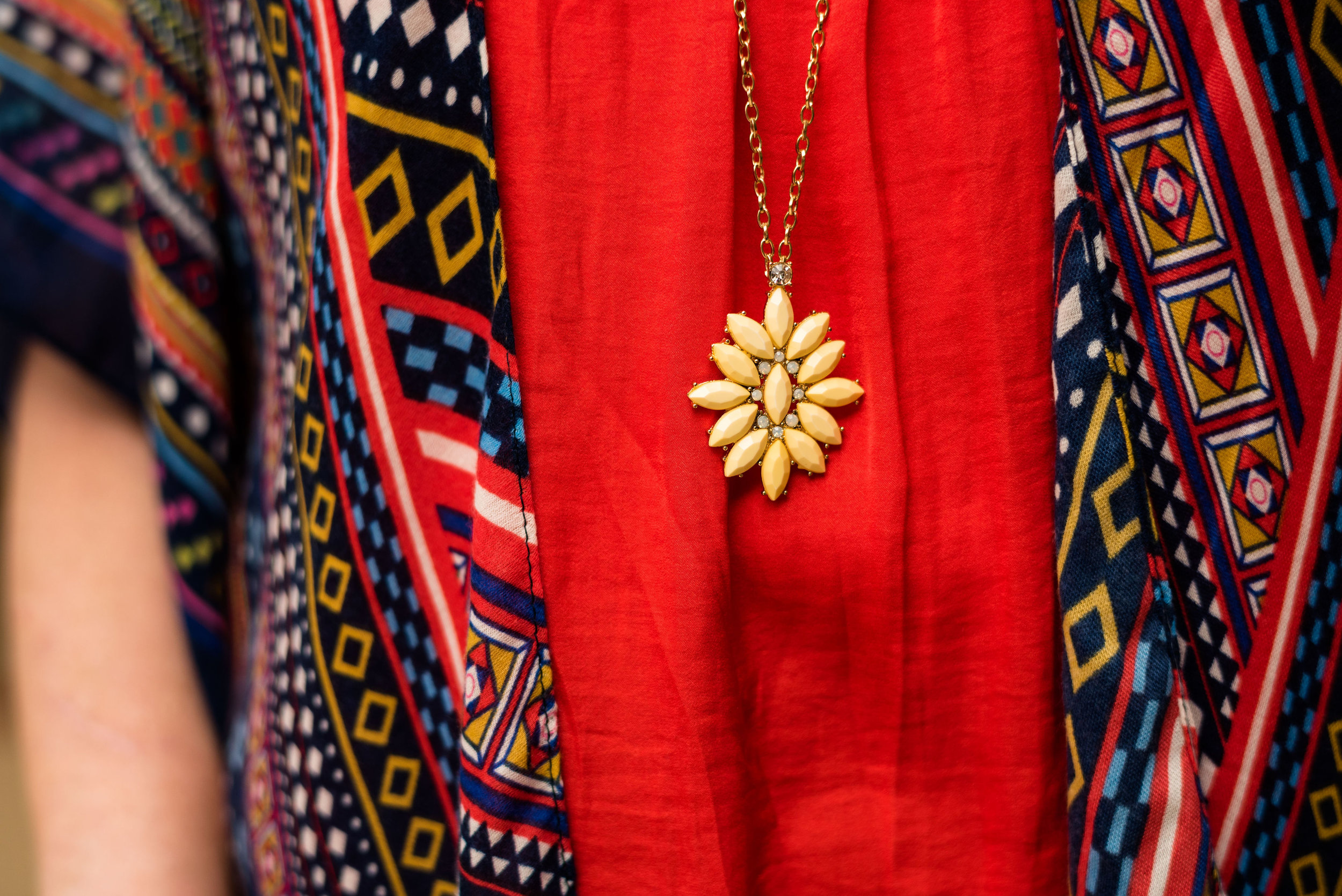
Outfit 2 - Cranberry and Chicory Coffee

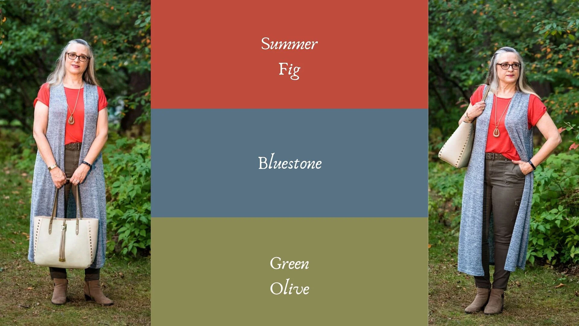
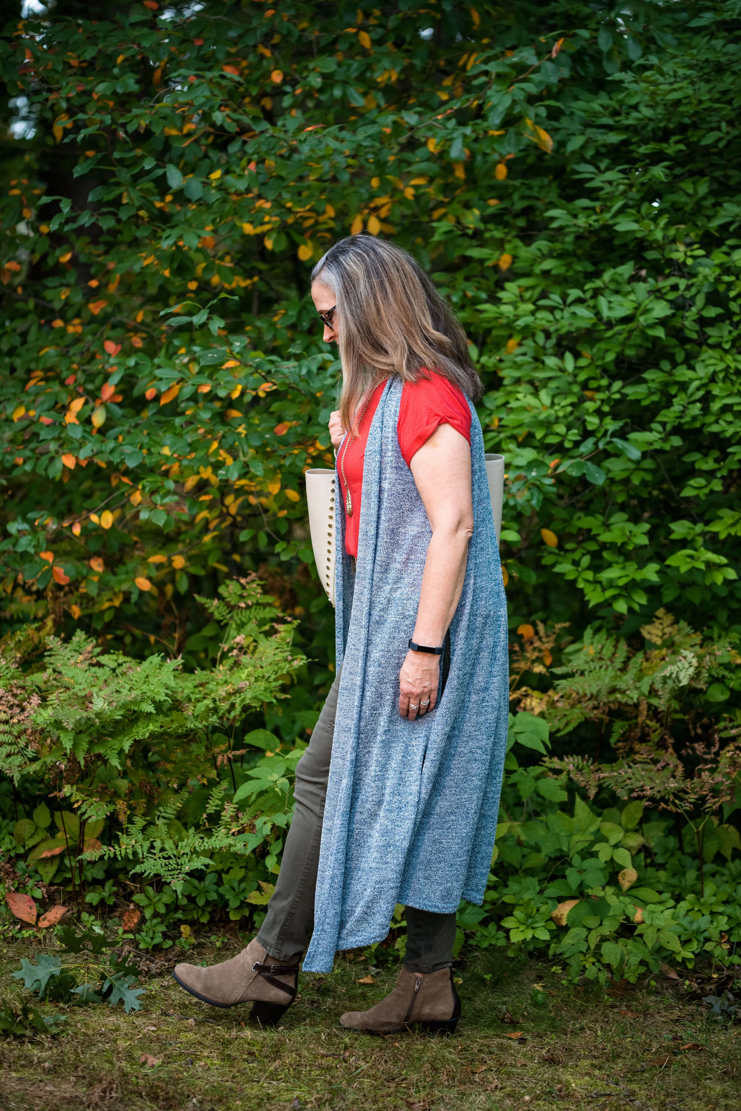
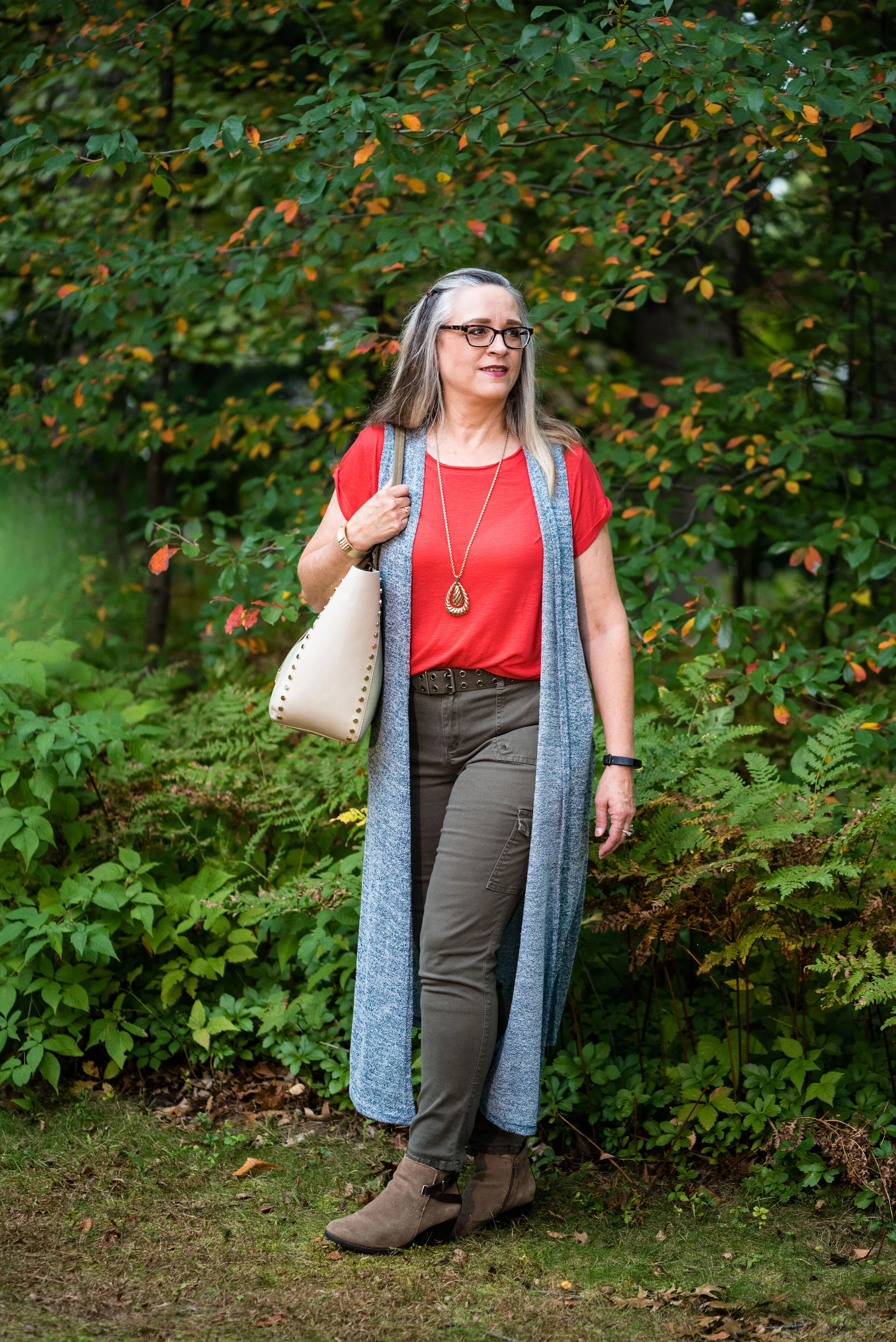
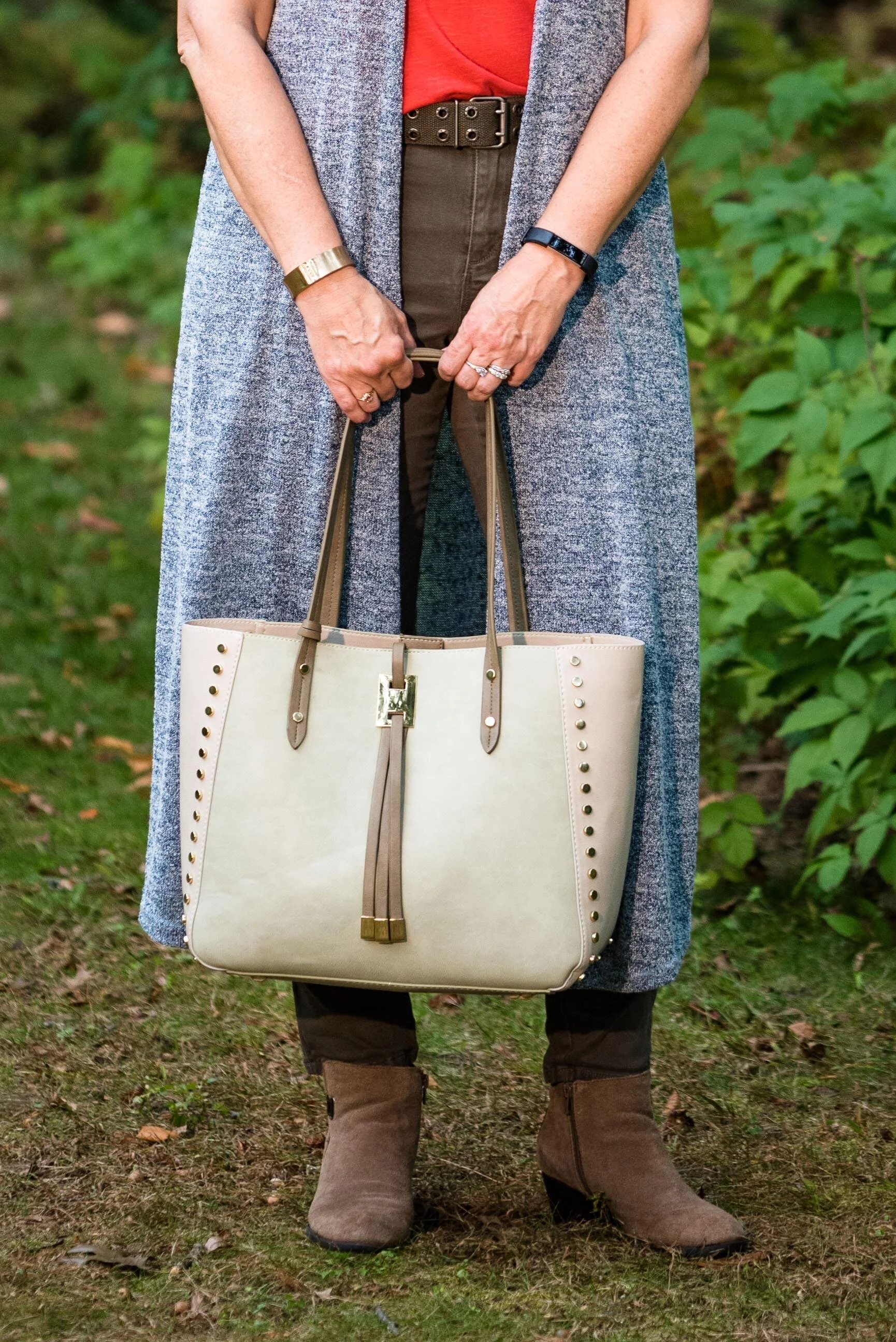
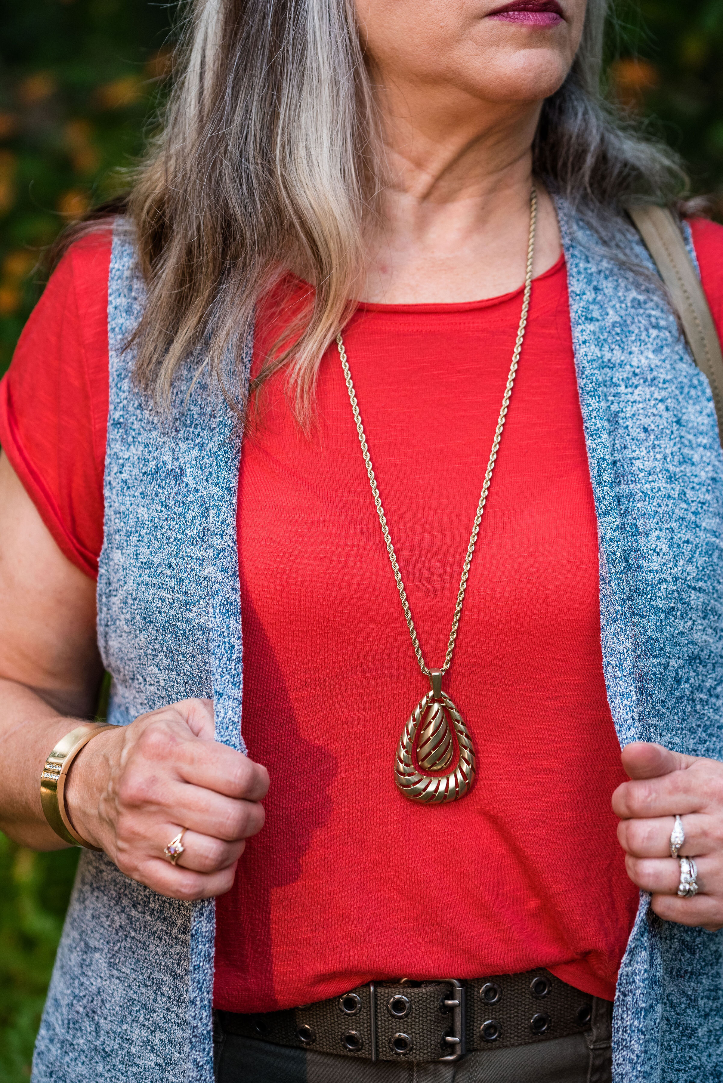
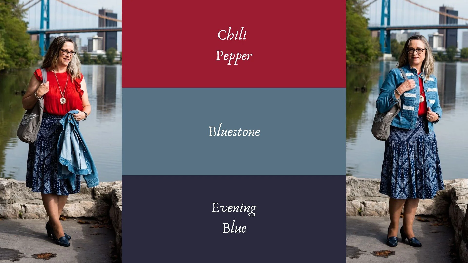
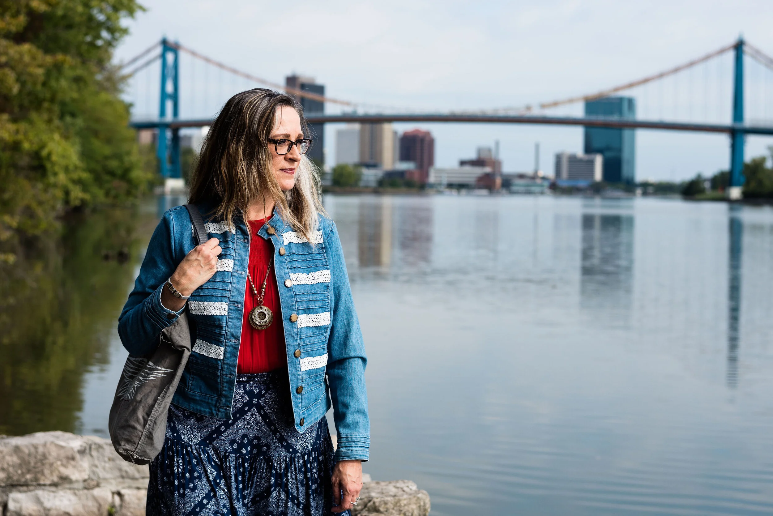
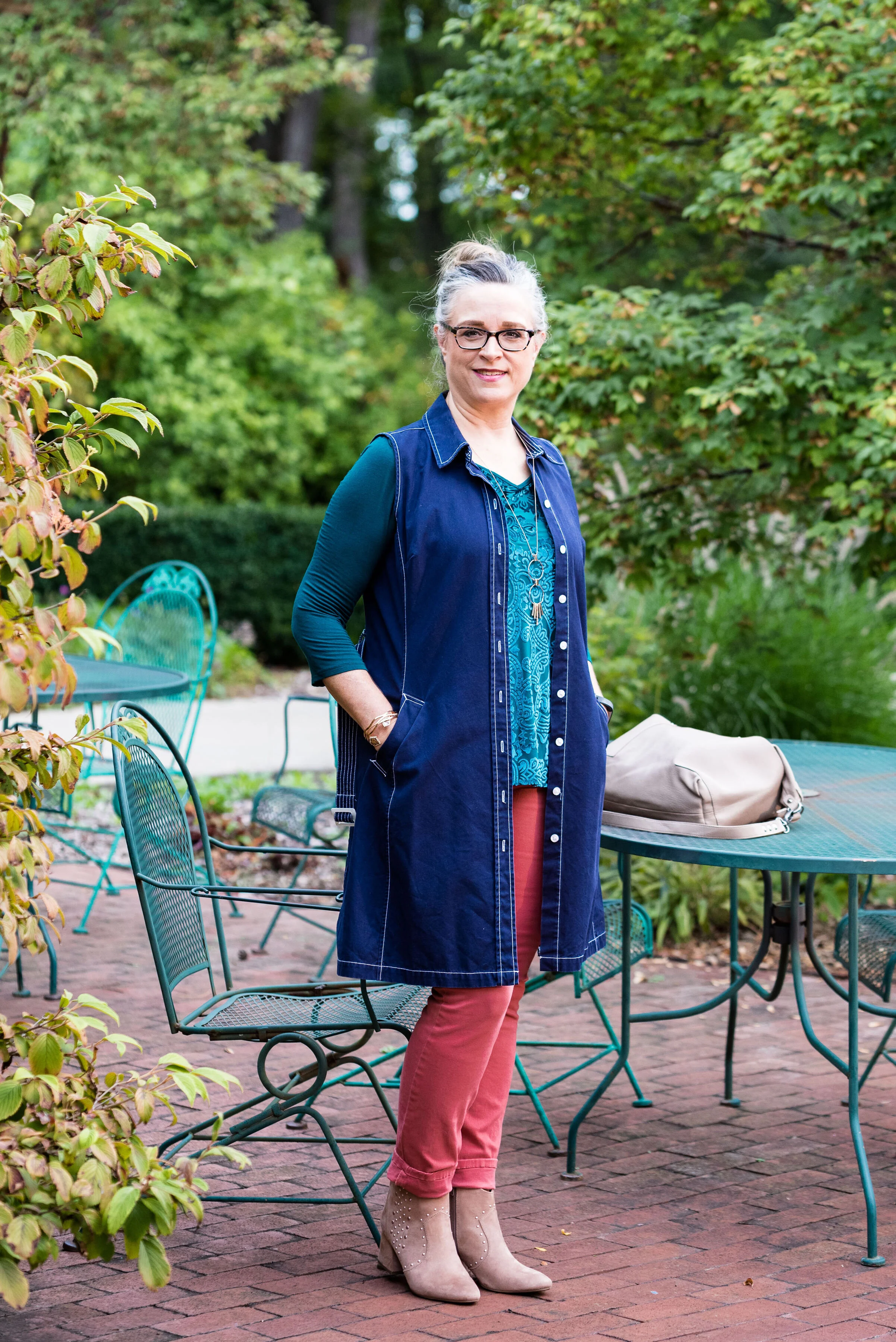
Outfit 3 - Summer Fig and Bluestone
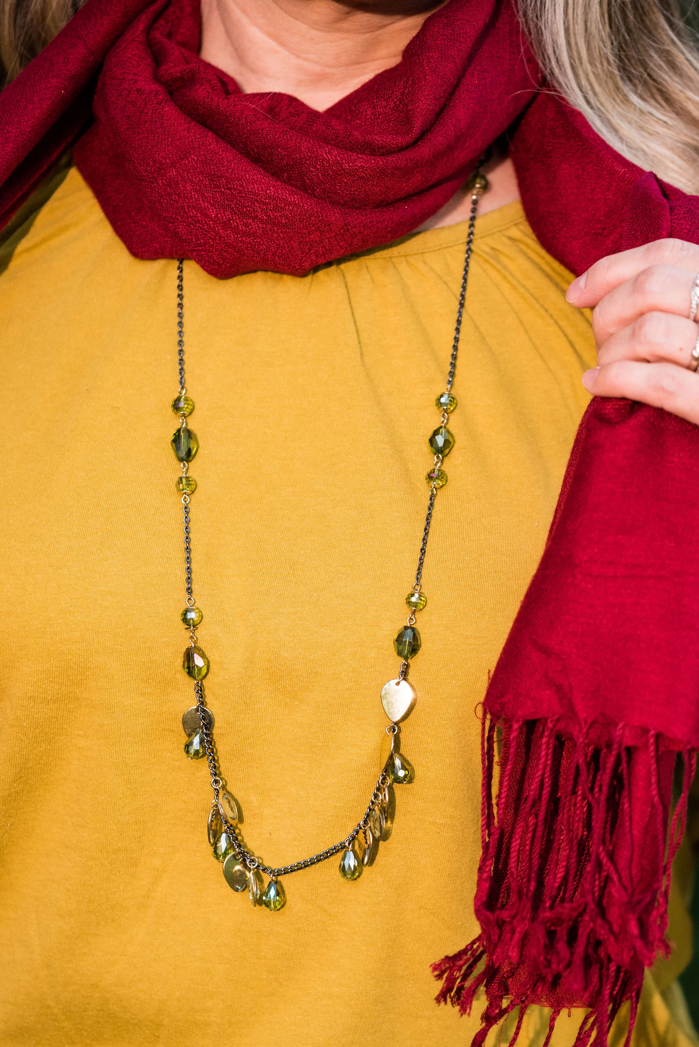
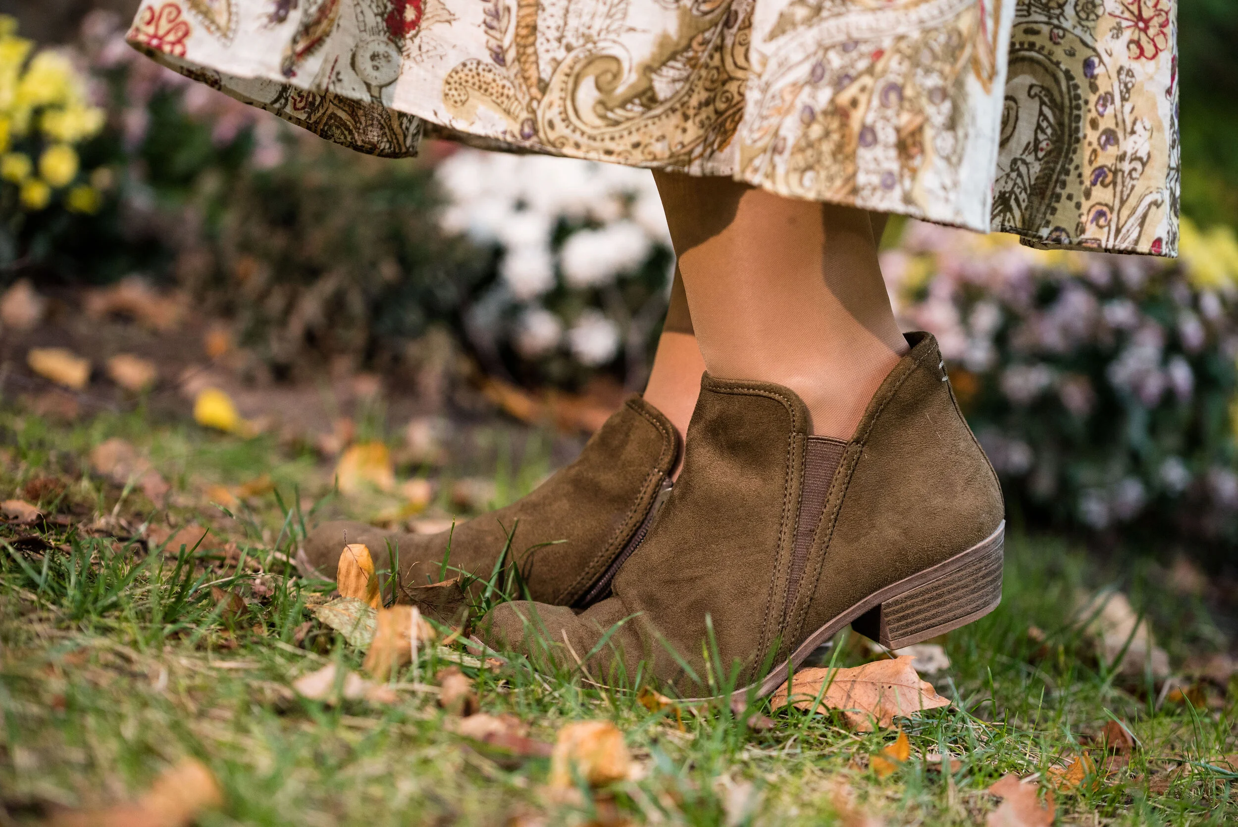
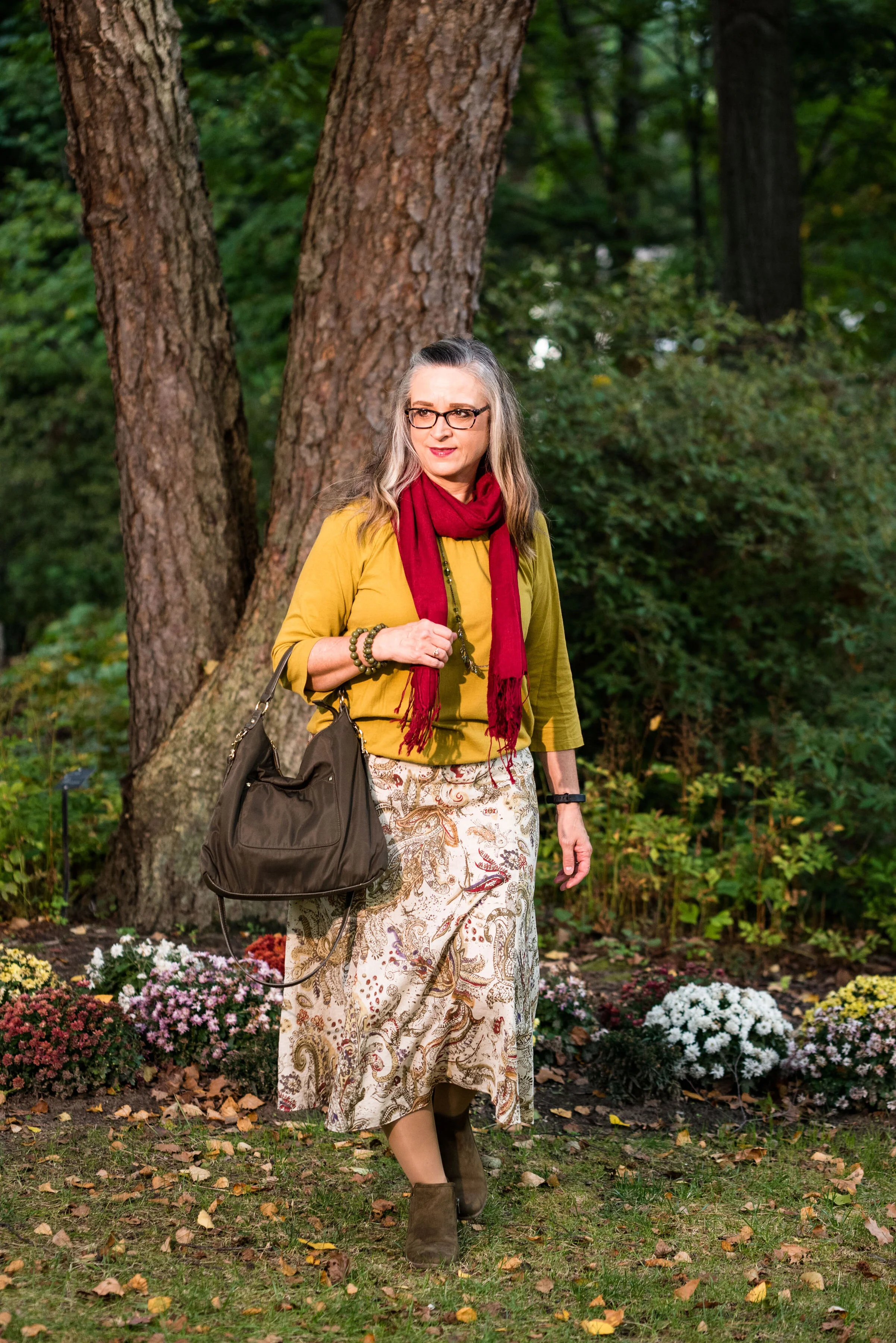
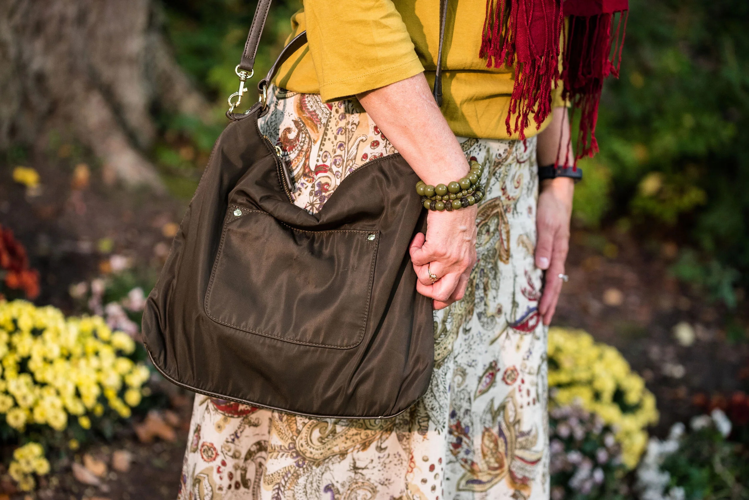
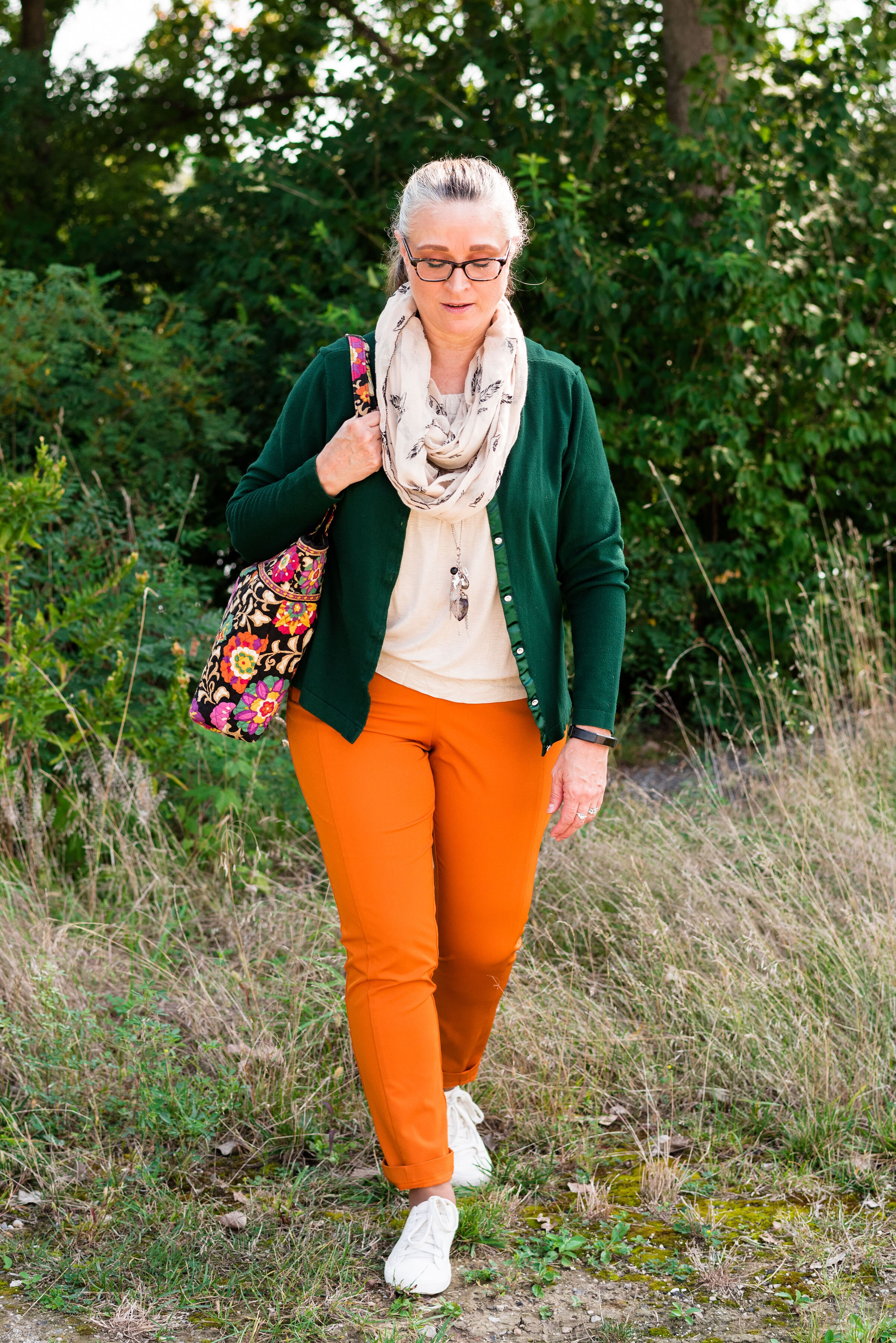
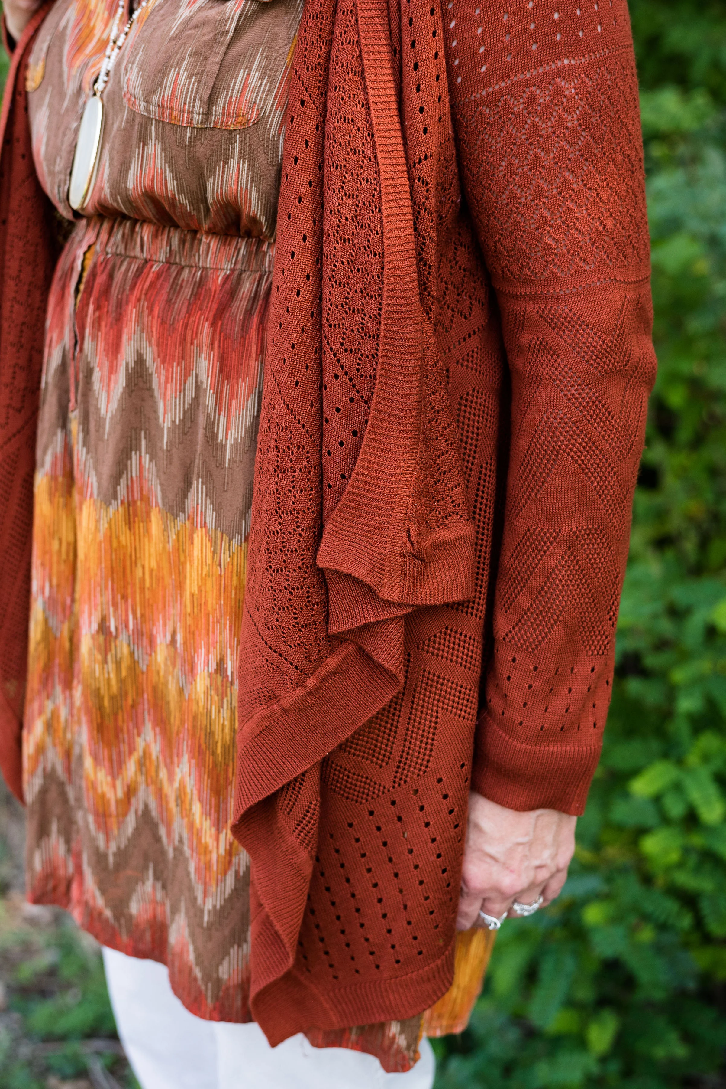
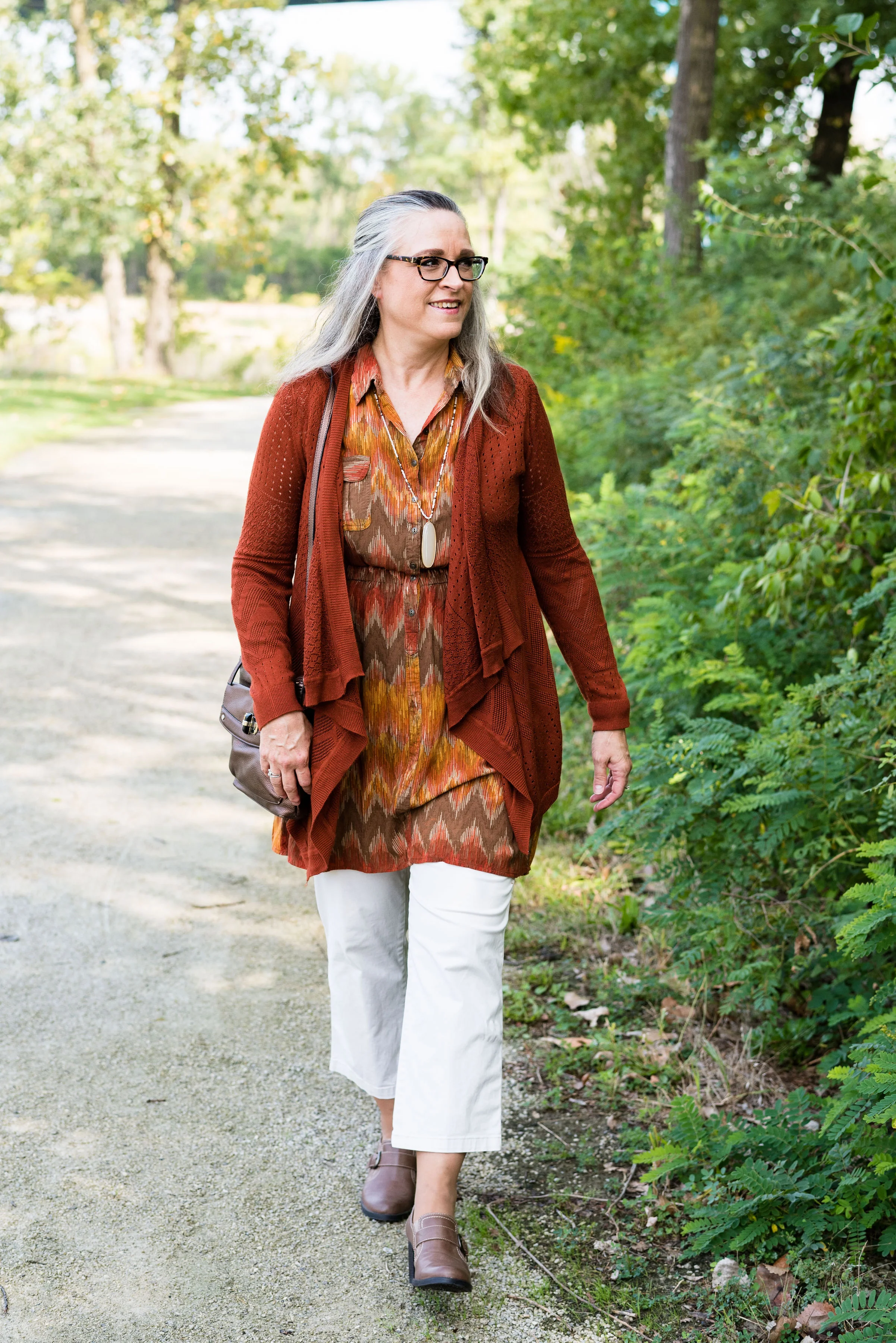
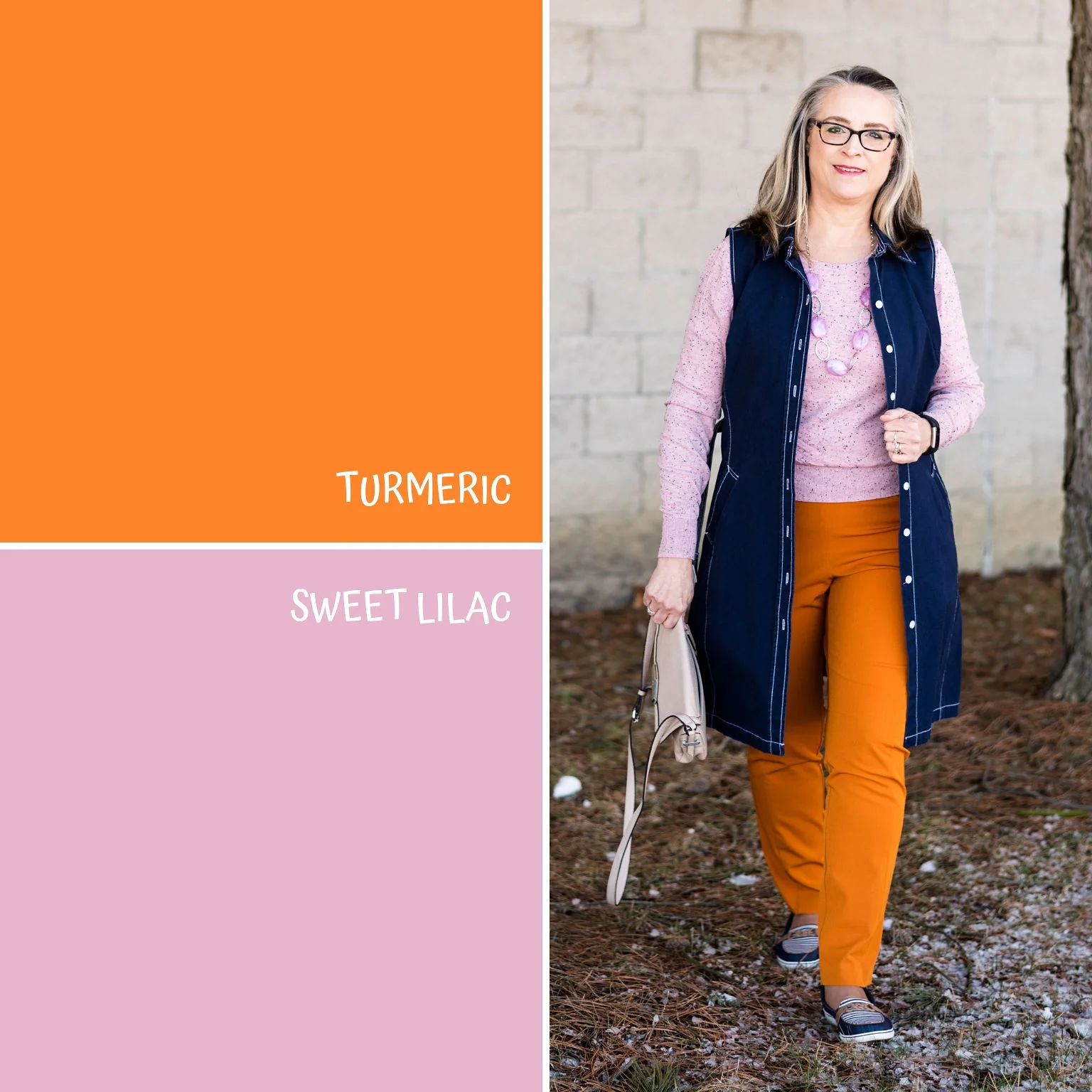
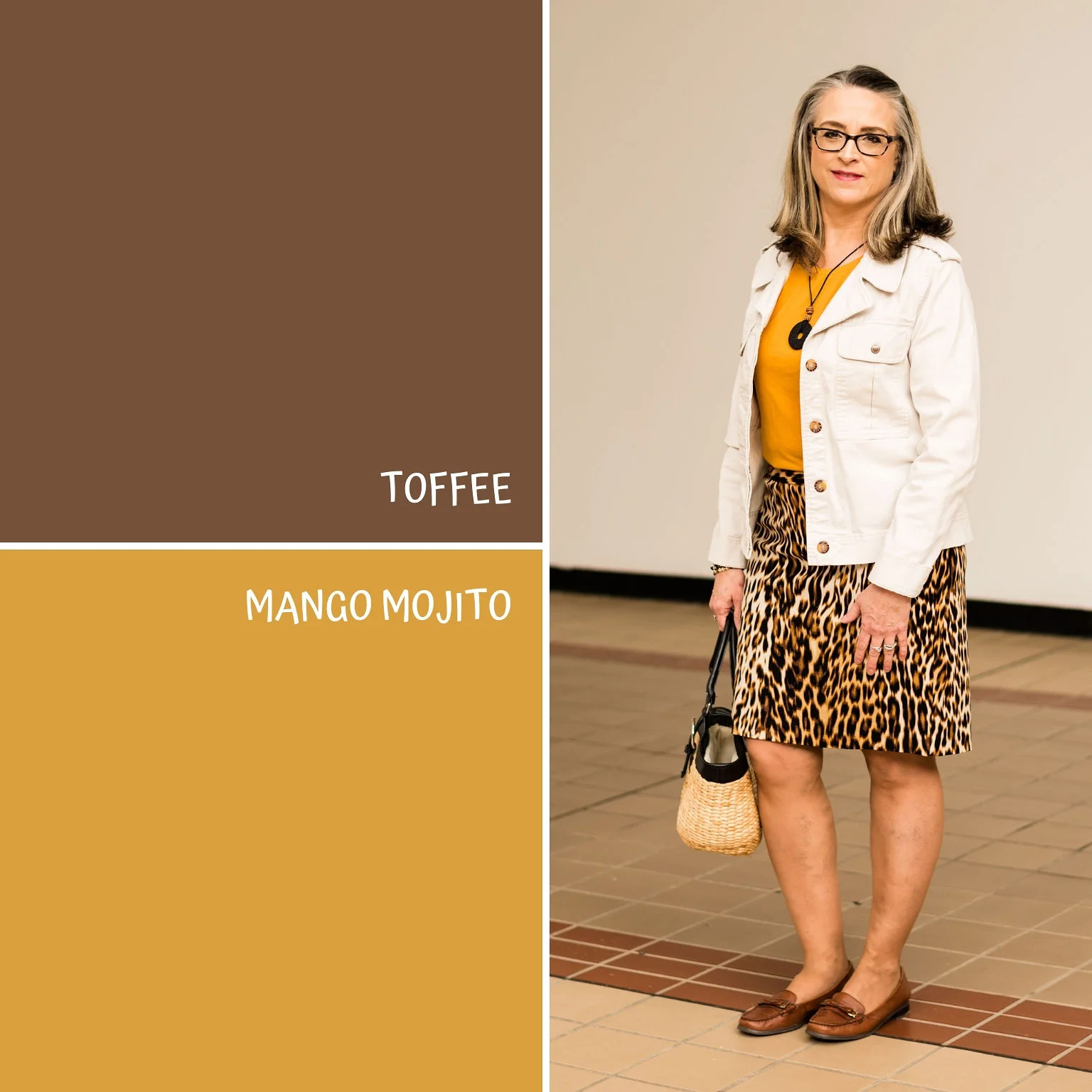
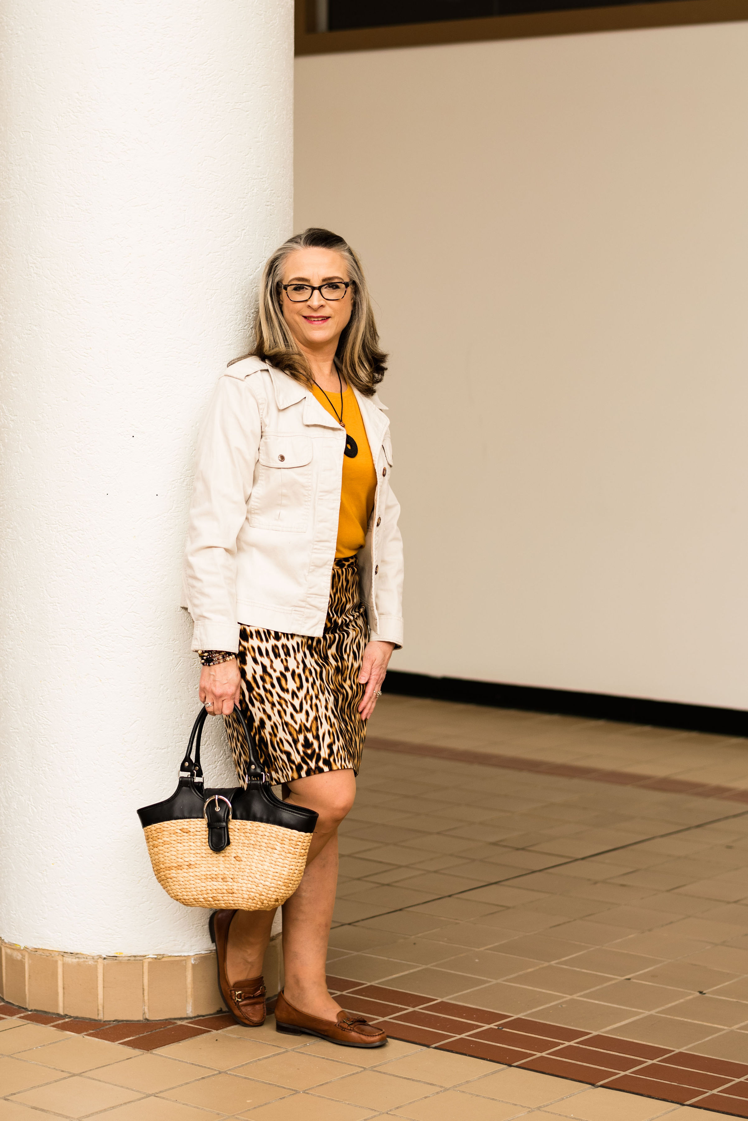
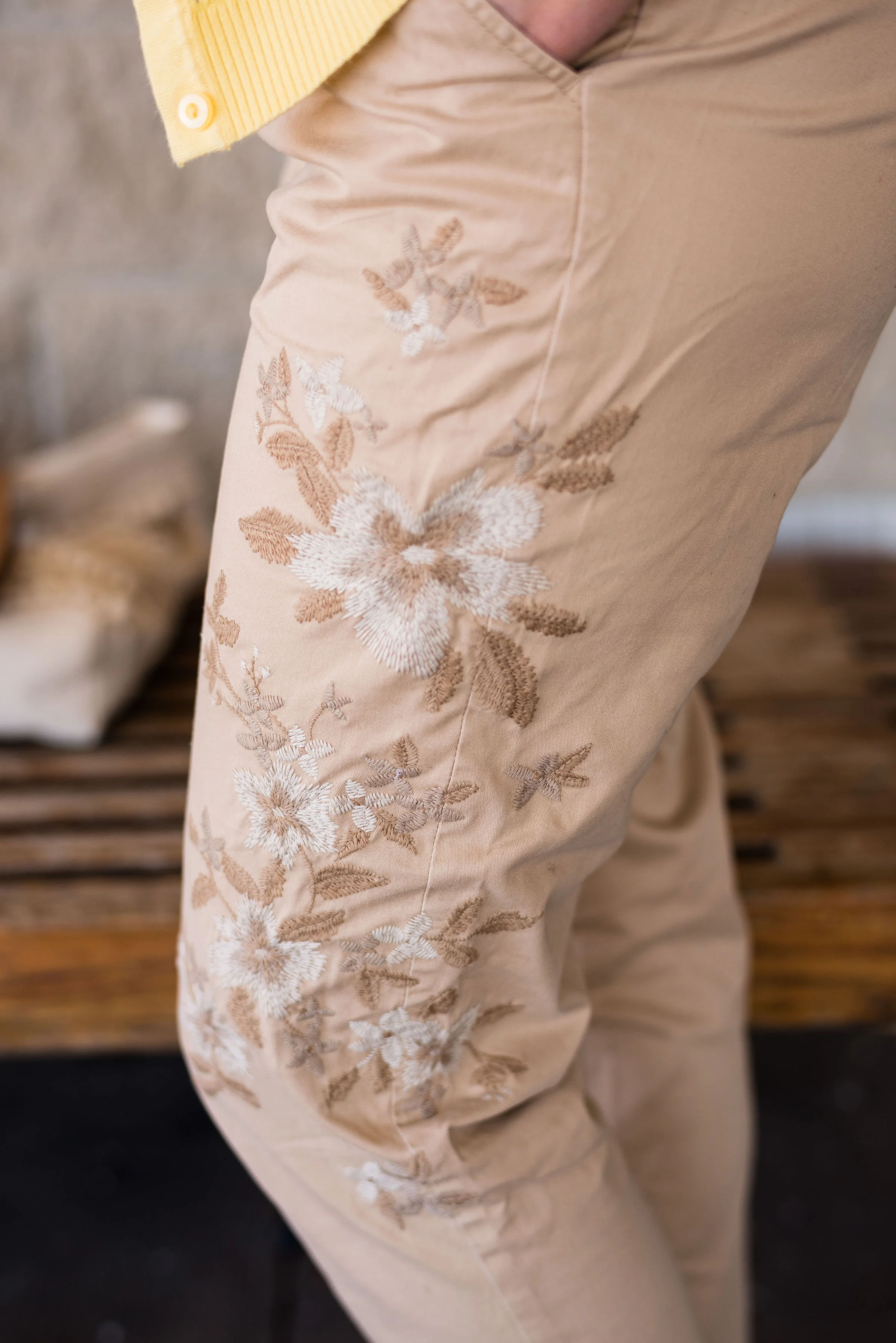
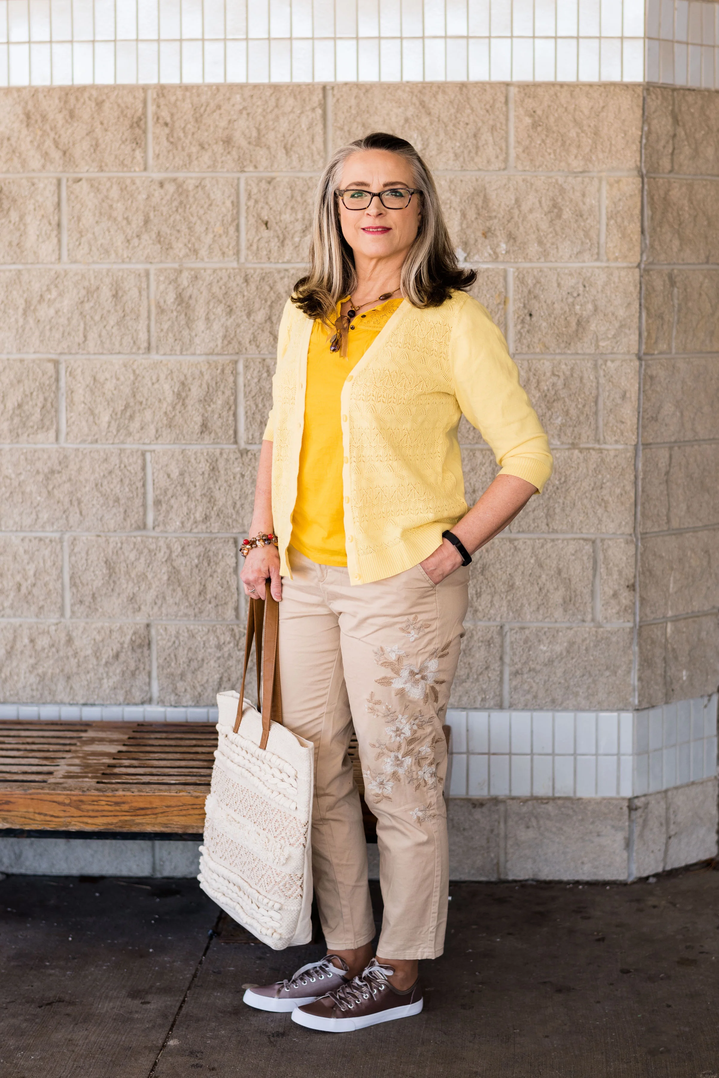
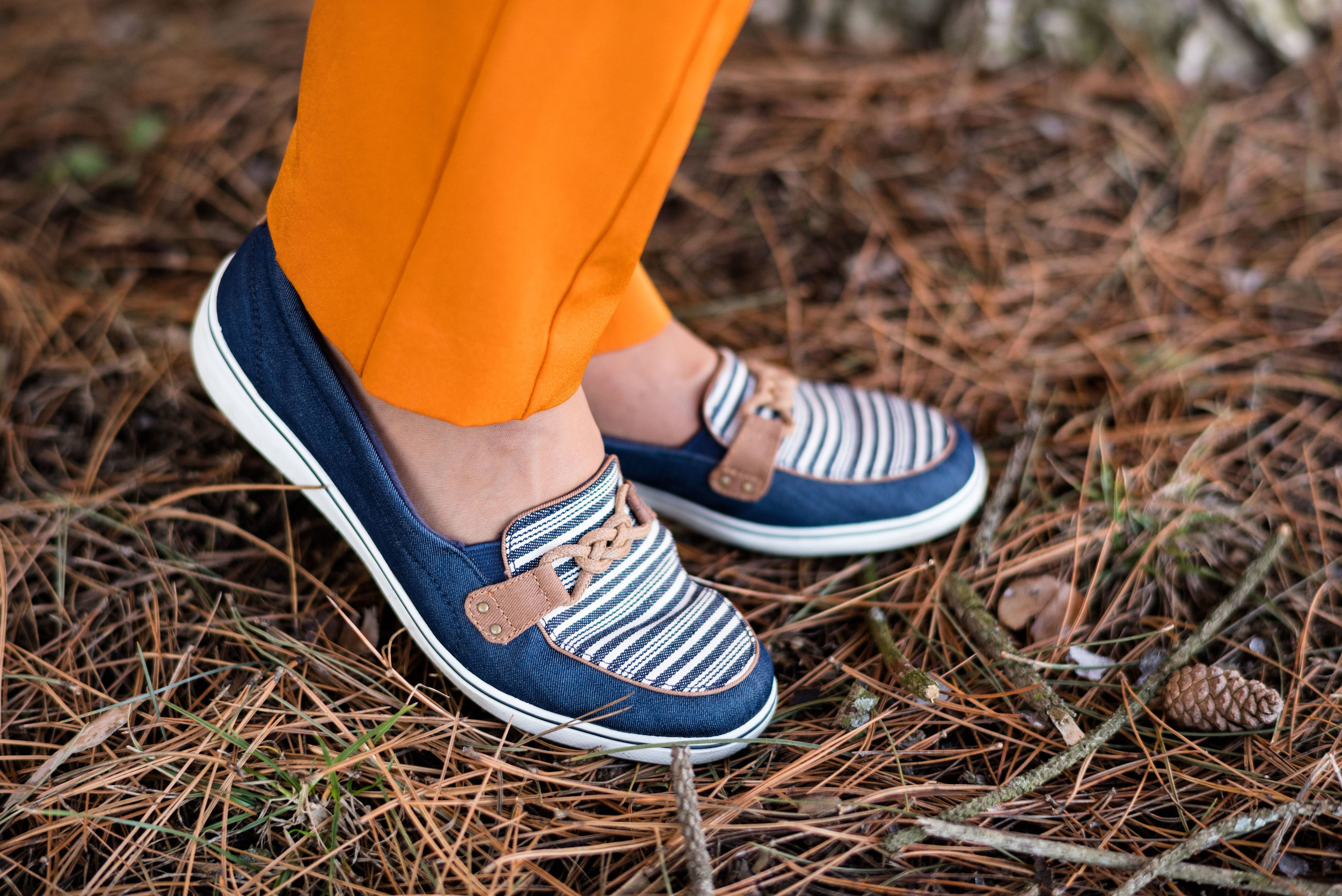
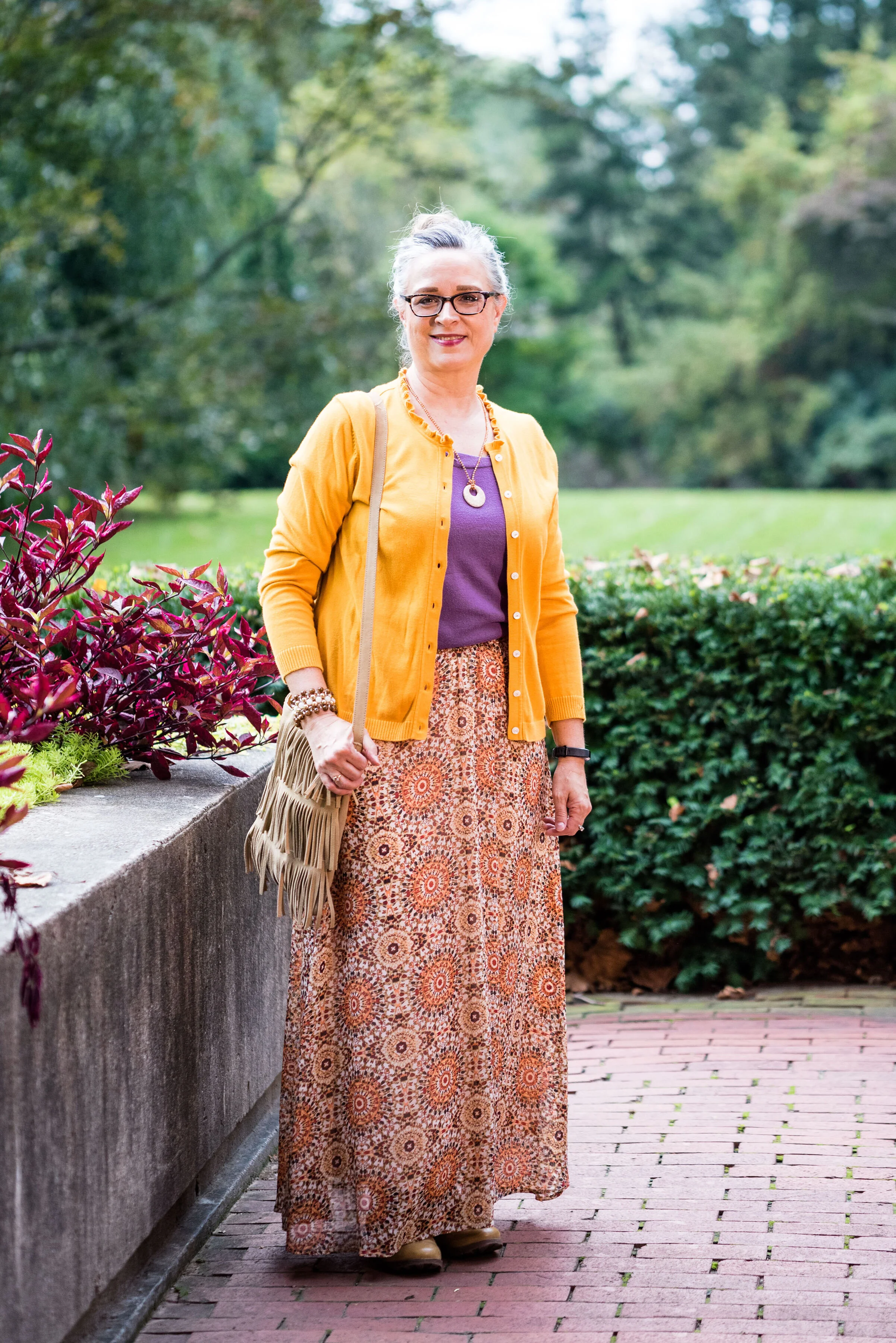
Outfit 4 - Butterscotch and Grapeade
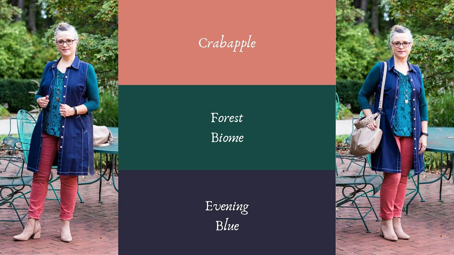
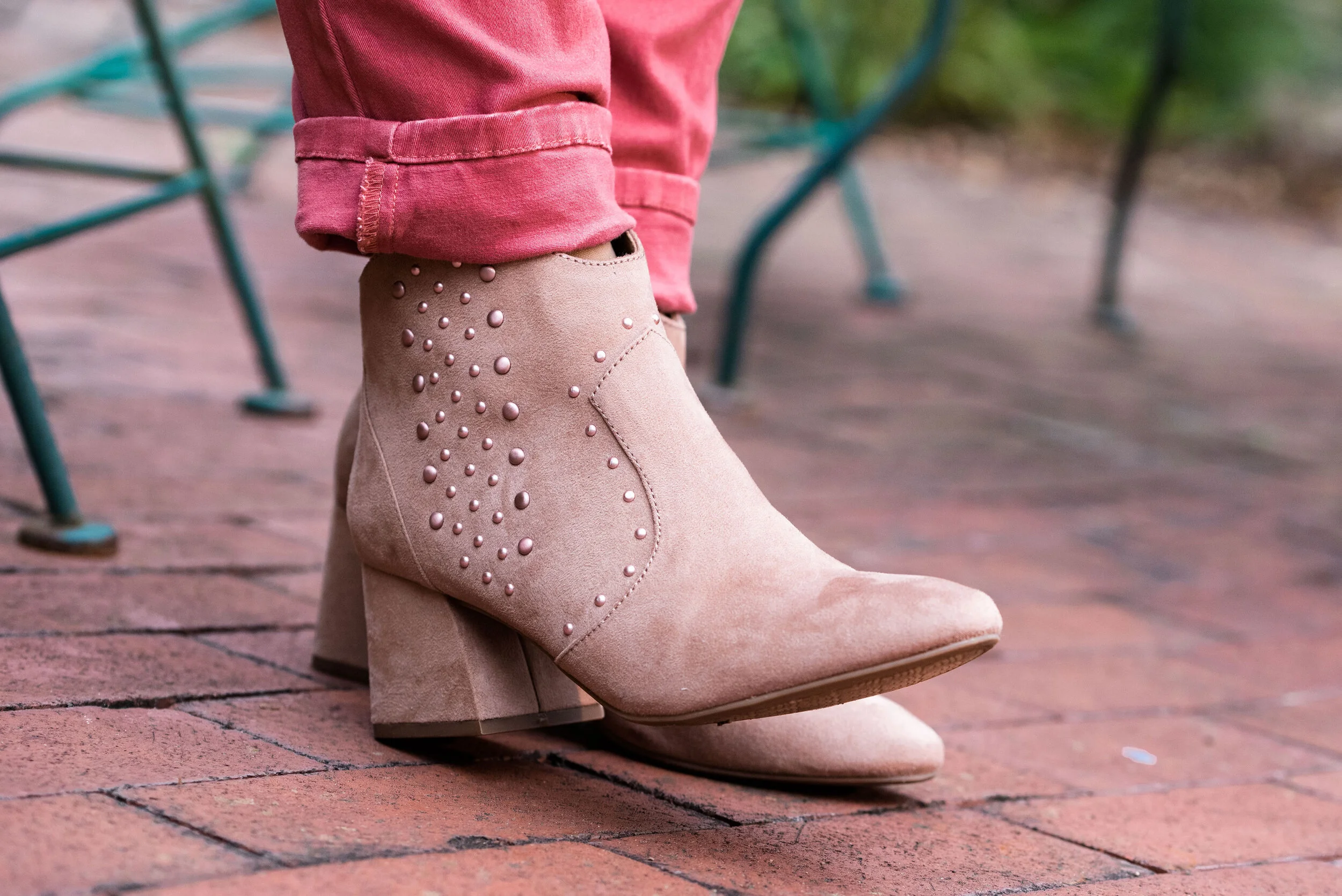
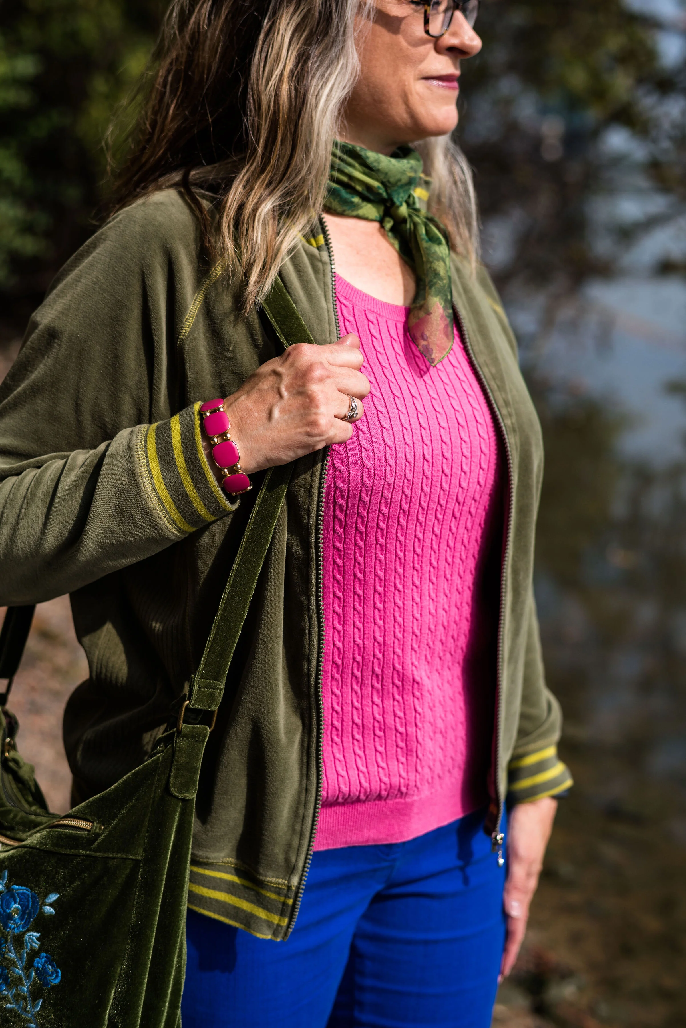
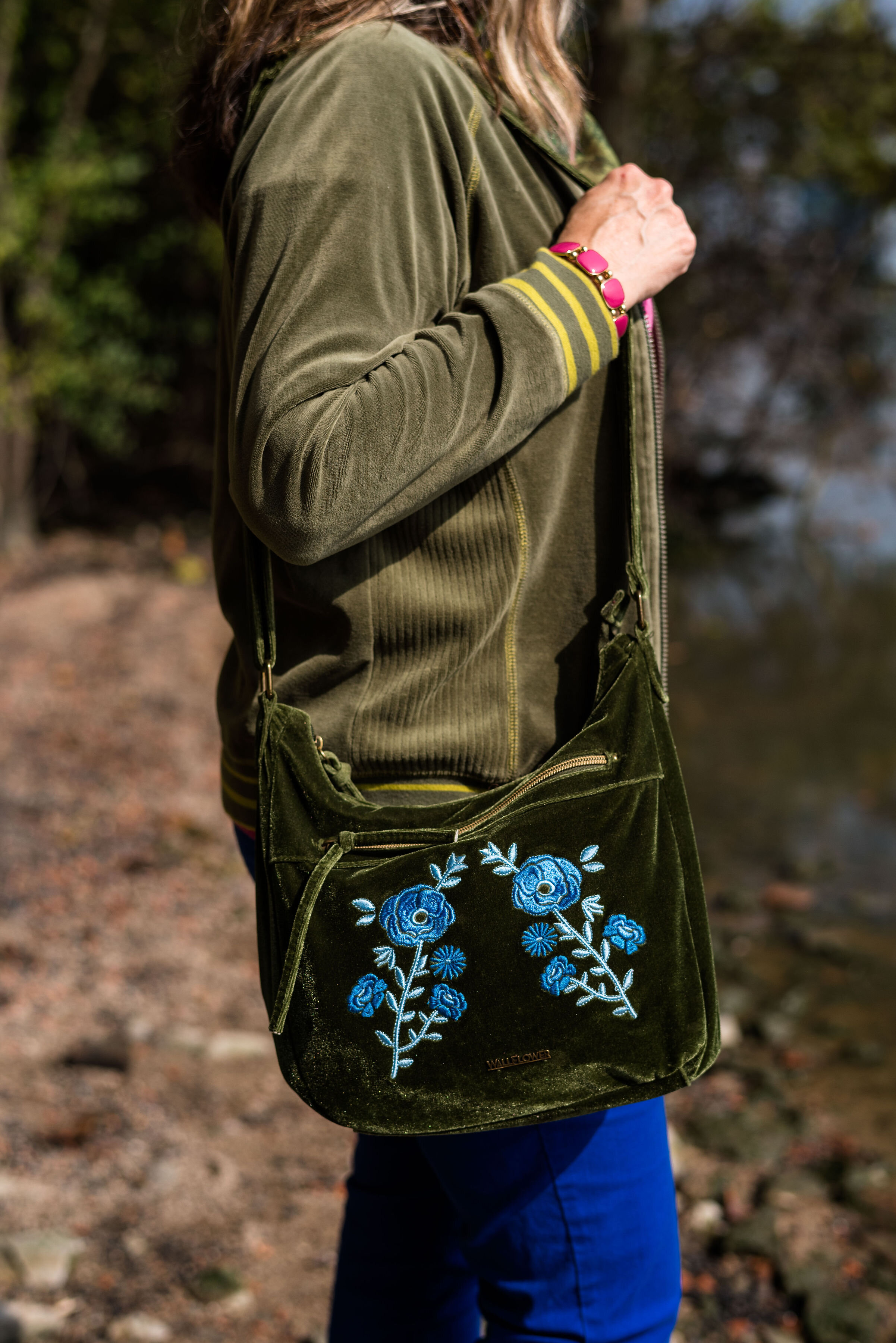
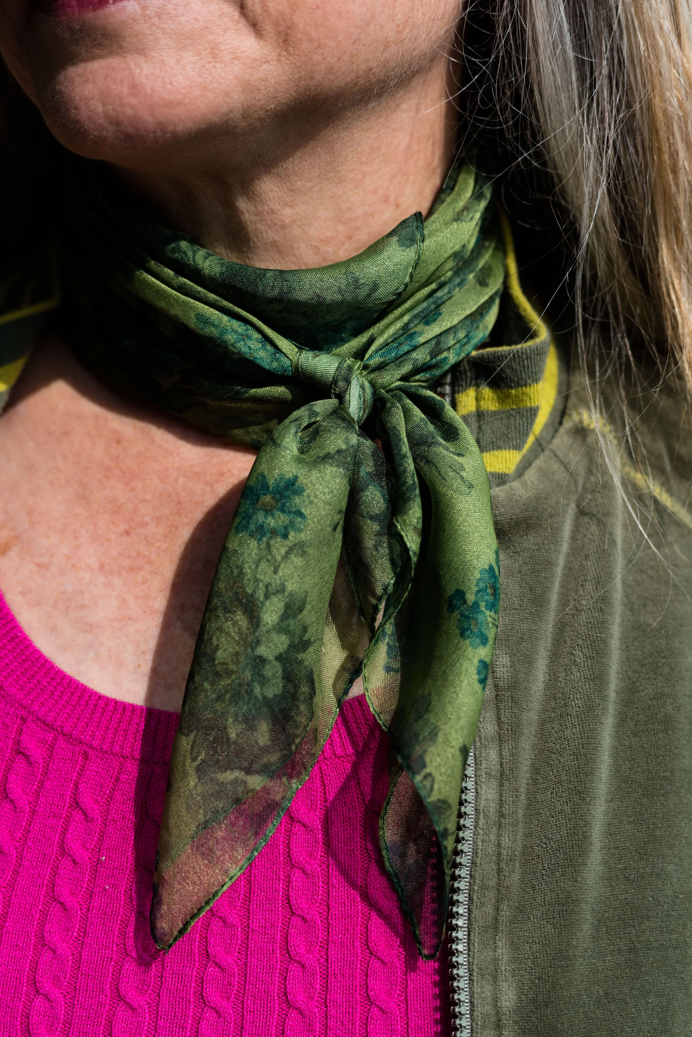
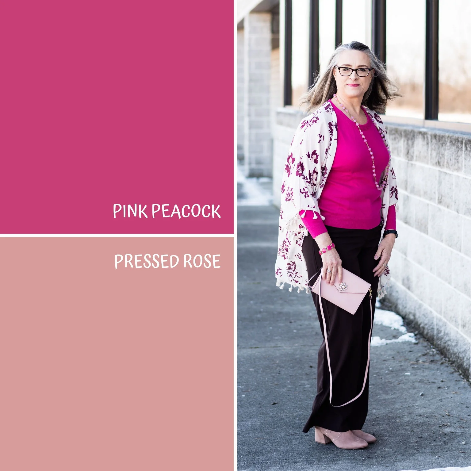
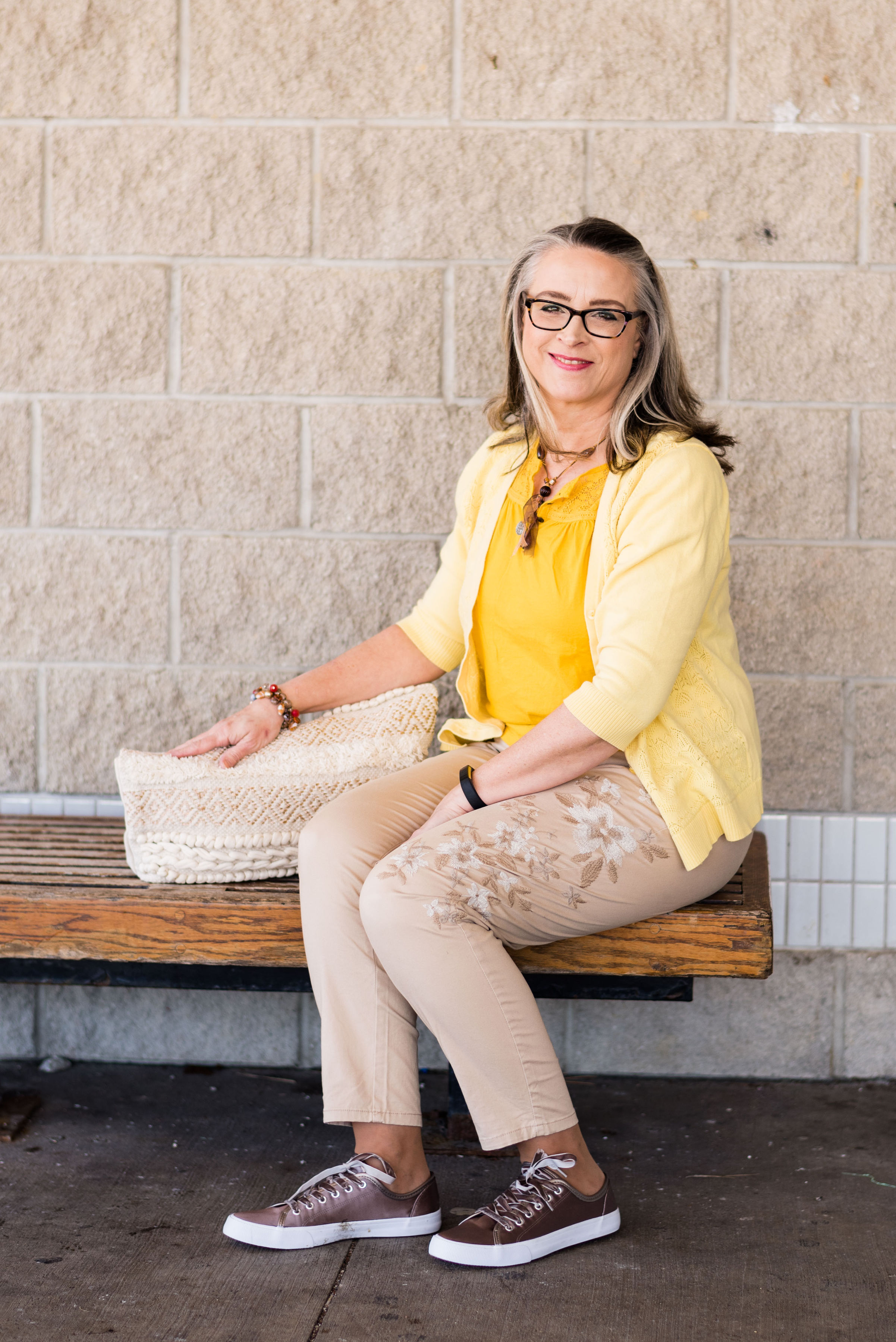
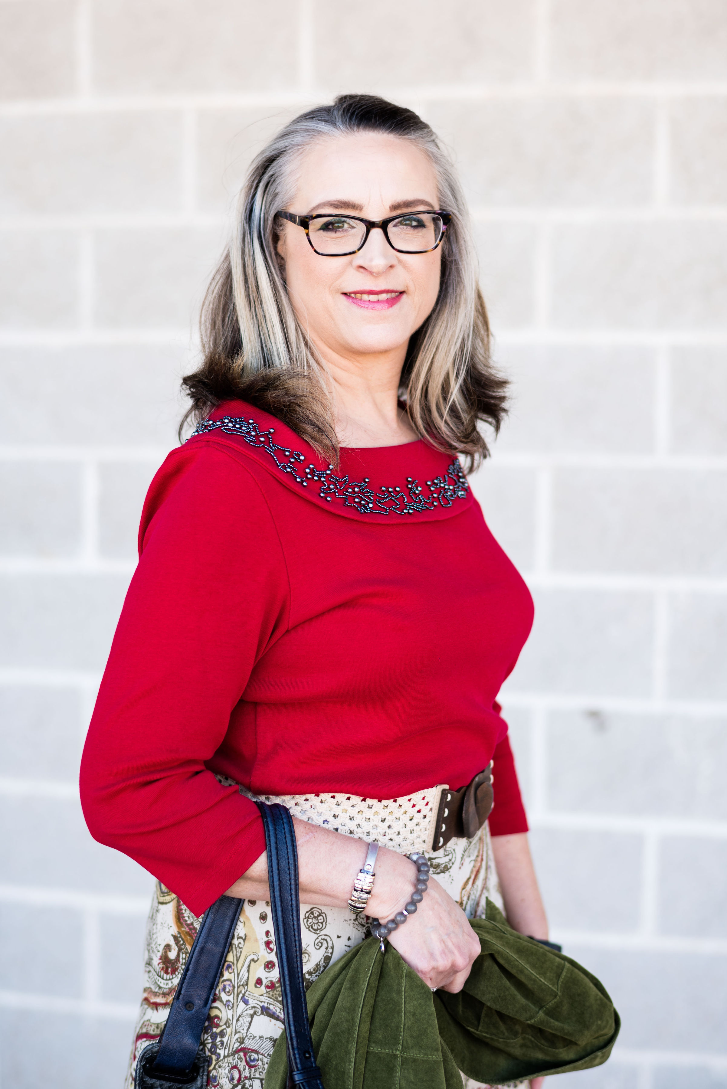
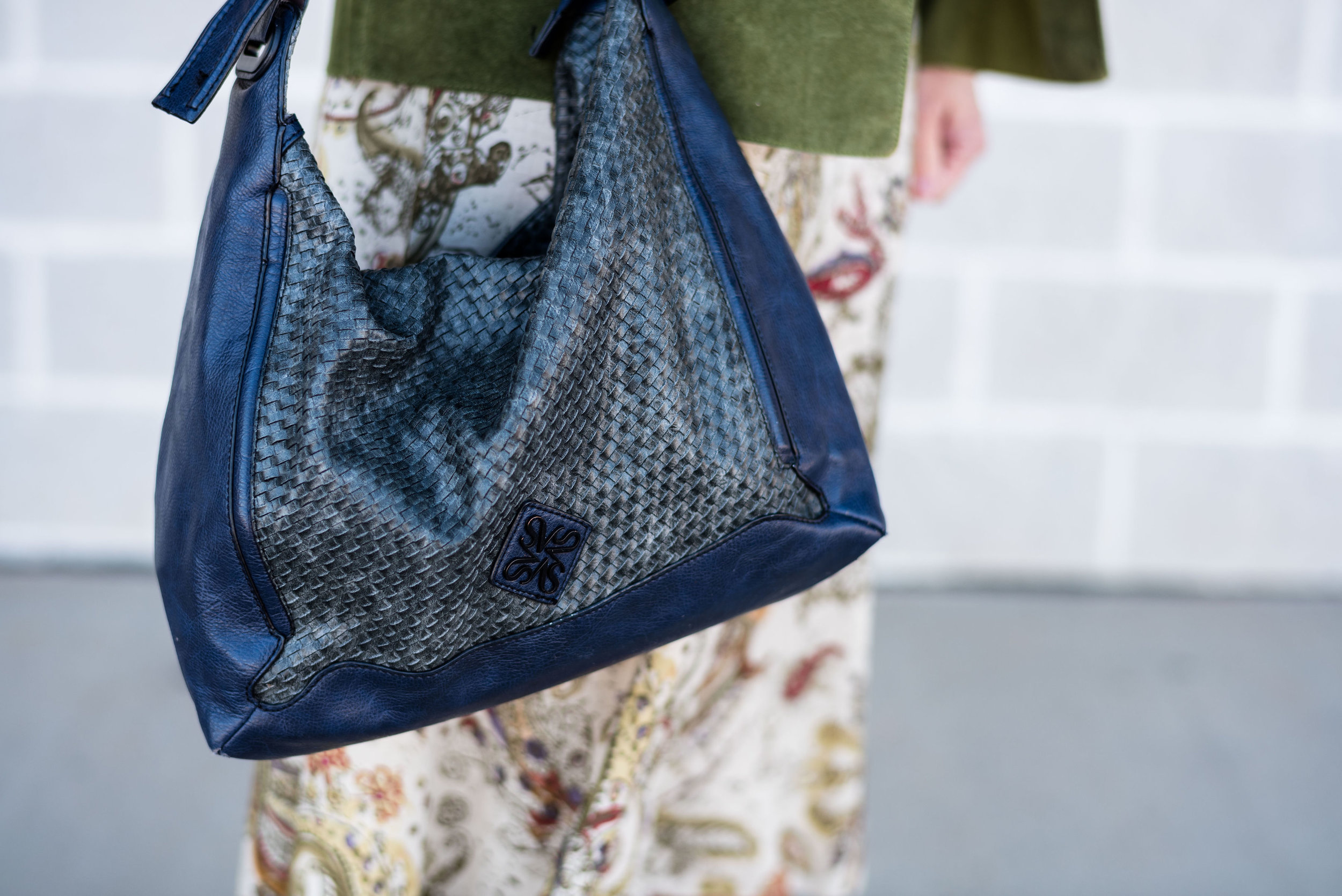
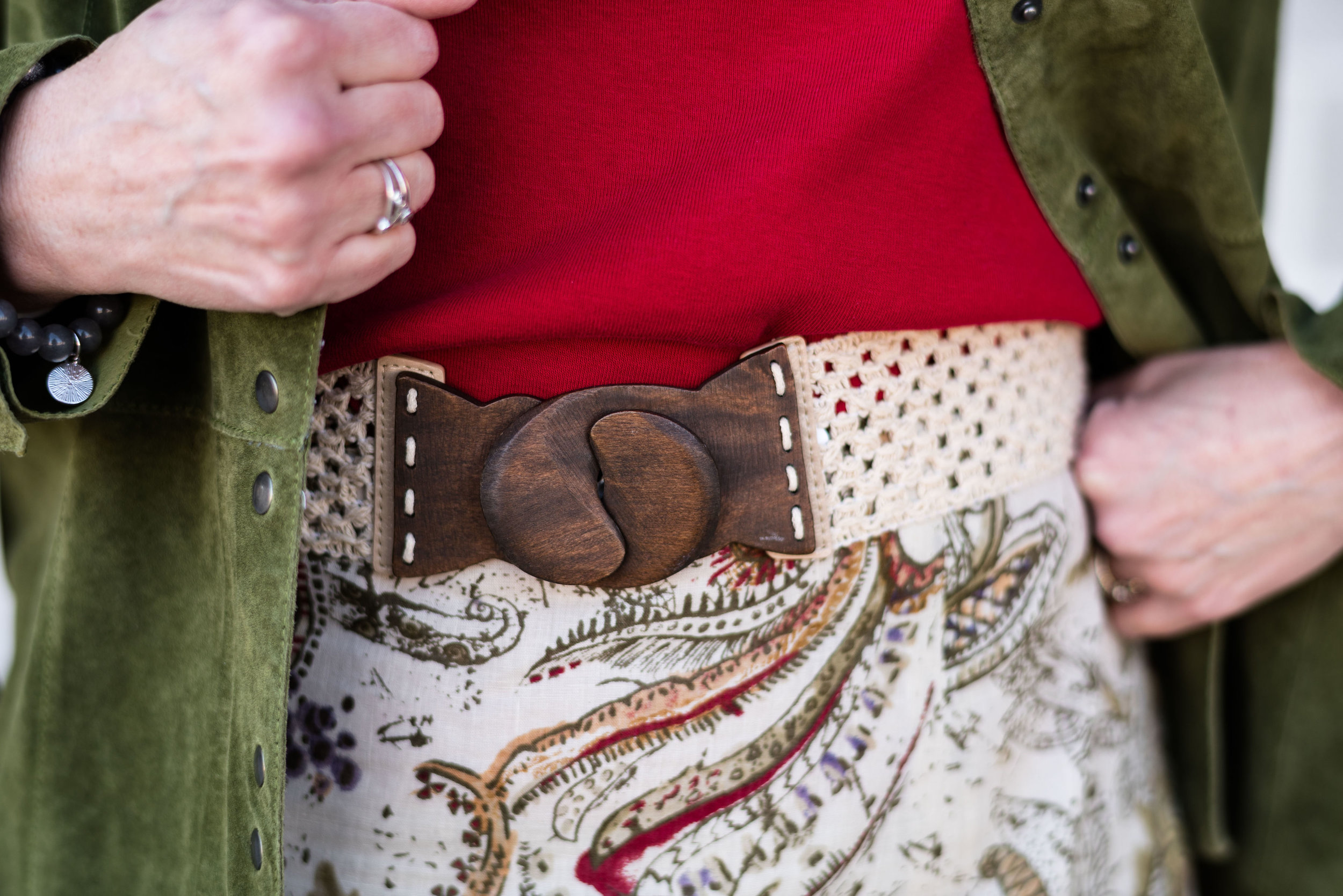
Outfit 5 - Crabapple and Forest Biome
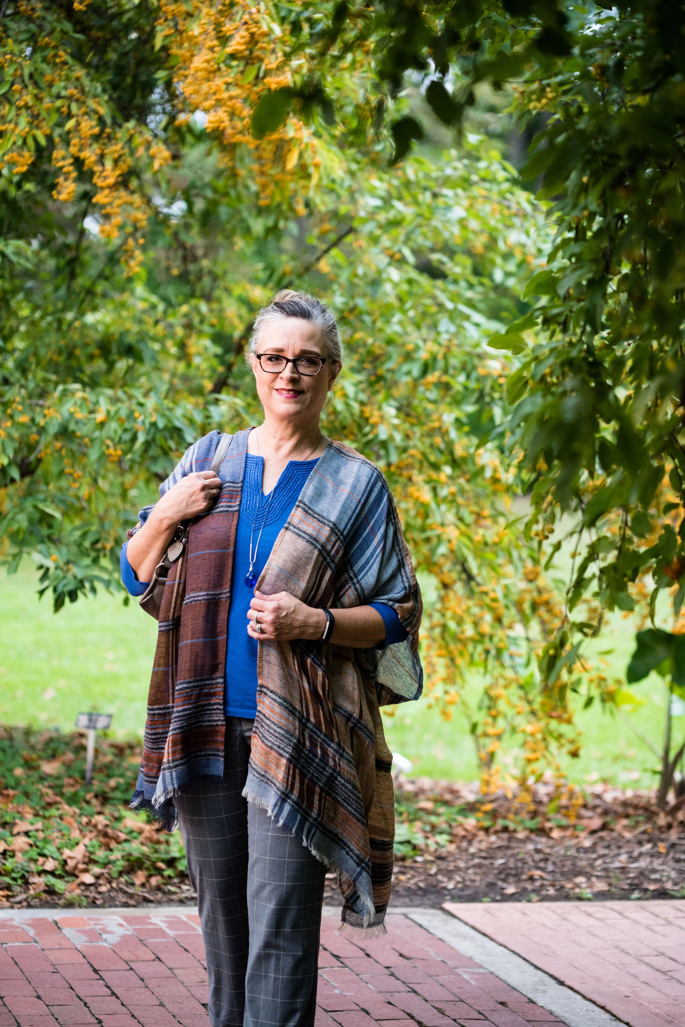
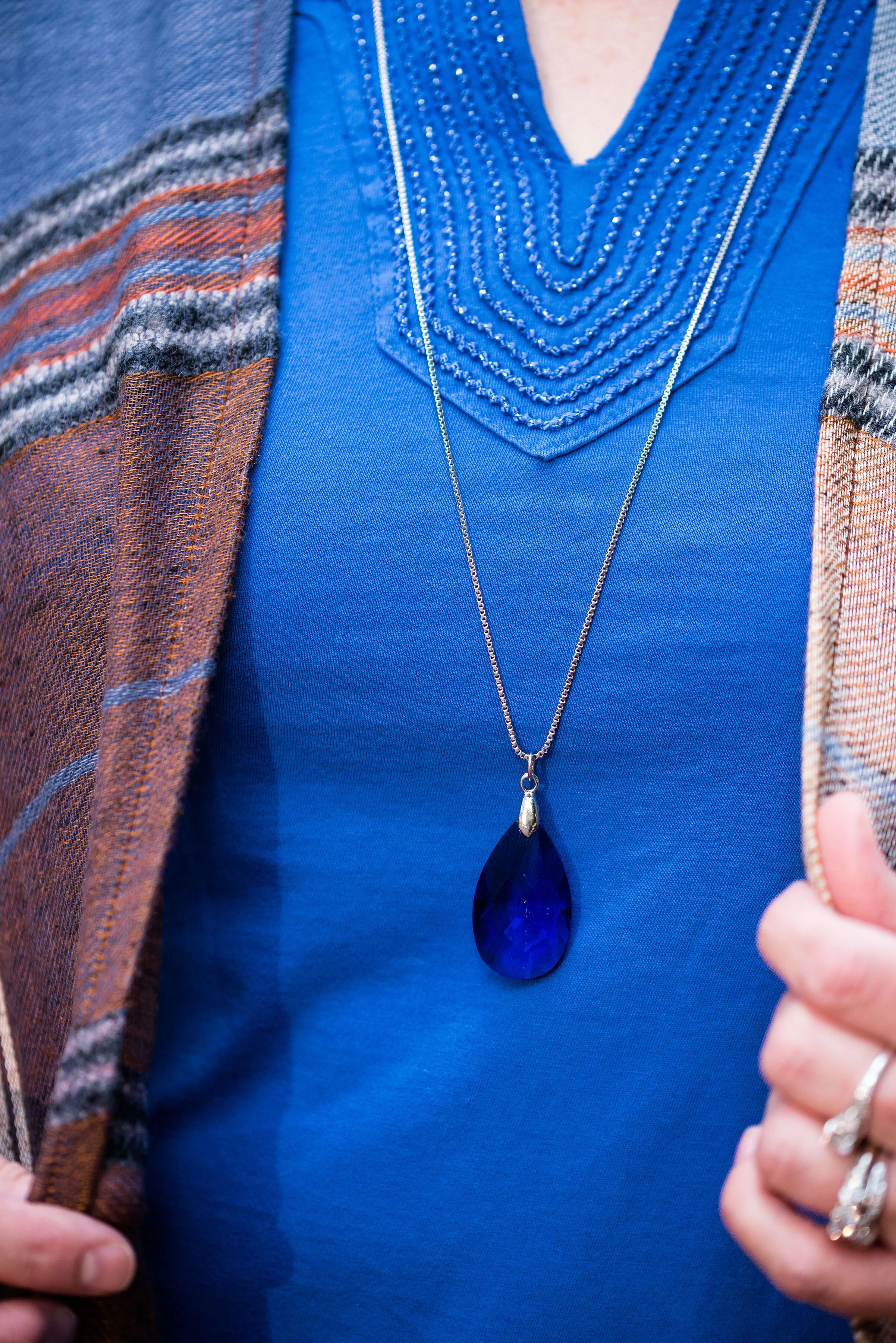
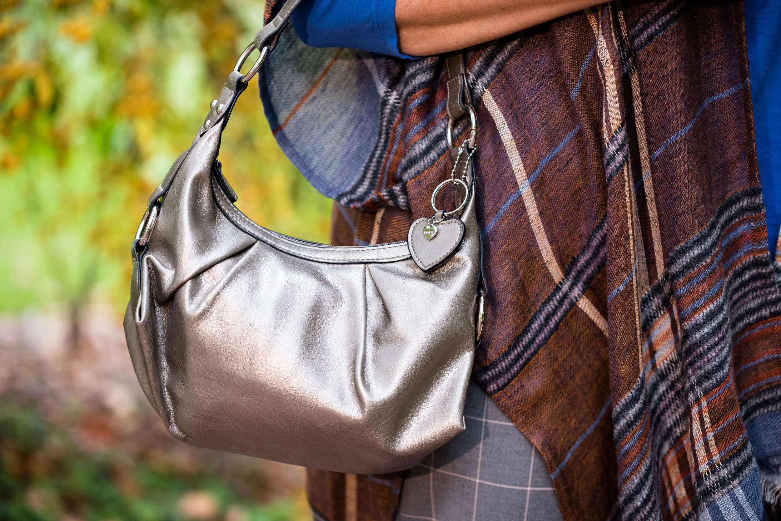
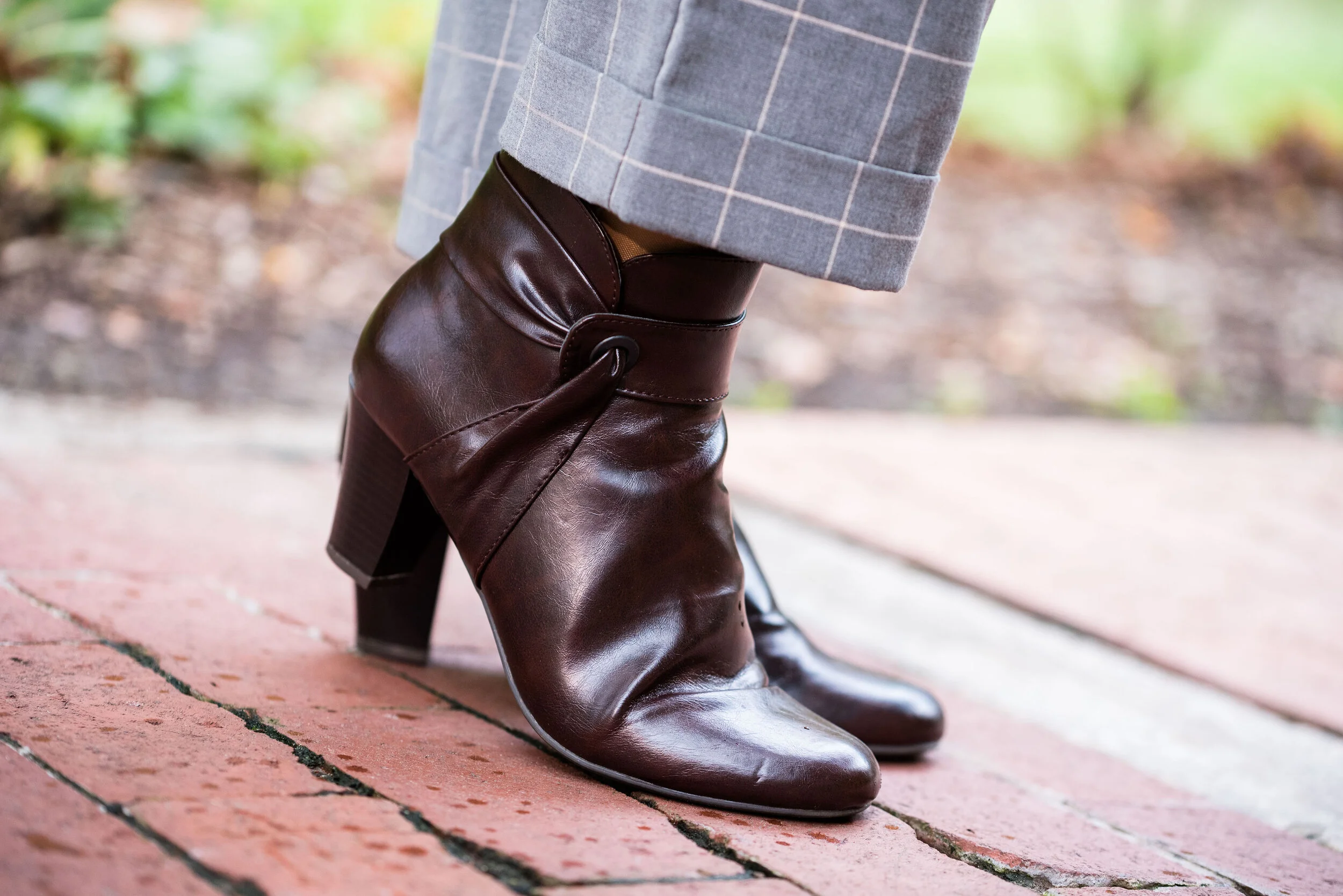
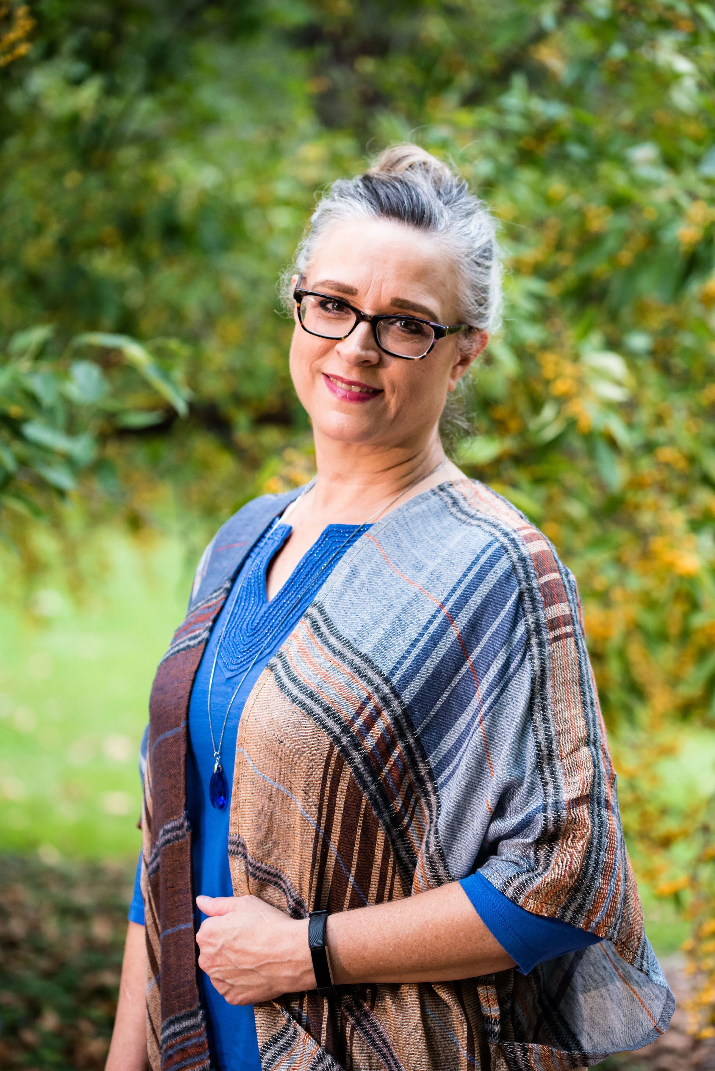
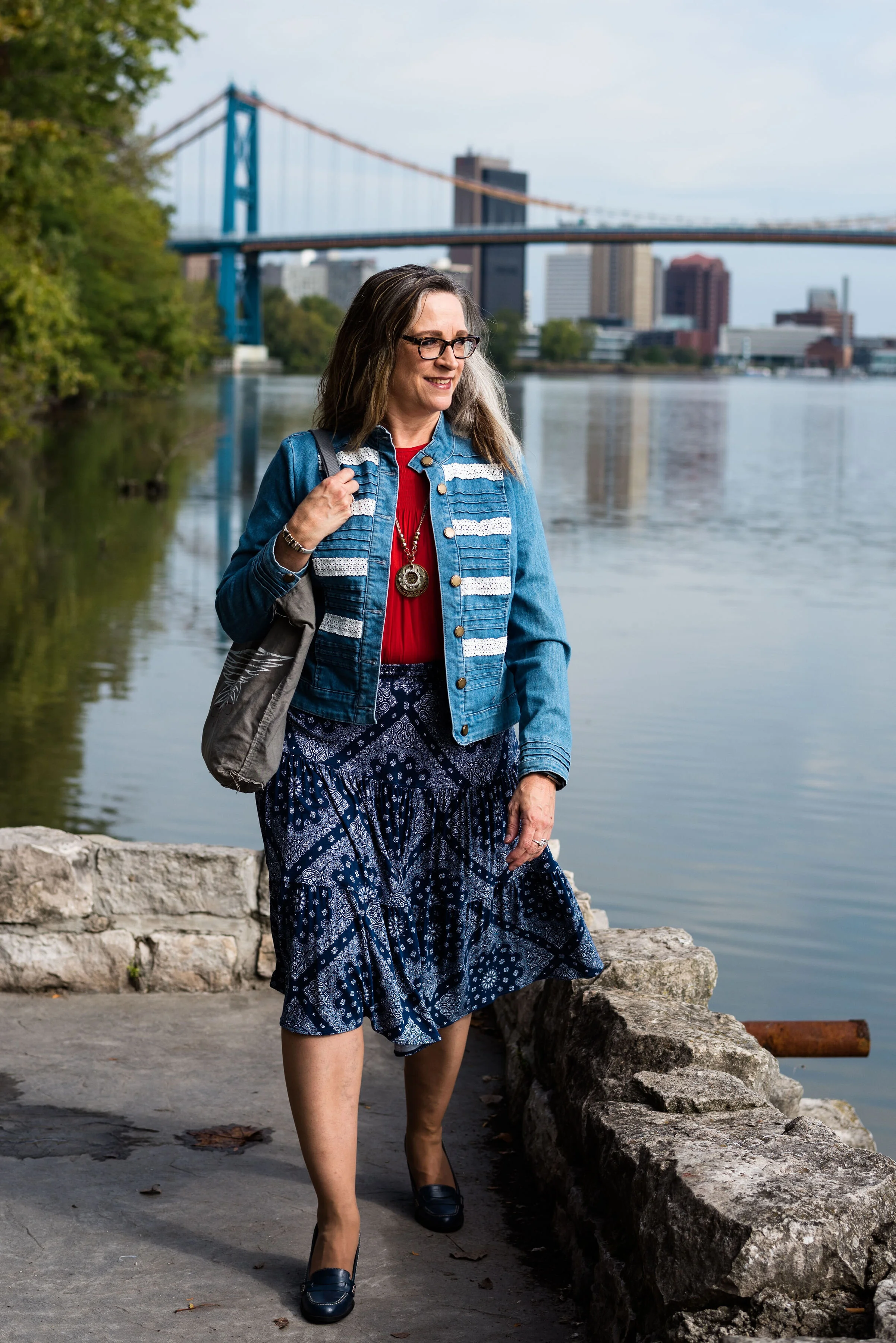
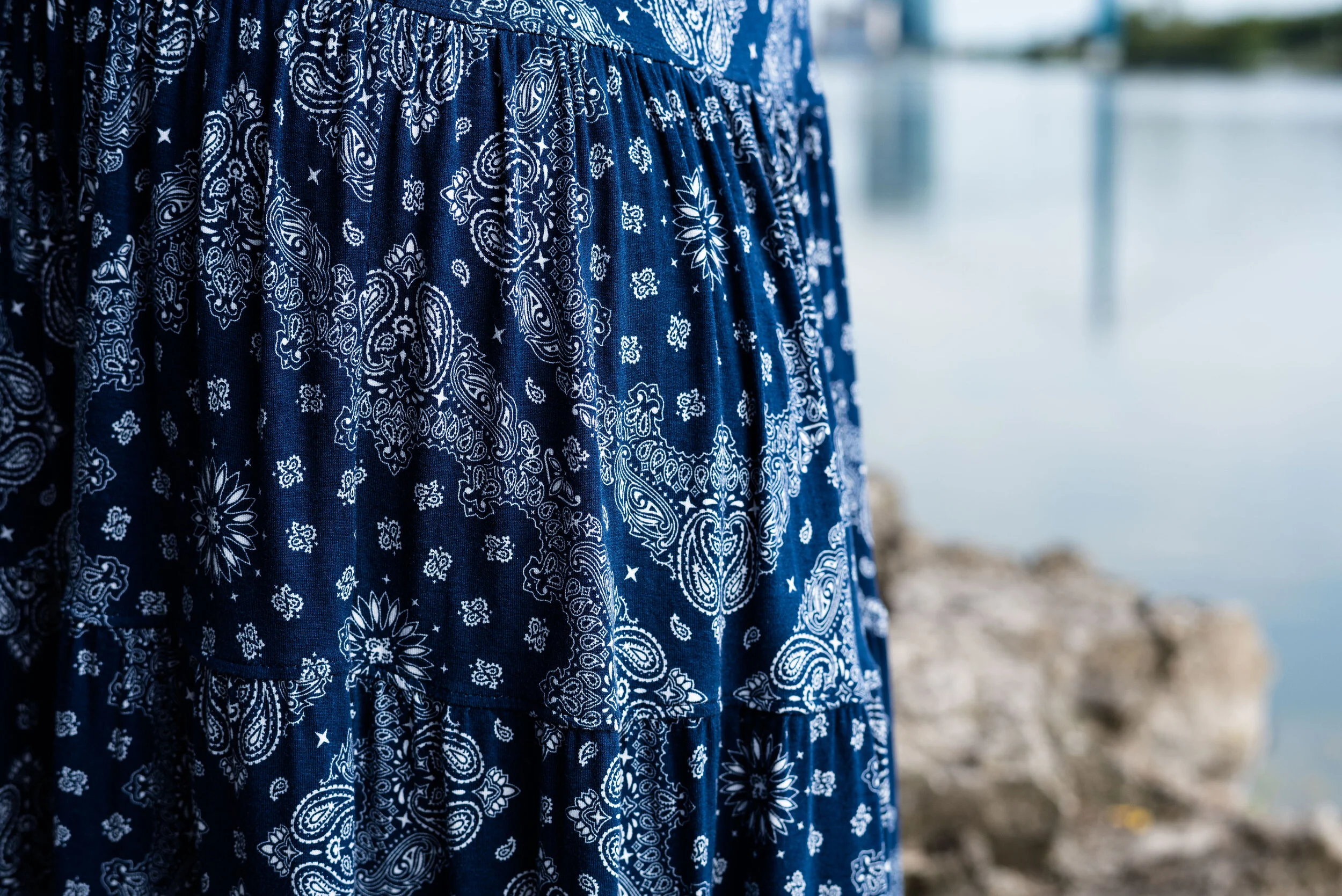
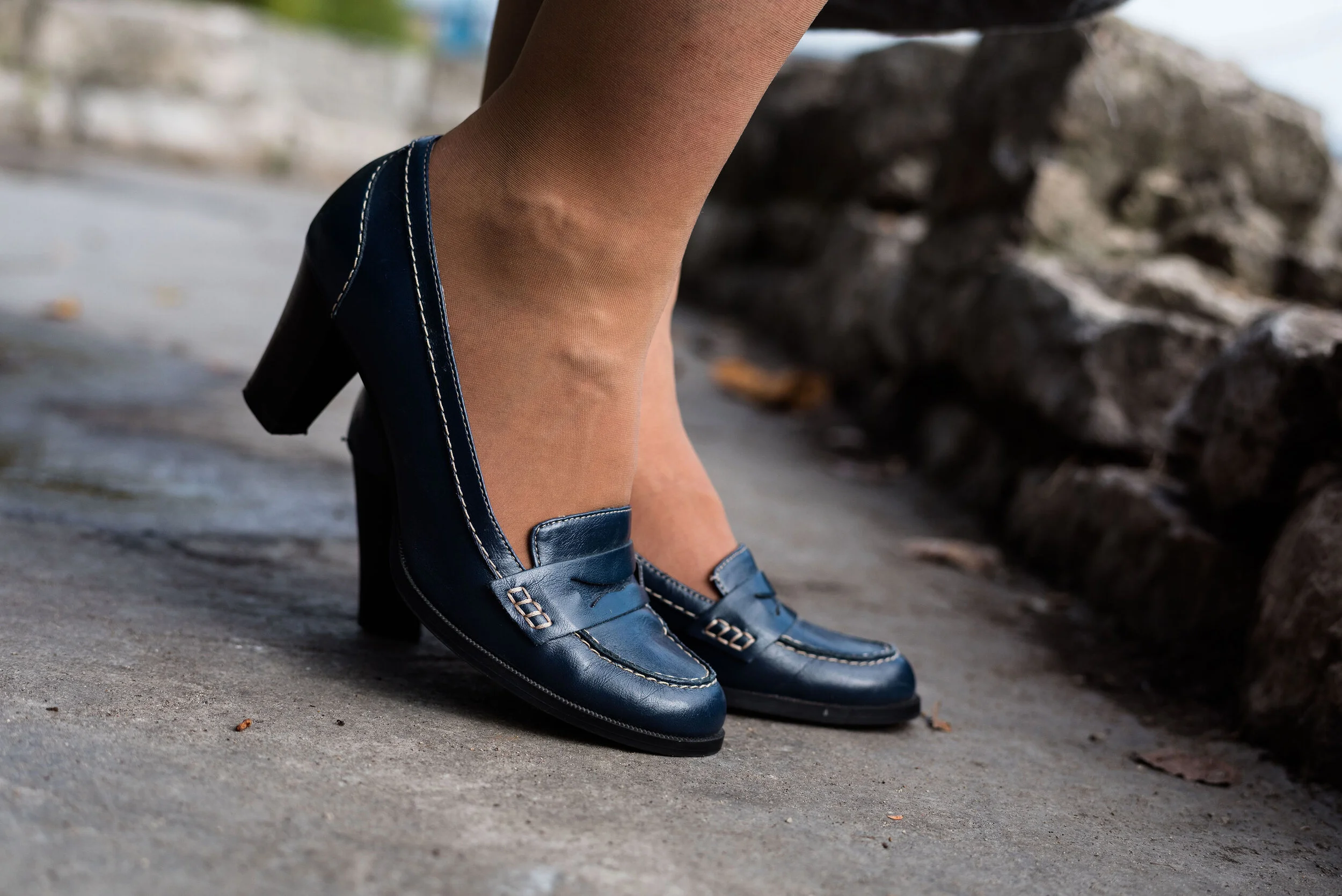
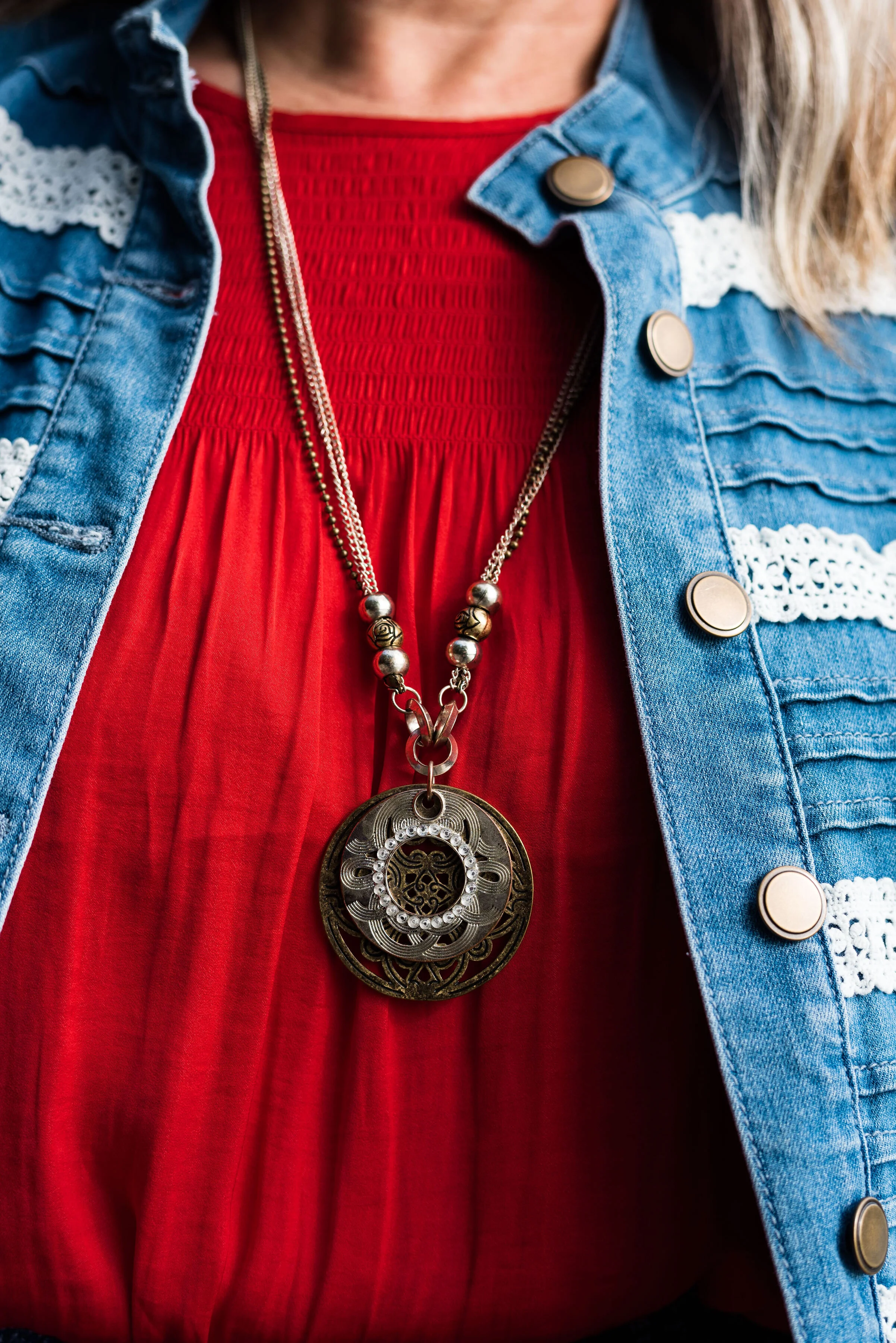
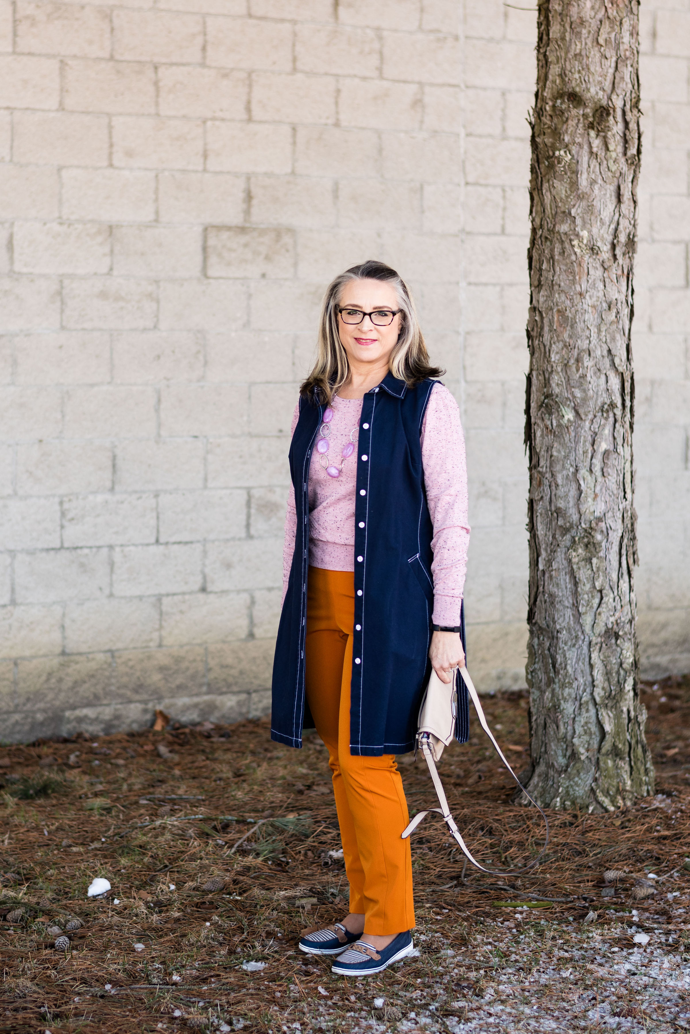
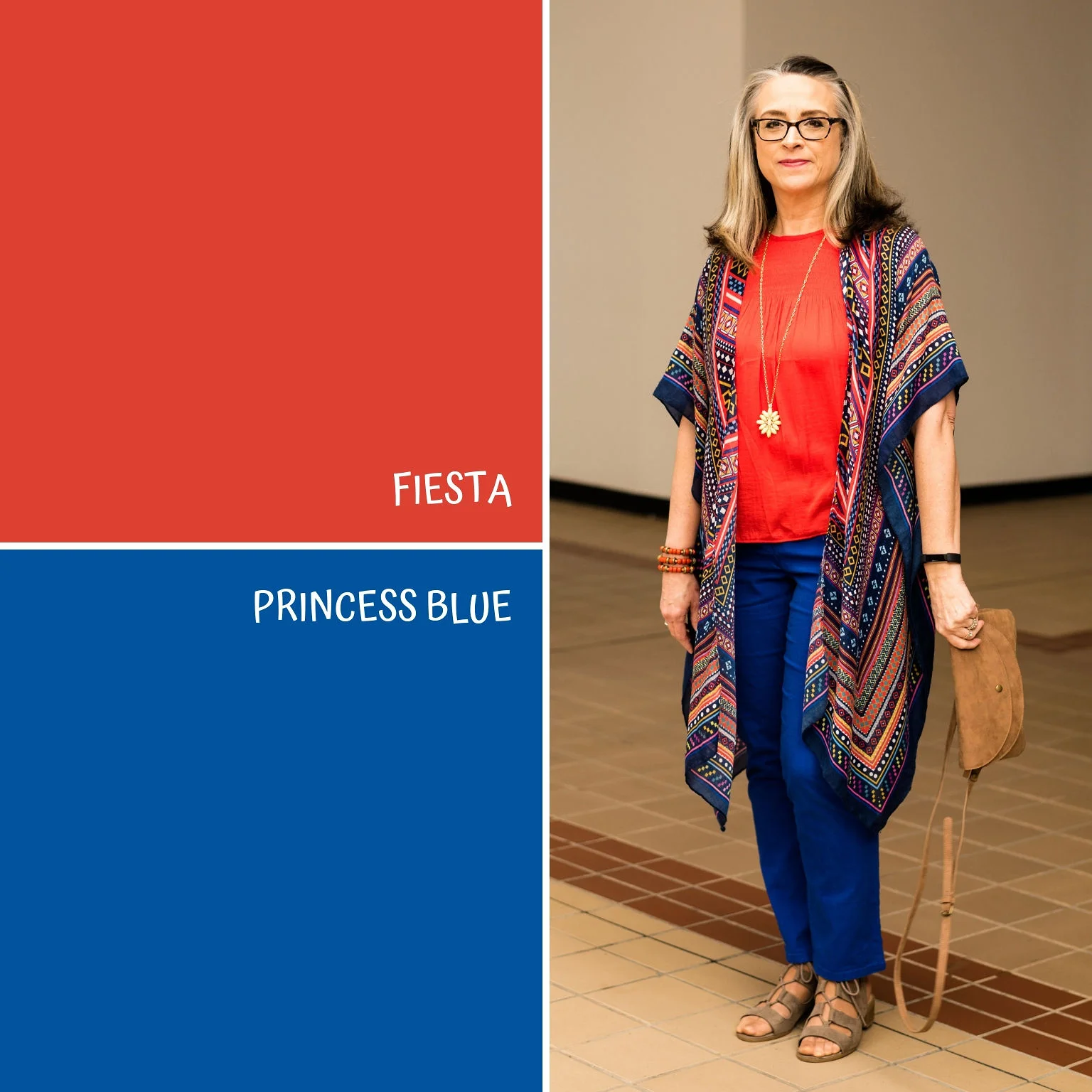
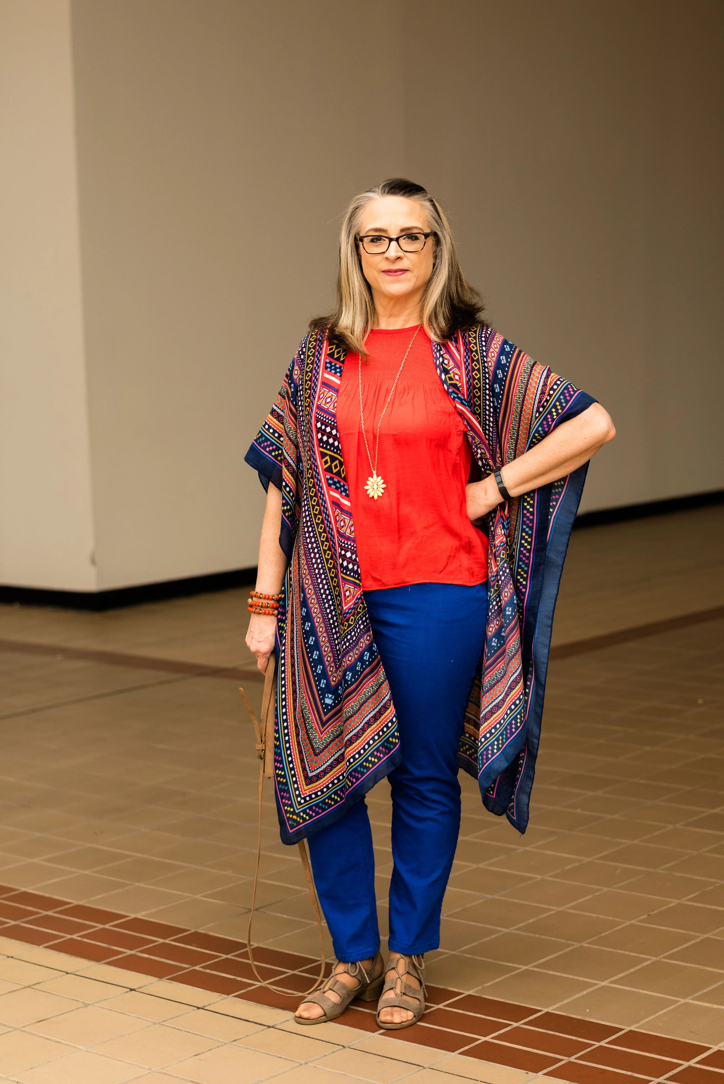
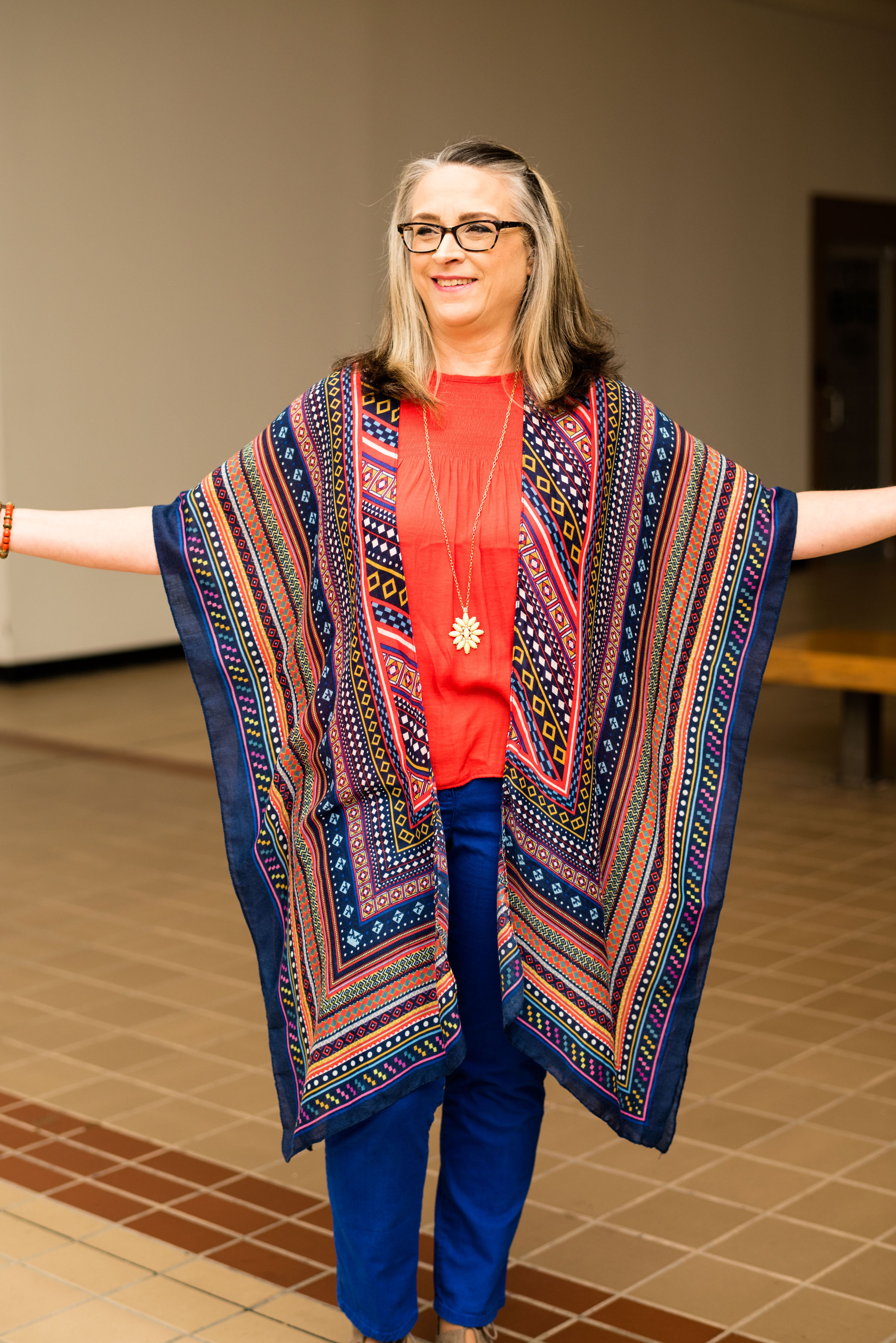
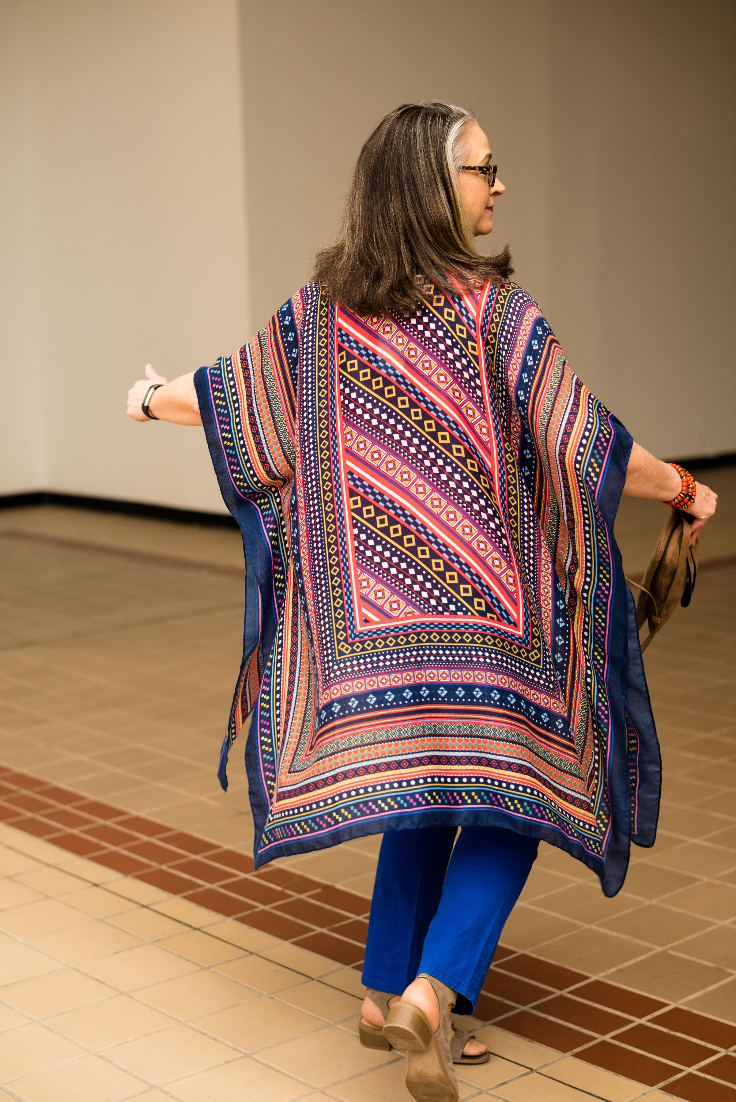
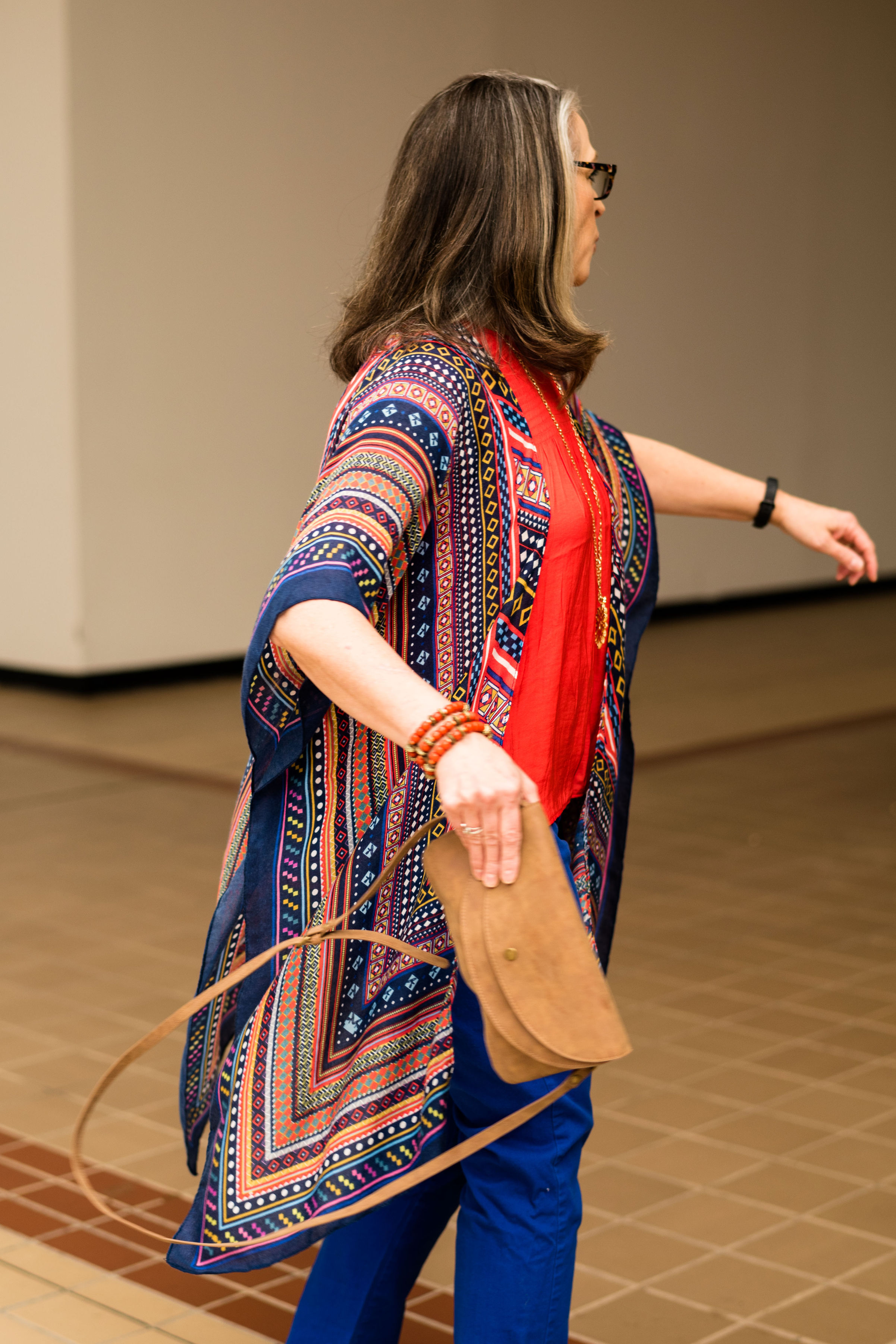
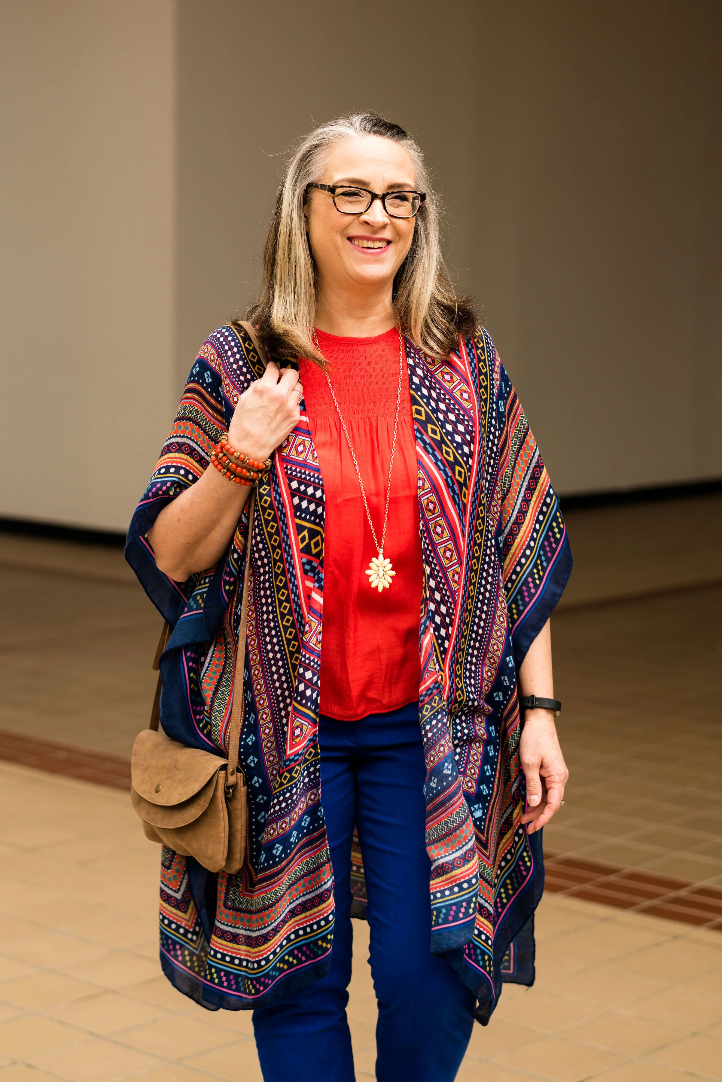
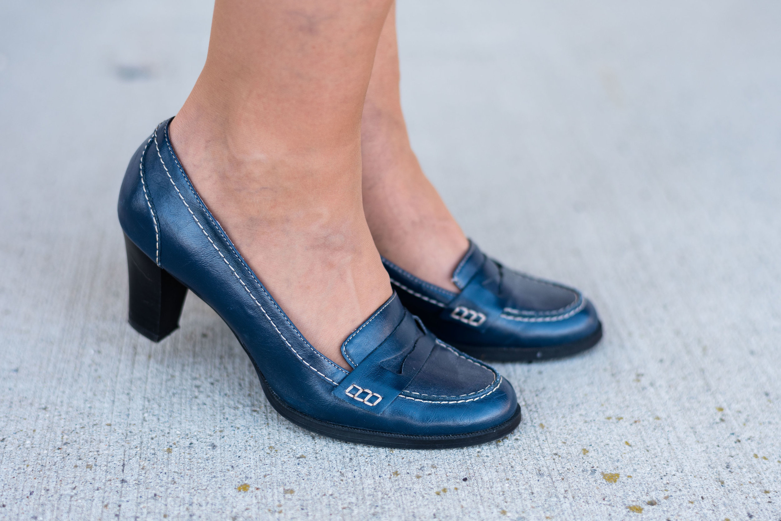
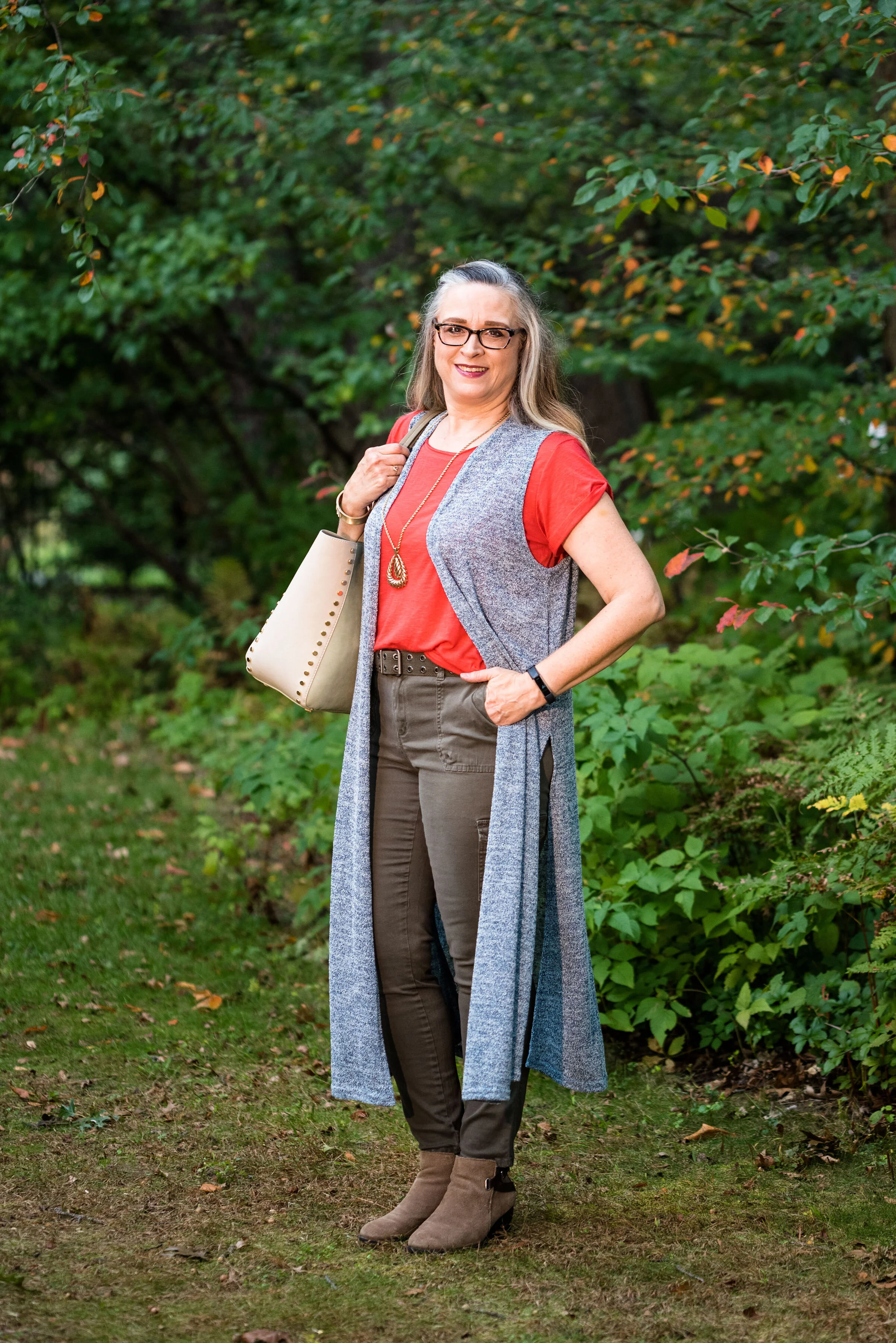
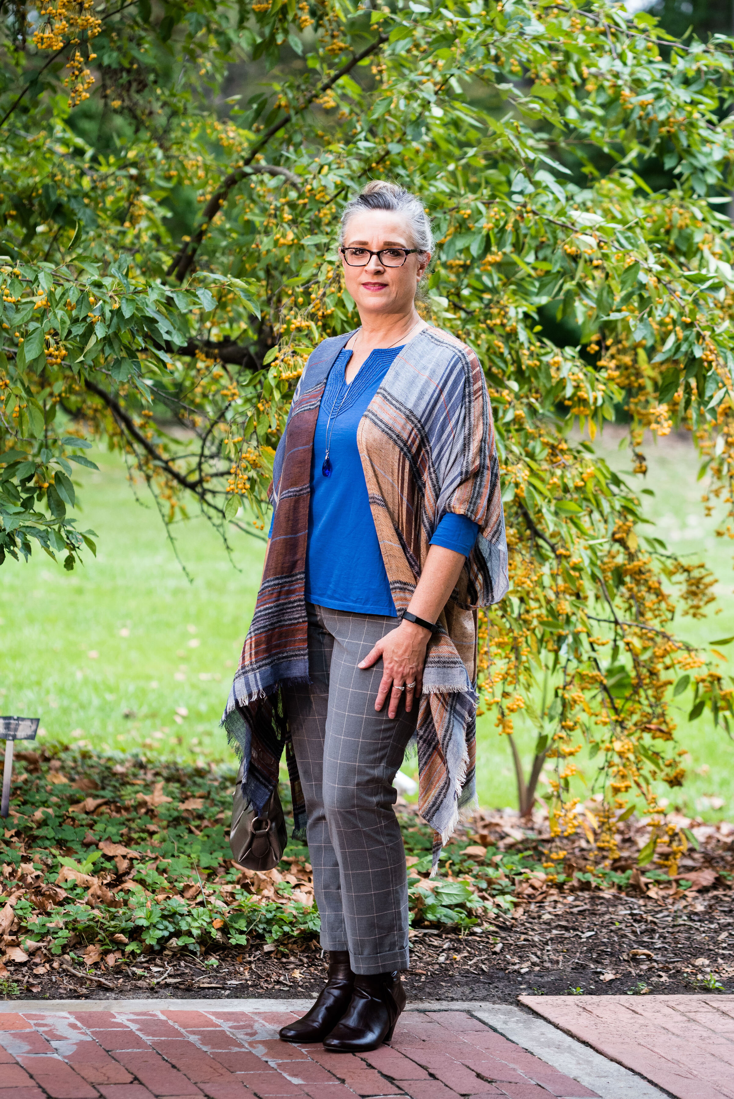
Outfit 6 - Galaxy Blue and Hazel
I am having a hard time picking just one outfit from this series that I liked the best. I really liked Cranberry and Chicory Coffee. I have always been a fan of browns, but I just love the result when it is combined with the medium pinky red of Cranberry. I also like the long line of this outfit and I think the long Rutabaga open front cardi helped with the illusion.
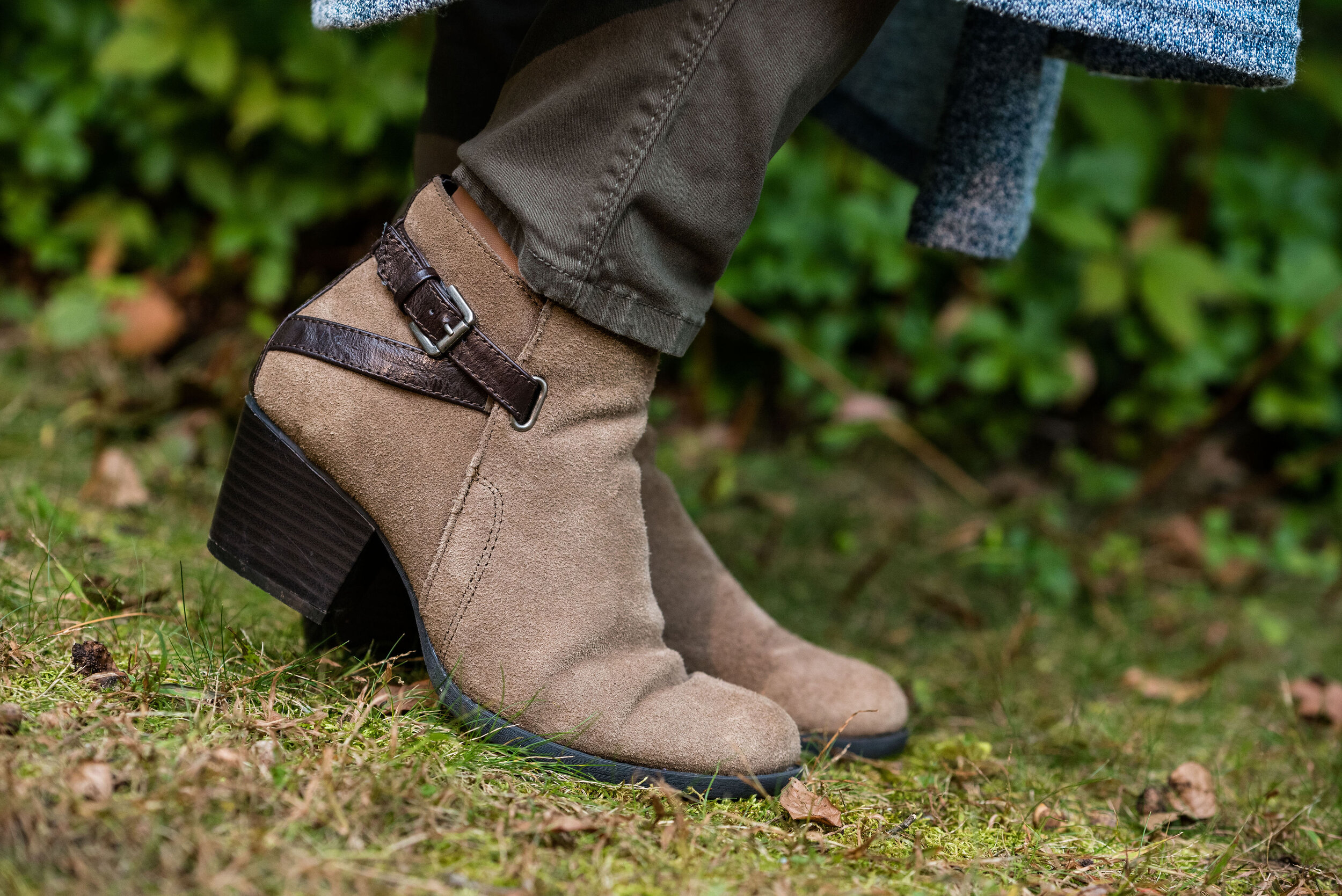
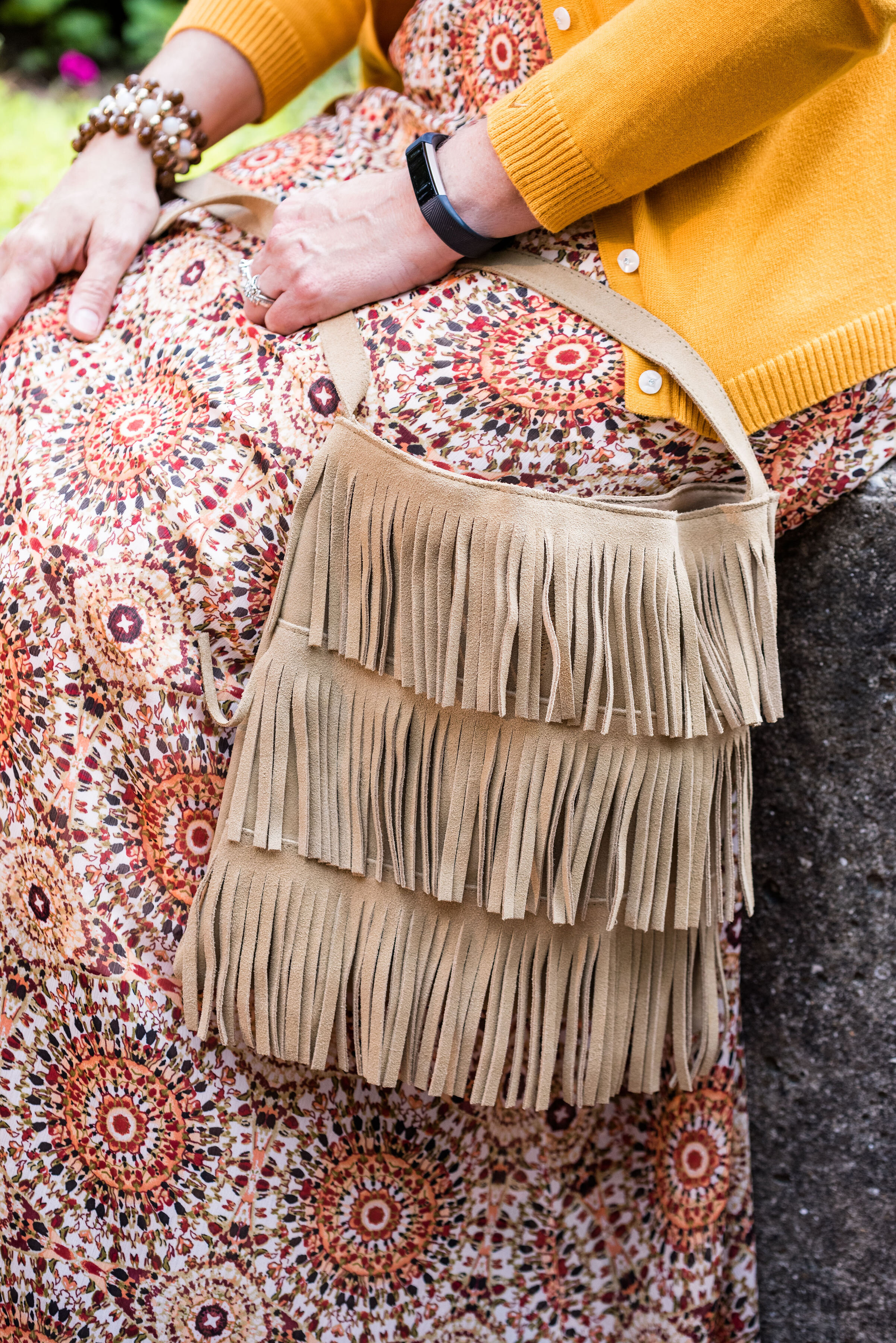
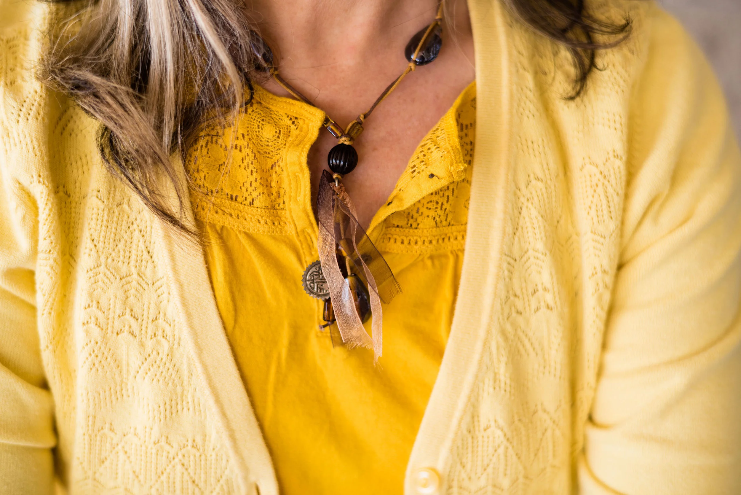
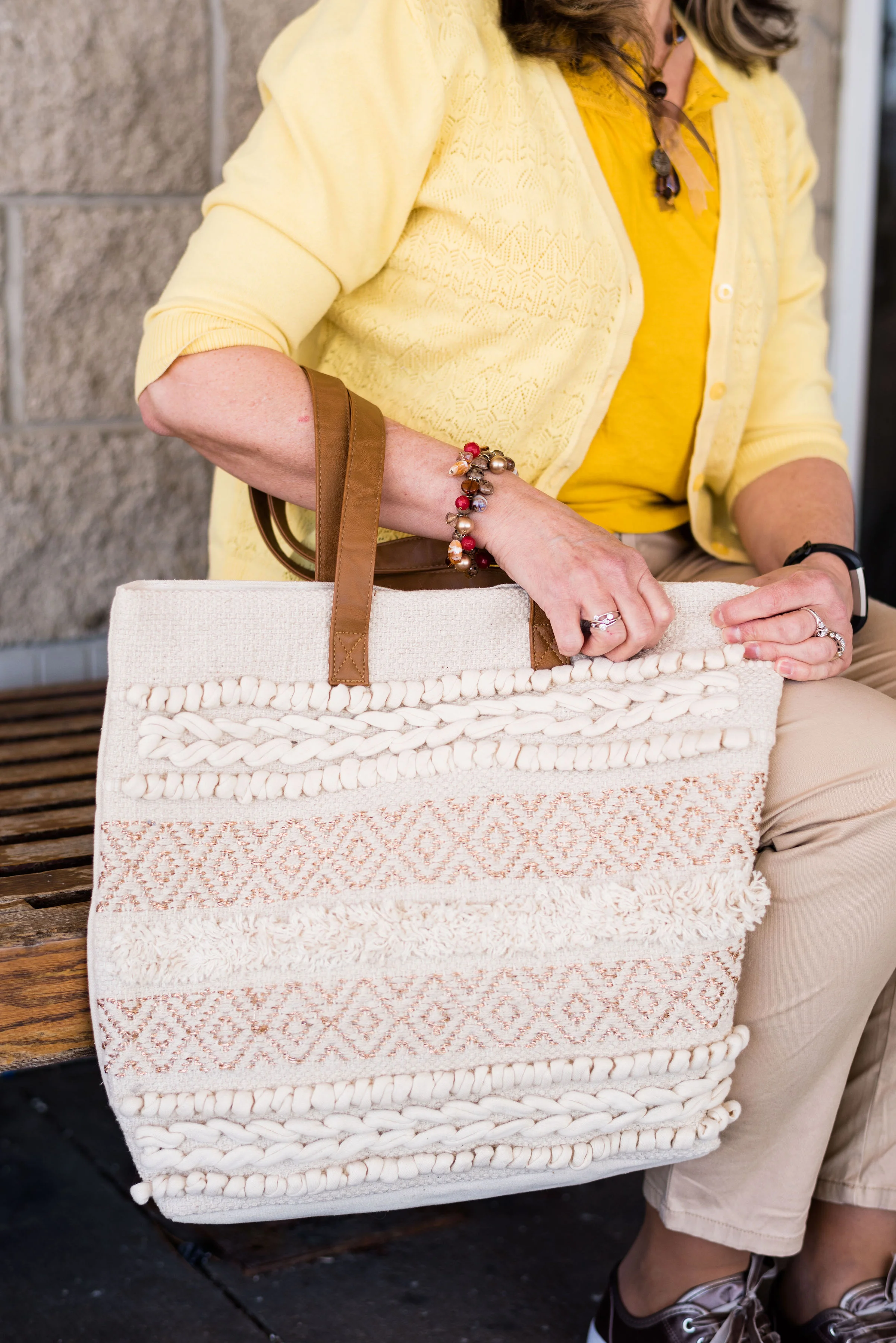
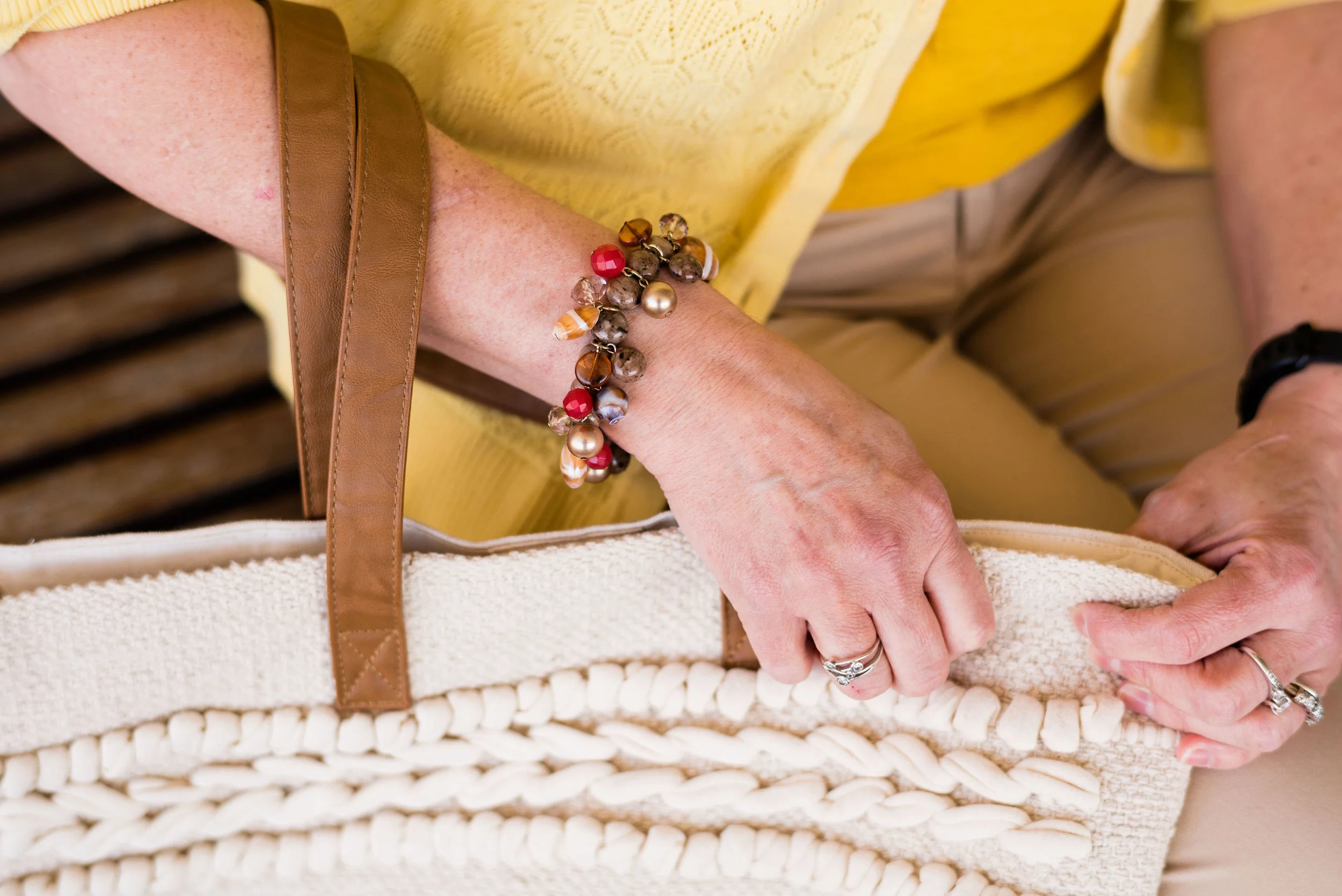
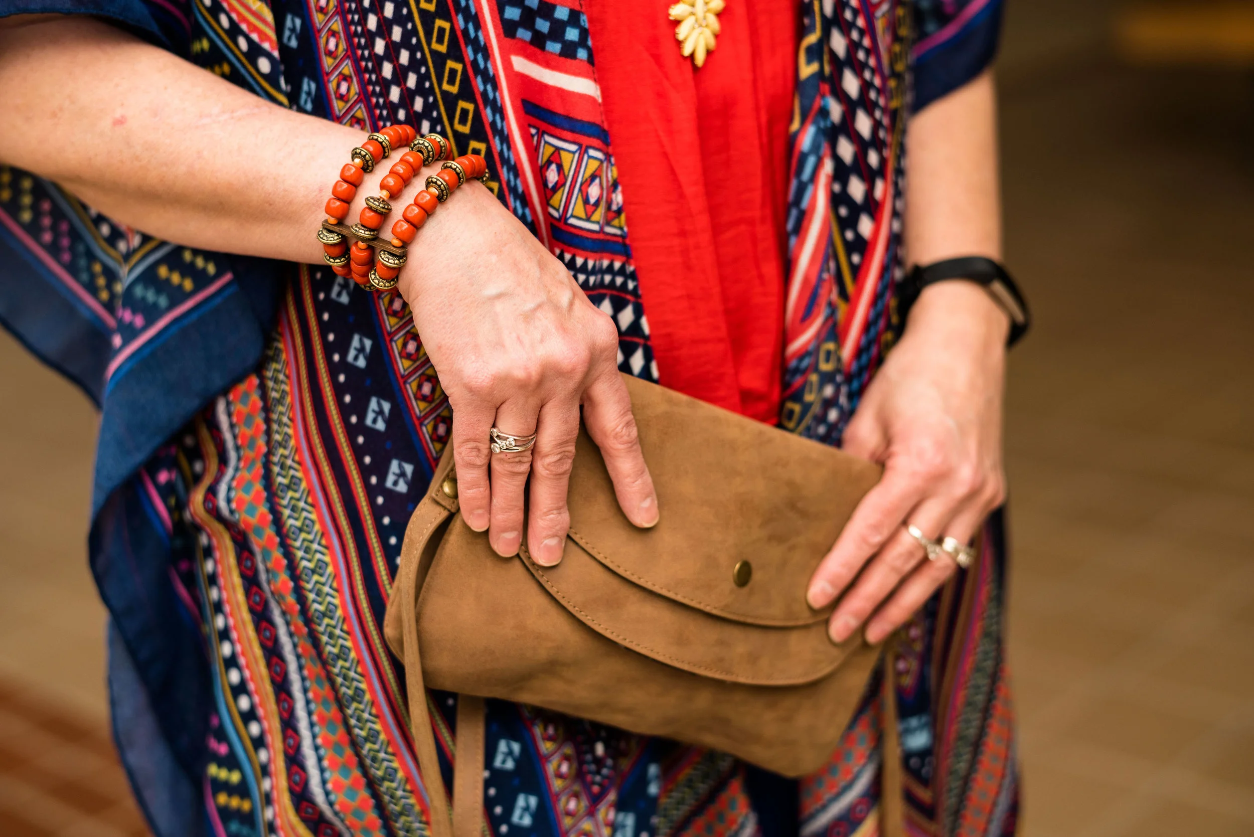
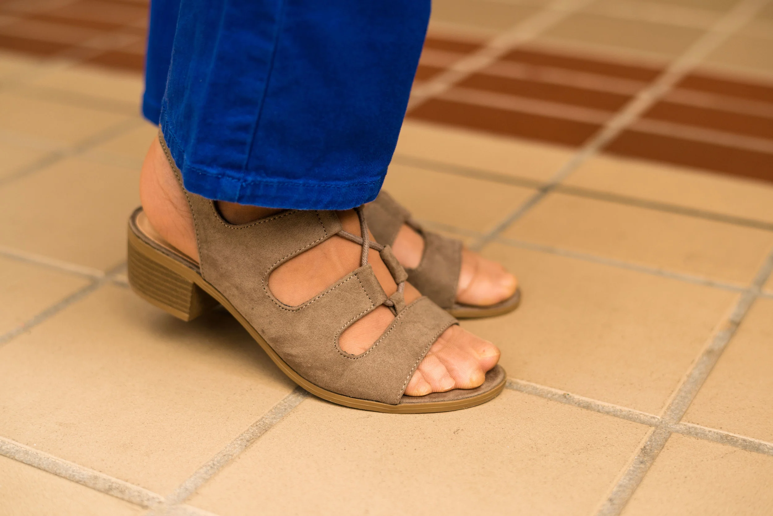
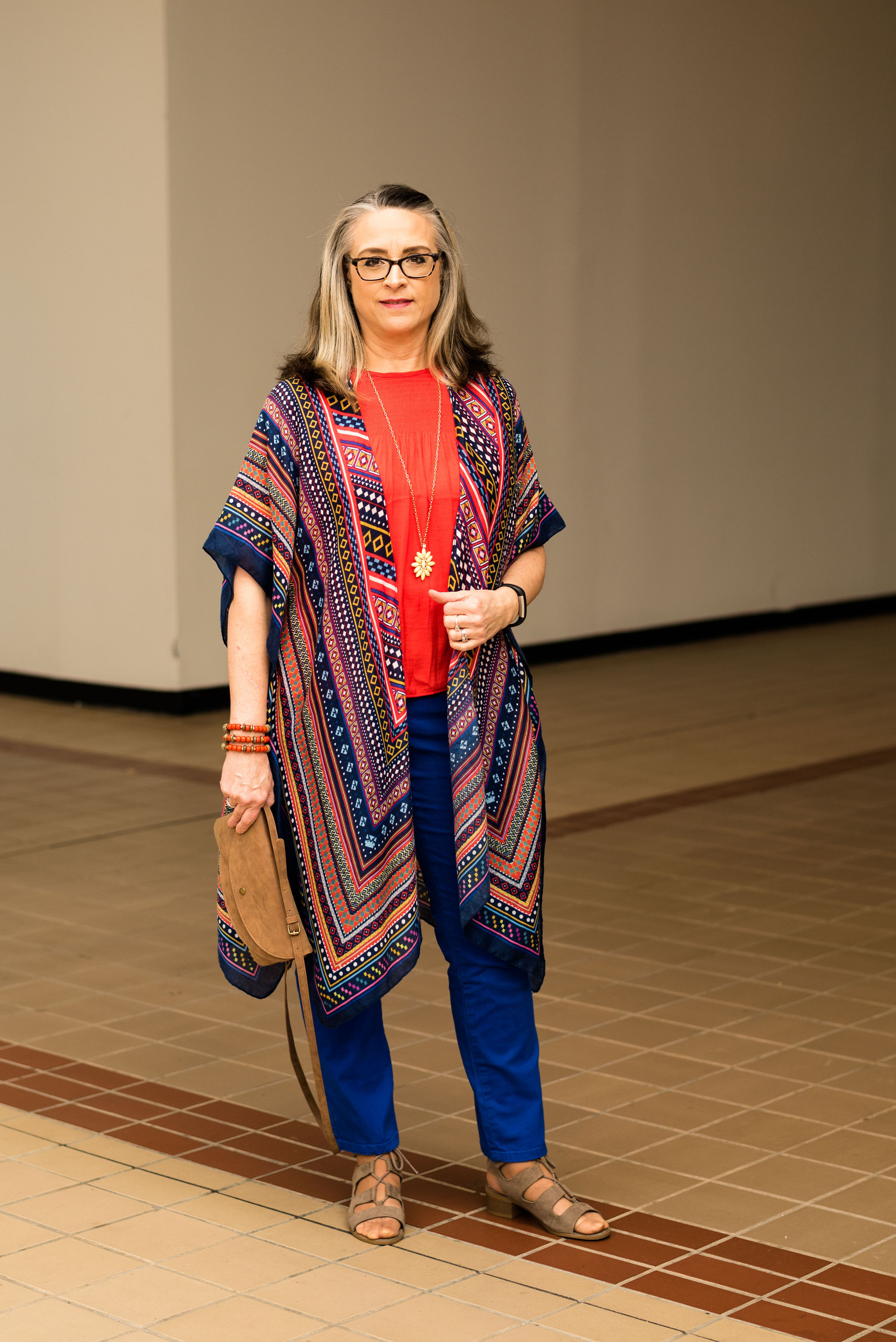
My next fave would be the boho vibe of Butterscotch and Grapeade. If you would have asked me a few years ago if I would wear an outfit with these two colors together, I would have said no way. Yellow and purple? You have to be kidding, but there is something whimsical about this outfit and the color combination is only part of it. The colors are happy and fun, but the print of the skirt, the fringe bag and the fun textured boots really give this outfit its bohemian style.
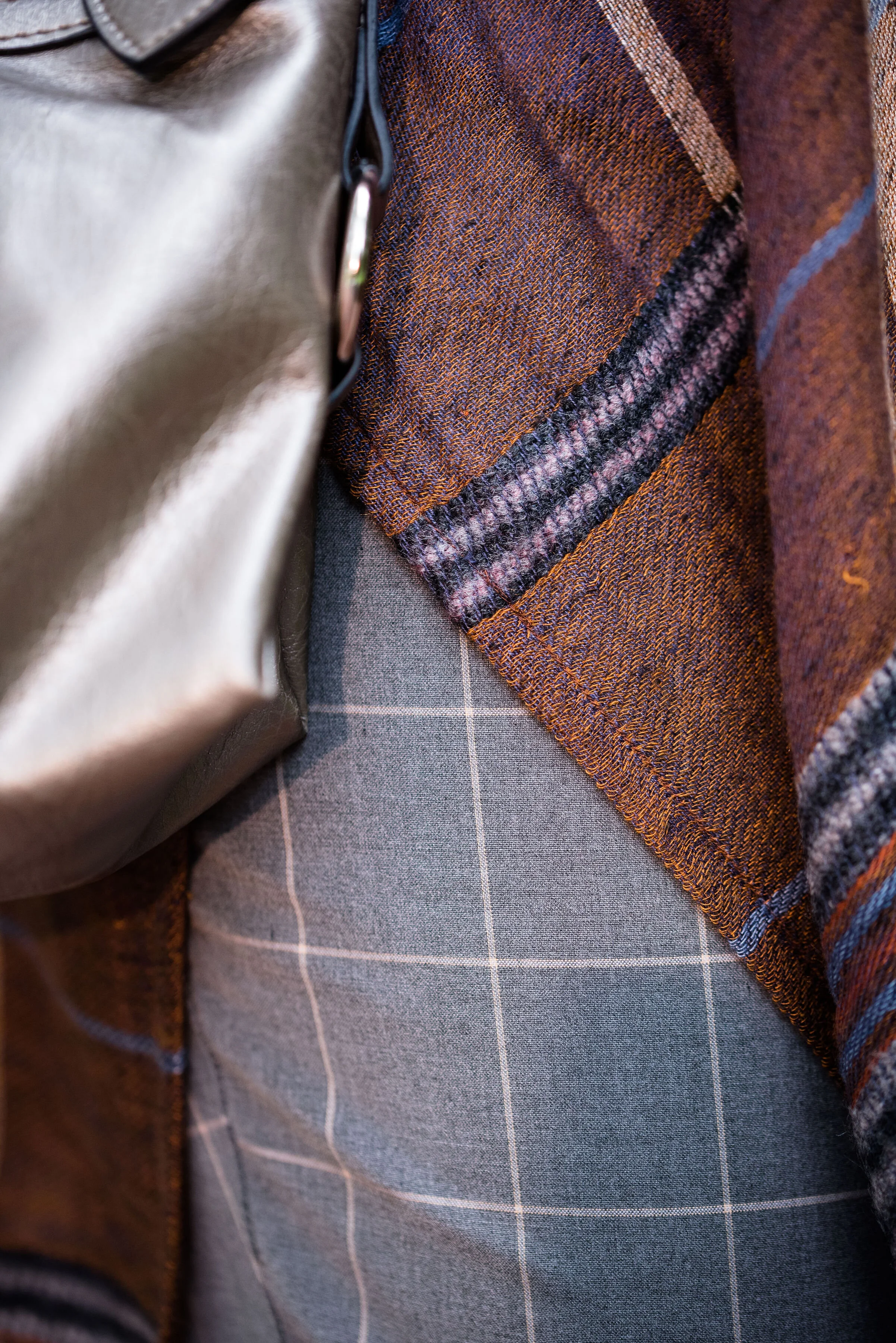
Finally, I really like the last outfit. Even though, I wouldn’t necessarily wear a color like Hazel all on it’s own, I do like the way this color pairs so well with the grays and the blues in outfit. I also like the subtle plaid print mixing. It is obvious, but it doesn’t overwhelm the eye like some print mixing is capable of doing.
Well, I’ve told you my favorites, now tell me yours. I love to hear your feedback.
i hope you enjoyed this Pantone - Autumn/Winter series. If there is anything else you would like to see, with regards to the Pantone Color Institute you can check out their website. Just click on the link.
Have a great Tuesday!
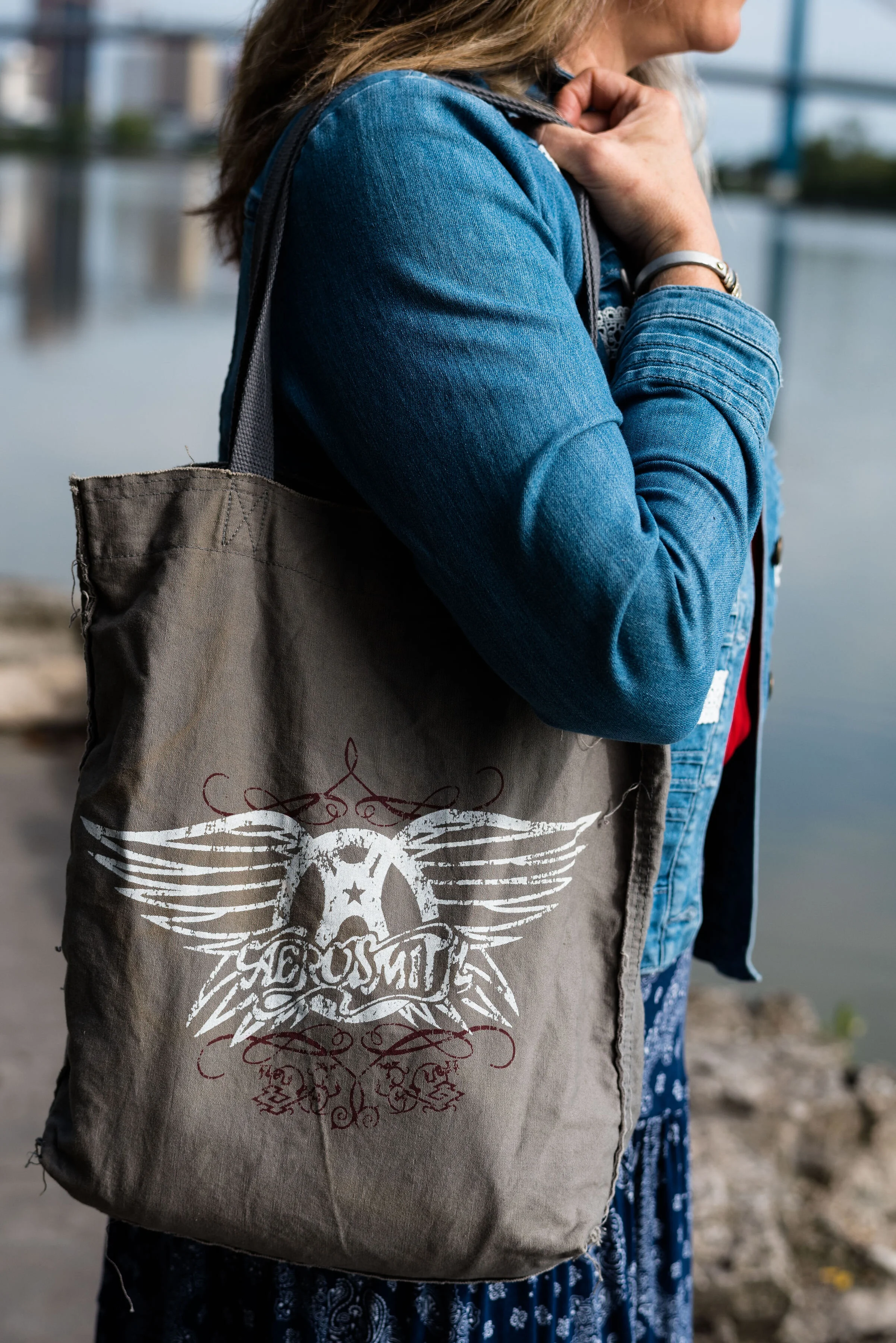
Photo credit Rebecca Trumbull.